Embed Size (px)
DESCRIPTION
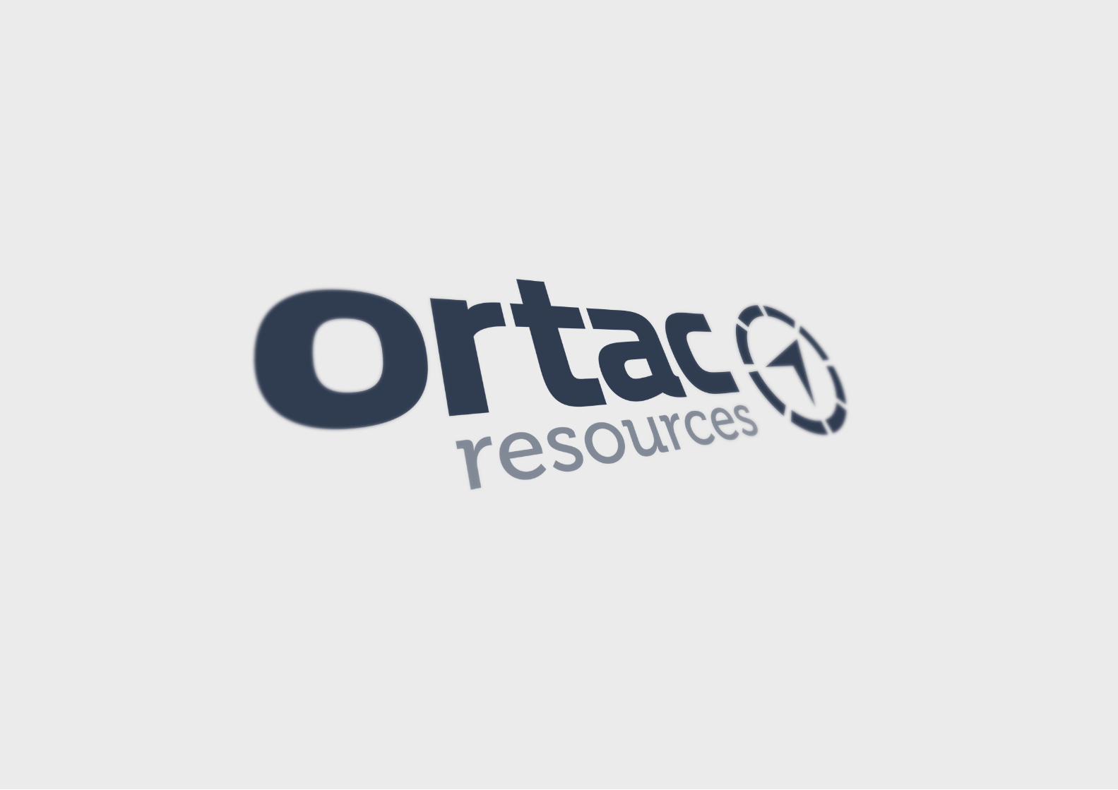
Route One Ortac Resources Redesign resources With this approach we have moved the current brand forward, using a strong customised typeface and a simpfied mark. This modernises and strengthens the current brand while still maintaining a strong resemblence to the original. Route One - Branding Evolution
Citation preview
Ortac Resources Redesign
Route One

resources
resources
Route One - Branding Evolution
With this approach we have moved the current brand forward, using a strong customised typeface and a simpfied mark. This modernises and strengthens the current brand while still maintaining a strong resemblence to the original.
ortac headline
ortac headlineortac headline
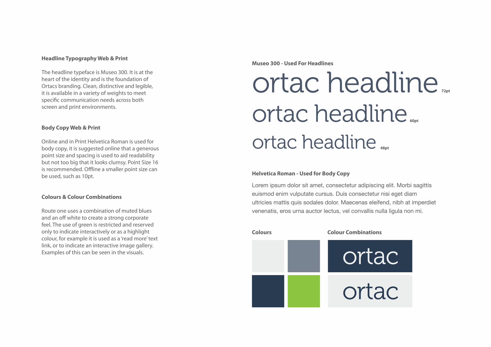
Headline Typography Web & Print
The headline typeface is Museo 300. It is at the heart of the identity and is the foundation of Ortacs branding. Clean, distinctive and legible, it is available in a variety of weights to meet specific communication needs across both screen and print environments.
Body Copy Web & Print
Online and in Print Helvetica Roman is used for body copy, it is suggested online that a generous point size and spacing is used to aid readability but not too big that it looks clumsy. Point Size 16 is recommended. Offline a smaller point size can be used, such as 10pt.
Colours & Colour Combinations
Route one uses a combination of muted blues and an off white to create a strong corporate feel. The use of green is restricted and reserved only to indicate interactively or as a highlight colour, for example it is used as a ‘read more’ text link, or to indicate an interactive image gallery. Examples of this can be seen in the visuals.
Lorem ipsum dolor sit amet, consectetur adipiscing elit. Morbi sagittis
euismod enim vulputate cursus. Duis consectetur nisi eget diam
ultricies mattis quis sodales dolor. Maecenas eleifend, nibh at imperdiet
venenatis, eros urna auctor lectus, vel convallis nulla ligula non mi.
Helvetica Roman - Used for Body Copy
Colours Colour Combinations
72pt
60pt
Museo 300 - Used For Headlines
48pt
ortac
ortac
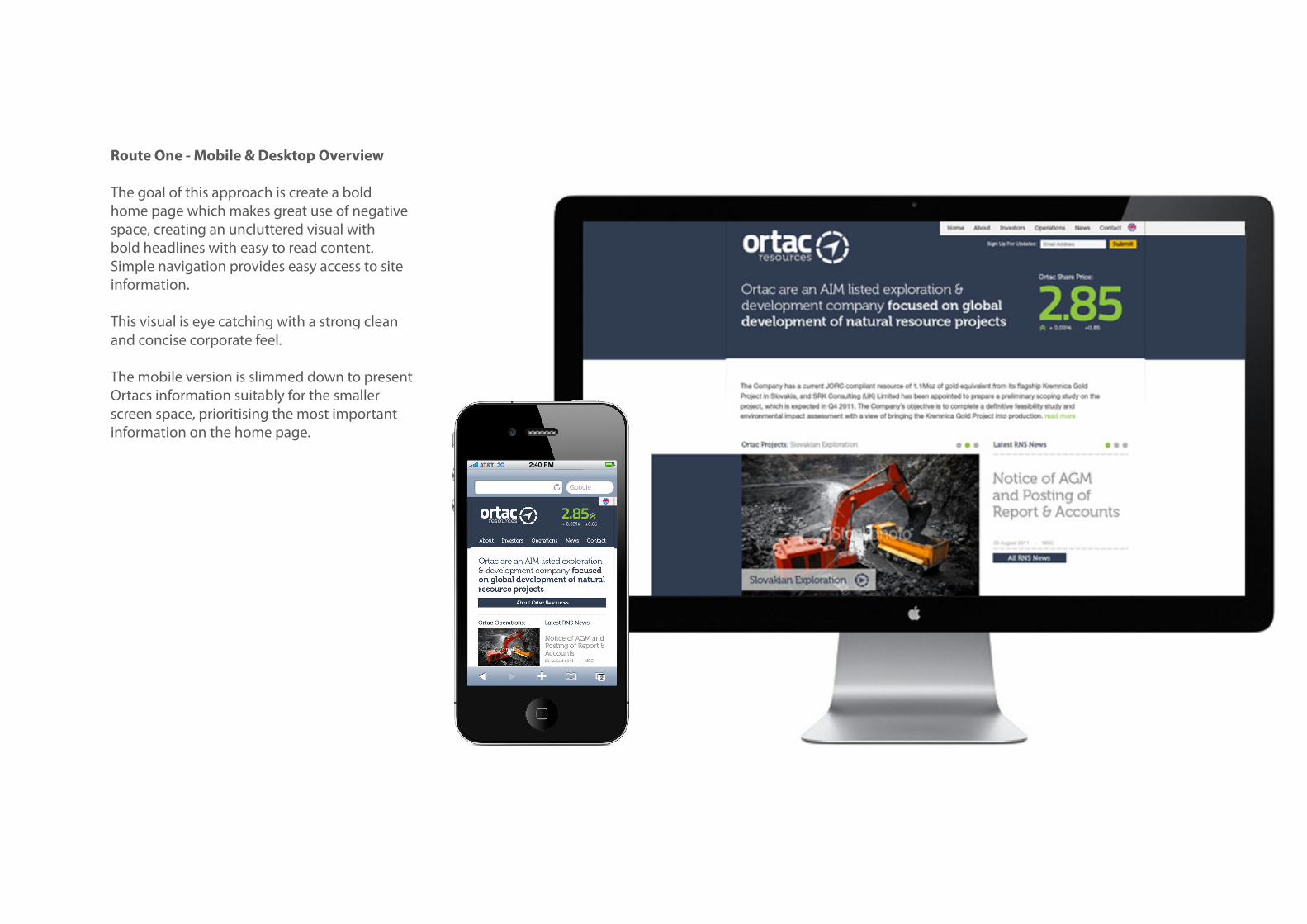
Route One - Mobile & Desktop Overview
The goal of this approach is create a bold home page which makes great use of negative space, creating an uncluttered visual with bold headlines with easy to read content. Simple navigation provides easy access to site information.
This visual is eye catching with a strong clean and concise corporate feel.
The mobile version is slimmed down to present Ortacs information suitably for the smaller screen space, prioritising the most important information on the home page.
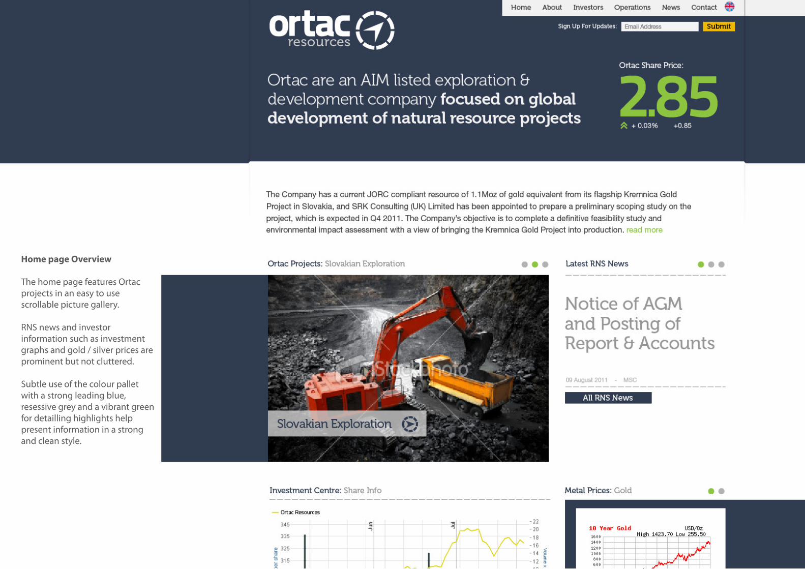
Home page Overview
The home page features Ortac projects in an easy to use scrollable picture gallery.
RNS news and investor information such as investment graphs and gold / silver prices are prominent but not cluttered.
Subtle use of the colour pallet with a strong leading blue, resessive grey and a vibrant green for detailling highlights help present information in a strong and clean style.

Project Overview
A project detail page follows the same structure and layout as the home page, while focusing more on written content.
Pull quotes and bold headlines are an important part of this design, with a picture gallery that is available, and can contain a number of images relating to the project
The operation map would be available down the page in a similar style the Operations Gallery.

Operations Detail
On the operations detail page, the photography will become the main focus of the header. With maps and technical details being relegated to the side column.
The information is clearly accessible with bold headlines and easy to read information.
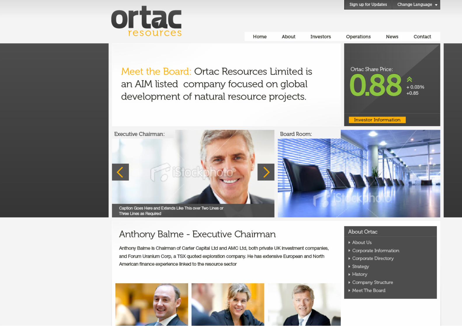
Directors Overview
The board of directors page shows the Executive Director as the main shot, with the key board members positioned below, each board member is given space for a short bio about their role in the company.
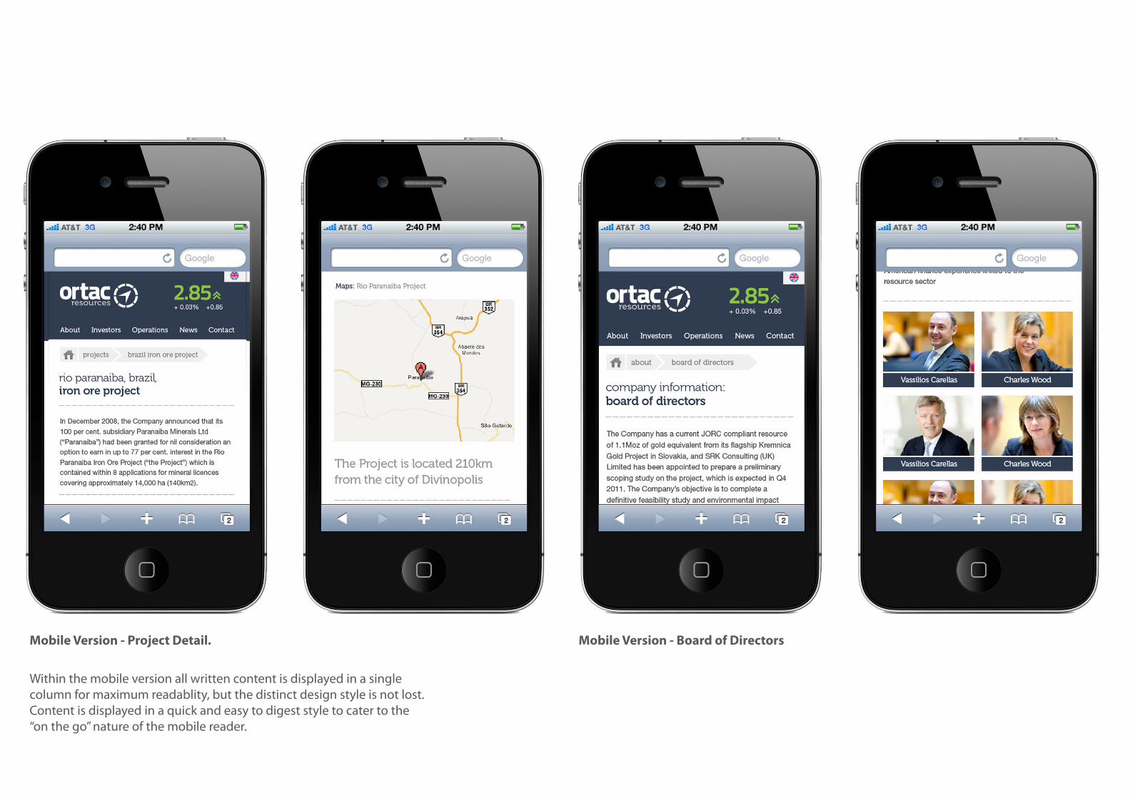
Mobile Version - Project Detail.
Within the mobile version all written content is displayed in a single column for maximum readablity, but the distinct design style is not lost.Content is displayed in a quick and easy to digest style to cater to the “on the go” nature of the mobile reader.
Mobile Version - Board of Directors
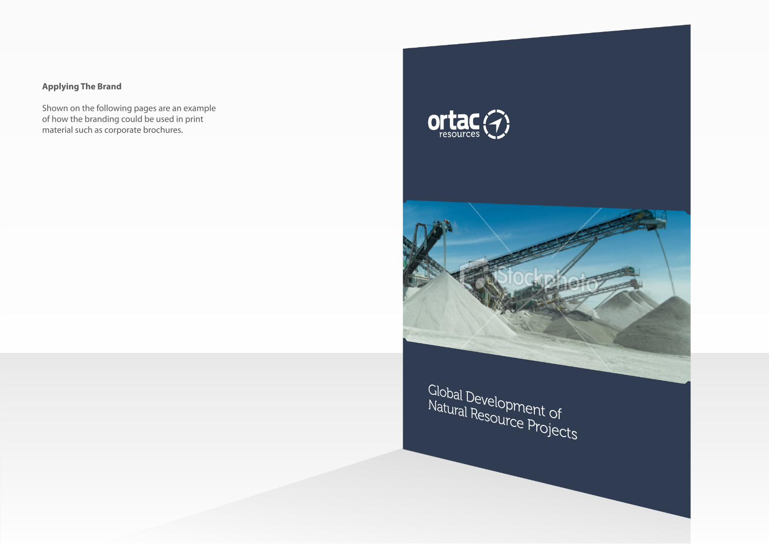
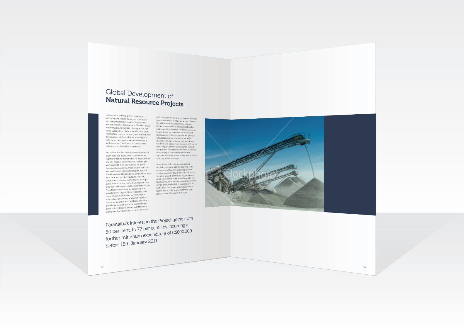
Applying The Brand
Shown on the following pages are an example of how the branding could be used in print material such as corporate brochures.

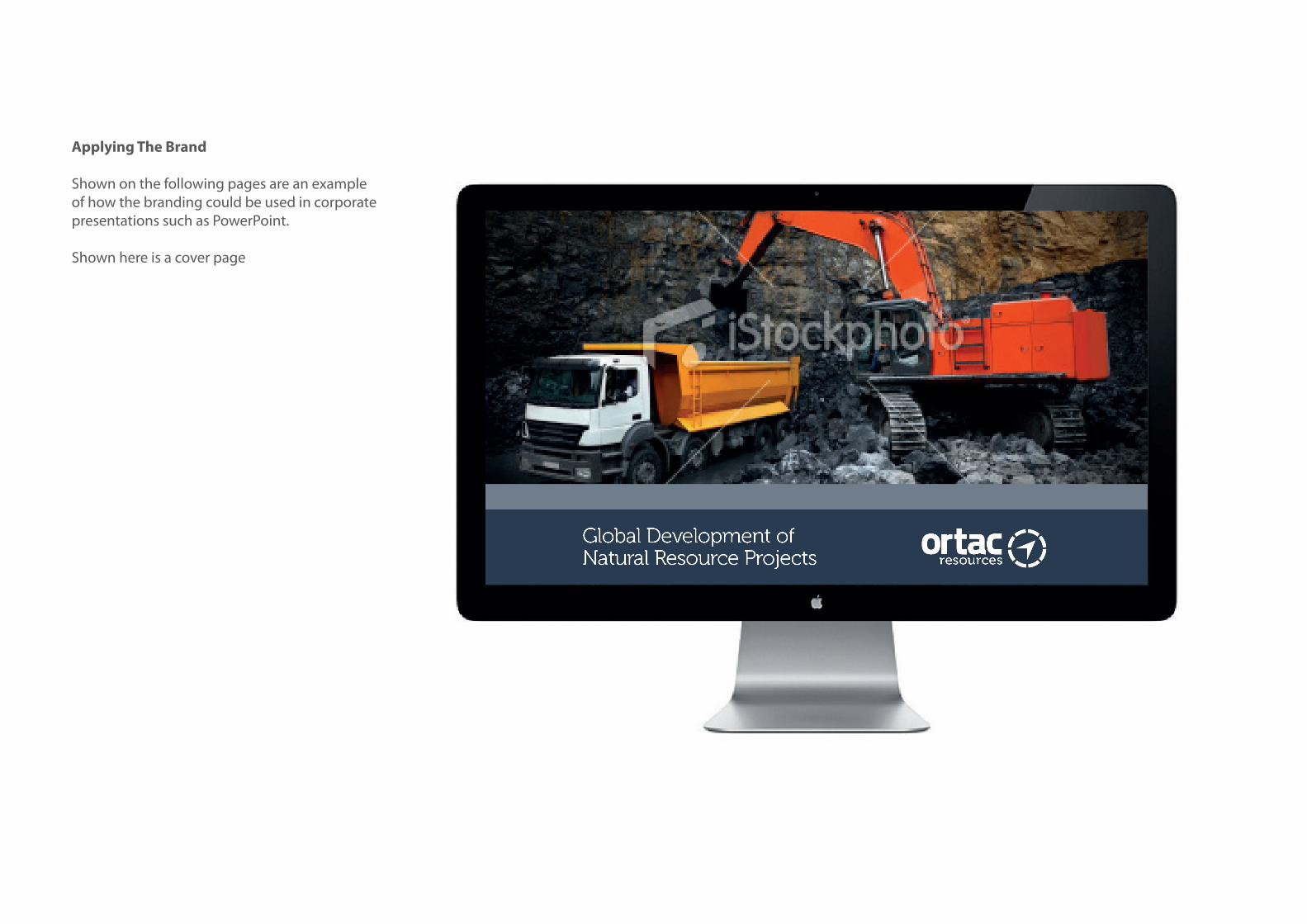
Applying The Brand
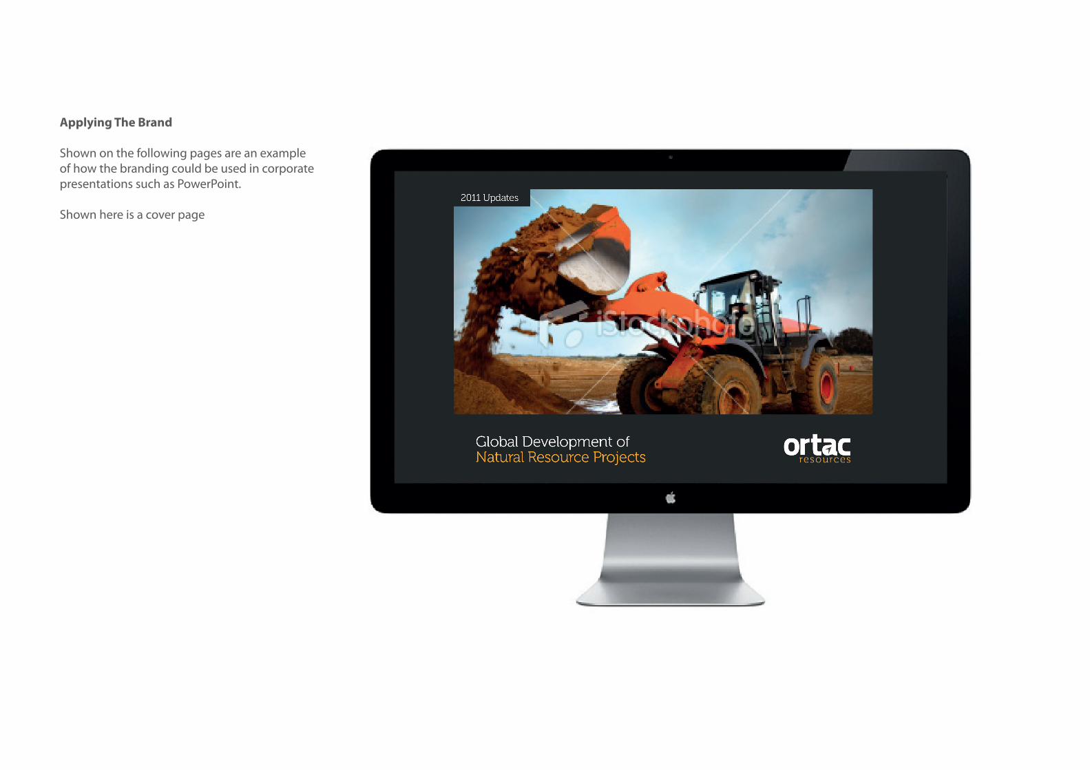
Shown on the following pages are an example of how the branding could be used in corporate presentations such as PowerPoint.
Shown here is a cover page
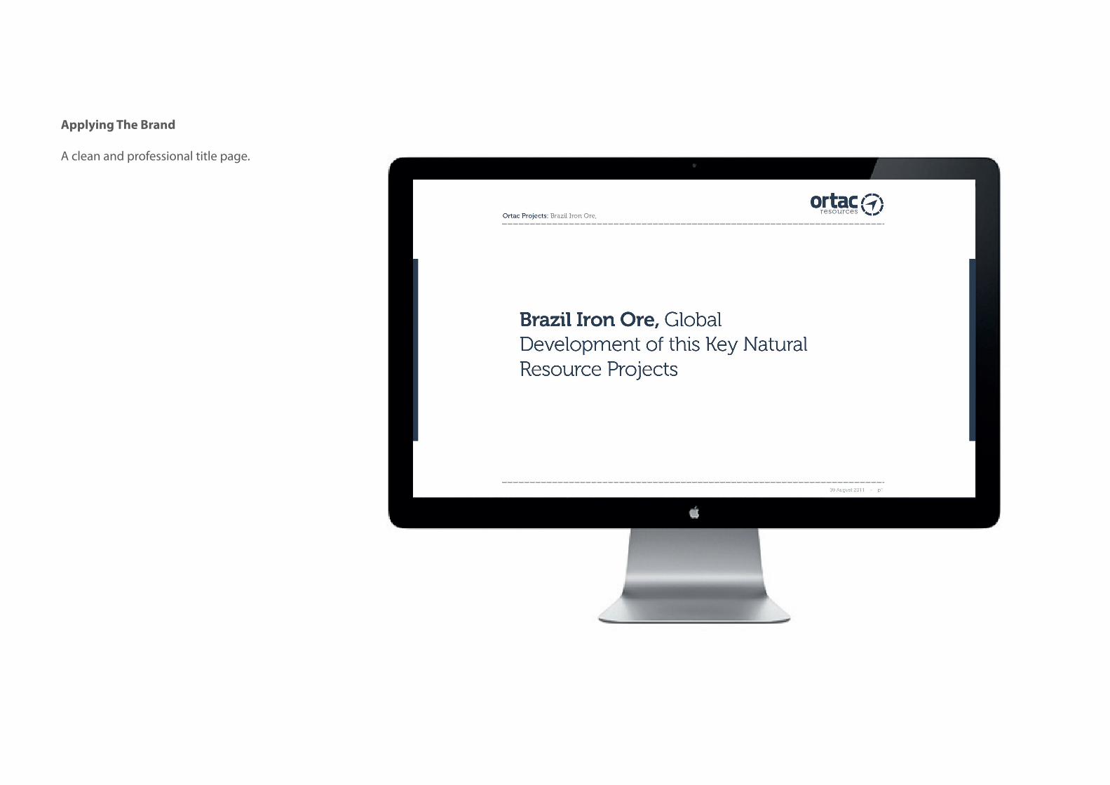
Applying The Brand
A clean and professional title page.
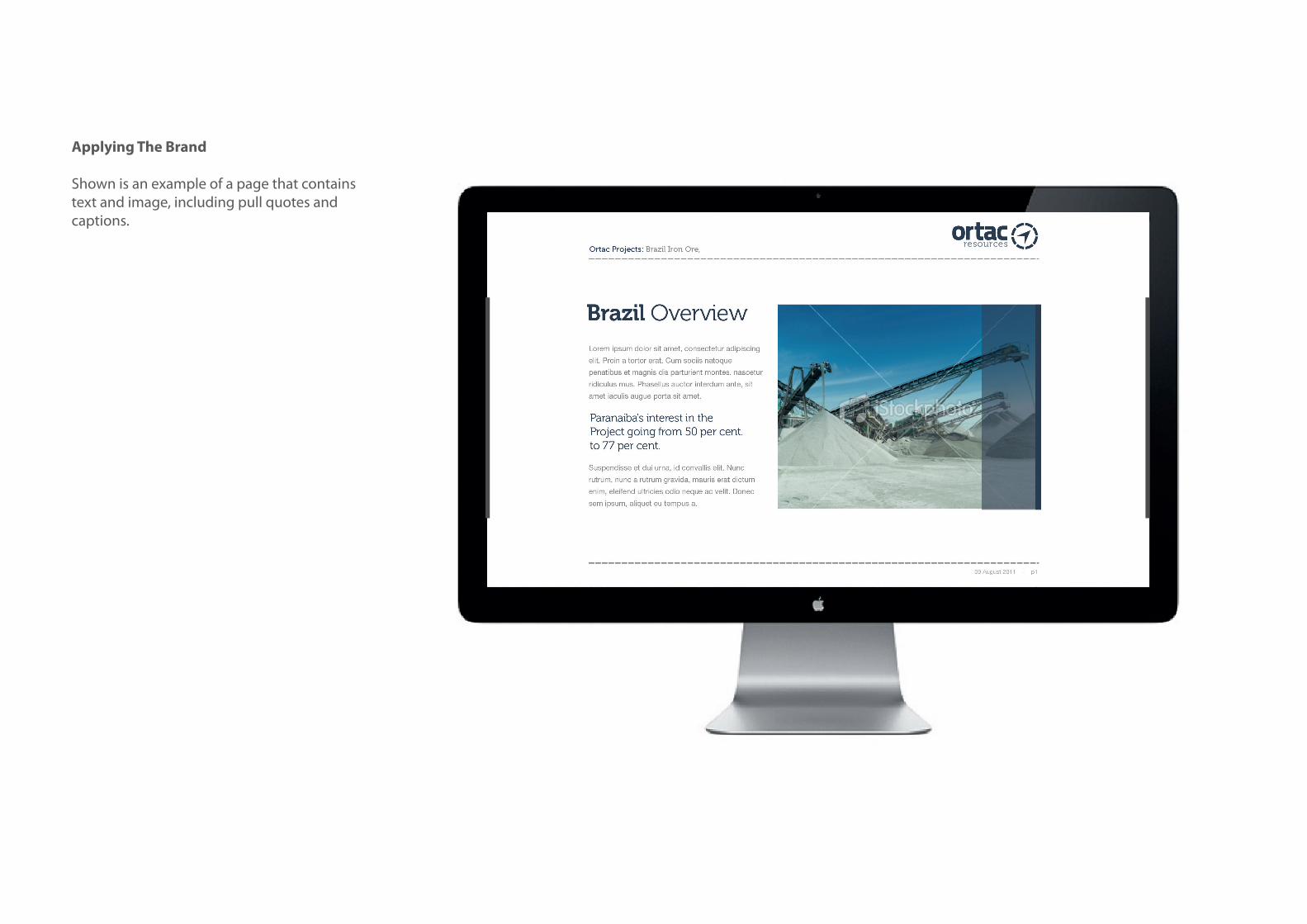
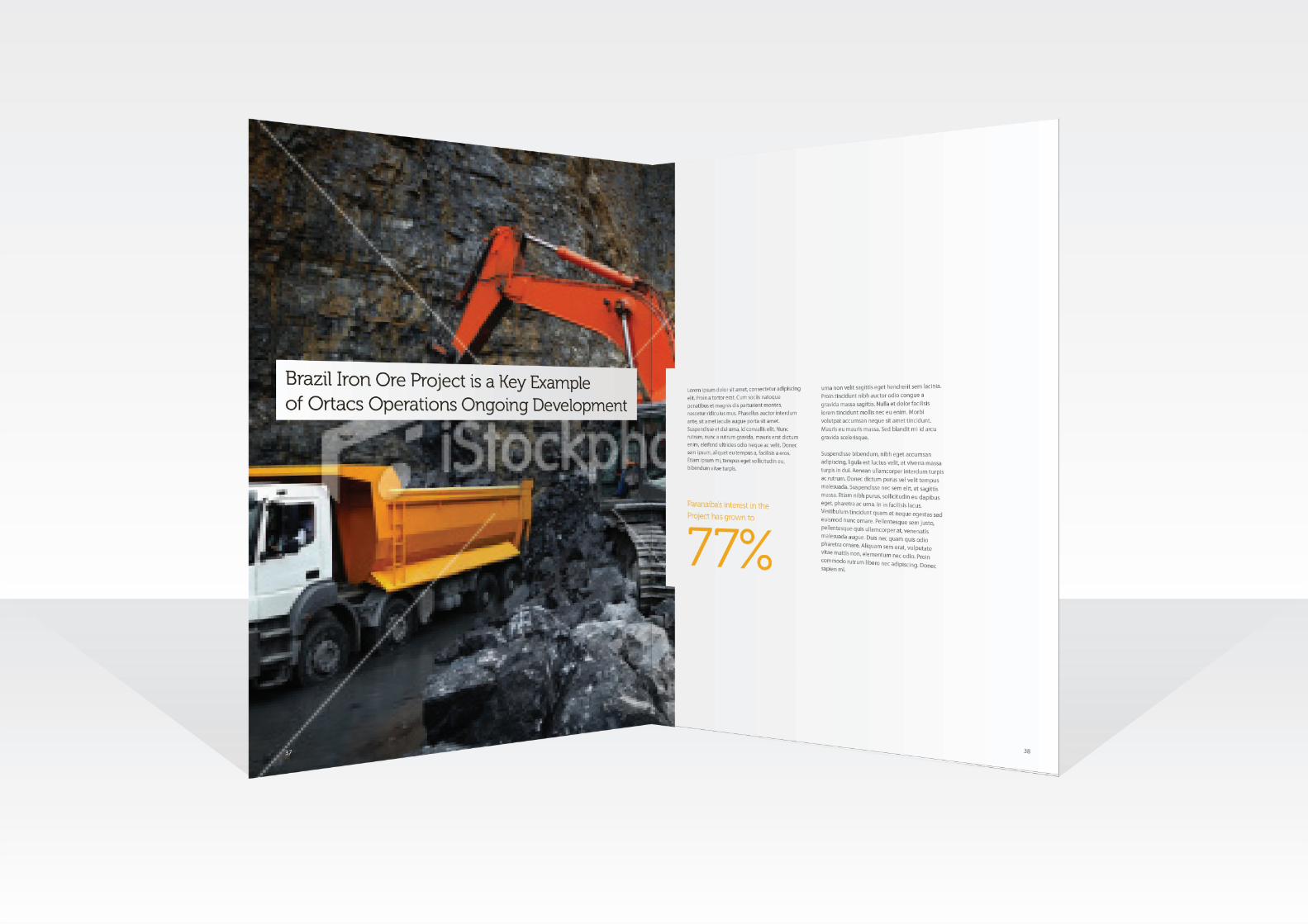
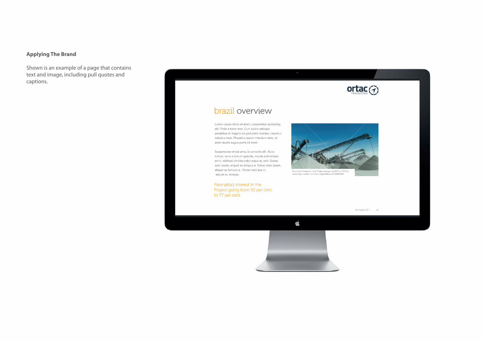
Applying The Brand
Shown is an example of a page that contains text and image, including pull quotes and captions.
Applying The Brand
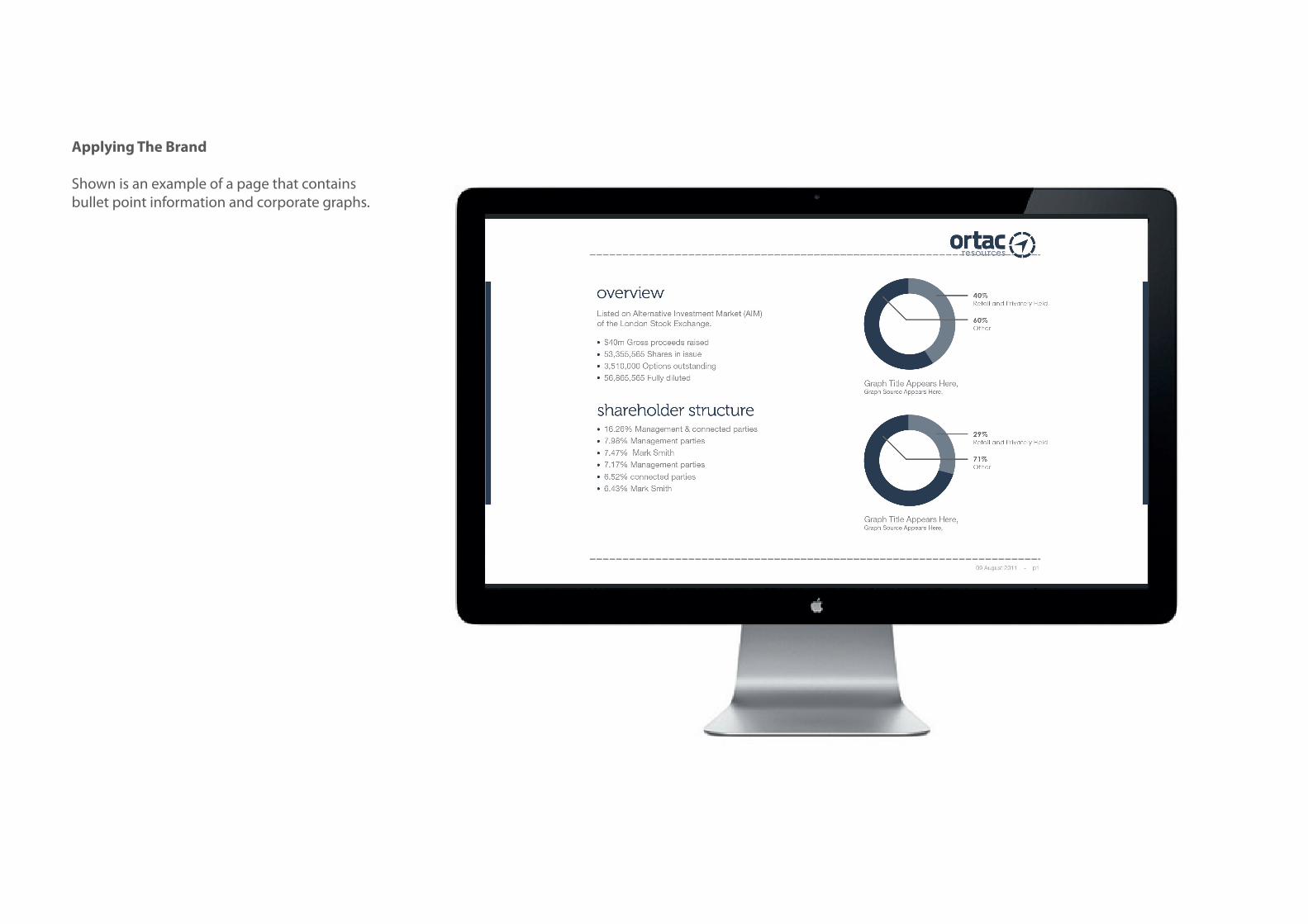
Shown is an example of a page that contains bullet point information and corporate graphs.

Ortac Resources Redesign
Route Two

resources
resources
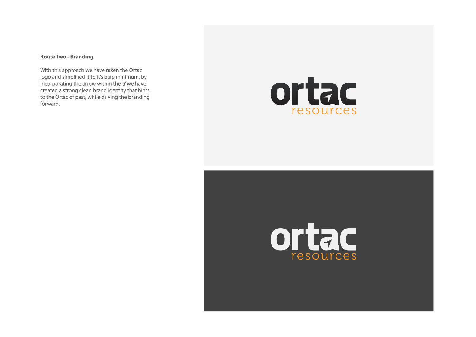
Route Two - Branding
With this approach we have taken the Ortac logo and simplified it to it’s bare minimum, by incorporating the arrow within the ‘a’ we have created a strong clean brand identity that hints to the Ortac of past, while driving the branding forward.

ortac headline
ortac headlineortac headline
Headline Typography Web & Print
The headline typeface is Museo 300. With this route, the headlines work best when using a combination of the two colours, with the warm yellow being used as a highlight colour. This distinctive colour change will help to keep the brand consistent and familiar across multiple uses such as web and print.
Body Copy Web & Print
Online and in print Helvetica Roman is used for body copy, it is suggested online that a generous point size and spacing is used to aid readability but not too big that it looks clumsy. Point size 14 is recommended for use in this route. Offline a smaller point size can be used, such as 10pt.
Colours & Colour Combinations
Route two uses a restricted colour pallete to striking effect. The combination of dark grey and warm yellow help to create a distinctive brand that is recognisable and consistent across both web and print applications.
Lorem ipsum dolor sit amet, consectetur adipiscing elit. Morbi sagittis
euismod enim vulputate cursus. Duis consectetur nisi eget diam
ultricies mattis quis sodales dolor. Maecenas eleifend, nibh at imperdiet
venenatis, eros urna auctor lectus, vel convallis nulla ligula non mi.
Helvetica Roman - Used for Body Copy
Colours Colour Combinations
72pt
60pt
Museo 300 - Used For Headlines
48pt
ortac
ortac

Route Two - Mobile & Desktop Overview
With this approach we have created a bold modular feature header that incorporates headlines, share price, operations and investor information. On internal pages this modular header could be used to present related information, for example on the operations page it could display operations photographs and maps.
Key information such as latest videos, RNS news are displayed below the header in a clean and professional way.
The mobile is a slimmed down version of the desktop visual suitable for the smaller screen space, we have only used the most important information on the home page.

Home Overview
The home page acts as a gateway to the entire site, giving snippets of information from different sections, the Operations are scrollable allowing the user to jump straight to an operation of interest, and investment information such as share price is clearly displayed.
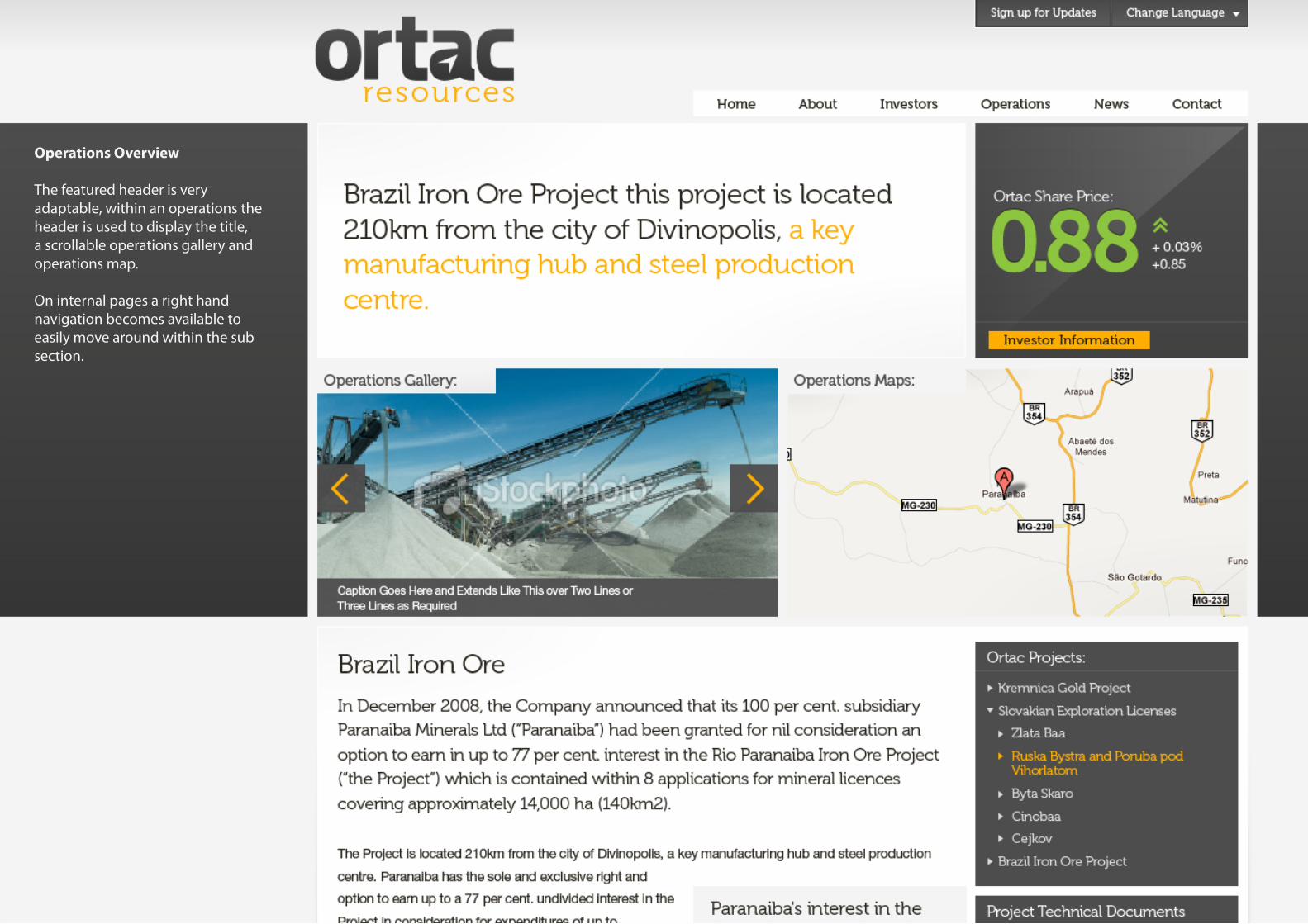
Operations Overview
The featured header is very adaptable, within an operations the header is used to display the title, a scrollable operations gallery and operations map.
On internal pages a right hand navigation becomes available to easily move around within the sub section.

Mobile Version - Project Detail.
Within the mobile version all written content is displayed in a single column for maximum readablity, but the distinct design style is not lost.Content is displayed in a quick and easy to digest style to cater to the “on the go” nature of the mobile reader.
Mobile Version - Board of Directors

Applying The Brand
Shown on the following pages are an example of how the branding could be used in print material such as corporate brochures.

Applying The Brand
Shown on the following pages are an example of how the branding could be used in corporate presentations such as PowerPoint.
Shown here is a cover page

Applying The Brand
A clean and professional title page.
Applying The Brand
Shown is an example of a page that contains text and image, including pull quotes and captions.

Applying The Brand
Shown is an example of a page that contains bullet point information and corporate graphs.