Embed Size (px)
Citation preview

TECHNICAL ANALYSISOverview

What is Technical Analysis?
Forecasting of future financial price movements based on an examination of past price movements
help investors anticipate what is "likely" to happen to prices over time.
uses a wide variety of charts that show price over time.
Fundamental analysis
• Depends on Macroeconomic data to
forecast• Appeals primarily to long
term investors
Technical analysis:
• Depends on internal market data price and
volume• Appeals mostly to short term traders
The Dow theory
Derived from 355 Wall street journals written by Charles H. Dow journalist, founder and first editor of the Wall Street Journal and co-founder of Dow Jones and Company.
Following his death, William Peter Hamilton, Robert Rhea and E. George Schaefer organized and collectively represented Dow theory, based on Dow's editorials. Dow himself never used the term Dow theory

Principles of DOW theory
There are 3 major movements in the market:
A) Daily Fluctuation/ Short Swing
B) Secondary Movements ( 2weeks to 3 months)/ Medium Swing
C) Primary Trends( Long term)/ Main Movement Maybe bullish / bearish Daily fluctuations and secondary movements only important to
the extent that they reflect on the final long term primary trend
Charles Dow noticed that markets tend to move in an orderly fashion, repeating the same patterns over and over again.


Trading charts
Day traders use trading charts to watch the markets that they trade, and decide when to make their trades.
Main charts:
Bar charts Line charts Candlestick charts Point and figure charts

Line Charts
Single line represents the stocks closing price on each day.
Dates are displayed along the bottom of the chart and prices are displayed on the side(s).
Line charts are typically displayed using stocks closing prices.


Bar Chart
Perhaps the most popular charting method is the bar chart.
The high and low are represented by the top and bottom of the vertical bar and the close is the short horizontal line crossing the vertical bar.
On a daily chart, each bar represents the high, low and close for a particular day.
Weekly charts would have a bar for each week based on Friday's close and the high and low for that week.


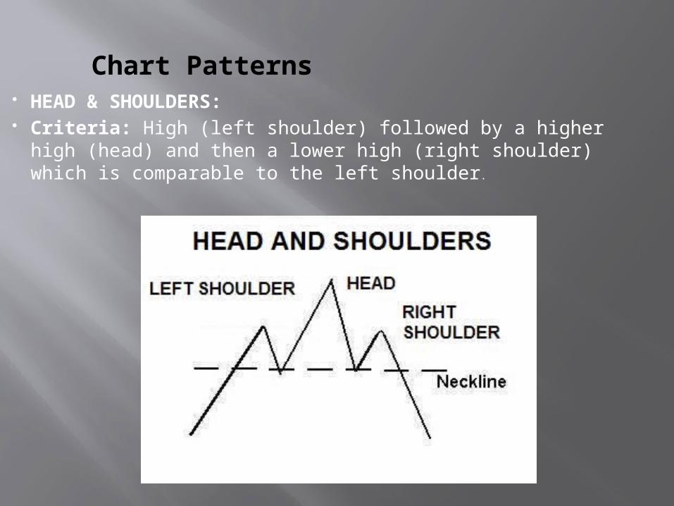
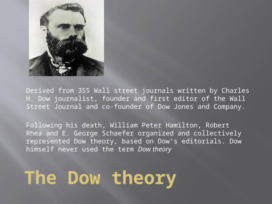
Chart Patterns HEAD & SHOULDERS: Criteria: High (left shoulder) followed by a higher high
(head) and then a lower high (right shoulder) which is comparable to the left shoulder.

Head and Shoulder pattern
The Left shoulder and head are created during an uptrend.
Volume in the formation of the left shoulder is often higher than volume in the formation of the head
=> Price is advancing with less participation => potential price fall
Neckline is the line joining the minor lows of the left and right shoulders.
If price falls below the neckline, time to sell or short sell.

Inverted Head and shoulders
Just the opposite pattern which occurs after an extended downtrend. Also called Head and Shoulders Bottom. It’s completion marks a change in trend.
Similar pattern in the reverse: two shoulders, a head and a neckline. The neckline is drawn through the highest points of the two intervening peaks.
If there is a breakout above the neckline, a price rise is expected => signal to buy.

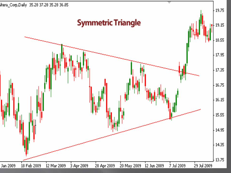
Triangle or coil Formation
The basic construct of this chart pattern is the convergence of two trendlines- flat, ascending or descending - with the price of the security moving between the two trendlines.
There are two types of triangles, : the symmetrical triangle, and asymmetric triangle.
Symmetric Triangle: Two converging trend lines that create a shape of triangle
that bounds price. You should not trade this chart pattern as it is highly unreliable.
The triangle can break in either way, either up or down, and price frequently reverses after the breakout, so this pattern is not good enough for us to trade.

Asymmetric Triangle
Consists of two trend lines – one that is horizontal and serves as support or resistance, and one that converges into the horizontal one, creating a shape of half a triangle.
This chart pattern is highly reliable and generates very powerful trading signals.
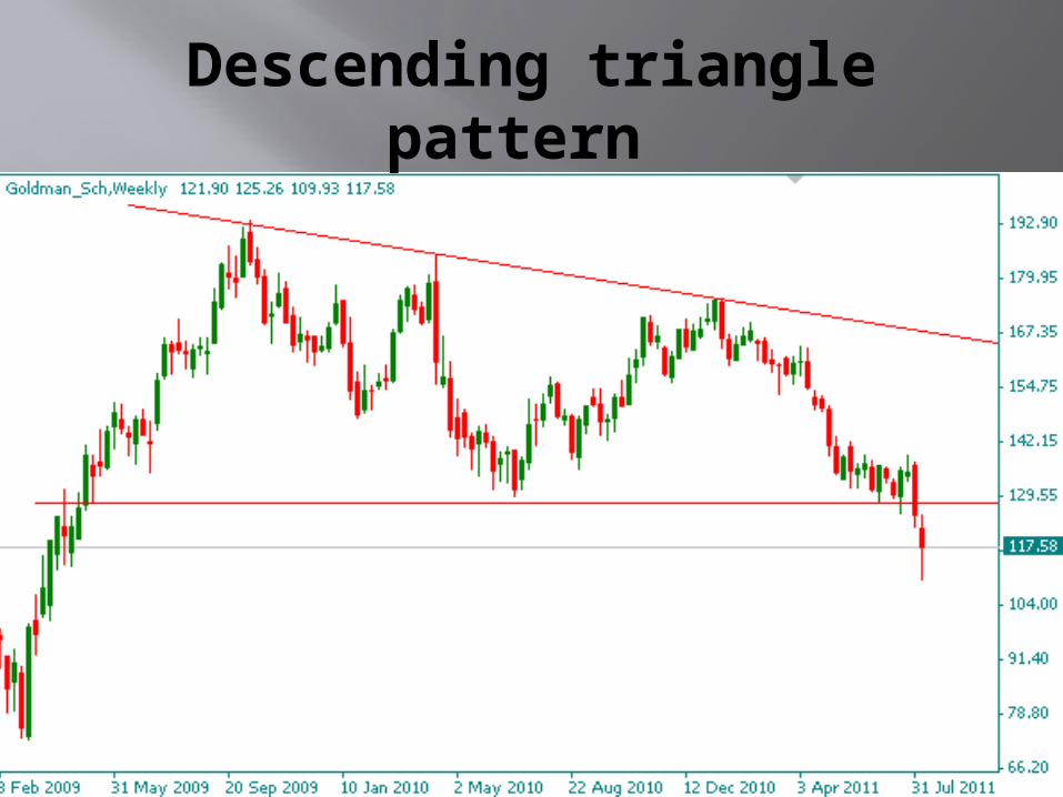
Descending triangle pattern

Ascending triangle pattern

Ascending triangle
Bullish chart pattern showing an uptrend The demand line, or lower trendline is drawn to touch the
base of the rising lows. The two highs have formed at the top line.
Once the price action breaks through the top line of the triangle with increased volume,=> buy .
Descending triangle: Shows a downtrend . Often thought of as a bearish signal. It is the upside down image of the ascending triangle. The two lows on the above chart form the lower flat line of
the triangle

Flags / Pennants
flag is a rectangular shape, while the pennant looks more like a triangle.
The rectangle is formed by two parallel trendlines that act as support and resistance for the price until the price breaks out
The buy or sell signal is formed once the price breaks through the support or resistance level, with the trend continuing in the prior direction

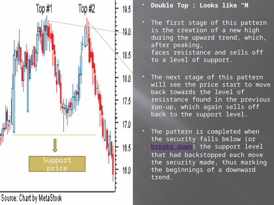
Double Top/ Double Bottom
Double Top : Looks like “M”
The first stage of this pattern is the creation of a new high during the upward trend, which, after peaking, faces resistance and sells off to a level of support.
The next stage of this pattern will see the price start to move back towards the level of resistance found in the previous run-up, which again sells off back to the support level.
The pattern is completed when the security falls below (or breaks down) the support level that had backstopped each move the security made, thus marking the beginnings of a downward trend.
Support price

Double Bottom
It signals a reversal of the downtrend into an uptrend. This pattern will closely resemble the shape of a "W".
The double bottom is formed when a downtrend sets a new low in the price movement. This downward move will find support, which prevents the security from moving lower. Upon finding support, the security will rally to a new high, which forms the security's resistance point. The next stage of this pattern is another sell-off that takes the security down to the previous low. These two support tests form the two bottoms in the chart pattern. But again, the security finds support and heads back up. The pattern is confirmed when the price moves above the resistance the security faced on the prior move up.

Support and Resistance Levels
Chartists attempt to define trading levels where price movements might face a challenge or barrier . There is :
A) support level of prices : Lower floor of the trading range B) Resistance levels : Upper end of trading range.
A breakout suggests higher or lower trading values outside the suggested range . May also mean a change in the demand supply situation in the market.

Support and Resistance
Support is the important price level where demand starts to rise so much that it prevents the price from further decline. It’s the level where buyers go into action and start buying.
Resistance is the price level where supply begins to be so high that it stops the price from further growth. It’s the level where sellers find the price so attractive that they sell heavily.