Embed Size (px)
Citation preview

ELIZABETH S. WEBBINK, PH.D.10 Crestmont Road, 6-M Montclair, NJ 07042 [email protected]
Tel.: 973-783-0924 Fax: 973-783-2875 Mobile: 610-216-1414
P R O D U C T I V I T Y B Y D E S I G N
PRODUCTIVITY IMPROVEMENT THROUGH BETTER DATA VISUALIZATION
National Association for Business EconomicsTeleconference
December 4, 2002
P R O D U C T I V I T Y B Y D E S I G N
THIS IS A DIALOGUE ON DATA VISUALIZATION
So we will attempt to
… visualize, as we verbalize
… consider some principles of good data design and
… compare examples that apply
--and fail to apply--them
N.B.: Always provide handouts
This presentation is designed to be used
as a handout, i.e., put in the hands of the audience,
not as an overhead, i.e., kept out of their reach
Handouts allow the user
- to be in control, going faster or slower than the presenter and
- to participate by engaging with the information provided
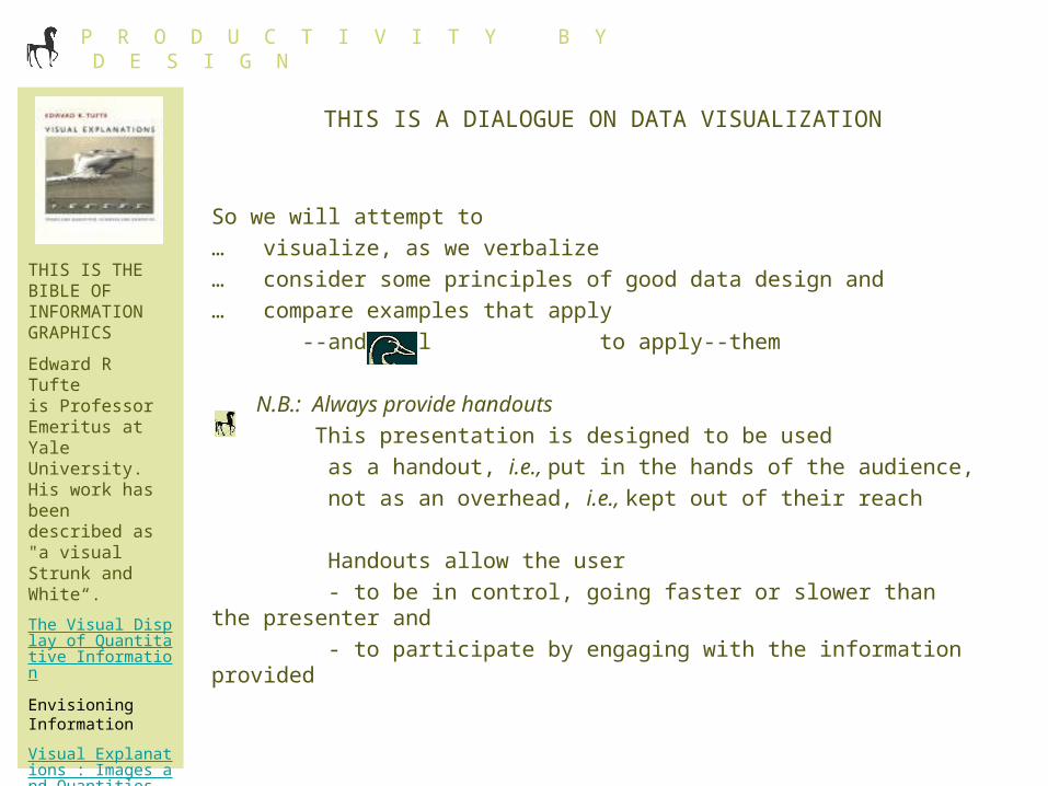
THIS IS THE BIBLE OF INFORMATION GRAPHICS
Edward R Tufteis Professor Emeritus at Yale University. His work has been described as "a visual Strunk and White“.
The Visual Display of Quantitative Information
Envisioning Information
Visual Explanations : Images and Quantities, Evidence and Narrative

P R O D U C T I V I T Y B Y D E S I G N
MAPQUEST
BE CLEAR, BUT NOT SIMPLE
Mapquest’s view of Nantucket is clear, but simple and flat.
Examples of rich, densely packed graphics abound in every port, (illustrated here by a clear but information-rich map of Nantucket Harbor) With permission of Youngs Bicycle Shop, Steamboat Wharf, Nantucket, MA 02554
www.youngsbicycleshop.com/frame.html
P R O D U C T I V I T Y B Y D E S I G N
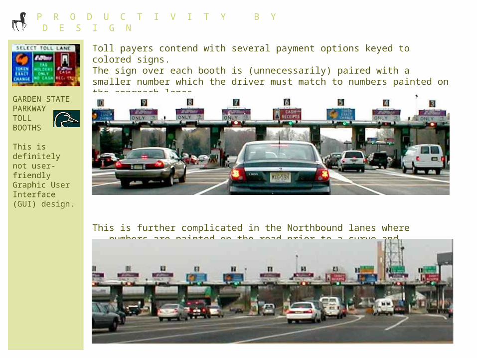
GARDEN STATE PARKWAY TOLL BOOTHS
This is definitely not user-friendly Graphic User Interface (GUI) design.
Toll payers contend with several payment options keyed to colored signs. The sign over each booth is (unnecessarily) paired with a smaller number which the driver must match to numbers painted on the approach lanes.
This is further complicated in the Northbound lanes where -- numbers are painted on the road prior to a curve and -- before the numbers are discernible

P R O D U C T I V I T Y B Y D E S I G N
MINIMIZE MAPPING
Place descriptive information as close as possible to the data it describes
Color code scales with data series
Do not force the viewer to map between legends and data

P R O D U C T I V I T Y B Y D E S I G N
MINIMIZE MAPPING (cont.)
Common scales facilitate comparison of datasets such as the income by state time series shown here.

P R O D U C T I V I T Y B Y D E S I G N
WORLD BANK 1969
MINIMIZE MAPPING (cont.)
Color doesn’t represent an improvement if it just adds complexity to the data’s interpretation rather than to its structure
WORLD BANK, 2002

P R O D U C T I V I T Y B Y D E S I G N
TREE OF LIFE
CROSS-POLLINATE
Look for examples of good design in other fields such as BioInformatics, an integration of Biology and Computer Science
Shown here is a Branch from the Tree of Life. David Hillis, Paul Lewis, and their collaborators are working on new methodologies for the analysis of extremely large data sets. Reprinted with permission of David Hillis, University of Texas, Austin, TX

P R O D U C T I V I T Y B Y D E S I G N
COMPARE & CONTRAST
A well-organized display can yield unexpected information. For example, researchers arrayed the DNA sequence, in a row, from a type of Leech without blood coagulating capability. They then compared it with DNA sequences, arrayed in columns, from coagulating Leeches. The interruption in the diagonal match of patterns identified the sequence responsible for coagulation.

P R O D U C T I V I T Y B Y D E S I G N
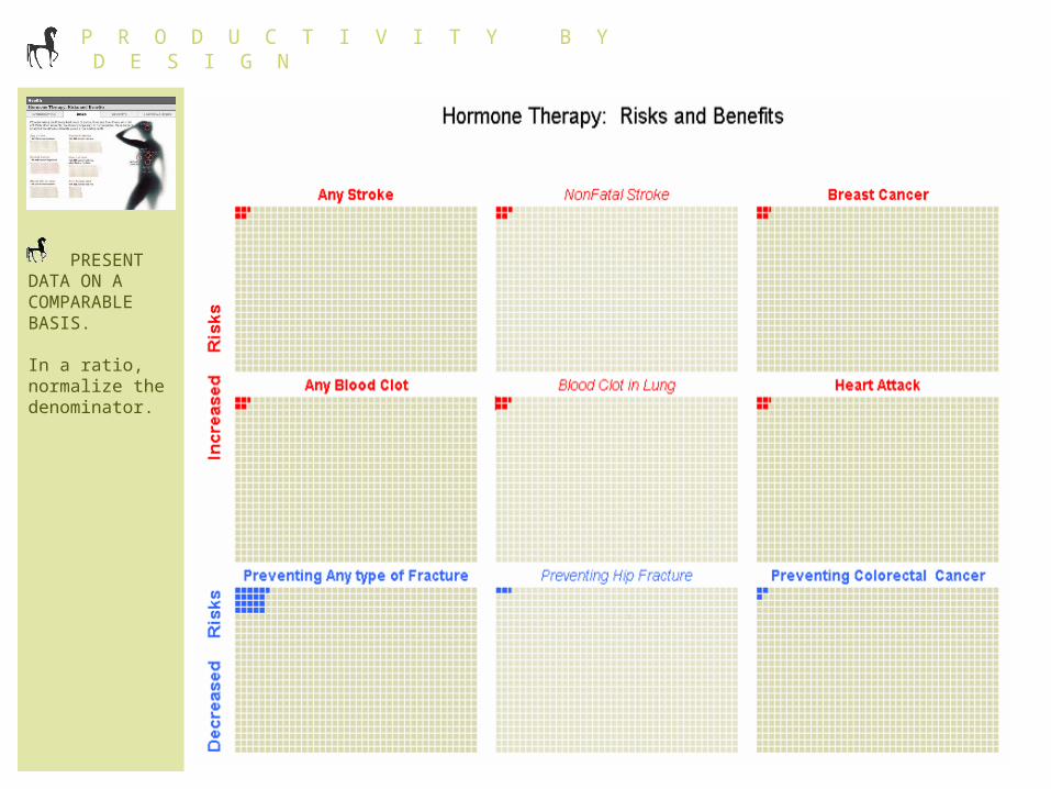
Keeping the numerator constant in these risk ratios probably had the opposite visual impact from what was intended.
P R O D U C T I V I T Y B Y D E S I G N
PRESENT DATA ON A COMPARABLE BASIS.
In a ratio, normalize the denominator.

P R O D U C T I V I T Y B Y D E S I G N
,,, Then again, a simple bar chart might have been clearer.
… Even here, much can be done to focus the viewer on the data, rather than on the capabilities of the graphics application.
MAXIMIZE THE DATA:INK RATIO AND ELIMINATE CHARTJUNK

P R O D U C T I V I T Y B Y D E S I G N
BRONX ZOO
USE SMALL MULTIPLES TOMAKE A BIG IMPRESSION…as in the zoo’s robin’s egg exhibit
I … In nature you start with 100 robins eggsII … about 74 eggs become hatchlingsIII …approximately 52 hatchlings grow to fledgling stageIV … and roughly 10 fledglings survive to be adult robins -- and make more eggs
Photography by Kate Webbink

P R O D U C T I V I T Y B Y D E S I G N
L’EGGS HOSIERY
COMBINE MULTIPLES WITH MULTI-DIMENSIONAL ELEMENTS
- rows,- groups of columns and- individual columns within those groups
organize merchandise by
- style- color and- size

P R O D U C T I V I T Y B Y D E S I G N
"HOMELAND SECURITY: How Infotech can combat homeland insecurity.“ FORTUNE MAGAZINE, Monday, July 22, 2002
OVERLAY DIFFERENT INFORMATION ON A COMMON ELEMENT
REUSING THE BASIC ELEMENT TO DISPLAY NEW INFORMATION
HERE THE BASIC MAP ELEMENT IS USED w/6 TYPES OF INFORMATION

P R O D U C T I V I T Y B Y D E S I G N
A little creativity can make today’s spreadsheets powerful tools for data visualization and productivity improvement.
USE ELEMENTS LIKE MULTIPLES TO BUILD DATA STRUCTURES FACILITATING
RAPID ASSIMILATION AND ANALYSIS OF LARGE AMOUNTS OF INFORMATION

P R O D U C T I V I T Y B Y D E S I G N
STANDARDIZE ELEMENTS TO MAXIMIZE THE PRODUCTIVITY GAINS FROM YOUR DATA VISUALIZATION STRUCTURE
INCORPORATE ALGORITHMS TO GENERATE TEXT AND KICK START YOUR ANALYSIS

P R O D U C T I V I T Y B Y D E S I G N
DON’T USE GRAPHS WHEN THERE ARE
- FEW DATAPOINTS OR
- HIGHLY LOCALIZED COMPARISONS, I.E., A LOT OF VARIABLES RELATIVE TO THE NUMBER OF OBSERVATIONS
-87 Now
0.0
0.2
0.4
0.6
0.8
1.0
WHEN NOT TO USE A GRAPH: THE GETTYSBURG ADDRESS
NEW NATIONS
GETTYSBURG POWERPOINT PRESENTATION
P R O D U C T I V I T Y B Y D E S I G N
REVIEW
Use Handouts
Be Clear, but not Simple
Minimize Mapping
Cross-Pollinate
Compare and Contrast
Normalize the data
Maximize the Data:Ink Ratio & Eliminate Chartjunk
Use Multiples to reduce the amount of new information to be filtered
Combine Multiples with Multidimensional Elements
Layer Information
Build data structures that facilitate rapid assimilation and
analysis of large amounts of information
Standardize elements
Integrate words and numbers
DON’T use graphs for few data points or highly localized comparisons
DO enjoy the time savings and productivity improvements
of better graphic design

P R O D U C T I V I T Y B Y D E S I G N
Productivity improvements don’t have to mean more output; they could mean less time working and more time just enjoying life and developing other interests!
Photography by Greg Webbink