Embed Size (px)
Citation preview

DEEP MOTIF DASHBOARD: VISUALIZING AND UNDERSTANDINGGENOMIC SEQUENCES USING DEEP NEURAL NETWORKS
JACK LANCHANTIN, RITAMBHARA SINGH, BEILUN WANG, YANJUN QI
Department of Computer Science, University of VirginiaCharlottesville, VA 22903, USA
E-mail: {jjl5sw,rs3zz,bw4mw,yq2h}@virginia.edu
Deep neural network (DNN) models have recently obtained state-of-the-art prediction accuracy forthe transcription factor binding (TFBS) site classification task. However, it remains unclear how theseapproaches identify meaningful DNA sequence signals and give insights as to why TFs bind to certainlocations. In this paper, we propose a toolkit called the Deep Motif Dashboard (DeMo Dashboard)which provides a suite of visualization strategies to extract motifs, or sequence patterns from deepneural network models for TFBS classification. We demonstrate how to visualize and understandthree important DNN models: convolutional, recurrent, and convolutional-recurrent networks. Ourfirst visualization method is finding a test sequence’s saliency map which uses first-order derivativesto describe the importance of each nucleotide in making the final prediction. Second, consideringrecurrent models make predictions in a temporal manner (from one end of a TFBS sequence to theother), we introduce temporal output scores, indicating the prediction score of a model over time fora sequential input. Lastly, a class-specific visualization strategy finds the optimal input sequence fora given TFBS positive class via stochastic gradient optimization. Our experimental results indicatethat a convolutional-recurrent architecture performs the best among the three architectures. Thevisualization techniques indicate that CNN-RNN makes predictions by modeling both motifs as wellas dependencies among them.
1. Introduction
In recent years, there has been an explosion of deep learning models which have lead togroundbreaking results in many fields such as computer vision,1 natural language processing,2
and computational biology.3–8 However, although these models have proven to be very accurate,they have widely been viewed as “black boxes” due to their complexity, making them hard tounderstand. This is particularly unfavorable in the biomedical domain, where understanding amodel’s predictions is extremely important for doctors and researchers trying to use the model.
Aiming to open up the black box, we present the “Deep Motif Dashboarda” (DeMo Dash-board), to understand the inner workings of deep neural network models for a genomic sequenceclassification task. We do this by introducing a suite of different neural models and visualizationstrategies to see which ones perform the best and understand how they make their predictions.b
Understanding genetic sequences is one of the fundamental tasks of health advancementsdue to the high correlation of genes with diseases and drugs. An important problem withingenetic sequence understanding is related to transcription factors (TFs), which are regulatoryproteins that bind to DNA. Each different TF binds to specific transcription factor binding sites(TFBSs) on the genome to regulate cell machinery. Given an input DNA sequence, classifyingwhether or not there is a binding site for a particular TF is a core task of bioinformatics.10
For our task, we follow a two step approach. First, given a particular TF of interest and adataset containing samples of positive and negative TFBS sequences, we construct three deeplearning architectures to classify the sequences. Section 2 introduces the three different DNNstructures that we use: a convolutional neural network (CNN), a recurrent neural network
aDashboard normally refers to a user interface that gives a current summary, usually in graphic, easy-to-readform, of key information relating to performance.9bWe implemented our model in Torch, and it is made available at deepmotif.org
Pacific Symposium on Biocomputing 2017
254
(RNN), and a convolutional-recurrent neural network (CNN-RNN).
Once we have our trained models to predict binding sites, the second step of our approachis to understand why the models perform the way they do. As explained in section 3, we dothis by introducing three different visualization strategies for interpreting the models:
(1) Measuring nucleotide importance with Saliency Maps.(2) Measuring critical sequence positions for the classifier using Temporal Output Scores.(3) Generating class-specific motif patterns with Class Optimization.
We test and evaluate our models and visualization strategies on a large scale benchmarkTFBS dataset. Section 4 provides experimental results for understanding and visualizing thethree DNN architectures. We find that the CNN-RNN outperforms the other models. From thevisualizations, we observe that the CNN-RNN tends to focus its predictions on the traditionalmotifs, as well as modeling long range dependencies among motifs.
2. Deep Neural Models for TFBS Classification
TFBS Classification. Chromatin immunoprecipitation (ChIP-seq) technologies anddatabases such as ENCODE11 have made binding site locations available for hundreds of differ-ent TFs. Despite these advancements, there are two major drawbacks: (1) ChIP-seq experimentsare slow and expensive, (2) although ChIP-seq experiments can find the binding site locations,they cannot find patterns that are common across all of the positive binding sites which cangive insight as to why TFs bind to those locations. Thus, there is a need for large scale compu-tational methods that can not only make accurate binding site classifications, but also identifyand understand patterns that influence the binding site locations.
In order to computationally predict TFBSs on a DNA sequence, researchers initially usedconsensus sequences and position weight matrices to match against a test sequence.10 Simpleneural network classifiers were then proposed to differentiate positive and negative binding sites,but did not show significant improvements over the weight matrix matching methods.12 Later,SVM techniques outperformed the generative methods by using k-mer features,13,14 but stringkernel based SVM systems are limited by expensive computational cost proportional to thenumber of training and testing sequences. Most recently, convolutional neural network modelshave shown state-of-the-art results on the TFBS task and are scalable to a large number ofgenomic sequences,3,7 but it remains unclear which neural architectures work best.
Deep Neural Networks for TFBSs. To find which neural models work the best on theTFBS classification task, we examine several different types of models. Inspired by their successacross different fields, we explore variations of two popular deep learning architectures: convolu-tional neural networks (CNNs), and recurrent neural networks (RNNs). CNNs have dominatedthe field of computer vision in recent years, obtaining state-of-the-art results in many tasksdue to their ability to automatically extract translation-invariant features. On the other hand,RNNs have emerged as one of the most powerful models for sequential data tasks such as nat-ural language processing due to their ability to learn long range dependencies. Specifically, onthe TFBS prediction task, we explore three distinct architectures: (1) CNN, (2) RNN, and (3)a combination of the two, CNN-RNN. Figure 1 shows an overview of the models.
End-to-end Deep Framework. While the body of the three architectures we use differ,each implemented model follows a similar end-to-end framework which we use to easily compareand contrast results. We use the raw nucleotide characters (A,C,G,T) as inputs, where eachcharacter is converted into a one-hot encoding (a binary vector with the matching characterentry being a 1 and the rest as 0s). This encoding matrix is used as the input to a convolutional,
Pacific Symposium on Biocomputing 2017
255
ACTTGCAG
TFBS
NON-
TFBS
ACTTGCAGTF
BSNO
N-TF
BS
ACTTGCAG
TFBS
NON-
TFBS
Convolution/ReLU
Maxpool
Convolution/ReLU/Maxpool
Linear & Softmax
LSTM
Average & Concatenate
Linear & Softmax
Convolution/ReLU
LSTM
Linear & Softmax
(a)
CNN(b)
RNN(c)
CNN-RNN
Average & Concatenate
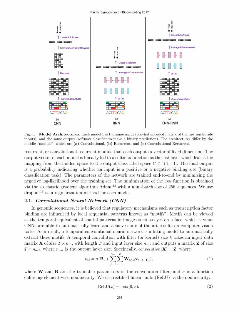
Fig. 1. Model Architectures. Each model has the same input (one-hot encoded matrix of the raw nucleotideinputs), and the same output (softmax classifier to make a binary prediction). The architectures differ by themiddle “module”, which are (a) Convolutional, (b) Recurrent, and (c) Convolutional-Recurrent.
recurrent, or convolutional-recurrent module that each outputs a vector of fixed dimension. Theoutput vector of each model is linearly fed to a softmax function as the last layer which learns themapping from the hidden space to the output class label space C ∈ [+1,−1]. The final outputis a probability indicating whether an input is a positive or a negative binding site (binaryclassification task). The parameters of the network are trained end-to-end by minimizing thenegative log-likelihood over the training set. The minimization of the loss function is obtainedvia the stochastic gradient algorithm Adam,15 with a mini-batch size of 256 sequences. We usedropout16 as a regularization method for each model.
2.1. Convolutional Neural Network (CNN)
In genomic sequences, it is believed that regulatory mechanisms such as transcription factorbinding are influenced by local sequential patterns known as “motifs”. Motifs can be viewedas the temporal equivalent of spatial patterns in images such as eyes on a face, which is whatCNNs are able to automatically learn and achieve state-of-the art results on computer visiontasks. As a result, a temporal convolutional neural network is a fitting model to automaticallyextract these motifs. A temporal convolution with filter (or kernel) size k takes an input datamatrix X of size T × nin, with length T and input layer size nin, and outputs a matrix Z of sizeT × nout, where nout is the output layer size. Specifically, convolution(X) = Z, where
zt,i = σ(Bi +
nin∑j=1
k∑z=1
Wi,j,zxt+z−1,j), (1)
where W and B are the trainable parameters of the convolution filter, and σ is a functionenforcing element-wise nonlinearity. We use rectified linear units (ReLU) as the nonlinearity:
ReLU(x) = max(0, x). (2)
Pacific Symposium on Biocomputing 2017
256
After the convolution and nonlinearity, CNNs typically use maxpooling, which is a dimensionreduction technique to provide translation invariance and to extract higher level features froma wider range of the input sequence. Temporal maxpooling on a matrix Z with a pooling sizeof m results in output matrix Y. Formally, maxpool(Z) = Y, where
yt,i =m
maxj=1
zm(t−1)+j,i (3)
Our CNN implementation involves a progression of convolution, nonlinearity, and maxpool-ing. This is represented as one convolutional layer in the network, and we test up to 4 layerdeep CNNs. The final layer involves a maxpool across the entire temporal domain so that wehave a fixed-size vector which can be fed into a softmax classifier.
Figure 1 (a) shows our CNN model with two convolutional layers. The input one-hot en-coded matrix is convolved with several filters (not shown) and fed through a ReLU nonlinearityto produce a matrix of convolution activations. We then perform a maxpool on the activationmatrix. The output of the first maxpool is fed through another convolution, ReLU, and max-pooled across the entire length resulting in a vector. This vector is then transposed and fedthrough a linear and softmax layer for classification.
2.2. Recurrent Neural Network (RNN)
Designed to handle sequential data, Recurrent neural networks (RNNs) have become themain neural model for tasks such as natural language understanding. The key advantage ofRNNs over CNNs is that they are able to find long range patterns in the data which are highlydependent on the ordering of the sequence for the prediction task.
Given an input matrix X of size T ×nin, an RNN produces matrix H of size T ×d, where d isthe RNN embedding size. At each timestep t, an RNN takes an input column vector xt ∈ Rnin
and the previous hidden state vector ht−1 ∈ Rd and produces the next hidden state ht byapplying the following recursive operation:
ht = σ(Wxt + Uht−1 + b), (4)
where W,U,b are the trainable parameters of the model, and σ is an element-wise nonlinearity.Due to their recursive nature, RNNs can model the full conditional distribution of any sequentialdata and find dependencies over time, where each position in a sequence is a timestep on animaginary time coordinate running in a certain direction. To handle the “vanishing gradients”problem of training basic RNNs on long sequences, Hochreiter and Schmidhuber17 proposedan RNN variant called the Long Short-term Memory (LSTM) network (for simplicity, we referto LSTMs as RNNs in this paper), which can handle long term dependencies by using gatingfunctions. These gates can control when information is written to, read from, and forgotten.Specifically, LSTM “cells” take inputs xt,ht−1, and ct−1, and produce ht, and ct:
it = σ(Wixt + Uiht−1 + bi)
ft = σ(Wfxt + Ufht−1 + bf )
ot = σ(Woxt + Uoht−1 + bo)
gt = tanh(Wgxt + Ught−1 + bg)
ct = ft � ct−1 + it � gt
ht = ot � tanh(ct)
where σ(·), tanh(·), and � are element-wise sigmoid, hyperbolic tangent, and multiplicationfunctions, respectively. it, ft, and ot are the input, forget, and output gates, respectively.
Pacific Symposium on Biocomputing 2017
257
RNNs produce an output vector ht at each timestep t of the input sequence. In order touse them on a classification task, we take the mean of all vectors ht, and use the mean vectorhmean ∈ Rd as input to the softmax layer.
Since there is no innate direction in genomic sequences, we use a bi-directional LSTM asour RNN model. In the bi-directional LSTM, the input sequence gets fed through two LSTMnetworks, one in each direction, and then the output vectors of each direction get concatenatedtogether in the temporal direction and fed through a linear classifier.
Figure 1 (b) shows our RNN model. The input one-hot encoded matrix is fed through anLSTM in both the forward and backward direction which each produce a matrix of columnvectors representing the LSTM output embedding at each timestep. These vectors are thenaveraged to create one vector for each direction representing the LSTM output. The forwardand backward output vectors are then concatenated and fed to the softmax for classification.
2.3. Convolutional-Recurrent Network (CNN-RNN)
Considering convolutional networks are designed to extract motifs, and recurrent networksare designed to extract temporal features, we implement a combination of the two in order tofind temporal patterns between the motifs. Given an input matrix X ∈ RT×nin , the output ofthe CNN is Z ∈ RT×nout . Each column vector of Z gets fed into the RNN one at a time in thesame way that the one-hot encoded vectors get input to the regular RNN model. The resultingoutput of the RNN H ∈ RT×d, where d is the LSTM embedding size, is then averaged acrossthe temporal domain (in the same way as the regular RNN), and fed to a softmax classifier.
Figure 1 (c) shows our CNN-RNN model. The input one-hot encoded matrix is fed throughone layer of convolution to produce a convolution activation matrix. This matrix is then inputto the LSTM, as done in the regular RNN model from the original one-hot matrix. The outputof the LSTM is averaged, concatenated, and fed to the softmax, similar to the RNN.
3. Visualizing and Understanding Deep Models
The previous section explained the deep models we use for the TFBS classification task,where we can evaluate which models perform the best. While making accurate predictions isimportant in biomedical tasks, it is equally important to understand why models make theirpredictions. Accurate, but uninterpretable models are often very slow to emerge in practice dueto the inability to understand their predictions, making biomedical domain experts reluctant touse them. Consequently, we aim to obtain a better understanding of why certain models workbetter than others, and investigate how they make their predictions by introducing several visu-alization techniques. The proposed DeMo Dashboard allows us visualize and understand DNNsin three different ways: Saliency Maps, Temporal Output Scores, and Class Optimizations.
3.1. Saliency Maps
For a certain DNA sequence and a model’s classification, a logical question may be: “whichwhich parts of the sequence are most influential for the classification?” To do this, we seekto visualize the influence of each position (i.e. nucleotide) on the prediction. Our approach issimilar to the methods used on images by Simonyan et al.18 and Baehrens et al.19 Given asequence X0 of length |X0|, and class c ∈ C, a DNN model provides a score function Sc(X0). Werank the nucleotides of X0 based on their influence on the score Sc(X0). Since Sc(X) is a highlynon-linear function of X with deep neural nets, it is hard to directly see the influence of eachnucleotide of X on Sc. Mathematically, around the point X0, Sc(X) can be approximated by a
Pacific Symposium on Biocomputing 2017
258
linear function by computing the first-order Taylor expansion:
Sc(X) ≈ wTX + b =
|X|∑i=1
wixi + b (5)
where w is the derivative of Sc with respect to the sequence variable X at the point X0:
w =∂Sc∂X
∣∣∣∣X0
= saliency map (6)
This derivative is simply one step of backpropagation in the DNN model, and is therefore easyto compute. We do a pointwise multiplication of the saliency map with the one-hot encodedsequence to get the derivative values for the actual nucleotide characters of the sequence (A,T,C,or G) so we can see the influence of the character at each position on the output score. Finally, wetake the element-wise magnitude of the resulting derivative vector to visualize how importanteach character is regardless of derivative direction. We call the resulting vector a “saliencymap18” because it tells us which nucleotides need to be changed the least in order to affect theclass score the most. As we can see from equation 5, the saliency map is simply a weighted sumof the input nucleotides, where the each weight, wi, indicates the influence of that nucleotideposition on the output score.
3.2. Temporal Output Scores
Since DNA is sequential (i.e. can be read in a certain direction), it can be insightful tovisualize the output scores at each timestep (position) of a sequence, which we call the temporaloutput scores. Here we assume an imaginary time direction running from left to right on a givensequence, so each position in the sequence is a timestep in such an imagined time coordinate.In other words, we check the RNN’s prediction scores when we vary the input of the RNN. Theinput series is constructed by using subsequences of an input X running along the imaginarytime coordinate, where the subsequences start from just the first nucleotide (position), and endswith the entire sequence X. This way we can see exactly where in the sequence the recurrentmodel changes its decision from negative to positive, or vice versa. Since our recurrent modelsare bi-directional, we also use the same technique on the reverse sequence. CNNs process theentire sequence at once, thus we can’t view its output as a temporal sequence, so we use thisvisualization on just the RNN and CNN-RNN.
3.3. Class Optimization
The previous two visualization methods listed are representative of a specific testing sample(i.e. sequence-specific). Now we introduce an approach to extract a class-specific visualization fora DNN model, where we attempt to find the best sequence which maximizes the probability ofa positive TFBS, which we call class optimization. Formally, we optimize the following equationwhere S+(X) is the probability (or score) of an input sequence X (matrix in our case) being apositive TFBS computed by the softmax equation of our trained DNN model for a specific TF:
arg maxX
S+(X) + λ‖X‖22 (7)
where λ is the regularization parameter. We find a locally optimal X through stochastic gradientdescent, where the optimization is with respect to the input sequence. In this optimization, themodel weights remain unchanged. This is similar to the methods used in Simonyan et al.18
to optimize toward a specific image class. This visualization method depicts the notion of apositive TFBS class for a particular TF and is not specific to any test sequence.
Pacific Symposium on Biocomputing 2017
259
3.4. End-to-end Automatic Motif Extraction from the Dashboard
Our three proposed visualization techniques allow us to manually inspect how the modelsmake their predictions. In order to automatically find patterns from the techniques, we also pro-pose methods to extract motifs, or consensus subsequences that represent the positive bindingsites. We extract motifs from each of our three visualization methods in the following ways: (1)From each positive test sequence (thus, 500 total for each TF dataset) we extract a motif fromthe saliency map by selecting the contiguous length-9 subsequence that achieves the highestsum of contiguous length-9 saliency map values. (2) For each positive test sequence, we extracta motif from the temporal output scores by selecting the length-9 subsequence that shows thestrongest score change from negative to positive output score. (3) For each different TF, we candirectly use the class-optimized sequence as a motif.
3.5. Connecting to Previous Studies
Neural networks have produced state-of-the-art results on several important benchmarktasks related to genomic sequence classification,3–5 making them a good candidate to use. How-ever, why these models work well has been poorly understood. Recent works have attemptedto uncover the properties of these models, in which most of the work has been done on un-derstanding image classifications using convolutional neural networks. Zeiler and Fergus20 useda “deconvolution” approach to map hidden layer representations back to the input space fora specific example, showing the features of the image which were important for classification.Simonyan et al.18 explored a similar approach by using a first-order Taylor expansion to linearlyapproximate the network and find the input features most relevant, and also tried optimizingimage classes. Many similar techniques later followed to understand convolutional models.21,22
Most importantly, researchers have found that CNNs are able to extract layers of translational-invariant feature maps, which may indicate why CNNs have been successfully used in genomicsequence predictions which are believed to be triggered by motifs.
On text-based tasks, there have been fewer visualization studies for DNNs. Karpathy etal.23 explored the interpretability of RNNs for language modeling and found that there existinterpretable neurons which are able to focus on certain language structure such as quotes. Li etal.24 visualized how RNNs achieve compositionality in natural language for sentiment analysisby visualizing RNN embedding vectors as well as measuring the influence of input words onclassification. Both studies show examples that can be validated by our understanding of naturallanguage linguistics. Contrarily, we are interested in understanding DNA “linguistics” givenDNNs (the opposite direction of Karpathy et al.23 and Li et al.24).
The main difference between our work and previous works on images and natural language isthat instead of trying to understand the DNNs given human understanding of such human per-ception tasks, we attempt to uncover critical signals in DNA sequences given our understandingof DNNs.
For TFBS prediction, Alipanahi et al.3 was the first to implement a visualization methodon a DNN model. They visualize their CNN model by extracting motifs based on the inputsubsequence corresponding to the strongest activation location for each convolutional filter(which we call convolution activation). Since they only have one convolutional layer, it is trivialto map the activations back, but this method does not work as well with deeper models. Weattempted this technique on our models and found that our approach using saliency mapsoutperforms it in finding motif patterns (details in section 4). Quang and Xie4 use the samevisualization method on their convolutional-recurrent model for noncoding variant prediction.
Pacific Symposium on Biocomputing 2017
260
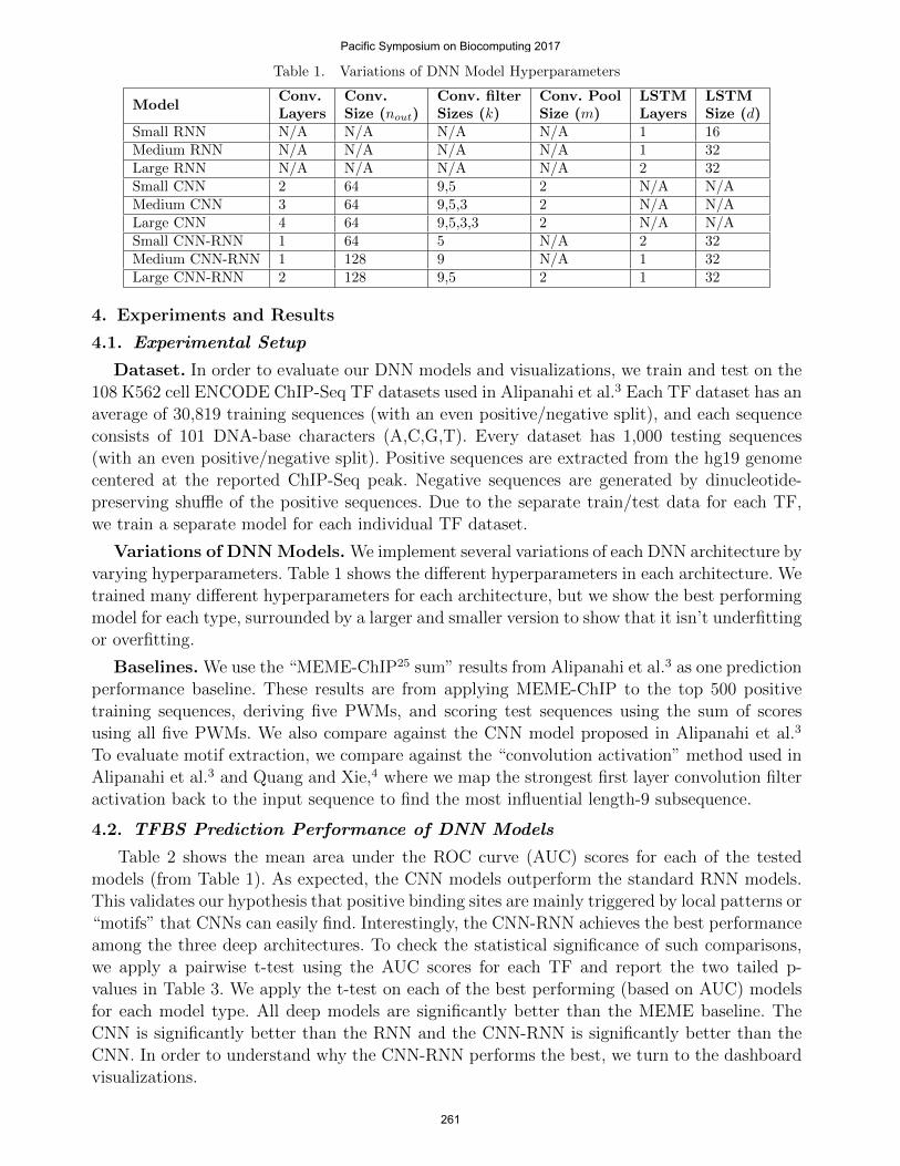
Table 1. Variations of DNN Model Hyperparameters
ModelConv.Layers
Conv.Size (nout)
Conv. filterSizes (k)
Conv. PoolSize (m)
LSTMLayers
LSTMSize (d)
Small RNN N/A N/A N/A N/A 1 16Medium RNN N/A N/A N/A N/A 1 32Large RNN N/A N/A N/A N/A 2 32Small CNN 2 64 9,5 2 N/A N/AMedium CNN 3 64 9,5,3 2 N/A N/ALarge CNN 4 64 9,5,3,3 2 N/A N/ASmall CNN-RNN 1 64 5 N/A 2 32Medium CNN-RNN 1 128 9 N/A 1 32Large CNN-RNN 2 128 9,5 2 1 32
4. Experiments and Results
4.1. Experimental Setup
Dataset. In order to evaluate our DNN models and visualizations, we train and test on the108 K562 cell ENCODE ChIP-Seq TF datasets used in Alipanahi et al.3 Each TF dataset has anaverage of 30,819 training sequences (with an even positive/negative split), and each sequenceconsists of 101 DNA-base characters (A,C,G,T). Every dataset has 1,000 testing sequences(with an even positive/negative split). Positive sequences are extracted from the hg19 genomecentered at the reported ChIP-Seq peak. Negative sequences are generated by dinucleotide-preserving shuffle of the positive sequences. Due to the separate train/test data for each TF,we train a separate model for each individual TF dataset.
Variations of DNN Models. We implement several variations of each DNN architecture byvarying hyperparameters. Table 1 shows the different hyperparameters in each architecture. Wetrained many different hyperparameters for each architecture, but we show the best performingmodel for each type, surrounded by a larger and smaller version to show that it isn’t underfittingor overfitting.
Baselines. We use the “MEME-ChIP25 sum” results from Alipanahi et al.3 as one predictionperformance baseline. These results are from applying MEME-ChIP to the top 500 positivetraining sequences, deriving five PWMs, and scoring test sequences using the sum of scoresusing all five PWMs. We also compare against the CNN model proposed in Alipanahi et al.3
To evaluate motif extraction, we compare against the “convolution activation” method used inAlipanahi et al.3 and Quang and Xie,4 where we map the strongest first layer convolution filteractivation back to the input sequence to find the most influential length-9 subsequence.
4.2. TFBS Prediction Performance of DNN Models
Table 2 shows the mean area under the ROC curve (AUC) scores for each of the testedmodels (from Table 1). As expected, the CNN models outperform the standard RNN models.This validates our hypothesis that positive binding sites are mainly triggered by local patterns or“motifs” that CNNs can easily find. Interestingly, the CNN-RNN achieves the best performanceamong the three deep architectures. To check the statistical significance of such comparisons,we apply a pairwise t-test using the AUC scores for each TF and report the two tailed p-values in Table 3. We apply the t-test on each of the best performing (based on AUC) modelsfor each model type. All deep models are significantly better than the MEME baseline. TheCNN is significantly better than the RNN and the CNN-RNN is significantly better than theCNN. In order to understand why the CNN-RNN performs the best, we turn to the dashboardvisualizations.
Pacific Symposium on Biocomputing 2017
261
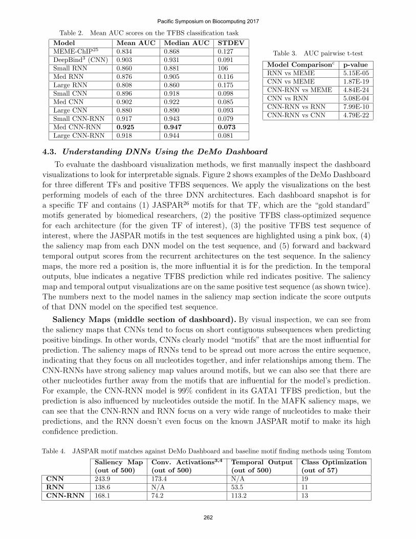
Table 2. Mean AUC scores on the TFBS classification task
Model Mean AUC Median AUC STDEVMEME-ChIP25 0.834 0.868 0.127DeepBind3 (CNN) 0.903 0.931 0.091Small RNN 0.860 0.881 106Med RNN 0.876 0.905 0.116Large RNN 0.808 0.860 0.175Small CNN 0.896 0.918 0.098Med CNN 0.902 0.922 0.085Large CNN 0.880 0.890 0.093Small CNN-RNN 0.917 0.943 0.079Med CNN-RNN 0.925 0.947 0.073Large CNN-RNN 0.918 0.944 0.081
Table 3. AUC pairwise t-test
Model Comparisonc p-valueRNN vs MEME 5.15E-05CNN vs MEME 1.87E-19CNN-RNN vs MEME 4.84E-24CNN vs RNN 5.08E-04CNN-RNN vs RNN 7.99E-10CNN-RNN vs CNN 4.79E-22
4.3. Understanding DNNs Using the DeMo Dashboard
To evaluate the dashboard visualization methods, we first manually inspect the dashboardvisualizations to look for interpretable signals. Figure 2 shows examples of the DeMo Dashboardfor three different TFs and positive TFBS sequences. We apply the visualizations on the bestperforming models of each of the three DNN architectures. Each dashboard snapshot is fora specific TF and contains (1) JASPAR26 motifs for that TF, which are the “gold standard”motifs generated by biomedical researchers, (2) the positive TFBS class-optimized sequencefor each architecture (for the given TF of interest), (3) the positive TFBS test sequence ofinterest, where the JASPAR motifs in the test sequences are highlighted using a pink box, (4)the saliency map from each DNN model on the test sequence, and (5) forward and backwardtemporal output scores from the recurrent architectures on the test sequence. In the saliencymaps, the more red a position is, the more influential it is for the prediction. In the temporaloutputs, blue indicates a negative TFBS prediction while red indicates positive. The saliencymap and temporal output visualizations are on the same positive test sequence (as shown twice).The numbers next to the model names in the saliency map section indicate the score outputsof that DNN model on the specified test sequence.
Saliency Maps (middle section of dashboard). By visual inspection, we can see fromthe saliency maps that CNNs tend to focus on short contiguous subsequences when predictingpositive bindings. In other words, CNNs clearly model “motifs” that are the most influential forprediction. The saliency maps of RNNs tend to be spread out more across the entire sequence,indicating that they focus on all nucleotides together, and infer relationships among them. TheCNN-RNNs have strong saliency map values around motifs, but we can also see that there areother nucleotides further away from the motifs that are influential for the model’s prediction.For example, the CNN-RNN model is 99% confident in its GATA1 TFBS prediction, but theprediction is also influenced by nucleotides outside the motif. In the MAFK saliency maps, wecan see that the CNN-RNN and RNN focus on a very wide range of nucleotides to make theirpredictions, and the RNN doesn’t even focus on the known JASPAR motif to make its highconfidence prediction.
Table 4. JASPAR motif matches against DeMo Dashboard and baseline motif finding methods using Tomtom
Saliency Map(out of 500)
Conv. Activations3,4
(out of 500)Temporal Output(out of 500)
Class Optimization(out of 57)
CNN 243.9 173.4 N/A 19RNN 138.6 N/A 53.5 11CNN-RNN 168.1 74.2 113.2 13
Pacific Symposium on Biocomputing 2017
262
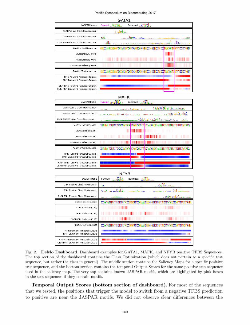
Fig. 2. DeMo Dashboard. Dashboard examples for GATA1, MAFK, and NFYB positive TFBS Sequences.The top section of the dashboard contains the Class Optimization (which does not pertain to a specific testsequence, but rather the class in general). The middle section contains the Saliency Maps for a specific positivetest sequence, and the bottom section contains the temporal Output Scores for the same positive test sequenceused in the saliency map. The very top contains known JASPAR motifs, which are highlighted by pink boxesin the test sequences if they contain motifs.
Temporal Output Scores (bottom section of dashboard). For most of the sequencesthat we tested, the positions that trigger the model to switch from a negative TFBS predictionto positive are near the JASPAR motifs. We did not observe clear differences between the
Pacific Symposium on Biocomputing 2017
263
forward and backward temporal output patterns.
In certain cases, it’s interesting to look at the temporal output scores and saliency mapstogether. An important case study from our examples is the NFYB example, where the CNNand RNN perform poorly, but the CNN-RNN makes the correct prediction. We observe that theCNN-RNN is able to switch its classification from negative to positive, while the RNN neverdoes. To understand why this may have happened, we can see from the saliency maps thatthe CNN-RNN focuses on two distinct regions, one of which is where it flips its classificationfrom negative to positive. However, the RNN doesn’t focus on either of the same areas, andmay be the reason why it’s never able to classify it as a positive sequence. The fact that theCNN is not able to classify it as a positive sequence, but focuses on the same regions as theCNN-RNN (from the saliency map), may indicate that it is the temporal dependencies betweenthese regions which influence the binding. In addition, the fact that there is no clear JASPARmotif in this sequence may show that the traditional motif approach is not always the best wayto model TFBSs.
Class Optimization (top section of dashboard). Class optimization on the CNN modelgenerates concise representations which often resemble the known motifs for that particular TF.For the recurrent models, the TFBS positive optimizations are less clear, though some aspectsstand out (like “AT” followed by “TC” in the GATA1 TF for the CNN-RNN). We notice thatfor certain DNN models, their class optimized sequences optimize the reverse complement motif(e.g. NFYB CNN optimization). The class optimizations can be useful for getting a general ideaof what triggers a positive TFBS for a certain TF.
Automatic Motif Extraction from Dashboard. In order to evaluate each DNN’s capa-bility to automatically extract motifs, we compare the found motifs of each method (introducedin section 3.4) to the corresponding JASPAR motif, for the TF of interest. We do the com-parison using the Tomtom27 tool, which searches a query motif against a given motif database(and their reverse complements), and returns significant matches ranked by p-value indicatingmotif-motif similarity. Table 4 summarizes the motif matching results comparing visualization-derived motifs against known motifs in the JASPAR database. We are limited to a comparisonof 57 out of our 108 TF datasets by the TFs which JASPAR has motifs for. We compare fourvisualization approaches: Saliency Map, Convolution Activation,3,4 Temporal Output Scoresand Class Optimizations. The first three techniques are sequence specific, therefore we reportthe average number of motif matches out of 500 positive sequences (then averaged across 57TF datasets). The last technique is for a particular TFBS positive class.
We can see from Table 4 that across multiple visualization techniques, the CNN finds motifsthe best, followed by the CNN-RNN and the RNN. However, since CNNs perform worse thanCNN-RNNs by AUC scores, we hypothesize that this demonstrates that it is also importantto model sequential interactions among motifs. In the CNN-RNN combination, CNN acts likea “motif finder” and the RNN finds dependencies among motifs. This analysis shows thatvisualizing the DNN classifications can lead to a better understanding of DNNs for TFBSs.
5. Conclusions and Future Work
Deep neural networks (DNNs) have shown to be the most accurate models for TFBS clas-sification. However, DNN models are hard to interpret, and thus their adaptation in practiceis slow. In this work, we propose the Deep Motif (DeMo) Dashboard to explore three differentDNN architectures on TFBS prediction, and introduce three visualization methods to shedlight on how these models work. Although our visualization methods still require a human
Pacific Symposium on Biocomputing 2017
264
practitioner to examine the dashboard, it is a start to understand these models and we hopethat this work will invoke further studies on visualizing and understanding DNN based genomicsequences analysis. Furthermore, DNN models have recently shown to provide excellent resultsfor epigenomic analysis.8 We plan to extend our DeMo Dashboard to related applications.
References
1. A. Krizhevsky, I. Sutskever and G. E. Hinton, Imagenet classification with deep convolutional neural net-works, in Advances in neural information processing systems, 2012.
2. I. Sutskever, O. Vinyals and Q. V. Le, Sequence to sequence learning with neural networks, in Advances inneural information processing systems, 2014.
3. B. Alipanahi, A. Delong, M. T. Weirauch and B. J. Frey, Predicting the sequence specificities of dna-andrna-binding proteins by deep learning Nature biotechnology (Nature Publishing Group, 2015).
4. D. Quang and X. Xie, Danq: a hybrid convolutional and recurrent deep neural network for quantifying thefunction of dna sequences bioRxiv (Cold Spring Harbor Labs Journals, 2015).
5. J. Zhou and O. G. Troyanskaya, Predicting effects of noncoding variants with deep learning-based sequencemodel Nature methods 12 (Nature Publishing Group, 2015).
6. D. R. Kelley, J. Snoek and J. L. Rinn, Basset: Learning the regulatory code of the accessible genome withdeep convolutional neural networks Genome research (Cold Spring Harbor Lab, 2016).
7. J. Lanchantin, R. Singh, Z. Lin and Y. Qi, Deep motif: Visualizing genomic sequence classifications ICLRWorkshops 2016.
8. R. Singh, J. Lanchantin, G. Robins and Y. Qi, Bioinformatics 32, i639 (2016).9. Dashboard definiton http://www.dictionary.com/browse/dashboard, Accessed: 2016-07-20.
10. G. D. Stormo, Dna binding sites: representation and discovery Bioinformatics 16 (Oxford Univ Press, 2000).11. E. P. Consortium et al., An integrated encyclopedia of dna elements in the human genome Nature 489
(Nature Publishing Group, 2012).12. P. B. Horton and M. Kanehisa, An assessment of neural network and statistical approaches for prediction
of e. coli promoter sites Nucleic Acids Research 20 (Oxford Univ Press, 1992).13. M. Ghandi, D. Lee, M. Mohammad-Noori and M. A. Beer, Enhanced regulatory sequence prediction using
gapped k-mer features2014.14. M. Setty and C. S. Leslie, Seqgl identifies context-dependent binding signals in genome-wide regulatory
element maps2015.15. D. Kingma and J. Ba, Adam: A method for stochastic optimization arXiv preprint arXiv:1412.6980 2014.16. N. Srivastava, G. Hinton, A. Krizhevsky, I. Sutskever and R. Salakhutdinov, Dropout: A simple way to
prevent neural networks from overfitting The Journal of Machine Learning Research 152014.17. S. Hochreiter and J. Schmidhuber, Long short-term memory Neural computation 9 (MIT Press, 1997).18. K. Simonyan, A. Vedaldi and A. Zisserman, Deep inside convolutional networks: Visualising image classifi-
cation models and saliency maps arXiv preprint arXiv:1312.6034 2013.19. D. Baehrens, T. Schroeter, S. Harmeling, M. Kawanabe, K. Hansen and K.-R. MAzller, How to explain
individual classification decisions Journal of Machine Learning Research 112010.20. M. D. Zeiler and R. Fergus, Visualizing and understanding convolutional networks, in Computer Vision–
ECCV 2014 , (Springer, 2014) pp. 818–833.21. A. Mahendran and A. Vedaldi, Visualizing deep convolutional neural networks using natural pre-images
International Journal of Computer Vision (Springer.22. S. Bach, A. Binder, G. Montavon, F. Klauschen, K.-R. Muller and W. Samek, On pixel-wise explanations
for non-linear classifier decisions by layer-wise relevance propagation PloS one 102015.23. A. Karpathy, J. Johnson and F.-F. Li, Visualizing and understanding recurrent networks arXiv preprint
arXiv:1506.02078 2015.24. J. Li, X. Chen, E. Hovy and D. Jurafsky, Visualizing and understanding neural models in nlp arXiv preprint
arXiv:1506.01066 2015.25. P. Machanick and T. L. Bailey, Meme-chip: motif analysis of large dna datasets Bioinformatics 27 (Oxford
Univ Press, 2011).26. A. Mathelier, O. Fornes, D. J. Arenillas, C.-y. Chen, G. Denay, J. Lee, W. Shi, C. Shyr, G. Tan, R. Worsley-
Hunt et al., Jaspar 2016: a major expansion and update of the open-access database of transcription factorbinding profiles Nucleic acids research (Oxford Univ Press, 2015).
27. S. Gupta, J. A. Stamatoyannopoulos, T. L. Bailey and W. S. Noble, Quantifying similarity between motifsGenome biology 8 (BioMed Central Ltd, 2007).
Pacific Symposium on Biocomputing 2017
265


![MOTIF XF Editor VST Owner’s Manual7.Sélectionnez « MOTIF XF6 (MOTIF XF7 ou MOTIF XF8) » dans la colonne [FW Device] (Périphérique FW). 8.Sélectionnez « MOTIF XF6 (MOTIF XF7](https://img.pdfslide.net/doc/110x75/611158b13f31404d2d274378/motif-xf-editor-vst-owneras-manual-7slectionnez-motif-xf6-motif-xf7-ou.jpg)