Embed Size (px)
Citation preview

How to graph your data in Microsoft excel:Note: If you have access to other graphing software, you may use it instead.
1. Sign in to your Office365 account.a. On the PASD website, find Students and then Student Resources to find the log-in
link.b. Select excel from the app choices.c. You may stay in the online version, or open a document for the following steps.
2. Once excel is open, enter your data. a. Start by entering your cereal types. Your first cereal should be in cell A2, your
second in A3, your third in A4, and so on.b. In the second column, second row (cell B1), type the word fiber. Right next to
that (cell C1), type the word sugar.c. Then enter your data. DO NOT type grams or g after your data. Just enter the
number!
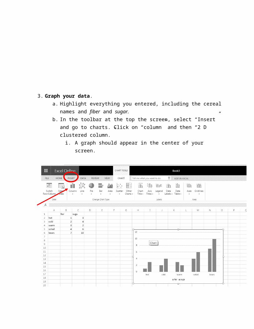
3. Graph your data.a. Highlight everything you entered, including the cereal names and fiber and
sugar.b. In the toolbar at the top the screen, select “Insert” and go to charts. Click on
“column” and then “2 D clustered column.”i. A graph should appear in the center of your screen.

c. Add a title and labels to your graph. When the graph is selected, the toolbar above will display Chart Tools. Click on “Chart Title” and select one of the options. Name your graph.
i. Be sure to also click “Axis Title” to label both your vertical and horizontal axis.

4. Print your graph. To print, make sure your graph is selected (click on it.). If working on the browser version, you will see a pop-up. Select “current selection.” If working on an installed version, make sure in settings it says “Print selected chart.” Then click the print button. If you can, print in color. If you cannot print in color, use crayon or colored pencil to color the bars after you print
a. If your graph is printing very small, select the chart and drag the corner to enlarge before printing.
Browser view Installed view