Embed Size (px)
DESCRIPTION
Paper 1 Section B Reading Multi-Modal Texts 45minutes (P15-31). Target skills. read and understand texts, and read and understand images select material appropriate to purpose; make connections between ideas, texts, words analyse how the language used varies according to audience; - PowerPoint PPT Presentation
Citation preview
Paper 1 Section B
Reading Multi-Modal Texts
45minutes(P15-31)
Target skills
1. read and understand texts, and 2. read and understand images
• select material appropriate to purpose;• make connections between ideas, texts, words • analyse how the language used varies
according to audience;• explain how writers use language in particular
ways and employ presentational features to capture the reader’s attention;
• draw together material from different sources.
Assessment Objectives (p16)
• AO3 i: selecting material appropriate to purpose/ collating & making c-refs
• AO3 ii: dev. and sustain interpretations
• AO3 iii: explaining and evaluating how a writer uses linguistic, grammatical and structural devices to achieve effects
Question : 45 mins
This DVD cover helps to advertise and sell this film. How does the language used in both DVD covers help promote/ sell the DVDs?
(15 marks)
This DVD cover helps to advertise and sell this film. How do presentational devices help to promote/ sell this DVD?
In your answer consider: – the layout– the use of images– the use of colour.
(9 marks)

How to use the time
45 minutes
•15 mins – reading + annotating texts•20 mins – Q1 – Language•10 mins – Q2 – Presentational Devices
Multi-modal texts used in the exam:
• DVD covers• Advertisements• Leaflets• Websites• Book covers• Magazine covers• Posters• Promotional flyers
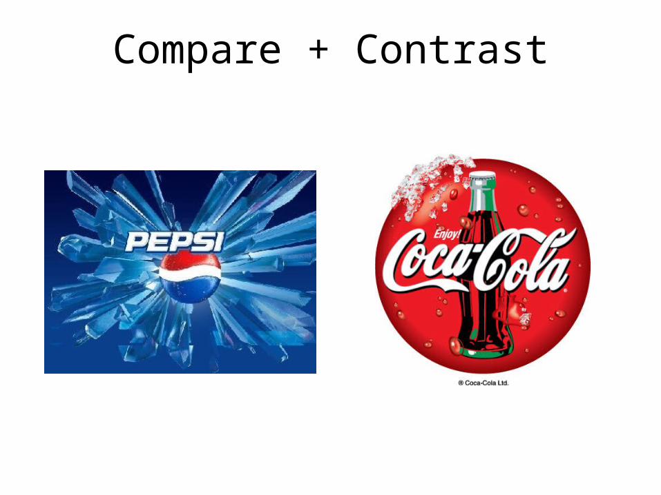
Compare + Contrast
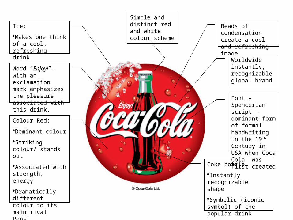
Ice:
Makes one think of a cool, refreshing drink
Beads of condensation create a cool and refreshing image
Colour Red:
Dominant colour
Striking colour/ stands out
Associated with strength, energy
Dramatically different colour to its main rival Pepsi
Worldwide instantly, recognizable global brand
Coke bottle
Instantly recognizable shape
Symbolic (iconic symbol) of the popular drink
Word “Enjoy!” – with an exclamation mark emphasizes the pleasure associated with this drink.
Simple and distinct red and white colour scheme
Font – Spencerian script – dominant form of formal handwriting in the 19th Century in USA when Coca Cola was first created
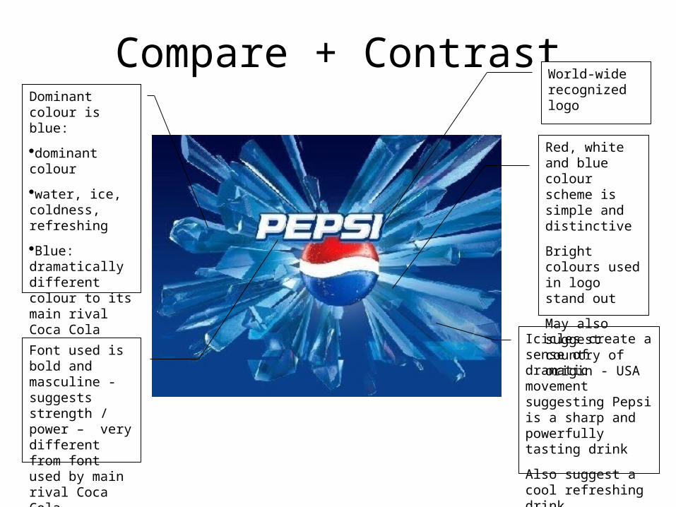
Compare + ContrastDominant colour is blue:
dominant colour
water, ice, coldness, refreshing
Blue: dramatically different colour to its main rival Coca Cola
World-wide recognized logo
Icicles create a sense of dramatic movement suggesting Pepsi is a sharp and powerfully tasting drink
Also suggest a cool refreshing drink
Red, white and blue colour scheme is simple and distinctive
Bright colours used in logo stand out
May also suggest country of origin - USA
Font used is bold and masculine -suggests strength / power – very different from font used by main rival Coca Cola
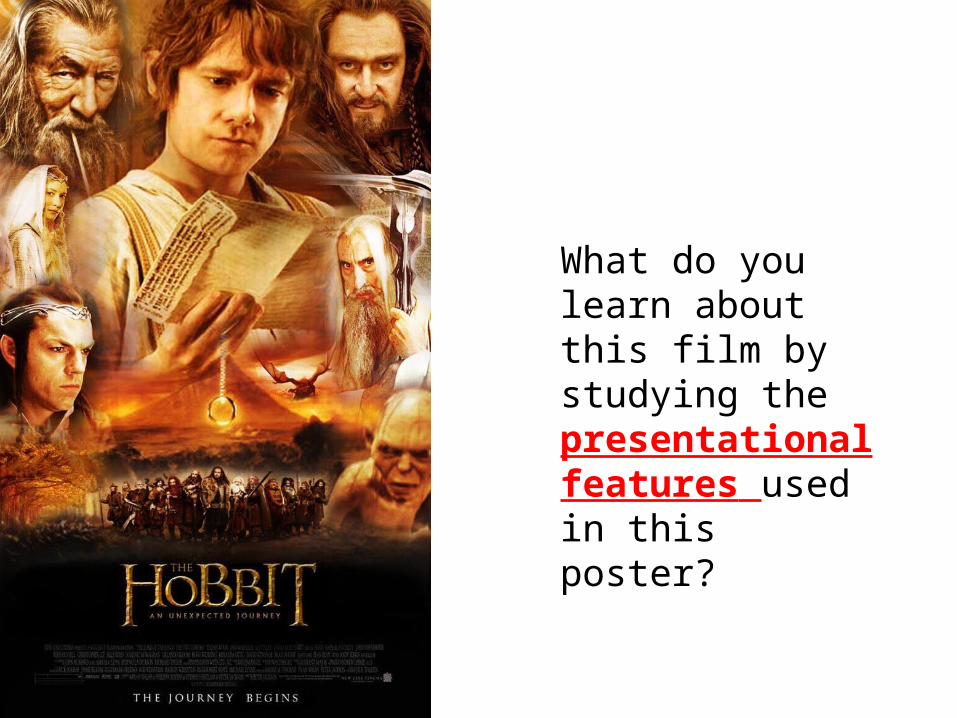
What do you learn about this film by studying the presentational features used in this poster?
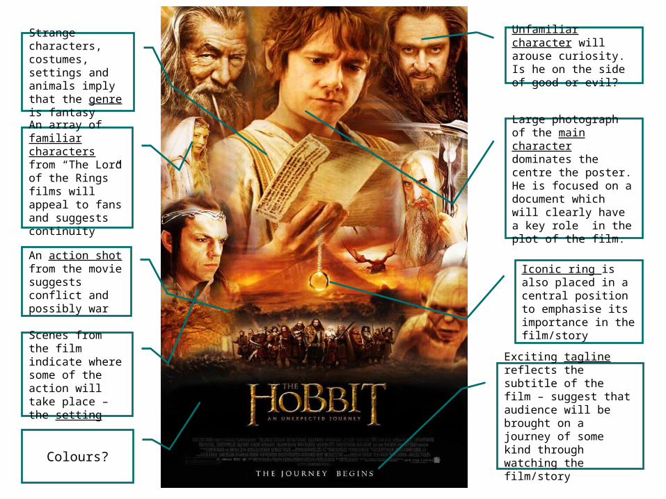
Large photograph of the main character dominates the centre the poster. He is focused on a document which will clearly have a key role in the plot of the film.
An array of familiar characters from “The Lord of the Rings” films will appeal to fans and suggests continuity
Unfamiliar character will arouse curiosity. Is he on the side of good or evil?
Exciting tagline reflects the subtitle of the film – suggest that audience will be brought on a journey of some kind through watching the film/story
Iconic ring is also placed in a central position to emphasise its importance in the film/story
An action shot from the movie suggests conflict and possibly war
Strange characters, costumes, settings and animals imply that the genre is fantasy
Scenes from the film indicate where some of the action will take place – the setting
Colours?
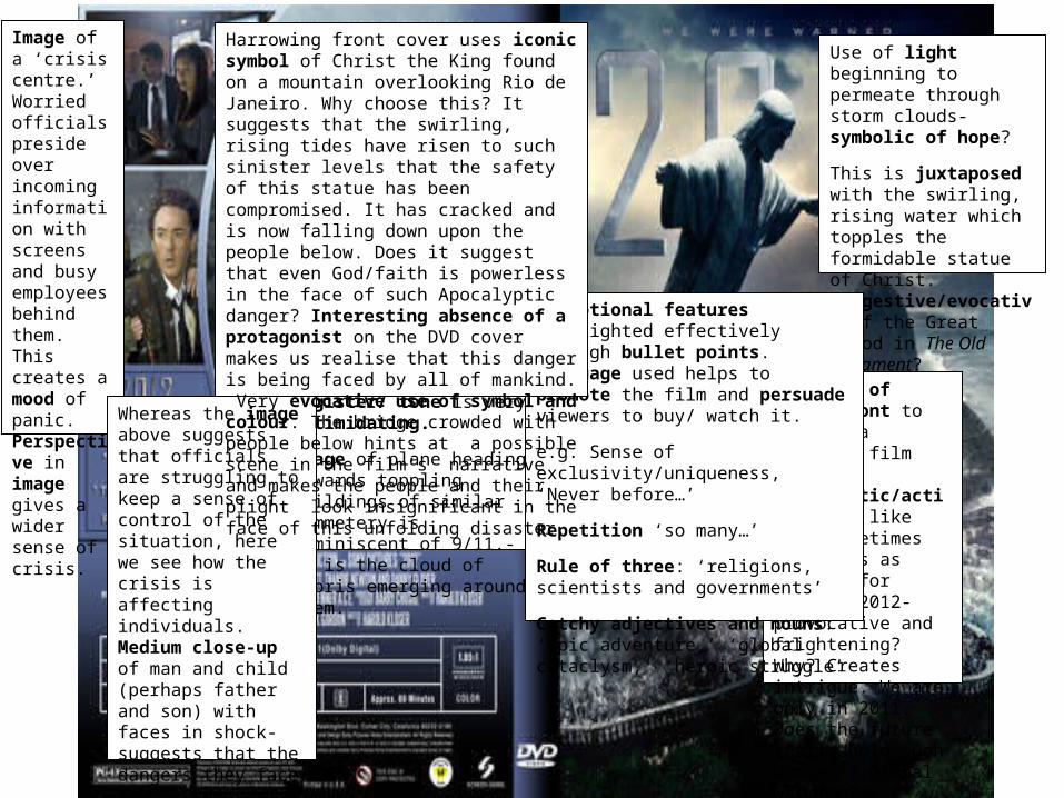
Bold use of modern font to capture a ‘catchy’ film title. Apocalyptic/action films like this sometimes use dates as markers for danger. 2012- provocative and frightening? Why? Creates intrigue. We are only in 2011. Does the future really hold such dangers? Global warming?
Use of light beginning to permeate through storm clouds- symbolic of hope?
This is juxtaposed with the swirling, rising water which topples the formidable statue of Christ. Suggestive/evocative of the Great Flood in The Old Testament?
Threatening slogan. Register/ tone is very intimidating.
Image of plane heading towards toppling buildings of similar symmetery is reminiscent of 9/11.- as is the cloud of debris emerging around them.
Image of a ‘crisis centre.’ Worried officials preside over incoming information with screens and busy employees behind them. This creates a mood of panic. Perspective in image gives a wider sense of crisis. Whereas the image
above suggests that officials are struggling to keep a sense of control of the situation, here we see how the crisis is affecting individuals. Medium close-up of man and child (perhaps father and son) with faces in shock- suggests that the dangers they face may be too difficult to overcome. Makes viewers want to find out what happens to them.
Promotional features highlighted effectively through bullet points. Language used helps to promote the film and persuade viewers to buy/ watch it.
e.g. Sense of exclusivity/uniqueness, ‘Never before…’
Repetition ‘so many…’
Rule of three: ‘religions, scientists and governments’
Catchy adjectives and nouns: ‘epic adventure,’ ‘global cataclysm,’ ‘heroic struggle’
Harrowing front cover uses iconic symbol of Christ the King found on a mountain overlooking Rio de Janeiro. Why choose this? It suggests that the swirling, rising tides have risen to such sinister levels that the safety of this statue has been compromised. It has cracked and is now falling down upon the people below. Does it suggest that even God/faith is powerless in the face of such Apocalyptic danger? Interesting absence of a protagonist on the DVD cover makes us realise that this danger is being faced by all of mankind. Very evocative use of symbol and colour. The bridge crowded with people below hints at a possible scene in the film’s narrative and makes the people and their plight look insignificant in the face of this unfolding disaster.
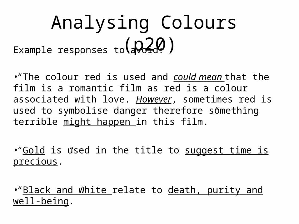
Analysing Colours (p20)
Example responses to avoid:
•“The colour red is used and could mean that the film is a romantic film as red is a colour associated with love. However, sometimes red is used to symbolise danger therefore something terrible might happen in this film.”
•“Gold is used in the title to suggest time is precious.”
•“Black and white relate to death, purity and well-being.”
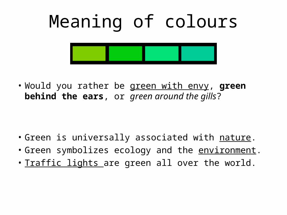
Meaning of colours
• Would you rather be green with envy, green behind the ears, or green around the gills?
• Green is universally associated with nature.• Green symbolizes ecology and the environment.• Traffic lights are green all over the world.
Analysing Colours
• Sometimes colours are symbolic.
• Sometimes colours may be used because they are bright and eye-catching and therefore stand out.
A FORREST
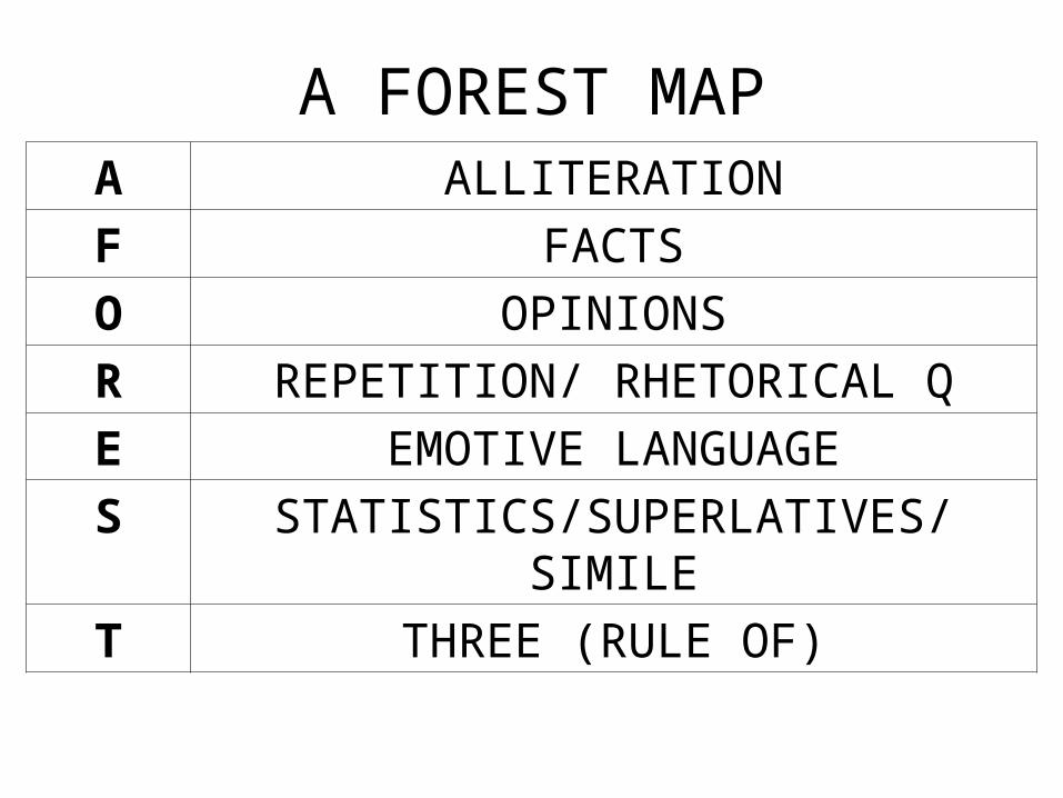
A FOREST MAPA ALLITERATION
F FACTS
O OPINIONS
R REPETITION/ RHETORICAL Q
E EMOTIVE LANGUAGE
S STATISTICS/SUPERLATIVES/SIMILE
T THREE (RULE OF)

Persuasive Language (p17)
Used to persuade someone to do something:
•buy a product
•believe in a particular argument
•donate money to a charity, etc
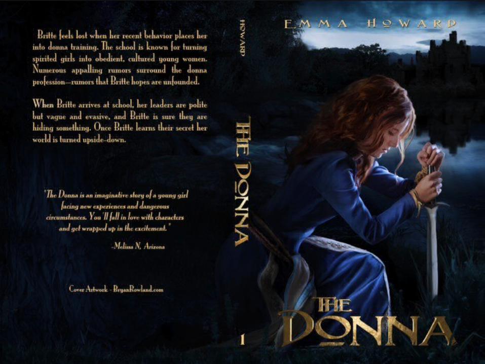
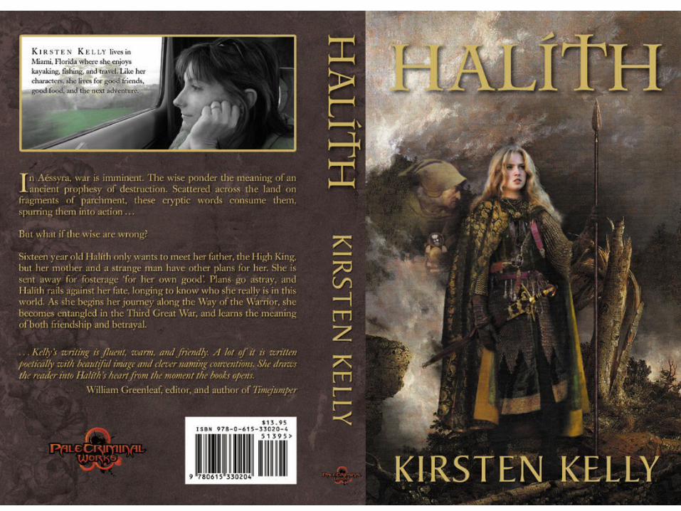
The Donna by Emma Howard
Britte feels lost when her recent behaviour places her into donna training. The school is known for turning spirited girls into obedient, cultured young women. Numerous appalling romours surround the donna profession – rumours that Britte hopes are unfounded.
When Britte arrives at school, her leaders are polite but vague and evasive and Britte is sure they are hiding something. Once Britte learns their secret her world is turned upside down.
“The Donna is an imaginative story of a young girl facing new experiences and dangerous circumstances. You’ll fall in love
with characters and get wrapped up in the excitement.”
Melissa N. Arizona
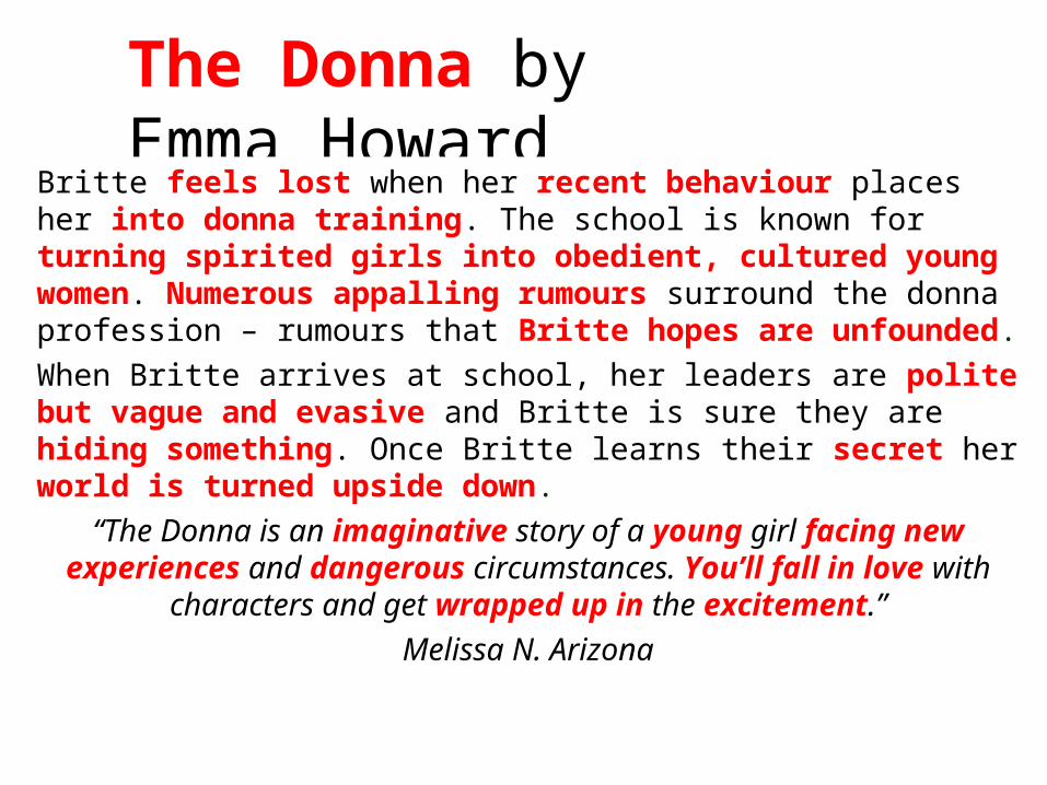
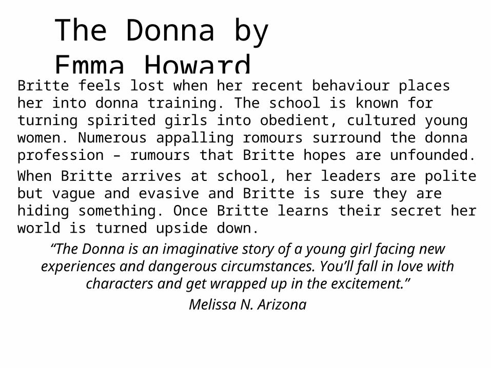
The Donna by Emma Howard
Britte feels lost when her recent behaviour places her into donna training. The school is known for turning spirited girls into obedient, cultured young women. Numerous appalling rumours surround the donna profession – rumours that Britte hopes are unfounded.
When Britte arrives at school, her leaders are polite but vague and evasive and Britte is sure they are hiding something. Once Britte learns their secret her world is turned upside down.
“The Donna is an imaginative story of a young girl facing new experiences and dangerous circumstances. You’ll fall in love
with characters and get wrapped up in the excitement.”
Melissa N. Arizona
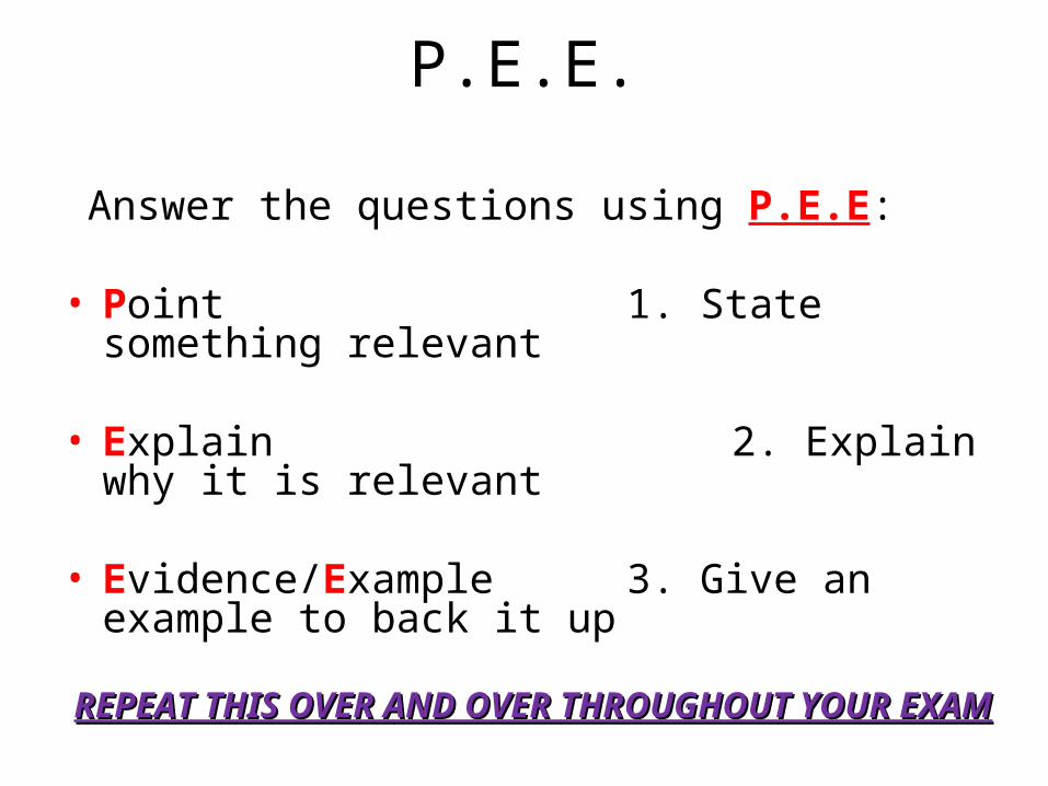
P.E.E.
Answer the questions using P.E.E:
• Point 1. State something relevant • Explain 2. Explain why it is relevant
• Evidence/Example 3. Give an example to back it up
REPEAT THIS OVER AND OVER THROUGHOUT YOUR REPEAT THIS OVER AND OVER THROUGHOUT YOUR
EXAMEXAM
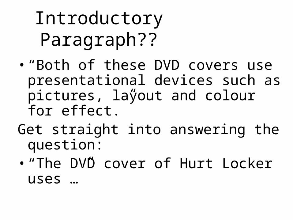
Introductory Paragraph??
• “Both of these DVD covers use presentational devices such as pictures, layout and colour for effect.”
Get straight into answering the question:
• “The DVD cover of Hurt Locker uses …”
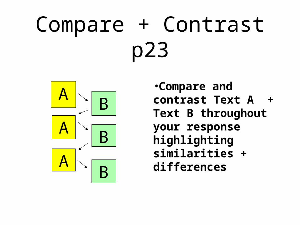
Compare + Contrast p23
•Compare and contrast Text A + Text B throughout your response highlighting similarities + differences
A
A
A
B
B
B
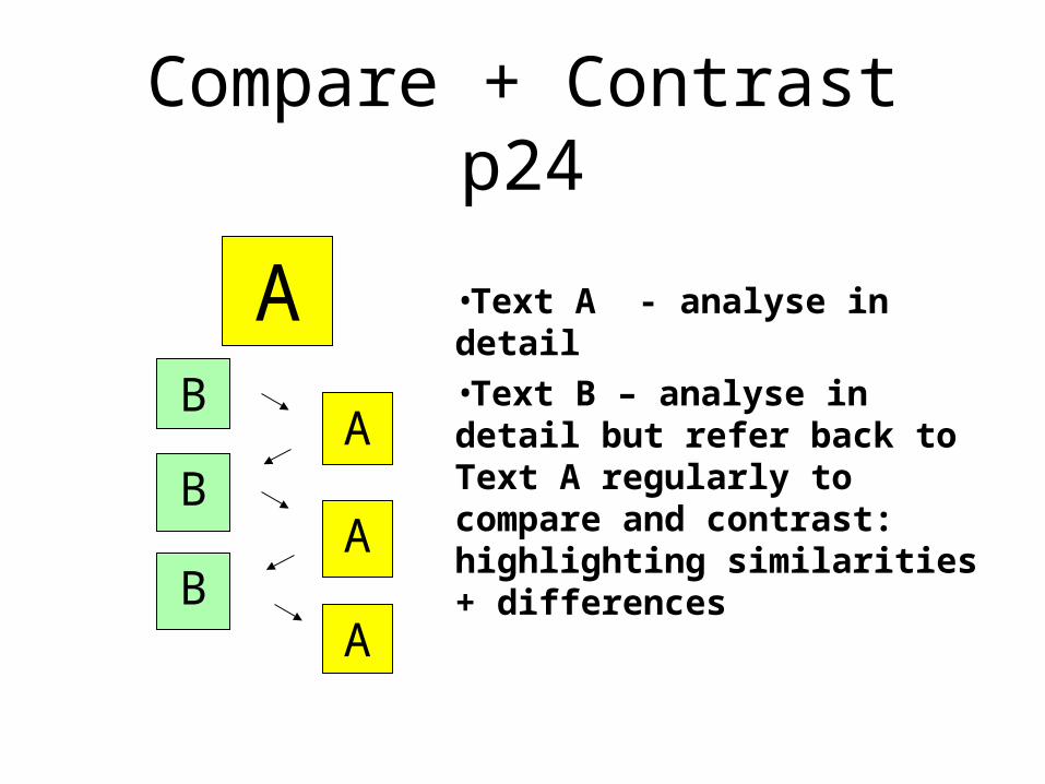
Compare + Contrast p24
•Text A - analyse in detail•Text B – analyse in detail but refer back to Text A regularly to compare and contrast: highlighting similarities + differences
AB
AB
AB
A
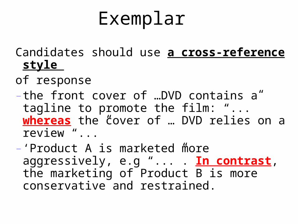
Exemplar
Candidates should use a cross-reference style
of response– the front cover of …DVD contains a tagline to
promote the film: “...” whereas the cover of … DVD relies on a review “...”
– ‘Product A is marketed more aggressively, e.g “...”. In contrast, the marketing of Product B is more conservative and restrained.
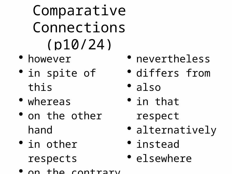
Comparative Connections (p10/24)
however in spite of this whereas on the other hand in other respects on the contrary rather
nevertheless differs from also in that respect alternatively instead elsewhere
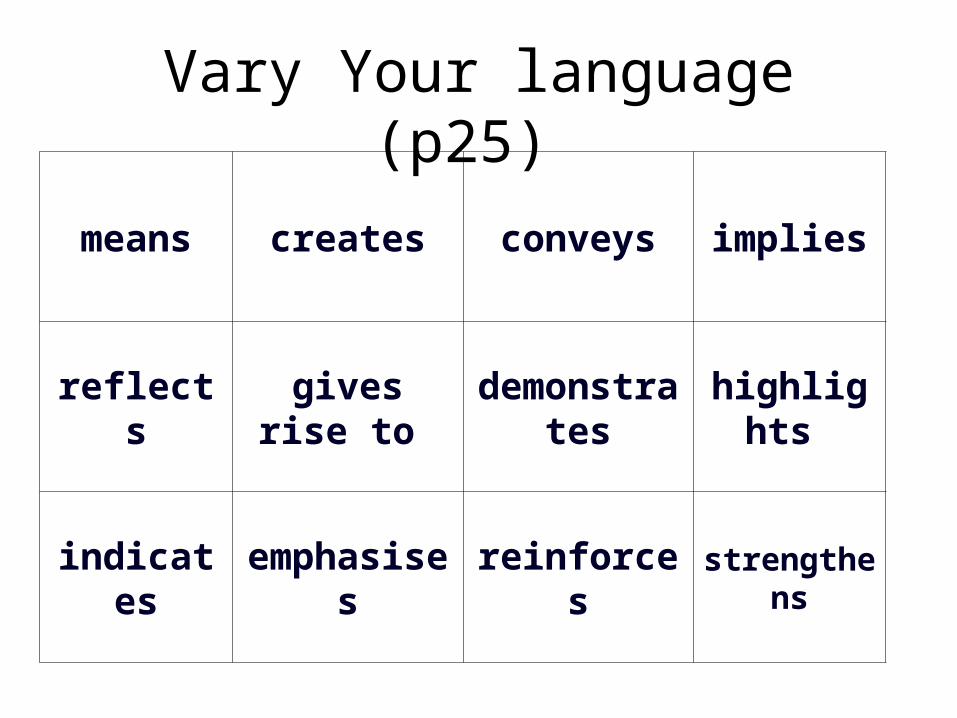
Vary Your language (p25)
means creates conveys implies
reflectsgives rise
to demonstrat
eshighlights
indicates emphasises reinforcesstrengthen
s