Embed Size (px)
DESCRIPTION
english version
Citation preview
Visitor’s guide
1
Per KirKeby
and the ‘Forbidden Paintings’ of Kurt Schwitters
09.02 > 20.05.2012
bOZAreXPO
Ce guide du visiteur vous est offert par BOZAR EXPO en collaboration avec l’imprimerie Hayez.
Deze bezoekersgids wordt u aangeboden door BOZAR EXPO ,in samenwerking met drukkerij Hayez.
This visitors’ guide is offered to you by BOZAR EXPOin collaboration with Hayez printers.
Hayez, your efficient printer
PUB-BOZAR:Mise en page 1 14/10/09 10:15 Page 1
This visitors’ guide is offered to you in collaboration with Hayez printers
Cossus ligniperda, 1989
ARoS Aarhus Museum, Denmark
© Galerie Michael Werner, Märkisch Wilmersdorf, Cologne, New York
2 3
HORTAHALHALL HORTA
INTRO
2
3
4
567
8
9
10
11
FILM
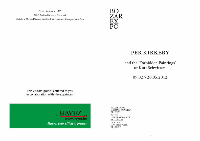
The Danish artist Per Kirkeby (born in 1938) has pursued a highly distinctive artistic path over the last 40 years. Even if the artist has always seen himself as first and foremost a painter, he is also sculptor, architect, writer and even filmmaker. He refuses to be pigeonholed, either in terms of style, artistic disciplines or in regional terms. His work, nonetheless, is characterised by a considerable internal coherence.
The Danish “Golden Age” around 1800, Edvard Munch, Asger Jorn, and the philosophers Søren Kierkegaard and Ludwig Wittgenstein have all been key influences on Kirkeby, who has also taken a great interest in French and German masters from the 19th century. One can also observe the close links he had with the generation of the so-called ‘German neo-expressionists’ in the 1980s. His early works present a powerful synthesis of the ideas of cubism, Cobra, Pop Art, informal art and minimalism. North and South, Germanic and Mediterranean culture, different movements and periods thus meet up in his work.
Per Kirkeby’s art, moreover rooted in his earlier studies of geology, has as its key themes landscape, sedimentation, and stratification. Throughout his career a perpetual dialogue between nature and abstraction, between landscape and architecture and finally between (the) man and nature, has been prominent in his work. The artist explores the boundaries between figurative and abstract art, and experiments with a variety of techniques and media: oil painting and mixed techniques on Masonite (hardboard) and canvas, collage, watercolour, drawing, “overpainting”, sculpture in bronze and brick.
Room 1
4 5
Kirkeby also illustrated numerous books and has a considerable amount of literary work to his name: poems, art books and essays about (history of ) art and on artists such as Eugène Delacroix, Gustave Moreau, Paul Gauguin, and Kurt Schwitters.
In his essay on Schwitters, Per Kirkeby does not refer to the avant-garde artist known for his “Merz” collages; instead he reveals the almost unknown realistic landscape paintings that Schwitters made in the 30s in Norway, and which made a deep impression on Kirkeby. The Danish artist was fascinated by the freedom Schwitters displayed in taking his distance from the modern mainstream with these landscapes considered as “forbidden” or “old-fashioned and styleless”. Kirkeby recognized in this an attitude towards art and the art scene quite similar to his.
This retrospective exhibition offers a representative sample of Kirkeby’s extensive œuvre from his beginnings to date, with a particular focus on his painting. An ‘enclave’ in the exhibition unveils furthermore a facet of Kurt Schwitters’ oeuvre as amazing as unexpected, and rarely seen before.
ROOM 1 Early works (1964 – 1973)
When Per Kirkeby created his first independent works in 1964-65, it was in reaction to many currents of the time. Yet his reaction amounted to a highly original synthesis. Motifs from the media played a role, as in concurrent American Pop Art. Film stars appeared. On the other hand, Kirkeby still preserved memories of experiences he had had as a geologist on expeditions to the Far North, before he turned to art. A geologist investigates structures that require precise observation. This experience provided a reservoir of motifs to which the artist would later recur again and again. Yet Kirkeby was also interested in the popular culture of comics like Tintin, whose style, often not modern at all, stood in the tradition of the illustrators of famous nineteenth-century novels, such as Ivanhoe by Walter Scott.
The young Kirkeby also received quite different impressions, from Minimalism, Fluxus and at the Experimental Art School in Copenhagen, where he studied with various artists. Here, his oeuvre began to diversify, to encompass films, photo books, installations and performances. Painting was his true metier and preoccupied his interests. Yet as painting had been declared dead, Kirkeby found an exit from this dilemma by using not canvas and stretchers but Masonite panels, hardboard plates available at any lumberyard in standardized sizes, including 122 x 122 cm.
The imagery that emerged from 1964 to 1973 had a collaged effect, yet rather than being pasted together of separate elements as in Cubism, it was painted. The motifs derived from highly varied sources. Mata Hari, a Dutch dancer
6 7
who was also active as an agent, appeared alongside Brigitte Bardot and Jeanne Moreau, two contemporary film stars. Though allusions to art history frequently appeared in the titles, direct references were hard to detect in the works themselves, as in Constantinople, Delacroix and the Crusaders’ Entry (III) …, alluding to a monumental painting by Eugène Delacroix of 1840. Still, the references did point up Kirkeby’s love of the colorism developed by nineteenth-century French masters, including Gustave Moreau. An expedition of 1971, finally, took Kirkeby to Central America, where he studied Maya architecture — gaining impressions that were digested in many of his Masonite panels and are still vital in his work today.
ROOM 2 Fences
Fences are a ubiquitous feature of everyday Danish life. Unlike walls, they form a partially permeable barrier and thus do not have a forbidding effect. They consist of a series of uniform elements that add up to a simple, “minimalistic” structure. This was one of Kirkeby’s points of departure; another was the possibility of extending the structure such that it could constitute an installation in painted form. Yet instead of a neutral plane between the pickets we find richly nuanced expressive brushwork, which appears pushed back. Nature was to be excluded from the conceptual space, yet without being entirely obscured.
8 9
ROOM 3 Shift to painting on canvas (1976-1983)
The style of the 1976 Masonite panels already reflects an imminent change, as seen in Maya Mountains 1. The collage-like structure here is dissolved in favor of painterly, spontaneous brushwork. Since then, this mountain motif has reappeared again and again, most recently in a large-format canvas of 2010. After 1976, landscape motifs took on increasing importance. At the time, Kirkeby took a crucial step by turning to painting on canvas, which permitted him to employ completely new formats. Yet not only an observation of the landscape during changing times of day and seasons formed a key source of inspiration from then onwards, but still life as well. While his landscapes were strongly influenced by the Danish tradition, in his still lifes Kirkeby often borrowed motifs and structures from the seventeenth-century Netherlands. And he frequently combined landscape with still life. Though figures were not excluded from the landscapes, they were often not recognizable on first sight, as the pictures had an abstract effect.
In the case of a quotation of a horse motif from Hans Baldung Grien, the situation was different. Kirkeby took the strangely stiff-looking animal from a famous 1534 woodcut by the German Renaissance master, depicting a herd of wild horses. This motif reappeared in 2010 in a large painting as a green horse, a self-quotation. Kirkeby had the opportunity to continually observe horses on a meadow on the island of Laesø, where he spends the summers.
In his work, we often find several interpenetrating strata, recalling geological formations. During the late 1970s and early
80s, Kirkeby explored simple themes in his flickering painting style, which frequently gave precedence to white.These themes, enriched by quotations and memories, burgeoned into multi-leveled compositions. This holds both for the layers of paint and for the motifs themselves.
From the virtually tangible character of the painted surface, it was only a small step to bronze sculpture. Kirkeby employed this medium to thoroughly explore the human figure, heads, arms, torsi, etc. This new focus of his oeuvre began around 1981. And as even the earliest sculptures indicate, Kirkeby linked up with sculptural ideas of the kind developed by Auguste Rodin, such as the relationship between volume, surface and light in sculpture. In addition, the bronzes reflected a new brand of expressiveness which required the human figure as a vehicle.
10 11
ROOM 4 Works on paper, overpaintings and writings
In addition to drawings, watercolors and gouaches, the collage technique formed a means that accompanied and expanded the compositional technique of the early Masonite panels. The rediscovery of collage in the early 1960s occurred simultaneously in Europe and America. Yet rather than following Cubist or Dada predecessors, Kirkeby interpreted the medium in a new way. In the works of Picasso and Braque he saw not so much a synthesis of facetted fragments or a second reality composed of newspaper clippings, advertising and stencilled words, as a structure that permitted enigmatic, even dangerous gaps. Though from the 1960s onwards he admittedly employed quotations from an optimistic world view comprising beautiful women, adventures, heroes, etc., on closer scrutiny we find that dangers lurk beneath this beautiful surface.
Concurrently with the collages there emerged watercolors, gouaches and drawings that dealt with public imagery in a freer and more arbitrary way and reflected outstanding draftsmanly skills. Though the insouciance of life in the 1960s is there, it is grounded in an existential search that was quite foreign to Pop Art.
The strategy of overpainting was also a feature of these years. At first apparently an act of aggression and rejection of traditional and kitschy art, this strategy held a great fascination for artists like Asger Jorn, Arnulf Rainer, Willem de Kooning, and others. Kirkeby negated and affirmed at the same time — something was destroyed, but out of the destruction emerged a new, creative answer. Overpainting turned out to be an
ambivalent process, which naturally could contain a great deal of playful energy. While with Jorn the revisions conveyed an aggressive effect, Kirkeby reacted with humor and presence of mind.
Literature and BooksThroughout his career Kirkeby has written books, and at the start even published them himself. These were volumes of poems, photo books, essays, theoretical demonstrations (Billedforklaringer - Picture Explanations) and monographs on artists Kirkeby admires and is involved with, like Gauguin, Picasso, Turner, Giacometti, Delacroix, Bellini, Manet,… In addition, a number of books has appeared that consist of series of drawings, which investigate elements of the paintings and sculptures.
Kirkeby is a member of the Danish Academy of Literature.In the course of the years a great number of book covers
for other authors’ works emerged, including a series of French writers. Kirkeby’s illustrations to texts should not be understood as classic book illustrations like those of the nineteenth century; rather, they represent his visual commentaries on the work of a writer or philosopher, such as Wittgenstein. Kirkeby’s art does not merely serve the text but stands on a basis of equality alongside the written word.
12 13
ROOM 5 Blackboards
Masonite is a kind of hardboard made of compressed wood fibers. Kirkeby grounded these panels in black and then applied colored chalk. These “blackboards” recall those used in school instruction, even though these are usually green. The artist who introduced such image supports into art was Joseph Beuys. During his performances and lectures he frequently used such panels, drawing and writing on them with white chalk. Beuys’s model was the anthroposopher Rudolf Steiner, who founded a center for his ideas concerning holistic human cultivation in Dornach, Switzerland. Kirkeby has nothing to do with this ideological, occasionally esoteric background; he simply uses its formal means. In the context of the exhibition, the panels are important because they clearly convey the motifs that are barely detectable in the paintings. They function like a repertoire from which Kirkeby draws again and again. Animals, architectures, natural details, structures are clearly depicted here. The panels wonderfully bring out Kirkeby’s iconography.
ROOM 6 Color and the motif of the tree (1985-1994)
During the 1980s Kirkeby began to explore the coloristic potentials of painting on canvas, based principally on landscape motifs. The formats took on monumental dimensions, of the kind common in the nineteenth century, for instance in Eugène Delacroix. In contrast to classical modernism, where the primary colors yellow, red and blue often dominated, Kirkeby developed a color scale containing innumerable gradations and intermediate tones, which went back to the epoch of the liberation of color around 1850. Thus, fine differentiations in the observation of contrasts, light reflections and concomitant changes of mood provide inexhaustible possibilities of color orchestration. Sometimes the radiant yellows recall the magnificence of medieval manuscripts, a source directly referred to in the title Beatus-Apokalypse, derived from the most famous Spanish manuscript of the Middle Ages.
While the large formats offered the oppportunity to create complex compositions with sweeping rhythms, in concurrently executed series Kirkeby explored individual elements of nature, such as the motif of the tree. A prominent component of landscape painting, the tree had been especially emphasized ever since Romanticism emerged around 1800. Parallels between human life and trees were repeatedly drawn, as indicated by metaphors like “family tree”, “tree of life”, and others.
When Kirkeby’s colorism reached its first apex in the 1980s, it stood in contrast to recent painting, especially in Germany, where he taught at the time as a professor in Karlsruhe and
14 15
Frankfurt. Though he had become involved with the visual conceptions of Georg Baselitz, Kirkeby never considered the emphasis on the figure found in German painting meaningful for himself. His international career began at about this time, when he participated in great exhibitions such as “A New Spirit in Painting” (London, 1981) and Documenta in Kassel.
ROOM 7 The « Forbidden Paintings » of Kurt Schwitters
Kurt Schwitters (1887-1948) was a major representative of the avant-garde in Germany, where, above all, he expanded Dada art with his special approach, known as «Merz». His preferred techniques were collage and assemblage. Images pasted together of newspaper clippings, tickets, printed advertising matter and similar materials emerged from the First World War onwards, soon supplemented by found objects such as wooden parts, screws, plants, etc.
His allegedly «degenerate» avant-garde art attracted the attention of the Gestapo and in 1937 he had to flee Nazi Germany and chose to spend his exile in Norway, where he had spent a number of summers since 1930. He stayed there until the Germans occupied the country in 1940, and moved to Great Britain, where he remained until his death in 1948.
Before he became a modern artist, Schwitters had had a conventional training in painting at the Dresden Academy. Later he used the skills acquired there when, alongside his avant-garde work, he began painting realistically in Norway and England. He also occasionally executed portraits to make a living. The main genre in this production, was landscape painting, done from nature, like the plein-air painters in the nineteenth century. This quite extensive figurative portion of Schwitters’s oeuvre long faced incomprehension, as it seemed incompatible with the modern avant-garde Schwitters.
Kirkeby discovered the realistic paintings of Schwitters in
16 17
the mid 1980s. This later inspired Kirkeby to devote a book to them in which he wrote:
«It was the first example I saw of Schwitters’ Norwegian potboilers. The forbidden paintings, the ones that did not correspond to “history”, the rejected and shameful reminders of the German painter’s adversity. I thought it was an amazing picture. It corresponded to my own crazy state of mind.»
(Per Kirkeby, Schwitters, Edition Bløndal, 1995, p. 11)
In his essay Kirkeby describes these landscapes as “forbidden” (in the sense of ‘wrong’ or ‘outcasted’), as they were outside the mainstream of the 1930s and 1940s. Kirkeby was fascinated to see that an avant-garde artist like Schwitters had dared to undertake such a drastic change in style. He recognised in these works his own free approach to art, independent of dominant styles and tastes. Like Schwitters, Kirkeby refuses to let himself be pigeonholed; his art transcends the dominant spirit of his time. Naturally he also found a confirmation for his own decision not to suppress the impressions of nature he had gleaned on expeditions to Greenland and Mexico, but rather the use them productively for his art. Incidentally, Piet Mondrian too created a great number of flower watercolors during his abstract years, and Ellsworth Kelly accompanied his abstract paintings by incessantly drawing plants. A contemporary of Schwitters, Lyonel Feininger, made thousands of sketches from nature throughout his life. So Schwitters was not an isolated case, if quite idiosyncratic in working in a traditional manner.
ROOM 8 Architectural brick sculptures
In Denmark, brick was the most important building material before the advent of concrete and glass architecture. Kirkeby employed bricks in an installation as early as 1965, and in 1973 began using them in outdoor pieces, for the first time in the town of Ikast. Since then, nearly one hundred brick sculptures have emerged, scattered around Europe and a few in the U.S. In 1993, the City of Antwerp acquired a brick sculpture of Per Kirkeby for it’s openair museum Middelheim.
Though these pieces have the look of architecture, they serve no purpose, being autonomous and always site-related. Typical features are an oscillation between inside and outside, material and void. The configurations are often inspired by historic architecture, e.g. arches, ornaments, and overall shapes reminiscent of towers and buildings.
The brick sculptures oscillate between architecture, monument, visual work and sign. They form prominent points of orientation, yet also contain a negation in the sense of the emptiness that surrounds them. On the one hand monuments, on the other evocations of fear of the void and death.
18 19
ROOM 9 Large formats (1995-2000)
Especially from the 1990s onwards, the large formats have been characterized not only by magnificent colors but by structures that recall both geological strata and rock formations of the kind found in Early Renaissance Italian paintings. In Giotto, the origin of such formations in Byzantine art is quite evident. Kirkeby used these visual elements as references to the religious tradition in Western painting. Along with the structures, as in Missing the World, a graphic ductus determines the rhythm of the composition. In contrast to earlier works of the 1980s, where the colors and forms appear in melodious flux, the movement key to all of Kirkeby’s more recent works has a rhythmic effect. The large formats convey the impression of having been inspired by the never-ending pulse of the seasons, the encounter of sea, air and earth. Without Romantic yearning, pathos and meaning-generating motifs, the rhythm of nature has been transformed into autonomous visual images. Still, everything in these works is filtered through the artist’s perception, that of an individual whose sensibility was shaped by aesthetic and painterly decisions.
SculptureAfter having created brick sculptures from the 1960s onwards, Kirkeby launched in 1981 into the medium of bronze. The motifs were unusual for him, portions of the human body such as head, arm and torso. Up to that point in his painting, figures had remained largely hidden. Concurrently with a reorientation of his painting after 1980, where landscapes and figure motifs were suggested without being depicted realistically, in sculpture a turn to exploring surface textures took place, based on the expressive movements of the human body. In this way, the figurative came to the center of Kirkeby’s sculptural art, like an opposite pole to the dense layers of the coloristic researches in the concurrent paintings. The painterly effects of the sculptures are obvious, recalling Rodin, to whom Kirkeby devoted an essay in 1985, where he discussed the renowned Hell’s Gate. What intrigued Kirkeby most about Rodin, apart from emphasized profiles and earthlike accumulations of matter, were the truncated volumes typical of Rodin’s handling of the plastic mass. Surface and light enter a vibrating combination here, as do plastic mass and gaping apertures. The artist’s handling of the material remained visible in a way that Kirkeby never permitted to happen in his paintings. A large cycle, titled Inventory, summed up his sculptural achievements in 2002. A few of his bronze sculptures stand in public areas, without functioning as monuments in the narrower sense. They form sculptural interventions, points of rest, gentle irritations of everyday perception.
20 21
ROOM 10 Still lifes (2000-2008)
In his recent works since the mid 1990s and especially the still lifes, Kirkeby has adapted recollections of earlier works, such as Fram, or of seventeenth-century Netherlandish still lifes. Especially the vanitas still lifes intrigued him, images in which reminders of death occur, in the midst of the opulence and abundance of life. We can recognize the crystal chalices, table edges and tablecloths found there. Frequently the motif of the “Fram” (Literally: forward) occurs, the ship on which Fritjof Nansen undertook his expeditions (1893-96), along with allusions to C.D. Friedrich’s Sea of Ice, where a ship called “Hoffnung” (Hope) is depicted caught among towering ice floes. Yet despite this complex weave of references, the artist’s perception always forms the hub around which everything revolves.
FilmPer Kirkeby Vinterbillede (Per Kirkeby Winter’s Tale)Jesper Jargil, Denmark, 1996, 48’, DVD, English subtitles
In this documentary about Kirkeby’s work, the filmmaker Jesper Jargil shows, step by step, how a large oil painting came into existence, from the first brushstroke on the bare canvas to the moment the work was hung in a museum. The camera, placed frontally, registers all the modifications that the artist undertakes: a privileged and unique moment revealing the process and the creation conditions of a major work of Kirkeby.
ROOM 11 Recent works
During the past years Kirkeby has altered his palette, rendering it lighter and more colorful. Many of the canvases are veritably radiant. Quotations from the storehouse of motifs he has amassed over the years appear again and again in his compositions, such as the snake, which appeared in a painting as early as 1977 as a reminiscence of Mexico. Tree stumps, cabin, horse – already seen in a painting of 1981 - these are introduced in ever-new contexts and ideas. Kirkeby has always returned to historical approaches in painting, yet this time not to the French nineteenth century, as in the 1980s, but to the Italian Early Renaissance, when European painting embarked on a new beginning in the wake of the Middle Ages. The works that inspire Kirkeby emerged at the threshold between sacred and profane.
In recent years the highly productive artist, now 73, has added a new, surprising phase to his oeuvre, expanding his cosmos of imagery unaffected by fads and trends. On view in the exhibition are works that come straight from the artist’s studio and have never been publicly exhibited before.
Unlike those of earlier phases of the oeuvre, these paintings give the impression of moving out towards the viewer, as if the effect of the colors were capable of overcoming the distance between viewer and work, as if the surfaces appealed to the viewer’s eye like harmonious, light-emitting bodies.
22 23
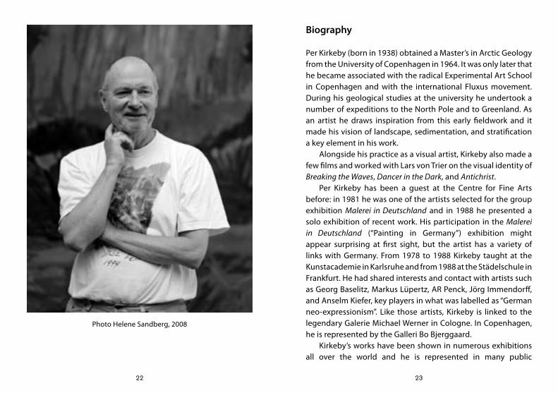
Biography
Per Kirkeby (born in 1938) obtained a Master’s in Arctic Geology from the University of Copenhagen in 1964. It was only later that he became associated with the radical Experimental Art School in Copenhagen and with the international Fluxus movement. During his geological studies at the university he undertook a number of expeditions to the North Pole and to Greenland. As an artist he draws inspiration from this early fieldwork and it made his vision of landscape, sedimentation, and stratification a key element in his work.
Alongside his practice as a visual artist, Kirkeby also made a few films and worked with Lars von Trier on the visual identity of Breaking the Waves, Dancer in the Dark, and Antichrist.
Per Kirkeby has been a guest at the Centre for Fine Arts before: in 1981 he was one of the artists selected for the group exhibition Malerei in Deutschland and in 1988 he presented a solo exhibition of recent work. His participation in the Malerei in Deutschland (“Painting in Germany”) exhibition might appear surprising at first sight, but the artist has a variety of links with Germany. From 1978 to 1988 Kirkeby taught at the Kunstacademie in Karlsruhe and from 1988 at the Städelschule in Frankfurt. He had shared interests and contact with artists such as Georg Baselitz, Markus Lüpertz, AR Penck, Jörg Immendorff, and Anselm Kiefer, key players in what was labelled as “German neo-expressionism”. Like those artists, Kirkeby is linked to the legendary Galerie Michael Werner in Cologne. In Copenhagen, he is represented by the Galleri Bo Bjerggaard.
Kirkeby’s works have been shown in numerous exhibitions all over the world and he is represented in many public
Photo Helene Sandberg, 2008
24 25
collections, including those of the Tate Gallery (London), the Metropolitan Museum of Art (New York), the Museum of Modern Art (New York), the Phillips Collection (Washington) and the Centre Pompidou (Paris). He represented Denmark at the Venice Biennale in 1976 and took part in Documenta VII and Documenta IX. A number of major monographic exhibitions have been held in Europe and in the US: at the Kunsthalle in Berne (1979), the Whitechapel Art Gallery in London (1985), the Museum Ludwig in Cologne (1987), the Castello di Rivoli in Turin, the Musée d’Art Moderne de la Ville de Paris (1998), the Arts Club of Chicago (2007), the Louisiana Museum of Modern Art, Humlebaek (2008), the Tate Modern in London, and the Museum Kunstpalast in Düsseldorf (2009).
26 27
Credits and acknowledgements
EXHIBITIONThis exhibition is a production of BOZAR EXPO organized at the occasion of the Danish Presidency of the Council of the European Union, in the context of the Danish focus “Let’s Dansk!”.CURATOR Siegfried GohrBOZAR EXPOCEO – Artistic Director : Paul DujardinDeputy Artistic Director : Adinda Van GeystelenDeputy Exhibitions Director : Sophie LauwersExhibition Coordinator : Maïté SmeyersAssistant Deputy Exhibitions Director: Axelle AncionPublication Coordination : Vera KotajiBOZAR TECHNICSDirector Technics : Stéphane VanreppelenTechnical Coordination : Isabelle Speybroeck, David RoelsBOZAR COMMAudience developer : Eva VereeckenPress officer: Leen DaemsBOZAR STUDIOSCoordinator : Tine Van GoethemCollaborators: Laurence Bragard, Sophie Caironi, Sarah De Loenen, Laurence Ejzyn, Lieve RaymaekersCONSTRUCTIONCMVD - Christophe Van DammeART HANDLING & INSTALLATIONAortaTRANSPORTSBrandl Transport GmbH
VISITOR’S GUIDERedaction : Siegfried GohrFinal Editing : Helena Bussers, Maïté SmeyersTranslation : John William GabrielLayout : Olivier Rouxhet
PARTNERS AND SUPPORTIn collaboration with the Galerie Michael Werner, Märkisch Wilmersdorf, Cologne & New York
With the support of the Ministry of Foreign Affairs and Ministry of Culture of Denmark, the Danish Agency for Culture, the Embassy of Denmark in Brussels, the Danish Cultural Institute / Benelux, the Galleri Bo Bjerggaard, Copenhagen
28 29
JCCO
SPONSORS
EWEA - European Wind Energy Association vzwDanish Agricultural Council (Brussels)Confederation of Danish IndustriesConfederation of Danish EmployersVELUXBrandl Transport GmbHNy CarlsbergfondetAugustinus Fonden
ACKNOWLEDGEMENTSThe Centre for Fine Arts, Brussels, wishes to thank especially
Per Kirkeby, Mari Anne Duus, Siegfried Gohr, Galerie Michael Werner, Galleri Bo Bjerggaard, Klaus Bondam, Lina Sloth Christensen, Helena Bussers
And the museums and private collectors who were so kind as to lend us their work(s) of art for this exhibition
LENDERSARoS Aarhus Kunstmuseum, AarhusCastello di Rivoli Museo d’Arte Contemporanea, Rivoli/TorinoEsbjerg Art Museum, EsbjergEssl Museum, Klosterneuburg/ViennaGalleri Bo Bjerggaard, CopenhagenGalerie Fred Jahn, MunichGalerie Michael Werner, Märkisch Wilmersdorf, Cologne & New YorkPer KirkebyLouisiana Museum of Modern Art, HumlebækMusée d’Art Moderne et Contemporain, StrasbourgMuseum Folkwang, EssenMuseum Jorn, SilkeborgRanders Kunstmuseum, RandersStatens Museum for Kunst, CopenhagenVan Abbemuseum, EindhovenKurt und Ernst Schwitters Stiftung, Hanover
Private collectors wishing to stay anonymous
30 31
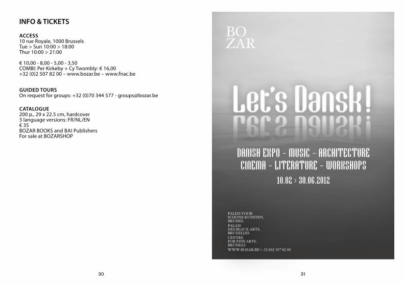
DANISH EXPO - MUSIC - ARCHITECTURE CINEMA - LITERATURE - WORKSHOPS
10.02 > 30.06.2012
bOZAr
PALeiS VOOr SCHONe KUNSTeN, brUSSeLPALAiS DeS beAUX-ArTS, brUXeLLeSCeNTre FOr FiNe ArTS, brUSSeLSWWW.bOZAr.be | + 32 (0)2 507 82 00
INFO & TICKETS
ACCESS10 rue Royale, 1000 BrusselsTue > Sun 10:00 > 18:00Thur 10:00 > 21:00
€ 10,00 - 8,00 - 5,00 - 3,50COMBI: Per Kirkeby + Cy Twombly: € 16,00+32 (0)2 507 82 00 – www.bozar.be – www.fnac.be
GUIDED TOURSOn request for groups: +32 (0)70 344 577 - [email protected]
CATALOGUE200 p., 29 x 22.5 cm, hardcover3 language versions: FR/NL/EN€ 35 BOZAR BOOKS and BAI PublishersFor sale at BOZARSHOP
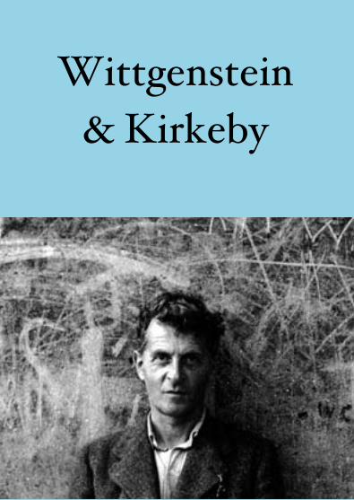
Wittgenstein & Kirkeby
Ludwig Wittgenstein
Remarks on Colour
3
Lichtenberg says that very few people have ever seen pure white. So do most people use the word wrong, then? And how did he learn the correct use? – He constructed an ideal use from the ordinary one. And that is not to say a better one, but one that has refined along certain lines and in the process something has been carried to extremes.1
54
Can a transparent green glass have the same colour as a piece of opaque paper or not? If such a glass were depicted in a painting, the colours would not be transparent on the palette. If we wanted to say the colour of the glass was also transparent in the painting, we would have to call the complex of colour patches which depict the glass its colour.
Imagine someone pointing to a place in the iris of a Rembrandt eye and saying: “The walls in my room should be painted in this colour”.
6 7
Imagine a painting cut up into small, almost monochromatic bits which are then used as pieces in a jig-saw puzzle. Even when such a piece is not monochromatic it should not indicate any three-dimensional shape, but should appear as a flat colour-patch. Only together with the other pieces does it become a bit of blue sky, a shadow, a high-light, transparent or opaque, etc. Do the individual pieces show us the real colours of the parts of the picture?
Blending in white removes the colouredness from the colour; but blending in yellow does not. – Is that the basis of the proposition that there can be no clear transparent white?
8 9
There is such a thing as a perfect pitch and there are people who don’t have it; similarly we could suppose that there could be a great range of different talents with respect to seeing colours. Compare, for example, the concept ‘saturated colour’ with ‘warm colour’. Must it be the case that everyone knows ‘warm’ and ‘cool’ colours? Apart from being taught to gives this or that name to a certain disjunc-tion of colours. Couldn’t there be a painter, for example, who had no concept whatsoever of ‘four pure colours’ and who even found it ridiculous to talk about such a thing?
Why is green drowned in the black, while white isn’t?
10 11
Our colour concepts sometimes relate to substances (Snow is white), sometimes to surfaces (this table is brown), sometimes to the illumination (in the reddish evening light), sometimes to transparent bodies. And isn’t there also an application to a place in the visual field, logically independent of a spatial context?Can’t I say ”there I see white” (and paint it, for example) even if I can’t in any way give a three-dimensional interpretation of the visual image? (Spots of colour.) (I am thinking of pointillist painting.)
1. Wittgenstein refers to the German writer Georg Christoph Lichtenberg (1742-1799). Lichtenberg is known above all for his aphorisms, but also engaged in a fascinating correspondence with his fellow writer Johann Wolfgang von Goethe. Wittgenstein refers to one of those letters, in which Lichtenberg explores colour theory.

12 13
Wittgenstein & Kirkeby: a posthumous connection2
The manuscripts left behind by the Austrian philosopher Ludwig Wittgenstein (1889-1951) included a series of observations on colours. Bemerkungen über Farben [Remarks on Colour] is not only a philosophical classic, but also enjoys minor cult status among painters. It is the “little red book” of many of them. The British-American painter RB Kitaj kept it on his bedside table, while Per Kirkeby has also long had a special bond with it. BOZAR LITERATURE asked Siegfried Gohr, curator of the Kirkeby retrospective, to compile a selection3 of Wittgenstein’s remarks on colour, by way of a reflection on the exhibition at the Centre for Fine Arts.
If we are to believe Kirkeby, his knowledge of philosophy is rather limited. And yet there are philosophical traces of all kinds to be found in his work. There is, of course, the influence of his celebrated compatriot Søren Kierkegaard. But it was Wittgenstein, above all, who played a major role in his intellectual development. Ten years ago the Danish painter made a series of etchings for a collector’s edition of the Bemerkungen über Farben4. Kirkeby’s admiration for Wittgenstein dates from the early years of his artistic career; the title of his novel 2,15 (1967) is a reference to a paragraph in Wittgenstein’s Tractatus logico-philosophicus, for the painter one of his “holy books”. In the text that Kirkeby wrote specially for the Bozar catalogue he alludes to his long-standing admiration for the two philosophers. The text is an exercise in modesty, in which the painter downplays his own thoughts.
‘(What I am trying to express here in a murky, poorly formulated, preliminary fashion is, in a way, what Søren Kierkegaard called ‘existential rationalism’. That the world must be understood from the inside. Which is what Karl Jaspers pursues in his distinguishing between the objective world that is understood from the outside—science, for example—and in opposition to this a ‘higher form of being’ that must be understood from within. Maybe it’s the old issue: the relation between body and soul. But my knowledge of philosophy isn’t that great. I am just on the hunt for metaphors to cover what it is that I am trying to say. Maybe I also want to mention Kierkegaard because he is Danish. I could also—for the same ‘biographical’ reasons stumble my way towards Ludwig Wittgenstein, who meant a lot to me in my first years as an artist. Maybe my primitive attempts at explaining myself are in fact a word game in the ‘Wittgensteinian’ sense.)’ 5
With “primitive attempts at explaining myself” Kirkeby is referring, inter alia, to the young Wittgenstein’s “retreat” in Norway. Far from the modern world, the philosopher spent a few years living in a hut overlooking a fjord and working in a remote village as a schoolmaster. It was during those Norwegian years that the foundations were laid for the Tractatus. This voluntary exile made an impression on the young painter and his artistic friends in Copenhagen. It also recalls the Norwegian years of Kurt Schwitters, a fine parallel that Kirkeby himself has referred to in his writings.The “Forbidden Paintings” of Norwegian landscapes by Schwitters also call to mind some of both Wittgenstein and
14 15
Kirkeby’s ideas. Siegfried Gohr notes the following remark of Kirkeby’s: “In my opinion, every significant work of art contains a good measure of kitsch. This is absolutely necessary…. By kitsch I mean elements that are generally emotive, such things as sunsets, precisely the motifs addressed in kitschy pictures. There is a sunset, there is a lovely forest, there are the gypsy women with big breasts, etc. And all of this is kitsch and nevertheless true. It is a part of our lives; but this runs alongside what takes place in a methodical mind.” 6 We find a comparable idea in Wittgenstein: “In all great art, a wild animal is: tamed…. All great art has as its thoroughbass the primitive instincts of man. These are not the melody … but that which gives the melody it’s depth and power.”
In Kirkeby’s late period Wittgenstein has kept coming up. In the 1980s the painter made less use of primary colours, preferring to experiment with blended colours and in-between shades. Here too there is a connection: in his Bemerkungen Wittgenstein undertakes an extremely painstaking attempt to give names to the different colours, from “reddish green” to “yellowish blue”.What particularly appeals to Kirkeby in Wittgenstein is his attempt to understand the world from the inside. The Danish artist calls this “the truth in painting”. The painting is a phenomenon that obeys its own laws, an outlook for which he finds an ally in the Austrian philosopher. The Tractatus is for Kirkeby more of an aesthetic theory than a logical treatise. For it is style that brings out the truth, beyond both word and image, and that temporarily reveals the ineffable and the invisible. In the words of the painter himself: “I am a painter, that is
someone who sees a picture like a painter sees a picture. For me that means that now and then you see for a second how a picture really looks. I’m absolutely convinced that what is out there is really there. Though we could be deceiving ourselves, it is there. At this point you can quote the famous first proposition from Wittgenstein’s Tractatus, which became so important in the nineteen-sixties: ‘The world is everything which is the case.’ But as you proceed through the text, Wittgenstein gets incredibly complicated: what is really the case? Still, I have often had the feeling that there are moments when, with the aid of my own paint, I really see the world in all its reality.” 7
Tom Van de Voorde
2. A number of the ideas in this text are indebted to Siegfried Gohr’s essay “Remarks on Colors – Kirkeby and Wittgenstein” , which appeared in Bo Bjerggaard (ed.) On Kirkeby. Texts by Siegfried Gohr, Ostfildern, Hantje Cantz, 2008.3. The fragments of Ludwig Wittgenstein were translated by Linda L. McAlister and Margarete Schättle and published in Remarks on Colour (Blackwell Publishing, Oxford, 1977). 4. Kirkeby / Wittgenstein, Münster, Kleinheinrich, 1998.5. Per Kirkeby and the “Forbidden Paintings” of Kurt Schwitters, Brussels, BOZAR BOOKS/BAI publishers, 2012, p. 14.6. “Per Kirkeby im Gespräch mit Siegfried Gohr” (Kunst Heute, 13, Cologne, 1994, p. 47).7. “Per Kirkeby im Gespräch mit Siegfried Gohr”.
16
BOZARLITERATURE
Colophon
Wittgenstein & Kirkeby is a project of BOZAR LITERATURE and was published in February 2012 as a literary intervention in the exhibition Per Kirkeby and the “Forbidden Paintings” of Kurt Schwitters.Concept, editing and postface: Tom Van de VoordeSelection Wittgenstein fragments: Siegfired GohrProduction ad coordination: Frederik VandewieleLay-out: Olivier RouxhetThanks to: Laura Bacquelaine, Niels Cornelissen, Daniel Cunin, Mari Anne Duus, Siegfried Gohr, Mélissa Henry, Per Kirkeby, Maité Smeyers and Gerd Van Looy.
Join BOZAR LITERATURE on Facebook