Embed Size (px)
Citation preview
P e r s p e c t i v e s
Ontario Association of Architects
The Journal of the
Ontario Association
of Architects
Volume 14, Number 2
Summer 2006 $5.00
Annua l De s i g n Award s
8
Pe
rs
pe
ct
ive
s/
Su
mm
er
2
00
6
ARCHITECTURAL EXCELLENCE
Once again, a brave group of thoughtful people allowedthemselves to be confined in the OAA Don MillsHeadquarters for an entire day of architectural immersion.The 2006 Architectural Awards juries were in session.
The quality of the work — and presentations — justkeeps getting better. All of the submitted work waspraiseworthy, some of it prize-worthy, and some of it wasexceptional by any standards. One entry, the house byHariri and Pontarini was recently ranked by architecture critic C.C. Sullivan as “One of the World’s Twelve Best NewBuildings” in the Best House category — in other words, thebest new house in the entire world. Sullivan (former chiefeditor of Architecture and Building Design & Constructionmagazines) also stated: “The best houses in the world arenow designed in Toronto.” 1 But based on the work being submitted, we could extend this comment to include all parts of Ontario and all types of building.
Among the entries, some trends emerged. Whileestablished firms continued to be well represented, the workof many younger architects and relative unknowns was alsorecognized with Awards and Honourable Mentions. Manyentries, possibly most, showed a firm commitment to sustainability — a trend that increases yearly. Several schemesdemonstrated a sensitive combination of restoration andaddition — insertion of a modern building next to a historicalstructure (Donnelly Centre and National Ballet School, e.g.).Some schemes showed a remarkable sympathy with theirsites, settling into the landscape so that “architecture extendslandscape and landscape extends architecture” (ChemicalScience Building at Trent, the War Museum, City of the Snow)or embracing it (Art Collector’s House, 18 Yorkville Avenue).All entries featured stunning graphic images. Some entries,furthermore, rather than merely presenting images, andputting together a few paragraphs of text, interspersed textand images, in a continuous narrative that added a furtherdimension to the presentation.
Again this year, the jury made a request that there besome requirement for the submissions to show context.Thejury is working at a disadvantage, since they can’t actually visitthe project, so they need a little something to go on. Butregarding the larger issue of cultural context, it is clear that astrong Ontario architectural identity has emerged.This ismost obvious, perhaps in the work of established offices,many of whom are represented here. But it is confirmed inthe work of younger architects, interns and students who,having had a chance to learn from older practices, have putthe lessons to use in surprising and exciting ways.
OAA ANNUAL DESIGN AWARDS
The Jury In addition to the Architectural Excellence entries, this juryalso judged the Landmark and Allied Artist categories.
Joe Berridge, Partner, Urban Strategies Inc.Brian Carter, Dean, School of Architecture and planning, StateUniversity of New York, Buffalo.Dave Leblanc, Architourist columnist, The Globe and Mail.Hilary Smyth, Deputy Editor, Canadian Housed and Home(residential projects judge)Peter Berton, Partner-in-Charge,The Ventin Group,Toronto
— Non-voting Architectural Advisor
In all copy to follow, unless otherwise indicated, italicized textindicates passages extracted from the entry brief.
Notes:
1 from <www.artinfo.com>, 29 March 2006
2. Lisa Rochon in an interview with Ian Chodikoff,, Canadian Architect,
March 2006.
Photo: Ben Rahn/A-Frame
9
Pe
rs
pe
ct
ive
s/
Su
mm
er
2
00
6
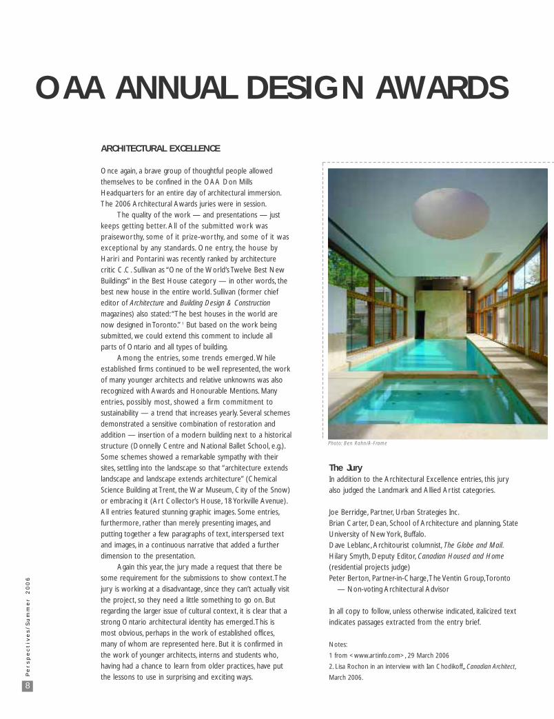
RESIDENTIAL A — Single-family residences
Of the eighteen entries in this category, most were city homes, but the jury also reviewed a sprinkling of country homes, a suburban home andthree warehouse conversions.
The jury noted that several submissions neglected to include even the most basic information about neighbourhood context or location.Dave Leblanc put it this way: “I’d like to see buildings on either side. How does this contemporary house annoy or not annoy the neighbours?”
RESIDENTIAL A: AWARD of EXCELLENCEArt Collectors’ Residence,Toronto— Hariri Pontarini Architects
This strikingly beautiful building — a tranquil composition of bold forms, flowing light-filled space, subdued colours and rich tactile materials —won the unanimous approval of the jurors.The material selection seems flawless.
“The external treatment of the house explores the finely honed language of natural materials: Algonquin limestone, copper detailing and awnings,rift-cut oak and teak windows, juxtaposed with cascading fountains filled with river rocks and plant life — evoking a sense of permanence, nature and timelessness.”
“Utilizing a consistent palette of white plaster, French limestone and dark walnut flooring, the interior provides an ideal backdrop for the clients’vibrant art collection. Spanning two floors, the art gallery is charged with diffused light from clerestory windows and skylights to simultaneously illuminate and protect the art within.”
“By incorporating its rich programme,” one juror noted, “the project is a hybrid of house, private space and art gallery.”
Photo: Steven Evans
10
Pe
rs
pe
ct
ive
s/
Su
mm
er
2
00
6
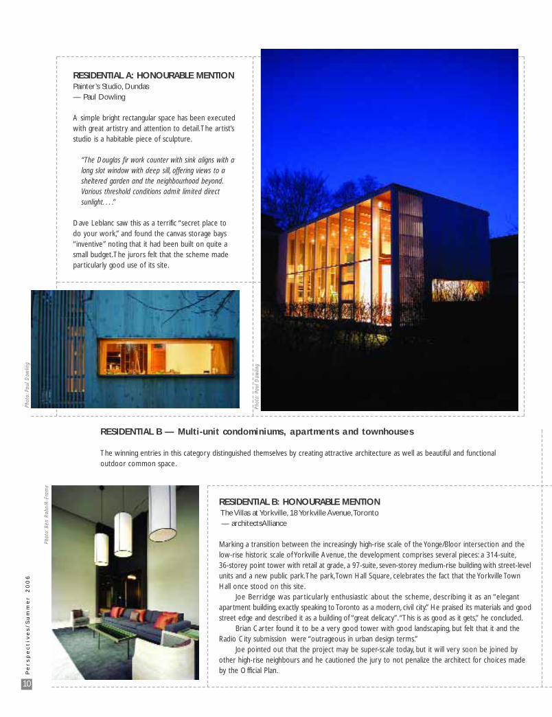
RESIDENTIAL A: HONOURABLE MENTION Painter’s Studio, Dundas— Paul Dowling
A simple bright rectangular space has been executedwith great artistry and attention to detail.The artist’sstudio is a habitable piece of sculpture.
“The Douglas fir work counter with sink aligns with a long slot window with deep sill, offering views to a sheltered garden and the neighbourhood beyond.Various threshold conditions admit limited direct sunlight. . . .”
Dave Leblanc saw this as a terrific “secret place todo your work,” and found the canvas storage bays“inventive” noting that it had been built on quite asmall budget.The jurors felt that the scheme madeparticularly good use of its site.
RESIDENTIAL B — Multi-unit condominiums, apartments and townhouses
The winning entries in this category distinguished themselves by creating attractive architecture as well as beautiful and functionaloutdoor common space.
RESIDENTIAL B: HONOURABLE MENTION The Villas at Yorkville, 18 Yorkville Avenue,Toronto— architectsAlliance
Marking a transition between the increasingly high-rise scale of the Yonge/Bloor intersection and thelow-rise historic scale of Yorkville Avenue, the development comprises several pieces: a 314-suite,36-storey point tower with retail at grade, a 97-suite, seven-storey medium-rise building with street-levelunits and a new public park.The park,Town Hall Square, celebrates the fact that the Yorkville TownHall once stood on this site.
Joe Berridge was par ticularly enthusiastic about the scheme, describing it as an “elegantapartment building, exactly speaking to Toronto as a modern, civil city.” He praised its materials and goodstreet edge and described it as a building of “great delicacy”. “This is as good as it gets,” he concluded.
Brian Carter found it to be a very good tower with good landscaping, but felt that it and theRadio City submission were “outrageous in urban design terms.”
Joe pointed out that the project may be super-scale today, but it will very soon be joined byother high-rise neighbours and he cautioned the jury to not penalize the architect for choices madeby the Official Plan.
Phot
o:Pa
ul D
owlin
g
Phot
o:Pa
ul D
owlin
g
Phot
o:B
en R
ahn/
A-F
ram
e

11
Pe
rs
pe
ct
ive
s/
Su
mm
er
2
00
6
RESIDENTIAL B: AWARD of EXCELLENCERichmond Road Affordable Housing, Ottawa — James A. Colizza Architect Inc.
An exciting three-dimensional composition of colourand texture surrounds an interior courtyard, whose“space is animated by a collage of fences, canopiesand screens set against a backdrop of white andgalvalume siding.”
“A modern affordable housing development comprising seven townhouses, fourteen stacked duplexes, two accessible units, two raised lofts and a common laundry room.
“The simple yet rich materials are used as canvas on which shadow and light become the paint.”
Joe Berridge commended the spare use of materials— charming and evidently devoid of the “meanness”that we are conditioned to expect from affordablehousing.
Dave Leblanc found this a nice marriage of oldand new and commended the new approach toaffordable housing that combines both street sitingand an internal courtyard. He described the massingas “wonderful”.
Brian Carter praised the project for “not lookinglike an affordable housing project”.
Peter Berton characterized it as “fresh, newand friendly”.
Phot
o:M
artin
Lip
man
Ph
oto:
Mar
tin L
ipm
an
Photo: Ben Rahn/A-Frame
12
Pe
rs
pe
ct
ive
s/
Su
mm
er
2
00
6
INSTITUTIONAL B — Schools, churches, hospitals, long-term care facilities— Over $10 million
Both institutional categories attracted some spectacular entries. In the words of one juror, “Howgood can we all feel about our country investing this amount of money in educational buildings.”
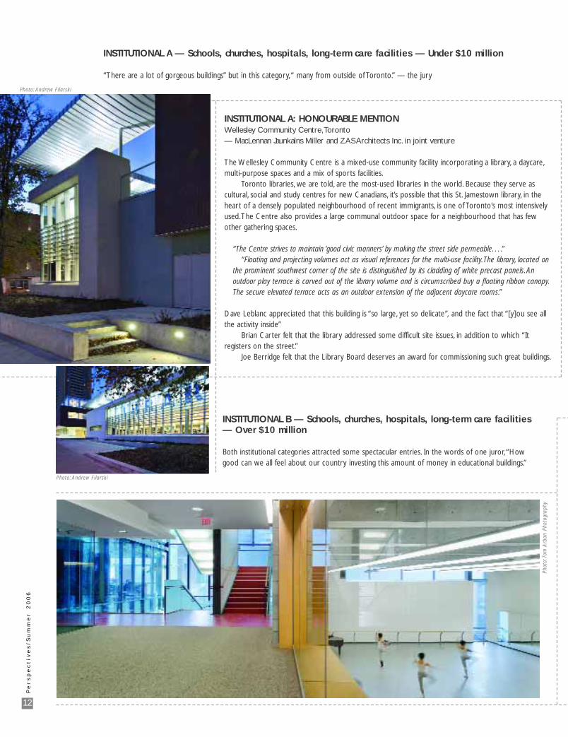
INSTITUTIONAL A: HONOURABLE MENTION Wellesley Community Centre,Toronto— MacLennan Jaunkalns Miller and ZAS Architects Inc. in joint venture
The Wellesley Community Centre is a mixed-use community facility incorporating a library, a daycare,multi-purpose spaces and a mix of sports facilities.
Toronto libraries, we are told, are the most-used libraries in the world. Because they serve as cultural, social and study centres for new Canadians, it’s possible that this St. Jamestown library, in theheart of a densely populated neighbourhood of recent immigrants, is one of Toronto’s most intensivelyused.The Centre also provides a large communal outdoor space for a neighbourhood that has fewother gathering spaces.
“The Centre strives to maintain ‘good civic manners’ by making the street side permeable. . . .”“Floating and projecting volumes act as visual references for the multi-use facility.The library, located on
the prominent southwest corner of the site is distinguished by its cladding of white precast panels. An outdoor play terrace is carved out of the library volume and is circumscribed buy a floating ribbon canopy.The secure elevated terrace acts as an outdoor extension of the adjacent daycare rooms.”
Dave Leblanc appreciated that this building is “so large, yet so delicate”, and the fact that “[y]ou see allthe activity inside”
Brian Carter felt that the library addressed some difficult site issues, in addition to which “It registers on the street.”
Joe Berridge felt that the Library Board deserves an award for commissioning such great buildings.
INSTITUTIONAL A — Schools, churches, hospitals, long-term care facilities — Under $10 million
“There are a lot of gorgeous buildings” but in this category, “ many from outside of Toronto.” — the jury
Photo: Andrew Filarski
Photo: Andrew Filarski
Phot
o:To
m A
rban
Pho
togr
aphy
13
Pe
rs
pe
ct
ive
s/
Su
mm
er
2
00
6
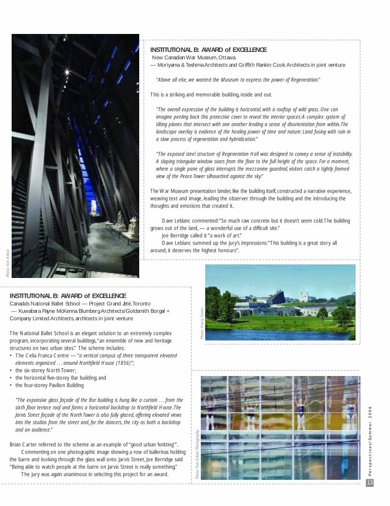
INSTITUTIONAL B: AWARD of EXCELLENCENew Canadian War Museum, Ottawa
— Moriyama & Teshima Architects and Griffith Rankin Cook Architects in joint venture
“Above all else, we wanted the Museum to express the power of Regeneration.”
This is a striking and memorable building, inside and out.
“The overall expression of the building is horizontal, with a rooftop of wild grass. One can imagine peeling back this protective cover to reveal the interior spaces: A complex system of tilting planes that intersect with one another lending a sense of disorientation from within.The landscape overlay is evidence of the healing power of time and nature: Land fusing with ruin in a slow process of regeneration and hybridization.”
“The exposed steel structure of Regeneration Hall was designed to convey a sense of instability.A sloping triangular window soars from the floor to the full height of the space. For a moment,where a single pane of glass interrupts the mezzanine guardrail, visitors catch a tightly framed view of the Peace Tower silhouetted against the sky.”
The War Museum presentation binder, like the building itself, constructed a narrative experience,weaving text and image, leading the observer through the building and the introducing thethoughts and emotions that created it.
Dave Leblanc commented:“So much raw concrete but it doesn’t seem cold.The buildinggrows out of the land, — a wonderful use of a difficult site.”
Joe Berridge called it “a work of art.”Dave Leblanc summed up the jury’s impressions: “This building is a great story all
around, it deserves the highest honours”.
INSTITUTIONAL B: AWARD of EXCELLENCECanada’s National Ballet School — Project Grand Jeté,Toronto— Kuwabara Payne McKenna Blumberg Architects/Goldsmith Borgal +
Company Limited Architects, architects in joint venture
The Natioinal Ballet School is an elegant solution to an extremely complex program, incorporating several buildings, “an ensemble of new and heritage structures on two urban sites.” The scheme includes:• The Celia Franca Centre — “a vertical campus of three transparent elevated
elements organized . . . around Northfield House (1856)”;• the six-storey North Tower;• the horizontal five-storey Bar building; and• the four-storey Pavilion Building
“The expansive glass façade of the Bar building is hung like a curtain . . . from the sixth floor terrace roof and forms a horizontal backdrop to Northfield House.The Jarvis Street façade of the North Tower is also fully glazed, offering elevated views into the studios from the street and, for the dancers, the city as both a backdrop and an audience.”
Brian Carter referred to the scheme as an example of “good urban ‘knitting’”.Commenting on one photographic image showing a row of ballerinas holding
the barre and looking through the glass wall onto Jarvis Street, Joe Berridge said“Being able to watch people at the barre on Jarvis Street is really something.”
The jury was again unanimous in selecting this project for an award.
Phot
o:To
m A
rban
Phot
o:H
arry
Fos
ter
Phot
o:To
m A
rban
Pho
togr
aphy
14
Pe
rs
pe
ct
ive
s/
Su
mm
er
2
00
6
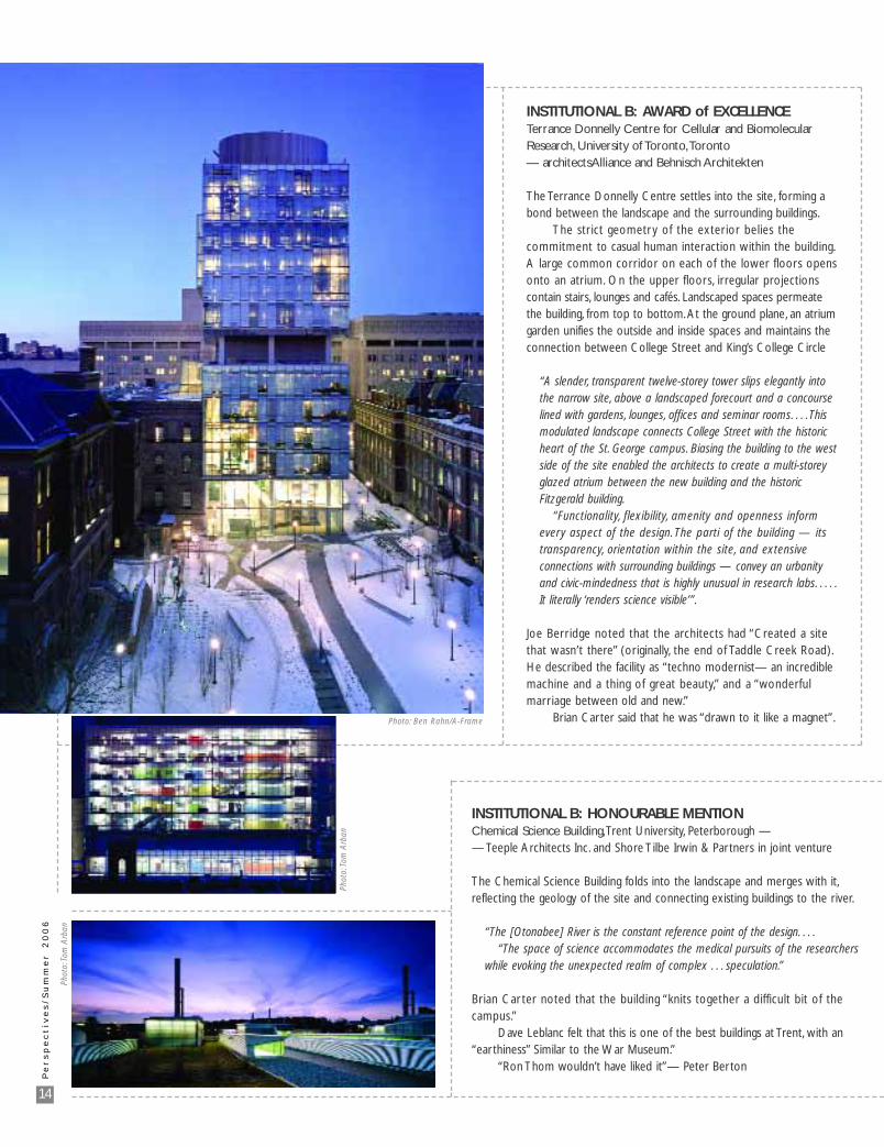
INSTITUTIONAL B: AWARD of EXCELLENCETerrance Donnelly Centre for Cellular and BiomolecularResearch, University of Toronto,Toronto — architectsAlliance and Behnisch Architekten
The Terrance Donnelly Centre settles into the site, forming abond between the landscape and the surrounding buildings.
The strict geometry of the exterior belies the commitment to casual human interaction within the building.A large common corridor on each of the lower floors opensonto an atrium. On the upper floors, irregular projectionscontain stairs, lounges and cafés. Landscaped spaces permeatethe building, from top to bottom. At the ground plane, an atriumgarden unifies the outside and inside spaces and maintains theconnection between College Street and King’s College Circle
“A slender, transparent twelve-storey tower slips elegantly into the narrow site, above a landscaped forecourt and a concourse lined with gardens, lounges, offices and seminar rooms. . . . This modulated landscape connects College Street with the historic heart of the St. George campus. Biasing the building to the west side of the site enabled the architects to create a multi-storey glazed atrium between the new building and the historic Fitzgerald building.
“Functionality, flexibility, amenity and openness inform every aspect of the design. The parti of the building — its transparency, orientation within the site, and extensive connections with surrounding buildings — convey an urbanity and civic-mindedness that is highly unusual in research labs. . . . .It literally ‘renders science visible’”.
Joe Berridge noted that the architects had “Created a sitethat wasn’t there” (originally, the end of Taddle Creek Road).He described the facility as “techno modernist— an incrediblemachine and a thing of great beauty,” and a “wonderful marriage between old and new.”
Brian Carter said that he was “drawn to it like a magnet”.
INSTITUTIONAL B: HONOURABLE MENTIONChemical Science Building,Trent University, Peterborough — — Teeple Architects Inc. and Shore Tilbe Irwin & Partners in joint venture
The Chemical Science Building folds into the landscape and merges with it,reflecting the geology of the site and connecting existing buildings to the river.
“The [Otonabee] River is the constant reference point of the design. . . .“The space of science accommodates the medical pursuits of the researchers
while evoking the unexpected realm of complex . . . speculation.”
Brian Carter noted that the building “knits together a difficult bit of thecampus.”
Dave Leblanc felt that this is one of the best buildings at Trent, with an“earthiness” Similar to the War Museum.”
“Ron Thom wouldn’t have liked it”— Peter Berton
Photo: Ben Rahn/A-Frame
Phot
o:To
m A
rban
Phot
o:To
m A
rban
15
COMMERCIAL A — Office buildings, retail, recreational and entertainment facilities — Under $5 million
No awards were made in this category
COMMERCIAL B — Office buildings, retail, recreational and entertainment facilities — Over $5 million
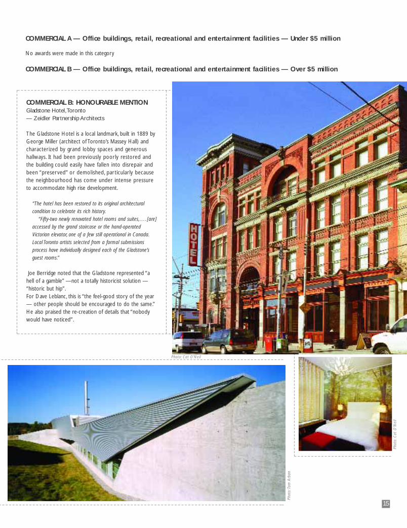
COMMERCIAL B: HONOURABLE MENTION Gladstone Hotel,Toronto— Zeidler Partnership Architects
The Gladstone Hotel is a local landmark, built in 1889 byGeorge Miller (architect of Toronto’s Massey Hall) andcharacterized by grand lobby spaces and generoushallways. It had been previously poorly restored andthe building could easily have fallen into disrepair andbeen “preserved” or demolished, par ticularly becausethe neighbourhood has come under intense pressureto accommodate high rise development.
“The hotel has been restored to its original architectural
condition to celebrate its rich history.
“Fifty-two newly renovated hotel rooms and suites, . . . [are]
accessed by the grand staircase or the hand-operated
Victorian elevator, one of a few still operational in Canada.
Local Toronto artists selected from a formal submissions
process have individually designed each of the Gladstone’s
guest rooms.”
Joe Berridge noted that the Gladstone represented “ahell of a gamble” —not a totally historicist solution —“historic but hip”.For Dave Leblanc, this is “the feel-good story of the year— other people should be encouraged to do the same.”He also praised the re-creation of details that “nobodywould have noticed”.
Phot
o:C
at O
’Nei
l
Photo: Cat O’Neil
Phot
o:To
m A
rban
16
INTERN/STUDENT/RETIRED MEMBER PROJECTS: AWARD of EXCELLENCEKleinburg Pool Pavilion
(Toto Residence), Kleinburg
— Michael Amantea, intern architect
The building programme combines
interior spaces (a kitchen, change
rooms, washroom and showers) with
exterior functions (dining area and fire
pit). The solution is light and rich,
elegant, peaceful and finely detailed.
“The solution was to provide an envelope
that would provide separation without
containment. . . a nested retreat resting
between the residence to the north and
a forested landscape to the south.”
The jury felt that this entry was far
superior the other entries in this
category and to many entries in the
residential category.
Dave Leblanc praised the “singularity
of vision.”
Joe Berridge described the solution
as “very peaceful”
INTERN/STUDENT/RETIRED MEMBER PROJECTS — Carried out by Intern Architects, Student Associates,Retired, Life– or Honorary Members (Not Through an Architectural Practice)
Phot
o:To
m A
rban
Photo: Tom Arban
17
Pe
rs
pe
ct
ive
s/
Su
mm
er
2
00
6
IDEAS & PRESENTATIONS
In the years since this category was introduced, the quality of presentations has steadily
improved.We can give much of the credit to the widespread use of digital technology, including
digital photography, typography, page-making programs and printing. But a lot of improvement
can be attributed to an increased emphasis on marketing and presentation. On the downside,
one juror noted that some images are sometimes so “PhotoShopped” and fussed over that
they lose their credibility. On balance, the rule may be: better too much
than too little, but be careful.
In addition, several other trends were noted in this year’s entries:
• Concepts were very strong
• Community-related projects appear to represent a trend
• Many projects dealt with themes of Respect and Human History
• Bright colour, once avoided by architects, is making its presence felt.
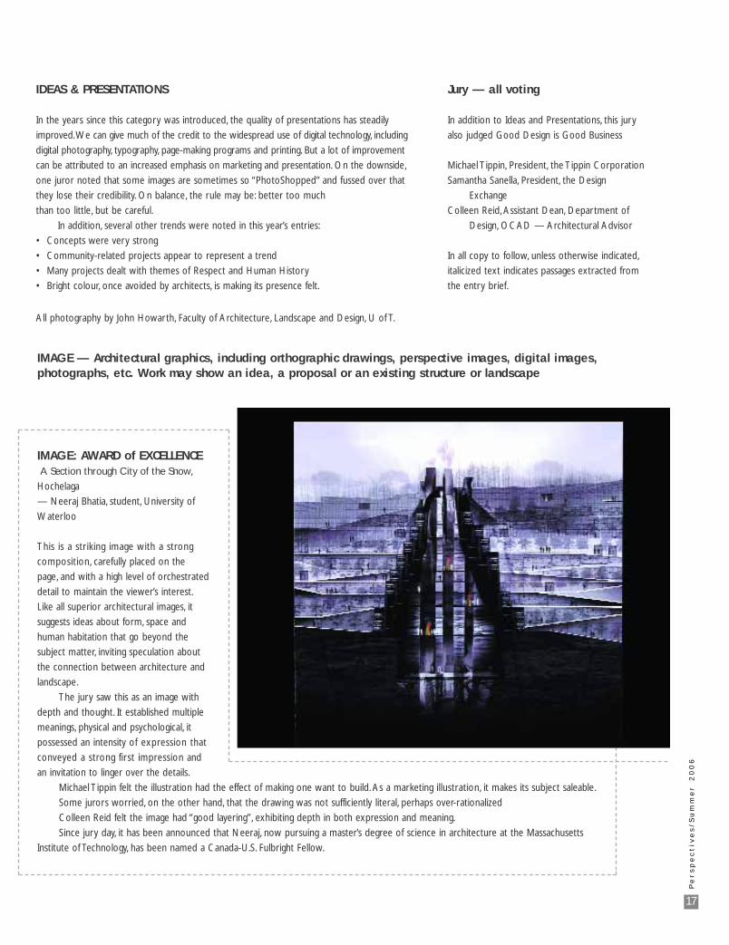
IMAGE: AWARD of EXCELLENCEA Section through City of the Snow,
Hochelaga
— Neeraj Bhatia, student, University of
Waterloo
This is a striking image with a strong
composition, carefully placed on the
page, and with a high level of orchestrated
detail to maintain the viewer’s interest.
Like all superior architectural images, it
suggests ideas about form, space and
human habitation that go beyond the
subject matter, inviting speculation about
the connection between architecture and
landscape.
The jury saw this as an image with
depth and thought. It established multiple
meanings, physical and psychological, it
possessed an intensity of expression that
conveyed a strong first impression and
an invitation to linger over the details.
Michael Tippin felt the illustration had the effect of making one want to build. As a marketing illustration, it makes its subject saleable.
Some jurors worried, on the other hand, that the drawing was not sufficiently literal, perhaps over-rationalized
Colleen Reid felt the image had “good layering”, exhibiting depth in both expression and meaning.
Since jury day, it has been announced that Neeraj, now pursuing a master’s degree of science in architecture at the Massachusetts
Institute of Technology, has been named a Canada-U.S. Fulbright Fellow.
IMAGE — Architectural graphics, including orthographic drawings, perspective images, digital images, photographs, etc. Work may show an idea, a proposal or an existing structure or landscape
Jury — all voting
In addition to Ideas and Presentations, this jury
also judged Good Design is Good Business
Michael Tippin, President, the Tippin Corporation
Samantha Sanella, President, the Design
Exchange
Colleen Reid, Assistant Dean, Department of
Design, OCAD — Architectural Advisor
In all copy to follow, unless otherwise indicated,
italicized text indicates passages extracted from
the entry brief.
All photography by John Howarth, Faculty of Architecture, Landscape and Design, U of T.
18
Pe
rs
pe
ct
ive
s/
Su
mm
er
2
00
6
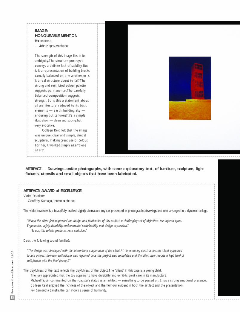
IMAGE: HONOURABLE MENTION Barceloneta
— John Kapov,Architect
The strength of this image lies in its
ambiguity. The structure portrayed
conveys a definite lack of stability. But
is it a representation of building blocks
casually balanced on one another, or is
it a real structure about to fail? The
strong and restricted colour palette
suggests permanence. The carefully
balanced composition suggests
strength. So is this a statement about
all architecture, reduced to its basic
elements — ear th, building, sky —
enduring but tenuous? It’s a simple
illustration — clean and strong, but
very evocative.
Colleen Reid felt that the image
was unique, clear and simple, almost
sculptural, making great use of colour.
For her, it worked simply as a “piece
of ar t”.
ARTIFACT: AWARD of EXCELLENCE Violet Roadster
— Geoffrey Kumagai, intern architect
The violet roadster is a beautifully crafted, slightly abstracted toy car, presented in photographs, drawings and text arranged in a dynamic collage.
“When the client first requested the design and fabrication of this artifact, a challenging set of objectives was agreed upon.
Ergonomics, safety, durability, environmental sustainability and design expression.”
“In use, this vehicle produces zero emissions”
Does the following sound familiar?:
“The design was developed with the intermittent cooperation of the client. At times during construction, the client appeared
to lose interest however enthusiasm was regained once the project was completed and the client now reports a high level of
satisfaction with the final product.”
The playfulness of the text reflects the playfulness of the object.The “client” in this case is a young child.
The jury appreciated that the toy appears to have durability and exhibits great care in its manufacture.
Michael Tippin commented on the roadster’s status as an artifact — something to be passed on. It has a strong emotional presence.
Colleen Reid enjoyed the richness of the object and the humour evident in both the artifact and the presentation.
For Samantha Sanella, the car shows a sense of humanity.
ARTIFACT — Drawings and/or photographs, with some explanatory text, of furniture, sculpture, lightfixtures, utensils and small objects that have been fabricated.
19
Pe
rs
pe
ct
ive
s/
Su
mm
er
2
00
6
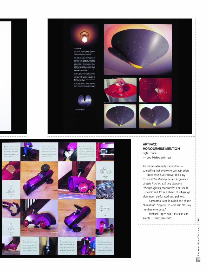
ARTIFACT: HONOURABLE MENTIONLight Shade
— Leo Mieles, architect
This is an extremely useful item —
something that everyone can appreciate
— inexpensive, attractive and easy
to install: “a shading device suspended
directly from an existing standard
[cheap] lighting receptacle.” The shade
is fashioned from a sheet of 24-gauge
aluminum, perforated and painted.
Samantha Sanella called the shade
“beautiful”, “ingenious” and said “It’s my
number one vote.”
Michael Tippen said, “it’s clean and
simple . . . very practical.”
20
Pe
rs
pe
ct
ive
s/
Su
mm
er
2
00
6
CONCEPT — The presentation of theoretical schemes, showing objects, buildings, landscapes orplanning proposals. Submissions may be client-commissioned, self-commissioned, entries in a competition, or purely speculative.
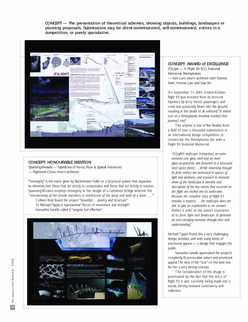
CONCEPT: HONOURABLE MENTION Spanning Weaves — Tapestries of Force, Flow & Spatial Networks — Raymond Chow, intern architect
“Tensegrity” is the name given by Buckminster Fuller to a structural system that separatesits elements into those that act strictly in compression and those that act strictly in tension.Spanning Weaves employs tensegrity in the design of a cantilever bridge wherein the“interweaving of the tensile members is reminiscent of the warp and weft of a loom. . . . “
Colleen Reid found the project “beautiful . . . poetry and structure”To Michael Tippin, it represented “forces of movement and strength”Samantha Sanella called it “singular but effective”.
CONCEPT: AWARD of EXCELLENCE(F)Light — A Flight 93 9/11 NationalMemorial, Pennsylvania— Ken Lum, intern architect with DennisFanti,Yvonne Lam and Ivan Ilic
On September 11, 2001, United Airlinesflight 93 was wrested from its terroristhijackers by forty heroic passengers andcrew and purposely flown into the ground,resulting in the death of all onboard: “A violentscar on a Pennsylvania meadow marked theirjourney’s end.”
This scheme is one of five finalists from a field of over a thousand submissions in an international design competition to consecrate the Pennsylvania site with a Flight 93 National Memorial.
“(F)Light’s roofscape [comprises] an outer textured cast glass shell and an inner glass-on-quartzite skin fastened to a structural steel space frame. . . .While traversing through its form, visitors are immersed in spaces of light and darkness, and exposed to dramatic views of the landscape. A timeline and description of the key events that occurred on the flight are etched into its under-skin.Because the complete story of Flight 93 remains a mystery . . . the roofscape does not aim to give an explanation or an answer.Rather, it relies on the visitor’s experience of its form, light and landscape to generate an ever-changing narrative through time and understanding.”
Michael Tippin found this a very challengingdesign, sensitive, and with many levels of emotional appeal — a design that engages thepublic.
Samantha Sanella appreciated the project’scomplexity, its provocative nature and emotionalappeal.The idea of the “scar” on the land wasfor her a very strong concept.
The consideration of this image ispunctuated by the fact that the story offlight 93 is also currently being made into amovie, stirring renewed controversy andreflection.
21
Pe
rs
pe
ct
ive
s/
Su
mm
er
2
00
6
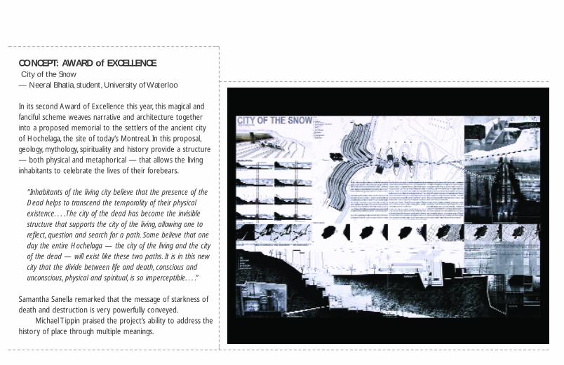
CONCEPT: AWARD of EXCELLENCECity of the Snow
— Neeral Bhatia, student, University of Waterloo
In its second Award of Excellence this year, this magical andfanciful scheme weaves narrative and architecture togetherinto a proposed memorial to the settlers of the ancient cityof Hochelaga, the site of today’s Montreal. In this proposal,geology, mythology, spirituality and history provide a structure— both physical and metaphorical — that allows the livinginhabitants to celebrate the lives of their forebears.
“Inhabitants of the living city believe that the presence of the Dead helps to transcend the temporality of their physical existence. . . . The city of the dead has become the invisible structure that supports the city of the living, allowing one to reflect, question and search for a path. Some believe that one day the entire Hochelaga — the city of the living and the city of the dead — will exist like these two paths. It is in this new city that the divide between life and death, conscious and unconscious, physical and spiritual, is so imperceptible. . . .”
Samantha Sanella remarked that the message of starkness ofdeath and destruction is very powerfully conveyed.
Michael Tippin praised the project’s ability to address thehistory of place through multiple meanings.
22
Pe
rs
pe
ct
ive
s/
Su
mm
er
2
00
6
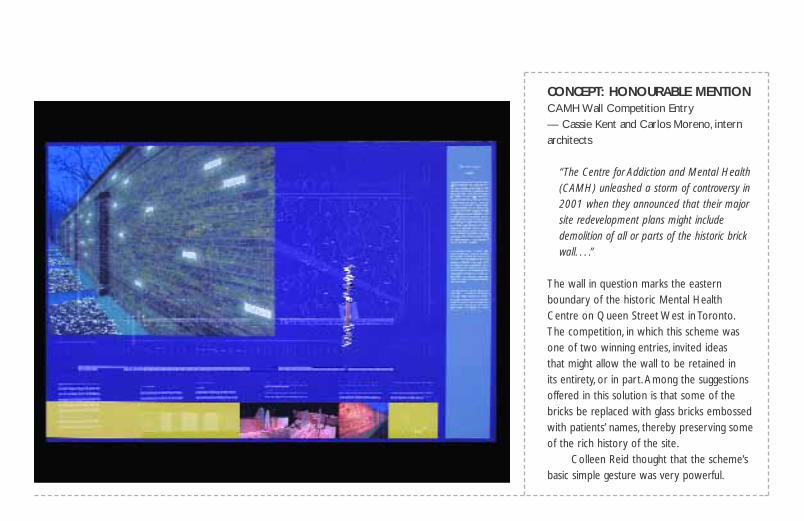
CONCEPT: HONOURABLE MENTION CAMH Wall Competition Entry— Cassie Kent and Carlos Moreno, intern architects
“The Centre for Addiction and Mental Health (CAMH) unleashed a storm of controversy in 2001 when they announced that their major site redevelopment plans might include demolition of all or parts of the historic brick wall. . . .”
The wall in question marks the easternboundary of the historic Mental HealthCentre on Queen Street West in Toronto.The competition, in which this scheme wasone of two winning entries, invited ideas that might allow the wall to be retained in its entirety, or in part. Among the suggestionsoffered in this solution is that some of thebricks be replaced with glass bricks embossedwith patients’ names, thereby preserving someof the rich history of the site.
Colleen Reid thought that the scheme’sbasic simple gesture was very powerful.
Bernie McGarva of Aird & Berlis LLP has been takingcare of details for the Architectural profession formore than 20 years.
Choose Experience. Choose A&B.
Bernie McGarvaCertified Specialist in Construction LawE [email protected] 416.865.7765
DE
TA
IL
S
BCE Place, 181 Bay St., Suite 1800, Box 754 Toronto, ON M5J 2T9 www.airdberlis.com
SOUND ISOLATION CLIPThe RSIC-1 Sound Isolation Clip is a compact rubber /steel isolator that holds standard steel furring (hattrack) It is designed to break the transfer of bothstructural and airborne sound. It can be used in virtually any wall or ceiling assembly that uses drywall.Performance starts at a 20 point STC increase.
Superior STC Ratings for Walls & Ceilings
AcoustiGuard – WILREP LTD.Tel. (905)625-8944
website: www.wilrep.comemail: [email protected]
• Architectural acoustics• Noise and vibration measurement and control• Environmental acoustics
Tel: 905-764-5223 Fax: 905-764-6813www.valcoustics.com [email protected]
23
Pe
rs
pe
ct
ive
s/
Su
mm
er
2
00
6
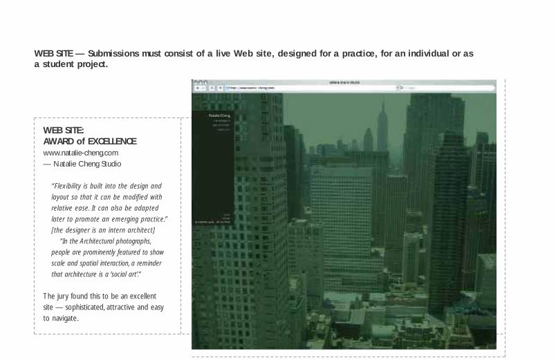
WEB SITE — Submissions must consist of a live Web site, designed for a practice, for an individual or asa student project.
WEB SITE: AWARD of EXCELLENCEwww.natalie-cheng.com — Natalie Cheng Studio
“Flexibility is built into the design and
layout so that it can be modified with
relative ease. It can also be adapted
later to promote an emerging practice.”
[the designer is an intern architect]
“In the Architectural photographs,
people are prominently featured to show
scale and spatial interaction, a reminder
that architecture is a ‘social art’.”
The jury found this to be an excellent site — sophisticated, attractive and easy to navigate.
ArchitecturalPainting Specification Manual
Services
308–211 Consumers Road, Willowdale, ON M2J 4G8Tel: (416) 498-5556, (800) 461-3630
Fax: (416) 498-6757
DO YOU NEED BROCHURES OR FLYERS DESIGNED?Canadian Association Publishers is now offering the servicesof our in-house design department to assist you with the production of your advertising literature - from start to finish.
From designing the artwork for your approval to making thearrangements for printing, we will supplyyou with a finished product ready to bedistributed. For quotes and more detailsplease contact us:T. 416-955-1550F. 416-955-1391E. [email protected]

24
Pe
rs
pe
ct
ive
s/
Su
mm
er
2
00
6
WEB SITE: HONOURABLE MENTION www.andritsosarchitect.com
— Andritsos Architect International
The jury commented that this site was very dynamic, entertainingand certainly reflects clearly the work the firm does.
WEB SITE: HONOURABLE MENTION www.kirkorarchitects.com — Carlos E.Antunes for Kirkor Architects and Planners
This site uses Black-grey-red tones and standard elements for unity.As well as high-tech imagery, hand-done illustrations and sketchesare also presented.
The jury found the site perhaps a little too subdued, but aclear, well laid out and a good representation of a corporate entity.
25
Pe
rs
pe
ct
ive
s/
Su
mm
er
2
00
6
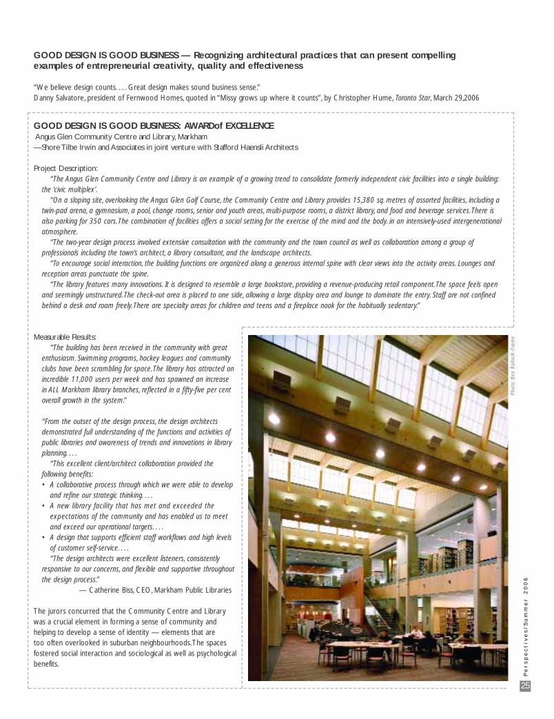
Measurable Results:“The building has been received in the community with great
enthusiasm. Swimming programs, hockey leagues and community clubs have been scrambling for space.The library has attracted an incredible 11,000 users per week and has spawned an increase in ALL Markham library branches, reflected in a fifty-five per cent overall growth in the system.”
“From the outset of the design process, the design architects demonstrated full understanding of the functions and activities of public libraries and awareness of trends and innovations in library planning. . . .
“This excellent client/architect collaboration provided the following benefits:• A collaborative process through which we were able to develop
and refine our strategic thinking. . . .• A new library facility that has met and exceeded the
expectations of the community and has enabled us to meet and exceed our operational targets. . . .
• A design that supports efficient staff workflows and high levels of customer self-service. . . .“The design architects were excellent listeners, consistently
responsive to our concerns, and flexible and supportive throughout the design process.”
— Catherine Biss, CEO, Markham Public Libraries
The jurors concurred that the Community Centre and Librarywas a crucial element in forming a sense of community and helping to develop a sense of identity — elements that are too often overlooked in suburban neighbourhoods.The spaces fostered social interaction and sociological as well as psychologicalbenefits.
GOOD DESIGN IS GOOD BUSINESS: AWARDof EXCELLENCEAngus Glen Community Centre and Library, Markham —Shore Tilbe Irwin and Associates in joint venture with Stafford Haensli Architects
Project Description:“The Angus Glen Community Centre and Library is an example of a growing trend to consolidate formerly independent civic facilities into a single building:
the ‘civic multiplex’.“On a sloping site, overlooking the Angus Glen Golf Course, the Community Centre and Library provides 15,380 sq. metres of assorted facilities, including a
twin-pad arena, a gymnasium, a pool, change rooms, senior and youth areas, multi-purpose rooms, a district library, and food and beverage services.There is also parking for 350 cars.The combination of facilities offers a social setting for the exercise of the mind and the body. in an intensively-used intergenerational atmosphere.
“The two-year design process involved extensive consultation with the community and the town council as well as collaboration among a group of professionals including the town’s architect, a library consultant, and the landscape architects.
“To encourage social interaction, the building functions are organized along a generous internal spine with clear views into the activity areas. Lounges and reception areas punctuate the spine.
“The library features many innovations. It is designed to resemble a large bookstore, providing a revenue-producing retail component.The space feels open and seemingly unstructured.The check-out area is placed to one side, allowing a large display area and lounge to dominate the entry. Staff are not confined behind a desk and roam freely.There are specialty areas for children and teens and a fireplace nook for the habitually sedentary.”
GOOD DESIGN IS GOOD BUSINESS — Recognizing architectural practices that can present compelling examples of entrepreneurial creativity, quality and effectiveness
“We believe design counts. . . . Great design makes sound business sense.”Danny Salvatore, president of Fernwood Homes, quoted in “Missy grows up where it counts”, by Christopher Hume, Toronto Star, March 29,2006
Phot
o:B
en R
ahn/
A-F
ram
e
26
Pe
rs
pe
ct
ive
s/
Su
mm
er
2
00
6
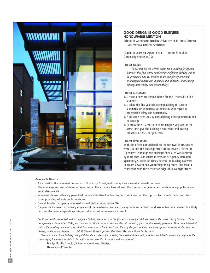
GOOD DESIGN IS GOOD BUSINESS: HONOURABLE MENTION School of Continuing Studies, University of Toronto,Toronto — Moriyama & Teshima Architects
“Open to Learning, Open to You” — motto, School ofContinuing Studies (SCS)
Project Scope:“To accomplish the client’s vision for ‘a building for lifelong
learners’, this four-storey nondescript inefficient building was to be preserved and yet needed to be completely reworked,including: full renovation, upgrades and additions, landscaping,lighting, accessibility and sustainability.”
Project Objectives:1. Create a new on-campus home for the (“nomadic”) SCS
students2. Update the fifty-year-old existing building to current
standards for administrative functions with regard to accessibility, safety and functionality.
3. Add some new uses by consolidating existing functions and expanding.
4. Express the SCS motto in some tangible way and, at the same time, give the building a noticeable and inviting presence on St. George Street.
Project description:With the offices consolidated on the top two floors, spaceswere cut into the building’s structure to create a “Sense ofOpenness”. Although the building’s floor area was reduced by more than 300 square metres, its occupancy increased significantly. A series of planes extend the building eastward to create a warm and welcoming “living room” and form aconnection with the pedestrian edge of St. George Street.
Measurable Results• As a result of the increased presence on St. George Street, walk-in enquiries showed a dramatic increase.• The openness and consolidation achieved within the structure have allowed the Centre to acquire a new function as a popular venue
for student events.• Increased planning efficiency permitted the administrative functions to be consolidated on the top two floors, with the bottom two
floors providing valuable public functions.• Overall building occupancy increased six-fold (240 as opposed to 40).• Despite the increased occupancy, upgrades of the mechanical and electrical systems and exterior wall assemblies have resulted in a thirty
per cent decrease in operating costs, as well as a vast improvement in comfort.
“With our totally renovated and reconfigured building, we now have the first ever centre for adult learners at the University of Toronto. . . . Since the opening in September, 2004, we continue to attract an increasing number of students , guests and university personnel.They are intrigued at first by the building, noting at times that “you now have a front door”, and then by the fact that we now have spaces in which to offer our own classes, seminars and lectures. . . . 158 St. George Street is proving that Good Design is Good for Business.
“We are proud of this building and grateful to the Architects for providing the physical design that proclaims the School’s mission and supports the University of Toronto’s mandate to be active in the daily life of our city and our citizens.”
Marilyn Booth, Director, School of Continuing Studies,University of Toronto
Phot
o:R
icha
rd J
ohns
on
28
Pe
rs
pe
ct
ive
s/
Su
mm
er
2
00
6
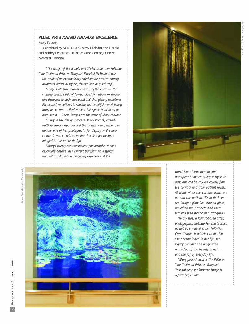
ALLIED ARTS AWARD: AWARDof EXCELLENCE Mary Pocock
— Submitted by ARK, Guela Solow-Ruda for the Harold
and Shirley Lederman Palliative Care Centre, Princess
Margaret Hospital.
“The design of the Harold and Shirley Lederman Palliative
Care Centre at Princess Margaret Hospital [in Toronto] was
the result of an extraordinary collaborative process among
architects, artists, designers, doctors and hospital staff.
“Large scale [transparent images] of the earth — the
crashing ocean, a field of flowers, cloud formations — appear
and disappear through translucent and clear glazing, sometimes
illuminated, sometimes in shadow, our beautiful planet fading
away, as we are — final images that speak to all of us, as
does death. . . . These images are the work of Mary Peacock.
“Early in the design process, Mary Pocock, already
battling cancer, approached the design team, wishing to
donate one of her photographs for display in the new
centre. It was at this point that her images became
integral to the entire design.
“Mary’s twenty-two transparent photographic images
essentially dissolve their context, transforming a typical
hospital corridor into an engaging experience of the
world. The photos appear and
disappear between multiple layers of
glass and can be enjoyed equally from
the corridor and from patient rooms.
At night, when the corridor lights are
on and the patients lie in darkness,
the images glow like stained glass,
providing the patients and their
families with peace and tranquility.
“[Mary was] a Toronto-based artist,
photographer, metalworker and teacher,
as well as a patient in the Palliative
Care Centre. In addition to all that
she accomplished in her life, her
legacy continues on as glowing
reminders of the beauty in nature
and the joy of everyday life.
“Mary passed away in the Palliative
Care Centre at Princess Margaret
Hospital near her favourite image in
September, 2004”
Phot
o:Sh
ai G
il,In
site
Pho
togr
aphy
Phot
o:Sh
ai G
il,In
site
Pho
togr
aphy
30
Pe
rs
pe
ct
ive
s/
Su
mm
er
O n t a r i o P l a c e s
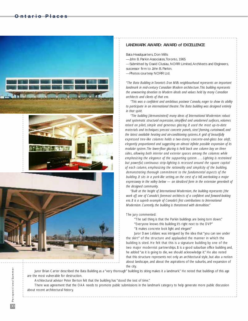
LANDMARK AWARD: AWARD of EXCELLENCE
Bata Headquarters, Don Mills—John B. Parkin Associates,Toronto, 1965—Submitted by David Clusiau, NORR Limited,Architects and Engineers,successor firm to John B. Parkin.—Photos courtesy NORR Ltd.
“The Bata Building in Toronto’s Don Mills neighbourhood represents an importantlandmark in mid-century Canadian Modern architecture.This building representsthe unwavering devotion to Modern ideals and values held by many Canadianarchitects and clients of that era.
“This was a confident and ambitious postwar Canada, eager to show its abilityto participate in an international theatre.The Bata building was designed entirelyin that spirit.
“The building [demonstrated] many ideas of International Modernism: robustand systematic structural expression, simplified and unadorned surfaces, volumesraised on piloti, simple and generous glazing. It used the most up-to-datematerials and techniques: precast concrete panels, steel framing, curtainwall, andthe latest available heating and air-conditioning systems. A grid of beautifullyexpressed tree-like columns holds a two-storey concrete-and-glass box aloft,elegantly proportioned and suggesting an almost infinite possible expansion of itsmodular system.The lower-floor glazing is held back one column bay on threesides, allowing both interior and exterior spaces among the columns whileemphasizing the elegance of the supporting system. . . . Lighting is restrainedbut powerful; continuous strip-lighting is recessed around the square capitalof each column, emphasizing the rationality and simplicity of the building,demonstrating thorough commitment to the fundamental aspects of thebuilding. It sits in a park-like setting, on the crest of a hill, overlooking a majorexpressway in the valley below — an idealized form in the extensive greenbelt ofthe designed community.
“Built at the height of International Modernism, the building represents [thework of] one of Canada’s foremost architects of a confident and forward-lookingera. It is a superb example of Canada’s first contributions to InternationalModernism. Currently, the building is threatened with demolition.”
The jury commented:“The sad thing is that the Parkin buildings are being torn down.”“Everyone knows this building; it’s right next to the DVP”“It makes concrete look light and elegant”Juror Dave Leblanc was intrigued by the idea that “you can see under
the skir t” of the structure and applauded the manner in which thebuilding is sited. He felt that this is a signature building by one of thetwo major modernist partnerships. It is a good suburban office building and,he added “as it is going to die, we should acknowledge it.” He also notedthat this structure represents not only an architectural style, but also a notionabout landscape, and about the aspirations of the suburbs, and expansion ofthe city.
Juror Brian Carter described the Bata Building as a “very thorough” building; its siting makes it a landmark.” He noted that buildings of this ageare the most vulnerable for destruction.
Architectural advisor Peter Berton felt that the building has “stood the test of time.”There was agreement that the OAA needs to promote public submissions in the landmark category to help generate more public discussion
about recent architectural history.