Embed Size (px)
Citation preview
Factsheet
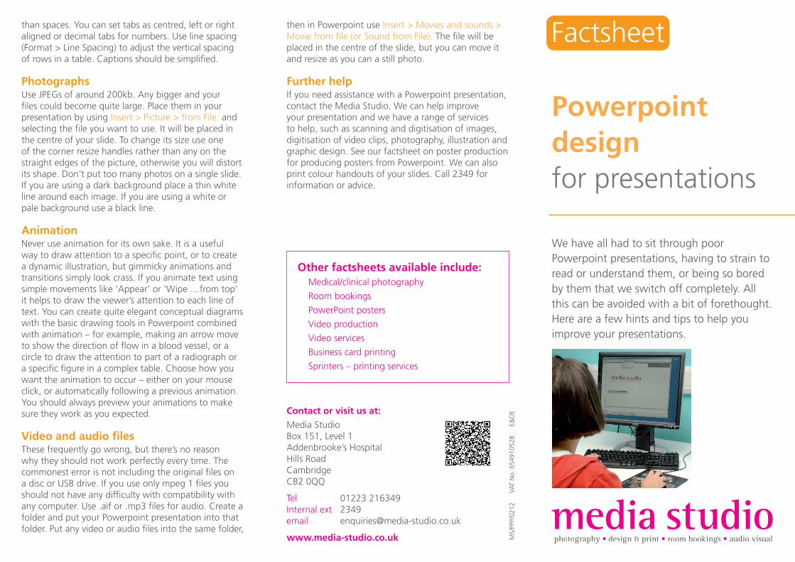
We have all had to sit through poor Powerpoint presentations, having to strain to read or understand them, or being so bored by them that we switch off completely. All this can be avoided with a bit of forethought. Here are a few hints and tips to help you improve your presentations.
Powerpointdesign for presentations
then in Powerpoint use Insert > Movies and sounds > Movie from fi le (or Sound from File). The fi le will be placed in the centre of the slide, but you can move it and resize as you can a still photo.
Further helpIf you need assistance with a Powerpoint presentation, contact the Media Studio. We can help improve your presentation and we have a range of services to help, such as scanning and digitisation of images, digitisation of video clips, photography, illustration and graphic design. See our factsheet on poster production for producing posters from Powerpoint. We can also print colour handouts of your slides. Call 2349 for information or advice.
than spaces. You can set tabs as centred, left or right aligned or decimal tabs for numbers. Use line spacing (Format > Line Spacing) to adjust the vertical spacing of rows in a table. Captions should be simplifi ed.
PhotographsUse JPEGs of around 200kb. Any bigger and your fi les could become quite large. Place them in your presentation by using Insert > Picture > from File: and selecting the fi le you want to use. It will be placed in the centre of your slide. To change its size use one of the corner resize handles rather than any on the straight edges of the picture, otherwise you will distort its shape. Don’t put too many photos on a single slide. If you are using a dark background place a thin white line around each image. If you are using a white or pale background use a black line.
AnimationNever use animation for its own sake. It is a useful way to draw attention to a specifi c point, or to create a dynamic illustration, but gimmicky animations and transitions simply look crass. If you animate text using simple movements like ‘Appear’ or ‘Wipe …from top’ it helps to draw the viewer’s attention to each line of text. You can create quite elegant conceptual diagrams with the basic drawing tools in Powerpoint combined with animation – for example, making an arrow move to show the direction of fl ow in a blood vessel, or a circle to draw the attention to part of a radiograph or a specifi c fi gure in a complex table. Choose how you want the animation to occur – either on your mouse click, or automatically following a previous animation. You should always preview your animations to make sure they work as you expected.
Video and audio fi lesThese frequently go wrong, but there’s no reason why they should not work perfectly every time. The commonest error is not including the original fi les on a disc or USB drive. If you use only mpeg 1 fi les you should not have any diffi culty with compatibility with any computer. Use .aif or .mp3 fi les for audio. Create a folder and put your Powerpoint presentation into that folder. Put any video or audio fi les into the same folder,
MS/
PPP/
0212
V
AT
No.
654
9105
28
E&
OEContact or visit us at:
Media StudioBox 151, Level 1Addenbrooke’s HospitalHills RoadCambridgeCB2 0QQ
Tel 01223 216349Internal ext 2349email [email protected]
www.media-studio.co.uk
Other factsheets available include: Medical/clinical photography
Room bookings
PowerPoint posters
Video production
Video services
Business card printing
Sprinters – printing services
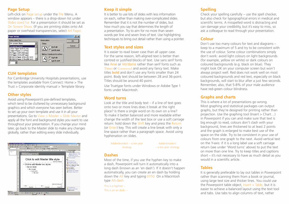
Page SetupLeft-click on Page setup under the File Menu. A window appears – there is a drop-down list under Slides sized for. For a presentation it should be set as On Screen Show. (If you are printing slides onto A4 paper or overhead transparencies, select A4 Page).
CUH templatesFor Cambridge University Hospitals presentations, use the templates available from Connect: Home > The Trust > Corporate identity manual > Template library.
Other stylesAvoid using Powerpoint’s pre-defined templates, which tend to be cluttered by unnecessary background graphics and which everyone has seen before. Better to set up your own template and use it in all your presentations. Go to View > Master > Slide Master and apply all the font and background styles you want to use throughout your presentation. If you change your mind later, go back to the Master slide to make any changes globally, rather than editing every slide individually.
Keep it simpleIt is better to use lots of slides with less information on each, rather than making over-complicated slides. Remember that it is not the number of slides, but how much you say that determines the length of a presentation. Try to aim for no more than seven words per line and seven lines of text. Use highlighting techniques to bring out detail rather than using a pointer.
Text styles and sizesIt is easier to read lower case than all upper case. For the same reason, left-aligned text is better than centred or justified blocks of text. Use sans serif fonts like Arial or Verdana rather than serif fonts such as Times or Garamond and avoid any fancy text. Make titles bold and don’t use any fonts smaller than 24 point. Body text should be between 28 and 36-point. Titles should be around 40 point.
Use Truetype fonts under Windows or Adobe Type 1 fonts under Macintosh.
Word turnsLook at the title and body text – if a line of text goes onto two or more lines does it break at the right place? Is there a single word on its own on a line? To make it better balanced and more readable either change the width of the text box or use a soft carriage return: hold down the Shift key and press the Return (or Enter) key. This will create a line break with only a line space rather than a paragraph space. Avoid using hyphenation on slides.
Addenbrooke’s – a ten-year Addenbrooke’s strategy – a ten-year strategy
DashesMost of the time, if you use the hyphen key to make a dash, Powerpoint will turn it automatically into a long dash (known as an ‘en dash’). If it doesn’t happen automatically, you can create an en dash by holding down the Alt key and typing 0150. On a Macintosh type Alt-dash.
This is a hyphen: -
This is an en dash: –
SpellingCheck your spelling carefully – use the spell checker, but also check for typographical errors in medical and scientific terms. A misspelled word is distracting and can damage your credibility, but it’s easy to miss, so ask a colleague to read through your presentation.
ColourDon’t use too many colours for text and diagrams – keep to a maximum of 5 and try to be consistent with the use of colour. Some colour combinations simply don’t work: avoid light colours on light backgrounds (for example, yellow on white) or dark colours on coloured backgrounds (e.g. black on blue). They might look OK on your computer screen but won’t always project well. Red does not work well on most coloured backgrounds and red text, especially on black backgrounds, will start to blur after a just few seconds. Remember, also, that 5-8% of your male audience have red-green colour blindness.
Graphs and chartsThis is where a lot of presentations go wrong. Most graphing and statistical packages can output graphs, but they’re designed for printing rather than projection. Use the graphing tool (Insert > Chart…) in Powerpoint if you can and make sure that text is big enough to read, colours don’t clash with your background, lines are thickened to at least 2 points and the graph is enlarged to make best use of the space on the slide. Try to be consistent in your use of colours from one graph to the next. Avoid vertical text on the Y-axis: if it is a long label use a soft carriage return (see under ‘Word turns’ above) to put the text on more than one line. Try to keep titles and captions short – it’s not necessary to have as much detail as you would in a scientific article.
TablesIt is generally preferable to lay out tables in Powerpoint rather than scanning them from a book or journal, using large text size and thicker lines. You could use the Powerpoint table object, Insert > Table, but it is easier to achieve a balanced layout using the text tool and tabs. Use tabs to align columns of text, rather