Embed Size (px)
DESCRIPTION
photo to my freinds
Citation preview
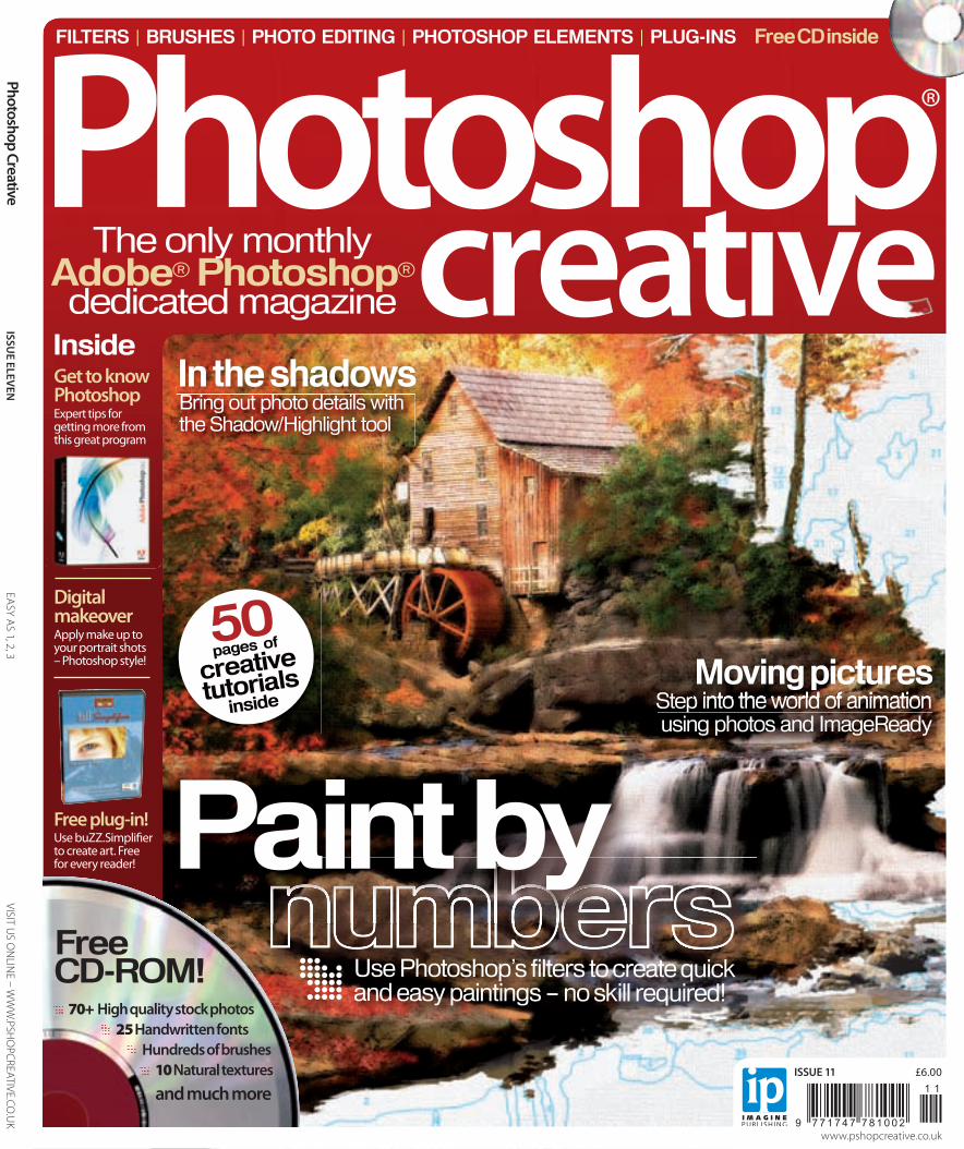
FILTERS | BRUSHES | PHOTO EDITING | PHOTOSHOP ELEMENTS | PLUG-INS
Inside
Free CD inside
®
Digital makeoverApply make up to your portrait shots – Photoshop style!
Free plug-in!Use buZZ.Simpli� er to create art. Free for every reader!
Get to know PhotoshopExpert tips for getting more from this great program
ISSUE ELEVEN
EA
SY AS 1, 2, 3 VISIT U
S ON
LINE – W
WW
.PSHO
PCREATIVE.CO.U
K
ISSUE 11 £6.00ISSN 1747-7816
9 7 7 1 7 4 7 7 8 1 0 0 2
1 1
Photoshop Creative
www.pshopcreative.co.uk
The only monthlyAdobe® Photoshop® dedicated magazine creatIve
Bring out photo details with the Shadow/Highlight tool
In the shadows
FreeCD-ROM!
70+ High quality stock photos 25 Handwritten fonts
Hundreds of brushes 10 Natural textures and much more
50pages of
creativetutorials
inside Step into the world of animation using photos and ImageReadyStep into the world of animation
Moving pictures
Paint by Use Photoshop’s filters to create quick and easy paintings – no skill required!
001-PC011-final cover.indd 1 14/6/06 14:06:42

CHECK IT OUT! | VISIT US ONLINE AT WWW.PSHOPCREATIVE.CO.UK
03PHOTOSHOP CREATIVE
welcome issue eleven
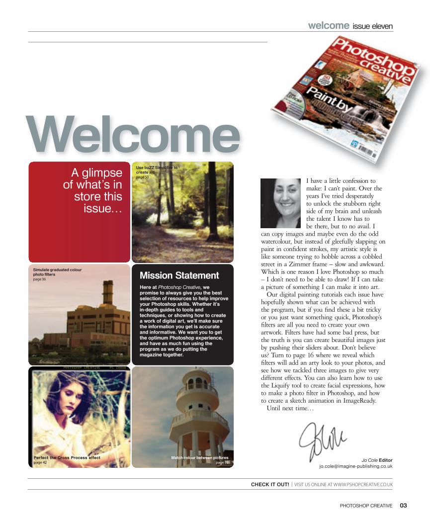
A glimpse of what’s in
store this issue…
Welcome
Here at Photoshop Creative, we promise to always give you the best selection of resources to help improve your Photoshop skills. Whether it’s in-depth guides to tools and techniques, or showing how to create a work of digital art, we’ll make sure the information you get is accurate and informative. We want you to get the optimum Photoshop experience, and have as much fun using the program as we do putting the magazine together.
Jo Cole [email protected]
Mission Statement
I have a little confession to make: I can’t paint. Over the years I’ve tried desperately to unlock the stubborn right side of my brain and unleash the talent I know has to be there, but to no avail. I
can copy images and maybe even do the odd watercolour, but instead of gleefully slapping on paint in confi dent strokes, my artistic style is like someone trying to hobble across a cobbled street in a Zimmer frame – slow and awkward. Which is one reason I love Photoshop so much – I don’t need to be able to draw! If I can take a picture of something I can make it into art.
Our digital painting tutorials each issue have hopefully shown what can be achieved with the program, but if you fi nd these a bit tricky or you just want something quick, Photoshop’s fi lters are all you need to create your own artwork. Filters have had some bad press, but the truth is you can create beautiful images just by pushing their sliders about. Don’t believe us? Turn to page 16 where we reveal which fi lters will add an arty look to your photos, and see how we tackled three images to give very different effects. You can also learn how to use the Liquify tool to create facial expressions, how to make a photo fi lter in Photoshop, and how to create a sketch animation in ImageReady.
Until next time…
Perfect the Cross Process effectpage 42
Simulate graduated colour photo fi lterspage 36
Use buZZ Simplifi er to create artpage 50
Match colour between picturespage 70
003_PC11_Welcome.indd 3 15/6/06 17:04:18
05PHOTOSHOP CREATIVE04 PHOTOSHOP CREATIVE
06 ContributorsPut a face to the writers’ names you’ll see in the magazine
10 Creative hubGet the skinny on the best creative sites, services and companies
13 Interview: Colin SmithFind out more about the man behind the PhotoshopCAFE site
14 Reader’s profi lePeer inside the mind of a fellow reader and see what they get up to
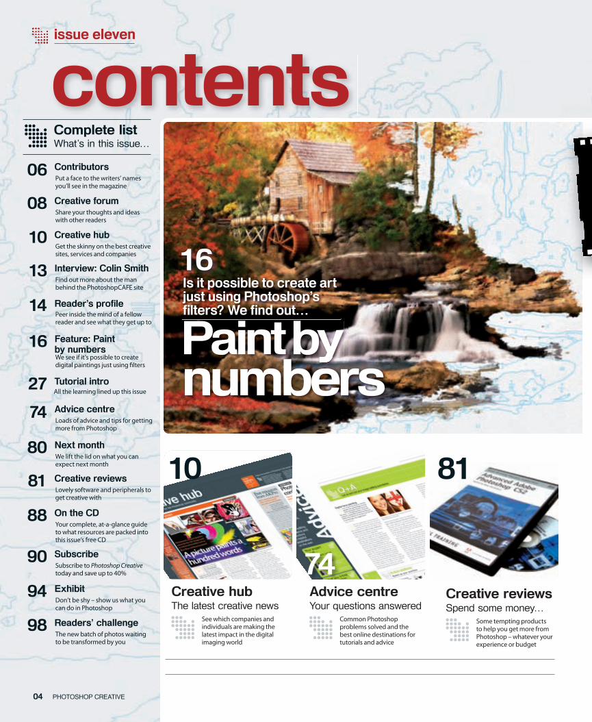
16 Feature: Paint by numbersWe see if it’s possible to create digital paintings just using � lters
80 Next monthWe lift the lid on what you can expect next month
81 Creative reviewsLovely software and peripherals to get creative with
Complete listWhat’s in this issue…
88 On the CDYour complete, at-a-glance guide to what resources are packed into this issue’s free CD
90 SubscribeSubscribe to Photoshop Creative today and save up to 40%
94 ExhibitDon’t be shy – show us what you can do in Photoshop
98 Readers’ challengeThe new batch of photos waiting to be transformed by you
Creative hubThe latest creative news
issue eleven
contents
10
74 Advice centreLoads of advice and tips for getting more from Photoshop
08 Creative forumShare your thoughts and ideas with other readers
See which companies and individuals are making the latest impact in the digital imaging world
Advice centreYour questions answered
Common Photoshop problems solved and the best online destinations for tutorials and advice
74
16Is it possible to create art just using Photoshop’s fi lters? We fi nd out…
Creative reviewsSpend some money…
Some tempting products to help you get more from Photoshop – whatever your experience or budget
81
27 Tutorial introAll the learning lined up this issue
Paint byPaint bynumbers
004-5_PC11_Contents.indd 6 15/6/06 18:36:27
05PHOTOSHOP CREATIVE04 PHOTOSHOP CREATIVE
Creative tutorialsMake great art today
Create crazy characters28 The Liquify � lter is the perfect tool for distorting photos in weird and wonderful ways. Here’s how to have fun with portraits
Mimic photo fi lters36 You don’t have to buy fancy lens � lters to get gradient e� ects – just load up Photoshop and follow this tutorial
Get the Cross Process look42 Discover how to emulate this classic � lm e� ect and use it to add colour and interest to dull photos
Use buZZ.Simplifi er50 Every reader of the magazine can get a full version of the buZZ.Simpli� er plug-in. Use this tutorial to see what it does…
Apply digital make-up58 Give your photos a touch of Hollywood glamour by applying make-up in Photoshop. A � awless � nish is guaranteed!
Cool plug-ins: Cubism72 Get a great artistic e� ect using this plug-in. It’s perfect for adding oomph to dull images or creating a focal point
issue four
11CD01
Focus on: Texture fi lters34 This � lter set can make any picture look as though it’s printed on a texture
Big Technique: Shadow/Highlight command46Don’t worry if your photos are plagued by shadows – this tool can bring out detail
Focus on: Other Dynamics56 We round o� our tour of the Brushes palette with a look at the Other Dynamics settings
From generating them to using them in your work, here’s a great guide to patterns
Focus on: Patterns62
Technical tutorialsUnderstand your software
Exhibit
See how your fellow readers have tackled past Readers’ Challenges, or � nd out if your entry has been printed!
Reader showcase
94
On the CDMore free resources
Photos, brushes, textures, fonts… just some of this issue’s CD content. See what else there is here
88
tuto
rial
s50
ImageReady,
Discover how to use Photoshop’s web app to animate your still photos
Work with Match Color70 Use this excellent tool for applying the same colour values to di� erent photos and ensure harmony reigns throughout
ImageReady, steady, go!64 If you’ve never used ImageReady before, look here for an introduction to using it to animate your still photos
11
tuto
rial
s50
ImageReady, 64 steady, GO!
004-5_PC11_Contents.indd 7 15/6/06 18:37:03
Send us your thoughts on the magazine or the Photoshop world in general, and see if other readers agree with you
Podcast powerI wanted to write in and see if any other readers subscribe to Photoshop podcasts? I think I may be getting addicted to them, and it’s all Photoshop Creative’s fault! I saw your news story on the Photoshop TV podcast and now I can’t get enough of them!
There’s loads of them out there. Obviously the quality varies, but it’s all good Photoshop fun. Do you have any favourites?Sienna Tyler
really helped me out and solved a couple of niggles I’ve had with Photoshop.
Whenever I get the magazine I always turn to these pages � rst to see what other great tips I can pick up. So thank you to whoever writes them and keep up the good work!Martin Grammer
Thanks for the compliment, Martin. The tips are provided by our Q&A genius, George Cairns. He’s been using Photoshop for years and years, so is more than quali� ed to share some enlightenment on the program.
The fi rst forum winnersLast issue we included a tutorial on uploading images to the Photoshop Creative forum. This was to promote the new Image Feedback area where readers can come for honest and friendly feedback on images, and where they can be improved. We also set up a Challenge area. The idea is that a challenge will be set every two weeks and the winners included in the magazine. Our � rst challenge was for people to illustrate the words ‘Summer Dreaming’. Since this was the � rst one, we decided to print all the entries and here they are! Going clockwise from the top, we have hi-liter,
Revjessecuster, Lorraine, Kaeso, Solo and James Turgon. Check out the forum for the current challenge and maybe you’ll be printed! www.pshopcreative/forum, Image Feedback. Good luck!
Creative Forum@@@@@@@@@@@@@@@@@@@@@@@@@@@@@@@@@@@@@@@@@@@@@@@@@@@@@@@@@@@@@@@@@@@@@@@@@@@@@@@@@@@@@@@@@@@@@@@@@@@@@@@@@@@@@@
TALK TO US! | EMAIL US YOUR THOUGHTS TO [email protected]
08 PHOTOSHOP CREATIVE
View from the forum
User: pixelgrrlPost: Game of tennis anyone?Since Wimbledon has got me in the mood for tennis, I was wondering if anyone out there would want to set up a game of Photoshop tennis on my site? I only need someone to kick it o� .
User: feetfi rstPost: More free photos!I saw the story you did about that Yotophoto site a couple of issues ago and I love it! I’ve bookmarked all the sites it links to but want to know if there are more websites o� ering free photos that I can practise my Photoshop skills on? Thanks. Take Photoshop knowledge with you wherever you go, thanks
to Photoshop podcastsLook out for more clever tips in each issue’s Q&A section of Photoshop Creative
Well Sienna, we won’t apologise for tipping you o� to the world of Photoshop podcasts because, as you rightly point out, they are a hive of useful information. They are also far more interesting than most radio stations!
In terms of favourites, there are quite a few we really like. Matt Kloskowski’s Photoshop Killer Tips podcast is always full of great content, and the One Minute Tip o� ering is also very good for image-editing fans. But our favourite has to be Photoshop TV, courtesy of The Photoshop Guys. It’s funny, it’s informative – and we got a mention in one of the episodes! Hoorah!
Boo to reviewsI agree with what Persimmon Tsang said last issue about you keeping your reviews to a minimum. Include books by all means, but please don’t feel you need to increase the section. Tutorials are far more important!Niles Pearce
Okay, we promise that the reviews section will not take up any more room!
Tip topHello, I just wanted to thank you for the tips in your Q&A section. Some of them have
008_PC11-Letters.indd 1 15/6/06 18:03:45

Creative hubThe latest news stories for the Photoshop community
10 PHOTOSHOP CREATIVE
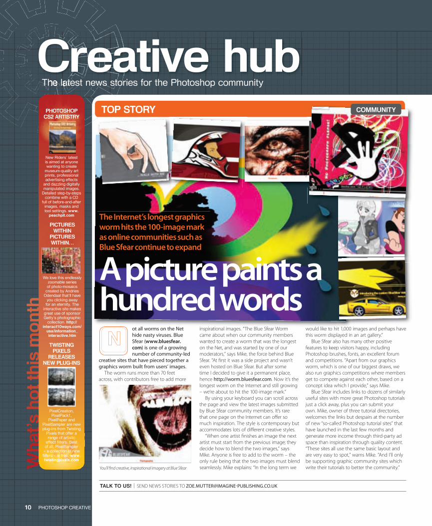
ot all worms on the Net hide nasty viruses. Blue Sfear (www.bluesfear.com) is one of a growing number of community-led
creative sites that have pieced together a graphics worm built from users’ images.
The worm runs more than 70 feet across, with contributors free to add more
Wha
t’s h
ot t
his
mont
h
TALK TO US! | SEND NEWS STORIES TO [email protected]
Creative hubCreative hubCreative hubCreative hubCreative hubCreative hubThe latest news stories for the Photoshop communityThe latest news stories for the Photoshop communityThe latest news stories for the Photoshop communityThe latest news stories for the Photoshop communityThe latest news stories for the Photoshop communityThe latest news stories for the Photoshop communityThe latest news stories for the Photoshop communityThe latest news stories for the Photoshop communityThe latest news stories for the Photoshop communityThe latest news stories for the Photoshop communityThe latest news stories for the Photoshop communityThe latest news stories for the Photoshop communityThe latest news stories for the Photoshop communityThe latest news stories for the Photoshop communityThe latest news stories for the Photoshop communityThe latest news stories for the Photoshop communityThe latest news stories for the Photoshop communityThe latest news stories for the Photoshop communityThe latest news stories for the Photoshop communityThe latest news stories for the Photoshop communityThe latest news stories for the Photoshop community
We love this endlessly zoomable series of photo-mosaics
created by Andries Odendaal that’ll have
you clicking away for an eternity. The
interactive site makes great use of sponsor Getty’s photographic
collection. http://interact10ways.com/
usa/information_interactive.htm
PICTURES WITHIN
PICTURES WITHIN…
inspirational images. “The Blue Sfear Worm came about when our community members wanted to create a worm that was the longest on the Net, and was started by one of our moderators,” says Mike, the force behind Blue Sfear. “At � rst it was a side project and wasn’t even hosted on Blue Sfear. But after some time I decided to give it a permanent place, hence http://worm.bluesfear.com. Now it’s the longest worm on the Internet and still growing – we’re about to hit the 100-image mark.”
By using your keyboard you can scroll across the page and view the latest images submitted by Blue Sfear community members. It’s rare that one page on the Internet can o� er so much inspiration. The style is contemporary but accommodates lots of di� erent creative styles.
“When one artist � nishes an image the next artist must start from the previous image; they decide how to blend the two images,” says Mike. Anyone is free to add to the worm – the only rule being that the two images must blend seamlessly. Mike explains: “In the long term we
would like to hit 1,000 images and perhaps have this worm displayed in an art gallery.”
Blue Sfear also has many other positive features to keep visitors happy, including Photoshop brushes, fonts, an excellent forum and competitions. “Apart from our graphics worm, which is one of our biggest draws, we also run graphics competitions where members get to compete against each other, based on a concept idea which I provide,” says Mike.
Blue Sfear includes links to dozens of similarly useful sites with more great Photoshop tutorials just a click away, plus you can submit your own. Mike, owner of three tutorial directories, welcomes the links but despairs at the number of new “so-called Photoshop tutorial sites” that have launched in the last few months and generate more income through third-party ad space than inspiration through quality content. “These sites all use the same basic layout and are very easy to spot,” warns Mike. “And I’ll only be supporting graphic community sites which write their tutorials to better the community.”
PHOTOSHOP CS2 ARTISTRY
New Riders’ latest is aimed at anyone wanting to create
museum-quality art prints, professional advertising effects
and dazzling digitally manipulated images.
Detailed step-by-steps combine with a CD
full of before-and-after images, masks and tool settings. www.
peachpit.com
PixelCreation, PixelPack1,
PixelPaper and PixelSampler are new plug-ins from Twisting
Pixels that offer a range of artistic
effect fi lters. Best of all, PixelSampler
– a collection of nine fi lters – is free. www.twistingpixels.com
TWISTING PIXELS
RELEASES NEW PLUG-INS
A picture paints a hundred words
You’ll � nd creative, inspirational imagery at Blue Sfear
TOP STORY
A picture paints a
The Internet’s longest graphics worm hits the 100-image mark as online communities such as Blue Sfear continue to expand
COMMUNITY
010-12-PC 11-News.indd 10 15/6/06 14:04:08
ros mixed with enthusiasts at Olympia 2 as Adobe Live enjoyed a third successful year of celebrating all things creative.
The two-day event saw thousands of visitors, with dozens of free events and seminars. Despite emphasis on the recent Macromedia purchase, Photoshop featured heavily, with experts on hand to reveal their favourite tips.
Photographers Martin Evening, Chris Coe and Nick Steven highlighted new features in CS2 and Lightroom. Wacom evangelist Robin Preston, a famed retoucher, wowed audiences with a demo of the tablet’s ability to get the best from Photoshop. Third-party partners Canon, Nikon, HP and Apple were all present, and there was a chance to bag a bargain from the large range of Focal Press publications.
ALERT! | DON’T FORGET TO ENTER OUR READERS’ CHALLENGE – SEE PAGE 98
11PHOTOSHOP CREATIVE
Adobe con� rmed the planned launch of CS3 for around May next year, within the usual 18-month upgrade cycle, and rea� rmed Apple users will have to wait until then for an Intel native Mac version of Photoshop. Adobe will continue to support GoLive and FreeHand, but Dreamweaver and Illustrator will take priority.
Tips and tricks and real-world inspiration wow the crowds as Adobe hits London’s Olympia
ILLUSTRATIONMUNDOwww.illustrationmundo.comSubmit your work to the illustrator database of this excellent site so people can fi nd you via your medium, style and work categories. There’s free advice and Q&A sessions with illustrators and those who commission the work, as well as the usual forum for illustration-related chat. With lots of bright and brilliant work on display there’s plenty to inspire!
RETOUCHPROwww.retouchpro.com With 25,000 members, this is a great forum to display Photoshop creations. An army of regulars offer advice, challenges fl ex creative muscles, and discussions include tips, tutorials, help with scanning, printing, colour management, the best plug-ins and apps. Work on display is a real mix, so you won’t feel left out if you’re new.
In the beginning, part 10
Codenamed ‘Venus In Furs’ Photoshop 6.0, launched September 2000, had a cleaner user interface and excellent toolbar. Adobe also introduced the Healing Brush and Liquify fi lter, collapsible layer sets
and colour coding. Decent text tools at last included Warp Text options, leading to a mass outbreak of bends, bulges, ripples and warps. ImageReady 3.0 was bundled with the package, dramatically improving
the app’s web tools and adding slicing and rollover creation directly within Photoshop. A 6.0.1 upgrade in March 2001 fi xed some bugs and saw memory usage improvements, adding to a much praised upgrade.
Follow the evolution of Photoshop in this regular series
in March 2001 fi xed some bugs and in March 2001 fi xed some bugs and
creative hub news
Photoshop CS3 con� rmed at Adobe Live
New additions to the world of Photoshop
Filter Forge plug-in beta
Filter Forge has released a public
beta version of Filter Forge, a high-end plug-in for Photoshop letting users build their own fi lters including textures, visual effects, distortions, patterns and backgrounds. Visit www.fi lterforge.com for a download and the free online library of user-created fi lters.
Photoshop updated to 9.01
If you’re a CS2 user it’s time to check those
updates. Adobe has fi xed many bugs with this upgrade, including application hanging, runtime errors, issues with palettes, text layers, speed and overall performance. www.adobe.com/support/downloads
Updates...
THIS MONTH IN SHORT
ADOBE LIVE
EXPOSURE
Free resources from AKProAK Productions Studios o� ers visitors great tutorials and templates
ith around 3,000 forum users and thousands of posts, AK Productions Studios (www.akpro.net) is
built round a small team of enthusiasts.Aysar Khalid, AKPro Administrator,
founded the site in 2003 as a personal portfolio, but after a few false starts things began to grow. Aysar set up a forum, and as members joined many o� ered help, and the range of resources began to expand. Aimed primarily at webmasters, the site attracted Photoshop enthusiasts thanks to great tutorials and downloads.
New content is added regularly, rated on a scale of 1-10 for di� culty. The
selection of great ‘Extreme Template’ tutorials explains how to perfect web banners and graphics achieving professional results – skills that could earn you an income. Free brushes include snazzy web icons, computer tech-style graphics, and vector-style people with around 60 brushes in some sets.
Aysar leads the sta� , manages and writes content, and does a lot of coding and design work: “AK Productions Studios is a global digital art and design group, providing a directory of free webmaster resources including high quality tutorials,” he says. “We also o� er downloads like Photoshop brushes, patterns and styles.” With plans to expand the site and resources over the summer, Aysar is looking for new sta� to join his team.
Check out AKPro’s free brushes at www.akpro.net
If you missed it this time, make sure you get to next year’s Adobe Live if only to take advantage of the expert advice
010-12-PC 11-News.indd 11 15/6/06 14:05:19
ational Association of Photoshop Professionals (NAPP) President, Scott Kelby, has launched a fun and informative training course
aimed at those with busy lifestyles. All Scott asks is that you spend � ve minutes
a day watching his tutorials over a 21-day course. The sessions are quick, easy and to the point, without boring theory or jargon. Scott, recently rated bestselling Photoshop author in the world, covers the basics from � xing photos to correcting colour, sharpening and adding time-enhancing automation to your work� ow.
With 60 days’ access to your online training class, you can a� ord a holiday or a quick break around the bike sheds. You can download the
photo you’ll be working with, along with a PDF outline of that day’s class, complete with a bonus tip and a list of shortcuts.
Costing $69.99 ($39.99 for NAPP members) you can sign up or watch the free demo at
12 PHOTOSHOP CREATIVE
italy Friedman from Saarbruecken has struck gold in his search for the best free quality fonts on the web. The German web designer began
the task on his blog (www.alvit.de/blog) some months ago, but quickly gained a following from font fans eager to pick up some of the best, most elegant free fonts. “Beautiful and professional fonts are quite expensive, and it may be a problem to � nd the best price-quality solution,” says Vitaly. “So I looked on the Net for some nice free quality fonts, and presented the result of my research to readers of my blog.”
Vitaly con� ned his search to licence-free fonts he could use in his projects, removing any he found to be copyrighted. The cache gives a real professional look to personal and commercial projects. Vitaly has linked many sites covering similar quality fonts, and his readers have added a few. The blog is
also a must for web designers, with tips on creating simple and accessible designs. “I have connections with typo-designers willing to share work. Maybe it’ll be interesting to have a competition, where people can o� er fonts.”
creative hub news
NAPP’s Scott Kelby o� ers new online class for those in a hurry
All you need is fontsThe search for free quality fonts continues, with the best collected on one outstanding blog
The team’s wish list
Pure material delight…PHOTOFRAME PRO 3 PHOTOSHOP PLUG-INNew from onOne Software, PhotoFrame Pro reaches version 3 with a major update and thousands of new frames to add artistic fl air to Photoshop work. Create realistic frames, unique edge effects or select the Random Frame Generator to combine several effects.
WE WANT IT BECAUSE…Maker of respected plug-ins, onOne Software scores another hit. Simple and intuitive, a built-in frame browser and multi-frame preview offer added simplicity and functionality. Around $159.95, or download a 30-day trial at www.onOnesoftware.com.
creative hub
Make a date SUPERCHARGED PHOTOSHOP AND
BRIDGE Participants in this Santa Fe, New Mexico workshop with Scott Kelby learn techniques used by leading pro photographers. Intermediate Photoshop users visit www.santafeworkshops.com
At a loose end? Here are the must-see events coming your way
TYPECON2006: THE BOSTON T PARTY If fonts are your thing you’ll love this conference presented by the Society of Typographic Afi cionados, now in its eighth year at the Hyatt Regency Boston. www.typecon.com
9-13
TH
AU
GU
ST LEAPING INTO DIGITAL WORKSHOP,
ROCKPORT, MAINE Award-winning photo-journalist Bob Sacha leads a week of training showing how going digital helps workfl ow and rejuvenates passion for the image-making process. www.bobsacha.com
13TH
A
UG
US
T
ImageShackwww.imageshack.us
To showcase work on sites like Myspace,
galleries or message boards, blogs or journals, try using free video and image hosting sites like ImageShack. You can upload, link and share images/videos including on your own ImageShack PhotoBlog. An ImageShack toolbar integrates with IE and lets you drag images from your desktop to the posting fi elds.
TinyPic.com www.tinypic.com
Owned and operated by Photobucket.
com, TinyPic.com is another free hosting site with the potential to ease bandwidth concerns. You can browse, search and view images, and don’t even have to log in. As with all free image hosting sites, check everything is free of copyright and unlikely to upset anyone with regards to decency.
Two of the best…FREE IMAGE HOSTING
creative hub
16-2
2ND
JU
LY
functionality. Around $159.95, or download a
ONLINE TUTORIALS
FREE FONTS
World’s bestselling Photoshop author goes back to school
www.photoshoptraining.com, with more classes planned. Scott’s co-hosts of the Adobe Photoshop TV podcast (www.photoshoptv.com), Dave Cross and Matt Kloskowski, will also be adding lessons to the classroom.
Photoshop online training for busy people should be popular Bene� t from Scott’s wisdom with his online course
010-12-PC 11-News.indd 12 15/6/06 14:05:38
creative hub interviewinterviewinterview
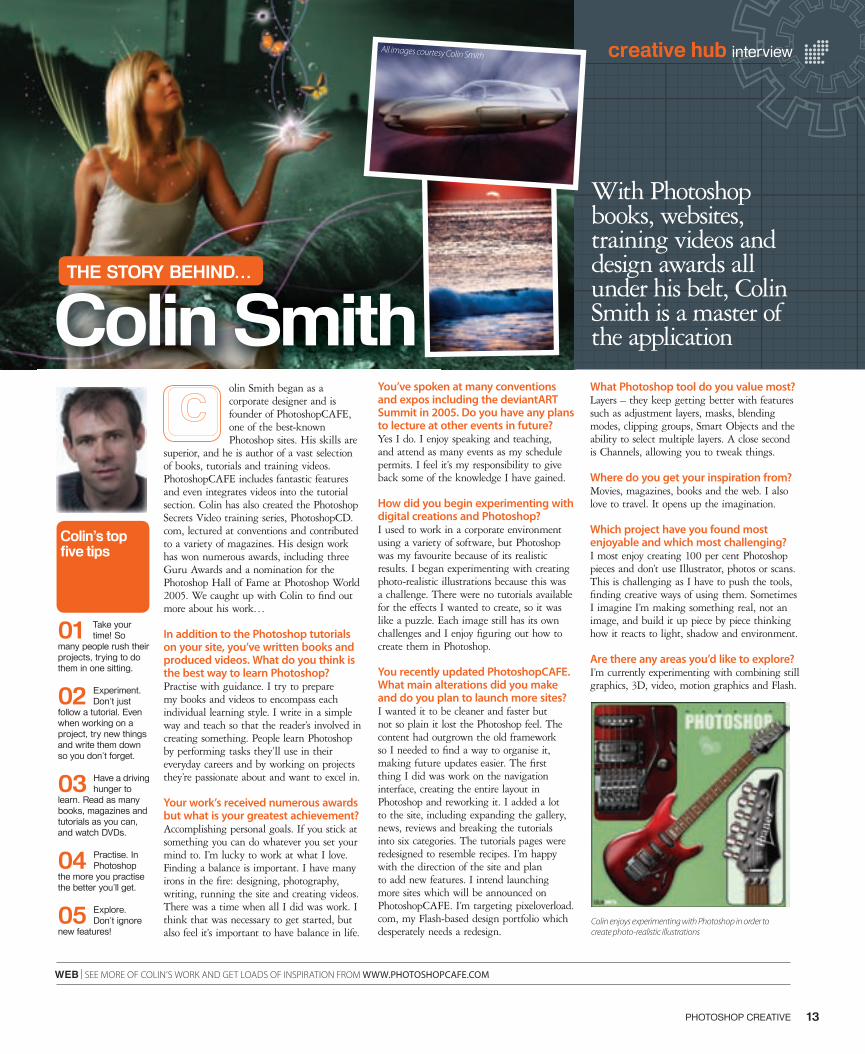
olin Smith began as a corporate designer and is founder of PhotoshopCAFE, one of the best-known Photoshop sites. His skills are
superior, and he is author of a vast selection of books, tutorials and training videos. PhotoshopCAFE includes fantastic features and even integrates videos into the tutorial section. Colin has also created the Photoshop Secrets Video training series, PhotoshopCD.com, lectured at conventions and contributed to a variety of magazines. His design work has won numerous awards, including three Guru Awards and a nomination for the Photoshop Hall of Fame at Photoshop World 2005. We caught up with Colin to fi nd out more about his work…
In addition to the Photoshop tutorials on your site, you’ve written books and produced videos. What do you think is the best way to learn Photoshop?Practise with guidance. I try to prepare my books and videos to encompass each individual learning style. I write in a simple way and teach so that the reader’s involved in creating something. People learn Photoshop by performing tasks they’ll use in their everyday careers and by working on projects they’re passionate about and want to excel in.
Your work’s received numerous awards but what is your greatest achievement?Accomplishing personal goals. If you stick at something you can do whatever you set your mind to. I’m lucky to work at what I love. Finding a balance is important. I have many irons in the fi re: designing, photography, writing, running the site and creating videos. There was a time when all I did was work. I think that was necessary to get started, but also feel it’s important to have balance in life.
You’ve spoken at many conventions and expos including the deviantART Summit in 2005. Do you have any plans to lecture at other events in future?Yes I do. I enjoy speaking and teaching, and attend as many events as my schedule permits. I feel it’s my responsibility to give back some of the knowledge I have gained.
How did you begin experimenting with digital creations and Photoshop?I used to work in a corporate environment using a variety of software, but Photoshop was my favourite because of its realistic results. I began experimenting with creating photo-realistic illustrations because this was a challenge. There were no tutorials available for the effects I wanted to create, so it was like a puzzle. Each image still has its own challenges and I enjoy fi guring out how to create them in Photoshop.
You recently updated PhotoshopCAFE. What main alterations did you make and do you plan to launch more sites?I wanted it to be cleaner and faster but not so plain it lost the Photoshop feel. The content had outgrown the old framework so I needed to fi nd a way to organise it, making future updates easier. The fi rst thing I did was work on the navigation interface, creating the entire layout in Photoshop and reworking it. I added a lot to the site, including expanding the gallery, news, reviews and breaking the tutorials into six categories. The tutorials pages were redesigned to resemble recipes. I’m happy with the direction of the site and plan to add new features. I intend launching more sites which will be announced on PhotoshopCAFE. I’m targeting pixeloverload.com, my Flash-based design portfolio which desperately needs a redesign.
What Photoshop tool do you value most?Layers – they keep getting better with features such as adjustment layers, masks, blending modes, clipping groups, Smart Objects and the ability to select multiple layers. A close second is Channels, allowing you to tweak things.
Where do you get your inspiration from?Movies, magazines, books and the web. I also love to travel. It opens up the imagination.
Which project have you found most enjoyable and which most challenging?I most enjoy creating 100 per cent Photoshop pieces and don’t use Illustrator, photos or scans. This is challenging as I have to push the tools, fi nding creative ways of using them. Sometimes I imagine I’m making something real, not an image, and build it up piece by piece thinking how it reacts to light, shadow and environment.
Are there any areas you’d like to explore? I’m currently experimenting with combining still graphics, 3D, video, motion graphics and Flash.
01 Take your time! So
many people rush their projects, trying to do them in one sitting.
02 Experiment. Don’t just
follow a tutorial. Even when working on a project, try new things and write them down so you don’t forget.
03 Have a driving hunger to
learn. Read as many books, magazines and tutorials as you can, and watch DVDs.
04 Practise. In Photoshop
the more you practise the better you’ll get.
05 Explore. Don’t ignore
new features!
WEB | SEE MORE OF COLIN’S WORK AND GET LOADS OF INSPIRATION FROM WWW.PHOTOSHOPCAFE.COM
Colin’s top fi ve tips
With Photoshop books, websites, training videos and design awards all under his belt, Colin Smith is a master of the application
13PHOTOSHOP CREATIVE
Colin enjoys experimenting with Photoshop in order to create photo-realistic illustrations
Colin SmithTHE STORY BEHIND…
All images courtesy Colin Smith
013_PC11_Interview.indd 13 15/6/06 12:05:07
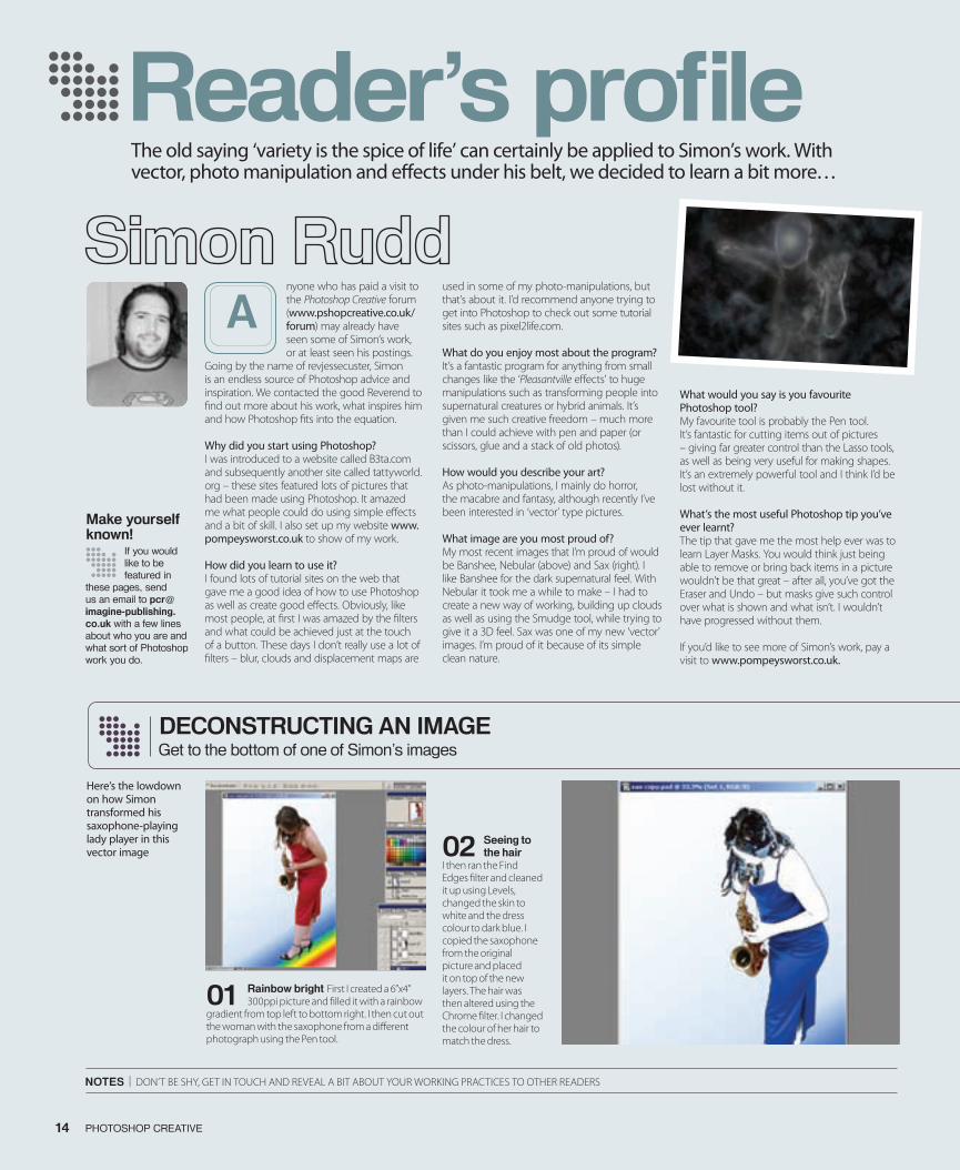
nyone who has paid a visit to the Photoshop Creative forum (www.pshopcreative.co.uk/forum) may already have seen some of Simon’s work, or at least seen his postings.
Going by the name of revjessecuster, Simon is an endless source of Photoshop advice and inspiration. We contacted the good Reverend to find out more about his work, what inspires him and how Photoshop fits into the equation.
Why did you start using Photoshop?I was introduced to a website called B3ta.com and subsequently another site called tattyworld.org – these sites featured lots of pictures that had been made using Photoshop. It amazed me what people could do using simple effects and a bit of skill. I also set up my website www.pompeysworst.co.uk to show of my work.
How did you learn to use it?I found lots of tutorial sites on the web that gave me a good idea of how to use Photoshop as well as create good effects. Obviously, like most people, at first I was amazed by the filters and what could be achieved just at the touch of a button. These days I don’t really use a lot of filters – blur, clouds and displacement maps are
used in some of my photo-manipulations, but that’s about it. I’d recommend anyone trying to get into Photoshop to check out some tutorial sites such as pixel2life.com.
What do you enjoy most about the program?It’s a fantastic program for anything from small changes like the ‘Pleasantville effects’ to huge manipulations such as transforming people into supernatural creatures or hybrid animals. It’s given me such creative freedom – much more than I could achieve with pen and paper (or scissors, glue and a stack of old photos).
How would you describe your art?As photo-manipulations, I mainly do horror, the macabre and fantasy, although recently I’ve been interested in ‘vector’ type pictures.
What image are you most proud of?My most recent images that I’m proud of would be Banshee, Nebular (above) and Sax (right). I like Banshee for the dark supernatural feel. With Nebular it took me a while to make – I had to create a new way of working, building up clouds as well as using the Smudge tool, while trying to give it a 3D feel. Sax was one of my new ‘vector’ images. I’m proud of it because of its simple clean nature.
What would you say is you favourite Photoshop tool?My favourite tool is probably the Pen tool. It’s fantastic for cutting items out of pictures – giving far greater control than the Lasso tools, as well as being very useful for making shapes. It’s an extremely powerful tool and I think I’d be lost without it.
What’s the most useful Photoshop tip you’ve ever learnt?The tip that gave me the most help ever was to learn Layer Masks. You would think just being able to remove or bring back items in a picture wouldn’t be that great – after all, you’ve got the Eraser and Undo – but masks give such control over what is shown and what isn’t. I wouldn’t have progressed without them.
If you’d like to see more of Simon’s work, pay a visit to www.pompeysworst.co.uk.
A
The old saying ‘variety is the spice of life’ can certainly be applied to Simon’s work. With vector, photo manipulation and effects under his belt, we decided to learn a bit more…
Reader’s profile
14 PHOTOSHOP CREATIVE 15PHOTOSHOP CREATIVE
notes | DON’T BE ShY, GET IN TOUch AND REvEAL A BIT ABOUT YOUR WORkING PRAcTIcES TO OThER READERS
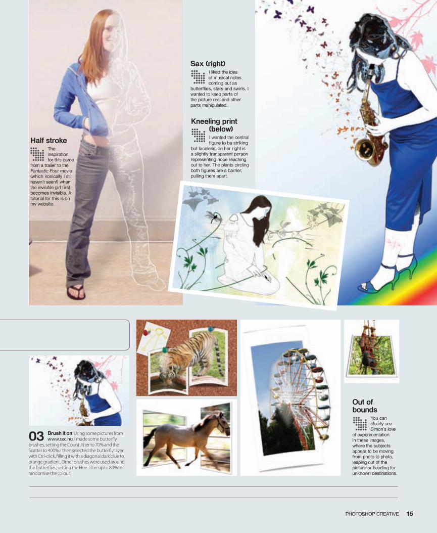
01 Rainbow bright First I created a 6”x4” 300ppi picture and filled it with a rainbow
gradient from top left to bottom right. I then cut out the woman with the saxophone from a different photograph using the Pen tool.
02 seeing to the hair
I then ran the Find Edges filter and cleaned it up using Levels, changed the skin to white and the dress colour to dark blue. I copied the saxophone from the original picture and placed it on top of the new layers. The hair was then altered using the chrome filter. I changed the colour of her hair to match the dress.
DeconstRucting An imAgeGet to the bottom of one of Simon’s images
Here’s the lowdown on how Simon transformed his saxophone-playing lady player in this vector image
make yourself known!
If you would like to be featured in
these pages, send us an email to [email protected] with a few lines about who you are and what sort of Photoshop work you do.
014-15_PC11_Readers Profile.indd14 14 15/6/06 12:14:02
Reader’s profile
14 PHOTOSHOP CREATIVE 15PHOTOSHOP CREATIVE
03 Brush it on Using some pictures from www.sxc.hu, I made some butterfly
brushes, setting the Count Jitter to 70% and the Scatter to 400%. I then selected the butterfly layer with Ctrl-click, filling it with a diagonal dark blue to orange gradient. Other brushes were used around the butterflies, setting the Hue Jitter up to 80% to randomise the colour.
Half stroke The inspiration for this came
from a trailer to the Fantastic Four movie (which ironically I still haven’t seen!) when the invisible girl first becomes invisible. A tutorial for this is on my website.
Kneeling print (below)I wanted the central figure to be striking
but faceless; on her right is a slightly transparent person representing hope reaching out to her. The plants circling both figures are a barrier, pulling them apart.
Sax (right)I liked the idea of musical notes coming out as
butterflies, stars and swirls. I wanted to keep parts of the picture real and other parts manipulated.
Out of bounds
You can clearly see Simon’s love
of experimentation in these images, where the subjects appear to be moving from photo to photo, leaping out of the picture or heading for unknown destinations.
014-15_PC11_Readers Profile.indd15 15 15/6/06 12:14:24
16 PHOTOSHOP CREATIVE
Feature
Paint byPaint bynumbers
016-25PC11_Feature temp.indd 16 15/6/06 20:23:07
17
numbers
the effect. Some will open a small dialog window where you can adjust the intensity of the fi lter, while others will launch the Filter Gallery. This offers a new workspace where you can access and apply multiple fi lters, preview the effect, and zoom in and out of your burgeoning painting to make sure all is going as it should. Only about half of all fi lters live in this gallery, but most of those used in artistic creation are found here.
Each fi lter in the gallery comes with sliders that allow you to alter characteristics for that fi lter. You can also apply more than one fi lter to an image – rather like creating new layers. This happens in the bottom right palette of the Filter Gallery, and the icon you need looks like a page with a corner curled over. Click this and a new ‘layer’ will appear above the fi rst one. As soon as you click on a different fi lter, it will be applied to the new layer. This means you can build up a rich effect and avoid fl at-looking images.
As well as being able to stack up different fi lters on top of one another, you can also rearrange them to get the exact effect you want. Keeping with the layers comparison, you click on the fi lter you want to move and then drag it to the new position. You can
Feature
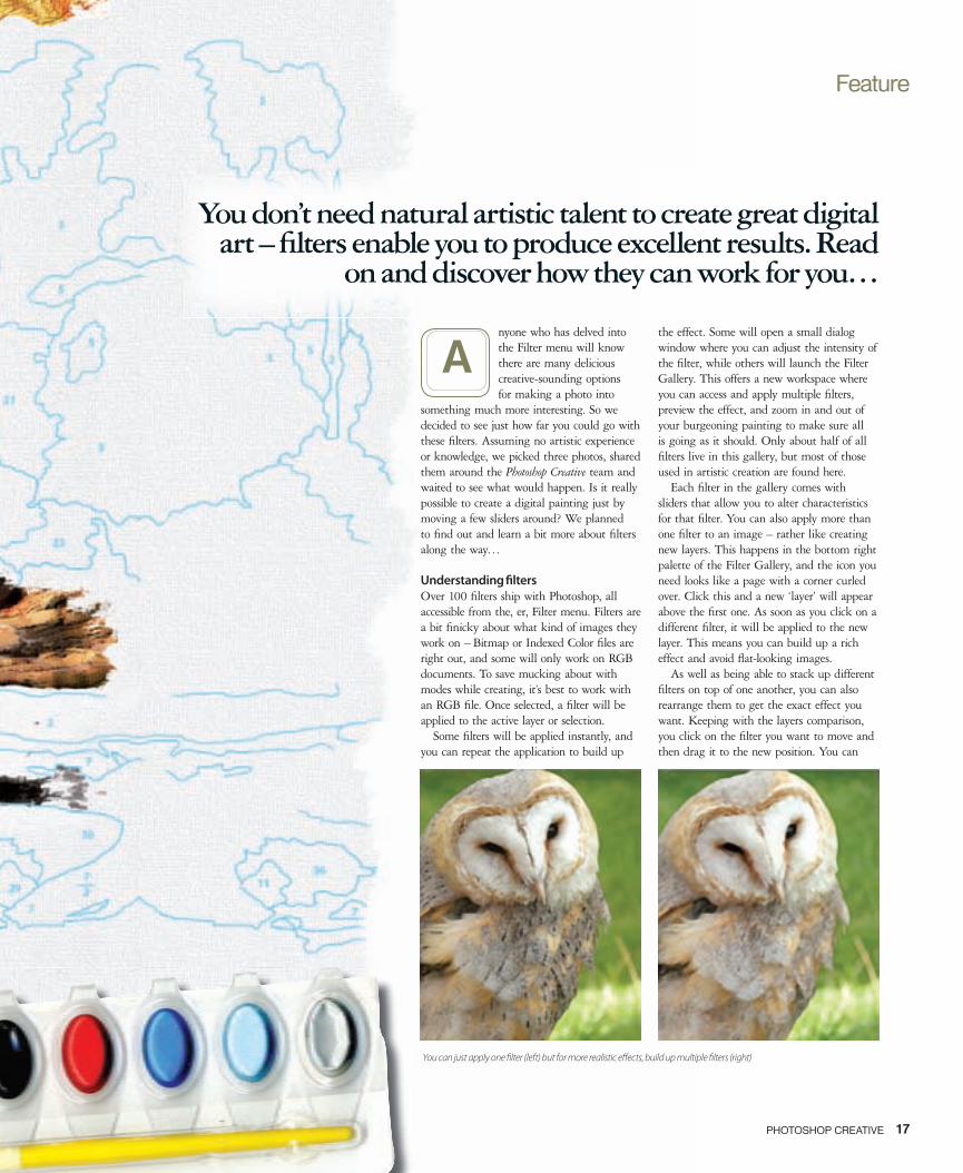
You can just apply one � lter (left) but for more realistic e� ects, build up multiple � lters (right)
nyone who has delved into the Filter menu will know there are many delicious creative-sounding options for making a photo into
something much more interesting. So we decided to see just how far you could go with these fi lters. Assuming no artistic experience or knowledge, we picked three photos, shared them around the Photoshop Creative team and waited to see what would happen. Is it really possible to create a digital painting just by moving a few sliders around? We planned to fi nd out and learn a bit more about fi lters along the way…
Understanding � ltersOver 100 fi lters ship with Photoshop, all accessible from the, er, Filter menu. Filters are a bit fi nicky about what kind of images they work on – Bitmap or Indexed Color fi les are right out, and some will only work on RGB documents. To save mucking about with modes while creating, it’s best to work with an RGB fi le. Once selected, a fi lter will be applied to the active layer or selection.
Some fi lters will be applied instantly, and you can repeat the application to build up
A
You don’t need natural artistic talent to create great digital art – fi lters enable you to produce excellent results. Read
on and discover how they can work for you…
PHOTOSHOP CREATIVE
016-25PC11_Feature temp.indd 17 15/6/06 20:23:33
18 PHOTOSHOP CREATIVE
Feature
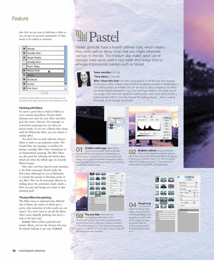
also click an eye icon to hide/view a fi lter so you can get an accurate assessment of what needs to be added or removed.
Painting with � ltersIt’s quite a good idea to think of fi lters as your cooking ingredients. Decide which elements you want for your effect and then pick the correct ‘fl avours’. For example, in watercolour paintings you can often see sketch marks. If you run a Sketch fi lter along with the Watercolor fi lter, you can achieve a similar effect.
You don’t have to stick with the obvious fi lters in order to get painterly results. The Clouds fi lter, for example, is excellent for giving a smudgy effect that’s reminiscent of an Impressionist painting. The Blur fi lters are also good for softening the harsh edges which are often the telltale sign of a heavily fi ltered image.
One other tool that deserves your attention is the Fade command. Found under the Edit menu (although it’s not in Elements), it controls the opacity or blending mode of any fi lter. This can be extremely effective in dulling down the sometimes brash results a fi lter can give and brings you closer to that painting goal!
The best � lters for paintingThe Filter menu is organised into different sets of fi lters, the names of which give a pretty clear indication of what result you can expect. You won’t need to use all the fi lters when you’re digitally painting, but here’s a look at the best ones:
Artistic fi lters achieve painterly and artistic effects, and are the obvious fi rst stop for anyone looking to get arty. Colored
03 The fi rst fi lter We’ll start the proceedings with a trip to the
Underpainting � lter. Go to Filter>Underpainting and the Filter Gallery will open. Set Brush Stroke to 1, Texture Coverage to 11; set Canvas as the texture, Scale to 125, Radius to 9 and Light to Top. Things will suddenly look very painterly!
04 Rough it up Click the New
Layer icon (looks like a page curling) and then click Rough Pastels. This is where you get to add all the chalky, smudgy goodness. Start by setting Stroke Length to 26 and Stroke Detail to 11.
Pastel
01 Create a safe copy Open up the ‘impressionist pastel’ � le from the disc.
You can see how this photo has su� ered from a lack of tripod – it’s slightly blurry. None of this will matter when it gets some � lter treatment! Create a duplicate layer of the photo and name it something suitable like ‘pastel image’.
02 Brighter outlook Because this look destroys any detail and darkens a photo,
take a trip to the Levels dialog and lighten things up. In the Input Levels bit, enter 2, 1.21, 185. The photo will look horrible, but trust us… if you don’t do it things will end up all dark and foreboding.
Pastels generally have a loosely de� ned style, which means they work well on blurry shots that you might otherwise consign to the bin. The medium also makes great use of textures. Here we’ve used a nice water and bridge shot to emulate Impressionist painters such as Monet.
Team member: Jo Cole
Time taken: 5 minutes
Why I chose this look: I’ve tried using pastels in real life, but only manage to produce a dirty, smeary mess and end up getting covered in pastel dust. I love taking photos at twilight, but am too lazy to carry a tripod so my shots are always slightly blurred or noisy. This technique means I can make use of my dodgy shots and even pretend I intentionally made them blurry to get a better painted e� ect! I love the texture this style produces – have a look at the water, it’s all smudgy and lovely!
In addition to laying � lters on top of one another, you can also move these ‘layers’ about or turn their visibility on or o�
016-25PC11_Feature temp.indd 18 15/6/06 20:24:04
19PHOTOSHOP CREATIVE
05 Boost the texture From the Texture pull-down menu, make sure Canvas is
selected and then set Scaling to 90%. Set Relief to 7. If you set Relief too high, you will get lots of diagonal lines that look a little too perfect for a pastel painting. Make sure Light is set to Top and leave Invert unchecked. Now click OK.
06 The fi nal touch Back in the main Photoshop interface, double-click on
the Foreground square to access the Color Picker and choose a really dark blue. Double-click on the Background square and pick a mid blue.
“I love the texture this style produces – have a look at the water, it’s all smudgy and lovely!”
07 Cloudy day With your colours selected, create a new layer and go to Filer>Clouds.
Set the blending mode to Multiply and lower the Opacity slider to 20%. This darkens the whole picture slightly and the cloudy pattern gives the impression of hand smudges.
5mins
Tip
When using the Rough Pastels fi lter,
try and hang back on the Relief slider. The higher it goes the more noticeable the pastel ‘strokes’ will be. You’ll end up with uniform diagonal lines, which isn’t a trademark of the pastel style!
016-25PC11_Feature temp.indd 19 15/6/06 20:24:27
Feature
PHOTOSHOP CREATIVE 2120 PHOTOSHOP CREATIVE
Pencil gives an, umm, coloured pencil look on a coloured background. It uses your currently selected background for this, so choose wisely. Dry Brush simplifi es an image into areas of common colour and then paints the edges. Think of what would happen if you mixed the qualities of watercolours with oils, and you’ll understand the effect of Dry Brush. Fresco is a coarse style with swiftly applied dabs, so it’s great for landscapes but won’t keep a lot of defi ned edges. Palette Knife reduces details to give a thinly painted canvas effect. Rough Pastels applies pastel chalk to textured background. Where colours are bright, chalk appears thick. Where they are darker, the texture is revealed a bit, emulating that dusty pastel effect. Smudge Stick softens an image by smudging the darker areas. The Sponge fi lter gives you textured areas of contrasting colour, but it can sometimes look like your image has loads of water stains. Underpainting puts your photo on a textured background and then paints on top. You lose a bit of detail, but it’s a good place to start when going for a washy paint effect. Watercolor does as you’d expect.
The Blur fi lters are actually really good for softening areas or smudging things together. Think of them as a digital version of blending paints or merging edges with your thumb. Gaussian Blur is particularly good because it adds low-frequency detail and gives a hazy effect.
The Brush Strokes fi lter group also gives a painterly or fi ne-art look. Accented Edges boosts edges of an image. When edge brightness controls are set high, accents resemble white chalk. When low they look more like black ink. Angled Strokes repaints a photo using diagonal strokes. Light and dark areas are painted with strokes going in opposite directions, giving a dynamic, messy effect. Crosshatch retains detail, adds texture and roughens edges. Dark Strokes
“This style works particularly well on portrait shots”
55minsmins
About half of the � lters are accessed from the Filter Gallery, but some will bring up their own dialog window
016-25PC11_Feature temp.indd 20 15/6/06 20:26:36
Feature
PHOTOSHOP CREATIVE 2120 PHOTOSHOP CREATIVE
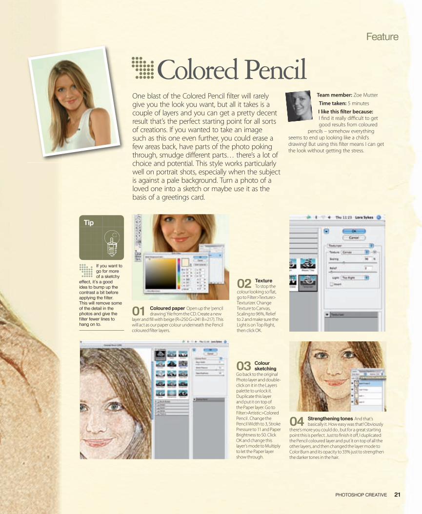
01 Coloured paper Open up the ‘pencil drawing’ � le from the CD. Create a new
layer and � ll with beige (R=250 G=241 B=217). This will act as our paper colour underneath the Pencil coloured � lter layers.
02 Texture To stop the
colour looking so � at, go to Filter>Texture> Texturizer. Change Texture to Canvas, Scaling to 96%, Relief to 2 and make sure the Light is on Top Right, then click OK.
03 Colour sketching
Go back to the original Photo layer and double-click on it in the Layers palette to unlock it. Duplicate this layer and put it on top of the Paper layer. Go to Filter>Artistic>Colored Pencil . Change the Pencil Width to 3, Stroke Pressure to 11 and Paper Brightness to 50. Click OK and change this layer’s mode to Multiply to let the Paper layer show through.
04 Strengthening tones And that’s basically it. How easy was that! Obviously
there’s more you could do , but for a great starting point this is perfect. Just to � nish it o� , I duplicated the Pencil coloured layer and put it on top of all the other layers, and then changed the layer mode to Color Burn and its opacity to 33% just to strengthen the darker tones in the hair.
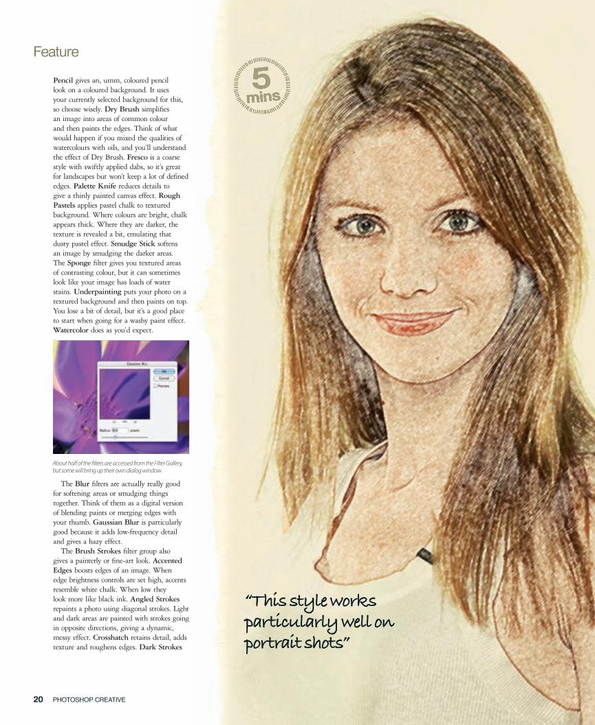
Colored PencilOne blast of the Colored Pencil � lter will rarely give you the look you want, but all it takes is a couple of layers and you can get a pretty decent result that’s the perfect starting point for all sorts of creations. If you wanted to take an image such as this one even further, you could erase a few areas back, have parts of the photo poking through, smudge di� erent parts… there’s a lot of choice and potential. This style works particularly well on portrait shots, especially when the subject is against a pale background. Turn a photo of a loved one into a sketch or maybe use it as the basis of a greetings card.
Team member: Zoe Mutter
Time taken: 5 minutes
I like this � lter because: I � nd it really di� cult to get good results from coloured
pencils – somehow everything seems to end up looking like a child’s drawing! But using this � lter means I can get the look without getting the stress.
Tip
If you want to go for more of a sketchy
effect, it’s a good idea to bump up the contrast a bit before applying the fi lter. This will remove some of the detail in the photos and give the fi lter fewer lines to hang on to.
016-25PC11_Feature temp.indd 21 15/6/06 20:27:20
Feature
PHOTOSHOP CREATIVE 2322 PHOTOSHOP CREATIVE
paints dark areas with short, dark and tight strokes, and is looser and longer with light areas. Ink Outlines applies fi ne narrow lines over original details. Spatter re-creates the spatter look of an airbrush. The higher the options, the more simple the effect. Sprayed Strokes repaints using an image’s dominant colours and uses angled strokes. Sumi-e
gives a kind of Japanese style. Think of a brush saturated with paint that’s applied to absorbent paper.
Distort fi lters may not be your fi rst stop on your digital painting journey, as they are generally used for distorting an image. But the Ocean Ripple fi lter adds random ripples to an image so it looks like it’s underwater. If set correctly it also looks like paint and can be a good base layer.
The Pixelate collection of fi lters gathers together pixels of similar colour values. The best one for painting is Pointillize. This breaks up colour into random dots, using the background colour as canvas area between dots. It’s basically your one-click way of emulating the Pointillist style of painters.
Render fi lters are primarily associated with 3D work, although there is one that comes in handy when making digital painting. Clouds gives a soft cloud pattern that’s perfect when layered, and is used to create Impressionist-style effects. Fibers is also worth experimenting with because it uses the foreground and background colours to give the impression of woven fi bres. This makes a perfect base for the Colored Pencil fi lter.
Sketch fi lters are another staple for digital artists. They use the foreground and background colours, so be aware of this. Chalk & Charcoal takes the highlights and midtones of an image and redraws them with a midtone grey colour in chalky effect. Shadow areas get replaced with black diagonal charcoal lines. The foreground colour is used
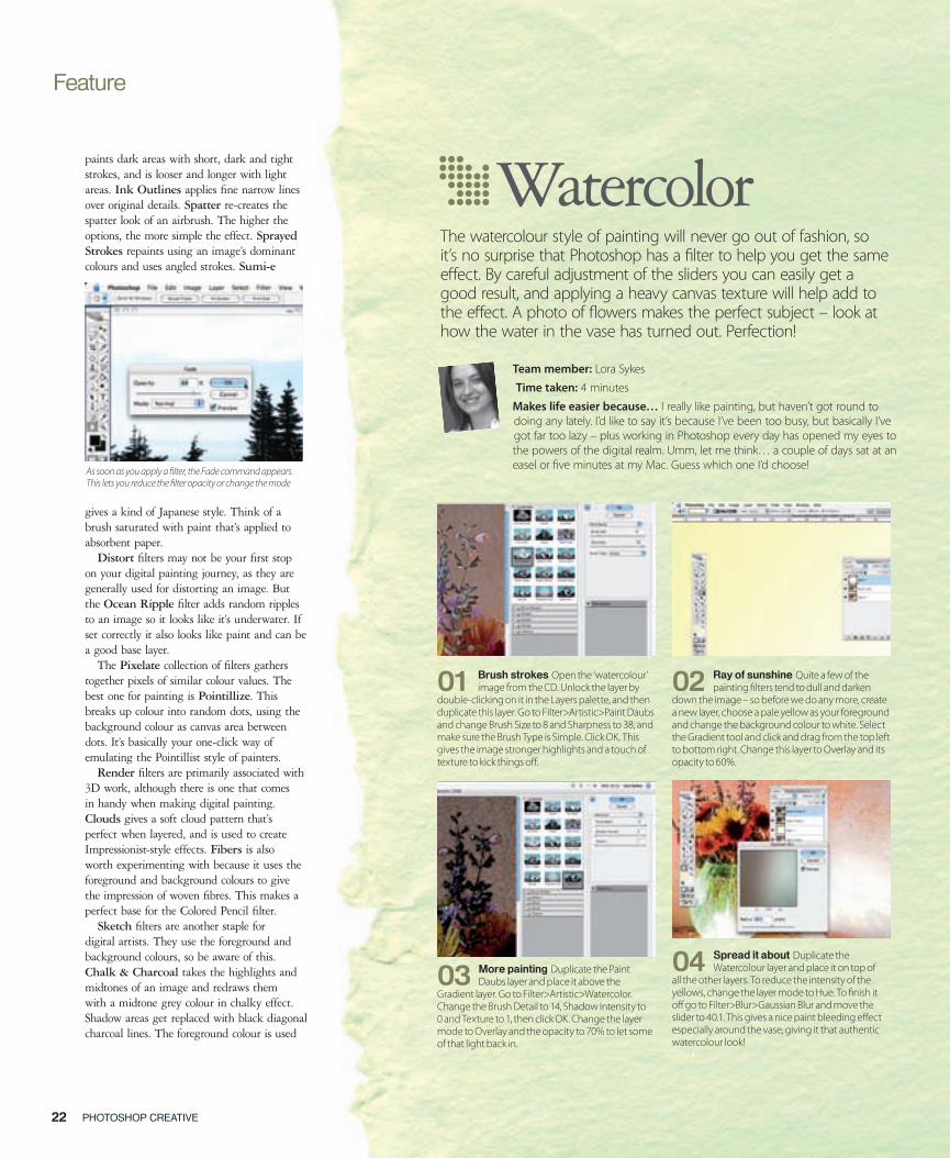
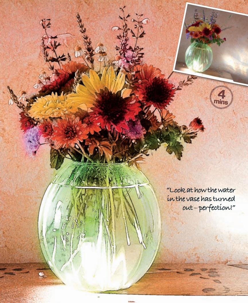
WatercolorThe watercolour style of painting will never go out of fashion, so it’s no surprise that Photoshop has a � lter to help you get the same e� ect. By careful adjustment of the sliders you can easily get a good result, and applying a heavy canvas texture will help add to the e� ect. A photo of � owers makes the perfect subject – look at how the water in the vase has turned out. Perfection!
Team member: Lora Sykes
Time taken: 4 minutes
Makes life easier because… I really like painting, but haven’t got round to doing any lately. I’d like to say it’s because I’ve been too busy, but basically I’ve got far too lazy – plus working in Photoshop every day has opened my eyes to the powers of the digital realm. Umm, let me think… a couple of days sat at an easel or � ve minutes at my Mac. Guess which one I’d choose!
02 Ray of sunshine Quite a few of the painting � lters tend to dull and darken
down the image – so before we do any more, create a new layer, choose a pale yellow as your foreground and change the background colour to white. Select the Gradient tool and click and drag from the top left to bottom right. Change this layer to Overlay and its opacity to 60%.
01 Brush strokes Open the ‘watercolour’ image from the CD. Unlock the layer by
double-clicking on it in the Layers palette, and then duplicate this layer. Go to Filter>Artistic>Paint Daubs and change Brush Size to 8 and Sharpness to 38, and make sure the Brush Type is Simple. Click OK. This gives the image stronger highlights and a touch of texture to kick things o� .
03 More painting Duplicate the Paint Daubs layer and place it above the
Gradient layer. Go to Filter>Artistic>Watercolor. Change the Brush Detail to 14, Shadow Intensity to 0 and Texture to 1, then click OK. Change the layer mode to Overlay and the opacity to 70% to let some of that light back in.
04 Spread it about Duplicate the Watercolour layer and place it on top of
all the other layers. To reduce the intensity of the yellows, change the layer mode to Hue. To � nish it o� go to Filter>Blur>Gaussian Blur and move the slider to 40.1. This gives a nice paint bleeding e� ect especially around the vase, giving it that authentic watercolour look!
As soon as you apply a � lter, the Fade command appears. This lets you reduce the � lter opacity or change the mode
016-25PC11_Feature temp.indd 22 15/6/06 20:27:41
PHOTOSHOP CREATIVE 2322 PHOTOSHOP CREATIVE
“Look at how the water in the vase has turned
out – perfection!”
44mins
016-25PC11_Feature temp.indd 23 15/6/06 20:28:02
Feature
PHOTOSHOP CREATIVE 2524 PHOTOSHOP CREATIVE
for the charcoal, while the background colour is used for the chalk. Charcoal gives a more smudged effect. The foreground colour is used for the charcoal, while the background colour is used for the paper. Conté Crayon re-creates a look of dark and white conté crayons. The foreground colour is used for dark areas, while the background colour takes care of the light areas. Graphic Pen uses linear ink strokes for redrawing an image. The ink colour is dictated by the foreground colour, while the background colour is used for the paper. Water Paper gives the impression of blotchy paint daubs on very wet, very fi brous paper, giving a heavily blended effect.
Stylize fi lters are generally a little too harsh or wacky for most artistic effects, but there is a gem. Find Edges will do pretty much as it says, by outlining the edge of an image with dark lines. The background will be white.
Texture fi lters are perfect for the fi nal fl ourish to a digital painting. They allow you to give depth to an image. Craquelure can
look like embossed wallpaper, but when used small, it gives a pleasing crackly texture. Texturizer is the big daddy, because of the Canvas option. This suddenly makes your fi lter painting look very realistic.
Now we’ve explained how fi lters operate and which ones are suitable for digital painting, all that remains is to see if they actually work! Is it possible to take a photo and apply a few fi lters and end up with something to be proud of? Look at our experiments and decide for yourself…
A note about the imagesUnfortunately we had a few gremlins when putting together the disc, and the interface doesn’t show the tutorial � les for this feature. They are there, though. Load the disc, double-click the icon and open the Disc Content folder. You’ll � nd them in Tutorial Files. If you get stuck, email [email protected]. Apologies for any inconvenience.
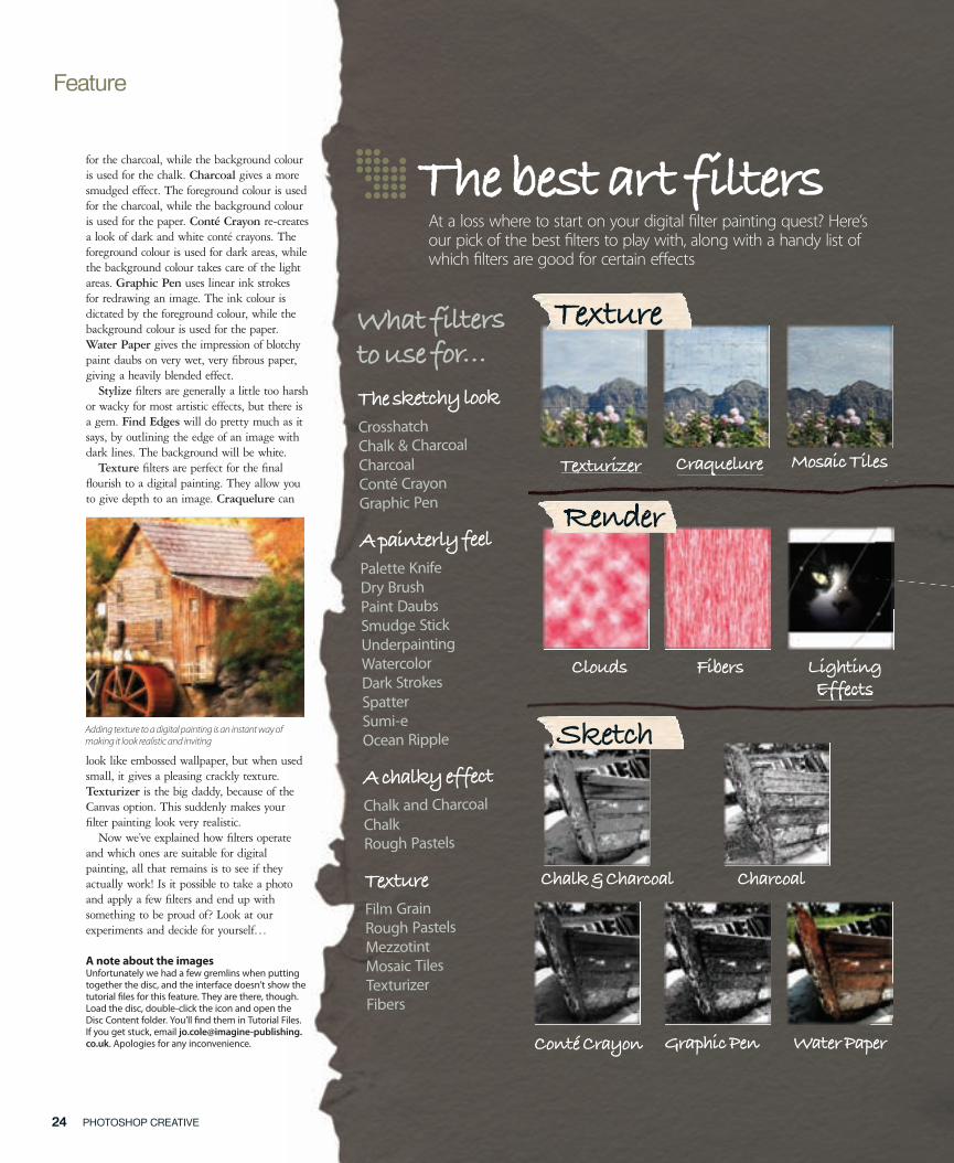
The best art filtersAt a loss where to start on your digital � lter painting quest? Here’s our pick of the best � lters to play with, along with a handy list of which � lters are good for certain e� ects
Adding texture to a digital painting is an instant way of making it look realistic and inviting
What filters to use for…
The sketchy look
CrosshatchChalk & Charcoal Charcoal Conté CrayonGraphic Pen
A painterly feel
Palette KnifeDry BrushPaint DaubsSmudge StickUnderpaintingWatercolorDark StrokesSpatterSumi-eOcean Ripple
A chalky effect
Chalk and CharcoalChalkRough Pastels
Texture
Film GrainRough PastelsMezzotintMosaic TilesTexturizerFibers
Texturizer Craquelure Mosaic Tiles
Clouds Fibers Lighting Effects
Render
Chalk & Charcoal Charcoal
Conté Crayon Graphic Pen Water Paper
Brush Strokes
Texture
Texturizer Craquelure
Render
Effects
Sketch
016-25PC11_Feature temp.indd 24 15/6/06 20:28:56

PHOTOSHOP CREATIVE 2524 PHOTOSHOP CREATIVE
StylizePixelate
Brush Strokes
StylizeStylizeStylizePixelate
Artistic
Colored Pencil Dry Brush Fresco Paint Daubs Palette Knife Poster Edges
Rough Pastels Smudge Stick Sponge Underpainting Watercolor
Add Noise Median
Noise
Mezzotint Pointillize Find Edges Diffuse Glow Ocean Ripple
Distort
Gaussian
Blur
Accented Edges Angled Strokes Crosshatch Dark Strokes
Ink Outlines Spatter Sprayed Strokes Sumi-e
016-25PC11_Feature temp.indd 25 15/6/06 20:30:48

This issue we look at using a plug-in to get artistic results, applying digital make-up to photos and animating still images
tutorials
CHECK IT OUT! | TUTORIAL RESOURCE FILES CAN BE FOUND ON THE CD – SEE THE INSIDE BACK COVER
27PHOTOSHOP CREATIVE
photoshop creative issue eleven
Don’t worry if you’ve lost detail in your photos due to adverse lighting conditions – this command can retrieve it
Photoshop Creative_Issue 11
The Shadow/Highlight tool 46
Big technique
Focus on…
Cool plug-ins
Texture fi lters 34
Brush settings 56
Pattern maker 62
Work with buZZ.Simplifi er
Use the full version plug-in on this issue’s disc to create digital art
Tutorial starts on page 50
Quickly transform a photo into a lively image that’s made up of di� erent shapes. It’s a great way to add interest to a boring image, or deal with dull backgrounds. You can also use it to create digital art!
Cubismplug-in 72
We continue to work our way through the inbuilt tools of the Photoshop software and reveal how they can be used to create better artwork
70Use the Match Color command
42Fake the Cross Process look36
Make your own photo fi lters
64 Animate in ImageReady
28Create crazy characters
58 Apply digital make-up
027_PC11_Tut intro.indd 27 15/6/06 17:57:23
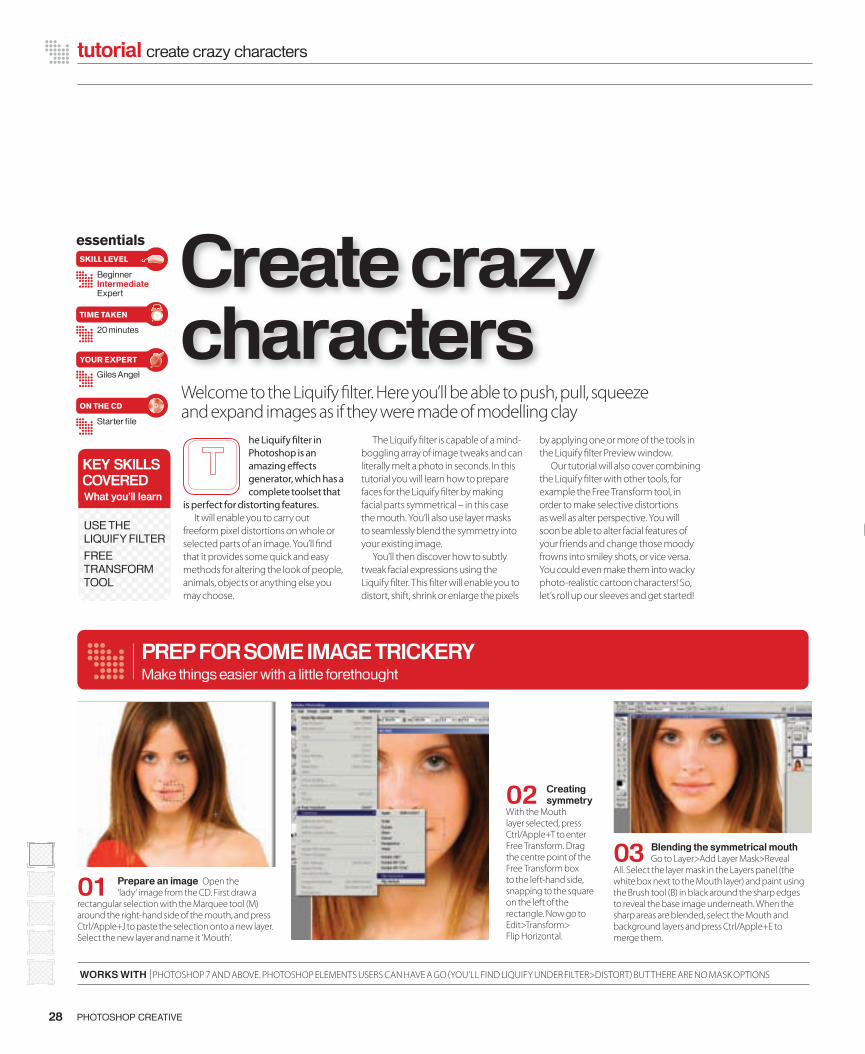
28 PHOTOSHOP CREATIVE
tutorial create crazy characters
essentials
BeginnerIntermediateExpert
20 minutes
Starter fi le
Giles Angel
SKILL LEVEL
TIME TAKEN
ON THE CD
YOUR EXPERT
Welcome to the Liquify � lter. Here you’ll be able to push, pull, squeeze and expand images as if they were made of modelling clay
he Liquify � lter in Photoshop is an amazing e� ects generator, which has a complete toolset that
is perfect for distorting features. It will enable you to carry out
freeform pixel distortions on whole or selected parts of an image. You’ll � nd that it provides some quick and easy methods for altering the look of people, animals, objects or anything else you may choose.
The Liquify � lter is capable of a mind-boggling array of image tweaks and can literally melt a photo in seconds. In this tutorial you will learn how to prepare faces for the Liquify � lter by making facial parts symmetrical – in this case the mouth. You’ll also use layer masks to seamlessly blend the symmetry into your existing image.
You’ll then discover how to subtly tweak facial expressions using the Liquify � lter. This � lter will enable you to distort, shift, shrink or enlarge the pixels
by applying one or more of the tools in the Liquify � lter Preview window.
Our tutorial will also cover combining the Liquify � lter with other tools, for example the Free Transform tool, in order to make selective distortions as well as alter perspective. You will soon be able to alter facial features of your friends and change those moody frowns into smiley shots, or vice versa. You could even make them into wacky photo-realistic cartoon characters! So, let’s roll up our sleeves and get started!
Create crazy characters
03 Blending the symmetrical mouth Go to Layer>Add Layer Mask>Reveal
All. Select the layer mask in the Layers panel (the white box next to the Mouth layer) and paint using the Brush tool (B) in black around the sharp edges to reveal the base image underneath. When the sharp areas are blended, select the Mouth and background layers and press Ctrl/Apple+E to merge them.
02 Creating symmetry
With the Mouth layer selected, press Ctrl/Apple+T to enter Free Transform. Drag the centre point of the Free Transform box to the left-hand side, snapping to the square on the left of the rectangle. Now go to Edit>Transform> Flip Horizontal.
01 Prepare an image Open the ‘lady’ image from the CD. First draw a
rectangular selection with the Marquee tool (M) around the right-hand side of the mouth, and press Ctrl/Apple+J to paste the selection onto a new layer. Select the new layer and name it ‘Mouth’.
PREP FOR SOME IMAGE TRICKERYMake things easier with a little forethought
KEY SKILLSCOVEREDWhat you’ll learn
USE THE LIQUIFY FILTER
FREE TRANSFORM TOOL
WORKS WITH | PHOTOSHOP 7 AND ABOVE. PHOTOSHOP ELEMENTS USERS CAN HAVE A GO (YOU’LL FIND LIQUIFY UNDER FILTER>DISTORT) BUT THERE ARE NO MASK OPTIONS
028-032_PC11_liquify.indd 28 15/6/06 12:48:36
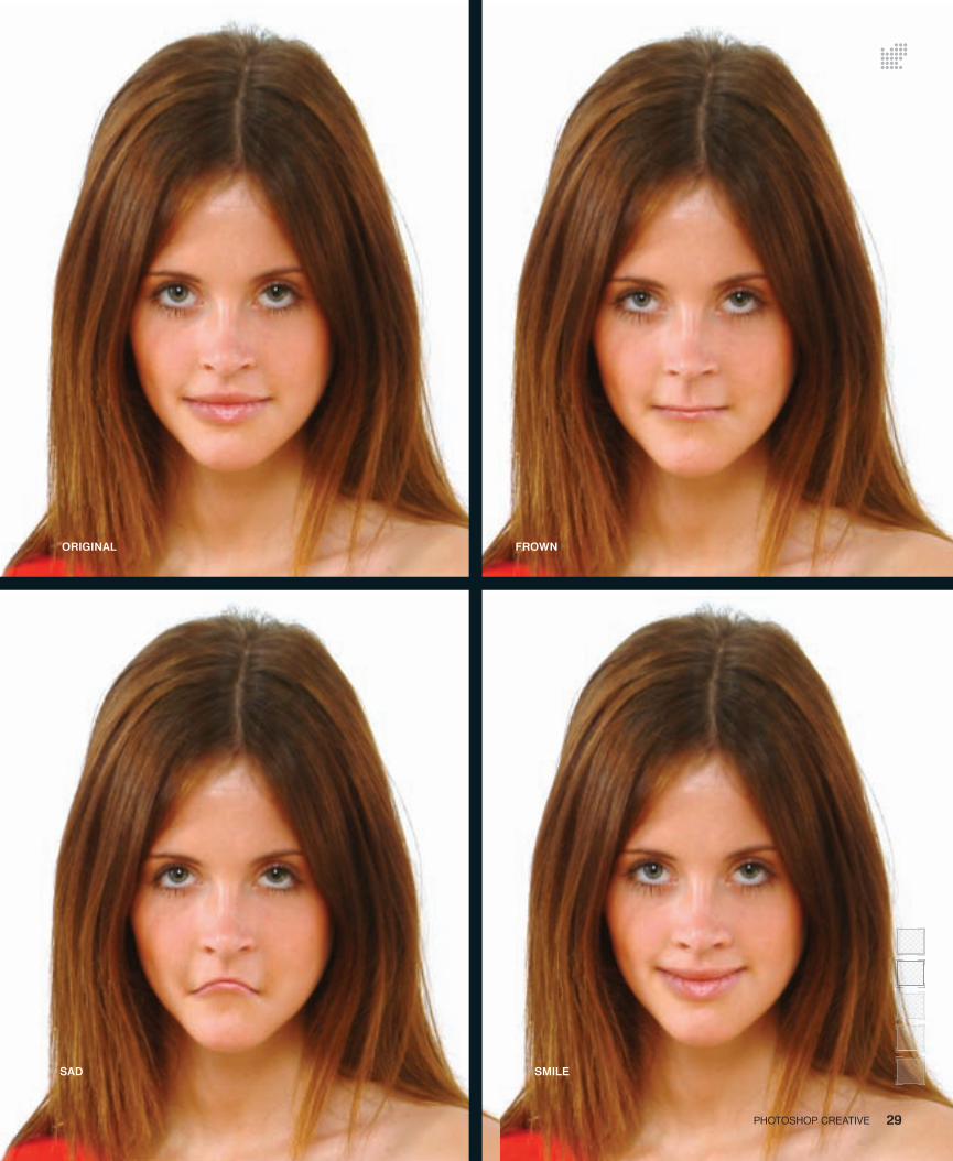
29PHOTOSHOP CREATIVE
ORIGINAL FROWN
SMILESAD
028-032_PC11_liquify.indd 29 15/6/06 12:49:02
LIQUID LUNCH
30 PHOTOSHOP CREATIVE
tutorial create crazy characters
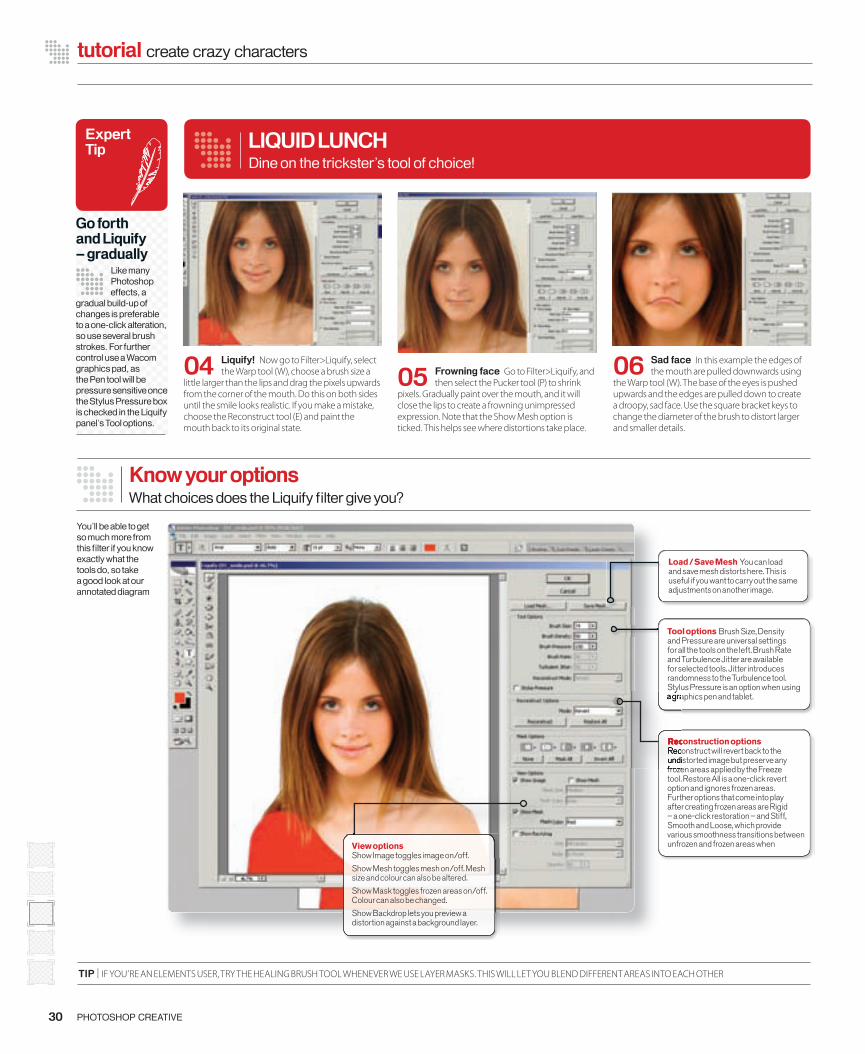
Know your optionsWhat choices does the Liquify fi lter give you?
04 Liquify! Now go to Filter>Liquify, select the Warp tool (W), choose a brush size a
little larger than the lips and drag the pixels upwards from the corner of the mouth. Do this on both sides until the smile looks realistic. If you make a mistake, choose the Reconstruct tool (E) and paint the mouth back to its original state.
You’ll be able to get so much more from this fi lter if you know exactly what the tools do, so take a good look at our annotated diagram
Expert Tip
Go forth and Liquify – gradually
Like many Photoshop effects, a
gradual build-up of changes is preferable to a one-click alteration, so use several brush strokes. For further control use a Wacom graphics pad, as the Pen tool will be pressure sensitive once the Stylus Pressure box is checked in the Liquify panel’s Tool options.
Load / Save Mesh You can load and save mesh distorts here. This is useful if you want to carry out the same adjustments on another image.
TIP | IF YOU’RE AN ELEMENTS USER, TRY THE HEALING BRUSH TOOL WHENEVER WE USE LAYER MASKS. THIS WILL LET YOU BLEND DIFFERENT AREAS INTO EACH OTHER
Dine on the trickster’s tool of choice!
06 Sad face In this example the edges of the mouth are pulled downwards using
the Warp tool (W). The base of the eyes is pushed upwards and the edges are pulled down to create a droopy, sad face. Use the square bracket keys to change the diameter of the brush to distort larger and smaller details.
05 Frowning face Go to Filter>Liquify, and then select the Pucker tool (P) to shrink
pixels. Gradually paint over the mouth, and it will close the lips to create a frowning unimpressed expression. Note that the Show Mesh option is ticked. This helps see where distortions take place.
Tool options Brush Size, Density and Pressure are universal settings for all the tools on the left. Brush Rate and Turbulence Jitter are available for selected tools. Jitter introduces randomness to the Turbulence tool. Stylus Pressure is an option when using a graphics pen and tablet.
Reconstruction options Reconstruct will revert back to the undistorted image but preserve any frozen areas applied by the Freeze tool. Restore All is a one-click revert option and ignores frozen areas. Further options that come into play after creating frozen areas are Rigid – a one-click restoration – and Stiff, Smooth and Loose, which provide various smoothness transitions between unfrozen and frozen areas when
Stylus Pressure is an option when using a graphics pen and tablet.
Reconstruction optionsReconstruct will revert back to the undistorted image but preserve any frozen areas applied by the Freeze
View options Show Image toggles image on/off.
Show Mesh toggles mesh on/off. Mesh size and colour can also be altered.
Show Mask toggles frozen areas on/off. Colour can also be changed.
Show Backdrop lets you preview a distortion against a background layer.
028-032_PC11_liquify.indd 30 15/6/06 12:49:21
13 Finishing off After blending, use the Crop tool (C) to crop, then Layer>Flatten
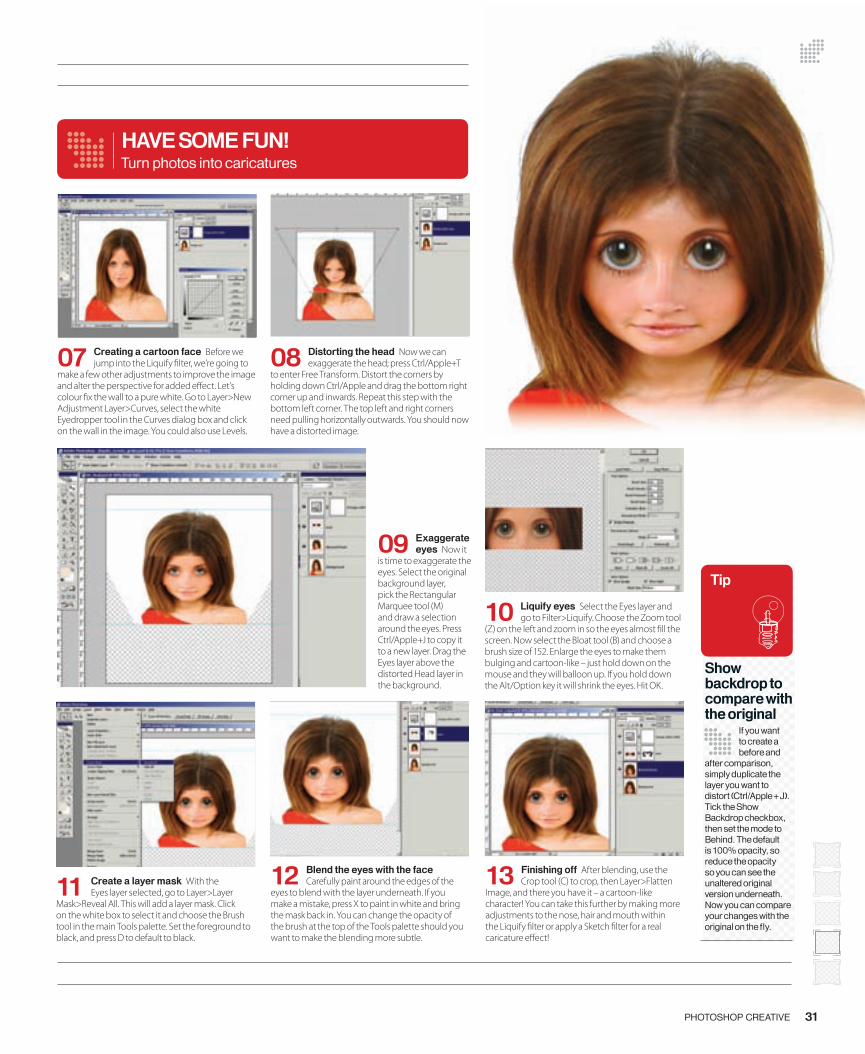
Image, and there you have it – a cartoon-like character! You can take this further by making more adjustments to the nose, hair and mouth within the Liquify � lter or apply a Sketch � lter for a real caricature e� ect!
07 Creating a cartoon face Before we jump into the Liquify � lter, we’re going to
make a few other adjustments to improve the image and alter the perspective for added e� ect. Let’s colour � x the wall to a pure white. Go to Layer>New Adjustment Layer>Curves, select the white Eyedropper tool in the Curves dialog box and click on the wall in the image. You could also use Levels.
09 Exaggerate eyes Now it
is time to exaggerate the eyes. Select the original background layer, pick the Rectangular Marquee tool (M) and draw a selection around the eyes. Press Ctrl/Apple+J to copy it to a new layer. Drag the Eyes layer above the distorted Head layer in the background.
10 Liquify eyes Select the Eyes layer and go to Filter>Liquify. Choose the Zoom tool
(Z) on the left and zoom in so the eyes almost � ll the screen. Now select the Bloat tool (B) and choose a brush size of 152. Enlarge the eyes to make them bulging and cartoon-like – just hold down on the mouse and they will balloon up. If you hold down the Alt/Option key it will shrink the eyes. Hit OK.
HAVE SOME FUN!
08 Distorting the head Now we can exaggerate the head; press Ctrl/Apple+T
to enter Free Transform. Distort the corners by holding down Ctrl/Apple and drag the bottom right corner up and inwards. Repeat this step with the bottom left corner. The top left and right corners need pulling horizontally outwards. You should now have a distorted image.
31PHOTOSHOP CREATIVE
Turn photos into caricatures
12 Blend the eyes with the face Carefully paint around the edges of the
eyes to blend with the layer underneath. If you make a mistake, press X to paint in white and bring the mask back in. You can change the opacity of the brush at the top of the Tools palette should you want to make the blending more subtle.
11 Create a layer mask With the Eyes layer selected, go to Layer>Layer
Mask>Reveal All. This will add a layer mask. Click on the white box to select it and choose the Brush tool in the main Tools palette. Set the foreground to black, and press D to default to black.
Tip
Show backdrop to compare with the original
If you want to create a before and
after comparison, simply duplicate the layer you want to distort (Ctrl/Apple+J). Tick the Show Backdrop checkbox, then set the mode to Behind. The default is 100% opacity, so reduce the opacity so you can see the unaltered original version underneath. Now you can compare your changes with the original on the fl y.
028-032_PC11_liquify.indd 31 15/6/06 12:49:41
WHAT LIQUIFY CAN DO FOR YOU
32 PHOTOSHOP CREATIVE
tutorial create crazy characters
At a loss as to what’s going on in the Liquify interface? Here’s a look at what all the tools do…
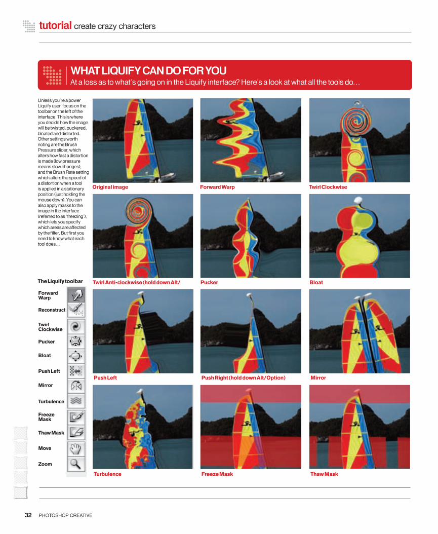
Unless you’re a power Liquify user, focus on the toolbar on the left of the interface. This is where you decide how the image will be twisted, puckered, bloated and distorted. Other settings worth noting are the Brush Pressure slider, which alters how fast a distortion is made (low pressure means slow changes), and the Brush Rate setting which alters the speed of a distortion when a tool is applied in a stationary position (just holding the mouse down). You can also apply masks to the image in the interface (referred to as ‘freezing’), which lets you specify which areas are affected by the fi lter. But fi rst you need to know what each tool does…
Original image Forward Warp Twirl Clockwise
Twirl Anti-clockwise (hold down Alt/ Pucker Bloat
Push Left Push Right (hold down Alt/Option) Mirror
Turbulence Freeze Mask Thaw Mask
The Liquify toolbar
Forward Warp
Reconstruct
Twirl Clockwise
Pucker
Bloat
Push Left
Mirror
Turbulence
Freeze Mask
Thaw Mask
Move
Zoom
028-032_PC11_liquify.indd 32 15/6/06 12:49:59

Focus on texture fi lters
NEXT ISSUE | SEE WHAT OPTIONS LURK IN THE OTHER FILTERS SET
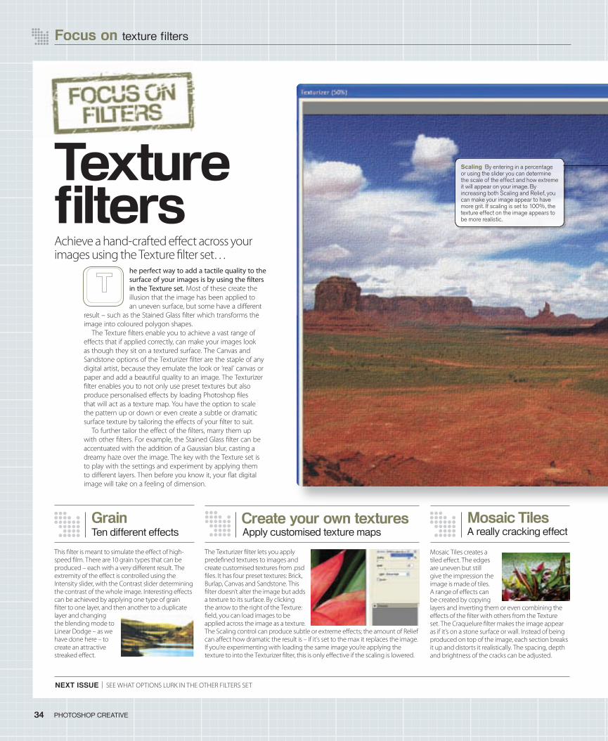
he perfect way to add a tactile quality to the surface of your images is by using the � lters in the Texture set. Most of these create the illusion that the image has been applied to an uneven surface, but some have a di� erent
result – such as the Stained Glass � lter which transforms the image into coloured polygon shapes.
The Texture � lters enable you to achieve a vast range of e� ects that if applied correctly, can make your images look as though they sit on a textured surface. The Canvas and Sandstone options of the Texturizer � lter are the staple of any digital artist, because they emulate the look or ‘real’ canvas or paper and add a beautiful quality to an image. The Texturizer � lter enables you to not only use preset textures but also produce personalised e� ects by loading Photoshop � les that will act as a texture map. You have the option to scale the pattern up or down or even create a subtle or dramatic surface texture by tailoring the e� ects of your � lter to suit.
To further tailor the e� ect of the � lters, marry them up with other � lters. For example, the Stained Glass � lter can be accentuated with the addition of a Gaussian blur, casting a dreamy haze over the image. The key with the Texture set is to play with the settings and experiment by applying them to di� erent layers. Then before you know it, your � at digital image will take on a feeling of dimension.
34 PHOTOSHOP CREATIVE
This � lter is meant to simulate the e� ect of high-speed � lm. There are 10 grain types that can be produced – each with a very di� erent result. The extremity of the e� ect is controlled using the Intensity slider, with the Contrast slider determining the contrast of the whole image. Interesting e� ects can be achieved by applying one type of grain � lter to one layer, and then another to a duplicate layer and changing the blending mode to Linear Dodge – as we have done here – to create an attractive streaked e� ect.
Ten different effectsGrain
The Texturizer � lter lets you apply prede� ned textures to images and create customised textures from .psd � les. It has four preset textures: Brick, Burlap, Canvas and Sandstone. This � lter doesn’t alter the image but adds a texture to its surface. By clicking the arrow to the right of the Texture: � eld, you can load images to be applied across the image as a texture. The Scaling control can produce subtle or extreme e� ects; the amount of Relief can a� ect how dramatic the result is – if it’s set to the max it replaces the image. If you’re experimenting with loading the same image you’re applying the texture to into the Texturizer � lter, this is only e� ective if the scaling is lowered.
Apply customised texture mapsCreate your own textures
A really cracking effectMosaic Tiles
Mosaic Tiles creates a tiled e� ect. The edges are uneven but still give the impression the image is made of tiles. A range of e� ects can be created by copying layers and inverting them or even combining the e� ects of the � lter with others from the Texture set. The Craquelure � lter makes the image appear as if it’s on a stone surface or wall. Instead of being produced on top of the image, each section breaks it up and distorts it realistically. The spacing, depth and brightness of the cracks can be adjusted.
Scaling By entering in a percentage or using the slider you can determine the scale of the effect and how extreme it will appear on your image. By increasing both Scaling and Relief, you can make your image appear to have more grit. If scaling is set to 100%, the texture effect on the image appears to be more realistic.
Texture fi ltersAchieve a hand-crafted e� ect across your images using the Texture � lter set…
034-35_PC11_Filter.indd 34 15/6/06 10:58:58
35PHOTOSHOP CREATIVE
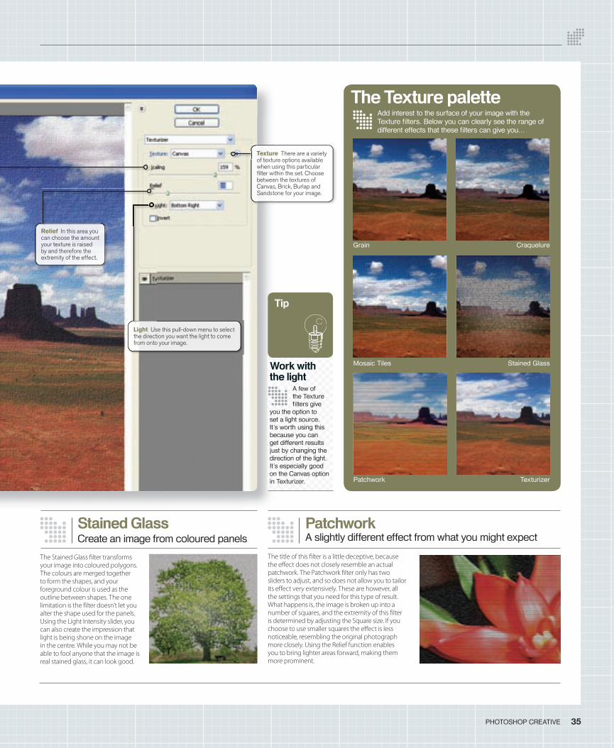
Add interest to the surface of your image with the Texture fi lters. Below you can clearly see the range of different effects that these fi lters can give you…
The Texture palette
Create an image from coloured panelsStained Glass
The Stained Glass � lter transforms your image into coloured polygons. The colours are merged together to form the shapes, and your foreground colour is used as the outline between shapes. The one limitation is the � lter doesn’t let you alter the shape used for the panels. Using the Light Intensity slider, you can also create the impression that light is being shone on the image in the centre. While you may not be able to fool anyone that the image is real stained glass, it can look good.
Work with the light
A few of the Texture fi lters give
you the option to set a light source. It’s worth using this because you can get different results just by changing the direction of the light. It’s especially good on the Canvas option in Texturizer.
Tip
Texture There are a variety of texture options available when using this particular fi lter within the set. Choose between the textures of Canvas, Brick, Burlap and Sandstone for your image.
Light Use this pull-down menu to select the direction you want the light to come from onto your image.
A slightly different effect from what you might expectPatchwork
The title of this � lter is a little deceptive, because the e� ect does not closely resemble an actual patchwork. The Patchwork � lter only has two sliders to adjust, and so does not allow you to tailor its e� ect very extensively. These are however, all the settings that you need for this type of result. What happens is, the image is broken up into a number of squares, and the extremity of this � lter is determined by adjusting the Square size. If you choose to use smaller squares the e� ect is less noticeable, resembling the original photograph more closely. Using the Relief function enables you to bring lighter areas forward, making them more prominent.
Relief In this area you can choose the amount your texture is raised by and therefore the extremity of the effect.
Mosaic Tiles Stained Glass
Grain Craquelure
Patchwork Texturizer
034-35_PC11_Filter.indd 35 15/6/06 10:59:31
36 PHOTOSHOP CREATIVE
Create an adjustable graduated colour lens and apply it to a landscape photo without the cost and hassle of the real thing
hen � rst getting hooked on photography you think it’s the coolest thing to toy with lenses. Then you’re introduced to � lters and � nd you can play with colour
e� ects that can change at a whim. But � lters cost money, and good ones aren’t cheap. Plus, you have to take them with you when you shoot, and � ddle with them in the view� nder.
Then Photoshop comes along and suddenly you have a fully stocked darkroom at your
� ngertips. You lose the will to sleep and ca� eine becomes your best friend. You’ve hit the jackpot!
But here’s the best thing about it. That digital darkroom gives you the ability to re-create most of those � lters you once bought. In addition, you can custom create any colour gradient � lter, tailoring it to suit your image. Your photographic tools have expanded and there’s no limit. What’s more, you can apply the � lters to the image in any way you see � t. All with a few clicks of the mouse!
So let’s get started and cut some � lter glass…
PHOTOSHOP CREATIVE
� ddle with them in the view� nder.Then Photoshop comes along and suddenly
you have a fully stocked darkroom at your
more, you can apply the � lters to the image in any way you see � t. All with a few clicks of the mouse!
So let’s get started and cut some � lter glass…
Create an adjustable graduated colour lens and apply it to a landscape photo without the cost and hassle of the real thing
e� ects that can change at a whim. But � lters cost money, and good ones aren’t cheap. Plus, you have to take them with you when you shoot, and � ddle with them in the view� nder.
Then Photoshop comes along and suddenly you have a fully stocked darkroom at your
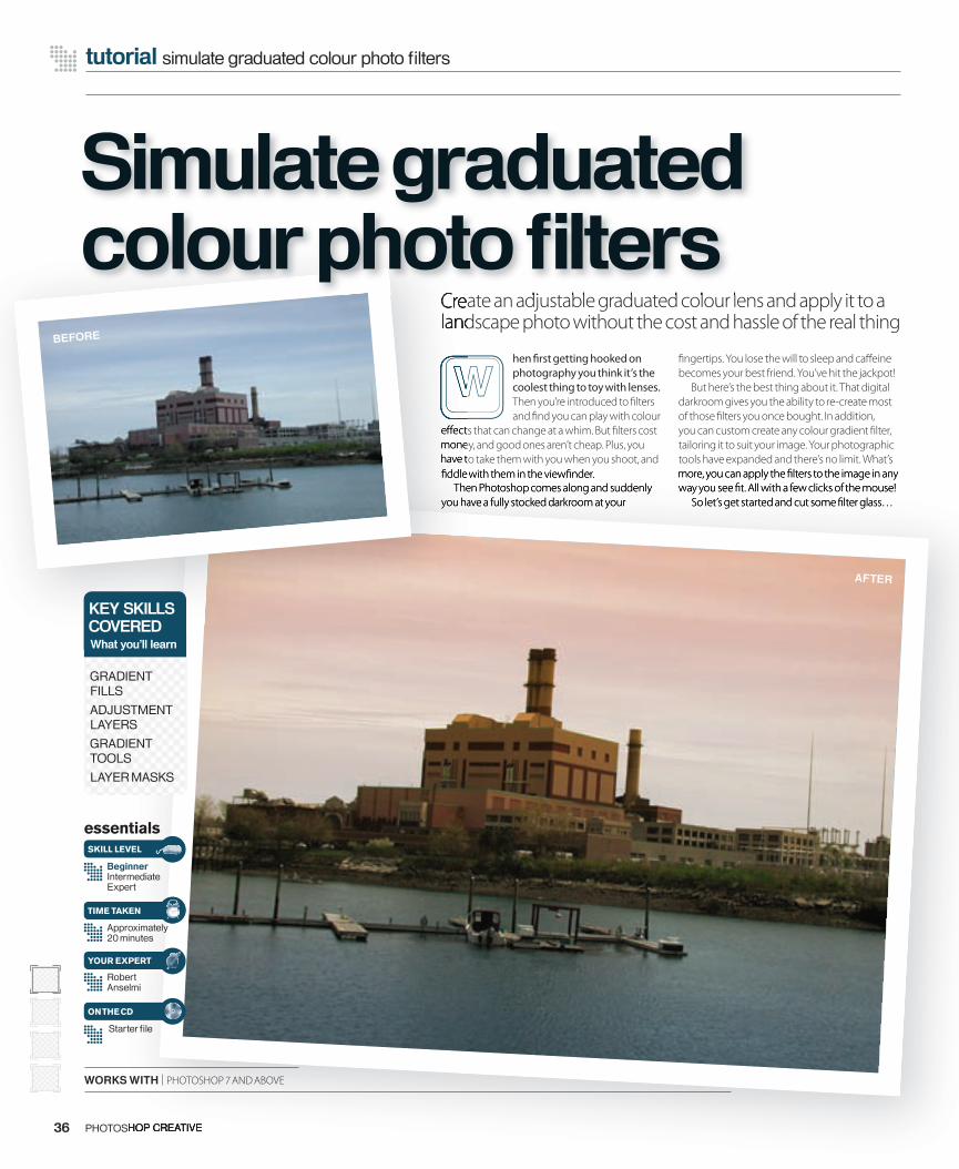
BEFORE
AFTER
essentials
BeginnerIntermediateExpert
Approximately 20 minutes
Robert Anselmi
SKILL LEVEL
TIME TAKEN
YOUR EXPERT
KEY SKILLSCOVEREDWhat you’ll learn
GRADIENT FILLS
ADJUSTMENT LAYERS
GRADIENT TOOLS
LAYER MASKS
Starter fi le
ON THE CD
WORKS WITH | PHOTOSHOP 7 AND ABOVE
Create an adjustable graduated colour lens and apply it to a Create an adjustable graduated colour lens and apply it to a
Simulate graduated colour photo fi lters
tutorial simulate graduated colour photo fi lters
036-039_PC_11.indd 36 15/6/06 09:49:04
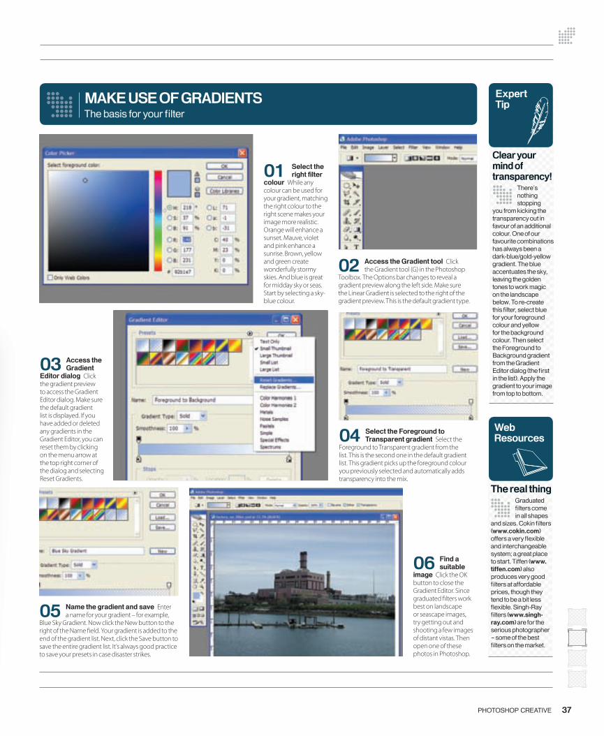
37PHOTOSHOP CREATIVE
03 Access the Gradient
Editor dialog Click the gradient preview to access the Gradient Editor dialog. Make sure the default gradient list is displayed. If you have added or deleted any gradients in the Gradient Editor, you can reset them by clicking on the menu arrow at the top right corner of the dialog and selecting Reset Gradients.
04 Select the Foreground to Transparent gradient Select the
Foreground to Transparent gradient from the list. This is the second one in the default gradient list. This gradient picks up the foreground colour you previously selected and automatically adds transparency into the mix.
05 Name the gradient and save Enter a name for your gradient – for example,
Blue Sky Gradient. Now click the New button to the right of the Name � eld. Your gradient is added to the end of the gradient list. Next, click the Save button to save the entire gradient list. It’s always good practice to save your presets in case disaster strikes.
MAKE USE OF GRADIENTS
02 Access the Gradient tool Click the Gradient tool (G) in the Photoshop
Toolbox. The Options bar changes to reveal a gradient preview along the left side. Make sure the Linear Gradient is selected to the right of the gradient preview. This is the default gradient type.
The basis for your fi lter
06 Find a suitable
image Click the OK button to close the Gradient Editor. Since graduated � lters work best on landscape or seascape images, try getting out and shooting a few images of distant vistas. Then open one of these photos in Photoshop.
01 Select the right fi lter
colour While any colour can be used for your gradient, matching the right colour to the right scene makes your image more realistic. Orange will enhance a sunset. Mauve, violet and pink enhance a sunrise. Brown, yellow and green create wonderfully stormy skies. And blue is great for midday sky or seas. Start by selecting a sky-blue colour.
WebResources
The real thingGraduated fi lters come in all shapes
and sizes. Cokin fi lters (www.cokin.com) offers a very fl exible and interchangeable system; a great place to start. Tiffen (www.tiffen.com) also produces very good fi lters at affordable prices, though they tend to be a bit less fl exible. Singh-Ray fi lters (www.singh-ray.com) are for the serious photographer – some of the best fi lters on the market.
Expert Tip
Clear your mind of transparency!
There’s nothing stopping
you from kicking the transparency out in favour of an additional colour. One of our favourite combinations has always been a dark-blue/gold-yellow gradient. The blue accentuates the sky, leaving the golden tones to work magic on the landscape below. To re-create this fi lter, select blue for your foreground colour and yellow for the background colour. Then select the Foreground to Background gradient from the Gradient Editor dialog (the fi rst in the list). Apply the gradient to your image from top to bottom.
036-039_PC_11.indd 37 15/6/06 09:49:29
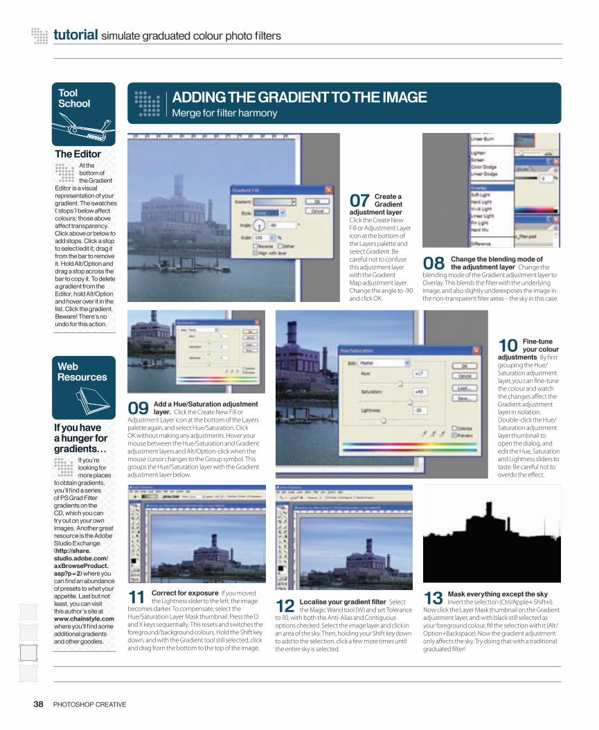
12 Localise your gradient fi lter Select the Magic Wand tool (W) and set Tolerance
to 30, with both the Anti-Alias and Contiguous options checked. Select the image layer and click in an area of the sky. Then, holding your Shift key down to add to the selection, click a few more times until the entire sky is selected.
13 Mask everything except the sky Invert the selection (Ctrl/Apple+ Shift+I).
Now click the Layer Mask thumbnail on the Gradient adjustment layer, and with black still selected as your foreground colour, � ll the selection with it (Alt/Option+Backspace). Now the gradient adjustment only a� ects the sky. Try doing that with a traditional graduated � lter!
09 Add a Hue/Saturation adjustment layer. Click the Create New Fill or
Adjustment Layer icon at the bottom of the Layers palette again, and select Hue/Saturation. Click OK without making any adjustments. Hover your mouse between the Hue/Saturation and Gradient adjustment layers and Alt/Option-click when the mouse cursor changes to the Group symbol. This groups the Hue/Saturation layer with the Gradient adjustment layer below.
07 Create a Gradient
adjustment layer Click the Create New Fill or Adjustment Layer icon at the bottom of the Layers palette and select Gradient. Be careful not to confuse this adjustment layer with the Gradient Map adjustment layer. Change the angle to -90 and click OK.
10 Fine-tune your colour
adjustments By � rst grouping the Hue/Saturation adjustment layer, you can � ne-tune the colour and watch the changes a� ect the Gradient adjustment layer in isolation. Double-click the Hue/Saturation adjustment layer thumbnail to open the dialog, and edit the Hue, Saturation and Lightness sliders to taste. Be careful not to overdo the e� ect.
11 Correct for exposure If you moved the Lightness slider to the left, the image
becomes darker. To compensate, select the Hue/Saturation Layer Mask thumbnail. Press the D and X keys sequentially. This resets and switches the foreground/background colours. Hold the Shift key down, and with the Gradient tool still selected, click and drag from the bottom to the top of the image.
ADDING THE GRADIENT TO THE IMAGE
38 PHOTOSHOP CREATIVE
tutorial simulate graduated colour photo fi lters
Merge for fi lter harmony
08 Change the blending mode of the adjustment layer Change the
blending mode of the Gradient adjustment layer to Overlay. This blends the � lter with the underlying image, and also slightly underexposes the image in the non-transparent � lter areas – the sky in this case.
Tool School
The Editor At the bottom of the Gradient
Editor is a visual representation of your gradient. The swatches (‘stops’) below affect colours; those above affect transparency. Click above or below to add stops. Click a stop to select/edit it; drag it from the bar to remove it. Hold Alt/Option and drag a stop across the bar to copy it. To delete a gradient from the Editor, hold Alt/Option and hover over it in the list. Click the gradient. Beware! There’s no undo for this action.
WebResources
If you have a hunger for gradients…
If you’re looking for more places
to obtain gradients, you’ll fi nd a series of PS Grad Filter gradients on the CD, which you can try out on your own images. Another great resource is the Adobe Studio Exchange (http://share.studio.adobe.com/axBrowseProduct.asp?p=2) where you can fi nd an abundance of presets to whet your appetite. Last but not least, you can visit this author’s site at www.chainstyle.com where you’ll fi nd some additional gradients and other goodies.
036-039_PC_11.indd 38 15/6/06 09:49:42
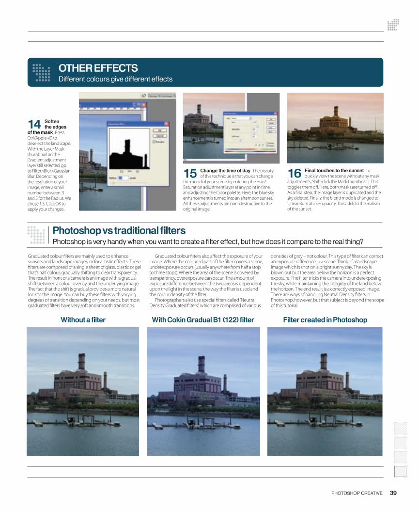
39PHOTOSHOP CREATIVE
14 Soften the edges
of the mask Press Ctrl/Apple+D to deselect the landscape. With the Layer Mask thumbnail on the Gradient adjustment layer still selected, go to Filter>Blur>Gaussian Blur. Depending on the resolution of your image, enter a small number between .5 and 5 for the Radius. We chose 1.5. Click OK to apply your changes.
15 Change the time of day The beauty of this technique is that you can change
the mood of your scene by entering the Hue/Saturation adjustment layer at any point in time, and adjusting the Color palette. Here, the blue sky enhancement is turned into an afternoon sunset. All these adjustments are non-destructive to the original image.
OTHER EFFECTS
16 Final touches to the sunset To quickly view the scene without any mask
adjustments, Shift-click the Mask thumbnails. This toggles them o� . Here, both masks are turned o� . As a � nal step, the image layer is duplicated and the sky deleted. Finally, the blend mode is changed to Linear Burn at 25% opacity. This adds to the realism of the sunset.
Different colours give different effects
Photoshop vs traditional fi ltersPhotoshop is very handy when you want to create a fi lter effect, but how does it compare to the real thing?
Graduated colour � lters are mainly used to enhance sunsets and landscape images, or for artistic e� ects. These � lters are composed of a single sheet of glass, plastic or gel that’s half colour, gradually shifting to clear transparency. The result in front of a camera is an image with a gradual shift between a colour overlay and the underlying image. The fact that the shift is gradual provides a more natural look to the image. You can buy these � lters with varying degrees of transition depending on your needs, but most graduated � lters have very soft and smooth transitions.
Graduated colour � lters also a� ect the exposure of your image. Where the coloured part of the � lter covers a scene, underexposure occurs (usually anywhere from half a stop to three stops). Where the area of the scene is covered by transparency, overexposure can occur. The amount of exposure di� erence between the two areas is dependent upon the light in the scene, the way the � lter is used and the colour density of the � lter.
Photographers also use special � lters called ‘Neutral Density Graduated � lters’, which are comprised of various
densities of grey – not colour. This type of � lter can correct an exposure di� erence in a scene. Think of a landscape image which is shot on a bright sunny day. The sky is blown out but the area below the horizon is a perfect exposure. The � lter tricks the camera into underexposing the sky, while maintaining the integrity of the land below the horizon. The end result is a correctly exposed image. There are ways of handling Neutral Density � lters in Photoshop, however, but that subject is beyond the scope of this tutorial.
Without a fi lter With Cokin Gradual B1 (122) fi lter Filter created in Photoshop
036-039_PC_11.indd 39 15/6/06 09:49:58
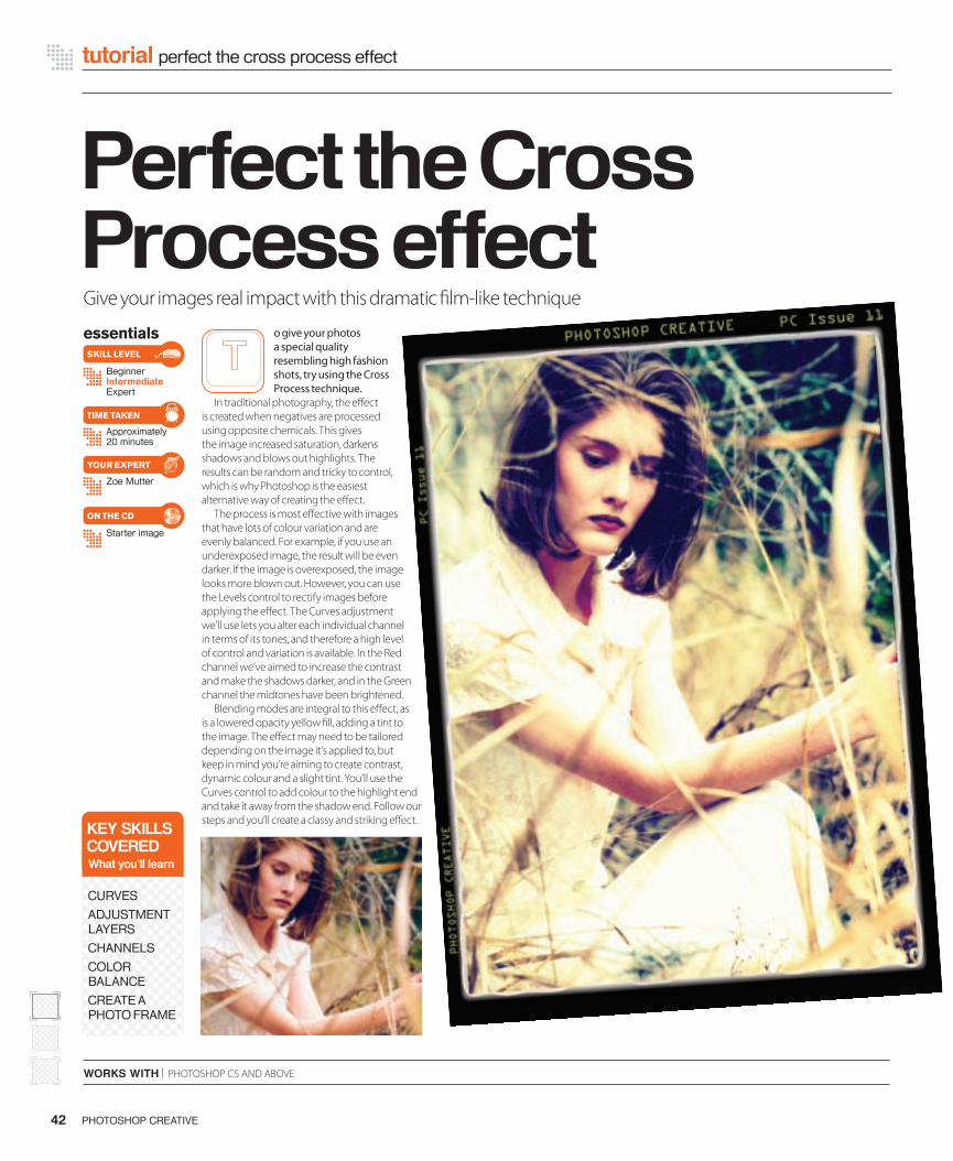
tutorial perfect the cross process effect
WORKS WITH | PHOTOSHOP CS AND ABOVE
Perfect the Cross Process effectessentials
BeginnerIntermediateExpert
Approximately 20 minutes
Starter image
Zoe Mutter
SKILL LEVEL
TIME TAKEN
ON THE CD
YOUR EXPERT
o give your photos a special quality resembling high fashion shots, try using the Cross Process technique.
In traditional photography, the e� ect is created when negatives are processed using opposite chemicals. This gives the image increased saturation, darkens shadows and blows out highlights. The results can be random and tricky to control, which is why Photoshop is the easiest alternative way of creating the e� ect.
The process is most e� ective with images that have lots of colour variation and are evenly balanced. For example, if you use an underexposed image, the result will be even darker. If the image is overexposed, the image looks more blown out. However, you can use the Levels control to rectify images before applying the e� ect. The Curves adjustment we’ll use lets you alter each individual channel in terms of its tones, and therefore a high level of control and variation is available. In the Red channel we’ve aimed to increase the contrast and make the shadows darker, and in the Green channel the midtones have been brightened.
Blending modes are integral to this e� ect, as is a lowered opacity yellow � ll, adding a tint to the image. The e� ect may need to be tailored depending on the image it’s applied to, but keep in mind you’re aiming to create contrast, dynamic colour and a slight tint. You’ll use the Curves control to add colour to the highlight end and take it away from the shadow end. Follow our steps and you’ll create a classy and striking e� ect.
PHOTOSHOP CREATIVE42
KEY SKILLSCOVEREDWhat you’ll learn
CURVES
ADJUSTMENT LAYERS
CHANNELS
COLOR BALANCE
CREATE A PHOTO FRAME
Give your images real impact with this dramatic � lm-like technique
042-044_PC11-cross.indd 42 14/6/06 18:02:56

08 Blending experiments Change this layer’s blending mode to Color, right-click
the adjustment layer and hit Duplicate Layer. Click the thumbnail of the new layer to make it active and change the blending mode to Overlay. Set Opacity to 50%. Experiment with the blending mode, as with some photos it can look e� ective set to Color.
04 Reduce dark and increase light Click again to add another point and enter
the values 192 and 159 in the two boxes. You will already have a point at the top right of the graph with the values 255, 255. What you are trying to do within the Curves adjustment is reduce the dark tones and increase the lighter ones to produce more extreme lighting.
01 Create a Curves adjustment layer Open the image ‘cross process before.
jpg’ from the disc. Choose Layer>New Adjustment Layer>Curves. Adjustment layers are useful as they are separate from your image, and by double-clicking their layer thumbnail you can go back and tweak the e� ect. It also means that your original image is not ruined if you make a mistake.
05 Rearrange the Red Move on to the Red channel and repeat the process but
enter di� erent numbers. Leave your points at the bottom left (0, 0) and top right (255, 255). Click on the graph to add a point and enter the values 88 and 56, and then add another point with the values 179 and 192.
06 Change channel Move to the Green channel by selecting it from the Channel
drop-down menu. Click to add a point and enter the values 63 and 60. Leave the point at the bottom left (0, 0), but then click to add another point and enter the values 183 and 211 into the boxes.
CROSS IT OUT
02 Adjust the channels Once the Curves dialog box opens you will see its main
feature is a histogram. The drop-down menu at the top automatically displays the RGB channel. Click on this to choose the Red, Green or Blue channel. By clicking on the histogram you can add points and adjust the di� erent tonal areas of your image in each channel.
43PHOTOSHOP CREATIVE
03 Adding points First adjust the RGB channel. You will already have a point at
the bottom left of your graph with the values 0, 0. By clicking again along the line of the graph you will add another point. In the two boxes that appear below, enter the value 50 in the � rst and 76 in the second.
Adjustment layers are the key to this fashion-photography look
07 Into the blue Select
the Blue channel and move the bottom point to 0, 26 and the top right point to 255, 232. When working with Curves the left side of the histogram represents the shadows, the right side the highlights of that particular channel, and the middle area is where the midtones are altered.
Tool School
Enhance the image fi rst
You may want to enhance
your image using the Levels control fi rst. This effect works best with images that are evenly balanced.
Picture resources
Finding good images
Thanks to Mike Slonecker
for letting us use his image in this tutorial. See more of his photos on the stock.xchng site.
042-044_PC11-cross.indd 43 14/6/06 18:03:10
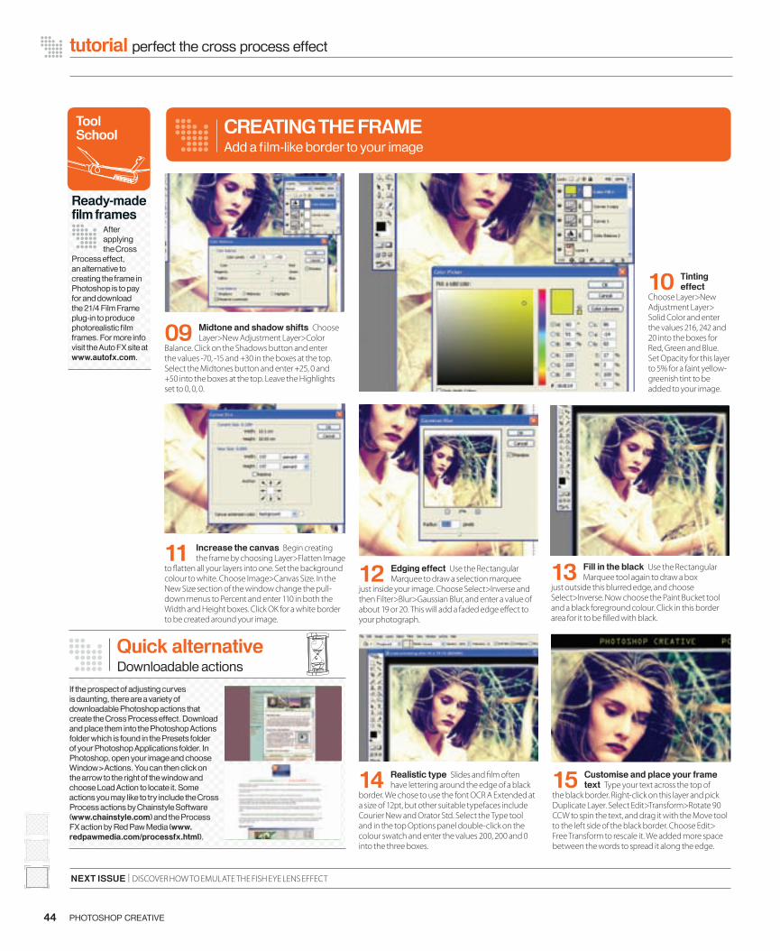
15 Customise and place your frame text Type your text across the top of
the black border. Right-click on this layer and pick Duplicate Layer. Select Edit>Transform>Rotate 90 CCW to spin the text, and drag it with the Move tool to the left side of the black border. Choose Edit> Free Transform to rescale it. We added more space between the words to spread it along the edge.
12 Edging effect Use the Rectangular Marquee to draw a selection marquee
just inside your image. Choose Select>Inverse and then Filter>Blur>Gaussian Blur, and enter a value of about 19 or 20. This will add a faded edge e� ect to your photograph.
09 Midtone and shadow shifts Choose Layer>New Adjustment Layer>Color
Balance. Click on the Shadows button and enter the values -70, -15 and +30 in the boxes at the top. Select the Midtones button and enter +25, 0 and +50 into the boxes at the top. Leave the Highlights set to 0, 0, 0.
44 PHOTOSHOP CREATIVE
tutorial perfect the cross process effect
10 Tinting effect
Choose Layer>New Adjustment Layer> Solid Color and enter the values 216, 242 and 20 into the boxes for Red, Green and Blue. Set Opacity for this layer to 5% for a faint yellow-greenish tint to be added to your image.
11 Increase the canvas Begin creating the frame by choosing Layer>Flatten Image
to � atten all your layers into one. Set the background colour to white. Choose Image>Canvas Size. In the New Size section of the window change the pull-down menus to Percent and enter 110 in both the Width and Height boxes. Click OK for a white border to be created around your image.
NEXT ISSUE | DISCOVER HOW TO EMULATE THE FISH EYE LENS EFFECT
13 Fill in the black Use the Rectangular Marquee tool again to draw a box
just outside this blurred edge, and choose Select>Inverse. Now choose the Paint Bucket tool and a black foreground colour. Click in this border area for it to be � lled with black.
14 Realistic type Slides and � lm often have lettering around the edge of a black
border. We chose to use the font OCR A Extended at a size of 12pt, but other suitable typefaces include Courier New and Orator Std. Select the Type tool and in the top Options panel double-click on the colour swatch and enter the values 200, 200 and 0 into the three boxes.
CREATING THE FRAMEAdd a fi lm-like border to your image
Tool School
Ready-made fi lm frames
After applying the Cross
Process effect, an alternative to creating the frame in Photoshop is to pay for and download the 21/4 Film Frame plug-in to produce photorealistic fi lm frames. For more info visit the Auto FX site at www.autofx.com.
Quick alternativeDownloadable actions
If the prospect of adjusting curves is daunting, there are a variety of downloadable Photoshop actions that create the Cross Process effect. Download and place them into the Photoshop Actions folder which is found in the Presets folder of your Photoshop Applications folder. In Photoshop, open your image and choose Window>Actions. You can then click on the arrow to the right of the window and choose Load Action to locate it. Some actions you may like to try include the Cross Process actions by Chainstyle Software (www.chainstyle.com) and the Process FX action by Red Paw Media (www.redpawmedia.com/processfx.html).
042-044_PC11-cross.indd 44 14/6/06 18:03:26

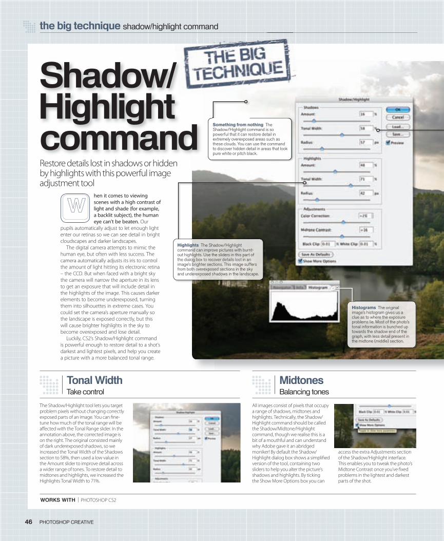
WORKS WITH | PHOTOSHOP CS2
the big technique shadow/highlight command
46 PHOTOSHOP CREATIVE
hen it comes to viewing scenes with a high contrast of light and shade (for example, a backlit subject), the human eye can’t be beaten. Our
pupils automatically adjust to let enough light enter our retinas so we can see detail in bright cloudscapes and darker landscapes.
The digital camera attempts to mimic the human eye, but often with less success. The camera automatically adjusts its iris to control the amount of light hitting its electronic retina – the CCD. But when faced with a bright sky the camera will narrow the aperture in its lens to get an exposure that will include detail in the highlights of the image. This causes darker elements to become underexposed, turning them into silhouettes in extreme cases. You could set the camera’s aperture manually so the landscape is exposed correctly, but this will cause brighter highlights in the sky to become overexposed and lose detail.
Luckily, CS2’s Shadow/Highlight command is powerful enough to restore detail to a shot’s darkest and lightest pixels, and help you create a picture with a more balanced tonal range.
Shadow/ Highlight command
MidtonesBalancing tones
All images consist of pixels that occupy a range of shadows, midtones and highlights. Technically, the Shadow/Highlight command should be called the Shadow/Midtone/Highlight command, though we realise this is a bit of a mouthful and can understand why Adobe gave it an abridged moniker! By default the Shadow/Highlight dialog box shows a simpli� ed version of the tool, containing two sliders to help you alter the picture’s shadows and highlights. By ticking the Show More Options box you can
access the extra Adjustments section of the Shadow/Highlight interface. This enables you to tweak the photo’s Midtone Contrast once you’ve � xed problems in the lightest and darkest parts of the shot.
Tonal Width
The Shadow/Highlight tool lets you target problem pixels without changing correctly exposed parts of an image. You can � ne-tune how much of the tonal range will be a� ected with the Tonal Range slider. In the annotation above, the corrected image is on the right. The original consisted mainly of dark underexposed shadows, so we increased the Tonal Width of the Shadows section to 58%, then used a low value in the Amount slider to improve detail across a wider range of tones. To restore detail to midtones and highlights, we increased the Highlights Tonal Width to 71%.
Take control
Restore details lost in shadows or hidden by highlights with this powerful image adjustment tool
Shadow/
Highlights The Shadow/Highlight command can improve pictures with burnt-out highlights. Use the sliders in this part of the dialog box to recover details lost in an image’s brighter sections. This image suffers from both overexposed sections in the sky and underexposed shadows in the landscape.
Something from nothing The Shadow/Highlight command is so powerful that it can restore detail in extremely overexposed areas such as these clouds. You can use the command to discover hidden detail in areas that look pure white or pitch black.
Histograms The original image’s histogram gives us a clue as to where the exposure problems lie. Most of the photo’s tonal information is bunched up towards the shadow end of the graph, with less detail present in the midtone (middle) section.
046-49_PC11_techniques.indd 46 14/6/06 17:55:57
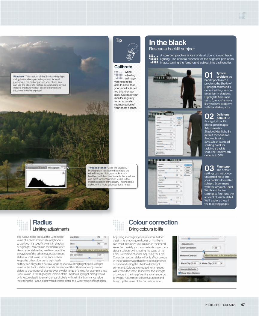
47PHOTOSHOP CREATIVE
Colour correctionBring colours to life
Adjusting an image’s tones to restore hidden detail in its shadows, midtones or highlights can result in washed-out colours in the edited areas. Fortunately you can create stronger, more vibrant colours by increasing the value of the Color Correction channel. Adjusting the Color Correction section slider will only a� ect colours in the original image that have been lightened or darkened using the Shadow/Highlight command. Colours in unedited tonal ranges will remain the same. To increase the strength of colours in the image’s entire tonal range, go to Image>Adjustments>Hue/Saturation and bump up the value of the Saturation slider.
Radius
The Radius slider looks at the Luminance value of a pixel’s immediate neighbours to work out if a speci� c pixel is in shadow or highlight. You can use the Radius slider like an extendable dog lead to control the behaviour of the other image adjustment sliders. A small value in the Radius slider keeps the other sliders on a tight leash so they can only alter a narrow range of shadow or highlight pixels. A larger value in the Radius slider extends the range of the other image adjustment sliders to create a tonal change over a wider range of pixels. For example, a low Radius value in the Highlights section of the Shadow/Highlight dialog would only restore details to small clumps of pixels with a similar Luminance value. Increasing the Radius slider would restore detail to a wider range of highlights.
Limiting adjustments
A common problem is loss of detail due to strong back-lighting. The camera exposes for the brightest part of an image, turning the foreground subject into a silhouette.
01 Typical problem As
backlit photos are a problem, the Shadow/Highlight command’s default settings restore detail lost in shadows. Highlights Amount is set to 0, as you’re more likely to have problems with the darker parts.
02 Delicious default To
� x a typical backlit photo go to Image> Adjustments> Shadow/Highlight. By default the Shadows Amount is set to 50%, which is a good starting point for tackling a backlit shot. The Tonal Width defaults to 50%.
03 Fine-tune The default
settings can introduce unwanted noise into your backlit silhouetted subject. Experiment with the Amount, Tonal Width and Radius settings to � ne-tune the amount of visible detail. We’ll explore these in the following pages.
In the blackRescue a backlit subject
When adjusting an image
you need to be able to know that your monitor is not too bright or too dark. Calibrate your monitor regularly for an accurate representation of your photo’s tones.
Tip
Calibrate
Shadows This section of the Shadow/Highlight dialog box enables you to target and fi x tonal problems in the darker parts of your photo. You can use the sliders to restore details lurking in your image’s shadows without causing highlights to become more overexposed.
Tweaked tones Once the Shadow/Highlight tool has worked its magic, the edited image’s histogram looks much healthier, with less bias towards the shadows and more tonal information visible in the midtone section of the graph. This indicates a shot with a more balanced tonal range.
046-49_PC11_techniques.indd 47 14/6/06 17:56:25
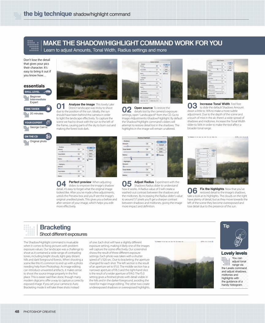
the big technique shadow/highlight command
48 PHOTOSHOP CREATIVE
MAKE THE SHADOW/HIGHLIGHT COMMAND WORK FOR YOULearn to adjust Amounts, Tonal Width, Radius settings and more
Don’t lose the detail that gives your pics their character. It’s easy to bring it out if you know how…
01 Analyse the image This lovely Lake District landscape was tricky to shoot
due to the position of the sun. Ideally, the sun should have been behind the camera in order to light the landscape e� ectively. To capture the scene we had to shoot with the sun to the left of the frame, causing parts of the sky to burn out and making the forest look dark.
02 Open source To restore the details lost by the camera’s exposure
settings, open ‘Landscape.tif’ from the CD. Go to Image>Adjustments>Shadow/Highlight. By default the Shadow/Highlight command’s sliders will attempt to restore detail lost in the shadows. The highlights in the image will remain unaltered.
03 Increase Tonal Width Feel free to slide the default Shadows Amount
down a little to 16% to make a more subtle adjustment. Due to the depth of the scene and a touch of mist in the air, there’s a wide spread of shadows and midtones. Increase the Tonal Width slider to 56% in order to make the tool a� ect a broader tonal range.
04 Perfect preview When adjusting sliders to improve the image’s shadow
detail, it’s easy to forget what the original image looked like. After you’ve made a few adjustments, untick the Preview box and you’ll see the image’s original unedited pixels. This gives you a before and after version of your image, which helps you edit more e� ectively.
05 Adjust Radius Experiment with the Shadows Radius slider to understand
how it works. A Radius value of 0 will create a washed-out contrast between the shadows and the midtones. By increasing the Radius slider’s value to around 57 pixels you’ll get a sharper contrast between shadows and midtones, giving the image more impact and de� nition.
06 Fix the highlights Now that you’ve restored detail to the image’s shadows,
take a look at its highlights. The clouds on the right have plenty of detail, but as they move towards the left of the scene they become overexposed and lose detail due to the presence of the sun.
essentials
BeginnerIntermediateExpert
20 minutes
George Cairns
SKILL LEVEL
TIME TAKEN
YOUR EXPERT
Original photo
ON THE CD
Bracketing
The Shadow/Highlight command is invaluable when it comes to � xing pictures with problem exposure values. Our landscape was a challenge to shoot as it contained a wide range of contrasting tones, including bright clouds, light grey distant hills and dark foreground forests. When shooting a scene like this it’s common to end up with a photo needing help from Photoshop. As image editing can introduce unwanted artefacts, it makes sense to shoot the source image properly in the � rst place. This is easier said than done, though many modern digicams o� er a way to capture a correctly exposed image. If you set your camera to Auto Bracketing mode it will take three shots instead
of one. Each shot will have a slightly di� erent exposure setting, making it likely one of the images will capture the scene e� ectively. Our screenshot shows the result of three di� erent exposure settings. Each photo was taken with a shutter speed of 1/320 sec. Due to bracketing, the aperture changed for each shot. The left section is the result of an aperture set to f/5.0. The middle section has a narrower aperture of f/6.3 and the right-hand slice is the result of a wider aperture of f/4.0. The f5.0 setting gives a � nished photo with detail visible in the hills and in the darker foreground, avoiding the need for major image editing. The other two create underexposed shadows or overexposed highlights.
Shoot different exposures
You can adjust tonal range via
the Levels command and adjust shadows, midtones and highlights with the guidance of a handy histogram.
Tip
Lovely levels
046-49_PC11_techniques.indd 48 14/6/06 17:56:57
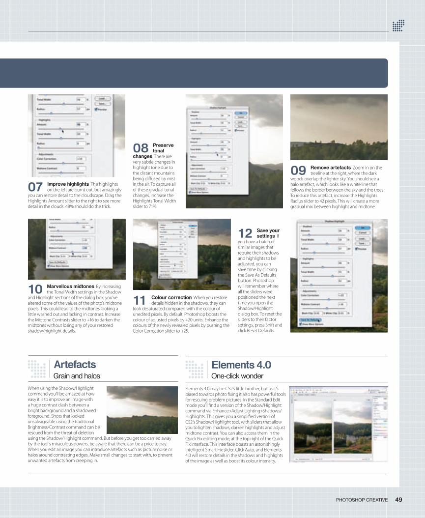
09 Remove artefacts Zoom in on the treeline at the right, where the dark
woods overlap the lighter sky. You should see a halo artefact, which looks like a white line that follows the border between the sky and the trees. To reduce this artefact, increase the Highlights Radius slider to 42 pixels. This will create a more gradual mix between highlight and midtone.
08 Preserve tonal
changes There are very subtle changes in highlight tone due to the distant mountains being di� used by mist in the air. To capture all of these gradual tonal changes, increase the Highlights Tonal Width slider to 71%.
07 Improve highlights The highlights on the left are burnt out, but amazingly
you can restore detail to the cloudscape. Drag the Highlights Amount slider to the right to see more detail in the clouds. 48% should do the trick.
49PHOTOSHOP CREATIVE
10 Marvellous midtones By increasing the Tonal Width settings in the Shadow
and Highlight sections of the dialog box, you’ve altered some of the values of the photo’s midtone pixels. This could lead to the midtones looking a little washed out and lacking in contrast. Increase the Midtone Contrasts slider to +16 to darken the midtones without losing any of your restored shadow/highlight details.
11 Colour correction When you restore details hidden in the shadows, they can
look desaturated compared with the colour of unedited pixels. By default, Photoshop boosts the colour of adjusted pixels by +20 units. Enhance the colours of the newly revealed pixels by pushing the Color Correction slider to +25.
12 Save your settings If
you have a batch of similar images that require their shadows and highlights to be adjusted, you can save time by clicking the Save As Defaults button. Photoshop will remember where all the sliders were positioned the next time you open the Shadow/Highlight dialog box. To reset the sliders to their factor settings, press Shift and click Reset Defaults.
Artefacts
When using the Shadow/Highlight command you’ll be amazed at how easy it is to improve an image with a huge contrast clash between a bright background and a shadowed foreground. Shots that looked unsalvageable using the traditional Brightness/Contrast command can be rescued from the threat of deletion using the Shadow/Highlight command. But before you get too carried away by the tool’s miraculous powers, be aware that there can be a price to pay. When you edit an image you can introduce artefacts such as picture noise or halos around contrasting edges. Make small changes to start with, to prevent unwanted artefacts from creeping in.
Grain and halosElements 4.0One-click wonder
Elements 4.0 may be CS2’s little brother, but as it’s biased towards photo � xing it also has powerful tools for rescuing problem pictures. In the Standard Edit mode you’ll � nd a version of the Shadow/Highlight command via Enhance>Adjust Lighting>Shadows/Highlights. This gives you a simpli� ed version of CS2’s Shadow/Highlight tool, with sliders that allow you to lighten shadows, darken highlights and adjust midtone contrast. You can also access them in the Quick Fix editing mode, at the top right of the Quick Fix interface. This interface boasts an astonishingly intelligent Smart Fix slider. Click Auto, and Elements 4.0 will restore details in the shadows and highlights of the image as well as boost its colour intensity.
046-49_PC11_techniques.indd 49 14/6/06 17:57:22
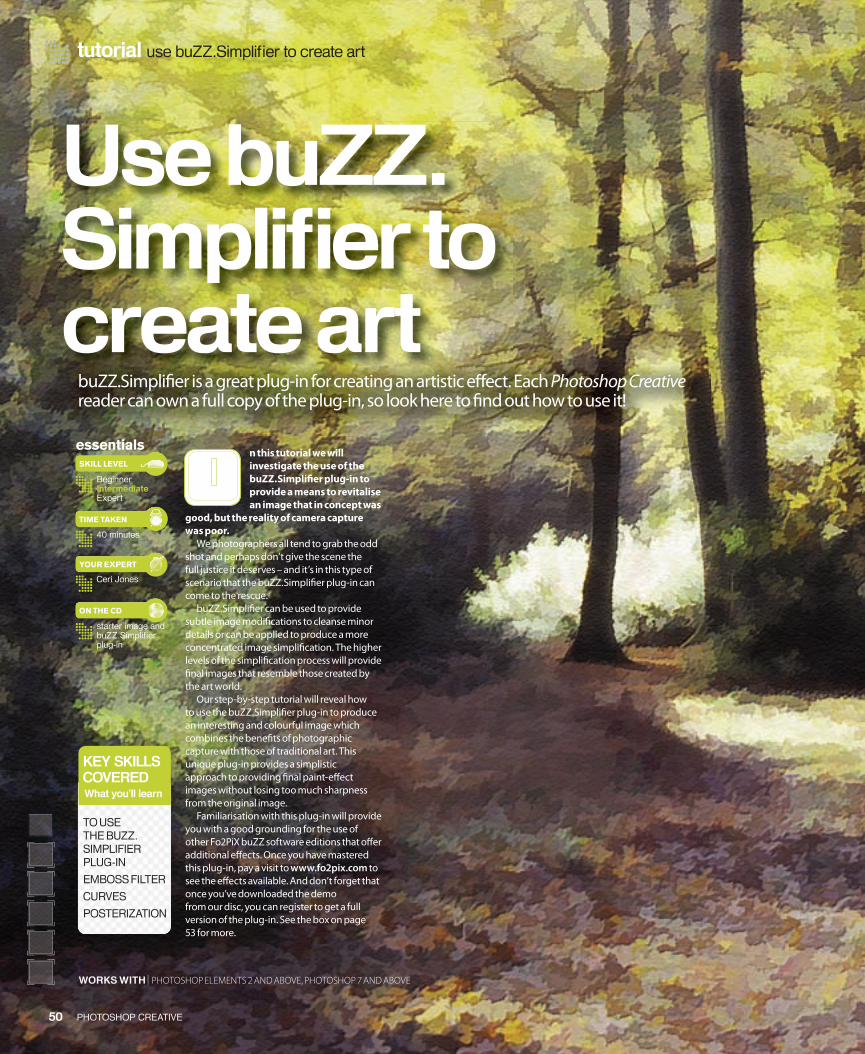
tutorial use buZZ.Simplifi er to create art
50 PHOTOSHOP CREATIVE
Use buZZ.Simplifi er to create art
buZZ.Simpli� er is a great plug-in for creating an artistic e� ect. Each Photoshop Creative reader can own a full copy of the plug-in, so look here to � nd out how to use it!
n this tutorial we will investigate the use of the buZZ.Simpli� er plug-in to provide a means to revitalise an image that in concept was
good, but the reality of camera capture was poor.
We photographers all tend to grab the odd shot and perhaps don’t give the scene the full justice it deserves – and it’s in this type of scenario that the buZZ.Simpli� er plug-in can come to the rescue.
buZZ.Simpli� er can be used to provide subtle image modi� cations to cleanse minor details or can be applied to produce a more concentrated image simpli� cation. The higher levels of the simpli� cation process will provide � nal images that resemble those created by the art world.
Our step-by-step tutorial will reveal how to use the buZZ.Simpli� er plug-in to produce an interesting and colourful image which combines the bene� ts of photographic capture with those of traditional art. This unique plug-in provides a simplistic approach to providing � nal paint-e� ect images without losing too much sharpness from the original image.
Familiarisation with this plug-in will provide you with a good grounding for the use of other Fo2PiX buZZ software editions that o� er additional e� ects. Once you have mastered this plug-in, pay a visit to www.fo2pix.com to see the e� ects available. And don’t forget that once you’ve downloaded the demo from our disc, you can register to get a full version of the plug-in. See the box on page 53 for more.
essentials
BeginnerIntermediateExpert
40 minutes
starter image and buZZ.Simplifi er plug-in
Ceri Jones
SKILL LEVEL
TIME TAKEN
ON THE CD
YOUR EXPERT
KEY SKILLSCOVEREDWhat you’ll learn
TO USE THE BUZZ.SIMPLIFIER PLUG-IN
EMBOSS FILTER
CURVES
POSTERIZATION
WORKS WITH | PHOTOSHOP ELEMENTS 2 AND ABOVE, PHOTOSHOP 7 AND ABOVE
050-055-PC11-buZZ.indd 50 15/6/06 10:11:32
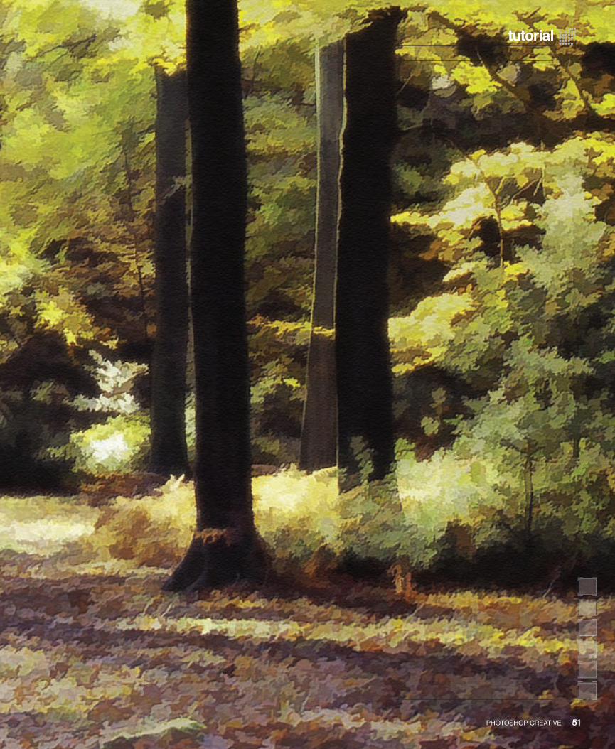
51PHOTOSHOP CREATIVE
tutorial
050-055-PC11-buZZ.indd 51 15/6/06 10:10:16
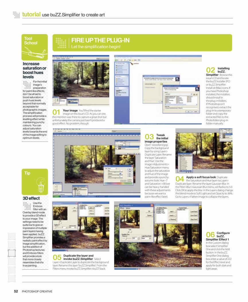
04 Apply a soft focus look Duplicate the Saturation and Hue layer via Layer>
Duplicate layer. Rename the layer Gaussian Blur. In the Filter>Blur>Gaussian Blur menu, set Radius to 5.0. Click OK to apply the blur. In the Layers dialog change the blend mode to Soft Light and set Opacity to 36%. Go to Layers>Flatten Image to collapse the layers.
01 Your image You’ll � nd the starter image on this issue’s CD. As you can see,
the intention was there to capture a great shot but unfortunately the camera just hasn’t produced a good e� ect. No problem, though.
52 PHOTOSHOP CREATIVE
tutorial use buZZ.Simplifi er to create art
02 Installing buZZ.
Simplifi er Browse this issue’s CD and locate the buZZ Installer (PC) or buZZ.Simpli� er Install.sit (Mac) icons. If you have Photoshop installed, the installers should install in the plug-in folders. If Photoshop isn’t recognised, extract the plug-in to a temporary folder and copy the extracted � les to the Photo Editor plug-in folder manually.
03 Tweak the initial
image properties Open ‘woodland.jpg’. Copy the background layer by using Layer> Duplicate Layer. Rename the layer ‘Saturation and Hue’. Use the Image>Adjustments> Hue/Saturation menu to adjust the saturation and hue of the image and provide a punchy autumn look: Hue –7 and Saturation +38 (we can be heavy-handed with these adjustments because we want a paint-like e� ect later).
05 Duplicate the layer and invoke buZZ.Simplifi er Select
Layer>Duplicate Layer to duplicate the background layer. Rename this layer ‘buZZ.Simpli� er’. From the Filters menu invoke buZZ.Simpli� er>buZZ Stack.
06 Confi gure buZZ.
Simplifi er Effect 1 In the Custom dialog box select Simpli� er One and click the Add button. In the buZZ.Simpli� er One dialog box enter a value of 222 for the E� ect level and apply for both dark and light areas.
FIRE UP THE PLUG-INLet the simplifi cation begin!
Tool School
Increase saturation or boost hues levels
For the initial image’s preparation
for paint-like effects, don’t be afraid to boost saturation or push hues levels beyond that normally acceptable for photographic images. The simplifi cation process will provide a levelling effect while maintaining punchy colours. You can adjust saturation levels towards the end of the image editing to optimum levels.
Tip
3D effectUse the Emboss fi lter with an
Overlay blend mode to provide a 3D effect to your image. The settings need to be quite low to give an impression of multiple paint layers having been applied. buZZ.Simplifi er provides a realistic paint effect by image simplifi cation, but the addition of Photoshop textures and Emboss fi lters will provide a look that more closely resembles that of a true painting.
050-055-PC11-buZZ.indd 52 15/6/06 10:11:49
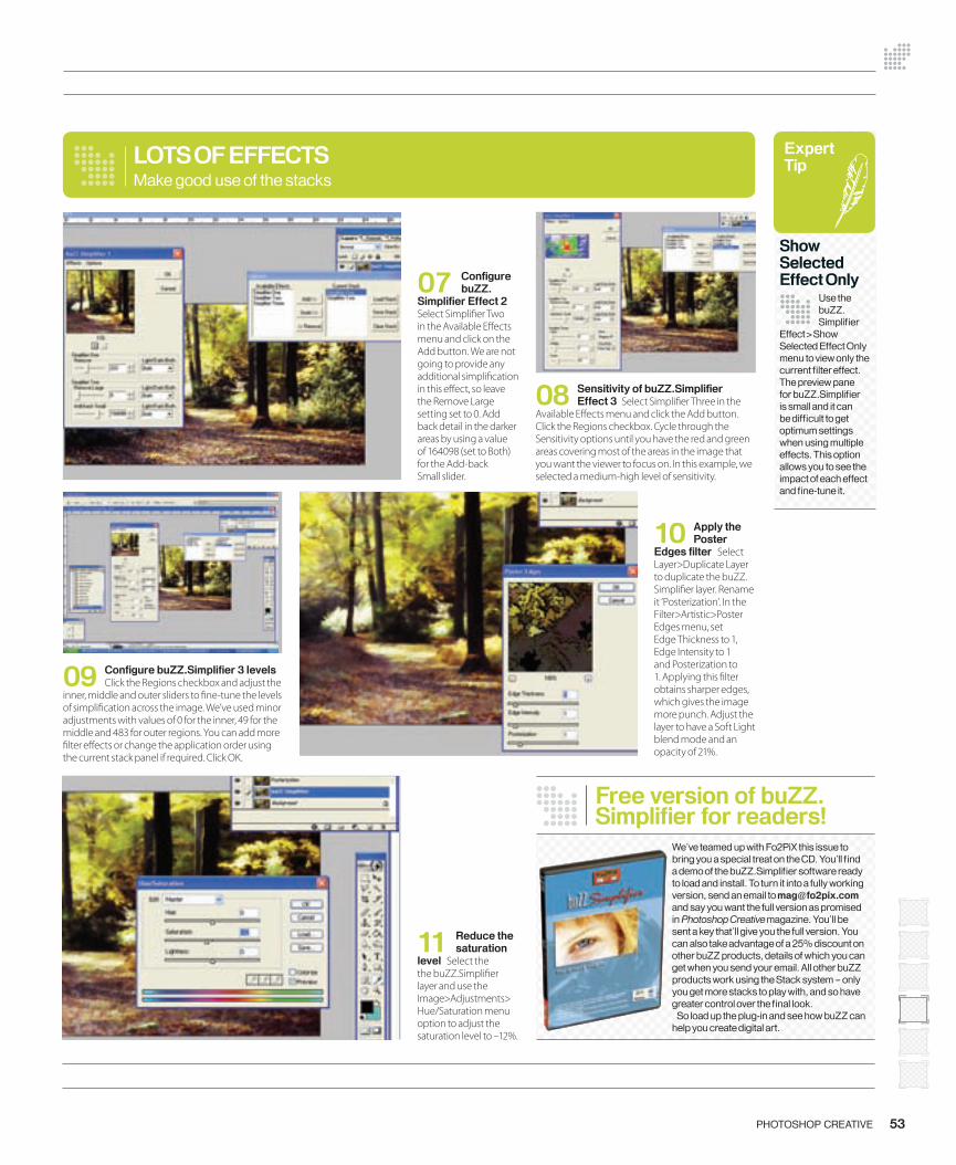
53PHOTOSHOP CREATIVE
09 Confi gure buZZ.Simplifi er 3 levels Click the Regions checkbox and adjust the
inner, middle and outer sliders to � ne-tune the levels of simpli� cation across the image. We’ve used minor adjustments with values of 0 for the inner, 49 for the middle and 483 for outer regions. You can add more � lter e� ects or change the application order using the current stack panel if required. Click OK.
LOTS OF EFFECTS
08 Sensitivity of buZZ.Simplifi er Effect 3 Select Simpli� er Three in the
Available E� ects menu and click the Add button. Click the Regions checkbox. Cycle through the Sensitivity options until you have the red and green areas covering most of the areas in the image that you want the viewer to focus on. In this example, we selected a medium-high level of sensitivity.
Make good use of the stacks
11 Reduce the saturation
level Select the the buZZ.Simpli� er layer and use the Image>Adjustments> Hue/Saturation menu option to adjust the saturation level to –12%.
07 Confi gure buZZ.
Simplifi er Effect 2 Select Simpli� er Two in the Available E� ects menu and click on the Add button. We are not going to provide any additional simpli� cation in this e� ect, so leave the Remove Large setting set to 0. Add back detail in the darker areas by using a value of 164098 (set to Both) for the Add-back Small slider.
Free version of buZZ.Simplifi er for readers!
We’ve teamed up with Fo2PiX this issue to bring you a special treat on the CD. You’ll fi nd a demo of the buZZ.Simplifi er software ready to load and install. To turn it into a fully working version, send an email to [email protected] and say you want the full version as promised in Photoshop Creative magazine. You’ll be sent a key that’ll give you the full version. You can also take advantage of a 25% discount on other buZZ products, details of which you can get when you send your email. All other buZZ products work using the Stack system – only you get more stacks to play with, and so have greater control over the fi nal look. So load up the plug-in and see how buZZ can help you create digital art.
10 Apply the Poster
Edges fi lter Select Layer>Duplicate Layer to duplicate the buZZ.Simpli� er layer. Rename it ‘Posterization’. In the Filter>Artistic>Poster Edges menu, set Edge Thickness to 1, Edge Intensity to 1 and Posterization to 1. Applying this � lter obtains sharper edges, which gives the image more punch. Adjust the layer to have a Soft Light blend mode and an opacity of 21%.
Expert Tip
Show Selected Effect Only
Use the buZZ.Simplifi er
Effect>Show Selected Effect Only menu to view only the current fi lter effect. The preview pane for buZZ.Simplifi er is small and it can be diffi cult to get optimum settings when using multiple effects. This option allows you to see the impact of each effect and fi ne-tune it.
050-055-PC11-buZZ.indd 53 15/6/06 10:16:13
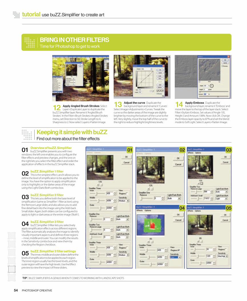
54 PHOTOSHOP CREATIVE
tutorial use buZZ.Simplifi er to create art
Keeping it simple with buZZFind out more about the fi lter effects
12 Apply Angled Brush Strokes Select Layer>Duplicate Layer to duplicate the
buZZ.Simpli� er layer. Rename it ‘Angled Brush Strokes’. In the Filter>Brush Strokes>Angled Strokes menu, set Direction to 50, Stroke Length to 4, Sharpness to 2. Now select Layers>Flatten Image.
01 Overview of buZZ.Simplifi erbuZZ.Simpli� er presents you with two
windows: the left one enables you to con� gure the � lter e� ects and preview changes, and the one on the right lets you select the � lter e� ect and order the application of e� ects in the buZZ.Simpli� er stack.
02 buZZ.Simplifi er 1 fi lterThis is the simplest e� ect, and it allows you to
de� ne the level of simpli� cation to be applied to the image. You have the option to apply simpli� cation only to highlights or the darker areas of the image using the Light/Dark/Both combo box.
03 buZZ.Simplifi er 2 fi lterThis lets you de� ne both the base level of
simpli� cation (same as Simpli� er 1 � lter action) using the Remove Large slider, and also allows you to add � ne detail back into the image using the Add-back Small slider. Again, both sliders can be con� gured to apply to light or dark areas or the entire image (‘Both’).
04 buZZ.Simplifi er 3 fi lterbuZZ.Simpli� er 3 � lter lets you selectively
apply simpli� cation e� ects across di� erent regions. The � lter automatically analyses the image to identify visually important aspects and de� nes three regions – inner, middle and outer. You can modify the results in the Sensitivity combo box and view them by checking the Region checkbox.
05 buZZ.Simplifi er 3 fi lter settingsThe inner, middle and outer sliders de� ne the
levels of simpli� cation to be applied to each region. The inner region usually has the lower levels, and the outer region will have the high levels. Use the E� ect preview to view the impact of these sliders.
TIP | BUZZ.SIMPLIFIER IS A GENIUS WHEN IT COMES TO WORKING WITH LANDSCAPE SHOTS
BRING IN OTHER FILTERSTime for Photoshop to get to work
14 Apply Emboss Duplicate the background layer, rename it ‘Emboss’ and
move the layer to the top of the layer stack. Select Filter>Stylize>Emboss. Set values of Angle 135, Height 3 and Amount 138%. Now click OK. Change the Emboss layer opacity to 87% and set the blend mode to Soft Light. Select Layers>Flatten Image.
13 Adjust the curve Duplicate the background layer and rename it ‘Curves’.
Select Image>Adjustments>Curves. Tweak the curve so the darker areas of the image are slightly brighter by moving the bottom of the curve to the left. Very slightly, move the top half of the curve to the right to reduce highlight brightness levels.
02 03
04 05
01
050-055-PC11-buZZ.indd 54 15/6/06 10:16:33
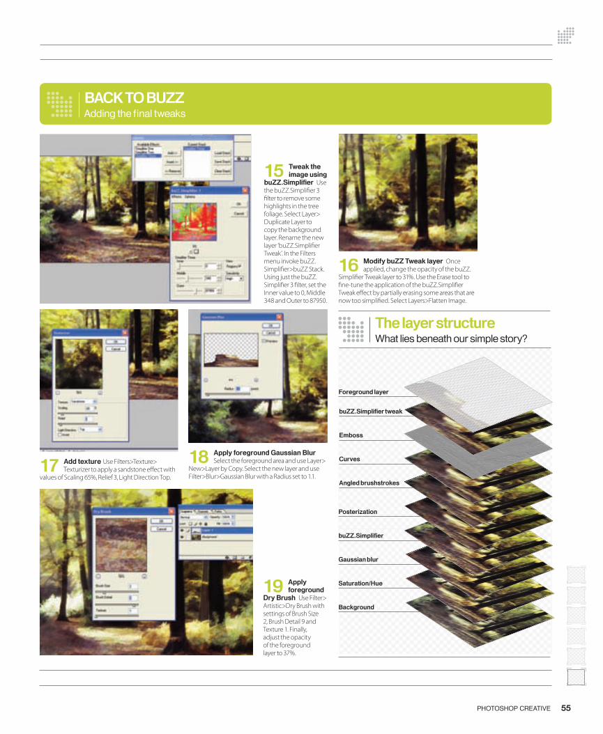
55PHOTOSHOP CREATIVE
17 Add texture Use Filters>Texture> Texturizer to apply a sandstone e� ect with
values of Scaling 65%, Relief 3, Light Direction Top.
18 Apply foreground Gaussian Blur Select the foreground area and use Layer>
New>Layer by Copy. Select the new layer and use Filter>Blur>Gaussian Blur with a Radius set to 1.1.
BACK TO BUZZ
16 Modify buZZ Tweak layer Once applied, change the opacity of the buZZ.
Simpli� er Tweak layer to 31%. Use the Erase tool to � ne-tune the application of the buZZ.Simpli� er Tweak e� ect by partially erasing some areas that are now too simpli� ed. Select Layers>Flatten Image.
Adding the fi nal tweaks
19 Apply foreground
Dry Brush Use Filter> Artistic>Dry Brush with settings of Brush Size 2, Brush Detail 9 and Texture 1. Finally, adjust the opacity of the foreground layer to 37%.
15 Tweak the image using
buZZ.Simplifi er Use the buZZ.Simpli� er 3 � lter to remove some highlights in the tree foliage. Select Layer> Duplicate Layer to copy the background layer. Rename the new layer ‘buZZ.Simpli� er Tweak’. In the Filters menu invoke buZZ.Simpli� er>buZZ Stack. Using just the buZZ.Simpli� er 3 � lter, set the Inner value to 0, Middle 348 and Outer to 87950.
Posterization
buZZ.Simplifi er
Gaussian blur
Saturation/Hue
Background
buZZ.Simplifi er tweak
Emboss
Curves
Angled brushstrokes
The layer structureWhat lies beneath our simple story?
Foreground layer
050-055-PC11-buZZ.indd 55 15/6/06 10:16:55
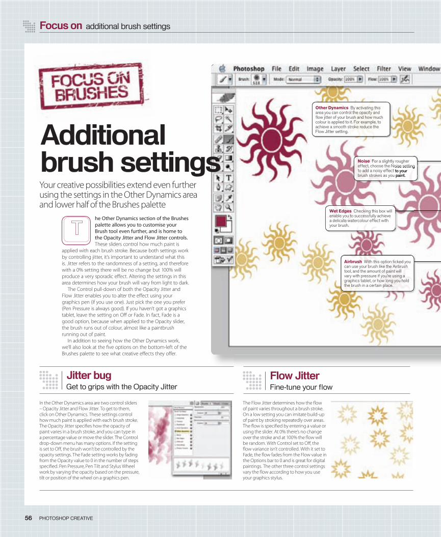
Focus on additional brush settings
56 PHOTOSHOP CREATIVE
In the Other Dynamics area are two control sliders – Opacity Jitter and Flow Jitter. To get to them, click on Other Dynamics. These settings control how much paint is applied with each brush stroke. The Opacity Jitter speci� es how the opacity of paint varies in a brush stroke, and you can type in a percentage value or move the slider. The Control drop-down menu has many options. If the setting is set to O� , the brush won’t be controlled by the opacity settings. The Fade setting works by fading from the Opacity value to 0 in the number of steps speci� ed. Pen Pressure, Pen Tilt and Stylus Wheel work by varying the opacity based on the pressure, tilt or position of the wheel on a graphics pen.
Jitter bugGet to grips with the Opacity Jitter
Flow JitterFine-tune your fl ow
The Flow Jitter determines how the � ow of paint varies throughout a brush stroke. On a low setting you can imitate build-up of paint by stroking repeatedly over areas. The � ow is speci� ed by entering a value or using the slider. At 0% there’s no change over the stroke and at 100% the � ow will be random. With Control set to O� , the � ow variance isn’t controlled. With it set to Fade, the � ow fades from the Flow value in the Options bar to 0 and is great for digital paintings. The other three control settings vary the � ow according to how you use your graphics stylus.
Your creative possibilities extend even further using the settings in the Other Dynamics area and lower half of the Brushes palette
he Other Dynamics section of the Brushes palette allows you to customise your Brush tool even further, and is home to the Opacity Jitter and Flow Jitter controls. These sliders control how much paint is
applied with each brush stroke. Because both settings work by controlling jitter, it’s important to understand what this is. Jitter refers to the randomness of a setting, and therefore with a 0% setting there will be no change but 100% will produce a very sporadic e� ect. Altering the settings in this area determines how your brush will vary from light to dark.
The Control pull-down of both the Opacity Jitter and Flow Jitter enables you to alter the e� ect using your graphics pen (if you use one). Just pick the one you prefer (Pen Pressure is always good). If you haven’t got a graphics tablet, leave the setting on O� or Fade. In fact, Fade is a good option, because when applied to the Opacity slider, the brush runs out of colour, almost like a paintbrush running out of paint.
In addition to seeing how the Other Dynamics work, we’ll also look at the � ve options on the bottom-left of the Brushes palette to see what creative e� ects they o� er.
Additional brush settings
Other Dynamics By activating this area you can control the opacity and fl ow jitter of your brush and how much colour is applied to it. For example, to achieve a smooth stroke reduce the Flow Jitter setting.
Airbrush With this option ticked you can use your brush like the Airbrush tool, and the amount of paint will vary with pressure if you’re using a graphics tablet, or how long you hold the brush in a certain place.
Noise For a slightly rougher effect, choose the Noise setting to add a noisy effect to your brush strokes as you paint.
Wet Edges Checking this box will enable you to successfully achieve a delicate watercolour effect with your brush.
effect, choose the Noise setting to add a noisy effect to your brush strokes as you paint.
056-57 PC11 brushes.indd 56 15/6/06 10:22:54
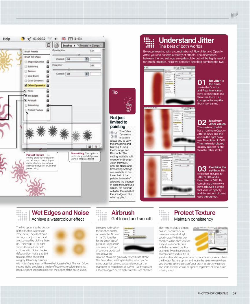
57PHOTOSHOP CREATIVE
Not just limited to painting
The Other Dynamics area also
allows you to vary the smudging and blurring if using the Smudge and Blur tools. The setting available will change to Strength Jitter. However, only the Noise and Smoothing settings are available in the lower half of the palette. Instead of affecting the change in paint throughout a stroke, the settings will alter the result of the smudge or blur when applied.
Tip
Understand Jitter
01 No Jitter In this brush
stroke the Opacity and Flow Jitter values have been set to 0, and therefore there is no change in the way the Brush tool paints.
02 Maximum Jitter values
The stroke on the left has a maximum Opacity Jitter of 100% and the one on the right has a max Flow Jitter of 100%. The stroke with altered opacity appears fainter than the other stroke.
03 Combine the settings This
stroke has an Opacity Jitter of 50% and a Flow Jitter of 50%. By combining the two we have achieved a stroke that varies in opacity and the amount of paint used throughout.
The Protect Texture option ensures consistency in texture when painting in your image. With this box checked, all brushes you use for textured e� ects paint with the same texture. For example, if you have created an impressive texture tip to your brush and change some of its parameters, you can check the Protect Texture option and retain the texture even when you change other aspects of your brush design. Any texture and scale already set will be applied regardless of what brush is being used.
The � ve options at the bottom of the Brushes palette are very useful. They don’t have settings to adjust them and are activated by clicking them on. The image to the right shows the results of both options. With Noise checked (left), random noise is added to areas of the brush that are grey. Obviously brushes with lots of grey areas will have the biggest e� ect. The Wet Edges setting (right) simulates a similar e� ect to watercolour painting, because paint seems to collect at the edges of the brush stroke.
Wet Edges and NoiseAchieve a watercolour effect
Protect TextureMaintain consistency
Selecting Airbrush in the Brushes palette activates the Airbrush in the Options Bar for the Brush tool. If pressure is applied in one area, a build-up of colour is produced. This allows the creation of a more gradually toned brush stroke. The Smoothing setting is ideal for when you’re using graphics tablets, because it reduces the sharpness or wobbliness of curves – so if you want a sharply angled curve make sure this isn’t checked.
AirbrushGet toned and smooth
By experimenting with a combination of Flow Jitter and Opacity Jitter, you can achieve a variety of effects. The differences between the two settings are quite subtle but will be highly useful for brush creators. Here we compare and then combine the two…
Smoothing This option is particularly useful if you are using a graphics tablet.
The best of both worlds
Protect Texture This setting enables consistency and allows you to apply your chosen texture even if you change the type of brush that you’re using.
056-57 PC11 brushes.indd 57 15/6/06 10:23:30
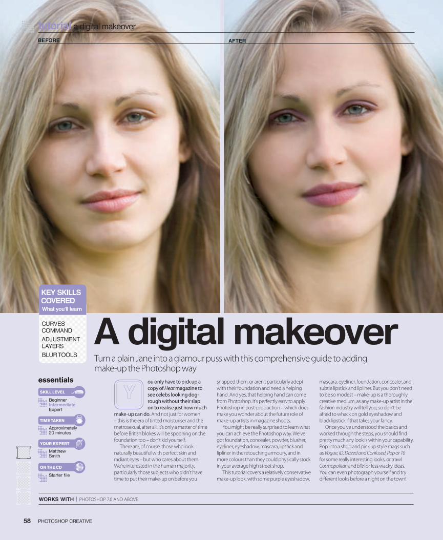
tutorial a digital makeover
WORKS WITH | PHOTOSHOP 7.0 AND ABOVE
Turn a plain Jane into a glamour puss with this comprehensive guide to adding make-up the Photoshop way
A digital makeoveressentials
BeginnerIntermediateExpert
Approximately 20 minutes
Starter fi le
Matthew Smith
SKILL LEVEL
TIME TAKEN
ON THE CD
YOUR EXPERT
ou only have to pick up a copy of Heat magazine to see celebs looking dog-rough without their slap on to realise just how much
make-up can do. And not just for women – this is the era of tinted moisturiser and the metrosexual, after all. It’s only a matter of time before British blokes will be spooning on the foundation too – don’t kid yourself.
There are, of course, those who look naturally beautiful with perfect skin and radiant eyes – but who cares about them. We’re interested in the human majority, particularly those subjects who didn’t have time to put their make-up on before you
snapped them, or aren’t particularly adept with their foundation and need a helping hand. And yes, that helping hand can come from Photoshop. It’s perfectly easy to apply Photoshop in post-production – which does make you wonder about the future role of make-up artists in magazine shoots.
You might be really surprised to learn what you can achieve the Photoshop way. We’ve got foundation, concealer, powder, blusher, eyeliner, eyeshadow, mascara, lipstick and lipliner in the retouching armoury, and in more colours than they could physically stock in your average high street shop.
This tutorial covers a relatively conservative make-up look, with some purple eyeshadow,
mascara, eyeliner, foundation, concealer, and subtle lipstick and lipliner. But you don’t need to be so modest – make-up is a thoroughly creative medium, as any make-up artist in the fashion industry will tell you, so don’t be afraid to whack on gold eyeshadow and black lipstick if that takes your fancy.
Once you’ve understood the basics and worked through the steps, you should � nd pretty much any look is within your capability. Pop into a shop and pick up style mags such as Vogue, iD, Dazed and Confused, Pop or 10 for some really interesting looks, or trawl Cosmopolitan and Elle for less wacky ideas. You can even photograph yourself and try di� erent looks before a night on the town!
BEFORE AFTER
PHOTOSHOP CREATIVE58
KEY SKILLSCOVEREDWhat you’ll learn
CURVES COMMAND
ADJUSTMENT LAYERS
BLUR TOOLS
058-061_PC11.indd 58 15/6/06 17:15:43
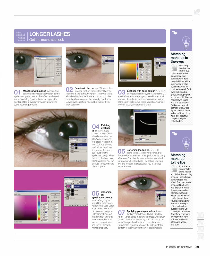
07 Applying your eyeshadow Invert the layer mask to turn it black with Ctrl/
Apple+I, then take a medium-hardness white brush (around 50%) at 100% opacity, and paint along the top of the eyelid and into the corner of the eye. Drop to 50% opacity, and paint the colour into the bottom of the eye. Drop the layer opacity to suit.
04 Painting eyeliner
in The layer mask should be highlighted already, so we just use Ctrl/Apple+I to invert it to black. We zoom in with Ctrl/Apple+Plus, and paint a line along the base of the lower eye-lid, above the eyelashes, using a white brush on the layer mask at 0% hardness. You can also use some at the top of the upper lid.
01 Mascara with curves We’ll start by adding a little mascara to thicken up the
eyelashes top and bottom. The e� ect is achieved with a darkening Curves adjustment layer, with points plotted to avoid information around the eyelashes being a� ected.
05 Softening the line The line is still going to look a little over-de� ned, but
fortunately we can soften its edges further by using a Gaussian Blur directly onto the layer mask, which softens our white line. Go to Filter>Blur>Gaussian Blur and increase the radius until you’re satis� ed with the result.
LONGER LASHES
02 Painting in the curves We invert the mask on the Curves adjustment layer by
selecting it, and using Ctrl/Apple+I. Then we take a white brush at 50% hardness, and zoom in on the eyelashes, brushing over them one by one. If your Curves layer is spot on, you can brush over them all quite quickly.
59PHOTOSHOP CREATIVE
Get the movie star look
06 Choosing an
eyeshadow colour Now we’re going to add a little eyeshadow. Add another Solid Color adjustment layer, and pick a colour using the Color Picker. It doesn’t matter which colour at the moment, because we can change it later and vary its strength with layer opacity.
03 Eyeliner with solid colour Next we’re going to add some eyeliner. We do this via
a Solid Color adjustment layer, created in the usual way with the Adjustment Layer icon at the bottom of the Layers palette. We chose a dark brown shade, which is usually preferential to black.
Tip
Matching make-up to the eyes
Matching eyeshadow to your eye
colour sounds like a good idea, but doesn’t work. Your beautiful blues will be lost in a sea of blue eyeshadow. Go for contrast instead. Dark eyes look good in greys, blues, purples and greens. Light eyes need brown, taupe and bronze shades. Darker shades help ‘retreat’ eyes, while lighter hues, or frosts, ‘advance’ them. If you want big, beautiful peepers, rely on pale shades.
Tip
Matching make-up to the lips
To make lips appear fuller, pick a lipstick
and lipliner in matching shades – go for lighter colours to get this effect. Choose darker shades of both liner and lipstick to make lips appear smaller. To make them look wider, use a liner that perfectly matches your lipstick and line the extreme edges of lips, extending out to corners. Of course, Photoshop’s Transform command gives another very effi cient method of altering lip shape and size!
058-061_PC11.indd 59 15/6/06 17:16:01
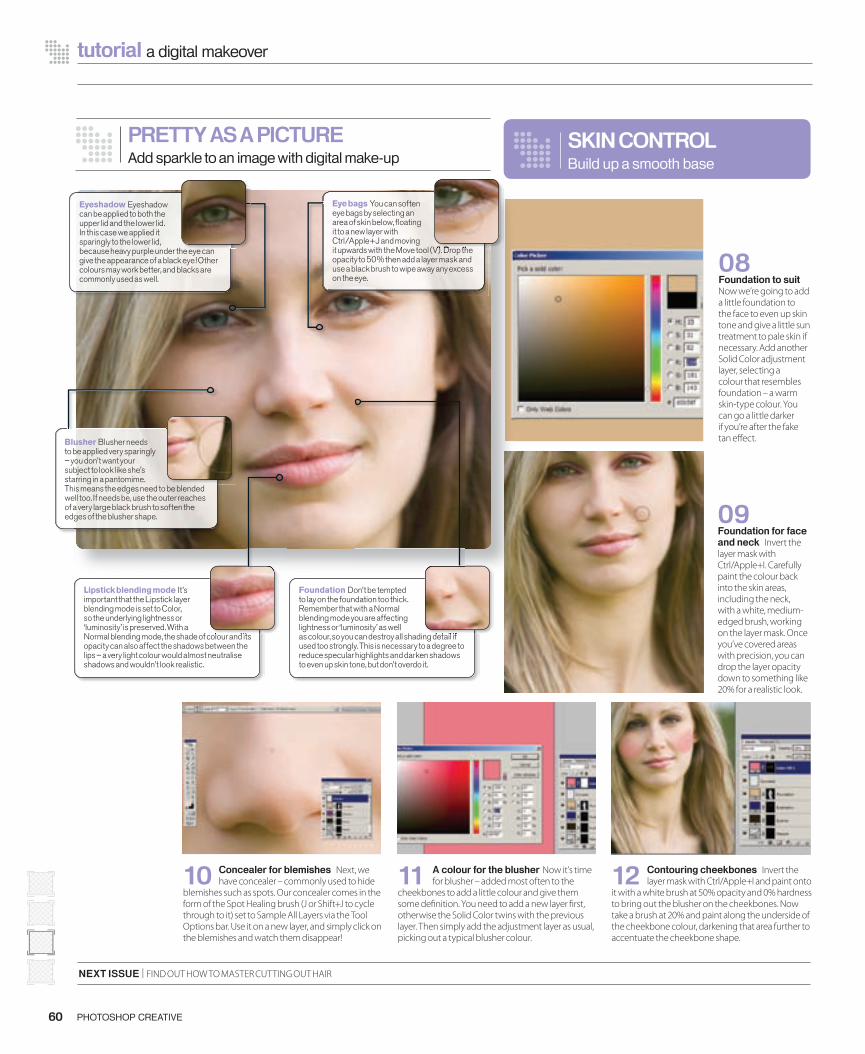
12 Contouring cheekbones Invert the layer mask with Ctrl/Apple+I and paint onto
it with a white brush at 50% opacity and 0% hardness to bring out the blusher on the cheekbones. Now take a brush at 20% and paint along the underside of the cheekbone colour, darkening that area further to accentuate the cheekbone shape.
60 PHOTOSHOP CREATIVE
tutorial a digital makeover
08 Foundation to suit Now we’re going to add a little foundation to the face to even up skin tone and give a little sun treatment to pale skin if necessary. Add another Solid Color adjustment layer, selecting a colour that resembles foundation – a warm skin-type colour. You can go a little darker if you’re after the fake tan e� ect.
NEXT ISSUE | FIND OUT HOW TO MASTER CUTTING OUT HAIR
10 Concealer for blemishes Next, we have concealer – commonly used to hide
blemishes such as spots. Our concealer comes in the form of the Spot Healing brush (J or Shift+J to cycle through to it) set to Sample All Layers via the Tool Options bar. Use it on a new layer, and simply click on the blemishes and watch them disappear!
11 A colour for the blusher Now it’s time for blusher – added most often to the
cheekbones to add a little colour and give them some de� nition. You need to add a new layer � rst, otherwise the Solid Color twins with the previous layer. Then simply add the adjustment layer as usual, picking out a typical blusher colour.
09 Foundation for face and neck Invert the layer mask with Ctrl/Apple+I. Carefully paint the colour back into the skin areas, including the neck, with a white, medium-edged brush, working on the layer mask. Once you’ve covered areas with precision, you can drop the layer opacity down to something like 20% for a realistic look.
SKIN CONTROLBuild up a smooth base
PRETTY AS A PICTUREAdd sparkle to an image with digital make-up
Blusher Blusher needs to be applied very sparingly – you don’t want your subject to look like she’s starring in a pantomime. This means the edges need to be blended well too. If needs be, use the outer reaches of a very large black brush to soften the edges of the blusher shape.
Lipstick blending mode It’s important that the Lipstick layer blending mode is set to Color, so the underlying lightness or ‘luminosity’ is preserved. With a Normal blending mode, the shade of colour and its opacity can also affect the shadows between the lips – a very light colour would almost neutralise shadows and wouldn’t look realistic.
Normal blending mode, the shade of colour and its
Foundation Don’t be tempted to lay on the foundation too thick. Remember that with a Normal blending mode you are affecting lightness or ‘luminosity’ as well as colour, so you can destroy all shading detail if used too strongly. This is necessary to a degree to reduce specular highlights and darken shadows to even up skin tone, but don’t overdo it.
as colour, so you can destroy all shading detail if
Eyeshadow Eyeshadow can be applied to both the upper lid and the lower lid. In this case we applied it sparingly to the lower lid, because heavy purple under the eye can give the appearance of a black eye! Other colours may work better, and blacks are commonly used as well.
because heavy purple under the eye can
Eye bags You can soften eye bags by selecting an area of skin below, fl oating it to a new layer with Ctrl/Apple+J and moving it upwards with the Move tool (V). Drop the opacity to 50% then add a layer mask and use a black brush to wipe away any excess on the eye.
it upwards with the Move tool (V). Drop the
058-061_PC11.indd 60 15/6/06 17:16:26
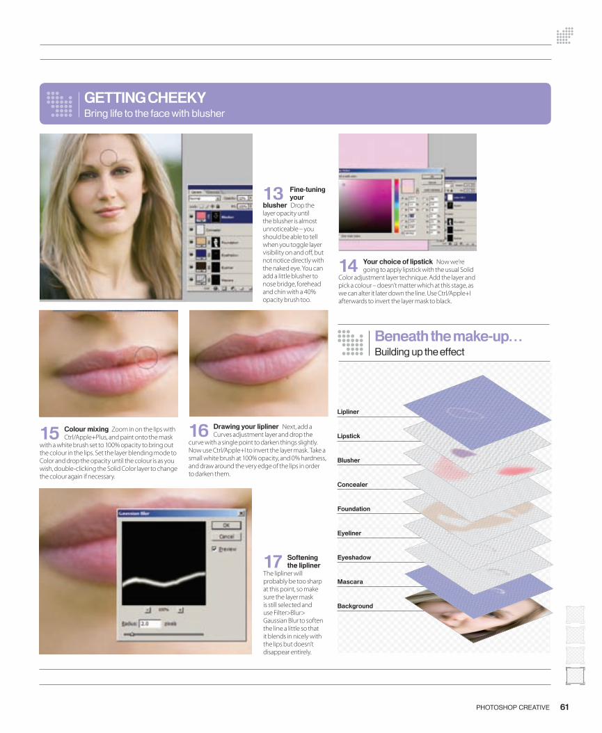
61PHOTOSHOP CREATIVE
14 Your choice of lipstick Now we’re going to apply lipstick with the usual Solid
Color adjustment layer technique. Add the layer and pick a colour – doesn’t matter which at this stage, as we can alter it later down the line. Use Ctrl/Apple+I afterwards to invert the layer mask to black.
15 Colour mixing Zoom in on the lips with Ctrl/Apple+Plus, and paint onto the mask
with a white brush set to 100% opacity to bring out the colour in the lips. Set the layer blending mode to Color and drop the opacity until the colour is as you wish, double-clicking the Solid Color layer to change the colour again if necessary.
GETTING CHEEKYBring life to the face with blusher
16 Drawing your lipliner Next, add a Curves adjustment layer and drop the
curve with a single point to darken things slightly. Now use Ctrl/Apple+I to invert the layer mask. Take a small white brush at 100% opacity, and 0% hardness, and draw around the very edge of the lips in order to darken them.
13 Fine-tuning your
blusher Drop the layer opacity until the blusher is almost unnoticeable – you should be able to tell when you toggle layer visibility on and o� , but not notice directly with the naked eye. You can add a little blusher to nose bridge, forehead and chin with a 40% opacity brush too.
Lipliner
Lipstick
Blusher
Concealer
Foundation
Eyeliner
Eyeshadow
Mascara
Background
Beneath the make-up…Building up the effect
17 Softening the lipliner
The lipliner will probably be too sharp at this point, so make sure the layer mask is still selected and use Filter>Blur> Gaussian Blur to soften the line a little so that it blends in nicely with the lips but doesn’t disappear entirely.
058-061_PC11.indd 61 15/6/06 17:17:16
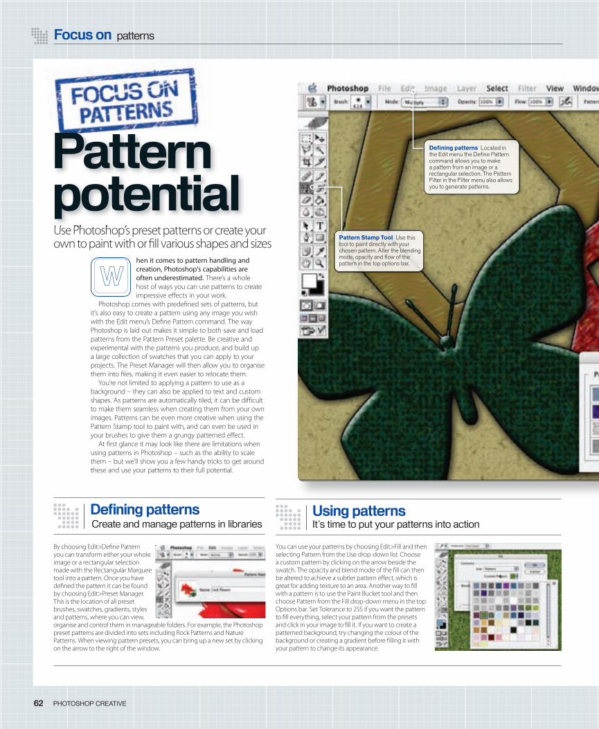
Focus on patterns
62 PHOTOSHOP CREATIVE
By choosing Edit>De� ne Pattern you can transform either your whole image or a rectangular selection made with the Rectangular Marquee tool into a pattern. Once you have de� ned the pattern it can be found by choosing Edit>Preset Manager. This is the location of all preset brushes, swatches, gradients, styles and patterns, where you can view, organise and control them in manageable folders. For example, the Photoshop preset patterns are divided into sets including Rock Patterns and Nature Patterns. When viewing pattern presets, you can bring up a new set by clicking on the arrow to the right of the window.
Defi ning patterns
hen it comes to pattern handling and creation, Photoshop’s capabilities are often underestimated. There’s a whole host of ways you can use patterns to create impressive e� ects in your work.
Photoshop comes with prede� ned sets of patterns, but it’s also easy to create a pattern using any image you wish with the Edit menu’s De� ne Pattern command. The way Photoshop is laid out makes it simple to both save and load patterns from the Pattern Preset palette. Be creative and experimental with the patterns you produce, and build up a large collection of swatches that you can apply to your projects. The Preset Manager will then allow you to organise them into � les, making it even easier to relocate them.
You’re not limited to applying a pattern to use as a background – they can also be applied to text and custom shapes. As patterns are automatically tiled, it can be di� cult to make them seamless when creating them from your own images. Patterns can be even more creative when using the Pattern Stamp tool to paint with, and can even be used in your brushes to give them a grungy patterned e� ect.
At � rst glance it may look like there are limitations when using patterns in Photoshop – such as the ability to scale them – but we’ll show you a few handy tricks to get around these and use your patterns to their full potential.
Use Photoshop’s preset patterns or create your own to paint with or � ll various shapes and sizes
You can use your patterns by choosing Edit>Fill and then selecting Pattern from the Use drop-down list. Choose a custom pattern by clicking on the arrow beside the swatch. The opacity and blend mode of the � ll can then be altered to achieve a subtler pattern e� ect, which is great for adding texture to an area. Another way to � ll with a pattern is to use the Paint Bucket tool and then choose Pattern from the Fill drop-down menu in the top Options bar. Set Tolerance to 255 if you want the pattern to � ll everything, select your pattern from the presets and click in your image to � ll it. If you want to create a patterned background, try changing the colour of the background or creating a gradient before � lling it with your pattern to change its appearance.
Using patternsIt’s time to put your patterns into action
Pattern Stamp Tool Use this tool to paint directly with your chosen pattern. Alter the blending mode, opacity and fl ow of the pattern in the top options bar.
Use Photoshop’s preset patterns or create your
Pattern potential
Defi ning patterns Located in the Edit menu the Defi ne Pattern command allows you to make a pattern from an image or a rectangular selection. The Pattern Filter in the Filter menu also allows you to generate patterns.
Create and manage patterns in libraries
062-63_PC11_focuspatterns.indd 64 15/6/06 19:10:30
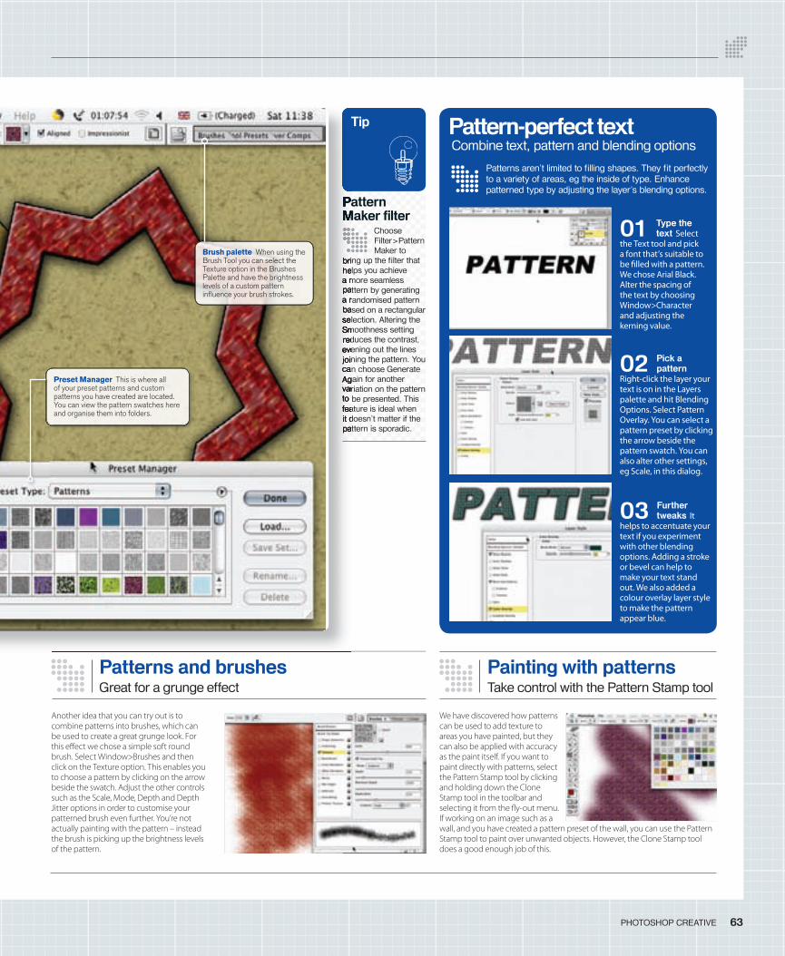
63PHOTOSHOP CREATIVE
Pattern Maker fi lter
Choose Filter>Pattern Maker to
bring up the fi lter that helps you achieve a more seamless pattern by generating a randomised pattern based on a rectangular selection. Altering the Smoothness setting reduces the contrast, evening out the lines joining the pattern. You can choose Generate Again for another variation on the pattern to be presented. This feature is ideal when it doesn’t matter if the pattern is sporadic.
Tip
Patterns and brushesGreat for a grunge effect
Another idea that you can try out is to combine patterns into brushes, which can be used to create a great grunge look. For this e� ect we chose a simple soft round brush. Select Window>Brushes and then click on the Texture option. This enables you to choose a pattern by clicking on the arrow beside the swatch. Adjust the other controls such as the Scale, Mode, Depth and Depth Jitter options in order to customise your patterned brush even further. You’re not actually painting with the pattern – instead the brush is picking up the brightness levels of the pattern.
Pattern Maker fi lter
bring up the fi lter that helps you achieve a more seamless pattern by generating a randomised pattern based on a rectangular selection. Altering the Smoothness setting reduces the contrast, evening out the lines joining the pattern. You can choose Generate Again for another variation on the pattern to be presented. This feature is ideal when it doesn’t matter if the pattern is sporadic.
Patterns aren’t limited to fi lling shapes. They fi t perfectly to a variety of areas, eg the inside of type. Enhance patterned type by adjusting the layer’s blending options.
Pattern-perfect text
01 Type the text Select
the Text tool and pick a font that’s suitable to be � lled with a pattern. We chose Arial Black. Alter the spacing of the text by choosing Window>Character and adjusting the kerning value.
02 Pick a pattern
Right-click the layer your text is on in the Layers palette and hit Blending Options. Select Pattern Overlay. You can select a pattern preset by clicking the arrow beside the pattern swatch. You can also alter other settings, eg Scale, in this dialog.
03 Further tweaks It
helps to accentuate your text if you experiment with other blending options. Adding a stroke or bevel can help to make your text stand out. We also added a colour overlay layer style to make the pattern appear blue.
Combine text, pattern and blending options
Painting with patternsTake control with the Pattern Stamp tool
We have discovered how patterns can be used to add texture to areas you have painted, but they can also be applied with accuracy as the paint itself. If you want to paint directly with patterns, select the Pattern Stamp tool by clicking and holding down the Clone Stamp tool in the toolbar and selecting it from the � y-out menu. If working on an image such as a wall, and you have created a pattern preset of the wall, you can use the Pattern Stamp tool to paint over unwanted objects. However, the Clone Stamp tool does a good enough job of this.
Preset Manager This is where all of your preset patterns and custom patterns you have created are located. You can view the pattern swatches here and organise them into folders.
Brush palette When using the Brush Tool you can select the Texture option in the Brushes Palette and have the brightness levels of a custom pattern infl uence your brush strokes.
062-63_PC11_focuspatterns.indd 65 15/6/06 19:11:39
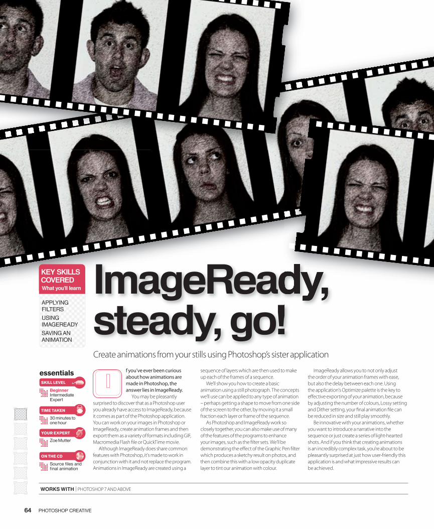
64 PHOTOSHOP CREATIVE
essentials
BeginnerIntermediateExpert
30 minutes to one hour
Source fi les and fi nal animation
Zoe Mutter
SKILL LEVEL
TIME TAKEN
ON THE CD
YOUR EXPERT
Create animations from your stills using Photoshop’s sister application
f you’ve ever been curious about how animations are made in Photoshop, the answer lies in ImageReady.
You may be pleasantly surprised to discover that as a Photoshop user you already have access to ImageReady, because it comes as part of the Photoshop application. You can work on your images in Photoshop or ImageReady, create animation frames and then export them as a variety of formats including GIF, Macromedia Flash � le or QuickTime movie.
Although ImageReady does share common features with Photoshop, it’s made to work in conjunction with it and not replace the program. Animations in ImageReady are created using a
sequence of layers which are then used to make up each of the frames of a sequence.
We’ll show you how to create a basic animation using a still photograph. The concepts we’ll use can be applied to any type of animation – perhaps getting a shape to move from one side of the screen to the other, by moving it a small fraction each layer or frame of the sequence.
As Photoshop and ImageReady work so closely together, you can also make use of many of the features of the programs to enhance your images, such as the � lter sets. We’ll be demonstrating the e� ect of the Graphic Pen � lter which produces a sketchy result on photos, and then combine this with a low opacity duplicate layer to tint our animation with colour.
ImageReady allows you to not only adjust the order of your animation frames with ease, but also the delay between each one. Using the application’s Optimize palette is the key to e� ective exporting of your animation, because by adjusting the number of colours, Lossy setting and Dither setting, your � nal animation � le can be reduced in size and still play smoothly.
Be innovative with your animations, whether you want to introduce a narrative into the sequence or just create a series of light-hearted shots. And if you think that creating animations is an incredibly complex task, you’re about to be pleasantly surprised at just how user-friendly this application is and what impressive results can be achieved.
ImageReady, steady, go!
KEY SKILLSCOVEREDWhat you’ll learn
APPLYING FILTERS
USING IMAGEREADY
SAVING AN ANIMATION
WORKS WITH | PHOTOSHOP 7 AND ABOVE
ImageReady, ImageReady, steady, go!
064-068_PC11_Animation.indd 64 15/6/06 19:02:31
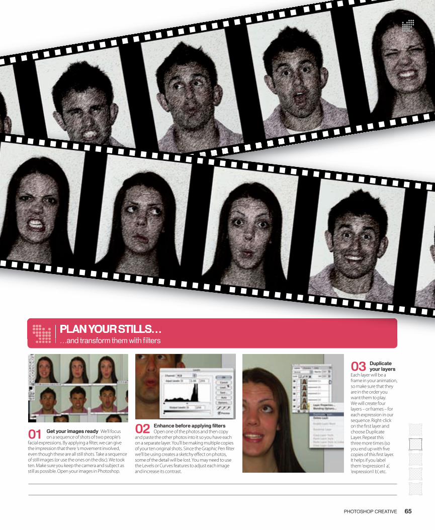
03 Duplicate your layers
Each layer will be a frame in your animation, so make sure that they are in the order you want them to play. We will create four layers – or frames – for each expression in our sequence. Right-click on the � rst layer and choose Duplicate Layer. Repeat this three more times (so you end up with � ve copies of this � rst layer. It helps if you label them ‘expression1 a’, ‘expression1 b’, etc.
02 Enhance before applying fi lters Open one of the photos and then copy
and paste the other photos into it so you have each on a separate layer. You’ll be making multiple copies of your ten original shots. Since the Graphic Pen � lter we’ll be using creates a sketchy e� ect on photos, some of the detail will be lost. You may need to use the Levels or Curves features to adjust each image and increase its contrast.
01 Get your images ready We’ll focus on a sequence of shots of two people’s
facial expressions. By applying a � lter, we can give the impression that there ‘s movement involved, even though these are all still shots. Take a sequence of still images (or use the ones on the disc). We took ten. Make sure you keep the camera and subject as still as possible. Open your images in Photoshop.
PLAN YOUR STILLS… …and transform them with fi lters
65PHOTOSHOP CREATIVE
PLAN YOUR STILLS… …and transform them with fi lters
064-068_PC11_Animation.indd 65 15/6/06 19:03:04
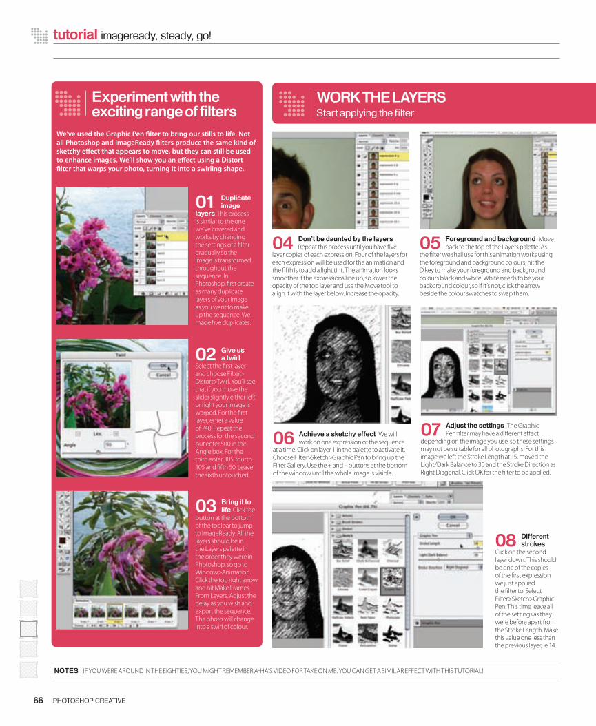
66 PHOTOSHOP CREATIVE
tutorial imageready, steady, go!
NOTES | IF YOU WERE AROUND IN THE EIGHTIES, YOU MIGHT REMEMBER A-HA’S VIDEO FOR TAKE ON ME. YOU CAN GET A SIMILAR EFFECT WITH THIS TUTORIAL!
04 Don’t be daunted by the layers Repeat this process until you have � ve
layer copies of each expression. Four of the layers for each expression will be used for the animation and the � fth is to add a light tint. The animation looks smoother if the expressions line up, so lower the opacity of the top layer and use the Move tool to align it with the layer below. Increase the opacity.
WORK THE LAYERSStart applying the fi lter
06 Achieve a sketchy effect We will work on one expression of the sequence
at a time. Click on layer 1 in the palette to activate it. Choose Filter>Sketch>Graphic Pen to bring up the Filter Gallery. Use the + and – buttons at the bottom of the window until the whole image is visible.
05 Foreground and background Move back to the top of the Layers palette. As
the � lter we shall use for this animation works using the foreground and background colours, hit the D key to make your foreground and background colours black and white. White needs to be your background colour, so if it’s not, click the arrow beside the colour swatches to swap them.
08 Different strokes
Click on the second layer down. This should be one of the copies of the � rst expression we just applied the � lter to. Select Filter>Sketch>Graphic Pen. This time leave all of the settings as they were before apart from the Stroke Length. Make this value one less than the previous layer, ie 14.
Experiment with the exciting range of fi lters
We’ve used the Graphic Pen � lter to bring our stills to life. Not all Photoshop and ImageReady � lters produce the same kind of sketchy e� ect that appears to move, but they can still be used to enhance images. We’ll show you an e� ect using a Distort � lter that warps your photo, turning it into a swirling shape.
01 Duplicate image
layers This process is similar to the one we’ve covered and works by changing the settings of a � lter gradually so the image is transformed throughout the sequence. In Photoshop, � rst create as many duplicate layers of your image as you want to make up the sequence. We made � ve duplicates.
02 Give us a twirl
Select the � rst layer and choose Filter> Distort>Twirl. You’ll see that if you move the slider slightly either left or right your image is warped. For the � rst layer, enter a value of 740. Repeat the process for the second but enter 500 in the Angle box. For the third enter 305, fourth 105 and � fth 50. Leave the sixth untouched.
03 Bring it to life Click the
button at the bottom of the toolbar to jump to ImageReady. All the layers should be in the Layers palette in the order they were in Photoshop, so go to Window>Animation. Click the top right arrow and hit Make Frames From Layers. Adjust the delay as you wish and export the sequence. The photo will change into a swirl of colour.
07 Adjust the settings The Graphic Pen � lter may have a di� erent e� ect
depending on the image you use, so these settings may not be suitable for all photographs. For this image we left the Stroke Length at 15, moved the Light/Dark Balance to 30 and the Stroke Direction as Right Diagonal. Click OK for the � lter to be applied.
064-068_PC11_Animation.indd 66 15/6/06 19:03:16
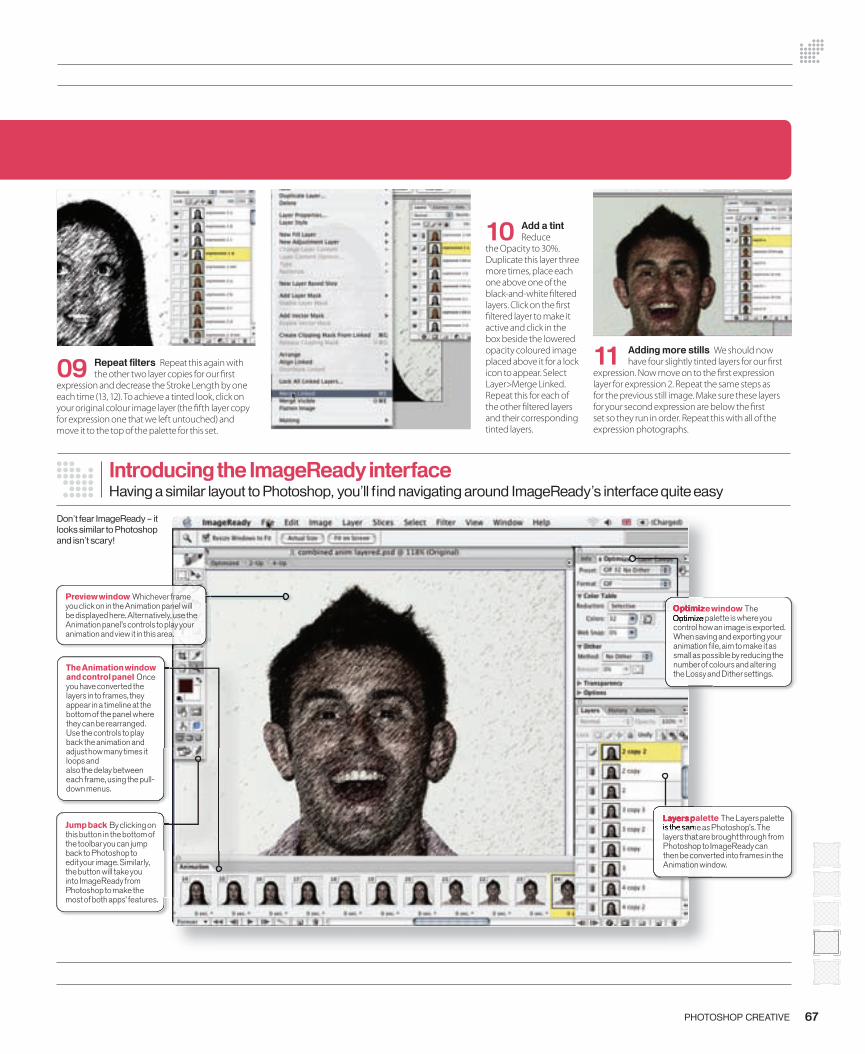
Introducing the ImageReady interfaceHaving a similar layout to Photoshop, you’ll fi nd navigating around ImageReady’s interface quite easy
Don’t fear ImageReady – it looks similar to Photoshop and isn’t scary!
Layers palette The Layers palette is the same as Photoshop’s. The layers that are brought through from Photoshop to ImageReady can then be converted into frames in the Animation window.
Optimize window The Optimize palette is where you control how an image is exported. When saving and exporting your animation fi le, aim to make it as small as possible by reducing the number of colours and altering the Lossy and Dither settings.
Preview window Whichever frame you click on in the Animation panel will be displayed here. Alternatively, use the Animation panel’s controls to play your animation and view it in this area.
67PHOTOSHOP CREATIVE
09 Repeat fi lters Repeat this again with the other two layer copies for our � rst
expression and decrease the Stroke Length by one each time (13, 12). To achieve a tinted look, click on your original colour image layer (the � fth layer copy for expression one that we left untouched) and move it to the top of the palette for this set.
10 Add a tint Reduce
the Opacity to 30%. Duplicate this layer three more times, place each one above one of the black-and-white � ltered layers. Click on the � rst � ltered layer to make it active and click in the box beside the lowered opacity coloured image placed above it for a lock icon to appear. Select Layer>Merge Linked. Repeat this for each of the other � ltered layers and their corresponding tinted layers.
11 Adding more stills We should now have four slightly tinted layers for our � rst
expression. Now move on to the � rst expression layer for expression 2. Repeat the same steps as for the previous still image. Make sure these layers for your second expression are below the � rst set so they run in order. Repeat this with all of the expression photographs.
Optimize windowOptimize windowOptimize palette is where you Optimize palette is where you
Layers paletteLayers paletteis the same as Photoshop’s. The is the same as Photoshop’s. The
The Animation window and control panel Once you have converted the layers in to frames, they appear in a timeline at the bottom of the panel where they can be rearranged. Use the controls to play back the animation and adjust how many times it loops andalso the delay between each frame, using the pull-down menus.
Jump back By clicking on this button in the bottom of the toolbar you can jump back to Photoshop to edit your image. Similarly, the button will take you into ImageReady from Photoshop to make the most of both apps’ features.
064-068_PC11_Animation.indd 67 15/6/06 19:03:35
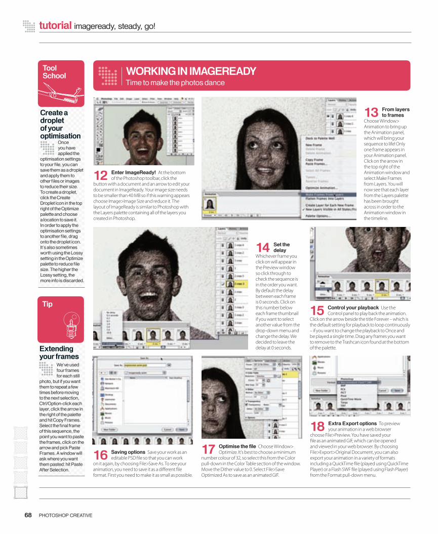
18 Extra Export options To preview your animation in a web browser
choose File>Preview. You have saved your � le as an animated GIF, which can be opened and viewed in your web browser. By choosing File>Export>Original Document, you can also export your animation in a variety of formats including a QuickTime � le (played using QuickTime Player) or a Flash SWF � le (played using Flash Player) from the Format pull-down menu.
15 Control your playback Use the Control panel to play back the animation.
Click on the arrow beside the title Forever – which is the default setting for playback to loop continuously – if you want to change the playback to Once and be played a single time. Drag any frames you want to remove to the Trashcan icon found at the bottom of the palette.
12 Enter ImageReady! At the bottom of the Photoshop toolbar, click the
button with a document and an arrow to edit your document in ImageReady. Your image size needs to be smaller than 40 MB so if this warning appears choose Image>Image Size and reduce it. The layout of ImageReady is similar to Photoshop with the Layers palette containing all of the layers you created in Photoshop.
68 PHOTOSHOP CREATIVE
tutorial imageready, steady, go!
13 From layers to frames
Choose Window> Animation to bring up the Animation panel, which will bring your sequence to life! Only one frame appears in your Animation panel. Click on the arrow in the top right of the Animation window and select Make Frames from Layers. You will now see that each layer from the Layers palette has been brought across in order to the Animation window in the timeline.
14 Set the delay
Whichever frame you click on will appear in the Preview window so click through to check the sequence is in the order you want. By default the delay between each frame is 0 seconds. Click on this number below each frame thumbnail if you want to select another value from the drop-down menu and change the delay. We decided to leave the delay at 0 seconds.
16 Saving options Save your work as an editable PSD � le so that you can work
on it again, by choosing File>Save As. To see your animation, you need to save it as a di� erent � le format. First you need to make it as small as possible.
17 Optimise the fi le Choose Window> Optimize. It’s best to choose a minimum
number colour of 32, so select this from the Color pull-down in the Color Table section of the window. Move the Dither value to 0. Select File>Save Optimized As to save as an animated GIF.
WORKING IN IMAGEREADYTime to make the photos dance
Tool School
Create a droplet of your optimisation
Once you have applied the
optimisation settings to your fi le, you can save them as a droplet and apply them to other fi les or images to reduce their size. To create a droplet, click the Create Droplet icon in the top right of the Optimize palette and choose a location to save it. In order to apply the optimisation settings to another fi le, drag onto the droplet icon. It’s also sometimes worth using the Lossy setting in the Optimize palette to reduce fi le size. The higher the Lossy setting, the more info is discarded.
Tip
Extending your frames
We’ve used four frames for each still
photo, but if you want them to repeat a few times before moving to the next selection, Ctrl/Option-click each layer, click the arrow in the right of the palette and hit Copy Frames. Select the fi nal frame of this sequence, the point you want to paste the frames, click on the arrow and pick Paste Frames. A window will ask where you want them pasted: hit Paste After Selection.
064-068_PC11_Animation.indd 68 15/6/06 19:03:49

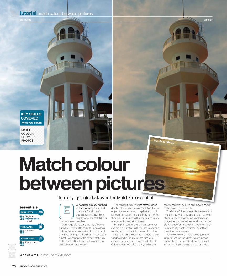
tutorial match colour between pictures
WORKS WITH | PHOTOSHOP CS AND ABOVE
Turn daylight into dusk using the Match Color control
essentials
BeginnerIntermediateExpert
5 minutes
Zoe Mutter
SKILL LEVEL
TIME TAKEN
YOUR EXPERT
ver wanted an easy method of transforming the mood of a photo? Well there’s good news, because this is exactly what the Match Color
function makes possible. Our image of a tower is already e� ective,
but what if we want to make the photo look as though it were taken at a di� erent time of day? By selecting another shot – in our case a sunset – we can apply the colours of this sky to the photo of the tower and force it to take on its colour characteristics.
The capabilities of this area of Photoshop don’t end here, as it’s also possible to select an object from one scene, using the Lasso tool for example, paste it into another and then set the colour attributes so that the pasted image merges with the existing scene.
For tighter control over the outcome, you can make a selection in the source image and use this area’s colour info to make the colour adjustment. Simply open up the Match Color window and in the Image Statistics area, choose Use Selection in Source to Calculate Colors option. We’ll also show you that the
control can even be used to remove a colour cast in a matter of seconds.
The Match Color command saves so much time because you can apply a colour scheme of one image to another in a single mouse-click, either to change the mood of a photo or blend parts of an image that have been taken from separate photos together by setting consistent colour values.
Follow our tutorial and discover just how simple it is to get the Match Color function to read the colour statistics from the sunset image and apply them to the tower photo.
BEFORE AFTER
PHOTOSHOP CREATIVE70
KEY SKILLSCOVEREDWhat you’ll learn
MATCH COLOUR BETWEEN PHOTOS
Turn daylight into dusk using the Match Color control The capabilities of this area of Photoshop control can even be used to remove a colour
Turn daylight into dusk using the Match Color control Turn daylight into dusk using the Match Color control
Match colour between pictures
SOURCE IMAGE
070-071_PC11.indd 70 15/6/06 20:06:31
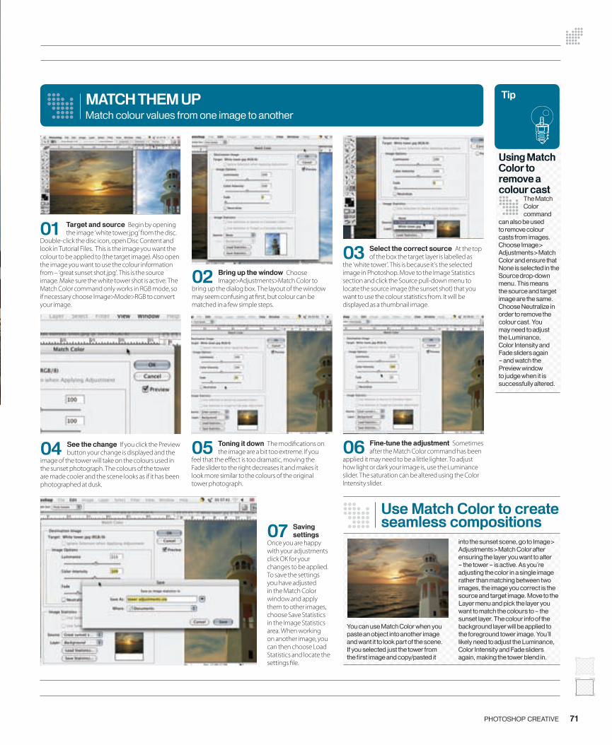
71PHOTOSHOP CREATIVE
04 See the change If you click the Preview button your change is displayed and the
image of the tower will take on the colours used in the sunset photograph. The colours of the tower are made cooler and the scene looks as if it has been photographed at dusk.
05 Toning it down The modi� cations on the image are a bit too extreme. If you
feel that the e� ect is too dramatic, moving the Fade slider to the right decreases it and makes it look more similar to the colours of the original tower photograph.
06 Fine-tune the adjustment Sometimes after the Match Color command has been
applied it may need to be a little lighter. To adjust how light or dark your image is, use the Luminance slider. The saturation can be altered using the Color Intensity slider.
MATCH THEM UP
03 Select the correct source At the top of the box the target layer is labelled as
the ‘white tower’. This is because it’s the selected image in Photoshop. Move to the Image Statistics section and click the Source pull-down menu to locate the source image (the sunset shot) that you want to use the colour statistics from. It will be displayed as a thumbnail image.
Match colour values from one image to another
07 Saving settings
Once you are happy with your adjustments click OK for your changes to be applied. To save the settings you have adjusted in the Match Color window and apply them to other images, choose Save Statistics in the Image Statistics area. When working on another image, you can then choose Load Statistics and locate the settings � le.
Using Match Color to remove a colour cast
The Match Color command
can also be used to remove colour casts from images. Choose Image> Adjustments>Match Color and ensure that None is selected in the Source drop-down menu. This means the source and target image are the same. Choose Neutralize in order to remove the colour cast. You may need to adjust the Luminance, Color Intensity and Fade sliders again – and watch the Preview window to judge when it is successfully altered.
02 Bring up the window Choose Image>Adjustments>Match Color to
bring up the dialog box. The layout of the window may seem confusing at � rst, but colour can be matched in a few simple steps.
01 Target and source Begin by opening the image ‘white tower.jpg’ from the disc.
Double-click the disc icon, open Disc Content and look in Tutorial Files. This is the image you want the colour to be applied to (the target image). Also open the image you want to use the colour information from – ‘great sunset shot.jpg’. This is the source image. Make sure the white tower shot is active. The Match Color command only works in RGB mode, so if necessary choose Image>Mode>RGB to convert your image.
Use Match Color to create seamless compositions
You can use Match Color when you paste an object into another image and want it to look part of the scene. If you selected just the tower from the fi rst image and copy/pasted it
into the sunset scene, go to Image> Adjustments>Match Color after ensuring the layer you want to alter – the tower – is active. As you’re adjusting the color in a single image rather than matching between two images, the image you correct is the source and target image. Move to the Layer menu and pick the layer you want to match the colours to – the sunset layer. The colour info of the background layer will be applied to the foreground tower image. You’ll likely need to adjust the Luminance, Color Intensity and Fade sliders again, making the tower blend in.
Tip
070-071_PC11.indd 71 15/6/06 20:06:48

tutorial cool plug-ins
essentials
BeginnerIntermediateExpert
Approximately 20 minutes
Zoe Mutter
SKILL LEVEL
TIME TAKEN
YOUR EXPERT
ubism from Auto FX Software comes as part of DreamSuite Series One but you can also pick it up as a standalone plug-in if you prefer.
The plug-in is perfect for giving an artistic touch to your photos. It basically applies geometric shapes that emerge from the photograph, fading from transparent to solid as they become visible. The e� ect created by the plug-in is particularly well suited to natural images such as landscapes or the photograph of � owers that we’ve chosen, but it can be applied to photographs of people just as successfully.
The result of the plug-in can be easily tailored to suit the extremity of the e� ect you wish to produce, and to what extent you want your image to retain its original form. Cubism also makes it possible to select where you want the e� ect to be applied. For example, we’ve shown that some interesting e� ects can be achieved when it’s con� ned to just the background of an image. This has the result of distracting the attention from the background, as it softens it in comparison to the sharply outlined foreground image. The simple controls for settings such as shape and size mean that using this plug-in couldn’t be easier. Often plug-ins are far too complex and daunting
to use, so it’s a pleasant surprise to � nd one that doesn’t include unnecessary and confusing controls.
If you want a quick and easy way to transform your photographs into artistic pieces, then using this plug-in is the best option. Masking is also possible, because by creating a selection within your image in Photoshop and then loading the plug-in, you can use this area as a basis for the mask and have complete control over which areas are a� ected.
For more information on Cubism or to buy a copy for $50, visit the website at www.autofx.com. Alternatively, enter our competition for the chance to win your very own copy!
Use the Cubism plug-in
72 PHOTOSHOP CREATIVE
essentials
ubism from Auto FX Software comes as part of DreamSuite Series One but you can also pick it up as a standalone
Use theCubism plug-in
BEFORE
AFTER
Quickly make your images more shapely and artistic
072-073-PC11-plugins.indd 1 14/6/06 17:14:58
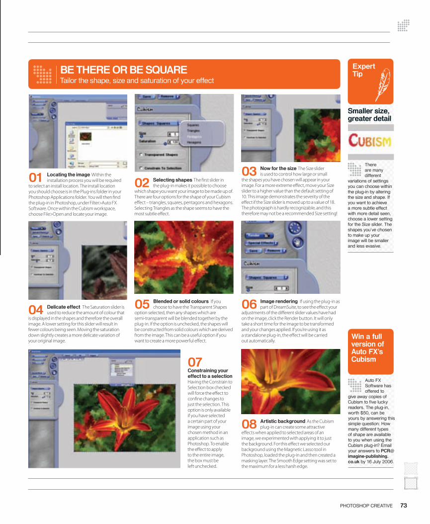
Use the Cubism plug-in
73PHOTOSHOP CREATIVE
04 Delicate effect The Saturation slider is used to reduce the amount of colour that
is displayed in the shapes and therefore the overall image. A lower setting for this slider will result in fewer colours being seen. Moving the saturation down slightly creates a more delicate variation of your original image.
05 Blended or solid colours If you choose to have the Transparent Shapes
option selected, then any shapes which are semi-transparent will be blended together by the plug-in. If the option is unchecked, the shapes will be constructed from solid colours which are derived from the image. This can be a useful option if you want to create a more powerful e� ect.
BE THERE OR BE SQUARETailor the shape, size and saturation of your effect
07 Constraining your effect to a selection Having the Constrain to Selection box checked will force the e� ect to con� ne changes to just the selection. This option is only available if you have selected a certain part of your image using your chosen method in an application such as Photoshop. To enable the e� ect to apply to the entire image, the box must be left unchecked.
01 Locating the image Within the installation process you will be required
to select an install location. The install location you should choose is in the Plug-ins folder in your Photoshop Applications folder. You will then � nd the plug-in in Photoshop, under Filter>Auto FX Software. Once within the Cubism workspace, choose File>Open and locate your image.
02 Selecting shapes The � rst slider in the plug-in makes it possible to choose
which shape you want your image to be made up of. There are four options for the shape of your Cubism e� ect – triangles, squares, pentagons and hexagons. Selecting Triangles as the shape seems to have the most subtle e� ect.
03 Now for the size The Size slider is used to control how large or small
the shapes you have chosen will appear in your image. For a more extreme e� ect, move your Size slider to a higher value than the default setting of 10. This image demonstrates the severity of the e� ect if the Size slider is moved up to a value of 18. The photograph is hardly recognizable, and this therefore may not be a recommended Size setting!
06 Image rendering If using the plug-in as part of DreamSuite, to see the e� ect your
adjustments of the di� erent slider values have had on the image, click the Render button. It will only take a short time for the image to be transformed and your changes applied. If you’re using it as a standalone plug-in, the e� ect will be carried out automatically.
08 Artistic background As the Cubism plug-in can create some attractive
e� ects when applied to selected areas of an image, we experimented with applying it to just the background. For this e� ect we selected our background using the Magnetic Lasso tool in Photoshop, loaded the plug-in and then created a masking layer. The Smooth Edge setting was set to the maximum for a less harsh edge.
Expert Tip
Smaller size, greater detail
There are many different
variations of settings you can choose within the plug-in by altering the size and shape. If you want to achieve a more subtle effect with more detail seen, choose a lower setting for the Size slider. The shapes you’ve chosen to make up your image will be smaller and less evasive.
Win a full version of Auto FX’s Cubism
Auto FX Software has offered to
give away copies of Cubism to fi ve lucky readers. The plug-in, worth $50, can be yours by answering this simple question: How many different types of shape are available to you when using the Cubism plug-in? Email your answers to [email protected] by 16 July 2006.
072-073-PC11-plugins.indd 2 14/6/06 17:15:21

74 PHOTOSHOP CREATIVE 75PHOTOSHOP CREATIVE
Adv
ice
Digital face painting I was inspired by all those patriotic
people who painted � ags on their faces during the World Cup to do
the same – in Photoshop that is. I’ve tried using the Liquify � lter to bloat the � ag so it follows the contours of my face, but can’t do it convincingly. Any suggestions?Adam Watkins
Our � rst suggestion is to put away the Liquify � lter and let your face do all the work! By turning your physical features
into a displacement map you can distort a � ag (or any design you like) to make it follow the contours of a face without needing to push pixels around with the Liquify � lter.
First open the source � le you want to add the � ag to. Ideally the face in the photo will have some shadow and highlight detail. This will give a more e� ective displacement map than a � at-lit face (especially if it’s been bleached by a burst of � ashlight). To turn the face into a displacement map, drag the background layer thumbnail onto the Create a New Layer icon at the bottom of the Layers palette. This will give a duplicate layer of your face. Go to Image>Adjustments>Desaturate to remove all colour info from the duplicate face layer. The layer’s black, grey and white pixels will push and pull the � ag layer’s pixels to displace them, so a high contrast image will be more e� ective. To create a more powerful displacement map, increase the contrast on the greyscale face by going to Image>
Visit the advice centre for help with fi xing photos, solutions to your image-editing problems and directions to helpful destinations on the web Adjustments>Equalize. Soften the greyscale
layer a little by going to Filter>Blur>Gaussian Blur. A blur value of 2.2 should do the trick. This will leave you with a high contrast greyscale layer. To turn it into a displacement map, save it as a PSD � le called ‘Displace.psd.’ You can turn o� the greyscale layer in your main document, as it’s no longer required.
Now for the � ag. Create a new layer and draw a � ag so it overlaps the face. We bashed out a St George’s cross using the Rectangular Marquee tool and the Paint Bucket. We used the Move tool to place the cross so it would overlap the model’s face in an appropriate position. At this stage the cross shape will be too � at, but the displacement map will � x that. Target the � ag layer’s thumbnail in the Layers palette and pick Select>All. Then go to Filter>Distort>Displace. In the Displace dialog box set the Horizontal and Vertical scales to 5 instead of the default 10. This will enable you to displace the � ag in small increments, giving
Your expertpanel…
GEORGE CAIRNSA Photoshop user for many years, George can tackle any problem
ZOE MUTTERZoe’s a keen photographer and a whizz at � xing common � aws in images
JO COLEThe web is awash with helpful sites, and Jo brings you the best ones out there
What you’ll fi nd in this section
Q+AGet to the bottom of your image-editing woes in this part
PHOTOFIXSend us your problem shots for advice on making them all better
RESOURCESWe guide you to the best websites for tutorials and instruction in using the Photoshop software
Post you questions to Photoshop Creative Q&A, Imagine Publishing Ltd, Richmond House, 33 Richmond Hill, Bournemouth, Dorset BH2 6EZ.
Alternatively you can email us at [email protected].
Send your questions to…
Use a displacement map to distort a design or logo so that it follows the contours of your face
Q+ALet us sort out your image-editing quandaries
Tip
When you use the Clone Stamp
tool, it’s wise to give yourself the option of undoing the changes. Select the Clone Stamp tool. In the Options bar tick the Sample All Layers box. Now you can sample pixels from the source image and clone them onto the new layer.
Action stationsSpeed up your workfl ow
Our answer to the picture framing question on page 75 covers a variety of steps that enable you to create a wooden frame from scratch. You can apply these steps to photos of any orientation to enhance them with a frame. To save time, turn repetitive multi-step procedures into a one-click action. Open the Actions palette (Window>Actions) and click Create New Action. Give the action a snappy name (eg Frame-o-matic!) and hit Record. Follow the steps then click Stop. You can apply the action to any photo and frame it in seconds.
074-077-PC11_Advice.indd 74 15/6/06 12:57:31
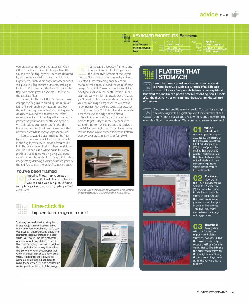
74 PHOTOSHOP CREATIVE 75PHOTOSHOP CREATIVE
advice q+a
you greater control over the distortion. Click OK and navigate to the Displace.psd � le. Hit OK and the � at � ag layer will become distorted by the greyscale version of the model’s face. Lighter areas such as highlights on cheekbones will push the � ag texture outwards, making it look as if it’s painted on the face. To distort the � ag even more press Ctrl/Apple+F to reapply the Displace � lter.
To make the � ag look like it’s made of paint, change the � ag layer’s blending mode to Soft Light. This will enable skin texture to show through the � ag design. Reduce the � ag layer’s opacity to around 74% to make the e� ect more subtle. Parts of the � ag will appear to be painted on your model’s teeth and eyeballs, which is taking patriotism too far! Use the Eraser and a soft-edged brush to remove the unwanted details so it only appears on skin.
Alternatively, add a layer mask to the � ag layer and use a soft black brush to poke holes in the � ag layer to reveal hidden features like hair. The advantage of using a layer mask is you can press X and use a white brush to restore pixels you’ve hidden earlier, giving you more creative control over the � nal image. Finish the image o� by dabbing a white brush on parts of the red � ag to fake the look of paint smudges.
You’ve been framedI’m using Photoshop to create an online portfolio of photos. Is there a way to add a wooden picture frame
to my images to create a classy gallery e� ect?Mark Evans
You can add a wooden frame to any image with a bit of � ddling around in the Layer style section of the Layers
palette. Kick o� by creating a new layer. Press Select>All. The ‘marching ants’ selection marquee will appear around the edge of your image. Go to Edit>Stroke. In the Stroke dialog box type a value in the Width section. In our example we went for 150 pixels, but the value you’ll need to choose depends on the size of your source image. Larger values will create larger frames. Pick a white colour. Set Location to Inside and click OK. This will add a � at white border around the edge of the photo.
To add texture and depth to the white border, target its layer in the Layers palette. Go to the bottom of the palette and click on the Add a Layer Style icon. To add a wooden texture to the white border, select the Pattern Overlay layer style. Initially your frame will
I want to make a good impression on someone via a photo, but I’ve developed a touch of middle-age spread. I’ll lose a few pounds before I meet my friend,
but want to send them a photo now representing how I’ll look after the diet. Any tips on trimming the fat using Photoshop?Max Ingram
Diets are dull and liposuction sucks. You can lose weight the easy way with a digital nip and tuck courtesy of the Liquify � lter’s Pucker tool. Follow the steps below to � rm
up with a Photoshop workout. We promise no sweat is involved!
03 Breathe in! Gently click
with the Pucker tool to push the bulging stomach inwards. To give the brush a softer edge, reduce the Brush Density value. This will help blend the puckered pixels with their neighbours. Finally. tidy up remaining curves using the Forward Warp tool (W).
02 Pucker up Now go to
the Filter>Liquify menu. Select the Pucker tool (S). Increase the tool’s Brush Size to cover the stomach area. Reduce the Brush Pressure so you can make changesin smaller increments. This gives you more control over the image-editing process.
01 Make a selection In
our example the stripes accentuate the shape of the stomach. Select the Elliptical Marquee tool (M). In the Options bar set Feather around 12 pixels. This helps make the blend between the edited pixels and their surroundings more subtle and therefore less noticeable.
FLATTEN THAT STOMACH
Enhance your online galleries by using Layer Styles like Bevel and Emboss to create three-dimensional picture frames
Q+ALet us sort out your image-editing quandaries
KEYBOARD SHORTCUTS Edit menuUndo Ctrl + Z Apple + ZStep forward Shift + Ctrl + Z Shift + Apple + ZStep backward Alt + Ctrl + Z Option + Apple + ZFade Shift + Ctrl + F Shift + Apple + F
PC Mac
One-click fi xImprove tonal range in a click!
You may be familiar with using the Image>Adjustments>Levels dialog to fi x tonal range problems. Let’s say you have an underexposed shot. The highlights look dull instead of bright white. You could use the histogram and the Input Level sliders to tweak the photo’s highlight values to brighten them up, but a faster way is to select the Set White Point eyedropper tool. Click an object that should look pure white. Photoshop will analyse the sampled pixels and adjust them to make them whiter. It’ll also brighten up similar pixels in the rest of the image.
Tip
074-077-PC11_Advice.indd 75 15/6/06 13:52:13
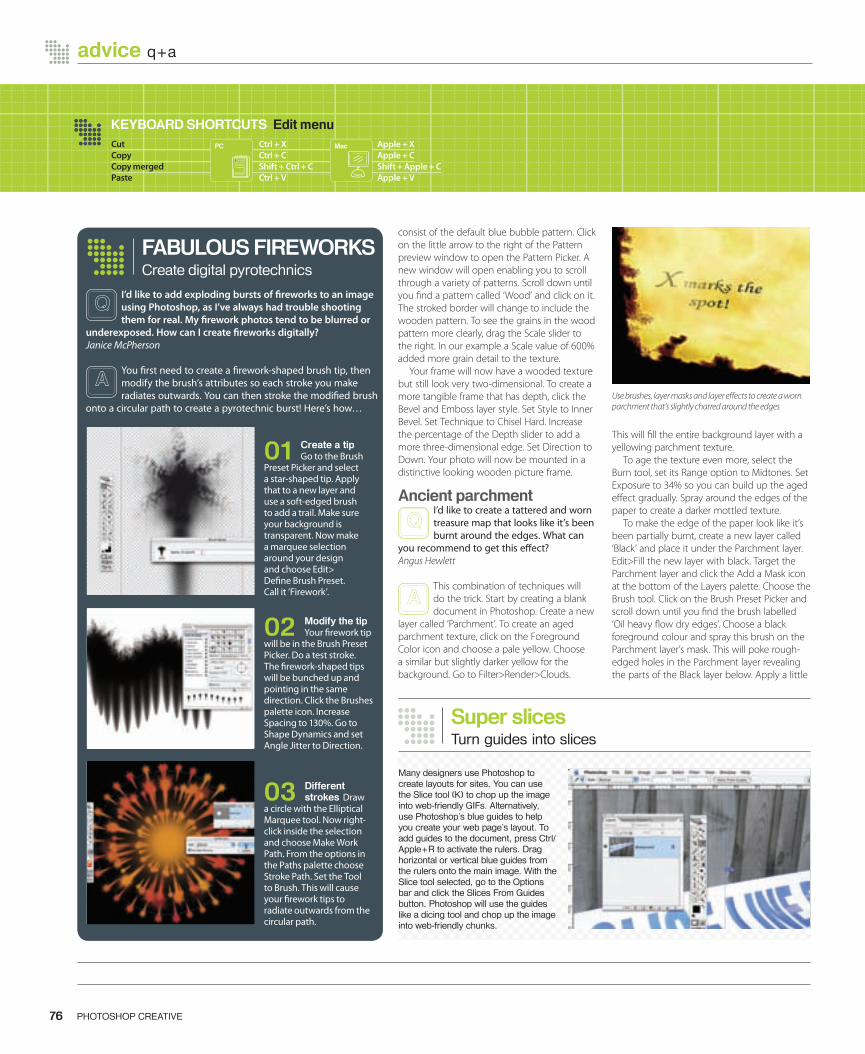
consist of the default blue bubble pattern. Click on the little arrow to the right of the Pattern preview window to open the Pattern Picker. A new window will open enabling you to scroll through a variety of patterns. Scroll down until you � nd a pattern called ‘Wood’ and click on it. The stroked border will change to include the wooden pattern. To see the grains in the wood pattern more clearly, drag the Scale slider to the right. In our example a Scale value of 600% added more grain detail to the texture.
Your frame will now have a wooded texture but still look very two-dimensional. To create a more tangible frame that has depth, click the Bevel and Emboss layer style. Set Style to Inner Bevel. Set Technique to Chisel Hard. Increase the percentage of the Depth slider to add a more three-dimensional edge. Set Direction to Down. Your photo will now be mounted in a distinctive looking wooden picture frame.
Ancient parchmentI’d like to create a tattered and worn treasure map that looks like it’s been burnt around the edges. What can
you recommend to get this e� ect?Angus Hewlett
This combination of techniques will do the trick. Start by creating a blank document in Photoshop. Create a new
layer called ‘Parchment’. To create an aged parchment texture, click on the Foreground Color icon and choose a pale yellow. Choose a similar but slightly darker yellow for the background. Go to Filter>Render>Clouds.
This will � ll the entire background layer with a yellowing parchment texture.
To age the texture even more, select the Burn tool, set its Range option to Midtones. Set Exposure to 34% so you can build up the aged e� ect gradually. Spray around the edges of the paper to create a darker mottled texture.
To make the edge of the paper look like it’s been partially burnt, create a new layer called ‘Black’ and place it under the Parchment layer. Edit>Fill the new layer with black. Target the Parchment layer and click the Add a Mask icon at the bottom of the Layers palette. Choose the Brush tool. Click on the Brush Preset Picker and scroll down until you � nd the brush labelled ‘Oil heavy � ow dry edges’. Choose a black foreground colour and spray this brush on the Parchment layer’s mask. This will poke rough-edged holes in the Parchment layer revealing the parts of the Black layer below. Apply a little
76 PHOTOSHOP CREATIVE 77PHOTOSHOP CREATIVE
advice q+a advice q+a
Use brushes, layer masks and layer e� ects to create a worn parchment that’s slightly charred around the edges
02 Modify the tip Your � rework tip
will be in the Brush Preset Picker. Do a test stroke. The � rework-shaped tips will be bunched up and pointing in the same direction. Click the Brushes palette icon. Increase Spacing to 130%. Go to Shape Dynamics and set Angle Jitter to Direction.
01 Create a tip Go to the Brush
Preset Picker and select a star-shaped tip. Apply that to a new layer and use a soft-edged brush to add a trail. Make sure your background is transparent. Now make a marquee selection around your design and choose Edit>De� ne Brush Preset. Call it ‘Firework’.
FABULOUS FIREWORKS
I’d like to add exploding bursts of � reworks to an image using Photoshop, as I’ve always had trouble shooting them for real. My � rework photos tend to be blurred or
underexposed. How can I create � reworks digitally?Janice McPherson
You � rst need to create a � rework-shaped brush tip, then modify the brush’s attributes so each stroke you make radiates outwards. You can then stroke the modi� ed brush
onto a circular path to create a pyrotechnic burst! Here’s how…
03 Different strokes Draw
a circle with the Elliptical Marquee tool. Now right-click inside the selection and choose Make Work Path. From the options in the Paths palette choose Stroke Path. Set the Tool to Brush. This will cause your � rework tips to radiate outwards from the circular path.
Create digital pyrotechnics
Super slicesTurn guides into slices
Many designers use Photoshop to create layouts for sites. You can use the Slice tool (K) to chop up the image into web-friendly GIFs. Alternatively, use Photoshop’s blue guides to help you create your web page’s layout. To add guides to the document, press Ctrl/Apple+R to activate the rulers. Drag horizontal or vertical blue guides from the rulers onto the main image. With the Slice tool selected, go to the Options bar and click the Slices From Guides button. Photoshop will use the guides like a dicing tool and chop up the image into web-friendly chunks.
Cut Ctrl + X Apple + XCopy Ctrl + C Apple + CCopy merged Shift + Ctrl + C Shift + Apple + CPaste Ctrl + V Apple + V
KEYBOARD SHORTCUTS Edit menuPC Mac
074-077-PC11_Advice.indd 76 15/6/06 13:52:36
Gaussian blur to the layer mask to add a softer, more realistic texture to the burnt edges.
To give the jagged edges a more burnt look, change their colour to darker reds and browns. You can do this by targeting the Parchment layer in the Layers palette and clicking on the Add a Layer Style icon. Select the Outer Glow e� ect. Change the default yellow glow colour to a dark rich red. Change the Spread attribute to 10% to create a charred edge e� ect around the edge of the parchment. Add a light yellow Inner Glow to the edge of the parchment to add a more realistic charred edge e� ect to your treasure map.
As a � nishing touch, you can give your � at two-dimensional parchment more depth by going to Edit>Transform>Warp. You can then use the Warp tool’s selection handles to lift up the edges of the parchment and make them curve like real paper.
Amazing automationI’m going through the tedious process of scanning my 35mm prints into my PC. To save time I’m
scanning several photos in one go. This places a batch of three or four pics into one Photoshop document. I then have to select and copy each photo and paste it into a new document to create individual pictures. Is there a way to speed my scanning work� ow?Cathryn Brock
Lurking in Photoshop’s menus is the perfect tool to help speed up your scanning and image-editing work� ow.
Thanks to Photoshop’s Automate menu you can slap a pile of photos onto the scanner without even making sure they’re all straight. Go to File>Automate>Crop and Straighten Photos. Photoshop will analyse the document full of misaligned shots, extract them one by one, rotate each to straighten it, then place the shots in documents of their own. All you need do is give the photos appropriate � lenames then get on with the scanning next batch.
Cracking upI’m trying to fake the Mona Lisa-style vintage paint texture e� ect where you see jagged cracks in the picture’s
paintwork. I guess these are caused by changes in temperature making the canvas stretch. How would you go about faking this e� ect in Photoshop?Michael Peel
Open your source � le and use the Art History brush to turn your photo into a painted masterpiece (see issue
nine for a full tutorial). To add some cracks, create a new layer and Edit>Fill it with 50% grey. Set the foreground to black. Go to Filter>Texture>Stained Glass. A Cell Size of 11 should create large enough cracks on an average photo. Create � ne lines by reducing the Border Thickness to 3; reduce the Light Intensity channel to 0. Click OK. To hide the grey pixels on the cracked paint layer, set its blending mode to Overlay – only the cracks will remain. At this stage the cracks look � at. To give them some depth go to Filter>Stylize>Emboss. In the Emboss dialog box set Angle to 38, Height to 1 and Amount to 52%. Click OK. Now target the greyscale layer and go to Image>Adjustments> Invert. This will make the cracks look more realistic as they’ll be sunken instead of raised.
Cheerio checkerboardRemove distracting elements
Photoshop indicates transparent sections of a document with a white and grey checkerboard pattern. This can be distracting if you’re working on a complex area that overlaps a transparent background. To make the pattern less distracting, go to Edit (or Photoshop on a Mac)>Preferences> Transparency & Gamut. Here you can change the size and colour of the grid so it doesn’t distract you from editing other layers. You can even remove the pattern entirely by setting Grid Size to None. Transparent areas will now be displayed by a clean white screen.
BookResources
For a thorough guide to using
fi lters, have a look at Ilex’s Photoshop Filter Effects Cookbook. It covers every fi lter in the program and gives an excellent description of what each one does. It costs £17.95.
76 PHOTOSHOP CREATIVE 77PHOTOSHOP CREATIVE
advice q+a advice q+a
Once you’ve turned your photos into paintings, use a combination of � lters to add cracks to the surface
KEYBOARD SHORTCUTS Edit menuPaste into Shift + Ctrl + V Shift + Apple + VFill Shift + F5 Shift + F5Free transform Ctrl + T Apple + TKeyboard shortcuts… Shift + Alt + Ctrl + K Shift + Option + Apple + K
PC Mac
Using layer blendsCreate a moveable Lens Flare layer
Photoshop does not enable you to apply the Lens Flare fi lter to an empty layer, which forces you to apply the fi lter directly onto your photograph or illustration. This means that once the fi lter has been applied to the image, you are stuck with the position of the lens fl are and can’t move it. A sneaky way around this problem is to create a new layer and fi ll it with black. Select Filter>Render>Lens Flare in order to add a fl are to the Black layer. Finally, set the layer’s blending mode to Screen. You can now move the fl are into any position at any time.
Photoshop can take the tedium out of scanning prints by rotating, cropping and separating images automatically
074-077-PC11_Advice.indd 77 15/6/06 13:53:04
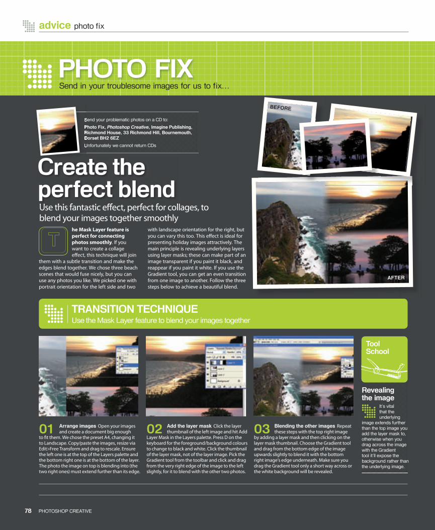
PHOTO FIXSend in your troublesome images for us to fi x…
02 Add the layer mask Click the layer thumbnail of the left image and hit Add
Layer Mask in the Layers palette. Press D on the keyboard for the foreground/background colours to change to black and white. Click the thumbnail of the layer mask, not of the layer image. Pick the Gradient tool from the toolbar and click and drag from the very right edge of the image to the left slightly, for it to blend with the other two photos.
03 Blending the other images Repeat these steps with the top right image
by adding a layer mask and then clicking on the layer mask thumbnail. Choose the Gradient tool and drag from the bottom edge of the image upwards slightly to blend it with the bottom right image’s edge underneath. Make sure you drag the Gradient tool only a short way across or the white background will be revealed.
01 Arrange images Open your images and create a document big enough
to � t them. We chose the preset A4, changing it to Landscape. Copy/paste the images, resize via Edit>Free Transform and drag to rescale. Ensure the left one is at the top of the Layers palette and the bottom right one is at the bottom of the layer. The photo the image on top is blending into (the two right ones) must extend further than its edge.
TRANSITION TECHNIQUEUse the Mask Layer feature to blend your images together
he Mask Layer feature is perfect for connecting photos smoothly. If you want to create a collage e� ect, this technique will join
them with a subtle transition and make the edges blend together. We chose three beach scenes that would fuse nicely, but you can use any photos you like. We picked one with portrait orientation for the left side and two
with landscape orientation for the right, but you can vary this too. This e� ect is ideal for presenting holiday images attractively. The main principle is revealing underlying layers using layer masks; these can make part of an image transparent if you paint it black, and reappear if you paint it white. If you use the Gradient tool, you can get an even transition from one image to another. Follow the three steps below to achieve a beautiful blend.
It’s vital that the underlying
image extends further than the top image you add the layer mask to, otherwise when you drag across the image with the Gradient tool it’ll expose the background rather than the underlying image.
Revealing the image
Tool School
Send your problematic photos on a CD to:
Photo Fix, Photoshop Creative, Imagine Publishing, Richmond House, 33 Richmond Hill, Bournemouth, Dorset BH2 6EZ
Unfortunately we cannot return CDs
Send your problematic photos on a CD to:
Photo Fix, Richmond House, 33 Richmond Hill, Bournemouth, Dorset BH2 6EZ
Unfortunately we cannot return CDs
advice photo fi x
78 PHOTOSHOP CREATIVE 79PHOTOSHOP CREATIVE
BEFORE
AFTER
Use this fantastic e� ect, perfect for collages, to blend your images together smoothlyUse this fantastic e� ect, perfect for collages, to
Create the perfect blend
078-079-PC11-Advice.indd 78 14/6/06 17:12:16

78 PHOTOSHOP CREATIVE 79PHOTOSHOP CREATIVE
advice resources
RESOURCESThe best sites to visit to increase your Photoshop knowledge…
AS SIMPLE AS PHOTOSHOPwww.simplephotoshop.com
Although this is a site primarily selling video tutorials, there’s still some excellent free content. Browse through or download the free video book, including the fi rst chapter of 13 movies. There are also written instructions
for each video. The fi rst chapter, for beginners, includes a work area tour and basic ops. In the Skills section not all tutorials and videos are free, but those that are include colour and tonal adjustments. The Recipes section offers solutions for retouching and correcting photos. The info isn’t detailed, but gives an overview of the app’s features. After browsing the free tutorials, you may want to buy the full version with over 220 video tutorials. There’s also a selection dedicated to Elements. An extremely useful section is the Toolbox Reference giving the icon, purpose and keyboard shortcut of each tool.
If you’re serious about your photography as well as your Photoshop, this site is ideal. It
is stuffed with photography tips cover shooting, exposure, composition, light and panoramas. Each page is detailed, and there’s a great explanation of the rule of thirds. Photoshop tips are under Improvements or Effects. Improvements includes tips on restoring and general touching-up. Effects covers creative techniques, such as converting a photo to a sketch and creating rays of light.
PICTURE CORRECTwww.picturecorrect.com
keyboard shortcut of each tool.
THE DESIGN WORLDwww.thedesignworld.com
Each area within this website contains many tutorials submitted by hundreds of Photoshop users and members of the site. If you want to learn some interesting web design tricks, logo creation skills or photo
effects, then visit The Design World. As well as the lessons, there are also a few brush sets for you to use in your creative work. The areas covered on the site include photo-manipulation, Photoshop fi lter effects, font and text effects, and texture tutorials – plenty to get your teeth into. If it’s fl ame and explosion effects you want to emulate, then the Filter tutorial area contains a range of ideal tutorials. A defi nite strength of this site is its abstract effects including colour bursts and vortex swirls.
Phoob isn’t just an educational resource – you can get both brush sets and fonts from the
Downloads section. Even though there are only nine purely Photoshop-related tutorials, it’s a must-visit if you’re looking for inventive ways to use Photoshop. There’s an excellent glass effect, ideal for use on a website or in a signature on a forum. You can also learn how to make part of an image glow realistically, or experiment with multi-colouring using Color Balance. The more abstract projects are accompanied by practical effects, eg changing the colour of someone’s eye – which can be adapted to other situations.
PHOOBwww.phoob.com
This site is quite oriented towards web design, but there are some very exciting
effects you can incorporate into your everyday designs. The tutorials have lots of short steps and helpful visuals, and one tutorial shows how to create a short animation in Photoshop in just four steps. The tutorials on creating navigation menus and professional sites are aimed at Photoshop users who want to increase their Internet design knowledge. There are also some impressive effects to experiment with, such as an electric bolt or glowing text.
ZASDESIGNwww.zasdesign.com
PHOTOSHOP CONTESTwww.photoshopcontest.com
brush sets for you to use in your creative work. The areas covered on the site include photo-manipulation, Photoshop fi lter effects, font and text effects, and texture tutorials – plenty to get your teeth into. If it’s fl ame and explosion effects you want to emulate, then the Filter tutorial area contains a range of ideal tutorials. A defi nite strength of this site is its abstract effects including colour bursts and vortex swirls.
In addition to a range of great contests, this site features tutorials showing how to create
wacky and also practical effects with images. The tutorials provide thorough coverage, and Photoshop Contest has had fun with them. Colour correction, perspective and masks are among the topics featured, and the theory behind each subject is also covered. This site is relevant to beginners and advanced users alike.
078-079-PC11-Advice.indd 79 14/6/06 17:12:51

If you like the buZZ.Simpli� er plug-in, check out the review of buZZ.Pro 2 and see what else can be achieved. Also, extend your knowledge with Total Training If you like the buZZ.Simpli� er plug-in, check out the review of buZZ.Pro 2 and see If you like the buZZ.Simpli� er plug-in, check out the review of buZZ.Pro 2 and see If you like the buZZ.Simpli� er plug-in, check out the review of buZZ.Pro 2 and see If you like the buZZ.Simpli� er plug-in, check out the review of buZZ.Pro 2 and see If you like the buZZ.Simpli� er plug-in, check out the review of buZZ.Pro 2 and see If you like the buZZ.Simpli� er plug-in, check out the review of buZZ.Pro 2 and see If you like the buZZ.Simpli� er plug-in, check out the review of buZZ.Pro 2 and see If you like the buZZ.Simpli� er plug-in, check out the review of buZZ.Pro 2 and see If you like the buZZ.Simpli� er plug-in, check out the review of buZZ.Pro 2 and see If you like the buZZ.Simpli� er plug-in, check out the review of buZZ.Pro 2 and see If you like the buZZ.Simpli� er plug-in, check out the review of buZZ.Pro 2 and see If you like the buZZ.Simpli� er plug-in, check out the review of buZZ.Pro 2 and see If you like the buZZ.Simpli� er plug-in, check out the review of buZZ.Pro 2 and see If you like the buZZ.Simpli� er plug-in, check out the review of buZZ.Pro 2 and see If you like the buZZ.Simpli� er plug-in, check out the review of buZZ.Pro 2 and see If you like the buZZ.Simpli� er plug-in, check out the review of buZZ.Pro 2 and see If you like the buZZ.Simpli� er plug-in, check out the review of buZZ.Pro 2 and see If you like the buZZ.Simpli� er plug-in, check out the review of buZZ.Pro 2 and see If you like the buZZ.Simpli� er plug-in, check out the review of buZZ.Pro 2 and see If you like the buZZ.Simpli� er plug-in, check out the review of buZZ.Pro 2 and see If you like the buZZ.Simpli� er plug-in, check out the review of buZZ.Pro 2 and see If you like the buZZ.Simpli� er plug-in, check out the review of buZZ.Pro 2 and see If you like the buZZ.Simpli� er plug-in, check out the review of buZZ.Pro 2 and see If you like the buZZ.Simpli� er plug-in, check out the review of buZZ.Pro 2 and see If you like the buZZ.Simpli� er plug-in, check out the review of buZZ.Pro 2 and see If you like the buZZ.Simpli� er plug-in, check out the review of buZZ.Pro 2 and see If you like the buZZ.Simpli� er plug-in, check out the review of buZZ.Pro 2 and see If you like the buZZ.Simpli� er plug-in, check out the review of buZZ.Pro 2 and see If you like the buZZ.Simpli� er plug-in, check out the review of buZZ.Pro 2 and see If you like the buZZ.Simpli� er plug-in, check out the review of buZZ.Pro 2 and see If you like the buZZ.Simpli� er plug-in, check out the review of buZZ.Pro 2 and see If you like the buZZ.Simpli� er plug-in, check out the review of buZZ.Pro 2 and see If you like the buZZ.Simpli� er plug-in, check out the review of buZZ.Pro 2 and see If you like the buZZ.Simpli� er plug-in, check out the review of buZZ.Pro 2 and see If you like the buZZ.Simpli� er plug-in, check out the review of buZZ.Pro 2 and see If you like the buZZ.Simpli� er plug-in, check out the review of buZZ.Pro 2 and see If you like the buZZ.Simpli� er plug-in, check out the review of buZZ.Pro 2 and see If you like the buZZ.Simpli� er plug-in, check out the review of buZZ.Pro 2 and see If you like the buZZ.Simpli� er plug-in, check out the review of buZZ.Pro 2 and see If you like the buZZ.Simpli� er plug-in, check out the review of buZZ.Pro 2 and see If you like the buZZ.Simpli� er plug-in, check out the review of buZZ.Pro 2 and see If you like the buZZ.Simpli� er plug-in, check out the review of buZZ.Pro 2 and see If you like the buZZ.Simpli� er plug-in, check out the review of buZZ.Pro 2 and see If you like the buZZ.Simpli� er plug-in, check out the review of buZZ.Pro 2 and see If you like the buZZ.Simpli� er plug-in, check out the review of buZZ.Pro 2 and see If you like the buZZ.Simpli� er plug-in, check out the review of buZZ.Pro 2 and see If you like the buZZ.Simpli� er plug-in, check out the review of buZZ.Pro 2 and see If you like the buZZ.Simpli� er plug-in, check out the review of buZZ.Pro 2 and see If you like the buZZ.Simpli� er plug-in, check out the review of buZZ.Pro 2 and see If you like the buZZ.Simpli� er plug-in, check out the review of buZZ.Pro 2 and see creative reviews
buZZ.Pro 2 82
Total Training DVD 84
Software reviews
The Digital Photographer’s Guide to Photoshop Elements 4 86
Photoshop CS2 One-On-One 87
Manga Clip Art 87
Photoshop CS2 RAW 87
Book reviews
CHECK IT OUT! | VISIT US ONLINE AT WWW.PSHOPCREATIVE.CO.UK
81PHOTOSHOP CREATIVE
reviews issue eleven
Advanced Adobe Photoshop CS2 DVD
“A thorough training resource that will take you to the next level”
081_PC11_Rev intro.indd 85 15/6/06 11:14:05
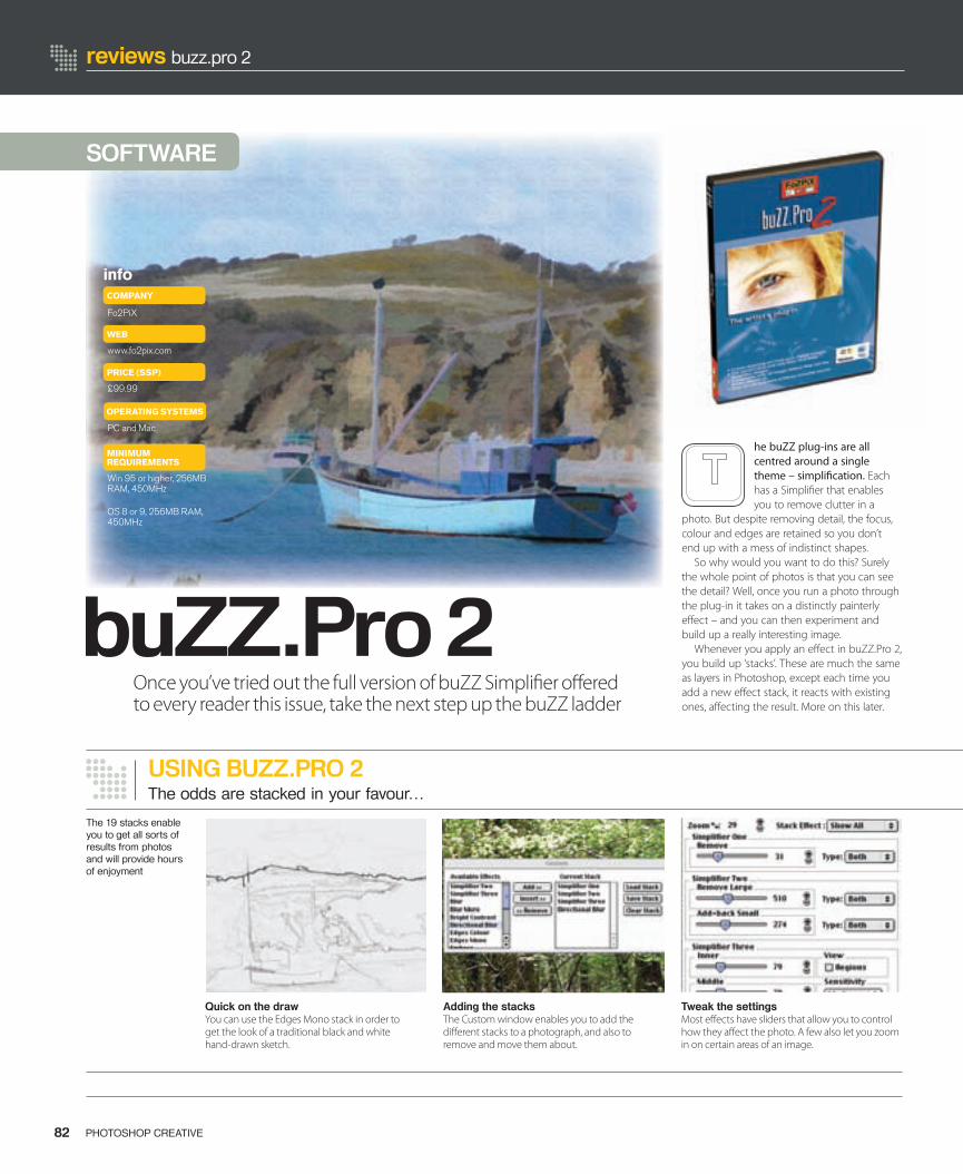
reviews buzz.pro 2
USING BUZZ.PRO 2The odds are stacked in your favour…
82 PHOTOSHOP CREATIVE
SOFTWARE
Quick on the drawYou can use the Edges Mono stack in order to get the look of a traditional black and white hand-drawn sketch.
Adding the stacksThe Custom window enables you to add the di� erent stacks to a photograph, and also to remove and move them about.
Tweak the settingsMost e� ects have sliders that allow you to control how they a� ect the photo. A few also let you zoom in on certain areas of an image.
The 19 stacks enable you to get all sorts of results from photos and will provide hours of enjoyment
he buZZ plug-ins are all centred around a single theme – simpli� cation. Each has a Simpli� er that enables you to remove clutter in a
photo. But despite removing detail, the focus, colour and edges are retained so you don’t end up with a mess of indistinct shapes.
So why would you want to do this? Surely the whole point of photos is that you can see the detail? Well, once you run a photo through the plug-in it takes on a distinctly painterly e� ect – and you can then experiment and build up a really interesting image.
Whenever you apply an e� ect in buZZ.Pro 2, you build up ‘stacks’. These are much the same as layers in Photoshop, except each time you add a new e� ect stack, it reacts with existing ones, a� ecting the result. More on this later.
infoCOMPANY
WEB
Fo2PiX
www.fo2pix.com
£99.99
PRICE (SSP)
PC and Mac
OPERATING SYSTEMS
MINIMUM REQUIREMENTS
Win 95 or higher, 256MB RAM, 450MHz
OS 8 or 9, 256MB RAM, 450MHz
buZZ.Pro 2Once you’ve tried out the full version of buZZ Simpli� er o� ered to every reader this issue, take the next step up the buZZ ladder
082-083-PC11-Buzz.indd 1 15/6/06 11:55:00
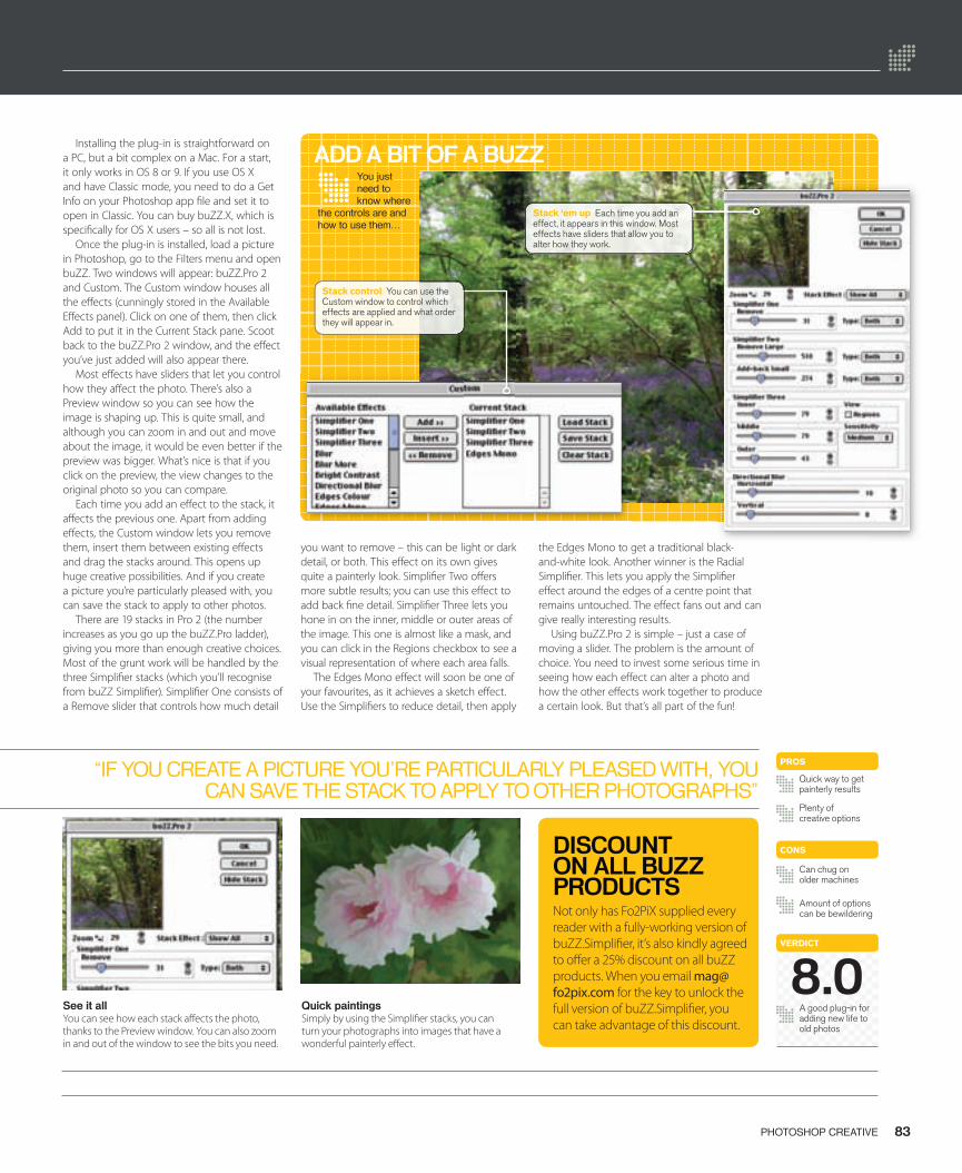
83PHOTOSHOP CREATIVE
You just need to know where
the controls are and how to use them…
“IF YOU CREATE A PICTURE YOU’RE PARTICULARLY PLEASED WITH, YOU CAN SAVE THE STACK TO APPLY TO OTHER PHOTOGRAPHS”
See it allYou can see how each stack a� ects the photo, thanks to the Preview window. You can also zoom in and out of the window to see the bits you need.
Quick paintingsSimply by using the Simpli� er stacks, you can turn your photographs into images that have a wonderful painterly e� ect.
DISCOUNT ON ALL BUZZ PRODUCTSNot only has Fo2PiX supplied every reader with a fully-working version of buZZ.Simpli� er, it’s also kindly agreed to o� er a 25% discount on all buZZ products. When you email [email protected] for the key to unlock the full version of buZZ.Simpli� er, you can take advantage of this discount.
VERDICT
A good plug-in for adding new life to old photos
Can chug on older machines
CONS
Amount of options can be bewildering
Installing the plug-in is straightforward on a PC, but a bit complex on a Mac. For a start, it only works in OS 8 or 9. If you use OS X and have Classic mode, you need to do a Get Info on your Photoshop app � le and set it to open in Classic. You can buy buZZ.X, which is speci� cally for OS X users – so all is not lost.
Once the plug-in is installed, load a picture in Photoshop, go to the Filters menu and open buZZ. Two windows will appear: buZZ.Pro 2 and Custom. The Custom window houses all the e� ects (cunningly stored in the Available E� ects panel). Click on one of them, then click Add to put it in the Current Stack pane. Scoot back to the buZZ.Pro 2 window, and the e� ect you’ve just added will also appear there.
Most e� ects have sliders that let you control how they a� ect the photo. There’s also a Preview window so you can see how the image is shaping up. This is quite small, and although you can zoom in and out and move about the image, it would be even better if the preview was bigger. What’s nice is that if you click on the preview, the view changes to the original photo so you can compare.
Each time you add an e� ect to the stack, it a� ects the previous one. Apart from adding e� ects, the Custom window lets you remove them, insert them between existing e� ects and drag the stacks around. This opens up huge creative possibilities. And if you create a picture you’re particularly pleased with, you can save the stack to apply to other photos.
There are 19 stacks in Pro 2 (the number increases as you go up the buZZ.Pro ladder), giving you more than enough creative choices. Most of the grunt work will be handled by the three Simpli� er stacks (which you’ll recognise from buZZ Simpli� er). Simpli� er One consists of a Remove slider that controls how much detail
you want to remove – this can be light or dark detail, or both. This e� ect on its own gives quite a painterly look. Simpli� er Two o� ers more subtle results; you can use this e� ect to add back � ne detail. Simpli� er Three lets you hone in on the inner, middle or outer areas of the image. This one is almost like a mask, and you can click in the Regions checkbox to see a visual representation of where each area falls.
The Edges Mono e� ect will soon be one of your favourites, as it achieves a sketch e� ect. Use the Simpli� ers to reduce detail, then apply
the Edges Mono to get a traditional black-and-white look. Another winner is the Radial Simpli� er. This lets you apply the Simpli� er e� ect around the edges of a centre point that remains untouched. The e� ect fans out and can give really interesting results.
Using buZZ.Pro 2 is simple – just a case of moving a slider. The problem is the amount of choice. You need to invest some serious time in seeing how each e� ect can alter a photo and how the other e� ects work together to produce a certain look. But that’s all part of the fun!
PROS
Quick way to get painterly results
Plenty of creative options
ADD A BIT OF A BUZZ
Stack control You can use the Custom window to control which effects are applied and what order they will appear in.
8.0
Stack ‘em up Each time you add an effect, it appears in this window. Most effects have sliders that allow you to alter how they work.
082-083-PC11-Buzz.indd 2 15/6/06 11:55:19
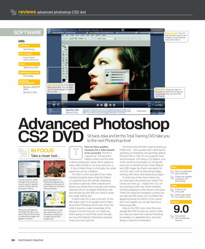
SOFTWARE
Advanced Photoshop CS2 DVD
here are three qualities necessary for a video tutorial to be successful. The � rst is a good host. The second is helpful content and the third
is decent production values. We’ve looked at many video tutorials in our time, and trust us – if one of these things is a bit shaky, the whole experience can be a letdown.
This DVD is a � ne example of how video tutorials should be done. Deke McClelland is a supreme host. He’s friendly, interesting and doesn’t patronise. While watching the lessons you almost feel as though you’re being inducted into an Ivy-league Photoshop club that will give you the skills you need to tackle any image-editing task.
Content-wise, this is also a triumph. As the title makes clear, it’s for people who’ve been around the Photoshop block a few times. But while it assumes a basic knowledge of the program, the fact that you can clearly see what’s going on (and if that wasn’t enough, you have McClelland’s informative narrative) means you won’t get lost.
84 PHOTOSHOP CREATIVE
reviews advanced photoshop CS2 dvd
PROS
Easy to understand,plus useful tips
Photos are suppliedso that you can follow along
A little on the pricey side
Viewer size may be too small for some
CONS
VERDICT
An excellent all-round training resource
9.0
The lessons kick o� with a look at setting up Preferences – this is packed with useful tips for speeding up Photoshop and generally getting the best from it. Then it’s on to speci� c tools and techniques. This being a CS2 edition, a lot of the content concentrates on CS2-speci� c tools such as Vanishing Point, Smart Objects and HDR images. But there’s also plenty for non-CS2 users, such as retouching images, working with colour and sharpening images.
So that’s two of the three criteria met, but what about the production values? Two words sum them up – mighty � ne. You can do everything within the viewer interface, including skipping to other lessons and topics. There’s the expected navigation controls, but you also get little extras, such as helpful tips appearing along the bottom of the viewer, and if you register you can get free bonus learning goodies.
Okay, so the DVD costs more than your average � lm DVD (or box set, come to that), but what you have here is prime Photoshop knowledge in a digestible form, and that’s always a welcome combination.
info
Total Training
Career Vision, www.cvision.co.uk
COMPANY
BUY IT FROM
PC and Mac
OPERATING SYSTEM
PRICE
£83.43 (inc VAT)
IN FOCUSTake a closer look...
You don’t have to wade through intro screens or menus to get to specifi c content. Simply use the drop-down menus.
Deke McClelland is a Photoshop stalwart and will appear at the start of each section to introduce what you’ll learn.
Obviously you’ll get the most from this disc if you have CS2, but the lessons on retouching images will appeal to anyone.
All of the advice on the disc will set you up for the future, including an in-depth look at how Levels work.
More help Keep your eyes on this area – helpful tips will pop up occasionally that can save time and hassle.
MINIMUM REQUIREMENTS
Windows 2000/XP2GHz
Mac OS X 1GHz
Follow along All of the action takes place here. You can load up the tutorial images from the disc as well.
Sit back, relax and let this Total Training DVD take you to the next Photoshop level
Move around You can skip between lessons and chapters using these top drop-down menus.
084_PC11_DVD total.indd 84 15/6/06 11:47:26

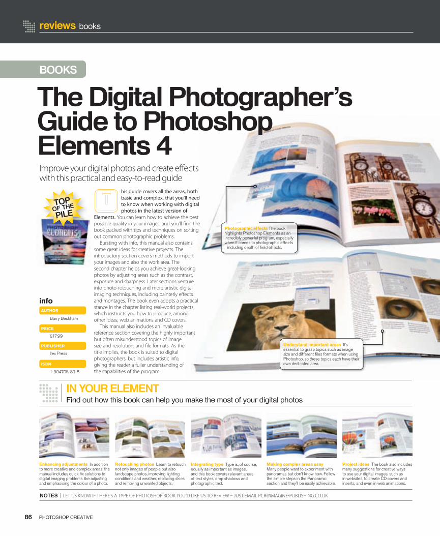
reviews books
NOTES | LET US KNOW IF THERE’S A TYPE OF PHOTOSHOP BOOK YOU’D LIKE US TO REVIEW – JUST EMAIL [email protected]
86 PHOTOSHOP CREATIVE
BOOKS
info
Barry Beckham
£17.99
Ilex Press
AUTHOR
PRICE
1-904705-89-8
ISBN
PUBLISHER
Enhancing adjustments In addition to more creative and complex areas, the manual includes quick fi x solutions to digital imaging problems like adjusting and emphasising the colour of a photo.
Retouching photos Learn to retouch not only images of people but also landscape photos, improving lighting conditions and weather, replacing skies and removing unwanted objects.
Integrating type Type is, of course, equally as important as images, and this book covers relevant areas of text styles, drop shadows and photographic text.
Making complex areas easy Many people want to experiment with panoramas but don’t know how. Follow the simple steps in the Panoramic section and they’ll be easily achievable.
Project ideas The book also includes many suggestions for creative ways to use your digital images, such as in websites, to create CD covers and inserts, and even in web animations.
Find out how this book can help you make the most of your digital photos
TOPOF THE
PILE
IN YOUR ELEMENT
Improve your digital photos and create e� ects with this practical and easy-to-read guide
his guide covers all the areas, both basic and complex, that you’ll need to know when working with digital photos in the latest version of
Elements. You can learn how to achieve the best possible quality in your images, and you’ll � nd the book packed with tips and techniques on sorting out common photographic problems.
Bursting with info, this manual also contains some great ideas for creative projects. The introductory section covers methods to import your images and also the work area. The second chapter helps you achieve great-looking photos by adjusting areas such as the contrast, exposure and sharpness. Later sections venture into photo-retouching and more artistic digital imaging techniques, including painterly e� ects and montages. The book even adopts a practical stance in the chapter listing real-world projects, which instructs you how to produce, among other ideas, web animations and CD covers.
This manual also includes an invaluable reference section covering the highly important but often misunderstood topics of image size and resolution, and � le formats. As the title implies, the book is suited to digital photographers, but includes artistic info, giving the reader a fuller understanding of the capabilities of the program.
Understand important areas It’s essential to grasp topics such as image size and different fi les formats when using Photoshop, so these topics each have their own dedicated area.
The Digital Photographer’s Guide to Photoshop Elements 4
Photographic effects The book highlights Photoshop Elements as an incredibly powerful program, especially when it comes to photographic effects
including depth of fi eld effects.
086-7_PC11_Books.indd 86 15/6/06 11:44:20
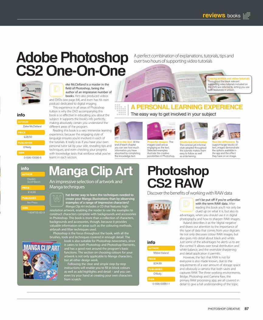
87PHOTOSHOP CREATIVE
reviews books
Adobe Photoshop CS2 One-On-One
Photoshop CS2 RAW
Manga Clip ArtAn impressive selection of artwork and Manga techniques
hat better way to learn the techniques needed to create your Manga illustrations than by observing examples of a range of impressive characters? Manga Clip Art includes a CD that features high-
resolution artwork, enabling the reader to use the examples to construct characters complete with backgrounds and accessories in Photoshop. This book is more than a collection of characters, backgrounds and accessories, though, because it provides valuable information on areas such as the colouring methods, airbrush and � lter techniques used.
Photoshop is the focus throughout the book, with all the brushes, tools and techniques covered in enough detail. The
book is also suitable for Photoshop newcomers, since it caters to both Photoshop and Photoshop Elements, and has a good root around the program’s basic functions. The section on choosing colours for your artwork is not only applicable to Manga characters, but all other design work.
Following the clear and simple step-by-step instructions will enable you to � ll in block colours as well as add highlights and detail – and you can even try your hand at creating your own characters from scratch.
A PERSONAL LEARNING EXPERIENCEThe easy way to get involved in your subject
Put to the test At the end of each chapter you can see how much information you have absorbed by completing the knowledge test.
Chatty but informative The concise yet informal style adopted throughout the tutorials makes them easy to follow as well as entertaining.
See the difference To support larger blocks of text, images demonstrate the options available in the app and the effect they have on an image.
on’t be put o� if you’re unfamiliar with the term RAW data. After reading this book you’ll not only be clued up on what it is, but also its
advantages, when you should use it in digital photography and how to sharpen RAW images.
Aaland describes it as the ‘digital negative’ and draws our attention to the importance of this type of data that comes from your digicam. He not only discusses colour RAW images, but also goes into detail about black and white. Just some of the advantages he alerts us to are the control it allows over tonal distribution and white balance, and the reversible sharpening and detail application it permits.
However, the fact that RAW is not for everyone is also made known, due to the requirements of a vast amount of storage space and obviously a camera that both saves and captures RAW. The three working environments, Bridge, Photoshop and Camera Raw, the primary RAW processing app, are all covered in detail to give a full understanding of the topic.
info
Mikkel Aaland
£24.99
O’Reilly
AUTHOR
PRICE
0-596-00851-1
ISBN
PUBLISHER
info
Hayden Scott-Baron
AUTHOR
1-904705-83-9
ISBN
£14.99
Ilex Press
PUBLISHER
PRICE
eke McClelland is a master in the � eld of Photoshop, being the author of an impressive number of books. He’s also produced videos
and DVDs (see page 84), and even has his own podcast dedicated to digital imaging.
This experience in all areas of Photoshop tuition is why the DVD accompanying this book is so e� ective in educating you about the subject. It supports the book’s info perfectly, making absolutely certain you understand the di� erent areas of the program.
Reading this book is a very immersive learning experience, because the engaging style of language ensures you’re involved in each of the tutorials. It really is as if you have your own personal tutor sat by your side, revealing tips and techniques, and even checking your progress with knowledge tests that reinforce what you’ve learnt in each section.
Deke McClelland
AUTHOR
£28.50
O’Reilly
PRICE
0-596-10096-5
ISBN
PUBLISHER
info
Linking written and video tutorials Throughout the book relevant supporting video tutorials included on the DVD are referred to, letting you use both resources in unison.
Powerful images The images used are as engaging as the text. Selected examples illustrate the creative possibilities in Photoshop.
Discover the bene� ts of working with RAW data
A perfect combination of explanations, tutorials, tips and over two hours of supporting video tutorials
086-7_PC11_Books.indd 87 15/6/06 11:44:40
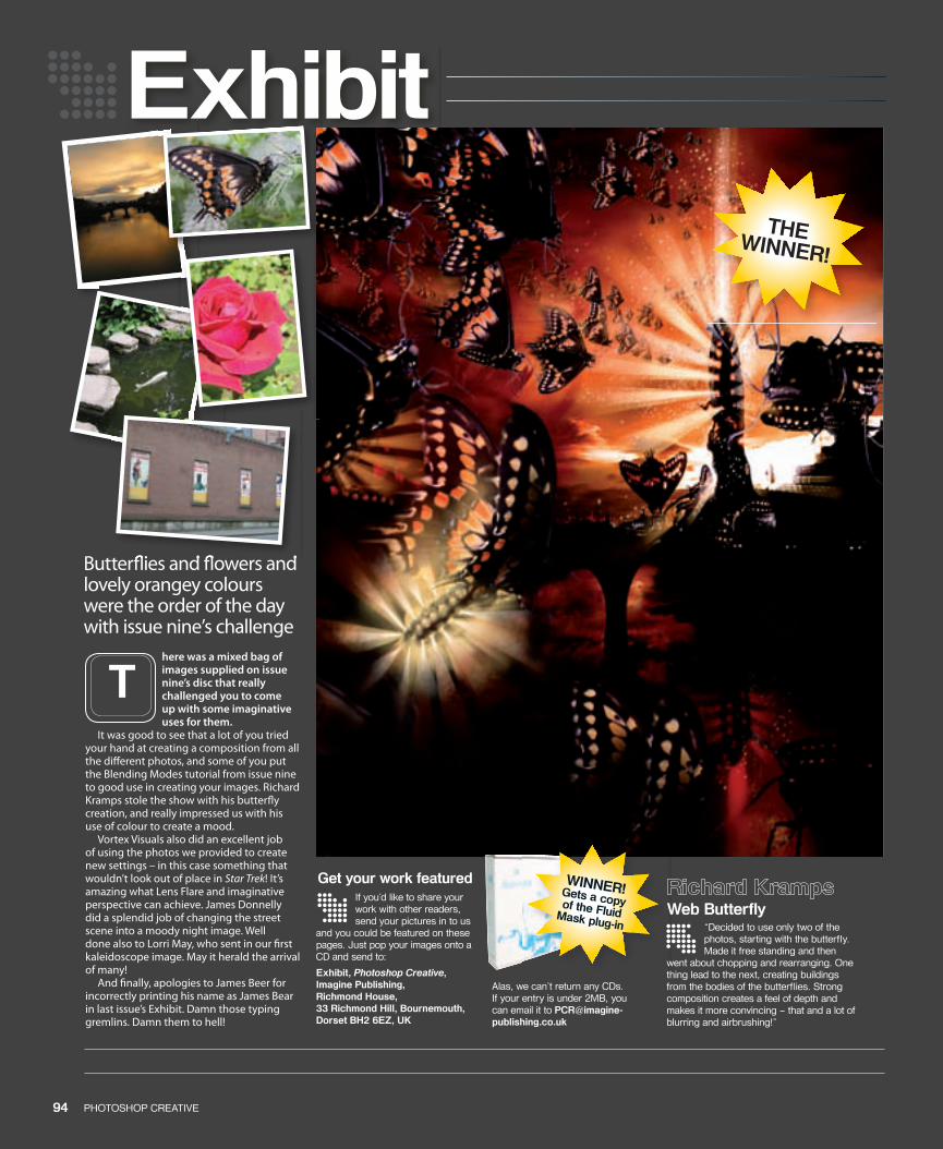
Butter� ies and � owers and lovely orangey colours were the order of the day with issue nine’s challenge
94 PHOTOSHOP CREATIVE 95PHOTOSHOP CREATIVE
here was a mixed bag of images supplied on issue nine’s disc that really challenged you to come up with some imaginative uses for them.
It was good to see that a lot of you tried your hand at creating a composition from all the di� erent photos, and some of you put the Blending Modes tutorial from issue nine to good use in creating your images. Richard Kramps stole the show with his butter� y creation, and really impressed us with his use of colour to create a mood.
Vortex Visuals also did an excellent job of using the photos we provided to create new settings – in this case something that wouldn’t look out of place in Star Trek! It’s amazing what Lens Flare and imaginative perspective can achieve. James Donnelly did a splendid job of changing the street scene into a moody night image. Well done also to Lorri May, who sent in our � rst kaleidoscope image. May it herald the arrival of many!
And � nally, apologies to James Beer for incorrectly printing his name as James Bear in last issue’s Exhibit. Damn those typing gremlins. Damn them to hell!
T
If you’d like to share your work with other readers, send your pictures in to us
and you could be featured on these pages. Just pop your images onto a CD and send to:
Exhibit, Photoshop Creative, Imagine Publishing, Richmond House, 33 Richmond Hill, Bournemouth, Dorset BH2 6EZ, UK
Alas, we can’t return any CDs. If your entry is under 2MB, you can email it to [email protected]
Get your work featured
THE WINNER!
Exhibit
WINNER!Gets a copy of the Fluid Mask plug-inWeb Butterfl y
“Decided to use only two of the photos, starting with the butterfl y. Made it free standing and then
went about chopping and rearranging. One thing lead to the next, creating buildings from the bodies of the butterfl ies. Strong composition creates a feel of depth and makes it more convincing – that and a lot of blurring and airbrushing!”
Butter� ies and � owers and
094-97_PC11-Exhibit.indd 94 15/6/06 14:45:02
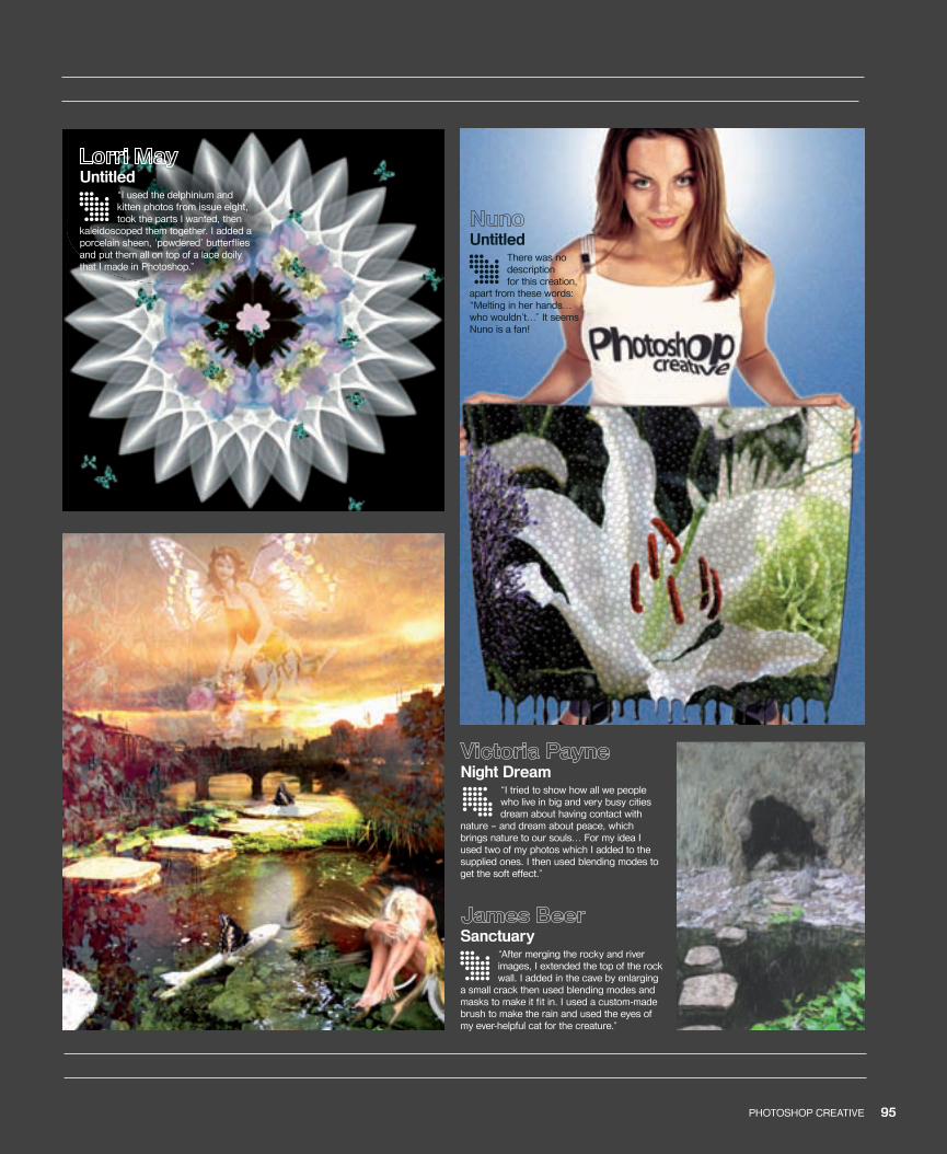
94 PHOTOSHOP CREATIVE 95PHOTOSHOP CREATIVE
Night Dream“I tried to show how all we people who live in big and very busy cities dream about having contact with
nature – and dream about peace, which brings nature to our souls… For my idea I used two of my photos which I added to the supplied ones. I then used blending modes to get the soft effect.”
UntitledThere was no description for this creation,
apart from these words: “Melting in her hands… who wouldn’t…” It seems Nuno is a fan!
Sanctuary“After merging the rocky and river images, I extended the top of the rock wall. I added in the cave by enlarging
a small crack then used blending modes and masks to make it fi t in. I used a custom-made brush to make the rain and used the eyes of my ever-helpful cat for the creature.”
Untitled“I used the delphinium and kitten photos from issue eight, took the parts I wanted, then
kaleidoscoped them together. I added a porcelain sheen, ‘powdered’ butterfl ies and put them all on top of a lace doily that I made in Photoshop.”
094-97_PC11-Exhibit.indd 95 15/6/06 14:45:30
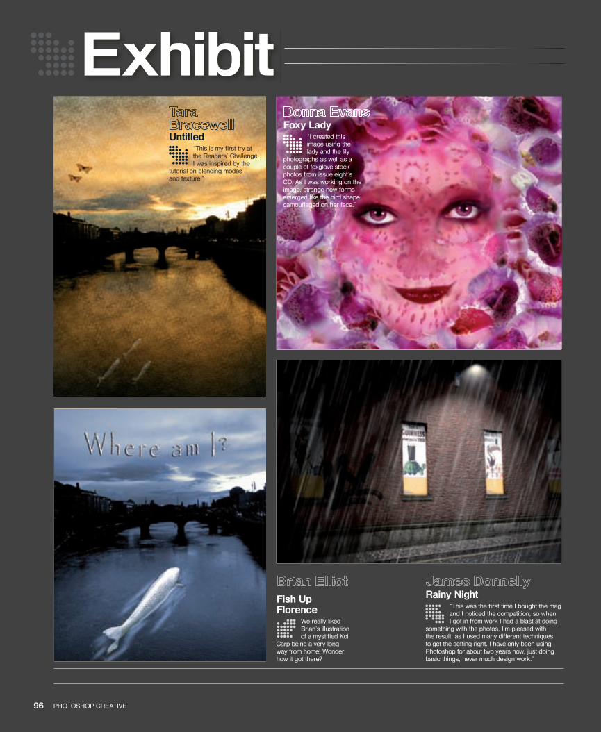
Exhibit
96 PHOTOSHOP CREATIVE 97PHOTOSHOP CREATIVE
Untitled“This is my fi rst try at the Readers’ Challenge. I was inspired by the
tutorial on blending modes and texture.”
Rainy Night“This was the fi rst time I bought the mag and I noticed the competition, so when I got in from work I had a blast at doing
something with the photos. I’m pleased with the result, as I used many different techniques to get the setting right. I have only been using Photoshop for about two years now, just doing basic things, never much design work.”
Fish Up Florence
We really liked Brian’s illustration of a mystifi ed Koi
Carp being a very long way from home! Wonder how it got there?
Foxy Lady“I created this image using the lady and the lily
photographs as well as a couple of foxglove stock photos from issue eight’s CD. As I was working on the image, strange new forms emerged like the bird shape camoufl aged on her face.”
094-97_PC11-Exhibit.indd 96 15/6/06 14:45:45
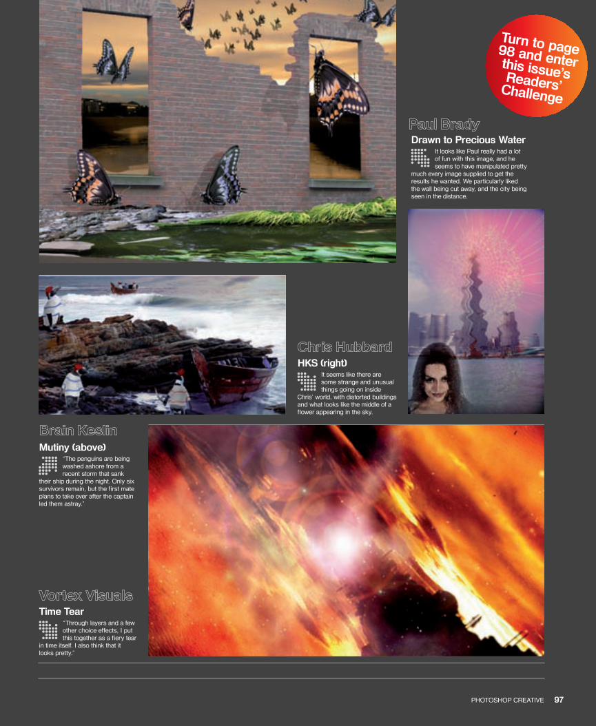
Turn to page 98 and enter this issue’s Readers’ Challenge
96 PHOTOSHOP CREATIVE 97PHOTOSHOP CREATIVE
HKS (right)It seems like there are some strange and unusual things going on inside
Chris’ world, with distorted buildings and what looks like the middle of a flower appearing in the sky.
Drawn to Precious WaterIt looks like Paul really had a lot of fun with this image, and he seems to have manipulated pretty
much every image supplied to get the results he wanted. We particularly liked the wall being cut away, and the city being seen in the distance.
Mutiny (above)“The penguins are being washed ashore from a recent storm that sank
their ship during the night. Only six survivors remain, but the first mate plans to take over after the captain led them astray.”
Time Tear“Through layers and a few other choice effects, I put this together as a fiery tear
in time itself. I also think that it looks pretty.”
094-97_PC11-Exhibit.indd 97 15/6/06 14:46:00
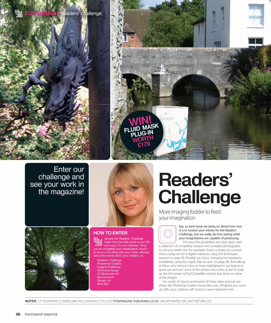
Enter our challenge and
see your work in the magazine!
competition readers’ challenge
NOTES | IF YOUR ENTRY IS UNDER 2MB, YOU CAN EMAIL IT TO US AT [email protected]. UNFORTUNATELY WE CAN’T RETURN CDS
98 PHOTOSHOP CREATIVE
Readers’ ChallengeMore imaging fodder to feed your imagination
kay, so each issue we bang on about how nice it is to receive your entries for the Readers’ Challenge, but we really do love seeing what your imaginations are capable of producing.
This issue the possibilities are wide open, with a collection of completely random and unrelated photographs to sink your teeth into. For example, there’s a photo of a woman who’s crying out for a digital makeover, using the techniques learned on page 58. Possibly you fancy changing her expression completely, using the Liquify � lter as seen on page 28. And talking of � lters, why not put a few of those highlighted in our feature to good use and turn some of the photos into works of art? Or load up the full version of buZZ.Simpli� er and let that loose on some of the images.
You could, of course, pooh-pooh all these ideas and just see where the Photoshop Creative mood takes you. Whatever you come up with, your creations will receive a warm welcome here.
Access the Readers’ Challenge folder from the side panel on our CD and copy it to your desktop. Once
you’ve completed your masterpiece, send it to us on a CD along with your name, address and a few words about your creation, to:
Readers’ ChallengePhotoshop CreativeImagine PublishingRichmond House33 Richmond HillBournemouthDorset, UKBH2 6EZ
HOW TO ENTER
WIN!FLUID MASK
PLUG-INWORTH
£179
098_PC_11.indd 98 14/6/06 17:13:55
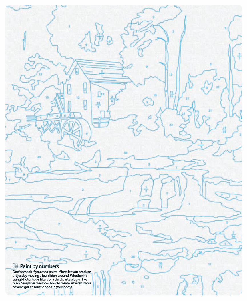
Paint by numbersDon’t despair if you can’t paint – filters let you produce art just by moving a few sliders around! Whether it’s using Photoshop’s filters or a third party plug-in like buZZ.Simplifier, we show how to create art even if you haven’t got an artistic bone in your body!
100_PC11_Backcover.indd 1 14/6/06 12:52:08