Embed Size (px)
Citation preview
Plot Version 1.2 Mac/1.3 WinMay, 1999 EditionCopyright ©1990-1999 Fortner SoftwareLLC and its Licensors. All Rights Reserved.
PlotUser’s GuideandReferenceManual

doc-plica-ent.
at any
anyionose.
er soft-
a lim-uchuch
r
ft-ni-
er-entnt
Restricted Rights Notice
The IDL® software program and the accompanying procedures, functions, andumentation described herein are sold under license agreement. Their use, dution, and disclosure are subject to the restrictions stated in the license agreemResearch Systems, Inc. reserves the right to make changes to this documenttime and without notice.
Limitation of Warranty
Research Systems, Inc. makes no warranties, either express or implied, as tomatter not expressly set forth in the license agreement, including without limitatthe condition of the software, merchantability, or fitness for any particular purp
Research Systems, Inc. shall not be liable for any direct, consequential, or othdamages suffered by the Licensee or any others resulting from use of the IDLware package or its documentation.
Permission to Reproduce this Manual
If you are a licensed user of this product, Research Systems, Inc. grants you ited, nontransferable license to reproduce this particular document provided scopies are for your use only and are not sold or distributed to third parties. All scopies must contain the title page and this notice page in their entirety.
Acknowledgments
Fortner Software and its logo are trademarks of Fortner Software LLC
Plot, Noesys, Transform, T3D and the HDF Browser are trademarks of FortneSoftware LLC
Copyright Notice and Statement for NCSA Hierarchical Data Format (HDF) Soware Library and Utilities. Copyright 1988-1998 The Board of Trustees of the Uversity of Illinois. All rights reserved.
Contributors: National Center for Supercomputing Applications (NCSA) at the Univsity of Illinois, Fortner Software, Unidata Program Center (netCDF), The IndependJPEG Group (JPEG), Jean-loup Gailly and Mark Adler (gzip), and Digital EquipmeCorporation (DEC).
Research Systems, Inc. documentation is printed on recycled paper. Our paper has a minimum20% post-consumer waste content and meets all EPA guidelines.

ing
of
listls
te of
areput-
sedr
lia-en if
is-ionightatedver-
is-
e
Redistribution and use in source and binary forms, with or without modification, arepermitted for any purpose (including commercial purposes) provided that the followconditions are met:
• Redistributions of source code must retain the above copyright notice, this list conditions, and the following disclaimer.
• Redistributions in binary form must reproduce the above copyright notice, this of conditions, and the following disclaimer in the documentation and/or materiaprovided with the distribution.
• In addition, redistributions of modified forms of the source or binary code mustcarry prominent notices stating that the original code was changed and the dathe change.
• All publications or advertising materials mentioning features or use of this softwmust acknowledge that it was developed by the National Center for Supercoming Applications at the University of Illinois, and credit the Contributors.
• Neither the name of the University nor the names of the Contributors may be uto endorse or promote products derived from this software without specific priowritten permission from the University or the Contributors.
DISCLAIMER: THIS SOFTWARE IS PROVIDED BY THE UNIVERSITY ANDTHE CONTRIBUTORS "AS IS" WITH NO WARRANTY OF ANY KIND, EITHEREXPRESSED OR IMPLIED. In no event shall the University or the Contributors beble for any damages suffered by the users arising out of the use of this software, evadvised of the possibility of such damage.
Portions of the import code are Copyright © 1991 Silicon Graphics, Inc. Permsion to use, copy, modify, distribute, and sell this software and its documentatfor any purpose is hereby granted without fee, provided that (i) the above copyrnotices and this permission notice appear in all copies of the software and reldocumentation, and (ii) the name of Silicon Graphics may not be used in any adtising or publicity relating to the software without the specific, prior written permsion of Silicon Graphics.
THE SOFTWARE IS PROVIDED “AS-IS” AND WITHOUT WARRANTY OF ANY KIND,EXPRESS, IMPLIED OR OTHERWISE, INCLUDING WITHOUT LIMITATION, ANY WAR-RANTY OF MERCHANTABILITY OR FITNESS FOR A PARTICULAR PURPOSE.
IN NO EVENT SHALL SILICON GRAPHICS BE LIABLE FOR ANY SPECIAL, INCIDEN-TAL, INDIRECT OR CONSEQUENTIAL DAMAGES OF ANY KIND, OR ANY DAMAGESWHATSOEVER RESULTING FROM LOSS OF USE, DATA OR PROFITS, WHETHER ORNOT ADVISED OF THE POSSIBILITY OF DAMAGE, AND ON ANY THEORY OF LIABIL-ITY, ARISING OUT OF OR IN CONNECTION WITH THE USE OR PERFORMANCE OFTHIS SOFTWARE.
Other trademarks and registered trademarks are the property of the respectivtrademark holders.


.. 15
. 16
.. 22
. 36
ContentsPart I: Introduction
Chapter 1:Welcome ....................................................................................... 13Plot Lets You.....................................................................................................
Getting Started with Plot.....................................................................................
Part II: Tours
Chapter 2:Simple Line Plots ......................................................................... 21A Simple Line Plot............................................................................................
Notebook Calculations........................................................................................
Noesys User’s Guide and Reference Manual 5

6
.. 42
. 44
48
. 51
54
58
.. 62
. 65
.. 68
. 70
75
. 80
81
... 83
. 86
87
.. 90
91
92
Chapter 3:Double-Y Plots .............................................................................. 41Reading a Data File............................................................................................
Creating a Double-Y Plot....................................................................................
Changing the Plot Appearance.............................................................................
Adding Text Annotations....................................................................................
Creating and Using Macros.................................................................................
Chapter 4:Analytic Line Plots ....................................................................... 57Plotting Sine, Cosine Curves...............................................................................
Parametric Plots.................................................................................................
Updating Calculations.........................................................................................
Chapter 5:Color Scatter Plots ....................................................................... 67Reading a Text File............................................................................................
Creating a Scatter Plot........................................................................................
Synchronizing Plot and Data...............................................................................
Part III: Reference Manual
Chapter 6:The Data Window .......................................................................... 79Entering Data Manually......................................................................................
Moving Around in the Data Window..................................................................
Selecting Data...................................................................................................
Copying and Pasting Data...................................................................................
Editing Data Window Columns...........................................................................
Data Specifications............................................................................................
Using the Notebook Window...............................................................................
Changing the Font in the Data Window..............................................................
Contents Noesys User’s Guide and Reference Manual

7
94
97
99
101
2
. 105
. 108
0
. 112
116
120
126
. 134
36
143
. 144
Chapter 7:Opening and Importing Files ...................................................... 93Importing Text Column Data...............................................................................
Importing Binary Column Files...........................................................................
Importing Non-Column Data...............................................................................
Using View File.................................................................................................
Importing Multiple-Record Files (Windows).................................................... 10
Chapter 8:The Plot Window ........................................................................ 103Resizing Plots...................................................................................................
Synchronize.......................................................................................................
Copy and Paste Plots (Power Macintosh).......................................................... 11
Chapter 9:Creating Plots ............................................................................. 111The Gallery.......................................................................................................
Select X,Y Pairs Dialog.....................................................................................
Chapter 10:Axes, Labels, and Grids ............................................................ 119Axis Labels Dialog............................................................................................
Chapter 11:Editing Plots ............................................................................... 125Edit Plot Dialog .................................................................................................
Chapter 12:Text, Legends, and Curve Fitting .............................................. 133Adding Text ......................................................................................................
Using the Text Formatting Language................................................................ 1
Creating Legends...............................................................................................
Curve Fitting.....................................................................................................
Noesys User’s Guide and Reference Manual Contents

8
. 152
162
5
74
82
84
185
194
96
198
00
207
22
27
232
234
236
Chapter 13:Building Plots ............................................................................. 151Layering ............................................................................................................
Chapter 14:Using Macros .............................................................................. 161The Notebook Window......................................................................................
Executing Macro Commands in the Notebook.................................................. 16
Function Macro Commands............................................................................... 1
Subroutine Macro Commands........................................................................... 1
Reserved Variable Macro Commands............................................................... 1
Custom Macros..................................................................................................
Chapter 15:Macro Reference ......................................................................... 193Mathematical Functions.....................................................................................
Data Manipulation Functions............................................................................. 1
Fast Fourier Transforms.....................................................................................
Macro Subroutines Reference............................................................................ 2
Macro Variables Reference................................................................................
Chapter 16:Printing ........................................................................................ 221Printing in Plot for Windows............................................................................. 2
Printing in Plot for Power Macintosh................................................................ 2
Chapter 17:Data Exchange and File Export ................................................. 231Copy Commands................................................................................................
Paste Commands................................................................................................
Exporting Files...................................................................................................
Contents Noesys User’s Guide and Reference Manual

9
. 242
. 243
. 245
. 246
47
. 248
249
. 250
252
53
60
Part IV: Appendices
Appendix A:Plot Menus ................................................................................. 241File Menu..........................................................................................................
Edit Menu..........................................................................................................
Data Menu.........................................................................................................
Graph Menu......................................................................................................
Format Menu (Power Macintosh)...................................................................... 2
Macros Menu....................................................................................................
Windows Menu..................................................................................................
Help Menu ........................................................................................................
Appendix B:Startup Macros and Preferences ............................................. 251Creating a Startup Macro...................................................................................
Preferences... Command (Windows)................................................................. 2
Appendix C:About the HDF Libraries ........................................................... 255
Appendix D:AppleEvents .............................................................................. 259Using AppleEvents to Control Plot................................................................... 2
Index ...................................................................................................... 263
Noesys User’s Guide and Reference Manual Contents

10
Contents Noesys User’s Guide and Reference Manual

Part I: Introduction


Chapter 1:
Welcome
ousory
ngl-
Trans-
Welcome to Plot. Whether you are a scientist, engineer, or anyone with a largeamount of data, Plot will help you plot your data quickly and conveniently.
Plot is unique among plotting packages in that it can import and work with enormdatasets. You can put a million numbers in a column if you have that much mem(4 bytes is required for each number). Plot organizes data into columns of floatipoint numbers. The spreadsheet-like data window lets you have up to 32,000 coumns. The number of rows is limited only by your system's memory.
Plot can read ASCII files where columns are delimited by spaces, tabs, or non-numeric punctuation. Plot also reads non-column files, such as arrays saved in form, and places them in the spreadsheet as if they were column files.
Plot Part 1: Introduction 13

14 Chapter 1: Welcome
y sim-,
hi-ien-ingles.
ge,lets
Plot lets you create line, double-y, scatter, number scatter, and error bar plots bply selecting from the plot gallery. You may also "build" advanced plots in layersselecting X,Y plot pairs and assigning the desired attributes for each.
The binary file format used for all Fortner Software LLC’s software is the Hierarccal Data File (HDF) format, a public-domain standard format for the storage of sctific data and ancillary information. It is an object-oriented format capable of stormany different kinds of data in one file. Plot uses HDF Vset to save column data fiHDF Vset is discussed in Appendix C.
Plot uses a macro language that allows you to save scripts to automate dataimport/export and plotting tasks. Because Plot supports a text formatting languayou can even control text formatting with macros. Plot for Power Macintosh alsoyou send macro scripts to Plot from other programs using AppleEvents.
Figure 1-1: Data Organized into Columns
Plot Part 1: Introduction

Chapter 1: Welcome 15
em
t gal-
ers
-
Plot Lets You...
• Import extremely large data sets—the number of rows is limited only by systmemory
• Display data in a spreadsheet-like data window
• Enter and apply formulas in the data window
• Generate line, scatter, double-Y and error bar plots from an easy-to-use plolery
• Apply built-in functions
• Build advanced plots applying different attributes to different X,Y pairs in lay
• Save macro scripts of plots and apply them to other data
• Set axis data range, label range, labels, and numeric format
• Add tick marks and grid lines
• Edit lines and symbols
• Add error bars
• Create and edit text labels and legends; control text using text formatting language
• Do curve fitting
• Export data as ASCII text files
• Print plots to any Windows- or Macintosh-compatible printer
• Save or copy plot images for use in presentation programs
Plot Part 1: Introduction Plot Lets You...

16 Chapter 1: Welcome
ee
hes set-cestion.
ew
rsion
us
he
s.be
Getting Started with Plot
This section describes how to install and upgrade Plot.
Installing Plot
Plot is installed with Noesys from the Noesys CD-ROM. For more information, sInstallation Guide for Windows and Macintoshincluded with your Noesys CD-ROM.
Upgrading Plot (Windows)
When upgrading Plot, an additional step is recommended. Besides performing tnormal installation mentioned above, we recommend you import the preferencetings and custom macros from your previous version of Plot. Importing preferensettings and custom macros enables you to upgrade Plot and retain this informa
NoteIf you decide not to import the preferences settings and custom macros, the nversion of Plot will use factory default settings.
To import these settings, start the upgrade version of Plot. Once the upgrade veof Plot is running, follow the procedures below:
1. SelectPreferences from the Edit menu.
2. Select theImport button from the Preferences Settings window.
3. In the Import Preferences window, change the directory to where the previoversion of Plot can be found.
4. If the previous version of Plot is from Spyglass, select the file ‘Prefs.spy.’ If tprevious version of Plot is from Fortner Software, select the file ‘Prefs.frl.’
5. SelectOpen.
After step 3, you will be prompted if you would like to import your custom macroBy selecting yes, all of your custom macros from the previous version of Plot willtransferred to the new version of Plot.
Getting Started with Plot Plot Part 1: Introduction

Chapter 1: Welcome 17
rsionac-
hetely.
thee task
rwise
Sys-
der)
the
Updating Custom Macros (Power Macintosh)
The preference file for storing custom macros has changed with the upgraded veof Plot. The old preference file is called ‘Spyglass Settings’ and it stores custom mros from Spyglass Plot. The new preference file is ‘Plot Prefs’ and is located in tPreferences:Fortner Software folder. This file stores Plot custom macros separa
To copy the custom macros from the old Spyglass tools (Plot and Transform) intoupgraded tools, simply follow the steps below. The file ‘Spyglass Settings’ can bread by the new tools and therefore, following these steps will avoid the tediousof exporting the custom macros to text files, then reading them back in.
WarningThese steps must be performed before creating any new custom macros, othethe new macros will be replaced.
1. Create a folder called ‘Fortner Software’ inside the Preferences folder of thetem Folder.
2. Drag the ‘Spyglass Settings’ file (which is located inside the Preferences folinto the ‘Fortner Software’ folder.
3. Rename the ‘Spyglass Settings’ file to ‘Plot Prefs’.
NoteTo copy both sets of custom macros into the new VDA tools, simply duplicate ‘Spyglass Settings’ file (after it is placed in the ‘Fortner Software’ folder) andrename them to ‘Plot Prefs’ and ‘Transform Prefs’.
Plot Part 1: Introduction Getting Started with Plot

18 Chapter 1: Welcome
Getting Started with Plot Plot Part 1: Introduction

Part II: Tours


Chapter 2:
Simple Line Plots
t
and
After installing Plot according to the directions in Chapter 1, double-click the Ploicon (Power Macintosh) or selectPlot from the Program Menu (Windows) to start theprogram.)
The first time you open Plot, you will be prompted for your name, organization, registration number. Enter these and clickOK .
Figure 2-1: Plot Icon
Plot Part 2: Tours 21

22 Chapter 2: Simple Line Plots
ound
dow,d
n 1n.
A Simple Line Plot
This chapter will briefly introduce you to most of the major features of Plot. Here ywill enter a series of numbers in the data window, plot the data, do a curve fit, achange the appearance of the plot.
The Data Window
A new data window is created each time Plot is started. To open a new data winchooseNew from the File menu. A Plot data window consists of a series of namecolumns which are, by default, Column1, Column2, and so on. Click onColumn1,then entery for the column name and pressEnter.
Now, with the cursor in the first cell of the same column, enter a number betweeand 10. PressEnter and enter a series of numbers between 1 and 10 in the columYour data window should now look similar to the figure below.
Figure 2-2: New Data Window
A Simple Line Plot Plot Part 2: Tours

Chapter 2: Simple Line Plots 23
lot.
Selecting Columns
Next chooseGallery from the Graph menu, and then selectLine on the Gallery hier-archical menu to generate a line plot.
Now in the Select X,Y Pairs dialog, you can select which columns you wish to pHere selectRow Numbers as the X column andy as the Y column, as shown in thefigure below.
Click onOK , and a simple line plot will appear.
Figure 2-3: Gallery Menu
Figure 2-4: Select X, Y Pairs Dialog
Plot Part 2: Tours A Simple Line Plot

24 Chapter 2: Simple Line Plots
-
Curve Fit
Next we will do a simple linear curve fit on this data. SelectCurve Fit...... from theGraph menu in the Plot window. In the Curve Fit dialog, make sure thatLinear isselected. Then click onCalculate to generate a curve fit equation, which will be displayed in the box in the lower half of the dialog.
Figure 2-5: Plot Window
A Simple Line Plot Plot Part 2: Tours

Chapter 2: Simple Line Plots 25
en
The curve fit equation is used to create a column of values. These values are thplotted to display the curve fit. Click thePlot button to plot the curve fit equation.Then chooseClose (Windows) orOK (Macintosh) to return to the plot window.Figure 2-6: Curve Fit Dialog
Figure 2-7: Plot Window with Curve Fit
Plot Part 2: Tours A Simple Line Plot

26 Chapter 2: Simple Line Plots
len-
ls,
h
ctn-
Curve Fit Data Column
Now bring the data window to the front. You can do this either by clicking on its titbar or by selectingUntitled from the Windows menu. Note how the data used to geerate the curve fit is stored in a new column, called y_fit.
Plot Appearance
Next we change the plot’s appearance by modifying its text fonts and sizes, labeand lines.
Changing the Text
Begin by bringing the plot window back to the front. ChooseSelect All from the Editmenu, then selectFont... from the Edit menu (Windows) or choose the fonts andstyles from the Format menu (Power Macintosh). For this example, selectArial font,Regular/Plain style, and12 points. Note that in Windows, a sample of the font witthe selected attributes is displayed in the Sample box. ClickOK to save yourchanges. All text should now be displayed using the new font.
Next, we’ll change just the plot title, ‘y vs Row Numbers’. Click on the title to seleit. Then selectFont... from the Edit menu (Windows) or Format menu (Power Macitosh). Change the font size to14point. Click onOK to save the change. You can alsochange the axes labels, ‘y’ and ‘Row Numbers’ text the same way.
Figure 2-8: Data Window with Curve Fit
A Simple Line Plot Plot Part 2: Tours

Chapter 2: Simple Line Plots 27
ext
To change the text itself, double-click on any of the text items to open the Edit Tdialog (or selectEdit Text... from the Graph menu).For now, enter a new title for the plot (here ‘Sample Plot’) and clickOK to update.Your plot should now resemble the following figure.
Figure 2-9: Edit Text Dialog
Figure 2-10: Plot Window with Text Changes
Plot Part 2: Tours A Simple Line Plot

28 Chapter 2: Simple Line Plots
helot cor-e theow
the
Moving and Resizing the Plot
To move the plot, click and hold anywhere within the plot boundaries and drag tplot to the desired location. To interactively resize the plot, click once within the pboundaries to select it. In Windows, solid black resize boxes will appear at eachner and on each side of the plot; grab one of the resize boxes and drag to resizplot. In Power Macintosh, click the box in the lower right corner and drag the windto a new size.
Changing the Axes
Next click anywhere on the horizontal axis of the plot to select it separately fromplot itself. Then selectEdit Axis... from the Graph menu. (Alternatively, you candouble-click on the axis.)
Figure 2-11: Resizing a Plot
A Simple Line Plot Plot Part 2: Tours
Chapter 2: Simple Line Plots 29
hebuts are
re-
.
her
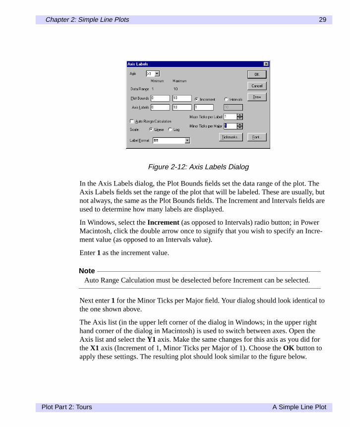
In the Axis Labels dialog, the Plot Bounds fields set the data range of the plot. TAxis Labels fields set the range of the plot that will be labeled. These are usually,not always, the same as the Plot Bounds fields. The Increment and Intervals fieldused to determine how many labels are displayed.
In Windows, select theIncrement (as opposed to Intervals) radio button; in PowerMacintosh, click the double arrow once to signify that you wish to specify an Incment value (as opposed to an Intervals value).
Enter1 as the increment value.
NoteAuto Range Calculation must be deselected before Increment can be selected
Next enter1 for the Minor Ticks per Major field. Your dialog should look identical tothe one shown above.
The Axis list (in the upper left corner of the dialog in Windows; in the upper righthand corner of the dialog in Macintosh) is used to switch between axes. Open tAxis list and select theY1 axis. Make the same changes for this axis as you did fotheX1 axis (Increment of 1, Minor Ticks per Major of 1). Choose theOK button toapply these settings. The resulting plot should look similar to the figure below.
Figure 2-12: Axis Labels Dialog
Plot Part 2: Tours A Simple Line Plot

30 Chapter 2: Simple Line Plots
itch
Changing the Lines, Styles, and Colors
Select the plot by clicking within its boundaries then selectEdit Plot... from theGraph menu (alternatively, you can double-click on the plot). You will see the EdPlot dialog shown in the figure below, where you can change the attributes of ealine in the plot.
Figure 2-13: Plot window with New Axes
A Simple Line Plot Plot Part 2: Tours

Chapter 2: Simple Line Plots 31
nthe
log
h
The Pairs list shows you all of the X,Y data pairs that are available for the curreplot. The Style/preview box shows you how the selected X,Y pair will be plotted. TLines..., Symbols..., Colors..., and Extras... buttons let you change the way theselected X,Y pair is plotted. The Add... and Delete buttons at the bottom of the dialet you add and delete X,Y pairs to the plot.
With the ‘Row Numbers,y’ X,Y pair selected, click theLines...button. SelectNoneas the Style, then clickOK . Note that the Style/preview box reflects the change.
Next, click theSymbols... button and selectDraw as the symbol type. Open theDraw list and selectCircle (on Power Macintosh this is the open circle symbol whicis the 6th symbol from the left). ClickOK to close the Symbols dialog.
Figure 2-14: Edit Plot dialog
Figure 2-15: Lines dialog
Plot Part 2: Tours A Simple Line Plot

32 Chapter 2: Simple Line Plots
Now click on theRow Numbers,y_fitX,Y pair. Click onLines...and check that theline style is set toSolid. Click OK to close all dialogs. Your plot should now look likethe one below.
Figure 2-16: Symbols dialog
A Simple Line Plot Plot Part 2: Tours

Chapter 2: Simple Line Plots 33
Adding Error Bars
Our final change to this plot is to add error bars. SelectEdit Plot... from the Graphmenu and chooseAdd.... SelectRow Numbers for the X column, andy for the Ycolumn as shown below.
Figure 2-17: Plot Window with New Lines
Figure 2-18: Adding another Plot Pair
Plot Part 2: Tours A Simple Line Plot

34 Chapter 2: Simple Line Plots
ldm-he
Click OK to add the selected pair and to return to the Edit Plot dialog. You shounow see three X,Y pairs, with the first and last being identical. The first ‘Row Nubers,y’ X,Y pair is needed to display the open circle symbols we added earlier. Tsecond ‘Row Numbers,y’ X,Y pair is needed to display the error bars.
With the last X,Y pair selected, clickLines... and set the line Style toNone, thenclick OK . Next, clickSymbols... to bring up the Symbols dialog. Here, click theError Bars radio button, then click on theBars... button to enable error bars.
In the Error Bars dialog that now appears, in Windows chooseSigma and enter1 asthe number of standard deviations (in Power Macintosh select theNumber of Std.Dev’s radio button and enter a1). Click OK in this dialog, in the Symbols dialog, andin the Edit Plot dialog.
Figure 2-19: Selecting Error Bars
A Simple Line Plot Plot Part 2: Tours

Chapter 2: Simple Line Plots 35
e
The resulting plot should look similar to the figure below. Note that by default, therror bars are symmetric.Figure 2-20: Error Bar dialog
Figure 2-21: Plot Window with Error Bars
Plot Part 2: Tours A Simple Line Plot

36 Chapter 2: Simple Line Plots
dardbook
t
onown
tion
g the
Notebook Calculations
The example you are working on brings up a question: What exactly is the standeviation used for the error bars? We can answer that question by using the noteto do a few calculations.
Calculating Standard Deviation
To open the notebook, selectSee Notebookfrom the Data menu (Windows) or selecUntitled.notebook from the Windows menu (Power Macintosh). Click in the textbox and typeprint sdev(y). With the cursor still on the line you just typed, selectCalculate Now from the Data menu to evaluate that line. The result is displayed the next line. The exact value you see will probably be different from the one shbelow, since it depends on the values you typed in at the beginning.
The ‘sdev’ function uses the following expression to calculate the standard deviaof a data column:
Where the elements of y are yi, the average of all y values is yave, and the number ofy values is N. We can verify that this is the equation used by sdev by again usinnotebook.
Click in the notebook again and enter the following three lines:
sum=sum((y-mean(y))**2)n=rows(y)print sqrt(sum/(n-1))
Figure 2-22: Notebook Window
Figure 2-23: Standard Deviation Calculation
Notebook Calculations Plot Part 2: Tours

Chapter 2: Simple Line Plots 37
hee
y
Select all three lines, then chooseCalculate Now from the Data menu. The resultshould be identical to that shown for the ‘sdev’ function, as shown below.
Calculating RMS Error
Although the standard deviation is useful, a more interesting number would be tdeviation of the data values from the fitted straight line, called the RMS error. Thequation for this is almost identical to that for the standard deviation, except thatave(a single value) is replaced by yfit,i (a column of values).
We can calculate this value by entering the following three lines:.
diff=y-y_fitsum=sum(diff**2)print sqrt(sum/(n-1))
Again, select all three lines and chooseCalculate Now. The value should be signifi-cantly smaller than the standard deviation value, as you would expect.
Figure 2-24: More Notebook Calculations
Figure 2-25: RMS Error Calculation
Plot Part 2: Tours Notebook Calculations

38 Chapter 2: Simple Line Plots
iff.’
se ofer,‘n’).
o then
Click on the data window and note that it now contains another column called ‘d
Any time the result of a notebook expression is a column of values (as in the ca‘diff’), a new column is created in the data window. No column is created, howevwhen the result of an expression is just a single value (as in the case of ‘sum’ and
As our final step in this chapter, we will assign the error bar length to be equal tRMS error. To do so, bring the Plot window back to the front. Select the plot, thechooseEdit Plot... from the Graph menu.
Figure 2-26: Using the Notebook to Calculate RMS Error
Figure 2-27: ‘diff’ Column Added to Data Window
Notebook Calculations Plot Part 2: Tours
Chapter 2: Simple Line Plots 39
en
wn
lot
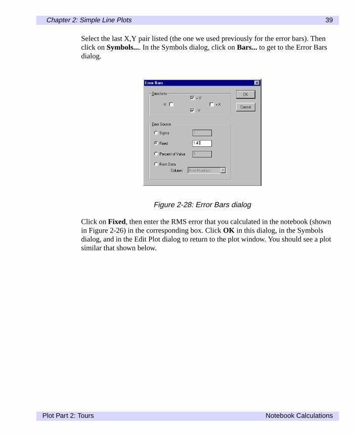
Select the last X,Y pair listed (the one we used previously for the error bars). Thclick onSymbols.... In the Symbols dialog, click on Bars... to get to the Error Barsdialog.
Click onFixed, then enter the RMS error that you calculated in the notebook (shoin Figure 2-26) in the corresponding box. ClickOK in this dialog, in the Symbolsdialog, and in the Edit Plot dialog to return to the plot window. You should see a psimilar that shown below.
Figure 2-28: Error Bars dialog
Plot Part 2: Tours Notebook Calculations

40 Chapter 2: Simple Line Plots
Figure 2-29: Plot Window with RMS Error Bars
Notebook Calculations Plot Part 2: Tours

Chapter 3:
Double-Y Plots
ble-electter
In this chapter we will read in data from a computer simulation, graph it as a douy plot, add text annotations, and use macros. If you have not already done so, sClose All from the File menu to close all of the windows that you opened in Chap2.
Plot Part 2: Tours 41

42 Chapter 3: Double-Y Plots
n.
ainsdataerify
Reading a Data File
We will start by importing a text file. SelectOpen... from the File menu, then selectthe file 'ls753.txt' in the 'Plot\Samples' folder and clickOK . This data is from a time-dependent computer simulation of the flow of material around a compact star(Nature, 342, 775 (1989)).
If Plot does not automatically recognize the file, it prompts you for more informatioIn this case, the data file is a text column file, so select that option and clickOK . TheText Columns dialog will appear.
In this dialog, make sure that 'Header titles' (Windows) or ‘Last header line contcolumn titles’ (Power Macintosh) is selected. Note that Plot has pre-scanned thefile, finding that there are 4 header lines, 321 rows, and 6 columns of data. To vthis guess, click on theView File... button.
Figure 3-1: Selecting Text Columns Import File Format
Figure 3-2: Text Columns dialog
Reading a Data File Plot Part 2: Tours

Chapter 3: Double-Y Plots 43
ol-ne try
The file should look like the one shown above. Note that the fourth line of the filedoes contain names for each of the columns. ClickClose/Done to return to the TextColumns dialog. ClickOK to read the file.
The resulting data window should look like the one above. If the names of the cumns are Column1, Column2, and so on, then the 'Header titles'/‘Last header licontains column titles’ check box was not selected. Close this data window andagain.
Figure 3-3: View File dialog
Figure 3-4: The Data Window
Plot Part 2: Tours Reading a Data File

44 Chapter 3: Double-Y Plots
his
Creating a Double-Y Plot
Now we will prepare to generate a plot from the imported data.
Entering Plot Labels
We first need to enter new plot labels for some of the columns. Click theTime col-umn name, and then selectColumn Settings... from the Data menu (alternatively,simply double-click on the column title).
In the Column Settings dialog for this column, enter 'Time(s)' for the Plot Label. Tname will be used for display whenever the column is plotted. Now clickOK .
Next, select theOpaccolumn and change the Plot Label for this column toOpacity.Click OK , then open theLj Column Settings dialog and enterL/L_E for the PlotLabel. ClickOK to close the dialog.
Figure 3-5: Specifying Plot Label for Time Column
Creating a Double-Y Plot Plot Part 2: Tours

Chapter 3: Double-Y Plots 45
b-
The underscore ( _ ) character specifies that the character that follows will be suscripted, like LE. Later in this chapter we will discuss the text formatting codes inmore detail.Selecting Columns
The next step is to select the columns to plot. SelectDouble-Y from the Gallery sub-menu on the Graph menu.
Figure 3-6: Specifying Plot Label for Lj
Figure 3-7: Graph Submenu
Plot Part 2: Tours Creating a Double-Y Plot

46 Chapter 3: Double-Y Plots
xis.
The first dialog you see is for specifying columns that are plotted on the left Y aSelectTime for the X axis andOpac for the Y axis, then clickOK .The second dialog is for specifying columns that are plotted on the right Y axis.Again specifyTime as the X axis andLj for the Y axis, and clickOK .
You should now see a Double-Y line plot that looks similar to the figure below.
Figure 3-8: Select X, Y Pairs Dialog for Left Axis
Figure 3-9: Select X,Y Pairs Dialog for Right Axis
Creating a Double-Y Plot Plot Part 2: Tours

Chapter 3: Double-Y Plots 47
Figure 3-10: Double-Y Plot
Plot Part 2: Tours Creating a Double-Y Plot

48 Chapter 3: Double-Y Plots
xis
nd
Changing the Plot Appearance
To improve the appearance of the plot, double click on the X axis to open the ALabels dialog. Select a Plot Bounds and an Axis Labels range of0.7 to 1.5, an Incre-ment of0.1, and a Label Format of#####.#(Windows) or####.#(Macintosh).
Next, click theTickmarks... button to bring up the Tickmarks dialog. ClickIn toselect inward directed tickmarks, andOut to deselect outward directed tickmarks.Click OK when done. In the Axis Labels dialog, chooseOK .
Double-click the left Y axis to open the Axis Labels dialog. Enter a Plot Bounds aan Axis Labels range of0 to 30, an Increment of5, a Label Format of#####(Win-dows) or#### (Macintosh), and5 Minor Ticks per Major. Click onTickmarks... tomake these tickmarks point inward. ClickOK in the Tickmarks dialog, and in theAxis Labels dialog.
Figure 3-11: X Axis Labels Dialog
Figure 3-12: Tickmarks Dialog
Changing the Plot Appearance Plot Part 2: Tours

Chapter 3: Double-Y Plots 49
.
ad ofe.
Finally, double-click the right Y axis to open the Axis Labels dialog. Enter a PlotBounds of0.63 to 1.08, an Axis Labels range of0.7 to 1.3, an Increment of0.1, aLabel Format of#####.##(Windows) or ####.##(Power Macintosh), and2 MinorTicks per Major. Also clickTickmarks... and make these tickmarks point inward.Click OK in the Tickmarks dialog and the Axis Labels dialog to return to the plot
In this case, we wanted the axis labels to start at 0.7, a nice round number, inste0.63. Therefore, our Axis Labels range was different from the Plot Bounds rang
Your resulting graph should look similar to the one in the figure below.
Figure 3-13: Left Y Axis Labels Dialog
Figure 3-14: Right Y Axis Labels Dialog
Plot Part 2: Tours Changing the Plot Appearance

50 Chapter 3: Double-Y Plots
rial,
In the figure above, we also changed the shape of the graph, changed all text to Aand added two new text labels (Luminosity and Opacity), using theNew Text...com-mand from the Graph menu. We also changed the title of the graph using theEditText... dialog. We will show how to add text labels next.Figure 3-15: Data Window with Improved Double-Y Plot
Changing the Plot Appearance Plot Part 2: Tours

Chapter 3: Double-Y Plots 51
le,
xam-
theuper-
ct
ow
the) is
lay
low.
Adding Text Annotations
Plot provides two methods of formatting text. You can specify size, font, and styfrom the menus within the Edit text dialog (Windows) or from the Format menu(Power Macintosh), or you can use Plot's text formatting language. In the next eple, we will use both methods to illustrate their use.
The main elements of annotation formatting are the \ character, which signifies beginning of a command, the _ and ^ characters, which signify subscripts and sscripts, and the { } characters, which signify groupings.
To see an example, in Windows create a new text annotation by selectingCenterfrom theNew Text... submenu in the Graph menu (in Power Macintosh, just seleNew Text...from the Graph menu). Click in the Edit Text dialog and typerout=30R.
Next, highlight 'out' and click theSubscript button (in Power Macintosh, selectSubscript from the Style submenu located on the Format menu). The text string nappears as r_{out}=30R.
Normally, only the first character after the _ character is subscripted. However, iffirst character is an open bracket ({) then everything up until the closing bracket (}subscripted.
The ^ character is used to signify superscripts in the same way. To actually dispeither an _ or a ^ character, preface them with a \.
Click OK to see how the text is displayed. The formatted text string is shown beNote that we have changed the font to Arial.
Figure 3-16: Edit Text Dialog with Selected Text
Plot Part 2: Tours Adding Text Annotations

52 Chapter 3: Double-Y Plots
line,s-oreee
owon
Now select the same text annotation again by double-clicking it. On the secondenter\epsilon =0.05, \mu_r=0.30. The \epsilon and \mu commands are used to diplay the Greek epsilon and mu characters, respectively. The space and undersccharacters that follow epsilon and mu are important for command termination. SChapter 12 for more details on text editing.
Click OK to display the text annotation and plot. The completed graph should nlook similar to the figure below. You can move any of the text blocks by clicking and dragging them.
Figure 3-17: Text String with Subscript
Figure 3-18: Complete Text Annotation
Adding Text Annotations Plot Part 2: Tours

Chapter 3: Double-Y Plots 53
at-the
The formatting language can be very useful, particularly because it permits formting information in your macros. Keep the plot window open, as we will use it andrelated data window to create import and plot macros.
Figure 3-19: Completed Double-Y Plot
Plot Part 2: Tours Adding Text Annotations

54 Chapter 3: Double-Y Plots
e pro-e thatg.
ss ofpply
lecte
eters
Creating and Using Macros
Plot's macro capabilities let you save, import, or plot parameters to automate thcess of importing data and creating plots. Macros use exactly the same languagis used in the notebook and in the Expression field of the Column Settings dialo
Creating an Import Macro
Recall that at the beginning of this chapter, we made several choices in the proceimporting the sample data file ‘ls753.txt.’ Here we will save those choices and athem to a new data file.
First, click on the data window to make sure it is the frontmost window. Then seCreate Macro... from the Macros menu. In the dialog that appears, enter the nam“Import Macro.”
Click OK. This creates a macro script that reads data files with the same paramwe chose interactively to import ‘ls753.txt.’
NoteBecause periods and other non-alphanumeric cannot be used in macros, Plotreplaces all such characters with underscores.
Creating a Plot Macro
Next, we will create a plot macro. Click on the plot window to make sure it is thefrontmost window. Now, again, selectCreate Macro... from the Macros menu. Enterthe name “Double Y Plot.”
Figure 3-20: Specify Macro Name
Creating and Using Macros Plot Part 2: Tours

Chapter 3: Double-Y Plots 55
).
-ike
Now, from the Macros menu, select the import macro we created (Import_Macro
You will be prompted to specify a data file. Select the file ‘ls746.txt’ from thePlot\Samples folder, then clickOpen. Plot will read this new file, using the parameters stored in the ‘Import_Macro’ macro. The resulting data window should look lthe figure below.
Figure 3-21: Saving a Plot Macro
Figure 3-22: Selecting an Import Macro
Figure 3-23: Results of Executing the Import Macro
Plot Part 2: Tours Creating and Using Macros

56 Chapter 3: Double-Y Plots
ueat
Now, from the Macros menu, select the plot macroDouble Y_Plot.
With minor exceptions, your plot should look like the figure shown above. As yocan see, even if you do not write or edit macros directly, they can save you a grdeal of time and effort.
Figure 3-24: Results of Executing a Plot Macro
Creating and Using Macros Plot Part 2: Tours

Chapter 4:
Analytic Line Plots
issine,
In the previous two chapters, we showed you how to use Plot to graph data. Thchapter describes how to use Plot to graph equations. Here you will plot sine, coand parametric curves.
If you have not already done so, selectClose All from the File menu to close all win-dows from the previous chapters.
Plot Part 2: Tours 57

58 Chapter 4: Analytic Line Plots
we
Plotting Sine, Cosine Curves
Sine and cosine curves require index fields, so first we create those fields, thencreate and plot the sine and cosine curves.
Creating Columns
SelectNew from the File menu to open a new data window. In Windows, selectSeeNotebookfrom the Data menu to open the notebook for the new data window. InPower Macintosh, selectUntitled.notebook from the Windows menu to open thenotebook for the new data window.
In the notebook, typet=series(200) and, with the cursor on the same line, selectCal-culate Now from the Data menu.
Next enter the lines inc=6 then print inc in the notebook. Select both lines, thenchooseCalculate Now from the Data menu.
Figure 4-1: Notebook Expression for t
Figure 4-2: Scalar Variable Verified
Plotting Sine, Cosine Curves Plot Part 2: Tours

Chapter 4: Analytic Line Plots 59
e
cle.
ofs.
The print command verifies that the scalar variable inc does contain 6. We will busing this variable in our equations.
Types=sin(t/inc)and, again, selectCalculate Now. Note how we use the inc variableto scale the sine curve. The function sin works with radians, where 2 is a full cySo with inc=6, the s column will go through 200/(6*2* ), or about 5, cycles.
Finally, typec=cos(t/inc) in the notebook, and selectCalculate Now.
The end result (shown below) should be three columns: a t column with a seriesindex numbers, an s column with sine values, and a c column with cosine value
Figure 4-3: Notebook with Expressions for s and c Added
Figure 4-4: Data Window with t, s, and c Columns
Plot Part 2: Tours Plotting Sine, Cosine Curves

60 Chapter 4: Analytic Line Plots
Plotting Columns
Now we can plot these curves. SelectLine from theGallery submenu on the Graphmenu. Selectt as the X column and boths andc as the Y columns.
To select both these columns, select the first one (heres), then hold down the shift keyand select the last column (herec). Click OK .
The resulting graph should look like the figure below.
Figure 4-5: Select Data Columns
Figure 4-6: Plot Window with s,c Curves
Plotting Sine, Cosine Curves Plot Part 2: Tours

Chapter 4: Analytic Line Plots 61
nd
ed
The plot appearance can be improved by changing the size, font, axes labels, asome of the text. An improved plot is shown below.
Note that we have changed the font for all text to Arial, modified the axes, changthe axes text, and changed the title.
Figure 4-7: Improved s,c Plot
Plot Part 2: Tours Plotting Sine, Cosine Curves

62 Chapter 4: Analytic Line Plots
dortu- To
Parametric Plots
Instead of plotting the sine and cosine curves against an index column, we coulinstead plot them against each other. This would produce a parametric plot. Unfnately, plotting c versus s would produce a fairly boring parametric plot: a circle.make it more interesting, we will create more columns.
Return to the notebook and enterts=t*s andtc=t*c . Make sure both lines are selectedthen click onCalculate Now.
SelectLine from theGallery submenu on the Graph menu. Selectts as the X columnandtc as the Y column.
Click OK in this dialog, and you should see the following parametric plot.
Figure 4-8: Notebook with New Expressions for New Data Columns
Figure 4-9: Select X,Y Pairs Dialog
Parametric Plots Plot Part 2: Tours

Chapter 4: Analytic Line Plots 63
Youthe
Adding Color
This plot can be improved. As before, you can modify the font, labels, and so on.can also enhance the plot by using color. To do so, double-click anywhere withinplot boundaries to bring up the Edit Plot dialog.
In the Edit Plot dialog, click on theLines... button and change the line width to3points (pt.). Return to the Edit Plot dialog then click on theColors...button. The Col-ors dialog will appear.
Figure 4-10: Parametric Plot
Figure 4-11: Colors Dialog
Plot Part 2: Tours Parametric Plots

64 Chapter 4: Analytic Line Plots
es
Click on theVariable radio button. This tells Plot to map colors to a data column.
Next, open the Column menu and select thet column. Finally, click onRainbow.Click OK in the Color and Edit Plot dialogs. Your plot should now look much likeFigure below, in color (we have also adjusted the font and labels).
Note that withRainbow selected, Plot maps colors evenly from blue to red as valuincrease. Since we colored the parametric line by the t column, your actual plotshould run from blue in the center to red in the end.
Figure 4-12: Parametric Plot with Color Added and Labels Adjusted
Parametric Plots Plot Part 2: Tours

Chapter 4: Analytic Line Plots 65
ate.
umn
wthe
Updating Calculations
Note that everything we have done depends on the ‘inc’ variable that we definedthe beginning of this chapter. Let us see what happens when we change its valuBring up the notebook again. On a new line, typeinc=12. Then selectCalculateNow.
Select thes, c, ts, andtc lines. Then selectCalculate Now from the Data menu toupdate all the columns. This is necessary because the ‘inc’ variable that the colequations depend upon has changed.
If you looked closely, you may have noticed the column values in the data windochange. Now bring the parametric plot window to the front. It should replot usingnew column values.
Figure 4-13: Notebook Window with the New 'inc' Calculation
Plot Part 2: Tours Updating Calculations

66 Chapter 4: Analytic Line Plots
-half
By doubling the ‘inc’ variable, we halved the number of cycles that the sine andcosine curves go through. So instead of five cycles, you see about two-and-onecycles.Figure 4-14: New Parametric Plot
Updating Calculations Plot Part 2: Tours

Chapter 5:
Color Scatter Plots
st.
ap-
In the previous chapters, we plotted one variable (Y) against another (X). In thichapter, we will plot a value against both X and Y to produce a color scatter plo
If you have not already done so, close all the Plot windows from the previous chters.
Plot Part 2: Tours 67

68 Chapter 5: Color Scatter Plots
-era-
ow
box
Reading a Text File
ChooseOpen... from the File menu and select the file ‘weather.txt’ from the ‘Samples’ directory. This data is from the U.S. Weather Service and consists of tempture measurements from January 2, 1991.
In the dialog that appears, select Text Columns as the import file type. You will nsee the Text Columns dialog shown in Figure 5-1.
Make sure that the 'Header titles'/‘Last header line contains column titles’ checkis selected before clickingOK . You may also want to clickView File... to see theimport file before continuing.
Figure 5-1: Text Columns Dialog
Figure 5-2: View File Dialog
Reading a Text File Plot Part 2: Tours

Chapter 5: Color Scatter Plots 69
f theed. In-
The resulting data window should look similar to the next figure.
The first two columns consist of map locations for the measurements. The rest ocolumns are measured values for temperature, dewpoint, pressure, and wind spethis chapter we will be working with only the temperature column, Temp(F) (Windows) or Temp_F_ (Power Macintosh).
Figure 5-3: Data Window for weather.txt
Plot Part 2: Tours Reading a Text File

70 Chapter 5: Color Scatter Plots
a bit
l to and
Creating a Scatter Plot
SelectScatter from theGallery submenu on the Graph menu. SelectX-coord as theX coordinate andY-coord as the Y coordinate, then clickOK .
Note how the data values outline the shape of the United States, but the shape iscompressed. In Windows, click theAspect Ratio button to make the plot look morerealistic
NoteIn order for Aspect Ratio button to appear at top of the screen, you must selectToolBar from the Edit menu.
On Power Macintosh, drag the image wider until it looks more natural.
In addition, modify the axes labels to improve the image. As shown in the imagebelow, we changed the number display in the Axis Labels dialog from exponentiaan integer, truncated the right side of the plot at 4,500,000, the top at 3,000,000made reasonable increment and tickmark choices.
Figure 5-4: Scatter Plot for weather.txt
Creating a Scatter Plot Plot Part 2: Tours

Chapter 5: Color Scatter Plots 71
The improved scatter plot should look similar to the figure below.
Figure 5-5: X Axis Labels Dialog
Figure 5-6: Improved Scatter Plot for weather.txt
Plot Part 2: Tours Creating a Scatter Plot

72 Chapter 5: Color Scatter Plots
itd
Adding Color to the Scatter Plot
Now we will add color to these symbols. Double-click on the plot to open the EdPlot dialog. Click onSymbols...to open the Symbols dialog. Open the Draw list anselectFilled Circle (on Macintosh, this is the last symbol on the right).
Click OK to return to the Edit Plot dialog. Now click onColors... to open the Colorsdialog. ChooseVariable. Then open the Column list and selectTemp(F). Set theMin/Max range from-15 to 76. Also, selectRainbow as the color mapping.
Figure 5-7: Symbols Dialog
Figure 5-8: Color Dialog
Creating a Scatter Plot Plot Part 2: Tours

Chapter 5: Color Scatter Plots 73
ld
tual
Click OK on this dialog and on the Edit Plot dialog. The resulting color plot shoulook something like the figure below.
Note that this color plot is different from the color plots in the previous chapters.Here, there is one data value, Temp(F), shown as a function of two columns (X-coord, Y-coord).
Creating a Number Scatter Plot
Instead of displaying the temperature readings as colors, we can display the acreadings.
To do so, open the Edit Plot dialog again. ClickSymbols... to open the Symbols dia-log. SelectNumber as the symbol style. Open the Column list and select theTemp(F) column. Open the Format list and select the #####(Windows) or ####(Power Macintosh) number format.
In Windows, click theFont button and select the Arial font with a size of 8 points;close the Font dialog (in Power Macintosh, enter8 in the Size box near the bottom ofthe dialog). Then, enter6 in the Skip box.
Figure 5-9: Weather Color Scatter Plot
Plot Part 2: Tours Creating a Scatter Plot

74 Chapter 5: Color Scatter Plots
es
The Skip value tells Plot to put a symbol at every sixth X-Y location. Skipping valucreates space between numbers, making them more legible.ChooseOK to close the Symbols dialog. In the Edit Plot dialog, click onColors...and set the color to solid black. Click onOK to return to the plot. Your plot shouldnow look like the one shown below.
Figure 5-10: Symbols Dialog for Number Scatter Plot
Figure 5-11: Finished Number Scatter Plot
Creating a Scatter Plot Plot Part 2: Tours

Chapter 5: Color Scatter Plots 75
rst,
val-
Synchronizing Plot and Data
You can easily compare points on a plot with their values in the data window. Fibe sure that the plot window is active. SelectSynchronize from the Graph menu(Windows) or Edit menu (Power Macintosh).
Now, click on any point along the graph. Note how the corresponding row of dataues is selected in the data window.
Figure 5-12: Synchronize Command
Figure 5-13: Corresponding Points on the Plot and in the Data WindowSelected using Synchronize
Plot Part 2: Tours Synchronizing Plot and Data

76 Chapter 5: Color Scatter Plots
e it
This works the other way also. You can click on a value in the data window and seselected in the plot window.Synchronizing Plot and Data Plot Part 2: Tours

Part III: ReferenceManual


Chapter 6:
The Data Window
new
A blank data window appears each time you launch Plot. You can also create adata window by selectingNew from the File menu. A new data window is shown inFigure 6-1.This chapter describes how to manipulate data and the data window’s settings.
Figure 6-1: An Empty Data Window
Plot Part 3: Reference Manual 79

80 Chapter 6: The Data Window
igh-ry
s-
abed,
Entering Data Manually
When a new data window appears, the first cell of column one is automatically hlighted. To start entering data, simply type a value for this cell. Note that the entalso appears in the edit box at the top of the screen.
Enter Data by Column
To enter the value in the cell and move down to the next cell in the column, presEnter. The value appears in the cell, and the next cell down is automatically highlighted, ready for the next entry.
Enter Data by Row
To enter a value in the cell and move right to the next cell in the row, press the Tkey. The value will be entered in the cell, and the next cell to the right is highlightready for the next entry.
Figure 6-2: Entering Data
Entering Data Manually Plot Part 3: Reference Manual

Chapter 6: The Data Window 81
ica-
,
Tab
Up
Moving Around in the Data Window
Besides using the mouse, you can also use theGoTo...command from the Data menuor the keyboard to move around in the data window.
GoTo... Command
To move directly to a specific cell, selectGoTo... from the Data menu. The Go ToCell dialog appears.
Enter the row and column number for the destination cell, and clickOK . That celland its contents will be displayed and highlighted.
Keyboard (Windows)
Keyboard keys generally work the same way in Plot as any other Windows appltion.
Tab, the arrow keys, Home, End, Page Up, and Page Down are used for movingselecting, and scrolling. Enter is used to confirm an action.
Shift is used to extend the selection or perform the opposite action. For example,moves right; Shift+Tab moves left.
Ctrl is used to perform the same action on a different scale. For example, Page move up one window; Ctrl+Page Up moves to the top row.
Figure 6-3: Using the Go To Cell Dialog
Plot Part 3: Reference Manual Moving Around in the Data Window

82 Chapter 6: The Data Window
Keyboard (Power Macintosh)
To Move... Press
Down one cell Return, Enter, or the down arrow
Up one cell Shift-Return or up arrow
Right one cell Tab or right arrow
Left one cell Shift-Tab or left arrow
Table 6-1: Power Macintosh Navigation Keys
Moving Around in the Data Window Plot Part 3: Reference Manual

Chapter 6: The Data Window 83
creen.
of the
data
Selecting Data
The data window provides a variety of methods for selecting data.
Select a Cell
Click on a cell to select it, or use the keyboard orGoTo...command described above.The contents of the selected cell are displayed in the edit box at the top of the s
Select a Region of Data
To select a region of data points in a window, click on one corner of the desiredregion, drag to the opposite corner, and release the mouse button. The contentsupper left cell of the selected region is displayed in the edit box.
To extend a selection of data, hold down the Shift key while selecting the desiredby using the mouse or arrow keys.
Figure 6-4: Selecting a Cell
Plot Part 3: Reference Manual Selecting Data

84 Chapter 6: The Data Window
6-.
Select Entire Row/Column
To select an entire column, click on the column label box for that column (Figure5). To select an entire row, click on the row number box for that row (Figure 6-6)You can also use the arrow keys to select a column label or row number box.
Figure 6-5: Selecting an Entire Column
Figure 6-6: Selecting an Entire Row
Selecting Data Plot Part 3: Reference Manual

Chapter 6: The Data Window 85
l-
ws
) ortosert
l col-the
om
.)
s
Select Contents of Entire Window
To select all the rows and columns of the data window (including empty rows/coumns), chooseSelect All from the Edit menu.
Insert Columns and Rows
TheInsert command under the Data menu allows you to insert new columns or rointo the data window.
To make an insertion, select a column or row to indicate where the new column(srow(s) are to be inserted. In Windows, you can select multiple rows or columns insert an equal number of new columns or rows. In Power Macintosh, you can inone column at a time or multiple rows. Then selectInsert from the Data menu.
Plot inserts the new columns, and the originally selected columns (as well as alumns to the right) shift to the right. Inserted rows shift all rows downward below insertion point.
Delete Columns and Rows
TheDelete command under the Data menu removes a selected column or row frthe window.
To delete a column or row, click the column title or row number to highlight theentire column or row. (You may also select multiple rows or columns for deletionThen selectDelete from the Data menu.
Columns to the right of the deleted column shift left to fill deleted columns. Rowbelow the deleted row shift upward.
Plot Part 3: Reference Manual Selecting Data

86 Chapter 6: The Data Window
.
henes ofhe data
the
rtion
Copying and Pasting Data
TheCopy andPaste commands, under the Edit menu, provide a useful way tomanipulate data within Plot, as well as a means of importing and exporting data
Copy
TheCopy command copies the current selection region from the data window. Tselected numbers are taken as displayed in the selection region and copied as linumbers separated by tab characters. Copied data can be pasted elsewhere in twindow, in other data windows or notebooks, or into other applications, such asspreadsheet programs.
Paste
Text fields delimited by spaces or tabs may be brought into a data window usingPaste command. To paste data, select a cell as an insertion point, then selectPastefrom the Edit menu. Numbers are pasted into the data window starting at the insepoint, filling down and to the right.
Copying and Pasting Data Plot Part 3: Reference Manual

Chapter 6: The Data Window 87
mns.
ditpen
org
Editing Data Window Columns
This section describes how to enter and change column names and editing colu
Entering and Changing Column Names
To enter or change a column name, click on it, then enter the new name in the ebox as shown in Figure 6-7. You may also double-click on the column name to othe Edit Columns dialog, described below.
Editing Columns
To bring up the Column Settings dialog, either double-click on the column nameselectColumn Settings... from the Data menu with the column selected. The dialoshown in Figure 6-8 appears.
Figure 6-7: Entering New Column Name
Plot Part 3: Reference Manual Editing Data Window Columns

88 Chapter 6: The Data Window
to-
hised on
col-ave
Column Number
The number of the column selected appears in the upper left corner.
Name
Displays the current name of the selected column and allows you to change it.
Plot Label
By default, column headings are used for plot axes labels. This box allows you specify a more descriptive plot label with text formatting, such as super- and subscript. For more on text formatting, see Chapter 12.
Expression
You can calculate values for the selected column by entering an expression in tbox. Plot executes expressions in this field and returns a column of numbers basthe entered function or expression. For more on calculations, see Chapter 14.
Format
This box lets you specify the numerical format for data displayed in the selectedumn. You can click on the arrow to the right of this box for a list of formats. To hPlot select a format automatically, selectGeneral.
Figure 6-8: Column Settings Dialog
Editing Data Window Columns Plot Part 3: Reference Manual

Chapter 6: The Data Window 89
num-
also
-fer-
drtical
You can also enter custom formats in the box. The pound sign (#) indicates the ber of digits to be displayed to the right of the decimal point.
Width/Characters Wide
This box lets you set the column width in terms of characters. Note that you canset column width interactively, as shown in Figure 6-10.
NoteIf a number is wider than the column, the hidden portion of the number is represented by an ellipsis. To display the full number, widen the column or use a difent number format.
Set Column Width Interactively
You can change a column’s width using the Column Settings dialog, as describeabove, or you can change it interactively. To do so, move the cursor over the verule. When the cursor changes, click and drag the rule to the desired width.
Figure 6-9: Numerical Format Pull-down Menu
Figure 6-10: Changing Column Width Interactively
Plot Part 3: Reference Manual Editing Data Window Columns

90 Chapter 6: The Data Window
col-
Edit-
Data Specifications
Plot is designed to work with columns of IEEE floating point numbers. For eachumn, Plot saves:
• Name
• Plot label
• Printing format
• Column width
• Formula
• Column of 32-bit floating numbers
For more information, see the description of the Column Settings dialog, under ing Columns, earlier in this chapter.
Number Ranges
The floating point values stored by Plot are 4-byte, 32-bit IEEE standard floatingpoint numbers. 24 bits are used for the mantissa.
Significant/Mantissa precision: 7 to 8 digits
Maximum positive number: 3.4E+38
Minimum positive number: 1.2E-38
Maximum negative number: -1.2E-38
Minimum negative number: -3.4E+38
Infinity: INF
Not a Number: NaN (for example, log of a negative number)
Data Specifications Plot Part 3: Reference Manual

Chapter 6: The Data Window 91
a. It areon-
win-dedsh).
opy-ext
t and
Using the Notebook Window
The notebook window in Plot provides a place to add comments about your datalso allows you to enter and execute expressions and macro commands, whichdescribed in Chapters 14 and 15. The figure below shows a notebook window ctaining both comments and expressions for calculations to be performed.
A notebook window is automatically created for each data window and takes thename of the data window. To display the notebook in Windows, selectSee Notebookfrom the Data menu.To display the notebook in Power Macintosh, selectunti-tled.notebook from the Windows menu.
Entries in the notebook window are automatically saved when you save the datadow. When you subsequently reload the dataset, the notebook window will be loaand available under the Data menu (Windows) or Windows menu (Power Macinto
The standard Windows and Macintosh text editing functions, such as selecting, cing, deleting, and pasting text, all work in the notebook window. In Windows, the tfont for the window can be changed by selectingFont from the Edit menu; in PowerMacintosh these commands can be found under the Format menu. Only one fonsize can be used in the notebook.
Figure 6-11: Notebook Window
Plot Part 3: Reference Manual Using the Notebook Window

92 Chapter 6: The Data Window
d
ta val-
Changing the Font in the Data Window
In Windows, you can change the font used in a dataset window by selectingFont...from the Edit menu. In Power Macintosh, the font, size and style can be modifieusing commands available from the Format menu.
Using a monospaced font, such as Courier New, is recommended so that the daues are aligned. The same font must be used for the entire data window.
Changing the Font in the Data Window Plot Part 3: Reference Manual

Chapter 7:
Opening andImporting Files
se
To open or import a data file, select theOpen... command under the File menu. Bydefault, Plot displays all file types. To limit displayed files to a specific file type, uthe pull-down menu and select the desired type.Plot Part 3: Reference Manual 93

94 Chapter 7: Opening and Importing Files
ericitles, but
Importing Text Column Data
Plot imports ASCII files of numbers delimited by spaces, tabs, or most non-numpunctuation. Text fields, such as "Jan," "Feb," or "Mar," are accepted as column tbut not as data. Note that when text fields appear in column data, they are ignoredmay cause inaccurate column counts.
After using theOpen... command to select the text file you wish to import, click onOK (Windows) or theOpen button (Power Macintosh), or double-click on the filename. The Import File Format dialog shown in Figure 7-1 appears.
Make sure thatText Columns is selected and clickOK . The dialog shown in Figure7-2 appears. The options on this dialog are described below.
Figure 7-1: Import File Format Dialog (Windows and Power Macintosh)
Figure 7-2: Text Columns Dialog
Importing Text Column Data Plot Part 3: Reference Manual

Chapter 7: Opening and Importing Files 95
ure
e
n of oflist-
Delimiters
Select the desired text delimiter by selecting from the Delimiters list, shown in Fig7-3.
Importing Fixed Field Column Files
SelectingFixed Fieldsfrom the Delimiters pull-down menu changes theView File...button toSet Columns.... Click this button to specify your fixed field columns in thdialog shown below.
Click and drag anywhere in the data portion of the window to select each columdata to import. The listing at the bottom shows you the exact character positionsthe columns you select. You may also enter column specifications directly in thising. Use the formfirst:last , wherefirst,last are the first and last charac-
Figure 7-3: Text Columns Delimiters
Figure 7-4: Fixed Columns Dialog
Plot Part 3: Reference Manual Importing Text Column Data

96 Chapter 7: Opening and Importing Files
s. If the
dmn,
re sep-
mit-is is
ter positions for that column. The column specifications are separated by commayou overlap a new column onto an existing one, the earlier one is replaced withnew entry.
Strict delimiters/Separate column for each delimiter
Select this check box if you have some data columns with missing data, indicateonly by two consecutive tabs, for example. If you have a data value in each coluleave the box unchecked.
Header titles/Last header line contains column titles
Select this check box if your text columns have headings and those headings aarated by the same delimiters as the data.
Header Lines
Enter the number of lines of text for Plot to skip before import.
Estimate Sizes
Click here to have Plot estimate row and column sizes, given your choice for deliers. Plot assumes that all of the data values for a row are on the same line. If thnot the case, override the incorrect estimates.
Rows (Y)/Number of rowsColumns (X)/Number of columns
Here enter the number of rows and columns of data to read from the file.
View File...
Click this button to view the data before you import it, as shown in Figure 7-7.
Importing Text Column Data Plot Part 3: Reference Manual
Chapter 7: Opening and Importing Files 97
data.
ta is
Importing Binary Column Files
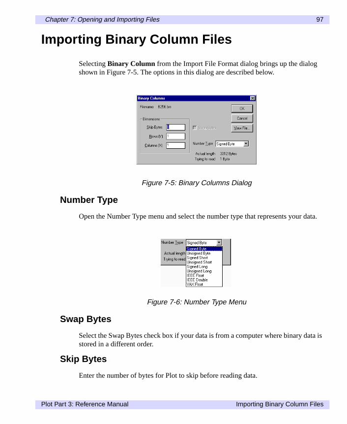
SelectingBinary Column from the Import File Format dialog brings up the dialogshown in Figure 7-5. The options in this dialog are described below.
Number Type
Open the Number Type menu and select the number type that represents your
Swap Bytes
Select the Swap Bytes check box if your data is from a computer where binary dastored in a different order.
Skip Bytes
Enter the number of bytes for Plot to skip before reading data.
Figure 7-5: Binary Columns Dialog
Figure 7-6: Number Type Menu
Plot Part 3: Reference Manual Importing Binary Column Files

98 Chapter 7: Opening and Importing Files
Fig-
Rows (Y)/Number of rowsColumns (X)/Number of columns
Enter the number of rows and columns of data to read from the file.
View File...
Click this button to view the data in hexadecimal before you import, as shown inure 7-7.
Actual length (Windows)
Size of file in bytes.
Trying to read (Windows)
Number of bytes that Plot will read, based on the current settings.
Importing Binary Column Files Plot Part 3: Reference Manual

Chapter 7: Opening and Importing Files 99
ata
ane as
ale
textdata
and
s, and
eadre on
Importing Non-Column Data
Plot can import a variety of matrix and image file types, placing the data in the dwindow in column format.
Opening Transform Files (Windows)
Plot displays Transform matrix data as columns in the Plot data window. When image is opened, Plot imports and displays the color mapping values for the imagcolumns of numbers.
Plot can also read files saved as ASCII Special from Transform, although the scvalues will not be applicable. See theTransform User’s Guide and Referencemanualfor information about ASCII Special.
Importing Text and Binary Matrix Data
To import text or binary matrix data, follow the same steps described above for and binary columns. The data will be displayed as columns and rows in the Plotwindow.
Two-Dimensional HDF Datasets (Windows)
Hierarchical Data Format (HDF) two-dimensional scientific datasets are openeddisplayed as columns in the Plot data window.
HDF and TIFF Image Files (Windows)
Imported 8-bit image files are read as two-dimensional arrays of 8-bit data valueconverted to floating point values, and displayed in the data window as columnsrows.
HDF Vset Files
HDF Vset is the normal storage format for data saved in Plot. The first Vgroup is rand each Vdata record is loaded as one column of data. See Appendix C for mothe HDF Vset standard.
Plot Part 3: Reference Manual Importing Non-Column Data

100 Chapter 7: Opening and Importing Files
s ofd 64-key-fter
s, 64-,
cre-fore
.
FITS Files (Windows)
Plot can open FITS files containing two-dimensional or three-dimensional array8-bit unsigned, and 16-bit, and 32-bit signed integer values, as well as 32-bit anbit floating point data. The data is scaled according to the BZERO and BSCALEwords before import. The FITS ASCII header appears in the notebook window aimporting.
GIF Files (Windows)
Graphics Interchange Format (GIF) files are read as an array of 8-bit data valuewhich are then displayed as columns of numbers. Plot supports 2-, 4-, 16-, 32-,and 256-color GIF plots, in '87a' or '89a' format.
PBM Files (Windows)
Portable Bitmap (PBM) files are read as 8-bit data values, which are then used toate a dataset of columns. 24-bit PBM plots are approximated as 8-bit images bebeing converted to data. PBM, PNM, PGM, and PPM file formats are supported
Importing Non-Column Data Plot Part 3: Reference Manual

Chapter 7: Opening and Importing Files 101
ores.
ry you
Using View File...
In most import dialogs, Plot allows you to view the contents of your data file befimporting the file. The View File dialog lists all the data in a file with row numberPlot for Power Macintosh also lists column numbers.
Figure 7-7 shows the text form of the View file dialog; Figure 7-8 shows the binaform of this dialog. Note that if the text form displays data that you cannot read,may simply be trying to import binary data as text data.
Figure 7-7: View File Dialog, Text Form
Figure 7-8: View File Dialog, Binary Form
Plot Part 3: Reference Manual Using View File...

102 Chapter 7: Opening and Importing Files
se listed
nto
Importing Multiple-Record Files (Windows)
Some Transform, Plot, MATLAB and HDF files contain multiple records. For thefiles, the Multiple Record dialog shown below appears. For HDF files, you see aof HDF records and sizes, by name. For MATLAB files, you see a list of numberrecords and their sizes.
In the scrolling list, select any or all of the records listed. Use theSelect Allbutton tochoose them all. ClickOK to proceed. Plot imports each of the selected records ia separate data window.
Figure 7-9: Choosing Record(s)
Importing Multiple-Record Files (Windows) Plot Part 3: Reference Manual

Chapter 8:
The Plot Window
nd
Each plot window is built on a similar foundation, so that fundamental features aoperations are the same, regardless of plot type.Figure 8-1: The Plot Window
Plot Part 3: Reference Manual 103

104 Chapter 8: The Plot Window
d toe of
ond- can-
d by
edit-
The window name in the title bar displays the name of the dataset that was usecreate the plot, followed by the plot number, which indicates when, in a sequencplots created from this dataset, this plot was created.
Under the plot is the canvas—the imaginary surface the plot is drawn on, corresping to the blank paper used for printing a plot. Scroll bars control the area of thevas to be displayed.
In Windows, the right and bottom borders of the printable page are also indicaterules representing the page borders.
In Power Macintosh, the mouse pointer is the only cursor tool used in Plot. Themouse pointer allows you to resize a plot, to select a plot or plot component for ing it, in conjunction with theSynchronizecommand, to select a point of interest onthe plot to highlight corresponding values in the data window.
Plot Part 3: Reference Manual

Chapter 8: The Plot Window 105
You.
ge
ee
andd a
and
Resizing Plots
Preference Settings Dialog (Windows)
In Windows, the initial size of new plots is set in the Preferences Settings dialog.can resize a plot by specifying an exact size or interactively by using the mouse
If the Tool Bar does not appear when a plot window is active, selectTool Bar fromthe Edit menu.
Using the Resize Tool (Windows)
To draw a plot at a specific size, type the height and width (in points) in the ImaSize fields and press Enter.
To adjust the image size so that the aspect ratio of the image matches that of thdataset, click theAspect Ratio button. The aspect ratio is calculated from the scalranges of the dataset.
Resizing Plots Interactively
To resize a plot, position the pointer within the rectangular boundaries of the plot,click once. The boundaries of the plot will be highlighted, and in Windows a solibox will appear in each corner and on each side of the plot (in Power Macintoshsolid box appears in the lower right corner).
To resize a plot in two dimensions at once, click on a corner box, and drag to expor shrink the plot to the desired size (Figure 8-3), and release.
Figure 8-2: Toolbar with Resize Tool Activated
Plot Part 3: Reference Manual Resizing Plots

106 Chapter 8: The Plot Window
'se key-key
in
y
In Windows, to resize a plot in only one dimension, click on a box along the plotside, drag to the desired size (Figure 8-4), and release. To resize a plot using thboard, press Tab until the plot is selected. Then, pressing Ctrl+Shift and an arrowto change the image size in the indicated direction. The image size is changed increments of one point.
In Power Macintosh, to grow or shrink the plot proportionately, press the Shift kebefore dragging.
Figure 8-3: Resizing a Plot in Two Dimensions
Figure 8-4: Resizing a Plot in One Dimension
Resizing Plots Plot Part 3: Reference Manual

Chapter 8: The Plot Window 107
ande
ted.he
uldome-
ayr textiting
lect. To
Positioning Plots on the Canvas
To move a plot around on the canvas, click anywhere within the plot boundariesdrag the plot to the desired location. If you move the plot too high or too far to thleft, Plot adjusts to make the plot visible.
In Windows, to move a plot using the keyboard, press Tab until the Plot is selecThen, press Shift and an arrow key to move the plot in the indicated direction. Tplot is moved in one-point increments.
In Windows, the keyboard can also be used to scroll the plot window, as you wouse a mouse to move the scroll bars. To scroll in one-page increments, press H(left), End (right), Page Up (up), or Page Down (down). To scroll in smaller increments, press an arrow key in the indicated direction.
Selecting Plot Components
The mouse pointer also lets you select individual components for editing. You mselect each axis and corresponding scale, each axis label, the plot title and othelabels, as well as the graph itself. See sections later in the manual for more on edeach of these components.
In Windows, to select plot components using the keyboard, press Ctrl+Tab to sethe plot window. Then press Tab or Shift+Tab to select the different componentsedit the selected component, press Enter.
Figure 8-5: Moving a Plot on the Canvas
Plot Part 3: Reference Manual Resizing Plots

108 Chapter 8: The Plot Window
lec-
lick
ve).
ati-in-
Synchronize
TheSynchronize feature is an especially useful analysis tool, as it allows you tointeractively display numeric values of plotted points. WhenSynchronizeis enabled,Plot automatically updates all windows associated with a dataset each time a setion is made on a plot or in the data window.
To enable the Synchronize feature, make the plot window active. In Windows, con theSynchronize button in the tool bar. If the plot contains more than one X,Ypair, open the Synchronize On menu list to switch between X,Y pairs (shown aboIn Power Macintosh, select theSynchronize command from the Edit menu. Now,when you click on a point along the plot, the corresponding data value is automcally selected in the data window (Figure 8-7). Likewise, if a value in the data wdow is selected, the corresponding point is selected in the plot window.
Figure 8-6: Toolbar with Synchronize Activated (Windows)
Synchronize Plot Part 3: Reference Manual

Chapter 8: The Plot Window 109
ointYou
lect
ugh
You may also select a value in the data window; Plot automatically selects the pin all plots that are drawn from that dataset which have Synchronize turned on. must enable Synchronize for each plot in turn.
In Windows, to use the Synchronize feature with a keyboard, press Ctrl+Tab to sethe plot window. Then selectSynchronize from the Graph menu. Press Space toselect the top row. Then press Shift and the up- or down-arrow key to move throthe data. To synchronize on a different X,Y pair, press Tab or Shift+Tab.
Figure 8-7: Plot and Corresponding Row of Data Selected using Synchronize
Plot Part 3: Reference Manual Synchronize

110 Chapter 8: The Plot Window
clip-sing
Copy and Paste Plots (Power Macintosh)
One way to export plots created in Plot is to use theCopy andPaste commandsunder the Edit menu.
To copy a plot, click anywhere within the plot bounds, then selectCopy from the Editmenu. The plot and axes, as well as all labels and legends will be copied to theboard. The copied plot can then be placed into another presentation program, uthePaste command.
Hold down the Option key and selectCopy from the Edit menu to copy just the plotwithout axes and titles. This can be useful for creating overlays in Transform.
Copy and Paste Plots (Power Macintosh) Plot Part 3: Reference Manual

Chapter 9:
Creating Plots
atterhealog
o you
Textst
Once data has been entered or imported into a data window, creating a plot is a mof selecting a plot type from the Gallery under the Graph menu, then selecting tdata to be plotted. This chapter first discusses the Gallery, then the X,Y Pairs diused for selecting data.
Note that the Gallery is only a starting point for creating plots. Plot is designed tmake it easy to go on to change plot parameters, and change plot type, allowingto create exactly the plot you need. For more information on changing plots, seeChapter 10: Axes, Labels, and Grids; Chapter 11: Editing Plots; and Chapter 12:and Legends. In addition, Chapter 13: Building Plots, illustrates one of Plot's mopowerful features, the ability to plot pairs in layers to create advanced plots.
Plot Part 3: Reference Manual 111

112 Chapter 9: Creating Plots
-
new
aremn and
leashed
The Gallery
To create a plot from the Gallery selectGallery from the Graph menu. The Plot Gallery offers five commands and plot types:Line, Double-Y, Scatter, Number Scatter,andError Bars . Each selection applies to a set of preselected parameters for a plot.
The plot title is taken from the names of the data columns plotted. Axes names taken from the names of plotted columns, or from the Plot Label entry in the ColuSettings dialog for the plotted columns. Plot estimates reasonable axes boundsintervals. Each Gallery choice is described below.
Line Plot
Line graphs are useful for showing trends in an X,Y pair or for comparing multipX,Y pairs. SelectingLine will plot a simple solid line connecting the data points forselected X,Y data pair. If multiple X,Y pairs are selected, each uses a different daline style.
Figure 9-1: Plot Gallery Commands
The Gallery Plot Part 3: Reference Manual
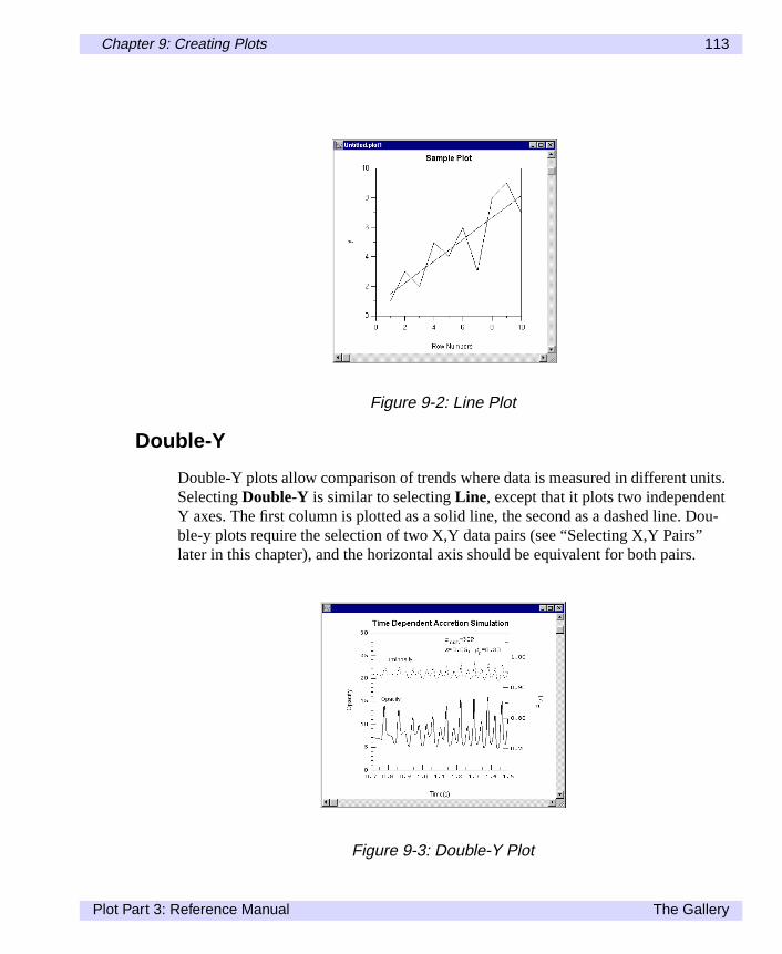
Chapter 9: Creating Plots 113
its.tDou-
.
Double-Y
Double-Y plots allow comparison of trends where data is measured in different unSelectingDouble-Y is similar to selectingLine, except that it plots two independenY axes. The first column is plotted as a solid line, the second as a dashed line. ble-y plots require the selection of two X,Y data pairs (see “Selecting X,Y Pairs”later in this chapter), and the horizontal axis should be equivalent for both pairs
Figure 9-2: Line Plot
Figure 9-3: Double-Y Plot
Plot Part 3: Reference Manual The Gallery

114 Chapter 9: Creating Plots
play
box
ally.
Scatter
Scatter plots are useful for displaying especially large datasets and allow the disof a third variable at each X,Y location. SelectingScatter will plot a symbol for theselected X,Y data pair to produce a scatter plot. By default, Plot simply draws aat each X,Y location.
Number Scatter
Number Scatterworks similar toScatter, except that it prints a number from a datacolumn, centered at each X,Y location. By default, row numbers are plotted initi
Figure 9-4: Scatter Plot
Figure 9-5: Number Scatter Plot
The Gallery Plot Part 3: Reference Manual

Chapter 9: Creating Plots 115
,o be
Error Bars
Error bars display some level of error along an X,Y data pair. SelectingError Barswill plot a simple line with error bar symbols for the selected X,Y pair. By defaultPlot sets the error at one standard deviation for the Y error. The error level can alsa percentage of plotted data, or it can be derived from a data column.
Figure 9-6: Error Bar Plot
Plot Part 3: Reference Manual The Gallery

116 Chapter 9: Creating Plots
-e
t of
n
ct arstigu-ead
sub-
cal be
Select X,Y Pairs Dialog
Choosing any plot type using theGallery command opens the Select X,Y Pairs dialog shown in Figure 9-7. This dialog prompts you to select the data columns to bplotted.
The current plot type is displayed just below the “Select X,Y Pairs” title. The resthe dialog consists of two lists, one for the X (horizontal) axis, the other for the Y(vertical) axis. Each list displays all columns from the active data window. A columselected under the X list will be plotted as the horizontal axis. A column selectedunder the Y list will be plotted as the vertical axis.
You can select only one X column, but you can select multiple Y columns. To selerange of columns in the Y list to plot against a single horizontal axis, select the ficolumn, hold down the Shift key, then select the last column. To select non-contous columns, hold down the Control key (Command key in Power Macintosh) instof the Shift key while selecting additional columns.
Clicking OK adds the selected data and draws the plot according to the Gallerymenu selection.
Select X,Y Pairs for Double-Y Plots
SelectingDouble-Y from the Gallery will prompt you twice with the Select X,YPairs dialog.
The first dialog prompts you to select columns to be plotted against the left vertiaxis (Y1). After a selection is made, a second dialog prompts you for the data toplotted against the right vertical axis (Y2).
Figure 9-7: Select X,Y Pairs Dialog
Select X,Y Pairs Dialog Plot Part 3: Reference Manual

Chapter 9: Creating Plots 117
romd in
d for X
most
After selecting data columns for the right vertical axis, clickOK to draw the Double-Y plot.
Select X,Y Pairs from the Data Window
You can also preselect X,Y pairs in the data window before selecting a plot type fthe Gallery. Column(s) selected in the data window are automatically highlightethe Select X,Y Pairs dialog.
When a single column is selected in the data window, that column is preselecteY in the Select X,Y Pairs dialog. Plot automatically selects Row Numbers for thecolumn.
When two or more contiguous columns are selected in the data window, the leftcolumn is preselected as X. The remaining column(s) are preselected for Y.
Figure 9-8: Select X,Y Pairs Dialog for Left and Right Axis of a Double-Y Plot
Plot Part 3: Reference Manual Select X,Y Pairs Dialog

118 Chapter 9: Creating Plots
Select X,Y Pairs Dialog Plot Part 3: Reference Manual

Chapter 10:
Axes, Labels, andGrids
Thet
Plot provides full control over axes, axes labels, tickmarks, grid lines, and scales.procedure for editing these components, described below, is the same for all plotypes.
Plot Part 3: Reference Manual 119

120 Chapter 10: Axes, Labels, and Grids
to
eath
irs
ou plot
Axis Labels Dialog
To open the Axis Labels dialog (Figure 10-1), double-click on the axis you wish edit, or click once to select it, then selectEdit Axis... from the Graph menu. A cut-away of the axis that would be drawn from the values shown below appears benthe dialog.
Axis
Open the Axis list in the top corner of the dialog to select another axis for editingwithout closing this dialog.
Data Range (Windows)
Displays the actual range of data values, which is calculated from all the X,Y paassociated with the axis.
Plot Bounds
Specify the range of values to be plotted in the Minimum and Maximum fields. Ymay plot only a portion of the actual data range or extend the boundaries of thebeyond the actual data range.
Figure 10-1: Axis Labels Dialog and Resulting Axis
Axis Labels Dialog Plot Part 3: Reference Manual

Chapter 10: Axes, Labels, and Grids 121
these
nt orust, the, if
axi-e val-
thejor
00).
otee.ick-
le
Axis Labels
These boxes list the starting and ending values for axis labels. You can changevalues to start and stop labels at points other than the plot boundaries.
Axis Label Increment and Intervals
You can choose to set spacing for labels by using the value listed under Incremeby setting intervals in the Intervals box. The Auto Range Calculation check box mbe deselected before choosing Increment. When a new value is entered for oneother is automatically adjusted. For example, in the dialog shown in Figure 10-1the Intervals value was 2 instead of 4, the increment would become 40000.
Auto Range Calculation
Check this box if you want Plot to calculate the increment, and minimum and mmum label values for you. Plot makes a “best guess” at boundaries based on thues entered for Plot Bounds, and Intervals.
Major Ticks per Label
This value sets the number of major tickmarks to be drawn per label interval. In dialog shown in Figure 10-1, if you set the Major Ticks per Label to 5, then 5 matickmarks will be set at intervals of 20,000 (i.e., 0, 20000, 40000, 60000 and 800Note that the first major tickmark is drawn at the label.
Minor Ticks per Major
This value specifies the number of minor tickmarks between major tickmarks. Nthat the first minor tickmark is drawn at the major tick, and therefore is not visiblFor example, if set to 2, one minor tick will appear between each pair of major tmarks.
Scale
Plot draws plots with either linear or logarithmic scales. Click on the desired scatype here.
Plot Part 3: Reference Manual Axis Labels Dialog
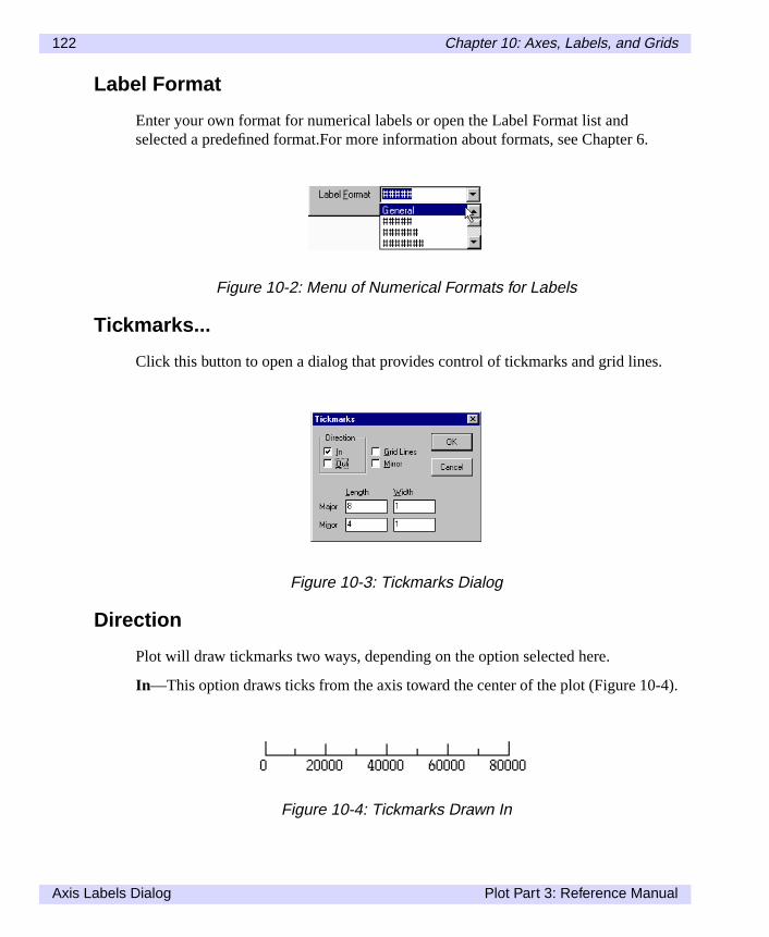
122 Chapter 10: Axes, Labels, and Grids
6.
s.
-4).
Label Format
Enter your own format for numerical labels or open the Label Format list andselected a predefined format.For more information about formats, see Chapter
Tickmarks...
Click this button to open a dialog that provides control of tickmarks and grid line
Direction
Plot will draw tickmarks two ways, depending on the option selected here.
In—This option draws ticks from the axis toward the center of the plot (Figure 10
Figure 10-2: Menu of Numerical Formats for Labels
Figure 10-3: Tickmarks Dialog
Figure 10-4: Tickmarks Drawn In
Axis Labels Dialog Plot Part 3: Reference Manual

Chapter 10: Axes, Labels, and Grids 123
t.
Out—This option draws ticks from the axis away from the plot (Figure 10-5).
You may also check both boxes to draw tickmarks both inward and outward.
Grid Lines
This option draws a line across the entire plot at each major tick.
Mirror
Selecting this option will draw identical tickmarks on the opposite axis of the plo
Figure 10-5: Tickmarks Drawn Out
Figure 10-6: Grid Lines
Plot Part 3: Reference Manual Axis Labels Dialog

124 Chapter 10: Axes, Labels, and Grids
ingizes,
Length and Width
You may enter length and width (in points) for both major and minor tickmarks usthese boxes. The width values also apply to grid lines. The values specify point sand you may enter fractions (e.g., 0.5).
Axis Labels Dialog Plot Part 3: Reference Manual

Chapter 11:
Editing Plots
it a
This chapter describes how to use the Edit Plot dialog and related dialogs to edplot.Plot Part 3: Reference Manual 125

126 Chapter 11: Editing Plots
lot
ithir to
Edit Plot Dialog
The Edit Plot dialog, shown below, provides control over all attributes of every ptype, as well as which data columns to plot for which axis.
To open the Edit Plot dialog, you can double-click the plot to be edited, or selectEditPlot... from the Graph menu.
Adding and Deleting Plot Pairs
The X,Y Pairs list displays the names of X,Y pairs available for the current plot, wthe X data column listed first and the Y column listed second. To add an X,Y pabe plotted, click on theAdd... button. The X,Y Pairs dialog appears.
All columns from the corresponding data window will by listed by column title intwo lists. Clicking a column title in the 'X' list assigns that column to X; clicking acolumn title in the 'Y' list assigns that column to Y.
Figure 11-1: Edit Plot Dialog
Figure 11-2: Select X,Y Pairs Dialog
Edit Plot Dialog Plot Part 3: Reference Manual

Chapter 11: Editing Plots 127
-
pairt
forf anrn
out
ist
eld.
When you clickOK , the new X,Y pair is added to the pairs list in the Edit Plot dialog. The axes are recalculated when you click onDraw or OK .
The Edit Plot dialog also allows you to delete X,Y data pairs. To do so, select theto be deleted, and click onDelete. The deleted pair is removed from the X,Y Pairs lisin the Edit Plot dialog.
Style Box (Preview)
The Style box (unmarked in Power Macintosh) represents the current attributesthe selected X,Y pair. When you edit lines, symbols, colors, and other attributes oX,Y pair, your changes will be applied to this graphic immediately before you retuto the Edit Plot dialog. This allows you to preview the effects of your changes withredrawing the entire plot.
Lines
To edit the line associated with any X,Y pair, select the pair from the X,Y Pairs land click onLines... in the Edit Plot dialog. The dialog below will appear.
The name of the X,Y data pair associated edited line appears above the Style fi
Style
The list in Figure 11-4 provides five choices for line style.
Figure 11-3: Lines Dialog
Figure 11-4: Line Styles Menu
Plot Part 3: Reference Manual Edit Plot Dialog

128 Chapter 11: Editing Plots
ted
ny
theacter,
Width
Specify the line width (in points) of the current X,Y pair.
Preview (Windows)
ChoosePreview to update the Style box in the Edit Plot dialog.
Symbols
Clicking on theSymbols... button in the Edit Plot dialog opens the Symbols dialogwhich lets you add or change symbols plotted along an X,Y data pair. The selecpair is displayed just below the title bar.
None
ChooseNone to disable all symbols.
Draw
ChooseDraw to plot symbols along the selected X,Y pair. You may choose from aof the nine symbols to the right of theDraw button by selecting the symbol type fromthe popup menu. Specify the size of the symbol in the Size field.
Character
ChooseCharacter to plot a keyboard character along the selected X,Y pair. Entercharacter to be used in the corresponding box. To set the attributes for this charclick onFont... or Size.
Number
ChooseNumber to plot actual numerical values along the selected X,Y pair.
Figure 11-5: Symbols Dialog
Edit Plot Dialog Plot Part 3: Reference Manual

Chapter 11: Editing Plots 129
u.mat
.
Y
Y
he
he
To select a column from the corresponding data window, open the Column menOpen the Format menu to select a numerical display format, or type your own forin the box provided. To set the font attributes of the numbers, click onFont....or Size.
Error Bars
Choose Error Bars, then click onBars... to open the Error Bars dialog.
The first group of check boxes allow you to control how the error bars are drawnNote that you can select any combination of choices.
Positive Y—Choose this option to draw a vertical bar for the positive error of thevalue.
Negative Y—Choose this option to draw a vertical bar for the negative error of thevalue.
Positive X—Choose this option to draw a horizontal bar for the positive error of tX value.
Negative X—Choose this option to draw a horizontal bar for the negative error of tX value.
The remaining buttons provide a choice of error sources.
Sigma—Error bars will be drawn according to the number of standard deviationsfrom the data, as entered in the accompanying box.
Figure 11-6: Error Bars Dialog
Plot Part 3: Reference Manual Edit Plot Dialog

130 Chapter 11: Editing Plots
ox,
nd
t, tovery
seta
bar.
Fixed—Error bars will be drawn at a fixed length specified in the accompanying bscaled to the axis.
Percent of Value—Error bars will be drawn as a percentage of the data value.
From Data—Error bars will be scaled to a column of data, as selected from theaccompanying list.
The remaining items in the Symbols dialog control character font, symbol size, ahow many data values to plot.
Size
Enter the point size for drawn symbols in this box.
Skip
The Skip box lets you display symbols at intervals, rather than at every data poinprevent symbols from overlapping. The default value of zero draws a symbol at edata point. Enter the number of data points to skip between symbols.
Font
Opens the Font dialog used to select the font for character or number symbols.
Preview (Windows)
ChoosePreview to update the Style box in the Edit Plot dialog.
Colors
Plot lets you display lines or symbols in solid color, variable color, or grayscale. Uthis feature to highlight features of an X,Y plot or to display a third column of daalong an X,Y pair plot. To apply or edit colors, selectColors... from the Edit Plot dia-log. The name of the currently selected plot pair is displayed just below the title
Figure 11-7: Colors Dialog
Edit Plot Dialog Plot Part 3: Reference Manual

Chapter 11: Editing Plots 131
enite).
ply
red.
. The
Solid
ChooseSolid to display lines, symbols, characters, or numbers in a solid color. Opits menu to select a color (black, yellow, magenta, red, cyan, green, blue, or wh
Variable
ChooseVariable to map color hue or grayscale along the selected X,Y plot to thecolumn displayed in the Column field.
Column—Open the Column menu to select the column to which you want to apcolor (all columns in the active data window are listed).
Min and Max—The Min and Max boxes let you set the range of values from thecolor control to be mapped to a color or grayscale range.
Rainbow
ChooseRainbow to map values to hues of blue, cyan, green, yellow, orange, and
Grayscale
ChooseGrayscale to map values to shades of gray.
Preview (Windows)
ChoosePreview to update the Style box in the Edit Plot dialog.
Extras
Clicking on theExtras... button in the Edit Plot dialog brings up the Extras dialog,which provides access to other features, including pen control and axis selectionname of the currently selected plot pair is displayed just below the title bar.
Figure 11-8: Extras Dialog
Plot Part 3: Reference Manual Edit Plot Dialog

132 Chapter 11: Editing Plots
1 isplot
1 isair,
ro-mn-
ides
PlotPlot
text
tate
Horizontal Axis
This box displays the X axis that corresponds to the selected plot pair, where Xthe bottom horizontal axis and X2 is the top axis. To assign a different axis to thepair, open the Horizontal Axis menu and select from the axes listed.
Vertical Axis
This box displays the Y axis that corresponds to the selected plot pair, where Ythe left vertical axis and Y2 is the right axis. To assign a different axis to the plot popen the Vertical Axis menu and select from the axes listed.
Pen Control
Pen control makes it possible to draw map outlines and other line drawings. It pvides the equivalent of plotter pen control using three columns of data: one colufor the X location, one column for the Y location, and a third for the Pen-Up/PenDown indicator.
Clicking the checkbox enables Pen Control. The currently selected plot pair provthe X and Y columns. The adjacent arrow button displays a list allowing you tochoose a third column of data as the pen controller.
Numbers in this column that are greater than zero toggle the pen down, meaningwill draw the line. Numbers less than or equal to zero toggle the pen up, meaningwill move the pen without drawing.
To see an example of how pen control is used, open the ‘USA_Map.txt’ file as acolumn file. Create a line graph usingColumn 1 as X andColumn 2 as Y. You willsee a map of the United States with crossed lines. Choose theEdit Plot command toopen the Edit Plot dialog, then selectExtras.... In the Extras dialog, select thePenControl option, then chooseColumn 3 from the pop-up menu. ClickOK to close theExtras and Edit Plot dialogs. You will now see a map of the United States with sborders.
Edit Plot Dialog Plot Part 3: Reference Manual
Chapter 12:
Text, Legends, andCurve Fitting
tion,ros.
Plot lets you add and edit text labels and generate legends for your plots. In addiPlot supports a text formatting language, which can be especially useful in mac
Plot Part 3: Reference Manual 133

134 Chapter 12: Text, Legends, and Curve Fitting
enu.
ge.
iting-
Adding Text
To add text to a plot, selectNew Text from the Graph menu. In Windows, select theposition where the new text should be placed in relation to the plot from the submNew text can be aligned with any side of a plot or with the center of the plot.
NoteIn Power Macintosh, you can change the text alignment with the macro languaRefer to Chapter 15: Macro Reference.
The Edit Text dialog that appears lets you enter text and use the standard text edfunctions. When finished, clickDraw to place the new text on the plot without leaving the dialog, or clickOK to place the new text and exit the dialog.
Figure 12-1: Selecting New Text and Text Position from the Graph Menu
Figure 12-2: Edit Text Dialog
Adding Text Plot Part 3: Reference Manual

Chapter 12: Text, Legends, and Curve Fitting 135
or-
to
ect) orbut-n the
nd
enu.
Moving Text
To move any text label, simply click to select it and hold (selected text in has a bder). Then drag the text to the desired location.
Editing Text
To edit existing text, click once on the text and selectEdit Text... from the Graphmenu, or double-click on the text. The Edit Text dialog will appear, allowing youedit the selected text.
Font, Size, Style
You can change text font, size, or style from within the Edit Text dialog. First selthe text you wish to change. To change the font style (plain, italic, bold, underlineposition (superscript, subscript), highlight the text, then click on the appropriate ton (Windows) or select the appropriate style from the Style submenu located oFormat menu (Power Macintosh).
In Windows, to change the font or font size, select the text you want to change aclick onFont... to open the Font dialog.
In Power Macintosh, simply select the available font and size from the Format m
Figure 12-3: Changing Text Style
Plot Part 3: Reference Manual Adding Text

136 Chapter 12: Text, Legends, and Curve Fitting
on a
ext.heypeon-sed
Text
lso
Using the Text Formatting Language
This section describes how to use Plot's text-formatting language, which is basedsubset of the TEX language.
The text formatting language consist of special codes that are inserted in your tThese codes are inserted automatically when you change font attributes using tFont dialog or use any of the style buttons in the Edit Text dialog. You can also tthese codes directly into macros or text annotations. Macros, for example, can ctain all formatting information for your text annotations. The same macro can be uto control text formatting on any platform supported by Plot.
Style attributes, such as subscript, are indicated by formatting codes in the Editdialog, as shown below.
Using the example above, when you clickOK , the text will appear as X1 vs. Y1.Other formatting codes are described later in this section.
Commands and Control Symbols
Functions and special characters are specified by commands (commands are areferred to as control sequences). A command is a backslash ( \ ) followed by a name.An example of a command and its printed product follow:
Figure 12-4: Formatted Text and Corresponding Codes in Edit Text Dialog
\alpha
Using the Text Formatting Language Plot Part 3: Reference Manual

Chapter 12: Text, Legends, and Curve Fitting 137
ers.ly a
ndterse com-
cters
d one.
-com-
Commands consisting of a single character, such as an ampersand
( & ) are called control symbols. An example and its printed product follow:
Command Termination
A command consists of upper- or lower-case alpha characters only, never numbThe command terminates with any non-alpha character. This character is usualspace, as shown below:
Note that there is no space between 'a' and 'there'. That is because the commaalways absorbs the space that follows it. If it did not do this, then special characwould always be followed by a space. To add a space to the example above, thmand would be as follows:
Note also, in the example below, that commands absorb spaces only, not charathat follow it:
Here the backslash terminates the first \alpha, and a space terminates the secon
Commands must be terminated to work correctly.
State Commands and Command Range
The examples above displayed specific words or characters. There are also commands that affect the state (or style) of the text, such as bold, italics, etc. Such amand, and its printed product, follow:
\& &
hi \alpha there hi there
hi \alpha there hi there
hi \alpha\alpha there hi there
hi \bf there hi there
Plot Part 3: Reference Manual Using the Text Formatting Language

138 Chapter 12: Text, Legends, and Curve Fitting
l
an
ws-
In this example,\bf (for bold font) affects everything that follows. This is true of alstate commands. To limit the range of a state command, use brackets ({} ), as illus-trated in the next example:
Here,\sz18 (specifying 18 pt. type) affects only the text within the brackets.
Text Formatting Codes
Listed below are all the codes currently available in Plot for formatting text. They cbe entered in the Edit Text dialog or within macros you create using Plot.
Command Symbol
Super- and Subscript
State Commands
The following commands must begin with a backslash, and affect all text that follothe command. Brackets ({} ) can be used to limit the range of the effect of a command, as described earlier.
This is a {\sz18 BIG} Word This is aBIG Word
\ The backslash character must be used to start any command.
^ Superscript next character.
_ Subscript next character.
^{text} Superscript all text within brackets.
_{text} Subscript all text within brackets.
\bf Boldface
\bg Fill text background with white (opaque)
\black Display/print black
\blue Display/print blue
\cyan Display/print cyan
Using the Text Formatting Language Plot Part 3: Reference Manual

Chapter 12: Text, Legends, and Curve Fitting 139
e let-
re
#it
Characters and Symbols
To print uppercase Greek letters, capitalize the command used to print lowercasters (see below). For example, for uppercase alpha ( ), type\Alpha
\fontname Change font tofontname . For example,\courier-new or\symbol . (Note that if a font name contains spaces, hyphens aused instead.)
\green Display/print green
\frame Place a frame around text
\it Italics
\legend# Display sample of attributes for X,Y pair referenced by #, whereis the sequence in which data appears in the Pairs list in the EdPlot dialog
\magenta Display/print magenta
\n line feed
\red Display/print red
\rm Cancel all font and font style changes (revert to defaults)
\sy Change to symbol font
\sznn Change tonn point font
\white Display/print white
\yellow Display/print yellow
\\ Backslash
\^ Caret
\_ Underscore
\{ Open bracket
\} Close bracket
\alpha
\beta
Plot Part 3: Reference Manual Using the Text Formatting Language

140 Chapter 12: Text, Legends, and Curve Fitting
\chi
\delta
\Delta
\epsilon
\eta
\gamma
\Gamma
\iota
\kappa
\lambda
\Lambda
\mu
\nu
\omega
Using the Text Formatting Language Plot Part 3: Reference Manual

Chapter 12: Text, Legends, and Curve Fitting 141
\Omega
\phi
\Phi
\varphi
\pi
\Pi
\varpi
\psi
\Pse
\rho
\varrho
\sigma
\Sigma
\varsigma
Plot Part 3: Reference Manual Using the Text Formatting Language

142 Chapter 12: Text, Legends, and Curve Fitting
\tau
\theta
\Theta
\vartheta
\upsilon
\Upsilon
\xi
\Xi
\zeta
Using the Text Formatting Language Plot Part 3: Reference Manual

Chapter 12: Text, Legends, and Curve Fitting 143
tedneright
can
the
Creating Legends
TheCreate Legend command in the Graph menu displays the name of each plotdata column, along with a sample of the attributes for each plot pair, including listyle, symbol, and color. The legend is drawn with a frame and is placed to the of the plot.
You can move the legend by clicking and dragging it to the desired location. Youedit the legend by clicking on it once and selectingEdit Text... from the Graph menuor by double-clicking on the legend. The Edit Text dialog will appear, displaying text and codes for other components of the legend.
Figure 12-5: Legend Placed on Plot
Plot Part 3: Reference Manual Creating Legends
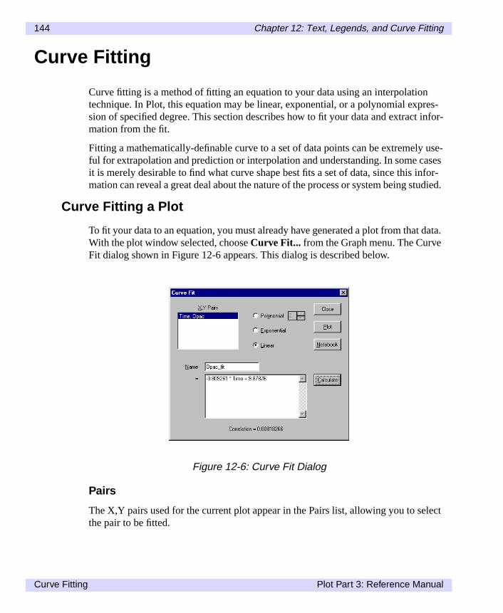
144 Chapter 12: Text, Legends, and Curve Fitting
res- infor-
use-ses
nfor-udied.
data.
lect
Curve Fitting
Curve fitting is a method of fitting an equation to your data using an interpolationtechnique. In Plot, this equation may be linear, exponential, or a polynomial expsion of specified degree. This section describes how to fit your data and extractmation from the fit.
Fitting a mathematically-definable curve to a set of data points can be extremelyful for extrapolation and prediction or interpolation and understanding. In some cait is merely desirable to find what curve shape best fits a set of data, since this imation can reveal a great deal about the nature of the process or system being st
Curve Fitting a Plot
To fit your data to an equation, you must already have generated a plot from thatWith the plot window selected, chooseCurve Fit... from the Graph menu. The CurveFit dialog shown in Figure 12-6 appears. This dialog is described below.
Pairs
The X,Y pairs used for the current plot appear in the Pairs list, allowing you to sethe pair to be fitted.
Figure 12-6: Curve Fit Dialog
Curve Fitting Plot Part 3: Reference Manual

Chapter 12: Text, Legends, and Curve Fitting 145
Byffix
sion
ter-. If
f theomi-
ce
the. Youlike. in
ve.ote-
Name
This box displays the name of the data column that will result from the curve fit.default, the name is taken from the y column of the X,Y pair selected, with the su_fit attached, but you can edit the name as desired.
Linear Curve Fits
Select this option to model your data as a straight line. Plot will use linear regresto produce the best fit through your data, yielding a slope (m) and y-intercept (b) inthe formy = mx+b .
Exponential
Select this option to model your data as an exponential function of the formY = ae bx .
Polynomial
Select this option for a polynomial fit. Specify the degree of the polynomial by ening a value in the Order box. Plot fits polynomials of degree one through twelveyou are uncertain what degree polynomial will best fit the shape of your graph,choose several options and compare their relative correlation through the use onotebook (see the discussion later in this section). Note that higher order polynals do not necessarily produce better fits, especially for small datasets.
Calculate
After selecting the type of curve fit, click on the Calculate button. Plot will produan equation with the best fit through your data and display it in the text box.
Notebook
To copy the equation in the text box to the notebook for future reference, click onNotebook button. The equation is placed in the notebook as a macro expressionmay calculate and place in the notebook as many different fitted curves as you (You may need to place lengthy equations in the notebook in order to view themtheir entirety.)
From the notebook it is also possible to get additional information from your curSee the notebook section later in this chapter for more information on using the nbook with curve fitting.
Plot Part 3: Reference Manual Curve Fitting

146 Chapter 12: Text, Legends, and Curve Fitting
yt aslog
theer-
Plot
To plot your fitted curve on the same graph as your data, click the Plot button. Bdefault, a curve fit is plotted as a solid line. You can, however, edit the curve fit ployou would any other plot. Simply select the curve fit plot pair in the Edit Plot diaand apply the desired attributes.
When a fitted curve is plotted, the corresponding column of fitted data is placed indata window, allowing you to compare actual data points (y-values) to those genated by the fitted equation.
Figure 12-7: Plotted Curve Fit
Curve Fitting Plot Part 3: Reference Manual

Chapter 12: Text, Legends, and Curve Fitting 147
r, it
lua-
mero-in
To exit the curve fit dialog at any time, click onOK .
Curve Fitting and the Notebook
It is often useful to try several curve fits to find the best possible fit. Often, howeveis impossible to visually determine which method is best.
By placing a curve-fit equation in the notebook, you can do a more rigorous evation of a fit, as illustrated by the following example.
The two plots in Figure 12-9 are the products of two curve fits taken from the sadata. The left plot was produced by an exponential curve fit, the right plot was pduced by a sixth-order polynomial curve fit. We can use the notebook to ascertawhich produces the best fit.
Figure 12-8: Curve Fit Data Column Added to Data Window
Plot Part 3: Reference Manual Curve Fitting
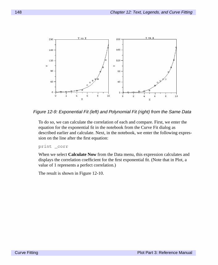
148 Chapter 12: Text, Legends, and Curve Fitting
the
pres-
da
To do so, we can calculate the correlation of each and compare. First, we enterequation for the exponential fit in the notebook from the Curve Fit dialog asdescribed earlier and calculate. Next, in the notebook, we enter the following exsion on the line after the first equation:
print _corr
When we selectCalculate Now from the Data menu, this expression calculates andisplays the correlation coefficient for the first exponential fit. (Note that in Plot, value of 1 represents a perfect correlation.)
The result is shown in Figure 12-10.
Figure 12-9: Exponential Fit (left) and Polynomial Fit (right) from the Same Data
Curve Fitting Plot Part 3: Reference Manual

Chapter 12: Text, Legends, and Curve Fitting 149
nd
Next, we enter and calculate the same expression for the second curve fit plot aequation. The result is shown in Figure 12-11.As you can see, the polynomial fit is the better of the two.
Figure 12-10: Correlation for Exponential Curve Fit Calculated in the Notebook
Figure 12-11: Correlation for Polynomial Curve Fit Calculated in the Notebook
Plot Part 3: Reference Manual Curve Fitting

150 Chapter 12: Text, Legends, and Curve Fitting
Curve Fitting Plot Part 3: Reference Manual

Chapter 13:
Building Plots
lay-ricate
lerylot dia-
licitothe
Chapter 9 explained how to create basic plots using theGallery command under theGraph menu. This chapter introduces the concept of editing and building plots iners, and provides several layering examples that may be used to create more intplots.
To understand layering, it is important to note that each plot type listed in the Galis created using a set of parameters that have been preselected from the Edit Plog.
Once a plot has been created from the Gallery, the Edit Plot dialog provides expcontrol over all plot attributes for any given X,Y data pair. In addition, the Edit Pldialog lets you use duplicate X,Y pairs. Duplicate pairs make it possible to plot tsame data in separate layers, with each layer having different attributes.
Plot Part 3: Reference Manual 151
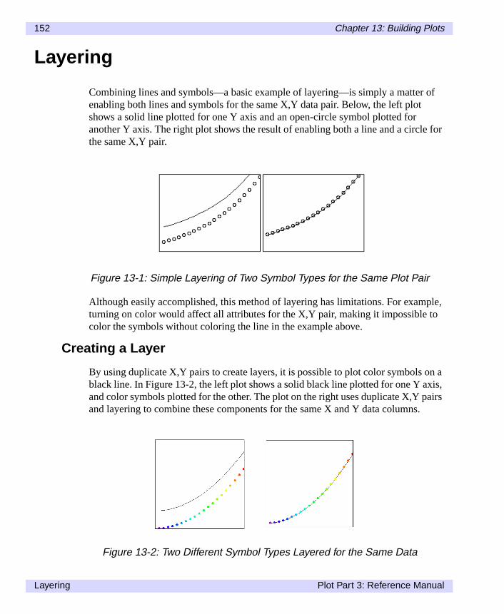
152 Chapter 13: Building Plots
of
for
ple,to
n ais,airs.
Layering
Combining lines and symbols—a basic example of layering—is simply a matterenabling both lines and symbols for the same X,Y data pair. Below, the left plotshows a solid line plotted for one Y axis and an open-circle symbol plotted foranother Y axis. The right plot shows the result of enabling both a line and a circlethe same X,Y pair.
Although easily accomplished, this method of layering has limitations. For examturning on color would affect all attributes for the X,Y pair, making it impossible color the symbols without coloring the line in the example above.
Creating a Layer
By using duplicate X,Y pairs to create layers, it is possible to plot color symbols oblack line. In Figure 13-2, the left plot shows a solid black line plotted for one Y axand color symbols plotted for the other. The plot on the right uses duplicate X,Y pand layering to combine these components for the same X and Y data columns
Figure 13-1: Simple Layering of Two Symbol Types for the Same Plot Pair
Figure 13-2: Two Different Symbol Types Layered for the Same Data
Layering Plot Part 3: Reference Manual
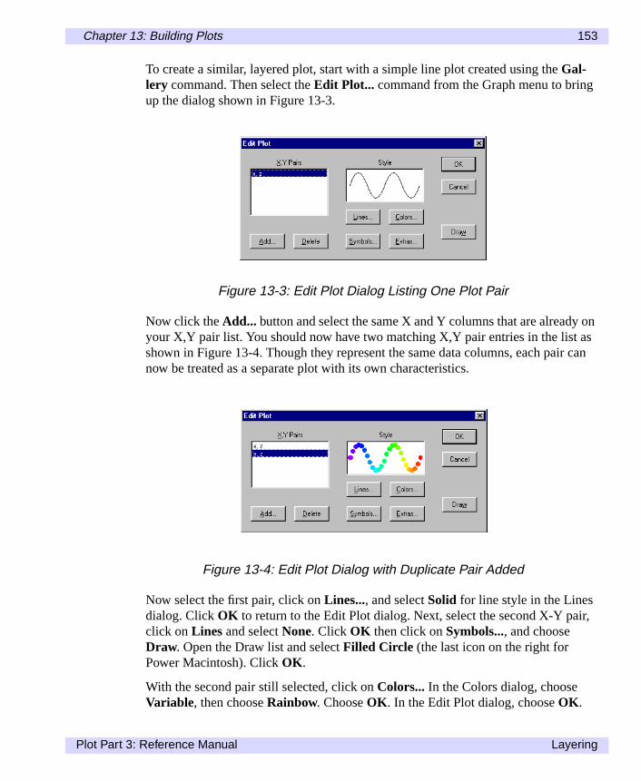
Chapter 13: Building Plots 153
onasr can
ir,
To create a similar, layered plot, start with a simple line plot created using theGal-lery command. Then select theEdit Plot... command from the Graph menu to bringup the dialog shown in Figure 13-3.
Now click theAdd... button and select the same X and Y columns that are alreadyyour X,Y pair list. You should now have two matching X,Y pair entries in the list shown in Figure 13-4. Though they represent the same data columns, each painow be treated as a separate plot with its own characteristics.
Now select the first pair, click onLines..., and selectSolid for line style in the Linesdialog. ClickOK to return to the Edit Plot dialog. Next, select the second X-Y paclick onLines and selectNone. Click OK then click onSymbols..., and chooseDraw. Open the Draw list and selectFilled Circle (the last icon on the right forPower Macintosh). ClickOK .
With the second pair still selected, click onColors... In the Colors dialog, chooseVariable, then chooseRainbow. ChooseOK . In the Edit Plot dialog, chooseOK .
Figure 13-3: Edit Plot Dialog Listing One Plot Pair
Figure 13-4: Edit Plot Dialog with Duplicate Pair Added
Plot Part 3: Reference Manual Layering

154 Chapter 13: Building Plots
rerncewill
re try-X,Yina-
5air to
tinc--6 is
Your plot should be drawn with colored symbols and a black line, similar to Figu13-2, except in color. You may want to experiment by adding more layers to youplot. As you click on each X,Y pair, note that the Style box displays the appearaof that particular layer. When the plot is drawn, the layers are drawn in order andappear as a combination of what you see in the preview.
More Layer Examples
The best way to add characteristics to a layer depends on the type of plot you aing to create. Sometimes it is best to create all layers from duplicates of the samepair; in other cases a combination of X,Y pairs is necessary. The example combtions below illustrate several useful techniques.
For example, you can construct a unique symbol from smaller parts. Figure 13-shows a circle and a plus sign plotted separately, then layered using a duplicate pcreate a bull's-eye symbol.
Using different symbol sizes and character symbols, it is possible to produce distive symbols that can make complex plots much easier to understand. Figure 13an example of a 6 point @ character inside a 9 point square.
Figure 13-5: Two Symbols Layered to Create a New Symbol
Figure 13-6: A Symbol and a Character Layered to Create a Unique Symbol
Layering Plot Part 3: Reference Manual

Chapter 13: Building Plots 155
re.
ls.n the
Sometimes only a few symbols are needed to make a line unique, as shown he
Also, numerical labels on points can be effective when layered on top of symbo(Note in Figure 13-7 that the Skip feature was used to increase the space betweesquare symbols.)
Figure 13-7: Layering Multiple Symbols
Figure 13-8: Symbols and Numerical Labels Layered
Plot Part 3: Reference Manual Layering

156 Chapter 13: Building Plots
e
ars
wasere
Error Bars
Using error bars effectively often requires multiple layers. This example takes thstandard line with error bars and adds a circle to mark each point.
When you have both X and Y error columns, one layer should plot the X error band the next layer should plot the Y error bars, as shown in Figure 13-10.
Sometimes error bars are too small to be significant. In Figure 13-11, pen controlused to remove all of the error bars smaller than a certain level. The error bars wthen layered on top of a basic line.
Figure 13-9: Error Bars and Symbols Layered using the Same X,Y Pair
Figure 13-10: Using Separate Layers to Plot the X and Y Errors
Layering Plot Part 3: Reference Manual

Chapter 13: Building Plots 157
ngcon-
As a final example, note the following six-layer plot. Each error direction is showia different type of error. A filled, black square is placed on the line, with a color-trolled filled circle on top of that.
Figure 13-11: Error Bars Layered on a Line Plot
Figure 13-12: Six Separate Layers Combined
Plot Part 3: Reference Manual Layering

158 Chapter 13: Building Plots
ap
Map Outline
Layering is important even for data from different sources. In Figure 13-13, forexample, a scatter plot is created from groundwater data. Using pen control, a moutline is created from a different data column. Finally, the two are layered.
Figure 13-13: Scatter Plot and Map Outline Layered
Layering Plot Part 3: Reference Manual

Chapter 13: Building Plots 159
e.
tion
Macros
Layering techniques are easily identified when you work in Plot’s macro languagCreate a plot using any of the layering techniques just described and use theCreateMacro... command. Now useEdit Macros... to examine this macro.
Note that each separate layer is created by a call to theaddline( ) subroutine.The line_type andsymbol_type variables (et al.) are set before eachaddline( ) call. If you ever need explicit control over the drawing order, or thelayering of the plot is confusing, refer to the macro for the step-by-step construcof the plot.
Figure 13-14: Edit Macro Dialog
Plot Part 3: Reference Manual Layering

160 Chapter 13: Building Plots
Layering Plot Part 3: Reference Manual

Chapter 14:
Using Macros
agetineeipu-o set
Tompty
,te-eses
ct
Plot has a built in macro language that is very similar to Fortran. The macro languis procedural and consists of three basic elements: functions (i.e., y=3*x), subroucalls (i.e., call open(“file”) and reserved variables (i.e., axis_auto=true). In Plot thfunction and subroutine elements are primarily used to perform calculations, manlate data, and generate images. The reserved variables give you the capability tthe preferences used by the subroutine elements.
Most of the following example macros are included in your Plot\Macros directory.use these macros without typing them in, either copy and paste the text into an enotebook window or simply selectEdit Macros... from the Macros menu. ThenselectImport ; in Windows you will type in the name of the file. In Power Macintoshselecting Import adds the macro to the list; you can then “call” the macro in a nobook window. The name of each macro described in this chapter is in the parenthby each figure number.
To run the macros, simply highlight all the text in the notebook window and seleCalculate Now from the Data menu.
Plot Part 3: Reference Manual 161

162 Chapter 14: Using Macros
ichne ofesemade
ee fol-
The Notebook Window
All of the three basic elements mentioned above contain a variety of macros whcan be accessed through the notebook window. To open the notebook window iWindows, selectSee Notebookunder the Data menu. In Power Macintosh, select thappropriate notebook under the Windows menu. The notebook window consiststhe following popup menus: Columns, Functions, and Scalars (Windows only). Thmenus are designed to expedite entries into the notebook. When a selection is from one of the menus, it is entered into the notebook.
Columns Pop-Up Menu
The Columns pop-up menu contains a list of all available columns currently in thactive dataset. For example, the following dataset was imported into Plot and thlowing columns are currently available.
Figure 14-1: Dataset Window
The Notebook Window Plot Part 3: Reference Manual

Chapter 14: Using Macros 163
into
Selecting a column name and pressing Enter/Return on the keyboard will paste itthe notebook at the current cursor location.Figure 14-2: Columns Menu
Plot Part 3: Reference Manual The Notebook Window

164 Chapter 14: Using Macros
alart the
isthat
5.
Scalars Menu (Windows)
The Scalars menu lists all of the reserved variables used in Plot. Selecting a scname and pressing Enter/Return on the keyboard will paste it into the notebook acurrent cursor location.
Functions Menu
The Functions menu contains a list of all the macro functions built into Plot.
When you select a function and press Enter/Return on the keyboard, the name pasted into the notebook, followed by a set of parentheses (). The function nameis initially highlighted is always the last function selected from the menu.
NoteEach individual mathematical macro is described in greater detail in Chapter 1
Figure 14-3: Scalars Menu
Figure 14-4: Functions Menu
The Notebook Window Plot Part 3: Reference Manual

Chapter 14: Using Macros 165
and.
it.
m-is is
Executing Macro Commands in the Notebook
Once the notebook window is open, it takes three steps to execute a macro commThese steps are:
1. Enter either a single macro command or a series of macro commands.
2. Highlight the command or commands to be executed.
3. SelectCalculate Now from the Data menu.
NoteEach macro command must occupy one and only one line.
TipIf you only want to execute one macro command you do not have to highlight You can simply put the cursor at the end of the macro you want to execute andselectCalculate Now.
The selection ofCalculate Nowcauses Plot to execute every highlighted macro comand in the notebook window starting from the top and ending at the bottom. Thvery convenient for executing a series of commands in a specific sequence.
Figure 14-5: Multiply Macro (multiply.txt)
Plot Part 3: Reference Manual Executing Macro Commands in the Notebook

166 Chapter 14: Using Macros
ula-e
r.
nd
on.
youcom-o
As in the example below, you may want to open a file, perform some data maniption, and then save the file. In this example, we are using the file ‘ls746.txt’. Maksure that when you import this file, you activate the box associated with ‘HeadeTitles’ (Windows) or ‘Last header line contains column titles’ (Power Macintosh)This will ensure the column titles are imported.
In the example below, you would enter text into the notebook window (stored as‘flipped.txt’ in the ‘Macros’ directory), select the entire text, and then selectCalcu-late Now from the Data menu.
NotePlot for Power Macintosh: in the example above, instead of ‘call setdirectory’ a‘call setsavedirectory’ you would use the line ‘call setfolder’ and ‘call setsave-folder’. See the flipped.txt example in the ‘Macros’ directory for more informati
Comments
It is also possible to enter comments in the notebook window. Comments allow to document your work so that it is easily understood at a later date. To enter a ment at the beginning of the line, place an asterisk (*) symbol before your text. T
Figure 14-6: Flipped Macro (flipped.txt)
Executing Macro Commands in the Notebook Plot Part 3: Reference Manual

Chapter 14: Using Macros 167
ama-ama-
ands,. The
le or a
ss cre-
enter a comment following a macro command you want to execute, place an excltion (!) symbol before your text. Any characters entered after an asterisk or excltion symbol will be ignored by Plot when Calculate Now is selected, as shown inFigure 14-7.
Macro Command Types
There are three types of macro commands: assignment statements, print command subroutine calls. Each macro command must occupy one and only one lineformat of the commands is very much like Fortran.
Assignment Statements
Assignment statements evaluate an expression and assign the result to a variabcolumn. For example:
x = (3.14/2)*y
If the expression returns a scalar value or a string, the variable being assigned idefined as a scalar variable. If the expression returns a column, a new column iated with the assigned name.
Figure 14-7: Comments Macro (comments.txt)
Plot Part 3: Reference Manual Executing Macro Commands in the Notebook

168 Chapter 14: Using Macros
ok.
y to
a
m
cre-thatr vari-glo-os.
e.a-
oun-r
In the example above, ify is a scalar variable, thenx will be a scalar variable. Ify isa column, then a new column calledx will be created when the macro command isexecuted.
Print Commands
Use theprint command to display the result of a scalar calculation in the noteboFor example:
print 27.3*sqrt(54)* Result: 200.613
Theprint command works only for scalar variables and expressions. (If you trprint a column or a column expression you will get an error dialog.)
NoteOutput from theprint command is preceded by an asterisk to distinguish it ascomment, rather than as a command to be executed.
Subroutine Calls
Thecall command is used to invoke either Plot's built-in subroutines or a customacro. An example of a Plot subroutine is:
call open("ls753_txt")
A full listing of Plot subroutines is given in Chapter 15. An example of a custommacro call is:
call ls753_txt_plot1_macro
where "ls753_txt_plot1_macro" is the name of a macro that you have previouslyated. The custom macros that you can call are listed in the Macros menu. Note you cannot pass parameters to the custom macros. You can instead set a scalaable to a value that is then used in your custom macro. All variables in Plot are bal. See the section earlier in this chapter for more information on custom macr
Error Messages
Plot will display an error dialog box any time an illegal operation is attempted, likincorrectly typing in the macro or attempting to perform an impossible procedureThe Warning dialog box will display the macro in question and give general informtion about the problem. Below is a list of common error messages you may encter. Please keep in mind that this list is not all inclusive and you may get an erromessage not listed below.
Executing Macro Commands in the Notebook Plot Part 3: Reference Manual

Chapter 14: Using Macros 169
l let-
utine
emat-
mac-
1. Warning, Incorrect or Misplaced Parameters in the Macro Function
2. Warning, Window Not Found
3. Error, Identifier Not Found. Undefined symbol or array
4. Syntax Error in line, ## Characters From the Beginning of Line
Some tips for avoiding error messages:
1. Ensure the macros are typed correctly.
2. Ensure CAPITAL letters are used when they refer to a name that has capitaters.
3. Ensure that double quotes (“”) are used around names when using the subromacros.
4. Ensure that the wordcall is placed before a subroutine macro name.
Components of Macro Commands
Before discussing how to use the macro commands, it is important to identify thcomponents of a command. A macro command consists of any number of Matheical Operators, Constants, Scalar Variables, Column Arrays, and Plot’s internal ros. Each component is defined below.
Mathematical Operators
Mathematical operators are listed below in order of precedence:
To override the precedence, use parentheses() .
An example of how mathematical operators are used is shown in Figure 14-8.
- negation (unary minus)
** exponentiation
* multiplication
/ division
+ addition
- subtraction
// concatenation (of strings)
Plot Part 3: Reference Manual Executing Macro Commands in the Notebook

170 Chapter 14: Using Macros
ing
re:
Constant
Numerical constants are entered with periods (.) for decimal points and withe repre-senting exponentiation. Integers are converted to floating point values before beused in calculations. Examples of numerical constants are:
3.141591.0669e+23
String constants are always delimited with double quotes ("). Some examples a
"ls753_txt""3.14159"
Scalar Variable
Scalar variables are created from assignment statements. For example,
pi = 3.14159
Figure 14-8: Precedence Macro (preceden.txt)
Executing Macro Commands in the Notebook Plot Part 3: Reference Manual

Chapter 14: Using Macros 171
s wellr, it is
ue is
usly
heande,
tersnum-
creates the scalar variablepi , which has the value "3.14159 ". All variables are glo-bal and may be referred to any time after they are created.
The values of all variables are stored as strings, so they may represent names aas numbers. Whenever a variable is used in an expression that requires a numbeconverted to a number before being used. The maximum length of a variable val255 characters. The examples below are all legal expressions:
pi = "3.14159"myfile = "ls753_txt"print 1 + "3.14159"* Result: 4.14159
In particular, the pi assignment statement given above and the one given previoare exactly equivalent.
The legal characters for a variable name include all of the alpha numerics and tunderscore (_ ). Names cannot start with a number. Periods, slashes, asterisks, plus or minus signs (. / * + – ) are not allowed in variable names. For examplpressure/dens , ke.hdf , andv*u are invalid variable names, butxv102 andK_Energy are valid.
Values for all variables are stored as ASCII strings which may be up to 255 characin length. When a numeric value is required by Plot, the string is converted to a ber. A value of zero is returned if the field does not start with a number.
An example showing values of scalar variables is show in Figure 14-9.
Plot Part 3: Reference Manual Executing Macro Commands in the Notebook

172 Chapter 14: Using Macros
se a:
re-
Dataset Column
Any column from the current dataset may be used in a calculation as you would uscalar variable. For example, ifA is a column, then executing the macro command
B=log(A)
generates a new column calledB, where each element is equal to the log of the corsponding element inA.
The following expressions are also legal:
B=log(A)+1C=A*A+2
Figure 14-9: Pi Macro (pi.txt)
Executing Macro Commands in the Notebook Plot Part 3: Reference Manual

Chapter 14: Using Macros 173
theset to
t all
ol-re the
In the first example above, each element inB is set to the log of the correspondingelement ofA, plus 1. Note that columns and scalar variables can be combined insame expression: the scalar variables are treated as columns with every elementthe scalar value.
In the second example, each element inB is set to the square of the correspondingelement inA, plus 2. If you use more than one column in an expression, they mushave the same number of data values.
The new column will have the number of data values and attributes of the first cumn in the expression. Legal characters for column names used in expressions asame as those for scalar variables.
Plot Part 3: Reference Manual Executing Macro Commands in the Notebook

174 Chapter 14: Using Macros
n thelar the
a
in a
Function Macro Commands
Function commands are used to calculate mathematical expressions and assigresults to either scalar variables or dataset columns. If the function returns a scavalue or a scalar string it is defined as a scalar variable. The best way to displayvalue of a scalar variable is to use thePrint command, as shown in Figure 14-10. Inmost calculations all of the columns must have the same dimensions. Note thatmathematical expression can contain any number of these functions.
In order to run this macro, the data for the "water" column must first be entered new dataset window.
Figure 14-10: Water Macro (water.txt)
Function Macro Commands Plot Part 3: Reference Manual

Chapter 14: Using Macros 175
.
ted
d
Function Macro Examples
The following pages provide examples of how to use function macro commands
Mathematical Trigonometric Functions that Create Arrays orReturn Scalars
If the function returns a column, then a new column with the variable name is creain the next vacant column. In the example below, you can see that sincex is a scalarvariable,y is also a scalar variable. Since ‘Time’ is a column, a new column calle‘Sine_Time’ is created.
Figure 14-11: Sine Macro (sine.txt)
Plot Part 3: Reference Manual Function Macro Commands

176 Chapter 14: Using Macros
As you can see, when given a columnq as an argument, thex column truncated thedecimals, they column rounded down, and thez column rounded up. This macrorequires the columnq to be entered in a new dataset window before running.
Mathematical Functions that Require a Column and Return a
Figure 14-12: Round Macro (round.txt)
Function Macro Commands Plot Part 3: Reference Manual

Chapter 14: Using Macros 177
umn
lue,ples
Scalar Value
Plot contains a number of functions which return a scalar value when using a colas an argument.
This example shows the mean, standard deviation, minimum value, maximum vaand sum of column "Opac" as scalar values. The file "ls746.txt" in the Plot\Samdirectory must be open in order to run this macro.
Figure 14-13: Means Macro (means.txt)
Plot Part 3: Reference Manual Function Macro Commands

178 Chapter 14: Using Macros
ew first
in theory
alue.
Data Manipulation Functions
These functions require at least one data column as an argument and return a ndata column. In all cases, the returned column has the same dimensions as thecolumn used in the argument.
In this example, the column "Opac" will be sorted in ascending order and storedthe column "OpacSorted". The column "Time" is then sorted to correspond withnewly sorted "OpacSorted" column. The file "ls746.txt" in the Plot\Samples directmust be open in order to run this macro.
Data Manipulation Functions that Require a Column and Return aScalar Value
These functions use a single data column as an argument and return a scalar v
Figure 14-14: Sorting Macro (sorting.txt)
Function Macro Commands Plot Part 3: Reference Manual

Chapter 14: Using Macros 179
s the
This example proves that the column "OpacSorted" has the same dimensions aoriginal column "Opac". In order to run this macro, the file "ls746.txt" in thePlot\Samples directory must first be opened.Figure 14-15: Row Macro (row.txt)
Plot Part 3: Reference Manual Function Macro Commands
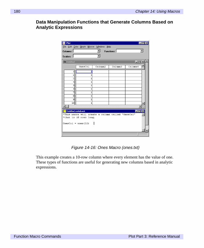
180 Chapter 14: Using Macros
e.ic
Data Manipulation Functions that Generate Columns Based onAnalytic Expressions
This example creates a 10-row column where every element has the value of onThese types of functions are useful for generating new columns based in analytexpressions.
Figure 14-16: Ones Macro (ones.txt)
Function Macro Commands Plot Part 3: Reference Manual

Chapter 14: Using Macros 181
seeintoe
mpty
Advanced Functions
Plot includes a variety of more complex data manipulation functions. As you canin the following example, Plot inserts the frequency of the column’s data values the appropriate location. There are three values ranging from 1 to 2. There is onvalue ranging from 3 to 4. There are two values ranging from 5 to 6.
In order to run this example macro, the column q must first be entered into an edataset window.
Figure 14-17: Histogram Macro (histogra.txt)
Plot Part 3: Reference Manual Function Macro Commands

182 Chapter 14: Using Macros
s cre-t sub-
erou-
e-
, win- fol-
Subroutine Macro Commands
Plot’s macro language includes subroutines for performing various tasks, such aating images, processing data, and running custom macros. In order to use mosroutines, the macro command requires the word “call” to be placed in front of thmacro. However, some of the subroutines have the form of functions. These subtines DO NOT require the word “call” to be placed in front of the macro.
TipYou can run custom macros from the notebook window by using the “call” statment.
It is also important to note that most subroutines require either the datasetnamedowname, filename, or macroname to be entered after the macro. Plot uses thelowing definitions:
Datasetname - Name of a dataset window currently open in Plot.
Windowname - Name of an image window currently open in Plot.
Filename - Name of a file as it is saved on disk.
Figure 14-18: Plot Macro (plot.txt)
Subroutine Macro Commands Plot Part 3: Reference Manual

Chapter 14: Using Macros 183
thehe.
cre-
and
Macroname - Name of macro listed under the Macros menu.
NoteIn Plot, images that are created from your datasets have the datasetname withimage type and number added to it. The number specifies the order in which timage is created. This is helpful if you create several images from one dataset
Subroutine Macro Examples
Various subroutine macros are included with Plot which allow users to open files,ate plots, process data, and run other macros, as shown in the example below.
NotePlot for Power Macintosh: in the examples above, instead of ‘call setdirectory’ ‘call setsavedirectory’ you would use the line ‘call setfolder’ and ‘call setsave-folder’. See the plot.txt example in the ‘Macros’ directory for more information.
Figure 14-19: Plot Macro (plot.txt)
Plot Part 3: Reference Manual Subroutine Macro Commands

184 Chapter 14: Using Macros
f ther age
ac-the edit-
well
nd
n.
Reserved Variable Macro Commands
In Plot the reserved variable macros are primarily used to set the preferences osubroutines. In other words, reserved variables provide the details necessary fosubroutine to carry out it’s function. For example if you attempt to create an imausing the subroutine:
currentplot = newplot(currentdataset)
All details about how to build that image are controlled by the reserved variable mros. The reserved variable macros define everything from image size to adding axes. They can be used from the notebook window, but are primarily used whening custom macros.
Reserved Variable Macro Examples
Plot contains a list of reserved variable names for use in macros.
The reserved variables define the graph's vertical and horizontal dimensions, asas the line type, symbol type, and number of symbols to be drawn.
NotePlot for Power Macintosh: in the example above, instead of ‘call setdirectory’ a‘call setsavedirectory’ you would use the line ‘call setfolder’ and ‘call setsave-folder’. See the lineplot.txt example in the ‘Macros’ directory for more informatio
Figure 14-20: Line Plot Macro (lineplot.txt)
Reserved Variable Macro Commands Plot Part 3: Reference Manual

Chapter 14: Using Macros 185
s
ote-
ebook
e aslaterof
verym-
To
Custom Macros
In addition to executing macros from the notebook, you can also execute macrofrom a stored menu.
Custom macros can be created in one of three ways, depending on whether a nbook window, a dataset array window, or an image window is currently active.
Custom Macros: Notebook Window
To save macro commands that you have entered in the notebook, make the notwindow the active window on your screen and selectCreate Macro... from the Mac-ros menu. Enter a name for the macro, then clickOK . The custom macro will beadded and stored in the Macros menu for future use. If you choose the same naman existing macro, the new macro will replace it. To use the custom macro at a date, you can either select it from the Macros menu or you can type “call” in frontit on the notebook window.
NoteCustom macros never accept parameters. Any information needed by a macroshould be stored in variables accessed by the macro before calling it.
The saved custom macro will work exactly as it did in the notebook. Note that eline of the notebook is brought into the custom macro, so make sure that any coments either begin with an asterisk (*) or an exclamation (!).
Custom Macros: Dataset Window
Custom import macros can also be saved for any non-HDF files that you open. save an import macro, simply open a file and selectCreate Macro...from the Macrosmenu. Enter a name for the macro, then clickOK . Creating an import macro is agood way to automate the loading of files that have exactly the same format.
NoteThe dataset window must be the active window before selectingCreate Macrofrom the Macros menu.
Plot Part 3: Reference Manual Custom Macros

186 Chapter 14: Using Macros
lot
NoteIf your dataset window was an imported HDF file, then theCreate Macro...optionin the macros menu will be grayed out.
Custom Macros: Plot Window
Custom plot macros can also be saved for any plot that you create. To save a pmacro, simply create a plot and selectCreate Macro... from the Macros menu. Entera name for the macro, then clickOK .
NoteThe plot window must be the active window before selectingCreate Macro...fromthe Macros menu.
Figure 14-21: Creating a Data Macro
Custom Macros Plot Part 3: Reference Manual

Chapter 14: Using Macros 187
Editing Custom Macros
To edit a custom macro, selectEdit Macros... from the Macros menu.
Figure 14-22: Creating a Plot Macro
Figure 14-23: Edit Macros Dialog
Plot Part 3: Reference Manual Custom Macros

188 Chapter 14: Using Macros
ndh of
e
theou
l
This dialog lets you create a new macro or select a macro from a scrolling list aedit, rename, delete, or export it. You can also import macros from text files. Eacthese options are described below. When you are finished, clickClose/Done toreturn.
NoteIt is always a good idea to make a back-up of all your custom macros using thExport... button.
New Macro
ChooseNew to create a new macro from scratch. In the dialog that appears, typenew name and chooseOK . The Macro Editor, described next, appears, allowing yto enter a new macro.
Edit Macro
Click Edit... to display the Macro Editor dialog.
You can now edit your macro. When done, clickOK to save your changes or Canceto leave your macro unchanged.
Rename Macro
Click onRename...to rename the selected macro. Enter the new name and clickOK ;otherwise clickCancel.
Figure 14-24: Macro Editor Dialog
Custom Macros Plot Part 3: Reference Manual

Chapter 14: Using Macros 189
, the
ow
ith
e
1ribu-
Delete Macro
Click Delete to remove the selected macro. As soon as you confirm the deletionmacro is removed from the list and cannot be recovered.
Import Macro
Click Import... to select a text file and save it in Plot as a custom macro. It will nappear on the Macros menu and in the dialog list.
Export Macro
Click onExport... to save the selected macro as a text file. You can edit this file wany text editor. UseImport... to read the file back in.
Custom Macro Examples
Examples of macro expressions, with explanatory notes, are given below. Thesexamples can be executed in the notebook window.
Analytic Functions
You can use Plot to produce plots of analytic functions:
z = (series(201)-1)/100-1fcn = exp(-3*z**2)
The expression above is equivalent to plotting the function exp(-3*x**2) from -1 toat intervals of 0.01. This function is a bell curve and represents a Gaussian disttion.
Figure 14-25: Analytic Expression Example
Plot Part 3: Reference Manual Custom Macros
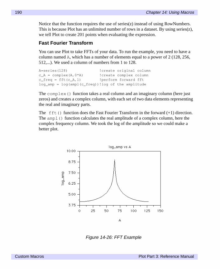
190 Chapter 14: Using Macros
ers.s(z),
ve a6,
stnting
n.e
a
Notice that the function requires the use of series(z) instead of using RowNumbThis is because Plot has an unlimited number of rows in a dataset. By using seriewe tell Plot to create 201 points when evaluating the expression.
Fast Fourier Transform
You can use Plot to take FFTs of your data. To run the example, you need to hacolumn namedA, which has a number of elements equal to a power of 2 (128, 25512,...). We used a column of numbers from 1 to 128.
A=series(128) !create original columnc_A = complex(A,0*A) !create complex columnc_freq = fft(c_A,1) !perform forward fftlog_amp = log(ampl(c_freq))!log of the amplitude
Thecomplex() function takes a real column and an imaginary column (here juzeros) and creates a complex column, with each set of two data elements represethe real and imaginary parts.
The fft() function does the Fast Fourier Transform in the forward (+1) directioTheampl() function calculates the real amplitude of a complex column, here thcomplex frequency column. We took the log of the amplitude so we could makebetter plot.
Figure 14-26: FFT Example
Custom Macros Plot Part 3: Reference Manual

Chapter 14: Using Macros 191
rred the
ased
s
u-
isthanol-nner,
Length of a Line
This macro brings up a dialog that displays the length of a line. The column refeto is the first column of the active dataset. The length calculated is the length ofplotted line when this data column is plotted versus RowNumbers. There mustalready be a dataset open for this macro to function properly. The calculation is bon the following equation:
user_interactive=falsemyname=getcolumnname(1)q=var(myname)total_length=sum(sqrt(1 + ddx(q)**2))user_interactive=truecall prompt(“The line length of “//myname//“ =“,total_length)
Settinguser_interactive to false disables all future dialogs. The next linestores the name of the column in the variable myname for later reference.
q = var(myname) creates a column namedq identical tomyname. This is donebecausemyname is a variable that contains a string, while mathematical functionrequire either a column or scalar as their arguments.
The next line calculates the line length and, finally, the last line displays the calclated line length.
Sorting Data
Plot preserves the order in which your data was stored. Sometimes, however, itnecessary to organize data columns in the order of their numeric values, rather their position in the original data file. For example, if your data consists of two cumns, A and B, where pairs of values in A and B are ordered in an arbitrary mayou can sort the data with the following commands.
x = sort(A)y = sort(A,B)
Figure 14-27: Length of Line Equation
Plot Part 3: Reference Manual Custom Macros

192 Chapter 14: Using Macros
These two commands will create two new columns of data,x andy. Columnx willhave all the points that were in columnA sorted from lowest to highest values. Thesecond command creates a column namedy, which contains all the data that wasoriginally in columnB but sorted by the numerical values stored in columnA. Inother words, every point(x,y) is identical to every point(A,B) , referenced inorder of ascending values ofA.
This method of reorganizing data is most helpful in producing a line graph ofB vs.A,whereB is a function ofA when the data is not organized by ascending values ofA. Inthe above example, a scatter plot of y vs. x is identical to a scatter plot ofB vs.A. Aline graph of y vs. x will move steadily from left to right, while the correspondingline graph ofB vs.A will not.
Custom Macros Plot Part 3: Reference Manual

Chapter 15:
Macro Reference
esthecals
Plot has mathematical and data manipulation functions which return scalar valuand/or create data columns. If the mathematical expression contains a column, result will be a column of the same size. If there are no arrays in the mathematiexpression, the result will be a scalar value. In all calculations, all of the columnmust have the same dimensions.
Plot Part 3: Reference Manual 193

194 Chapter 15: Macro Reference
.
l
Mathematical Functions
Note that a mathematical expression can contain any number of these functions
Mathematical Trigonometric Functions that Create Columnsor Return Scalars
The following trigonometric functions are available. They will either create a newcolumn or return a scalar value, depending on the argument in the mathematicaexpression.
sin(q) Sine of the argument (q) in radians
cos(q) Cosine of the argument (q) in radians
tan(q) Tangent of the argument (q), in radians
asin(q) Arcsine of the argument (q), returns radians
acos(q) Arcosine of the argument (q), returns radians
atan(q) Arctangent of (q), returns radians between -p/2 and p/2
atan2(q,p) Arctangent of (q)/(p), returns radians between 0 and 2p
sinh(q) Hyperbolic sine of the argument (q) in radians
cosh(q) Hyperbolic cosine of the argument (q) in radians
tanh(q) Hyperbolic tangent of the argument (q) in radians
dtor(q) Converts the argument (q) from degrees to radians
rtod(q) Converts the argument (q) from radians to degrees
Mathematical Functions Plot Part 3: Reference Manual

Chapter 15: Macro Reference 195
a sca-
More Mathematical Functions that Create Columns or ReturnScalars
Mathematical Functions that Require a Column, and Return aScalar
These functions require a single data column as an argument, and always returnlar value.
mod(q,p) Integer remainder of q/p
log(q) Natural logarithm of the argument (q)
exp(q) Exponential function of the argument (q)
log10(q) Base 10 logarithm of the argument (q)
pow(q,p) Take the argument (q) to the power of p
sqrt(q) Square root of the argument (q)
abs(q) Absolute value of the argument (q)
int(q) Integer truncation of the argument (q)
floor(q) Round down to next integer
ceiling(q) Round up to next integer
mean(q) Arithmetic mean of the column (q)
sdev(q) Standard deviation of the column (q)
min(q) Minimum data value of the column (q)
max(q) Maximum data value of the column (q)
pts(q) Number of points in column (q)
rows(q) Number of rows in column (q), same as pts (q)
elem(q,#) Returns the value of the # number in column (q)
sum(q) Sum of all the data values of the column (q)
Plot Part 3: Reference Manual Mathematical Functions

196 Chapter 15: Macro Reference
newarray
d
d
Data Manipulation Functions
These functions require at least one data column as an argument, and create adata array. The resultant columns always has the same dimensions as the first used in the argument.
flip(q) Exchanges the rows (flips top for bottom) of columnq.
shu(q) Creates a new column where the data has been shifteup one row. The bottom row will be set equal to theprevious bottom row.
shd(q) Creates a new column where the data has been shiftedown one row. The top row will be set equal to theprevious top row.
rotrows(q,#rows) Rotates the rows inq from top to bottom by#rows .Copies the bottom rows to the top as they fall off. Neg-ative numbers move the data up; positive numbersmove the data down.
recode(q,n) Replaces all zero values in columnq with floatingpoint valuen.
zapnan(q,n) Replaces allNAN(Not-A-Number) values in columnqwith floating point valuen.
LEmask(q,#) Returns a column where every element is set to1 ifthe corresponding element inq is less than or equal to#, and set to0 if it is greater than#.
LTmask(q,#) Same asLEmask() , but with less than.
GEmask(q,#) Same asLEmask() , but with greater than or equal to.
GTmask(q,#) Same asLEmask() , but with greater than.
EQmask(q,#) Same asLEmask() , but with equal to.
NEmask(q,#) Same asLEmask() , but with not equal to.
Data Manipulation Functions Plot Part 3: Reference Manual

Chapter 15: Macro Reference 197
ions.
s.
is
n.
is
Data Manipulation Functions that Generate Columns Basedon Analytic Expressions
These functions are useful for generating new arrays based on analytic express
Advanced Functions
Plot allows you to use these more complex data manipulation features in macro
zeros(n) Creates a column of n rows, where every element in the columnequal to0.
series(n) Creates a list of numbers ranging from1 to n at intervals of 1.Since Plot has an infinite number of rows, use this expressionwhen you would need to reference the row number in a calculatio
rand(n) Creates a column of n rows, where every element is a randomnumber between0 and1.
ones(n) Creates a column of n rows, where every element in the columnequal to1.
fillmissing(q) Fills missing data in column q. Allfill_ reservedvariables must be set appropriately before calling thisfunction. Seefill_equal , fill_method , andfill_value in the “Macro Variables” section.
frequency(q,n) Creates a histogram of columnq. The function firstdivides the number range inton equally spaced bins, andthen counts the number of data points in the columnqwhich fall in each bin.
movingavg(q,n) Calculates moving average overn cells.
smooth(q,n) Smooths columnq usingn passes.
sort(q) Sorts the columnq in ascending order.
sort(q,p) Sorts columnp in ascending order ofq. Only data from cp is returned, but the resulting order is the same as ifq issorted and numbers inp are arranged in the same order.
ddx(q) Calculates a numerical approximation to the derivative ofq. Each element of the result,Di is calculated:Di =(qi+1-qi-1)/2 .
Plot Part 3: Reference Manual Data Manipulation Functions

198 Chapter 15: Macro Reference
rier
inaryary
Fast Fourier Transforms
Plot provides a set of functions for dealing with complex variables and Fast FouTransforms.
Complex Numbers
You can create complex columns using thecomplex(r,i) function. Herer is acolumn containing real values, andi is a column containing imaginary values. Theresulting complex column has twice as many elements as either the real or imagcolumns (which must be the same size). The columns alternate real and imaginnumbers. For instance, the real column:
r1
r2
r3
and the imaginary column:
i1
i2
i3
become the combined complex column:
r1
i1
r2
i2
r3
i3
Fast Fourier Transforms Plot Part 3: Reference Manual
Chapter 15: Macro Reference 199
t
-
In the list below,c refers to complex columns (that is, double length columns thaalternate real and imaginary components).
complex(r,i) Combines the real columnsr andi (both of the samedimension) into a complex column.
real(c) Extracts the real part of complex columnc and makes anew column with only the real values.
imag(c) Extracts the imaginary part of complex columnc andmakes a new column of only the imaginary values.
complexap(a,p) Forms a complex column, given two columns represent-ing the amplitude and phase of those complex numbers.The phase is assumed to be in radians.
ampl(c) Calculates the amplitude of each complex number in thecomplex column c of real and imaginary parts, andreturns a real column with only the amplitude values.
phase(c) Calculates the phase of each complex number in the complex columnc of real and imaginary parts, and returns areal column with only the phase values, in radians.
fft(c,n) Performs a one-dimensional Fast Fourier Transform oncomplex columnc . The parametern=1 is for a forwardtransform andn=-1 is for an inverse transform. Thenumber of rows must be a power of 2.
Plot Part 3: Reference Manual Fast Fourier Transforms

200 Chapter 15: Macro Reference
cess-
mple:
you
nu)
the
dowendedfor
ese
Macro Subroutines Reference
Plot's macro language includes subroutines for opening files, creating plots, proing data, and running other macros.
Calling Macro Subroutines
To use one of these subroutines, put it in a macro with a call statement. For exa
call open("ls753.txt")
or equivalently,
myfile = "ls753.txt"call open(myfile)
Some of the subroutines return a value, so you can use them in expressions aswould a function. For example:
name = getdatasetname(currentplot)
Custom Macro Subroutines
You also access your custom macro subroutines (the macros on the Macros meusing the call statement:
call mycustommacro
Note that custom macros never accept parameters. Any information needed by macro should be stored in variables before calling the macro.
Window Naming Conventions
Several macro subroutines either accept or return window names. The data winname is the name of the dataset. The plot window name is the dataset name appwith 'plot' and a number specifying the order in which the window was created (example, ls753_txt_plot1 ). If you specify a window name without a number(for example,ls753_txt_plot ), the window with the highest number will beused.
Listing of Macro Subroutines
In the listing of macro subroutines, the following conventions are used; each of thfour names must be enclosed in quotation marks when used in macros:
Macro Subroutines Reference Plot Part 3: Reference Manual

Chapter 15: Macro Reference 201
X-
n cre-
t
call addaxis( windowname, whichaxis, whichside)
Adds axiswhichaxis to windowwindowname . whichaxis is representedby a number from 0 to 255.whichside indicates on which side of the plot theaxis should appear:
=1 Top (north)
=2 Right (east)
=3 Bottom (south)
=4 Left (west)
call addline( windowname, X_column, Y_column, xaxis, yaxis)
Adds a new X,Y plot pair to the plot in the windowwindowname . X_columnandY_column are the names of the columns to plot. Reserved variables areused to indicate what type(s) of lines and/or symbols to plot for this data. NewY pairs must have an existing X axis (xaxis ) and an existing Y axis (yaxis ) inorder to be drawn. These can be any axis numbers from 0-255 that have beeated with call addaxis( ) .
call addtext( windowname, text_string, whichside)
Adds the text intext_string to windowwindowname . When the plot isresized or modified, text objects stay in relative position to the side of the ploindicated bywhichside . whichside indicates the relationship to the plot.
=0 Relative to the origin of the plot, not rotated
=1 Above the plot, not rotated
=2 Right of plot, rotated 90 degree clockwise
=3 Below the plot, not rotated
=4 Left of plot, rotated 90 degrees counterclockwise
datasetname Name of a dataset currently open in Plot [e.g., ls753.txt(Macintosh), ls753_txt (Windows)].
windowname Name of a currently open window (e.g., ls753_txt_plot).
filename Name of a disk file (e.g., ls753.txt).
macroname Name of macro listed under the Macros menu.
Plot Part 3: Reference Manual Macro Subroutines Reference

202 Chapter 15: Macro Reference
a
d.
plot
n
call beep
Beeps the speaker once.
call close( windowname)
Closes windowwindowname . If you close the dataset window, all windowsassociated with that dataset are closed. An error will occur if you try to closedataset from the notebook window associated with that dataset.
call closeall
Same asClose All from the File menu. Ifuser_interactive=false ,every window will be closed without being saved.
call copy( windowname)
Copies the highlighted data in the data window windowname to the ClipboarSame asCopy from the Edit menu.
currentplot = newplot( currentdataset)
Creates a plot window from the datasetdatasetname , using the currentreserved variable values, and returns the name of the new window. The newis empty until axes and lines are added to the plot.
call curvefit( a, b, function_number)
Creates coefficients_c0 , _c1 , etc. to construct a fit ofb vs.a when these coeffi-cients are applied to the terms of the function number specified. The functionumber is:
0 = Exponential
1 = Linear
>2 = Order of polynomial
Also sets thevariable _corr to correlation factor of the fit.
call deletecolumn( column_name )
Deletes thecolumn column_name .
call deletemacro( macroname)
Deletes the macromacroname from the Macros menu. Does nothing if thenamed macro is not found.
Macro Subroutines Reference Plot Part 3: Reference Manual
Chapter 15: Macro Reference 203
ess-
nota-er-
call exechdfmacro( filename, macroname )
Executes the macromacroname from the HDF filefilename .
call execmacrofile( filename)
Executes a macro from the text file filename . The entire contents of the textfile are executed as a single macro.
s = getcolumnname( column_number )
Returns the column name for columncolumn_number in current dataset.
s = getdatasetname( windowname)
Returns the dataset name for the windowwindowname .
n = getfilecount( )
Counts the number of files in the current directory. Used in scripts or for procing sequences of files with the loop command.
f = getnthfilename(filenumber )
Returns the filename for file numberfilenumber in the current directory. Theparameterfilenumber is the number of the file.
s = getvalidname( datasetname) (Power Macintosh only)
Returns a unique name for the givendatasetname . Useful in macros to avoidconflicts with existing dataset names.
call hide( windowname ) (Windows only)
Hideswindowname ; same as selectingMinimize from the Control menu to theleft of the title bar in a window.
call loadhdfvset( filename, reference# )
Loads the dataset record with reference numberreference# from the HDFfile filename . Used internally for opening HDF files.
call loadhdfnotes( filename, datasetname, reference# )
Given filename, a dataset name, and an HDF reference number, read an antion record and attach it as notebook contents to the given dataset. Used intnally for opening notebook records.
Plot Part 3: Reference Manual Macro Subroutines Reference
204 Chapter 15: Macro Reference
he
n.
call loop( start, stop, increment, macroname )
Executes the macromacroname as the variableloop_index goes from thevalue start to the value stop in increments of increment. The macromacronameis executed (stop-start)/increment+1 times. The variableloop_index can beused to reference files to be opened or saved.
call new( text_string )
Creates a new blank data window namedtext_string . Same as selectingNew from the File menu.
call open( filename)
Opens the disk filefilename , opening any datasets and windows stored in tfile. Used both for Plot-saved files and imported files. Looks for the file in thecurrent directory. If no file name is given, a dialog prompts for the informatio
call paste( windowname )
Pastes data from the Clipboard into the data windowwindowname . Same asPaste from the Edit menu.
s = prompt( promptstring, defaultstring )
Prompts with the text stringpromptstring and waits for text input. Returnsthe string typed in. If no changes are made, it returns the stringdefault-string . Syntax example:
s=prompt(“How many rows?”, “5”)
user_interactive must be set to true prior to using this function andshould be set back to false immediately after.
call saveas( windowname, filename, save_type )
Saves the windowwindowname to the disk file filename in the current direc-tory. If user_interactive=false , it will overwrite any file of the samename without prompting. The parametersave_type is:
=0 Prompts the user
=1 Saves data, plots, and notebook to HDF file
=2 Saves data only to HDF file
=3 Saves data to text file
=4 Saves plot to HDF file (Windows only)
Macro Subroutines Reference Plot Part 3: Reference Manual

Chapter 15: Macro Reference 205
=5 Saves plot to PICT file (Power Macintosh only)
=6 Saves plot to TIFF file (Windows only)
=7 Appends data, notebook to HDF file (Windows only)
=8 Appends plot to HDF file (Windows only)
=10 Saves plot to EPSF file (Power Macintosh only)
=13 Appends plot to HDF file, same size as image(s) already in file—useful for animations (Windows only)
=14 Saves plot to Windows bitmap (Windows only)
call savemacro( windowname, macroname)
Creates macromacroname from the plot windowwindowname and adds it tothe Macros menu. Same asCreate Macro... on the Macros menu.
call setcolumnname( column_number, column_name)
Specifies the namecolumn_name for columncolumn_number in the cur-rent dataset. Example:call setcolumnname (5, “new name”)
call setdirectory( directoryname ) (Windows only)
Specifies the directory name and path indirectoryname for opening files.You can use a full or partial path name with slash separators. Example:call setdirectory (“C:\Fortner\Plot”)
call setexpression( column_name, text_string )
Assigns the expression intext_string to the columncolumn_name .
call setfolder( foldername ) (Power Macintosh only)
Specifies the folder name and path infoldername for opening files. You canuse a full or partial path name with slash separators. Example:call setfolder (“Harddrive:Fortner:Plot”)
call setformat( column_name, format_string )
Specifies numerical display format forcolumn_name . Example:call setformat (“opac”, “###.##”)
call setlabel( column_name, column_label )
Changes the plot label of columncolumn_name to column_label . Thelabel is used for axes and plot titles on newly created plots.
Plot Part 3: Reference Manual Macro Subroutines Reference

206 Chapter 15: Macro Reference
ple:
ple:
call setlocation( windowname, left, top, right, bottom, hide) (Windows only)
Sets the location for windowname. The parametersleft , top , right , andbottom refer to pixel locations. Whenhide=0 window is hidden; whenhide=1 window is brought to front.
call setsavedirectory( directoryname ) (Windows only)
Specifies the directory name and path indirectoryname for files saved withsaveas . You can use a full or partial path name with slash separators. Examcall setdirectory (“C:\Fortner\Save”)
call setsavefolder( foldername ) (Power Macintosh only)
Specifies the folder name and path infoldername for files saved withsaveas . You can use a full or partial path name with slash separators. Examcall setfolder (“Harddrive:Save”)
call setselection( datasetname, left, top, right, bottom )
Sets the selection region for datasetdatasetname . The parametersleft ,top , right , andbottom refer to the row and column index numbers of thedataset, starting with 0,0 for the upper left corner.
call setwidth( column_name, column_width )
Sets the column width of columncolumn_name . The width is set to the num-ber of characters incolumn_width .
call show( windowname ) (Windows only)
Bringswindowname to front.
d = var( columnname)
Returns a column variable from a column name. Example:g=max(var("e")) is equivalent tog=max(e) . Useful for applying mathe-matical functions when only the column name is available.
Macro Subroutines Reference Plot Part 3: Reference Manual
Chapter 15: Macro Reference 207
rved
ctersari-
ng,
e
,
d
Macro Variables Reference
Listed here are the reserved variable names for use in Plot macros. These resevariables are used by the macro subroutine calls, listed earlier in this chapter.
Values for all variables are stored as ASCII strings that may be up to 255 charain length. When a numeric value is required by Plot, the string is converted into number. A value of 0 is returned if the field does not start with a number. For vaables that require the string "true" or "false", you can use the reserved variablestrueandfalse instead.
Plot Reserved Variables
axis_auto=true
When=true , Plot automatically calculates the axis labels, format, and spaciand overridesaxis_labelspacing , axis_min , axis_max ,axis_labelmin , axis_labelmax , andtext_format . When=false ,those same parameters are used to calculate the axis labels.
axis_autominmax=true
When=true , Plot automatically calculates the minimum and maximum for thattached X,Y pairs.
axis_autoprintformat=true
When=true , Plot automatically calculates the printing format for axis labelsand overridestext_formatdata . When=false , text_formatdata is used toset the printing format.
axis_autospacing=true
When=true , Plot automatically calculates the label spacing (increment), anoverridesaxis_labelspacing . When=false , axis_labelspacing isused to calculate the label spacing.
axis_gridlines=true
When=true , Plot draws gridlines on the plot. Gridlines are drawn from eachmajor tick to the opposite side of the plot. When=false , no gridlines aredrawn.
Plot Part 3: Reference Manual Macro Variables Reference

208 Chapter 15: Macro Reference
alue.
alue.
axis_labelinterval=5
Number of intervals between labels on the axis. Labels are spaced to formaxis_labelinterval intervals betweenaxis_labelmin andaxis_labelmax .
axis_labelmax=3.14
End of label range, in data or scale units. Labels are drawn starting ataxis_labelmin and ending ataxis_labelmax . They may be clipped byaxis_min andaxis_max . If axis_labelmax is less thanaxis_labelmin the labels decrease in value along the axis.
axis_labelmin=0.0
Start of label range, in data or scale units. Labels are drawn starting ataxis_labelmin and ending ataxis_labelmax . They may be clipped byaxis_min andaxis_max . If axis_labelmax is less thanaxis_labelmin the labels decrease in value along the axis.
axis_labelspacing=0.5
Distance between axis labels, in data units.
axis_logscale=false
When=true , the axis created will use logarithmic scaling. When=false , theaxis will use linear scaling.
axis_majorlength=8
Length of a major tickmark, in points.
axis_majorticks=2
Number of major tickmarks per label interval. Ifaxis_majorticks=1 , thena major tick is placed at every axis label.
axis_majorwidth=1
Width of a major tickmark, in points.
axis_max=3.14
End of the axis in scale units. No tickmarks and labels appear beyond this v
axis_min=0.0
Start of the axis in scale units. No tickmarks and labels appear before this v
Macro Variables Reference Plot Part 3: Reference Manual

Chapter 15: Macro Reference 209
ofen
es
axis_minorlength=8
Length of a minor tickmark, in points.
axis_minorticks=2
Number of minor tickmark intervals per major interval. Ifaxis_minorticks=5 , then four minor ticks are visible between each twomajor tickmarks. Ifaxis_minorticks=1 , then each minor tick is obscuredby a major tickmark.
axis_minorwidth=1
Width of a minor tickmark, in points.
axis_mirror=false (Windows)
When=true , two sets of axes are drawn. The axes are drawn on both sidesthe plot when vertical axes are being drawn, or above and below the plot whhorizontal axes are being drawn.
axis_tickinout=2
Direction to draw both major and minor tickmarks:
=1 Inward ticks
=2 Outward ticks
=3 Both inward and outward ticks
color_calculateminmax=true
When=true , overridescolor_scalemin andcolor_scalemax and cal-culates min/max for the color control data column.
color_rgb=“0, 65535, 0"
Color of a plot object, in red/green/blue components. Each component rangfrom 0 to 65535.
color_scalemax=30
Maximum value to be used from the color control data column.
color_scalemin=100
Minimum value to be used from the color control data column.
Plot Part 3: Reference Manual Macro Variables Reference

210 Chapter 15: Macro Reference
the
the
es to
color_table="Rainbow"
Maps values to colors from blue for low values to red for high values. Ifcolor_table="Grayscale" , shades of gray are used instead.
column_width=9
Specifies the column width, in characters.
currentdataset
Name of the most recently created dataset. Macros often use this to refer tofile that was just opened.
currentfile
Name of the file being opened. Used internally for opening files. It contains filename during the open process.
currentplot
Name of the most recently created plot. In macros saved withCreate Macro...,this variable is used to store the name of the new plot.
data_max=3.14 (Power Macintosh only)data_min=0.0 (Power Macintosh only)
The highest and lowest data values. These are used for converting data valucolors.
file_directory (Windows only)
Name of the current directory for opening files. See thesetdirectory sub-routine for details.
file_folder (Power Macintosh only)
Name of the current folder for opening files. See thesetfolder subroutine fordetails.
file_savedirectory(Windows only)
Name of the current directory for saving files. See thesetsavedirectorysubroutine for details.
file_savefolder(Power Macintosh only)
Name of the current folder for saving files. See thesetsavefolder subrou-tine for details.
Macro Variables Reference Plot Part 3: Reference Manual
Chapter 15: Macro Reference 211
.
er
fill_equal=1
Parameter used for defining missing data values:
=1 if missing data values are equal tofill_value
=2 if missing data values are greater thanfill_value
=3 if missing data values are less thanfill_value
fill_method=1
Parameter for selecting fill missing data method. Used for thefillmissing() notebook function:
=1 for nearest neighbor interpolation
=3 for linear interpolation
fill_value=-99
Missing data value. Along withfill_equal , specifies the range of missingdata values (and, therefore, the range of valid data values).
image_canvash=2048(Windows) or=640(Power Macintosh)image_canvasv=2048(Windows) or =480(Power Macintosh)
Size of the canvas in pixels. The default value is the size of the main display
image_frame=true(Windows)
When =true , the plot is enclosed in a frame.
image_v=300image_h=300
The plot size, in points.
image_marginleft=0image_margintop=0
The position of the upper left corner of the plot, relative to the upper left cornof the canvas, in points.
import_3d=true
When=true , the file being imported is flagged as a three-dimensional file.When =false , the file is flagged as a two-dimensional file.
Plot Part 3: Reference Manual Macro Variables Reference

212 Chapter 15: Macro Reference
less
d
tion
and
col-
import_3daxis=1
Parameter used when importing 3D files to specify axis direction. Ignored unimport_3d=true :
=1 for importing slice in XY plane
=2 for slice in XZ plane
=3 for slice in YZ plane
import_3dslices="20,22,23"
List of two-dimensional slices to import from a three-dimensional file. Ignoreunless import_3d=true .
import_byteswap=true
When=true , Plot swaps bytes when reading data. See the data import secfor more information.
import_coldelim=false
When=true , Plot treats every delimiter as a new column. When=false , youcan have multiple delimiters (spaces, commas, tabs) between columns.
import_colfixedchar="1:4,5:10,11:15"
Specifies the character positions of the columns whenimport_delimiter=7(fixed character positions). Each column is specified by a starting character ending character position, separated by a colon.
import_coltitles=true
When=true , the last line of the header contains the column names (for textumn import only).
import_delimiter=3
Specifies how text columns are delimited:
=0 for columns separated by tabs only
=1 for columns separated by spaces only
=2 for columns separated by commas only
=3 for columns separated by tabs or spaces
=4 for columns separated by tabs or commas
Macro Variables Reference Plot Part 3: Reference Manual

Chapter 15: Macro Reference 213
mn
=5 for columns separated by spaces or commas
=6 for columns separated by tabs, spaces, or commas
=7 for columns in fixed locations specified byimport_colfixedchar
import_dimcolumns=100import_dimrows=80import_dimlayers=70
Specifies the size of the two-dimensional or three-dimensional matrix or colufile to be imported. The parameterimport_dimlayers is ignored unlessimport_3d=true .
import_filetype=1
Parameter specifying the type of import file:
=0 for file type not specified (the default case)
=1 for HDF files
=2 for HDF files saved with Plot
=3 for HDF VSET files
=6 for TIFF files (Windows only)
=7 for FITS files (Windows only)
=8 for binary matrix files
=9 for binary column files
=10 for binary PBM files (Power Macintosh only)
=12 for MATLAB files (Windows only)
=14 for GIF files (Windows only)
=15 for ASCII Text matrix files
=16 for ASCII Special files
=17 for ASCII Text matrix files with scale information
=18 for ASCII column files
import_numtype=1
Parameter specifying the number type in a binary file:
Plot Part 3: Reference Manual Macro Variables Reference

214 Chapter 15: Macro Reference
or
d
=1 for signed 8-bit byte
=2 for unsigned 8-bit byte
=3 for signed 16-bit integer
=4 for unsigned 16-bit integer
=5 for signed 32-bit integer
=6 for unsigned 32-bit integer
=7 for IEEE 32-bit floating point
=8 for IEEE 64-bit floating point
=9 for VAX/VMS 32-bit floating point
import_record=“5,6,7,10"
Specifies which records to read from a multi-record file.
import_skip=0
For text files, specifies the number of text lines to skip before reading data. Fbinary files, specifies the number of bytes to skip before reading data.
line_dashlength=5 (Power Macintosh only)
Length of dashes in a dashed line, in pixels. Used only when drawing dashelines.
line_type=1
Specifies what type of line to draw between X,Y pair locations.
=0 No line
=1 Solid line
=2,3 Dotted line
=4,5,6 Dashed line
=7,8 Long dashes
line_width=1
Width of drawn lines, in points. Note that you can setline_width to fractionalvalues such as0.4 , to produce very fine lines when printing to high-resolutionoutput devices.
Macro Variables Reference Plot Part 3: Reference Manual

Chapter 15: Macro Reference 215
in
the
Theg
loop_index
Current loop counter. See theloop() subroutine call for details.
offset_h=0offset_v=0
Adjustment distance for axis labels, text objects, and plot number symbols, points. Used for manually adjusting the positioning of objects in the plot.
plot_colorcolumn=“colorcol”
Specifies the name of the column to use whenplot_colorcontrol=true .
plot_colorcontrol=false
When=true , data fromplot_colorcolumn is used to set the color of eachline segment or symbol in the line. The color depends on the data value andcurrentcolor_scalemin , color_scalemax range. Used for color scat-terplots. When=false , all lines and symbols are drawn in the same color.
plot_errorcolumn=“errcol”
Specifies the name of the column to use for error bars whenplot_errortype=4 .
plot_errordir=1
When drawing error bars, specifies which direction(s) to draw the error bars.directions drawn are indicated by the sum of any combination of the followinvalues.
=1 Positive X
=2 Negative X
=4 Positive Y
=8 Negative Y
plot_errorfixed=5.0
When drawing error bars andplot_errortype=2 , indicates what fixedlength (in data units) to use for the error bar length.
plot_errorpercent=8.0
When drawing error bars andplot_errortype=3 , indicates what percentageof the data value to use for the error bar.
Plot Part 3: Reference Manual Macro Variables Reference

216 Chapter 15: Macro Reference
s.
d
s.0.0,
and
e are
plot_errorstd=1.0
When drawing error bars andplot_errortype=1 , indicates how many stan-dard deviations to use for the error bar length.
plot_errortype=1
Whensymbol_type=4 , specify the method to calculate the length error bar
=1 Standard deviation
=2 Fixed error
=3 Percent of value
=4 From data specified byplot_errorcolumn
plot_maxpoints=100000
For a given set of X,Y pairs, limits the number of symbols displayed. Ifplot_maxpoints is greater than the total number of points available, allpoints are drawn. Ifplot_maxpoints is less than the total, points are skippewhile drawing.
plot_pencolumn=“pencol”
Specifies the name of the column to use forplot_pencontrol .
plot_pencontrol=false
When=true , plot_pencolumn is used as a series of pen control commandWhen the data value is > 0.0, the pen draws a line; when the data value is <=the pen moves without drawing. When=false , no pen control is active.
pref_columnwidth=9
Specifies the column width, in characters, to use as a default. New datasetsall empty columns have the default column width.
pref_maxnumber=INF (Power Macintosh only)pref_minnumber=-INF (Power Macintosh only)
Specifies the largest and smallest legal numbers. All values outside this rangassumed invalid, so they are left out of max/min calculations, etc. Note:INF rep-resents infinity.
pref_printoutline=true (Windows only)
When=true an outline of printable area of the page is displayed, when=false no page outline is displayed.
Macro Variables Reference Plot Part 3: Reference Manual

Chapter 15: Macro Reference 217
le,nt
s.
pref_startwithnew=true (Windows only) or=1 (Power Macintosh only)
When=true (Windows) or=1 (Power Macintosh) a new data window will becreated when Plot is started, when=false (Windows) or=0 (Power Macintosh)no new window is created at startup.
pref_textface=0(Windows only)
Specifies default font style. Valid codes are:
=0 normal
=1 bold
=2 italic
=4 underline
These codes may be added together to achieve the desired style; for examppref_textfont=7 specifies a bold, italic, and underlined version of the fonamed bypref_textfont .
pref_textfont=“Courier New”
Default font for new windows.
pref_textformatdata="F8.1" (Windows only)
Specifies the printing format used for the data values in all new data windowAlso found in the Preferences dialog.
pref_textsize=12
Default font size for new windows.
pref_windowh=200
Width of new windows in pixels.
pref_windowv=200
Height of new windows in pixels.
print_cropmarks=true (Windows only)
When=true , places cropmarks on multi-page printouts for alignment assis-tance.
Plot Part 3: Reference Manual Macro Variables Reference

218 Chapter 15: Macro Reference
le
fol-
e
lots,
print_marginleft=1 (Windows only)print_marginright=1 (Windows only)print_margintop=1 (Windows only)print_marginbottom=1 (Windows only)
Specify page margins, in inches, as measured from the border of the printabarea of a page.
print_pageheaderleft=" " (Windows only)print_pageheaderright="&n" (Windows only)print_pagefooterleft="&d" (Windows only)print_pagefooterright="Page &p of &P" (Windows only)
Parameter specifying text page headers and page footers to be printed. Thelowing special symbols will be expanded as each page is printed:
symbol_char=65
Whensymbol_type=2 , specifies which character to use for the symbol. Thnumber is the ASCII value for the character to plot.
symbol_column=“columnname”
Specifies the name of the column of data to use for drawing number-scatter pwheresymbol_type=3 .
&d date MMM DD YYYY
&D date DD MMM YYYY
&n or &N dataset name
&p page number
&P total number of pages
&t or &T the total number of pages
&w or &W name of the window
&& &
Macro Variables Reference Plot Part 3: Reference Manual

Chapter 15: Macro Reference 219
on
ls.
symbol_drawn=1
Whensymbol_type=1 , specifies the symbol to be drawn:
=0 No symbol
=1 Square
=2 Plus
=3 X
=4 Dot (square)
=5 Square with center dot
=6 Circle
=7 Circle with center dot
=8 Filled square
=9 Filled circle
symbol_size=8
Size of plot symbol in points (or fractions of a point). This is the size of capserror bars and the size of drawn symbols.
symbol_type=1
Specifies how to draw the symbol at each X,Y pair location.
=0 No symbol
=1 Draw a symbol according tosymbol_drawn
=2 Draw a text character according tosymbol_char
=3 Draw a number fromsymbol_column at each point
=4 Draw error bars
text_formatdata="#####.#"
Specifies the number printing format. Used for numbers printed as axis labe
user_interactive=true
When=true , dialogs are allowed. When=false , no dialogs are displayed,and the keywords defined here are used to create the plots. The parameteruser_interactive is usually set tofalse for complex macros.
Plot Part 3: Reference Manual Macro Variables Reference

220 Chapter 15: Macro Reference
es in
Literals
Literals are terms that have a special meaning in Plot. Only use literals as variablmacro expressions.
true, false
These values are used to set other macro expressions to true or false.
INF
The value for infinity.
NAN
Not a number.
Macro Variables Reference Plot Part 3: Reference Manual

Chapter 16:
Printing
and.
in-
Plot provides extensive support for printing dataset windows, notebook windows,plot windows. Plot windows are printed just as they are displayed on the screen
This chapter describes the print commands and windows associated with the Wdows and Macintosh platforms.
Plot Part 3: Reference Manual 221

222 Chapter 16: Printing
inte.
o a
foroosext
Printing in Plot for Windows
This section describes how to set up your printer, the options available in the Prdialog, page setup, the Print command, and details for printing each window typ
Printer Setup
Before printing, you must select and configure a printer from the list of printersinstalled on your Windows system.
To do so, select thePrinter Setup... command from the File menu. You will see adialog similar to the one shown below.
Print Range
The buttons under Print Range let you choose to print all pages, to limit output trange of pages or, for dataset and notebooks, to the selection region.
Other options in the Print dialog will vary by printer.
The first time that you open the Print dialog while using Plot, the default settingsthe default system printer will appear. To change printers or paper attributes, chProperties.... You will see a Print Setup dialog similar to the one shown in the nefigure.
Figure 16-1: Print Dialog
Printing in Plot for Windows Plot Part 3: Reference Manual

Chapter 16: Printing 223
dif- on
ln.)
erom
con-
dia-e
Printer
The currently selected printer is displayed in the Specific Printer field. To select aferent printer, open the printer list and select one of the other printers configuredyour system. (If this list is empty or does not include the printer you wish to use,install or configure the printer using the Printers program in the Windows ControPanel; please refer to the your Windows documentation for additional informatio
The remainder of the Print Setup dialog is tailored to the currently selected printand to your version of Windows. Therefore, its content may vary considerably frthat shown above. Additional dialogs may be available to you to specify moreadvanced printer settings, such as the scaling percentage, or to select network-nected printers.
Page Setup
When you print a Plot window, it will be paginated if necessary. The Page Setuplog, available from thePage Setup...command on the File menu, lets you select pagmargins and optional header and footer text.
Figure 16-2: Print Setup Dialog
Plot Part 3: Reference Manual Printing in Plot for Windows

224 Chapter 16: Printing
cs on arealace-
he
ttome the
nd
r mayed
Page Margins
Use the Page Margin fields to control the size and placement of text and graphithe printed page. Values are specified in inches, and are relative to the printableof the page as reported by the printer driver. Therefore, if you have exact page pment requirements, you will need to decrease your margins to compensate for tunprintable region.
Page Headers and Footers
Plot also allows you to specify header and footer text to appear at the top and boof each page of your output. Vertically, headers and footers are placed just outsidmargin; they are suppressed if the corresponding vertical margin is less than theheight of the selected font. Horizontally, they are placed just inside the margin aare justified to the outside.
The header and footer text may be set to any text or phrase of your choosing, obe empty. Plot allows you to specify the following special tokens that will be replacas each page is printed:
Figure 16-3: Page Setup Dialog
Printing in Plot for Windows Plot Part 3: Reference Manual

Chapter 16: Printing 225
ox tomake
the
and
rtedme
Use of any other character following an & is reserved for future use.
Print Crop Marks
When printing an oversized plot in sections, on more than one page, check this bprint crop marks on each page. Crop marks can help you assemble the pages toa complete plot.
The Print Command
SelectingPrint from the File menu prints the contents of the active window. Thedetails of printing the various window types are given in the next section. While window is being printed, a Print Progress dialog will be visible and will showprogress on a page-by-page basis.
Interrupting or Aborting a Print
To abort the printing process, click onCancel in this dialog. It may take a momentfor the abort signal to terminate processing, since it is checked at the beginningending of each page.
(If the output was queued to Windows Print Manager (the default), it may be aboor cancelled using Print Manager; see the Print Manager documentation that cawith your Windows system.)
Token... Replacement...
&d date MMM DD YYYY
&D date DD MMM YYYY
&n or &N dataset name
&p page number
&P total number of pages
&t or &T the total number of pages
&w or &W name of the window
&& &
Plot Part 3: Reference Manual Printing in Plot for Windows

226 Chapter 16: Printing
rsmes
s allhis
ance. font
theyny
Printing Windows
Here we give specific details on printing each Plot window type.
Printing Data and Notebook Windows
The page size and margin settings from thePage Setup... command determine howmany rows and columns of text will fit on each page. Plot then prints the numbefrom top to bottom then left to right on each page. Row numbers and column naare printed on each page so that multiple pages may be aligned.
NoteIt is strongly recommended that you select a fixed width font, such as ‘CourierNew’, so that decimal points line up properly.
Unless you specified to print only a selected region or range of pages, Plot printnumbers in the data window, not just the visible window or the selection region. Tcan easily add up to many pages, so double-check the size of your data windowbefore printing.
The notebook window prints with line breaks set up to match the screen appearThe contents of the notebook are paginated, and the pages are numbered. Theand size match the font and size set up for the window on the screen.
Printing Plot Windows
Plot windows are printed actual size in the same position relative to the paper asare placed relative to the canvas. The entire plot is printed with axis labels and atext annotations that have been added.
Printing in Plot for Windows Plot Part 3: Reference Manual

Chapter 16: Printing 227
t-fer
If
large on
Printing in Plot for Power Macintosh
Here we give an overview of printing from Plot for Power Macintosh to LaserWriers. Although printing to other printers is usually very similar, you may need to reto your printer manual for assistance.
Page Setup
To set up your printer, select thePage Setup...command from the File menu. If youare using the LaserWriter 8 driver, you will see the dialog shown in Figure 16-4.you are using an earlier version of the LaserWriter driver, or a different printerentirely, your dialog will be different.
Use this dialog to specify paper size, layout, and orientation. The Reduce or Enbox lets you specify the print size as a percentage of the size of the plot you seeyour screen.
SelectingPrint... from the File menu prints the contents of the frontmost window.The details of printing the various window types are given in the next section.
Figure 16-4: Page Setup...Dialog
Plot Part 3: Reference Manual Printing in Plot for Power Macintosh
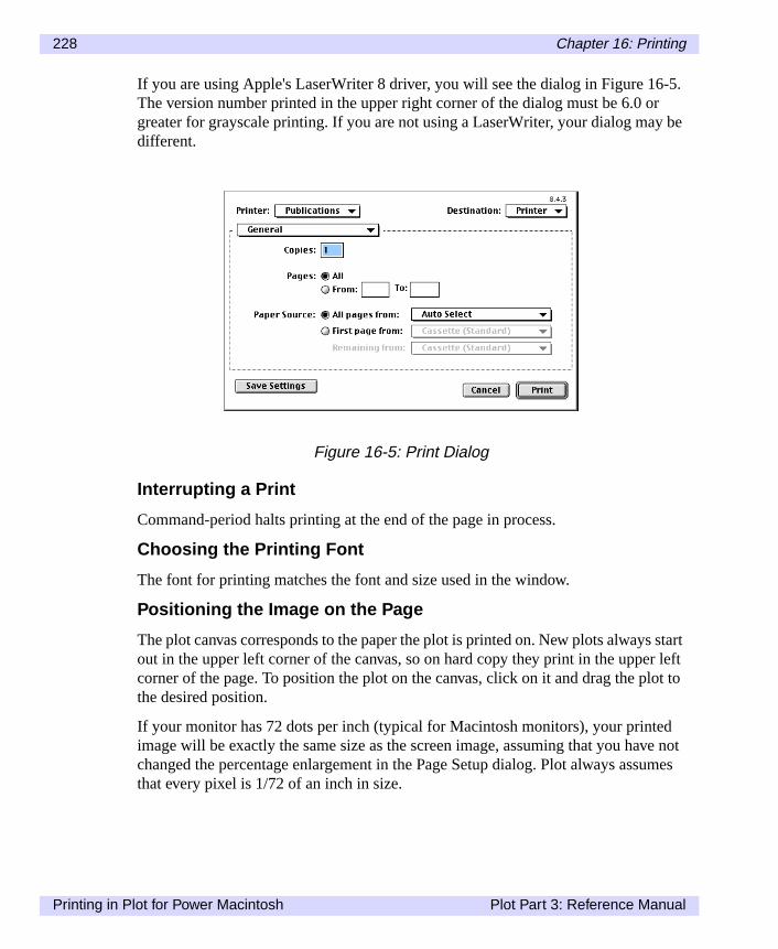
228 Chapter 16: Printing
-5.rbe
startr leftlot to
dve notumes
If you are using Apple's LaserWriter 8 driver, you will see the dialog in Figure 16The version number printed in the upper right corner of the dialog must be 6.0 ogreater for grayscale printing. If you are not using a LaserWriter, your dialog maydifferent.
Interrupting a Print
Command-period halts printing at the end of the page in process.
Choosing the Printing Font
The font for printing matches the font and size used in the window.
Positioning the Image on the Page
The plot canvas corresponds to the paper the plot is printed on. New plots alwaysout in the upper left corner of the canvas, so on hard copy they print in the uppecorner of the page. To position the plot on the canvas, click on it and drag the pthe desired position.
If your monitor has 72 dots per inch (typical for Macintosh monitors), your printeimage will be exactly the same size as the screen image, assuming that you hachanged the percentage enlargement in the Page Setup dialog. Plot always assthat every pixel is 1/72 of an inch in size.
Figure 16-5: Print Dialog
Printing in Plot for Power Macintosh Plot Part 3: Reference Manual

Chapter 16: Printing 229
.
ness
thens are col-
le
theeck
nd
ance.nt and
theyny
the
Setting Line Width
All plot types support theline_width setting to refine line thickness on printoutsBefore you create your plot, set the reserved variableline_width to the desiredline thickness, in fractions of a point. We have seen good results setting the thickto 0.4 points.
Printing Data and Notebook Windows
The page size, orientation and percent reduction settings from thePage Setup...com-mand determine how many rows and columns of text will fit on each page. Plot prints the numbers from left to right, then top to bottom on each page. The pageprinted with the page number, and a borderline along the top and left of the dataumns. The independent column names are printed on each page so that multippages may be aligned.
ThePrint... command prints the entire dataset contents, not just the visible part ofwindow or selection region. This can easily add up to many pages, so double-chthe size of your dataset before printing.
To print only the contents of the selection region, first create a new data windowusing theNew command from the File menu. Copy the desired selection region apaste it into the blank, new data window, then print from the new window.
The notebook window prints with line breaks set up to match the screen appearThe contents of the notebook are paginated and the pages are numbered. The fosize match the font and size set up for the window on the screen.
Printing Plot Windows
All plot types are printed actual size in the same position relative to the paper asare placed relative to the canvas. The entire plot is printed with axis labels and atext annotations that have been added.
Printing Color or Grayscale Plots
It is best to print color plots on a color printer, but black and white printers such asLaserWriter can produce reasonable grayscale printouts of color plots.
If color or grayscale has been used in a plot, be sure that the color/grayscale isenabled for your printer drivers. For the LaserWriter 8 driver, Color/Grayscale isfound under the Options dialog. For other printers, consult your manual.
Plot Part 3: Reference Manual Printing in Plot for Power Macintosh

230 Chapter 16: Printing
Printing in Plot for Power Macintosh Plot Part 3: Reference Manual

Chapter 17:
Data Exchange andFile Export
ata
Plot provides four commands under the Edit menu that allow you to exchange dusing the clipboard. The commands areCopy, Copy As...(Windows), Paste, andPaste As...(Windows). TheSave As... andSave commands let you save your plotsand data in any of several formats. This chapter describes these commands.Plot Part 3: Reference Manual 231
232 Chapter 17: Data Exchange and File Export
linesrams.
into
a. In
tshen
he
Copy Commands
This section describes theCopy command andCopy As... (Windows) commands.
The Copy Command
TheCopy command makes choices about what to copy, and about copy format,according to the context in which it is selected.
Using Copy in Dataset and Notebook Windows
When selected from a dataset window, theCopy command places whatever is cur-rently selected on the clipboard as text. Data in the selection region is copied asof numbers separated by tabs. This is suitable for pasting into spreadsheet progIn addition, text on the clipboard in this format may be pasted into another Plotdataset window.
When selected from a notebook window, theCopy command places the currentlyselected text on the clipboard. The text can be pasted into other applications, orother Plot notebook windows.
Using Copy in Plot Windows
When selected from a plot, theCopy command places the plot on the clipboard asbitmap/PICT file. This is suitable for pasting into presentation graphics programsPlot for Power Macintosh, hold down the Option key and selectCopy to copy just theplot without axes sand titles. This can be useful for creating overlays.
The Copy As... Command (Windows only)
Copy As...allows more flexibility than theCopy command by opening a dialog withoptions. When selected from a dataset window, theCopy As... command producesthe dialog shown in Figure 17-1.
This dialog always consists of two lists. The left list displays the choice of objecthat may be copied. The right list contains the choices of what formats to use wstoring the information on the clipboard.
The contents of the lists vary depending on what type of window is active, and tcontents of that window.
Copy Commands Plot Part 3: Reference Manual

Chapter 17: Data Exchange and File Export 233
sing
Using Copy As... from Dataset Window
From a dataset window, the selection region is copied as text, just as it would be utheCopy command.
NoteFrom a notebook window,Copy As... works identically toCopy; the selectionregion is simply copied as text.
Using Copy As... from Plot Windows
Figure 17-2 shows the Copy As dialog when invoked from a plot.
To copy a plot, including any annotations, as a bitmap, selectPlot from the Copy list.To copy only an annotation as text, selectPlot Annotation from the Copy list.
Figure 17-1: Using Copy As... from a Dataset Window
Figure 17-2: Copy As Dialog
Plot Part 3: Reference Manual Copy Commands

234 Chapter 17: Data Exchange and File Export
w,
arated
ft cor-the
jectte
,
ment
, thein-
Paste Commands
This section describes thePaste andPaste As... (Windows) commands.
The Paste Command
ThePastecommand, like theCopy command, is simple and allows no options. Infact, if the clipboard does not contain a format which is valid for the active windothePaste command is grayed.
Using Paste in Data and Notebook Windows
For data windows, thePastecommand requires a text object on the clipboard. Thetext must be text numbers, separated by tabs or spaces. Each row must be sepby a carriage return and linefeed.
The numbers on the clipboard are pasted into the dataset starting at the upper lener of the selection region. If the clipboard is in the correct format, the numbers indataset are replaced by the numbers on the clipboard.
ThePaste command is not supported in plot windows.
The Paste As... Command (Windows only)
ThePaste As... command allows more flexibility in pasting objects from the clip-board. The Windows clipboard is capable of containing more than one kind of obat a time. Using thePaste As...command, it is possible to choose which item to pasand how to paste it.
Bitmap objects can only be pasted into applications other than Plot. Text objectshowever, can be pasted into any plot window, as well as other applications.
In plot windows, a text object can be pasted as a new annotation, or as a replacefor a selected annotation. In dataset windows, text is pasted as new data.
When plot annotations that were copied as text are pasted into notebook windowsformatting codes are also pasted. Text copied from dataset or other notebook wdows is pasted into notebook windows simply as text.
Paste Commands Plot Part 3: Reference Manual

Chapter 17: Data Exchange and File Export 235
ribed
rd
on for-
Paste As Dialog
Shown below is the Paste As dialog. This dialog always displays two lists, descbelow.
Paste
This list shows the type of objects, text or bitmap, that is available on the clipboafor pasting.
As
This list shows the ways in which the object might be pasted into Plot, dependingthe type of object under Paste, as well as on the type of the active window. Onlymats appropriate for the active window are shown.
Figure 17-3: Paste As Dialog
Plot Part 3: Reference Manual Paste Commands
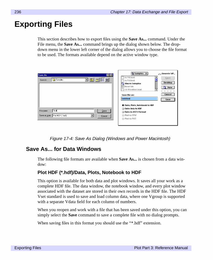
236 Chapter 17: Data Exchange and File Export
at
aowHDForted
can
Exporting Files
This section describes how to export files using theSave As... command. Under theFile menu, theSave As... command brings up the dialog shown below. The drop-down menu in the lower left corner of the dialog allows you to choose the file formto be used. The formats available depend on the active window type.
Save As... for Data Windows
The following file formats are available whenSave As... is chosen from a data win-dow:
Plot HDF (*.hdf)/Data, Plots, Notebook to HDF
This option is available for both data and plot windows. It saves all your work ascomplete HDF file. The data window, the notebook window, and every plot windassociated with the dataset are stored in their own records in the HDF file. The Vset standard is used to save and load column data, where one Vgroup is suppwith a separate Vdata field for each column of numbers.
When you reopen and work with a file that has been saved under this option, yousimply select theSave command to save a complete file with no dialog prompts.
When saving files in this format you should use the “*.hdf” extension.
Figure 17-4: Save As Dialog (Windows and Power Macintosh)
Exporting Files Plot Part 3: Reference Manual
Chapter 17: Data Exchange and File Export 237
l foruse
w isin theders,ort-
cho-
f the
is
f the the
f thee-a-
HDF Data (*.hdf)/Data Only to HDF
This option saves just the data window as an HDF Vset. This is especially usefuexporting datasets to other programs. When saving files in this format you shouldthe “*.hdf” extension.
ASCII Data (*.txt)/Data in ASCII Format
This option saves the contents of the data window as an ASCII text file. Each rooutput on one line with each number separated by a tab. The numbers are savedsame format as used in the data window. The first line contains the column heaand each line starts with the row header for that row. This format is useful for exping the data to spreadsheets or word processors.
Save As...From Plot Windows
The following options are available in the Save As dialog when the command issen from a plot window:
Plot HDF (*.hdf)/Data, Plots, Notebook to HDF
Same as described above for dataset windows.
HDF Image (*.hdf) (Windows only)
With this option, Plot creates an 8-bit raster image which contains the contents ocurrent window and saves it as an HDF file.
App. HDF Image (*.hdf) (Windows only)
This is the same as the HDF Image file described above, except that the imageappended to any existing HDF file.
TIFF Image (*.tif) (Windows only)
With this option, Plot creates an 8-bit raster image which contains the contents ocurrent window and saves it into a TIFF (Tagged Image File Format) file, one ofmost commonly used standard formats for image data.
Bitmap (*.bmp) (Windows only)
With this option, Plot creates an 8-bit raster image which contains the contents ocurrent window and saves it into a Windows bitmap file. This file is a Device Indpendent Bitmap (BMP), which is appropriate for import into most graphics applictions.
Plot Part 3: Reference Manual Exporting Files

238 Chapter 17: Data Exchange and File Export
n asat isf the
Post-
Plot to EPSF (Power Macintosh only)
This option saves the plot, with axes and all text annotations, to EPSF (also knowEPS) format. Briefly, EPSF is a format suited for storing single-page graphics thcommonly supported by presentation and page layout programs. It is a subset oPostScript language.
Plot to PICT (Power Macintosh only)
This option saves the plot in a PICT file as one combined drawing. Plot embedsScript where necessary for highest possible print quality.
Exporting Files Plot Part 3: Reference Manual

Part IV: Appendices


Appendix A:
Plot Menus
enu
This appendix reviews each of the menus and commands that appear in Plot’s mbar.Plot Part 4: Appendices 241

242 Appendix A: Plot Menus
ere
f
een.
e-
and
t.
File Menu
TheNew command creates a new, empty data window.
TheOpen... command accesses a file from disk. Use it to load datasets which wpreviously saved from Plot or to import data from a variety of file formats.
TheSave command saves the current dataset, notebook, and any Plot windows.
TheSave As... command saves a copy of the current dataset with the file name oyour choice. Several export types are available.
TheClose command closes the current window and removes it from the screen.When you close the dataset window, the data is removed from memory, and alldependent windows are also removed.
TheClose All command closes all datasets and removes all windows from the scr
ThePrint command prints the current window in a manner consistent with paramters set usingPage Setup... andPrinter Setup....
ThePage Setup... command opens a dialog that allows you to set page margins,add header and footer text.
ThePrinter Setup... command (Windows) opens a dialog that allows you to selecand configure a printer from the list of printers installed on your Windows system
TheExit/Quit command closes all of the windows and exits the program.
Figure A-1: File Menu
File Menu Plot Part 4: Appendices

Appendix A: Plot Menus 243
ard.
cur-
ow
ted
m-ose
tormat
re-
Edit Menu
TheCut command removes the currently selected text and copies it to the clipbo
TheCopy command copies a bitmap representation of the current plot, or copiesrently selected data as text, to the clipboard.
ThePastecommand adds the contents of the current clipboard to the current windwherever appropriate.
TheClear command removes the currently selected text from the currently selecnotebook window.
TheCopy As... command (Windows) opens a dialog that lets you select which coponents in a window to copy. When appropriate, this dialog also allows you to chowhat format to copy to.
ThePaste As... command (Windows) opens a dialog which lets you choose whatpaste from the clipboard. When appropriate, this dialog also lets you choose a fofor the pasted component.
TheSelect All command selects everything in the current window.
TheSynchronize command (Power Macintosh) links a plot window with its corre-sponding windows so that when data points are selected in one window, the corsponding points will be selected in the other(s).
Figure A-2: Edit Menu
Plot Part 4: Appendices Edit Menu

244 Appendix A: Plot Menus
ds
ef
nark
the
TheFont... command (Windows) opens a dialog that allows you to select font ansize for text in dataset and notebook windows, and for text annotations and axelabels in plot windows.
ThePreferences... command (Windows) opens a dialog that allows you to edit thplot session settings and defaults, or restore factory settings. For descriptions omacro commands, see the Macro Variables Reference section in Chapter 15.
TheStatus Bar command (Windows) lets you display or hide the status bar. Wheenabled, the Status Bar appears along the bottom of the screen, and a checkmappears in the menu next to the command.
TheTool Bar command (Windows) lets you display or hide the tool bar. Whenenabled, the tool bar appears below the menu bar, and a checkmark appears inmenu next to the command.
Edit Menu Plot Part 4: Appendices

Appendix A: Plot Menus 245
dow
the
in
e
.
set.
ote-
Data Menu
The Data menu allows you to navigate and manipulate the contents of a data winand perform notebook calculations.
TheColumn Settings...command opens a dialog that lets you set parameters forcurrently selected column in the data window.
TheGoTo... command opens a dialog that lets you specify and move to any cell the data window.
The Insert... command lets you insert one or more blank columns or rows into thdata window.
TheDelete... command removes selected columns or rows from the data window
TheSee Notebook command (Windows) opens the notebook for the current data
TheCalculate Nowcommand evaluates the currently selected expression in the nbook, or evaluates the expression fields for all columns in the data window.
Figure A-3: Data Menu
Plot Part 4: Appendices Data Menu
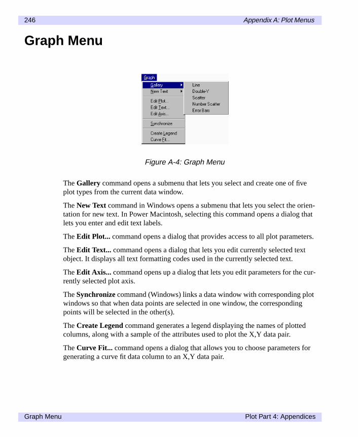
246 Appendix A: Plot Menus
ve
rien- that
ters.
t
cur-
otg
d
for
Graph Menu
The Gallery command opens a submenu that lets you select and create one of fiplot types from the current data window.
TheNew Text command in Windows opens a submenu that lets you select the otation for new text. In Power Macintosh, selecting this command opens a dialoglets you enter and edit text labels.
TheEdit Plot... command opens a dialog that provides access to all plot parame
TheEdit Text... command opens a dialog that lets you edit currently selected texobject. It displays all text formatting codes used in the currently selected text.
TheEdit Axis... command opens up a dialog that lets you edit parameters for therently selected plot axis.
TheSynchronizecommand (Windows) links a data window with corresponding plwindows so that when data points are selected in one window, the correspondinpoints will be selected in the other(s).
TheCreate Legend command generates a legend displaying the names of plottecolumns, along with a sample of the attributes used to plot the X,Y data pair.
TheCurve Fit... command opens a dialog that allows you to choose parametersgenerating a curve fit data column to an X,Y data pair.
Figure A-4: Graph Menu
Graph Menu Plot Part 4: Appendices

Appendix A: Plot Menus 247
also
Format Menu (Power Macintosh)
The Format menu lets you choose fonts and sizes for currently selected text. It includes the Style submenu, which lets you apply listed styles to selected text.
Figure A-5: Format Menu
Plot Part 4: Appendices Format Menu (Power Macintosh)

248 Appendix A: Plot Menus
sed
cro,
s.
d to
Macros Menu
TheCreate Macro... command prompts for a macro name and saves a macro baon the characteristics of the current window.
TheEdit Macros... command opens a dialog that allows you to create a new maor edit, rename, delete, import, and export existing macros.
Additional items on the Macros menu represent the list of currently saved macroSelecting one of them executes the stored macro.
Some example macros, MakeExampleData and MakeExamplePlot, are providedemonstrate how macros work.
Figure A-6: Macros Menu
Macros Menu Plot Part 4: Appendices
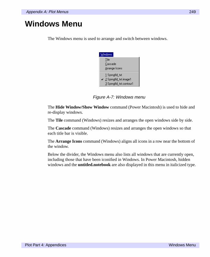
Appendix A: Plot Menus 249
d
ide.
at
of
en,n.
Windows Menu
The Windows menu is used to arrange and switch between windows.
TheHide Window/Show Window command (Power Macintosh) is used to hide anre-display windows.
TheTile command (Windows) resizes and arranges the open windows side by s
TheCascade command (Windows) resizes and arranges the open windows so theach title bar is visible.
TheArrange Icons command (Windows) aligns all icons in a row near the bottomthe window.
Below the divider, the Windows menu also lists all windows that are currently opincluding those that have been iconified in Windows. In Power Macintosh, hiddewindows and theuntitled.notebook are also displayed in this menu in italicized type
Figure A-7: Windows menu
Plot Part 4: Appendices Windows Menu

250 Appendix A: Plot Menus
er
rn
Help Menu
Windows
TheMacro Language Reference... starts the on-line reference to the macro lan-guage.
TheAbout Plot... command gives information on Plot, including the version numband copyright information (Note: in Power Macintosh, this command is availablefrom the Apple menu.
Power Macintosh
The Help menu provides information on how to use Balloon Help and lets you tuthis feature on and off.
Figure A-8: Help Menu
Help Menu Plot Part 4: Appendices
Appendix B:
Startup Macros andPreferences
s just on
pec-
Plots default settings can be changed by creating a macro namedStartup_Macro .This macro will automatically be executed each time Plot is started. The startupmacro lets you set variables, perform calculations and use the macro subroutineas you would in any other macro. See Chapters 14 and 15 for more informationcreating macros.
Preferences, available only in Plot for Windows, are a collection of settings that sify the default behavior of Plot.
Plot Part 4: Appendices 251

252 Appendix B: Startup Macros and Preferences
then
ze
nd
Creating a Startup Macro
To create a startup macro in Windows, selectEdit Macro from the Macros menu. Inthe Edit Macros dialog, chooseNew. TypeStartup_Macro as the name of themacro and chooseOK . In the blank window that appears, enter any of the macroexpressions described in Chapter 15. To save the macro, chooseOK .
To create a startup macro in Power Macintosh, enter it into an empty notebook,selectCreate Macro from the Macros menu. Name itStartup_Macro . The Mac-ros menu will be updated to include the newly created macro.
Example 1: Plot Size
This Startup_Macro sets the initial plot size at 400 x 400 points.
image_h = 400image_v = 400
Example 2: Setting Data Window Attributes
ThisStartup_Macro sets initial characteristics for data windows. It sets type sito 10 points, font to Arial, and column width to six characters.
pref_textsize=10pref_textfont="Arial"pref_columnwidth=6
Example 3: Setting Default Print Options (Windows)
This example sets initial printer and print options. It sets the top page margin, adisables page outline printing.
print_margintop=.5print_marginbottom=.5print_marginleft=.5print_marginright=.5pref_printoutline=0
Example 4: Setting Default Directories (Windows)
This macro sets initial directories for opening and saving files.
call setdirectory("C:\Plot\rawdata")call setsavedirectory("C:\Plot\dataout")
Creating a Startup Macro Plot Part 4: Appendices

Appendix B: Startup Macros and Preferences 253
albles
the set-m.
ther
re
Preferences... Command (Windows)
ThePreferences... command can be used to set variables that determine the initiappearance of new plots and windows. Advanced users can set additional variaby creating a special macro, namedStartup_Macro , which is executed automati-cally each time Plot is started.
To open the Preferences Settings dialog, selectPreferences... from the Edit menu.
This dialog consists of a text editing area which lists preference settings. When dialog first appears, the values shown reflect the current state of the preferencetings in Plot. Note that these settings may change during your use of the progra
Using the text editing area and the various options in this dialog, you may modifycurrent settings within the program and, optionally, save those settings to disk fofuture sessions. The options in this dialog are discussed below.
Factory Defaults
Choose Factory Defaults to restore all preferences to the default settings that weshipped with Plot. Remember to mark theSave Settingscheckbox if you want to usethe factory settings for future sessions.
Figure B-1: Preferences Settings Dialog
Plot Part 4: Appendices Preferences... Command (Windows)

254 Appendix B: Startup Macros and Preferences
Last Saved
Click this button to reset all the current settings to the last settings you saved.
Import
Click this button to bring up the Import Preference dialog.
If this box is checked at the time you clickOK , the settings shown in the dialog willbe saved on disk, and will be active the next time you use Plot as well.
Preferences... Command (Windows) Plot Part 4: Appendices

Appendix C:
About the HDFLibraries
atafor-xt,
lica-vel-
d
ing
thei-age
HDF is an extensible, binary, public domain file format specification for storing dand images. All Fortner Software products use HDF as their primary data storagemat. HDF files can store floating point data, scaling information, color images, teand other items. HDF originated at the National Center for Supercomputing Apptions (NCSA) at the University of Illinois at Urbana-Champaign, where it was deoped as a solution to the problem of sharing data among all of their differentcomputers.
NCSA maintains and distributes a public domain software library for reading anwriting HDF format files. The libraries are available on a variety of computersincluding Macintosh, Windows, Sun, VAX, Silicon Graphics, and Cray UNICOS.The software is written in C with both Fortran and C interfaces supported for makcalls to the HDF libraries.
Source code and documentation for the HDF storage routines is available from National Center for Supercomputing Applications (NCSA) at the University of Illnois. The libraries and documentation can be obtained from NCSA's HDF home pathttp://hdf.ncsa.uiuc.edu.
Plot Part 4: Appendices 255

256 Appendix C: About the HDF Libraries
et)oca-ed asace
headslumn
-
Scientific Data Groups and Vsets
The most important HDF storage format supported by Plot is the Vertex Set (Vsformat. Columns of data are stored in VSETs where columns may represent x-ltion, y-location, density, temperature, etc. Plot reads and writes column data storVSET groups, also known as Vgroups. You may use the HDF Vset calling interfto write column data directly into HDF files to be read by Plot.
HDF is most commonly used for storing N-dimensional arrays of scientific data. THDF storage type for arrays is the Scientific Data Group, or SDG. When Plot retwo-dimensional arrays stored in SDGs, each column in the array becomes a coin the data window. Plot cannot write SDGs.
In addition, Plot reads 2-dimensional arrays from SDG type data. In Plot for Windows, each column in the array becomes a column in the data window.
HDF Web Sites
Additional information about HDF and its application can be found on the WorldWide Web at the following web sites:
• HDFinfo.com: A clearinghouse of HDF format informationhttp://www.hdfinfo.com/
• NCSA's web pagehttp://hdf.ncsa.uiuc.edu
• NASA Goddard Space Flight Center (GSFC) page on HDFhttp://daac.gsfc.nasa.gov/REFERENCE_DOCS/HDF/gdaac_hdf.html
• Earth Science Enterprise (Mission to Planet Earth) web page:http://www.hq.nasa.gov/office/mtpe/
• EOS Data Resources web pagehttp://eospso.gsfc.nasa.gov/eos_homepage/
Other Data Web Sites
The following web sites let you access data other than HDF to be downloaded.
• TOMS (zipped):http://daac.gsfc.nasa.gov/CAMPAIGN_DOCS/FTP_SITE/readmes/toms_daily.html
• GOME:http://daac.gsfc.nasa.gov/CAMPAIGN_DOCS/FTP_SITE/readmes/gome_daily.html
Plot Part 4: Appendices

Appendix C: About the HDF Libraries 257
ithoe-
Fort-
• CZCS:http://daac.gsfc.nasa.gov/CAMPAIGN_DOCS/OCDST/czcs_readme.html
• SeaWiFS:http://daac.gsfc.nasa.gov/CAMPAIGN_DOCS/OCDST/OB_main.html
• SSMI:http://daac.gsfc.nasa.gov/CAMPAIGN_DOCS/hydrology/readme_html/ssmi_monthly_readme.html
• TRMM:http://lake.nascom.nasa.gov/DATA/TRMM/
• NSCAT:ftp://podaac.jpl.nasa.gov/pub/ocean_wind/nscat/
• DTED:http://164.214.2.59/geospatial/products/DTED/dted.htmlhttp://164.214.2.54/mel/data.html
• SDTS:http://edcwww.cr.usgs.gov/doc/edchome/ndcdb/ndcdb.html
Note that the SeaWiFS and TRMM sites require you to order the data for a fee. Wthe exception of the DTED and SDTS web sites, all data is stored in HDF. The Nsys technical data processing application supports import of DTED and SDTS toHDF. For more information on the data products that Noesys supports, see the ner Software web site at http://www.fortner.com.
Plot Part 4: Appendices

258 Appendix C: About the HDF Libraries
Plot Part 4: Appendices

Appendix D:
AppleEvents
byYou
In this appendix we describe Plot's support for AppleEvents, which may be usedAppleScript, Fortran, HyperCard and other programs to send commands to Plot.must be running System 7 to use this feature.
Plot Part 4: Appendices 259

260 Appendix D: AppleEvents
ngeming most
anipu-
intkeich com-
oc’,l’.com-
epts a
youill data
nd
Using AppleEvents to Control Plot
AppleEvents is a Macintosh System 7 feature which allows applications to exchadata and commands. AppleEvents generated by scripting systems and programlanguages may be used to send macro commands to Plot to be executed. Sinceprogram features are available through macros, these macro commands can mlate data and create any plots which are available from the menus.
Supported Events
Plot supports the required AppleEvents: Open Application, Open Document, PrDocument, and Quit Application. These give external programs the ability to maPlot open specific data files or even voluntarily quit. The additional two events whPlot supports are DoScript and Evaluate. These make it possible to send macromands to Plot and retrieve variable values.
NoteRequired events are in the event class ‘aevt’ and are of type ‘oapp’, ‘odoc’, ‘pdand ‘quit’. The other two events are in class ‘misc’ and are of type ‘dosc’ and ‘evaDoScript accepts a handle to a script of commands to be executed as notebookmands. Each command is separated by a hard return character. Evaluate accvariable name and returns a string with the value of that variable.
HyperCard Example
Claris HyperCard (version 2.1 and later) supports the send command, which letssend and execute Plot commands. For example, the following send command wcreate a column of 50 numbers, assuming that Plot is already running and has awindow open. Internally HyperCard generates a DoScript AppleEvent.
send "x = series(50)" to program "Plot"
NoteIf you do not have a name assigned to your Macintosh under System 7, the secommand will not be able to find Plot. Use the Sharing Setup control panel toassign a name to your Macintosh.
Using AppleEvents to Control Plot Plot Part 4: Appendices

Appendix D: AppleEvents 261
stndagee
-
To retrieve results and variable values from Plot, HyperCard supports the requecommand. For example, the following commands perform a simple calculation aretrieve the result from Plot. Note that any variable value from Plot's variable stormay be requested. For the request command, HyperCard generates an EvaluatAppleEvent.
send "q = 2+2" to program "Plot"request "q" from program "Plot"
Suppressing User Interaction
To suppress user interaction when sending macro commands, set theuser_interactive flag to false. To set it from an external script, send the following:
user_interactive=false
Plot Part 4: Appendices Using AppleEvents to Control Plot

262 Appendix D: AppleEvents
Using AppleEvents to Control Plot Plot Part 4: Appendices
Index
AAnalytic line plots, 57Annotation, 51AppleEvents, 259Aspect ratio, 70, 105Axes, 119extras, 131increment and interval, 29labels, 120modify, 28plot bounds, 29switch, 29tickmarks, 29
CCalculations, 36
update, 65Color
line, 63plot, 63, 130scatter plot, 72
Columnscreate, 58
Cosine curve, 58Curve fitting, 24, 144
DData
copy, 232copy as, 232
Plot User’s Guide and Reference Manual 263

264
exchange using clipboard, 231paste, 234paste as, 234specifications, 90synchronize, 75web sites, 256
Data window, 22, 79copy and paste data, 86edit columns, 87font, 92manual entry, 80navigate, 81notebook, 91selecting data, 83
DocumentationHDF, 255
Double-Y plot, 41, 113
EEdit
text, 26Edit Plot dialog, 126Error bars, 115Export, 236
ASCII, 237HDF, 236HDF Vset, 237image, 237save as, 236
FFile
export, 236import, 93open, 93
Font, 26Format language
text, 136
Fortner Softwareweb site, 257
GGallery, 23, 111, 112
HHDF
documentation, 255libraries, 255web site, 256
IImport, 93, 254
binary column, 97FITS files, 100fixed field column, 95GIF files, 100HDF, 99HDF Vset files, 99image files, 99multiple record files, 102PBM files, 100text column, 94text columns, 68text file, 42Transform files, 99
Installation, 16
LLayer plots, 152Legends, 143Line plot, 22, 23, 112
analytic, 57
Index Plot User’s Guide and Reference Manual

265
Lines, 127style, 31
MMacros, 54, 161
advanced functions, 181, 197analytic functions, 189command components, 169command types, 167comments, 166complex numbers, 198create, 54custom, 185data column, 172data manipulation functions, 178, 196, 197errors, 168execute, 165Fast Fourier Transforms, 190, 198function commands, 174import, 54layer plots, 159length of a line, 191literals, 220math functions, 176, 194, 195math operators, 169math trigonometric functions, 175, 194notebook, 162numerical constants, 170preferences, 253reference, 193reserved variables, 184, 207scalar variables, 170sorting data, 191startup_macro, 251, 252subroutines, 182, 200, 200
Menus, 241Data, 245Edit, 243File, 242Format, 247
Graph, 246Help, 250Macros, 248Windows, 249
NNCSA, 255Notebook, 91, 162
calculations, 36comments, 166curve fitting, 147execute commands, 165
Number scatter plot, 114
PParametric plots, 62Plot
add/delete X,Y pairs, 126aspect ratio, 105color, 63, 130columns, 60copy and paste, 110create, 111curve fitting, 144curves, 60Double-Y, 41, 113edit, 30, 125error bars, 115labels, 44layers, 151legends, 143lines, 112, 127move, 28number scatter, 73, 114parametric, 62preferences, 105scatter, 67, 70, 114symbols, 128
Plot User’s Guide and Reference Manual Index

266
synchronize, 75, 108window, 103
Preferences, 253Preferences settings, 105Printing, 221
Plot for Power Macintosh, 227Plot for Windows, 222
RRMS Error, 37
SScatter plot, 67, 70, 114
number, 73Sine curves, 58Standard deviation, 36Style box, 31Symbols, 31, 72, 128Synchronize, 75, 108, 108
TText
add, 134annotation, 51edit, 26, 135font, 135format codes, 138
formatting language, 136import, 42move, 135size, 135style, 135subscript, 51
Tours, 21
UUpgrade
Plot for Power Macintosh, 17Plot for Windows, 16
VView file, 42, 68, 96, 101
WWeb site
download data, 256Fortner Software, 257, 257HDF, 256, 256
XX,Y pairs
select, 116
Index Plot User’s Guide and Reference Manual