Embed Size (px)
Citation preview

Population Matters
More Aid + More People ≠ Less Poverty A Study into How Different Types of Development Aid Have Influenced the
Absolute Levels of Poverty in Countries with High Fertility Rates
Candidate Number: 78250
LSE MSc Operational Research Dissertation 2013
Sponsor: Population Matters
LSE Supervisor: Sue Merchant

More Aid + More People ≠Less Poverty Population Matters
1
Executive Summary
Background and Purpose
The client, Population Matters, is a membership organization and a charity which is concerned with how
population growth influences the environment and people’s living standards. During the past several
decades, a massive amount of development aid has been invested into the world’s poorest countries to
reduce poverty and to improve living standards. The total amount can reach trillions of US dollars.
Population Matters is concerned with where the aid comes from, how the huge amount of aid is
distributed, and whether the usage of aid is effective and achieves the purpose of poverty reduction. It
also wishes to know which methods might improve the efficiency of aid usage. Among all of these,
Population Matters is particularly concerned with how aid might affect total fertility rate (TFR) reduction
in the poorest and highest fertility rate countries. Moreover, it also wishes to find out what percentage
of development aid actually contributes to the reduction of total fertility rate.
Methodology
The research analysed data from the twenty highest fertility rate countries in the world over the past
ten years. Most of these countries are located in the Sub-Saharan African region and they are amongst
the poorest countries around the world. A graphical analysis was first used to illustrate trends and
sources over the past five decades and distributions of development aid in the past ten years from 2002
to 2011. Then, a simple spreadsheet calculation was used to explore an approximate result of
percentage and the absolute number of people living below the poverty line ($1.25 per day) and
efficiency of poverty reduction in the twenty highest fertility rate countries. Next, fixed-effect panel data
model was produced to investigate which aspects of development aid contribute to total fertility rate
reduction. Finally, a causal loop diagram was created to demonstrate how economic, social and cultural
factors lead to high total fertility rates in the twenty highest fertility countries and to help consider how
development aid contributes to the total fertility rate reduction.
Main Findings
High fertility rates and rapidly increasing population size were shown to be the main reasons for the absolute number of people living below the poverty line to increase in the twenty highest fertility countries during the past three decades, despite a sharp increase in the number of aid recipients. In these countries, the rate of TFR decrease is very slow and compared with the world average, TFR levels remain significantly high. How to reduce TFR to a reasonable level therefore becomes the key factor. Based on the results of an empirical model, three aspects of development aid directly contribute to reduction of the fertility rate: family planning; education; and economic infrastructure. However, the average percentage of aid spent on these three aspects are small compared with total development aid disbursement - only 16.38% in the past ten years, with only 0.31% on the most important, family planning. Since fertility reduction is the key to reducing poverty, aid donors should consider investing more aid in these three areas, especially family planning.

More Aid + More People ≠Less Poverty Population Matters
2
Table of Contents
Executive Summary……………………………………………………………………………………………………………………………1
1. Introduction
1.1. Background……………………………………………………………………………………………..………………………………4
1.2. Population Matters………………………………………………………………………………………………………………….4
1.3. Objectives of the Report……………………………………………………………………………………………….…………5
1.4. Structure of the Report……………………………………………………………………………………………………………5
2. Literature
2.1. Previous Literature Relating to Development Aid…………………………………………………………………….6
2.2. Previous Literature Relating to Total Fertility Rate………………………………………………………………..…7
2.3. Previous Literature of Using Panel Data Model……………………………………………………………….………9
3. Methodology
3.1. Data……………………………………………………………………………………………………………………………………...10
3.2. Approach…………………………………………………………………………………………………………………..………….11
3.3. Data Preparation and Model Building
3.3.1. Analysis Part 1: Source and Distribution of Development Aid…………………………….…………12
3.3.2. Analysis Part 2: Poverty Analysis…………………………………………………………………………………..12
3.3.3. Analysis Part 3: Empirical Research
1). Justification of Using Panel Data Model………………………………………………………………..…13
2). Data Observation…………………………………………………………………………………………………….13
3). Panel Data Model………………………………………………………………………………………….…………17
3.3.4. Analysis Part 4: Causal Loop Diagram……………………………………………………………………………17
4. Results and Interpretations
4.1. Source and Distribution of Development Aid
4.1.1. Source of Development Aid…………………………………………………………………………………………19
4.1.2. Distribution of Development Aid…………………………………………………………………………………20
4.2. Trends of Poverty……………………………………………………………………………………………………………….…23
4.3. Empirical Model……………………………………………………………………………………………………….……………27
4.4. Causal Loop Diagram – Factors Affecting Total Fertility Rate…………………………………………………30
4.4.1. Economic Factors……………………………………………………………………………………………..…………30
4.4.2. Social Factors…………………………………………………………………………………………………….…………31
4.4.3. Culture Factors………………………………………………………………………….………………………………..32
4.5. Discussion………………………………………………………………………………………………..……………………………33
4.6. Limitations of the Research…………………………………………………………………………..………………………34
4.7. Recommendations for Further Work…………………………………………………………………………….………34
5. Conclusions………………………………………………………………………………………………………………..…………..……35
6. Reflective Chapter
6.1. Challenges Faced………………………………………………………………………………………………….……….………35
6.2. Data and Approach Shifting……………………………………………………………………………………….………….37
6.3. Project Related with MSc Management Science Course……………………………………….…….…………37
6.4. Outcomes……………………………………………………………………………………………………………………………..38
6.3. Important Lessons Learned and Possible Improvements………………………………………………….……38
7. References………………………………………………………………………………………………………………………………..…39

More Aid + More People ≠Less Poverty Population Matters
3
Appendix A Terms of Reference…………………………………………………………………………….…………………………41
Appendix B Glossary of Technical Terms……………………………………………………………………..…………………..43
Appendix C Data Sources………………………………………………………………………………………………..……………….45
Appendix D Model Building and Test for Panel Data Model
1). Aggregate Value of Poverty Headcount Ratio in the Twenty Highest Fertility Countries……….46
2). Boxplot…………………………………………………………………………………………………………….………48
3). Histogram…………………………………………………………………………………………………………………49
4). Matrix Plot…………………………………………………………………………………………………….…………50
5). Two-Way Fixed Effect Panel Data Model………………………………………………………..………..51
6). Residual Plot…………………………………………………………………………………………………………....52
7). Causal Loop Diagram………………………………………………………………………………………………..53

More Aid + More People ≠Less Poverty Population Matters
4
1. Introduction
1.1 Background
The research was sponsored by Population Matters. Population Matters was previously known as the
Optimum Population Trust, which is a membership organization and a charity which is concerned with
how population growth influences the environment, resources and quality of life through education and
research [14].
During the past five decades, huge amounts of development aid have flown into the world’s poorest
countries. The sum of the money exceeds trillions of US dollars. Population Matters is concerned with
where the money came from and where it went, whether the money was used effectively and whether
any improvements of development aid distribution can be made on reducing poverty and improving
living standards in developing countries. Specifically, since the rapid growth size of population is one of
the major causes of poverty, Population Matters wishes to know what percentage of aid contributed to
reducing total fertility rate in these poorest and highest fertility countries, whether total fertility rate
was reduced effectively and whether any improvements can be made.
There is an enormous amount of previous research on development aid or total fertility rate, however,
not many studies on how development aid affects total fertility rate. Many previous reports investigate
whether development aid work is effective in reducing poverty through macro social-economic factors
such as quality of life, economic growth and so on. This research tries to explore whether development
aid works effectively on reducing poverty through total fertility rate and size of population.
1.2 Population Matters
The aim that Population Matters had in sponsoring this project was to find out how development aid
performs on reducing poverty and improving living standards in high fertility developing countries. It is
concerned that although huge amounts of development aid is invested in developing countries every
year to reduce poverty, the outcome is not as good as donors’ expectations. Population Matters believes
that even though the percentage of people living below poverty line is decreasing, the absolute number
of people living in poverty keeps rising due to the slowly decreasing and significantly high total fertility
rate in developing countries. The original plan of the project was to analyse what and how aspects of
development aid affect the total fertility rate of one high fertility developing country for fifty years.
However, after large amounts of sources and websites had been searched, only ten years of previous
data was found to be available for the different aspects of development aid spent in each country. Due
to the limitation of data, compromises have to be made. After this had been agreed with the client, the
research changed to analyse the twenty highest total fertility rate developing countries for ten years.
The twenty high fertility rate countries used in spreadsheet analysis and empirical models are presented
in Table 1. They are the highest fertility rate countries in the world in 2011 and most of them are located
in the Sub-Saharan regions of Africa.

More Aid + More People ≠Less Poverty Population Matters
5
1.3 Objectives of the Report
The report has four main objectives. The first objective is to classify source and distribution of
development aid disbursement in these twenty countries which have the poorest and the highest
fertility rate countries around the world. The second objective is to discover whether the huge amounts
of development aid works effectively in reducing poverty through analysis of trends of percentage and
absolute number of people living below the poverty line $1.25 per day. The third objective is to analyse
aspects of development aid which contribute to reducing fertility rates in these twenty highest fertility
rate countries and obtain the percentage of aid distributed on these aspects. The final objective is to
discuss factors which lead to an increase in people living in poverty and identify possible solutions to
alter the situation.
The twenty highest fertility rate countries used for analysis are presented in Table 1. The average total
fertility rate for these twenty countries in 2011 was 5.62, which means that on average every woman in
these countries would have 5.62 children during their lifetime. This obviously is a very high number
compare with other countries in the world, especially developed countries. The average total fertility
rate in the European Union was only 1.6 in 2011 [19].
Table 1: Twenty Countries with the Highest Fertility Rate
Country Fertility Rate (2011 World Bank) [19]
Niger 7.0 Zambia 6.3
Mali 6.2 Afghanistan 6.2
Uganda 6.1 Malawi 6.0
Chad 5.9 Burkina Faso 5.8
Democratic Republic of the Congo 5.7 Tanzania 5.5 Nigeria 5.5
Timor-Leste 5.5 Rwanda 5.3 Angola 5.3 Benin 5.2
Guinea 5.2 Liberia 5.2
Republic of Yemen 5.0 Mozambique 4.8
Kenya 4.7
1.4 Structure of the Report
The report describes in section 4.1 the source and distribution of the international development aid
given to the twenty highest fertility developing countries. Then it indicates many interesting but hard to
understand relationships between poverty, fertility rates and size of population in the twenty highest

More Aid + More People ≠Less Poverty Population Matters
6
fertility rate countries in section 4.2. Recently, many social economists have investigated factors
affecting fertility rates using statistical methods, especially panel data models due to the nature of the
data structure. This report follows the tradition of building a panel data empirical model to study aspects
of development aid which contribute to reducing fertility rate in section 4.3. It then demonstrates how
various factors affect fertility rates through a causal loop diagram. At the end, the report uses various
charts to discuss the percentage of development aid contributing to fertility rate reduction and sets out
the conclusions of the study.
2. Literature:
A great many pieces of research have been carried out on development aid and fertility rate respectively.
This section specifies the main findings from previous research in three separate parts: development aid,
fertility rate and using panel data model for fertility rate analysis.
2.1 Previous Literature Relating to Development Aid
Countries analysed in this report are categorised by Keeley (2012) [10] as the stagnating or declining
countries. In his book, he pointed out that “these countries gain little from globalisation, but are among
the most vulnerable to it’s adverse effects, such as climate change and higher natural resource prices”.
He mentioned several main reasons why these countries stay in extreme poverty, including civil wars,
reliance on exportation of commodities such as oil or diamonds, a lack of incentive to develop industries
due to rich natural resources, landlocked and bad governance.
The aid most generally discussed normally refers to Official Development Assistance (ODA). ODA has
three key characteristics:
1. It comes from governments or from their official agencies;
2. The main objective is improving the economic development and welfare of developing countries;
and
3. It is either given as a grant or a loan at a rate less than market interest rates. Developing countries
who receive the grants do not need to pay it back and around 90% of ODA is given as grants. Most of the
rest are given as a loan but charged with a very low interest rate. [10]
Sub-Saharan Africa is the largest recipient region of development aid in recent years and the amount
keeps rising [10]. Most countries analysed in this report are located in the Sub-Saharan African region
which means that these countries should be the biggest beneficiaries.
The reason leads to the recent ten years, especially in 2005 and 2006, sharp increase of aid which was
due to the setting of the Millennium Development Goals. The eight Millennium Development Goals
include:

More Aid + More People ≠Less Poverty Population Matters
7
Eradicate extreme poverty and hunger Achieve universal primary education Promote gender equality and empower women Reduce child mortality Improve maternal health Combat HIV/AIDS, malaria, and other diseases Ensure environmental sustainability Develop a global partnership for development [26]
The key of all these goals is poverty reduction. The eight Millennium Development Goals document was
signed by 189 countries which targeted to help developing countries reducing poverty until 2015. The
efforts made from developed countries to achieve the Millennium Development Goals can be measured
using many aspects: increase developing countries’ debt forgiveness, boost grants and so on. The strong
willingness and ambition to help given by developed countries can be seen from the sharp increasing aid
after 2000.
Although in the Millennium Development Goals, donor countries increased the amount of aid in many
aspects, the effectiveness of aid in the Sub-Saharan African countries is not obvious and involves several
problems. As pointed out by Abegaz (2005)[1], Sub-Saharan African is the only region where real income
per capita is falling for a significant portion of the population, capital accumulation only has a limited
impact on growth, the risk-adjusted private rates of return are low; political instability is widespread;
and primary export earnings and aid flows are vulnerable.
In Abegaz (2005) [1] paper, he stated several problems which caused aid inefficiency: serious agency
problems, highly asymmetrical power relations between donors and recipients, coordination failures
among donors and recipients, and inadequate attention paid to local circumstances. He also stated that
the aid inefficiency is caused by failure of involved institutions, including domestic institutions (sub-
national governments, the business community, and civic groups) and the global governance system
(donor governments and international institutions).
Pedersen (2001) [13] specified that the organizations and developed countries, eager to reduce poverty,
are counter-productive that their activities may lead to more poverty and more uneven distribution of
income in recipient countries than without of aid. The reason is recipient countries put less effort on
reducing poverty because there are foreign aid organizations anxious to help the poor. The recipient
governments know that the more poverty a generous donor organization observes the more aid it will
give. These selfless organizations create an incentive to distort the true picture.
2.2 Previous Literature Relating to Fertility Rate
Hemmi (2003) [8] said that high fertility is not only the result of poverty, but also the cause of the
poverty. They found the reason of negative correlation between income and fertility. In low-income
countries, high fertility rates lead to higher educational costs. Low income and higher educational costs
cause fewer children who can get an advanced level of education, reduce in the income level which
children face in the next period and thus reducing the opportunity cost of having children. Therefore,
low-income families tend to have more children.

More Aid + More People ≠Less Poverty Population Matters
8
Bongaarts and Casterline (2012) [2] stated that the fertility transition of the Sub-Saharan African region
is still in the early stages and the high fertility rate is caused by a high desire for family size. Two main
reasons make couples want as many children as possible: more labour force in traditional farming
business and for security purposes due to high child mortality rates. In addition, high child mortality
leads parents to have additional children to protect against losses. Fertility decline occurs with rising
levels of urbanization, education and declining children mortality (Gayawan et al 2010) [5]. Moreover,
fertility decline followed with human capital accumulation and economic growth. Caldwell (1980) had
similar findings. He pointed out that one reason for high fertility rate is that the lifestyle of most of the
population in African countries is commonly rural and less industrialized than the rest of the world [3].
This rural lifestyle encourages people to engage in farming. As a result, large family size is considered as
an asset. Kokole (1994) [11] stated that costs associated with raising a child also affect fertility rate.
When costs rise, children become less affordable for actual and potential parents. Parents rely on
contraception, abortion or family planning programs to control the fertility rate in many countries.
Therefore, family planning aid should have a negative relationship with fertility rate. However, from
Gayawan et al (2010) [5], the high fertility rate in African countries is caused by low use of contraception
products and a high level of social value of childbearing. The usage increases with the education level of
a woman. Generally speaking, family planning was not practiced very effectively in Africa. It is widely
agreed that education, especially female education, is the main motivation of fertility modernization.
Gayawan et al (2010) [5] also found some significant differences of fertility transition between African
and non-African countries.
1. The recent speed of fertility decline in Africa is noticeably slower than the speed of decline in Asia
and Latin America during their early stage of fertility transition. In fact, in many African countries the
fertility rate appears to have stalled to around 5. The static fertility rate is highly unusual. Non-African
countries such as Asian countries typically experienced an acceleration of the fertility decline when they
were in early stages.
2. Birth intervals are longer in Africa. This is probably caused by the widespread traditional breastfeeding
in Africa.
3. Ideal family size is larger in Africa. In fact, the larger ideal family size is one of the main reasons of
the slowly decreasing fertility rate.
John et al (2012) [9] stated that although HIV-infected women has significantly lower fertility rates, local
community HIV prevalence has had no significant effect on non-infected women’s fertility. Therefore the
development aid on STD control and HIV protection is not relevant with the change of fertility rate.
Cultural factors also have great impact on fertility rate. D’Addio and d’Ercole (2005) [4] found that
transformation of women’s role played in society would change childbearing. The values and beliefs of
women’s role in work and family has changed, which may contribute to delaying childbearing in all
countries. They pointed out that women’s income level, education level and unemployment rate would
influence childbearing. Because having a child involves trading-off time and energy between paid work
and childbearing. Higher earnings increase the opportunity cost of not working. Similarly, higher

More Aid + More People ≠Less Poverty Population Matters
9
education level increases earning potential and the opportunity cost of childbearing. The general
relation suggested women have fewer children when they have higher income and higher educational
achievement, and that fertility rate and labour market participation of women are negatively related.
The relationship between unemployment rate and fertility rate is complicated. D’Addio and d’Ercole
(2005) [4] found negative relationship. When unemployment rate is high, young people may decide to
remain longer in the parents’ home or in school. However, as females may also expect a lower
probability of finding job, unemployment may also increase childbearing.
Gayawan et al (2010) [5] found other reasons of high fertility rate in African including early and
universal marriage and competition among co-wives, resulting in child bearing which begins early and
continues for much of the reproductive life span.
Romaniuk (2011) [18] said three culture factors seriously affect fertility rate in most African countries:
kinship, polygamy and lactation. The kinship system can influence fertility behaviours seriously. In
traditional African societies, large amounts of pressure on couples produce as many children as
possible in order to enhance the power of family and to ensure the continuity of the lineage. The
second feature is polygamy. As partners, polygamous women on average are less prolific than
monogamous ones. This is a result the lower frequency of coitus and greater age difference between
spouses in such unions. However, at general level, polygamy maximizes the reproductive capacity of the
lineage and thus maximise the number of children a family can have. The third feature is postnatal
abstinence and breastfeeding. Long breastfeeding duration leads to longer birth interval in Africa.
Heisel (1990) [7] has similar findings with Romaniuk (2011) but from different perspective. The
importance of agriculture and lineage conducted early marriage and continuous childbearing in Africa.
2.2 Previous Literature of Using Panel Data Model
There are a large number of previous papers on fertility rate using panel data models. In the D’Addio
and d’Ercole (2005) paper [4] “policies, institutions and fertility rates: a panel data analysis for OECD
countries”, the dynamic two-way fixed effect panel data model used to determine factors affect fertility
rate is adopted by D’Addio and d’Ercole. The only difference between the model adopted in D’Addio and
d’Ercole (2005) and this research is that the authors have one more lag dependent variable in the
fertility rate equation. The reason to include this lag factor is to account for the potential dynamic
effects of policies on the fertility rate, which is not relevant with the goal of this report. Therefore, the
two-way fixed effect panel model is used without the lag factor.

More Aid + More People ≠Less Poverty Population Matters
10
3. Methodology
3.1 Data
The data used in the research was found from several multilateral agencies using official websites, such
as the United Nations, the Organisation for Economic Co-operation and Development (OECD) and the
World Bank. All data of development aid includes total development aid disbursement, development aid
distributed on each sector for each country were searched using the OECD website. The OECD is an
international economic organisation which focuses on policy and practice of world economics [27].
Members of Development Assistance Committee (DAC) are 26 countries selected from OECD [Table 5]
which are putting much effort into helping developing countries [12].
The data used in this research relates to the twenty highest fertility rate countries in the world in 2011.
Most of them are Sub-Saharan African countries except Afghanistan, the Democratic Republic of Timor-
Leste and Republic of Yemen. These twenty countries are shown in Table 1 in section 1.3. Although
Somalia and Equatorial Guinea have a higher fertility rate than Mozambique and Kenya in 2011, the
former two countries have incomplete data records. Therefore the report uses Mozambique and Kenya,
which fertility rates are also unreasonably high, to do analysis instead of Somalia and Equatorial Guinea.
Data about development aid comes from OECD website, according to the website, the sectors of
development aid used in the report means that development aid is of one country which is received
from all donors around the world, not only developed countries which are regular donors to developing
countries such as the United Kingdom, Finland, Japan, but also many multilateral agencies, such as the
United Nations and the World Health Organization. Table 2 displays part data sources. This data is very
important for building an empirical model. The full data sources are presented in Appendix C. Data
associated with social and economic aspects including Total Fertility Rate, Children Mortality Rate
under 5, Life Expectancy, GDP per capita and size of population are from the United Nations data
website, known as the UNdata, where most data is sourced from the World Bank. Aggregate data of
poverty headcount ratio below $38 per month was obtained from the World Bank Website. The unit of
the value for aid is US dollars in millions. Since the data is found from many different sources and the
terminology might be different, the definition of terminology used in this report is provided in Appendix
B.
Table 2: Sources of Data
Variable Sources
Total Fertility Rate the World Bank [19] Life Expectancy the World Bank [20] Size of Population the World Bank [21] Children Under 5 Mortality Rate United Nations Statistic Division [23] GDP per Capita United Nations Statistic Division [25]
Total Development Aid Disbursement[13] Development Aid on Education
Organisation for Economic Co-operation and Development (OECD) [16]
Development Aid on Health Development Aid on Reproductive Health Development Aid on Family Planning Development Aid on STD Control Development Aid on Economic Infrastructure

More Aid + More People ≠Less Poverty Population Matters
11
Aggregate Value of Poverty Headcount Ratio The World Bank [22]
3.2 Approach
Part 1
Part 2
Part 3
Part 4
Graph 1
There are four parts of the analysis, which are presented as Graph 1, in the report to find out answers
for the three main questions: how development aid has been used, whether the aid was used effectively
to reduce poverty and why the aid spent does not reduce poverty effectively. The first two questions will
be solved in part 1 and 2 respectively; the final question will be answered by parts 3 and 4.
Generally, the analysis in the report follows the logic in Graph 1. It starts with investigating the source
and distribution of development aid to answer the question where aid came from and where the aid
went. Part two studies trends of poverty through analysing percentage and absolute number of people
living below the poverty line by comparing the twenty highest fertility rate countries, the Sub-Saharan
African region, China and the worldwide. Then it goes to the core of the research – the reasons
development aid does not appear to work very effectively in these countries. Part three builds a two-
way fixed effect panel data model to explore aspects of development aid related with fertility rate in the
twenty highest fertility rate countries and part four constructs a causal loop diagram to explain all
possible fundamental variables that affect fertility rate. Finally, in the discussion, the percentage of
development aid which actually contributed to fertility rate reduction over the past five and ten years
are displayed by pie charts.
Source and Distribution of Development Aid
Spread Sheet Data Analysis about Trends of
Poverty
Empirical Model: Aspects of Development Aid
Contribute to Total Fertility Rate Reduction
Causal Loop Diagram: Fundamental Reasons of
High Fertility Rate

More Aid + More People ≠Less Poverty Population Matters
12
3.3 Data Preparation and Model Building
3.3.1 Analysis Part 1: Source and Distribution of Development Aid
Part 1 uses various charts to explain the sources of development aid for past five decades and the
average distribution of development aid of the twenty countries in the most recent ten years from 2002
to 2011. The source of total development aid for the twenty countries from DAC, G7 and Multilateral
Agencies is calculated by summing up the aid given from 1961 to 2011. The average distribution for the
twenty highest fertility rate countries is calculated by summing up ten years aid on each sector for all
twenty countries and then divided by the number of countries and the number of years to get the
average percentage of distribution for each country in each year (See equations below). The report
points out the most interesting similarities and notable differences of aid distribution between these
twenty highest fertility rate countries.
𝑇𝑜𝑡𝑎𝑙 𝐴𝑖𝑑 𝑓𝑜𝑟 𝑡ℎ𝑒 𝑇𝑤𝑒𝑛𝑡𝑦 𝐶𝑜𝑢𝑛𝑡𝑟𝑖𝑒𝑠 = ∑ 𝐴𝑖𝑑 𝐷𝑖𝑠𝑏𝑢𝑟𝑠𝑒𝑚𝑒𝑛𝑡𝑖𝑡
𝐴𝑣𝑒𝑟𝑎𝑔𝑒 𝐴𝑖𝑑 𝐷𝑖𝑠𝑡𝑟𝑖𝑏𝑢𝑡𝑖𝑜𝑛 𝑓𝑜𝑟 𝐸𝑎𝑐ℎ 𝑆𝑒𝑐𝑡𝑜𝑟 =∑ 𝐴𝑖𝑑 𝐷𝑖𝑠𝑏𝑢𝑟𝑠𝑒𝑚𝑒𝑛𝑡 𝑜𝑛 𝐸𝑎𝑐ℎ 𝑆𝑒𝑐𝑡𝑜𝑟𝑖𝑡
𝑖 × 𝑡
∀𝑖 ∈ 𝑐𝑜𝑢𝑛𝑡𝑟𝑦, 𝑡 ∈ 𝑦𝑒𝑎𝑟
3.3.2 Analysis Part 2: Poverty Analysis
The second part of the research analysed the percentage and absolute number of people living below
the poverty line through a simple spreadsheet calculation of the poverty headcount ratio and the size of
population [Definition in Appendix B]. It also discussed percentage change of the poverty headcount
ratio and the total fertility rate through scatterplot. Data of poverty headcount ratio is from the World
Bank aggregate value. It also explains the reason that although a huge amount of development aid was
spent in these developing countries, the living standard did not actually improve. This is caused by fast
increasing population as it can be seen from displaying trends of total fertility rate and the size of
population in these twenty highest fertility rate countries from 1961 to 2011. The absolute number of
people living below poverty line $1.25 per day is calculated by the equation:
𝐴𝑏𝑠𝑜𝑙𝑢𝑡𝑒 𝑁𝑢𝑚𝑏𝑒𝑟 𝑜𝑓 𝑃𝑒𝑜𝑝𝑙𝑒 𝐿𝑖𝑣𝑖𝑛𝑔 𝐵𝑒𝑙𝑜𝑤 𝑃𝑜𝑣𝑒𝑟𝑡𝑦 𝐿𝑖𝑛𝑒𝑖𝑡 = 𝑃𝑜𝑣𝑒𝑟𝑡𝑦 𝐻𝑒𝑎𝑑𝑐𝑜𝑢𝑛𝑡 𝑅𝑎𝑡𝑖𝑜𝑖𝑡 × 𝑆𝑖𝑧𝑒 𝑜𝑓 𝑃𝑜𝑝𝑢𝑙𝑎𝑡𝑖𝑜𝑛𝑖𝑡
∀𝑖 ∈ 𝑐𝑜𝑢𝑛𝑡𝑟𝑦, 𝑟𝑒𝑔𝑖𝑜𝑛 ∀𝑡 ∈ 𝑦𝑒𝑎𝑟
𝑃𝑒𝑟𝑐𝑒𝑛𝑡𝑎𝑔𝑒 𝐶ℎ𝑎𝑛𝑔𝑒 𝑜𝑓 𝑃𝑜𝑣𝑒𝑟𝑡𝑦 𝐻𝑒𝑎𝑑𝑐𝑜𝑢𝑛𝑡 𝑅𝑎𝑡𝑖𝑜 =𝑃𝑜𝑣𝑒𝑟𝑡𝑦 𝐻𝑒𝑎𝑑𝑐𝑜𝑢𝑛𝑡 𝑅𝑎𝑡𝑖𝑜𝑡 − 𝑃𝑜𝑣𝑒𝑟𝑡𝑦 𝐻𝑒𝑎𝑑𝑐𝑜𝑢𝑛𝑡 𝑅𝑎𝑡𝑖𝑜𝑡 − 1
𝑃𝑜𝑣𝑒𝑟𝑡𝑦 𝐻𝑒𝑎𝑑𝑐𝑜𝑢𝑛𝑡 𝑅𝑎𝑡𝑖𝑜𝑡 − 1

More Aid + More People ≠Less Poverty Population Matters
13
3.3.3 Analysis Part 3: Empirical Research
1) Justification of Using Panel Data Model
In the empirical research, the report explores which aspects of development aid affects the total fertility
rate in these twenty highest fertility rate countries. As stated in section 2.3, there are many previous
panel data models which have been used to investigate; social, economic or cultural factors affecting
fertility rate. The reason behind using panel data model is not only because normally fertility rate
analysis involves a wide range of countries, but also because it usually involves a time scale to show the
trends of fertility rates. According to previous literature, development aid on education, health,
reproductive health, family planning, STD control and economic infrastructure may have a relationship
with the total fertility rate. The statistical software used in the model building process includes Minitab
and Stata. Data preparation did in both software and fixed effect panel model built in Stata.
2) Data Observation
The original dataset contains 20 countries over a period of 10 years. The approach used is fixed effect
panel data model. Table 3 shows a statistical summary of the original dataset. The number of
observations in the original dataset is 200 which are shown in Table 3 below N column. The number of
observations containing missing values is 27. In the original dataset, there are 3 observations which have
a negative value, which are development aid on family planning. The negative value on development aid
is unusual; the negative value observations were aid on family planning in Burkina Faso, Mali in 2005
and in Zambia in 2007. The donor of the former two countries is Germany and of the latter is Canada.
The reason of negative value of family planning aid is unknown. After removing the 30 unusual
observations, there were 170 observations left in the model dataset. After removing missing value
observations, the panel data became unbalanced: five countries contained 10 years value, seven
countries contained 9 years value, three countries contained 8 years value, four countries contained 7
years value and one country had 5 years value. Table 3 shows the summary statistics before removing
any unusual observations.
Table 3: Summary Statistics of Original Data N N* Mean St Dev Min Q1 Median Q3 Max
Total Fertility Rate 200 0 5.93 0.61 4.68 5.51 5.87 6.29 7.45 Country 200 0 * * 1 * * * 20 Year 200 0 * * 2002 * * * 2011 Life Expectancy 200 0 51.87 4.51 42.34 48.39 51.10 54.12 65.45 GDP per Capita 200 0 718.40 866.30 104.80 302.60 452.90 737.50 5318 Size of Population 200 0 2574137
9 3101998
8 888099 1002409
1 1494103
5 3064872
0 162470737
Children Under 5 Mortality (among 1000)
200 0 128.69 37.68 54.10 96.90 126.00 161.93 206.70
Aid on Education 200 0 74.03 59.19 1.38 35.41 56.57 101.42 391.81 Aid on Health 200 0 83.71 82.60 1.02 24.10 56.20 108.53 528.42 Aid on Reproductive 199 1 8.17 11.28 0.14 2.40 4.86 9.56 86.01 Aid on Family Planning 175 25 3.91 5.65 -0.04 0.32 1.91 5.15 41.50 Aid on STD control 198 2 71.86 104.34 0.01 5.96 18.29 108.26 455.19 Aid on Economic 199 1 128.60 179.90 0.00 30.60 66.20 160.20 1164.50

More Aid + More People ≠Less Poverty Population Matters
14
Infrastructure
After investigating the original dataset, it was found that some observations were close to zero value of
development aid on family planning, to avoid Stata treating these values as zero, all family planning aid
had a constant term 0.1 added.
Below are two graphs that show the scatter of observations of variable total fertility rate against GDP
per capita before and after logarithmic transformation of variable GDP per Capita. In the graphs, the
vertical axis is total fertility rate and the horizontal axis are GDP per capita and log GDP per capita
respectively. It is obvious that before logarithmic transformation to variable GDP per capita,
observations were concentrated on the left side of the graph [Graph 2]. After the transformation,
observations were more scattered [Graph 3]. More scattered observations will improve the accuracy of
empirical model.
The problem of observations concentrated on the left also happens to variable development aid on
education, health, STD control, family planning, reproductive health and economic infrastructure. It can
be seen from the first matrix plot [Appendix D4] that observations of variable GDP per capita and all
development aid variables are concentrated on the left hand side of each plot. The reason might be
caused by the fact that although these values are increasing steadily with time, the differences between
the values are not significant, therefore most data is concentrated together. To resolve this problem, a
logarithmic transformation was applied to these variables. It can be seen from the second matrix plot,
after the transformation, the variables GDP per capita, development aid on education, health,
reproductive health, family planning, STD control and economic infrastructure become much more
scattered.
Graph 2 Graph 3
Graph 4, which contains a set of line plots, shows changes of the twenty countries with the average
value of each variable used in the empirical model from 2002 to 2011. All plots below have years from
2002 to 2011 on the horizontal axis, and mean of total fertility rate, life expectancy, log GPD per capita,
children under five mortality, size of population, log development aid on family planning, education,
health, reproductive health, STD control and economic infrastructure for each year on the vertical axis.
The purpose of using mean value of variables of each year is to display the general trends of these
variables.
It is clear that the total fertility rate and the children under 5 mortality rate have downward trends in
the ten years. Variable life expectancy, log GDP per capita, size of population and six aspects of
development aid generally have an upward trend. It can be seen there is a sharp decreasing trend in
45
67
8
Tota
l Fert
ility
Rate
0 1000 2000 3000 4000 5000GDP per capita
45
67
8
Tota
l Fert
ility
Rate
5 6 7 8 9logGDPperCapita

More Aid + More People ≠Less Poverty Population Matters
15
development aid on the family planning plot and the huge drop of the size of population. They are
caused by removing several unusual and missing value observations from the original dataset.
Graph 4
Table 4 shows the description of the panel data variables after dealing with unusual observations and
logarithmic transformation. It can be seen from the table that the standard deviation of variable country
does not vary within individual observations. This means variable country does not vary with time – set
country as a fixed variable. Variable year, log aid on reproductive health and log aid on family planning
vary more within individual than between individual. However, other variables vary more between
individuals than within individual. The “within” standard deviation of TFR is smaller than the “between”
standard deviation of TFR. This indicates that if two countries are randomly selected from the dataset,
the difference of total fertility rate between two countries is expected to be smaller than the difference
for the same country in two randomly selected years. The number of observations used to build the
Mean of Total Fertiltiy Rate
5.6
5.8
66
.2
2002 2004 2006 2008 2010 2012Year
TFRMean of Life Expectancy
48
50
52
54
2002 2004 2006 2008 2010 2012Year
YearMean of Log GDP per Capita
5.6
5.8
66
.26
.46
.6
2002 2004 2006 2008 2010 2012Year
GDP per Capita
Mean of Children Under 5 Mortality Rate
100
120
140
160
2002 2004 2006 2008 2010 2012Year
Number of Death Among 1000 Number of PeopleMean Size of Population
2.0
0e
+0
72
.50e
+0
73
.00e
+0
73
.50e
+0
7
2002 2004 2006 2008 2010 2012Year
Mean of Log Development Aid Family Planning
-2-1
01
2
2002 2004 2006 2008 2010 2012Year
Log Aid on Family Planning
Mean of Development Aid Education
33
.54
4.5
2002 2004 2006 2008 2010 2012Year
Log Aid on Education Log Aid on HealthMean of Development Aid Health
33
.54
4.5
5
2002 2004 2006 2008 2010 2012Year
Mean of Development Aid Reproductive Health
.51
1.5
22
.5
2002 2004 2006 2008 2010 2012Year
Log Aid on Reproductive Health
Mean of Development Aid STD Control
12
34
2002 2004 2006 2008 2010 2012Year
Log Aid on STD
Mean of Development Aid Economic Infrastrucutre
33
.54
4.5
5
2002 2004 2006 2008 2010 2012Year
Log Aid on Economic Infra

More Aid + More People ≠Less Poverty Population Matters
16
fixed effect panel model was 170, which contained 20 countries and on average 8.5 years since after
removing missing value observation, the dataset became unbalanced. There are some negative value
observations in variable aid reproductive health, family planning, STD control and economic
infrastructure. The reason of these negative values is caused because after applying logarithms to these
variables some very small values became negative, which does not affect the accuracy of model.
Table 4 Panel Data Statistical Summary with Model Dataset
Variable Mean Std Dev. Min Max Observations
Country
Overall 10.77647 5.743793 1 20 N 170 Between 5.91608 1 20 n 20 Within 0 10.77647 10.77647 T-bar 8.5
Year
Overall 2006.659 2.971474 2002 2011 N 170 Between 0.5530596 2005.5 2008.2 n 20 Within 2.935606 2001.087 2011.23 T-bar 8.5
Total Fertility Rate
Overall 5.877235 0.6012394 4.68 7.447 N 170 Between 0.5616263 4.8438 7.214375 n 20 Within 0.2402732 5.195458 6.962236 T-bar 8.5
Life Expectancy
Overall 51.83833 4.499133 42.34254 65.45166 N 170 Between 4.424156 45.63558 63.58979 n 20 Within 1.724606 46.65422 55.58939 T-bar 8.5
Log GDP per Capita
Overall 6.227191 0.7377703 4.65996 8.578861 N 170 Between 0.6928062 5.135456 7.808372 n 20 Within 0.3730171 4.452002 7.063143 T-bar 8.5
Size of Population
Overall 27300000 32700000 931324 162000000 N 170 Between 31700000 1087538 146000000 n 20 Within 3183563 11600000 442000000 T-bar 8.5
Children under 5 Mortality(among
1000)
Overall 127.9947 37.98176 54.1 206.7 N 170 Between 36.11948 65.64 190.2556 n 20 Within 16.12488 89.60582 185.1058 T-bar 8.5
Log Aid on Education
Overall 4.058962 0.8369787 0.3244719 5.970773 N 170 Between 0.6908725 2.342775 4.939646 n 20 Within 0.5284894 1.918353 5.534985 T-bar 8.5
Log Aid on Health
Overall 4.052629 0.9867621 1.142519 6.269889 N 170 Between 0.8187898 2.488533 5.164634 n 20 Within 0.6044056 2.183631 5.220017 T-bar 8.5
Log Aid on Reproductive
Health
Overall 1.660315 1.028602 -1.942292 4.454507 N 170 Between 0.6831634 0.6780774 2.848349 n 20 Within 0.7878377 -1.824449 3.266473 T-bar 8.5
Log Aid on Family
Planning
Overall 0.1690259 2.115976 -8.859683 3.730489 N 170 Between 1.231541 -3.446169 1.494908 n 20 Within 1.76245 -5.480622 4.738595 T-bar 8.5
Log Aid on STD Control including
Aids/HIV
Overall 3.028374 2.081957 -4.438978 6.120706 N 170 Between 1.82404 -0.473213 5.065977 n 20 Within 1.143893 -0.937391 5.706414 T-bar 8.5
Log Aid on Economic
Infrastructure
Overall 4.212915 1.345145 -3.307543 7.060068 N 170 Between 1.039048 2.086538 5.979427 n 20 Within 0.9203744 -1.181166 6.779774 T-bar 8.5

More Aid + More People ≠Less Poverty Population Matters
17
Since the unit of all development aid variables is US dollars in millions, after logarithmic transformation
the number of these aid variables becomes relatively small. The range of variable size of population for
different countries is huge, which can be seen from the difference between the minimum and the
maximum value. The life expectancy for these developing countries is generally quite small, even the
maximum life expectancy is only around 65 years old, which is much lower than the life expectancy in
developed countries.
In order to show there were no significant outliers in the dataset, boxplots were plotted and these are
presented in the Appendix D2. From the boxplots, it can be seen that there are only a few outliers in
variable life expectancy, size of population, log GDP per capita, log Aid on Education, log aid on
reproductive health, log aid on STD control and log aid on economic infrastructure. The number of
outliers is not significant and none of them is an error. Therefore, the outliers were kept in the model
dataset.
In addition, to see the structure of data, histograms of variables are presented in Appendix D3. It can be
seen from the histogram that several variables have a negative value, including development aid on
reproductive health, family planning, STD control and economic infrastructure. As stated before, the
reason of these negative values is caused because before logarithmic transformation, the original values
of these observations were very small. After transformation, the value of observations become more
scattered and some small values become negative. The variable size of population has a wide range
between these twenty countries. It is worth noticing that the general fertility rates are very high in these
countries, even though the minimum value is higher than 4.5.
3) Panel Data Model
The two-way fixed effect panel data model used is:
𝑌𝑖𝑡 = 𝛼 + 𝜷𝑿𝒊𝒕 + 𝛾𝑖 + 𝛿𝑡 + 휀𝑖𝑡 ∀𝑖 ∈ 𝑐𝑜𝑢𝑛𝑡𝑟𝑦, 𝑡 ∈ 𝑦𝑒𝑎𝑟 (1)
The Yit indicates the dependent variable total fertility rate in twenty different countries over a period of
ten years, Xit indicates independent variables including GDP per year, Children under 5 mortality rate, life
expectancy, size of population, development aid on education, health, reproductive health, family
planning, STD control and economic infrastructure. The γi represents fixed effect variable country and δt
is fixed effect variable year. This is a two-way fixed effect model. In the software package, when apply
fixed effect, the model becomes:
𝑌𝑖𝑡 − 𝑌�̅� = (𝑿𝒊𝒕 − 𝑿𝒊̅̅ ̅)𝜷 + (ε𝑖𝑡 − 휀�̅�) ∀𝑖 ∈ 𝑐𝑜𝑢𝑛𝑡𝑟𝑦, 𝑡 ∈ 𝑦𝑒𝑎𝑟 (2)
The 𝑌�̅� represents the average of dependent variable total fertility rate 𝑌𝑖𝑡, 𝑿𝒊̅̅ ̅ is average of 𝑿𝒊𝒕 and 휀�̅� is
average of ε𝑖𝑡.
3.3.4 Analysis Part 4: Causal Loop Diagram
In order to illustrate why it is difficult to decrease the fertility rate in developing countries a causal loop
diagram was constructed. Several alternative approaches of causal loop diagram were considered, such

More Aid + More People ≠Less Poverty Population Matters
18
as an illustrative simulation through Simul8 or a simulation of development aid allocation through @Risk.
However, after comparing the causal loop diagram with illustrative simulation, it has been found that
the causal loop diagram can not only display all characteristics of illustrative simulation, but also show
some extra features. Moreover, the simulation of development aid allocation does not fit the research
topic very well. Therefore, the causal loop diagram was chosen.
The causal loop diagram illustrates cause and effect relationships and feedback processes. [24] It
involves interrelated elements which might affect fertility rates as many as possible according to
previous findings. It shows both factors related with fertility rates through arrows and the direction they
affect fertility rates through the minus and plus sign. The minus sign indicates negative relationship
between two elements. For example, when the level of female education increases, the fertility rate
would go down and vice versa. The diagram displays factors which affect fertility rate through three
major areas: social, economic and cultural. The most vital causes of high fertility rate will be discussed
through the diagram. The software used to build the diagram is called Vensim.

More Aid + More People ≠Less Poverty Population Matters
19
4. Results and Interpretations
4.1 Source and Distribution of Development Aid
4.1.1 Source of Development Aid
The development aid comes from a wide range of sources, not only from many generous developed and
developing countries, but also a large number of multilateral agencies. Several well-known groups of
countries are the main sources of development aid, such as members of Development Assistance
Commitment (DAC) and G7. DAC countries include nineteen European countries, two North American
countries, one country in the Australasian continent, one country in New Zealand region, two Asian
countries and the European Union. Table 5 displays DAC countries and all of them are well developed.
G7 countries are seven developed countries covered by DAC countries [12].
Graph 5
Graph 5 shows the main sources of total development aid disbursement to the twenty highest fertility
rate countries from 1961 to 2011. It is clear that DAC countries made a great contribution and are very
ambitious in helping developing countries to reduce poverty; more than 60% of the total development
aid in the past fifty years has come from these twenty five countries (DAC) in the world. The sum of
development aid from DAC exceeds 26000 million US dollars. OECD’s DAC are traditional donors of
development aid, but there are some other governments which also made a great contribution on
development aid, such as Brazil, Russia, India, China, South Africa, Saudi Arabia and Turkey. It is worth to
noticing that private donations have also started to become involved in recent years, such as the Bill &
Melinda Gates Foundation.
Members of G7 countries are included in DAC and they are the major donors in the DAC. Multilateral
Agencies played a significant role when dealing with international development aid. They are not only
fund donors, but also involved in the allocation of these huge amounts of money. The most well-known
multilateral donors include the United Nations, the World Bank, the Global Funds and so on.
Table 5: Development Assistance Commitment Countries [12]
Australia Austria Belgium Canada Denmark European Union
0
100000
200000
300000
400000
500000
Total DAC Countries G7 Countries Multilateral Agencies
Million $
Source of Total Aid for the Twenty Countries From 1961 to 2011

More Aid + More People ≠Less Poverty Population Matters
20
Finland France Germany Greece Ireland Italy Japan Korea Luxembourg The Netherlands New Zealand Norway Portugal Spain Sweden Switzerland United Kingdom United States
4.1.2 Distribution of Development Aid
The distribution of development aid is complicated because the amount of money is large and the
purpose is vital. More importantly it involves not only recipients and donors, but also multilateral
agencies play a vital role as intermediate. Some researchers even think that the institutions involved in
aid distribution directly influence the effectiveness of aid [1]. In order to illustrate the trends clearer, the
data has been displayed into two graphs.
Graph 6
Graph 7
Graph 6 and 7 show that in these twenty highest fertility rate countries, the total development aid
disbursements generally have upward trends, especially after the year 2000. The most dramatic increase
happened in Afghanistan where from around 400 million US dollars in 2001 there was a sharp increase
to more than 6700 million in 2011. In most countries, total development aid increased steadily and fast
during the past fifty years. However, a few countries seem to have a large level of fluctuations, such as
the Democratic Republic of Congo and Nigeria. The large fluctuation which happened in these two
countries was caused by a large amount of debt forgiveness on action relating to debt. The debt
“forgiveness” is not real money, but the cancellation of loan repayment for these developing countries.
Donor countries sometimes agree to defer loan repayments or cancel them altogether. This is where the
large amount of activities relating to debt comes from in 2006 in Nigeria and 2003 in Congo.
0
2000
4000
6000
1961 1966 1971 1976 1981 1986 1991 1996 2001 2006 2011
US$ in Million
Year
Total Development Aid Disbursement by All Donors Niger
Kenya
Zambia
Mali
Afghanistan
Uganda
Malawi
Chad
Burkina Faso
Congo, Dem Rep
0
2000
4000
6000
1961 1966 1971 1976 1981 1986 1991 1996 2001 2006 2011
US$ in Million
Year
Total Development Aid Disbursement by All Donors
Tanzania
Nigeria
Timor-Leste
Rwanda
Angola
Benin
Guinea
Liberia
Mozambique
Yemen,Rep.

More Aid + More People ≠Less Poverty Population Matters
21
Many researchers thought that the total amount of development aid normally differs from donor and
recipient perspectives and it is difficult to count an exact figure [10]. This is because of too many
institutions that are involved and the way funds are disbursed in many different ways such as loans,
grants and so on. This research uses development aid disbursement from recipient countries’
perspectives. Generally speaking, until the end of 2011, Tanzania was the country which received the
highest amount of aid in Sub-Saharan Africa and Afghanistan was the country which received the highest
amount of aid in the Middle East region amongst these twenty highest fertility rate countries. In total,
there are ten countries where aid disbursement exceeded 1000 million US dollars in 2011, including
Kenya, Zambia, Mali, Afghanistan, Uganda, Democratic Republic of Congo, Tanzania, Mozambique,
Nigeria and Rwanda. If one considers the accumulated amount aid disbursement for past fifty years
from 1961 to 2011, fourteen out of twenty countries disbursed more than 10000 million US dollars in
the fifty years. Afghanistan, Tanzania and Democratic Republic of Congo are the biggest beneficiary. If
we only consider the accumulated amount over the past ten years, these three countries still are the
biggest beneficiaries. The Democratic Republic of Congo and Tanzania are two countries which have a
very large proportion of their land in the Sub-Saharan African region.
Two graphs are shown below to illustrate the distribution of development aid in the twenty highest
fertility rate countries. One graph shows the distribution by general categories and the second gives a
breakdown of the social category of aid. The development aid is distributed into eight categories: social
infrastructure, economic infrastructure, production, multi-sector (crosscutting), commodity aid (general
programme assistance), action relating to debt, humanitarian aid and others. The last sector “Others”
includes administrative costs of donors, refugees in Donor countries and unallocated aid.
Graph 8
Graph 8 shows the average aid distribution for these twenty countries in the past ten years from 2002 to
2011. Most countries spent the largest percentage of aid on social infrastructure sector, except Zambia,
Malawi, Chad, Democratic Republic of Congo, Nigeria and Liberia. The largest percentage of
development aid disbursement of these countries, except Chad, is Action relating to the debt sector,
0.00%
20.00%
40.00%
60.00%
80.00%
100.00%
Tan
zan
ia
Nig
er
Afg
han
ista
n
An
gola
Zam
bia
Yem
en
Be
nin
Bu
rkin
Fas
o
Mal
i
Uga
nd
a
Mal
awi
Ch
ad
De
m R
ep
. Co
ngo
Nig
eri
a
Tim
or-
Lest
e
Rw
and
a
Gu
ine
a
Lib
eria
Mo
zam
biq
ue
Ke
nya
Ten Years Average Distribution of Development Aid
Others
Humanitarian Aid
Action Relating to Debt
Commodity Aid
Multisector/Crosscutting
Production
Economic Infrastructure
Social Infrastructure

More Aid + More People ≠Less Poverty Population Matters
22
which is mostly the debt forgiveness from donor countries, not real money transfers. Therefore, in
general, almost all countries spend the largest percentage of aid on social infrastructure. Chad has a
large percentage of aid which is humanitarian aid, which is quite unusual compared with the other
countries. The reason of high humanitarian aid in Chad is caused by political violence and active conflict
happening over the past decade.
Action relating to debt is the second largest sector where development aid distributed. However, the
majority of this sector has no real money inflow since a large percentage belongs to debt forgiveness
from donor countries. As mentioned in earlier, since DAC countries wish to help developing countries to
achieve the Eight Millionaire Development Goals until 2015, aid investment increased on every aspect
during the past ten years, including debt forgiveness which reduced huge amount of pressure to pay
debt in these developing countries.
In most countries the production sector dominates less than 10% of total development aid, which is not
very significant. Comparing with the production sector, economic infrastructure has greater input. Eight
countries have economic infrastructure higher than 10% of their total aid disbursement. They are
Tanzania, Afghanistan, Yemen, Benin, Mali, Uganda, Mozambique and Kenya. But comparing with social
infrastructure, economic infrastructure is still a very small proportion. It will be discussed in section 4.3
that economic infrastructure sector is one of the three aspects of development aid which actually
contributes to fertility rate reduction and it is also the largest aspect which contributes on fertility
reduction comparing with the other two.
Graph 9
Since the social sector has the largest percentage of total development aid and quite a few aspects in
social infrastructure are related with fertility rate reduction, graph 9 specifies the detail of social sector.
It has been divided into education, health, reproductive health, family planning, STD control and other
social sectors. The other social sector includes water supply, sanitation, population policy except
0.00%
20.00%
40.00%
60.00%
80.00%
100.00%
Tan
zan
ia
Nig
er
Afg
han
ista
n
An
gola
Zam
bia
Yem
en
Be
nin
Bu
rkin
Fas
o
Mal
i
Uga
nd
a
Mal
awi
Ch
ad
De
m R
ep
. Co
ngo
Nig
eri
a
Tim
or-
Lest
e
Rw
and
a
Gu
ine
a
Lib
eria
Mo
zam
biq
ue
Ke
nya
Ten Years Average Distribution Social Sector of Development Aid
Other Social Activities
STD Control including HIV/Aids
Health
Reproductive Health
Family Planning
Education

More Aid + More People ≠Less Poverty Population Matters
23
reproductive health, family planning, STD control, government & civil policy, conflict prevention and so
on. Although, normally the social infrastructure sector would be divided by more general categories,
graph 9 divides them into the way which is more appropriate for the core of the research.
It is clear from graph 9, when considering development aid disbursement on social sector during recent
ten years, the aid disbursed on family planning has very small percentage compared with other parts of
population policies, such as STD control. Later analysis will point out how important the relationship
between development aid on family planning and reduction of fertility rate is. Thus, the tiny percentage
of development aid allocated to family planning is worthy of notice by authorities which can control the
aid distribution since fertility rate reduction is vital in these developing countries if donor countries want
to reduce number of people living below the poverty line effectively.
It is clear from graph 9 that in over half of the countries, the sum of proportion for education and family
planning is less than 20% of the social sector. From the statistical model in section 4.3, it has been found
that the development aid on education and family planning contributes directly to the reduction of
fertility rate. Graph 9 indicates that the percentage of input of development aid on reduction of fertility
rate is still very small.
4.2 Trends of Poverty
This section discusses the effectiveness of poverty reduction in these twenty highest fertility rate
countries through analysing trends of percentage and the absolute number of people living below the
poverty line ($1.25 per day). Moreover, it concludes that the main reason which causes the increasing
absolute number of people living below the poverty line is high fertility rate.
Graph 10
The above graph shows the past thirty years trend of aggregate value of poverty headcount ratio
[Definition in Appendix B] through comparing the twenty highest fertility rate countries, the Sub-
Saharan African region, worldwide and China [Appendix D1]. Through definition it can be known the
poverty headcount ratio displays trend of percentage of people living below the poverty line $1.25 per
day (equivalent to $38 per month). Through the graph 10, it shows that on average of these twenty
countries [Dark Blue Line], the percentage of people living below the poverty line reached a peak in
1999 and then decreased slowly. The percentage of people living below the poverty line in 1999 was
0102030405060708090
Percentage Below Poverty Line
Year
Aggregate Value of Poverty Headcount Ratio
The Twenty HighFertility Countries
Sub-Sahara AfricanRegion
Worldwide
China

More Aid + More People ≠Less Poverty Population Matters
24
more than in 1981. It also can be seen from the graph 10 that although most of these twenty highest
fertility rate countries are located in the Sub-Sahara Africa region, they are actually poorer than the
average level of the Sub-Sahara region. In 1981, China had much more percentage of people living below
poverty line than the Sub-Saharan African region, but it decreased fast during the past thirty years. In
2010, the percentage in China is even lower than the world average level. This let us think about the
dramatic improvement made in China which is due to the strict fertility control – one child policy.
Graph 11
Graph 11 displays the trends of absolute number of people living below the poverty line $1.25 per day. It
can be seen the absolute number of people living below the poverty line in the twenty highest fertility
countries and the Sub-Saharan African region rose to around 500 million. The difference of poverty
people in these two areas is only about 83 million in 2010, but the difference between sizes of
population in these two areas is close to 300 million in 2010. It indicates the density of poverty people in
the twenty highest fertility countries is much larger than the Sub-Sahara African region. It can be seen
that the number of people living below the poverty line worldwide and in China have very distinct
downward trends, but the trends in the twenty highest fertility rate countries and the Sub-Saharan
African are clearly upward from 1981 to 2010. If one thinks about the huge amount of development aid
invested in these twenty countries in the past several decades, it raises a big question: What did the
development aid actually do if number of people living below the poverty line increased? To answer this
question, it is important to find out the causes of the increasing number of poor people at first.
Below graph 12 illustrates the scatterplot of percentage change of poverty headcount ratio versus the
total fertility rate in the twenty highest fertility rate countries. The scattered observations indicate that
when the percentage of people living below the poverty line increased, which is positive, the
corresponding total fertility rate during the year is high. When the percentage of people living below the
poverty line decreased during the years, which is negative, the corresponding total fertility rate is low.
The graph tells us the percentage change of people living below the poverty line is positively related
with total fertility rate.
0.00
500,000,000.00
1,000,000,000.00
1,500,000,000.00
2,000,000,000.00
2,500,000,000.00
Size of Poplulation below Poverty
Year
Absolute Number of People Living Below Poverty Line
The TwentyHigh FertilityCountries
Sub-SaharaAfricanRegion
Worldwide
China

More Aid + More People ≠Less Poverty Population Matters
25
Graph 12
The direct cause of increasing absolute number of people living below the poverty line is actually quite
obvious – fast increasing size of population. In most countries, the relatively apparent decreasing trends
of fertility rate start after 2002 [Graph 13 and 14], which was probably caused by conducting the eight
Millennium Development Goals. During the past fifty years, although the fertility rate keeps decreasing
in these highest fertility rate countries, the general level is still significantly high if comparing with other
countries in the world, especially developed countries. The fertility rate of all twenty countries is higher
than 4 in 2011, which indicates in these countries, every woman would have at least four children during
their lifetime on average.
Graph 13
Graph 14
Although many developed countries and organizations invested huge amounts of development aid in
the poorest countries, the absolute number of people living below the poverty line in these countries
7.257.006.756.506.256.005.755.50
0.100
0.075
0.050
0.025
0.000
-0.025
-0.050
Total Fertility Rate
Pe
rce
nta
ge
In
cre
ase
of
PH
R
Percentage Increase of Poverty Headcount Ratio vs Total Fertility Rate
4
6
8
10
1961 1966 1971 1976 1981 1986 1991 1996 2001 2006 2011
TFR
Year
Total Fertility Rate
TanzaniaNigeriaTimor-LesteRwandaAngolaBeninGuineaLiberiaKenyaYemen,Rep.
5.5
6.5
7.5
8.5
1961 1966 1971 1976 1981 1986 1991 1996 2001 2006 2011
TFR
Year
Total Fertility Rate NigerMozambiqueZambiaMaliAfghanistanUgandaMalawiChadBurkina FasoCongo, Dem Rep

More Aid + More People ≠Less Poverty Population Matters
26
did not reduce. One of the major reason is the absolutely high fertility rate makes size of population
growing fast, especially in the Democratic Republic of Congo and Nigeria, which can be seen from graph
15 and 16. There are eight countries size of population increased more than four times during past fifty
years. Almost all countries increase more than three times. This is a very huge increase if compared with
2.29 times world population increase during past fifty years.
Since the fast increasing population is caused by the absolutely high fertility rate, this brings another
issue – how to control the high fertility rate. From the empirical model in section 4.3, fertility rate is
influenced by development aid on education, family planning and economic infrastructure. One way
might be to increase the amounts of development aid which directly contributes to reduction of fertility
rate. Because the main goal of development aid is to reduce poverty, if the fertility rate does not obtain
real control, the vast amount of development aid is just waste of money since the past several decades;
the absolute number of people living below poverty line increased in the twenty countries.
Graph 15
Graph 16
There are some other countries which have performed well on fertility control for example– China.
Through the adoption of one child policy during past thirty years, the population growth in China has
been controlled strictly. This directly led to the percentage of people living below poverty line to be
dropping dramatically in China from around 40% in 1981 to about 3% in 2009 (graph 10). Although there
might be some other factors also contributing to reduction of poverty in China, the effective fertility
control should play an important role. However, it is difficult to adopt the same policy in African
countries due to different cultural backgrounds and political conditions. The next two sections analyse
and discuss which social, economic and culture factors are the fundamental reasons which led to the
0
50000000
100000000
150000000
200000000
1961 1966 1971 1976 1981 1986 1991 1996 2001 2006 2011
Population
Year
Size of Population TanzaniaNigeriaTimor-LesteRwandaAngolaBeninGuineaLiberiaKenyaYemen,Rep.
0
20000000
40000000
60000000
80000000
1961 1966 1971 1976 1981 1986 1991 1996 2001 2006 2011
Population
Year
Size of Population NigerMozambiqueZambiaMaliAfghanistanUgandaMalawiChadBurkina FasoCongo, Dem Rep

More Aid + More People ≠Less Poverty Population Matters
27
high fertility rate in these twenty countries, which aspects of development aid contribute to reduction of
fertility rate and suggestions for allocating development aid.
4.3 Empirical Model
The empirical research model is used to investigate which aspects of development aid contribute to
reducing fertility rate in the twenty highest fertility rate countries. The model is a two-way fixed effect
panel data model. The panel variables are country (which includes the twenty countries in Table 1) and
time (in years from 2002 to 2011). The results in table 6 are ranked by the level of influence of the
coefficients. Generally, development aid affects total fertility rate in a very small level, see details are
discussed below. Table 6 shows the final empirical model with all significant variables and one non-
significant variable.
Table 6: Results of Empirical Model
Variables Coefficients (t-values) Log_GDP per Capita -0.3099233000 (6.59) Life Expectancy 0.0772527000 (4.18) Log_Education (development aid) -0.0377718000 (1.42)*** Log_Economic Infrastructure (development aid) -0.0354165000 (2.44)* Log_Family Planning (development aid) -0.0241570000 (4.10) Children under 5 mortality (per 1000) -0.0072044000 (4.66) Size of Population 0.0000000123 (3.49)
***represent no evidence against the null hypothesis (P>0.1), the variable non-significant; *represent moderate evidence against the null hypothesis (p<0.05), the variable significant at 5% level; all other variables significant at 1% level; Brackets contain the t value of coefficient. When t value larger than 1.96, it means the variable significant at 5% level (Definition in Appendix B)
Although some previous literature believes that health, reproductive health, education, family planning,
STD control and economic infrastructure might be related to fertility rate in different levels, the research
here only explores development aid on education, family planning and economic infrastructure is
significantly related with total fertility rate. It is worth mentioning that development aid on health, STD
control and reproductive health are not significantly related with total fertility rate in these twenty
highest fertility countries since the P-value is larger than 0.05 and t value of these variables are very
small.
The development aid on education, family planning and economic infrastructure has a negative
relationship with total fertility rate. Holding other factors fixed, when the amount of education, family
planning or economic infrastructure aid increases, the average number of children a woman would have
during her lifetime goes down.
It has been widely recognised that when females are better educated, the fertility rate would reduce.
This finding is consistent with D’Addio and d’Ercole (2005) [4], better education improved non-family
role of a woman, thus increased probability to find a job and earning potential. The opportunity cost of
having a child rises, which negatively affects total fertility rate.

More Aid + More People ≠Less Poverty Population Matters
28
The family planning aid helps family do more preparation before couples have a child and increases the
chance of using contraception. It is reasonable to say that the more development aid spent on family
planning, the better promotion and adoption of using contraceptives, the more the total fertility rate
decreases. The table demonstrates that this factor is significant at the 1% level.
Moreover, the economic infrastructure aid also contributes to reduction of the total fertility rate. This is
related with economic growth and urbanization. When a country becomes more modernized, women’s
role in workforce is more important. The involvement of work is higher and potentially reduces the
number of children a woman might have. However, all countries the research was analysed with are still
living on agriculture, whether the female role in workforce has improved is not clear. The aspects of
development aid contributing to reduction of total fertility rate are only education, family planning and
economic infrastructure. The sum of three aspects is only 16.38% of total amount of development aid on
ten years average (results in Section 4.5). Although the research found these three aspects of
development aid contribute to fertility rate reduction, the degree of influence is weak. This can be seen
from the coefficients of the three aspects of aid. Holding other factors fixed, a one percentage increases
of development aid on education can reduce the fertility rate by 0.0003758 unit (= 0.0377718*ln(1.01)).
Similar results can be obtained from development aid on economic infrastructure and family planning,
which are 0.0003524 unit (= 0.0354165*ln (1.01) and 0.0002404 unit (= 0.024157*ln(1.01) respectively.
The reason of the minor level of influence the three aspects of aid occur might be that there are many
other important social, economic and culture variables which affect the total fertility rate in the twenty
highest fertility rate countries.
Social factors such as life expectancy are positively related with fertility rate and children under 5
mortality rate is negatively related with fertility rate. When the life expectancy goes up, the
reproductive duration of a woman also would increase, especially for these in developing countries
where life expectancy is around 40 to 50. With one year increase of life expectancy in these twenty
highest fertility rate countries, the total fertility rate would increase 0.07725 units when holding other
factors fixed. The factor of child mortality rate appears to be negatively related with fertility rate which
is opposite with finding in many previous studies. From Table 6 when the children mortality rate is
higher in these twenty countries, the total fertility rate tend to decrease holding other factors fixed. The
difference with previous finding is difficult to explain. The negative relationship between children under
5 mortality rate and total fertility rate might worth further investigation.
The relationship between size of population and fertility rate is also difficult to explain. It is easy to
imagine when fertility rate increases, size of population goes up. However, it is difficult to think about
the reason when the size of population rises, the fertility rate would increase. It can be seen from Table
6 that the coefficient of size of population is very close to zero, which indicates the total fertility rate is
weakly related with the size of population. It is believed by the author that the size of population might
be related with fertility rate through some other changing factors, such as child mortality rates and life
expectancy. This has been demonstrated by Heer and Smith (1968). They stated that when the mortality
rate is high, the size of population increased slowly and the fertility rate became high [6]. One possible
reason is that as the size of population goes up, more people can meet a suitable partner and have
children.

More Aid + More People ≠Less Poverty Population Matters
29
GDP per Capita is a typical measurement of living standard even though it is controversial. The GDP per
capita negatively affects total fertility rate. Holding other variables fixed, when GDP per capita increases
one percentage, the total fertility rate would decrease by 0.0030838 unit (= 0.3099233*ln(1.01)).
From Table 6, all independent variables in the model are at least significant at the 5% level except
development aid on education [Definition in Appendix B]. Variable life expectancy, size of population,
children under 5 mortality rate, log GDP per capita, development aid on family planning are significant at
1% level; variable log development aid on economic infrastructure is significant at 5% level. Although
variable log development aid on education is not significant, it is still sensible to put it into the model
according to findings from previous literature. Moreover, the joint test also suggests development aid
on education should be included into the model.
Table 7: Test of Model
R-Square (within) 0.8495 R-Square 0.9760 Adjusted R-Square 0.9697 F-test 47.26 P-value of F-test 0.0000
The joint test of fixed effect time factor from the Year 2003 to 2011 are significant, which means fixed
factor time should be included in the model and the two-way fixed effect model is appropriate. The
within R-square of the model is 0.8495, which indicates that the fitting of mean-deviation model where
the group variables country and year are assumed to be fixed is 0.8495. The general R-square obtained
from Stata is 0.9760. When general R-square equals to 1, the model is a perfect fit. The R-square of
model equal 0.9760 is very close to 1, which indicates the model fitting very well. From F-test, the model
is jointly significant.
From the scatterplot of standardized residual vs. fitted value (Appendix D6), there is no obvious unusual
observation generally – no extremely large standardized residual in the graph. There is only one
observation which has leverage larger than 0.5 according to leverage vs. fitted value plot. After
investigating this high leverage observation, it was found that the high leverage is caused by observation
of Timor-Leste in 2003. This observation has extremely low GDP per capita, aid on education and family
planning in 2003 compared with other years’ value. Although some value of this observation has large
difference with other observations, there is no reason to believe any error occurred with this
observation. Thus the observation is still included in the model to prevent any bias which might occur if
removing it.
From section 4.2, it is clear that if the fertility rate in the countries researched stalls at 4 to 5 in recent
years and size of population keeps increasing quickly, the absolute number of people living below
poverty line will constantly rise, the invested development aid could not solve the poverty problem
unless it makes total fertility rate drop sharply and strictly controls the fast growing population. This
brings out the key problem, how to control fertility rate and reduce the speed of the ever increasing
population. At least it is clear from the empirical model, that the development aid contributing to
fertility rate reduction includes education, family planning and economic infrastructure.

More Aid + More People ≠Less Poverty Population Matters
30
4.4 Causal Loop Diagram – Factors Affecting Total Fertility Rate
The previous section illustrated aspects of development aid affect fertility rate through the empirical
model. The paragraph below uses a causal loop diagram to discuss the fundamental reasons why these
factors might affect fertility rate, why fertility rate is so hard to reduce in these poorest countries and try
to discover improvements through analysing the most ultimate causes based on findings from previous
literature. The effects of development aid are not unidirectional. Different aspects of development aid
lead to mixed influences on total fertility rates. The relationship which has already investigated by the
empirical model in section 4.3 presented in bold light blue arrows and the relationship which based on
previous findings use dark blue arrows. Explanations involve results from empirical model, previous
findings and understanding from the author. There are mainly three areas influencing the control of
fertility rate: economic, social and culture factors. The diagram is built in software Vensim shown in
Appendix D7.
Graph 17
4.4.1 Economic Factors:
It has been investigated by many previous studies in the literature that economic conditions seriously
influence a country’s fertility rate. The model in Table 6 shows that economic factors with development
aid on economic infrastructure and GDP per capita both negatively related with total fertility rate. This
indicates that when either of economic infrastructure aid or GDP per capita increases, the fertility rate in
these twenty highest fertility rate countries would decrease. However, these two economic factors are
not independent of each other. The economic growth in the developing countries are positively
influenced by the amount of economic infrastructure aid [10] and then positively affect GDP per capita
which has contribute to the reduction of the fertility rate. The economic growth not only positively
Total Fertility
Rate
Family
Planning Aid
Children Under
5 Mortality
Rate
Reproductive
Health Aid
Food Aid
Health Aid
GDP per
Capita
Urbanization
Unemployment
Rate
Technology and
Productivity
Level
the Importance ofwomen's role in
Labour
Income
Level
AbortionContraception
Starting Time of
Childbearing
Life
Expectancy
Early andUniversalMarriage
-
-
-
+
--
-
-
-
-
+
+
+
-
+
Education
Aid
FemaleEducation
Level
Female
Income
Size of
Family
Size of
Population
Belif of Farming
Culture
Kinship
System
EnhanceContinuityof Lineage
Polygamy
Length of
Breastfeeding
Length ofPostnatal Sextual
Abstinence
Length ofBirth
Interval
Size of Population
Below Poverty Line
R
+
+
-
+
+
++
+
+
+ +
-
++
-
+
+
+
-
-
EconomicInfrastructure
Aid
Economic
Growth+
+
+
++
--
-/+
Economic Factors
Social Factors
Culture Factors

More Aid + More People ≠Less Poverty Population Matters
31
affects GDP per capita, it also influences developing countries’ economics in other aspects, such as
improving urbanization, technology and productivity levels. When the technology and productivity level
becomes higher, the women’s role in labour would be more important. Moreover, the improvement of
modernization and urbanization also contribute to the reduction of fertility rate [7]. In addition, the way
unemployment rates affect fertility rate is quite complex. When the unemployment rates are higher,
youth may increase the length of time staying with parents and reduce the probability of having a child,
thus reducing fertility rates. On the other hand, when unemployment rates becomes high, women tend
to feel the chance to find a job is low and the probability of becoming a housewife is higher, thus
increasing the chance to have child [4]. Therefore, unemployment rates have both a positive and
negative sign in the causal loop diagram.
There is a reinforcing loop between total fertility rate and GDP per capita. The reinforce loop among
interrelated variables indicates exponential increasing or decreasing within these variables. From the
empirical model, the GDP per capita has a negative relationship with the total fertility rate. The fertility
rate also has negative effect with GDP per capita. When the fertility rate is high, the size of population
increases quickly. With the steady level of GDP, the GDP per capita decreases. Thus the fertility rate will
also cause a negative relationship with GDP per capita.
4.4.2 Social Factors
From the empirical model result in Table 6, social factor children under 5 mortality rate is negatively
related with the total fertility rate and life expectancy is positively related with the total fertility rate.
The negative relationship between children under 5 mortality rate and the total fertility rate is opposite
with the previous findings and it is more reasonable to explain the relationship using the positive
relationship which obtained from previous findings at this stage since the rationale behind the negative
relationship has not investigated. The rationale behind is that (Bongaarts and Casterline 2012) [2]
(Gayawan et al 2010) [5] the positive relationship between child mortality rates and total fertility rates
might be when the number of children mortality is high, parents afraid of losing child and lack of labour
force on farming, thus they try to produce as many children as possible. When the child mortality
decreases, the pressure of losing child becomes smaller, the fertility rate decreasing. The reasons of
decreasing child mortality include improved health level, better food and reproductive health. Although
in the empirical model, there is no evidence show that development aid on health, food and
reproductive health contribute to reduction of fertility rate, it still worth believing that they may have
some indirect influences on fertility rate.
The reason behind the positive relationship between life expectancy and fertility rate might be that
when people become healthier and length of living becomes longer, their production length will also
become longer. This probably will be more obvious in developing countries, especially those countries
increasing to 40-50 years life expectancy. Not if the years go up to beyond 50 as few women have
children above that age. According to the similar reason of the factor of child mortality rates, it is worth
considering that development aid on health and food are positively affecting life expectancy.
It is believed by the author that development aid on food and health should have an indirect influence
on total fertility rates through affecting the rate of mortality for children under five and life expectancy.
It is reasonable to think the development aid on food and health can positively affect life expectancy

More Aid + More People ≠Less Poverty Population Matters
32
since quality of life will be better when the amount of aid on food and health increases. For similar
reasons, they should have negative influence on children under five mortality rates since when quality of
life improved with the rising amount of development aid on food and health, fewer children would die.
Moreover, reproductive health aid should also negatively relate with children under five mortality rates.
As found in the empirical model, life expectancy and children under five mortality rates directly
influenced total fertility rates. Although the empirical model found no significant relationship between
development aid on food, reproductive health and health with fertility rate, it is still reasonable to
believe these three aspects of aid might affect fertility rates indirectly.
4.4.3 Culture Factors
From empirical model results in Table 6, the development aid on education and family planning are
negatively related with fertility rates. The increasing amount of education aid or family planning aid
would directly contribute to fertility rate reduction. When the family planning aid rises, more
contraceptives are promoted and used. As long as the awareness of contraceptives is significantly
improved, the fertility rate should be reduced. Although according to Romaniuk (2011) [18] that the
usage of contraceptive products is still very low in Africa, it is still in progress, in a slow and steady way.
It is widely accepted that education plays a vital role on affecting fertility rate. When female education
level is improved, the female non-family role would become more important and the time and energy
spent on childbearing would be much later and smaller. Moreover, better female education increases
female earning potential and the opportunity cost of having child goes up (D’Addio and d’Ercole 2005)
[4]. It has been found by Gayawan et al (2010) [5] that early and universal marriage in Africa leads to a
much early starting time of childbearing, which creates longer reproductive duration in a woman’s
lifetime. The number of children one woman could have during her reproductive period potentially
increased. Last but not the least, deep belief of farming culture positively influences the number of
children a family would have since farming business requires a large amount of labour force.
After the huge amount of aid investment, the fertility rate in these poorest countries is significantly high
compared with developed countries. One of the most uncontrollable reasons is African culture.
According to Romaniuk (2011) [18], three cultural factors seriously affect fertility rates in most African
countries: kinship, polygamy and lactation. The kinship system gives great pressure on couples to have
children. In order to enhance the continuity of the lineage, couples tend to produce as many children as
possible to create a large and powerful family. The fundamental reason might also relate with farming
culture and less industrialization. Polygamy is another important factor which can lead to high fertility.
Although from Romaniuk’s finding, the polygamous women are less prolific than monogamous women
on average at individual level, the competition between co-wives ensures to maximize the reproductive
capacity of the whole family. In addition, the length of breastfeeding in African countries is longer than
other countries in the world. The longer duration of breastfeeding leads to longer length of birth interval,
which might potentially reduce the number of children per woman.
There is a reinforcing loop amongst total fertility rate, size of family, size of population and size of
population below poverty line. When the total fertility rate is high, sizes of families tend to be larger,
which leads to the size of the population becoming larger and size of population below poverty line is
also greater. Moreover, more people living below the poverty line tend to lead to higher fertility rates.

More Aid + More People ≠Less Poverty Population Matters
33
4.5 Discussion
From the model in Table 6, only three aspects of development aid contributed to reducing fertility rates.
They are development aid on education, family planning and economic infrastructure. The pie charts
below show the average percentage of aid spent on these three aspects in the past five and ten years
for the twenty highest fertility rate countries.
Graph 18 Graph 19
From the pie charts, the average percentage of total aid spent on education is 7.04% from 2002 to 2011,
on family planning is only 0.31% and on economic infrastructure is 9.03%. The sum of average
percentage of aid disbursed which contributes to reduction of fertility rate for the past ten years is
16.38%. However, the average percentage of aid dsbursement on these three aspects increased if only
considering past five years from 2007 to 2011. Education and economic infrastructure show a significant
increase in the past five years to 11.00% and 11.08% respectively. The sum of percentage of
development aid spent which able to contribute on fertility rate reduction rose to 22.53%. Although the
total percentages of aid contribute to fertility rate reduction increased in the past five years, it is still a
quite a small proportion compared with the rest. Moreover, in these three aspects, only family planning
belongs to population policy and the percentage spent on family planning is still very tiny. As mentioned
in the earlier section, the amount spent on family planning is much less than other population policies
such as STD control.
Although the total amount of development aid disbursed in these countries is rising hugely, the absolute
number of people living below the poverty line kept increasing due to the still relatively high fertility rate
and fast growing population. If the fertility rates do not at least decrease to the world average level,
poverty cannot be controlled effectively no matter what amount of aid is invested in these poorest
countries. It is worth considering whether the allocation of development aid on population policy
aspects needs to be adjusted to make the fertility control more effective. It is mentioned by other
researchers [13], the reason these developing countries are still very poor is not only because of large
increase in population, but also the massive amount of aid does not really boost economy in these
countries. Only increasing the amount of development aid does not improve poverty situation because
people living in these countries know the poorer they are the more aid would be given to them due to
the strong willingness and eager to help from developed countries. Therefore, people live in the poorest
countries do not have incentive to work hard and maximise the efficiency of development aid invested
to them.
7.04%
0.31% 9.03%
83.62%
Average Past Ten Years Aid Distribution
11.00% 0.45% 11.08%
77.47%
Average Past Five Years Aid Distribution
Education
Family Planning
EconomicInfrastructureOthers
More Aid + More People ≠Less Poverty Population Matters
34
4.6 Limitations of the Research
Models and estimations are approximation and simplification of real world. Although the causal loop
diagram tries to include as many factors as possible, there are still many factors that are not included.
One of the downsides of using fixed effect panel data model is including too many dummy variables into
model. If the degree of freedom is not very large, the results could be inaccurate. However, this should
not be a serious problem for the empirical model in section 4.3 since the only dummy variables included
are fixed variable country and year.
The report analysed the twenty highest fertility countries, but these countries are not all in the Sub-
Saharan region and there are quite a few Sub-Saharan countries which are not included in the analysis,
therefore the results might not be accurate in explaining what happens in Sub-Saharan Africa.
Due to the limitation of data for the poverty headcount ratio for the twenty highest fertility rate
countries, the use of aggregate value of poverty headcount ratio might not be accurate. Because of the
nature of aggregate value, the poverty headcount ratio and absolute number of people living below
poverty line are rough trends.
Independent variables in the empirical model should be satisfied with the assumption of independency.
A few independent variables might have little relationship with each other, such as life expectancy and
size of population. However, from the empirical model perspective, this is not a serious problem for the
model.
4.7 Recommendations for Further Work
The research has several aspects open to further exploration. One interesting and valuable aspect worth
further investigation is to find out how to adjust the percentage of development aid contribute in
relation to the reduction of fertility rates which can achieve the adequate level of fertility rate – world
average level – in the next ten years through simulation and forecasting. This involves considering many
factors, not only on the aspect of contributing to fertility rate reduction, but also how to improve the
awareness of people living in these developing countries through education and cultural perspectives.
The simulation could be based on the causal loop diagram described in section 4.4.
Another interesting area is to discover the balance amount of different aspects of development aid,
especially between development aid on STD control and family planning. Through the research, it has
been known that amongst population policies, the percentage of development aid disbursed on STD
control including HIV/AIDS is much more than that disbursed on family planning. Since fertility rate
control is very vital in the developing countries, it might be valuable if a balance could be found between
these aspects of development aid.
The last but not the least, reasons behind the negative relationship between children under five
mortality rate and total fertility rate might be worth further investigation since the result is opposite
with previous finding.

More Aid + More People ≠Less Poverty Population Matters
35
5. Conclusions
In conclusion, several interesting findings are obtained from the spreadsheet data analysis, the empirical
model and the causal loop diagram:
It can be seen that the total amount of development aid disbursement in the twenty countries kept
increasing in the previous ten years from 2002 to 2011.
However, neither the percentage of people living below the poverty line nor the absolute number of
people living below the poverty line declined with increases in aid. The inefficiency of development aid is
caused by the high fertility rate and rapidly growing population in the poorest developing countries.
The fundamental reasons leading to the high fertility rate are complex, and according to previous
studies are mainly caused by three factors – economic, social and cultural features in the twenty highest
fertility rate developing countries.
There are three aspects of development aid which have been shown in the statistical model in this
report to contribute to the reduction of fertility rates: family planning, education, and economic
infrastructure. However, the average percentage of development aid spent on these three aspects was
only 16.38% in the past ten years from 2002 to 2011, with only 0.31% on the key sector, family planning.
Although the average percentage of aid spent on these three aspects increased in the past five years
from 2007 to 2011 to 22.53%, it is still small compared with other social sectors of aid. Since the key to
reducing poverty is to control the size of the population and fertility rate, it is worth distributing more
aid on family planning, education, and economic infrastructure sectors.
6. Reflective chapter
6.1 Challenges Faced
During the process of the project, changes and challenges were always likely to exist. At the first
meeting with Dr. Roger Martin and Ms Sue Merchant, the original idea was to analyse the distribution
and effectiveness of development aid in reducing poverty in one or two developing countries over the
past fifty years, especially on how the aid performed on reducing fertility rate. This is the content we set
in terms of reference. However, after searching through a large amount of websites data sources, it had
been realised that the data for development aid distributed in different aspects for each country is only
available in the most recent ten year period from 2002 to 2011. This is because the OECD started to
collect and record the aid disbursement on each specific sector for receipt countries since 2002. Due to
the limitation of development aid data on the OECD website, there are only ten years of data available
about how the development aid was disbursed in these specific sectors. If only analysing one or two
countries for ten years, the sample size would be too small and easy to cause inaccurate results. Thus,
the idea of building a panel dataset emerged. Therefore, the analysis changed from one or two high
fertility rates in the Sub-Saharan African countries over the past fifty years to the twenty highest fertility
countries in ten years. The idea of the study was that the twenty countries in the past ten years is to

More Aid + More People ≠Less Poverty Population Matters
36
build a panel dataset with these countries and to explore which aspects of development aid mostly
contributed to reducing fertility rates in these poorest countries in the world.
The use of panel data brought the second challenge that although I have some experiences of cross
sectional data analysis; I had not carried out any panel data statistical analysis before. Moreover, the
software – Minitab I was familiar as it was taught in my course had limitations with panel data analysis,
therefore I had to learn the new and more professional statistical software – Stata. During the panel
data analysis process, Dr. David Jarrett gave me great help not only for the knowledge of panel data
model but also regarding the usage of Stata.
The third challenge for me was building a causal loop diagram to illustrate fundamental reasons which
lead to high fertility rates in the twenty developing countries that were analysed. The causal loop
diagram is a new tool for me and when I tried to use Vensim to build the diagram for the first time, I
panicked and felt it was very difficult to explain the relationship between each interrelated variables.
After a period of systematic practice by myself and with the help from my internal supervisor Ms Sue
Merchant, the diagram was completed on time. During the whole project process, Ms Sue Merchant was
always very patient and provided me with a massive amount of support. In addition, I devised my own
Gantt chart with the help from Ms Merchant to have better time management with the project.
There are several alternative approaches of causal loop diagrams that were considered, such as
illustrative simulations through Simul8 and simulate development aid allocation through @Risk.
However, after comparing causal loop diagram with illustrative simulations, it has been found that the
causal loop diagram can not only display all characteristics of illustrative simulation but also show some
extra features. Moreover, the simulation of development aid allocation does not fit the research topic
very well. Therefore, the causal loop diagram was chosen.
The last but not the least, writing a succinct report in a foreign language is also a challenge for me. Ms
Merchant and I spent a large amount of time correcting grammar and tried to make the whole report
compact and well arranged.
Table 8: Gantt Chart
Start Date Planned End Actual Start Actual Finish Date
Background Reading and Literature Reviewing 23/Jun/13 27/Jun/13 Finding Relevant Literatures 23/Jun/13 24/Jun/13 23/Jun/13 23/Jun/13 Reading and Make Notes 25/Jun/13 26/Jun/13 24/Jun/13 26/Jun/13 Meet with Supervisor 27/Jun/13 27/Jun/13 27/Jun/13 27/Jun/13
Data Gathering 28/Jun/13 16/Jul/13 Finding Data 28/Jun/13 28/Jun/13 28/Jun/13 01/Jul/13 Building Pie Charts to show Aid distribution for ten years
01/Jul/13 03/Jul/13 02/Jul/13 04/Jul/13
Plot graphs show aid trends for fifty years 04/Jul/13 08/Jul/13 05/Jul/13 05/Jul/13 Data analysis (statistical) Meet with Supervisor
09/Jul/13 16/Jul/13 06/Jul/13 08/Jul/13
Model Building 17/Jul/13 26/Jul/13 Statistical model building 17/Jul/13 19/Jul/13 09/Jul/13 13/Jul/13 Test model 20/Jul/13 23/Jul/13 16/Jul/13 18/Jul/13 Compare results with previous findings 24/Jul/13 26/Jul/13 19/Jul/13 20/Jul/13
Writing Report (draft) 01/Aug/13 15/Aug/13 20/Jul/13 05/Aug/13 Meet with Supervisor 08/Aug/13 08/Aug/13 Report Correction 16/Aug/13

More Aid + More People ≠Less Poverty Population Matters
37
Final Draft Hand In 02/Sep/13 28/Aug/13
The Gantt chart was the key of research time management. It can be seen from the chart that I finished
most parts of research earlier than expected. This gave me sufficient time to write and improve the
report.
6.2 Data and Approach Shifting
As explained in early section, there has been found limitation of available data after the research began.
After meeting with my LSE supervisor Ms Sue Merchant and agreed by my organisational supervisor Dr.
Roger Martin, in order to keep the quality of research and to ensure the outcome is rich and varied, the
research shifted to analyse how development aid affects poverty in the twenty highest fertility countries
for past ten years. The approach adopted change to a fixed effect panel data model correspondingly.
The shifting of approach brings some strengths and weaknesses for the research. The main weakness of
shortening the period from fifty years to ten years is that causes the trend of change during time
becomes more vague and what happened during the former forty years was unknown. On the other
hand, it also brings some strength:
The research switch from one country to twenty countries can lead to more comparisons and interesting
discussion about the differences of development aid effectiveness in different countries.
The approach two-way fixed effect panel data model follows the nature of available data but regardless
of differences between countries and years, which lead to a relatively accurate outcome.
As mentioned in data section 3.3.3, there are quite a few missing values observations for some countries
analysed. The adopt panel data model can directly increase the number of observations used in
empirical research through increasing the number of countries to avoid inaccuracy of model results due
to the quality of data.
6.3 Project Related with MSc Management Science Course
There are two main aspects directly related with the MSc Management Science course: the statistical
model building and simulation. As mentioned in section 6.1, alternative approaches for two-way fixed
effect model and causal loop diagram exists. Two alternative approaches to adopt an illustrative
simulation in Simul8 or to build @Risk simulation model was considered by us at the beginning of the
research. The software Simul8 and @Risk are taught in the course OR 426.2. After searching for the
data and discussing the purpose of the project with Ms Sue Merchant, we agreed that although building
the causal loop diagram is new to me, it can reflect more information on the reasons which caused high
fertility rates. Therefore, the causal loop diagram was adopted. Although at the beginning of the
research, fixed effect panel data model were not familiar to me, the course OR 426.1 taught by Dr. David
Jarrett provided much useful advice and knowledge about how to build fixed effect panel data models to
investigate development aid affecting fertility rates.

More Aid + More People ≠Less Poverty Population Matters
38
6.4 Outcomes
In my opinion, the overall outcome of the research is successful since all requirements written in terms
of reference were achieved. The conclusion obtained by the research is consistent with the likely
conclusion which was suspected by the client and the research provides sufficient quantitative support
for the conclusion. Moreover, during the research, interaction and communication with supervisors
provided great help with the completion of research, especially Ms Sue Merchant who was always
constructive and patient. Although I have not met my external supervisor Dr. Roger Martin very often,
we communicated smoothly via e-mail.
6.5 Important Lessons Learned and Possible Improvements
In general, it is been a great experience to work on this project and I learned a lot of knowledge about
development aid – where aid comes from, how aid is distributed, whether aid works efficiently and any
possible ways to improve the level of efficiency. Besides specialized knowledge about development aid,
many other things which have given me a great chance to help my career in the future were also learned
from doing the project:
Time management is the key for a project, especially a quite large project. During the project, I realized
there are always unknown and new challenges to be met. If I do not leave enough time at each stage, there
is a good chance I might finish the project in a rush and would not have enough time to deal with details of
report.
Detail is very important. When doing the project, there were many terminologies, such as GDP per capita,
total fertility rate, poverty headcount ratio and so on. Each data source has a different definition and
calculation method for these terminologies. If I did not pay attention to the detail of differences, mistakes
and misleading is easy to occur, especially when interpreting a complicated result.
Regularly communicating with my supervisor was much more efficient than solving problems on my own.
During the project, when I met a problem and tried to solve it by myself, I normally spent large amount of
time thinking. However, when I frequently communicated my problem with my supervisor, even though the
supervisor only gives me a hint, discussion was more efficient to solve the issue.
Being creative is the solution of many problems. This can be reflected when I was trying to find appropriate
method to analyse the topic given by the client. People are likely to feel fearful when they face an unknown
problem, I found that being open minded and creative can provide many ideas about solving problems.
The core of a problem should be analysed carefully at the beginning of project. Since the problem of
research can be very complex and big, it is easy to get confused about the main problem we wish to solve.
Setting bullet points about the main problems is a very helpful to guide the logic of researchers during the
project.
Due to the time limitation, it is regret that the reason behind the negative relationship between children
under five mortality rates and total fertility rate has not been found. This might worth further investigation.
More Aid + More People ≠Less Poverty Population Matters
39
7. References
[1] Abegaz, B., (2005) “Multilateral Development Aid for Africa”. Economic Systems, 29 (4), 433-454.
[2] Bongaarts, J. and Casterline, J. (2013) “Fertility Transition: Is sub-Saharan Africa Different?”.
Population and Development Review, 28 (s1), 153-168.
[3] Caldwell, J.C., (1980) “Mass Education as a Determinant of the Timing of Fertility Decline”.
Population and Development Review, 6 (2), 225-255.
[4] D’Addio, A.C. and d’Ercole. M.M. (2005) “Policies, Institutions and Fertility Rates: A Panel Data
Analysis For OECD Countries”. OECD Economic Studies, 41 (2), 7.
[5] Gayawan, E., Adebayo, S.B., Ipinyomi, R.A. and Oyejola, B.A. (2010) “Modelling Fertility Curves in
Africa”. Demographic Research, 22 (10), 211-236.
[6] Heer, D.M. and Smith, D.O. (1968) “Mortality Level, Desired Family Size, And Population
Increase”. Demography, 5 (1), 104-121.
[7] Heisel, D.F., (1990) “Cultural Aspects of Africa’s High Fertility Rates”. International Family
Planning Perspectives, 16 (4), 149-150.
[8] Hemmi, N., (2003) “The Poverty Trap with High Fertility Rates”. Economics Bulletin, 9 (6), 1-4.
[9] John, C., Kalemli-Ozcan, S. and Turan, B. (2012) “HIV and fertility in Africa: first evidence from
population-based surveys”. Journal of Population Economics, 26 (3), 835-853.
[10] Keeley, B., (2012) “From Aid to Development The Global Fight against Poverty”. [Online] OECD
Insights, OECD Publishing. Available from:
http://www.oecd-ilibrary.org/agriculture-and-food/development-and-aid_9789264123571-en
[Accessed 25th June 2013].
[11] Kokole, O.H., (1994) “The Politics of Fertility in Africa”. Population and Development Review, 20,
73-88.
[12] Organisation for Economic Co-operation and Development. (2013). “Development Co-operation
Directorate DAC Members”. [online] Available from: http://www.oecd.org/dac/dacmembers.htm
[13] Pedersen, K. R., (2001) “The Samaritan’s Dilemma and the Effectiveness of Development Aid”.
International Tax and Public Finance, 8 (5), 693-703.
[14] Population Matters. (2013). Population Matters for a Sustainable Future About [Online].
[Accessed 1st August 2013]. Available from: http://populationmatters.org/about/

More Aid + More People ≠Less Poverty Population Matters
40
[15] Query Wizard for International Development Statistics. Organisation for Economic Co-Operation
and Development. “Total Development Aid Disbursement 1961-2011”. Download from:
http://stats.oecd.org/qwids/
[16] Query Wizard for International Development Statistics. Organisation for Economic Co-Operation
and Development. “Development Aid on All Sectors 2002-2011”. Download from:
http://stats.oecd.org/qwids/
[17] Query Wizard for International Development Statistics. Organisation for Economic Co-Operation
and Development. “Development Aid from Different Donors 1961-2011”. Download from:
http://stats.oecd.org/qwids/
[18] Romaniuk, A., (2011) “Persistence of High Fertility in Tropical Africa: The Case of the Democratic
Republic of the Congo”. Population and Development Review, 37 (1), 1-28.
[19] The World Bank. “Fertility Rate, Total (Birth per Woman) 1961-2011”. Download from:
http://data.worldbank.org/indicator/SP.DYN.TFRT.IN
[20] The World Bank. “Life Expectancy at Birth, Total (Years) 2002-2011”. Download from:
http://data.worldbank.org/indicator/SP.DYN.LE00.IN
[21] The World Bank. “Population, Total 1961-2011”. Download from:
http://data.worldbank.org/indicator/SP.POP.TOTL
[22] The World Bank. “Povcal Net – An Online Poverty Analysis Tool: Aggregate Poverty Headcount
Ratio for the Twenty Highest Fertility Rate Countries, Sub-Saharan Region, China, Worldwide 1981-
2010”. Downward from: http://iresearch.worldbank.org/PovcalNet/index.htm?2#
[23] Millennium Development Goals Indicators. United Nations Statistics Division. “Children Under
Five Mortality Rate Per 1000 Live Births 2002-2011”. Download from:
http://mdgs.un.org/unsd/mdg/SeriesDetail.aspx?srid=561&crid=
[24] Morecroft, J (2007) “Strategic Modelling and Business Dynamics: A Feedback Systems
Approach”. Wiley Publishing.
[25] National Accounts Main Aggregates Database. United Nations Statistics Division. “GDP, Per
Capita GDP 2002-2011”. Download from: http://unstats.un.org/unsd/snaama/selbasicFast.asp
[26] United Nations Development Programme. (2013) “Millennium Development Goals”. [Online]
Available from: http://www.undp.org/content/undp/en/home/mdgoverview/ [Accessed 25th June
2013].
[27] Organisation for Economic Co-operation and Development. (2013). “About OECD”. [online]
Available from: http://www.oecd.org/about/ [Accessed 25th Aug 2013].

More Aid + More People ≠Less Poverty Population Matters
41
Appendix A
Terms of Reference
Sponsoring Organisation:
Population Matters
135-137 Station Road, London E4 6AG, UK
Student:
78250
Client Supervisor:
Roger Martin, Chairman of Population Matters
LSE Supervisor:
Sue Merchant
Working Project Title:
How Aid Resources Are Distributed in Developing Countries and Their Impacts
Description of Problem Area:
Over the last fifty years, governments, Non-Governmental Organisations, World Bank, United
Nations and many other organisations have devoted much effort on improving health, education,
food production and many other aspects in developing countries. However the overall impact of
these efforts, whilst they may have reduced the percentage of people living in poverty, may not
have reduced the absolute numbers, which is likely to have placed increasing strain on resources.
Purpose of Project:
This research attempts to analyse the aid given to one or more countries over the last 50 years, in
terms of its distribution by type (eg health, education, food aid etc) and in particular the percentage
spent on aspects which may contribute to reducing fertility. The research should also try to assess
how effective this has been in reducing the birth rate in those countries. The purpose of the research
will be to try to clarify how expenditure between types of aid might be adjusted to achieve greater
stabilisation of the population.
Proposed Method:
Statistical Analysis, Illustrative Simulation (Possibly)
Data Type and Sources:
Website, Journal
Hardware and Software Required and Available:
Minitab, @Risk (Possibly)
Deliverables:
Report

More Aid + More People ≠Less Poverty Population Matters
42
Agreed by: Internal supervisor Date
LSE supervisor Date
Student Date

More Aid + More People ≠Less Poverty Population Matters
43
Appendix B – Glossary of Technical Terms
Table 9: Definition of Terminology
Variable Definition
Total Fertility Rate or Fertility Rate
The total number of children every women would have during her lifetime on average of the region
Life Expectancy
The average number of years a new born infant would live if prevailing patterns of mortality at the time of its birth were to stay the same throughout its life. [20]
Size of Population
Population counts all residents regardless of legal status or citizenship who are generally considered part of the population of their country of origin. But not include refugees who not permanently settled in the country. [21]
Children Under 5 Mortality Rate
The probability of children under five years old will die among 1000 new born baby if subject to current age-specific mortality rate.
GDP per Capita
It is gross domestic product divided by the number of population in the current year. The gross domestic product is measure of aggregate production.
Poverty Line
The poverty line used in the report is $38 per month, which equivalent to $1.25 per day. People living below poverty line means people daily living standard less or equal than $1.25.
Poverty Headcount Ratio
Poverty headcount ratio measures the percentage of people living below the poverty line ($1.25 per day). The higher poverty headcount ratio indicates there are more people living below the poverty line in the region. [22]
OECD
Abbreviation of the Organisation for Economic Co-operation and Development. It focus on promote policies that will improve the economic and social well-being of people all over the world. [27]
DAC
Abbreviation of the Development Assistance Committee. It is a group of developed countries selected from OECD members discuss and deciding issues about development aids and poverty reduction in developing countries. [12]
Total Development Aid Disbursement It is the total amount of actual international transfer of financial resources at every year. [15]
Development Aid on Education
Total amount of development aid spent on education. Education includes unspecified level, basic education, secondary education and post-secondary education.
Development Aid on Health Total amount of development aid spent on health. It includes general health and basic health.
Development Aid on Reproductive Health
Total amount of development aid spent on reproductive health care.
Development Aid on Family Planning Total amount of development aid spent on family planning.
Development Aid on STD control
Total amount of development aid spent on STD control including HIV/AIDS.
Development Aid on Economic
Infrastructure
Total amount of development aid spent on economic infrastructure. It includes transport, storage, communication, energy, banking & financial service and business & other services.

More Aid + More People ≠Less Poverty Population Matters
44
P or P Value
P value measures a hypothetical repetition of the study. It tests the significance of the variable in regression model. If the p value of the variable less than 0.05, then the variable is significant at 5% level.
t Value
t value measures the significance of the variable in regression model. It corresponds with p value. If a variable has very small p value and it is significant, then the t value of this variable is large and significant in the model.

More Aid + More People ≠Less Poverty Population Matters
45
Appendix C. Data Sources
Table 10: Data Sources
Data Source
Table Data:
Table 1: 2011 world fertility rate The World Bank
Source and Distribution of Development Aid Data:
Total Development Aid Disbursement from 1961 to 2011
Organisation for Economic Co-Operation and Development (OECD) – Query Wizard for
International Development Statistics (QWIDS)
Total Aid from DAC Countries from 1961 to 2011 Total Aid from G7 Countries from 1961 to 2011 Total Aid for Multilateral Agencies from 1961 to 2011 Aid Distribution on Social Infrastructure, Economic Infrastructure, Production, Multi-sector, Commodity Aid, Action Relating to Debt, Humanitarian Aid and Others from 2002 to 2011 Aid Distribution on Education, Health, Reproductive Health, Family Planning, STD Control and Others from 2002 to 2011
Poverty Data
Aggregate Value of Poverty Headcount Ratio for the Twenty Highest Fertility Rate Countries from 1981 to 2010
The World Bank – PovcalNet an Online Poverty Analysis Tool
Aggregate Value of Poverty Headcount Ratio for Sub-Saharan African Region from 1981 to 2010 Aggregate Value of Poverty Headcount Ratio for Worldwide from 1981 to 2010 Aggregate Value of Poverty Headcount Ratio for China from 1981 to 2010
Empirical Research Data:
Total Fertility Rate United Nation Data, sourced from the World Bank
Life Expectancy Size of Population Children Under 5 Mortality Rate United Nation Data, sourced from United Nations
Statistic Division GDP per Capita Development Aid on Education
Organisation for Economic Co-Operation and Development (OECD) – Query Wizard for
International Development Statistics (QWIDS)
Development Aid on Health Development Aid on Reproductive Health Development Aid on Family Planning Development Aid on STD Control Development Aid on Economic Infrastructure
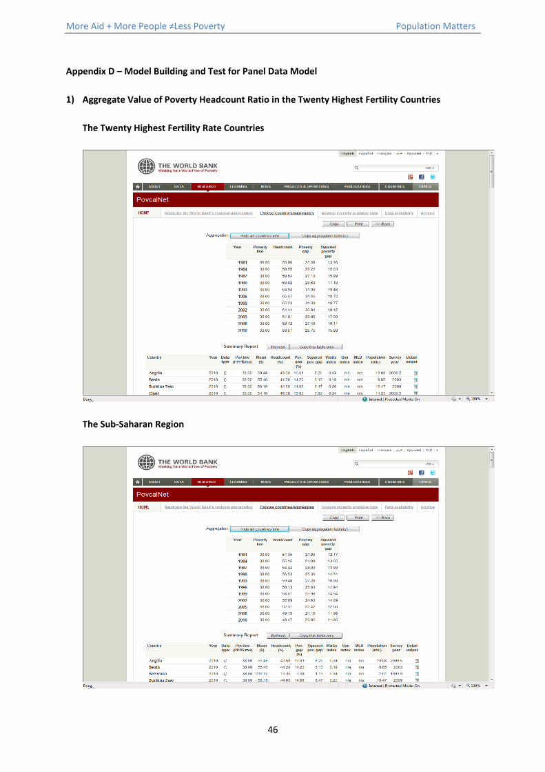
More Aid + More People ≠Less Poverty Population Matters
46
Appendix D – Model Building and Test for Panel Data Model
1) Aggregate Value of Poverty Headcount Ratio in the Twenty Highest Fertility Countries
The Twenty Highest Fertility Rate Countries
The Sub-Saharan Region

More Aid + More People ≠Less Poverty Population Matters
47
China
Worldwide

More Aid + More People ≠Less Poverty Population Matters
48
2) Boxplot
Below boxplots show any outlier of variables in empirical model dataset. It can be seen that variable
life expectancy, log GDP per capita, size of population, log aid on education, log aid on reproductive
health, log aid on STD control and economic infrastructure has a few outliers. After investigate these
outlier observations, none of them are error and removing them would lead data bias. Therefore,
keep these outlier observations in the model building dataset.
7.5
7.0
6.5
6.0
5.5
5.0
To
ta
l Fe
rtilit
y R
ate
Boxplot of Total Fertility Rate
65
60
55
50
45
40
Lif
e E
xp
ecta
ncy
Boxplot of Life Expectancy
3.8
3.6
3.4
3.2
3.0
2.8
2.6
2.4
2.2
2.0
Lo
g G
DP
Boxplot of Log GDP
180000000
160000000
140000000
120000000
100000000
80000000
60000000
40000000
20000000
0
Siz
e o
f P
op
ula
tio
n
Boxplot of Size of Population
225
200
175
150
125
100
75
50
Ch
ild
re
n u
nd
er 5
Mo
rta
lity
(p
er
Boxplot of Children under 5 Mortality (per
2.5
2.0
1.5
1.0
0.5
0.0
Lo
g o
n E
du
ca
tio
n
Boxplot of Log on Education
3.0
2.5
2.0
1.5
1.0
0.5
Lo
g o
n H
ea
lth
Boxplot of Log on Health
2.0
1.5
1.0
0.5
0.0
-0.5
-1.0
Lo
g o
n R
ep
ro
Boxplot of Log on Repro
1.5
1.0
0.5
0.0
-0.5
-1.0
Lo
g o
n F
am
ily
Pla
nn
ing
Boxplot of Log on Family Planning
3
2
1
0
-1
-2
Lo
g o
n S
TD
Boxplot of Log on STD
3
2
1
0
-1
-2
Lo
g o
n E
co
Boxplot of Log on Economic Infrastructure

More Aid + More People ≠Less Poverty Population Matters
49
3) Histogram
Histogram displays data structure of each variable. The vertical axis displays the frequencies of the
observations appear in the range which indicated by horizontal axis. It can be seen from the size of
population plot that there are some extreme values in variable size of population. Some
observations have very large size of population, exceed 150 million. These observations are from
Nigeria, which is the seventh largest populous country in the world.
7.57.06.56.05.55.04.5
35
30
25
20
15
10
5
0
Total Fertility Rate
Frequency
Mean 5.877
StDev 0.6012
N 170
Histogram of Total Fertility RateNormal
646056524844
40
30
20
10
0
Life Expectancy
Frequency
Mean 51.84
StDev 4.499
N 170
Histogram of Life ExpectancyNormal
3.63.33.02.72.42.1
30
25
20
15
10
5
0
Log GDP
Frequency
Mean 2.704
StDev 0.3204
N 170
Histogram of Log GDPNormal
1500
0000
0
1200
0000
0
9000
0000
6000
0000
3000
00000
-300
0000
0
70
60
50
40
30
20
10
0
Size of Population
Frequency
Mean 27316845
StDev 32743521
N 170
Histogram of Size of PopulationNormal
2101801501209060
20
15
10
5
0
Children under 5 Mortality (per
Frequency
Mean 128.0
StDev 37.98
N 170
Histogram of Children under 5 Mortality (perNormal
2.42.01.61.20.80.4
40
30
20
10
0
Log on Education
Frequency
Mean 1.763
StDev 0.3635
N 170
Histogram of Log on EducationNormal
2.82.42.01.61.20.80.4
35
30
25
20
15
10
5
0
Log on Health
Frequency
Mean 1.760
StDev 0.4285
N 170
Histogram of Log on HealthNormal
2.01.61.20.80.40.0-0.4-0.8
35
30
25
20
15
10
5
0
Log on Repro
Frequency
Mean 0.7211
StDev 0.4467
N 170
Normal Histogram of Log on Reproductive Health
1.61.20.80.40.0-0.4-0.8-1.2
25
20
15
10
5
0
Log on Family Planning
Frequency
Mean 0.2208
StDev 0.6582
N 170
Histogram of Log on Family PlanningNormal
3.002.251.500.750.00-0.75-1.50
25
20
15
10
5
0
Log on STD
Frequency
Mean 1.315
StDev 0.9042
N 170
Histogram of Log on STDNormal
3.002.251.500.750.00-0.75-1.50
40
30
20
10
0
Log on Eco
Frequency
Mean 1.830
StDev 0.5842
N 170
Histogram of Log on EcoNormal

More Aid + More People ≠Less Poverty Population Matters
50
4) Matrix Plot
The above matrix shows observation scatter of each variable before logarithmic transformation. It is
clear that observations of variable GDP per capita, development aid on education, health,
reproductive health, family planning, STD control and economic infrastructure are concentrated at
left hand side of their plot. After logarithmic transformation, observations of these variables are
more scattered from the below matrix.
TotalFertility
Rate
LifeExpectancy
GDPper
capita
Size ofPopulation
Childrenunder 5Mortality
(per 1000)
Aid onEducation
Aid onHealth
Aid onReproductive
HealthCare
FamilyPlanning(c=0.1)
Aid on STDcontrol
includingHIV/Aids
Aid onEconomic
Infrastructure& Service
4
6
8
4 6 8
40
50
60
70
40 50 60 70
0
2000
4000
6000
0 2000 4000 6000
0
100000000
200000000
0 100000000 200000000
50
100
150
200
50 100 150 200
0
200
400
0 200 400
0
200
400
600
0 200 400 600
0
50
100
0 50 100
0
20
40
0 20 40
0
500
0 500
0
500
1000
0 500 1000
TotalFertility
Rate
LifeExpectancy
log_GDPperCapita
Size ofPopulation
Childrenunder 5Mortality
(per 1000)
log_aidEducation
log_aidHealth
log_aidReproductive
log_aidFamilyPlanning
log_STD
log_aidEco
4
6
8
4 6 8
40
50
60
70
40 50 60 70
4
6
8
4 6 8
0
100000000
200000000
0 100000000 200000000
50
100
150
200
50 100 150 200
0
2
4
6
0 2 4 6
2
4
6
2 4 6
-2
0
2
4
-2 0 2 4
-10
-5
0
5
-10 -5 0 5
-5
0
5
-5 0 5
-5
0
5
-5 0 5
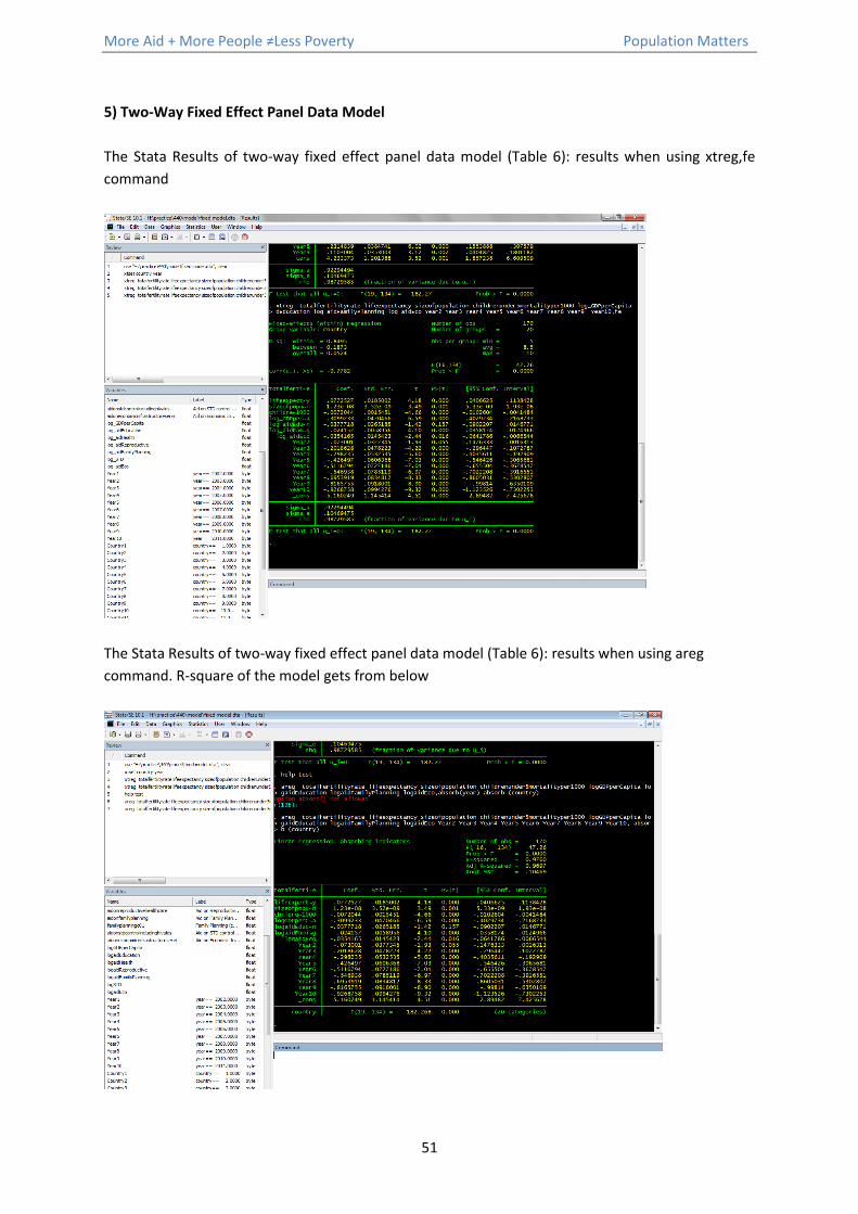
More Aid + More People ≠Less Poverty Population Matters
51
5) Two-Way Fixed Effect Panel Data Model
The Stata Results of two-way fixed effect panel data model (Table 6): results when using xtreg,fe
command
The Stata Results of two-way fixed effect panel data model (Table 6): results when using areg
command. R-square of the model gets from below

More Aid + More People ≠Less Poverty Population Matters
52
6) Residual plot
Standardized Residual vs. Fitted Value
There are only two observations which have standardized residuals larger than 3 which indicate that
no unusually large standardized residual in the empirical model.
Leverage vs. Fitted Value
There is only one observation has leverage higher than 0.5, which has no reason to believe that it is
an error. Thus, keep in model building dataset.
7.57.06.56.05.55.04.5
4
3
2
1
0
-1
-2
-3
-4
Fitted Value
Sta
nd
ard
ize
d R
esid
ua
l
Scatterplot of Standardized Residual vs Fitted Value
7.57.06.56.05.55.04.5
0.5
0.4
0.3
0.2
0.1
Fitted Value
Le
ve
rag
e
Scatterplot of Leverage vs Fitted Value

More Aid + More People ≠Less Poverty Population Matters
53
7) Causal Loop Diagram