Embed Size (px)
DESCRIPTION
...still needs for editting. (Part 1)
Citation preview
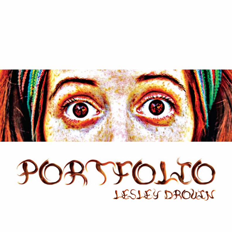
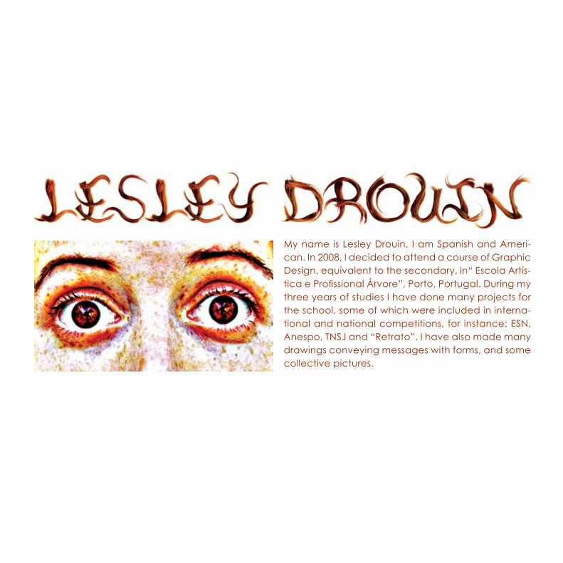
My name is Lesley Drouin, I am Spanish and Ameri-can. In 2008, I decided to attend a course of Graphic Design, equivalent to the secondary, in“ Escola Artís-tica e Profissional Árvore”, Porto, Portugal. During my three years of studies I have done many projects for the school, some of which were included in interna-tional and national competitions, for instance: ESN, Anespo, TNSJ and “Retrato”. I have also made many drawings conveying messages with forms, and some collective pictures.
6
190
282
110
1
2
3
In the subject of Graphic Design, for the final project of the 2nd year, we were asked to choose a national or universal day in order to create a campaign where the student had to relate that chosen day with Intangible Heritage. In my case, I decided to create a campaign called “Eye” relating it to the universal day of poverty and social exclusion,17th October.
My concept has to do with the creation of a future where people live and think in communion. It is necessary that the society knows that this problem of poverty and social exclusions has to do with everyone, not only with the less fortunate. In a more and more materialistic world, with economical problems and unemployment as well as low salaries, it is important that we understand that this type of individuality is completely unsustainable. We need to change and be more conscious of our actions, consume less and give more, take our actions to a global perspective and be more conscious that we are all the same, what matters is the union. With this sense, my objective is to talk about many different customs, analyzing many cultural characteristics from different nationalities, creating a union to demonstrate with these examples of identifications how we are all the same. We have to be more conscious of the present and live as one, because all the perspectives and illusions are creating misunderstandings and separations between us all, even though we all come from the same nature - Life.
The “main target” are youngsters (10-30 years old), because they are always the ones that make a change. The youngsters have daring creativity and energy, they have natural feelings for justice and peace that can make tomorrow a better day than today.
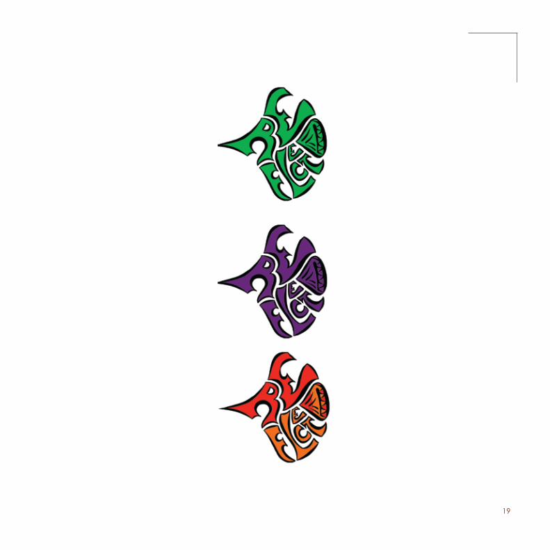
As for the logomark, I created a symbol with the shape of a sun, to symbolize consciousness, and inside the sun there holds an eye to symbolize different perspectives. I also created the typography in order to be graphically coherent with the sunrays. I used the color green so that the logo can have an organic expression that would lead us to thinking of our ecosystem, and the color orange to symbolise the consciousness and the energy to change. I invented the slogan for the campaign, “Change Vision”. I think this might motivate the public to change their way of thinking or simply remind them that it is our duty to maintain justice and equality and therefore evolve in a sustainable way.
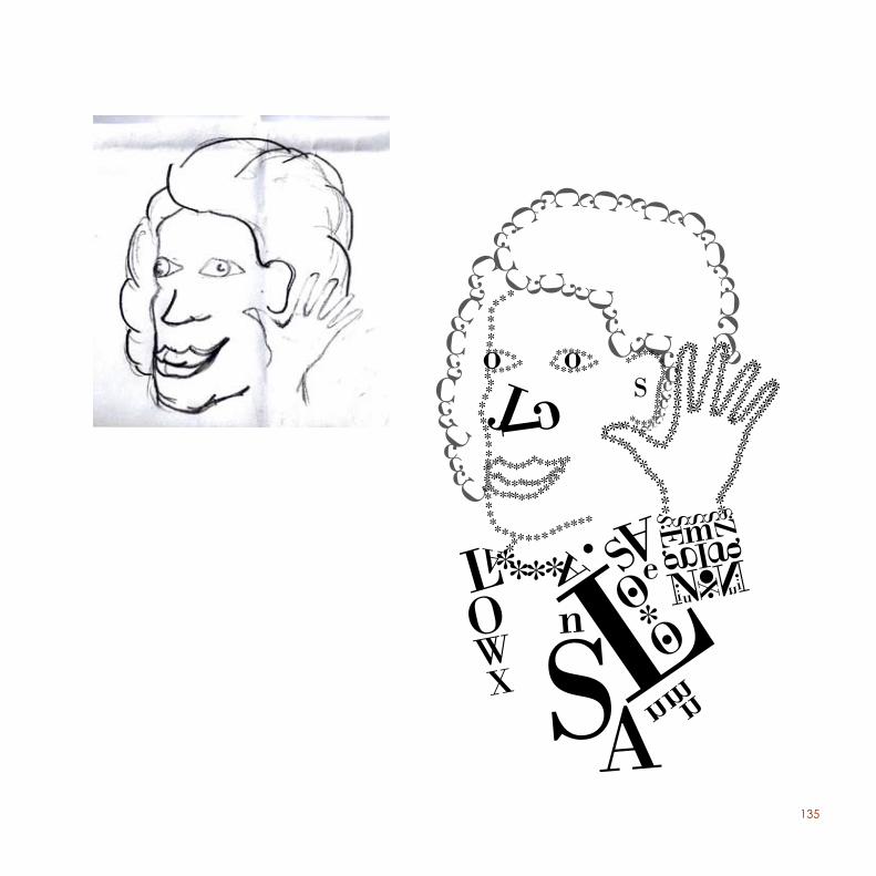
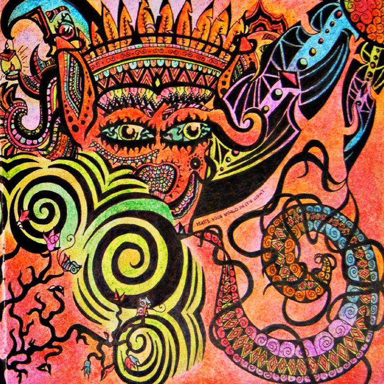
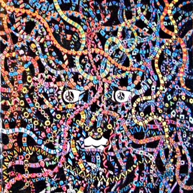
After some research, studies and long reflections, I developed an idea that consists of an illustration containing a “Mandala”, which is a circle with a structure integrated and organized around a unified center. The “Mandala” for the poster is divided in five parts, representing the continents Africa, Asia, America, Europe and Oceania. Each continent contains three countries which are represented with a symbol to identify each one of those countries. In the middle of the “Mandala” is the sun with the form of a human’s face to represent the human race and the essence of life. Basically, the only way to unite is by opening our minds, and realize how we are all the same and we are all one part of the universe, because when thoughts, memories, beliefs, are left aside we realize what is there, and not the illusion or perspective our minds tend to create. We are all beings, humans, who have the capability to be able to use our minds to evolve in a sustainable way of life. If we are conscious that we are not the symbols but yes the sun, it will mean that we will think as one and simply realize all the perspectives and have the ability to use them, and not actually be them.
4
LogomarkRe
flect
5
Poster (A0)Reflect
6
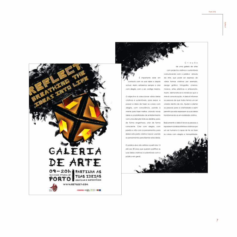
Criação de uma galeria de artes com projectos criativos e sustentáveis comunicando com o público através da Arte, que pode ser expresso de várias formas criativas por exemplo, design gráfico, fotografia, cinema, música, artes plásticas e artesanato. Assim, demonstra-se e revela-se que a Arte é comunicação.
A ideia é informar as pessoas de que todos temos um ser criador dentro de nós. Ajudar a alertar as pessoas para a criatividade e assim permitir que elas expressem as suas ideias transformando-as em realidade criativa.
Basicamente a ideia é pôr em prática, para levar as pessoas a repararem as ideias infinitas e criativas que um ser humano é capaz de ter ao fazer as coisas com alegria e tranquilidade. É importante estar em contacto com as suas raízes e depois actuar. Assim, estaremos sempre a criar com alegria, com o ser, contigo mesmo.
O objectivo é coleccionar várias ideias criativas e sustentáveis, para expor, e passar a ideia de fazer as coisas com alegria, com consciência, usando a mente para fazer melhor, criando novas ideias e novas possibilidades de entretenimento com uma atenção forte ao detalhe, para, de forma engenhosa, criar conscientemente. Criar com alegria, com sentimento e não com os pensamentos, deixar esta parte criativa nascer usando os pensamentos para libertar estas ideias.
O público-alvo são artistas a partir dos 15 até aos 30 anos que querem partilhar as suas ideias criativas e sustentáveis com o público em geral.
Leaflet (A4)Re
flect
7
C r i a ç ã o
de uma galeria de artes
com projectos criativos e sustentáveis
comunicando com o público através
da Arte, que pode ser expresso de
várias formas criativas por exemplo,
design gráfico, fotografia, cinema,
música, artes plásticas e artesanato.
Assim, demonstra-se e revela-se que a
Arte é comunicação. A ideia é informar
as pessoas de que todos temos um ser
criador dentro de nós. Ajudar a alertar
as pessoas para a criatividade e assim
permitir que elas expressem as suas ideias
transformando-as em realidade criativa.
Basicamente a ideia é levar as pessoas a
repararem as ideias infinitas e criativas que
um ser humano é capaz de ter ao fazer
as coisas com alegria e tranquilidade.
É importante estar em
contacto com as suas raízes e depois
actuar. Assim, estaremos sempre a criar
com alegria, com o ser, contigo mesmo.
O objectivo é coleccionar várias ideias
criativas e sustentáveis, para expor, e
passar a ideia de fazer as coisas com
alegria, com consciência, usando a
mente para fazer melhor, criando novas
ideias e possibilidades de entretenimento
com uma atenção forte ao detalhe, para,
de forma engenhosa, criar de forma
consciente. Criar com alegria, com
paixão e não com os pensamentos, para
deixar esta parte criativa nascer usando
os pensamentos para libertar estas ideias.
O público-alvo são artistas a partir dos 15
até aos 30 anos que querem partilhar as
suas ideias criativas e sustentáveis com o
público em geral.
Flyer (A5)Reflect
8
ww
w.re
flect
.com
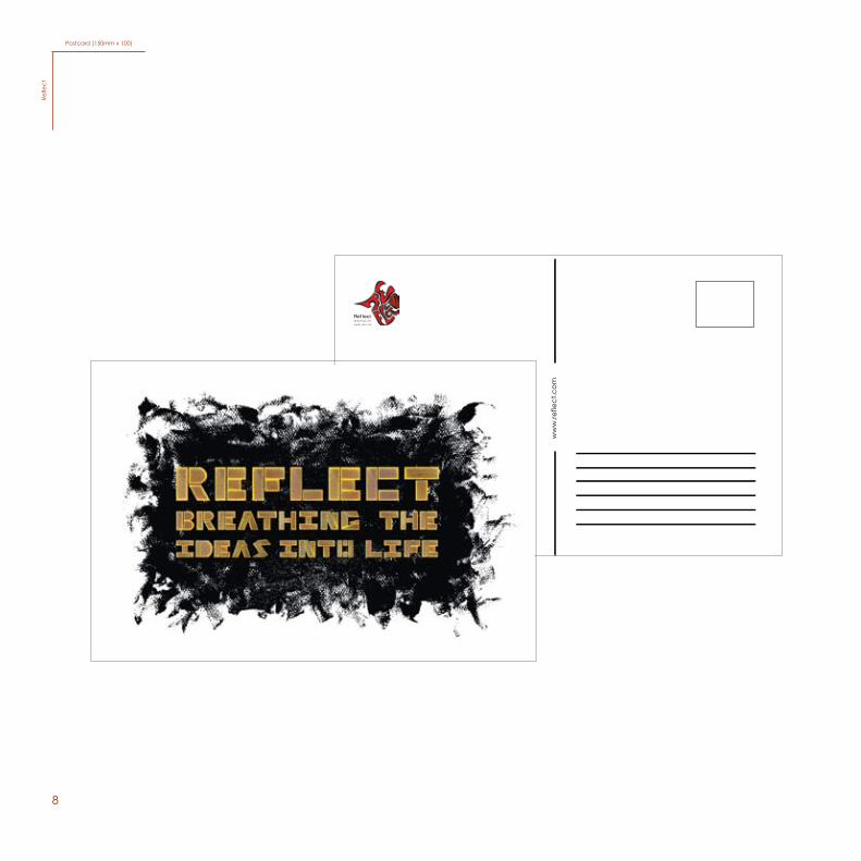
Postcard (150mm x 100)Re
flect
9
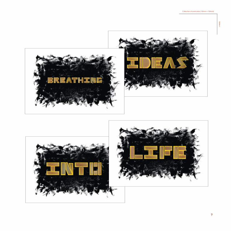
Collection of postcards (150mm x 100mm)Reflect
10
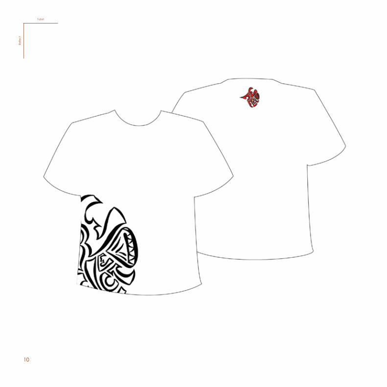
T-shirtRe
flect
11
MerchandisingReflect
12
CalenderRe
flect
13
CD albumReflect
14
Basicamente a ideia é pôr em prática, para levar as pessoas a repararem
as ideias infinitas e criativas que um ser humano é capaz de ter ao fazer as
coisas com alegria e tranquilidade. Quando se para de pensar por um
momento e foca-se toda a atenção no campo de energia no interior de cada
ser, vai estar consciente de uma quietude, ganhando assim consciência no
seu corpo. E, depois, quando voltar a pensar, a mente vai estar fresca e
com um impulso mais criativo. Isto ajudará sempre quando for necessário dar
uma resposta, uma solução ou uma ideia criativa. É importante estar em
contacto com as suas raízes e depois actuar. Assim, estaremos sempre a criar
com alegria, com o ser, contigo mesmo.
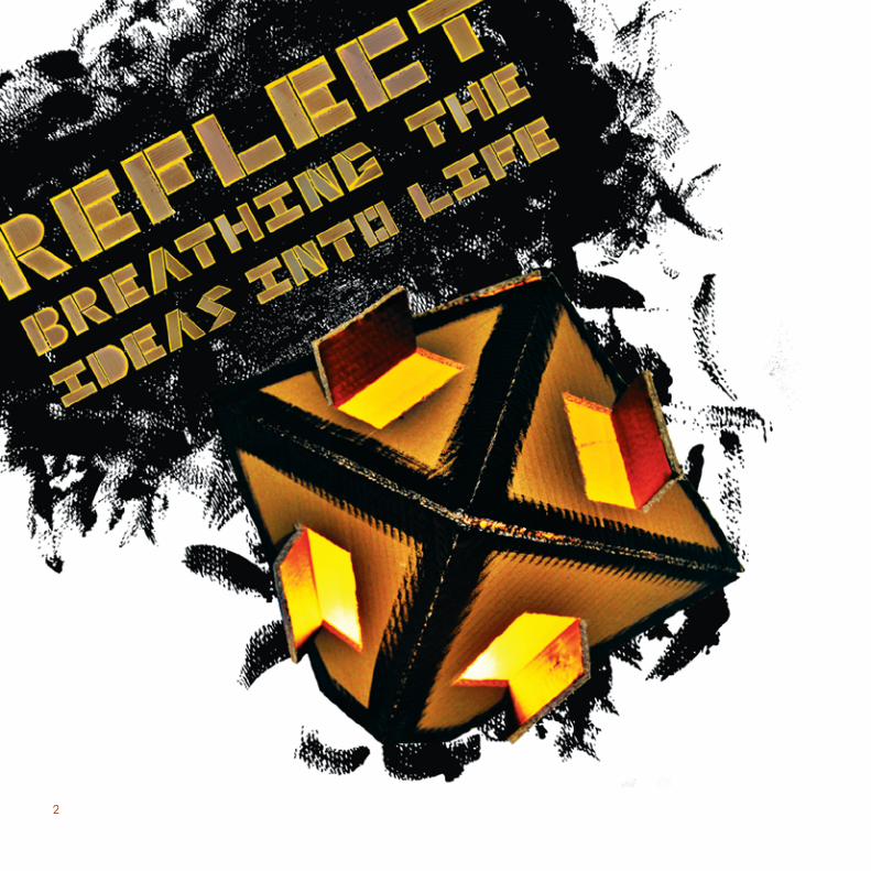
Na realização da logomarca, a ideia é usar um diamante como o elemento
simbólico da campanha. Decidi usar este elemento por ser transparente
e ter várias faces e ângulos de perspectivas. Depois de vários esboços e
diversas tentativas em relação à forma do diamante, a conclusão foi esta,
a ideia de construir o diamante com o próprio nome da campanha. Tal
como esta campanha precisa do público para conseguir reflectir as ideias,
o público vai-se sentir reflectido nas ideias da campanha. Também tem a
estrutura da forma como os olhos do ser humano vêem as formas. Usei a cor
vermelha com um “stroke” preto para causar um forte impacto ao público.
Isto é uma ideia para parar a inconsciência colectiva e fazer as pessoas
repararem na diferença entre o que é e o que não é realidade. Todo o mal
vem da inconsciência. Sem ter uma profunda mudança na consciência
humana, o sofrimento do mundo não acabará.
Eu acredito que a solução está na pessoa, a consciência presente. Se for
preciso actuar, não há a necessidade de ter uma reacção com a condição
da mente, mas pode-se responder à situação através da consciência
presente. Neste estado, a mente está livre de conceitos, incluindo o
conceito de não-violência. Quando a identificação com o estado da
mente estiver fora do caminho, a verdadeira comunicação iniciará.
O público-alvo são artistas a partir dos 15 até aos 30 anos que querem
partilhar as suas ideias criativas e sustentáveis com o público em geral.
Em relação ao cartaz, criei um diamante de cartão com portas abertas,
para explicar que somos nós que temos de abrir as portas para despertar
a criatividade, a qual pode ser expressa de várias formas sempre vindo da
mesma essência, a vida, que é simbolizada como a luz vinda do centro do
diamante. Visualizar uma luz no interior é o mais perto que conseguimos
chegar de ver a consciência no seu estado mais puro.
Foi utilizado cartão para dar a sensação de ser rascunho, criando duas
tipografias, de cartão para o título, e de tinta para a informação, como
se fossem as últimas gotas que caíram do rascunho.
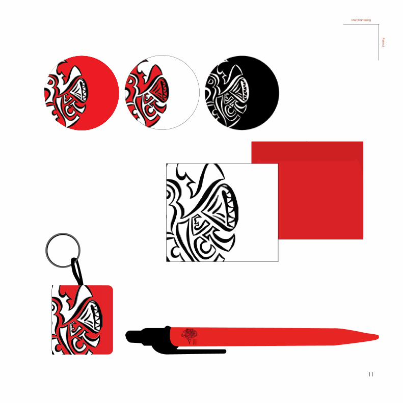
Para os outros elementos publicitários utilizei os mesmos elementos do
cartaz e também, em alguns, utilizei a forma do diamante, por exemplo,
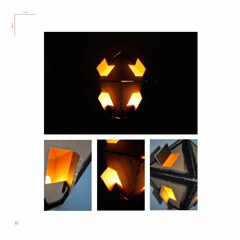
no kit, no elemento informativo (desdobrável) e no candeeiro.
Fazer uma galeria numa casa abandonada. Coleccionar várias ideias
criativas e sustentáveis, para expor. Passar a ideia de fazer as coisas
com alegria, com consciência, usando a mente para fazer melhor,
criando novas ideias e novas possibilidades de entretenimento com
uma atenção forte ao detalhe para, de forma engenhosa, criar de
forma consciente. Criar com alegria, com sentimento e não com os
pensamentos, deixar esta parte criativa nascer usando os pensamentos
para libertar estas ideias.
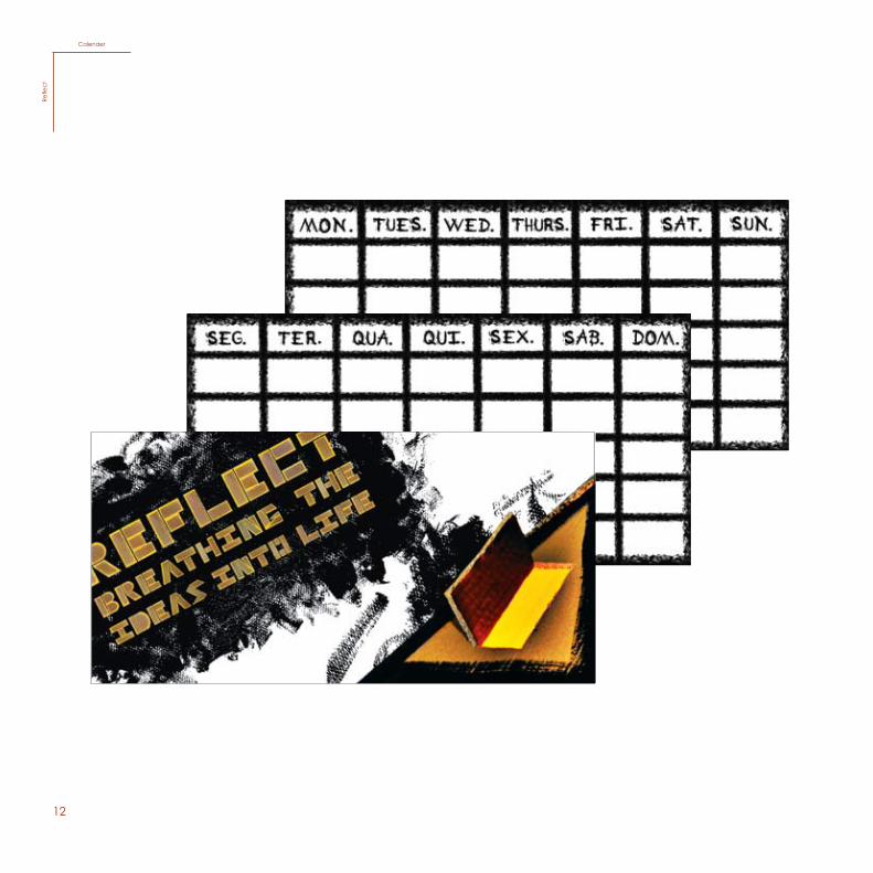
Para o último projecto de Design Gráfico, PAP, foi-nos dado o
tema “Pensar Globalmete, Actuar Localmente”. Decidi criar uma
campanha com o nome “Reflect” e o slogan “Breathing the ideas
into life”.
A ideia é informar as pessoas de que todos temos um ser criador
dentro de nós. Ajudar a alertar as pessoas para a criatividade e
assim permitir que elas expressem as suas ideias transformando-as
em realidade criativa.
CD album leaflet (A3)Re
flect
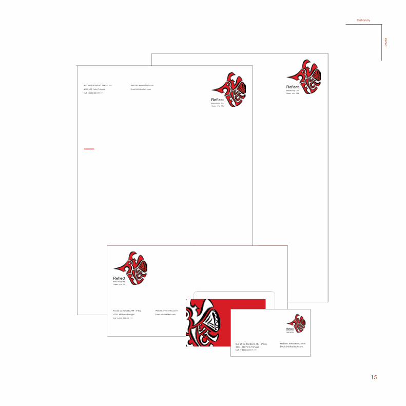
15
Rua Sá da Bandeira, 784 - 6º Esq.
4000 - 432 Porto Portugal
Telf: (+351) 223 171 171
Website: www.reflect.com
Email: [email protected]
Rua Sá da Bandeira, 784 - 6º Esq.
4000 - 432 Porto Portugal
Telf: (+351) 223 171 171
Website: www.reflect.com
Email: [email protected]
Rua Sá da Bandeira, 784 - 6º Esq.4000 - 432 Porto PortugalTelf: (+351) 223 171 171
Website: www.reflect.comEmail: [email protected]
StationaryReflect
16
Reflect“Breathing these Ideas into Life”
Sub-tema: Comunicar através da Arte e explicar como a Arte é comunicação.
Sub-tema: Comunicar através da Arte e explicar como a Arte é comunicação.
Reflect“Breathing the ideas into life”
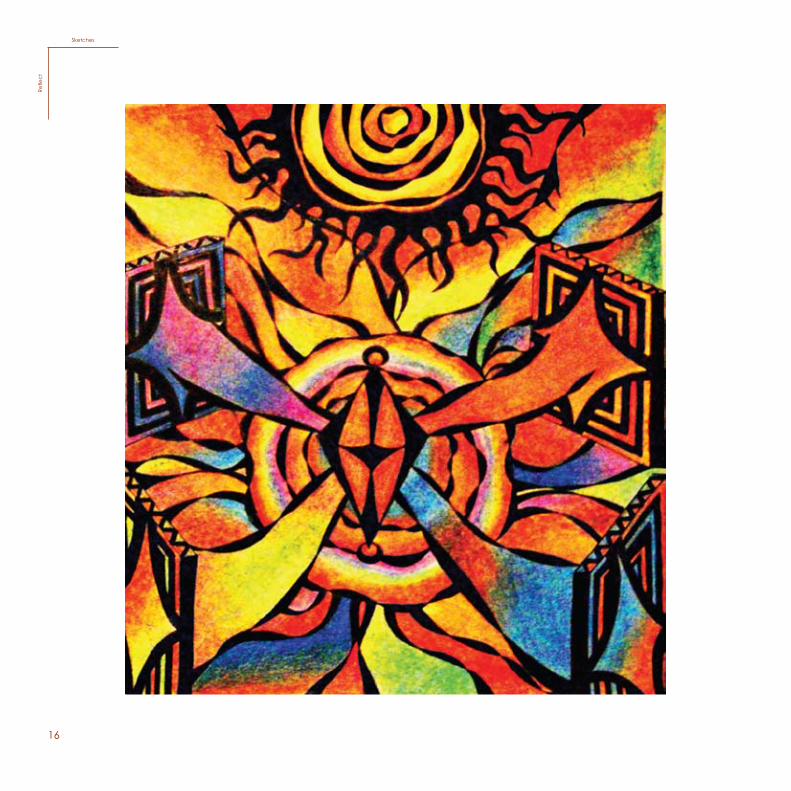
SketchesRe
flect
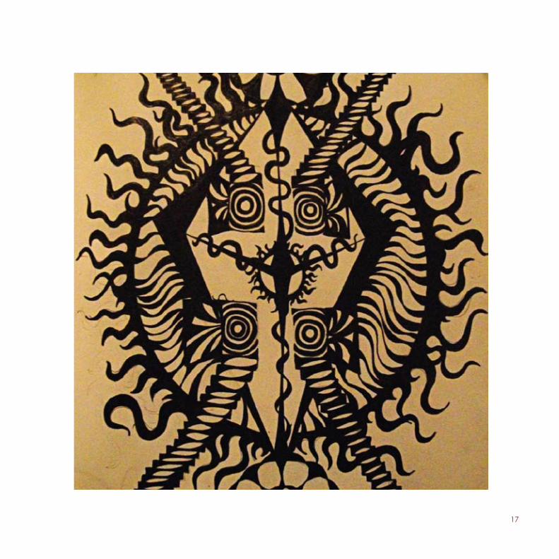
17
Objectivos: fazer uma galéria numa casa abandonada para colecionar várias ideas criativas e sustentáveis.
Objectivos: Fazer uma galeria numa casa abandonada para colecionar várias ideas criativas e sustentáveis.
18
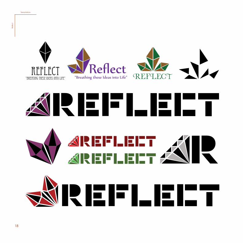
Reflect“Breating these ideas into life” REFLECT
TemptationsRe
flect
19
20
Processo
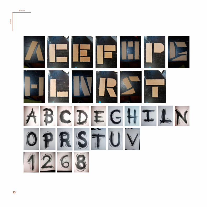
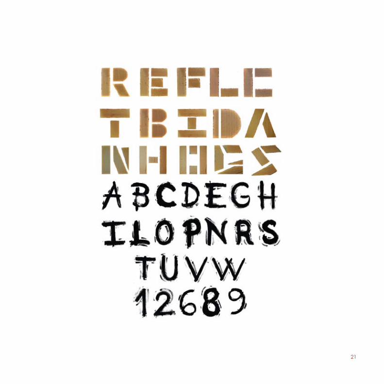
TypefaceRe
flect
21
22
LampRe
flect
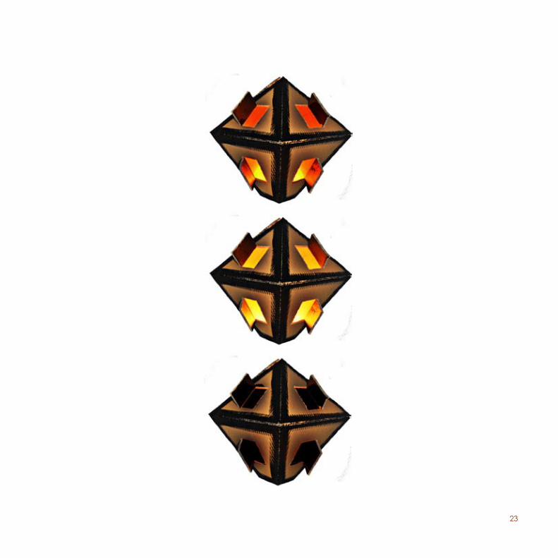
23
24
25
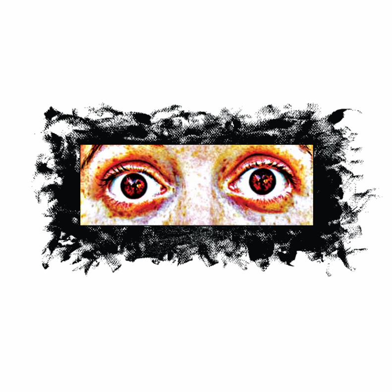
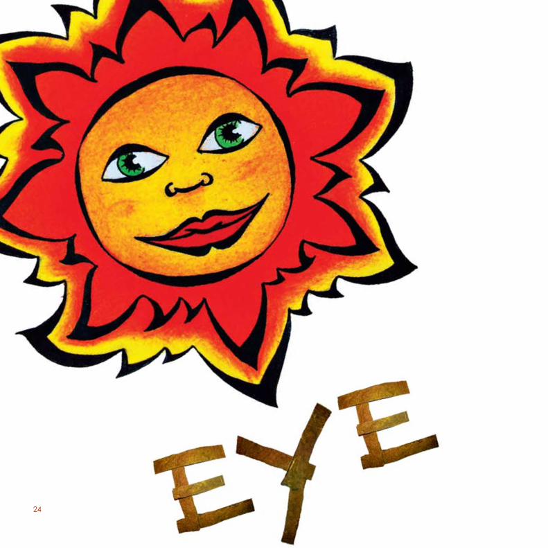
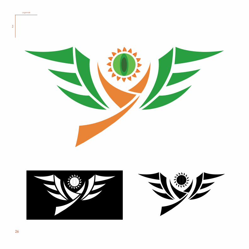
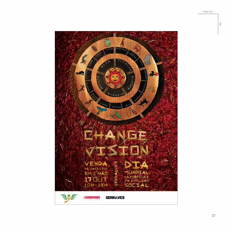
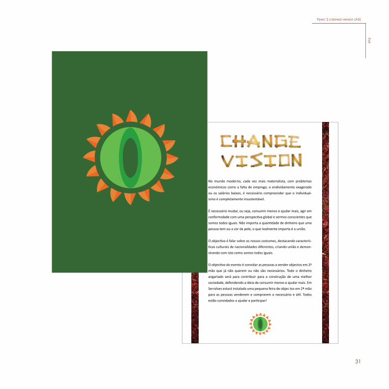
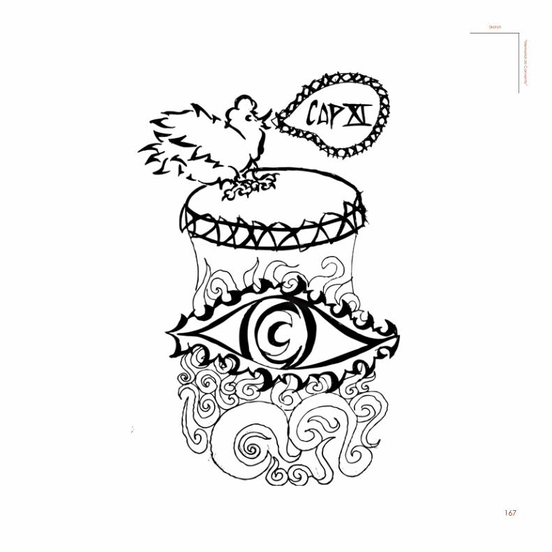
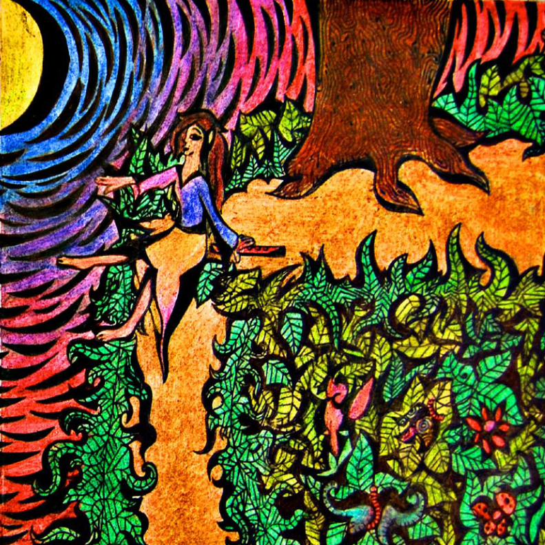
In the subject of Graphic Design, for the final project of the 2nd year, we were asked to choose a national or universal day in order to create a campaign where the student had to relate that chosen day with Intangible Heritage. In my case, I decided to create a campaign called “Eye” relating it to the universal day of poverty and social exclusion,17th October.
My concept has to do with the creation of a future where people live and think in communion. It is necessary that the society knows that this problem of poverty and social exclusions has to do with everyone, not only with the less fortunate. In a more and more materialistic world, with economical problems and unemployment as well as low salaries, it is important that we understand that this type of individuality is completely unsustainable. We need to change and be more conscious of our actions, consume less and give more, take our actions to a global perspective and be more conscious that we are all the same, what matters is the union. With this sense, my objective is to talk about many different customs, analyzing many cultural characteristics from different nationalities, creating a union to demonstrate with these examples of identifications how we are all the same. We have to be more conscious of the present and live as one, because all the perspectives and illusions are creating misunderstandings and separations between us all, even though we all come from the same nature - Life.
The “main target” are youngsters (10-30 years old), because they are always the ones that make a change. The youngsters have daring creativity and energy, they have natural feelings for justice and peace that can make tomorrow a better day than today.
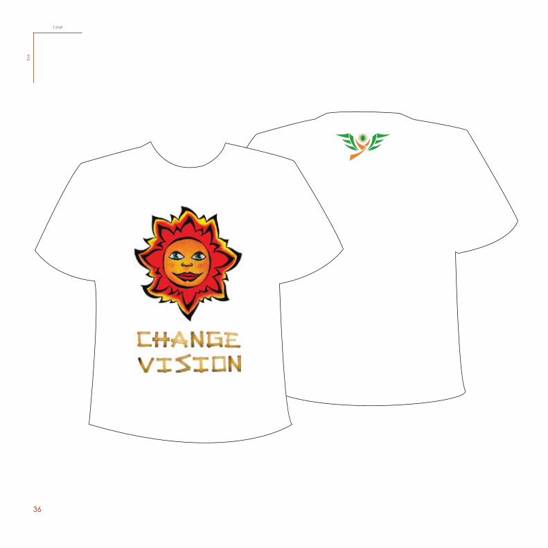
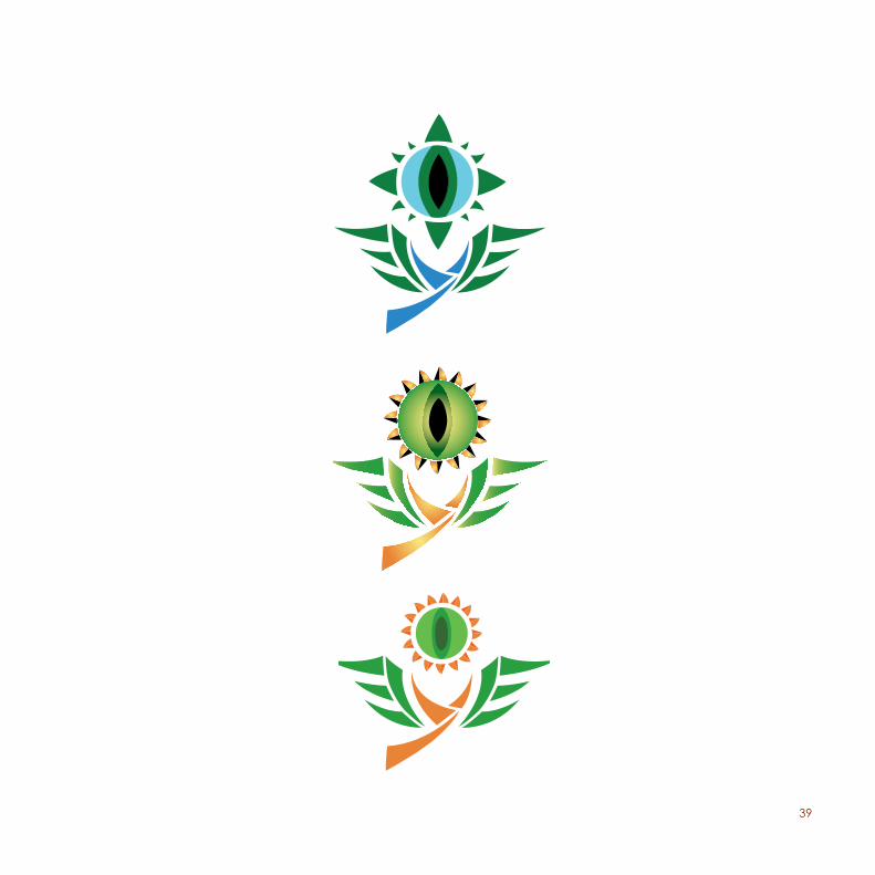
As for the logomark, I created a symbol with the shape of a sun, to symbolize consciousness, and inside the sun there holds an eye to symbolize different perspectives. I also created the typography in order to be graphically coherent with the sunrays. I used the color green so that the logo can have an organic expression that would lead us to thinking of our ecosystem, and the color orange to symbolise the consciousness and the energy to change. I invented the slogan for the campaign, “Change Vision”. I think this might motivate the public to change their way of thinking or simply remind them that it is our duty to maintain justice and equality and therefore evolve in a sustainable way.
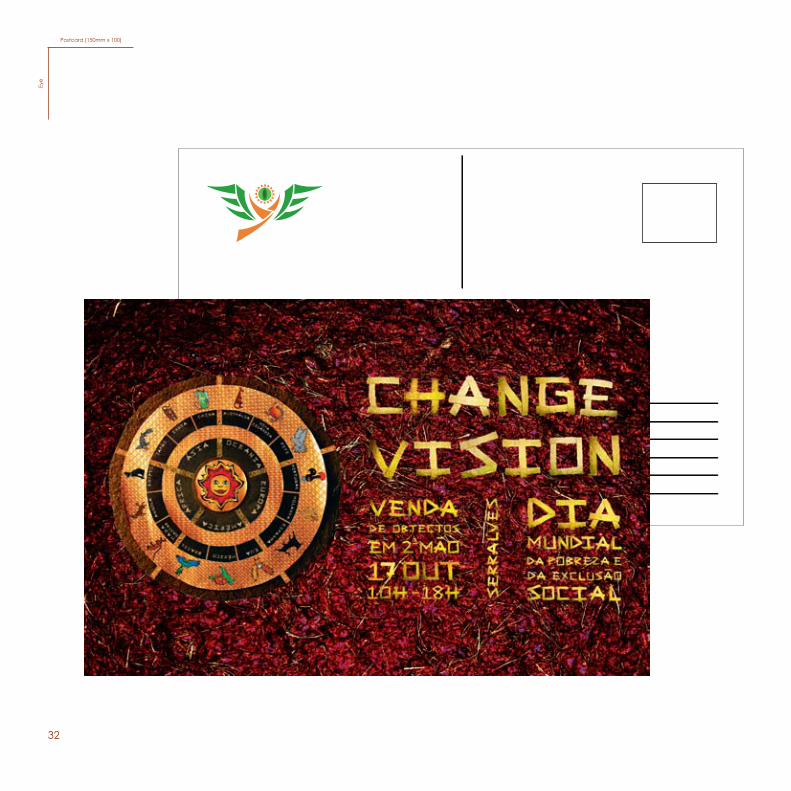
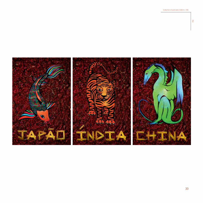
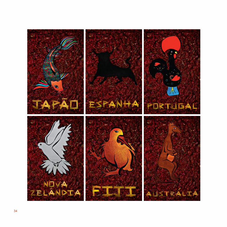
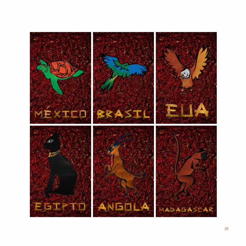
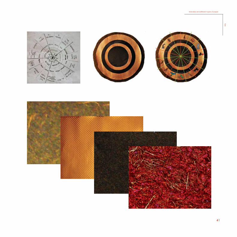
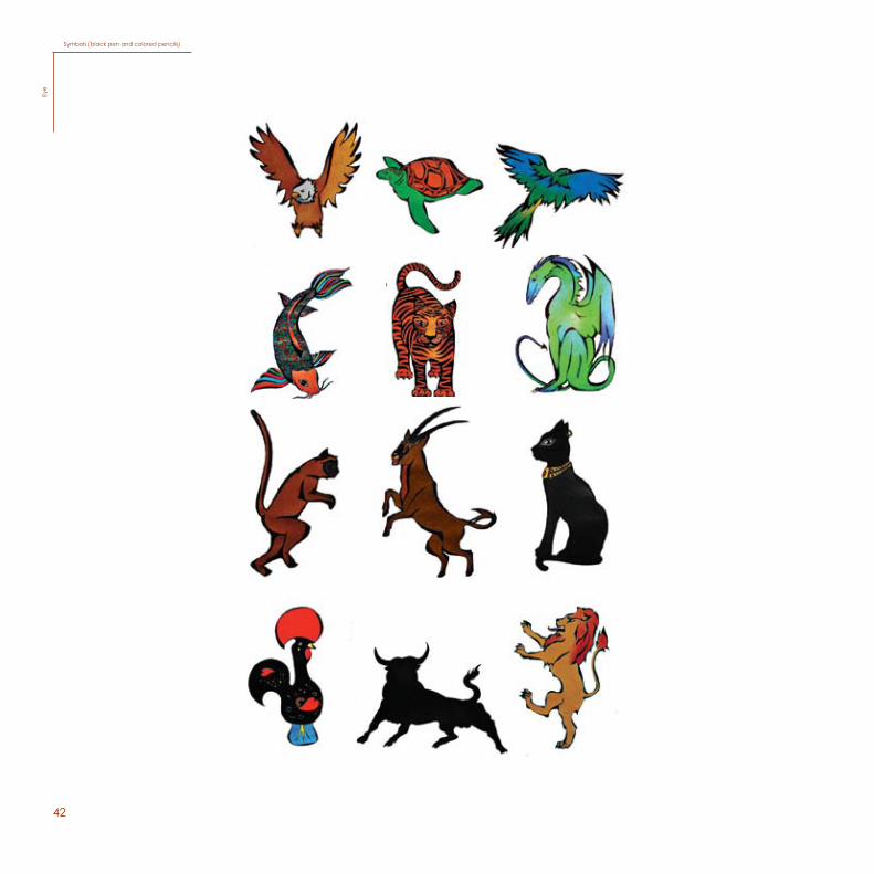
After some research, studies and long reflections, I developed an idea that consists of an illustration containing a “Mandala”, which is a circle with a structure integrated and organized around a unified center. The “Mandala” for the poster is divided in five parts, representing the continents Africa, Asia, America, Europe and Oceania. Each continent contains three countries which are represented with a symbol to identify each one of those countries. In the middle of the “Mandala” is the sun with the form of a human’s face to represent the human race and the essence of life. Basically, the only way to unite is by opening our minds, and realize how we are all the same and we are all one part of the universe, because when thoughts, memories, beliefs, are left aside we realize what is there, and not the illusion or perspective our minds tend to create. We are all beings, humans, who have the capability to be able to use our minds to evolve in a sustainable way of life. If we are conscious that we are not the symbols but yes the sun, it will mean that we will think as one and simply realize all the perspectives and have the ability to use them, and not actually be them.
26
LogomarkEy
e
27
Poster (A1)Eye
28
LeafletEy
e
29
Leaflet/ 2 colored versionEye
30
Flyer (A5)Ey
e
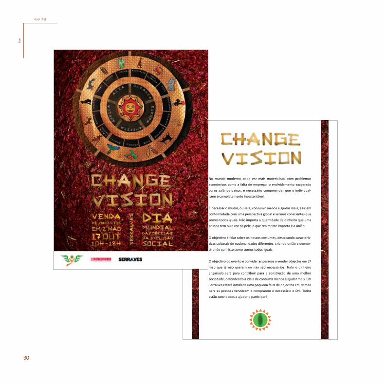
No mundo moderno, cada vez mais materialista, com problemas
económicos como a falta de emprego, o endividamento exagerado
ou os salários baixos, é necessário compreender que o individual-
ismo é completamente insustentável.
É necessário mudar, ou seja, consumir menos e ajudar mais, agir em
conformidade com uma perspectiva global e sermos conscientes que
somos todos iguais. Não importa a quantidade de dinheiro que uma
pessoa tem ou a cor da pele, o que realmente importa é a união.
O objectivo é falar sobre os nossos costumes, destacando caracterís-
ticas culturais de nacionalidades diferentes, criando união e demon-
strando com isto como somos todos iguais.
O objectivo do evento é convidar as pessoas a vender objectos em 2ª
mão que já não querem ou não são necessários. Todo o dinheiro
angariado será para contribuir para a construção de uma melhor
sociedade, defendendo a ideia de consumir menos e ajudar mais. Em
Serralves estará instalada uma pequena feira de objec tos em 2ª mão
para as pessoas venderem e comprarem o necessário e útil. Todos
estão convidados a ajudar e participar!
31
Flyer/ 2 colored version (A5) Eye
No mundo moderno, cada vez mais materialista, com problemas
económicos como a falta de emprego, o endividamento exagerado
ou os salários baixos, é necessário compreender que o individual-
ismo é completamente insustentável.
É necessário mudar, ou seja, consumir menos e ajudar mais, agir em
conformidade com uma perspectiva global e sermos conscientes que
somos todos iguais. Não importa a quantidade de dinheiro que uma
pessoa tem ou a cor da pele, o que realmente importa é a união.
O objectivo é falar sobre os nossos costumes, destacando caracterís-
ticas culturais de nacionalidades diferentes, criando união e demon-
strando com isto como somos todos iguais.
O objectivo do evento é convidar as pessoas a vender objectos em 2ª
mão que já não querem ou não são necessários. Todo o dinheiro
angariado será para contribuir para a construção de uma melhor
sociedade, defendendo a ideia de consumir menos e ajudar mais. Em
Serralves estará instalada uma pequena feira de objec tos em 2ª mão
para as pessoas venderem e comprarem o necessário e útil. Todos
estão convidados a ajudar e participar!
32
Postcard (150mm x 100)Ey
e
33
Collection of postcards (150mm x 100)Eye
34
35
36
T-shirtEy
e
37
Lesley Drouin Alvarez
(+351) 918 951 211
Rua Elísio nº748 6ºDt
www.eye.com
4000-432 Porto
Lesley Drouin Alvarez
(+351) 918 951 211
Rua Elísio nº748 6ºDt
www.eye.com
4000-432 Porto
Lesley Drouin Alvarez
(+351) 918 951 211
Rua Elísio nº748 6ºDt
www.eye.com
4000-432 Porto
Lesley Drouin Alvarez
(+351) 918 951 211
Rua Elísio nº748 6ºDt
www.eye.com
4000-432 Porto
StationaryEye
38
14
Sketches
Eye
SketchesEy
e
3915
40
16
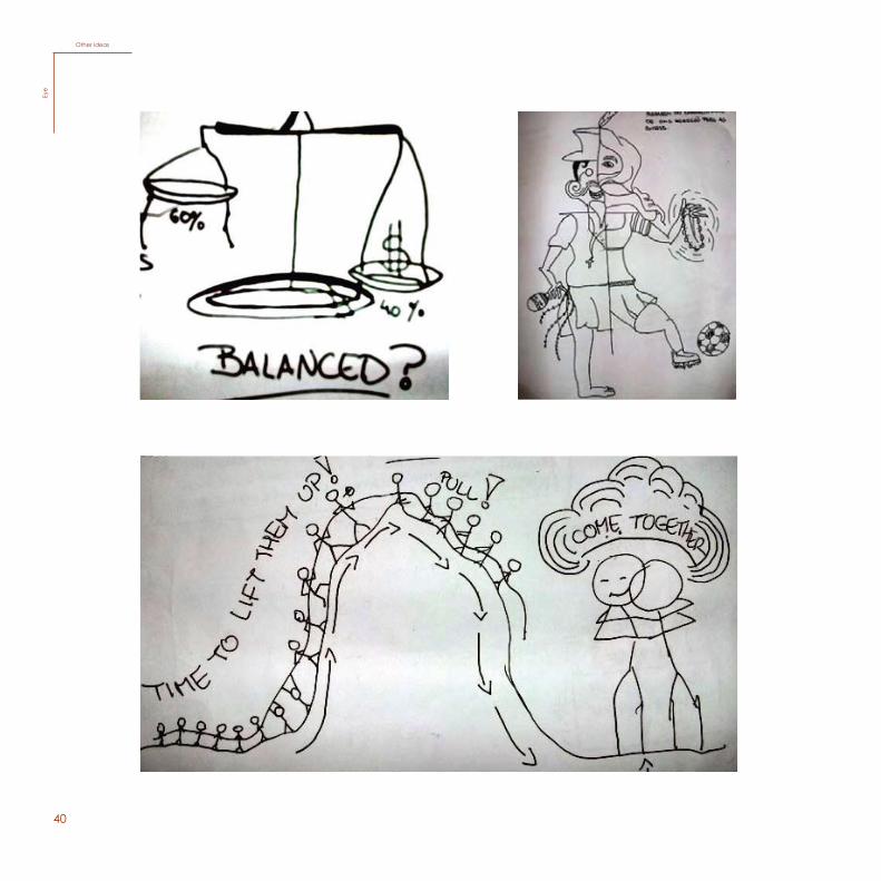
We see it as a balance, we think it’s ok...but it’s really just another illusion
We see it as a balance, we think it’s ok...but it’s really just another illusion
Other ideas
Eye
Other ideasEy
e
41
17
Mandala and different types of paperEye
Mandala and different types of paperEye
42
18
Symbols (black pen and colored pencils)Ey
e
Symbols (black pen and colored pencils)Ey
e
43
19
TypefaceEye
TypefaceEye
44
45
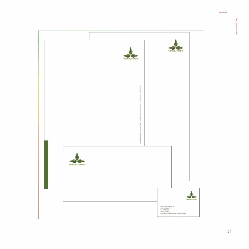
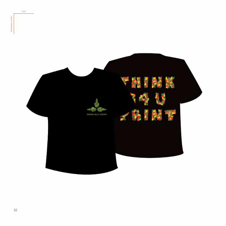
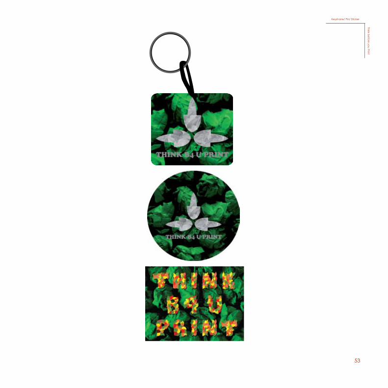
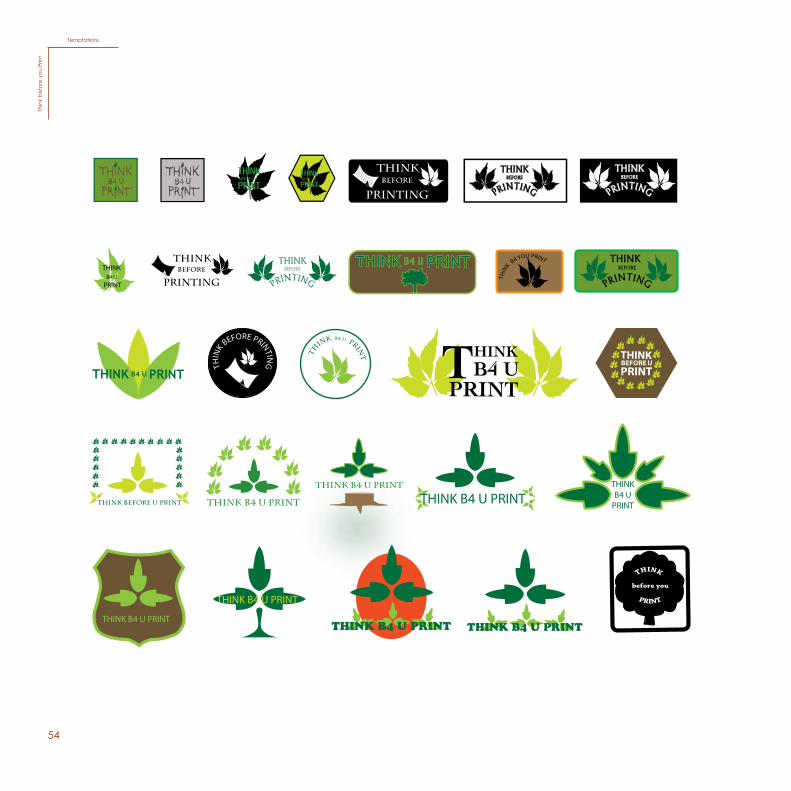
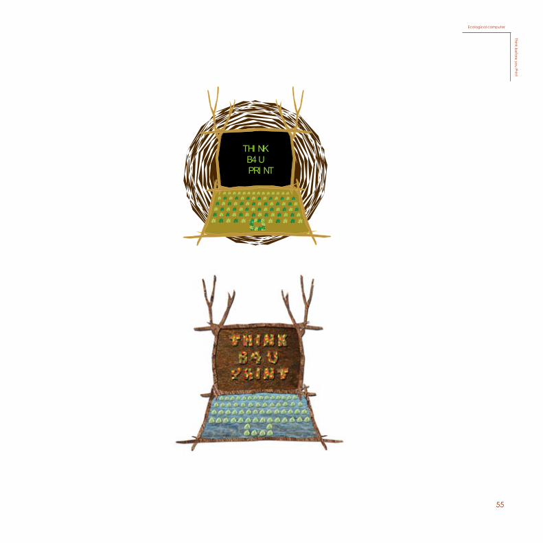
In the subject of Graphic Design, for the final project of the 1st year, we were asked to develop an idea for the campaign “Think before you Print”.
In the beginning of the project, I thought of all the problems that were related to the excessive consumption of paper and printing. I started to observe around me and realized that one of the main problems that has to do with me and the school, was the excessive use of paper every year: notebooks, books, photocopies, tests and worksheets.
My solution for this problem is to substitute paper for laptops, computers and beamers, instead of printing, using notebooks, buying books for school, and all the rest of the things that you usually need to carry around with you when you go to school. The same goes for the teachers. They can also use the beamer when they want to show something to the class, instead of printing worksheets all the time. It is much more practical and it is only a matter of time to replace paper. We need to help our ecosystem because we depend on it. Replacing paper is one way to go. We have to stop the excessive use of paper. Think before you print. When using paper be responsible and use it wisely. Sooner or later, there will be none left.
My concept, graphically, is to relate paper with nature so that no one forgets that, when consuming paper, we are consuming a fundamental source, the ecosystem.
The campaign is directed to the school, and the main target are the students and the teachers.
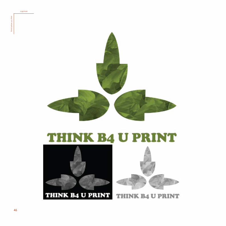
For the production of the logotype, I made a geometrical form with a very simplified leaf from a tree, with a background of smashed up paper in order to demonstrate how we are wasting paper. The idea is to relate it with the natural sources, leaves and trees, with paper, because we might forget the place from where it is coming from and how we are destroying trees and are not able to replace them. I used the color green to represent nature, our ecosystem. I chose the font “cooper black” because I thought that the typeface had a very organic form, which ends up having a connection with the symbol. The slogan that was invented for this campaign is “Embrace the Earth”. I think it will motivate the public to respect the ecosystem more.
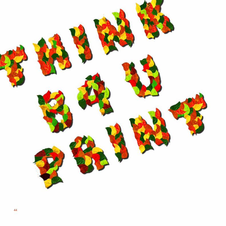
As for the poster, I created an illustration that contains an “ecological“ laptop, which gives the idea of how we will help the ecosystem using laptops instead of printing and wasting paper. I also created a typography for “think before you print” using leaves with a variety of colors to represent the trees which are more valuable alive than cut down. I used warm colors to make a huge contrast with the background and it is also an example of the multiple colors and forms that nature can give us. Finally, for the background, I used the same idea of smashed up paper so that it can be graphically coherent.
46
LogomarkTh
ink
bef
ore
you
Prin
t
47
Poster (A2)Think b
efore you Print
48
Leaflet (A4)Th
ink
bef
ore
you
Prin
t
49
Flyer (A5)Think b
efore you Print
50
Postcard (150mm x 100mm)Th
ink
bef
ore
you
Prin
t
51
25
19Linha Gráfica
Passeio das Virtudes 144050-629 PortoTel.: 223394820Fax: 223394820http://[email protected]
Stationary
Think before you Print
StationaryThink b
efore you Print
52
T-shirtTh
ink
bef
ore
you
Prin
t
53
Keyshane/ Pin/ StickerThink b
efore you Print
5426
THIN
K B4 YOU PRINT
THINK B4 U
TH
INK B4 u PRIN
T
THIN
K BEFORE PRINTIN
G
THINK B4 U PRINTTHINK BEFORE U PRINT
THINK B4 U PRINT
THINK B4 U PRINTTHINK B4 U
THINK B4 U PRINT
THINK B4 U PRINT
Temptations
Thin
k be
fore
you
Prin
t
TemptationsTh
ink
bef
ore
you
Prin
t
5527
THI NK B4 U
PRI NT
Ecological computer
Think before you Print
Ecological computerThink b
efore you Print
56
57
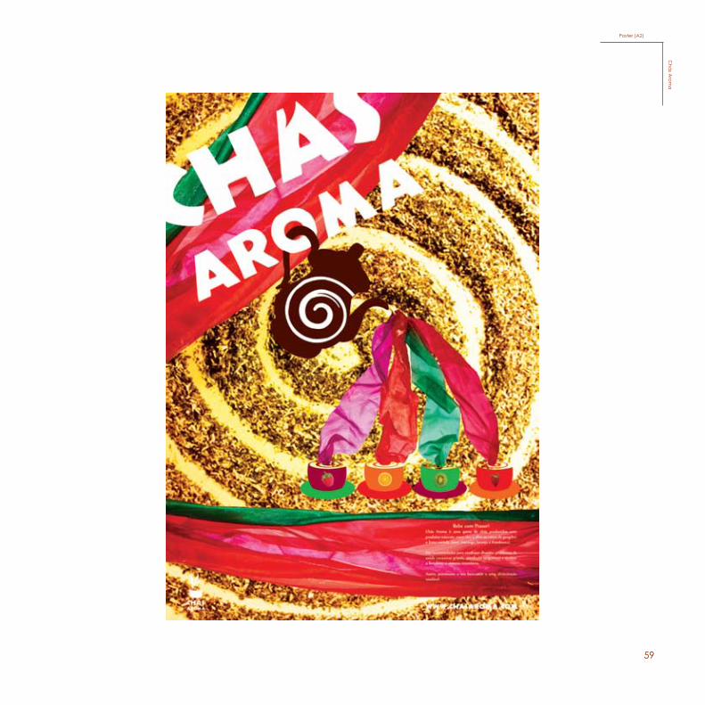
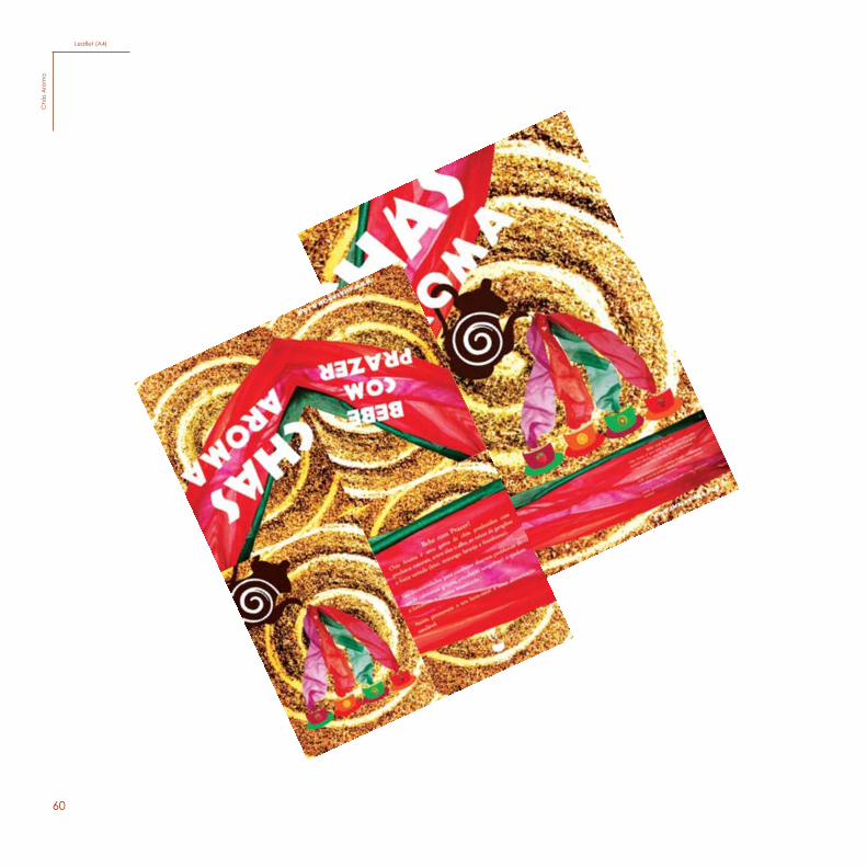
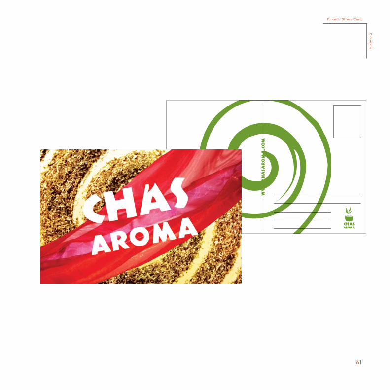
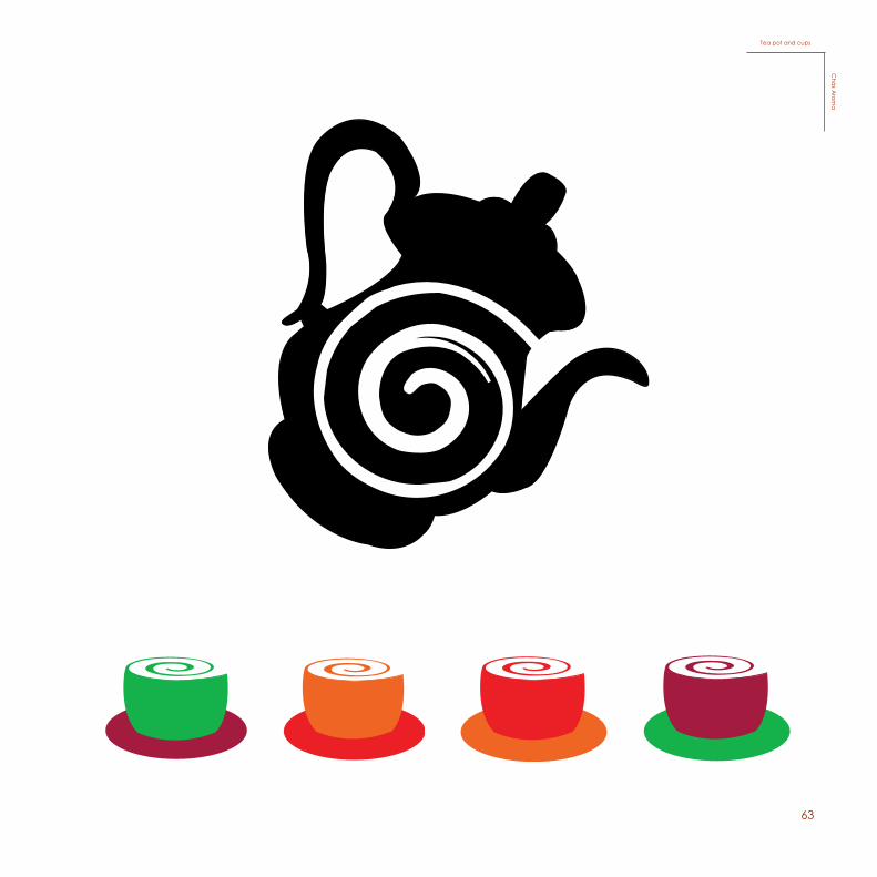
For this project, developed in the beginning of the 2nd year for the international on going project “Man and the Tree”, we were asked to make a campaign of an organic farm or product hav-ing to do with sustainability. I decided to make a campaign for an organic product called “Chás Aroma”.
My concept has to do with demonstrating the two sensations of tea, which means, tea is a dry element which is consumed when mixed with water. This tea was made by an unknown Afri-can chef, so I also wanted to give it a wild and exotic style, using a lot of dynamism.
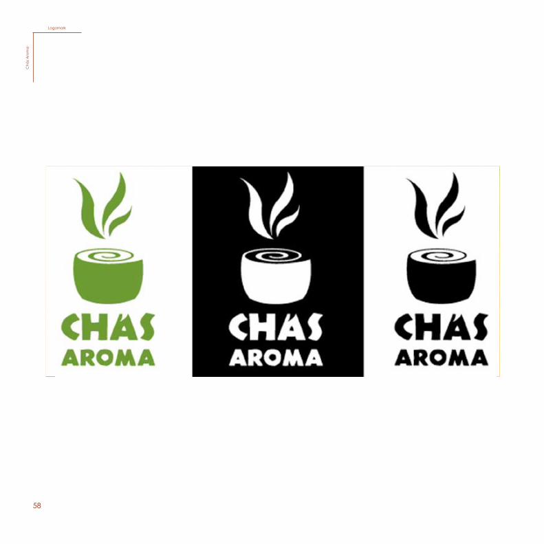
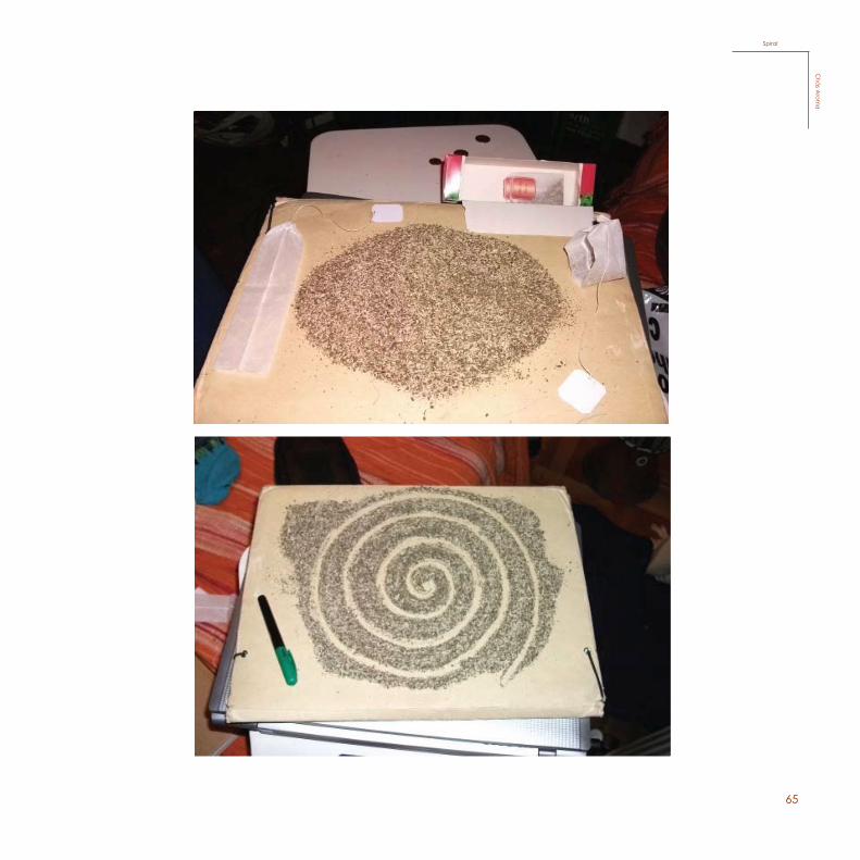
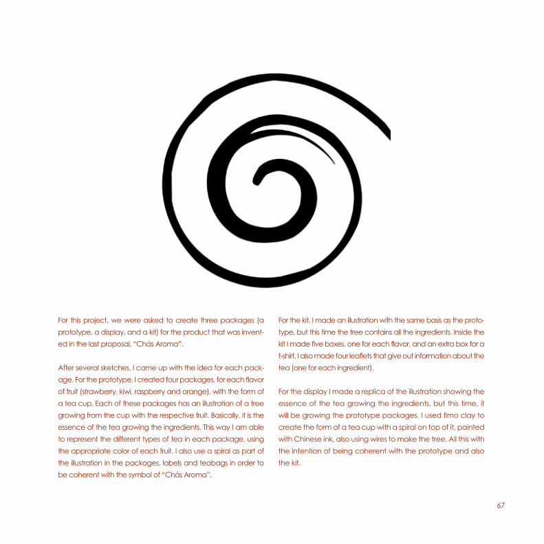
The logotype has a simplified cup with a spiral to symbolise the tea and create this sort of dynamism, using also three stripes to give it a warm expression.. The color I chose was green to give it a fresh sensation. I used a type with this expression to go with the idea of it being wild and exotic.
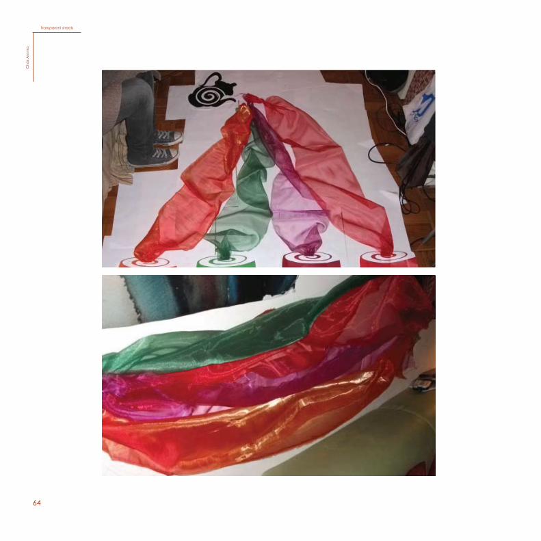
The idea of my poster is to illustrate the four flavors of tea from this brand, by using four transparent sheets to symbolise the water, with the appropriate color of each flavor. For the background I also made a spiral, which is coherent with the logo. This way I am able to show the two sensations, dryness and wetness. The logo is intended to create dynamism as well, therefore being coherent with the rest of the elements in the poster.
58
3Logótipo
LogomarkC
hás
Aro
ma
59
Poster (A2)C
hás A
roma
60
Leaflet (A4)C
hás
Aro
ma
61
Postal
Frente
Verso
Postal
Frente
Verso
Postcard (150mm x 100mm)C
hás A
roma
62
32
SketchesC
hás A
rom
a
SketchesC
hás
Aro
ma
63
33
Tea pot and cupsC
hás Arom
aTea pot and cups
Chá
s Arom
a
64
34
Transparent sheetsC
hás A
rom
a
Transparent sheetsC
hás
Aro
ma
65
35
SpiralC
hás Arom
a
SpiralC
hás A
roma
66
67
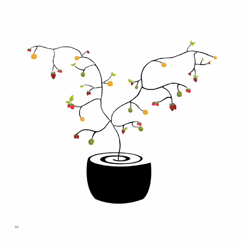
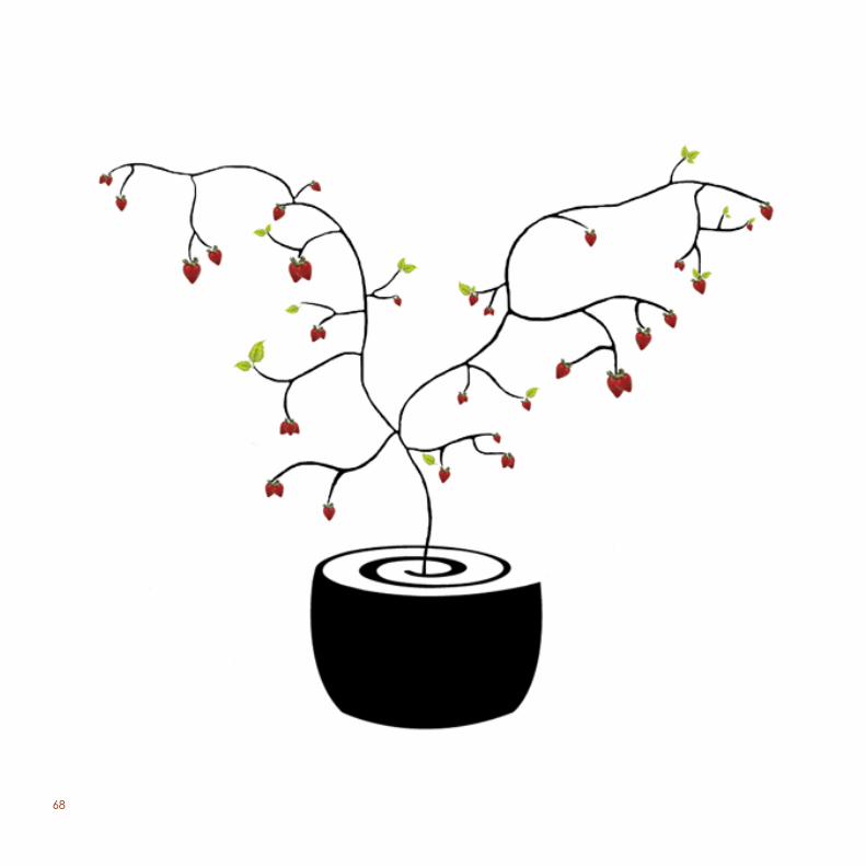
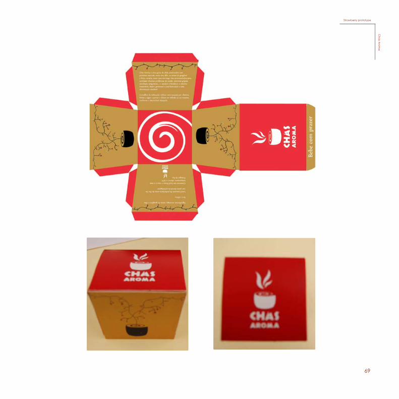
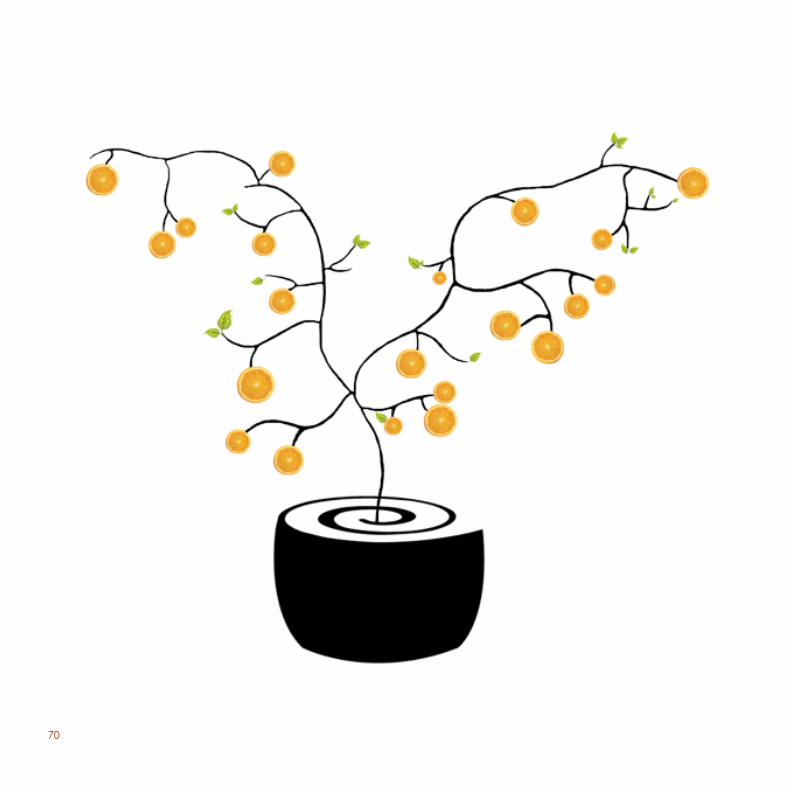
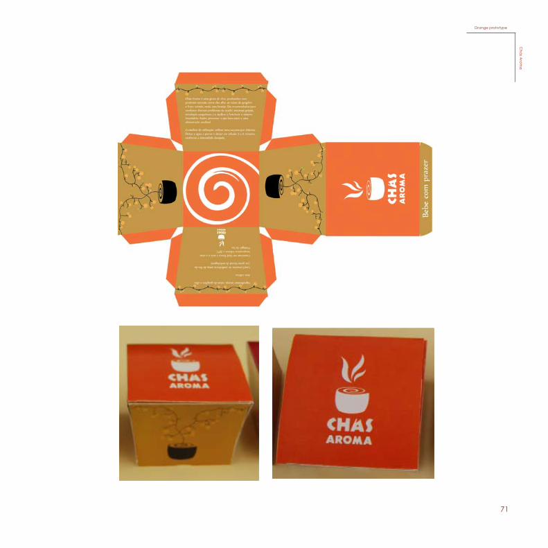
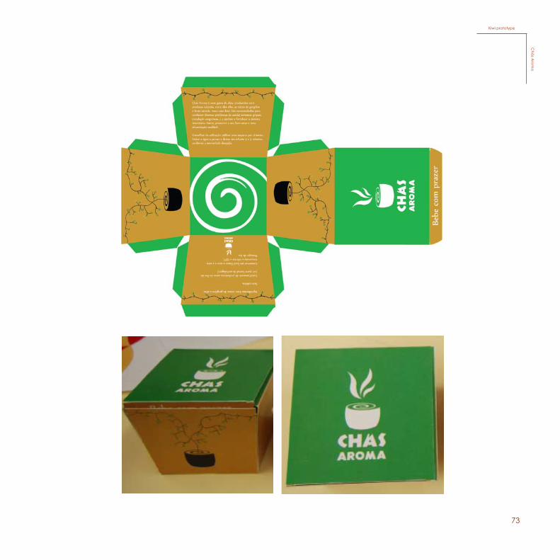
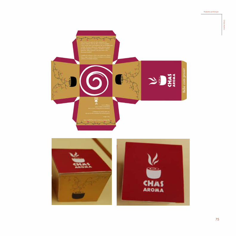
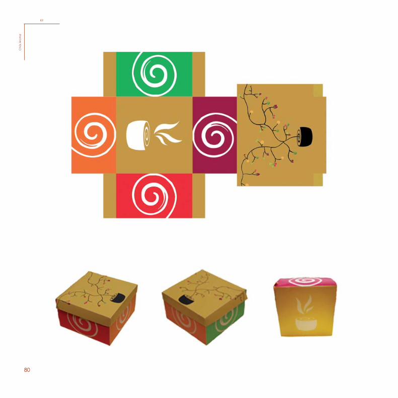
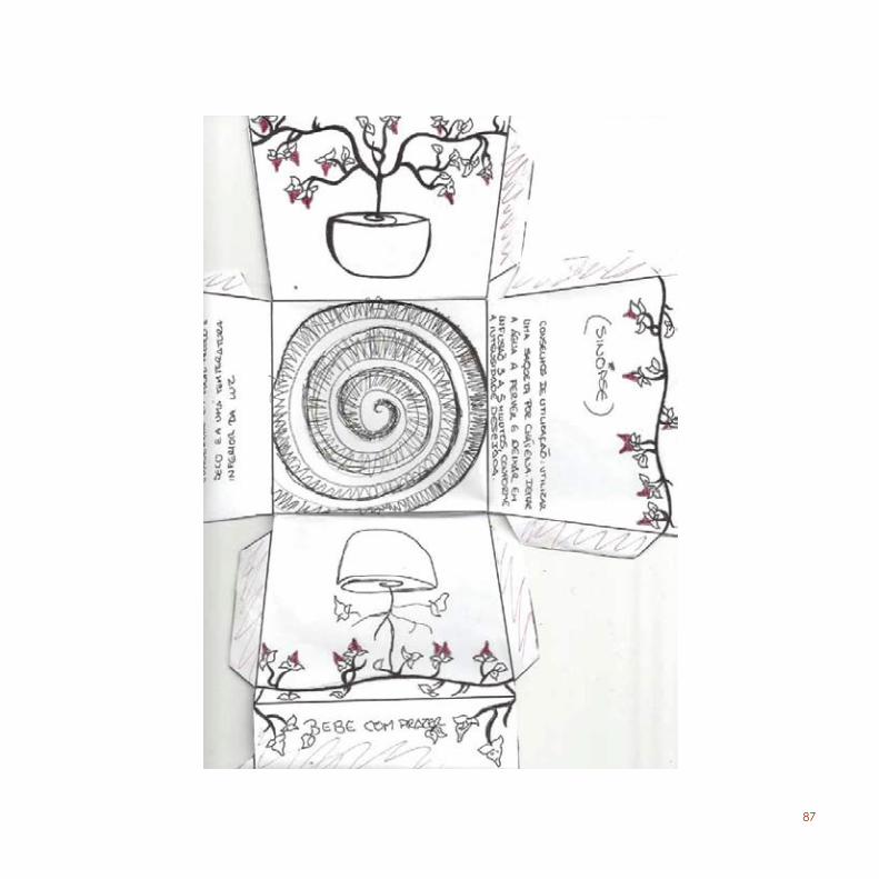
For this project, we were asked to create three packages (a prototype, a display, and a kit) for the product that was invent-ed in the last proposal, “Chás Aroma”.
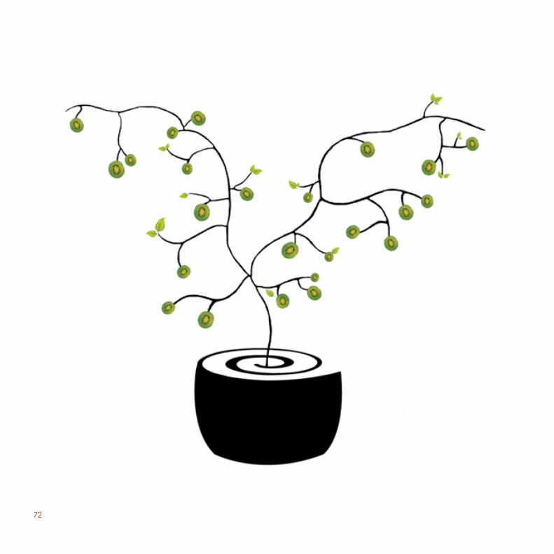
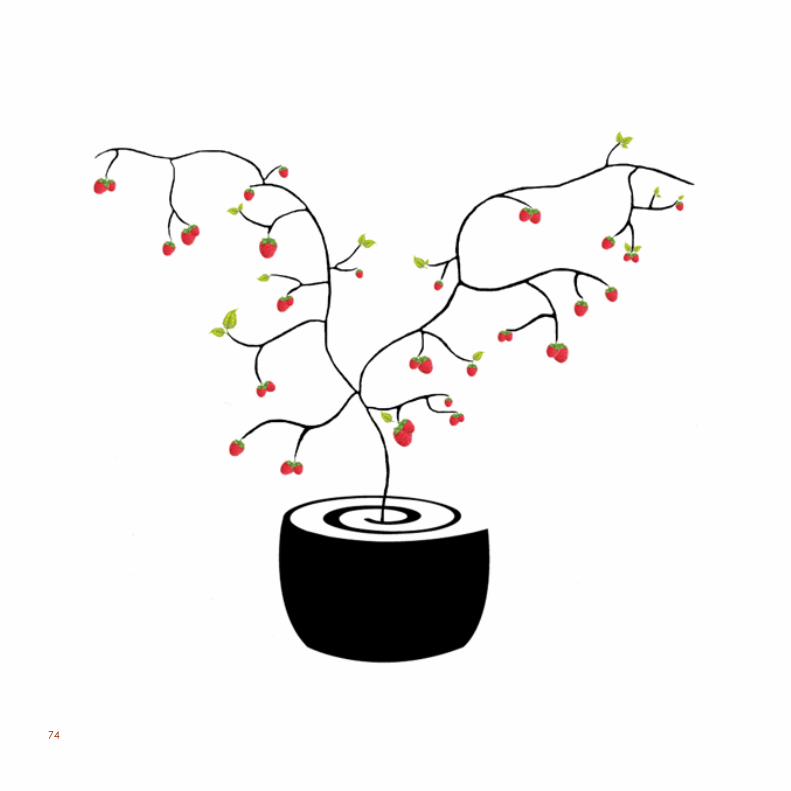
After several sketches, I came up with the idea for each pack-age. For the prototype, I created four packages, for each flavor of fruit (strawberry, kiwi, raspberry and orange), with the form of a tea cup. Each of these packages has an illustration of a tree growing from the cup with the respective fruit. Basically, it is the essence of the tea growing the ingredients. This way I am able to represent the different types of tea in each package, using the appropriate color of each fruit. I also use a spiral as part of the illustration in the packages, labels and teabags in order to be coherent with the symbol of “Chás Aroma”.
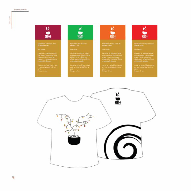
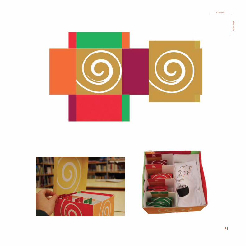
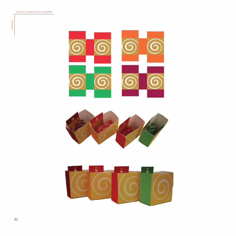
For the kit, I made an illustration with the same basis as the proto-type, but this time the tree contains all the ingredients. Inside the kit I made five boxes, one for each flavor, and an extra box for a t-shirt. I also made four leaflets that give out information about the tea (one for each ingredient).
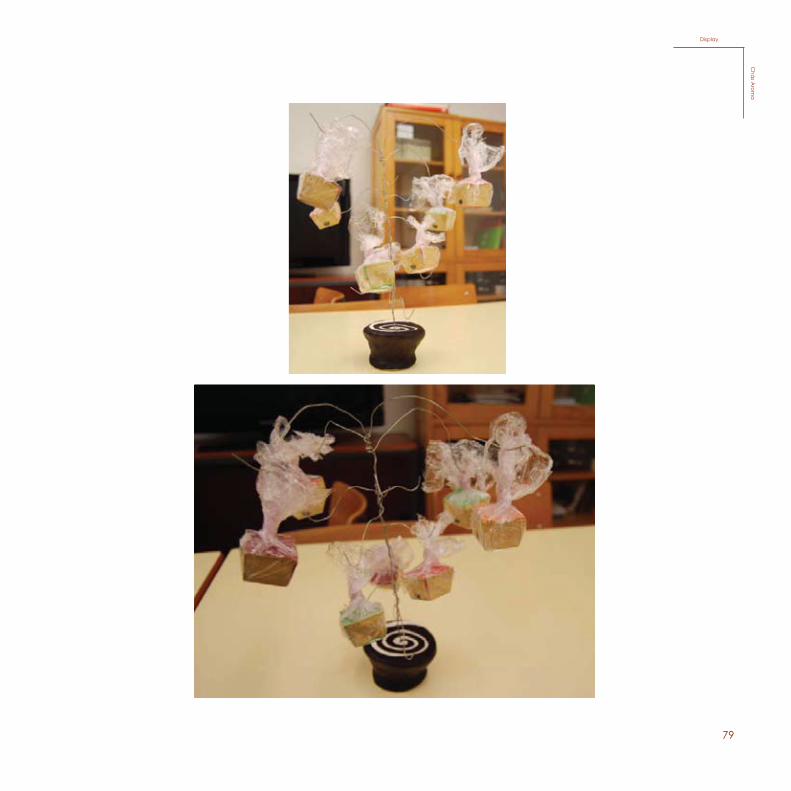
For the display I made a replica of the illustration showing the essence of the tea growing the ingredients, but this time, it will be growing the prototype packages. I used fimo clay to create the form of a tea cup with a spiral on top of it, painted with Chinese ink, also using wires to make the tree. All this with the intention of being coherent with the prototype and also the kit.
68
Morango
69
Strawberry prototypeC
hás A
roma
70
Laranja
71
Orange prototypeC
hás A
roma
72
Kiwi
73
Kiwi prototypeC
hás A
roma
74
Framboesa
75
Rasberry prototypeC
hás A
roma
76
Saquetas
Saquetas
Saquetas
Saquetas
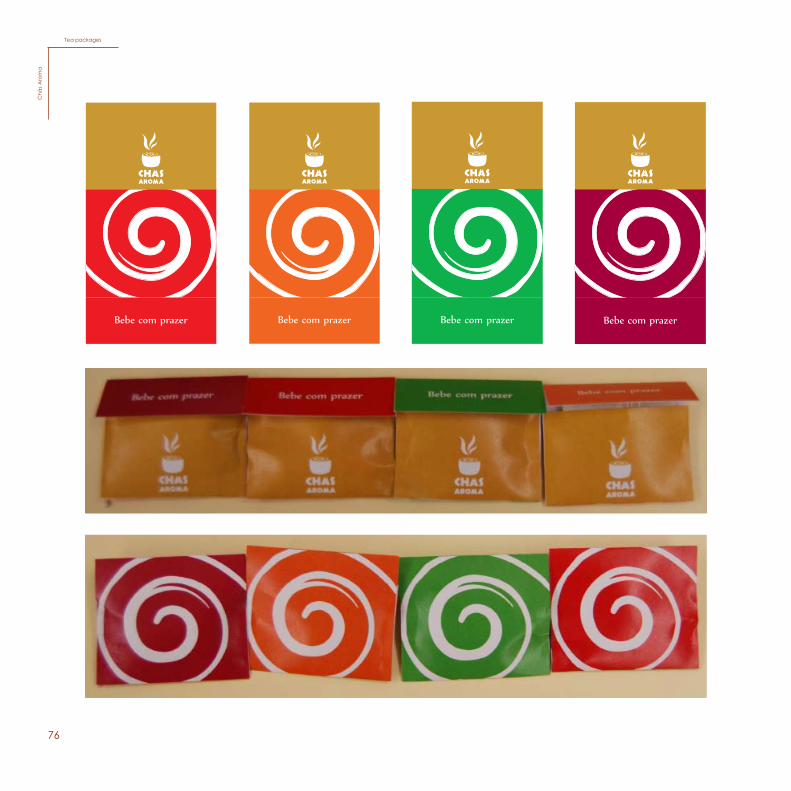
Tea packagesC
hás
Aro
ma
77
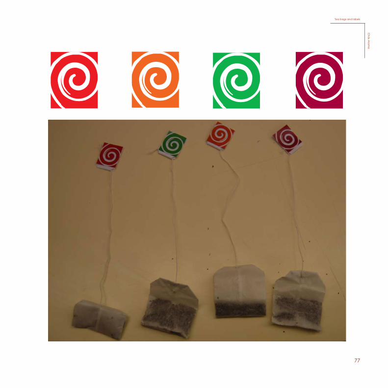
Etiquetas
EtiquetasEtiquetas
Tea bags and labelsC
hás A
roma
78
48
Elementos do Kit
Ingredientes: framboesa, raízes do gengibre e alho.
Sem cafeína.
Conselhos de utilização: utilizar uma saqueta por chávena. Deitar a água a perver e deixar em infusão 3 a 5 minutos, conforme a intensidade desejada.
Conservar em local fresco e seco e a uma temperatura inferior a 25ºC.Proteger da luz.
Ingredientes: kiwi, raízes do gengibre e alho.
Sem cafeína.
Conselhos de utilização: utilizar uma saqueta por chávena. Deitar a água a perver e deixar em infusão 3 a 5 minutos, conforme a intensidade desejada.
Conservar em local fresco e seco e a uma temperatura inferior a 25ºC.Proteger da luz.
Ingredientes: laranja, raízes do gengibre e alho.
Sem cafeína.
Conselhos de utilização: utilizar uma saqueta por chávena. Deitar a água a perver e deixar em infusão 3 a 5 minutos, conforme a intensidade desejada.
Conservar em local fresco e seco e a uma temperatura inferior a 25ºC.Proteger da luz.
Ingredientes: morango, raízes do gengibre e alho.
Sem cafeína.
Conselhos de utilização: utilizar uma saqueta por chávena. Deitar a água a perver e deixar em infusão 3 a 5 minutos, conforme a intensidade desejada.
Conservar em local fresco e seco e a uma temperatura inferior a 25ºC.Proteger da luz.
Panphlets and t-shirt
Chá
s Aro
ma
Panphlets and t-shirtC
hás
Aro
ma
79
49
Display
Chás A
roma
DisplayC
hás A
roma
80
4544
Kit por foraKit por dentro
Kit por dentroKitC
hás A
rom
aKit (inside)
Chás A
roma
KitC
hás
Aro
ma
81
45
Kit por dentro
Kit por dentro Kit (inside)C
hás Arom
aKit (inside)
Chá
s Arom
a
82
46
Caixas dentro do Kit
Caixas dentro do KitKit (inside) / packages for the tea and panphletsC
hás A
rom
a
Kit (inside)/ packages for the tea nd panphletsC
hás
Aro
ma
83
47
Kit (inside) / package for the t-shirt
Chás A
roma
Kit (inside) / package for the t-shirtC
hás A
roma
84
50
SketchesC
hás A
rom
a
50
Sketches
Chá
s Aro
ma
SketchesC
hás
Aro
ma
85
51
51
86
52
52
87
53
88
89
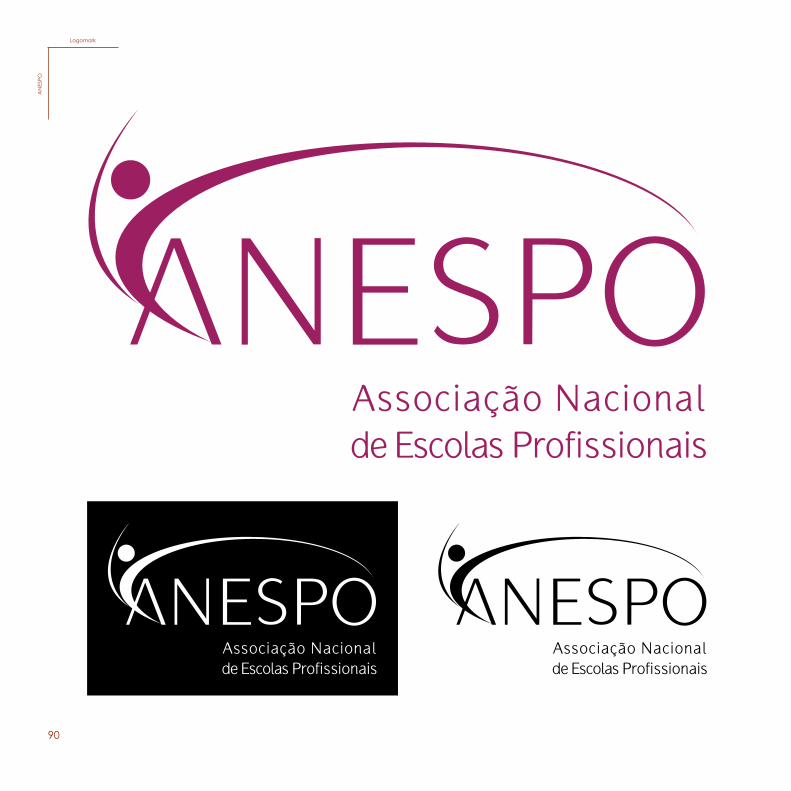
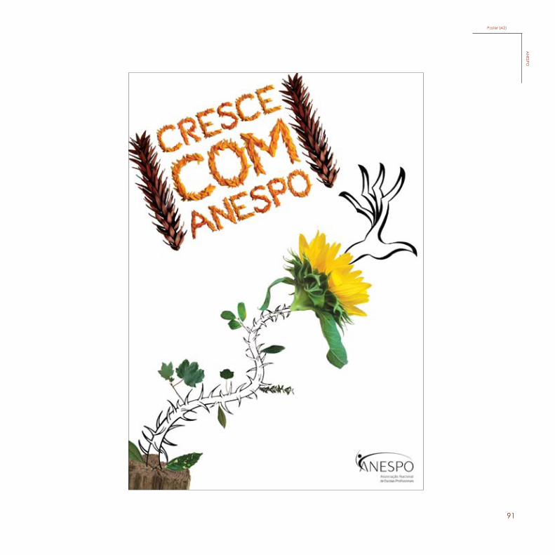
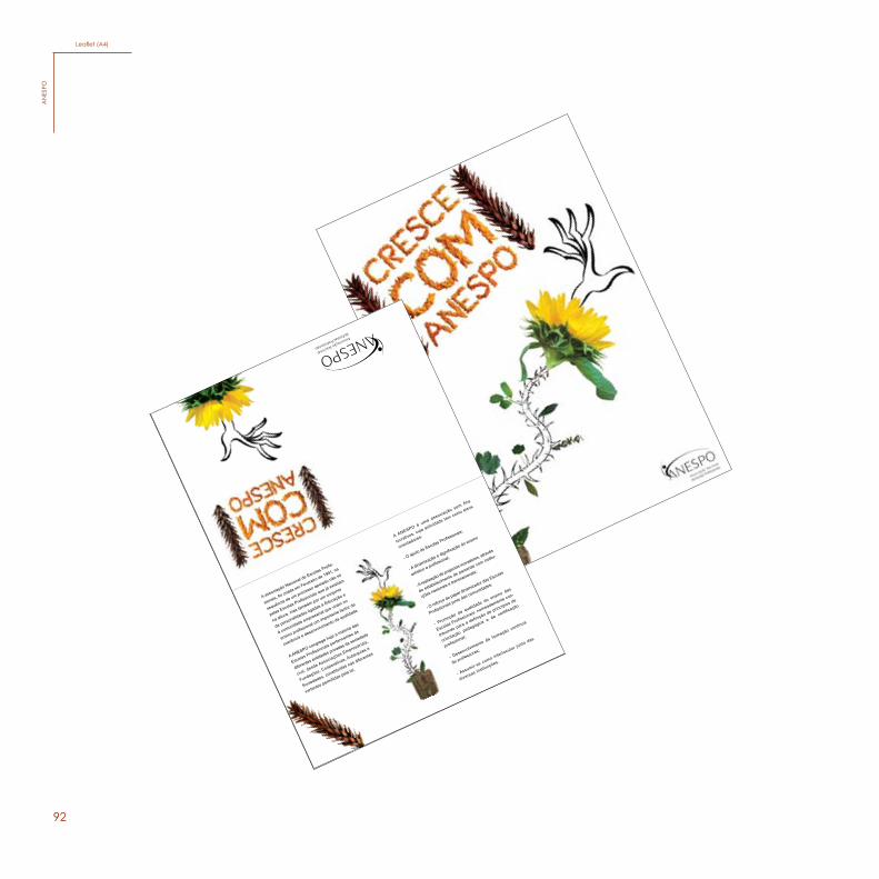
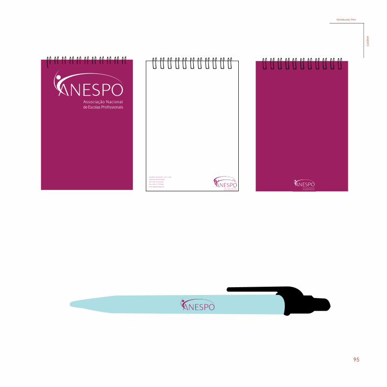
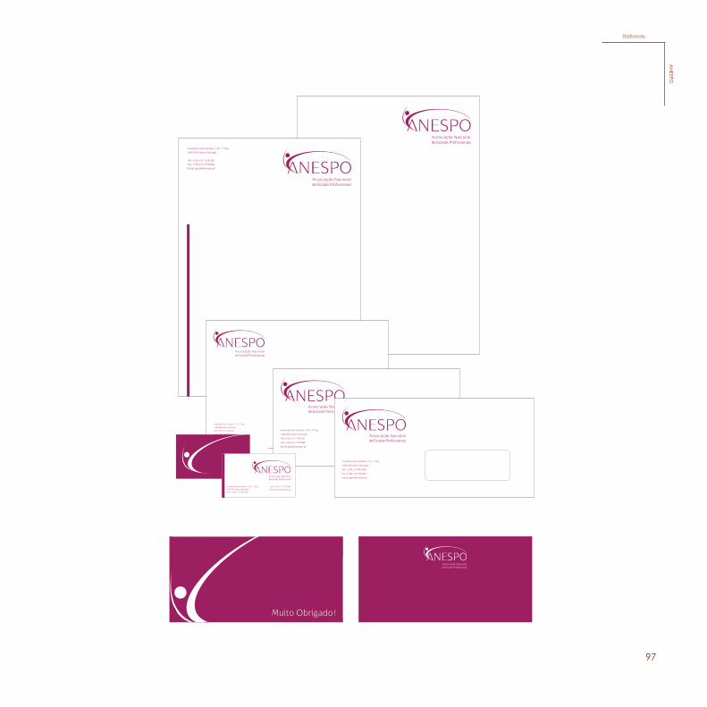
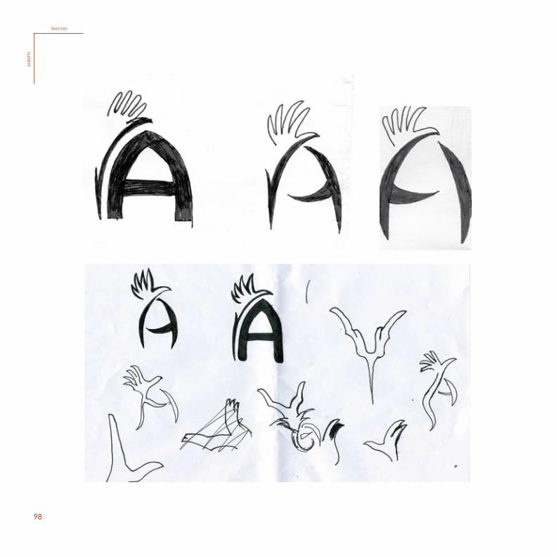
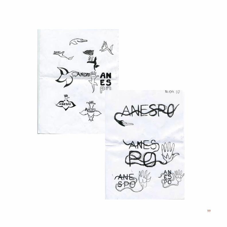
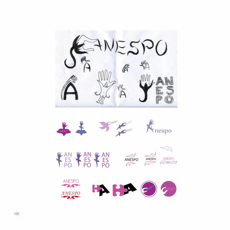
This is the first project that was proposed in the subject of Graph-ic Design, in the 3rd year. This proposal was for a national com-petition to renew the logotype of “ANESPO”, which is a national association of vocational schools.
For this project, I worked together with one of my classmates, Chelsea Drouin. We came up with the idea of representing the logo as if it were growing, to give the idea of evolution while at-tending a professional school, using the color pink which gives it a serious, professional and modern expression. The logo also contains a circle representing the head of a person, to be co-herent with the last logo of “ANESPO” which also had a person.
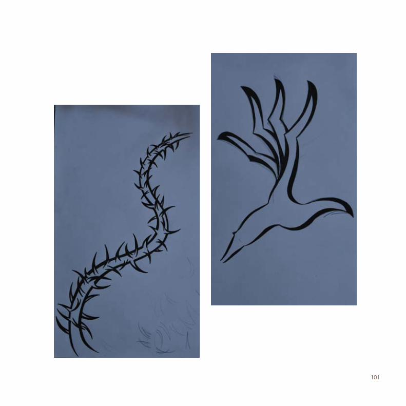
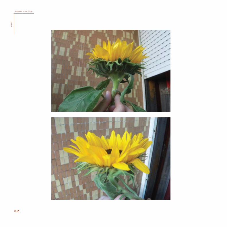
As for the poster, we kept the idea of personal evolution with “ANESPO”, so we used a sunflower to represent the person’s knowledge which will finally blossom after working hard and climbing up the opportunities of the professional life. To express this we used a branch with spikes, which was drawn with a black pen in order to explain that we are the ones that have to create the branch, but “ANESPO” will offer us the pot, being us, the ones that have to choose sowing the seed.
The slogan we chose to use is “Cresce com ANESPO”, which means “Grow with ANESPO”, which creates a huge connec-tion with the concept of the poster.
90
5756
This is the first project that was proposed in the subject of Graphic Design, in the 3rd year. This proposal was for a national competition to renew the logotype of “ANESPO”, which is a national association of vocational schools.
For this project, I worked together with one of my classmates, Chelsea Drouin. We came up with the idea of representing the logo as if it were growing, to give the idea of evolution while attending a professional school, using the color pink which gives it a serious, professional and modern expression. The logo also contains a circle representing the head of a person, to be coherent with the last logo of “ANESPO” which also had a person.
As for the poster, we kept the idea of personal evolution with “ANESPO”, so we used a sunflower to represent the person’s knowledge which will finally blossom after working hard and climbing up the opportunities of the professional life. To express this we used a branch with spikes, which was drawn with a black pen in order to explain that we are the ones that have to create the branch, but “ANESPO” will offer us the pot, being us, the ones that have to choose sowing the seed.
The slogan we chose to use is “Cresce com ANESPO”, which means “Grow with ANESPO”, which creates a huge connection with the concept of the poster.
LogomarkA
NESPO
LogomarkA
NES
PO
91
Poster (A2)A
NESPO
92
A ANESPO é uma associação sem fins
lucrativos, cuja actividade tem como eixos
orientadores:
- O apoio às Escolas Profissionais;
- A dinamização e dignificação do ensino
artístico e profissional;
- A realização de projectos inovadores, através
do estabelecimento de parcerias com institu-
ições nacionais e transnacionais;
- O reforço do papel dinamizador das Escolas
Profissionais junto das comunidades;
- Promoção da qualidade do ensino das
Escolas Profissionais, nomeadamente con-
tribuindo para a definição de princípios de
orientação pedagógica e de certificação
profissional;
- Desenvolvimento da formação contínua
de professores;
- Assumir-se como interlocutor junto das
diversas instituições.
A associação Nacional de Escolas Profis-
sionais, foi criada em Fevereiro de 1991, na
sequência de um processo apoiado não só
pelas Escolas Profissionais que já existiam
na altura, mas também por um conjunto
de personalidades ligadas à Educação e
à comunidade empresarial que viram no
ensino profissional um importante factor de
coerência e desenvolvimento da qualidade.
A ANESPO congrega hoje a maioria das
Escolas Profissionais pertencentes às
diferentes entidades privadas da sociedade
civil, desde Associações Empresariais,
Fundações, Cooperativas, Autarquias e
Sociedades, constituídas nas diferentes
vertentes permitidas pela lei.
Leaflet (A4)A
NES
PO
93
Avenida 5 de Outubro, 176 - 1º Esq.1050-063 Lisboa Portugal
Telf: (+351) 217 818 320Fax: (+351) 217 970 824
Email: [email protected]
Postcard (150mm x 100mm)A
NESPO
94
A associação Nacional de Escolas Profis-sionais, foi criada em Fevereiro de 1991, na sequência de um processo apoiado não só pelas Escolas Profissionais que já existiam na altura, mas também por um conjunto de personalidades ligadas à Educação e à comunidade empresarial que viram no ensino profissional um importante factor de coerência e desenvolvimento da qualidade.
A ANESPO congrega hoje a maioria das Escolas Profissionais pertencentes às diferentes entidades privadas da sociedade civil, desde Associações Empresariais, Fundações, Cooperativas, Autarquias e Sociedades, constituídas nas diferentes vertentes permitidas pela lei.
Flyer (A5)A
NES
PO
95 61
Avenida
5
de
Outubro,
176
-
1º
Esq.
1050-063
Lisboa
Portugal
Telf:
(+351)
217
818
320
Fax:
(+351)
217
970
824
Email:
MerchandisingA
NESPO
Notebook/ PenA
NESPO
9662
Stickers and envelope / PinA
NES
POStickers/ Pin
AN
ESPO
97
63
Avenida 5 de Outubro, 176 - 1º Esq.1050-063 Lisboa Portugal
Telf: (+351) 217 818 320 Fax: (+351) 217 970 824Email: [email protected]
Muito Obrigado!
.qsE º1 - 671 ,orbutuO ed 5 adinevA
lagutroP aobsiL 360-0501
023 818 712 )153+( :fleT
428 079 712 )153+( :xaF
tp.opsena@lareg :liamE
Avenida 5 de Outubro, 176 - 1º Esq.
1050-063 Lisboa Portugal
Telf: (+351) 217 818 320
Fax: (+351) 217 970 824
Email: [email protected]
Avenida 5 de Outubro, 176 - 1º Esq.
1050-063 Lisboa Portugal
Telf: (+351) 217 818 320
Fax: (+351) 217 970 824
Email: [email protected]
Stationary
AN
ESPOStationary
AN
ESPO
98
64
Sketches
AN
ESPO
SketchesA
NES
PO
99
65
100
66
ANESPO
ANESPOANESPO
ANESPOANESPO
ANESPO
ANESPO
ANESPO
ANESPO
ANESPO
ANESPO
nespo
ANESPO ANESPO ANESPO
101
67
102
68
Sunflower for the posterA
NES
PO
Sunflower for the posterA
NES
PO
103
69
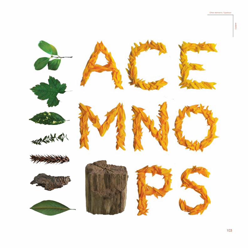
Other elements / TypefaceA
NESPO
Other elements / TypefaceA
NESPO
104
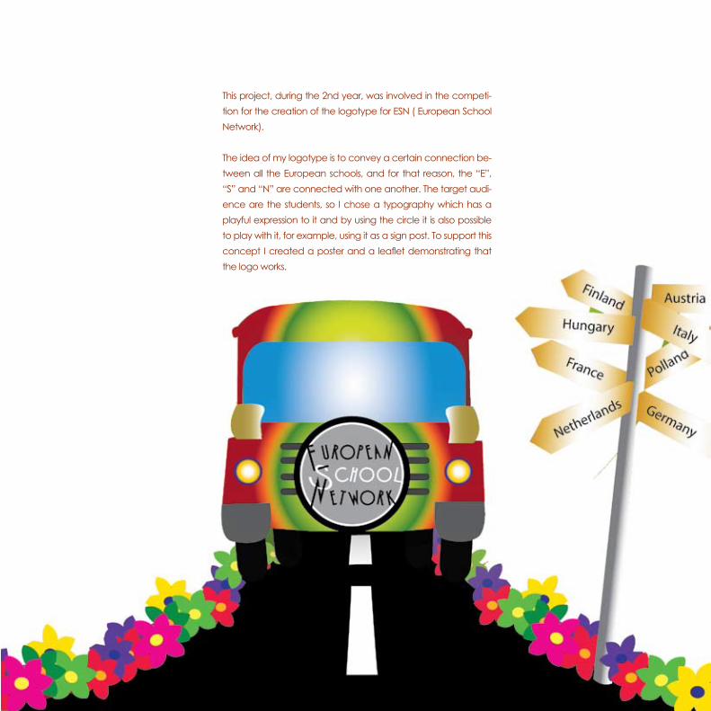
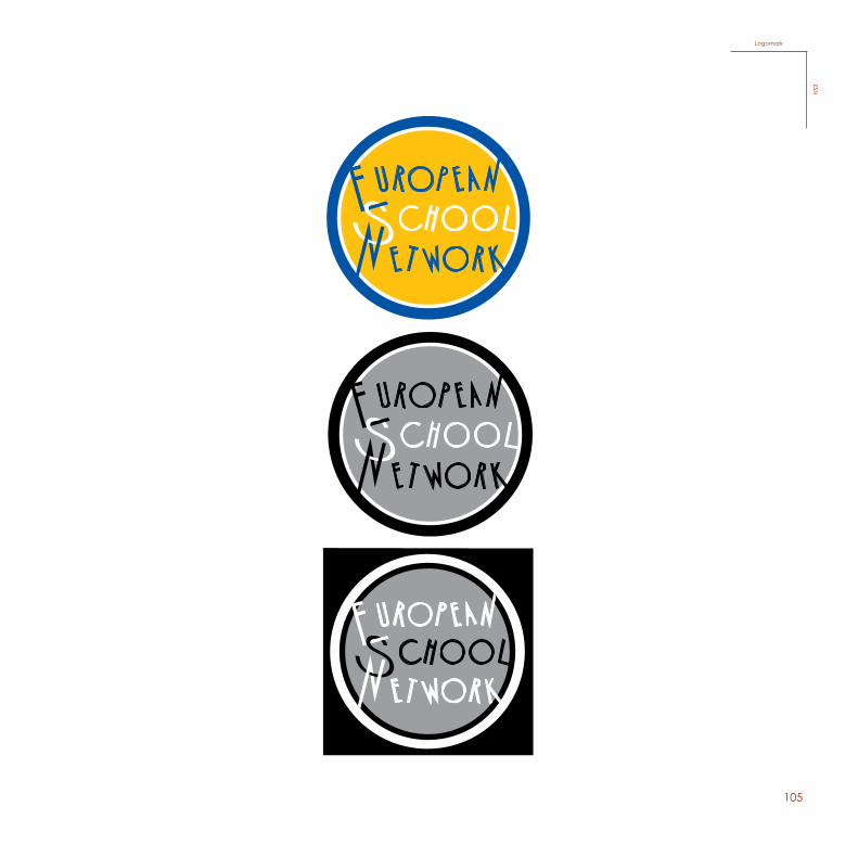
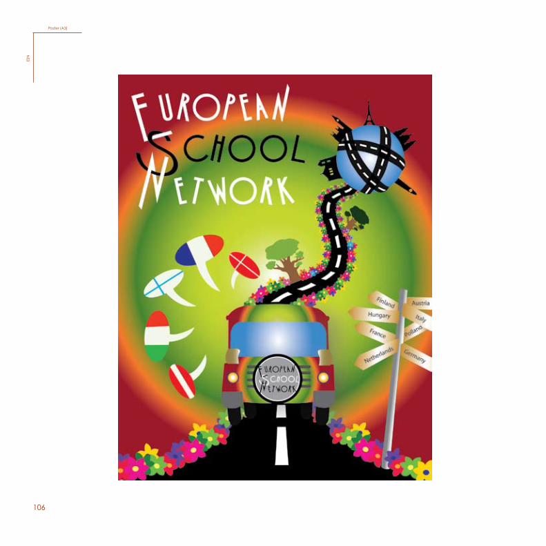
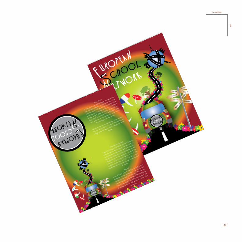
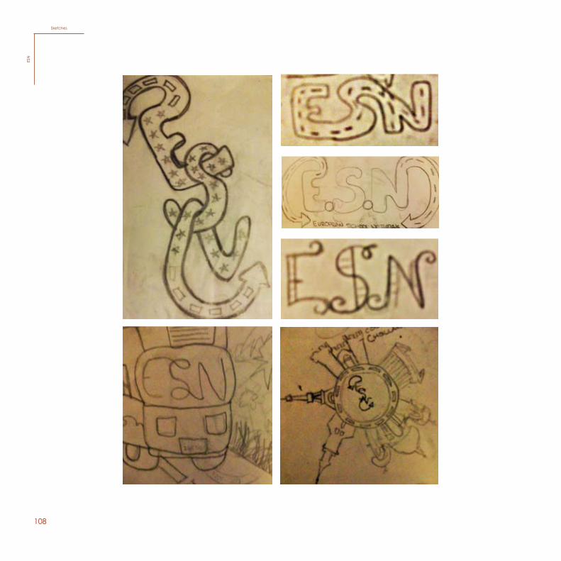
This project, during the 2nd year, was involved in the competi-tion for the creation of the logotype for ESN ( European School Network).
The idea of my logotype is to convey a certain connection be-tween all the European schools, and for that reason, the “E”, “S” and “N” are connected with one another. The target audi-ence are the students, so I chose a typography which has a playful expression to it and by using the circle it is also possible to play with it, for example, using it as a sign post. To support this concept I created a poster and a leaflet demonstrating that the logo works.
105
Color
Black & White
Negative
Color
Color
LogomarkESN
106
Poster (A3)ES
N
107
Polla
nd
Netherla
nds Germany
Italy
Austria
France
Hungary
Finland
Polla
nd
Netherla
nds
Germany
Italy
Austria
France
Hungary
Finland
What is ESN?
In 2006 a group of seven Finnish upper secondary schools
(high schools) outlined a proposition in which their
friendship schools, i.e. foreign schools with which they had
shared projects and exchanges, would form a multilateral
exchange network. Within this network the students can
change schools for a period of 1 to 8 weeks and they sign a
mutual agreement to accommodate each other in their
homes during the exchange periods.
In addition to these one-to-one exchanges, European School
Network also provides its members the possibility to
arrange group exchanges, teacher exchanges and student
seminars.
Why student exchange?
Studying in a foreign school and staying in a host family for
even a short period of time improves your social skills and
your intercultural communication skills and boosts your
independence. Above all, it is an experience that definitely
changes your world view and gives you a totally new
perspective. It is an amazing opportunity to see what
people's everyday lives are like in another culture.
Friendships that have their roots in such circumstances last
for a lifetime.
Why ESN?
European School Network schools are carefully selected
institutions whose headmasters and international
coordinators know each other personally. They meet each
other at least once a year in the Annual ESN Conferences.
Personal relationships between the schools guarantee that
all exchange students are well taken care of by the school
coordinators.
Leaflet (A4)ESN
108
74
Sketches
ESN
SketchesES
N
109
CertificateESN
112
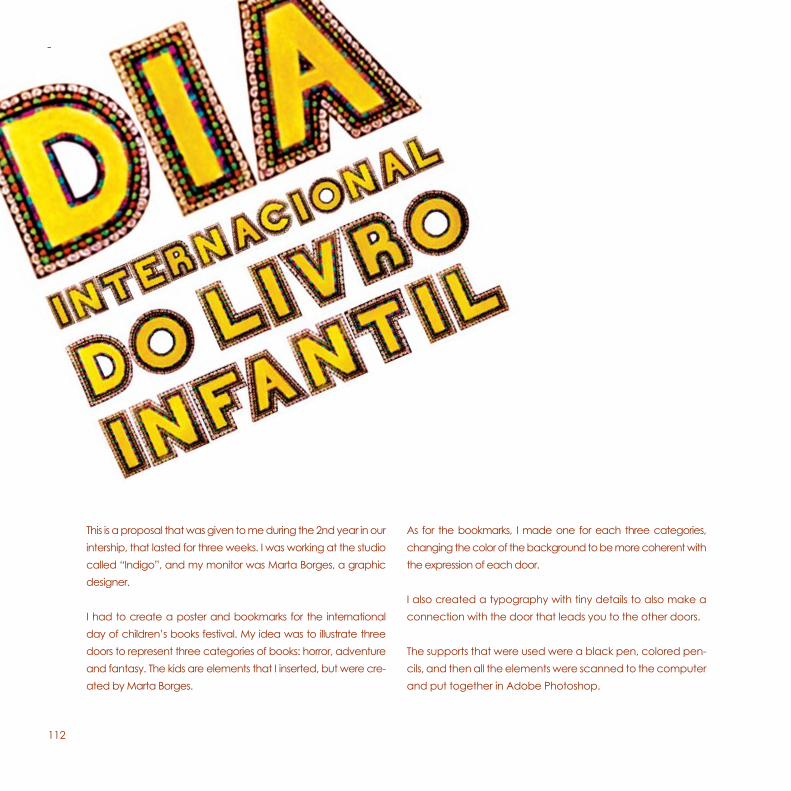
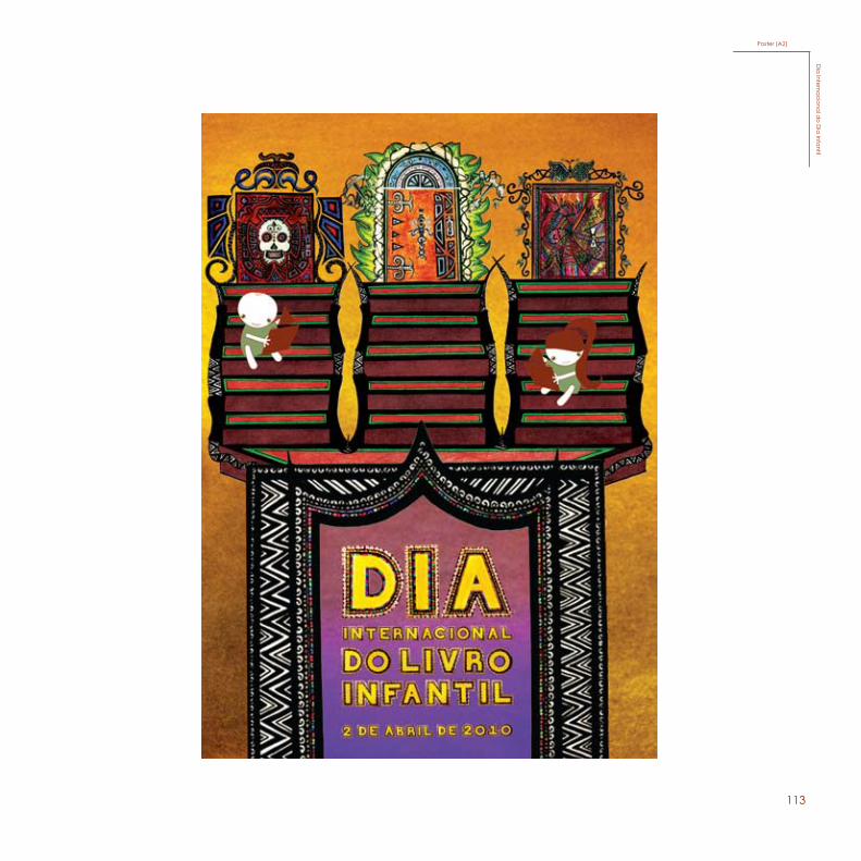
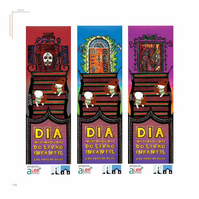
This is a proposal that was given to me during the 2nd year in our intership, that lasted for three weeks. I was working at the studio called “Indigo”, and my monitor was Marta Borges, a graphic designer.
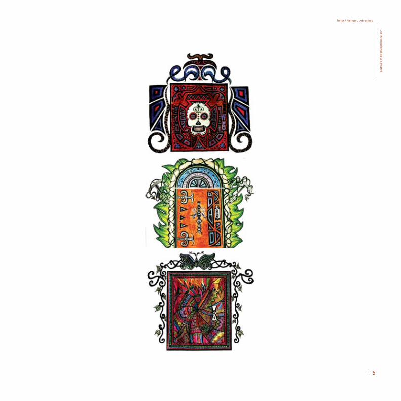
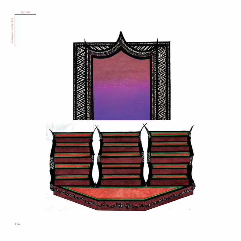
I had to create a poster and bookmarks for the international day of children’s books festival. My idea was to illustrate three doors to represent three categories of books: horror, adventure and fantasy. The kids are elements that I inserted, but were cre-ated by Marta Borges.
As for the bookmarks, I made one for each three categories, changing the color of the background to be more coherent with the expression of each door.
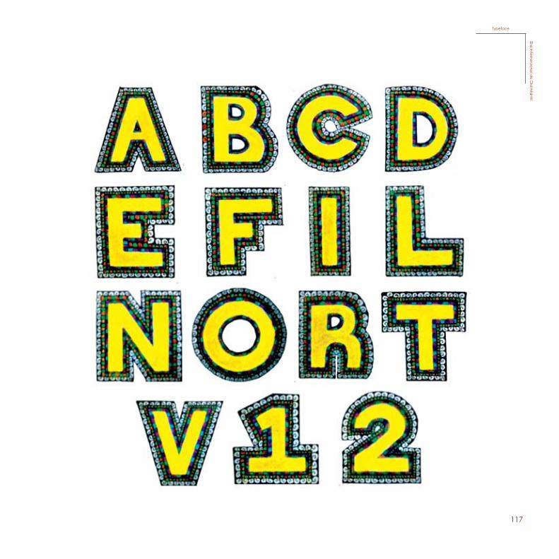
I also created a typography with tiny details to also make a connection with the door that leads you to the other doors.
The supports that were used were a black pen, colored pen-cils, and then all the elements were scanned to the computer and put together in Adobe Photoshop.
113
Poster (A2)D
ia Interna
cional d
o Dia
Infantil
114
BookmarksD
ia In
tern
aci
ona
l do
Dia
Infa
ntil
115
Terror / Fantasy / AdventureD
ia Interna
cional d
o Dia
Infantil
116
Door/ StairsD
ia In
tern
aci
ona
l do
Dia
Infa
ntil
117
TypefaceD
ia Interna
cional d
o Dia
Infantil
118
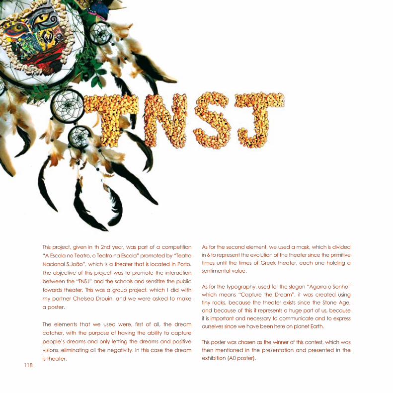
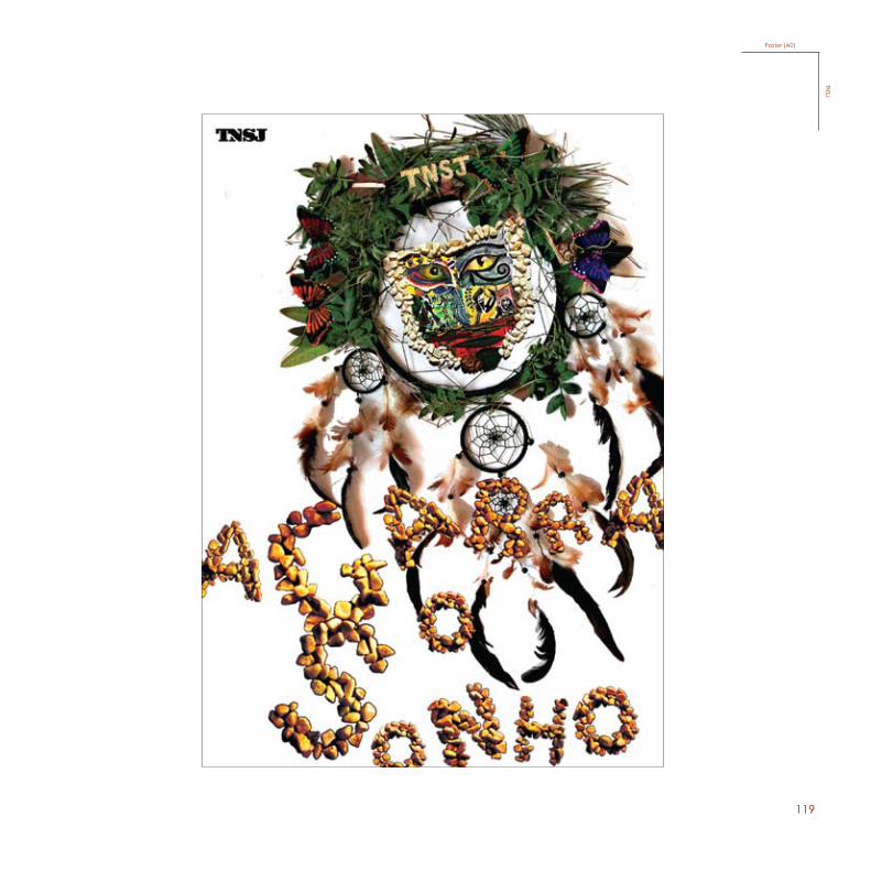
This project, given in th 2nd year, was part of a competition “A Escola no Teatro, o Teatro na Escola” promoted by “Teatro Nacional S.João”, which is a theater that is located in Porto. The objective of this project was to promote the interaction between the “TNSJ” and the schools and sensitize the public towards theater. This was a group project, which I did with my partner Chelsea Drouin, and we were asked to make a poster.
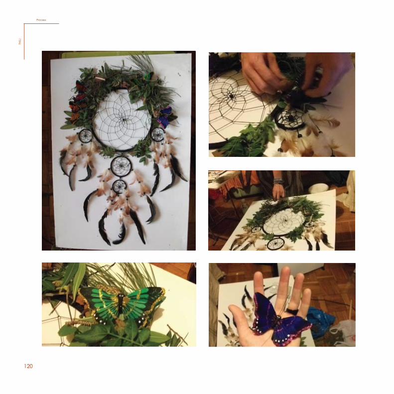
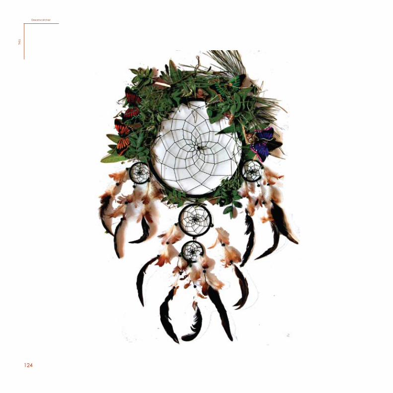
The elements that we used were, first of all, the dream catcher, with the purpose of having the ability to capture people’s dreams and only letting the dreams and positive visions, eliminating all the negativity. In this case the dream is theater.
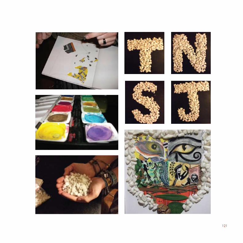
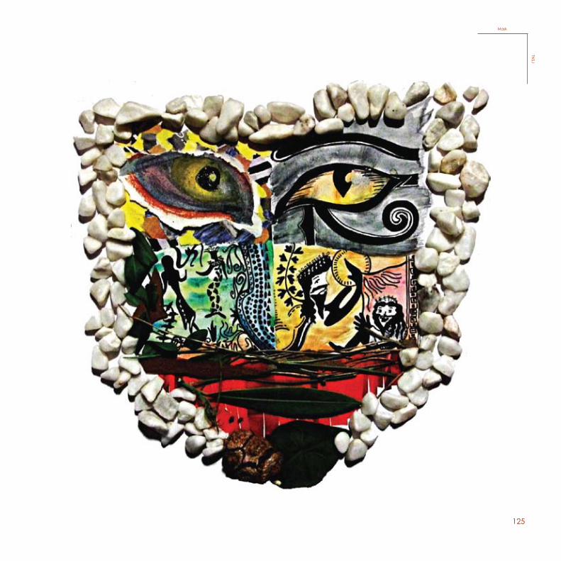
As for the second element, we used a mask, which is divided in 6 to represent the evolution of the theater since the primitive times until the times of Greek theater, each one holding a sentimental value.
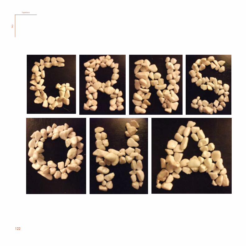
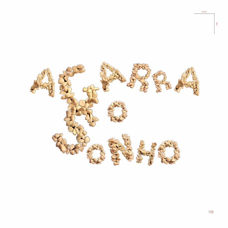
As for the typography, used for the slogan “Agarra o Sonho” which means “Capture the Dream”, it was created using tiny rocks, because the theater exists since the Stone Age, and because of this it represents a huge part of us, because it is important and necessary to communicate and to express ourselves since we have been here on planet Earth.
This poster was chosen as the winner of this contest, which was then mentioned in the presentation and presented in the exhibition (A0 poster).
119
Poster (A0)TN
SJ
120
100
Process
TNSJ
ProcessTN
SJ
121
101
122102
Typeface
TNSJ
TypefaceTN
SJ
123
103
SloganTN
SJ
SloganTN
SJ
124104
DreamcatcherTN
SJDreamcatcher
TNSJ
125
105
MaskTN
SJ
MaskTN
SJ
126
127
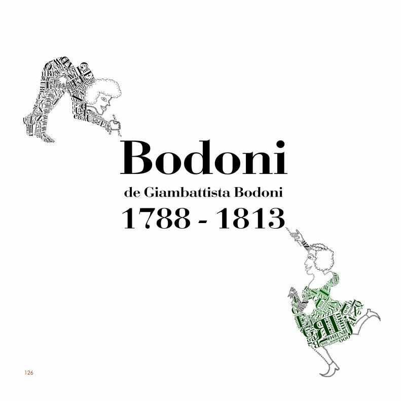
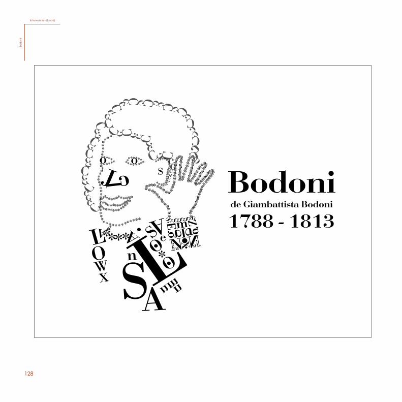
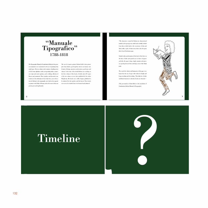
For this project, accomplished during the 3rd year, we were asked to pick a typography and develop an intervention and a site. Bodoni is the typeface I chose to work with.
Giambattista Bodoni during his life created a book known as “the typographic manual”, and his wife, Margarita Dall’agilio, published the book five years after he passed away. The type Bodoni was created between the Neoclas-sical and Romantic time, the age of Enlightment. So the type is very influenced by the time it was made in, as you can see, it holds many neoclassical characteristics, for in-stance, it is very symmetrical and pure, with thin and thick contrasts very consciously structured. Many revolutions oc-curred during this Neoclassicism period.
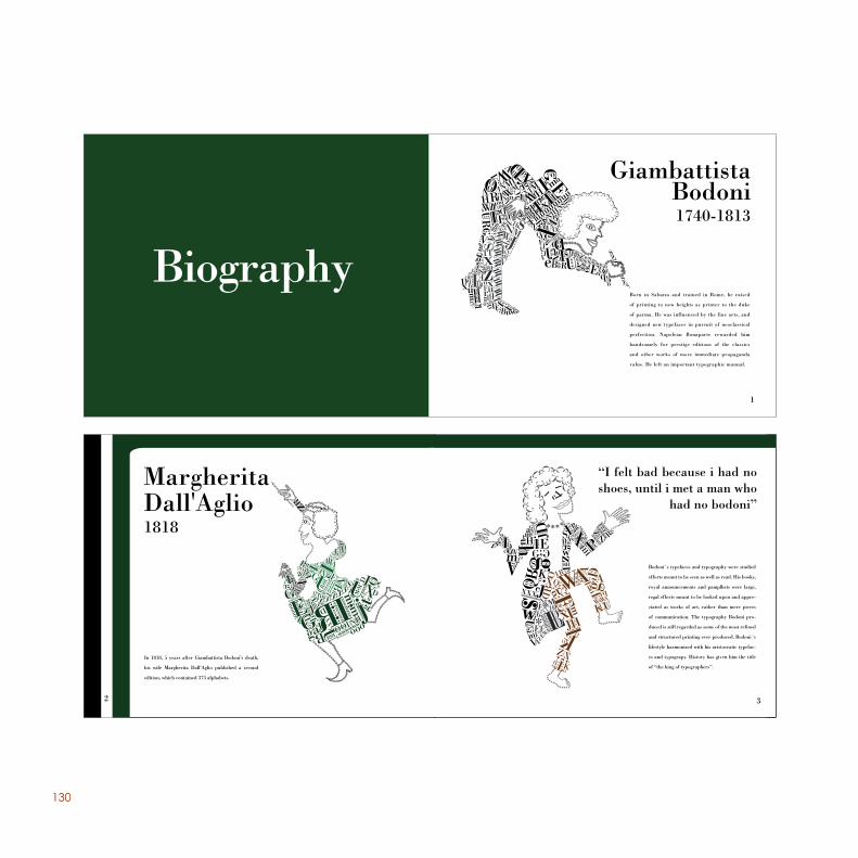
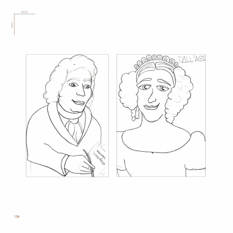
After researching and brainstorming, I decided to make many characters representing Giambattista Bodoni and Margarita Dall’Agilio. The characters were constructed using the type Bodoni itself, creating a certain dynamism by positioning the letters in many ways, thus representing the time of revolutions, of movement, using classical expressions.
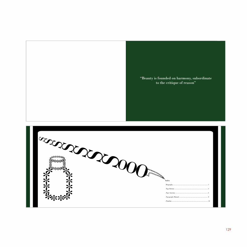
For the intervention, I chose to make a book holding some information about Giambattista Bodoni and the type Bodoni, using the characters throughout the book. I created a small timeline explaining some aspects of Bodoni and the typo-graphic manual that also was inserted in the book.
128
Intervention (book)Bo
don
i
129
3
“Beauty is founded on harmony, subordinate to the critique of reason”
3
“Beauty is founded on harmony, subordinate to the critique of reason”
Index
- Biography............................................................................................ 1
- Type Bodoni ....................................................................................... 3
- Type Anatomy .................................................................................... 6
- Typography Manual ........................................................................... 8
- Timeline .............................................................................................. 10
130
6 1
BiographyBorn in Saluzzo and trained in Rome, he raised
of printing to new heights as printer to the duke
of parma. He was influenced by the fine arts, and
designed new typefaces in pursuit of neoclassical
perfection. Napolean Bonaparte rewarded him
handsomely for prestige editions of the classics
and other works of more immediate propaganda
value. He left an important typographic manual.
In 1818, 5 years after Giambattista Bodoni’s death,
his wife Margherita Dall’Aglio published a second
edition, which contained 373 alphabets.
2
Bodoni´s typefaces and typography were studied
efforts meant to be seen as well as read. His books,
royal announcements and pamplhets were large,
regal efforts meant to be looked upon and appre-
ciated as works of art, rather than mere pieces
of communication. The typography Bodoni pro-
duced is still regarded as some of the most refined
and structured printing ever produced. Bodoni´s
lifestyle harmonized with his aristocratic typefac-
es and typograpy. History has given him the title
of “the king of typographers”.
3
131
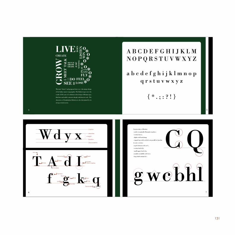
The most “classic” and pompous letter ever - the unique design
of the Italian master typographer. The Bodoni types were the
result of 250 years of evolution in the design of Roman type,
thin lines and subtle contrasts sharply with heavier rods. The
characters of Giambattista Bodoni are also determined by its
strong vertical accent.
4 5
A B C D E F G H I J K L M N O P Q R S T U V W X Y Z
a b c d e f g h i j k l m n o p q r s t u v w x y z
{ * . ; : ? ! }
x-height
Descenderline
Meanline
Baseline
Arm
Stroke
Crossbar
Ascender
Modern-Thin or hairline
BowlEar
Counter
Serif
Link
Stem
Terminal
Arm
Leg
Descender
6
Caracteristics of Bodoni:
- easily recognizable Romantic typeface;
- vertical stress;
- slight serif bracketing;
- cupped top serifs on b,h,l, not parallel to baseline
in some versions;
- top & bottom serifs on C;
- vertical tail of Q;
- small upper bowl of g;
- usually no middle serif on w;
- large ball terminal of c.
7
Capline
132
The Typographic Manual of Giambattista Bodoni is the great-
est monument ever constructed to the art of printing from
metal types. The two-volume work contains a dazzling array
of 142 roman alphabets (with corresponding italics), numer-
ous script and exotic typefaces, and a striking collection of
flowers and ornaments. These typefaces and decorative ma-
terials were the culmination of more than forty years of devo-
tion by Bodoni to the typographic arts, both in his capacity
as printer to the Duke of Parma, and as the owner of his own
private press and typefoundry.
The son of a master printer, Bodoni held to four princi-
ples from which a good typeface derives its beauty: uni-
formity of design, smartness and neatness, good taste, and
charm. At the time of his death Bodoni was working on
the first volume of this book, of which only 250 copies
of the two-volume set were later published by his widow
Margherita. His books were coldly elegant, published to
be admired for the typeface and the layout. These books
were not to be studied, but to be featured and admired.
8
“The characters created by Bodoni are characterized
mainly by the passage now subtle and carefully studied
from thin to thick dash or the coexistence of thin and
thick stalks, a play of chiaroscuro that is also the game
that is based bodoniana page.
Studied with an alternation of the body of the letter on
the lines of titles and special care in choice of papers
and inks, the page is large, simple, margins and gener-
ous spacing between lines and large areas of the blank
page.
The search for clarity and luminosity of the page is en-
hanced by the use of types with reduced x-height and
long ascending and descending. This dialectic of white
and black characters is already clearly neo-classical. “
(The presentation of John Bicker to his translation of
Giambattista Bodoni Manual of Typography)
9
1010
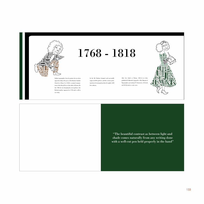
Timeline
133
In his life Bodoni designed and personally
engraved 298 typefaces, and the various print-
ing houses he managed produced roughly 1,200
fine editions.
After his death at Parma, 1813, h is w idow
published Il Manuale tipografico (The Manual of
Typography), presenting 373 characters, 34 Greek
and 48 Oriental or exotic ones.
Italian typographer. Son of a printer, he served an
apprenticeship at the press of the Roman Catholic
Church i n Rome. I n 1768 h e assumed manage-
ment of the Royal Press of the duke of Parma. By
the 1780s he was designing his own typefaces; the
Bodoni typeface appeared in 1790 and is still in
use today.
1768 - 1818
1313
“The beautiful contrast as between light and shade comes naturally from any writing done
with a well-cut pen held properly in the hand”
134
SketchesBo
don
i
135
136
137
138
139
140
141
142106
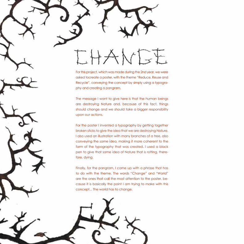
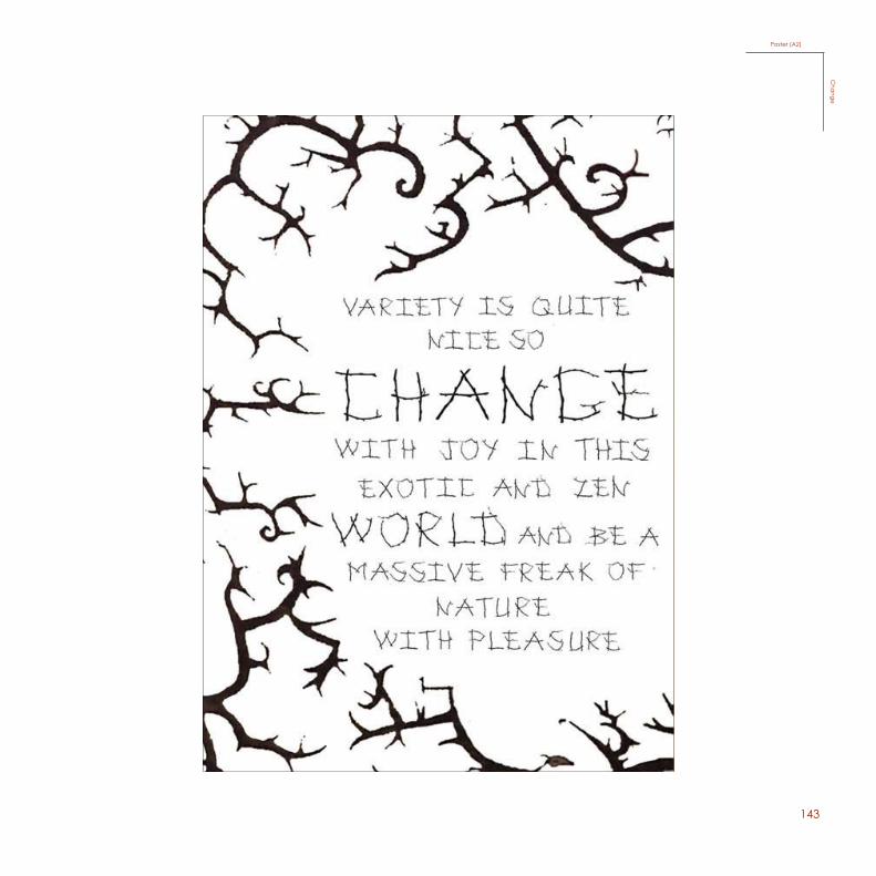
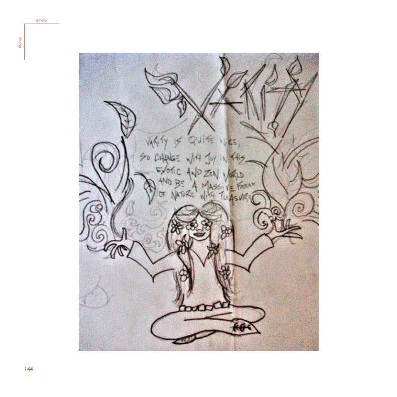
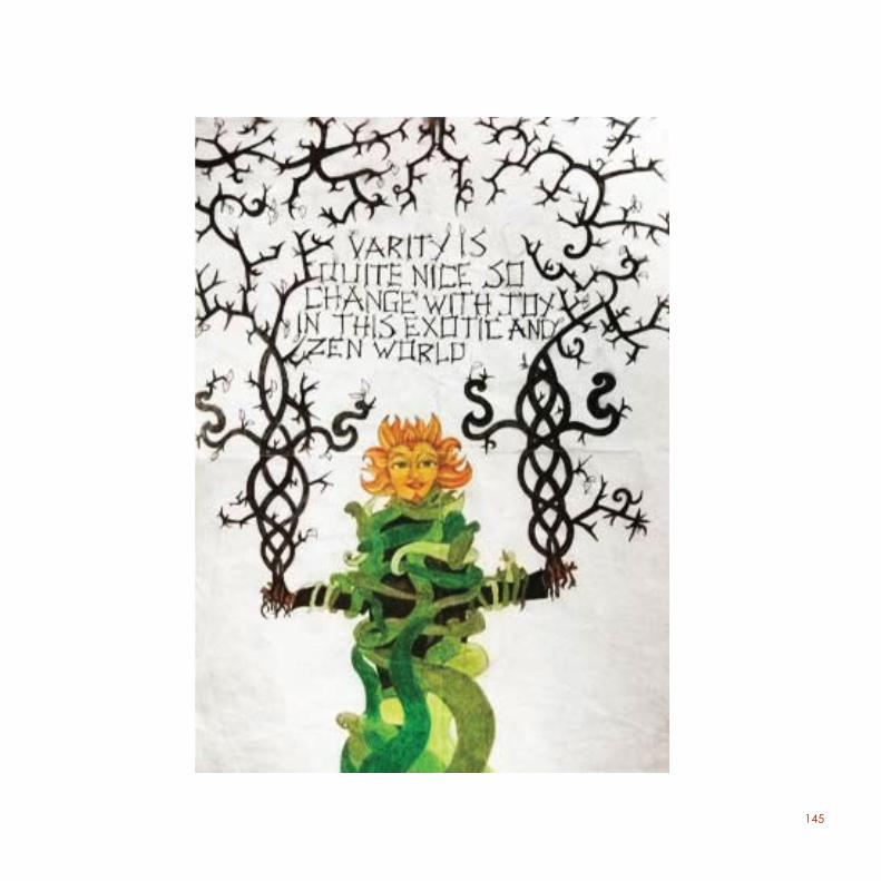
For this project, which was made during the 2nd year, we were asked to create a poster, with the theme “Reduce, Reuse and Recycle”, conveying the concept by simply using a typography and creating a pangram.
The message I want to give here is that the human beings are destroying Nature and, because of this fact, things should change and we should take a bigger responsibility upon our actions.
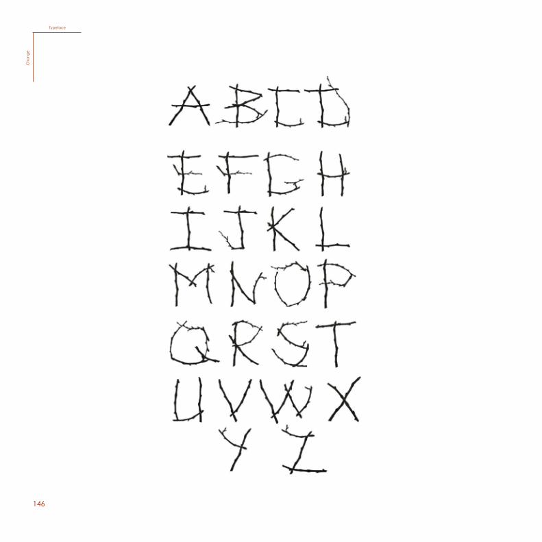
For the poster I invented a typography by getting together broken sticks to give the idea that we are destroying Nature. I also used an illustration with many branches of a tree, also conveying the same idea, making it more coherent to the form of the typography that was created. I used a black pen to give that same idea of Nature that is rotting, therefore, dying.
Finally, for the pangram, I came up with a phrase that has to do with the theme. The words “Change” and “World” are the ones that call the most attention to the poster, because it is basically the point I am trying to make with this concept... The world has to change.
For this project, which was made during the 2nd year, we were asked tocreate a poster, with the theme “Reduce, Reuse and Recycle”, conveying the concept by simply using a typogra-phy and creating a pangram.
The message I want to give here is that the human beings are destroying Nature and, because of this fact, things should change and we should take a bigger responsibility upon our actions.
For the poster I invented a typography by getting together broken sticks to give the idea that we are destroying Nature. I also used an illustration with many branches of a tree, also conveying the same idea, making it more coherent to the form of the typography that was created. I used a black pen to give that same idea of Nature that is rotting, there-fore, dying.
Finally, for the pangram, I came up with a phrase that has to do with the theme. The words “Change” and “World” are the ones that call the most attention to the poster, be-cause it is basically the point I am trying to make with this concept... The world has to change.
143
107
45Pangram/ Cartaz
Poster (A3)C
hangePoster (A2)
Cha
nge
144108
SketchesC
hang
eSketches
Cha
nge
145
109
146110
TypefaceC
hang
eTypeface
Cha
nge
147
111
Pangram
PangramC
hange
PangramC
hange
148112
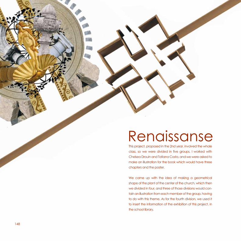
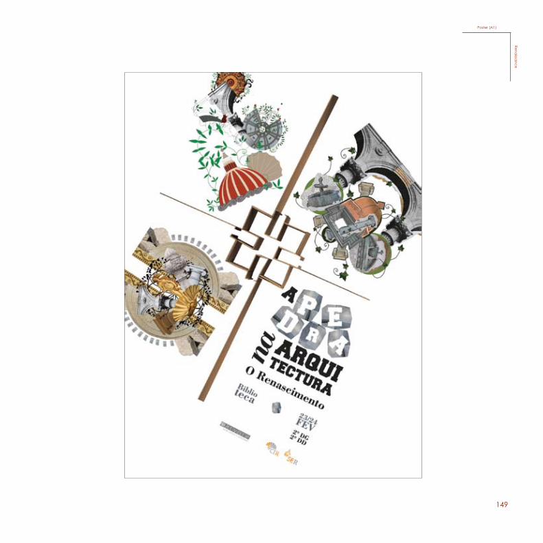
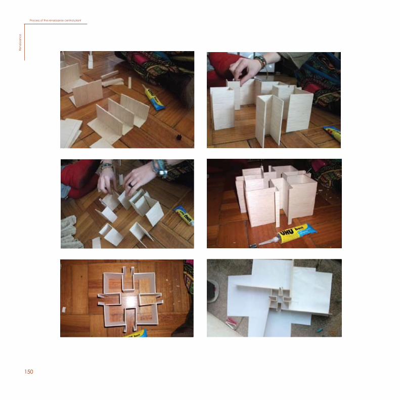
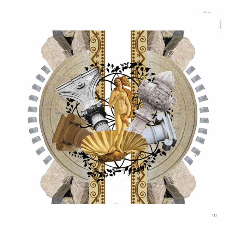
RenaissanseThis project, proposed in the 2nd year, involved the whole class, so we were divided in five groups. I worked with Chelsea Drouin and Tatiana Costa, and we were asked to make an illustration for the book which would have three chapters and the poster.
We came up with the idea of making a geometrical shape of the plant of the center of the church, which then we divided in four, and three of those divisions would contain an illustration from each member of the group, having to do with this theme. As for the fourth division, we used it to insert the information of the exhibition of this project, in the school library.
This project, proposed in the 2nd year, involved the whole class, so we were divided in five groups. I worked with Chelsea Drouin and Tatiana Costa, and we were asked to make an illustration for the book which would have three chapters and the poster.
We came up with the idea of making a geometrical shape of the plant of the center of the church, which then we divided in four, and three of those divisions would con-tain an illustration from each member of the group, having to do with this theme. As for the fourth division, we used it to insert the information of the exhibition of this project, in the school library.
Renaissanse
149112
RenaissanseThis project, proposed in the 2nd year, involved the whole class, so we were divided in five groups. I worked with Chelsea Drouin and Tatiana Costa, and we were asked to make an illustration for the book which would have three chapters and the poster.
We came up with the idea of making a geometrical shape of the plant of the center of the church, which then we divided in four, and three of those divisions would contain an illustration from each member of the group, having to do with this theme. As for the fourth division, we used it to insert the information of the exhibition of this project, in the school library.
113
Poster (A2)Renaissance
Poster (A1)Rena
issance
150
114
Process of the renaissanse central plant
Rena
issan
ce
Process of the renaissanse central plantRe
naiss
anc
e
151
115
IllustrationRenaissance
IllustrationRena
issance
152116
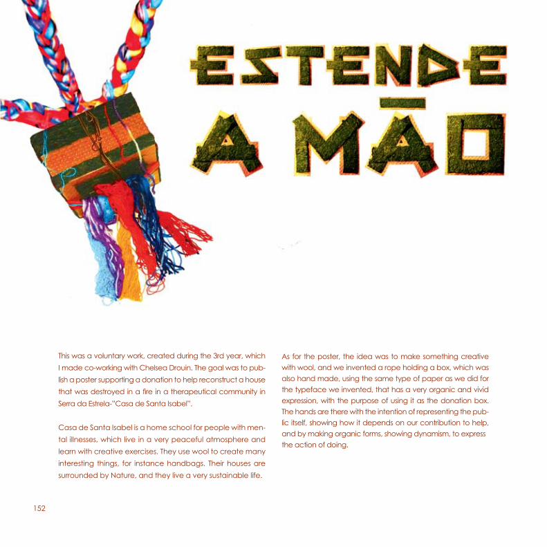
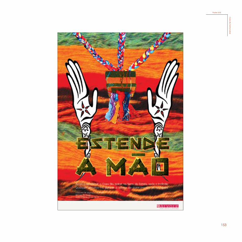
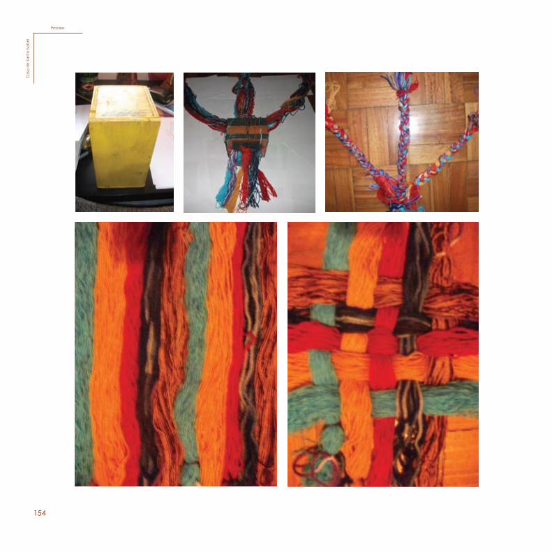
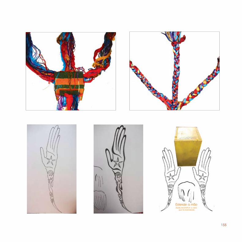
This was a voluntary work, created during the 3rd year, which I made co-working with Chelsea Drouin. The goal was to publish a poster supporting a donation to help reconstruct a house that was destroyed in a fire in a therapeutical community in Serra da Estrela-”Casa de Santa Isabel”.
Casa de Santa Isabel is a home school for people with mental illnesses, which live in a very peaceful atmosphere and learn with creative exercises. They use wool to create many interesting things, for instance handbags. Their houses are surrounded by Nature, and they live a very sustainable life.
As for the poster, the idea was to make something creative with wool, and we invented a rope holding a box, which was also hand made, using the same type of paper as we did for the typeface we invented, that has a very organic and vivid expression, with the purpose of using it as the donation box. The hands are there with the intention of repre-senting the public itself, showing how it depends on our contribution to help, and by making organic forms, showing dynamism, to express the action of doing.
This was a voluntary work, created during the 3rd year, which I made co-working with Chelsea Drouin. The goal was to pub-lish a poster supporting a donation to help reconstruct a house that was destroyed in a fire in a therapeutical community in Serra da Estrela-”Casa de Santa Isabel”.
Casa de Santa Isabel is a home school for people with men-tal illnesses, which live in a very peaceful atmosphere and learn with creative exercises. They use wool to create many interesting things, for instance handbags. Their houses are surrounded by Nature, and they live a very sustainable life.
As for the poster, the idea was to make something creative with wool, and we invented a rope holding a box, which was also hand made, using the same type of paper as we did for the typeface we invented, that has a very organic and vivid expression, with the purpose of using it as the donation box. The hands are there with the intention of representing the pub-lic itself, showing how it depends on our contribution to help, and by making organic forms, showing dynamism, to expressthe action of doing.
153116
This was a voluntary work, created during the 3rd year, which I made co-working with Chelsea Drouin. The goal was to publish a poster supporting a donation to help reconstruct a house that was destroyed in a fire in a therapeutical community in Serra da Estrela-”Casa de Santa Isabel”.
Casa de Santa Isabel is a home school for people with mental illnesses, which live in a very peaceful atmosphere and learn with creative exercises. They use wool to create many interesting things, for instance handbags. Their houses are surrounded by Nature, and they live a very sustainable life.
As for the poster, the idea was to make something creative with wool, and we invented a rope holding a box, which was also hand made, using the same type of paper as we did for the typeface we invented, that has a very organic and vivid expression, with the purpose of using it as the donation box. The hands are there with the intention of repre-senting the public itself, showing how it depends on our contribution to help, and by making organic forms, showing dynamism, to express the action of doing.
117
Poster (A3)
Casa de Santa Isabel
Poster (A3)C
asa
de Sa
nta Isa
bel
154118
ProcessC
asa
de S
anta
Isab
el
ProcessC
asa
de
Sant
a Is
ab
el
155
119119119
156
120
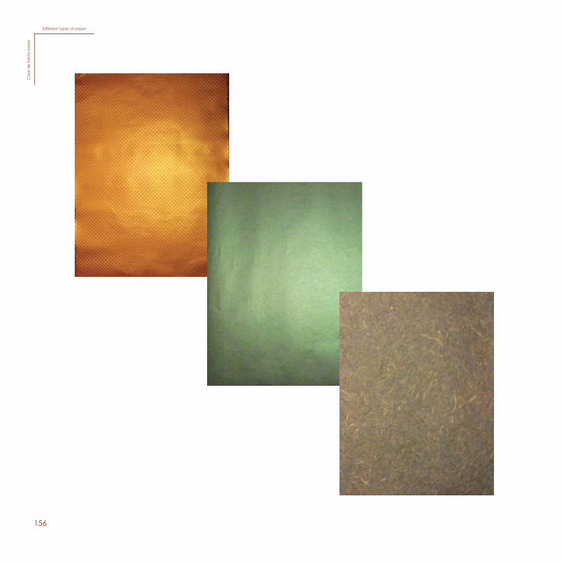
Different types of paperC
asa
de S
anta
Isab
el
Different types of paperC
asa
de
Sant
a Is
ab
el
157
121
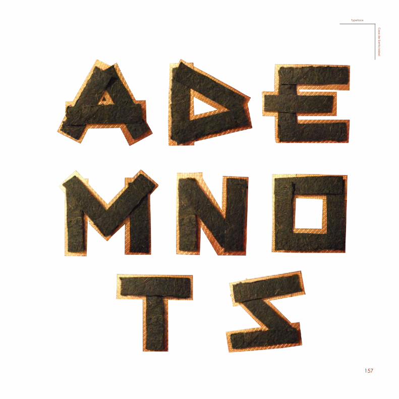
TypefaceC
asa de Santa IsabelTypeface
Ca
sa d
e Santa
Isab
el
158
159
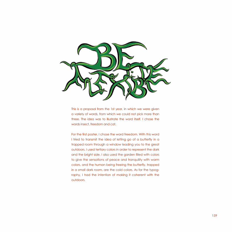
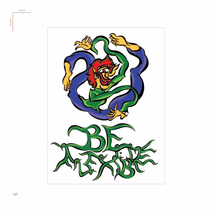
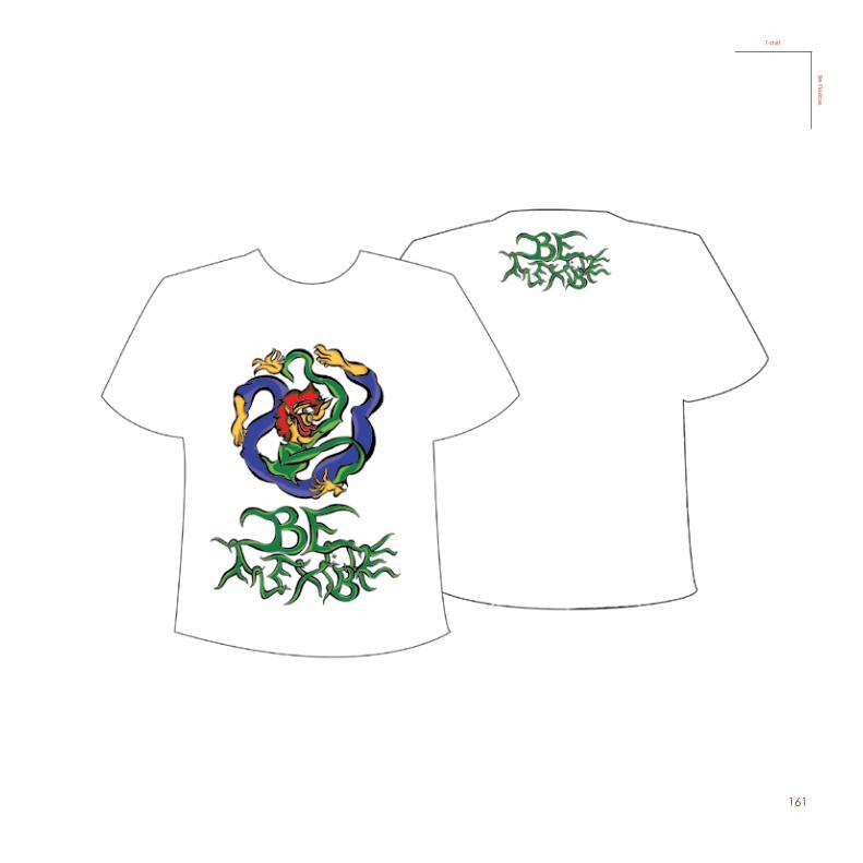
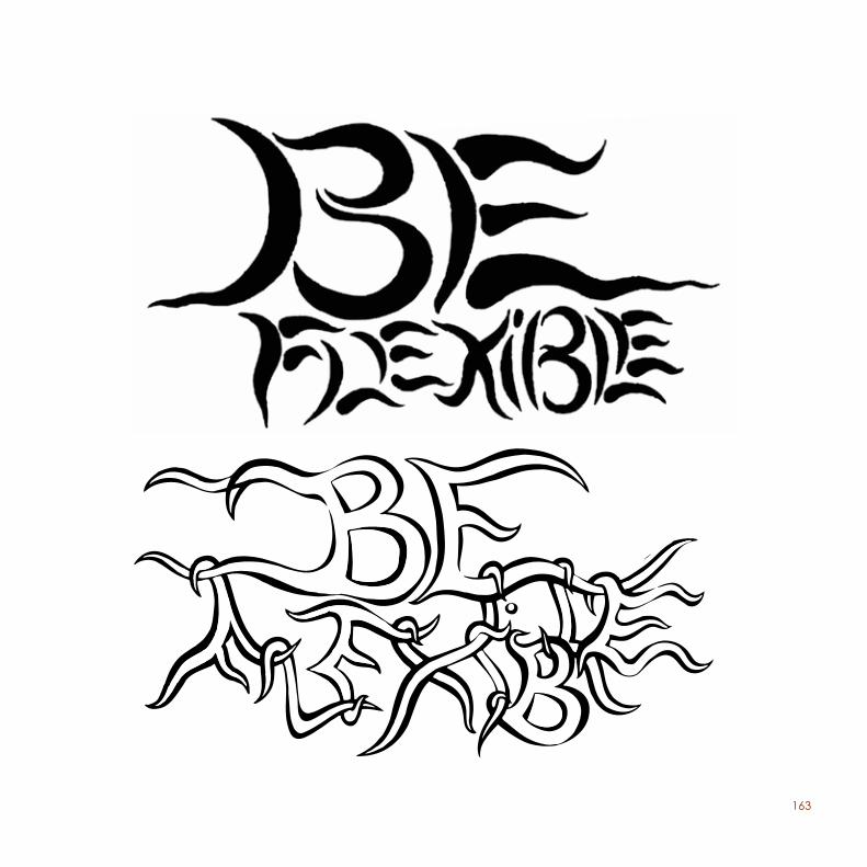
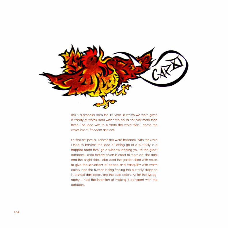
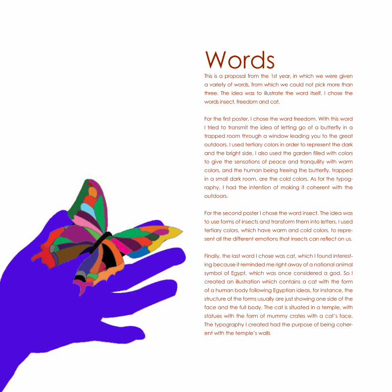
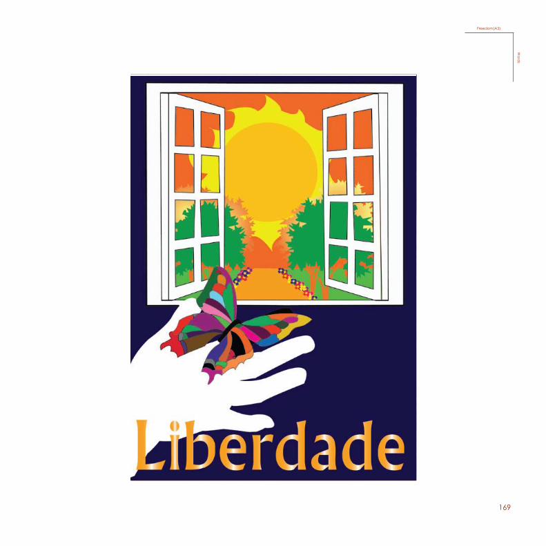
This is a proposal from the 1st year, in which we were given a variety of words, from which we could not pick more than three. The idea was to illustrate the word itself. I chose the words insect, freedom and cat.
For the first poster, I chose the word freedom. With this word I tried to transmit the idea of letting go of a butterfly in a trapped room through a window leading you to the great outdoors. I used tertiary colors in order to represent the dark and the bright side. I also used the garden filled with colors to give the sensations of peace and tranquility with warm colors, and the human being freeing the butterfly, trapped in a small dark room, are the cold colors. As for the typog-raphy, I had the intention of making it coherent with the outdoors.
160
SketchesBe
Fle
xib
le
161
T-shirtBe Flexib
le
162
ProcessBe
Fle
xib
le
163
164
This is a proposal from the 1st year, in which we were given a variety of words, from which we could not pick more than three. The idea was to illustrate the word itself. I chose the words insect, freedom and cat.
For the first poster, I chose the word freedom. With this word I tried to transmit the idea of letting go of a butterfly in a trapped room through a window leading you to the great outdoors. I used tertiary colors in order to represent the dark and the bright side. I also used the garden filled with colors to give the sensations of peace and tranquility with warm colors, and the human being freeing the butterfly, trapped in a small dark room, are the cold colors. As for the typog-raphy, I had the intention of making it coherent with the outdoors.
165
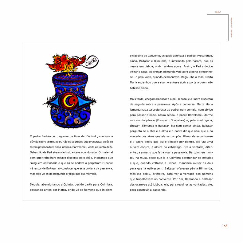
O padre Bartolomeu regressa da Holanda. Contudo, continua a
dúvida sobre se trouxe ou não os segredos que procurava. Após se
terem passado três anos inteiros, Bartolomeu visita a Quinta de S.
Sebastião da Pedreira onde tudo estava abandonado. O material
com que trabalhara estava disperso pelo chão, indicando que
“ninguém adivinharia o que ali se andava a perpetrar.” O padre
vê rastos de Baltasar ao constatar que este cuidara da passarola,
mas não vê os de Blimunda e julga que ela morrera.
Depois, abandonando a Quinta, decide partir para Coimbra,
passando antes por Mafra, onde vê os homens que iniciam
o trabalho do Convento, os quais abençoa a pedido. Procurando,
ainda, Baltasar e Blimunda, é informado pelo pároco, que os
casara em Lisboa, onde residem agora. Assim, o Padre decide
visitar o casal. Ao chegar, Blimunda veio abrir a porta e reconhe-
ceu-o pelo vulto, quando desmontava. Beijou-lhe a mão. Marta
Maria estranhou que a sua nora fosse abrir a porta a quem não
batesse ainda.
Mais tarde, chegam Baltasar e o pai. O casal e o Padre discutem
de seguida sobre a passarola. Após a conversa, Marta Maria
lamenta nada ter a oferecer ao padre, nem comida, nem abrigo
para passar a noite. Assim sendo, o padre Bartolomeu dorme
na casa do pároco (Francisco Gonçalves) e, pela madrugada,
chegam Blimunda e Baltasar. Ela sem comer ainda. Baltasar
pergunta se o éter é a alma e o padre diz que não, que é da
vontade dos vivos que ele se compõe. Blimunda espantou-se
e o padre pediu que ela o olhasse por dentro. Ela viu uma
nuvem escura, à altura do estômago. Era a vontade, difer-
ente da alma, o que faria voar a passarola. Bartolomeu mon-
tou na mula, disse que ia a Coimbra aprofundar os estudos
e que, quando voltasse a Lisboa, mandaria avisar os dois
para que lá estivessem. Baltasar ofereceu pão a Blimunda,
mas ela pediu, primeiro, para ver a vontade dos homens
que trabalhavam no convento. Por fim, Blimunda e Baltasar
deslocam-se até Lisboa: ela, para recolher as vontades; ele,
para construir a passarola.
Layout“M
emoria
l do C
onvento”
166
Illustration“M
emor
ial d
o C
onve
nto”
167
Sketch“M
emoria
l do C
onvento”
168
This is a proposal from the 1st year, in which we were given a variety of words, from which we could not pick more than three. The idea was to illustrate the word itself. I chose the words insect, freedom and cat.
For the first poster, I chose the word freedom. With this word I tried to transmit the idea of letting go of a butterfly in a trapped room through a window leading you to the great outdoors. I used tertiary colors in order to represent the dark and the bright side. I also used the garden filled with colors to give the sensations of peace and tranquility with warm colors, and the human being freeing the butterfly, trapped in a small dark room, are the cold colors. As for the typog-raphy, I had the intention of making it coherent with the outdoors.
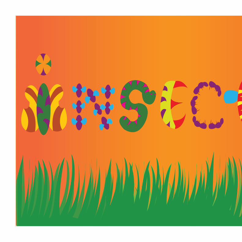
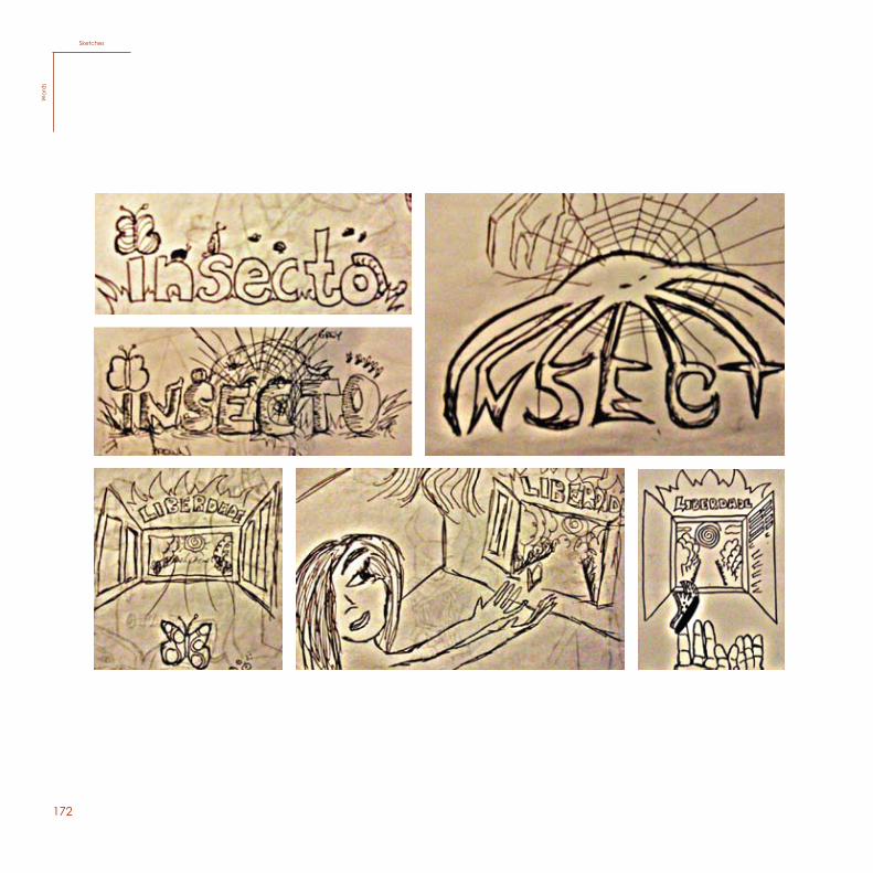
For the second poster I chose the word insect. The idea was to use forms of insects and transform them into letters. I used tertiary colors, which have warm and cold colors, to repre-sent all the different emotions that insects can reflect on us.
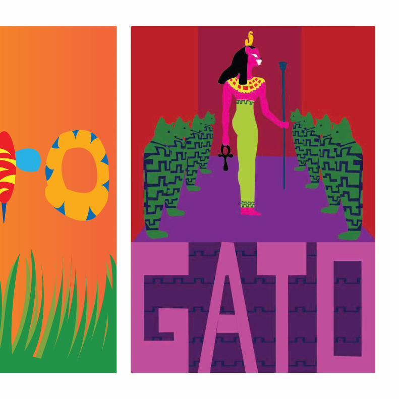
Finally, the last word I chose was cat, which I found interest-ing because it reminded me right away of a national animal symbol of Egypt, which was once considered a god. So I created an illustration which contains a cat with the form of a human body following Egyptian ideas, for instance, the structure of the forms usually are just showing one side of the face and the full body. The cat is situated in a temple, with statues with the form of mummy crates with a cat’s face. The typography I created had the purpose of being coher-ent with the temple’s walls
Words
169
128
35Ilustração da palavra Liberdade
Freedom (A3)W
ords
Freedom(A3)W
ords
170
127
33Ilustração da palavra Insecto
Insect (A3)
Words
171129
37Ilustração da palavra Gato
Cat (A3)
Words
127
33Ilustração da palavra Insecto
Insect (A3)
Words
172130
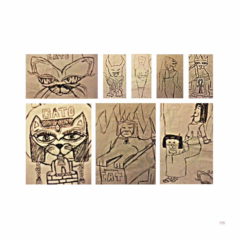
SketchesW
ords
SketchesW
ord
s
173131
174
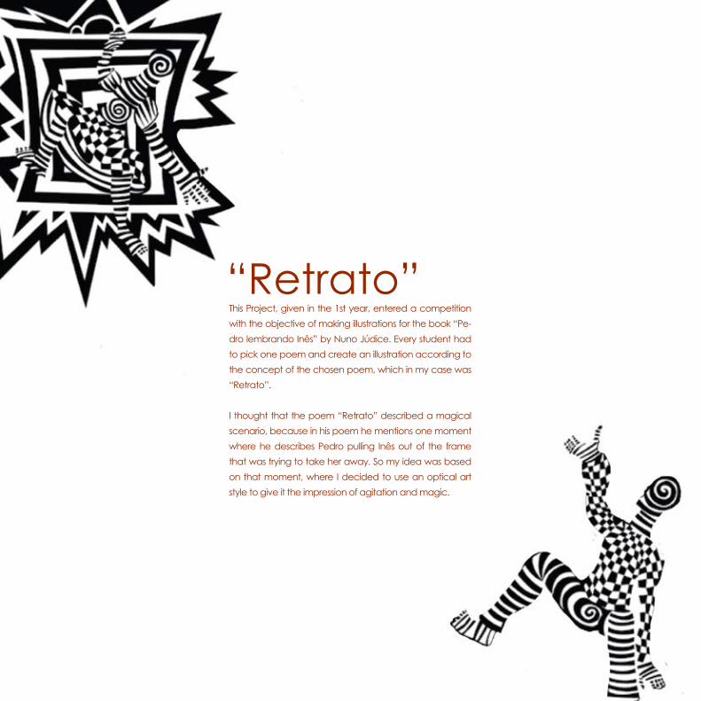
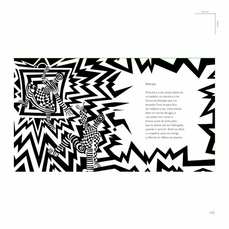
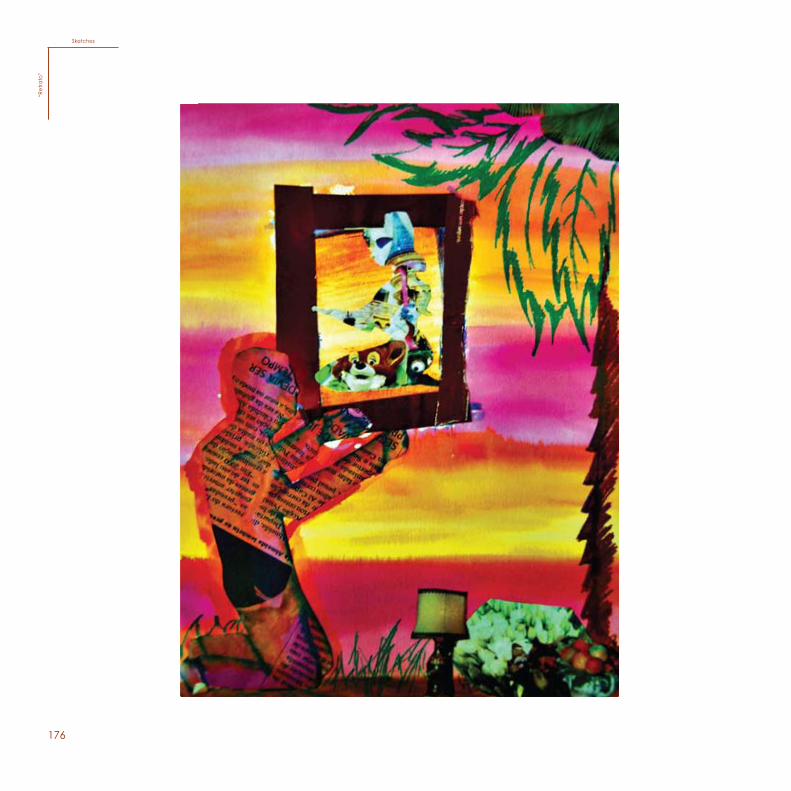
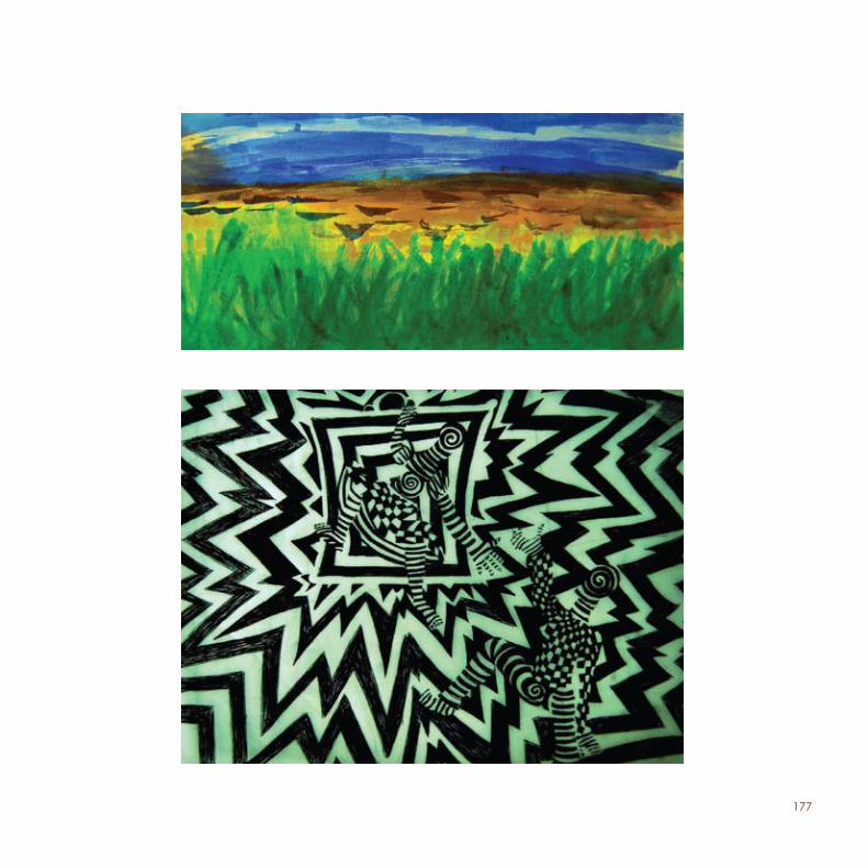
This Project, given in the 1st year, entered a competition with the objective of making illustrations for the book “Pe-dro lembrando Inês” by Nuno Júdice. Every student had to pick one poem and create an illustration according to the concept of the chosen poem, which in my case was “Retrato”.
I thought that the poem “Retrato” described a magical scenario, because in his poem he mentions one moment where he describes Pedro pulling Inês out of the frame that was trying to take her away. So my idea was based on that moment, where I decided to use an optical art style to give it the impression of agitation and magic.
“Retrato”
175
123
43Ilustração do poema “Retrato” de Nuno Júdice
Illustration“Retrato”
Illustration“Retra
to”
176
124
Sketches“R
etra
to”
Sketches“R
etra
to”
177
125
178
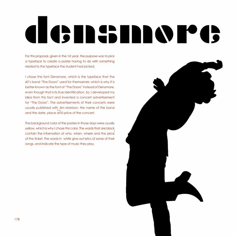
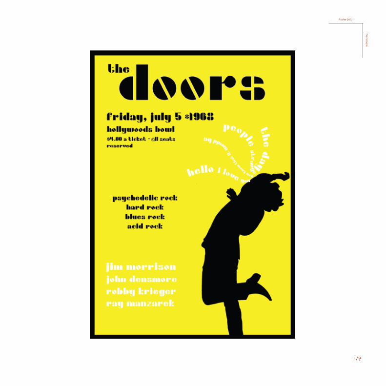
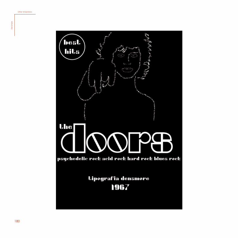
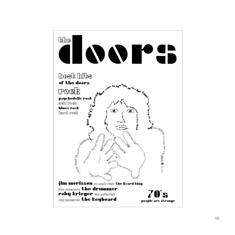
For this proposal, given in the 1st year, the purpose was to pick a typeface to create a poster having to do with something related to the typeface the student had picked.
I chose the font Densmore, which is the typeface that the 60’s band “The Doors” used for themselves, which is why it is better known as the font of “The Doors” instead of Densmore, even though that is its true identification. So, I developed my idea from this fact and invented a concert advertisement for “The Doors”. The advertisements of their concerts were usually published with Jim Morrison, the name of the band and the date, place and price of the concert.
The background color of the posters in those days were usually yellow, which is why I chose this color. The words that are black contain the information of who, when, where and the price of the ticket. The words in white give out lyrics of some of their songs, and indicate the type of music they play.
179
141
Poster (A3)
Densm
ore
Poster (A3)D
ensmore
180
Other temptationsD
ensm
ore
181
143
182
132
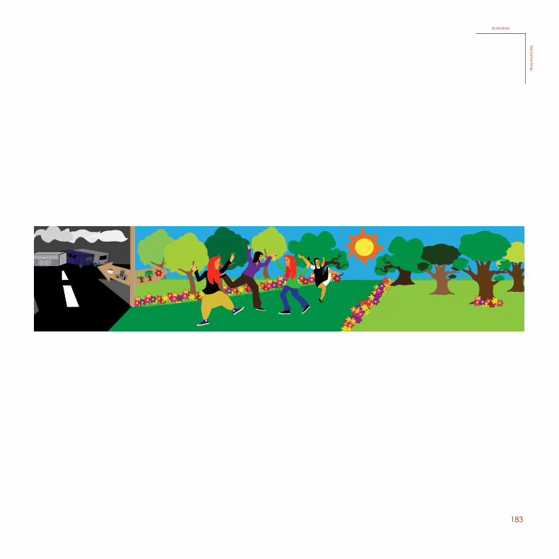
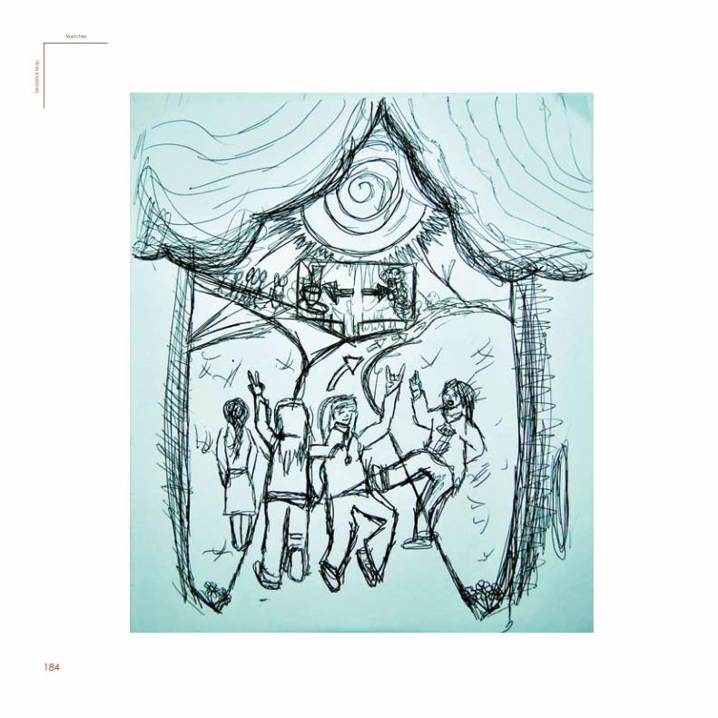
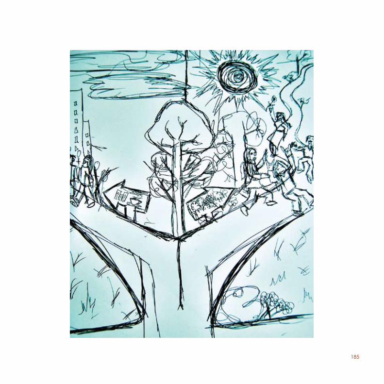
Sensorial mapFor this proposal, in the 1st year, we were asked to reflect a moment of a field trip we had in Lisbon and creating a sensorial map.
The moment I chose to illustrate for my sensorial map represents two sides, the dark side and the bright side, with a road that will lead you to one side or the other. The dark side is representing the atmosphere inside the city of Lisbon, and the bright side represents the atmosphere that is apart from the city, Nature. This is one moment we had in the field trip, which took place around lunch time.
39
Mapa Sensorial
For this proposal, in the 1st year, we were asked to reflect a moment of a field trip we had in Lisbon and creating a senso-rial map.
The moment I chose to illustrate for my sensorial map rep-resents two sides, the dark side and the bright side, with a road that will lead you to one side or the other. The dark side is representing the atmosphere inside the city of Lisbon, and the bright side represents the atmosphere that is apart from the city, Nature. This is one moment we had in the field trip, which took place around lunch time.
Words
183
illustrationSensoria
l Ma
p
184
134
SketchesSe
nsor
ial m
ap
SketchesSe
nsor
ial M
ap
185
135
186136
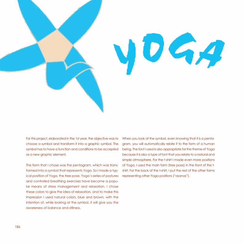
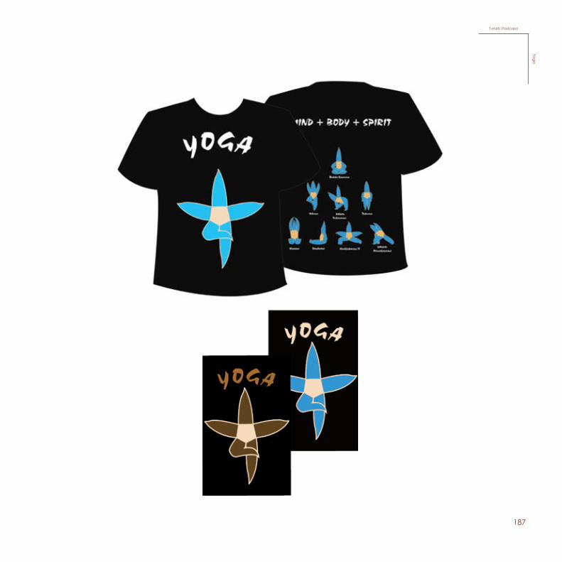
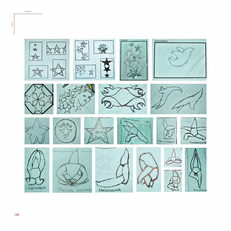
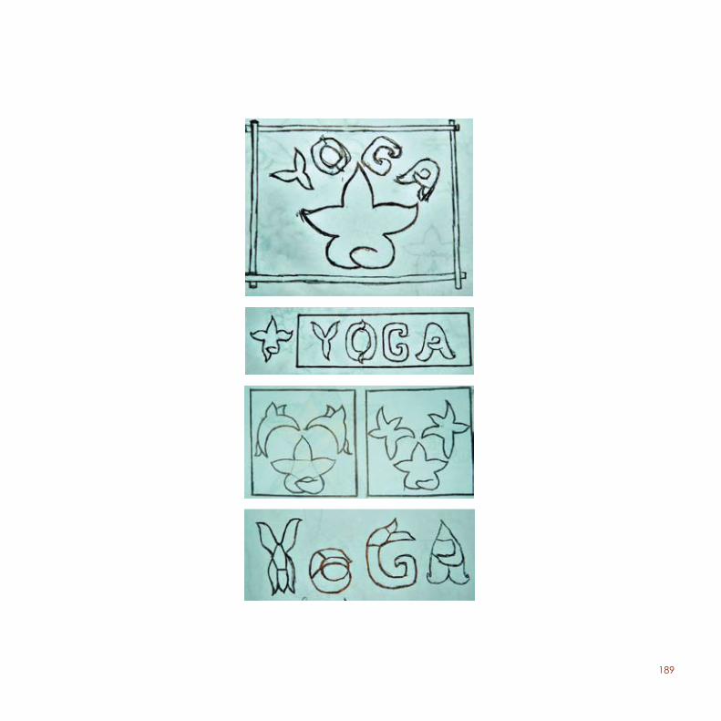
For this project, elaborated in the 1st year, the objective was to choose a symbol and transform it into a graphic symbol. The symbol has to have a function and conditions to be accepted as a new graphic element.
The form that I chose was the pentagram, which I was able to transform into a symbol that would represent Yoga. So I made a typical position of Yoga, the tree pose. Yoga´s series of postures and controlled breathing exercises have become a popular means of stress management and relaxation. I chose these colors to give the idea of relaxation, and to make this impression I used natural colors, blue and brown, with the intention of, while looking at the symbol, it will give you the awareness of balance and stillness.
When you look at the symbol, even knowing that it is a pentagram, you will automatically relate it to the form of a human being. The font I used is also appropriate for the theme of Yoga because it is also a type of font that you relate to a natural and simple atmosphere. For the t-shirt I made even more positions of Yoga. I used the main form (tree pose) in the front of the t-shirt. For the back of the t-shirt, I put the rest of the other forms representing other Yoga positions (“asanas”).
For this project, elaborated in the 1st year, the objective was to choose a symbol and transform it into a graphic symbol. The symbol has to have a function and conditions to be accepted as a new graphic element.
The form that I chose was the pentagram, which was trans-formed into a symbol that represents Yoga. So I made a typ-ical position of Yoga, the tree pose. Yoga´s series of postures and controlled breathing exercises have become a popu-lar means of stress management and relaxation. I chose these colors to give the idea of relaxation, and to make this impression I used natural colors, blue and brown, with the intention of, while looking at the symbol, it will give you the awareness of balance and stillness.
When you look at the symbol, even knowing that it is a penta-gram, you will automatically relate it to the form of a human being. The font I used is also appropriate for the theme of Yoga because it is also a type of font that you relate to a natural and simple atmosphere. For the t-shirt I made even more positions of Yoga. I used the main form (tree pose) in the front of the t-shirt. For the back of the t-shirt, I put the rest of the other forms representing other Yoga positions (“asanas”).
187
T-shirt/ PostcardYoga
188
SketchesYo
ga
138
Sketches
Yoga
189
139
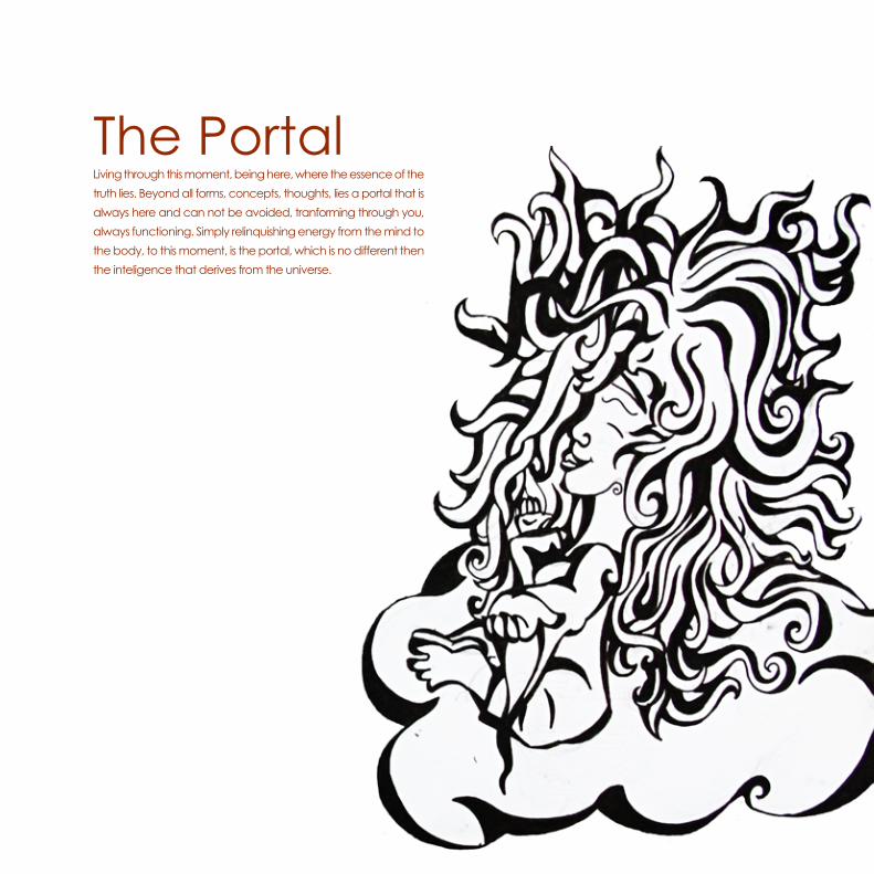
The PortalLiving through this moment, being here, where the essence of the truth lies. Beyond all forms, concepts, thoughts, lies a portal that is always here and can not be avoided, tranforming through you, always functioning. Simply relinquishing energy from the mind to the body, to this moment, is the portal, which is no different then the inteligence that derives from the universe.
194
195
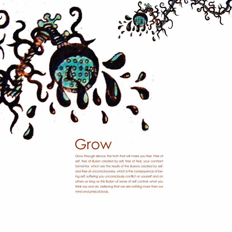
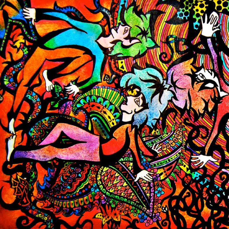
GrowGrow through silence, the truth that will make you free. Free of self, free of illusion created by self, free of fear, your constant tormentor, which are the results of the illusions created by self, and free of unconsciousness, which is the consequence of be-ing self, suffering you unconsciously conflict on yourself and on others as long as this illusion of sense of self controls what you think say and do, believing that we are nothing more then our mind and phisical body.
198
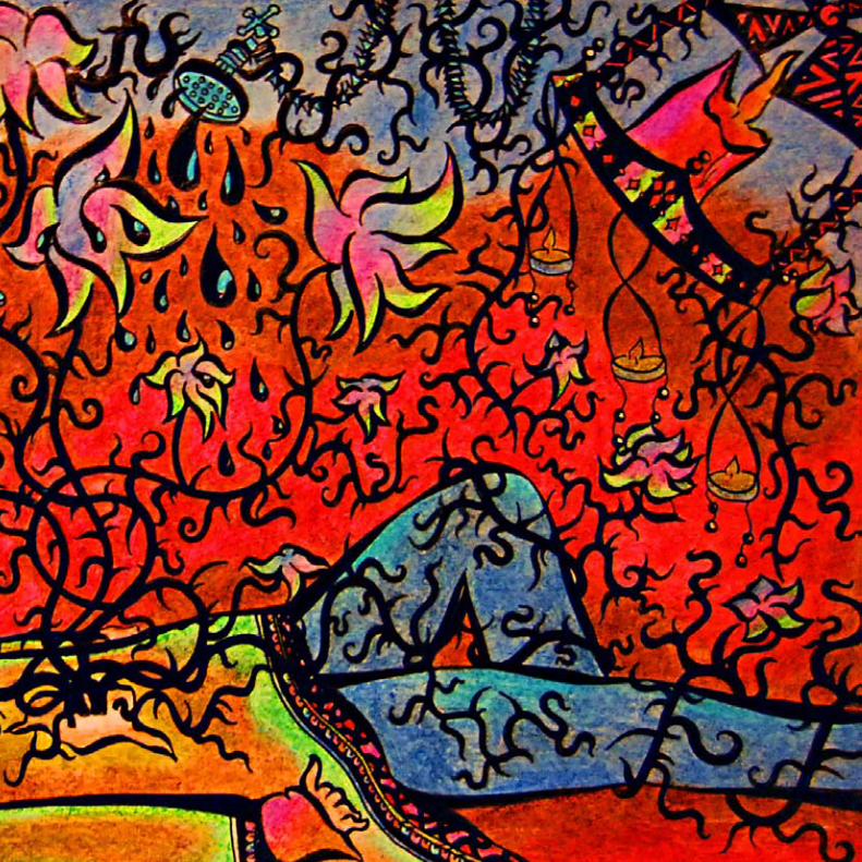
199
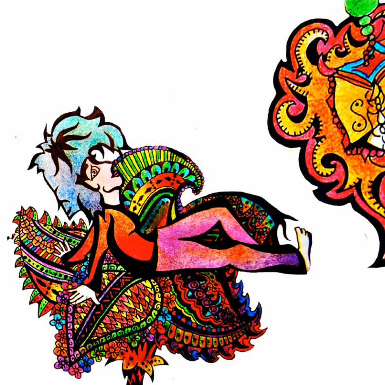
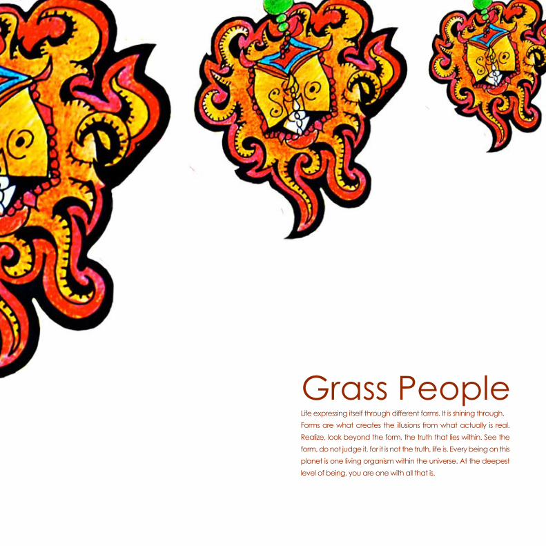
Grass PeopleLife expressing itself through different forms. It is shining through.Forms are what creates the illusions from what actually is real. Realize, look beyond the form, the truth that lies within. See the form, do not judge it, for it is not the truth, life is. Every being on this planet is one living organism within the universe. At the deepest level of being, you are one with all that is.
202
203
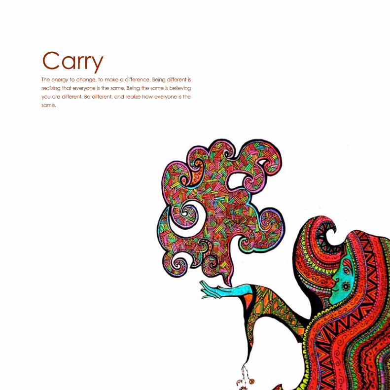
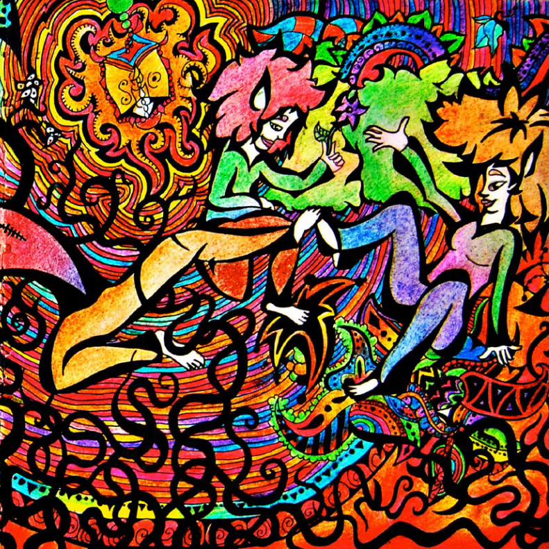
CarryThe energy to change, to make a difference. Being different is realizing that everyone is the same. Being the same is believing you are different. Be different, and realize how everyone is the same.
206
207
The Key...is you.
210
211
213
Long way...one step at a time.
214
215
216
217
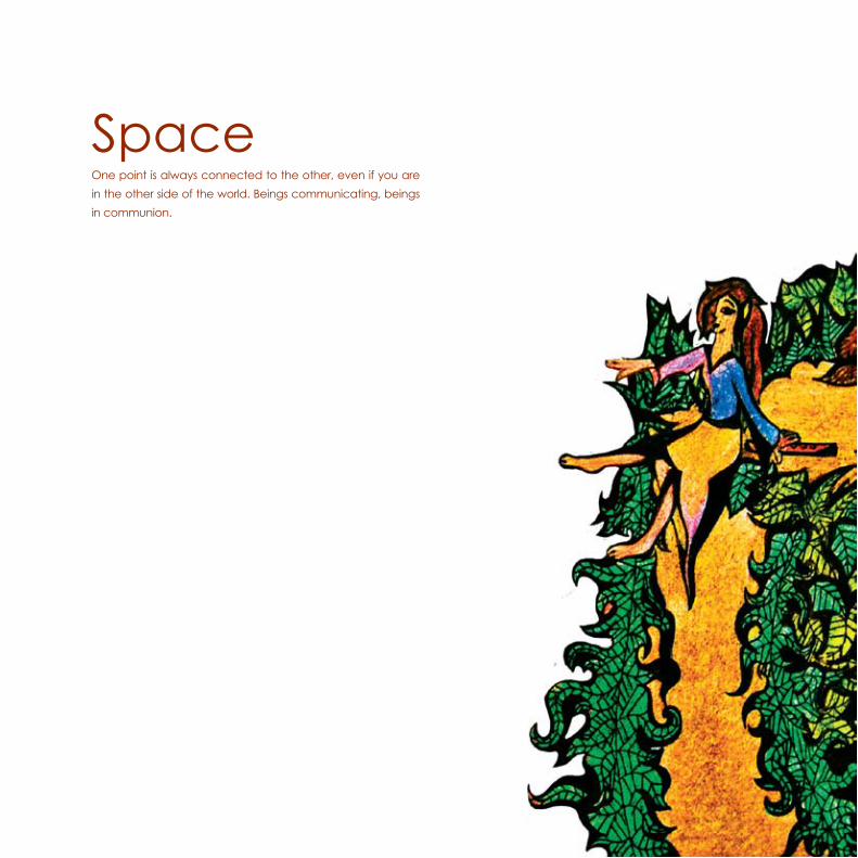
SpaceOne point is always connected to the other, even if you are in the other side of the world. Beings communicating, beings in communion.
218
219