Embed Size (px)
DESCRIPTION
I am David Aldave, a peruvian creative director. I think a concept, draw it, plan it and finally make it real. I love design and film, they make me feel inspired. This is my portfolio with all the best of my work. Please click on www.davidaldave.com to see more of my experience and profile. Thank you.
Citation preview
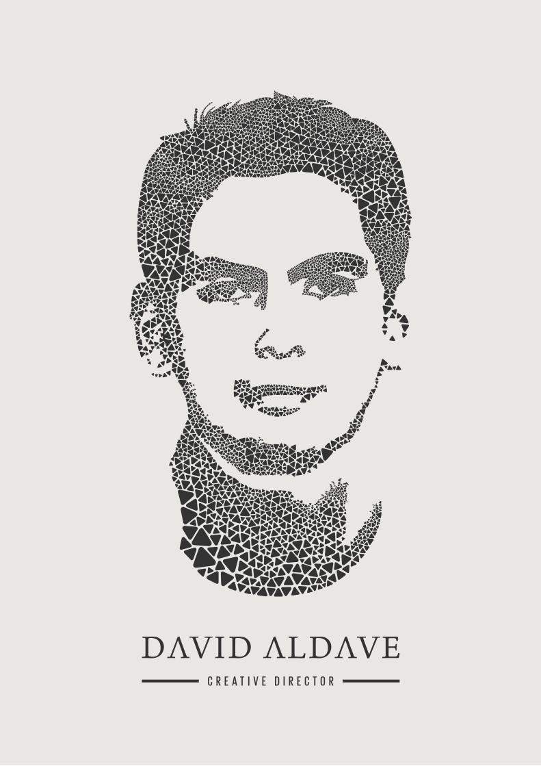
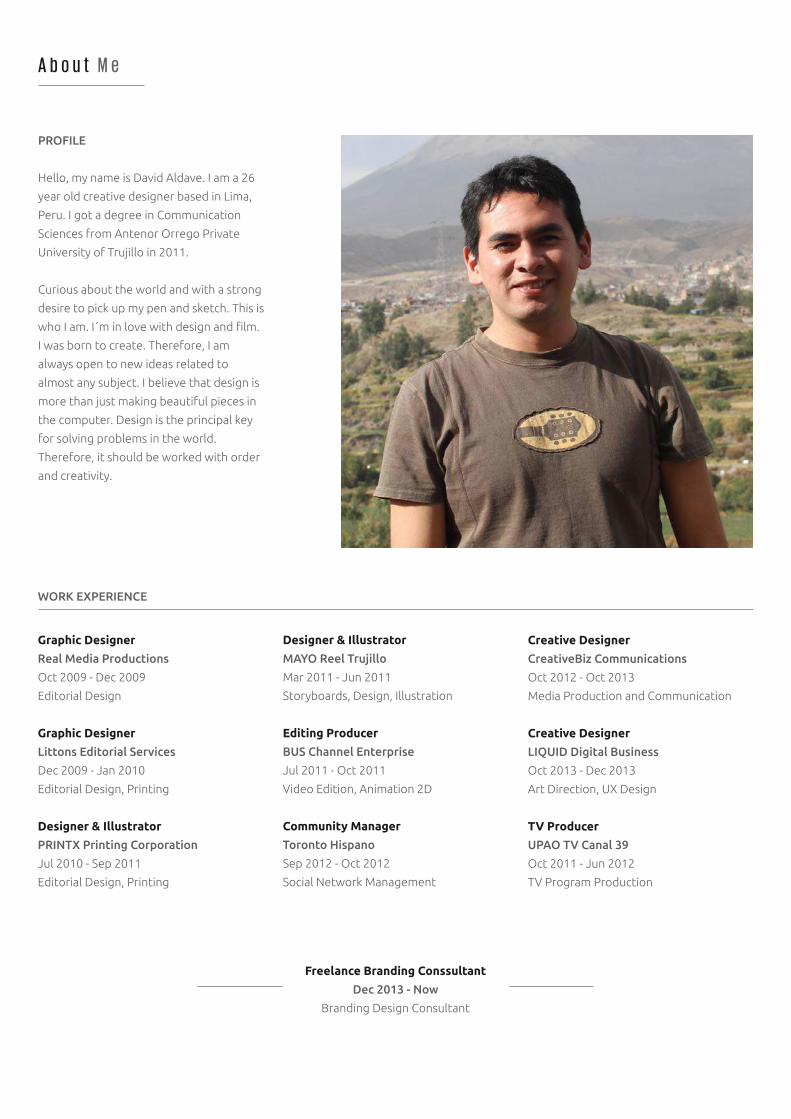
A b o u t M e
PROFILE
Hello, my name is David Aldave. I am a 26
year old creative designer based in Lima,
Peru. I got a degree in Communication
Sciences from Antenor Orrego Private
University of Trujillo in 2011.
Curious about the world and with a strong
desire to pick up my pen and sketch. This is
who I am. I´m in love with design and film.
I was born to create. Therefore, I am
always open to new ideas related to
almost any subject. I believe that design is
more than just making beautiful pieces in
the computer. Design is the principal key
for solving problems in the world.
Therefore, it should be worked with order
and creativity.
WORK EXPERIENCE
Graphic Designer
Real Media Productions
Oct 2009 - Dec 2009
Editorial Design
Graphic Designer
Littons Editorial Services
Dec 2009 - Jan 2010
Editorial Design, Printing
Designer & Illustrator
PRINTX Printing Corporation
Jul 2010 - Sep 2011
Editorial Design, Printing
Creative Designer
CreativeBiz Communications
Oct 2012 - Oct 2013
Media Production and Communication
Creative Designer
LIQUID Digital Business
Oct 2013 - Dec 2013
Art Direction, UX Design
TV Producer
UPAO TV Canal 39
Oct 2011 - Jun 2012
TV Program Production
Designer & Illustrator
MAYO Reel Trujillo
Mar 2011 - Jun 2011
Storyboards, Design, Illustration
Editing Producer
BUS Channel Enterprise
Jul 2011 - Oct 2011
Video Edition, Animation 2D
Community Manager
Toronto Hispano
Sep 2012 - Oct 2012
Social Network Management
E d u c a t i o n
UNIVERSITY / COURSES / WORKSHOPS
High School
Integral Class
Class of 2004
Graduated
University
Antenor Orrego Private University
Bachelor 2005 - 2010
Graduated with Honours
Degree in Communication Sciences
Antenor Orrego Private University
Dec 2011
Major in Advertising
B1 French
Alliance Française
Feb 2010 - Sep 2013
Certificate Diploma
Digital Photography
IPAD - Lima
Jun 2013 - Aug 2013
Diploma
Lightning for Photography
Centro de la Imagen - Lima
Apr 2014 - May 2014
Workshop Diploma
Advanced English
El Cultural - Trujillo
Class of 2009
Certificate of Language Proficiency
Graphic Design
SENCICO - Trujillo
Sep 2007 - Dec 2007
Diploma
Web Design
SENATI
Feb 2010 - Jun 2010
Diploma
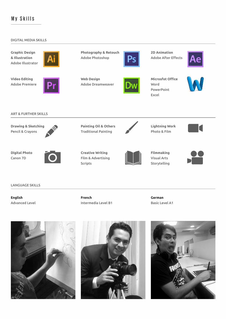
DIGITAL MEDIA SKILLS
Graphic Design
& Illustration
Adobe Illustrator
Video Editing
Adobe Premiere
2D Animation
Adobe After Effects
Microsfot Office
Word
PowerPoint
Excel
Photography & Retouch
Adobe Photoshop
Web Design
Adobe Dreamweaver
M y S k i l l s
ART & FURTHER SKILLS
Drawing & Sketching
Pencil & Crayons
Digital Photo
Canon 7D
Lightning Work
Photo & Film
Filmmaking
Visual Arts
Storytelling
Painting Oil & Others
Traditional Painting
Creative Writing
Film & Advertising
Scripts
LANGUAGE SKILLS
English
Advanced Level
German
Basic Level A1
French
Intermedia Level B1
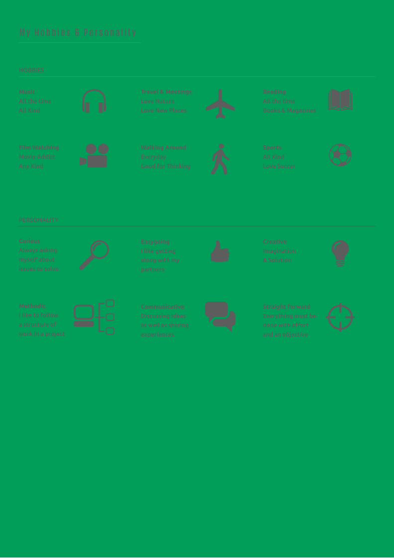
HOBBIES
Music
All the time
All Kind
Film Watching
Movie Addict
Any Kind
Reading
All the time
Books & Magazines
Sports
All Kind
Love Soccer
Travel & Meetings
Love Nature
Love New Places
Walking Around
Everyday
Good for Thinking
M y H o b b i e s & P e r s o n a l i t y
PERSONALITY
Curious
Always asking
myself about
issues to solve
Methodic
I like to follow
a structure of
work in a project
Creative
Imagination
& Solution
Straight forward
Everything must be
done with effort
and an objective
Easygoing
I like getting
along with my
partners
Communicative
Discussing Ideas
as well as sharing
experiences
Innovation
Service Design
Business Management
Social Issues & People
Life & Human Welfare
Health and Education
Arts & Culture
Creativity & Design Thinking
Environment Protection
Animal Protection
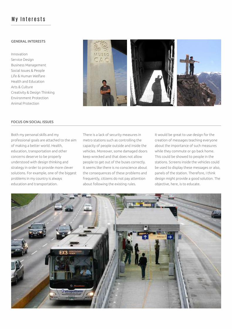
GENERAL INTERESTS
Both my personal skills and my
professional goals are attached to the aim
of making a better world. Health,
education, transportation and other
concerns deserve to be properly
understood with design thinking and
strategy in order to provide more clever
solutions. For example, one of the biggest
problems in my country is always
education and transportation.
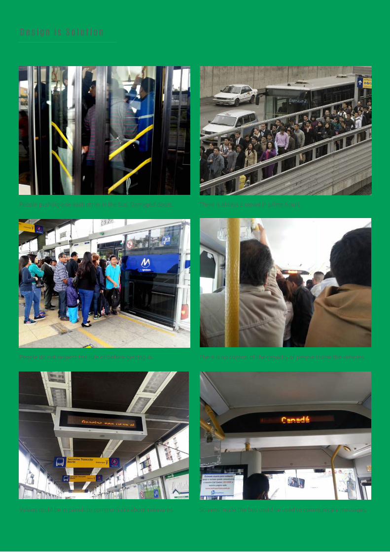
It would be great to use design for the
creation of messages teaching everyone
about the importance of such measures
while they commute or go back home.
This could be showed to people in the
stations. Screens inside the vehicles could
be used to display these messages or also,
panels of the station. Therefore, I think
design might provide a good solution. The
objective, here, is to educate.
There is a lack of security measures in
metro stations such as controlling the
capacity of people outside and inside the
vehicles. Moreover, some damaged doors
keep wrecked and that does not allow
people to get out of the buses correctly.
It seems like there is no conscience about
the consequences of these problems and
frequently, citizens do not pay attention
about following the existing rules.
FOCUS ON SOCIAL ISSUES
M y I n t e r e s t s
D e s i g n i s S o l u t i o n
People pushing one each other in the bus. Damaged doors.
People do not respect the rule of before getting in.
There is always a crowd in prime hours.
There is no control of the capacity of people inside the vehicles.
Screens inside the bus could be used to communicate messages.Videos could be in panels to communicate about measures.
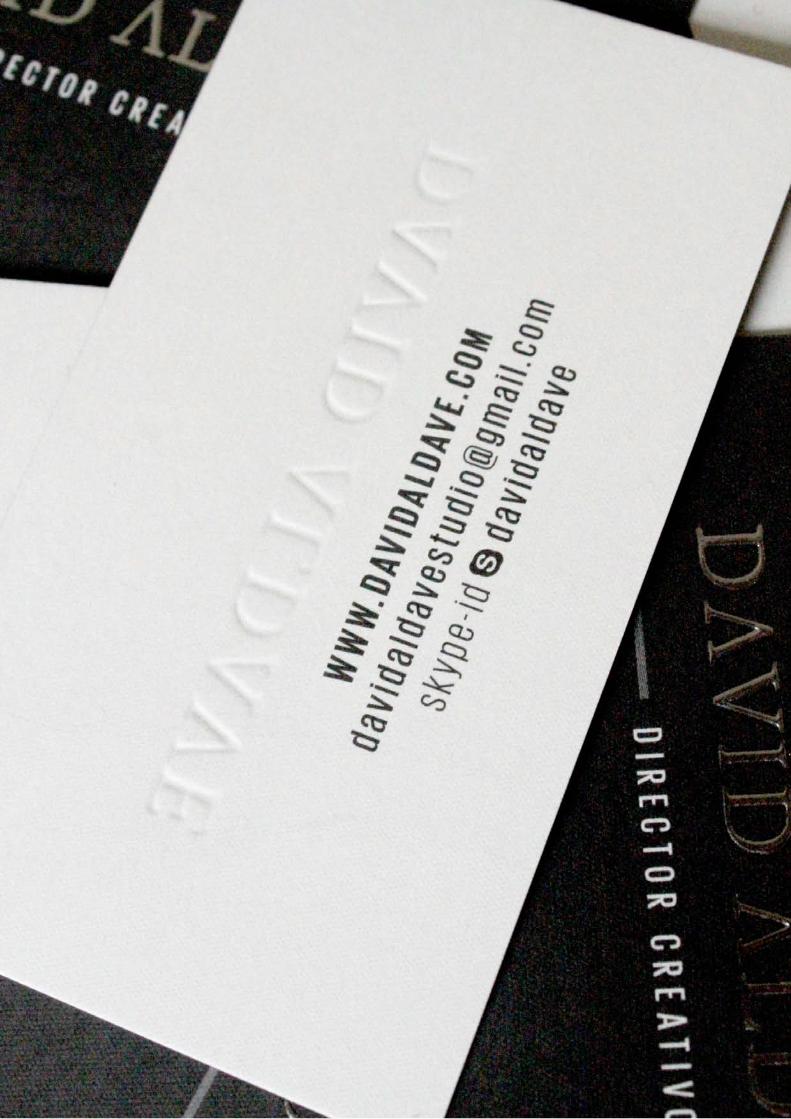
C o n t a c t M e
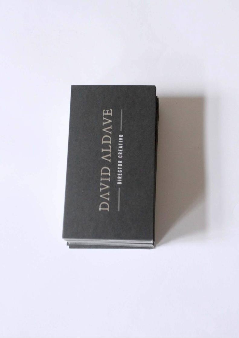
David Aldave Alva
David Aldave Alva
www.behance.net/davidaldave
www.facebook.com/david.aldavealva
+51 978 729 654
davidaldave
4420 Arequipa Avenue.
Miraflores District. Lima, Peru
W W W . D A V I D A L D A V E . C O M
S e e M o r e . C l i c k o n
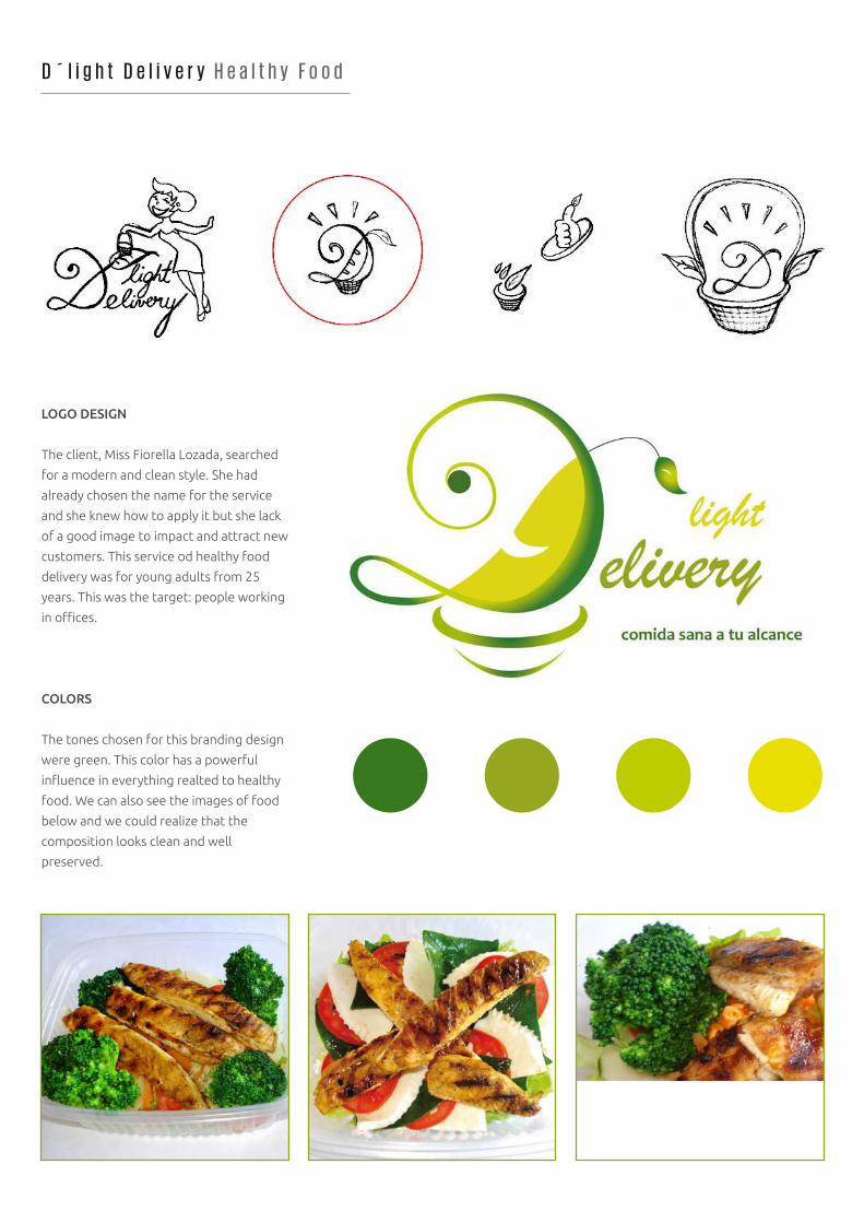
D ´ l i g h t D e l i v e r y H e a l t h y F o o d
LOGO DESIGN
The client, Miss Fiorella Lozada, searched
for a modern and clean style. She had
already chosen the name for the service
and she knew how to apply it but she lack
of a good image to impact and attract new
customers. This service od healthy food
delivery was for young adults from 25
years. This was the target: people working
in offices.
COLORS
The tones chosen for this branding design
were green. This color has a powerful
influence in everything realted to healthy
food. We can also see the images of food
below and we could realize that the
composition looks clean and well
preserved.
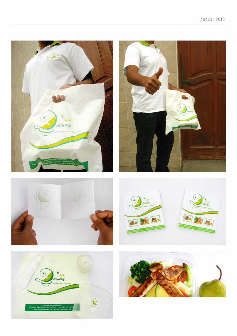
A u g u s t 2 0 1 0
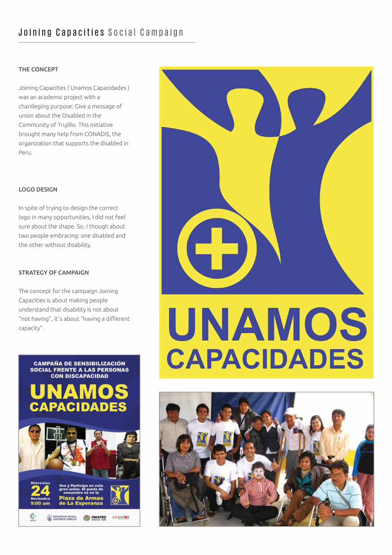
J o i n i n g C a p a c i t i e s S o c i a l C a m p a i g n
THE CONCEPT
Joining Capacities ( Unamos Capacidades )
was an academic project with a
chanlleging purpose: Give a message of
union about the Disabled in the
Community of Trujillo. This initiative
brought many help from CONADIS, the
organization that supports the disabled in
Peru.
LOGO DESIGN
In spite of trying to design the correct
logo in many opportunities, I did not feel
sure about the shape. So, I though about
two people embracing: one disabled and
the other without disability.
STRATEGY OF CAMPAIGN
The concept for the campaign Joining
Capacities is about making people
understand that disability is not about
“not having”, it´s about “having a different
capacity” .
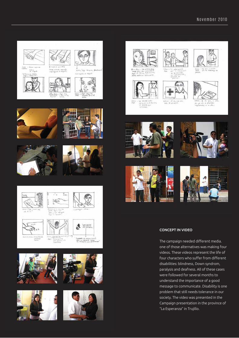
CONCEPT IN VIDEO
The campaign needed different media.
one of those alternatives was making four
videos. These videos represent the life of
four characters who suffer from different
disabilities: blindness, Down syndrom,
paralysis and deafness. All of these cases
were followed for several months to
understand the importance of a good
message to communicate. Disability is one
problem that still needs tolerance in our
society. The video was presented in the
Campaign presentation in the province of
“La Esperanza” in Trujillo.
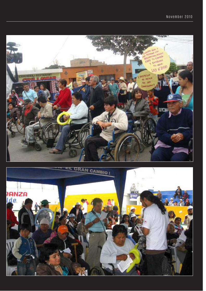
N o v e m b e r 2 0 1 0
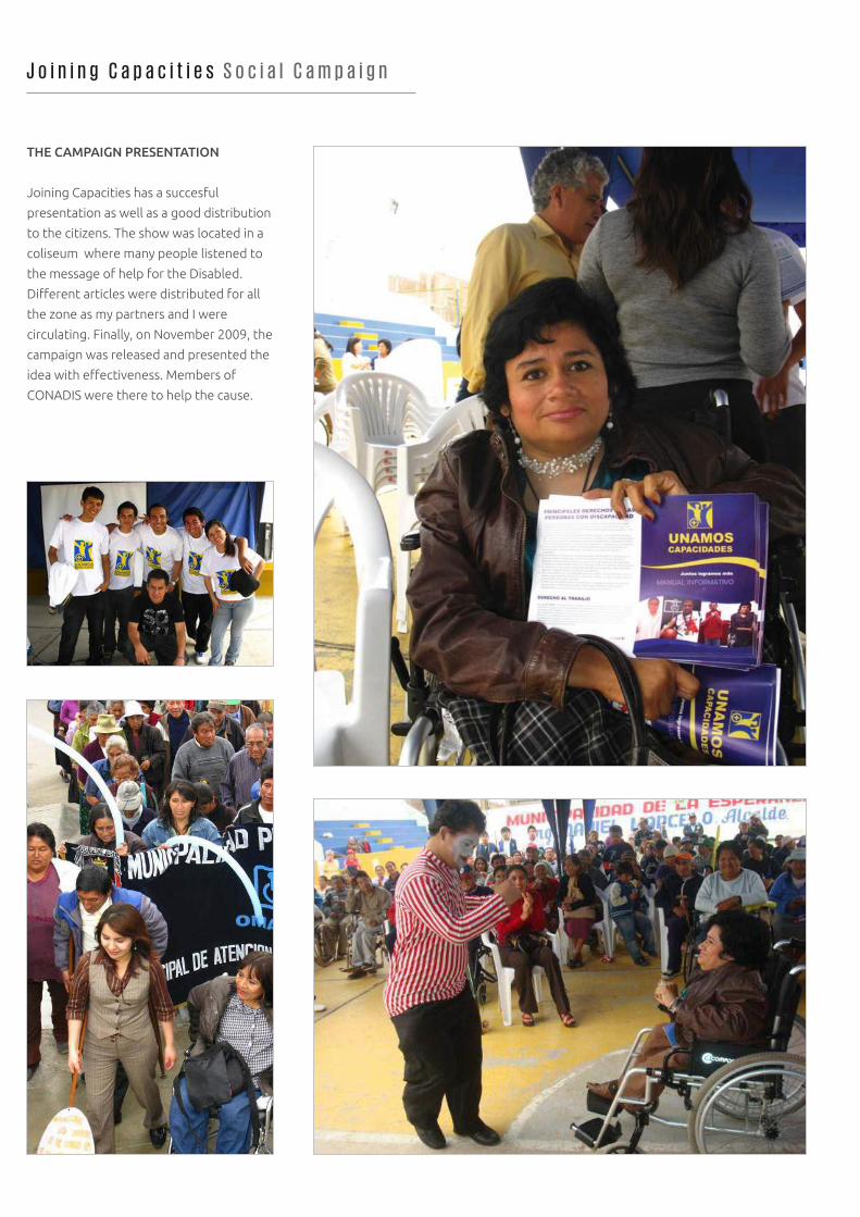
THE CAMPAIGN PRESENTATION
Joining Capacities has a succesful
presentation as well as a good distribution
to the citizens. The show was located in a
coliseum where many people listened to
the message of help for the Disabled.
Different articles were distributed for all
the zone as my partners and I were
circulating. Finally, on November 2009, the
campaign was released and presented the
idea with effectiveness. Members of
CONADIS were there to help the cause.
J o i n i n g C a p a c i t i e s S o c i a l C a m p a i g n
N o v e m b e r 2 0 1 0
C a r i c a t u r e s D r a w i n g
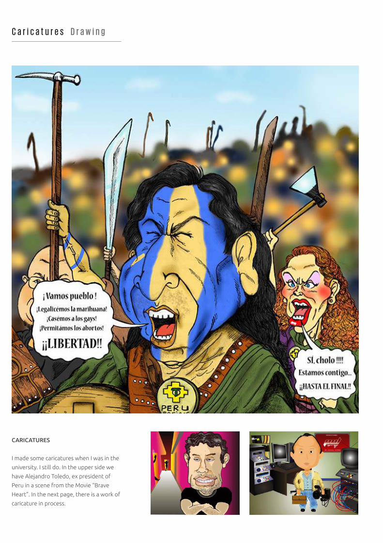
CARICATURES
I made some caricatures when I was in the
university. I still do. In the upper side we
have Alejandro Toledo, ex president of
Peru in a scene from the Movie “Brave
Heart”. In the next page, there is a work of
caricature in process.
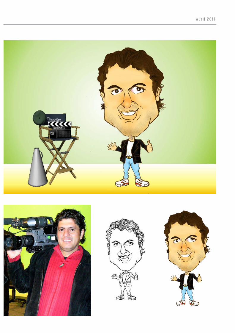
A p r i l 2 0 1 1
D r . M a r i e l a A l v a P s y c h i a t r i s t
CHROMATIC
The colors in the composition had to be
set up according to the concept. White
blue is frequently used in this case.
However, a low tone of green had to be
added here. It looks more showy and not
so formal.
Pantone 319 U SILVER WHITE
LOGOTYPE
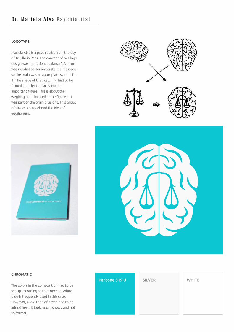
Mariela Alva is a psychiatrist from the city
of Trujillo in Peru. The concept of her logo
design was “ emotional balance”. An icon
was needed to demonstrate the message
so the brain was an appropiate symbol for
it. The shape of the sketching had to be
frontal in order to place another
important figure. This is about the
weghing scale located in the figure as it
was part of the brain divisions. This group
of shapes comprehend the idea of
equilibrium.
J u n e 2 0 1 2
TYPEFACE
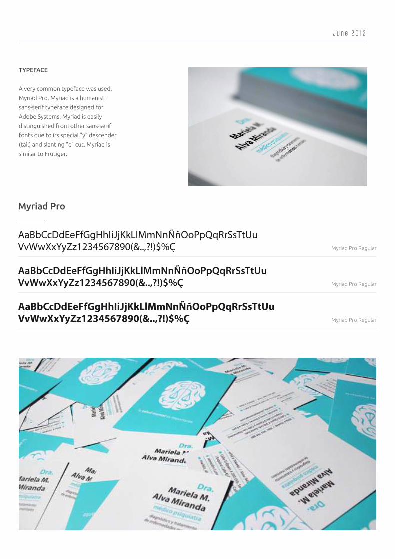
A very common typeface was used.
Myriad Pro. Myriad is a humanist
sans-serif typeface designed for
Adobe Systems. Myriad is easily
distinguished from other sans-serif
fonts due to its special "y" descender
(tail) and slanting "e" cut. Myriad is
similar to Frutiger.
AaBbCcDdEeFfGgHhIiJjKkLlMmNnÑñOoPpQqRrSsTtUuVvWwXxYyZz1234567890(&..,?!)$%Ç
AaBbCcDdEeFfGgHhIiJjKkLlMmNnÑñOoPpQqRrSsTtUuVvWwXxYyZz1234567890(&..,?!)$%Ç
AaBbCcDdEeFfGgHhIiJjKkLlMmNnÑñOoPpQqRrSsTtUuVvWwXxYyZz1234567890(&..,?!)$%Ç
Myriad Pro
Myriad Pro Regular
Myriad Pro Regular
Myriad Pro Regular
E n p e x G a s S t a t i o n s
BIRTH OF A NEW BRAND
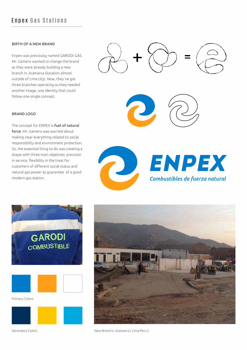
Enpex was previoulsy named GARODI GAS.
Mr. Gamero wanted to change the brand
as they were already building a new
branch in Jicamarca (location almost
outside of Lima city). Now, they´ve got
three branches operating so they needed
another image, one identity that could
follow one single concept.
BRAND LOGO
The concept for ENPEX is fuel of natural
force. Mr. Gamero was worried about
making clear everything related to social
responsibility and environment protection.
So, the essential thing to do was creating a
shape with three main objetives: precision
in service, flexibility in the treat for
customers of different social status and
natural gas power as guarantee of a good
modern gas station.
New Brand in Jicamarca ( Lima-Peru ).Secondary Colors
Primary Colors
J a n u a r y 2 0 1 3
BUILDING THE CONCEPT
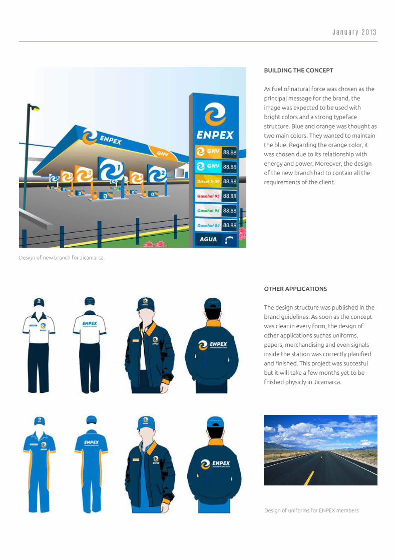
As fuel of natural force was chosen as the
principal message for the brand, the
image was expected to be used with
bright colors and a strong typeface
structure. Blue and orange was thought as
two main colors. They wanted to maintain
the blue. Regarding the orange color, it
was chosen due to its relationship with
energy and power. Moreover, the design
of the new branch had to contain all the
requirements of the client.
OTHER APPLICATIONS
The design structure was published in the
brand guidelines. As soon as the concept
was clear in every form, the design of
other applications suchas uniforms,
papers, merchandising and even signals
inside the station was correctly planified
and finished. This project was succesful
but it will take a few months yet to be
fnished physicly in Jicamarca.
Design of uniforms for ENPEX members
Design of new branch for Jicamarca.
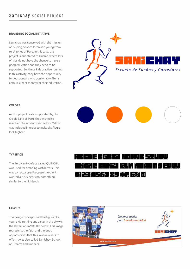
S a m i c h a y S o c i a l P r o j e c t
BRANDING SOCIAL INITIATIVE
Samichay was conceived with the mission
of helping poor children and young from
rural zones of Peru. In this case, the
project is orientated to Huaraz, where lots
of kids do not have the chance to have a
good education and they need to be
supported. So, these kids practice running.
In this activity, they have the opportunity
to get sponsors who ocasionally offer a
certain sum of money for their education.
COLORS
As this project is also supported by the
Credit Bank of Peru, they wished to
maintain the similar brand colors. Yellow
was included in order to make the figure
look bighter.
TYPEFACE
The Peruvian typeface called QUINCHA
was used for branding with letters. This
was correctly used because the client
wanted a rusty peruvian, something
similar to the highlands.
LAYOUT
The design concept used the figure of a
young kid running and a star in the sky wit
the letters of SAMICHAY below. This image
represents the faith and the good
opportunities that this iniative wants to
offer. It was also called Samichay, School
of Dreams and Runners.
E s c u e l a d e S u e ñ o s y C o r r e d o r e s
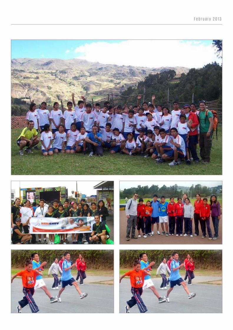
F e b r u a r y 2 0 1 3
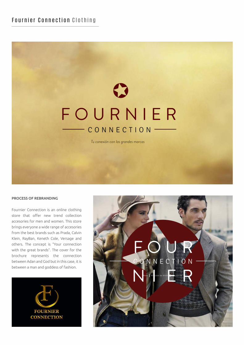
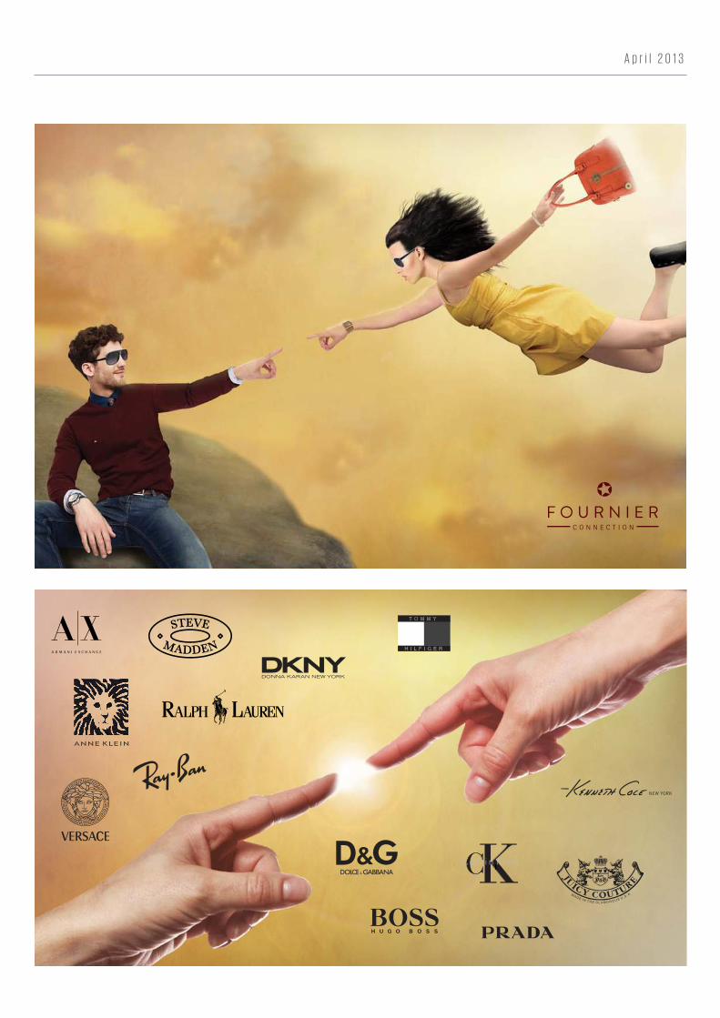
F o u r n i e r C o n n e c t i o n C l o t h i n g
PROCESS OF REBRANDING
Fournier Connection is an online clothing
store that offer new trend collection
accesories for men and women. This store
brings everyone a wide range of accesories
from the best brands such as Prada, Calvin
Klein, RayBan, Keneth Cole, Versage and
others. The concept is “Your connection
with the great brands”. The cover for the
brochure represents the connection
between Adan and God but in this case, it is
between a man and goddess of fashion.
Moda Art iculos de Vestir Accesorios
F O U R N I E RC O N N E C T I O N
Tu conexión con las grandes marcas
A p r i l 2 0 1 3
F O U R N I E RC O N N E C T I O N
P e l o t e a P h o n e A p p
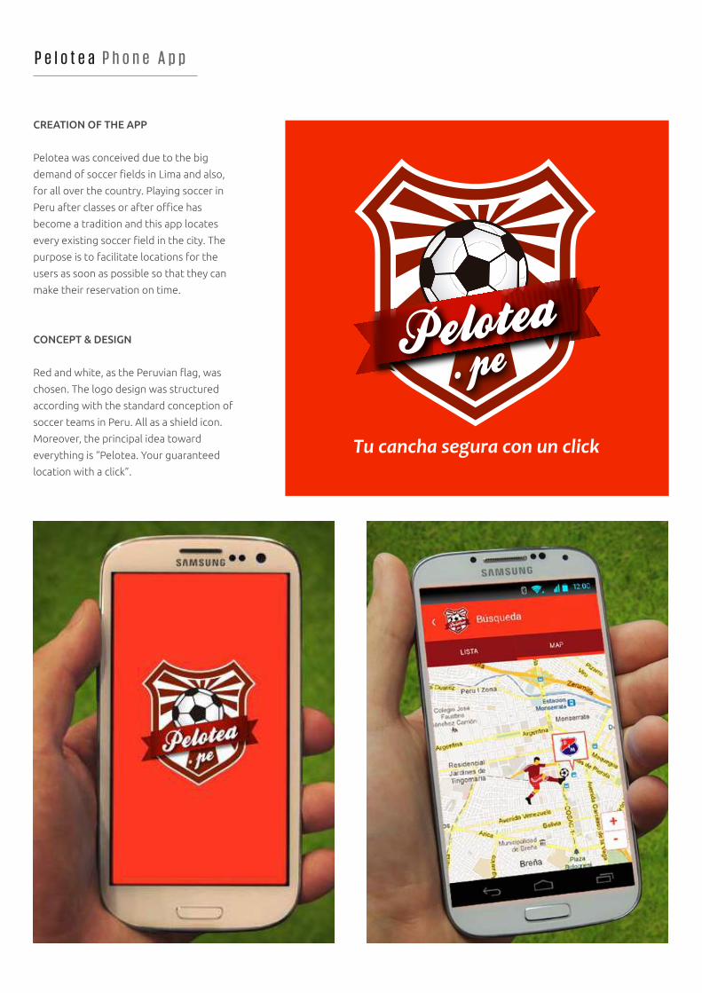
CREATION OF THE APP
Pelotea was conceived due to the big
demand of soccer fields in Lima and also,
for all over the country. Playing soccer in
Peru after classes or after office has
become a tradition and this app locates
every existing soccer field in the city. The
purpose is to facilitate locations for the
users as soon as possible so that they can
make their reservation on time.
CONCEPT & DESIGN
Red and white, as the Peruvian flag, was
chosen. The logo design was structured
according with the standard conception of
soccer teams in Peru. All as a shield icon.
Moreover, the principal idea toward
everything is “Pelotea. Your guaranteed
location with a click”.
M a y 2 0 1 3
ADVERTISING CAMPAIGN
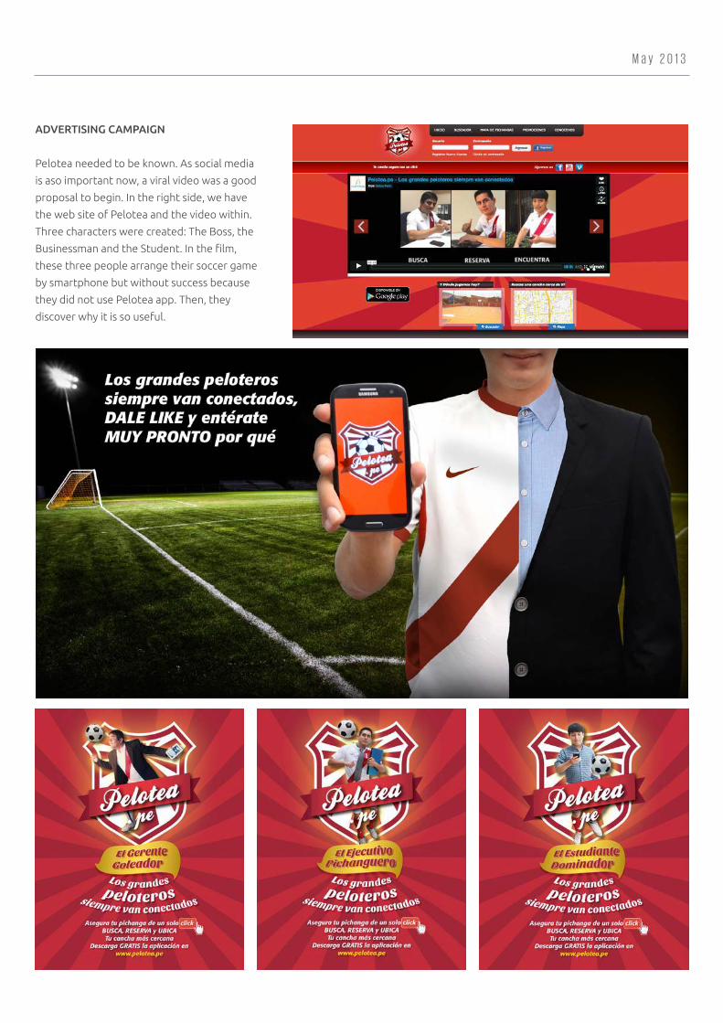
Pelotea needed to be known. As social media
is aso important now, a viral video was a good
proposal to begin. In the right side, we have
the web site of Pelotea and the video within.
Three characters were created: The Boss, the
Businessman and the Student. In the film,
these three people arrange their soccer game
by smartphone but without success because
they did not use Pelotea app. Then, they
discover why it is so useful.
A e t o s P e r ú T e c h n o l o g y
BRANDING FOR EVENT
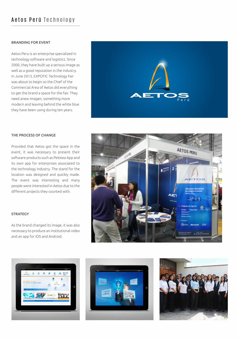
Aetos Peru is an enterprise specialized in
technology software and logistics. Since
2000, they have built up a serious image as
well as a good reputation in the industry.
In June 2013, EXPOTIC Technology Fair
was about to begin so the Chief of the
Commercial Area of Aetos did everything
to get the brand a space for the fair. They
need anew imagen, something more
modern and leaving behind the white blue
they have been using during ten years.
THE PROCESS OF CHANGE
Provided that Aetos got the space in the
event, it was necessary to present their
software products such as Pelotea App and
its own app for enterprises associated to
the technology industry. The stand for the
location was designed and quickly made.
The event was interesting and many
people were interested in Aetos due to the
different projects they counted with.
STRATEGY
As the brand changed its image, it was also
necessary to produce an institutional video
and an app for IOS and Android.
J u n e 2 0 1 3
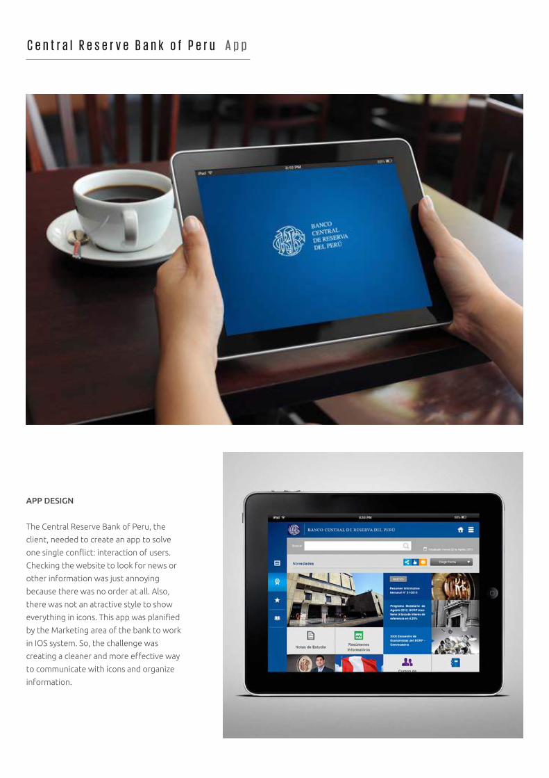
C e n t r a l R e s e r v e B a n k o f P e r u A p p
APP DESIGN
The Central Reserve Bank of Peru, the
client, needed to create an app to solve
one single conflict: interaction of users.
Checking the website to look for news or
other information was just annoying
because there was no order at all. Also,
there was not an atractive style to show
everything in icons. This app was planified
by the Marketing area of the bank to work
in IOS system. So, the challenge was
creating a cleaner and more effective way
to communicate with icons and organize
information.
A u g u s t 2 0 1 3
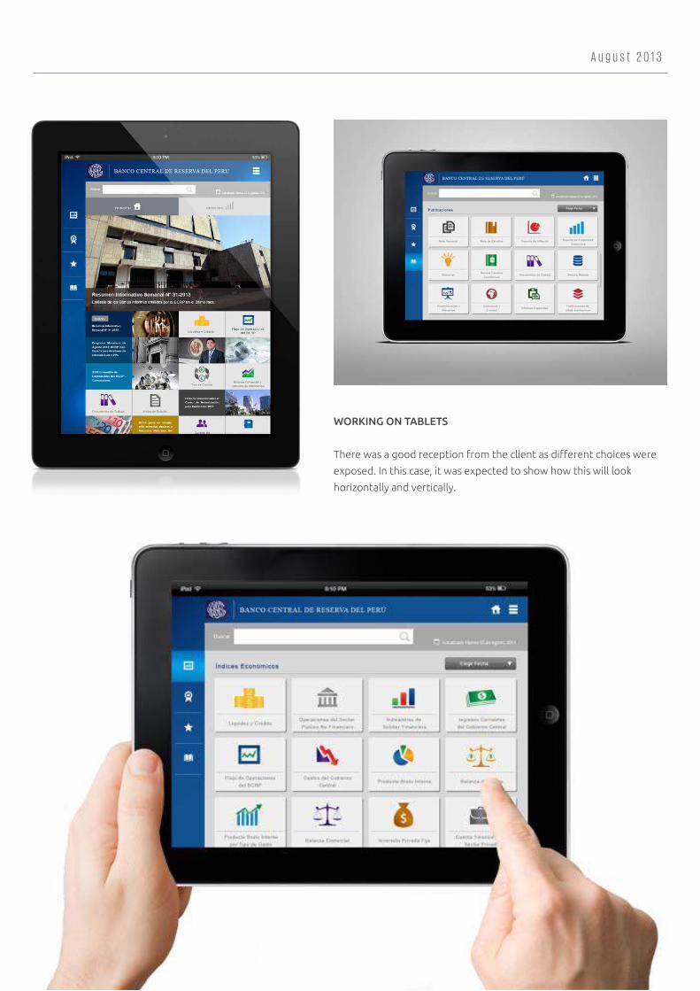
WORKING ON TABLETS
There was a good reception from the client as different choices were
exposed. In this case, it was expected to show how this will look
horizontally and vertically.
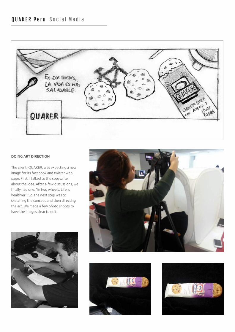
Q U A K E R P e r u S o c i a l M e d i a
DOING ART DIRECTION
The client, QUAKER, was expecting a new
image for its facebook and twitter web
page. First, I talked to the copywriter
about the idea. After a few discussions, we
finally had one: “In two wheels, Life is
healthier”. So, the next step was to
sketching the concept and then directing
the art. We made a few photo shoots to
have the images clear to edit.
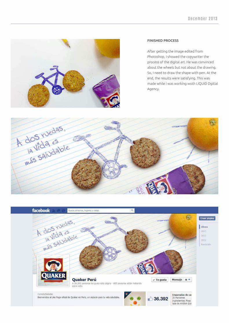
D e c e m b e r 2 0 1 3
FINISHED PROCESS
After getting the image edited from
Photoshop, I showed the copywriter the
process of the digital art. He was convinced
about the wheels but not about the drawing.
So, I need to draw the shape with pen. At the
end, the results were satisfying. This was
made while i was working woth LIQUID Dgitial
Agency.
R A J U C l o t h i n g C o m p a n y
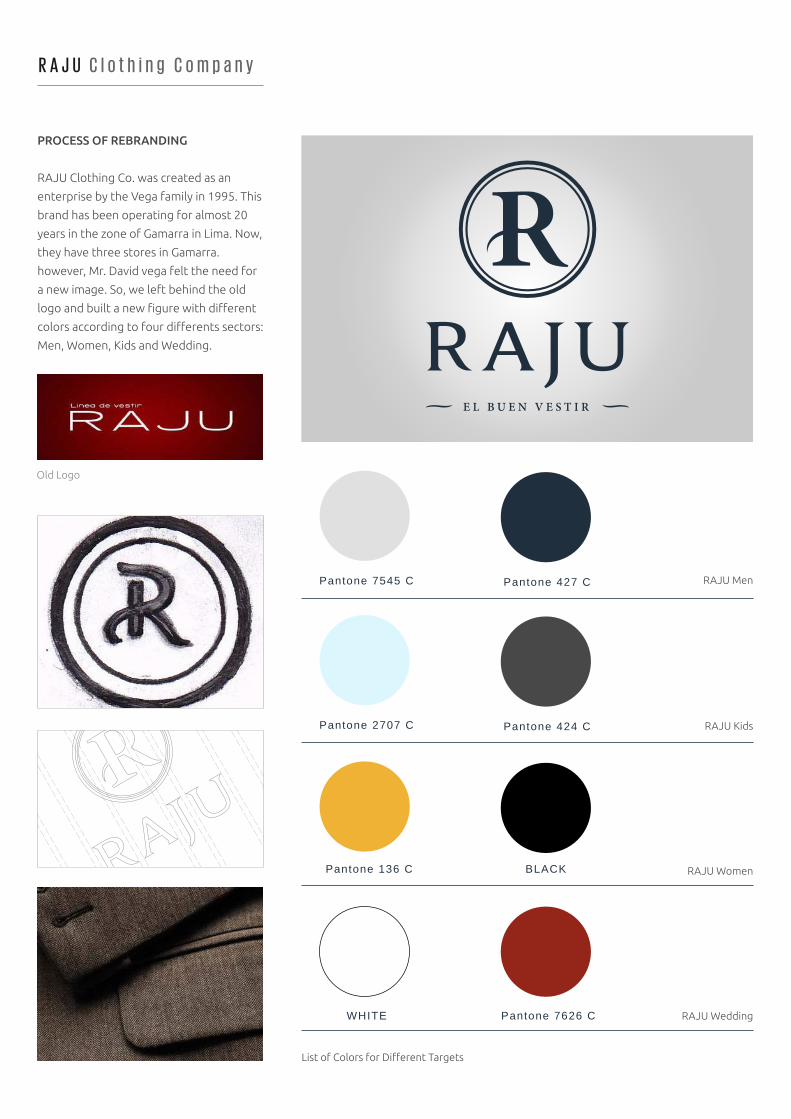
PROCESS OF REBRANDING
RAJU Clothing Co. was created as an
enterprise by the Vega family in 1995. This
brand has been operating for almost 20
years in the zone of Gamarra in Lima. Now,
they have three stores in Gamarra.
however, Mr. David vega felt the need for
a new image. So, we left behind the old
logo and built a new figure with different
colors according to four differents sectors:
Men, Women, Kids and Wedding.
List of Colors for Different Targets
E L B U E N V E S T I R
RAJU KidsPantone 2707 C Pantone 424 C
RAJU Men
Old Logo
Pantone 7545 C Pantone 427 C
Pantone 136 C BLACK
WHITE Pantone 7626 C
RAJU Women
RAJU Wedding
J a n u a r y 2 0 1 4
CONCEPT
The concept of the brand is “The Good
Outfit”. This was conceived as there was a
need for recognition of the brand in other
economic sectors such as the wealthy A
and B of Lima. However, this is a process
that takes time so many accesories were
made. In the list, we have the fabric cases
for suits, bags, bottoms. Furthermore,
web design was also planified but it will be
applied afterwards. In the left, we have
the cover of RAJU´s brochure for Men.
There is also brochures for the rest of
targets.
Fabric Case for Suits Bag design for clothing Bottom for Suits
Cover of brochure for Men
C
ON
FE
CC
I O N E S R A J U E L BU
EN
VE
ST
IR DESDE 1995
C A T Á L O G O 2 0 1 3 C A B A L L E R O S
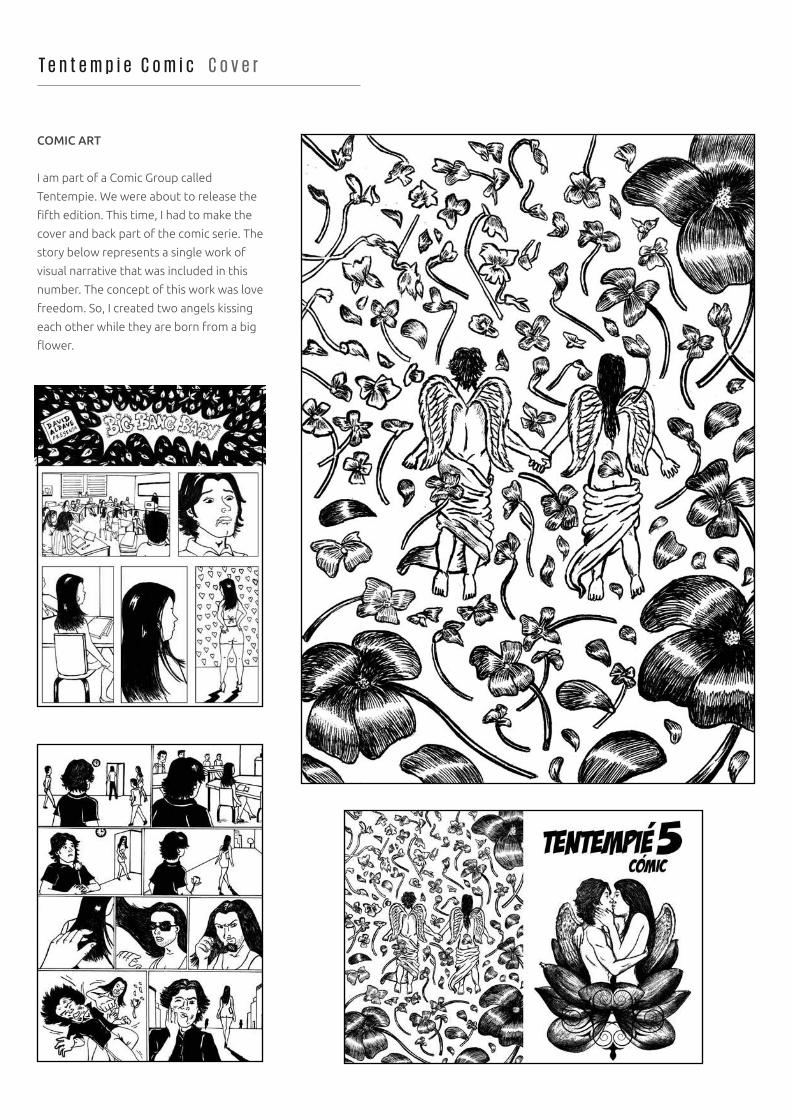
T e n t e m p i e C o m i c C o v e r
COMIC ART
I am part of a Comic Group called
Tentempie. We were about to release the
fifth edition. This time, I had to make the
cover and back part of the comic serie. The
story below represents a single work of
visual narrative that was included in this
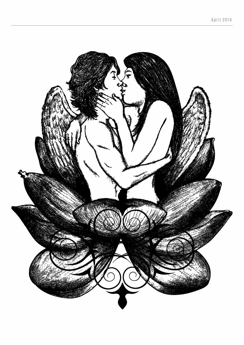
number. The concept of this work was love
freedom. So, I created two angels kissing
each other while they are born from a big
flower.
A p r i l 2 0 1 4
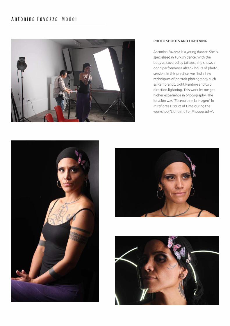
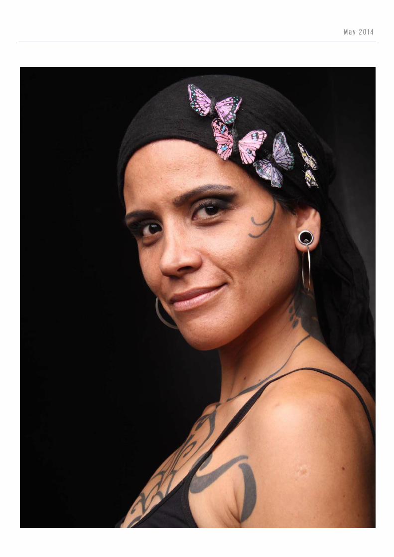
A n t o n i n a F a v a z z a M o d e l
PHOTO SHOOTS AND LIGHTNING
Antonina Favazza is a young dancer. She is
specialized in Turkish dance. With the
body all covered by tattoos, she shows a
good performance after 2 hours of photo
session. In this practice, we find a few
techniques of portrait photography such
as Rembrandt, Light Painting and two
direction.lightning. This work let me get
higher experience in photography. The
location was “El centro de la Imagen” in
Miraflores District of Lima during the
workshop “Lightning for Photography”.
M a y 2 0 1 4
F r a n t i k A p p G a m e
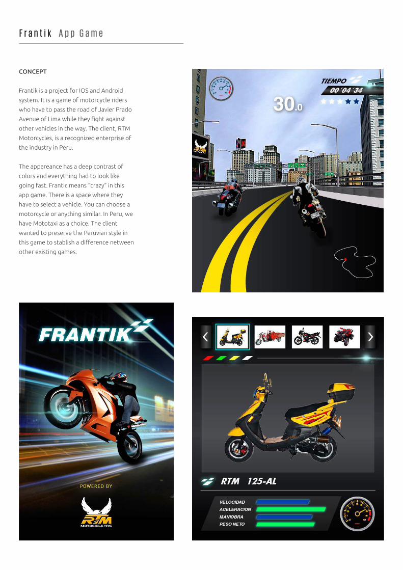
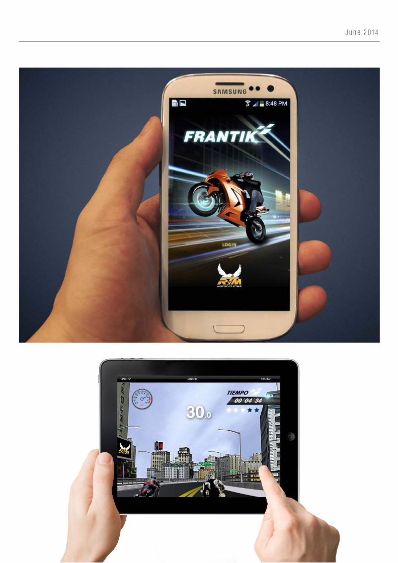
CONCEPT
Frantik is a project for IOS and Android
system. It is a game of motorcycle riders
who have to pass the road of Javier Prado
Avenue of Lima while they fight against
other vehicles in the way. The client, RTM
Motorcycles, is a recognized enterprise of
the industry in Peru.
The appareance has a deep contrast of
colors and everything had to look like
going fast. Frantic means “crazy” in this
app game. There is a space where they
have to select a vehicle. You can choose a
motorcycle or anything similar. In Peru, we
have Mototaxi as a choice. The client
wanted to preserve the Peruvian style in
this game to stablish a difference netween
other existing games.
J u n e 2 0 1 4