Embed Size (px)
Citation preview

1
PLANNING COMMISSION
Working Paper No. 1/2006-PC
POVERTY AND HUNGER IN INDIA:
WHAT IS NEEDED TO ELIMINATE THEM
Arvind Virmani
February 2006

2
POVERTY AND HUNGER IN INDIA:
WHAT IS NEEDED TO ELIMINATE THEM
Arvind Virmani∗
FEBRUARY 2006
∗ Any views expressed in the paper are those of the author and do not represent those of the organisation for which he works.

3
CONTENTS Page No.
1 INTRODUCTION 1
2 CONSUMPTION DISTRIBUTION 2
3 POVERTY TRENDS 3
4 POVERTY AND PER CAPITA CONSUMPTION 4
5 POVERTY IN 1999-2000 6
6 GLOBAL COMPARISON: AN EQUAL SOCIETY 8
7 HUNGER 9
8 LIFE AND LITERACY 10
9 GOVERNANCE FAILURE: QUASI-PUBLIC GOODS 12
10 POVERTY ELIMINATION 15 10.1 Estimated Cost 15 10.2 Income Transfers 16 10.3 PDS Non-experiment 17 10.4 Smart Card System 17 10.5 Regulatory Authority 18
11 CONCLUSION 19
12 REFRENCES 20
TABLES
Page No Table 1: Rural Consumption Distribution (NSS 30 day recall) 2 Table 2: National/Total Consumption Distribution 3 Table 3: Global Comparison of Poverty and Distribution 9 Table 4: Social Indicators During Two Phases 11 Table 5: Global Comparison of Basic Health and Education Indicators 14 Table 6: Consumption Expenditures and Expenditure Gap 15

4
FIGURES
Page No Figure 1: Poverty as Measured by the Head Count Ratio 5 Figure 2: Per Capita Expenditure and Poverty (World Bank Data-1950 to 2000) 5 Figure 3: Comparitive Performance Of India in Sanitation And Water Supply 13

1
1 INTRODUCTION
There is widespread impression among the Indian intelligentsia, foreign scholars and residents of
developed/rich countries that India’s economic growth has not reduced poverty, that globalisation has
worsened poverty and/or income distribution and there are 100 of millions of hungry people in India.
These arguments are buttressed by recourse to India’s ranking on several social indicators. Esoteric
debates about the comparability of survey data and gaps between NSS and NAS add to the confusion and
allow ideologues to believe and assert whatever information suits the argument. What are the basic facts
about poverty, income distribution and hunger at an aggregate level? This paper reviews the available data
and debates on this subject and comes to a common sense view. It then tries to link some of the outcomes
to the policy framework and programs of the government.
The next section presents data on the consumption distribution. Sections 3 to 6 look at the issue of
poverty from different perspectives. Section 3 looks at broad historical trends, section 4 examines the
linkage between aggregate poverty and per capita consumption. Section 5 tackles the contentious issue of
poverty in 1999-2000. Section 6 ranks India’s poverty and income distributions from a global perspective.
The next two sections deal with other dimensions of poverty, besides income/consumption. Section 7
presents the facts about hunger in India and section 8 about social indicators like health and literacy.
Section 9 analyses their linkage to government policy and programs. The broad theme that emerges is that
the failures on this front, apart from the indirect effects of growth, are linked directly to the failure of
governance. This failure has many dimensions; the misallocation of government resources, the failure to
follow norms of social benefit-cost analysis that were the reason de tar for the introduction of national
planning, the neglect of public and quasi-public goods that are the most fundamental justification for the
existence of government and a gradual (over decades) but progressive deterioration in the quality of
governance. This conclusion differs radically from the conventional wisdom (national and international)
about India’s poverty, social indicators and income distribution. Even if treated as a hypothesis it merits
debate and further analysis.
Section 10 proposes a radical solution to the problem of hunger and poverty. Section 11
summarises the conclusions of the paper.

2
2 CONSUMPTION DISTRIBUTION
A reasonably standardised large sample consumption survey has been carried out every five years
by the National Sample Survey Organisation since 1972-73 (the earlier surveys are not strictly
comparable). Based on these surveys a consistent series for the consumption distribution can be
constructed. This is shown in Table 1. If we ignore the 1977-78 data for the moment, we find a
noteworthy result. The rural income distribution has improved progressively (but very gradually) from
1972-73 to 1999-2000 and this can be seen at every level. Thus for instance the share of the poorest 10%,
which was 3.7% in 1972-73 increased to 3.8% by 1983, to 4.3% in 1987-8 to 1993-4 and to 4.4% in 1999-
2000. The same pattern is found at every level of cummulation (Technically there is “Stochastic
Dominance,”). Thus the new situation is Pareto superior to the earlier one, reducing the importance of
measure such as the ‘Gini' coefficient.
Another way to look at the result is from the perspective of the eighties and nineties. In this case
1977-78 constitutes the situation prior to the start of the eighties. Therefore ignoring 1972-73 we again
find that the consumption distribution has improved continuously (though very gradually) during the
eighties and the nineties. Each rural consumption distribution during the eighties stochastically dominates
the previous distribution based on large sample surveys. In common parlance citizens at every level of
income have shared in the fruits of growth since 1980-81.
Table 1: Rural Consumption Distribution (NSS 30 day recall)
Cumulative Percentage of Rural Persons Poverty 10% 20% 30% 40% 50% 60% 70% 80% 90% 100% HCR (%)
Year Cumulative Consumption Distribution Rural Total 1972-3 3.7% 8.9% 15.0% 22.0% 30.1% 38.7% 49.1% 60.5% 74.8% 100% 56.5 54.9 1977-8 3.5% 8.4% 14.3% 20.8% 28.4% 36.7% 46.2% 57.6% 71.7% 100% 53.1 51.3 1983 3.8% 9.0% 15.2% 22.1% 30.2% 39.2% 49.2% 60.9% 75.5% 100% 45.6 44.7 1987-8 4.1% 9.5% 15.8% 22.9% 30.7% 39.7% 49.6% 61.5% 74.7% 100% 39.1 38.6 1993-4 4.1% 9.6% 16.0% 23.1% 31.1% 40.0% 50.1% 61.7% 75.8% 100% 37.3 36.2 1999-00 4.4% 10.1% 16.7% 24.1% 32.8% 41.9% 52.1% 63.8% 77.8% 100% 27.1 26.2
Source: P. D. Joshi, “Changing Pattern of Consumption Expenditure in India and Some selected States,” Sarvekshna Analytical Report No 2 (July 1998) and NSS
The results for the national total (rural cum urban areas together) are shown in Table 2. These
results confirm that the consumption distribution has improved over the eighties and nineties. Every
cumulative consumption distribution during the eighties and nineties (except 1987-88) stochastically
dominates the previous distribution. The only ambiguity is in 1987-88 where stochastic dominance fails at
the 50th percentile vis-à-vis the 1983 distribution. Even this distribution however dominates the 1977-78
one. The consumption distribution has unambiguously improved during the nineties. The anomalies arise
because the urban distribution is not unidirectional, dependent as it is on the migration from surrounding
rural areas (push and pull factors).

3
Table 2: National/Total Consumption Distribution
Cumulative Percentage of Persons Gini 10% 20% 30% 40% 50% 60% 70% 80% 90% 100%
Year Cumulative Consumption Distribution (%) 1977-8 3.3% 8.1% 13.8% 20.2% 27.5% 35.9% 45.4% 56.7% 71.0% 100% 34.7 1983 3.5% 8.4% 14.3% 20.9% 28.5% 37.1% 47.0% 58.6% 73.2% 100% 32.5 1987-8 3.7% 8.6% 14.4% 21.0% 28.4% 36.8% 46.5% 57.9% 72.5% 100% 32.9 1993-4 3.7% 8.7% 14.5% 21.2% 28.7% 37.1% 46.8% 58.2% 72.7% 100% 32.5 99-00 3.9% 8.9% 14.8% 21.5% 29.0% 37.4% 47.1% 58.6% 73.1% 100% 32.0 Source : Bhalla (2003b) background tables.
The Kuznets curve hypothesis asserted that income distribution is likely to follow an inverted U
shaped pattern as per capita income grows from very low levels to high levels. As early studies were based
on cross-country evidence they do not demonstrate anything about the Kuznets hypothesis. Lindert and
Williamson (1985), Deninger and Squire (1998) and Lundberg and Squire (2003) do not find any evidence
to support the hypothesis. Consistent with this finding and in contrast to the Kuznets hypothesis, the Indian
Gini (as per the World Bank series) has followed a declining trend over the first two and half decades.
During the eighties and nineties the above data shows that the distribution has improved gradually but
slowly.1
3 POVERTY TRENDS
There are numerous controversies regarding the measurement of poverty. The most important one
relates to the adjustment of individual consumption levels as derived from a survey, by the ratio of the per
capita consumption from the National account statistics to the survey mean for the same item. Such an
adjustment leaves the distribution of consumption unaffected while changing the calculated poverty rate.
Before 1993 such an adjustment was routinely made in calculating poverty rates, after 1993 it has been
discontinued. The World Bank’s Country Economic Memorandums for India however introduced the
change in methodology several years earlier. We were critical of the change in methodology by the World
Bank and the Planning Commission and continue to believe that an adjustment of the survey mean is
necessary to get a true picture of the poverty rates.2 The World Bank’s series covers the entire period from
the 1950s on a consistent basis and is therefore essential for finding out what happened in phase I as well as
for comparing poverty in the two phases.3
The 3rd order polynomial trend line fitted to the World Bank poverty data (figure 1) shows that
poverty increased during the fifties and sixties. This happened despite the fact that per capita GDP grew at
a trend rate of between 1% and 2% per annum through out these two decades. The increase in poverty
therefore coincided with a declining rate of growth of per capita income and private consumption. This
1 However the upward trend is not statistically significant i.e. it is an L shaped pattern. 2 In personal discussions with the author(s) of the WB CEMs and in internal notes in the Planning Commission respectively. The ratio has increased over time (Bhalla(2003a). 3 The only other such series is by Bhalla (2003a).

4
contradicts the picture of the Golden age of Independence under the Fabian Socialist policies of the first
Prime Minister Nehru that many development economists have.4
Since the early seventies, poverty has been on a clear down trend according to all series. The
official poverty calculations based on large sample surveys (Figure 1) shows a steeper decline in poverty
(especially in the nineties) than the World Bank series.5 The declining trend in poverty rate therefore
coincided with an acceleration in the trend growth of Per capita GDP and TFPG from the mid-1970s.
4 POVERTY AND PER CAPITA CONSUMPTION
We can also use the survey data to determine the relationship between the national poverty rate
derived from the survey and the all average all India per capita GDP as calculated from the survey. This
helps us skirt/avoid the controversies arising from the discrepancies between NSS and NAS consumption
data and differing judgement about which is superior for what purpose. As both the poverty rates and the
average consumption are derived from the same data set, this yields a consistent picture of the evolution of
poverty rates over time as well as its relationship to average consumption. As official poverty rates are not
available for early decades we use the World Bank poverty and average consumption data from 1950 to
1999.
It is clear from figure 2 that there is a linear relationship between aggregate poverty and average
consumption.6 A one Rupee increase in average real monthly consumption expenditure raises 1% of the
population above the poverty line. This implies that in India, given our democratic political system, in
which the poor are fully represented, growth of aggregate income/consumption is a sufficient condition for
the reduction of poverty.
4 The Bhalla (2003a) series in contrast shows a decline in poverty during the two decades. 5 The Bhalla (2003a) series shows an even steeper decline. 6 The R2 is 0.93. The 2nd order polynomial, implying a smaller impact of consumption growth in the early decades and a larger impact in recent decades, has an R2 of 0.97.

5
Figure 1: Poverty as Measured by the Head Count Ratio
25
30
35
40
45
50
55
60
65
1951
1953
*19
5519
5719
5919
6119
6319
6519
6719
6919
7119
7319
7519
7719
7919
8119
8319
8519
8719
8919
91*
1993
1995
1997
1999
2001
Year
Pro
po
rtio
n o
f P
oo
r (%
)
WorldBank P.C.
Poly. (WorldBank) Linear (P.C.)
Figure 2: Per Capita Expenditure and Poverty (World Bank Data-1950 to 2000)
y = -1.0834x + 115.33
30
35
40
45
50
55
60
65
50 55 60 65 70 75
Per Capita Expenditure (Rs per month in constant rural prices)
Pov
erty
: H
ead
coun
t R
atio
hcr Linear (hcr) Poly. (hcr)

6
5 Poverty in 1999-2000
The most recent controversy regarding poverty estimates relates to the manner in which the data
was collected in the 1999-2000 survey. Briefly there are three categories of goods in the consumption
surveys: Food products that are purchased frequently (daily/weekly), semi-durable goods that are purchased
with moderate frequency (monthly/quarterly) and durable goods that are purchased occasionally
(annual/biannual or less). To obtain optimal recall it would be appear to be best to use the 7 day recall
period for the first category, 30 day for the second and 365 day for the last. The National sample surveys
have been rightly experimenting with these periods, but perhaps without giving due regard to the
implications for comparability of poverty estimates over time. In the 1999-2000 survey, for the first time
the same set of households were asked to give their food consumption for 7 days and 30 days, thus making
it non-comparable with earlier periods when only the 30 day question was asked.7 It was subsequently
discovered that there was another source of non-comparability. The use of the 365 day recall period for a
sub-set of commodities in 1999-2000, whereas the 30 day recall was used for these commodities earlier.8
Different scholars have tried to make adjustments and re-calculate the poverty rate (Head count ratio),
based on the official methodology. According to these the poverty rate was between 26.1% and 28.5% in
India in 1999-2000 (table below).
HCR in 1999-2000
Total Rural Urban
Planning Commission 26.1 27.1 23.6
Sundaram & Tendulkar 27.3 28.9 23.1
Sen (Abhijit) & Himanshu 27.8 28.8 25.1
Angus Deaton 28.5 30.0 24.7
It is useful to note the other estimates that have been made using other methodologies. Deaton &
Dreze (2002) have estimated a Poverty rate of 22.2% (26.28% rural & 12% urban) based on better
measures of rural-urban cost of living differences and more accurate poverty lines based on better price
indices. Bhalla (2003b) has estimated a poverty level of 12-13% based on the consumption distribution
prevailing in 1983 and measures of increase in the income of the poorest based on real wage increases from
7 K L Datta’s forthcoming ICRIER Working paper goes into all the complications and problems. 8 The 1993-4 survey however had also collected data for 365 day recall for these sub-set of commodities, but stored it in the archives.

7
NSS surveys and other sources.9 Bhalla’s (2003a) estimates for poverty in 1999-2000 (1993) is 6% (15%)
when based on an appropriate adjustment of the gap between survey mean consumption and average
consumption as per NAS.10 Quah (2002) has also estimated Indian poverty using a $2 per day poverty line
to be 12%-19% for 1992.11 The World Bank however estimates a $1 (PPP) a day based poverty rate of
35.3% for India in 1993. Our calculations suggest that the $ a day line, which was $1.08 international in
1993 is equal to $1.2 in 1999. India’s national poverty line (rural-urban average) was $1.48 at India’s PPP
exchange rate of Rs. 8.17 per International $ in 1999. The poverty rate based on dollar a day should
therefore be lower than that based on the National poverty line, whereas the World Bank’s estimate of
35.3% for the former is much higher than the 28.6% for the latter.12 The World Bank estimate of the
poverty rate based on $ a day poverty line is therefore not credible.
Deaton and Dreze’s (2002) estimate of a poverty rate of 22.2% in 1999-2000, falls in between that
of Bhalla and the conventional ones. From a global comparative perspective, a small empirical exercise
based on WDI (WB) data for national poverty rates, per capita GDP, and share of the bottom 20% of the
population suggests a poverty rate of 21.7% for India in 1999.13
The issue raised by Bhalla (2003a & b) about the inconsistencies that arise when the conventional
approach is used, has not been adequately answered by experts who defend the conventional approach.
Thus his method of using NSS agricultural wage data (average growth 2.5%) to adjust for understatement
of NSS consumption (average growth 0.8%) is credible. This adjustment however, requires an assumption
of zero net saving by the poor (or no change in the saving rate), that may be only partially valid. The poor,
particularly those pushed into poverty because of health reasons are likely to be net dis-savers (by drawing
down their assets). This net dies-saving is likely to decline with average income of the poor and the
vulnerable.14 Therefore we conclude that the poverty rate for India in 1999-2000 was between 12% and
22%.
What is likely to happen to Poverty assuming that the growth rate of per capita GDP (about 3.8%
per annum) and the rate of decline of poverty maintain the average rate seen in that period? Since 1980-81,
poverty has declined at a rate of 0.92 per cent points per annum according to the World Bank estimates and
9 Bhalla (2003a) estimates a poverty rate of 5.7% for 1999 by adjusting for the gap between NAS and NSS average consumption. 10 Based on an Indian poverty line equal to PPP $1.25 per capita per day at 1993 prices. This first appeared in 2000 book edited by Govinda Rao. 11 His estimate of poverty for China for 1992 using the same poverty line is 14% to 17%. 12 The reason seems to be that two different people have made the estimates at different points, perhaps based on different methodology! 13 We find about 20 country-data points which have a per capita GDP in (2000 prices) between $2224 and $3874 (India is $2362) as well as an estimate of HCR ratio and income/consumption share of bottom 20%. Assuming that these are all based on conventional methodology, HCR is regressed on the per capita GDP and share of bottom 20%. The estimated equation is used to obtain the predicted value for India. 14 For instance if consumption of the poor falls from 1.2 times income to 1 times over 16 years, a rate of growth of income of 2.5%(2.9%) per annum would be reduced to a consumption growth rate of 1.3% (1.7%) per annum.
8
at the rate of 1.17 per cent point per annum according to official data.15 Given the assumption of the future
evolution of per capita GDP and its relationship to poverty reduction these imply that poverty would be
eliminated by 2030 and 2021 respectively. If we take the Deaton-Dreze estimate of 22.2% in 1999 and the
corresponding rate of decline of 1.08% point per annum (since 1987), then poverty in India would be
eliminated by 2020, when India would be a Middle Income Country.16
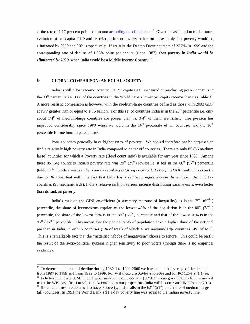
6 GLOBAL COMPARISON: AN EQUAL SOCIETY
India is still a low income country. Its Per capita GDP measured at purchasing power parity is in
the 33rd percentile i.e. 33% of the countries in the World have a lower per capita income then us (Table 3).
A more realistic comparison is however with the medium-large countries defined as those with 2003 GDP
at PPP greater than or equal to $ 15 billion. For this set of countries India is in the 23rd percentile i.e. only
about 1/4th of medium-large countries are poorer than us, 3/4th of them are richer. The position has
improved considerably since 1980 when we were in the 16th percentile of all countries and the 10th
percentile for medium-large countries.
Poor countries generally have higher rates of poverty. We should therefore not be surprised to
find a relatively high poverty rate in India compared to better off countries. There are only 85 (56 medium
large) countries for which a Poverty rate (Head count ratio) is available for any year since 1985. Among
these 85 (56) countries India’s poverty rate was 29th (25th) lowest i.e. it fell in the 66th (57th) percentile
(table 3).17 In other words India’s poverty ranking is far superior to its Per capita GDP rank. This is partly
due to (& consistent with) the fact that India has a relatively equal income distribution. Among 127
countries (95 medium-large), India’s relative rank on various income distribution parameters is even better
than its rank on poverty.
India’s rank on the GINI co-efficient (a summary measure of inequality), is in the 75th (69th )
percentile, the share of income/consumption of the lowest 40% of the population is in the 80th (78th )
percentile, the share of the lowest 20% is in the 89th (88th ) percentile and that of the lowest 10% is in the
95th (96th ) percentile. This means that the poorest tenth of population have a higher share of the national
pie than in India, in only 6 countries (5% of total) of which 4 are medium-large countries (4% of ML).
This is a remarkable fact that the “nattering nabobs of negativism” choose to ignore. This could be partly
the result of the socio-political systems higher sensitivity to poor voters (though there is no empirical
evidence).
15 To determine the rate of decline during 1980-1 to 1999-2000 we have taken the average of the decline from 1987 to 1999 and from 1983 to 1999. For WB these are 0.94% & 0.90% and for PC 1.2% & 1.14%. 16 In between a lower (LMIC) and upper middle income country (UMIC), a category that has been removed from the WB classification scheme. According to our projections India will become an LIMC before 2010. 17 If rich countries are assumed to have 0 poverty, India falls in the 62nd (51st) percentile of medium-large (all) countries. In 1993 the World Bank’s $1 a day poverty line was equal to the Indian poverty line.

9
Table 3: Global Comparison of Poverty and Distribution
Rank No of Value Year Rank No ofIndia Countries Above Below India Countries Above Below
IncomePer Capita GDP ppp 71 79 90% 10% 636 1980 107 127 84% 16%Per Capita GDPxr$ 80 104 77% 23% 2892 2003 111 165 67% 33%
Income Distribution & PovertyShare of Lowest 10% 4 95 4% 96% 3.9 2000* 6 127 5% 95%Share of Lowest 20% 11 95 12% 88% 8.9 2000* 14 127 11% 89%Share of Lower 40% 21 95 22% 78% 21.2 2000* 25 127 20% 80%Gini Index 29 95 31% 69% 32.5 2000* 32 126 25% 75%Poverty: Head Count Ratio (%) 24 56 43% 57% 28.6 2000* 29 85 34% 66%
% countriesAll countries with dataCntry GDPppp > $ 15 bil (2003)
Note: * = Poverty And Income Distribution Data is available for different years for different countries
% countries
7 HUNGER
The FAO defines about 19% of the people in developing countries (828 million) as hungry, while
the proportion of Hungry in S. Asia is asserted to be about 20% (254 million). The World food programme
on the other hand claims that nearly 50% of the hungry in the World live in India and 35% (350 million)
are food insecure. Recall that 26.1% to 28.5% of the population has been found to be poor in 1999-2000,
where the former is the official figure. What are the facts about hunger? NSS 38 round in 1983 as well as
the NSS 50th (1993-94) and NSS 55th round (1999-2000) had a question on hunger that allows a direct
answer to this question.18 The NSS questions on hunger are, (a) Do all members of your household get two
square meal/enough food everyday, (b) If not, then during which calendar months did you or other
members of the household not have enough food everyday? The number of months indicated by the
household is recorded.
The proportion of households that were hungry during any part of the year, by this definition (the
authentic voice of the poor in India) was 15.7% in 1983, 4.5% in 1993-4 and 2.1% 1999-2000. In terms of
individuals (assuming that every person in the household was hungry), we estimate that the number of
hungry people declined from 15.1% of total population (101 mil.) in 1983 to 4.4% of population (37 mi.) in
1993-4 and further to 2% of the population (18.5 mi.) in 1999-2000.
It is useful to look at these numbers in relation to poverty, because logically the number of hungry
people must be a fraction (less than 100%) of the poor for any reasonable definition of poverty. More
formally the line defining the ‘very poor’ or ‘hungry’ must logically lie below the poverty line. Thus the
hunger ratio must be lower that the poverty ratio. The ratio of very poor/hungry to the poor may in general
decline, stay constant or rise, depending on the distribution of consumption in the lower half of the
distribution. In 1983 an estimated 33.9% i.e. more that 1/3rd of the poor were hungry at some point in the
18 Do we believe in “Voices of the Poor,” or don’t we? Is it only if it is a small selected group of poor?

10
year. This proportion declined to 12.2% in 1993-4 and further to below 7.7% in 1999-2000.19 Thus not
only has poverty declined over the 1980s and 1990s, but the proportion of the poor who are hungry has also
declined. This is precisely what we would expect given that the consumption distribution has consistently
improved for the bottom 40% of the population.
That 18.5 million people went hungry and 260 million people were still poor half a century after
Independence is matter of great sadness for the nation. Do we need to exaggerate/ magnify the problem to
convince ourselves of its seriousness or to gather the will to solve it?
8 LIFE AND LITERACY
Only a few indicators of health and education are available on a continuous basis and for earlier
periods. On the health side Mortality and life expectancy data is available since 1960-61 and on the
education side literacy data is available from the same date. This allows us to compare the performance of
these over the two phases of growth and to see whether they are consistent with the data on poverty and
hunger. It should be remembered that these indicators are a) very strongly correlated with per capita
income of the household. b) The quantity & quality of public and quasi-public goods and services have a
have a critical influence on the basic health and education indicators in low income countries. These
include public health measures (control of communicable diseases & epidemics), public education
(nutrition, personal hygiene, ORT), the supply of clean water, sewerage and sanitation and primary
education.
In Table 4 we use a ‘life expectancy gap,’ defined as follows: The maximum female life
expectancy in any country (which is higher than the male) is currently 85.2 years. We therefore round this
up to 90 and calculate the difference between this and the actual life expectancy in any year and call it the
‘life expectancy gap.’ Similarly we use the rate of illiteracy (100 - literacy rate) to calculate the pace of
change.
All the available health indicators, with one exception, show that the annual rate of improvement
has accelerated (or remained unchanged) during phase II above that which prevailed during phase I. The
most significant is the pace of improvement in under – 5 and infant mortality. The rate of decline in infant
mortality has almost doubled to an average of 2.5% per annum between 1980-1 and 2003-4. The rate of
decline of under-5 mortality has increased from 1.7% per annum between 1960-1 and 1980-1 to 2.8% per
annum between 1980-1 and 2003-4. The female and total life expectancy gap is also closing at a faster rate
in phase II than it was in phase I.
19 Using the official poverty rate gives us the upper bound on this percentage.

11
Table 4: Social Indicators During Two Phases (Per 1000, years or % of category) Phase I: 1950-1 to 1979-80 Phase II: 1980-1 to 2003-4 Years Variable Change Years Variable Change TI1 TI2 YI1 YI2 Gr Rt I TII1 TII2 YII1 YII2 Gr Rt II Health Mortality rate, under-5 (per 1,000) 60 80 242 173 -1.7% 80 03 173 87 -2.9% Mortality rate, infant (per 1,000 live births) 60 80 146 113 -1.3% 80 03 113 63 -2.5% Mortality rate, adult female (per 1,000 fem adlt) 60 80 407 279 -1.9% 80 00 279 191 -1.9% Mortality rate, adult, male (per 1,000 male adlt) 60 80 398 261 -2.1% 80 00 261 250 -0.2% Life expectancy at birth, total (years) Gap 62 82 45 35 -1.2% 82 03 35 27 -1.3% Life expectancy at birth, female (years) Gap 62 82 45 35 -1.3% 82 03 35 26 -1.5% Life expectancy at birth, male (years) Gap 62 82 44 35 -1.1% 82 03 35 27 -1.1% Education Illiteracy rate, youth male (% of males 15-24) 70 80 40 32 -2.1% 80 00 32 20 -2.3% Illiteracy rate, youth total (% of people 15-24) 70 80 55 45 -2.0% 80 00 45 27 -2.4% Illiteracy rate, youth female (% of females 15-24) 70 80 70 58 -1.9% 80 00 58 35 -2.5% Illiteracy rate, adult male (% of males > 15 ) 70 80 53 45 -1.6% 80 00 45 32 -1.8% Illiteracy rate, adult total (% of people > 15) 70 80 67 59 -1.3% 80 01 59 39 -2.0% Illiteracy adult female (% of females > 15) 70 80 81 73 -1.0% 80 00 73 55 -1.5% Young Illiterate females:males (% ages 15-24) 70 80 1.8 1.8 0.2% 80 00 1.8 1.7 -0.1% Socio-economic Labor force, children 10-14 (% of age group) 60 80 30.1 21.4 -1.7% 80 03 21.4 10.7 -3.0% Fertility rate, total (births per woman) 62 82 6.5 4.8 -1.5% 82 03 4.8 2.9 -2.4%

12
The only contrary indicator is adult male mortality rate, whose improvement has almost come to a
halt. As the male is more likely to be employed this suggests that the reason may lie in his work
environment rather than in his household situation (income, residence etc.). This evidence is however,
contradictory to that on the male life expectancy gap, which has continued to close at the same rate as
earlier.
On the education side, the rate of illiteracy has declined at a much faster rate in phase II for all
categories (adults, youth, male, female). For instance the illiteracy rate of adult females aged 15 and over
declined at the rate of 1.5% per annum during 1980-1 to 2000-1 compared a decline 1% per annum
between 1970-1 and 1980-1. The literacy gap between females and males, which was expanding during
1970-1 to 1980-1, has been closing for adults as well as youth during 1980-1 to 2000-1 (table 4).
Two general indicators which reflect the acceleration in income/consumption growth and social
improvement are the labour force participation rate of children aged 10 to 14 years and the total fertility
rate (births per women). The prevalence of child labour declined at 1.7% per annum between 1960-1 and
1980-1. The rate of decline has almost doubled to 3% per annum during 1980-1 to 2003-4. The rate of
decline of the fertility rate has similarly increased from 1.5% per annum over 1962-3 to 1982-3 to 2.4% per
annum during 1982-3 to 2003-4.
9 GOVERNANCE FAILURE: QUASI-PUBLIC GOODS
Our relative performance in the area of basic health is broadly in line with our relative ranking on
per capita income. However our relative performance on education is worse than our relative per capita
income. The relative ranking in both is also much worse than in poverty and income distribution. This set
of facts suggests that the failure lies in the quantity and quality of Public and Quasi-Public Goods (&
services) supplied by the State. Relatively poor performance in basic education and to a lesser extent in
public health represents a relative failure of governance. Despite an extensive network of government
health Centres the poor spend a substantial fraction of their funds on health. Much of this is, however,
wasted on unqualified medical practitioners, Quacks and Faith healers. The effectiveness of this
expenditure can be increased through public education. State Governments must give much more attention
to basic education (3R s & discipline), public education & information dissemination (new approaches,
technology & opportunities) and public health education (nutrition, nature and method of spread of
diseases, constraints on treatment, faith healing) than most have in the past, to correct these anomalies.
Among the set of medium-large countries, India ranks around the 20th percentile in Life
expectancy at birth, Mortality rate of infants, children under 5 and females (table 5). This is only
marginally lower than our ranking on per capita GDP. India’s ranking on male mortality at the 31st
percentile is however much better than for per capita GDP, but still significantly worse than for poverty
(57th percentile). India has many government programs focused on Women and children’s nutrition and
health. These have clearly not been successful in closing the large gap between adult male mortality,

13
because 40% of staff (55 to 60% in PHS of poorer states) is absent (Chaudhury ET all (2005)). In addition,
the relative neglect of basic public health and public health education is a major factor in the relatively poor
level of basic health indicators. This is apparent from the following figure giving India’s comparative
performance on sanitation services (arrows point to India’s data). Figure 3 shows clearly that the access of
our population to sanitation services is much worse than is to be expected at our level of per capita GDP.
Further 89% of the countries for which data is available perform better on this indicator than India. This is
rank is worse than our rank on the mortality indicators and life expectancy indicators (table 5).
Figure 3: Comparative Performance Of India in Sanitation And Water Supply
30
40
50
60
70
80
90
100
581
871
1047
1543
1696
2018
2126
2497
3178
3537
3814
4224
4606
4935
5387
5897
6389
6733
7181
8309
9160
1294
017
225
2658
028
335
2986
535
924
Per Capita GDP Purchasing Power Parity
% o
f Pop
ulat
ion
with
Acc
ess
WaterSanitaryTrend(water)Trend(saniary)
Basic education was badly neglected during the Phase of Indian socialism. This is most starkly
reflected in the literacy rate and the education level of the labour force. At the beginning of the 21st
century India ranks in the 7th – 8th percentile in adult literacy, youth (15-24) literacy and percent of labour
force with Primary or higher level of schooling (table 5). Persistence of student to the level of grade 5 (as
% of the cohort) is even worse with only 4 out of 92 countries having a worse performance (4th percentile).
The global ranking is somewhat better for Net Primary school enrolment and Primary school completion
rates, being ranked in the 15th percentile in the former and in the 21st percentile in the latter. These are,
however, worse than our Per capita GDP ranking.

14
Table 5: Global Comparison of Basic Health and Education Indicators
Rank No of Value YearIndia Countries Above Below
HealthMortality Rate Male(per 1000 males) 75 108 69% 31% 250 2000Mortality Rate female(per 1000 females) 85 108 79% 21% 191 2000Mortality Rate Infant (per 1000 infants) 84 108 78% 22% 63 2003Mortality Rate under 5(per 1000 5-) 86 108 80% 20% 87 2003Life expectancy at birth(per 1000) 87 108 81% 19% 63 2003
EducationPrimary(net) school enrolmnt (%) 82 101 81% 19% 83 2000Primary(net) school enrolmnt (%) 86 101 85% 15% 83 2001Primary completion rate (%) 82 100 82% 18% 77 2000Primary completion rate (%) 81 102 79% 21% 81 2002Persistence to grade 5(% of cohort) 88 92 96% 4% 61 2000Labor force with education > Primary 69 74 93% 7% 49 1988Youth(15-24) Literacy (% of youth) 90 98 92% 8% 73 2000Adult Literacy Rate (% of adults) 100 108 93% 7% 57 2000Adult Literacy Rate (% of adults) 100 108 93% 7% 61 2001
% countries
Source: World Bank, World Development Indicators, 2005 CD ROM.
The constitution enjoined the State to provide education. The courts interpreted these to create a
government monopoly over Primary and Secondary education (State list) and degree granting
colleges/universities (Central list). The government(s) took 40 years to set up a network of schools, where
on average 25% of teachers are absent from school, another 25% are absent from the class, and 5% or more
are just sitting in class. (Choudury ET all (2005)). Overall the quality of teaching is abysmal, despite
teachers getting much higher salary than in the reluctantly permitted, bureaucratically oppressed, non-profit
schools. A government monopoly coupled with low accountability and poor governance is the worst
possible solution to any economic or social problem. Our constitutionally mandated and court interpreted
education system is an approximation of this hypothetical one. The solution is greater accountability (via
user groups) to those who are directly affected by this failure, namely the parents and grandparents of
school age children. Sustained accountability also requires the involvement of Panchayati Raj institutions
(local level for primary, block for secondary) and non-govt organisations.

15
10 POVERTY ELIMINATION
10.1 Estimated Cost
What is the cost of eliminating poverty and hunger in India? That of course depends on the extent
of poverty, which is currently mired in academic debates about the measurement of poverty. There is
however universal agreement that in the years from 1993-94 to 1999-2000 the poverty rate (HCR) was
between 25% and 35%. We can therefore skirt the esoteric debate about the precise change in poverty
between 1993-4 and 1999-2000 and its level in either year by considering three numbers. For each of these
years we order the households/person by consumption level and identify the ones which are 25%, 30% and
35% from the bottom. That is we identify in each year the consumption level of the person(s) who would
be just at the poverty line if the poverty rate was 25%, 30% and 35% respectively. Then we calculate the
income transfer needed for every body below that level to be brought up to the level. This data is
summarised in the table below.
Table 6: Consumption Expenditures and Expenditure Gap
25% 30% 35% 50%
Average Per Capita Expenditure (1999-2000) Person at x% line 4092 4356 4632 5532 Persons below x% 3273 3523 3622 4026 Average Gap 819 833 1010 1506Number below x%(crore) 23.1 27 32 46.21Total GAP (Rs crore) 18914 22478 32318 69584
Average Per Capita Expenditure (1993-94) Person at x% line 2288 2448 2596 3102 Persons below x% 1810 1927 2029 2258 Average Gap 478 521 567 844Number below x%(crore) 21.1 25 29 42Total GAP (Rs crore) 10086 13016 16448 35459
Poverty Rate (HCR) or Cut off line (x)
In 1993-94 the Central government expenditure in the budget category “subsidies” was Rs. 12,682
crore of which Rs. 10,099 crore were for food and fertiliser subsidies. The latter would have been enough
to bring all the poor to the consumption level of the person/household at the 25% level. During the same
year the Central and State governments together spent another Rs. 14,160 crore on the budget categories
‘Rural development,’ ‘Welfare of SC, ST & OBCs’ and ‘Social Security and Welfare.’ This expenditure
would have been enough to bring all the poor to the consumption level of the person/household at the 30%
level. These two sets of expenditures (Rs. 25850) would have been more than sufficient to eliminate

16
poverty in 1993 if transferred directly to the poor and disadvantaged (SC, ST, handicapped, old, poor
farmers).20
In 1999-2000 the total subsidies provided by the Central government were Rs. 25,690 crore of
which Rs. 22,680 crore were for food and fertiliser. During the same year the Central and State
governments together spent another Rs. 28,080 crore on ‘Rural development (RD),’ ‘Welfare of SC, ST &
OBCs and ‘Social Security and Welfare.’ Either of these was sufficient to bring all the poor to the
consumption level of the person/household at the 30% level. Given that poverty was between 26.1% and
28.6% either of these if transferred directly to the poor and disadvantaged (SC, ST, handicapped, old, poor
farmers) would have eliminated poverty. Together these subsidies and poverty alleviation expenditures
(Rs. 53,770 crore) would have been sufficient to eliminate poverty in 1999-2000, even if administrative
costs and leakages used up half the allocation (and the small fraction of RD expenditures on water supply
were excluded).
10.2 Income Transfers It can be argued that the ideal (most efficient) social welfare policy is a direct transfer of income to
the poor through a negative income tax. In a developed country this would be very easy. How can we
transfer these amounts directly to the poor, the needy and the disadvantaged in a poor country? The
answer, by setting up an Indian version using a modern smart card system that delivers cash and/or
subsidies to the poor based on their entitlements as per specified parameters and norms. Such a smart card
could be programmed with identity (photo & biometric fingerprint), and have information on social
(SC/ST) and personal/household characteristics. Each person/ households’ entitlements could be in the
form of specified subsidies (per unit subsidy of si for up to qi units for all i in C) for the purchase of a set of
items C. The set of items C could include food/cereals, kerosene, midday meals, nutrition supplements,
drinking water, toilet/ sanitation services, basic drugs, schooling (primary/secondary), internet access,
electricity and a host of other items reflecting the dozens of subsidies and programs currently in existence.
The entitlement could be varied with and dependent on various economic and social handicaps such as SC-
ST, age (infant or aged), mental handicap, physical disability, female head of household, lactating mother,
chronic illness. In this way all the current stakeholders, special interest groups and social policies could be
accommodated within a single integrated system.
These subsidies would have to be collected by the provider of the specified service from the
government through the smart card system just as is done currently in a credit card system.21 Alternatively
all these entitlements could be calculated and consolidated into a single cash value to be delivered to the
beneficiary every month at his residential address, through the smart card system. Though on theoretical
20 Official poverty rate was 36.1% in 1993. 21 The entitled person would pay the difference between the market price and the subsidy directly to the private or public entity supplying the goods or services.

17
economic grounds the latter may be the preferred option, the former would also yield substantial gains and
perhaps be more feasible at this stage.
10.3 PDS Non-experiment If poverty could be eliminated so easily why has this not been tried before? There are many
reasons, but the most fundamental is illustrated by the following experience: In the formulation of the tenth
Plan as Advisor (Development Policy) responsible for food policy/ PDS system the author proposed the
gradual introduction of a credit /debit /smart card system to replace the existing PDS system characterised
by enormous leakages and high administrative costs (see Virmani and Rajeev (2001)). In this system the
entitled person could obtain the specified subsidy from any participating supplier of food/cereals. The
person would pay the supplier the difference between the market price and the unit subsidy, and the
supplier would collect the subsidy from the government. The formal proposal was to carry out an
experiment (as a first step) to determine its effectiveness and to learn about and iron out any problems that
may arise. Consequently funds were allocated in the tenth plan for introducing it in a sample of urban areas
along with the introduction of food stamp system in a sample of rural areas. Not a single State govt has
agreed to undertake this experiment so far, as it has the potential of dramatically reducing leakages and
administrative costs.
10.4 Smart Card System The smart card would also constitute a national identity card. For instance the card could contain
information on citizenship and voting eligibility (constituency for voting) as provided and checked by the
home ministry and the election commission respectively. Secrecy and confidentiality clauses would have
to be built into the national smart card system by law. For instance, any person who does not want to avail
of any subsidies / entitlements from the government need not provide the information needed for
calculating & monitoring the subsidy/entitlement. They would for instance only provide the information
necessary to obtain a passport and voter registration card. Many agencies of government (e.g. CBEC,
CBDT, and Home) have proposed identification cards. There are significant economies of scale in having
one smart card system for all citizens, with different agencies having their own special modules (password
protected access to memory segments) within the card for their specialised needs.
The setting up of a smart card system is somewhat distinct from running it even though there may
be economies of scope. The former is very similar to carrying out a (special) census in which the data
gathered would be entered into a smart card. There is however an additional, technically challenging
component, the simultaneous recording of a photo and a biometric fingerprint so as to minimise fraud.
The experience with a similar system used in SEBI MAPIN project suggests that it would be best to sub-
contract it to private parties in each State/region.
The running of smart card system is on the other hand very much like the running of a credit card
system. All the credit card companies, as well as companies that provide back office services to credit card
issuers or marketers, would be interested in competing to obtain the contract for the running of such a

18
system. As a credit card company has to incur a fixed cost in setting up its own credit card system, these
companies may be willing to charge below cost if they can share the fixed costs of the public system with
their private card systems. This could make a significant difference in the cost of spreading the system to
the rural areas. Cash delivery through smart card would be akin to a modern version of the Post &
Telegraph department’s money order system, already operational with specialised companies that
intermediate international/national remittances. The cost of setting up and running a nationwide cash
delivery system for the poor would probably be significantly less than that of a commodity related system.
The total steady state cost of running this system (including depreciation and return on capital) should be of
the same order as the current credit card systems (< 10%).
The identity of the households below the poverty line is not fixed from year to year. The largest
turnover occurs because of health shocks followed by natural disasters (droughts and floods) that knock
people below the poverty line, while others who have recovered from the shock or have improved their
position move above the line. As a matter of abundant caution we could target the bottom half of the
population for issue of smart cards (with complete entitlement related information). Annual updating of
entitlement related information could be done for those below the poverty line and those up to half this
percentage above the line (i.e. if poverty rate, HCR, is 24%, cover poorest 36%).
10.5 Regulatory Authority An independent authority including government officials and non-government organisations could
be set up to monitor the integrity of the Poverty Elimination System. This supervisory authority would
ensure that private operators are running the smart card system in a manner needed to ensure that the
subsidy reaches the poor.
Poverty, which rose during the socialist period (1950-1 to 1979-80), has been on a clear down
trend during the Market reform period (1980-1 to current). The level of poverty in 1999-2000 is estimated
to be between 26.1% and 28.5% as per the Planning Commission methodology. This level of poverty is to
be expected in a low income country like India. Our Global poverty ranking is in fact better than our
ranking by per capita income. Further our rank with respect to income distribution is even better, with the
poorest 10% of the population having a consumption share that is the 6th highest in the World.

19
11 CONCLUSION
India’s poverty ratio of around 22% in 1999-2000 is in line with those observed in countries at
similar levels of per capita income. The ratio is relatively high because we are relatively poor/ low income
i.e. with low average income. 90% of the countries in the world have higher per capita (average) income
than India. The number of poor is very high because our population is very large, the second highest in the
world. Contrary to hints, illusions and allegations, the large number of poor has nothing to do with income
distribution. Our income distribution as measured by the Gini co-efficient is better than 3/4th the countries
of the World. The consumption share of the poorest 10% of the population is the 6th best in the world.
Where we have failed as a nation is in improving our basic social indicators like literacy and
mortality rates. Much of the failure is a legacy of the three decades of Indian socialism (till 1979-80). The
rate of improvement of most indicators has accelerated during the market period (starting 1980-81). The
gap between our level and that of global benchmarks is still wide and our global ranking on most of these
social parameters remains very poor. This is the result of government failure. Government overstretch,
misplaced priorities and deteriorating quality (corruption) has resulted in a failure to fulfil the traditional,
accepted functions of government like public safety & security, universal literacy and primary education,
public health education (superstition & quackery), provision of drinkable water, sanitation drains & sewage
facilities, public health (infectious & epidemic diseases), building roads and creating & disseminating
agricultural technology. Consequently the improvement in social indicators has not kept pace with
economic growth and poverty decline and has led to increasing interstate disparities in growth and poverty.

20
12 REFRENCES
1. Bhalla, Surjit S.,(2003a) “Imagine there is no Country: Poverty, Inequality and Growth in the era of
Globalisation," Institute of International Economics, 2003. 2. Bhalla, Surjit S.(2003b),"Recounting the Poor: Poverty in India, 1983-99, Economic and Political
Weekly, Vol. XXXVIII, No. 4, January 25-31, 2003. 3. Chaudhury, Nazmul, Jeffery Hammer, Michael Hammer, Karthik Muralidharan and F Halsey Rogers
(2005), “Missing in Action: Teacher and Health Worker Absence in Developing Countries,” Journal of Economic Perspectives, Vlo. 19, No. 4, Fall 2005.
4. Deaton, Angus, “Estimates of Consumer Expenditure and Its Distribution,” Economic and Political Weekly, Vol. 37, 25-31, January 2003.
5. Deaton, Angus and Jean Dreze “Poverty and Inequality in India: A Re-examination “ Economic and Political Weekly, 7 September 2002
6. Denninger, Klaus and Lyn Squire (1996),”Measuring Income Inequality: A New Data Base.” World Bank Economic Review 10: 565-591.
7. ____________ (1998), “New Ways of Looking at Old issues: Inequality and Growth,” Journal of Development Economics 57: 259-287.
8. Lindert, Peter H., and Jeffery G. Williamson (1985), “Growth, Equality and History.” Explorations in Economic History 22: 341-377.
9. Lundberg, Mattias, and Lyn Squire (2003), “The Simultaneous Evolution of Growth and Inequality.” Economic Journal 113: 326-344.
10. Quah, Danny (2002), “One Third of The World’s Growth and Inequality.” CEPR Discussion Paper No. 3316.
11. Sen Abhijit and Himanshu, “Poverty and Inequality in India,” Economic and Political Weekly, Vol. 39, 18-25 September-1 October, 2004.
12. Sundaram, K and Suresh D Tendulkar, “Poverty Outcomes in India in the 1990s,” In editors Angus Deaton & Valerie Kozal, The great Indian Poverty Debate, Macmillan India Ltd., 2005.
13. Virmani, Arvind and Rajeev, P. V., (2002), ‘Excess Food Stocks, PDS, and Procurement Policy’, Planning Commission Working Paper No. 5/2002-PC, Planning Commission (processed), India, May 2002, available online at <www.planningcommission.nic.in/reports/wrkpapers/rpwpf.htm>
14. Virmani, Arvind (2005), “Policy Regimes, Growth and Poverty in India: Lessons of Government Failure and Entrepreneurial Success, ICRIER Working Paper No. 170, October 2005.
15. Virmani, Arvind (2006), Propelling India From Socialist Stagnation to Global Power: Growth Process, Vol. I (Policy Reform, Vol. II), Academic Foundation (forthcoming).