Embed Size (px)
Citation preview

Predictive Maintenance of Electrical Grid Assets
Carlos Filipe Teixeira Gameiro
Internship at EDP Distribuição - Energia S.A.
Internship Report presented as the partial requirement for
obtaining a Master's degree in Information Management

NOVA Information Management School
Instituto Superior de Estatística e Gestão de Informação
Universidade Nova de Lisboa
PREDICTIVE MAINTENANCE OF ELECTRICAL GRID ASSETS
Internship at EDP Distribuição - Energia S.A.
Carlos Filipe Teixeira Gameiro
Internship Report presented as the partial requirement for obtaining a Master's degree in
Information Management, Specialization in Knowledge Management and Business Intelligence
Advisor: Prof. Doutor Flávio Luis Portas Pinheiro
November 2020

iii
ACKNOWLEDGEMENTS
I would like to offer my special thanks to EDP Distribuição, including Dra. Fazila Ahmad, Dra. Catarina
Calhau and Ana Delfino, for allowing me the opportunity to work on a data science project that
provided the theme and content used in this report, and for all the help and support given along the
way.
I would also like to acknowledge the work and dedication of NOVA IMS faculty members and the
knowledge and experience shared during the Master’s program that ultimately contributed to my
personal and professional development, including Prof. Dr. Flávio Pinheiro, Prof. Dr. Roberto
Henriques, Prof. Dr. Ricardo Rei and Prof. Dr. André Melo.

iv
ABSTRACT
This report will describe the activities developed during an internship at EDP Distribuição, focusing on
a Predictive Maintenance analytics project directed at high voltage electrical grid assets including
Overhead Lines, Power Transformers and Circuit Breakers. The project’s main goal is to support EDP’s
asset management processes by improving maintenance and investing planning. The project’s main
deliverables are the Probability of Failure metric that forecast asset failures 15 days ahead of time,
estimated through supervised machine learning models; the Health Index metric that indicates
asset’s current state and condition, implemented though the Ofgem methodology; and two asset
management dashboards. The project was implemented by an external service provider, a consultant
company, and during the internship it was possible to integrate the team, and participate in the
development activities.
KEYWORDS
Asset Management, Asset Failure, Big Data, Classification, Data Science, EDP Distribuição, Electrical
Grid, Feature Engineering, Forecasting, Geospatial, Predictive Maintenance, Supervised Learning,
Timeseries
v
INDEX
1. Introduction ............................................................................................................................. 1
1.1. Company overview ........................................................................................................... 1
1.2. The team and Activities .................................................................................................... 2
1.3. Internship Goals................................................................................................................ 3
2. Theoretical Framework ............................................................................................................ 4
2.1. Asset Management ........................................................................................................... 4
2.2. Asset Maintenance ........................................................................................................... 4
2.3. Asset Failure ..................................................................................................................... 5
2.4. Electrical Grid Assets ........................................................................................................ 6
2.5. Data Structures ................................................................................................................. 6
2.6. Data Mining ...................................................................................................................... 8
2.7. Machine Learning ............................................................................................................. 9
2.8. Data Preparation ............................................................................................................ 11
2.9. Feature Engineering ....................................................................................................... 13
2.10. Feature Selection .......................................................................................................... 14
2.11. Classification Algorithms .............................................................................................. 15
2.12. Classification Metrics ................................................................................................... 19
3. Tools and Technology ............................................................................................................. 22
3.1. Azure ............................................................................................................................... 22
3.2. Python............................................................................................................................. 22
3.3. Databricks and Apache Spark ......................................................................................... 23
3.4. Google Collaboratory...................................................................................................... 24
3.5. SAS Enterprise Guide ...................................................................................................... 24
4. Projects ................................................................................................................................... 25
4.1. Timeline .......................................................................................................................... 25
4.2. Predictive Asset Maintenance Project ........................................................................... 26
4.2.1. Motivation .............................................................................................................. 26
4.2.2. Timeline .................................................................................................................. 26
4.2.3. Technology and Development ................................................................................ 27
4.2.4. Health Index (HI) ..................................................................................................... 27
4.2.5. Probability of Failure (PoF) ..................................................................................... 28
4.2.6. Maintenance and Investing Planning Dashboards ................................................. 28
4.2.7. Data Description ..................................................................................................... 29
4.2.8. Model and Analysis ................................................................................................. 46
4.2.9. Optimal classification threshold ............................................................................. 49

vi
4.2.10. Model Explainability ............................................................................................. 52
4.2.11. Results and Discussion ......................................................................................... 53
4.3. Improvements ................................................................................................................ 54
5. Conclusions ............................................................................................................................ 56
5.1. Connection to the master program ................................................................................ 56
5.2. Internship evaluation ..................................................................................................... 56
5.3. Limitations ...................................................................................................................... 57
5.4. Lessons Learned ............................................................................................................. 58
5.5. Future work .................................................................................................................... 61
6. Bibliography ........................................................................................................................... 64

vii
LIST OF FIGURES
Figure 1 – Images of High Voltage Assets ................................................................................................ 6
Figure 2 - Examples of R-tree in 2 dimensions ........................................................................................ 7
Figure 3 - Ball-tree example .................................................................................................................... 8
Figure 4 - Phases of the CRISP-DM Process Model ................................................................................. 8
Figure 5 - Example of a Supervised ML Classificatoin Dataset .............................................................. 10
Figure 6 – Supervised ML process for Classification ............................................................................. 10
Figure 7 - KNN prediction surface ......................................................................................................... 15
Figure 8 - Sigmoid function and example of Logistic Regression .......................................................... 16
Figure 9 - Example of decision tree ....................................................................................................... 16
Figure 10 - Strengths and weaknesses of Decision Tree models .......................................................... 17
Figure 11 - Example of Random Forest architecture ............................................................................. 18
Figure 12 – Visual example of gradient Boosting .................................................................................. 18
Figure 13 - Example of 2x2 confusion matrix for binary classification .................................................. 19
Figure 14 - F1-Score formula .................................................................................................................. 19
Figure 15 - MCC formula ....................................................................................................................... 20
Figure 16 - ROC curve example and interpretation............................................................................... 20
Figure 17 - ROC-AUC example ............................................................................................................... 20
Figure 18 - Example of PR curve ............................................................................................................ 21
Figure 19 - Investing Planning Risk Matrix ............................................................................................ 29
Figure 20 - Example of Training Dataset creation ................................................................................. 31
Figure 21 - Example of how to create 1 day ahead PoF target ............................................................. 32
Figure 22 - Overhead Line Rights of Way cleared of vegetation ........................................................... 33
Figure 23 - Example of a Hot Spot captured during a Thermographic Inspection ................................ 33
Figure 24 - Example of Labelec Inspection Dataset............................................................................... 33
Figure 25 - Example of pivoted features from the Lablec Inspections dataset ..................................... 35
Figure 26 - Example of merging Hot Spot anomaly counts with Training Dataset ............................... 35
Figure 27 -Example of combining infrequent Anomaly Subtypes ......................................................... 36
Figure 28 - EU-DEM vizualization .......................................................................................................... 37
Figure 29 - Spatial reference system and Pixel coordinate system ....................................................... 39
Figure 30 - Real example of extracting LPPT elevation value from EU-DEM ........................................ 40
Figure 31 - Real example of elevation function output......................................................................... 40
Figure 32 - Visual example of spatial join between an Overhead Line and COS 2018 .......................... 42
Figure 33 - Example of Spatial Join between Overhead Lines and COS 2018 ....................................... 42
Figure 34 - Example of Terrain Cover features in Training Dataset ...................................................... 43
Figure 35 - Real example of Terrain Cover script output ...................................................................... 43
Figure 36 - Average IPMA wind speed predictions for a single day ...................................................... 44
Figure 37 - Possible Implementation of Walk-forward validation ........................................................ 48

viii
Figure 38 - Maintenance Returns metric according to decision threshold ........................................... 51
Figure 39 - Optimal threshold according to Average Failure Cost and Average Maintenance Cost ..... 51
Figure 40 - SHAP feature importance and effects (summary plot) ....................................................... 52
Figure 41 - SHAP prediction explainer (force plot) ................................................................................ 53
Figure 42 - Big-O Complexity Chart ....................................................................................................... 60

ix
LIST OF TABLES
Table 1 - Description of Phases and Tasks of CRISP-DM Process Model................................................. 9
Table 2 - Description of basic classification metrics .............................................................................. 19
Table 3 - Predictive Asset Maintenance Project main Data Sources .................................................... 30
Table 4 - Profiling of Elevation functions .............................................................................................. 40
Table 5 - Economic cost of an Asset Failure .......................................................................................... 50
Table 6 - Effect of different thresholds on the F1-Score ....................................................................... 51
Table 7 - Feature Importance by Dataset .............................................................................................. 53
Table 8 - PoF Results.............................................................................................................................. 54

x
LIST OF ABBREVIATIONS AND ACRONYMS
AIS Aeronautical Information Service
AUC Area under the curve
CoF Consequence of Failure
COS Carta de Uso e Ocupação do Solo (Land Cover)
CRS Coordinate reference system
DEM Digital elevation model
DGT Direção-Geral do Território (Directorate General for Territory)
DSO Distribution System Operator
ECMWF European Centre for Medium-Range Weather Forecasts
EDP Energias de Portugal
EP Eletrecidade de Portugal
ETRS89 European Terrestrial Reference System 1989
EU-DEM Digital Elevation Model over Europe
FNR False negative rate
FPR False positive rate
GIS Geographic Information System
HDF5 Hierarchical Data Format 5
HI Health Index
HMM Hidden Markov Model
HV High voltage
IaaS Infrastructure as a Service
IBA Important Bird and Biodiversity Area
ICESat Ice, Cloud,and land Elevation Satellite
ICNF Instituto da Conservação da Natureza e das Florestas (Institute for Nature Conservation and Forests)
ICS Industrial control system
IPMA Instituto Português do Mar e da Atmosfera (Portuguese Institute for Sea and Atmosphere)
IQR Interquartile range
IS Information system
kV Kilovolt
LOCF Last Observation Carried Forward
LSTM Long short-term memory
MAE Mean absolute error
MBR Minimum bounding rectangle
MCC Matthews correlation coefficient
MDA Mean decrease accuracy
MDI Mean decrease impurity
MVP Minimum viable product

xi
NASA National Aeronautics and Space Administration
Ofgem Office of Gas and Electricity Markets
OV Overhead
PaaS Platform as a Service
PoF Probability of Failure
PPV Positive prediction value
RMSE Root mean square error
RNN Recurrent neural network
ROC Receiver operating characteristics
ROC-AUC Area under the ROC curve
ROW Rights of way
RUL Remaining useful life
SaaS Software as a Service
SPEA Sociedade Portuguesa para o Estudo das Aves (Society for the Study of Birds)
SRS Spatial reference system
TNR True negative rate
TRP True postitive rate
WGS84 World Geodetic System 1984
1
1. INTRODUCTION
This report will focus on the activities performed during an internship at EDP Distribuição.
The main objective of the internship was to support an analytics project concerning Predictive
Maintenance of high voltage assets, including Overhead Lines, Power Transformers and Circuit
Breakers.
The project’s main objective is to support EDP’s Asset Management processes by improving
maintenance and investing planning.
The project was divided into multiple Minimum Viable Products according to asset type and
deliverable, and relied on agile project management techniques.
The deliverables including the Probability of Failure metric that forecast asset failures 15 days ahead
of time, estimated through supervised machine learning models; the Health Index metric that
indicates asset’s current state and condition; and two asset management dashboards.
The development was carried by an external service provider, a consultant company that deployed a
multidisciplinary team to EDP’s premises. During the internship it was possible to integrate the
consultant team, support and monitor the progression of the MVPs, and take part in the
development effort.
The activities discussed in this report are most of the times connected with this project, most notably
the Overhead Lines MVP. The report will be focused on more practical or hands-on activities,
including implementing specific requirements using the technologies presented forward. Most of the
work discussed in this report was integrated in the products.
A great part of the report is going to be dedicated to feature cleaning, feature transformation and
feature engineering, since these tasks constitute great part of the work developed for this project
during the internship. Nevertheless, other topics concerning other phases of the project are also
going to be presented.
1.1. COMPANY OVERVIEW
Energias de Portugal (EDP) is a Portuguese electric utility company. It was founded in 1976 under the
name Eletrecidade de Portugal (EP) as a result of a merger of 13 Portuguese electric companies
nationalized in 1975 (EDP Distribuição, 2018).
The company underwent several organizational changes with the introduction of the 1996’s
European Union directive concerning common rules for the internal market in electricity (European
Parliament, 1997). The following year, 1997, marks the beginning of the first phase of a privatization
program that results in the in the selling of 30% of EDP’s capital (EDP Distribuição, 2018). The fourth
phase of this program was deployed in 2000, by then, EDP is a privately held company with 70% of its
capital owned by the private sector. In the same year EDP Distribuição is founded (EDP Distribuição,
2018).
In 2006 customers were able to freely choose their own electricity supplier and EDP Distribuição is
responsible for the resulting supplier change management processes (EDP Distribuição, 2018).

2
According to Reuters (2019) EDP operates in the following business segments:
• Long Term Contracted Generation in Iberia, which includes the activity of electricity generation
of plants with contractual stability compensation and special regime generation plants in
Portugal and Spain;
• Liberalized Activities in Iberia, which includes the activity of unregulated generation and supply
of electricity in Portugal and Spain, and gas in Spain;
• Regulated Networks in Iberia, which includes the activities of electricity distribution in Portugal
and Spain, gas distribution in Spain, and last resort supplier;
• EDP Renováveis, which includes power generation activity through renewable energy
resources;
• EDP Brasil, which includes the activities of electricity generation, distribution and supply in
Brazil;
• Other related areas, such as engineering, laboratory tests and property management.
As of 2019 EDP Distribuição has 228 046 Km of connected electrical grid, 3085 workers, more than 6
million clients, a net profit of 78 million euros (EDP Distribuição, 2019). The entire EDP Group had a
net profit of 512 million euros in 2019 (EDP Group, 2019).
Labelec
Labelec is a company owned by EDP Group which carries out activities in the electric power and
environmental sectors. Its main client is EDP group, however specialized services for external clients
are also provided (EDP Labelec, 2020b). The company provides the following services (EDP Labelec,
2020a):
• Tests and trials - “management and maintenance of assets in order to increase safety, reduce
failures and incidents and optimize environmental and maintenance costs”;
• Environment – “collection of water samples, chemical and biological laboratory tests, studies,
consultancy and technical support to meet environmental obligations”;
• Certification, Qualification and Inspections – “development of certification, qualification and
inspection activities of electrical equipment and external service providers”;
• Energy Consulting – “specialized analytical and numerical simulation studies, consulting
projects, development and applied innovation projects in the energy sector”.
1.2. THE TEAM AND ACTIVITIES
The internship took place in EDP’s Data Management and Analytics department, that according to
EDP Distribuição organizational structure belongs to the Digital Acceleration area that belongs to the
Digital Platform direction. The team is composed of 7-10 people with different roles, related to
Business Intelligence, Data Science, Data Engineering, Data Architecture, GIS Analytics, Business
Processes, GDPR, Privacy and Information Security.

3
The team is responsible for tasks including the following:
• Oversight and support of projects during development, deployment and production;
• Managing the documentation of projects, applications, data sources and schemas;
• Fulfillment of requests concerning data extraction from an internal or external source,
providing details about an application, system or business area by involving domain experts;
• Maintain, implement new requirements, or provide data ingestion pipelines to other projects;
• Creating or fostering new initiatives;
• Creating policies, setting forward data models and architectures for systems and applications;
• Creating and presenting training sections, and learning material for other departments;
The external consultant team on the predictive asset maintenance project had 10-20 elements and
was composed of Data Scientists, Data Engineers and Domain Experts in the field of electrical
engineering.
The main activity developed during the internship was to provide support to the predictive asset
maintenance project and making part of the development effort.
1.3. INTERNSHIP GOALS
The following plan stating the main internship goals together with a detailed action plan was
delivered by EDP during the beginning of the internship.
Main goals:
• Participate in the Predictive Asset Maintenance Project from EDP Distribuição and other
analytics initiatives relevant for the internship’s curricular program.
Action plan:
• Get to know EDP Distribuição mission, vision and its role as a Distribution System Operator
(DSO);
• Get familiarized with the organizational structure, roles and responsibilities of EDP
Distribuição’s business areas;
• Know DOD’s responsibilities and clients;
• Acquire knowledge in the field of Knowledge Management;
• Collaborate in several activities from the Predictive Asset Maintenance Project;
• Participate in other department initiatives in the field of Analytics;
• Acquire knowledge in other tools commonly used in the field of Information Management,
including SAS, SAP-BO, SIT, GSA, and others.

4
2. THEORETICAL FRAMEWORK
A brief theoretical contextualization of some subjects discussed throughout the report is going to be
presented in this section.
2.1. ASSET MANAGEMENT
According to the ISO 55000 standard, Asset Management consists on the coordinated activity of an
organization to realize value from assets (International Organization for Standardization, 2014).
According to EDP internal learning materials (Universidade EDP, 2019), an asset’s lifecycle includes
the following stages:
• Identification of requirements – the necessity for a new asset can have different sources, for
example, increased demand or improving electrical grid efficiency;
• Assessment and decision – financial resources are scarce and the electric power distribution
sector is capital intensive and regulated;
• Conception – assessment of external factors, including environment and terrain;
• Project – conceptualization of a feasible solution that must be approved and licensed;
• Adjudication and Construction – technical requirements for the acquisition of materials and
equipment, guaranteeing quality standards. Construction is usually outsourced to external
contractors;
• Commissioning – reception of the asset after construction, acceptance testing;
• Operation and Maintenance – Go live, when the asset start contributing to business results.
During the asset’s operational phase, it is essential to maximize its use, guarantee acceptable
levels of performance and optimize costs of operation and maintenance. This is the longest
stage of the asset’s life, when the business impact can be greater. It is represented by four
cyclical phases: plan, execute, monitor and optimize.
• Decommissioning - disposal of asset, can have different causes like irreparable damage,
economically infeasible repair, theft, vandalism or obsolete technology. The process is
monitored for environmental and fiscal compliance, and the recycled scraps can generate
gains for the company.
2.2. ASSET MAINTENANCE
According to EDP’s internal learning materials Maintenance is the activity that aims to keep or
restore asset’s technical condition or health, assure safety and preserve the correct and reliable
performance of its functions.
According to the learning materials (Universidade EDP, 2019), there are two types of maintenance
identified:
• Corrective Maintenance, or activities that are deployed after the occurrence of a failure to
restore the asset to its operational condition and guarantee the execution of its functions. The
type of corrective maintenance can be Healing or Palliative;
5
• Predictive Maintenance, that involves fixed and pre-established servicing or inspection tasks
carried out to an asset periodically and based on its condition. Types of predictive
Maintenance include Systematic Maintenance, e.g. essential, carried out periodically or
regulated; Condition Maintenance that is planned based on an asset’s current health or
condition; Predictive Maintenance, that attempts to predict and prevent future failures and
optimize planning and costs; and Extraordinary Maintenance, related to infrequent high cost
activities recommended by manufactures to extend an asset’s useful life.
2.3. ASSET FAILURE
According to EDP’s learning materials on Asset Management (Universidade EDP, 2019), a Failure
represents the loss or limitation of an asset’s function.
There are several types of failure identified:
• Functional Failure, when there is loss of function, e.g. transformer malfunction or a broken
conductor;
• Potential Failures, that are present in the asset but didn’t cause loss of functions, and don’t
manifest until some point in time. Potential Failures can be Latent, when they limit or
condition functions, e.g. a hot-spot detected in a thermographic inspection or broken element
connected in a chain; or Hidden if the functions affected were not requested so far, e.g. a
defective backup battery.
Potential failures turn into Functional failures if not addressed in due time.
A failure can be analyzed by the following perspectives:
• Mode - manner by which a failure can happen;
• Cause - factors that affect an asset’s characteristics and surroundings;
• Root Cause - directly responsible for causing the failure;
• Effect - functions that are not executed or are poorly executed;
• Consequence – impact on business value, or situations that are caused by the occurrence of a
failure.
When analyzing failures, the type of element that failed should also be accounted for. EDP’s assets
are organized in a tree structure or hierarchy that represents their relationships and contains
complex assets, simple assets, and components.
Recording and storing a detailed and standardized history of past failures including context, analysis
and research of past occurrences is essential and allows, in the long term, to reduce the number of
failures, to continuously improve performance and to manage assets more efficiently. A common
example is using Machine Learning models to calculate the Probability of Failure, or other KPIs to
monitor and optimize asset performance and maintenance planning.

6
2.4. ELECTRICAL GRID ASSETS
In this report some high voltage electrical grid assets will be referenced. A very brief and basic
description partially based on EDP’s learning materials (Universidade EDP, 2019) is presented below.
• Overhead Power Line, an above ground electrical line composed of cables, insulators and
appropriate supports. The example in Figure 1 - A shows a 60 kV Overhead Line;
• Transformers are used to increase voltage to allow for electricity transmission at greater
distances with lower power losses and decrease voltage to distribute electricity safely to
consumers’ homes (Figure 1 - B);
• Circuit Breaker, an electrical switch that detects defective electrical current and can
automatically or manually cut and close or open and reestablish current to its normal levels
(Figure 1 - C).
A B C
Figure 1 – Images of High Voltage Assets Source: EDP
2.5. DATA STRUCTURES
Some data structures frequently referenced in the next chapters of the report are presented here.
R-tree
An R-tree is a hierarchal data structure used for efficiently indexing multidimensional geometric
objects (Guttman, 1984).
This data structure is usually applied to geographic data in two-dimensional space and uses the
minimum bounding rectangle (MBR) of a geometry as input, described by 4 coordinates (xmin, xmax,
ymin, ymax).
The MBRs are then organized in a tree structure where “each node of the R-tree corresponds to the
MBR that bounds its children” (Manolopoulos et al., 2006).
An example of an R-tree applied to 2-d data is shown in Figure 2.

7
Figure 2 - Examples of R-tree in 2 dimensions Source: (Wikipedia contributors, 2020)
R-tree implementations usually allows for two types of query - Spatial Join and Nearest Neighbor.
Spatial Join queries can result in false positives, since MBRs of different geometries can intersect
without their geometries intersecting. At the same time full recall is guaranteed, meaning that when
querying the R-tree all geometries that intersect, or their indexes, are returned.
Therefore, to obtain an exact solution it’s necessary to test the intersection of all pairs of candidate
solutions obtained (Jacox & Samet, 2007). This operation is expensive if applied using a brute-force
approach, however by using this structure the number of geometries that have to be tested is
reduced to a small subset of candidates.
Nearest Neighbor queries can be challenging, because full recall isn’t guaranteed in Python’s
implementation. Geometries that intersect a queried MBR will be returned in situations where other
geometries are closer but don’t intersect. The simplest solution is to increase the number of
neighbors and test the distances, this approach will result in an approximation. Another alternative is
to expand each queried geometry MBR according to the radius of a neighbor obtained from a
previous approximation, guaranteeing exact results at the expense of increased computational cost.
Ball Tree
A Ball Tree is a hierarchal data structure based on a binary tree that recursively partitions space using
hyperspheres and is used for indexing points in multidimensional space through a distance metric
(Dolatshah et al., 2015). A 2-d example can be seen in Figure 3.
Construction and query time vary according to the type of algorithm and implementation
(Omohundro, 1989).
This data structure allows to perform efficient Nearest Neighbor queries to retrieve the closest first K
number of samples or to retrieve all samples within a Radius. In Scikit-learn’s implementation several
distance metrics are supported including Manhattan (L1), Euclidean (L2) and Haversine.
This data structure is commonly used by instance-based learners (K-nearest neighbors) and clustering
algorithms (K-means) (Witten & Frank, 2005, pp. 129–136).
Nearest neighbor queries in high dimensional spaces are still an open problem in computer science
(SciPy community, 2020).
8
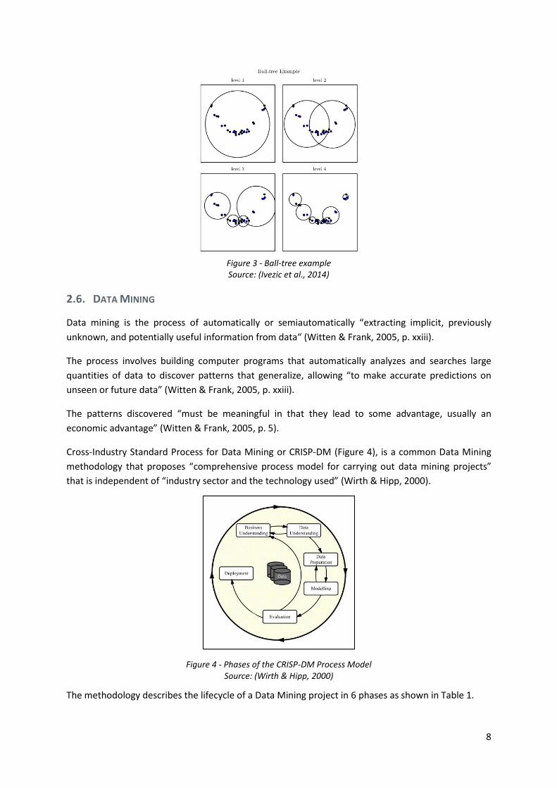
Figure 3 - Ball-tree example Source: (Ivezic et al., 2014)
2.6. DATA MINING
Data mining is the process of automatically or semiautomatically “extracting implicit, previously
unknown, and potentially useful information from data“ (Witten & Frank, 2005, p. xxiii).
The process involves building computer programs that automatically analyzes and searches large
quantities of data to discover patterns that generalize, allowing “to make accurate predictions on
unseen or future data” (Witten & Frank, 2005, p. xxiii).
The patterns discovered “must be meaningful in that they lead to some advantage, usually an
economic advantage” (Witten & Frank, 2005, p. 5).
Cross-Industry Standard Process for Data Mining or CRISP-DM (Figure 4), is a common Data Mining
methodology that proposes “comprehensive process model for carrying out data mining projects”
that is independent of “industry sector and the technology used” (Wirth & Hipp, 2000).
Figure 4 - Phases of the CRISP-DM Process Model Source: (Wirth & Hipp, 2000)
The methodology describes the lifecycle of a Data Mining project in 6 phases as shown in Table 1.

9
Phase Tasks Description
Business
Understanding
o Determine Business Objectives
o Assess Situation
o Determine Data Mining Goals
o Produce Project Plan
“Understanding the project objectives and
requirements and converting this knowledge into a
data mining problem definition”. E.g. meetings with
business experts and domain experts to define main
goals and targets.
Data
Understanding
o Collect Initial Data
o Describe Data
o Explore Data
o Verify Data Quality
Acquiring and exploring initial data “to identify data
quality problems, to discover first insights, and to
form hypotheses”. E.g. creating an Exploratory Data
Analysis (EDA) to summarize datasets visually.
Data
Preparation
o Select Data
o Clean Data
o Construct Data
o Integrate Data
o Format Data
Creating the final dataset, the input of the modeling
phase, from raw data. Some tasks include “table,
record, and attribute selection, data cleaning,
construction of new attributes, and transformation of
data for modeling tools”. E.g. feature engineering,
feature scaling, data transformations, dummy coding.
Modeling
o Select Modeling Technique
o Generate Test Design
o Build Model
o Assess Model
“Selecting and applying several modeling techniques
and calibrating their parameters to optimal values”,
considering that each technique has different
prerequisites and “requires specific data formats”.
E.g. designing a validation strategy, creating a
baseline, hyperparameter optimization.
Evaluation
o Evaluate Results
o Review Process
o Determine Next Steps
Evaluate the model results and verify if it achieves the
business objectives, taking corrective action if
necessary, by considering specific business issues and
improving previous phases. “Decide if the if the data
mining result is going to be used”. E.g. validation of
results by business experts, acceptance testing.
Deployment
o Plan Deployment
o Plan Monitoring & Maintenance
o Produce Final Report
o Review Project
“Organize and present the knowledge gained” to the
client according to the project requirements.
Complexity can vary “from generating a report to
implementing a repeatable data mining process”.
“Usually the client carries out the deployment steps”,
so it is important to have all necessary actions and
required information properly documented. E.g.
deploying a data pipeline to production environment,
documentation and knowledge transfer.
Table 1 - Description of Phases and Tasks of CRISP-DM Process Model
Source: (Wirth & Hipp, 2000)
2.7. MACHINE LEARNING
According to Mitchell (1997) “the field of Machine Learning is concerned with the question of how to
construct computer programs that automatically improve with experience”. The main application of
Machine Learning is Data Mining (Kotsiantis, 2007).
10
According to Russell & Norvig (2009), there are different types of learning motivated by different
types of feedback, these include:
• Unsupervised learning, where “the agent learns patterns in the input even though no explicit
feedback is supplied”. Common learning tasks include Clustering, or grouping similar samples
automatically, Dimensionality Reduction and Anomaly Detection;
• Supervised learning, where “the agent observes some example input–output pairs and learns a
function that maps from input to output”. “The goal of supervised learning is to build a concise
model of the distribution of class labels in terms of predictor features” (Kotsiantis, 2007).
Common learning tasks include Regression, used to estimate continuous or numerical variable,
and Classification, used to estimate categorical variables or classes;
• Semi-supervised learning, that combines few labeled examples together with a large collection
of unlabeled examples.
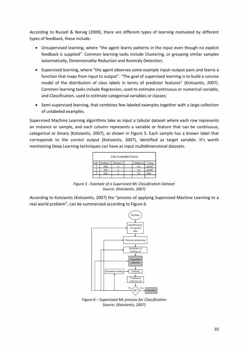
Supervised Machine Learning algorithms take as input a tabular dataset where each row represents
an instance or sample, and each column represents a variable or feature that can be continuous,
categorical or binary (Kotsiantis, 2007), as shown in Figure 5. Each sample has a known label that
corresponds to the correct output (Kotsiantis, 2007), identified as target variable. It’s worth
mentioning Deep Learning techniques can have as input multidimensional datasets.
Figure 5 - Example of a Supervised ML Classificatoin Dataset Source: (Kotsiantis, 2007)
According to Kotsiantis (Kotsiantis, 2007) the “process of applying Supervised Machine Learning to a
real world problem”, can be summarized according to Figure 6.
Figure 6 – Supervised ML process for Classification
Source: (Kotsiantis, 2007)

11
After acquiring all relevant and accessible datasets, it’s necessary to conduct multiple steps including
data cleaning, preparation and pre-processing, creating and selecting variables, defining a cross-
validation strategy to evaluate and control the quality of the results and estimate model
performance on unseen data, train one or several ML Algorithms and optimize its hyperparameters.
These steps can be repeated and improved in multiple iterations.
2.8. DATA PREPARATION
Data preparation addresses data quality issues including cleaning and handling potential problems in
data. Most datasets have low quality and noise. This process is specific to the type of analysis carried
out and ML models being deployed.
According to Kotsiantis (2007, pp. 52–53):
• “Integrating data from different sources usually presents many challenges. Different
departments will use different styles of record keeping, different conventions, different time
periods, different degrees of data aggregation, different primary keys, and will have different
kinds of error. The data must be assembled, integrated, and cleaned up”.
Inaccurate or incoherent values are an example of a very common data quality problem that affects
most datasets. Frequent problems involve invalid entries (e.g. 9999), numerical fields with text,
different date formats, duplicated records, etc. Before carrying out any statistical analysis or
inputting data into algorithms, it’s necessary to account for, determine and treat these types of
values to prevent low quality results.
Frequent data quality problems and strategies to deal with these issues are described below.
Missing values
The presence of missing values is very common in most datasets. It’s important to determine the
root cause of the missing values and understand its meaning (Kotsiantis, 2007). Some common
causes include, nonresponses in a study, loss of communication from a sensor, data sources with
infrequent or irregular updates, Information System defects, incorrectly executed business
processes.
According to Mack et al. (2018) missing data is categorized according to three types:
• Missing completely at random (MCAR), “the fact that the data is missing is independent of the
observed and unobserved data”. This means that “no systematic differences exist between
samples with missing data and those with complete data”;
• Missing at random (MAR), “the fact that the data is missing is systematically related to the
observed but not the unobserved data”. This means that the missing data is related with a
known feature from the dataset (e.g. non-responses associated with participants gender);
• Missing not at random (MNAR), “the fact that the data is missing is systematically related to
the unobserved data”, more specifically events or facts not measured.
The most common strategy to handle missing data are imputation techniques. Even though some
models support missing values, imputation can improve predictive performance.

12
Univariate imputation techniques use the mean or median of a single variable to estimate the
missing values while multivariate imputation techniques use the complete set of features (Scikit-
learn developers, 2020b). Examples of multivariate methods include KNN imputation that averages
the value of the K closest samples to estimate the missing point, or MICE that “models each feature
with missing values as a function of other features in a round-robin fashion” (Scikit-learn developers,
2020b).
Outliers
Outliers are “extreme values that abnormally lie outside the overall pattern of a distribution of
variables” (Kwak & Kim, 2017). These types of value are also common in most datasets.
Outliers can have negative effects on the results of data analysis and ML models by “introducing bias
into statistical estimates such as mean and standard deviation, leading to underestimated or
overestimated resulting values” (Kwak & Kim, 2017).
It’s important to identify the root cause of outliers and adopt the appropriated strategy to treat
these values. Some common causes include Information System defects, communication problems,
noisy readings from sensors, human error, fraud and others.
Univariate Outlier detection methods include:
• Z-score, that assumes that the variable is normally distributed, and “measures the distance
between a data point and the center of all data points to determine an outlier” (Kwak & Kim,
2017). This is achieved by calculating the mean and SD of the dataset. If a sample lies outside
of the interval defined by the mean and SD multiplied by a threshold, [μ - 2σ, μ + 2σ], then it’s
considered an outlier;
• Interquartile range (IQR), that uses the median and interquartile range and is less sensitive to
outliers (Kwak & Kim, 2017). If a point falls outside the interval defined by the median and the
IQR multiplied by a threshold, [Q1 - 1.5 × IQR, Q3 + 1.5 × IQR], where IQR = Q3 - Q1, then it’s
considered an outlier (Hubert & Van Der Veeken, 2008);
Multivariate outlier detection methods consider combinations of features instead of a single variable.
For example, for a specific region values of 33 oC temperature or 90% relative humidity might not be
considered outliers when analyzed individually, however the combination of both data points might
represent an abnormality, rare event or noise. Anomaly detection algorithms like Isolation Forest
(Tony Liu et al., 2008) or strategies that involve clustering algorithms like DBSCAN are examples of
multivariate outlier detection methods.
The are multiple methods to treat outliers, common approaches include removing instances from the
dataset, trimming variables, e.g. defining upper and lower bounds, and replacing outliers by an
estimation, e.g. though imputation. Applying some types of non-linear transformations can also
minimize the impact of outliers, e.g. Logarithm or Sigmoid.

13
2.9. FEATURE ENGINEERING
According to Zheng & Casari (2018) feature engineering can be defined as “the act of extracting
features from raw data and transforming them into formats that are suitable for the machine
learning model”.
A feature is a “numeric representation of raw data” (Zheng & Casari, 2018) that provides context or
information about a specific subject. The optimal representation of features varies according to
problem type and ML models applied.
There is a relation between feature complexity, model complexity, and domain knowledge. Simpler
features require complex models that can learn abstract representations, and complex features that
encode domain knowledge and directly account for factors that are influencing the outcome, require
simpler models (Zheng & Casari, 2018).
Using Time Series forecasting as an example, it’s possible use simpler ML models (e.g. Random
Forest), which require creating complex features that encode temporal information, moving window
statistics, differencing, and other advanced time series decomposition methods, even from the signal
processing field. Using the same dataset, it’s also possible to deploy time series forecasting models or
Deep Learning techniques involving Recurrent Neural Networks, that can learn dependencies
between timesteps (e.g. memory), using simple features as input, usually a window of the previous
values, and achieve similar levels of performance.
Some feature engineering techniques include:
• Calculating simple aggregation statistics at different levels of granularity (e.g. counts, averages,
etc.);
• Discretizing binning continuous variables;
• Encoding categorical variables using strategies like one-hot-encoding, mean encoding or
Bayesian target encoding. Encoding cyclical variables and ordinal variables.
• Applying non-linear transformations like the Log-transformation to skewed distributions;
• Creating interaction features that describe “the product of two features” (Zheng & Casari,
2018);
• Combining features using domain Knowledge (e.g. obtaining wind direction and magnitude
from u and v components), or using statistical or information theory measures;
• Feature scaling and normalization, to account for different scales of input variables, that affect
some models (e.g. KNN). Common approaches include min-max scaling, that conforms each
feature scale between 0 and 1, and Z-score standardization, that subtracts each feature by its
mean and divides it by its standard deviation;
• Automatic Dimensionality Reduction techniques, including Principal component Analysis (PCA),
that “reduces the dimensionality of a dataset, while preserving as much variability or statistical
information as possible” (Jolliffe & Cadima, 2016). It’s used to project data into a lower
dimensional space by creating new uncorrelated variables called Principal Components (PCs)
that are linear combinations of the original variables.

14
2.10. FEATURE SELECTION
Feature selection is a dimensionality reduction technique that aims to find an optimal subset of
features. It’s usually considered an important step of data science projects and has several
advantages since it helps reduce the number of variables and avoid the curse of dimensionality, it
can reduce training time and produce simpler and more compact models, it can reduce overfitting
and improve generalization (Mayo, 2017).
According to (Guyon & Elisseeff, 2003), there are three types of feature selection methods:
• Filters select “subsets of variables as a pre-processing step, independently of the chosen
predictor”. Examples are filtering variables based on their correlation coefficient or variance,
assuming a threshold. Variables with small variance carry a small amount of information and
can usually be discarded. Correlated variables are usually redundant and can affect model
performance by causing numerical instability in some methods and masking relationships
between variables (Tuv et al., 2009). Other filter methods rely on Mutual Information measure,
used to estimate the dependence between two variables.
• Wrappers use a machine learning algorithm “to score a subset of variables according to their
predictive power”. These methods are usually based on greedy search algorithms that select
variables iteratively by training models on a subset of all variables. This subset is adjusted in
each iteration based on model performance, by removing or adding features (Kaushik, 2016).
Common examples of algorithms are Forward Selection and Backward Elimination;
• Embedded perform “variable selection in the process of training and are usually specific to
given learning machines”. An example is Linear Regression with L1 regularization, also known
as Lasso Regression. A strong penalty term will produce solutions with sparse coefficients.
Weights of irrelevant variables will be zero, having no effect on model output.
Boruta (Kursa & Rudnicki, 2010) is a feature selection algorithm that works by duplicating features in
a dataset and shuffling each one, creating “shadow features”. A Random Forest is trained with both
original features and shadow features do determine feature importance1 using Gini Importance also
known as Mean Decrease in Impurity (MDI) or alternatively Permutation Importance also known as
Mean Decrease Accuracy2 (MDA).
The importance of the highest-ranking shadow feature is obtained, all original features that have
higher importance than this threshold are marked as a hit. This process is repeated and
“accumulated hit counts are assessed” (Kursa, 2020). Using a statistical test Boruta “rejects features
which significantly under-perform best shadow feature” by removing them “from the set for all
subsequent iterations” and confirms those “which significantly outperform best shadow” (Kursa,
2020).
1 According to Brownlee (2020c), “feature importance refers to techniques that assign a score to input
features based on how useful they are at predicting a target variable”. 2 Mean Decrease Accuracy (MDA) measures the decrease in model score when a single feature is
randomly shuffled (Scikit-learn developers, 2020c).
15
2.11. CLASSIFICATION ALGORITHMS
In this section a description of classifiers referenced in the report is going to be presented. A classier
“is a function that maps an unlabeled instance to a class label using internal data structures” (Kohavi,
1995).
Parametric learning algorithms “summarize data with a set of parameters of fixed size, independent
of the number of training examples”. They are faster at the cost of “making stronger assumptions
about the nature of the data distributions”. Nonparametric models “cannot be characterized by a
bounded set of parameters” but are more flexible at the cost of being slower with larger datasets
and increasing the risk of overfitting3 the data (Murphy, 2012, p. 16; Russell & Norvig, 2009, pp. 737–
738).
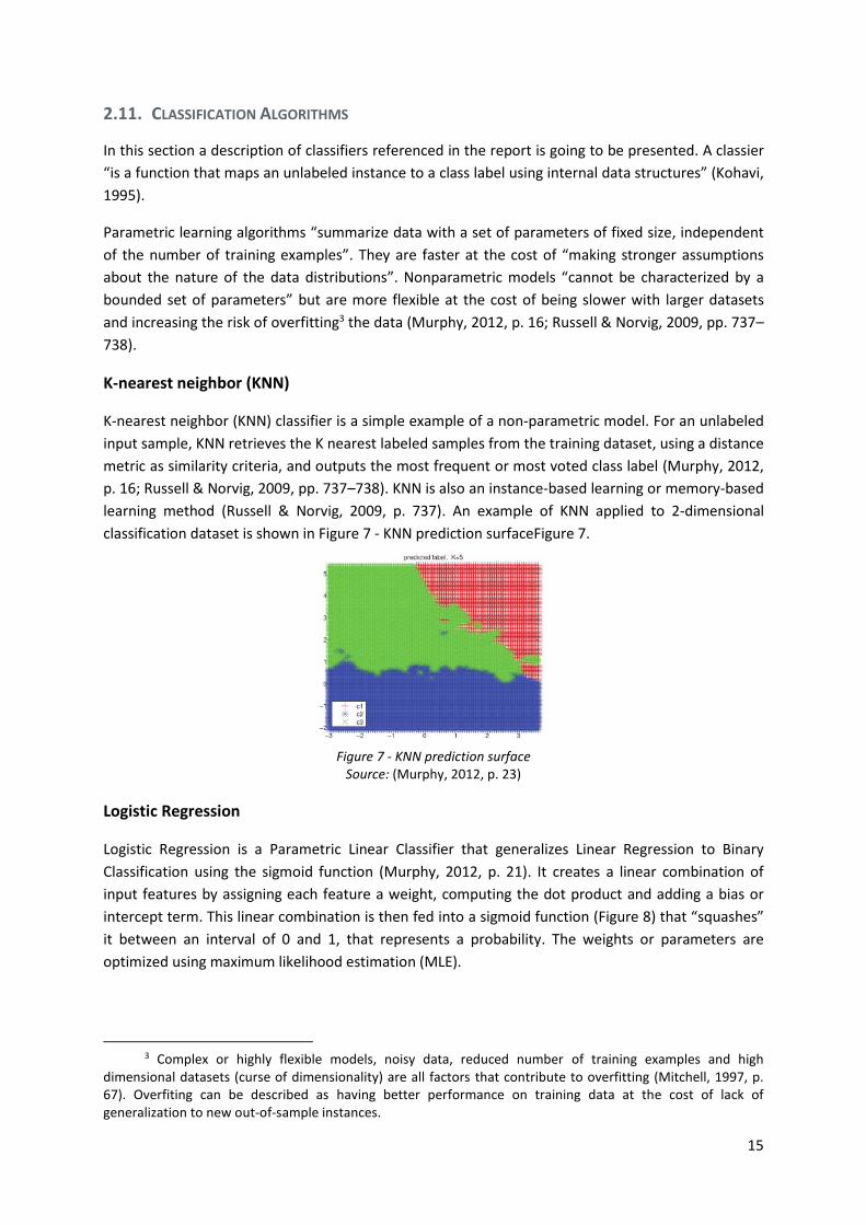
K-nearest neighbor (KNN)
K-nearest neighbor (KNN) classifier is a simple example of a non-parametric model. For an unlabeled
input sample, KNN retrieves the K nearest labeled samples from the training dataset, using a distance
metric as similarity criteria, and outputs the most frequent or most voted class label (Murphy, 2012,
p. 16; Russell & Norvig, 2009, pp. 737–738). KNN is also an instance-based learning or memory-based
learning method (Russell & Norvig, 2009, p. 737). An example of KNN applied to 2-dimensional
classification dataset is shown in Figure 7 - KNN prediction surfaceFigure 7.
Figure 7 - KNN prediction surface
Source: (Murphy, 2012, p. 23)
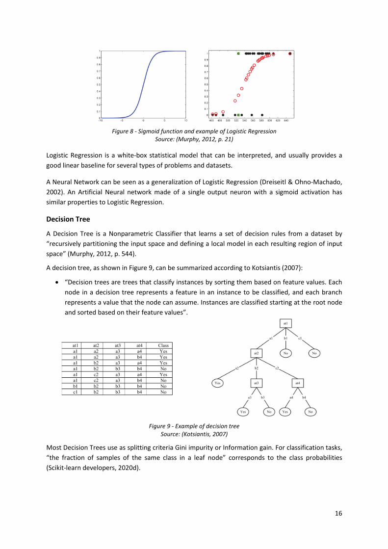
Logistic Regression
Logistic Regression is a Parametric Linear Classifier that generalizes Linear Regression to Binary
Classification using the sigmoid function (Murphy, 2012, p. 21). It creates a linear combination of
input features by assigning each feature a weight, computing the dot product and adding a bias or
intercept term. This linear combination is then fed into a sigmoid function (Figure 8) that “squashes”
it between an interval of 0 and 1, that represents a probability. The weights or parameters are
optimized using maximum likelihood estimation (MLE).
3 Complex or highly flexible models, noisy data, reduced number of training examples and high
dimensional datasets (curse of dimensionality) are all factors that contribute to overfitting (Mitchell, 1997, p. 67). Overfiting can be described as having better performance on training data at the cost of lack of generalization to new out-of-sample instances.
16
Figure 8 - Sigmoid function and example of Logistic Regression Source: (Murphy, 2012, p. 21)
Logistic Regression is a white-box statistical model that can be interpreted, and usually provides a
good linear baseline for several types of problems and datasets.
A Neural Network can be seen as a generalization of Logistic Regression (Dreiseitl & Ohno-Machado,
2002). An Artificial Neural network made of a single output neuron with a sigmoid activation has
similar properties to Logistic Regression.
Decision Tree
A Decision Tree is a Nonparametric Classifier that learns a set of decision rules from a dataset by
“recursively partitioning the input space and defining a local model in each resulting region of input
space” (Murphy, 2012, p. 544).
A decision tree, as shown in Figure 9, can be summarized according to Kotsiantis (2007):
• “Decision trees are trees that classify instances by sorting them based on feature values. Each
node in a decision tree represents a feature in an instance to be classified, and each branch
represents a value that the node can assume. Instances are classified starting at the root node
and sorted based on their feature values”.
Figure 9 - Example of decision tree Source: (Kotsiantis, 2007)
Most Decision Trees use as splitting criteria Gini impurity or Information gain. For classification tasks,
“the fraction of samples of the same class in a leaf node” corresponds to the class probabilities
(Scikit-learn developers, 2020d).

17
Some strengths and weaknesses of this model (Murphy, 2012, p. 550; Scikit-learn developers,
2020a), that depend on the implementation and type of tree (CART, ID3, etc.), are shown in Figure
10.
Strengths Weaknesses
o Relatively robust to outliers;
o Insensitive to monotone transformations;
o Does not require data normalization or scaling;
o Handles continuous and categorical data;
o Handles missing values;
o Automatic variable selection;
o Computationally cheap and scales to large
datasets;
o Interpretable white-box.
o High variance estimator;
o Suffers from numerical instability, where small
changes in input result in large changes in output,
producing completely different trees;
o Tends to overfit the data;
o Based on greedy heuristic algorithms that do not
guarantee a global optimum tree;
o Sensible to class imbalance.
Figure 10 - Strengths and weaknesses of Decision Tree models
Random Forest
Random Forest models address the issues of decision trees, combining different techniques, as
described below.
Ensemble learning “refers to learning a weighted combination of base model” (Murphy, 2012, p.
580). An ensemble combines the predictions of individually trained classifiers, usually high variance
estimators, resulting in a “more accurate estimate than any of the single classifiers in the ensemble”
(Opitz & Maclin, 1999).
Bootstrap aggregation or bagging is a technique to “reduce the variance of an estimate by averaging
together many estimates”. In practice, this can be achieved by training different models on different
random subsets of data with replacement (Murphy, 2012, pp. 550–551). However, “running the
same learning algorithm on different subsets of the data can result in highly correlated predictors,
which limits the amount of variance reduction that is possible” (Murphy, 2012, pp. 550–551).
The Random Forests algorithm grows an ensample of decision trees by randomly sampling a subset
of instances and a subset of input variables (Meinshausen, 2006; Murphy, 2012, pp. 550–551). This is
an attempt to “decorrelate the base learners” and reduce variance, while creating a strong learner
from an ensemble of weak learners (Figure 11).
This meta-estimator can be adapted to classification problems by using the “mean predicted class
probabilities of the trees in the forest” as output class probability (Scikit-learn developers, 2020d).
Random Forests usually provide “very good predictive accuracy” (Murphy, 2012, pp. 550–551) while
requiring less preprocessing and data preparation.
18
Figure 11 - Example of Random Forest architecture Source: (Verikas et al., 2011)
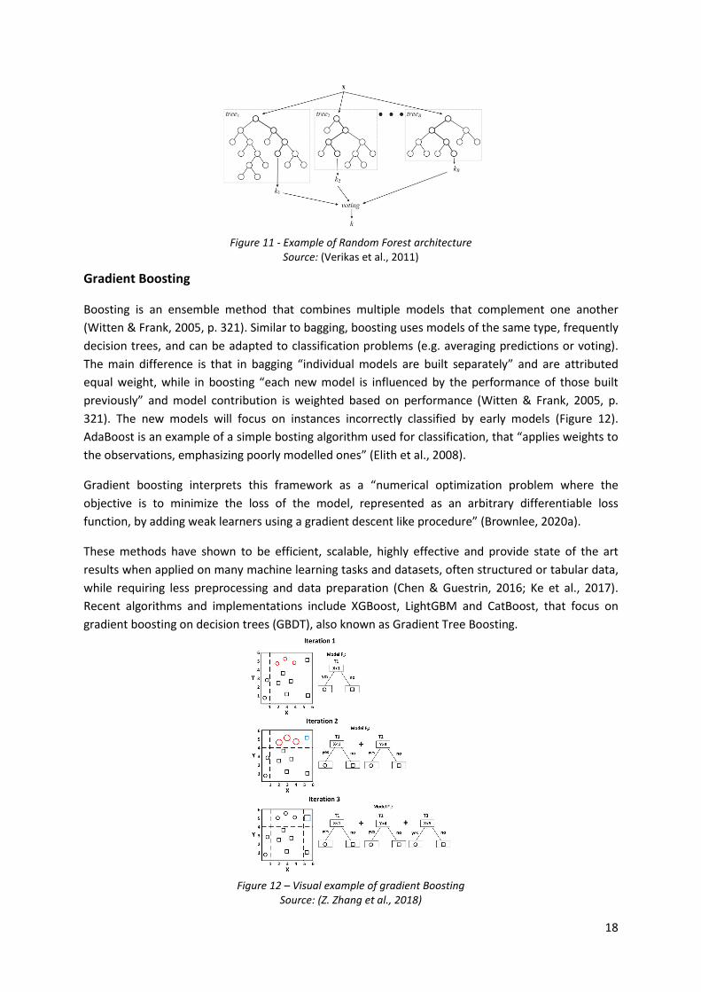
Gradient Boosting
Boosting is an ensemble method that combines multiple models that complement one another
(Witten & Frank, 2005, p. 321). Similar to bagging, boosting uses models of the same type, frequently
decision trees, and can be adapted to classification problems (e.g. averaging predictions or voting).
The main difference is that in bagging “individual models are built separately” and are attributed
equal weight, while in boosting “each new model is influenced by the performance of those built
previously” and model contribution is weighted based on performance (Witten & Frank, 2005, p.
321). The new models will focus on instances incorrectly classified by early models (Figure 12).
AdaBoost is an example of a simple bosting algorithm used for classification, that “applies weights to
the observations, emphasizing poorly modelled ones” (Elith et al., 2008).
Gradient boosting interprets this framework as a “numerical optimization problem where the
objective is to minimize the loss of the model, represented as an arbitrary differentiable loss
function, by adding weak learners using a gradient descent like procedure” (Brownlee, 2020a).
These methods have shown to be efficient, scalable, highly effective and provide state of the art
results when applied on many machine learning tasks and datasets, often structured or tabular data,
while requiring less preprocessing and data preparation (Chen & Guestrin, 2016; Ke et al., 2017).
Recent algorithms and implementations include XGBoost, LightGBM and CatBoost, that focus on
gradient boosting on decision trees (GBDT), also known as Gradient Tree Boosting.
Figure 12 – Visual example of gradient Boosting Source: (Z. Zhang et al., 2018)
19
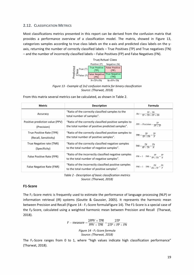
2.12. CLASSIFICATION METRICS
Most classifications metrics presented in this report can be derived from the confusion matrix that
provides a performance overview of a classification model. The matrix, showed in Figure 13,
categorizes samples according to true class labels on the x-axis and predicted class labels on the y-
axis, returning the number of correctly classified labels – True Positives (TP) and True negatives (TN)
– and the number of incorrectly classified labels – False Positives (FP) and False Negatives (FN).
Figure 13 - Example of 2x2 confusion matrix for binary classification
Source: (Tharwat, 2018)
From this matrix several metrics can be calculated, as shown in Table 2.
Metric Description Formula
Accuracy “Ratio of the correctly classified samples to the
total number of samples”.
Positive prediction value (PPV)
(Precision)
“Ratio of the correctly classified positive samples to
the total number of positive predicted samples”.
True Positive Rate (TPR)
(Recall, Sensitivity)
“Ratio of the correctly classified positive samples to
the total number of positive samples”.
True Negative rate (TNR)
(Specificity)
“Ratio of the correctly classified negative samples
to the total number of negative samples”.
False Positive Rate (FPR) “Ratio of the incorrectly classified negative samples
to the total number of negative samples”.
False Negative Rate (FNR) “Ratio of the incorrectly classified positive samples
to the total number of positive samples”.
Table 2 - Description of basic classification metrics Source: (Tharwat, 2018)
F1-Score
The F1-Score metric is frequently used to estimate the performance of language processing (NLP) or
information retrieval (IR) systems (Goutte & Gaussier, 2005). It represents the harmonic mean
between Precision and Recall (Figure 14 - F1-Score formulaFigure 14). The F1-Score is a special case of
the Fβ-Score, calculated using a weighted harmonic mean between Precision and Recall (Tharwat,
2018).
Figure 14 - F1-Score formula Source: (Tharwat, 2018)
The F1-Score ranges from 0 to 1, where “high values indicate high classification performance”
(Tharwat, 2018).

20
This metric uses only 3 elements of the confusion matrix and disregards True Negatives, therefore
“two classifiers with different TNR values may have the same F-score” (Tharwat, 2018).
Matthews correlation coefficient (MCC)
Matthews correlation coefficient (MCC) was introduced in 1975 by biochemist Brian W. Matthews. It
represents the “correlation between the observed and predicted classification” (Tharwat, 2018). It’s
calculated using all 4 elements of the confusion matrix, as shown in Figure 15, and it’s sensitive to
imbalanced data.
Figure 15 - MCC formula Source: (Tharwat, 2018)
Similar to Pearson correlation, the MCC ranges from -1 to 1, from inverse association to strong
association between predicted and observed class labels.
Some authors claim that MCC “produces a more informative and truthful score in evaluating binary
classifications than accuracy and F1 score” (Chicco & Jurman, 2020).
This metric was used in the “VSB Power Line Fault Detection” Kaggle competition hosted by the
Technical University of Ostrava, situated in the Czech Republic. The competition objective was
“detect faults in above-ground electrical lines” (Enet Centre - VSB, 2019).
Receiver Operating Characteristics (ROC)
The receiver operating characteristics (ROC) curve “is a two-dimensional graph in which the True
Positive Rate (TPR) represents the y-axis and False Positive Rate (FPR) is the x-axis” (Tharwat, 2018).
It’s used to evaluate diagnostic systems (e.g. biomarkers), medical decision-making systems, and
machine learning algorithms (Tharwat, 2018).
Each point on the ROC curve is generated “by changing the threshold on the confidence score” and
calculating both metrics (Tharwat, 2018). A point above the reference line represents a classifier
better than chance and a point closer to the top left corner represents a classifier with both high
Sensitivity (TPR) and high Specificity (1-TNR), where positive and negative samples are correctly
classified. An example of a ROC curve is shown in Figure 16.
Figure 16 - ROC curve example and interpretation
Source: (Tharwat, 2018)
Figure 17 - ROC-AUC example
Source: (Tharwat, 2018)
21
The Area under the ROC curve, shown in Figure 17, summarizes the ROC curve between a score of 0
and 1 (Tharwat, 2018). Any classifier with an AUC score greater than 0.5 outperforms a random
classifier and has capacity to discriminate between classes.
Youden’s index (J) or Youden’s J statistic combines specificity and sensitivity and ranges between 0
and 1, from no discrimination to perfect discrimination (Tharwat, 2018). It’s commonly applied to
find the optimal cut-off value in the ROC curve, where the maximum value of J represents the highest
point above the ROC reference line or the closest point to the top left corner (FPR=0, TPR=1) (Unal,
2017). Youden’s index is defined according to the following formula YI = TPR + TNR - 1.
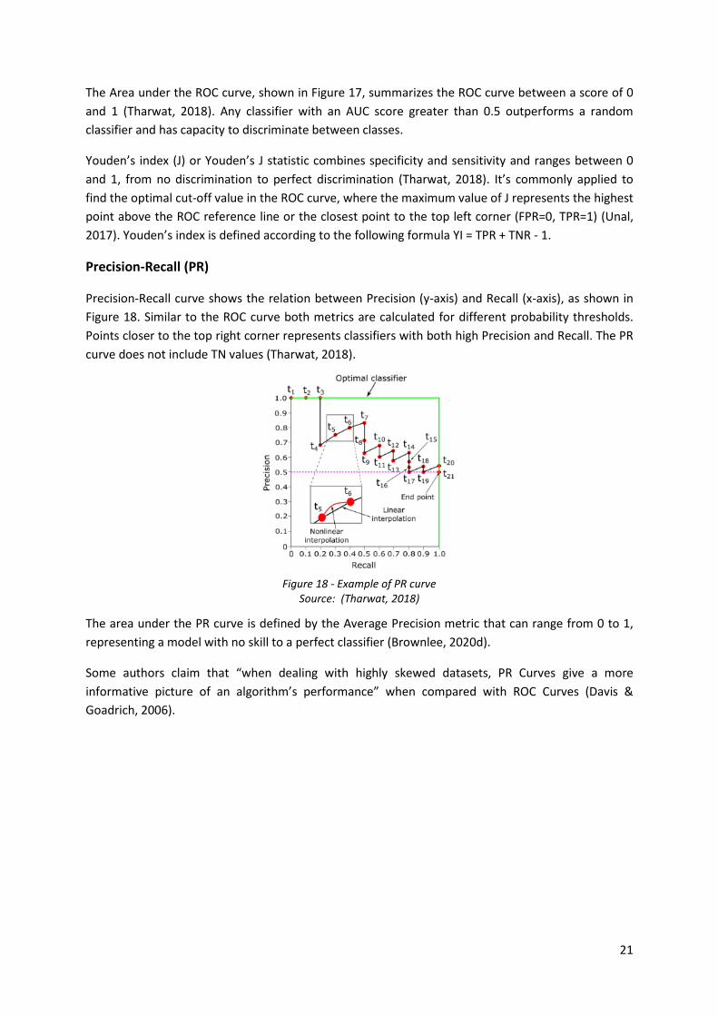
Precision-Recall (PR)
Precision-Recall curve shows the relation between Precision (y-axis) and Recall (x-axis), as shown in
Figure 18. Similar to the ROC curve both metrics are calculated for different probability thresholds.
Points closer to the top right corner represents classifiers with both high Precision and Recall. The PR
curve does not include TN values (Tharwat, 2018).
Figure 18 - Example of PR curve Source: (Tharwat, 2018)
The area under the PR curve is defined by the Average Precision metric that can range from 0 to 1,
representing a model with no skill to a perfect classifier (Brownlee, 2020d).
Some authors claim that “when dealing with highly skewed datasets, PR Curves give a more
informative picture of an algorithm’s performance” when compared with ROC Curves (Davis &
Goadrich, 2006).
22
3. TOOLS AND TECHNOLOGY
Some of the tools and technologies used during the internship and considered relevant to the report
are presented in the chapters below.
3.1. AZURE
Azure is a cloud provider from Microsoft that offers several solutions, technologies and frameworks.
It includes different products under IaaS, PaaS and SaaS models that can be applied to different
fields, e.g. web development, big data, data science projects etc.
EDP Distribuição is migrating its On-Premises Infrastructure to cloud providers. Currently there are
several solutions and architectures being implemented in Azure, including several Data Lakes and
Analytics Platforms based on Databricks.
The Data Lakes provides a similar interface of a file system, with folders and files that usually
represent data partitions and originate from legacy systems. There are pipelines in Azure Data
Factory responsible for the ETL process between Information Systems and the Data Lake. The output
files are usually in a Big Data format like Avro or Parquet.
There is an emerging data architecture being developed and implemented in EDP. There is an
enterprise wide Data Lake, and other smaller Data Lakes that are project dependent. The predictive
asset maintenance project has its own Data Lake.
Usually to transfer information between Data Lakes there is an ETL process implemented in Data
Factory that copies the files or alternatively a mount point is requested and created between Data
Lakes allowing direct access.
3.2. PYTHON
Python is a high-level general-purpose interpreted programming language released in 1991 and
created by Guido van Rossum (Kuhlman, 2013).
It’s one of the main tools used during development, deployment and more general problem solving
during the internship. Python was used together with multiple environments, including in Databricks,
Jupyter Notebooks and Google Collaboratory.
Python has a vast amount of open source and actively developed libraries for different kinds of
domains. Some of the libraries used include:
• NumPy (van der Walt et al., 2011) for linear algebra and multidimensional array manipulation
SciPy for statistics and interpolation;
• Pandas (McKinney, 2010) for tabular data processing, data exploration, data cleaning, feature
engineering and transformations, and computing basic statistics;
• Scikit-learn (Varoquaux et al., 2015) for machine learning algorithms and other steps including
preprocessing, feature engineering and transformations, feature importance and selection,
metrics and evaluation;

23
• LightGBM (Ke et al., 2017) as a modeling framework for tree based gradient boosting;
• SHAP (K. Zhang et al., 2012) for explaining the output of black box models;
• Matplotlib, Seaborn, Bokeh, Holoviews and Datashader for data visualization;
• GeoPandas, Shapely, PyGEOS, GeoPy, Rtree and Rasterio for spatial queries, including reading
and processing shapefiles and raster data, converting spatial reference systems, calculating
geographic distances, performing Spatial Joins and Nearest Neighbors joins;
• Dask (Rocklin, 2015) used for specific use cases of distributed computing and prototyping, e.g.
reading shapefiles by chunks and saving as parquet.
3.3. DATABRICKS AND APACHE SPARK
Databricks is a collaborative Big Data cloud platform based on Apache Spark.
Apache Spark (Zaharia et al., 2010) is described as an “unified engine designed for large-scale
distributed data processing” (Damji et al., 2020). More precisely Spark is an open source distributed
computing framework based on community clusters that supports Data Engineering and Data
Science workflows and allows to create, read, query and transform large datasets, thought data
structures and data abstractions.
Databricks interface consists of code notebooks, similar to Jupyter, it includes a cluster management
section with a library management tool, a data explorer tool where it’s possible to show existing
databases, tables and preview datasets and an input section to upload datasets.
Python, R, SQL and Scala are supported programming languages used to interact with Databricks and
Spark. Thorough the internship, the developed projects used Python and SQL, meaning that
interactions with Spark are implemented though PySpark, an API between Python and Spark, and
Spark SQL (Armbrust et al., 2015).
Usually a cluster setup is composed of a driver machine that serves as workspace for all users, where
non-distributed code is executed, similar to notebook or a VM running Python, and the worker
nodes, used to process distributed operations and dataset partitions. Usually the user can abstract
from low-level operations related to the distribution process of a query, that happens in the
background.
One of the most recurring and important topics when working and integrating these technologies is
designing the implementation of a specific workflow to be as efficient as possible when working with
large datasets. This means that operations need to scale vertically avoiding O(n^2) complexity or
worse when possible and to scale horizontally by using a distributed implementation, unlocking all
resources of the cluster, providing linear speedups.
The main data structures provided by Spark are Data Frames, used for structured data and tabular
datasets, with operations very similar to a traditional database, and RDDs, deployed on the cluster
memory, and usually used for unstructured data that requires a specialized preprocessing (e.g. text).
EDP’s projects usually consisted of tabular datasets and mainly used data frames, however later on

24
during the internship both data structures were used to take full advantage of Spark for advanced
use cases.
Through PySpark, raw files usually in the format of CSV, Parquet or Avro are consumed from the data
lake processed and stored as optimized Hive tables stored in the Databricks environment.
3.4. GOOGLE COLLABORATORY
Collaboratory is a free cloud service from Google. It allows everyone with a Google account to read,
create, save and run Python notebooks. The notebooks are automatically attached to a virtual
machine with considerable amount of computing resources. There is also a GPU and TPU available to
accelerate the training of neural networks with deep learning frameworks like Keras and TensorFlow
or PyTorch.
When the data being worked on wasn’t confidential, Collab was used to rapidly develop procedures,
by allowing to acquire all required online resources and libraries, and contain errors caused by
resource exhaustion or failed installations, that would otherwise break the Databricks cluster driver
disrupting users and running processes. For these reasons, whenever more experimental work had to
be executed that didn’t involve private or confidential data, Colab was the environment of choice.
3.5. SAS ENTERPRISE GUIDE
SAS enterprise guide is the main access point to all EDP’s Information Systems that rely on relational
databases, data marts and replicas.
SAS Guide allows to build complex pipelines of queries using different kinds of operations and
transformations, visually through wizards or SQL and SAS code. It supports multiple inputs from
different sources and allows to save results as tables in SAS libraries.
SAS environment depends on legacy technologies like relational databases running on servers that
only scale vertically. These servers are usually overloaded because they’re accessed and used by
many collaborators at the same time for all kinds of data processing tasks and hold many sessions of
SAS.
Some SAS tables are also pushed to the limit concerning the number of records they hold. A good
example is the tables that store Smart Counter readings. These timeseries have very high granularity
and resolution, since records are taken form millions of Counters spread throughout the country,
with sampling frequency of 15 minutes. This kind of data tends to grow very fast and is pushing EDP
to adopt new solutions based on Big Data technologies and Cloud providers that can scale and fulfill
the necessary requirements.
25
4. PROJECTS
The main objective of the internship was to support the Predictive Asset Maintenance Project. For
this reason, the report will only focus on this project, that is described in detailed throughout the
following chapters.
4.1. TIMELINE
The internship started January 16th, 2020 and is scheduled to end on October 15th, 2020. Several
activities were performed concerning different projects in the field of Analytics and Business
Intelligence. The main priority of the internship was to support the Predictive Asset Maintenance
project.
The hands-on activities performed for the project include feature cleaning, feature engineering,
working with geospatial data and general problem solving. Other activities include following and
reporting on project progression, decisions taken, architecture and code, advising on some specific
data science issues on EDP side and discussing and brainstorming solutions with the consultant team
for more specific requirements or problems that would come up.
Some of the data related activities performed, considered relevant for the report, and later discussed
in detail include:
• Helping constructing the training dataset and some general features based on failures e.g.
moving averages and encoding cyclic variables like month number with trigonometric
functions (Adams & Vamplew, 1998);
• Creating a very basic exploratory data analysis for several Lablec datasets, with correlation
matrixes using Pearson and Spearman correlation for continuous variables. Spearman
correlation was useful to capture non-linear relationships, that would otherwise only show up
in Pearson after log transforming the variables. For categorical variables Cramér's V was used
as a measure of association. Other basic visualizations like histograms and scatter plots were
used in bulk to provide an idea of the distribution of each variable (frequently positively
skewed), possible univariate outliers, and the relationship between variables.
• Creating the preprocessing scheme for Labelec datasets;
• Analyzing and interpreting the IPMA dataset;
• Creating solutions for geospatial problems, including elevation, terrain cover and distance to
coastline;
• Creating a naïve baseline for the Overhead Lines PoF metric;
• Applying Logistic Regression and LightGBM models together with walk-forward cross
validation, to test and select variables at the same time they were being created. However,
this was only done during a very short phase of the project;
• Developing an example notebook for a presentation, containing all steps from data
transformation and preprocessing to model training, validation, evaluation and interpretation.
This notebook is important because it sums up concepts that later will be addressed in the
report, and contains no sensitive data.

26
4.2. PREDICTIVE ASSET MAINTENANCE PROJECT
The predictive Asset maintenance Project, including its scope, objectives, main challenges, datasets,
processing and techniques are going to be described in detail.
4.2.1. Motivation
The Predictive Asset Maintenance Project is an Analytics and Business Intelligence initiative that aims
to support EDP business and experts on management activities of high voltage power distribution
assets, including maintenance planning and investing planning.
EDP had other smaller analytics initiatives in the past, focused on power distribution assets and
predictive maintenance, usually pilots or proof of concepts with limited scope based on a subset of
assets, for example predicting only certain types of failures for HV Circuit Breakers.
The Predictive Asset Maintenance Project is one of EDP’s Distribuição most ambitious projects in the
area so far. It is a collaborative effort between several EDP’s business areas and departments,
together with an external consultant company of large dimension, that deployed a multidisciplinary
team to EDP’s Distribuição offices.
The project was managed using concepts from agile methodologies, with short iterations and
incremental development of “working pieces of software”. The project was organized and divided in
several Minimum Viable Products according to asset type and metric being estimated:
• MVP High Voltage Transformers Health Index;
• MVP High Voltage Circuit Breakers Health Index;
• MVP High Voltage Overhead Lines Health Index;
• MVP High Voltage Circuit Breakers Probability of Failure;
• MVP High Voltage Overhead Lines Probability of Failure;
• MVP for Maintenance and Investing Planning Dashboards.
4.2.2. Timeline
The actual project timeline is summarized below. Since this is an ambitious project with a wide
scope, and many challenges, there was some deviation from the planned schedule.
The project started on September 2019. Onboarding and Scoping activities took place in October and
November 2019.
The development phase that includes Data Visualization, Data Collection, Feature Engineering and
Modeling activities lasted from the beginning of the project all the way through May 2020.
The Handover activities, that includes documentation and knowledge transfer started on January
2020 and ended in July 2020.
The Industrialization activities, that include deploying the project in pre-production environment,
started on May 2020 and ended in July 2020, with some activities of corrective maintenance being
reopened in August and lasting until November 2020.
27
4.2.3. Technology and Development
All MVPs were developed in Microsoft Azure Cloud ecosystem. The main development platform is
Databricks, most of the code is written in Python and SQL notebooks.
Azure Data Lake was used together with Data Factory ETL pipelines to retrieve most of the data
sources used, that were processed and saved as optimized Hive tables in Databricks for later usage.
Multiple environments were used including development, test and pre-production. The development
environment is powered by three large clusters with four workers each. When including the driver
machine and workers the computing resources amount to 540 GB of RAM and 72 CPU cores on each
cluster.
The notebooks contain all the processing including transformations and models, the intermediary
results are saved to Hive tables and the final output to a SQLServer relational Database that feeds the
dashboards built on top of PowerBI, that also include Dax and M queries.
The notebooks are deployed with Data Factory by creating sequential drag and drop pipelines that
define their execution.
4.2.4. Health Index (HI)
The Health Index metric is based on “Common Network Asset Indices Methodology” (Ofgem, 2017)
from the Office of Gas and Electricity Markets (Ofgem), a governmental regulatory body for the
electricity and gas market in Great Britain. The Ofgem methodology is used to estimate asset health
and criticality, and to answer to reporting requirements.
The methodology contains a set of rules, mappings, and functions used to calculate the Health Index
of an asset. It can be thought of as a “pre-trained model” that can be applied to other utility
companies and their electrical grid.
There was an active effort between EDP asset experts and the project team to identify, select, map
and adapt relevant variables of the methodology to EDP’s Information Systems and sources.
Each source presented a challenge, for example, all sorts of data quality problems could be found,
some sources were unavailable because the cloud ETL pipelines had not yet been created were
temporarily replaced by static extractions, some variables were unavailable because EDP did not
record them in the past, but were recognized as valuable and documented as future work, other
variables had to be obtained and calculated from external sources, e.g. altitude.
The selection and mapping process consisted in business and domain experts identifying all the
possible variables from the Ofgem methodology that could be applied and were relevant to EDP’s
context. The methodology accounts for dozens of factors and respective variables.
The Modeling Phase consisted on implementing the methodology and following calibration
guidelines, tables with parameters that account for different contexts, e.g. types of material of a
pole. These were applied and the results validated iteratively.

28
This phase also depended on the input and validation of business experts while being developed.
Since the Ofgem methodology describes a white-box model it’s possible to determine which factors
are influencing a specific outcome.
Usually, excel files were created a specific component of the Ofgem Model and applied to a sample
of assets, then delivered to experts, who would validate the results, having knowledge on current
assets condition and wear, manually tune the model parameters to achieve a desired outcome or
propose changes.
Some parameters and factors were changed so the methodology could be adapted to EDP’s context.
For example, the “Oil Test Modifier” of HV Transformers, is based on oil condition information
including moisture content, acidity and breakdown strength (Ofgem, 2017), and is composed of
several factors. During calculation some of these factors had to be adjusted, because some variables
from oil tests conducted by EDP had a different distribution and did not match the intervals proposed
in Ofgem.
The Health Index output, consists of 5 bands, each asset is allocated to one band based on their
“Health Score” (Ofgem, 2017). The first band represents assets in excellent condition and the last
band assets with deteriorated health.
4.2.5. Probability of Failure (PoF)
The Probability of Failure is a metric that was defined by the business and consists in forecasting if an
asset will fail exactly 15 days ahead of time.
The prediction frequency is daily, and the granularity of the training dataset is also daily at the level
of each asset. The training dataset spans from 2008 through 2019.
Several probabilistic classification Machine Learning Models were applied together with a loose data
mining framework and multiple iterations to create this metric.
4.2.6. Maintenance and Investing Planning Dashboards
The dashboards are the main deliverables of the project, they incorporate the Health Index and
Probability of Failure metrics together with context information from the assets.
Two dashboards were created with different themes to support activities of Maintenance Planning
and Investing Planning.
The Maintenance Planning dashboard are designed at an operational level, to support decisions that
affect the assets maintenance and operation. It includes lists and details of assets, a complex view
with aggregated information for certain types of asset, e.g. Overhead Lines instead of Line Sections,
and a geographic view. The HI and PoF metrics are highlighted in all dashboards together with
complex filters and search patterns. It’s possible to list all Ofgem parameters defined for each asset.
A section that explains each metric is also included. For each asset the parameters that are
contributing to the displayed HI are highlighted. There is also an attempt to make the black-box
model behind the PoF interpretable, by displaying an ordered static list of feature importance,
however there is no information at the level of each prediction.
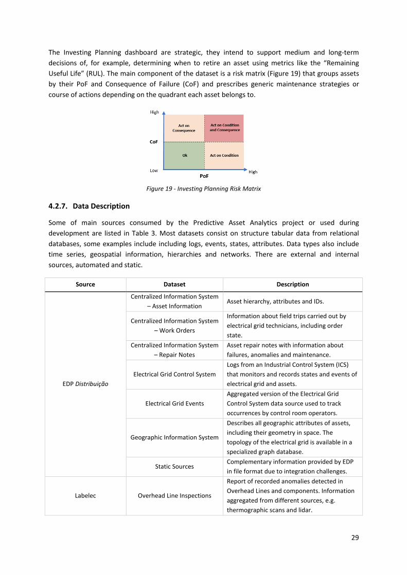
29
The Investing Planning dashboard are strategic, they intend to support medium and long-term
decisions of, for example, determining when to retire an asset using metrics like the “Remaining
Useful Life” (RUL). The main component of the dataset is a risk matrix (Figure 19) that groups assets
by their PoF and Consequence of Failure (CoF) and prescribes generic maintenance strategies or
course of actions depending on the quadrant each asset belongs to.
Figure 19 - Investing Planning Risk Matrix
4.2.7. Data Description
Some of main sources consumed by the Predictive Asset Analytics project or used during
development are listed in Table 3. Most datasets consist on structure tabular data from relational
databases, some examples include including logs, events, states, attributes. Data types also include
time series, geospatial information, hierarchies and networks. There are external and internal
sources, automated and static.
Source Dataset Description
EDP Distribuição
Centralized Information System
– Asset Information Asset hierarchy, attributes and IDs.
Centralized Information System
– Work Orders
Information about field trips carried out by
electrical grid technicians, including order
state.
Centralized Information System
– Repair Notes
Asset repair notes with information about
failures, anomalies and maintenance.
Electrical Grid Control System
Logs from an Industrial Control System (ICS)
that monitors and records states and events of
electrical grid and assets.
Electrical Grid Events
Aggregated version of the Electrical Grid
Control System data source used to track
occurrences by control room operators.
Geographic Information System
Describes all geographic attributes of assets,
including their geometry in space. The
topology of the electrical grid is available in a
specialized graph database.
Static Sources Complementary information provided by EDP
in file format due to integration challenges.
Labelec Overhead Line Inspections
Report of recorded anomalies detected in
Overhead Lines and components. Information
aggregated from different sources, e.g.
thermographic scans and lidar.
30
Source Dataset Description
Transformer Tests
Tests carried out to Transformers.
Measurements and condition assessment, e.g.
insulation resistance
Circuit Breaker Tests
Tests carried out to Circuit Breakers.
Measurements and condition assessment, e.g.
contact resistance.
Transformer Oil tests Chemical tests carried out to transformers’ oil.
IPMA and third party Numerical weather predictions
Daily 3-day predictions, with 3-hour interval for
weather variables including temperature,
atmospheric pressure, wind speed and
direction, precipitation.
Directorate General for
Territory (DGT) Land Cover (COS)
Inventory of land use and land cover
classification for mainland Portugal.
Institute for Nature
Conservation and Forests
(ICNF)
Burnt Area
Burnt areas in mainland Portugal published
annually. Available since the year 2000 until
2019.
Society for the Study of
Birds (SPEA) Important Bird Areas
Areas identified as important for protecting
endangered bird species. Relevant for
Overhead Lines, to account for the presence of
nesting birds (e.g. storks), a potential cause for
failures.
EU’s Copernicus
Programme
Digital Elevation Model over
Europe (EU-DEM)
Raster tiles with elevation data for mainland
Portugal.
Surface Water Body Shapefile of Europe’s coastline and other water
bodies.
Table 3 - Predictive Asset Maintenance Project main Data Sources
Training Dataset
The training dataset has two main axes, time and asset. For all PoF MVPs the granularity of the time
axis is daily, with a range spanning from 2008 to 2019. The asset is represented as a whole, by its
identifier, and not at the level of its components. For example, for the Overhead Lines MVP a
previously identified requirement was making higher granularity predictions at the level of the
Overhead Lines’ Segments, however it was not possible to match a failure with a particular Segment
because this type of information is not captured.
To create the dataset, a range or interval of dates is generated, a list of unique asset identifiers in
scope is retrieved, a Cartesian product is applied between these two sets. This results on all
combinations of dates with assets (Figure 20).

31
Figure 20 - Example of Training Dataset creation
All features created and presented below will be transformed into the shape of the training dataset
and appended to it.
Target
The most challenging and time-consuming activity of the project was to determine when a failure
had occurred for a specific asset. This step is extremely important since this feature is the target
required for the supervised models that estimate the PoF metric. This process started in the end of
2019 and lasted until the first trimester of 2020.
The team of consultants worked alongside EDP experts to develop an algorithm that allows to
determine when an asset failed, in this case a High Voltage Circuit Breaker or Overhead Line.
The pipeline implemented gathers data mainly from the Electrical Grid Control System and Electrical
Grid Events datasets. These datasets consist of multiple timeseries of millions of events and states
and represent some of the largest sources used. The algorithms implemented consists of hundreds of
rules, applied though queries, and took many iterations and validation sessions to design and until a
consensus could be reached.
The output for the Overhead Lines was mostly recognized as accurate. However, Circuit Breaker
failures could not be determined exactly. This type of asset is regularly tested by grid operators,
these tests add noise to the logs making it difficult to discriminate between an actual failure and
tests.
Performance was also an issue, since the algorithm consisted of complex rules and there was very
limited time, some of the Spark Data Frames being used were collected and converted Python lists
and iterated with nested loops and If conditions. This resulted in massive overhead, since the
computation was no longer distributed, a high percentage of available RAM memory was being
allocated to hold the dataset, and the nested loops applied to non-optimized data structures
produced queries with O(n2) time complexity. For Circuit Breakers the entire algorithm takes almost a
week to run on the entire training dataset.
Later it was showed that it was possible to reduce the processing time of these loops from 10-12
hours to 5-10 minutes by taking advantage of Spark queries to produce a reduced subset of
candidate results, collecting this subset to memory, and use optimized Python data structures,
including dictionaries and sets (hash tables), to run the rest of the algorithm and filter out False
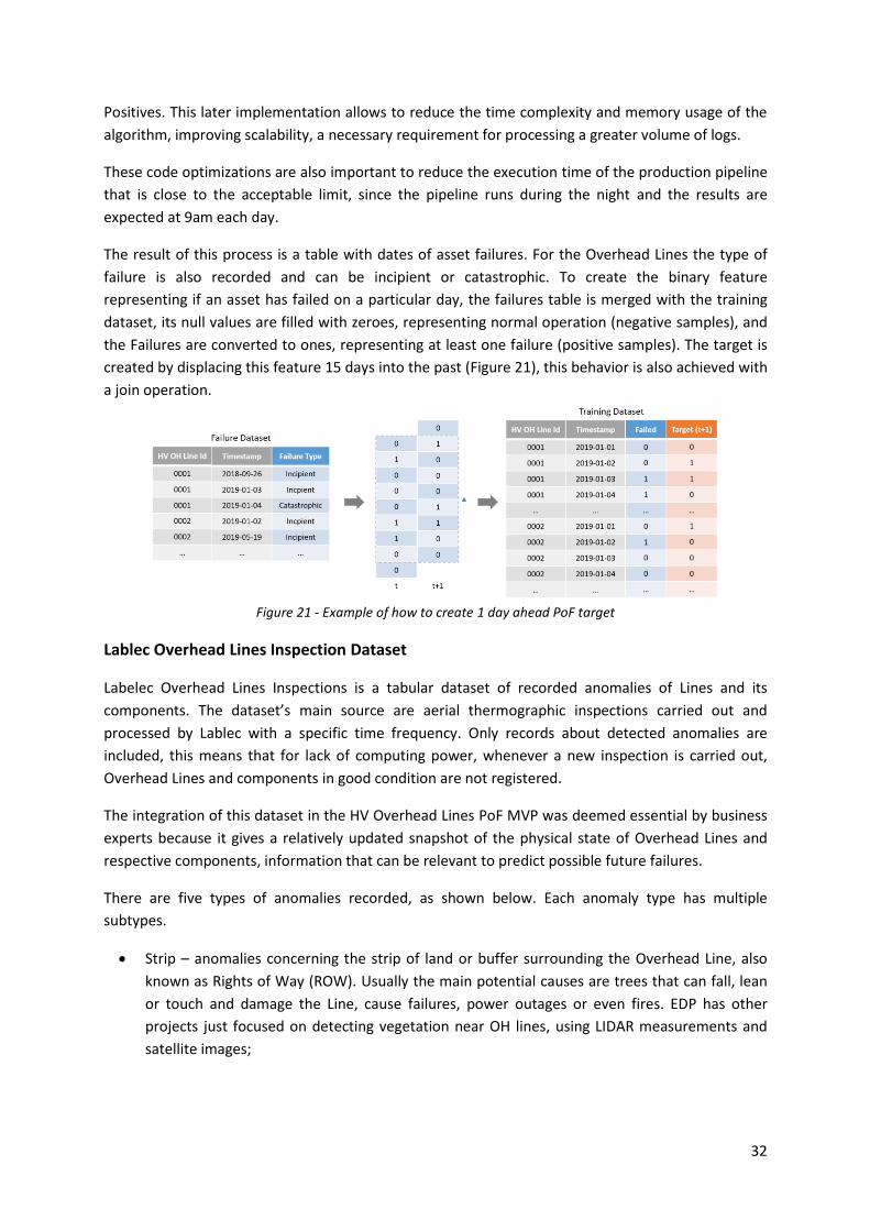
32
Positives. This later implementation allows to reduce the time complexity and memory usage of the
algorithm, improving scalability, a necessary requirement for processing a greater volume of logs.
These code optimizations are also important to reduce the execution time of the production pipeline
that is close to the acceptable limit, since the pipeline runs during the night and the results are
expected at 9am each day.
The result of this process is a table with dates of asset failures. For the Overhead Lines the type of
failure is also recorded and can be incipient or catastrophic. To create the binary feature
representing if an asset has failed on a particular day, the failures table is merged with the training
dataset, its null values are filled with zeroes, representing normal operation (negative samples), and
the Failures are converted to ones, representing at least one failure (positive samples). The target is
created by displacing this feature 15 days into the past (Figure 21), this behavior is also achieved with
a join operation.
Figure 21 - Example of how to create 1 day ahead PoF target
Lablec Overhead Lines Inspection Dataset
Labelec Overhead Lines Inspections is a tabular dataset of recorded anomalies of Lines and its
components. The dataset’s main source are aerial thermographic inspections carried out and
processed by Lablec with a specific time frequency. Only records about detected anomalies are
included, this means that for lack of computing power, whenever a new inspection is carried out,
Overhead Lines and components in good condition are not registered.
The integration of this dataset in the HV Overhead Lines PoF MVP was deemed essential by business
experts because it gives a relatively updated snapshot of the physical state of Overhead Lines and
respective components, information that can be relevant to predict possible future failures.
There are five types of anomalies recorded, as shown below. Each anomaly type has multiple
subtypes.
• Strip – anomalies concerning the strip of land or buffer surrounding the Overhead Line, also
known as Rights of Way (ROW). Usually the main potential causes are trees that can fall, lean
or touch and damage the Line, cause failures, power outages or even fires. EDP has other
projects just focused on detecting vegetation near OH lines, using LIDAR measurements and
satellite images;

33
Figure 22 - Overhead Line Rights of Way cleared of vegetation Source: (Universidade EDP, 2019)
• Conductors – damaged, worn out, broken, or corroded cables;
• Insulator – damaged, worn out, broken, or corroded insulator chains;
• Hot spots – components with higher than normal recorded temperature;
Figure 23 - Example of a Hot Spot captured during a Thermographic Inspection Source: (Universidade EDP, 2019)
• Poles – utility poles can be damaged, broken, tilted, corroded, have missing pieces or contain
bird nests. Issues concerning the foundation of the poles are also recorded.
Each row of the dataset represents an anomaly detected at the level of a specific Component,
Overhead Line and Date (Figure 24). A single report can have associated multiple anomalies where
each type and subtype of anomaly can also occur more than once. This representation is possible
because each Overhead Line, composed of multiple Line Segments, can span for several kilometers,
therefore its structure and respective components can repeat and be similar throughout. For
example, during an inspection the same Overhead Line can have three broken insulators of the same
type at different locations.
Figure 24 - Example of Labelec Inspection Dataset
Even though the dataset contains dozens of attributes, the business experts only identified as
relevant the Anomaly occurrence itself and its Priority. Each anomaly has a priority that can differ

34
between A, B or C, ordered from more to less serious. This attribute is created and processed by
Labelec and takes into consideration the temperature of the hotspot and other criteria.
Limitations
During the analysis, cleaning and transformation of the dataset some limitations were identified.
The first integration challenge was related with data quality and data cleaning. Data provided by
Labelec was stored in a Microsoft Access Database, and during collection no validation rules were
enforced. This means that some numeric fields will occasionally have text, invalid and incoherent
values. The same applies for text and categorical attributes that can have unrecognizable entries, or
multiple values with different case, spaces or punctuation representing the same entity or category
level. The Date or Timestamp column can contain dates in multiple formats, some dates have
characters or text appended to them which makes it especially difficult to parse, others are
incoherent or invalid (e.g. year 9999).
The second integration challenge concerns the Asset Identifier used in the Labelec’s dataset and its
relation to the Training Dataset, or in other words, how to merge each Inspection Report with the
respective Overhead Line. This identifier was present in three different columns and in different
formats representing the different Information Systems it originated from. It was necessary to apply
transformation rules to Labelec’s Overhead Line Ids, according to origin, and combining several
relation tables previously available, to convert each Identifier into the same format of the Training
Dataset.
This process was applied for all three columns. The result is obtained by reducing the columns into a
single Identifier. The criteria applied was to choose the first not-null value. In cases where more than
one Id column was defined the Identifier values were equal.
The main limitation identified was not knowing when an anomaly is repaired or resolved. For
example, an Overhead Line has several critical anomalies with priority A detected in an inspection,
these anomalies are promptly addressed and repaired, however if months later a new inspection is
carried out and that Line has no other defects, it’s state will not be updated in the inspection dataset
for reasons discussed above.
The problem is that inspections are carried out by helicopter affecting multiple dates and territories
in phases, and not on a single campaign, and at that time there was no way to know if the absence of
records since the last inspection means that the Overhead Line underwent corrective maintenance
works and the defects were repaired or if the Overhead Line wasn’t re-inspected to that date. The
same applies for Overhead Lines that have no recorded inspections, possible reasons include no
inspections ever carried out or no anomalies detected during all inspections.
To address this issue, the business experts identified as relevant integrating other Data Source with
Labelec’s inspections, the Repair Notes (Table 3), enabling to trace back any maintenance operations
carried out, to determine when a specific Anomaly was resolved. This introduces more frequent
Anomaly state updates and increases the resolution of the dataset.
Other limitation that could not be addressed include some Inspections that couldn’t be integrated
due to being recorded in analogue format.
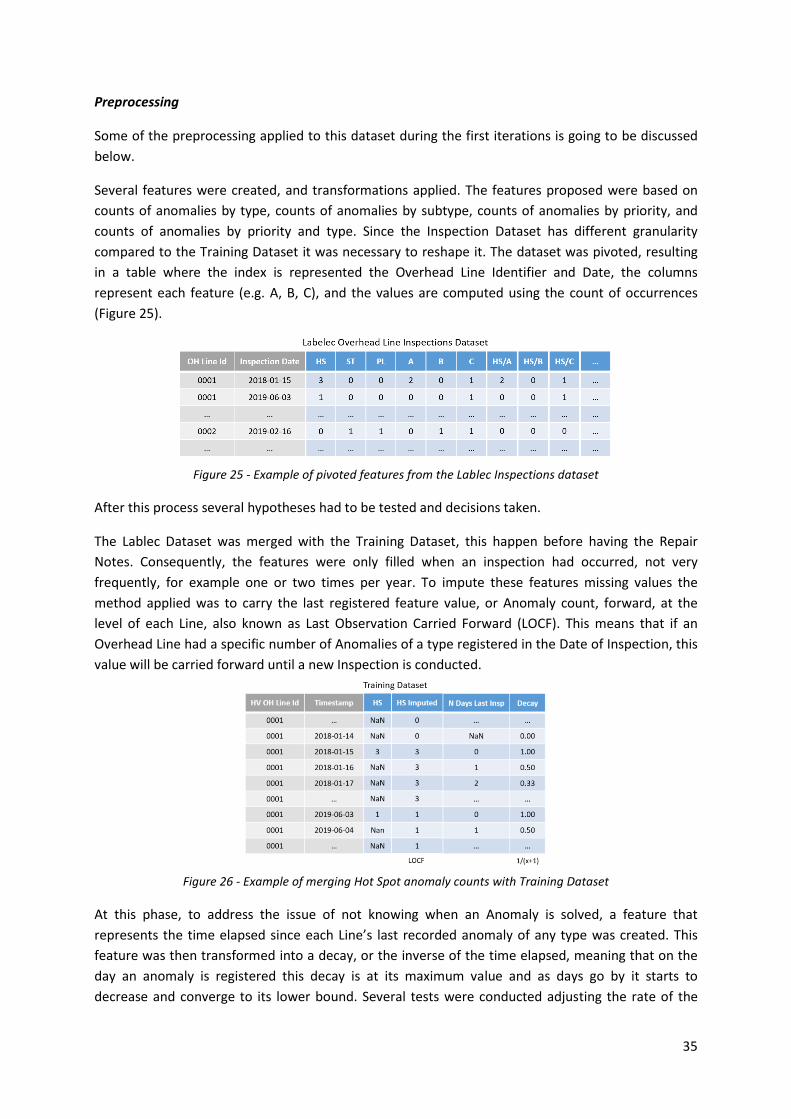
35
Preprocessing
Some of the preprocessing applied to this dataset during the first iterations is going to be discussed
below.
Several features were created, and transformations applied. The features proposed were based on
counts of anomalies by type, counts of anomalies by subtype, counts of anomalies by priority, and
counts of anomalies by priority and type. Since the Inspection Dataset has different granularity
compared to the Training Dataset it was necessary to reshape it. The dataset was pivoted, resulting
in a table where the index is represented the Overhead Line Identifier and Date, the columns
represent each feature (e.g. A, B, C), and the values are computed using the count of occurrences
(Figure 25).
Figure 25 - Example of pivoted features from the Lablec Inspections dataset
After this process several hypotheses had to be tested and decisions taken.
The Lablec Dataset was merged with the Training Dataset, this happen before having the Repair
Notes. Consequently, the features were only filled when an inspection had occurred, not very
frequently, for example one or two times per year. To impute these features missing values the
method applied was to carry the last registered feature value, or Anomaly count, forward, at the
level of each Line, also known as Last Observation Carried Forward (LOCF). This means that if an
Overhead Line had a specific number of Anomalies of a type registered in the Date of Inspection, this
value will be carried forward until a new Inspection is conducted.
Figure 26 - Example of merging Hot Spot anomaly counts with Training Dataset
At this phase, to address the issue of not knowing when an Anomaly is solved, a feature that
represents the time elapsed since each Line’s last recorded anomaly of any type was created. This
feature was then transformed into a decay, or the inverse of the time elapsed, meaning that on the
day an anomaly is registered this decay is at its maximum value and as days go by it starts to
decrease and converge to its lower bound. Several tests were conducted adjusting the rate of the
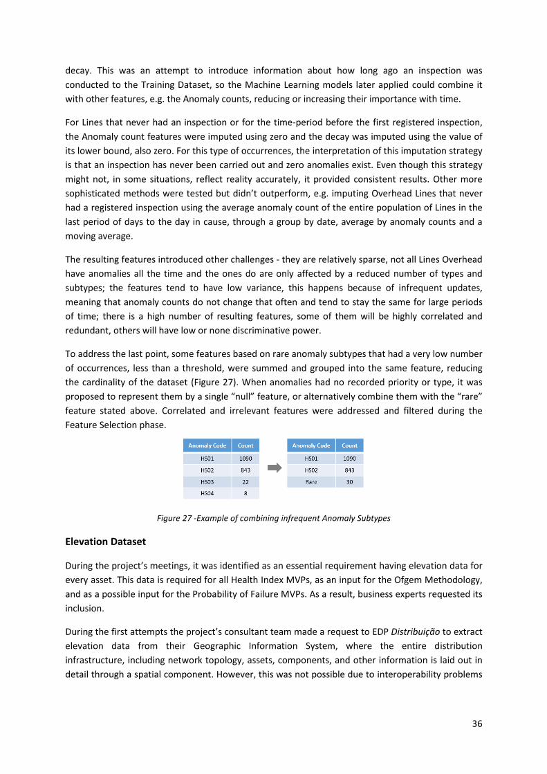
36
decay. This was an attempt to introduce information about how long ago an inspection was
conducted to the Training Dataset, so the Machine Learning models later applied could combine it
with other features, e.g. the Anomaly counts, reducing or increasing their importance with time.
For Lines that never had an inspection or for the time-period before the first registered inspection,
the Anomaly count features were imputed using zero and the decay was imputed using the value of
its lower bound, also zero. For this type of occurrences, the interpretation of this imputation strategy
is that an inspection has never been carried out and zero anomalies exist. Even though this strategy
might not, in some situations, reflect reality accurately, it provided consistent results. Other more
sophisticated methods were tested but didn’t outperform, e.g. imputing Overhead Lines that never
had a registered inspection using the average anomaly count of the entire population of Lines in the
last period of days to the day in cause, through a group by date, average by anomaly counts and a
moving average.
The resulting features introduced other challenges - they are relatively sparse, not all Lines Overhead
have anomalies all the time and the ones do are only affected by a reduced number of types and
subtypes; the features tend to have low variance, this happens because of infrequent updates,
meaning that anomaly counts do not change that often and tend to stay the same for large periods
of time; there is a high number of resulting features, some of them will be highly correlated and
redundant, others will have low or none discriminative power.
To address the last point, some features based on rare anomaly subtypes that had a very low number
of occurrences, less than a threshold, were summed and grouped into the same feature, reducing
the cardinality of the dataset (Figure 27). When anomalies had no recorded priority or type, it was
proposed to represent them by a single “null” feature, or alternatively combine them with the “rare”
feature stated above. Correlated and irrelevant features were addressed and filtered during the
Feature Selection phase.
Figure 27 -Example of combining infrequent Anomaly Subtypes
Elevation Dataset
During the project’s meetings, it was identified as an essential requirement having elevation data for
every asset. This data is required for all Health Index MVPs, as an input for the Ofgem Methodology,
and as a possible input for the Probability of Failure MVPs. As a result, business experts requested its
inclusion.
During the first attempts the project’s consultant team made a request to EDP Distribuição to extract
elevation data from their Geographic Information System, where the entire distribution
infrastructure, including network topology, assets, components, and other information is laid out in
detail through a spatial component. However, this was not possible due to interoperability problems

37
between the GIS system and EDP’s Data Lake and other integration problems, so EDP instead
requested the acquisition of the data from an external source.
After conducting a search through possible freely available, trustworthy, updated and low error
sources, the Digital Elevation Model over Europe (EU-DEM) was chosen. This elevation model is the
result of the Copernicus Programme from the European Union and it covers all countries from the
European Environment Agency (H. Dufourmont, J. Gallego, H. Reuter, 2014). To achieve full
consistent coverage, it combines data from multiple sources.
The model was validated using NASA’s ICESat mission as reference. It has a vertical accuracy of
approximately 2.9 m RMSE that varies according the latitude and slope of the terrain, being lowest in
lowlands, and increasing in midlands and mountains (H. Dufourmont, J. Gallego, H. Reuter, 2014). For
Mainland Portugal the accuracy is approximately 2 m RMSE.
EU-DEM’s spatial reference system is ETRS89 LAEA, it has spatial resolution of 25 m, vertical
resolution of 5 m, and is arranged in 1000 km by 1000 km tiles (Copernicus Programme, 2020).
Therefore, it was only necessary to acquire 2 raster files to cover Mainland Portugal’s in its full extent
– E20N10, E20N20 as shown in Figure 28. These files are in GeoTIFF format.
Figure 28 - EU-DEM vizualization Source: (Copernicus Programme, 2020)
Preprocessing
A function was created to receive a list of coordinates as input and output the respective elevation
for each point. This function would later be used in the project to get elevation data for all assets.
Multiple steps had to be implemented. First, the raster metadata is loaded to determine its Spatial
Reference System, the input points are then converted from their original coordinate system
(WGS84) to the raster’s projected coordinate system (ETRS89).
The next steps are applied to each raster file and include extracting the tile bounds from the
metadata and create a polygon or box that represents the tile shape and covers the same area.
Afterwards the intersection between each input point and tile is checked. For all the points that are
contained within the raster bounds, a Rasterio function is applied. The function uses an affine
transformation to map each point represented by geographic coordinates to the index of the raster
array that represents that point, or simply put the “pixel coordinates”.

38
Finally, the raster file is loaded in memory as a 2d NumPy array, and the previous mentioned indexes
are used to extract the elevation values from the array. The values are then concatenated in the
same order as the input points, the process repeats for other raster files, and the result is outputted.
Tests
Several versions of this function were created during the project and for each one a set of tests were
conducted to guarantee the same consistent results. These tests include creating 600 000 points on
an evenly spaced grid covering Mainland Portugal and getting the elevation values for each point.
This allows to verify the performance of the function by measuring how much time it takes and to
compare the result with previous versions guaranteeing they provide equal output.
The second test consists of getting 220 elevation values by selecting random points from an external
website’s map (DaftLogic, 2018), importing the list into Python, getting EU-DEM elevation for points
in the list and calculating regression metrics, in this case MAE and RMSE to compare both sources.
The reported error was approximately 3 meters RMSE. As expected, there were some small
discrepancies, caused by comparing different elevation providers.
The third test consists in manually selecting points from Google Earth and comparing their elevation,
which provided very similar results. It was also verified if the function worked with a single input
point and not only multiple input points.
Deployment Issues
During the project’s deployment in pre-production environment, the execution of the pipeline
responsible for Overhead Lines PoF failed and throwed an out of memory error. The root cause was
high RAM memory consumption used by the elevation function during the process of loading the
raster, even though each layer was being loaded individually.
Each geoTIFF file is stored using compression and occupies less than 1gb in disk space, however when
loaded into memory each raster will take approximately 7 to 8gb of ram as a NumPy array, and the
entire process, will require a machine with approximately 25gb of RAM or slightly less to run
smoothly. At the time, this function was being developed in a Google Collaboratory notebook that
complied with these requirements, and had similar specifications to the cluster’s driver machine.
However, during deployment, the driver machine of the cluster was downscaled to keep costs down.
This, and the fact that other resources of the same pipeline and notebook had memory allocated,
contributed to the general problem. Later, it was discovered that the same function was running in
other parts of the pipeline without causing any issues, because they had less memory allocated from
previous tasks.
During the deployment meeting where this issue was discussed, several solutions that would involve
refactoring the code in the least amount of time possible were considered, including the following:
1. Making a distributed version of the code using PySpark, so the task could be executed using all
nodes and resources of the cluster;
2. Keep most of the code intact and instead of loading each complete raster into memory, only
load a single chunk or piece at a time and proceed with similar processing logic.

39
To implement the 1st solution multiple approaches are possible:
• Using native distributed solution that would require installing and configuring a geospatial
library that can run on top of the Spark cluster and supports raster processing. Most of these
libraries are not easy to deploy, not accessible or don’t have a stable release available. This
would require changes to the cluster achieved through initialization scripts and other methods,
which can be a complex process, create compatibility issues and even break the current
environment that was being deployed to pre-production. Also, the code and process logic had
to be recreated from scratch.
• Creating a hybrid distributed solution, either through Spark DataFrames or RDDs integrated
with functions from Rasterio, Shapely and GeoPandas libraries. This process should read
multiple pieces of the raster concurrently, and either save the resulting matrix for later access,
or output the elevation values directly. The first approach is challenging because Spark does
not natively support multidimensional arrays meaning that storing such structure would
require saving the matrix using custom formats (e.g. HDF5 chunks), conforming to the available
output formats by saving the matrix as a nested structure in binary format, or transforming the
matrix into pairs of coordinates and values, which, due to each raster’s high resolution, would
yield 1,6 billion rows. The second approach is simpler and would require aligning Spark Data
Frame partitions with sets of input points that belong to the same raster chunk and map each
partition though RDDs to read the respective raster chunk and retrieve elevation values for all
points. This way each raster chunk would only be read once and multiple partitions
representing different chunks would be processed in parallel. Afterwards the RDD would be
converted to Data Frame and the result saved.
Due to the urgency required, the 2nd non distributed solution being the fastest to implement was
chosen to fix the issue. It consists in keeping the same basic structure and single threaded code and
taking advantage of Rasterio’s window functionality that allows to slice a raster and retrieve only a
square tile or chunk efficiently and with a very small footprint. Therefore, it becomes possible to read
and manipulate raster files that are larger than memory (Rasterio developers, 2018).
In practice, to implement this solution, an evenly square grid is created over each raster with a
predefined number of tiles, so each reading window can be defined. Afterwards, for each input
coordinate it’s necessary to determine which window it belongs to. This can be achieved efficiently
through spatial join that by default uses a R-tree data structure to index spatial information. This
operation avoids unnecessary queries to the index of each window that would otherwise yield out of
bound error and hurt performance by creating a N*M number of steps, where N is the number of
input points and M the number of windows. ´
Figure 29 - Spatial reference system and Pixel coordinate system Source: (Perry, 2015)
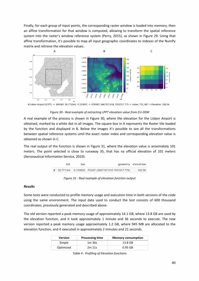
40
Finally, for each group of input points, the corresponding raster window is loaded into memory, then
an affine transformation for that window is computed, allowing to transform the spatial reference
system into the raster’s window reference system (Perry, 2015), as shown in Figure 29. Using that
affine transformation, it’s possible to map all input geographic coordinates to indexes of the NumPy
matrix and retrieve the elevation values.
A B C
Figure 30 - Real example of extracting LPPT elevation value from EU-DEM
A real example of the process is shown in Figure 30, where the elevation for the Lisbon Airport is
obtained, marked by a white dot in all images. The square box in A represents the Raster tile loaded
by the function and displayed in B. Below the images it’s possible to see all the transformations
between spatial reference systems until the exact raster index and corresponding elevation value is
obtained as shown in C.
The real output of the function is shown in Figure 31, where the elevation value is aroximately 101
meters. The point selected is close to runaway 35, that has na official elevation of 101 meters
(Aeronautical Information Service, 2019).
Figure 31 - Real example of elevation function output
Results
Some tests were conducted to profile memory usage and execution time in both versions of the code
using the same environment. The input data used to conduct the test consists of 600 thousand
coordinates, previously generated and described above.
The old version reported a peak memory usage of approximately 14.1 GB, where 13.8 GB are used by
the elevation function, and it took approximately 1 minute and 36 seconds to execute. The new
version reported a peak memory usage approximately 1.2 GB, where 945 MB are allocated to the
elevation function, and it executed in approximately 2 minutes and 21 seconds.
Version Processing time Memory consumption
Simple 1m 36s 13.8 GB
Optimized 2m 21s 0.95 GB
Table 4 - Profiling of Elevation functions

41
At the cost of computing time that increased 47%, it was possible to reduce memory consumption by
91% as shown in Table 4. This tradeoff is caused by the increased number of operations introduced
by the second approach, leading to multiple disk reads.
Improvements
The current version can be further improved:
• Use vectorized operations, already supported by Rasterio and NumPy to retrieve elevation
values, instead of using a Python loop, that in most cases will be slower;
• Perform a spatial join to match raster boundaries and input points instead of intersecting all
points with all raster files being used. This improvement would have greater impact if in future
versions more European countries were included, and the number of raster files and input
coordinates increased;
• Create a distributed version of this procedure, using the previously described solutions in
Spark or using an alternative distributed computing framework that support processing of
multidimensional arrays, e.g. Dask with Zarr arrays.
Land Cover (COS)
To perform spatial queries using asset information EDP frequently uses the Land Cover Dataset
(Carta de Uso e Ocupação do Solo - COS) from the Directorate General for Spatial Planning (Direção
Geral do Território - DGT). The dataset is available online (Direção-Geral do Território, 2020), open to
the public and it’s published in multiple formats, including a shapefile. It contains a timeseries
component, where 5 years are available to download as separate files. The schema and
nomenclature changes between versions, however the latest available version is from 2018 and
includes 9 main classes (e.g. water bodies, florets, agriculture, etc.) and 83 subclasses with finer
granularity (e.g. pine forest, airport, etc.).
One of the requirements of the Overhead Lines MVP was to enrich the training dataset using
features derived from the type of terrain each Overhead Line goes through. These features were
extracted from the COS dataset.
Preprocessing
Several steps were necessary to extract and create these features.
First, an EDP specialist in Overhead Lines, decided, based on domain knowledge and experience,
which classes and subclasses of the COS had potential to create disruptions and possible failures, and
therefore were relevant to include in the model. The chosen classes were all related with vegetation
and species of trees, based on several factors like growth rate, potential height or species of nesting
birds that might live near such trees. This step helped reduce processing time, since most of the COS
records and geometries can be filtered out, and helped accelerate the feature selection process.
The second step was to extract features from the COS. To accomplish that, the spatial reference
system of all Points that represent the start and end of each Line Section, stored in WGS84, a
geographic coordinate system, were transformed into a projected coordinate system, PT-
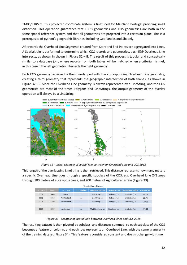
42
TM06/ETRS89. This projected coordinate system is finetuned for Mainland Portugal providing small
distortion. This operation guarantees that EDP’s geometries and COS geometries are both in the
same spatial reference system and that all geometries are projected into a cartesian plane. This is a
prerequisite of python’s geographic libraries, including GeoPandas and Shapely.
Afterwards the Overhead Line Segments created from Start and End Points are aggregated into Lines.
A Spatial Join is performed to determine which COS records and geometries, each EDP Overhead Line
intersects, as shown in shown in Figure 32 – B. The result of this process is tabular and conceptually
similar to a database join, where records from both tables will be matched when a criterium is met,
in this case if the left geometry intersects the right geometry.
Each COS geometry retrieved is then overlapped with the corresponding Overhead Line geometry,
creating a third geometry that represents the geographic intersection of both shapes, as shown in
Figure 32 - C. Since the Overhead Line geometry is always represented by a LineString, and the COS
geometries are most of the times Polygons and LineStrings, the output geometry of the overlay
operation will always be a LineString.
A B C
Figure 32 - Visual example of spatial join between an Overhead Line and COS 2018
This length of the overlapping LineString is then retrieved. This distance represents how many meters
a specific Overhead Line goes through a specific subclass of the COS, e.g. Overhead Line XYZ goes
through 100 meters of eucalyptus trees, and 200 meters of Agriculture terrain (Figure 33).
Figure 33 - Example of Spatial Join between Overhead Lines and COS 2018
The resulting dataset is then pivoted by subclass, and distances summed, so each subclass of the COS
becomes a feature or column, and each row represents an Overhead Line, with the same granularity
of the training dataset (Figure 34). This feature is considered constant and doesn’t change with time.

43
Figure 34 - Example of Terrain Cover features in Training Dataset
Using the same example of Figure 32, the real ouput in meters from the Terrain Cover script is shown
below in Figure 35.
Figure 35 - Real example of Terrain Cover script output
The exact same procedure was then applied by the consultant team to the Burnt Area dataset and
the Important Bird Areas dataset.
Improvements
Due to time constraints this task was delivered without feature selection and transformation steps.
Further improvements could be made to the calculated features including excluding or combining
subclasses.
This approach could be further improved, if the Overhead Line’s original and more detailed
geometries were used, instead of start and end points of each Overhead Line Segment, this was not
possible due to integration problems with EDP’s GIS. A second improvement would be to create a 10-
20m buffer around each Overhead Line geometry, to account for possible vegetation present in the
border zone and calculate the intersection area instead of intersection length.
IPMA Dataset
EDP, as a service subscriber, receives weather forecasts from IPMA that are used in several predictive
analytics projects.
The forecasts are the result of a numerical weather predictions model. Usually these types of models
have as output a multidimensional array, e.g. ECMWF models, but in this case the data is obtained in
table format.
In the first version of the dataset analyzed, the forecasts were received everyday around midnight
and spanned 3 days into the future, with a 3-hour frequency, for several coordinates that cover
mainland Portugal. The coordinates represent points on a regular WGS84 grid.
The dataset contains several variables, usually calculated at 2m above the surface, including wind
speed and direction (magnitude and direction of u and v components), temperature, precipitation
and sea level atmospheric pressure. The variables were pivoted and treated as columns.
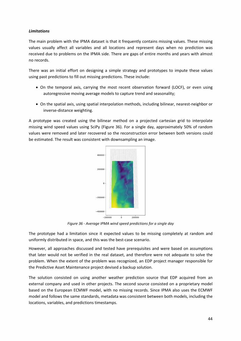
44
Limitations
The main problem with the IPMA dataset is that it frequently contains missing values. These missing
values usually affect all variables and all locations and represent days when no prediction was
received due to problems on the IPMA side. There are gaps of entire months and years with almost
no records.
There was an initial effort on designing a simple strategy and prototypes to impute these values
using past predictions to fill out missing predictions. These include:
• On the temporal axis, carrying the most recent observation forward (LOCF), or even using
autoregressive moving average models to capture trend and seasonality;
• On the spatial axis, using spatial interpolation methods, including bilinear, nearest-neighbor or
inverse-distance weighting.
A prototype was created using the bilinear method on a projected cartesian grid to interpolate
missing wind speed values using SciPy (Figure 36). For a single day, approximately 50% of random
values were removed and later recovered so the reconstruction error between both versions could
be estimated. The result was consistent with downsampling an image.
Figure 36 - Average IPMA wind speed predictions for a single day
The prototype had a limitation since it expected values to be missing completely at random and
uniformly distributed in space, and this was the best-case scenario.
However, all approaches discussed and tested have prerequisites and were based on assumptions
that later would not be verified in the real dataset, and therefore were not adequate to solve the
problem. When the extent of the problem was recognized, an EDP project manager responsible for
the Predictive Asset Maintenance project devised a backup solution.
The solution consisted on using another weather prediction source that EDP acquired from an
external company and used in other projects. The second source consisted on a proprietary model
based on the European ECMWF model, with no missing records. Since IPMA also uses the ECMWF
model and follows the same standards, metadata was consistent between both models, including the
locations, variables, and predictions timestamps.

45
It was decided to combine both models and complete IPMA dataset’s missing observations with the
ECMWF dataset. However, no verification was conducted to determine if the variables defined for
both models matched or were closely related, e.g. Pearson correlation, regression metrics or
statistical tests.
Improvements
Features extracted from the IPMA dataset consist of moving averages applied to weather variables,
e.g. average temperature in the past 30 days. Even though this approach is useful, it is basically
introducing information of historical weather into the models, since the lag introduced by the moving
average overshadows the 3 day ahead predictions.
Potential new features can be created using only the predictions for days ahead. Since these
predictions are already the result of weather models they are smoothed out and have very low noise.
All weather variables are timeseries and are autocorrelated. To avoid creating correlated features
(e.g. windt+1, windt+2), aggregation could be used, e.g. moving average of predictions for days ahead,
or other strategies like differencing, e.g. calculating the difference or rate of change between days,
and decomposition.
Distance to coastline
An asset’s shortest distance to coastline was also a requirement from the OFGEM methodology, and
a desired feature for the probability of failure models. This feature is relevant because the proximity
to shore, together with factors like humidity and salt, might have a negative impact and accelerate
deterioration of assets that are affected by corrosion.
A prototype was designed based on Surface Water Body Dataset from the European Union
Copernicus Programme. This dataset was acquired as a shapefile and consists of information about
the coastline and other water bodies in the European Union.
Preprocessing
To process this dataset and extract features a slightly different approach was taken, regarding the
previous geographic datasets. The spatial reference system worked on was WGS84, this means that
Shapely library could no longer be used.
The coastline and water bodies were represented by geometries, more specifically polygons. The
dataset was filtered only to include Iberian Peninsula coastline records, and the exterior of each
polygons was extracted as lines, and from each line all points were extracted.
This operation will result in approximately 2 million of points, making it practically impossible to use
brute-force methods to calculate nearest neighbor between an asset position and a coastline point.
The query does not scale and would require N*M number of distance calculations between
thousands of assets and millions of points.
To solve this problem Scikit-learn’s Ball Tree implementation was used. This implementation
supports Haversine distance also known as great-circle distance, the shortest distance between two

46
points on a sphere. This metric is used to approximate distances on the surface of the earth because
it’s computationally cheap to calculate.
There is other more accurate distance metric based on Vincenty's formulae later improved by Karney
(Karney, 2013), that take into account the shape of earth as an ellipsoid, at the cost of being
computationally expensive.
The solution was implemented follows these steps:
• Get the points that represent the Portuguese coastline, remove duplicates;
• Convert the WGS84 coordinates from degrees to radians;
• Create the Ball Tree with coastline coordinates, adjusting the leaf size parameter and testing
performance tradeoffs between creation time and query time;
• Get all assets’ WGS84 coordinates, convert to radians and query Ball Tree obtaining index and
distance of closest coastline point;
• Multiply distances by the radius of the earth in meters to obtain the desired feature “distance
to coastline”.
Limitations
It’s important to mention that this method only provides an approximation, since it’s calculating the
distance between coastline vertices and asset points and not using the full representation of line
geometry. This means, theoretically, if an asset is close or intersects the middle of a line segment, the
distance calculated will be to the closest start or end vertex of that segment, even though the asset is
at approximately zero meters of the segment.
However, the geometry that represents the coastline is very detailed and is composed of many
vertices, limiting the error of the approximation. Alternative solution that takes into account the
geometries could be more complex.
Other features were calculated including distance to other water bodies, e.g. rivers and lakes, but
were discarded due to lack of time.
4.2.8. Model and Analysis
A summary of some key aspects concerning the PoF MVPs modelling phase are going to be presented
in this chapter.
Since there is a relatively small number of failures on High Voltage assets, this is a positively
imbalanced binary classification dataset. For example, in the Overhead Lines MVP only 1.5% of the
samples are classified as positive and represent actual failures.
To deal with class imbalance the consultant team used a combination of downsampling, by randomly
subsampling negative instances or non-failures, together with oversampling achieved with SMOTE
(Chawla et al., 2011), by generating synthetic instances to increase the number of positive examples
or failures in the training dataset.
The cost function used with all models was Log Loss also knows as Binary Cross Entropy.

47
To address class imbalance, tests were performed using LightGBM with Focal Loss cost function (Lin
et al., 2017), originally applied to object detection. According to the authors, this function is a
modified version of cross entropy, that “reduces the relative loss for well classified examples putting
more focus on hard, misclassified examples”, preventing a “vast number of easy negatives from
overwhelming the detector during training” (Lin et al., 2017). It has two hyperparameters that need
to be adjusted during cross validation:
• Alpha, that controls the “importance of positive and negative values”, this parameter is similar
to weighted cross entropy used for balancing classes, by allocating more weight to rare classes
and less weight to common classes, usually using the inverse class frequency;
• Gamma, the parameter that “reshapes the loss function” and controls the tradeoff between
“down-weighting easy examples” and “focusing training on hard negatives”;
However Focal Loss cost function wasn’t adopted for any MVP.
The cross-validation strategy applied by the consultant team was based on the stratified holdout
method4 with shuffling. This method splits the dataset samples randomly between training and test
set, while guaranteeing the same percentage of class labels on both sets, to account for the highly
skewed class distribution. Some theoretical issues were raised by EDP concerning this cross-
validation strategy and its implementation.
Since the dataset consists of multiple timeseries, by shuffling the dataset and disregarding the
ordering of samples, the model is going to be validated with samples from prior dates relative to the
train set and trained with samples from posterior dates relative to the test set. This means the model
is trained with data from the “future”, that should not have access to, and validated with data from
the “past”, which has already been seen.
Time series, images, graphs and geospatial data are examples dependent data, that frequently have
local structure and show significant autocorrelation - “adjacent observations have similar data
values” (Haining, 2001). For example, if on a given day at 9am the temperature is 10 degrees Celsius,
at 9:10 the temperature value will probably be very close to 10 degrees; if at location A there is a
forest, it’s very likely that 10 meters from location A is still the same forest.
Consequently, samples that are close to each other and likely similar will end up on both training and
test set, and both sets will share information.
Another limitation identified by EDP’s team concerns the absence of a validation set. It’s a well-
known good practice to keep a hidden test set to guarantee a final unbiased evaluation of the
results, while using the training and validation sets to train models, optimize hyperparameters and
make modeling decisions, e.g. what type of imputation strategy provides better result. Using the test
4 The holdout method “partitions the data into two mutually exclusive subsets called a training set and a
test set or holdout set. It is common to designate 2/3 of the data as the training set and the remaining 1/3 as the test set” (Kohavi, 1995). The classifier is trained using the training set and evaluated on the test. This method can have disadvantages, especially when used with small datasets since “the evaluation can have a high variance and depend heavily on which data points end up in the training set and which end up in the test set, and thus the evaluation may be significantly different depending on how the division is made” (Schneider, 1997). It’s a common practice, when computationally feasible, to use K-fold cross-validation to address these issues.

48
set “to both choose a hypothesis and evaluate it” is referred to as peeking and keeping final and
hidden test set allows for “an independent evaluation of the final hypothesis” (Brownlee, 2020e;
Russell & Norvig, 2009, p. 709; Varma & Simon, 2006).
All of these factors put together can possibly contribute to leakage between training and test set
resulting in a biased and overly-optimistic model evaluation.
Designing a validation strategy to replicate as much as possible the same conditions that will be
observed in production, can be useful during analysis, simplify interpretation, and provide a more
realistic performance estimation. A common option for evaluating time series forecasting models is
using out-of-sample or prequential approaches, as described by Cerqueira et al. (2019). The
prequential method also known as walk-forward validation (Brownlee, 2019), is “usually applied in
data stream mining”, where “each observation is first used to test the model, and then to train the
model” (Cerqueira et al., 2019). This approach can be applied in “blocks of sequential instances”.
Figure 37 - Possible Implementation of Walk-forward validation
Source: based on (Cerqueira et al., 2019)
An example of this strategy is shown in Figure 37, where the criteria chosen to split the dataset was
the calendar year. The first split or fold consists on using the first year of data as training set and
evaluating the results using the following year, the second split consists on using the first two years
of data as training set and using the following year as validation set, and so on. The last fold is used
as a hidden test set. The evaluation estimations from all validation sets are then averaged5 to obtain
the final classification metric value.
This method reflects performance on different periods and accounts for changing conditions, e.g. the
year 2017 can be harder to forecast because fires caused more Overhead Line failures. It’s also very a
feasible strategy to deployed during production, involving retraining the model on a regular basis
with all available current data, apply it to predict subsequent data, and monitor quality.
The main evaluation metric monitored during the project progression was the Area Under the Curve
of the Receiver Operating Characteristic (ROC-AUC) that summarizes False Positive Rate and Positive
Negative Rate under multiple thresholds. F1-Score, the harmonic mean of precision and recall was
also monitored.
To deal with missing values usually very simple imputation strategies were used independent of
context, like the mean or median value. For time series carrying the last observation forward (LOCF)
was also proposed. In most cases outliers were not treated. Categorical features were initially
5 Cross-validation should only be used to estimate model performance. The final model or models
should be trained on the complete dataset, using the best hyperparameters and modeling decisions that were selected with cross-validation. It’s also a common but less correct practice to average the results of all models trained during cross-validation creating an ensemble.

49
encoded using dummy coding, dropping one level to avoid perfect multicollinearity, also known as
dummy variable trap. However, this resulted in sparse matrixes with high dimensionality for
categories with many level (e.g. city), for that reason a second approach was later adopted.
The models officially applied include Logistic Regression, Random Forest and XGBoost. The final
selected model was XGBoost, since it outperformed the other models, handles missing values, and is
robust to features scale and outliers.
There was no defined procedure or criteria for feature selection. The process was performed
manually, using business expert insights, filtering strongly correlated variables and removing weak
features according to the importance score from the model, retraining and repeating these steps.
During the first modeling iterations, when the team was getting acquainted with the models being
deployed, hyperparameter optimization was also conducted manually. During later iterations, when
XGBoost was adopted, hyperparameter optimization was carried out with Grid Search6 on a subset of
the most relevant hyperparameters, e.g. maximum tree depth. Since there was no validations set,
results were evaluated on the test set.
While the initial modeling results were being presented by the consultant team, a naïve baseline was
created without using a model for the HV Overhead Lines PoF MVP. The baseline relied only on
Failure feature that informs if an asset has failed or not during the current day.
A Cumulative Moving Average was applied to this feature, at the level of each asset, where the
window start is anchored to the beginning of the dataset, and the average is calculated up to each
day in the dataset. This results in Rate of Failure for each asset since the beginning of the dataset
until the current day.
The ROC-AUC score between Failure Rate baseline and the Target is 0.75. During the first iterations,
this value was not being reached, however later on this result was bested by all models deployed.
4.2.9. Optimal classification threshold
As mentioned in previous chapters, to monitor model performance and capacity to discriminate
between classes, and control the quality of the PoF metric, ROC-AUC was used together with F1-
Score to make results more interpretable during meetings.
Some authors claims that ROC-AUC “presents several flaws and it’s sensitive to class imbalance”
(Chicco & Jurman, 2020). This point motivated some experiments made using Average Precision, that
summarizes the tradeoff between Precision and Recall under different thresholds (Zhu, 2004). The
objective was to monitor both metrics. However, this topic was studied only halfway of the modeling
iterations and therefore Average Precision was not adopted.
All models used have as output soft probabilities. To create a decision-making process based on
model forecasts, considering a prescriptive analytics approach, or to simply calculate metrics like the
F1-score, it’s necessary calculate a decision threshold parameter. The threshold converts the
6 Brute-force or exhaustive search of hyperparameters conducted by defining a set of possible values,
generating all combinations and evaluating the results.
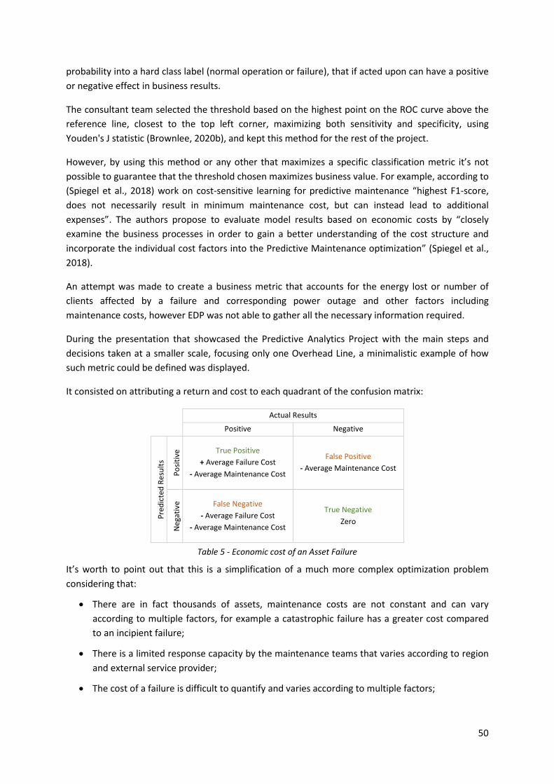
50
probability into a hard class label (normal operation or failure), that if acted upon can have a positive
or negative effect in business results.
The consultant team selected the threshold based on the highest point on the ROC curve above the
reference line, closest to the top left corner, maximizing both sensitivity and specificity, using
Youden's J statistic (Brownlee, 2020b), and kept this method for the rest of the project.
However, by using this method or any other that maximizes a specific classification metric it’s not
possible to guarantee that the threshold chosen maximizes business value. For example, according to
(Spiegel et al., 2018) work on cost-sensitive learning for predictive maintenance “highest F1-score,
does not necessarily result in minimum maintenance cost, but can instead lead to additional
expenses”. The authors propose to evaluate model results based on economic costs by “closely
examine the business processes in order to gain a better understanding of the cost structure and
incorporate the individual cost factors into the Predictive Maintenance optimization” (Spiegel et al.,
2018).
An attempt was made to create a business metric that accounts for the energy lost or number of
clients affected by a failure and corresponding power outage and other factors including
maintenance costs, however EDP was not able to gather all the necessary information required.
During the presentation that showcased the Predictive Analytics Project with the main steps and
decisions taken at a smaller scale, focusing only one Overhead Line, a minimalistic example of how
such metric could be defined was displayed.
It consisted on attributing a return and cost to each quadrant of the confusion matrix:
Actual Results
Positive Negative
Pre
dic
ted
Re
sult
s
Po
siti
ve True Positive
+ Average Failure Cost
- Average Maintenance Cost
False Positive
- Average Maintenance Cost
Neg
ativ
e
False Negative
- Average Failure Cost
- Average Maintenance Cost
True Negative
Zero
Table 5 - Economic cost of an Asset Failure
It’s worth to point out that this is a simplification of a much more complex optimization problem
considering that:
• There are in fact thousands of assets, maintenance costs are not constant and can vary
according to multiple factors, for example a catastrophic failure has a greater cost compared
to an incipient failure;
• There is a limited response capacity by the maintenance teams that varies according to region
and external service provider;
• The cost of a failure is difficult to quantify and varies according to multiple factors;
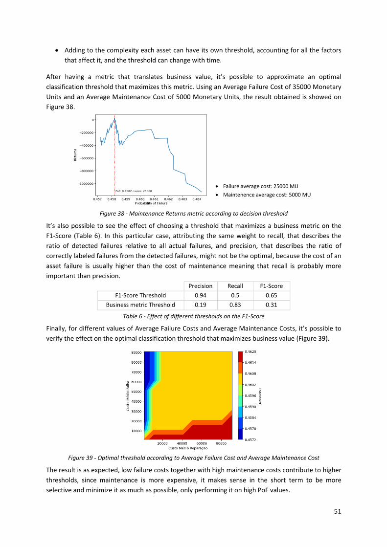
51
• Adding to the complexity each asset can have its own threshold, accounting for all the factors
that affect it, and the threshold can change with time.
After having a metric that translates business value, it’s possible to approximate an optimal
classification threshold that maximizes this metric. Using an Average Failure Cost of 35000 Monetary
Units and an Average Maintenance Cost of 5000 Monetary Units, the result obtained is showed on
Figure 38.
• Failure average cost: 25000 MU
• Maintenence average cost: 5000 MU
Figure 38 - Maintenance Returns metric according to decision threshold
It’s also possible to see the effect of choosing a threshold that maximizes a business metric on the
F1-Score (Table 6). In this particular case, attributing the same weight to recall, that describes the
ratio of detected failures relative to all actual failures, and precision, that describes the ratio of
correctly labeled failures from the detected failures, might not be the optimal, because the cost of an
asset failure is usually higher than the cost of maintenance meaning that recall is probably more
important than precision.
Precision Recall F1-Score
F1-Score Threshold 0.94 0.5 0.65
Business metric Threshold 0.19 0.83 0.31
Table 6 - Effect of different thresholds on the F1-Score
Finally, for different values of Average Failure Costs and Average Maintenance Costs, it’s possible to
verify the effect on the optimal classification threshold that maximizes business value (Figure 39).
Figure 39 - Optimal threshold according to Average Failure Cost and Average Maintenance Cost
The result is as expected, low failure costs together with high maintenance costs contribute to higher
thresholds, since maintenance is more expensive, it makes sense in the short term to be more
selective and minimize it as much as possible, only performing it on high PoF values.

52
The reverse also applies, high failure costs together with low maintenance costs yields lower
thresholds, in this case it makes sense to perform more maintenance activity, to avoid as many
failures as possible, even if some of the maintenance turns out to be non-essential, therefore acting
out on lower PoF values and prioritizing detection.
4.2.10. Model Explainability
During the final development iterations, when the model results were being presented and
validated, the business experts showed interest in having a more detailed analysis and understanding
of the model output and what factors might be influencing it.
Multiple approaches were applied, however all of them used feature importance from a specific
algorithm, usually gradient tree boosting. These methods resulted on a bar a plot of ordered features
by some importance metric, for example in LightGBM the importance metric is the “number of times
a feature is used in a model”.
To achieve the desired result SHAP was proposed, a method based on game theory that promises to
explain the output any machine learning model (K. Zhang et al., 2012). A feature importance plot that
summarizes variables effects on model output was presented (Figure 40), where it’s possible to see
the distribution of all samples for each feature, sorted by the impact on the model output though
SHAP values, where higher values contribute for the positive class, an asset failure, and negative
values to the negative class or normal asset operation. Each sample is also rated by color scale
according to its magnitude, where warmer colors represent higher sample values for that feature and
colder colors represent lower values.
Figure 40 - SHAP feature importance and effects (summary plot)
For example, using this method, visually it’s possible to conclude that higher values of sea-level
atmospheric pressure (Figure 40 – “msl_max”) appear to contribute to Overhead Line failure, what is
counterintuitive, since higher atmospheric pressure is usually associated with good weather, and
lower values with storms. However, after analyzing the atmospheric pressure history for the location
and asset in scope, very high values and peaks could be found during the winter months of every
year, a factor that might be influencing this particular outcome. It’s also possible to verify that the

53
most important variable identified was the average failure rate since the beginning of the dataset
(Figure 40 – “falha_maa_asset”).
This approach was adopted for the PoF MVPs and included in the project documentation.
SHAP offered a second method to explain each sample of the dataset by showing what features are
pushing a prediction higher or lower, in this case a failure or normal operation (Figure 41). This
means that, it’s possible to visualize and determine what features and corresponding observation
values are contributing to a specific PoF prediction, on a given day, for particular asset. However,
even though this method answered the requirements of the request set forward by the business
experts, it was not implemented by the consultant team because it required changes to the
dashboard that were out of scope for the project.
Figure 41 - SHAP prediction explainer (force plot)
It’s important to point out that SHAP does not guarantee causality, and it constitutes an attempt to
explain the behavior of machine learning models and make the results more interpretable. However,
it’s a relevant tool that emerged in the recent years, and when used correctly can contribute to the
widespread acceptance of a particular model or metric throughout a company.
SHAP can also be used as a robust feature importance metric together with a feature selection
framework, e.g. recursive feature elimination or Boruta, and as a method to debug models.
4.2.11. Results and Discussion
Some of the features discussed in the previous chapters were selected and included in the final
Overhead Lines PoF model. The delivered model included 36 features as showed in Table 7.
Dataset % Feature Importance7 Number of Features
Overhead Line Failure rates 40,65% 3
Number of Labelec Anomalies by class and priority 26,39% 6
Weather variables 9,79% 7
Other variables (Age, Length, Month, etc.) 8,11% 6
Intersection length of Land Cover vegetation subclasses 6,68% 7
Number of Repair Notes 3,49% 1
Intersection length of Important Bird Areas 2,53% 3
Maximum elevation of Overhead Line 0,83% 1
Distance to coastline 0,77% 1
Intersection length of Burnt Area 0,76% 1
Grand Total 100,00% 36
Table 7 - Feature Importance by Dataset
7 Feature Importance metric used was Gain from XGBoost framework that uses tree boosting
algorithms. According to XGBoost documentation (XGBoost developers, 2020) “Gain is the improvement in accuracy brought by a feature to the branches it is on”. These values were retrieved from the final version of project the documentation and then aggregated by theme.

54
From all sources used at least one or more features were included in the model. Features related
with past failures, are among the most important ones for both Circuit Breakers and Overhead Lines,
usually with longer time windows, e.g. the failure rate in the last 2 years.
The following results were reported for the PoF metrics:
Asset AUC-ROC
HV Circuit Breakers 0.73
HV Overhead Lines 0.83
Table 8 - PoF Results
The Overhead Lines PoF model together with the classification threshold reported, provided 0.08
recall and 0.23 precision. The real-word applicability of both models was later discussed by EDP.
4.3. IMPROVEMENTS
After the main Development phase and Industrialization phase of the Predictive Asset Analytics
Project finished, validations from EDP experts continued for several weeks, together with essential
corrective maintenance activities supported by the external service provider.
To this day some problems and improvements were identified, that are holding the project back from
being deployed from pre-production to the production environment.
Example of some feedback provided by EDP include the following topics:
• The dashboards are very heavy and slow;
• Some very relevant internal EDP sources used for the projected are not connected or linked to
the automated version in the data lake, and are instead static;
• Variables created form external sources are merged with the dataset before they are available
online or before the event occurs, e.g. the Burnt Area;
• Some errors concerning business rules, bugs, and variables that do not have the correct time
interval;
• Versioning problems, where the last version of the notebooks was not deployed to the pre-
production environment;
• Some issues were raised concerning incomplete or vague documentation.
• Uncertainty about real-world applicability of PoF metrics based on the reported performance
estimations;
However, the project and its outcome should not be seen as unsuccessful, since all products
delivered are MVPs with vast scope and complexity, tight schedules and many challenges, including
legacy systems, complex domain and problem, very complex business rules, large developing teams
with different backgrounds working with different technologies, high coordination required with
different EDP’s business areas and experts, during all phases of the project.
Even though quality might not be the best during the first version of these products, the structure
and most of the work is there, and the successful handover and knowledge transfer allowed EDP to

55
start working on and improving all MVPs, to allow for a successful deployment. This is expected since
software products developed with agile methodologies are improved during consecutive iterations
and only essential requirements are delivered.
The ETL process, including data loading, pre-processing, cleaning, transformations, feature
engineering and identifying the target variables was without a doubt the most time-consuming
activities of the whole project, however provide the necessary foundation for the later modeling
phases.
The results provided by both PoF metrics provide a baseline that can be improved upon with new
modeling iterations:
• By taking advantage of other internal EDP information sources and variables, e.g. readings
from sensors, monitoring electrical signals, and further exploring integrated datasets,
especially the Electrical Grid Control System and Events;
• New techniques and models. Creating a stronger baseline by testing time series forecasting
models like ARMA and ARIMA. Applying Deep Learning methods using Neural Networks, and
testing different architectures, including Recurrent layers (e.g. GRU, LSTM), Convolutional
layers, Attention layers, Embedding layers, etc.; Creating ensembles of different classifiers,
stacking predictions from previous days, or from other models, etc.;
• Redefining the problem or the approach to solve the problem, for example predicting the
probability of failure within the next 15 days instead of probability of failure on the 15th day
ahead. Using unsupervised time series anomaly detection techniques to detect abnormal asset
behavior. Apply other ML methods used to model and forecast extreme or rare events.
56
5. CONCLUSIONS
A project composed of several MVPs concerning Prediction Maintenance of high voltage power grid
assets, using two approaches, OFGEM and probabilistic machine learning classification algorithms.
The main conclusions are going to be presented in this section, including limitations, lessons learned,
and future work.
5.1. CONNECTION TO THE MASTER PROGRAM
During the internship, most of the tasks developed where related to Data Analytics, Data Science,
and Business Intelligence. Many and diverse topics were analyzed and worked on.
Most of the theoretical and practical knowledge acquired during the Master Program was applied.
Almost all theoretical and practical course materials from Data Mining I and II, Text Analytics and Big
Data Analytics, played a central role and supported most of the functions developed during the
internship.
For Data Mining I and II this includes knowledge acquired of data mining processes and frameworks,
data cleaning and preprocessing, feature engineering and selection, descriptive and predictive
models, validation strategies and evaluation metrics. For text analytics, topics concerning more
advanced machine learning concepts that are transversal to other fields outside of NLP, e.g. Hidden
Markov Model (HMM) Recurrent Neural Networks (RNN) and sequential data, text cleaning and
preprocessing, and other concepts already referenced. For Big Data analytics, the concept distributed
computing, distributed file systems, clusters and of manipulating, processing and transforming
datasets bigger than available memory, by splitting larger files into partitions and distributing them
by computing resources while saving the outputs in a file system.
All practical knowledge obtained applying these concepts in Python notebooks using the Python Data
stack, in Big Data technologies, most notably Spark and the Databricks platform, was directly used in
the internship, explored thoroughly and improved.
Other course units also proved useful during the internship. Concepts of ETL, Data Warehousing, SQL,
Relational Databases, Data Models and Data Visualization approached in Business Intelligence I and
II. Knowledge about social network analysis and graphs from Knowledge Management was also
relevant to the internship, since the electrical grid and assets can be described as a network through
edges and nodes. Finally, knowledge about Business Processes and BPMN notation was also used to
implement new requirements in a process mining project, not discussed in this report.
5.2. INTERNSHIP EVALUATION
The evaluation of the internship is overall very positive. Most of the requirements and objectives set
forward for the second year of the Master’s program were accomplished, these include:
• Finding an internship related with Data Analytics, Data Science, or Machine Learning fields.
Guaranteeing that the activities performed during the internship are aligned with the Master’s
program;

57
• The internship also included a hands-on approach. Working on challenging and interesting
problems and datasets, applying recent algorithms, and using mainstream development
platforms and tools, usually open source supported by a wide community, where recent
papers are implemented;
• Being included in a major advanced analytics project, working side by side with one of the
biggest IT consulting companies in the market, provided a real-world experience in the Energy
Sector and privileged insight of the state of Data Science in Portugal;
• Working for one of the largest Portuguese companies, more specifically in the Energy
Distribution Sector, also provided unique insights on a wide variety of topics.
During the internship, most of the work performed was on data cleaning, transformation, feature
engineering, where a great percentage of the effort of the project was allocated as expected.
However, it could also have been a very interesting experience to work more closely in the next steps
of the process, most notably the modeling phase, while using more experimental approaches.
5.3. LIMITATIONS
There were several limitations identified concerning the Predictive Asset Maintenance Project,
described below.
• Very ambitious project scope and tight scheduling. There were several meetings every week,
where objectives, activities and deliverables were planned. Sometimes there was only one or
two days available until the next meeting to complete the work and deliver results, however
the problems solved during this period could be very complex and require great effort.
Sometimes this would result in delays, rushed or poorly executed requirements, cutting
corners, and not extensively testing code being developed. Consequently, the concept of an
MVP was pushed to the limit;
• There was no clear software testing methodology. During the development EDP recommended
the adoption of some good practices, concerning the product architecture and methods being
deployed, however these were sometimes overlooked by the service provider. Business
validations and acceptance testing was carried out during final stages of the project, which
revealed many issues, that later were confirmed in the source code delivered. More explicit
quality control may have prevented some issues, but typically agile methodologies overlook
quality in favor of rapid development cycles, and constant and incremental improvements;
• All sorts of data quality problems affecting internal sources. All datasets consumed by the
project required cleaning and preprocessing. The cleaning effort varies according to dataset;
• Integration problems with legacy systems and interdependencies with other projects, some
sources were not available in the data lake during early stages;
• Very complex business rules and business domain that required coordination and very close
participation of EDP experts of diverse business areas and fields during most stages of the
development. Lack of documentation and knowledge base. Business knowledge required for
deciphering and manipulating the information from datasets was usually locked within a
limited number of experts; The fact that EDP has a low turnover of employees may account for
a less strict knowledge management practices.

58
• At least 7 MVPs were being developed at the same time, each one with different complexity
levels. The consultant team had approximately 10 to 20 members actively developing all MVPs.
With some frequency elements would leave the team and new elements would be introduced.
Each element had different background and specialization, and different levels of experience
working with technologies being used, and the methods being applied. Sometimes exploration
and analysis of problems, learning and training, and implementation of requirements was
performed at the same time. This required a great coordination effort.
5.4. LESSONS LEARNED
Some general thoughts concerning topics that could have been improved by the author during the
internship, and overall good practices and experience acquired is going to be presented below.
The first point that could be improved concerns a more thorough monitoring and involvement during
the development of the Predictive Asset Maintenance project. Some problems could have been
anticipated and avoided if closer monitoring and testing had been performed during development.
Possible issues and errors could have been reported so adjustments could have been made.
The second point that could have been improved concerns providing more information about EDP’s
business domain and internal sources to the consultant team, to speed up development and assure
the correct implementation of business rules. However, since the author was not acquainted with
some topics in the first months of the internship, a viable alternative would have been to connect the
consultant team with the appropriated EDP business experts, to bridge the knowledge gap whenever
a requirement being implemented required details or interpretation about some source, dataset or
business domain. The reverse also applies, since it was possible to integrate the consultant team
from an early period, knowledge documentation and transfer about the project and deliverables,
including the products source code, logic and architecture, could have also been done more
comprehensively.
The third point consists on flowing good practices for software development. It’s important to
carefully manage the development environments, code readability, software dependencies and
libraries versions, to guarantee compatibility, integration and long-term support, so that the product
does not stop working in the future because of changes to the environment. It’s also important to
document all code being developed both conceptually and technically, providing information on
what and how it is doing - what problem is being solved and what solution is being implemented.
This is important to enable other developers to build on top of or improve the product, or to clarify
any questions from EDP business users.
The fourth point concerns the importance of having a well-defined scope and very organized and
result oriented approach to implementing software requirements.
Having a static scope is essential, because new specifications and problems usually change the
architecture of the solution being implemented, similar to how a painter needs its subjects to stand
still when drawing a portraited. However, unanticipated problems that have to be addressed should
also be accounted for.
It’s important to first research and analyze the problem, finding candidate solutions, and selecting
the optimal solution without implementing all candidates, maintaining a balance between

59
exploration and exploitation. It’s also very easy when working on an interesting problem lose track of
time or the objective, or testing different approaches, to compare results, when a workable solution
has already been found. Though the knowledge acquired is usually useful for other tasks ahead.
Research and analysis of the problem should consider current literature, relevant open source
development communities and platforms, and mainstream software libraries and its
implementations of algorithms. It’s usually safer and faster to use well established and tested
implementations, instead of custom development, or “reinventing the wheel”, even if means
sacrificing some performance.
Generalization is time consuming can be a pitfall. Usually well-defined solutions generalize well,
however highly specific parts of code that are contained, can be left more tailored to the task being
solved. The entire pipeline should be viewed as an approximation of reality, including the statistical
models, so it’s important to manage time and effort, to achieve a good enough solution without
consuming all resources.
The fifth point concerns the importance of the domain experts in a data science project. In this case,
the business experts had a very important role during all stages of the project, including data
cleaning, feature engineering and feature selection processes, because they possess extended
domain knowledge about assets, their operation and behavior, maintenance procedures, internal
and external factors (e.g. weather or vegetation) and their effect, and Information Systems, e.g. data
structure, relational model, and retrieval processes.
This allows the experts to share invaluable insight that include for example:
• Features that might be relevant to discriminate the target or irrelevant features that should be
excluded;
• Formulas, rules or criteria to transform, combine and create new variables;
• Describe and justify apparent relations between variables or detect spurious relationships;
• Determine the cause of missing values and advise on the best way to impute them, e.g.
estimating the value using other assets from the same manufacturer, or in some cases the
expert acquired and provided the values using other Information System;
• Determine the cause of an incoherent values and advise on possible solutions to deal with
such values, e.g. identify the value or consider it null;
• Help explain or justify outliers and provide lower and upper bounds or lists of possible
expected values;
• Help interpret and validate model results and other procedures.
These inputs will also affect, guide or justify multiple modeling decisions throughout the project.
The sixth point consist on controlling performance, overhead and resource consumption of the
operations being implemented. It’s important to have a notion of the computational cost of the
operations and algorithms being implemented, usually described using time complexity and memory
complexity. This is especially relevant on big datasets, avoiding or approximating when possible,
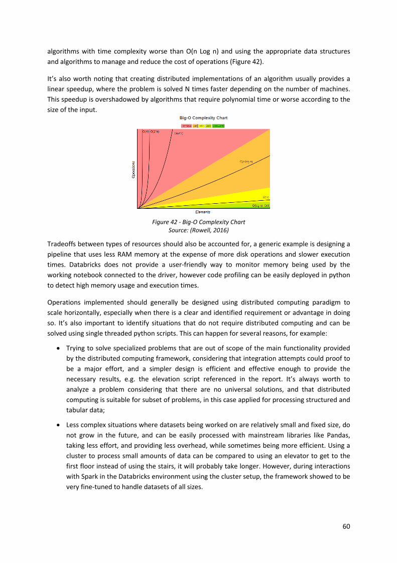
60
algorithms with time complexity worse than O(n Log n) and using the appropriate data structures
and algorithms to manage and reduce the cost of operations (Figure 42).
It’s also worth noting that creating distributed implementations of an algorithm usually provides a
linear speedup, where the problem is solved N times faster depending on the number of machines.
This speedup is overshadowed by algorithms that require polynomial time or worse according to the
size of the input.
Figure 42 - Big-O Complexity Chart Source: (Rowell, 2016)
Tradeoffs between types of resources should also be accounted for, a generic example is designing a
pipeline that uses less RAM memory at the expense of more disk operations and slower execution
times. Databricks does not provide a user-friendly way to monitor memory being used by the
working notebook connected to the driver, however code profiling can be easily deployed in python
to detect high memory usage and execution times.
Operations implemented should generally be designed using distributed computing paradigm to
scale horizontally, especially when there is a clear and identified requirement or advantage in doing
so. It’s also important to identify situations that do not require distributed computing and can be
solved using single threaded python scripts. This can happen for several reasons, for example:
• Trying to solve specialized problems that are out of scope of the main functionality provided
by the distributed computing framework, considering that integration attempts could proof to
be a major effort, and a simpler design is efficient and effective enough to provide the
necessary results, e.g. the elevation script referenced in the report. It’s always worth to
analyze a problem considering that there are no universal solutions, and that distributed
computing is suitable for subset of problems, in this case applied for processing structured and
tabular data;
• Less complex situations where datasets being worked on are relatively small and fixed size, do
not grow in the future, and can be easily processed with mainstream libraries like Pandas,
taking less effort, and providing less overhead, while sometimes being more efficient. Using a
cluster to process small amounts of data can be compared to using an elevator to get to the
first floor instead of using the stairs, it will probably take longer. However, during interactions
with Spark in the Databricks environment using the cluster setup, the framework showed to be
very fine-tuned to handle datasets of all sizes.

61
The seventh point concerns a common good practice of starting modeling activities by creating a very
simple baseline, usually without using a statistical model, based on one or two basic rules, and
increasing the complexity of methods used and models deployed as iterations progress. This allows
to keep track of performance during iterations, and determine if complex models are outperforming
the baseline provided by simpler models from previous iterations, and if the choice of using a
complex model is indeed justified.
The eight point concerns soft skills including communication, reporting and presentation, that in this
case, can be improved. These skills can be enhanced by practicing, e.g. preparing before
presentations, training with colleagues, etc.
5.5. FUTURE WORK
Currently several new initiatives are being followed or developed. Some of these initiatives are
presented below.
Several corrections and improvements for the Predictive Asset Maintenance project, some of them
discussed in this report, are currently being identified and implemented by an EDP team, with the
goal of deploying all products to production as soon as possible. This first iteration only explored part
of the potential that this project and its products can deliver, from a technical, analytical and
business or functional perspective. One example of some improvements consists on refining
objectives and requirements (e.g. prediction window), integrating new data sources, developing new
features and applying other modeling techniques.
• One of the greatest opportunities that has not been explored consists on using all resources of
the cluster to train models. Since the dataset is relatively small, and consists of approximately
4 million samples, currently only one XGBoost model is trained using the driver resources, in a
multithread setup. There are distribution implementations of this model integrated with
PySpark, usually deployed for datasets that are larger than memory and require collective
resources to be trained. However, since it’s possible to run the model in memory there is also
the opportunity to run instances of a model in different machines, using Spark but applying a
concept closer to parallel computing. Considering the large amount of resources available in
the cluster this approach would allow to train multiple models at the same time, this is a very
useful property to apply advanced strategies including cross validation (e.g. walk-forward),
feature selection (e.g. recursive feature elimination or Boruta), hyperparameter optimization
(e.g. grid search or even Bayesian optimization), and ultimately creating ensembles of models,
that would otherwise be unfeasible due to limited resources and large execution times. This
kind of strategy would also accelerate a result driven exploration and analysis of the dataset
and the effects of applying different techniques.
• Deploying advanced approaches based on Deep Learning, for example, applying Recurrent
Neural Networks to leverage predictions from previous time steps and capture “the history of
all the past elements of the sequence” (Lecun et al., 2015). This approach would require a
different architecture - a batch generator should be created, since the preprocessing would
yield a larger dataset with more than two dimensions. This generator would return batches of
fixed size of a multidimensional array the form of (batch size, time steps and features), a
fourth dimension could be added, representing the asset, and the weights could be shared on

62
this axis, between all assets. Integration strategies with Spark should be studied, considering
that training batches or samples should be shuffled, as this is a requirement of mini batch
Stochastic Gradient Descent optimizers (Goyal et al., 2017), that improves generalization and
reduces overfitting. However perfect shuffling of a large stored dataset can introduce
overhead and latency, since accessing random indexes of an array requires for the same
partitions be loaded multiple times. Usually Neural Networks can be computationally intensive
and are accelerated with GPUs, which provide seamless integration with Keras, and are
available on Databricks, therefore it’s important to have a low latency, high throughput
pipeline, that can feed the GPU, and does not constitute a bottleneck;
• Using a semi-supervised8 approach to more accurately determine Circuit Breaker failures. A
sampling strategy could be designed, e.g. select a small sample of random dates, and select log
events using a time window centered on these dates to account for data locality and
autocorrelation (other factors should be studied to create a representative sample).
Afterwards, create a simple and minimalistic interface that shows all required information, so
business experts can quickly classify these samples with a high degree of confidence. The
resulting small dataset can be enhanced with some of the most accurately classified events
already deployed in the current pipeline that were obtained by applying very complex business
rules. Semi-supervised approaches could then be applied, the simplest example is using a “self-
training scheme”, it consists on training a model using all available labeled samples, and use
high confidence predictions obtained from unlabeled data as training samples for following
iterations (Kingma et al., 2014);
A proof of concept to automatically identify incorrectly positioned elements of EDP’s electrical grid
from its geographic information system is currently being developed. For this project it was
necessary to implement a spatial join with Spark, since this operation is not natively supported,
Python libraries where integrated with the framework. This implementation will also be used as an
improvement from the Predictive Asset Maintenance project, to expand the Land Cover features, as
previously discussed. The design had to take into consideration that there are parts of the process
that can be distributed and integrated with Spark and others that aren’t thread safe or use objects
that can’t be serialized and must be executed in Python.
• Python’s Rtree library isn’t thread safe and can’t be serialized, however it can take as input the
identifier of each record, and the bounding box of each geometry, in the form of a python
generator. This is a very useful property since spark RDDs also offer an option to be accessed
through a generator, meaning that, the dataset does not have to be loaded into memory. And
even though this process is executed sequentially on a single machine or core it’s relatively
fast. The result is an in-memory spatial index.
• To query the Rtree the same strategy can be used, however the results are saved in memory as
a python list that maps each identifier of the left geometries to the identifiers of the right
geometries, creating a relation table of possible intersections. Since the identifiers saved in a
Python list are just integers this process continues to scale to hundreds of millions of
geometries without consuming all available memory. The relation list has then to be converted
8 According to (Kingma et al., 2014) “semi-supervised learning considers the problem of classification
when only a small subset of the observations have corresponding class labels”. It’s utilized in situations where there is a large number of unlabeled samples that are hard to classify (Kingma et al., 2014)

63
to a Spark Data Frame. This is the slowest part of the non-distributed process, taking
approximately 10-15 minutes for every 2 million geometries queried, considering the
infrastructure and dataset being used;
• The next step consists on merging both left and right tables using the relation table obtained
using a Spark join and finally testing if each pair of geometries intersects, filtering out the ones
that don’t. This step can be achieved with distributed computing, by mapping a function that
serializes both geometries and tests the intersection using Shapely functions and prepared
geometries, retuning a Boolean flag, later used as filter. This reduces the execution time from
several minutes to seconds. The result are two merged datasets based on the condition if their
geometries intersect.
Other initiatives include:
• An analytics project that aims to predict energy consumption and generation in real-time is
being accompanied;
• A process mining and business intelligence project that is going through a new iteration. New
requirements and some improvements are currently being implemented;

64
6. BIBLIOGRAPHY
Adams, A., & Vamplew, P. (1998). Encoding and Decoding Cyclic Data. The South Pacific Journal of Natural Science, 16, 54–58.
Aeronautical Information Service. (2019). Manual VFR. https://www.nav.pt/docs/AIS/aerodromos/lisboaa7bd57cda4b86c298a71ff00009f255e.pdf?sfvrsn=46
Armbrust, M., Ghodsi, A., Zaharia, M., Xin, R. S., Lian, C., Huai, Y., Liu, D., Bradley, J. K., Meng, X., Kaftan, T., & Franklin, M. J. (2015). Spark SQL: Relational Data Processing in Spark Michael. Proceedings of the 2015 ACM SIGMOD International Conference on Management of Data - SIGMOD ’15, 41(6), 1383–1394. https://doi.org/10.1145/2723372.2742797
Brownlee, J. (2019). How To Backtest Machine Learning Models for Time Series Forecasting.
Brownlee, J. (2020a). A Gentle Introduction to the Gradient Boosting Algorithm for Machine Learning. https://machinelearningmastery.com/gentle-introduction-gradient-boosting-algorithm-machine-learning/
Brownlee, J. (2020b). A Gentle Introduction to Threshold-Moving for Imbalanced Classification. Machine Learning Mastery. https://machinelearningmastery.com/threshold-moving-for-imbalanced-classification/
Brownlee, J. (2020c). How to Calculate Feature Importance With Python. https://machinelearningmastery.com/calculate-feature-importance-with-python/
Brownlee, J. (2020d). ROC Curves and Precision-Recall Curves for Imbalanced Classification. https://machinelearningmastery.com/roc-curves-and-precision-recall-curves-for-imbalanced-classification/
Brownlee, J. (2020e). What is the Difference Between Test and Validation Datasets? https://machinelearningmastery.com/difference-test-validation-datasets/
Cerqueira, V., Torgo, L., & Mozetic, I. (2019). Evaluating time series forecasting models: An empirical study on performance estimation methods. 1–28. http://arxiv.org/abs/1905.11744
Chawla, N. V., Bowyer, K. W., Hall, L. O., & Kegelmeyer, W. P. (2011). SMOTE: Synthetic Minority Over-sampling Technique. Journal of Artificial Intelligence Research, 2009(Sept. 28), 321–357. https://doi.org/10.1613/jair.953
Chen, T., & Guestrin, C. (2016). XGBoost: A scalable tree boosting system. Proceedings of the ACM SIGKDD International Conference on Knowledge Discovery and Data Mining, 13-17-Augu, 785–794. https://doi.org/10.1145/2939672.2939785
Chicco, D., & Jurman, G. (2020). The advantages of the Matthews correlation coefficient (MCC) over F1 score and accuracy in binary classification evaluation. BMC Genomics, 21(1), 6. https://doi.org/10.1186/s12864-019-6413-7
Copernicus Programme. (2020). EU-DEM v1.1 - Metadata. https://land.copernicus.eu/imagery-in-situ/eu-dem/eu-dem-v1.1?tab=metadata
DaftLogic. (2018). Find Altitude on Map. https://www.daftlogic.com/sandbox-google-maps-find-altitude.htm

65
Damji, J. S., Wenig, B., Das, T., & Lee, D. (2020). Learning Spark: Lightning-Fast Data Analytics (2nd ed.). O’Reilly Media. https://www.oreilly.com/library/view/learning-spark-2nd/9781492050032/ch01.html
Davis, J., & Goadrich, M. (2006). The relationship between Precision-Recall and ROC curves. Proceedings of the 23rd International Conference on Machine Learning - ICML ’06, 233–240. https://doi.org/10.1145/1143844.1143874
Direção-Geral do Território. (2020). Cartografia de Uso e Ocupação do Solo (COS, CLC e Copernicus). https://www.dgterritorio.gov.pt/cartografia/cartografia-tematica/COS-CLC-COPERNICUS
Dolatshah, M., Hadian, A., & Minaei-Bidgoli, B. (2015). Ball*-tree: Efficient spatial indexing for constrained nearest-neighbor search in metric spaces. http://arxiv.org/abs/1511.00628
Dreiseitl, S., & Ohno-Machado, L. (2002). Logistic regression and artificial neural network classification models: a methodology review. Journal of Biomedical Informatics, 35(5–6), 352–359. https://doi.org/10.1016/S1532-0464(03)00034-0
EDP Distribuição. (2018). Who we are. https://www.edpdistribuicao.pt/en/about-us/who-we-are
EDP Distribuição. (2019). Os nossos números. https://www.edpdistribuicao.pt/pt-pt/sobre-nos/os-nossos-numeros
EDP Group. (2019). A EDP em Números - Indicadores Financeiros. https://www.edp.com/pt-pt/a-edp/edp-em-numeros
EDP Labelec. (2020a). História. https://labelec.edp.com/pt-pt/historia
EDP Labelec. (2020b). Who are we. https://labelec.edp.com/en/who-are-we
Elith, J., Leathwick, J. R., & Hastie, T. (2008). A working guide to boosted regression trees. Journal of Animal Ecology, 77(4), 802–813. https://doi.org/10.1111/j.1365-2656.2008.01390.x
Enet Centre - VSB. (2019). VSB Power Line Fault Detection. https://www.kaggle.com/c/vsb-power-line-fault-detection/overview
European Parliament. (1997). Directive 96/92/EC of the European Parliament and of the Council of 19 December 1996 concerning common rules for the internal market in electricity. https://eur-lex.europa.eu/legal-content/EN/TXT/?uri=CELEX%3A31996L0092
Goutte, C., & Gaussier, E. (2005). A Probabilistic Interpretation of Precision, Recall and F-Score, with Implication for Evaluation (pp. 345–359). https://doi.org/10.1007/978-3-540-31865-1_25
Goyal, P., Dollár, P., Girshick, R., Noordhuis, P., Wesolowski, L., Kyrola, A., Tulloch, A., Jia, Y., & He, K. (2017). Accurate, Large Minibatch SGD: Training ImageNet in 1 Hour. http://arxiv.org/abs/1706.02677
Guttman, A. (1984). R-trees: A dynamic index structure for spatial searching. ACM SIGMOD Record, 14(2), 47–57. https://doi.org/10.1145/971697.602266
Guyon, I., & Elisseeff, A. (2003). An Introduction to Variable and Feature Selection. Journal of Machine Learning Research, 3, 1157–1182. https://doi.org/10.1162/153244303322753616
H. Dufourmont, J. Gallego, H. Reuter, P. S. (2014). EU-DEM Statistical Validation Report. https://ec.europa.eu/eurostat/documents/7116161/7172326/Report-EU-DEM-statistical-validation-August2014.pdf

66
Haining, R. P. (2001). Spatial Autocorrelation. In International Encyclopedia of the Social & Behavioral Sciences (pp. 14763–14768). Elsevier. https://doi.org/10.1016/B0-08-043076-7/02511-0
Hubert, M., & Van Der Veeken, S. (2008). Outlier detection for skewed data. Journal of Chemometrics, 22(3–4), 235–246. https://doi.org/10.1002/cem.1123
International Organization for Standardization. (2014). ISO 55000:2014: Asset management — Overview, principles and terminology. International Organization for Standardization, Geneva, Switzerland. https://www.iso.org/obp/ui/#iso:std:55088:en
Ivezic, Ž., Connolly, A. J., VanderPlas, J. T., & Gray, A. (2014). Statistics, Data Mining, and Machine Learning in Astronomy (1st ed.). Oxford University Press. https://www.astroml.org/book_figures/chapter2/fig_balltree_example.html
Jacox, E. H., & Samet, H. (2007). Spatial join techniques. ACM Transactions on Database Systems, 32(1), 0–70. https://doi.org/10.1145/1206049.1206056
Jolliffe, I. T., & Cadima, J. (2016). Principal component analysis: a review and recent developments. Philosophical Transactions. Series A, Mathematical, Physical, and Engineering Sciences, 374(2065), 20150202. https://doi.org/10.1098/rsta.2015.0202
Karney, C. F. F. (2013). Algorithms for geodesics. Journal of Geodesy, 87(1), 43–55. https://doi.org/10.1007/s00190-012-0578-z
Kaushik, S. (2016). Introduction to Feature Selection methods with an example. https://www.analyticsvidhya.com/blog/2016/12/introduction-to-feature-selection-methods-with-an-example-or-how-to-select-the-right-variables/
Ke, G., Meng, Q., Finley, T., Wang, T., Chen, W., Ma, W., Ye, Q., & Liu, T. Y. (2017). LightGBM: A highly efficient gradient boosting decision tree. Advances in Neural Information Processing Systems, 2017-Decem(Nips), 3147–3155.
Kingma, D. P., Rezende, D. J., Mohamed, S., & Welling, M. (2014). Semi-supervised learning with deep generative models. Advances in Neural Information Processing Systems, 4(January), 3581–3589.
Kohavi, R. (1995). A study of cross-validation and bootstrap for accuracy estimation and model selection. International Joint Conferences on Artificial Intelligence (IJCAI), 2, 1137–1143. https://doi.org/10.5555/1643031.1643047
Kotsiantis, S. B. (2007). Supervised Machine Learning: A Review of Classification Techniques. Informatica, 31, 249–268. https://dl.acm.org/doi/10.5555/1566770.1566773
Kuhlman, D. (2013). A Python Book. A Python Book, 1–227.
Kursa, M. B. (2020). Boruta for those in a hurry. 1–6. https://cran.r-project.org/web/packages/Boruta/vignettes/inahurry.pdf
Kursa, M. B., & Rudnicki, W. R. (2010). Feature selection with the boruta package. Journal of Statistical Software, 36(11), 1–13. https://doi.org/10.18637/jss.v036.i11
Kwak, S. K., & Kim, J. H. (2017). Statistical data preparation: Management of missing values and outliers. Korean Journal of Anesthesiology, 70(4), 407–411. https://doi.org/10.4097/kjae.2017.70.4.407
Lecun, Y., Bengio, Y., & Hinton, G. (2015). Deep learning. Nature, 521(7553), 436–444. https://doi.org/10.1038/nature14539

67
Lin, T.-Y., Goyal, P., Girshick, R., He, K., & Dollár, P. (2017). Focal Loss for Dense Object Detection. http://arxiv.org/abs/1708.02002
Mack, C., Su, Z., & Westreich, D. (2018). Managing Missing Data in Patient Registries. https://www.ncbi.nlm.nih.gov/books/NBK493611/pdf/Bookshelf_NBK493611.pdf
Manolopoulos, Y., Nanopoulos, A., Papadopoulos, A. N., & Theodoridis, Y. (2006). R-Trees: Theory and Applications. Springer London. https://doi.org/10.1007/978-1-84628-293-5
Mayo, M. (2017). The Practical Importance of Feature Selection. https://www.kdnuggets.com/2017/06/practical-importance-feature-selection.html
McKinney, W. (2010). Data Structures for Statistical Computing in Python. Proceedings of the 9th Python in Science Conference, 1697900(Scipy), 51–56. http://conference.scipy.org/proceedings/scipy2010/mckinney.html
Meinshausen, N. (2006). Quantile Regression Forests. Journal of Machine Learning Research, 7, 983–999. https://doi.org/10.5555/1248547.1248582
Mitchell, T. M. (1997). Machine Learning (1st ed.). McGraw-Hill Science/Engineering/Math.
Murphy, K. P. (2012). Machine Learning: A Probabilistic Perspective. The MIT Press.
Ofgem. (2017). DNO common network asset indices methodology. January, 198. https://www.ofgem.gov.uk/system/files/docs/2017/05/dno_common_network_asset_indices_methodology_v1.1.pdf
Omohundro, S. M. (1989). Five balltree construction algorithms. Science, 51(1), 1–22. https://doi.org/10.1016/S0092-8240(89)80047-3
Opitz, D., & Maclin, R. (1999). Popular Ensemble Methods: An Empirical Study. Journal of Artificial Intelligence Research, 11, 169–198. https://doi.org/10.1613/jair.614
Perry, M. T. (2015). Python affine transforms. https://www.perrygeo.com/python-affine-transforms.html
Rasterio developers. (2018). Windowed reading and writing. https://rasterio.readthedocs.io/en/latest/topics/windowed-rw.html
Reuters. (2019). About EDP - Energias de Portugal SA. https://www.reuters.com/companies/EDP.LS
Rocklin, M. (2015). Dask: Parallel Computation with Blocked algorithms and Task Scheduling. Proceedings of the 14th Python in Science Conference, Scipy, 126–132. https://doi.org/10.25080/majora-7b98e3ed-013
Rowell, E. (2016). Big-O Cheat Sheet. Big-O Cheat Sheet
Russell, S., & Norvig, P. (2009). Artificial Intelligence: A Modern Approach.
Schneider, J. (1997). Cross Validation. Carnegie Mellon School of Computer Science. https://www.cs.cmu.edu/~schneide/tut5/node42.html
Scikit-learn developers. (2020a). Decision Trees. https://scikit-learn.org/stable/modules/tree.html
Scikit-learn developers. (2020b). Imputation of missing values. https://scikit-learn.org/stable/modules/impute.html

68
Scikit-learn developers. (2020c). Permutation feature importance. https://scikit-learn.org/stable/modules/permutation_importance.html
Scikit-learn developers. (2020d). RandomForestClassifier. https://scikit-learn.org/stable/modules/generated/sklearn.ensemble.RandomForestClassifier.html
SciPy community. (2020). kd-tree for quick nearest-neighbor lookup. https://docs.scipy.org/doc/scipy/reference/generated/scipy.spatial.cKDTree.html
Spiegel, S., Mueller, F., Weismann, D., & Bird, J. (2018). Cost-Sensitive Learning for Predictive Maintenance. 1–18. http://arxiv.org/abs/1809.10979
Tharwat, A. (2018). Classification assessment methods. Applied Computing and Informatics. https://doi.org/10.1016/j.aci.2018.08.003
Tony Liu, F., Ming Ting, K., & Zhou, Z.-H. (2008). Isolation Forest. ICDM. https://cs.nju.edu.cn/zhouzh/zhouzh.files/publication/icdm08b.pdf%0Ahttps://cs.nju.edu.cn/zhouzh/zhouzh.files/publication/icdm08b.pdf?q=isolation-forest
Tuv, E., Borisov, A., Runger, G., & Torkkola, K. (2009). Feature selection with ensembles, artificial variables, and redundancy elimination. Journal of Machine Learning Research, 10, 1341–1366.
Unal, I. (2017). Defining an optimal cut-point value in ROC analysis: An alternative approach. Computational and Mathematical Methods in Medicine, 2017. https://doi.org/10.1155/2017/3762651
Universidade EDP. (2019). Curso Gestão de Ativos.
van der Walt, S., Colbert, S. C., & Varoquaux, G. (2011). The NumPy Array: A Structure for Efficient Numerical Computation. Computing in Science & Engineering, 13(2), 22–30. https://doi.org/10.1109/MCSE.2011.37
Varma, S., & Simon, R. (2006). Bias in error estimation when using cross-validation for model selection. BMC Bioinformatics, 7, 91. https://doi.org/10.1186/1471-2105-7-91
Varoquaux, G., Buitinck, L., Louppe, G., Grisel, O., Pedregosa, F., & Mueller, A. (2015). Scikit-learn. GetMobile: Mobile Computing and Communications, 19(1), 29–33. https://doi.org/10.1145/2786984.2786995
Verikas, A., Gelzinis, A., & Bacauskiene, M. (2011). Mining data with random forests: A survey and results of new tests. Pattern Recognition, 44(2), 330–349. https://doi.org/10.1016/j.patcog.2010.08.011
Wikipedia contributors. (2020). R-tree. Wikipedia, The Free Encyclopedia. https://en.wikipedia.org/w/index.php?title=R-tree&oldid=977399328
Wirth, R., & Hipp, J. (2000). CRISP-DM : Towards a Standard Process Model for Data Mining. Proceedings of the Fourth International Conference on the Practical Application of Knowledge Discovery and Data Mining, 24959, 29–39.
Witten, I., & Frank, E. (2005). Data Mining: Practical Machine Learning Tools and Techniques (2nd (ed.)).
XGBoost developers. (2020). Understand your dataset with XGBoost. https://xgboost.readthedocs.io/en/latest/R-package/discoverYourData.html

69
Zaharia, M., Chowdhury, M., Franklin, M. J., Shenker, S., & Stoica, I. (2010). Spark: Cluster computing with working sets. 2nd USENIX Workshop on Hot Topics in Cloud Computing, HotCloud 2010.
Zhang, K., Zhang, Y., & Wang, M. (2012). A Unified Approach to Interpreting Model Predictions Scott. Nips, 16(3), 426–430.
Zhang, Z., Mayer, G., Dauvilliers, Y., Plazzi, G., Pizza, F., Fronczek, R., Santamaria, J., Partinen, M., Overeem, S., Peraita-Adrados, R., da Silva, A. M., Sonka, K., Rio-Villegas, R. del, Heinzer, R., Wierzbicka, A., Young, P., Högl, B., Bassetti, C. L., Manconi, M., … Khatami, R. (2018). Exploring the clinical features of narcolepsy type 1 versus narcolepsy type 2 from European Narcolepsy Network database with machine learning. Scientific Reports, 8(1), 10628. https://doi.org/10.1038/s41598-018-28840-w
Zheng, A., & Casari, A. (2018). Feature Engineering for Machine Learning: Principles and Techniques for Data Scientists (1st ed.). O’Reilly Media.

Page | i