Embed Size (px)
Citation preview
INDEX
Presentation Graphic standards manual Who we are
Visual IdentityBrandSafety marginMinimum sizeColourShades of grey, positive/negativeBackground colour Photographic backgroundTypographyMisuse
Final Note
34
56789
10111213
14
GRAPHIC STANDARDS MANUAL TECNOCAMPO 2
GRAPHIC STANDARDS MANUAL
3
This manual has been designed to contain the basic guideline accordingly to the usage of the fundamental aspects when it comes to the brand design of Tecnocampo, which assures its appropriate understanding and reproduction.
These basic elements regarding Tecnocampo identity are based on shapes, colours and type of font and when combined they turn into the identity of the brand. Thus, more coherence and visual impact are given to it.
In order to assure a consistent presentation of Tecnocampo brand, it is advisable to follow the guidelines established in this document.
GRAPHIC STANDARDS MANUAL TECNOCAMPO
WHO WE ARE
4
Tecnocampo has started its activity in 1998, in the construction and public work field, especially the construction of industrial and residential infrastructures. It can fulfil the construction process, from surveys and engineering projects to execution followed by inspection.
GRAPHIC STANDARDS MANUAL TECNOCAMPO
VISUAL IDENTITY
5
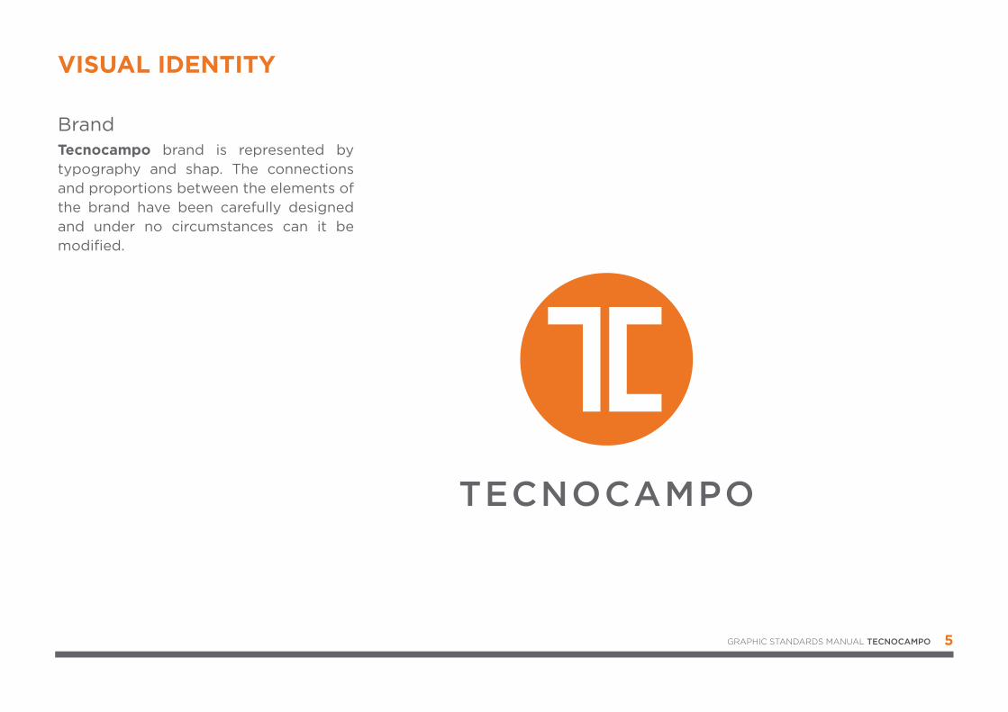
Tecnocampo brand is represented by typography and shap. The connections and proportions between the elements of the brand have been carefully designed and under no circumstances can it be modified.
Brand
GRAPHIC STANDARDS MANUAL TECNOCAMPO
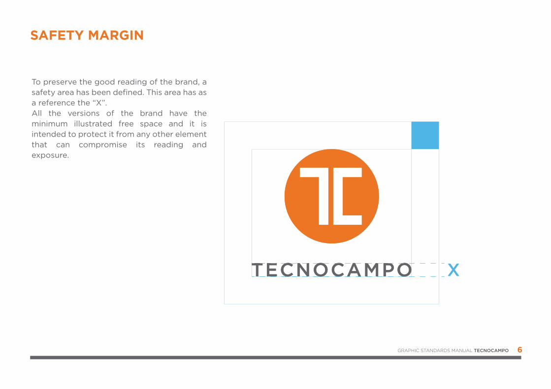
SAFETY MARGIN
X
2X2
6
To preserve the good reading of the brand, a safety area has been defined. This area has as a reference the “X”.All the versions of the brand have the minimum illustrated free space and it is intended to protect it from any other element that can compromise its reading and exposure.
GRAPHIC STANDARDS MANUAL TECNOCAMPO
MANUAL DE NORMAS GRÁFICAS TECNOCAMPO 7
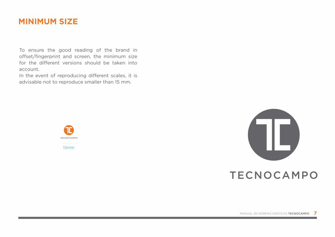
To ensure the good reading of the brand in o�set/fingerprint and screen, the minimum size for the di�erent versions should be taken into account. In the event of reproducing di�erent scales, it is advisable not to reproduce smaller than 15 mm.
15mm
MINIMUM SIZE
8
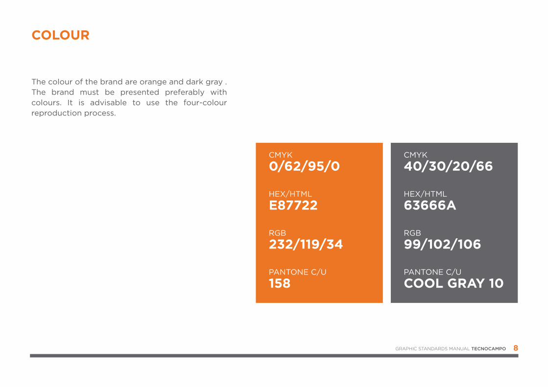
The colour of the brand are orange and dark gray . The brand must be presented preferably with colours. It is advisable to use the four-colour reproduction process.
COLOUR
CMYK
0/62/95/0
HEX/HTML
E87722
RGB
232/119/34
PANTONE C/U
158
CMYK
40/30/20/66
HEX/HTML
63666A
RGB
99/102/106
PANTONE C/U
COOL GRAY 10
GRAPHIC STANDARDS MANUAL TECNOCAMPO
9
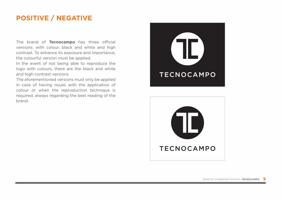
POSITIVE / NEGATIVE
The brand of Tecnocampo has three o�cial versions: with colour, black and white and high contrast. To enhance its exposure and importance, the colourful version must be applied. In the event of not being able to reproduce the logo with colours, there are the black and white and high contrast versions. The aforementioned versions must only be applied in case of having issues with the application of colour or when the reproduction technique is required, always regarding the best reading of the brand.
GRAPHIC STANDARDS MANUAL TECNOCAMPO
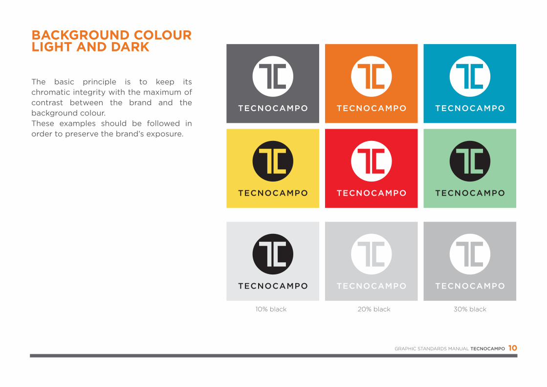
10% black 20% black 30% black
10
The basic principle is to keep its chromatic integrity with the maximum of contrast between the brand and the background colour. These examples should be followed in order to preserve the brand’s exposure.
BACKGROUND COLOURLIGHT AND DARK
GRAPHIC STANDARDS MANUAL TECNOCAMPO
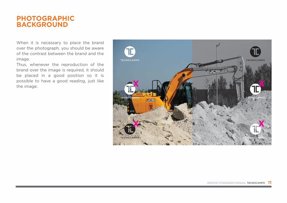
When it is necessary to place the brand over the photograph, you should be aware of the contrast between the brand and the image. Thus, whenever the reproduction of the brand over the image is required, it should be placed in a good position so it is possible to have a good reading, just like the image.
11
PHOTOGRAPHICBACKGROUND
GRAPHIC STANDARDS MANUAL TECNOCAMPO
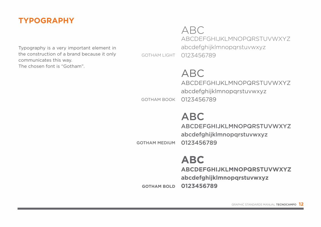
Typography is a very important element in the construction of a brand because it only communicates this way.The chosen font is “Gotham”.
12
TYPOGRAPHY
GOTHAM LIGHT
GOTHAM BOOK
GOTHAM BOLD
ABCABCDEFGHIJKLMNOPQRSTUVWXYZabcdefghijklmnopqrstuvwxyz0123456789
ABCABCDEFGHIJKLMNOPQRSTUVWXYZabcdefghijklmnopqrstuvwxyz0123456789
GOTHAM MEDIUM
ABCABCDEFGHIJKLMNOPQRSTUVWXYZabcdefghijklmnopqrstuvwxyz0123456789
ABCABCDEFGHIJKLMNOPQRSTUVWXYZabcdefghijklmnopqrstuvwxyz0123456789
GRAPHIC STANDARDS MANUAL TECNOCAMPO
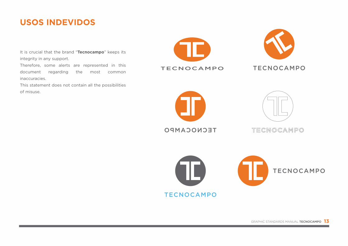
It is crucial that the brand “Tecnocampo” keeps its
integrity in any support.
Therefore, some alerts are represented in this
document regarding the most common
inaccuracies.
This statement does not contain all the possibilities
of misuse.
13
USOS INDEVIDOS
GRAPHIC STANDARDS MANUAL TECNOCAMPO
14
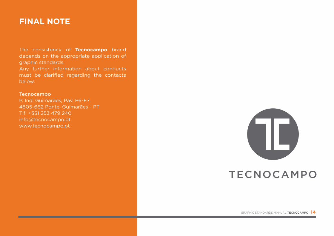
FINAL NOTE
The consistency of Tecnocampo brand depends on the appropriate application of graphic standards.Any further information about conducts must be clarified regarding the contacts below.
TecnocampoP. Ind. Guimarães, Pav. F6-F74805-662 Ponte, Guimarães - PTTlf: +351 253 479 [email protected]
GRAPHIC STANDARDS MANUAL TECNOCAMPO
GRAPHIC STANDARDS MANUAL


![Identity: n v identity (-ies p) [identity]](https://img.pdfslide.net/doc/110x75/61c6ea26100dbe3ec3259821/identity-n-v-identity-ies-p-identity.jpg)