Embed Size (px)
DESCRIPTION
Principles of Document Design. Adapted from http://condor.depaul.edu/~hgraves/eng206/docdesign/frame.htm Original Source: Robin Williams’ Non-Designers’ Design Book. Four Basic Principles. Contrast Repetition Alignment Proximity. Proximity. Group related items together - PowerPoint PPT Presentation
Citation preview

Principles of Document Design
Adapted from http://condor.depaul.edu/~hgraves/eng206/docdesign/frame.htm
Original Source: Robin Williams’ Non-Designers’ Design Book

Four Basic Principles
ContrastRepetitionAlignmentProximity

Proximity
Group related items together Closeness implies a relation Lack of closeness also implies a relation

Dull Design: Equal Spacing A dull but typical report
cover: centered, evenly spaced to fill the page
If you didn’t read English, you might think there are six difference topics on the page
Each line seems to be a separate element

Better Design for Proximity
What Goes Around Comes Around
Lessons from Hitchhiking Across the Country
Robin Williams
January 1, 2001
Put the title and subtitle close to each other to create one well-defined unit.
Move the name and date further away to signal that they are not part of the title.
Creating Proximity
Count the number of visual elements on a page by counting where your eye stops
Aim for 3 to 5 items on a page See which items can be grouped together
to become one visual unit

Proximity: What to Avoid
Too many separate elements on a page Sticking things in the corners and middle Equal white space between elements
(unless they form a subset) Creating visual relationships among
unrelated elements (move them apart)

Awkward Proximity
Little Bo Peep (773) 325-7000
Lincoln Park Sheep Farm
715 W. Lincoln St. Chicago, IL

Better Proximity (& Alignment)
Alignment
Nothing should be placed on the page arbitrarily
Every item should have a visual connection with something else on the page

Choices for Alignment
Center alignment
Left alignment Right alignment
Full justification (goes from left to right and reaches the margins on both sides)

Centering
Most commonly used by beginners It’s safe, comfortable, formal, sedate,
ordinary, often dull Be aware of these impressions you make
with centering and use them consciously

Alignment: What to Avoid
More than one text alignment on the page (generally keep everything centered, everything left aligned [but not necessarily at the same left point of alignment], or everything right aligned)

Aligning Well Alignment creates a
visual link between the title and author’s name, even though they are far apart
A flush left or flush right alignment imparts a more sophisticated look than a centered alignment
What Goes Around Comes Around
Lessons from Hitchhiking Across the Country
Robin Williams
January 1, 2001

Repetition
Repeat some aspect of the design throughout the entire piece, e.g. Choice of fonts Lines Bullets Colors Graphics
In multi-page publications
Repetition is crucial for achieving unity among pages
Using subheadings in the same font, with the same boldness or italics is one type of repetition you can use in long documents

How to Create Repetition
Push existing consistencies a little further Turn some consistent elements into part
of the conscious graphic design Add elements expressly to create
repetition
Contrast
If two items are not exactly the same, make them different
Really different

Purpose of Contrast
To highlight items of importance To make clear the purpose and
organization of the document To create interest on the page

The yellow box on a blue background adds contrast to the title page.
The italicized type contrasts with the bold sans serif font.

Ways to Create Contrast
Pair large type with small type (size) A serif font with a sans serif font A thin line with a thick line A cool color with a warm one A smooth texture with a rough one A horizontal element with a vertical one

Contrast: What to Avoid
Being overly subtle with the contrast E.g., contrasting a 3/4 point line with a 1
1/2 point line


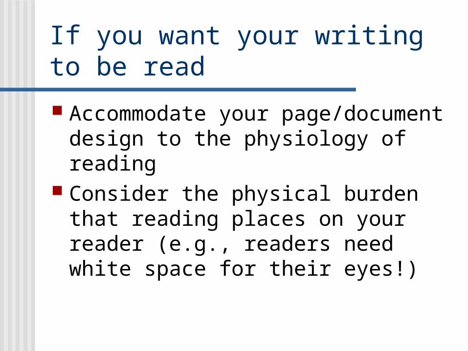
If you want your writing to be read
Accommodate your page/document design to the physiology of reading
Consider the physical burden that reading places on your reader (e.g., readers need white space for their eyes!)

Layout that hinders reading

Layout that helps the reader:
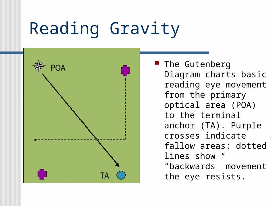
Reading Gravity
The Gutenberg Diagram charts basic reading eye movement from the primary optical area (POA) to the terminal anchor (TA). Purple crosses indicate fallow areas; dotted lines show “backwards” movement the eye resists.
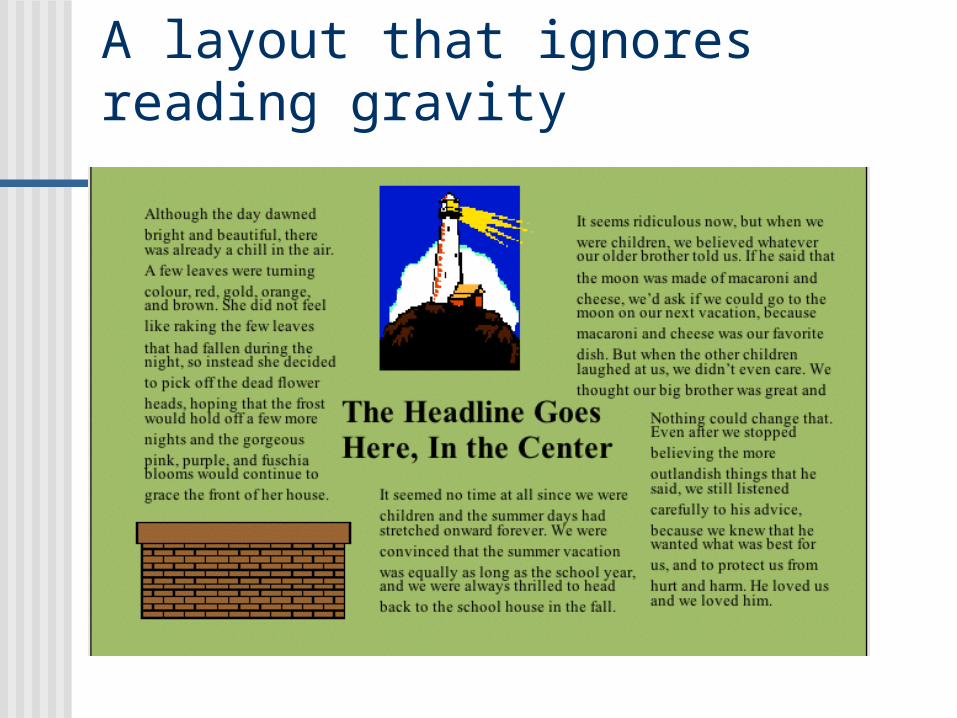
A layout that ignores reading gravity

A layout that acknowledges reading gravity

Why You Should Use Graphics
Even when simple, design helps to convey the message of the text