Embed Size (px)
Citation preview
Principles of Visual Design 2720
Principles of Visual Design LCC 2720Instructor: Brian Schrank
Color Theory
Principles of Visual Design 2720
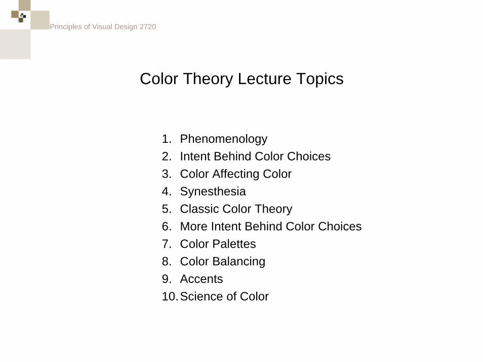
Color Theory Lecture Topics
1. Phenomenology2. Intent Behind Color Choices3. Color Affecting Color4. Synesthesia5. Classic Color Theory6. More Intent Behind Color Choices7. Color Palettes8. Color Balancing9. Accents10.Science of Color
Principles of Visual Design 2720
phenomenology
Principles of Visual Design 2720
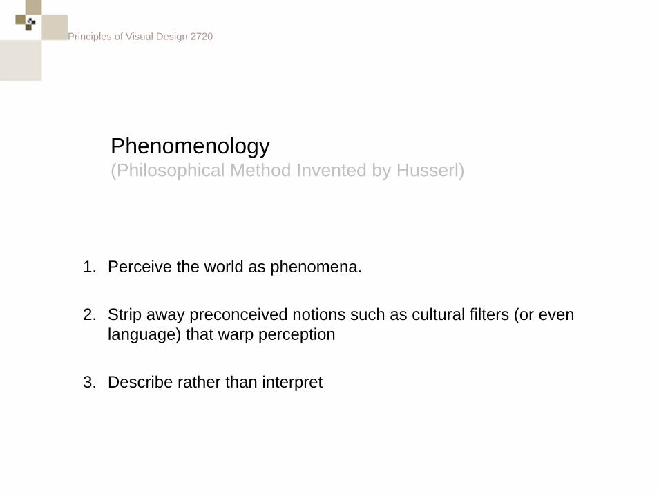
Phenomenology(Philosophical Method Invented by Husserl)
1. Perceive the world as phenomena.
2. Strip away preconceived notions such as cultural filters (or even language) that warp perception
3. Describe rather than interpret
Principles of Visual Design 2720
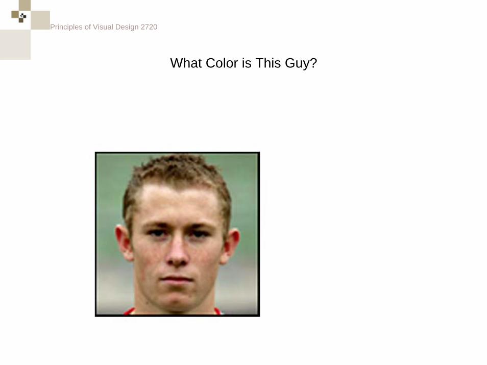
What Color is This Guy?
Principles of Visual Design 2720
What Color is This Guy?
well...
he’s not white.
Principles of Visual Design 2720
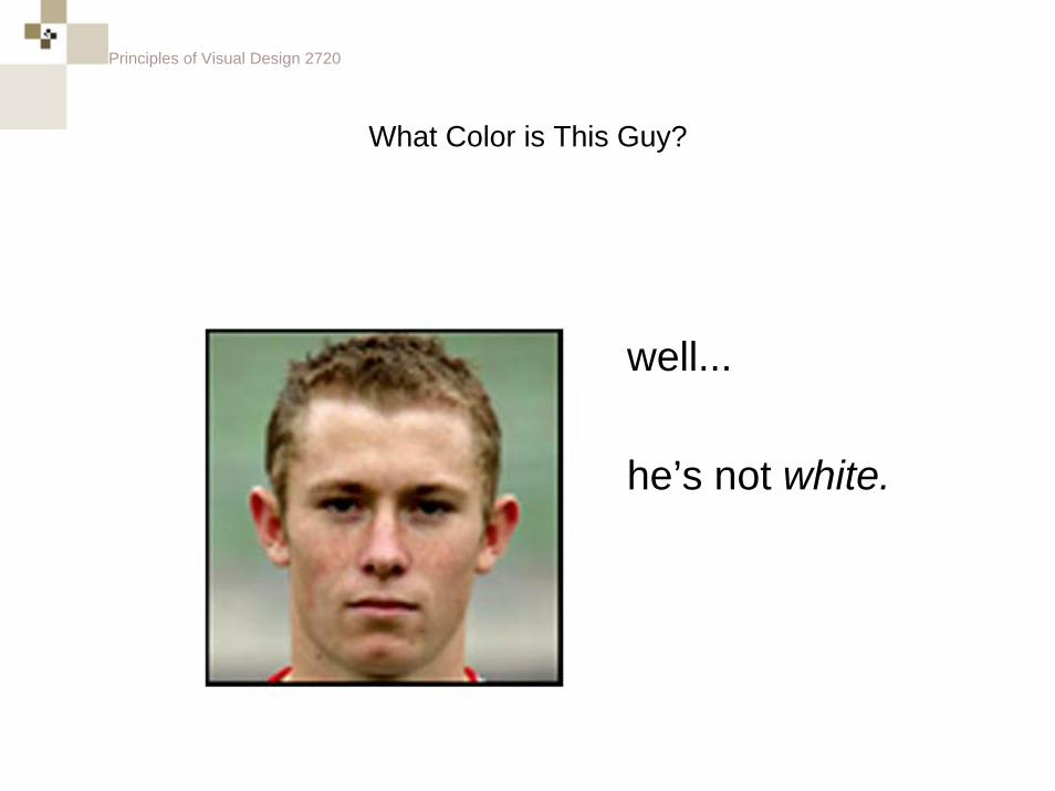
What Color is This Guy?
Principles of Visual Design 2720
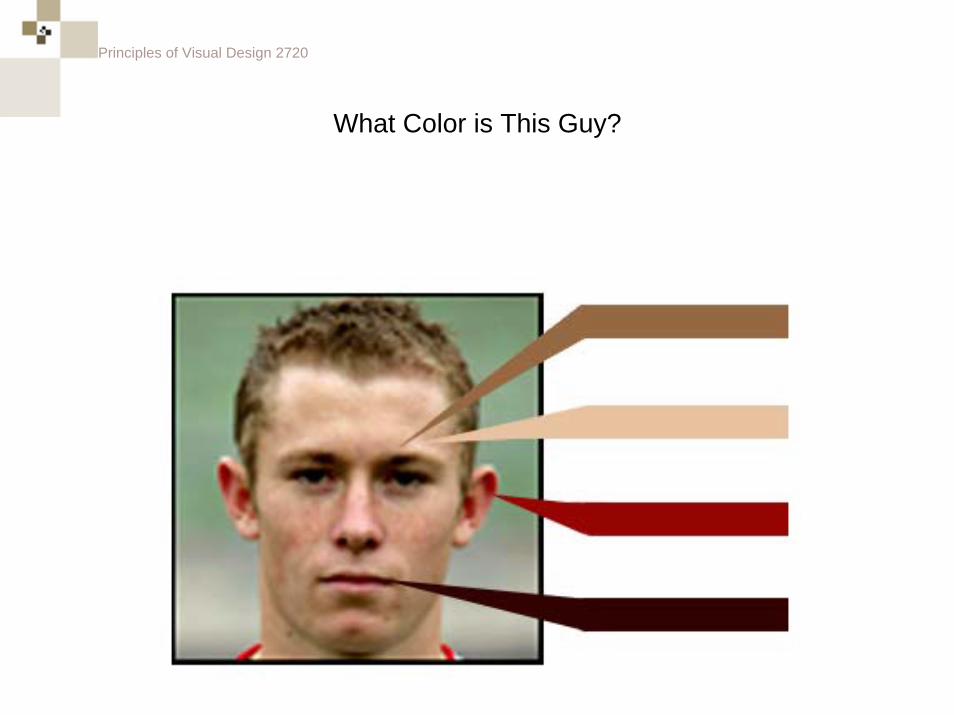
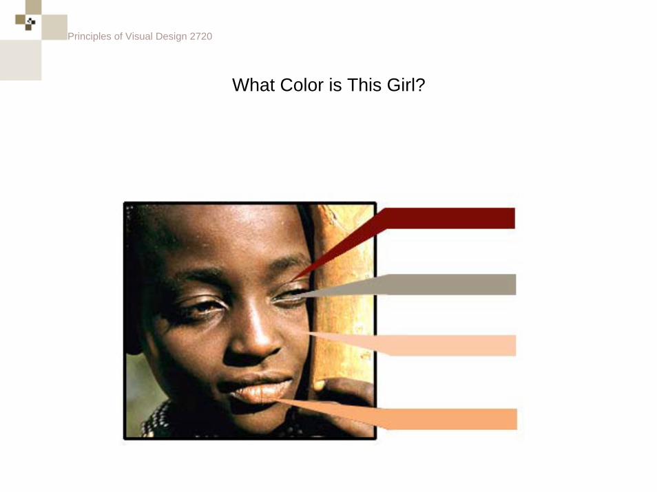
What Color is This Girl?
Principles of Visual Design 2720
What Color is This Girl?
Principles of Visual Design 2720
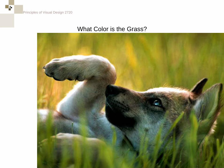
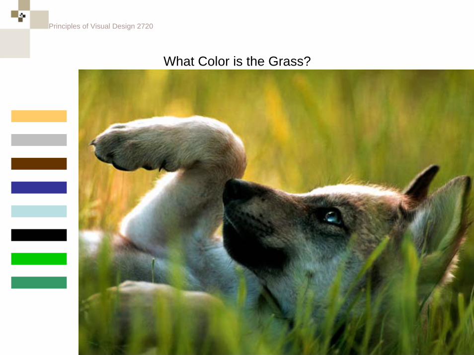
What Color is the Grass?
Principles of Visual Design 2720
What Color is the Grass?
Principles of Visual Design 2720
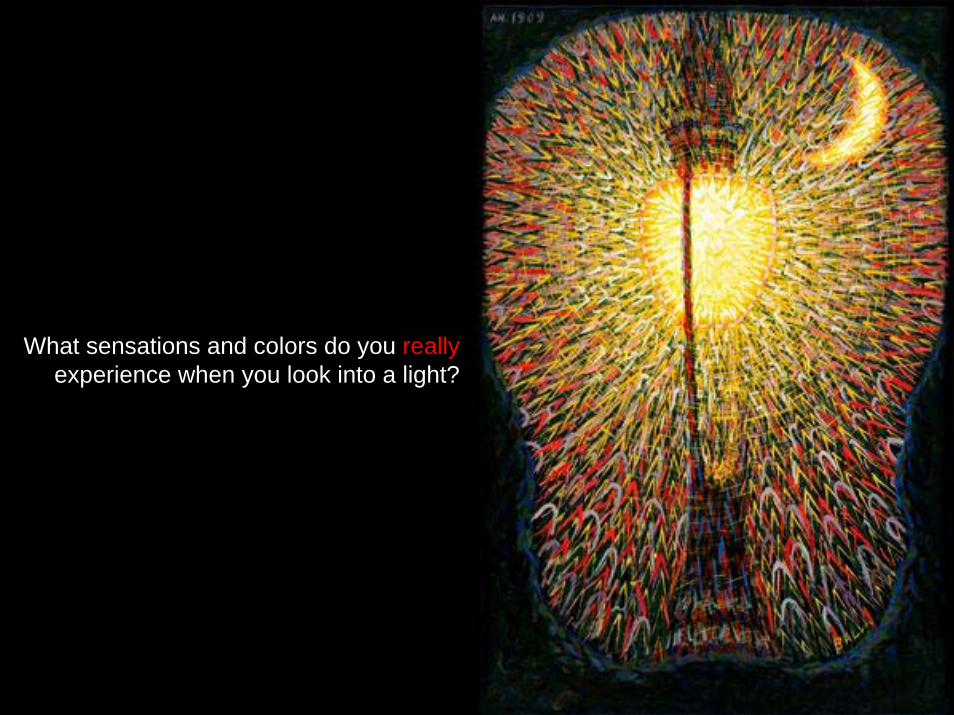
What sensations and colors do you really experience when you look into a light?
Principles of Visual Design 2720
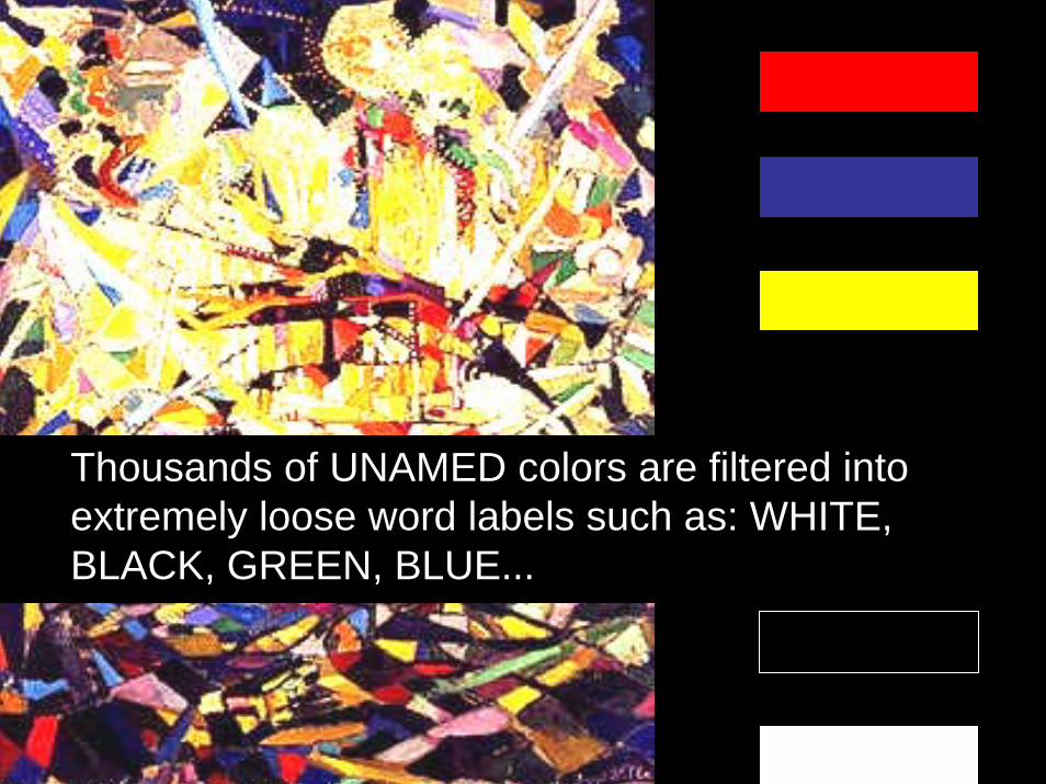
Thousands of UNAMED colors are filtered into extremely loose word labels such as: WHITE, BLACK, GREEN, BLUE...
Principles of Visual Design 2720
It is useful to use phenomenological techniques when analyzing design choices of others.
Principles of Visual Design 2720
It is useful to use phenomenological techniques when analyzing the design choices of others.
To do this you explore your unconscious and biological reactions of the design.
Principles of Visual Design 2720
Intent Behind Color Choices
Principles of Visual Design 2720
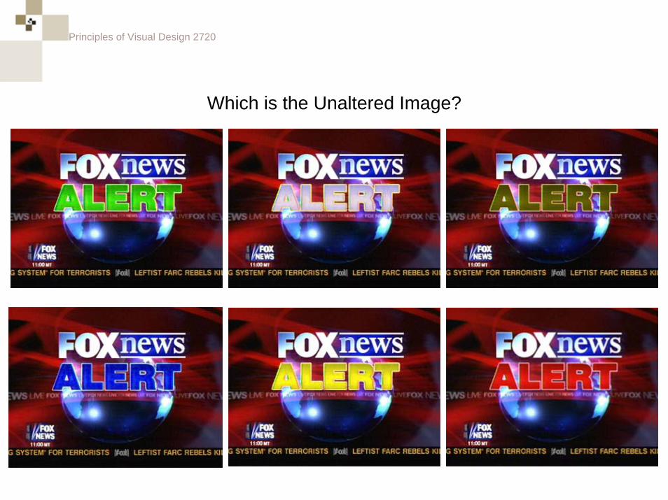
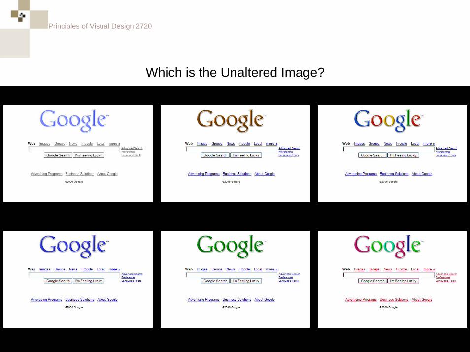
Which is the Unaltered Image?
• <<Fox News Alert>>
Principles of Visual Design 2720
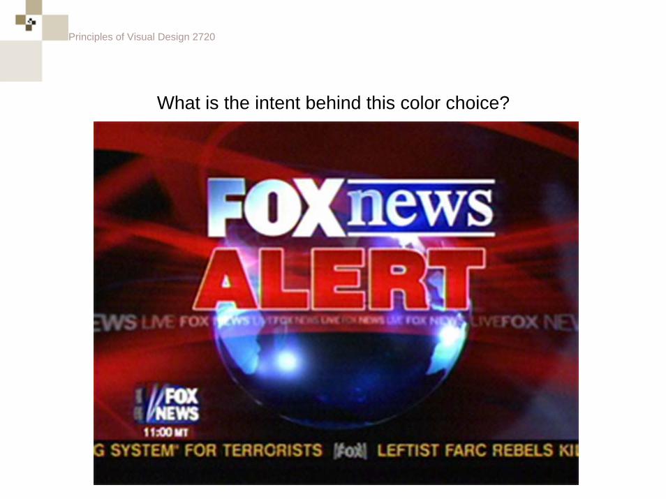
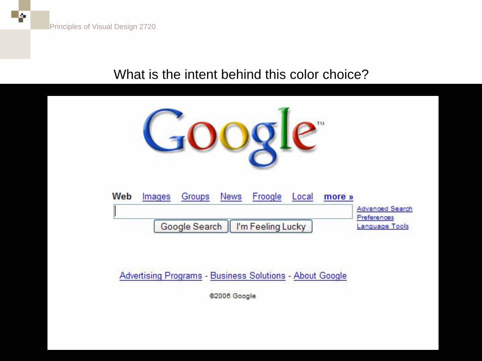
What is the intent behind this color choice?
Principles of Visual Design 2720
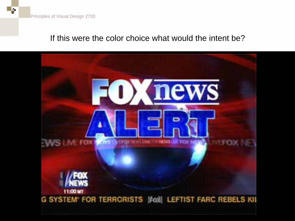
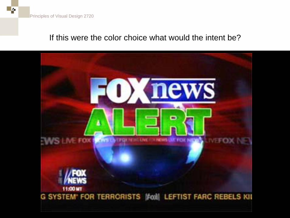
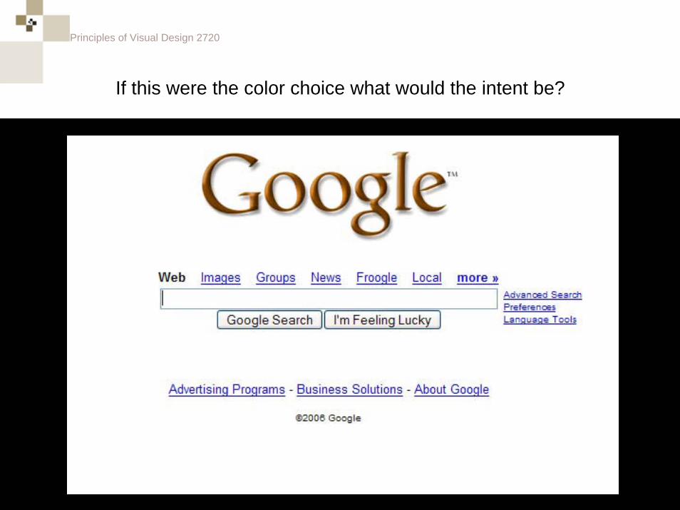
If this were the color choice what would the intent be?
Principles of Visual Design 2720
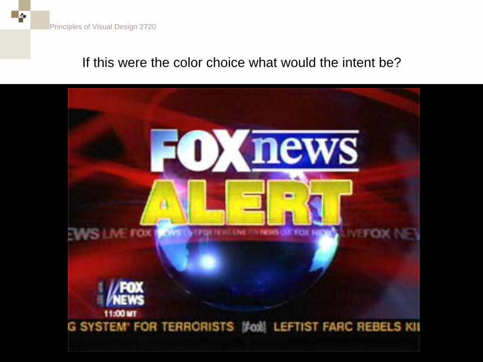
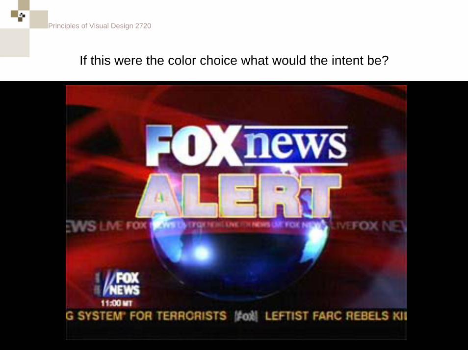
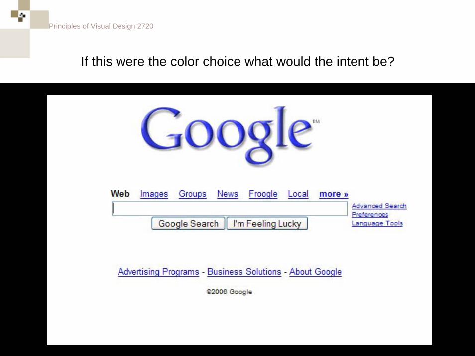
If this were the color choice what would the intent be?
Principles of Visual Design 2720
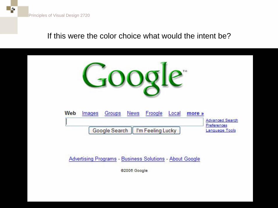
If this were the color choice what would the intent be?
Principles of Visual Design 2720
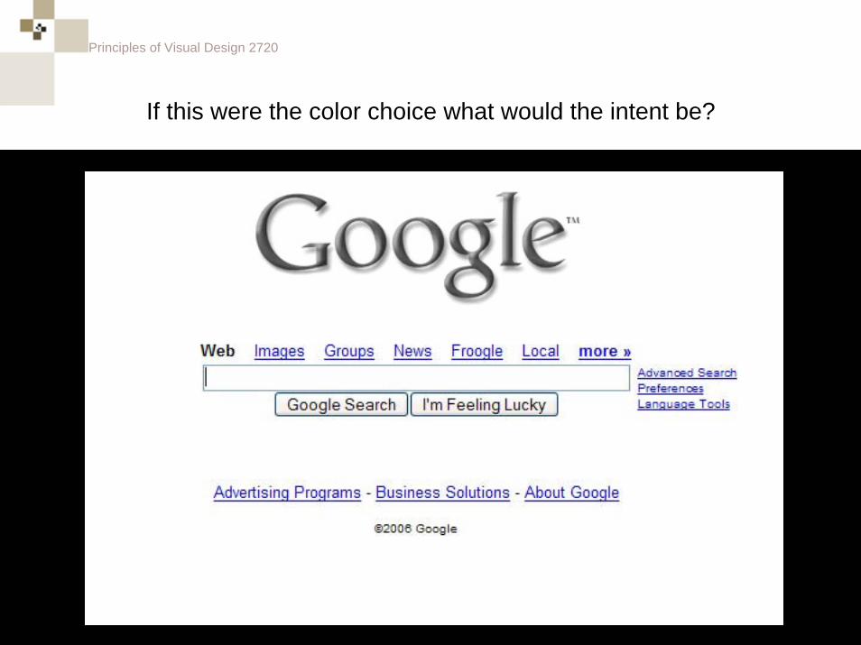
If this were the color choice what would the intent be?
Principles of Visual Design 2720
Which is the Unaltered Image?
Principles of Visual Design 2720
What is the intent behind this color choice?
Principles of Visual Design 2720
If this were the color choice what would the intent be?
Principles of Visual Design 2720
If this were the color choice what would the intent be?
Principles of Visual Design 2720
If this were the color choice what would the intent be?
Principles of Visual Design 2720
If this were the color choice what would the intent be?
Principles of Visual Design 2720
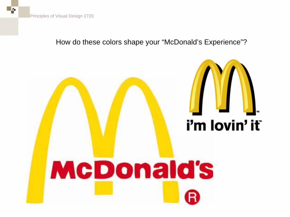
How do these colors shape your “McDonald’s Experience”?
Principles of Visual Design 2720
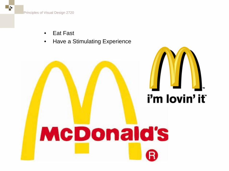
• Eat Fast• Have a Stimulating Experience
Principles of Visual Design 2720
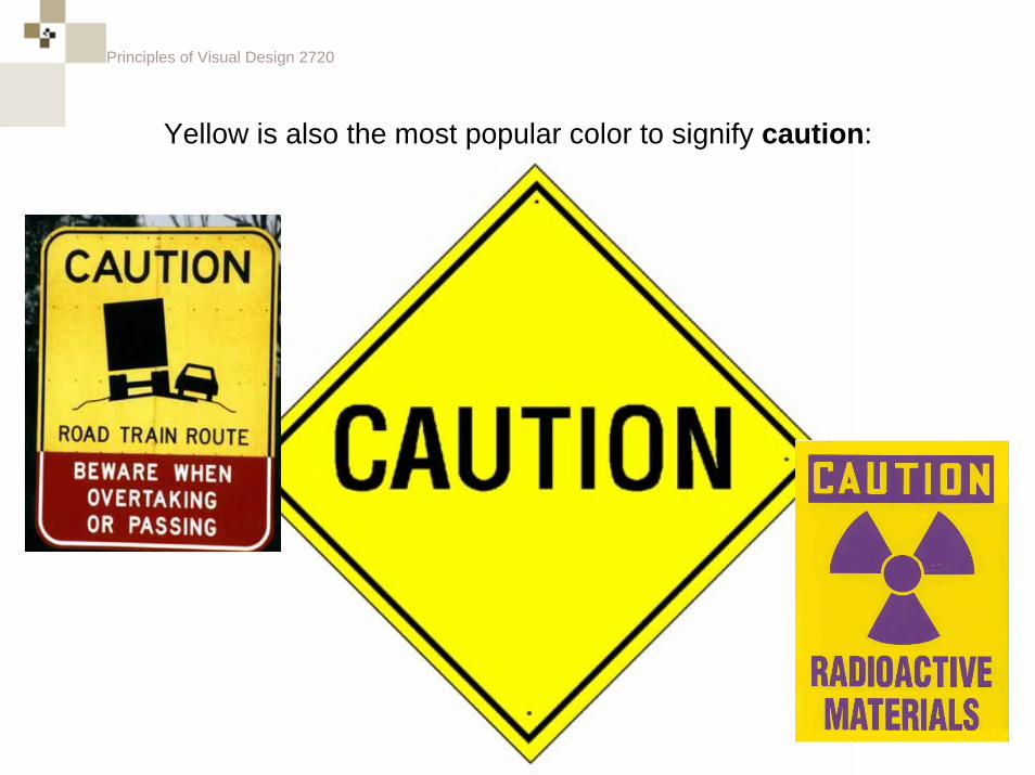
Yellow is also the most popular color to signify caution:
Principles of Visual Design 2720
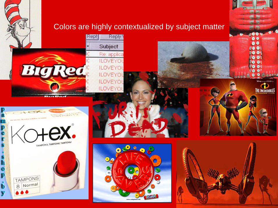
Colors are highly contextualized by subject matter
Principles of Visual Design 2720
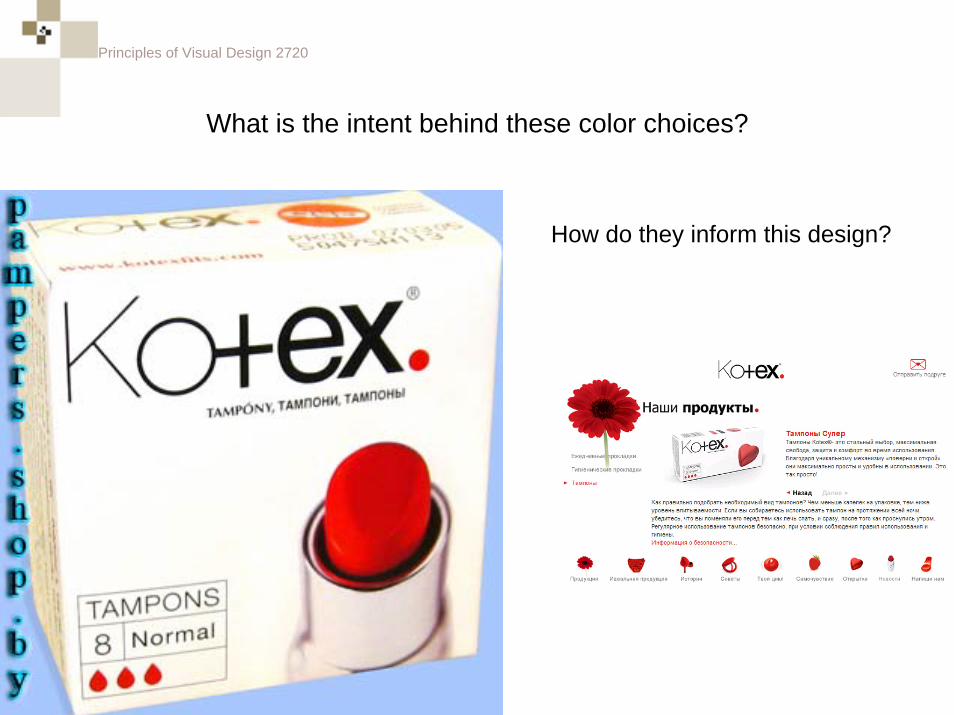
What is the intent behind these color choices?
How do they inform this design?
Principles of Visual Design 2720
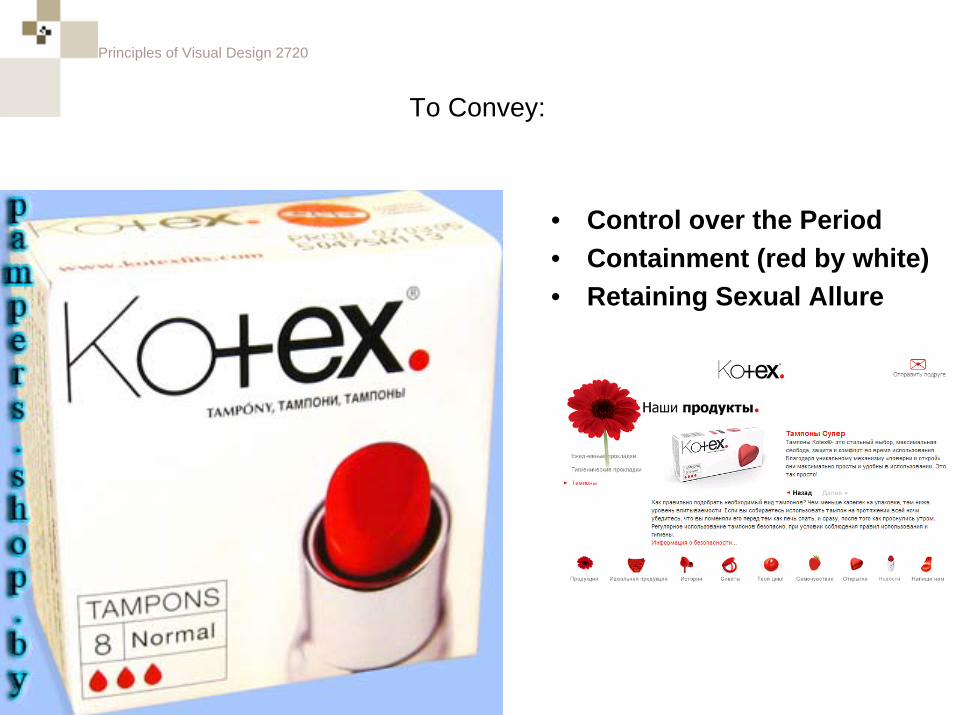
To Convey:
• Control over the Period• Containment (red by white)• Retaining Sexual Allure
Principles of Visual Design 2720
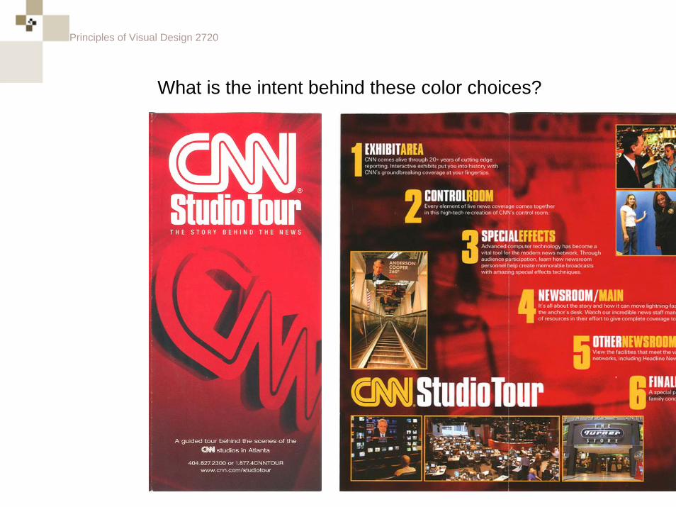
What is the intent behind these color choices?
Principles of Visual Design 2720
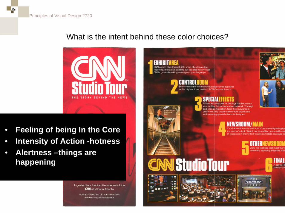
What is the intent behind these color choices?
• Feeling of being In the Core• Intensity of Action -hotness• Alertness –things are
happening
Principles of Visual Design 2720
What is the intent behind these color choices?
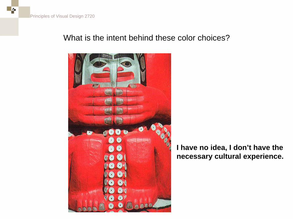
Principles of Visual Design 2720
I have no idea, I don’t have the necessary cultural experience.
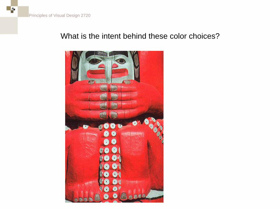
What is the intent behind these color choices?
Principles of Visual Design 2720
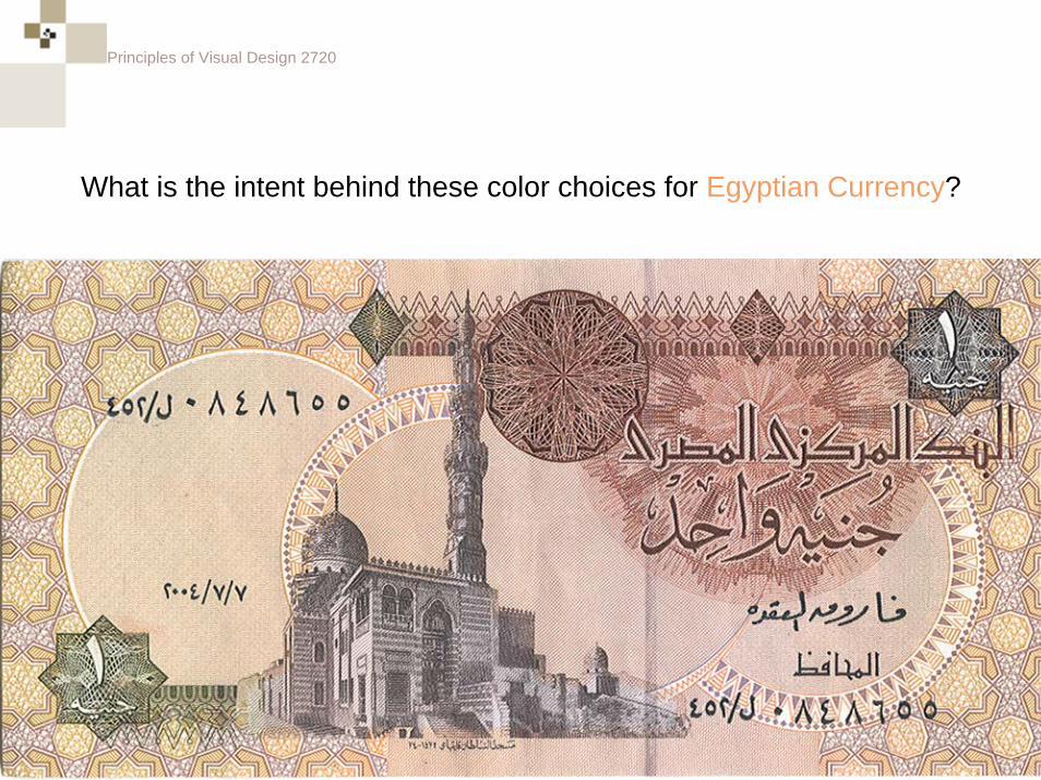
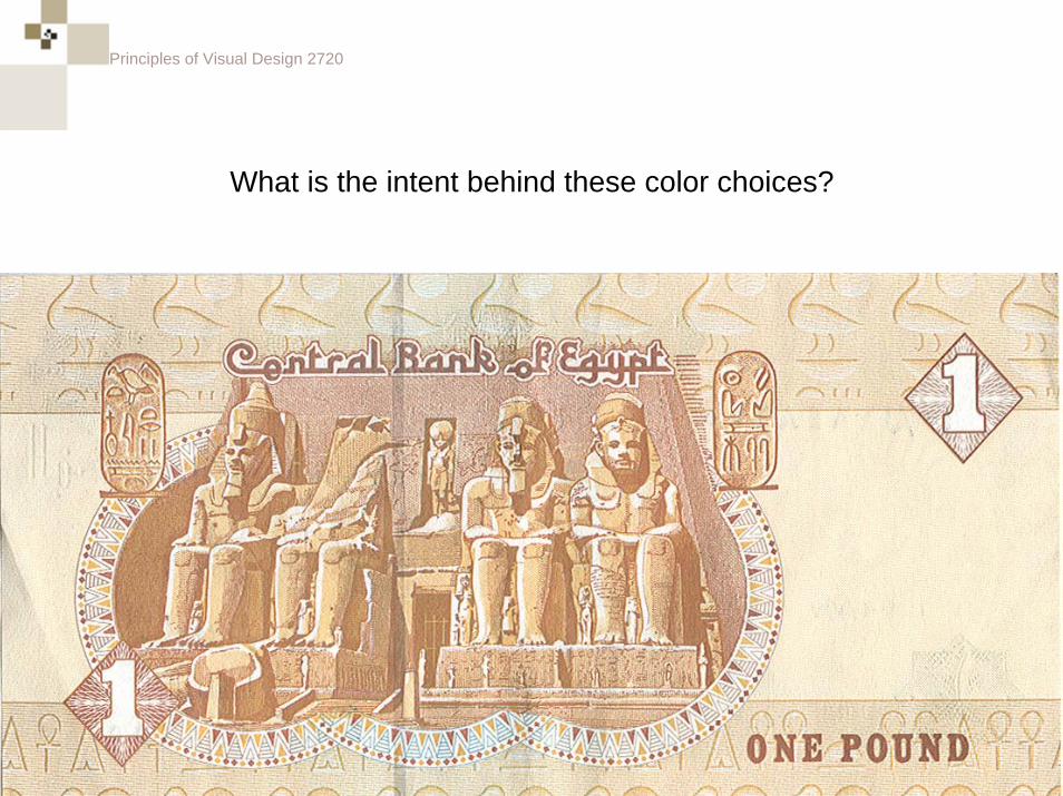
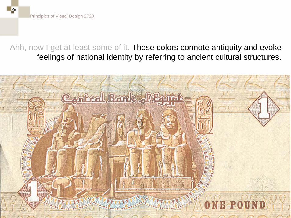
What is the intent behind these color choices for Egyptian Currency?
Principles of Visual Design 2720
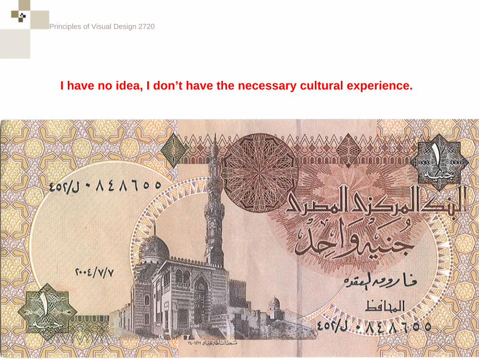
I have no idea, I don’t have the necessary cultural experience.
Principles of Visual Design 2720
What is the intent behind these color choices?
Principles of Visual Design 2720
Ahh, now I get at least some of it. These colors connote antiquity and evoke feelings of national identity by referring to ancient cultural structures.
Principles of Visual Design 2720
Color Affecting Color
Principles of Visual Design 2720
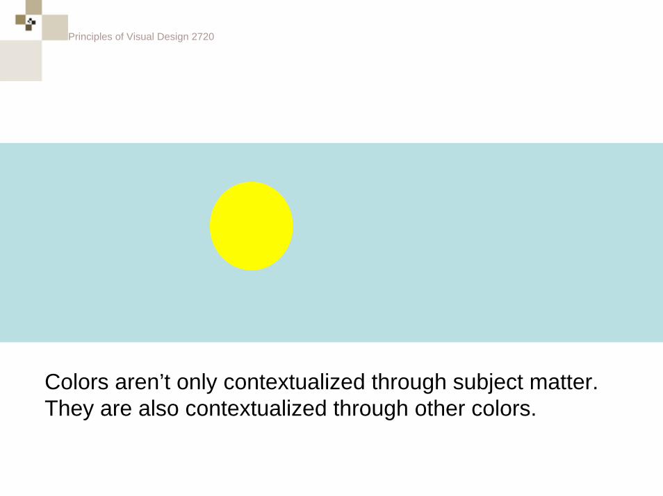
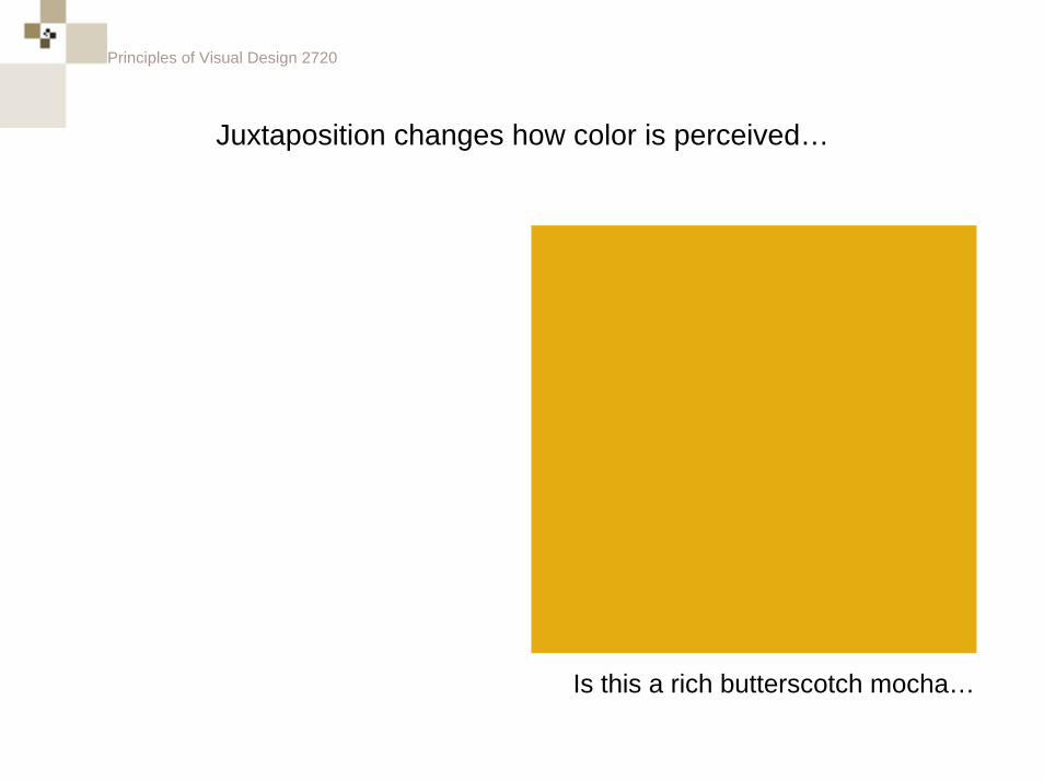
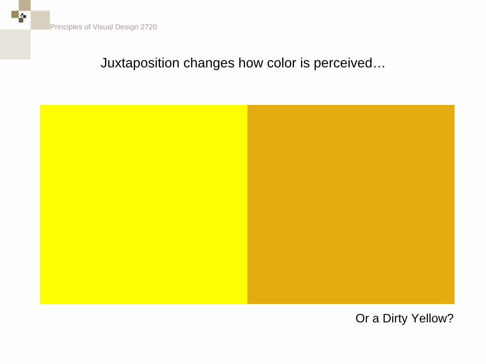
Colors aren’t only contextualized through subject matter. They are also contextualized through other colors.
Principles of Visual Design 2720
Juxtaposition changes how color is perceived…
Is this a rich butterscotch mocha…
Principles of Visual Design 2720
Juxtaposition changes how color is perceived…
Or a Dirty Yellow?
Principles of Visual Design 2720
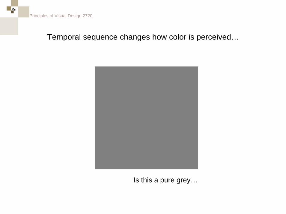
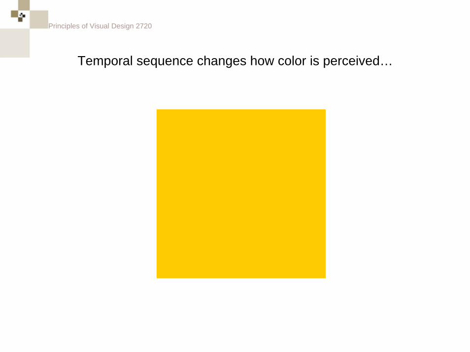
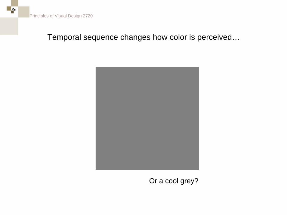
Temporal sequence changes how color is perceived…
Is this a pure grey…
Principles of Visual Design 2720
Temporal sequence changes how color is perceived…
Principles of Visual Design 2720
Temporal sequence changes how color is perceived…
Or a cool grey?
Principles of Visual Design 2720
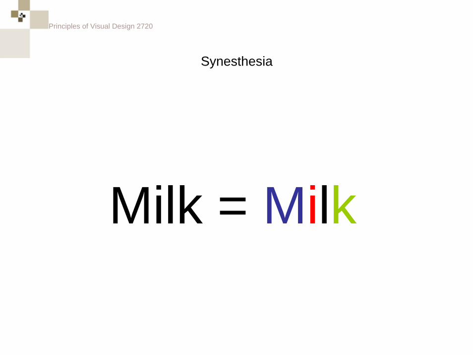
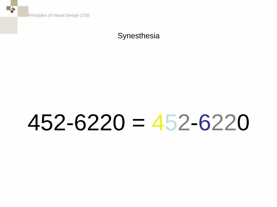
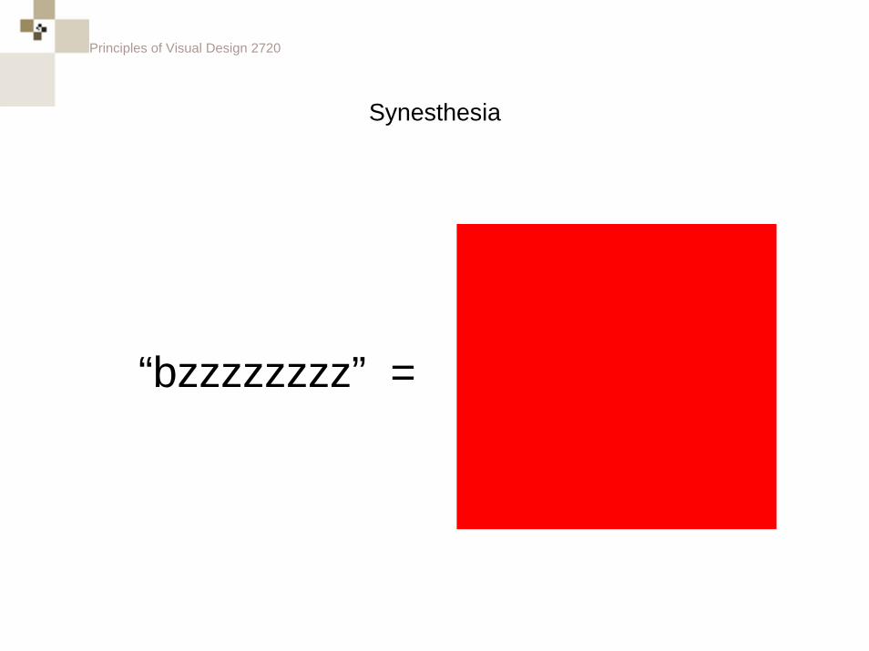
Synesthesia
Principles of Visual Design 2720
SynesthesiaThe faculty to receive stimuli through one sense, sight, for example, and perceive it through another, hearing, for example.
Principles of Visual Design 2720
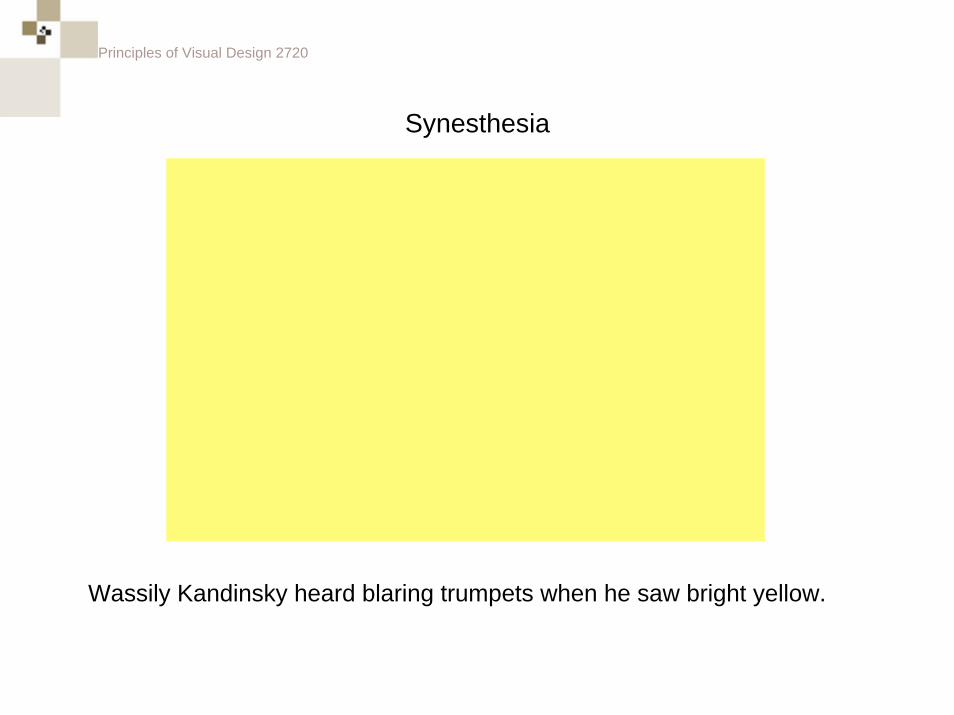
Synesthesia
Wassily Kandinsky heard blaring trumpets when he saw bright yellow.
Principles of Visual Design 2720
Synesthesia
Milk = Milk
Principles of Visual Design 2720
Synesthesia
452-6220 = 452-6220
Principles of Visual Design 2720
“bzzzzzzzz” =
Synesthesia
Principles of Visual Design 2720
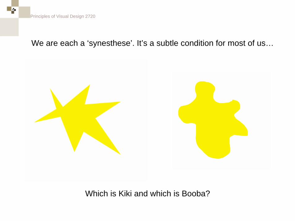
Which is Kiki and which is Booba?
We are each a ‘synesthese’. It’s a subtle condition for most of us…
Principles of Visual Design 2720
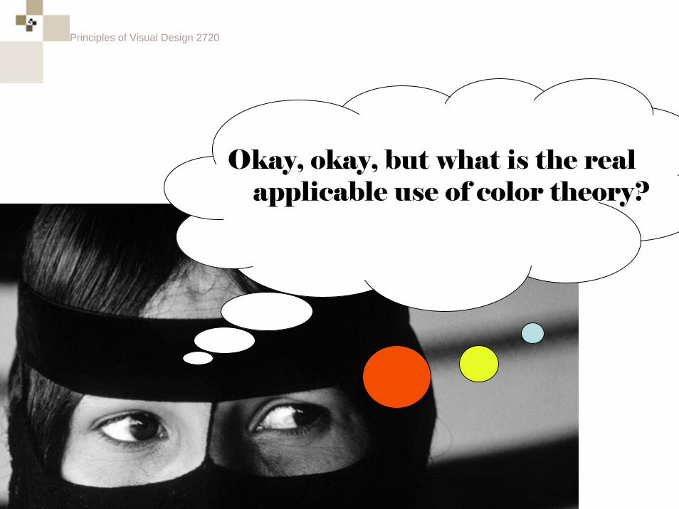
Okay, okay, but what is the real applicable use of color theory?
Principles of Visual Design 2720
Classic Color Theory
Principles of Visual Design 2720
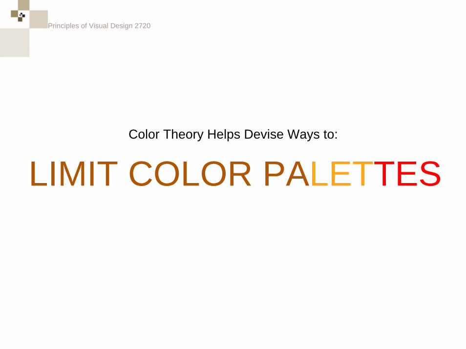
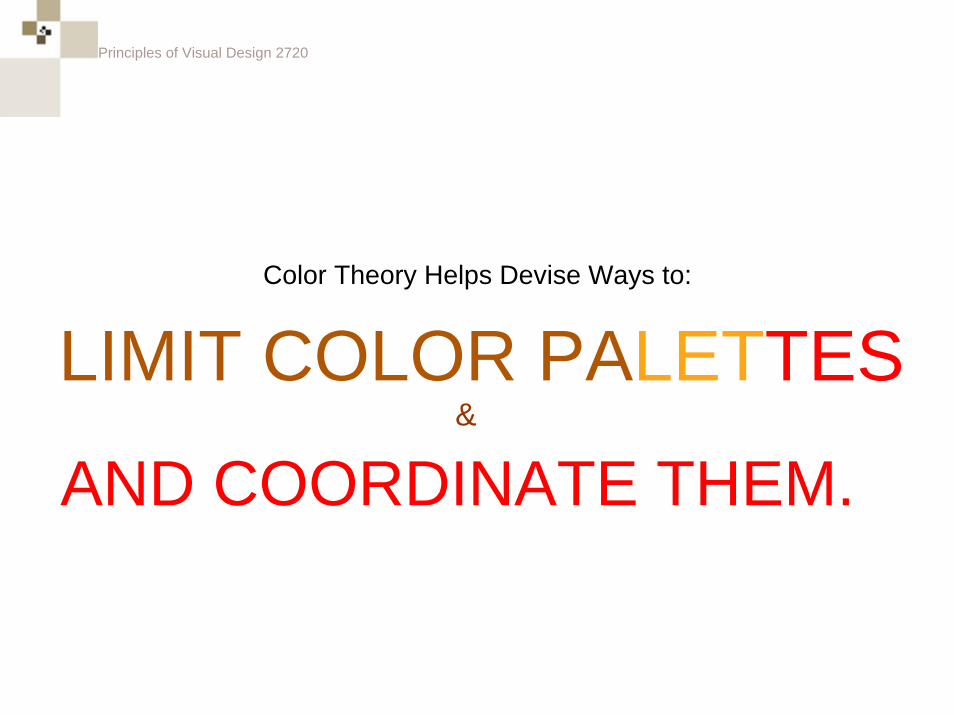
LIMIT COLOR PALETTESColor Theory Helps Devise Ways to:
Principles of Visual Design 2720
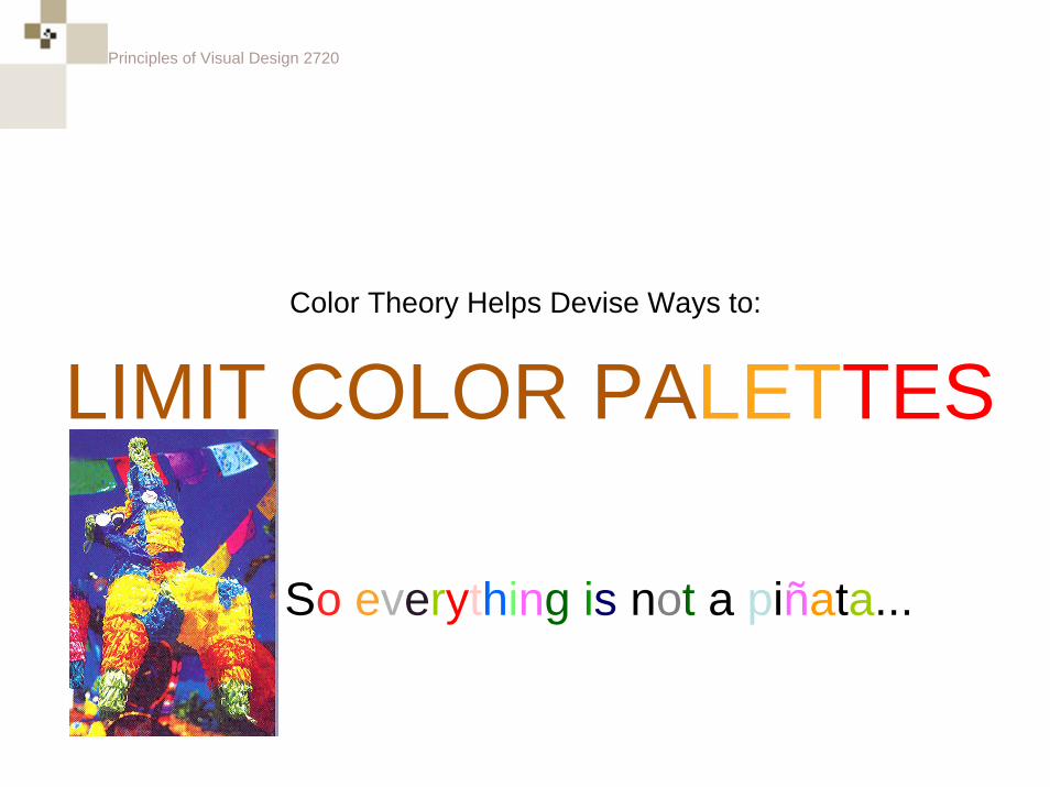
LIMIT COLOR PALETTESColor Theory Helps Devise Ways to:
So everything is not a piñata...
Principles of Visual Design 2720
LIMIT COLOR PALETTESColor Theory Helps Devise Ways to:
AND COORDINATE THEM.&
Principles of Visual Design 2720
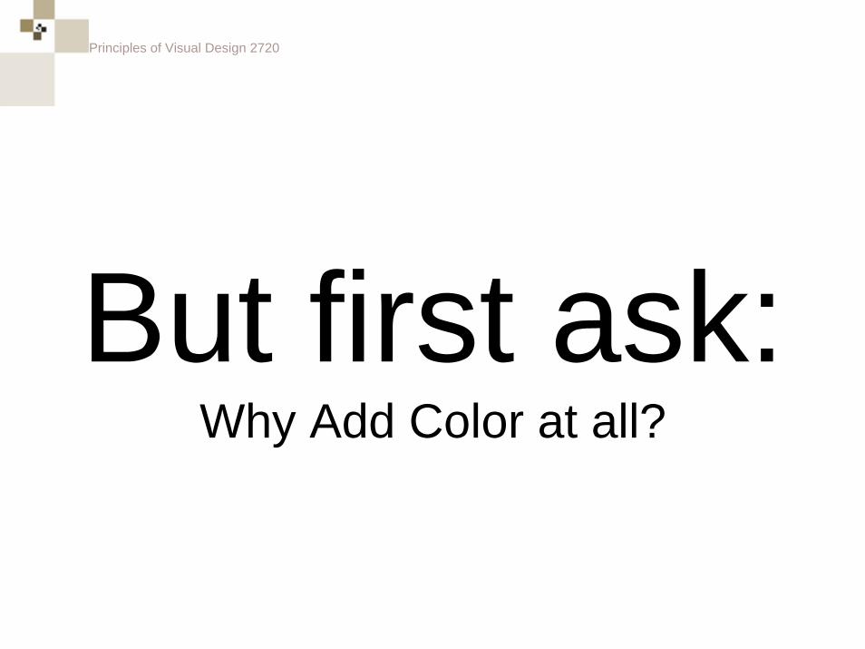
But first ask:Why Add Color at all?
Principles of Visual Design 2720
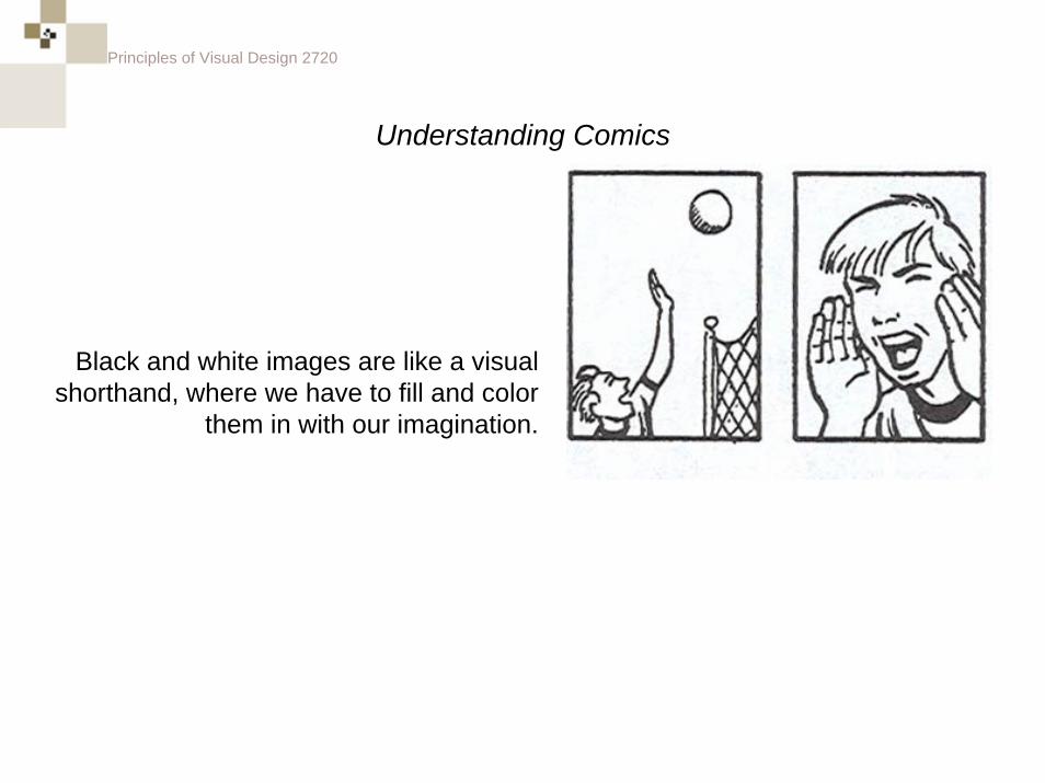
Understanding Comics
Black and white images are like a visual shorthand, where we have to fill and color
them in with our imagination.
Principles of Visual Design 2720
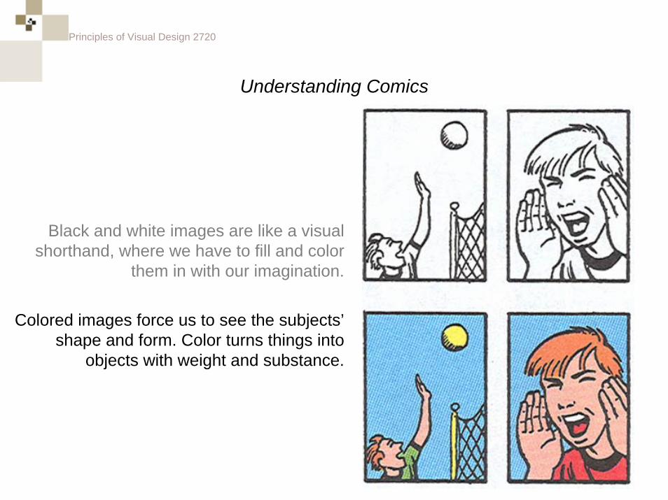
Understanding Comics
Colored images force us to see the subjects’shape and form. Color turns things into
objects with weight and substance.
Black and white images are like a visual shorthand, where we have to fill and color
them in with our imagination.
Principles of Visual Design 2720
Principles of Visual Design 2720
Color Wheel
Principles of Visual Design 2720
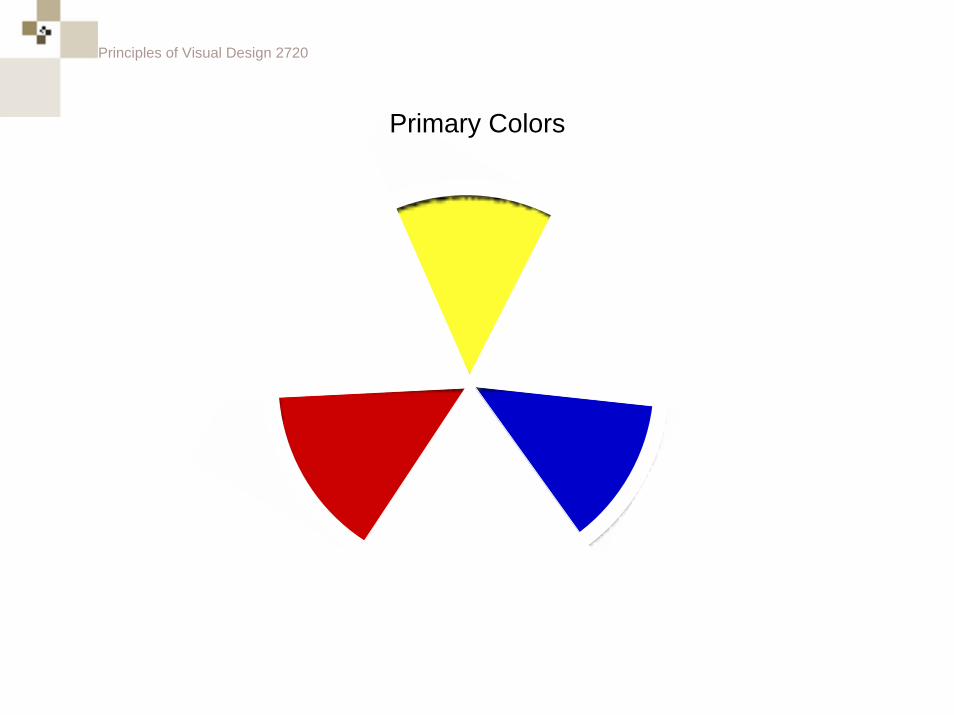
Primary Colors
Principles of Visual Design 2720
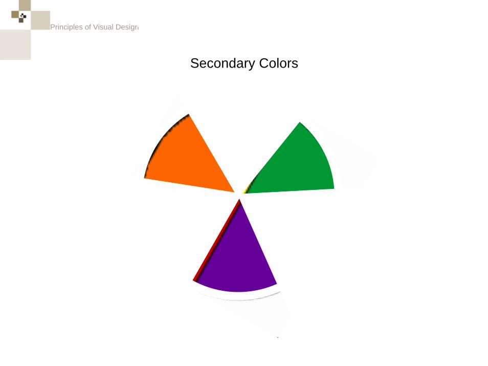
Secondary Colors
Principles of Visual Design 2720
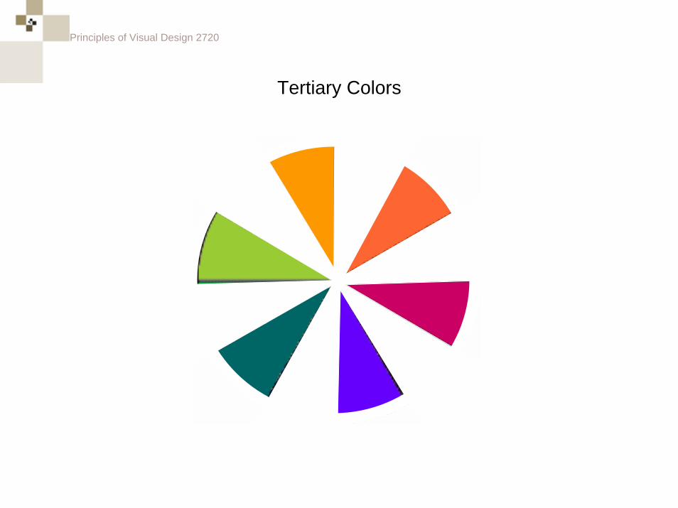
Tertiary Colors
Principles of Visual Design 2720
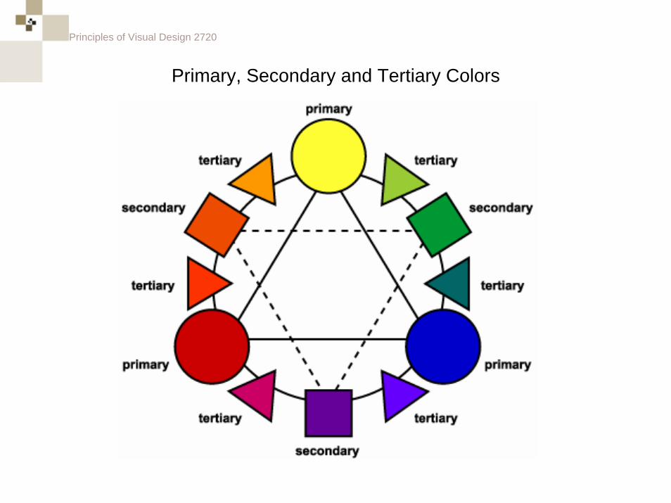
Primary, Secondary and Tertiary Colors
Principles of Visual Design 2720
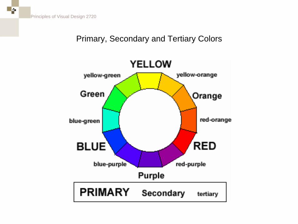
Primary, Secondary and Tertiary Colors
Principles of Visual Design 2720
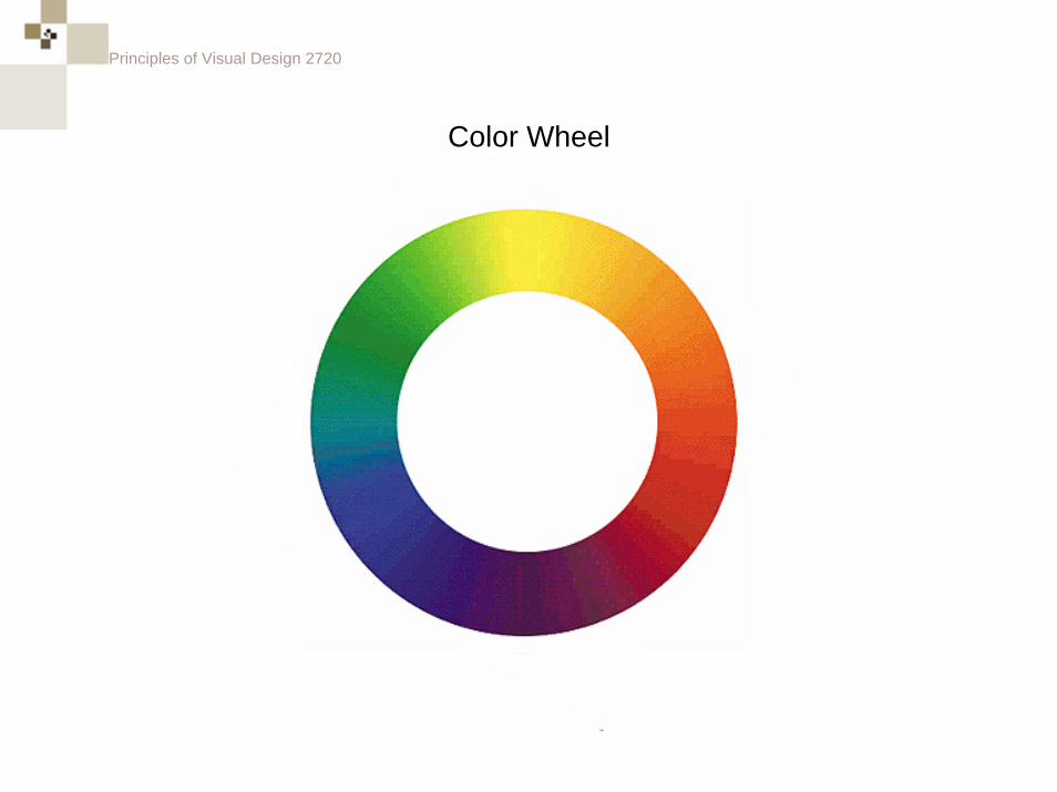
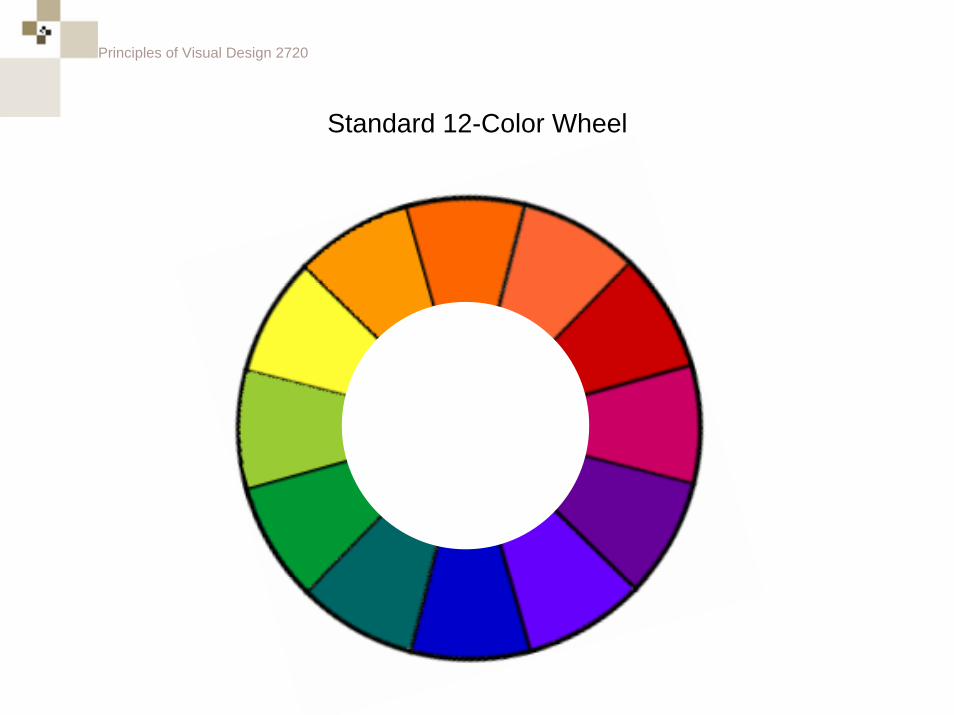
Standard 12-Color Wheel
Principles of Visual Design 2720
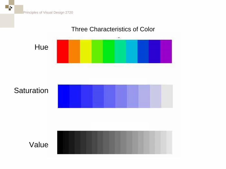
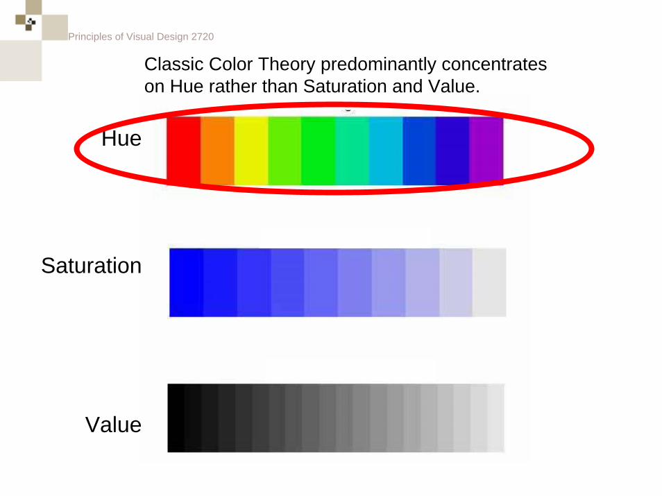
Three Characteristics of Color
Hue
Saturation
Value
Principles of Visual Design 2720
Hue
Saturation
Value
Classic Color Theory predominantly concentrates on Hue rather than Saturation and Value.
Principles of Visual Design 2720
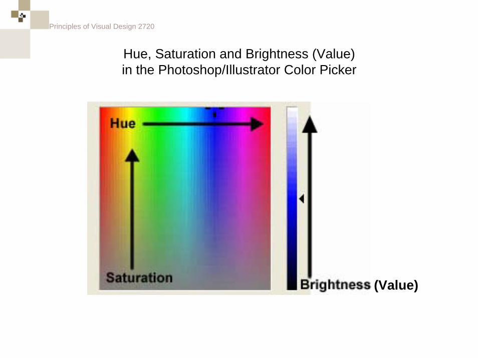
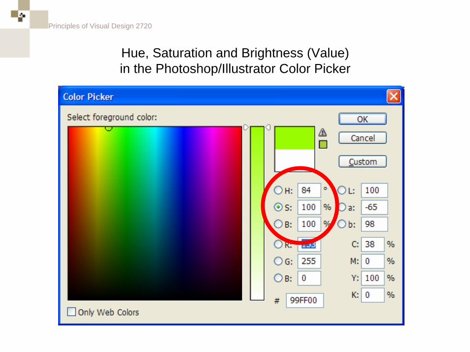
Hue, Saturation and Brightness (Value)in the Photoshop/Illustrator Color Picker
(Value)
Principles of Visual Design 2720
Hue, Saturation and Brightness (Value)in the Photoshop/Illustrator Color Picker
Principles of Visual Design 2720
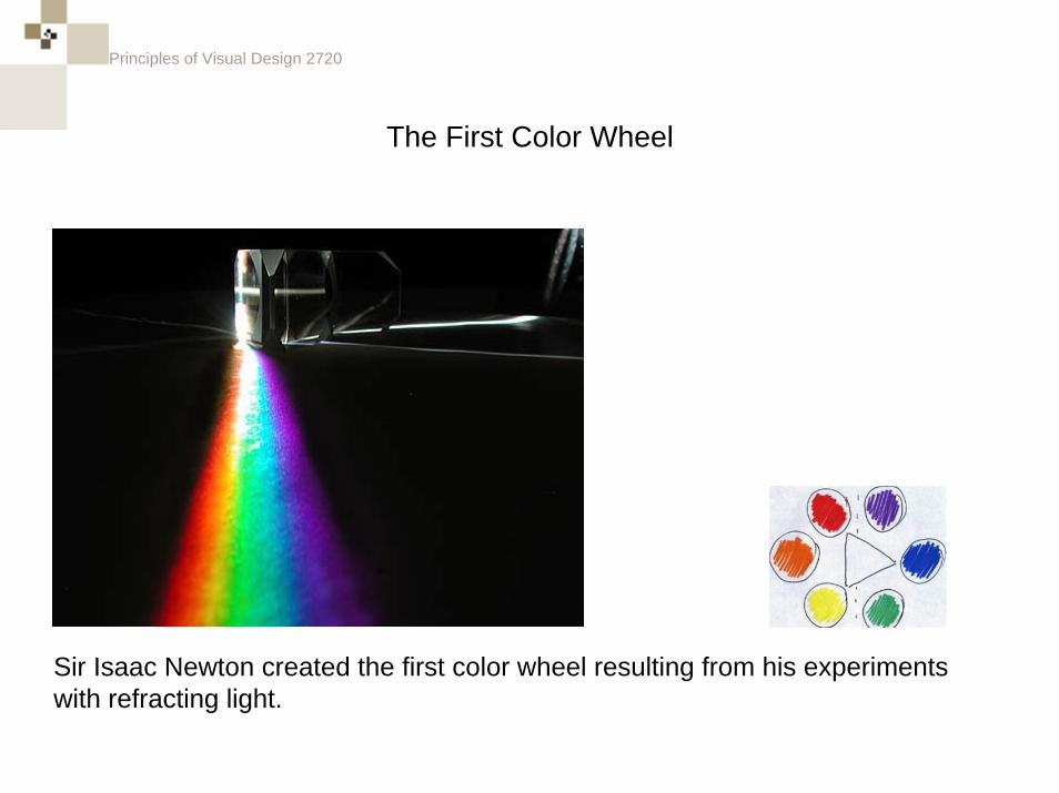
The First Color Wheel
Sir Isaac Newton created the first color wheel resulting from his experiments with refracting light.
Principles of Visual Design 2720
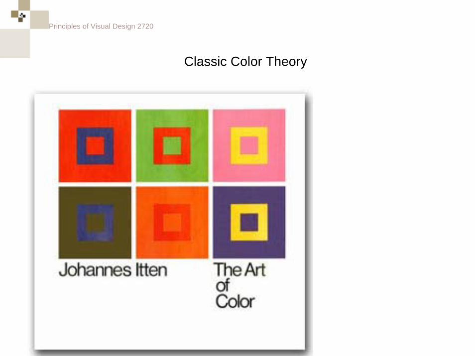
Classic Color Theory
Principles of Visual Design 2720
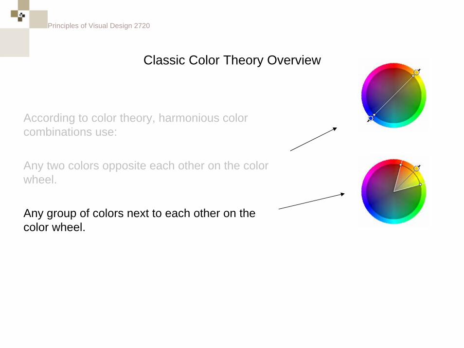
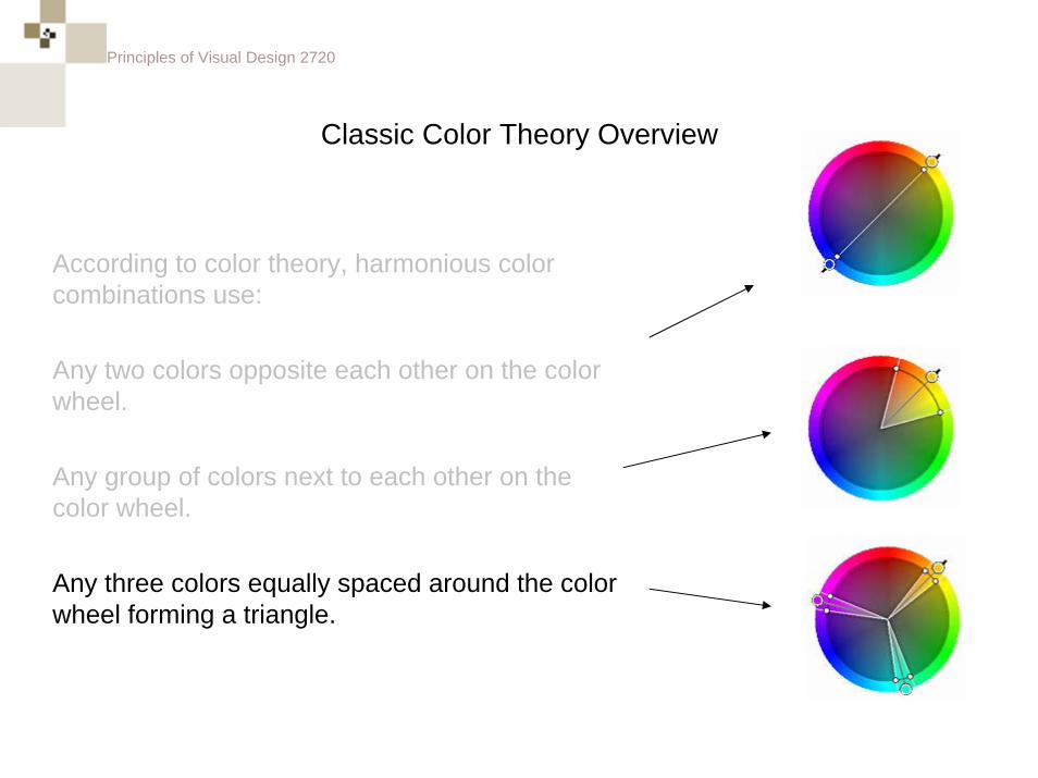
Classic Color Theory Overview
According to color theory, harmonious color combinations use:
Principles of Visual Design 2720
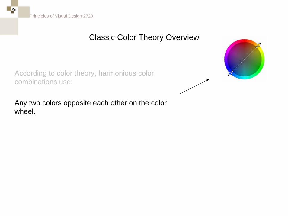
Classic Color Theory Overview
According to color theory, harmonious color combinations use:
Any two colors opposite each other on the color wheel.
Principles of Visual Design 2720
Classic Color Theory Overview
According to color theory, harmonious color combinations use:
Any two colors opposite each other on the color wheel.
Any group of colors next to each other on the color wheel.
Principles of Visual Design 2720
Classic Color Theory Overview
According to color theory, harmonious color combinations use:
Any two colors opposite each other on the color wheel.
Any group of colors next to each other on the color wheel.
Any three colors equally spaced around the color wheel forming a triangle.
Principles of Visual Design 2720
Classic Color Theory Overview
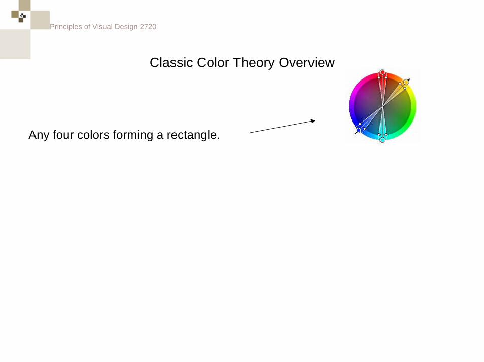
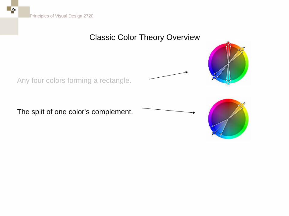
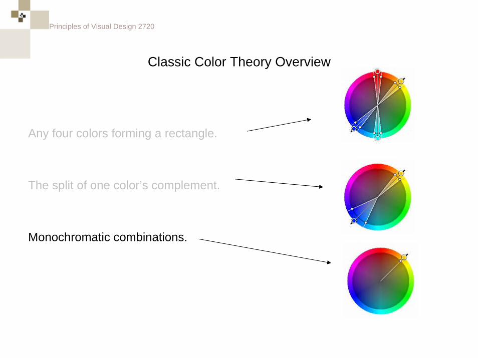
Any four colors forming a rectangle.
Principles of Visual Design 2720
Classic Color Theory Overview
Any four colors forming a rectangle.
The split of one color’s complement.
Principles of Visual Design 2720
Classic Color Theory Overview
Any four colors forming a rectangle.
The split of one color’s complement.
Monochromatic combinations.
Principles of Visual Design 2720
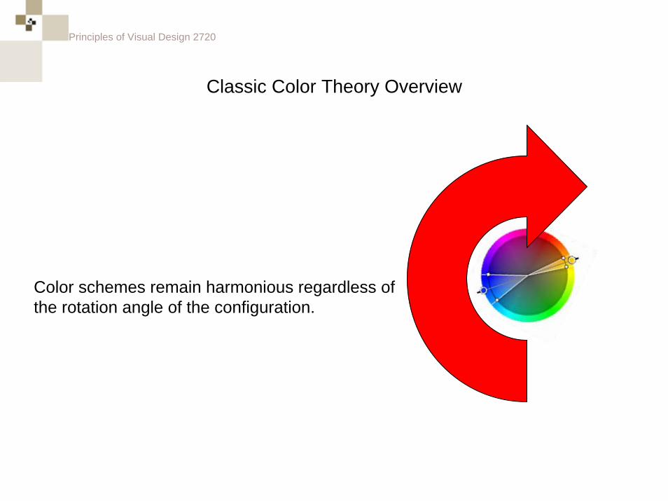
Classic Color Theory Overview
Color schemes remain harmonious regardless of the rotation angle of the configuration.
Principles of Visual Design 2720
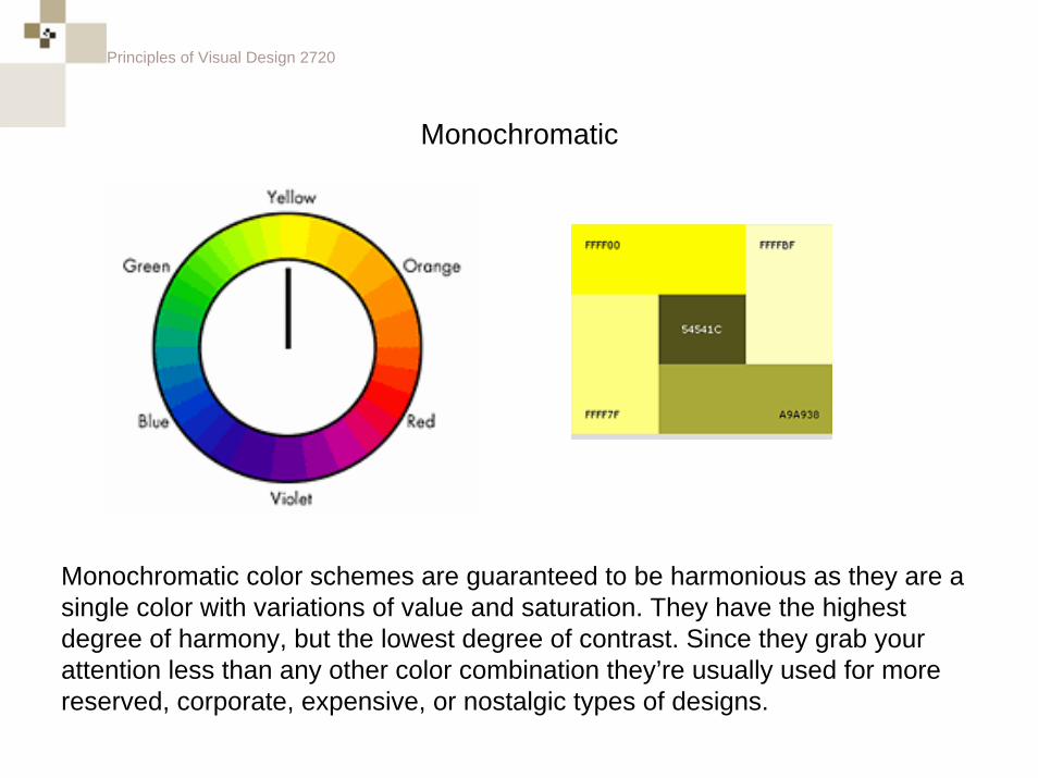
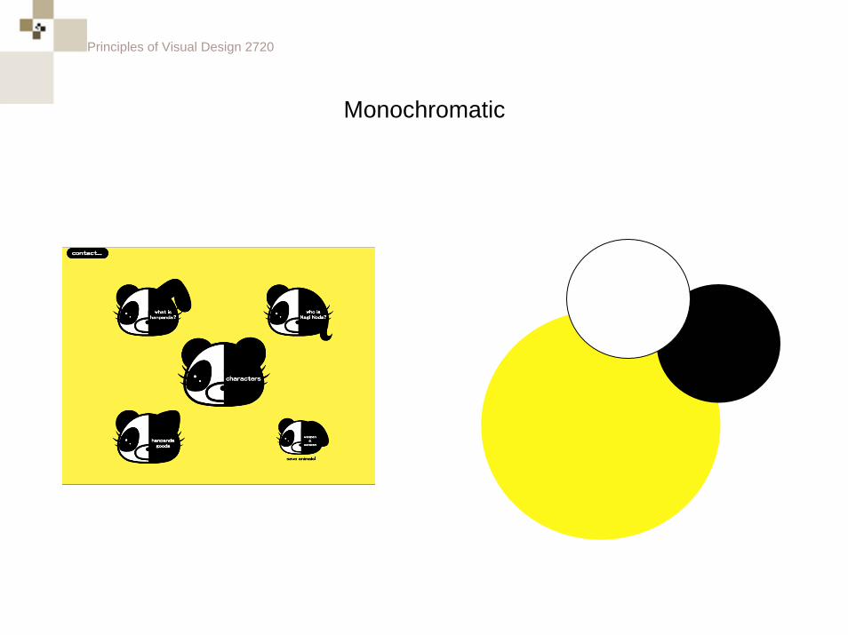
Monochromatic
Monochromatic color schemes are guaranteed to be harmonious as they are a single color with variations of value and saturation. They have the highest degree of harmony, but the lowest degree of contrast. Since they grab your attention less than any other color combination they’re usually used for more reserved, corporate, expensive, or nostalgic types of designs.
Principles of Visual Design 2720
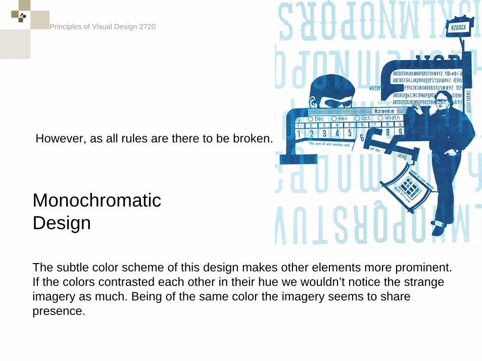
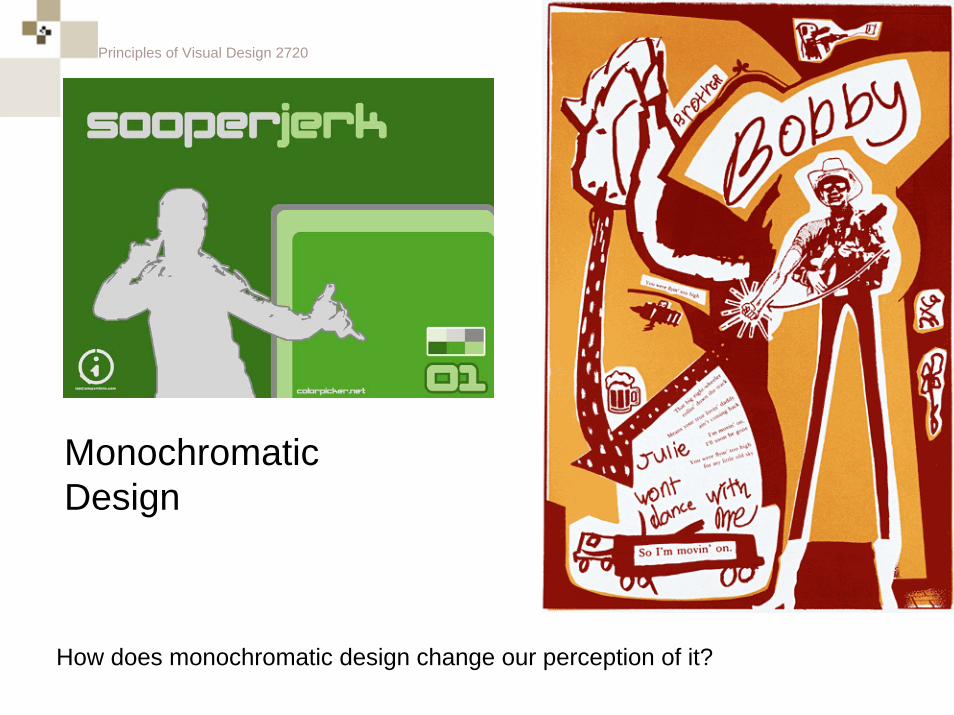
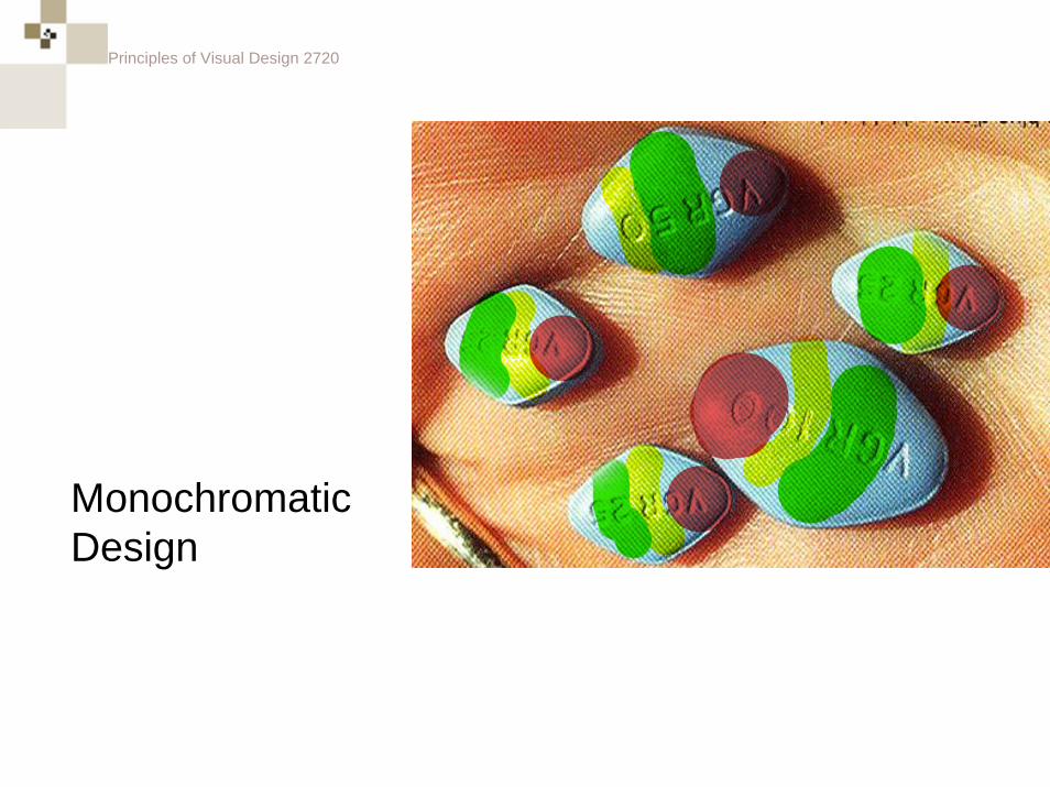
The subtle color scheme of this design makes other elements more prominent. If the colors contrasted each other in their hue we wouldn’t notice the strange imagery as much. Being of the same color the imagery seems to share presence.
Monochromatic Design
However, as all rules are there to be broken.
Principles of Visual Design 2720
Monochromatic Design
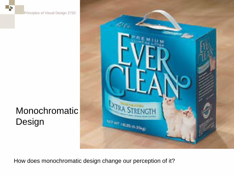
How does monochromatic design change our perception of it?
Principles of Visual Design 2720
Monochromatic Design
How does monochromatic design change our perception of it?
Principles of Visual Design 2720
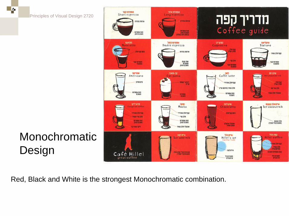
Red, Black and White is the strongest Monochromatic combination.
Monochromatic Design
Principles of Visual Design 2720
Monochromatic Design
Principles of Visual Design 2720
Monochromatic Design
Principles of Visual Design 2720
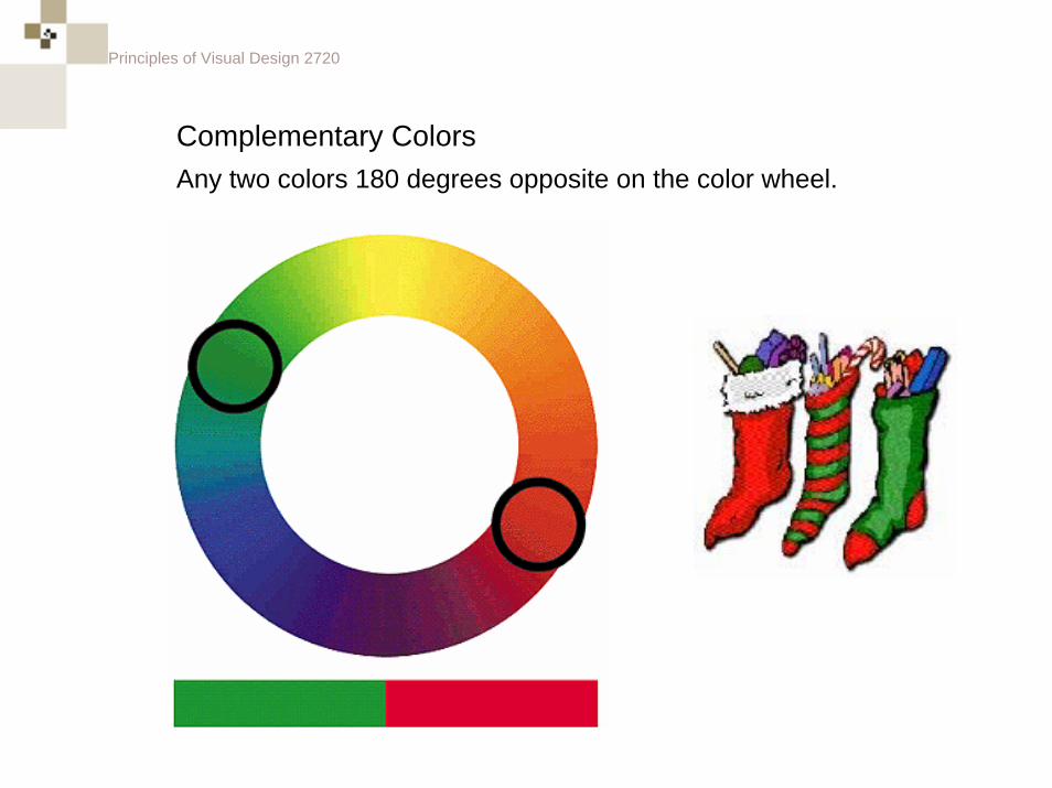
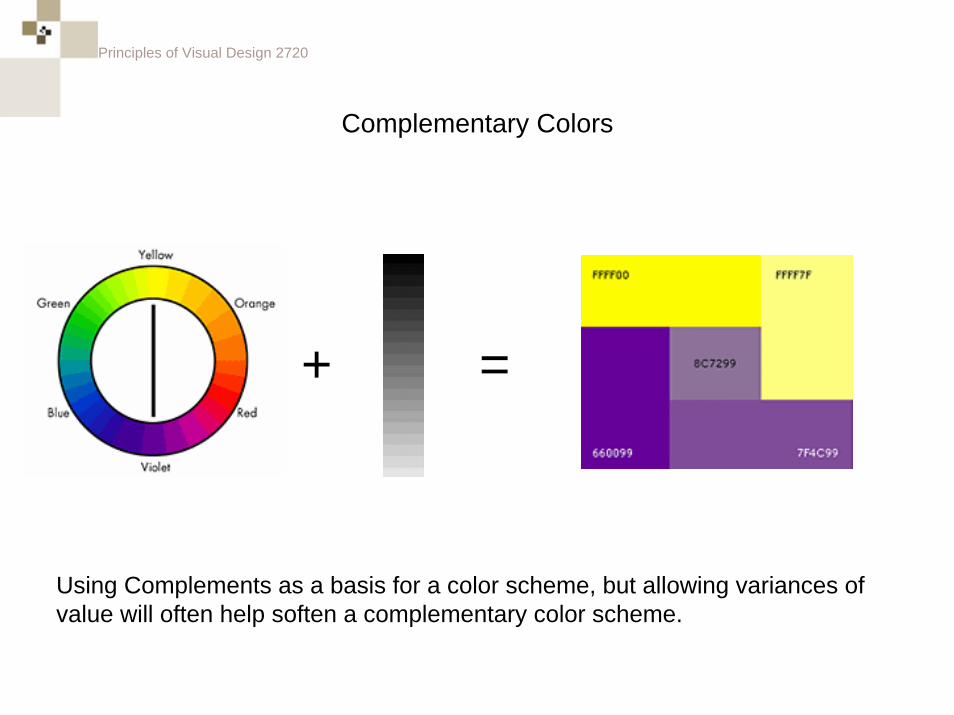
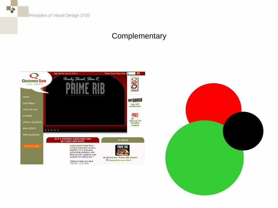
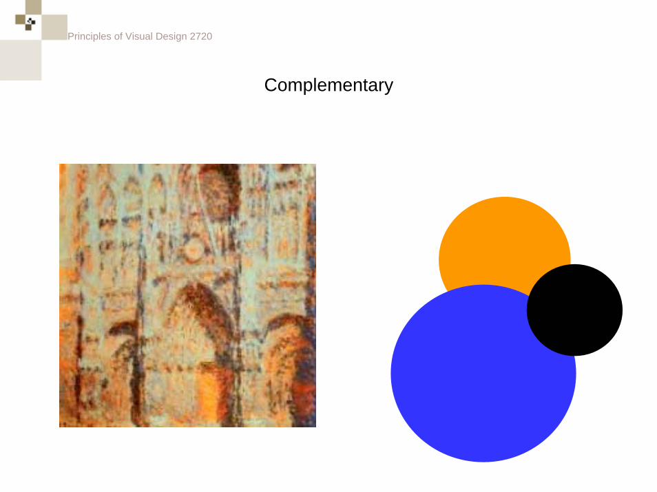
Complementary ColorsAny two colors 180 degrees opposite on the color wheel.
Principles of Visual Design 2720
What is the definition of “complement”?
Principles of Visual Design 2720
What is the definition of “complement”?
To complete or enhance each other.
Principles of Visual Design 2720
What is the definition of “compliment”?
Principles of Visual Design 2720
What is the definition of “compliment”?
To praise.
Principles of Visual Design 2720
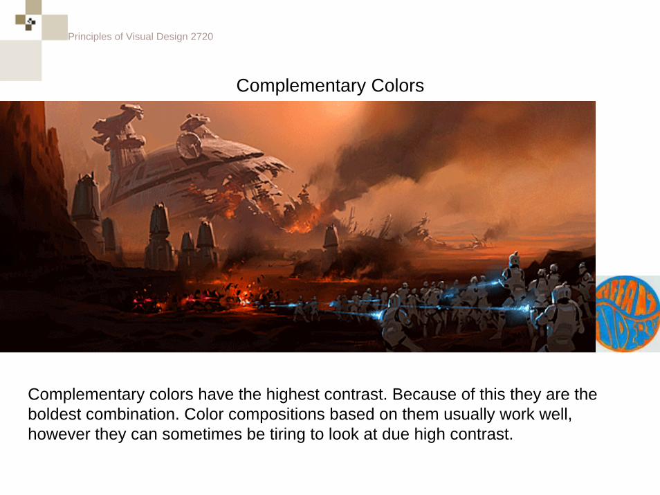
Complementary Colors
Complementary colors have the highest contrast. Because of this they are the boldest combination. Color compositions based on them usually work well, however they can sometimes be tiring to look at due high contrast.
Principles of Visual Design 2720
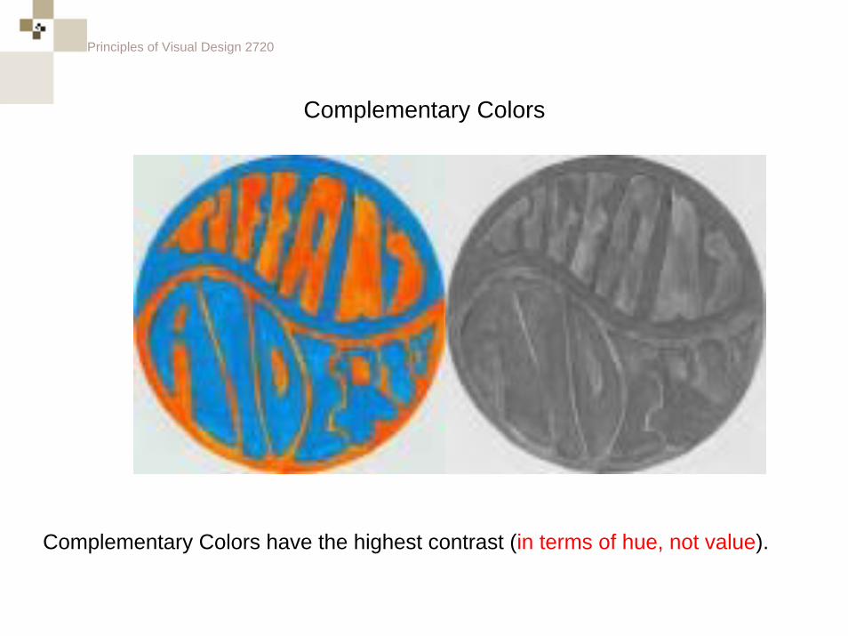
Complementary Colors
Complementary Colors have the highest contrast (in terms of hue, not value).
Principles of Visual Design 2720
Complementary Colors
Using Complements as a basis for a color scheme, but allowing variances of value will often help soften a complementary color scheme.
+ =
Principles of Visual Design 2720
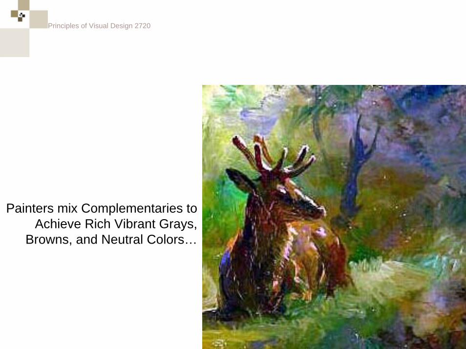
Painters mix Complementaries to Achieve Rich Vibrant Grays,
Browns, and Neutral Colors…
Principles of Visual Design 2720
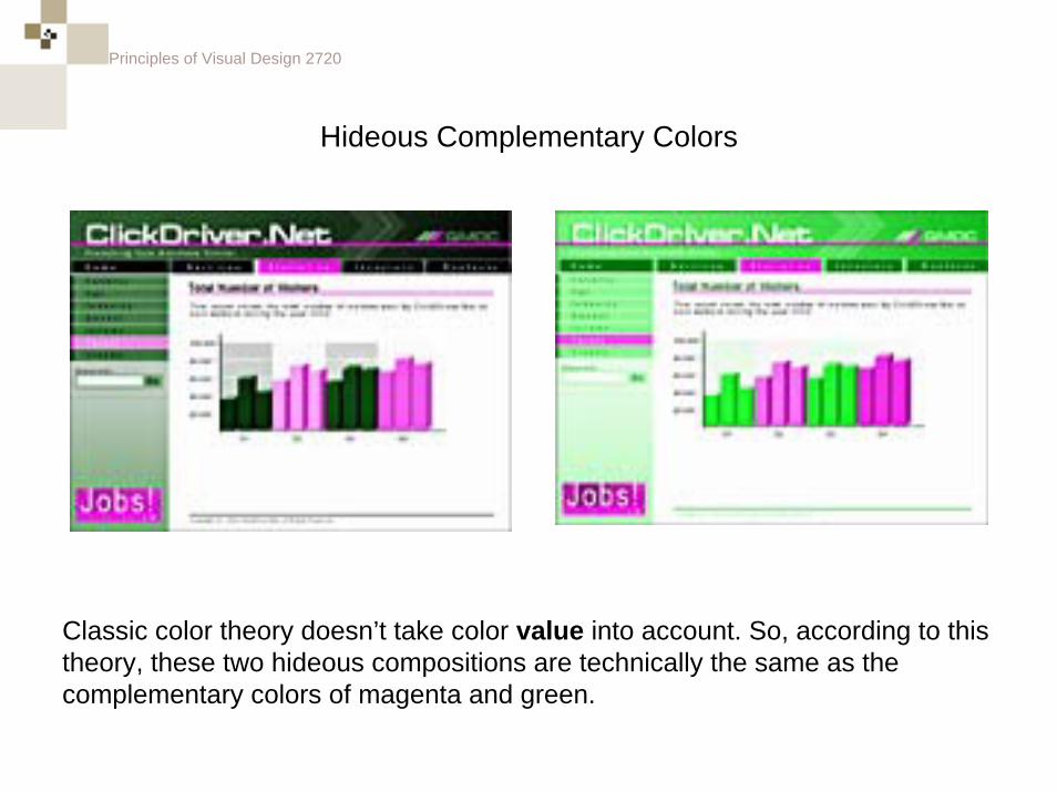
Hideous Complementary Colors
Classic color theory doesn’t take color value into account. So, according to this theory, these two hideous compositions are technically the same as the complementary colors of magenta and green.
Principles of Visual Design 2720
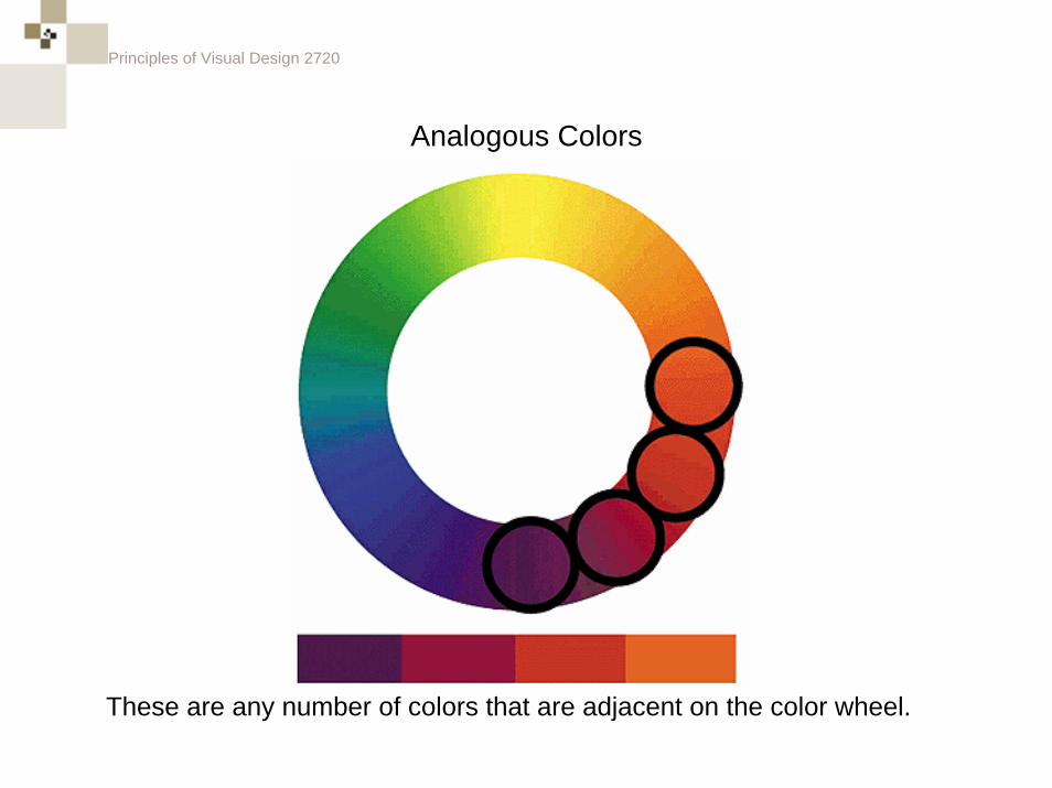
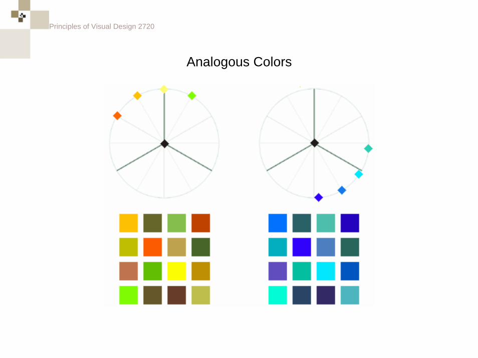
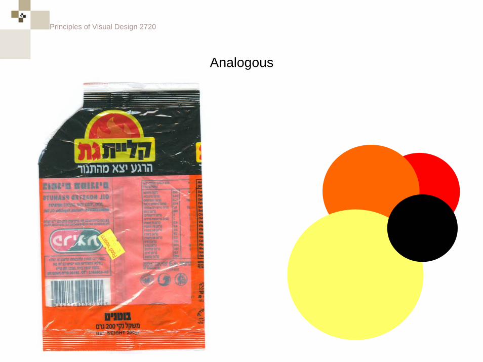
Analogous Colors
These are any number of colors that are adjacent on the color wheel.
Principles of Visual Design 2720
Analogous Colors
Principles of Visual Design 2720
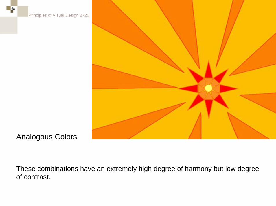
Analogous Colors
These combinations have an extremely high degree of harmony but low degree of contrast.
Principles of Visual Design 2720
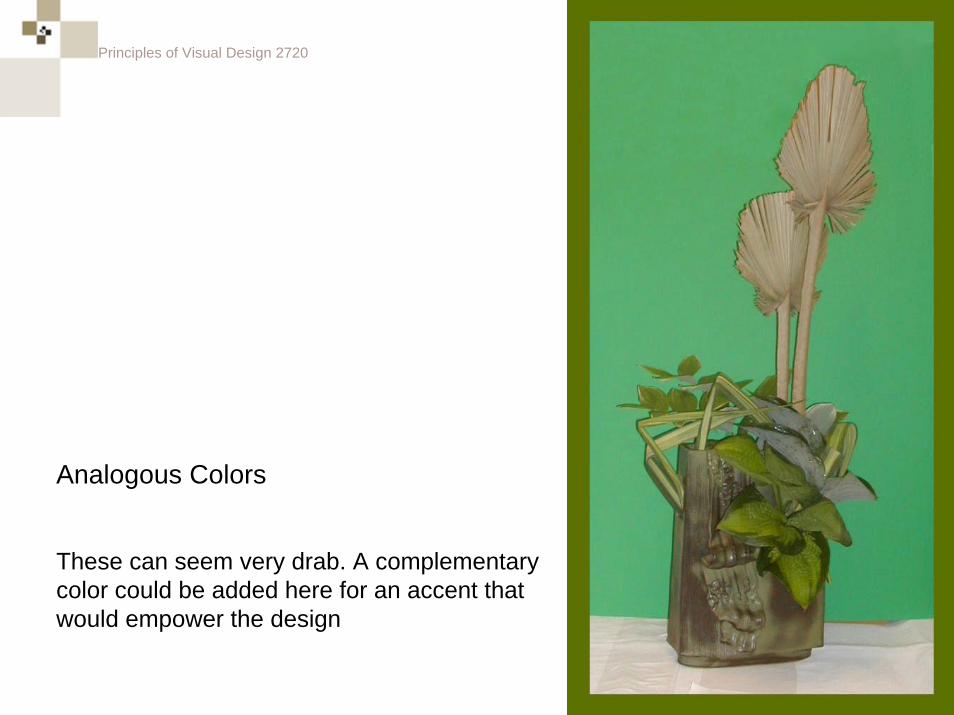
These can seem very drab. A complementary color could be added here for an accent that would empower the design
Analogous Colors
Principles of Visual Design 2720
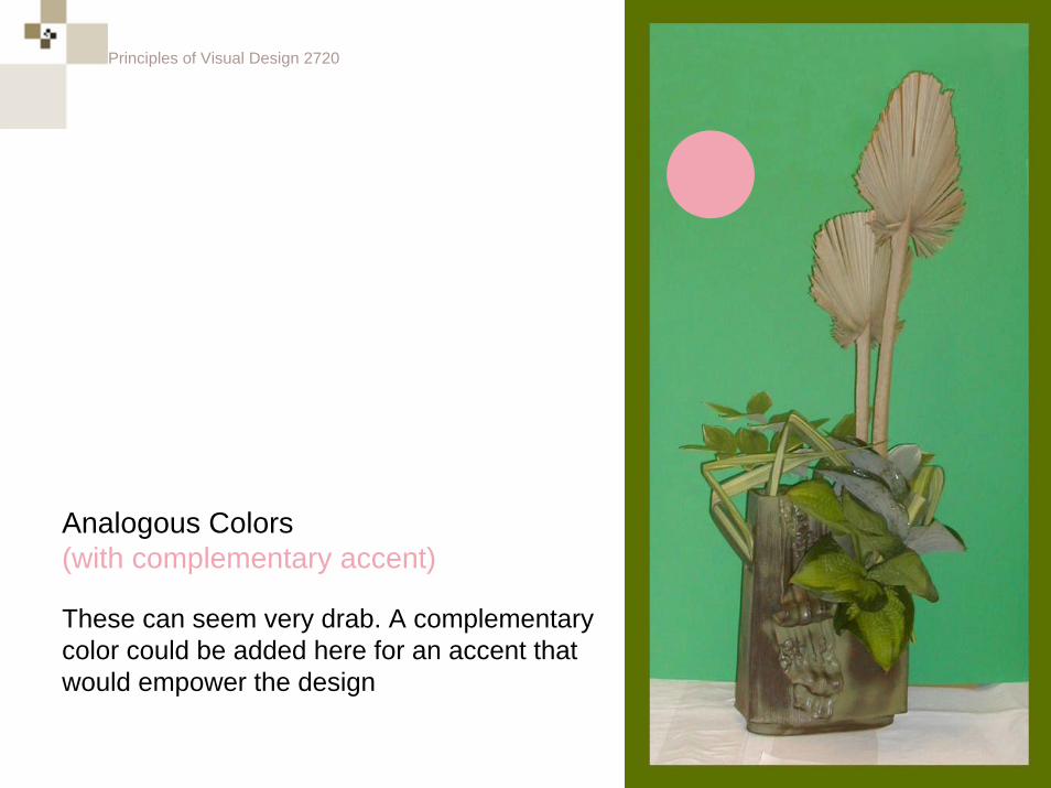
These can seem very drab. A complementary color could be added here for an accent that would empower the design
Analogous Colors(with complementary accent)
Principles of Visual Design 2720
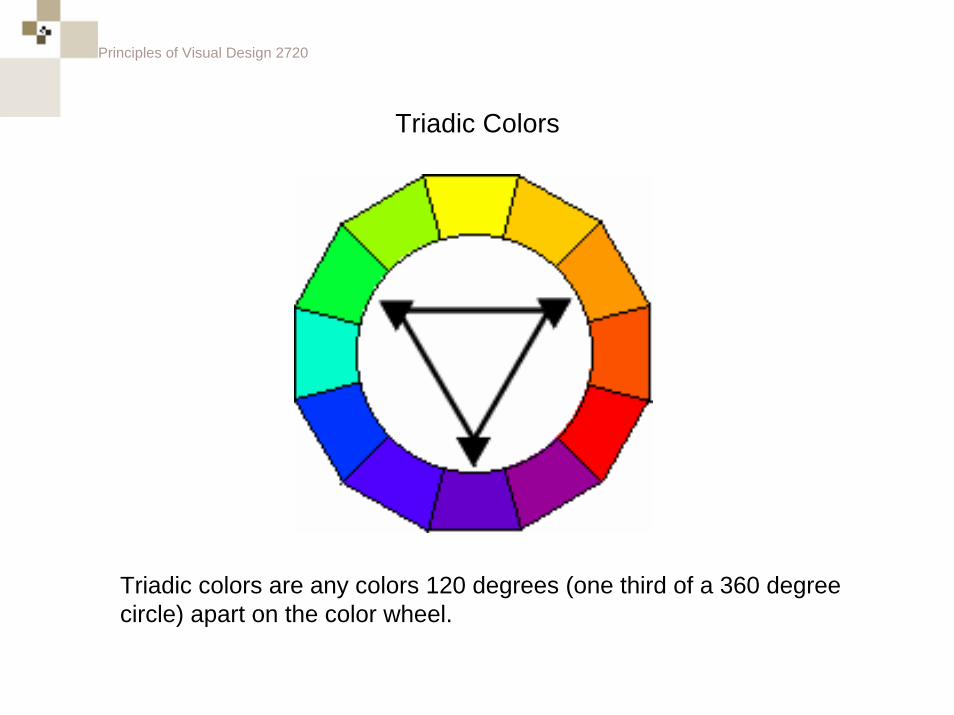
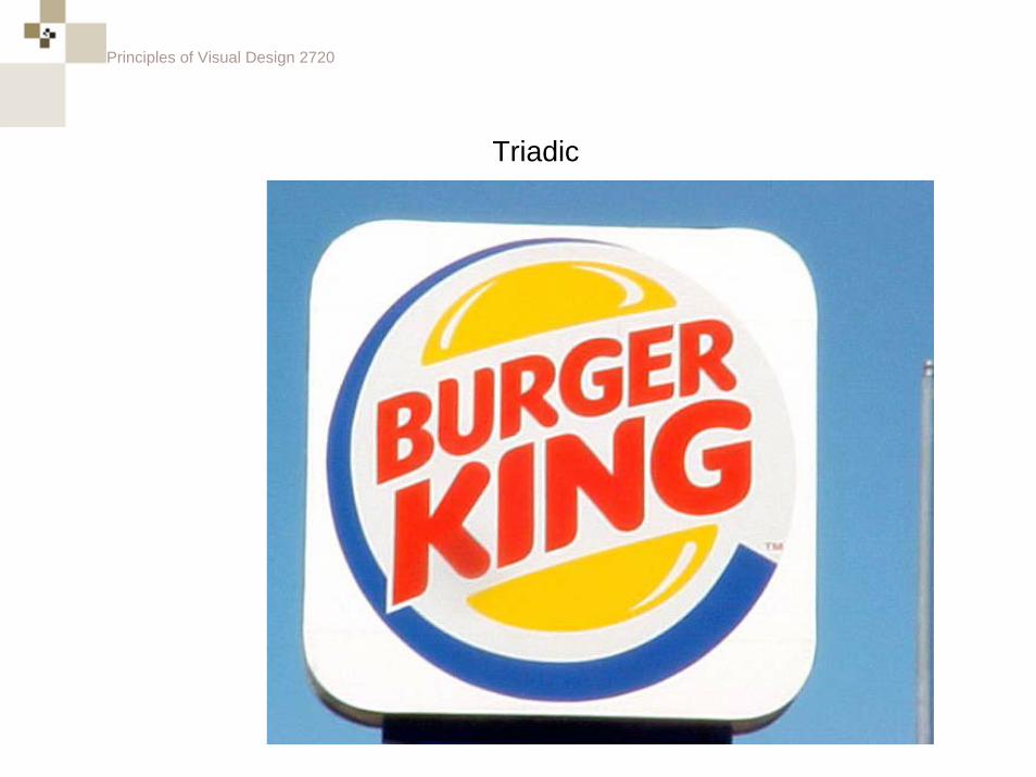
Triadic Colors
Triadic colors are any colors 120 degrees (one third of a 360 degree circle) apart on the color wheel.
Principles of Visual Design 2720
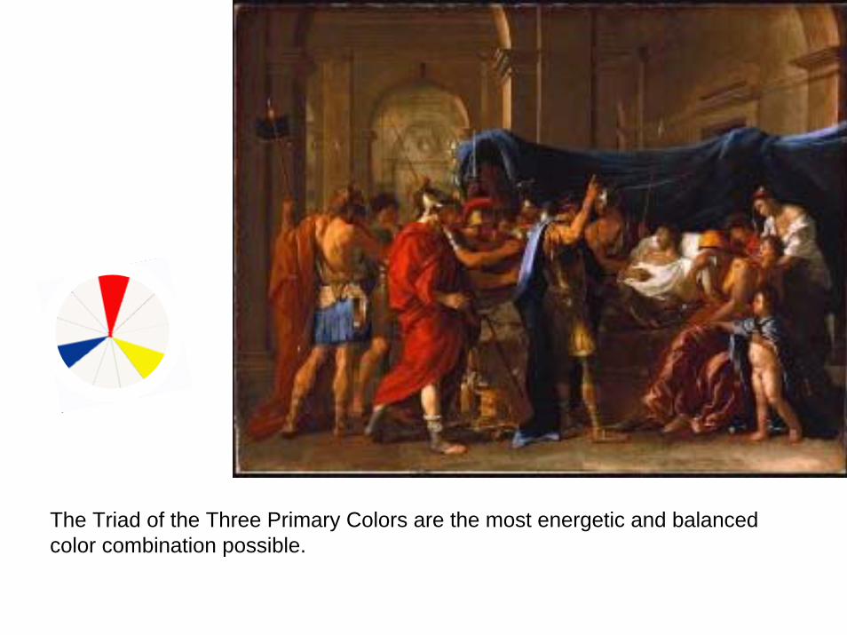
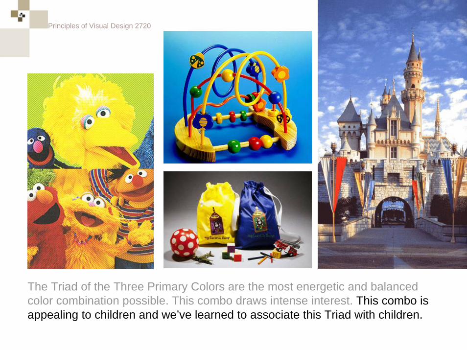
The Triad of the Three Primary Colors are the most energetic and balanced color combination possible.
Principles of Visual Design 2720
The Triad of the Three Primary Colors are the most energetic and balanced color combination possible. This combo draws intense interest. This combo is appealing to children and we’ve learned to associate this Triad with children.
Principles of Visual Design 2720
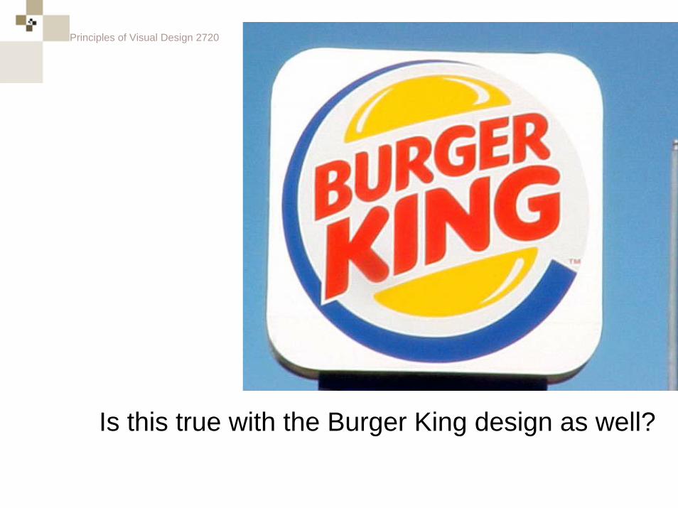
Is this true with the Burger King design as well?
Principles of Visual Design 2720
Principles of Visual Design 2720
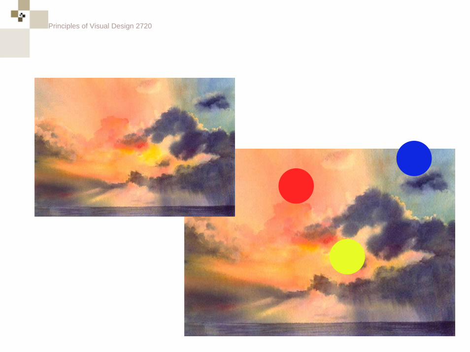
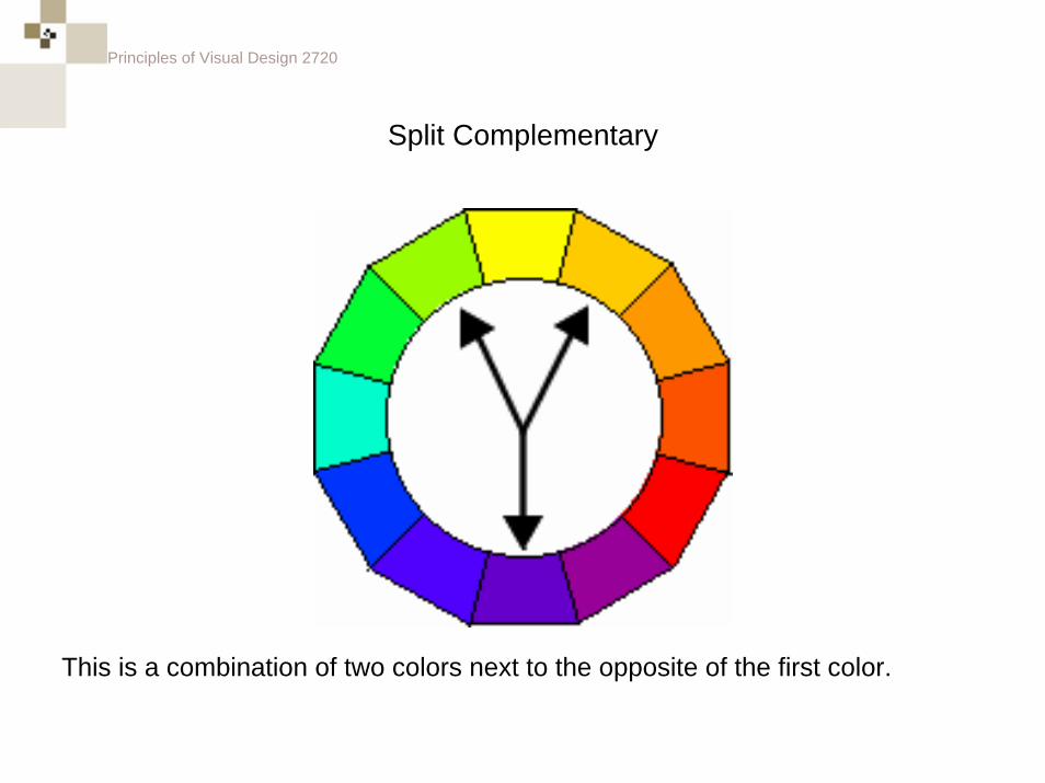
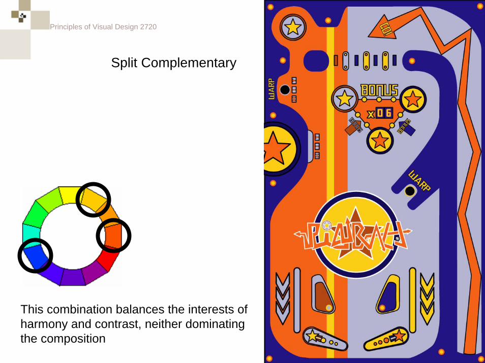
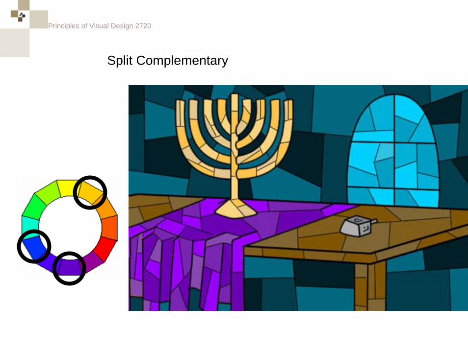
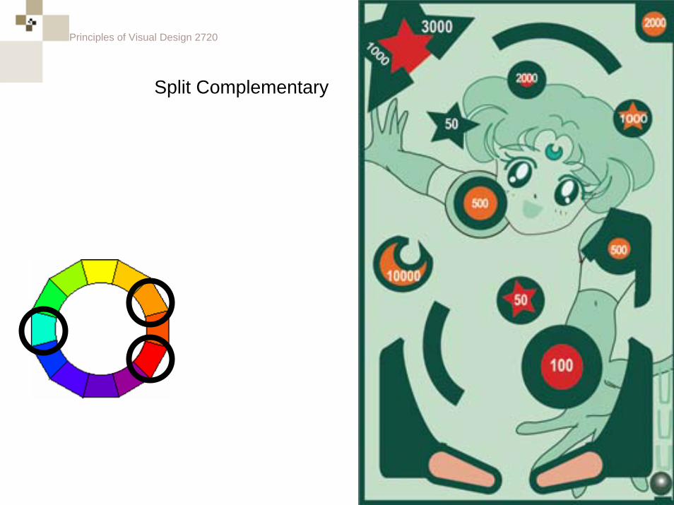
Split Complementary
This is a combination of two colors next to the opposite of the first color.
Principles of Visual Design 2720
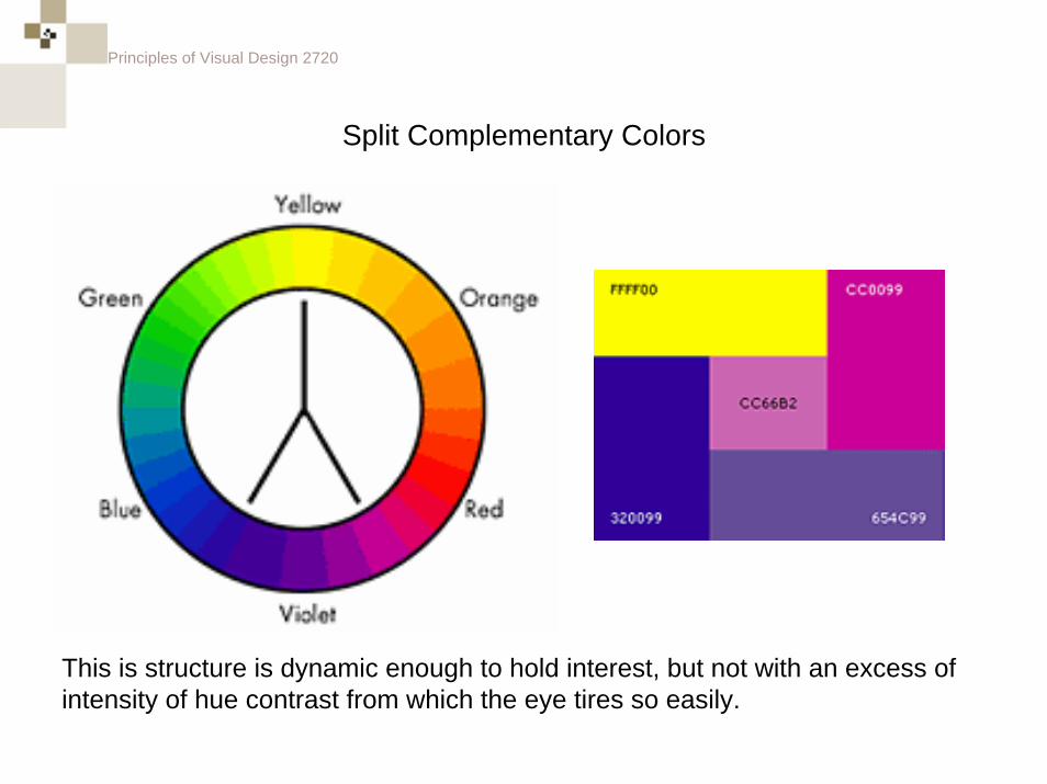
Split Complementary Colors
This is structure is dynamic enough to hold interest, but not with an excess of intensity of hue contrast from which the eye tires so easily.
Principles of Visual Design 2720
This combination balances the interests of harmony and contrast, neither dominating the composition
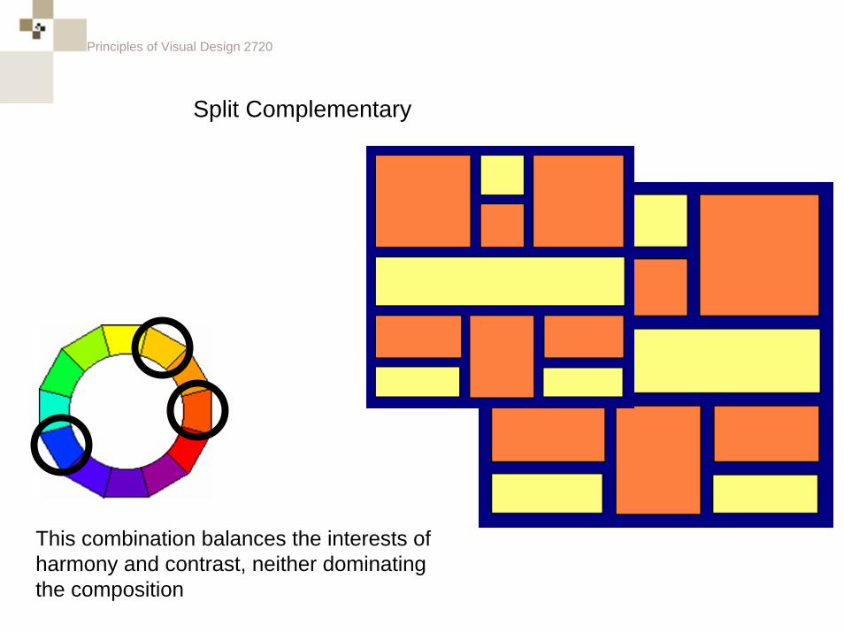
Split Complementary
Principles of Visual Design 2720
Split Complementary
This combination balances the interests of harmony and contrast, neither dominating the composition
Principles of Visual Design 2720
Split Complementary
Principles of Visual Design 2720
Split Complementary
Principles of Visual Design 2720
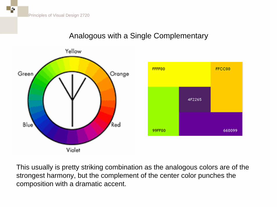
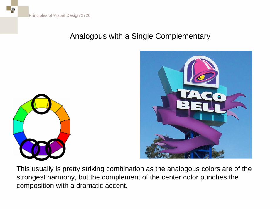
Analogous with a Single Complementary
This usually is pretty striking combination as the analogous colors are of the strongest harmony, but the complement of the center color punches the composition with a dramatic accent.
Principles of Visual Design 2720
Analogous with a Single Complementary
This usually is pretty striking combination as the analogous colors are of the strongest harmony, but the complement of the center color punches the composition with a dramatic accent.
Principles of Visual Design 2720
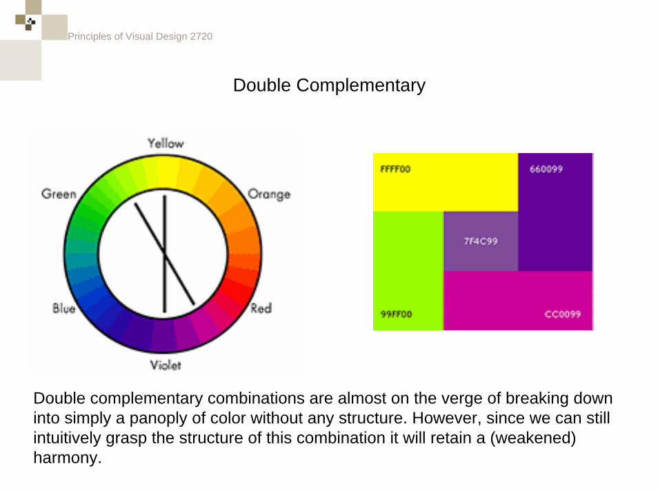
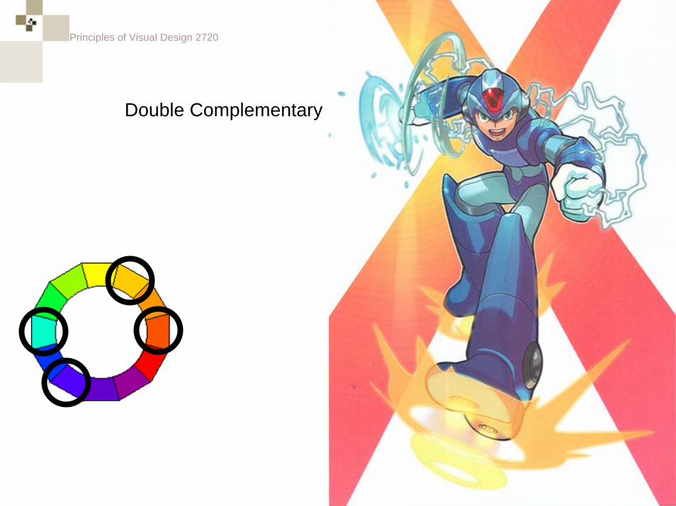
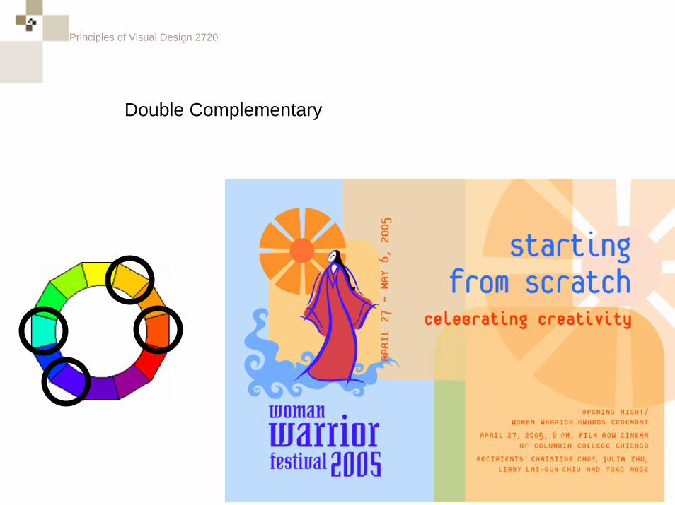
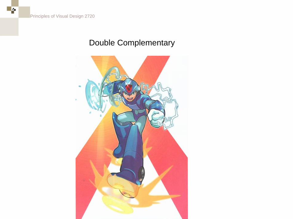
Double Complementary
Double complementary combinations are almost on the verge of breaking down into simply a panoply of color without any structure. However, since we can still intuitively grasp the structure of this combination it will retain a (weakened) harmony.
Principles of Visual Design 2720
Double Complementary
Principles of Visual Design 2720
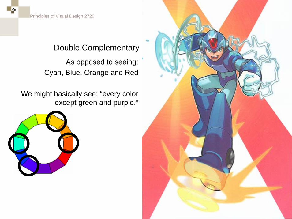
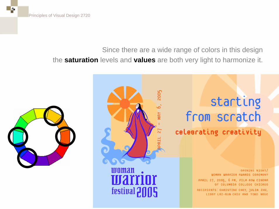
As opposed to seeing:Cyan, Blue, Orange and Red
We might basically see: “every color except green and purple.”
Double Complementary
Principles of Visual Design 2720
Double Complementary
Principles of Visual Design 2720
Since there are a wide range of colors in this designthe saturation levels and values are both very light to harmonize it.
Principles of Visual Design 2720
Quick Classic Color Theory Quiz
Principles of Visual Design 2720
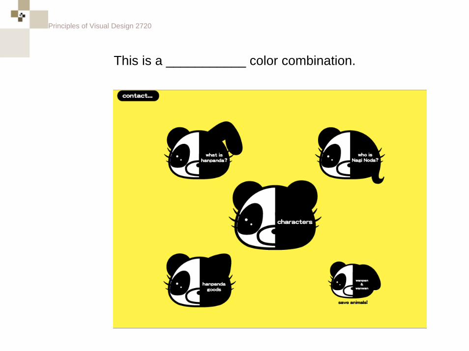
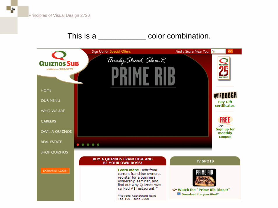
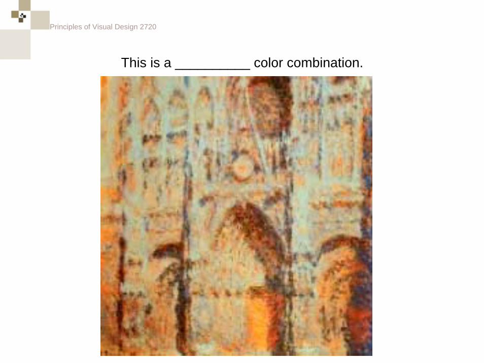
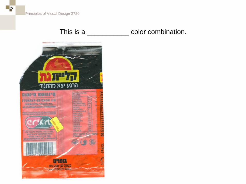
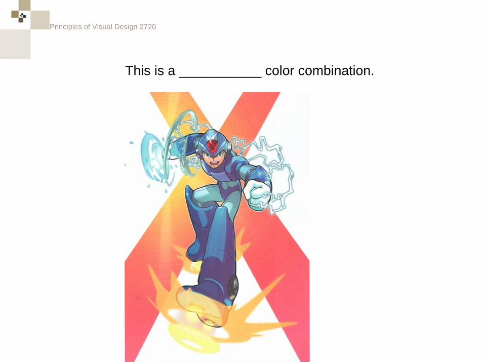
This is a ___________ color combination.
Principles of Visual Design 2720
Monochromatic
Principles of Visual Design 2720
This is a ___________ color combination.
Principles of Visual Design 2720
Complementary
Principles of Visual Design 2720
This is a __________ color combination.
Principles of Visual Design 2720
Complementary
Principles of Visual Design 2720
This is a ___________ color combination.
Principles of Visual Design 2720
Analogous

Principles of Visual Design 2720
This is a ___________ color combination.
Principles of Visual Design 2720
Triadic
Principles of Visual Design 2720
This is a ___________ color combination.
Principles of Visual Design 2720
Double Complementary
Principles of Visual Design 2720
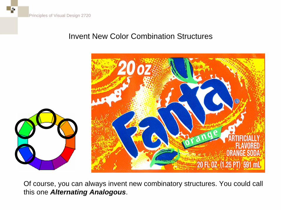
Invent New Color Combination Structures
Of course, you can always invent new combinatory structures. You could call this one Alternating Analogous.
Principles of Visual Design 2720
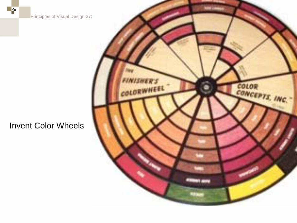
Invent Color Wheels
Principles of Visual Design 2720
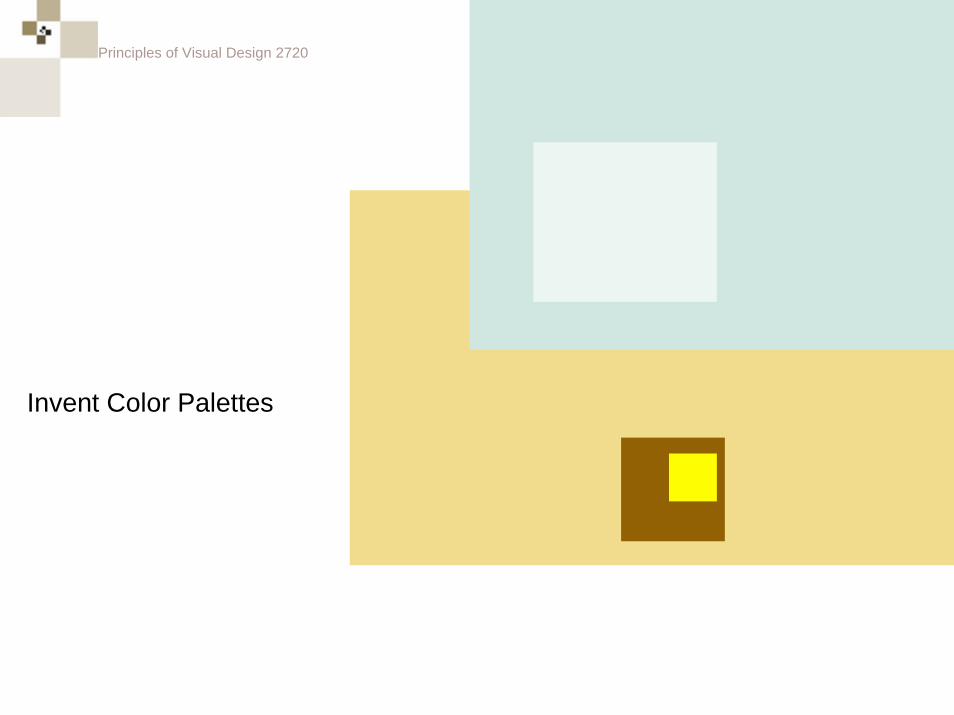
Invent Color Palettes
Principles of Visual Design 2720
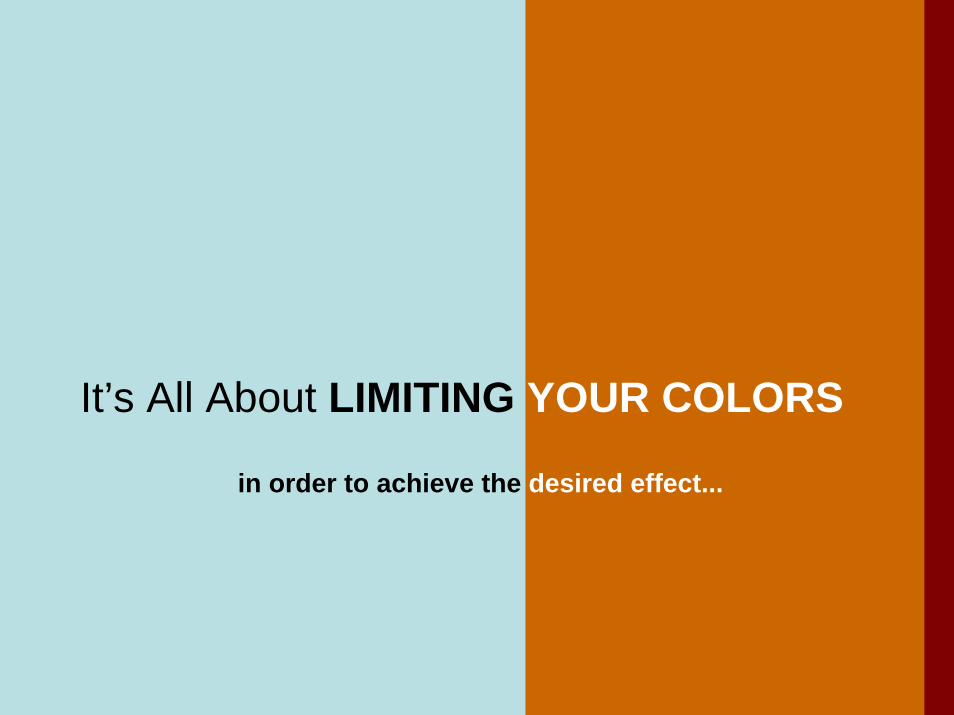
It’s All About LIMITING YOUR COLORS
in order to achieve the desired effect...
Principles of Visual Design 2720
More Intent Behind Color Choices
Principles of Visual Design 2720
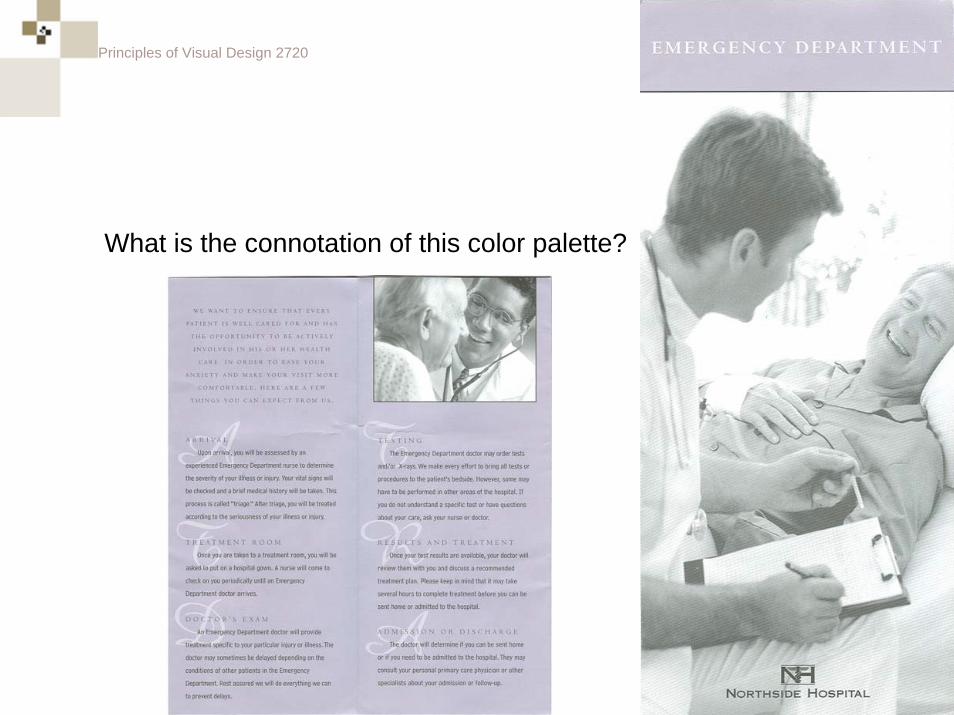
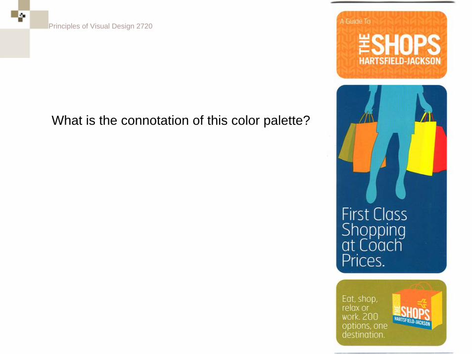
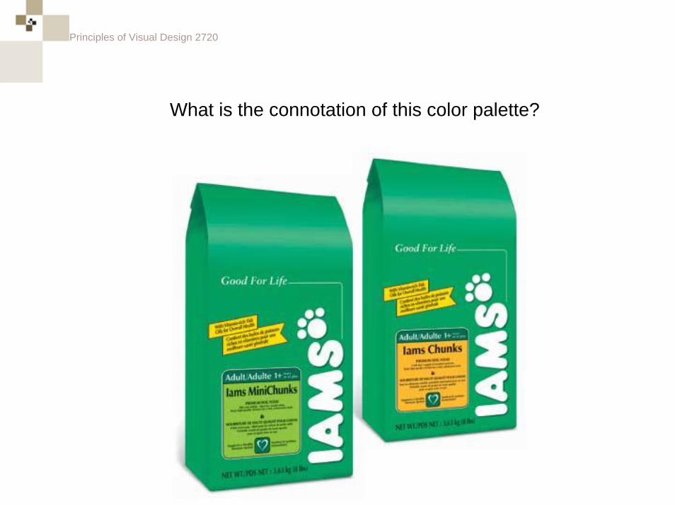
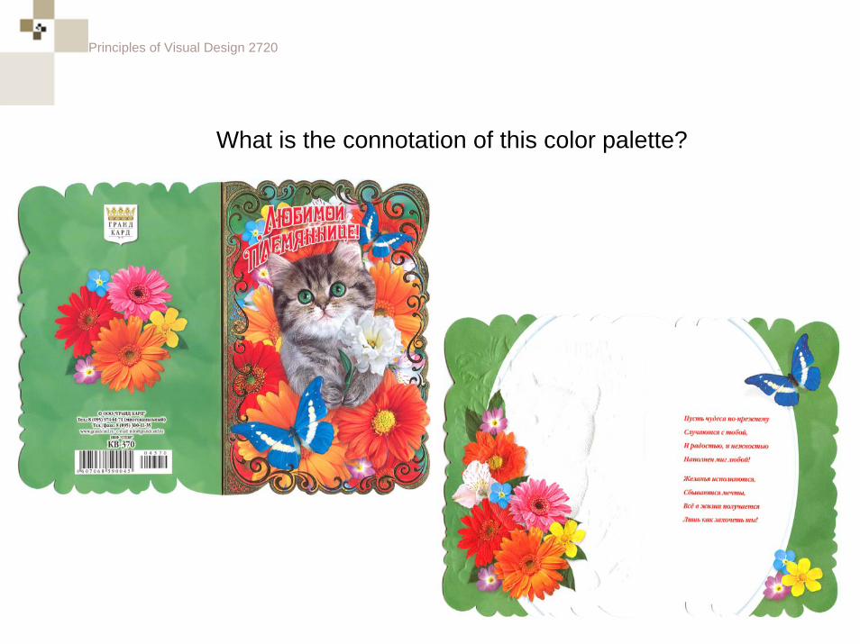
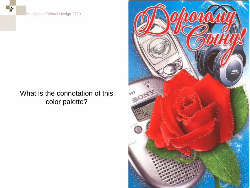
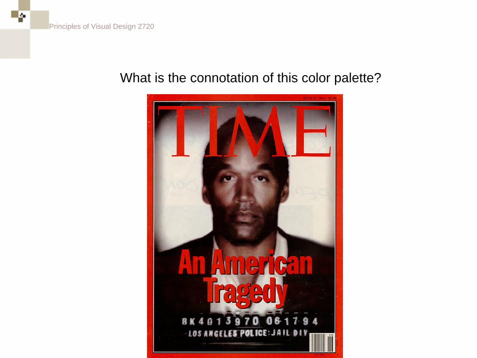
What is the connotation of this color palette?
Principles of Visual Design 2720
What is the connotation of this color palette?
Principles of Visual Design 2720
What is the connotation of this color palette?
Principles of Visual Design 2720
What is the connotation of this color palette?
Principles of Visual Design 2720
What is the connotation of this color palette?
Principles of Visual Design 2720
What is the connotation of this color palette?
Principles of Visual Design 2720
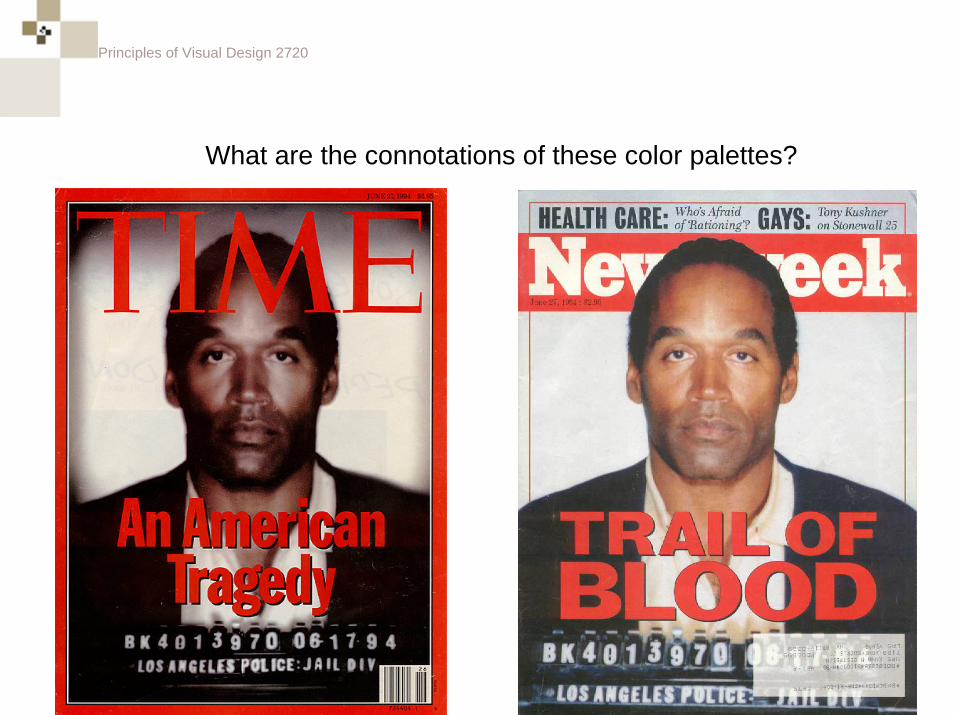
What are the connotations of these color palettes?
Principles of Visual Design 2720
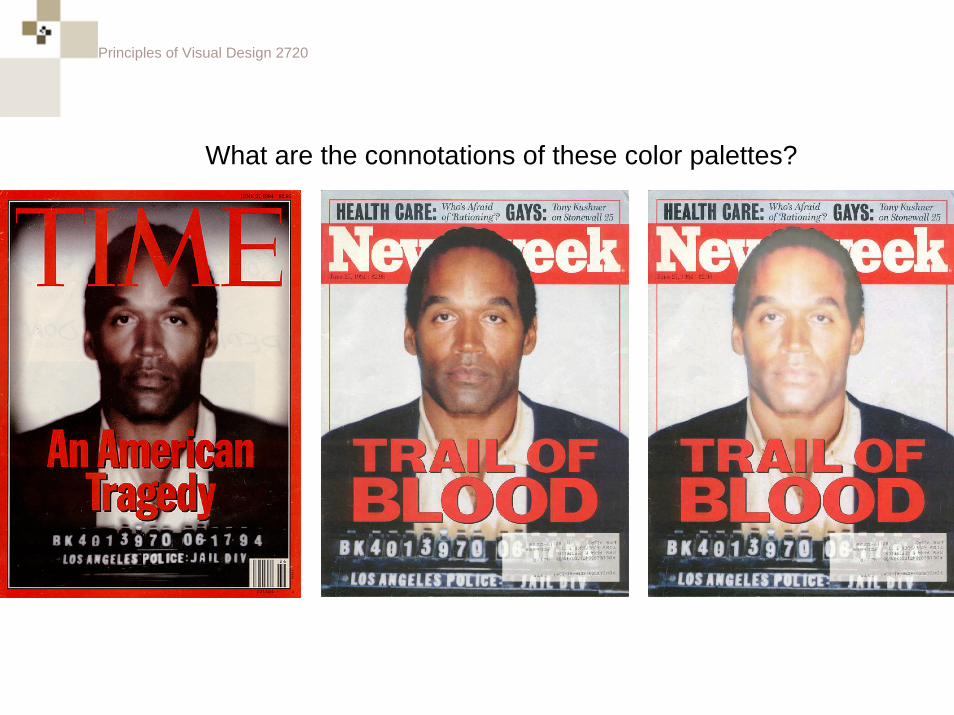
What are the connotations of these color palettes?
Principles of Visual Design 2720
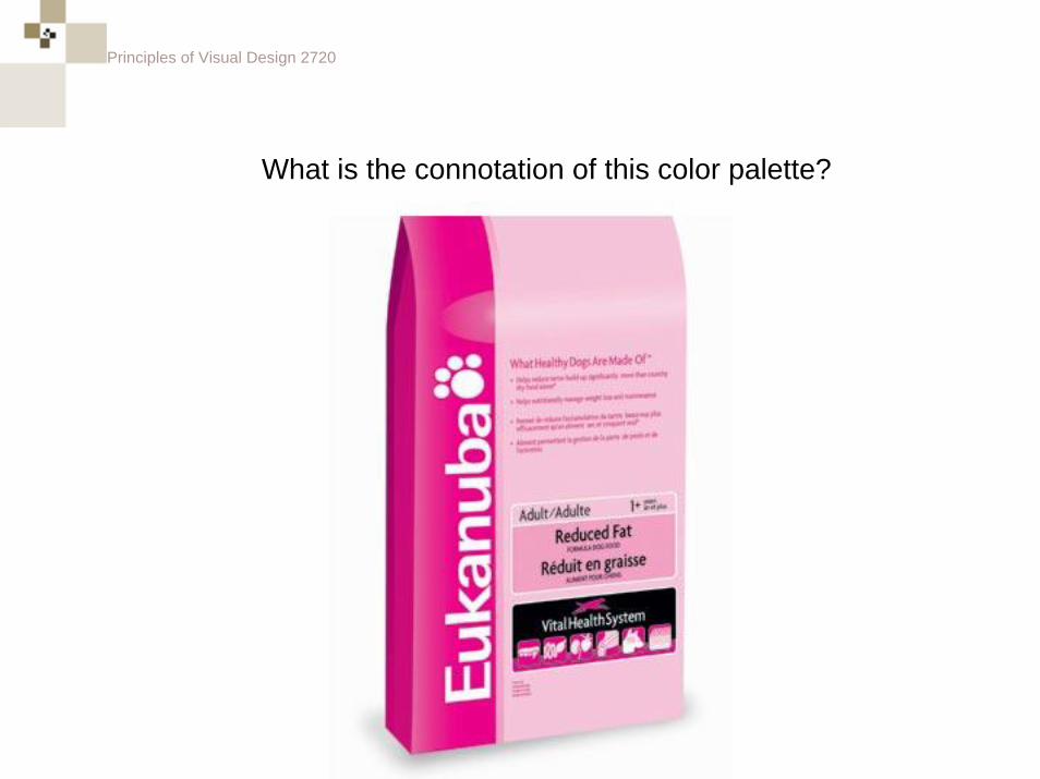
What is the connotation of this color palette?
Principles of Visual Design 2720
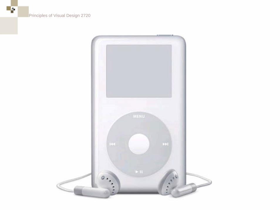
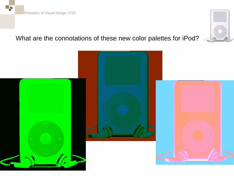
What are the connotations of these new color palettes for iPod?
Principles of Visual Design 2720
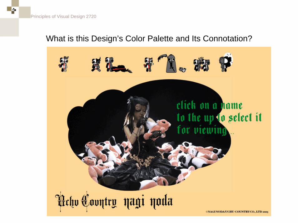
What is this Design’s Color Palette and Its Connotation?
Principles of Visual Design 2720
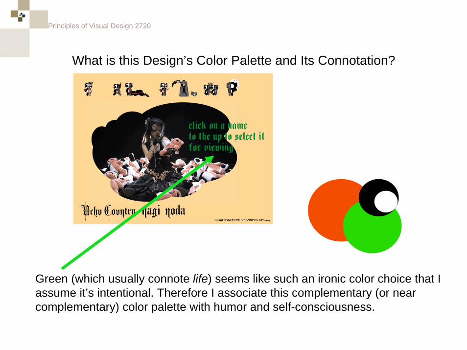
What is this Design’s Color Palette and Its Connotation?
Green (which usually connote life) seems like such an ironic color choice that I assume it’s intentional. Therefore I associate this complementary (or nearcomplementary) color palette with humor and self-consciousness.
Principles of Visual Design 2720
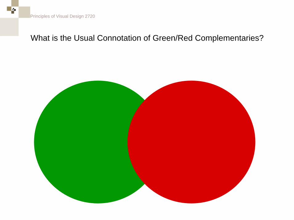
What is the Usual Connotation of Green/Red Complementaries?
Principles of Visual Design 2720
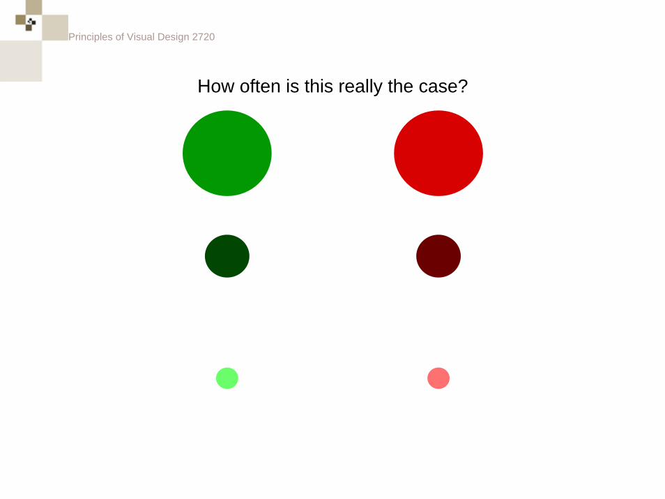
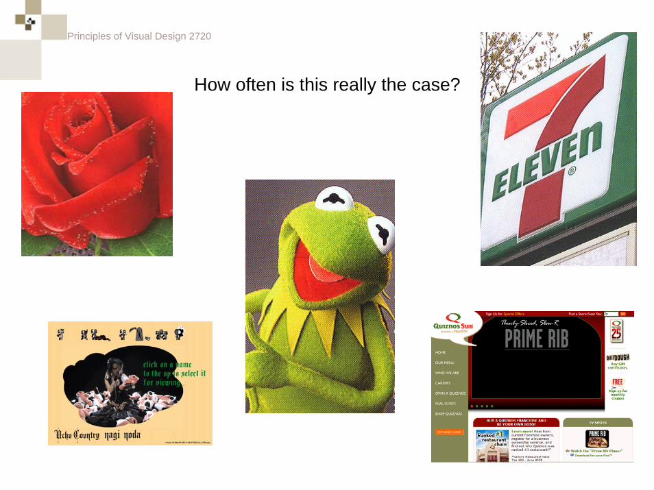
How often is this really the case?
Principles of Visual Design 2720
How often is this really the case?
Principles of Visual Design 2720
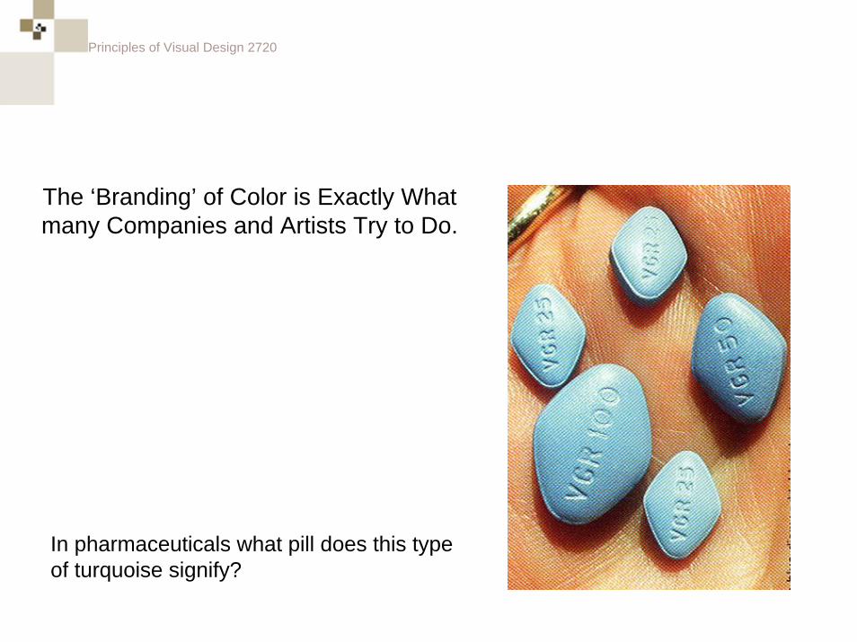
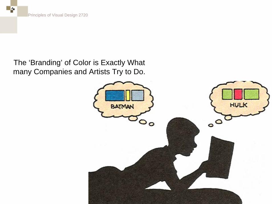
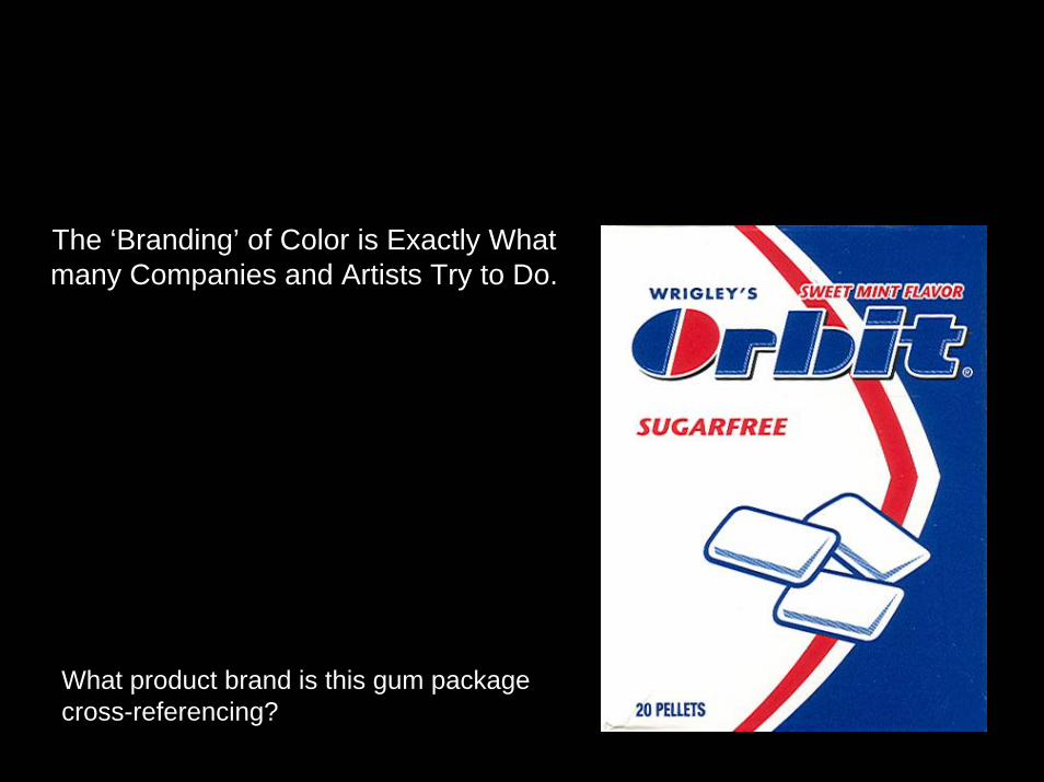
The ‘Branding’ of Color is Exactly What many Companies and Artists Try to Do.
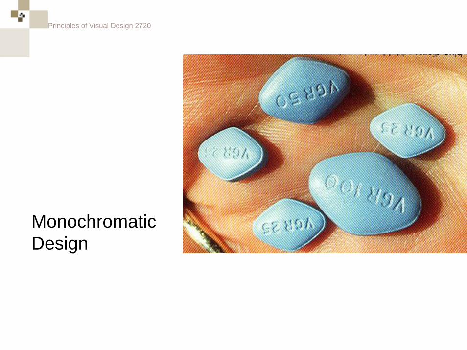
In pharmaceuticals what pill does this type of turquoise signify?
Principles of Visual Design 2720
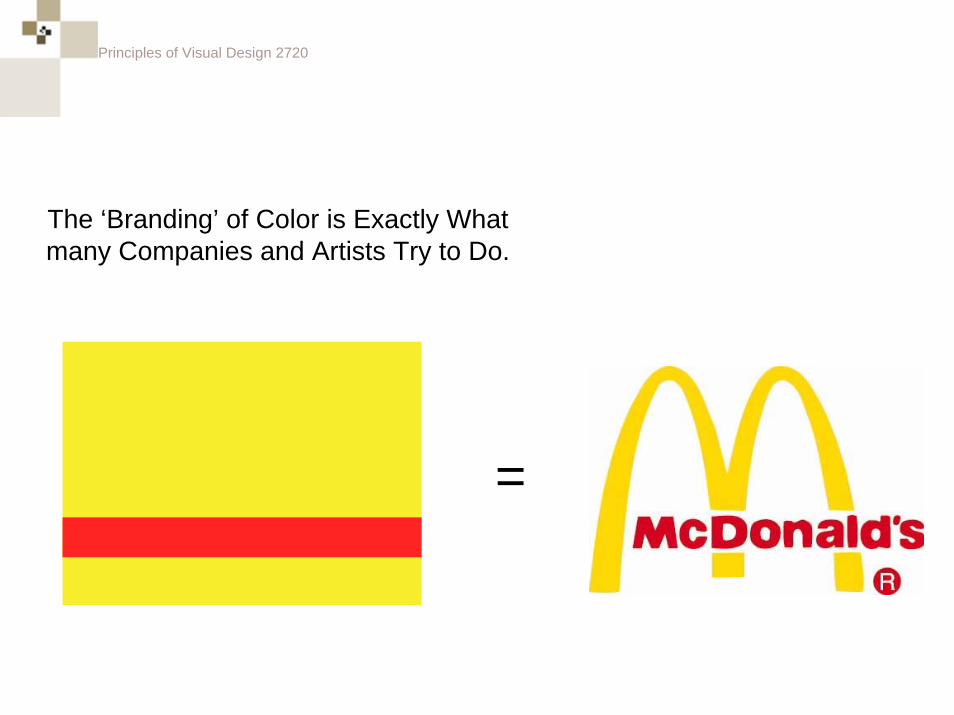
The ‘Branding’ of Color is Exactly What many Companies and Artists Try to Do.
=
Principles of Visual Design 2720
The ‘Branding’ of Color is Exactly What many Companies and Artists Try to Do.
Principles of Visual Design 2720
The ‘Branding’ of Color is Exactly What many Companies and Artists Try to Do.
What product brand is this gum package cross-referencing?
Principles of Visual Design 2720
Color Palettes
Principles of Visual Design 2720
What types of things are Color Palettes made for?
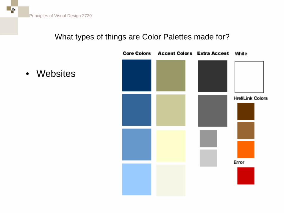
Principles of Visual Design 2720
What types of things are Color Palettes made for?
• Websites
Principles of Visual Design 2720
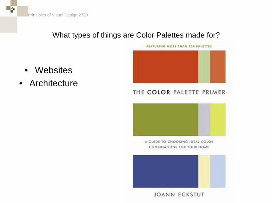
What types of things are Color Palettes made for?
• Websites• Architecture
Principles of Visual Design 2720
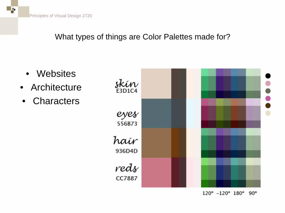
What types of things are Color Palettes made for?
• Websites• Architecture• Characters
Principles of Visual Design 2720
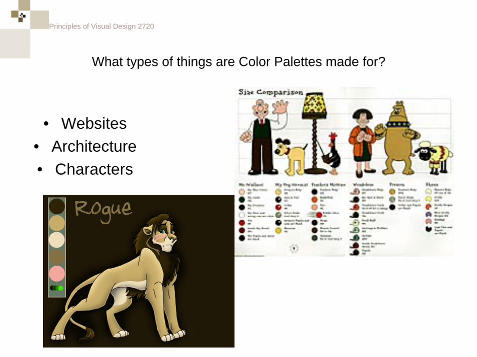
What types of things are Color Palettes made for?
• Websites• Architecture• Characters
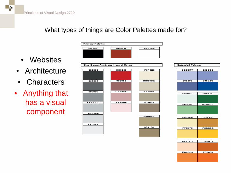
Principles of Visual Design 2720
What types of things are Color Palettes made for?
• Websites• Architecture• Characters
• Anything that has a visual component
Principles of Visual Design 2720
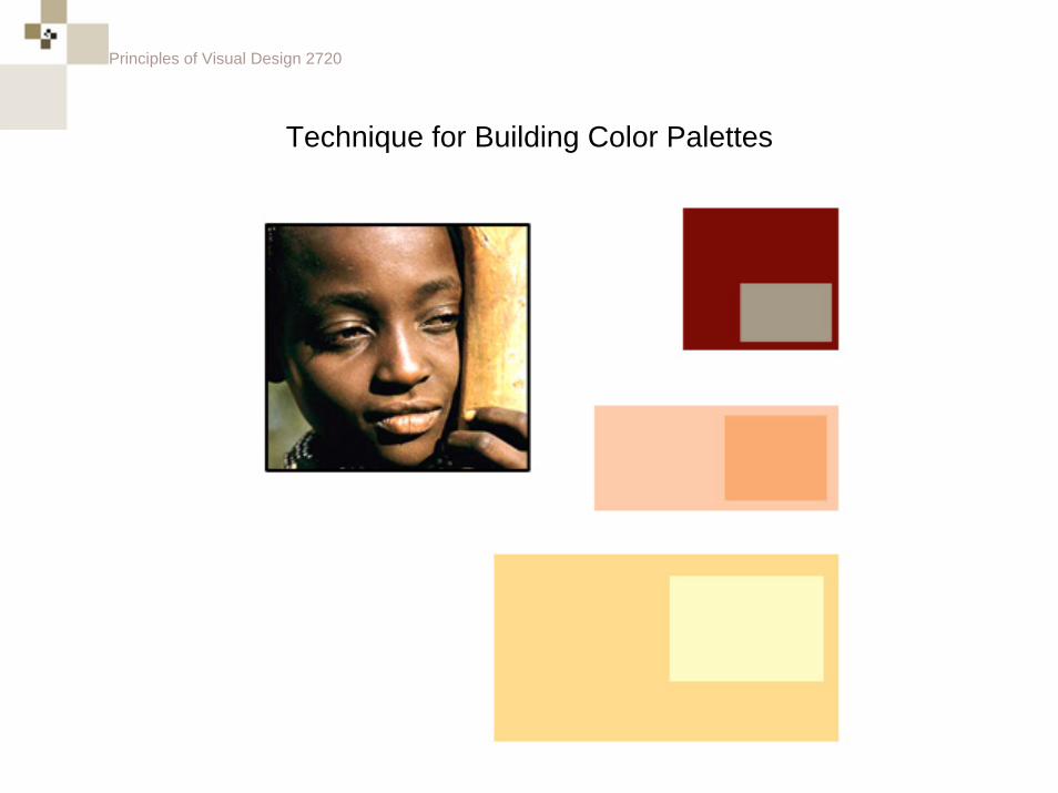
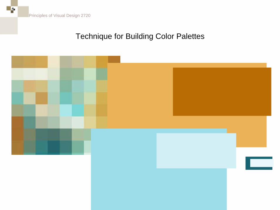
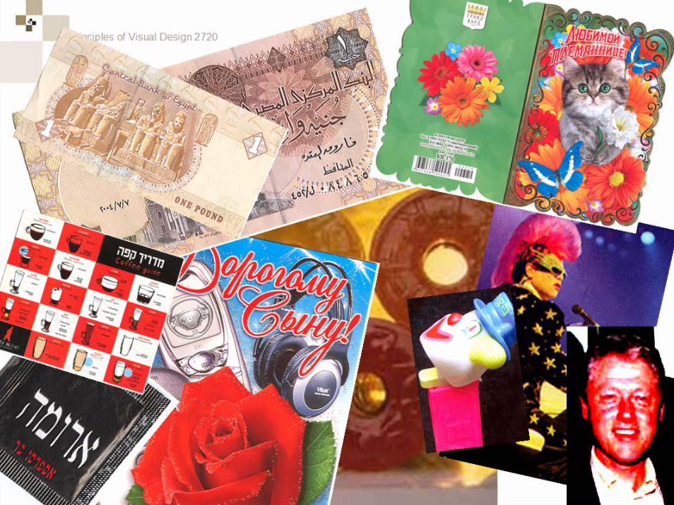
Technique for Building Color Palettes
Principles of Visual Design 2720
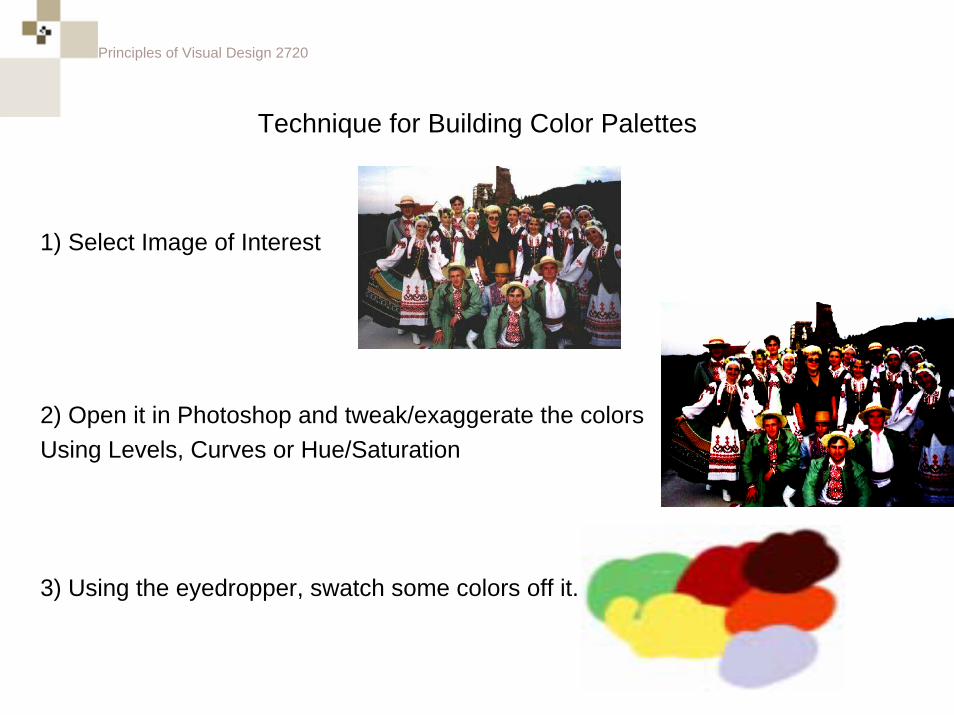
Technique for Building Color Palettes
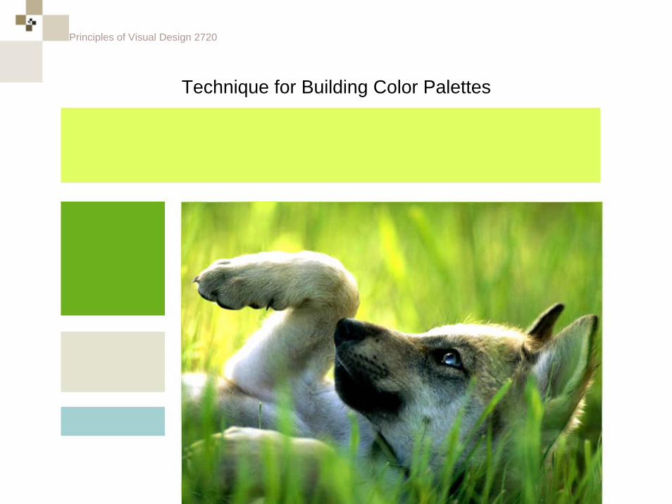
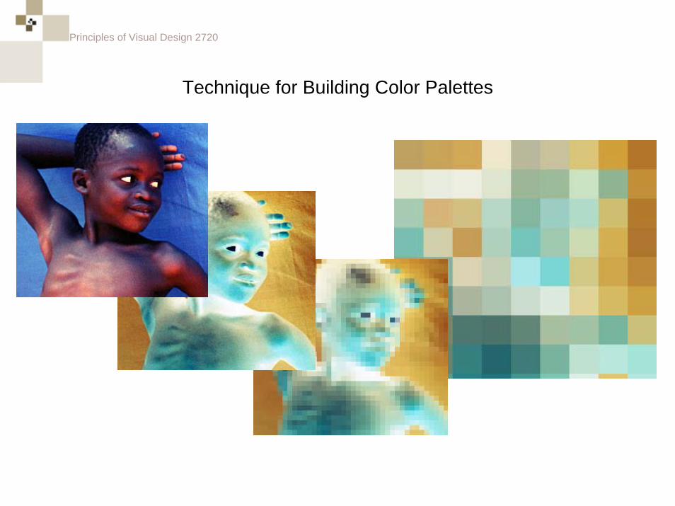
1) Select Image of Interest
2) Open it in Photoshop and tweak/exaggerate the colorsUsing Levels, Curves or Hue/Saturation
3) Using the eyedropper, swatch some colors off it.
Principles of Visual Design 2720
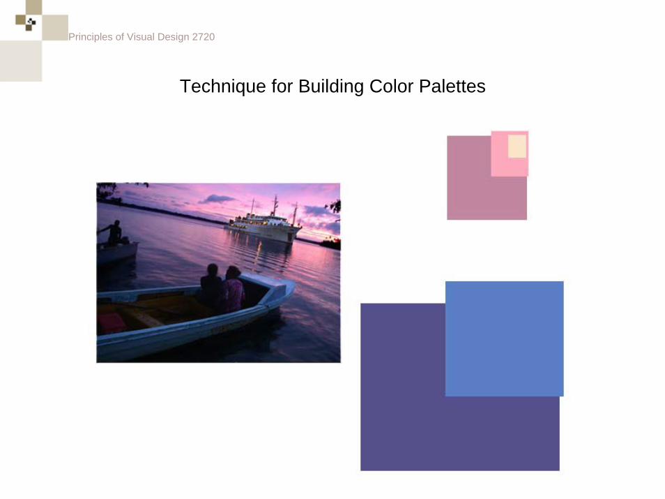
Technique for Building Color Palettes
Principles of Visual Design 2720
Technique for Building Color Palettes
Principles of Visual Design 2720
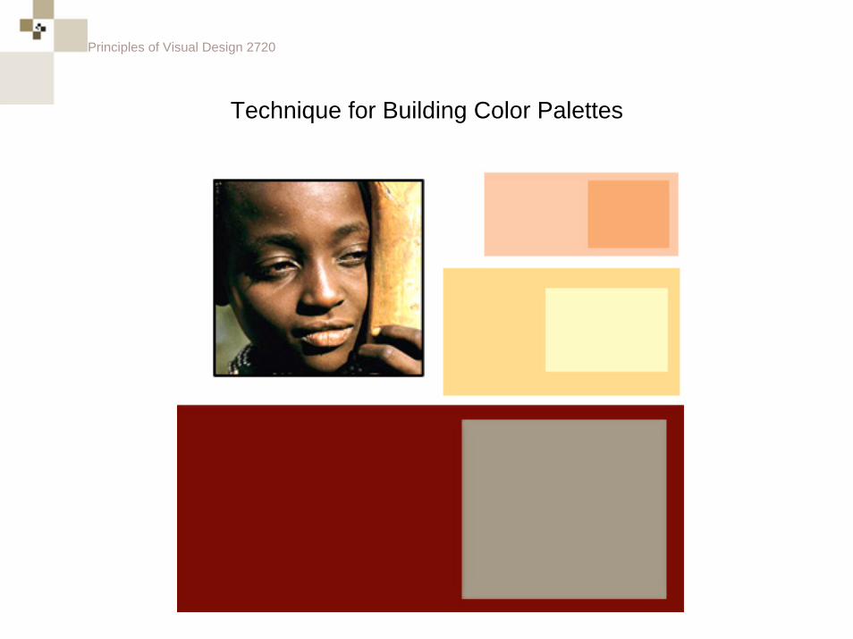
Technique for Building Color Palettes
Principles of Visual Design 2720
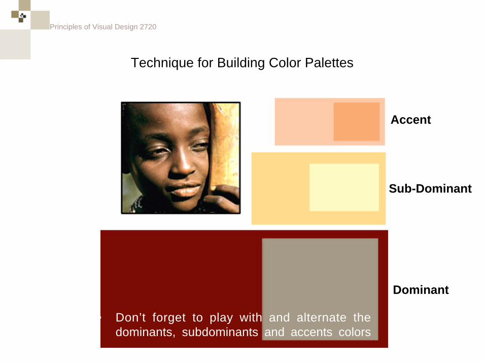
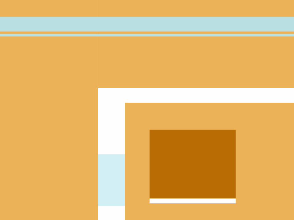
Technique for Building Color Palettes
• Don’t forget to play with and alternate the dominants, subdominants and accents colors
Accent
Sub-Dominant
Dominant
Principles of Visual Design 2720
Technique for Building Color Palettes
Principles of Visual Design 2720
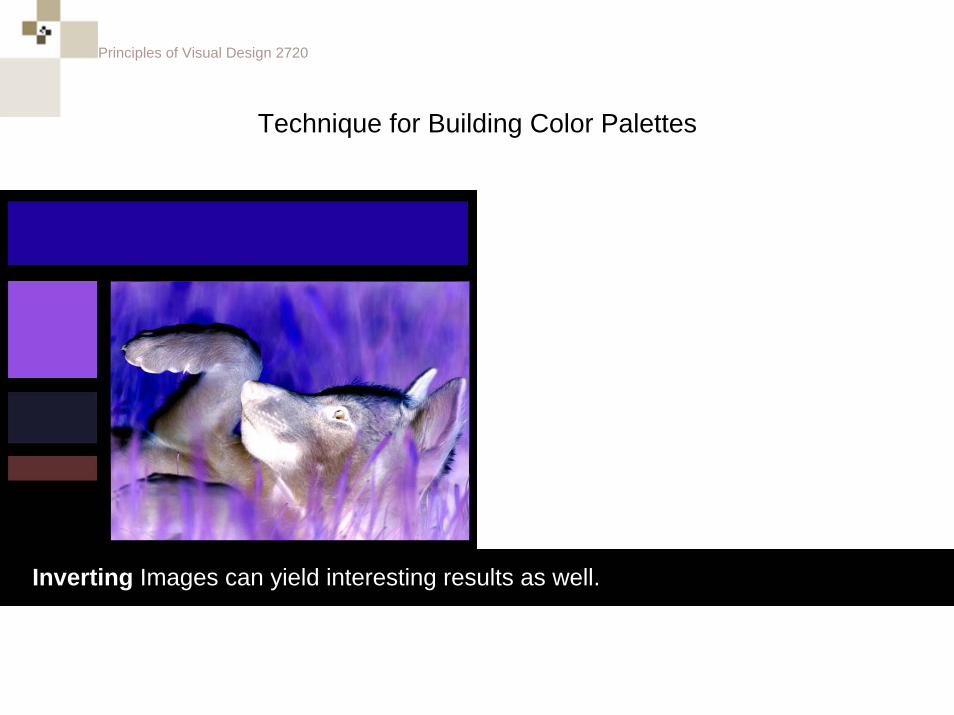
Technique for Building Color Palettes
Inverting Images can yield interesting results as well.
Principles of Visual Design 2720
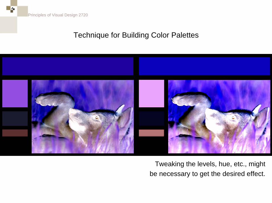
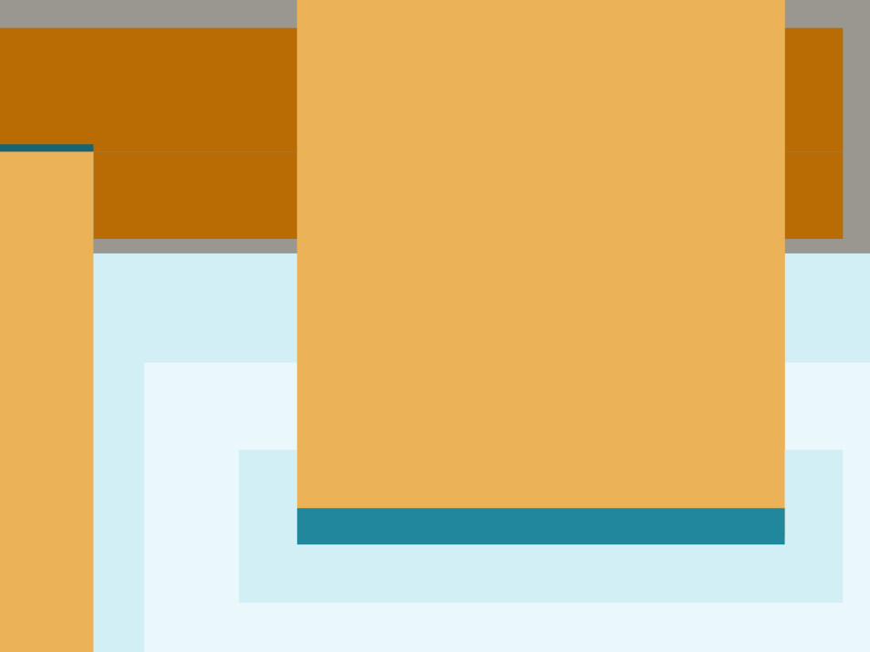
Technique for Building Color Palettes
Tweaking the levels, hue, etc., mightbe necessary to get the desired effect.
Principles of Visual Design 2720
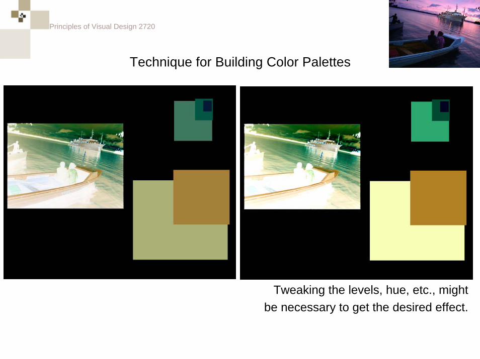
Technique for Building Color Palettes
Tweaking the levels, hue, etc., mightbe necessary to get the desired effect.
Principles of Visual Design 2720
Technique for Building Color Palettes
Principles of Visual Design 2720
Technique for Building Color Palettes

Principles of Visual Design 2720
Technique for Building Color Palettes
Principles of Visual Design 2720
Principles of Visual Design 2720
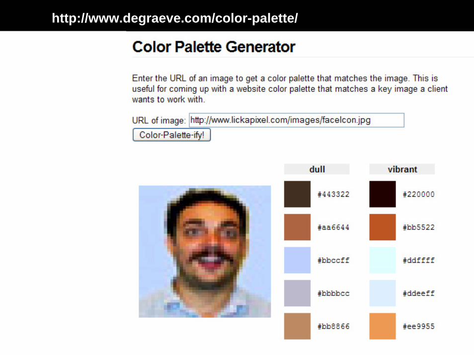
Principles of Visual Design 2720http://www.degraeve.com/color-palette/
Principles of Visual Design 2720
Number One Technique for Building Color Palettes
RESEARCH!!!
Principles of Visual Design 2720
Number One Technique for Building Color Palettes
RESEARCH!!!
Principles of Visual Design 2720
Principles of Visual Design 2720
Color Balancing
Principles of Visual Design 2720
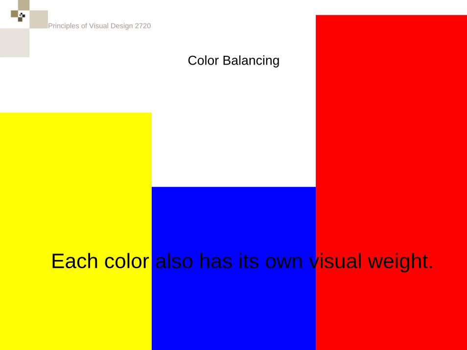
Color Balancing
Each color also has its own visual weight.
Principles of Visual Design 2720
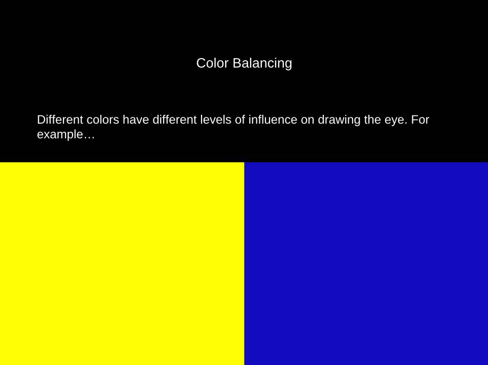
Color Balancing
Different colors have different levels of influence on drawing the eye. For example…
Principles of Visual Design 2720
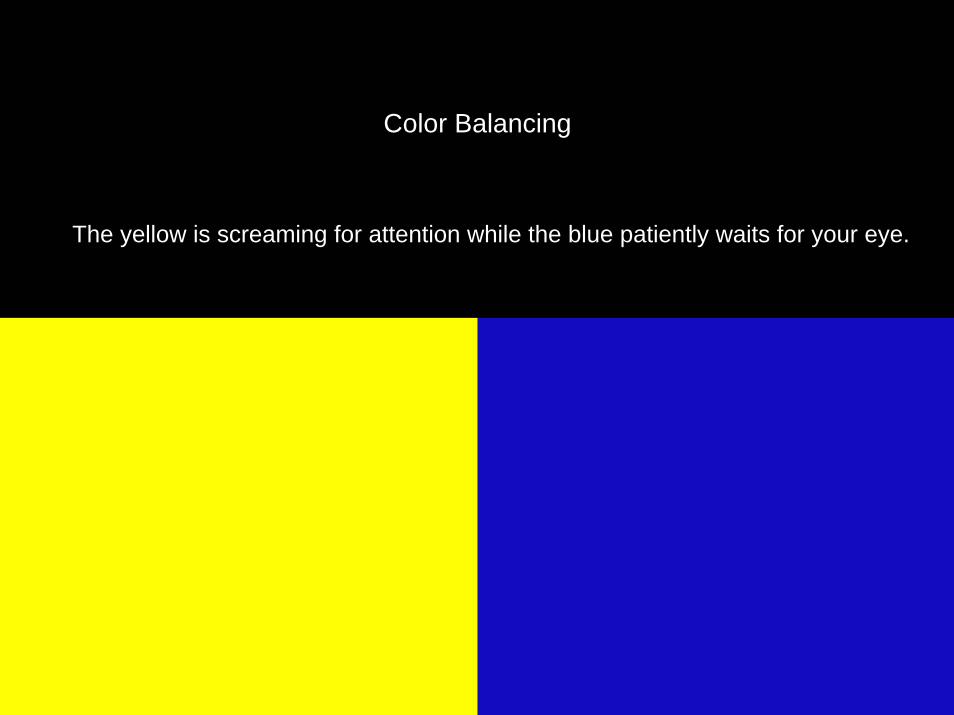
Color Balancing
The yellow is screaming for attention while the blue patiently waits for your eye.
Principles of Visual Design 2720
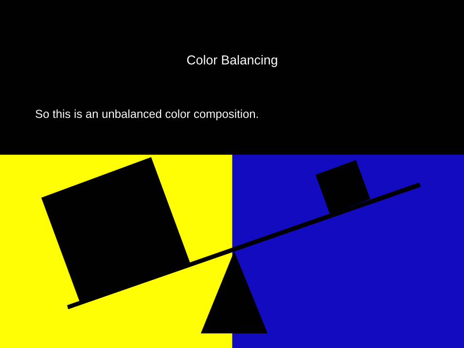
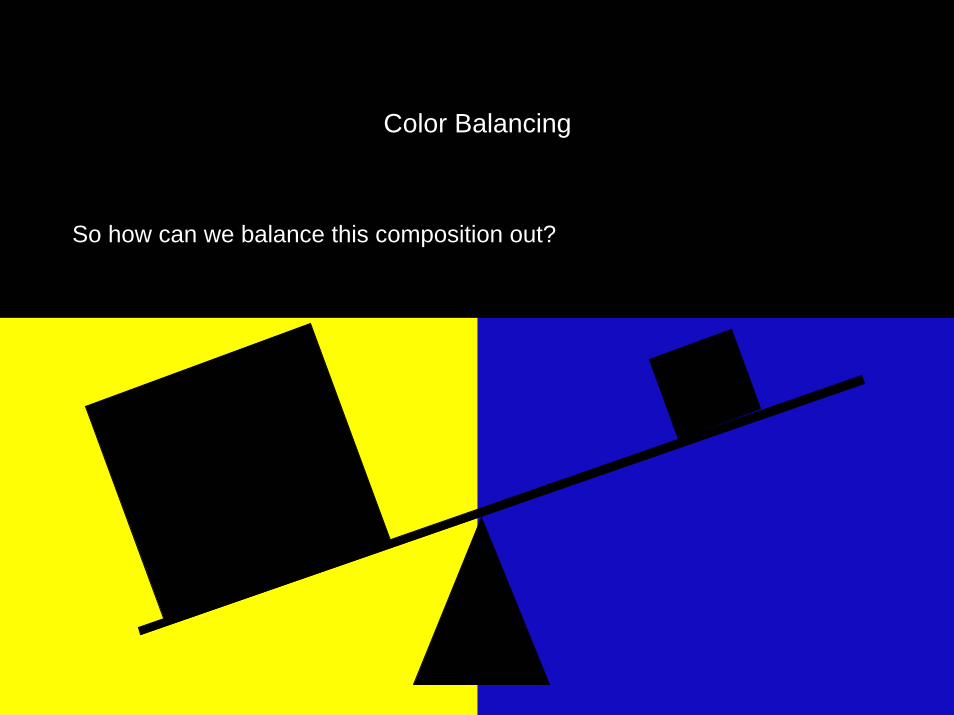
Color Balancing
So this is an unbalanced color composition.
Principles of Visual Design 2720
Color Balancing
So how can we balance this composition out?
Principles of Visual Design 2720
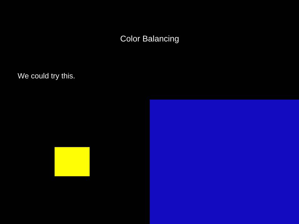
We could try this.
Color Balancing
Principles of Visual Design 2720
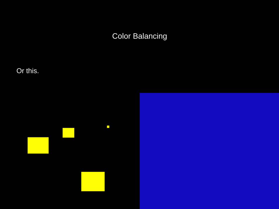
Or this.
Color Balancing
Principles of Visual Design 2720
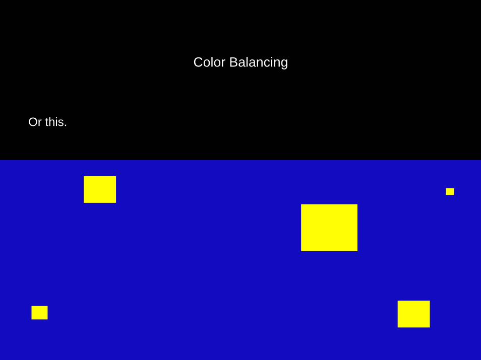
Or this.
Color Balancing
Principles of Visual Design 2720
Principles of Visual Design 2720
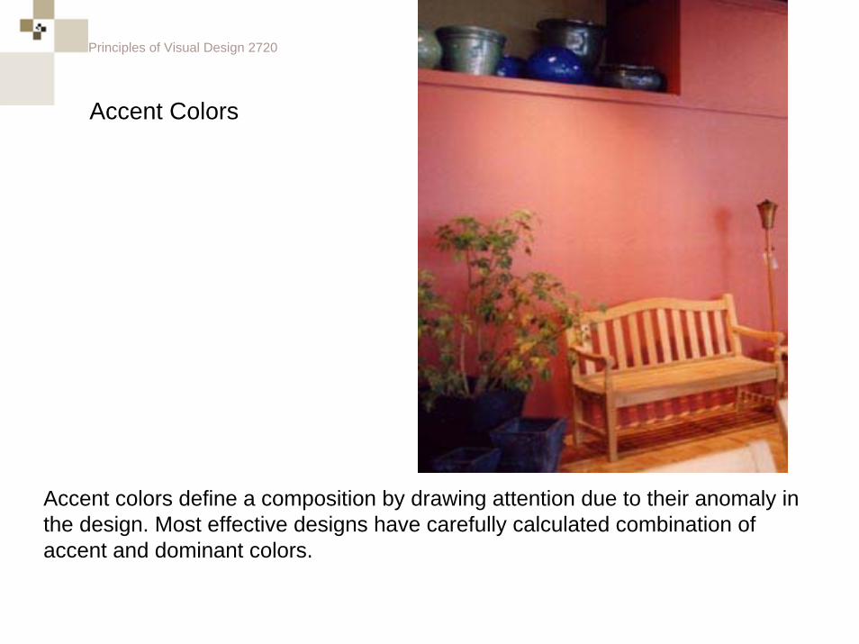
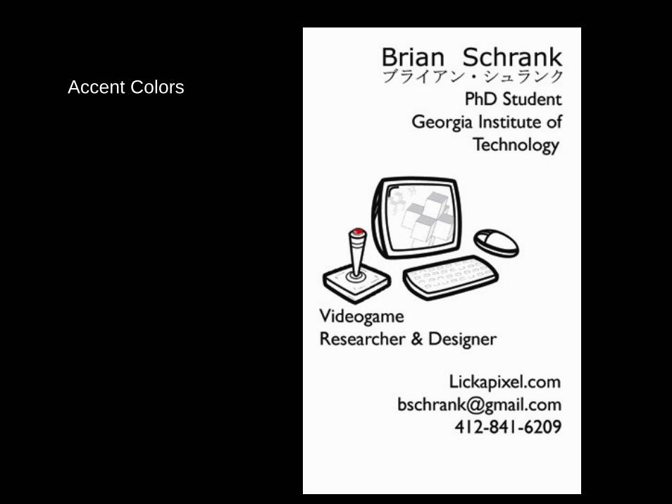
Accent colors define a composition by drawing attention due to their anomaly in the design. Most effective designs have carefully calculated combination of accent and dominant colors.
Accent Colors
Principles of Visual Design 2720
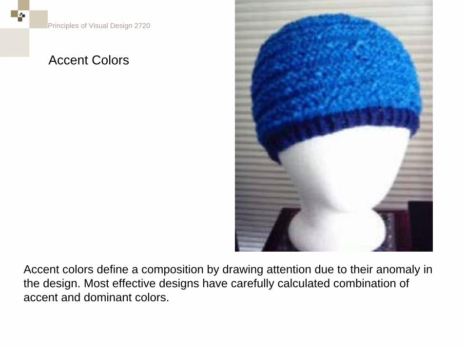
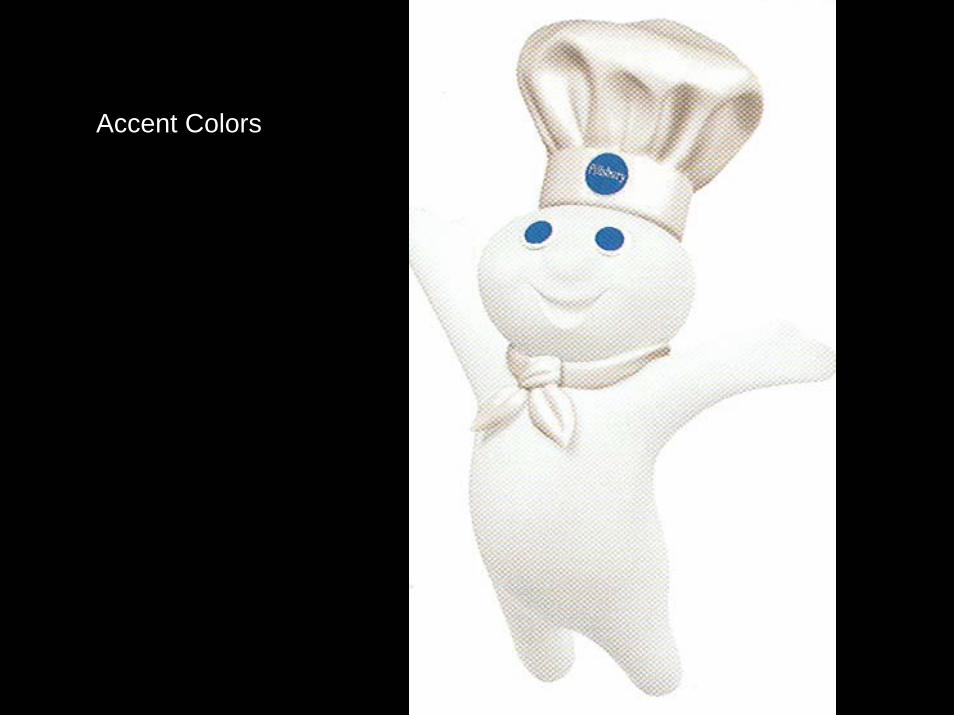
Accent Colors
Accent colors define a composition by drawing attention due to their anomaly in the design. Most effective designs have carefully calculated combination of accent and dominant colors.
Principles of Visual Design 2720
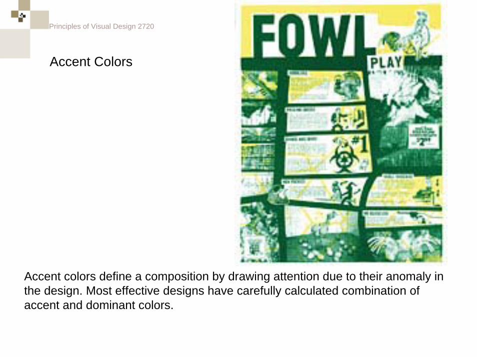
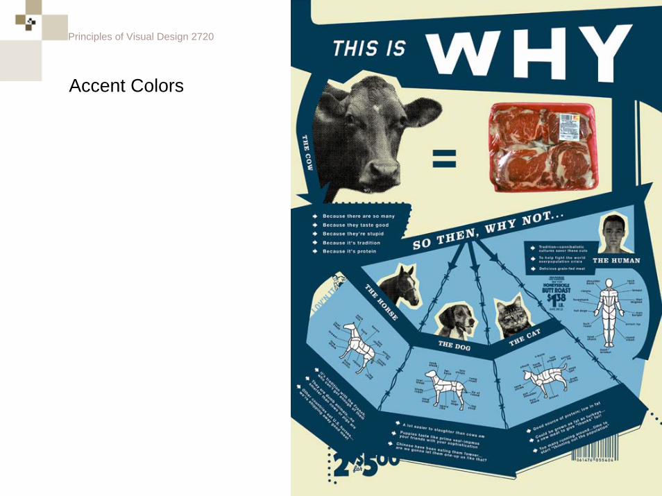
Accent colors define a composition by drawing attention due to their anomaly in the design. Most effective designs have carefully calculated combination of accent and dominant colors.
Accent Colors
Principles of Visual Design 2720
Accent Colors
Principles of Visual Design 2720
Accent Colors
Principles of Visual Design 2720
Accent Colors

Principles of Visual Design 2720
Accent Colors
Principles of Visual Design 2720
Selective emphasis on VALUE or SATURATION can also serve as an accent. For example...
Principles of Visual Design 2720
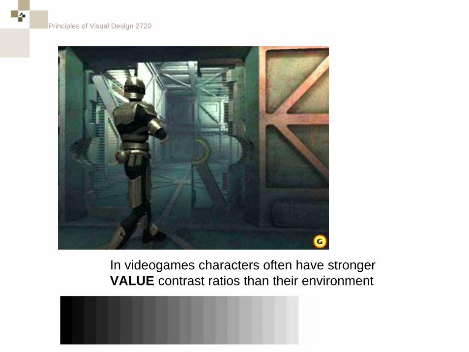
In videogames characters often have stronger VALUE contrast ratios than their environment
Principles of Visual Design 2720
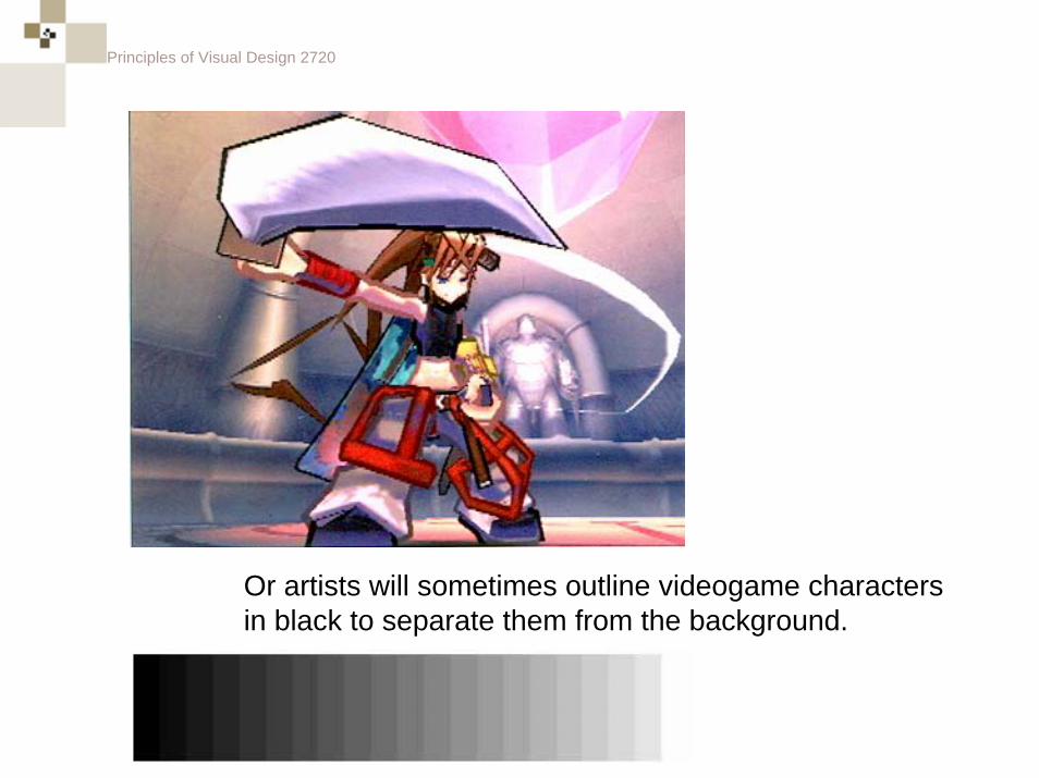
Or artists will sometimes outline videogame characters in black to separate them from the background.
Principles of Visual Design 2720
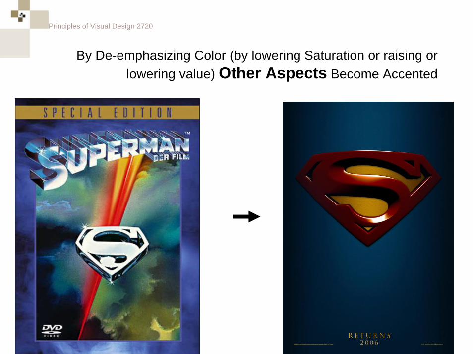
By De-emphasizing Color (by lowering Saturation or raising or lowering value) Other Aspects Become Accented
Principles of Visual Design 2720
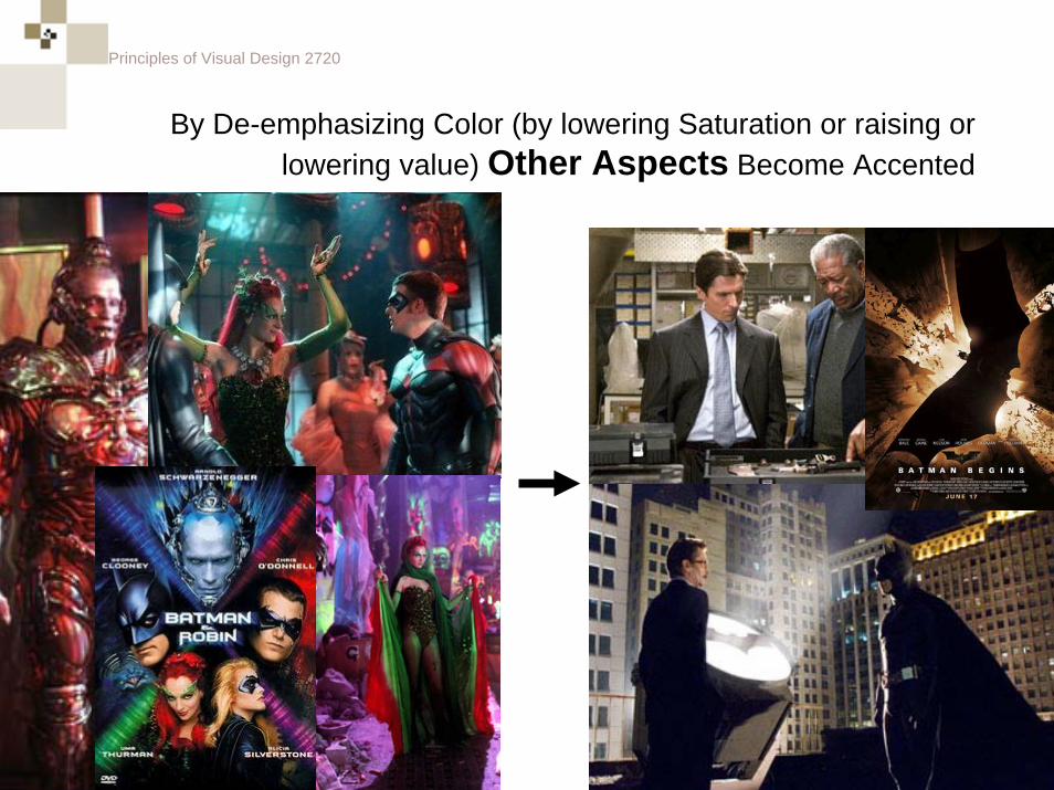
By De-emphasizing Color (by lowering Saturation or raising or lowering value) Other Aspects Become Accented
Principles of Visual Design 2720
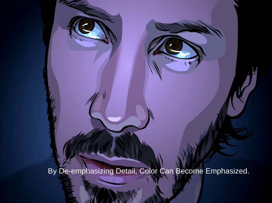
By De-emphasizing Detail, Color Can Become Emphasized.
Principles of Visual Design 2720
Science of Color
Principles of Visual Design 2720
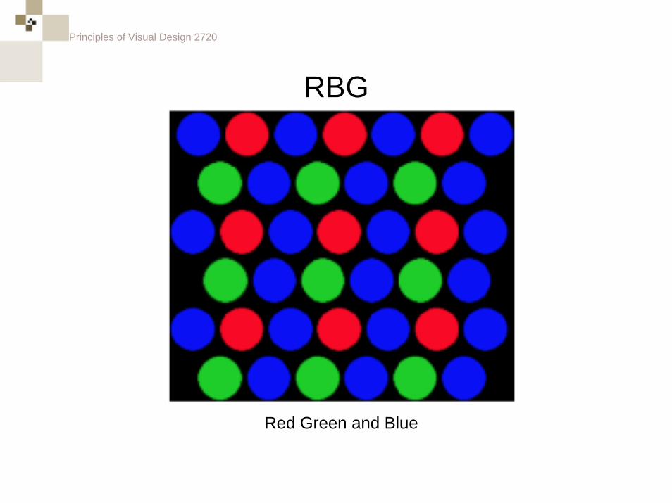
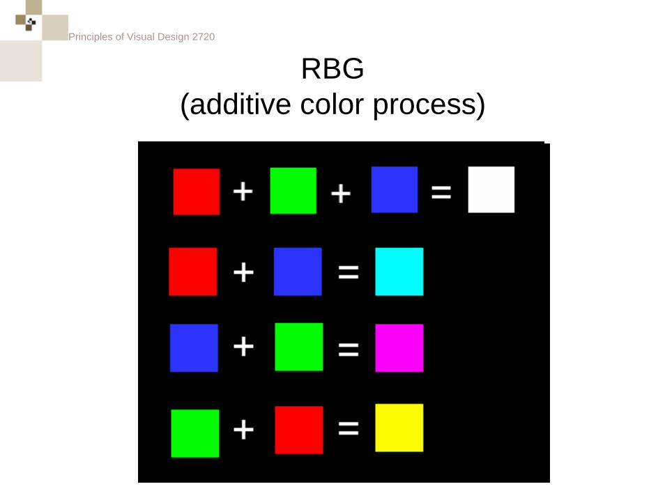
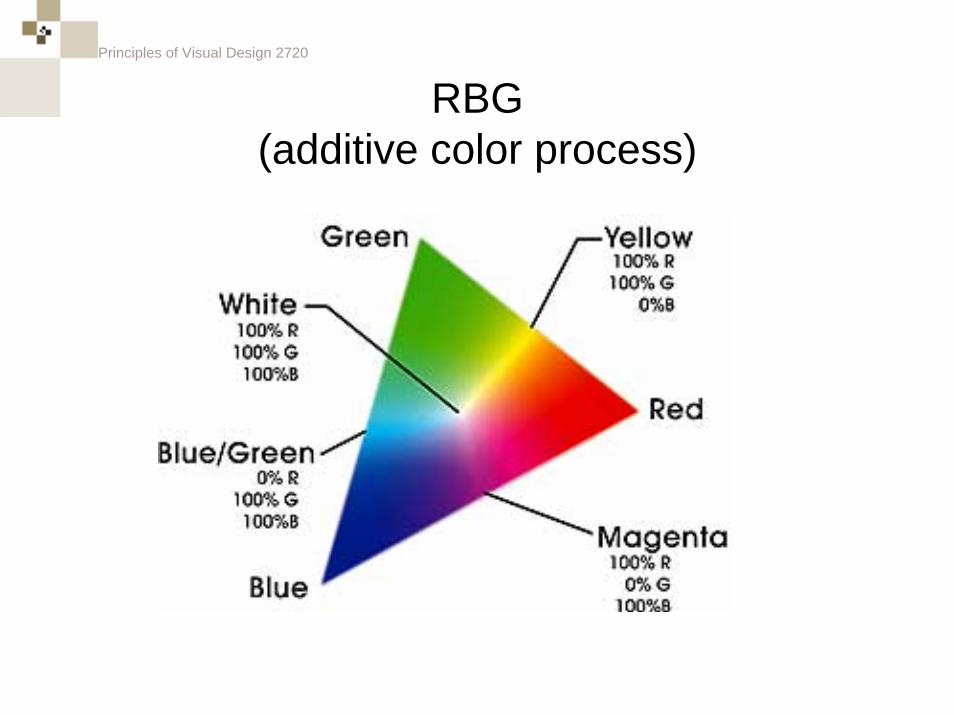
RBG
Red Green and Blue
Principles of Visual Design 2720
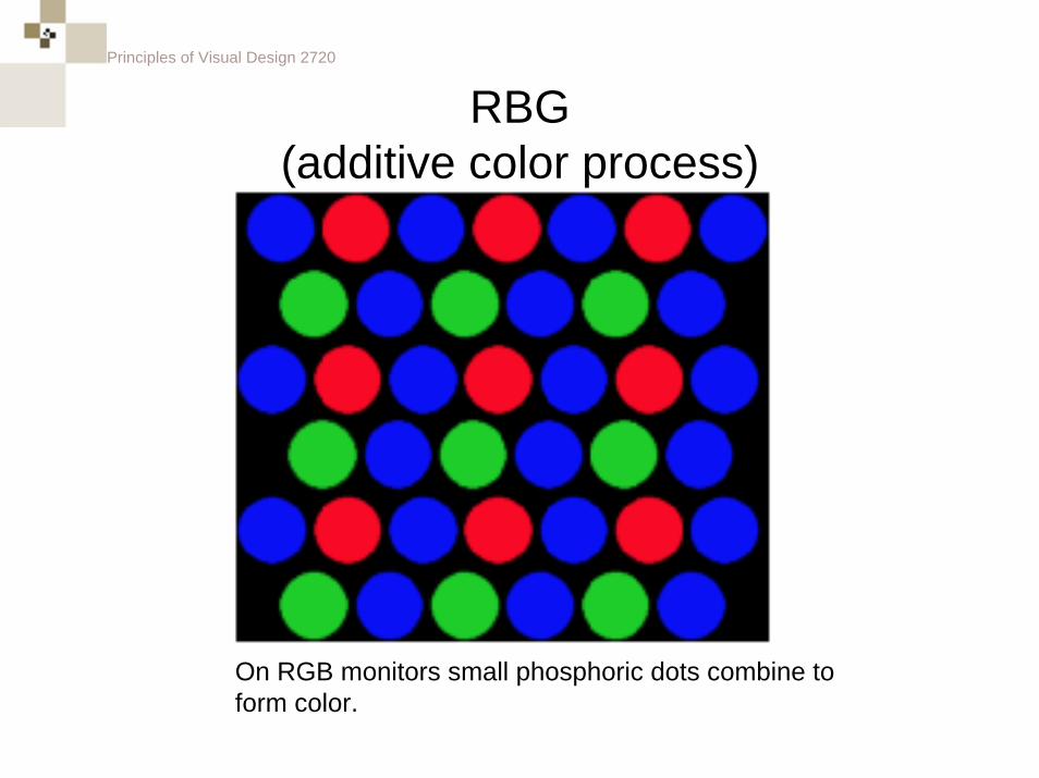
RBG(additive color process)
On RGB monitors small phosphoric dots combine to form color.
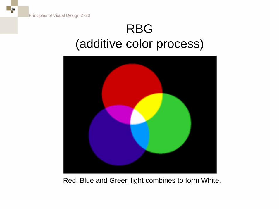
Principles of Visual Design 2720
RBG(additive color process)
Red, Blue and Green light combines to form White.
Principles of Visual Design 2720
RBG(additive color process)
Principles of Visual Design 2720
RBG(additive color process)
Principles of Visual Design 2720
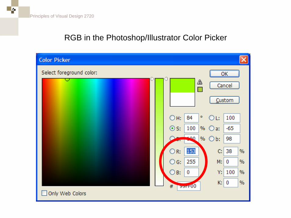
RGB in the Photoshop/Illustrator Color Picker
Principles of Visual Design 2720
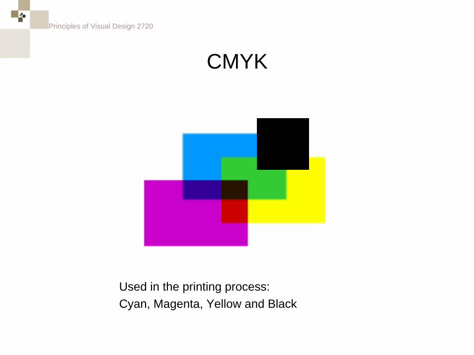
CMYK
Used in the printing process:Cyan, Magenta, Yellow and Black
Principles of Visual Design 2720
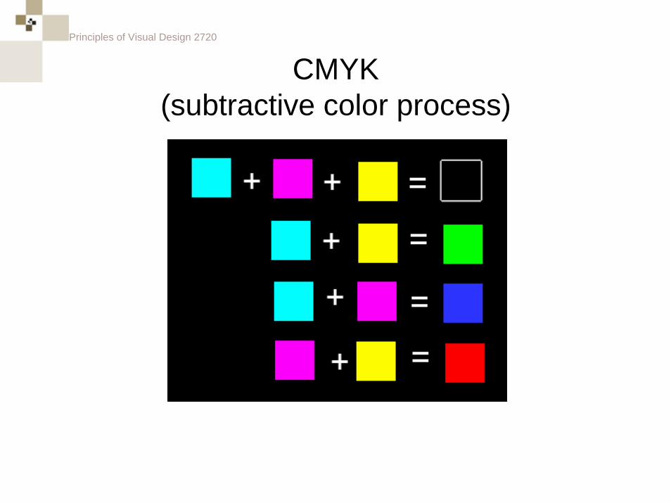
CMYK(subtractive color process)
Principles of Visual Design 2720
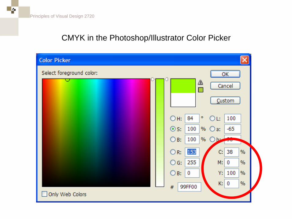
CMYK in the Photoshop/Illustrator Color Picker
Principles of Visual Design 2720
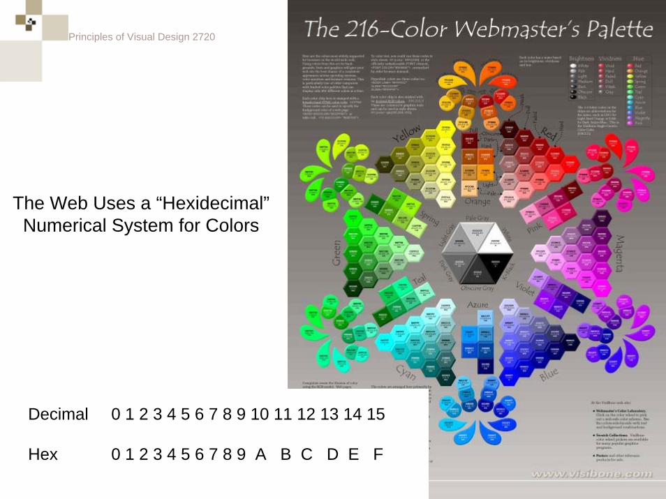
The Web Uses a “Hexidecimal”Numerical System for Colors
0 1 2 3 4 5 6 7 8 9 10 11 12 13 14 15
0 1 2 3 4 5 6 7 8 9 A B C D E F
Decimal
Hex
Principles of Visual Design 2720
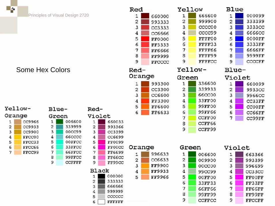
Some Hex Colors
Principles of Visual Design 2720
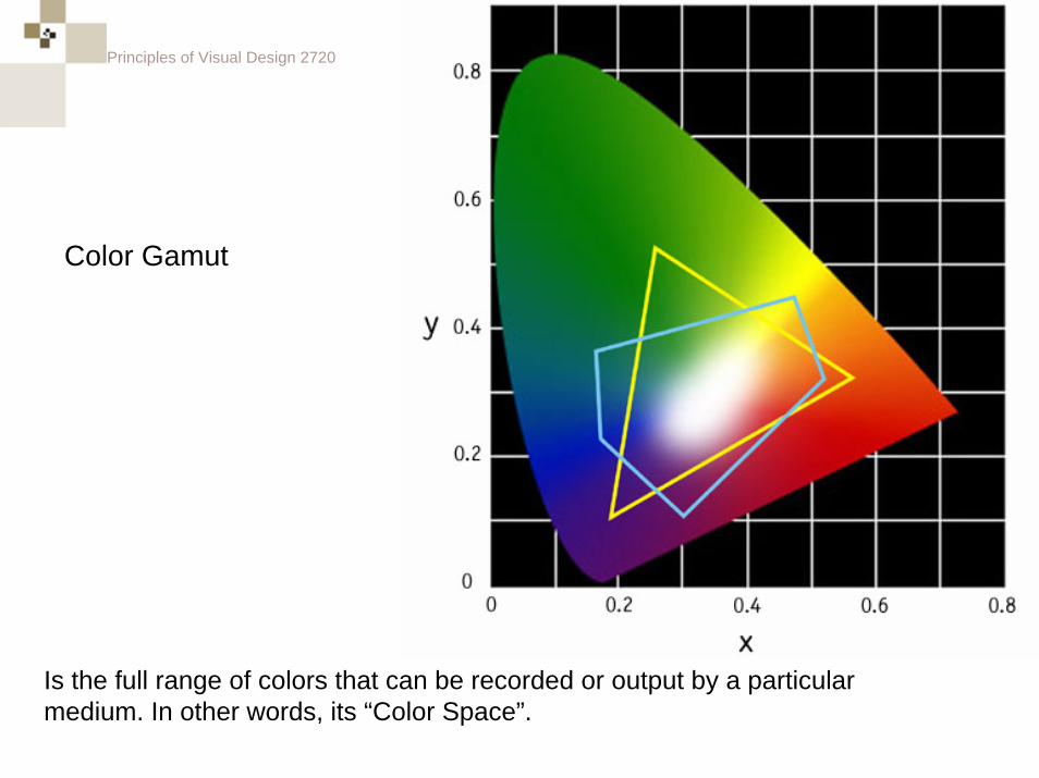
Color Gamut
Is the full range of colors that can be recorded or output by a particular medium. In other words, its “Color Space”.
Principles of Visual Design 2720
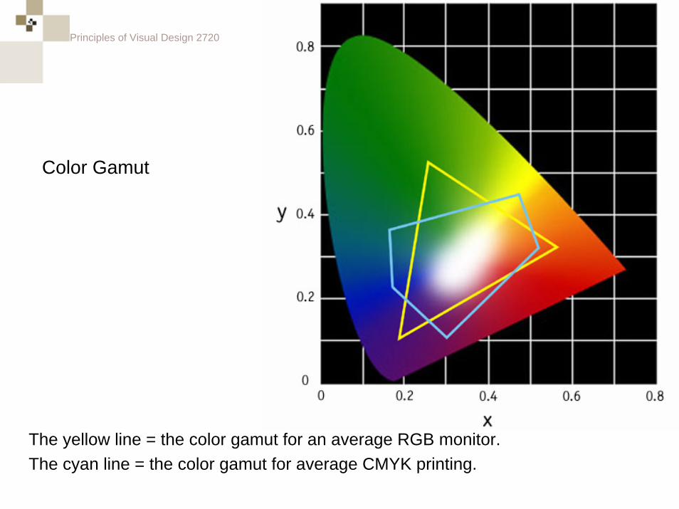
Color Gamut
The yellow line = the color gamut for an average RGB monitor.The cyan line = the color gamut for average CMYK printing.
Principles of Visual Design 2720
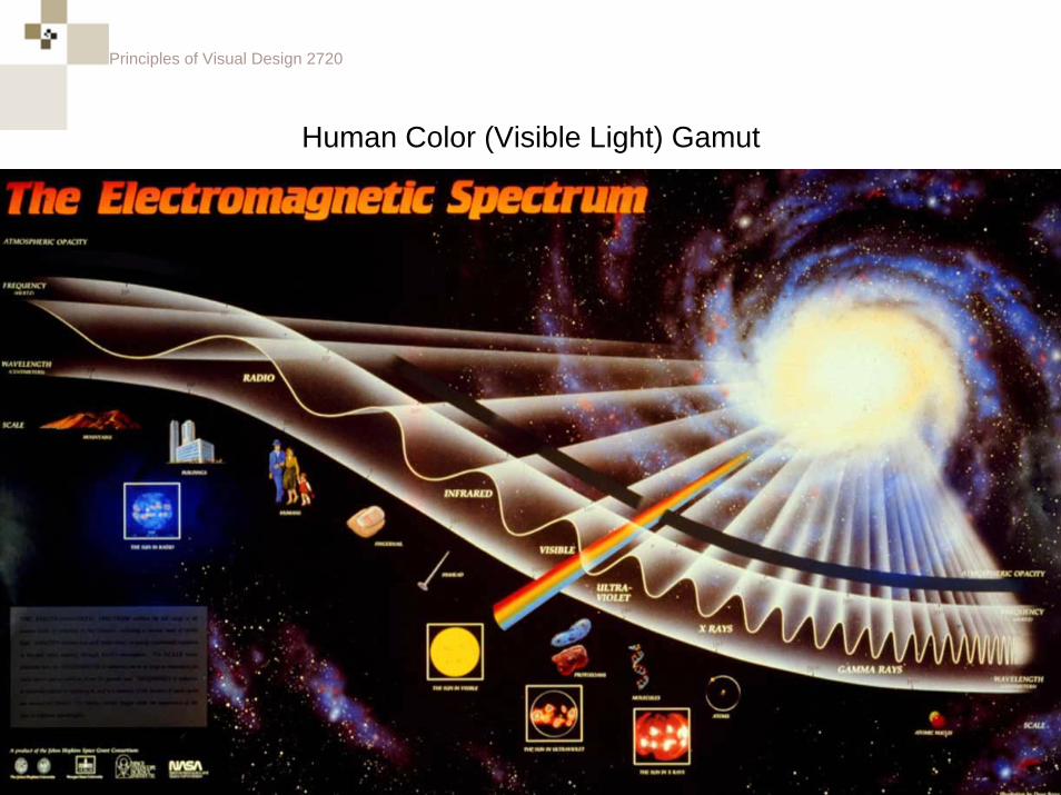
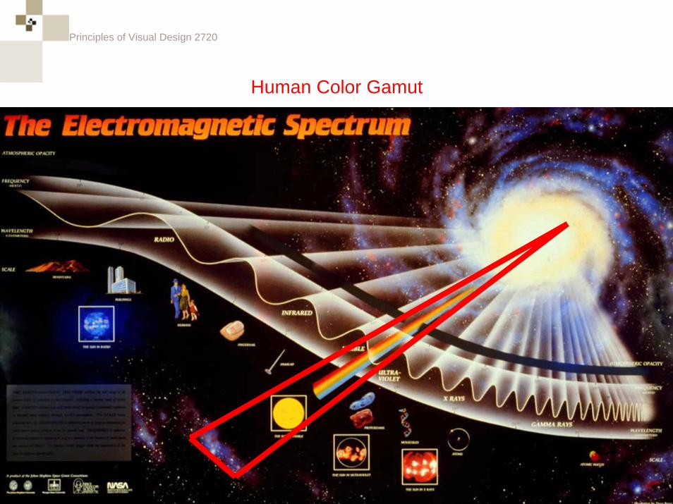
Human Color (Visible Light) Gamut
Principles of Visual Design 2720
Human Color Gamut
Principles of Visual Design 2720
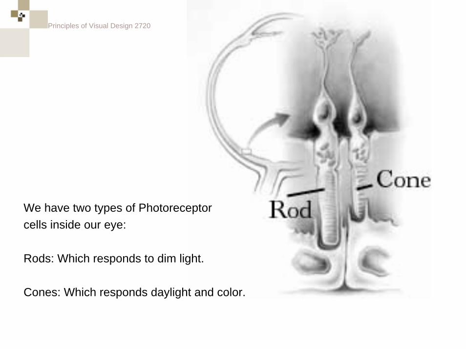
We have two types of Photoreceptorcells inside our eye:
Rods: Which responds to dim light.
Cones: Which responds daylight and color.
Principles of Visual Design 2720
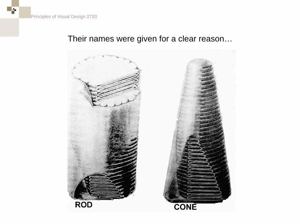
Their names were given for a clear reason…
Principles of Visual Design 2720
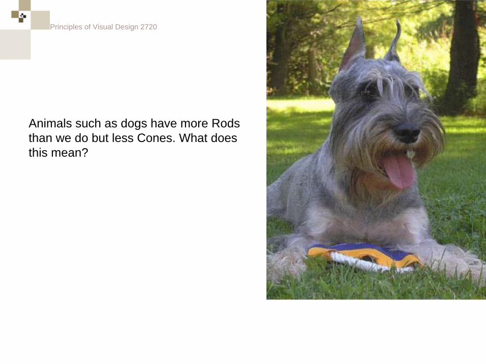
Animals such as dogs have more Rods than we do but less Cones. What does this mean?
Principles of Visual Design 2720
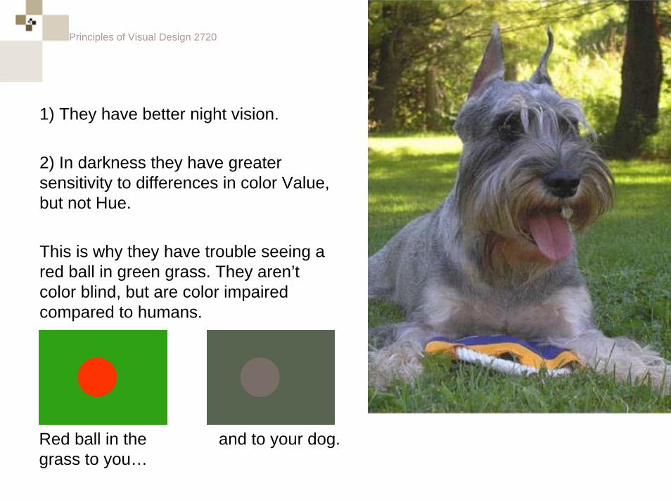
1) They have better night vision.
2) In darkness they have greater sensitivity to differences in color Value, but not Hue.
This is why they have trouble seeing a red ball in green grass. They aren’t color blind, but are color impaired compared to humans.
Red ball in thegrass to you…
and to your dog.
Principles of Visual Design 2720
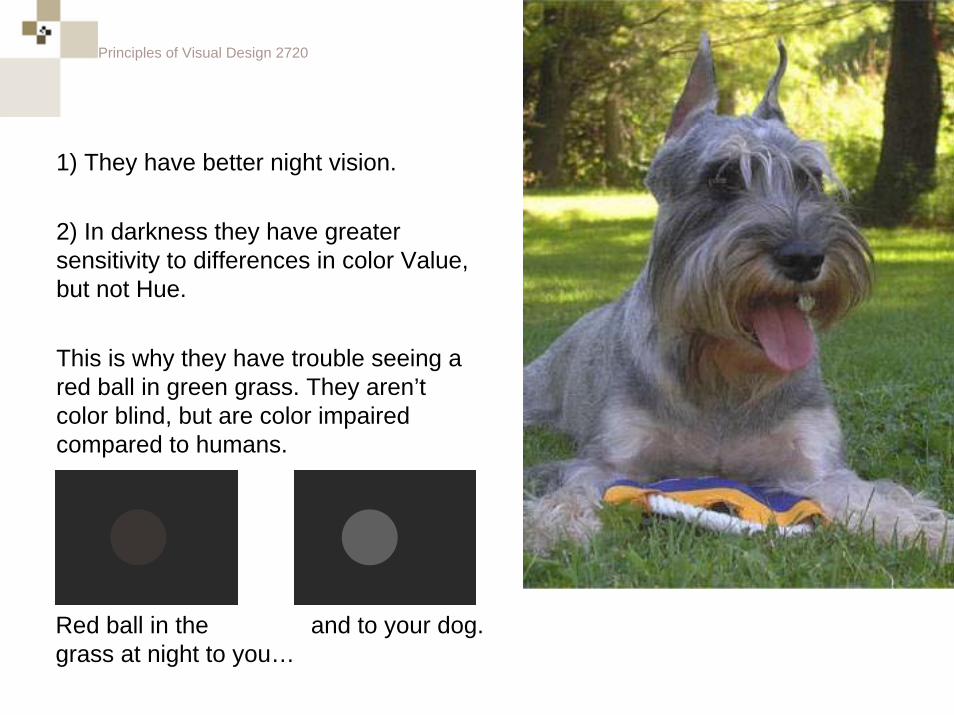
1) They have better night vision.
2) In darkness they have greater sensitivity to differences in color Value, but not Hue.
This is why they have trouble seeing a red ball in green grass. They aren’t color blind, but are color impaired compared to humans.
Red ball in thegrass at night to you…
and to your dog.


![Visual Design Principles Elements[1]](https://img.pdfslide.net/doc/110x75/577cc5561a28aba7119c0f4d/visual-design-principles-elements1.jpg)