Embed Size (px)
Citation preview
Print Workflow
The same winds of change buffetingcommercial printers in Japan are begin-ning to effect big-time newspaperproduction. This very conservativemarket is at a crossroads. The old main-
frame-based proprietary systems created in the early’80s by IBM, NEC and others are finally beingreplaced. Some newspapers are playing it safe andsticking with those big vendors. At the other extreme,Asahi Newspaper, Japan’s largest (circulation: 8.6million) and oldest newspaper, is building an opensystem with components from eight different vendors.Amid the confusion, one trend is clear: New systemsare moving away from proprietary CTS technology toPostScript-compatible RIPs and in-house fontsconverted to OpenType format. Only 10 percent ofnewspaper-production systems now use PostScript-compatible RIPs, but this should change dramaticallyin the next few years.
As we’ve noted in these pages before, there aresound technical and business reasons why opensystems did not catch on as early in Japan as in theWest. Font problems lead the list, just as in commercialprinting, but newspapers face an extra hurdle. TheJapanese Newspaper Production Show earlier thismonth gave us the chance to examine some font issuesspecific to newspapers.
Drawn on demand. Special-character creation is a factof newspaper production life. These extra charactersare called gaiji, and every major newspaper has a ded-icated team of font designers on hand, ready to instant-ly create new characters that are not included intraditional font sets. Sometimes these characters willbe used for only one edition. Any new system must beable to create and distribute gaiji system-wide to meetdaily deadlines.
To get a better idea of the situation, we sat downwith Tomihisa Uchida of Iwata Corporation. There isprobably nobody on this planet who knows moreabout Japanese font programming and typographythan Uchida. He has been involved with Japanese dig-ital font production from the start, working at its veryheart: Shaken KK.
Uchida: I was with Shaken for 23 years. I entered right
out of college, where I was a chemistry major. My first
job there was working with analog plates and mechani-
cal processes. That involved high-resolution plates, simi-
lar to what is used for IC chip manufacture, to produce
high-quality typography. I did that for 10 years; then dig-
ital fonts came along in the early ’70s. Shaken was the
first Japanese vendor to have computerized layout. It
also did the Japanese version of Ikarus. There wasn’t any
real competition and it had the market to itself.
Seybold: So Shaken made the transfer to digitalizedfonts and computer-based layout successfully?Uchida: Yes, it purchased the Japanese rights to Auto-logic technology to produce a hybrid product where thesoftware was a customized Autologic engine running onShaken hardware. That didn’t last too long, as Shakenhad been developing in-house technology and soonreleased its own original product.
We simply implemented Japanese typography andcomposition rules on the computer with outline fontsthat output on an imagesetter using proprietary tech-nology. At that time, Shaken systems were extensivelyused in newspaper production. However, Shaken lostthat market because it didn’t have strong networkcapability, which newspaper production demands.
One of the ways Shaken was able to build up a strongtype library in a fairly short time was by sponsoring a type-face competition. It would pay the winner and purchasehis typeface. It raised lots of young designers that way[like Suzuki-san, who would later create the Hiragino fontused in Apple’s MacOS X] and really expanded the marketwith new typefaces for comic books and such.
Later on, my job was creating different weights. Thedesigner would create the basic design, then we’d use theIkarus system to make the weights. That was the late ’70s.The systems we designed ran on hardware from the likesof DEC and Wang. I had a group of people who werebasically a font production line. When Japanese PostScriptfirst arrived, it wasn’t immediately apparent that thingswould change as they did. It took forever to print. Shak-en systems always had excellent performance.
Developing the toolsOf the many issues that Uchida has involved himselfwith throughout his career, none has occupied him
8 December 15, 2003 • The Seybold Report • Analyzing Publishing Technologies • © 2003 Seybold Publications
Japanese Newspapers Move Toward Open Systems
BY JOEL BRECKINRIDGE
Like their commercial counterparts, Japanese newspapers have continued to rely on proprietary
systems long after Western media espoused open systems. We look at one reason why—and how
one vendor intends to change it.
Print Workflow
more than trying to solve the Japanese character-creation bottleneck. To this end, he joined Font-works International, one of the first JapanesePostScript font vendors. It invested heavily in theQuickDraw GX type-creation solutions that hit themarket just about the time Apple decided to dropGX. (Fontworks International stroke fonts werefeatured in The Seybold Report on PublishingSystems, Vol. 30, No. 6. It’s online atwww.seyboldreports.com/SRPS/subs/3006/html/strokefonts.html.)
Seybold: It’s too bad you didn’t start with Fontworksearlier; you really seemed on the verge of a break-through.Uchida: Yes, we were pretty close. If we had just hadsome more time…. I was only with them for five years,from just about the time when Apple started having sec-ond thoughts about QuickDraw GX. Fontworks asked meif I was interested in working on its stroke-font base-character production tool, ‘2 x 2’, so I joined the effortand worked on the hinting and performance quality. Iwas always interested in font-production tools. Fontog-rapher really isn’t very good for Japanese font produc-tion. It’s an issue I hope to continue working on in thefuture.
Seybold: And now you are with Iwata Corporation.Uchida: Correct. I work with newspaper fonts and lay-out. Newspaper font designs are different because thetext is always vertical. Fonts need good layout to looktheir best, so I’m working on them together. OpenType,for example, has fractions, third-width and quarter-width glyphs, but most applications are not OpenTypelayout-aware, so it’s a real waste. The result is prettyugly.
Right now, the only OpenType layout engine outthere is InDesign. I haven’t heard much, but it seems thenext version of Quark XPress J doesn’t have muchOpenType support. If that’s true, it means you’ll have touse InDesign to access OpenType advanced typography.I’m not sure if users are really ready to make the changeor not. There are still lots of old fonts out there, too.But still, no matter what kind of fancy fonts you have,they look bad with poor typography.
As far as newspaper production is concerned, I under-stand that American systems are much more open thanJapanese systems, and American papers seem moreadept at leveraging their content for different media.Japanese newspapers are still living in the age of pro-prietary systems—Hitachi, IBM, etc.—but that era isover. I think you’ll see things starting to change. One ofthe good things I saw at JANPS was much more opensolutions. The big vendors like NEC were showing moreWindows-based systems, but nothing built aroundInDesign or Quark.
Do the chores firstAt Iwata, Uchida has been busy using his Shakenknowledge to create specialty InDesign plug-ins fordifficult, tedious newspaper-composition jobs such asthe stock-market page and classified ads.
Volume 3, Number 17 • The Seybold Report • Analyzing Publishing Technologies 9
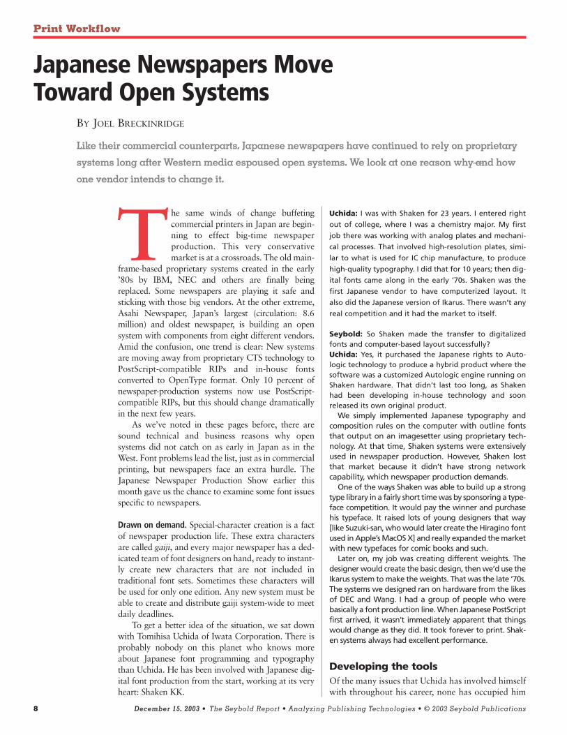
Automating hard jobs. Japanese newspaper composition has long been the monopoly ofproprietary systems from NEC and Matsushita, but change is coming. One harbinger is aset of InDesign plug-ins from Iwata Corporation that automate production of pages suchas these.
Print Workflow
The plug-ins are part of a larger server package,called Iwata Composition Software, that allows usersto set up an automated workflow and batch processesfor financial data. (Details can be found at www.iwata-font.co.jp/personal/font04.htm.) It might not seem likemuch now, but solutions like this hold lots of promiseas the newspaper industry moves away from propri-etary systems.
Uchida told us, “This product release is a bit of awarm-up. The newspaper market really isn’t quiteready for InDesign-based solutions at this point. Wereleased these with an eye to the future. As the marketwarms up to InDesign and notices what we have tooffer, we’ll expand our product line. I have many moreproduct ideas.”
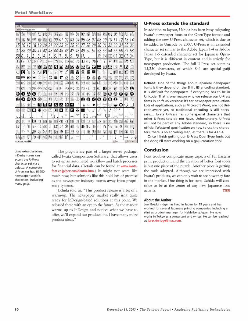
U-Press extends the standardIn addition to layout, Uchida has been busy migratingIwata’s newspaper fonts to the OpenType format andadding the new U-Press character set, which is due tobe added to Unicode by 2007. U-Press is an extendedcharacter set similar to the Adobe Japan 1-4 or AdobeJapan 1-5 extended character set for Japanese Open-Type, but it is different in content and is strictly fornewspaper production. The full U-Press set contains15,250 characters, of which 841 are special gaijideveloped by Iwata.
Uchida: One of the things about Japanese newspaperfonts is they depend on the Shift JIS encoding standard.It is difficult for newspapers if everything has to be inUnicode. That is one reason why we release our U-Pressfonts in Shift JIS versions; it’s for newspaper production.Lots of applications, such as Microsoft Word, are not Uni-code-aware yet, so traditional encoding is still neces-sary…. Iwata U-Press has some special characters thatother U-Press sets do not have. Unfortunately, U-Presswill not be part of any Adobe standard, so there is noofficial [Western] specification on how to use the charac-ters; there is no encoding map, as there is for AJ 1-4.
Once I finish getting our U-Press OpenType fonts outthe door, I’ll start working on a gaiji-creation tool.
ConclusionFont troubles complicate many aspects of Far Easternprint production, and the creation of better font toolsis but one piece of the puzzle. Another piece is gettingthe tools adopted. Although we are impressed withIwata’s products, we can only wait to see how they farein the market. One thing is for sure: Uchida will con-tinue to be at the center of any new Japanese fontactivity. TSR
About the AuthorJoel Breckinridge has lived in Japan for 19 years and hasworked for several Japanese printing companies, including astint as product manager for Heidelberg Japan. He nowworks in Tokyo as a consultant and writer. He can be reachedat [email protected].
10 December 15, 2003 • The Seybold Report • Analyzing Publishing Technologies
Using extra characters.InDesign users canaccess the U-Presscharacter set via apalette. A completeU-Press set has 15,250newspaper-specificcharacters, includingmany gaiji.