Embed Size (px)
Citation preview
Louisiana State UniversityLSU Digital Commons
LSU Doctoral Dissertations Graduate School
2016
Process Monitoring and Data Mining withChemical Process Historical DatabasesMichael Carl ThomasLouisiana State University and Agricultural and Mechanical College, [email protected]
Follow this and additional works at: https://digitalcommons.lsu.edu/gradschool_dissertations
Part of the Chemical Engineering Commons
This Dissertation is brought to you for free and open access by the Graduate School at LSU Digital Commons. It has been accepted for inclusion inLSU Doctoral Dissertations by an authorized graduate school editor of LSU Digital Commons. For more information, please [email protected].
Recommended CitationThomas, Michael Carl, "Process Monitoring and Data Mining with Chemical Process Historical Databases" (2016). LSU DoctoralDissertations. 4480.https://digitalcommons.lsu.edu/gradschool_dissertations/4480
PROCESS MONITORING AND DATA MINING
WITH CHEMICAL PROCESS HISTORICAL DATABASES
A Dissertation
Submitted to the Graduate Faculty of the
Louisiana State University and
Agricultural and Mechanical College
in partial fulfillment of the
requirements for the degree of
Doctor of Philosophy
in
The Gordon A. and Mary Cain
Department of Chemical Engineering
by
Michael Carl Thomas
B.E., Vanderbilt University, 2012
M.S., Louisiana State University, 2014
December 2016

ii
To my father,
for teaching me about many things,
from engineering to investing to fantasy football,
and to my mother,
for all her warm love and gumbo.

iii
Acknowledgements
Creating the research in this dissertation would not have been possible without help from
many people whose support I greatly appreciate.
I would like to thank my advisor, Dr. José Romagnoli for his guidance and mentorship
during my years in graduate school. He helped me explore and develop as a researcher, and I am
thankful for the opportunities I have had while working in his lab. I would also like to thank Dr.
Jianhua Chen, Dr. John Flake, and Dr. Andreas Giger for serving on my dissertation committee.
More people than I can list here have also enriched my experience in graduate school. In
particular I am grateful for the mentorship and help provided by John, Mike, Elaine, and Brian
which fostered my growth into a professional engineer. I also appreciated the support of my fellow
members of the Romagnoli group: Greg Robertson, Rob Willis, Bing Zhang, Vikram
Gowrishankar, Jorge Chebir, Santiago Salas, and Aryan Geraili. I am grateful for their friendship
and support while I was flying in and out of the lab and tapping away at code in the corner. I am
also grateful to Wenbo Zhu for collaborating with me for some of the work in this dissertation.
Finally, I would like to thank my roommate, Navid Ghadipasha, for his support while we
commiserated over the challenges of graduate school.
I would also like to gratefully acknowledge Donald W. Clayton for supporting me through
his generous Clayton Engineering Award and for giving me ten two-letter words that have
encouraged me in graduate school: “If it is to be, it is up to me!”
Finally, thank you to my cat, Carol, and my family for their love and support that has
sustained me through graduate school. I am especially grateful for the love and support of my
parents.
iv
Table of Contents
Acknowledgements ........................................................................................................................ iii
List of Tables ................................................................................................................................ vii
List of Figures .............................................................................................................................. viii
Abstract ........................................................................................................................................ xiv
Chapter 1 - Introduction .................................................................................................................. 1
1.1 Background ................................................................................................................... 1 1.2 Dissertation Motivation ................................................................................................ 5
1.3 Research Aims .............................................................................................................. 8 1.4 Publications and Presentations ...................................................................................... 9
1.5 Dissertation Contributions .......................................................................................... 10 1.6 Dissertation Structure .................................................................................................. 11 1.7 References ................................................................................................................... 12
Chapter 2 - Data Preprocessing..................................................................................................... 16 2.1 Data Pretreatment........................................................................................................ 16
2.1.1 Outlier removal ............................................................................................ 17
2.1.2 Data normalization ....................................................................................... 17
2.1.3 Missing data approximation ......................................................................... 18 2.2 Multiway Unfolding.................................................................................................... 18 2.3 Dynamic Time Warping (DTW) ................................................................................. 20
2.3.1 Synchronization of batch trajectories with DTW ........................................ 21 2.3.2 Iterative synchronization of multivariate batch process data ....................... 26
2.4 Synthetic Minority Over-sampling Technique (SMOTE) .......................................... 28 2.5 References ................................................................................................................... 31
Chapter 3 - Data Mining Techniques ............................................................................................ 32 3.1 Data Mining Approach ............................................................................................... 33 3.2 Dimensionality Reduction (DR) ................................................................................. 34
3.2.1 Principal component analysis (PCA) ........................................................... 35
3.2.2 Independent component analysis (ICA) ....................................................... 36
3.2.3 Kernel principal component analysis (KPCA) ............................................ 39 3.2.4 Isomap .......................................................................................................... 41 3.2.5 Spectral embedding (SE) ............................................................................. 42
3.3 Data Clustering ........................................................................................................... 44 3.3.1 K-means clustering ...................................................................................... 44 3.3.2 DBSCAN ..................................................................................................... 45 3.3.3 Balanced iterative reducing and clustering using hierarchies (BIRCH) ...... 48
v
3.3.4 Mean shift clustering.................................................................................... 50
3.4 Cluster Evaluation ....................................................................................................... 51 3.5 Subspace Clustering Study: Parameters and Analysis ................................................ 53 3.6 References ................................................................................................................... 56
Chapter 4 - Process Monitoring and Supervision ......................................................................... 59
4.1 Introduction to Data-Driven Process Monitoring ....................................................... 60 4.2 Statistical Process Control .......................................................................................... 63 4.3 PCA-Based Process Monitoring ................................................................................. 64
4.3.1 PCA fault detection ...................................................................................... 65 4.3.2 PCA fault identification ............................................................................... 67
4.3.3 PCA Fault diagnosis – discriminant analysis............................................... 68 4.3.4 Nonlinear principal component analysis (NLPCA) ..................................... 68
4.4 Novel Self-Organizing Map (SOM) Monitoring Approach ....................................... 69 4.4.1 The self-organizing map (SOM) .................................................................. 70 4.4.2 SOM visualization tools for process analysis .............................................. 72 4.4.3 Clustering of the SOM using k-means ......................................................... 74
4.5 MSOM in Process Monitoring .................................................................................... 75 4.5.1 SOM fault detection and diagnosis .............................................................. 75
4.5.2 Variable contribution plots .......................................................................... 76 4.6 Multiway Methods for Batch Process Monitoring...................................................... 78 4.7 Defining Normal Operations: Example on Fisher Iris Data ....................................... 79
4.7.1 PCA analysis – fault detection ..................................................................... 79 4.7.2 Contribution plots – fault identification ....................................................... 80
4.7.3 Discriminant analysis – fault diagnosis ....................................................... 82
4.8 References ................................................................................................................... 85
Chapter 5 - Case Study 1: Tennessee Eastman Process (TEP) ..................................................... 87
5.1 Introduction ................................................................................................................. 87 5.2 Tennessee Eastman Process Description .................................................................... 88
5.3 Tennessee Eastman Process Fault Extraction ............................................................. 91 5.3.1 Normal and fault 1: basic case ..................................................................... 92
5.3.2: Reduced TEP data set ................................................................................. 92 5.3.3 Full TEP data set ........................................................................................ 101
5.4 Process Monitoring of the Tennessee Eastman Process ........................................... 101 5.4.1 Fault detection results ................................................................................ 104 5.4.2 Fault identification results.......................................................................... 105
5.4.3 Fault diagnosis results ................................................................................ 109 5.5 Conclusions ............................................................................................................... 113
5.6 References ................................................................................................................. 114
Chapter 6 - Case Study 2: Industrial Separation Tower ............................................................. 116
6.1 Introduction ............................................................................................................... 116 6.2 Separation Tower Process Description ..................................................................... 118
6.3 Separation Tower Dimensionality Reduction (DR) and Clustering ......................... 121
vi
6.4 Novel Event Detection .............................................................................................. 131
6.4.1 Data mining and analysis for monitoring................................................... 131 6.4.2 Map training and visualization................................................................... 133 6.4.3 Determining the quantization error (QE) threshold ................................... 137
6.5 Fault Detection and Identification Results ................................................................ 139 6.6 Conclusions ............................................................................................................... 148 6.7 References ................................................................................................................. 151
Chapter 7 - Case 3: Analysis and Monitoring of an Industrial Batch Polymerization Process .. 152 7.1 Introduction ............................................................................................................... 152 7.2 Process Description ................................................................................................... 153
7.3 Dynamic Time Warping for Batch Synchronization and Unfolding ........................ 155 7.4 Fault Detection and Diagnosis on Batch Process ..................................................... 159
7.4.1 Detection of filter clogging ........................................................................ 161 7.4.2 Detection of valve sticking ........................................................................ 162
7.5 Fault Detection Discussion ....................................................................................... 162 7.6 Diagnosis of Both Reactor Conditions ..................................................................... 165
7.7 Conclusions ............................................................................................................... 165 7.8 References ................................................................................................................. 167
Chapter 8 - FastMan: A Software Tool for Data Mining Chemical Process Data ..................... 168
8.1 Introduction ............................................................................................................... 168 8.2 Software Description and Demonstration ................................................................. 169 8.3 Conclusions ............................................................................................................... 171
Chapter 9 - Conclusions .............................................................................................................. 173 9.1 Summary of Results .................................................................................................. 173 9.2 Future Research Recommendations .......................................................................... 174
Appendix A - Complete Clustering Results................................................................................ 176
Vita .............................................................................................................................................. 190
vii
List of Tables
Table 3.1: Clustering metrics used to compare the quality of clustering results .......................... 52
Table 5.1: TEP measured variables .............................................................................................. 90
Table 5.2: TEP manipulated variables .......................................................................................... 90
Table 5.3: TEP process faults description ..................................................................................... 91
Table 5.4: Number of components used by DR projections in clustering TEP data .................... 95
Table 5.5: Clustering results on reduced TEP data set ................................................................. 96
Table 5.6: Data clustering and DR applied to the full TEP data set ........................................... 104
Table 5.7: Fault detection rate of MPCA and MSOM ................................................................ 106
Table 5.8: Fault detection results for all 20 faults ...................................................................... 106
Table 5.9: False alarm rates of the four techniques from the analysis in Table 5.8 ................... 107
Table 5.10: Correct diagnosis rates for selected TEP faults ....................................................... 110
Table 5.11: Fault Diagnosis for all 20 TEP faults ...................................................................... 111
Table 6.1: Process measurements and derived measurements .................................................... 122
Table 6.2: Supervised clustering metrics on tower data set ...................................................... 1256
Table 6.3: Sizes of historical data groups and training data ....................................................... 133
Table 7.1: Sizes of reactor fault data sets ................................................................................... 159
Table 7.2: Filter clog detection ................................................................................................... 161
Table 7.3: Valve sticking detection ............................................................................................ 162
Table 7.4: Diagnosis of batch faults ........................................................................................... 165

viii
List of Figures
Figure 2.1: Multiway unfolding of batch process data takes the three-dimensional batch
process data matrix and unfolds it into a two-dimensional matrix. In the new matrix,
each batch’s data formed into a single row of entries. .......................................................... 19
Figure 2.2: Batch sensor measurement data (a) before synchronization and (b) after
synchronization. In both figures, the average trajectory is indicated by the bolded
black line. Two abnormal batches are visible: one occurs before the others (blue)
and another dip. ..................................................................................................................... 24
Figure 2.3: DTW alignment path of a normal batch from the example batch data trajectories. ... 25
Figure 2.4: DTW alignment path of the batch trajectory that dips at the end in Figure 2.2, a. .... 25
Figure 3.1: Schematic of data mining approach. .......................................................................... 34
Figure 3.2: Illustration of the various clustering metrics. ............................................................. 54
Figure 4.1: Industrial process monitoring workflow. ................................................................... 61
Figure 4.2: Shewhart chart. ........................................................................................................... 64
Figure 4.3: Schematic of the overall strategy for fault detection and identification. .................... 71
Figure 4.4: Proposed MSOM process monitoring framework. Data comes from the
computerized control system and is first projected onto the SOM of normal
operations. ............................................................................................................................. 76
Figure 4.5: Illustration of the residual analysis. The SOM based contribution identifies
large contributions from both variables relative to the structure of the data. ....................... 77
Figure 4.6: Green points were classified as normal and red points were classified as faulty
points. The cylinder denotes the normal operating region. PCA was able to clearly
separate class 1 from classes 2 and 3. ................................................................................... 80
Figure 4.7: Fault detection without using the T2 cylinder. The NOR is represented by the
small, dense cluster of points in the lower left corner of the graph. The lower left
corner is enlarged in Figure 4.8. ........................................................................................... 81

ix
Figure 4.8: A detail of the NOR cluster from Figure 4.7. Because the PCA model was
created using class 1 data, the error in the model for class 1 is small which yields
small T2 and Q statistics. ...................................................................................................... 81
Figure 4.9: Faulty points from each class produce different contribution plots. The petal
length and width are most responsible for the "faulty" status. .............................................. 82
Figure 4.10: Data scores with respect to the class 1 PCA model. ................................................ 83
Figure 4.11: Data scores with respect to the class 2 PCA model. ................................................ 83
Figure 4.12: Data scores with respect to the class 3 PCA model. ................................................ 84
Figure 4.13: SOM fits to each of the Fisher Iris classes with less overlap compared to the
MPCA models. ...................................................................................................................... 84
Figure 5.1: Process schematic with control scheme. .................................................................... 89
Figure 5.2 Data from TEP0 and TEP1 projected to 3 PCs. .......................................................... 93
Figure 5.3 DBSCAN identifies the clusters formed by TEP0 and TEP1. .................................... 93
Figure 5.4 Flow of Stream 4 colored by the DBSCAN clusters ................................................... 94
Figure 5.5 A time series plot of each data point’s cluster. ............................................................ 94
Figure 5.6 DBSCAN cluster labels largely correspond to original labels .................................... 98
Figure 5.7 DBSCAN cluster labels on data reduced by PCA ....................................................... 98
Figure 5.8 K-means cluster labels on data with No DR ............................................................... 99
Figure 5.9 Clusters found using DBSCAN and spectral embedding ............................................ 99
Figure 5.10: Raw mean shift results with ICA reduced data gave rise to a very large
number of clusters seen in (a). Combining all clusters with fewer than 10 members
into the noise cluster in (b), had only a minor effect on the ARI results. ........................... 100
x
Figure 5.11 PCA projection of the reduced TEP data set colored by true fault group. .............. 102
Figure 5.12 Detail of the data clustered near the TEP’s normal operations ............................... 102
Figure 5.13 Clustering TEP data with K-means ......................................................................... 103
Figure 5.14: DBSCAN with NO DR identified most clusters, though issues with
unrelated data and noise data remain challenges. ............................................................... 103
Figure 5.15: Contribution plots of faulty data made my PCA and MSOM. ............................... 108
Figure 5.16: Data classification using MPCA, 1-SOM, and MSOM on the testing data set
with time colored according to class. Solid lines of color indicate a consistent
classification while discontinuous lines indicate an inconsistent classification. ................ 112
Figure 5.17: PCA projections of data from Fault 14+1, the map used in 1-SOM
classification (a), and the map fit to Fault 14+1 in MSOM (b). ......................................... 113
Figure 6.1: Simplified process flow sheet. .................................................................................. 119
Figure 6.2: This PCA projection of separation tower data demonstrates the variability of
tower data with feed grade. The normal operating region from one grade generally
doesn’t overlap with other grades. Date are colored according to feed grade. ................... 119
Figure 6.3 Projections of tower data using PCA......................................................................... 123
Figure 6.4 Projections of tower data using ICA ......................................................................... 123
Figure 6.5 Projections of tower data using Isomap break up the cluster of normal data ............ 124
Figure 6.6 Projections of tower data using SE separate the data well, but interpretation is
less intuitive ........................................................................................................................ 124
Figure 6.7 PCA projection of K-means clusters of tower data with k=2 .................................... 127
Figure 6.8 PCA projection of K-means clustering of tower data with k=3 ................................ 128
Figure 6.9 PCA projection of DBSCAN clusters ....................................................................... 128
xi
Figure 6.10 PCA projection of mean shift clusters ..................................................................... 129
Figure 6.11: Adjustments to the eps parameter in DBSCAN finds the smaller clusters in
(a). In (b) the data are colored based on time (blue is older, yellow is newer, with
dark red being the most recent). .......................................................................................... 130
Figure 6.12: Graphical tool used to manually classify training data. Selected data is
plotted in time series with dense group’s circles and added to different fault groups
with the controls in the upper left of the window. .............................................................. 132
Figure 6.13: PCA projection of trained map with sampled training data, including synthetic
samples from SMOTE. ....................................................................................................... 134
Figure 6.14: Visualizations of the map used in monitoring. (a) the SOM U-matrix
visualizes groups in the data. (b) colors are derived from clustering results. (c) is a
hit diagram of the training data on the map. (d) labels the map regions. ............................ 135
Figure 6.15: Davies-Bouldin index of the clustering given in Figure 6.8, b. Lower values
indicate a better clustering. Based on the number of data groups we expect from this
set, the five cluster result is accepted as the best. ............................................................... 136
Figure 6.16: SOM component planes for F2, F3, and T7 showing the different normalized
measurement values across different regions of the map in Figure 6.8, d. ......................... 138
Figure 6.17: Log normal distribution fit to a histogram of the QE calculated over all data
from 2012-2013. ................................................................................................................. 139
Figure 6.18: Fault detection using the quantization error of new data vectors on the SOM.
The pink line on the top corresponds to the threshold for a detected fault. The
bottom graph colors the data based on the region of the map the system is in. .................. 140
Figure 6.19: Close-ups of the QE with time calculated (a) after a regular Tfault and (b)
during the Novel Event. ...................................................................................................... 141
Figure 6.20: T2 statistic based MPCA classification. While the PCA model of normal
outputs a strong fault signal, classification results are inferior to SOM due to
nonlinearity in the data and overlapping fault and normal regions in the data space. ........ 142
Figure 6.21: SOM trajectories of the process state for three separate conditions in the
tower: (a) normal startup, (b) regular temperature sensor fault, and (c) Novel Event.
Each trajectory plots about one day of data. ....................................................................... 143

xii
Figure 6.22: The SOM based fault contribution plot for (a) normal steady state
operations, (b) typical temperature sensor fault, and (c) the Novel Event showing
which variables could be contributing to an elevated fault detection statistic. ................... 144
Figure 6.23: PCA contribution plots of the sensor fault (a), the temperature fault (b), and
the Novel Event (c) with respect to the PCA models for the normal and the sensor
fault PCA model (the class much Novel Event data was classified with). ......................... 145
Figure 6.24 Time series plot of SG colored by classes found by SOM ...................................... 146
Figure 6.25 Time series plot of T3_T7 colored by classes found by SOM ................................ 147
Figure 6.26 Times series plot of T7 colored by classes found by SOM ..................................... 147
Figure 6.27 Time series plot of F2 colored by classes found by SOM ....................................... 148
Figure 6.28: Projection of map vectors to (a) two and (b) three dimensions. The pink data
points are data drawn from Novel Event. ........................................................................... 149
Figure 7.1: Batch reactor process flow sheet. ............................................................................. 154
Figure 7.2: Sticky valve faults can be spotted from patterns in PA flow. .................................. 155
Figure 7.3: Clogged filter batches can be seen from a changed pattern in dP1 pressure
drop through the filter. ........................................................................................................ 156
Figure 7.4: This synchronized, unfolded batch temperature trajectory matches the raw
data well. ............................................................................................................................. 157
Figure 7.5: This shows the trajectories of reactor pressure. While this batch’s pressure is
offset, the general pattern of the batch is preserved. ........................................................... 158
Figure 7.6: The synchronized PA flow from batch with a sticky valve still preserves the
characteristic behavior of the fault while still synchronizing the batches relative to
the average batch. ................................................................................................................ 158
Figure 7.7: The QE of the training data relative to the map fit to normal operations for
MSOM. ............................................................................................................................... 160

xiii
Figure 7.8: 1-SOM maps fit for fault detection of the clogged filter (a) and sticky valve
(b) conditions. ..................................................................................................................... 161
Figure 7.9: Hit diagrams of normal data on the maps shown in Figure 7.8. In both cases, a
large amount of normal data is being projected on to the faulty side of the map,
leading to misdiagnosis by the 1-SOM classifier................................................................ 163
Figure 7.10: T squared statistic generated by MPCA. ................................................................ 164
Figure 7.11: QE results from MSOM. ........................................................................................ 164
Figure 7.12: (a) From MPCA results, low T2 statistic from the sticky valve PCA model
causes consistent misdiagnosis of clogged filter data. MSOM result plotted in (b) is
more accurate. The horizontal blue line corresponds to each map’s NOR threshold. ........ 166
Figure 8.1: FastMan UI before data has been loaded. Clustering and projection figures are
shown adjacent to each other to facilitate comparisons with time series data. ................... 169
Figure 8.2: FastMan UI with data from the industrial separation tower. .................................... 171
Figure 8.3: Projected data clustering results are displayed on the left. When the user
selects a cluster its constituent data is highlighted in the time series on the right. ............. 172

xiv
Abstract
Modern chemical plants have distributed control systems (DCS) that handle normal
operations and quality control. However, the DCS cannot compensate for fault events such as
fouling or equipment failures. When faults occur, human operators must rapidly assess the
situation, determine causes, and take corrective action, a challenging task further complicated by
the sheer number of sensors. This information overload as well as measurement noise can hide
information critical to diagnosing and fixing faults. Process monitoring algorithms can highlight
key trends in data and detect faults faster, reducing or even preventing the damage that faults can
cause.
This research improves tools for process monitoring on different chemical processes.
Previously successful monitoring methods based on statistics can fail on non-linear processes and
processes with multiple operating states. To address these challenges, we develop a process
monitoring technique based on multiple self-organizing maps (MSOM) and apply it in industrial
case studies including a simulated plant and a batch reactor. We also use standard SOM to detect
a novel event in a separation tower and produce contribution plots which help isolate the causes of
the event.
Another key challenge to any engineer designing a process monitoring system is that
implementing most algorithms requires data organized into “normal” and “faulty”; however, data
from faulty operations can be difficult to locate in databases storing months or years of operations.
To assist in identifying faulty data, we apply data mining algorithms from computer science and
compare how they cluster chemical process data from normal and faulty conditions. We identify
several techniques which successfully duplicated normal and faulty labels from expert knowledge
and introduce a process data mining software tool to make analysis simpler for practitioners.

xv
The research in this dissertation enhances chemical process monitoring tasks. MSOM-
based process monitoring improves upon standard process monitoring algorithms in fault
identification and diagnosis tasks. The data mining research reduces a crucial barrier to the
implementation of monitoring algorithms. The enhanced monitoring introduced can help engineers
develop effective and scalable process monitoring systems to improve plant safety and reduce
losses from fault events.
1
Chapter 1 - Introduction
1.1 Background
The information age has given rise to the generation of huge amounts of data. Each year,
the world generates about 1.2 zettabytes (1021) of electronic data (Mervis 2012). The concept of
big data and the use of large scale analysis is gaining acceptance in a wide variety of applications
including the management of supply chains (Marr 2016), water infrastructure (Grady 2016), as
well as cloud based public transport (Daniel 2016). While simply generating and storing such huge
amounts of data is its own technical achievement, a large gap exists in our ability to utilize big
data for problem solving. Without a means of automatically searching for interesting patterns in
data, all of the investments in increasing data storage capacity have created at best an archive of
human activity and at worse the creation of forgotten “data graveyards” (Venkatasubramanian
2009).
In response to the accumulation of data, scientists developed data mining and machine
learning algorithms to process information and extract knowledge from databases. This loose
collection of computing algorithms and analysis techniques arose out of earlier research on
statistics and data analysis. The earliest applications of PCA to data analysis problems were by
Pearson (1901) and Hotelling (1933) to find projections of multivariate data. One of the earliest
methods for the automatic classification of data with multiple measurements was proposed by
Fisher (1936). Data clustering can be seen as a descendent of work by another scientist named
Fisher (1958) who analyzed the problem of “grouping [arbitrary numbers] so that the variance
within groups is minimized.” Tukey (1961) described exploratory data analysis as procedures for
making the gathering and interpretation of data easier and more accurate, and called for research
into novel data analysis. Subsequent increases in computing and data storage capacity have made

2
data mining, the automatic discovery of useful information in large data bases and machine
learning, the automated classification of data objects by computer, dynamic areas of research
subject to millions of dollars in research projects by the U.S. government (Mervis 2012).
The two broad categories of tools represented by machine learning and data mining are
supervised and unsupervised learning, respectively. Machine learning and artificial intelligence,
like neural networks, fall under the umbrella of supervised classification, which uses a set of
labeled data objects called a “training set” to fit a model to classify unlabeled data for the user.
Data mining or data clustering are classified as unsupervised classification where labels for data
objects are generated by the algorithm using only the data itself (Tan 2005). Both categories of
algorithms have rapidly developed and become a part of modern life across a variety of disciplines.
Clinical medicine (Bellazzi 2008), autonomous vehicles (Urmson et al 2008), fraud detection
(Bolton 2002), and gene expression data (Jiang 2004) are only a selection of recent advances in
machine learning. Harding et al. (2006) reviewed a wide variety of applications of data mining to
manufacturing and engineering applications including studies in fault detection, maintenance,
customer relationship management, and other areas.
Chemical engineering has also experienced changes and challenges from the dual
computing and data revolution. Chemical systems can generate large amounts of data through
chemical manufacturing sensor data, quantum and molecular simulations, as well as from
pharmaceutical drug development, taking chemical engineers from a “data poor” to a “data rich”
paradigm (Venkatasubramanian 2009). Chemical plants in particular represent fertile ground for
data mining and machine learning use to grow due to how much chemical manufacturing is already
influenced by computer automation. Modern chemical plants use a distributed control system to
maintain a consistent product quality and continuously adjust for disturbances entering the process,

3
with human operators acting as a supervisor over multiple automatic processes. Physically and
mathematically, these processes tend to be highly multivariate and non-linear, making control and
modeling of these systems challenging. Engineers designing chemical manufacturing processes
place great emphasis on making process systems robust to anticipated disturbances, but continuing
challenges arise from how to handle unforeseen faults. A fault is formally defined as an
unpermitted deviation of one or more characteristic properties of a system, such as heat exchanger
fouling, changes in concentration, or equipment problems like valve sticking (Russell 2000).
Helping operators to sift through the large amounts of process data necessary to manage
abnormal fault events is an important and useful application of data mining and machine learning
on chemical processes. In a study on fault detection on nuclear submarines, Malkoff (1987) argued
that factors that compromise operators’ ability to assess and address fault events include not only
personnel training, stress, and culture, but also the “Christmas tree effect” where major fault events
simultaneously trigger more alarms than the human operator can usefully process. These factors
all contributed to the mismanagement of industrial accidents such as 3 Mile Island, Deepwater
Horizon, and Piper Alpha. In addition to these isolated large-scale disasters, less serious faults
occur much more frequently in industrial process systems, resulting in occupational injuries and
economic losses. Techniques for process monitoring assist operators in the detection and diagnosis
of chemical process faults and are crucial to abnormal event management and maintaining a culture
of chemical process safety.
Process monitoring consists of three main tasks: (1) fault detection where operators are
initially alerted to a plant’s abnormal behavior, (2) fault identification, which draws the operators’
attention to a subset of equipment likely responsible for a detected fault, and (3) fault diagnosis
which identifies the underlying causes of a fault. When these three steps function properly,

4
operators can act to fix the faulty status of the plant and return to safe and efficient operations
(Russell 2000).
Process monitoring techniques can be divided into three classes: knowledge-based
methods, qualitative model-based methods, and process history or data driven approaches
(Venkatasubramanian 2003). Analytical- or model-based methods can consist of a mathematical
model of the dynamics of a system which requires detailed knowledge and familiarity with a
system. Model-based process monitoring methods include parameter estimation, state observers,
and signal models. Knowledge-based methods arise from years of accumulated experience of
people familiar with the monitored process. Heuristic knowledge of the causes of faults can be
translated into IF-THEN rules which reliably and understandably connect symptoms to faulty
behavior (Isermann 2005). In large, complex systems like chemical plants, both analytical- and
knowledge-based methods can require months to years to construct, validate, and implement. In
contrast, data-driven methods are derived directly from process data without assuming any
underlying physical laws and can take full advantage of the large repositories of process data.
Those advantages enable data-driven monitoring technology to be implemented more rapidly and
on larger numbers of systems.
Popular data-based techniques for process monitoring include principal components
analysis, partial least squares, and neural networks. Wise (1996) used principal component analysis
(PCA) to detect faults on a thermocouple and Kourti (1996) used statistical techniques based on
PCA and partial least squares to detect and diagnose faults on a recovery process and a batch
polymerization reactor. Himmelblau (2008) has applied neural networks to a wide range of
chemical engineering tasks such as process monitoring and polymer product quality prediction.
Gardner (2000) used data mining to guide the experimental analysis to diagnose process problems

5
on a semiconductor manufacturing process, resulting in faster solutions and millions of dollars in
cost savings. Comprehensive reviews of the numerous successful applications of process
monitoring techniques have been performed by Venkatasubramanian (2003), Qin (2012), and Ge
(2013).
1.2 Dissertation Motivation
Much research has been done into adapting PCA to process monitoring; however, PCA
makes the assumption that the data are linear and formed from Gaussian distributed data. Further
adaptations are required to adjust to multiple operating states and to detect and diagnose truly novel
fault events. A valuable tool for addressing these challenges comes in the form of self-organizing
maps (SOMs). Also known as Kohonen Networks (Kohonen 2001), SOMs are a type of neural
network used in the visualization and analysis of high dimensional data and have been applied to
a wide range of engineering problems (Kohonen 1996). SOM’s versatility comes from its topology
preservation and data representation abilities to isolate the key variables and patterns that emerge
from data. Vesanto (1999) demonstrated how to use SOM in conjunction with data clustering and
analysis.
Previous research has seen SOM applied to fault detection and diagnosis as well as for
novelty detection. Alhoniemi (1999) and Simula and Kangas (1995) demonstrate the basics to
using SOM for process monitoring problems on several industrial cases and an anesthesia system.
They monitor the quantization error (or distance from the BMU) and track changes in the BMU in
response to changes in system state. Ypma (1997) showed how to use SOMs for unsupervised
novelty detection in detecting pipeline leaks. Wong (2006) applied a modified SOM to novelty
detection to machine vibration signal monitoring and classification on data from a helicopter and
a rotating bearing test rig. Ng and Srinivasan (2008a), (2008b) proposed a magnitude-based

6
resampling strategy to help visualize multistate operations and apply it to case studies on a lab-
scale distillation unit, refinery hydrocracker, and the Tennessee Eastman Process simulation.
Corona et al. (2010; 2012) used SOM to identify significant operational modes and sensitive
process variables before developing a process monitoring and control strategy. Yu et al. (2014)
proposed a SOM-based methodology modified for non-Gaussian process behavior and validated
their approach on the Tennessee Eastman Process simulation. Recently, Robertson et al. (2015)
expanded the SOM capabilities for process monitoring towards an overall SOM strategy for
process monitoring by formulating additional tools for fault detection and variable contributions
mimicking similar properties of PCA-based approaches. The methodology was validated on the
Tennessee Eastman Process using simulated data
This research formulates and validates an SOM-based strategy for characterizing an
industrial-scale reactor-separation system, diagnosing its common operating states, and detecting
novel events. The challenge was to use data from previous years to train the map to model the
expected operating states (startup, normal steady state, and sensor fault) and to test this strategy
on data from a subsequent year containing a novel process event occurring simultaneously with a
common fault. The novel event considered comes from a recent large process fault with economic
costs in the hundreds of thousands. A comparison to a basic implementation of MPCA fault
detection and diagnosis is given to demonstrate the need for the additional capabilities offered by
SOM in this case study, particularly the robustness to non-linearity and data visualizations. It is
shown that the proposed overall SOM strategy successfully detects the unknown event and
provides information towards understanding the novel fault’s root causes.
The second thrust of research concerns not the algorithms used for fault detection, but how
to acquire the data to train them through unsupervised learning. The most effective data-based

7
models for process monitoring are supervised learning algorithms and require a previously
assembled repository of data classified into “normal” and “faulty” by users. However, in practice,
data previously labelled as faulty or normal is seldom available. Starting from nothing, expertly
labeled data sets require much human effort to build and have characteristics that can change with
every maintenance cycle. It is imperative for the scalability and widespread adoption of data-based
process monitoring techniques to reduce the difficulty and effort required to build labeled
databases used in training. Reducing the difficulty of this initial step could lower the time and
money required to create advanced fault detection and diagnosis systems and expand their
application in industrial settings.
In this dissertation, we propose the use of unsupervised learning as a tool for helping
engineers generate normal and faulty labels to use in training data sets. In contrast with supervised
learning where data-based models are fit by checking their accuracy against a training set,
unsupervised learning includes the tasks of data clustering and dimensionality reduction.
Unsupervised learning is a topic studied widely in computer science, but many clustering
techniques beyond k-means have seen relatively limited application in process monitoring
situations. Wang and McGreavy (1998) performed an early study in clustering process data from
a simulated fluid catalytic cracker simulation with a Bayesian automatic classification method.
Harding et al. (2006) reviewed data mining applications in a variety of manufacturing
environments, including customer relationship management, decision support, and fault detection.
Beaver and Palazoglu (2007) used a moving window clustering algorithm based on PCA to detect
process states and transition points disturbed by a periodic signal. Bhushan and Romagnoli (2008)
utilized self-organizing maps for unsupervised pattern classification and applied in fault diagnosis
for CSTR modelling for a fault diagnosis problem. Zhu et al. (2011) used a k-ICA-PCA modelling

8
method to capture relevant process patterns applied to monitoring the Tennessee Eastman process.
Srinivasan et al. (2004) used DPCA-based similarity factor for clustering transitions between
different process states in agile chemical plants. Singhal et al. (2005) developed his methodology
to cluster multivariate time-series data from similarity factors based on PCA.
To test the practical applicability of the above research, the studies in this dissertation are
performed on not only the benchmark Tennessee Eastman simulation (Downs and Vogel 1993),
but also on real industrial-scale process equipment. Moving from simulations to real unit
operations in a plant entails challenges in process monitoring, including gradual changes in the
parameters of the process with time as well as nonlinear changes due to routine process operations.
1.3 Research Aims
The goal of this dissertation is to improve and add process monitoring tools to simplify
model implementation tasks and improve the accuracy of the resulting process monitoring system.
Specific contributions are outlined below:
We develop and validate a new process monitoring technique: multiple self-organizing
maps (MSOM) and adapt it to all process monitoring tasks including fault detection,
identification, and diagnosis. We demonstrate MSOM’s superiority over more traditional
process monitoring algorithms through application to the benchmark Tennessee Eastman
process simulation.
MSOM is further modified for batch process monitoring using multiway unfolding to
unfold entire batches of data and dynamic time warping (DTW) to synchronize each batch
to a uniform time scale. We demonstrate the improved detection and diagnosis abilities of
MSOM over a couple of competing batch monitoring methods in detecting process faults
on an industrial-scale polymerization reactor.

9
Traditional SOM is adapted to the novelty detection and process monitoring of an industrial
scale separation tower. We use SOM to create a robust model of three separate operating
conditions in the separation tower and demonstrate its ability in diagnosing a known
process fault and in detecting a novel fault event. Contribution plots effectively isolate the
causes of the novel event to a particular section of the separation tower.
We confront the difficulty of creating training sets for fault detection and diagnosis
algorithms by proposing a data mining framework to separate process data from faulty and
undesirable operations from normal data. We analyze data from the Tennessee Eastman
benchmark simulation and data from the novel event in the separation tower, and in each
case cluster normal and faulty data. We tested and compared combinations of different
dimensionality reduction and data clustering techniques in this task using supervised
clustering metrics.
Finally we created a user-friendly process data mining tool (FastMan) to enable plant
engineers to discover fault events without advanced knowledge of data mining techniques
and combine expert knowledge with data analysis results. The user interface allows the
rapid testing of different dimensionality reduction and data clustering techniques at
separating data from faulty operations from the larger amount of normal data. Using data
labelled by Fastman, an engineer can subsequently train a useful fault detection and
diagnosis algorithm.
1.4 Publications and Presentations
This section lists the research contributions arising from the work presented in this
dissertation, including conference presentations and research papers:
Thomas, M. C. and Romagnoli, J. (2014) Topological Preservation Techniques for
Nonlinear Process Monitoring. 2014 AIChE Annual Meeting. Atlanta, GA.

10
Robertson, G., Thomas, M. C., and Romagnoli, J. (2015) Topological Preservation
techniques for Nonlinear process monitoring. Computers and Chemical Engineering, 76,
1-16.
Thomas, M. C. and Romagnoli, J. (2015). Data Mining and Monitoring for Industrial Scale
Chemical Processes. 2015 AIChE Annual Meeting. Salt Lake City, UT.
Thomas, M. C. and Romagnoli, J. (2016). Extracting Knowledge from Historical Databases
for Process Monitoring using Feature Extraction and Data Clustering. 26th European
Symposium on Computer Aided Process Engineering. Portoroz, Slovenia.
Thomas, M. C. and Romagnoli, J. (2016) Novel Fault Event Detection in Industrial
Systems Using Self-Organizing Maps. (Under review).
Thomas, M. C., Zhu, W., Romagnoli, J. (2016) Data Mining and Clustering in Chemical
Process Databases for Monitoring and Knowledge Discovery. (Under review).
1.5 Dissertation Contributions
This doctoral thesis contains several contributions, which are outlined below.
Fault detection and diagnosis/novel event detection: Formulated, implemented and tested
a generalized approach suitable for nonlinear systems based on self-organizing maps
Data clustering and dimensionality reduction: Defined an approach to data mining of
chemical process data and validated the approach on industrial-scale chemical
manufacturing equipment
Fault detection and diagnosis on a batch process: Formulated a general methodology
utilizing DTW to data preprocessing and adapted SOM to fault event detection and
diagnosis.
Pioneered development of a data mining tool to allow non-experts in data mining to use
the tools presented in this dissertation.

11
1.6 Dissertation Structure
Chapter 2 Introduces the data preprocessing techniques used to prepare data for analysis.
First, we briefly discuss the removal of statistical outliners, data normalization, and missing
data approximation. Next, additional advanced preprocessing methods are presented.
Dynamic time warping (DTW) is presented for synchronizing batch process data and
demonstrated on a set of batch temperature trajectories. Multiway unfolding is discussed
as a method used to process batch data into a useable form. Next, Synthetic Minority Over-
sampling Technique (SMOTE) is presented to adjust training data sets for machine learning
algorithms that have data distributed between groups unevenly.
Chapter 3 presents the methodology used for data mining. First, we present a selection of
dimensionality reduction techniques used to remove noise data and amplify signals,
followed by several data clustering techniques used in unsupervised classification.
Supervised cluster evaluation metrics are presented that will be used to compare results
from different clustering methods in addition to an example. The last section describes the
techniques used to mine the process data.
Chapter 4 introduces the pattern recognition techniques used for fault detection and
diagnosis. Specifically, standard PCA model tools for fault detection, identification, and
diagnosis are described along with the newer methods proposed by this thesis based on
MSOM. An example on the Fisher Iris data is presented at the end of the chapter.
Chapter 5 presents a study of data mining and process monitoring on the benchmark
Tennessee Eastman process (TEP) simulation. We survey the performance of the data
mining and DR techniques introduced earlier and apply it to the unsupervised classification
of fault data from the TEP. Clustering results are evaluated using supervised clustering

12
metrics. We also compare the performance of four algorithms in the process monitoring of
TEP data, including fault detection, identification, and diagnosis.
Chapter 6 applies the previously discussed techniques for data clustering and process
monitoring to an industrial-scale separation tower. The analysis first compares different
approaches to data clustering to find data from a process fault from among months of
historical data. Next, using the process monitoring methods from Chapter 4, we study how
this process fault could be detected and validate a strategy based on self-organizing maps
for detecting and identifying the process fault.
Chapter 7 presents an industrial case in process monitoring on a batch process. We apply
a strategy combining multiway unfolding and DTW for batch data synchronization with
PCA, SOM, and MSOM for the fault detection and diagnosis of two faults on the industrial-
scale polymerization reactor.
Chapter 8 presents FastMan, a prototype process data mining tool, along with illustrative
examples of its use for chemical process problems. The goal of this tool is to make the data
mining methods presented in this dissertation more accessible for process engineers at a
plant who may not be experts in data mining.
Chapter 9 discusses the results and conclusions of this work and highlights promising
avenues of further research.
1.7 References
Alhoniemi, E., Hollmen, J., Simula, O., Vesanto, J. (1999). Process monitoring and modeling using
the self-organizing map. Integrated Computer-Aided Engineering, 6, 3-14.
Beaver, S. & Palazoglu, A. (2007). Cluster analysis for autocorrelated and cyclic chemical process
data. Industrial and Engineering Chemistry Research, 46, 3610-3622.
Bellazzi, R. & Zupan, B. (2008). Predictive data mining in clinical medicine: Current issues and
guidelines. International Journal of Medical Informatics, 77, 81-97.
13
Bhushan, B. & Romagnoli, J. A. (2008). Self-organizing self-clustering network: A strategy for
unsupervised pattern classification with its application to fault diagnosis. Industrial and
Engineering Chemistry Research, 47, 4209-4219.
Bolton, R. J., Hand, D. J. (2002). Statistical Fraud Detection: A review. Statistical Science, 17(3),
235-249.
Corona, F., Mulas, M., Baratti, R., Romagnoli, J. A. (2010). On the topological modeling and
analysis of industrial process data using SOM. Computers and Chemical Engineering, 34,
2022-2032.
Corona, F., Mulas, M., Baratti, R., Romagnoli, J. A. (2012). Data-derived analysis and inference
for an industrial deethanizer. Industrial and Engineering Chemistry Research, 51, 13732-
13742.
Daniel, J. (2016, February 15). Big data and the cloud. Cloud Tweaks. Retrieved from
http://cloudtweaks.com/2016/02/big-data-and-the-cloud-combining-forces/
Downs, J. J. & Vogel, E. F. (1993). A plant-wide industrial process control problem. Computers
and Chemical Engineering, 17(3), 245-255.
Fisher, R.A. (1936). The use of multiple measurements in taxonomic problems. Annals of
Eugenics, 7(2), 179-188.
Fisher, W. D. (1958). On grouping for maximum homogeneity. Journal of the American Statistical
Association, 53(284), 789-798.
Gardner, M. & Bieker, J. (2000). Data mining solves tough semiconductor manufacturing
problems. KDD '00 Proceedings of the sixth ACM SIGKDD international conference on
Knowledge discovery and data mining, 376-383.
Grady, B. (2016, February 19). Can Big Data save our water infrastructure? GreenBiz. Retrieved
from https://www.greenbiz.com/article/can-big-data-save-our-water-infrastructure
Ge, Z., Song, Z., Gao, F. (2013). Review of recent research on data-based process monitoring.
Industrial and Engineering Chemistry Research, 52, 3543-3562.
Harding, J. A., Shahbaz, M., Srinivas, S., Kusiak, A. (2006). Data mining in manufacturing: A
review. Journal of Manufacturing Science and Engineering, 128, 969-976.
Himmelblau, D. M. (2008). Accounts of experiences in the application of artificial neural networks
in chemical engineering. Industrial and Engineering Chemistry Research, 47, 5782-5796.
Hotelling, H. (1933). Analysis of a complex of statistical variables into principal components.
Journal of Educational Psychology, 24(6), 417-441.
Iserman, R. (2005). Model-based fault-detection a diagnosis – status and applications. Annual
Reviews in Control, 29, 71-85.
14
Jiang, D., Chun, T., & Zhang, A. (2004). Cluster analysis for gene expression data: A survey. IEEE
Transactions on Knowledge and Data Engineering, 16(11), 1370-1386.
Kohonen, T. (2000). Self-organizing maps. Berlin: Springer-Verlag.
Kohonen, T., Oja, E., Simula, O., Visa, A., and Kangas, J. (1996). Engineering Applications of the
Self-Organizing Map. Proceedings of the IEEE, 84(10), 1358-1384.
Koutri, T. (2002). Process analysis and abnormal situation detection: From theory to practice.
IEEE Control Systems Magazine, 10-25.
Malkoff, D. B. (1987). A framework for real-time fault detection and diagnosis using temporal
data. Artificial Intelligence in Engineering, 2(2), 97-111.
Marr, B. (2016, April 22). How big data and analytics are transforming supply chain management.
Forbes. Retrieved from http://www.forbes.com/sites/bernardmarr/2016/04/22/how-big-
data-and-analytics-are-transforming-supply-chain-management/2/#634e1dcc382e
Mervis, J. (2012). U.S. Science Policy: Agencies Rally to Tackle Big Data. Science, 335(6077),
22.
Ng, Y. S. & Srinivasan, R. (2008a). Multivariate temporal data analysis using self-organizing
maps. 1. Training methodology for effective visualization of multistate operations.
Industrial and Engineering Chemistry Research, 47, 7744-7757.
Ng, Y. S. & Srinivasan, R. (2008b). Multivariate temporal data analysis using self-organizing
maps. 2. Monitoring and diagnosis of multistate operations. Industrial and Engineering
Chemistry Research, 47, 7758-7771.
Pearson, K. (1901). On lines and planes of closest fit to systems of points in space. Philosophical
Magazine, 2, 559-572.
Qin, S. J. (2012). Survey on data-driven industrial process monitoring and diagnosis. Annual
Reviews in Control, 36, 220-234.
Robertson, G., Thomas, M. C., Romagnoli, J. A. (2015). Topological preservation techniques for
nonlinear process monitoring. Computers and Chemical Engineering, 76, 1-16.
Russell, E. L., Chiang, L. H. , Braatz, R. D. (2000). Data-driven techniques for fault detection and
diagnosis in chemical processes. London: Springer.
Simula, O. & Kangas, J. (1995). Process monitoring and visualization using self-organizing maps.
Neural Networks for Chemical Engineers, 6, 371-384.
Singhal, A. & Seborg, D. E. (2005). Clustering multivariate time-series data. Journal of
Chemometrics, 19, 427-438.

15
Srinivasan, R., Wang, C., Ho, W. K., & Lim, K. W. (2004) Dynamic principal component analysis
based methodology for clustering process states in agile chemical plants. Industrial and
Engineering Chemistry Research, 43, 2123-2139.
Tan, P., Steinbach, M., & Kumar, V. (2006) Introduction to Data Mining. Boston: Longman.
Tukey, J. W. (1962). The Future of Data Analysis. The Annals of Mathematical Statistics, 33(1),
1-67.
Urmson, C., Anhalt, J., Bagnell, D., Baker, C., Bittner, R., Clark, M. N., … Ferguson, D. (2008).
Autonomous Driving in Urban Environments: Boss and the Urban Challenge. Journal of
Field Robotics 25(8), 425-466.
Venkatasubramanian, V., Rengaswamy, R., Kavuir, S. N., & Yin, K. (2003). A review of process
fault detection and diagnosis part I: Quantitative model-based methods. Computers &
Chemical Engineering, 27, 293-311.
Venkatasubramanian, V. (2009). Drowning in Data: Informatics and Modeling Challenges in a
Data-Rich Networked World. AIChE Journal, 55(1), 2-8.
Wang, X. Z. & McGreavy, C. (1998). Automatic classification for mining process operational
data. Industrial and Engineering Chemistry Research, 37, 2215-2222.
Wise, B. M. & Gallagher, N. B. (1996). The process chemometrics approach to process monitoring
and fault detection. Journal of Process Control, 6(6), 329-348.
Wong, M. L. D., Jack, L. B., Nandi, A. K. (2006). Modified self-organising map for automated
novelty detection applied to vibration signal monitoring. Mechanical Systems and Signal
Processing, 20, 593-610.
Ypma, A.& Duin, R. (1997). Novelty detection using self-organizing maps. Progress in
Connectionist-Based Information Systems, 1322-1325.
Yu, H., Khan, F., Garaniya, V., & Ahmad, A. (2014). Self-organizing map based fault diagnosis
technique for non-Gaussian processes. Industrial and Engineering Chemistry Research,
53(21), 8831-8843.
Zhu, Z., Song, Z., & Palazoglu, A. (2011) Transition Process Modeling and Monitoring based on
dynamic ensemble clustering and multi-class support vector data description. Industrial
and Engineering Chemistry Research, 50, 13969-13983.

16
Chapter 2 - Data Preprocessing
Data mining provides methods for analyzing large amount of multivariate data
accumulated in modern chemical process databases, however, in many cases these data are not in
a form suitable for the desired application. Firstly, data must be normalized to remove the artificial
influence of engineering units used in measurements. Errors from sensor instruments and sampling
techniques must also be removed as they can give rise to outliers and missing data.
In more advanced case studies, preprocessing can address other crucial issues with the data.
In batch process monitoring, methods developed for processes approximately at steady state cannot
be applied due to time-dependent variations in the data and the way it occurs in discrete batches in
a time-varying trajectory. In applying machine learning and classification to process monitoring
and fault diagnosis studies, challenges arise from imbalance in training data sets. Often a large
amount of normal, steady state data is available with a relatively small amount of fault data. Data
sets with these challenges require specialized algorithms for their proper use.
This chapter reviews basic data preprocessing and also presents two techniques used to
preprocess batch data for the adaptation of fault detection and diagnosis algorithms: multiway
unfolding and dynamic time warping. Section 2.1 covers basic data cleaning and preprocessing.
Section 2.2 introduces the idea behind multiway unfolding. Section 2.3 describes dynamic time
warping (DTW) in detail. Section 2.4 presents a technique used to balance and resample training
data for machine learning algorithms: Synthetic Minority Over-sampling Technique (SMOTE).
2.1 Data Pretreatment
To ensure accurate and effective process monitoring, data must be cleaned and pretreated.
Three standard pretreatment operations are outlier removal, data normalization, and missing data
interpolation.

17
2.1.1 Outlier removal
An outlier is a statistical anomaly that does not follow the statistical distribution of the bulk
of the data. Outliers represent extreme values far outside the statistical distribution of practical
measurements. Outliers can be influential observations and cleaning the data of outliers can
dramatically affect the estimates, confidence region, and other tests performed on the data.
Because of the effects outliers can have on the integrity of a data set, their detection and removal
is crucial before further analysis. (Romagnoli 2012). Chen and Romagnoli (1998) used a mean
minimum distance-based clustering method for outlier removal. Russell et al. (2000) proposed a
method for outlier removal using the T2 statistic. Other techniques for outlier removal are reviewed
in Rousseeuw (1987).
2.1.2 Data normalization
In monitoring, data must be autoscaled or normalized to remove the effects of engineering
units on the statistics of a process. For example, a change in a flow measurement from 0.1 kg/hr
to 1 kg/hr is much more significant than a change in a temperature measurement from 400°C to
410°C. In this dissertation, to ensure that each measurement is given equal weight in the modeling
process, all data used for monitoring are scaled to zero mean and unit variance. For each sensor, a
sample mean is calculated from the process historical data along with the sample standard
deviation. To normalize the data set as well as new sensor measurements, we subtract the mean
from each measurement and divide by the standard deviation
𝑥𝑛 =𝑥 − �̂�
�̂�
When 𝑥 is a measurement, 𝑥𝑛 is the normalized measurement and the feature sample mean and
standard deviation are �̂� and �̂� respectively. Another common normalization is range
18
normalization, which scales each feature of the data set to have the range 0 to 1 by subtracting the
minimum value and dividing by the range:
𝑥𝑛 =𝑥 − 𝑥𝑚𝑖𝑛
𝑥𝑚𝑎𝑥 − 𝑥𝑚𝑖𝑛
where 𝑥𝑚𝑖𝑛 and 𝑥𝑚𝑎𝑥 is the minimum and maximums of the data set (Tan 2005).
2.1.3 Missing data approximation
Missing data may arise in process databases from instrument or software errors. They can
often be removed without affecting data analysis, but in smaller data sets they can have a larger
impact. In these cases, data must be filled in using interpolation techniques to facilitate further
analysis. In this dissertation, missing data are filled in using linear interpolation.
2.2 Multiway Unfolding
Most process monitoring systems are designed for steady state operations where the
normality of the system is often evaluated based on the statistical significance data from a single
unit of time. The ideal steady state system normally experiences measurement noise or small
perturbations but generally remains in a well-defined region of normal operations. In contrast to
steady state systems, batch processes experience large amounts of non-linear, time-varying
changes over the course of each batch. Data-based models of batch processes for fault detection
and diagnosis must take into consideration these fluctuations in order to adequately characterize
the region of normal operations.
Multiway unfolding introduced by Nomikos and McGregor (1994) allows an entire batch’s
data to be considered as an individual data object. In a typical batch run, 𝑗 = 1,2, … , 𝐽 variables
are measured at 𝑘 = 1,2, … , 𝐾 time intervals throughout the batch. Similar data exists on several
(𝑖 = 1,2, … , 𝐼) similar process batch runs. This vast amount of data can be organized into a three-
way array 𝑋(𝐼 × 𝐽 × 𝐾) (Nomikos and MacGregor 1995). In the time-wise unfolding approach

19
depicted in Figure 2.1, the three-way array is reorganized into a two-way array. The method
combines the measured variables dimension with time. The first J columns of the unfolded matrix
contain the first measurement recorded for each sensor for the first timestamp. Columns J through
2J contain measurements from the J sensors taken during the second time point and so forth.
Complete rows of the unfolded matrix correspond to individual batches. Each vertical slice is a
(𝐼 × 𝐽) matrix representing the values of all sensors for all batches at the common time interval 𝑘
(Nomikos and MacGregor 1994).
Once the three-way array is decomposed into two-way form, the data can be modeled using
PCA or another approach in similar fashion with steady state data. However, in contrast to steady
state process monitoring systems where new data is evaluated at each new time point, the multiway
monitoring approach creates a new row at the end of each batch. This approach has been adapted
so that statistical process control can use data from each time point of the batch (Nomikos and
MacGregor 1995).
Figure 2.1: Multiway unfolding of batch process data takes the three-dimensional batch process
data matrix and unfolds it into a two-dimensional matrix. In the new matrix, each batch’s data
formed into a single row of entries.

20
2.3 Dynamic Time Warping (DTW)
In the previous section, multiway unfolding is presented as a way to adapt steady state
process monitoring strategies to batch processes. While multiway unfolding is crucial for making
batch process monitoring a tractable problem, an additional challenge posed by batch processes is
that often each batch has a different length of time. As a result, the three-dimensional matrix in
Figure 2.1 contains a large amount of variation in the time dimension. Decomposition to the two-
dimensional matrix required for the monitoring techniques studied requires each batch to use the
same amount of time.
The simplest way to synchronize batch trajectories of different length is to simply use the
minimum time length of each batch (Rothwell et al 1998), but this approach clearly ignores large
amounts of data and the variations in the batch durations. Nomikos and MacGregor (1995)
executed their monitoring strategy based on a “trigger variable” which synchronizes each batch at
time 0 using set criteria. Yao and Gao (2009) present a comprehensive review of different
approaches to the batch monitoring problem, particularly phase division methods which use the
multiphase characteristics of batch processes. The selection of the correct phase division is crucial,
and phase division methods based on expert knowledge, process data analysis, or data-based
methods.
The approach used in this dissertation uses the method proposed by Kassidas et al. (1998)
which synchronizes each batch to the same timeframe using dynamic time warping (DTW), a
technique drawn from speech recognition (Itakura 1974) and modified for multivariate process
monitoring. DTW was originally developed by Sakoe and Chiba (1978) as a pattern-matching
algorithm for spoken word recognition with a nonlinear time-normalization effect. DTW
minimizes the distance between two time trajectories by aligning similar data observations. Series
21
of data may be expanded, compressed, or shifted in time and some data points may be duplicated,
but these operations are done in a way that minimizes the distance between the two trajectories of
data. The key advantage of the DTW strategy discussed below is that it synchronizes all batch data
trajectories to be the same length in time, which allows the use of the entire trajectory of a batch
of data instead of only a smaller amount of points selected artificially.
2.3.1 Synchronization of batch trajectories with DTW
The DTW algorithm proposed by Kassidas et al. (1998) uses a combination of symmetric
and asymmetric synchronization. In a symmetric DTW algorithm, the synchronized trajectories
are given a newer, longer length that arises out of the calculations and cannot be fixed at the
beginning, meaning that synchronizing each trajectory to 𝑩𝑅𝐸𝐹will yield a trajectory with a
different length. Each 𝑩𝑖 will be synchronized with 𝑩𝑅𝐸𝐹, but not with any other batch in the data
set, which does not meet the need of uniform duration required for training a process monitoring
model. Therefore, asymmetric synchronization is desirable because it favors 𝑩𝑅𝐸𝐹 and outputs
trajectories with the same length as the reference trajectory. The disadvantage of using only
asymmetric synchronization is that it may miss data points that do not precisely match the
reference trajectory. Training a process monitoring data with these inconsistent data filtered out
would yield a fault detection algorithm biased towards false alarms, since anything inconsistent in
a new batch trajectory would look like a fault. Therefore, the DTW algorithm used first
synchronizes with symmetric DTW before using asymmetric DTW (Kassidas et al. 1998). The
result is still a symmetric algorithm, meaning that the optimal path found passes through all data
points in both patterns.
The DTW algorithm used to synchronize the batch data studied in this dissertation is given
below (Kassidas et al. 1998). Let 𝑩𝒊, 𝑖 = 1,… , 𝐼 be a set of 𝐼 batch trajectories. Each B is a b x N

22
matrix where b is the number of measured variables. In our application, the data have been
normalized to zero mean and unit variance. Before beginning synchronization, a 𝑩𝑅𝐸𝐹 baseline
reference batch is selected at the beginning of the process. 𝑩𝑅𝐸𝐹 affects how long the synchronized
batch data trajectory will be and for the first few iterations of the algorithm, 𝑩𝑅𝐸𝐹 functions as an
average batch.
Step 1: Symmetric DTW Algorithm
o For each 𝑩𝑖, apply DTW between 𝑩𝑖 and 𝑩𝑅𝐸𝐹 using the following constraints
Fixed endpoint constraints
Band global constraint
Local constraint
𝑫𝐴(𝑖, 𝑗) = 𝑚𝑖𝑛 {
𝑫𝐴(𝑖 − 1, 𝑗) + 𝑑(𝑖, 𝑗)
𝑫𝐴(𝑖 − 1, 𝑗 − 1) + 𝑑(𝑖, 𝑗)
𝑫𝐴(𝑖, 𝑗 − 1) + 𝑑(𝑖, 𝑗)
} , 𝑫𝐴(1,1) = 𝑑(1,1)
After the trajectory is synchronized symmetrically, the result is compressed via an asymmetric
synchronization step:
Step 2: Asymmetric synchronization
o When multiple points from 𝑩𝑖 are aligned with a single point of 𝑩𝑅𝐸𝐹:
Average of the points from 𝑩𝑖.
Align the average point with the point from 𝑩𝑅𝐸𝐹
o After synchronization, 𝑩𝑖 contains the same number of data points as 𝑩𝑅𝐸𝐹.
As an illustration of asymmetric synchronization, assume that 𝑩𝑖 is placed on the horizontal and
𝑩𝑅𝐸𝐹on the vertical axis. This arrangement does not affect the DTW algorithm in Step 1 since it
is symmetric. Also, assume that after DTW, the following three points are included in the optimal

23
path: (𝑖 − 1, 𝑗), (𝑖, 𝑗), and (𝑖 + 1, 𝑗). According to them, the (𝑖 − 1)th and (𝑖 + 1)th points of 𝑩𝑖
are all aligned with the 𝑗th point of 𝑩𝑅𝐸𝐹. The proposed method takes the average of the three:
𝑩𝑖(𝑖 − 1, : ) + 𝑩𝑖(𝑖, : ) + 𝑩𝑖(𝑖 + 1, : )
3
And synchronizes this average with 𝑩𝑅𝐸𝐹(𝑗, : )
Figure 2.2, a. and Figure 2.2, b. show the utility of DTW in synchronizing a measurement
over a set of batch data trajectories. Each colored line in Figure 2.2 corresponds to the evolution
of a measured variable over the course of the batch and the black bolded line represents the baseline
average batch 𝑩𝑅𝐸𝐹 which all the other batches are compared. Therefore, each batch 𝑩𝑖 is of
dimension 1 × 𝑁, where 𝑁 is the time length of each batch that varies from batch to batch. Each
batch ranges in length from 29 minutes to 43 minutes. While the normal batches generally remain
close to the bolded line representing the average batch, two trajectories are noticeably abnormal.
The blue trajectory that begins low also ends early, and may be out of sync due to abnormal factors
in other parts of the process. The magenta trajectory that dips towards the end may also be
experiencing abnormal conditions. Figure 2.2, b. shows the batch trajectories after they have been
synchronized with the average batch. DTW brings each batch’s behavior closer to the average line,
making small adjustments in the timing of observations to minimize distance between each 𝑩𝑖 and
𝑩𝑅𝐸𝐹.
The DTW alignment plots in Figures 2.3 and 2.4 display the distances considered by DTW
in synchronizing two sample trajectories and plots the path of minimum distance chosen by DTW.
Figure 2.3 shows the alignment path of a normal batch. Perfect alignment would be a straight
diagonal line, but the low distances along the alignment path point to good matching between 𝑩𝑖
and 𝑩𝑅𝐸𝐹. Figure 2.4 shows the alignment path of an abnormal batch. The abnormality of this
batch is visible by the higher distances (dark reds) towards the bottom right corner, where the
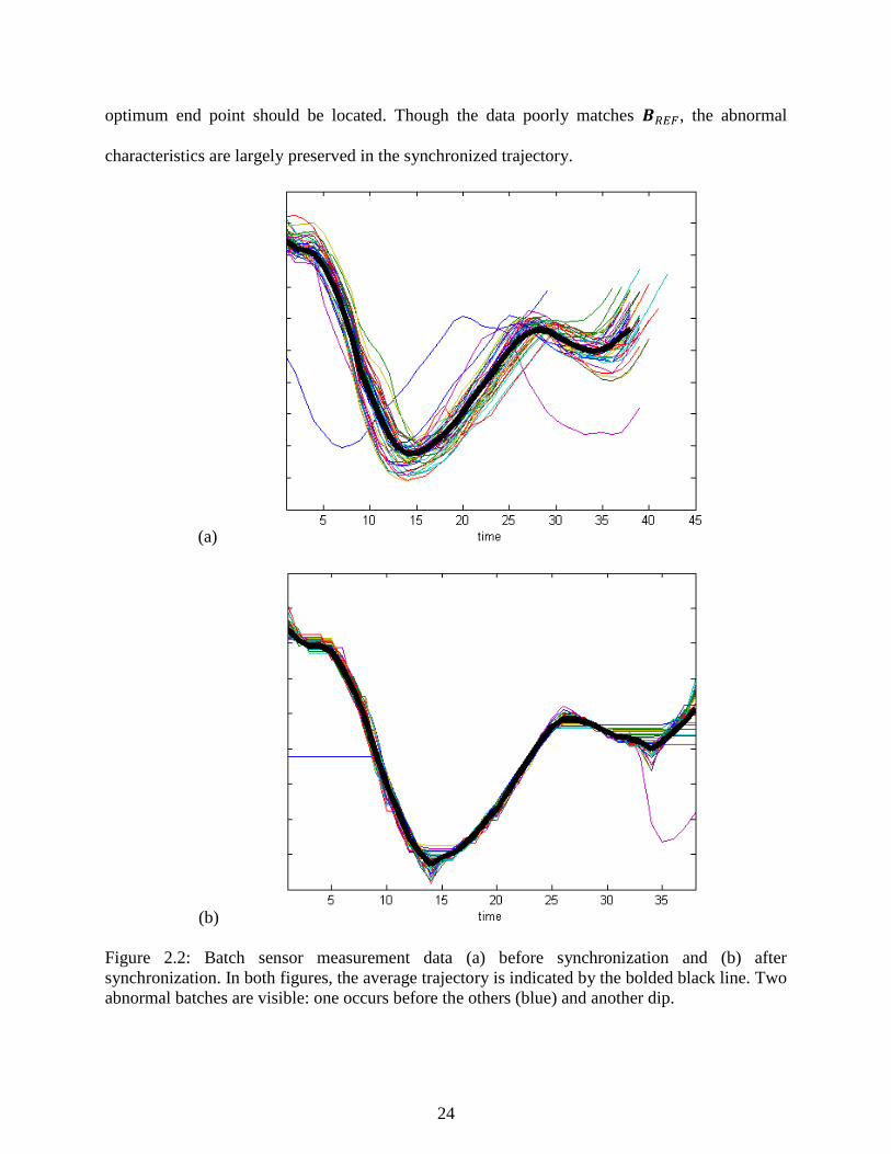
24
optimum end point should be located. Though the data poorly matches 𝑩𝑅𝐸𝐹, the abnormal
characteristics are largely preserved in the synchronized trajectory.
(a)
(b)
Figure 2.2: Batch sensor measurement data (a) before synchronization and (b) after
synchronization. In both figures, the average trajectory is indicated by the bolded black line. Two
abnormal batches are visible: one occurs before the others (blue) and another dip.
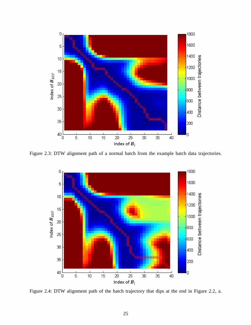
25
Figure 2.3: DTW alignment path of a normal batch from the example batch data trajectories.
Figure 2.4: DTW alignment path of the batch trajectory that dips at the end in Figure 2.2, a.

26
2.3.2 Iterative synchronization of multivariate batch process data
The algorithm presented in the last section symmetrically synchronizes two trajectories of
batch process data. When synchronizing an entire set of batch process data, initial steps must be
taken to ensure that the relative importance of different measurements are considered in the
synchronization process and to remove any bias that might arise from the selection of the reference
trajectory.
Scaling the data set is important for emphasizing the variables that are very consistent from
batch to batch. Subjective weights could be assigned to each variable, but that approach requires
process knowledge. Instead a procedure to weight the variables is built into the synchronization
algorithm. For each variable, the sum of squared error from the reference trajectory over every
batch considered is used as an indicator of its consistency. The relative importance of variables is
encoded in the weight matrix 𝑾 that is used in the distance computation in DTW, given by:
𝑑(𝑖, 𝑗) = [𝑩𝑖(𝑖, : ) − 𝑩𝑅𝐸𝐹(𝑗, : )] ∙ 𝑾 ∙ [𝑩𝑖(𝑖, : ) − 𝑩𝑅𝐸𝐹(𝑗, : )]𝑇
First the data must be scaled according to the procedure below.
Let 𝑩𝑅𝐴𝑊, 𝑖 = 1,… , 𝐼 be a set of unsynchronized trajectories which contain raw
measurements from I good quality batches.
For each variable, calculate its average range by averaging the range from each batch; store
these values because they will be used in the offline and online monitoring of a new batch.
Divide each variable in all batches with its average range.
Let𝑩𝑖 , 𝑖 = 1,… , 𝐼 be the resulting set of scaled batch trajectories.
Below is the DTW synchronization procedure:
Step 0: Initialization:

27
o Select the reference trajectory from the training set of batch trajectories 𝑩𝑘, i.e.
𝑩𝑅𝐸𝐹 = 𝑩𝑘. Consequently: 𝑏𝑅𝐸𝐹 = 𝑏𝑘
o Set W (the weight matrix in the DTW algorithm) equal to the identity matrix.
o Execute the following steps for a specified maximum number of iterations.
Step 1, synchronize all 𝑩𝑖 , 𝑖 = 1,… , 𝐼 with 𝑩𝑅𝐸𝐹 according to the procedure described in
the previous section. Now �̂�𝑖, 𝑖 = 1,… , 𝐼 are synchronized trajectories, each with the same
duration as 𝑏𝑅𝐸𝐹.
Step 2. Calculate the average trajectory �̅�, by �̅� = ∑ �̂�𝑖𝐼
⁄𝑖𝑖=1
Step 3. For every variable, calculate the sum of squared error (SSE) from �̅�
o The inverse of the SSE will be the weight of variable in the following iteration.
More specifically, 𝑾 will be the diagonal matrix with:
𝑾(𝑖, 𝑗) = [∑ ∑ [�̂�(𝑘, 𝑗) − �̅�(𝑘, 𝑗)]2
𝑏𝑅𝐸𝐹
𝑘=1
𝐼
𝑖=1
]
−1
o Normalize 𝑾 such that the sum of the weights is equal to the number of variables.
To accomplish this, 𝑾 is multiplied by the number of variables 𝑁 divided by the
sum of the diagonals in :
𝑾 = 𝑾 ∗ (𝑁[∑ 𝑾(𝑗, 𝑗)𝑁
𝑗=1 ]⁄ )
Step 4. For the first three iterations, use the same 𝑩𝑅𝐸𝐹 selected initially.
For subsequent iterations, use the average trajectory: 𝑩𝑅𝐸𝐹 = �̅�
At the end of this procedure, the length of the synchronized trajectories will match the
length of the reference trajectory 𝑩𝑅𝐸𝐹 selected initially. The duration of the synchronized batch

28
could be adjusted by calculating the average duration of the initial batches and choosing a good
trajectory close to the average duration to act as the 𝑩𝑅𝐸𝐹. With this approach, the duration of the
synchronized trajectories will be the average duration of all batches. The maximum number of
iterations is a parameter that must be selected by the user. Changes in 𝑾 could be monitored every
iteration and used to evaluate the convergence of the algorithm.
2.4 Synthetic Minority Over-sampling Technique (SMOTE)
In practice, fault detection and diagnosis and other data-driven classification applications
often have a problem with data set imbalance. Normal data by definition will be more numerous
than fault data, often by a sizable margin. In a data set with 99% normal data, a default guess of
normal would achieve 99% accuracy. In these cases, there is a higher cost of missing fault cases
than missing normal cases. Data set imbalance is an important issue with discriminant analysis and
in training fault diagnosis algorithms where imbalance in the data can cause one fault class to
dominate the others. To balance the representation of normal and faulty data in a data-based model
for fault diagnosis, it is vital to make maximum use of the information in faulty data by
oversampling fault data and undersampling data from normal operations.
Ling and Li (1998) performed a comprehensive study of the interaction of oversampling
and undersampling and how it affects classification performance using a data set from product
marketing. Different undersamplings of the majority class were tested and measured using lift
analysis and the study determined that the best lift index is obtained when the classes are equally
represented. Oversampling with replacement itself was found not to significantly improve minority
class recognition. As the minority class is over-sampled by increasing amounts, the effect is to
identify similar but more specific regions in the feature space as the decision region for the
minority class. In the fault diagnosis case, for example, where fault regions of space must be

29
distinguished from the normal operating region, sampling with replacement can actually make the
minority decision region smaller and more specific as minority samples in the region are
duplicated. SMOTEd data has larger decision regions and leads to larger decision regions with
improved characterization of the shape and size of the fault regions.
SMOTE is an over-sampling approach in which the minority class is over-sampled by
creating “synthetic” examples rather than by over-sampling with replacement. SMOTE creates
new data along line segments between randomly chosen k nearest neighbors among the minority
class of data. The user specifies k, the number of nearest neighbors to generate. For each minority
data point, SMOTE finds its k nearest neighbors in the minority data set, selects a number of them
based on the percent over-sampling specified (for example, when 𝑁 = 200%, two neighbors are
selected), and randomly generates a synthetic data point along the line between the data point and
its nearest neighbor. This process generalizes and “fleshes out” the decision region of the minority
class to a larger and less specific region (Chawla 2002).
The SMOTE algorithm in full is:
Algorithm 𝑆𝑀𝑂𝑇𝐸(𝑇, 𝑁, 𝑘)
Input: Number of minority class samples T; Amount of SMOTE N%; Number of nearest neighbors
k
Output: (𝑁/100) ∗ 𝑇 synthetic minority class samples
1. /* If N is less than 100% randomize the minority class samples as only a random percent
of them will be SMOTEd */
2. 𝒊𝒇 𝑁 < 100 3. Then randomize the T minority class samples
4. 𝑇 = (𝑁
100) ∗ 𝑇
5. N = 100
6. 𝒆𝒏𝒅𝒊𝒇
7. 𝑁 = (𝑖𝑛𝑡)(𝑁/100) /* The amount of SMOTE is assumed to be integral multiples of
100.*/
8. 𝑘 = number of nearest neighbors found for synthetic data generation
9. 𝑁𝑢𝑚𝑎𝑡𝑡𝑟𝑠 = number of attributes
10. 𝑆𝑎𝑚𝑝𝑙𝑒[ ][ ]: array storing original samples drawn from the minority class
11. 𝑛𝑒𝑤𝑖𝑛𝑑𝑒𝑥: counts the number of synthetic samples generated, initialized at 0

30
12. 𝑆𝑦𝑛𝑡ℎ𝑒𝑡𝑖𝑐[ ][ ]: array for synthetic samples /* Compute k nearest neighbors for each
minority sample only. */
13. 𝒇𝒐𝒓 𝑖 ← 1 𝑡𝑜 𝑇 14. Compute k nearest neighbors for 𝑖, and save the indices in the 𝑛𝑛𝑎𝑟𝑟𝑎𝑦
15. 𝑃𝑜𝑝𝑢𝑙𝑎𝑡𝑒(𝑁, 𝑖, 𝑛𝑛𝑎𝑟𝑟𝑎𝑦)
16. 𝒆𝒏𝒅𝒇𝒐𝒓
𝑃𝑜𝑝𝑢𝑙𝑎𝑡𝑒 (𝑁, 𝑖, 𝑛𝑛𝑎𝑟𝑟𝑎𝑦) /* Function to generate the synthetic samples. */
17. 𝒘𝒉𝒊𝒍𝒆 𝑁 ≠ 0 18. Pick one of the k nearest neighbors of 𝑖 with a random number between 1 and k
19. 𝒇𝒐𝒓 𝑎𝑡𝑡𝑟 ← 1 𝑡𝑜 𝑛𝑢𝑚𝑎𝑡𝑡𝑟𝑠
20. Compute: 𝑑𝑖𝑓𝑓 = 𝑆𝑎𝑚𝑝𝑙𝑒[𝑛𝑛𝑎𝑟𝑟𝑎𝑦[𝑛𝑛]][𝑎𝑡𝑡𝑟] − 𝑆𝑎𝑚𝑝𝑙𝑒[𝑖][𝑎𝑡𝑡𝑟] 21. Compute: 𝑔𝑎𝑝 = random number between 0 and 1
22. 𝑆𝑦𝑛𝑡ℎ𝑒𝑡𝑖𝑐[𝑛𝑒𝑤𝑖𝑛𝑑𝑒𝑥][𝑎𝑡𝑡𝑟] = 𝑆𝑎𝑚𝑝𝑙𝑒[𝑖][𝑎𝑡𝑡𝑟] + 𝑔𝑎𝑝 ∗ 𝑑𝑖𝑓
23. 𝒆𝒏𝒅𝒇𝒐𝒓
24. 𝑛𝑒𝑤𝑖𝑛𝑑𝑒𝑥 + +
25. 𝑁 = 𝑁 − 1
26. 𝒆𝒏𝒅𝒘𝒉𝒊𝒍𝒆 27. 𝒓𝒆𝒕𝒖𝒓𝒏 /* End of Populate */
End of Pseudo-Code (Chawla 2002)
To undersample data from the majority class, samples are randomly removed from the
population until the size of the majority class becomes some specified percentage of the minority
class. In SMOTE terminology, stating that “the majority class is under sampled at 200%,” means
that in the modified, “SMOTEd” data set, the number of data points from the minority class will
be double the number of data points from the majority class. For example, if the minority class had
50 samples and the majority class had 200 samples and we under sample the majority at 200%, the
majority class would end up having 25 samples. Equal representation between minority and
majority classes occurs when the majority class is under sampled at 100% (i.e. the number of
majority samples is 100% of the number of minority samples). To create a balanced dataset,
generally both oversampling of the minority class and undersampling of the majority class are
required.

31
2.5 References
Chawla, N. V., Bowyer, K. W., Hall, L. O., & Kegelmeyer, W. P. (2002). SMOTE: Synthetic
minority over-sampling technique. Journal of Artificial Intelligence Research, 16, 321-357.
Chen, J., & Romagnoli, J. A. (1998). Strategy for simultaneous dynamic data reconciliation and
outlier detection. Computers and Chemical Engineering, 22, 559-562.
Itakura, F. (1975). Minimum prediction residual principle applied to speech recognition. IEEE
Transactions on Acoustics, Speech, and Signal Processing, 23(1), 67-72.
Kassidas, A., MacGregor, J. F., & Taylor, P. A. (1998). Synchronization of batch trajectories using
dynamic time warping. American Institute of Chemical Engineers Journal, 44(4), 864-875.
Ling, C. X., & Li, C. (1998). Data mining for direct marketing: Problems and solutions.
Proceedings of the Fourth International Conference on Knowledge Discovery and Data
Mining, 73-79.
Nomikos, P., & Macgregor, J. F. (1994). Monitoring batch processes using multiway principal
component analysis. American Institute of Chemical Engineers Journal, 40(8), 1361-1375.
Nomikos, P., & Macgregor, J. F. (1995). Multivariate SPC charts for monitoring batch processes.
Technometrics, 37(1), 41-59.
Romagnoli, J. A., & Palazoglu, A. (2012). Introduction to process control. Boca Raton: Taylor
and Francis Group.
Rothwell, S. G., Martin, E. B., & Morris, A. J. (1998). Comparison of methods for dealing with
uneven length batches. Proceedings of the 7th International Conference on Computer
Application in Biotechnology (CAB7), 387–392
Rousseeuw, P.J., & Leroy, A. M. (1987). Robust regression and outlier detection. New York:
Wiley.
Russell, E. L., Chiang, L. H., & Braatz, R. D. (2000). Data-driven techniques for fault detection
and diagnosis in chemical processes. London: Springer.
Sakoe, H., & Chiba, S. (1978). Dynamic programming algorithm optimization for spoken word
recognition. IEEE Transactions on Acoustics, Speech, and Signal Processing, 26(1), 43-
49.
Tan, P., Steinbach, M., & Kumar, V. (2006) Introduction to data mining. Boston: Longman.
Yao, Y., & Gao, F. (2009). A survey of multistage/multiphase statistical modeling methods for
batch processes. Annual Reviews in Control, 33, 172-183.

32
Chapter 3 - Data Mining Techniques
Each year, the world generates 1.2 zettabytes (1021) of data composed of everything from
social media posts, pictures, videos to scientific sensor measurements (Mervis 2012). As
impressive as society’s ability to generate data may be, extracting useful information from large
data sets remains a challenge. While traditional statistics remain vital tools for the design and
analysis of experiments, they are poorly suited to the challenges of extremely large data sets. Data
mining techniques are algorithms for computationally discovering meaningful patterns and
relationships among large data sets that would be difficult to find through traditional analysis
methods. For example, Gardner and Bieker (2000) demonstrated several case studies in which
hypotheses generated through data mining solved complex manufacturing problems on
semiconductor processes that conventional experimental and statistical approaches consistently
missed.
This dissertation will evaluate the applicability of dimensionality reduction (DR) and data
clustering techniques drawn from computer science literature to extract fault knowledge from
chemical process databases. Previous approaches to data clustering in the chemical engineering
literature often involve elaborate modifications and combinations of PCA or other statistical
concepts, but few have utilized the potential of standard clustering strategies from the computer
science literature. Innovative and proven clustering techniques such as DBSCAN, BIRCH,
Meanshift, and others can offer improved and efficient methods for finding clusters in chemical
process data. The role of dimensionality reduction, also known as feature extraction, is also
considered because of the prominent role it plays in knowledge discovery as well as process
monitoring. As an example, Ding (2004) explores the close relationship between unsupervised

33
learning and dimensionality reduction and provides a theoretical basis for the use of PCA
dimensionality reduction in K-means clustering.
This chapter presents the algorithms we use to study chemical process data. Section 3.1
discusses the general workflow used in analysis. Section 3.2 covers dimensionality reduction
algorithms used to project data to a reduced subspace for clustering. Section 3.3 introduces the
clustering algorithms considered. Section 3.4 presents several ways to evaluate clustering results
including homogeneity, completeness, and adjusted Rand index (ARI).
3.1 Data Mining Approach
Figure 3.1 outlines the data mining approach used. First, DR techniques project the raw
process data, removing redundant, correlated sensor measurements and combining them into lower
dimensional scores. DR may project data in two or three dimensions to enable visualization, or the
technique may simply function to remove redundant information from raw process data. In some
cases DR may not be necessary for feature extraction if the data are of good quality.
After projection by a DR technique, data clustering algorithms partition the data using any
number of clustering techniques. Xu (2005) presents a thorough survey of data clustering
techniques, but clustering is a subjective process and there is no universal definition of a cluster
except that it consists of groups with members more similar to each other than data from different
groups. Depending on the data and the parameters used to calculate the clustering, clusters found
may or may not correspond to significant process trends, therefore, cluster evaluation metrics are
important to help the user judge the quality of the clusters extracted before more detailed analysis.
Finally, in the Cluster Assignment step, the user analyses the data in the clusters to relate
them to meaningful process events such as faults or operating procedures. When labelled according
to process events, the data can be used by machine learning or other supervised fault detection or
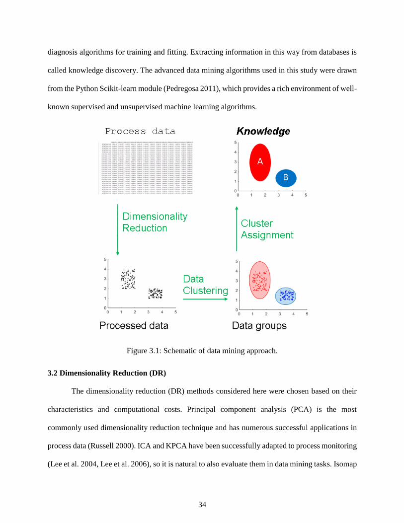
34
diagnosis algorithms for training and fitting. Extracting information in this way from databases is
called knowledge discovery. The advanced data mining algorithms used in this study were drawn
from the Python Scikit-learn module (Pedregosa 2011), which provides a rich environment of well-
known supervised and unsupervised machine learning algorithms.
Figure 3.1: Schematic of data mining approach.
3.2 Dimensionality Reduction (DR)
The dimensionality reduction (DR) methods considered here were chosen based on their
characteristics and computational costs. Principal component analysis (PCA) is the most
commonly used dimensionality reduction technique and has numerous successful applications in
process data (Russell 2000). ICA and KPCA have been successfully adapted to process monitoring
(Lee et al. 2004, Lee et al. 2006), so it is natural to also evaluate them in data mining tasks. Isomap

35
and spectral embedding are more recently developed non-linear manifold learning DR techniques
that can be more sensitive to non-linear structures in the data than PCA, ICA, or KPCA which are
based on matrix decompositions. As a benchmark, clustering results where the data has undergone
little preprocessing apart from normalization are also considered. A comparative study by van der
Maaten et al. (2008) revealed that while advanced nonlinear dimensionality reduction
outperformed PCA and others at reducing data sets with artificial structure, on other “natural” data
sets not artificially generated by computers all dimensionality reduction techniques considered
failed to provide any advantage at all! A brief discussion of each DR technique considered in this
dissertation follows.
3.2.1 Principal component analysis (PCA)
Principal component analysis (PCA) is a linear distance preservation technique which
determines a set of orthogonal vectors which optimally capture the variability of the data. The
orthogonal vectors are determined through an eigenvalue decomposition of the covariance matrix
and arranged in order of the variance explained in the loading vector directions (Russell 2000).
PCA reduces the data as follows. For a given training set of n observations and m sensor
measurements stored in 𝑋𝑛×𝑚, its sample covariance matrix S can be calculated:
𝑆 =1
𝑛 − 1𝑋𝑇𝑋 = 𝑃𝛬𝑃𝑇
By finding the eigenvalues (𝛬) of covariance matrix S, the projections of the observation in X into
the lower-dimensional space are calculated in the score matrix:
𝑇 = 𝑋𝑃
In our dimensionality reduction studies we determine the number of principal components,
𝑎, using the percent variance test. The percent variance test calculates the smallest number of
loading vectors needed to explain a minimum percentage of the total variance, judged by the sum

36
of the 𝑎 largest eigenvalues (Russell 2000). Our models include enough principal components
needed to model 95% of the variance of the original data.
3.2.2 Independent component analysis (ICA)
Independent component analysis (ICA) is used in multivariate signal separation for
extracting hidden and statistically independent components (ICs) from the observed data and has
been adapted for process monitoring tasks similar to PCA by Lee (2004). Signal source separation
recovers the independent signals after linear mixing. In other words, for mixed signals represented
by 𝑥, independent signal sources 𝑠 are linearly mixed in the matrix 𝐴 by:
𝒙 = ∑ 𝑠𝑘𝑎𝑘
𝑛
𝑘=1
= 𝐴𝑠
The goal of ICA is to find the source signals 𝑠 using information stored in 𝑥. After matrix
𝐴 is estimated, the matrix inverse 𝑊 (𝑊 = 𝑨−1) can be used to calculate the original independent
source signals by:
𝑠 = 𝑊𝑥
The matrix 𝑊 can be found using the FastICA algorithm of Hyvarinen and Oja (2000). In
separating signals, the two key assumptions that ICA makes is that the source signals are
independent of each other and the values in each source signals have non-Gaussian distributions.
𝑊 is calculated through fixed point iteration to find components with the maximum non-
gaussianity, measured using negentropy (Hyvarinen and Oja 2000). Negentropy comes from the
information theory concept of entropy. Entropy measures the heterogeneity of data (Mitchell
1997); therefore, the more unpredictable and unstructured a variable is, the higher its entropy.
Negentropy functions as a measure of non-gaussianity that is zero for a Gaussian variable, always
nonnegative, and defined by the difference:

37
𝐽(𝑦) = 𝐻(𝑦𝑔𝑎𝑢𝑠𝑠) − 𝐻(𝑦)
Where 𝐻 is the continuous entropy function, 𝑦 is a random vector, and 𝑦𝑔𝑎𝑢𝑠𝑠 is a Gaussian
random variable with the same covariance matrix as 𝑦 (Hyvarinen and Oja 2000). Negentropty is
the most direct way to measure non-gaussianity, but estimating negentropy requires knowledge of
the probability distribution function (PDF). Due to the complexity of finding the PDF, negentropy
is usually approximated as
𝐽(𝑦) ≈ [𝐸{𝐺(𝑦)} − 𝐸{𝐺(𝑣)}]2
Where 𝑦 is a random variable with zero mean and unit variance, 𝑣 is a Gaussian variable
with zero mean and unit variance, and 𝐺 is any non-quadratic function (Lee 2004). Choosing the
correct 𝐺 can greatly improve the quality of negentropy estimations. The following functions were
suggested by Hyvarinen and Oja (2000) as being suitable for 𝐺:
𝐺1(𝑢) =1
𝑎1log cosh(𝑎1𝑢)
𝐺2(𝑢) = 𝑒𝑥𝑝(−𝑎2𝑢2 2⁄ )
𝐺3(𝑢) = 𝑢4
Where 1 ≤ 𝑎1 ≤ 2 and 𝑎2 ≈ 1 (Hyvarinen and Oja 2000). This study uses 𝐺1 to estimate
negentropy.
FastICA requires two simple preprocessing to simplify calculations: data must be mean
centered (by subtracting the mean from all data records) and whitened. Whitening is the process
of finding a linear transform such that the “white” data set has components that are uncorrelated
with variances of 1, meaning that the covariance matrix is equal to the identity matrix. A simple
way to whiten the data is to perform an eigenvalue decomposition on the covariance matrix 𝒙𝒙𝑇 =

38
𝑬𝑫𝑬𝑇 where 𝑫 is a diagonal matrix holding the eigenvalues and 𝑬 holds the eigenvectors of 𝒙𝒙𝑻.
The whitened data can be calculated by:
�̃� = 𝑬𝑫−1
2⁄ 𝑬𝑇𝒙
𝑫−1 2⁄ can be calculated quickly by taking the square root of diagonal components. The whitening
operation changes the mixing transform operation to the following form:
�̃� = 𝐸𝐷−1
2⁄ 𝐸𝑇𝐴𝑠 = �̃�𝑠
In this form, �̃� can be shown to be orthogonal, which reduces the number of parameters that must
be found by half because 𝐴 has 𝑛2 degrees of freedom while �̃� has (𝑛 − 1) 2⁄ degrees of freedom
(Oja and Hyvarinen 2000).
To calculate a number of ICs m selected by the user, the following algorithm has been
proposed:
1. Choose a random initial weight vector 𝒘𝑖.
2. Let 𝒘𝑖 = 𝐸{𝒙𝐺′(𝒘𝑖𝑇𝒙)} − 𝐸{𝐺′′(𝒘𝑖
𝑇𝒙)}𝒘𝑖
3. Decorrelate components using: 𝒘𝑖 = 𝒘𝑖 − ∑ (𝒘𝑖)𝑇𝒘𝑗𝒘𝑗
𝑖−1𝑗=1
4. Normalize 𝒘𝑖: 𝒘𝑖 = 𝒘𝑖 ‖𝒘𝑖‖⁄
5. If 𝑤 has not converged, return to step 2
The algorithm converges when the old and new values of 𝑤 in the algorithm point in the same
direction (i.e. 𝒘𝑖−1 ∙ 𝒘𝑖 = 1) (Hyvarinen and Oja 2000). To select the number of ICs to include in
the data model, Lee (2006) suggest several methods. The subspace clustering study performed in
this dissertation simply uses the same number of ICs as PCs in our PCA model, since the selected
PCs can give a good approximation for the number of ICs needed.

39
3.2.3 Kernel principal component analysis (KPCA)
Kernel principal component analysis extends traditional principal component analysis to
nonlinear data spaces. Instead of directly taking eigenvalue decomposition of the covariance
matrix as in PCA, KPCA takes a data set with non-linear features that that PCA fails to preserve
and projects them to a higher dimensional space where they vary linearly. The high dimensional
space is called the feature space (F). KPCA first assumes that the data have been transformed non-
linearly using a non-linear mapping function Φ(𝑥). Conventional PCA is then performed in the
feature space to perform the transformations for dimensionality reduction (Scholkopf 1997).
After the data have been mapped into the feature space, the covariance matrix in the feature
space is calculated by:
𝐶̅ =1
𝐿∑Φ(𝑥𝑗)Φ(𝑥𝑗)
𝑇.
𝐿
𝑗=1
To diagonalize the covariance matrix, the following eigenvalue problem must be solved:
𝜆𝑉 = 𝐶̅𝑉.
After substituting for 𝐶̅ and simplifying, the eigenvalue problem becomes:
𝜆(Φ(𝑥𝑘) ∙ 𝑉) = (Φ(𝑥𝑘) ∙ 𝐶̅𝑉) for all 𝑘 = 1,… , 𝐿
We also assume that there exist coefficients 𝛼𝑖(𝑖 = 1,… ,𝑁) such that:
𝑉 = ∑𝛼𝑖Φ(𝑥𝑖)
𝐿
𝑖=1
.
Finally we define a 𝐿 × 𝐿 matrix 𝐾:
𝐾𝑖𝑗 ≔ (Φ(𝑥𝑖) ∙ Φ(𝑥𝑗))
Which allows us to substitute kernel function 𝑘(𝑥, 𝑦) for all occurrences of (Φ(x),Φ(y)). After
substituting in for 𝐶̅, 𝑉, and finally 𝐾 and simplifying, the eigenvalue problem reduces to:

40
𝐿𝜆𝛼 = 𝐾𝛼
for non-zero eigenvalues (Scholkopf 1997). 𝐾 is important because it allows us to calculate dot
products using the non-linear mapping function Φ without knowing its form. It can be shown
through functional analysis that for certain Φ, 𝐾(𝑥, 𝑦) can compute the dot product in the feature
space 𝐹. Some possible kernel functions are:
𝑃𝑜𝑙𝑦𝑛𝑜𝑚𝑖𝑎𝑙 𝑘𝑒𝑟𝑛𝑒𝑙: 𝑘(𝑥, 𝑦) = ⟨𝑥, 𝑦⟩𝑑
𝑆𝑖𝑔𝑚𝑜𝑖𝑑 𝑘𝑒𝑟𝑛𝑒𝑙: 𝑘(𝑥, 𝑦) = tanh (𝛽0⟨𝑥, 𝑦⟩ + 𝛽1)
𝑅𝑎𝑑𝑖𝑎𝑙 𝑏𝑎𝑠𝑖𝑠 𝑘𝑒𝑟𝑛𝑒𝑙: 𝑘(𝑥, 𝑦) = exp (−‖𝑥 − 𝑦‖2
𝑐)
In this work, we use the radial basis kernel 𝑘(𝑥, 𝑦) = exp(−‖𝑥 − 𝑦‖2 𝑐⁄ ). The following
algorithm for KPCA arises from the previous derivations:
1. Compute dot product matrix 𝐾𝑖𝑗 = (𝑘(𝑥𝑖, 𝑥𝑗))𝑖𝑗
2. Solve 𝐿𝜆𝛼 = 𝐾𝛼 by diagonalizing 𝐾
3. Normalize the eigenvector expansion coefficients 𝛼𝑛 by requiring that (𝛼𝑘 ∙ 𝐾𝛼𝑘) = 1
4. Extract PCs for each new data vector 𝑥 by computing its projection onto eigenvectors
using 𝑡𝑘 = 𝑘𝛼𝑘Λ−1 2⁄
As with other non-linear dimensionality reduction methods (i.e. Isomap), the major
weakness of KPCA is the high computational cost of calculating a feature matrix (or kernel matrix
for KPCA). To determine the number of PCs, in accordance with Lee (2004) we applied the cut-
off method using the average eigenvalue which only includes PCs with eigenvalues above the
average.

41
3.2.4 Isomap
Isomap performs non-linear dimensionality reduction by learning the data’s non-linear
topology using a fitted graph structure and then projecting the data with non-metric
multidimensional scaling (MDS) based on the ordering. Isomap overcomes some of the limitations
of other approaches by representing the data set within a single coordinate system, all using a
noniterative procedure with a polynomial computational complexity and guaranteed global
optimality (Tenenbaum et al. 2000).
Isomap only begins learning a mapping after the topological structure of the data has been
learned. The graph fit by the Isomap algorithm contrasts with that of self-organizing maps, which
attempt to fit a model based on a predefined structure. In Isomap, Euclidian distances are used to
find the geodesic distances defined as the shortest line between two points on the topological
surface formed by the data, and this distance along the surface of the data’s topological structure
is used in the dimensionality reduction of the input data. The full Isomap algorithm proceeds as
follows (Tenenbaum 1998):
1. Build the neighborhood graph by randomly selecting 𝑟 points to be nodes in the graph and
use their nearest neighbors to form connections between all points within radius 𝜖. Graph
𝐺 is created by connecting two nodes 𝑔𝑖 and 𝑔𝑗 if there exists at least one data point whose
two nearest nodes are 𝑔𝑖 and 𝑔𝑗.
2. Calculate the manifold distance between nodes. First, assign weights between nodes in the
graph using the Euclidean distance: 𝑤𝑖𝑗 = 𝑑𝑋𝑖𝑗
= ‖𝑥𝑖 − 𝑥𝑗‖. The geodesic distance 𝑑𝐺𝑖𝑗
between two nodes on 𝐺 is defined as the sum of link weights along the shortest path
between the nodes. After calculating the geodesic distance between all pairs of nodes in G,

42
the shortest path between all pairs of points is found using Floyd’s all pairs shortest-path
𝑂(𝑟3) algorithm (Foster 1995).
3. Create 𝑑-dimensional embedding between all points using non-metric or “ordinal” MDS
from Cox and Cox (1994) which finds a Euclidean embedding that preserves the graph
distances. The use of MDS is important because MDS works for any monotonically
decreasing function of distance. In contrast to metric MDS, which preserves distances
between points, non-metric MDS preserves only the rank ordering of distances,
independent of the metric used to calculate the ordering. MDS will find a projection which
minimizes the stress function:
𝑆 = min�̂�𝐺
𝑖𝑗√
∑ (𝑑𝑌𝑖𝑗
− �̂�𝐺𝑖𝑗)2
𝑖<𝑗
∑ (𝑑𝑌𝑖𝑗)2
𝑖<𝑗
Where 𝑑𝑌𝑖𝑗
is the Euclidean distance between feature vectors 𝑖 and 𝑗 and the �̂�𝐺𝑖𝑗
is the
primary monotone least-squares regression of the data’s pairwise Euclidean distances and
the graph distances (Cox and Cox 1994).
3.2.5 Spectral embedding (SE)
Spectral embedding, also known as LaPlacian Eigenmaps, is a manifold non-linear
dimensionality reduction technique using the LaPlacian of a graph based on the topology of the
data set to non-linearly project data in a way that optimally preserves local neighborhood
information and emphasizes clustering structures in the data (Belkin and Niyogi 2003).
The adjacency graph used by SE is created using pairwise distances between points in the
data set. Belkin and Niyogi (2003) presents two variations:

43
𝜖-neighborhood graph: connect all points whose distances are smaller than a
threshold 𝜖.
𝑘-nearest neighbor graph: connect data vectors 𝑣𝑖 and 𝑣𝑗 if 𝑣𝑗 is among the k-
nearest neighbors of 𝑣𝑖 or if 𝑣𝑖 is among the 𝑘-nearest neighbors of 𝑣𝑗 . The edges
of the resulting graph are weighted by the similarity between their endpoints, i.e.
the distance between 𝑣𝑖 and 𝑣𝑗 (von Luxburg 2007).
Once the graph is defined, we must calculate the LaPlacian to generate the embedding of
the data. Two matrices are needed to do this. The weighted adjacency matrix weights edges
between the vertices of the graph based on their distance and is defined as 𝑾 = 𝑤𝑖𝑗 for 𝑖, 𝑗 =
1, … , 𝑛. From the weight matrix, the degree of a vertex 𝑣𝑖 in the connected graph is defined as:
𝑫𝑖𝑖 = ∑ 𝑾𝑗𝑖𝑗
The normalized LaPlacian implemented in the Scikit-learn package is calculated from:
𝑳 = 𝑫−1 2⁄ (𝑫 − 𝑾)𝑫−1 2⁄
Where 𝑳 is a symmetric, positive semidefinite matrix.
Finally, we can calculate the non-linear embedding of the data using eigenvectors found
by solving the generalized eigenvector problem:
𝑳𝒇 = 𝜆𝑫𝒇
𝑳 will have 𝑛 non-negative, real-valued eigenvalues:
0 = 𝜆0 ≤ 𝜆1 ≤ ⋯ ≤ 𝜆𝑛
Leaving out the corresponding eigenvector of eigenvalue 0, the embedding in 𝑚-dimensional
Euclidean space comes from the next 𝑚 eigenvectors:
𝒙𝑖 → (𝒇1(𝑖),… , 𝒇𝑚(𝑖))

44
The eigendecomposition of the graph LaPlacian has been previously used for clustering in
spectral clustering algorithms. The clustering methods developed by Shi and Malik (2000) and Ng
et al. (2002) among others begin by performing an eigenvalue decomposition on the graph
LaPlacian to embed the data, followed by K-means clustering to find clusters. Within the subspace
clustering framework studied here, spectral embedding is used for dimensionality reduction while
several different techniques for data clustering are tested for the clustering step.
3.3 Data Clustering
The goal of data clustering is the unsupervised classification of data into groups or clusters
that are useful and meaningful. Using data clustering, the key groups within a database can be
isolated and connected to meaningful operating conditions in a plant. The techniques K-means,
DBSCAN, Meanshift, and BIRCH were selected for their scalability and ability to find clusters
corresponding to regions of high density in data. The latter three techniques locate clusters based
on density, and therefore have the ability to find clusters of any arbitrary shape. Additionally, all
techniques applied here consider each data measurement to be independent of time. Fu (2011)
reviews data mining techniques for time series data. Partitional algorithms which separate all data
into different clusters are preferred in our approach over hiearchical techniques, our study focuses
on these algorithms.
3.3.1 K-means clustering
The fundamental concept of K-means clustering was developed independently by several
researchers studying “optimal partitioning”. MacQueen (1967) coined the term “K-means” and
provided the one of the earliest formal introduction of the K-means clustering process. In spite of
its age, K-means is still one of the most widely used algorithms for clustering due to its simplicity
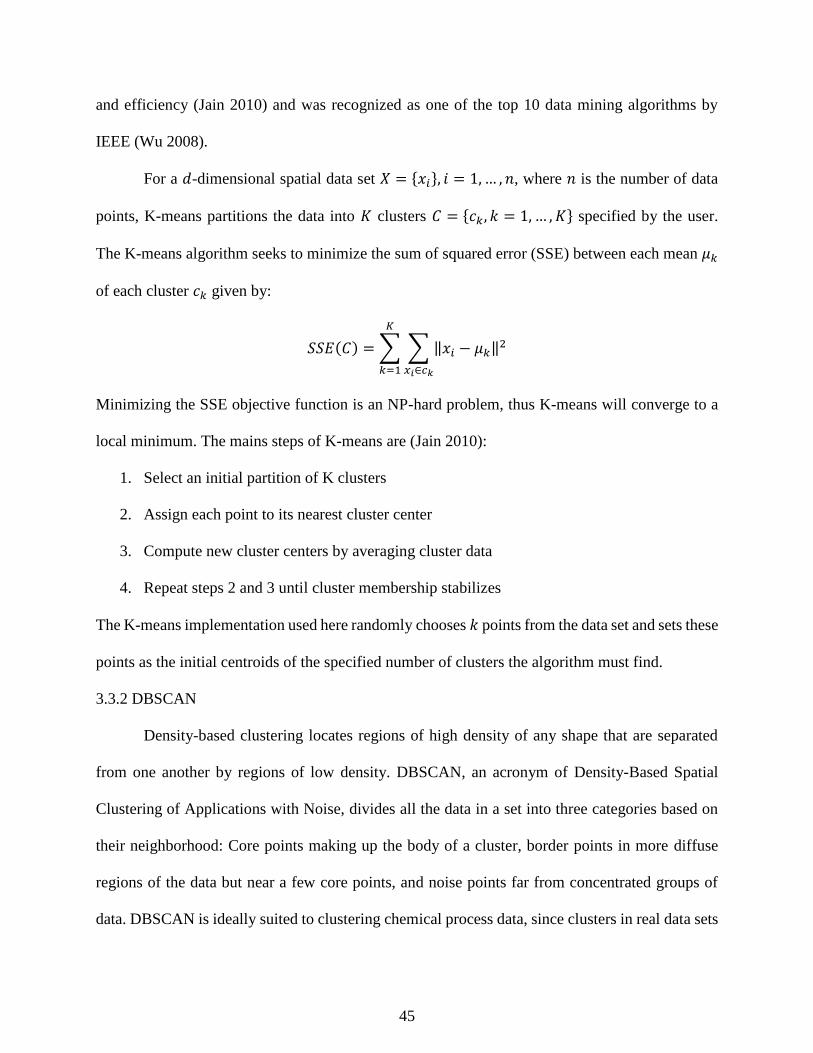
45
and efficiency (Jain 2010) and was recognized as one of the top 10 data mining algorithms by
IEEE (Wu 2008).
For a 𝑑-dimensional spatial data set 𝑋 = {𝑥𝑖}, 𝑖 = 1,… , 𝑛, where 𝑛 is the number of data
points, K-means partitions the data into 𝐾 clusters 𝐶 = {𝑐𝑘, 𝑘 = 1, … , 𝐾} specified by the user.
The K-means algorithm seeks to minimize the sum of squared error (SSE) between each mean 𝜇𝑘
of each cluster 𝑐𝑘 given by:
𝑆𝑆𝐸(𝐶) = ∑ ∑ ‖𝑥𝑖 − 𝜇𝑘‖2
𝑥𝑖∈𝑐𝑘
𝐾
𝑘=1
Minimizing the SSE objective function is an NP-hard problem, thus K-means will converge to a
local minimum. The mains steps of K-means are (Jain 2010):
1. Select an initial partition of K clusters
2. Assign each point to its nearest cluster center
3. Compute new cluster centers by averaging cluster data
4. Repeat steps 2 and 3 until cluster membership stabilizes
The K-means implementation used here randomly chooses 𝑘 points from the data set and sets these
points as the initial centroids of the specified number of clusters the algorithm must find.
3.3.2 DBSCAN
Density-based clustering locates regions of high density of any shape that are separated
from one another by regions of low density. DBSCAN, an acronym of Density-Based Spatial
Clustering of Applications with Noise, divides all the data in a set into three categories based on
their neighborhood: Core points making up the body of a cluster, border points in more diffuse
regions of the data but near a few core points, and noise points far from concentrated groups of
data. DBSCAN is ideally suited to clustering chemical process data, since clusters in real data sets

46
are rarely spherical and often clouded by noise (Tan 2005). Removing this noise can focus attention
on the densest clusters in the data set.
For each core point within a cluster, the neighborhood of a given radius (𝐸𝑞𝑠) must contain
a minimum number of points (𝑀𝑖𝑛𝑃𝑡𝑠 parameter), i.e. the density of the point’s neighborhood
must exceed a threshold. The shape of the clusters found can depend on the distance metric
selected. Unlike K-means, the clusters found by DBSCAN arise from a series of specific
definitions. Each definition assumes the specification of a particular value of Eps and MinPts.
Definition 1, Eps-neighborhood of a point: The 𝐸𝑝𝑠 neighborhood of a point 𝑝 (𝑁𝐸𝑝𝑠(𝑝)) is
defined as: 𝑁𝐸𝑝𝑠(𝑝) = {𝑞 ∈ 𝐷| 𝑑𝑖𝑠𝑡(𝑝, 𝑞) ≤ 𝐸𝑝𝑠}.
The shape of this neighborhood is determined by the distance criterion used. Euclidian
distance was used in our studies, but in practice any appropriate distance metric may be
used. A simple approach could require every point in the cluster to have at least 𝑀𝑖𝑛𝑃𝑡𝑠
in its neighborhood, but this would miss the border points on the outside of the cluster.
Border points are within the Eps neighborhood of at least one core point, but a border
point’s neighborhood contains fewer points than 𝑀𝑖𝑛𝑃𝑡𝑠.
Definition 2, directly density-reachable: Point 𝑝 is directly density-reachable (DDR) from point 𝑞
if:
1. 𝑝 is in 𝑁𝐸𝑝𝑠(𝑞)
2. 𝑁𝐸𝑝𝑠(𝑞) ≥ 𝑀𝑖𝑛𝑃𝑡𝑠 (i.e. 𝑞 is a core point)
In other words, if 𝑞 is a core point, other data points in its Epsilon neighborhood are said
to be directly density-reachable. Core points are directly density-reachable with each other.

47
Border points are directly density-reachable from core points, but core points are not
directly density-reachable from border points due to condition 2. Arising from the directly
density-reachable definition is the concept of density reachability for groups of core points:
Definition 3, density reachable: a point 𝑝 is density reachable from a point 𝑞 if there is a chain of
points 𝑝1, … , 𝑝𝑛, where 𝑝𝑛 = 𝑞 such that 𝑝𝑖+1 is directly density reachable from 𝑝𝑖.
Two points are DR if there is a chain of core points DDR from each other connecting the
two points. A border point can be density reachable from a core point, but because of the
definition of DDR, no core points are DR from a border point. What finally defines clusters
in DBSCAN is the concept of density connectivity:
Definition 4, Density connected: A point 𝑝 is density connected to a point 𝑞 if there is a point 𝑜
such that both 𝑝 and 𝑞 are density reachable from 𝑜.
In other words, if both 𝑝 and 𝑞 are density reachable from a point 𝑜, they are said to be
density connected. Therefore, clusters in DBSCAN are groups of density connected points.
Definition 5: Cluster definition: For database 𝐷, a cluster 𝐶 is a non-empty set such that:
1. ∀𝑝, 𝑞 if 𝑝 ∈ 𝐶 and 𝑞 is density reachable from 𝑝, then 𝑞 ∈ 𝐶
2. ∀𝑝, 𝑞 ∈ 𝐶, 𝑝 is density connected to 𝑞
Noise points are simply defined as data that are not associated with any cluster (Ester 1996).
To find clusters, the user must specify parameters 𝐸𝑝𝑠 and 𝑀𝑖𝑛𝑃𝑡𝑠. There is no simple
way to determine the correct value of 𝐸𝑝𝑠 and 𝑀𝑖𝑛𝑃𝑡𝑠, but Ester (1996) suggests a heuristic which

48
uses the sorted k-dist graph, which is created by finding the distance to each point’s 𝑘-th nearest
neighbor, sorting the distances found in descending order, and plotting. Eps is determined by the
distance value of the first “valley” of the sorted 𝑘-dist graph. In essence, the user is estimating the
percentage of noise in the data. Further details of the DBSCAN algorithm are presented by Ester
et al. (1996).
3.3.3 Balanced iterative reducing and clustering using hierarchies (BIRCH)
Different from previously discussed clustering methods, BIRCH finds subclusters of data
and condenses them into a three element data vector. The Clustering Feature (CF) vectors of the
subclusters are combined using a specialized tree structure to generate the output clusters. This
approach affords BIRCH advantages over other clustering techniques, particularly in a computing
environment with limited memory resources. The combined CF tree and vector approach treats
dense areas of data as a single vector, and can allow BIRCH to obtain a clustering of data with one
scan of the input data. In other words, the decisions to combine and split clusters are made locally,
without the need to calculate the pairwise distances over the entire data set. Sparse regions of data
can be removed with additions to the algorithm.
The CF vector representing individual subclusters is represented as 𝐶𝐹 = (𝑁, 𝐿𝑆⃗⃗⃗⃗ , 𝑆𝑆⃗⃗⃗⃗ )
where 𝑁 is the number of data points in the cluster, 𝐿𝑆⃗⃗⃗⃗ is the linear sum of the 𝑁 data points
calculated by ∑ 𝑋 𝑖𝑁𝑖=1 and 𝑆𝑆⃗⃗⃗⃗ is the square sum calculated from ∑ 𝑋 𝑖
2𝑁𝑖=1 . CF vectors allow BIRCH
to accurately and incrementally combine subclusters of data within the CF tree structure (Zhang et
al. 1996).
A CF tree is a height balanced tree with two parameters: branching factor 𝐵 and threshold
𝑇. The tree is composed of split nodes (non-leaf nodes) which branch and ultimately terminate in
leaf nodes. Each split node contains at most 𝐵 entries of the form [𝐶𝐹𝑖 , 𝑐ℎ𝑖𝑙𝑑𝑖], where 𝑖 =

49
1,2, … , 𝐵, and 𝑐ℎ𝑖𝑙𝑑𝑖 is a pointer to its 𝑖th child node, and 𝐶𝐹𝑖 is the CF of the subcluster
represented by this child. Leaf nodes have at most 𝐿 entries and represent a cluster made up of all
the subclusters of its entries of the form [𝐶𝐹𝑖], where 𝑖 = 1,2, … , 𝐿. To be part of a leaf node, a
subcluster must have a diameter or radius less than the defined threshold 𝑇. The radius and
diameter are defined relative to the cluster centroid 𝑋 0 defined as:
𝑋 0 =∑ 𝑋 𝑖
𝑁𝑖=1
𝑁
The cluster radius 𝑅 and diameter 𝐷 are defined as:
𝑅 = (∑ (𝑋 𝑖 − 𝑋 𝑜)
2𝑁𝑖=1
𝑁)
1 2⁄
𝐷 = (∑ ∑ (𝑋 𝑖 − 𝑋 𝑗)
𝑁𝑗=1
𝑁𝑖=1
𝑁(𝑁 − 1))
Where 𝑅 is the average distance from member points to the centroid, 𝐷 is the average pairwise
distance within a cluster, and 𝑁 is the number of data points. The value of 𝑇 limits the size of the
tree. Larger 𝑇 values will yield smaller trees as the subclusters under consideration absorb larger
amounts of data by spreading through the data space.
A new data point or subcluster 𝑋𝑖 is added to the tree by starting at the root and descending
the CF tree by choosing the closest branch based on a chosen distance metric, such as Euclidian.
At a leaf node, BIRCH first tests whether 𝑋𝑖 can be incorporated into one of the other subclusters
present on the leaf. If the leaf node can absorb 𝑋𝑖, the leaf nodes CF vector is updated with the
data from 𝑋𝑖, but if not a new split node is created at the leaf using the farthest pair of entries as
seeds. Additional operations refine the clusters that arise from this approach as described in Zhang
et al. (1996).

50
3.3.4 Mean shift clustering
Mean shift clustering is a probability density formulation of the clustering problem. In two
dimensions for example, probability density functions (PDF) form structures like mountains
around clusters, with slopes and a peak at the point of highest density in the cluster as the cluster
density increases to a peak. Mean shift clustering uses the theory of probability density estimation
to create clusters using the mean shift procedure first introduced by Fukunaga and Hostetler
(1975).
The most widely used nonparametric technique for finding an estimation of the PDF for a
set of data is kernel density estimation. For data 𝑋𝑖 𝑖 = 1, … , 𝑛, the multivariate kernel estimator
with kernel 𝐾 is defined as:
𝑓(𝑥) =1
𝑛ℎ𝑑∑𝐾
𝑛
𝑖=1
(𝑥 − 𝑋𝑖
ℎ)
Where 𝐾 is a kernel function, ℎ is the bandwidth or window width, and 𝑑 is the number of
dimensions in the data (Silverman 1986). Selection of the bandwidth is a crucial parameter for
mean shift clustering. In our application we calculated acceptable results using a heuristic based
on the median of pairwise distances. The selection of the kernel also affects results, but the
common normal or Gaussian kernel 𝐾𝑁 is usually most effective:
𝐾𝑁(𝒙) = (2𝜋)−𝑑 2⁄ 𝑒𝑥𝑝 (−1
2‖𝒙‖2)
Mean shift clustering first finds the zeros of ∇̂𝑓(𝑥), which correspond to local maxima and
minima of the PDF. The mean shift procedure itself is important for finding zeros in ∇̂𝑓(𝑥) without
estimating the density (Comaniciu 2002). Arising from this approach is the mean shift vector:

51
𝑚(𝑥) =∑ 𝑥𝑖𝑔 (‖
𝑥 − 𝑥𝑖
ℎ‖
2
)𝑛𝑖=1
∑ 𝑔 (‖𝑥 − 𝑥𝑖
ℎ‖
2
)𝑛𝑖=1
− 𝑥𝑖
Where g is defined as
𝑔(𝑥) = −𝑘′(𝑥)
Which arises from the “shadow” of the kernel 𝐾, a concept introduced by Cheng (1995).
Derivations and additional details about the mean shift procedure can be found in Fukunaga and
Hostetler (1975) and Cheng (1995). The resulting mean shift vector always points towards the
direction of maximum increase in probability density, and following the mean shift vector through
the PDF leads us to a zero of ∇̂𝑓(𝑥).
In the mean shift clustering approach presented by Comaniciu (2002), clusters arise from
this mode seeking process. All the points visited by each execution of the mean shift procedure
are associated in the cluster corresponding to the local maximum the procedure converges upon.
3.4 Cluster Evaluation
Almost every clustering algorithm will find clusters in a data set, even if that data set has
no natural cluster structure. Cluster evaluation metrics are important to give an idea of the validity
of a given clustering generated by an algorithm. This study uses four cluster evaluation metrics:
homogeneity, completeness, V-measure (Rosenburg 2007), and Adjusted Rand Index (ARI)
(Hubert and Arabie 1985). Each metric gives the output of a clustering algorithm a score from 0
(corresponding to a poor or random clustering) to 1. A brief summary of these clustering metrics
is given in Table 3.1.
Homogeneity determines whether data points defined in the same cluster are from the same
single class. The score is between 0 to 1, where 1 represents for perfectly homogeneous labelling.
Completeness determines whether data from the same single group is defined in the same cluster.
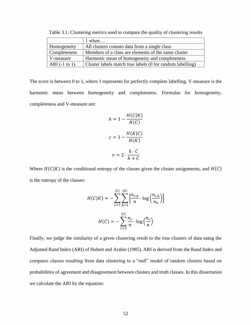
52
Table 3.1: Clustering metrics used to compare the quality of clustering results
1 when…
Homogeneity All clusters contain data from a single class
Completeness Members of a class are elements of the same cluster
V-measure Harmonic mean of homogeneity and completeness
ARI (-1 to 1) Cluster labels match true labels (0 for random labelling)
The score is between 0 to 1, where 1 represents for perfectly complete labelling. V-measure is the
harmonic mean between homogeneity and completeness. Formulas for homogeneity,
completeness and V-measure are:
ℎ = 1 −𝐻(𝐶|𝐾)
𝐻(𝐶)
𝑐 = 1 −𝐻(𝐾|𝐶)
𝐻(𝐾)
𝑣 = 2 ⋅ℎ ⋅ 𝐶
ℎ + 𝐶
Where 𝐻(𝐶|𝐾) is the conditional entropy of the classes given the cluster assignments, and 𝐻(𝐶)
is the entropy of the classes:
𝐻(𝐶|𝐾) = −∑∑ [𝑛𝑐,𝑘
𝑛⋅ log (
𝑛𝑐,𝑘
𝑛𝑘)]
|𝐾|
𝑘=1
|𝐶|
𝑐=1
𝐻(𝐶) = −∑𝑛𝑐
𝑛
|𝐶|
𝑐=1
⋅ log (𝑛𝑐
𝑛)
Finally, we judge the similarity of a given clustering result to the true clusters of data using the
Adjusted Rand Index (ARI) of Hubert and Arabie (1985). ARI is derived from the Rand Index and
compares classes resulting from data clustering to a “null” model of random clusters based on
probabilities of agreement and disagreement between clusters and truth classes. In this dissertation
we calculate the ARI by the equation:

53
𝐴𝑅𝐼 =∑ (
𝑛𝑖𝑗
2)𝑖,𝑗 − ∑ (
𝑛𝑖
2)𝑖 ∑ (
𝑛𝑗
2)𝑗 (
𝑛2)⁄
12 (∑ (
𝑛𝑖.
2)𝑖 + ∑ (
𝑛.𝑗
2)𝑗 ) − ∑ (
𝑛𝑖.
2)𝑖 ∑ (
𝑛.𝑗
2)𝑗 (
𝑛2)⁄
where two clusterings of the data, 𝑈 and 𝑉, are compared. The indices 𝑖 and 𝑗 refer to groups within
𝑈 and 𝑉 respectively: 𝑛𝑖∙ and 𝑛∙𝑗 refer to the number of objects in class 𝑢𝑖 in 𝑈 and class 𝑣𝑗 in 𝑉.
The contingency table in Hubert and Arabie (1985) fully illustrates this notation.
Figure 3.2 illustrates the meaning of the various clustering metrics using the Fischer Iris
data set (Fisher 1936). The Iris data is composed of 3 species of flowers, and Figure 3.2 gives
several possible clustering results found by K-means similar to good and bad clustering results: 1.
all data in one cluster, 2. Data is separated into many clusters, and 3. Data is separated into 3
clusters (which closely match the true clusters). The sample cases in Figure 3.2 illustrate how
homogeneity and completeness give us insight into how the clusters separate the data, particularly
their relative size to each other, whether they might be too general or too specific. ARI gives an
evaluation of how accurately the clustering results capture the true grouping of the data (assuming
the true clusters are known).
3.5 Subspace Clustering Study: Parameters and Analysis
Each DR and clustering technique had one or more parameters which needed to be
specified, and the determination of these parameters has a substantial effect on clustering
performance and the validity of the analysis. Finding appropriate values can be a trial and error
process; therefore, in order to simulate the trial and error process an engineer might use to find a
useful clustering of the process data, we tested a range of different values for each clustering
technique, usually based on heuristics. As an example, our use of the 95th percentile nearest
neighbors distance for DBSCAN comes from the convention of using the 95% significance to
accept or reject a null hypothesis. In some cases we did not attempt to avoid using our knowledge
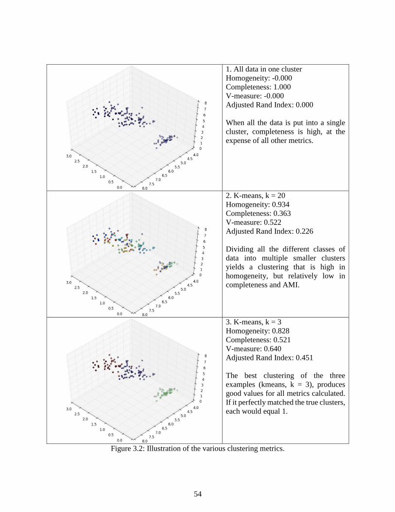
54
1. All data in one cluster
Homogeneity: -0.000
Completeness: 1.000
V-measure: -0.000
Adjusted Rand Index: 0.000
When all the data is put into a single
cluster, completeness is high, at the
expense of all other metrics.
2. K-means, k = 20
Homogeneity: 0.934
Completeness: 0.363
V-measure: 0.522
Adjusted Rand Index: 0.226
Dividing all the different classes of
data into multiple smaller clusters
yields a clustering that is high in
homogeneity, but relatively low in
completeness and AMI.
3. K-means, k = 3
Homogeneity: 0.828
Completeness: 0.521
V-measure: 0.640
Adjusted Rand Index: 0.451
The best clustering of the three
examples (kmeans, k = 3), produces
good values for all metrics calculated.
If it perfectly matched the true clusters,
each would equal 1.
Figure 3.2: Illustration of the various clustering metrics.

55
of the sets, as in tests with K-means where we based a central estimate of the number of clusters
on the number of groups known to be in the data and varying k around this estimate.
DBSCAN: minPts was fixed at 10, while eps was determined using the k-nearest neighbors
(kNN) graph as suggested by Ester et al. (1996). We varied the range of the percentile of
the kNN graph used between the values 0.99, 0.95, 0.9, 0.8, and 0.7.
K-means: 𝑘 was varied around the number of groups that were known to be in the data.
For example, in the reduced fault data set from the Tennessee Eastman process, the values
of 𝑘 considered were 6, 7, 8, 9, and 10.
The base estimate for the bin width parameter of mean shift was determined by finding the
average median nearest neighbor distance over the entire data set. This estimate was varied
by multiplying by five sets of factors: 1.8, 1.5, 1 (no modification of initial estimate), 0.5,
and 0.2.
The threshold parameter of BIRCH has conceptual similarity to the bin width parameter of
mean shift, and was varied in the same fashion. The branching factor had a limited effect
on clustering results and was fixed at 50.
The dimensionality reduction techniques used also required some parameters to be
specified. In this case we assumed some simple benchmarks to specify the dimensionality of the
projections:
PCA: Cross validation was used such that 95% of the variance was preserved in the
projection.
KPCA: we used the average eigenvalue approach utilized by Lee et al. (2006) which
accepts all components with eigenvalues above the average eigenvalue.

56
ICA, Isomap, and SE each required an estimate of the intrinsic dimensionality for the
projection. In practice, this can be difficult to estimate, so as a benchmark we used the same
number of components as PCA.
In the clustering results in Chapters 5 and 6, we present the best ARI result out of the five
parameter guesses for each clustering/DR combination. Full results are provided in Appendix A
and can be informative in judging the reproducibility of the maximum ARI clustering results
highlighted in the chapters. It should be noted that in a clustering study without any a priori
knowledge of the true data groups, ARI cannot be calculated. Without true cluster labels, only
unsupervised clustering metrics like the Davies-Bouldin Index (Davies and Bouldin 1979) provide
a benchmark for the accuracy of a clustering of the data.
3.6 References
Belkin, M., & Niyogi, P. (2002). Laplacian eigenmaps for dimensionality reduction and data
representation. Neural Computation, 15(6), 1373-1396.
Cheng, Y. (1995). Mean shift, mode seeking, and clustering. IEEE Transactions on Pattern
Analysis and Machine Intelligence, 17(8), 790-799.
Comaniciu, D., & Meer, P. (2002). Mean shift: A robust approach toward feature space analysis.
IEEE Transactions on Pattern Analysis and Machine Intelligence, 24(5), 603-619.
Cox, M. A. A., & Cox, T. F. (1994). Multidimensional scaling. In Handbook of Data Visualization
(315-347). Heidelberg: Springer.
Davies, D. L., & Bouldin, D. W. (1979). A cluster separation measure. IEEE Transactions on
Pattern Analysis and Machine Intelligence, 1(2), 224-227.
Ding, C., & He, X. (2004). K-means clustering via principal component analysis. Proceedings of
the 21st International Conference on Machine Learning, 29-38.
Ester, M., Kriegel, H.P., Sander, J., & Xu, X. (1996). A density based algorithm for discovering
clusters in large spatial databases with noise. Proceedings of 2nd International Conference
on Knowledge Discovery and Data Mining, 226-231.
Fisher, R. A. (1936). The use of multiple measurements in taxonomic problems. Annals of
Eugenics, 7(2), 179-188.

57
Foster, I. (1995). Designing and building parallel programs. Retrieved from http://www-
unix.mcs.anl.gov/dbpp/text/book.html
Fu, T. (2011). A review on time series data mining. Engineering Applications of Artificial
Intelligence, 24, 164-181.
Fukunaga, K., & Hostetler, L. D. (1975). The estimation of the gradient of a density function, with
applications in pattern recognition. IEEE Transactions on Information Theory, 21(1), 32-
40.
Gardner, M., & Bieker, J. (2000). Data mining solves tough semiconductor manufacturing
problems. KDD '00 Proceedings of the Sixth ACM SIGKDD International Conference on
Knowledge Discovery and Data Mining, 376-383.
Hubert, L., & Arabie, P. (1985). Comparing patterns. Journal of Classification, 2, 193-218.
Hyvarinen, A., & Oja, E. (2000). Independent component analysis: Algorithms and applications.
Neural Networks, 13(4-5), 411-430.
Jain, A. K. (2010). Data clustering: 50 years beyond K-means. Pattern Recognition Letters, 31,
651-666.
Lee, J., Qin, S. J., & Lee, I. (2006). Fault detection and diagnosis based on modified independent
component analysis. American Institute of Chemical Engineers Journal, 52(10), 3501-
3514.
Lee, J., Yoo, C. K., Choi, S. W., Vanrolleghem, P. A., & Lee, I. (2004). Nonlinear process
monitoring using kernel principal component analysis. Chemical Engineering Science, 59,
223-234.
MacQueen, J. (1967). Some methods for classification and analysis of multivariate observations.
Fifth Berkeley Symposium on Mathematics, Statistics, and Probability, 281-297.
Mervis, J. (2012). U.S. science policy: Agencies rally to tackle big data. Science, 335(6077), 22.
Mitchell, T. M. (1997). Machine learning. Singapore: McGraw-Hill.
Ng, A., Jordan, M., & Weiss, Y. (2002). On spectral clustering: Analysis and an algorithm. In T.
Dietterich, S. Becker, & Z. Ghahramani (Eds.), Advances in Neural Information
Processing Systems, (849-856). Cambridge: MIT Press.
Pedregosa, F., Varoquaux, G., Gramfort, A., Michel, V., Thirion, B., Grisel, O., … Duchesnay, E.
(2011). Scikit-learn: Machine learning in Python. Journal of Machine Learning Research,
12, 2825-2830.
Rosenberg, A., & Hirschberg, J. (2007). V-Measure: A conditional entropy-based external cluster
evaluation measure. Proceedings of the 2007 Joint Conference on Empirical Methods in
Natural Language Processing and Computational Natural Language Learning, 410-420.

58
Russell, E. L., Chiang, L. H., & Braatz, R. D. (2000). Data-driven techniques for fault detection
and diagnosis in chemical processes. London: Springer.
Scholkopf, B., Smola, A., & Muller, K. R. (1999). Kernel principal component analysis. In
Advances in kernel methods – Support vector learning (327-352). Cambridge: MIT Press.
Shi, J., & Malik, J. (2000). Normalized cuts and image segmentation. IEEE Transactions on
Pattern Analysis and Machine Intelligence, 22(8), 888 – 905.
Silverman, B. W. (1986). Density estimation for statistics and data analysis. London: Chapman
and Hall.
Tan, P., Steinbach, M., & Kumar, V. (2006). Introduction to data mining. Boston: Longman.
Tenenbaum, J. B. (1998). Mapping a manifold of perceptual observations. Advances in Neural
Information Processing Systems, 10, 682-688.
Tenenbaum, J. B., De Silva, V., & Langford, J. C. (2000). A global geometric framework for
nonlinear dimensionality reduction. Science, 290(5500), 2319-2323.
Van der Maaten, L., Postma, J., & van den Herik, J. (2008). Dimensionality reduction: A
comparative review. Retrived from https://lvdmaaten.github.io/publications/papers/TR_
Dimensionality _ Reduction_Review_2009.pdf
Von Luxburg, U. (2007). A tutorial on spectral clustering. Statistics and Computing, 17, 395-416.
Xu, R., & Wunsch, D. (2005). Survey of clustering algorithms. IEEE Transactions on Neural
Networks, 16(3), 645-678.
Zhang, T., Ramakrishnan, R., & Livny, M. (1996). BIRCH: An efficient data clustering method
for very large databases. SIGMOD ’96, 103-114.

59
Chapter 4 - Process Monitoring and Supervision
Modern chemical plants have advanced distributed control systems (DCS) that handle
normal, day-to-day operations of quality control. However, some events, such as heat exchanger
fouling or equipment breakdowns, cannot be compensated for by the DCS. These events are called
faults. When process faults occur, the burden falls on the human operator to rapidly assess the
situation, determine the causes, and take corrective action. This is a challenging task further
complicated by information overload. The average DCS measures hundreds of variables every
second and important trends for the correct diagnosis can be hidden beneath sensor noise. Mistakes
in managing major process faults cost the U.S. chemical industry billions of dollars in occupational
injuries, damages, and lost products (Venkatasubramanian 2003). Detecting faults early is crucial
to prevent the progression of the incident and reduce losses.
This research is focused on process monitoring algorithms: mathematical computer
programs designed to assist plant operators in the detection and diagnosis of chemical process
faults. A wide array of statistical methods, such as principal component analysis (PCA), have been
adapted to fault detection with success, but too often PCA performs poorly on non-linear
processes. Here, our work develops an advanced process monitoring algorithm based on self-
organizing maps (SOM) that is robust to the challenges posed by non-linear processes and uses
ideas from data mining and artificial intelligence.
This chapter introduces data-based methods for process monitoring tasks. A key issue
associated with multivariate statistical monitoring schemes is the construction or definition of
process normal operating region, which can be thought of as the acceptable level of variation
around target values. Statistics are generated from new observations to quantify the degree of

60
belongingness in the normal region and are employed as an indicator of the process performance
and product quality.
In univariate process monitoring, the normal operating region is constructed based upon
the assumption of normality and independence. Although a similar approach has been extended to
multivariate case using Principal Components Analysis (PCA), the underlying assumptions such
as linearity can be restrictive and inappropriate for complex processes. Still, one of the main
advantages of PCA is its simplicity and the range of tools it provides which covers all fault
detection, identification, and diagnosis tasks discussed above. In this dissertation we will develop
a nonlinear approach that will mimic PCA by defining similar measures for process monitoring
and fault detection.
Section 4.1 introduces the basic concepts and goals of process monitoring technology.
Section 4.2 introduces a basic univariate process monitoring technique. Section 4.3 briefly
overviews PCA tools for multivariate process monitoring. Section 4.4 introduces the fundamentals
of self-organizing maps and Section 4.5 introduces our new method for process monitoring using
multiple SOMs. Section 4.6 explains how SOM methods can be adapted to batch processes using
multiway unfolding. Section 4.7 presents an illustrative demonstration of PCA and MSOM
monitoring on the Fisher Iris data.
4.1 Introduction to Data-Driven Process Monitoring
Chemical process monitoring can be separated into several tasks outlined in the flowchart
in Figure 4.1. The four main tasks that compose process monitoring are fault detection (also known
as abnormal event detection or AED), fault identification, fault diagnosis, and process recovery.
This dissertation studies every task but process recovery which is the process through which the
human operators act to address fault events and close the “control loop” illustrated in Figure 4.1.
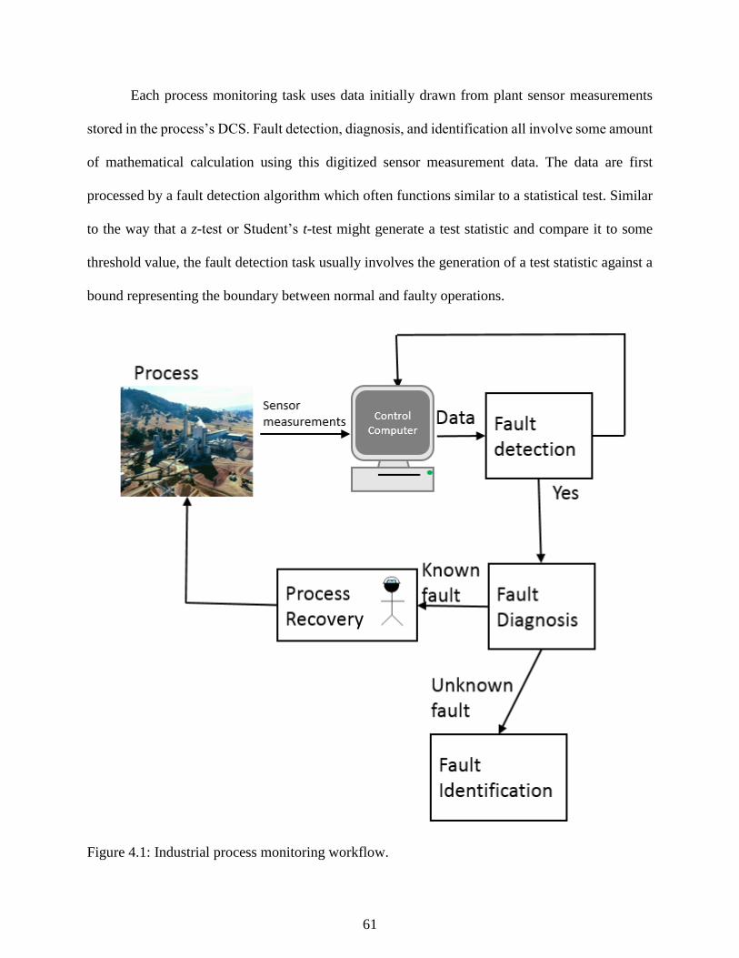
61
Each process monitoring task uses data initially drawn from plant sensor measurements
stored in the process’s DCS. Fault detection, diagnosis, and identification all involve some amount
of mathematical calculation using this digitized sensor measurement data. The data are first
processed by a fault detection algorithm which often functions similar to a statistical test. Similar
to the way that a z-test or Student’s t-test might generate a test statistic and compare it to some
threshold value, the fault detection task usually involves the generation of a test statistic against a
bound representing the boundary between normal and faulty operations.
Figure 4.1: Industrial process monitoring workflow.

62
When our test statistic exceeds this bound, we say a fault has occurred, and while the
statistic is below the bound we say operations are normal. When the statistic above the bounds for
normal is observed, the next step is the fault diagnosis step. If data from previously experienced
or expected faults is available, pattern recognition fault diagnosis algorithm can be trained to
associate the data to the known fault and enable operators to proceed immediately to the process
recovery step to address the conditions creating the fault status. If there is no data from previously
available faults or the observed abnormal data does not fit into any known fault models, the
workflow proceeds to fault identification. Fault identification uses the model of normal operations
to assist operators in isolating the sensor measurements responsible for faulty observations.
Without fault identification, operators may see a faulty plant status but not take action if the sensors
producing the faulty statistic are not obvious. Fault identification can guide operators’
investigation into the root causes of the fault event by focusing attention to a certain area of the
plant more relevant to the diagnosis of the fault.
The purpose of implementing a process monitoring AED system is not to automate the
management of abnormal events, but to assist in incorporating operators into the loop. Process
monitoring must provide useful insight in quickly assessing an abnormal situation and offer a user
friendly way for operators to view and process large amounts of information. Additionally, they
must accomplish all these tasks in a scalable, user-friendly manner without requiring expensive,
time-consuming maintenance from application engineers or experts in data mining.
Process monitoring falls into three broad categories: data-driven, analytical, and
knowledge-based. Analytical models are built from first principles chemistry and physics models
of the system which fully model all possible behavior of the system. However, in practice,
constructing and validating non-linear analytical models of processes from scratch can take months

63
to years in analysis and experimentation. Knowledge based approaches are based on cause-effect
descriptions and IF-THEN rules to describe the behavior of faults. Often knowledge-based
methods are built on past experiences of operators following fault events with clearly isolated
causes. In contrast, data driven models are built from only accumulated process data. Data driven
models are based on machine learning or statistics, but have the disadvantage that they behave
unpredictably when encountering situations not covered in the training data set. Therefore training
data for data-based process monitoring methods must be as diverse as possible to ensure the model
that arises is robust to multiple unusual (but not faulty) events that a process experiences such as
weather variations or irregularities arising from normal maintenance procedures (Chiang et al.
2000). The following sections discuss various strategies for the process monitoring tasks.
4.2 Statistical Process Control
Process industries are under constant pressure to produce high quality products, reduce
product rejection rates, and to satisfy strict safety and environmental regulations (Romagnoli and
Palazoglu 2012). These requirements led to the extensive use of statistical process control (SPC),
here referred to as process monitoring. SPC assumes that a process experiencing natural variations
will remain in a state of statistical control under which certain process or product variables will
remain close to their desired values (Venkatasubramanian 2003). The simplest and most common
technique for process monitoring and quality control is a Shewhart control chart, where a single
variable is plotted against time (Shewhart 1931). The target is the centerline, and upper and lower
limits define a normal region for acceptable variation from the target, as shown in Figure 4.2. The
upper and lower limits represent three-sigma (sample standard deviation) from the sample, defined
as:
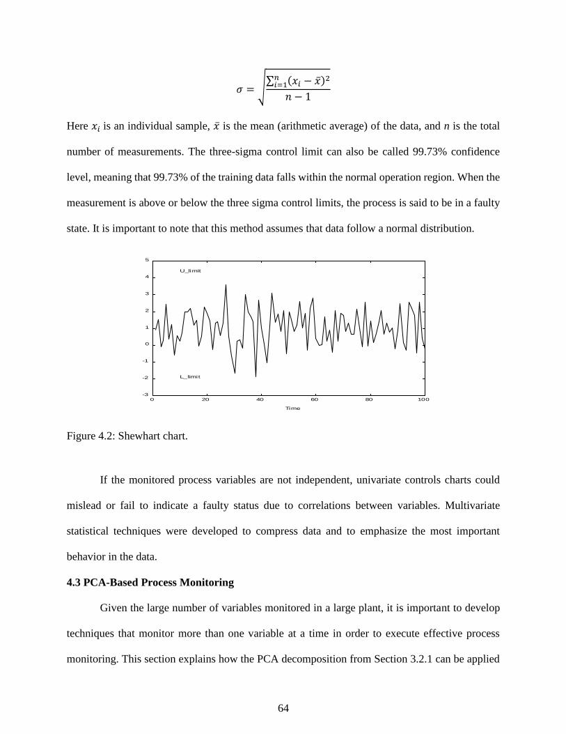
64
𝜎 = √∑ (𝑥𝑖 − �̅�)2𝑛
𝑖=1
𝑛 − 1
Here 𝑥𝑖 is an individual sample, �̅� is the mean (arithmetic average) of the data, and n is the total
number of measurements. The three-sigma control limit can also be called 99.73% confidence
level, meaning that 99.73% of the training data falls within the normal operation region. When the
measurement is above or below the three sigma control limits, the process is said to be in a faulty
state. It is important to note that this method assumes that data follow a normal distribution.
Figure 4.2: Shewhart chart.
If the monitored process variables are not independent, univariate controls charts could
mislead or fail to indicate a faulty status due to correlations between variables. Multivariate
statistical techniques were developed to compress data and to emphasize the most important
behavior in the data.
4.3 PCA-Based Process Monitoring
Given the large number of variables monitored in a large plant, it is important to develop
techniques that monitor more than one variable at a time in order to execute effective process
monitoring. This section explains how the PCA decomposition from Section 3.2.1 can be applied
0 20 40 60 80 100-3
-2
-1
0
1
2
3
4
5
Time
L_limit
U_limit

65
to the three process monitoring tasks of fault detection, identification, and diagnosis. Besides its
statistical ability to detect large deviations from normal operations, PCA is also useful for feature
extraction and dimensionality reduction (DR). Some monitored variables can generate highly
noisy data with few significant variations, and PCA is adept at ignoring the noise and capturing a
signal in data.
PCA is a widely used benchmark in process monitoring research. Raich and Cinar (1996)
demonstrated the use of standard PCA for fault detection and diagnosis on the Tennessee Eastman
process. A thorough treatment of PCA and other statistical techniques to the Tennessee Eastman
process is presented in Chiang et al. (2000). In addition to the techniques presented here, PCA has
been applied to process monitoring in other forms which more specifically take into account
dynamics and non-linearity. NLPCA developed by Kramer (1994) uses non-linear feedforward
neural networks employing a “bottleneck” layer to uncover linear and non-linear correlations. Ku
(1995) developed an important adaptation of PCA process monitoring strategies called DPCA
which uses “time lag shifts” to include dynamic behavior in PCA models.
The following sections explain how to use PCA models for process monitoring.
4.3.1 PCA fault detection
Faulty data can be detected with PCA in two ways: either the scores can move outside the
normal operating region or the residuals generated by the PCA model could become large. Using
the projections of multivariate process data described in Section 3.2.1, deviations from the normal
operating region are measured using Hotelling’s T2 statistic. A high T2 indicates a fault is
occurring, and a low T2 indicates a normal status. In similar fashion, the residuals generated by the
PCA model in response to a new data point are used to calculate the squared prediction error (SPE)
also known as the Q statistic. The calculations for both statistics are described below.

66
Given the 1 × 𝑎 projection of a 1 × 𝑚 observation row vector into the score space t, the T2
statistic can be calculated:
𝑇2 = 𝑡𝑇𝛬𝑎−1𝑡
Where 𝛬𝑎 is the diagonal matrix containing the first a largest eigenvalues in order of decreasing
magnitude. The T2 statistic threshold for normal operation can be represented as an ellipsoid with
a 1 − 𝛼 statistical significance using the 𝑇𝛼2 threshold and a level:
𝑡𝑇𝛬𝑎−1𝑡 < 𝑇𝛼
2
When the actual covariance matrix is estimated from the sample covariance matrix, the 𝑇𝛼2
threshold is found from the F distribution by the equation:
𝑇𝛼2 =
𝑎(𝑛 − 1)(𝑛 + 1)
𝑛(𝑛 − 𝑎)𝐹𝛼(𝑎, 𝑛 − 𝑎)
Where n is the number of data points and 𝑎 is the number of principal components. The T2 statistic
is highly sensitive to inaccuracies in the PCA space corresponding to the smaller eigenvalues
(Chiang 2000) because it directly measures scores corresponding to the smaller singular values.
The 𝑚 − 𝑎 smallest principal components can be monitored using a supplement to fault
detection based on the T2 statistic, or the Q statistic. Also known as the squared prediction error
(SPE), the Q statistic can be computed to measure how well each sample conforms to the PCA
model and the amount of variation not captured by the principal components retained in the model
(Wise 1996). The part of the observation space corresponding to the m – a smallest singular values,
which correspond to the m – a ignored by the reduction in dimension, can be monitored using the
Q statistic:
𝑟 = (𝐼 − 𝑃𝑃𝑇)𝑥 𝑄 = 𝑟𝑇𝑟
Where, r is the residual vector, a projection of observation x into the residual space. The threshold
for the Q statistic is given by the following equations from Wise and Gallagher (1996).

67
𝑄𝛼 = Θ1 [𝑐𝛼√2Θ2ℎ0
2
Θ1+
Θ2ℎ0(ℎ0 − 1)
Θ12 + 1]
1ℎ0
where cα is the standard normal deviate corresponding to the upper 1 − 𝛼 percentile and
ℎ0 = 1 −2Θ1Θ3
3Θ22
and
Θ𝑖 = ∑ 𝜆𝑗𝑖
𝑁
𝑗=𝑎+1
for 𝑖 = 1 − 3
where the 𝜆𝑖 are the eigenvalues of the covariance matrix of 𝑋 and 𝑁 is the total number of
principal components, which is either the number of variables or samples in 𝑋, whichever is
smaller. The thresholds defined for the 𝑇2 and Q statistics set the boundaries for normal variations
and random noise, and a violation of the threshold indicates that the random noise has changed
(Chiang et al. 2000) and a statistically separate operating status reached.
4.3.2 PCA fault identification
Contribution plots are a PCA approach to fault identification based on determining the
process variable responsible for the faulty condition. For a 𝑇2 violation, follow the approach in
Chiang et al. (2000) in which the contribution of each variable is calculated according to:
𝑐𝑜𝑛𝑡𝑖,𝑗 =𝑡𝑖𝜆𝑖
𝑝𝑖,𝑗(𝑥𝑗 − 𝜇𝑗)
Where 𝑝𝑖,𝑗 is the 𝑖th element of the loading matrix 𝑃. The total contribution of the 𝑗th process
variable is determined from:
𝐶𝑂𝑁𝑇𝑗 = ∑(𝑐𝑜𝑛𝑡𝑖,𝑗)
𝑟
𝑖=1

68
The 𝐶𝑂𝑁𝑇𝑗 for all process variables are then plotted on a single graph in order to decide which
variables are responsible for the faulty condition.
4.3.3 PCA Fault diagnosis – discriminant analysis
To determine the root cause of a given fault, data previously collected from out of control
or faulty operations can be grouped and used by a pattern classification scheme to diagnose future
faults. Pattern classification proceeds via three steps: feature extraction, discriminant analysis, and
maximum selection. Feature extraction is the process of isolating the important trends in the data
and removing noise which could disrupt classification. PCA performs feature extraction in the
projection into the score space using 𝑃 in the fault detection step. The pattern classification system
assigns an observation 𝑥 to class 𝑖 if
𝑔(𝑥)𝑖 > 𝑔(𝑥)𝑗 ∀𝑗 ≠ 𝑖
Where, 𝑔𝑗 is the discriminant function for class 𝑗. 𝑔(𝑥)𝑖 can be approximated using the −𝑇2
statistic assuming the probability of each class is the same and the total amount of variability in
each class is the same.
PCA, and similar techniques that use matrix decomposition, assume linearity and preserve
distances. Preserving topologies with non-linear techniques maintains the order of data, which may
aid our classification goals. In the next section, SOM as a topological preservation method is
discussed.
4.3.4 Nonlinear principal component analysis (NLPCA)
Nonlinear PCA (NLPCA) is an extension of PCA proposed by Kramer (1991) and Dong
and McAvoy (1996). A critical result for NLPCA is the proof by Cybenko (1989) that arbitrary
decision regions can be well approximated by continuous feedforward neural networks with only
one hidden layer and continuous sigmoidal nonlinearity. Like linear PCA, NLPCA seeks to remove

69
noise variables and weight statistically important variables in the detection and diagnosis of faults.
While PCA uses multivariate statistics, NLPCA performs the reduction in dimensionality using a
feedforward neural network. The neural network consists of a mapping or “bottleneck” layer,
which reduces the input data to the intrinsic dimension, and a de-mapping layer that can reconstruct
the original signals input into the neural network. In this work, we use the NLPCA implementation
presented in Dong and McAvoy (1996) for fault detection. We use the SPE of reconstructed data
was used as the fault detection statistic. For fault diagnosis, an equivalent to MPCA with individual
models for each fault class was used for NLPCA fault diagnosis, a technique referred to here as
MNLPCA (Multiple NLPCA). We use MNLPCA as a benchmark nonlinear process monitoring
technique. The SPE of a competing set of NLPCA neural networks was calculated, and the class
assigned to the group with the minimum SPE.
4.4 Novel Self-Organizing Map (SOM) Monitoring Approach
A valuable tool for addressing these challenges of high dimensional data sets, novelty
detection, and multiple operating states comes in the form of self-organizing maps (SOMs). Also
known as Kohonen networks (Kohonen 2000), SOMs are a type of neural network used in the
visualization and analysis of high dimensional data and have been applied to a wide range of
engineering problems (Kohonen 1996). SOM’s versatility comes from its topology preservation
and data representation abilities which help isolate the key variables and patterns that emerge from
data. Vesanto (1999) demonstrated how to use SOM in conjunction with data clustering and
analysis.
Figure 4.3 illustrates the overall approach followed. Using the groups of training data
created, an SOM is fitted to the data. Next the map is analyzed using SOM visualization tools and
K-means clustering. Different groups of data are projected onto the SOM to explain the meaning

70
of the clusters and determine which events or operating regimes that area of the map represents.
After that, training data is projected to the map, and the quantization error (QE) is calculated for
each point. A distribution is also fit to the QE results, which is used to create a reference value for
detecting novel events. After the projection and analysis steps are complete, the map is prepared
for process monitoring: detection through QE scores, identification using contribution plots, and
diagnosis using the map structure. Some detection, diagnosis, and identification results are
duplicated using the PCA monitoring strategies presented by Russell et al. (2000) which use PCA
with parallel analysis to model data, Hotelling’s T2 and Q statistic for classification, and minimum
T2 statistic for discriminant analysis.
4.4.1 The self-organizing map (SOM)
The self-organizing map (SOM) is a type of neural network that can be used to non-linearly
project high dimensional data onto a lower dimensional array of neurons. Mapping with an SOM
preserves topological relationships as the SOM conforms to the multidimensional shape of the data
and allows the neurons organization to preserve whatever clustering might arise from the data.
(Kohonen 1996) This study used the MATLAB implementation of SOM developed by Vesanto et
al. (2000).
An SOM is a connected array of nodes forming a regular rectangular or hexagonal grid
structure. The prototype vectors making up each map model vectors within the training data. The
number of map nodes is determined by a heuristic algorithm related to the number of data points
in the training data. The prototype vectors can be represented in both the data space and in the
dimensionality reduced space within the map structure. A data point’s representation on the map
is found by locating its best matching unit (BMU). In short, the BMU of a given data vector is the
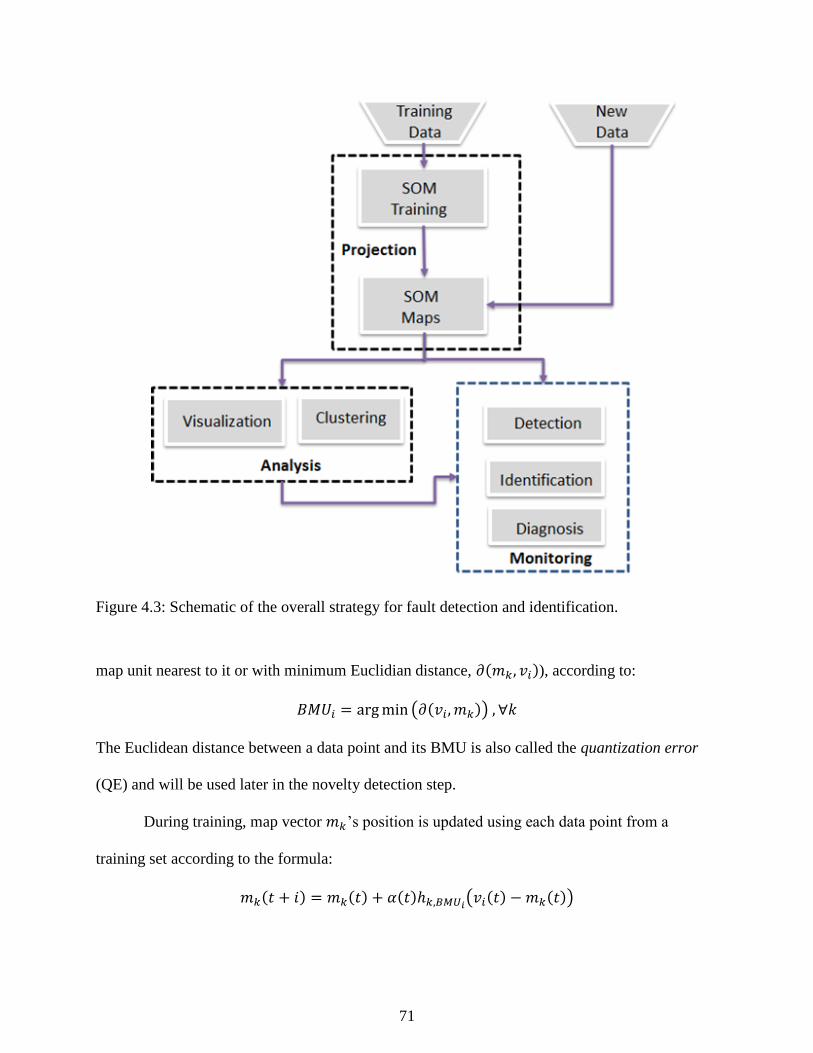
71
Figure 4.3: Schematic of the overall strategy for fault detection and identification.
map unit nearest to it or with minimum Euclidian distance, 𝜕(𝑚𝑘, 𝑣𝑖)), according to:
𝐵𝑀𝑈𝑖 = argmin (𝜕(𝑣𝑖, 𝑚𝑘)) , ∀𝑘
The Euclidean distance between a data point and its BMU is also called the quantization error
(QE) and will be used later in the novelty detection step.
During training, map vector 𝑚𝑘’s position is updated using each data point from a
training set according to the formula:
𝑚𝑘(𝑡 + 𝑖) = 𝑚𝑘(𝑡) + 𝛼(𝑡)ℎ𝑘,𝐵𝑀𝑈𝑖(𝑣𝑖(𝑡) − 𝑚𝑘(𝑡))

72
where 𝑡 is the mapping time step and 𝛼 is the monotonically decreasing learning rate, ℎ𝑘,𝐵𝑀𝑈𝑖
denoting a neighborhood kernel function centered at the BMU. The training algorithm matches
data vectors to prototype vectors using Euclidean distance. The neighborhood kernel ℎ𝑘,𝐵𝑀𝑈𝑖
centered at 𝑚𝑘(𝑡) is usually chosen in the Gaussian form:
ℎ𝑚𝑘,𝐵𝑀𝑈𝑖= 𝑒𝑥𝑝 (
‖𝑚𝑘 − 𝐵𝑀𝑈𝑖‖2
2𝜎2)
𝜎(𝑡) denotes the monotonically decreasing width of the kernel that allows for a regular smoothing
of the prototypes (Kohonen 2000).
A common alternative to the update rule outlined above is the SOM batch training
algorithm. During the batch training algorithm, the training data is passed through once to
determine which data vectors lie in each prototype’s neighborhood. Then each map unit is replaced
by the weighted average of the data vectors in its neighborhood, where the weighting factors are
the neighborhood kernel values. In the notation used previously:
𝑚𝑖(𝑡 + 1) =∑ ℎ𝑖,𝑐(𝑗)(𝑡)𝒙𝑗
𝑛𝑗=1
∑ ℎ𝑖,𝑐(𝑗)(𝑡)𝑛𝑗=1
where 𝑐(𝑗) is the BMU of the sample vector 𝒙𝑗, ℎ𝑖,𝑐(𝑗) is the neighborhood kernel defined above,
and n is the number of data vectors used for training. This variant of the training algorithm is often
used because it is much faster to calculate and the results are typically as good as or better than the
sequential training algorithm (Kohonen 2000).
4.4.2 SOM visualization tools for process analysis
A key advantage to using SOM in process monitoring comes from the insights it provides
into high dimensional structures within the data on the two dimensional map. The visualizations
discussed below allow us to see the shape of the data distribution, cluster borders, projection
directions, and possible dependencies between the variables. Common visualizations discussed

73
here include component planes, distance matrices, and projections as proposed by Kaski (1997),
Vesanto (1999), (Vesanto 2002), and Himberg, (2001).
Component Planes: A component plane displays the value of individual variables at each
prototype vector in the map. Each component plane is associated to one variable in the
observation space. The value of the variable at all map nodes is visualized using different
colors which allows the user to visually identify possible dependencies between variables
(Vesanto 1999, Lampinen 2000). The dependencies between variables can be seen as
similar patterns in identical locations on the component planes. In that sense, the SOM
reduces the effect of noise and outliers in the observations and, therefore, may actually
make any existing dependency clearer than in the original data.
Distance Matrices: Distance matrices show the pairwise distances between nodes within
the map structure. Using the lower dimensional structure of the SOM, colors are used to
show high or low distances, which provides insight into the dominant clustering patterns
present in the data. The most common visualization of the distance matrix is the U-matrix
(Ultsch 1993), which visualizes all pairwise distances between nodes in the map. In a U-
matrix, the dominant clustering structure can be seen as areas with small distances
separated by large distances. As in the basic U-matrix, visualization of the clusters can be
greatly improved by augmenting the distance matrix with an additional entry between each
prototype vector and each of its neighbors.
Projections: Finally, projections onto the map are very important visualization tools.
Highlighting the BMU of data illustrates the location of the observations on the map
relative to other observed data. Two important figures derived from projections are hit
diagrams and trajectories. Hit diagrams project a collection of data points to show a region

74
belonging to a group of data. Trajectories take a series of time and project them on to the
map, connecting them with lines. The trajectory makes it possible to visually indicate the
current state of the process and observe how that state has been reached.
4.4.3 Clustering of the SOM using k-means
The final goal of our analysis of an SOM is to identify meaningful regions of the map and
groups of SOM vectors with similar characteristics to help us understand structure in data. It is
useful to perform clustering on the SOM itself as a way to add more information about the
associations that emerge within groups of map vectors that might be difficult to identify from a U-
matrix or component plane alone. Separating map vectors into different clusters can, in
combination with the visualizations mentioned previously, give an engineer more insight about the
SOM results by showing which variables differentiate the clusters and revealing sub clusters,
among other uses (Vesanto 2000).
In this work, we used K-means to cluster the SOM. K-means is a popular and fairly simple
method to implement for unsupervised data clustering. First, 𝐾 initial centroids are chosen,
corresponding to the number of clusters desired. Each point in the dataset is then assigned to the
closest centroid, and each collection of points assigned to a centroid is a cluster. The centroid of
each cluster is then updated based on the points assigned to the cluster. The assignment and update
steps are repeated until no point changes clusters or until the centroids remain the same (Tan 2005).
In a k-means analysis on a data set, several groups of clusters are found and evaluated for
quality based on the Davies-Bouldin index (DBI). DBI, �̅�, is based on the ratio of within cluster
scatter to between cluster scatter:
𝑅𝑖𝑗 =𝑆𝑖 + 𝑆𝑗
𝑀𝑖𝑗

75
�̅� =1
𝑁∑𝑅𝑖
𝑁
𝑖=1
For clusters 𝑖 and 𝑗. 𝑀𝑖𝑗 holds the distances between cluster centroids and 𝑅𝑖 is the maximum of
𝑅𝑖𝑗, 𝑖 ≠ 𝑗. S is the dispersion of the cluster which is usually measured by the standard deviation of
data in the cluster relative to the cluster centroids (Davies and Bouldin 1979).
4.5 MSOM in Process Monitoring
4.5.1 SOM fault detection and diagnosis
Figure 4.4 outlines the MSOM approach to process monitoring. Fault detection and
diagnosis is performed by using the Euclidian distance, also called the quantization error (QE),
between a new data point produced by the DCS as a measure of novelty and its BMU on the SOM.
Once the quantization error rises above a previously determined threshold (i.e. the process data at
a given time point move a certain distance away from its BMU), a novel event is said to have
occurred. Here, the threshold that defines the boundary between a normality and novelty was
determined by fitting a statistical distribution to the QE’s performance on the training data. Since
in this case known, faults are modeled and we want to detect novel events with a very low
probability, we will use the 99.99% confidence interval. A confidence interval like 99% on one-
minute data could give rise to large number of false alarms. The QE calculated from the training
data in these case studies followed a lognormal distribution, which was used to generate the QE
threshold for monitoring.
Incoming data is sorted by simply giving new data the same class as its BMU. When the
BMU is known, the new data can be projected onto a two-dimensional representation of the map
to locate where the new data falls on the map relative to other data of the same type.
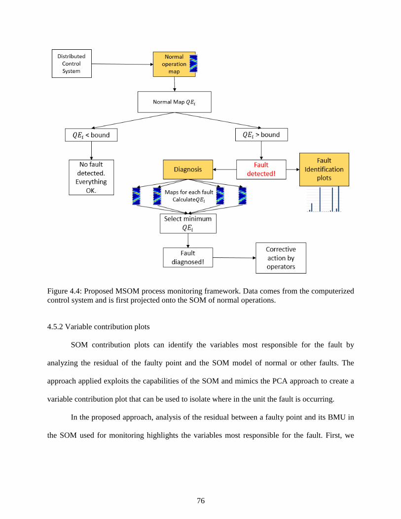
76
Figure 4.4: Proposed MSOM process monitoring framework. Data comes from the computerized
control system and is first projected onto the SOM of normal operations.
4.5.2 Variable contribution plots
SOM contribution plots can identify the variables most responsible for the fault by
analyzing the residual of the faulty point and the SOM model of normal or other faults. The
approach applied exploits the capabilities of the SOM and mimics the PCA approach to create a
variable contribution plot that can be used to isolate where in the unit the fault is occurring.
In the proposed approach, analysis of the residual between a faulty point and its BMU in
the SOM used for monitoring highlights the variables most responsible for the fault. First, we
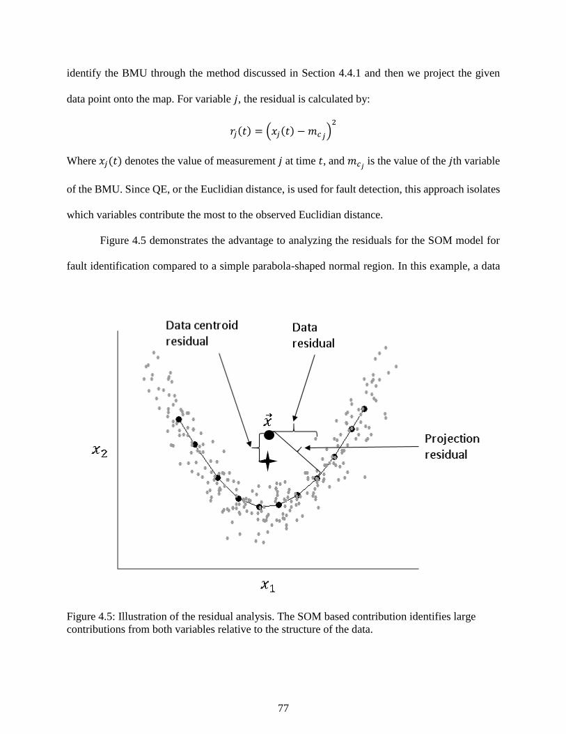
77
identify the BMU through the method discussed in Section 4.4.1 and then we project the given
data point onto the map. For variable 𝑗, the residual is calculated by:
𝑟𝑗(𝑡) = (𝑥𝑗(𝑡) − 𝑚𝑐𝑗)2
Where 𝑥𝑗(𝑡) denotes the value of measurement 𝑗 at time 𝑡, and 𝑚𝑐𝑗 is the value of the 𝑗th variable
of the BMU. Since QE, or the Euclidian distance, is used for fault detection, this approach isolates
which variables contribute the most to the observed Euclidian distance.
Figure 4.5 demonstrates the advantage to analyzing the residuals for the SOM model for
fault identification compared to a simple parabola-shaped normal region. In this example, a data
Figure 4.5: Illustration of the residual analysis. The SOM based contribution identifies large
contributions from both variables relative to the structure of the data.

78
set exists with related dimensions 𝑥1 and 𝑥2 and other independent variables. A “fault” gives rise
to deviations in both the 𝑥1 and 𝑥2 directions through the alteration of an unmeasured variable,
and takes the point out of the general trend of the data.
Figure 4.5 plots three residuals from the faulty point using the black brackets: the centroid,
the nearest data point, and the BMU in the SOM. In this case, the centerline of the nonlinearly
related data does not lie within the data cloud itself. Therefore, the deviations from the data point
are negligible and do not represent the point’s deviation from the data. The residual vector is small
and would erroneously capture only 𝑥1 as the deviated variable, which ignores the deviation in
𝑥2.Using raw uncompressed data causes the faulty point to be matched with a noisy outlier. The
SOM residual approximates an orthogonal projection onto the topological structure of the data
cloud. The SOM residual accurately captures both 𝑥1 and 𝑥2’s contribution (Robertson et al. 2015).
4.6 Multiway Methods for Batch Process Monitoring
Batch processes experience many changes in dynamics and time variations, in contrast to
continuous processes which typically operate around a fixed target region represented by PCA
process monitoring as a bound on the 𝑇2 or Q statistic. As discussed in Section 2.2, multiway
unfolding can be used to adapt techniques developed for continuous processes to batch processes.
This section will discuss two techniques for batch process monitoring: multiway-PCA and a batch
adaptation of MSOM.
Both multiway PCA and MSOM techniques perform fault detection at the end of batches
using batch data processed through multiway unfolding. In addition to performing automated
process monitoring tasks, projecting data processed by multiway unfolding can lead to insights
about operating procedures and pinpoint sources of batch-to-batch variations. In creating training

79
data sets for batch process monitoring, the modeler must identify historical batches that operators
would expect to be marked as abnormal and remove them to enhance the characterization of
normal operations. Data must be analyzed batch-to-batch. For the modeling step itself, both batch
adaptations of PCA and MSOM monitoring operate similarly to the continuous case except that
they use multiway data. The data model (PCA or SOM) is fit as described in Sections 4.3 and 4.4
to data unfolded as in Figure 2.1, where individual rows of the data matrix correspond to all the
measurements taken during a batch. For multiway unfolding to function as desired, each batch
needs to have an identical length in time. A batch process dataset with variable lengths can be
synchronized through DTW technique discussed in Section 2.3. Yao and Gao (2009) review
alternatives.
In contrast to Nomikos and MacGregor (1994), we perform detection and diagnosis at the
end of the batch, though there are adaptations allowing online diagnosis. In the case of MSOM,
MSOM could be adapted to the online batch process monitoring by adjusting how the BMU is
found. If only half of the time period is known, half of the measured data could be used still be
used to find the BMU without any other changes to the SOM model of data.
4.7 Defining Normal Operations: Example on Fisher Iris Data
4.7.1 PCA analysis – fault detection
The results of applying PCA fault detection, using Class 1, or Setosa data, as the normal
operating region (NOR), is given in Figure 4.6. Fault points are points that lie outside of the T2
and Q statistical thresholds (represented by the cylinder drawn in black lines), and are colored red.
Only four points in Class 1 were misclassified giving a misclassification rate for the entire data set
of 2.67% and a misclassification rate within Class 1 of 8%.
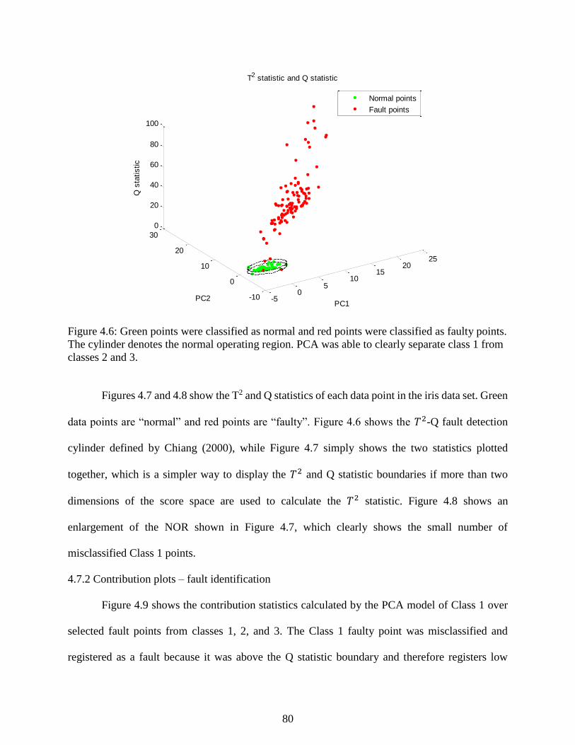
80
Figure 4.6: Green points were classified as normal and red points were classified as faulty points.
The cylinder denotes the normal operating region. PCA was able to clearly separate class 1 from
classes 2 and 3.
Figures 4.7 and 4.8 show the T2 and Q statistics of each data point in the iris data set. Green
data points are “normal” and red points are “faulty”. Figure 4.6 shows the 𝑇2-Q fault detection
cylinder defined by Chiang (2000), while Figure 4.7 simply shows the two statistics plotted
together, which is a simpler way to display the 𝑇2 and Q statistic boundaries if more than two
dimensions of the score space are used to calculate the 𝑇2 statistic. Figure 4.8 shows an
enlargement of the NOR shown in Figure 4.7, which clearly shows the small number of
misclassified Class 1 points.
4.7.2 Contribution plots – fault identification
Figure 4.9 shows the contribution statistics calculated by the PCA model of Class 1 over
selected fault points from classes 1, 2, and 3. The Class 1 faulty point was misclassified and
registered as a fault because it was above the Q statistic boundary and therefore registers low
-50
510
1520
25
-10
0
10
20
30
0
20
40
60
80
100
PC1
T2 statistic and Q statistic
PC2
Q s
tatistic
Normal points
Fault points
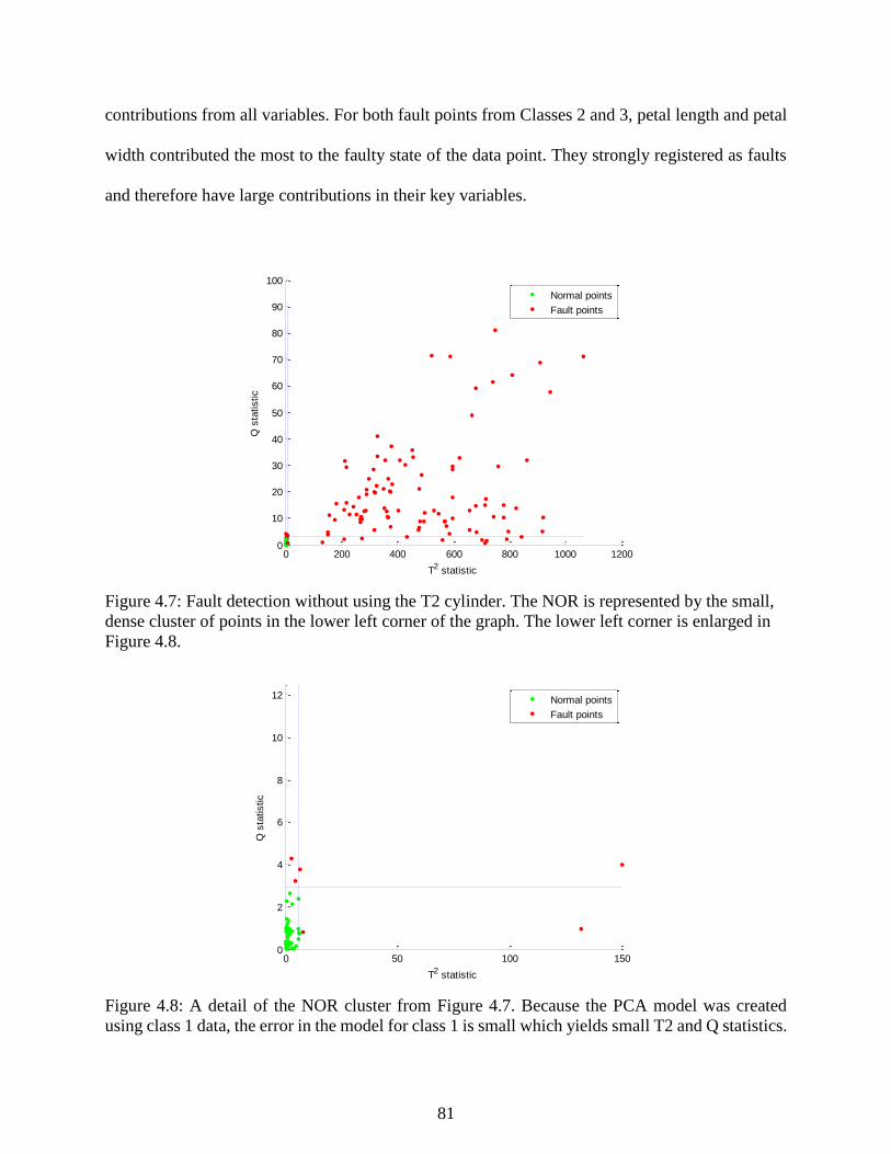
81
contributions from all variables. For both fault points from Classes 2 and 3, petal length and petal
width contributed the most to the faulty state of the data point. They strongly registered as faults
and therefore have large contributions in their key variables.
Figure 4.7: Fault detection without using the T2 cylinder. The NOR is represented by the small,
dense cluster of points in the lower left corner of the graph. The lower left corner is enlarged in
Figure 4.8.
Figure 4.8: A detail of the NOR cluster from Figure 4.7. Because the PCA model was created
using class 1 data, the error in the model for class 1 is small which yields small T2 and Q statistics.
0 200 400 600 800 1000 12000
10
20
30
40
50
60
70
80
90
100
T2 statistic
Q s
tatistic
Normal points
Fault points
0 50 100 1500
2
4
6
8
10
12
T2 statistic
Q s
tatistic
Normal points
Fault points
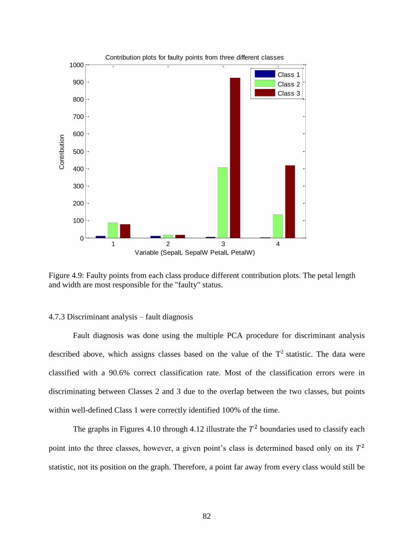
82
Figure 4.9: Faulty points from each class produce different contribution plots. The petal length
and width are most responsible for the "faulty" status.
4.7.3 Discriminant analysis – fault diagnosis
Fault diagnosis was done using the multiple PCA procedure for discriminant analysis
described above, which assigns classes based on the value of the T2 statistic. The data were
classified with a 90.6% correct classification rate. Most of the classification errors were in
discriminating between Classes 2 and 3 due to the overlap between the two classes, but points
within well-defined Class 1 were correctly identified 100% of the time.
The graphs in Figures 4.10 through 4.12 illustrate the 𝑇2 boundaries used to classify each
point into the three classes, however, a given point’s class is determined based only on its 𝑇2
statistic, not its position on the graph. Therefore, a point far away from every class would still be
1 2 3 40
100
200
300
400
500
600
700
800
900
1000Contribution plots for faulty points from three different classes
Variable (SepalL SepalW PetalL PetalW)
Contr
ibution
Class 1
Class 2
Class 3
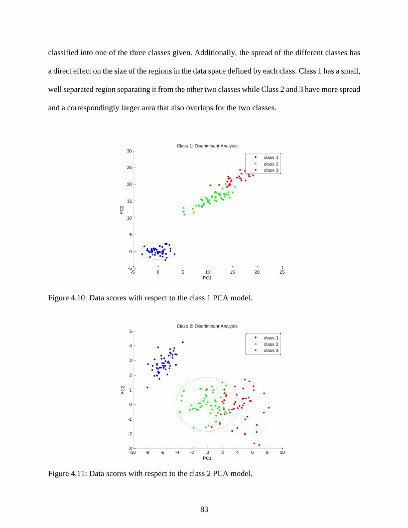
83
classified into one of the three classes given. Additionally, the spread of the different classes has
a direct effect on the size of the regions in the data space defined by each class. Class 1 has a small,
well separated region separating it from the other two classes while Class 2 and 3 have more spread
and a correspondingly larger area that also overlaps for the two classes.
Figure 4.10: Data scores with respect to the class 1 PCA model.
Figure 4.11: Data scores with respect to the class 2 PCA model.
-5 0 5 10 15 20 25-5
0
5
10
15
20
25
30Class 1: Discriminant Analysis
PC1
PC
2
class 1
class 2
class 3
-10 -8 -6 -4 -2 0 2 4 6 8 10-3
-2
-1
0
1
2
3
4
5Class 2: Discriminant Analysis
PC1
PC
2
class 1
class 2
class 3
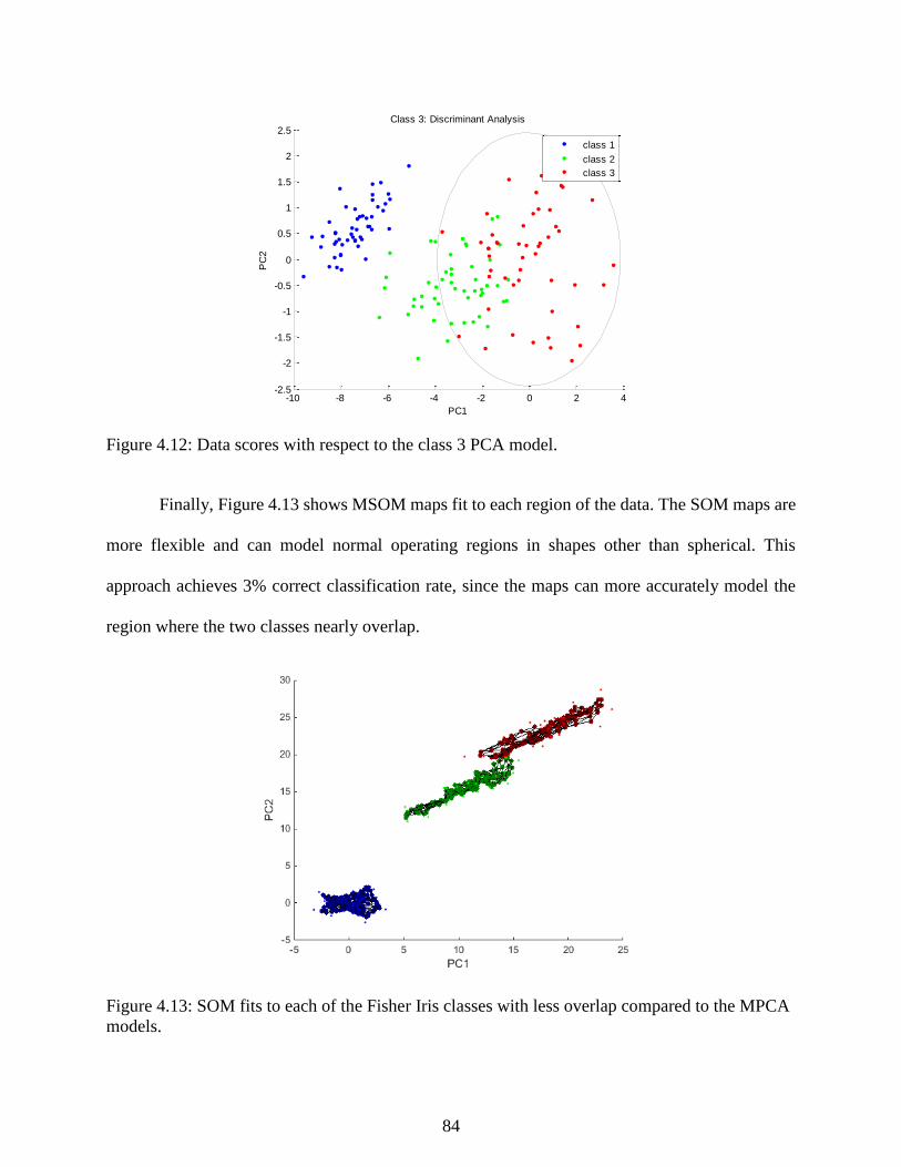
84
Figure 4.12: Data scores with respect to the class 3 PCA model.
Finally, Figure 4.13 shows MSOM maps fit to each region of the data. The SOM maps are
more flexible and can model normal operating regions in shapes other than spherical. This
approach achieves 3% correct classification rate, since the maps can more accurately model the
region where the two classes nearly overlap.
Figure 4.13: SOM fits to each of the Fisher Iris classes with less overlap compared to the MPCA
models.
-10 -8 -6 -4 -2 0 2 4-2.5
-2
-1.5
-1
-0.5
0
0.5
1
1.5
2
2.5Class 3: Discriminant Analysis
PC1
PC
2
class 1
class 2
class 3

85
4.8 References
Chiang L. H., Russell E. L., & Braatz, R. D. (2000). Fault detection in chemical processes using
Fischer discriminant analysis, discriminant partial least squares, and principal component
analysis. Chemometrics and Intelligent Laboratory Systems, 50, 243-252.
Davies, D. L., & Bouldin, D. W. (1979). A cluster separation measure. IEEE Transactions on
Pattern Analysis and Machine Intelligence, 1(2), 224-227.
Himberg, J. (2001). From insights to innovations: Data mining, visualization, and user interfaces.
(Doctoral dissertation). Retrieved from http://lib.tkk.fi/Diss/2004/ isbn9512273373/
Kaski, S. (1997). Data exploration using self-organizing maps. (Doctoral dissertation). Retrieved
from http://users.ics.aalto.fi/sami/thesis/
Kohonen, T., Oja, E., Simula, O., Visa, A., & Kangas, J. (1996). Engineering applications of the
self-organizing map. Proceedings of the IEEE, 84(10), 1358-1384.
Kohonen, T. (2000). Self-organizing maps. Berlin: Springer-Verlag.
Kramer, M. A. (1991). Nonlinear principal component analysis using autoassociative neural
networks. American Institute of Chemical Engineers Journal, 37(2), 233-243.
Ku, W., Storer, R. H., & Georgakis, C. (1995). Disturbance detection and isolation by dynamic
principal component analysis. Chemometrics and Intelligent Laboratory Systems, 30, 179-
196.
Lampinen, J., & Kostiainen, T. (2000). Self-organizing maps in data analysis – Notes on
overfitting and overinterpretation. Proceedings of the European Symposium on Artificial
Neural Networks, 239-244.
Nomikos, P., & Macgregor, J. F. (1994). Monitoring batch processes using multiway principal
component analysis. American Institute of Chemical Engineers Journal, 40(8), 1361-1375.
Raich, A., & Cinar, A. (1996). Statistical process monitoring and disturbance diagnosis in
multivariable continuous processes. American Institute of Chemical Engineers Journal,
42(4), 995-1009.
Robertson, G., Thomas, M. C., & Romagnoli, J. A. (2015). Topological preservation techniques
for nonlinear process monitoring. Computers and Chemical Engineering, 76, 1-16.
Romagnoli, J. A., & Palazoglu, A. (2012). Introduction to process control. Boca Raton: Taylor
and Francis Group.
Russell, E. L., Chiang, L. H., & Braatz, R. D. (2000). Data-driven techniques for fault detection
and diagnosis in chemical processes. London: Springer.

86
Shewhart, W. A. (1931). Economic control of quality of manufactured product. New York: Van
Nostrand.
Tan, P., Steinbach, M., & Kumar, V. (2006). Introduction to Data Mining. Boston: Longman.
Ultsch, A. (1993). Self-organizing neural networks for visualization and classification. In Opitz,
O., Lausen, B., & Klar, R. (Eds), Information and Classification (307-313). Berlin:
Springer.
Venkatasubramanian, V., Rengaswamy, R., Kavuir, S. N., & Yin, K. (2003). A review of process
fault detection and diagnosis part I: Quantitative model-based methods. Computers &
Chemical Engineering, 27, 293-311.
Vesanto, J., & Ahola, J. (1999). Hunting for correlations in data using the self-organizing map.
Proceedings of the International ICSC Congress on Computational Intelligence Methods
and Applications, 279-285.
Vesanto, J., & Alhoniemi, E. (2000). Clustering of the self-organizing map. IEEE Transactions
on Neural Networks, 11(3), 586-600.
Vesanto,L., Himberg, J., Alhoniemi, E., & Parhankangas, J. (2000). SOM toolbox for Matlab 5
[Computer software]. Helsinki University of Technology: Helsinki, Finland.
Vesanto, J. (2002). Data exploration process based on the self-organizing map. (Doctoral
dissertation). Retrieved from http://lib.tkk.fi/Diss/2002/isbn9512258978/
Wise, B. M., & Gallagher, N. B. (1996). The process chemometrics approach to process
monitoring and fault detection. Journal of Process Control, 6(6), 329-348.
Yao, Y., & Gao, F. (2009). A survey of multistage/multiphase statistical modeling methods for
batch processes. Annual Reviews in Control, 33, 172-183.

87
Chapter 5 - Case Study 1: Tennessee Eastman Process (TEP)
5.1 Introduction
Modern process monitoring is marked by the extensive use of advanced computer systems
and large numbers of sensors to determine if a plant is operating in a safe state and to detect when
a problem occurs. Identifying these states can be difficult due to the large number of variables
measured, but data driven methods offer ways to quickly and efficiently extract useful information
from the large data sets common in process industries. The goal of process monitoring systems is
to detect and manage faults in order to minimize downtime, increase safety, reduce manufacturing
costs, and improve performance.
Creating process monitoring systems for chemical manufacturing units from scratch is a
challenging task. The most effective process monitoring and data classification methods are
supervised, meaning that the data must be supplied with labels for model fitting. In practice, data
are seldom labelled, and creating labelled process data is a time-consuming process that requires
a large amount of process knowledge. Further, the definition of “normal” data can change with
each turnaround and maintenance cycle of process equipment. Implementing and maintaining
process monitoring and fault detection algorithms could be greatly simplified with unsupervised
learning techniques like data clustering and dimensionality reduction.
In this chapter, we demonstrate how data clustering and dimensionality reduction can be
used to discover fault classes in historical databases, and we apply the process monitoring
methodologies described in Chapter 4 to detecting process fault events. The data studied is drawn
from the benchmark Tennessee Eastman process (TEP). We test the ability of different
combinations of data clustering and dimensionality reduction at effectively recreating the faults of
the TEP using supervised cluster evaluation metrics. Next, we train process monitoring algorithms

88
using PCA, NLPCA, SOM, and MSOM for the detection, identification, and diagnosis of TEP
faults. Both studies first consider a reduced data set of TEP faults for a simpler illustration and
analysis of the effectiveness of the methods tested, followed by studying performance on the
complete data set of 20 TEP faults.
Section 5.2 describes the TEP and its set of pre-programmed faults. Section 5.3 presents
the results of the data clustering and DR study. Section 5.4 contains the process monitoring study
of the fault detection, identification, and diagnosis of the TEP faults. Section 5.5 summarizes the
results and offers conclusions.
5.2 Tennessee Eastman Process Description
First introduced as a process control challenge problem by Downs and Vogel (1993), the
TEP is a simulation based on a real chemical process and has become an important benchmark in
the evaluation of process control and process monitoring techniques (Yin 2012). The process uses
four gaseous reactants (A, C, D, and E) to produce two liquid products (G and H) in competition
with an unwanted by-product (F) and in the presence of an inert (B). There are four competing
reactions related to temperature through Arrhenius laws, two producing desired products and the
others producing the by-product. The entire simulation includes five unit operations: a reactor,
condenser, separator, compressor, and a stripper. There are 41 measured variables, but many are
delayed composition measurements. Our approach ignored delayed composition measurements
and instead uses only the 22 measured variables defined in Table 5.1 along with 9 of the 12 original
manipulated variables (Ricker (1996) holds three manipulated variables constant) defined in Table
5.2. Downs and Vogel (1993) also defined 20 disturbances or faults for the challenge process (see
Table 5.3).
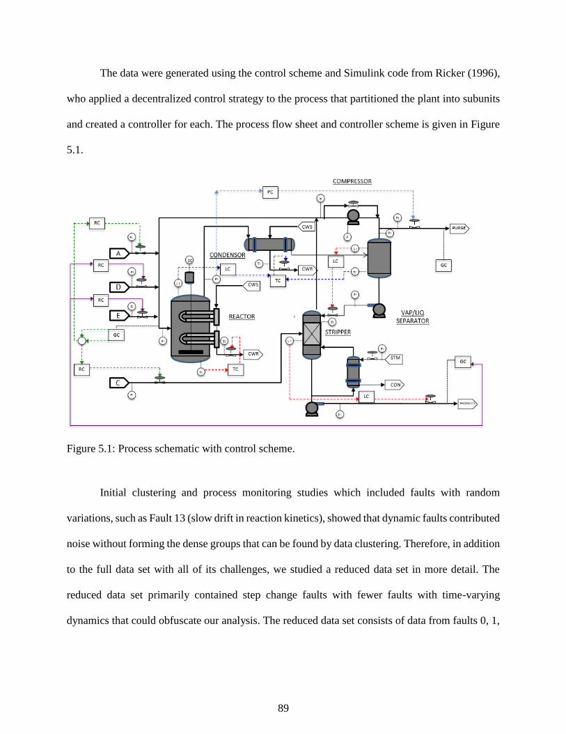
89
The data were generated using the control scheme and Simulink code from Ricker (1996),
who applied a decentralized control strategy to the process that partitioned the plant into subunits
and created a controller for each. The process flow sheet and controller scheme is given in Figure
5.1.
Figure 5.1: Process schematic with control scheme.
Initial clustering and process monitoring studies which included faults with random
variations, such as Fault 13 (slow drift in reaction kinetics), showed that dynamic faults contributed
noise without forming the dense groups that can be found by data clustering. Therefore, in addition
to the full data set with all of its challenges, we studied a reduced data set in more detail. The
reduced data set primarily contained step change faults with fewer faults with time-varying
dynamics that could obfuscate our analysis. The reduced data set consists of data from faults 0, 1,
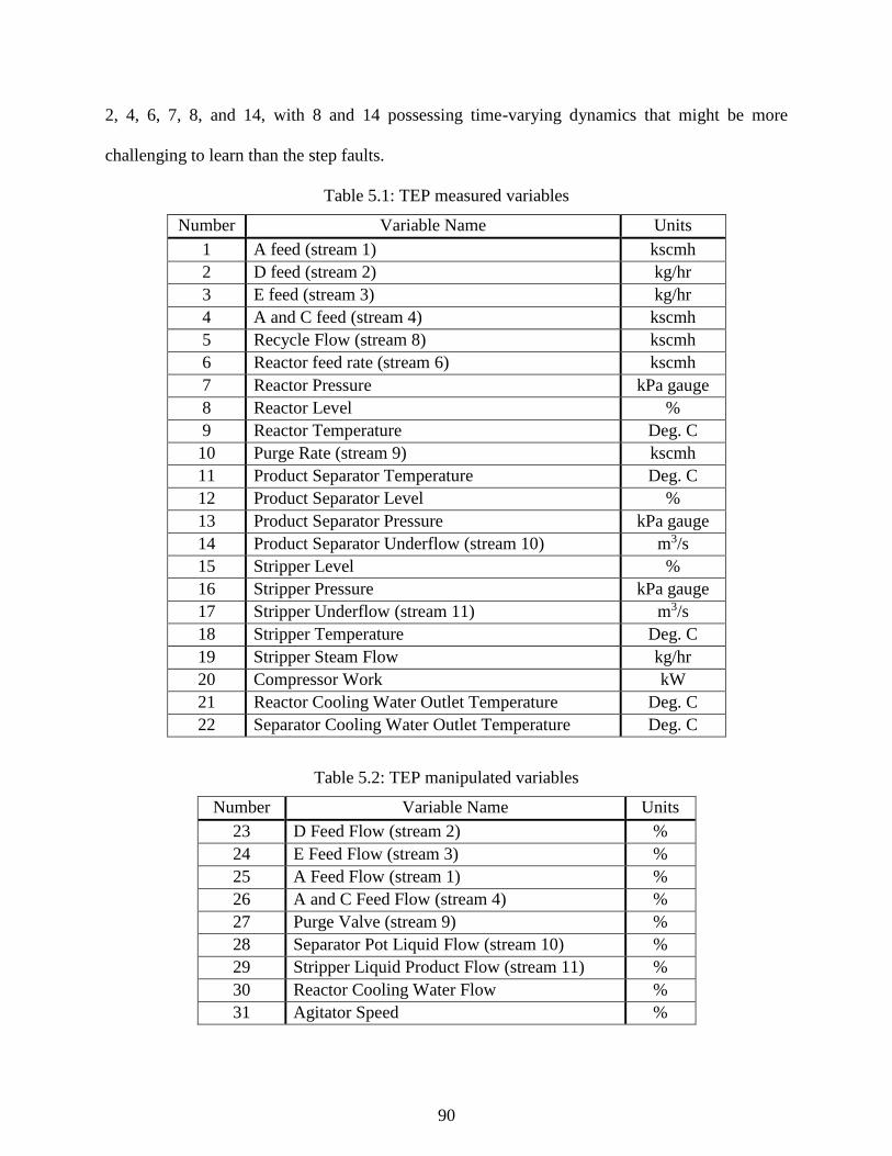
90
2, 4, 6, 7, 8, and 14, with 8 and 14 possessing time-varying dynamics that might be more
challenging to learn than the step faults.
Table 5.1: TEP measured variables
Number Variable Name Units
1 A feed (stream 1) kscmh
2 D feed (stream 2) kg/hr
3 E feed (stream 3) kg/hr
4 A and C feed (stream 4) kscmh
5 Recycle Flow (stream 8) kscmh
6 Reactor feed rate (stream 6) kscmh
7 Reactor Pressure kPa gauge
8 Reactor Level %
9 Reactor Temperature Deg. C
10 Purge Rate (stream 9) kscmh
11 Product Separator Temperature Deg. C
12 Product Separator Level %
13 Product Separator Pressure kPa gauge
14 Product Separator Underflow (stream 10) m3/s
15 Stripper Level %
16 Stripper Pressure kPa gauge
17 Stripper Underflow (stream 11) m3/s
18 Stripper Temperature Deg. C
19 Stripper Steam Flow kg/hr
20 Compressor Work kW
21 Reactor Cooling Water Outlet Temperature Deg. C
22 Separator Cooling Water Outlet Temperature Deg. C
Table 5.2: TEP manipulated variables
Number Variable Name Units
23 D Feed Flow (stream 2) %
24 E Feed Flow (stream 3) %
25 A Feed Flow (stream 1) %
26 A and C Feed Flow (stream 4) %
27 Purge Valve (stream 9) %
28 Separator Pot Liquid Flow (stream 10) %
29 Stripper Liquid Product Flow (stream 11) %
30 Reactor Cooling Water Flow %
31 Agitator Speed %

91
Table 5.3: TEP process faults description
Fault No. Description Type
1 A/C Feed Ratio, B Composition Constant (Stream 4) Step
2 B Composition, A/C Ratio Constant (Stream 4) Step
3 D Feed Temperature (Stream 2) Step
4 Reactor Cooling Water Inlet Temperature Step
5 Condenser Cooling Water Inlet Temperature Step
6 A Feed Loss (Stream 1) Step
7 C Header Pressure Loss - Reduced Availability (Stream 4) Step
8 A, B, C Feed Composition (Stream 4) Random Variation
9 D Feed Temperature (Stream 2) Random Variation
10 C Feed Temperature (Stream 2) Random Variation
11 Reactor Cooling Water Inlet Temperature Random Variation
12 Condenser Cooling Water Inlet Temperature Random Variation
13 Reaction Kinetics Slow Drift
14 Reactor Cooling Water Valve Sticking
15 Condenser Cooling Water Valve Sticking
16 Unknown
17 Unknown
18 Unknown
19 Unknown
20 Unknown
5.3 Tennessee Eastman Process Fault Extraction
The goal in our study of clustering and dimensionality reduction on the Tennessee Eastman
process is to examine how effectively various approaches to clustering extract different process
operating regimes from the data. In contrast to the separation tower study in Chapter 6 where the
data contain one large normal cluster and a much smaller fault cluster, the TEP simulates a variety
of behaviors including step changes, random variations, and other plant trends. An additional
advantage to using the simulation is that the ground truth classes are known with certainty which
allows the use of supervised cluster evaluation metrics.

92
5.3.1 Normal and fault 1: basic case
To demonstrate in a simple case our proposed approach to clustering, we first study two
simple operating regimes: normal operations and Fault 1, which is a step change in one of the feeds
to the process. Here, we would expect the clustering algorithm to reproduce the groups in the data
that might be difficult to find without projection and clustering. We project the data using PCA
and DBSCAN for this example, but any technique in this paper could accomplish this task.
Figure 5.2 projects the data to 3 principal components, showing the dense cluster
corresponding to normal operations as well as the transition to Fault 1’s steady state. Figure 5.3
shows the result of DBSCAN applied to the data set. Blue corresponds to the faulty data, green is
the normal cluster, and the black data is identified by the DBSCAN algorithm as noise. Figure 5.4
and 5.5 point to how to use clustering results to reveal knowledge from data sets. Coloring a time
series plot of the evolution of the Stream 4 flow with the clusters found by DBSCAN, green, blue,
and noise groups can be clearly connected to changes in Stream 4 and studied as separate process
states. This result can reveal the dominant behavior of each cluster and, if the ultimate goal is the
creation of a process monitoring algorithm, it can be used to separate normal and faulty groups for
training.
5.3.2: Reduced TEP data set
We consider a reduced data set consisting of TEP faults 0, 1, 2, 4, 6, 7, 8, and 14 because
the results are simpler to analyze and visualize than a data set including all 20 TEP faults studied
later. Most of these faults are step changes that are simpler to detect, but faults 8 and 14 express
dynamic, non-linear variations that do not form into a dense group, and might disrupt the clustering
of other data. All data studied were first normalized to zero mean and unit variance with respect
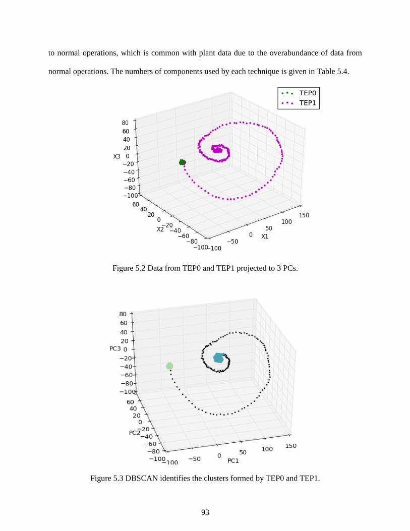
93
to normal operations, which is common with plant data due to the overabundance of data from
normal operations. The numbers of components used by each technique is given in Table 5.4.
Figure 5.2 Data from TEP0 and TEP1 projected to 3 PCs.
Figure 5.3 DBSCAN identifies the clusters formed by TEP0 and TEP1.
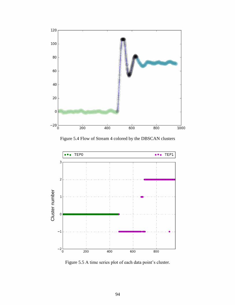
94
Figure 5.4 Flow of Stream 4 colored by the DBSCAN clusters
Figure 5.5 A time series plot of each data point’s cluster.
Clu
ste
r n
um
be
r

95
Table 5.4: Number of components used by DR projections in clustering TEP data
PCA ICA KPCA Isomap SE
Reduced 7 7 8 7 7
Full 9 9 11 9 9
Table 5.5 gives the cluster evaluation results of four data clustering techniques and
dimensionality reduction techniques applied in the manner described in Section 3.5. Each
clustering in Table 5.5 had the best ARI among the five clustering parameters tested according to
the method described in Section 3.5. The complete set of clustering results can be found in
Appendix A. The best homogeneity, completeness, and ARI observed on each data set is shaded,
but the most accurate reconstruction of the original TEP classes will have the highest ARI. The
number of clusters is also important as the most desirable number of clusters matches the number
of true clusters in the database. In practice, a perfect result is rare, but a large number of clusters
can obfuscate useful groupings in the data and makes an engineer’s job of interpreting clustering
results more difficult.
Judging by ARI, DBSCAN without any DR produced the most accurate duplication of the
true data clusters closely followed by SE reduced k-means results. Many techniques were
successful due to the data set’s bias towards step change faults which often give rise to well-defined
spherical clusters. As can be seen in Figure 5.6, the clusters found by DBSCAN without
dimensionality reduction most closely match the true groups of TEP data. DBSCAN successfully
found groups of all step faults except Fault 6, and even grouped data from valve sticking in Fault
14. Data from Fault 6 (A feed loss) and 8 (random feed composition variations) were all classified
into the “noise”.
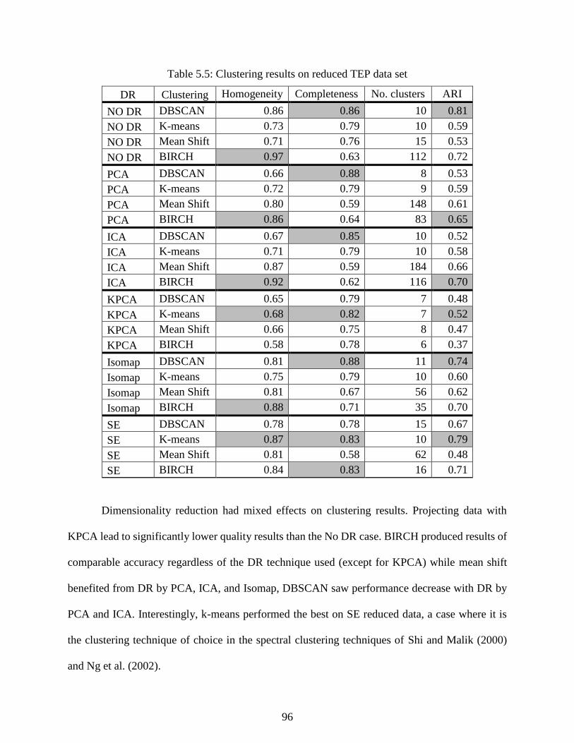
96
Table 5.5: Clustering results on reduced TEP data set
DR Clustering Homogeneity Completeness No. clusters ARI
NO DR DBSCAN 0.86 0.86 10 0.81
NO DR K-means 0.73 0.79 10 0.59
NO DR Mean Shift 0.71 0.76 15 0.53
NO DR BIRCH 0.97 0.63 112 0.72
PCA DBSCAN 0.66 0.88 8 0.53
PCA K-means 0.72 0.79 9 0.59
PCA Mean Shift 0.80 0.59 148 0.61
PCA BIRCH 0.86 0.64 83 0.65
ICA DBSCAN 0.67 0.85 10 0.52
ICA K-means 0.71 0.79 10 0.58
ICA Mean Shift 0.87 0.59 184 0.66
ICA BIRCH 0.92 0.62 116 0.70
KPCA DBSCAN 0.65 0.79 7 0.48
KPCA K-means 0.68 0.82 7 0.52
KPCA Mean Shift 0.66 0.75 8 0.47
KPCA BIRCH 0.58 0.78 6 0.37
Isomap DBSCAN 0.81 0.88 11 0.74
Isomap K-means 0.75 0.79 10 0.60
Isomap Mean Shift 0.81 0.67 56 0.62
Isomap BIRCH 0.88 0.71 35 0.70
SE DBSCAN 0.78 0.78 15 0.67
SE K-means 0.87 0.83 10 0.79
SE Mean Shift 0.81 0.58 62 0.48
SE BIRCH 0.84 0.83 16 0.71
Dimensionality reduction had mixed effects on clustering results. Projecting data with
KPCA lead to significantly lower quality results than the No DR case. BIRCH produced results of
comparable accuracy regardless of the DR technique used (except for KPCA) while mean shift
benefited from DR by PCA, ICA, and Isomap, DBSCAN saw performance decrease with DR by
PCA and ICA. Interestingly, k-means performed the best on SE reduced data, a case where it is
the clustering technique of choice in the spectral clustering techniques of Shi and Malik (2000)
and Ng et al. (2002).

97
In addition to evaluations of the overall clustering, we can use a time series plot of cluster
membership where vertical position indicates cluster membership to evaluate how well the
individual faults were learned. Figure 5.6 through 5.9 gives a sampling of cluster series plots.
Clusters found by DBSCAN with no DR largely correspond to the original sets from the TEP
simulation, though transitions between steady states as well as all of Fault 8 and Fault 14 were
designated as “noise”. In Figure 5.7, DBSCAN with PCA finds many of the same clusters but
incorrectly combined data from faults 4, 6, and 14. In the simulation, Fault 4 and 14 both affect
the cooling water of the reactor, so the PCA clustering results suggest that PCA removed the
information in the cooling water temperature sensor’s data. Figure 5.8 shows K-means incorrectly
associating large amounts of data with normal operations, which can result when K-means seeks
to impose spherical clusters on groups of data that are not spherical. Figure 5.9 shows a case where
a high ARI was calculated, but the data from some classes are inconveniently divided into multiple
clusters.
In several cases where mean shift and BIRCH produced a large number of clusters, a good
homogeneity and completeness is still observed because many of these clusters have less than 10
members. Unlike DBSCAN, mean shift and BIRCH do not define clusters with one member as
noise, which leads to the large cluster count of these techniques. Figure 5.10, a. shows the
clustering results of mean shift data reduced by ICA, where the algorithm found many clusters
containing one or two members. Enforcing the same requirement from DBSCAN that each cluster
has a minimum of 10 points leads to the plot in Figure 5.10, b. with 20 clusters and a slightly
improved ARI of 0.71. For the cases studied here, enforcing a minimum number of points had only
minor effects on ARI in cases where mean shift or BRICH output large numbers of clusters, and
therefore we use only the basic clustering algorithm for simplicity.
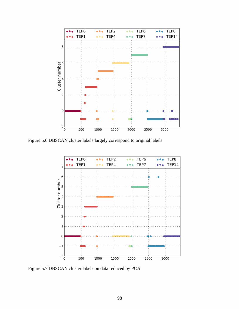
98
Figure 5.6 DBSCAN cluster labels largely correspond to original labels
Figure 5.7 DBSCAN cluster labels on data reduced by PCA
Clu
ster
nu
mb
er
Clu
ster
nu
mb
er
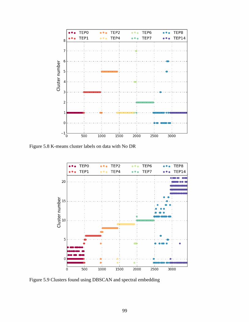
99
Figure 5.8 K-means cluster labels on data with No DR
Figure 5.9 Clusters found using DBSCAN and spectral embedding
Clu
ster
nu
mb
er
Clu
ster
nu
mb
er
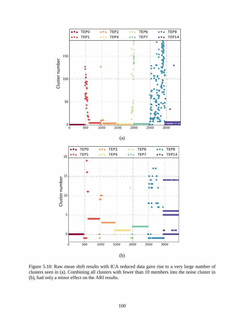
100
(a)
(b)
Figure 5.10: Raw mean shift results with ICA reduced data gave rise to a very large number of
clusters seen in (a). Combining all clusters with fewer than 10 members into the noise cluster in
(b), had only a minor effect on the ARI results.
Clu
ster
nu
mb
er
Clu
ster
nu
mb
er
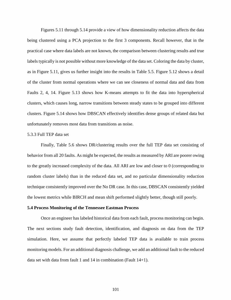
101
Figures 5.11 through 5.14 provide a view of how dimensionality reduction affects the data
being clustered using a PCA projection to the first 3 components. Recall however, that in the
practical case where data labels are not known, the comparison between clustering results and true
labels typically is not possible without more knowledge of the data set. Coloring the data by cluster,
as in Figure 5.11, gives us further insight into the results in Table 5.5. Figure 5.12 shows a detail
of the cluster from normal operations where we can see closeness of normal data and data from
Faults 2, 4, 14. Figure 5.13 shows how K-means attempts to fit the data into hyperspherical
clusters, which causes long, narrow transitions between steady states to be grouped into different
clusters. Figure 5.14 shows how DBSCAN effectively identifies dense groups of related data but
unfortunately removes most data from transitions as noise.
5.3.3 Full TEP data set
Finally, Table 5.6 shows DR/clustering results over the full TEP data set consisting of
behavior from all 20 faults. As might be expected, the results as measured by ARI are poorer owing
to the greatly increased complexity of the data. All ARI are low and closer to 0 (corresponding to
random cluster labels) than in the reduced data set, and no particular dimensionality reduction
technique consistently improved over the No DR case. In this case, DBSCAN consistently yielded
the lowest metrics while BIRCH and mean shift performed slightly better, though still poorly.
5.4 Process Monitoring of the Tennessee Eastman Process
Once an engineer has labeled historical data from each fault, process monitoring can begin.
The next sections study fault detection, identification, and diagnosis on data from the TEP
simulation. Here, we assume that perfectly labeled TEP data is available to train process
monitoring models. For an additional diagnosis challenge, we add an additional fault to the reduced
data set with data from fault 1 and 14 in combination (Fault 14+1).
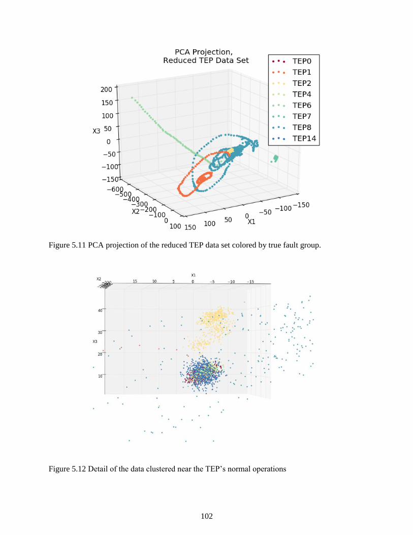
102
Figure 5.11 PCA projection of the reduced TEP data set colored by true fault group.
Figure 5.12 Detail of the data clustered near the TEP’s normal operations
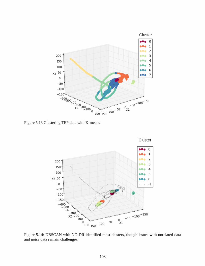
103
Figure 5.13 Clustering TEP data with K-means
Figure 5.14: DBSCAN with NO DR identified most clusters, though issues with unrelated data
and noise data remain challenges.
Cluster
No.
Cluster
No.
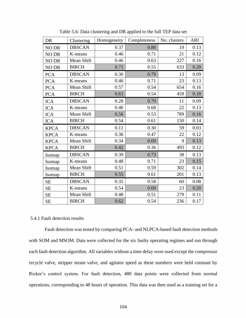
104
Table 5.6: Data clustering and DR applied to the full TEP data set
DR Clustering Homogeneity Completeness No. clusters ARI
NO DR DBSCAN 0.37 0.80 19 0.13
NO DR K-means 0.46 0.71 21 0.12
NO DR Mean Shift 0.46 0.63 227 0.16
NO DR BIRCH 0.71 0.55 633 0.20
PCA DBSCAN 0.30 0.79 13 0.09
PCA K-means 0.46 0.71 23 0.13
PCA Mean Shift 0.57 0.54 654 0.16
PCA BIRCH 0.63 0.54 459 0.18
ICA DBSCAN 0.28 0.79 11 0.09
ICA K-means 0.46 0.68 22 0.13
ICA Mean Shift 0.56 0.53 789 0.16
ICA BIRCH 0.54 0.61 150 0.14
KPCA DBSCAN 0.11 0.30 59 0.03
KPCA K-means 0.36 0.47 22 0.12
KPCA Mean Shift 0.34 0.69 9 0.13
KPCA BIRCH 0.42 0.36 493 0.12
Isomap DBSCAN 0.39 0.73 38 0.13
Isomap K-means 0.48 0.71 23 0.15
Isomap Mean Shift 0.51 0.59 302 0.14
Isomap BIRCH 0.55 0.61 201 0.13
SE DBSCAN 0.35 0.58 60 0.08
SE K-means 0.54 0.69 23 0.20
SE Mean Shift 0.48 0.51 279 0.11
SE BIRCH 0.62 0.54 236 0.17
5.4.1 Fault detection results
Fault detection was tested by comparing PCA- and NLPCA-based fault detection methods
with SOM and MSOM. Data were collected for the six faulty operating regimes and run through
each fault detection algorithm. All variables without a time delay were used except the compressor
recycle valve, stripper steam valve, and agitator speed as these numbers were held constant by
Ricker’s control system. For fault detection, 480 data points were collected from normal
operations, corresponding to 48 hours of operation. This data was then used as a training set for a

105
SOM, PCA and NLPCA models of normal operations. An SOM map of normal operations was fit
for the MSOM strategy and the QE bound for normal operation was found using the optimization
described in section 3.2. For PCA, an alpha significance level of 0.01 was used to determine the
T2-Q boundaries for normality. Principal components (PCs) were included in the model so 99% of
the variance of the original data set was included – or 26 PCs. The number of mapping nodes used
by NLPCA was the same as the number of components retained by PCA. The threshold SPE value
representing a faulty condition was calculated similar to the MSOM probably bound calculation.
The correct detection rates of the two methods over the data sets of interest are given in
Tables 5.7 and 5.8. Table 5.9 illustrates the false alarm rates found by each method on the 20 fault
data set. Overall, for this application, MSOM performs as well as MPCA in detecting the simulated
data and both of them outperform 1-SOM. For NLPCA, the results vary between runs of the
algorithm based on the random initialization of the neurons, and the results given here represent a
typical result of the algorithm.
5.4.2 Fault identification results
Fault identification was performed on data sets from the TEP according to the PCA method
and the MSOM method proposed in Section 3.2. Contribution plots of faulty data points from each
fault were analyzed and compared with contribution plots calculated by a PCA method and our
process knowledge to evaluate the proposed method’s ability to isolate the causes of the faulty
condition. Sometimes, the root causes of the problem are not in variables we have data for, so the
goals of fault identification are to isolate a subsection of the plant where the root causes of the
issue are likely located and to give engineers useful clues on how to identify them. In Figure 5.15,
we used a data vector roughly 10 hours after the imposition of the faulty condition to create

106
Table 5.7: Fault detection rate of MPCA and MSOM
Detection Rate (%)
TEP fault MPCA NLPCA 1-SOM* MSOM
1 99.9% 99.9% 97.8% 99.9%
8 99.4% 99.4% 82.7% 99.3%
11 99.3% 99.3% 79.1% 99.0%
13 99.5% 99.5% 88.3% 99.5%
14 99.9% 99.9% 94.8% 99.9%
14+1 99.9% 99.9% 90.3% 99.9%
* The results for SOM given here are the same as those in Table 5.10 from the diagnosis results
since diagnosis and detection are the same step when 1-SOM is used. They are included in this
table in order to facilitate a comparison with the other techniques.
Table 5.8: Fault detection results for all 20 faults
% Detected
TEP Fault MPCA NLPCA 1-SOM* MSOM
1 99.9% 99.9% 98.0% 99.9%
2 97.8% 97.7% 90.5% 97.8%
3 9.8% 3.1% 34.5% 9.9%
4 99.9% 99.9% 97.4% 99.9%
5 4.0% 2.1% 21.7% 6.5%
6 100.0% 100.0% 94.4% 100.0%
7 100.0% 100.0% 99.7% 100.0%
8 99.4% 99.4% 74.4% 99.4%
9 13.6% 5.6% 20.5% 16.0%
10 97.1% 91.3% 73.9% 93.0%
11 99.3% 99.0% 58.3% 99.5%
12 55.9% 40.9% 51.2% 59.9%
13 99.5% 99.5% 77.8% 99.5%
14 99.9% 99.9% 79.6% 99.9%
15 4.5% 1.8% 15.9% 7.2%
16 3.3% 1.8% 0.0% 5.7%
17 99.7% 99.6% 87.8% 99.7%
18 87.8% 79.7% 71.0% 87.4%
19 99.7% 99.5% 93.1% 99.6%
20 99.6% 99.5% 98.0% 99.5%
* The results for SOM given here are the same as those in Table 5.11, since diagnosis and
detection are the same step when 1-SOM is used. They are included in this table in order to
facilitate a comparison with the other techniques.

107
Table 5.9: False alarm rates of the four techniques from the analysis in Table 5.8
MPCA NLPCA* 1-SOM MSOM
3.3% 1.8-25% 81.9% 5.0%
* Results vary between runs of the algorithm based on the random initialization of the neurons.
contribution plots as illustrative examples of the proposed method. A table of the variable
numbers and names can be found in Tables 5.1 and 5.2.
In Figure 5.15, contribution plots generated from Fault 1 data are compared. In response to
the changes in the composition of the feed, the composition controller on the reactor feed creates
changes in streams 1 and 4 in response to the disturbance. Both PCA and MSOM point to a
disturbance in the composition of the feeds to the process since the plots indicate that variables
associated with the feeds (stream 1 through 4) have significant contributions. In both cases, the
variable with the largest contribution is the controller output to stream 1, and based on the
knowledge that stream 1 and 4 are in the same control loop, this points to a feed composition issue.
Applying a similar analysis to Fault 13, MSOM successfully reproduces the results of PCA
in isolating the fault to changes in the pressure of the reactor and in the separation units following
the reactor. Dramatic changes in all of these variables at the same time could point to a change in
the reactor outlet’s composition. In fact, Fault 13 creates a “slow drift” in the kinetics of the reactor.
The result is wild variations spread over many process variables, but both methods successfully
isolate the signal to a subset of variables related to the reactor and its composition.
Faults 11 and 14 are illustrative of the value of using MSOM. Both faults relate to the
cooling water of the reactor, which may not be very important to the PCA model, as under normal
operations reactor cooling water flow remains relatively constant. The result for Fault 11 and 14
is that when a fault related to the cooling water occurs, cooling water variables have low weights
in favor of more variable flow variables. For fault identification, MSOM uses all online measured
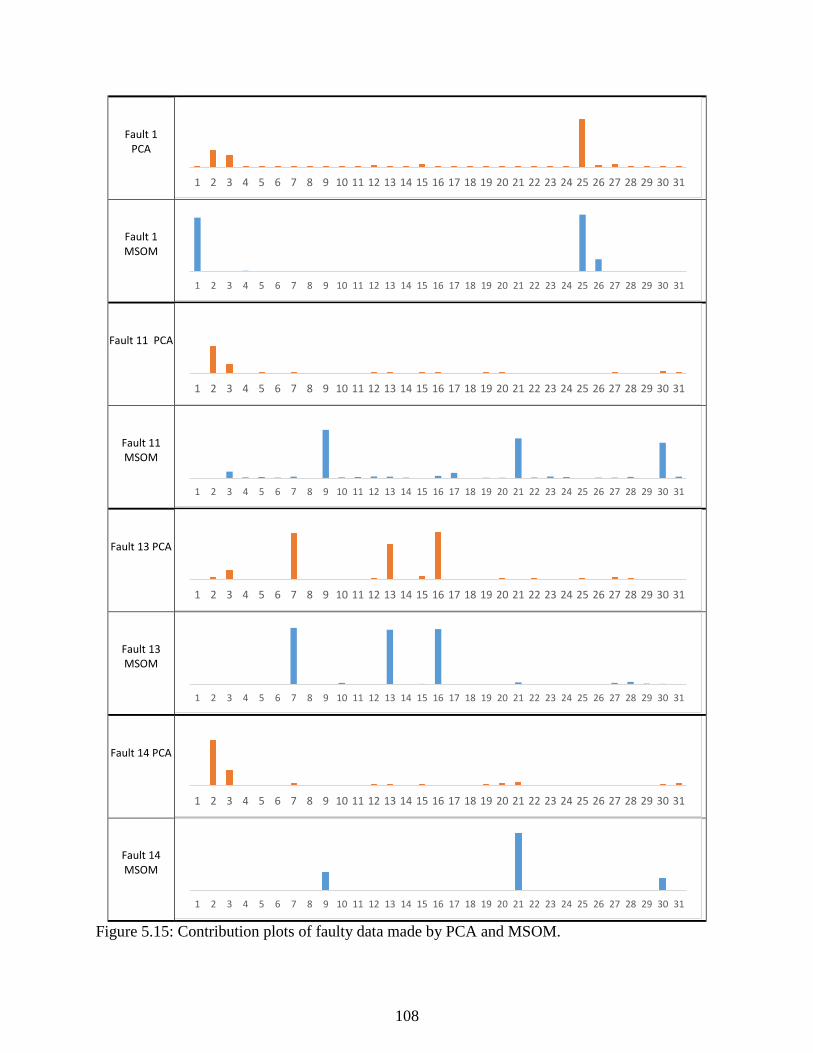
108
Fault 1 PCA
Fault 1 MSOM
Fault 11 PCA
Fault 11 MSOM
Fault 13 PCA
Fault 13 MSOM
Fault 14 PCA
Fault 14 MSOM
Figure 5.15: Contribution plots of faulty data made by PCA and MSOM.
1 2 3 4 5 6 7 8 9 10 11 12 13 14 15 16 17 18 19 20 21 22 23 24 25 26 27 28 29 30 31
1 2 3 4 5 6 7 8 9 10 11 12 13 14 15 16 17 18 19 20 21 22 23 24 25 26 27 28 29 30 31
1 2 3 4 5 6 7 8 9 10 11 12 13 14 15 16 17 18 19 20 21 22 23 24 25 26 27 28 29 30 31
1 2 3 4 5 6 7 8 9 10 11 12 13 14 15 16 17 18 19 20 21 22 23 24 25 26 27 28 29 30 31
1 2 3 4 5 6 7 8 9 10 11 12 13 14 15 16 17 18 19 20 21 22 23 24 25 26 27 28 29 30 31
1 2 3 4 5 6 7 8 9 10 11 12 13 14 15 16 17 18 19 20 21 22 23 24 25 26 27 28 29 30 31
1 2 3 4 5 6 7 8 9 10 11 12 13 14 15 16 17 18 19 20 21 22 23 24 25 26 27 28 29 30 31
1 2 3 4 5 6 7 8 9 10 11 12 13 14 15 16 17 18 19 20 21 22 23 24 25 26 27 28 29 30 31

109
variables and weighs them equally. The result is that while PCA appears to point to more changes
in feed streams, MSOM’s largest contribution variables clearly point to the specific problem with
the reactor and its cooling water.
The plots in Figure 5.15 illustrate MSOM’s superior ability in identifying variables
responsible for a deviation from normal operation. The data compression abilities of SOM help
identification by reducing the noise in individual data without the loss of information that comes
with performing a dimensionality reduction using PCA. The next section will illustrate the
effectiveness of MSOM in diagnosing the faulty condition of the process.
5.4.3 Fault diagnosis results
In this section, the MSOM method proposed is used to classify data sets from the faults of
interest and compared to some standard techniques: MPCA, MNLPCA (NLPCA using fault-
specific neural networks trained to each fault as described in Section 4.3.4), and the standard form
of SOM which uses a single map for classification. In each case, a series of data from an operating
regime of the Tennessee Eastman process is given to each set of models, and every data point is
classified into the different fault categories using each technique’s discriminant function. PCA
uses Hotelling’s 𝑇2 statistic, 1-SOM uses a given data point’s BMU on the map of the process,
and MSOM uses the QE calculated relative to each fault’s SOM map.
From the results in Table 5.10, both 1-SOM and MSOM techniques represent a dramatic
improvement over conventional MPCA and MNLPCA fault diagnosis. 1-SOM gave fewer false
fault classifications, but MSOM had a better correct classification rate, particularly for the random
variation faults. As a benchmark, the performance of each method over all TEP faults is given in
Table 5.11. MSOM outperforms the other techniques with the exception of a few special cases. In
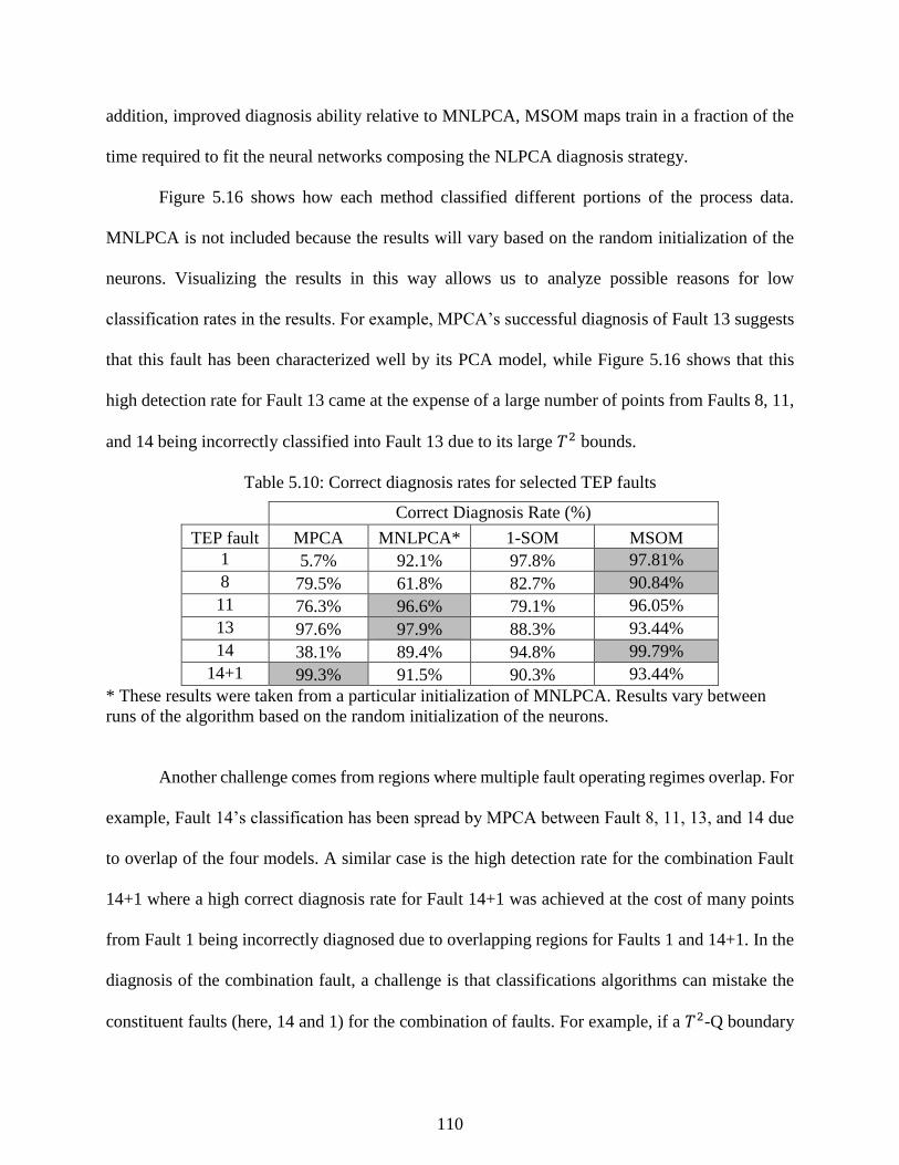
110
addition, improved diagnosis ability relative to MNLPCA, MSOM maps train in a fraction of the
time required to fit the neural networks composing the NLPCA diagnosis strategy.
Figure 5.16 shows how each method classified different portions of the process data.
MNLPCA is not included because the results will vary based on the random initialization of the
neurons. Visualizing the results in this way allows us to analyze possible reasons for low
classification rates in the results. For example, MPCA’s successful diagnosis of Fault 13 suggests
that this fault has been characterized well by its PCA model, while Figure 5.16 shows that this
high detection rate for Fault 13 came at the expense of a large number of points from Faults 8, 11,
and 14 being incorrectly classified into Fault 13 due to its large 𝑇2 bounds.
Table 5.10: Correct diagnosis rates for selected TEP faults
Correct Diagnosis Rate (%)
TEP fault MPCA MNLPCA* 1-SOM MSOM
1 5.7% 92.1% 97.8% 97.81%
8 79.5% 61.8% 82.7% 90.84%
11 76.3% 96.6% 79.1% 96.05%
13 97.6% 97.9% 88.3% 93.44%
14 38.1% 89.4% 94.8% 99.79%
14+1 99.3% 91.5% 90.3% 93.44%
* These results were taken from a particular initialization of MNLPCA. Results vary between
runs of the algorithm based on the random initialization of the neurons.
Another challenge comes from regions where multiple fault operating regimes overlap. For
example, Fault 14’s classification has been spread by MPCA between Fault 8, 11, 13, and 14 due
to overlap of the four models. A similar case is the high detection rate for the combination Fault
14+1 where a high correct diagnosis rate for Fault 14+1 was achieved at the cost of many points
from Fault 1 being incorrectly diagnosed due to overlapping regions for Faults 1 and 14+1. In the
diagnosis of the combination fault, a challenge is that classifications algorithms can mistake the
constituent faults (here, 14 and 1) for the combination of faults. For example, if a 𝑇2-Q boundary
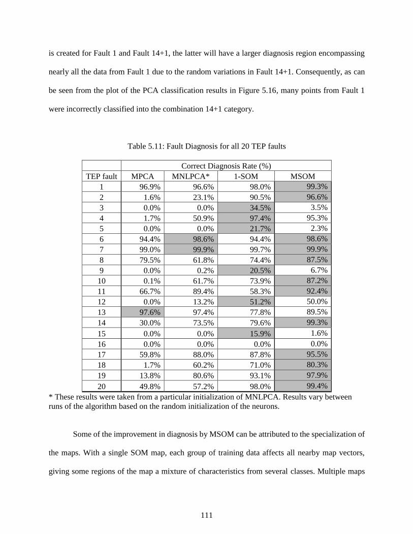
111
is created for Fault 1 and Fault 14+1, the latter will have a larger diagnosis region encompassing
nearly all the data from Fault 1 due to the random variations in Fault 14+1. Consequently, as can
be seen from the plot of the PCA classification results in Figure 5.16, many points from Fault 1
were incorrectly classified into the combination 14+1 category.
Table 5.11: Fault Diagnosis for all 20 TEP faults
Correct Diagnosis Rate (%)
TEP fault MPCA MNLPCA* 1-SOM MSOM
1 96.9% 96.6% 98.0% 99.3%
2 1.6% 23.1% 90.5% 96.6%
3 0.0% 0.0% 34.5% 3.5%
4 1.7% 50.9% 97.4% 95.3%
5 0.0% 0.0% 21.7% 2.3%
6 94.4% 98.6% 94.4% 98.6%
7 99.0% 99.9% 99.7% 99.9%
8 79.5% 61.8% 74.4% 87.5%
9 0.0% 0.2% 20.5% 6.7%
10 0.1% 61.7% 73.9% 87.2%
11 66.7% 89.4% 58.3% 92.4%
12 0.0% 13.2% 51.2% 50.0%
13 97.6% 97.4% 77.8% 89.5%
14 30.0% 73.5% 79.6% 99.3%
15 0.0% 0.0% 15.9% 1.6%
16 0.0% 0.0% 0.0% 0.0%
17 59.8% 88.0% 87.8% 95.5%
18 1.7% 60.2% 71.0% 80.3%
19 13.8% 80.6% 93.1% 97.9%
20 49.8% 57.2% 98.0% 99.4%
* These results were taken from a particular initialization of MNLPCA. Results vary between
runs of the algorithm based on the random initialization of the neurons.
Some of the improvement in diagnosis by MSOM can be attributed to the specialization of
the maps. With a single SOM map, each group of training data affects all nearby map vectors,
giving some regions of the map a mixture of characteristics from several classes. Multiple maps
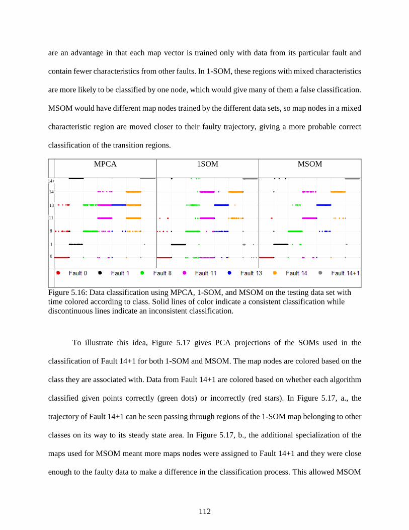
112
are an advantage in that each map vector is trained only with data from its particular fault and
contain fewer characteristics from other faults. In 1-SOM, these regions with mixed characteristics
are more likely to be classified by one node, which would give many of them a false classification.
MSOM would have different map nodes trained by the different data sets, so map nodes in a mixed
characteristic region are moved closer to their faulty trajectory, giving a more probable correct
classification of the transition regions.
MPCA 1SOM MSOM
Figure 5.16: Data classification using MPCA, 1-SOM, and MSOM on the testing data set with
time colored according to class. Solid lines of color indicate a consistent classification while
discontinuous lines indicate an inconsistent classification.
To illustrate this idea, Figure 5.17 gives PCA projections of the SOMs used in the
classification of Fault 14+1 for both 1-SOM and MSOM. The map nodes are colored based on the
class they are associated with. Data from Fault 14+1 are colored based on whether each algorithm
classified given points correctly (green dots) or incorrectly (red stars). In Figure 5.17, a., the
trajectory of Fault 14+1 can be seen passing through regions of the 1-SOM map belonging to other
classes on its way to its steady state area. In Figure 5.17, b., the additional specialization of the
maps used for MSOM meant more maps nodes were assigned to Fault 14+1 and they were close
enough to the faulty data to make a difference in the classification process. This allowed MSOM
Fault 0
Fault 0
Fault 1
Fault 1
Fault 8
Fault 8
Fault 11
Fault 11
Fault 13
Fault 13
Fault 14
Fault 14
Fault 114
Fault 114
Fault 0
Fault 0
Fault 1
Fault 1
Fault 8
Fault 8
Fault 11
Fault 11
Fault 13
Fault 13
Fault 14
Fault 14
Fault 114
Fault 114
Fault 0
Fault 0
Fault 1
Fault 1
Fault 8
Fault 8
Fault 11
Fault 11
Fault 13
Fault 13
Fault 14
Fault 14
Fault 114
Fault 114
14
14+
1
13
11
8
1
0

113
to correctly classify the early trajectory of Fault 14+1 better than 1-SOM. For faults with dynamics
like Fault 8, 11, and 13, the process state is constantly experiencing similar dynamics, and the
diagnosis results show the advantage MSOM provides in the classification of data from these
cases. Further, when the amount of faulty data is large compared to the amount of normal data
used in training, the region assigned to normal becomes small enough that false alarms become a
problem, as shown in the false alarm rate for SOM on the set of 20 faults given in Table 5.9.
a) b)
SOM MAP VECTOR COLOR:
Figure 5.17: PCA projections of data from Fault 14+1, the map used in 1-SOM classification (a),
and the map fit to Fault 14+1 in MSOM (b).
5.5 Conclusions
This research studied the complete process monitoring workflow proposed in Chapter 5 on
the Tennessee Eastman process simulation and applied all the steps from DR and clustering to
fault detection. Data clustering and DR functioned in tandem to isolate data from the different
faults in the process, information which is vital for training a supervised classification technique
for fault detection. We studied the performance of four different clustering techniques and six
-200 -150 -100 -50 0 50 100-60
-40
-20
0
20
40
60
PC1
PC
2
-160 -140 -120 -100 -80 -60 -40 -20 0 20-50
-40
-30
-20
-10
0
10
20
30
40
50
PC1
PC
2
Normal
region
Normal
region

114
different dimensionality reduction strategies. Performance varied greatly between different
combinations of clustering techniques and DR, and no one technique clearly outperformed the
others. On a reduced set containing many step faults, nearly all techniques effectively duplicated
the original labels; however, no technique performed satisfactorily on the data set containing all
TEP faults.
We introduce an SOM-based strategy for nonlinear process monitoring. In the proposed
approach, SOMs were extended to cover all aspects of process monitoring to develop a nonlinear
topological preservation approach. The aim was to mimic PCA by defining similar measures for
process monitoring and fault detection and diagnosis. In particular, fault diagnosis was performed
using multiple SOMs to characterize different fault classes, which enables the calculation of
contribution plots with respect to normal and improves the quality of the diagnosis. In this regard,
a number of contributions were proposed for detection, identification, and diagnosis of process
faults.
We compared the proposed MSOM process monitoring architecture to PCA, NLPCA, and
a more conventional SOM monitoring with data generated from the Tennessee Eastman process,
with a focus on faulty conditions containing non-linear variations with time that have not been
previously analyzed with SOM. The results indicate that MSOM outperforms MPCA and NLPCA
and also improves upon conventional SOM for fault diagnosis and identification steps. The fault
identification technique presented was extremely accurate at identifying the highest contributors
to faults in places where PCA was inaccurate.
5.6 References
Downs, J. J., & Vogel, E. F. (1993). A plant-wide industrial process control problem. Computers
and Chemical Engineering, 17(3), 245-255.

115
Ng, A., Jordan, M., & Weiss, Y. (2002). On spectral clustering: analysis and an algorithm. In T.
Dietterich, S. Becker, & Z. Ghahramani (Eds.), Advances in Neural Information
Processing Systems,(849 – 856). Cambridge: MIT Press.
Ricker, N. L. (1996). Decentralized control of the Tennessee Eastman challenge process. Journal
of Process Control, 6(4), 205-221.
Shi, J., & Malik, J. (2000). Normalized cuts and image segmentation. IEEE Transactions on
Pattern Analysis and Machine Intelligence, 22(8), 888 – 905.
Yin, S., Ding, S. X., Haghani, A., Hao, H., & Zhang, P. (2012). A comparison study of basic data-
driven fault diagnosis and process monitoring methods on the benchmark Tennessee
Eastman process. Journal of Process Control, 22, 1567-1581.

116
Chapter 6 - Case Study 2: Industrial Separation Tower
6.1 Introduction
The global trend in chemical process control towards increased automation, integration,
and computerization has led to the generation, use, and management of massive amounts of data.
Sifting through overwhelming amounts of information, plant engineers seek knowledge of what
events are occurring in a plant. Data-based algorithms for process monitoring and fault diagnosis
can give access to this event knowledge without the challenge of creating the detailed process
models required by alternative approaches.
Challenges to data-based process monitoring are many. First, the average control system
measures hundreds of variables every second and often important trends for the correct diagnosis
are hidden from plant operators beneath sensor noise. Second, the most effective process
monitoring algorithms require labeled data to fit fault classification models and often this
information is unavailable. Third, data-driven fault detection and diagnosis schemes are trained to
classify a subdivision of previously analyzed faults, but such a system can behave unpredictably
when a combination of faults occurs or the system encounters an unexpected novel fault. An
effective monitoring scheme must detect novel events and present information to plant operators
to help diagnose a new and unknown fault’s root causes.
In this chapter, we apply supervised and unsupervised classification techniques to the
analysis and monitoring of data from an industrial-scale separation tower. This research validates
the proposed approach to process monitoring on a manufacturing-scale unit, which presents
different challenges from the monitoring and mining data from the TEP simulation. The data
contains a novel event from a large process fault in a separation tower with economic costs in the
hundreds of thousands.

117
We study the monitoring of this unit from two perspectives. First, we consider the case
where we attempt use data clustering to isolate this process fault from within the historical database
months after it has occurred. We test different data clustering and dimensionality reduction
techniques on the task of extracting the fault data from six months of tower operations using the
dimensionality reduction and data clustering strategy used in Chapter 5 to separate data from
different TEP faults. The different methods are compared using supervised clustering metrics and
data labels created from expert knowledge of the process.
Second, we study how we could create a process monitoring regime which could have
detected and prevented the fault in the first place by fitting a model using data from before the
fault and validating process monitoring performance on six months of data containing the fault.
To study this separation tower and fault event from a process monitoring perspective, we use data
from previous years to train the map to model the expected operating states (startup, normal steady
state, and sensor fault) and test this strategy on data from a subsequent year containing a novel
process event occurring simultaneously with a common fault. SOM was compared to PCA in the
task of characterizing the operations of the separation tower, diagnosing its common operating
states, and detecting novel events.
An initial problem with training data-based models to represent the difference states of the
process arose from asymmetry in the size of data sets. To prevent normal operations from
dominating the map representation of the data and to create a more balanced representation on the
SOM, the data were balanced using SMOTE (Chawla 2002) for minority oversampling. The SOM
strategy was used in conjunction with K-means clustering to characterize the operating regimes
considered and assign model prototypes to each group in the training data. We demonstrate that

118
the proposed overall SOM strategy successfully detects the unknown event better than PCA and
provides information towards understanding the novel fault’s “hidden” root causes.
Section 6.2 provides a description of the industrial separation tower studied and further
information about the problem examined. Section 6.3 details the results of analyzing the data from
this tower using dimensionality reduction and data clustering. Section 6.4 details the process of
training the SOM model used for monitoring and novelty detection. Section 6.5 presents the results
of the process monitoring study on this tower including the isolation of data from a common fault
and fault detection and identification. Finally, Section 6.6 provides conclusions and summarizes
the results.
6.2 Separation Tower Process Description
An industrial separation tower was used to study fault detection and diagnosis as well as
data clustering to extract fault event information from historical data. Figure 6.1 presents a flow
sheet of the sensors and equipment considered with the measurements indicated in Table 6.1. The
feed to the system is produced by a reactor upstream and varies depending on the petroleum grade
fed into the system. The reactor and separation system is fed a number of different grades,
including two “standby” grades thus leading to a number of start-up conditions during the grade
changes. Different grades can result in large differences between many process variables as
visualized in Figure 6.2. The differences between operations based on grade can form a significant
separating factor in the data, therefore, in this case study it is important to consider each grade
independently.
Before entering the tower outlined in Figure 6.1, the feed is passed through Tank 1 to
remove water. Feed then enters the tower at a high temperature and pressure, and a mixture of
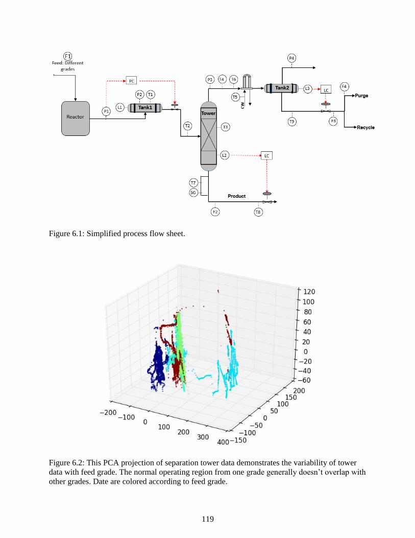
119
Figure 6.1: Simplified process flow sheet.
Figure 6.2: This PCA projection of separation tower data demonstrates the variability of tower
data with feed grade. The normal operating region from one grade generally doesn’t overlap with
other grades. Date are colored according to feed grade.

120
solvent and product leaves out the bottoms with extra solvent and any water leaving out of the top
of the column. Tank 2 removes any remaining water before recycling the solvent. To give a sense
of scale, the tower is approximately two stories tall. The specific gravity sensor at the bottom of
the column is used to evaluate the quality of the separation and to manually control the feed to the
tower by manipulating the flow of steam to Tank 2. The product quality specification is loosely
based on the composition of the polymer product in the bottoms of the tower evaluated by the
specific gravity analyzer (SG). The specific gravity is controlled by manipulating the amount of
steam fed to Tank 1.
In the fault detection and diagnosis section, a common fault (referred to as the “Tfault”)
lies in the SG and T7 sensors in the flash tower. These sensors work through the use of a small
side stream that occasionally gets clogged with polymer. Detection of this sensor fault is fairly
straightforward; however, it can “mask” other problems that may occur during operation. That is,
when the SG and T7 sensors report odd measurements, operators might believe that a typical clog
in the small side stream occurred when a different fault actually occurred.
Recently, a larger fault (the Novel Event) that created changes in many disparate process
variables occurred at the same time the sensor fault occurred, and the timely detection of this fault
could prevented losses in the hundreds of thousands dollars from off-spec product. This Novel
Event occurred at the same time as a more common sensor fault, which masked the existence of
the Novel Event. In this dissertation, we will consider two different aspects of this problem: the
isolation of the faulty data among months of data from normal operations data and creating an
algorithm to detect the Novel Event while diagnosing the state of the process.
To study how to diagnose this situation, we first constructed a data set to train the
algorithm. We drew from operations data from one particular grade from 2012 and 2013 that had
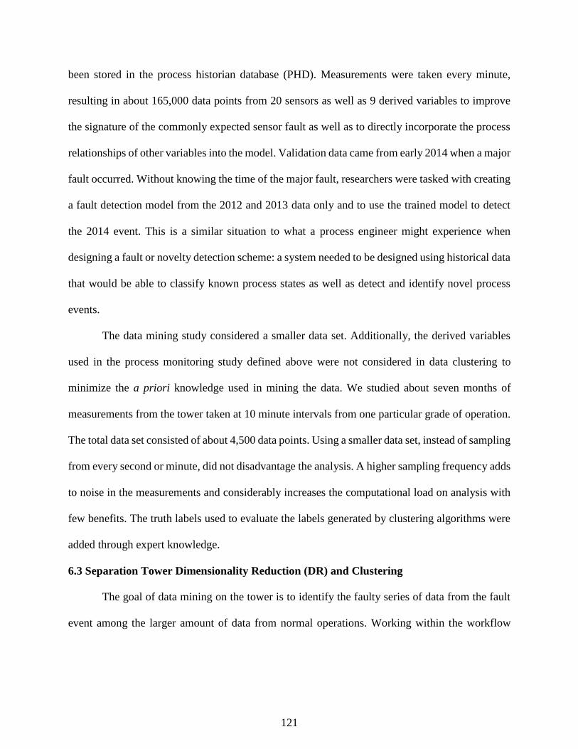
121
been stored in the process historian database (PHD). Measurements were taken every minute,
resulting in about 165,000 data points from 20 sensors as well as 9 derived variables to improve
the signature of the commonly expected sensor fault as well as to directly incorporate the process
relationships of other variables into the model. Validation data came from early 2014 when a major
fault occurred. Without knowing the time of the major fault, researchers were tasked with creating
a fault detection model from the 2012 and 2013 data only and to use the trained model to detect
the 2014 event. This is a similar situation to what a process engineer might experience when
designing a fault or novelty detection scheme: a system needed to be designed using historical data
that would be able to classify known process states as well as detect and identify novel process
events.
The data mining study considered a smaller data set. Additionally, the derived variables
used in the process monitoring study defined above were not considered in data clustering to
minimize the a priori knowledge used in mining the data. We studied about seven months of
measurements from the tower taken at 10 minute intervals from one particular grade of operation.
The total data set consisted of about 4,500 data points. Using a smaller data set, instead of sampling
from every second or minute, did not disadvantage the analysis. A higher sampling frequency adds
to noise in the measurements and considerably increases the computational load on analysis with
few benefits. The truth labels used to evaluate the labels generated by clustering algorithms were
added through expert knowledge.
6.3 Separation Tower Dimensionality Reduction (DR) and Clustering
The goal of data mining on the tower is to identify the faulty series of data from the fault
event among the larger amount of data from normal operations. Working within the workflow

122
Table 6.1: Process measurements and derived measurements
Variable
Name
Description Derived
Var. Name
Derived Var. Description
F1 Feed to upstream reactor P1_P2 Tank 1 Feed pressure change
T1 Tank 1 Temperature T1_T2 Tank 1 to Feed temperature change
P1 Tank 1 feed pressure T3_T4 Mid-tower to top tower temperature
change
P2 Tank 1 pressure T3_T7 Tower to sensor temperature change
L1 Tank 1 level T3_T6 Tower to overhead temperature
change
T2 Tower feed temperature P3_P4 Tower overhead to Tank 2
temperature change
T3 Middle Tower temperature T6_T5 Exchanger temperature gradient
L2 Tower level T9_T6 Overhead to product temperature
change
T4 Tower overhead temperature T8_T6 Overhead and product temperature
change
T5 Cooling water temperature
T6 Tower overhead temperature
P3 Overhead Pressure 3
F2 Bottoms flow
T7 Bottoms temperature
T8 Bottoms Product temperature
SG Specific gravity sensor
F3 Total Overhead product flow
F4 Non-recycle overhead product
flow
T9 Overhead Product temperature
P4 Vapor Purge
L3 Tank 2 Level
described in Figure 3.1, the data will be projected using dimensionality reduction techniques,
clustered using a sampling of data clustering algorithms, and evaluated using clustering metrics.
Here, because expert analysis already determined which data are faulty and which are normal, we
can use supervised cluster evaluation methods.
Figures 6.3, 6.4, .6.5, and 6.6 show 4 different dimensional projections of data from the
tower made by four different dimensionality reduction techniques for visualization of the data.
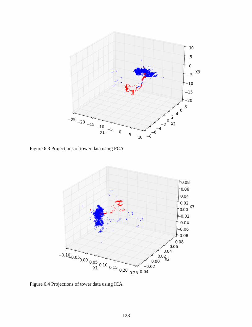
123
Figure 6.3 Projections of tower data using PCA
Figure 6.4 Projections of tower data using ICA
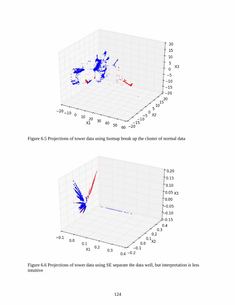
124
Figure 6.5 Projections of tower data using Isomap break up the cluster of normal data
Figure 6.6 Projections of tower data using SE separate the data well, but interpretation is less
intuitive

125
PCA in Figure 6.3 and ICA in Figure 6.4 yield qualitatively similar projection results preserve the
density of normal operations. Both have large, dense normal regions in blue and a smaller cluster
for the fault event in red. In contrast, Isomap in Figure 6.5 and SE in Figure 6.6 break apart the
dense normal cluster into smaller clusters (which from Figure 6.11, we can see are related to the
time). The data in the faulty group could be straightforwardly linked to a fault event using latent
variable methods and time series plots of the original sensor.
For data clustering, we consider the case where the faulty period of data was not known
beforehand to analyze how effectively data clustering techniques isolate the faulty data series and
check the results against the known groups in the data. Table 6.2 shows the quality of the
clusterings obtained by combinations of DR and clustering techniques applied to the data set. Each
clustering in Table 6.2 had the best ARI among the five clustering parameters tested according to
the method described in Section 3.5. The complete set of clustering results can be found in
Appendix A.
As might be expected for a “natural” data set not generated by a simulation, results in this
study are more varied in contrast to the Tennessee Eastman process, where most techniques
produced clustering corresponding fairly closely to the base classes. BIRCH and SE produced the
highest ARI of the cases considered, although both performed poorly with the other DR and
clustering techniques. Mean shift and K-means also produced good quality results in several cases.
Here, some techniques produced random clusters (i.e., ARIs close to zero), as was the case
for all tests on KPCA-reduced data. Also different from the simulation study, many of the DR
techniques improved clustering results over the No DR case. ICA and Isomap dramatically
improved the results of DBSCAN and k-means, even compared to PCA which had poor results for
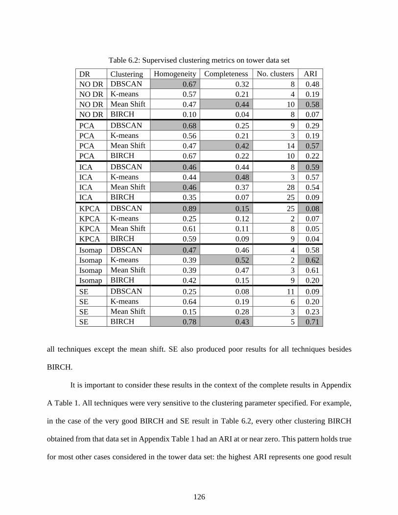
126
Table 6.2: Supervised clustering metrics on tower data set
DR Clustering Homogeneity Completeness No. clusters ARI
NO DR DBSCAN 0.67 0.32 8 0.48
NO DR K-means 0.57 0.21 4 0.19
NO DR Mean Shift 0.47 0.44 10 0.58
NO DR BIRCH 0.10 0.04 8 0.07
PCA DBSCAN 0.68 0.25 9 0.29
PCA K-means 0.56 0.21 3 0.19
PCA Mean Shift 0.47 0.42 14 0.57
PCA BIRCH 0.67 0.22 10 0.22
ICA DBSCAN 0.46 0.44 8 0.59
ICA K-means 0.44 0.48 3 0.57
ICA Mean Shift 0.46 0.37 28 0.54
ICA BIRCH 0.35 0.07 25 0.09
KPCA DBSCAN 0.89 0.15 25 0.08
KPCA K-means 0.25 0.12 2 0.07
KPCA Mean Shift 0.61 0.11 8 0.05
KPCA BIRCH 0.59 0.09 9 0.04
Isomap DBSCAN 0.47 0.46 4 0.58
Isomap K-means 0.39 0.52 2 0.62
Isomap Mean Shift 0.39 0.47 3 0.61
Isomap BIRCH 0.42 0.15 9 0.20
SE DBSCAN 0.25 0.08 11 0.09
SE K-means 0.64 0.19 6 0.20
SE Mean Shift 0.15 0.28 3 0.23
SE BIRCH 0.78 0.43 5 0.71
all techniques except the mean shift. SE also produced poor results for all techniques besides
BIRCH.
It is important to consider these results in the context of the complete results in Appendix
A Table 1. All techniques were very sensitive to the clustering parameter specified. For example,
in the case of the very good BIRCH and SE result in Table 6.2, every other clustering BIRCH
obtained from that data set in Appendix Table 1 had an ARI at or near zero. This pattern holds true
for most other cases considered in the tower data set: the highest ARI represents one good result
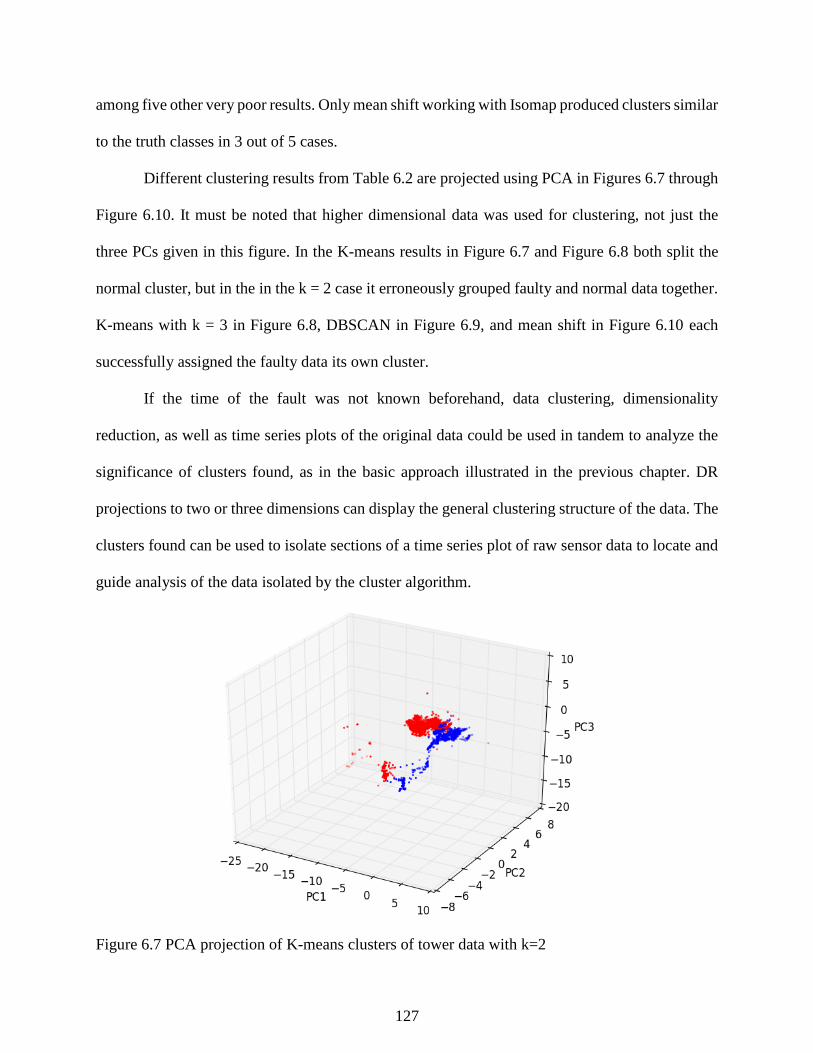
127
among five other very poor results. Only mean shift working with Isomap produced clusters similar
to the truth classes in 3 out of 5 cases.
Different clustering results from Table 6.2 are projected using PCA in Figures 6.7 through
Figure 6.10. It must be noted that higher dimensional data was used for clustering, not just the
three PCs given in this figure. In the K-means results in Figure 6.7 and Figure 6.8 both split the
normal cluster, but in the in the k = 2 case it erroneously grouped faulty and normal data together.
K-means with k = 3 in Figure 6.8, DBSCAN in Figure 6.9, and mean shift in Figure 6.10 each
successfully assigned the faulty data its own cluster.
If the time of the fault was not known beforehand, data clustering, dimensionality
reduction, as well as time series plots of the original data could be used in tandem to analyze the
significance of clusters found, as in the basic approach illustrated in the previous chapter. DR
projections to two or three dimensions can display the general clustering structure of the data. The
clusters found can be used to isolate sections of a time series plot of raw sensor data to locate and
guide analysis of the data isolated by the cluster algorithm.
Figure 6.7 PCA projection of K-means clusters of tower data with k=2
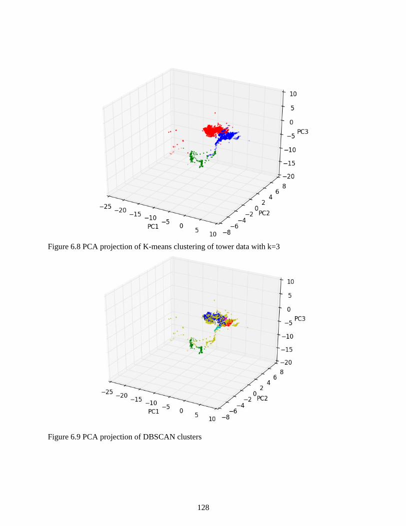
128
Figure 6.8 PCA projection of K-means clustering of tower data with k=3
Figure 6.9 PCA projection of DBSCAN clusters
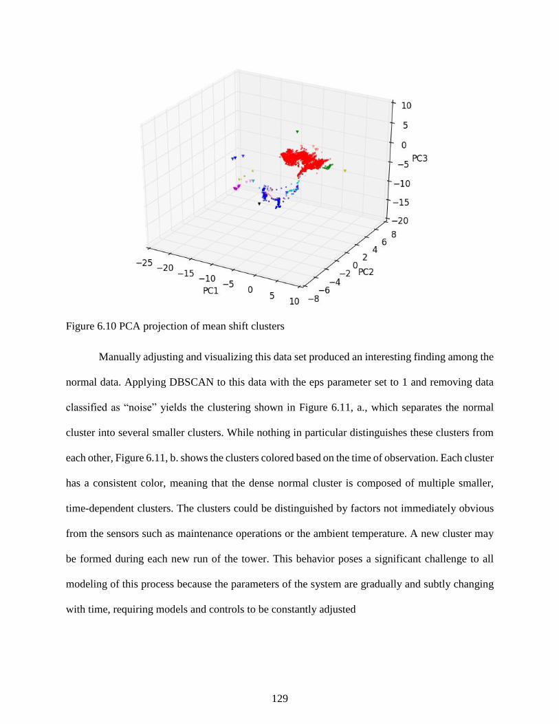
129
Figure 6.10 PCA projection of mean shift clusters
Manually adjusting and visualizing this data set produced an interesting finding among the
normal data. Applying DBSCAN to this data with the eps parameter set to 1 and removing data
classified as “noise” yields the clustering shown in Figure 6.11, a., which separates the normal
cluster into several smaller clusters. While nothing in particular distinguishes these clusters from
each other, Figure 6.11, b. shows the clusters colored based on the time of observation. Each cluster
has a consistent color, meaning that the dense normal cluster is composed of multiple smaller,
time-dependent clusters. The clusters could be distinguished by factors not immediately obvious
from the sensors such as maintenance operations or the ambient temperature. A new cluster may
be formed during each new run of the tower. This behavior poses a significant challenge to all
modeling of this process because the parameters of the system are gradually and subtly changing
with time, requiring models and controls to be constantly adjusted
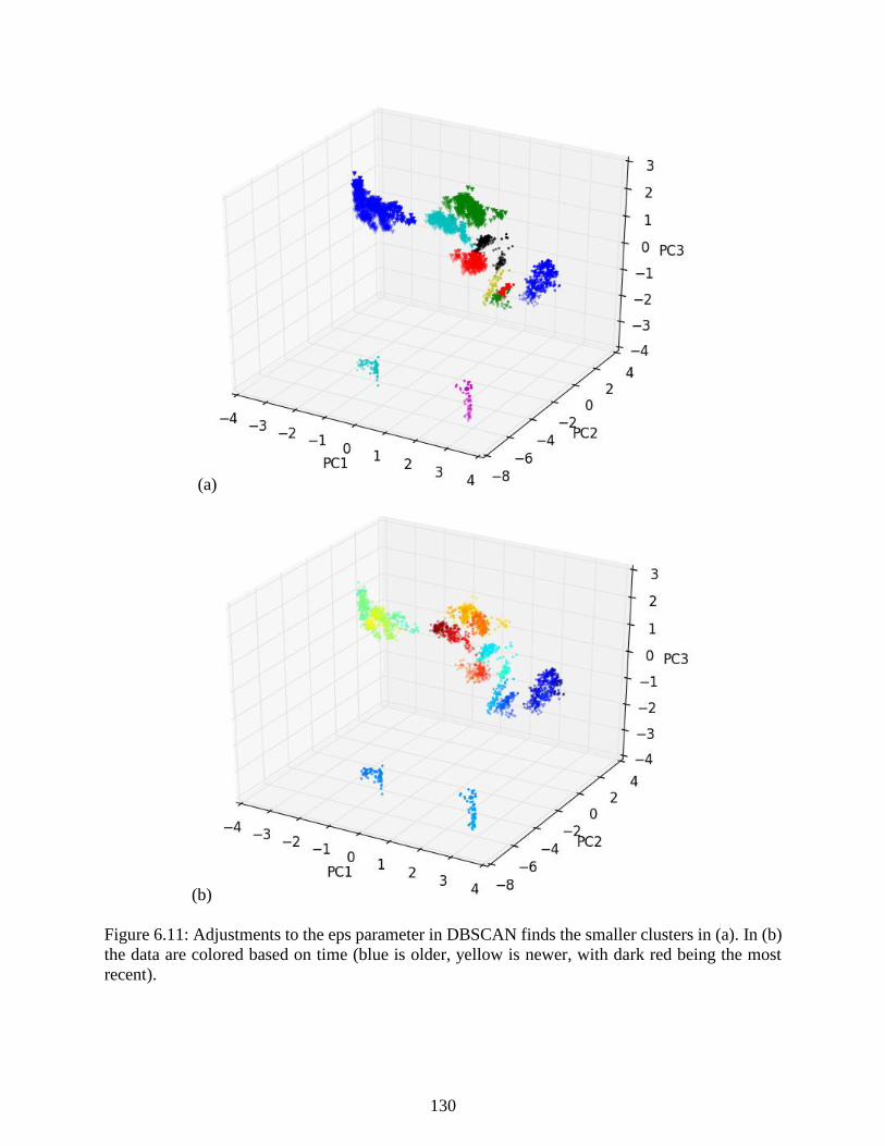
130
(a)
(b)
Figure 6.11: Adjustments to the eps parameter in DBSCAN finds the smaller clusters in (a). In (b)
the data are colored based on time (blue is older, yellow is newer, with dark red being the most
recent).

131
6.4 Novel Event Detection
6.4.1 Data mining and analysis for monitoring
The following research attempts to use historical data to detect the previously considered
novel fault event. A historical data set spanning 2012 to 2013 was used as a training set while data
from 2014 was used to validate the effectiveness of the models created. In order to make a more
broadly useful characterization of the process (i.e. not only for detecting the sensor fault described
in Section 6.2, but also good for general fault detection), nearly all measurements around the unit
were selected for the mining task, excluding only variables associated with equipment that is
seldom used.
Additionally, new variables were created by taking the difference between related
measurements in different parts of the process, such as the temperature difference between the
middle of the column and the top of the column, or the pressure difference between the feed
pressure and the pressure in the first tank. This included taking the difference between T3 (middle
tower temperature) and T7 (bottom tower temperature), which allowed the easy separation of the
known sensor fault from normal operations. This allows the user to add a small amount of process
knowledge by giving the data some of the structure of the process and created a potentially useful
new set of variables from the process. Combining the temperature difference with the qualitative
knowledge about the appearance of startup and temperature faults, the simple graphical tool shown
in Figure 6.12 was created to quickly select data and organize it into different groups.
To effectively diagnose the state of the process, three pools of data were created:
a larger data set containing all normal data for a particular grade,
a smaller set containing data from startup conditions
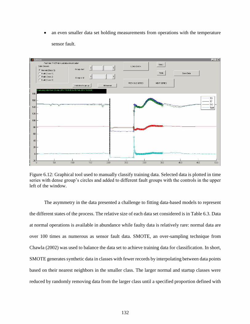
132
an even smaller data set holding measurements from operations with the temperature
sensor fault.
Figure 6.12: Graphical tool used to manually classify training data. Selected data is plotted in time
series with dense group’s circles and added to different fault groups with the controls in the upper
left of the window.
The asymmetry in the data presented a challenge to fitting data-based models to represent
the different states of the process. The relative size of each data set considered is in Table 6.3. Data
at normal operations is available in abundance while faulty data is relatively rare: normal data are
over 100 times as numerous as sensor fault data. SMOTE, an over-sampling technique from
Chawla (2002) was used to balance the data set to achieve training data for classification. In short,
SMOTE generates synthetic data in classes with fewer records by interpolating between data points
based on their nearest neighbors in the smaller class. The larger normal and startup classes were
reduced by randomly removing data from the larger class until a specified proportion defined with
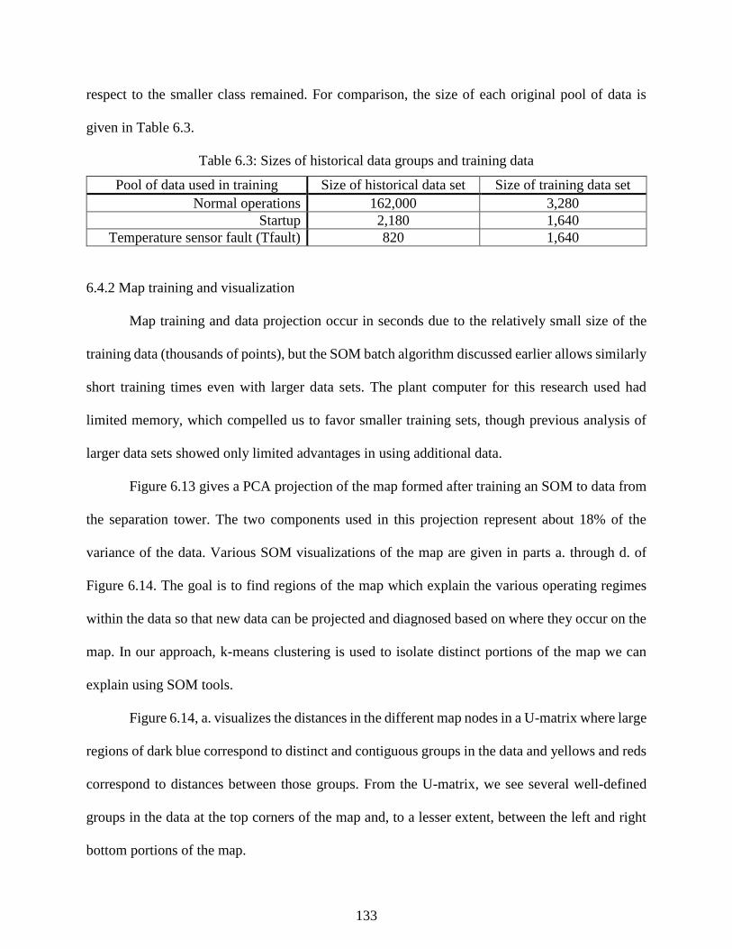
133
respect to the smaller class remained. For comparison, the size of each original pool of data is
given in Table 6.3.
Table 6.3: Sizes of historical data groups and training data
Pool of data used in training Size of historical data set Size of training data set
Normal operations 162,000 3,280
Startup 2,180 1,640
Temperature sensor fault (Tfault) 820 1,640
6.4.2 Map training and visualization
Map training and data projection occur in seconds due to the relatively small size of the
training data (thousands of points), but the SOM batch algorithm discussed earlier allows similarly
short training times even with larger data sets. The plant computer for this research used had
limited memory, which compelled us to favor smaller training sets, though previous analysis of
larger data sets showed only limited advantages in using additional data.
Figure 6.13 gives a PCA projection of the map formed after training an SOM to data from
the separation tower. The two components used in this projection represent about 18% of the
variance of the data. Various SOM visualizations of the map are given in parts a. through d. of
Figure 6.14. The goal is to find regions of the map which explain the various operating regimes
within the data so that new data can be projected and diagnosed based on where they occur on the
map. In our approach, k-means clustering is used to isolate distinct portions of the map we can
explain using SOM tools.
Figure 6.14, a. visualizes the distances in the different map nodes in a U-matrix where large
regions of dark blue correspond to distinct and contiguous groups in the data and yellows and reds
correspond to distances between those groups. From the U-matrix, we see several well-defined
groups in the data at the top corners of the map and, to a lesser extent, between the left and right
bottom portions of the map.
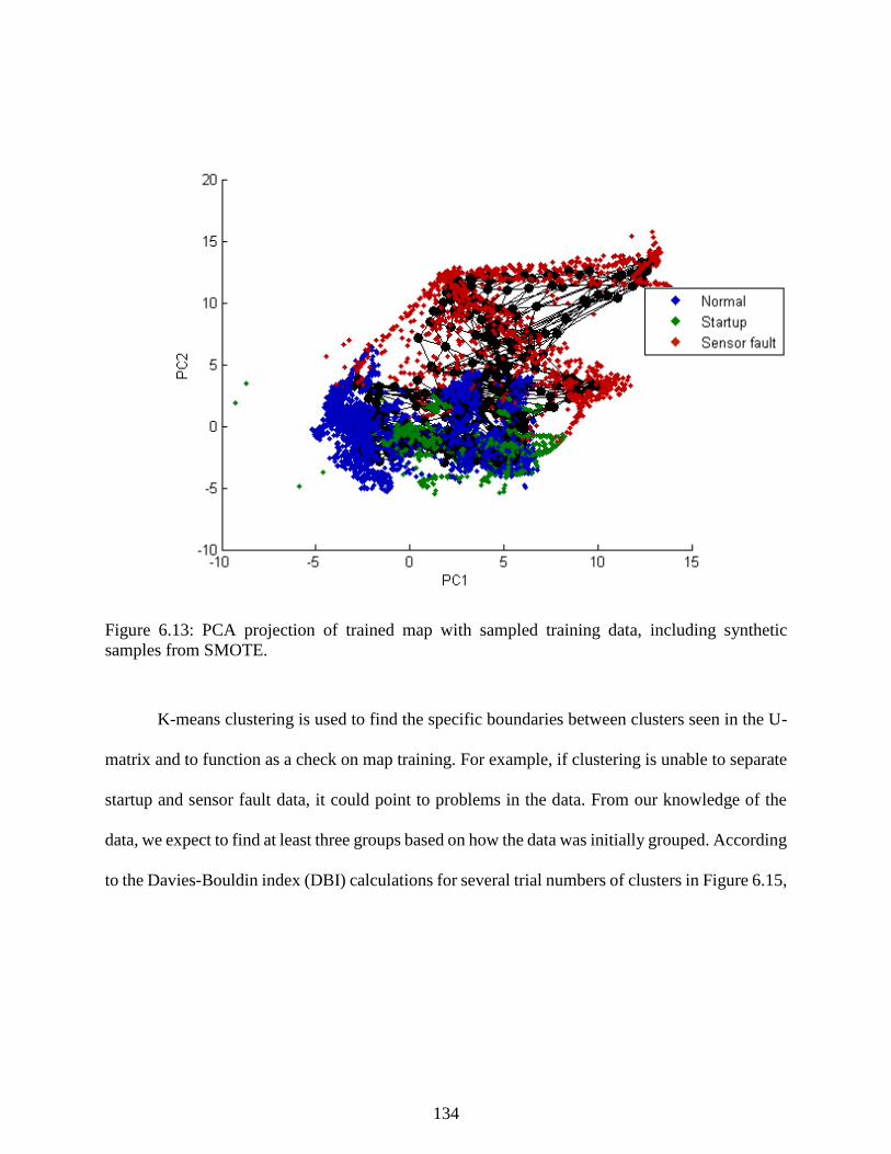
134
Figure 6.13: PCA projection of trained map with sampled training data, including synthetic
samples from SMOTE.
K-means clustering is used to find the specific boundaries between clusters seen in the U-
matrix and to function as a check on map training. For example, if clustering is unable to separate
startup and sensor fault data, it could point to problems in the data. From our knowledge of the
data, we expect to find at least three groups based on how the data was initially grouped. According
to the Davies-Bouldin index (DBI) calculations for several trial numbers of clusters in Figure 6.15,

135
(a) (b)
(c) (d)
Figure 6.14: Visualizations of the map used in monitoring. (a) the SOM U-matrix visualizes groups
in the data. (b) colors are derived from clustering results. (c) is a hit diagram of the training data
on the map. (d) labels the map regions.
Sensor Fault
Normal
Startup
136
Figure 6.15: Davies-Bouldin index of the clustering given in Figure 6.8, b. Lower values indicate
a better clustering. Based on the number of data groups we expect from this set, the five cluster
result is accepted as the best.
the best clustering of the data occurs at five clusters. The SOMs in Figure 6.14, b. and 6.14, c.
show the map colored according to these five clusters found from K-means clustering, and each
belongs to one of the predefined classes of our training data. These clusters can be taken to form
the definite boundaries of the clusters observed from inspection of the U-matrix earlier and helps
ensure that all data is grouped with similar observations.
Next, to explain the meaning of clusters found from the K-means analysis, the data are
projected to the map to find the dominant patterns expressed in each cluster. From the hit diagram
in Figure 6.14, c., we can see that three of the five clusters are subdivisions of the sensor fault
group (red data). Note that larger hexagons correspond to a relatively large amount of data being

137
projected to that area of the map. The cluster identified as the normal region of the map contains
some points classified as faulty or startup but more similar to normal operations (representing noise
in the training set or transitional measurements while moving between states in the map).
Finally, we can name the regions of the map so that when new data can be projected to the
map and classified online. Naming each cluster based on its dominant data group results in the
SOM in Figure 6.14, d. with one well defined region for each operating condition of interest. While
the SOM was able to organize a good separation between the representations of the different
classes, the K-means results removed the effects of some of the noise in the training data and, more
importantly, helped explain the regions of the map for analysis of the process state.
Component planes can be used to show the multidimensional characteristics of the state
space of the tower operations and different variables are correlated with the operating states in the
structure of the map. in a. through c. of Figure 6.16 shows component planes for variables F2, F3,
and T7. The value of each variable at different parts of the map is color-coded. How each variable
changes over the map gives us insight as to the meaning of different regions of the map. Figures
6.16, a. and 6.16, b. show that the sensor fault often corresponds to low bottoms flow (F2) and
lower temperature measurements where in Figure 6.16, c. the sensor fault is correlated with high
flows through the product stream (F3).
6.4.3 Determining the quantization error (QE) threshold
In order to create a useful reference to quantify how well new data fit to the SOM, a
probability distribution was fit to the QE calculated from the training data. Using the fit
distribution, the bound of the 99.99% one-sided confidence limit was chosen to avoid a large
number of false alarms. The histogram of the QE calculated over the training data is given in Figure
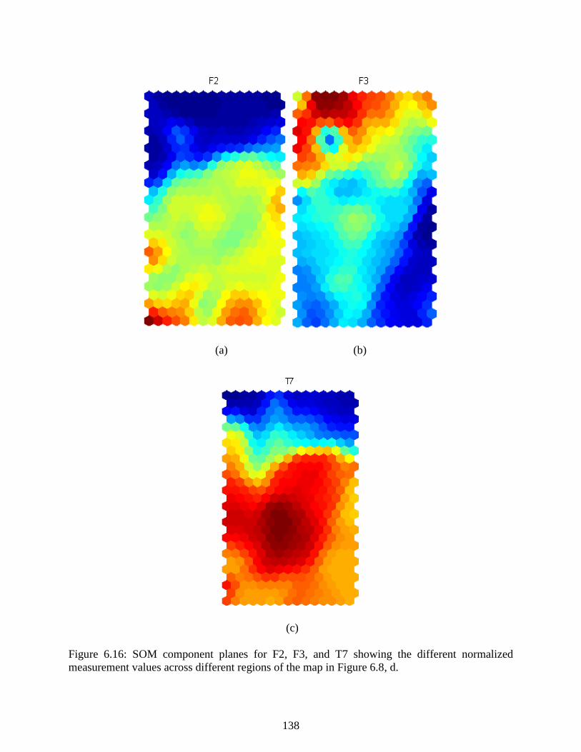
138
(a) (b)
(c)
Figure 6.16: SOM component planes for F2, F3, and T7 showing the different normalized
measurement values across different regions of the map in Figure 6.8, d.

139
6.17. A lognormal was fit to this histogram with parameters 0.9037 and 0.3370. From the
distribution, the threshold for a faulty status with 99.99% confidence occurred at a QE of 8.64.
Figure 6.17: Log normal distribution fit to a histogram of the QE calculated over all data from
2012-2013.
6.5 Fault Detection and Identification Results
To quantitatively test the ability of the fault detection scheme to detect a novel event
occurring, we projected data from 2014 to the map and calculated the quantization error (QE). A
low QE indicates close proximity to a map vector, whether that map vector means normal, startup,
or faulty. A time series of this fault detection statistic is given in the upper plot of Figure 6.18. The
QE E is colored according to the predicted class of the process in the lower plot of Figure 6.18.
The QE calculations contain many uninteresting peaks from startups or feed grade switches, but
the faulty condition can be easily identified by an extended period lasting several days in which
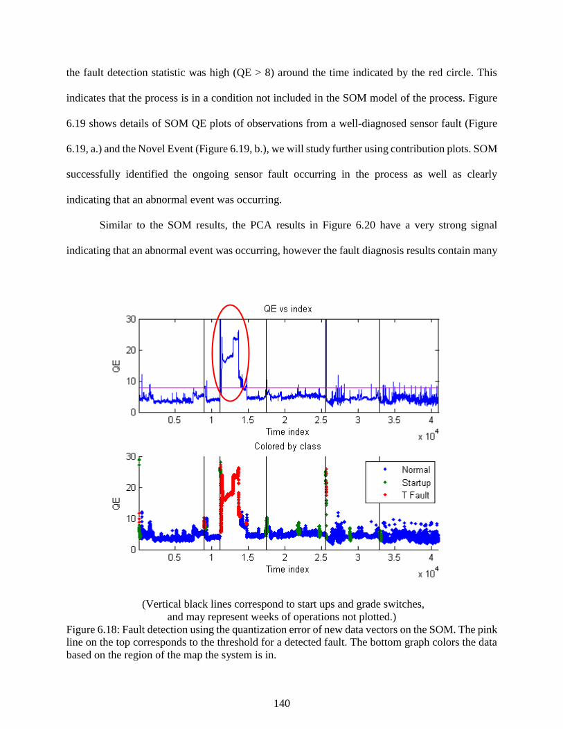
140
the fault detection statistic was high (QE > 8) around the time indicated by the red circle. This
indicates that the process is in a condition not included in the SOM model of the process. Figure
6.19 shows details of SOM QE plots of observations from a well-diagnosed sensor fault (Figure
6.19, a.) and the Novel Event (Figure 6.19, b.), we will study further using contribution plots. SOM
successfully identified the ongoing sensor fault occurring in the process as well as clearly
indicating that an abnormal event was occurring.
Similar to the SOM results, the PCA results in Figure 6.20 have a very strong signal
indicating that an abnormal event was occurring, however the fault diagnosis results contain many
(Vertical black lines correspond to start ups and grade switches,
and may represent weeks of operations not plotted.)
Figure 6.18: Fault detection using the quantization error of new data vectors on the SOM. The pink
line on the top corresponds to the threshold for a detected fault. The bottom graph colors the data
based on the region of the map the system is in.
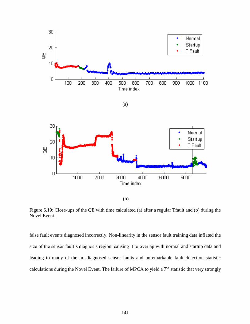
141
(a)
(b)
Figure 6.19: Close-ups of the QE with time calculated (a) after a regular Tfault and (b) during the
Novel Event.
false fault events diagnosed incorrectly. Non-linearity in the sensor fault training data inflated the
size of the sensor fault’s diagnosis region, causing it to overlap with normal and startup data and
leading to many of the misdiagnosed sensor faults and unremarkable fault detection statistic
calculations during the Novel Event. The failure of MPCA to yield a 𝑇2 statistic that very strongly
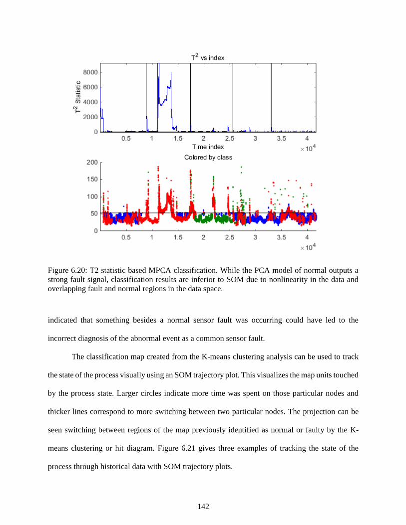
142
Figure 6.20: T2 statistic based MPCA classification. While the PCA model of normal outputs a
strong fault signal, classification results are inferior to SOM due to nonlinearity in the data and
overlapping fault and normal regions in the data space.
indicated that something besides a normal sensor fault was occurring could have led to the
incorrect diagnosis of the abnormal event as a common sensor fault.
The classification map created from the K-means clustering analysis can be used to track
the state of the process visually using an SOM trajectory plot. This visualizes the map units touched
by the process state. Larger circles indicate more time was spent on those particular nodes and
thicker lines correspond to more switching between two particular nodes. The projection can be
seen switching between regions of the map previously identified as normal or faulty by the K-
means clustering or hit diagram. Figure 6.21 gives three examples of tracking the state of the
process through historical data with SOM trajectory plots.
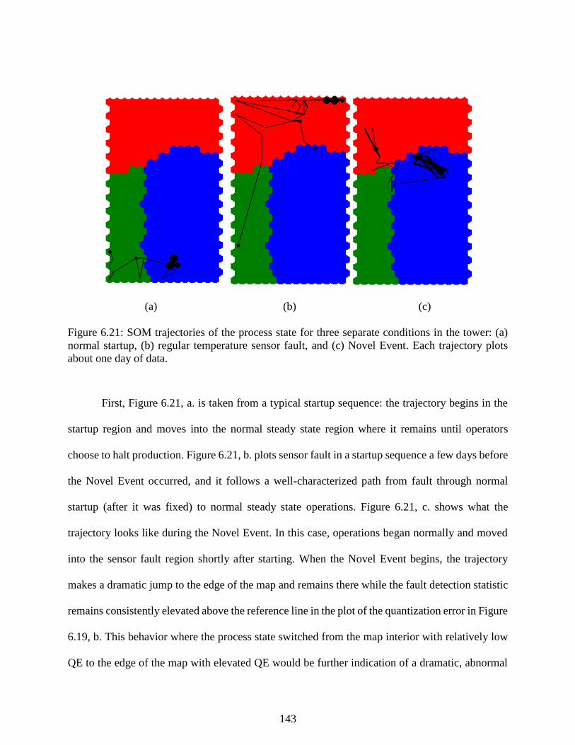
143
(a) (b) (c)
Figure 6.21: SOM trajectories of the process state for three separate conditions in the tower: (a)
normal startup, (b) regular temperature sensor fault, and (c) Novel Event. Each trajectory plots
about one day of data.
First, Figure 6.21, a. is taken from a typical startup sequence: the trajectory begins in the
startup region and moves into the normal steady state region where it remains until operators
choose to halt production. Figure 6.21, b. plots sensor fault in a startup sequence a few days before
the Novel Event occurred, and it follows a well-characterized path from fault through normal
startup (after it was fixed) to normal steady state operations. Figure 6.21, c. shows what the
trajectory looks like during the Novel Event. In this case, operations began normally and moved
into the sensor fault region shortly after starting. When the Novel Event begins, the trajectory
makes a dramatic jump to the edge of the map and remains there while the fault detection statistic
remains consistently elevated above the reference line in the plot of the quantization error in Figure
6.19, b. This behavior where the process state switched from the map interior with relatively low
QE to the edge of the map with elevated QE would be further indication of a dramatic, abnormal
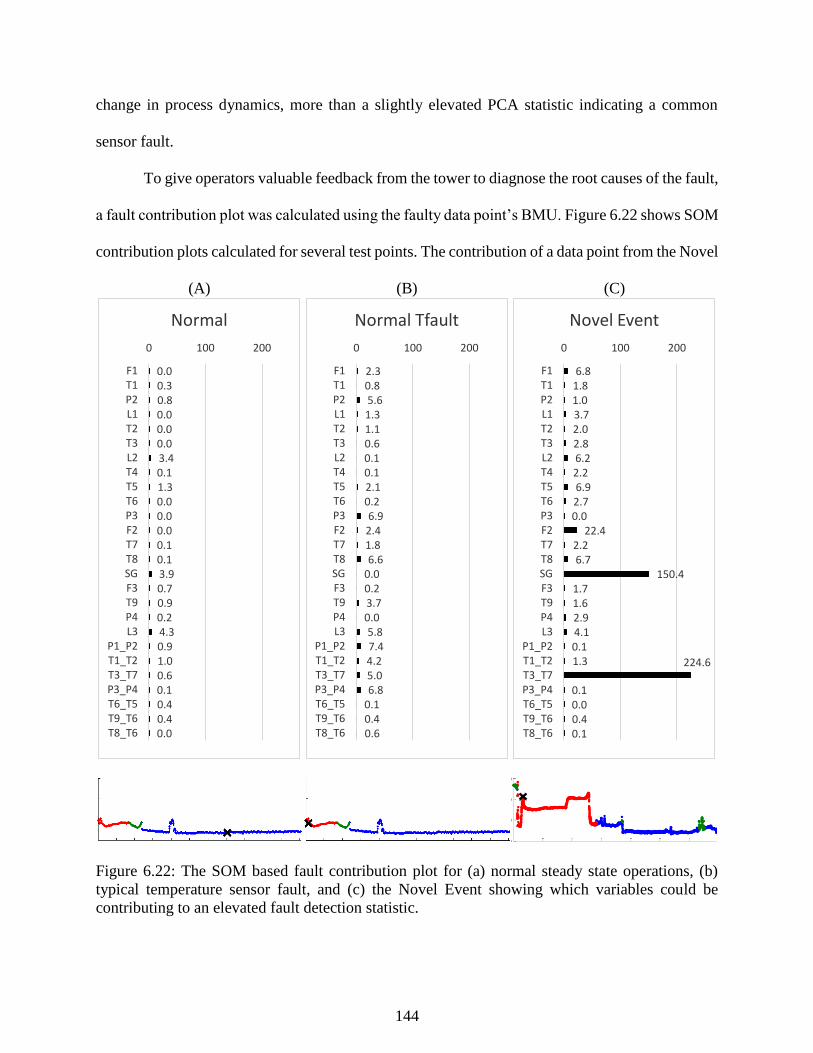
144
change in process dynamics, more than a slightly elevated PCA statistic indicating a common
sensor fault.
To give operators valuable feedback from the tower to diagnose the root causes of the fault,
a fault contribution plot was calculated using the faulty data point’s BMU. Figure 6.22 shows SOM
contribution plots calculated for several test points. The contribution of a data point from the Novel
(A) (B) (C)
Figure 6.22: The SOM based fault contribution plot for (a) normal steady state operations, (b)
typical temperature sensor fault, and (c) the Novel Event showing which variables could be
contributing to an elevated fault detection statistic.
0.00.30.80.00.00.03.40.11.30.00.00.00.10.13.90.70.90.24.30.91.00.60.10.40.40.0
0 100 200
F1T1P2L1T2T3L2T4T5T6P3F2T7T8SGF3T9P4L3
P1_P2T1_T2T3_T7P3_P4T6_T5T9_T6T8_T6
Normal
2.30.85.61.31.10.60.10.12.10.26.92.41.86.6
0.00.23.70.05.87.44.25.06.8
0.10.40.6
0 100 200
F1T1P2L1T2T3L2T4T5T6P3F2T7T8SGF3T9P4L3
P1_P2T1_T2T3_T7P3_P4T6_T5T9_T6T8_T6
Normal Tfault
6.81.81.03.72.02.86.22.26.92.70.0
22.42.26.7
150.41.71.62.94.10.11.3 224.6
0.10.00.40.1
0 100 200
F1T1P2L1T2T3L2T4T5T6P3F2T7T8SGF3T9P4L3
P1_P2T1_T2T3_T7P3_P4T6_T5T9_T6T8_T6
Novel Event
0
50
100
150
200
08-Mar-2014 19:10:00 SOM contribution
Contr
ibution
F1
T1
P2
L1
T2
T3
L2
T4
T5
T6
P3
F2
T7
T8
SG F3
T9
P4
L3
P1_P
2
T1_T
2
T3_T
7
P3_P
4
T6_T
5
T9_T
6
T8_T
6
1000 2000 3000 4000 5000 60000
10
20
30
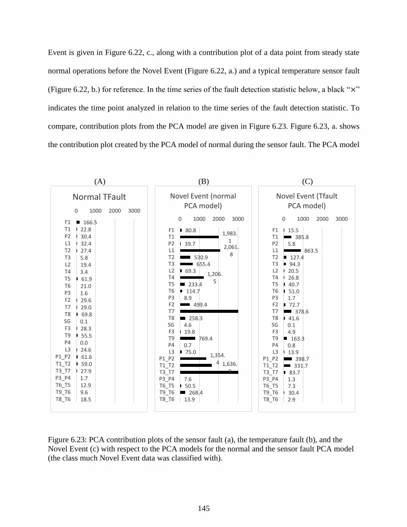
145
Event is given in Figure 6.22, c., along with a contribution plot of a data point from steady state
normal operations before the Novel Event (Figure 6.22, a.) and a typical temperature sensor fault
(Figure 6.22, b.) for reference. In the time series of the fault detection statistic below, a black “×”
indicates the time point analyzed in relation to the time series of the fault detection statistic. To
compare, contribution plots from the PCA model are given in Figure 6.23. Figure 6.23, a. shows
the contribution plot created by the PCA model of normal during the sensor fault. The PCA model
(A) (B) (C)
Figure 6.23: PCA contribution plots of the sensor fault (a), the temperature fault (b), and the
Novel Event (c) with respect to the PCA models for the normal and the sensor fault PCA model
(the class much Novel Event data was classified with).
166.522.830.432.427.45.819.43.461.921.01.629.629.069.80.128.355.50.024.661.659.027.91.712.99.618.5
0 1000 2000 3000
F1T1P2L1T2T3L2T4T5T6P3F2T7T8SGF3T9P4L3
P1_P2T1_T2T3_T7P3_P4T6_T5T9_T6T8_T6
Normal TFault
80.81,983.
139.7
2,061.8
530.9655.4
69.31,206.
5233.4
114.78.9
499.4
258.34.619.8
769.40.775.0
1,354.4 1,636.
9
7.650.5
268.413.9
0 1000 2000 3000
F1T1P2L1T2T3L2T4T5T6P3F2T7T8SGF3T9P4L3
P1_P2T1_T2T3_T7P3_P4T6_T5T9_T6T8_T6
Novel Event (normal PCA model)
15.5385.8
5.8863.5
127.494.3
20.526.840.751.01.772.7
378.641.60.14.9
163.30.813.9
398.7331.7
83.71.37.330.42.9
0 1000 2000 3000
F1T1P2L1T2T3L2T4T5T6P3F2T7T8SGF3T9P4L3
P1_P2T1_T2T3_T7P3_P4T6_T5T9_T6T8_T6
Novel Event (Tfault PCA model)
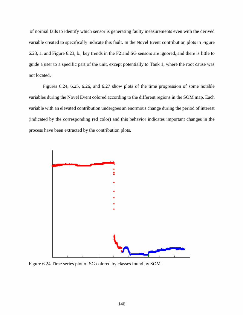
146
of normal fails to identify which sensor is generating faulty measurements even with the derived
variable created to specifically indicate this fault. In the Novel Event contribution plots in Figure
6.23, a. and Figure 6.23, b., key trends in the F2 and SG sensors are ignored, and there is little to
guide a user to a specific part of the unit, except potentially to Tank 1, where the root cause was
not located.
Figures 6.24, 6.25, 6.26, and 6.27 show plots of the time progression of some notable
variables during the Novel Event colored according to the different regions in the SOM map. Each
variable with an elevated contribution undergoes an enormous change during the period of interest
(indicated by the corresponding red color) and this behavior indicates important changes in the
process have been extracted by the contribution plots.
Figure 6.24 Time series plot of SG colored by classes found by SOM

147
Figure 6.25 Time series plot of T3_T7 colored by classes found by SOM
Figure 6.26 Times series plot of T7 colored by classes found by SOM
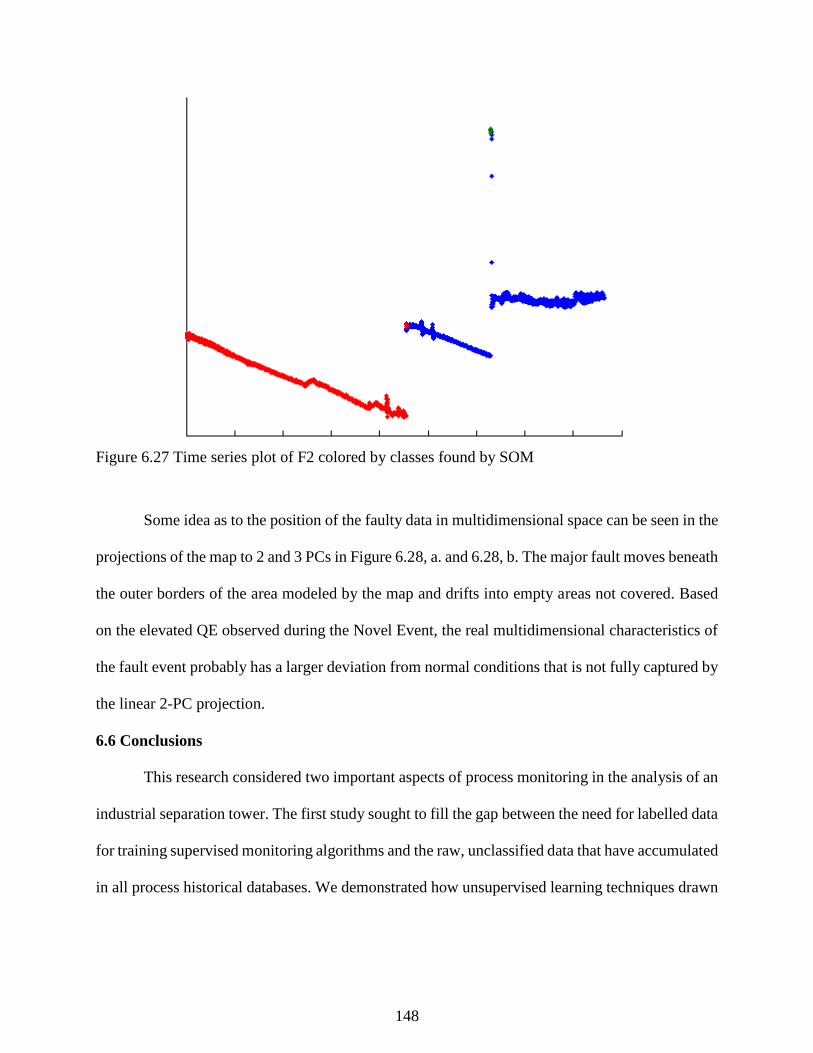
148
Figure 6.27 Time series plot of F2 colored by classes found by SOM
Some idea as to the position of the faulty data in multidimensional space can be seen in the
projections of the map to 2 and 3 PCs in Figure 6.28, a. and 6.28, b. The major fault moves beneath
the outer borders of the area modeled by the map and drifts into empty areas not covered. Based
on the elevated QE observed during the Novel Event, the real multidimensional characteristics of
the fault event probably has a larger deviation from normal conditions that is not fully captured by
the linear 2-PC projection.
6.6 Conclusions
This research considered two important aspects of process monitoring in the analysis of an
industrial separation tower. The first study sought to fill the gap between the need for labelled data
for training supervised monitoring algorithms and the raw, unclassified data that have accumulated
in all process historical databases. We demonstrated how unsupervised learning techniques drawn
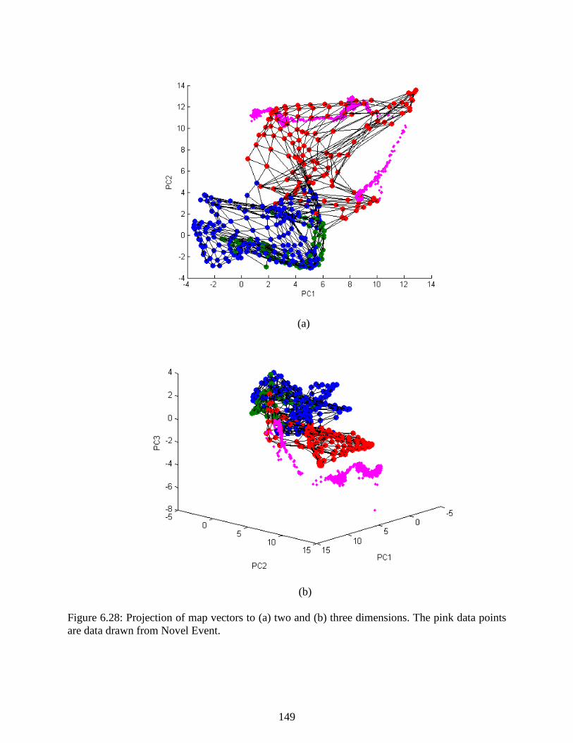
149
(a)
(b)
Figure 6.28: Projection of map vectors to (a) two and (b) three dimensions. The pink data points
are data drawn from Novel Event.

150
from the computer science literature can extract knowledge from chemical process databases.
Dimensionality reduction and data clustering identified a major process fault that had occurred
during the months of data considered and distinguished it from a large, dense normal region
corresponding to normal process operations. Additional analysis revealed that at the grade studied,
each start-up of the column formed a new cluster in the dimensionally-reduced space, as visualized
by a PCA projection of the clusters found by DBSCAN.
Next, we demonstrated the implementation and testing of an SOM-based strategy for
process monitoring on an industrial-scale separation tower system. The study shows SOM and
data clustering can be used together to explore large process data sets, simultaneously diagnose a
known fault, and detect a novel fault. The proposed approach uses SOM in tandem with k-means
clustering to find and explain contiguous regions of an SOM trained with two years of historical
data and to also extract the key data patterns they represent. The process state was diagnosed in a
historical data set and showed that the quantization error calculated from the map can effectively
detect a novel process event that occurred simultaneously with a more common process fault.
Additionally, SOM trajectory plots provide a qualitative visualization of the process state changing
over time. Finally, SOM-based contribution plots indicated the variables with the biggest deviation
from the expected process conditions early in the progression of the fault, thus helping to isolate
the root causes of the novel fault faster. A standard MPCA approach was shown to produce less
informative results compared to SOM and could have led to operators ignoring the fault event.
Altogether, the study from data clustering to process monitoring shows the complete
workflow proposed in Section 3.1. Data clustering and projections generated by dimensionality
reductions are key tools in the isolation of fault data for training process monitoring algorithms
and aid in reducing model development time of data-based fault detection algorithms.

151
Additionally, we demonstrate how SOM can effectively model the operations of an industrial-
scale separations tower and detect a novel event without detailed knowledge of the process.
6.7 References
Chawla, N. V., Bowyer, K. W., Hall, L. O., & Kegelmeyer, W. P. (2002). SMOTE: Synthetic
minority over-sampling technique. Journal of Artificial Intelligence Research, 16, 321-
357.

152
Chapter 7 - Case 3: Analysis and Monitoring of an Industrial Batch
Polymerization Process
7.1 Introduction
Batches and semi-batch processes encompass most processes in the chemical industry,
particularly for specialty chemicals, polymers, pharmaceuticals, and biochemicals. Batch
processes are distinguished by their limited duration and the discrete steps that make up their
operations including charging, processing (or the reacting stage), and discharging (Nomikos and
MacGregor 1994). The conventional steady state approaches to process monitoring used in
previous chapters fail on batch processes due to the dynamics of multiphase batch operations.
Special adaptations taking into account the dynamics of individual batches are necessary for
effective monitoring.
Direct composition and product quality measures often require offline laboratory tests on a
product sample. Multivariate statistical process control, while more complex on batch processes
due to the need for preprocessing like dynamic time warping (DTW) to consider the full
progression of each batch, has been widely studied nonetheless because of the desire for faster and
more frequent product quality measurements. Nomikos and MacGregor (1994) introduced some
of the earliest applications of multiway principal component analysis (multiway PCA) to batch
processes which enabled monitoring. Yao and Gao (2009) provide a comprehensive review of
batch process monitoring methods.
This chapter considers fault detection and diagnosis of a batch polymerization reactor
system, which presents particular challenges due to time-varying batch dynamics. Most standard
process monitoring algorithms assume steady state operations, and adapting to dynamic batch
operations is no trivial task. We apply several adaptations of steady state process monitoring
algorithms based on PCA, SOM, and the MSOM technique presented earlier using DTW and

153
multiway unfolding strategies discussed in Chapter 2 and compare their performance in diagnosing
two process faults on the reactor system.
Section 7.2 briefly describes the batch polymerization reactor studied. Section 7.3
demonstrates the synchronization of the batch trajectories. Section 7.4 studies the fault detection
of individual process faults and Section 7.5 discusses the results of this study. The work in Section
7.6 attempts the diagnosis of both fault conditions considered. Section 7.7 offers additional
discussion and conclusions.
7.2 Process Description
The polymerization reactor in Figure 7.1 converts monomer mixtures to a product with
certain qualities. The different batches are distinguished according to the specific feed blends and
the feed is preheated with a pump around stream from the reactor and heated by hot oil in a heat
exchanger. Reactor operations proceeds through five phases in which reactants are fed, heated
inside the batch to a specific temperature, left inside the vessel to react for a predetermined amount
of time, transferred to downstream separation units and a finishing plant, and a stand-by phase
where the reactor is prepared for the next batch. The quality of the product is evaluated based on
its softening point, or the point at which the polymer interacts with water, measured via an offline
laboratory experiment with a considerable time delay. Each particular grade has a target softening
point, and the feeds to the reactor are controlled manually by operators to hit the target.
Occasionally, the valve controlling F1 experiences value sticking, which affects process
performance and can lead to off-spec products. Personnel can correct this occurrence by opening
and closing the valve, also called “stroking” the valve. The characteristic behavior of a sticky valve
is shown in Figure 7.2. The pump-around flow rate is operating abnormally for six batches,
corresponding with abnormalities in the behavior of the flow valve. Another common fault is
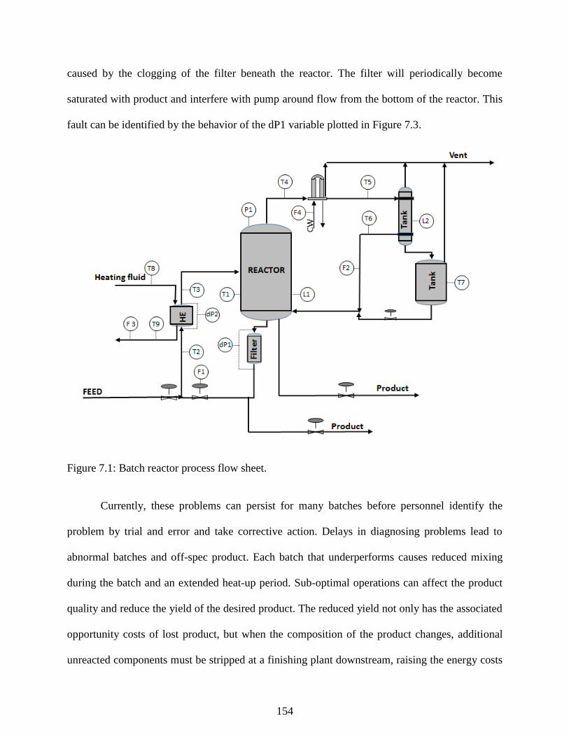
154
caused by the clogging of the filter beneath the reactor. The filter will periodically become
saturated with product and interfere with pump around flow from the bottom of the reactor. This
fault can be identified by the behavior of the dP1 variable plotted in Figure 7.3.
Figure 7.1: Batch reactor process flow sheet.
Currently, these problems can persist for many batches before personnel identify the
problem by trial and error and take corrective action. Delays in diagnosing problems lead to
abnormal batches and off-spec product. Each batch that underperforms causes reduced mixing
during the batch and an extended heat-up period. Sub-optimal operations can affect the product
quality and reduce the yield of the desired product. The reduced yield not only has the associated
opportunity costs of lost product, but when the composition of the product changes, additional
unreacted components must be stripped at a finishing plant downstream, raising the energy costs
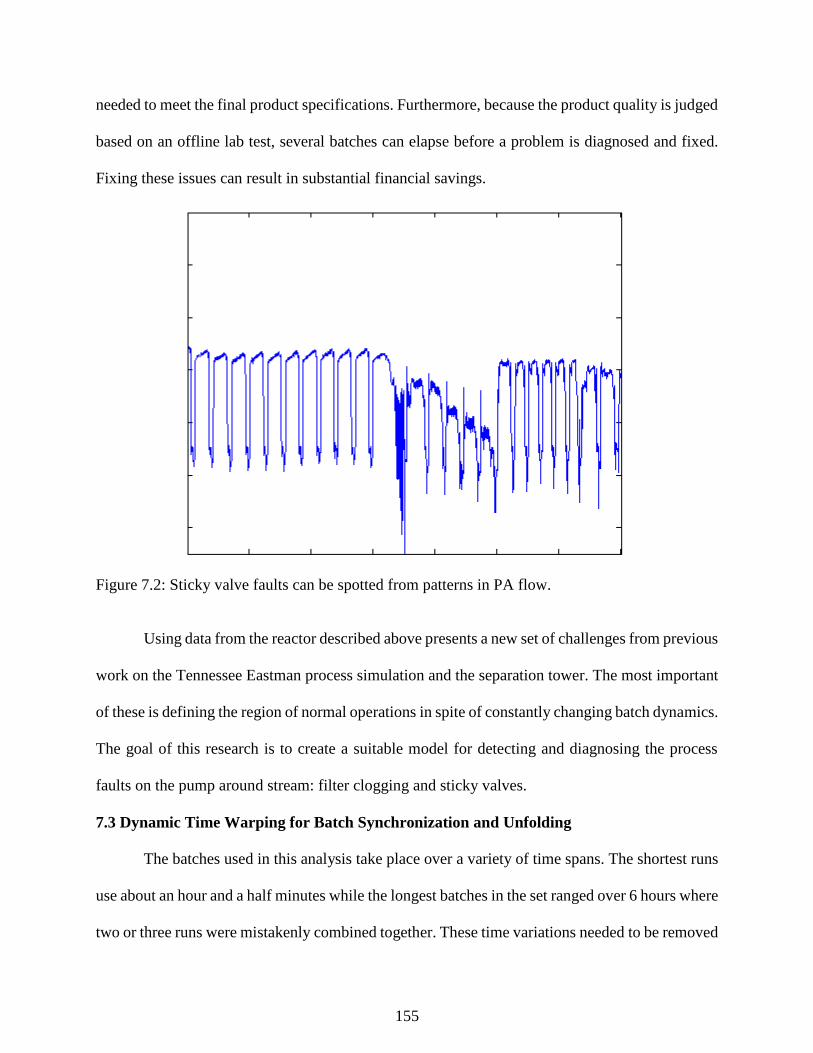
155
needed to meet the final product specifications. Furthermore, because the product quality is judged
based on an offline lab test, several batches can elapse before a problem is diagnosed and fixed.
Fixing these issues can result in substantial financial savings.
Figure 7.2: Sticky valve faults can be spotted from patterns in PA flow.
Using data from the reactor described above presents a new set of challenges from previous
work on the Tennessee Eastman process simulation and the separation tower. The most important
of these is defining the region of normal operations in spite of constantly changing batch dynamics.
The goal of this research is to create a suitable model for detecting and diagnosing the process
faults on the pump around stream: filter clogging and sticky valves.
7.3 Dynamic Time Warping for Batch Synchronization and Unfolding
The batches used in this analysis take place over a variety of time spans. The shortest runs
use about an hour and a half minutes while the longest batches in the set ranged over 6 hours where
two or three runs were mistakenly combined together. These time variations needed to be removed
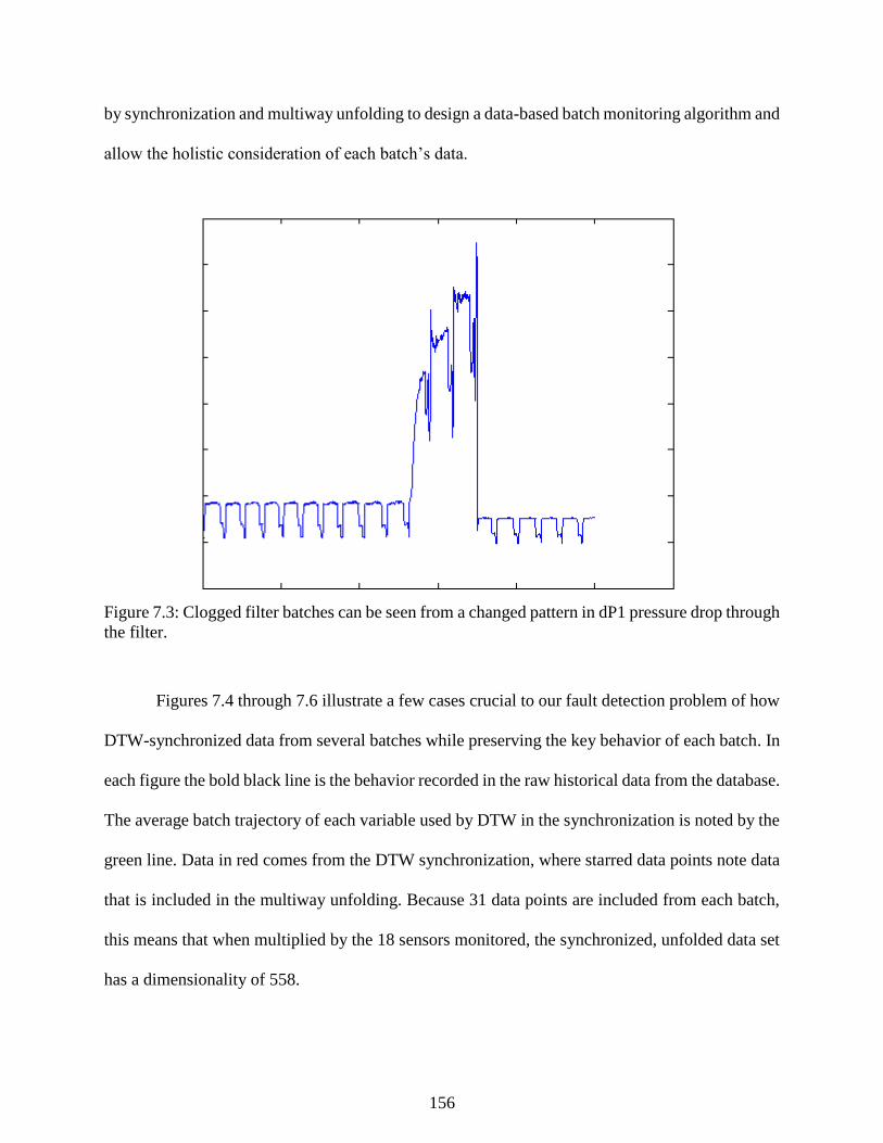
156
by synchronization and multiway unfolding to design a data-based batch monitoring algorithm and
allow the holistic consideration of each batch’s data.
Figure 7.3: Clogged filter batches can be seen from a changed pattern in dP1 pressure drop through
the filter.
Figures 7.4 through 7.6 illustrate a few cases crucial to our fault detection problem of how
DTW-synchronized data from several batches while preserving the key behavior of each batch. In
each figure the bold black line is the behavior recorded in the raw historical data from the database.
The average batch trajectory of each variable used by DTW in the synchronization is noted by the
green line. Data in red comes from the DTW synchronization, where starred data points note data
that is included in the multiway unfolding. Because 31 data points are included from each batch,
this means that when multiplied by the 18 sensors monitored, the synchronized, unfolded data set
has a dimensionality of 558.
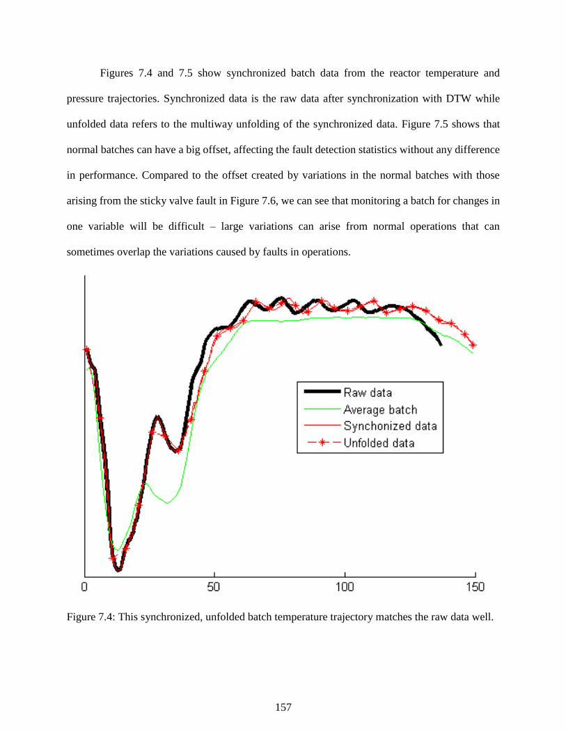
157
Figures 7.4 and 7.5 show synchronized batch data from the reactor temperature and
pressure trajectories. Synchronized data is the raw data after synchronization with DTW while
unfolded data refers to the multiway unfolding of the synchronized data. Figure 7.5 shows that
normal batches can have a big offset, affecting the fault detection statistics without any difference
in performance. Compared to the offset created by variations in the normal batches with those
arising from the sticky valve fault in Figure 7.6, we can see that monitoring a batch for changes in
one variable will be difficult – large variations can arise from normal operations that can
sometimes overlap the variations caused by faults in operations.
Figure 7.4: This synchronized, unfolded batch temperature trajectory matches the raw data well.
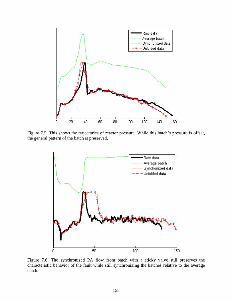
158
Figure 7.5: This shows the trajectories of reactor pressure. While this batch’s pressure is offset,
the general pattern of the batch is preserved.
Figure 7.6: The synchronized PA flow from batch with a sticky valve still preserves the
characteristic behavior of the fault while still synchronizing the batches relative to the average
batch.

159
7.4 Fault Detection and Diagnosis on Batch Process
In this section, the methods of Chapter 4 are combined with DTW and multiway unfolding
discussed in Chapter 2 to build FDI for time-varying batch processes and evaluate using cross-
validation. Three different data based classifiers from Chapter 4 were tested against each other for
the task of fault detection and diagnosis: PCA, 1-SOM, and MSOM. Results show the difference
a more non-linear monitoring algorithm like SOM or MSOM could have on batch process
monitoring.
We used the holdout method (or two-fold cross-validation) to separate training data from
the testing dataset and measure the predictive performance of each statistical model. Table 7.1
shows the relative distribution of data between the different faults on the polymerization process.
Typical of plant fault data sets, there is a large amount of data from normal operations, and
relatively little from abnormal conditions. As in the separation tower study in Chapter 6, we used
the SMOTE preprocessing technique from Chawla (2002) to balance the data sets for training
classifiers. Data from the sticky valves were SMOTE at 400% while Normal and clogged filter
data sets were reduced.
Table 7.1: Sizes of reactor fault data sets
Reactor
Condition
Initial batch
groups
Validation batches
after cross-
validation
Training batches
after SMOTE
Normal 1611 806 50
Clogged Filter 124 62 50
Sticky Valve 20 10 50
The QE bound for MSOM fault detection was calculated in the same manner as discussed
in Chapter 6. Figure 7.7 shows a histogram for one set of training data used in this study and shows
that the training data are approximately exponentially distributed. We used a 95% threshold to
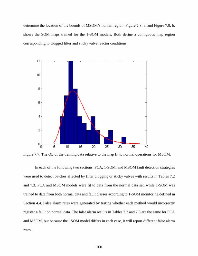
160
determine the location of the bounds of MSOM’s normal region. Figure 7.8, a. and Figure 7.8, b.
shows the SOM maps trained for the 1-SOM models. Both define a contiguous map region
corresponding to clogged filter and sticky valve reactor conditions.
Figure 7.7: The QE of the training data relative to the map fit to normal operations for MSOM.
In each of the following two sections, PCA, 1-SOM, and MSOM fault detection strategies
were used to detect batches affected by filter clogging or sticky valves with results in Tables 7.2
and 7.3. PCA and MSOM models were fit to data from the normal data set, while 1-SOM was
trained to data from both normal data and fault classes according to 1-SOM monitoring defined in
Section 4.4. False alarm rates were generated by testing whether each method would incorrectly
register a fault on normal data. The false alarm results in Tables 7.2 and 7.3 are the same for PCA
and MSOM, but because the 1SOM model differs in each case, it will report different false alarm
rates.

161
(a) (b)
Figure 7.8: 1-SOM maps fit for fault detection of the clogged filter (a) and sticky valve (b)
conditions.
7.4.1 Detection of filter clogging
Running both filter clogging testing data sets through the three fault detection models
yielded the detection results in Table 7.2. Both PCA and MSOM successfully detected the filter
clogging event, while SOM had a significantly lower detection rate. While PCA had the highest
detection rate, it had a higher false alarm rate compared to the MSOM method. Consistent with
results on the Tennessee Eastman Process, 1-SOM had a much higher false alarm rate compared
to the other methods: more than a third of normal batches were incorrectly classified as faulty.
Table 7.2: Filter clog detection
% Detected % False Alarm
PCA 99.2% 17.3%
1-SOM 66.9% 34.5%
MSOM 94.4% 10.5%
Normal
Batch
Normal
Batch
Clogged
Filter
Sticky
valve
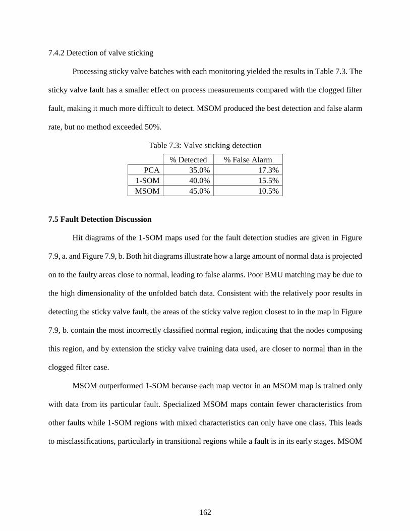
162
7.4.2 Detection of valve sticking
Processing sticky valve batches with each monitoring yielded the results in Table 7.3. The
sticky valve fault has a smaller effect on process measurements compared with the clogged filter
fault, making it much more difficult to detect. MSOM produced the best detection and false alarm
rate, but no method exceeded 50%.
Table 7.3: Valve sticking detection
% Detected % False Alarm
PCA 35.0% 17.3%
1-SOM 40.0% 15.5%
MSOM 45.0% 10.5%
7.5 Fault Detection Discussion
Hit diagrams of the 1-SOM maps used for the fault detection studies are given in Figure
7.9, a. and Figure 7.9, b. Both hit diagrams illustrate how a large amount of normal data is projected
on to the faulty areas close to normal, leading to false alarms. Poor BMU matching may be due to
the high dimensionality of the unfolded batch data. Consistent with the relatively poor results in
detecting the sticky valve fault, the areas of the sticky valve region closest to in the map in Figure
7.9, b. contain the most incorrectly classified normal region, indicating that the nodes composing
this region, and by extension the sticky valve training data used, are closer to normal than in the
clogged filter case.
MSOM outperformed 1-SOM because each map vector in an MSOM map is trained only
with data from its particular fault. Specialized MSOM maps contain fewer characteristics from
other faults while 1-SOM regions with mixed characteristics can only have one class. This leads
to misclassifications, particularly in transitional regions while a fault is in its early stages. MSOM
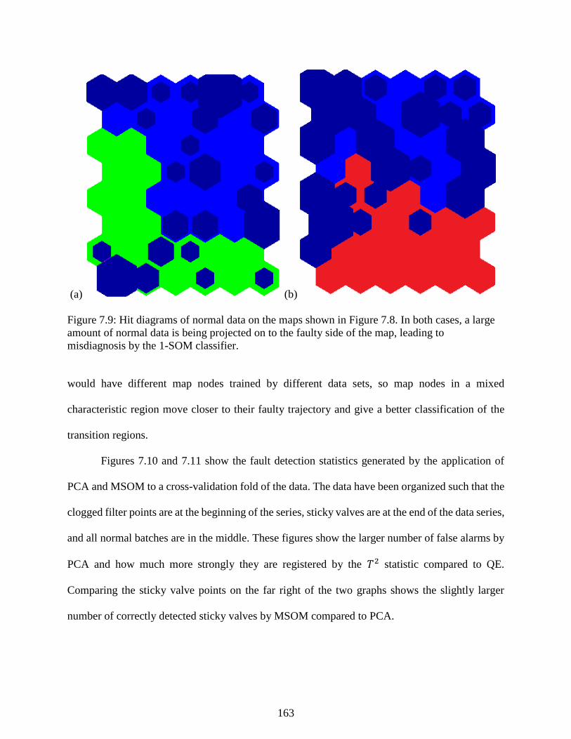
163
(a) (b)
Figure 7.9: Hit diagrams of normal data on the maps shown in Figure 7.8. In both cases, a large
amount of normal data is being projected on to the faulty side of the map, leading to
misdiagnosis by the 1-SOM classifier.
would have different map nodes trained by different data sets, so map nodes in a mixed
characteristic region move closer to their faulty trajectory and give a better classification of the
transition regions.
Figures 7.10 and 7.11 show the fault detection statistics generated by the application of
PCA and MSOM to a cross-validation fold of the data. The data have been organized such that the
clogged filter points are at the beginning of the series, sticky valves are at the end of the data series,
and all normal batches are in the middle. These figures show the larger number of false alarms by
PCA and how much more strongly they are registered by the 𝑇2 statistic compared to QE.
Comparing the sticky valve points on the far right of the two graphs shows the slightly larger
number of correctly detected sticky valves by MSOM compared to PCA.
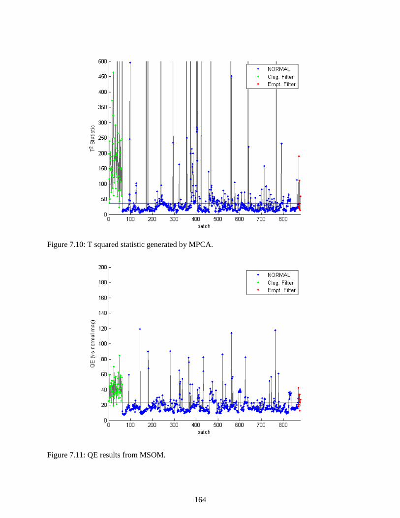
164
Figure 7.10: T squared statistic generated by MPCA.
Figure 7.11: QE results from MSOM.

165
7.6 Diagnosis of Both Reactor Conditions
Lastly, the multiway adaptations of each technique were tested head-to-head on the fault
diagnosis task. Table 7.4 presents the results. 1-SOM and MSOM perform approximately the same
as it did for the fault diagnosis task, except 1SOM had a significantly higher false alarm rate due
to additional fault classes affecting the map’s characterization of normal operating conditions. The
result that stands out the most is PCA’s failure to diagnose any batch with a clogged filter. The
reason for this can be seen in Figure 7.12, a. showing the fault diagnosis 𝑇2 statistic generated by
each fault PCA model at each time point checked. Likely due to issues with the small size of the
training data used in creating the sticky valve model, it yields very low fault detection statistics for
almost every type of batch, meaning MPCA consistently classified all fault batches with elevated
𝑇2 statistics as sticky valves, even clogged filters batches. Figure 7.12, b. shows MSOM’s
improved diagnosis performance: the correct class has the lowest QE value most often, meaning
the map corresponding to the correct class is the closest to that data point.
Table 7.4: Diagnosis of batch faults
% Correct Diagnosis
MPCA SOM MSOM
Clogged Filter 0.0% 66.9% 91.9%
Sticky Valve 35.0% 45% 40.0%
1-SOM False alarm rate: 53.5%
7.7 Conclusions
This study demonstrated the improved process monitoring abilities of the MSOM
technique over PCA-based process monitoring on an industrial-scale batch process. We used data-
based process monitoring techniques to model batches with clogged filters and sticky valves in the
reactor pump-around system. These events affect the product quality and their detection can
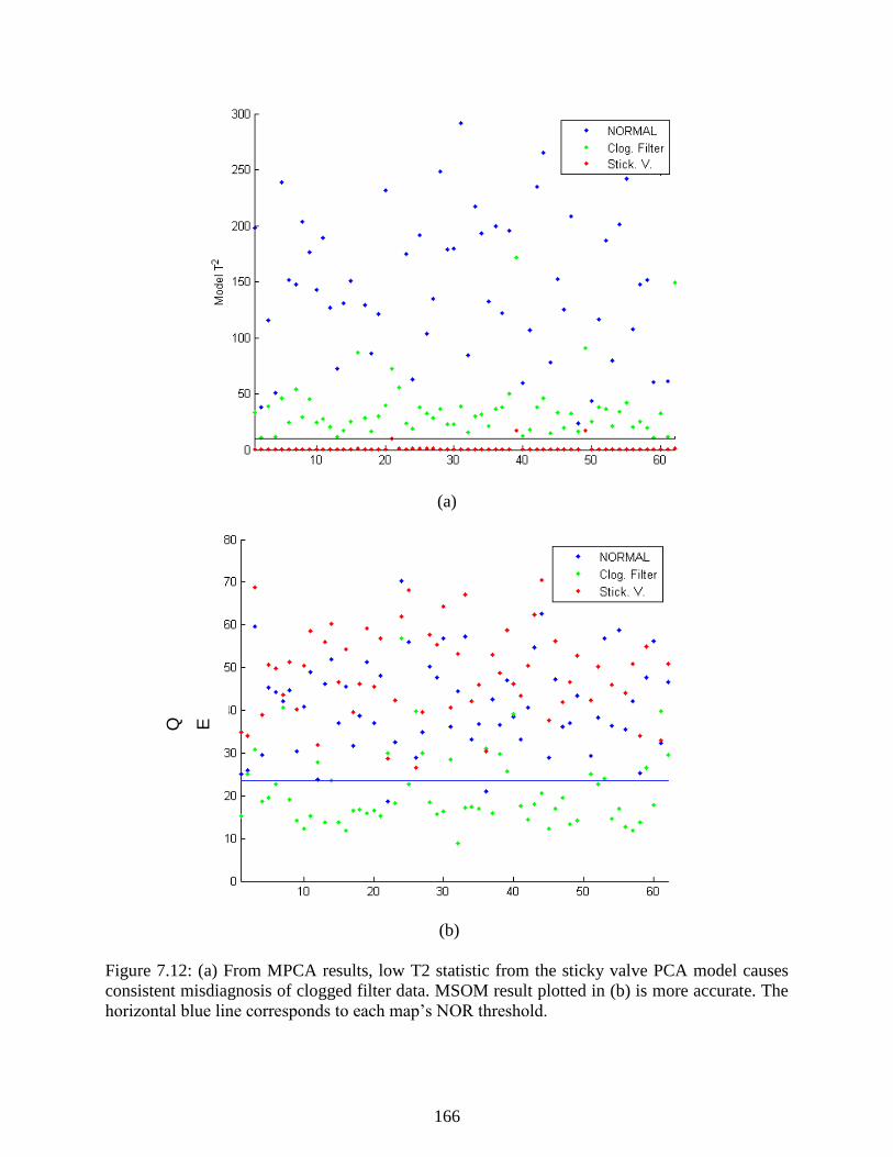
166
(a)
(b)
Figure 7.12: (a) From MPCA results, low T2 statistic from the sticky valve PCA model causes
consistent misdiagnosis of clogged filter data. MSOM result plotted in (b) is more accurate. The
horizontal blue line corresponds to each map’s NOR threshold.
Q E

167
improve the consistency of the reactor product and lower separation costs at a product finishing
plant.
The batch process monitoring schemes applied require advanced preprocessing techniques
to account for process dynamics and to allow us to adapt steady-state process monitoring
techniques. DTW was used to synchronize each batch into the same timeframe and enable the use
of multiway unfolding to reduce complex batch data sets into a single matrix for analysis. Finally,
the SMOTE procedure oversampled the smaller data set and undersampled the larger sets to ensure
that each group of data had a balanced representation in the training set.
Three process monitoring strategies were used to monitor this process and detect faults:
PCA, SOM, and MSOM. Batches with clogged filters were effectively detected by all the
techniques considered, however the sticky valve was much more difficult to detect. The most
effective technique at detecting the sticky valve, MSOM, only detected 45% of sticky valve faults.
Similar difficulties were encountered in diagnosis. PCA consistently misclassified clogged filters
as sticky valves due to the properties of the training data, while SOM had a very high false alarm
rate. MSOM retained a similar performance as in the detection steps and achieved the best
performance on challenging batch process.
7.8 References
Nomikos, P., & Macgregor, J. F. (1994). Monitoring batch processes using multiway principal
component analysis. American Institute of Chemical Engineers Journal, 40(8), 1361-1375.
Yao, Y., & Gao, F. (2009). A survey of multistage/multiphase statistical modeling methods for
batch processes. Annual Reviews in Control, 33, 172-183.

168
Chapter 8 - FastMan: A Software Tool for Data Mining Chemical
Process Data
8.1 Introduction
The overall goal of this dissertation is to make data-driven process monitoring simpler to
implement and maintain. Previous research on data clustering and dimensionality reduction
evaluated a set of tools for mining chemical process historical databases and separating normal
data from faulty data. We have studied a suite of tools to help lower the barrier for implementing
supervised process monitoring algorithms in chemical plants, but without a software user interface,
only engineers proficient in writing coding or other data mining tools could utilize the algorithms
previously studied.
The final step is to bring all the tools previously researched into a single chemical process
data mining software tool. Data mining is a relatively new field of study and is currently not a
common part of a typical plant engineer’s training. Few chemical process engineers have data
mining skills, so a data mining software tool should be simple to use and insulate users from the
intimate mathematical details of the data mining algorithms while at the same time assist them in
conducting a valid analysis.
This computer program would be specialized for chemical process time series data mining.
The key is to combine projections by dimensionality reduction techniques and data clustering
results with a time series plot of the different measurements an engineer might be studying. After
the engineer has used data clustering and dimensionality reduction to settle on new labels for the
historical data, the output of this program can be saved and loaded into a tool with the relevant
process monitoring algorithms for training or updating.
This chapter discusses FastMan (Fast Manual data classification), an assisted process data
clustering tool developed as part of the research in this dissertation. The basic functionality of this
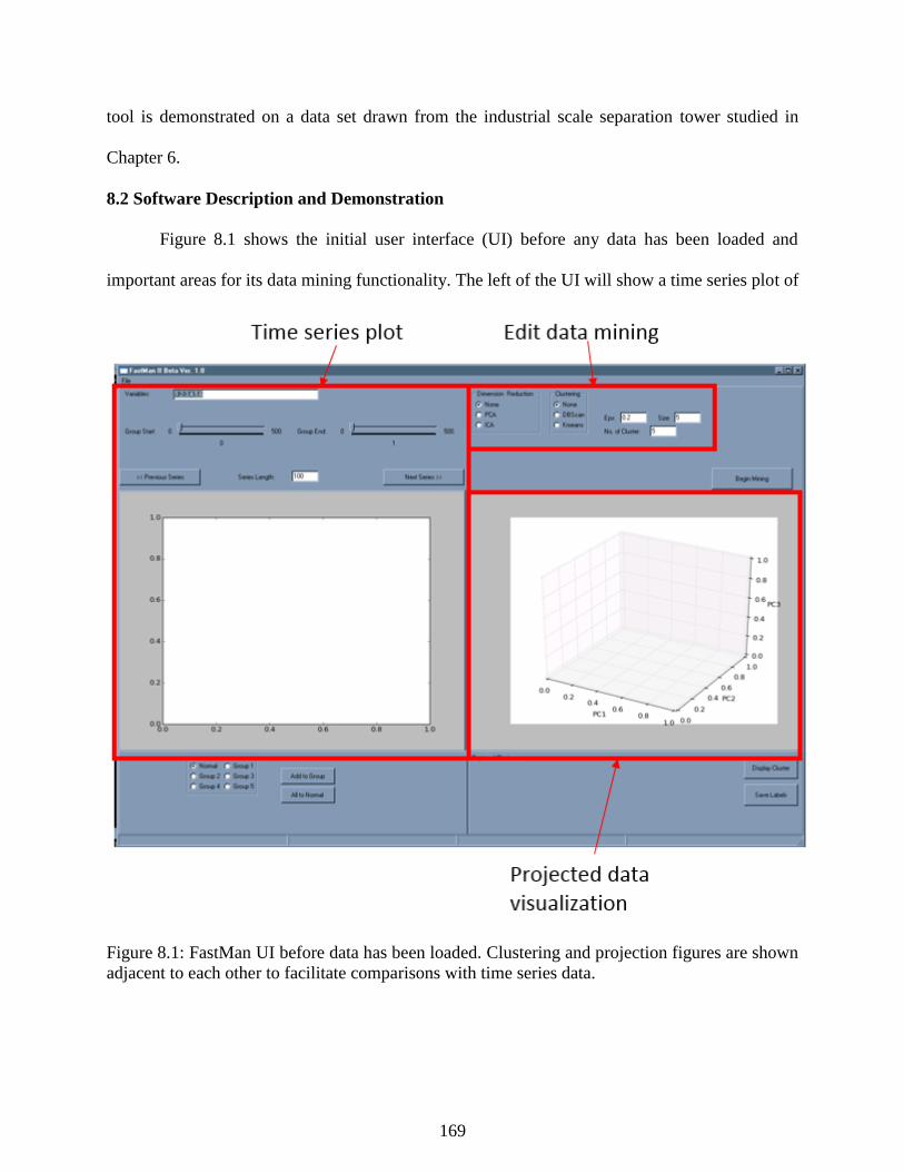
169
tool is demonstrated on a data set drawn from the industrial scale separation tower studied in
Chapter 6.
8.2 Software Description and Demonstration
Figure 8.1 shows the initial user interface (UI) before any data has been loaded and
important areas for its data mining functionality. The left of the UI will show a time series plot of
Figure 8.1: FastMan UI before data has been loaded. Clustering and projection figures are shown
adjacent to each other to facilitate comparisons with time series data.

170
the data from the chemical process. The user has control over how much of the data to show and
which sensors’ data to plot. The slider bars are used to select data for group classification. The
radio buttons at the bottom left are for the creation of user-specified data. The user must use the
slider bars to select a series of data and click a radio button to add the specified label to the selected
data.
The right side of the UI uses the data clustering and dimensionality reduction tools. The
controls at the top can change the parameters of the data clustering algorithm used (𝑘 in K-means
for example). The user can also select which dimensionality reduction technique to use to project
the data with principal component analysis (PCA) functioning as the default. Arranging the two
screens side by side in this manner is important because it highlights the connection between
process behavior visible in the time series data and the movement of the state of the process in the
DR projected data space on the right.
Figure 8.2 shows FastMan’s UI with time series data from the industrial scale separation
tower. The plot on the left shows a time series plot of all the data after normalization to unit mean
and variance. By default, all sensor patterns are shown in the time series plot window. As no data
clustering technique has been selected, the projected data to the right is shown in one color.
The screenshot in Figure 8.3 shows FastMan after DBSCAN clustering has been
performed. Noise data is shown in black while the other clusters are plotted in different colors.
Using controls in the bottom right of the UI, the user can select data from different clusters and
give them custom labels. Selection of a cluster highlights its data in the time series plots to the left,
allowing simpler evaluation of the data relative to the actual sensor behavior in the process. The
light green cluster in the figure is from a single continuous series of data which corresponds to the
fault condition the clustering research in Chapter 6 sought to locate.

171
Figure 8.2: FastMan UI with data from the industrial separation tower.
8.3 Conclusions
This chapter demonstrated a software tool that could be used to assist in the creation of
training data for supervised classification algorithms from raw chemical process data. The
demonstration showed how projections of high dimensional process data can be clustered and data
from process events of interest can be located in large amounts of chemical process data. Future
work could further develop this tool and integrate the clustering functionality with a program to
train, maintain, and use PCA, SOM, or other process monitoring algorithms.
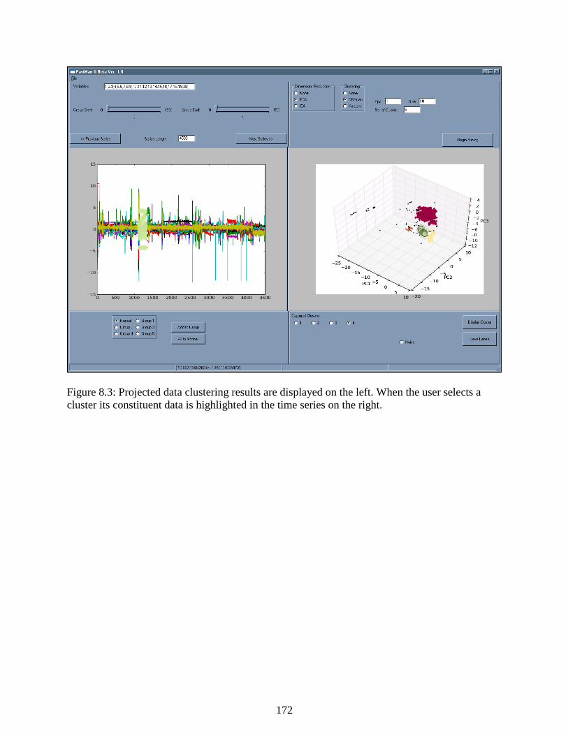
172
Figure 8.3: Projected data clustering results are displayed on the left. When the user selects a
cluster its constituent data is highlighted in the time series on the right.

173
Chapter 9 - Conclusions
9.1 Summary of Results
The research in this dissertation has focused on improving the performance and
construction of process monitoring algorithms. The contributions address challenges in finding
training data in unlabeled chemical process databases, in process monitoring tasks, and in novelty
detection. Each aspect of this research was demonstrated on a simulation and validated on real
industrial processes. In summary, the findings of this dissertation are as follows:
Improved process monitoring with multiple self-organizing maps (MSOM): we introduced
a novel process monitoring strategy using multiple self-organizing maps to perform the
complete suite of process monitoring tasks including fault detection, identification, and
diagnosis. We demonstrate the advantages of MSOM by monitoring the benchmark
Tennessee Eastman process and diagnosing a reduced set and the complete set of process
faults. MSOM performed better than more standard techniques at detection and diagnosis
while generating more accurate and informative contribution plots for identifying the
section of the process responsible for a faulty status.
Batch process monitoring with MSOM, dynamic time warping (DTW), and multiway
unfolding: we adapted MSOM to batch process monitoring using multiway unfolding to
process the batch data and DTW to synchronize each batch to a common time frame. The
results of a batch monitoring study demonstrate MSOM’s superior performance in
detecting and diagnosing two faults in the batch.
SOM applied for novelty detection on separation tower: we used SOM to model 3 different
operating regimes of an industrial-scale separations tower. The SOM model we created
diagnosed the process state more accurately than PCA models trained to the same set of

174
data. Furthermore, SOM contribution plots indicated the variables at the bottom of the
tower that were responsible for the faulty status.
Unsupervised classification of chemical process data: a data mining scheme based on
dimensionality reduction and data clustering separated faulty process data from normal
operations data in two case studies on the Tennessee Eastman process and the industrial-
separation tower. Results between the different combinations of reduction and clustering
techniques varied, but in general dimensionality reduction improved the accuracy of the
clusters found relative to their true labels.
FastMan - a process data mining software tool: we created a software tool designed to
simplify the widespread application of supervised and unsupervised classification methods
by engineering practitioners. FastMan connects projections of high dimensional data and
data clustering results to time series plots of sensor data. The side-by-side visualization and
plots of process data make data from abnormal operations easier to distinguish from normal
operating data and simplifies the use of this data in fitting process monitoring methods.
9.2 Future Research Recommendations
The research in this dissertation opened new avenues of research in using data mining and
machine learning for process monitoring. The following questions naturally follow from the results
in this dissertation:
Can data mining and machine learning predict equipment faults before they occur?
Anticipating the failures in process equipment could offer substantial savings compared to
fixed replacement maintenance schedules and avoid the costs of unexpected equipment
failures in run-to-failure schemes.

175
Given a set of labels from data clustering, what unsupervised clustering metrics are best
for finding optimal clustering parameters for a given set of data? From the results of the
Davies-Bouldin Index (DBI) in the complete clustering results of Appendix A, the most
accurate clustering results do not always coincide with the best DBI value. Unsupervised
clustering metrics are important tools to judge the suitability of clustering results, and better
metrics could make cluster parameter selection easier.
Given the discovery of several clusters in an industrial data set from different time periods,
how can an engineer know the significance of the difference? It is possible that an engineer
can observe two separate clusters that appear to be normal, but not be able to determine a
clear reason for the difference. Further research on statistical or computational tools can
address this data clustering issue and assist in interpreting clustering results.
Many features could be added to FastMan to enhance its capabilities. There are certainly
more dimensionality reduction and data clustering techniques than those implemented in
Chapter 8, but additional features could make the software more interactive. Additional
analysis tools to isolate the sensor measurements that differentiate clusters from each other
are crucial for assisting engineers in extracting meaningful knowledge from clustering
results. Also, the UI could be further modified to better suit chemical engineers. For
example, chemical process databases contain many discrete variables that correspond to
feed grades or changes in operations which could affect the clustering and monitoring of
the process, and tools could be added to easily clean the loaded dataset using these
variables.

176
Appendix A - Complete Clustering Results
In this dissertation, three data sets were studied using six dimensionality reduction
techniques and four clustering techniques, while varying a parameter of each clustering technique
between five different values. This approach gives rise to 120 different clustering runs, of which
only the best of each DR and clustering combination are selected and presented with the results
earlier. However, the remaining results are a important window into the challenges of data
clustering and unsupervised classification. It is difficult to identify an effective parameter setting
for some clustering techniques, and many of the results shown below vary dramatically depending
on the precise setting of the key clustering parameter. For example, in Table 1 below, the best
DBSCAN with no DR result was produced an ARI of 0.48, while other parameter setting over the
same DR setting yielded ARIs of less than 0.1 (very inaccurate).
An important result reported in these results and not discussed is earlier is the V-measure
and Davies-Bouldin Index (DBI). V-measure is the weighted average of the Completeness and
Homogeneity of each clustering result and helps to judge those metrics in combination. The DBI
of each clustering result is particularly important as DBI is an unsupervised cluster evaluation
metric. In a real data clustering study where previous data labels are not known, DBI would be the
only evaluation metric available to engineers. In many cases the DBI may not provide a good
characterization of accuracy because its definition biases it towards spherical clusters.
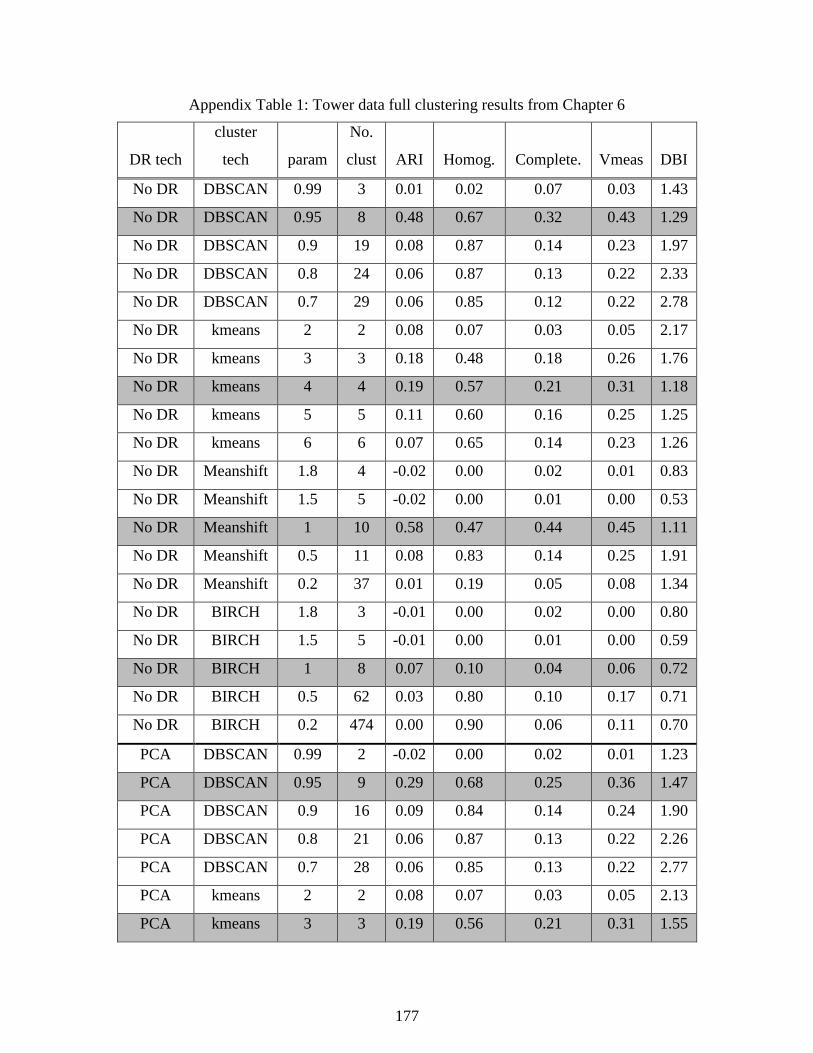
177
Appendix Table 1: Tower data full clustering results from Chapter 6
DR tech
cluster
tech param
No.
clust ARI Homog. Complete. Vmeas DBI
No DR DBSCAN 0.99 3 0.01 0.02 0.07 0.03 1.43
No DR DBSCAN 0.95 8 0.48 0.67 0.32 0.43 1.29
No DR DBSCAN 0.9 19 0.08 0.87 0.14 0.23 1.97
No DR DBSCAN 0.8 24 0.06 0.87 0.13 0.22 2.33
No DR DBSCAN 0.7 29 0.06 0.85 0.12 0.22 2.78
No DR kmeans 2 2 0.08 0.07 0.03 0.05 2.17
No DR kmeans 3 3 0.18 0.48 0.18 0.26 1.76
No DR kmeans 4 4 0.19 0.57 0.21 0.31 1.18
No DR kmeans 5 5 0.11 0.60 0.16 0.25 1.25
No DR kmeans 6 6 0.07 0.65 0.14 0.23 1.26
No DR Meanshift 1.8 4 -0.02 0.00 0.02 0.01 0.83
No DR Meanshift 1.5 5 -0.02 0.00 0.01 0.00 0.53
No DR Meanshift 1 10 0.58 0.47 0.44 0.45 1.11
No DR Meanshift 0.5 11 0.08 0.83 0.14 0.25 1.91
No DR Meanshift 0.2 37 0.01 0.19 0.05 0.08 1.34
No DR BIRCH 1.8 3 -0.01 0.00 0.02 0.00 0.80
No DR BIRCH 1.5 5 -0.01 0.00 0.01 0.00 0.59
No DR BIRCH 1 8 0.07 0.10 0.04 0.06 0.72
No DR BIRCH 0.5 62 0.03 0.80 0.10 0.17 0.71
No DR BIRCH 0.2 474 0.00 0.90 0.06 0.11 0.70
PCA DBSCAN 0.99 2 -0.02 0.00 0.02 0.01 1.23
PCA DBSCAN 0.95 9 0.29 0.68 0.25 0.36 1.47
PCA DBSCAN 0.9 16 0.09 0.84 0.14 0.24 1.90
PCA DBSCAN 0.8 21 0.06 0.87 0.13 0.22 2.26
PCA DBSCAN 0.7 28 0.06 0.85 0.13 0.22 2.77
PCA kmeans 2 2 0.08 0.07 0.03 0.05 2.13
PCA kmeans 3 3 0.19 0.56 0.21 0.31 1.55
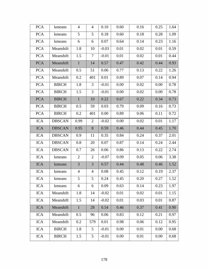
178
PCA kmeans 4 4 0.10 0.60 0.16 0.25 1.64
PCA kmeans 5 5 0.18 0.60 0.18 0.28 1.09
PCA kmeans 6 6 0.07 0.64 0.14 0.23 1.16
PCA Meanshift 1.8 10 -0.03 0.01 0.02 0.01 0.59
PCA Meanshift 1.5 7 -0.01 0.01 0.02 0.01 0.44
PCA Meanshift 1 14 0.57 0.47 0.42 0.44 0.93
PCA Meanshift 0.5 51 0.06 0.77 0.13 0.22 1.26
PCA Meanshift 0.2 401 0.01 0.89 0.07 0.14 0.94
PCA BIRCH 1.8 3 -0.01 0.00 0.02 0.00 0.78
PCA BIRCH 1.5 3 -0.01 0.00 0.02 0.00 0.78
PCA BIRCH 1 10 0.22 0.67 0.22 0.34 0.73
PCA BIRCH 0.5 59 0.03 0.79 0.09 0.16 0.73
PCA BIRCH 0.2 401 0.00 0.89 0.06 0.11 0.72
ICA DBSCAN 0.99 2 -0.02 0.00 0.02 0.01 1.17
ICA DBSCAN 0.95 8 0.59 0.46 0.44 0.45 1.70
ICA DBSCAN 0.9 11 0.35 0.84 0.24 0.37 2.01
ICA DBSCAN 0.8 20 0.07 0.87 0.14 0.24 2.44
ICA DBSCAN 0.7 26 0.06 0.86 0.13 0.22 2.74
ICA kmeans 2 2 -0.07 0.09 0.05 0.06 3.38
ICA kmeans 3 3 0.57 0.44 0.48 0.46 1.52
ICA kmeans 4 4 0.08 0.45 0.12 0.19 2.37
ICA kmeans 5 5 0.24 0.45 0.20 0.27 1.52
ICA kmeans 6 6 0.09 0.63 0.14 0.23 1.97
ICA Meanshift 1.8 14 -0.02 0.01 0.02 0.01 1.15
ICA Meanshift 1.5 14 -0.02 0.01 0.03 0.01 0.87
ICA Meanshift 1 28 0.54 0.46 0.37 0.41 0.90
ICA Meanshift 0.5 96 0.06 0.83 0.12 0.21 0.97
ICA Meanshift 0.2 579 0.01 0.98 0.06 0.12 0.95
ICA BIRCH 1.8 5 -0.01 0.00 0.01 0.00 0.68
ICA BIRCH 1.5 5 -0.01 0.00 0.01 0.00 0.68
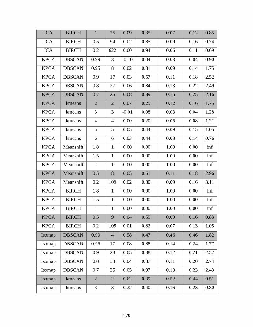
179
ICA BIRCH 1 25 0.09 0.35 0.07 0.12 0.85
ICA BIRCH 0.5 94 0.02 0.85 0.09 0.16 0.74
ICA BIRCH 0.2 622 0.00 0.94 0.06 0.11 0.69
KPCA DBSCAN 0.99 3 -0.10 0.04 0.03 0.04 0.90
KPCA DBSCAN 0.95 8 0.02 0.31 0.09 0.14 1.75
KPCA DBSCAN 0.9 17 0.03 0.57 0.11 0.18 2.52
KPCA DBSCAN 0.8 27 0.06 0.84 0.13 0.22 2.49
KPCA DBSCAN 0.7 25 0.08 0.89 0.15 0.25 2.16
KPCA kmeans 2 2 0.07 0.25 0.12 0.16 1.75
KPCA kmeans 3 3 -0.01 0.08 0.03 0.04 1.28
KPCA kmeans 4 4 0.00 0.20 0.05 0.08 1.21
KPCA kmeans 5 5 0.05 0.44 0.09 0.15 1.05
KPCA kmeans 6 6 0.03 0.44 0.08 0.14 0.76
KPCA Meanshift 1.8 1 0.00 0.00 1.00 0.00 inf
KPCA Meanshift 1.5 1 0.00 0.00 1.00 0.00 Inf
KPCA Meanshift 1 1 0.00 0.00 1.00 0.00 Inf
KPCA Meanshift 0.5 8 0.05 0.61 0.11 0.18 2.96
KPCA Meanshift 0.2 109 0.02 0.80 0.09 0.16 3.11
KPCA BIRCH 1.8 1 0.00 0.00 1.00 0.00 Inf
KPCA BIRCH 1.5 1 0.00 0.00 1.00 0.00 Inf
KPCA BIRCH 1 1 0.00 0.00 1.00 0.00 Inf
KPCA BIRCH 0.5 9 0.04 0.59 0.09 0.16 0.83
KPCA BIRCH 0.2 105 0.01 0.82 0.07 0.13 1.05
Isomap DBSCAN 0.99 4 0.58 0.47 0.46 0.46 1.82
Isomap DBSCAN 0.95 17 0.08 0.88 0.14 0.24 1.77
Isomap DBSCAN 0.9 23 0.05 0.88 0.12 0.21 2.52
Isomap DBSCAN 0.8 34 0.04 0.87 0.11 0.20 2.74
Isomap DBSCAN 0.7 35 0.05 0.97 0.13 0.23 2.43
Isomap kmeans 2 2 0.62 0.39 0.52 0.44 0.51
Isomap kmeans 3 3 0.22 0.40 0.16 0.23 0.80
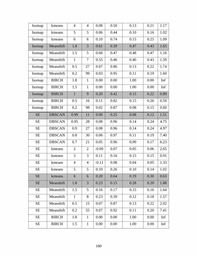
180
Isomap kmeans 4 4 0.08 0.50 0.13 0.21 1.17
Isomap kmeans 5 5 0.06 0.44 0.10 0.16 1.02
Isomap kmeans 6 6 0.10 0.74 0.15 0.25 1.09
Isomap Meanshift 1.8 3 0.61 0.39 0.47 0.43 1.65
Isomap Meanshift 1.5 5 0.60 0.47 0.48 0.47 1.16
Isomap Meanshift 1 7 0.55 0.46 0.40 0.43 1.59
Isomap Meanshift 0.5 27 0.07 0.86 0.13 0.22 1.74
Isomap Meanshift 0.2 99 0.03 0.95 0.11 0.19 1.60
Isomap BIRCH 1.8 1 0.00 0.00 1.00 0.00 Inf
Isomap BIRCH 1.5 1 0.00 0.00 1.00 0.00 Inf
Isomap BIRCH 1 9 0.20 0.42 0.15 0.22 0.89
Isomap BIRCH 0.5 16 0.11 0.82 0.15 0.26 0.59
Isomap BIRCH 0.2 98 0.02 0.87 0.08 0.15 0.60
SE DBSCAN 0.99 11 0.09 0.25 0.08 0.12 1.51
SE DBSCAN 0.95 28 0.08 0.96 0.14 0.24 4.75
SE DBSCAN 0.9 27 0.08 0.96 0.14 0.24 4.97
SE DBSCAN 0.8 30 0.06 0.97 0.11 0.19 7.40
SE DBSCAN 0.7 21 0.05 0.96 0.09 0.17 6.23
SE kmeans 2 2 -0.09 0.07 0.05 0.06 2.65
SE kmeans 3 3 0.11 0.16 0.15 0.15 0.91
SE kmeans 4 4 -0.11 0.08 0.04 0.05 1.33
SE kmeans 5 5 0.10 0.26 0.10 0.14 1.02
SE kmeans 6 6 0.20 0.64 0.19 0.30 0.63
SE Meanshift 1.8 3 0.23 0.15 0.28 0.20 1.88
SE Meanshift 1.5 5 0.16 0.17 0.15 0.16 1.64
SE Meanshift 1 8 0.23 0.39 0.12 0.18 1.57
SE Meanshift 0.5 15 0.07 0.87 0.13 0.22 2.02
SE Meanshift 0.2 55 0.07 0.92 0.11 0.20 7.41
SE BIRCH 1.8 1 0.00 0.00 1.00 0.00 Inf
SE BIRCH 1.5 1 0.00 0.00 1.00 0.00 Inf
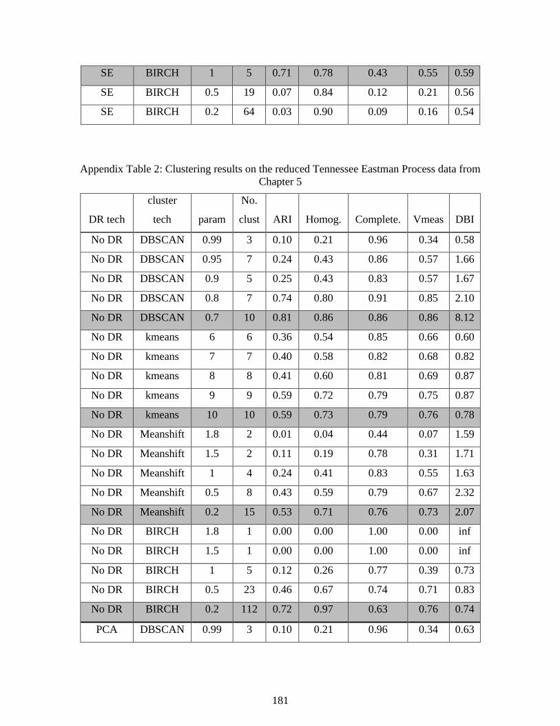
181
SE BIRCH 1 5 0.71 0.78 0.43 0.55 0.59
SE BIRCH 0.5 19 0.07 0.84 0.12 0.21 0.56
SE BIRCH 0.2 64 0.03 0.90 0.09 0.16 0.54
Appendix Table 2: Clustering results on the reduced Tennessee Eastman Process data from
Chapter 5
DR tech
cluster
tech param
No.
clust ARI Homog. Complete. Vmeas DBI
No DR DBSCAN 0.99 3 0.10 0.21 0.96 0.34 0.58
No DR DBSCAN 0.95 7 0.24 0.43 0.86 0.57 1.66
No DR DBSCAN 0.9 5 0.25 0.43 0.83 0.57 1.67
No DR DBSCAN 0.8 7 0.74 0.80 0.91 0.85 2.10
No DR DBSCAN 0.7 10 0.81 0.86 0.86 0.86 8.12
No DR kmeans 6 6 0.36 0.54 0.85 0.66 0.60
No DR kmeans 7 7 0.40 0.58 0.82 0.68 0.82
No DR kmeans 8 8 0.41 0.60 0.81 0.69 0.87
No DR kmeans 9 9 0.59 0.72 0.79 0.75 0.87
No DR kmeans 10 10 0.59 0.73 0.79 0.76 0.78
No DR Meanshift 1.8 2 0.01 0.04 0.44 0.07 1.59
No DR Meanshift 1.5 2 0.11 0.19 0.78 0.31 1.71
No DR Meanshift 1 4 0.24 0.41 0.83 0.55 1.63
No DR Meanshift 0.5 8 0.43 0.59 0.79 0.67 2.32
No DR Meanshift 0.2 15 0.53 0.71 0.76 0.73 2.07
No DR BIRCH 1.8 1 0.00 0.00 1.00 0.00 inf
No DR BIRCH 1.5 1 0.00 0.00 1.00 0.00 inf
No DR BIRCH 1 5 0.12 0.26 0.77 0.39 0.73
No DR BIRCH 0.5 23 0.46 0.67 0.74 0.71 0.83
No DR BIRCH 0.2 112 0.72 0.97 0.63 0.76 0.74
PCA DBSCAN 0.99 3 0.10 0.21 0.96 0.34 0.63

182
PCA DBSCAN 0.95 7 0.23 0.42 0.84 0.56 2.01
PCA DBSCAN 0.9 5 0.24 0.42 0.83 0.56 1.54
PCA DBSCAN 0.8 8 0.53 0.66 0.88 0.76 1.79
PCA DBSCAN 0.7 6 0.49 0.61 0.84 0.71 1.68
PCA kmeans 6 6 0.36 0.54 0.85 0.66 0.61
PCA kmeans 7 7 0.40 0.58 0.82 0.68 0.70
PCA kmeans 8 8 0.55 0.67 0.79 0.72 0.75
PCA kmeans 9 9 0.59 0.72 0.79 0.75 0.75
PCA kmeans 10 10 0.59 0.72 0.79 0.75 0.82
PCA Meanshift 1.8 2 0.10 0.19 0.79 0.30 1.58
PCA Meanshift 1.5 4 0.11 0.24 0.80 0.37 1.08
PCA Meanshift 1 12 0.38 0.57 0.81 0.67 1.18
PCA Meanshift 0.5 34 0.42 0.63 0.73 0.68 0.77
PCA Meanshift 0.2 148 0.61 0.80 0.59 0.68 0.86
PCA BIRCH 1.8 1 0.00 0.00 1.00 0.00 inf
PCA BIRCH 1.5 1 0.00 0.00 1.00 0.00 inf
PCA BIRCH 1 5 0.12 0.28 0.77 0.41 0.71
PCA BIRCH 0.5 22 0.46 0.67 0.75 0.70 0.74
PCA BIRCH 0.2 83 0.65 0.86 0.64 0.73 0.65
ICA DBSCAN 0.99 4 0.10 0.21 0.91 0.34 0.89
ICA DBSCAN 0.95 5 0.21 0.39 0.83 0.53 2.31
ICA DBSCAN 0.9 5 0.24 0.43 0.83 0.56 2.56
ICA DBSCAN 0.8 10 0.52 0.67 0.85 0.75 2.11
ICA DBSCAN 0.7 10 0.52 0.66 0.77 0.71 2.37
ICA kmeans 6 6 0.56 0.67 0.85 0.75 1.04
ICA kmeans 7 7 0.55 0.67 0.84 0.74 0.82
ICA kmeans 8 8 0.56 0.69 0.82 0.75 0.75
ICA kmeans 9 9 0.56 0.69 0.81 0.75 0.66
ICA kmeans 10 10 0.58 0.71 0.79 0.75 0.75
ICA Meanshift 1.8 4 0.01 0.04 0.38 0.07 1.41
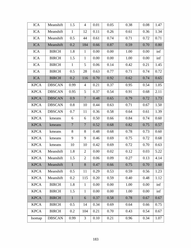
183
ICA Meanshift 1.5 4 0.01 0.05 0.38 0.08 1.47
ICA Meanshift 1 12 0.11 0.26 0.61 0.36 1.34
ICA Meanshift 0.5 44 0.61 0.74 0.71 0.72 0.71
ICA Meanshift 0.2 184 0.66 0.87 0.59 0.70 0.80
ICA BIRCH 1.8 1 0.00 0.00 1.00 0.00 inf
ICA BIRCH 1.5 1 0.00 0.00 1.00 0.00 inf
ICA BIRCH 1 5 0.06 0.14 0.42 0.21 1.45
ICA BIRCH 0.5 28 0.63 0.77 0.71 0.74 0.72
ICA BIRCH 0.2 116 0.70 0.92 0.62 0.74 0.65
KPCA DBSCAN 0.99 4 0.21 0.37 0.95 0.54 1.05
KPCA DBSCAN 0.95 5 0.37 0.54 0.91 0.68 2.11
KPCA DBSCAN 0.9 7 0.48 0.65 0.79 0.72 1.73
KPCA DBSCAN 0.8 10 0.44 0.63 0.71 0.67 1.50
KPCA DBSCAN 0.7 11 0.36 0.58 0.64 0.61 1.39
KPCA kmeans 6 6 0.50 0.66 0.84 0.74 0.60
KPCA kmeans 7 7 0.52 0.68 0.82 0.75 0.57
KPCA kmeans 8 8 0.48 0.68 0.78 0.73 0.60
KPCA kmeans 9 9 0.46 0.69 0.75 0.72 0.68
KPCA kmeans 10 10 0.42 0.69 0.72 0.70 0.63
KPCA Meanshift 1.8 2 0.00 0.02 0.12 0.03 5.22
KPCA Meanshift 1.5 2 0.06 0.09 0.27 0.13 4.14
KPCA Meanshift 1 8 0.47 0.66 0.75 0.70 1.60
KPCA Meanshift 0.5 11 0.29 0.53 0.59 0.56 1.23
KPCA Meanshift 0.2 115 0.20 0.59 0.40 0.48 1.12
KPCA BIRCH 1.8 1 0.00 0.00 1.00 0.00 inf
KPCA BIRCH 1.5 1 0.00 0.00 1.00 0.00 inf
KPCA BIRCH 1 6 0.37 0.58 0.78 0.67 0.67
KPCA BIRCH 0.5 14 0.34 0.69 0.64 0.66 0.75
KPCA BIRCH 0.2 104 0.21 0.70 0.43 0.54 0.67
Isomap DBSCAN 0.99 3 0.10 0.21 0.96 0.34 1.07
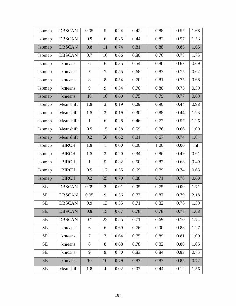
184
Isomap DBSCAN 0.95 5 0.24 0.42 0.88 0.57 1.68
Isomap DBSCAN 0.9 6 0.25 0.44 0.82 0.57 1.53
Isomap DBSCAN 0.8 11 0.74 0.81 0.88 0.85 1.65
Isomap DBSCAN 0.7 16 0.66 0.80 0.76 0.78 1.75
Isomap kmeans 6 6 0.35 0.54 0.86 0.67 0.69
Isomap kmeans 7 7 0.55 0.68 0.83 0.75 0.62
Isomap kmeans 8 8 0.54 0.70 0.81 0.75 0.68
Isomap kmeans 9 9 0.54 0.70 0.80 0.75 0.59
Isomap kmeans 10 10 0.60 0.75 0.79 0.77 0.69
Isomap Meanshift 1.8 3 0.19 0.29 0.90 0.44 0.98
Isomap Meanshift 1.5 3 0.19 0.30 0.88 0.44 1.23
Isomap Meanshift 1 6 0.28 0.46 0.77 0.57 1.26
Isomap Meanshift 0.5 15 0.38 0.59 0.76 0.66 1.09
Isomap Meanshift 0.2 56 0.62 0.81 0.67 0.74 1.04
Isomap BIRCH 1.8 1 0.00 0.00 1.00 0.00 inf
Isomap BIRCH 1.5 3 0.20 0.34 0.86 0.49 0.61
Isomap BIRCH 1 5 0.32 0.50 0.87 0.63 0.40
Isomap BIRCH 0.5 12 0.55 0.69 0.79 0.74 0.63
Isomap BIRCH 0.2 35 0.70 0.88 0.71 0.78 0.60
SE DBSCAN 0.99 3 0.01 0.05 0.75 0.09 1.71
SE DBSCAN 0.95 9 0.56 0.73 0.87 0.79 2.18
SE DBSCAN 0.9 13 0.55 0.71 0.82 0.76 1.59
SE DBSCAN 0.8 15 0.67 0.78 0.78 0.78 1.68
SE DBSCAN 0.7 22 0.55 0.71 0.69 0.70 1.74
SE kmeans 6 6 0.69 0.76 0.90 0.83 1.27
SE kmeans 7 7 0.64 0.75 0.89 0.81 1.00
SE kmeans 8 8 0.68 0.78 0.82 0.80 1.05
SE kmeans 9 9 0.70 0.83 0.84 0.83 0.75
SE kmeans 10 10 0.79 0.87 0.83 0.85 0.72
SE Meanshift 1.8 4 0.02 0.07 0.44 0.12 1.56
185
SE Meanshift 1.5 5 0.02 0.08 0.39 0.14 1.23
SE Meanshift 1 7 0.10 0.25 0.51 0.33 1.17
SE Meanshift 0.5 19 0.44 0.62 0.65 0.64 1.08
SE Meanshift 0.2 62 0.48 0.81 0.58 0.67 0.84
SE BIRCH 1.8 1 0.00 0.00 1.00 0.00 inf
SE BIRCH 1.5 1 0.00 0.00 1.00 0.00 inf
SE BIRCH 1 7 0.26 0.48 0.76 0.59 0.81
SE BIRCH 0.5 16 0.71 0.84 0.83 0.84 0.51
SE BIRCH 0.2 58 0.52 0.93 0.60 0.72 0.45
Appendix Table 3: Clustering results on the full Tennessee Eastman Process data
from Chapter 5
DR tech
cluster
tech param
No.
clust ARI Homog. Complete. Vmeas DBI
No DR DBSCAN 0.99 4 0.01 0.07 0.89 0.13 1.66
No DR DBSCAN 0.95 9 0.03 0.17 0.79 0.28 2.00
No DR DBSCAN 0.9 14 0.04 0.20 0.78 0.31 2.18
No DR DBSCAN 0.8 16 0.08 0.29 0.80 0.43 2.07
No DR DBSCAN 0.7 19 0.13 0.37 0.80 0.51 2.69
No DR kmeans 19 19 0.11 0.44 0.73 0.55 0.96
No DR kmeans 20 20 0.10 0.42 0.73 0.53 0.89
No DR kmeans 21 21 0.12 0.46 0.71 0.55 1.01
No DR kmeans 22 22 0.11 0.46 0.73 0.56 0.91
No DR kmeans 23 23 0.11 0.45 0.72 0.56 1.05
No DR Meanshift 1.8 6 0.03 0.15 0.74 0.25 1.16
No DR Meanshift 1.5 9 0.04 0.20 0.71 0.31 1.26
No DR Meanshift 1 16 0.06 0.27 0.74 0.39 1.13
No DR Meanshift 0.5 32 0.10 0.32 0.68 0.44 1.19
No DR Meanshift 0.2 227 0.16 0.46 0.63 0.53 1.80
186
No DR BIRCH 1.8 1 0.00 0.00 1.00 0.00 inf
No DR BIRCH 1.5 10 0.02 0.16 0.66 0.25 1.16
No DR BIRCH 1 22 0.05 0.30 0.73 0.42 0.92
No DR BIRCH 0.5 133 0.09 0.48 0.62 0.54 0.83
No DR BIRCH 0.2 633 0.20 0.71 0.55 0.62 0.74
PCA DBSCAN 0.99 5 0.01 0.07 0.87 0.13 1.79
PCA DBSCAN 0.95 10 0.03 0.16 0.78 0.27 1.88
PCA DBSCAN 0.9 15 0.04 0.20 0.79 0.32 2.12
PCA DBSCAN 0.8 16 0.08 0.30 0.79 0.43 2.12
PCA DBSCAN 0.7 13 0.09 0.30 0.79 0.43 2.59
PCA kmeans 19 19 0.12 0.44 0.71 0.54 0.94
PCA kmeans 20 20 0.11 0.43 0.72 0.53 0.75
PCA kmeans 21 21 0.12 0.45 0.71 0.55 0.87
PCA kmeans 22 22 0.12 0.45 0.71 0.55 0.87
PCA kmeans 23 23 0.13 0.46 0.71 0.56 0.93
PCA Meanshift 1.8 10 0.03 0.18 0.72 0.29 1.09
PCA Meanshift 1.5 15 0.04 0.21 0.71 0.33 0.83
PCA Meanshift 1 41 0.06 0.29 0.70 0.41 0.88
PCA Meanshift 0.5 179 0.10 0.39 0.62 0.48 0.74
PCA Meanshift 0.2 654 0.16 0.57 0.54 0.55 1.19
PCA BIRCH 1.8 3 0.00 0.02 0.59 0.04 0.55
PCA BIRCH 1.5 11 0.02 0.16 0.67 0.26 0.99
PCA BIRCH 1 20 0.05 0.29 0.72 0.41 0.85
PCA BIRCH 0.5 126 0.09 0.46 0.62 0.53 0.79
PCA BIRCH 0.2 459 0.18 0.63 0.54 0.58 0.61
ICA DBSCAN 0.99 4 0.01 0.07 0.90 0.13 1.65
ICA DBSCAN 0.95 10 0.03 0.16 0.79 0.27 1.92
ICA DBSCAN 0.9 11 0.03 0.19 0.79 0.30 1.95
ICA DBSCAN 0.8 12 0.08 0.29 0.83 0.43 1.66
ICA DBSCAN 0.7 11 0.09 0.28 0.79 0.42 2.19
187
ICA kmeans 19 19 0.11 0.43 0.71 0.53 0.88
ICA kmeans 20 20 0.11 0.43 0.70 0.53 0.91
ICA kmeans 21 21 0.11 0.43 0.69 0.53 1.01
ICA kmeans 22 22 0.13 0.46 0.68 0.55 0.92
ICA kmeans 23 23 0.12 0.46 0.70 0.55 0.94
ICA Meanshift 1.8 10 0.04 0.21 0.73 0.32 1.22
ICA Meanshift 1.5 19 0.05 0.25 0.72 0.37 1.13
ICA Meanshift 1 50 0.08 0.32 0.68 0.44 0.90
ICA Meanshift 0.5 224 0.13 0.46 0.61 0.53 0.85
ICA Meanshift 0.2 789 0.16 0.56 0.53 0.54 0.88
ICA BIRCH 1.8 1 0.00 0.00 1.00 0.00 inf
ICA BIRCH 1.5 10 0.03 0.18 0.61 0.28 1.23
ICA BIRCH 1 31 0.07 0.35 0.67 0.46 0.95
ICA BIRCH 0.5 150 0.14 0.54 0.61 0.58 0.79
ICA BIRCH 0.2 591 0.19 0.65 0.51 0.57 0.63
KPCA DBSCAN 0.99 3 0.00 0.00 0.04 0.00 0.65
KPCA DBSCAN 0.95 4 0.00 0.00 0.12 0.01 1.03
KPCA DBSCAN 0.9 8 0.00 0.01 0.17 0.02 1.20
KPCA DBSCAN 0.8 21 0.00 0.03 0.21 0.05 1.29
KPCA DBSCAN 0.7 59 0.03 0.11 0.30 0.17 1.50
KPCA kmeans 19 19 0.11 0.36 0.49 0.41 1.18
KPCA kmeans 20 20 0.12 0.36 0.48 0.41 1.26
KPCA kmeans 21 21 0.12 0.36 0.48 0.41 1.31
KPCA kmeans 22 22 0.12 0.36 0.47 0.41 1.37
KPCA kmeans 23 23 0.11 0.36 0.47 0.41 1.22
KPCA Meanshift 1.8 2 0.01 0.05 0.30 0.09 2.39
KPCA Meanshift 1.5 3 0.08 0.19 0.69 0.30 1.25
KPCA Meanshift 1 9 0.13 0.34 0.69 0.46 1.56
KPCA Meanshift 0.5 561 0.11 0.38 0.34 0.36 1.06
KPCA Meanshift 0.2 1903 0.09 0.44 0.35 0.39 1.00
188
KPCA BIRCH 1.8 1 0.00 0.00 1.00 0.00 inf
KPCA BIRCH 1.5 5 0.10 0.28 0.72 0.40 1.23
KPCA BIRCH 1 21 0.11 0.33 0.47 0.39 1.33
KPCA BIRCH 0.5 493 0.12 0.42 0.36 0.39 0.97
KPCA BIRCH 0.2 1956 0.10 0.54 0.37 0.44 0.39
Isomap DBSCAN 0.99 5 0.01 0.07 0.88 0.13 1.38
Isomap DBSCAN 0.95 14 0.03 0.18 0.80 0.30 1.65
Isomap DBSCAN 0.9 14 0.04 0.20 0.81 0.32 1.40
Isomap DBSCAN 0.8 32 0.09 0.34 0.77 0.47 2.25
Isomap DBSCAN 0.7 38 0.13 0.39 0.73 0.50 3.56
Isomap kmeans 19 19 0.13 0.46 0.74 0.57 0.77
Isomap kmeans 20 20 0.12 0.44 0.72 0.55 0.72
Isomap kmeans 21 21 0.12 0.45 0.73 0.55 0.66
Isomap kmeans 22 22 0.13 0.48 0.73 0.58 0.75
Isomap kmeans 23 23 0.15 0.48 0.71 0.58 0.79
Isomap Meanshift 1.8 8 0.04 0.23 0.80 0.36 1.48
Isomap Meanshift 1.5 10 0.04 0.24 0.78 0.36 1.39
Isomap Meanshift 1 20 0.05 0.26 0.72 0.38 1.38
Isomap Meanshift 0.5 68 0.07 0.33 0.65 0.44 0.95
Isomap Meanshift 0.2 302 0.14 0.51 0.59 0.55 0.80
Isomap BIRCH 1.8 3 0.02 0.11 0.90 0.19 0.44
Isomap BIRCH 1.5 3 0.02 0.11 0.90 0.19 0.44
Isomap BIRCH 1 16 0.05 0.27 0.77 0.40 0.73
Isomap BIRCH 0.5 49 0.08 0.40 0.70 0.51 0.69
Isomap BIRCH 0.2 201 0.13 0.55 0.61 0.58 0.62
SE DBSCAN 0.99 5 0.01 0.09 0.86 0.16 1.91
SE DBSCAN 0.95 13 0.02 0.15 0.74 0.25 1.41
SE DBSCAN 0.9 13 0.06 0.27 0.81 0.40 1.53
SE DBSCAN 0.8 31 0.08 0.33 0.70 0.45 1.95
SE DBSCAN 0.7 60 0.08 0.35 0.58 0.44 1.95
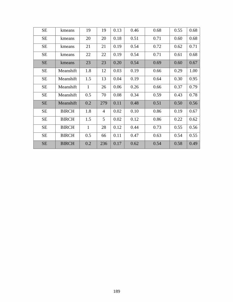
189
SE kmeans 19 19 0.13 0.46 0.68 0.55 0.68
SE kmeans 20 20 0.18 0.51 0.71 0.60 0.68
SE kmeans 21 21 0.19 0.54 0.72 0.62 0.71
SE kmeans 22 22 0.19 0.54 0.71 0.61 0.68
SE kmeans 23 23 0.20 0.54 0.69 0.60 0.67
SE Meanshift 1.8 12 0.03 0.19 0.66 0.29 1.00
SE Meanshift 1.5 13 0.04 0.19 0.64 0.30 0.95
SE Meanshift 1 26 0.06 0.26 0.66 0.37 0.79
SE Meanshift 0.5 70 0.08 0.34 0.59 0.43 0.78
SE Meanshift 0.2 279 0.11 0.48 0.51 0.50 0.56
SE BIRCH 1.8 4 0.02 0.10 0.86 0.19 0.67
SE BIRCH 1.5 5 0.02 0.12 0.86 0.22 0.62
SE BIRCH 1 28 0.12 0.44 0.73 0.55 0.56
SE BIRCH 0.5 66 0.11 0.47 0.63 0.54 0.55
SE BIRCH 0.2 236 0.17 0.62 0.54 0.58 0.49

190
Vita
Michael Thomas was born and raised in Baton Rouge, Louisiana and graduated from
Catholic High School. He went on to attend Vanderbilt University where he studied simulations
in the lab of Dr. Peter T. Cummings. In 2012, he graduated with a Bachelor of Engineering in
chemical and biomolecular engineering. Later that year, he joined Jose Romagnoli’s lab at LSU to
begin his PhD and research process control and data mining. After the completion of his PhD
studies, Michael hopes to start a career in applied research in industry.
Away from work, Michael enjoys many hobbies such as brewing beer, hiking, history,
studying Chinese, and college football.