Embed Size (px)
Citation preview
1
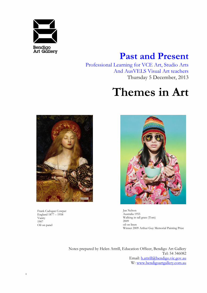
Past and Present Professional Learning for VCE Art, Studio Arts
And AusVELS Visual Art teachers Thursday 5 December, 2013
Themes in Art
Notes prepared by Helen Attrill, Education Officer, Bendigo Art Gallery Tel: 54 346082
Email: [email protected] W: www.bendigoartgallery.com.au
Jan Nelson Australia 1955 Walking in tall grass (Tom) 2009 oil on linen Winner 2009 Arthur Guy Memorial Painting Prize
Frank Cadogan Cowper England 1877 – 1958 Vanity 1907 Oil on panel
2
The Big themes Introduction Bendigo Art Gallery’s extensive collection of over five thousand artworks from the 18th century to the contemporary era provides the opportunity for students and teachers to view a range of of themes over different periods. When the re-development of the Gallery’s display spaces opens in March, 2014, students and teachers will be able to view a greater breadth of artworks firsthand than ever before whilst being able to supplement their viewing with visits to special exhibitions of international significance. Viewing the artworks firsthand provides many unique sensory and educational experiences for students. This includes being able to appreciate the aesthetics and fine nuances of the artworks, comprehending three-dimensional works from all angles, marvelling at the immensity of large scale artworks and understanding the display of artworks in a museum context. The vast range of artists and styles within the Bendigo Art Gallery collection also enable students to learn about the ideas communicated by artists within the same theme but across different historical and cultural contexts. Some of the most common themes in art history represented at Bendigo Art Gallery are:
Portraiture
Landscape / Nature
Identity
Social Commentary
Animals
Architecture / the built world
The human form
Identity In addition to being able to view Australian artworks from the 19th to 21st centuries and international artworks from the 18th to early 20th century from the permanent collection, students visiting Bendigo Art Gallery in first semester, 2014 will have a rare opportunity to view important British artworks by major artists in Genius and Ambition: The Royal Academy of Arts, London 2 March - 9 June 2014. Genius and Ambition will draw on the wealth of the Royal Academy in England’s holdings, ranging from paintings and sculpture to works on paper (drawings and prints) and historic books. The exhibition will focus on what is often referred to as ‘the long 19th century’, from 1768 to 1914. This allows for the inclusion of such stellar artists as Reynolds, Gainsborough, Constable, Turner, Leighton, Millais, Waterhouse and Singer Sargent. To complement this international exhibition, Bendigo Art Gallery has curated a second exhibition, Australians at the Royal Academy, featuring more than 30 significant works by Australian artists whose works were displayed at the Royal Academy including Tom Roberts, Arthur Streeton, Rupert Bunny, George Coates, George Lambert, Agnes Goodsir, and E Phillips Fox. Genius and Ambition is an ideal exhibition for students to learn about many of the important painting genres from the 18th and 18th centuries that lead into 20th century art. The exhibition also enables comparison and contrast of the representation of common themes such as portraiture and landscape with those in the Bendigo Art Gallery permanent collection. The exhibition provides a unique opportunity for students to experience the viewing of major international artworks first hand, in Bendigo.
3
Themes
Portraiture
Contemporary Australian portraits in the Bendigo Art Gallery collection
Del Kathryn Barton, Zhong Chen, Jan Nelson
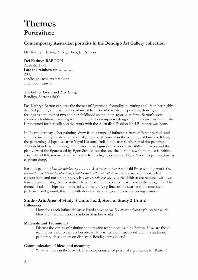
Del Kathryn BARTON Australia 1972 i ate the rainbow up … … … 2008 acrylic, gouache, watercolour and ink on canvas The Gift of Grace and Alec Craig, Bendigo, Victoria 2009 Del Kathryn Barton explores the themes of figuration, fecundity, nurturing and life in her highly detailed paintings and sculptures. Many of her artworks are deeply personal, drawing on her feelings as a mother of two and her childhood spent on an agora goat farm. Barton’s work combines traditional painting techniques with contemporary design and illustrative styles and she is renowned for her collaborative work with the Australian Fashion label Romance was Born. In Postmodern style, her paintings draw from a range of influences from different periods and cultures, including the decorative yet slightly sexual element in the paintings of Gustave Klimt, the patterning of Japanese artist Yayoi Kusama, Indian miniatures, Aboriginal dot painting; Tibetan Mandalas, the strange but cartoon-like figures of outside artist William Darger and the plan view of the figure used by Egon Schiele, but the one she identifies with the most is British artist Chris Ofili, renowned sensationally for his highly decorative black Madonna paintings using elephant dung. Barton’s painting i ate the rainbow up … … …is similar to her Archibald Prize winning work You are what is most beautiful about me, a self portrait with Kell and Arella, in the use of the crowded composition and nurturing figures. In i ate the rainbow up……; the children are replaced with two female figures, using the decorative element of a multicoloured scarf to bind them together. The theme of relationships is emphasised with the unifying lines of the scarf and the consistent patterned background, this time with dots and stars, suggesting a never ending cosmos.
Studio Arts Area of Study 3 Units 1 & 3; Area of Study 2 Unit 2 Influences
1. How does each influential artist listed above show in i ate the rainbow up? on her work. How are these influences symbolised in her work?
Materials and Techniques
1. Discuss the variety of painting and drawing techniques used by Barton. How are these techniques used to express her ideas? How is her use of media different to traditional painters such as others on display in Bendigo Art Gallery?
Communication of ideas and meaning
1. What symbols in the artwork link to experiences of personal significance for Barton?
4
Elements and Principles of Design/ Aesthetic Qualities
1. Explain how Barton has used dominant elements such as line, colour and shape to create the aesthetic quality of a dominant focal point.
Style
1. How does Barton’s work challenge traditional understandings of portraiture in Art? Discuss how the layering of different techniques, inspired from different times and cultures result in a Postmodern style. Consider the formal elements, techniques and symbols used by the artist.
VCE Art Analytical Frameworks Formal Framework
1. Investigate the style of Del Kathryn Barton’s art works and discuss the influences on her work. How are these influences symbolised in her work?
2. Discuss Del Kathryn Barton’s use of techniques in her work. How are these techniques used to express her ideas?
Personal Framework
1. What symbols in the artwork link to experiences of personal significance for Barton? 2. How has Barton used design elements and principles to link the ideas in her work?
Contemporary Framework
1. How does Barton’s work challenge traditional understandings of portraiture in Art? Consider the formal elements, techniques and symbols used by the artist.
Del Kathryn BARTON Australia 1972 i ate the rainbow up … … … 2008 acrylic, gouache, watercolour and ink on canvas The Gift of Grace and Alec Craig, Bendigo, Victoria 2009
5
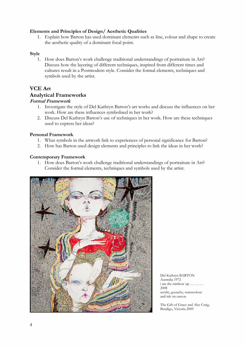
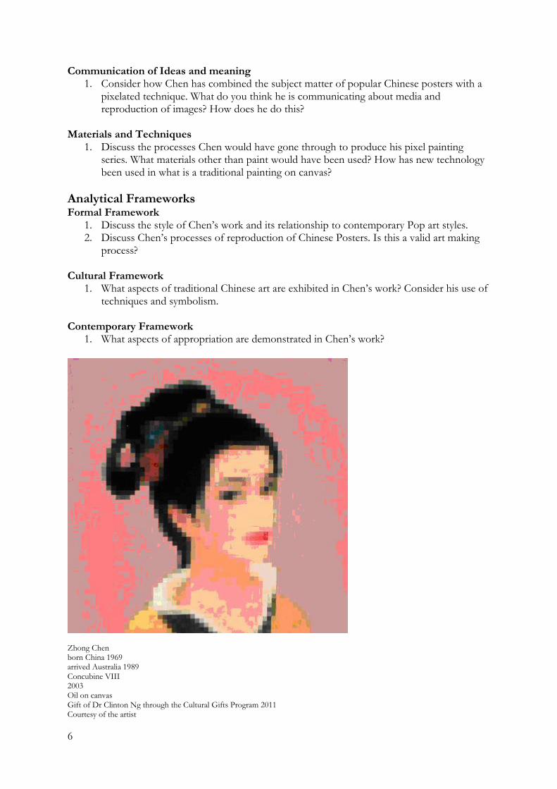
Zhong Chen born China 1969 arrived Australia 1989 Concubine VIII 2003 Oil on canvas Gift of Dr Clinton Ng through the Cultural Gifts Program 2011 Zhong Chen is one of a dynamic group of Chinese born artists working in Australia who emigrated during China’s Cultural Revolution in the late 20th century. After arriving in Australia at the age of 19, in 1989 he studied art in Australia and England, exploring both contemporary and cultural issues. He continues to explore issues of cultural identity, transcultural identity, belonging and place. Concubine VIII is one of a large series of pixel paintings in which he drew from a range of images and symbols often used by Chinese artists such as portraits, animals and landscapes, opera characters, Door and Imperial Gods. The folk art of China is an important part of the everyday and popular culture. By using traditional Chinese inspired images Zhong conveys a sense of his cultural identity. Zhong uses the pixel as a symbol of the contemporary world that we live in. Chen paints in a range of styles including drip painting but the development of his ‘pixel paintings’ in 1999 cemented his place in Australian art and scored him entry in a number of prizes including the Archibald Prize. These paintings involve reproducing popular Chinese Posters enlarging the pixels and this questions and comments on the reproduction and portability of images in the 21st centuries whilst also referring back to his traditional Chinese culture. The flatness of the images also draws inspiration from the flatness in traditional Chinese woodblock prints. Themes of new technology, time and place are addressed in Concubine VII.
Beginning with small sketches and paintings, Chen draws inspiration from everyday life, contemporary subjects and traditional Chinese ladies to blend the ancient themes of Chinese culture with a dynamic and ever-changing new world. Portraits, landscapes and animals are integral to traditional Chinese ink brush painting. Chen’s pixel interpretations combine a deep respect for the culture of his birthplace with the symbolism of our contemporary, rapidly evolving world. Modern digital technology meets ancient, time-honoured culture in Chen’s pixel portraits: a computer age artistic interpretation.
Influences Like many Chinese born Australian artists, Chen’s art is a fusion of Eastern and Western cultures. He is inspired by traditional Chinese culture such as Chinese folk art prints, traditional Chinese ink brush painting, folk paper-cuts and Ming and Qing porcelains.
Studio Arts Area of Study 3 Units 1 & 3; Area of Study 2 Unit 2 questions Influences/ Style
1. Research the influence of Pop Art and contemporary Chinese art on Chen’s painting practice.
Cultural contexts/ Influences
1. Analyse how Chen, like many contemporary Chinese artists use the influence of traditional Chinese art on their artwork. What element of Chinese art has Chen incorporated into Concubine VIII?
6
Communication of Ideas and meaning
1. Consider how Chen has combined the subject matter of popular Chinese posters with a pixelated technique. What do you think he is communicating about media and reproduction of images? How does he do this?
Materials and Techniques
1. Discuss the processes Chen would have gone through to produce his pixel painting series. What materials other than paint would have been used? How has new technology been used in what is a traditional painting on canvas?
Analytical Frameworks Formal Framework
1. Discuss the style of Chen’s work and its relationship to contemporary Pop art styles. 2. Discuss Chen’s processes of reproduction of Chinese Posters. Is this a valid art making
process? Cultural Framework
1. What aspects of traditional Chinese art are exhibited in Chen’s work? Consider his use of techniques and symbolism.
Contemporary Framework
1. What aspects of appropriation are demonstrated in Chen’s work?
Zhong Chen born China 1969 arrived Australia 1989 Concubine VIII 2003 Oil on canvas Gift of Dr Clinton Ng through the Cultural Gifts Program 2011 Courtesy of the artist
7
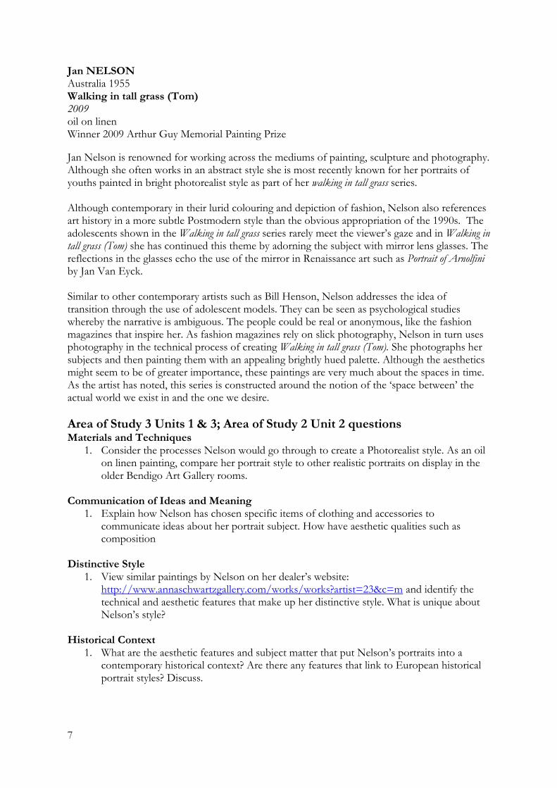
Jan NELSON Australia 1955 Walking in tall grass (Tom) 2009 oil on linen Winner 2009 Arthur Guy Memorial Painting Prize
Jan Nelson is renowned for working across the mediums of painting, sculpture and photography. Although she often works in an abstract style she is most recently known for her portraits of youths painted in bright photorealist style as part of her walking in tall grass series. Although contemporary in their lurid colouring and depiction of fashion, Nelson also references art history in a more subtle Postmodern style than the obvious appropriation of the 1990s. The adolescents shown in the Walking in tall grass series rarely meet the viewer’s gaze and in Walking in tall grass (Tom) she has continued this theme by adorning the subject with mirror lens glasses. The reflections in the glasses echo the use of the mirror in Renaissance art such as Portrait of Arnolfini by Jan Van Eyck. Similar to other contemporary artists such as Bill Henson, Nelson addresses the idea of transition through the use of adolescent models. They can be seen as psychological studies whereby the narrative is ambiguous. The people could be real or anonymous, like the fashion magazines that inspire her. As fashion magazines rely on slick photography, Nelson in turn uses photography in the technical process of creating Walking in tall grass (Tom). She photographs her subjects and then painting them with an appealing brightly hued palette. Although the aesthetics might seem to be of greater importance, these paintings are very much about the spaces in time. As the artist has noted, this series is constructed around the notion of the ‘space between’ the actual world we exist in and the one we desire.
Area of Study 3 Units 1 & 3; Area of Study 2 Unit 2 questions Materials and Techniques
1. Consider the processes Nelson would go through to create a Photorealist style. As an oil on linen painting, compare her portrait style to other realistic portraits on display in the older Bendigo Art Gallery rooms.
Communication of Ideas and Meaning
1. Explain how Nelson has chosen specific items of clothing and accessories to communicate ideas about her portrait subject. How have aesthetic qualities such as composition
Distinctive Style
1. View similar paintings by Nelson on her dealer’s website: http://www.annaschwartzgallery.com/works/works?artist=23&c=m and identify the technical and aesthetic features that make up her distinctive style. What is unique about Nelson’s style?
Historical Context
1. What are the aesthetic features and subject matter that put Nelson’s portraits into a contemporary historical context? Are there any features that link to European historical portrait styles? Discuss.
8
VCE Art Analytical Frameworks
Formal Framework 1. Nelson’s painting is sometimes labeled as ‘Photo Realist’. What are some of the
techniques she has used in Walking in tall grass (Tom) that are in this style? 2. What formal qualities in the art work contribute to the meanings and messages that
Nelson is expressing? Give examples of these formal qualities that you can see in the work.
3. What aspects of other artworks are evident in Nelson’s work? List the techniques, depiction of subject matter and formal qualities that you can see.
4. What processes does Nelson use to create her work? How do they contribute to the ideas that Nelson is expressing?
Personal Framework
1. What is Nelson’s relationship with the subjects of her works? How is this relationship expressed in the work?
2. What aspects of the artist’s belief’s and desires are expressed in this work? How does she symbolise them?
Contemporary Framework
1. What aspects of Nelson’s art practice would be deemed as contemporary? Discuss her use of formal elements and the processes she uses to create these works. What is the significance of the processes she uses?
2. Nelson’s images have an advertising feel about them. How is this an example of Post Modernism? Discuss.
Jan NELSON Australia 1955 Walking in tall grass (Tom) 2009 oil on linen Winner 2009 Arthur Guy Memorial Painting Prize Courtesy of the artist and Anna Schwartz Gallery
9
Portraits in Genius and Ambition exhibition John William Waterhouse
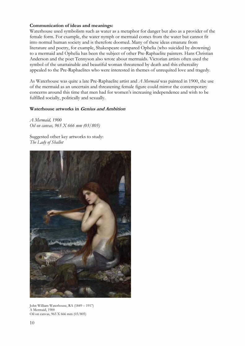
John William Waterhouse (1849 – 1917) Historical context Waterhouse was born later than most of the other Pre-Raphaelite painters, in 1849, sometimes being referred to as an associate of the Pre-Raphaelite brotherhood rather than being part of the main group. Although the subjects of his paintings appear to have little to do with his time of the late 19th century, in fact they were laden with symbolism related to some of the fears and attitudes towards fin de siècle (end of the century). Although his depiction of women as romantic nymphs or doomed figures drawn from poetry and literature may seem to have little to do with feminism, the symbol of the unattainable or dangerous female (such as sirens) parallels the unease men had over the increasing independence and fulfillment women were striving for through happenings such as the suffragette movement. Being born into the mid-19th century also meant witnessing the poverty that the Industrial Revolution brought to the masses. Artists such as Waterhouse created art that took the viewer away from the reality of their existence. Like other Pre-Raphaelite and Neo-Classical painters, Waterhouse admired the art created before Raphael’s time, when paintings were laden with symbols, religion and idealised beauty. Influences By the late 19th century there were both local and European artists to gain inspiration from. Waterhouse was influenced by artists practising the styles of Neo-Classicism, Realism and Pre-Raphaelitism. Amongst the French artists he admired was Jules Bastien-Lepage who always included figures in the foreground of landscapes. A Mermaid borrows Bastien-Lepage’s use of a foreground figure with a landscape background. As a young artist Waterhouse viewed exhibitions of the major Pre-Raphaelite artists Dante Gabriel Rossetti, William Holman Hunt and John Everett Millais and became friends with the Dutch artist Lawrence Alma-Tadema, whose classical compositions he imitated. He admired the use of detail and colour in the work of Frederic Lord Leighton. Waterhouse however, moved beyond the highly academic style of Leighton and incorporated more movement in his figures. Techniques: Pre-raphaelite painters were said to use a ‘wet-white’ technique to achieve luminosity. This involved using transparent glazes over a wet ground and the addition of the resin copal to the paint medium. They also used delicate hatching brushstrokes over the medium. Waterhouse purchased primed canvases and brushed on the main lines of his composition with dark flowing paint mixed with medium. He painted the basic tones as thinned translucent colour such as green or brown. If the figure was going to be clothed, he would refrain from finishing the figure in the underpainting, knowing that it was going to be painted over. Most of his detail went into faces and hair. He sometimes included up to twelve layers of paint and up to six different pigments in the one brushload. He often painted the subject of metal work, which appears a metallic brown/yellow but he used a broad range of broken colours to achieve this. He often used expensive materials such as verdigris (copper carbonate).
10
Communication of ideas and meanings: Waterhouse used symbolism such as water as a metaphor for danger but also as a provider of the female form. For example, the water nymph or mermaid comes from the water but cannot fit into normal human society and is therefore doomed. Many of these ideas emanate from literature and poetry, for example, Shakespeare compared Ophelia (who suicided by drowning) to a mermaid and Ophelia has been the subject of other Pre-Raphaelite painters. Hans Christian Anderson and the poet Tennyson also wrote about mermaids. Victorian artists often used the symbol of the unattainable and beautiful woman threatened by death and this ethereality appealed to the Pre-Raphaelites who were interested in themes of unrequited love and tragedy. As Waterhouse was quite a late Pre-Raphaelite artist and A Mermaid was painted in 1900, the use of the mermaid as an uncertain and threatening female figure could mirror the contemporary concerns around this time that men had for women’s increasing independence and wish to be fulfilled socially, politically and sexually. Waterhouse artworks in Genius and Ambition A Mermaid, 1900 Oil on canvas, 965 X 666 mm (03/805) Suggested other key artworks to study: The Lady of Shallot
John William Waterhouse, RA (1849 – 1917) A Mermaid, 1900 Oil on canvas, 965 X 666 mm (03/805)
11
Landscape
Contemporary Australian landscapes in the Bendigo Art Gallery collection Andrew Browne, Stephen Bush, Ningura Napurrula, Paddy Bedford, Tim Johnson
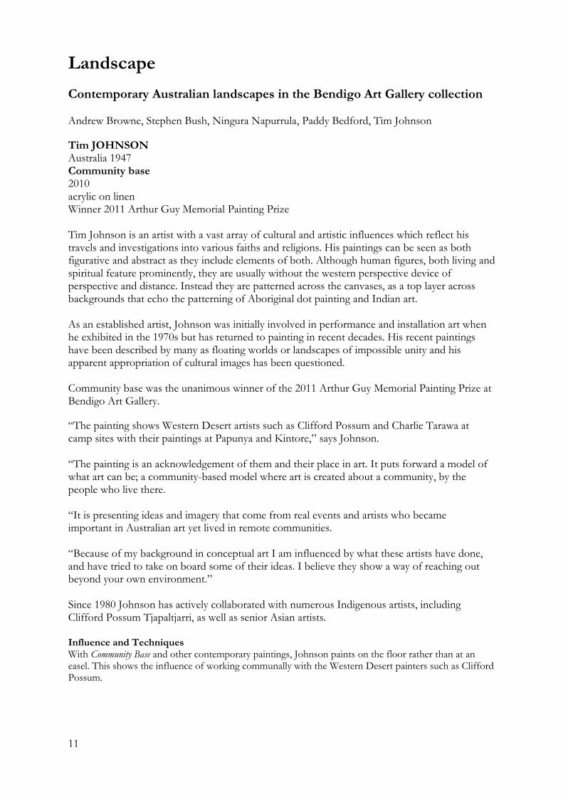
Tim JOHNSON Australia 1947 Community base 2010 acrylic on linen Winner 2011 Arthur Guy Memorial Painting Prize Tim Johnson is an artist with a vast array of cultural and artistic influences which reflect his travels and investigations into various faiths and religions. His paintings can be seen as both figurative and abstract as they include elements of both. Although human figures, both living and spiritual feature prominently, they are usually without the western perspective device of perspective and distance. Instead they are patterned across the canvases, as a top layer across backgrounds that echo the patterning of Aboriginal dot painting and Indian art. As an established artist, Johnson was initially involved in performance and installation art when he exhibited in the 1970s but has returned to painting in recent decades. His recent paintings have been described by many as floating worlds or landscapes of impossible unity and his apparent appropriation of cultural images has been questioned. Community base was the unanimous winner of the 2011 Arthur Guy Memorial Painting Prize at Bendigo Art Gallery.
“The painting shows Western Desert artists such as Clifford Possum and Charlie Tarawa at camp sites with their paintings at Papunya and Kintore,” says Johnson. “The painting is an acknowledgement of them and their place in art. It puts forward a model of what art can be; a community-based model where art is created about a community, by the people who live there. “It is presenting ideas and imagery that come from real events and artists who became important in Australian art yet lived in remote communities. “Because of my background in conceptual art I am influenced by what these artists have done, and have tried to take on board some of their ideas. I believe they show a way of reaching out beyond your own environment.” Since 1980 Johnson has actively collaborated with numerous Indigenous artists, including Clifford Possum Tjapaltjarri, as well as senior Asian artists. Influence and Techniques With Community Base and other contemporary paintings, Johnson paints on the floor rather than at an easel. This shows the influence of working communally with the Western Desert painters such as Clifford Possum.
12
Tim JOHNSON Australia 1947 Community base 2010 acrylic on linen Winner 2011 Arthur Guy Memorial Painting Prize
13
Ningura NAPURRULA Australia c1938 Untitled 2001 acrylic on canvas Gift of Shaun Dennison under the Cultural Gifts Program 2004 2004.3 Ningura Napurrula was born at Watulka, in the central desert region. She married senior Pintupi artist Yala Yala Gibbs Tjungurrayi (c1928–1998) and together they moved to Papunya community in the 1960s. She commenced painting with the Papunya Tula Artists’ Cooperative in 1996. In 2004 Napurrula was one of eight Aboriginal artists selected to have an example of their work incorporated into the architecture of the Musee du Quai Branly in Paris. This museum opened in early 2006, and houses the French collection of art from Africa, Asia, Oceania and the Americas. The lines around the edge and bordering the centre section of the work represent windbreaks; the U shapes are Tali or sand hills and also represent Women's Dreaming and body paint. The roundels in the centre of the work represent the meeting place for a women’s ceremony. This is sand hill country; the women usually have their ceremonies in the middle of the sand hills so that men cannot see them. The long red shapes represent digging sticks.
Rusty PETERS Australia c1935 Katy Yard 2006 ochre and acrylic on linen RHS Abbott Bequest Fund 2006 2006.14 Rusty Peters is a senior Gija man of Juwurru skin. He was born in 1934, under a Warlagarri or Supplejack tree on Springvale Station south west of Turkey Creek. The land and the myths of his birthplace (and home) continue to inspire the majority of his works. Like most senior East Kimberley artists, Peters spent his years before painting working as a station hand. A skilled rider and horse breaker he was never short of work from the large cattle and sheep stations in the top end. However, the introduction of award wages in the 1970s resulted in the dislocation of many station hands. His bush name Dirrji refers to dingo pups looking out of a hole at the sunrise. His background details outline interesting biographical details such as the fact that he was born under a Warlagarri or Supplejack tree on Springvale Station south west of Turkey Creek the same day as his jimarri or age mate Charlie McAdam. Spirits being significant to Indigenous identity, Peters’ spirit is said to have come from a crocodile his father had killed when his mother became pregnant. Rusty Peters moved to Warmun Community and became involved with the community school and was instrumental in the development of its cultural and bilingual syllabus. It was when he moved to in 1989 he moved to Kununurra in 1989 that he began to paint. Initially he was employed as an arts assistant but then he met and formed a strong friendship with the artist Rover Thomas and this lead him to work on canvases. By 1997, the artist had joined Jirrawun Arts (the centre established by Freddie Timms) and became known as one of its leading practitioners.
14
Rusty Peters’ work portrays an assured and personal view of the Kimberley landscape. He often depicts the creation ancestors in the Turkey Creek minimalist style, but the intricate curves which map the country, dark caves and rivers are particular to his practice. Typical of the painters of the East Kimberley, Katy Yard features the use of ochre but in contemporary style, this has been combined with acrylic black and white paint. Paddy BEDFORD Australia 1922–2007 Yoowangeny – Mud Springs 2005 natural earth pigments and synthetic binder on linen The Gift of Grace and Alec Craig, Bendigo Victoria 2011 2001.34 Bedford was a senior law man of the Gija people of the Kimberly region of Western Australia. His paintings relate the narratives of his mother’s and father’s country, combining the Dreaming stories of the cockatoo, bush turkey and emu with the topography of the land he regularly traversed as a stockman, including rivers, roads, rocks and waterholes. Born around 1922 on Bedford Downs Station in the remote East Kimberley region of Western Australia, Paddy Bedford began painting on canvas and board in 1998 and his artistic practice since then was remarkable, prolific and consistently innovative and is reflected in his selection as one of only eight Indigenous Australian artists to create a site-specific work for the Quai Branly Museum in Paris. A senior lawman of the Gija people, he painted as part of ceremony all his life, and brought this wealth of symbolic, historical and technical knowledge to bear on his art. Paddy Bedford’s paintings relate the narratives of his mother’s and father’s country, combining the Dreaming stories of the cockatoo, bush turkey and emu with the topography of the land he regularly traversed as a stockman, including rivers, roads, rocks and waterholes. The artist also created paintings based on accounts of the often brutal interaction between Aboriginal people and white settlers in the early years of the twentieth century, the repercussions of which continue in the Kimberley today.
Area of Study 3 Units 1 & 3; Area of Study 2 Unit 2 questions Historical and Cultural Context/ Influences
1. How are Bedford’s traditional links to his country and particular Dreamtime stories reflected in Yoowangeny – Mud Springs.
Style
1. What stylistic qualities of Bedford’s work are representative of the East Kimberley region?
Communication of Ideas and Meanings
1. Bedford’s works are a combination of symbolic, technical and historical knowledge. Analyse the artwork to find examples of these three areas of knowledge and link these in your writing.
Aesthetic qualities/ Communication of Ideas and Meanings
1. Bedford’s paintings can be seen as narrative. How does he use aesthetic qualities to communicate a the subject matter?
15
Analytical Frameworks
Formal Framework 1. How are Bedford’s traditional links to his country reflected in his artwork and the
processes he uses to create it? 2. What stylistic qualities of Bedford’s work are representative of traditional Indigenous
motifs? Cultural Framework
1. Bedford’s works are a combination of symbolic, technical and historical knowledge. Analyse the artwork to find examples of these three areas of knowledge.
Personal Framework
1. Bedford’s works are narratives. How do the formal qualities of this work convey a sense of narrative?
2. Can you link some of the symbols, techniques and style to other examples of Indigenous Art? List the similarities between this work and another Indigenous work.
Contemporary Framework
1. How does the artwork take on a new meaning in the context of its display at the Musee Quay Branly in Paris?
2. How does the display of Bedford’s work challenge the traditional methods of display by placing the work in a gallery?
16
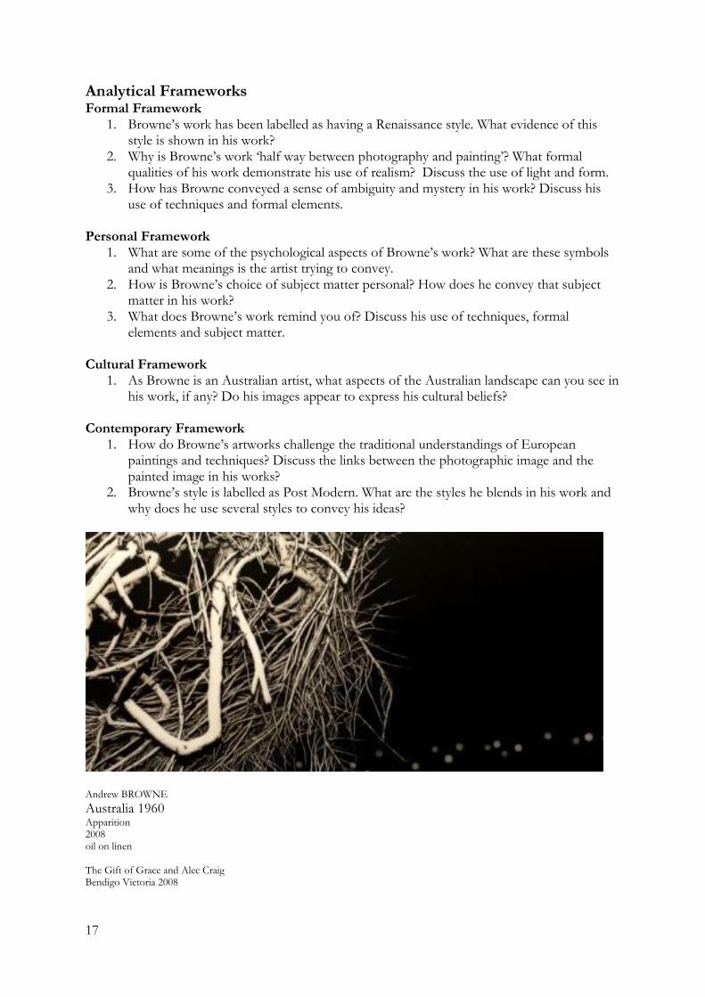
Andrew BROWNE Australia 1960 Apparition 2008 oil on linen The Gift of Grace and Alec Craig Bendigo Victoria 2008 Andrew Browne is renowned for his panoramic, often nocturnal landscape paintings which blur the boundaries between art and photography. He often describes his subject matter as “nature on the fringe of the city”. In contemporary Postmodern style, he investigates a range of landscape painting traditions from Northern Renaissance painters and their concern with humanity and nature through to the Modernist reduction of form. ‘‘Apparition’ is a culmination of several years of paintings that have explored the nocturnal world, one that exists at the edge of our urban and rational experience. I have attempted to insert an uneasy and ambiguous presence into these paintings – one that conjures up highly suggestive forms derived from both direct observation and subsequent manipulation, to prompt reflections on both the natural and denatured place that we, as the observer, occupy.
‘Apparition’ might be seen as representing a tangle of foliage and detritus that leans close to the viewer, partially obscuring an expansive dark space illuminated by distant blurred lights – signs of habitation. But look again and perhaps the visage of something more sinister emerges from this tangle – the face of a ghostly presence that looms forward to receive the flash of a camera or torch, the black void cloaking other threatening experiences and feelings. The intended ambiguity that exists within this image and others of the greater series of paintings encourages multiple readings, leaving the observer and the observed in a state of flux, shifting between the conscious and the unconscious, image and meaning.’ Andrew Browne 7/8/08
Area of Study 3 Units 1 & 3; Area of Study 2 Unit 2 questions Influences/ Style
1. Investigate the style of Northern Renaissance painters and study the similarities and differences between theirs and Browne’s landscapes.
2. Browne’s style is could be described as Postmodern. Explain how he combines historical traditions of landscape painting with contemporary references.
Materials and Techniques
1. Although Apparition is a painting, discuss how photography may have been used as part of the practical process.
Communication of Ideas and Meaning
1. How has Browne conveyed a sense of ambiguity and mystery in his work?
Historical/ Cultural Contexts 1. As Browne is an Australian artist, what aspects of the Australian landscape can you see in
his work, if any? Do his images appear to express his cultural beliefs?
Elements of Design/ Aesthetic Qualities 1. Explain how Browne’s use of low key tones contributes to an emotional effect. What
aesthetic qualities are created through his use of tone and line?
17
Analytical Frameworks Formal Framework
1. Browne’s work has been labelled as having a Renaissance style. What evidence of this style is shown in his work?
2. Why is Browne’s work ‘half way between photography and painting’? What formal qualities of his work demonstrate his use of realism? Discuss the use of light and form.
3. How has Browne conveyed a sense of ambiguity and mystery in his work? Discuss his use of techniques and formal elements.
Personal Framework
1. What are some of the psychological aspects of Browne’s work? What are these symbols and what meanings is the artist trying to convey.
2. How is Browne’s choice of subject matter personal? How does he convey that subject matter in his work?
3. What does Browne’s work remind you of? Discuss his use of techniques, formal elements and subject matter.
Cultural Framework
1. As Browne is an Australian artist, what aspects of the Australian landscape can you see in his work, if any? Do his images appear to express his cultural beliefs?
Contemporary Framework
1. How do Browne’s artworks challenge the traditional understandings of European paintings and techniques? Discuss the links between the photographic image and the painted image in his works?
2. Browne’s style is labelled as Post Modern. What are the styles he blends in his work and why does he use several styles to convey his ideas?
Andrew BROWNE
Australia 1960 Apparition 2008 oil on linen The Gift of Grace and Alec Craig Bendigo Victoria 2008
18
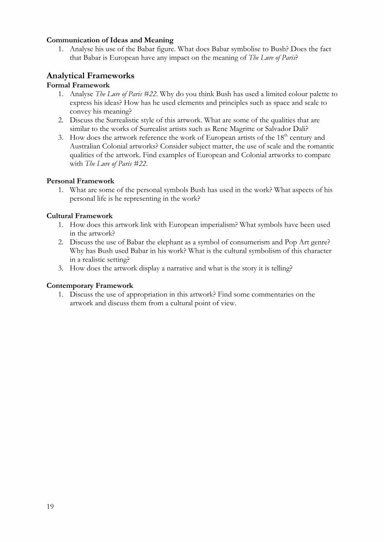
Stephen BUSH Australia 1958 The Lure of Paris #22 2002 oil on linen The Gift of Grace and Alec Craig Bendigo Victoria 2010 2010.9 Stephen Bush is renowned for his paintings which reference traditional European landscape painting traditions, juxtaposed with often incongruent subjects such as pot-bellied stoves, food packages or Babar elephants. Aware of using aesthetics for either mood or Postmodern play, his recent paintings swing between lurid high-keyed colours and monochromatic tonal effects. In The Lure of Paris #22, Bush continues his playful investigation into the idea of image reproduction and Western cultural icons by producing more than 20 versions of the same painting, each one with only subtle differences. The image includes his trademark romantic sublime seaside landscape but with the figures of the elephant cartoon character Babar and friends, large and out of scale, appearing to climb the rocks. These paintings were produced using only black and white paint, appearing as early reproductions of artworks might. The use of the character Babar may on the surface may seem quirky or kitschy but the reasoning is multilayered. Bush, aware of the character of Babar from watching him on television with his child had found an abandoned, stuffed-toy version on a Geelong street. He then found out that Babar, after the death of his mother, was taken to France to be "civilised" before returning to Africa to "civilise" his fellow elephants. At this point, he knew Babar could be an ideal tool with which to explore Australia's post-colonial identity in painting. As a youth in the 60s and 70s, Bush was well versed in protest and questioning of western imperialism. He would have been aware of the protest and performance art of this period along with the quest for equal rights for indigenous Australians and women. As Appropriation has moved beyond direct appropriation, Bush has used more subtle means of referencing the European styles he comments on.
Area of Study 3 Units 1 & 3; Area of Study 2 Unit 2 questions Style
1. Explain how Bush combines imagery from both popular culture and art history to create a Postmodern style
Cultural/ Historical Contexts
1. Explain how Bush references the European landscape tradition in The Lure of Paris. Consider whether he identifies with this tradition and/or if he is questioning its dominance in art history discourse.
Elements of Design/ Aesthetic Qualities
1. Explain why you think Bush has used a limited palette of the use of tone and texture. How does this create an aesthetic quality?
19
Communication of Ideas and Meaning 1. Analyse his use of the Babar figure. What does Babar symbolise to Bush? Does the fact
that Babar is European have any impact on the meaning of The Lure of Paris?
Analytical Frameworks Formal Framework
1. Analyse The Lure of Paris #22. Why do you think Bush has used a limited colour palette to express his ideas? How has he used elements and principles such as space and scale to convey his meaning?
2. Discuss the Surrealistic style of this artwork. What are some of the qualities that are similar to the works of Surrealist artists such as Rene Magritte or Salvador Dali?
3. How does the artwork reference the work of European artists of the 18th century and Australian Colonial artworks? Consider subject matter, the use of scale and the romantic qualities of the artwork. Find examples of European and Colonial artworks to compare with The Lure of Paris #22.
Personal Framework
1. What are some of the personal symbols Bush has used in the work? What aspects of his personal life is he representing in the work?
Cultural Framework
1. How does this artwork link with European imperialism? What symbols have been used in the artwork?
2. Discuss the use of Babar the elephant as a symbol of consumerism and Pop Art genre? Why has Bush used Babar in his work? What is the cultural symbolism of this character in a realistic setting?
3. How does the artwork display a narrative and what is the story it is telling? Contemporary Framework
1. Discuss the use of appropriation in this artwork? Find some commentaries on the artwork and discuss them from a cultural point of view.
20
Stephen BUSH Australia 1958 The Lure of Paris #22 2002 oil on linen The Gift of Grace and Alec Craig Bendigo Victoria 2010
21
Early Australian landscapes in the Bendigo Art Gallery collection
Louis Buvelot, Arthur Streeton
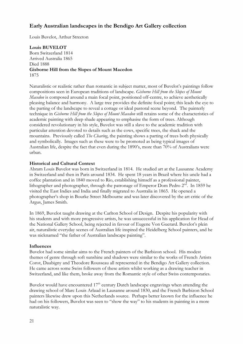
Louis BUVELOT Born Switzerland 1814 Arrived Australia 1865 Died 1888 Gisborne Hill from the Slopes of Mount Macedon 1875 Naturalistic or realistic rather than romantic in subject matter, most of Buvelot’s paintings follow compositions seen in European traditions of landscape. Gisborne Hill from the Slopes of Mount Macedon is composed around a main focal point, positioned off-centre, to achieve aesthetically pleasing balance and harmony. A large tree provides the definite focal point; this leads the eye to the parting of the landscape to reveal a cottage or ideal pastoral scene beyond. The painterly technique in Gisborne Hill from the Slopes of Mount Macedon still retains some of the characteristics of academic painting with deep shade appearing to emphasise the form of trees. Although considered revolutionary in his style, Buvelot was still a slave to the academic tradition with particular attention devoted to details such as the cows, specific trees, the shack and the mountains. Previously called The Clearing, the painting shows a parting of trees both physically and symbolically. Images such as these were to be promoted as being typical images of Australian life, despite the fact that even during the 1890’s, more than 70% of Australians were urban. Historical and Cultural Context Abram Louis Buvelot was born in Switzerland in 1814. He studied art at the Lausanne Academy in Switzerland and then in Paris around 1834. He spent 18 years in Brazil where his uncle had a coffee plantation and in 1840 moved to Rio, establishing himself as a professional painter, lithographer and photographer, through the patronage of Emperor Dom Pedro 2nd. In 1859 he visited the East Indies and India and finally migrated to Australia in 1865. He opened a photographer’s shop in Bourke Street Melbourne and was later discovered by the art critic of the Argus, James Smith. In 1869, Buvelot taught drawing at the Carlton School of Design. Despite his popularity with his students and with more progressive artists, he was unsuccessful in his application for Head of the National Gallery School, being rejected in favour of Eugene Von Guerard. Buvelot’s plein air, naturalistic everyday scenes of Australian life inspired the Heidelberg School painters, and he was nicknamed “the father of Australian landscape painting”. Influences Buvelot had some similar aims to the French painters of the Barbizon school. His modest themes of genre through soft sunshine and shadows were similar to the works of French Artists Corot, Daubigny and Theodore Rousseau all represented in the Bendigo Art Gallery collection. He came across some Swiss followers of these artists whilst working as a drawing teacher in Switzerland, and like them, broke away from the Romantic style of other Swiss contemporaries. Buvelot would have encountered 17th century Dutch landscape engravings when attending the drawing school of Marc Louis Arlaud in Lausanne around 1830, and the French Barbizon School painters likewise drew upon this Netherlands source. Perhaps better known for the influence he had on his followers, Buvelot was seen to “show the way” to his students in painting in a more naturalistic way.
22
Materials and Techniques / Aesthetic Qualities Dominant colours include blues, greens, golds and browns with definite light sources providing tonal changes. Subject matter is the intimate landscape, rather than the vastness and grandeur of high mountain peaks and storms. This showed a great contrast to his contemporaries such as Nicholas Chevalier and Eugene Von Guerard. Horizon lines were usually low, emphasising the flatness and at times dryness of the Australian bushland. Light and atmosphere were shown rather than emphasising the largeness of particular motifs. Buvelot was known for sketching outdoors but still completed paintings in the studio. His observation of the paintable qualities of the ordinary pioneered the way for the plein air landscapes of the Heidelberg School painters.
Louis BUVELOT Born Switzerland 1814 Arrived Australia 1865 Died 1888 Gisborne Hill from the Slopes of Mount Macedon 1875
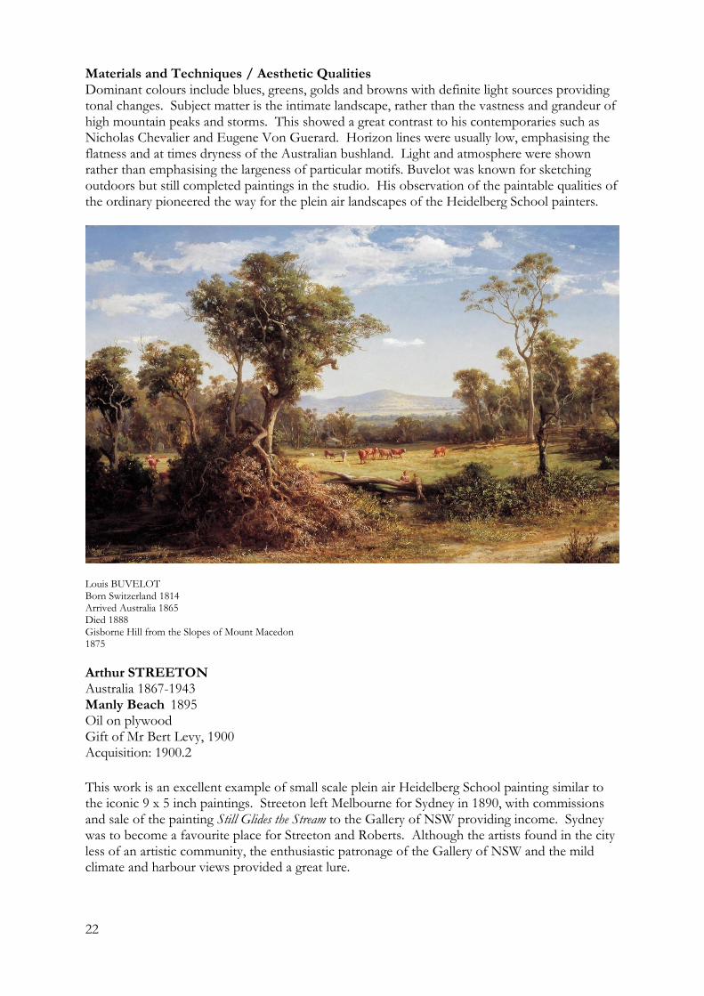
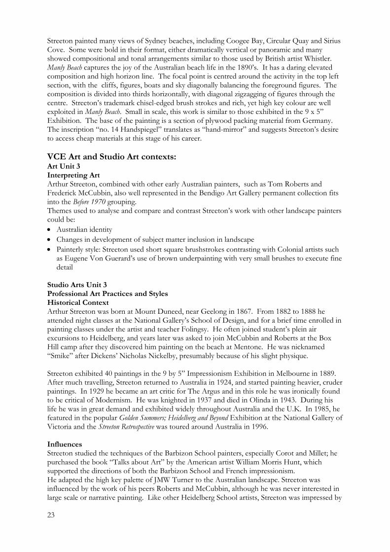
Arthur STREETON Australia 1867-1943 Manly Beach 1895 Oil on plywood Gift of Mr Bert Levy, 1900 Acquisition: 1900.2
This work is an excellent example of small scale plein air Heidelberg School painting similar to the iconic 9 x 5 inch paintings. Streeton left Melbourne for Sydney in 1890, with commissions and sale of the painting Still Glides the Stream to the Gallery of NSW providing income. Sydney was to become a favourite place for Streeton and Roberts. Although the artists found in the city less of an artistic community, the enthusiastic patronage of the Gallery of NSW and the mild climate and harbour views provided a great lure.
23
Streeton painted many views of Sydney beaches, including Coogee Bay, Circular Quay and Sirius Cove. Some were bold in their format, either dramatically vertical or panoramic and many showed compositional and tonal arrangements similar to those used by British artist Whistler. Manly Beach captures the joy of the Australian beach life in the 1890’s. It has a daring elevated composition and high horizon line. The focal point is centred around the activity in the top left section, with the cliffs, figures, boats and sky diagonally balancing the foreground figures. The composition is divided into thirds horizontally, with diagonal zigzagging of figures through the centre. Streeton’s trademark chisel-edged brush strokes and rich, yet high key colour are well exploited in Manly Beach. Small in scale, this work is similar to those exhibited in the 9 x 5” Exhibition. The base of the painting is a section of plywood packing material from Germany. The inscription “no. 14 Handspiegel” translates as “hand-mirror” and suggests Streeton’s desire to access cheap materials at this stage of his career.
VCE Art and Studio Art contexts: Art Unit 3 Interpreting Art Arthur Streeton, combined with other early Australian painters, such as Tom Roberts and Frederick McCubbin, also well represented in the Bendigo Art Gallery permanent collection fits into the Before 1970 grouping. Themes used to analyse and compare and contrast Streeton’s work with other landscape painters could be:
Australian identity
Changes in development of subject matter inclusion in landscape
Painterly style: Streeton used short square brushstrokes contrasting with Colonial artists such as Eugene Von Guerard’s use of brown underpainting with very small brushes to execute fine detail
Studio Arts Unit 3 Professional Art Practices and Styles Historical Context Arthur Streeton was born at Mount Duneed, near Geelong in 1867. From 1882 to 1888 he attended night classes at the National Gallery’s School of Design, and for a brief time enrolled in painting classes under the artist and teacher Folingsy. He often joined student’s plein air excursions to Heidelberg, and years later was asked to join McCubbin and Roberts at the Box Hill camp after they discovered him painting on the beach at Mentone. He was nicknamed “Smike” after Dickens’ Nicholas Nickelby, presumably because of his slight physique. Streeton exhibited 40 paintings in the 9 by 5” Impressionism Exhibition in Melbourne in 1889. After much travelling, Streeton returned to Australia in 1924, and started painting heavier, cruder paintings. In 1929 he became an art critic for The Argus and in this role he was ironically found to be critical of Modernism. He was knighted in 1937 and died in Olinda in 1943. During his life he was in great demand and exhibited widely throughout Australia and the U.K. In 1985, he featured in the popular Golden Summers; Heidelberg and Beyond Exhibition at the National Gallery of Victoria and the Streeton Retrospective was toured around Australia in 1996. Influences Streeton studied the techniques of the Barbizon School painters, especially Corot and Millet; he purchased the book “Talks about Art” by the American artist William Morris Hunt, which supported the directions of both the Barbizon School and French impressionism. He adapted the high key palette of JMW Turner to the Australian landscape. Streeton was influenced by the work of his peers Roberts and McCubbin, although he was never interested in large scale or narrative painting. Like other Heidelberg School artists, Streeton was impressed by
24
the atmospheric techniques of his forerunner, Louis Buvelot. After viewing Buvelot’s Summer Evening at Templestowe, he retraced the artist’s footsteps, taking the train to Heidelberg and then walking through the bush to Templestowe. Despite using the high key palette and plein air techniques of his predecessors, Streeton was to adapt the styles of these artists to his own interpretation of Australian light and colour and developed instead his unique style of trademark square brush strokes and economical use of colour. Studio Arts Unit 1 & 3 Materials and Techniques Streeton’s work developed into a characteristic style of high keyed palette and crisp, square ended brush strokes. Colour was often used economically, with shadows rendered with transparent colour. Like other Heidelberg School painters, he saw Australia as blue and gold rather than brown and green country. Foreground figures were usually simplified, seen as mainly elements of composition. Daring compositions consisting of zigzagging lines and positive/negative space are often reminiscent of the British artist Whistler. Streeton was renowned for using paint directly from the tube in contrast to the pre-mixing of the academic style painters.
Arthur STREETON Australia 1867-1943 Manly Beach 1895 Oil on plywood Gift of Mr Bert Levy, 1900 Acquisition: 1900.2
25
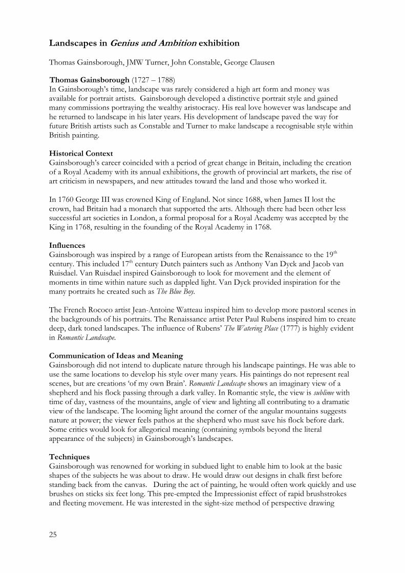
Landscapes in Genius and Ambition exhibition Thomas Gainsborough, JMW Turner, John Constable, George Clausen
Thomas Gainsborough (1727 – 1788) In Gainsborough’s time, landscape was rarely considered a high art form and money was available for portrait artists. Gainsborough developed a distinctive portrait style and gained many commissions portraying the wealthy aristocracy. His real love however was landscape and he returned to landscape in his later years. His development of landscape paved the way for future British artists such as Constable and Turner to make landscape a recognisable style within British painting. Historical Context Gainsborough’s career coincided with a period of great change in Britain, including the creation of a Royal Academy with its annual exhibitions, the growth of provincial art markets, the rise of art criticism in newspapers, and new attitudes toward the land and those who worked it. In 1760 George III was crowned King of England. Not since 1688, when James II lost the crown, had Britain had a monarch that supported the arts. Although there had been other less successful art societies in London, a formal proposal for a Royal Academy was accepted by the King in 1768, resulting in the founding of the Royal Academy in 1768. Influences Gainsborough was inspired by a range of European artists from the Renaissance to the 19th century. This included 17th century Dutch painters such as Anthony Van Dyck and Jacob van Ruisdael. Van Ruisdael inspired Gainsborough to look for movement and the element of moments in time within nature such as dappled light. Van Dyck provided inspiration for the many portraits he created such as The Blue Boy. The French Rococo artist Jean-Antoine Watteau inspired him to develop more pastoral scenes in the backgrounds of his portraits. The Renaissance artist Peter Paul Rubens inspired him to create deep, dark toned landscapes. The influence of Rubens’ The Watering Place (1777) is highly evident in Romantic Landscape. Communication of Ideas and Meaning Gainsborough did not intend to duplicate nature through his landscape paintings. He was able to use the same locations to develop his style over many years. His paintings do not represent real scenes, but are creations ‘of my own Brain’. Romantic Landscape shows an imaginary view of a shepherd and his flock passing through a dark valley. In Romantic style, the view is sublime with time of day, vastness of the mountains, angle of view and lighting all contributing to a dramatic view of the landscape. The looming light around the corner of the angular mountains suggests nature at power; the viewer feels pathos at the shepherd who must save his flock before dark. Some critics would look for allegorical meaning (containing symbols beyond the literal appearance of the subjects) in Gainsborough’s landscapes. Techniques Gainsborough was renowned for working in subdued light to enable him to look at the basic shapes of the subjects he was about to draw. He would draw out designs in chalk first before standing back from the canvas. During the act of painting, he would often work quickly and use brushes on sticks six feet long. This pre-empted the Impressionist effect of rapid brushstrokes and fleeting movement. He was interested in the sight-size method of perspective drawing
26
advocated by Leonardo Da Vinci. This involved the artist working from a fixed position so to keep the subject matter to scale. Key Terms
Fat over lean
Wet in wet technique
Underlayers/ underpainting
Glazing
Scumbling
Sight-size method of perspective drawing (from Renaissance artists) Gainsborough artworks in Genius and Ambition Romantic Landscape, ca. 1783 oil on canvas, 1537 X 1867 mm
Thomas Gainsborough, RA (1727 – 1788) Romantic Landscape, ca. 1783 Oil on canvas, 1537 X 1867 mm
27
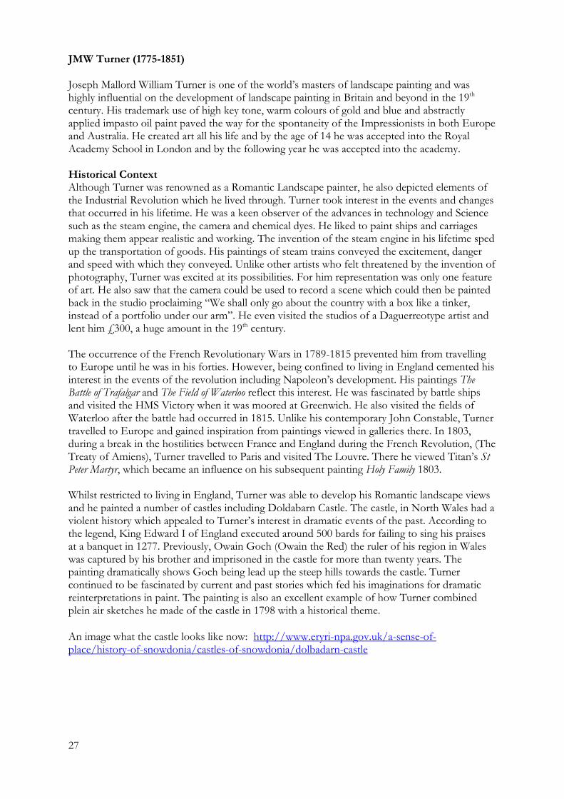
JMW Turner (1775-1851) Joseph Mallord William Turner is one of the world’s masters of landscape painting and was highly influential on the development of landscape painting in Britain and beyond in the 19th century. His trademark use of high key tone, warm colours of gold and blue and abstractly applied impasto oil paint paved the way for the spontaneity of the Impressionists in both Europe and Australia. He created art all his life and by the age of 14 he was accepted into the Royal Academy School in London and by the following year he was accepted into the academy. Historical Context Although Turner was renowned as a Romantic Landscape painter, he also depicted elements of the Industrial Revolution which he lived through. Turner took interest in the events and changes that occurred in his lifetime. He was a keen observer of the advances in technology and Science such as the steam engine, the camera and chemical dyes. He liked to paint ships and carriages making them appear realistic and working. The invention of the steam engine in his lifetime sped up the transportation of goods. His paintings of steam trains conveyed the excitement, danger and speed with which they conveyed. Unlike other artists who felt threatened by the invention of photography, Turner was excited at its possibilities. For him representation was only one feature of art. He also saw that the camera could be used to record a scene which could then be painted back in the studio proclaiming “We shall only go about the country with a box like a tinker, instead of a portfolio under our arm”. He even visited the studios of a Daguerreotype artist and lent him £300, a huge amount in the 19th century. The occurrence of the French Revolutionary Wars in 1789-1815 prevented him from travelling to Europe until he was in his forties. However, being confined to living in England cemented his interest in the events of the revolution including Napoleon’s development. His paintings The Battle of Trafalgar and The Field of Waterloo reflect this interest. He was fascinated by battle ships and visited the HMS Victory when it was moored at Greenwich. He also visited the fields of Waterloo after the battle had occurred in 1815. Unlike his contemporary John Constable, Turner travelled to Europe and gained inspiration from paintings viewed in galleries there. In 1803, during a break in the hostilities between France and England during the French Revolution, (The Treaty of Amiens), Turner travelled to Paris and visited The Louvre. There he viewed Titan’s St Peter Martyr, which became an influence on his subsequent painting Holy Family 1803. Whilst restricted to living in England, Turner was able to develop his Romantic landscape views and he painted a number of castles including Doldabarn Castle. The castle, in North Wales had a violent history which appealed to Turner’s interest in dramatic events of the past. According to the legend, King Edward I of England executed around 500 bards for failing to sing his praises at a banquet in 1277. Previously, Owain Goch (Owain the Red) the ruler of his region in Wales was captured by his brother and imprisoned in the castle for more than twenty years. The painting dramatically shows Goch being lead up the steep hills towards the castle. Turner continued to be fascinated by current and past stories which fed his imaginations for dramatic reinterpretations in paint. The painting is also an excellent example of how Turner combined plein air sketches he made of the castle in 1798 with a historical theme.
An image what the castle looks like now: http://www.eryri-npa.gov.uk/a-sense-of-place/history-of-snowdonia/castles-of-snowdonia/dolbadarn-castle
28
Influences Turner was influenced by various artists and experiences commencing with his work with the English Romantic painter John Robert Cozens. Turner was employed to make reproductions of the unfinished paintings by Cozens; through his watercolours, Turner would give his watercolours a highly luminous appearance. Another landscape painter, Richard Wilson inspired Turner to be more poetic and imaginative. When Turner was eventually able to travel to France, he viewed the landscape paintings of Claude Lorraine in The Louvre. Lorraine is widely acknowledged to have heavily influenced Turner through his poetic use of aerial views, framing with trees, romantic effects of disappearing or appearing light from around mountains at dawn or dusk and high key colour. Turner was even nicknamed the “British Claude”.
Turner travelled through England, Wales, Scotland and Europe observing the dramatic effects of the landscape. He sought the extremities of nature such as snow covered ground and massive mountains. He drew avidly producing 400 drawings from a tour of Switzerland and France which were then developed into paintings. He also studied the emotional effects of colour and took notice of new colour theories being discussed by scientists, artists and the German poet Goethe. Whilst studying at the Royal Academy, Sir Joshua Reynolds gave lectures on the idea of ‘poetic painting’ involving the combination of both form and imagination. From Reynolds, Turner also learned that inspiration did not have to be visual and used literature and poetry as inspiration.
Techniques As a youth, Turner was an avid sketcher. He also seemed to seek out opportunities to record nature at its most dramatic and challenging times such as at sea, during storms or when mountains were covered in snow. Because of the time in which Turner was alive, paint in tubes was not yet available, so he worked with dry pigments which required mixing with oil prior to use. This made it difficult to work outside with oil paint. He kept the dry pigments in a box. Therefore he did watercolour sketches outside using a pocket book and made full size paintings in his studio. Unlike most of the other artists of his time, he would paint directly onto the primed canvas rather than drawing the outlines first. His ground was painted white rather than the darker colours favoured by his contemporaries. He liked to use expensive materials such as natural ultramarine even though it cost around one hundred times more than the synthetic version that became available during his time. Because Turner liked to work fast, he needed a ground that was absorbent. He added a paint medium called megilp to thicken the paint and bitumen as a drier. The darkness of bitumen also helped him to achieve dark shadows. He also used beeswax and spermaceti wax (from whales) to give a soft and thick texture suitable for water and clouds. Because he worked quickly with these different materials cracking often occurred. He used new pigment colours such as cobalt blue, emerald green and chrome yellow which gave his paintings their characteristic and unrealistic brightness. Terminology
Vortex like composition
Abstraction
Warm accent
High key tone
Thick paint/ impasto
29
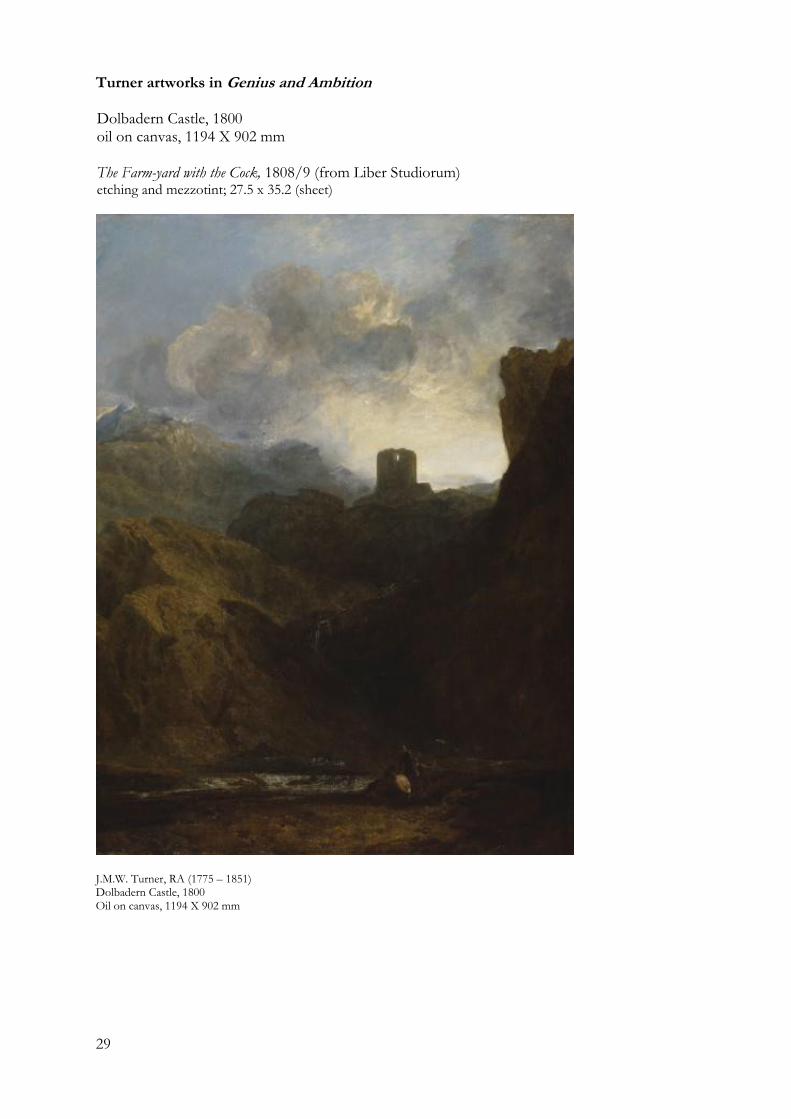
Turner artworks in Genius and Ambition Dolbadern Castle, 1800 oil on canvas, 1194 X 902 mm The Farm-yard with the Cock, 1808/9 (from Liber Studiorum) etching and mezzotint; 27.5 x 35.2 (sheet)
J.M.W. Turner, RA (1775 – 1851) Dolbadern Castle, 1800 Oil on canvas, 1194 X 902 mm
30
John Constable (1776-1837)
Historical context Being born in the second half of the 18th century meant that Constable was born into the Industrial Revolution witnessing poverty in poorer communities in Britain. Many Britons needed to move from the country to cities such as London to look for work. Constable intended to paint naturalistic landscapes, which was very different to the more Romantic landscape painters such as Turner and Gainsborough, who sought escapism in idealised compositions and sublime depiction of subject matter. Constable was born into a wealthy family so, although his father initially hoped he would take over the family business, he was determined to be an artist. Unlike his contemporary, JMW Turner, Constable never travelled abroad considering that the landscapes of his homeland of Suffolk were all he needed to sustain his artistic imagination. Influences His wealthy connections enabled him to meet a collector, George Beaumont, who introduced him to the landscape paintings of the French artist Claude Lorrain, in particular the painting Landscape with Hagar and the Angel. He was also inspired by John Thomas Smith, a friend who was an engraver who encouraged him to pursue a career as an artist. Whilst studying at The Royal Academy he admired the work of landscape work of Thomas Gainsborough and Claude Lorrain, and older masters such as Peter Paul Rubens, Annibale Carracci and Jacob van Ruisdael. Style and Aesthetic Qualities Constable would often use complementary colours of red and green to make each colour project. For example, he would put dabs of red on top of green. His style was seen as Realist as it depicted the landscape in a realist manner without dramatic exaggeration. Many landscape painters had used the ‘coffee colours’ used by Dutch painters but Constable broke with this tradition by emphasising the colour green. In addition to using red highlights against green, he also used white highlights to give water the effect of movement. Techniques Constable used sketching to work out his compositions as he aimed to copy nature rather than making up a composition and trying to get the subject matter to fit, as the Romantic painters had done. He often completed primary sketches in oils and the exhibition Genius and Ambition showcases a range of these artworks that are now regarded as artworks in themselves. As a boy he would spend a considerable amount of time drawing the sky and he called these ‘skying sessions’. He used a grid technique to transfer his sketches up to full size. Many of his paintings were very large, and came to be known as ‘six footers’. Although he did not paint his large canvases en plein air, many of his techniques would have pre-empted Impressionism. He used an impasto style of painting with thick details and rough brush strokes, broken colour and broadness of brush at times. Although he used glazes, he also used a dry brush effect for the details of subject matter to give texture he thought representational of the landscapes he was viewing. Constable artworks in Genius and Ambition A Boat passing a Lock, 1826 oil on canvas, 1016 X 1270 mm Flatford Mill from a Lock on the Stour, ca.1811 oil on paper laid on canvas, 260 X 355 mm
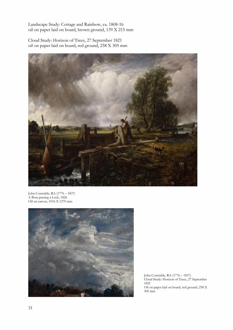
31
Landscape Study: Cottage and Rainbow, ca. 1808-16 oil on paper laid on board, brown ground, 139 X 215 mm Cloud Study: Horizon of Trees, 27 September 1821 oil on paper laid on board, red ground, 258 X 305 mm
John Constable, RA (1776 – 1837) A Boat passing a Lock, 1826 Oil on canvas, 1016 X 1270 mm
John Constable, RA (1776 – 1837) Cloud Study: Horizon of Trees, 27 September 1821 Oil on paper laid on board, red ground, 258 X 305 mm
32
George Clausen (1852-1944)
Historical Context Clausen was born later than most of the artists in Genius and Ambition. His work was largely inspired by the Impressionists which can be seen in his use of a high key palette and the way he conveyed the effects of light. Clausen was considered a Naturalist, a style now considered the Photo realist style of the 19th century. Why study Clausen? Of all the artists in the exhibition, Clausen (along with Walter Sickert) is perhaps the most Impressionistic. With five artworks in the exhibition, this provides a good cross section of styles and techniques for students to view first-hand. Clausen provides an excellent counterpoint to the Romanticism of artists such as Turner (as seen in Doldabarn Castle) and Gainsborough. View of a lady in pink standing in a cornfield is dramatically reductive in its flatness, which would have been quite new at the time in Britain, although the French Impressionists had already been simplifying and stylizing subject matter since 1870s. Styles His use of high key palette, bright warm colours and evident brushstrokes show characteristics of the Impressionism style. His use of dominant foreground figures in a detailed landscape background has much in common with the Naturalism movement. Both Naturalism and Impressionism involved painting everyday scenes rather than dramatizing the elements in the style of Romanticism. Naturalism was a style distinct from portraiture in a landscape in that it included a figure in the foreground. Techniques Like the other Impressionists, Clausen used the camera as a sketching tool. This meant that the compositions mimicked the snapshot foreshortened compositions made possible with the cropping of the camera. He purchased a Marion Miniature “Academy” camera. This was a hand-held plate camera with a fixed aperture of f4.5. Although paint was available in tubes in the last 19th century, he preferred to mix his own from powder. He preferred to use thick absorbent canvases as he thought oil would come to the surface of thinner ones causing the painting to darken over time if excess paint was used and he liked to use a large amount of paint. He also used chrome rather than cadmium based paints as he believed that cadmium caused darkening. For thinning he only uses linseed oil and turpentine spirit, rather than patent mediums or varnish which darkened over time. Like other Naturalists, he would often use a square brush technique. This was also practiced by the Impressionist artists, and involved using the flatness of a paint brush to make square shaped markings. This solid effect was useful for building up solid forms and gave a dazzling pixelated effect. In Genius and Ambition this can also be seen in the Australian artist Arthur Streeton. Influences Clausen travelled to Belgium and Holland between 1873- 75 and viewed paintings by Dutch masters. He was also inspired by the tonalism of Whistler (James Abbott McNeill Whistler). In the early 1880s, he studied the works of the French plein-air school such as the Barbizon School and the rural outdoor scenes of realism by Jules Bastien-Lepage. His travels to France to see artists painting outdoors inspired him to form the New English Art Club in 1886 which encouraged its members to paint outdoors in the style of the French painters. Clausen artworks in Genius and Ambition Interior of an Old Barn, 1908 oil on canvas, 916 X 766 mm Study of a young Dutch boy, mid-late 1870s oil on canvas, 347 X 262 mm
33
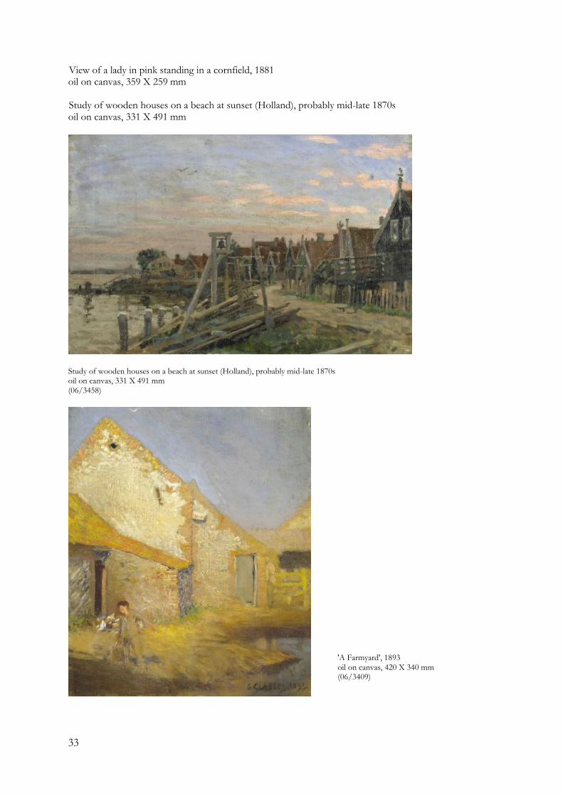
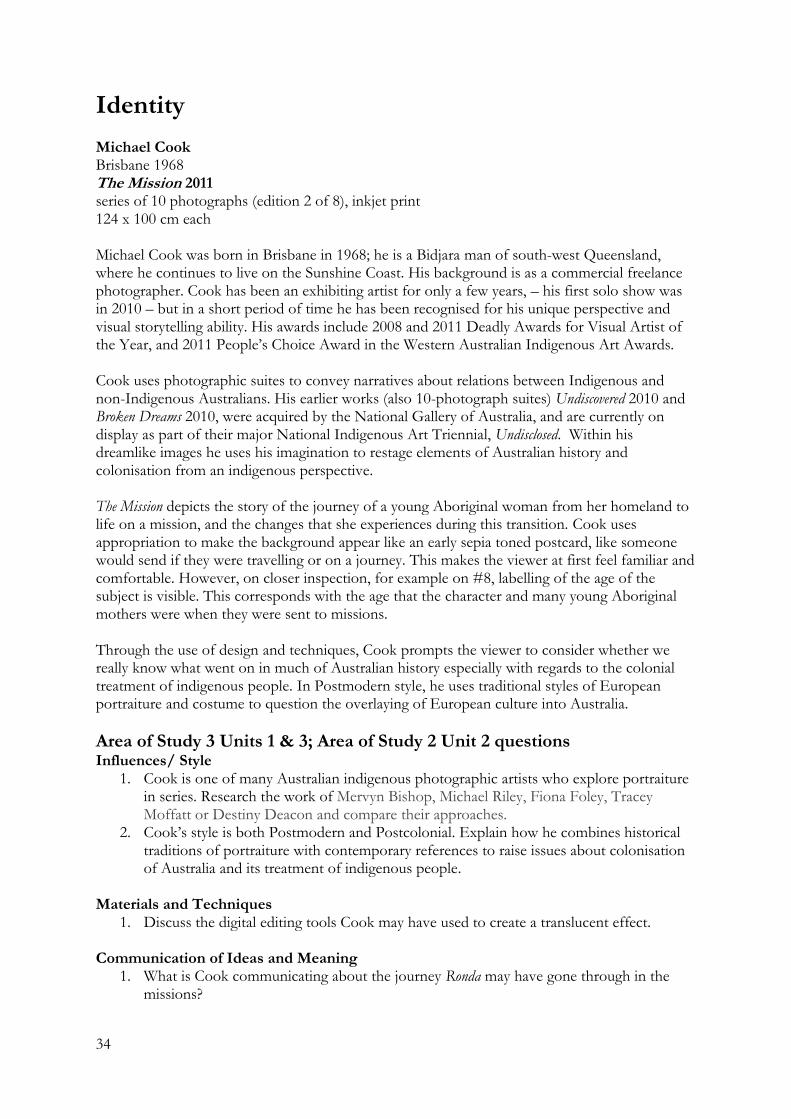
View of a lady in pink standing in a cornfield, 1881 oil on canvas, 359 X 259 mm Study of wooden houses on a beach at sunset (Holland), probably mid-late 1870s oil on canvas, 331 X 491 mm
Study of wooden houses on a beach at sunset (Holland), probably mid-late 1870s oil on canvas, 331 X 491 mm (06/3458)
'A Farmyard', 1893 oil on canvas, 420 X 340 mm (06/3409)
34
Identity
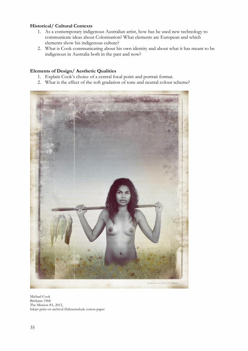
Michael Cook Brisbane 1968 The Mission 2011 series of 10 photographs (edition 2 of 8), inkjet print 124 x 100 cm each Michael Cook was born in Brisbane in 1968; he is a Bidjara man of south-west Queensland, where he continues to live on the Sunshine Coast. His background is as a commercial freelance photographer. Cook has been an exhibiting artist for only a few years, – his first solo show was in 2010 – but in a short period of time he has been recognised for his unique perspective and visual storytelling ability. His awards include 2008 and 2011 Deadly Awards for Visual Artist of the Year, and 2011 People’s Choice Award in the Western Australian Indigenous Art Awards. Cook uses photographic suites to convey narratives about relations between Indigenous and non-Indigenous Australians. His earlier works (also 10-photograph suites) Undiscovered 2010 and Broken Dreams 2010, were acquired by the National Gallery of Australia, and are currently on display as part of their major National Indigenous Art Triennial, Undisclosed. Within his dreamlike images he uses his imagination to restage elements of Australian history and colonisation from an indigenous perspective. The Mission depicts the story of the journey of a young Aboriginal woman from her homeland to life on a mission, and the changes that she experiences during this transition. Cook uses appropriation to make the background appear like an early sepia toned postcard, like someone would send if they were travelling or on a journey. This makes the viewer at first feel familiar and comfortable. However, on closer inspection, for example on #8, labelling of the age of the subject is visible. This corresponds with the age that the character and many young Aboriginal mothers were when they were sent to missions. Through the use of design and techniques, Cook prompts the viewer to consider whether we really know what went on in much of Australian history especially with regards to the colonial treatment of indigenous people. In Postmodern style, he uses traditional styles of European portraiture and costume to question the overlaying of European culture into Australia.
Area of Study 3 Units 1 & 3; Area of Study 2 Unit 2 questions Influences/ Style
1. Cook is one of many Australian indigenous photographic artists who explore portraiture in series. Research the work of Mervyn Bishop, Michael Riley, Fiona Foley, Tracey Moffatt or Destiny Deacon and compare their approaches.
2. Cook’s style is both Postmodern and Postcolonial. Explain how he combines historical traditions of portraiture with contemporary references to raise issues about colonisation of Australia and its treatment of indigenous people.
Materials and Techniques
1. Discuss the digital editing tools Cook may have used to create a translucent effect. Communication of Ideas and Meaning
1. What is Cook communicating about the journey Ronda may have gone through in the missions?
35
Historical/ Cultural Contexts 1. As a contemporary indigenous Australian artist, how has he used new technology to
communicate ideas about Colonisation? What elements are European and which elements show his indigenous culture?
2. What is Cook communicating about his own identity and about what it has meant to be indigenous in Australia both in the past and now?
Elements of Design/ Aesthetic Qualities
1. Explain Cook’s choice of a central focal point and portrait format. 2. What is the effect of the soft gradation of tone and neutral colour scheme?
Michael Cook Brisbane 1968 The Mission #1, 2012, Inkjet print on archival Hahnemuhule cotton paper
36
Suggested Resources and Commentaries Del Kathryn Barton Videos http://www.abc.net.au/arts/stories/s2934478.htm http://www.youtube.com/watch?v=7g1SPDYnsSM Articles http://www.theage.com.au/news/arts/stealing-a-kind-of-beauty/2008/05/29/1211654216577.html http://www.smh.com.au/articles/2008/03/07/1204780034685.html http://www.theaustralian.com.au/news/arts/the-face-del-kathryn-barton/story-e6frg8n6-1111116196517 http://www.artcollector.net.au/DelKathrynBartonHeavyPetting http://kalimangallery.blogspot.com.au/2008/06/del-kathryn-barton-age-saturday-31-may.html Andrew Browne http://andrewbrowne.com.au/ http://www.tolarnogalleries.com/andrew-browne/ Paddy Bedford http://www.mca.com.au/collection/artist/paddy-bedford/ http://www.shermangalleries.com.au/artists/inartists/artist_profile.asp%3Fartist=bedfordp.html Jan Nelson http://www.annaschwartzgallery.com/works/works?artist=23&c=m http://qag.qld.gov.au/collection/contemporary_australian_art/jan_nelson http://blogs.abc.net.au/victoria/2009/08/jan-nelson-takes-out-the-2009-arthur-guy-memorial-painting-prize.html http://www.artgallery.nsw.gov.au/work/218.2004/ Michael Cook http://www.artaustralia.com/article.asp?issue_id=213&article_id=412 http://education.qagoma.qld.gov.au/?p=167 Through my eyes series http://www.andrew-baker.com/Michael%20Cook_Through%20My%20Eyes.pdf Tim Johnson http://www.qagoma.qld.gov.au/__data/assets/pdf_file/0003/68529/TimJohnsonEduResource_V6.pdf Zhong Chen http://www.evabreuerartdealer.com.au/artists/zhong-chen/ http://www.abstractaustralis.com.au/artists/artist.cfm?id=1068 Thomas Gainsborough LEONARD, Jonathan Norton The World of Gainsborough 1727-1788 Time Life 1972 http://voices.yahoo.com/thomas-gainsborough-landscape-painting-style-shift-271218.html http://arthistoryinenglish.edublogs.org/painting/xviiith-century-art/thomas-gainsborough-a-biography-of-the-painter/ http://www.independent.co.uk/arts-entertainment/art/features/a-change-of-view-that-shook-the-world-8434158.html http://www.holburne.org/gainsborough-s-landscapes/ http://www.comptonverney.org.uk/_userfiles/pages/file/Press/Gainsborough's%20Landscapes%20press%20release.pdf
37
JMW Turner Dorling Kindersley Limited Great Artists Explained 2007 http://www.artgallery.sa.gov.au/agsa/home/Learning/docs/Turner-Education_Resource-Reloaded-Online.pdf John Constable Gary Allen Pty Ltd Techniques of the World’s Great Masters 2004 The influence of Constable on Australian artists: http://nga.gov.au/Exhibition/CONSTABLE%20/default.cfm?MnuID=2 Education activities from the V&A Museum http://www.vam.ac.uk/content/articles/t/constable-teachers-resource/ http://www.paintermagazine.co.uk/images_about/_PDFsamples/InspirationalTutorials.pdf http://www.theguardian.com/artanddesign/2012/nov/23/constable-turner-gainsborough-making-landscape John William Waterhouse http://www.artble.com/artists/john_william_waterhouse Thank you to Kathryn Hendy-Ekers, VCAA Arts Manager for the use of her VCE Art Analytical Frameworks notes
38
VCE Exam Practice Activities: Question 1 Art Select two paintings in Bendigo Art Gallery Abbott Court that depict the theme of wealth and or/poverty
Compare the meanings and messages each artist portraying in this artwork:
Studio Arts
Choose one narrative painting in the Abbott Court. Discuss the communication of ideas and meanings in this artwork:
39
Question 1 Art Select two artworks from the contemporary Australian art room/s
Compare the use of formal elements of colour and shape in the artworks:
Studio Arts
Choose one artwork form the contemporary Australian art room/s Discuss how the artist has used two elements of design to create aesthetic qualities in the artwork.