Embed Size (px)
DESCRIPTION
Educational
Citation preview
AmeritalkSimple solution
Project Book 2013
1
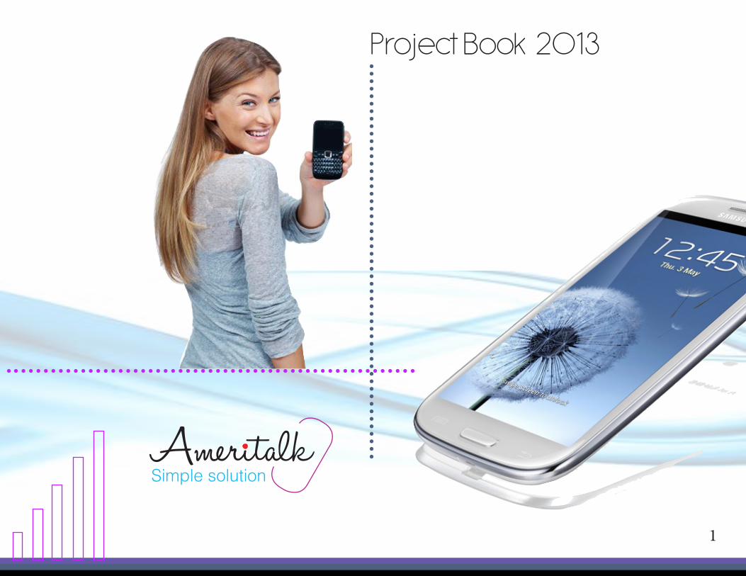
Designer’s notesHello, I would like to present for your enjoyment, Ameritalk. Ameritalk is a sub brand of a company you may already know. T-Mobile is doing its best to compete in the newly formed prepaid cell phone in-ustry. The problem all post paid carriers face, is hevy competition from prepaid wireless providers. The new prepaid compaies often offer the same services at almost half the cost. what’s the solution? Ameri-talk, offering the same nationwide network access that drives T-Mobiles success. using unique sales offers and the latest handsets, Ameritalk hopes to attract a more diverse customer base than its parent company T-Mobile. Through out this wonderful cam-paign docunment, you will find the information relat-ing to every step of the campaign design process, as well as the meaning behind the descisions.
2
Table of contents1.0 RESEARCH
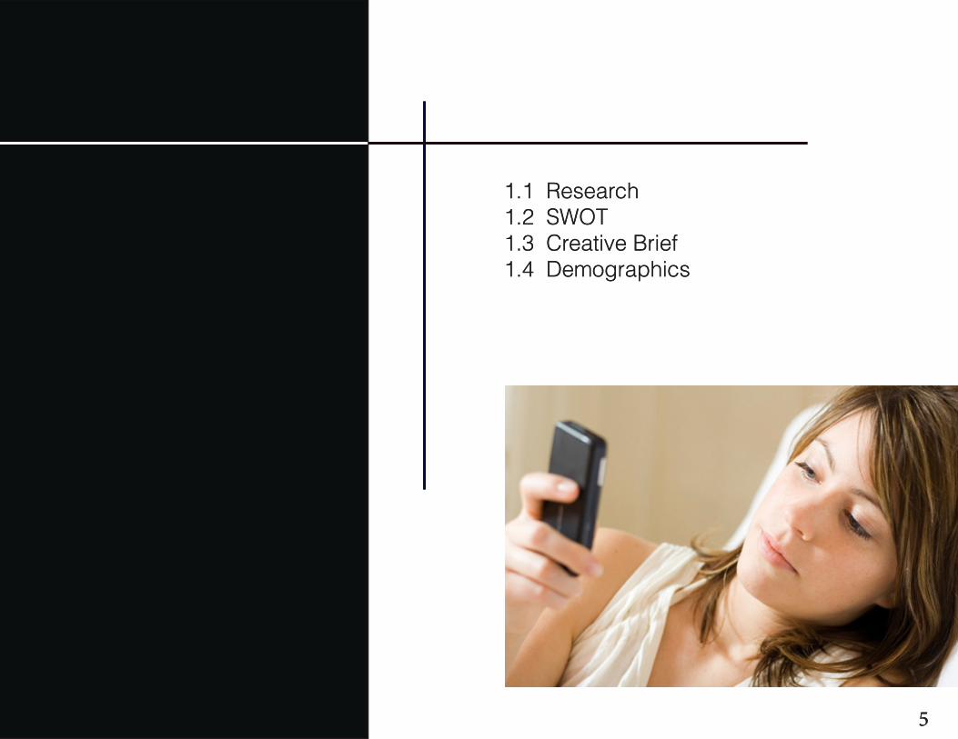
1.1 Research
1.2 SWOT
1.3 Creative Brief
1.4 Demographics
2.0 CREATIVE DEVELOPMENT
2.1 Competitive Survey
2.2 Design Research
2.3 Mood Boards
2.4 Logo
2.5 Interactive Logo
2.6 Code Club
3.0 STYLE GUIDE
3.1 Logo Standards 3.2 Color Palette
3.3 Typography
3.4 Visual Elements
4.0 FINAL DESIGN
4.1 Digital Media
4.2 Promotional Items
4.3 Advertising
4.4 Commercials
3

1.0 Research
1.0
4
1.1 Research1.2 SWOT1.3 Creative Brief1.4 Demographics
1.1 Research1.2 SWOT1.3 Creative Brief1.4 Demographics
55
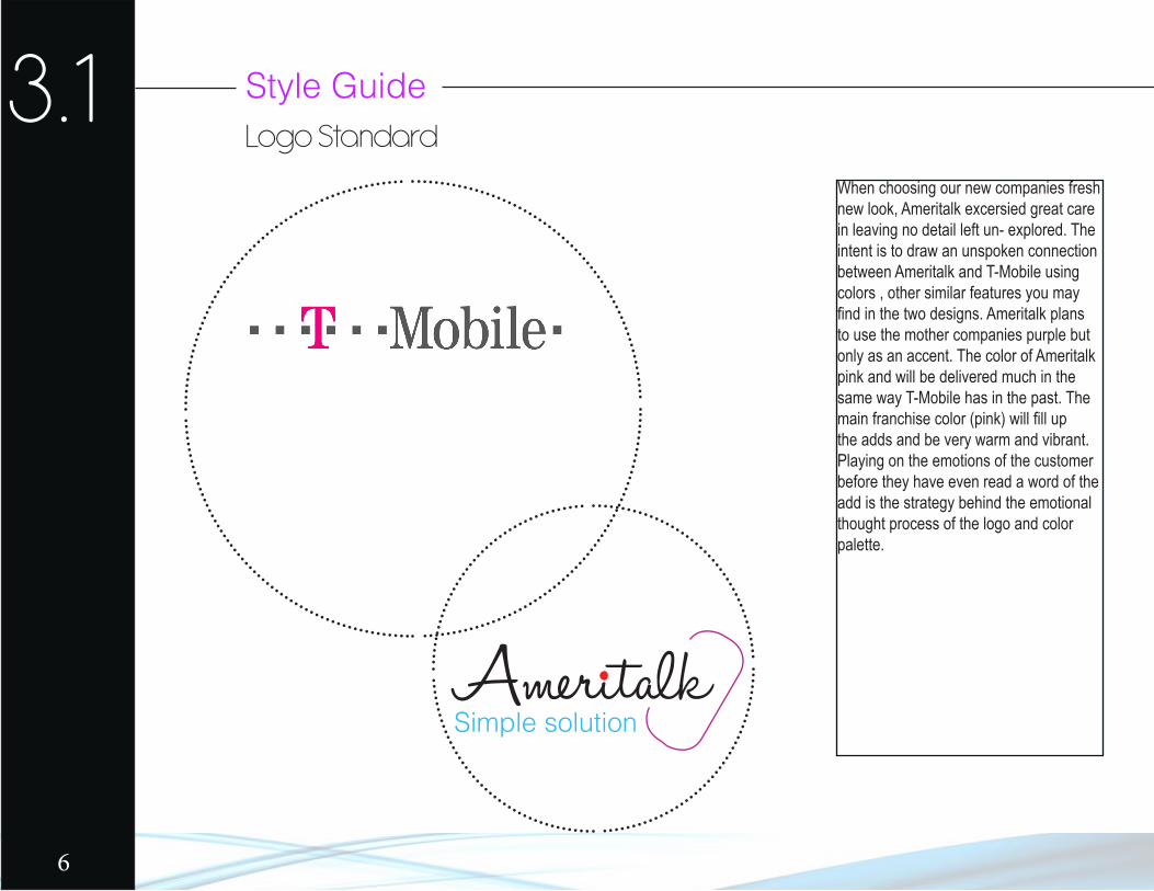
3.1 Style GuideLogo Standard
When choosing our new companies fresh new look, Ameritalk excersied great care in leaving no detail left un- explored. The intent is to draw an unspoken connection between Ameritalk and T-Mobile using colors , other similar features you may find in the two designs. Ameritalk plans to use the mother companies purple but only as an accent. The color of Ameritalk pink and will be delivered much in the same way T-Mobile has in the past. The main franchise color (pink) will fill up the adds and be very warm and vibrant. Playing on the emotions of the customer before they have even read a word of the add is the strategy behind the emotional thought process of the logo and color palette.
AmeritalkSimple solution
6
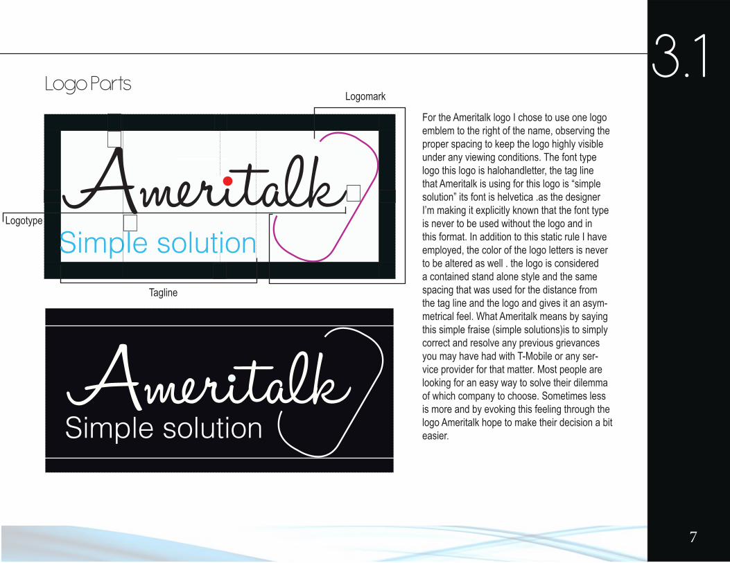
3.1Logo Parts
Ameritalk
Ameritalk
Simple solution
Simple solution
For the Ameritalk logo I chose to use one logo emblem to the right of the name, observing the proper spacing to keep the logo highly visible under any viewing conditions. The font type logo this logo is halohandletter, the tag line that Ameritalk is using for this logo is “simple solution” its font is helvetica .as the designer I’m making it explicitly known that the font type is never to be used without the logo and in this format. In addition to this static rule I have employed, the color of the logo letters is never to be altered as well . the logo is considered a contained stand alone style and the same spacing that was used for the distance from the tag line and the logo and gives it an asym-metrical feel. What Ameritalk means by saying this simple fraise (simple solutions)is to simply correct and resolve any previous grievances you may have had with T-Mobile or any ser-vice provider for that matter. Most people are looking for an easy way to solve their dilemma of which company to choose. Sometimes less is more and by evoking this feeling through the logo Ameritalk hope to make their decision a bit easier.
Tagline
Logomark
Logotype
7

8