Embed Size (px)
Citation preview
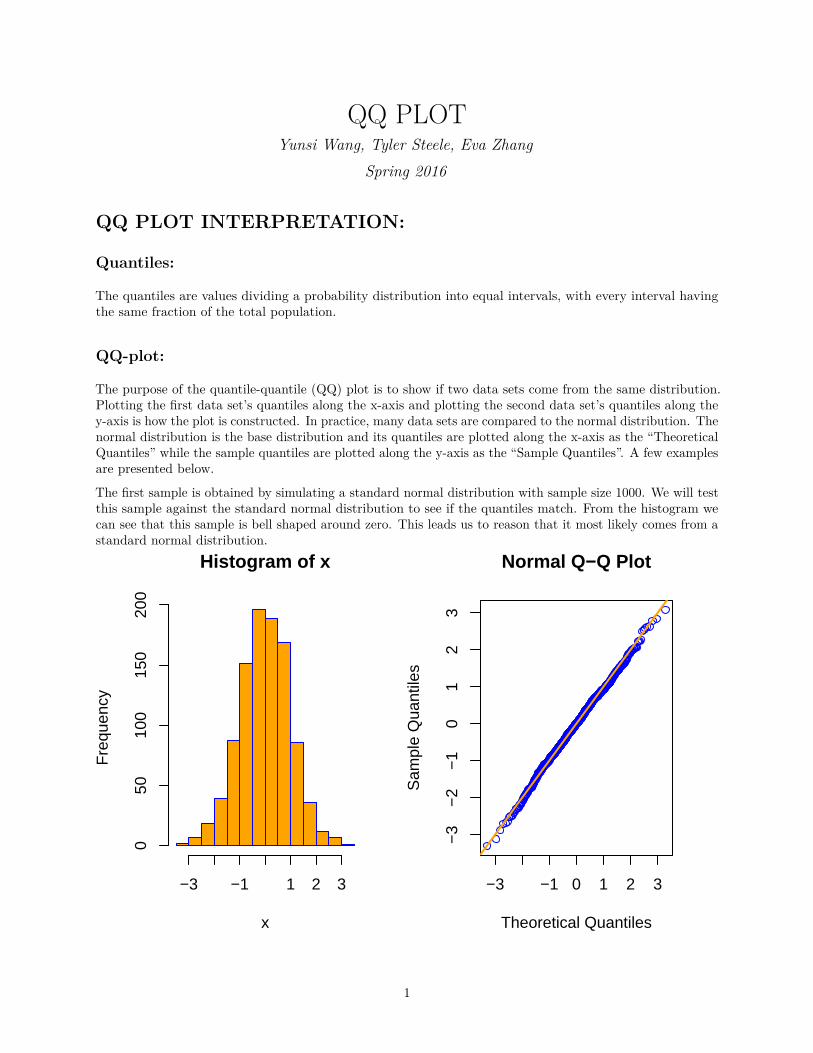
QQ PLOTYunsi Wang, Tyler Steele, Eva Zhang
Spring 2016
QQ PLOT INTERPRETATION:
Quantiles:
The quantiles are values dividing a probability distribution into equal intervals, with every interval havingthe same fraction of the total population.
QQ-plot:
The purpose of the quantile-quantile (QQ) plot is to show if two data sets come from the same distribution.Plotting the first data set’s quantiles along the x-axis and plotting the second data set’s quantiles along they-axis is how the plot is constructed. In practice, many data sets are compared to the normal distribution. Thenormal distribution is the base distribution and its quantiles are plotted along the x-axis as the “TheoreticalQuantiles” while the sample quantiles are plotted along the y-axis as the “Sample Quantiles”. A few examplesare presented below.
The first sample is obtained by simulating a standard normal distribution with sample size 1000. We will testthis sample against the standard normal distribution to see if the quantiles match. From the histogram wecan see that this sample is bell shaped around zero. This leads us to reason that it most likely comes from astandard normal distribution.
Histogram of x
x
Fre
quen
cy
−3 −1 1 2 3
050
100
150
200
−3 −1 0 1 2 3
−3
−2
−1
01
23
Normal Q−Q Plot
Theoretical Quantiles
Sam
ple
Qua
ntile
s
1
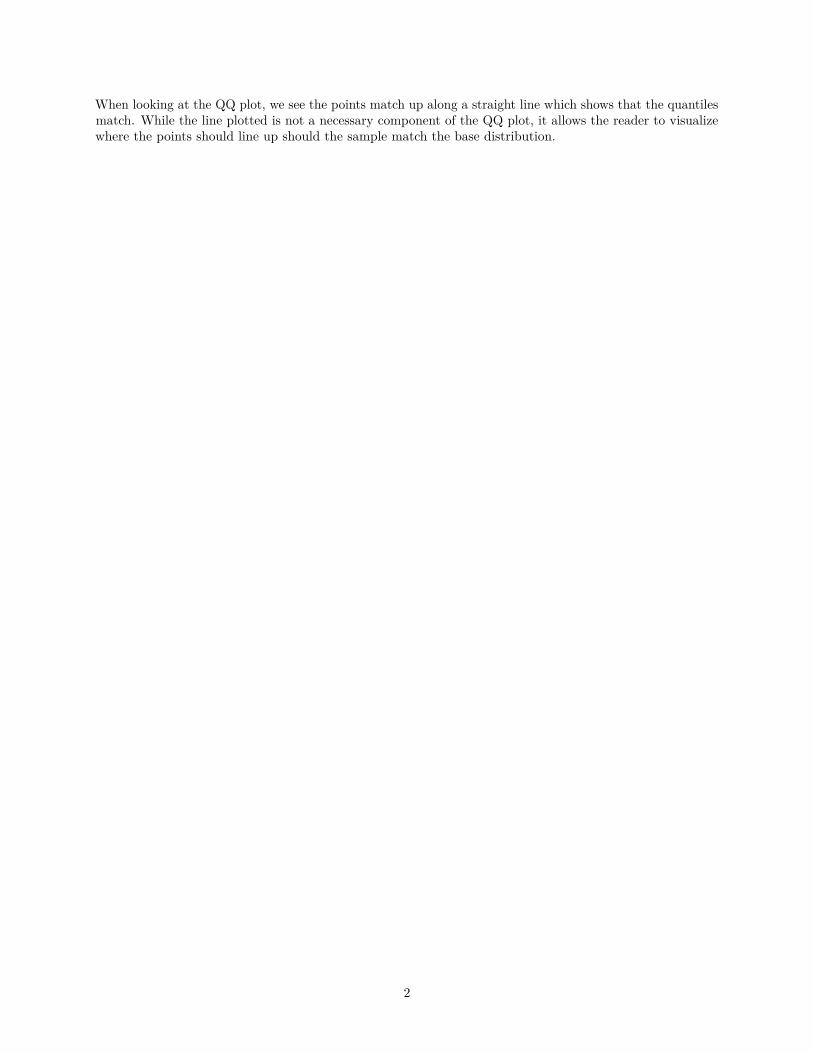
When looking at the QQ plot, we see the points match up along a straight line which shows that the quantilesmatch. While the line plotted is not a necessary component of the QQ plot, it allows the reader to visualizewhere the points should line up should the sample match the base distribution.
2
The next examples will show what various QQ plots look like if two data sets do not come from the samedistribution.
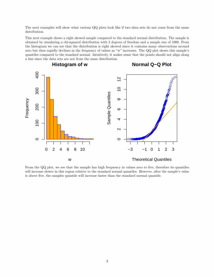
This next example shows a right skewed sample compared to the standard normal distribution. The sample isobtained by simulating a chi-squared distribution with 2 degrees of freedom and a sample size of 1000. Fromthe histogram we can see that the distribution is right skewed since it contains many observations aroundzero but then rapidly declines in the frequency of values as “w” increases. The QQ plot shows this sample’squantiles compared to the standard normal. Intuitively, it makes sense that the points should not align alonga line since the data sets are not from the same distribution.
Histogram of w
w
Fre
quen
cy
0 2 4 6 8 10
010
020
030
040
0
−3 −1 0 1 2 3
02
46
810
12
Normal Q−Q Plot
Theoretical Quantiles
Sam
ple
Qua
ntile
s
From the QQ plot, we see that the sample has high frequency in values zero to five, therefore its quantileswill increase slower in this region relative to the standard normal quantiles. However, after the sample’s valueis above five, the samples quantile will increase faster than the standard normal quantile.
3
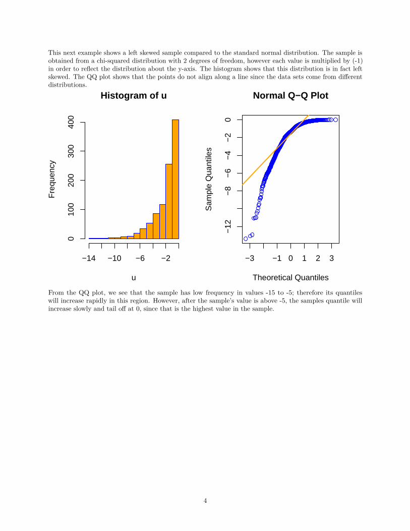
This next example shows a left skewed sample compared to the standard normal distribution. The sample isobtained from a chi-squared distribution with 2 degrees of freedom, however each value is multiplied by (-1)in order to reflect the distribution about the y-axis. The histogram shows that this distribution is in fact leftskewed. The QQ plot shows that the points do not align along a line since the data sets come from differentdistributions.
Histogram of u
u
Fre
quen
cy
−14 −10 −6 −2
010
020
030
040
0
−3 −1 0 1 2 3
−12
−8
−6
−4
−2
0
Normal Q−Q Plot
Theoretical Quantiles
Sam
ple
Qua
ntile
s
From the QQ plot, we see that the sample has low frequency in values -15 to -5; therefore its quantileswill increase rapidly in this region. However, after the sample’s value is above -5, the samples quantile willincrease slowly and tail off at 0, since that is the highest value in the sample.
4
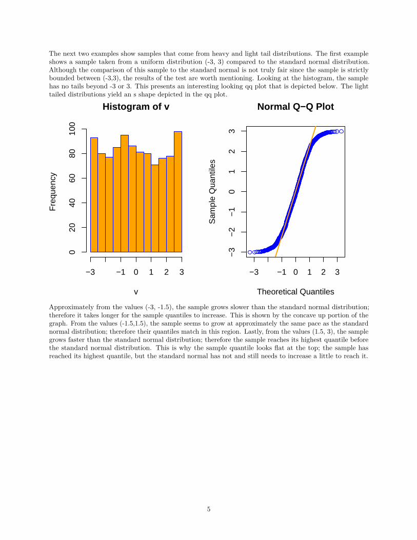
The next two examples show samples that come from heavy and light tail distributions. The first exampleshows a sample taken from a uniform distribution (-3, 3) compared to the standard normal distribution.Although the comparison of this sample to the standard normal is not truly fair since the sample is strictlybounded between (-3,3), the results of the test are worth mentioning. Looking at the histogram, the samplehas no tails beyond -3 or 3. This presents an interesting looking qq plot that is depicted below. The lighttailed distributions yield an s shape depicted in the qq plot.
Histogram of v
v
Fre
quen
cy
−3 −1 0 1 2 3
020
4060
8010
0
−3 −1 0 1 2 3
−3
−2
−1
01
23
Normal Q−Q Plot
Theoretical Quantiles
Sam
ple
Qua
ntile
s
Approximately from the values (-3, -1.5), the sample grows slower than the standard normal distribution;therefore it takes longer for the sample quantiles to increase. This is shown by the concave up portion of thegraph. From the values (-1.5,1.5), the sample seems to grow at approximately the same pace as the standardnormal distribution; therefore their quantiles match in this region. Lastly, from the values (1.5, 3), the samplegrows faster than the standard normal distribution; therefore the sample reaches its highest quantile beforethe standard normal distribution. This is why the sample quantile looks flat at the top; the sample hasreached its highest quantile, but the standard normal has not and still needs to increase a little to reach it.
5
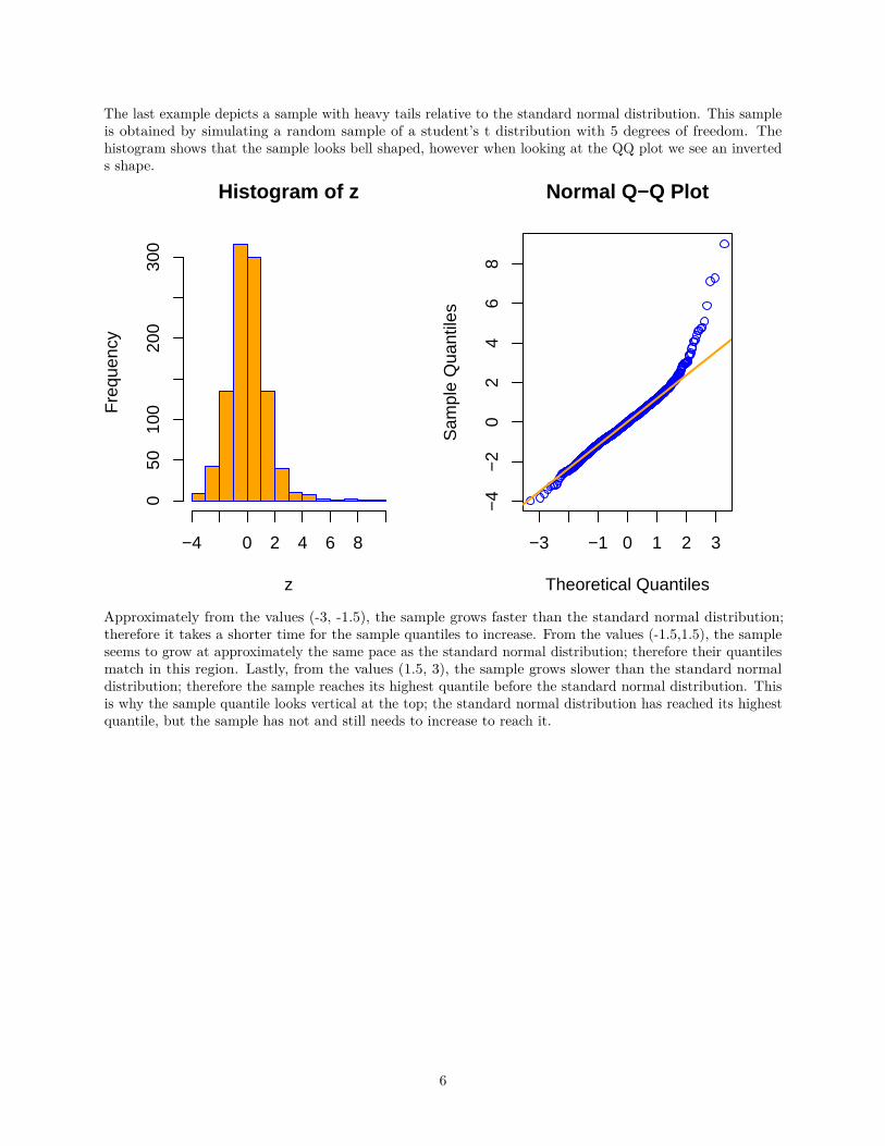
The last example depicts a sample with heavy tails relative to the standard normal distribution. This sampleis obtained by simulating a random sample of a student’s t distribution with 5 degrees of freedom. Thehistogram shows that the sample looks bell shaped, however when looking at the QQ plot we see an inverteds shape.
Histogram of z
z
Fre
quen
cy
−4 0 2 4 6 8
050
100
200
300
−3 −1 0 1 2 3
−4
−2
02
46
8
Normal Q−Q Plot
Theoretical Quantiles
Sam
ple
Qua
ntile
s
Approximately from the values (-3, -1.5), the sample grows faster than the standard normal distribution;therefore it takes a shorter time for the sample quantiles to increase. From the values (-1.5,1.5), the sampleseems to grow at approximately the same pace as the standard normal distribution; therefore their quantilesmatch in this region. Lastly, from the values (1.5, 3), the sample grows slower than the standard normaldistribution; therefore the sample reaches its highest quantile before the standard normal distribution. Thisis why the sample quantile looks vertical at the top; the standard normal distribution has reached its highestquantile, but the sample has not and still needs to increase to reach it.
6
These different types of plots help us distinguish how the sample compares to the base distribution. Forexample, if we have a sample and would like to see how it compares to the standard normal, we construct aQQ plot. If the QQ plot yields an inverted s shape, then we would reason that the sample probably does notcome from the normal distribution. In addition, from our analysis of the different QQ plots, we would reasonthat the sample has heavy tails. Therefore, we have the option of comparing our sample to a heavy taileddistribution such as a two parameter Pareto, or a Weibull distribution. If we now construct a QQ plot of oursample against one of these heavy tailed distributions and the QQ plot yields a straight line, then we havereason to believe that our sample has a high probability of coming from the distribution that we tested.
7
QQ PLOT APPLICATION:
Part one of this document discusses an analysis of the extreme valuation theorem. Maximum Likelihoodestimates are calculated from simulating different random variables.
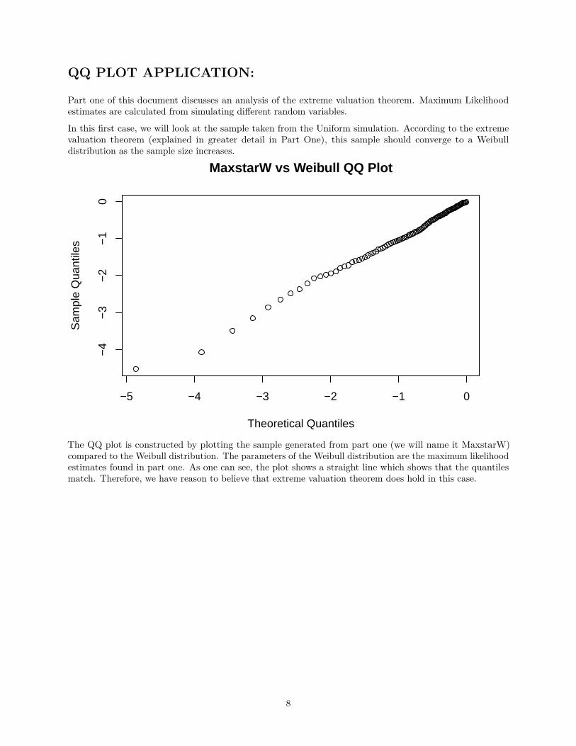
In this first case, we will look at the sample taken from the Uniform simulation. According to the extremevaluation theorem (explained in greater detail in Part One), this sample should converge to a Weibulldistribution as the sample size increases.
−5 −4 −3 −2 −1 0
−4
−3
−2
−1
0
MaxstarW vs Weibull QQ Plot
Theoretical Quantiles
Sam
ple
Qua
ntile
s
The QQ plot is constructed by plotting the sample generated from part one (we will name it MaxstarW)compared to the Weibull distribution. The parameters of the Weibull distribution are the maximum likelihoodestimates found in part one. As one can see, the plot shows a straight line which shows that the quantilesmatch. Therefore, we have reason to believe that extreme valuation theorem does hold in this case.
8
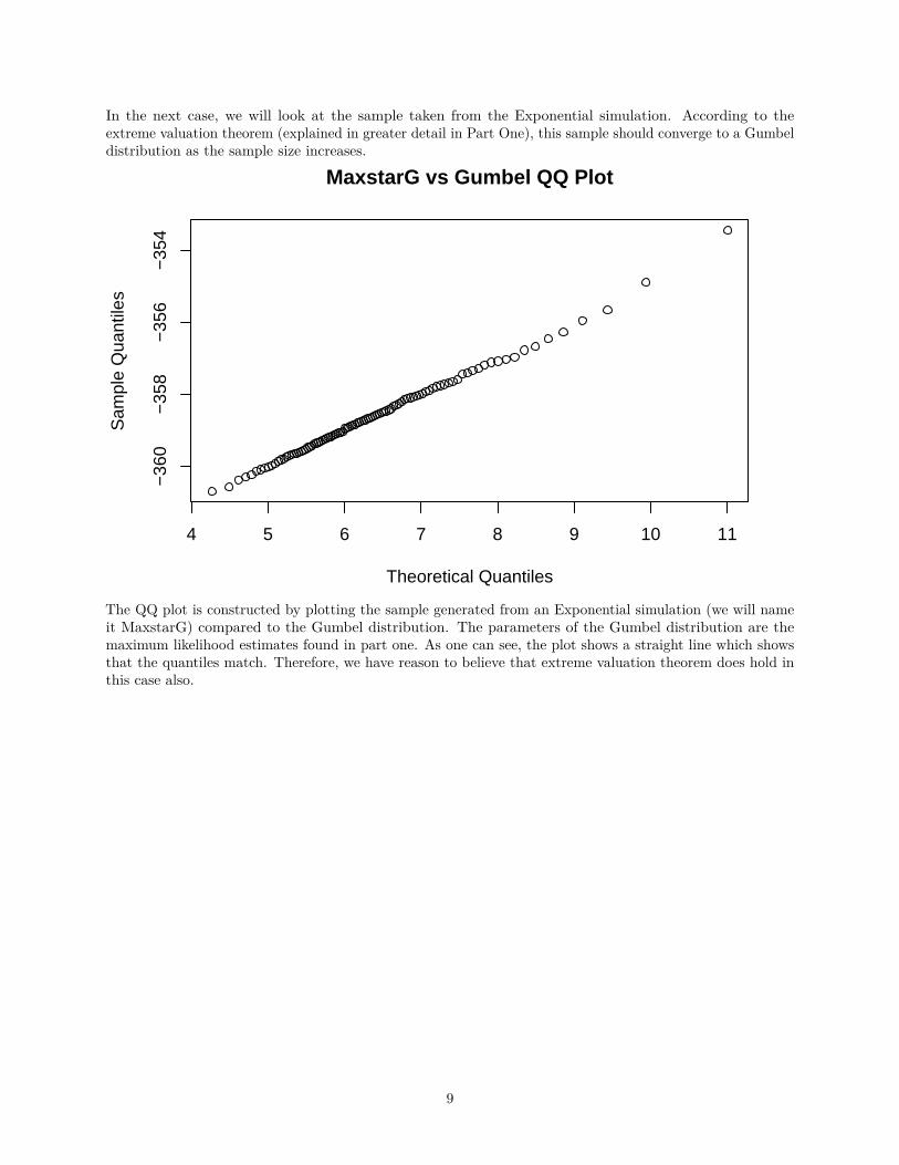
In the next case, we will look at the sample taken from the Exponential simulation. According to theextreme valuation theorem (explained in greater detail in Part One), this sample should converge to a Gumbeldistribution as the sample size increases.
4 5 6 7 8 9 10 11
−36
0−
358
−35
6−
354
MaxstarG vs Gumbel QQ Plot
Theoretical Quantiles
Sam
ple
Qua
ntile
s
The QQ plot is constructed by plotting the sample generated from an Exponential simulation (we will nameit MaxstarG) compared to the Gumbel distribution. The parameters of the Gumbel distribution are themaximum likelihood estimates found in part one. As one can see, the plot shows a straight line which showsthat the quantiles match. Therefore, we have reason to believe that extreme valuation theorem does hold inthis case also.
9
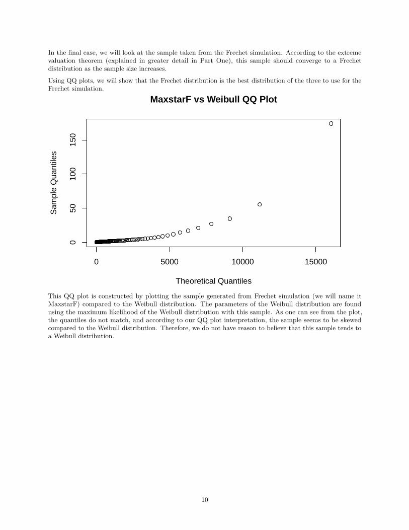
In the final case, we will look at the sample taken from the Frechet simulation. According to the extremevaluation theorem (explained in greater detail in Part One), this sample should converge to a Frechetdistribution as the sample size increases.
Using QQ plots, we will show that the Frechet distribution is the best distribution of the three to use for theFrechet simulation.
0 5000 10000 15000
050
100
150
MaxstarF vs Weibull QQ Plot
Theoretical Quantiles
Sam
ple
Qua
ntile
s
This QQ plot is constructed by plotting the sample generated from Frechet simulation (we will name itMaxstarF) compared to the Weibull distribution. The parameters of the Weibull distribution are foundusing the maximum likelihood of the Weibull distribution with this sample. As one can see from the plot,the quantiles do not match, and according to our QQ plot interpretation, the sample seems to be skewedcompared to the Weibull distribution. Therefore, we do not have reason to believe that this sample tends toa Weibull distribution.
10
−2000 0 2000 4000 6000 8000
050
100
150
MaxstarF vs Gumbel QQ Plot
Theoretical Quantiles
Sam
ple
Qua
ntile
s
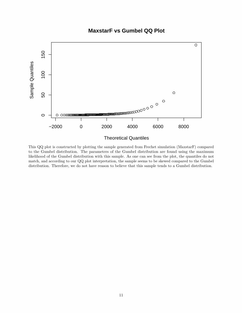
This QQ plot is constructed by plotting the sample generated from Frechet simulation (MaxstarF) comparedto the Gumbel distribution. The parameters of the Gumbel distribution are found using the maximumlikelihood of the Gumbel distribution with this sample. As one can see from the plot, the quantiles do notmatch, and according to our QQ plot interpretation, the sample seems to be skewed compared to the Gumbeldistribution. Therefore, we do not have reason to believe that this sample tends to a Gumbel distribution.
11
0 10000 20000 30000 40000 50000 60000
050
100
150
MaxstarF vs Frechet QQ Plot
Theoretical Quantiles
Sam
ple
Qua
ntile
s
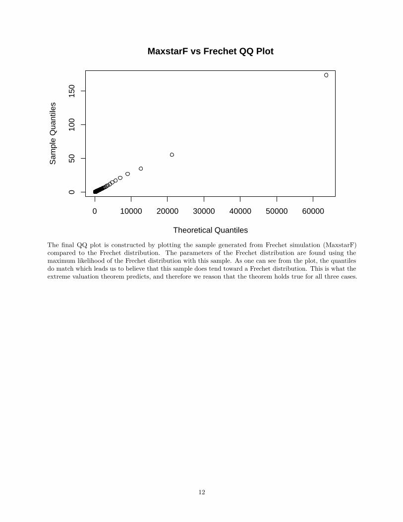
The final QQ plot is constructed by plotting the sample generated from Frechet simulation (MaxstarF)compared to the Frechet distribution. The parameters of the Frechet distribution are found using themaximum likelihood of the Frechet distribution with this sample. As one can see from the plot, the quantilesdo match which leads us to believe that this sample does tend toward a Frechet distribution. This is what theextreme valuation theorem predicts, and therefore we reason that the theorem holds true for all three cases.
12
References:
Engineering Statistics Handbook “Quantile-Quantile Plot” (2016) http://www.itl.nist.gov/div898/handbook/eda/section3/qqplot.htm
“Skews and Tails” (2016) http://www.google.com/search?q=heavy+tailed+qq+plot&client=safari&rls=en&prmd=ivns&ei=nhc-V5SwF8THmQG166Ug&start=10&sa=N
University of Virginia Library Research Data Services “Understanding Q-Q Plots” (2016) http://data.library.virginia.edu/understanding-q-q-plots/
13