Embed Size (px)
Citation preview

Question one.

1. In what ways does your media product use, develop or
challenge forms and conventions of real media
products?

What products did I use for inspiration?


This contents page Is what I used the most to develop my magazine to fit the usual conventions of a music magazine.
The contents page used small and wide columns to arrange their text effectively. I copied this to achieve the usual conventions of a magazine.
The overall mise-en-scene of the contents is simple and effective, I used this style within my design.
Fonts I have used are fairly similar to that of the other magazine, I felt this created something extra to the page, creating more interest.
Inserting pictures of young females is what my audience expected. Although I challenged usual conventions of a music magazine as the portraits seem to be professionally taken rather than live shots.

I challenged the usual conventions of a music magazines with the general colours used. I decided to stick to three colours white, black and green. These gave the magazine a softer approach and made my target audience of girls fairly obvious.
I copied some general music magazine ideas to class my magazine as ‘down market’ so it appeals to my younger audience.
My magazine can be recognised as a real magazine due to the professionally taken photo, Masthead, title and the bar code. Which are generally found on every magazine.
I copied this of the NME magazine to fill up the space at the bottom of my magazine and also so my audience can read what else is within the magazine.
I decided to add no other photos onto my cover as I felt this cheapened the overall look, also making it look cluttered.
I used pull quotes to fit in with usual conventions of a double page spread, this grabs the readers attention and makes them want to read more.
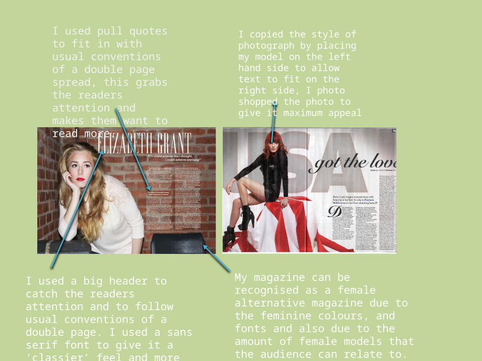
I copied the style of photograph by placing my model on the left hand side to allow text to fit on the right side, I photo shopped the photo to give it maximum appeal
I used a big header to catch the readers attention and to follow usual conventions of a double page. I used a sans serif font to give it a ‘classier’ feel and more sophisticated.
My magazine can be recognised as a female alternative magazine due to the feminine colours, and fonts and also due to the amount of female models that the audience can relate to.