Embed Size (px)
Citation preview

Fast Tools & Resources
Ratio Analysis Program With this program, peer-group financial ratios of Illinois farms can be categorized and used to analyze a farming operation’s financial performance.
Data can be categorized based on these peer groups: farm sales, age of operator, farm type and tenure (% of land ownership). Information is displayed in two ways: all categories of a peer group for a specific year or one category of a peer group for all years available. The data used in this program come from Illinois Farm Business Farm Management Association and reported the Financial Characteristics of Illinois Farms published by the University of Illinois. Navigating the Program The program contains four worksheets. When the program is initially opened, the “Ratios” worksheet appears on the screen.
To move among worksheets, click and select among the four Excel tabs at the bottom of the screen: Peer Ratios, Ratios, Summary Ratios, and Common Size. The “Peer Ratios” worksheet also can be opened by selecting “compare peer levels” on the left side of the “Ratios” screen, while the “Ratios” worksheet can be opened by selecting “compare over time” on the left side of the “Peer Ratios” screen. The worksheets are briefly described below. More detail is provided in the “Explanation of Worksheets” section. The RATIOS worksheet is used to compare financial ratios for one category of a peer group over a period of multiple years. Financial ratios include: liquidity, solvency, profitability, repayment capacity, financial efficiency, operational ratios, assets and liabilities. For example, financial ratios may be shown for farms with less than $75,000 in sales for each year since 1995.

Fast Tools & Resources
The PEER RATIOS worksheet is used to compare financial ratios for all categories of a peer group for a specific year. Financial ratios include: liquidity, solvency, profitability, repayment capacity, financial efficiency, and operational ratios. For example, financial ratios may be shown for all categories of the “Sales” peer group for the year 2000. The SUMMARY RATIOS worksheet is used to define the calculations for key financial ratios related to the analysis of repayment, liquidity, solvency, profitability and financial efficiency. Three levels of benchmarks are provided for each of these categories. The COMMON SIZE worksheet contains graphs representing the common size of assets, liabilities, and income statements for a specific peer-group category and a selected year. Categorizing Data To categorize data, use the box shown on the next page in the “Comparison Level” section. Six items are needed to define the categories and calculate the measures: • Comparison Level • Peer Group • Adjustments to Benchmark Regions for Tenure • Type of Analysis (ie. compare over time versus compare peer levels) • Ratio Definition Button • Reset Page Size
Comparison Level The user may choose to view ratios for a specific section of the data set. For example, the user may want to view data for a specific quartile or decile. The upper quartile (75%) is the ratio value exceeded by one-fourth of the farms in the category, while the lower quartile (25%) is the ratio value exceeded by three-fourths of the farms. The median (50%) is the ratio value exceeded by one-half of the farms in the category. Using quartile data also allows for the analysis of the distribution of the ratio within each category.

Fast Tools & Resources
In the example shown below, the lower and upper quartiles are represented by the 0.25 and 0.75 selections.
Peer Group The program contains financial data for the following peer groups: Sales, Age, Farm Type, Tenure (% of land ownership), or All Farms. When a peer group is selected, a drop-down box appears next to it, which allows the user to identify the specific category within the peer group. For example, in the box below, the “Sales” peer group is selected and a drop-down box is shown next to it. The specific category for the “Sales” peer group in the example is farms with sales of “less than $75,000”.

Fast Tools & Resources
Peer Group Categories Sales Age
Farm Type Tenure (% of land
ownership) Less than $75,000 <30 Hog 0 to 10% $75,000 to 150,000 30 to 39 Grain 11 to 25%
$150,001 to 225,000 40 to 49 Dairy 26 to 50% $225,001 to 300,000 50 to 59 Beef Cattle 51 to 75%
Greater than $300,000 >60 Over 75%
Adjustments to Benchmark Regions for Tenure When selecting criteria for categorizing data, the user may adjust the benchmark regions that appear on the graph of the “Ratios” or “Peer Ratio” worksheets to appropriately represent the user’s percentage of land ownership. The user may choose the Low, Mid, or High category in the box as shown below. For example, Low represents users who own 0-20% of the land they use in their farming operation. The ratios affected by the adjustments are: debt to asset, equity to asset, debt to equity, rate of return on farm assets, rate of return on farm equity, asset turnover ratio, and operating expense ratio. More information about the three adjustment categories is provided in the Explanation of Worksheets section.

Fast Tools & Resources
Type of Analysis The user must choose either “Compare over time” or “Compare peer levels”. This selection will open the appropriate worksheet. “Compare over time” displays the “Ratios” worksheet, allowing the user to view multi-year data for a specific category of a peer group. For example, data may be shown for farms with less than $75,000 in sales for each year since 1995. “Compare peer levels” displays the “Peer Ratios” worksheet, allowing the user to vi ew data for all categories of a peer group for a specific year. For example, data for all of the categories in the “Sales” peer group may be shown for the year 2000.
Compare Over Time: Sales Less Than $75,000
Compare Peer Levels: Sales

Fast Tools & Resources
Ratio Definition Button To view the definition of a ratio, click anywhere in the ratio’s section and click
. For example, by clicking anywhere on the “Current Ratio”
line (step 1) and then clicking (step 2), the definition screen will appear (step 3). 1. Click anywhere on the ratio’s line.
2. Click .
3. Definition appears.
Fast Tools & Resources
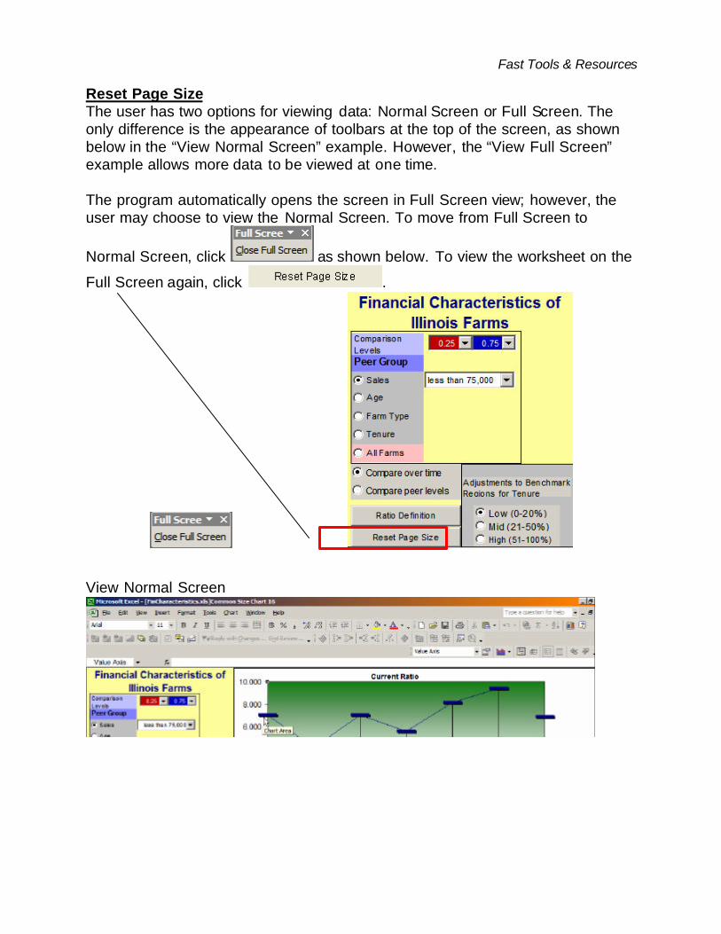
Reset Page Size The user has two options for viewing data: Normal Screen or Full Screen. The only difference is the appearance of toolbars at the top of the screen, as shown below in the “View Normal Screen” example. However, the “View Full Screen” example allows more data to be viewed at one time. The program automatically opens the screen in Full Screen view; however, the user may choose to view the Normal Screen. To move from Full Screen to
Normal Screen, click as shown below. To view the worksheet on the
Full Screen again, click .
View Normal Screen
Fast Tools & Resources
View Full Screen
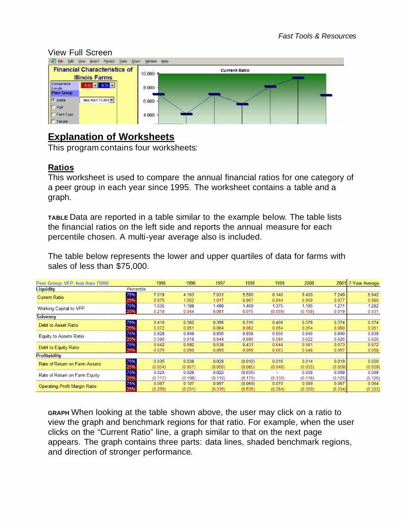
Explanation of Worksheets This program contains four worksheets: Ratios This worksheet is used to compare the annual financial ratios for one category of a peer group in each year since 1995. The worksheet contains a table and a graph. TABLE Data are reported in a table similar to the example below. The table lists the financial ratios on the left side and reports the annual measure for each percentile chosen. A multi-year average also is included. The table below represents the lower and upper quartiles of data for farms with sales of less than $75,000.
GRAPH When looking at the table shown above, the user may click on a ratio to view the graph and benchmark regions for that ratio. For example, when the user clicks on the “Current Ratio” line, a graph similar to that on the next page appears. The graph contains three parts: data lines, shaded benchmark regions, and direction of stronger performance.

Fast Tools & Resources
The data lines represent the data for the two comparison levels chosen in the search criteria for a selected financial ratio. In addition to the lines, the graph also is shaded in three color regions (green, yellow, red) to represent benchmarks for the chosen ratio and provide a visual analysis of the operation’s level of strength. For example, the green region represents potential strength, the yellow region indicates caution or a potential problem problem, and the red region suggests the measure is in the problem region. To better represent the user’s benchmarks, the user may adjust the benchmark regions in the “Adjustments to Benchmark Regions for “Tenure section as discussed ear lier. Note that regions may be changed for a select set of ratios. Finally, in the lower right-hand corner of the graph, an arrow shows the “Direction of Stronger Performance”. For example, it is preferred to have a larger current ratio, while it is preferred to have a lower debt-to-asset ratio. The arrow will change directions accordingly for selected ratios. The graph below represents the current ratio for the lower and upper quartiles of data for farms wi th sales of less than $75,000. The upper quartile is represented by the top (blue) line and the lower quartile data is represented by the bottom (red) line.

Fast Tools & Resources
Peer Ratios This worksheet is used to compare financial ratios for all categories of a peer group for a specific year. The worksheet contains a table and a graph. TABLE Data are reported in a table similar to the example below. The table lists the financial ratios on the left side and reports the measire for each category of the peer group chosen for the selected year. An all-farm measure and a 6-year all-farm average are also included for the specific year chosen. The data for the two percentiles chosen are the two lines graphed in the graph on the previous page. The table below represents data for 25th to 75th percentile for Sales in 1995.
GRAPH The graph is displayed in a similar manner to that of the graph in the “Ratios” section. The vertical axis represents the values of the ratio chosen and the horizontal axis represents the categories of a specific peer group. The graph below represents the current ratio data for the “Sales” peer group for 1995, showing 75th percentile data with the top line and 25th percentile data with the bottom line.

Fast Tools & Resources
Summary Ratios This worksheet contains a one-page summary of key ratio calculations and benchmarks. This is a useful document to have when using this program because it explains the calculations used for each ratio, as well as defines the benchmarks for each. A copy of this summary is included at the end of this documentation. The worksheet may be printed by selecting “File” and “Print” on your tool bar. Portion of the Summary Ratios worksheet

Fast Tools & Resources
Common Size This worksheet displays three graphs: Common Size Assets, Common Size Liabilities, and Common Size Income Statement. The box below shows the criteria used for generating the graphs. In the example, the graphs represent the average size of assets, liabilities, and income statement for the “less than 30” category in the “Age” peer group for the year 2000. To view the “exact” percentage of an item in the graphs, move the cursor over the bar for that item. After a few seconds, a box will appear with the exact percentage.
The “Common Size Assets” bar graph presents assets for a peer group in seven categories, as shown below. Each item represents the categories respective proportion of total assets. For example, 7% indicates that the “Cash and Equivalents” represent 7% of total assets for farms in the less than 30 age group for 2000. The asset categories are comprised of:
Cash and Equivalents 7% Crops and Feed 22% Market Livestock 4% All Other Current Assets 3% Total Current Assets 36% Intermediate Assets 44% Fixed Assets 20%

Fast Tools & Resources
Common Size Assets
7%
22%
4%3%
36%
44%
20%
0%
10%
20%
30%
40%
50%
Cash andEquivalents
Crops and Feed MarketLivestock
All OtherCurrent Assets
Total CurrentAssets
IntermediateAssets
Fixed Assets
The “Common Size Liabilities & Net Worth” bar graph presents the average liabilities for a peer group across nine categories, as shown below. The example graph represents the percentage of liabilities for a specific category relative to total assets. The items are averages for the “less than 30” category of the “Age” peer group for the year 2000. The Liability & Equity categories are comprised of:
Operating Short-Term Notes < One Year 12% Current Maturities: Term Debt 5% Other Short-Term Loans 1% All Other Current Liabilities 3% Total Current Liabilities 21% Intermediate Liabi lities 14% Long-Term Liabilities 13% Total Liabilities 48% Net Worth 52%

Fast Tools & Resources
Common Size Liabilities & Net Worth
12%
5%1% 3%
21%
14% 13%
48%52%
0%
25%
50%
75%
Operatingshort-term
notes < 1 year
CurrentMaturities:Term Debt
Other STLoans
All OtherCurrent
Liabilities
Total CurrentLiabilities
IntermediateLiabilities
Long-termLiabilities
TotalLiabilities
Net Worth
The “Common Size Income Statement” bar graph represents three categories listed on the peer group’s expense section of the income statement, as well as the net farm income from operations. Each bar represents the amount of expense per-dollar earned. For example, for each $1.00 earned, $0.58 was spent on operating expenses. The example graph below represents the average percentage of operating expenses, depreciation, and interest expenses for the “less than 30” category of the “Age” peer group for the year 2000. It shows that the expenses the proportion in each of the categories are:
Operating Expenses 58% Depreciation 14% Interest Expense 6% Net Farm Income from Operations 22%

Fast Tools & Resources
Common Size Income Statement
58%
14%
6%
22%
0%
25%
50%
75%
Operating Expenses Depreciation Interest Expense NFI from Operations