Embed Size (px)
Citation preview


Report of the Thirteenth Quadrennial Review of Military Compensation
Volume II. Adequacy of Military Compensation
December 2020

iii Preface
Preface
Every four years, the president directs “a complete review of the principles and concepts of the compensation system for members of the uniformed services.”1 In September 2017, President Donald J. Trump instructed the Secretary of Defense to conduct the Thirteenth Quadrennial Review of Military Compensation (13th QRMC). In his charge to the secretary, the President stated:
In addition to our support and gratitude, we owe our men and women in uniform the tools, equipment, resources, and training they need to fight and win. Our military compensation system must recognize their sacrifices and adequately and fairly reward them for their efforts and contributions. It also must encourage the next generation of men and women to answer the call to serve their fellow citizens as members of our uniformed services. Although the world and the threats to our Nation have changed over time, the structure of our military compensation system, with the exception of recent changes to military retirement, has remained largely the same.2
Thus, the 13th QRMC examined several structural changes to the military compensation system—a single-salary system and a time-in-grade pay table— in addition to topics concerning the adequacy of military pay.
This second volume of the 13th QRMC report contains research papers on the adequacy of military compensation prepared by federally funded research and development centers in support of the QRMC. They include more detailed discussion of the topics addressed in the main report to include description of the data sets and methodology used in the various analyses. These reports are presented, with permission, in their entirety. The views expressed in these papers represent those of the authors and are not necessarily those of the Department of Defense.
This volume includes the following:
An Updated Look at Military and Civilian Pay Levels and Recruit Quality
Troy D. Smith, Beth J. Asch, Michael G. Mattock, RAND Corporation
Thrift Savings Plan Contributions Under the Blended Retirement System
Dan Leeds, Josh Horvath, Chris Gonzales, CNA
1. United States Code, Section 1008b, title 37.
2. The White House, “Thirteenth Quadrennial Review of Military Compensation,” memorandum for the Secretary of Defense, September 15, 2017.


TROY D. SMITH, BETH J. ASCH, MICHAEL G. MATTOCK
An Updated Look at Military and Civilian Pay Levels and Recruit Quality
C O R P O R A T I O N


Prepared for the Office of the Secretary of DefenseApproved for public release; distribution unlimited
An Updated Look at Military and Civilian Pay Levels and Recruit Quality
TROY D. SMITH, BETH J. ASCH, MICHAEL G. MATTOCK
NATIONAL DEFENSE RESEARCH INSTITUTE

Limited Print and Electronic Distribution Rights
This document and trademark(s) contained herein are protected by law. This representation of RAND intellectual property is provided for noncommercial use only. Unauthorized posting of this publication online is prohibited. Permission is given to duplicate this document for personal use only, as long as it is unaltered and complete. Permission is required from RAND to reproduce, or reuse in another form, any of its research documents for commercial use. For information on reprint and linking permissions, please visit www.rand.org/pubs/permissions.
The RAND Corporation is a research organization that develops solutions to public policy challenges to help make communities throughout the world safer and more secure, healthier and more prosperous. RAND is nonprofit, nonpartisan, and committed to the public interest.
RAND’s publications do not necessarily reflect the opinions of its research clients and sponsors.
Support RANDMake a tax-deductible charitable contribution at
www.rand.org/giving/contribute
www.rand.org
Library of Congress Cataloging-in-Publication Data is available for this publication.
ISBN: 978-1-9774-0393-3
For more information on this publication, visit www.rand.org/t/RR3254
Published by the RAND Corporation, Santa Monica, Calif.
© Copyright 2020 RAND Corporation
R® is a registered trademark.
Cover: U.S. Marine Corps photo by Lance Cpl. Phuchung Nguyen.

iii
Preface
Quadrennial reviews of military compensation seek to ensure that pay and benefit levels for those serving in the military are adequate and able to attract the quality and quantity of recruits necessary to maintain read-iness. This report, in support of the 13th Quadrennial Review of Mili-tary Compensation, builds on earlier RAND work (Hosek et al., 2018) by examining the current state of military compensation relative to civil-ian pay for workers of comparable ages, education levels, and labor-force participation. The Ninth Quadrennial Review of Military Compensa-tion recommended that military pay for active-component enlisted per-sonnel be at about the 70th percentile of civilian pay for full-time work-ers with some college and that military pay for active-component officers be at about the 70th percentile of civilian pay for full-time workers with four or more years of college. We compare relative pay for enlisted and officers in 2017 with their relative pay in 2009. We also examine how changes in military pay affect the quality of recruits across branches of the military, as well as how pay percentiles vary by geography.
The current research was sponsored by the 13th Quadrennial Review of Military Compensation and conducted within the Forces and Resources Policy Center of the RAND National Defense Research Institute, a federally funded research and development center spon-sored by the Office of the Secretary of Defense, the Joint Staff, the Unified Combatant Commands, the Navy, the Marine Corps, the defense agencies, and the defense Intelligence Community.
For more information on the RAND Forces and Resources Policy Center, see www.rand.org/nsrd/ndri/centers/frp or contact the director (contact information is provided on the webpage).


v
Contents
Preface . . . . . . . . . . . . . . . . . . . . . . . . . . . . . . . . . . . . . . . . . . . . . . . . . . . . . . . . . . . . . . . . . . . . . . . . . . . . . iiiFigures . . . . . . . . . . . . . . . . . . . . . . . . . . . . . . . . . . . . . . . . . . . . . . . . . . . . . . . . . . . . . . . . . . . . . . . . . . . . . viiTables . . . . . . . . . . . . . . . . . . . . . . . . . . . . . . . . . . . . . . . . . . . . . . . . . . . . . . . . . . . . . . . . . . . . . . . . . . . . . . xiSummary . . . . . . . . . . . . . . . . . . . . . . . . . . . . . . . . . . . . . . . . . . . . . . . . . . . . . . . . . . . . . . . . . . . . . . . . . xiiiAcknowledgments . . . . . . . . . . . . . . . . . . . . . . . . . . . . . . . . . . . . . . . . . . . . . . . . . . . . . . . . . . . . . . xxiAbbreviations . . . . . . . . . . . . . . . . . . . . . . . . . . . . . . . . . . . . . . . . . . . . . . . . . . . . . . . . . . . . . . . . . . xxiii
CHAPTER ONE
Introduction . . . . . . . . . . . . . . . . . . . . . . . . . . . . . . . . . . . . . . . . . . . . . . . . . . . . . . . . . . . . . . . . . . . . . . . 1
CHAPTER TWO
Comparisons of Military and Civilian Pay . . . . . . . . . . . . . . . . . . . . . . . . . . . . . . . . . . 5Educational Attainment . . . . . . . . . . . . . . . . . . . . . . . . . . . . . . . . . . . . . . . . . . . . . . . . . . . . . . . . . . . 5Regular Military Compensation Percentiles in 2017 . . . . . . . . . . . . . . . . . . . . . . . . . . 8Trends in the Regular Military Compensation Percentile for Selected
Age and Education Groups, 2000–2017 . . . . . . . . . . . . . . . . . . . . . . . . . . . . . . . . . . 19Summary . . . . . . . . . . . . . . . . . . . . . . . . . . . . . . . . . . . . . . . . . . . . . . . . . . . . . . . . . . . . . . . . . . . . . . . . . . 24
CHAPTER THREE
Recruit Quality and Military and Civilian Pay . . . . . . . . . . . . . . . . . . . . . . . . . . . . 25Trends in Recruit Quality and Factors Related to Recruit Quality . . . . . . . . 26Modeling the Relationship Between Recruiting Rate and Regular
Military Compensation/Wage Ratio . . . . . . . . . . . . . . . . . . . . . . . . . . . . . . . . . . . . . 34Modeling the Relationship Between Share of Non–High School
Diploma Graduate Accessions and Regular Military Compensation/Wage Ratio . . . . . . . . . . . . . . . . . . . . . . . . . . . . . . . . . . . . . . . . . . . . . . . . . 37

vi Update on Military and Civilian Pay Levels and Recruit Quality
Regression Results . . . . . . . . . . . . . . . . . . . . . . . . . . . . . . . . . . . . . . . . . . . . . . . . . . . . . . . . . . . . . . . . 38Conclusion . . . . . . . . . . . . . . . . . . . . . . . . . . . . . . . . . . . . . . . . . . . . . . . . . . . . . . . . . . . . . . . . . . . . . . . . . 41
CHAPTER FOUR
Geographic Differences in Regular Military Compensation Percentiles . . . . . . . . . . . . . . . . . . . . . . . . . . . . . . . . . . . . . . . . . . . . . . . . . . . . . . . . . . . . . . . . . . . 43
Geographic Differences in Regular Military Compensation Percentiles for Enlisted and Officers . . . . . . . . . . . . . . . . . . . . . . . . . . . . . . . . . . . . . . . . . . . . . . . . . . . 46
Conclusion . . . . . . . . . . . . . . . . . . . . . . . . . . . . . . . . . . . . . . . . . . . . . . . . . . . . . . . . . . . . . . . . . . . . . . . . . 49
CHAPTER FIVE
Closing Thoughts . . . . . . . . . . . . . . . . . . . . . . . . . . . . . . . . . . . . . . . . . . . . . . . . . . . . . . . . . . . . . . . . 51Findings in Brief . . . . . . . . . . . . . . . . . . . . . . . . . . . . . . . . . . . . . . . . . . . . . . . . . . . . . . . . . . . . . . . . . . 51Wrap-Up . . . . . . . . . . . . . . . . . . . . . . . . . . . . . . . . . . . . . . . . . . . . . . . . . . . . . . . . . . . . . . . . . . . . . . . . . . . 53
APPENDIXES
A. Regular Military Compensation Percentile and Regular Military Compensation/Wage Ratio . . . . . . . . . . . . . . . . . . . . . . . . . . . . . . . . . . . . 55
B. Recruiting Rates for Armed Forces Qualification Test Categories I–IIIB and Regression Estimates . . . . . . . . . . . . . . . . . . . . . . . . . . 61
C. Additional Graphs Comparing Regular Military Compensation Percentiles in Least and Most Urban States . . . . . . . . . . . . . . . . . . . . . . . . . . . 73
Bibliography . . . . . . . . . . . . . . . . . . . . . . . . . . . . . . . . . . . . . . . . . . . . . . . . . . . . . . . . . . . . . . . . . . . . . . 79

vii
Figures
2.1a. Enlisted Regular Military Compensation, Civilian Wages, and Regular Military Compensation Percentiles for Full-Time, Full-Year Workers with High School, Some College, or Bachelor’s Degree, 2017 . . . . . . . . . . . . . . . . . . . . . . . . . . . . . . . 10
2.1b. Enlisted Regular Military Compensation, Civilian Wages, and Regular Military Compensation Percentiles for Full-Time, Full-Year Workers with High School, Some College, or Associate’s Degree, 2017 . . . . . . . . . . . . . . . . . . . . . . . . . . . . . . . 11
2.2. Officer Regular Military Compensation, Civilian Wages, and Regular Military Compensation Percentiles for Full-Time, Full-Year Workers with Bachelor’s Degree or with Master’s Degree or Higher, 2017 . . . . . . . . . . . . . . . . . . . . . . . . . . . . 12
2.3. Civilian Wages for High School Graduate Men and Median Regular Military Compensation for Army Enlisted, Ages 23–27, Calendar Years 2000–2017, in 2017 Dollars . . . . . 20
2.4. Civilian Wages for Men with Some College and Median Regular Military Compensation for Army Enlisted, Ages 28–32, Calendar Years 2000–2017, in 2017 Dollars . . . . . . 21
2.5. Civilian Wages for Men with Four-Year College Degrees and Median Regular Military Compensation for Army Officers, Ages 28–32, Calendar Years 2000–2017, in 2017 Dollars . . . . . 22
2.6. Civilian Wages for Men with Master’s Degrees or Higher and Median Regular Military Compensation for Army Officers, Ages 33–37, Calendar Years 2000–2017, in 2017 Dollars . . . . . . . . . . . . . . . . . . . . . . . . . . . . . . . . . . . . . . . . . . . . . . . . . . . . . . . . . 23
3.1. Percentage of Active-Component Non–Prior Service Accessions Who Were Category I–IIIA High School Diploma Graduates, by Service, FY 2000–2018 . . . . . . . . . . . . . . . . 27

viii Update on Military and Civilian Pay Levels and Recruit Quality
3.2. Percentage of Active-Component Non–Prior Service Accessions Who Were High School Diploma Graduates, by Service, FY 2000–2018 . . . . . . . . . . . . . . . . . . . . . . . . . . . . . . . . . . . . . . . . . . . . 28
3.3. Percentage of Active-Component Non–Prior Service Accessions Who Were in Categories I–IIIA, by Service, FY 2000–2018 . . . . . . . . . . . . . . . . . . . . . . . . . . . . . . . . . . . . . . . . . . . . . . . . . . . . . . . 29
3.4. Smoothed Regular Military Compensation Percentiles: Male and Female High School Graduates, Ages 18–22, FY 1999–2017 . . . . . . . . . . . . . . . . . . . . . . . . . . . . . . . . . . . . . . . . . . . . . . . . . . . . . . . 30
3.5. Regular Military Compensation/Median Wage Ratio: Male and Female High School Graduates, Ages 18–22, FY 1999–2017 . . . . . . . . . . . . . . . . . . . . . . . . . . . . . . . . . . . . . . . . . . . . . . . . . . . . . . . . 31
3.6. Recruiting Goals, by Service, FY 1999–2017 . . . . . . . . . . . . . . . . . . . . 31 3.7. Enlisted Personnel Receiving Imminent-Danger or
Hostile-Fire Pay, Calendar Years 1999–2017 . . . . . . . . . . . . . . . . . . . . . 32 3.8. Civilian Unemployment Rate, Calendar Years 2000–2018 . . . . 33 3.9. Regular Military Compensation/Wage Coefficients from
Logit Regressions of Recruiting Rate for Armed Forces Qualification Test Categories I–IIIB, by Service . . . . . . . . . . . . . . . . 39
3.10. Regular Military Compensation/Wage Coefficients from Logit Regressions of the Non–High School Diploma Graduate Share of Accessions for Armed Forces Qualification Test Categories I–IIIB, by Service . . . . . . . . . . . . . . . . . . . . . . . . . . . . . . . . 40
4.1. Weekly Wages by Education Level for Those in the Ten Least Urban States and Those in the Ten Most Urban States, 2014–2017 . . . . . . . . . . . . . . . . . . . . . . . . . . . . . . . . . . . . . . . . . . . . . . . . . . . . . . . . . . . . 45
4.2. Enlisted Regular Military Compensation and Regular Military Compensation Percentiles for Full-Time, Full-Year Workers with High School Diploma, Some College, and Associate’s Degree in the Most and Least Urban States, 2017 . . . . . . . . . . . . . . . . . . . . . . . . . . . . . . . . . . . . . . . . . . . . . . . . . . . . . . . . . . . . . . . . . . . 47
4.3. Officer Regular Military Compensation and Regular Military Compensation Percentiles for Full-Time, Full-Year Workers with Bachelor’s Degree or with Master’s Degree or Higher in the Most and Least Urban States, 2017 . . . . . . . . . . . . . . 48
C.1. Enlisted Regular Military Compensation, Civilian Wages for Civilians in the Least Urban States, and Regular Military Compensation Percentiles for Full-Time, Full-Year Workers with High School, Some College, or Associate’s Degree, 2017 . . . . . . . . . . . . . . . . . . . . . . . . . . . . . . . . . . . . . . . . . . . . . . . . . . . . . . . . . . . . . . . . . . . 74

Figures ix
C.2. Enlisted Regular Military Compensation, Civilian Wages for Civilians in the Most Urban States, and Regular Military Compensation Percentiles for Full-Time, Full-Year Workers with High School, Some College, or Associate’s Degree, 2017 . . . . . . . . . . . . . . . . . . . . . . . . . . . . . . . . . . . . . . . . . . . . . . . . . . . . . . . . . 75
C.3. Officer Regular Military Compensation, Civilian Wages for Civilians in the Least Urban States, and Regular Military Compensation Percentiles for Full-Time, Full-Year Workers with Bachelor’s Degree or with Master’s Degree or Higher, 2017 . . . . . . . . . . . . . . . . . . . . . . . . . . . . . . . . . . . . . . . . . . . . . . . . . . . . . . . . . . 76
C.4. Officer Regular Military Compensation, Civilian Wages for Civilians in the Most Urban States, and Regular Military Compensation Percentiles for Full-Time, Full-Year Workers with Bachelor’s Degree or with Master’s Degree or Higher, 2017 . . . . . . . . . . . . . . . . . . . . . . . . . . . . . . . . . . . . . . . . . . . . . . . . . . . . . . . . . 77


xi
Tables
2.1. Educational Attainment of Enlisted Personnel, by Pay Grade, 2009 and 2017, as Percentages . . . . . . . . . . . . . . . . . . . . . . . . . . . . . . . . . . . . . . 6
2.2. Enlisted Personnel with Post–High School Education, by Pay Grade, 1999, 2009, and 2017, as Percentages . . . . . . . . . . . . . . . . . 7
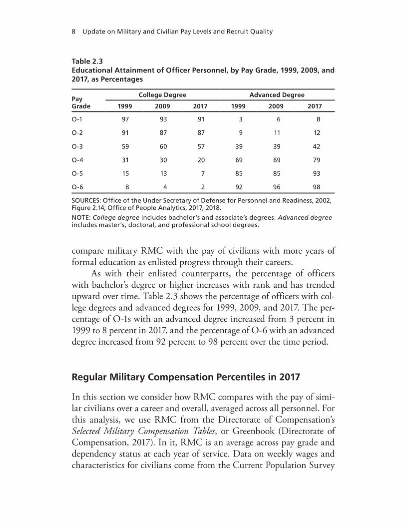
2.3. Educational Attainment of Officer Personnel, by Pay Grade, 1999, 2009, and 2017, as Percentages . . . . . . . . . . . . . . . . . . . . . . . . . . . . . . 8
2.4. Regular Military Compensation as a Percentile of Civilian Wages, by Level of Education and Year of Service, for Enlisted Personnel, 2017 . . . . . . . . . . . . . . . . . . . . . . . . . . . . . . . . . . . . . . . . . . . . 14
2.5. Regular Military Compensation as a Percentile of Civilian Wages, by Level of Education and Year of Service, for Officers, 2017 . . . . . . . . . . . . . . . . . . . . . . . . . . . . . . . . . . . . . . . . . . . . . . . . . . . . . . . . 16
A.1. Regression Results for High School Graduates, Ages 18–22 . . . 58 A.2. Regular Military Compensation Percentiles for High School
Graduate Civilian Wages, Ages 18–22, as Percentages . . . . . . . . . . 59 A.3. Regular Military Compensation/Wage Ratio for High
School Graduates, Ages 18–22 . . . . . . . . . . . . . . . . . . . . . . . . . . . . . . . . . . . . 60 B.1. High School Completers, 1999–2018, Net Those Predicted
to Complete Four or More Years of College . . . . . . . . . . . . . . . . . . . . . . 63 B.2. Army Recruiting Rates, 2000–2018: Armed Forces
Qualification Test Categories I, II, IIIA, and IIIB, as Percentages . . . . . . . . . . . . . . . . . . . . . . . . . . . . . . . . . . . . . . . . . . . . . . . . . . . . . . . 64
B.3. Navy Recruiting Rates, 2000–2018: Armed Forces Qualification Test Categories I, II, IIIA, and IIIB, as Percentages . . . . . . . . . . . . . . . . . . . . . . . . . . . . . . . . . . . . . . . . . . . . . . . . . . . . . . . . 65
B.4. Marine Corps Recruiting Rates, 2000–2018: Armed Forces Qualification Test Categories I, II, IIIA, and IIIB, as Percentages . . . . . . . . . . . . . . . . . . . . . . . . . . . . . . . . . . . . . . . . . . . . . . . . . . . . . . . 66
xii Update on Military and Civilian Pay Levels and Recruit Quality
B.5. Air Force Recruiting Rates, 2000–2018: Armed Forces Qualification Test Categories I, II, IIIA, and IIIB, as Percentages . . . . . . . . . . . . . . . . . . . . . . . . . . . . . . . . . . . . . . . . . . . . . . . . . . . . . . . . 67
B.6. Logit Regression of Recruiting Rate for Armed Forces Qualification Test Categories I–IIIB, Army and Navy . . . . . . . . 68
B.7. Logit Regression of Recruiting Rate for Armed Forces Qualification Test Categories I–IIIB, Marine Corps and Air Force . . . . . . . . . . . . . . . . . . . . . . . . . . . . . . . . . . . . . . . . . . . . . . . . . . . . . . . . . . . . . . 69
B.8. Logit Regression of Share of Non–High School Diploma Graduate Accessions for Armed Forces Qualification Test Categories I–IIIB, Army and Navy . . . . . . . . . . . . . . . . . . . . . . . . . . . . . . . . 70
B.9. Logit Regression of Share of Non–High School Diploma Graduate Accessions for Armed Forces Qualification Test Categories I–IIIB, Marine Corps and Air Force . . . . . . . . . . . . . . . . . 71

xiii
Summary
Since the beginning of the all-volunteer force in the early 1970s, com-pensation and benefits have been among the most critical tools for attracting and retaining the quantity and quality of military person-nel necessary for the United States to achieve its military goals. Mili-tary pay must be high enough to attract quality recruits away from other jobs that they could get given their education, skills, and ability while also being respectful of the public trust to appropriately manage public funds.1 The Ninth Quadrennial Review of Military Compensa-tion (QRMC) measured military pay via regular military compensa-tion (RMC), which is the sum of basic pay, basic allowance for hous-ing (BAH), basic allowance for subsistence (BAS), and the federal tax advantage resulting from allowances not being taxed. The report con-cluded, “Pay at around the 70th percentile of comparably educated civilians has been necessary to enable the military to recruit and retain the quantity and quality of personnel it requires” (Office of the Under Secretary of Defense for Personnel and Readiness, 2002, p. xxiii).2
1 This report focuses on active-component (AC) compensation and does not directly con-sider reserve-component (RC) compensation, though elements of the RC system are tied to that of the AC system, such as the pay table. An analysis of RC compensation would require consideration of the nature of Selected Reserve RC service, where members typically are employed full-time in a civilian job or attending school, and are employed only part-time in the RC. Such an analysis is beyond the scope of the current study. 2 In this report we do not ask the question of whether the 70th percentile is still the correct level for military pay and instead focus on correctly measuring RMC compared with civilian wages. However, in ongoing work we do explicitly explore whether the standard set by the 9th QRMC is still the appropriate benchmark.
xiv Update on Military and Civilian Pay Levels and Recruit Quality
Like the 9th QRMC, this report also focuses on active-component personnel, and it measures military pay via RMC. We compare RMC of enlisted personnel with the annual earnings of full-time, full-year workers with high school degrees and those with some college educa-tion. In our main results we adjust the civilian earnings distribution to resemble the gender mix of the military. We compare RMC for offi-cers with college graduates and to those with advanced degrees, again adjusting the civilian distribution to look more similar to the military distribution in terms of gender.3
In this report we address three main questions:
• How does military pay for active-component personnel in 2017 compare with civilian pay?
• What has happened to recruit quality given the relative changes in military and civilian pay since 2000?
• How does the difference between civilian and military pay change across geographies within the United States?
In addressing these questions, we used data from the U.S. Depart-ment of Defense’s (DoD’s) Selected Military Compensation Tables (Direc-torate of Compensation, 2017), also known as the Greenbook, and from Active Duty Pay Files provided by the Defense Manpower Data Center (DMDC). We also use data from the March supplements to the Current Population Survey (CPS; U.S. Census Bureau, 2018), from DMDC’s August 2009 and September 2017 Status of Forces Surveys on the education distribution of enlisted personnel and officers (Office of People Analytics, 2017, 2018), and from 2015 Demographics: Profile of the Military Community (Office of the Deputy Assistant Secretary of Defense for Military Community and Family Policy, 2016) on the gender mix in the military. We weighted civilian workers by the mili-tary gender mix then computed a civilian wage distribution for each
3 Note that throughout the report we focus on individual comparisons and provide no evi-dence on how total household military pay compares with total household civilian pay.

Summary xv
level of education to make results comparable with previous QRMCs.4 Treating RMC as though it were a wage, we found its placement in the distribution (i.e., we determined its percentile). We computed RMC percentiles for officers and enlisted by year of service, as well as overall RMC percentiles for officers and enlisted for 2017 and 2009.
To examine how quality changes as civilian and military pay varies, we estimated regression models to study the relationship between recruiting outcomes and the ratio of RMC to the median civilian wage of high school completers ages 18–22, controlling for other variables. We estimated separate models by branch of service for non–prior service (NPS) accessions and used two types of recruit-ing outcomes, the recruiting rate and the share of accessions who are not high school diploma graduates (HSDGs). We calculated the outcomes for Armed Forces Qualification Test (AFQT) score catego-ries I, II, IIIA, and IIIB. For instance, the category II recruiting rate in a year is the ratio of HSDG accessions in category II to the popula-tion of high school completers in that category net of those going on to complete four or more years of college. The share of non-HSDG accessions in category II is the ratio of non-HSDG accessions in cat-egory II to the total number of accessions in that category (HSDG and non-HSDG).
To examine how military wages compare with civilian wages across geographies, we build on recent work in economics that has documented fundamental changes in wage patterns between rural and urban areas.5 Using data from the 2010 U.S. Census, we split states into the ten most urban and the ten least urban and compare RMC with civilian wages for each of these groups.
4 We do not weight by race, as our results would not be directly comparable with the results of studies in support of previous QRMCs. However, military pay does not differ by race, and the military tends to be more diverse than the civilian population. Thus, if we were to weight the civilian population by the military racial mix our RMC percentiles would likely be higher than they presently are. In this way, our results are conservative estimates (that is, they are likely biased downward).5 See, for instance, Autor (2019).
xvi Update on Military and Civilian Pay Levels and Recruit Quality
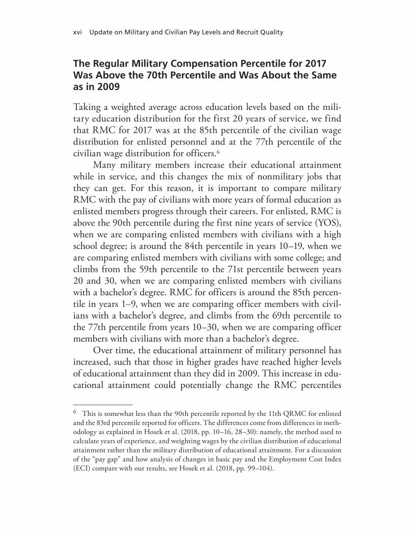
The Regular Military Compensation Percentile for 2017 Was Above the 70th Percentile and Was About the Same as in 2009
Taking a weighted average across education levels based on the mili-tary education distribution for the first 20 years of service, we find that RMC for 2017 was at the 85th percentile of the civilian wage distribution for enlisted personnel and at the 77th percentile of the civilian wage distribution for officers.6
Many military members increase their educational attainment while in service, and this changes the mix of nonmilitary jobs that they can get. For this reason, it is important to compare military RMC with the pay of civilians with more years of formal education as enlisted members progress through their careers. For enlisted, RMC is above the 90th percentile during the first nine years of service (YOS), when we are comparing enlisted members with civilians with a high school degree; is around the 84th percentile in years 10–19, when we are comparing enlisted members with civilians with some college; and climbs from the 59th percentile to the 71st percentile between years 20 and 30, when we are comparing enlisted members with civilians with a bachelor’s degree. RMC for officers is around the 85th percen-tile in years 1–9, when we are comparing officer members with civil-ians with a bachelor’s degree, and climbs from the 69th percentile to the 77th percentile from years 10–30, when we are comparing officer members with civilians with more than a bachelor’s degree.
Over time, the educational attainment of military personnel has increased, such that those in higher grades have reached higher levels of educational attainment than they did in 2009. This increase in edu-cational attainment could potentially change the RMC percentiles
6 This is somewhat less than the 90th percentile reported by the 11th QRMC for enlisted and the 83rd percentile reported for officers. The differences come from differences in meth-odology as explained in Hosek et al. (2018, pp. 10–16, 28–30): namely, the method used to calculate years of experience, and weighting wages by the civilian distribution of educational attainment rather than the military distribution of educational attainment. For a discussion of the “pay gap” and how analysis of changes in basic pay and the Employment Cost Index (ECI) compare with our results, see Hosek et al. (2018, pp. 99–104).

Summary xvii
over time. Yet we found that the overall RMC percentiles for 2017 for enlisted personnel and officers were very similar to those for 2009. This finding uses five levels of education for enlisted (high school, some college, associate’s degree, bachelor’s degree, and master’s degree or higher), and it uses two levels for officers (bachelor’s degree and mas-ter’s degree or higher).
Our RMC percentile for officers—the 77th percentile in both 2009 and 2017—is below the 11th QRMC’s estimate for 2009, which was the 83rd percentile. However, our methodology was also differ-ent in that we used additional education categories and imputed civil-ian labor force experience differently. When we compute percentiles in 2009 using a method comparable with the one we used in 2017 and include the additional education categories, we find that enlisted RMC is at around the 84th percentile in 2009, similar to our estimate for 2017. Put differently, enlisted RMC relative to civilian pay has remained unchanged between 2009 and 2017, and the differences reported here versus the 11th QRMC are attributable to differences in methodologies.
We also compared RMC with civilian wages from 2000 to 2017 for selected age and education groups. There is a steady increase in RMC relative to civilian pay from 2000 to 2010 and a leveling off afterward. This is likely due to wage stagnation in the civilian sector and continued growth in wages for military personnel through the 2000s.
Recruit Quality Rose in Three Services as Military Pay Increased Relative to Civilian Pay
Our regression findings show similar patterns to those noted in Hosek et al. (2018, pp. 52–63): namely, a positive association between enlisted recruit quality and the ratio of RMC to the civilian wage for the Navy, Marine Corps, and Air Force but not for the Army. Recruit quality is defined as individuals who enlist who are in the top half of the distri-bution of AFQT scores and who are HSDGs. Those who are assigned AFQT categories I, II, and IIIA are considered in the top half of the distribution. The Navy, Marine Corps, and Air Force increased quality over time as both wages and the recruiting rates for categories I and II

xviii Update on Military and Civilian Pay Levels and Recruit Quality
increased. The Marine Corps also increased the recruiting rate for cat-egories IIIA and IIIB. As wages rose, the Army decreased the recruiting rate for category IIIB, as well as for II and IIIA. The reasons for the difference in the relationship between RMC and quality for the Army are unclear. However, some potential reasons are discussed below in this report (see also Hosek et al., 2018, pp. 71–73).
Further, the Army and the Marine Corps had positive associations between the share of accessions that were non-HSDGs and the ratio of RMC to the civilian wage in categories I, II, and IIIB but not in IIIA. These services took more non-HSDGs as military pay rose, other things being equal. The Navy increased the share of non-HSDGs in catego-ries I and II but not IIIA or IIIB. The Air Force decreased the share of non-HSDGs in category I and increased the share in categories IIIA and IIIB.
Geography Matters Less for Service Members at Lower Levels of Education and More for Service Members with Higher Levels of Education
Confirming trends noted by Autor (2019), we find that civilian wages do not differ much across geographies in the United States for work-ers with less than a high school degree, a high school degree, or some college, but that they differ substantially for workers with a bachelor’s degree or higher. Thus, unlike in the past when civilian wages for both highly skilled and less-skilled workers were higher in urban than less-urban areas, civilian wages are more equal across geographic areas, at least for those with a high school degree or some college. We find that RMC percentiles of the civilian wage distribution for enlisted person-nel with lower levels of education are similar across the most urban and the least urban states. However, RMC percentiles of the civilian wage distribution for Army officers with higher levels of education are much lower in the most urban states compared with the least urban states. As automation and outsourcing have changed the labor market and replaced many jobs that required specialized training but lower levels of formal education (such as factory jobs), alternatives for less edu-

Summary xix
cated workers have changed (Acemoglu and Autor, 2011; Acemoglu and Restrepo, 2017, 2018; Alabdulkareem et al., 2018; Autor, 2015, 2019; Autor and Dorn, 2013; Autor, Katz, and Kearney, 2006; Autor, Levy, and Murnane, 2003). Whereas previously many less-educated workers worked in these “middle-skill” jobs as well as less skill-intensive jobs, they are increasingly taking less skill-intensive jobs as the middle-skill jobs have disappeared. Additional research should be conducted to fur-ther examine how RMC compares with civilian wages in different parts of the country for workers with different levels of education and the implications for recruiting and retention of military personnel.


xxi
Acknowledgments
We would like to thank Thomas K. Emswiler, Director, 13th Quadren-nial Review of Military Compensation, for sponsoring this study. We especially appreciate the guidance offered by Jeri Busch, Director for Mili-tary Compensation, and Don Svendsen of the Office of Compensation, as well as Don’s comments. We are grateful to Mike DiNicolantonio and his team at the Research, Surveys, and Statistics Center of the Office of People Analytics in the Defense Human Resources Activity for tabulations on educational attainment of those in the military. At RAND, Christine DeMartini helped process the military pay and Current Population Survey files, and we are thankful for her assis-tance. We appreciate the input and comments from the two reviewers, John Warner, Professor Emeritus from Clemson University, and Mela-nie Zaber at RAND.


xxiii
Abbreviations
AFQT Armed Forces Qualification Test
ASVAB Armed Services Vocational Aptitude Battery
BAH basic allowance for housing
BAS basic allowance for subsistence
CPS Current Population Survey
DMDC Defense Manpower Data Center
DoD U.S. Department of Defense
ECI Employment Cost Index
FY fiscal year
GED General Education Development
HSDG high school diploma graduate
MEPS military enlistment processing station
NCES National Center for Education Statistics
NLSY National Longitudinal Survey of Youth
NPS non–prior service

xxiv Update on Military and Civilian Pay Levels and Recruit Quality
NR not reported
QRMC Quadrennial Review of Military Compensation
RMC regular military compensation
YOS years of service

1
CHAPTER ONE
Introduction
A common theme of past Quadrennial Reviews of Military Compensa-tion (QRMCs), as far back at the first one in 1969, is whether military compensation is set high enough to attract and retain the number and quality of personnel required by the armed services. Basic pay is the foundation of military compensation. Every service member on active duty is entitled to basic pay, though the particular amount depends on the member’s pay grade and length of service. Every member is also entitled to receive two other elements of military compensation, the basic allowance for housing (BAH) (or quarters in kind) and basic allowance for subsistence (BAS) (or subsistence in kind). The entitle-ment to these three elements—basic pay, BAH, and BAS—led the Gorham Commission in 1962 to develop the construct of “regular military compensation,” or RMC, as a benchmark for comparing mili-tary compensation with civilian compensation. Later, the definition of RMC was expanded to include the federal tax advantage associated with receiving BAH and BAS tax-free.
Subsequent QRMCs and commissions also considered the com-petitiveness, effectiveness, and efficiency of military compensation, focusing on various elements of compensation to include not only RMC but also BAH, military retirement reserve compensation, and the structure of the pay table.1 It was the 9th QRMC that made the level of RMC the focal point of its study. In its 2002 report, the 9th
1 A history of studies considering major structural changes to military compensation is provided in Appendix III of Office of the Under Secretary of Defense for Personnel and Readiness (2018).
2 Update on Military and Civilian Pay Levels and Recruit Quality
QRMC concluded, “Pay at around the 70th percentile of comparably educated civilians has been necessary to enable the military to recruit and retain the quantity and quality of personnel it requires” (Office of the Under Secretary of Defense for Personnel and Readiness, 2002, p. xxiii). Further, it found that comparing enlisted personnel with civil-ians with a high school diploma no longer reflected the education level of the force because an increasing fraction of the enlisted force had some college education and the military actively recruited from the college-bound youth market. Thus, the 9th QRMC argued that com-parative pay analyses should look at military pay for enlisted person-nel relative to the 70th percentile of pay of civilians with some college. Similarly, the comparison group for officers should be civilians with a bachelor’s degree or higher (rather than those with only a bachelor’s degree).
Using data from 2009, a decade after the data used by the 9th QRMC, the 11th QRMC found that military pay exceeded the 70th percentile. Specifically, it found that RMC was at about the 90th percentile for enlisted members and at the 83rd percentile for officers. Thus, over the course of the 2000s, military pay increased substantially relative to civilian pay.
In a recent study, Hosek et al. (2018) found that military pay continued to exceed the 70th percentile and that the percentiles for 2016 were in fact virtually the same as what the 11th QRMC found for 2009. The Hosek et al. (2018) study also analyzed the extent to which readiness, as measured by the quality of the enlisted force, improved as military pay relative to civilian pay increased since 2000. The study found that recruit quality rose as relative military pay increased since 2000 for each service, except for the Army. The reason for the Army difference was unclear. Some proposed explanations include Army recruiting becoming more difficult than other services’ recruiting over this period, the Army reduced other recruiting resources such as bonuses, or the Army chose to focus its recruiting efforts on nontradi-tional metrics of quality.
The director of the 13th QRMC requested that RAND update the Hosek et al. (2018) study to consider how military pay compares with the pay of similar civilians through 2017 rather than 2016. He
Introduction 3
also requested that we update the regression analysis in that study to examine how recruit quality changes with increases in relative military pay. In the spirit of the 9th QRMC, we first consider the educational attainment of the enlisted and officer forces and how attainment has changed since the 9th QRMC considered this question using data from 1999 and since the 11th QRMC considered this question using data from 2009. For this analysis we use input from the Office of People Analytics within the Office of the Under Secretary of Defense for Personnel and Readiness. Given the shift in the educational attain-ment of the enlisted and officer force, we then address three main questions:
1. How does military pay for active-component personnel in 2017 compare with the pay of comparably educated civilians? Simi-larly, are our results for 2017 different from the results in Hosek et al. (2018) for 2016?
2. Has the comparability of military pay changed since 2009, when the 11th QRMC compared military and civilian pay?
3. What has happened to recruit quality given the relative changes in military and civilian pay since 2000?
We address these questions using data from the U.S. Department of Defense’s (DoD’s) Selected Military Compensation Tables (Director-ate of Compensation, 2017), also known as the Greenbook, and from Active Duty Pay Files provided by the Defense Manpower Data Center (DMDC). We also use data from the March supplements to the Current Population Survey (CPS; U.S. Census Bureau, 2018) and from 2015 Demographics: Profile of the Military Community (Office of the Deputy Assistant Secretary of Defense for Military Community and Family Policy, 2016) on the gender mix in the military and from DMDC’s August 2009 and September 2017 Status of Forces Surveys on the edu-cation distribution of enlisted personnel and officers (Office of People Analytics, 2017, 2018). To analyze how recruit quality changes as civil-ian and military pay varies, we estimated regression models for each service, controlling for other variables that change over time (such as unemployment rate and recruiting goals).

4 Update on Military and Civilian Pay Levels and Recruit Quality
Chapter Two shows how educational attainment for military per-sonnel has changed over time and then addresses the first two questions above. We compare RMC with civilian wages both over a career and over calendar time for specific age and education groups. Chapter Three summarizes our analysis for the third question regarding the relationship between recruit quality and relative military pay. Because our methodol-ogy for both Chapters Two and Three closely follows the methodology used in Hosek et al. (2018), we provide only a broad overview of our methods and focus more on results. Interested readers are referred to the Hosek et al. (2018) document. In Chapter Four, we explore how geog-raphy affects the competitiveness of military pay and how this varies by education level. We offer concluding thoughts in Chapter Five.
5
CHAPTER TWO
Comparisons of Military and Civilian Pay
In this chapter we examine how RMC compares with civilian pay. RMC includes basic pay, BAH, BAS, and the federal tax advantage resulting from the allowances not being taxed. RMC accounts for approximately 90 percent of current cash compensation (Office of the Under Secretary of Defense for Personnel and Readiness, 2012a, 2012b).
We note that throughout the report we are comparing the pay of individuals and not households and that we will not provide any evidence on the adequacy of military pay for military families. Pre-vious work has documented that military spouses have significantly lower rates of employment and earnings than comparable civilians and that they tend to be underemployed when employed (Asch, Hosek, and Warner, 2007). Spousal employment and earnings have increased as a share of family employment and earnings over time, and this may affect military and civilian families differently. We are conducting ongoing work that will more fully examine the adequacy of military pay.
We first examine how educational attainment for military per-sonnel has changed over time and use these data to adjust our measures of RMC. We compare RMC with civilian wages both over a career and through time for specific age and education groups.
Educational Attainment
To compare military personnel with similar civilians, we used the education distribution of officers and enlisted personnel from the August 2009 and September 2017 Status of Forces Surveys of Active

6 Update on Military and Civilian Pay Levels and Recruit Quality
Duty Members, provided by the DoD Office of People Analytics.1 We considered five education levels for enlisted personnel—high school, some college (more than high school but no degree), associate’s degree, bachelor’s degree, and master’s degree or higher—and two levels for officers—bachelor’s degree and master’s degree or higher.
In Table 2.1 we show the education attainment for enlisted mem-bers in 2017 and in 2009 when the 11th QRMC compared military and civilian pay. We find that enlisted personnel in 2017 and 2009 show a similar education profile, although those in 2017 have more years of formal education than those in 2009. The 9th QRMC identified the trend of increasing educational attainment while members were in ser-vice, and we find evidence that this trend continued beyond 1999.
1 These data were provided to RAND by the Office of People Analytics in 2017 and 2018, respectively.
Table 2.1Educational Attainment of Enlisted Personnel, by Pay Grade, 2009 and 2017, as Percentages
PayGrade
Non–HighSchool
GraduateHigh School
Graduate
Less ThanOne Year of
College
One or MoreYears of
College, No Degree
AssociateDegree
Bachelor’sDegree
AdvancedDegree
2009 2017 2009 2017 2009 2017 2009 2017 2009 2017 2009 2017 2009 2017
E-2 1 1 70 66 20 20 8 13 NR 0 1 0 NR 0
E-3 1 1 48 51 23 16 21 22 4 5 3 4 0 0
E-4 0 0 39 40 25 18 22 23 7 9 6 8 1 1
E-5 1 1 25 23 22 18 32 30 13 18 6 9 0 1
E-6 1 0 17 13 23 15 30 32 20 26 8 12 1 2
E-7 1 0 10 9 15 10 30 22 28 32 14 22 2 5
E-8 0 0 9 4 13 7 30 25 24 24 20 28 4 11
E-9 NR 0 7 6 10 4 17 14 22 22 30 37 14 18
SOURCES: Office of the Under Secretary of Defense for Personnel and Readiness, 2002, Figure 2.5; Office of People Analytics, 2017, 2018.
NOTE: NR = not reported. The percentages in each row add to 100 with rounding. There is no row for E-1s because their education distribution was not reported in the survey. In this table, high school graduate includes traditional diploma and alternative diploma (e.g., home school, equivalency test, distance learning). The survey responses are weighted to be representative of the force.
Comparisons of Military and Civilian Pay 7
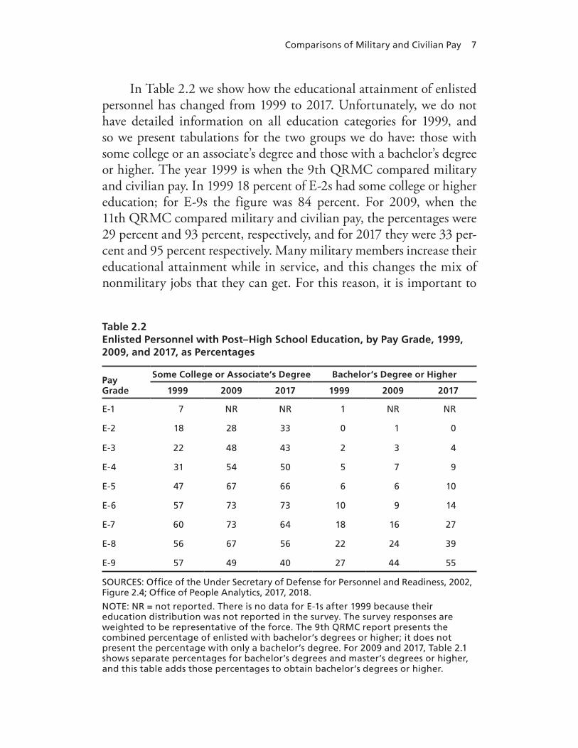
In Table 2.2 we show how the educational attainment of enlisted personnel has changed from 1999 to 2017. Unfortunately, we do not have detailed information on all education categories for 1999, and so we present tabulations for the two groups we do have: those with some college or an associate’s degree and those with a bachelor’s degree or higher. The year 1999 is when the 9th QRMC compared military and civilian pay. In 1999 18 percent of E-2s had some college or higher education; for E-9s the figure was 84 percent. For 2009, when the 11th QRMC compared military and civilian pay, the percentages were 29 percent and 93 percent, respectively, and for 2017 they were 33 per-cent and 95 percent respectively. Many military members increase their educational attainment while in service, and this changes the mix of nonmilitary jobs that they can get. For this reason, it is important to
Table 2.2Enlisted Personnel with Post–High School Education, by Pay Grade, 1999, 2009, and 2017, as Percentages
PayGrade
Some College or Associate’s Degree Bachelor’s Degree or Higher
1999 2009 2017 1999 2009 2017
E-1 7 NR NR 1 NR NR
E-2 18 28 33 0 1 0
E-3 22 48 43 2 3 4
E-4 31 54 50 5 7 9
E-5 47 67 66 6 6 10
E-6 57 73 73 10 9 14
E-7 60 73 64 18 16 27
E-8 56 67 56 22 24 39
E-9 57 49 40 27 44 55
SOURCES: Office of the Under Secretary of Defense for Personnel and Readiness, 2002, Figure 2.4; Office of People Analytics, 2017, 2018.
NOTE: NR = not reported. There is no data for E-1s after 1999 because their education distribution was not reported in the survey. The survey responses are weighted to be representative of the force. The 9th QRMC report presents the combined percentage of enlisted with bachelor’s degrees or higher; it does not present the percentage with only a bachelor’s degree. For 2009 and 2017, Table 2.1 shows separate percentages for bachelor’s degrees and master’s degrees or higher, and this table adds those percentages to obtain bachelor’s degrees or higher.
8 Update on Military and Civilian Pay Levels and Recruit Quality
compare military RMC with the pay of civilians with more years of formal education as enlisted progress through their careers.
As with their enlisted counterparts, the percentage of officers with bachelor’s degree or higher increases with rank and has trended upward over time. Table 2.3 shows the percentage of officers with col-lege degrees and advanced degrees for 1999, 2009, and 2017. The per-centage of O-1s with an advanced degree increased from 3 percent in 1999 to 8 percent in 2017, and the percentage of O-6 with an advanced degree increased from 92 percent to 98 percent over the time period.
Regular Military Compensation Percentiles in 2017
In this section we consider how RMC compares with the pay of simi-lar civilians over a career and overall, averaged across all personnel. For this analysis, we use RMC from the Directorate of Compensation’s Selected Military Compensation Tables, or Greenbook (Directorate of Compensation, 2017). In it, RMC is an average across pay grade and dependency status at each year of service. Data on weekly wages and characteristics for civilians come from the Current Population Survey
Table 2.3Educational Attainment of Officer Personnel, by Pay Grade, 1999, 2009, and 2017, as Percentages
PayGrade
College Degree Advanced Degree
1999 2009 2017 1999 2009 2017
O-1 97 93 91 3 6 8
O-2 91 87 87 9 11 12
O-3 59 60 57 39 39 42
O-4 31 30 20 69 69 79
O-5 15 13 7 85 85 93
O-6 8 4 2 92 96 98
SOURCES: Office of the Under Secretary of Defense for Personnel and Readiness, 2002, Figure 2.14; Office of People Analytics, 2017, 2018.
NOTE: College degree includes bachelor’s and associate’s degrees. Advanced degree includes master’s, doctoral, and professional school degrees.

Comparisons of Military and Civilian Pay 9
(CPS) Annual Social and Economic Supplement, also known as the March CPS. The CPS, administered by the Bureau of Labor Statistics, uses a representative random sample of the population.
Following the 11th QRMC, we used data on full-time, full-year workers and weight civilian-wage data by the percentages of men and women in the military.2 In 2015, the percentages were 85 percent men and 15 percent women for enlisted and 83 percent men and 17 per-cent women for officers (Office of the Deputy Assistant Secretary of Defense for Military Community and Family Policy, 2016, pp. 18–19).
While the Greenbook provides RMC by years of service (YOS), the CPS does not have data on civilian years of labor-force experience. To compare military and civilian wages adjusted for experience, we used assumptions to map age and years of education to years of labor-force experience for civilians. Specifically, for high school graduates we sub-tracted 18 from the person’s age in years, for those with some college and associate’s degrees we subtracted 20, for college graduates we subtracted 22, and for those with advanced degrees we subtracted 24. For those who started school at a later age or who interrupted their schooling for any reason, these assumptions overstate their experience.3 However, most students initially enrolling in two- and four-year institutions are 19 years or younger (National Center for Education Statistics [NCES], 2017).4
Regular Military Compensation Percentiles over a Career in 2017
Figures 2.1a, 2.1b, and 2.2 show enlisted and officer RMC in 2017 for a given year of service and compare RMC with civilian wages for a com-parable year of experience at the 50th (median) and 70th percentiles, for the levels of education noted in the figure notes. As shown in Table
2 These are workers with a usual workweek of more than 35 hours and who worked more than 35 weeks in the year.3 Since we are treating “some college” as two years, we may also be underestimating work experience for some individuals. However, for those who start school late, take a gap year, complete extended religious mission service, or take more than four years for college or more than two years for graduate school, we are assigning them more experience than they have.4 For more information on how these assumptions impact our estimates as well as details about top coding in the CPS and how this approach compares with that of the 11th QRMC, see Hosek et al. (2018, p 17).
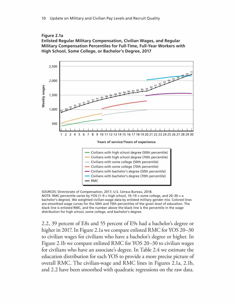
10 Update on Military and Civilian Pay Levels and Recruit Quality
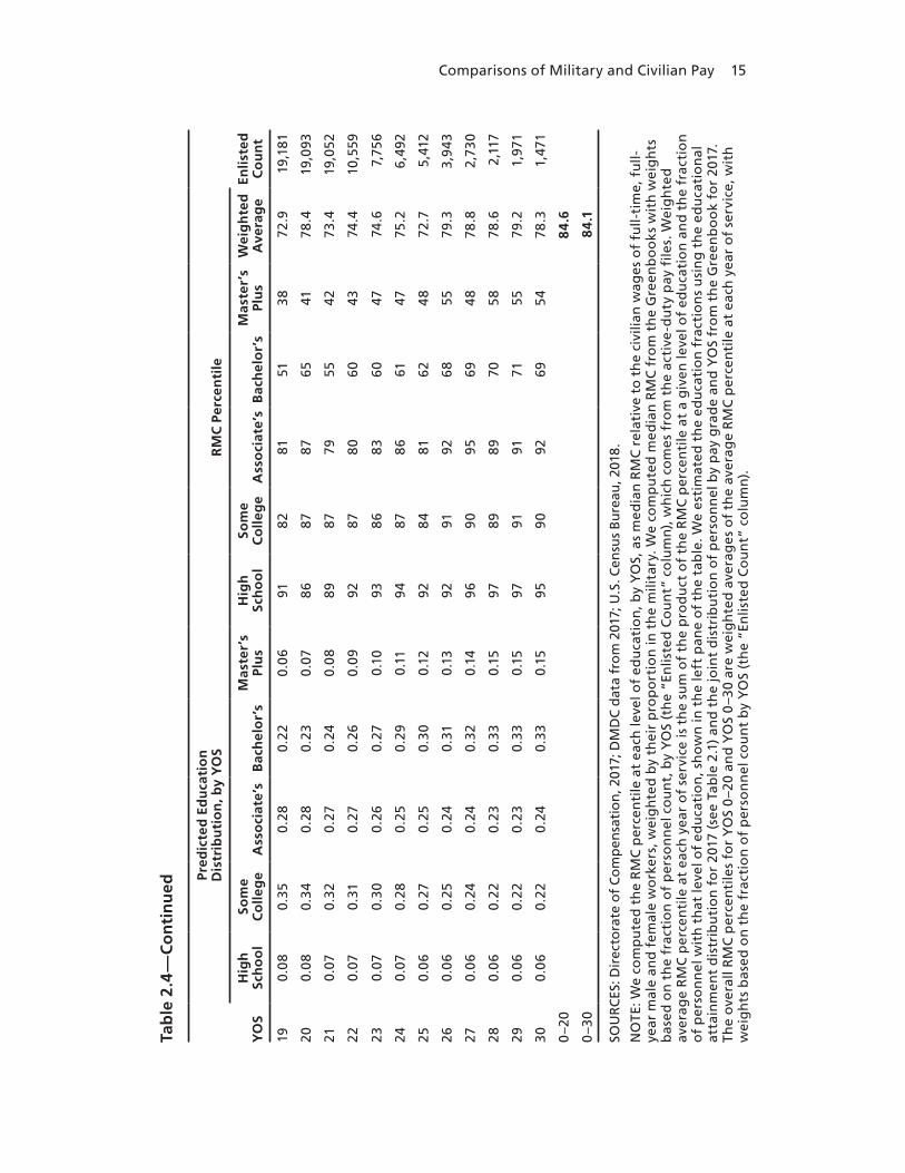
2.2, 39 percent of E8s and 55 percent of E9s had a bachelor’s degree or higher in 2017. In Figure 2.1a we compare enlisted RMC for YOS 20–30 to civilian wages for civilians who have a bachelor’s degree or higher. In Figure 2.1b we compare enlisted RMC for YOS 20–30 to civilian wages for civilians who have an associate’s degree. In Table 2.4 we estimate the education distribution for each YOS to provide a more precise picture of overall RMC. The civilian-wage and RMC lines in Figures 2.1a, 2.1b, and 2.2 have been smoothed with quadratic regressions on the raw data.
SOURCES: Directorate of Compensation, 2017; U.S. Census Bureau, 2018. NOTE: RMC percentile varies by YOS (1–9 = high school, 10–19 = some college, and 20–30 = a bachelor’s degree). We weighted civilian-wage data by enlisted military gender mix. Colored lines are smoothed wage curves for the 50th and 70th percentiles of the given level of education. The black line is enlisted RMC, and the number above the black line is the percentile in the wage distribution for high school, some college, and bachelor’s degree.
Wee
kly
wag
es
2,500
2,000
1,500
1,000
500
1 2 3 4 6 8
Years of service/Years of experience
5 7 109 11 12 13 14 16 1815 17 2019 21 22 23 24 26 2825 27 3029
9393
9292 92 91 91
91 91 85 84 84 84 84 84 84 84 84 84 5960
6162
6364
6566
6869
71
Civilians with high school degree (50th percentile)Civilians with high school degree (70th percentile)Civilians with some college (50th percentile)Civilians with some college (70th percentile)Civilians with bachelor’s degree (50th percentile)Civilians with bachelor’s degree (70th percentile)RMC
Figure 2.1aEnlisted Regular Military Compensation, Civilian Wages, and Regular Military Compensation Percentiles for Full-Time, Full-Year Workers with High School, Some College, or Bachelor’s Degree, 2017

Comparisons of Military and Civilian Pay 11
SOURCES: Directorate of Compensation, 2017; U.S. Census Bureau, 2018. NOTE: RMC percentile varies by YOS (1–9 = high school, 10–19 = some college, and 20–30 = a associate’s degree). We weighted civilian-wage data by enlisted military gender mix. Colored lines are smoothed wage curves for the 50th and 70th percentiles of the given level of education. The black line is enlisted RMC, and the number above the black line is the percentile in the wage distribution for high school, some college, and associate’s degree.
Wee
kly
wag
es
2,500
2,000
1,500
1,000
500
1 2 3 4 6 8
Years of service/Years of experience
5 7 109 11 12 13 14 16 1815 17 2019 21 22 23 24 26 2825 27 3029
9393
9292 92 91 91
91 91 85 84 84 84 84 84 84 84 84 84 8283
8485
8687
8889
9091
93
Civilians with high school degree (50th percentile)Civilians with high school degree (70th percentile)Civilians with some college (50th percentile)Civilians with some college (70th percentile)Civilians with associate’s degree (50th percentile)Civilians with associate’s degree (70th percentile)RMC
Figure 2.1bEnlisted Regular Military Compensation, Civilian Wages, and Regular Military Compensation Percentiles for Full-Time, Full-Year Workers with High School, Some College, or Associate’s Degree, 2017
Compared with civilians with a high school degree, enlisted pay is around the 90th percentile of the civilian pay distribution in the first part of the career (1–9 YOS). When we compare RMC with civilians with some college for years 10–19, enlisted pay is at around the 84th per-centile. RMC then rises from the 59th percentile to the 71st percentile for YOS 20–30 when compared with the pay of civilians with a bach-elor’s degree (Figure 2.1a). When we compare to civilians with an

12 Update on Military and Civilian Pay Levels and Recruit Quality
SOURCES: Directorate of Compensation, 2017; U.S. Census Bureau, 2018. NOTE: RMC percentile varies by YOS (1–9 = bachelor’s degree, 10–30 = master’s degree or higher). We weighted civilian-wage data by of�cer gender mix. Colored lines are smoothed wage curves for the 50th and 70th percentiles of the given level of education. The black line is enlisted RMC, and the numbers above the black line are the percentile in the wage distribution for a bachelor’s degree and a master’s degree or higher.
Wee
kly
wag
es
3,000
2,500
2,000
1,500
1,000
1 2 3 4 6 8
Years of service/Years of experience
5 7 109 11 12 13 14 16 1815 17 2019 21 22 23 24 26 2825 27 3029
Civilians with bachelor’s degree (50th percentile)
Civilians with bachelor’s degree (70th percentile)
Civilians with master’s degree or higher (50th percentile)
Civilians with master's degree or higher (70th percentile)
RMC
8685
8585
8484
8484
8469
7070
69
7171
72 7273 73 74
7474
7575
7676 76
777777
Figure 2.2Officer Regular Military Compensation, Civilian Wages, and Regular Military Compensation Percentiles for Full-Time, Full-Year Workers with Bachelor’s Degree or with Master’s Degree or Higher, 2017
associate’s degree (Figure 2.1b), pay goes from the 82nd percentile in YOS 20 to the 93rd percentile in YOS 30. It is not surprising that the percentiles are lower for 20–30 YOS than for the YOS earlier in the career because personnel policies become more selective in terms of which personnel are allowed to be retained after 20 YOS—that is, the point at which military personnel are eligible for an immediate annuity under the military retirement system. As shown in the fig-ures, RMC sharply increases after 20 YOS, reflecting the higher qual-

Comparisons of Military and Civilian Pay 13
ity and higher pay of those permitted to stay on. For 20–30 YOS in Figure 2.1a, we are comparing RMC with the wages of civilians with a bachelor’s degree, and this results in lower RMC percentiles of the civilian wage distribution. When compared to civilians with an associ-ate’s degree, RMC percentiles remain relatively high through YOS 30.
Officer RMC is at about the 85th percentile of the civilian wage distribution when compared with civilians with a bachelor’s degree in the early career (years 1–9) and rises from the 69th percentile to the 77th percentile from years 10–30 when compared with civilians with a master’s degree or higher.
Weighted Average of Regular Military Compensation Percentiles for 2017
It is also of interest to have an overall summary measure of how RMC compares with civilian pay, so we computed an overall weighted aver-age of the RMC percentiles. The procedure for estimating the overall average is provided in Hosek et al. (2018, pp. 26–28), but in short, we computed the RMC percentiles for 2017 by YOS for each education level. This way, we could examine the RMC percentile in detail by education level. In addition, we estimated the percentage of education distribution at each year of service, used this to compute the average RMC percentile by YOS, and then used the number of personnel by YOS to compute an overall weighted average of the RMC percentile.5 To compute percentiles, civilian pay by formal education level and age
5 To compute the weighted averages, we first translated the education distribution by rank (Tables 2.1 and 2.3) to a distribution at each year of service, by interpolation. We did this in several steps. First, we obtained the joint distribution of personnel by pay grade and YOS from the Greenbook. This allowed us to compute the percentage of personnel at each pay grade, by YOS. Second, we used these percentages to obtain a weighted average of the educa-tion distribution at each year of service (i.e., the percentage with high school, some college, associate’s degrees, bachelor’s degrees, and master’s degrees or higher). Third, for each level of education (e.g., high school, some college), we fitted a polynomial curve to its percentages by YOS and then used the fitted curves to predict the percentage, in effect smoothing the percentages. The set of curves for the different levels of education gave us the predicted edu-cation distribution by YOS. The predicted education distribution is shown in Tables 2.4 and 2.5 for enlisted and officers, respectively. To check for sensitivity, we perturbed the education percentages by YOS and found little change in the predicted overall RMC percentile.

14 Update on Military and Civilian Pay Levels and Recruit Quality
Tab
le 2
.4R
egu
lar
Mili
tary
Co
mp
ensa
tio
n a
s a
Perc
enti
le o
f C
ivili
an W
ages
, by
Leve
l of
Edu
cati
on
an
d Y
ear
of
Serv
ice,
fo
r En
liste
d P
erso
nn
el, 2
017
YO
S
Pred
icte
d E
du
cati
on
D
istr
ibu
tio
n, b
y Y
OS
RM
C P
erce
nti
le
Enlis
ted
Co
un
tH
igh
Sch
oo
lSo
me
Co
lleg
eA
sso
ciat
e’s
Bac
hel
or’
sM
aste
r’s
Plu
s H
igh
Sch
oo
lSo
me
Co
lleg
eA
sso
ciat
e’s
Bac
hel
or’
sM
aste
r’s
Pl
us
Wei
gh
ted
A
vera
ge
10.
560.
370.
04
0.0
40.
00
928
879
6532
88.
917
5,46
8
20.
460.
40
0.0
80.
06
0.0
092
90
84
5333
88.
113
3,76
1
30.
380.
430.
110.
070.
0192
918
459
3887
.912
4,91
6
40.
320.
450.
140.
08
0.01
88
9585
5738
87.7
124,
147
50.
270.
460.
160.
090.
0195
838
861
378
4.5
103,
467
60.
240.
470.
180.
100.
0192
9181
6149
85.9
71,6
18
70.
210.
470.
200.
100.
0293
88
8757
398
4.9
56,2
19
80.
190.
470.
210.
110.
0289
9177
6332
83.6
46,8
91
90.
170.
460.
230.
120.
0292
88
7755
3981
.539
,891
100.
160.
460.
240.
120.
029
081
8355
40
78.9
33,2
98
110.
150.
450.
250.
130.
0292
8278
6035
78.6
28,2
68
120.
140.
44
0.26
0.14
0.02
9383
8257
3479
.328
,359
130.
130.
420.
270.
150.
0386
88
7956
3779
.122
,956
140.
120.
410.
280.
160.
0392
8282
6141
78.6
24,8
19
150.
110.
40
0.28
0.17
0.0
494
7974
5232
73.0
23,8
84
160.
110.
380.
290.
180.
04
918
085
6136
77.3
22,2
99
170.
100.
370.
290.
190.
0589
84
8355
4176
.521
,128
180.
090.
360.
290.
210.
06
9181
7955
3873
.620
,98
0
Comparisons of Military and Civilian Pay 15
Tab
le 2
.4—
Co
nti
nu
ed
YO
S
Pred
icte
d E
du
cati
on
D
istr
ibu
tio
n, b
y Y
OS
RM
C P
erce
nti
le
Enlis
ted
Co
un
tH
igh
Sch
oo
lSo
me
Co
lleg
eA
sso
ciat
e’s
Bac
hel
or’
sM
aste
r’s
Plu
s H
igh
Sch
oo
lSo
me
Co
lleg
eA
sso
ciat
e’s
Bac
hel
or’
sM
aste
r’s
Pl
us
Wei
gh
ted
A
vera
ge
190.
08
0.35
0.28
0.22
0.0
691
8281
5138
72.9
19,1
81
200.
08
0.34
0.28
0.23
0.07
8687
8765
4178
.419
,093
210.
070.
320.
270.
240.
08
8987
7955
4273
.419
,052
220.
070.
310.
270.
260.
0992
878
060
4374
.410
,559
230.
070.
300.
260.
270.
1093
8683
6047
74.6
7,75
6
240.
070.
280.
250.
290.
1194
8786
6147
75.2
6,49
2
250.
06
0.27
0.25
0.30
0.12
928
481
624
872
.75,
412
260.
06
0.25
0.24
0.31
0.13
9291
9268
5579
.33,
943
270.
06
0.24
0.24
0.32
0.14
969
095
694
878
.82,
730
280.
06
0.22
0.23
0.33
0.15
9789
8970
5878
.62,
117
290.
06
0.22
0.23
0.33
0.15
9791
9171
5579
.21,
971
300.
06
0.22
0.24
0.33
0.15
959
092
6954
78.3
1,47
1
0–2
08
4.6
0–3
08
4.1
SOU
RC
ES: D
irec
tora
te o
f C
om
pen
sati
on
, 201
7; D
MD
C d
ata
fro
m 2
017;
U.S
. Cen
sus
Bu
reau
, 201
8.
NO
TE: W
e co
mp
ute
d t
he
RM
C p
erce
nti
le a
t ea
ch le
vel o
f ed
uca
tio
n, b
y Y
OS,
as
med
ian
RM
C r
elat
ive
to t
he
civi
lian
wag
es o
f fu
ll-ti
me,
fu
ll-ye
ar m
ale
and
fem
ale
wo
rker
s, w
eig
hte
d b
y th
eir
pro
po
rtio
n in
th
e m
ilita
ry. W
e co
mp
ute
d m
edia
n R
MC
fro
m t
he
Gre
enb
oo
ks w
ith
wei
gh
ts
bas
ed o
n t
he
frac
tio
n o
f p
erso
nn
el c
ou
nt,
by
YO
S (t
he
“En
liste
d C
ou
nt”
co
lum
n),
wh
ich
co
mes
fro
m t
he
acti
ve-d
uty
pay
file
s. W
eig
hte
d
aver
age
RM
C p
erce
nti
le a
t ea
ch y
ear
of
serv
ice
is t
he
sum
of
the
pro
du
ct o
f th
e R
MC
per
cen
tile
at
a g
iven
leve
l of
edu
cati
on
an
d t
he
frac
tio
n
of
per
son
nel
wit
h t
hat
leve
l of
edu
cati
on
, sh
ow
n in
th
e le
ft p
ane
of
the
tab
le. W
e es
tim
ated
th
e ed
uca
tio
n f
ract
ion
s u
sin
g t
he
edu
cati
on
al
atta
inm
ent
dis
trib
uti
on
fo
r 20
17 (
see
Tab
le 2
.1)
and
th
e jo
int
dis
trib
uti
on
of
per
son
nel
by
pay
gra
de
and
YO
S fr
om
th
e G
reen
bo
ok
for
2017
. Th
e o
vera
ll R
MC
per
cen
tile
s fo
r Y
OS
0–2
0 an
d Y
OS
0–3
0 ar
e w
eig
hte
d a
vera
ges
of
the
aver
age
RM
C p
erce
nti
le a
t ea
ch y
ear
of
serv
ice,
wit
h
wei
gh
ts b
ased
on
th
e fr
acti
on
of
per
son
nel
co
un
t b
y Y
OS
(th
e “E
nlis
ted
Co
un
t” c
olu
mn
).

16 Update on Military and Civilian Pay Levels and Recruit Quality
Table 2.5Regular Military Compensation as a Percentile of Civilian Wages, by Level of Education and Year of Service, for Officers, 2017
YOS
Predicted Education Distributiona RMC Percentile
Officer CountBachelor’sMaster’s
Plus Bachelor’sMaster’s
PlusWeighted Average
1 0.92 0.08 81 55 78.9 10,242
2 0.84 0.16 85 51 79.5 9,299
3 0.76 0.24 86 68 81.7 9,244
4 0.69 0.31 87 74 83.0 9,132
5 0.63 0.37 86 72 80.8 9,829
6 0.56 0.44 82 73 78.1 9,077
7 0.51 0.49 85 68 76.6 8,794
8 0.45 0.55 88 64 74.9 8,464
9 0.41 0.59 81 70 74.5 8,034
10 0.36 0.64 85 77 79.9 7,842
11 0.32 0.68 85 75 78.2 7,569
12 0.28 0.72 81 67 71.0 6,909
13 0.25 0.75 86 75 77.7 6,302
14 0.22 0.78 84 74 76.2 6,556
15 0.19 0.81 82 68 70.7 6,340
16 0.17 0.83 87 67 70.4 6,280
17 0.15 0.85 84 70 72.1 6,252
18 0.13 0.87 83 73 74.3 6,261
19 0.11 0.89 78 71 71.8 5,882
20 0.10 0.90 89 71 72.8 6,088
21 0.09 0.91 85 65 66.8 6,138
22 0.08 0.92 83 74 74.7 4,657
23 0.08 0.92 85 75 75.8 4,316
24 0.07 0.93 87 77 77.7 4,054
25 0.07 0.93 89 78 78.8 3,810
26 0.07 0.93 87 74 74.9 3,526
27 0.07 0.93 88 71 72.2 2,959
28 0.07 0.93 87 78 78.7 2,606

Comparisons of Military and Civilian Pay 17
was drawn from the CPS, and military pay for each year of service was drawn from the Greenbooks. Table 2.4 presents the results for enlisted, and Table 2.5 presents the results for officers.
For enlisted personnel we estimate RMC to be at the 85th per-centile of civilian wages for 0–20 YOS and at the 84th percentile of civilian wages for 0–30 YOS. The 11th QRMC reported their results averaged over 0–20 YOS, so we show results for both 0–20 and 0–30 YOS. Both calculations show that RMC is well above the 70th per-centile of civilian pay even when accounting for the higher educational attainment of enlisted personnel since 1999.
For officers we estimate RMC to be at the 77th percentile of civilian wages when examining 0–20 YOS and at the 76th percentile of civilian wages for 0–30 YOS. Officers start their careers around the 79th percen-tile before dropping to around the 70th percentile around year 20 before
Table 2.5—Continued
YOS
Predicted Education Distributiona RMC Percentile
Officer CountBachelor’sMaster’s
Plus Bachelor’sMaster’s
PlusWeighted Average
29 0.08 0.92 89 81 81.6 2,507
30 0.08 0.92 90 82 82.7 1,996
0–20 76.7
0–30 76.4
SOURCES: Directorate of Compensation, 2017; DMDC data from 2017; U.S. Census Bureau, 2018.
NOTE: We computed the RMC percentile at each level of education, by YOS, as median RMC relative to the civilian wages of full-time, full-year male and female workers, weighted by their proportion in the military. We computed median RMC from the Greenbooks with weights based on the fraction of personnel count, by YOS (the “Officer Count” column), which comes from the active-duty pay files. Weighted average RMC percentile at each year of service is the sum of the product of the RMC percentile at a given level of education and the fraction of personnel with that level of education, shown in the left pane of the table. We estimated the education fractions using the educational attainment distribution for 2017 (see Table 2.1) and the joint distribution of personnel by pay grade and YOS from the Greenbook for 2017. The overall RMC percentiles for 0–20 YOS and 0–30 YOS are weighted averages of the average RMC percentile at each year of service, with weights based on the fraction of personnel count by YOS (the “Officer Count” column).a This is the fraction of officers, by education level, at each year of service.
18 Update on Military and Civilian Pay Levels and Recruit Quality
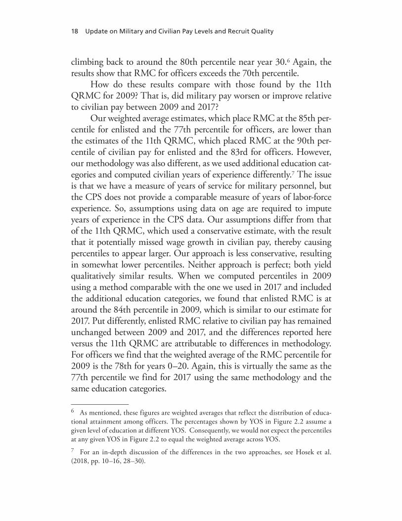
climbing back to around the 80th percentile near year 30.6 Again, the results show that RMC for officers exceeds the 70th percentile.
How do these results compare with those found by the 11th QRMC for 2009? That is, did military pay worsen or improve relative to civilian pay between 2009 and 2017?
Our weighted average estimates, which place RMC at the 85th per-centile for enlisted and the 77th percentile for officers, are lower than the estimates of the 11th QRMC, which placed RMC at the 90th per-centile of civilian pay for enlisted and the 83rd for officers. However, our methodology was also different, as we used additional education cat-egories and computed civilian years of experience differently.7 The issue is that we have a measure of years of service for military personnel, but the CPS does not provide a comparable measure of years of labor-force experience. So, assumptions using data on age are required to impute years of experience in the CPS data. Our assumptions differ from that of the 11th QRMC, which used a conservative estimate, with the result that it potentially missed wage growth in civilian pay, thereby causing percentiles to appear larger. Our approach is less conservative, resulting in somewhat lower percentiles. Neither approach is perfect; both yield qualitatively similar results. When we computed percentiles in 2009 using a method comparable with the one we used in 2017 and included the additional education categories, we found that enlisted RMC is at around the 84th percentile in 2009, which is similar to our estimate for 2017. Put differently, enlisted RMC relative to civilian pay has remained unchanged between 2009 and 2017, and the differences reported here versus the 11th QRMC are attributable to differences in methodology. For officers we find that the weighted average of the RMC percentile for 2009 is the 78th for years 0–20. Again, this is virtually the same as the 77th percentile we find for 2017 using the same methodology and the same education categories.
6 As mentioned, these figures are weighted averages that reflect the distribution of educa-tional attainment among officers. The percentages shown by YOS in Figure 2.2 assume a given level of education at different YOS. Consequently, we would not expect the percentiles at any given YOS in Figure 2.2 to equal the weighted average across YOS.7 For an in-depth discussion of the differences in the two approaches, see Hosek et al. (2018, pp. 10–16, 28–30).

Comparisons of Military and Civilian Pay 19
In summary, we find little change in average RMC percentiles between 2009 and 2017 when calculated using a consistent methodology.
Trends in the Regular Military Compensation Percentile for Selected Age and Education Groups, 2000–2017
To see whether and to what extent RMC percentiles evolved over time rather than a point in time, we also computed the RMC per-centile for 2000 through 2017 for specific groups defined by edu-cation level and age. We conducted this analysis for each service, but we present only the results for Army men because results were similar across services. In these graphs we use cross-section data on males from the given age group and rank (officer or enlisted) from the Defense Manpower Data Center Active Duty Pay Files to com-pute RMC.8 Figures 2.3 through 2.6 show results for Army men in the following groups:
• enlisted members ages 23–27 compared to civilian high school graduates
• enlisted members ages 28–32 compared to civilians with some college
• officers ages 28–32 compared to civilians with bachelor’s degrees• officers ages 33–37 compared to civilians with master’s degrees or
higher.
Unlike in Figures 2.1 and 2.2, we did not smooth the wage percen-tiles in Figures 2.3 through 2.6. These comparisons also differ from the YOS comparisons in the earlier figures because some individuals enter service at older ages and have fewer years of service than one would expect based on their ages.
Overall, we find that RMC for these groups increased from 2000 to 2010 and then stayed roughly constant through 2017. The increase
8 Computing RMC with the military-pay files required that we compute the tax advantage. It is based on taxable (basic-pay) and nontaxable (BAS and BAH) income, number of depen-dents, and marital status. Additional details can be found in Hosek et al (2018, pp. 4–8).

20 Update on Military and Civilian Pay Levels and Recruit Quality
SOURCES: Active-duty pay �les from DMDC; U.S. Census Bureau, 2018. NOTE: The reference population is men ages 23–27 who reported high school completion as their highest level of education, worked more than 35 weeks in the year, and usually worked more than 35 hours per week. We computed the weekly wage by dividing annual earnings by annual weeks worked. The colored lines depict the wages at the indicated percentiles of the wage distribution for this population. For instance, at the 70th percentile, 30 percent of the population had higher wages and 70 percent had lower wages. The black line depicts median RMC for Army enlisted between ages 23 and 27. The numbers above the RMC line are the percentiles at which RMC stood in the population’s wage distribution.
Wee
kly
wag
es
1,250
1,050
850
650
450
2000 2001 2002 2003
Year
2004 2005 2006 2007 2008 2009 2010 2011 2012 2013 2014
Army Median RMC 60th percentile
90th percentile 50th percentile
80th percentile 40th percentile
70th percentile 30th percentile
2015 2016 2017
75.878.9
84.181.984.884.684.5 81.786.585.383.9
82.380.3
78.472.7
70.9
64.761.1
Figure 2.3Civilian Wages for High School Graduate Men and Median Regular Military Compensation for Army Enlisted, Ages 23–27, Calendar Years 2000–2017, in 2017 Dollars

Comparisons of Military and Civilian Pay 21
SOURCES: Active-duty pay files from DMDC; U.S. Census Bureau, 2018. NOTE: The reference population is men ages 28–32 who reported some college as their highest level of education, worked more than 35 weeks in the year, and usually worked more than 35 hours per week. We computed the weekly wage by dividing annual earnings by annual weeks worked. The colored lines depict the wages at the indicated percentiles of the wage distribution for this population. For instance, at the 70th percentile, 30 percent of the population had higher wages and 70 percent had lower wages. The black line depicts median RMC for Army officers between ages 28 and 32. The numbers above the RMC line are the percentiles at which RMC stood in the population’s wage distribution.
Wee
kly
wag
es
1,800
1,600
1,400
1,200
1,000
800
600
2000 2001 2002 2003
Year
2004 2005 2006 2007 2008 2009 2010 2011 2012 2013 2014 2015 2016 2017
Army Median RMC 60th percentile
90th percentile 50th percentile
80th percentile 40th percentile
70th percentile 30th percentile
70.272.2
76.57978.481.973.3 75.2747976.9
7266.5
66.162.7
53.150
68.3
Figure 2.4Civilian Wages for Men with Some College and Median Regular Military Compensation for Army Enlisted, Ages 28–32, Calendar Years 2000–2017, in 2017 Dollars

22 Update on Military and Civilian Pay Levels and Recruit Quality
SOURCES: Active-duty pay files from DMDC; U.S. Census Bureau, 2018. NOTE: The reference population is men ages 28–32 who reported bachelor’s degrees as their highest levels of education, worked more than 35 weeks in the year, and usually worked more than 35 hours per week. We computed the weekly wage by dividing annual earnings by annual weeks worked. The colored lines depict the wages at the indicated percentiles of the wage distribution for this population. For instance, at the 70th percentile, 30 percent of the population had higher wages and 70 percent had lower wages. The black line depicts median RMC for Army officers between ages 28 and 32. The numbers above the RMC line are the percentiles at which RMC stood in the population’s wage distribution.
Wee
kly
wag
es
2,410
2,210
2,010
1,810
1,610
1,410
1,210
1,010
810
2000 2001 2002 2003
Year
2004 2005 2006 2007 2008 2009 2010 2011 2012 2013 2014 2015 2016 2017
Army Median RMC 60th percentile
90th percentile 50th percentile
80th percentile 40th percentile
70th percentile 30th percentile
82.287.587.4 87.389.18889.2
85
83.684.982.282.781.6
78.9
73.173.1
87.6
79.8
Figure 2.5Civilian Wages for Men with Four-Year College Degrees and Median Regular Military Compensation for Army Officers, Ages 28–32, Calendar Years 2000–2017, in 2017 Dollars

Comparisons of Military and Civilian Pay 23
SOURCES: Active-duty pay files from DMDC; U.S. Census Bureau, 2018. NOTE: The reference population is men ages 33–37 who reported master’s degrees or higher as their highest levels of education, worked more than 35 weeks in the year, and usually worked more than 35 hours per week. We computed the weekly wage by dividing annual earnings by annual weeks worked. The colored lines depict the wages at the indicated percentiles of the wage distribution for this population. For instance, at the 70th percentile, 30 percent of the population had higher wages, and 70 percent had lower wages. The black line depicts median RMC for Army officers between ages 33 and 37. The numbers above the RMC line are the percentiles at which RMC stood in the population’s wage distribution.
Wee
kly
wag
es
4,350
4,150
3,950
3,750
3,550
3,350
3,150
2,950
2,750
2,550
2,350
2,150
1,950
1,750
1,550
1,350
1,150
2000 2001 2002 2003
Year
2004 2005 2006 2007 2008 2009 2010 2011 2012 2013 2014 2015 2016 2017
Army Median RMC 60th percentile
90th percentile 50th percentile
80th percentile 40th percentile
70th percentile 30th percentile
71.363.7
75.667.7727472.7 73.368.8
65.265.16062.8
56.6
57.956.2
76.2
69.1
Figure 2.6Civilian Wages for Men with Master’s Degrees or Higher and Median Regular Military Compensation for Army Officers, Ages 33–37, Calendar Years 2000–2017, in 2017 Dollars

24 Update on Military and Civilian Pay Levels and Recruit Quality
was driven by several factors including a restructuring of the basic-pay table from 2001 through 2003, higher-than-usual basic-pay increases from (fiscal year) FY 2000 to FY 2010, increases in BAH implemented in the first part of the decade to cover the full cost of housing, increases in housing cost that resulted in further BAH increases, and a down-ward trend in civilian wages that leveled off around 2012 and tended to increase after 2013.9
From 2010 onward, the figures indicate that RMC was between
• the 81st and 87th percentiles for enlisted members ages 23–27 compared to civilian high school graduates
• the 73rd and 82nd percentiles for enlisted members ages 28–32 compared to civilians with some college
• the 82nd and 89th percentiles for officers ages 28–32 compared to civilians who were four-year college graduates
• the 68th and 76th percentiles for officers ages 33–37 compared to civilians with master’s degrees or higher.
Summary
We computed RMC percentiles for enlisted and officers adjusting for the education distribution of military personnel. We estimated RMC for enlisted to be at the 85th percentile of the civilian wage distribu-tion and RMC for officers to be at the 77th percentile of the civil-ian wage distribution. We also computed RMC percentiles for 2009. Our RMC percentiles are similar but somewhat lower than those of the 11th QRMC, and we attribute this to methodological differences. That is, accounting for these differences, we find little change between RMC percentile estimates for both enlisted and officers between 2009 and 2017. Trend analysis shows an increase in RMC percentile from 2000 to 2017 for various age and education groups. This reflects the relatively fast military pay growth from 2000 to 2010, as well as a downward trend in real civilian wages.
9 For more details on each of these factors, see Hosek et al. (2018, pp. 30–35).

25
CHAPTER THREE
Recruit Quality and Military and Civilian Pay
Military compensation is one of the primary tools used by the services to get the quantity and quality of personnel they need. Both RMC and the RMC percentile have increased substantially since 1999. Conse-quently, it is natural to wonder if this has resulted in an increase in the quality of recruits over time. That is, did readiness as measured by the quality of enlisted recruits increase as relative pay increased?
Military recruits are deemed high quality if they are high school degree graduates (HSDGs) and score in the upper half of the Armed Forces Qualification Test (AFQT) score distribution.1 AFQT scores are normed to the general population using the distribution of AFQT scores from representative Bureau of Labor Statistics surveys so that they range from 0 to 99 and are subdivided into categories:
• Category I: 93–99• Category II: 65–92• Category IIIA: 50–64• Category: IIIB: 31–49• Category: IV: 16–30• Category V: 0–15.
Thus, a recruit is in the upper half of the AFQT score distribution if he or she is in categories I–IIIA.
To examine the relationship between RMC and recruit quality, we estimated reduced-form regression models of two recruiting outcomes:
1 AFQT is comprised of four sections from the Armed Services Vocational Aptitude Bat-tery (ASVAB), which all enlisted take.

26 Update on Military and Civilian Pay Levels and Recruit Quality
the recruiting rate for HSDGs and the non-HSDG share of accessions. We defined the outcomes separately for each of the AFQT score catego-ries I–IIIB. We also only consider those recruits who have no prior ser-vice, that is, non–prior service (NPS) accessions.
We construct the recruiting rate as the ratio of HSDG accessions in a given AFQT category to the population of youth who have com-pleted high school in that AFQT category, net of those who went on to complete four or more years of college. We use DMDC’s Military Entrance Processing Command data for information on HSDG acces-sion in a given AFQT category. The population of youth high school completers within a given AFQT category is estimated using a meth-odology described in Appendix B of Hosek et al. (2018). The method-ology involves using National Center of Education Statistics (NCES) information on the population of high school completers and adjusting for AFQT category using data from the 1997 National Longitudinal Survey of Youth. Recruiting rates by service, category, and gender can be found in Appendix B Tables B.2–B.5.
The second outcome we consider is the share of non-HSDG accessions, which is computed as the ratio of non-HSDG accessions in a given AFQT category to the total number of accessions in that category (HSDG and non-HSDG). We compute this outcome using DMDC’s Military Entrance Processing Command data.
We use data from 2000 through 2017. The most recent March CPS available for this analysis is for March 2018, which reports earn-ings for 2017, so the last year we include is 2017. Before presenting our regression results, we first show trends in recruit quality and the explanatory variables or factors that we posit are related to recruit qual-ity and included in the regression models. We then discuss the models and results.
Trends in Recruit Quality and Factors Related to Recruit Quality
NPS recruit quality changed between 2000 and 2018. Figure 3.1 shows the percentage of accessions who are high quality, by service, defined here as HSDGs in AFQT categories I through IIIA. Figure 3.2 shows

Recruit Quality and Military and Civilian Pay 27
the percentages who are HSDGs, while Figure 3.3 shows the percent-ages who are in AFQT categories I through IIIA.
Recruit quality increased between 2000 and 2017 for the Air Force, Navy, and Marine Corps, but not the Army. The Air Force, Navy, and Marine Corps increased their percentages of accessions who were high quality (Figure 3.1) and had, or reached, a very high per-centage of accessions who were NPS HSDGs (Figure 3.2). The Army’s percentage of accessions who were high quality fell after 2004, then rebounded to its initial level by 2010, and then stayed there. Its HSDG percentage bottomed out in 2007 and then rose to a stable level closer that of the other services by 2010. Its percentage of accessions in cat-egories I through IIIA in the active component declined fairly steadily after 2004 (Figure 3.2) but showed an uptick in 2018. This percentage
SOURCE: Office of People Analytics, undated. NOTE: An HSDG is someone with at least a high school diploma and not exclusively a GED, associate’s degree, professional nursing diploma, bachelor’s degree, master’s degree, post–master’sdegree, first professional degree, doctoral degree, post-doctorate work, or one semester of college completed. Category I–IIIA personnel are those who scored in the upper half of the AFQT score distribution.
Perc
enta
ge
of
acce
ssio
ns
100
90
80
70
60
50
40
2000 2004
Fiscal year
2002 2006 2008 2010 2012 2014 2016 2018
Air ForceArmyMarine CorpsNavy
Figure 3.1Percentage of Active-Component Non–Prior Service Accessions Who Were Category I–IIIA High School Diploma Graduates, by Service, FY 2000–2018

28 Update on Military and Civilian Pay Levels and Recruit Quality
increased in the other services.2 Note that the fall in quality among Army accessions was driven by both a reduction in HSDGs and a smaller decrease in the percentage of overall recruits who scored in cat-egory IIIA or above (as shown in Figure 3.3).
Raw trends in quality of recruits over time do not account for other factors that were also changing over this time period such as the outside job options. We used the following explanatory variables in the reduced form regressions described below to isolate the effect of pay and better control for these other factors: military and civilian pay, recruiting goal, deployment, unemployment, gender, and a post-2009 indicator (that is, an indicator being after 2009) to control for changes in educational benefits policy. We describe the purpose of the latter variable in greater detail later in this section.
2 For some ideas about why the Army failed to increase its quality at a time of increasing RMC, see Hosek et al. (2018, pp. 71–73).
SOURCE: Office of People Analytics, undated. NOTE: An HSDG is someone with a high school diploma and not exclusively a GED, associate’s degree, professional nursing diploma, bachelor’s degree, master’s degree, post–master’s degree, first professional degree, doctoral degree, post-doctorate work, or one semester of college completed.
Perc
enta
ge
of
acce
ssio
ns
100
90
80
70
60
50
40
2000 2004
Fiscal year
2002 2006 2008 2010 2012 2014 2016 2018
Air ForceArmyMarine CorpsNavy
Figure 3.2Percentage of Active-Component Non–Prior Service Accessions Who Were High School Diploma Graduates, by Service, FY 2000–2018

Recruit Quality and Military and Civilian Pay 29
To construct a variable for military and civilian pay, we used RMC for an E-4 with four YOS and the median civilian wages of 18- to 22-year-old male and female workers with high school edu-cation (and not more; including a General Education Development [GED] certificate). As a measure of pay we used the military/civilian wage ratio. This was constructed from data from the Greenbook and from the March CPS. We considered two pay measures—the RMC percentile and the military/civilian wage ratio—and chose the latter, which is consistent with the approach used in past studies (e.g., Simon and Warner, 2007; Asch et al., 2010). The former approach has the dis-advantage that pay must increase by a larger absolute amount to move from, say, the 85th to the 90th percentile than from, say, the 70th to the 75th, while the pay ratio has the same interpretation throughout its range. That said, the regression results using the RMC percentile were nearly the same as the pay ratio results and had similar statistical sig-nificance. RMC is from the Greenbook, and the civilian wage is from
SOURCE: Office of People Analytics, undated. NOTE: Category I–IIIA personnel are those who scored in the upper half of the AFQT score distribution.
Perc
enta
ge
of
acce
ssio
ns
100
90
80
70
60
50
40
2000 2004
Fiscal year
2002 2006 2008 2010 2012 2014 2016 2018
Air ForceArmyMarine CorpsNavy
Figure 3.3Percentage of Active-Component Non–Prior Service Accessions Who Were in Categories I–IIIA, by Service, FY 2000–2018

30 Update on Military and Civilian Pay Levels and Recruit Quality
the March CPS. We chose RMC of an E-4 at four YOS to approximate pay at the end of the first enlistment term.
In Figures 3.4 and 3.5 we show the RMC percentile, smoothed to adjust for variation resulting from sample size and the RMC/wage ratio.3 Since females in the civilian sector make less on average than their male counterparts, the RMC percentile is higher for women than for men. Figure 3.5 shows the raw ratio and a linear curve fitted to it.
Figure 3.6 shows the recruiting goals for each service over the same time period. The Army had the largest recruiting goal, roughly double that of each of the other services in the middle of the decade. The recruiting goals decreased on net during this period, but the timing of the decrease differed by service. Recruiting goals have generally increased in recent years.
3 Appendix A describes the smoothing method and contains the raw and smoothed values.
SOURCES: Active-duty pay files from DMDC; U.S. Census Bureau, 2018.NOTE: We estimated the curves as described in Appendix A. The data used in the regressions were based on our tabulations of RMC as a percentile of the civilian wages of male and female high school graduates ages 18–22. RMC is for an E-4 with four YOS. The RMC percentile is relative to the wage distribution for 18- to 22-year-old workers with high school (and not additional) education who had more than 35 hours of work in the year and more than 35 usual weekly hours of work.
Perc
enti
le o
f R
MC
100
95
90
85
80
75
70
1999 2003
Fiscal year
2001 2005 2007 2009 2011 2013 2015 2017
MenWomen
Figure 3.4Smoothed Regular Military Compensation Percentiles: Male and Female High School Graduates, Ages 18–22, FY 1999–2017
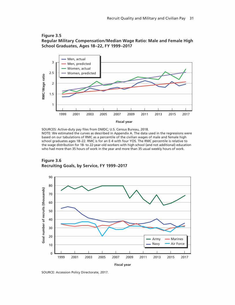
Recruit Quality and Military and Civilian Pay 31
SOURCES: Active-duty pay files from DMDC; U.S. Census Bureau, 2018.NOTE: We estimated the curves as described in Appendix A. The data used in the regressions were based on our tabulations of RMC as a percentile of the civilian wages of male and female high school graduates ages 18–22. RMC is for an E-4 with four YOS. The RMC percentile is relative to the wage distribution for 18- to 22-year-old workers with high school (and not additional) education who had more than 35 hours of work in the year and more than 35 usual weekly hours of work.
RM
C/W
age
rati
o
3
2.5
2
1.5
1
1999 2003
Fiscal year
2001 2005 2007 2009 2011 2013 2015 2017
Men, actualMen, predictedWomen, actualWomen, predicted
Figure 3.5Regular Military Compensation/Median Wage Ratio: Male and Female High School Graduates, Ages 18–22, FY 1999–2017
SOURCE: Accession Policy Directorate, 2017.
Go
al n
um
ber
of
recr
uit
s (t
ho
usa
nd
s)
90
80
70
60
50
40
30
20
10
01999 2003
Fiscal year
2001 2005 2007 2009 2011 2013 2015 2017
ArmyNavy
MarinesAir Force
Figure 3.6Recruiting Goals, by Service, FY 1999–2017

32 Update on Military and Civilian Pay Levels and Recruit Quality
To get a measure of deployment, we use the number of person-nel receiving imminent-danger or hostile-fire pay. With 1999 normal-ized to one for each service, the Army and Marine Corps had 5 to 11 times more deployed personnel between 2003 and 2010 than in 1999 (Figure 3.7). Navy and Air Force deployed personnel were .9 to 2.5 times their 1999 level.
Extensive deployments between 2002 and 2009 might have made it more difficult for the Army to enlist high-quality recruits. The per-centage of Army accessions who were HSDGs dropped in the middle of the decade (Figure 2.2), which also meant a drop in high-quality accessions (Figure 2.1). Marine Corps deployment also rose, but the service’s HSDG and high-quality recruiting rose as well.
Figure 3.8 shows changes in unemployment during this time period. When the economy worsens, workers have fewer outside options and may be more likely to be enticed to join the military, which pro-vides relatively high and stable pay. The percentage of high-quality recruits who were in categories I through IIIA rose rapidly from 2009
SOURCES: Author’s calculations based on Defense Manpower Data Center Active-Duty Pay files. NOTE: 1999 = 1.00.
Ind
ex v
alu
e
12
10
8
6
4
2
01999 2003
Calendar year
2001 2005 2007 2009 2011 2013 2015 2017
Army enlistedNavy enlistedMarine Corps enlistedAir Force enlisted
Figure 3.7Enlisted Personnel Receiving Imminent-Danger or Hostile-Fire Pay, Calendar Years 1999–2017

Recruit Quality and Military and Civilian Pay 33
to 2012, a period when the unemployment rate was high relative to 2000–2008 and 2013–2018. Researchers in past studies have found that the number of high-quality enlistments in each service, including the Army, is positively associated with the civilian unemployment rate (for reviews of past studies, see, e.g., Asch, Hosek, and Warner [2007]; Asch et al. [2010]).
We also include a post-2009 indicator variable to capture the changing nature of educational benefits for service members in dif-ferent branches. The Post-9/11 Veterans Educational Assistance Act of 2008 (also known as the Post-9/11 GI Bill) for education benefits took effect in August 2009 (Pub. L. 110-252, Title V, 2008). This bill cov-ered tuition at a level equal to the tuition of a service member’s home-state four-year public university, plus offering BAH while attending school. Prior to that point, while the services had the same base educa-tion benefit, the Army offered a supplement, the Army College Fund, for high-quality recruits in critical occupations. The Post-9/11 GI Bill made benefits available to recruits of all services on equal terms, regard-less of quality, and, given the generosity of the benefits, the Army lost the recruiting advantage it had.
SOURCE: Bureau of Labor Statistics, undated.
Rat
e
Calendar year
12
10
8
6
4
2
0
2000 2002 2004 2006 2008 2010 2012 2014 2016 2018
Figure 3.8Civilian Unemployment Rate, Calendar Years 2000–2018

34 Update on Military and Civilian Pay Levels and Recruit Quality
Modeling the Relationship Between Recruiting Rate and Regular Military Compensation/Wage Ratio
Recruiting is determined both by the willingness of an individual to enlist and by the service’s willingness to accept the recruit. The model we estimated is a reduced-form model that reflects supply-and-demand influences but does not identify the effects of the supply-and-demand variables separately.
We view willingness to enlist as a variant of the random utility model (McFadden, 1983). An individual’s willingness to join a ser-vice depends on military pay relative to civilian pay, job opportunities as measured by the unemployment rate, job and school opportunities related to AFQT, the chance of being deployed in hostile operations, and possible differences in preferences and opportunities related to gender. It also depends on factors not observed in our data, including the military occupational specialties that are offered, bonuses, educational benefits, ship date, information from advertising or service websites, the influence of family and friends, and aspects of military service, such as its roles, missions, tradition, and values (see, e.g., Eighmey, 2006).
On the demand side, the recruiting command wants to meet a quantity goal and meet or exceed a quality goal. The service goals must comply with DoD guidance that calls for at least 60 percent of acces-sions to be in categories I through IIIA and at least 90 percent to be tier 1 (Kapp, 2013; Sellman, 2004). A tier 1 recruit is one with a high school diploma or at least 15 college credits; tier 1 recruits are pre-dominantly HSDGs. Category I–IIIA HSDG recruits count toward the quantity and quality goals, while category IIIB HSDG and cat-egory IV HSDG recruits count only toward the quantity goal. This suggests that the probability of an HSDG’s recruitment conditional on the person being willing to enlist relates to a preference ordering:
Pr(accept|willingCatsIthroughIIIA) = 1Pr(accept|willingCatIIIB) ≤ 1Pr(accept|willingCatIV ) << 1
The “equal” part of “less than or equal” for IIIB allows for the possibility that meeting the quantity goal might require accepting

Recruit Quality and Military and Civilian Pay 35
all willing IIIBs. It also reflects the possibility of identifying high-potential IIIB prospects through nontraditional methods. Thus, the AFQT can affect a service’s willingness to accept someone who is will-ing to join, especially if the person is at IIIB or less. Also, a person’s willingness can depend on AFQT results, because, as mentioned, these can be related to job prospects, college expectations, and college oppor-tunities. For these demand-and-supply reasons, our analysis allowed for possible differences by AFQT category in the recruiting rate’s respon-siveness to the RMC/wage ratio.
Our model is a reduced-form model because it does not identify structural equations for the demand-and-supply sides. For instance, unemployment can increase willingness to enlist, and in response the services can decrease their recruiting resources, such as recruit-ers, advertising, and bonuses, and tighten eligibility. Our reduced-form unemployment coefficient is the net effect of these responses. The direct effect of unemployment on supply is positive, but if unem-ployment triggers a large enough decrease in recruiting resources at the same time, the coefficient on unemployment in the reduced-form model could be negative. Similarly, deployment might have a positive or negative effect on supply, and if the supply effect is negative, the service might take the option of increasing its enlistment bonuses (as mentioned above) to nullify the negative effect.
It would be ideal to identify structural (causal) effects of recruiting resources, which are endogenous to the recruiting process, but doing so requires exogenous variation in explanatory variables, such as through enlistment bonus, recruiter, or advertising experiments, or through the use of instrumental variables. Our data are not from experiments, and we did not have instruments or enough data to estimate instrumental variable models. Instead, the variables we included in the reduced-form model were outside the control of the recruiting command and, as sug-gested, are external to its resourcing decisions. These variables are mili-tary and civilian pay, recruiting goal, deployment, unemployment, and eligibility. Although the reduced-form model does not identify causal effects, such as the causal effect of pay, it avoids issues of bias that would have arisen if we had included observed bonuses, recruiters, and advertising.
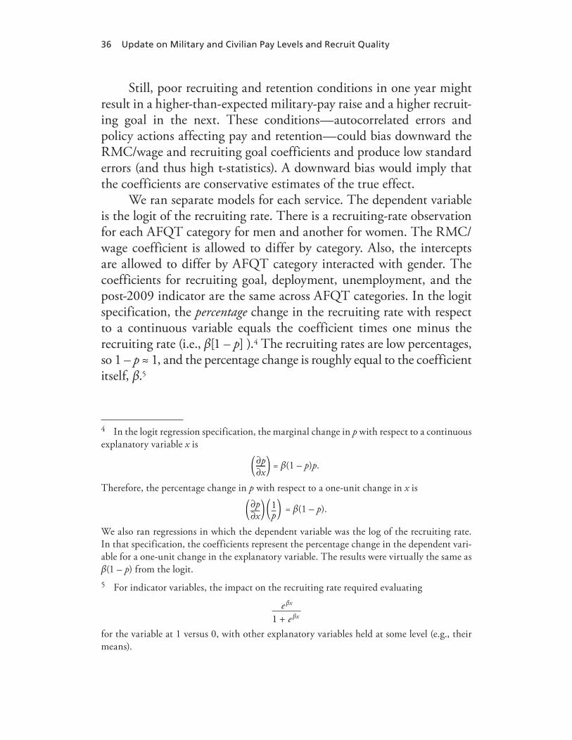
36 Update on Military and Civilian Pay Levels and Recruit Quality
Still, poor recruiting and retention conditions in one year might result in a higher-than-expected military-pay raise and a higher recruit-ing goal in the next. These conditions—autocorrelated errors and policy actions affecting pay and retention—could bias downward the RMC/wage and recruiting goal coefficients and produce low standard errors (and thus high t-statistics). A downward bias would imply that the coefficients are conservative estimates of the true effect.
We ran separate models for each service. The dependent variable is the logit of the recruiting rate. There is a recruiting-rate observation for each AFQT category for men and another for women. The RMC/wage coefficient is allowed to differ by category. Also, the intercepts are allowed to differ by AFQT category interacted with gender. The coefficients for recruiting goal, deployment, unemployment, and the post-2009 indicator are the same across AFQT categories. In the logit specification, the percentage change in the recruiting rate with respect to a continuous variable equals the coefficient times one minus the recruiting rate (i.e., β[1 – p] ).4 The recruiting rates are low percentages, so 1 – p ≈ 1, and the percentage change is roughly equal to the coefficient itself, β.5
4 In the logit regression specification, the marginal change in p with respect to a continuous explanatory variable x is
= β(1 – p)p.∂p∂x
Therefore, the percentage change in p with respect to a one-unit change in x is
= β(1 – p).∂p∂x
1p
We also ran regressions in which the dependent variable was the log of the recruiting rate. In that specification, the coefficients represent the percentage change in the dependent vari-able for a one-unit change in the explanatory variable. The results were virtually the same as β(1 – p) from the logit.5 For indicator variables, the impact on the recruiting rate required evaluating
1 + e βx
e βx
for the variable at 1 versus 0, with other explanatory variables held at some level (e.g., their means).

Recruit Quality and Military and Civilian Pay 37
A final point is that one might expect the results to differ for the Army and the other services because the Army’s recruiting goal is the largest, being roughly twice that of each of the other services. However, the extent to which the magnitude of the recruiting goal makes a dif-ference depends on resourcing decisions that the services made and the quality they required. The marginal cost of a recruit of a given quality might be higher for the Army if it must go deeper into the popula-tion of prospective recruits; yet, by programming enough resources to recruiting, the Army might attain the same quality as the other ser-vices. But resources have other uses, and the same quality might not be needed. The issue, then, turns on the expected benefit from higher-quality recruits relative to their cost and, further, whether the positions in the Army need to be manned by the same quality of recruit, on average, as needed in the other services. In short, service differences in recruiting cost and required quality could give rise to differences in recruit quality and—relevant to this research—differential responses in recruit quality by service when the rise in RMC is the same across services.
Modeling the Relationship Between Share of Non–High School Diploma Graduate Accessions and Regular Military Compensation/Wage Ratio
Here, we focus on the share of accessions who are non-HSDGs, again by AFQT category. The intuition is that the service will prefer an HSDG recruit to a non-HSDG recruit, other things being equal. Yet, if recruiting conditions are more difficult than expected, recruit-ing outcomes are below goal, goals have unexpectedly increased, or recruiting stations become short-staffed, recruiting a non-HSDG might be more attractive. This would be the case if, given the adverse recruiting conditions, the marginal benefit from meeting the quantity goal relative to the marginal cost of doing so were greater for a non-HSDG than an HSDG recruit. This intuition extends beyond unex-pected, difficult recruiting conditions, though. Judging by recruit-ing outcomes (Figures 3.1 through 3.3), non-HSDG accessions are a

38 Update on Military and Civilian Pay Levels and Recruit Quality
regular part of the recruiting mix that the services program resources to obtain, although the actual outcomes will depend on conditions realized during the recruiting year. In 1999, more than 10 percent of Army and Navy accessions were non-HSDG, and, although the percentage in recent years has been well below 10 percent for all ser-vices, in 2006 and 2007, more than 35 percent of male Army acces-sions were non-HSDGs. Overall, the cost of an all high-quality or all-HSDG accession cohort might be too high relative to the expected value to the service.
To capture the idea that non-HSDG accessions serve as an outlet, we estimated models of the share of accessions who were non-HSDGs. The models include the same explanatory variables as the recruiting rate models, and the dependent variable is the logit of the share of accessions who were non-HSDGs.
Regression Results
The regression estimates are reported in Tables B.6 through B.9 in Appendix B. We summarize our findings in Figures 3.9 and 3.10. These figures depict the estimated coefficient for the ratio of RMC to civilian wage, by AFQT category for each service for the two models, respectively. Thus, the figures show the estimated relationship between the RMC/wage ratio and the recruiting outcome variable by AFQT category for each service.
Recruiting Rate
As shown in Figure 3.9, an increase in the RMC/wage ratio was associ-ated with
• no change in the recruiting rate for category I for the Army but decreases in the rates for II, IIIA, and IIIB
• an increase for the Navy in recruiting rates for categories I and II• increases in all categories—I, II, IIIA, and IIIB—for the Marine
Corps
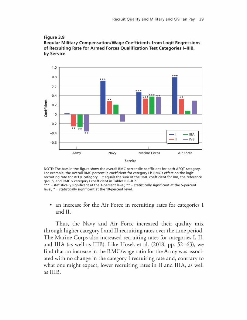
Recruit Quality and Military and Civilian Pay 39
• an increase for the Air Force in recruiting rates for categories I and II.
Thus, the Navy and Air Force increased their quality mix through higher category I and II recruiting rates over the time period. The Marine Corps also increased recruiting rates for categories I, II, and IIIA (as well as IIIB). Like Hosek et al. (2018, pp. 52–63), we find that an increase in the RMC/wage ratio for the Army was associ-ated with no change in the category I recruiting rate and, contrary to what one might expect, lower recruiting rates in II and IIIA, as well as IIIB.
NOTE: The bars in the �gure show the overall RMC percentile coef�cient for each AFQT category. For example, the overall RMC percentile coef�cient for category I is RMC’s effect on the logit recruiting rate for AFQT category I. It equals the sum of the RMC coef�cient for IIIA, the reference group, and RMC × category I coef�cient in Tables B.6–B.7. *** = statistically signi�cant at the 1-percent level; ** = statistically signi�cant at the 5-percent level; * = statistically signi�cant at the 10-percent level.
Co
ef�
cien
t
1.0
0.8
0.6
0.4
0.2
0
–0.2
–0.4
–0.6
Army
Service
Navy Marine Corps Air Force
** ****
***
***
***
**
***
***** **
III
IIIAIVB
Figure 3.9Regular Military Compensation/Wage Coefficients from Logit Regressions of Recruiting Rate for Armed Forces Qualification Test Categories I–IIIB, by Service

40 Update on Military and Civilian Pay Levels and Recruit Quality
NOTE: The bars in the figure show the overall RMC percentile coefficient for each AFQT category. For example, the overall RMC percentile coefficient for category I is RMC’s effect on the share of non-HSDG accessions for AFQT category I. It equals the sum of the RMC coefficient for IIIA, the reference group, and RMC × category I coefficient in Tables B.7–B.9. *** = statistically significant at the 1-percent level; ** = statistically significant at the 5-percent level; * = statistically significant at the 10-percent level.
Co
ef�
cien
t
2.5
2
1.5
1
0.5
0
–0.5
–1
Army
Service
Navy Marine Corps Air Force
III
******
***
***
**
***
******
******
IIIAIVB
*
Figure 3.10Regular Military Compensation/Wage Coefficients from Logit Regressions of the Non–High School Diploma Graduate Share of Accessions for Armed Forces Qualification Test Categories I–IIIB, by Service
In short, increasing RMC relative to civilian wages was associ-ated with an increase in the recruiting rate, especially in categories I and II for all services except the Army. Hosek et al. (2018, pp. 71–73) discuss in depth why the results for the Army might be different than for the other services. It could be that Army recruiting became more difficult for reasons not captured in our models. Another possibility is that the Army set quality goals and programmed recruiting resources to sustain, but not increase, accession quality or that higher RMC affected recruiter effort. Yet another explanation is that Army recruit-ers were allowed to reduce effort as the recruiting market expanded as RMC increased, so recruiting rates in II and IIIA were lower. Hosek et al. (2018) explicitly model a trade-off between RMC and a service’s
Recruit Quality and Military and Civilian Pay 41
recruiting resources, including recruiter effort, and show that such a model could explain these results.
Non–High School Diploma Graduate Share
As shown in Figure 3.10, an increase in the RMC/wage ratio was asso-ciated with
• an increase for the Army in the share of non-HSDG in catego-ries I, II, and IIIB
• an increase in the share of non-HSDG in categories I and II for the Navy
• an increase for the Marine Corps in the share of non-HSDG in categories I, II, and IIIB
• an increase in the RMC/wage ratio associated with a decrease in the share of non-HSDGs in category I and an increase in the share in categories IIIA and IIIB for the Air Force.
Controlling for the factors discussed above, we found that an increase in the RMC/wage ratio was associated with a higher share of non-HSDGs across all services and with a higher share of non-HSDGs in categories I, II, and IIIB for the Army and Marine Corps and in categories I and II in the Navy.6 Thus, in the Army, Navy, and Marine Corps, the RMC/wage ratio was associated with an increase in the quality of non-HSDGs. Still, the non-HSDG share in IIIB also increased in the Army and Marine Corps. The findings for the Air Force were mixed, with a decrease in this share for category I but an increase in the share in IIIA and IIIB.
Conclusion
This chapter has analyzed the relationship between military pay and recruit quality. While the RMC/wage ratio for an E-4 with four YOS
6 With no controls, the relationship between share of non-HSDG and RMC/wage ratio is negative for all branches except the Air Force.

42 Update on Military and Civilian Pay Levels and Recruit Quality
rose significantly during this period, recruit quality varied by service. We used a reduced form regression analysis to control for several fac-tors and shed further light on the association between RMC and recruit quality.
As the regressions indicate, recruit quality increased for all ser-vices except the Army as the RMC/wage ratio increased. The Navy and Air Force increased their category I and II recruiting rates; and the Marine Corps increased its category I, II, and IIIA recruits (as well as IIIB recruits). In contrast, the association between the RMC/wage ratio and the Army recruiting rate for II, IIIA, and IIIB was negative.
We also found that a higher RMC/wage ratio was associated with a higher share of non-HSDG accessions in categories I, II, and IIIB for the Army and Marine Corps, categories I and II for the Navy, and categories IIIA and IIIB for the Air Force. A higher RMC/wage ratio was correlated with a decrease in share of non-HSDG accessions in category I for the Air Force.
Our regression models are reduced form and did not identify the causal effect that military or civilian pay has on recruiting outcomes. Ideally, each of our explanatory variables would be varied experimen-tally in order to avoid endogeneity. However, the military does not have direct control over many of our explanatory variables, and in the past, it has been reluctant to vary policy levers that it does control (such as bonuses, advertising, and recruiting locations), because the impor-tance of meeting recruiting missions has often taken precedence over experimentation.

43
CHAPTER FOUR
Geographic Differences in Regular Military Compensation Percentiles
Pay comparisons in past QRMC reports as well as in the comparisons shown in previous chapters in this report are based on national data. That is, RMC is compared with the pay of civilians throughout the United States, without regard to where individuals live. Such national comparisons are useful because they provide a summary measure of the overall status of military pay relative to civilian pay and because basic pay, the foundation of RMC, is set at the national, not the regional, level. Further, personnel rotate frequently and are not attached to a specific location over their entire career, so from the standpoint of the retention decisions of military personnel, comparison of military pay with pay across the national external market seems relevant. The rel-evance of the national market is less clear for the initial recruiting deci-sion since potential recruits are likely to put more weight on how mili-tary pay compares with pay in their hometown region than with pay at the national level. In general, more research is needed to better under-stand the extent to which pay comparisons at the local rather than the national level influence both recruiting and retention decisions and the extent to which pay supplements such as BAH help to make pay com-petitive in different areas.
Insofar as local pay comparisons are important for these deci-sions, it is useful to consider geographic differences in RMC percen-tiles, especially because the structure of wages in urban versus non-urban regions of the country has shifted in recent years and thereby affected how RMC compares with civilian pay in urban versus non-urban areas. In this chapter, we highlight these comparisons.

44 Update on Military and Civilian Pay Levels and Recruit Quality
Researchers are becoming increasingly aware of the important ways in which location influences life outcomes. Several studies have examined the influence of neighborhoods on wages and social mobil-ity (Chetty and Hendren, 2018a, 2018b; Chetty, Hendren, and Katz, 2016), the importance of state laws for promoting economic growth or access to healthcare (Clarke, 2004; Currie and MacLeod, 2008; Holmes, 1998; Kleiner, 2016), and the differences in economic oppor-tunities between cities and more rural areas (Glaeser, 2010, 2011). However, recent research has also documented changes in the complex interactions between educational attainment, economic opportunities, and geography (Autor, 2019; Austin, Glaeser, and Summers, 2018). In previous decades, cities offered wage premiums to both highly skilled and less-skilled individuals. That is, pay was higher in cities than out-side cities for both highly skilled and less-skilled workers. Urban areas had dynamic labor markets supporting large manufacturing facilities as well as specialized high-skilled innovation. For example, Detroit became known for large car manufacturing plants. Relatively high-paying jobs attracted workers who then specialized in the skills nec-essary for their work. In turn, firms in adjacent industries had an incentive to locate to Detroit to take advantage of this large pool of skilled workers. After gaining experience in the industry, workers were also more likely to start new firms, which further attracted additional workers to the area. These benefits of geographic concentration are called agglomeration effects.
In previous decades, the higher productivity and higher wages from agglomeration effects encouraged more people to move to cities. However, in the last several years many of the relatively high-paying jobs that were previously done by individuals with less formal education have been automated or outsourced, and many of these workers have moved into lower-paying service-sector jobs (Acemoglu and Autor, 2011; Acemoglu and Restrepo, 2017, 2018; Alabdulkareem et al., 2018; Autor, 2015, 2019; Autor and Dorn, 2013; Autor, Katz, and Kearney, 2006; Autor, Levy, and Murnane, 2003). The result is that wages are now no higher in more urban areas for individuals with less formal edu-cation than they are in less urban areas. For highly educated workers,

Geographic Differences in Regular Military Compensation Percentiles 45
there is still a large wage premium for moving to cities. At the same time, other policies (such as limitations on new construction, increases in local taxes, and licensing requirements) have increased the costs of living in many cities even as the premium for workers with less formal education has disappeared (Ganong and Shoag, 2017).
Figure 4.1 illustrates the result of this trend. It shows median weekly wages from the CPS for 2014–2017 for those who have differ-ent levels of education and who live in the ten least urban states and in
SOURCES: U.S. Census Bureau, 2010, 2018.NOTE: Median weekly wages are in 2017 dollars.
Wee
kly
wag
e
Education level
1,800
1,600
1,400
1,200
1,000
800
600
400
200
0
High schooldropout
High school Somecollege
Collegegraduate
Master’s degree or higher
10 least urban states
10 most urban states
Figure 4.1Weekly Wages by Education Level for Those in the Ten Least Urban States and Those in the Ten Most Urban States, 2014–2017

46 Update on Military and Civilian Pay Levels and Recruit Quality
the ten most urban states.1 As can be seen, workers with lower levels of education make around the same amount whether they live in more or less urban areas. Those with higher levels of education make signifi-cantly more in more urban states.
To the extent that pay at the local level is relevant to recruiting and retention decisions, the implication of this trend in the civilian labor market is that military service was less competitive in urban than in less urban areas in the past because pay was higher in urban areas for both higher- and lower-skilled workers. Because of the shifts in the urban labor markets for lower-skilled workers over the last few decades, it seems likely that military service may now be just as competitive for lower-skilled workers in urban as in less urban areas, all else being equal. The lower-skilled workers include those with high school and some college, as shown in Figure 4.1, and are a prime market for the enlisted force, especially the junior enlisted force.
Geographic Differences in Regular Military Compensation Percentiles for Enlisted and Officers
To some extent RMC includes a geographic component. As an element of RMC, BAH provides an adjustment to pay based on the cost of housing in different areas. Also, the services offer enlistment and reen-listment bonuses to eligible individuals, and such bonuses help make military service more competitive to the extent that RMC does not compare as favorably in a specific area. Still, it is useful to consider
1 States are categorized based on the percentage of the total population in urban areas from the 2010 Decennial Census. The District of Columbia, although not a state, is included in the measure since more people live there than many states. Note that the definition is the percentage of the population who lives in urban areas and not the percent of the total land mass filled by people. Thus, states that we do not often think of as urban because they have lots of empty land are surprisingly dense because most of the population lives in a small geo-graphic area. This is the case with states such as Utah, Nevada, and Arizona. The ten dens-est states are District of Columbia, California, New Jersey, Nevada, Massachusetts, Hawaii, Florida, Rhode Island, Utah, and Arizona. The ten least urban states are North Dakota, Ala-bama, Kentucky, South Dakota, Arkansas, Montana, Mississippi, West Virginia, Vermont, and Maine.

Geographic Differences in Regular Military Compensation Percentiles 47
how the changing dynamics of civilian wages by geography affect how RMC compares with civilian wages in urban and less urban areas.
Figures 4.2 and 4.3 summarize the regional comparisons shown in Appendix C by showing RMC for enlisted and officers, respectively, as the gray line graphed relative to the right axis. On the left axis, the figures show the percentile values along the RMC line, by year of service/age. The figures show how RMC wages compare with civilian wages over a career in the most urban and the least urban states.
For enlisted personnel in Figure 4.2, RMC is a higher percentile of civilian wages compared with civilians who live in the most urban
SOURCES: Directorate of Compensation, 2017; U.S. Census Bureau, 2018. NOTE: RMC percentile varies by YOS (1–9 = high school, 10–19 = some college, and 20–30 = associate’s degree). We weighted civilian-wage data by enlisted military gender mix. The gray line is enlisted RMC. Data are smoothed.
Perc
enti
le o
f ci
vilia
n w
age
dis
trib
uti
on
Years of service
100
95
90
85
80
75
70
65
60
55
50
1 2 3 4 6 85 7 109 11 12 13 14 16 1815 17 2019 21 22 23 24 26 2825 27 3029
Percentile—most urbanPercentile—least urbanRMC
2,500
2,000
1,500
1,000
500
0
RM
C w
eekl
y w
age
97 9796 9695 94 94 9493
83 83
79 80 81 82 83 8486 87
8991
93
87 87 8788 88 88 88 88
89
87 87 87 87 87 87 87 8788 88
8788 89 90 91 92 93
95 96 9799
82 82 82 82 82 82 82 82
Figure 4.2Enlisted Regular Military Compensation and Regular Military Compensation Percentiles for Full-Time, Full-Year Workers with High School Diploma, Some College, and Associate’s Degree in the Most and Least Urban States, 2017

48 Update on Military and Civilian Pay Levels and Recruit Quality
versus the least urban states for one through nine YOS. That is, for enlisted personnel early in their career, RMC compares more favor-ably with civilian pay in urban areas than in nonurban areas. This pattern flips as we compare RMC with the pay for civilians with more years of formal education as years of service increase. However, the difference between the percentiles in the least and most urban states is about 5 percentiles (e.g., 87th percentile for less urban work-ers and 82nd percentile for more urban workers for 12–19 YOS) and grows to about 8 percentage points at 20 YOS. That is, for enlisted personnel in their later career, RMC compares somewhat less favor-
SOURCES: Directorate of Compensation, 2017; U.S. Census Bureau, 2018.NOTE: RMC percentile varies by YOS (1–9 = bachelor’s degree, 10–30 = master’s degree or higher). We weighted civilian-wage data by officer military gender mix. The gray line is enlisted RMC. Data are smoothed.
Perc
enti
le o
f ci
vilia
n w
age
dis
trib
uti
on
Years of service
100
95
90
85
80
75
70
65
60
55
50
1 2 3 4 6 85 7 109 11121314 16 1815 17 2019 21 22 23 24 26 2825 27 3029
Percentile—most urbanPercentile—least urbanRMC
79 79 79 79 79 79 7980 80
62 6263 64 65 6566 67 68 69 70 71 72 73 74 75 76 77 78 79 80
91 9192 92 92 92 92 93 93
77 76 76 75 75 75 75 7576 7677 78 79 80 81 8284
86 8789
91
3,500
3,000
2,500
2,000
1,500
1,000
500
0
RM
C w
eekl
y w
age
Figure 4.3Officer Regular Military Compensation and Regular Military Compensation Percentiles for Full-Time, Full-Year Workers with Bachelor’s Degree or with Master’s Degree or Higher in the Most and Least Urban States, 2017

Geographic Differences in Regular Military Compensation Percentiles 49
ably with civilian pay in urban areas than in non-urban areas. But, notably, the 5 to 8 percentile differences after ten YOS are smaller than the differences for officers, which are shown in Figure 4.3
In Figure 4.3 we compare RMC for officers from the Greenbooks with civilians with bachelor’s degrees (1–9 YOS) and master’s degrees or more (10–30 YOS). While exhibiting a similar overall pattern to that found in Figure 2.2, officer RMC is at a persistently and substantially higher percentage of civilian pay in the least urban states than in the most urban states; in most cases the difference is more than ten per-centiles. That is, because of the higher wages of urban civilian workers, RMC percentiles are lower in urban areas than in less urban areas by more than ten percentiles.
Traditionally, wages have been lower in less urban areas so we would expect RMC to be a higher percentile of civilian wages in these areas. This is still true for workers with more years of formal education; RMC compares more favorably with what workers with more years of formal education in less urban states could get in their local labor market. However, for less-educated workers, the difference between wages in more and less urban areas is much smaller; and for those with only a high school degree, wages may now be higher in less urban areas, thereby making RMC a higher percentile of civilian wages in more urban areas.
Conclusion
There appear to be differences in RMC percentiles across geographies for individuals of different education levels. Due to trends for less-educated workers across the economy, enlisted military members with a high school degree are more likely to find RMC equally competitive no matter where they live (and perhaps even more competitive in urban areas). However, officers and those with more education in general are likely to find military pay more competitive if they live in less urban areas than if they live in more urban areas.
While these patterns are briefly noted here, further research is necessary to explore their implications for military recruiting and retention.


51
CHAPTER FIVE
Closing Thoughts
Our findings are relevant to the following questions. How does military pay for active-component personnel compare with civilian pay? Has the position of military pay improved or worsened since 2009, when the 11th QRMC last benchmarked military pay? Given that military pay has increased since 1999, when the 9th QRMC first benchmarked military pay, was that increase associated with an increase in recruit quality? We summarize our findings and offer some final thoughts.
Findings in Brief
At What Percentile Did Regular Military Compensation Stand in 2017?
We find that RMC in 2017 was at the 85th percentile of comparably educated civilian wages for active-component enlisted personnel and at the 77th percentile for active-component officers. The 9th QRMC noted that many enlisted members have some college and recom-mended that military pay be at around the 70th percentile for that level of education. In 2017, we find that RMC was at the 84th percentile for enlisted with some college and the 93rd percentile for those with high school. For officers, RMC was at the 86th percentile for officers with a bachelor’s degree and the 70th percentile for officers with a master’s degree or higher. We also compared RMC with civilian wages over time from 2000 to 2017 for selected age and education groups. These comparisons showed a steady increase in RMC relative to civilian pay from 2000 to 2010 and a leveling off afterward.
52 Update on Military and Civilian Pay Levels and Recruit Quality
At What Percentile Did Regular Military Compensation Stand in 2009?
RMC in 2009 was at the 84th percentile of civilians comparable with enlisted members and at the 77th percentile of civilians comparable with officers—the same as 2017. RMC was at the 85th percentile for enlisted with some college and the 91st percentile for those with high school. RMC was at the 87th percentile for officers with a bachelor’s degree and the 69th percentile for those with a master’s degree or higher. Our RMC percentiles for 2009 are somewhat below those of the 11th QRMC estimates—90th percentile for enlisted personnel and 83rd for officers—and we attribute the difference to method-ological considerations described in Hosek et al. (2018, pp. 10–16, 28–30).
Our finding that the RMC percentile was nearly the same in 2017 as 2009 might be surprising because there were years when basic-pay raises were below the Employment Cost Index (ECI)—namely, 2014–2016—though in our view the ECI is not a reliable guide for military and civilian pay comparisons for various reasons, including that it is not adjusted for the military education distribution.
How Did Recruit Quality Change as Regular Military Compensation Rose?
We used regression models to isolate the relationship between the RMC/wage ratio and recruiting outcomes. We found that as the RMC/wage ratio increased, recruit quality increased in the Navy, Marine Corps, and Air Force but not in the Army.
The regressions controlled for recruiting goal, deployment, unem-ployment, and gender and were estimated separately by service. As the RMC/wage ratio rose, the Navy, Marine Corps, and Air Force increased their AFQT category I and II recruiting rates, and the Marine Corps also increased its category IIIA rate. But the Army decreased its cat-egory II and IIIA recruiting rates. The Army, Navy, and Marine Corps increased the percentage of non-HSDG accessions in category I and II while the Air Force reduced the percentages of non-HSDG accessions in category I. These results suggest that the Army, Navy, and Marine Corps increased the quality of their non-HSDG recruits.
Closing Thoughts 53
The reason for the Army’s different result is an open question. It is possible that Army recruiting became more difficult during the 2000s because of extensive deployments in support of operations in Iraq and Afghanistan, and the Army did not program enough recruit-ing resources to match the increased difficulty. It may also be that the Army set its recruiting quality goals to hold recruit quality constant as RMC increased, thereby holding its recruit quality near the DoD quality benchmarks of at least 90 percent HSDG recruits and at least 60 percent from categories I through IIIA, rather than allocating more resources such as bonuses and recruiters to recruiting.
How Does the Regular Military Compensation Percentile Vary Across Geographies Within the United States?
There appear to be large differences in how RMC compares with civil-ian pay across geographies for individuals of different education levels. Due to trends for less-educated workers across the economy, enlisted military members with a high school degree are likely to find mili-tary pay relative to civilian pay as attractive in urban as in nonurban areas—a change from earlier years when military pay was relatively less attractive. However, officers and those with more education in general are likely to find military pay higher relative to civilian pay if they live in less urban areas than if they live in more urban areas.
Wrap-Up
In short, our results indicate that RMC continues to exceed the 70th percentile of the distribution of pay of civilians with similar charac-teristics, found by the 11th QRMC and more recently in Hosek et al. (2018). This result is reached even when accounting for an increase in the educational attainment of both the enlisted force and officers. Our analysis indicates that since 2000, increases in RMC relative to civil-ian pay have been associated with increases in recruit quality, with the exception of the Army.
These results raise some additional questions. First, the defense capability gained from recruiting more high-quality recruits must be

54 Update on Military and Civilian Pay Levels and Recruit Quality
weighed against the added cost of higher RMC, which increases the entire personnel budget. Our analysis has shown where and to what extent recruit quality increased as military pay increased, but it cannot place a value on the increased quality. Valuing quality is the services’ domain.
Second, the increase in recruit quality for three of the four services between 1999 and 2017 raises the question of whether achieving that quality could have been accomplished in a more cost-effective manner than increasing RMC relative to civilian pay. Though estimates differ on the marginal cost of pay and recruiting resources, virtually every study finds that military pay is the costliest approach for enlisting high-quality recruits (Asch et al., 2010; Orvis et al., 2016; Simon and Warner, 2007). RMC is a blunt instrument that is not targeted to occupational specialties in which recruiting or retention shortfalls occur. An increase in RMC affects the cost of all personnel budget in every service, while an increase in a service’s recruiting resources such as recruiters, enlist-ment bonuses, advertising, and recruiting stations and equipment is specific to its recruiting budget, and resources such as bonuses can be targeted.
These questions should be addressed when considering the setting of RMC in the future. The analysis in this report indicates that in the recent past, and since the 11th QRMC, RMC continues to support readiness and lies above the benchmark of the 70th percentile set by the 9th QRMC.
55
APPENDIX A
Regular Military Compensation Percentile and Regular Military Compensation/Wage Ratio
This appendix describes how we smoothed the RMC percentile for an E-4 with four YOS relative to the civilian-wage distribution for high school graduates ages 18 to 22 who worked more than 35 weeks in the year and had more than 35 usual hours of work. The smoothed values are shown in Figure 3.5 in Chapter Three. This appendix also describes the ratio of RMC to the median civilian wage. RMC is based on Greenbook data, and civilian wages come from March CPSs.
Smoothing the Regular Military Compensation Percentile
Raw RMC percentiles vary considerably from year to year. Some varia-tion comes from annual increases in RMC resulting from increases in basic pay and BAH, but much of the variation comes from the smallness of CPS samples. For high school graduates ages 18 to 22, sample sizes for each year of data range from 150 to 250 observations for men and the same for women. These sample sizes do not provide dense enough coverage for a precise estimate of the wage distribution or the RMC percentile. We used a smoothing method to adjust for the variation.
There are different approaches to smoothing. One approach is a kernel density estimator to smooth the wage distribution each year. But that approach does not use data from adjacent years and cannot be relied on to provide year-to-year continuity. Instead, we estimated a log

56 Update on Military and Civilian Pay Levels and Recruit Quality
wage model to identify the mean and variance of the wage distribu-tion, allowing for a common trend in real wages. The estimation used the tabulated wages at the 30th, 40th, 50th, 60th, 70th, 80th, and 90th percentiles. Then, using the estimated wage distribution parame-ters, we inferred the RMC percentile. The approach smooths the RMC percentile and provides year-to-year continuity in the wage distribution as real wages change over time.
Using Wage Percentiles to Estimate the Log Wage Distribution
Let p be the percentile (e.g., p = 0.6 at the 60th percentile), and let F be the standard normal distribution with mean 0 and standard deviation σ. Assume that the wage is log-normally distributed, so
p = F [ [ln wp – μ
σ .
(A.1)
Taking the inverse normal, the log wage at percentile p is ln wp = μ + σF –1[p].
We tabulated CPS wage data to find wages at the 30th through 90th percentiles for each year, 1999 through 2017. These wages are the observations on ln wp. Thus, for a given group (e.g., 18- to 22-year-old high school graduates), the log wage at percentile p in year t is
μt + σF –1[p]. ln wpt =
(A.2)
At the 50th percentile, F–1[0.5] = 0, and it follows that the mean of the log wage distribution, μt , equals the log of the wage at the 50th percentile. We computed the wage at the 50th percentile and used it to obtain an estimate of the mean of the log wage distribution: μt = ln w0.5t
at each year and, in particular, for the base year of our data, 1999. We refer to 1999 as period 0.
For small changes, we approximated the year-to-year wage change as a percentage change from the wage in period 0:
ˆwpt = e μ0
δ tσF –1[p]e + . (A.3)

Appendix A 57
Taking logs, we have
μ0 + σF –1[p] + δt. ln wpt = (A.4)
We can replace μ0 with ln w0.5t + εpt given that w0.5,0 is computed from the data and its log is an estimate of the mean. Subtract ln w0.5t from both sides to obtain
σF –1[p] + δt + εpt . ln wpt – ln w0.5,0 = (A.5)
In the usual regression format, this can be thought of as
β1F –1[p] + β2t + εpt , ln wpt – ln w0.5,0 = (A.6)
where β1 is an estimate of σ, the standard deviation of the log wage, β2 is an estimate of δ, the annual percentage change in the wage, and there is no intercept. Values for F –1[p] at each percentile came from the inverse normal function evaluated at the given percentile. The variable t is the year. This approach assumes that the standard devia-tion does not change during the observation period and that the mean evolves according to the time trend. For each group, there are wages for seven percentiles in each of 19 years, 1999 through 2017, for a total of 133 observations. There are two parameters to estimate.
Using the estimated parameters, the predicted wage in period t at percentile p is
ˆwpt = e ln
δ tσ̂F –1[p] + w0.5,0 + . (A.7)
Also, for a given value of the wage, the corresponding percentile is derived as follows:
ˆln wt – ln w0.5,0 =
δ t.σ̂F –1[p] + (A.8)
ˆF –1[p] = ln wt – ln w0.5,0 – δ t
σ̂[ [.
(A.9)
ˆp = F ln wt – ln w0.5,0 – δ t
σ̂[ [.
(A.10)

58 Update on Military and Civilian Pay Levels and Recruit Quality
Letting RMCt stand in for wage, its percentile is
ˆp = F ln RMCt – ln w0.5,0 – δ t
σ̂[ [.
(A.11)
Parameter Estimates and Goodness of Fit
Table A.1 reports the regression results. The standard deviation of the log wage distribution is 0.457 for men and 0.398 for women, both of which are highly significant. Also, for interpretability, the estimates for δ are reported as the annual percentage change (i.e., as 100 times the estimated coefficient). For example, the δ estimate of –0.500 for male high school graduates reported in the table means that wages trended down by 0.500 percent per year from 1999 to 2017. Similarly, the reported standard error of δ is 100 times the estimated standard error. The wage data are in 2017 dollars. The trend estimate is statis-tically significant for men and women. The models fit the data well, with an R2 of 0.93 for men and 0.88 for women.
Table A.1Regression Results for High School Graduates, Ages 18–22
Group Coefficient
Robust Standard
Error t P>|t |
Male
Standard deviation of log wage distribution
0.457 0.015 30.78 0.000
Time trend –0.500 0.059 –8.42 0.000
R2 0.929
Female
Standard deviation of log wage distribution
0.398 0.016 25.75 0.000
Time trend –1.046 0.085 –12.28 0.000
R2 0.883

Appendix A 59
Raw and Smoothed Regular Military Compensation Percentiles
Table A.2 contains the raw and smoothed (predicted) RMC percen-tiles. In making predictions, we used the coefficients in Table A.1 and the median weekly wage for 1999, which was $565.89 for men and $500.25 for women.
Table A.2Regular Military Compensation Percentiles for High School Graduate Civilian Wages, Ages 18–22, as Percentages
Year
Males Females
%Raw %Smoothed %Raw %Smoothed
1999 79 75 94 86
2000 76 77 88 88
2001 81 79 86 90
2002 80 83 90 92
2003 89 86 96 94
2004 88 85 91 94
2005 88 87 95 95
2006 87 88 91 96
2007 92 89 99 97
2008 94 89 91 97
2009 90 91 94 98
2010 96 91 100 98
2011 94 91 100 98
2012 89 92 100 98
2013 82 92 88 98
2014 86 93 98 99
2015 90 93 99 99
2016 97 93 97 99
2017 87 93 99 99
SOURCES: Directorate of Compensation, 1999–2017; U.S. Census Bureau, 2018.
NOTE: RMC is for an E-4 with four YOS. Civilian wages are for 18- to 22-year-old workers with high school (and not additional) education who worked more than 35 weeks in the year and had more than 35 usual weekly hours of work.
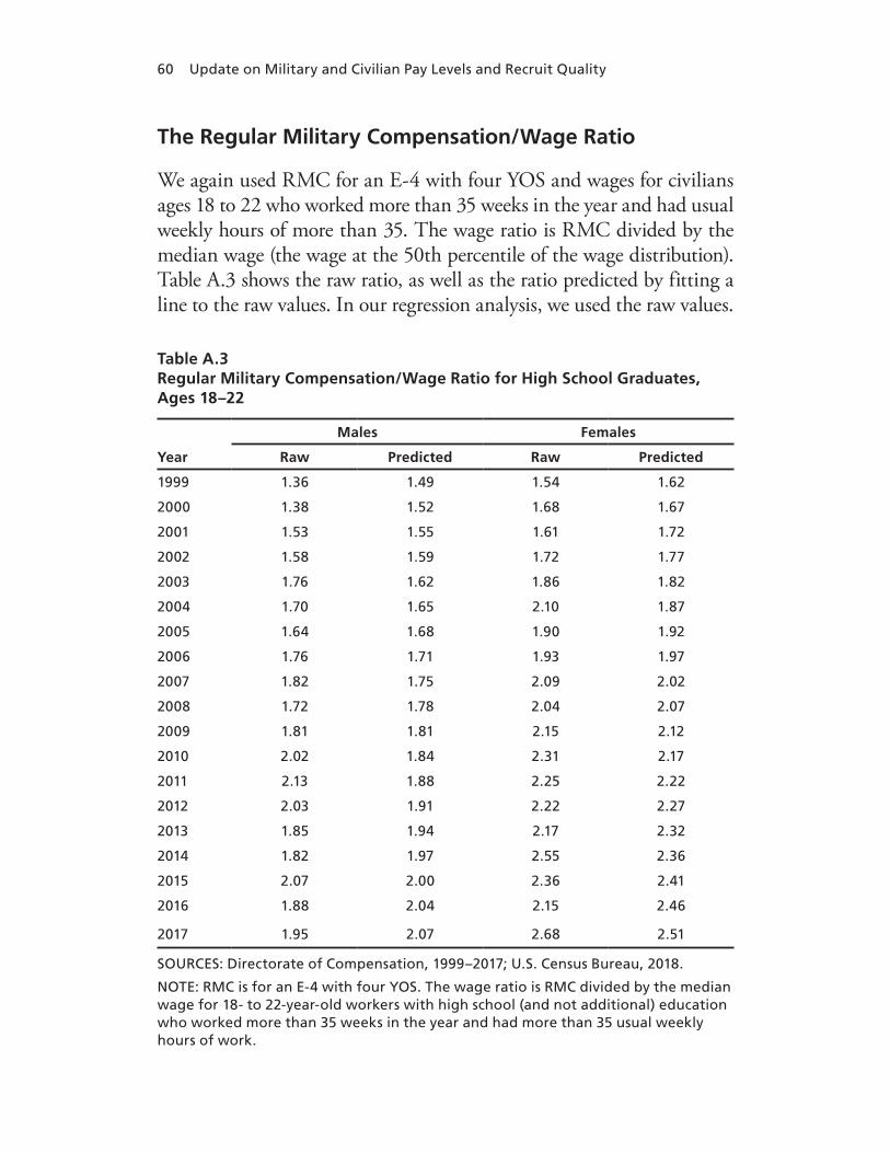
60 Update on Military and Civilian Pay Levels and Recruit Quality
The Regular Military Compensation/Wage Ratio
We again used RMC for an E-4 with four YOS and wages for civilians ages 18 to 22 who worked more than 35 weeks in the year and had usual weekly hours of more than 35. The wage ratio is RMC divided by the median wage (the wage at the 50th percentile of the wage distribution). Table A.3 shows the raw ratio, as well as the ratio predicted by fitting a line to the raw values. In our regression analysis, we used the raw values.
Table A.3Regular Military Compensation/Wage Ratio for High School Graduates, Ages 18–22
Year
Males Females
Raw Predicted Raw Predicted
1999 1.36 1.49 1.54 1.62
2000 1.38 1.52 1.68 1.67
2001 1.53 1.55 1.61 1.72
2002 1.58 1.59 1.72 1.77
2003 1.76 1.62 1.86 1.82
2004 1.70 1.65 2.10 1.87
2005 1.64 1.68 1.90 1.92
2006 1.76 1.71 1.93 1.97
2007 1.82 1.75 2.09 2.02
2008 1.72 1.78 2.04 2.07
2009 1.81 1.81 2.15 2.12
2010 2.02 1.84 2.31 2.17
2011 2.13 1.88 2.25 2.22
2012 2.03 1.91 2.22 2.27
2013 1.85 1.94 2.17 2.32
2014 1.82 1.97 2.55 2.36
2015 2.07 2.00 2.36 2.41
2016 1.88 2.04 2.15 2.46
2017 1.95 2.07 2.68 2.51
SOURCES: Directorate of Compensation, 1999–2017; U.S. Census Bureau, 2018.
NOTE: RMC is for an E-4 with four YOS. The wage ratio is RMC divided by the median wage for 18- to 22-year-old workers with high school (and not additional) education who worked more than 35 weeks in the year and had more than 35 usual weekly hours of work.
61
APPENDIX B
Recruiting Rates for Armed Forces Qualification Test Categories I–IIIB and Regression Estimates
Recruiting Rates
The recruiting rate is the ratio of NPS HSDG enlisted accessions to the population of high school completers, net those who went on to com-plete four or more years of college. Accession data are from the military enlistment processing station (MEPS) file. Data on high school com-pleters and on the percentage of high school completers who had com-pleted four or more years of college by ages 25 to 29 are from NCES. We calculated recruiting rates by AFQT category. The category is given directly in MEPS data, but it is not present in NCES data. To allocate our adjusted high school completer population by AFQT category, we used the 1997 National Longitudinal Survey of Youth (NLSY), which administered the AFQT to a representative sample of young adults.
NCES provides data on recent high school completers, by gender, for 1960 through 2017 (NCES, 2018a). We also drew on NCES data to calculate the percentage of 25- to 29-year-olds who completed bachelor’s degrees or higher conditional on completing high school or higher (NCES, 2018b). We assumed a modal age of 18 for high school completers and a modal age of 27 for the 25- to 29-year-olds who com-pleted bachelor’s degrees or higher (i.e., nine years later: age 27 minus age 18). The completion-rate data were available through 2017. We fitted linear trend models to the higher-degree (bachelor’s or higher) completion data and used the estimated trend models to predict the higher-degree completion rates for high school completers for the span covered by our data, 1999 to 2017. We deducted these percentages

62 Update on Military and Civilian Pay Levels and Recruit Quality
from the population of completers. What remained was the number of high school completers not expected to later complete four-year degrees or higher. We assumed that this was the population to be recruited into the military.
The 1997 NLSY is the most recent renorming of the ASVAB (from which the AFQT score is calculated). NLSY provides informa-tion on the AFQT score distribution for 18- to 23-year-old men and women. We used the percentage of the population in each category to estimate the percentage of our net high school completer population by category. This did not account for the possibility that the AFQT distri-bution conditional on high school completion differs from that of the unconditional population. The high school completion rate in 2000 was 87 percent for men and 89 percent for women (NCES, 2018b), suggesting that the AFQT distribution for high school completers is likely to be close to that for the 18- to 23-year-old population overall.
Table B.1 shows the total number of male and female high school completers, the percentage of completers expected to complete four or more years of college, and the number of high school completers net of the latter. Tables B.2 through B.5 show the recruiting rates by service and gender for AFQT categories I, II, IIIA, and IIIB.

Appendix B 63
Table B.1High School Completers, 1999–2018, Net Those Predicted to Complete Four or More Years of College
Calendar Year
High School Completers,
in Thousands
Percentage Predicted to Complete Bachelor’s
or Higher
High School Completers Net of Predicted
Bachelor’s or Higher Completers, in Thousands
Male Female Male Female Male Female
1999 1,474 1,423 31.1 38.1 1,015 881
2000 1,251 1,505 31.7 38.6 855 924
2001 1,277 1,273 32.2 39.1 866 774
2002 1,412 1,384 32.7 39.7 950 835
2003 1,306 1,372 33.2 40.2 872 820
2004 1,327 1,425 33.8 40.8 879 844
2005 1,262 1,414 34.3 41.3 829 830
2006 1,328 1,363 34.8 41.8 866 793
2007 1,511 1,444 35.4 42.4 977 832
2008 1,640 1,511 35.9 42.9 1,052 862
2009 1,407 1,531 36.4 43.5 894 865
2010 1,679 1,482 36.9 44.0 1,059 830
2011 1,611 1,468 37.5 44.5 1,007 814
2012 1,622 1,581 38.0 45.1 1,006 868
2013 1,524 1,453 38.5 45.6 937 790
2014 1,423 1,445 39.0 46.1 867 778
2015 1,448 1,516 39.6 46.7 875 808
2016 1,517 1,620 40.1 47.2 908 855
2017 1,345 1,525 40.6 47.8 799 796
2018a 1,548 1,555 41.2 48.3 911 804
SOURCE: NCES, 2018.
NOTE: We fitted a linear trend to the percentage of 25- to 29-year-olds who completed bachelor’s degrees or higher, conditional on completing high school or more, for 2005 through 2018. We assumed a median age of 27 for the 25- to 29-year-olds and a median age of 18 for high school completers, a nine-year difference, then used the linear trend to predict the percentage of high school completers in 1999 through 2018 who would complete bachelor’s degrees or higher by nine years later. a The number of high school completers in 2018 was predicted from a linear trend model fitted to high school completers in 1999 through 2017.

64 Update on Military and Civilian Pay Levels and Recruit Quality
Table B.2Army Recruiting Rates, 2000–2018: Armed Forces Qualification Test Categories I, II, IIIA, and IIIB, as Percentages
Year
I II IIIA IIIB
%Men %Women %Men %Women %Men %Women %Men %Women
2000 2.7 0.4 5.3 1.3 8.1 2.2 8.3 2.6
2001 2.8 0.5 5.3 1.5 7.9 2.6 7.8 3.0
2002 3.5 0.5 5.3 1.4 7.1 2.2 6.6 2.3
2003 4.2 0.6 5.7 1.3 7.5 2.1 6.4 2.3
2004 5.5 0.7 7.2 1.5 9.4 2.3 7.9 2.4
2005 4.8 0.6 5.9 1.2 7.5 1.9 7.0 2.1
2006 4.0 0.5 5.1 1.1 5.9 1.6 6.6 2.1
2007 3.1 0.4 3.9 1.0 4.6 1.3 5.1 1.7
2008 3.1 0.4 4.1 1.0 4.9 1.3 5.7 1.9
2009 4.1 0.4 5.1 1.0 6.4 1.3 7.7 1.9
2010 4.4 0.6 5.5 1.2 6.7 1.7 8.5 2.5
2011 4.1 0.5 5.1 1.0 6.1 1.5 8.1 2.5
2012 3.3 0.4 4.9 0.9 6.4 1.3 7.9 2.0
2013 3.8 0.5 5.8 1.1 8.1 1.9 10.4 2.8
2014 3.0 0.4 4.8 0.9 7.1 1.7 8.7 2.3
2015 3.1 0.4 4.9 0.9 7.1 1.7 9.4 2.6
2016 3.0 0.4 4.7 0.9 6.5 1.5 8.9 2.5
2017 3.8 0.4 5.8 1.0 8.2 1.7 10.7 2.8
2018a 3.9 0.5 5.6 1.2 7.4 1.8 8.2 2.6
a Denominator is imputed.

Appendix B 65
Table B.3Navy Recruiting Rates, 2000–2018: Armed Forces Qualification Test Categories I, II, IIIA, and IIIB, as Percentages
Year
I II IIIA IIIB
%Men %Women %Men %Women %Men %Women %Men %Women
2000 2.2 0.3 4.2 0.9 5.4 1.5 7.4 1.7
2001 1.9 0.3 3.9 1.1 5.2 1.8 7.3 1.9
2002 2.1 0.3 3.4 0.9 4.4 1.4 5.7 1.4
2003 2.2 0.3 3.5 0.8 4.3 1.4 5.5 1.1
2004 3.1 0.4 4.4 1.0 5.1 1.5 5.5 1.1
2005 2.9 0.4 4.5 0.9 5.9 1.4 6.6 1.3
2006 2.8 0.4 4.1 1.0 4.8 1.4 3.9 1.3
2007 2.2 0.3 3.2 0.8 3.8 1.2 3.8 1.2
2008 2.3 0.4 3.3 0.9 3.8 1.2 3.4 1.3
2009 2.9 0.5 3.9 1.1 4.3 1.4 3.2 1.0
2010 2.8 0.5 3.5 1.2 3.8 1.8 1.9 0.8
2011 3.2 0.6 3.8 1.3 4.2 1.9 1.1 0.7
2012 3.4 0.6 4.2 1.3 4.7 2.0 1.1 0.7
2013 3.7 0.6 4.5 1.5 5.3 2.3 2.2 1.2
2014 3.6 0.5 4.3 1.3 5.1 2.1 1.4 0.8
2015 3.5 0.6 4.5 1.4 5.4 2.3 1.2 0.9
2016 3.0 0.4 3.5 1.0 4.2 1.7 1.3 0.9
2017 3.8 0.5 4.5 1.3 5.4 2.3 2.2 1.2
2018a 3.3 0.5 4.1 1.2 4.5 1.9 3.3 1.9
a Denominator is imputed.

66 Update on Military and Civilian Pay Levels and Recruit Quality
Table B.4Marine Corps Recruiting Rates, 2000–2018: Armed Forces Qualification Test Categories I, II, IIIA, and IIIB, as Percentages
Year
I II IIIA IIIB
%Men %Women %Men %Women %Men %Women %Men %Women
2000 1.1 0.1 3.1 0.2 4.7 0.4 5.2 0.3
2001 1.1 0.1 3.1 0.3 4.8 0.5 5.2 0.4
2002 1.2 0.1 3.1 0.3 4.6 0.5 4.6 0.3
2003 1.5 0.1 3.5 0.3 4.7 0.5 4.5 0.3
2004 1.9 0.1 3.9 0.3 5.2 0.5 4.8 0.3
2005 2.0 0.1 4.2 0.3 5.7 0.5 5.8 0.5
2006 1.8 0.1 3.6 0.3 4.7 0.4 4.8 0.5
2007 1.7 0.1 3.4 0.3 4.3 0.4 4.6 0.5
2008 1.6 0.1 3.4 0.3 4.5 0.4 4.6 0.4
2009 1.7 0.1 3.5 0.3 4.6 0.5 4.4 0.4
2010 1.5 0.1 2.8 0.3 3.7 0.5 3.1 0.4
2011 1.6 0.1 3.3 0.3 4.4 0.5 3.2 0.4
2012 1.6 0.1 3.4 0.3 4.7 0.5 3.3 0.4
2013 1.7 0.2 3.7 0.4 5.2 0.6 3.9 0.5
2014 1.4 0.1 3.1 0.4 4.6 0.7 3.4 0.5
2015 1.5 0.1 3.5 0.4 5.4 0.7 3.9 0.4
2016 1.3 0.1 3.2 0.4 5.0 0.7 4.0 0.4
2017 1.8 0.2 4.1 0.4 6.1 0.8 4.9 0.5
2018a 1.6 0.2 3.5 0.5 4.9 0.7 4.3 0.6
a Denominator is imputed.

Appendix B 67
Table B.5Air Force Recruiting Rates, 2000–2018: Armed Forces Qualification Test Categories I, II, IIIA, and IIIB, as Percentages
Year
I II IIIA IIIB
%Men %Women %Men %Women %Men %Women %Men %Women
2000 1.5 0.2 3.6 1.0 4.7 1.7 3.5 1.4
2001 1.6 0.3 3.7 1.2 4.7 1.9 3.2 1.4
2002 1.8 0.3 3.7 1.2 4.6 1.9 3.0 1.4
2003 2.2 0.4 4.1 1.2 4.8 1.9 2.5 1.0
2004 2.9 0.5 4.8 1.4 5.4 2.0 2.7 1.1
2005 1.8 0.3 2.7 0.8 3.3 1.1 1.7 0.6
2006 2.3 0.4 3.8 1.2 4.2 1.7 2.5 1.2
2007 1.8 0.3 3.1 1.0 3.3 1.4 2.1 1.0
2008 1.8 0.3 2.9 0.9 3.1 1.3 1.9 0.9
2009 2.7 0.4 4.0 1.0 4.1 1.4 2.3 0.9
2010 2.4 0.4 3.4 1.0 3.4 1.2 0.9 0.4
2011 2.5 0.4 3.9 1.1 4.2 1.5 0.1 0.1
2012 2.6 0.4 3.9 1.0 4.2 1.4 0.2 0.1
2013 2.4 0.4 3.8 1.1 4.0 1.3 0.2 0.1
2014 2.4 0.4 3.6 1.0 3.8 1.4 0.5 0.2
2015 2.3 0.3 3.5 1.0 3.5 1.3 0.8 0.3
2016 2.7 0.4 4.0 1.2 4.1 1.6 1.6 0.6
2017 3.0 0.4 4.3 1.2 4.5 1.7 2.1 0.9
2018a 2.6 0.5 3.6 1.2 3.7 1.5 1.8 0.9
a Denominator is imputed.

68 Update on Military and Civilian Pay Levels and Recruit Quality
Regression Estimates
Table B.6Logit Regression of Recruiting Rate for Armed Forces Qualification Test Categories I–IIIB, Army and Navy
Variable
Army Navy
CoefficientStandard
error t CoefficientStandard
error t
Pay ratio –0.2750 (0.153) –1.801 0.2060 (0.153) 1.345
Pay ratio × Cat I 0.280 (0.167) 1.672 0.508 (0.168) 3.029
Pay ratio × Cat II 0.018 (0.126) 0.140 0.076 (0.115) 0.668
Pay ratio × Cat IIIB –0.087 (0.212) –0.412 –0.360 (0.388) –0.928
Recruiting goal 0.006 (0.002) 2.695 0.012 (0.005) 2.356
Deployment –0.012 (0.007) –1.880 –0.105 (0.060) –1.737
Unemployment 0.023 (0.010) 2.167 0.006 (0.014) 0.414
Cat I –1.181 (0.329) –3.592 –1.450 (0.315) –4.607
Cat II –0.329 (0.242) –1.358 –0.326 (0.214) –1.521
Cat IIIB 0.123 (0.348) 0.355 0.558 (0.661) 0.844
Female –1.351 (0.079) –16.992 –1.133 (0.063) –17.998
Female × Cat I –0.699 (0.097) –7.220 –0.996 (0.078) –12.833
Female × Cat II –0.167 (0.087) –1.928 –0.279 (0.071) –3.916
Female × Cat IIIB 0.201 (0.104) 1.930 0.181 (0.144) 1.257
Post-2009 0.015 (0.064) 0.232 0.153 (0.063) 2.412
Post-2009 × Cat IIIB 0.360 (0.093) 3.882 –0.881 (0.156) –5.633
Constant –2.643 (0.353) –7.495 –3.838 (0.428) –8.977
R-squared 0.972 0.949
Observations 144 144
Pay ratio I 0.005 (0.167) 0.030 0.713 (0.202) 3.530
Pay ratio II –0.257 (0.125) –2.050 0.282 (0.139) 2.030
Pay ratio IIIA –0.275 (0.153) –1.801 0.206 (0.153) 1.345
Pay ratio IIIB –0.362 (0.178) –2.040 –0.154 (0.419) –0.370
NOTE: Table shows the results of regressions of the logit recruiting rate on the given variables. Robust standard errors are shown. The reference category is category IIIA. The final three rows show the estimate for the pay ratio and the given category by combining the coefficient for pay ratio and the relevant interaction term.

Appendix B 69
Table B.7Logit Regression of Recruiting Rate for Armed Forces Qualification Test Categories I–IIIB, Marine Corps and Air Force
Variable
Marine Corps Air Force
CoefficientStandard
error t CoefficientStandard
error t
Pay ratio 0.3780 (0.122) 3.098 0.0760 (0.126) 0.600
Pay ratio × Cat I 0.090 (0.131) 0.685 0.712 (0.221) 3.226
Pay ratio × Cat II –0.044 (0.113) –0.391 0.256 (0.135) 1.899
Pay ratio × Cat IIIB –0.014 (0.208) –0.068 0.217 (0.655) 0.330
Recruiting goal –0.010 (0.005) –1.836 0.032 (0.005) 6.084
Deployment 0.007 (0.007) 1.057 –0.098 (0.099) –0.987
Unemployment –0.030 (0.008) –3.509 –0.044 (0.031) –1.438
Cat I –1.340 (0.247) –5.427 –1.901 (0.412) –4.617
Cat II –0.276 (0.202) –1.362 –0.559 (0.244) –2.286
Cat IIIB –0.025 (0.361) –0.069 –0.875 (1.090) –0.803
Female –2.363 (0.054) –43.408 –1.033 (0.055) –18.732
Female × Cat I –0.347 (0.069) –5.061 –1.022 (0.083) –12.277
Female × Cat II –0.103 (0.064) –1.603 –0.333 (0.064) –5.211
Female × Cat IIIB –0.111 (0.094) –1.186 0.029 (0.277) 0.104
Post-2009 0.003 (0.048) 0.059 –0.002 (0.084) –0.024
Post-2009 × Cat IIIB –0.161 (0.083) –1.938 –1.614 (0.330) –4.892
Constant –3.201 (0.292) –10.973 –3.877 (0.247) –15.713
R-squared 0.990 0.895
Observations 144 144
Pay ratio I 0.468 (0.111) 4.220 0.788 (0.262) 3.010
Pay ratio II 0.334 (0.091) 3.680 0.331 (0.168) 1.980
Pay ratio IIIA 0.378 (0.122) 3.098 0.076 (0.126) 0.600
Pay ratio IIIB 0.364 (0.177) 2.050 0.292 (0.675) 0.430
NOTE: Table shows the results of regressions of the logit recruiting rate on the given variables. Robust standard are errors shown. The reference category is category IIIA. The final three rows show the estimate for the pay ratio and the given category by combining the coefficient for pay ratio and the relevant interaction term.
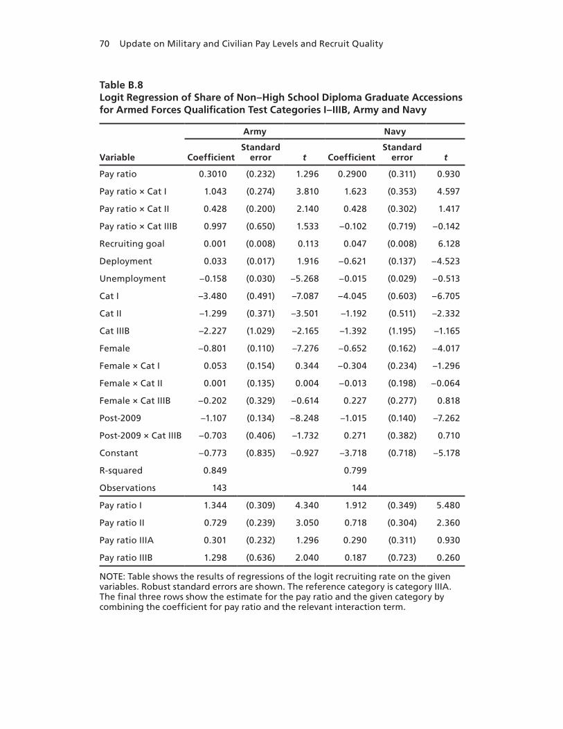
70 Update on Military and Civilian Pay Levels and Recruit Quality
Table B.8Logit Regression of Share of Non–High School Diploma Graduate Accessions for Armed Forces Qualification Test Categories I–IIIB, Army and Navy
Variable
Army Navy
CoefficientStandard
error t CoefficientStandard
error t
Pay ratio 0.3010 (0.232) 1.296 0.2900 (0.311) 0.930
Pay ratio × Cat I 1.043 (0.274) 3.810 1.623 (0.353) 4.597
Pay ratio × Cat II 0.428 (0.200) 2.140 0.428 (0.302) 1.417
Pay ratio × Cat IIIB 0.997 (0.650) 1.533 –0.102 (0.719) –0.142
Recruiting goal 0.001 (0.008) 0.113 0.047 (0.008) 6.128
Deployment 0.033 (0.017) 1.916 –0.621 (0.137) –4.523
Unemployment –0.158 (0.030) –5.268 –0.015 (0.029) –0.513
Cat I –3.480 (0.491) –7.087 –4.045 (0.603) –6.705
Cat II –1.299 (0.371) –3.501 –1.192 (0.511) –2.332
Cat IIIB –2.227 (1.029) –2.165 –1.392 (1.195) –1.165
Female –0.801 (0.110) –7.276 –0.652 (0.162) –4.017
Female × Cat I 0.053 (0.154) 0.344 –0.304 (0.234) –1.296
Female × Cat II 0.001 (0.135) 0.004 –0.013 (0.198) –0.064
Female × Cat IIIB –0.202 (0.329) –0.614 0.227 (0.277) 0.818
Post-2009 –1.107 (0.134) –8.248 –1.015 (0.140) –7.262
Post-2009 × Cat IIIB –0.703 (0.406) –1.732 0.271 (0.382) 0.710
Constant –0.773 (0.835) –0.927 –3.718 (0.718) –5.178
R-squared 0.849 0.799
Observations 143 144
Pay ratio I 1.344 (0.309) 4.340 1.912 (0.349) 5.480
Pay ratio II 0.729 (0.239) 3.050 0.718 (0.304) 2.360
Pay ratio IIIA 0.301 (0.232) 1.296 0.290 (0.311) 0.930
Pay ratio IIIB 1.298 (0.636) 2.040 0.187 (0.723) 0.260
NOTE: Table shows the results of regressions of the logit recruiting rate on the given variables. Robust standard errors are shown. The reference category is category IIIA. The final three rows show the estimate for the pay ratio and the given category by combining the coefficient for pay ratio and the relevant interaction term.

Appendix B 71
Table B.9Logit Regression of Share of Non–High School Diploma Graduate Accessions for Armed Forces Qualification Test Categories I–IIIB, Marine Corps and Air Force
Variable
Marine Corps Air Force
CoefficientStandard
error t CoefficientStandard
error t
Pay ratio 0.5070 (0.367) 1.383 1.2990 (0.319) 4.076
Pay ratio × Cat I 1.823 (0.362) 5.033 –1.927 (0.399) –4.834
Pay ratio × Cat II 0.282 (0.310) 0.908 –1.410 (0.345) –4.083
Pay ratio × Cat IIIB 0.535 (0.470) 1.138 –0.062 (0.474) –0.130
Recruiting goal 0.049 (0.014) 3.492 –0.014 (0.009) –1.577
Deployment –0.059 (0.015) –3.931 –0.619 (0.111) –5.586
Unemployment –0.088 (0.025) –3.439 0.274 (0.040) 6.895
Cat I –3.787 (0.652) –5.812 3.616 (0.737) 4.905
Cat II –0.761 (0.549) –1.385 2.948 (0.645) 4.570
Cat IIIB –1.148 (0.776) –1.480 0.066 (0.773) 0.085
Female –0.685 (0.132) –5.178 –0.534 (0.169) –3.168
Female × Cat I –0.197 (0.223) –0.884 0.672 (0.210) 3.196
Female × Cat II 0.083 (0.165) 0.505 0.435 (0.191) 2.282
Female × Cat IIIB –0.186 (0.213) –0.871 –0.027 (0.270) –0.099
Post-2009 –0.776 (0.176) –4.410 0.244 (0.131) 1.859
Post-2009 × Cat IIIB –0.535 (0.235) –2.277 –0.001 (0.261) –0.004
Constant –4.388 (0.662) –6.625 –7.244 (0.640) –11.312
R-squared 0.708 0.721
Observations 142 144
Pay ratio I 2.330 (0.331) 7.040 –0.628 (0.371) –1.690
Pay ratio II 0.789 (0.279) 2.830 –0.111 (0.317) –0.350
Pay ratio IIIA 0.507 (0.367) 1.383 1.299 (0.319) 4.076
Pay ratio IIIB 1.042 (0.344) 3.030 1.237 (0.365) 3.390
NOTE: Table shows the results of regressions of the logit recruiting rate on the given variables. Robust standard are errors shown. The reference category is category IIIA. The final three rows show the estimate for the pay ratio and the given category by combining the coefficient for pay ratio and the relevant interaction term.


73
APPENDIX C
Additional Graphs Comparing Regular Military Compensation Percentiles in Least and Most Urban States
In Figures C.1 through C.4 we repeat versions of Figures 2.1b and 2.2, which show RMC by year of service compared with civilian wages. We use data from the Greenbooks and weight the CPS data based on the military gender mix. Figures C.1 and C.2 examine how enlisted RMC compares with civilian wages using high school graduates as the refer-ence group for the first nine years of a career, those with some college as the reference group for those with 10–19 years of service, and those with an associate’s degree for those enlisted with 20–30 years of service. Figure C.1 shows RMC compared with civilian wages for civilians who live in the least urban states. Figure C.2 shows RMC compared with civilian wages for civilians who live in the most urban states. RMC is a higher percentile of civilian wages compared with civilians who live in the most urban versus the least urban states for years one through nine.1 This pattern flips as we compare RMC with civilians with more years of formal education as years of service increase. However, differ-ences between the percentiles in the least and most urban states are relatively small for less-educated workers.
In Figures C.3 and C.4 we compare RMC for officers from the Greenbooks with civilians with bachelor’s degrees (1–9 years of service) and master’s degrees or more (10–30 years of service). While exhibiting a similar overall pattern to that found in Figure 2.2, officer RMC is at
1 This may be due to more competition for low-skilled jobs in these areas, which leads to lower civilian wages; a full analysis is beyond the scope of this report.
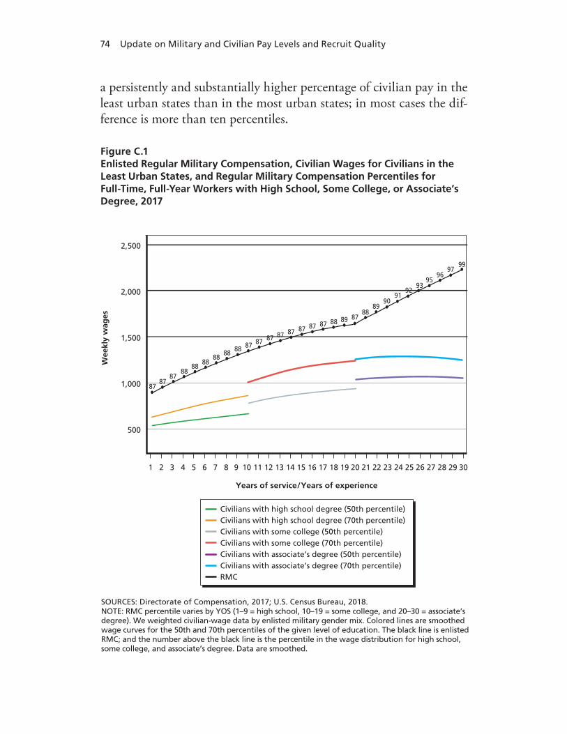
74 Update on Military and Civilian Pay Levels and Recruit Quality
a persistently and substantially higher percentage of civilian pay in the least urban states than in the most urban states; in most cases the dif-ference is more than ten percentiles.
SOURCES: Directorate of Compensation, 2017; U.S. Census Bureau, 2018. NOTE: RMC percentile varies by YOS (1–9 = high school, 10–19 = some college, and 20–30 = associate’s degree). We weighted civilian-wage data by enlisted military gender mix. Colored lines are smoothed wage curves for the 50th and 70th percentiles of the given level of education. The black line is enlisted RMC; and the number above the black line is the percentile in the wage distribution for high school, some college, and associate’s degree. Data are smoothed.
Wee
kly
wag
es
2,500
2,000
1,500
1,000
500
1 2 3 4 6 8
Years of service/Years of experience
5 7 109 11 12 13 14 16 1815 17 2019 21 22 23 24 26 2825 27 3029
9395
9796
99
9091
92
89
8988
87888787878787878787
8787
87
8888
8888
88 88
Civilians with high school degree (50th percentile)Civilians with high school degree (70th percentile)Civilians with some college (50th percentile)Civilians with some college (70th percentile)Civilians with associate’s degree (50th percentile)Civilians with associate’s degree (70th percentile)RMC
Figure C.1Enlisted Regular Military Compensation, Civilian Wages for Civilians in the Least Urban States, and Regular Military Compensation Percentiles for Full-Time, Full-Year Workers with High School, Some College, or Associate’s Degree, 2017

Appendix C 75
SOURCES: Directorate of Compensation, 2017; U.S. Census Bureau, 2018. NOTE: RMC percentile varies by YOS (1–9 = high school, 10–19 = some college, and 20–30 = associate’s degree). We weighted civilian-wage data by enlisted military gender mix. Colored lines are smoothed wage curves for the 50th and 70th percentiles of the given level of education. The black line is enlisted RMC; and the number above the black line is the percentile in the wage distribution for high school, some college, and associate’s degree. Data are smoothed.
Wee
kly
wag
es
2,500
2,000
1,500
1,000
500
1 2 3 4 6 8
Years of service/Years of experience
5 7 109 11 12 13 14 16 1815 17 2019 21 22 23 24 26 2825 27 3029
8687
9189
93
8283
84
82
8180
7982828282828282838393
949494
9596
9697
97
Civilians with high school degree (50th percentile)Civilians with high school degree (70th percentile)Civilians with some college (50th percentile)Civilians with some college (70th percentile)Civilians with associate’s degree (50th percentile)Civilians with associate’s degree (70th percentile)RMC
Figure C.2Enlisted Regular Military Compensation, Civilian Wages for Civilians in the Most Urban States, and Regular Military Compensation Percentiles for Full-Time, Full-Year Workers with High School, Some College, or Associate’s Degree, 2017
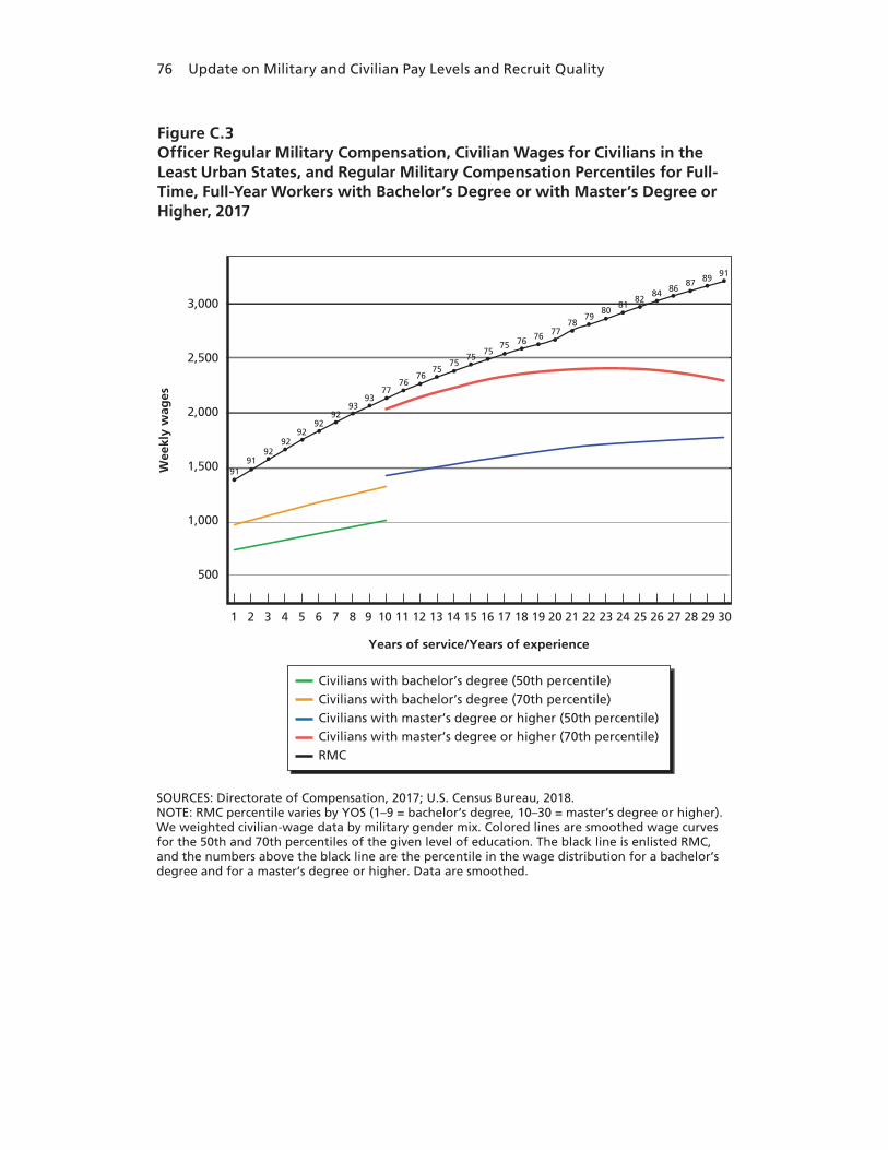
76 Update on Military and Civilian Pay Levels and Recruit Quality
SOURCES: Directorate of Compensation, 2017; U.S. Census Bureau, 2018. NOTE: RMC percentile varies by YOS (1–9 = bachelor’s degree, 10–30 = master’s degree or higher). We weighted civilian-wage data by military gender mix. Colored lines are smoothed wage curves for the 50th and 70th percentiles of the given level of education. The black line is enlisted RMC, and the numbers above the black line are the percentile in the wage distribution for a bachelor’s degree and for a master’s degree or higher. Data are smoothed.
Wee
kly
wag
es
3,000
2,500
2,000
1,500
1,000
500
1 2 3 4 6 8
Years of service/Years of experience
5 7 109 11 12 13 14 16 1815 17 2019 21 22 23 24 26 2825 27 3029
9292
91
Civilians with bachelor’s degree (50th percentile)Civilians with bachelor’s degree (70th percentile)Civilians with master’s degree or higher (50th percentile)Civilians with master’s degree or higher (70th percentile)RMC
9292
91
92
91
9393
7776
7675
7575
7575 76 76 77
7879
8081
8284 86
87 89
Figure C.3Officer Regular Military Compensation, Civilian Wages for Civilians in the Least Urban States, and Regular Military Compensation Percentiles for Full-Time, Full-Year Workers with Bachelor’s Degree or with Master’s Degree or Higher, 2017
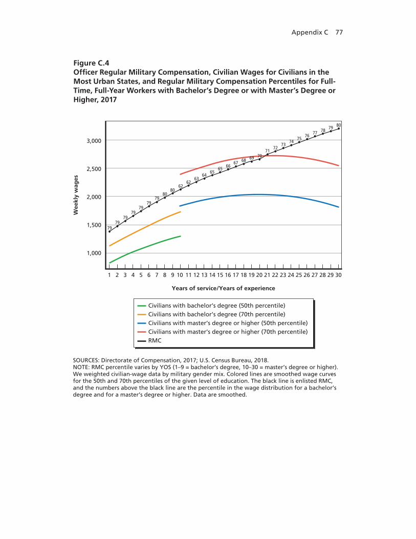
Appendix C 77
SOURCES: Directorate of Compensation, 2017; U.S. Census Bureau, 2018. NOTE: RMC percentile varies by YOS (1–9 = bachelor’s degree, 10–30 = master’s degree or higher). We weighted civilian-wage data by military gender mix. Colored lines are smoothed wage curves for the 50th and 70th percentiles of the given level of education. The black line is enlisted RMC, and the numbers above the black line are the percentile in the wage distribution for a bachelor’s degree and for a master’s degree or higher. Data are smoothed.
Wee
kly
wag
es
3,000
2,500
2,000
1,500
1,000
1 2 3 4 6 8
Years of service/Years of experience
5 7 109 11 12 13 14 16 1815 17 2019 21 22 23 24 26 2825 27 3029
Civilians with bachelor’s degree (50th percentile)Civilians with bachelor’s degree (70th percentile)Civilians with master’s degree or higher (50th percentile)Civilians with master’s degree or higher (70th percentile)RMC
8080
7979
7979
79
7979
62
6362
6564
6566
686769 70
7271
7374
7675
77 78 79 80
Figure C.4Officer Regular Military Compensation, Civilian Wages for Civilians in the Most Urban States, and Regular Military Compensation Percentiles for Full-Time, Full-Year Workers with Bachelor’s Degree or with Master’s Degree or Higher, 2017


79
Bibliography
“2001 US Military Basic Pay Charts,” Navy CyberSpace, undated. As of July 8, 2019: https://www.navycs.com/charts/2001-military-pay-chart.html
“2016: Another Lukewarm Year for Military Compensation,” Military Times, January 18, 2016. As of July 31, 2018: https://www.militarytimes.com/pay-benefits/military-pay-center/2016/01/18/ 2016-another-lukewarm-year-for-military-compensation/
Accession Policy Directorate, Office of the Under Secretary of Defense for Personnel and Readiness, “Accession Goals, Achievement and Quality,” 2017, not available to the general public.
Acemoglu, Daron, and David Autor, “Skills, Tasks and Technologies: Implications for Employment and Earnings,” in Orley Ashenfelter and David Card, eds., Handbook of Labor Economics, Vol. 4B, Amsterdam: North Holland/Elsevier, 2011, pp. 1043–1171.
Acemoglu, Daron, and Pascual Restrepo, “Robots and Jobs: Evidence from US Labor Markets,” Cambridge, Mass.: National Bureau of Economic Research (NBER), Working Paper No. 23285, 2017.
———, “The Race between Man and Machine: Implications of Technology for Growth, Factor Shares, and Employment.” American Economic Review, Vol. 108, No. 6, 2018, pp. 1488–1542.
Air Force Institute of Technology, “About the Graduate School,” July 27, 2018. As of July 31, 2018: https://www.afit.edu/EN/page.cfm?page=134
Alabdulkareem, Ahmad, Morgan R. Frank, Lijun Sun, Bedoor AlShebli, César Hidalgo, and Iyad Rahwan, “Unpacking the Polarization of Workplace Skills,” Science Advances, Vol. 4, No. 7, 2018, eaao6030.
Asch, Beth J., Paul Heaton, James Hosek, Paco Martorell, Curtis Simon, and John T. Warner, Cash Incentives and Military Enlistment, Attrition, and Reenlistment, Santa Monica, Calif.: RAND Corporation, MG-950-OSD, 2010. As of May 19, 2017: https://www.rand.org/pubs/monographs/MG950.html

80 Update on Military and Civilian Pay Levels and Recruit Quality
Asch, Beth J., James Hosek, and John T. Warner, An Analysis of Pay for Enlisted Personnel, Santa Monica, Calif.: RAND Corporation, DB-344-OSD, 2001. As of March 6, 2018: https://www.rand.org/pubs/documented_briefings/DB344.html
———, “New Economics of Manpower in the Post–Cold War Era,” in Todd Sandler and Keith Hartley, eds., Handbook of Defense Economics, Vol. 2, New York: Elsevier, 2007, pp. 1075–1138.
Asch, Beth J., John A. Romley, and Mark E. Totten, The Quality of Personnel in the Enlisted Ranks, Santa Monica, Calif.: RAND Corporation, MG-324-OSD, 2005. As of November 23, 2017: https://www.rand.org/pubs/monographs/MG324.html
Austin, Benjamin A., Edward L. Glaeser, and Lawrence H. Summers, “Jobs for the Heartland: Place-Based Policies in 21st Century America,” Cambridge, Mass.: NBER Working Paper No. 24548, April 2018.
Autor, David, “Why Are There Still So Many Jobs? The History and Future of Workplace Automation,” Journal of Economic Perspectives, Vol. 29, No. 3, 2015, pp. 3–30.
———, “Work of the Past, Work of the Future,” Richard T. Ely Lecture, American Economic Association: Papers and Proceedings, Vol. 109, No. 5, May 2019, pp. 1–32. As of September 30, 2019: https://economics.mit.edu/files/16724
Autor, David H., and David Dorn, “The Growth of Low-Skill Service Jobs and the Polarization of the US Labor Market,” American Economic Review, Vol. 103, No. 5, 2013, pp. 1553–1597.
Autor, David H., Lawrence F. Katz, and Melissa S. Kearney, “The Polarization of the U.S. Labor Market,” American Economic Review, Vol. 96, No. 2, 2006, pp. 189–194.
Autor, David H., Frank Levy, and Richard J. Murnane, “The Skill Content of Recent Technological Change: An Empirical Exploration,” Quarterly Journal of Economics, Vol. 118, No. 4, 2003, pp. 1279–1333.
Bedno, Sheryl A., Christine E. Lang, William E. Daniell, Andrew R. Wiesen, Bennett Datu, and David W. Niebuhr, “Association of Weight at Enlistment with Enrollment in the Army Weight Control Program and Subsequent Attrition in the Assessment of Recruit Motivation and Strength Study,” Military Medicine, Vol. 175, No. 3, March 2010, pp. 188–193. As of August 28, 2018: http://www.amsara.amedd.army.mil/Documents/ARMS_Publication/ 2.%20Bedno-Mar-2010.pdf
Buddin, Richard, Analysis of Early Military Attrition Behavior, Santa Monica, Calif.: RAND Corporation, R-3069-MIL, 1984. As of November 10, 2017: https://www.rand.org/pubs/reports/R3069.html
Bibliography 81
———, Success of First-Term Soldiers: The Effects of Recruiting Practices and Recruit Characteristics, Santa Monica, Calif.: RAND Corporation, MG-262-A, 2005. As of December 21, 2017: https://www.rand.org/pubs/monographs/MG262.html
Bureau of Labor Statistics, U.S. Department of Labor, “Databases, Tables, and Calculators by Subject,” undated. As of August 30, 2018: https://www.bls.gov/data/
Chapman, Chris, Jennifer Laird, Nicole Ifill, and Angelina KewalRamani, Trends in High School Dropout and Completion Rates in the United States: 1972–2009—Compendium Report, Washington, D.C.: U.S. Department of Education, National Center for Education Statistics, Institute of Education Sciences, NCES 2012-006, October 2011. As of January 13, 2018: https://nces.ed.gov/pubs2012/2012006.pdf
Chetty, Raj, and Nathaniel Hendren, “The Effects of Neighborhoods on Intergenerational Mobility I: Childhood Exposure Effects,” Quarterly Journal of Economics, Vol. 133, No. 3, 2018a, pp. 1107–1162.
———, “The Effects of Neighborhoods on Intergenerational Mobility II: County Level Estimates,” Quarterly Journal of Economics, Vol. 133, No. 3, 2018, pp. 1663–1228.
Chetty, Raj, Nathaniel Hendren, and Lawrence Katz, “The Effects of Exposure to Better Neighborhoods on Children: New Evidence from the Moving to Opportunity Experiment,” American Economic Review, Vol. 106, No. 4, 2016, pp. 855–902.
Christensen, Garret, “Occupational Fatalities and the Labor Supply: Evidence from the Wars in Iraq and Afghanistan,” Journal of Economic Behavior and Organization, Vol. 139, July 2017, pp. 182–195.
Clarke, Margaret Z., “Geographic Deregulation of Banking and Economic Growth,” Journal of Money, Credit and Banking, Vol. 36, No. 5, 2004, pp. 929–942.
CNA Analysis and Solutions, “Population Representation in the Military Services,” undated. As of May 19, 2017: https://www.cna.org/research/pop-rep
Currie, Janet, and W. Bentley MacLeod, “First Do No Harm? Tort Reform and Birth Outcomes,” Quarterly Journal of Economics, Vol. 123, No. 2, May 2008, pp. 795–830.
Defense Travel Management Office (DTMO), “Basic Allowance for Housing (BAH) Frequently Asked Questions,” Alexandria, Va.: DTMO, January 27, 2015.
———, A Primer on the Basic Allowance for Housing (BAH) for the Uniformed Services, Alexandria, Va.: DTMO, January 2018.
Dertouzos, James N., Recruiter Incentives and Enlistment Supply, Santa Monica, Calif.: RAND Corporation, R-3065-MIL, 1985. As of May 19, 2017: http://www.rand.org/pubs/reports/R3065.html

82 Update on Military and Civilian Pay Levels and Recruit Quality
Directorate of Compensation, Office of the Under Secretary of Defense for Personnel and Readiness, Selected Military Compensation Tables, Washington, D.C.: U.S. Department of Defense, 1999.
———, Selected Military Compensation Tables, Washington, D.C.: U.S. Department of Defense, 2000.
———, Selected Military Compensation Tables, Washington, D.C.: U.S. Department of Defense, 2001.
———, Selected Military Compensation Tables, Washington, D.C.: U.S. Department of Defense, 2002.
———, Selected Military Compensation Tables, Washington, D.C.: U.S. Department of Defense, 2003. As of August 5, 2018: https://militarypay.defense.gov/Portals/3/Documents/Reports/greenbook_fy2003.pdf
———, Selected Military Compensation Tables, Washington, D.C.: U.S. Department of Defense, January 1, 2004. As of August 5, 2018: https://militarypay.defense.gov/Portals/3/Documents/Reports/greenbook_fy04.pdf
———, Selected Military Compensation Tables, Washington, D.C.: U.S. Department of Defense, January 1, 2005. As of August 5, 2018: https://militarypay.defense.gov/Portals/3/Documents/Reports/greenbook_fy05.pdf
———, Selected Military Compensation Tables, Washington, D.C.: U.S. Department of Defense, January 1, 2006. As of August 5, 2018: https://militarypay.defense.gov/Portals/3/Documents/Reports/greenbook2_fy06.pdf
———, Selected Military Compensation Tables, Washington, D.C.: U.S. Department of Defense, April 1, 2007. As of August 5, 2018: https://militarypay.defense.gov/Portals/3/Documents/Reports/GreenBook_APRIL_40YOS_2007_Dist.pdf
———, Selected Military Compensation Tables, Washington, D.C.: U.S. Department of Defense, January 1, 2008. As of August 5, 2018: https://militarypay.defense.gov/Portals/3/Documents/Reports/GreenBook_2008.pdf
———, Selected Military Compensation Tables, Washington, D.C.: U.S. Department of Defense, January 1, 2009. As of August 5, 2018: https://militarypay.defense.gov/Portals/3/Documents/Reports/GreenBook_2009.pdf
———, Selected Military Compensation Tables, Washington, D.C.: U.S. Department of Defense, January 1, 2010. As of August 5, 2018: https://militarypay.defense.gov/Portals/3/Documents/Reports/GreenBook_2010.pdf
———, Selected Military Compensation Tables, Washington, D.C.: U.S. Department of Defense, January 1, 2011. As of August 5, 2018: https://militarypay.defense.gov/Portals/3/Documents/Reports/GreenBook_2011.pdf
———, Selected Military Compensation Tables, Washington, D.C.: U.S. Department of Defense, January 1, 2012. As of August 5, 2018: https://militarypay.defense.gov/Portals/3/Documents/Reports/GreenBook_2012.pdf

Bibliography 83
———, Selected Military Compensation Tables, Washington, D.C.: U.S. Department of Defense, January 1, 2013. As of August 5, 2018: https://militarypay.defense.gov/Portals/3/Documents/Reports/GreenBook_2013.pdf
———, Selected Military Compensation Tables, Washington, D.C.: U.S. Department of Defense, January 1, 2014. As of August 5, 2018: https://militarypay.defense.gov/Portals/3/Documents/Reports/GreenBook_2014.pdf
———, Selected Military Compensation Tables, Washington, D.C.: U.S. Department of Defense, January 1, 2015. As of August 5, 2018: https://militarypay.defense.gov/Portals/3/Documents/Reports/GreenBook_2015.pdf
———, Selected Military Compensation Tables, Washington, D.C.: U.S. Department of Defense, January 1, 2016. As of August 4, 2018: https://militarypay.defense.gov/Portals/3/Documents/Reports/GreenBook_2016.pdf
———, Selected Military Compensation Tables, Washington, D.C.: U.S. Department of Defense, January 1, 2017. As of December 30, 2017: http://militarypay.defense.gov/Portals/3/Documents/Reports/GreenBook_2017 .pdf?ver=2017-04-24-232444-753
DoD—See U.S. Department of Defense
Drasgow, Fritz, Tailored Adaptive Personality Assessment System (TAPAS), briefing presented to the International Personnel Assessment Council, July 22, 2013. As of August 28, 2018: http://www.ipacweb.org/Resources/Documents/conf13/drasgow.pdf
Eighmey, John, “Why Do Youth Enlist? Identification of Underlying Themes,” Armed Forces and Society, Vol. 32, No. 2, 2006, pp. 307–328.
Federal Reserve Bank of St. Louis, “Employment Cost Index: Wages and Salaries— Private Industry Workers,” undated a. As of July 31, 2018: https://fred.stlouisfed.org/series/ECIWAG
———, “Real Median Household Income in the United States,” undated b. As of July 31, 2018: https://fred.stlouisfed.org/series/MEHOINUSA672N
Ganong, Peter, and Daniel Shoag, “Why Has Regional Income Convergence in the U.S. Declined?” Journal of Urban Economics, Vol. 102, November 2017, pp. 76–90.
Glaeser, Edward L., Triumph of the City, New York: Penguin Press, 2011.
———, ed., Agglomeration Economics, Chicago: University of Chicago Press, 2010.
Granger, C. W. J., and P. Newbold, “Spurious Regressions in Economics,” Journal of Econometrics, Vol. 2, No. 2, July 1974, pp. 111–120.
Heffner, Tonia S., Roy C. Campbell, and Fritz Drasgow, Select for Success: A Toolset for Enhancing Soldier Accessioning, U.S. Army Research Institute for the Behavioral and Social Sciences, Special Report 70, March 2011. As of August 28, 2018: http://www.dtic.mil/dtic/tr/fulltext/u2/a554057.pdf
84 Update on Military and Civilian Pay Levels and Recruit Quality
Holmes, Thomas J., “The Effect of State Policies on the Location of Manufacturing: Evidence from State Borders,” Journal of Political Economy, Vol. 106, No. 4, August 1998, pp. 667–705.
Hosek, James, Beth J. Asch, Michael G. Mattock, and Troy D. Smith, Military and Civilian Pay Levels, Trends, and Recruit Quality, Santa Monica, Calif.: RAND Corporation, RR-2396-OSD, 2018. As of September 30, 2019: https://www.rand.org/pubs/research_reports/RR2396.html
Hosek, James, and Paco Martorell, How Have Deployments During the War on Terrorism Affected Reenlistment? Santa Monica, Calif.: RAND Corporation, MG-873-OSD, 2009. As of November 23, 2017: https://www.rand.org/pubs/monographs/MG873.html
Hosek, James, Christine E. Peterson, Jeannette Van Winkle, and Hui Wang, A Civilian Wage Index for Defense Manpower, Santa Monica, Calif.: RAND Corporation, R-4190-FMP, 1992. As of March 6, 2018: https://www.rand.org/pubs/reports/R4190.html
Kapp, Lawrence, Recruiting and Retention: An Overview of FY 2011 and FY 2012 Results for Active and Reserve Component Enlisted Personnel, Congressional Research Service, RL32965, May 10, 2013. As of March 11, 2018: https://fas.org/sgp/crs/natsec/RL32965.pdf
Kilburn, M. Rebecca, and Jacob Alex Klerman, Enlistment Decisions in the 1990s: Evidence from Individual-Level Data, Santa Monica, Calif.: RAND Corporation, MR-944-OSD/A, 1999. As of July 27, 2018: https://www.rand.org/pubs/monograph_reports/MR944.html
Kleiner, Morris M., “Battling over Jobs: Occupational Licensing in Health Care,” American Economic Review Papers and Proceedings, Vol. 106, No. 5, 2016, pp. 165–170.
Knapp, David, Beth J. Asch, Michael G. Mattock, and James Hosek, An Enhanced Capability to Model How Compensation Policy Affects U.S. Department of Defense Civil Service Retention and Cost, Santa Monica, Calif.: RAND Corporation, RR-1503-OSD, 2016. As of July 27, 2018: https://www.rand.org/pubs/research_reports/RR1503.html
Knapp, David, Bruce R. Orvis, Christopher E. Maerzluft, and Tiffany Tsai, Resources Required to Meet the U.S. Army’s Enlisted Recruiting Requirements Under Alternative Recruiting Goals, Conditions, and Eligibility Policies, Santa Monica, Calif.: RAND Corporation, RR-2364-A, 2018. As of July 27, 2018: https://www.rand.org/pubs/research_reports/RR2364.html
Laurence, Janice H., Education Standards for Military Enlistment and the Search for Successful Recruits, Alexandria, Va.: Human Resources Research Organization, FR-PRD-84-4, February 1984. As of November 10, 2017: http://www.dtic.mil/dtic/tr/fulltext/u2/a139718.pdf

Bibliography 85
Loughran, David S., and Bruce R. Orvis, The Effect of the Assessment of Recruit Motivation and Strength (ARMS) Program on Army Accessions and Attrition, Santa Monica, Calif.: RAND Corporation, TR-975-A, 2011. As of July 27, 2018: https://www.rand.org/pubs/technical_reports/TR975.html
“Marine Corps University,” Wikipedia, July 1, 2018. As of July 31, 2018: https://en.wikipedia.org/wiki/Marine_Corps_University
McFadden, Daniel L., “Econometric Analysis of Qualitative Response Models,” in Zvi Griliches and Michael D. Intriligator, eds., Handbook of Econometrics, Vol. 2, Amsterdam: Elsevier, 1983, pp. 1395–1457.
Murray, Carla Tighe, senior analyst for military compensation and health care, Congressional Budget Office, Evaluating Military Compensation, Statement of Carla Tighe Murray Before the Subcommittee on Personnel, Committee on Armed Services, United States Senate, Washington, D.C.: Congressional Budget Office, April 28, 2010. As of February 10, 2018: https://www.cbo.gov/sites/default/files/111th-congress-2009-2010/reports/ 04-28-militarypay.pdf
Nataraj, Shanthi, M. Wade Markel, Jaime L. Hastings, Eric V. Larson, Jill Luoto, Christopher E. Maerzluft, Craig A. Myatt, Bruce R. Orvis, Christina Panis, Michael Powell, Jose Rodriguez, and Tiffany Tsai, Evaluating the Army’s Ability to Regenerate: History and Future Options, Santa Monica, Calif.: RAND Corporation, RR-1637-A, 2017. As of May 19, 2017: https://www.rand.org/pubs/research_reports/RR1637.html
National Center for Education Statistics, Institute of Education Sciences, “Number and Percentage Distribution of First-Time Postsecondary Students Starting at 2- and 4-Year Institutions During the 2011–12 Academic Year, by Attainment and Enrollment Status and Selected Characteristics: Spring 2014,” Digest of Education Statistics, Table 326.50, February 2017. As of July 16, 2019: https://nces.ed.gov/programs/digest/d17/tables/dt17_326.50.asp
———, “Recent High School Completers and Their Enrollment in College, by Sex and Level of Institution: 1960 through 2017,” Digest of Education Statistics, Table 302.10, July 2018a. As of July 16, 2019: https://nces.ed.gov/programs/digest/d18/tables/dt18_302.10.asp
———, “Percentage of Persons 25 to 29 Years Old with Selected Levels of Educational Attainment, by Race/Ethnicity and Sex: Selected Years, 1920 Through 2018,” Digest of Education Statistics, Table 104.20, October 2018b. As of July 16, 2019: https://nces.ed.gov/programs/digest/d18/tables/dt18_104.20.asp
Naval Postgraduate School, “Programs and Degrees,” undated. As of July 31, 2018: https://my.nps.edu/degree-programs
NCES—See National Center for Education Statistics

86 Update on Military and Civilian Pay Levels and Recruit Quality
Nye, Christopher D., Fritz Dragow, Oleksandr S. Chernyshenko, Stephen Stark, U. Christean Kubisiak, Leonard A. White, and Irwin Jose, Assessing the Tailored Adaptive Personality Assessment System (TAPAS) as an MOS Qualification Instrument, Fort Belvoir, Va.: U.S. Army Research Institute for the Behavioral and Social Sciences, Technical Report 1312, August 2012. As of May 25, 2017: http://www.dtic.mil/dtic/tr/fulltext/u2/a566090.pdf
Office of the Deputy Assistant Secretary of Defense for Military Community and Family Policy, 2015 Demographics: Profile of the Military Community, c. 2016. As of August 2, 2018: http://download.militaryonesource.mil/12038/MOS/Reports/2015-Demographics -Report.pdf
Office of People Analytics, U.S. Department of Defense, military enlistment processing station files provided to the authors, undated.
———, Status of Forces Surveys of Active Duty Members results provided to the authors, 2017. Data for 2009 and 2016 were provided in December 2017.
———, Status of Forces Surveys of Active Duty Members results provided to the authors, 2018. Data for 2017 were provided in October 2018.
———, “Summer 2017 Propensity Update: Youth Poll Study Findings,” unpublished manuscript, February 2018.
Office of the Under Secretary of Defense (Comptroller), Military Personnel Programs (M-1): Department of Defense Budget—March Budget Amendment to the Fiscal Year 2017 President’s Budget Request for BASE + Overseas Contingency Operations (OCO), March 2017. As of July 31, 2018: http://comptroller.defense.gov/Portals/45/Documents/defbudget/fy2017/marchAmendment/fy2017_m1a.pdf
Office of the Under Secretary of Defense for Personnel and Readiness,“Annual Pay Adjustment,” Military Compensation, undated. As of July 31, 2018: http://militarypay.defense.gov/Pay/Basic-Pay/AnnualPayRaise/
———, Report of the Seventh Quadrennial Review of Military Compensation, Washington, D.C.: U.S. Department of Defense, 1992.
———, Report of the Ninth Quadrennial Review of Military Compensation, Vols. I–V, Washington, D.C.: U.S. Department of Defense, March 2002. As of July 31, 2018: http://militarypay.defense.gov/Portals/3/Documents/Reports/9th_QRMC_Report _Volumes_I_-_V.pdf
———, Report of the Tenth Quadrennial Review of Military Compensation, Vol. I: Cash Compensation, Washington, D.C.: U.S. Department of Defense, February 2008. As of August 28, 2018: https://militarypay.defense.gov/Portals/3/Documents/Reports/10th_QRMC_2008 _Vol_I_Cash_Compensation.pdf

Bibliography 87
———, Population Representation in the Military Services: Fiscal Year 2010, Washington, D.C.: U.S. Department of Defense, 2011. As of August 2, 2018: https://prhome.defense.gov/M-RA/Inside-M-RA/MPP/Accession-Policy/ Pop-Rep/2010/
———, Report of the Eleventh Quadrennial Review of Military Compensation: Main Report, Washington, D.C.: U.S. Department of Defense, June 2012a. As of July 31, 2018: http://militarypay.defense.gov/Portals/3/Documents/Reports/11th_QRMC_Main_Report_FINAL.pdf?ver=2016-11-06-160559-590
———, Report of the Eleventh Quadrennial Review of Military Compensation: Supporting Research Papers, Washington, D.C.: U.S. Department of Defense, June 2012b. As of July 31, 2018: http://militarypay.defense.gov/Portals/3/Documents/Reports/11th_QRMC_Supporting_Research_Papers_(932pp)_Linked.pdf
———, Population Representation in the Military Services: Fiscal Year 2015, Washington, D.C.: U.S. Department of Defense, c. 2016. As of August 2, 2018: https://prhome.defense.gov/M-RA/Inside-M-RA/MPP/Accession-Policy/Pop-Rep/ 2015/
———, Military Compensation Background Papers: Compensation Elements and Related Manpower Cost Items, Their Purposes and Legislative Backgrounds, 8th Edition, Washington, D.C.: U.S. Department of Defense, 2018. As of January 31, 2019: https://militarypay.defense.gov/Portals/3/Documents/Reports/Mil-Comp_8thEdition .pdf?ver=2018-09-01-181142-307
Orvis, Bruce R., Michael Childress, and J. Michael Polich, Effect of Personnel Quality on the Performance of Patriot Air Defense System Operators, Santa Monica, Calif.: RAND Corporation, R-3901-A, 1992. As of November 23, 2017: https://www.rand.org/pubs/reports/R3901.html
Orvis, Bruce R., Steven Garber, Philip Hall-Partyka, Christopher E. Maerzluft, and Tiffany Tsai, Recruiting Strategies to Support the Army’s All-Volunteer Force, Santa Monica, Calif.: RAND Corporation, RR-1211-A, 2016. As of November 23, 2017: https://www.rand.org/pubs/research_reports/RR1211.html
Orvis, Bruce R., Christopher E. Maerzluft, Sung-Bou Kim, Michael G. Shanley, and Heather Krull, Prospective Outcome Assessment for Alternative Recruit Selection Policies, Santa Monica, Calif.: RAND Corporation, RR-2267-A, 2018. As of August 28, 2018: https://www.rand.org/pubs/research_reports/RR2267.html
“Project A: The U.S. Army Selection and Classification Project,” special issue, Personnel Psychology, Vol. 43, No. 2, 1990, pp. 231–379. As of September 29, 2019: https://onlinelibrary.wiley.com/toc/17446570/1990/43/2

88 Update on Military and Civilian Pay Levels and Recruit Quality
Public Law 110-252, Supplemental Appropriations Act, 2008, June 30, 2008. As of August 5, 2018: https://www.gpo.gov/fdsys/pkg/PLAW-110publ252/content-detail.html
Rubenstein, Yona, and Yoram Weiss, “Post Schooling Wage Growth: Investment, Search and Learning,” in Erik Hanushek and Finis Welch, eds., Handbook of the Economics of Education, Vol. 1, Amsterdam: Elsevier North Holland, 2007, pp. 1–68.
Schmitz, Edward J., and Michael J. Moskowitz, with David Gregory and David L. Reese, Recruiting Budgets, Recruit Quality, and Enlisted Performance, Alexandria, Va.: Center for Naval Analyses, CRM D0017035.A2/Final, February 2008. As of July 31, 2018: https://www.cna.org/CNA_files/PDF/d0017035.a2.pdf
Scribner, Barry L., D. Alton Smith, Robert H. Baldwin, and Robert L. Phillips, “Are Smart Tankers Better? AFQT and Military A Productivity,” Armed Forces and Society, Vol. 12, No. 2, 1986, pp. 193–206.
Segall, Daniel O., Development and Evaluation of the 1997 ASVAB Score Scale, Alexandria, Va.: Defense Manpower Data Center, July 2004. As of July 27, 2018: http://official-asvab.com/docs/1997score_scale.pdf
Sellman, W. Steven, “Predicting Readiness for Military Service: How Enlistment Standards Are Established,” draft prepared for the National Assessment Governing Board, September 30, 2004. As of August 1, 2018: https://www.nagb.gov/content/nagb/assets/documents/what-we-do/sellman.doc
Simon, Curtis J., and John T. Warner, “Managing the All-Volunteer Force in Time of War,” Economics of Peace and Security Journal, Vol. 2, No. 1, January 2007, pp. 20–29.
Stark, Stephen, Oleksandr S. Chernyshenko, Fritz Drasgow, Christopher D. Nye, Leonard A. White, Tonia Heffner, and William L. Farmer, “From ABLE to TAPAS: A New Generation of Personality Tests to Support Military Selection and Classification Decisions,” Military Psychology, Vol. 26, No. 3, 2014, pp. 153–164.
U.S. Army War College, “Military Education Level 1 Programs,” undated. As of July 31, 2018: https://www.armywarcollege.edu/programs/mel_1.cfm
U.S. Census Bureau, Decennial Census, 1900–2010, “Percentage of the Total Population in Urban Areas,” Iowa State University, Iowa Community Indicators Program, 2010. As of October 18, 2019: https://www.icip.iastate.edu/tables/population/urban-pct-states
———, “Current Population Survey (CPS): Data,” March 6, 2018. As of August 31, 2018: https://www.census.gov/programs-surveys/cps/data-detail.html

Bibliography 89
U.S. Code, Title 26, Internal Revenue Code, Subtitle C, Employment Taxes, Chapter 21, Federal Insurance Contributions Act, January 3, 2012. As of August 2, 2018: https://www.gpo.gov/fdsys/granule/USCODE-2011-title26/USCODE-2011 -title26-subtitleC-chap21/content-detail.html
U.S. Department of Defense, Career Compensation for the Uniformed Forces: Army, Navy, Air Force, Marine Corps, Coast Guard, Coast and Geodetic Survey, Public Health Service: A Report and Recommendation for the Secretary of Defense by the Advisory Commission on Service Pay, Washington, D.C.: U.S. Department of Defense, 1948.
———, “Fall 2016 Propensity Update, Youth Propensity: Youth Poll Study Findings,” Joint Advertising and Marketing Research and Studies, Office of People Analytics, 2017, unpublished.
U.S. Government Accountability Office, Military Personnel: Military and Civilian Pay Comparisons Present Challenges and Are One of Many Tools in Assessing Compensation, Washington, D.C., GAO-10-561R, April 1, 2010. As of August 30, 2018: https://www.gao.gov/products/GAO-10-561R
U.S. Naval War College, “Programs Offered,” undated. As of July 31, 2018: https://usnwc.edu/Academics-and-Programs/Programs-Offered
Warner, John, Curtis Simon, and Deborah Payne, “The Military Recruiting Productivity Slowdown: The Roles of Resources, Opportunity Cost and the Tastes of Youth,” Defence and Peace Economics, Vol. 14, No. 5, October 2003, pp. 329–342.
Wenger, Jennie W., Zachary T. Miller, and Seema Sayala, Recruiting in the 21st Century: Technical Aptitude and the Navy’s Requirements, Washington, D.C.: CNA Analysis and Solutions, CRM D0022305.A2/Final, May 2010. As of May 19, 2017: https://www.cna.org/CNA_files/PDF/D0022305.A2.pdf
Winkler, John D., Judith C. Fernandez, and J. Michael Polich, Effect of Aptitude on the Performance of Army Communications Operators, Santa Monica, Calif.: RAND Corporation, R-4143-A, 1992. As of November 23, 2017: https://www.rand.org/pubs/reports/R4143.html
Yule, G. Udny, “Why Do We Sometimes Get Nonsense Correlations Between Time-Series? A Study in Sampling and the Nature of Time-Series,” Journal of the Royal Statistical Society, Vol. 89, No. 1, January 1926, pp. 1–63.

NATIONAL DEFENSE RESEARCH INSTITUTE
Given an all-volunteer force, compensation and benefits are
critical for attracting and retaining the quantity and quality of
military personnel necessary for the United States to achieve
its military goals. The military must set pay high enough
to draw quality recruits away from other jobs that they
could obtain, while also appropriately managing public funds. Analyzing data
from 1999, the Ninth Quadrennial Review of Military Compensation (QRMC)
recommended in 2002 that regular military compensation (RMC)—which is the
sum of basic pay, basic allowance for housing, basic allowance for subsistence,
and the federal tax advantage resulting from allowances not being taxed—be at
around the 70th percentile of comparably-educated civilian wages. The authors’
analysis indicates that RMC has consistently remained above that benchmark
and has thus continued to support readiness. The authors also found that
as the RMC/wage ratio increased over time, recruit quality increased in the
Navy, Marine Corps, and Air Force, but not in the Army. In addition, they saw
large differences in how RMC compares with civilian pay across geographies
for individuals of different education levels: Whereas officers and those with
more education in general are likely to find military pay higher relative to civilian
pay if they live in less urban areas, enlisted military with a high school degree
are likely to find military pay as attractive in urban as in nonurban areas. On
average, RMC in 2017 was at the 85th percentile for active-component enlisted
personnel and at the 77th percentile for active-component officers.
RR-3254-OSD
www.rand.org
$24.00
9 7 8 1 9 7 7 4 0 3 9 3 3
ISBN-13 978-1-9774-0393-3ISBN-10 1-9774-0393-X
52400

DRM-2019-U-021622-Final
September 2019
ThriftSavingsPlanContributionsundertheBlendedRetirementSystem
Dan Leeds, Josh Horvath, and Chris Gonzales

Copyright © 2020 CNA. All rights reserved
Abstract
The Blended Retirement System aims to increase Servicemembers’ retirement savings by matching contributions to Thrift Savings Plans by up to five percent of basic pay. This new system applies to Servicemembers who entered uniformed service on January 1, 2018, or later, or to Servicemembers with early entry dates and fewer than 12 years of service who opted in to the new system during 2018. This report analyzes Thrift Savings Plan contributions by Active component Servicemembers, across Services, eligibility categories, and Servicemember characteristics. We find that age, regular military compensation, paygrade, race, and gender are all correlated to varying degrees with retirement savings rates. In particular, older and higher income Servicemembers save at higher rates. We also find substantial differences across Services in the savings patterns of auto-enrollees, suggesting differences in training or messaging. Furthermore, some Servicemembers may be saving inefficiently by reaching the annual limit on TSP contributions prior to December and thereby forgoing matching funds.
This document contains the best opinion of CNA at the time of issue. It does not necessarily represent the opinion of the sponsor.
Specific Authority. To protect information not specifically included in the above reasons and discussions but which requires protection in accordance with valid documented authority such as Executive Orders, classification guidelines, DoD or DoD-component regulatory documents. 9/6/2019
This work was performed under Federal Government Contract No. N00014-16-D-5003.
Cover image credit: Col Darren Halford, 9th Operations Group commander (left), presents CMSgt James Crites, 9th Operations Group superintendent, his shadow box during Crites’ retirement ceremony at Beale Air Force Base, CA, Jan. 9, 2015. Crites served more than 30 years in the Air Force. (US Air Force photo by Senior Airman Bobby Cummings/Released) Approved by: September 2019
Anita U. Hattiangadi, Program Director Marine Corps and Defense Workforce Program
Resources and Force Readiness Division
Request additional copies of this document through [email protected].

CNA Research Memorandum | i
Executive Summary
The Blended Retirement System (BRS), implemented in 2018, aims to make Servicemembers
more active participants in retirement saving. It does so by lowering the pension payments
automatically available to Servicemembers upon completing 20 years of service (YOS) and
instead automatically contributing an amount equal to one percent of the member’s basic pay
to the member’s retirement savings account and by matching the member’s voluntary
contributions to that retirement savings account. This allows Servicemembers to retain their
retirement savings if they leave before qualifying for a pension, but means that career
Servicemembers who do not proactively save for retirement will be worse off than under the
previous system. This report examines how Servicemembers save for retirement and the
characteristics associated with higher retirement contributions as a first step in determining
whether these contributions are offsetting the reduction in pension payments.
Prior to the BRS, the Department of Defense (DOD) used a cliff-vesting pension program.
Servicemembers became vested in the program (i.e., eligible for pension payments) only after
20 years of service (YOS), and received no pension benefit if they left the military prior to 20
YOS. The BRS instead provides benefits that Servicemembers may access even if they do not
reach 20 YOS, while encouraging them to actively participate in their retirement planning. The
BRS reduces the payment associated with the cliff-vesting program, but it compensates for the
reduction by incentivizing participation in the Thrift Savings Plan (TSP), a retirement savings
plan that vests member and matching contributions immediately and that vests automatic
contributions after two years of service. It does so by matching Servicemembers’ contributions
at a 100 percent rate up to 3 percent of basic pay and at a 50 percent rate between three and
five percent of basic pay. BRS participants also receive an automatic contribution equal to 1
percent of their basic pay regardless of their contribution rate; thus, the government will
contribute between 1 percent (for Servicemembers who make no contribution) and 5 percent
(for Servicemembers who contribute at least 5 percent) of a Servicemember’s basic pay.
Servicemembers who are ineligible for the BRS or who opt to remain in the legacy pension
system still may contribute to the TSP, but they do not receive any matching funds or automatic
contributions.
The BRS was implemented on January 1, 2018; TSP contributions prior to this date did not
receive matching funds, regardless of a Servicemember’s eventual BRS enrollment status.
Servicemembers with Dates of Initial Entry into Military Service (DIEMS dates) or Dates of
Initial Entry into Uniformed Service (DIEUS dates) on or after January 1, 2018 were
automatically enrolled in the BRS, though they will receive matching benefits only after two

CNA Research Memorandum | ii
YOS. Those with DIEMS/DIEUS dates prior to January 1, 2018 could opt in to the BRS at any
point in 2018 if they had fewer than 12 YOS, but they became ineligible upon reaching 12 YOS.
Servicemembers who opted in to the BRS began receiving matching funds immediately,
regardless of their YOS at the time of opt-in. Servicemembers who failed to opt in by the end of
2018 became ineligible for the BRS at the beginning of 2019.
This report examines how TSP contributions vary by Service, eligibility category, and
Servicemember characteristics, using aggregate-level data provided by the Defense Manpower
Data Center (DMDC) (for the Marine Corps) and TSP data (for the Army, Navy, and Air Force).
We used different datasets because only the Marine Corps provided usable TSP data to DMDC
in 2018. Each dataset has strengths and weaknesses—DMDC data let us observe
Servicemembers’ characteristics but did not show whether they had an active TSP account or
had opted in to the BRS (if eligible), whereas TSP provided data on only Servicemembers
enrolled in the BRS. We examined how the Marine Corps’ contribution patterns varied prior to
and during BRS implementation, along with how Marines who were ineligible for the BRS may
have been affected during this process, but we could not determine whether contribution rates
among eligible Marines changed because they planned to opt in to the BRS or because they
were better informed about retirement savings more generally. Conversely, we could clearly
view behavior by Soldiers, Sailors, and Airmen who opted in to the BRS, but we had a far more
limited set of characteristics by which to evaluate them and could not observe how their
behavior changed prior to or immediately upon opting in.
Our principal findings include the following:
Auto-enrolled Servicemembers from all four Services are more likely than those who
opted in to contribute the default rate of 3 percent.
Soldiers and Airmen were much more likely than Sailors or Marines to make the
default TSP contribution of three percent of basic pay, likely reflecting Service-level
differences in BRS implementation.
Both BRS-eligible and BRS-ineligible Marines became much more likely to contribute
to the TSP in the May 2017 pay data, likely reflecting both Corps-wide education on
the BRS and positive spillover effects.
Age, regular military compensation (RMC), and paygrades (both enlisted and officer)
exhibited clear correlations with contribution levels, as predicted by research on
civilian retirement saving.
Some Servicemembers may be contributing to the TSP at too high a rate and forgoing
matching funds by reaching the elective deferral limit prior to December. This issue
can likely be addressed at low cost to the Services.

CNA Research Memorandum | iii
Contents
Introduction .................................................................................................................................................. 1
Background ................................................................................................................................................... 3
BRS eligibility ........................................................................................................................................................ 3 Elements of the BRS ........................................................................................................................................... 4
TSP defined contribution plan ............................................................................................................... 5 Defined contributions ................................................................................................................................ 6 Continuation pay ......................................................................................................................................... 6 Lump-sum retirement option ................................................................................................................. 6
Literature Review ....................................................................................................................................... 7
BRS literature ........................................................................................................................................................ 7 Simulation papers and discussion papers ......................................................................................... 7 BRS analysis studies ................................................................................................................................... 9
Retirement plan literature ............................................................................................................................... 9 Defined benefit and defined contribution plans ............................................................................. 9 Participation and contribution rates ................................................................................................. 10
Implications ........................................................................................................................................................ 11
Overall Differences in TSP Contribution Rates .............................................................................. 12
Data comparability issues ............................................................................................................................. 12 Army, Navy, and Air Force TSP contributions ...................................................................................... 14 Marine Corps TSP Contributions ............................................................................................................... 18 Takeaways ........................................................................................................................................................... 21
Lifecycle Differences in TSP Contribution Rates ........................................................................... 23
TSP contribution rates by age ..................................................................................................................... 23 TSP contribution rates by paygrade and RMC (Marine Corps only) ........................................... 27 Takeaways ........................................................................................................................................................... 31
The Elective Deferral Limit ................................................................................................................... 32
Implications of the Single-Salary System ......................................................................................... 36
Conclusion and Recommendations .................................................................................................... 37
Appendix A: Auto-enrolled Marines Contributing 0 percent to the TSP ............................... 39
Appendix B: Contributions over Time by Servicemember Characteristics ......................... 40
USMC contributions by paygrade .............................................................................................................. 40 Enlisted paygrade ...................................................................................................................................... 40
CNA Research Memorandum | iv
Officer paygrade ......................................................................................................................................... 44 USMC contributions by age and RMC ....................................................................................................... 48 USMC contribution rates by gender, race, and Hispanic ethnicity ............................................... 57
Gender ............................................................................................................................................................ 57 Race and Hispanic ethnicity .................................................................................................................. 59
Army, Navy, and Air Force TSP contributions by age ....................................................................... 66 Auto-enrollees ............................................................................................................................................ 66 Opt-ins ............................................................................................................................................................ 68
Army, Navy, and Air Force TSP contribution rates by basic pay level ....................................... 72 Auto-enrollees ............................................................................................................................................ 72 Opt-ins ............................................................................................................................................................ 74
Figures .......................................................................................................................................................... 78
Abbreviations ............................................................................................................................................. 80
References ................................................................................................................................................... 81
CNA Research Memorandum | 1
Introduction
The Blended Retirement System (BRS), implemented in January 2018, aims to make
Servicemembers more active participants in retirement saving. It does so by lowering the
pension payments automatically available to Servicemembers upon completing 20 years of
service (YOS) and instead automatically contributing an amount equal to one percent of the
member’s basic pay to that member’s Thrift Savings Plan (TSP) account and matching a portion
of voluntary contributions to the TSP. Servicemembers who exit the uniformed services prior
to 20 YOS will retain their TSP contributions, but BRS participants who do not proactively save
for retirement will receive lower pension payments without sufficient TSP savings to offset the
difference.
Servicemembers entering after January 1, 2018, are automatically enrolled in the BRS. Those
who entered before this date could opt in to the BRS at any point in 2018, provided they had
not completed 12 YOS before choosing to opt in. Eligible Servicemembers who did not opt in
to the BRS remained in the legacy system and became BRS-ineligible on January 1, 2019.
Considering that some Servicemembers had a choice to enroll in the BRS and some did not, this
study has three main objectives:
1. Describe the contribution patterns of opt-in BRS participants.
2. Describe the contribution patterns of auto-enrolled BRS participants.
3. Identify differences in contribution rates by Service, paygrade, gender, and other
relevant factors.
We used data from the Defense Manpower Data Center (DMDC) pay records and the TSP Office.
The DMDC data contain information for only the Marine Corps on Servicemember eligibility
for the BRS, those auto-enrolled, and contribution percentages. The data also contain
information on Servicemember paygrade, age, regular military compensation (RMC) level,
gender, race, and Hispanic ethnicity. Using this information, we examined Marine Corps TSP
contribution rates by various demographic and socioeconomic characteristics.
The TSP Office provided data on Soldiers, Sailors, and Airmen; however, these data do not
contain as much demographic information as those from DMDC. Using the TSP Office data, we
examined contribution patterns among auto-enrollees and among Servicemembers who opted
in to the BRS. However, we did not have data on Soldiers, Sailors, or Airmen who remained in
the legacy retirement system or data from prior to any Servicemember’s BRS enrollment.
CNA Research Memorandum | 2
Furthermore, we could examine differences in participation and contribution patterns only by
age and basic pay.
The rest of the paper is organized as follows. We start by providing background information
about the BRS, previous studies on the BRS, and the literature on civilian retirement plans that
are relevant to this study. Then, we show participation and contribution patterns of opt-in and
auto-enrolled participants. As part of this analysis, we emphasize overall Service-level
differences over time; differences between older. Finally, we conclude with a discussion of the
implications of our results and how they relate to the single-salary system.

CNA Research Memorandum | 3
Background
The fiscal year (FY) 2013 National Defense Authorization Act (NDAA) established the Military
Compensation and Retirement Modernization Commission (MCRMC) to review and make
recommendations regarding compensation and retirement reform in the military [2]. The
commission was established in response to concerns over the legacy retirement system, which
provides a defined benefit plan that is vested upon 20 YOS. According to some, this system is
inflexible as a force-shaping tool because of its one-size-fits-all nature. It is inefficient because
Servicemembers generally are younger and place a higher value on current rather than
deferred income. And finally, it is inequitable because most officers and enlisted personnel do
not meet the vesting cliff of 20 YOS [3].
Responding to these concerns, the goals for a new retirement system were to maintain the
current force structure, reduce personnel costs, and provide some retirement benefits to
Servicemembers leaving before 20 YOS [4-5]. The final MCRMC report, released in January
2015, provided several recommendations intended to accomplish these goals [6]. Based on
these recommendations, the FY 2016 NDAA established the BRS, to be implemented in January
2018 [7]. Before we discuss the changes to the retirement system in more detail, we describe
BRS eligibility requirements.
BRS eligibility
BRS eligibility is determined by date of entry1 into the Uniformed Services and YOS.
Servicemembers entering on or after January 1, 2018, are automatically enrolled in the BRS
and do not participate in the legacy system. Active component (AC) personnel with less than
12 YOS who entered before January 1, 2018 were eligible to opt in to the BRS between January
1, 2018, and December 31, 2018. Those who did not opt in remained in the legacy system.
Those with 12 or more YOS were ineligible to enroll in the BRS and remained under the legacy
system. Figure 1 shows the different paths to the BRS and the legacy system depending on the
date of entry and YOS. Essentially, this results in four groups of interest: BRS auto-enrolled
participants, BRS opt-in participants, legacy system stayers, and Servicemembers ineligible for
the BRS.
1 This is the date of initial entry to military service (DIEMS) or the date of initial entry to uniformed services
(DIEUS).

CNA Research Memorandum | 4
Figure 1. Retirement system eligibility
Source: CNA generated.
Note: DIEMS—Date of Initial Entry to Military Service. DIEUS—Date of Initial Entry to Uniformed Services.
Servicemembers entering before January 1, 2018 with less than 12 YOS were grandfathered into the legacy
system, but could choose to opt in to the BRS in 2018.
Elements of the BRS
The BRS instituted the following four main changes to the military retirement system [7]:2
The establishment of Department of Defense (DOD) automatic and matching
contributions to a thrift savings plan (TSP)3
The reduction of the defined benefit plan monthly annuity payment multiplier
The establishment of continuation pay at 12 YOS4
The establishment of a lump-sum retirement option
2 The Office of Financial Readiness provides a succinct guide to these four BRS elements [8].
3 TSP has existed since 1986 as a federal program available to civilian employees. In FY2001, the Floyd D. Spence
National Defense Authorization Act extended the TSP to military personnel. In general, Servicemembers did not
receive matching contributions until the establishment of the BRS [9].
4 This has since been updated; Servicemembers are now able to receive continuation pay any time between 8 and
12 YOS, though Services may determine the timing and amount.

CNA Research Memorandum | 5
This paper focuses on the TSP component of the BRS; however, Servicemembers make
decisions regarding TSP based on the entire military retirement package. Therefore, we
describe each aspect of the BRS system in more detail.
TSP defined contribution plan
TSP is a defined contribution plan, which means its retirement value depends on the
contributions of the employer and employee and on market performance after contributions
have been made. Once a TSP account has been set up for a Servicemember, which typically
takes 60 days from application, an automatic contribution of 1 percent of basic pay is made
from the Services, regardless of what the Servicemember contributes. Servicemembers are
allowed to make additional contributions within the limits set by the Internal Revenue
Service.5 In addition, the Services will match up to 4 percent of basic pay if a Servicemember
contributes 5 percent of basic pay (see Table 1 for more details). Servicemembers opting in to
the BRS choose initial contribution rates. Servicemembers automatically enrolled are started
at 3 percent, although they can adjust this amount at any time. Servicemembers who opt in to
the BRS receive Service matching contributions immediately, regardless of YOS. For auto-
enrolled Servicemembers, matching starts after 2 YOS.
Table 1. BRS Servicemember contribution and Service matching contributions
Servicemember
Contribution
Service Automatic
(1%) Contribution
Service Matching
Contribution
Total
Contribution
0.0% 1.0% 0.0% 1.0%
1.0% 1.0% 1.0% 3.0%
2.0% 1.0% 2.0% 5.0%
3.0% 1.0% 3.0% 7.0%
4.0% 1.0% 3.5% 8.5%
5.0% 1.0% 4.0% 10.0%
>5.0% 1.0% 4.0% >10.0%
The TSP allows Servicemembers to receive some retirement benefits if they serve fewer than
20 years. In contrast, the legacy retirement system provided a defined benefit plan that became
vested only after 20 or more YOS. In other words, if a Servicemember did not serve 20 or more
years, he or she received no retirement benefit from the military. With TSP, Servicemembers
5 Contribution limits change over time, but in 2018 the limit on Servicemember contributions to TSP was $18,500.
This does not include Service matching contributions. The total cap on Servicemember contributions and Service
matching contributions was $55,000 in 2018. Individuals 50 years old or older can make catch-up contributions
up to $6,000.

CNA Research Memorandum | 6
become vested (have ownership) of the Service’s automatic 1 percent contribution after two
YOS. Servicemembers always are vested in their own contributions and their earnings.
Servicemembers are immediately vested in Service matching contributions and their earnings.
Servicemembers who do not participate in BRS, either because they are ineligible or because
they opted to stay with the legacy system, may still contribute to the TSP. They will not receive
Service matching contributions, but will still receive all tax advantages that come with
retirement savings accounts.
Defined contributions
Both the legacy system and the BRS have a defined benefit component. The difference is that
under the BRS, the defined benefit multiplier was changed from 2.5 percent to 2.0 percent. The
formula for calculating the monthly pension payment for life is 2.0 percent × years served ×
average of highest 36 months of basic pay. This implies that the longer the service, the higher
the monthly pension payment. Payments are adjusted for cost of living over time.
Continuation pay
Under the BRS, AC Servicemembers between 8 and 12 YOS are eligible for continuation pay
(CP), which is a one-time bonus of between 2.5 to 13 times regular pay in exchange for 3 or
more years of additional service [8]. Currently, all Services set the timing of CP for AC personnel
to 12 YOS with a multiplier of 2.5 and an additional commitment of 4 years of service [10].
However, Services may adjust the timing, multiplier, or additional commitment within the
bounds mentioned above. CP adds flexibility and is an adjustable lever for the Services to affect
retention. Under the BRS, CP offsets potential declines in retention due to the decreased
defined benefit multiplier. Servicemembers may contribute CP to the TSP.
Lump-sum retirement option
Finally, between the age of military retirement and the age of Social Security retirement,
Servicemembers may elect to receive a portion of their future retirement payments in a
discounted lump sum paid at the time of retirement from military service. Servicemembers can
choose to receive 25 or 50 percent of future payments. This implies that the monthly
retirement pay until Social Security retirement age will be 75 or 50 percent of the full monthly
value if the lump-sum option is chosen. Once a person reaches full Social Security age, which is
usually 67, the payments will revert to their full value. The lump-sum option is available at
retirement upon 20 or more YOS, and Servicemembers must make the lump-sum election no
less than 90 days before retirement.

CNA Research Memorandum | 7
Literature Review
We divide the literature review into two sections. The first examines studies conducted before
BRS implementation that either discuss or simulate the possible effects of BRS on force
structure, retention, and personnel costs. The second reviews papers on civilian retirement
plans, including enrollment rates, employer match rates, and employee contribution rates.
Private-sector defined contribution plans are comparable to TSP and can inform the analysis
in this report.
BRS literature
We begin the BRS literature review by discussing the analysis that laid the groundwork for
MCRMC’s BRS plan and the subsequent analysis of the potential implications of BRS. These
studies do not analyze Servicemember behavior under BRS; rather, they use simulation or
other methods to infer how BRS may affect Servicemember behavior and DOD personnel costs.
We close with a discussion of a paper that analyzes actual Servicemember behavior under BRS.
Simulation papers and discussion papers
In 2011, the Office of the Secretary of Defense convened a DOD working group to review
military compensation. Between 2011 and 2013, RAND provided analytic support to this group
as it considered two concepts. Asch et al. (2014) use RAND’s dynamic retention model (DRM)
to evaluate the effects of a hybrid retirement plan that combines a reduced defined benefit with
a defined contribution plan and continuation pay. They find that the blended approach can
maintain the current force structure while decreasing personnel costs and increasing flexibility
in using the system as a retention tool [16].
The DOD working group developed two concepts that were given to MCRMC, and the MCRMC
BRS plan was, in part, based on the working group concepts. Evaluating the MCRMC plan, Asch
et al. (2015) use RAND’s DRM to find that the BRS plan could maintain force structure while
decreasing cost, adding flexibility, and being valuable to Servicemembers because of early
vesting in the defined contribution plan and the lump-sum option [3]. Finally, Asch et al.
(2017) use the DRM to further analyze the BRS with a focus on retention and cost effects, as
well as add a Coast Guard analysis.6 They find that the enlisted CP multiplier can be set at or
6 See Asch et al. (2019) for a detailed analysis of the effects of BRS on the Army Reserve [17].

CNA Research Memorandum | 8
near the floor of 2.5 to achieve baseline retention, but the officer continuation pay multiplier
would have to be higher.
Grefer and coauthors also produced several analyses of BRS. The first study, Grefer (2016),
examines the potential effects of the MCRMC’s BRS plan assumptions on recruitment,
retention, and personnel costs in the Navy and Marine Corps [5]. He concludes that young
enlisted recruits may prefer the new system, but officers may prefer the old system if they
perceive TSP to be a series of short-term investments. To maintain the current length of service
profiles (LOS) for both enlisted and officers, he suggests that the Services will need to pay
higher CP than the MCRMC estimate of 2.5 times basic pay. This implies higher personnel costs
than the commission estimated.
The second and third studies evaluate the effects of MCRMC’s BRS plan on the Marine Corps’
force management objectives (FMOs). Both studies find that the effects of BRS on the Marine
Corps’ FMOs change based on the underlying assumptions of MCRMC’s BRS plan, including
assumptions about personnel discount rates, CP amounts, average DOD contributions to TSP,
and opt-in rates in the first year. Grefer et al. (2016a) reason that recruitment may benefit
under the new system, but if older Servicemembers have higher personal discount rates
(PDRs), retention may be negatively affected [11]. They also reason that potential savings to
DOD and the Services may decrease if CP needs to be increased to maintain force profiles, if
BRS opt-in rates are lower than expected, or if TSP contribution rates are higher than expected.
Using simulation methods, Grefer et al. (2016b) find that YOS profiles for active component
(AC) personnel are not very sensitive to changes in assumptions; however, personnel cost
savings estimates for both officers and enlisted in the AC are more sensitive to assumptions
[18]. Additionally, Huff et al. (2018) model the effects of CP on enlisted force profiles for the
Navy [4]. They find that CP can offset decreases in retention due to the pension reduction. The
lowest level they model (2.5 times monthly basic pay) is not enough to match retention levels
before BRS; however, 7.5 and 12.5 are enough.
Several CNA reports focus on specific BRS aspects. Ladner and Malone (2018) show that leave
percentages in some occupation groups are higher at 8 and 9 YOS, suggesting that offering CP
earlier than 12 YOS may be advantageous [12]. Because of the concern that Servicemembers
may choose the lump-sum option without considering its costs, Grefer and Parcell (2017)
discuss treating the lump-sum option in BRS as a loan, and they developed a calculator showing
the costs and benefits of the regular pension and the lump-sum option [13]. Lien (2016)
focuses on the discount rate used by MCRMC and its relation to the lump-sum option and
recommends that the discount rate should not vary between enlisted and officers, should be
the same for the 25 and 50 percent lump-sum options, and should not encourage any particular

CNA Research Memorandum | 9
choice [14]. Finally, Lien and Alper (2016) discuss options for setting the lump-sum discount
rate [15].
BRS analysis studies
Both the simulation studies and discussion papers use historical, pre-BRS data or theory to
infer what would happen under BRS. None use information on Servicemember behavior after
BRS implementation. However, Brockert (2019) examines actual BRS participation rates and
TSP contribution rates in the Marine Corps [19]. He finds that about 50 percent of eligible
Marines opted in to BRS by the end of 2018. Perhaps unsurprisingly, Marines with fewer YOS
and younger Marines were more likely to opt in to BRS. He also finds that many Marines are
not maxing out contributions to receive the full Service matching contribution.7
Brockert (2019) is the first study we know of that analyzes actual Servicemember behavior
under BRS. We contribute to this literature by conducting an analysis across Services, and
while Brockert (2019) focuses on participation, we provide an in-depth analysis of
contribution patterns.
Retirement plan literature
This subsection starts by describing defined benefit and defined contribution plans in more
detail. Then, we discuss reports related to the participation and contribution patterns of
employees in defined contribution plans. Since the focus of this report is on TSP, which is a
defined contribution plan, we restrict our attention to the literature on this subject.
Defined benefit and defined contribution plans
Defined benefit plans (pensions) offer payouts to former employees based on a predetermined
formula that is usually based on salary and years of employment. This type of plan requires no
employee contribution. The employer invests in the appropriate funds to make future payouts
to its employees. In this way, the firm bears the majority of the risk and administrative costs.
However, as recent recessions have demonstrated, pensions are not guaranteed, and payouts
can be reduced if the pension fund is mismanaged by the employer or if outside forces, such as
the 2008–2009 financial crash, reduce its value.
7 Although not a direct study of BRS, Pontiff (2018) finds that new Air Force recruits and airmen with 2 YOS have
poor financial knowledge and practices, which may be a cause for concern as Servicemembers choose BRS
participation and TSP contribution rates [20].

CNA Research Memorandum | 10
Defined contribution plans are retirement plans in which the employee, employer, or both
contribute funds to a retirement account. Employee contributions come with tax advantages—
either contributions are tax deductible or withdrawals are tax free. Examples of defined
contribution plans include 401(k)s, 403(b)s, IRAs, and ROTH IRAs. Employees have the ability
to choose their contribution rate and, to a limited extent, how the funds are invested.
Employers often will match contributions up to a certain percentage of an employee’s salary.
Because defined contribution plans place more decision-making power in the hands of the
employee, questions have been raised about employee retirement-saving behavior. For
example, should employees be automatically enrolled in a retirement plan? What if they have
multiple options? How do employees respond to employer matching? How much do employees
choose to contribute to their defined contribution plans? We review the literature addressing
these questions in the following subsection.
In the last four decades, defined contribution plans have grown in popularity to the point that
most large private employers offer only defined contribution plans and not defined benefit
plans to new employees [21-23]. Although defined contribution plans became the primary
vehicle for retirement savings in the private sector, the public sector lagged, although its use
of defined contribution plans also increased [21].
Participation and contribution rates
Enrollment rates in employer-sponsored defined contribution plans are not 100 percent, even
though these plans provide tax advantages and often employer-matched contributions. The
Bureau of Labor Statistics shows that 62 percent of private industry workers in 2016 had
access to defined contribution plans but only 44 percent participated [24]. Further, research
finds that many employees are reluctant to join or take full advantage of attractive retirement
plans—even in “for-sure profit” situations [25-26].8
Research shows that participation can be affected by the default option. For example, studies
find that automatically enrolling employees in defined contribution plans, but giving the option
to decline enrollment, increases defined contribution enrollment rates [27-28]. Further,
Chingos and West (2013) show that when teachers in Florida were automatically enrolled in a
defined benefit plan but given the choice to switch to a defined contribution plan, only 30
percent did [29]. This suggests that people often choose the option that requires the least
8 In the for-sure profit case, employees of a certain age are allowed to withdraw funds from a retirement account
while working without penalty, and they receive an employer match. In effect, these employees can immediately
withdraw the funds they invest while still receiving the employer match. The authors find about 36 percent of
employees in these situations do not contribute enough for the full match.

CNA Research Memorandum | 11
effort. This research suggests that automatically enrolling Servicemembers into BRS will
increase participation, but that Servicemembers eligible to switch to BRS may stay under the
legacy system even when BRS should be a preferable option.
In 2016, Vanguard reported that participants in its defined contribution plans contributed 6.2
percent of their salaries on average [30]. With employer matches, the contribution rate was
10.9 percent. Studies show that, under automatic enrollment, employees are likely to keep the
automatic contribution rate [27-28]. According to the Vanguard report, it is common for the
default contribution rate to be set at or near 3 percent [30]. This suggests that auto-enrolled
BRS participants may have a 3 percent contribution rate on average since this is the default
rate.
Studies have also examined the effects of employer matching on employee participation and
contributions. Huberman et al. (2007) find that employer matching increases employee
contributions, especially for low-income employees [31]. However, Engelhardt and Kumar
(2007) find that employer matching has small positive effects on participation and
contribution, and they conclude that matching is a rather poor policy instrument to increase
savings [32]. Therefore, under BRS, it is unclear whether the lower DOD match rates at
Servicemember contribution rates of 4 and 5 percent will induce Servicemembers to
contribute beyond the 3 percent default rate.
Finally, studies examine differences in participation and contribution patterns in defined
contribution plans along several other dimensions. Huberman et al. (2007) find that
participation rates and contribution rates increase with income and that women have higher
participation and contribution rates than men [31]. The Vanguard report also shows that
participation and contribution rates increase with age [30]. Based on these papers, we expect
Servicemember characteristics to affect TSP participation and contribution rates.
Implications
The previous discussion indicates that automatic enrollment and a default contribution rate of
3 percent under BRS align with features of the private-sector retirement system. Since
participants usually maintain the default settings, MCRMC’s assuming a 3 percent contribution
rate may be reasonable. However, Servicemembers opting in to BRS have no default
contribution rate, so it is unclear what rates they would choose. Further, since research
indicates that people often choose the default plan regardless of value, opt-in rates into BRS
may not be as high as MCRMC anticipated. In the next section, we empirically examine
enrollment rates and contribution patterns.

CNA Research Memorandum | 12
Overall Differences in TSP
Contribution Rates
In this section, we present TSP contribution rates over 2018 for BRS auto-enrollees and opt-
ins in the Army, Navy, and Air Force, and TSP contribution rates over 2017 and 2018 for auto-
enrolled, BRS-eligible, and BRS-ineligible Marines. Our goal in this section is to highlight
differences by Service and eligibility category.
Data comparability issues
Data on Army, Navy, and Air Force contributions came from the TSP Office and cover only
Servicemembers who contributed to the TSP under the BRS. As a result, we cannot view TSP
contributions by Servicemembers who did not participate in the BRS or that took place prior
to BRS enrollment.
We present data on the Marine Corps separately form the other three Services because DMDC
data do not state whether Servicemembers were enrolled in the BRS; DIEMS dates let us infer
whether they were auto-enrolled in or ineligible for the BRS, but we cannot determine whether
those eligible for the BRS opted in.9 Because TSP contribution rates among BRS-eligible
Marines could reflect either Marines opting into the BRS or spillover effects on those remaining
in the legacy system, comparing BRS-eligible Marines to auto-enrollees and BRS-ineligible
Marines may provide suggestive evidence of the extent to which either is true.
Some Servicemembers contributed amounts that seemed implausibly high or impossibly low.
The TSP Office separated out contribution rates less than 0 percent or greater than 30 percent
9 Because the Marine Corps was the only Service that treated remaining in the legacy retirement system as an
affirmative choice rather than a passive default option, we cannot assume that Marines opted into the BRS at the
same rate as other Servicemembers, that the distribution of opt-in decisions across months in 2018 was identical
for Marines and other Servicemembers, or that Marines who opted into the BRS were as likely as other
Servicemembers to make any TSP contribution. Although eligible Marines who made TSP contributions were
probably more likely than those who did not to have opted into the BRS, we cannot comment on the extent to
which this is true in practice. It is possible that this framing may have forced more Marines to weigh the benefits
and costs of the BRS prior to its implementation and thereby increased early opt-in rates (and the amount of time
Marines would receive matching funds for a given basic pay level relative to Soldiers, Sailors, and Airmen).
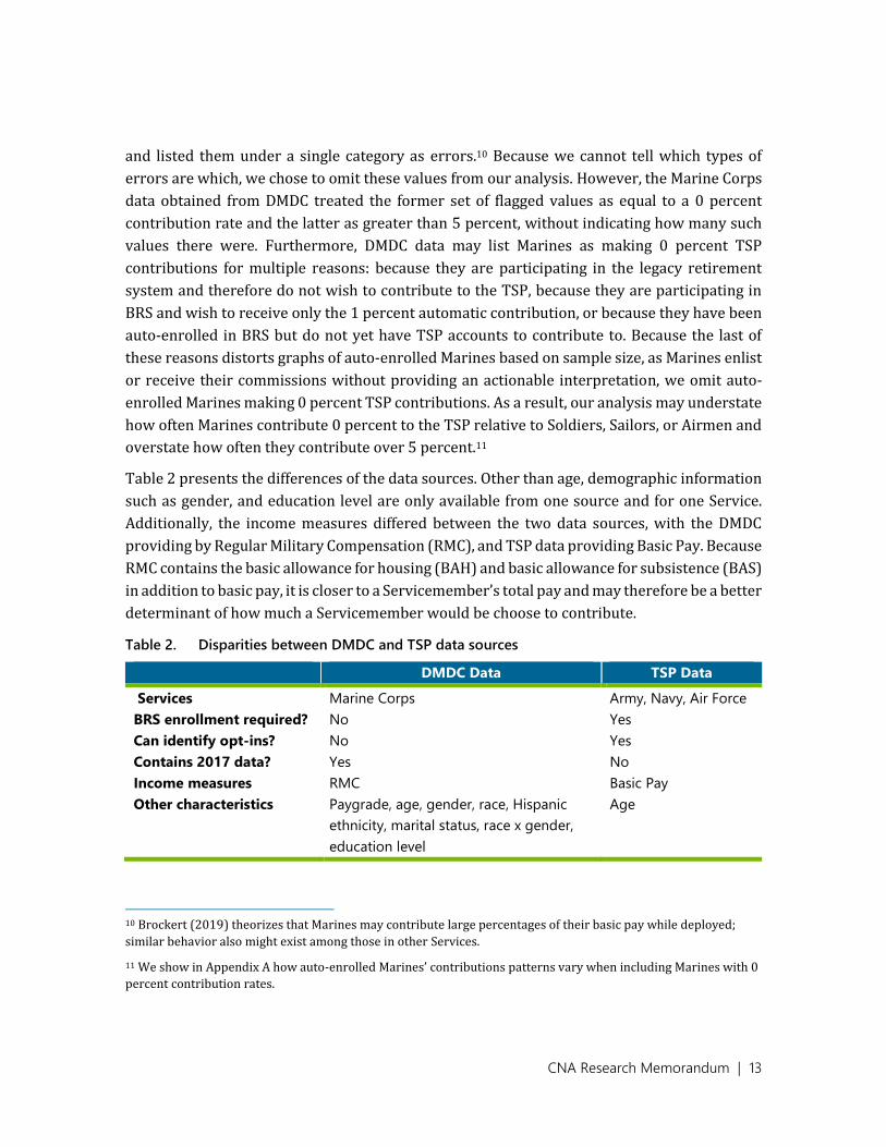
CNA Research Memorandum | 13
and listed them under a single category as errors.10 Because we cannot tell which types of
errors are which, we chose to omit these values from our analysis. However, the Marine Corps
data obtained from DMDC treated the former set of flagged values as equal to a 0 percent
contribution rate and the latter as greater than 5 percent, without indicating how many such
values there were. Furthermore, DMDC data may list Marines as making 0 percent TSP
contributions for multiple reasons: because they are participating in the legacy retirement
system and therefore do not wish to contribute to the TSP, because they are participating in
BRS and wish to receive only the 1 percent automatic contribution, or because they have been
auto-enrolled in BRS but do not yet have TSP accounts to contribute to. Because the last of
these reasons distorts graphs of auto-enrolled Marines based on sample size, as Marines enlist
or receive their commissions without providing an actionable interpretation, we omit auto-
enrolled Marines making 0 percent TSP contributions. As a result, our analysis may understate
how often Marines contribute 0 percent to the TSP relative to Soldiers, Sailors, or Airmen and
overstate how often they contribute over 5 percent.11
Table 2 presents the differences of the data sources. Other than age, demographic information
such as gender, and education level are only available from one source and for one Service.
Additionally, the income measures differed between the two data sources, with the DMDC
providing by Regular Military Compensation (RMC), and TSP data providing Basic Pay. Because
RMC contains the basic allowance for housing (BAH) and basic allowance for subsistence (BAS)
in addition to basic pay, it is closer to a Servicemember’s total pay and may therefore be a better
determinant of how much a Servicemember would be choose to contribute.
Table 2. Disparities between DMDC and TSP data sources
DMDC Data TSP Data
Services Marine Corps Army, Navy, Air Force
BRS enrollment required? No Yes
Can identify opt-ins? No Yes
Contains 2017 data? Yes No
Income measures RMC Basic Pay
Other characteristics Paygrade, age, gender, race, Hispanic
ethnicity, marital status, race x gender,
education level
Age
10 Brockert (2019) theorizes that Marines may contribute large percentages of their basic pay while deployed;
similar behavior also might exist among those in other Services.
11 We show in Appendix A how auto-enrolled Marines’ contributions patterns vary when including Marines with 0
percent contribution rates.

CNA Research Memorandum | 14
Army, Navy, and Air Force TSP contributions
Figure 2 shows contribution patterns by auto-enrolled Servicemembers in the Army, Navy, and
Air Force in 2018. These graphs show the percentages of Soldiers, Sailors, and Airmen,
respectively, contributing different amounts in each month. The 12 months of 2018 are
arranged along the vertical axis, and percentages are stacked to sum to 100. Each contribution
level is shaded a different color.
Three things immediately stand out. First, TSP contribution data do not exist in January 2018
for any Services and are available for all three Services only in May 2018. This is chiefly because
TSP cannot report information on Servicemembers whose accounts do not yet exist, but may
reflect some Service-level differences in how quickly TSP accounts were set up or how quickly
these data were provided to the TSP office. May is also the first month in which a clear picture
of contribution patterns begins to emerge, likely because it is the first month in which each
Service provided data on over 100 Servicemembers. Second, Soldiers and Airmen default to a
3 percent contribution level far more often than Sailors. In every month since May 2018, at
least 75 percent of auto-enrolled Soldiers and 67 percent of auto-enrolled Airmen contributed
3 percent; by contrast, fewer than 45 percent of Sailors contributed at this level in any month.
However, while Sailors were more likely to receive all possible matching funds by contributing
at least 5 percent, they also were more likely to forgo some of the matching funds available at
the default contribution rate of 3 percent. Over the second half of 2018, Soldiers and Sailors
gradually became less likely to contribute the default rate, and the percentage contributing
over 5 percent increased. However, Airmen became more likely to contribute the default rate
through September 2018, likely reflecting the fact that the sample of Airmen was both smaller
and grew at a different rate than the samples of Soldiers and Sailors.

CNA Research Memorandum | 15
Figure 2. Army, Navy, and Air Force TSP contribution rates, auto-enrollees, 2018
Notes: Sample sizes for Soldiers ranged from 3 (in February) to 28,629 (in December). Sample sizes for Sailors ranged from
165 (in May) to 23,568 (in December). Sample sizes for Airmen ranged from 1 (in March) to 9,526 (in December).
Source: TSP.

CNA Research Memorandum | 16
Figure 3 shows the corresponding enrollment rates for Soldiers, Sailors, and Airmen who opted
into the BRS. Samples in January 2018 were extremely low for each Service (0 Soldiers, 43
Sailors, and 1 Airman) but grew rapidly over the next two months (approximately 2,000
Soldiers and Sailors and approximately 1,500 Airmen in February; 27,457 Soldiers, 46,242
Sailors, and 29,083 Airmen in March). Over the remaining 10 months of 2018, opt-in samples
grew much more steadily; as a result, contribution patterns change noticeably between
January and March 2018 as the sample composition shifts but remain fairly stable afterwards.

CNA Research Memorandum | 17
Figure 3. Army, Navy, and Air Force TSP contribution rates, opt-ins, 2018
Notes: Sample sizes for Soldiers ranged from 1,983 (in February) to 54,362 (in December). Sample sizes for Sailors ranged
from 43 (in January) to 121,152 (in December). Sample sizes for Airmen ranged from 1 (in January) to 50,746 (in December).
Source: TSP.

CNA Research Memorandum | 18
As a rule, Servicemembers who opted into the BRS contributed different amounts to the TSP
than those who were auto-enrolled. In any given month, auto-enrolled Sailors were over 6
times more likely than opt-in Sailors to contribute 3 percent, and corresponding ratios for
Soldiers and Airmen were even higher. In general, Servicemembers who opted into the BRS
were more likely than auto-enrollees to appear in any contribution category other than 3
percent. This may be because Servicemembers who are auto-enrolled can easily minimize the
effort involved in selecting a contribution rate by choosing the default level. For
Servicemembers who opt in, any effort involved in selecting an optimal contribution rate is
incorporated into the decision to opt in. Curiously, however, Sailors who opted into the BRS
were less likely than auto-enrollees to contribute below 3 percent; the opposite is true for
Soldiers and Airmen.
From March onward, the share of Soldiers and Airmen contributing nothing fell somewhat,
while the share of Sailors increased slightly. During this period, the shares of Soldiers and
Airmen in every other contribution category increased, and the share of Sailors contributing
over 5 percent fell, while the share of Sailors contributing other amounts increased or
remained the same.
Marine Corps TSP Contributions
Figure 4 shows contributions among Marines, by eligibility category. These graphs are
organized similarly to those for Soldiers, Sailors, and Airmen, with three main differences. The
first is that, without observing BRS enrollment status in the Marine Corps, we can state only
whether Marines are BRS-eligible or BRS-ineligible. However, for these two groups of Marines,
we can show how their TSP contributions changed over 2017, as BRS training was
implemented, as well as in 2018, when Marines could opt into the BRS. Recall that auto-
enrolled Marines contributing 0 percent to the TSP have been omitted from this figure and
subsequent ones.12
12 However, because fewer than 3 percent of Soldiers, Sailors, or Airmen make TSP contributions of 0 percent in
September 2018 or onward, it appears unlikely that this will noticeably distort the TSP contribution rates of
Marines with active TSP accounts.
CNA Research Memorandum | 19
Figure 4. USMC TSP contribution rates by retirement system eligibility group
Notes: Sample sizes ranged from 60 (in January) to 15,558 (in December) for auto-enrolled Marines, from 139,378 (in
December 2018) to 153,412 (in January 2018) for eligible Marines, and from 24,523 (in December 2018) to 25,268 (in May
2017) for ineligible Marines.
Source: DMDC.

CNA Research Memorandum | 20
Contribution patterns varied over time and by eligibility category. Auto-enrollees rarely
contributed any amount between 0 and 3 percent or between 3 and 5 percent. Although many
likely contributed 3 percent because it was the default option, matching rates should not have
affected how much they contributed at this time, since auto-enrollees do not receive matching
contributions (beyond the automatic 1 percent contribution) until their 25th month of service.
Contribution rates greater than 3 percent therefore should reflect a desired savings level in the
absence of any incentive.13
Contribution patterns were more stable among Marines who became eligible to opt into the
BRS in 2018. In May 2017, contribution rates in each contribution category increased
dramatically, likely due to BRS training programs, which first became available in March 2017
[32]. Over the rest of 2017, contribution categories greater than 3 percent grew slightly. In
2018, these Marines became eligible for the BRS, with immediate matching for TSP
contributions. Although contribution levels did not change noticeably in January 2018, the
shares contributing 5 percent and more than 5 percent increased in February and in every
subsequent month in 2018. Meanwhile, the share contributing less than 3 percent dropped
gradually over 2018. This suggests that Marines who opted into the BRS and had to choose a
contribution level were disproportionately likely to seek the maximum matching level.
Contribution patterns were even steadier among BRS-ineligible Marines. These Marines were
far more likely to contribute to the TSP prior to May 2017 than those with fewer years of
service. However, these graphs alone cannot tell us whether (and/or to what extent) these
Marines contributed more to their retirement savings because they (a) were older and
therefore felt that retirement saving was more salient, (b) had served with the Marine Corps
longer and therefore gave greater thought to the retirement plan the Marine Corps provided,
or (c) differed materially from younger Marines in some way unrelated to age or years of
service. In May 2017, the likelihood of BRS-ineligible Marines contributing within each
category increased, just as it did for those who eventually would become eligible; however, this
increase was much smaller. After this increase, all contribution categories stayed relatively
stable; by the end of 2018, eligible Marines were contributing to the TSP at a higher rate than
ineligible Marines.
13 Alternatively, some may base their contributions on the match rate if they do not anticipate that they will
remember to update their contribution levels later; however, it would be impossible to evaluate this possibility
without conducting extensive Servicemember interviews or observing contribution patterns in 2020 and beyond.
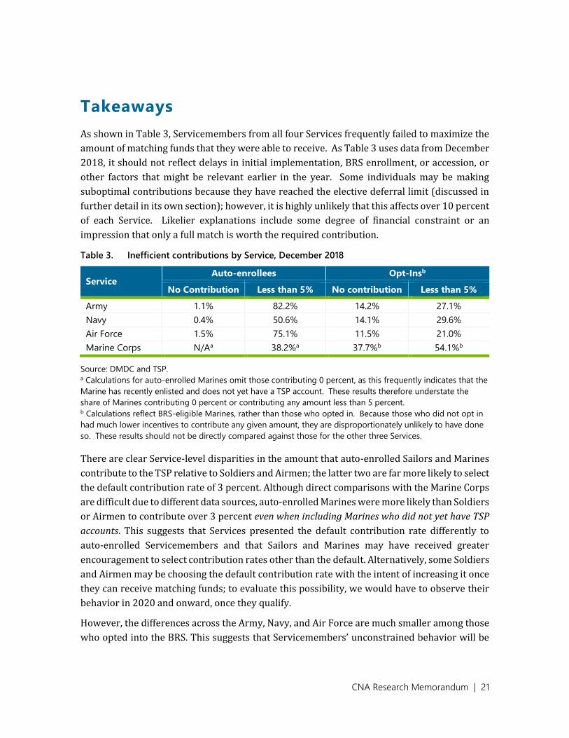
CNA Research Memorandum | 21
Takeaways
As shown in Table 3, Servicemembers from all four Services frequently failed to maximize the
amount of matching funds that they were able to receive. As Table 3 uses data from December
2018, it should not reflect delays in initial implementation, BRS enrollment, or accession, or
other factors that might be relevant earlier in the year. Some individuals may be making
suboptimal contributions because they have reached the elective deferral limit (discussed in
further detail in its own section); however, it is highly unlikely that this affects over 10 percent
of each Service. Likelier explanations include some degree of financial constraint or an
impression that only a full match is worth the required contribution.
Table 3. Inefficient contributions by Service, December 2018
Service Auto-enrollees Opt-Insb
No Contribution Less than 5% No contribution Less than 5%
Army 1.1% 82.2% 14.2% 27.1%
Navy 0.4% 50.6% 14.1% 29.6%
Air Force 1.5% 75.1% 11.5% 21.0%
Marine Corps N/Aa 38.2%a 37.7%b 54.1%b
Source: DMDC and TSP. a Calculations for auto-enrolled Marines omit those contributing 0 percent, as this frequently indicates that the
Marine has recently enlisted and does not yet have a TSP account. These results therefore understate the
share of Marines contributing 0 percent or contributing any amount less than 5 percent. b Calculations reflect BRS-eligible Marines, rather than those who opted in. Because those who did not opt in
had much lower incentives to contribute any given amount, they are disproportionately unlikely to have done
so. These results should not be directly compared against those for the other three Services.
There are clear Service-level disparities in the amount that auto-enrolled Sailors and Marines
contribute to the TSP relative to Soldiers and Airmen; the latter two are far more likely to select
the default contribution rate of 3 percent. Although direct comparisons with the Marine Corps
are difficult due to different data sources, auto-enrolled Marines were more likely than Soldiers
or Airmen to contribute over 3 percent even when including Marines who did not yet have TSP
accounts. This suggests that Services presented the default contribution rate differently to
auto-enrolled Servicemembers and that Sailors and Marines may have received greater
encouragement to select contribution rates other than the default. Alternatively, some Soldiers
and Airmen may be choosing the default contribution rate with the intent of increasing it once
they can receive matching funds; to evaluate this possibility, we would have to observe their
behavior in 2020 and onward, once they qualify.
However, the differences across the Army, Navy, and Air Force are much smaller among those
who opted into the BRS. This suggests that Servicemembers’ unconstrained behavior will be

CNA Research Memorandum | 22
similar across Services and that any differences may be limited to how default contribution
rates are addressed or the degree of training that auto-enrollees receive on TSP contributions.
Although we cannot directly compare contribution rates to those in the Marine Corps, the
consistency in contribution levels among Soldiers, Sailors, and Airmen who opted into the BRS
suggests that changes in contribution levels over time among eligible Marines may be
attributable to additional Marines opting into the BRS rather than changes among those who
already have opted in.
Overall contribution patterns by eligibility category align with findings in the civilian research
literature and provide us with several theories for further investigation. First, providing a
default contribution level will lead to many more Servicemembers selecting that contribution
level, since auto-enrolled Marines were far more likely to contribute 3 percent than those who
opted into the BRS. The choice of a default contribution rate could therefore be used to
encourage optimal savings behavior. Since the Federal Retirement Thrift Investment Board has
recently announced that the default contribution rate for Servicemembers enrolling on or after
October 1, 2020, will increase to 5 percent, Servicemembers entering after this date will
probably become much more likely to contribute 5 percent.
Second, before the introduction of BRS training programs, Marines with at least 12 YOS were
more likely both to contribute to the TSP and to do so at higher rates than those with fewer
than 12 YOS. This finding aligns with prior research, since Marines who were ineligible were
older and had more disposable income than those who were eligible. Afterwards, BRS-eligible
Marines began contributing to the TSP at a higher rate—whether because they intended to
enroll in the BRS, because they had been encouraged to think about retirement planning,
because they were made aware of savings options that they had not previously know about, or
for some other reason. However, BRS training also appears to have affected Marines who were
ineligible. Although additional research would be necessary to determine why this was the
case, it is worth considering that changes in behavior may not be limited to the targeted group
of Servicemembers.

CNA Research Memorandum | 23
Lifecycle Differences in TSP
Contribution Rates
In the research literature on civilian retirement saving, age and income can affect retirement
contributions. We examine how age affected retirement savings among Soldiers, Sailors, and
Airmen, and how age, RMC, and enlisted and officer paygrades affected contribution rates
among Marines.
TSP contribution rates by age
Figure 5 and Figure 6 show how Soldiers, Sailors, and Airmen of different age groups
contributed to TSP accounts; Figure 5 focuses on auto-enrollees, while Figure 6 focuses on opt-
ins. These figures use data from September 2018 for comparability across figures. By this point,
there is a suitably large sample of auto-enrollees, and it is far enough from the end of the year
that it is unlikely for opt-ins to have reached the elective deferral limit on TSP contributions.
Both figures show the percentages of Soldiers, Sailors, and Airmen by age grouping in each
contribution category. Graphs are organized first by Service, then by age within Service. The
length of each bar segment represents the percentage of Servicemembers in that contribution
category.

CNA Research Memorandum | 24
Figure 5. TSP contribution rates by age among auto-enrolled Soldiers, Sailors, and Airmen,
September 2018
Source: TSP.
The Service-level differences observable in Figure 2 are present across all age groups.
However, older auto-enrollees in all three Services were less likely to adopt the default
contribution rate of 3 percent. Among Soldiers and Airmen, this reflects a greater likelihood of
contributing 5 percent or more to a TSP, but results are more ambiguous among Sailors.

CNA Research Memorandum | 25
Figure 6. TSP contribution rates by age among opt-in Soldiers, Sailors, and Airmen, September
2018
Source: TSP.
Among opt-ins, age is positively correlated with the probability of contributing over 5 percent
and negatively correlated with the probability of contributing nothing, but negatively
correlated with the probability of contributing exactly 5 percent. Within each Service, opt-ins
of all age groups were far less likely than auto-enrollees of any age group to contribute 3
percent. Across all age groups, Soldiers were less likely than Sailors or Airmen to contribute
over 5 percent; Soldiers younger than 40 also were more likely than Sailors or Airmen to
contribute nothing.

CNA Research Memorandum | 26
Figure 7 shows contribution rates among Marines by age and eligibility group. As in Figure 4,
we omit Marines who made no TSP contribution because it is likely to reflect the lack of a TSP
account rather than a conscious decision to make no contribution. In addition, while graphs for
Soldiers, Sailors, and Airmen use their age at any given point in time, graphs for Marines use
their age as of January 1, 2018.14 This means, for example, that a Marine whose birthday is
January 2, 1998, will remain in the “younger than 20” category, even though he or she has
turned 20 prior to appearing in the graph below.
Figure 7. TSP contribution rates by age and eligibility category among Marines, September
2018
Source: DMDC.
14 DMDC data contained Marines’ dates of birth, from which it was possible to manually compute age as of any
given reference date. We chose January 1, 2018, since it was the date the policy went into effect.

CNA Research Memorandum | 27
In contrast to both the civilian literature and the other three Services, auto-enrolled Marines
aged 20–29 contributed less to the TSP (conditional on making any contribution) than those
younger than 20. Among BRS-eligible Marines, age was positively correlated with the
probability of contributing over 5 percent to the TSP and negatively correlated with
contributing lower amounts. Curiously, older BRS-ineligible Marines were simultaneously less
likely to make any TSP contribution yet more likely to contribute over 5 percent.
TSP contribution rates by paygrade and RMC
(Marine Corps only)
Figure 8 and Figure 9 show how contribution rates varied by officer and enlisted paygrade,
respectively, for each eligibility category. Because the TSP Office did not have access to
Servicemembers’ paygrades, this analysis is restricted to the Marine Corps. We show graphs
for only a subset of paygrade and eligibility group combinations. Some combinations are
impossible as a matter of policy—for example, an auto-enrolled Marine will not reach E9
within one year of enlisting. Others are possible but occur so infrequently as to provide little
usable information—for example, some auto-enrolled Marines reach E6, and some Marines
with 12 or more years of service are demoted to E1, but it would be inappropriate to regard
these Marines as representative of any broader patterns or make inferences based on their
behavior.
Figure 8 shows contributions among enlisted Marines. Auto-enrolled Marines at paygrade E2
were more likely than those at E1 (conditional on TSP contribution) to contribute 3 percent
but less likely to contribute 5 percent or more. Eligible Marines at paygrades E3 through E7
were similarly likely to contribute to the TSP; however, the precise amount contributed by
paygrade differs—in particular, eligible Marines at E5 or higher were more likely than those at
E3 or E4 to contribute over 5 percent to the TSP. For ineligible Marines, paygrade appears to
be negatively correlated with the probability of contributing to the TSP. While ineligible
Marines at paygrades E8 and E9 are as likely as those at E6 and E7 to contribute over five
percent to the TSP, they are less likely to have any other contribution rate.

CNA Research Memorandum | 28
Figure 8. TSP contribution rates by enlisted paygrade and eligibility category among Marines,
September 2018
Source: DMDC.
Figure 9 shows contributions among Marine officers. We omit auto-enrollees, as there were
only 42 auto-enrolled Marine officers as of September 2018; the most there were in any given
month in 2018 was 156 in November. Both BRS-eligible and BRS-ineligible O1s are much less
likely than O2s to contribute to the TSP or to contribute over 5 percent; this may reflect
differences in basic pay or RMC, but is not immediately clear. At O2 and above, BRS-eligible
Marines with higher paygrades had lower probabilities of contributing to the TSP at all,
reflected in substantially lower probabilities of contributing five percent or more. Among BRS-

CNA Research Memorandum | 29
ineligible Marines, higher paygrades above O2 are also correlated with lower probabilities of
contribution to the TSP, though differences in individual contribution levels are less dramatic.
Figure 9. TSP contribution rates by officer paygrade and eligibility category among Marines,
September 2018
Source: DMDC.
Figure 10 shows how Marines’ TSP contribution levels vary by RMC. It is organized similarly
to the two figures above, but shows auto-enrollees both including and omitting zero
contribution levels. While paygrade is one of the factors determining RMC, it is unlikely that
attaining higher paygrades in and of itself causes certain Marines to change their contribution
levels. It is much more plausible that a change in RMC would cause this (e.g., if Marines prefer
to meet a certain subsistence-level basic pay before saving for retirement). Although we cannot

CNA Research Memorandum | 30
fully isolate the effect that RMC has on Marines’ TSP contribution levels, we can nevertheless
examine how it varies with TSP contributions.
Figure 10. TSP contribution rates by RMC and eligibility category among Marines, September
2018
Source: DMDC.
Auto-enrollees earning less than $25,000 were much less likely than those earning higher
levels of basic pay to contribute to the TSP at all. This may reflect the need for a certain level of
baseline income before Marines are willing to devote part of their paycheck to retirement
saving. However, there are two competing reasons that might take precedence. First, Marines
who do not yet have TSP accounts are more likely than those who do to be earning less than
$25,000; some portion of the contribution gap reflects an inability to contribute, rather than a

CNA Research Memorandum | 31
choice to do so. Second, enlisted auto-enrolled Marines in 2018 would be unable to earn
$25,000 in RMC through basic pay alone – with less than 2 YOS, an enlisted Marine would have
needed to rate E4 to do so. As a result, auto-enrolled Marines would have needed to either rate
BAH or be officers to have earned at least $25,000 in RMC.15 Auto-enrollees who earned at least
$25,000 in RMC may therefore have additional systematic differences from those who did not,
making it challenging to assess which factors are causing different contribution rates. Omitting
Marines who contributed zero percent to the TSP, however, is the difference between Marines
who earned less than $25,000 contributing less in every non-zero category than those earning
at least $25,000 versus being substantially more likely to contribute over five percent and less
likely to contribute less than three percent.
For eligible Marines earning less than $125,000, basic pay levels were positively correlated
with both the probability of making any TSP contribution and the probability of contributing
over 5 percent. However, eligible Marines earning between $125,000 and $149,999 were less
likely to contribute to the TSP or to contribute over 5 percent than those earning between
$100,000 and $124,999. They also were the least likely group to contribute 5 percent. Eligible
Marines who earned less than $25,000 were the most likely to contribute 3 percent, 5 percent,
or any amount in between.
Among ineligible Marines, it makes sense to think about those earning less than $125,000
separately from those earning at least $125,000. Those earning less than $125,000 are less
likely to contribute to the TSP, more likely to contribute exactly five percent, and substantially
less likely to contribute over five percent. In general, the probability of contributing over five
percent is positively correlated with RMC.
Takeaways
Contribution rates appear to be strongly correlated with both paygrade and RMC; however, it
is likely that RMC is the more relevant factor. Marines with low incomes may wish to prioritize
immediate necessities over future savings, limiting the effectiveness of matching plans;
however, this result might also be explained by factors such as rating BAH, officership, or other
characteristics separate from RMC itself. Among BRS-eligible and BRS-ineligible Marines,
though, the probability both of contribution and of contributing over five percent is positively
correlated with RMC, suggesting that earnings do play some role in contribution levels.
15 For context, the annualized basic pay of an auto-enrolled E1 in our data with less than four months of service
would have been approximately $18,192. Any BAH payment over $567.33 would therefore result in earning at
least $25,000 per year.

CNA Research Memorandum | 32
The Elective Deferral Limit
Since matching funds are distributed in each month and are determined by the percentage of
basic pay contributed in that month, the timing of TSP contributions may matter as much as
the total amount contributed over the course of a year. As an extreme case, consider a
Servicemember who contributes 36 percent of his or her basic pay in one month and nothing
else for the remainder of the year and another Servicemember who contributes 3 percent of
the same basic pay in every month. The first Servicemember will receive a 5 percent match in
January and the automatic 1 percent contribution in the remaining 11 months (for a total of 16
percent of monthly basic pay), while the second will receive 4 percent of basic pay in every
month (for a total of 48 percent of monthly basic pay).16
A less extreme version of the scenario above involves Servicemembers reaching the TSP
elective deferral limit prior to December. TSP contributions are capped on several dimensions:
direct employee contributions have an elective deferral limit ($18,500 for 2018), while
automatic and matching contributions made by employers have an annual addition limit
($55,000 for 2018). If this happens, they still will receive the automatic 1 percent contribution
in any remaining months, since the limit applies only to personal contributions, not to
employer contributions; however, any months in which a Servicemember cannot contribute
due to the deferral limit will result in forgone matching funds.
While we are unable to show conclusively that this happens on a regular basis, we can show
some evidence consistent with reaching the elective deferral limit. Figure 11 shows
contributions by BRS-eligible Marine O4s. In this figure, there is a clear drop in both overall
contribution rates and in the share of Marines contributing over 5 percent of basic pay toward
the end of both calendar years. This is what we would expect to see if a Marine reaches the
contribution limit; to reach the 2018 limit of $18,500, a Marine would have needed to
contribute an average of $1,541.67 per month, which is substantially higher than 5 percent of
any monthly rate in the 2018 basic pay tables. Importantly, the share of Marines contributing
to TSP accounts reaches local maxima in June 2017 and September 2018, so some
Servicemembers may be forgoing several months of matching funds.
16 While this example does not consider interest accrual over the course of the year, there is no realistic interest
rate that would make the first Servicemember’s savings pattern preferable to the second’s.

CNA Research Memorandum | 33
Figure 11. Evidence that eligible Marine Corps O4s may reach the elective deferral limit too
soon
Source: DMDC.
Table 4 illustrates potential forgone investment using the example of a Marine O4 with 11
YOS—the highest-earning combination of service length and paygrade for a BRS-eligible
individual. This Marine would have earned $7,052.70 each month in 2018. If this Marine
contributed 25 percent of his or her basic pay, he or she would only be able to contribute
through November before reaching the $18,500 cap. During this time frame, they would
receive $352.64 in matching contributions, but would only receive the automatic contribution
of $70.53 in December. By contrast, a Servicemember who contributed approximately 21.9
percent in each month would receive the full $352.64 match in every month, earning an
additional $282.11 in matching funds while reaching the same personal TSP contribution of
$18,500.17
17 To put this in context, a Servicemember who forgoes $282.11 per year, with a 5 percent interest rate
compounded monthly would lose a total of $10,468.58 over 20 years.

CNA Research Memorandum | 34
Table 4. Example of effects of an O4 with 11 YOS reaching contribution limit
Month Monthly Basic Pay
Personal Contribution Match
Total Contribution
Cum. Total Contribution
Cum. Personal Contribution
Contributing 25% of Basic Pay
January $7,052.70 $1,763.18 $352.64 $2,115.81 $2,115.81 $1,763.18
February $7,052.70 $1,763.18 $352.64 $2,115.81 $4,231.62 $3,526.35
March $7,052.70 $1,763.18 $352.64 $2,115.81 $6,347.43 $5,289.53
… … …
October $7,052.70 $1,763.18 $352.64 $2,115.81 $21,158.10 $17,631.75
November $7,052.70 $868.25 $352.64 $1,220.89 $22,378.99 $18,500.00
December $7,052.70 $0.00 $70.53 $70.53 $22,449.51 $18,500.00
Contributing 21.9% of Basic Pay
January $7,052.70 $1,541.72 $352.64 $1,894.36 $1,894.36 $1,541.72
February $7,052.70 $1,541.72 $352.64 $1,894.36 $3,788.71 $3,083.44
March $7,052.70 $1,541.72 $352.64 $1,894.36 $5,683.07 $4,625.16
… … ...
October $7,052.70 $1,541.72 $352.64 $1,894.36 $18,943.55 $15,417.20
November $7,052.70 $1,541.72 $352.64 $1,894.36 $20,837.91 $16,958.92
December $7,052.70 $1,541.08 $352.64 $1,894.36 $22,732.26 $18,500.00
Source: Defense Finance and Accounting Service 2018 Military Active & Reserve Component Pay Table.
There are several scenarios in which Marines might reach the elective deferral limit prior to
December in any given year. First, they may simply have very high baseline contribution levels.
However, this is unlikely to occur commonly across the Marine Corps—even the highest
earning BRS-eligible Marines would need to contribute over a fifth of their salary in every
month to reach the limit.
Brockert (2019) mentions two other scenarios in which Marines might increase their TSP
contribution levels, and which could therefore lead Marines to reach the elective deferral limit
too quickly. First, Marines may increase their contributions while deployed, since their
immediate needs are being accounted for by the Marine Corps. For those in combat zones, this
may be a sensible choice, as traditional TSP contributions made in a combat zone apply to the
annual addition limit rather than the elective deferral limit. However, Marines deployed
outside of combat zones or making Roth contributions still face the elective deferral limit and

CNA Research Memorandum | 35
may therefore reach it at an inefficiently early date.18 Second, Marines could increase their
contribution levels upon receiving one-time bonus pay. In this case, all contributions will still
count towards the elective deferral limit.
This issue currently affects relatively few Marines, but could become more salient in time.
Because Servicemembers with 12 YOS or more were ineligible for BRS enrollment, the highest
earning Marines (who may therefore be most likely to reach the elective deferral limit) do not
have matching contributions to forego. However, as current enrollees gain additional YOS, their
basic pay rates will increase, and so will their TSP contributions; they will also begin to attain
higher paygrades than those we currently observe them holding. Nevertheless, this issue will
be more applicable to officers rather than enlisted Servicemembers, as an O3 earns more in
basic pay than an E9.19
18 Servicemembers deployed to combat zones should generally make Roth contributions below the elective
deferral limit. Roth contribution plans differ from traditional plans in applying taxes at contribution rather than at
withdrawal; Roth contributions made in combat zones are exempt from these up-front taxes, allowing
Servicemembers in combat zones to make completely tax-free contributions. Contributions above the elective
deferral limit should instead come from traditional contributions. Comparison of taxes avoided via Roth
contributions versus contributions foregone by reaching the elective deferral limit depends on when in the
calendar year a Servicemember is deployed, for how long TSP contributions will accrue interest, and a forecast of
future tax rates, and is therefore beyond the scope of our analysis.
19 Making specific predictions beyond 2019 would require either estimating changes in both the basic pay table
and the elective deferral limit or assuming that the same proportional changes apply to each. Using 2019 values,
an E9 with 20 YOS would need to contribute over 25 percent of his or her basic pay to reach the elective deferral
limit, while an E5 with 20 YOS would need to contribute slightly over 17 percent.

CNA Research Memorandum | 36
Implications of the Single-Salary
System
The effects of a single-salary system on TSP contribution rates and its costs to DOD and the
federal government depend on the structure of the single-salary system, which has not yet
been well defined. However, we can start with the assumptions used by IDA in their briefing
concerning the Salary-Based Pay System [34]. They start by assuming that “all allowances are
redistributed as basic pay across the entire force.” They conclude that this would increase
current basic pay by 69 percent. Based on this increase and a retirement pay accrual calculated
at 30.4 percent of basic pay, they conclude an extra cost of 11.8 billion to DOD and 9.9 billion
to the federal government. However, this does not include higher costs to match higher Service
contributions to the TSP.
If Servicemembers’ contribution rates are not affected by the move to a single-salary system,
an increase in basic pay by a factor of 1.69 would also increase Service matching contribution
levels by 69 percent. However, the single-salary system is likely to increase take-home pay for
some Servicemembers and decrease it for others [34]. An increase or decrease in take-home
pay may induce Servicemembers to change their contribution rates. This, in turn may increase
or decrease the costs to DOD.
Finally, the Federal Retirement Thrift Investment Board (FRTIB) recently announced that the
default contribution rate for people automatically enrolled on or after October 1, 2020, will be
increased from 3 percent to 5 percent [35]. Given that Servicemembers auto-enrolled in the
BRS are likely to contribute the default rate or higher, the change in the default rate likely
implies even higher TSP costs for DOD.

CNA Research Memorandum | 37
Conclusion and Recommendations
Our Marine Corps analysis shows that auto-enrolled participants are more likely to contribute
the default 3 percent contribution than those who opt to participate. Contribution rates for the
Army, Navy, and Air Force reveal that auto-enrollees are much more likely to contribute the
default 3 percent rate while the majority of Servicemembers who opt in contribute 5 percent
or more. This may be the result of two factors. First, auto-enrolled participants are assigned a
default contribution rate of 3 percent, while those opting in must choose a contribution rate.
The civilian retirement literature indicates that people are likely to choose the easiest path,
which for auto-enrolled participants is to stick with the default rate. Second, opt-in participants
immediately receive Service matching contributions, while auto-enrolled participants must
complete two YOS to receive full Service matching contributions. This may be inducing opt-in
participants to contribute more—a result consistent with the civilian literature.
Recommendation: If the Services view higher contribution rates as a positive outcome,
they could increase the default contribution rate of auto-enrollees or allow for immediate
Service-level matching for auto-enrolled participants.
Recommendation: We cannot separately observe both those who opt in to the BRS and
those who remain in the legacy system. Because those opting in have high contribution
rates, the Services may be more interested in the proportion who participate—a topic for
future research.20
A second interesting result for the Army, Navy, and Air Force is that Sailors have very different
contribution rates than Soldiers or Airmen. In the Army and Air Force, auto-enrollees are much
more likely to stick with the default contribution rate, while those in the Navy are the most
likely to contribute more than the default rate.
Recommendation: Investigate why the Navy has higher contribution rates than the
other Services, and potentially apply its method to the other Services.
A third finding, which may be immediately actionable at relatively low cost, is that a small
number of Servicemembers may reach the annual limit on elective contributions to the TSP
before the end of the year and thereby end up forgoing matching funds. It should be relatively
inexpensive to compute the maximum contribution rate at which a Servicemember would
optimize his or her matching funds, based on the TSP-provided contribution limit and military
20 A recent study found that only 50 percent of the eligible Marine Corps population opted in (officers and
enlisted) [19]. This study did not evaluate opt-in rates across the Services.
CNA Research Memorandum | 38
pay charts by paygrade and YOS. Given the stability in military pay relative to civilian pay, it
could additionally take into account any raises based on YOS without a significant increase in
effort.21 This could be incorporated as highlighted value on any paperwork or electronic forms
or as an error message or confirmation prompt on electronic forms.
21 While increases in paygrade might not be as easily predicted, this could be incorporated into any paperwork
necessary at promotion.

CNA Research Memorandum | 39
Appendix A: Auto-enrolled Marines
Contributing 0 percent to the TSP
Figure 12 shows how auto-enrolled Marines’ TSP contribution rates varied by month in 2018,
when including all zero values; the vast majority of these are likely to reflect newly-enlisted
Marines who do not yet have TSP accounts set up rather than Marines choosing not to
contribute, but we are unable to determine how often either is the case. However, it is almost
certainly why auto-enrollees contributed none of their basic pay in January 2018. As Marines’
TSP accounts are set up, they begin contributing; however, because new Marines enlist every
month, there are always some who do not contribute simply because they cannot. As a result,
the graph for auto-enrollees consistently overstates the number of Marines who wish to
contribute nothing and understates all other contribution levels. Contribution shares also may
be affected by months in which many Marines enlist. For example, if 30 Marines are enlisted
and contribute to the TSP but another 20 do not yet have TSP accounts, then 60 percent
contribute. If in the following month another 50 Marines enlist—with the resulting lag in TSP
account creation—then the share contributing to the TSP will fall even if the 20 who were not
contributing previously all begin to do so. The influx of new recruits likely explains why
contribution levels appear to fall in September 2018.
Figure 12. USMC TSP contribution rates by auto-enrollees, including zero values
Source: DMDC.

CNA Research Memorandum | 40
Appendix B: Contributions over Time
by Servicemember Characteristics
In this section, we present TSP contribution rates over 2018 for auto-enrollees and over 2017
and 2018 for BRS-eligible and BRS-ineligible Marines based on their characteristics. Because
Servicemembers may react differently to policy changes over time, the progression of
contribution rates may be of additional interest above and beyond snapshots. This appendix
includes auto-enrolled Marines who do not contribute to TSP accounts.
USMC contributions by paygrade
Enlisted paygrade
Figure 13, Figure 14, and Figure 15 show how TSP contributions vary by enlisted paygrade for
each BRS eligibility group. We do not include graphs for every combination of paygrade and
eligibility group. Some are impossible as a matter of policy—for example, an auto-enrolled
Marine will not reach E9 within one year of enlisting. Others are possible but occur so
infrequently as to provide little usable information—for example, some auto-enrolled Marines
reach E6, and some Marines with 12 or more years of service are demoted to E1, but it would
be inappropriate to regard these Marines as representative of any broader patterns or make
inferences based on their behavior.
Figure 13 shows contributions by auto-enrolled Marines in paygrades E1 and E2. Readers
should note that while auto-enrolled Marines in E2 appear more likely to contribute at each
non-zero level than those in E1, this may be because Marines in E1 are much less likely to have
active TSP accounts; after removing zero values, auto-enrolled Marines in paygrade E1 are
more likely to contribute five percent or more.

CNA Research Memorandum | 41
Figure 13. USMC TSP contribution rates by enlisted paygrade, auto-enrollees, 2018
Notes: Among E1s, sample sizes ranged from 41 (in January) to 7,707 (in December). Among E2s, sample sizes
ranged from 16 (in January) to 7,262 (in December).
Source: DMDC
Figure 14 shows contribution rates for paygrades E2 through E7 among Marines who were
eligible for the BRS. Eligible Marines at paygrade E2 had notably different contribution
patterns than those at higher paygrades; in particular, they were much more likely to
contribute between 3 and 4 percent between May 2017 and January 2018. Although there is a
clear positive correlation prior to May 2017 between enlisted paygrade and contributing to the
TSP, eligible Marines at pay grades E3 through E7 were similarly likely to contribute to the
TSP; between 40 and 50 percent contributed in May 2017 and approximately 60 percent
contributed in December 2018. However, the precise amount contributed by paygrade
differs—in particular, eligible Marines at E5 or higher were more likely than those at E3 or E4
to contribute over 5 percent to the TSP and less likely to contribute exactly 5 percent.

CNA Research Memorandum | 42
Figure 14. USMC TSP contribution rates by enlisted paygrade, eligible for the BRS, 2017–2018
Notes: For E2s, sample sizes ranged from 11,637 (in December 2018) to 21,298 (in February 2018). For E3s,
sample sizes ranged from 41,142 (in October 2017) to 43,594 (in May 2018). For E4s, sample sizes ranged from
34,059 (in August 2017) to 35,717 (in June 2018). For E5s, sample sizes ranged from 25,002 (in October 2018)
to 25,582 (in June 2017). For E6s, sample sizes ranged from 7,770 (in September 2017) to 9,951 (in December
2018). For E7s, sample sizes ranged from 258 (in September 2017) to 406 (in February 2018).
Source: DMDC.

CNA Research Memorandum | 43
Figure 15 shows contribution rates for paygrades E6 through E9 among Marines who were
ineligible for the BRS. In general, for these Marines, paygrade appears to be negatively
correlated with the probability of contributing to the TSP. Ineligible Marines at paygrades E8
and E9 are noticeably less likely to contribute less than 3 percent or exactly 5 percent to the
TSP than those at E6 or E7, but differences in contribution patterns by paygrade are much
smaller for this group of Marines than for auto-enrolled or eligible Marines.
Figure 15. USMC TSP contribution rates by enlisted paygrade, ineligible for the BRS, 2017–2018
Notes: For E6s, sample sizes ranged from 4,329 (in October 2018) to 5,265 (in June 2017). For E7s, sample sizes
ranged from 6,609 (in June 2017) to 7,328 (in December 2018). For E8s, sample sizes ranged from 3,135 (in
January 2018) to 3,363 (in September 2018). For E9s, sample sizes ranged from 1,375 (in September 2017) to
1,415 (in November 2017).
Source: DMDC.

CNA Research Memorandum | 44
Officer paygrade
Figure 16 shows TSP contributions for auto-enrolled Marines in paygrade O1; no auto-enrolled
Marines appeared in any other officer paygrade.22 This figure contains barely enough Marines
to be interpretable—the first month with more than 10 Marines is August 2018, and the
highest number of Marines in any given month is 156 (in November 2018). Nevertheless,
influxes of Marines in August 2018 and November 2018 are visible as spikes in the number of
Marines who do not yet have TSP accounts (and therefore cannot contribute toward them).
However, the month after each of these two shocks, the contribution rate rises to over 90
percent. Although additional data are necessary to observe longer term patterns, it appears at
a glance that auto-enrolled officers are substantially more likely than auto-enrolled enlisted
Marines to contribute the default amount to the TSP.23
Figure 16. USMC TSP contribution rates for O1, auto-enrollees, 2018
Notes: Sample sizes ranged from 1 (in March and April) to 156 (in November).
Source: DMDC.
22 We omit discussion of warrant officer paygrades because they contain relatively few Marines, none of whom
were auto-enrolled.
23 Based on December 2018 values, enlisted Marines may be more likely to contribute any amount other than the
default; however, this could change as more Marines determine their ideal contribution levels or become officers.
0%
20%
40%
60%
80%
100%
Jan 18 Feb 18 Mar 18 Apr 18 May 18 Jun 18 Jul 18 Aug 18 Sep 18 Oct 18 Nov 18 Dec 18
O1
TSP = 0% 0%<TSP<3% TSP = 3% 3%<TSP<5% TSP = 5% TSP > 5%
CNA Research Memorandum | 45
Figure 17 shows TSP contributions by paygrades O1 through O4 among Marines who were
eligible for the BRS.24 Prior to May 2017, officer paygrade was positively correlated with the
likelihood of contributing to the TSP at all or appearing in any given contribution category.
After 2018, these officers became much more likely to contribute to TSP, chiefly at levels over
5 percent. The likelihood of contributing exactly 5 percent, meanwhile, became negatively
correlated with officer paygrade. The entry and promotion schedule for officers explains some
of the variation in the O1 graph—more than 450 officers leave paygrade O1 and more than 400
enter paygrade O2 in May of each year in our data, followed by an influx at O1 the following
month.25 The new officers at O1 may need time to establish their TSP accounts—explaining the
gradual rise in contributions between June 2017 and June 2018—but those promoted to O2
have had plenty of time to determine their ideal contribution rates.
Some contribution patterns among Marine officers may reflect hitting the elective deferral
limit. Among O2s, contribution rates had nearly flattened by December 2017 after a gradual
rise. In January 2018, their contribution rates began to rise again (quickly in the beginning of
the year, but more slowly afterwards). Among O3s, contribution rates declined slightly in
December 2017 from their prior low the month before, then rose over the next 11 months
before falling again in December 2018. The decline in contribution rates at the end of the year
was more pronounced among O4s, whose contribution rates fell from September to December
2017 and in November and December 2018.
24 Due to typical promotion schedules, at most three Marines with fewer than 12 years of service held paygrade O5
in any given month, and none held paygrades O6 or higher.
25 Although most of these differences likely represent promotion, aggregate data combined with the possibility of
demotion do not let us say exactly how many.

CNA Research Memorandum | 46
Figure 17. USMC TSP contribution rates by officer paygrade, eligible for the BRS, 2017–2018
Notes: For O1s, sample sizes ranged from 2,231 (in May 2017) to 3,044 (in February 2018). For O2s, sample
sizes ranged from 2,593 (in February 2018) to 3,161 (in May 2017). For O3s, sample sizes ranged from 4,240 (in
October 2017) to 4,604 (in April 2018). For O1s, sample sizes ranged from 623 (in April 2018) to 887 (in
October 2017).
Source: DMDC.
Figure 18 shows TSP contributions by paygrades O2 through O6 among ineligible Marines. In
general, the probability of contributing to the TSP is negatively correlated with paygrade for
ineligible Marine officers. Again, there is evidence of the elective deferral limit, even without
the incentive of automatic or matching payments: for paygrades O4 and higher, the probability
of contributing fell over the second half of each year, becoming more pronounced as paygrades
rise. In each year, this decrease in contribution was most closely tied to an accompanying
decrease in contributions of over 5 percent.

CNA Research Memorandum | 47
Figure 18. USMC TSP contribution rates by officer paygrade, ineligible for the BRS, 2017–2018
Notes: For O2s, sample sizes ranged from 157 (in October 2018) to 239 (in August 2018). For O3s, sample sizes
ranged from 1,077 (in November 2017) to 1,185 (in April 2018). For O4s, sample sizes ranged from 2,593 (in
December 2018) to 2,851 (in June 2017). For O5s, sample sizes ranged from 1,779 (in September 2017 and
November 2018) to 1,795 (in March 2018). For O6s, sample sizes ranged from 605 (in June and July 2018) to
616 (in June 2018).
Source: DMDC.

CNA Research Memorandum | 48
USMC contributions by age and RMC
Figure 19 shows contribution rates by auto-enrolled Marines, separated into categories based
on their 10-year age range as of January 1, 2018.26 This means, for example, that a Marine whose
birthday is January 2, 1998 will remain in the “younger than 20” category for the duration of
our analysis, even though he or she turns 20 one day into our sample. Although Marines may
enter and exit our sample entirely, they will not transfer across categories. Although Marines
age 20–29 were much more likely to contribute to the TSP than those under 20, this may reflect
different growth in the two samples. In 11 of 12 months, the under-20 sample grew at a higher
rate than the 20–29 sample.27 In particular, in July 2018, when the gap in TSP contribution
widened, the 20–29 sample had grown by only 6.7 percent versus 33.3 percent for the under-
20 sample. The difference in sample growth across age categories means a difference in the
percentage of Marines without TSP accounts. However, despite continual growth in the under-
20 category, the contribution gap narrowed noticeably in the last two months of 2018. In the
second half of the year, once contribution patterns began to stabilize, Marines in the 20–29 age
group were much more likely to contribute the default rate to the TSP than those in the under-
20 age group. Through middle and late 2018, they were also more likely to contribute 5 percent
or more, though the under-20 age group caught up in the final two months of the year.
26 DMDC data contained Marines’ dates of birth, from which it was possible to manually compute age as of any
given reference date. We chose January 1, 2018, since it was the date the policy went into effect.
27 The exception was in May 2018, when the under-20 sample grew by 88.0 percent over the previous month and
the 20–29 sample grew by 88.1 percent.
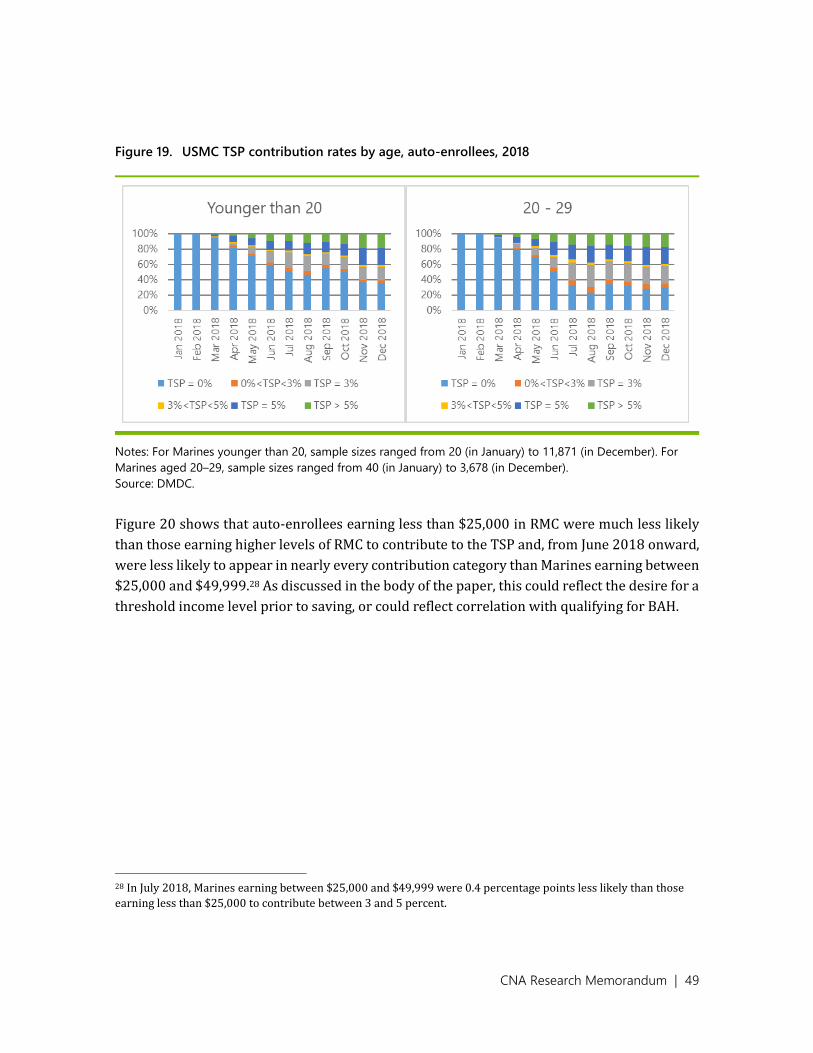
CNA Research Memorandum | 49
Figure 19. USMC TSP contribution rates by age, auto-enrollees, 2018
Notes: For Marines younger than 20, sample sizes ranged from 20 (in January) to 11,871 (in December). For
Marines aged 20–29, sample sizes ranged from 40 (in January) to 3,678 (in December).
Source: DMDC.
Figure 20 shows that auto-enrollees earning less than $25,000 in RMC were much less likely
than those earning higher levels of RMC to contribute to the TSP and, from June 2018 onward,
were less likely to appear in nearly every contribution category than Marines earning between
$25,000 and $49,999.28 As discussed in the body of the paper, this could reflect the desire for a
threshold income level prior to saving, or could reflect correlation with qualifying for BAH.
28 In July 2018, Marines earning between $25,000 and $49,999 were 0.4 percentage points less likely than those
earning less than $25,000 to contribute between 3 and 5 percent.

CNA Research Memorandum | 50
Figure 20. USMC TSP contribution rates by total gross annual income, auto-enrollees, 2017–2018
Notes: For Marines earning less than $25,000, sample sizes ranged from 59 (in January) to 12,329 (in
December). For Marines earning $25,000–$49,999, sample sizes ranged from 1 (in January) to 3,007 (in
December).
Source: DMDC.
Figure 21 shows mixed trends in TSP contribution rates by age group among eligible Marines.
Though eligible Marines younger than 20 were contributing at much lower rates than those
aged 20–29 or 30–39 well into 2017, their probability of contributing rose steadily in the
second half of 2017 and all of 2018, and they were the group most likely to contribute in
November and December 2018. This corresponds to steady (if uneven) growth in the
probability of contributing 5 percent or more during this time, including a rapid and
simultaneous decrease in the probability of contributing between 3 and 5 percent and increase
in the probability of contributing 5 percent in February of 2018. The 20–29 age group and 30–
39 age group also showed steady (though more gradual) increases in the probability of
contributing to the TSP, each driven by growth in the number of Marines contributing 5 percent
or more.

CNA Research Memorandum | 51
Figure 21. USMC TSP contribution rates by age, eligible for the BRS, 2017–2018
Notes: For Marines younger than 20, sample sizes ranged from 9,407 (in January 2017) to 36,225 (in November
2018). For Marines aged 20–29, sample sizes ranged from 96,387 (in December 2018) to 128,815 (in January
2017). For Marines aged 30–39, sample sizes ranged from 6,808 (in December 2018) to 13,827 (in January
2017).
Source: DMDC.
Figure 22 shows that, for eligible Marines earning less than $125,000, RMC levels were
positively correlated with both the probability of making any TSP contribution and the
probability of contributing over 5 percent. However, eligible Marines earning between
$125,000 and $149,999 were less likely to contribute to the TSP or to contribute over 5 percent
than those earning between $100,000 and $124,999. They also were the least likely group to
contribute 5 percent during all months of 2018. Beginning in February 2018, eligible Marines
CNA Research Memorandum | 52
who earned less than $25,000 were the most likely to contribute 3 percent, 5 percent, or any
amount in between. Some Marines earning less than $25,000 also appear to have noticeably
increased their TSP contributions once the BRS was implemented, perhaps because they
required some form of matching to justify a reduction in their already-low gross incomes.
Among eligible Marines earning over $100,000, contribution patterns again appear to reflect
reaching the elective deferral limit.

CNA Research Memorandum | 53
Figure 22. USMC TSP contribution rates by total gross annual income, eligible for the BRS, 2017–2018
Notes: Between 23,675 (December 2018) and 42,539 (December 2017) Marines earned less than $25,000. Between
65,394 (August 2017) and 78,824 (January 2018) Marines earned $25,000–$49,999. Between 32,565 (November 2017)
and 34,217 (May 2018) Marines earned $50,000–$74,999. Between 7,815 (November 2017) and 8,779 (July 2018)
Marines earned $75,000–$99,999. Between 2,803 (September 2017) and 3,157 (February 2018) Marines earned
$100,000–$124,999. Between 388 (April 2017) and 546 (March 2018) Marines earned $125,000–$149,999.
Source: DMDC.

CNA Research Memorandum | 54
Figure 23 shows that TSP contribution rates are positively correlated with age among ineligible
Marines. For ineligible Marines under age 50 as of January 2018, contributions remain
extremely steady starting in May 2017—the share contributing at all and the share
contributing over 5 percent always remain within 3 percentage points of their values in May
2017, and other contribution categories are even more stable. Ineligible Marines age 50 and
older in January 2018 instead appeared increasingly likely to reach the elective deferral limit
over the course of each year.
Figure 23. USMC TSP contribution rates by age, ineligible for the BRS, 2017–2018
Notes: For Marines aged 30–39, sample sizes ranged from 15,365 (in January 2017) to 17,531 (in November
2018). For Marines aged 40–49, sample sizes ranged from 6,048 (in December 2018) to 8,841 (in January 2017).
For Marines aged 50 or older, sample sizes ranged from 410 (in December 2018) to 7525 (in January 2017).
Source: DMDC.

CNA Research Memorandum | 55
Figure 24 shows three distinct patterns for ineligible Marines based on their RMC levels.
Ineligible Marines earning under $100,000 gradually became more likely to contribute to the
TSP between May 2017 and December 2018; those earning $100,000 to $124,999 had
extremely stable contribution levels over this time; and those earning $125,000 or more
became less likely to contribute to the TSP over the second half of each year, with the decrease
in contribution rates becoming more pronounced as RMC rises. This again is likely to reflect
hitting the TSP contribution limit.

CNA Research Memorandum | 56
Figure 24. USMC TSP contribution rates by total gross annual income, ineligible for the BRS, 2017–2018
Notes: Between 4,964 (August 2018) and 5,877 (November 2017) Marines earned $50,000–$74,999. Between 9,329
(December 2017) and 9,869 (June 2018) Marines earned $75,000–$99,999. Between 4,774 (November 2018) and 5,271
(July 2017) Marines earned $100,000–$124,999. Between 2,940 (October 2017) and 3,298 (July 2018) Marines earned
$125,000–$149,999. Between 1,121 (November 2017) and 1,371 (May 2018) Marines earned $150,000-$174,000.
Between 322 (February 2017) and 408 (March 2018) Marines earned $175,000-$199,999.
Source: DMDC.

CNA Research Memorandum | 57
USMC contribution rates by gender, race, and
Hispanic ethnicity
Gender
Figure 25 shows that female enrollees were slightly more likely to contribute to the TSP in the
second half of 2018 (patterns earlier in the year may reflect small sample sizes). However, the
percent of basic pay contributed varied by gender. Beginning in April 2018, female Marines
were more likely than male Marines in each month to select a non-default contribution rate
below 5 percent; in six of these nine months, they also were more likely to contribute exactly
5 percent. However, male Marines were consistently more likely than female Marines to
contribute over 5 percent to the TSP.29
Figure 25. USMC TSP contribution rates by gender, auto-enrollees, 2018
Notes: For men, sample sizes ranged from 56 (in January) to 14,002 (in December). For women, sample sizes
ranged from 4 (in January) to 1,556 (in December).
Source: DMDC.
Figure 26 shows that, starting in May 2017, female Marines who would become eligible for the
BRS were much more likely than their male counterparts to contribute to the TSP. After four
months in which male and female Marines were almost equally likely to contribute to the TSP,
female Marines were over 12 percentage points more likely to contribute in every subsequent
29 The exceptions to this were in January and February, during which no Marines contributed to TSP, and in April,
during which only 56 male Marines and 263 male Marines contributed to TSPs.

CNA Research Memorandum | 58
month. This gap was driven chiefly by women contributing between 1 and 3 percent of their
basic pay. In every month, female Marines were more likely to contribute exactly 3 percent of
their basic pay, while male Marines were more likely to contribute over 5 percent. Beginning
in January 2018, female Marines became more likely than male Marines to contribute between
3 and 5 percent, after achieving this only once in the prior 12 months. Although men were more
likely to contribute 5 percent in every month through June 2018, women were more likely to
do so in four of the six subsequent months.
Figure 26. USMC TSP contribution rates by gender, eligible for the BRS, 2017–2018
Notes: For men, sample sizes ranged from 126,922 (in December 2018) to 139,916 (in January 2018). For
women, sample sizes ranged from 12,456 (in December 2018) to 13,526 (in February 2018).
Source: DMDC.
Figure 27 shows that female Marines who were ineligible to enroll in the BRS were much more
likely than their male counterparts to contribute to the TSP. Unlike auto-enrollees and Marines
who were eligible for the BRS, female Marines who were ineligible for the BRS were more likely
than men to contribute 5 percent or more of their basic pay in every month (or to contribute
the default rate of 3 percent) and less likely to contribute between 0 and 3 percent. Male
Marines generally were more likely to contribute between 3 and 5 percent.

CNA Research Memorandum | 59
Figure 27. USMC TSP contribution rates by gender, ineligible for the BRS, 2017–2018
Notes: For men, sample sizes ranged from 23,244 (in December 2018) to 23,987 (in May 2017). For women,
sample sizes ranged from 1,236 (in April 2017) to 1,327 (in June 2018).
Source: DMDC.
Race and Hispanic ethnicity
We examined race and Hispanic ethnicity separately. For race, we used the categorizations of
American Indian/Alaska Native (AI/AN), Asian, Black, Native Hawai’ian/Pacific Islander
(NH/PI), White, or two or more of the above, regardless of Hispanic status. We then treated
Hispanic status as a binary category, regardless of race. Figure 28 and Figure 29 show TSP
contribution rates by race and Hispanic ethnicity for auto-enrolled Marines. Figure 30 and
Figure 31 show contributions for Marines who were eligible for the BRS (or would have been
eligible had the BRS existed in 2017). Figure 32 and Figure 33 show TSP contribution rates for
Marines who were ineligible for the BRS (or would have been ineligible had it existed in 2017).
Figure 28 shows that in December 2018, between 65 and 69 percent of auto-enrollees in all
racial groups contributed to the TSP.30 In this month, AI/AN auto-enrollees were the most
likely to make any contribution or to contribute over 5 percent of their basic pay. NH/PI auto-
enrollees were the least likely to contribute and the most likely to contribute the default rate
of 3 percent. White auto-enrollees were the most likely to contribute 5 percent, and Black auto-
enrollees were the most likely to contribute amounts below 5 percent other than the default.
30 We omit a sub-graph for auto-enrolled Marines belonging to two or more races, since this category never
contained more than 15 Marines. Because there were fewer than 200 AI/AN or NH/PI and fewer than 500 Asian
auto-enrolled Marines in any month in 2018, results for these groups should also be treated with caution.

CNA Research Memorandum | 60
Figure 28. USMC TSP contribution rates by race, auto-enrollees, 2018
Notes: For AI/AN Marines, sample sizes ranged from 15 (in March) to 160 (in December). For Asian Marines, sample
sizes ranged from 4 (in January) to 459 (in December). For Black Marines, sample sizes ranged from 5 (in January) to
1,773 (in December). For NH/PI Marines, sample sizes ranged from 1 (in February) to 137 (in December). For White
Marines, sample sizes ranged from 51 (in January) to 13,014 (in December).
Source: DMDC.
Figure 29 shows that Hispanic and non-Hispanic auto-enrollees were similarly likely to
contribute to the TSP over the course of 2018. In general, Hispanic auto-enrollees were more
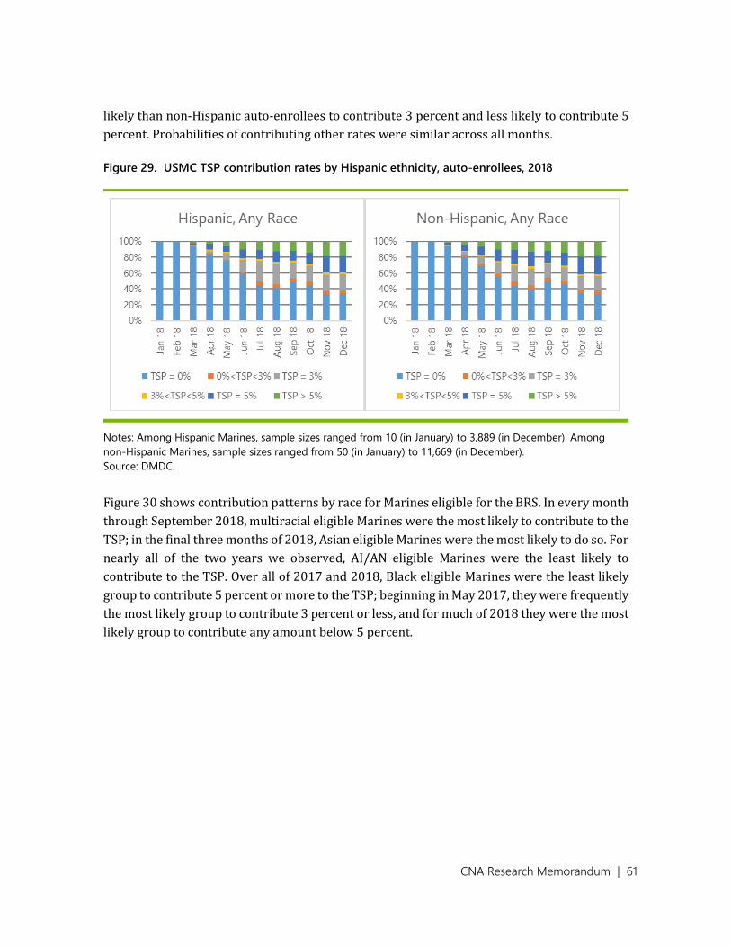
CNA Research Memorandum | 61
likely than non-Hispanic auto-enrollees to contribute 3 percent and less likely to contribute 5
percent. Probabilities of contributing other rates were similar across all months.
Figure 29. USMC TSP contribution rates by Hispanic ethnicity, auto-enrollees, 2018
Notes: Among Hispanic Marines, sample sizes ranged from 10 (in January) to 3,889 (in December). Among
non-Hispanic Marines, sample sizes ranged from 50 (in January) to 11,669 (in December).
Source: DMDC.
Figure 30 shows contribution patterns by race for Marines eligible for the BRS. In every month
through September 2018, multiracial eligible Marines were the most likely to contribute to the
TSP; in the final three months of 2018, Asian eligible Marines were the most likely to do so. For
nearly all of the two years we observed, AI/AN eligible Marines were the least likely to
contribute to the TSP. Over all of 2017 and 2018, Black eligible Marines were the least likely
group to contribute 5 percent or more to the TSP; beginning in May 2017, they were frequently
the most likely group to contribute 3 percent or less, and for much of 2018 they were the most
likely group to contribute any amount below 5 percent.

CNA Research Memorandum | 62
Figure 30. USMC TSP contribution rates by race, eligible for the BRS, 2017–2018
Notes: For AI/AN Marines, sample sizes ranged from 1,466 (December 2018) to 1,631 (January 2018). For Asian
Marines, sample sizes ranged from 4,321 (December 2018) to 4,630 (January 2018). For Black Marines, sample
sizes ranged from 14,454 (December 2018) to 16,382 (January 2018). For NH/PI Marines, sample sizes ranged
from 1,595 (December 2018) to 1,775 (March 2017). For White Marines, sample sizes ranged from 115,926
(December 2018) to 127,532 (January 2018). For Marines of two or more races, sample sizes ranged from 1,403
(September and October 2017) to 1,616 (December 2018).
Source: DMDC.

CNA Research Memorandum | 63
As Figure 31 shows, beginning in May 2017, non-Hispanic eligible Marines were between 3.0
and 4.2 percentage points more likely than Hispanic Marines to contribute to the TSP and
between 3.0 and 4.3 percentage points more likely to contribute 5 percent. Differences across
other contribution categories were small—at most 0.6 percentage points.
Figure 31. USMC TSP contribution rates by Hispanic ethnicity, eligible for the BRS, 2017–2018
Notes: Among Hispanic Marines, sample sizes ranged from 30,331 (in January 2017) to 32,574 (in February
2018). Among non-Hispanic Marines, sample sizes ranged from 108,680 (in December 2018) to 121,820 (in
January 2017).
Source: DMDC.
Figure 32 shows that among those ineligible for the BRS, Asian Marines were the most likely to
contribute to the TSP in every month from May 2017 onward, while Black Marines were the
least likely. Asian ineligible Marines also were by far the most likely to contribute over 5
percent; the next-closest group never came closer than 8 percentage points. AI/AN, Black, and
NH/PI ineligible Marines were the least likely groups to contribute over 5 percent; in any given
month from May 2017 onward, one of these groups was the least likely contribute this amount,
and differences between the three groups only infrequently exceeded 1 percentage point.
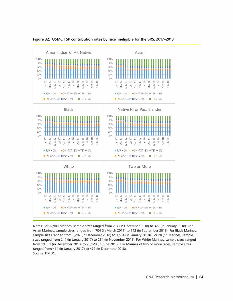
CNA Research Memorandum | 64
Figure 32. USMC TSP contribution rates by race, ineligible for the BRS, 2017–2018
Notes: For AI/AN Marines, sample sizes ranged from 297 (in December 2018) to 322 (in January 2018). For
Asian Marines, sample sizes ranged from 704 (in March 2017) to 743 (in September 2018). For Black Marines,
sample sizes ranged from 3,207 (in December 2018) to 3,584 (in January 2018). For NH/PI Marines, sample
sizes ranged from 244 (in January 2017) to 264 (in November 2018). For White Marines, sample sizes ranged
from 19,551 (in December 2018) to 20,120 (in June 2018). For Marines of two or more races, sample sizes
ranged from 414 (in January 2017) to 472 (in December 2018).
Source: DMDC.
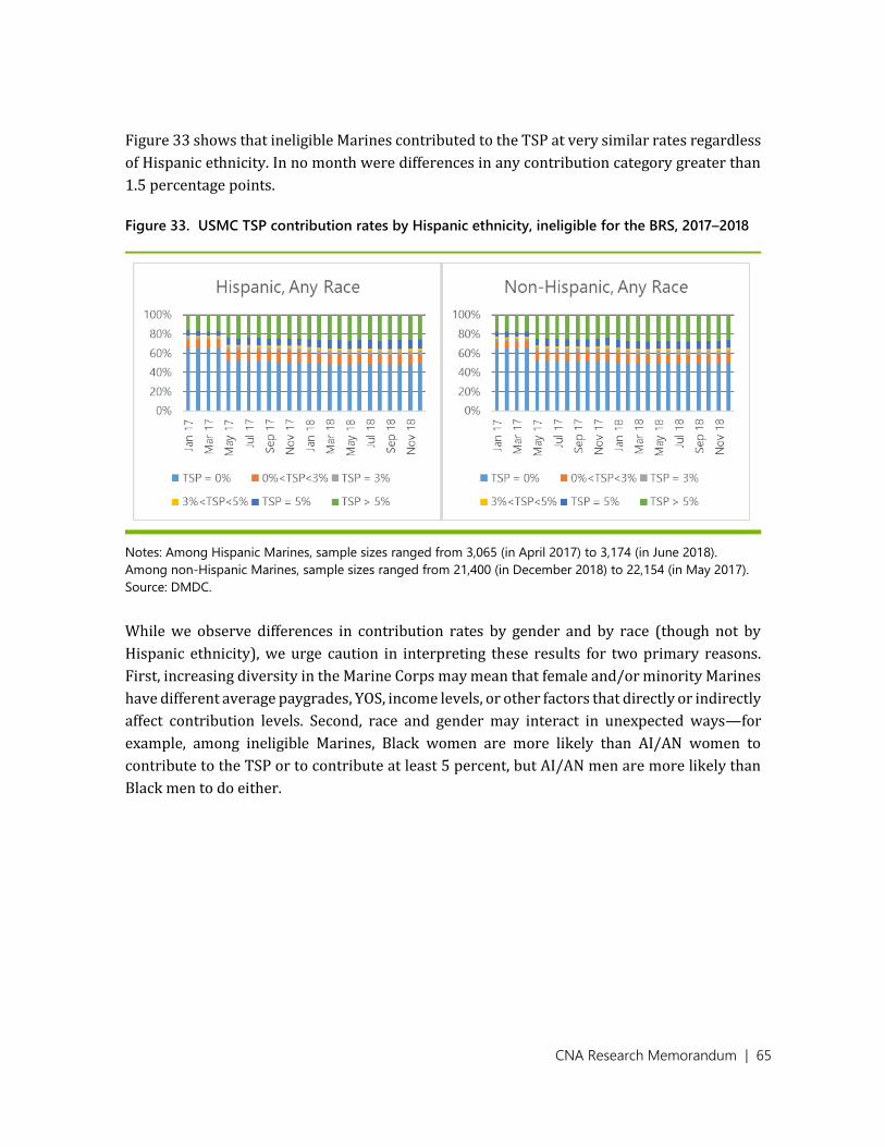
CNA Research Memorandum | 65
Figure 33 shows that ineligible Marines contributed to the TSP at very similar rates regardless
of Hispanic ethnicity. In no month were differences in any contribution category greater than
1.5 percentage points.
Figure 33. USMC TSP contribution rates by Hispanic ethnicity, ineligible for the BRS, 2017–2018
Notes: Among Hispanic Marines, sample sizes ranged from 3,065 (in April 2017) to 3,174 (in June 2018).
Among non-Hispanic Marines, sample sizes ranged from 21,400 (in December 2018) to 22,154 (in May 2017).
Source: DMDC.
While we observe differences in contribution rates by gender and by race (though not by
Hispanic ethnicity), we urge caution in interpreting these results for two primary reasons.
First, increasing diversity in the Marine Corps may mean that female and/or minority Marines
have different average paygrades, YOS, income levels, or other factors that directly or indirectly
affect contribution levels. Second, race and gender may interact in unexpected ways—for
example, among ineligible Marines, Black women are more likely than AI/AN women to
contribute to the TSP or to contribute at least 5 percent, but AI/AN men are more likely than
Black men to do either.
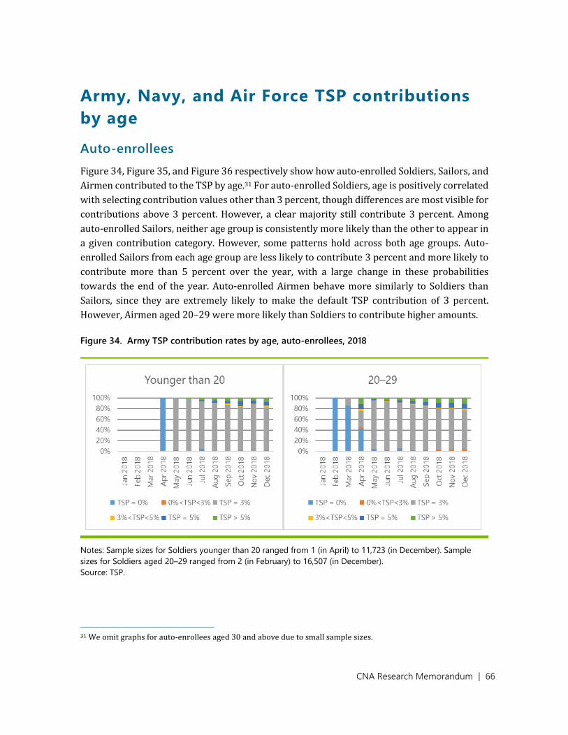
CNA Research Memorandum | 66
Army, Navy, and Air Force TSP contributions
by age
Auto-enrollees
Figure 34, Figure 35, and Figure 36 respectively show how auto-enrolled Soldiers, Sailors, and
Airmen contributed to the TSP by age.31 For auto-enrolled Soldiers, age is positively correlated
with selecting contribution values other than 3 percent, though differences are most visible for
contributions above 3 percent. However, a clear majority still contribute 3 percent. Among
auto-enrolled Sailors, neither age group is consistently more likely than the other to appear in
a given contribution category. However, some patterns hold across both age groups. Auto-
enrolled Sailors from each age group are less likely to contribute 3 percent and more likely to
contribute more than 5 percent over the year, with a large change in these probabilities
towards the end of the year. Auto-enrolled Airmen behave more similarly to Soldiers than
Sailors, since they are extremely likely to make the default TSP contribution of 3 percent.
However, Airmen aged 20–29 were more likely than Soldiers to contribute higher amounts.
Figure 34. Army TSP contribution rates by age, auto-enrollees, 2018
Notes: Sample sizes for Soldiers younger than 20 ranged from 1 (in April) to 11,723 (in December). Sample
sizes for Soldiers aged 20–29 ranged from 2 (in February) to 16,507 (in December).
Source: TSP.
31 We omit graphs for auto-enrollees aged 30 and above due to small sample sizes.
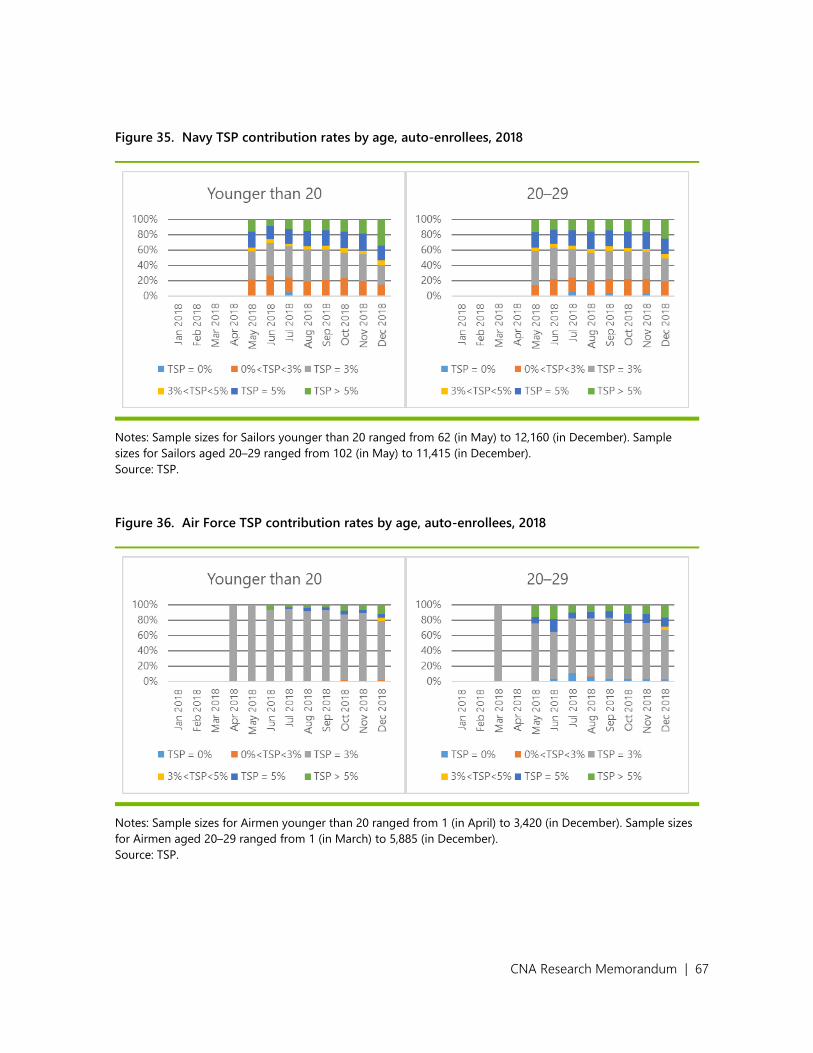
CNA Research Memorandum | 67
Figure 35. Navy TSP contribution rates by age, auto-enrollees, 2018
Notes: Sample sizes for Sailors younger than 20 ranged from 62 (in May) to 12,160 (in December). Sample
sizes for Sailors aged 20–29 ranged from 102 (in May) to 11,415 (in December).
Source: TSP.
Figure 36. Air Force TSP contribution rates by age, auto-enrollees, 2018
Notes: Sample sizes for Airmen younger than 20 ranged from 1 (in April) to 3,420 (in December). Sample sizes
for Airmen aged 20–29 ranged from 1 (in March) to 5,885 (in December).
Source: TSP.

CNA Research Memorandum | 68
Opt-ins
Figure 37, Figure 38, and Figure 39 respectively show how TSP contribution rates varied by
age for Soldiers, Sailors, and Airmen who opted in to the BRS.32 In all three figures, age is
positively correlated with the probability of contributing 5 percent or more than 5 percent and
negatively correlated with the probability of contributing nothing. Opt-ins of all age groups
were far less likely than auto-enrollees of either age group above to contribute the default of 3
percent, regardless of Service. As with opt-ins overall, contribution patterns among all age
groups remained relatively stable from March 2018 onward. Soldiers younger than 20 who
opted in had the greatest variation in contribution patterns across Services and age groups;
this may reflect that even though there are more Soldiers under age 20 than Sailors or Airmen,
fewer Soldiers under age 20 opted in to the BRS than Sailors or Airmen. Across all age groups,
Soldiers were less likely than Sailors or Airmen to contribute over 5 percent; Soldiers younger
than 40 also were more likely than Sailors or Airmen to contribute nothing.
32 In each figure, we omit those aged 50 and above due to small sample sizes.

CNA Research Memorandum | 69
Figure 37. Army TSP contribution rates by age, opt-ins, 2018
Notes: Sample sizes for Soldiers younger than 20 ranged from 37 (in February) to 1,799 (in December). Sample
sizes for Soldiers aged 20–29 ranged from 1,337 (in February) to 40,028 (in December). Sample sizes for
Soldiers aged 30–39 ranged from 564 (in February) to 12,236 (in December). Sample sizes for Soldiers aged
40–49 ranged from 39 (in February) to 1,012 (in December).
Source: TSP.

CNA Research Memorandum | 70
Figure 38. Navy TSP contribution rates by age, opt-ins, 2018
Notes: Sample sizes for Sailors younger than 20 ranged from 2 (in January) to 12,161 (in December). Sample
sizes for Sailors aged 20–29 ranged from 24 (in January) to 97,341 (in December). Sample sizes for Sailors aged
30–39 ranged from 17 (in January) to 12,892 (in December). Sample sizes for Sailors aged 40–49 ranged from
25 (in February) to 565 (in December).
Source: TSP.

CNA Research Memorandum | 71
Figure 39. Air Force TSP contribution rates by age, opt-ins, 2018
Notes: Sample sizes for Airmen younger than 20 ranged from 34 (in February) to 2,555 (in December). Sample
sizes for Airmen aged 20–29 ranged from 1,017 (in February) to 40,740 (in December). Sample sizes for Airmen
aged 30–39 ranged from 1 (in January) to 7,965 (in December). Sample sizes for Airmen aged 40–49 ranged
from 14 (in February) to 289 (in December).
Source: TSP.

CNA Research Memorandum | 72
Army, Navy, and Air Force TSP contribution
rates by basic pay level
Auto-enrollees
Figure 40, Figure 41, and Figure 42 show the respective contribution rates among auto-
enrolled Soldiers, Sailors, and Airmen by pay range.33 These figures should be interpreted with
caution, and are placed here rather than in the body of the report, both because they do not
contain BAH or BAS (which may affect contribution levels) and because sample sizes fluctuate
substantially from month to month.34 In particular, the number of Servicemembers earning
$25,000–$49,999 drops noticeably in October 2018 for all three Services. Similarly, the
number of Soldiers, Sailors, and Airmen earning less than $25,000 falls precipitously in
December 2018, coincident with sharp increases in the numbers of Servicemembers in higher
basic pay bands (though only those earning $25,000–$49,999 are shown here). It is possible
that these fluctuations could reflect inconsistencies in how Servicemembers were paid in the
beginning of the fiscal year; however, additional research and data would be necessary to
determine whether this is in fact the case.
As with Marines, increases in income are correlated with increases in the probability of
contributing 5 percent or more to the TSP across the other three Services. However,
contribution levels among auto-enrollees earning $25,000–$49,999 fluctuate considerably
across all three Services due to low sample sizes earlier in the year and the large variation in
sample sizes between September and December. Across all three Services, there is a downward
trend in the share contributing 3 percent (ignoring October and December due to sample size
inconsistency), though this is most clearly visible in the Navy.
33 We omit graphs for Servicemembers earning $50,000 or more, since very few auto-enrollees in any Service
earned this amount prior to December 2018.
34 Additionally, they do not include BAH or BAS, which may affect contribution levels.

CNA Research Memorandum | 73
Figure 40. Army TSP contribution rates by annualized basic pay, auto-enrollees, 2018
Notes: Sample sizes for Soldiers earning less than $25,000 ranged from 1 (in March) to 16,443 (in November).
Sample sizes for Soldiers earning $25,000–$49,999 ranged from 3 (in February) to 22,275 (in December).
Source: TSP.
Figure 41. Navy TSP contribution rates by annualized basic pay, auto-enrollees, 2018
Notes: Sample sizes for Sailors earning less than $25,000 ranged from 31 (in May) to 11,081 (in October).
Sample sizes for Sailors earning $25,000–$49,999 ranged from 122 (in May) to 14,612 (in December).
Source: TSP.

CNA Research Memorandum | 74
Figure 42. Air Force TSP contribution rates by annualized basic pay, auto-enrollees, 2018
Notes: Sample sizes for Airmen earning less than $25,000 ranged from 48 (in May) to 5,512 (in November).
Sample sizes for Airmen earning $25,000–$49,999 ranged from 1 (in April) to 7,257 (in December).
Source: TSP.
Opt-ins
Figure 43, Figure 44, and Figure 45 respectively show how Soldiers, Sailors, and Airmen who
opted in to the BRS contributed to the TSP. As with auto-enrollees, these figures should be
taken with caution. For example, many more Servicemembers had over $75,000 of annualized
basic pay and many fewer had under $50,000 in annualized pay in March and in December
than in any of the intervening months. Furthermore, as with auto-enrollees, there is a
noticeable dip in the number of Servicemembers earning annualized basic pay over $100,000
in October relative to September or November. Any interpretation of patterns in the data
should therefore focus primarily on April through September.
Opt-in Soldiers were less likely than Sailors or Airmen to make any contribution or to
contribute over 5 percent to the TSP. Across all three Services, basic pay levels correlated with
any contribution. Sailors were the most likely group across all income categories to contribute
between 0 and 3 percent. These graphs do not show evidence of Servicemembers reaching the
TSP contribution limit, which could reflect that many Soldiers, Sailors, and Airmen opted in
over the course of the year, that contribution rates over 30 percent were flagged as potential
errors, or other factors.

CNA Research Memorandum | 75
Figure 43. Army TSP contribution rates by annualized basic pay, opt-ins, 2018
Notes: Between 72 (February) and 6,181 (November) Soldiers earned less than $25,000. Between 321
(February) and 31,627 (November) Soldiers earned $25,000–$49,999. Between 722 (February) and 23,642
(December) Soldiers earned $50,000–$74,999. Between 293 (February) and 10,452 (December) Soldiers earned
$75,000–$99,999. Between 7 (October) and 4,856 (December) Soldiers earned $100,000–$124,999. Between 4
(October) and 6,266 (December) earned $125,000-$150,000.
Source: TSP.

CNA Research Memorandum | 76
Figure 44. Navy TSP contribution rates by annualized basic pay, opt-ins, 2018
Notes: Between 42 (January) and 28,338 (November) Sailors earned less than $25,000. Between 1 (January) and
62,139 (November) Sailors earned $25,000–$49,999. Between 757 (February) and 57,487 (December) Sailors
earned $50,000–$74,999. Between 334 (February) and 13,678 (December) Sailors earned $75,000–$99,999.
Between 34 (October) and 5,334 (December) Sailors earned $100,000–$124,999. Between 26 (October) and
7,105 (December) Sailors earned $125,000–$149,999.
Source: TSP.

CNA Research Memorandum | 77
Figure 45. Air Force TSP contribution rates by annualized basic pay, opt-ins, 2018
Notes: Between 1 (January) and 14,498 (November) Airmen earned less than $25,000. Between 252 (February)
and 22,516 (November) Airmen earned $25,000–$49,999. Between 455 (February) and 19,788 (December)
Airmen earned $50,000–$74,999. Between 164 (February) and 5,153 (December) Airmen earned $75,000–
$99,999. Between 2 (October) and 2,924 (December) Airmen earned $100,000–$124,999. Between 2 (October)
and 6,368 (December) Airmen earned $125,000–$149,999.
Source: TSP.

CNA Research Memorandum | 78
Figures
Figure 1. Retirement system eligibility.................................................................................................. 4
Figure 2. Army, Navy, and Air Force TSP contribution rates, auto-enrollees, 2018 ......... 15
Figure 3. Army, Navy, and Air Force TSP contribution rates, opt-ins, 2018 ........................ 17
Figure 4. USMC TSP contribution rates by retirement system eligibility group ................ 19
Figure 5. TSP contribution rates by age among auto-enrolled Soldiers, Sailors, and
Airmen, September 2018 ....................................................................................................... 24
Figure 6. TSP contribution rates by age among opt-in Soldiers, Sailors, and Airmen,
September 2018 ......................................................................................................................... 25
Figure 7. TSP contribution rates by age and eligibility category among Marines,
September 2018 ......................................................................................................................... 26
Figure 8. TSP contribution rates by enlisted paygrade and eligibility category among
Marines, September 2018 ...................................................................................................... 28
Figure 9. TSP contribution rates by officer paygrade and eligibility category among
Marines, September 2018 ...................................................................................................... 29
Figure 10. TSP contribution rates by RMC and eligibility category among Marines,
September 2018 ......................................................................................................................... 30
Figure 11. Evidence that eligible Marine Corps O4s may reach the elective deferral
limit too soon ............................................................................................................................... 33
Figure 12. USMC TSP contribution rates by auto-enrollees, including zero values ............. 39
Figure 13. USMC TSP contribution rates by enlisted paygrade, auto-enrollees, 2018 ....... 41
Figure 14. USMC TSP contribution rates by enlisted paygrade, eligible for the BRS,
2017–2018 ................................................................................................................................... 42
Figure 15. USMC TSP contribution rates by enlisted paygrade, ineligible for the BRS,
2017–2018 ................................................................................................................................... 43
Figure 16. USMC TSP contribution rates for O1, auto-enrollees, 2018 ..................................... 44
Figure 17. USMC TSP contribution rates by officer paygrade, eligible for the BRS,
2017–2018 ................................................................................................................................... 46
Figure 18. USMC TSP contribution rates by officer paygrade, ineligible for the BRS,
2017–2018 ................................................................................................................................... 47
Figure 19. USMC TSP contribution rates by age, auto-enrollees, 2018..................................... 49
Figure 20. USMC TSP contribution rates by total gross annual income, auto-enrollees,
2017–2018 ................................................................................................................................... 50
Figure 21. USMC TSP contribution rates by age, eligible for the BRS, 2017–2018 .............. 51
Figure 22. USMC TSP contribution rates by total gross annual income, eligible for the
BRS, 2017–2018 ......................................................................................................................... 53

CNA Research Memorandum | 79
Figure 23. USMC TSP contribution rates by age, ineligible for the BRS, 2017–2018 .......... 54
Figure 24. USMC TSP contribution rates by total gross annual income, ineligible for
the BRS, 2017–2018 ................................................................................................................. 56
Figure 25. USMC TSP contribution rates by gender, auto-enrollees, 2018 ............................. 57
Figure 26. USMC TSP contribution rates by gender, eligible for the BRS, 2017–2018 ....... 58
Figure 27. USMC TSP contribution rates by gender, ineligible for the BRS, 2017–2018 ... 59
Figure 28. USMC TSP contribution rates by race, auto-enrollees, 2018 ................................... 60
Figure 29. USMC TSP contribution rates by Hispanic ethnicity, auto-enrollees, 2018 ...... 61
Figure 30. USMC TSP contribution rates by race, eligible for the BRS, 2017–2018 ............ 62
Figure 31. USMC TSP contribution rates by Hispanic ethnicity, eligible for the BRS,
2017–2018 ................................................................................................................................... 63
Figure 32. USMC TSP contribution rates by race, ineligible for the BRS, 2017–2018 ........ 64
Figure 33. USMC TSP contribution rates by Hispanic ethnicity, ineligible for the BRS,
2017–2018 ................................................................................................................................... 65
Figure 34. Army TSP contribution rates by age, auto-enrollees, 2018 ..................................... 66
Figure 35. Navy TSP contribution rates by age, auto-enrollees, 2018 ...................................... 67
Figure 36. Air Force TSP contribution rates by age, auto-enrollees, 2018 .............................. 67
Figure 37. Army TSP contribution rates by age, opt-ins, 2018 .................................................... 69
Figure 38. Navy TSP contribution rates by age, opt-ins, 2018 ..................................................... 70
Figure 39. Air Force TSP contribution rates by age, opt-ins, 2018 ............................................. 71
Figure 40. Army TSP contribution rates by annualized basic pay, auto-enrollees, 2018 .. 73
Figure 41. Navy TSP contribution rates by annualized basic pay, auto-enrollees, 2018... 73
Figure 42. Air Force TSP contribution rates by annualized basic pay, auto-enrollees,
2018 ................................................................................................................................................ 74
Figure 43. Army TSP contribution rates by annualized basic pay, opt-ins, 2018 ................. 75
Figure 44. Navy TSP contribution rates by annualized basic pay, opt-ins, 2018 .................. 76
Figure 45. Air Force TSP contribution rates by annualized basic pay, opt-ins, 2018 ......... 77

CNA Research Memorandum | 80
Abbreviations
AC Active Component
AI/AN American Indian/Alaska Native
BAH Basic Allowance for Housing
BAS Basic Allowance for Subsistence
BRS Blended Retirement System
DFAS Defense Finance and Accounting Services
DIEMS Date of Initial Entry into Military Service
DIEUS Date of Initial Entry to Uniformed Services
DMDC Defense Manpower Data Center
DOD Department of Defense
FMO Force Management Objective
FRTIB Federal Retirement Thrift Investment Board
LOS Length of Service
MCRMC Military Compensation and Retirement Modernization Commission
NDAA National Defense Authorization Act
NH/PI Native Hawai’ian/Pacific Islander
PDR Personal Discount Rate
QRMC Quadrennial Review of Military Compensation
CNA Research Memorandum | 81
References
[1] Public Law 114-328. 2016. National Defense Authorization Act for Fiscal Year 2017.[2] Public Law 112-239. 2012. National Defense Authorization Act for Fiscal Year 2013.[3] Asch, Beth J., Michael G. Mattock, and James Hosek. 2015. “Reforming Military Retirement:
Analysis in Support of the Military Compensation and Retirement Modernization Commission.” RAND.
[4] Huff, Jared M., Mikhail Smirnov, Gregg Schell, and James E. Grefer. 2018. (U) Estimating the retention effects of Continuation Pay. . CNA. DRM-2018-U-017177-Final.
[5] Grefer, James E. 2016. (U) Military Retirement Reform: An Initial Look at Potential Effects on Navy and Marine Corps Personnel. . CNA. DRM-2016-U-013523-Final.
[6] Military Compensation and Retirement Modernization Commission. 2015. Report of the Military Compensation and Retirement Modernization Commission: Final Report.
[7] Public Law 114-92. 2015. National Defense Authorization Act for Fiscal Year 2016.[8] Office of Financial Readiness. 2017. BRS Uniformed Services Blended Retirement System: A Guide
to the Uniformed Services Blended Retirement System.https://militarypay.defense.gov/Portals/3/Documents/BlendedRetirementDocuments/A%2 0Guide%20to%20the%20Uniformed%20Services%20BRS%20December%202017.pdf?ver=2
17-12-18-140805-343.[9] Gilmore, Gerry J. 2001. “Military TSP Savings Plan Enrollments Start Oct. 9.” DoD News.[10] BRS Uniformed Services Blended Retirement System. 2019. “Continuation Pay Rates - 2019.”
https://militarypay.defense.gov/Portals/3/Documents/BlendedRetirementDocuments/2019-1-07.pdf?ver=2019-01-16-092802-143.
[11] Grefer, James E., Shannon P. Desrosiers, Jeffery M. Peterson, Lewis G. Lee, and Aline O. Quester. 2016. (U) The Military Compensation and Retirement Modernization Commission’s Blended Retirement Plan: A First Look at Marine Corps Implications. . CNA. DRM-2015-U-011370-1Rev.
[12] Ladner, Justin A., and Lauren Malone. 2018. (U) Optimal Timing of Blended Retirement System Continuation Pay: Should It Vary by Occupational Group? Unclassified. CNA. DSA-2018-U-018446-Final.
[13] Grefer, James E., and Ann D. Parcell. 2017. (U) Viewing the lump-sum option in the Blended Retirement System (BRS) as a loan. Unclassified. CNA. DSA-2017-U-015350-Final.
[14] Lien, Diana S. 2016. (U) Blended Retirement System: Background and Lump Sum Payments. Unclassified. CNA. DSA-2016-U-013999-Final.
[15] Lien, Diana S., and Omer E. Alper. 2016. (U) Blended Retirement System lump sum determination: Guiding principles and potential options. Unclassified. CNA. DSA-2016-U-014144-Final.
[16] Asch, Beth J., James Hosek, and Michael G. Mattock. 2014. “Toward Meaningful Military Compensation Reform: Reseach in Support of DoD's Review.” RAND.
[17] Asch, Beth J., Michael G. Mattock, and James Hosek. 2019. “Effects of the Blended Retirement System on United States Army Reserve Participation and Cost.” RAND.
[18] Grefer, James E., Ann D. Parcell, Robert Trost, Jared M. Huff, William C. Komiss, Robert W. Shuford, Omer E. Alper, Catherine M. Hiatt, David Gregory, and Jeffrey M. Peterson. 2016. (U) The Military Compensation and Retirement Modernization Commission’s Blended Retirement Plan: Implications for Marine Corps Force Management Objectives. Unclassified. CNA. DRM-2016-U-014008-Final.
[19] Brockert, Nicholas D. 2019. “Blended Retirement System Opt-In Decisions: A Behavioral Economic Analysis.” Master's Thesis, Naval Postgraduate School.

CNA Research Memorandum | 82
[20] Pontiff, Michael Eldon. 2018. “Readiness for Blended Retirement: A Descriptive Analysis ofFinancial Literacy Among Young American Military Members.” Doctoral Dissertation, LibertyUniversity.
[21] Poterba, James, Steven Venti, and David A. Wise. 2006. “The Decline of Defined BenefitRetirement Plans and Asset Flows.” National Bureau of Economic Research.
[22] Broadbent, John, Michael Palumbo, and Elizabeth Woodman. 2006. “The Shift from DefinedBenefit to Defined Contribution Pension Plans - Implications for Asset Allocation and RiskManagement.” Working Paper.
[23] McFarland, Brendan. 2016. “A Continuing Shift in Retirement Offerings in the Fortune 500.”Insider (Willis Towers Watson) 26 (2).
[24] US Bureau of Labor Statistics. 2016. Employee Benefits in the United States, March 2016.Retirement benefits: Access, participation, and take-up rates. Bulletin 2785, table 2.https://www.bls.gov/ncs/ebs/benefits/2016/ownership/private/table02a.htm.
[25] Benartzi, Shlomo, and Richard H. Thaler. 2007. “Heuristics and Biases in Retirement SavingsBehavior.” Journal of Economic Perspectives 21 (3): 81-104.
[26] Choi, James, David Laibson, and Brigitte Madrian. 2011. “$100 Bills on the Sidewalk: Violationsof No-Arbitrage in 401(k) Accounts.” The Review Of Economics and Statistics 93 (3): 748-763.
[27] Choi, James J., David Laibson, Brigitte Madrian, and Andrew Metrick. 2002. “DefinedContribution Pensions: Plan Rules, Participation Decisions, and the Path of Least Resistance.”Tax Policy and the Economy 16: 67-113.
[28] Madrian, Brigitte C., and Dennis F. Shea. 2001. “The Power of Suggestion: Inertia in 401(k)Participation and Savings Behavior.” The Quarterly Journal of Economics 116 (4).
[29] Chingos, Matthew M., and Martin R. West. 2015. “Which Teachers Choose a DefinedContribution Pension Plan? Evidence from the Florida Retirement System.” Education Financeand Policy 10 (2): 193-222.
[30] 2017. How America Saves 2017: Vanguard 2017 Defined Contribution Plan Data. Vanguard.[31] Huberman, Gur, Sheena S. Iyengar, and Wei Jiang. 2007. “Defined Contribution Pension Plans:
Determinants of Participation and Contribution Rates.” Journal of Financial Services Research31 (1): 1-32.
[32] Engelhardt, Gary V., and Anil Kumar. 2007. “Employer Matching and 401(k) Saving: Evidencefrom the Health and Retirement Survey.” Journal of Public Economics 91: 1920-1943.
[33] MARADMIN 085/17. 2017. BLENDED RETIREMENT SYSTEM (BRS) TRAININGANNOUNCEMENT.
[34] IDA. 2019. “Analysis of a Salary-Based Pay System.”[35] Tee Ramos, Director, Office of Particpant Services. 2019. “Announcement of Upcoming Change
to the Automatic Enrollment Percentage for Thrift Savings Plan Participants.” TSPBulletin forAgency TSP Representatives. https://www.tsp.gov/PDF/bulletins/19-04.html.

CNA Research Memorandum | 83
This page intentionally left blank.

This report was written by CNA’s Resources and Force Readiness Division (RFR).
RFR provides analytic support grounded in data to inform resource, process, and policy decisions that affect military and force readiness. RFR’s quantitative and qualitative analyses provide insights on a full range of resource allocation and investment decisions, including those pertaining to manning, maintenance, supply, and training. Drawing on years of accumulated individual and unit data, as well as primary data collections, the RFR toolbox includes predictive data analytics, statistical analysis, and simulation to answer optimization and what-if questions, allowing military leaders to make better informed decisions.

DRM-2019-U-021622-Final
3003 Washington Boulevard, Arlington, VA 22201
www.cna.org ● 703-824-2000
CNA is a not-for-profit research organization that serves the public interest by providing in-depth analysis and result-oriented solutions to help government leaders choose the
best course of action in setting policy and managing operations.

-1—0—
Preparation of this report and its underlying studies cost the Department of Defense a total of approximately $5,680,000 in Fiscal Years 2018–2020.
Report of
The Thirteenth Quadrennial Review of Military CompensationNovember 2020
Department of DefenseOffice of the Under Secretary of Defense
for Personnel and ReadinessWashington, D.C.
Th
e T
hirte
en
th Q
ua
dre
nn
ial R
ev
iew
of M
ilitary
Co
mp
en
sa
tion
Vo
lum
e I
Volume I. Main Report
586-92551-QRMC_cover_vol1.indd 1 10/29/20 11:25 AM