Embed Size (px)
Citation preview

Answers
Predicting the sales and airplay of popular music
The plot of sales versus airplay indicates a modest positive relationship, although the variation is quite
large. The plots for sales last week versus airplay this week and sales last week versus airplay last week are
similar.
0 10 20 30 40 50 60 70 80
0
10
20
30
40
50
60
70
Airplay list rank
Sal
es li
st r
ank
0 10 20 30 40 50 60 70 80
0
10
20
30
40
50
60
70
80
Airplay list rank
Sal
es r
ank
last
wee
k
c 1999, Je�rey S. Simono�

0 10 20 30 40 50 60 70 80
0
10
20
30
40
50
60
70
80
Airplay rank last week
Sal
es r
ank
last
wee
k
The plot of change in sales versus the change in airplay indicates an extreme outlier with a change in
sales of 44 places. This is \Quit Playing Games (With My Heart)" by Backstreet Boys. This was the �rst
week it was on the sales chart and it ranked 32nd in sales. The jump in sales is at least this much, as the
imputed rank for last week (76) is conservative (that is, it could have been much larger). With this case
removed there is apparently no relationship between change in sales rank and change in airplay rank. This
is a bit surprising, since we might expect a direct relationship (it's di�cult to sort out which direction a
causal link might be | does more airplay cause more sales, or do radio stations play popular songs more |
but a direct relationship is expected either way).
c 1999, Je�rey S. Simono�

-10 -5 0 5
-10
0
10
20
30
40
Change in airplay rank
Cha
nge
in s
ales
ran
k
-10 -5 0 5
-10
0
10
Change in airplay rank
Cha
nge
in s
ales
ran
k
The change in sales decreases steadily as the number of weeks on the sales charts increases, along with
the high outlier in the �rst week on the chart. A similar pattern occurs for the change in airplay as the
number of weeks on the airplay charts increases. Presumably this re ects the aging process of the song's
popularity.
c 1999, Je�rey S. Simono�
0 10 20 30
-10
0
10
20
30
40
Weeks on sales list
Cha
nge
in s
ales
ran
k
0 5 10 15 20 25 30 35
-10
-5
0
5
Weeks on airplay list
Cha
nge
in a
irpla
y ra
nk
Histogram bins and anchors and stock data
Consider �rst the price change variable. The histogram of this variable is quite insensitive to the choice
of bin width. Bin widths ranging from 2 to 15 all indicate a unimodal shape for the variable. Here are two
extreme examples: histograms based on bin widths 2 and 15, respectively. The �rst is undersmoothed (the
bins are too narrow, making the histogram too rough), while the second is oversmoothed (the bins are too
wide, making the histogram too smooth), yet both still show the unimodal shape:
c 1999, Je�rey S. Simono�

-20 -10 0 10 20 30 40
0
5
10
15
Weekly price change
Freq
uenc
y
-30 -10 10 30 50
0
10
20
30
40
50
60
70
Weekly price change
Freq
uenc
y
The choice of the anchor seems to have virtually no e�ect at all; varying it does not a�ect the shape of
the histograms. Thus, there is every reason to think that the unimodal shape of this variable is genuine.
The situation is di�erent for the sales volume data. The only sensible anchor position to use for this
variable is 0, since this is a natural boundary of the variable (any lower value would imply negative sales
volumes in the �gure, and the highest possible value is 3). The bin width is di�cult to choose, because of
the long right tail in the distribution; a large bin width (1000) reinforces the long tail, but obscures any
structure close to zero, while a small bin width (100) allows structure to come through, but leads to overall
bumpiness.
c 1999, Je�rey S. Simono�

0 1000 2000 3000 4000 5000 6000 7000 8000 9000 10000
0
10
20
30
40
50
60
70
80
Weekly sales volume
Freq
uenc
y
1000050000
40
30
20
10
0
Weekly sales volume
Freq
uenc
y
Statistical theory suggests that the anchor position will have a smaller e�ect on the appearance of
histograms than the bin width does. Detailed investigation of the e�ect of anchor position on the properties
of the histogram can be found in \The anchor position of histograms and frequency polygons: quantitative
and qualitative smoothing" by J.S. Simono�, Communications in Statistics | Simulation and Computation,
24, 691{710 (1995) and \Measuring the stability of histogram appearance when the anchor position is
changed" by J.S. Simono� and F. Udina, Computational Statistics and Data Analysis, 21, 335{353 (1996).
By the way, the way to control the anchor position and bin width for a histogram is by setting the
cutpoints of the histogram into a column yourself. For example, for the second histogram, I clicked on
c 1999, Je�rey S. Simono�

Calc ! Make patterned data ! Simple Set of Numbers. I entered a column name C6 under Store
patterned data in:, and entered 0 under From first value:, 10000 under To last value:, 100 under
In steps of:, and then clicked OK. Then, I went to Graph ! Histogram, and after entering the variable
name under X, I clicked on Options. I clicked the radio button next to CutPoint under Type of Intervals,
clicked the radio button next to Midpoint/cutpoint positions:, and entered C6 in the box. This tells
MINITAB to create a histogram with bins that anchor at 0 and have width 100.
Stock data by market
Here are summary statistics separated by market:
Descriptive Statistics
Variable Market N Mean Median Tr Mean StDev SE Mean
Weekly p OTC 51 0.64 0.00 0.09 9.43 1.32
NYSE 24 -0.03 -0.85 -0.58 5.96 1.22
ASE 13 3.49 1.30 2.79 6.18 1.71
Weekly s OTC 51 263.0 113.0 227.1 316.0 44.3
NYSE 24 916 447 560 1912 390
ASE 13 78.5 34.0 73.3 68.7 19.0
Price to OTC 51 23.20 20.00 21.87 12.82 1.79
NYSE 24 22.46 20.00 21.36 12.22 2.49
ASE 13 18.69 18.00 18.09 6.52 1.81
Variable Market Min Max Q1 Q3
Weekly p OTC -19.40 34.20 -5.00 4.40
NYSE -7.60 19.70 -4.55 1.38
ASE -4.10 18.80 -1.05 6.30
Weekly s OTC 3.0 1219.0 33.0 354.0
NYSE 28 9639 141 902
ASE 13.0 202.0 23.5 142.0
Price to OTC 3.00 66.00 15.00 28.00
NYSE 10.00 59.00 14.25 26.00
ASE 10.00 34.00 13.50 22.50
c 1999, Je�rey S. Simono�

OTC NYSE ASE
-20
-10
0
10
20
30
40
Market
Wee
kly
pric
e ch
ange
The price changes are pretty similar for the three markets, with the ASE values slightly higher. It's
not surprising that all three markets would be similar in terms of price change, since if one market could
consistently outperform another, people would put all of their money there.
The sales volume �gures are very di�erent, exhibiting very long right tails.
OTC NYSE ASE
0
5000
10000
Market
Wee
kly
sale
s vo
lum
e
These data are better analyzed in the log scale, as that brings in the long right tails:
c 1999, Je�rey S. Simono�

OTC NYSE ASE
0
1
2
3
4
Market
Logg
ed s
ales
vol
ume
It is apparent that the sales volume is highest in the NYSE, followed by OTC and then ASE. Since
blue chip stocks are more likely to be listed on the NYSE, a higher sales volume would be expected. The
American Stock Exchange trails behind, in keeping with its somewhat less{than{exciting image.
OTC NYSE ASE
0
10
20
30
40
50
60
70
Market
Pric
e to
ear
ning
s ra
tio
The P/E ratio pattern is interesting. While the bulk of stocks in all three markets have similar P/E
ratios (around 20), a few in the NYSE and OTC seem to be wildly overpriced. In three of these cases
(COINBILL, MORTNRST, and MADDEN) the stock exhibited a sharp price increase that week, which
might account for part of this pattern. None of the ASE stocks are unusual in their P/E ratios, reinforcing
the general impression of a lack in excitement in the market.
c 1999, Je�rey S. Simono�

Unemployment rates by state, month and year
In order to analyze these data e�ectively, we �rst have to recognize that what we have are 4 short
time series (each of length 13), or perhaps two longer time series (each of length 26). The series can be
grouped in two natural ways: by state (over year) and by year (over state). Thus, comparisons between
states, comparisons between years, and investigation of the way state and year interact with each other are
all worth looking at.
I entered the data into the computer as 4 variables corresponding to the 4 time series (it's in the �le
unemploy.mtp in the js subdirectory of the course diskette | did you notice?). A nice way to then look at
the data is using time series plots (in the \Time series" menu of MINITAB). I can put several time series
on one plot, which allows for easy comparison (click on Frame ! Multiple graphs ! Overlay graphs
on the same page). Unfortunately, one thing that becomes apparent for these data is that they are very
\sticky," concentrating on a few values and sticking to them in consecutive four{week periods. Because of
this, I've separated the New York from the New Jersey series. In each case, the solid line is 1995, while the
dashed line is 1996:
2 4 6 8 10 12
6.1
6.2
6.3
6.4
6.5
Four week period
New
Yor
k un
empl
oym
ent r
ate
c 1999, Je�rey S. Simono�

2 4 6 8 10 12
6.1
6.2
6.3
6.4
6.5
Four week period
New
Jer
sey
unem
ploy
men
t rat
e
The most obvious e�ect is that in each state the unemployment rate was generally lower in 1996 than in
1995, re ecting the area's improving economy. Interestingly, there seem to possibly be \month" e�ects, but
they are the reverse of each other, with dips in one year corresponding to peaks in the other. Perhaps this
re ects temporary employment, since the most noticeable 1995 peaks and 1996 dips are during the summer,
and again around Thanksgiving.
To see the state e�ect, I've strung the two year variables for each state together to form one series for
each state (Manip ! Stack/Unstack! Stack). Here is the resultant plot:
10 20
6.1
6.2
6.3
6.4
6.5
Four week period
Une
mpl
oym
ent r
ate
Until early 1996, the unemployment rate in New York (solid line) was generally a bit lower than that
c 1999, Je�rey S. Simono�
in New Jersey (dashed line), but after that the pattern suddenly ips over. Both states exhibited the drop
in unemployment rate noted earlier, something that no doubt makes Governors Pataki and Whitman very
happy.
What about predictions for the next �ve four{week periods? The unemployment rate was either 6.1 or
6.2 for the last six periods for both states, so those values seem to be reasonable predictions. Given that the
trend in New York was upwards (6.1, 6.1, 6.1, 6.2, 6.2, 6.2), we would probably go with 6.2, or maybe 6.3,
for the next few periods. In fact, the unemployment rate was 6.3 for all �ve periods in 1997. The pattern in
New Jersey was apparently random jumps between 6.1 and 6.2, so one of those values seems best. In fact,
the �rst �ve periods of 1997 saw New jersey unemployment rates of 5.9, 5.6, 5.5, 5.2, and 5.3! Obviously,
this could never have been predicted based on these data. This is an illustrative example of just how di�cult
it is to forecast future time series values from past values.
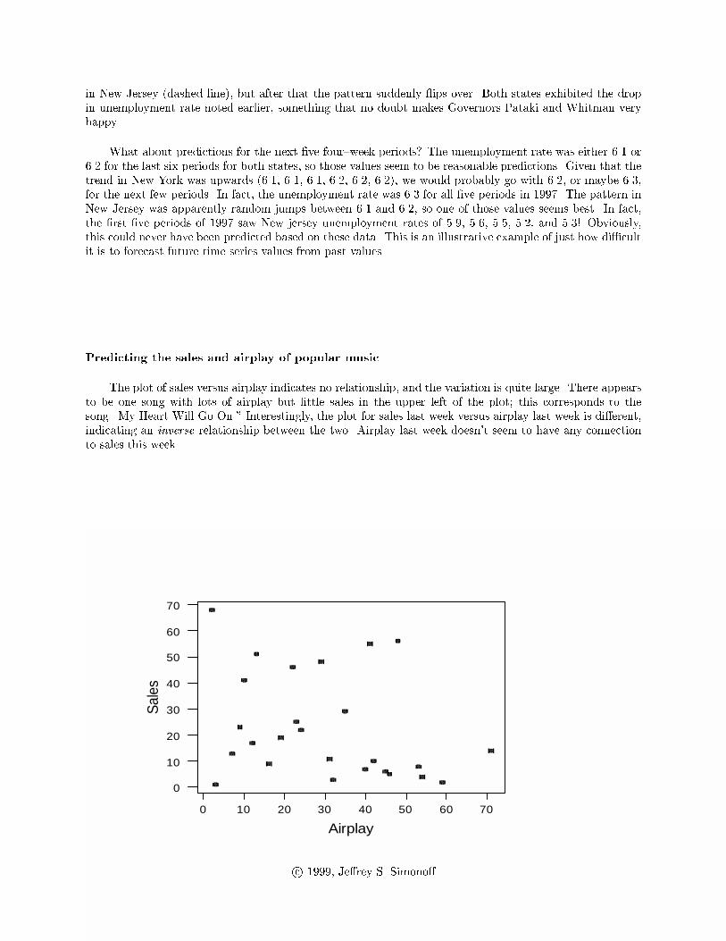
Predicting the sales and airplay of popular music
The plot of sales versus airplay indicates no relationship, and the variation is quite large. There appears
to be one song with lots of airplay but little sales in the upper left of the plot; this corresponds to the
song \My Heart Will Go On." Interestingly, the plot for sales last week versus airplay last week is di�erent,
indicating an inverse relationship between the two. Airplay last week doesn't seem to have any connection
to sales this week.
706050403020100
70
60
50
40
30
20
10
0
Airplay
Sal
es
c 1999, Je�rey S. Simono�

80706050403020100
80
70
60
50
40
30
20
10
0
Airplay last week
Sal
es la
st w
eek
80706050403020100
70
60
50
40
30
20
10
0
Airplay last week
Sal
es
The plot of change in sales versus the change in airplay indicates three very unusual observations. One
is \Sex and Candy," which jumped 53 places in the sales chart. This was the �rst week it was on the sales
chart and it ranked 23rd in sales. The jump in sales is at least this much, as the imputed rank for last week
(76) is conservative (that is, it could have been much larger). Two songs with surprising changes in airplay
were \Body Bumpin' Yippie{Yi{Yo," (I can't make this stu� up, folks!) which jumped at least 23 places,
and \Are You Jimmy Ray?," which dropped 17 spots. With these cases removed there is apparently a direct
relationship between change in sales rank and change in airplay rank. This is probably what we would expect
(it's di�cult to sort out which direction a causal link might be | does more airplay cause more sales, or do
c 1999, Je�rey S. Simono�

radio stations play popular songs more | but a direct relationship is expected either way).
20100-10-20
60
50
40
30
20
10
0
-10
-20
Change in airplay
Cha
nge
in s
ales
151050-5
5
0
-5
-10
-15
Change in airplay
Cha
nge
in s
ales
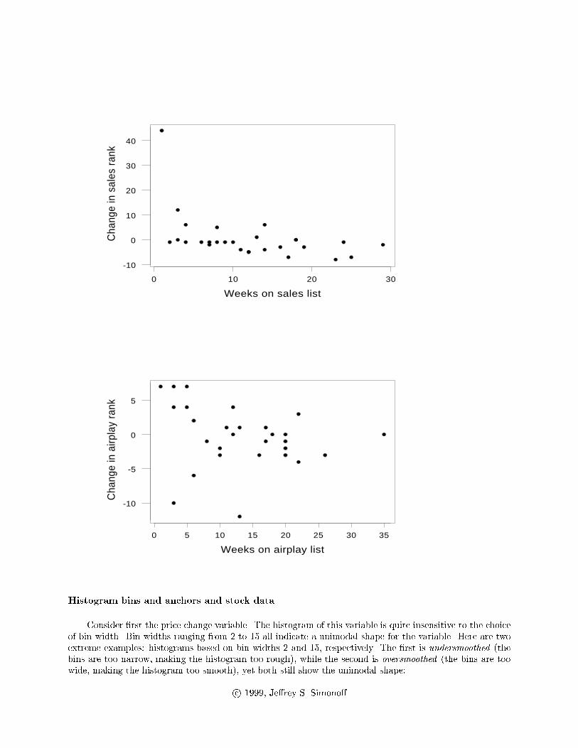
The change in sales doesn't seem to be related to the number of weeks on the sales charts, other than
the high outlier in the �rst week on the chart. On the other hand, the change in airplay decreases steadily
as the number of weeks on the airplay charts increases. Presumably this re ects the aging process of the
song's popularity, at least as viewed by radio stations.
c 1999, Je�rey S. Simono�

403020100
60
50
40
30
20
10
0
-10
-20
No. weeks sales
Cha
nge
in s
ales
403020100
20
10
0
-10
-20
No. weeks airplay
Cha
nge
in a
irpla
y
Histogram bins and anchors and stock data
Consider �rst the price change variable. The histogram of this variable is quite insensitive to the choice
of bin width. Bin widths ranging from 2 to 10 all indicate a unimodal shape for the variable. Here are two
extreme examples: histograms based on bin widths 2 and 10, respectively. The �rst is undersmoothed (the
bins are too narrow, making the histogram too rough), while the second is oversmoothed (the bins are too
wide, making the histogram too smooth), yet both still show the unimodal shape:
c 1999, Je�rey S. Simono�

20100-10-20
5
4
3
2
1
0
Weekly price change %
Freq
uenc
y
25155-5-15
20
10
0
Weekly price change %
Freq
uenc
y
The choice of the anchor seems to have little e�ect, although some versions do indicate the possibility
of a second mode at around 10%. Still, a unimodal shape for this variable seems most likely.
c 1999, Je�rey S. Simono�

191494-1-6-11-16
10
5
0
Weekly price change %
Freq
uenc
y
The situation is di�erent for the market capitalization data. The only sensible anchor position to use
for this variable is 0, since this is a natural boundary of the variable (any lower value would imply negative
capitalization in the �gure, and the highest possible value for the anchor is .04). The bin width is di�cult
to choose, because of the long right tail in the distribution; a large bin width (20) reinforces the long tail,
but obscures any structure close to zero, while a small bin width (5) allows structure to come through, but
leads to overall bumpiness.
806040200
20
10
0
Market capitalization
Freq
uenc
y
c 1999, Je�rey S. Simono�

80706050403020100
20
10
0
Market capitalization
Freq
uenc
y
Statistical theory suggests that the anchor position will have a smaller e�ect on the appearance of
histograms than the bin width does. Detailed investigation of the e�ect of anchor position on the properties
of the histogram can be found in \The anchor position of histograms and frequency polygons: quantitative
and qualitative smoothing" by J.S. Simono�, Communications in Statistics | Simulation and Computation,
24, 691{710 (1995) and \Measuring the stability of histogram appearance when the anchor position is
changed" by J.S. Simono� and F. Udina, Computational Statistics and Data Analysis, 21, 335{353 (1996).
By the way, the way to control the anchor position and bin width for a histogram is by setting the
cutpoints of the histogram into a column yourself. For example, for the second histogram, I clicked on
Calc ! Make patterned data ! Simple Set of Numbers. I entered a column name C7 under Store
patterned data in:, and entered 0 under From first value:, 80 under To last value:, 20 under In
steps of:, and then clicked OK. Then, I went to Graph! Histogram, and after entering the variable name
under X, I clicked on Options. I clicked the radio button next to CutPoint under Type of Intervals,
clicked the radio button next to Midpoint/cutpoint positions:, and entered C7 in the box. This tells
MINITAB to create a histogram with bins that anchor at 0 and have width 20.
Stock data by market
Here are summary statistics separated by market:
Descriptive Statistics
Variable Exchange N N* Mean Median Tr Mean
Weekly p NASDAQ 10 0 5.99 8.53 6.05
NYSE 14 0 1.05 0.42 0.60
AMEX 6 0 -5.95 -4.86 -5.95
P/E rati NASDAQ 10 0 22.33 27.03 22.87
NYSE 14 0 22.98 20.37 20.38
AMEX 5 1 -89.8 -1.2 -89.8
Market c NASDAQ 10 0 2.48 0.66 1.59
NYSE 14 0 17.87 4.21 14.70
AMEX 6 0 1.337 0.215 1.337
c 1999, Je�rey S. Simono�

Variable Exchange StDev SE Mean Min Max Q1 Q3
Weekly p NASDAQ 8.86 2.80 -6.96 18.48 -2.37 12.90
NYSE 3.79 1.01 -3.32 10.92 -1.71 3.51
AMEX 6.31 2.57 -14.29 3.39 -12.35 -1.69
P/E rati NASDAQ 17.83 5.64 -9.49 49.82 8.88 31.89
NYSE 14.77 3.95 8.59 68.63 14.77 23.02
AMEX 217.4 97.2 -477.1 34.2 -248.8 24.7
Market c NASDAQ 3.72 1.18 0.13 11.95 0.40 4.49
NYSE 25.65 6.86 0.63 73.15 1.45 33.43
AMEX 1.936 0.790 0.040 4.500 0.040 3.383
AMEXNYSENASDAQ
20
10
0
-10
Exchange
Wee
kly
pric
e ch
ange
%
The price changes are noticeably di�erent for the three markets. While it was generally a good week
for the NASDAQ market, it was pretty much a breakeven week for the NYSE, and a loser for AMEX. This
no doubt is related to the types of stocks traded on each market; in particular, NASDAQ stocks are more
likely to be high tech, which could account for this pattern. Note, however, that we wouldn't expect this
pattern to persist, since if it did everyone would take their money out of the AMEX market and put it into
the NASDAQ market.
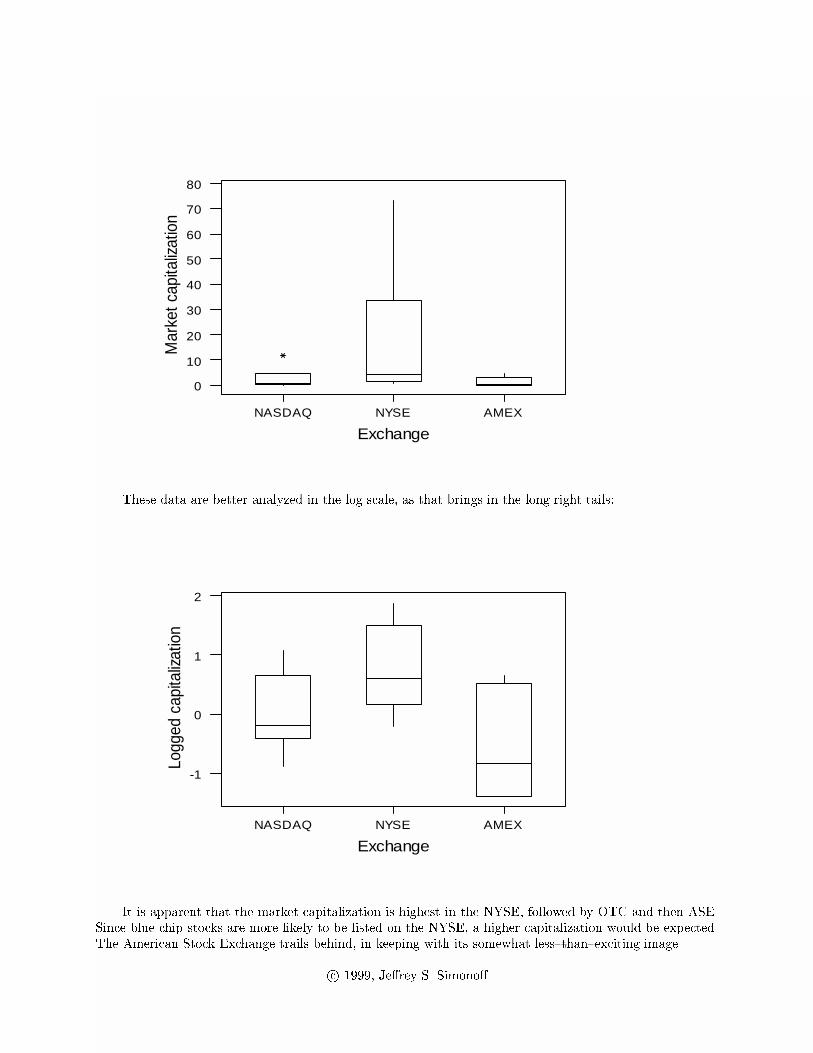
The market capitalization �gures are very di�erent, exhibiting very long right tails.
c 1999, Je�rey S. Simono�
AMEXNYSENASDAQ
80
70
60
50
40
30
20
10
0
Exchange
Mar
ket c
apita
lizat
ion
These data are better analyzed in the log scale, as that brings in the long right tails:
AMEXNYSENASDAQ
2
1
0
-1
Exchange
Logg
ed c
apita
lizat
ion
It is apparent that the market capitalization is highest in the NYSE, followed by OTC and then ASE.
Since blue chip stocks are more likely to be listed on the NYSE, a higher capitalization would be expected.
The American Stock Exchange trails behind, in keeping with its somewhat less{than{exciting image.
c 1999, Je�rey S. Simono�

AMEXNYSENASDAQ
100
0
-100
-200
-300
-400
-500
Exchange
P/E
rat
io
The P/E ratio pattern is interesting. The plot is dominated by the negative P/E ratios for AMEX
stocks, which re ect negative earnings for these stocks. Perhaps the poor returns are reasonable! A plot
with just NASDAQ and NYSE shows that while they are similar in location (P/E ratios around 25 or so),
the NASDAQ has much more variability in P/E ratios. Once again, the NASDAQ market does seem to be
a more volatile market than the staid NYSE:
NYSENASDAQ
70
60
50
40
30
20
10
0
-10
Exchange
P/E
rat
io
(8) From the output above we see that the average of the averages is (2:48 + 17:87 + 1:34)=3 = 7:23, while
the output below shows that the overall mean is 9.44.
c 1999, Je�rey S. Simono�

Descriptive Statistics
Variable N Mean Median Tr Mean StDev SE Mean
Market c 30 9.44 1.95 5.82 19.09 3.49
Variable Min Max Q1 Q3
Market c 0.04 73.15 0.58 6.47
There is no reason for these two numbers to equal each other. The overall mean can be derived from
group means, but only if the group means are weighted by the group size. Since the sample here does not
have exactly 10 stocks from each of the three exchanges, the (unweighted) average of the averages does not
necessarily equal the overall average.
(9) The �rst step in any data analysis is always to look at your data to see what general impressions emerge.
Thus, the �rst thing to do is to look at histograms and descriptive statistics for the di�erent variables.
You might notice that outstanding loans range from roughly $20,000 to $55,000. Average job o�ers
fall between roughly 2.5 and 4 o�ers per graduate, with Harvard and (suprisingly) Purdue at the high
end. Encouragingly enough, close to 90% of the graduates at even the worst performers had job o�ers,
with Stern coming in at 94%. Now let's say that you decided to look at relationships with the overall
Business Week rank. As you would expect, there are direct relationships between the overall rank and
the graduate rank (r = :708) and recruiter rank (r = :802), which are con�rmed by looking at scatter
plots (you must look at such plots | correlation coe�cients only re ect straight line associations, and
can be very misleading if relationships are nonlinear, or if there are outliers). The plot of overall rank
versus recruiter rank reveals one very unusual point (USC), which is ranked very low by the corporate
recruiters (#55; according to the magazine, \Recruiters give dismal grades for �nance, analytics"), but
much higher by the graduates (#18; \Top marks in international business from grads, thanks in part
to popular PRIME study program").
6050403020100
25
20
15
10
5
0
Corporate Rank
Ove
rall
rank
If USC is omitted from the data set, the correlation between overall rank and recruiter rank increases
to .9, making this variable the single most important to the rankings. There is surprisingly little
relationship between the overall ranking and the job o�er variables, although Purdue does show up as
unusual (being ranked 24th with students getting an average of 4.2 job o�ers, and 97% of all students
receiving o�ers (doubtful that many were on Wall Street, however!). The University of Maryland also
shows up as being a bit unusual, with 100% of its graduates receiving o�ers. Encouragingly, there
is a strong relationship between ranking and the percentage of students making more than $100,000
(r = �:832); this value is highly correlated with outstanding loans (r = :86), so at least those loans can
get paid o�!
c 1999, Je�rey S. Simono�

(10) The best way to see what is going on in these data is to look at side{by{side boxplots. Here, for example,
is the display for 15 year results:
6 (B)5 (Ba)4 (Baa)3 (A)2 (Aa)1 (Aaa)
70
60
50
40
30
20
10
0
Rating level
Fift
ee
n ye
ar d
efa
ult
The display shows the basic patterns that also occur for the 5 and 10 year time periods. As would
be expected, higher ratings are associated with lower default rates. There is also more variability among
bond cohorts that are lower rated. That is, in some years poorly rated bonds didn't ultimately default as
much, while in other years there were amazingly high default rates (even over 70% among bonds rated B
that were issued in 1980); in contrast, highly rated bond cohorts are much more consistent, with very few
years resulting in very high default rates (never above 3% or so). Descriptive statistics separated by rating
show this too:
Descriptive Statistics
Variable Rating l N N* Mean Median TrMean
Fifteen 1 (Aaa) 15 10 1.893 2.310 1.938
2 (Aa) 15 10 1.833 1.830 1.855
3 (A) 15 10 3.215 3.790 3.240
4 (Baa) 15 10 8.437 7.990 8.472
5 (Ba) 15 10 27.71 27.03 27.82
6 (B) 15 10 44.36 58.48 44.54
Variable Rating l StDev SE Mean Minimum Maximum Q1
Fifteen 1 (Aaa) 1.066 0.275 0.000 3.200 1.590
2 (Aa) 1.141 0.295 0.000 3.370 1.240
3 (A) 1.646 0.425 0.900 5.200 1.600
4 (Baa) 1.994 0.515 5.420 11.000 6.630
5 (Ba) 9.50 2.45 13.24 40.67 19.85
6 (B) 20.53 5.30 15.22 71.17 21.37
Variable Rating l Q3
Fifteen 1 (Aaa) 2.610
2 (Aa) 2.680
3 (A) 4.770
4 (Baa) 10.660
5 (Ba) 36.84
6 (B) 61.37
c 1999, Je�rey S. Simono�

The other noticeable pattern is that there does not appear to be any meaningful di�erence between
default rates for Aaa and Aa bonds (in fact, at the �fteen year time period, Aa bonds have a lower
default rate). This is not proof that Moody's rating classes Aaa and Aa are too �ne, but it does suggest
that it is more sensible to invest in Aa bonds than Aaa bonds (since the former would pay a higher
interest rate to compensate for the perceived increased default risk). Similar patterns emerge for the
other two time periods.
Given the long right tails of the variables here, you might have considered taking logs of the
variables. This is not a bad idea, but there is a problem | all variables have cohorts with zero default
rates, which become missing values if you try to take logs.
c 1999, Je�rey S. Simono�