Embed Size (px)
Citation preview

SAS® 9.3 ODS Graphics DesignerUser’s Guide
SAS® Documentation
The correct bibliographic citation for this manual is as follows: SAS Institute Inc 2011. SAS 9.3 ODS Graphics Designer: User's Guide. Cary, NC: SAS Institute Inc.
SAS® 9.3 ODS Graphics Designer: User's Guide
Copyright © 2011, SAS Institute Inc., Cary, NC, USA
All rights reserved. Produced in the United States of America.
For a hardcopy book: No part of this publication may be reproduced, stored in a retrieval system, or transmitted, in any form or by any means, electronic, mechanical, photocopying, or otherwise, without the prior written permission of the publisher, SAS Institute Inc.
For a Web download or e-book:Your use of this publication shall be governed by the terms established by the vendor at the time you acquire this publication.
The scanning, uploading, and distribution of this book via the Internet or any other means without the permission of the publisher is illegal and punishable by law. Please purchase only authorized electronic editions and do not participate in or encourage electronic piracy of copyrighted materials. Your support of others' rights is appreciated.
U.S. Government Restricted Rights Notice: Use, duplication, or disclosure of this software and related documentation by the U.S. government is subject to the Agreement with SAS Institute and the restrictions set forth in FAR 52.227–19 Commercial Computer Software-Restricted Rights (June 1987).
SAS Institute Inc., SAS Campus Drive, Cary, North Carolina 27513.
1st electronic book, July 2011
SAS® Publishing provides a complete selection of books and electronic products to help customers use SAS software to its fullest potential. For more information about our e-books, e-learning products, CDs, and hard-copy books, visit the SAS Publishing Web site at support.sas.com/publishing or call 1-800-727-3228.
SAS® and all other SAS Institute Inc. product or service names are registered trademarks or trademarks of SAS Institute Inc. in the USA and other countries. ® indicates USA registration.
Other brand and product names are registered trademarks or trademarks of their respective companies.
Contents
What's New in SAS 9.3 ODS Graphics Designer . . . . . . . . . . . . . . . . . . . . . . . . . . . . . . vii
PART 1 Introduction 1
Chapter 1 • Overview of the ODS Graphics Designer . . . . . . . . . . . . . . . . . . . . . . . . . . . . . . . . . . . 3About the ODS Graphics Designer . . . . . . . . . . . . . . . . . . . . . . . . . . . . . . . . . . . . . . . . . . 3Manual Tasks for Upgrading to SAS 9.3 ODS Graphics Designer . . . . . . . . . . . . . . . . . 4Main Tasks That You Can Perform in the ODS Graphics Designer . . . . . . . . . . . . . . . . 6Accessibility Features of the ODS Graphics Designer . . . . . . . . . . . . . . . . . . . . . . . . . . . 6Start the ODS Graphics Designer . . . . . . . . . . . . . . . . . . . . . . . . . . . . . . . . . . . . . . . . . . . 9
Chapter 2 • Understanding the User Interface . . . . . . . . . . . . . . . . . . . . . . . . . . . . . . . . . . . . . . . . 11Overview of the User Interface . . . . . . . . . . . . . . . . . . . . . . . . . . . . . . . . . . . . . . . . . . . . 11About the Graph Gallery . . . . . . . . . . . . . . . . . . . . . . . . . . . . . . . . . . . . . . . . . . . . . . . . 13About the Elements Pane . . . . . . . . . . . . . . . . . . . . . . . . . . . . . . . . . . . . . . . . . . . . . . . . 15
PART 2 Getting Started 21
Chapter 3 • Quick-Start Examples . . . . . . . . . . . . . . . . . . . . . . . . . . . . . . . . . . . . . . . . . . . . . . . . . 23About the Quick-Start Examples . . . . . . . . . . . . . . . . . . . . . . . . . . . . . . . . . . . . . . . . . . 23Quick-Start Example One: Design a Simple Graph . . . . . . . . . . . . . . . . . . . . . . . . . . . . 24Quick-Start Example Two: Enhance the Simple Quick-Start Graph . . . . . . . . . . . . . . . 27Run the Examples on the SAS Server . . . . . . . . . . . . . . . . . . . . . . . . . . . . . . . . . . . . . . 35
Chapter 4 • Fundamentals of Designing Graphs . . . . . . . . . . . . . . . . . . . . . . . . . . . . . . . . . . . . . . 37Components of a Graph . . . . . . . . . . . . . . . . . . . . . . . . . . . . . . . . . . . . . . . . . . . . . . . . . 37Compatible Plot Types . . . . . . . . . . . . . . . . . . . . . . . . . . . . . . . . . . . . . . . . . . . . . . . . . . 39High-Level Steps for Designing Graphs . . . . . . . . . . . . . . . . . . . . . . . . . . . . . . . . . . . . . 40
PART 3 Designing Graphs 43
Chapter 5 • Creating and Managing Graphs . . . . . . . . . . . . . . . . . . . . . . . . . . . . . . . . . . . . . . . . . 45Creating a Graph . . . . . . . . . . . . . . . . . . . . . . . . . . . . . . . . . . . . . . . . . . . . . . . . . . . . . . . 45Add a Plot to a Graph . . . . . . . . . . . . . . . . . . . . . . . . . . . . . . . . . . . . . . . . . . . . . . . . . . . 47Assigning Data to a Plot . . . . . . . . . . . . . . . . . . . . . . . . . . . . . . . . . . . . . . . . . . . . . . . . . 47Select a Plot . . . . . . . . . . . . . . . . . . . . . . . . . . . . . . . . . . . . . . . . . . . . . . . . . . . . . . . . . . 58Adding Reference Lines to Graphs . . . . . . . . . . . . . . . . . . . . . . . . . . . . . . . . . . . . . . . . . 60Remove a Plot from a Graph . . . . . . . . . . . . . . . . . . . . . . . . . . . . . . . . . . . . . . . . . . . . . 63Save a Graph to a File . . . . . . . . . . . . . . . . . . . . . . . . . . . . . . . . . . . . . . . . . . . . . . . . . . . 63Add a Graph to the Graph Gallery . . . . . . . . . . . . . . . . . . . . . . . . . . . . . . . . . . . . . . . . . 64Open a Graph . . . . . . . . . . . . . . . . . . . . . . . . . . . . . . . . . . . . . . . . . . . . . . . . . . . . . . . . . 65Working with the Graph Code . . . . . . . . . . . . . . . . . . . . . . . . . . . . . . . . . . . . . . . . . . . . 66
Copy and Paste a Graph to Another Application . . . . . . . . . . . . . . . . . . . . . . . . . . . . . . 67Manage the Plots and Insets in a Cell . . . . . . . . . . . . . . . . . . . . . . . . . . . . . . . . . . . . . . . 67
Chapter 6 • Working with Titles and Footnotes . . . . . . . . . . . . . . . . . . . . . . . . . . . . . . . . . . . . . . . 71About Titles and Footnotes . . . . . . . . . . . . . . . . . . . . . . . . . . . . . . . . . . . . . . . . . . . . . . . 71Add a Title or a Footnote . . . . . . . . . . . . . . . . . . . . . . . . . . . . . . . . . . . . . . . . . . . . . . . . 71Edit and Format a Title or Footnote . . . . . . . . . . . . . . . . . . . . . . . . . . . . . . . . . . . . . . . . 72Align a Title or Footnote Horizontally . . . . . . . . . . . . . . . . . . . . . . . . . . . . . . . . . . . . . . 73Remove a Title or Footnote from a Graph . . . . . . . . . . . . . . . . . . . . . . . . . . . . . . . . . . . 73
Chapter 7 • Working with Legends . . . . . . . . . . . . . . . . . . . . . . . . . . . . . . . . . . . . . . . . . . . . . . . . . 75Adding Legends . . . . . . . . . . . . . . . . . . . . . . . . . . . . . . . . . . . . . . . . . . . . . . . . . . . . . . . 75Change the Contents of a Legend . . . . . . . . . . . . . . . . . . . . . . . . . . . . . . . . . . . . . . . . . . 77Edit a Legend's Labels . . . . . . . . . . . . . . . . . . . . . . . . . . . . . . . . . . . . . . . . . . . . . . . . . . 78Add a Title to a Legend . . . . . . . . . . . . . . . . . . . . . . . . . . . . . . . . . . . . . . . . . . . . . . . . . 78Change a Legend's Outline or Background Color . . . . . . . . . . . . . . . . . . . . . . . . . . . . . 79Arrange Legend Contents in a Row or Column . . . . . . . . . . . . . . . . . . . . . . . . . . . . . . . 80Reposition a Legend . . . . . . . . . . . . . . . . . . . . . . . . . . . . . . . . . . . . . . . . . . . . . . . . . . . . 81Remove a Legend . . . . . . . . . . . . . . . . . . . . . . . . . . . . . . . . . . . . . . . . . . . . . . . . . . . . . . 81
Chapter 8 • Working with Text Entries . . . . . . . . . . . . . . . . . . . . . . . . . . . . . . . . . . . . . . . . . . . . . . 83Add a Text Entry to a Graph . . . . . . . . . . . . . . . . . . . . . . . . . . . . . . . . . . . . . . . . . . . . . . 83Edit and Format a Text Entry . . . . . . . . . . . . . . . . . . . . . . . . . . . . . . . . . . . . . . . . . . . . . 83Reposition a Text Entry . . . . . . . . . . . . . . . . . . . . . . . . . . . . . . . . . . . . . . . . . . . . . . . . . 84Remove a Text Entry from a Cell . . . . . . . . . . . . . . . . . . . . . . . . . . . . . . . . . . . . . . . . . . 85
Chapter 9 • General Information about Modifying Textual Elements . . . . . . . . . . . . . . . . . . . . . 87Specifying Style Elements for Text Properties . . . . . . . . . . . . . . . . . . . . . . . . . . . . . . . . 87Using the Color List Box . . . . . . . . . . . . . . . . . . . . . . . . . . . . . . . . . . . . . . . . . . . . . . . . 88Adding Dynamic Content to Text . . . . . . . . . . . . . . . . . . . . . . . . . . . . . . . . . . . . . . . . . . 90
PART 4 Changing the Appearance of Graphs 93
Chapter 10 • Changing Graph Properties . . . . . . . . . . . . . . . . . . . . . . . . . . . . . . . . . . . . . . . . . . . . 95About Graph Properties . . . . . . . . . . . . . . . . . . . . . . . . . . . . . . . . . . . . . . . . . . . . . . . . . 95Change the Style That Is Applied to a Graph . . . . . . . . . . . . . . . . . . . . . . . . . . . . . . . . . 95Change a Graph's Background Color and Border . . . . . . . . . . . . . . . . . . . . . . . . . . . . . 97Resize a Graph . . . . . . . . . . . . . . . . . . . . . . . . . . . . . . . . . . . . . . . . . . . . . . . . . . . . . . . . 97
Chapter 11 • Changing Plot Properties . . . . . . . . . . . . . . . . . . . . . . . . . . . . . . . . . . . . . . . . . . . . . 99About Plot Properties . . . . . . . . . . . . . . . . . . . . . . . . . . . . . . . . . . . . . . . . . . . . . . . . . . . 99Change Plot Properties . . . . . . . . . . . . . . . . . . . . . . . . . . . . . . . . . . . . . . . . . . . . . . . . . 100Specifying Style Elements for Plot Properties . . . . . . . . . . . . . . . . . . . . . . . . . . . . . . . 101General Properties . . . . . . . . . . . . . . . . . . . . . . . . . . . . . . . . . . . . . . . . . . . . . . . . . . . . 102Plot-Specific Properties . . . . . . . . . . . . . . . . . . . . . . . . . . . . . . . . . . . . . . . . . . . . . . . . 108Change the Wall Color and the Outline for a Cell . . . . . . . . . . . . . . . . . . . . . . . . . . . . 123
Chapter 12 • Changing Axis Properties . . . . . . . . . . . . . . . . . . . . . . . . . . . . . . . . . . . . . . . . . . . . 125About Axis Properties . . . . . . . . . . . . . . . . . . . . . . . . . . . . . . . . . . . . . . . . . . . . . . . . . . 125Change an Axis Label . . . . . . . . . . . . . . . . . . . . . . . . . . . . . . . . . . . . . . . . . . . . . . . . . . 125Change Axis Properties . . . . . . . . . . . . . . . . . . . . . . . . . . . . . . . . . . . . . . . . . . . . . . . . 126About the Axis Data Range . . . . . . . . . . . . . . . . . . . . . . . . . . . . . . . . . . . . . . . . . . . . . 127About Advanced Axis Properties . . . . . . . . . . . . . . . . . . . . . . . . . . . . . . . . . . . . . . . . . 130
iv Contents
Chapter 13 • Customizing Graph Styles . . . . . . . . . . . . . . . . . . . . . . . . . . . . . . . . . . . . . . . . . . . . 135About Styles and Style Elements . . . . . . . . . . . . . . . . . . . . . . . . . . . . . . . . . . . . . . . . . 135About the Graph Style Editor . . . . . . . . . . . . . . . . . . . . . . . . . . . . . . . . . . . . . . . . . . . . 137Use the Sample Graphs to Identify Style Elements . . . . . . . . . . . . . . . . . . . . . . . . . . . 138Create a Custom Style . . . . . . . . . . . . . . . . . . . . . . . . . . . . . . . . . . . . . . . . . . . . . . . . . 139Modify a Custom Style . . . . . . . . . . . . . . . . . . . . . . . . . . . . . . . . . . . . . . . . . . . . . . . . . 141Modify and Apply the Current Style . . . . . . . . . . . . . . . . . . . . . . . . . . . . . . . . . . . . . . 142Export a Custom Style . . . . . . . . . . . . . . . . . . . . . . . . . . . . . . . . . . . . . . . . . . . . . . . . . 143Delete a Custom Style . . . . . . . . . . . . . . . . . . . . . . . . . . . . . . . . . . . . . . . . . . . . . . . . . 143How the Style Elements Map to Parts of a Graph . . . . . . . . . . . . . . . . . . . . . . . . . . . . 144
PART 5 Multi-Cell Graphs 151
Chapter 14 • Overview of Multi-Cell Graphs . . . . . . . . . . . . . . . . . . . . . . . . . . . . . . . . . . . . . . . . 153About Multi-Cell Graphs in ODS Graphics Designer . . . . . . . . . . . . . . . . . . . . . . . . . 153Summary of the Main Differences among Multi-Cell Graphs . . . . . . . . . . . . . . . . . . . 154
Chapter 15 • Creating Heterogeneous Panels . . . . . . . . . . . . . . . . . . . . . . . . . . . . . . . . . . . . . . . 157About Heterogeneous Panels . . . . . . . . . . . . . . . . . . . . . . . . . . . . . . . . . . . . . . . . . . . . 157Creating a Heterogeneous Panel . . . . . . . . . . . . . . . . . . . . . . . . . . . . . . . . . . . . . . . . . . 158Adding Rows and Columns to a Graph . . . . . . . . . . . . . . . . . . . . . . . . . . . . . . . . . . . . 159Move a Row or Column . . . . . . . . . . . . . . . . . . . . . . . . . . . . . . . . . . . . . . . . . . . . . . . . 161Resize a Row or Column . . . . . . . . . . . . . . . . . . . . . . . . . . . . . . . . . . . . . . . . . . . . . . . 162Sharing or Unsharing a Common External Axis . . . . . . . . . . . . . . . . . . . . . . . . . . . . . 162Remove a Row or Column from a Graph . . . . . . . . . . . . . . . . . . . . . . . . . . . . . . . . . . . 164
Chapter 16 • Working with Cell Headers . . . . . . . . . . . . . . . . . . . . . . . . . . . . . . . . . . . . . . . . . . . 165Add a Header to a Cell . . . . . . . . . . . . . . . . . . . . . . . . . . . . . . . . . . . . . . . . . . . . . . . . . 165Edit and Format a Cell Header . . . . . . . . . . . . . . . . . . . . . . . . . . . . . . . . . . . . . . . . . . . 165Change the Position of a Cell Header . . . . . . . . . . . . . . . . . . . . . . . . . . . . . . . . . . . . . . 166Remove a Header from a Cell . . . . . . . . . . . . . . . . . . . . . . . . . . . . . . . . . . . . . . . . . . . 167
Chapter 17 • Creating Classification Panels . . . . . . . . . . . . . . . . . . . . . . . . . . . . . . . . . . . . . . . . 169About Classification Panels . . . . . . . . . . . . . . . . . . . . . . . . . . . . . . . . . . . . . . . . . . . . . 169Creating a Classification Panel . . . . . . . . . . . . . . . . . . . . . . . . . . . . . . . . . . . . . . . . . . . 170
Chapter 18 • Creating Scatter Plot Matrices . . . . . . . . . . . . . . . . . . . . . . . . . . . . . . . . . . . . . . . . 175About Scatter Plot Matrices . . . . . . . . . . . . . . . . . . . . . . . . . . . . . . . . . . . . . . . . . . . . . 175Create a Scatter Plot Matrix . . . . . . . . . . . . . . . . . . . . . . . . . . . . . . . . . . . . . . . . . . . . . 176
PART 6 Shared Variables 179
Chapter 19 • Using Shared Variables in Graphs . . . . . . . . . . . . . . . . . . . . . . . . . . . . . . . . . . . . . 181About Shared Variables . . . . . . . . . . . . . . . . . . . . . . . . . . . . . . . . . . . . . . . . . . . . . . . . 181Main Features of Shared Variables . . . . . . . . . . . . . . . . . . . . . . . . . . . . . . . . . . . . . . . . 182Requirements for Creating Shared-Variable Graphs . . . . . . . . . . . . . . . . . . . . . . . . . . 183Create a Shared-Variable Graph . . . . . . . . . . . . . . . . . . . . . . . . . . . . . . . . . . . . . . . . . . 183Change the Data That Is Used in a Shared-Variable Graph . . . . . . . . . . . . . . . . . . . . . 185
Contents v
PART 7 Managing Preferences and the Graph Gallery 189
Chapter 20 • Setting Preferences . . . . . . . . . . . . . . . . . . . . . . . . . . . . . . . . . . . . . . . . . . . . . . . . . 191Overview of the Preferences . . . . . . . . . . . . . . . . . . . . . . . . . . . . . . . . . . . . . . . . . . . . . 191Setting Preferences . . . . . . . . . . . . . . . . . . . . . . . . . . . . . . . . . . . . . . . . . . . . . . . . . . . . 192
Chapter 21 • Managing Graphs in the Graph Gallery . . . . . . . . . . . . . . . . . . . . . . . . . . . . . . . . . 197Add a Graph to the Graph Gallery . . . . . . . . . . . . . . . . . . . . . . . . . . . . . . . . . . . . . . . . 197Change the Name, Icon, or Tooltip for a Graph in the Graph Gallery . . . . . . . . . . . . . 199Managing the Graphs in the Graph Gallery . . . . . . . . . . . . . . . . . . . . . . . . . . . . . . . . . 200Managing the Groups in the Graph Gallery . . . . . . . . . . . . . . . . . . . . . . . . . . . . . . . . . 202
PART 8 Examples 205
Chapter 22 • Examples for Creating Single-Cell Graphs . . . . . . . . . . . . . . . . . . . . . . . . . . . . . . 207Example: Create a Grouped Series Plot . . . . . . . . . . . . . . . . . . . . . . . . . . . . . . . . . . . . 207Example: Create a Scatter Plot with Modified Axis Labels and Two Titles . . . . . . . . 209Example: Add a Regression Overlay and Set Plot Properties . . . . . . . . . . . . . . . . . . . 211
Chapter 23 • Examples for Creating Multi-Cell Graphs . . . . . . . . . . . . . . . . . . . . . . . . . . . . . . . . 217Example: Create a Classification Panel . . . . . . . . . . . . . . . . . . . . . . . . . . . . . . . . . . . . 217Example: Create a Heterogeneous Panel . . . . . . . . . . . . . . . . . . . . . . . . . . . . . . . . . . . 220Example: Create a Shared-Variable Graph and Add a Dynamic Title . . . . . . . . . . . . . 224
Glossary . . . . . . . . . . . . . . . . . . . . . . . . . . . . . . . . . . . . . . . . . . . . . . . . . . . . . 233Index . . . . . . . . . . . . . . . . . . . . . . . . . . . . . . . . . . . . . . . . . . . . . . . . . . . . . . . . 235
vi Contents
What's New in SAS 9.3 ODS Graphics Designer
Overview
The ODS Graphics Designer has the following changes and enhancements:
• inclusion with Base SAS
• ODS style changes
• ability to start the designer from the SAS menu bar
• more options for saving a graph
• enhanced data assignment options
• enhanced plot properties
Designer Included with Base SAS
ODS Graphics Designer is now available with Base SAS software. SAS/GRAPH software is not required in order to use the designer.
Note: If you customized preferences, styles, or Graph Gallery files in the previous production release (the third maintenance release of 9.2) of ODS Graphics Designer, you must migrate your custom files to the designer's new 9.3 location. If you do not perform this one-time task, the 9.3 designer can not use your customized preferences, styles, or Graph Gallery files. For more information, see “Manual Tasks for Upgrading to SAS 9.3 ODS Graphics Designer” on page 4.
Note: ODS Graphics Designer does not support SGD files that were created before the third maintenance release of 9.2.
ODS Style Enhancements and Changes
The designer supports a new ODS style: HTMLBlueCML (Color, Marker, Line). The default style is still Listing, although you can change that in the Preferences.
Note: SGD graphs that are rendered using the SGDESIGN procedure continue to honor the active style of the open ODS destination. In the SAS Windowing environment, HTML is now the default ODS destination, and HTMLBlue is the default style.
vii
Graphs that are output to the default ODS destination in SAS will look different from those that were created using the designer's default style.
Enhanced Way to Start the Designer
In addition to using a SAS macro to start the designer, you can start the designer from the SAS menu bar.
More Options for Saving a Graph
The Save As dialog box has the following changes and enhancements:
• ability to save a graph as a PDF file or an Enhanced Metafile (EMF)
• option to specify a resolution for graphs that are saved as JPG or PNG files
• option to specify a target for bar charts that are saved as HTML files when the chart has a URL role specified
• option to specify a name for the graph’s template (you can also specify the name in the Graph Properties dialog box)
Enhanced Data Assignment Options
The Assign Data dialog box has the following changes and enhancements:
• For some plots, group display options enable you to specify whether grouped plot elements are clustered, overlaid, or stacked (bar charts). Scatter plots, series plots, step plots, needle plots, box plots, and bar charts support this feature.
• The Discrete Offset option enables you to specify an amount to offset all plot elements from the discrete tick marks.
• You can specify the width of plot elements for box plots and bar charts. (This feature is also available as a plot property. You can also click and drag a plot element to change the width.)
Enhanced Plot Properties
The following changes and enhancements apply to plot properties:
• enhanced bar skin options for bar charts
• scatter plot enhancements:
• ability to select a position for the data label with respect to the marker
viii ODS Graphics Designer

• ability to hide markers by selecting 0 for the marker size
Enhanced Plot Properties ix

x ODS Graphics Designer

Part 1
Introduction
Chapter 1Overview of the ODS Graphics Designer . . . . . . . . . . . . . . . . . . . . . . . . . . 3
Chapter 2Understanding the User Interface . . . . . . . . . . . . . . . . . . . . . . . . . . . . . . . . 11
1

2
Chapter 1
Overview of the ODS Graphics Designer
About the ODS Graphics Designer . . . . . . . . . . . . . . . . . . . . . . . . . . . . . . . . . . . . . . . . 3What Is the ODS Graphics Designer? . . . . . . . . . . . . . . . . . . . . . . . . . . . . . . . . . . . . 3Who Uses the ODS Graphics Designer? . . . . . . . . . . . . . . . . . . . . . . . . . . . . . . . . . . 4About SGD Files . . . . . . . . . . . . . . . . . . . . . . . . . . . . . . . . . . . . . . . . . . . . . . . . . . . . . 4About the SGDESIGN Procedure . . . . . . . . . . . . . . . . . . . . . . . . . . . . . . . . . . . . . . . 4Supported Platforms . . . . . . . . . . . . . . . . . . . . . . . . . . . . . . . . . . . . . . . . . . . . . . . . . . 4
Manual Tasks for Upgrading to SAS 9.3 ODS Graphics Designer . . . . . . . . . . . . . . 4Overview of the Tasks to be Performed . . . . . . . . . . . . . . . . . . . . . . . . . . . . . . . . . . . 4Steps for Moving the Files . . . . . . . . . . . . . . . . . . . . . . . . . . . . . . . . . . . . . . . . . . . . . 5
Main Tasks That You Can Perform in the ODS Graphics Designer . . . . . . . . . . . . . 6
Accessibility Features of the ODS Graphics Designer . . . . . . . . . . . . . . . . . . . . . . . . 6About the Accessibility Features . . . . . . . . . . . . . . . . . . . . . . . . . . . . . . . . . . . . . . . . 6Accessibility Exceptions . . . . . . . . . . . . . . . . . . . . . . . . . . . . . . . . . . . . . . . . . . . . . . . 7
Start the ODS Graphics Designer . . . . . . . . . . . . . . . . . . . . . . . . . . . . . . . . . . . . . . . . . 9
About the ODS Graphics Designer
What Is the ODS Graphics Designer?The SAS ODS Graphics Designer is an interactive graphical application that you can use to create and design custom graphs. The designer creates graphs that are based on the Graph Template Language (GTL), the same system that is used by SAS analytical procedures and SAS ODS Graphics procedures. The ODS Graphics Designer provides a graphical user interface for designing graphs easily without having to know the details of templates and the GTL.
Using point-and-click interaction, you can create simple or complex graphical views of data for analysis. The ODS Graphics Designer enables you to design sophisticated graphs by using a wide array of plot types. You can design multi-cell graphs, classification panels, and scatter plot matrices. Your graphs can have titles, footnotes, legends, and other graphics elements. You can save the results as an image for inclusion in a report or as an ODS Graphics Designer file (SGD) that you can later edit.
3
Who Uses the ODS Graphics Designer?The ODS Graphics Designer is generally used by analysts, statisticians, managers, academics, and others who want to graphically explore data or present the results of their analyses. Users do not need to know about the GTL. However, users are often knowledgeable about the DATA step and SAS/STAT procedures.
About SGD FilesAn SGD file is a graph file that has been created using the ODS Graphics Designer and that has an .sgd file extension. The file contains a description of the graph to be rendered. You can open this file in the designer and make changes to the graph. You can also render the graph to an ODS destination by using the SGDESIGN procedure.
About the SGDESIGN ProcedureThe SGDESIGN procedure complements the ODS Graphics Designer and is used to render a graph that has been saved as an SGD file. The procedure enables you to run one or more graphs in batch mode and render the graphs to any ODS destination. You can run graphs using different variables against the same or different data.
The basic syntax of the procedure is as follows:
PROC SGDESIGN SGD='SGD-file-name' <options>;
Here is an example:
ods html file="CarsLattice.html"; proc sgdesign sgd="C:\SGDFiles\CarsLattice.sgd"; run;ods html close;
You can specify a data set as an option to the procedure. By default, the procedure uses the data set that was used to create the SGD file.
For more information about the SGDESIGN procedure, see the SAS ODS Graphics: Procedures Guide.
Supported PlatformsThe ODS Graphics Designer runs in Windows and UNIX operating environments only.
Manual Tasks for Upgrading to SAS 9.3 ODS Graphics Designer
Overview of the Tasks to be PerformedSAS 9.3 ODS Graphics Designer supports SGD files that were created with the 9.2 (third maintenance) release of the designer. However, because the 9.3 release of the designer is part of Base SAS instead of SAS/GRAPH, the path to designer preferences, custom styles, and custom Graph Gallery files has changed. In order for the designer to find your 9.2 (third maintenance release) custom preferences, styles, and Graph Gallery
4 Chapter 1 • Overview of the ODS Graphics Designer

files, you must manually move those files to the new designer location on your system. The preferences file must also be renamed.
If you have not customized the 9.2 (third maintenance release) preferences, styles, or the Graph Gallery, then no action is required.
Note: SGD files created before the 9.2 (third maintenance) release are not supported.
Steps for Moving the Files
Step One: Locate the Files to be MovedUse the following table to identify the files and directories for the 9.2 (third maintenance release) preferences, custom styles, and custom Graph Gallery graphs and groups.
To move: Locate:
Custom preferences SASGraphODSGraphicsDesigner.properties file
Custom styles styles subdirectory
custom Graph Gallery graphs and groups
plot_gallery subdirectory
These files and subdirectories reside within the SASGRAPHODSGraphicsDesigner 9.2 application data directory on your system. Here are some examples for different platforms:
Windows XP C:\Documents and Settings\user-name\Application Data\SAS\SASGRAPHODSGraphicsDesigner\9.2
Windows 7 C:\Users\user-name\AppData\Roaming\SAS\SASGRAPHODSGraphicsDesigner\9.2
UNIX user-home-directory/SASAppData/SAS/SASGRAPHODSGraphicsDesigner/9.2
Step Two: Move the Files to the 9.3 LocationMove the applicable files and subdirectories to the 9.3 location. When you move a subdirectory, be sure to move all the files within that subdirectory.
The 9.3 files reside within the ODSGraphicsDesigner 9.3 application data directory on your system. Here are some examples for different platforms:
Windows XP C:\Documents and Settings\user-name\Application Data\SAS\ODSGraphicsDesigner\9.3
Windows 7 C:\Users\user-name\AppData\Roaming\SAS\ODSGraphicsDesigner\9.3
UNIX user-home-directory/SASAppData/SAS/ODSGraphicsDesigner/9.3
Manual Tasks for Upgrading to SAS 9.3 ODS Graphics Designer 5
Step Three: Rename the Preferences FileIf you moved the custom preferences file, rename that file from SASGraphODSGraphicsDesigner.properties to ODSGraphicsDesigner.properties.
Step Four: Restart the ODS Graphics DesignerYou must restart the designer for your changes to take effect.
Main Tasks That You Can Perform in the ODS Graphics Designer
The following list highlights some of the tasks that you can perform using the ODS Graphics Designer:
• use a gallery of predefined graphs to quickly create a graph. You can also add your own graphs to the gallery.
• create multi-cell graphs, classification panels, and scatter plot matrices
• add plots and reference lines to a graph.
• add and format titles and footnotes.
• add and customize legends.
• change the visual appearance of the entire graph by changing the applied style. You can also develop your own style.
• change the appearance of individual plot elements such as markers and lines.
• change the appearance of the axes. You can also change an axis type and customize the range of values that are displayed on the axis.
• resize the graph.
• copy a graph (image) to the system clipboard to paste directly into other applications.
• create graphs that can be reused with different variables in the same or different data set. These graphs are called shared-variable graphs.
Note: The shared-variable feature is new in the third maintenance release for SAS 9.2.
Accessibility Features of the ODS Graphics Designer
About the Accessibility FeaturesThe ODS Graphics Designer includes accessibility and compatibility features that improve the usability of the product for users with disabilities, with exceptions noted below. These features are related to accessibility standards for electronic information technology that were adopted by the U.S. Government under Section 508 of the U.S. Rehabilitation Act of 1973, as amended.
6 Chapter 1 • Overview of the ODS Graphics Designer
If you have questions or concerns about the accessibility of SAS products, send e-mail to [email protected] or call SAS Technical Support.
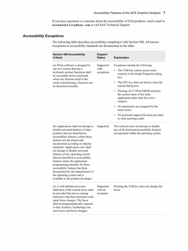
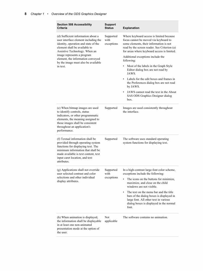
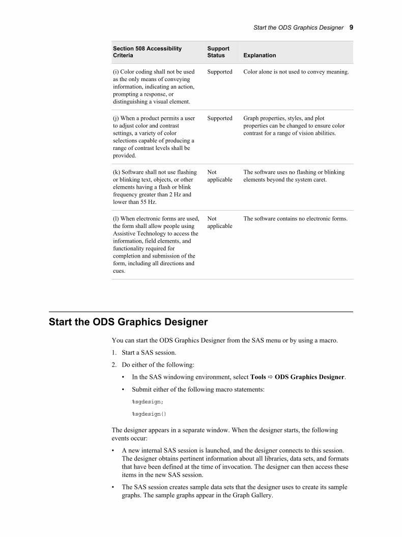
Accessibility ExceptionsThe following table describes accessibility compliance with Section 508. All known exceptions to accessibility standards are documented in the table.
Section 508 Accessibility Criteria
Support Status Explanation
(a) When software is designed to run on a system that has a keyboard, product functions shall be executable from a keyboard where the function itself or the result of performing a function can be discerned textually.
Supported with exceptions
Exceptions include the following:
• The TAB key cannot access some controls in the Graph Properties dialog box.
• The ESC key does not always close the current dialog box.
• Pressing ALT+SPACEBAR activates the system menu of the main application rather than the active window.
• No mnemonics are assigned for the menu items.
• No keyboard support has been provided to click and drag a plot.
(b) Applications shall not disrupt or disable activated features of other products that are identified as accessibility features, where those features are developed and documented according to industry standards. Applications also shall not disrupt or disable activated features of any operating system that are identified as accessibility features where the application programming interface for those accessibility features has been documented by the manufacturer of the operating system and is available to the product developer.
Supported The software does not disrupt or disable any of the keyboard accessibility features incorporated within the operating system.
(c) A well-defined on-screen indication of the current focus shall be provided that moves among interactive interface elements as the input focus changes. The focus shall be programmatically exposed so that Assistive Technology can track focus and focus changes.
Supported with an exception
Pressing the TAB key does not change the focus.
Accessibility Features of the ODS Graphics Designer 7
Section 508 Accessibility Criteria
Support Status Explanation
(d) Sufficient information about a user interface element including the identity, operation and state of the element shall be available to Assistive Technology. When an image represents a program element, the information conveyed by the image must also be available in text.
Supported with exceptions
Where keyboard access is limited because focus cannot be moved via keyboard to some elements, their information is not read by the screen reader. See Criterion (a) for areas where keyboard access is limited.
Additional exceptions include the following:
• Most of the labels in the Graph Style Editor dialog box are not read by JAWS.
• Labels for the edit boxes and frames in the Preferences dialog box are not read by JAWS.
• JAWS cannot read the text in the About SAS ODS Graphics Designer dialog box.
(e) When bitmap images are used to identify controls, status indicators, or other programmatic elements, the meaning assigned to those images shall be consistent throughout an application's performance.
Supported Images are used consistently throughout the interface.
(f) Textual information shall be provided through operating system functions for displaying text. The minimum information that shall be made available is text content, text input caret location, and text attributes.
Supported The software uses standard operating system functions for displaying text.
(g) Applications shall not override user selected contrast and color selections and other individual display attributes.
Supported with exceptions
In a high-contrast large-font color scheme, exceptions include the following:
• The icons on the buttons for minimize, maximize, and close on the child windows are not visible.
• The text on the menu bar and the title bars of the dialog boxes is displayed in large font. All other text in various dialog boxes is displayed in the normal font.
(h) When animation is displayed, the information shall be displayable in at least one non-animated presentation mode at the option of the user.
Not applicable
The software contains no animation.
8 Chapter 1 • Overview of the ODS Graphics Designer
Section 508 Accessibility Criteria
Support Status Explanation
(i) Color coding shall not be used as the only means of conveying information, indicating an action, prompting a response, or distinguishing a visual element.
Supported Color alone is not used to convey meaning.
(j) When a product permits a user to adjust color and contrast settings, a variety of color selections capable of producing a range of contrast levels shall be provided.
Supported Graph properties, styles, and plot properties can be changed to ensure color contrast for a range of vision abilities.
(k) Software shall not use flashing or blinking text, objects, or other elements having a flash or blink frequency greater than 2 Hz and lower than 55 Hz.
Not applicable
The software uses no flashing or blinking elements beyond the system caret.
(l) When electronic forms are used, the form shall allow people using Assistive Technology to access the information, field elements, and functionality required for completion and submission of the form, including all directions and cues.
Not applicable
The software contains no electronic forms.
Start the ODS Graphics DesignerYou can start the ODS Graphics Designer from the SAS menu or by using a macro.
1. Start a SAS session.
2. Do either of the following:
• In the SAS windowing environment, select Tools ð ODS Graphics Designer.
• Submit either of the following macro statements:
%sgdesign;
%sgdesign()
The designer appears in a separate window. When the designer starts, the following events occur:
• A new internal SAS session is launched, and the designer connects to this session. The designer obtains pertinent information about all libraries, data sets, and formats that have been defined at the time of invocation. The designer can then access these items in the new SAS session.
• The SAS session creates sample data sets that the designer uses to create its sample graphs. The sample graphs appear in the Graph Gallery.
Start the ODS Graphics Designer 9
The designer macro has optional parameters:
portNum = integerDefault = 5310. This parameter indicates the port that the designer uses to communicate with the SAS server. If another application is using port 5310, you can specify a different port for the designer.
dataSets = Y | NDefault = N. Some of the plots that are supplied with the designer depend on data sets that the designer creates in the WORK library. If you inadvertently delete some of these data sets, you can re-create them by setting this parameter to Y the next time you start the designer.
For example, to change the server port number to 5320 and re-create the data sets, you can submit the following statement:
%sgdesign( portnum=5320 , datasets=Y)
The parameters can be used in any order.
10 Chapter 1 • Overview of the ODS Graphics Designer
Chapter 2
Understanding the User Interface
Overview of the User Interface . . . . . . . . . . . . . . . . . . . . . . . . . . . . . . . . . . . . . . . . . . 11
About the Graph Gallery . . . . . . . . . . . . . . . . . . . . . . . . . . . . . . . . . . . . . . . . . . . . . . . 13Overview of the Graph Gallery . . . . . . . . . . . . . . . . . . . . . . . . . . . . . . . . . . . . . . . . 13Open and Use the Graph Gallery . . . . . . . . . . . . . . . . . . . . . . . . . . . . . . . . . . . . . . . 14Description of the Tabs in the Graph Gallery . . . . . . . . . . . . . . . . . . . . . . . . . . . . . . 14
About the Elements Pane . . . . . . . . . . . . . . . . . . . . . . . . . . . . . . . . . . . . . . . . . . . . . . . 15Overview of the Elements Pane . . . . . . . . . . . . . . . . . . . . . . . . . . . . . . . . . . . . . . . . 15Show or Hide the Elements Pane . . . . . . . . . . . . . . . . . . . . . . . . . . . . . . . . . . . . . . . 15Use the Add an Element Pop-up Window . . . . . . . . . . . . . . . . . . . . . . . . . . . . . . . . 16About the Plot Layers Panel . . . . . . . . . . . . . . . . . . . . . . . . . . . . . . . . . . . . . . . . . . . 17About the Insets Panel . . . . . . . . . . . . . . . . . . . . . . . . . . . . . . . . . . . . . . . . . . . . . . . 18Change the Appearance of the Elements Pane . . . . . . . . . . . . . . . . . . . . . . . . . . . . . 18
Overview of the User InterfaceThe ODS Graphics Designer user interface consists of several main components, as shown in the following display:
11
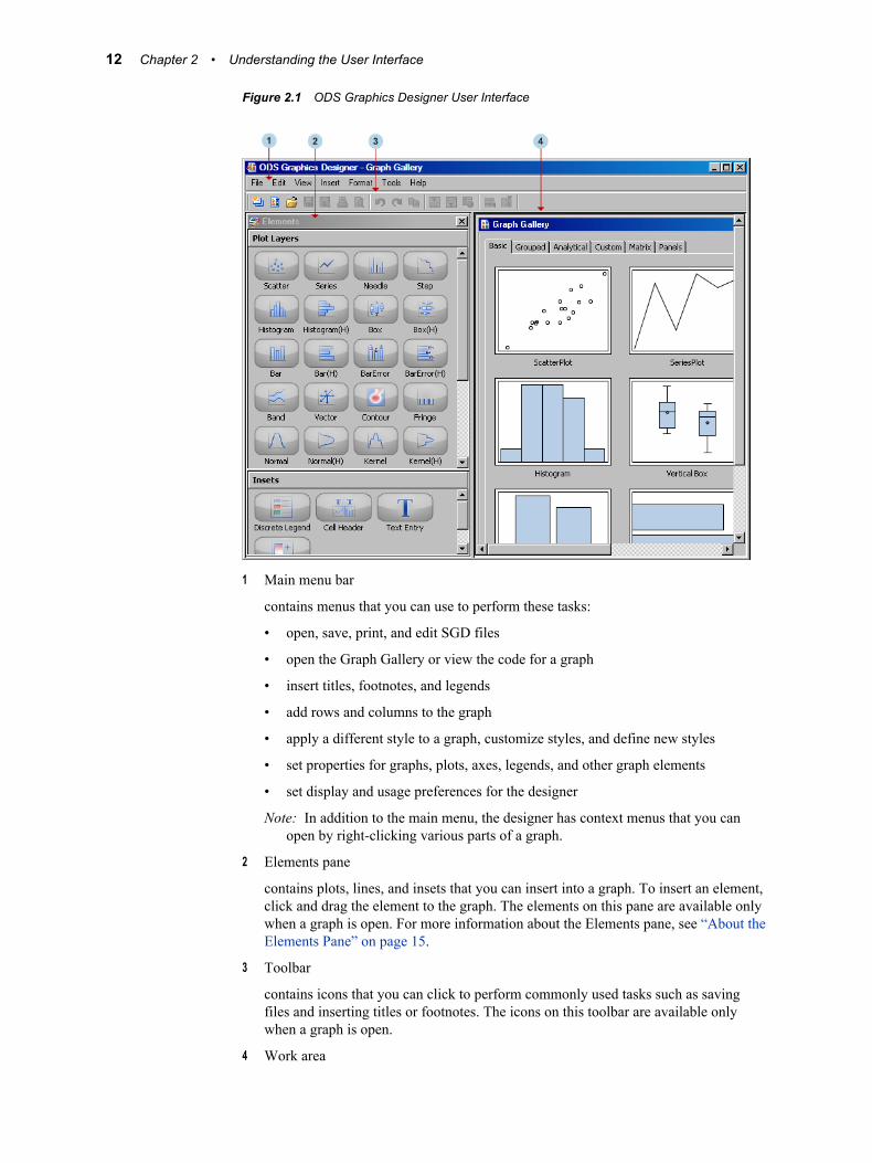
Figure 2.1 ODS Graphics Designer User Interface
1 Main menu bar
contains menus that you can use to perform these tasks:
• open, save, print, and edit SGD files
• open the Graph Gallery or view the code for a graph
• insert titles, footnotes, and legends
• add rows and columns to the graph
• apply a different style to a graph, customize styles, and define new styles
• set properties for graphs, plots, axes, legends, and other graph elements
• set display and usage preferences for the designer
Note: In addition to the main menu, the designer has context menus that you can open by right-clicking various parts of a graph.
2 Elements pane
contains plots, lines, and insets that you can insert into a graph. To insert an element, click and drag the element to the graph. The elements on this pane are available only when a graph is open. For more information about the Elements pane, see “About the Elements Pane” on page 15.
3 Toolbar
contains icons that you can click to perform commonly used tasks such as saving files and inserting titles or footnotes. The icons on this toolbar are available only when a graph is open.
4 Work area
12 Chapter 2 • Understanding the User Interface
contains one or more graphs that you create and design in the designer. In addition to the graphs, you can display the Graph Gallery, a collection of predefined graphs. For more information about the Graph Gallery, see “About the Graph Gallery” on page 13.
About the Graph Gallery
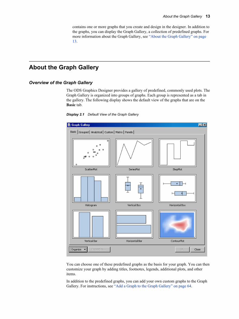
Overview of the Graph GalleryThe ODS Graphics Designer provides a gallery of predefined, commonly used plots. The Graph Gallery is organized into groups of graphs. Each group is represented as a tab in the gallery. The following display shows the default view of the graphs that are on the Basic tab.
Display 2.1 Default View of the Graph Gallery
You can choose one of these predefined graphs as the basis for your graph. You can then customize your graph by adding titles, footnotes, legends, additional plots, and other items.
In addition to the predefined graphs, you can add your own custom graphs to the Graph Gallery. For instructions, see “Add a Graph to the Graph Gallery” on page 64.
About the Graph Gallery 13
Open and Use the Graph GalleryIf the gallery is not already displayed, you can open the gallery in any of the following ways:
• Select File ð New ð From Graph Gallery. You typically use this command when you are ready to create a graph.
• Select View ð Graph Gallery.
• Click the View Graph Gallery icon in the toolbar.
After you open the gallery, you can open one of the graphs in the gallery. To open a graph, double-click the icon for the graph, or select an icon and then click OK.
Description of the Tabs in the Graph GalleryThe Graph Gallery organizes graphs into tabs. For example, the Grouped tab contains plots for data that has been grouped by a variable.
For graphs that are created from the Graph Gallery, placeholder data is assigned to the plot or plots in the graph. When you create your graph, you can change the data as appropriate.
Note: Before changing the data, you should ensure that your replacement data has been properly preprocessed for the plots in the gallery. Some plots require particular types of data. For example, in the Pareto graph on the Analytical tab, the series plot requires a variable that calculates a cumulative percent.
Here are the predefined tabs:
Table 2.1 Predefined Tabs in the Graph Gallery
Tab Description
Basic Includes scatter plots, histograms, and other basic plots
Grouped Includes plots for data that has been grouped by a variable
Analytical Includes commonly used analytical graphs
Custom Includes graphs that require custom data
Matrix Includes various scatter plot matrices
Panels Includes various types of classification panel graphs
You can add your own custom groups to the gallery. For more information, see Chapter 21, “Managing Graphs in the Graph Gallery,” on page 197.
14 Chapter 2 • Understanding the User Interface
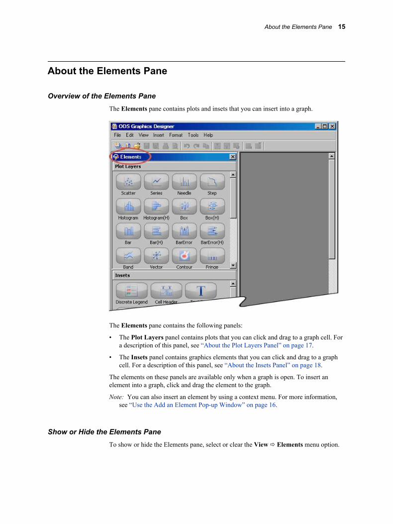
About the Elements Pane
Overview of the Elements PaneThe Elements pane contains plots and insets that you can insert into a graph.
The Elements pane contains the following panels:
• The Plot Layers panel contains plots that you can click and drag to a graph cell. For a description of this panel, see “About the Plot Layers Panel” on page 17.
• The Insets panel contains graphics elements that you can click and drag to a graph cell. For a description of this panel, see “About the Insets Panel” on page 18.
The elements on these panels are available only when a graph is open. To insert an element into a graph, click and drag the element to the graph.
Note: You can also insert an element by using a context menu. For more information, see “Use the Add an Element Pop-up Window” on page 16.
Show or Hide the Elements PaneTo show or hide the Elements pane, select or clear the View ð Elements menu option.
About the Elements Pane 15
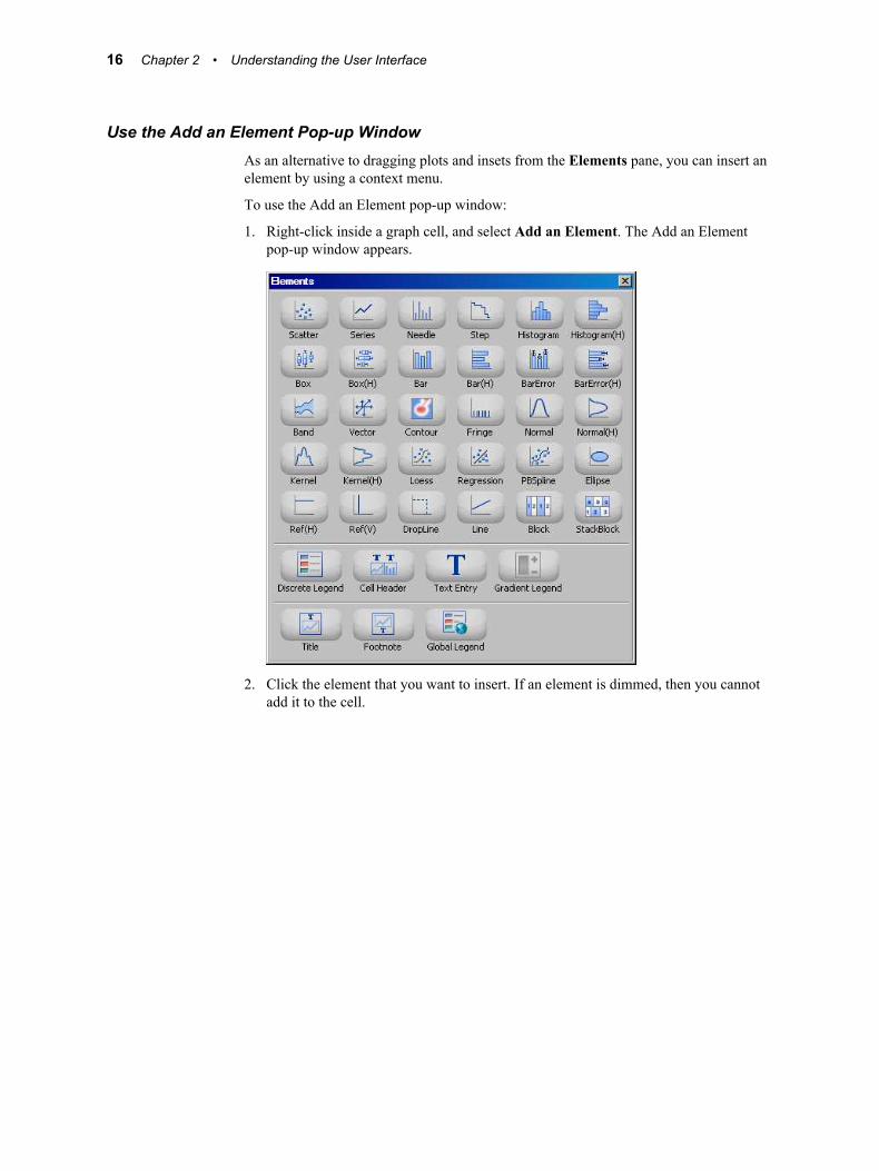
Use the Add an Element Pop-up WindowAs an alternative to dragging plots and insets from the Elements pane, you can insert an element by using a context menu.
To use the Add an Element pop-up window:
1. Right-click inside a graph cell, and select Add an Element. The Add an Element pop-up window appears.
2. Click the element that you want to insert. If an element is dimmed, then you cannot add it to the cell.
16 Chapter 2 • Understanding the User Interface
About the Plot Layers Panel
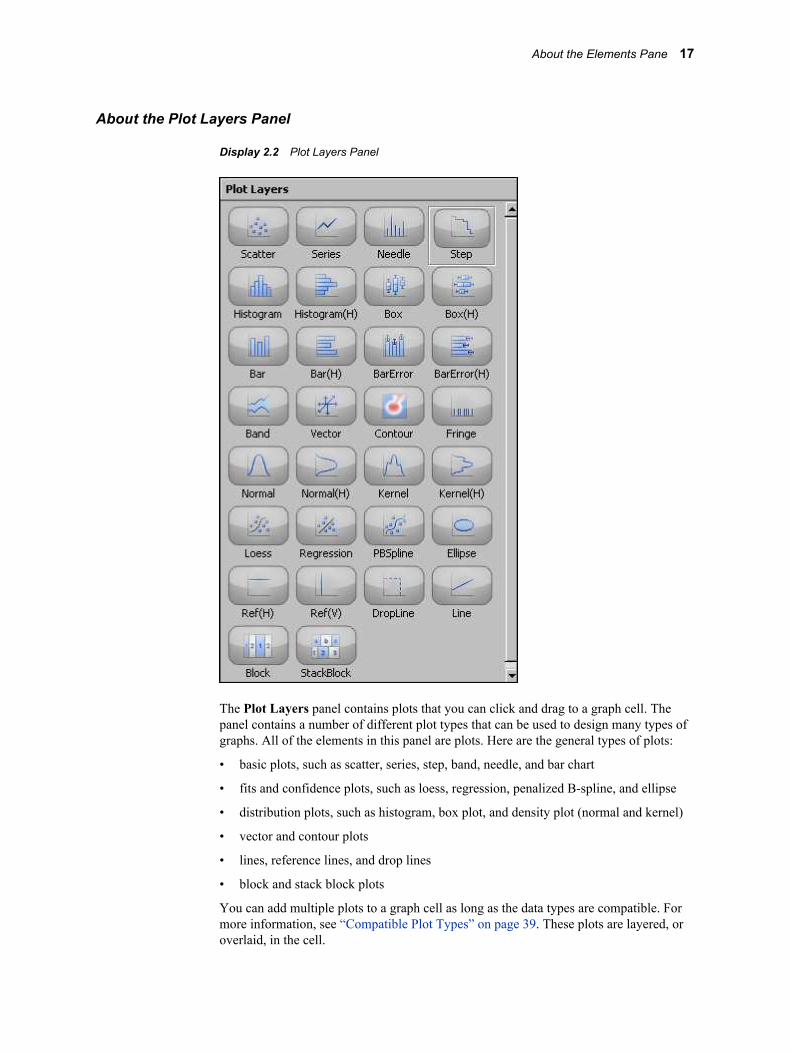
Display 2.2 Plot Layers Panel
The Plot Layers panel contains plots that you can click and drag to a graph cell. The panel contains a number of different plot types that can be used to design many types of graphs. All of the elements in this panel are plots. Here are the general types of plots:
• basic plots, such as scatter, series, step, band, needle, and bar chart
• fits and confidence plots, such as loess, regression, penalized B-spline, and ellipse
• distribution plots, such as histogram, box plot, and density plot (normal and kernel)
• vector and contour plots
• lines, reference lines, and drop lines
• block and stack block plots
You can add multiple plots to a graph cell as long as the data types are compatible. For more information, see “Compatible Plot Types” on page 39. These plots are layered, or overlaid, in the cell.
About the Elements Pane 17
About the Insets Panel
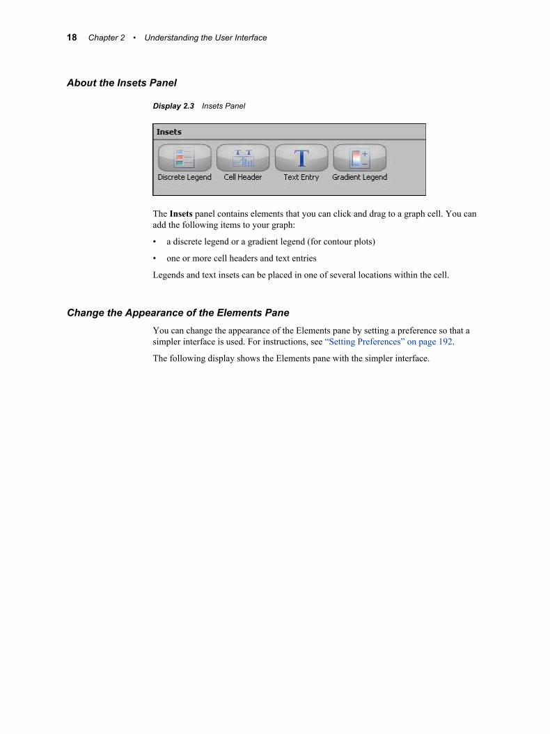
Display 2.3 Insets Panel
The Insets panel contains elements that you can click and drag to a graph cell. You can add the following items to your graph:
• a discrete legend or a gradient legend (for contour plots)
• one or more cell headers and text entries
Legends and text insets can be placed in one of several locations within the cell.
Change the Appearance of the Elements PaneYou can change the appearance of the Elements pane by setting a preference so that a simpler interface is used. For instructions, see “Setting Preferences” on page 192.
The following display shows the Elements pane with the simpler interface.
18 Chapter 2 • Understanding the User Interface
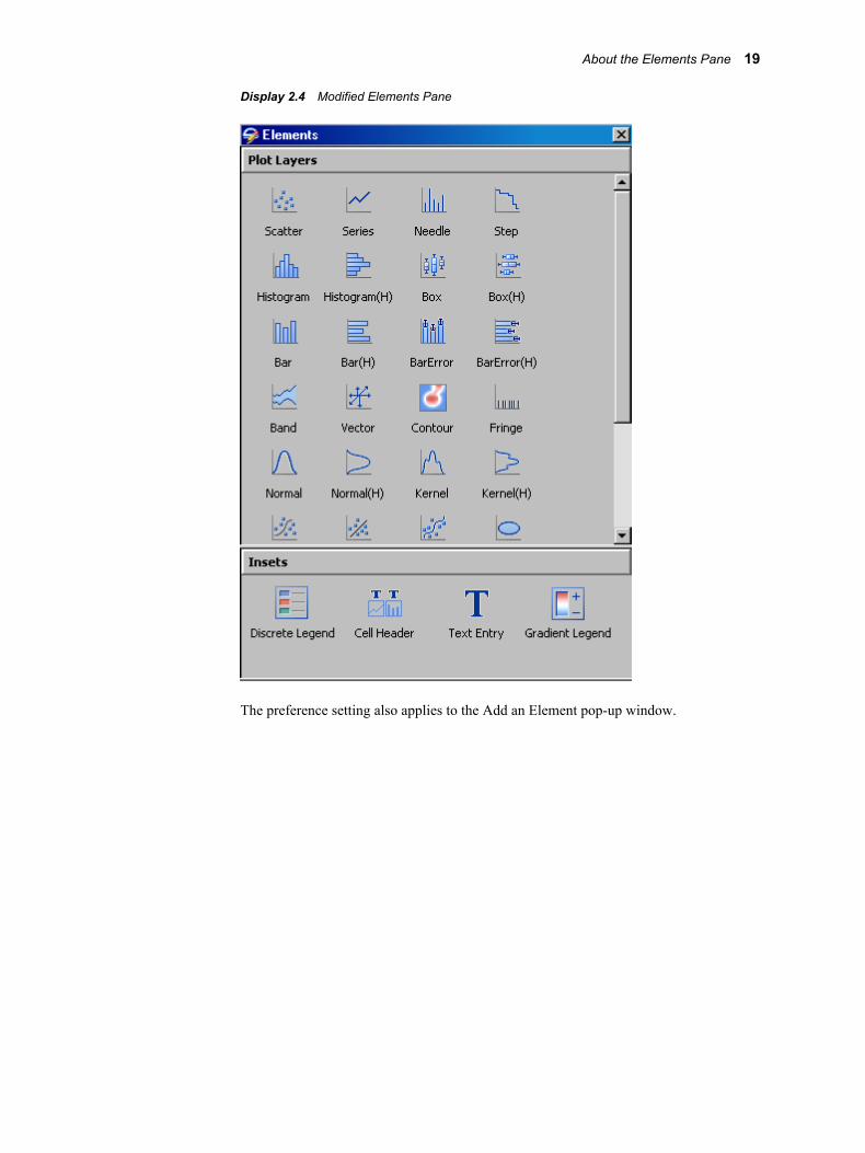
Display 2.4 Modified Elements Pane
The preference setting also applies to the Add an Element pop-up window.
About the Elements Pane 19

20 Chapter 2 • Understanding the User Interface

Part 2
Getting Started
Chapter 3Quick-Start Examples . . . . . . . . . . . . . . . . . . . . . . . . . . . . . . . . . . . . . . . . . . . . 23
Chapter 4Fundamentals of Designing Graphs . . . . . . . . . . . . . . . . . . . . . . . . . . . . . . 37
21

22

Chapter 3
Quick-Start Examples
About the Quick-Start Examples . . . . . . . . . . . . . . . . . . . . . . . . . . . . . . . . . . . . . . . . 23
Quick-Start Example One: Design a Simple Graph . . . . . . . . . . . . . . . . . . . . . . . . . 24About Quick-Start Example One . . . . . . . . . . . . . . . . . . . . . . . . . . . . . . . . . . . . . . . 24Step One: Create the Graph and Assign Data . . . . . . . . . . . . . . . . . . . . . . . . . . . . . . 24Step Two: Add a Normal Plot to the Graph . . . . . . . . . . . . . . . . . . . . . . . . . . . . . . . 25Step Three: Customize the Graph Title . . . . . . . . . . . . . . . . . . . . . . . . . . . . . . . . . . 26Step Four: Remove the Graph Footnote . . . . . . . . . . . . . . . . . . . . . . . . . . . . . . . . . . 26Step Five: Save the Graph . . . . . . . . . . . . . . . . . . . . . . . . . . . . . . . . . . . . . . . . . . . . 27
Quick-Start Example Two: Enhance the Simple Quick-Start Graph . . . . . . . . . . . 27About Quick-Start Example Two . . . . . . . . . . . . . . . . . . . . . . . . . . . . . . . . . . . . . . . 27Step One: Open Quick-Start Example One . . . . . . . . . . . . . . . . . . . . . . . . . . . . . . . 28Step Two: Add a Kernel Density Plot to the Histogram . . . . . . . . . . . . . . . . . . . . . 28Step Three: Add a Column Cell to the Graph . . . . . . . . . . . . . . . . . . . . . . . . . . . . . . 28Step Four: Add a Box Plot to the New Cell . . . . . . . . . . . . . . . . . . . . . . . . . . . . . . . 29Step Five: Add a Global Legend to the Graph . . . . . . . . . . . . . . . . . . . . . . . . . . . . . 31Step Six: Change the Format of the Kernel Plot . . . . . . . . . . . . . . . . . . . . . . . . . . . . 32Step Seven: Widen the Cell in the First Column . . . . . . . . . . . . . . . . . . . . . . . . . . . 34Step Eight: Save the Graph . . . . . . . . . . . . . . . . . . . . . . . . . . . . . . . . . . . . . . . . . . . . 35
Run the Examples on the SAS Server . . . . . . . . . . . . . . . . . . . . . . . . . . . . . . . . . . . . . 35
About the Quick-Start ExamplesTwo quick-start examples have been provided to help you get started creating graphs:
• “Quick-Start Example One: Design a Simple Graph” on page 24
• “Quick-Start Example Two: Enhance the Simple Quick-Start Graph” on page 27
The examples provide step-by-step instructions for creating a graph. You first create a simple graph and then add more complexity to the graph. The graph is based on data that is available in the SASHELP library.
These examples are intended to be followed in order. The graph that you create in example two builds on and enhances the graph that you create in example one.
By following the steps in these examples, you can learn about several main features of ODS Graphics Designer, such as titles, legends, plot properties, and multi-cell graphs.
For more examples, see these chapters:
• Chapter 22, “Examples for Creating Single-Cell Graphs ,” on page 207
23

• Chapter 23, “Examples for Creating Multi-Cell Graphs,” on page 217
Quick-Start Example One: Design a Simple Graph
About Quick-Start Example OneThis example uses the Heart data set in the SASHELP library. The example shows the distribution of the weight of individuals who participated in a medical study. The graph that you create here contains a histogram and a normal density curve.
Display 3.1 Simple Histogram and Normal Curve
To create this graph, follow these steps.
Step One: Create the Graph and Assign DataIn this step, you create a graph from the Graph Gallery.
1. Open the Graph Gallery if it is not already open. Select File ð New ð From Graph Gallery, or click the Graph Gallery toolbar button.
2. On the Basic tab, double-click the Histogram icon.
The Histogram icon looks like this:
The Assign Data dialog box appears.
3. In the Assign Data dialog box, complete these steps:
24 Chapter 3 • Quick-Start Examples
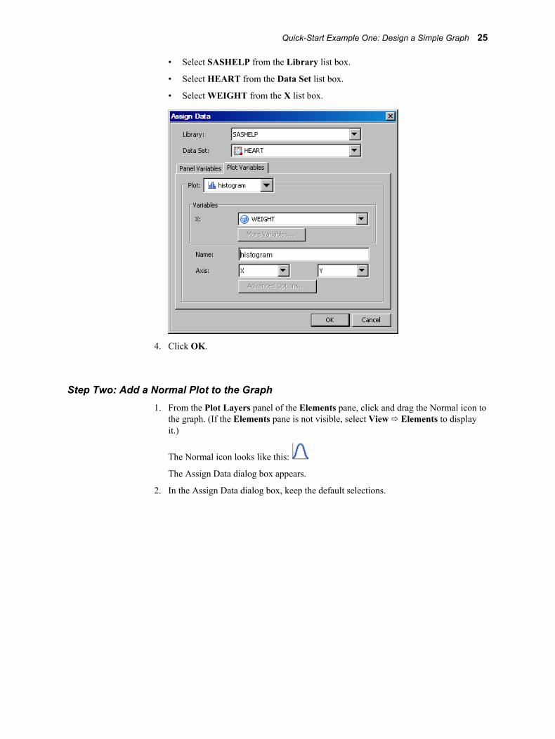
• Select SASHELP from the Library list box.
• Select HEART from the Data Set list box.
• Select WEIGHT from the X list box.
4. Click OK.
Step Two: Add a Normal Plot to the Graph1. From the Plot Layers panel of the Elements pane, click and drag the Normal icon to
the graph. (If the Elements pane is not visible, select View ð Elements to display it.)
The Normal icon looks like this:
The Assign Data dialog box appears.
2. In the Assign Data dialog box, keep the default selections.
Quick-Start Example One: Design a Simple Graph 25
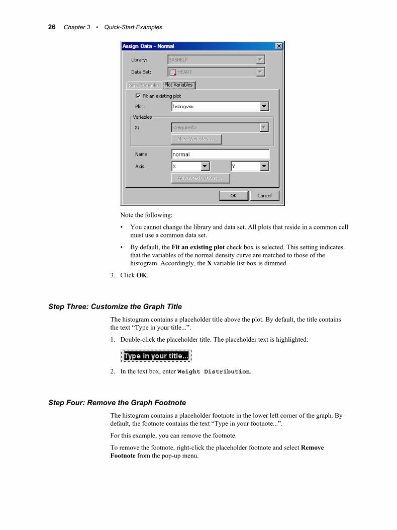
Note the following:
• You cannot change the library and data set. All plots that reside in a common cell must use a common data set.
• By default, the Fit an existing plot check box is selected. This setting indicates that the variables of the normal density curve are matched to those of the histogram. Accordingly, the X variable list box is dimmed.
3. Click OK.
Step Three: Customize the Graph TitleThe histogram contains a placeholder title above the plot. By default, the title contains the text “Type in your title...”.
1. Double-click the placeholder title. The placeholder text is highlighted:
2. In the text box, enter Weight Distribution.
Step Four: Remove the Graph FootnoteThe histogram contains a placeholder footnote in the lower left corner of the graph. By default, the footnote contains the text “Type in your footnote...”.
For this example, you can remove the footnote.
To remove the footnote, right-click the placeholder footnote and select Remove Footnote from the pop-up menu.
26 Chapter 3 • Quick-Start Examples
Step Five: Save the GraphIt is recommended that you save this graph so that you can later return to it.
1. Select File ð Save As.
2. Save the file to the desired location. Specify the name that you want for the file. For example, you might enter quickStart. The file type SGD Files (*.sgd) is selected by default.
3. Click Save.
The next quick-start example builds on this graph. See “Quick-Start Example Two: Enhance the Simple Quick-Start Graph” on page 27.
Quick-Start Example Two: Enhance the Simple Quick-Start Graph
About Quick-Start Example TwoThis example builds on and enhances the graph that you created in quick-start example one, which showed the distribution of the weight of individuals who participated in a medical study.
The graph that you create here adds more information to the example. In this example, you add a kernel density plot to the histogram. You also create a second column that contains a box plot, add a global legend, and change the line format of the kernel density curve.
Quick-Start Example Two: Enhance the Simple Quick-Start Graph 27
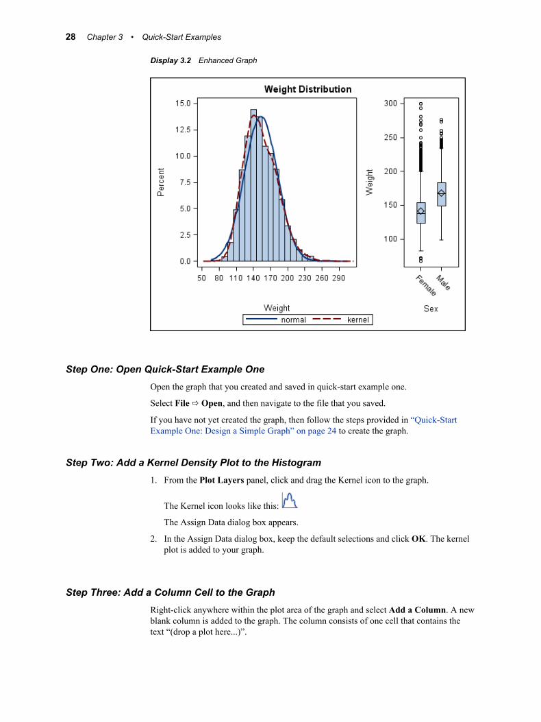
Display 3.2 Enhanced Graph
Step One: Open Quick-Start Example OneOpen the graph that you created and saved in quick-start example one.
Select File ð Open, and then navigate to the file that you saved.
If you have not yet created the graph, then follow the steps provided in “Quick-Start Example One: Design a Simple Graph” on page 24 to create the graph.
Step Two: Add a Kernel Density Plot to the Histogram1. From the Plot Layers panel, click and drag the Kernel icon to the graph.
The Kernel icon looks like this:
The Assign Data dialog box appears.
2. In the Assign Data dialog box, keep the default selections and click OK. The kernel plot is added to your graph.
Step Three: Add a Column Cell to the GraphRight-click anywhere within the plot area of the graph and select Add a Column. A new blank column is added to the graph. The column consists of one cell that contains the text “(drop a plot here...)”.
28 Chapter 3 • Quick-Start Examples

Step Four: Add a Box Plot to the New Cell1. From the Plot Layers panel of the Elements pane, click and drag the Box icon to the
new cell in the graph.
The Box icon looks like this:
The Assign Data dialog box appears.
2. In the Assign Data dialog box, complete these steps:
• Select SASHELP from the Library list box.
• Select HEART from the Data Set list box.
• Select SEX from the X list box.
• Select WEIGHT from the Y list box.
Quick-Start Example Two: Enhance the Simple Quick-Start Graph 29
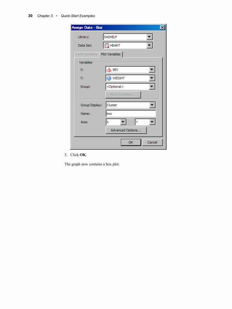
3. Click OK.
The graph now contains a box plot.
30 Chapter 3 • Quick-Start Examples
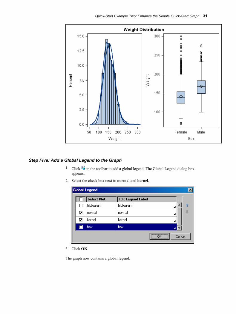
Step Five: Add a Global Legend to the Graph1. Click in the toolbar to add a global legend. The Global Legend dialog box
appears.
2. Select the check box next to normal and kernel.
3. Click OK.
The graph now contains a global legend.
Quick-Start Example Two: Enhance the Simple Quick-Start Graph 31
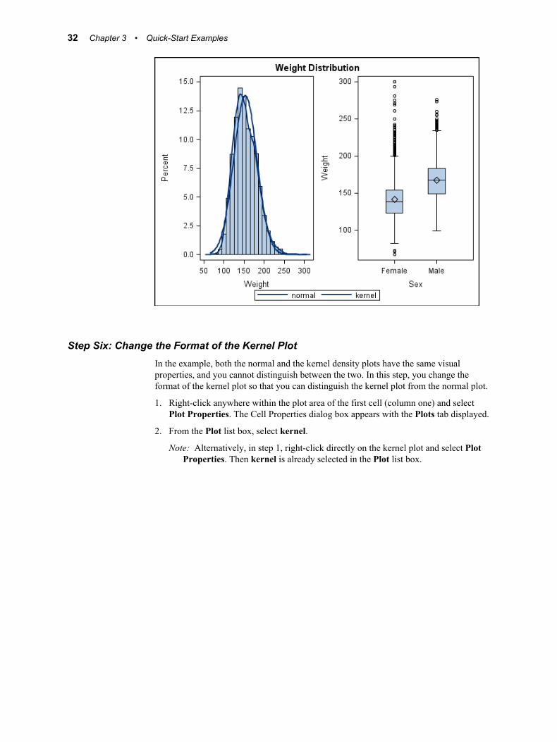
Step Six: Change the Format of the Kernel PlotIn the example, both the normal and the kernel density plots have the same visual properties, and you cannot distinguish between the two. In this step, you change the format of the kernel plot so that you can distinguish the kernel plot from the normal plot.
1. Right-click anywhere within the plot area of the first cell (column one) and select Plot Properties. The Cell Properties dialog box appears with the Plots tab displayed.
2. From the Plot list box, select kernel.
Note: Alternatively, in step 1, right-click directly on the kernel plot and select Plot Properties. Then kernel is already selected in the Plot list box.
32 Chapter 3 • Quick-Start Examples
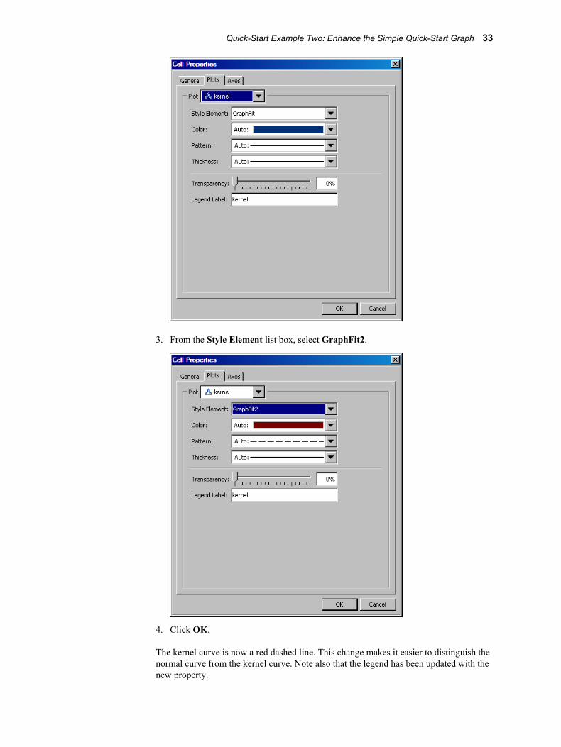
3. From the Style Element list box, select GraphFit2.
4. Click OK.
The kernel curve is now a red dashed line. This change makes it easier to distinguish the normal curve from the kernel curve. Note also that the legend has been updated with the new property.
Quick-Start Example Two: Enhance the Simple Quick-Start Graph 33

Style elements are obtained from ODS styles and determine the format of plot elements. It is preferable to change the style element rather than the explicit line properties of the kernel plot. Changing the style element guarantees that the kernel and normal plots are visually distinct for any style that is applied to the graph.
Step Seven: Widen the Cell in the First ColumnBoth cells in the graph currently have the same width. You can widen the cell that contains the histogram so that the histogram has more space.
1. Position the cursor between the two cells of the graph. A dashed line appears between the cells and the cursor changes to a two-headed arrow .
2. Click and drag the dashed line toward the right. The cell with the histogram becomes wider and the cell with the box plot becomes narrower.
34 Chapter 3 • Quick-Start Examples
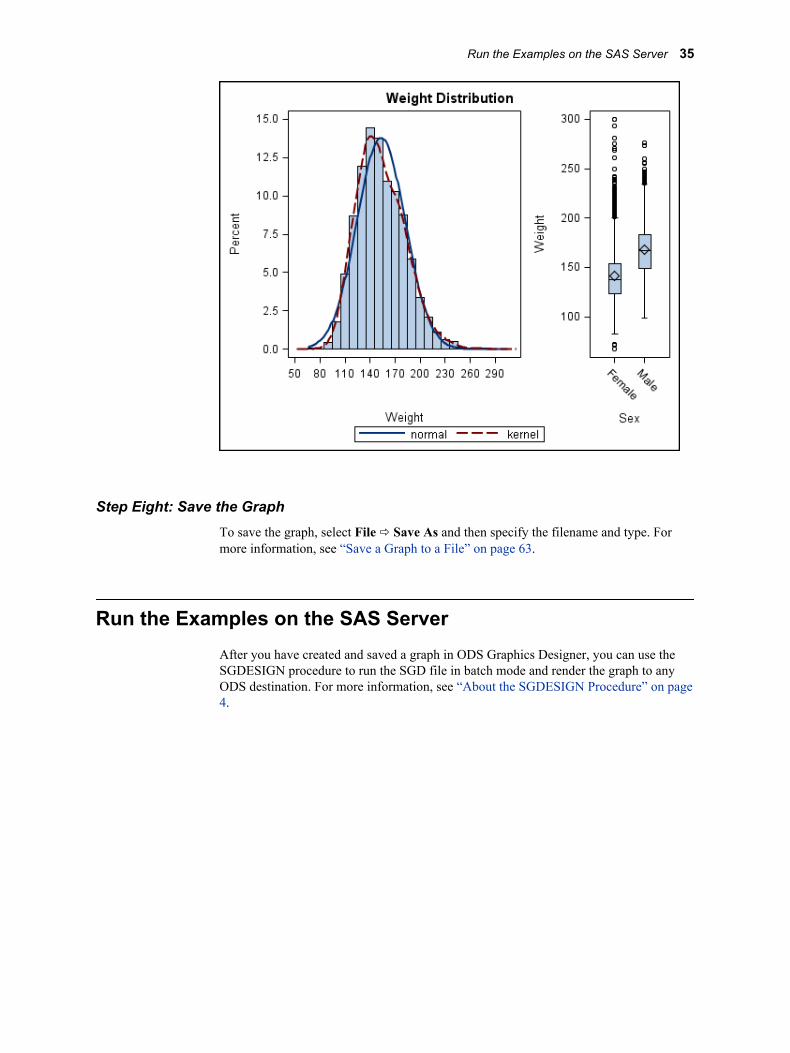
Step Eight: Save the GraphTo save the graph, select File ð Save As and then specify the filename and type. For more information, see “Save a Graph to a File” on page 63.
Run the Examples on the SAS ServerAfter you have created and saved a graph in ODS Graphics Designer, you can use the SGDESIGN procedure to run the SGD file in batch mode and render the graph to any ODS destination. For more information, see “About the SGDESIGN Procedure” on page 4.
Run the Examples on the SAS Server 35

36 Chapter 3 • Quick-Start Examples
Chapter 4
Fundamentals of Designing Graphs
Components of a Graph . . . . . . . . . . . . . . . . . . . . . . . . . . . . . . . . . . . . . . . . . . . . . . . . 37
Compatible Plot Types . . . . . . . . . . . . . . . . . . . . . . . . . . . . . . . . . . . . . . . . . . . . . . . . . 39
High-Level Steps for Designing Graphs . . . . . . . . . . . . . . . . . . . . . . . . . . . . . . . . . . . 40
Components of a Graph
In general, a graph is made of up of the following parts:
• titles and footnotes
• one or more cells that contain a composite of one or more plots
• legends, which can reside inside or outside a cell
The following figure shows the different parts of a graph:
37
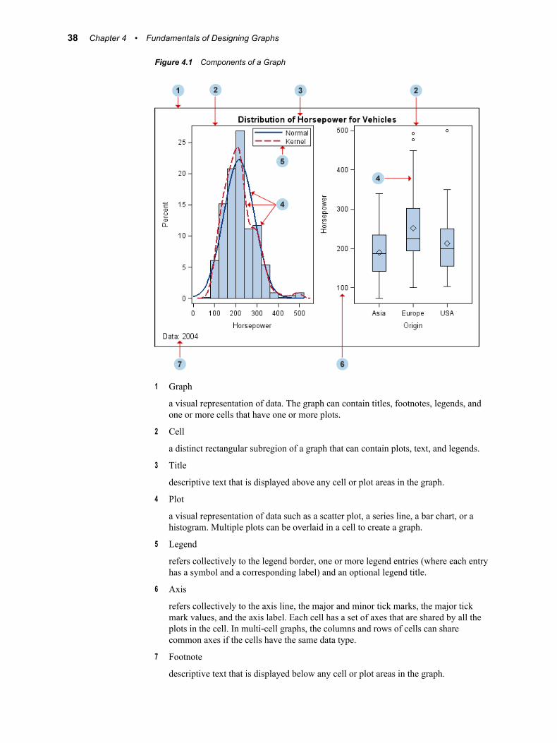
Figure 4.1 Components of a Graph
1 Graph
a visual representation of data. The graph can contain titles, footnotes, legends, and one or more cells that have one or more plots.
2 Cell
a distinct rectangular subregion of a graph that can contain plots, text, and legends.
3 Title
descriptive text that is displayed above any cell or plot areas in the graph.
4 Plot
a visual representation of data such as a scatter plot, a series line, a bar chart, or a histogram. Multiple plots can be overlaid in a cell to create a graph.
5 Legend
refers collectively to the legend border, one or more legend entries (where each entry has a symbol and a corresponding label) and an optional legend title.
6 Axis
refers collectively to the axis line, the major and minor tick marks, the major tick mark values, and the axis label. Each cell has a set of axes that are shared by all the plots in the cell. In multi‐cell graphs, the columns and rows of cells can share common axes if the cells have the same data type.
7 Footnote
descriptive text that is displayed below any cell or plot areas in the graph.
38 Chapter 4 • Fundamentals of Designing Graphs
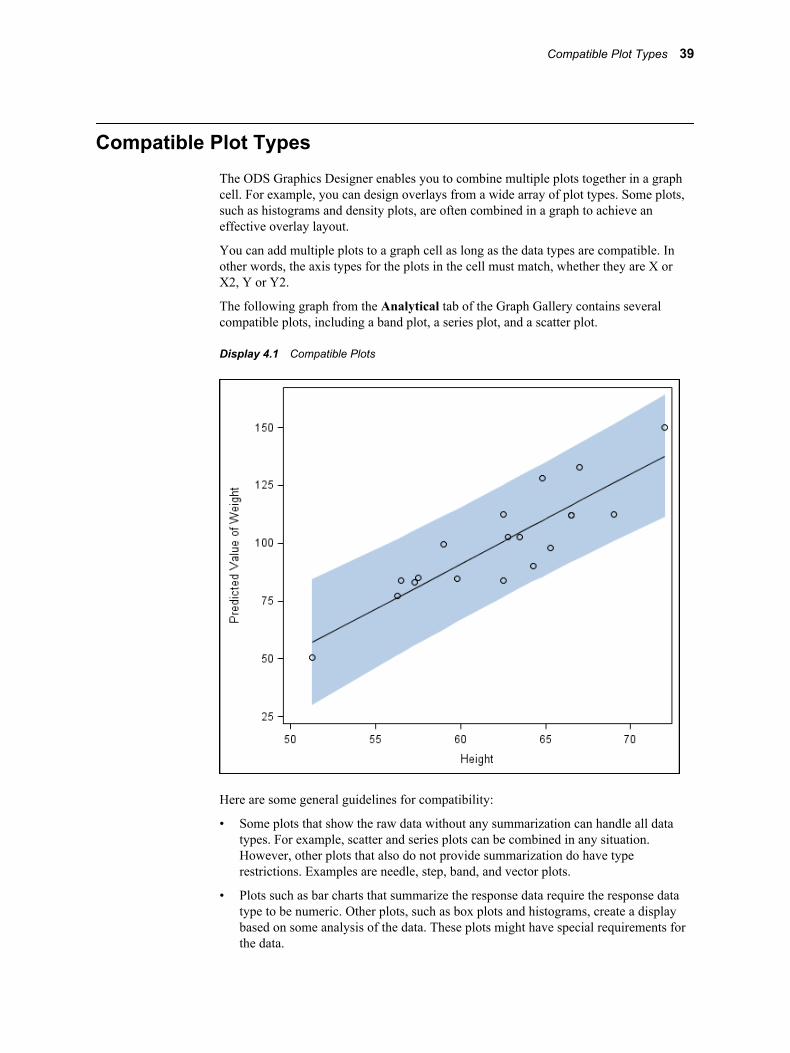
Compatible Plot TypesThe ODS Graphics Designer enables you to combine multiple plots together in a graph cell. For example, you can design overlays from a wide array of plot types. Some plots, such as histograms and density plots, are often combined in a graph to achieve an effective overlay layout.
You can add multiple plots to a graph cell as long as the data types are compatible. In other words, the axis types for the plots in the cell must match, whether they are X or X2, Y or Y2.
The following graph from the Analytical tab of the Graph Gallery contains several compatible plots, including a band plot, a series plot, and a scatter plot.
Display 4.1 Compatible Plots
Here are some general guidelines for compatibility:
• Some plots that show the raw data without any summarization can handle all data types. For example, scatter and series plots can be combined in any situation. However, other plots that also do not provide summarization do have type restrictions. Examples are needle, step, band, and vector plots.
• Plots such as bar charts that summarize the response data require the response data type to be numeric. Other plots, such as box plots and histograms, create a display based on some analysis of the data. These plots might have special requirements for the data.
Compatible Plot Types 39
Note that these plots can be vertical or horizontal. The response axis is Y or Y2 for vertical plots and X or X2 for horizontal plots.
• When a plot that you drag to a cell is incompatible with existing plots in the cell, the ODS Graphics Designer displays a message.
High-Level Steps for Designing GraphsThe ODS Graphics Designer provides many options for designing graphs, and your approach can vary from what is described here. Generally, a typical design process might consist of the following steps:
1. Create a graph in one of the following ways:
From the Graph Gallery 1. Create the graph by opening a predefined graph from the gallery. Placeholder data is assigned to the plot or plots in the graph.
2. Assign data that is appropriate for your graph.
For instructions, see “Create a Graph from the Graph Gallery” on page 46.
From a blank graph 1. Create a blank graph.
2. Add a plot to the graph.
3. Assign data to the plot.
For instructions, see “Create a Graph from a Blank Graph Window” on page 46.
2. Add additional plots to the graph as desired. For instructions, see “Add a Plot to a Graph” on page 47.
Exception: You cannot add plots to matrix graphs that you create from the Matrix tab of the Graph Gallery.
3. To design a multi-cell graph, add one or more rows, columns, or both to the graph. Then add one or more plots to the new cells. For instructions, see “Adding Rows and Columns to a Graph” on page 159.
Exception: You cannot add rows and columns to graphs that you create from the Matrix tab or the Panels tab of the Graph Gallery.
Note: The designer also enables you to create classification panels, which are data-driven layouts that create a grid of cells based on one or more classification variables. For more information, see Chapter 17, “Creating Classification Panels,” on page 169.
4. Customize the graph. Here are some of the changes that you can make:
• Change the graph’s style, size, or background color. For more information, see Chapter 10, “Changing Graph Properties,” on page 95.
• Change the visual attributes of a plot, such as marker color, symbol, line color, and thickness. For more information, see Chapter 11, “Changing Plot Properties,” on page 99.
40 Chapter 4 • Fundamentals of Designing Graphs
• Change axis properties, including grid lines. For more information, see Chapter 12, “Changing Axis Properties,” on page 125.
• Add titles and footnotes to the graph. For more information, see Chapter 6, “Working with Titles and Footnotes,” on page 71.
• Add or customize legends, which can reside inside or outside of a cell. For more information, see Chapter 7, “Working with Legends,” on page 75.
• Add headers to a cell. For more information, see Chapter 16, “Working with Cell Headers,” on page 165.
• Add text to a cell. For more information, see Chapter 8, “Working with Text Entries,” on page 83.
5. Save the graph. For instructions, see “Save a Graph to a File” on page 63.
You can also create graphs that can be reused with different variables in the same or in a different data set. For more information, see Chapter 19, “Using Shared Variables in Graphs,” on page 181. (This feature is new in the third maintenance release for SAS 9.2.)
High-Level Steps for Designing Graphs 41

42 Chapter 4 • Fundamentals of Designing Graphs
Part 3
Designing Graphs
Chapter 5Creating and Managing Graphs . . . . . . . . . . . . . . . . . . . . . . . . . . . . . . . . . . 45
Chapter 6Working with Titles and Footnotes . . . . . . . . . . . . . . . . . . . . . . . . . . . . . . . 71
Chapter 7Working with Legends . . . . . . . . . . . . . . . . . . . . . . . . . . . . . . . . . . . . . . . . . . . 75
Chapter 8Working with Text Entries . . . . . . . . . . . . . . . . . . . . . . . . . . . . . . . . . . . . . . . . 83
Chapter 9General Information about Modifying Textual Elements . . . . . . . . . . . 87
43

44
Chapter 5
Creating and Managing Graphs
Creating a Graph . . . . . . . . . . . . . . . . . . . . . . . . . . . . . . . . . . . . . . . . . . . . . . . . . . . . . 45About Creating a Graph . . . . . . . . . . . . . . . . . . . . . . . . . . . . . . . . . . . . . . . . . . . . . . 45Create a Graph from the Graph Gallery . . . . . . . . . . . . . . . . . . . . . . . . . . . . . . . . . . 46Create a Graph from a Blank Graph Window . . . . . . . . . . . . . . . . . . . . . . . . . . . . . 46
Add a Plot to a Graph . . . . . . . . . . . . . . . . . . . . . . . . . . . . . . . . . . . . . . . . . . . . . . . . . 47
Assigning Data to a Plot . . . . . . . . . . . . . . . . . . . . . . . . . . . . . . . . . . . . . . . . . . . . . . . . 47About Assigning Data to a Plot . . . . . . . . . . . . . . . . . . . . . . . . . . . . . . . . . . . . . . . . 47About Plot Roles . . . . . . . . . . . . . . . . . . . . . . . . . . . . . . . . . . . . . . . . . . . . . . . . . . . . 48Assign Data to a New Plot . . . . . . . . . . . . . . . . . . . . . . . . . . . . . . . . . . . . . . . . . . . . 48Change the Data Assignment for a Plot in a Graph . . . . . . . . . . . . . . . . . . . . . . . . . 50Summary of Plot Roles and Data Attributes . . . . . . . . . . . . . . . . . . . . . . . . . . . . . . . 54
Select a Plot . . . . . . . . . . . . . . . . . . . . . . . . . . . . . . . . . . . . . . . . . . . . . . . . . . . . . . . . . . 58
Adding Reference Lines to Graphs . . . . . . . . . . . . . . . . . . . . . . . . . . . . . . . . . . . . . . . 60About Adding Reference Lines . . . . . . . . . . . . . . . . . . . . . . . . . . . . . . . . . . . . . . . . 60Add a Reference Line to a Graph . . . . . . . . . . . . . . . . . . . . . . . . . . . . . . . . . . . . . . . 60Reposition a Reference Line . . . . . . . . . . . . . . . . . . . . . . . . . . . . . . . . . . . . . . . . . . . 62Change the Length of a Drop Line . . . . . . . . . . . . . . . . . . . . . . . . . . . . . . . . . . . . . . 63
Remove a Plot from a Graph . . . . . . . . . . . . . . . . . . . . . . . . . . . . . . . . . . . . . . . . . . . . 63
Save a Graph to a File . . . . . . . . . . . . . . . . . . . . . . . . . . . . . . . . . . . . . . . . . . . . . . . . . 63
Add a Graph to the Graph Gallery . . . . . . . . . . . . . . . . . . . . . . . . . . . . . . . . . . . . . . . 64
Open a Graph . . . . . . . . . . . . . . . . . . . . . . . . . . . . . . . . . . . . . . . . . . . . . . . . . . . . . . . . 65
Working with the Graph Code . . . . . . . . . . . . . . . . . . . . . . . . . . . . . . . . . . . . . . . . . . 66View, Copy, and Save the Code for a Graph . . . . . . . . . . . . . . . . . . . . . . . . . . . . . . 66Change the Name of the Graph Template . . . . . . . . . . . . . . . . . . . . . . . . . . . . . . . . 66
Copy and Paste a Graph to Another Application . . . . . . . . . . . . . . . . . . . . . . . . . . . 67
Manage the Plots and Insets in a Cell . . . . . . . . . . . . . . . . . . . . . . . . . . . . . . . . . . . . . 67
Creating a Graph
About Creating a GraphODS Graphics Designer provides more than one way to create a graph:
45
• The designer provides a gallery of predefined, commonly used graphs. If the graph that you want to create exists in the Graph Gallery, then an easy way to create the graph is to open the predefined graph from the gallery. Even if you do not find the exact graph that you need in the gallery, you might find a graph that can be used as a starting point, from which to build your custom graph.
For graphs that are created from the Graph Gallery, placeholder data is assigned to the graph. You can change the data as appropriate for your graph. After you create the graph, you can add plots, titles, legends, and other elements to the graph.
For more information about the gallery, see “About the Graph Gallery” on page 13.
• You can start from a blank graph window and then add plots, titles, legends, and other elements to create your graph.
Note: You can also create what is called a shared-variable graph. This type of graph is useful when you want to reuse a graph with different variable names. For more information, see “About Shared Variables” on page 181.
Create a Graph from the Graph GalleryTo create a graph from the Graph Gallery:
1. Open the Graph Gallery if it is not already open. For instructions, see “Open and Use the Graph Gallery” on page 14.
The Graph Gallery appears and displays graphs that are grouped into different tabs.
2. In the gallery, locate and select the graph that you want. Then either double-click the graph or click OK.
The Assign Data dialog box appears.
Exception: The Assign Data dialog box does not open if you selected a multi-cell graph from the gallery. This is because each cell of the graph might use a different data set. After opening a multi-cell graph, to customize the data for the various plots in the graph, you must open the Assign Data dialog box for each cell individually.
3. In the Assign Data dialog box, specify the data for the plot or plots in the graph, and then click OK. For more information, see “Change the Data Assignment for a Plot in a Graph” on page 50.
After you have created a graph, you can perform additional steps as desired to design and customize your graph. For example, you might add another plot or more cells to the graph. You can also add titles, footnotes, and make other changes to the graph. For more information about the tasks that you can perform, see “High-Level Steps for Designing Graphs” on page 40.
Create a Graph from a Blank Graph WindowTo create a graph from a blank graph window:
1. Select File ð New ð Blank Graph, or click the New Blank Graph toolbar button.
2. Add a plot to the blank graph. One way to add a plot is to click and drag the plot icon from the Plot Layers panel to your graph. For more information, see “Add a Plot to a Graph” on page 47.
The Assign Data dialog box appears.
46 Chapter 5 • Creating and Managing Graphs
3. In the Assign Data dialog box, specify the data for the plot in the graph, and then click OK. For more information, see “Assign Data to a New Plot” on page 48.
After you have created a graph, you can perform additional steps as desired to design and customize your graph. For example, you might add another plot or more cells to the graph. You can also add titles, footnotes, and make other changes to the graph. For more information about the tasks that you can perform, see “High-Level Steps for Designing Graphs” on page 40.
Add a Plot to a GraphA plot is a visual representation of data such as a scatter plot, a series line, a bar chart, or a histogram. A graph can contain one or more plots. Many analytical graphs are built by layering multiple plots in a graph cell.
Note: You cannot add plots to matrix graphs that you create from the Matrix tab of the Graph Gallery.
To add a plot to a graph cell:
1. Do one of the following:
• In the Plot Layers panel of the Elements pane, click and drag a plot icon to a cell in your graph.
• Right-click inside a graph cell and choose Add an Element from the pop-up menu. Then click a plot icon from the Elements pop-up window.
The Assign Data dialog box appears.
2. Specify the data for the plot, and then click OK. For more information, see “Assign Data to a New Plot” on page 48.
3. Repeat the previous steps if you want to overlay another plot on the existing plot.
Note: All plots in a cell must use a single common data set.
4. Save your changes. See “Save a Graph to a File” on page 63.
Assigning Data to a Plot
About Assigning Data to a PlotYou assign plot data when you add a plot to a graph or when you first create a graph from the Graph Gallery. Here are more details:
• When you add a plot to a graph, an Assign Data dialog box appears in which you can assign a library, data set, and one or more plot variables.
Note: If you are adding a plot overlay to a cell, you cannot change the library or the data set when you assign data. All plot layers in a cell must use a common data set.
• If you create a graph from the Graph Gallery, the graph has placeholder data assigned to its plots. For this pre-assigned data, the designer uses data from the
Assigning Data to a Plot 47
WORK, SASHELP, or the SASUSER library. You can change the data that is associated with the plot or plots in the graph.
Regardless of the method used to create a graph, you can later change the data for all plots in a cell of a graph.
About Plot RolesWhen you assign data to a plot, you can assign variables to various plot roles.
A role is a generic term for the purpose that a variable serves in a plot. All plots have predefined roles. For example, a scatter plot includes roles named for X , Y, Group, Data Label, Error Upper and Error Lower. A bar chart includes roles named Category, Response, Group, and URL. In the scatter plot example, you might assign a data variable WEIGHT to the plot role X.
Assign Data to a New PlotFor each new plot that you add to a graph, you assign data in the Assign Data dialog box. The fields on this dialog box vary by plot. The Assign Data dialog box displays the plot type in its title bar.
The following display shows the Assign Data dialog box that appears when you add a scatter plot.
Display 5.1 Assign Data Dialog Box for a Scatter Plot That is Added to a Graph
48 Chapter 5 • Creating and Managing Graphs
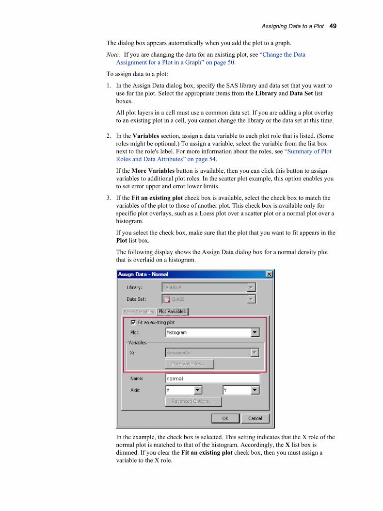
The dialog box appears automatically when you add the plot to a graph.
Note: If you are changing the data for an existing plot, see “Change the Data Assignment for a Plot in a Graph” on page 50.
To assign data to a plot:
1. In the Assign Data dialog box, specify the SAS library and data set that you want to use for the plot. Select the appropriate items from the Library and Data Set list boxes.
All plot layers in a cell must use a common data set. If you are adding a plot overlay to an existing plot in a cell, you cannot change the library or the data set at this time.
2. In the Variables section, assign a data variable to each plot role that is listed. (Some roles might be optional.) To assign a variable, select the variable from the list box next to the role's label. For more information about the roles, see “Summary of Plot Roles and Data Attributes” on page 54.
If the More Variables button is available, then you can click this button to assign variables to additional plot roles. In the scatter plot example, this option enables you to set error upper and error lower limits.
3. If the Fit an existing plot check box is available, select the check box to match the variables of the plot to those of another plot. This check box is available only for specific plot overlays, such as a Loess plot over a scatter plot or a normal plot over a histogram.
If you select the check box, make sure that the plot that you want to fit appears in the Plot list box.
The following display shows the Assign Data dialog box for a normal density plot that is overlaid on a histogram.
In the example, the check box is selected. This setting indicates that the X role of the normal plot is matched to that of the histogram. Accordingly, the X list box is dimmed. If you clear the Fit an existing plot check box, then you must assign a variable to the X role.
Assigning Data to a Plot 49
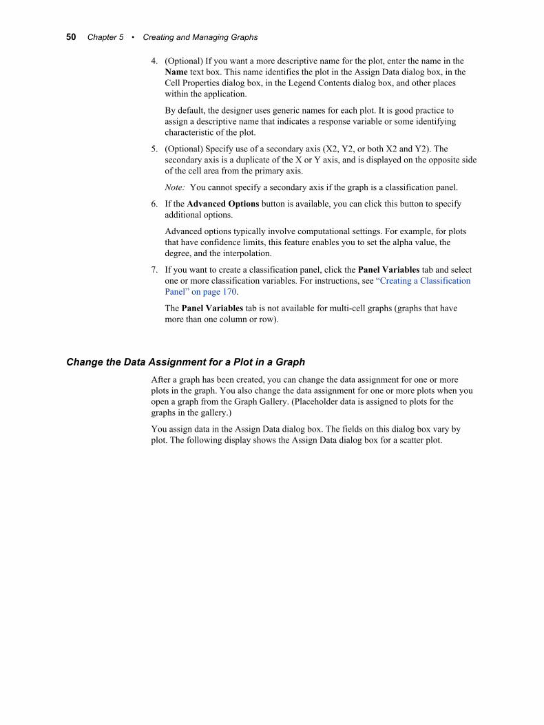
4. (Optional) If you want a more descriptive name for the plot, enter the name in the Name text box. This name identifies the plot in the Assign Data dialog box, in the Cell Properties dialog box, in the Legend Contents dialog box, and other places within the application.
By default, the designer uses generic names for each plot. It is good practice to assign a descriptive name that indicates a response variable or some identifying characteristic of the plot.
5. (Optional) Specify use of a secondary axis (X2, Y2, or both X2 and Y2). The secondary axis is a duplicate of the X or Y axis, and is displayed on the opposite side of the cell area from the primary axis.
Note: You cannot specify a secondary axis if the graph is a classification panel.
6. If the Advanced Options button is available, you can click this button to specify additional options.
Advanced options typically involve computational settings. For example, for plots that have confidence limits, this feature enables you to set the alpha value, the degree, and the interpolation.
7. If you want to create a classification panel, click the Panel Variables tab and select one or more classification variables. For instructions, see “Creating a Classification Panel” on page 170.
The Panel Variables tab is not available for multi-cell graphs (graphs that have more than one column or row).
Change the Data Assignment for a Plot in a GraphAfter a graph has been created, you can change the data assignment for one or more plots in the graph. You also change the data assignment for one or more plots when you open a graph from the Graph Gallery. (Placeholder data is assigned to plots for the graphs in the gallery.)
You assign data in the Assign Data dialog box. The fields on this dialog box vary by plot. The following display shows the Assign Data dialog box for a scatter plot.
50 Chapter 5 • Creating and Managing Graphs
Display 5.2 Example Assign Data Dialog Box for Scatter Plot Data
Depending on how you opened the graph, the Assign Data dialog box appears as follows:
• If you open a graph that you have already created, then you must open the dialog box manually (as described in the following procedure).
• The dialog box appears automatically when you open a graph from the Graph Gallery.
Exception: The Assign Data dialog box does not open if you select a multi-cell graph from the gallery. After opening a multi-cell graph, to customize the data for the various plots in the graph, you must open the Assign Data dialog box for each cell individually.
To change the data assignment for a plot:
1. Open the Assign Data dialog box if it is not already open. To open the dialog box, right-click inside the graph cell that contains the plot whose data you want to modify, and select Assign Data.
The Assign Data dialog box appears.
Note: Alternatively, right-click directly on the plot and select Assign Data. This action opens the Assign Data dialog box with the plot already selected.
Assigning Data to a Plot 51

2. If you want to change the SAS library and data set, select the appropriate items from the Library and Data Set list boxes.
After you change the library or data set, the plot labels might appear red. This color indicates that required variables do not exist in the new data set, and that you must assign variables for the plots. When you assign variables for any of these plots, the plot name changes to black.
3. Make sure that the Plot list box displays the plot that you want to modify. If necessary, select a different plot from the list box.
4. In the Variables section, assign a data variable to each plot role that is listed. (Some roles might be optional.) To assign a variable, select the variable from the list box next to the role's label. For more information about the roles, see “Summary of Plot Roles and Data Attributes” on page 54.
If the More Variables button is available, then you can click this button to assign variables to additional plot roles. In the scatter plot example, this option enables you to set error upper and error lower limits.
5. If the Fit an existing plot check box is available, select the check box to match the variables of the plot to those of another plot. This check box is available only for specific plot overlays, such as a Loess plot over a scatter plot or a normal plot over a histogram.
If you select the check box, make sure that the plot that you want to fit appears in the Plot list box.
The following display shows the Assign Data dialog box for a normal density plot that is overlaid on a histogram.
52 Chapter 5 • Creating and Managing Graphs
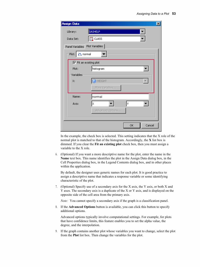
In the example, the check box is selected. This setting indicates that the X role of the normal plot is matched to that of the histogram. Accordingly, the X list box is dimmed. If you clear the Fit an existing plot check box, then you must assign a variable to the X role.
6. (Optional) If you want a more descriptive name for the plot, enter the name in the Name text box. This name identifies the plot in the Assign Data dialog box, in the Cell Properties dialog box, in the Legend Contents dialog box, and in other places within the application.
By default, the designer uses generic names for each plot. It is good practice to assign a descriptive name that indicates a response variable or some identifying characteristic of the plot.
7. (Optional) Specify use of a secondary axis for the X axis, the Y axis, or both X and Y axes. The secondary axis is a duplicate of the X or Y axis, and is displayed on the opposite side of the cell area from the primary axis.
Note: You cannot specify a secondary axis if the graph is a classification panel.
8. If the Advanced Options button is available, you can click this button to specify additional options.
Advanced options typically involve computational settings. For example, for plots that have confidence limits, this feature enables you to set the alpha value, the degree, and the interpolation.
9. If the graph contains another plot whose variables you want to change, select the plot from the Plot list box. Then change the variables for the plot.
Assigning Data to a Plot 53
10. If you want to create a classification panel, click the Panel Variables tab and select one or more classification variables. For instructions, see “Creating a Classification Panel” on page 170.
The Panel Variables tab is not available for multi-cell graphs (graphs that have more than one column or row).
Summary of Plot Roles and Data AttributesIn the Assign Data dialog box, you assign data variables to various plot roles, such as X, Y, and so on. The roles that are available depend on which type of plot you are editing.
You can also assign data attributes, such as data labels, to some plots.
The following list summarizes the roles that you can specify for plots:
X, Y, or Z RolesFor most of the plots, you assign the variable for the X role, the Y role, or both roles. These roles correspond to the X and Y axes. (Exceptions include bar charts, which have category and response roles instead.)
For the contour plot, you also assign a variable for the Z role.
Group RoleSeveral types of plots enable you to specify a variable for grouping the data. Scatter plots, series plots, step plots, bar charts, box plots, needle plots, and vector plots support this role in the designer.
For example, in a scatter plot, you might specify a group variable of ORIGIN, where ORIGIN contains values for the country of origin. In this example, the plot marker colors and symbols are different for different countries of origin.
Group DisplayFor some plot types, when you group the data, you can also specify how the grouped plot elements appear in the graph. Scatter plots, series plots, step plots, needle plots, box plots, and bar charts support this feature.
Here are the options:
Clusterthe plot elements are displayed adjacent to each other.
Overlay(all except bar charts) the plot elements for a given group value are drawn at the exact coordinate and might overlap. Each group is represented by unique visual attributes.
Stack(bar charts) groups are overlaid without any clustering.
This feature is applicable only when a variable has been assigned to the Group role. In addition, the feature is not available when a discrete offset other than 0 has been specified for the plot.
Discrete OffsetFor some plot types, you can specify an amount to offset all plot elements from the discrete tick marks. Specify a value from -0.5 (left offset) to +0.5 (right offset). Scatter plots, series plots, step plots, needle plots, box plots, and bar charts support this feature.
To access the Discrete Offset option, click Advanced Options in the Assign Data dialog box.
54 Chapter 5 • Creating and Managing Graphs
T I P You can also select a plot element and drag it to the desired offset position.
This feature is not available when the group display feature has been specified with a value of CLUSTER.
Data Label, Curve LabelYou can display the data label for each observation in a scatter plot, and a curve label for a series or a step plot.
For scatter plots, you assign the variable that you want to use for labels.
For series and step plots, you provide the text that you want to appear next to the plot curve. If you have specified a group variable, then you select a variable for the label.
Error Upper, Error LowerSome plots can display the upper and lower error (or confidence or prediction) limits for the data. You compute these error values in advance as variables in the data set. Then, you assign the variables to the appropriate role for the plot.
You can specify error upper and error lower variables for scatter plots, step plots, and bar error plots. For scatter plots, you can specify the variables for both the X and the Y axes. You might need to click the More Variables button to assign these variables to the appropriate roles.
Connect OrderThis option is available for plots such as series or step plots. The connect order specifies how to connect the data points to form the step or line. Select X Axis to connect data points as they occur minimum-to-maximum along the X axis. Select X Values to connect data points in the order read from the X variable. X Axis is the default.
To access this option when assigning data for series or step plots, click the Advanced Options button.
Bar Chart and Bar Error Chart DataFor bar charts, you provide a category variable and an optional response variable. If you do not specify a response variable, then the designer displays the frequency for the category variable.
Here are additional options:
• The Group role creates a separate bar segment for each unique group value in each category. You can also use the Group Display option to specify whether bars are stacked or clustered. For more information, see “Group Display” on page 54.
• Bar Width enables you to specify the width of the bars as a ratio of the maximum possible width. The maximum width is equal to the distance between the center of each bar and the centers of the adjacent bars. Specify a value from 0.0 (narrowest) to 1.0 (widest).
For example, if you specify a width of 1.0, then there is no space between the bars. If you specify a width of 0.5, then the width of the bars is equal to the space between the bars.
To access this option, click Advanced Options in the Assign Data dialog box.
T I P This feature is also available as a plot property. You can also click and drag a bar edge to change the bar width.
• The URL role enables a URL link to be associated with each bar or bar segment. If the graph is saved as an HTML output file, then clicking on each bar navigates to the specified HTML page.
Assigning Data to a Plot 55
You assign the variable that contains the URL values. Here is an example URL:
http://www.sas.com/technologies/analytics/index.html
For non-grouped data, the values of the variable are expected to be the same for each unique X.
• You can specify the statistic to be computed for the Y axis. When the response variable is selected, the default statistic is SUM. When the response variable is not selected, the default statistic is FREQ.
• Discrete Offset enables you to specify an amount to offset all bars from the category midpoints. To access this option, click Advanced Options in the Assign Data dialog box. For more information, see “Discrete Offset” on page 54.
T I P You can also select a plot element and drag it to the desired offset position.
For Bar Error charts, the category variable should not have repeated values. You can specify upper error and lower error limits.
Box Plot DataFor box plots, you specify variables for the X and Y roles.
Here are additional options:
• The Group role creates a separate box segment for each unique group value in each category. You can also use the Group Display option to specify whether boxes are overlaid or clustered. For more information, see “Group Display” on page 54.
• Box Width enables you to specify the width of the boxes as a ratio of the maximum possible width. Specify a value from 0.0 (narrowest) to 1.0 (widest).
For example, if you specify a width of 1.0, then there is no space between the boxes. If you specify a width of 0.5, then the width of the boxes is equal to the space between the boxes.
To access this option, click Advanced Options in the Assign Data dialog box.
T I P This feature is also available as a plot property. You can also click and drag a box edge to change the box width.
• Discrete Offset enables you to specify an amount to offset all boxes from the tick marks. To access this option, click Advanced Options in the Assign Data dialog box. For more information, see “Discrete Offset” on page 54.
T I P You can also select a plot element and drag it to the desired offset position.
Histogram Bin DataFor histograms, you can specify these advanced options:
• bin width. Changing the bin width can also result in a different number of bins.
• bin starting position. This value sets the X coordinate of the first bin for the histogram. The bin is drawn only if it contains data.
Band DataFor band plots, in addition to the X variable, you can specify the upper and lower limits for the band.
You can specify a numeric data variable for the limits by selecting the variable from the Limit Upper and the Limit Lower list boxes. Alternatively, to specify a constant value, select Constant: <type value> from the list box. Then type the value.
56 Chapter 5 • Creating and Managing Graphs
Vector Origin DataFor vector plots, in addition to the X and Y variables, you can specify the vector origin.
You can specify a numeric data variable to use for the origin by selecting the variable from the XOrigin or the YOrigin list box. Alternatively, to specify a constant coordinate, such as 0.0, select Constant: <type value> from the list box. Then type the coordinate value.
Contour DataFor a contour plot, you must specify grid data for the contour X and Y roles, with a Z value for each (X,Y) crossing.
The Contour Type list box enables you to specify how the contour is displayed as follows:
Line displays contour levels as unlabeled lines.
Fill displays the area between the contour levels as filled. Each contour interval is filled with one color.
Gradient displays a smooth gradient of color to represent contour levels.
LineFill combines the Line and Fill types. Each contour interval is filled with one color. Displays contour levels as unlabeled lines.
LineGradient combines the Line and Gradient types. Displays contour levels as unlabeled lines.
LabeledLine adds labels to the Line type. Displays contour levels as labeled lines.
LabeledLineFill adds labels to the LineFill type. Each contour interval is filled with one color. Displays contour levels as lines with labels showing contour level values.
LabeledLineGradient adds labels to the LineGradient type. Displays contour levels as lines with labels showing contour level values.
Loess, Regression, PBSpline, and Model Band DataYou can select the Fit an existing plot check box to match the variables of an overlaid loess, regression, or PBSpline (penalized B-spline) plot to those of a scatter plot.
You can also enable the following model band options:
CLMcreates confidence limits. This option is available for all three plots. The confidence level is set by the alpha value.
CLIproduces confidence limits for individual predicted values for each observation. This option is available for regression and PBSpline plots. The confidence level is set by the alpha value.
You can specify the following by clicking Advanced Options:
Alpha valuespecifies the confidence level to compute. The default is 0.05, which represents a 95% confidence level.
Assigning Data to a Plot 57

Degreespecifies the degree of the polynomial that is computed. A degree of one produces a linear fit, a degree of two produces a quadratic fit, and so on. The available degrees are shown here:
Plot Degrees Available
Loess one and two
PBSpline one, two, and three
Regression one through five
Interpolationspecifies the degree of the interpolating polynomials that are used for blending local polynomial fits at the vertices. This value is used with loess plots. Possible choices are Linear (default) and Cubic.
Reference and Drop LinesYou can specify the position and other information for horizontal, vertical, and sloped reference lines as well as for drop lines. For more information, see “Adding Reference Lines to Graphs” on page 60.
Block, Stack Block DataBlock plots create one or more strips of rectangular blocks containing text values. The width of each block corresponds to specified numeric intervals along the X-axis. The height of the blocks represents the value of the chart statistic for each category of data.
You select an X variable and a block variable. If the X variable is numeric, values are expected to be in sorted, ascending order.
You can assign a position for the plot. Most block plots are positioned in the center of the graph area. When you combine a block plot with another plot in an overlay, the block plot can be positioned in the top or bottom margin of the graph.
For a stacked block, you must also specify a group variable.
Select a PlotYou can select a plot by clicking or right-clicking the plot. You right-click a plot to display a pop-up menu and perform operations on the selected plot, such as assigning data or changing the plot properties.
When you click or right-click a plot, the plot remains in full color. Any other plots in the cell appear dimmed. The following image shows a normal density curve that is selected. The histogram is dimmed.
58 Chapter 5 • Creating and Managing Graphs
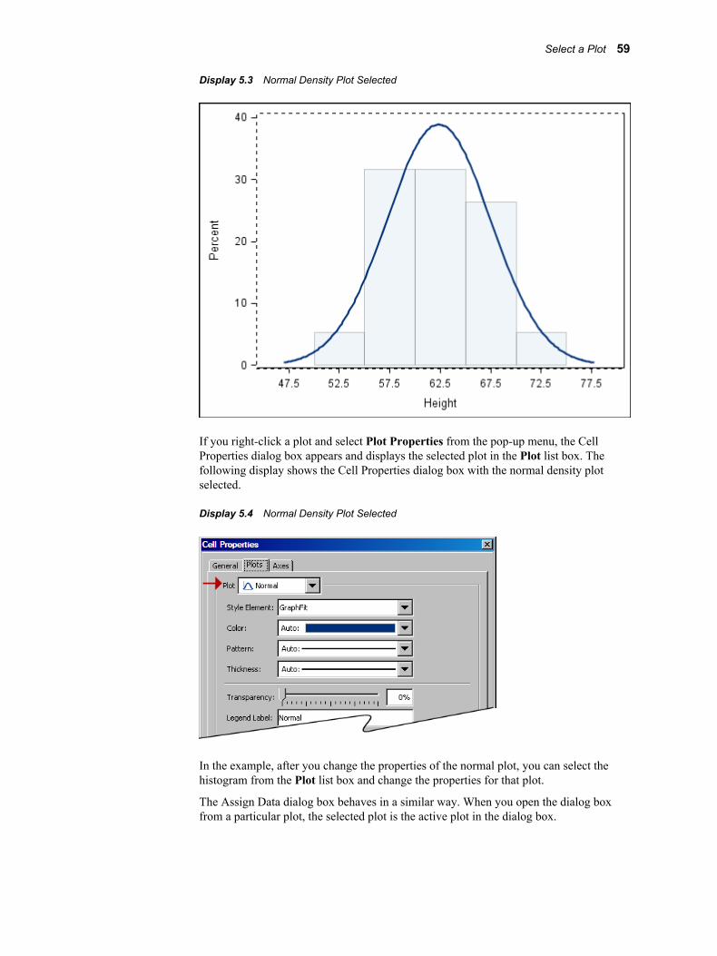
Display 5.3 Normal Density Plot Selected
If you right-click a plot and select Plot Properties from the pop-up menu, the Cell Properties dialog box appears and displays the selected plot in the Plot list box. The following display shows the Cell Properties dialog box with the normal density plot selected.
Display 5.4 Normal Density Plot Selected
In the example, after you change the properties of the normal plot, you can select the histogram from the Plot list box and change the properties for that plot.
The Assign Data dialog box behaves in a similar way. When you open the dialog box from a particular plot, the selected plot is the active plot in the dialog box.
Select a Plot 59
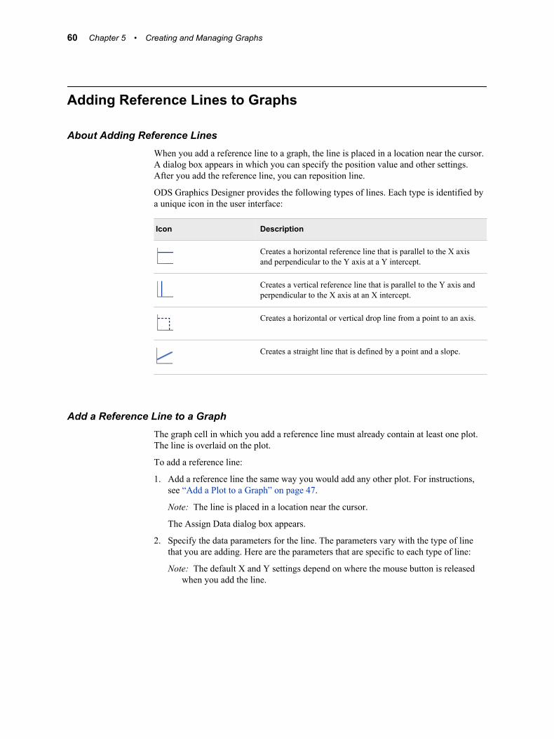
Adding Reference Lines to Graphs
About Adding Reference LinesWhen you add a reference line to a graph, the line is placed in a location near the cursor. A dialog box appears in which you can specify the position value and other settings. After you add the reference line, you can reposition line.
ODS Graphics Designer provides the following types of lines. Each type is identified by a unique icon in the user interface:
Icon Description
Creates a horizontal reference line that is parallel to the X axis and perpendicular to the Y axis at a Y intercept.
Creates a vertical reference line that is parallel to the Y axis and perpendicular to the X axis at an X intercept.
Creates a horizontal or vertical drop line from a point to an axis.
Creates a straight line that is defined by a point and a slope.
Add a Reference Line to a GraphThe graph cell in which you add a reference line must already contain at least one plot. The line is overlaid on the plot.
To add a reference line:
1. Add a reference line the same way you would add any other plot. For instructions, see “Add a Plot to a Graph” on page 47.
Note: The line is placed in a location near the cursor.
The Assign Data dialog box appears.
2. Specify the data parameters for the line. The parameters vary with the type of line that you are adding. Here are the parameters that are specific to each type of line:
Note: The default X and Y settings depend on where the mouse button is released when you add the line.
60 Chapter 5 • Creating and Managing Graphs
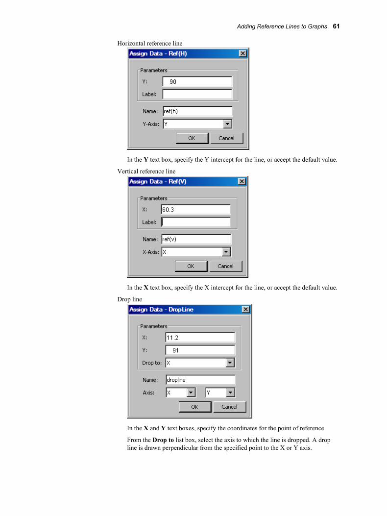
Horizontal reference line
In the Y text box, specify the Y intercept for the line, or accept the default value.
Vertical reference line
In the X text box, specify the X intercept for the line, or accept the default value.
Drop line
In the X and Y text boxes, specify the coordinates for the point of reference.
From the Drop to list box, select the axis to which the line is dropped. A drop line is drawn perpendicular from the specified point to the X or Y axis.
Adding Reference Lines to Graphs 61

Line with a specified slope
In the X and Y text boxes, specify the coordinates for the point of reference.
In the Slope text box, specify a slope for the line. A slope value of zero creates a horizontal line that is parallel to the X axis. A slope value of infinity creates a vertical line that is parallel to the Y axis. To create a vertical line, specify a decimal point (.) as the slope.
The line is drawn based on the specified point and the specified slope of the line that passes through that point.
Note: You cannot add this type of line to a plot if the plot's axis has date or time values.
3. (Optional) In the Label text box, specify a label for the line. This text box is available only for horizontal and vertical reference lines.
4. (Optional) In the Name text box, specify a descriptive name for the line.
5. If an X2 or Y2 axis has been associated with one or more plots in the cell, select either from the Axis list box to associate the line with the respective axis.
6. Click OK.
Reposition a Reference LineAfter you add a line, you can move the line to a different location. When you position
the cursor over the line, the cursor changes to a two-headed arrow . You can then click and drag the line to the new location.
For a more precise position, you can use the Assign Data dialog box.
Note: You cannot move a sloped line by using the click-and-drag method. You must use the Assign Data dialog box.
To reposition a line by using the Assign Data dialog box:
1. Right-click the line that you want to move, and select Assign Data. The Assign Data dialog box appears.
Alternatively, right-click anywhere in the plot area, and select Assign Data. Then, in the Assign Data dialog box, select the line that you want to move from the Plot list box.
62 Chapter 5 • Creating and Managing Graphs
2. Specify the parameters for the position that you want. For a description of these parameters, see “Add a Reference Line to a Graph” on page 60.
3. Click OK.
Change the Length of a Drop LineWhen you position the cursor at the tip of a drop line, the cursor changes to a double
arrow . You can then click and drag to lengthen or shorten the line.
For a more precise length, you can use the Assign Data dialog box.
1. Right-click the line that you want to modify, and select Assign Data. The Assign Data dialog box appears.
Alternatively, right-click anywhere in the plot area, and select Assign Data. Then, in the Assign Data dialog box, select the line that you want to modify from the Plot list box.
2. Change the X parameter to modify a horizontal drop line, and the Y parameter to modify a vertical drop line. For a description of these parameters, see “Add a Reference Line to a Graph” on page 60.
3. Click OK.
Remove a Plot from a GraphTo remove a plot from a graph, right-click the plot that you want to remove and select Remove Plot 'name', where name is replaced with the actual name of the plot.
If you remove the wrong plot, click the Undo toolbar button to undo your change.
Note: You can also remove a plot by using the Cell Contents dialog box. For more information, see “Manage the Plots and Insets in a Cell” on page 67.
Save a Graph to a FileYou can save a graph as follows:
• If you have modified an existing graph and want to save your changes, select File ð Save, or click in the toolbar.
• If you have created a new graph that has not yet been saved, select File ð Save As,
or click in the toolbar. Then, choose a location and file type for the graph that you want to save.
You can also use this option to save an existing graph using a different filename or file format.
You can save a graph as one of the following types of files:
• as an ODS Graphics Designer (SGD) file. The file can later be opened and edited in the ODS Graphics Designer.
Save a Graph to a File 63

You can also specify the name of the template that is created for the graph. For more information, see “Working with the Graph Code ” on page 66.
• as an image file. Image files can be in TIF, JPG, BMP, GIF, and PNG file formats. The image file can then be opened in any graphics application that supports the file format.
When you save the graph as a JPG or a PNG file, you can also select a resolution from the Resolution (in DPI) list box.
• as an Enhanced Metafile (EMF).
• as an HTML file.
You can also select a target from the Target list box. This feature, used with bar charts that have a URL role specified, determines how to open the linked target. Here are the available targets:
Blank (Default) Open the linked document in a new window.
Self Open the linked document in the same frame as the graph. This option replaces the graph in the browser.
Top Open the linked document in the full body of the window. This option acts like the Self option when the document is already at the top.
Parent Open the linked document in the parent frame set. This option acts like the Self option when the document has no parent.
Search Open the linked document in the Search pane of the browser, if the Search pane has been enabled.
• as a PDF file.
• as a PostScript (PS) file.
Add a Graph to the Graph GalleryAfter you have designed a graph, you can add that graph to the Graph Gallery for future reuse.
To add a graph to the Graph Gallery:
1. Select the graph that you want to add.
2. Select File ð Save in Graph Gallery. The Save in Graph Gallery dialog box appears.
64 Chapter 5 • Creating and Managing Graphs

3. From the Group name list box, select the name of the group into which you want to add the graph. Each group corresponds to a tab in the gallery.
The Group name list box contains the names of groups that have been created at your site. The list box does not contain the names of the default groups.
To create a new group, click the New icon . In the New Group dialog box, enter the name that you want for the group, and then click OK.
4. In the Graph name text box, enter the name that you want displayed in the gallery. If a graph exists with the name that you provide, you are prompted to overwrite the existing graph. The default name is NewGraph.
5. The Icon field shows a small icon that ODS Graphics Designer creates to represent the graph being added to the gallery. However, if you want to use a custom icon to identify the graph, click Browse and locate the image that you want to use. The image can be in BMP, GIF, JPEG, or PNG format. Regardless of its original size, the image is scaled to a fixed size in the gallery.
You can revert to the automatically created icon by clicking the Default button. Automatically generated icons do not show the axis labels, titles, footnotes, and legends; they show only the main part of the graph.
6. In the Tooltip text box, enter a short description of the graph. This description is displayed as a tooltip when the cursor hovers over the graph's icon. If you do not enter a tooltip description, the graph name becomes the tooltip by default.
7. Click OK. The graph is added to the Graph Gallery.
See Also“Change the Name, Icon, or Tooltip for a Graph in the Graph Gallery” on page 199
Open a GraphThere are three main ways to open a graph SGD file:
Open a Graph 65
• Select File ð Open, and then select the file.
• Select File ð Open Recent, and then select one of the last few opened files.
You can control the number of files that appear in the menu. For more information, see “Setting Preferences” on page 192.
• Click the Open button in the toolbar and then select the file.
Working with the Graph CodeFor each graph that you create, the designer provides the code that is used to generate the graph. The code contains the graph template and the SGRENDER procedure that renders the graph.
View, Copy, and Save the Code for a GraphYou can view the SAS code for any of your graphs. You can also copy and paste part or all of the code into a SAS program, and you can save the code as a SAS file.
1. To view the code, select the graph to make it active, and then select View ð Code. A window appears and displays the code for the graph.
2. To copy the code, select the portion of the code that you want, and then select Edit ð Copy.
T I P To select the entire code, select Edit ð Select All.
You can now paste the code into SAS or into a text editing application.
3. To save the code as a SAS program, select File ð Save As. Then specify the location and filename for the code.
4. Select View ð Code again to close the code window, or click the Close button in the window.
Change the Name of the Graph TemplateThe default name for the graph template is SGDESIGN when the graph is created from the Graph Gallery. The default name for new blank graph is GRAPH1, GRAPH2, and so on.
There are two ways to change the template name:
• change the name when you save the graph using the Save As function.
• change the name in the Graph Properties dialog box. To access this dialog box, right-click the graph and select Graph Properties.
The name must start with a letter or underscore. Subsequent characters can be letters, underscores, or numeric digits.
66 Chapter 5 • Creating and Managing Graphs
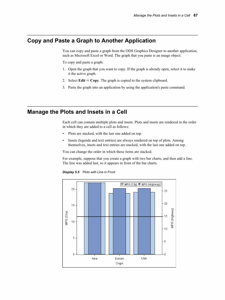
Copy and Paste a Graph to Another ApplicationYou can copy and paste a graph from the ODS Graphics Designer to another application, such as Microsoft Excel or Word. The graph that you paste is an image object.
To copy and paste a graph:
1. Open the graph that you want to copy. If the graph is already open, select it to make it the active graph.
2. Select Edit ð Copy. The graph is copied to the system clipboard.
3. Paste the graph into an application by using the application's paste command.
Manage the Plots and Insets in a CellEach cell can contain multiple plots and insets. Plots and insets are rendered in the order in which they are added to a cell as follows:
• Plots are stacked, with the last one added on top.
• Insets (legends and text entries) are always rendered on top of plots. Among themselves, insets and text entries are stacked, with the last one added on top.
You can change the order in which these items are stacked.
For example, suppose that you create a graph with two bar charts, and then add a line. The line was added last, so it appears in front of the bar charts.
Display 5.5 Plots with Line in Front
Manage the Plots and Insets in a Cell 67
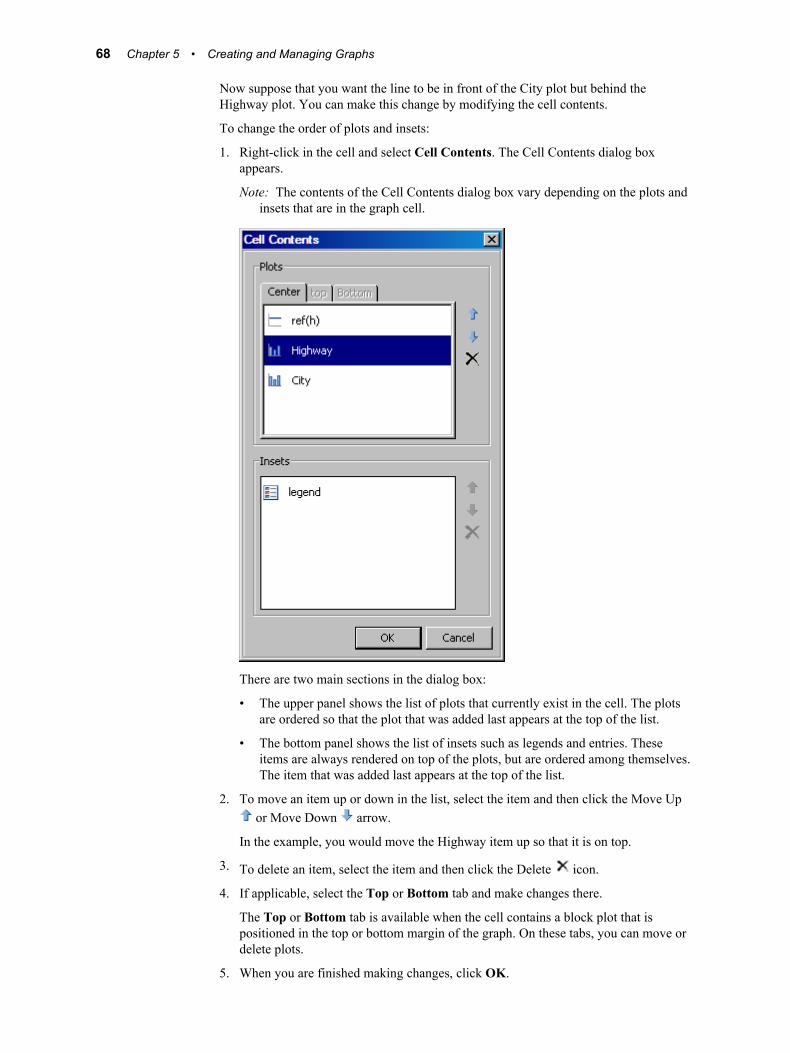
Now suppose that you want the line to be in front of the City plot but behind the Highway plot. You can make this change by modifying the cell contents.
To change the order of plots and insets:
1. Right-click in the cell and select Cell Contents. The Cell Contents dialog box appears.
Note: The contents of the Cell Contents dialog box vary depending on the plots and insets that are in the graph cell.
There are two main sections in the dialog box:
• The upper panel shows the list of plots that currently exist in the cell. The plots are ordered so that the plot that was added last appears at the top of the list.
• The bottom panel shows the list of insets such as legends and entries. These items are always rendered on top of the plots, but are ordered among themselves. The item that was added last appears at the top of the list.
2. To move an item up or down in the list, select the item and then click the Move Up or Move Down arrow.
In the example, you would move the Highway item up so that it is on top.
3. To delete an item, select the item and then click the Delete icon.
4. If applicable, select the Top or Bottom tab and make changes there.
The Top or Bottom tab is available when the cell contains a block plot that is positioned in the top or bottom margin of the graph. On these tabs, you can move or delete plots.
5. When you are finished making changes, click OK.
68 Chapter 5 • Creating and Managing Graphs
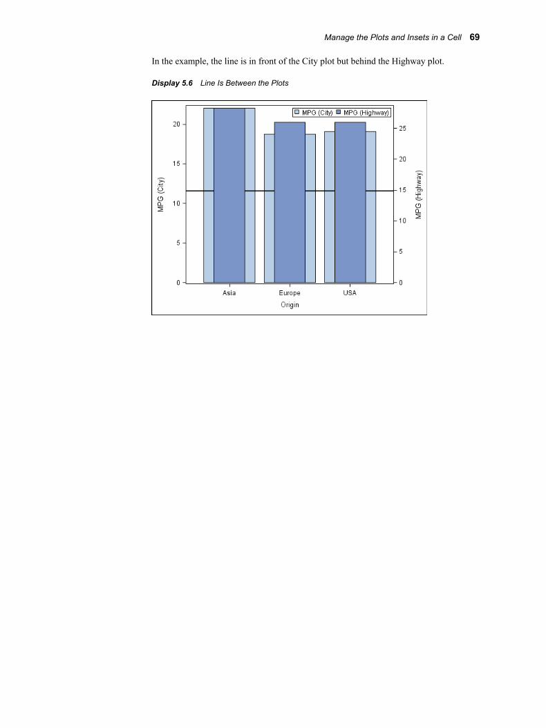
In the example, the line is in front of the City plot but behind the Highway plot.
Display 5.6 Line Is Between the Plots
Manage the Plots and Insets in a Cell 69

70 Chapter 5 • Creating and Managing Graphs
Chapter 6
Working with Titles and Footnotes
About Titles and Footnotes . . . . . . . . . . . . . . . . . . . . . . . . . . . . . . . . . . . . . . . . . . . . . 71
Add a Title or a Footnote . . . . . . . . . . . . . . . . . . . . . . . . . . . . . . . . . . . . . . . . . . . . . . . 71
Edit and Format a Title or Footnote . . . . . . . . . . . . . . . . . . . . . . . . . . . . . . . . . . . . . . 72
Align a Title or Footnote Horizontally . . . . . . . . . . . . . . . . . . . . . . . . . . . . . . . . . . . . 73
Remove a Title or Footnote from a Graph . . . . . . . . . . . . . . . . . . . . . . . . . . . . . . . . . 73
About Titles and FootnotesYou can add multiple titles and footnotes to a graph. The limit to the number of titles or footnotes that you can add depends on the size of your graph. As you add more titles or footnotes, the Y axis of the graph shrinks proportionally to the point where the graph is no longer visible.
When you add a long title or footnote to a graph, the text automatically wraps to the next line. If you re-align a title or footnote in the graph, all of the lines of a single title or footnote move as one unit.
Add a Title or a FootnoteIf you created the graph from the Graph Gallery, then your graph might already have title and footnote placeholders. You can edit the title or footnote in order to change its text. See “Edit and Format a Title or Footnote” on page 72.
If you created the graph from a blank graph, or if you want to insert an additional title or footnote, follow these steps:
1. Select one of the following options:
• To add a title, select Insert ð Title, or click in the toolbar. A new title text box is added above the graph. If one or more titles already exist, the new title is added below the others. Here is an example title that is added to the graph.
71
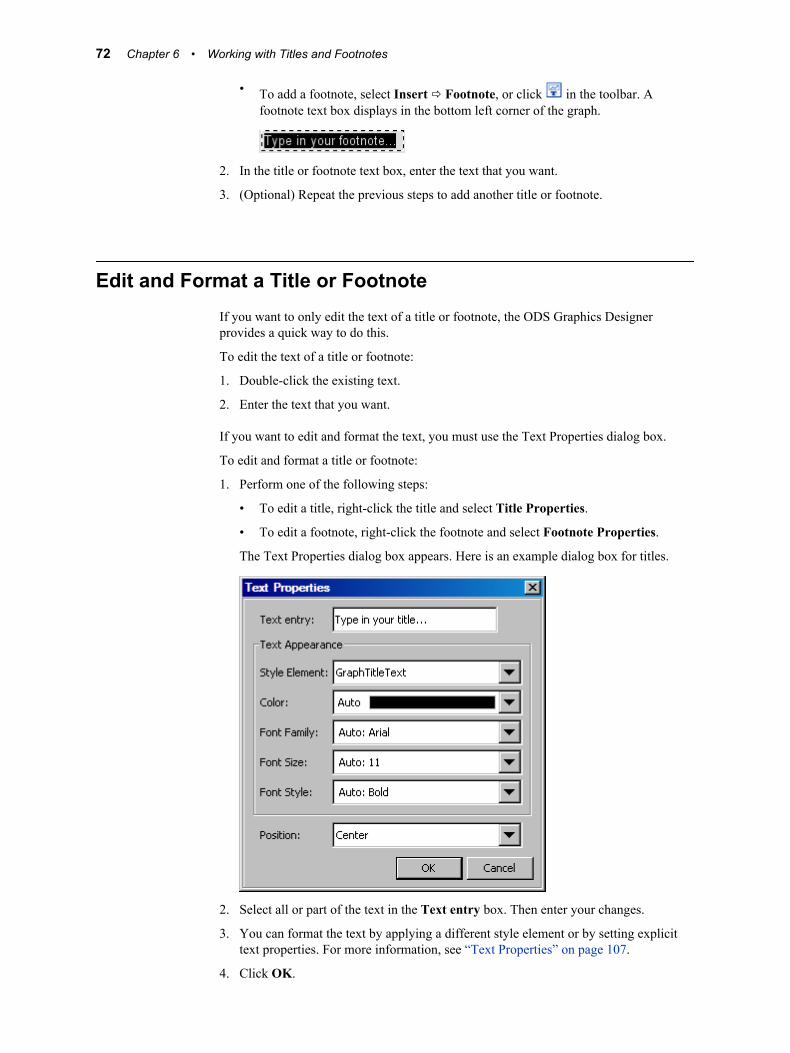
• To add a footnote, select Insert ð Footnote, or click in the toolbar. A footnote text box displays in the bottom left corner of the graph.
2. In the title or footnote text box, enter the text that you want.
3. (Optional) Repeat the previous steps to add another title or footnote.
Edit and Format a Title or FootnoteIf you want to only edit the text of a title or footnote, the ODS Graphics Designer provides a quick way to do this.
To edit the text of a title or footnote:
1. Double-click the existing text.
2. Enter the text that you want.
If you want to edit and format the text, you must use the Text Properties dialog box.
To edit and format a title or footnote:
1. Perform one of the following steps:
• To edit a title, right-click the title and select Title Properties.
• To edit a footnote, right-click the footnote and select Footnote Properties.
The Text Properties dialog box appears. Here is an example dialog box for titles.
2. Select all or part of the text in the Text entry box. Then enter your changes.
3. You can format the text by applying a different style element or by setting explicit text properties. For more information, see “Text Properties” on page 107.
4. Click OK.
72 Chapter 6 • Working with Titles and Footnotes

See Also• “Specifying Style Elements for Text Properties” on page 87
• “Using the Color List Box” on page 88
Align a Title or Footnote HorizontallyTo align a title or footnote:
1. Perform one of the following steps:
• To align a title, right-click the title, and select Title Properties.
• To align a footnote, right-click the footnote, and select Footnote Properties.
The Text Properties dialog box appears.
2. Select Left, Center, or Right from the Position list box.
3. Click OK.
Remove a Title or Footnote from a GraphTo remove a title or footnote:
• Right-click the title and select Remove Title.
• Right-click the footnote and select Remove Footnote .
Note: To undo the change, select Edit ð Undo from the main menu.
An alternative method is to double-click the title or footnote and press the DELETE key.
Remove a Title or Footnote from a Graph 73

74 Chapter 6 • Working with Titles and Footnotes
Chapter 7
Working with Legends
Adding Legends . . . . . . . . . . . . . . . . . . . . . . . . . . . . . . . . . . . . . . . . . . . . . . . . . . . . . . 75About Legends . . . . . . . . . . . . . . . . . . . . . . . . . . . . . . . . . . . . . . . . . . . . . . . . . . . . . 75Add a Cell Legend . . . . . . . . . . . . . . . . . . . . . . . . . . . . . . . . . . . . . . . . . . . . . . . . . . 76Add a Global Legend to a Graph . . . . . . . . . . . . . . . . . . . . . . . . . . . . . . . . . . . . . . . 76
Change the Contents of a Legend . . . . . . . . . . . . . . . . . . . . . . . . . . . . . . . . . . . . . . . . 77
Edit a Legend's Labels . . . . . . . . . . . . . . . . . . . . . . . . . . . . . . . . . . . . . . . . . . . . . . . . . 78
Add a Title to a Legend . . . . . . . . . . . . . . . . . . . . . . . . . . . . . . . . . . . . . . . . . . . . . . . . 78
Change a Legend's Outline or Background Color . . . . . . . . . . . . . . . . . . . . . . . . . . 79
Arrange Legend Contents in a Row or Column . . . . . . . . . . . . . . . . . . . . . . . . . . . . 80
Reposition a Legend . . . . . . . . . . . . . . . . . . . . . . . . . . . . . . . . . . . . . . . . . . . . . . . . . . . 81
Remove a Legend . . . . . . . . . . . . . . . . . . . . . . . . . . . . . . . . . . . . . . . . . . . . . . . . . . . . . 81
Adding Legends
About LegendsA graph can have multiple legends. There are two main categories of legends:
Cell legendapplies to the plots within a cell. By default, a cell legend contains all plots in the cell. There are two types of cell legends:
• You can add a discrete legend to any of the cells in a graph. A discrete legend is created within the cell.
• If the plot is a contour plot with a contour type of fill or gradient, then you can add a gradient legend to the cell. A gradient legend appears alongside the contour plot.
Global legendapplies to all cells in a multi-cell graph. You specify which plots you want in the legend when you create the legend.
A global legend is a discrete legend. It does not display the legend for a gradient plot, such as a filled contour.
75
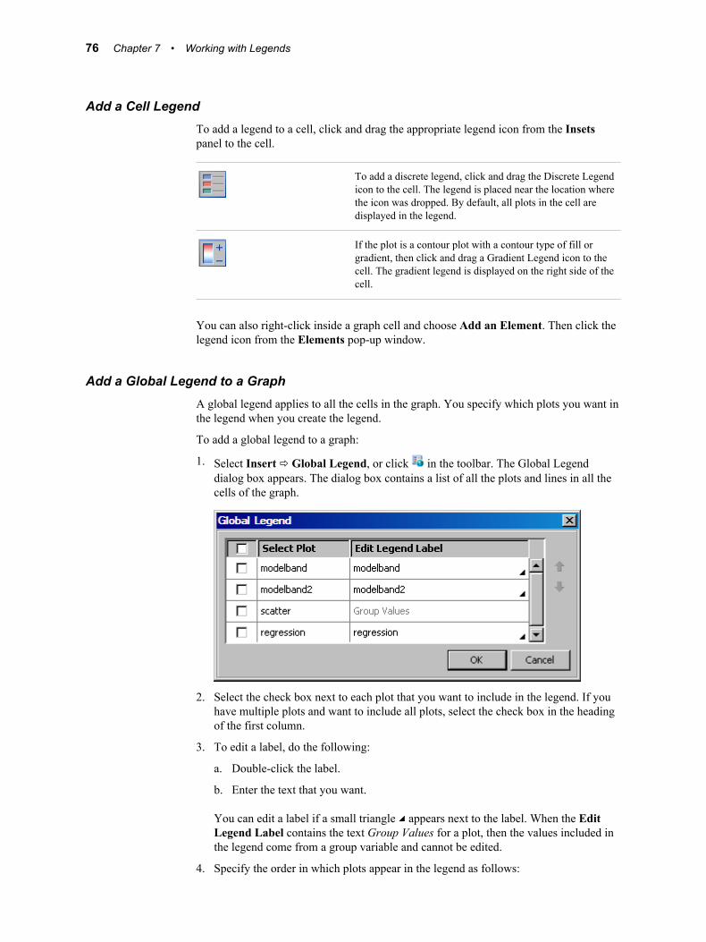
Add a Cell LegendTo add a legend to a cell, click and drag the appropriate legend icon from the Insets panel to the cell.
To add a discrete legend, click and drag the Discrete Legend icon to the cell. The legend is placed near the location where the icon was dropped. By default, all plots in the cell are displayed in the legend.
If the plot is a contour plot with a contour type of fill or gradient, then click and drag a Gradient Legend icon to the cell. The gradient legend is displayed on the right side of the cell.
You can also right-click inside a graph cell and choose Add an Element. Then click the legend icon from the Elements pop-up window.
Add a Global Legend to a GraphA global legend applies to all the cells in the graph. You specify which plots you want in the legend when you create the legend.
To add a global legend to a graph:
1. Select Insert ð Global Legend, or click in the toolbar. The Global Legend dialog box appears. The dialog box contains a list of all the plots and lines in all the cells of the graph.
2. Select the check box next to each plot that you want to include in the legend. If you have multiple plots and want to include all plots, select the check box in the heading of the first column.
3. To edit a label, do the following:
a. Double-click the label.
b. Enter the text that you want.
You can edit a label if a small triangle appears next to the label. When the Edit Legend Label contains the text Group Values for a plot, then the values included in the legend come from a group variable and cannot be edited.
4. Specify the order in which plots appear in the legend as follows:
76 Chapter 7 • Working with Legends
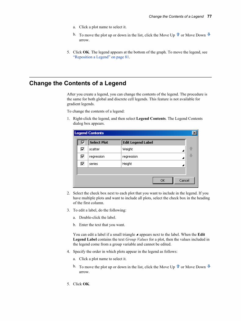
a. Click a plot name to select it.
b. To move the plot up or down in the list, click the Move Up or Move Down arrow.
5. Click OK. The legend appears at the bottom of the graph. To move the legend, see “Reposition a Legend” on page 81.
Change the Contents of a LegendAfter you create a legend, you can change the contents of the legend. The procedure is the same for both global and discrete cell legends. This feature is not available for gradient legends.
To change the contents of a legend:
1. Right-click the legend, and then select Legend Contents. The Legend Contents dialog box appears.
2. Select the check box next to each plot that you want to include in the legend. If you have multiple plots and want to include all plots, select the check box in the heading of the first column.
3. To edit a label, do the following:
a. Double-click the label.
b. Enter the text that you want.
You can edit a label if a small triangle appears next to the label. When the Edit Legend Label contains the text Group Values for a plot, then the values included in the legend come from a group variable and cannot be edited.
4. Specify the order in which plots appear in the legend as follows:
a. Click a plot name to select it.
b. To move the plot up or down in the list, click the Move Up or Move Down arrow.
5. Click OK.
Change the Contents of a Legend 77
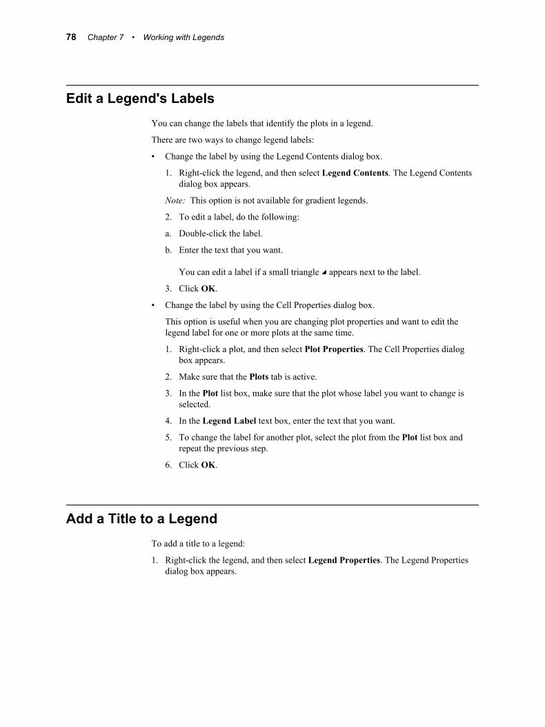
Edit a Legend's LabelsYou can change the labels that identify the plots in a legend.
There are two ways to change legend labels:
• Change the label by using the Legend Contents dialog box.
1. Right-click the legend, and then select Legend Contents. The Legend Contents dialog box appears.
Note: This option is not available for gradient legends.
2. To edit a label, do the following:
a. Double-click the label.
b. Enter the text that you want.
You can edit a label if a small triangle appears next to the label.
3. Click OK.
• Change the label by using the Cell Properties dialog box.
This option is useful when you are changing plot properties and want to edit the legend label for one or more plots at the same time.
1. Right-click a plot, and then select Plot Properties. The Cell Properties dialog box appears.
2. Make sure that the Plots tab is active.
3. In the Plot list box, make sure that the plot whose label you want to change is selected.
4. In the Legend Label text box, enter the text that you want.
5. To change the label for another plot, select the plot from the Plot list box and repeat the previous step.
6. Click OK.
Add a Title to a LegendTo add a title to a legend:
1. Right-click the legend, and then select Legend Properties. The Legend Properties dialog box appears.
78 Chapter 7 • Working with Legends
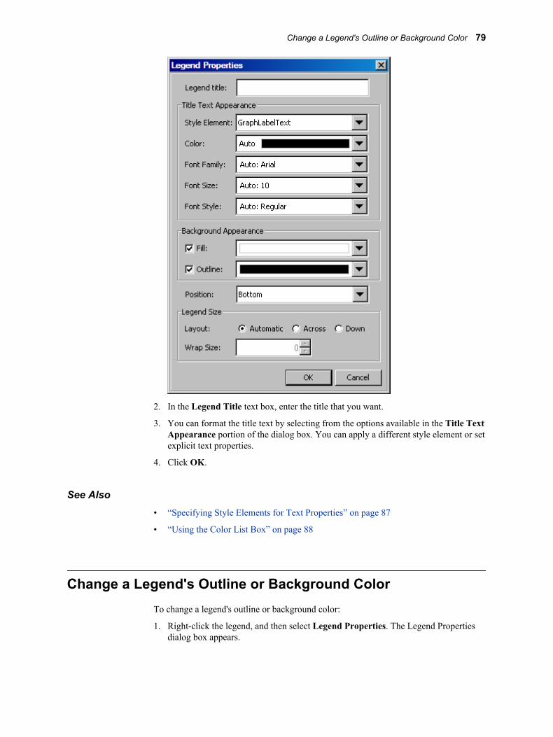
2. In the Legend Title text box, enter the title that you want.
3. You can format the title text by selecting from the options available in the Title Text Appearance portion of the dialog box. You can apply a different style element or set explicit text properties.
4. Click OK.
See Also• “Specifying Style Elements for Text Properties” on page 87
• “Using the Color List Box” on page 88
Change a Legend's Outline or Background ColorTo change a legend's outline or background color:
1. Right-click the legend, and then select Legend Properties. The Legend Properties dialog box appears.
Change a Legend's Outline or Background Color 79
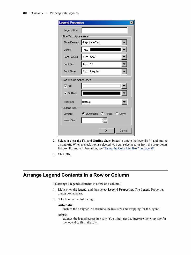
2. Select or clear the Fill and Outline check boxes to toggle the legend's fill and outline on and off. When a check box is selected, you can select a color from the drop-down list box. For more information, see “Using the Color List Box” on page 88.
3. Click OK.
Arrange Legend Contents in a Row or ColumnTo arrange a legend's contents in a row or a column:
1. Right-click the legend, and then select Legend Properties. The Legend Properties dialog box appears.
2. Select one of the following:
Automaticenables the designer to determine the best size and wrapping for the legend.
Acrossextends the legend across in a row. You might need to increase the wrap size for the legend to fit in the row.
80 Chapter 7 • Working with Legends
Downextends the legend down in a column. You might need to increase the wrap size for the legend to fit in the column.
3. If you selected Across or Down, click the Wrap Size arrow control to expand or reduce the size of the legend row or column.
4. Click OK.
Reposition a LegendTo reposition a legend:
1. Right-click the legend, and then select Legend Properties. The Legend Properties dialog box appears.
2. Select a position for the legend from the Position list box.
Here are the position choices for discrete legends. These choices refer to positions within the cell:
left top rightright bottom leftcenter bottom righttop left automatic
Note: The automatic option positions the legend where there is the most room.
Here are the position choices for global legends:
left topright bottom
3. Click OK.
Remove a LegendTo remove a legend, right-click the legend, and then select Remove Legend.
Remove a Legend 81

82 Chapter 7 • Working with Legends
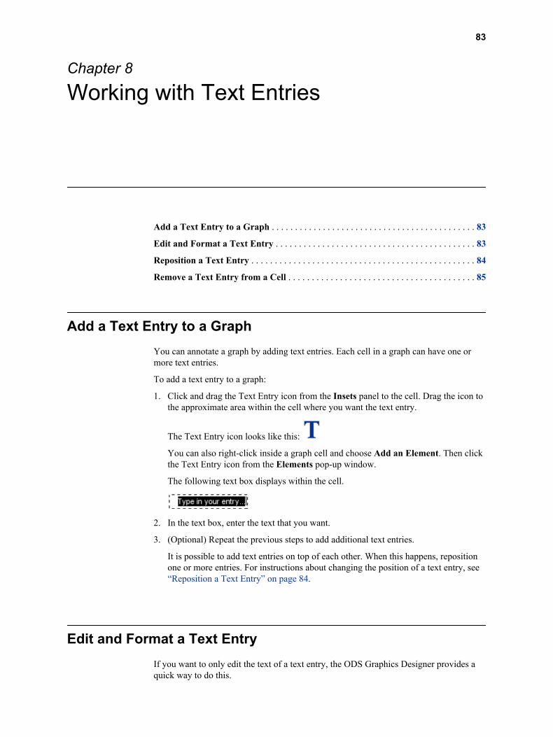
Chapter 8
Working with Text Entries
Add a Text Entry to a Graph . . . . . . . . . . . . . . . . . . . . . . . . . . . . . . . . . . . . . . . . . . . . 83
Edit and Format a Text Entry . . . . . . . . . . . . . . . . . . . . . . . . . . . . . . . . . . . . . . . . . . . 83
Reposition a Text Entry . . . . . . . . . . . . . . . . . . . . . . . . . . . . . . . . . . . . . . . . . . . . . . . . 84
Remove a Text Entry from a Cell . . . . . . . . . . . . . . . . . . . . . . . . . . . . . . . . . . . . . . . . 85
Add a Text Entry to a GraphYou can annotate a graph by adding text entries. Each cell in a graph can have one or more text entries.
To add a text entry to a graph:
1. Click and drag the Text Entry icon from the Insets panel to the cell. Drag the icon to the approximate area within the cell where you want the text entry.
The Text Entry icon looks like this:
You can also right-click inside a graph cell and choose Add an Element. Then click the Text Entry icon from the Elements pop-up window.
The following text box displays within the cell.
2. In the text box, enter the text that you want.
3. (Optional) Repeat the previous steps to add additional text entries.
It is possible to add text entries on top of each other. When this happens, reposition one or more entries. For instructions about changing the position of a text entry, see “Reposition a Text Entry” on page 84.
Edit and Format a Text EntryIf you want to only edit the text of a text entry, the ODS Graphics Designer provides a quick way to do this.
83
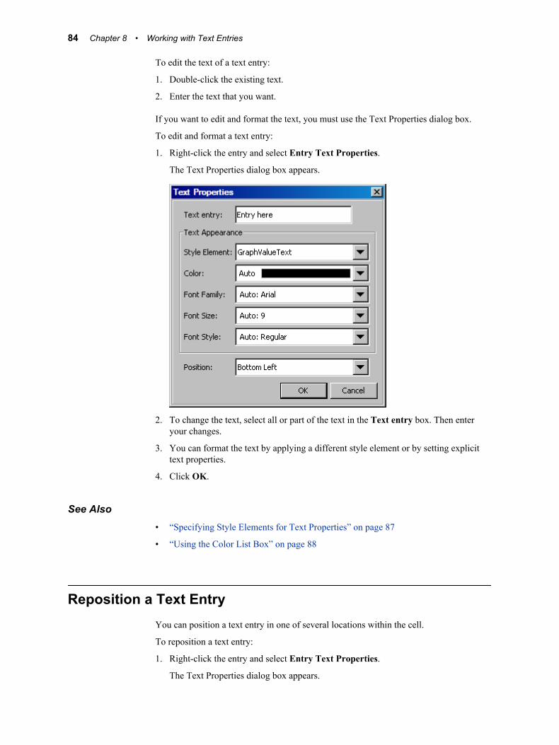
To edit the text of a text entry:
1. Double-click the existing text.
2. Enter the text that you want.
If you want to edit and format the text, you must use the Text Properties dialog box.
To edit and format a text entry:
1. Right-click the entry and select Entry Text Properties.
The Text Properties dialog box appears.
2. To change the text, select all or part of the text in the Text entry box. Then enter your changes.
3. You can format the text by applying a different style element or by setting explicit text properties.
4. Click OK.
See Also• “Specifying Style Elements for Text Properties” on page 87
• “Using the Color List Box” on page 88
Reposition a Text EntryYou can position a text entry in one of several locations within the cell.
To reposition a text entry:
1. Right-click the entry and select Entry Text Properties.
The Text Properties dialog box appears.
84 Chapter 8 • Working with Text Entries
2. Select the position that you want from the Position list box.
Here are the position choices:
top top leftbottom top rightleft bottom leftright bottom rightcenter
3. Click OK.
Remove a Text Entry from a CellTo remove a text entry, right-click the entry and select Remove Text Entry.
The text entry is removed from the cell.
Remove a Text Entry from a Cell 85

86 Chapter 8 • Working with Text Entries
Chapter 9
General Information about Modifying Textual Elements
Specifying Style Elements for Text Properties . . . . . . . . . . . . . . . . . . . . . . . . . . . . . . 87
Using the Color List Box . . . . . . . . . . . . . . . . . . . . . . . . . . . . . . . . . . . . . . . . . . . . . . . 88
Adding Dynamic Content to Text . . . . . . . . . . . . . . . . . . . . . . . . . . . . . . . . . . . . . . . . 90About Dynamic Content . . . . . . . . . . . . . . . . . . . . . . . . . . . . . . . . . . . . . . . . . . . . . . 90Specify Dynamic Content . . . . . . . . . . . . . . . . . . . . . . . . . . . . . . . . . . . . . . . . . . . . . 90
Specifying Style Elements for Text PropertiesThe color schemes and visual attributes for a graph come from the active ODS Style. ODS styles consist of style elements, and each style element has its own attributes. When you format text properties, you often have the option to specify a style element. For example, you can select a style element when you change the properties of titles, footnotes, and other textual items.
The visual properties of the item that you format are obtained from the style element that you specify. The following display shows the default style element for a title.
87
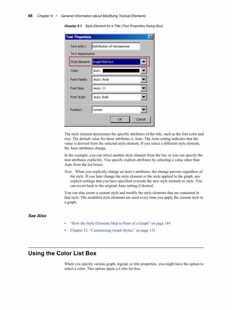
Display 9.1 Style Element for a Title (Text Properties Dialog Box)
The style element determines the specific attributes of the title, such as the font color and size. The default value for those attributes is Auto. The Auto setting indicates that the value is derived from the selected style element. If you select a different style element, the Auto attributes change.
In the example, you can select another style element from the list, or you can specify the font attributes explicitly. You specify explicit attributes by selecting a value other than Auto from the list boxes.
Note: When you explicitly change an item’s attributes, the change persists regardless of the style. If you later change the style element or the style applied to the graph, any explicit settings that you have specified override the new style element or style. You can revert back to the original Auto setting if desired.
You can also create a custom style and modify the style elements that are contained in that style. The modified style elements are used every time you apply the custom style to a graph.
See Also• “How the Style Elements Map to Parts of a Graph” on page 144
• Chapter 13, “Customizing Graph Styles,” on page 135
Using the Color List BoxWhen you specify various graph, legend, or title properties, you might have the option to select a color. This option opens a Color list box.
88 Chapter 9 • General Information about Modifying Textual Elements

The Color list box provides colors to choose from and the option to define your own color.
The Color list box contains the following items:
Auto or Group valuerestores the default color. This option is useful when you have changed a color and want to restore the original color.
The Auto value indicates that the value is derived from a style element. This value is not available for legend fill and outline.
The Group value is used for plot properties. The Group value indicates that the value is derived from a group variable if one has been defined for the plot.
Palette of colorsselects a predefined color from the palette.
Row of recently used custom colorsselects a custom color. This row is populated with colors that you choose after you click the More Colors option.
More Colors optionenables you to locate a custom color. This option opens the More Colors dialog box, which contains two tabs:
Using the Color List Box 89
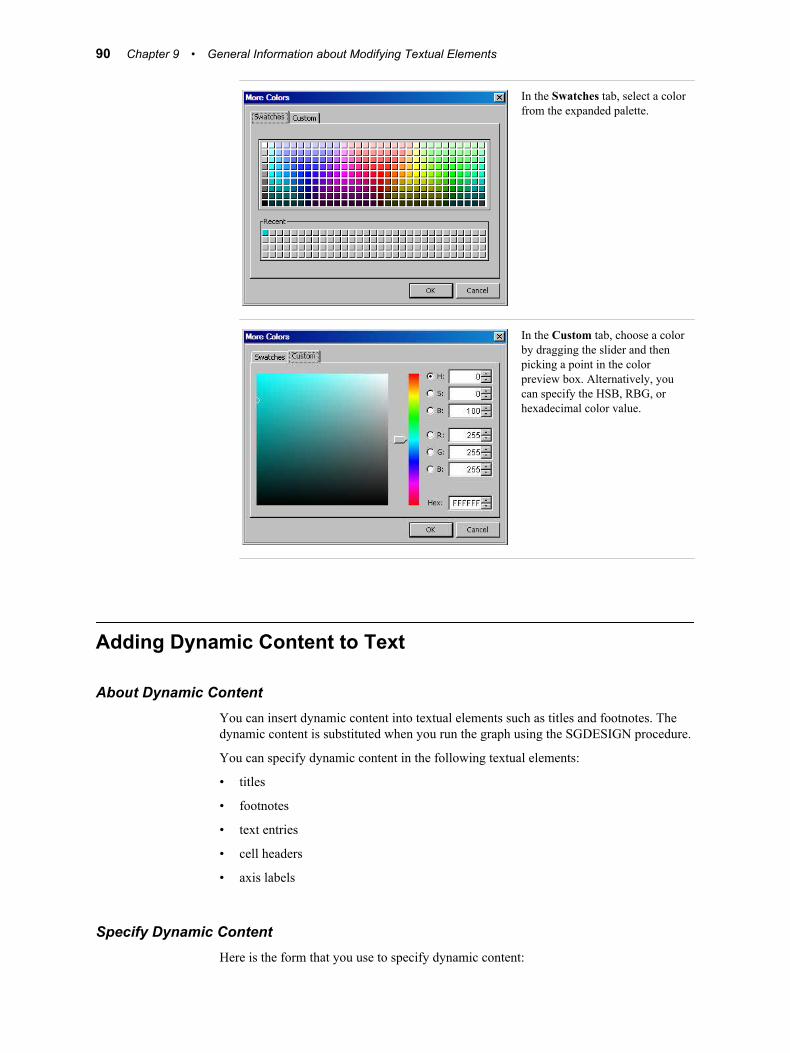
In the Swatches tab, select a color from the expanded palette.
In the Custom tab, choose a color by dragging the slider and then picking a point in the color preview box. Alternatively, you can specify the HSB, RBG, or hexadecimal color value.
Adding Dynamic Content to Text
About Dynamic ContentYou can insert dynamic content into textual elements such as titles and footnotes. The dynamic content is substituted when you run the graph using the SGDESIGN procedure.
You can specify dynamic content in the following textual elements:
• titles
• footnotes
• text entries
• cell headers
• axis labels
Specify Dynamic ContentHere is the form that you use to specify dynamic content:
90 Chapter 9 • General Information about Modifying Textual Elements
dyn(DNAME)
where DNAME is a name that you want to associate with the text that is generated.
Note: DNAME follows SAS naming conventions. The name cannot contain any special character other than “_”. In addition, DNAME must start with an alphabetic character.
After you have saved the graph, you can generate the graph using the SGDESIGN procedure. In the SGDESIGN procedure, you specify the value for DNAME with a DYNAMIC statement. When you generate the graph, the SGDESIGN procedure substitutes dyn(DNAME) with the value that you specified for DNAME.
For example, suppose that you want the title of a graph to vary by year. In ODS Graphics Designer, you might specify the following title: “Revenues for dyn(YEAR).”
When you run the graph using the SGDESIGN procedure, you can specify DYNAMIC year=”2009”. The entire string “dyn(YEAR)” is replaced with the specified value. In the resulting graph, the title becomes “Revenues for 2009”.
See Also“About the SGDESIGN Procedure” on page 4
Adding Dynamic Content to Text 91

92 Chapter 9 • General Information about Modifying Textual Elements
Part 4
Changing the Appearance of Graphs
Chapter 10Changing Graph Properties . . . . . . . . . . . . . . . . . . . . . . . . . . . . . . . . . . . . . . 95
Chapter 11Changing Plot Properties . . . . . . . . . . . . . . . . . . . . . . . . . . . . . . . . . . . . . . . . 99
Chapter 12Changing Axis Properties . . . . . . . . . . . . . . . . . . . . . . . . . . . . . . . . . . . . . . . 125
Chapter 13Customizing Graph Styles . . . . . . . . . . . . . . . . . . . . . . . . . . . . . . . . . . . . . . 135
93

94
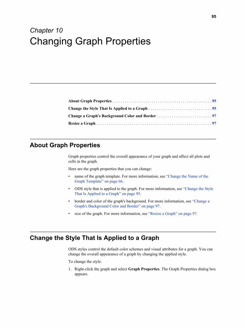
Chapter 10
Changing Graph Properties
About Graph Properties . . . . . . . . . . . . . . . . . . . . . . . . . . . . . . . . . . . . . . . . . . . . . . . . 95
Change the Style That Is Applied to a Graph . . . . . . . . . . . . . . . . . . . . . . . . . . . . . . 95
Change a Graph's Background Color and Border . . . . . . . . . . . . . . . . . . . . . . . . . . 97
Resize a Graph . . . . . . . . . . . . . . . . . . . . . . . . . . . . . . . . . . . . . . . . . . . . . . . . . . . . . . . 97
About Graph PropertiesGraph properties control the overall appearance of your graph and affect all plots and cells in the graph.
Here are the graph properties that you can change:
• name of the graph template. For more information, see “Change the Name of the Graph Template” on page 66.
• ODS style that is applied to the graph. For more information, see “Change the Style That Is Applied to a Graph” on page 95.
• border and color of the graph's background. For more information, see “Change a Graph's Background Color and Border” on page 97.
• size of the graph. For more information, see “Resize a Graph” on page 97.
Change the Style That Is Applied to a GraphODS styles control the default color schemes and visual attributes for a graph. You can change the overall appearance of a graph by changing the applied style.
To change the style:
1. Right-click the graph and select Graph Properties. The Graph Properties dialog box appears.
95
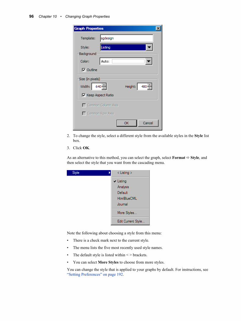
2. To change the style, select a different style from the available styles in the Style list box.
3. Click OK.
As an alternative to this method, you can select the graph, select Format ð Style, and then select the style that you want from the cascading menu.
Note the following about choosing a style from this menu:
• There is a check mark next to the current style.
• The menu lists the five most recently used style names.
• The default style is listed within < > brackets.
• You can select More Styles to choose from more styles.
You can change the style that is applied to your graphs by default. For instructions, see “Setting Preferences” on page 192.
96 Chapter 10 • Changing Graph Properties
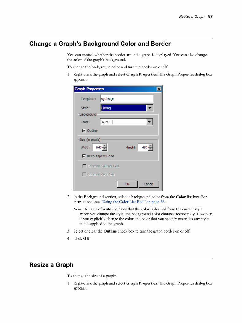
Change a Graph's Background Color and BorderYou can control whether the border around a graph is displayed. You can also change the color of the graph's background.
To change the background color and turn the border on or off:
1. Right-click the graph and select Graph Properties. The Graph Properties dialog box appears.
2. In the Background section, select a background color from the Color list box. For instructions, see “Using the Color List Box” on page 88.
Note: A value of Auto indicates that the color is derived from the current style. When you change the style, the background color changes accordingly. However, if you explicitly change the color, the color that you specify overrides any style that is applied to the graph.
3. Select or clear the Outline check box to turn the graph border on or off.
4. Click OK.
Resize a GraphTo change the size of a graph:
1. Right-click the graph and select Graph Properties. The Graph Properties dialog box appears.
Resize a Graph 97
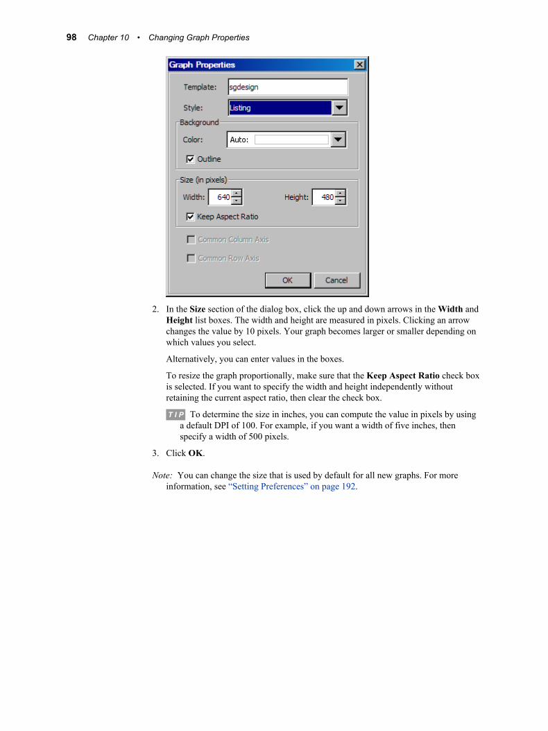
2. In the Size section of the dialog box, click the up and down arrows in the Width and Height list boxes. The width and height are measured in pixels. Clicking an arrow changes the value by 10 pixels. Your graph becomes larger or smaller depending on which values you select.
Alternatively, you can enter values in the boxes.
To resize the graph proportionally, make sure that the Keep Aspect Ratio check box is selected. If you want to specify the width and height independently without retaining the current aspect ratio, then clear the check box.
T I P To determine the size in inches, you can compute the value in pixels by using a default DPI of 100. For example, if you want a width of five inches, then specify a width of 500 pixels.
3. Click OK.
Note: You can change the size that is used by default for all new graphs. For more information, see “Setting Preferences” on page 192.
98 Chapter 10 • Changing Graph Properties

Chapter 11
Changing Plot Properties
About Plot Properties . . . . . . . . . . . . . . . . . . . . . . . . . . . . . . . . . . . . . . . . . . . . . . . . . . 99Overview of Plot Properties . . . . . . . . . . . . . . . . . . . . . . . . . . . . . . . . . . . . . . . . . . . 99Properties That Have Auto or Group Values . . . . . . . . . . . . . . . . . . . . . . . . . . . . . 100
Change Plot Properties . . . . . . . . . . . . . . . . . . . . . . . . . . . . . . . . . . . . . . . . . . . . . . . . 100
Specifying Style Elements for Plot Properties . . . . . . . . . . . . . . . . . . . . . . . . . . . . . 101
General Properties . . . . . . . . . . . . . . . . . . . . . . . . . . . . . . . . . . . . . . . . . . . . . . . . . . . 102About General Plot Properties . . . . . . . . . . . . . . . . . . . . . . . . . . . . . . . . . . . . . . . . 102Line Properties . . . . . . . . . . . . . . . . . . . . . . . . . . . . . . . . . . . . . . . . . . . . . . . . . . . . 102Fill and Outline Properties . . . . . . . . . . . . . . . . . . . . . . . . . . . . . . . . . . . . . . . . . . . 104Marker Properties . . . . . . . . . . . . . . . . . . . . . . . . . . . . . . . . . . . . . . . . . . . . . . . . . . 106Text Properties . . . . . . . . . . . . . . . . . . . . . . . . . . . . . . . . . . . . . . . . . . . . . . . . . . . . 107
Plot-Specific Properties . . . . . . . . . . . . . . . . . . . . . . . . . . . . . . . . . . . . . . . . . . . . . . . 108About Plot-Specific Properties . . . . . . . . . . . . . . . . . . . . . . . . . . . . . . . . . . . . . . . . 108Scatter Properties . . . . . . . . . . . . . . . . . . . . . . . . . . . . . . . . . . . . . . . . . . . . . . . . . . 109Series, Needle, and Step Properties . . . . . . . . . . . . . . . . . . . . . . . . . . . . . . . . . . . . 109Histogram Properties . . . . . . . . . . . . . . . . . . . . . . . . . . . . . . . . . . . . . . . . . . . . . . . 110Box Properties . . . . . . . . . . . . . . . . . . . . . . . . . . . . . . . . . . . . . . . . . . . . . . . . . . . . 111Bar and Bar Error Properties . . . . . . . . . . . . . . . . . . . . . . . . . . . . . . . . . . . . . . . . . 113Band Properties . . . . . . . . . . . . . . . . . . . . . . . . . . . . . . . . . . . . . . . . . . . . . . . . . . . . 115Vector Properties . . . . . . . . . . . . . . . . . . . . . . . . . . . . . . . . . . . . . . . . . . . . . . . . . . 116Contour Properties . . . . . . . . . . . . . . . . . . . . . . . . . . . . . . . . . . . . . . . . . . . . . . . . . 117Fringe Properties . . . . . . . . . . . . . . . . . . . . . . . . . . . . . . . . . . . . . . . . . . . . . . . . . . . 118Normal and Kernel Properties . . . . . . . . . . . . . . . . . . . . . . . . . . . . . . . . . . . . . . . . 118Loess, Regression, PBSpline, and Model Band Properties . . . . . . . . . . . . . . . . . . 119Ellipse Properties . . . . . . . . . . . . . . . . . . . . . . . . . . . . . . . . . . . . . . . . . . . . . . . . . . 120Line Properties . . . . . . . . . . . . . . . . . . . . . . . . . . . . . . . . . . . . . . . . . . . . . . . . . . . . 120Block and Stack Block Properties . . . . . . . . . . . . . . . . . . . . . . . . . . . . . . . . . . . . . 122
Change the Wall Color and the Outline for a Cell . . . . . . . . . . . . . . . . . . . . . . . . . 123
About Plot Properties
Overview of Plot PropertiesODS styles control the default appearance of the plots in a graph. The ODS styles are optimized to produce effective graphics without any changes to the default settings. However, you can override the default style settings by changing plot properties.
99
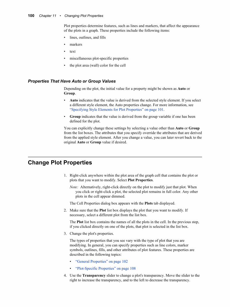
Plot properties determine features, such as lines and markers, that affect the appearance of the plots in a graph. These properties include the following items:
• lines, outlines, and fills
• markers
• text
• miscellaneous plot-specific properties
• the plot area (wall) color for the cell
Properties That Have Auto or Group ValuesDepending on the plot, the initial value for a property might be shown as Auto or Group.
• Auto indicates that the value is derived from the selected style element. If you select a different style element, the Auto properties change. For more information, see “Specifying Style Elements for Plot Properties” on page 101.
• Group indicates that the value is derived from the group variable if one has been defined for the plot.
You can explicitly change these settings by selecting a value other than Auto or Group from the list boxes. The attributes that you specify override the attributes that are derived from the applied style element. After you change a value, you can later revert back to the original Auto or Group value if desired.
Change Plot Properties
1. Right-click anywhere within the plot area of the graph cell that contains the plot or plots that you want to modify. Select Plot Properties.
Note: Alternatively, right-click directly on the plot to modify just that plot. When you click or right-click a plot, the selected plot remains in full color. Any other plots in the cell appear dimmed.
The Cell Properties dialog box appears with the Plots tab displayed.
2. Make sure that the Plot list box displays the plot that you want to modify. If necessary, select a different plot from the list box.
The Plot list box contains the names of all the plots in the cell. In the previous step, if you clicked directly on one of the plots, that plot is selected in the list box.
3. Change the plot's properties.
The types of properties that you see vary with the type of plot that you are modifying. In general, you can specify properties such as line colors, marker symbols, outlines, fills, and other attributes of plot features. These properties are described in the following topics:
• “General Properties” on page 102
• “Plot-Specific Properties” on page 108
4. Use the Transparency slider to change a plot's transparency. Move the slider to the right to increase the transparency, and to the left to decrease the transparency.
100 Chapter 11 • Changing Plot Properties
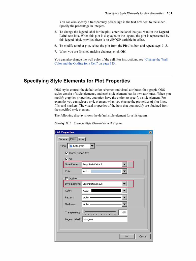
You can also specify a transparency percentage in the text box next to the slider. Specify the percentage in integers.
5. To change the legend label for the plot, enter the label that you want in the Legend Label text box. When this plot is displayed in the legend, the plot is represented by this legend label, provided there is no GROUP variable in effect.
6. To modify another plot, select the plot from the Plot list box and repeat steps 3–5.
7. When you are finished making changes, click OK.
You can also change the wall color of the cell. For instructions, see “Change the Wall Color and the Outline for a Cell” on page 123.
Specifying Style Elements for Plot PropertiesODS styles control the default color schemes and visual attributes for a graph. ODS styles consist of style elements, and each style element has its own attributes. When you modify graphics properties, you often have the option to specify a style element. For example, you can select a style element when you change the properties of plot lines, fills, and markers. The visual properties of the item that you modify are obtained from the specified style element.
The following display shows the default style element for a histogram.
Display 11.1 Example Style Element for a Histogram
Specifying Style Elements for Plot Properties 101

The style element determines the specific attributes of the plot, such as the outline color, pattern, and thickness. The default value for those attributes is Auto, which indicates that the value is automatically derived from the selected style element. If you select a different style element, the automatic attributes change.
In the example, you can select another style element from the list box. Alternatively, you can specify the plot fill and outline attributes explicitly by selecting a value other than Auto from the list boxes.
When you explicitly change an item’s attributes, the change persists regardless of the style. If you later change the style element or the graph's style, your explicit settings override the new style element or style.
Note: Plot elements might have a Group value instead of an Auto value. The Group value indicates that the value is derived from the group variable if one has been defined for the plot.
After you change attributes, you can later revert back to the original Auto or Group value if desired.
You can also create a custom style and modify the style elements that are contained in that style. The modified style elements are used every time you apply the custom style to a graph.
See Also• “How the Style Elements Map to Parts of a Graph” on page 144
• Chapter 13, “Customizing Graph Styles,” on page 135
General Properties
About General Plot PropertiesIn the Plots tab of the Cell Properties dialog box, you can change properties that affect the appearance of the plots in a graph.
The types of properties that you see vary with the type of plot that you are modifying. In general, you can specify colors, marker symbols, line attributes, and outlines and fills. These general plot properties are described in the following sections.
For instructions on changing plot properties, see “Change Plot Properties” on page 100.
Line PropertiesLine properties apply to many of the plots, including series, needle, step, reference lines, box, contour, and density plots.
Here is an example of line properties for a step plot.
102 Chapter 11 • Changing Plot Properties
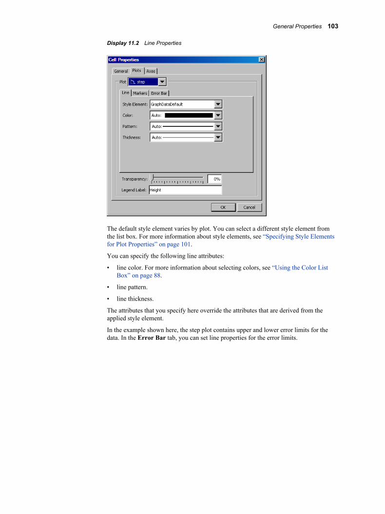
Display 11.2 Line Properties
The default style element varies by plot. You can select a different style element from the list box. For more information about style elements, see “Specifying Style Elements for Plot Properties” on page 101.
You can specify the following line attributes:
• line color. For more information about selecting colors, see “Using the Color List Box” on page 88.
• line pattern.
• line thickness.
The attributes that you specify here override the attributes that are derived from the applied style element.
In the example shown here, the step plot contains upper and lower error limits for the data. In the Error Bar tab, you can set line properties for the error limits.
General Properties 103
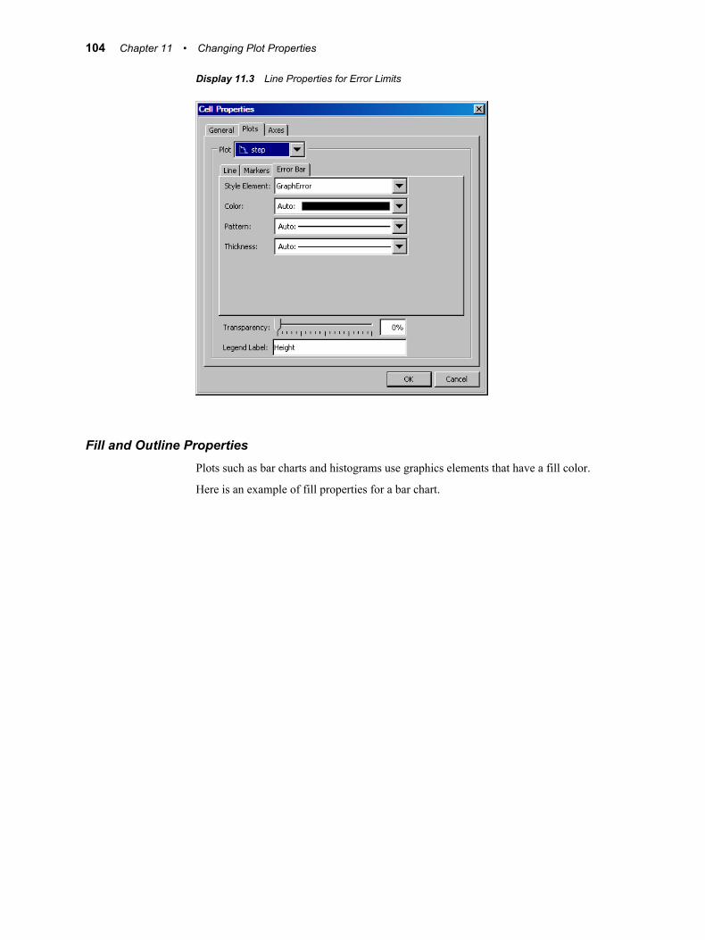
Display 11.3 Line Properties for Error Limits
Fill and Outline PropertiesPlots such as bar charts and histograms use graphics elements that have a fill color.
Here is an example of fill properties for a bar chart.
104 Chapter 11 • Changing Plot Properties
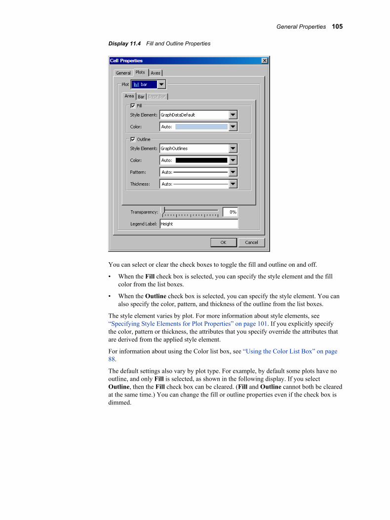
Display 11.4 Fill and Outline Properties
You can select or clear the check boxes to toggle the fill and outline on and off.
• When the Fill check box is selected, you can specify the style element and the fill color from the list boxes.
• When the Outline check box is selected, you can specify the style element. You can also specify the color, pattern, and thickness of the outline from the list boxes.
The style element varies by plot. For more information about style elements, see “Specifying Style Elements for Plot Properties” on page 101. If you explicitly specify the color, pattern or thickness, the attributes that you specify override the attributes that are derived from the applied style element.
For information about using the Color list box, see “Using the Color List Box” on page 88.
The default settings also vary by plot type. For example, by default some plots have no outline, and only Fill is selected, as shown in the following display. If you select Outline, then the Fill check box can be cleared. (Fill and Outline cannot both be cleared at the same time.) You can change the fill or outline properties even if the check box is dimmed.
General Properties 105
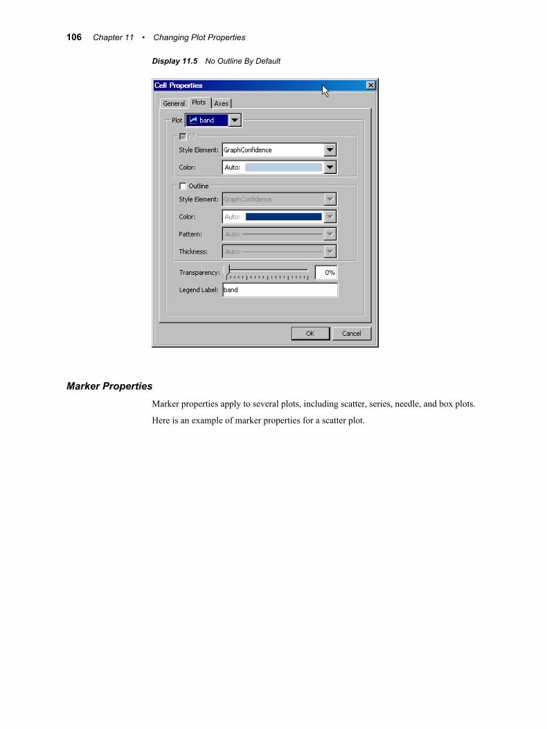
Display 11.5 No Outline By Default
Marker PropertiesMarker properties apply to several plots, including scatter, series, needle, and box plots.
Here is an example of marker properties for a scatter plot.
106 Chapter 11 • Changing Plot Properties
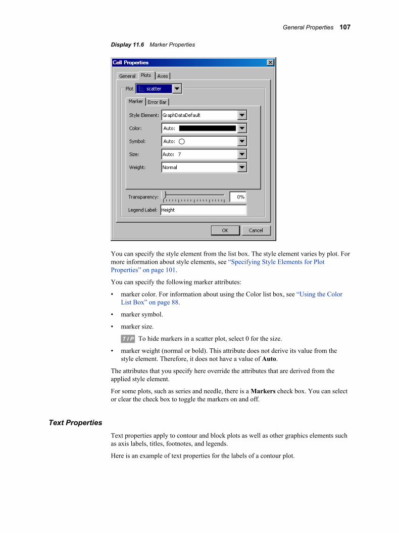
Display 11.6 Marker Properties
You can specify the style element from the list box. The style element varies by plot. For more information about style elements, see “Specifying Style Elements for Plot Properties” on page 101.
You can specify the following marker attributes:
• marker color. For information about using the Color list box, see “Using the Color List Box” on page 88.
• marker symbol.
• marker size.
T I P To hide markers in a scatter plot, select 0 for the size.
• marker weight (normal or bold). This attribute does not derive its value from the style element. Therefore, it does not have a value of Auto.
The attributes that you specify here override the attributes that are derived from the applied style element.
For some plots, such as series and needle, there is a Markers check box. You can select or clear the check box to toggle the markers on and off.
Text PropertiesText properties apply to contour and block plots as well as other graphics elements such as axis labels, titles, footnotes, and legends.
Here is an example of text properties for the labels of a contour plot.
General Properties 107
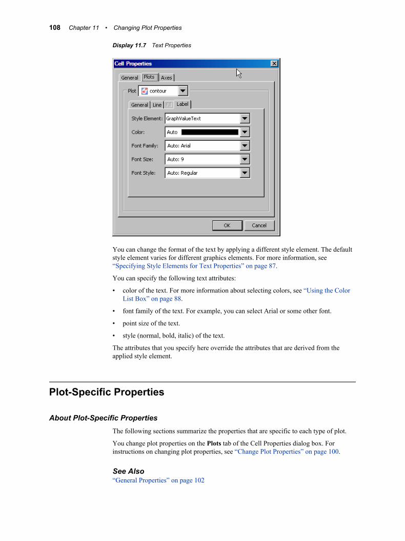
Display 11.7 Text Properties
You can change the format of the text by applying a different style element. The default style element varies for different graphics elements. For more information, see “Specifying Style Elements for Text Properties” on page 87.
You can specify the following text attributes:
• color of the text. For more information about selecting colors, see “Using the Color List Box” on page 88.
• font family of the text. For example, you can select Arial or some other font.
• point size of the text.
• style (normal, bold, italic) of the text.
The attributes that you specify here override the attributes that are derived from the applied style element.
Plot-Specific Properties
About Plot-Specific PropertiesThe following sections summarize the properties that are specific to each type of plot.
You change plot properties on the Plots tab of the Cell Properties dialog box. For instructions on changing plot properties, see “Change Plot Properties” on page 100.
See Also“General Properties” on page 102
108 Chapter 11 • Changing Plot Properties
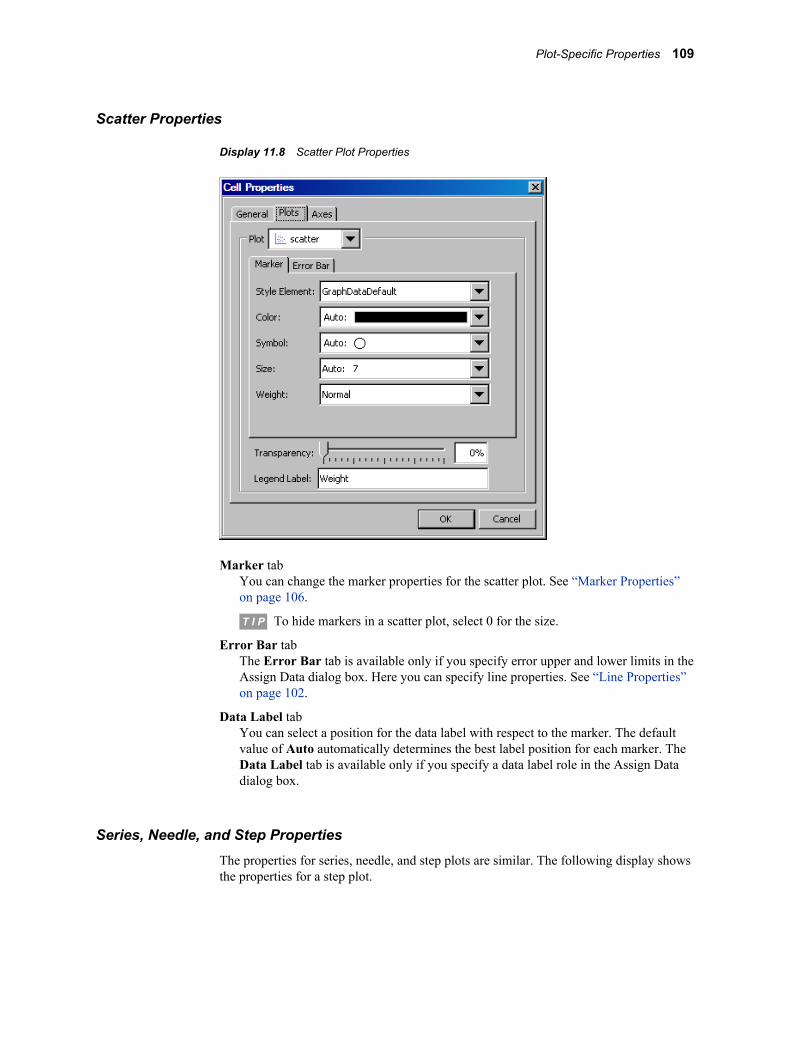
Scatter Properties
Display 11.8 Scatter Plot Properties
Marker tabYou can change the marker properties for the scatter plot. See “Marker Properties” on page 106.
T I P To hide markers in a scatter plot, select 0 for the size.
Error Bar tabThe Error Bar tab is available only if you specify error upper and lower limits in the Assign Data dialog box. Here you can specify line properties. See “Line Properties” on page 102.
Data Label tabYou can select a position for the data label with respect to the marker. The default value of Auto automatically determines the best label position for each marker. The Data Label tab is available only if you specify a data label role in the Assign Data dialog box.
Series, Needle, and Step PropertiesThe properties for series, needle, and step plots are similar. The following display shows the properties for a step plot.
Plot-Specific Properties 109
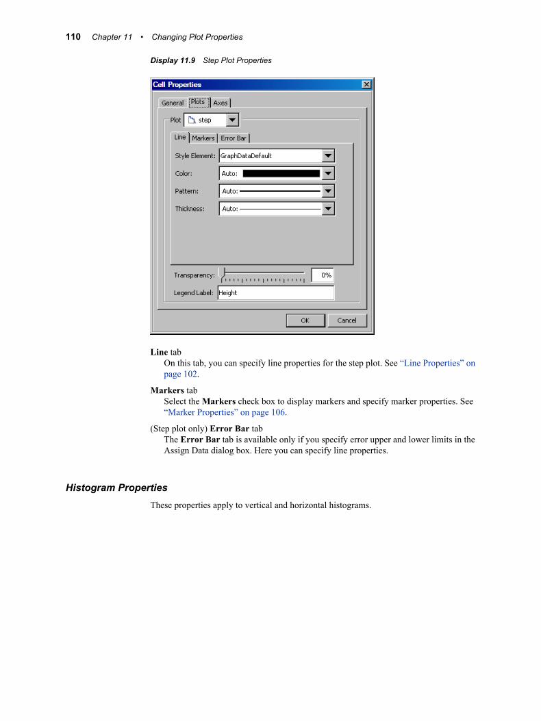
Display 11.9 Step Plot Properties
Line tabOn this tab, you can specify line properties for the step plot. See “Line Properties” on page 102.
Markers tabSelect the Markers check box to display markers and specify marker properties. See “Marker Properties” on page 106.
(Step plot only) Error Bar tabThe Error Bar tab is available only if you specify error upper and lower limits in the Assign Data dialog box. Here you can specify line properties.
Histogram PropertiesThese properties apply to vertical and horizontal histograms.
110 Chapter 11 • Changing Plot Properties
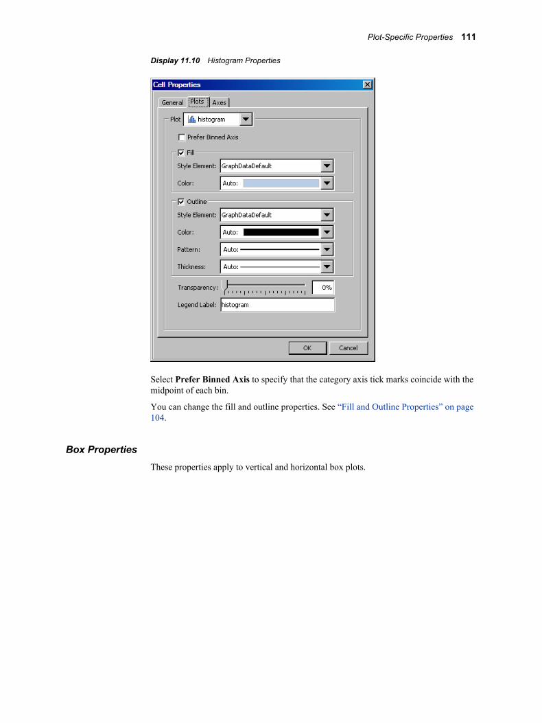
Display 11.10 Histogram Properties
Select Prefer Binned Axis to specify that the category axis tick marks coincide with the midpoint of each bin.
You can change the fill and outline properties. See “Fill and Outline Properties” on page 104.
Box PropertiesThese properties apply to vertical and horizontal box plots.
Plot-Specific Properties 111
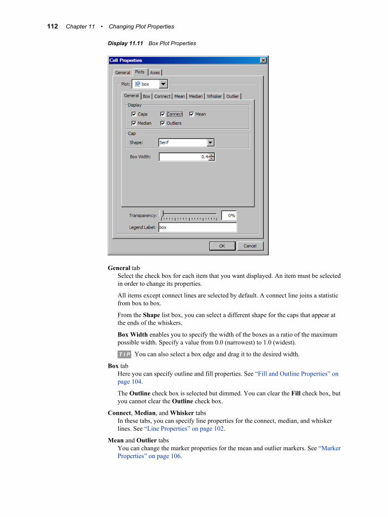
Display 11.11 Box Plot Properties
General tabSelect the check box for each item that you want displayed. An item must be selected in order to change its properties.
All items except connect lines are selected by default. A connect line joins a statistic from box to box.
From the Shape list box, you can select a different shape for the caps that appear at the ends of the whiskers.
Box Width enables you to specify the width of the boxes as a ratio of the maximum possible width. Specify a value from 0.0 (narrowest) to 1.0 (widest).
T I P You can also select a box edge and drag it to the desired width.
Box tabHere you can specify outline and fill properties. See “Fill and Outline Properties” on page 104.
The Outline check box is selected but dimmed. You can clear the Fill check box, but you cannot clear the Outline check box.
Connect, Median, and Whisker tabsIn these tabs, you can specify line properties for the connect, median, and whisker lines. See “Line Properties” on page 102.
Mean and Outlier tabsYou can change the marker properties for the mean and outlier markers. See “Marker Properties” on page 106.
112 Chapter 11 • Changing Plot Properties
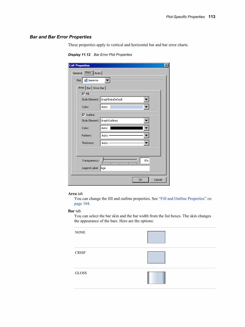
Bar and Bar Error PropertiesThese properties apply to vertical and horizontal bar and bar error charts.
Display 11.12 Bar Error Plot Properties
Area tabYou can change the fill and outline properties. See “Fill and Outline Properties” on page 104.
Bar tabYou can select the bar skin and the bar width from the list boxes. The skin changes the appearance of the bars. Here are the options:
NONE
CRISP
GLOSS
Plot-Specific Properties 113
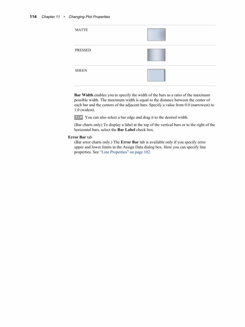
MATTE
PRESSED
SHEEN
Bar Width enables you to specify the width of the bars as a ratio of the maximum possible width. The maximum width is equal to the distance between the center of each bar and the centers of the adjacent bars. Specify a value from 0.0 (narrowest) to 1.0 (widest).
T I P You can also select a bar edge and drag it to the desired width.
(Bar charts only) To display a label at the top of the vertical bars or to the right of the horizontal bars, select the Bar Label check box.
Error Bar tab(Bar error charts only.) The Error Bar tab is available only if you specify error upper and lower limits in the Assign Data dialog box. Here you can specify line properties. See “Line Properties” on page 102.
114 Chapter 11 • Changing Plot Properties
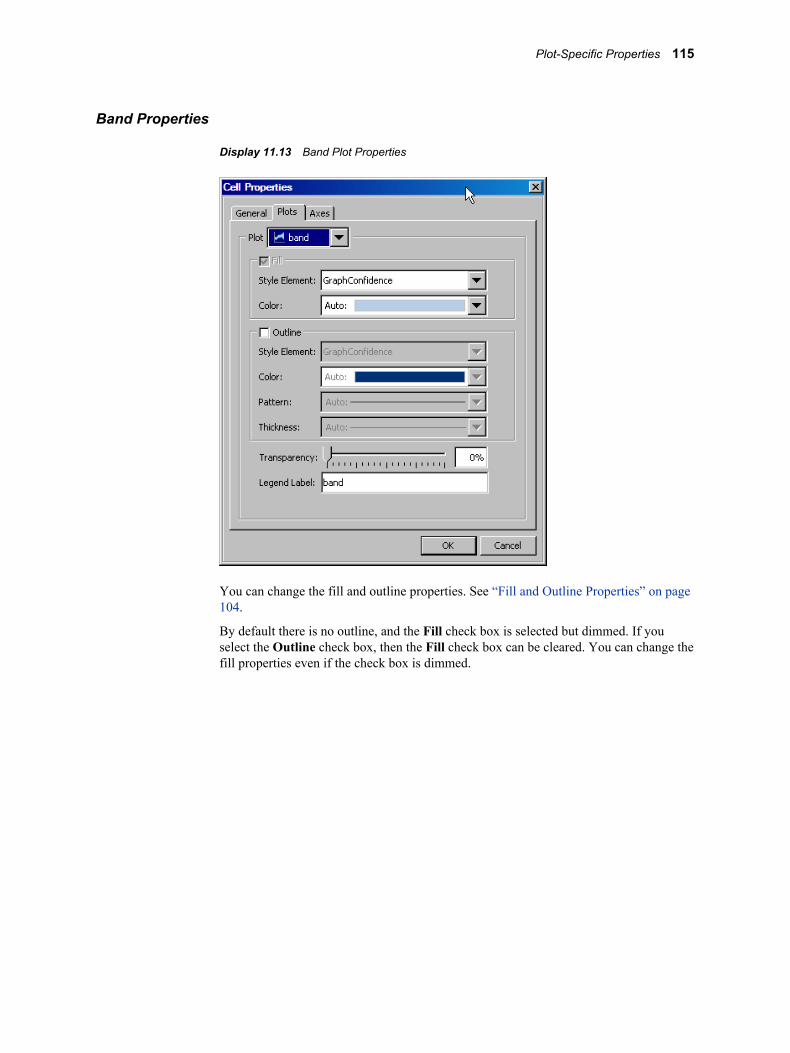
Band Properties
Display 11.13 Band Plot Properties
You can change the fill and outline properties. See “Fill and Outline Properties” on page 104.
By default there is no outline, and the Fill check box is selected but dimmed. If you select the Outline check box, then the Fill check box can be cleared. You can change the fill properties even if the check box is dimmed.
Plot-Specific Properties 115

Vector Properties
Display 11.14 Vector Plot Properties
Arrow tabSelect or clear the Arrow check box to toggle arrows on and off.
You can select the arrow direction and shape from the list boxes. Arrows can point outward from the origin, inward toward the origin, or in both directions.
Line tabHere you can specify line properties for the vectors. See “Line Properties” on page 102.
116 Chapter 11 • Changing Plot Properties

Contour Properties
Display 11.15 Contour Plot Properties
General tabYou can specify the legend label.
Line tabIf the Line tab is available, you can specify line properties. See “Line Properties” on page 102.
The Line tab is available for the following types of contour plots:
• Line
• LineGradient
• LabeledLine
• LabeledLineFill
• LabeledLineGradient
Fill tabIf the Fill tab is available, you can select a different style element from the list box.
To reverse the color gradient of the fill, select the Reverse color model check box.
The Fill tab is available for the following types of contour plots:
• Fill
• Gradient
• LineFill
• LineGradient
• LabeledLineFill
Plot-Specific Properties 117

• Labeled LineGradient
Label tabIf the Label tab is available, then you can specify text properties for the contour labels. See “Text Properties” on page 107.
The Label tab is available for the following types of contour plots:
• LabeledLine
• LabeledLineFill
• LabeledLineGradient
Fringe Properties
Display 11.16 Fringe Plot Properties
You can specify line properties for the plot. See “Line Properties” on page 102.
Use the Height control to adjust the height of the fringe lines. You can also enter a height.
Normal and Kernel PropertiesThese properties apply to vertical and horizontal normal and kernel plots.
118 Chapter 11 • Changing Plot Properties
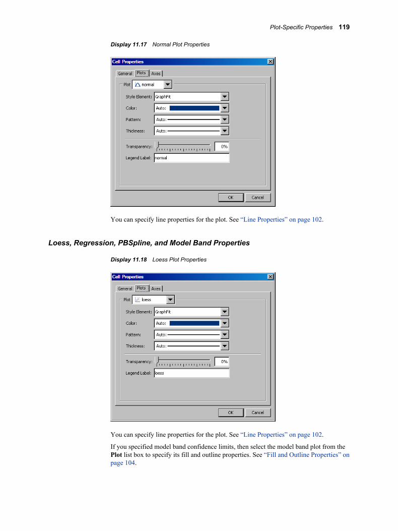
Display 11.17 Normal Plot Properties
You can specify line properties for the plot. See “Line Properties” on page 102.
Loess, Regression, PBSpline, and Model Band Properties
Display 11.18 Loess Plot Properties
You can specify line properties for the plot. See “Line Properties” on page 102.
If you specified model band confidence limits, then select the model band plot from the Plot list box to specify its fill and outline properties. See “Fill and Outline Properties” on page 104.
Plot-Specific Properties 119

Ellipse Properties
Display 11.19 Ellipse Properties
You can change the fill and outline properties. See “Fill and Outline Properties” on page 104.
By default there is no fill, and the Outline check box is selected but dimmed. If you select the Fill check box, then the Outline check box can be cleared. You can change the outline properties even if the check box is dimmed.
Line PropertiesThese properties apply to point-and-slope lines, drop lines, and vertical and horizontal reference lines.
120 Chapter 11 • Changing Plot Properties
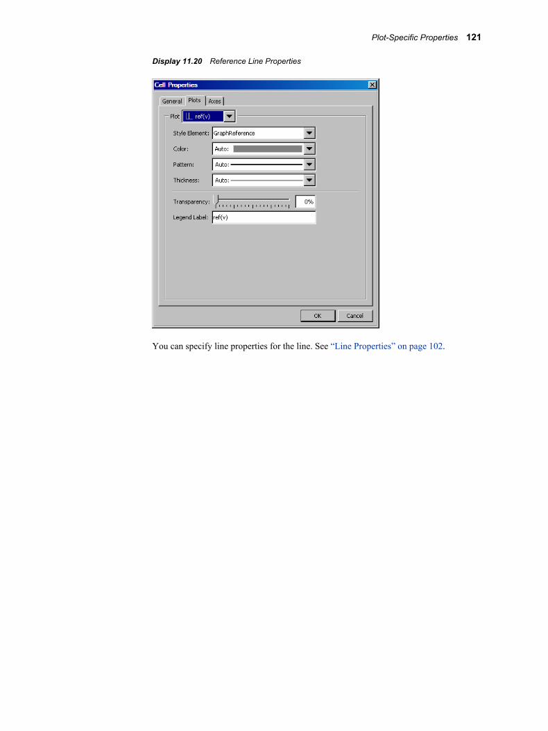
Display 11.20 Reference Line Properties
You can specify line properties for the line. See “Line Properties” on page 102.
Plot-Specific Properties 121
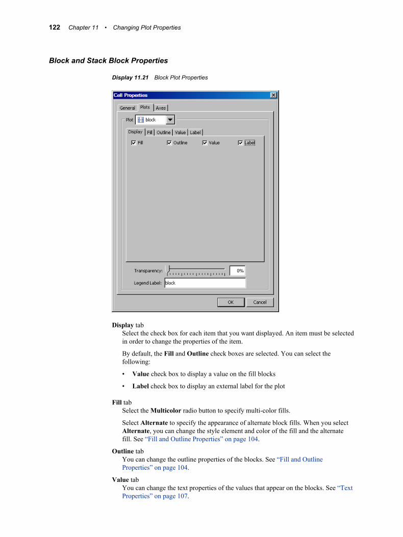
Block and Stack Block Properties
Display 11.21 Block Plot Properties
Display tabSelect the check box for each item that you want displayed. An item must be selected in order to change the properties of the item.
By default, the Fill and Outline check boxes are selected. You can select the following:
• Value check box to display a value on the fill blocks
• Label check box to display an external label for the plot
Fill tabSelect the Multicolor radio button to specify multi-color fills.
Select Alternate to specify the appearance of alternate block fills. When you select Alternate, you can change the style element and color of the fill and the alternate fill. See “Fill and Outline Properties” on page 104.
Outline tabYou can change the outline properties of the blocks. See “Fill and Outline Properties” on page 104.
Value tabYou can change the text properties of the values that appear on the blocks. See “Text Properties” on page 107.
122 Chapter 11 • Changing Plot Properties
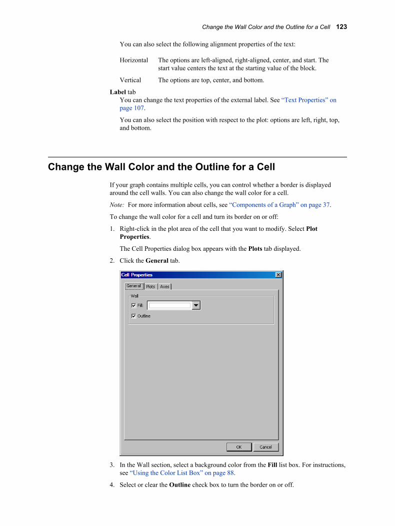
You can also select the following alignment properties of the text:
Horizontal The options are left-aligned, right-aligned, center, and start. The start value centers the text at the starting value of the block.
Vertical The options are top, center, and bottom.
Label tabYou can change the text properties of the external label. See “Text Properties” on page 107.
You can also select the position with respect to the plot: options are left, right, top, and bottom.
Change the Wall Color and the Outline for a CellIf your graph contains multiple cells, you can control whether a border is displayed around the cell walls. You can also change the wall color for a cell.
Note: For more information about cells, see “Components of a Graph” on page 37.
To change the wall color for a cell and turn its border on or off:
1. Right-click in the plot area of the cell that you want to modify. Select Plot Properties.
The Cell Properties dialog box appears with the Plots tab displayed.
2. Click the General tab.
3. In the Wall section, select a background color from the Fill list box. For instructions, see “Using the Color List Box” on page 88.
4. Select or clear the Outline check box to turn the border on or off.
Change the Wall Color and the Outline for a Cell 123

5. Click OK.
124 Chapter 11 • Changing Plot Properties
Chapter 12
Changing Axis Properties
About Axis Properties . . . . . . . . . . . . . . . . . . . . . . . . . . . . . . . . . . . . . . . . . . . . . . . . 125
Change an Axis Label . . . . . . . . . . . . . . . . . . . . . . . . . . . . . . . . . . . . . . . . . . . . . . . . . 125
Change Axis Properties . . . . . . . . . . . . . . . . . . . . . . . . . . . . . . . . . . . . . . . . . . . . . . . 126
About the Axis Data Range . . . . . . . . . . . . . . . . . . . . . . . . . . . . . . . . . . . . . . . . . . . . 127
About Advanced Axis Properties . . . . . . . . . . . . . . . . . . . . . . . . . . . . . . . . . . . . . . . 130
About Axis PropertiesYou can modify the properties of your axes as follows:
• specify general display attributes, such as whether to display a grid and tick marks
• change the text for axis labels
• change the font properties for labels and axis values
• choose the axis type, such as discrete, linear, or logarithmic
• customize the range of values that are displayed on the axis
• specify the tick sequence for a linear axis
• reverse the axis
• in multi-cell graphs, set a uniform scale on the axis for rows, columns, or both
Note: In some cases, these properties are dimmed. For example, some plots require a particular type of axis, and the axis type cannot be changed for those plots. In addition, you cannot reverse a common axis.
For multi-cell graphs, you can also specify whether to use a common row or column axis. For more information, see “Sharing or Unsharing a Common External Axis” on page 162.
Change an Axis LabelThere are two main ways to change the text of an axis label:
125
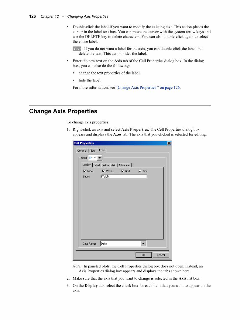
• Double-click the label if you want to modify the existing text. This action places the cursor in the label text box. You can move the cursor with the system arrow keys and use the DELETE key to delete characters. You can also double-click again to select the entire label.
T I P If you do not want a label for the axis, you can double-click the label and delete the text. This action hides the label.
• Enter the new text on the Axis tab of the Cell Properties dialog box. In the dialog box, you can also do the following:
• change the text properties of the label
• hide the label
For more information, see “Change Axis Properties ” on page 126.
Change Axis PropertiesTo change axis properties:
1. Right-click an axis and select Axis Properties. The Cell Properties dialog box appears and displays the Axes tab. The axis that you clicked is selected for editing.
Note: In paneled plots, the Cell Properties dialog box does not open. Instead, an Axis Properties dialog box appears and displays the tabs shown here.
2. Make sure that the axis that you want to change is selected in the Axis list box.
3. On the Display tab, select the check box for each item that you want to appear on the axis.
126 Chapter 12 • Changing Axis Properties
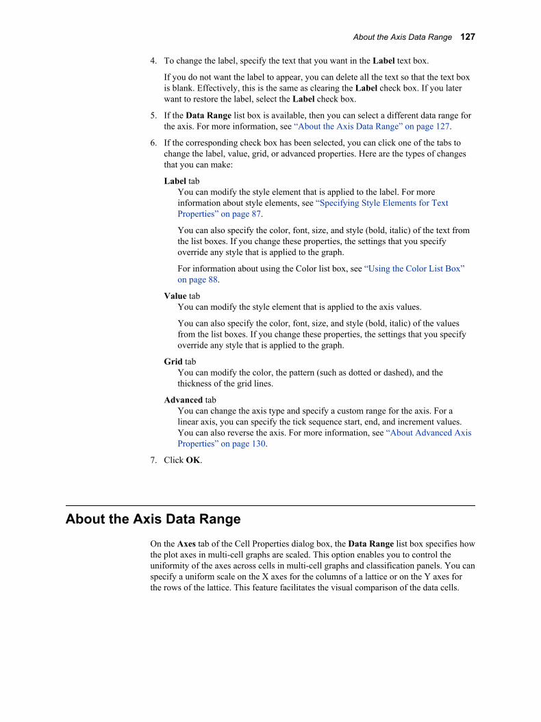
4. To change the label, specify the text that you want in the Label text box.
If you do not want the label to appear, you can delete all the text so that the text box is blank. Effectively, this is the same as clearing the Label check box. If you later want to restore the label, select the Label check box.
5. If the Data Range list box is available, then you can select a different data range for the axis. For more information, see “About the Axis Data Range” on page 127.
6. If the corresponding check box has been selected, you can click one of the tabs to change the label, value, grid, or advanced properties. Here are the types of changes that you can make:
Label tabYou can modify the style element that is applied to the label. For more information about style elements, see “Specifying Style Elements for Text Properties” on page 87.
You can also specify the color, font, size, and style (bold, italic) of the text from the list boxes. If you change these properties, the settings that you specify override any style that is applied to the graph.
For information about using the Color list box, see “Using the Color List Box” on page 88.
Value tabYou can modify the style element that is applied to the axis values.
You can also specify the color, font, size, and style (bold, italic) of the values from the list boxes. If you change these properties, the settings that you specify override any style that is applied to the graph.
Grid tabYou can modify the color, the pattern (such as dotted or dashed), and the thickness of the grid lines.
Advanced tabYou can change the axis type and specify a custom range for the axis. For a linear axis, you can specify the tick sequence start, end, and increment values. You can also reverse the axis. For more information, see “About Advanced Axis Properties” on page 130.
7. Click OK.
About the Axis Data RangeOn the Axes tab of the Cell Properties dialog box, the Data Range list box specifies how the plot axes in multi-cell graphs are scaled. This option enables you to control the uniformity of the axes across cells in multi-cell graphs and classification panels. You can specify a uniform scale on the X axes for the columns of a lattice or on the Y axes for the rows of the lattice. This feature facilitates the visual comparison of the data cells.
About the Axis Data Range 127
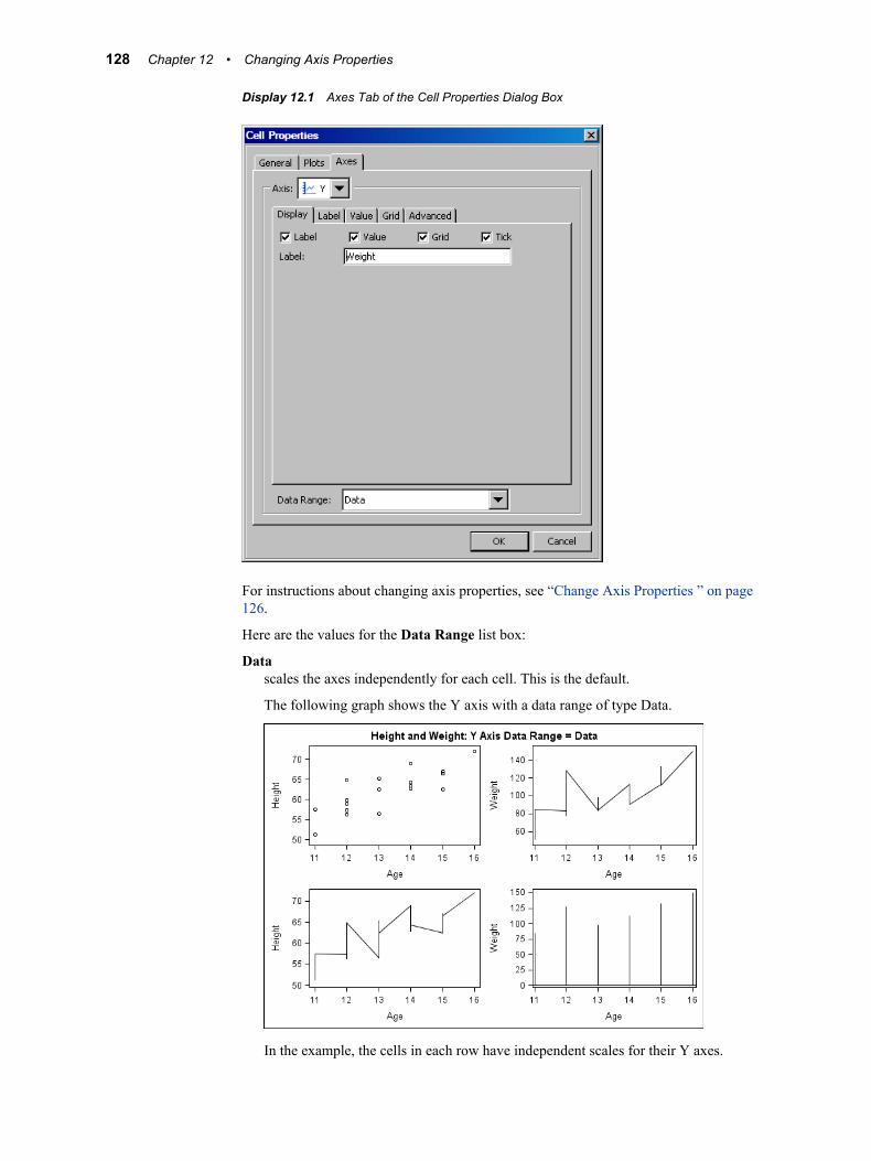
Display 12.1 Axes Tab of the Cell Properties Dialog Box
For instructions about changing axis properties, see “Change Axis Properties ” on page 126.
Here are the values for the Data Range list box:
Datascales the axes independently for each cell. This is the default.
The following graph shows the Y axis with a data range of type Data.
In the example, the cells in each row have independent scales for their Y axes.
128 Chapter 12 • Changing Axis Properties
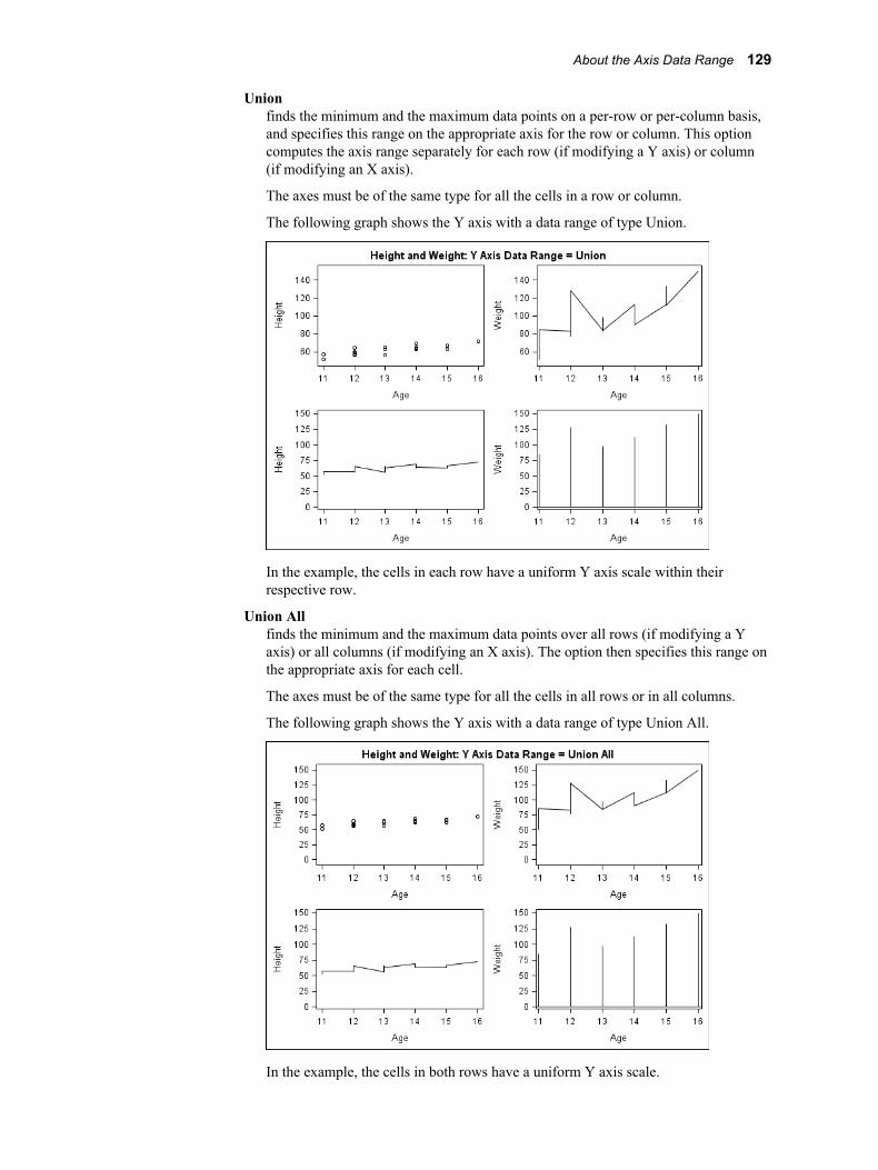
Unionfinds the minimum and the maximum data points on a per-row or per-column basis, and specifies this range on the appropriate axis for the row or column. This option computes the axis range separately for each row (if modifying a Y axis) or column (if modifying an X axis).
The axes must be of the same type for all the cells in a row or column.
The following graph shows the Y axis with a data range of type Union.
In the example, the cells in each row have a uniform Y axis scale within their respective row.
Union Allfinds the minimum and the maximum data points over all rows (if modifying a Y axis) or all columns (if modifying an X axis). The option then specifies this range on the appropriate axis for each cell.
The axes must be of the same type for all the cells in all rows or in all columns.
The following graph shows the Y axis with a data range of type Union All.
In the example, the cells in both rows have a uniform Y axis scale.
About the Axis Data Range 129

About Advanced Axis PropertiesFrom the Axes tab of the Cell Properties dialog box, you can change the axis type and specify a custom range for the axis. For a linear axis, you can specify the tick sequence start, end, and increment values. You can also reverse the axis.
Display 12.2 Advanced Axis Properties
For instructions about changing axis properties, see “Change Axis Properties ” on page 126.
Here are the fields on this tab:
TypeWithin any given layout in the graph, each plot axis is of a particular type. By default, the axis type is linear or discrete. The data for discrete axes can be character or numeric. Here are the available types:
• Discrete: The axis contains independent data values rather than a range of numeric values. Each distinct value is represented by a tick mark. Discrete is the default axis type for character data. Some plots require a discrete axis. For example, bar charts use a discrete axis for the category variable.
• Linear: The axis contains a linear range of numeric values. Linear is the default axis type for numeric data. Some plots require a linear axis. For example, bar charts use a linear axis for the response variable.
130 Chapter 12 • Changing Axis Properties
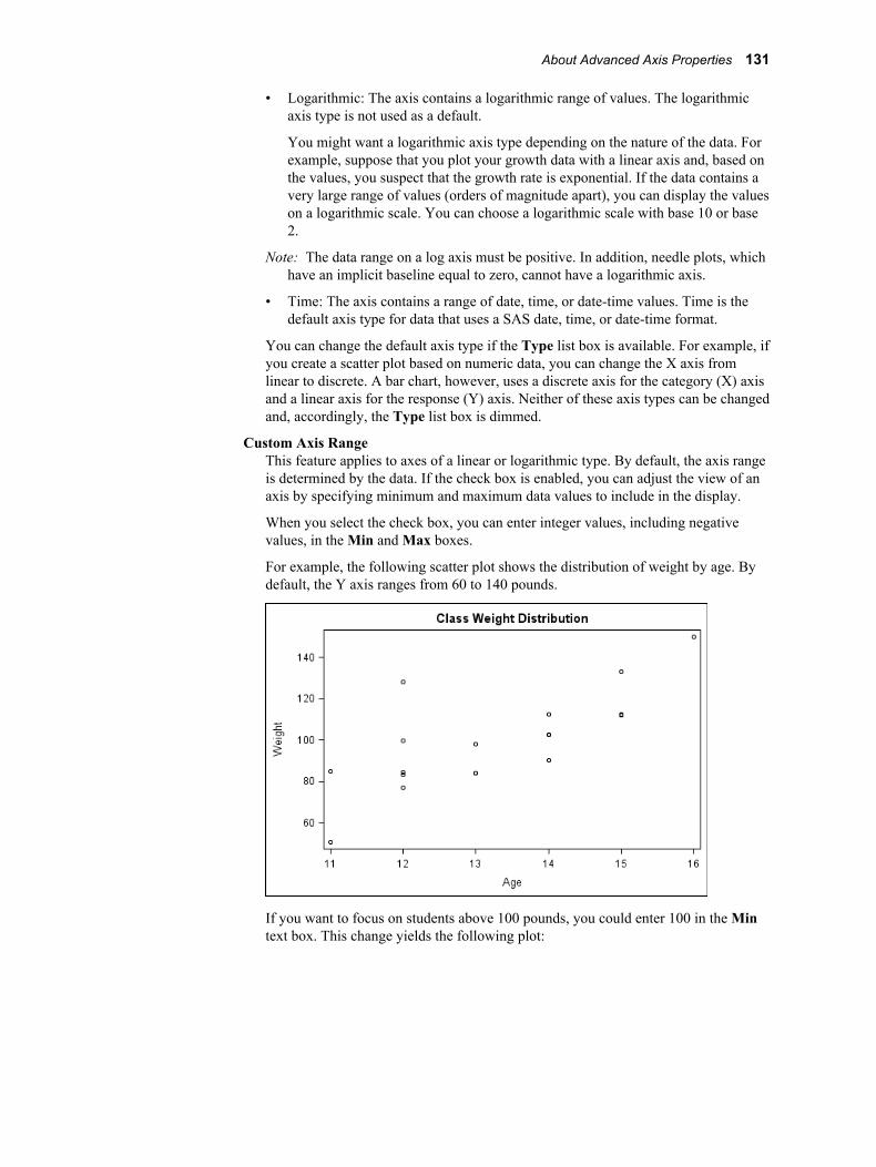
• Logarithmic: The axis contains a logarithmic range of values. The logarithmic axis type is not used as a default.
You might want a logarithmic axis type depending on the nature of the data. For example, suppose that you plot your growth data with a linear axis and, based on the values, you suspect that the growth rate is exponential. If the data contains a very large range of values (orders of magnitude apart), you can display the values on a logarithmic scale. You can choose a logarithmic scale with base 10 or base 2.
Note: The data range on a log axis must be positive. In addition, needle plots, which have an implicit baseline equal to zero, cannot have a logarithmic axis.
• Time: The axis contains a range of date, time, or date-time values. Time is the default axis type for data that uses a SAS date, time, or date-time format.
You can change the default axis type if the Type list box is available. For example, if you create a scatter plot based on numeric data, you can change the X axis from linear to discrete. A bar chart, however, uses a discrete axis for the category (X) axis and a linear axis for the response (Y) axis. Neither of these axis types can be changed and, accordingly, the Type list box is dimmed.
Custom Axis RangeThis feature applies to axes of a linear or logarithmic type. By default, the axis range is determined by the data. If the check box is enabled, you can adjust the view of an axis by specifying minimum and maximum data values to include in the display.
When you select the check box, you can enter integer values, including negative values, in the Min and Max boxes.
For example, the following scatter plot shows the distribution of weight by age. By default, the Y axis ranges from 60 to 140 pounds.
If you want to focus on students above 100 pounds, you could enter 100 in the Min text box. This change yields the following plot:
About Advanced Axis Properties 131
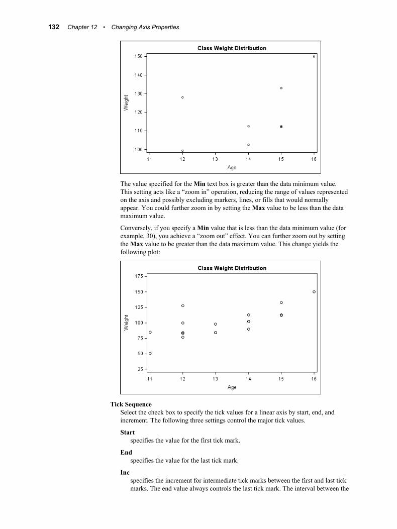
The value specified for the Min text box is greater than the data minimum value. This setting acts like a “zoom in” operation, reducing the range of values represented on the axis and possibly excluding markers, lines, or fills that would normally appear. You could further zoom in by setting the Max value to be less than the data maximum value.
Conversely, if you specify a Min value that is less than the data minimum value (for example, 30), you achieve a “zoom out” effect. You can further zoom out by setting the Max value to be greater than the data maximum value. This change yields the following plot:
Tick SequenceSelect the check box to specify the tick values for a linear axis by start, end, and increment. The following three settings control the major tick values.
Startspecifies the value for the first tick mark.
Endspecifies the value for the last tick mark.
Incspecifies the increment for intermediate tick marks between the first and last tick marks. The end value always controls the last tick mark. The interval between the
132 Chapter 12 • Changing Axis Properties

last tick mark and the previous tick mark might not necessarily be the increment value.
ReverseSelect this check box to reverse the axis.
About Advanced Axis Properties 133

134 Chapter 12 • Changing Axis Properties
Chapter 13
Customizing Graph Styles
About Styles and Style Elements . . . . . . . . . . . . . . . . . . . . . . . . . . . . . . . . . . . . . . . . 135Overview of Styles and Style Elements . . . . . . . . . . . . . . . . . . . . . . . . . . . . . . . . . 135Main Tasks Related to Styles . . . . . . . . . . . . . . . . . . . . . . . . . . . . . . . . . . . . . . . . . 136
About the Graph Style Editor . . . . . . . . . . . . . . . . . . . . . . . . . . . . . . . . . . . . . . . . . . 137Introduction to the Graph Style Editor . . . . . . . . . . . . . . . . . . . . . . . . . . . . . . . . . . 137Open the Graph Style Editor . . . . . . . . . . . . . . . . . . . . . . . . . . . . . . . . . . . . . . . . . . 137The Graph Style Editor's User Interface . . . . . . . . . . . . . . . . . . . . . . . . . . . . . . . . . 137
Use the Sample Graphs to Identify Style Elements . . . . . . . . . . . . . . . . . . . . . . . . . 138
Create a Custom Style . . . . . . . . . . . . . . . . . . . . . . . . . . . . . . . . . . . . . . . . . . . . . . . . 139
Modify a Custom Style . . . . . . . . . . . . . . . . . . . . . . . . . . . . . . . . . . . . . . . . . . . . . . . . 141
Modify and Apply the Current Style . . . . . . . . . . . . . . . . . . . . . . . . . . . . . . . . . . . . 142
Export a Custom Style . . . . . . . . . . . . . . . . . . . . . . . . . . . . . . . . . . . . . . . . . . . . . . . . 143
Delete a Custom Style . . . . . . . . . . . . . . . . . . . . . . . . . . . . . . . . . . . . . . . . . . . . . . . . . 143
How the Style Elements Map to Parts of a Graph . . . . . . . . . . . . . . . . . . . . . . . . . . 144About the Mappings . . . . . . . . . . . . . . . . . . . . . . . . . . . . . . . . . . . . . . . . . . . . . . . . 144Mapping by Style Elements . . . . . . . . . . . . . . . . . . . . . . . . . . . . . . . . . . . . . . . . . . 144Mapping by Graph Components . . . . . . . . . . . . . . . . . . . . . . . . . . . . . . . . . . . . . . . 148
About Styles and Style Elements
Overview of Styles and Style ElementsODS styles control the default color schemes and visual attributes for a graph. The style contains information about the various fonts used for different textual parts for the graph, such as titles, footnotes, and axis labels. The style also contains information about colors, marker shapes and sizes, line patterns, and so on. Styles are designed to create an aesthetic and effective graph that conveys information clearly and without clutter.
SAS supplies a set of predefined styles that can be used with the graphs. You can apply different styles to your graph to achieve different effects. You can also create your own custom styles. In ODS Graphics Designer, you can create styles by using the interactive Graph Style Editor.
135

ODS styles consist of style elements, and each style element has its own attributes. Within a given style, the style elements give you more granular control of a graph's visual elements.
You can change the style element that is assigned to a graph component in a particular graph. For example, GraphTitleText is the default style element for a title. To change the properties of a title, you can assign a different style element. This feature enables you to obtain a different look for the title without changing the applied style. For more information, see “Specifying Style Elements for Text Properties” on page 87 and “Specifying Style Elements for Plot Properties” on page 101.
Display 13.1 The GraphTitleText Style Element in the Text Properties Dialog Box
You can override an attribute of a style element. For example, if you want the title text to be blue for your graphs, you can explicitly set the color to blue. However, you must make this change for every graph. Instead, you can change the definition of the style element itself and set its color to blue. To do this, use the Graph Style Editor to make the change and save your change as a custom style. Then you can apply the custom style to your graphs, or make the custom style the default style for all new graphs.
See Also• “About the Graph Style Editor” on page 137
• “Create a Custom Style” on page 139
Main Tasks Related to Styles
• Change the style that is applied to a graph. For instructions, see “Change the Style That Is Applied to a Graph” on page 95.
• Change the style that is applied to new graphs by default. For instructions, see “Setting Preferences” on page 192.
136 Chapter 13 • Customizing Graph Styles
• Create a new style. For instructions, see “Create a Custom Style” on page 139. When you create a style, you can do the following:
• set the font attributes for titles, footnotes, and other text elements
• set the attributes of style elements that are used for plots, backgrounds, gradients, lines, and other plot features
• Edit a style that you created. For instructions, see “Modify a Custom Style” on page 141.
• Export a style to a SAS file. For instructions, see “Export a Custom Style” on page 143.
• Delete a style that you created. For instructions, see “Delete a Custom Style” on page 143.
Note: If you customized styles in the previous production release (9.2M3) of ODS Graphics Designer, there is a one-time task that you must perform to migrate your custom styles to the designer's new 9.3 location. For more information, see “Manual Tasks for Upgrading to SAS 9.3 ODS Graphics Designer” on page 4.
About the Graph Style Editor
Introduction to the Graph Style EditorThe ODS Graphics Designer includes an interactive Graph Style Editor that you can use to create your own custom styles. You base custom styles on existing styles. When you create custom styles, you change the attributes for various style elements. The Graph Style Editor shows the association between the style elements and the different parts of the graph.
See Also“About Styles and Style Elements” on page 135
Open the Graph Style EditorTo open the Graph Style Editor, select Tools ð Style Editor.
As an alternative, open a graph whose style you want to change, and select Format ð Style ð Edit Current Style. When opened this way, the Graph Style Editor enables you to modify the style of the graph and immediately apply the modified style to the graph. For more information, see “Modify and Apply the Current Style” on page 142.
The Graph Style Editor's User InterfaceThe Graph Style Editor organizes style components using the following hierarchy:
element groups ð elements ð attributes
Style elements are organized into groups, and each element has its own particular attributes.
The following display shows how the Graph Style Editor represents these style components.
About the Graph Style Editor 137
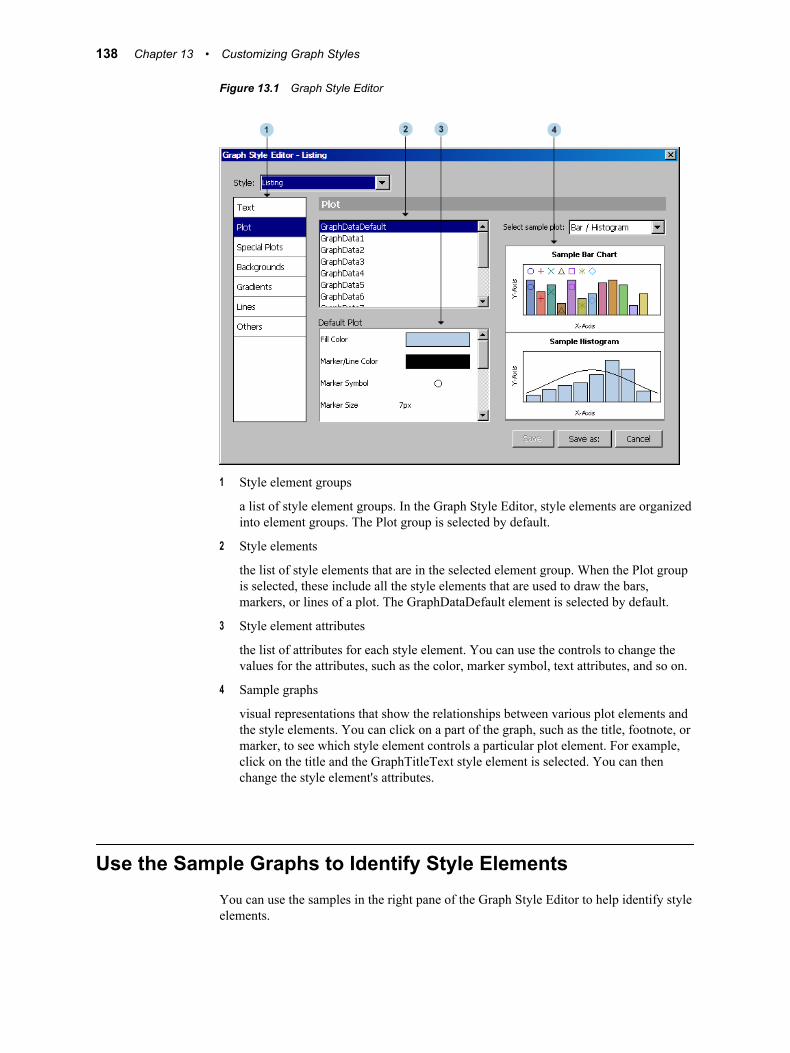
Figure 13.1 Graph Style Editor
1 Style element groups
a list of style element groups. In the Graph Style Editor, style elements are organized into element groups. The Plot group is selected by default.
2 Style elements
the list of style elements that are in the selected element group. When the Plot group is selected, these include all the style elements that are used to draw the bars, markers, or lines of a plot. The GraphDataDefault element is selected by default.
3 Style element attributes
the list of attributes for each style element. You can use the controls to change the values for the attributes, such as the color, marker symbol, text attributes, and so on.
4 Sample graphs
visual representations that show the relationships between various plot elements and the style elements. You can click on a part of the graph, such as the title, footnote, or marker, to see which style element controls a particular plot element. For example, click on the title and the GraphTitleText style element is selected. You can then change the style element's attributes.
Use the Sample Graphs to Identify Style ElementsYou can use the samples in the right pane of the Graph Style Editor to help identify style elements.
138 Chapter 13 • Customizing Graph Styles
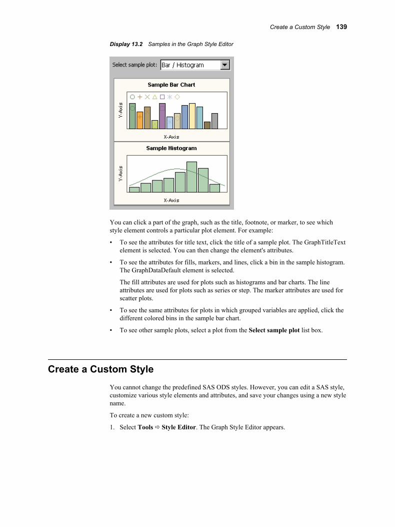
Display 13.2 Samples in the Graph Style Editor
You can click a part of the graph, such as the title, footnote, or marker, to see which style element controls a particular plot element. For example:
• To see the attributes for title text, click the title of a sample plot. The GraphTitleText element is selected. You can then change the element's attributes.
• To see the attributes for fills, markers, and lines, click a bin in the sample histogram. The GraphDataDefault element is selected.
The fill attributes are used for plots such as histograms and bar charts. The line attributes are used for plots such as series or step. The marker attributes are used for scatter plots.
• To see the same attributes for plots in which grouped variables are applied, click the different colored bins in the sample bar chart.
• To see other sample plots, select a plot from the Select sample plot list box.
Create a Custom StyleYou cannot change the predefined SAS ODS styles. However, you can edit a SAS style, customize various style elements and attributes, and save your changes using a new style name.
To create a new custom style:
1. Select Tools ð Style Editor. The Graph Style Editor appears.
Create a Custom Style 139
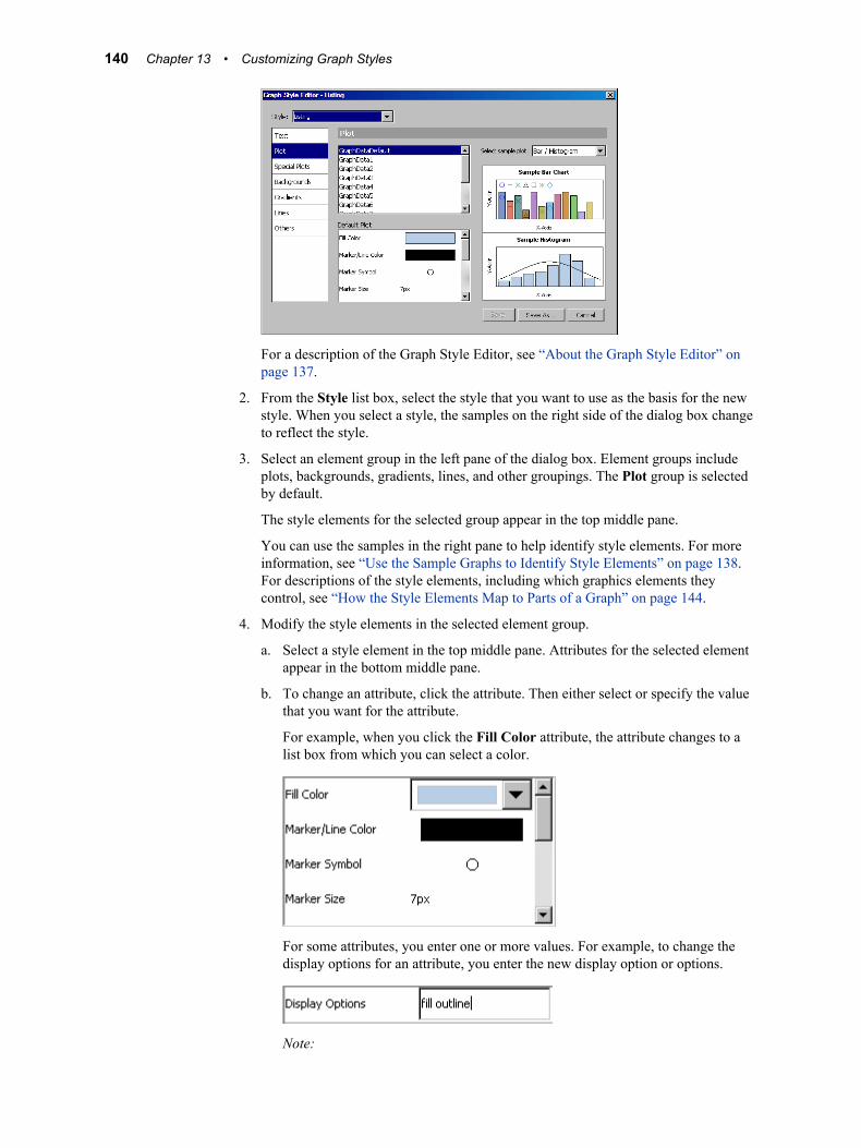
For a description of the Graph Style Editor, see “About the Graph Style Editor” on page 137.
2. From the Style list box, select the style that you want to use as the basis for the new style. When you select a style, the samples on the right side of the dialog box change to reflect the style.
3. Select an element group in the left pane of the dialog box. Element groups include plots, backgrounds, gradients, lines, and other groupings. The Plot group is selected by default.
The style elements for the selected group appear in the top middle pane.
You can use the samples in the right pane to help identify style elements. For more information, see “Use the Sample Graphs to Identify Style Elements” on page 138. For descriptions of the style elements, including which graphics elements they control, see “How the Style Elements Map to Parts of a Graph” on page 144.
4. Modify the style elements in the selected element group.
a. Select a style element in the top middle pane. Attributes for the selected element appear in the bottom middle pane.
b. To change an attribute, click the attribute. Then either select or specify the value that you want for the attribute.
For example, when you click the Fill Color attribute, the attribute changes to a list box from which you can select a color.
For some attributes, you enter one or more values. For example, to change the display options for an attribute, you enter the new display option or options.
Note:
140 Chapter 13 • Customizing Graph Styles

• If you specify more than one value, leave a blank space between the values.
• When you specify the value of an attribute, you must press ENTER before the new value takes effect.
c. Continue changing attributes as appropriate to modify the style element.
d. Repeat these steps to modify another style element and change its attributes.
Note: Your style settings are ignored when the style is applied to a graph that has style element overrides. For example, if you have explicitly changed the marker color for a graph, then that explicit plot property setting overrides style settings for the graph.
5. To make more changes, select a different element group. Then repeat the previous step to modify the style elements in the group.
6. To save the new style, click Save as and provide a name for the style. If a custom style exists with the name that you provide, a message box asks whether you want to replace the style. If you click Yes, the custom style is overwritten.
The Graph Style Editor remains open. To close the editor, click the Close icon in the top right corner of the editor.
After you have created a style, you can apply the style to your graphs. For instructions, see “Change the Style That Is Applied to a Graph” on page 95.
Note: You can also modify the current style of a graph and immediately apply the modified style to the graph. For more information, see “Modify and Apply the Current Style” on page 142.
Modify a Custom StyleYou can modify any user-defined, custom style by changing its style elements and attributes.
To modify a custom style:
1. Select Tools ð Style Editor. The Graph Style Editor appears.
For a description of the Graph Style Editor, see “About the Graph Style Editor” on page 137.
Modify a Custom Style 141
2. From the Style list box, select the style that you want to modify. When you select a style, the samples on the right side of the dialog box change to reflect the style.
3. Modify the style. For more information about the changes that you can make to a style, see “Create a Custom Style” on page 139.
4. To save your changes, click Save.
Note: You can also modify the current style of a graph and immediately apply the modified style to the graph. For more information, see “Modify and Apply the Current Style” on page 142.
Modify and Apply the Current StyleThe ODS Graphics Designer enables you to modify the current style of a graph and immediately apply the modified style to the graph. This feature is useful when you want to create and apply a new style based on the current style.
To modify and apply the current style:
1. Open the graph whose style you want to change. The style can be a custom style or a SAS predefined style. (You cannot change the predefined SAS styles. However, you can edit a SAS style, customize various style elements and attributes, and save your changes using a new style name.)
Note: If you have multiple graphs opened that use the current custom style, these graphs will all change if the current style is changed.
2. Select Format ð Style ð Edit Current Style. The Graph Style Editor appears. The Style list box contains only the current style that you are modifying.
For a description of the Graph Style Editor, see “About the Graph Style Editor” on page 137.
3. Modify the style. For more information about the changes that you can make to a style, see “Create a Custom Style” on page 139.
4. To save your changes, click one of the following buttons:
• Save/Apply to save and apply the changes in the current style. If the current style is a SAS predefined style, then this button is dimmed, and you must use the Save As/Apply option.
142 Chapter 13 • Customizing Graph Styles
• Save As/Apply to save the current style as a new style and apply the new style.
The Graph Style Editor saves your changes and then closes.
Export a Custom StyleYou can export the template code for any user-defined style that has been created in ODS Graphics Designer. This feature is useful when you want to generate graphs outside of ODS Graphics Designer.
For example, suppose that you want to generate a graph by running the SGDESIGN procedure against an SGD file. To apply a custom style to the graph, export the custom style and run the exported code to create the style in SAS. Then, specify the custom style in your ODS statement when you run the SGDESIGN procedure.
To export the template code for a style:
1. Select File ð Export Style. The Export Style dialog box appears.
2. From the Style list box, select the style that you want to export. Only custom styles are listed in the list box.
3. Specify a name and location for the SAS program, and then click Save.
Delete a Custom StyleYou cannot delete a SAS predefined style, but you can delete any custom style that you have created.
Any graphs that currently use the style that you delete are changed to the Listing style. In addition, if you delete a style that is set up as your default style in the preferences, then the Listing style becomes the new default.
To delete a custom style:
1. Make sure that at least one graph is open.
2. Select Format ð Style ð More Styles. The More Styles dialog box appears.
Delete a Custom Style 143
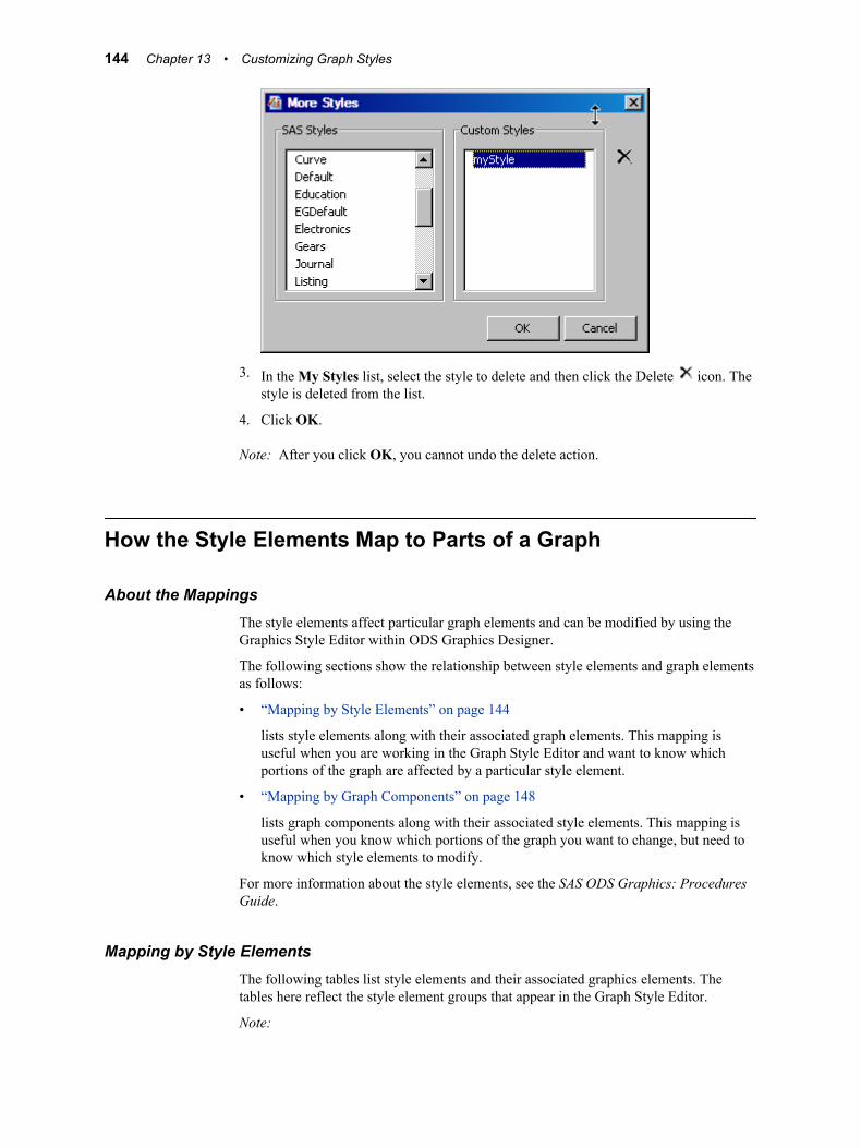
3. In the My Styles list, select the style to delete and then click the Delete icon. The style is deleted from the list.
4. Click OK.
Note: After you click OK, you cannot undo the delete action.
How the Style Elements Map to Parts of a Graph
About the MappingsThe style elements affect particular graph elements and can be modified by using the Graphics Style Editor within ODS Graphics Designer.
The following sections show the relationship between style elements and graph elements as follows:
• “Mapping by Style Elements” on page 144
lists style elements along with their associated graph elements. This mapping is useful when you are working in the Graph Style Editor and want to know which portions of the graph are affected by a particular style element.
• “Mapping by Graph Components” on page 148
lists graph components along with their associated style elements. This mapping is useful when you know which portions of the graph you want to change, but need to know which style elements to modify.
For more information about the style elements, see the SAS ODS Graphics: Procedures Guide.
Mapping by Style ElementsThe following tables list style elements and their associated graphics elements. The tables here reflect the style element groups that appear in the Graph Style Editor.
Note:
144 Chapter 13 • Customizing Graph Styles
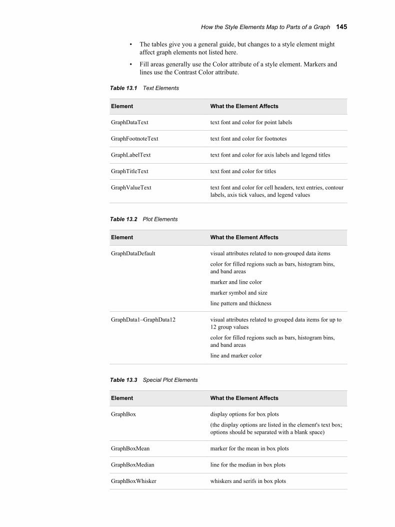
• The tables give you a general guide, but changes to a style element might affect graph elements not listed here.
• Fill areas generally use the Color attribute of a style element. Markers and lines use the Contrast Color attribute.
Table 13.1 Text Elements
Element What the Element Affects
GraphDataText text font and color for point labels
GraphFootnoteText text font and color for footnotes
GraphLabelText text font and color for axis labels and legend titles
GraphTitleText text font and color for titles
GraphValueText text font and color for cell headers, text entries, contour labels, axis tick values, and legend values
Table 13.2 Plot Elements
Element What the Element Affects
GraphDataDefault visual attributes related to non-grouped data items
color for filled regions such as bars, histogram bins, and band areas
marker and line color
marker symbol and size
line pattern and thickness
GraphData1–GraphData12 visual attributes related to grouped data items for up to 12 group values
color for filled regions such as bars, histogram bins, and band areas
line and marker color
Table 13.3 Special Plot Elements
Element What the Element Affects
GraphBox display options for box plots
(the display options are listed in the element's text box; options should be separated with a blank space)
GraphBoxMean marker for the mean in box plots
GraphBoxMedian line for the median in box plots
GraphBoxWhisker whiskers and serifs in box plots
How the Style Elements Map to Parts of a Graph 145
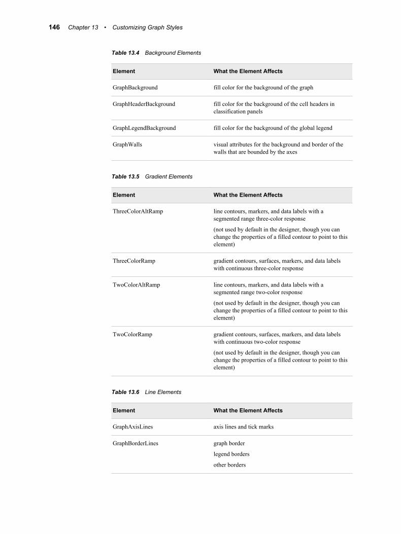
Table 13.4 Background Elements
Element What the Element Affects
GraphBackground fill color for the background of the graph
GraphHeaderBackground fill color for the background of the cell headers in classification panels
GraphLegendBackground fill color for the background of the global legend
GraphWalls visual attributes for the background and border of the walls that are bounded by the axes
Table 13.5 Gradient Elements
Element What the Element Affects
ThreeColorAltRamp line contours, markers, and data labels with a segmented range three-color response
(not used by default in the designer, though you can change the properties of a filled contour to point to this element)
ThreeColorRamp gradient contours, surfaces, markers, and data labels with continuous three-color response
TwoColorAltRamp line contours, markers, and data labels with a segmented range two-color response
(not used by default in the designer, though you can change the properties of a filled contour to point to this element)
TwoColorRamp gradient contours, surfaces, markers, and data labels with continuous two-color response
(not used by default in the designer, though you can change the properties of a filled contour to point to this element)
Table 13.6 Line Elements
Element What the Element Affects
GraphAxisLines axis lines and tick marks
GraphBorderLines graph border
legend borders
other borders
146 Chapter 13 • Customizing Graph Styles
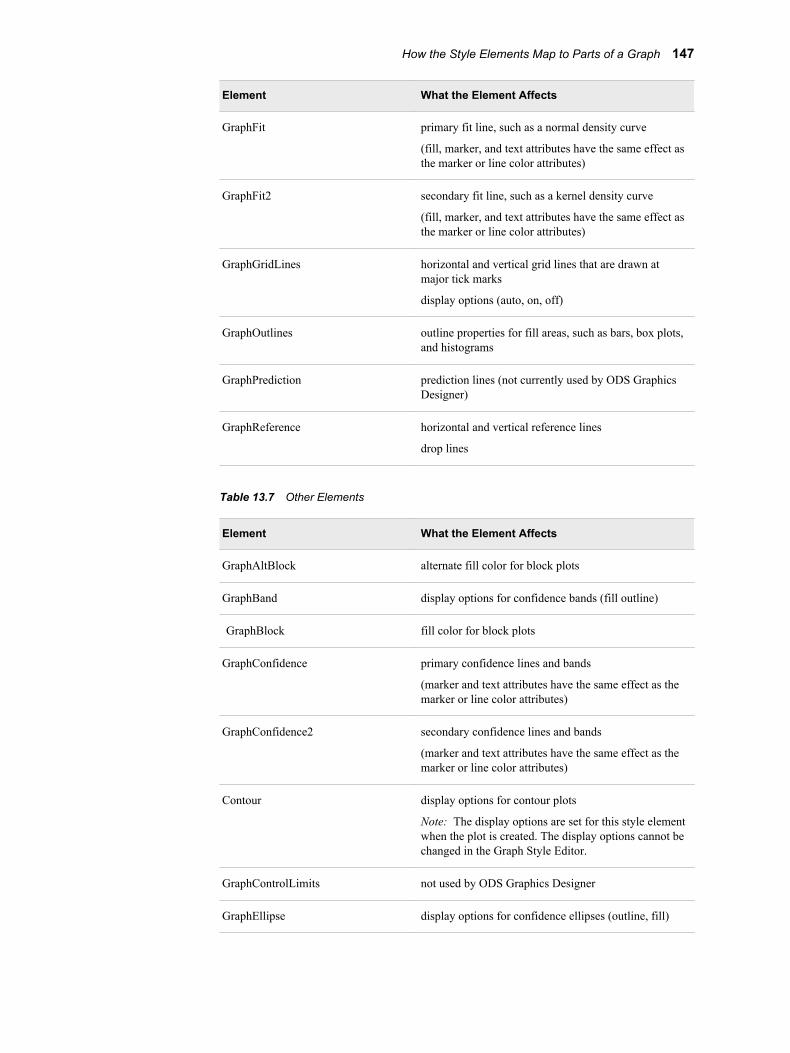
Element What the Element Affects
GraphFit primary fit line, such as a normal density curve
(fill, marker, and text attributes have the same effect as the marker or line color attributes)
GraphFit2 secondary fit line, such as a kernel density curve
(fill, marker, and text attributes have the same effect as the marker or line color attributes)
GraphGridLines horizontal and vertical grid lines that are drawn at major tick marks
display options (auto, on, off)
GraphOutlines outline properties for fill areas, such as bars, box plots, and histograms
GraphPrediction prediction lines (not currently used by ODS Graphics Designer)
GraphReference horizontal and vertical reference lines
drop lines
Table 13.7 Other Elements
Element What the Element Affects
GraphAltBlock alternate fill color for block plots
GraphBand display options for confidence bands (fill outline)
GraphBlock fill color for block plots
GraphConfidence primary confidence lines and bands
(marker and text attributes have the same effect as the marker or line color attributes)
GraphConfidence2 secondary confidence lines and bands
(marker and text attributes have the same effect as the marker or line color attributes)
Contour display options for contour plots
Note: The display options are set for this style element when the plot is created. The display options cannot be changed in the Graph Style Editor.
GraphControlLimits not used by ODS Graphics Designer
GraphEllipse display options for confidence ellipses (outline, fill)
How the Style Elements Map to Parts of a Graph 147
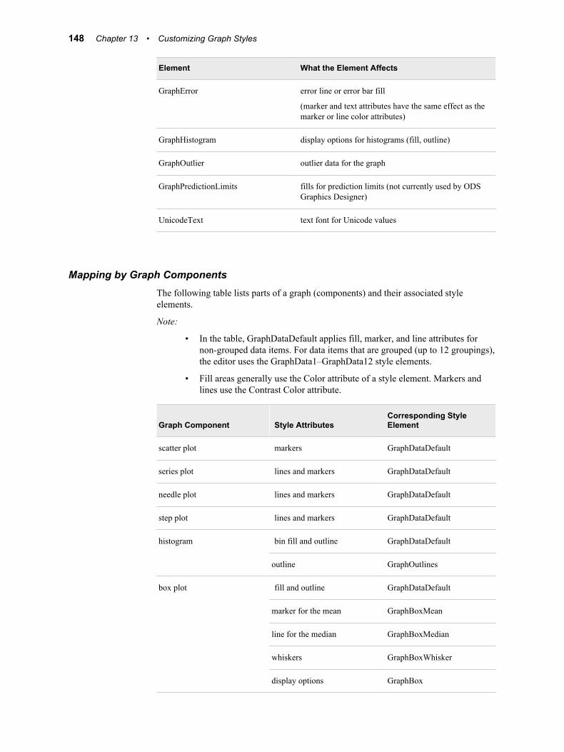
Element What the Element Affects
GraphError error line or error bar fill
(marker and text attributes have the same effect as the marker or line color attributes)
GraphHistogram display options for histograms (fill, outline)
GraphOutlier outlier data for the graph
GraphPredictionLimits fills for prediction limits (not currently used by ODS Graphics Designer)
UnicodeText text font for Unicode values
Mapping by Graph ComponentsThe following table lists parts of a graph (components) and their associated style elements.
Note:
• In the table, GraphDataDefault applies fill, marker, and line attributes for non-grouped data items. For data items that are grouped (up to 12 groupings), the editor uses the GraphData1–GraphData12 style elements.
• Fill areas generally use the Color attribute of a style element. Markers and lines use the Contrast Color attribute.
Graph Component Style AttributesCorresponding Style Element
scatter plot markers GraphDataDefault
series plot lines and markers GraphDataDefault
needle plot lines and markers GraphDataDefault
step plot lines and markers GraphDataDefault
histogram bin fill and outline GraphDataDefault
outline GraphOutlines
box plot fill and outline GraphDataDefault
marker for the mean GraphBoxMean
line for the median GraphBoxMedian
whiskers GraphBoxWhisker
display options GraphBox
148 Chapter 13 • Customizing Graph Styles
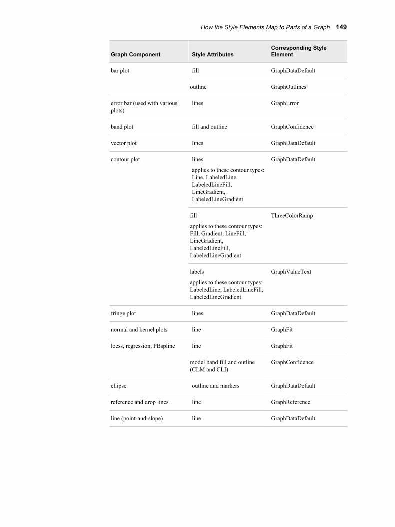
Graph Component Style AttributesCorresponding Style Element
bar plot fill GraphDataDefault
outline GraphOutlines
error bar (used with various plots)
lines GraphError
band plot fill and outline GraphConfidence
vector plot lines GraphDataDefault
contour plot lines
applies to these contour types: Line, LabeledLine, LabeledLineFill, LineGradient, LabeledLineGradient
GraphDataDefault
fill
applies to these contour types: Fill, Gradient, LineFill, LineGradient, LabeledLineFill, LabeledLineGradient
ThreeColorRamp
labels
applies to these contour types: LabeledLine, LabeledLineFill, LabeledLineGradient
GraphValueText
fringe plot lines GraphDataDefault
normal and kernel plots line GraphFit
loess, regression, PBspline line GraphFit
model band fill and outline (CLM and CLI)
GraphConfidence
ellipse outline and markers GraphDataDefault
reference and drop lines line GraphReference
line (point-and-slope) line GraphDataDefault
How the Style Elements Map to Parts of a Graph 149
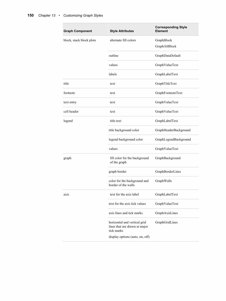
Graph Component Style AttributesCorresponding Style Element
block, stack block plots alternate fill colors GraphBlock
GraphAltBlock
outline GraphDataDefault
values GraphValueText
labels GraphLabelText
title text GraphTitleText
footnote text GraphFootnoteText
text entry text GraphValueText
cell header text GraphValueText
legend title text GraphLabelText
title background color GraphHeaderBackground
legend background color GraphLegendBackground
values GraphValueText
graph fill color for the background of the graph
GraphBackground
graph border GraphBorderLines
color for the background and border of the walls
GraphWalls
axis text for the axis label GraphLabelText
text for the axis tick values GraphValueText
axis lines and tick marks GraphAxisLines
horizontal and vertical grid lines that are drawn at major tick marks
display options (auto, on, off)
GraphGridLines
150 Chapter 13 • Customizing Graph Styles
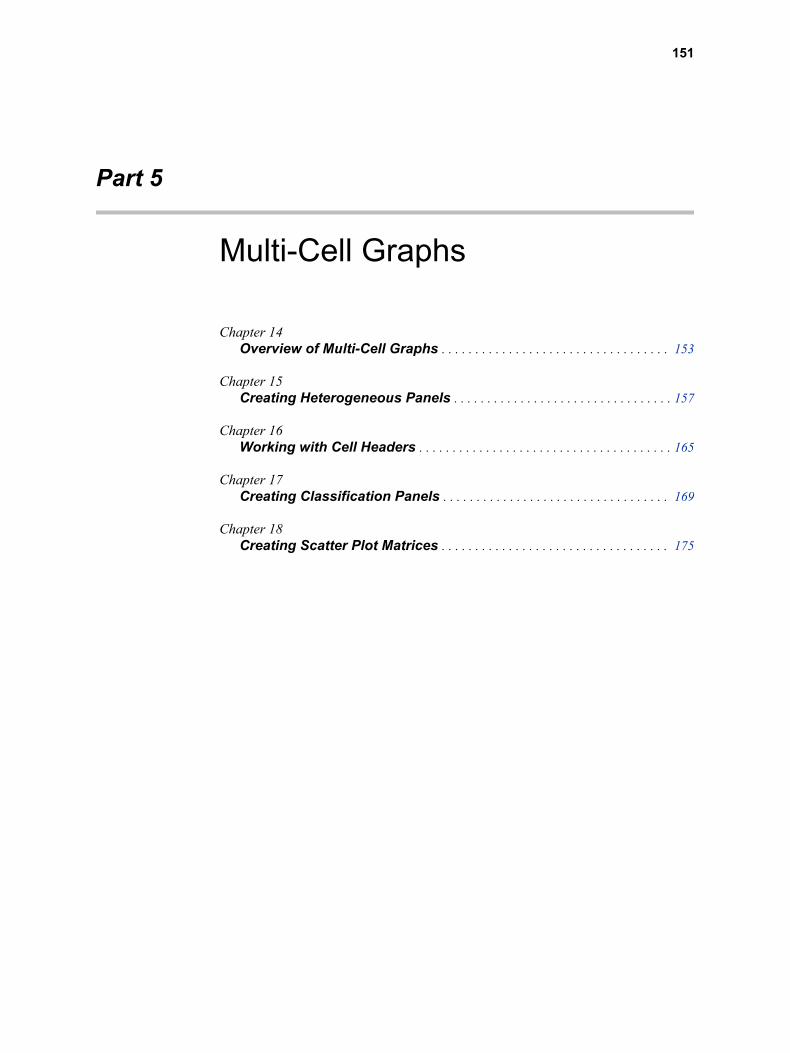
Part 5
Multi-Cell Graphs
Chapter 14Overview of Multi-Cell Graphs . . . . . . . . . . . . . . . . . . . . . . . . . . . . . . . . . . 153
Chapter 15Creating Heterogeneous Panels . . . . . . . . . . . . . . . . . . . . . . . . . . . . . . . . . 157
Chapter 16Working with Cell Headers . . . . . . . . . . . . . . . . . . . . . . . . . . . . . . . . . . . . . . 165
Chapter 17Creating Classification Panels . . . . . . . . . . . . . . . . . . . . . . . . . . . . . . . . . . 169
Chapter 18Creating Scatter Plot Matrices . . . . . . . . . . . . . . . . . . . . . . . . . . . . . . . . . . 175
151

152
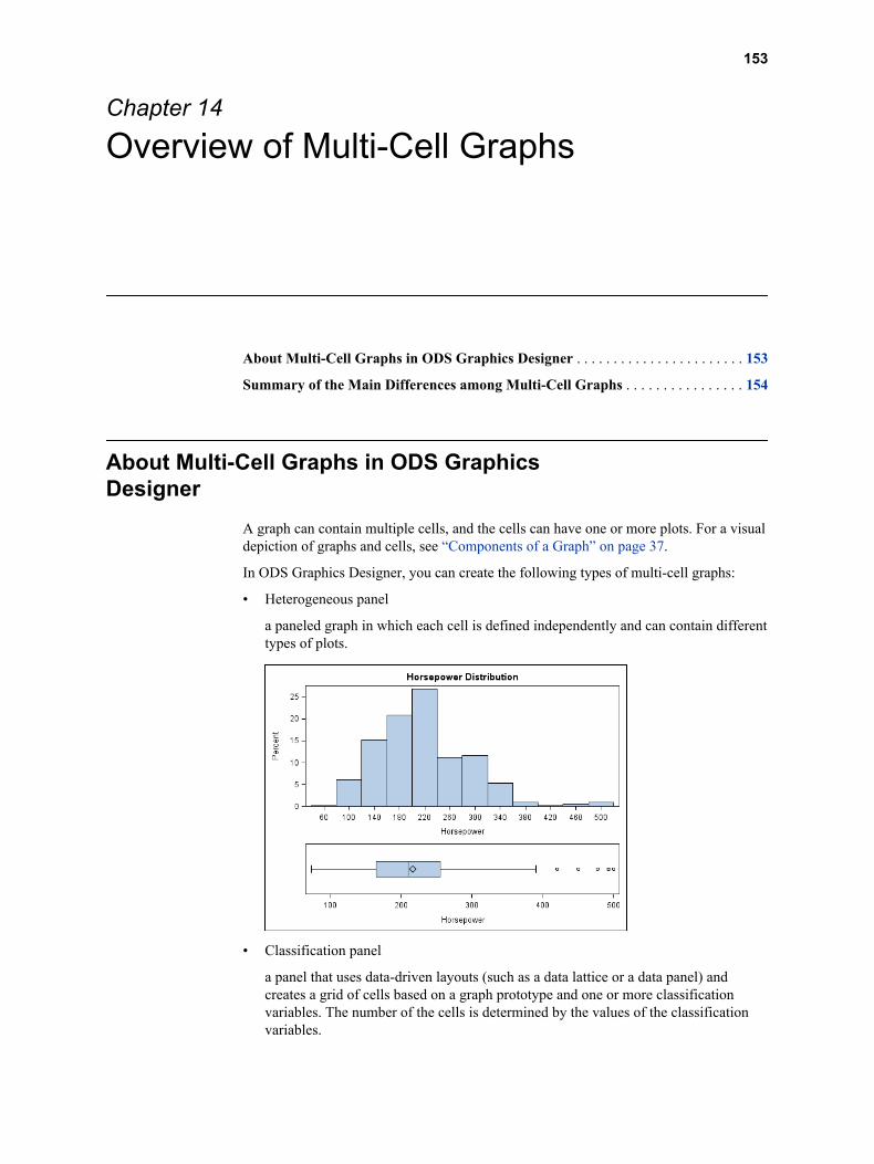
Chapter 14
Overview of Multi-Cell Graphs
About Multi-Cell Graphs in ODS Graphics Designer . . . . . . . . . . . . . . . . . . . . . . . 153
Summary of the Main Differences among Multi-Cell Graphs . . . . . . . . . . . . . . . . 154
About Multi-Cell Graphs in ODS Graphics Designer
A graph can contain multiple cells, and the cells can have one or more plots. For a visual depiction of graphs and cells, see “Components of a Graph” on page 37.
In ODS Graphics Designer, you can create the following types of multi-cell graphs:
• Heterogeneous panel
a paneled graph in which each cell is defined independently and can contain different types of plots.
• Classification panel
a panel that uses data-driven layouts (such as a data lattice or a data panel) and creates a grid of cells based on a graph prototype and one or more classification variables. The number of the cells is determined by the values of the classification variables.
153
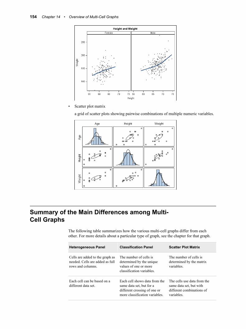
• Scatter plot matrix
a grid of scatter plots showing pairwise combinations of multiple numeric variables.
Summary of the Main Differences among Multi-Cell Graphs
The following table summarizes how the various multi-cell graphs differ from each other. For more details about a particular type of graph, see the chapter for that graph.
Heterogeneous Panel Classification Panel Scatter Plot Matrix
Cells are added to the graph as needed. Cells are added as full rows and columns.
The number of cells is determined by the unique values of one or more classification variables.
The number of cells is determined by the matrix variables.
Each cell can be based on a different data set.
Each cell shows data from the same data set, but for a different crossing of one or more classification variables.
The cells use data from the same data set, but with different combinations of variables.
154 Chapter 14 • Overview of Multi-Cell Graphs
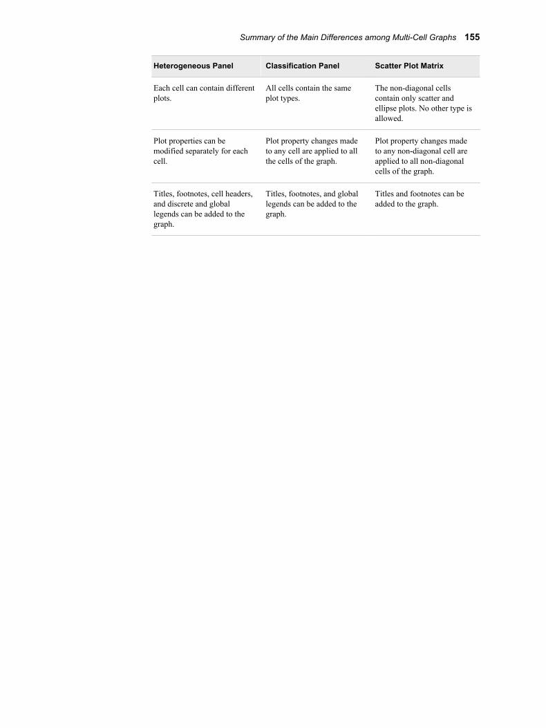
Heterogeneous Panel Classification Panel Scatter Plot Matrix
Each cell can contain different plots.
All cells contain the same plot types.
The non-diagonal cells contain only scatter and ellipse plots. No other type is allowed.
Plot properties can be modified separately for each cell.
Plot property changes made to any cell are applied to all the cells of the graph.
Plot property changes made to any non-diagonal cell are applied to all non-diagonal cells of the graph.
Titles, footnotes, cell headers, and discrete and global legends can be added to the graph.
Titles, footnotes, and global legends can be added to the graph.
Titles and footnotes can be added to the graph.
Summary of the Main Differences among Multi-Cell Graphs 155

156 Chapter 14 • Overview of Multi-Cell Graphs

Chapter 15
Creating Heterogeneous Panels
About Heterogeneous Panels . . . . . . . . . . . . . . . . . . . . . . . . . . . . . . . . . . . . . . . . . . . 157
Creating a Heterogeneous Panel . . . . . . . . . . . . . . . . . . . . . . . . . . . . . . . . . . . . . . . . 158Create a Heterogeneous Panel from the Graph Gallery . . . . . . . . . . . . . . . . . . . . . 158Create a Heterogeneous Panel from a Blank Graph Window . . . . . . . . . . . . . . . . 159
Adding Rows and Columns to a Graph . . . . . . . . . . . . . . . . . . . . . . . . . . . . . . . . . . 159Overview of Adding Rows and Columns . . . . . . . . . . . . . . . . . . . . . . . . . . . . . . . . 159Add a Row or Column . . . . . . . . . . . . . . . . . . . . . . . . . . . . . . . . . . . . . . . . . . . . . . 161
Move a Row or Column . . . . . . . . . . . . . . . . . . . . . . . . . . . . . . . . . . . . . . . . . . . . . . . 161
Resize a Row or Column . . . . . . . . . . . . . . . . . . . . . . . . . . . . . . . . . . . . . . . . . . . . . . 162
Sharing or Unsharing a Common External Axis . . . . . . . . . . . . . . . . . . . . . . . . . . . 162About Shared Axes . . . . . . . . . . . . . . . . . . . . . . . . . . . . . . . . . . . . . . . . . . . . . . . . . 162Share or Unshare a Common External Axis . . . . . . . . . . . . . . . . . . . . . . . . . . . . . . 164
Remove a Row or Column from a Graph . . . . . . . . . . . . . . . . . . . . . . . . . . . . . . . . 164
About Heterogeneous PanelsA heterogeneous panel contains multiple cells. Each cell is defined independently and can contain different types of plots. Here is an example of a simple heterogeneous panel:
157
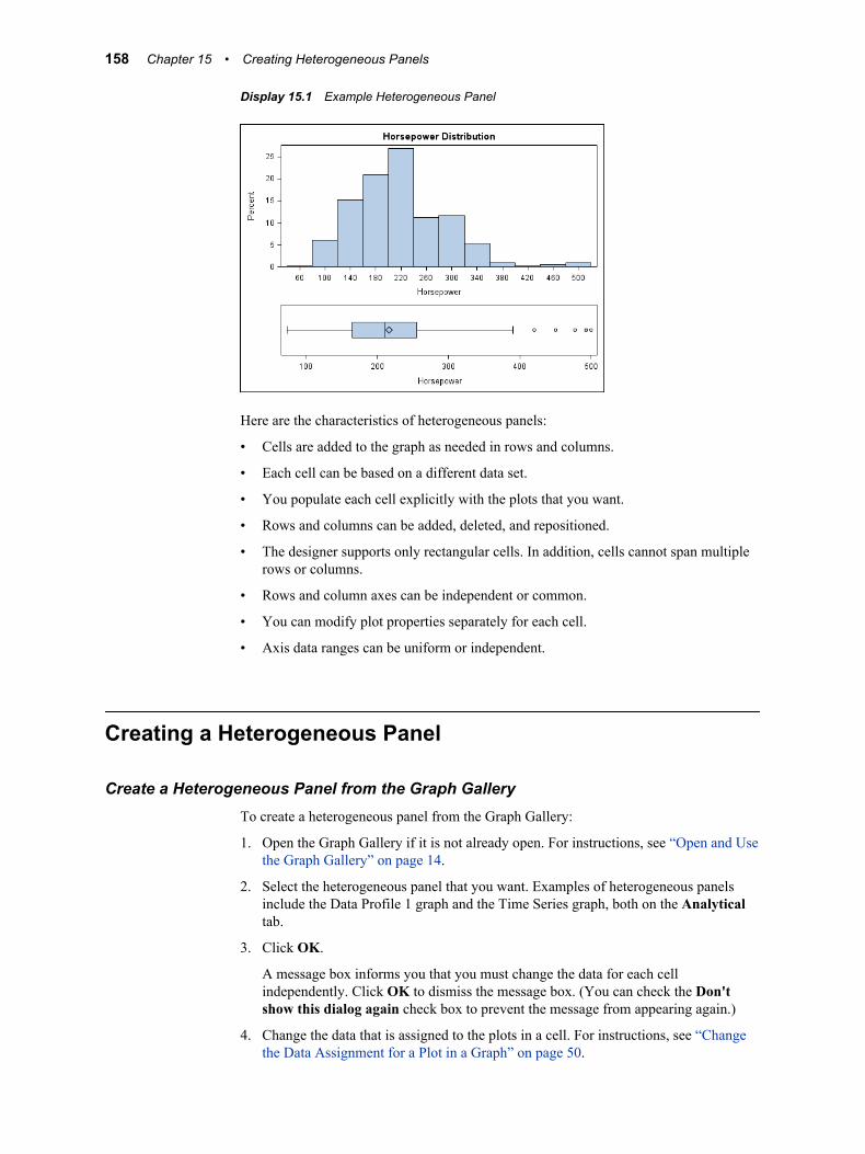
Display 15.1 Example Heterogeneous Panel
Here are the characteristics of heterogeneous panels:
• Cells are added to the graph as needed in rows and columns.
• Each cell can be based on a different data set.
• You populate each cell explicitly with the plots that you want.
• Rows and columns can be added, deleted, and repositioned.
• The designer supports only rectangular cells. In addition, cells cannot span multiple rows or columns.
• Rows and column axes can be independent or common.
• You can modify plot properties separately for each cell.
• Axis data ranges can be uniform or independent.
Creating a Heterogeneous Panel
Create a Heterogeneous Panel from the Graph GalleryTo create a heterogeneous panel from the Graph Gallery:
1. Open the Graph Gallery if it is not already open. For instructions, see “Open and Use the Graph Gallery” on page 14.
2. Select the heterogeneous panel that you want. Examples of heterogeneous panels include the Data Profile 1 graph and the Time Series graph, both on the Analytical tab.
3. Click OK.
A message box informs you that you must change the data for each cell independently. Click OK to dismiss the message box. (You can check the Don't show this dialog again check box to prevent the message from appearing again.)
4. Change the data that is assigned to the plots in a cell. For instructions, see “Change the Data Assignment for a Plot in a Graph” on page 50.
158 Chapter 15 • Creating Heterogeneous Panels
Repeat this step for each cell.
Note: As an alternative to this procedure, you can select a single-cell graph from the Graph Gallery and assign data to the graph. Then you can add rows and columns to create a heterogeneous panel.
After you have created the graph, you can add or remove cells and plots and make other changes. For example, you can add titles, footnotes, and legends to the graph. You can also change the sizes of the rows, columns, or both. For instructions, see “Resize a Row or Column” on page 162.
Create a Heterogeneous Panel from a Blank Graph WindowTo create a heterogeneous panel from a blank graph window:
1. Select File ð New ð Blank Graph. An empty graph appears.
2. Perform the following sequence:
a. Add a row or column to the graph. For instructions, see “Adding Rows and Columns to a Graph” on page 159.
The graph now contains two cells, either in two rows or in two columns.
b. Add a plot to one of the empty cells. For instructions, see “Add a Plot to a Graph” on page 47.
The Assign Data dialog box appears.
c. Assign data to the plot. For instructions, see “Assign Data to a New Plot” on page 48.
d. Repeat the previous two steps for the other cell.
e. (Optional) Add more plots to either cell, and assign data to the plots.
3. (Optional) Add more rows or columns to the graph. For each new cell that is created, add one or more plots and assign data to the plots.
After you have created the graph, you can customize the graph. For example, you can add titles, footnotes, and legends to the graph. You can also change the sizes of the rows, columns, or both. For instructions, see “Resize a Row or Column” on page 162.
Adding Rows and Columns to a Graph
Overview of Adding Rows and ColumnsIn a heterogeneous panel, the cells in a graph are arranged in rows and columns. Each cell is defined independently and can contain different types of plots. For more information about cells, see “Components of a Graph” on page 37.
You can add multiple rows and columns to a graph. The limit to the number of rows and columns that you can add depends on the size of your graph. As you add more rows and columns, the individual cells shrink proportionally.
Here is an example of a heterogeneous panel that has one column and two rows, for a total of two cells:
Adding Rows and Columns to a Graph 159
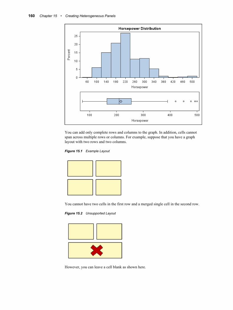
You can add only complete rows and columns to the graph. In addition, cells cannot span across multiple rows or columns. For example, suppose that you have a graph layout with two rows and two columns.
Figure 15.1 Example Layout
You cannot have two cells in the first row and a merged single cell in the second row.
Figure 15.2 Unsupported Layout
However, you can leave a cell blank as shown here.
160 Chapter 15 • Creating Heterogeneous Panels
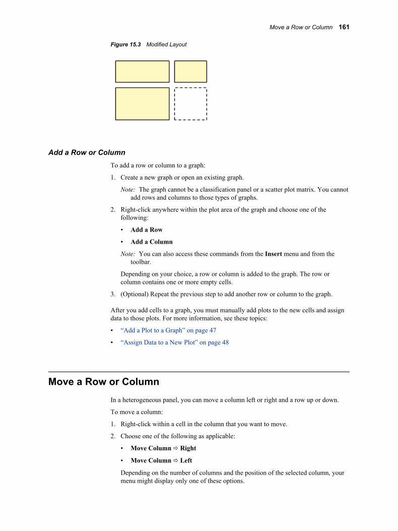
Figure 15.3 Modified Layout
Add a Row or ColumnTo add a row or column to a graph:
1. Create a new graph or open an existing graph.
Note: The graph cannot be a classification panel or a scatter plot matrix. You cannot add rows and columns to those types of graphs.
2. Right-click anywhere within the plot area of the graph and choose one of the following:
• Add a Row
• Add a Column
Note: You can also access these commands from the Insert menu and from the toolbar.
Depending on your choice, a row or column is added to the graph. The row or column contains one or more empty cells.
3. (Optional) Repeat the previous step to add another row or column to the graph.
After you add cells to a graph, you must manually add plots to the new cells and assign data to those plots. For more information, see these topics:
• “Add a Plot to a Graph” on page 47
• “Assign Data to a New Plot” on page 48
Move a Row or ColumnIn a heterogeneous panel, you can move a column left or right and a row up or down.
To move a column:
1. Right-click within a cell in the column that you want to move.
2. Choose one of the following as applicable:
• Move Column ð Right
• Move Column ð Left
Depending on the number of columns and the position of the selected column, your menu might display only one of these options.
Move a Row or Column 161
To move a row:
1. Right-click within a cell in the row that you want to move.
2. Choose one of the following as applicable:
• Move Row ð Down
• Move Row ð Up
Depending on the number of rows and the position of the selected row, your menu might display only one of these options.
Resize a Row or ColumnYou can change the width of the columns and the height of the rows in a heterogeneous panel. For example, you might want a particular column to be wider than the others.
To resize a column:
1. Position the cursor between the column that you want to change and an adjacent column. A dashed line appears between the columns and the cursor changes to a horizontal two-headed arrow .
2. Click and drag the dashed line left or right to change the width of the column.
If you widen the column, the adjacent column becomes narrower. If you narrow the column, the adjacent column becomes wider.
To resize a row:
1. Position the cursor between the row that you want to change and an adjacent row. A dashed line appears between the rows and the cursor changes to a vertical two-
headed arrow .
2. Click and drag the dashed line up or down to change the height of the row.
If you make the row taller, the adjacent row becomes shorter. If you make the row shorter, the adjacent row becomes taller.
Sharing or Unsharing a Common External Axis
About Shared AxesIn a heterogeneous panel, the cells can share a common axis if the cells have the same axis type. In the graph shown here, the cells can share a common column axis because both cells in the column have the same data type (Date) for the X axis.
162 Chapter 15 • Creating Heterogeneous Panels
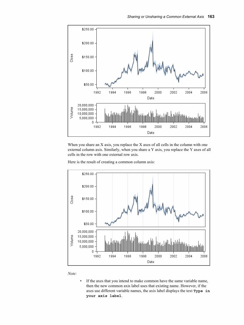
When you share an X axis, you replace the X axes of all cells in the column with one external column axis. Similarly, when you share a Y axis, you replace the Y axes of all cells in the row with one external row axis.
Here is the result of creating a common column axis:
Note:
• If the axes that you intend to make common have the same variable name, then the new common axis label uses that existing name. However, if the axes use different variable names, the axis label displays the text Type in your axis label.
Sharing or Unsharing a Common External Axis 163
• A common axis implies a data union. If the data ranges of the individual axes are not the same, the common axis uses the union of the data from all axes to be shared as its data range. All the graphs are redrawn appropriately. For more information about data ranges, see “About the Axis Data Range” on page 127.
Share or Unshare a Common External AxisTo share or unshare a common axis:
1. To share an axis, right-click the axis that you want to share.
2. Select one of the following, depending on whether you selected an X or Y axis:
• Common Column Axis (X axis)
• Common Row Axis (Y axis)
A check mark appears next to the menu item that you select. The check mark indicates that the column or row axis has been shared and is now a common external axis.
Note: You can also make these selections in the Graph Properties dialog box.
3. To unshare a common axis that has been shared, right-click the axis and select the menu item with the check mark. The check mark disappears, indicating that the column or row axis is no longer shared.
Remove a Row or Column from a GraphWhen you remove a row or column from a heterogeneous panel, all cells in the row or column are removed.
You cannot remove a row or column under the following conditions:
• The cells in the row or column share a common axis. You must first unshare the common axis. For instructions, see “Share or Unshare a Common External Axis” on page 164.
• The row or column that you want to remove is the only row or column in the graph. For example, if a graph has two rows and one column, you can remove one of the rows, but you cannot remove the column.
To remove a row or column from a heterogeneous panel:
1. Right-click within a cell in the row or column that you want to remove.
2. Choose one of the following:
• Remove Row
• Remove Column
Depending on your choice, the row or column is removed from the graph.
164 Chapter 15 • Creating Heterogeneous Panels
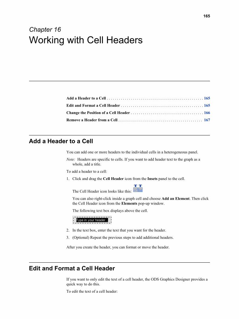
Chapter 16
Working with Cell Headers
Add a Header to a Cell . . . . . . . . . . . . . . . . . . . . . . . . . . . . . . . . . . . . . . . . . . . . . . . . 165
Edit and Format a Cell Header . . . . . . . . . . . . . . . . . . . . . . . . . . . . . . . . . . . . . . . . . 165
Change the Position of a Cell Header . . . . . . . . . . . . . . . . . . . . . . . . . . . . . . . . . . . . 166
Remove a Header from a Cell . . . . . . . . . . . . . . . . . . . . . . . . . . . . . . . . . . . . . . . . . . 167
Add a Header to a CellYou can add one or more headers to the individual cells in a heterogeneous panel.
Note: Headers are specific to cells. If you want to add header text to the graph as a whole, add a title.
To add a header to a cell:
1. Click and drag the Cell Header icon from the Insets panel to the cell.
The Cell Header icon looks like this:
You can also right-click inside a graph cell and choose Add an Element. Then click the Cell Header icon from the Elements pop-up window.
The following text box displays above the cell.
2. In the text box, enter the text that you want for the header.
3. (Optional) Repeat the previous steps to add additional headers.
After you create the header, you can format or move the header.
Edit and Format a Cell HeaderIf you want to only edit the text of a cell header, the ODS Graphics Designer provides a quick way to do this.
To edit the text of a cell header:
165
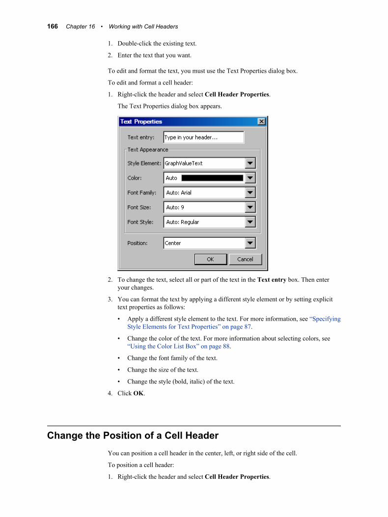
1. Double-click the existing text.
2. Enter the text that you want.
To edit and format the text, you must use the Text Properties dialog box.
To edit and format a cell header:
1. Right-click the header and select Cell Header Properties.
The Text Properties dialog box appears.
2. To change the text, select all or part of the text in the Text entry box. Then enter your changes.
3. You can format the text by applying a different style element or by setting explicit text properties as follows:
• Apply a different style element to the text. For more information, see “Specifying Style Elements for Text Properties” on page 87.
• Change the color of the text. For more information about selecting colors, see “Using the Color List Box” on page 88.
• Change the font family of the text.
• Change the size of the text.
• Change the style (bold, italic) of the text.
4. Click OK.
Change the Position of a Cell HeaderYou can position a cell header in the center, left, or right side of the cell.
To position a cell header:
1. Right-click the header and select Cell Header Properties.
166 Chapter 16 • Working with Cell Headers
The Text Properties dialog box appears.
2. Select the position that you want from the Position list box.
3. Click OK.
Remove a Header from a CellTo remove a cell header, right-click the header and select Remove Cell Header.
The header is removed from the cell.
Remove a Header from a Cell 167

168 Chapter 16 • Working with Cell Headers
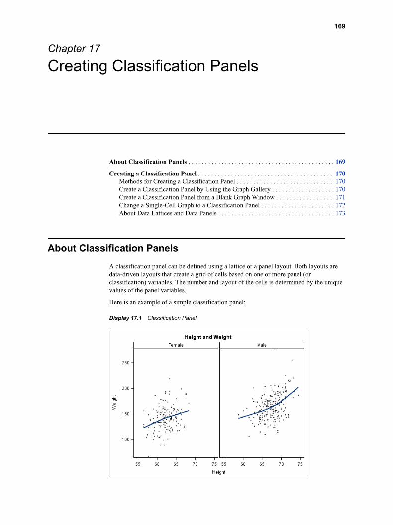
Chapter 17
Creating Classification Panels
About Classification Panels . . . . . . . . . . . . . . . . . . . . . . . . . . . . . . . . . . . . . . . . . . . . 169
Creating a Classification Panel . . . . . . . . . . . . . . . . . . . . . . . . . . . . . . . . . . . . . . . . . 170Methods for Creating a Classification Panel . . . . . . . . . . . . . . . . . . . . . . . . . . . . . 170Create a Classification Panel by Using the Graph Gallery . . . . . . . . . . . . . . . . . . . 170Create a Classification Panel from a Blank Graph Window . . . . . . . . . . . . . . . . . 171Change a Single-Cell Graph to a Classification Panel . . . . . . . . . . . . . . . . . . . . . . 172About Data Lattices and Data Panels . . . . . . . . . . . . . . . . . . . . . . . . . . . . . . . . . . . 173
About Classification PanelsA classification panel can be defined using a lattice or a panel layout. Both layouts are data-driven layouts that create a grid of cells based on one or more panel (or classification) variables. The number and layout of the cells is determined by the unique values of the panel variables.
Here is an example of a simple classification panel:
Display 17.1 Classification Panel
169

Here are the characteristics of classification panels:
• You can define up to two panel variables in the designer.
• All panel and plot variables must come from a single data set.
• Plots can be added to a classification panel the same way they are added to cells in other graphs. When you add a plot to any cell of the panel, the plot is displayed in every cell. The plot is displayed with the appropriate subset of the data for the combination of the panel variables.
Note: Ellipse plots cannot be added to classification panels.
• When you change the plot data or properties in one cell, the change is applied to all the cells of the graph.
Creating a Classification Panel
Methods for Creating a Classification PanelThe ODS Graphics Designer enables you to create classification panels in several ways:
• If the classification panel that you want to create exists in the Graph Gallery (in the Panels tab), then you can create the graph by opening the predefined graph from the gallery. For more information, see “Create a Classification Panel by Using the Graph Gallery” on page 170.
• You can start from a blank graph window and then add one or more plots to create your graph. When you assign data to the plot, you specify both plot and panel variables. For more information, see “Create a Classification Panel from a Blank Graph Window” on page 171.
• If you have an existing single-cell graph that you want to use as the basis for your classification panel, you can convert the single-cell graph to a panel. Most single-cell graphs can be converted to classification panels. For more information, see “Change a Single-Cell Graph to a Classification Panel” on page 172.
Note:
• Multi-cell heterogeneous panels cannot be converted to classification panels.
• Graphs that contain an ellipse plot cannot be converted to classification panels.
The following sections describe these methods of creating classification panels.
Create a Classification Panel by Using the Graph GalleryThe Panels tab of the Graph Gallery contains several predefined classification panels. For graphs that are created from the Graph Gallery, placeholder data is assigned to the graph. You typically will change the data as appropriate for your graph.
To create a classification panel:
1. Open the Graph Gallery if it is not already open. For instructions, see “Open and Use the Graph Gallery” on page 14.
2. Click the Panels tab.
170 Chapter 17 • Creating Classification Panels
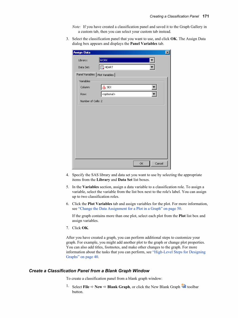
Note: If you have created a classification panel and saved it to the Graph Gallery in a custom tab, then you can select your custom tab instead.
3. Select the classification panel that you want to use, and click OK. The Assign Data dialog box appears and displays the Panel Variables tab.
4. Specify the SAS library and data set you want to use by selecting the appropriate items from the Library and Data Set list boxes.
5. In the Variables section, assign a data variable to a classification role. To assign a variable, select the variable from the list box next to the role's label. You can assign up to two classification roles.
6. Click the Plot Variables tab and assign variables for the plot. For more information, see “Change the Data Assignment for a Plot in a Graph” on page 50.
If the graph contains more than one plot, select each plot from the Plot list box and assign variables.
7. Click OK.
After you have created a graph, you can perform additional steps to customize your graph. For example, you might add another plot to the graph or change plot properties. You can also add titles, footnotes, and make other changes to the graph. For more information about the tasks that you can perform, see “High-Level Steps for Designing Graphs” on page 40.
Create a Classification Panel from a Blank Graph WindowTo create a classification panel from a blank graph window:
1. Select File ð New ð Blank Graph, or click the New Blank Graph toolbar button.
Creating a Classification Panel 171
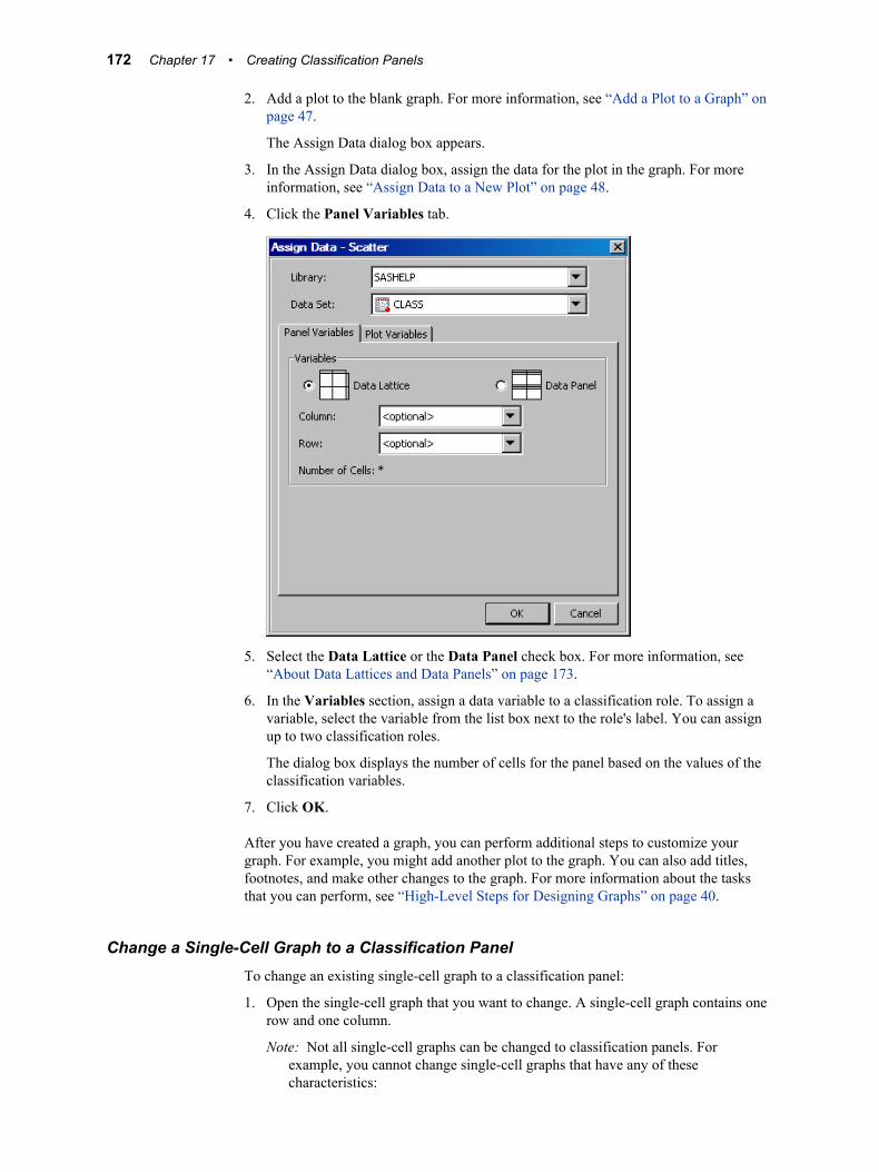
2. Add a plot to the blank graph. For more information, see “Add a Plot to a Graph” on page 47.
The Assign Data dialog box appears.
3. In the Assign Data dialog box, assign the data for the plot in the graph. For more information, see “Assign Data to a New Plot” on page 48.
4. Click the Panel Variables tab.
5. Select the Data Lattice or the Data Panel check box. For more information, see “About Data Lattices and Data Panels” on page 173.
6. In the Variables section, assign a data variable to a classification role. To assign a variable, select the variable from the list box next to the role's label. You can assign up to two classification roles.
The dialog box displays the number of cells for the panel based on the values of the classification variables.
7. Click OK.
After you have created a graph, you can perform additional steps to customize your graph. For example, you might add another plot to the graph. You can also add titles, footnotes, and make other changes to the graph. For more information about the tasks that you can perform, see “High-Level Steps for Designing Graphs” on page 40.
Change a Single-Cell Graph to a Classification PanelTo change an existing single-cell graph to a classification panel:
1. Open the single-cell graph that you want to change. A single-cell graph contains one row and one column.
Note: Not all single-cell graphs can be changed to classification panels. For example, you cannot change single-cell graphs that have any of these characteristics:
172 Chapter 17 • Creating Classification Panels
• contain a (confidence) ellipse
• use both the X and X2 axes or both the Y and Y2 axes
• contain cell legends
2. Right-click an existing plot and select Assign Data. The Assign Data dialog box appears.
3. If you want to change the SAS library or data set, select the appropriate items from the Library and Data Set list boxes.
After you change the library or data set, the plot labels might appear red. This color indicates that required variables do not exist in the new data set, and that you must reassign variables for the plots. When you reassign variables, the plot name changes to black.
4. If necessary, assign variables to the plot roles. For more information, see “Change the Data Assignment for a Plot in a Graph” on page 50.
5. Click the Panel Variables tab.
6. Select the Data Lattice or the Data Panel check box. For more information, see “About Data Lattices and Data Panels” on page 173.
7. In the Variables section, assign a data variable to a classification role. To assign a variable, select the variable from the list box next to the role's label. You can assign up to two classification roles.
The dialog box displays the number of cells for the panel based on the values of the classification variables.
8. Click OK.
After you have modified the graph, you can perform additional steps to customize your graph. For example, you might add another plot to the graph or change plot properties. You can also add titles, footnotes, and make other changes to the graph. For more information about the tasks that you can perform, see “High-Level Steps for Designing Graphs” on page 40.
About Data Lattices and Data PanelsWhen you change the data assignment for a classification panel, you can select one of the following layout options:
Data LatticeHeaders appear along the top (for column classification variables) and the side (for row classification variables).
If there are no observations for a particular crossing of the classification variables, the designer creates a blank cell for the crossing. For example, suppose that you create a graph with two classification variables: gender and year. Now suppose that there is no data for females in the year 2005. The designer creates a cell for females in 2005, but leaves the cell blank.
Data PanelHeaders appear in each cell.
If there are no observations for a particular crossing of the classification variables, the designer might not create the cell. The designer creates blank cells only to complete the panel grid. For example, suppose that your graph contains 10 columns and 10 rows, and only 40% of the cells have data. Instead of having blank cells (as
Creating a Classification Panel 173

with the lattice) for 60 of the 100 cells, the designer creates a smaller graph. In this example, the graph contains eight rows and five columns.
174 Chapter 17 • Creating Classification Panels
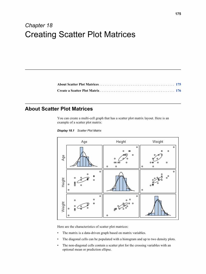
Chapter 18
Creating Scatter Plot Matrices
About Scatter Plot Matrices . . . . . . . . . . . . . . . . . . . . . . . . . . . . . . . . . . . . . . . . . . . 175
Create a Scatter Plot Matrix . . . . . . . . . . . . . . . . . . . . . . . . . . . . . . . . . . . . . . . . . . . 176
About Scatter Plot MatricesYou can create a multi-cell graph that has a scatter plot matrix layout. Here is an example of a scatter plot matrix:
Display 18.1 Scatter Plot Matrix
Here are the characteristics of scatter plot matrices:
• The matrix is a data-driven graph based on matrix variables.
• The diagonal cells can be populated with a histogram and up to two density plots.
• The non-diagonal cells contain a scatter plot for the crossing variables with an optional mean or prediction ellipse.
175

• You can change the properties of a scatter plot matrix as follows:
• You cannot change the properties of the histograms, density plots, and ellipses.
• You can change the marker properties for the scatter plots. When you change the marker properties, the change is applied to all non-diagonal cells.
• You can change the transparency of all plots.
• You can change the outline and background properties of the graph.
For more information, see the sections on changing graph and plot properties.
Create a Scatter Plot MatrixTo create a scatter plot matrix:
1. Open the Graph Gallery if it is not already open. For instructions, see “Open and Use the Graph Gallery” on page 14.
2. Select the Matrix tab.
3. Select the predefined matrix graph that you want to use. You can choose from two different types:
• NxN matrix: The first four predefined matrix graphs in the Graph Gallery create an NxN matrix. This matrix uses one list of variables. It creates a square grid of cells using the list of N variables along the rows and columns.
• MxN matrix: The last two graphs in the Graph Gallery create an MxN matrix. This type of matrix crosses two lists of variables and creates a rectangular matrix without any diagonal cells.
4. Click OK. The Assign Data dialog box appears.
176 Chapter 18 • Creating Scatter Plot Matrices
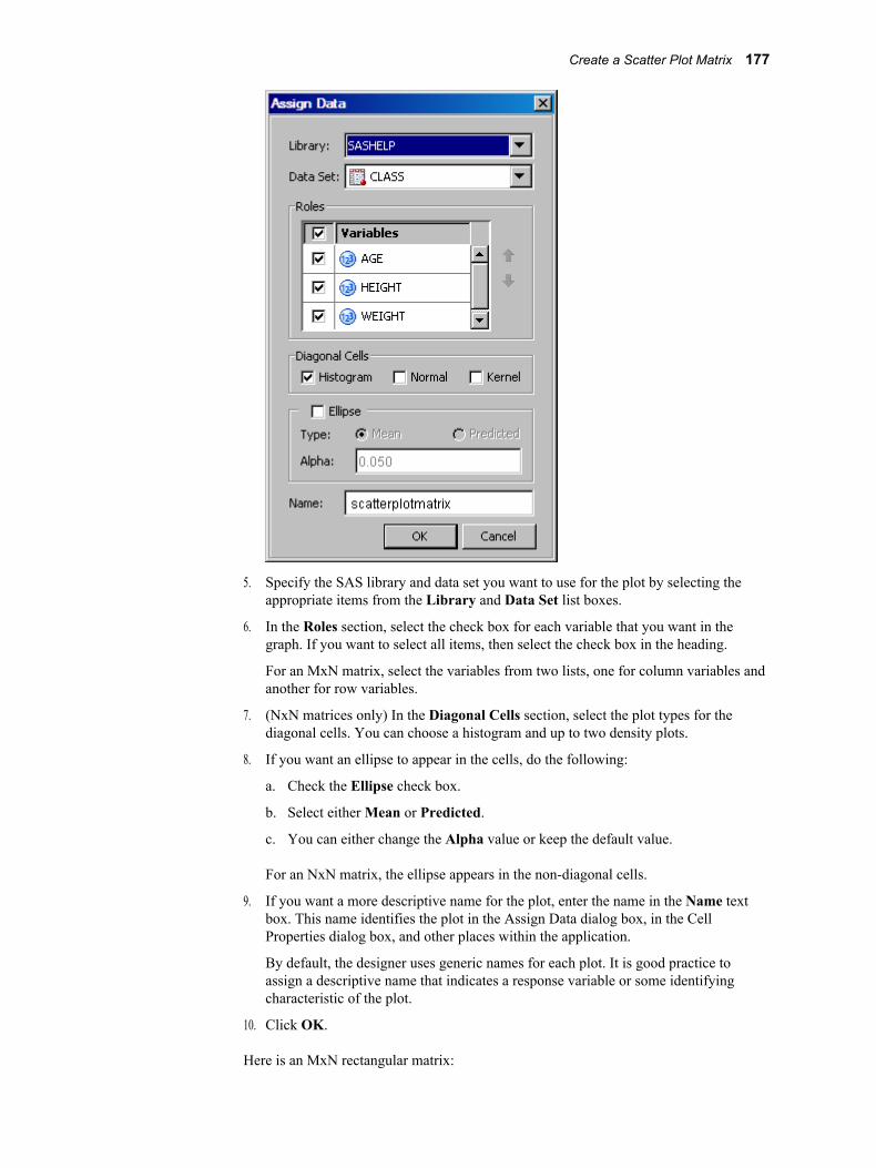
5. Specify the SAS library and data set you want to use for the plot by selecting the appropriate items from the Library and Data Set list boxes.
6. In the Roles section, select the check box for each variable that you want in the graph. If you want to select all items, then select the check box in the heading.
For an MxN matrix, select the variables from two lists, one for column variables and another for row variables.
7. (NxN matrices only) In the Diagonal Cells section, select the plot types for the diagonal cells. You can choose a histogram and up to two density plots.
8. If you want an ellipse to appear in the cells, do the following:
a. Check the Ellipse check box.
b. Select either Mean or Predicted.
c. You can either change the Alpha value or keep the default value.
For an NxN matrix, the ellipse appears in the non-diagonal cells.
9. If you want a more descriptive name for the plot, enter the name in the Name text box. This name identifies the plot in the Assign Data dialog box, in the Cell Properties dialog box, and other places within the application.
By default, the designer uses generic names for each plot. It is good practice to assign a descriptive name that indicates a response variable or some identifying characteristic of the plot.
10. Click OK.
Here is an MxN rectangular matrix:
Create a Scatter Plot Matrix 177

178 Chapter 18 • Creating Scatter Plot Matrices
Part 6
Shared Variables
Chapter 19Using Shared Variables in Graphs . . . . . . . . . . . . . . . . . . . . . . . . . . . . . . 181
179

180
Chapter 19
Using Shared Variables in Graphs
About Shared Variables . . . . . . . . . . . . . . . . . . . . . . . . . . . . . . . . . . . . . . . . . . . . . . . 181
Main Features of Shared Variables . . . . . . . . . . . . . . . . . . . . . . . . . . . . . . . . . . . . . 182
Requirements for Creating Shared-Variable Graphs . . . . . . . . . . . . . . . . . . . . . . . 183
Create a Shared-Variable Graph . . . . . . . . . . . . . . . . . . . . . . . . . . . . . . . . . . . . . . . 183
Change the Data That Is Used in a Shared-Variable Graph . . . . . . . . . . . . . . . . . 185
About Shared VariablesODS Graphics Designer enables you to create graphs that use shared variables. Shared variables provide these benefits:
• They enable the reuse of a plot that uses one or more common shared variables.
• They enable the reuse of different plots in a graph that use one or more common shared variables.
For example, suppose that you have created the following graph:
181
Display 19.1 Three-Cell Distribution Graph
This example involves a multi-cell graph with three cells that each contain one or more plots. All plots use the same variable: HORSEPOWER. The example is based on SASHELP.CARS data.
This graph is very effective for visualizing the distribution of a measure. After you have created this graph, you might want to reuse it to view the distribution of some other variable in the same or different data set.
For example, you might want to use the example graph to visualize the distribution of the MPG_CITY variable. In graphs that are not created with shared variables, you must change the variable for each cell individually. Because the X axis is shared, during the changes the X axis might briefly display data from both HORSEPOWER and MPG_CITY. However, when graphs are created with shared variables, you can change one or more variables for all plots simultaneously in a single step. Shared variables facilitate the reuse of graphs, and are especially effective in graphs that have multiple plots.
Main Features of Shared VariablesHere are the main features of shared variables:
• Shared variables enable you to easily reuse a graph with different data.
• Shared variables can be used in single-cell graphs and in multi-cell graphs, including classification panels.
• You can change one or more variables for all plots at one time, including plots that are in different cells of a multi-cell graph.
182 Chapter 19 • Using Shared Variables in Graphs

• Shared variables are most effective for creating graphs that have many plots and that use very few (one or two) variables. The graph shown in Display 19.1 on page 182 is a good example because it has several plots and uses just one variable.
• You can run shared-variable graphs in batch mode by using the SGDESIGN procedure. You can specify different variables in the same or in a different data set by using the DYNAMIC option.
You can also use the DYNAMIC option to generate dynamic text, such as a title, that changes depending on the data that is used to generate the graph. For more information about dynamic content in text, see “Adding Dynamic Content to Text” on page 90.
See Also“About the SGDESIGN Procedure” on page 4
Requirements for Creating Shared-Variable Graphs
Shared-variable graphs are created the same way as other graphs in the designer, but have the following additional requirements:
• The entire graph must be created from one data set. You assign the data set when you create the shared-variable graph.
• You also define the shared variables when you first create the graph, before you add any plots. (You can later add shared variables and remove unused shared variables.)
• All plots are created using only the shared variables that have been defined for the graph.
Create a Shared-Variable GraphTo create a shared-variable graph, you first define one or more shared variables. Then, you add one or more plots and assign the shared variables to the plot roles.
To create a shared-variable graph:
1. Select File ð New ð Blank Shared Variable Graph. The following occur:
• A blank shared-variable graph is created. The graph is identified by a shared-variable icon in the top left corner.
• The Assign Data dialog box appears and displays the Shared Variables tab. The other tabs are present but are dimmed.
Create a Shared-Variable Graph 183
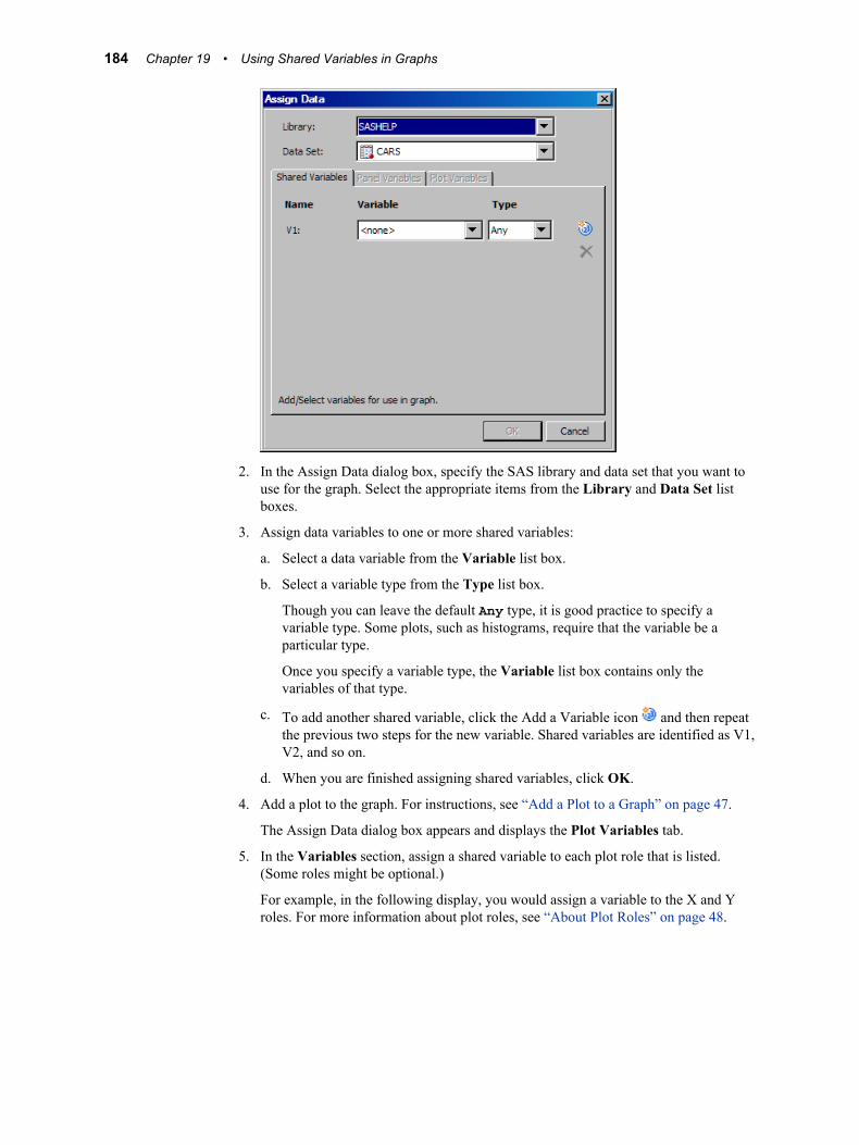
2. In the Assign Data dialog box, specify the SAS library and data set that you want to use for the graph. Select the appropriate items from the Library and Data Set list boxes.
3. Assign data variables to one or more shared variables:
a. Select a data variable from the Variable list box.
b. Select a variable type from the Type list box.
Though you can leave the default Any type, it is good practice to specify a variable type. Some plots, such as histograms, require that the variable be a particular type.
Once you specify a variable type, the Variable list box contains only the variables of that type.
c. To add another shared variable, click the Add a Variable icon and then repeat the previous two steps for the new variable. Shared variables are identified as V1, V2, and so on.
d. When you are finished assigning shared variables, click OK.
4. Add a plot to the graph. For instructions, see “Add a Plot to a Graph” on page 47.
The Assign Data dialog box appears and displays the Plot Variables tab.
5. In the Variables section, assign a shared variable to each plot role that is listed. (Some roles might be optional.)
For example, in the following display, you would assign a variable to the X and Y roles. For more information about plot roles, see “About Plot Roles” on page 48.
184 Chapter 19 • Using Shared Variables in Graphs
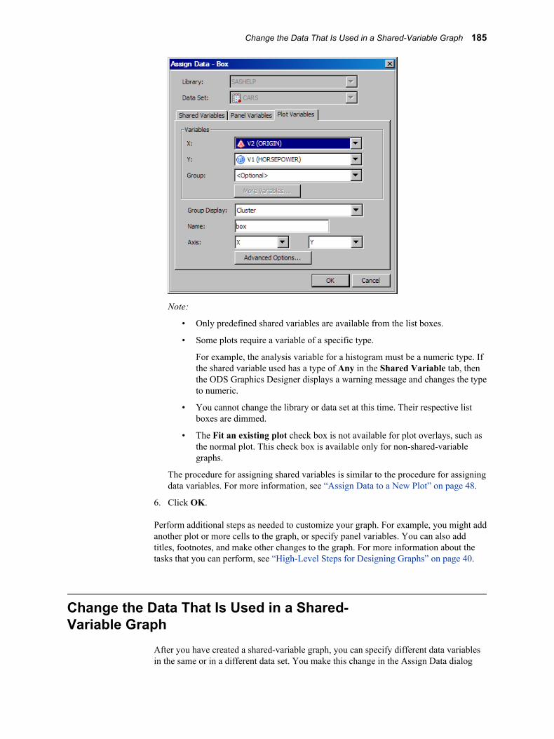
Note:
• Only predefined shared variables are available from the list boxes.
• Some plots require a variable of a specific type.
For example, the analysis variable for a histogram must be a numeric type. If the shared variable used has a type of Any in the Shared Variable tab, then the ODS Graphics Designer displays a warning message and changes the type to numeric.
• You cannot change the library or data set at this time. Their respective list boxes are dimmed.
• The Fit an existing plot check box is not available for plot overlays, such as the normal plot. This check box is available only for non-shared-variable graphs.
The procedure for assigning shared variables is similar to the procedure for assigning data variables. For more information, see “Assign Data to a New Plot” on page 48.
6. Click OK.
Perform additional steps as needed to customize your graph. For example, you might add another plot or more cells to the graph, or specify panel variables. You can also add titles, footnotes, and make other changes to the graph. For more information about the tasks that you can perform, see “High-Level Steps for Designing Graphs” on page 40.
Change the Data That Is Used in a Shared-Variable Graph
After you have created a shared-variable graph, you can specify different data variables in the same or in a different data set. You make this change in the Assign Data dialog
Change the Data That Is Used in a Shared-Variable Graph 185
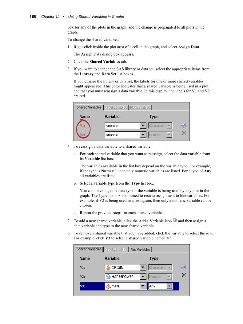
box for any of the plots in the graph, and the change is propagated to all plots in the graph.
To change the shared variables:
1. Right-click inside the plot area of a cell in the graph, and select Assign Data.
The Assign Data dialog box appears.
2. Click the Shared Variables tab.
3. If you want to change the SAS library or data set, select the appropriate items from the Library and Data Set list boxes.
If you change the library or data set, the labels for one or more shared variables might appear red. This color indicates that a shared variable is being used in a plot and that you must reassign a data variable. In this display, the labels for V1 and V2 are red.
4. To reassign a data variable to a shared variable:
a. For each shared variable that you want to reassign, select the data variable from its Variable list box.
The variables available in the list box depend on the variable type. For example, if the type is Numeric, then only numeric variables are listed. For a type of Any, all variables are listed.
b. Select a variable type from the Type list box.
You cannot change the data type if the variable is being used by any plot in the graph. The Type list box is dimmed to restrict assignment to like variables. For example, if V2 is being used in a histogram, then only a numeric variable can be chosen.
c. Repeat the previous steps for each shared variable.
5. To add a new shared variable, click the Add a Variable icon and then assign a data variable and type to the new shared variable.
6. To remove a shared variable that you have added, click the variable to select the row. For example, click V3 to select a shared variable named V3.
186 Chapter 19 • Using Shared Variables in Graphs
Then click the Delete a Variable icon .
Note: You cannot delete a shared variable that is currently used by any of the plots in the graph.
7. Click OK.
Note: If you want to assign different shared variables to the variable roles in a plot, you can make this change in the Plot Variables tab of the Assign Data dialog box for the plot. If the cell contains more than one plot, select each plot from the Plot list box and assign shared variables. Assigning shared variables is similar to assigning data variables. For more information, see “Change the Data Assignment for a Plot in a Graph” on page 50.
Change the Data That Is Used in a Shared-Variable Graph 187

188 Chapter 19 • Using Shared Variables in Graphs
Part 7
Managing Preferences and the Graph Gallery
Chapter 20Setting Preferences . . . . . . . . . . . . . . . . . . . . . . . . . . . . . . . . . . . . . . . . . . . . . 191
Chapter 21Managing Graphs in the Graph Gallery . . . . . . . . . . . . . . . . . . . . . . . . . . 197
189

190

Chapter 20
Setting Preferences
Overview of the Preferences . . . . . . . . . . . . . . . . . . . . . . . . . . . . . . . . . . . . . . . . . . . 191
Setting Preferences . . . . . . . . . . . . . . . . . . . . . . . . . . . . . . . . . . . . . . . . . . . . . . . . . . . 192Set Preferences . . . . . . . . . . . . . . . . . . . . . . . . . . . . . . . . . . . . . . . . . . . . . . . . . . . . 192Settings on the Graph Tab . . . . . . . . . . . . . . . . . . . . . . . . . . . . . . . . . . . . . . . . . . . 192Settings on the Rendering Tab . . . . . . . . . . . . . . . . . . . . . . . . . . . . . . . . . . . . . . . . 194
Overview of the PreferencesODS Graphics Designer enables you to enter your personal preferences for displaying graphs. For example, you can specify the default graph size and style and whether the Graph Gallery is displayed when you start the application. You can also make changes that affect how a graph is rendered.
Here is a summary of the preferences that you can set. For more detailed descriptions of these preferences, see “Setting Preferences” on page 192.
General preferences:
• size that is used for graphs by default
• style that is used for graphs by default
• the number of recently used files to display when users open a file from the File menu
• whether to show the Graph Gallery when the designer is started
• whether to show an embellished or a simple interface for the Elements pane and the Add an Element pop-up window
• option to restore any information dialog boxes in which you might have selected the Don't show this dialog again option
Rendering preferences:
• whether to use anti-aliasing of data labels, axis text, or both
• maximum number of values to display when a graph contains a group or a classification variable
• maximum number of observations in a data set to be rendered
Note: If you customized preferences in the previous production release (the third maintenance release of 9.2) of ODS Graphics Designer, there is a one-time task that you must perform to migrate your custom preferences to the designer's new 9.3
191
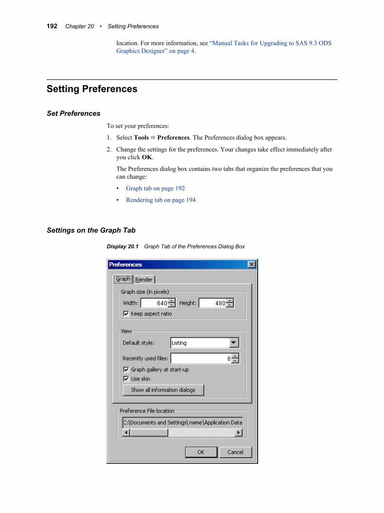
location. For more information, see “Manual Tasks for Upgrading to SAS 9.3 ODS Graphics Designer” on page 4.
Setting Preferences
Set PreferencesTo set your preferences:
1. Select Tools ð Preferences. The Preferences dialog box appears.
2. Change the settings for the preferences. Your changes take effect immediately after you click OK.
The Preferences dialog box contains two tabs that organize the preferences that you can change:
• Graph tab on page 192
• Rendering tab on page 194
Settings on the Graph Tab
Display 20.1 Graph Tab of the Preferences Dialog Box
192 Chapter 20 • Setting Preferences
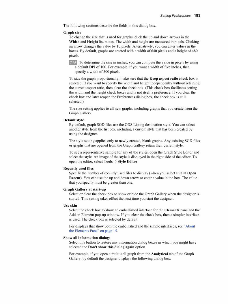
The following sections describe the fields in this dialog box.
Graph sizeTo change the size that is used for graphs, click the up and down arrows in the Width and Height list boxes. The width and height are measured in pixels. Clicking an arrow changes the value by 10 pixels. Alternatively, you can enter values in the boxes. By default, graphs are created with a width of 640 pixels and a height of 480 pixels.
T I P To determine the size in inches, you can compute the value in pixels by using a default DPI of 100. For example, if you want a width of five inches, then specify a width of 500 pixels.
To size the graph proportionally, make sure that the Keep aspect ratio check box is selected. If you want to specify the width and height independently without retaining the current aspect ratio, then clear the check box. (This check box facilitates setting the width and the height check boxes and is not itself a preference. If you clear the check box and later reopen the Preferences dialog box, the check box is still selected.)
The size setting applies to all new graphs, including graphs that you create from the Graph Gallery.
Default styleBy default, graph SGD files use the ODS Listing destination style. You can select another style from the list box, including a custom style that has been created by using the designer.
The style setting applies only to newly created, blank graphs. Any existing SGD files or graphs that are opened from the Graph Gallery retain their current style.
To see a representative sample for any of the styles, open the Graph Style Editor and select the style. An image of the style is displayed in the right side of the editor. To open the editor, select Tools ð Style Editor.
Recently used filesSpecify the number of recently used files to display (when you select File ð Open Recent). You can use the up and down arrow or enter a value in the box. The value that you specify must be greater than one.
Graph Gallery at start-upSelect or clear the check box to show or hide the Graph Gallery when the designer is started. This setting takes effect the next time you start the designer.
Use skinSelect the check box to show an embellished interface for the Elements pane and the Add an Element pop-up window. If you clear the check box, then a simpler interface is used. The check box is selected by default.
For displays that show both the embellished and the simple interfaces, see “About the Elements Pane” on page 15.
Show all information dialogsSelect this button to restore any information dialog boxes in which you might have selected the Don't show this dialog again option.
For example, if you open a multi-cell graph from the Analytical tab of the Graph Gallery, by default the designer displays the following dialog box:
Setting Preferences 193
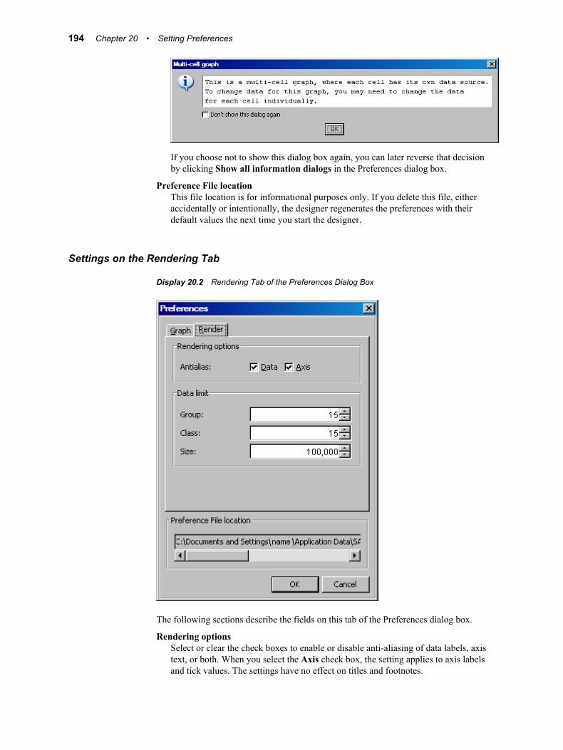
If you choose not to show this dialog box again, you can later reverse that decision by clicking Show all information dialogs in the Preferences dialog box.
Preference File locationThis file location is for informational purposes only. If you delete this file, either accidentally or intentionally, the designer regenerates the preferences with their default values the next time you start the designer.
Settings on the Rendering Tab
Display 20.2 Rendering Tab of the Preferences Dialog Box
The following sections describe the fields on this tab of the Preferences dialog box.
Rendering optionsSelect or clear the check boxes to enable or disable anti-aliasing of data labels, axis text, or both. When you select the Axis check box, the setting applies to axis labels and tick values. The settings have no effect on titles and footnotes.
194 Chapter 20 • Setting Preferences
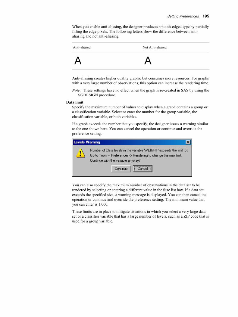
When you enable anti-aliasing, the designer produces smooth-edged type by partially filling the edge pixels. The following letters show the difference between anti-aliasing and not anti-aliasing.
Anti-aliased Not Anti-aliased
Anti-aliasing creates higher quality graphs, but consumes more resources. For graphs with a very large number of observations, this option can increase the rendering time.
Note: These settings have no effect when the graph is re-created in SAS by using the SGDESIGN procedure.
Data limitSpecify the maximum number of values to display when a graph contains a group or a classification variable. Select or enter the number for the group variable, the classification variable, or both variables.
If a graph exceeds the number that you specify, the designer issues a warning similar to the one shown here. You can cancel the operation or continue and override the preference setting.
You can also specify the maximum number of observations in the data set to be rendered by selecting or entering a different value in the Size list box. If a data set exceeds the specified size, a warning message is displayed. You can then cancel the operation or continue and override the preference setting. The minimum value that you can enter is 1,000.
These limits are in place to mitigate situations in which you select a very large data set or a classifier variable that has a large number of levels, such as a ZIP code that is used for a group variable.
Setting Preferences 195

196 Chapter 20 • Setting Preferences
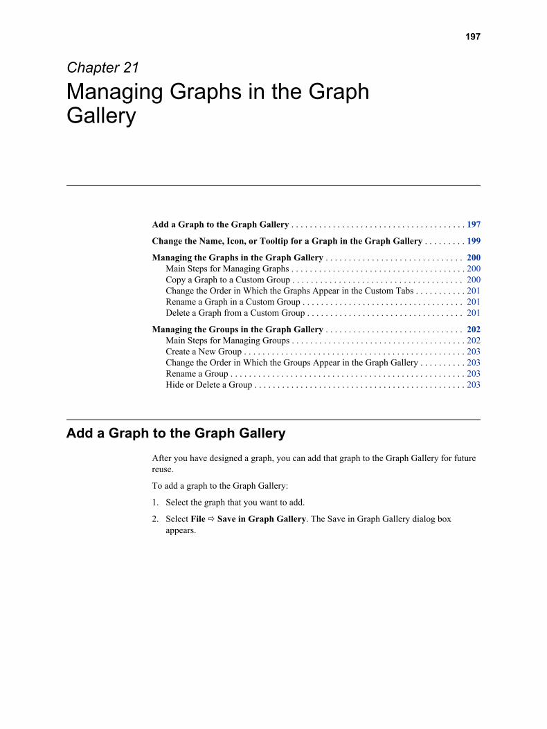
Chapter 21
Managing Graphs in the Graph Gallery
Add a Graph to the Graph Gallery . . . . . . . . . . . . . . . . . . . . . . . . . . . . . . . . . . . . . . 197
Change the Name, Icon, or Tooltip for a Graph in the Graph Gallery . . . . . . . . . 199
Managing the Graphs in the Graph Gallery . . . . . . . . . . . . . . . . . . . . . . . . . . . . . . 200Main Steps for Managing Graphs . . . . . . . . . . . . . . . . . . . . . . . . . . . . . . . . . . . . . . 200Copy a Graph to a Custom Group . . . . . . . . . . . . . . . . . . . . . . . . . . . . . . . . . . . . . 200Change the Order in Which the Graphs Appear in the Custom Tabs . . . . . . . . . . . 201Rename a Graph in a Custom Group . . . . . . . . . . . . . . . . . . . . . . . . . . . . . . . . . . . 201Delete a Graph from a Custom Group . . . . . . . . . . . . . . . . . . . . . . . . . . . . . . . . . . 201
Managing the Groups in the Graph Gallery . . . . . . . . . . . . . . . . . . . . . . . . . . . . . . 202Main Steps for Managing Groups . . . . . . . . . . . . . . . . . . . . . . . . . . . . . . . . . . . . . . 202Create a New Group . . . . . . . . . . . . . . . . . . . . . . . . . . . . . . . . . . . . . . . . . . . . . . . . 203Change the Order in Which the Groups Appear in the Graph Gallery . . . . . . . . . . 203Rename a Group . . . . . . . . . . . . . . . . . . . . . . . . . . . . . . . . . . . . . . . . . . . . . . . . . . . 203Hide or Delete a Group . . . . . . . . . . . . . . . . . . . . . . . . . . . . . . . . . . . . . . . . . . . . . . 203
Add a Graph to the Graph GalleryAfter you have designed a graph, you can add that graph to the Graph Gallery for future reuse.
To add a graph to the Graph Gallery:
1. Select the graph that you want to add.
2. Select File ð Save in Graph Gallery. The Save in Graph Gallery dialog box appears.
197
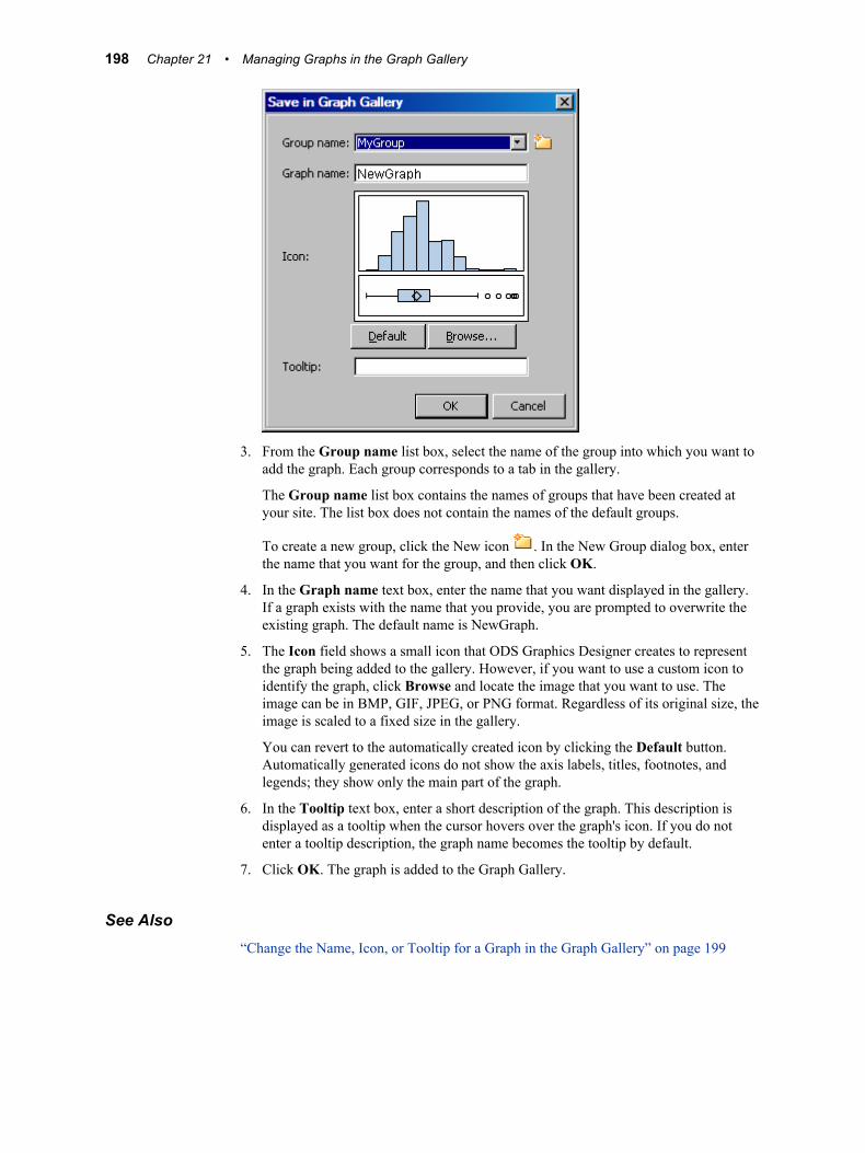
3. From the Group name list box, select the name of the group into which you want to add the graph. Each group corresponds to a tab in the gallery.
The Group name list box contains the names of groups that have been created at your site. The list box does not contain the names of the default groups.
To create a new group, click the New icon . In the New Group dialog box, enter the name that you want for the group, and then click OK.
4. In the Graph name text box, enter the name that you want displayed in the gallery. If a graph exists with the name that you provide, you are prompted to overwrite the existing graph. The default name is NewGraph.
5. The Icon field shows a small icon that ODS Graphics Designer creates to represent the graph being added to the gallery. However, if you want to use a custom icon to identify the graph, click Browse and locate the image that you want to use. The image can be in BMP, GIF, JPEG, or PNG format. Regardless of its original size, the image is scaled to a fixed size in the gallery.
You can revert to the automatically created icon by clicking the Default button. Automatically generated icons do not show the axis labels, titles, footnotes, and legends; they show only the main part of the graph.
6. In the Tooltip text box, enter a short description of the graph. This description is displayed as a tooltip when the cursor hovers over the graph's icon. If you do not enter a tooltip description, the graph name becomes the tooltip by default.
7. Click OK. The graph is added to the Graph Gallery.
See Also“Change the Name, Icon, or Tooltip for a Graph in the Graph Gallery” on page 199
198 Chapter 21 • Managing Graphs in the Graph Gallery
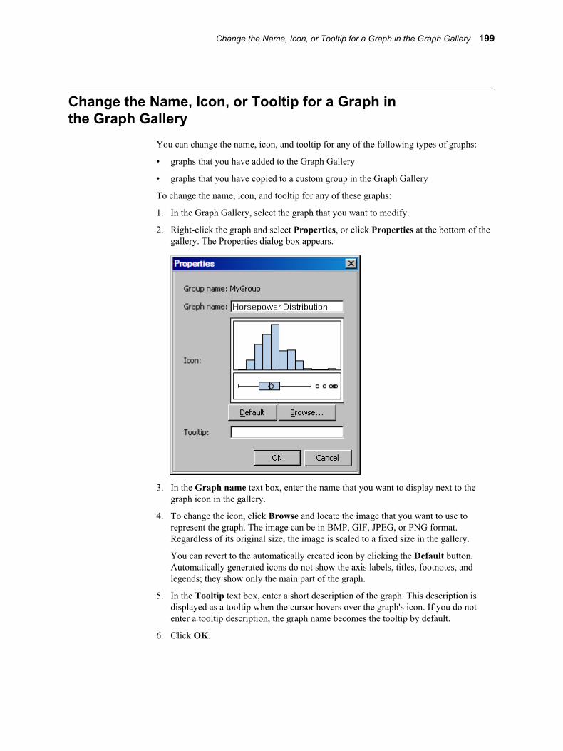
Change the Name, Icon, or Tooltip for a Graph in the Graph Gallery
You can change the name, icon, and tooltip for any of the following types of graphs:
• graphs that you have added to the Graph Gallery
• graphs that you have copied to a custom group in the Graph Gallery
To change the name, icon, and tooltip for any of these graphs:
1. In the Graph Gallery, select the graph that you want to modify.
2. Right-click the graph and select Properties, or click Properties at the bottom of the gallery. The Properties dialog box appears.
3. In the Graph name text box, enter the name that you want to display next to the graph icon in the gallery.
4. To change the icon, click Browse and locate the image that you want to use to represent the graph. The image can be in BMP, GIF, JPEG, or PNG format. Regardless of its original size, the image is scaled to a fixed size in the gallery.
You can revert to the automatically created icon by clicking the Default button. Automatically generated icons do not show the axis labels, titles, footnotes, and legends; they show only the main part of the graph.
5. In the Tooltip text box, enter a short description of the graph. This description is displayed as a tooltip when the cursor hovers over the graph's icon. If you do not enter a tooltip description, the graph name becomes the tooltip by default.
6. Click OK.
Change the Name, Icon, or Tooltip for a Graph in the Graph Gallery 199
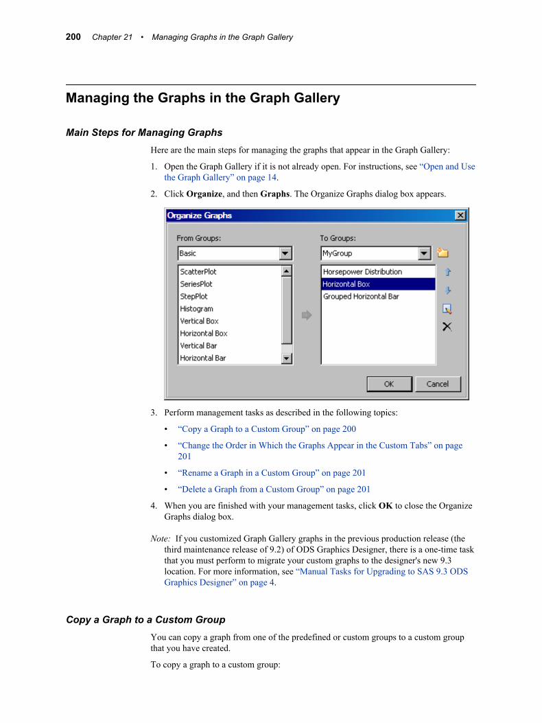
Managing the Graphs in the Graph Gallery
Main Steps for Managing GraphsHere are the main steps for managing the graphs that appear in the Graph Gallery:
1. Open the Graph Gallery if it is not already open. For instructions, see “Open and Use the Graph Gallery” on page 14.
2. Click Organize, and then Graphs. The Organize Graphs dialog box appears.
3. Perform management tasks as described in the following topics:
• “Copy a Graph to a Custom Group” on page 200
• “Change the Order in Which the Graphs Appear in the Custom Tabs” on page 201
• “Rename a Graph in a Custom Group” on page 201
• “Delete a Graph from a Custom Group” on page 201
4. When you are finished with your management tasks, click OK to close the Organize Graphs dialog box.
Note: If you customized Graph Gallery graphs in the previous production release (the third maintenance release of 9.2) of ODS Graphics Designer, there is a one-time task that you must perform to migrate your custom graphs to the designer's new 9.3 location. For more information, see “Manual Tasks for Upgrading to SAS 9.3 ODS Graphics Designer” on page 4.
Copy a Graph to a Custom GroupYou can copy a graph from one of the predefined or custom groups to a custom group that you have created.
To copy a graph to a custom group:
200 Chapter 21 • Managing Graphs in the Graph Gallery
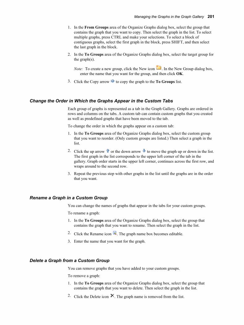
1. In the From Groups area of the Organize Graphs dialog box, select the group that contains the graph that you want to copy. Then select the graph in the list. To select multiple graphs, press CTRL and make your selections. To select a block of contiguous graphs, select the first graph in the block, press SHIFT, and then select the last graph in the block.
2. In the To Groups area of the Organize Graphs dialog box, select the target group for the graph(s).
Note: To create a new group, click the New icon . In the New Group dialog box, enter the name that you want for the group, and then click OK.
3. Click the Copy arrow to copy the graph to the To Groups list.
Change the Order in Which the Graphs Appear in the Custom TabsEach group of graphs is represented as a tab in the Graph Gallery. Graphs are ordered in rows and columns on the tabs. A custom tab can contain custom graphs that you created as well as predefined graphs that have been moved to the tab.
To change the order in which the graphs appear on a custom tab:
1. In the To Groups area of the Organize Graphs dialog box, select the custom group that you want to reorder. (Only custom groups are listed.) Then select a graph in the list.
2. Click the up arrow or the down arrow to move the graph up or down in the list. The first graph in the list corresponds to the upper left corner of the tab in the gallery. Graph order starts in the upper left corner, continues across the first row, and wraps around to the second row.
3. Repeat the previous step with other graphs in the list until the graphs are in the order that you want.
Rename a Graph in a Custom GroupYou can change the names of graphs that appear in the tabs for your custom groups.
To rename a graph:
1. In the To Groups area of the Organize Graphs dialog box, select the group that contains the graph that you want to rename. Then select the graph in the list.
2. Click the Rename icon . The graph name box becomes editable.
3. Enter the name that you want for the graph.
Delete a Graph from a Custom GroupYou can remove graphs that you have added to your custom groups.
To remove a graph:
1. In the To Groups area of the Organize Graphs dialog box, select the group that contains the graph that you want to delete. Then select the graph in the list.
2. Click the Delete icon . The graph name is removed from the list.
Managing the Graphs in the Graph Gallery 201
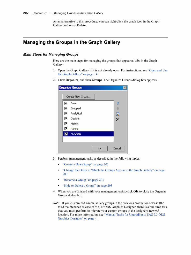
As an alternative to this procedure, you can right-click the graph icon in the Graph Gallery and select Delete.
Managing the Groups in the Graph Gallery
Main Steps for Managing GroupsHere are the main steps for managing the groups that appear as tabs in the Graph Gallery:
1. Open the Graph Gallery if it is not already open. For instructions, see “Open and Use the Graph Gallery” on page 14.
2. Click Organize, and then Groups. The Organize Groups dialog box appears.
3. Perform management tasks as described in the following topics:
• “Create a New Group” on page 203
• “Change the Order in Which the Groups Appear in the Graph Gallery” on page 203
• “Rename a Group” on page 203
• “Hide or Delete a Group” on page 203
4. When you are finished with your management tasks, click OK to close the Organize Groups dialog box.
Note: If you customized Graph Gallery groups in the previous production release (the third maintenance release of 9.2) of ODS Graphics Designer, there is a one-time task that you must perform to migrate your custom groups to the designer's new 9.3 location. For more information, see “Manual Tasks for Upgrading to SAS 9.3 ODS Graphics Designer” on page 4.
202 Chapter 21 • Managing Graphs in the Graph Gallery
Create a New GroupEach group that you create is represented as a tab in the Graph Gallery.
To create a new group:
1. In the Organize Groups dialog box, click Create New Group. The New Group dialog box appears.
2. In the Name text box, enter a name for the group.
3. Click OK.
Change the Order in Which the Groups Appear in the Graph GalleryTo change the order in which the groups appear in the gallery:
1. In the Organize Groups dialog box, click the name of a group to highlight it in the list.
2. Click the up arrow or the down arrow to move the group up or down in the list. The first group in the list appears as the first tab in the Graph Gallery.
Rename a GroupYou can change the names of groups that you have created.
To rename a group:
1. In the Organize Groups dialog box, click the name of a group to highlight it in the list.
2. Click the Rename icon . The group name box becomes editable.
3. Enter the name that you want for the group.
Hide or Delete a GroupYou can delete a group that you have created. You can also temporarily hide a group's tab in the Graph Gallery.
To remove a group:
1. In the Organize Groups dialog box, click the name of a group to highlight it in the list.
2. Click the Delete icon . The group name is removed from the list.
To hide a group, clear the check box next to the name of the group that you want to hide. When you want the group's tab to appear again in the gallery, select the check box for the group.
Managing the Groups in the Graph Gallery 203

204 Chapter 21 • Managing Graphs in the Graph Gallery
Part 8
Examples
Chapter 22Examples for Creating Single-Cell Graphs . . . . . . . . . . . . . . . . . . . . . . . 207
Chapter 23Examples for Creating Multi-Cell Graphs . . . . . . . . . . . . . . . . . . . . . . . . 217
205

206
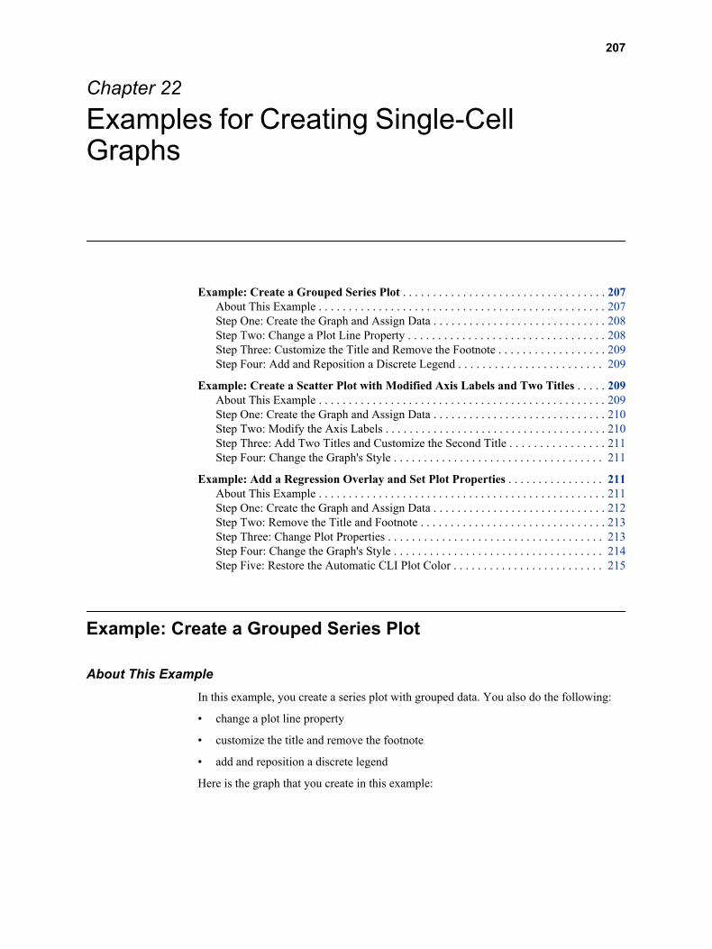
Chapter 22
Examples for Creating Single-Cell Graphs
Example: Create a Grouped Series Plot . . . . . . . . . . . . . . . . . . . . . . . . . . . . . . . . . . 207About This Example . . . . . . . . . . . . . . . . . . . . . . . . . . . . . . . . . . . . . . . . . . . . . . . . 207Step One: Create the Graph and Assign Data . . . . . . . . . . . . . . . . . . . . . . . . . . . . . 208Step Two: Change a Plot Line Property . . . . . . . . . . . . . . . . . . . . . . . . . . . . . . . . . 208Step Three: Customize the Title and Remove the Footnote . . . . . . . . . . . . . . . . . . 209Step Four: Add and Reposition a Discrete Legend . . . . . . . . . . . . . . . . . . . . . . . . 209
Example: Create a Scatter Plot with Modified Axis Labels and Two Titles . . . . . 209About This Example . . . . . . . . . . . . . . . . . . . . . . . . . . . . . . . . . . . . . . . . . . . . . . . . 209Step One: Create the Graph and Assign Data . . . . . . . . . . . . . . . . . . . . . . . . . . . . . 210Step Two: Modify the Axis Labels . . . . . . . . . . . . . . . . . . . . . . . . . . . . . . . . . . . . . 210Step Three: Add Two Titles and Customize the Second Title . . . . . . . . . . . . . . . . 211Step Four: Change the Graph's Style . . . . . . . . . . . . . . . . . . . . . . . . . . . . . . . . . . . 211
Example: Add a Regression Overlay and Set Plot Properties . . . . . . . . . . . . . . . . 211About This Example . . . . . . . . . . . . . . . . . . . . . . . . . . . . . . . . . . . . . . . . . . . . . . . . 211Step One: Create the Graph and Assign Data . . . . . . . . . . . . . . . . . . . . . . . . . . . . . 212Step Two: Remove the Title and Footnote . . . . . . . . . . . . . . . . . . . . . . . . . . . . . . . 213Step Three: Change Plot Properties . . . . . . . . . . . . . . . . . . . . . . . . . . . . . . . . . . . . 213Step Four: Change the Graph's Style . . . . . . . . . . . . . . . . . . . . . . . . . . . . . . . . . . . 214Step Five: Restore the Automatic CLI Plot Color . . . . . . . . . . . . . . . . . . . . . . . . . 215
Example: Create a Grouped Series Plot
About This ExampleIn this example, you create a series plot with grouped data. You also do the following:
• change a plot line property
• customize the title and remove the footnote
• add and reposition a discrete legend
Here is the graph that you create in this example:
207
Display 22.1 Grouped Series Plot
There are several ways to create and customize this graph. The following steps show one way to create the graph.
Step One: Create the Graph and Assign DataTo create the graph and assign data:
1. Open the Graph Gallery if it is not already open. For instructions, see “Open and Use the Graph Gallery” on page 14.
2. On the Basic tab, double-click the SeriesPlot icon. The Assign Data dialog box appears.
3. In the Assign Data dialog box, complete these steps:
• Select SASHELP from the Library list box.
• Select STOCKS from the Data Set list box.
• Select DATE from the X list box.
• Select CLOSE from the Y list box.
• Select STOCK from the Group list box.
4. Click OK.
Step Two: Change a Plot Line PropertyChange the line properties of the plot so that all the lines are solid. The lines obtain their appearance from the style element for the group. By changing the line properties, you override that style element.
208 Chapter 22 • Examples for Creating Single-Cell Graphs
To change the line properties:
1. Right-click anywhere within the plot area and select Plot Properties. The Cell Properties dialog box appears and displays the Plots tab.
2. From the Plot list box, select series if it is not already selected.
3. From the Pattern list box, select the solid line.
By default, Group is selected. This selection indicates that the value is derived from the group variable. When you explicitly change the pattern, you override the default value.
4. Click OK.
Step Three: Customize the Title and Remove the FootnoteTo customize the title and remove the footnote:
1. Double-click the placeholder title. The placeholder text is highlighted:
2. In the text box, enter Stock Trend.
3. In the bottom left corner of the graph, right-click the placeholder footnote and select Remove Footnote from the pop-up menu.
Step Four: Add and Reposition a Discrete LegendTo add and reposition a discrete legend:
1. Click and drag the Discrete Legend icon from the Insets panel to the bottom of the plot area. The legend is placed near the X axis (where you dragged it).
2. Right-click the legend and select Legend Properties. The Legend Properties dialog box appears.
3. From the Position list box, select Top Left, and then click OK.
The legend is moved to the top left corner of the graph.
Example: Create a Scatter Plot with Modified Axis Labels and Two Titles
About This ExampleIn this example, you create a scatter plot from a blank graph window. You also do the following:
• modify the axis labels
• add two titles and apply a different style element to the second title
• change the style that is applied to the graph
Example: Create a Scatter Plot with Modified Axis Labels and Two Titles 209
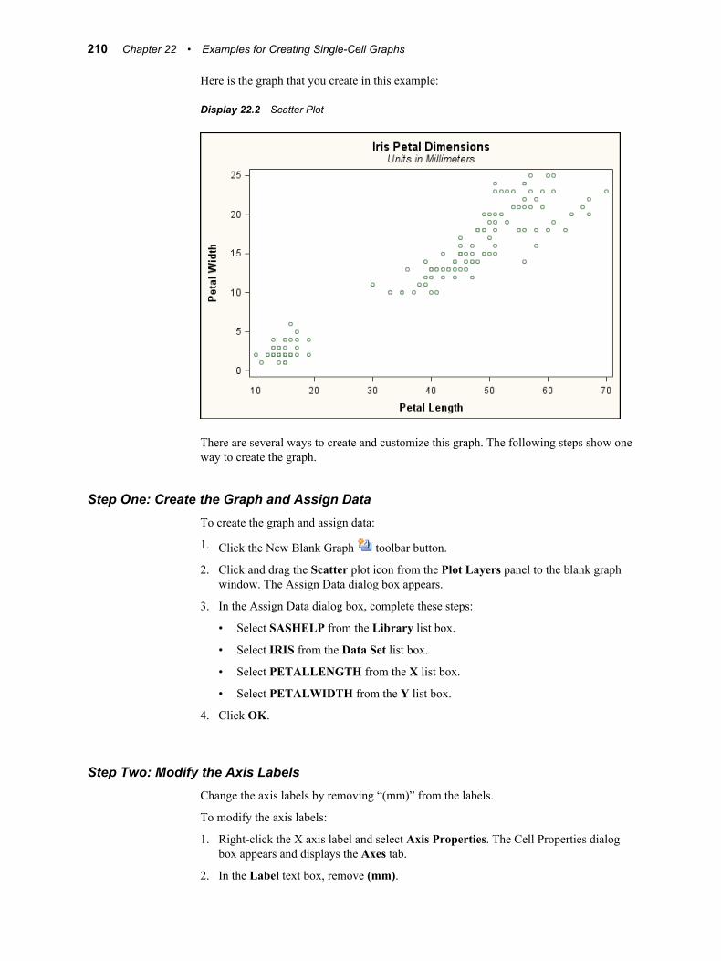
Here is the graph that you create in this example:
Display 22.2 Scatter Plot
There are several ways to create and customize this graph. The following steps show one way to create the graph.
Step One: Create the Graph and Assign DataTo create the graph and assign data:
1. Click the New Blank Graph toolbar button.
2. Click and drag the Scatter plot icon from the Plot Layers panel to the blank graph window. The Assign Data dialog box appears.
3. In the Assign Data dialog box, complete these steps:
• Select SASHELP from the Library list box.
• Select IRIS from the Data Set list box.
• Select PETALLENGTH from the X list box.
• Select PETALWIDTH from the Y list box.
4. Click OK.
Step Two: Modify the Axis LabelsChange the axis labels by removing “(mm)” from the labels.
To modify the axis labels:
1. Right-click the X axis label and select Axis Properties. The Cell Properties dialog box appears and displays the Axes tab.
2. In the Label text box, remove (mm).
210 Chapter 22 • Examples for Creating Single-Cell Graphs
3. From the Axis list box, select Y. Then repeat the previous step for the Y axis.
4. Click OK.
Step Three: Add Two Titles and Customize the Second TitleAdd two titles and apply a different style element to the second title.
To add and modify titles:
1. Click in the toolbar. A new title text box is added above the graph.
2. In the title text box, enter Iris Petal Dimensions.
3. To add the second title, repeat the previous steps and enter Units in Millimeters for the title text.
4. Right-click the second title and select Title Properties from the pop-up menu. The Text Properties dialog box appears.
5. From the Style Element list box, select GraphFootnoteText. Then select OK. The title now has a different appearance.
A style element is a component of an ODS style. Changing the style element enables you to obtain a different look for the title without overriding the style. In the next step, when you change the style that is applied to the graph, the appearance of the title is suitable to the new style.
Step Four: Change the Graph's Style
To change the graph's style:
1. Right-click the graph and select Graph Properties. The Graph Properties dialog box appears.
2. From the Style list box, select Analysis.
3. Click OK.
Example: Add a Regression Overlay and Set Plot Properties
About This ExampleIn this example, you overlay a regression plot with confidence limits on a scatter plot. You also do the following:
• remove the title and footnote
• change the style element for one section of the plot, and explicitly override a style attribute for a different section
• change the graph's style and examine the appearance of the modified sections
• restore the style attribute override to its automatic value
Example: Add a Regression Overlay and Set Plot Properties 211
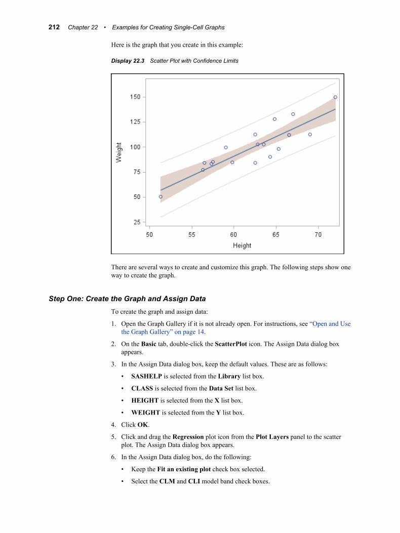
Here is the graph that you create in this example:
Display 22.3 Scatter Plot with Confidence Limits
There are several ways to create and customize this graph. The following steps show one way to create the graph.
Step One: Create the Graph and Assign DataTo create the graph and assign data:
1. Open the Graph Gallery if it is not already open. For instructions, see “Open and Use the Graph Gallery” on page 14.
2. On the Basic tab, double-click the ScatterPlot icon. The Assign Data dialog box appears.
3. In the Assign Data dialog box, keep the default values. These are as follows:
• SASHELP is selected from the Library list box.
• CLASS is selected from the Data Set list box.
• HEIGHT is selected from the X list box.
• WEIGHT is selected from the Y list box.
4. Click OK.
5. Click and drag the Regression plot icon from the Plot Layers panel to the scatter plot. The Assign Data dialog box appears.
6. In the Assign Data dialog box, do the following:
• Keep the Fit an existing plot check box selected.
• Select the CLM and CLI model band check boxes.
212 Chapter 22 • Examples for Creating Single-Cell Graphs
7. Click OK.
Step Two: Remove the Title and FootnoteThis example is concerned primarily with plot properties. You do not need the title or footnote.
To remove the title and footnote:
1. At the top of the graph, right-click the placeholder title and select Remove Title from the pop-up menu.
2. In the bottom left corner of the graph, right-click the placeholder footnote and select Remove Footnote from the pop-up menu.
Step Three: Change Plot PropertiesFirst, you change the style element that is assigned to one section of the plot. Then you explicitly override the style attribute for a different section.
To change the plot properties:
1. Right-click anywhere within the plot area and select Plot Properties. The Cell Properties dialog box appears and displays the Plots tab.
2. From the Plot list box, select modelband if it is not already selected. This selection corresponds to the CLM band. By default, the Fill check box is selected.
3. From the Style Element list box, select GraphConfidence2. The CLM band fill changes color.
4. From the Plot list box, select modelband2. This selection corresponds to the CLI band. By default, the Outline check box is selected.
5. From the Color list box (in the Outline section), select the bright green color ( ). The CLI band outline changes color.
6. Click OK.
Your graph looks similar to the following display.
Example: Add a Regression Overlay and Set Plot Properties 213

Display 22.4 Scatter Plot with Modified Confidence Limits
Step Four: Change the Graph's Style
To change the graph's style:
1. Right-click the graph and select Graph Properties. The Graph Properties dialog box appears.
2. From the Style list box, select Statistical.
3. Click OK.
Your graph looks like the following display.
214 Chapter 22 • Examples for Creating Single-Cell Graphs

Display 22.5 Scatter Plot with Modified Confidence Limits
The CLM band is suitable to the new style, whereas the CLI outline clashes with the style. The CLI clash occurs because you earlier overrode the style element that is associated with the CLI outline. In the next step, you restore the automatic value for the style element.
Step Five: Restore the Automatic CLI Plot ColorTo restore the automatic value for the CLI color:
1. Right-click anywhere within the plot area and select Plot Properties. The Cell Properties dialog box appears and displays the Plots tab.
2. From the Plot list box, select modelband2 if it is not already selected. This selection corresponds to the CLI band.
3. From the Color list box, select Auto. The CLI band outline changes color.
4. Click OK.
Your graph looks like the following display.
Example: Add a Regression Overlay and Set Plot Properties 215
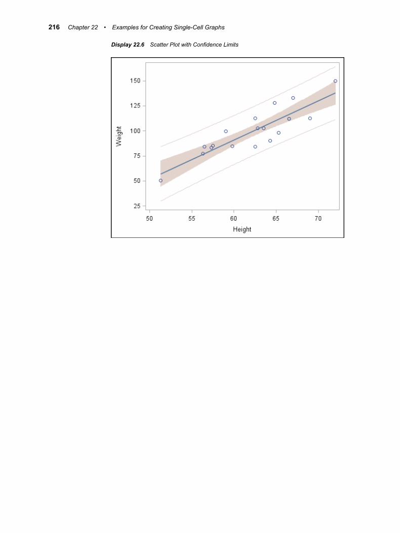
Display 22.6 Scatter Plot with Confidence Limits
216 Chapter 22 • Examples for Creating Single-Cell Graphs
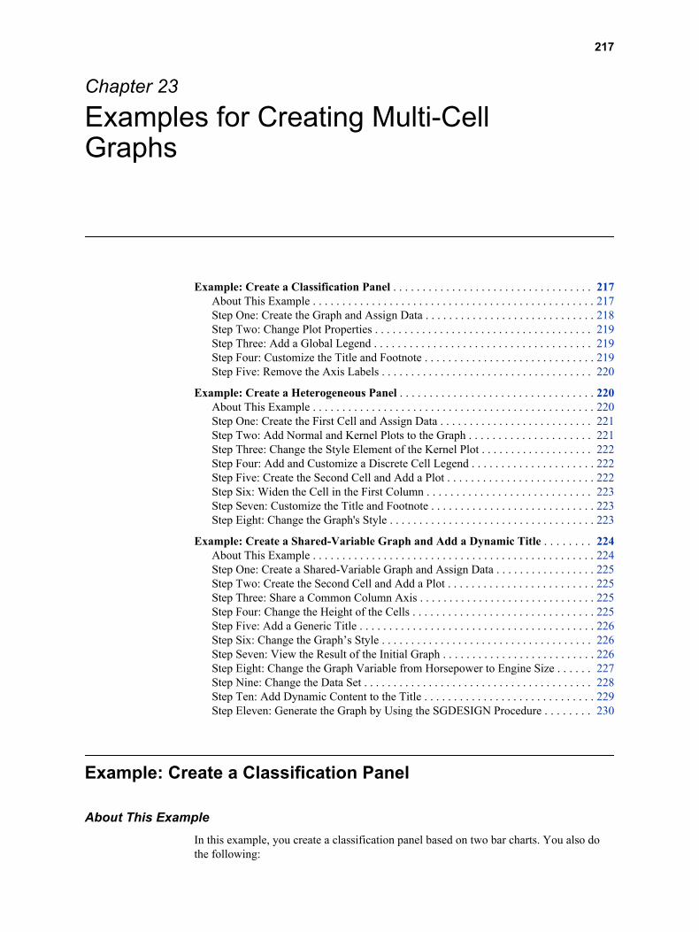
Chapter 23
Examples for Creating Multi-Cell Graphs
Example: Create a Classification Panel . . . . . . . . . . . . . . . . . . . . . . . . . . . . . . . . . . 217About This Example . . . . . . . . . . . . . . . . . . . . . . . . . . . . . . . . . . . . . . . . . . . . . . . . 217Step One: Create the Graph and Assign Data . . . . . . . . . . . . . . . . . . . . . . . . . . . . . 218Step Two: Change Plot Properties . . . . . . . . . . . . . . . . . . . . . . . . . . . . . . . . . . . . . 219Step Three: Add a Global Legend . . . . . . . . . . . . . . . . . . . . . . . . . . . . . . . . . . . . . 219Step Four: Customize the Title and Footnote . . . . . . . . . . . . . . . . . . . . . . . . . . . . . 219Step Five: Remove the Axis Labels . . . . . . . . . . . . . . . . . . . . . . . . . . . . . . . . . . . . 220
Example: Create a Heterogeneous Panel . . . . . . . . . . . . . . . . . . . . . . . . . . . . . . . . . 220About This Example . . . . . . . . . . . . . . . . . . . . . . . . . . . . . . . . . . . . . . . . . . . . . . . . 220Step One: Create the First Cell and Assign Data . . . . . . . . . . . . . . . . . . . . . . . . . . 221Step Two: Add Normal and Kernel Plots to the Graph . . . . . . . . . . . . . . . . . . . . . 221Step Three: Change the Style Element of the Kernel Plot . . . . . . . . . . . . . . . . . . . 222Step Four: Add and Customize a Discrete Cell Legend . . . . . . . . . . . . . . . . . . . . . 222Step Five: Create the Second Cell and Add a Plot . . . . . . . . . . . . . . . . . . . . . . . . . 222Step Six: Widen the Cell in the First Column . . . . . . . . . . . . . . . . . . . . . . . . . . . . 223Step Seven: Customize the Title and Footnote . . . . . . . . . . . . . . . . . . . . . . . . . . . . 223Step Eight: Change the Graph's Style . . . . . . . . . . . . . . . . . . . . . . . . . . . . . . . . . . . 223
Example: Create a Shared-Variable Graph and Add a Dynamic Title . . . . . . . . 224About This Example . . . . . . . . . . . . . . . . . . . . . . . . . . . . . . . . . . . . . . . . . . . . . . . . 224Step One: Create a Shared-Variable Graph and Assign Data . . . . . . . . . . . . . . . . . 225Step Two: Create the Second Cell and Add a Plot . . . . . . . . . . . . . . . . . . . . . . . . . 225Step Three: Share a Common Column Axis . . . . . . . . . . . . . . . . . . . . . . . . . . . . . . 225Step Four: Change the Height of the Cells . . . . . . . . . . . . . . . . . . . . . . . . . . . . . . . 225Step Five: Add a Generic Title . . . . . . . . . . . . . . . . . . . . . . . . . . . . . . . . . . . . . . . . 226Step Six: Change the Graph’s Style . . . . . . . . . . . . . . . . . . . . . . . . . . . . . . . . . . . . 226Step Seven: View the Result of the Initial Graph . . . . . . . . . . . . . . . . . . . . . . . . . . 226Step Eight: Change the Graph Variable from Horsepower to Engine Size . . . . . . 227Step Nine: Change the Data Set . . . . . . . . . . . . . . . . . . . . . . . . . . . . . . . . . . . . . . . 228Step Ten: Add Dynamic Content to the Title . . . . . . . . . . . . . . . . . . . . . . . . . . . . . 229Step Eleven: Generate the Graph by Using the SGDESIGN Procedure . . . . . . . . 230
Example: Create a Classification Panel
About This ExampleIn this example, you create a classification panel based on two bar charts. You also do the following:
217
• change the color and transparency for one of the bar charts
• add a global legend
• customize the title and footnote
• remove the axis labels
Here is the graph that you create in this example:
Display 23.1 Classification Panel
There are several ways to create and customize this graph. The following steps show one way to create the graph.
Step One: Create the Graph and Assign DataTo create the graph and assign data:
1. Open the Graph Gallery if it is not already open. For instructions, see “Open and Use the Graph Gallery” on page 14.
2. On the Basic tab, double-click the Vertical Bar icon. The Assign Data dialog box appears.
3. In the Assign Data dialog box, complete these steps:
• Select SASHELP from the Library list box.
• Select PRDSALE from the Data Set list box.
• Select COUNTRY from the Category list box.
• Select PREDICT from the Response list box.
4. Click the Panel Variables tab.
5. Select PRODTYPE from the Column list box.
6. Click OK.
218 Chapter 23 • Examples for Creating Multi-Cell Graphs
7. From the Plot Layers panel, click and drag the Bar icon to the graph. The Assign Data dialog box appears.
8. In the Assign Data dialog box, complete these steps:
• Select COUNTRY from the Category list box.
• Select ACTUAL from the Response list box.
9. Click OK.
Step Two: Change Plot PropertiesChange the color and transparency of the second bar chart so that it can more easily be distinguished from the first bar chart.
To change the plot properties:
1. Right-click anywhere within the plot area and select Plot Properties. The Cell Properties dialog box appears and displays the Plots tab.
2. From the Plot list box, select bar2 if it is not already selected.
3. In the Fill section, select a different color from the Color list box. For this example,
select the peach color ( ).
4. Click and drag the Transparency slider to the right to increase the transparency to 50%.
5. Click the Bar tab.
6. Select 0.65 from the Bar Width list box.
7. Click OK.
T I P The bar width can also be changed when you assign data to the plot. To access this option, click Advanced Options in the Assign Data dialog box.
Step Three: Add a Global LegendTo add a global legend to a graph:
1. Click in the toolbar. The Global Legend dialog box appears. The dialog box contains a list of all the plots and lines in the graph.
2. Select the check box next to the Select Plot column heading. Both plots are automatically selected.
3. Click OK. The legend appears at the bottom of the graph.
Step Four: Customize the Title and FootnoteMost graphs that are opened from the Graph Gallery contain a placeholder title and footnote. For this example, you replace the title text and remove the footnote.
To customize the title and the footnote:
1. Double-click the placeholder title. The placeholder text is highlighted:
Example: Create a Classification Panel 219
2. In the text box, enter Predicted and Actual Sales Figures.
3. In the bottom left corner of the graph, double-click the placeholder footnote. The placeholder text is highlighted.
4. In the text box, enter Data: 1993, 1994.
Step Five: Remove the Axis LabelsThe axis labels occupy graph space and are not necessary to understand the graph. You can remove them from the graph.
1. Triple-click the Y axis label (“Predicted Sales”) and press DELETE. The axis label is removed.
2. Triple-click the X axis label (“Country”) and press DELETE. The axis label is removed.
The labels are not permanently deleted. If you want to restore a label for an axis, right-click the axis and select Axis Properties. Then select the Label check box.
Example: Create a Heterogeneous Panel
About This ExampleIn this example, you create a paneled graph with two cells. Each cell contains different types of plots. You also do the following:
• add and customize the contents of a cell legend
• change the style element of the kernel plot
• resize the two cells
• customize the title and footnote
• change the graph's style
Here is the graph that you create in this example:
220 Chapter 23 • Examples for Creating Multi-Cell Graphs
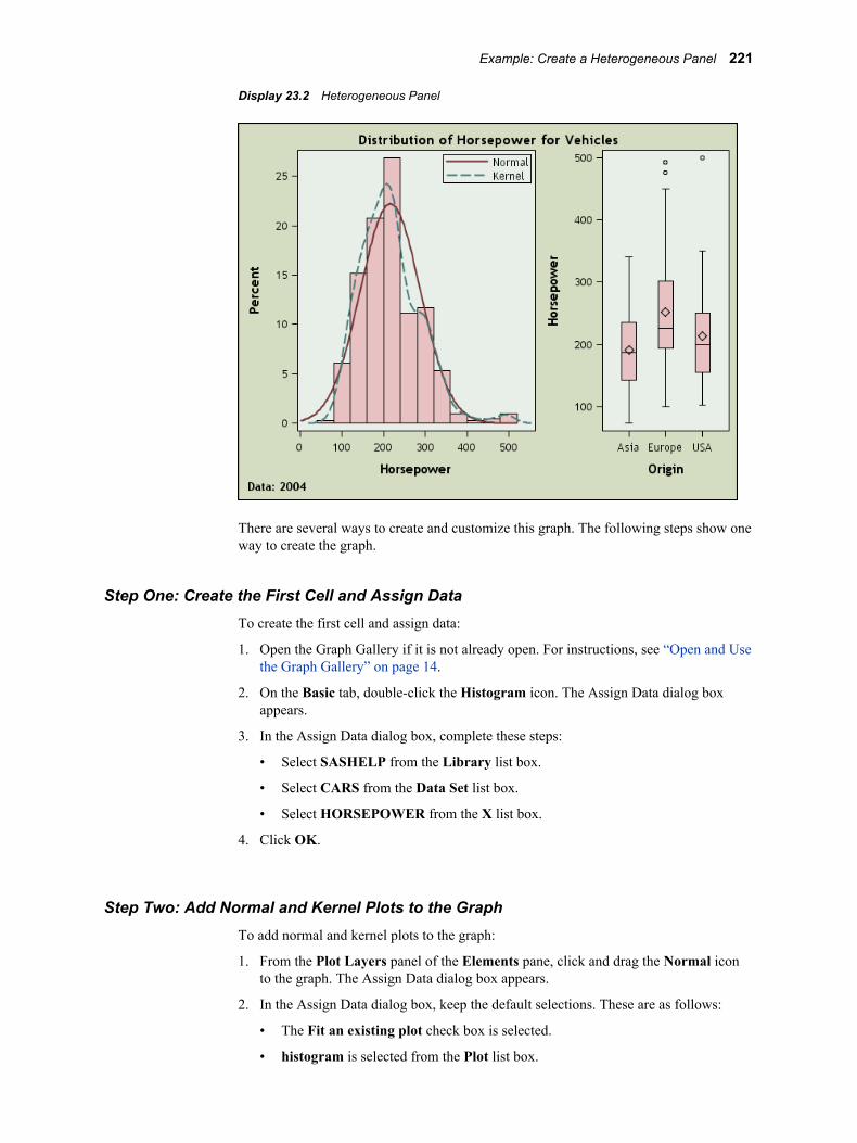
Display 23.2 Heterogeneous Panel
There are several ways to create and customize this graph. The following steps show one way to create the graph.
Step One: Create the First Cell and Assign DataTo create the first cell and assign data:
1. Open the Graph Gallery if it is not already open. For instructions, see “Open and Use the Graph Gallery” on page 14.
2. On the Basic tab, double-click the Histogram icon. The Assign Data dialog box appears.
3. In the Assign Data dialog box, complete these steps:
• Select SASHELP from the Library list box.
• Select CARS from the Data Set list box.
• Select HORSEPOWER from the X list box.
4. Click OK.
Step Two: Add Normal and Kernel Plots to the GraphTo add normal and kernel plots to the graph:
1. From the Plot Layers panel of the Elements pane, click and drag the Normal icon to the graph. The Assign Data dialog box appears.
2. In the Assign Data dialog box, keep the default selections. These are as follows:
• The Fit an existing plot check box is selected.
• histogram is selected from the Plot list box.
Example: Create a Heterogeneous Panel 221
Keep all other defaults and click OK. A normal plot is added to your graph.
3. From the Plot Layers panel, click and drag the Kernel icon to the graph. The Assign Data dialog box appears.
4. In the Assign Data dialog box, keep the default selections. These are as follows:
• The Fit an existing plot check box is selected.
• histogram is selected from the Plot list box.
Keep all other defaults and click OK. A kernel plot is added to your graph.
Step Three: Change the Style Element of the Kernel PlotIn the example, both the normal and the kernel density plots have the same visual properties, and you cannot distinguish between the two. In this step, you change the style element of the kernel plot so that you can distinguish the kernel plot from the normal plot.
1. Right-click anywhere within the plot area and select Plot Properties. The Cell Properties dialog box appears and displays the Plots tab.
2. From the Plot list box, select kernel if it is not already selected.
3. From the Style Element list box, select GraphFit2.
4. Click OK.
The kernel plot now has a different appearance from the normal plot. This change makes it easier to distinguish the two plots from each other.
Step Four: Add and Customize a Discrete Cell LegendIn this step, you first add a legend to the graph cell. Then you remove the histogram from the legend. Finally, you capitalize the normal and kernel labels in the legend.
To add and customize a legend:
1. Click and drag the Discrete Legend icon from the Insets panel to the upper right corner of the cell. By default, all plots in the cell are displayed in the legend.
2. Right-click the legend, and then select Legend Contents. The Legend Contents dialog box appears.
3. Clear the check box next to the histogram plot.
4. Double-click the label for the normal plot and change the first letter to a capital N.
5. Double-click the label for the kernel plot and change the first letter to a capital K.
6. Click OK.
Step Five: Create the Second Cell and Add a Plot
1. Right-click anywhere within the plot area and select Add a Column. A new column cell is added to the right of the histogram.
2. From the Plot Layers panel, click and drag the Box icon to the new cell. The Assign Data dialog box appears.
222 Chapter 23 • Examples for Creating Multi-Cell Graphs
3. In the Assign Data dialog box, complete these steps:
• Select SASHELP from the Library list box.
• Select CARS from the Data Set list box.
• Select ORIGIN from the X list box.
• Select HORSEPOWER from the Y list box.
4. Click OK.
Step Six: Widen the Cell in the First ColumnBoth cells in the graph currently have the same width. You can widen the cell that contains the histogram so that the histogram has more space.
To change the width of the two columns:
1. Position the cursor between the two cells of the graph. A dashed line appears between the cells and the cursor changes to a two-headed arrow .
2. Click and drag the dashed line toward the right. The cell with the histogram becomes wider and the cell with the box plot becomes narrower.
Step Seven: Customize the Title and Footnote
To customize the title and the footnote:
1. Double-click the placeholder title. The placeholder text is highlighted:
2. In the text box, enter Distribution of Horsepower for Vehicles.
3. In the bottom left corner of the graph, double-click the placeholder footnote. The placeholder text is highlighted.
4. In the text box, enter Data: 2004.
Step Eight: Change the Graph's Style
To change the graph's style:
1. Right-click the graph and select Graph Properties. The Graph Properties dialog box appears.
2. From the Style list box, select Curve.
3. Click OK.
Example: Create a Heterogeneous Panel 223
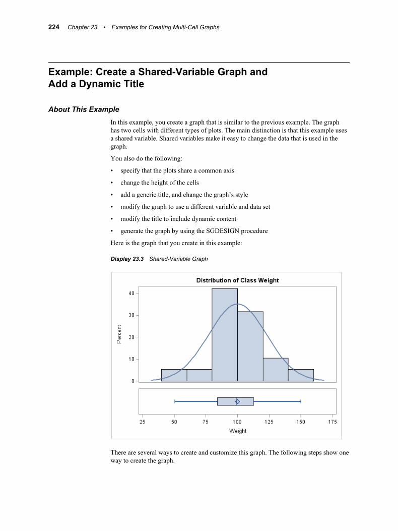
Example: Create a Shared-Variable Graph and Add a Dynamic Title
About This ExampleIn this example, you create a graph that is similar to the previous example. The graph has two cells with different types of plots. The main distinction is that this example uses a shared variable. Shared variables make it easy to change the data that is used in the graph.
You also do the following:
• specify that the plots share a common axis
• change the height of the cells
• add a generic title, and change the graph’s style
• modify the graph to use a different variable and data set
• modify the title to include dynamic content
• generate the graph by using the SGDESIGN procedure
Here is the graph that you create in this example:
Display 23.3 Shared-Variable Graph
There are several ways to create and customize this graph. The following steps show one way to create the graph.
224 Chapter 23 • Examples for Creating Multi-Cell Graphs
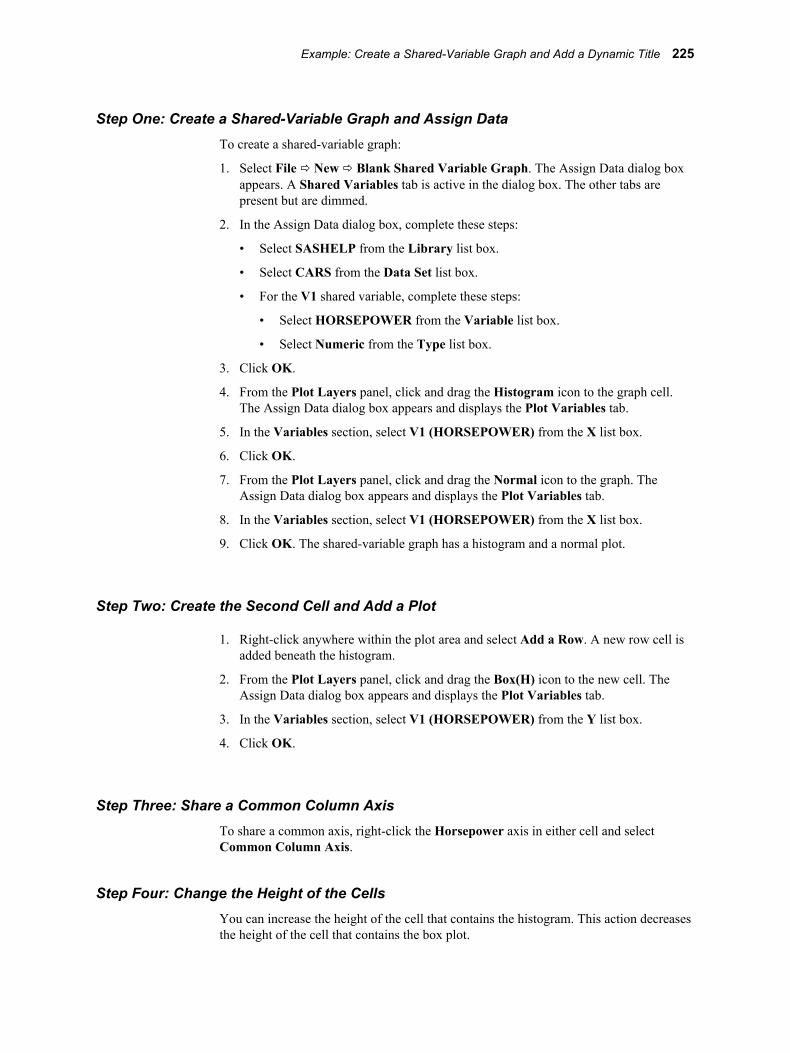
Step One: Create a Shared-Variable Graph and Assign DataTo create a shared-variable graph:
1. Select File ð New ð Blank Shared Variable Graph. The Assign Data dialog box appears. A Shared Variables tab is active in the dialog box. The other tabs are present but are dimmed.
2. In the Assign Data dialog box, complete these steps:
• Select SASHELP from the Library list box.
• Select CARS from the Data Set list box.
• For the V1 shared variable, complete these steps:
• Select HORSEPOWER from the Variable list box.
• Select Numeric from the Type list box.
3. Click OK.
4. From the Plot Layers panel, click and drag the Histogram icon to the graph cell. The Assign Data dialog box appears and displays the Plot Variables tab.
5. In the Variables section, select V1 (HORSEPOWER) from the X list box.
6. Click OK.
7. From the Plot Layers panel, click and drag the Normal icon to the graph. The Assign Data dialog box appears and displays the Plot Variables tab.
8. In the Variables section, select V1 (HORSEPOWER) from the X list box.
9. Click OK. The shared-variable graph has a histogram and a normal plot.
Step Two: Create the Second Cell and Add a Plot
1. Right-click anywhere within the plot area and select Add a Row. A new row cell is added beneath the histogram.
2. From the Plot Layers panel, click and drag the Box(H) icon to the new cell. The Assign Data dialog box appears and displays the Plot Variables tab.
3. In the Variables section, select V1 (HORSEPOWER) from the Y list box.
4. Click OK.
Step Three: Share a Common Column AxisTo share a common axis, right-click the Horsepower axis in either cell and select Common Column Axis.
Step Four: Change the Height of the CellsYou can increase the height of the cell that contains the histogram. This action decreases the height of the cell that contains the box plot.
Example: Create a Shared-Variable Graph and Add a Dynamic Title 225
To change the height of the cells:
1. Position the cursor between the two rows. A dashed line appears between the rows
and the cursor changes to a vertical two-headed arrow .
2. Click and drag the dashed line downward. The box plot becomes shorter, and the histogram becomes taller.
Step Five: Add a Generic TitleIn this step, you add a title to the graph. You need to keep the title generic because later you will change the data.
To add a title to the graph:
1. Click in the toolbar. A new title text box is added above the graph.
2. In the text box, enter Distribution Chart.
Step Six: Change the Graph’s StyleTo change the graph's style:
1. Right-click the graph and select Graph Properties. The Graph Properties dialog box appears.
2. From the Style list box, select HtmlBlueCML.
3. Click OK.
Step Seven: View the Result of the Initial GraphHere is the result of the shared-variable graph that you have created.
226 Chapter 23 • Examples for Creating Multi-Cell Graphs
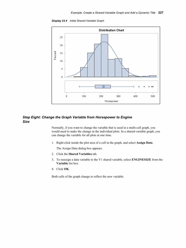
Display 23.4 Initial Shared-Variable Graph
Step Eight: Change the Graph Variable from Horsepower to Engine Size
Normally, if you want to change the variable that is used in a multi-cell graph, you would need to make the change in the individual plots. In a shared-variable graph, you can change the variable for all plots at one time.
1. Right-click inside the plot area of a cell in the graph, and select Assign Data.
The Assign Data dialog box appears.
2. Click the Shared Variables tab.
3. To reassign a data variable to the V1 shared variable, select ENGINESIZE from the Variable list box.
4. Click OK.
Both cells of the graph change to reflect the new variable.
Example: Create a Shared-Variable Graph and Add a Dynamic Title 227
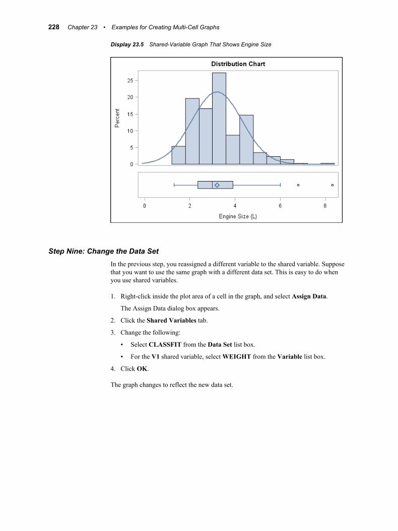
Display 23.5 Shared-Variable Graph That Shows Engine Size
Step Nine: Change the Data SetIn the previous step, you reassigned a different variable to the shared variable. Suppose that you want to use the same graph with a different data set. This is easy to do when you use shared variables.
1. Right-click inside the plot area of a cell in the graph, and select Assign Data.
The Assign Data dialog box appears.
2. Click the Shared Variables tab.
3. Change the following:
• Select CLASSFIT from the Data Set list box.
• For the V1 shared variable, select WEIGHT from the Variable list box.
4. Click OK.
The graph changes to reflect the new data set.
228 Chapter 23 • Examples for Creating Multi-Cell Graphs
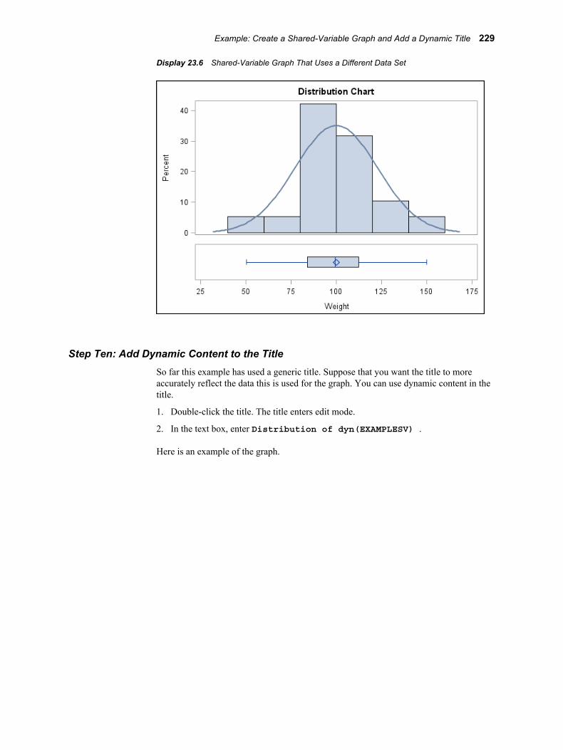
Display 23.6 Shared-Variable Graph That Uses a Different Data Set
Step Ten: Add Dynamic Content to the TitleSo far this example has used a generic title. Suppose that you want the title to more accurately reflect the data this is used for the graph. You can use dynamic content in the title.
1. Double-click the title. The title enters edit mode.
2. In the text box, enter Distribution of dyn(EXAMPLESV) .
Here is an example of the graph.
Example: Create a Shared-Variable Graph and Add a Dynamic Title 229
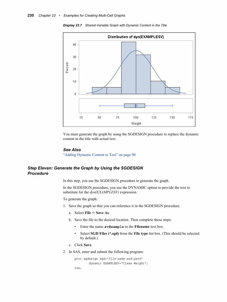
Display 23.7 Shared-Variable Graph with Dynamic Content in the Title
You must generate the graph by using the SGDESIGN procedure to replace the dynamic content in the title with actual text.
See Also“Adding Dynamic Content to Text” on page 90
Step Eleven: Generate the Graph by Using the SGDESIGN Procedure
In this step, you use the SGDESIGN procedure to generate the graph.
In the SGDESIGN procedure, you use the DYNAMIC option to provide the text to substitute for the dyn(EXAMPLESV) expression.
To generate the graph:
1. Save the graph so that you can reference it in the SGDESIGN procedure.
a. Select File ð Save As.
b. Save the file to the desired location. Then complete these steps:
• Enter the name svExample in the Filename text box.
• Select SGD Files (*.sgd) from the File type list box. (This should be selected by default.)
c. Click Save.
2. In SAS, enter and submit the following program:
proc sgdesign sgd="file-name-and-path" dynamic EXAMPLESV="Class Weight";run;
230 Chapter 23 • Examples for Creating Multi-Cell Graphs
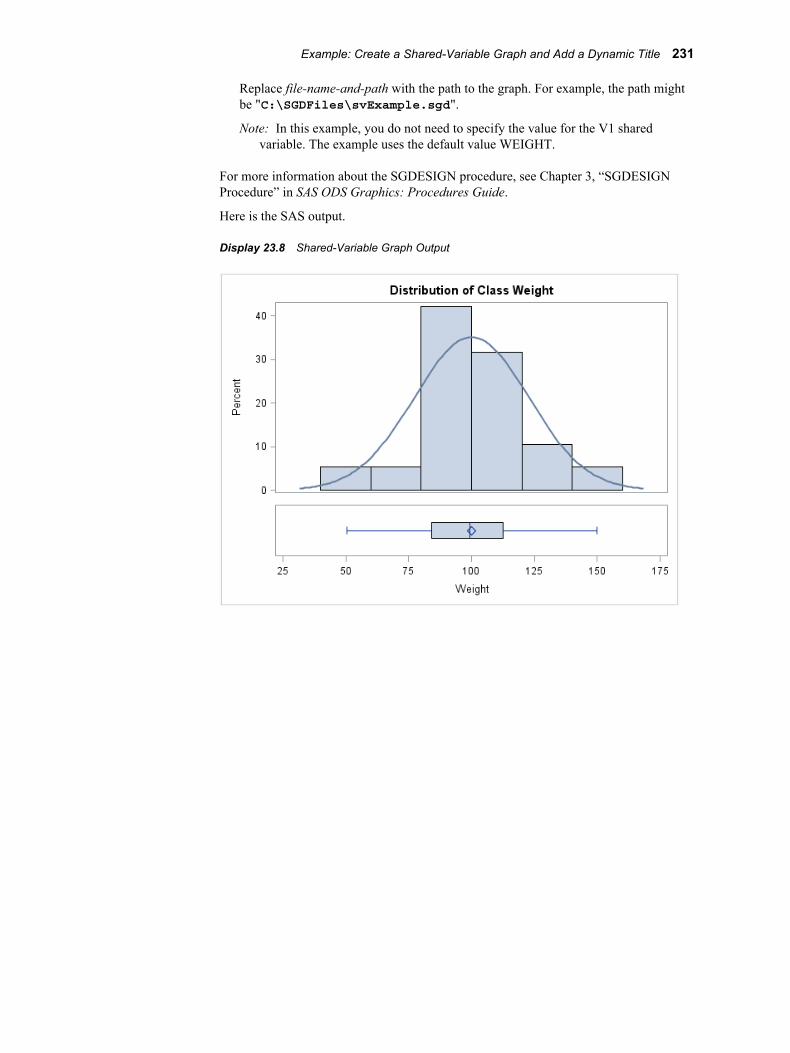
Replace file-name-and-path with the path to the graph. For example, the path might be "C:\SGDFiles\svExample.sgd".
Note: In this example, you do not need to specify the value for the V1 shared variable. The example uses the default value WEIGHT.
For more information about the SGDESIGN procedure, see Chapter 3, “SGDESIGN Procedure” in SAS ODS Graphics: Procedures Guide.
Here is the SAS output.
Display 23.8 Shared-Variable Graph Output
Example: Create a Shared-Variable Graph and Add a Dynamic Title 231

232 Chapter 23 • Examples for Creating Multi-Cell Graphs
Glossary
cellin ODS graphics, a distinct rectangular subregion of a graph that can contain plots, text, or legends.
classification panela multi-cell graph in which the cell data is driven by the values of one or more classification variables. The number of the cells is determined by the unique values of the classification variables. Each cell of the panel has the same types of plots.
classification variablea variable whose values are used to group (or classify) the observations in a data set into different groups that are meaningful for analysis.
grapha visualization created by SAS software that can contain any of the following: a title, footnotes, legend, and multiple cells.
Graph Galleryin ODS Graphics Designer, a gallery of predefined, commonly used graphs. Users can add their own custom graphs to the gallery.
Graph Template Languagean extension to the Output Delivery System (ODS) that enables users to create sophisticated analytical graphs. Short form: GTL.
GTLSee Graph Template Language.
heterogeneous panela multi-cell graph in which each cell is defined independently and can contain different types of plots.
markera symbol such as a diamond, a circle, or a triangle that is used to indicate the location of a data point in a plot.
ODSSee Output Delivery System.
233
ODS Graphicsan extension to ODS that is used to create analytical graphs using the Graph Template Language.
ODS stylea template that specifies instructions for the presentation aspects (color, font face, font size, and so on) of your SAS output. This template determines the overall appearance of the documents that use it. Each style definition consists of style elements.
ODS templatea description of how output should appear when it is formatted. ODS templates are stored as compiled entries in a template store (item store). Common template types include STATGRAPH, STYLE, CROSSTABS, TAGSET, and TABLE.
Output Delivery Systema component of SAS software that can produce output in a variety of formats such as markup languages (HTML, XML), PDF, listing, RTF, PostScript, other formats, and SAS data sets. Short form: ODS.
panela graph with multiple cells.
plota visual representation of data such as a scatter plot, a series line, or a histogram. Multiple plots can be overlaid in a cell to create a graph.
scatter plot matrixa grid of scatter plots showing pairwise combinations of multiple numeric variables.
SGD filean ODS Graphics Designer file. Users can open this file in the designer and change the graph. Users can also render the graph to an ODS destination by using the SGDESIGN procedure.
shared variablea feature of ODS Graphics Designer that enables users to reuse graphs and specify different variables from the same or from a different data set.
style attributea visual property, such as color, font properties, and line characteristics, that has a reserved name and value defined in ODS. Style attributes are collectively referenced by a style element within a style definition.
style elementa named collection of style attributes that affects specific parts of ODS output. For example, a style element might specify the color and font properties of title text or other text in a table or graph.
234 Glossary
Index
Aaccessibility features 6Add an Element pop-up window 16axes
shared 162sharing or unsharing a common external
axis 162axis labels
creating scatter plot with modified labels 209
Bbackground color
changing for legends 79Band Data role 56Bar Chart role 55Bar Error Chart Data role 55blank graph windows
creating classification panels 171creating graphs 46creating heterogeneous panels 159
Block Stack Block Data role 58box plots
adding to graph cells 29
Ccell 37cell headers 165
changing position of 166editing and formatting 165removing 167
cell legends 75adding 76
cellsadding headers to 165multi-cell graphs 153removing text entries from 85
classification panels 153, 154, 169changing single-cell graphs to 172
creating 170, 217creating from blank graph window 171creating with Graph Gallery 170data lattices and data panels 173layout options 173methods for creating 170
CLI colorrestoring automatic value for 215
code for graphsviewing, copying, and saving 66
colorchanging legend outline or background
color 79restoring automatic value for CLI color
215specifying 88
Color list box 88column cells
adding box plots to 29adding to graphs 28widening 34
columnsadding to graphs 159arranging legend contents in 80removing 164resizing 162
components of a graph 37Connect Order role 55Contour Data role 57copy and paste
graphs to another application 67copying code for graphs 66curve label role 55
Ddata
assigning 24assigning to new plots 48assigning to plots 47
235
changing data assignment for a plot in a graph 50
Data Label role 55data lattices 173data limit 195data panels 173default style 193Discrete Offset option 54drop lines
changing length of 63Drop Lines role 58dynamic content 90
adding to text 90specifying 90
dynamic titles 224
EElements pane 15
Add an Element pop-up window 16changing appearance of 18Insets panel 18Plot Layers panel 17showing or hiding 15
Error Lower role 55Error Upper role 55examples
adding regression overlay and setting plot properties 211
creating classification panel 217creating grouped series plot 207creating heterogeneous panel 220creating scatter plot with modified axis
labels and two titles 209creating shared-variable graph with
dynamic title 224quick-start 23running on SAS server 35
Ffiles
saving graphs to 63footnotes 71
adding 71editing 72formatting 72removing 26
Gglobal legends 75
adding 31, 76graph components 37Graph Gallery 13
adding graphs to 64, 197
at start-up 193creating a simple graph 24creating classification panels 170creating graphs from 46creating heterogeneous panels from 158opening and using 14predefined tabs 14tab descriptions 14
graph properties 95Graph tab
preference settings on 192Graph Template Language (GTL) 3graph windows
creating classification panels from blank window 171
creating graphs from blank window 46creating heterogeneous panels from
blank window 159graphs
adding column cells 28adding global legend 31adding normal plot 25adding plots 47adding reference lines 60adding rows and columns 159adding text entries 83adding to Graph Gallery 64, 197assigning data 24changing data assignment for plots in
50changing single-cell graph to
classification panel 172copy and paste to another application
67creating 45creating from blank graph window 46creating from Graph Gallery 46designing a simple graph (example) 24enhancing 27multi-cell 153opening 65properties 95removing rows or columns 164saving 27, 35saving to a file 63shared variables in 181size of 193viewing, copying, and saving code 66
Group Display options 54Group role 54, 55, 56grouped series plot
creating 207GTL (Graph Template Language) 3
236 Index
Hheaders
adding to cells 165heterogeneous panels 153, 154, 157
adding headers to cells 165adding rows and columns 159creating 158, 220creating from blank graph window 159creating from Graph Gallery 158removing rows or columns 164resizing rows or columns 162sharing or unsharing a common external
axis 162Histogram Bar Data role 56histograms
adding kernel density plot to 28
Iinformation dialogs 193Insets panel 18
Kkernel density plots
adding to histograms 28changing format of 32
Llabels
creating scatter plot with modified axis labels 209
editing legend labels 78layout options
classification panels 173legends 75
adding 75adding cell legends 76adding global legends 31, 76adding titles to 78arranging contents in rows or columns
80cell legends 75changing contents of 77changing outline or background color
79editing labels 78global legends 75removing 81repositioning 81
Loess role 57
MModel Band Data role 57
multi-cell graphs 153differences among 154in ODS Graphics Designer 153
OODS Graphics Designer 3
accessibility features 6main tasks 6multi-cell graphs in 153starting 9supported platforms 4users of 4
ODS styles 87opening graphs 65outline color
changing for legends 79
PPBSpline role 57platforms supported 4plot area 37Plot Layers panel 17plot properties 99, 100plot roles 48, 54plots
adding normal plot to graph 25adding to graphs 47assigning data to 47assigning data to new plots 48changing data assignment for 50grouped series plot 207kernel density plots 28, 32selecting 58setting properties 100, 211
Preference file location 194preferences 191
setting 192settings on Graph tab 192settings on Rendering tab 194
propertiesgraph 95plot 99, 100
Qquick-start examples 23
designing a simple graph 24enhancing graphs 27
Rrecently used files 193reference lines
adding to graphs 60
Index 237

changing length of drop lines 63repositioning 62types of 60
Reference role 58regression overlay 211Regression role 57rendering options 194Rendering tab
preference settings on 194repositioning
legends 81reference lines 62text entries 84
resizingrows or columns 162
rowsadding to graphs 159arranging legend contents in 80removing 164resizing 162
SSAS server
running examples on 35saving
code for graphs 66graphs to a file 63
scatter plot matrices 154, 175creating 176
scatter plotscreating, with modified axis labels and
two titles 209Section 508 6SGD files 4SGDESIGN procedure 4shared axes 162shared variables 181
changing data used in graphs 185creating graphs 183creating graphs with dynamic title 224features of 182requirements for creating graphs 183
single-cell graphschanging to classification panel 172
skin 193starting ODS Graphics Designer 9style elements
specifying for text properties 87
Ttext
adding dynamic content to 90text entries
adding to graphs 83editing 83formatting 83removing from cells 85repositioning 84
text propertiesspecifying style elements for 87
titles 71adding 71adding to legends 78creating scatter plot with two titles 209creating shared-variable graph and
adding dynamic title 224customizing 26editing 72formatting 72
UURL role 55user interface 11
Vvariables
See also shared variablesassigning data to plots 47
Vector Origin Data role 57viewing code for graphs 66
XX role 54
YY role 54
ZZ role 54
238 Index