Embed Size (px)
Citation preview

SCIENTIFIC AND LARGE DATA VISUALIZATION
Daniela Giorgi
Visual Computing Lab CNR-ISTI
October 18 2020
Fundamentals of Information Visualization ndash Part II
Recap from the previous lesson
1 Visualization is in the mainstream
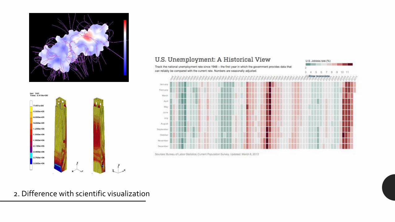
2 Difference with scientific visualization
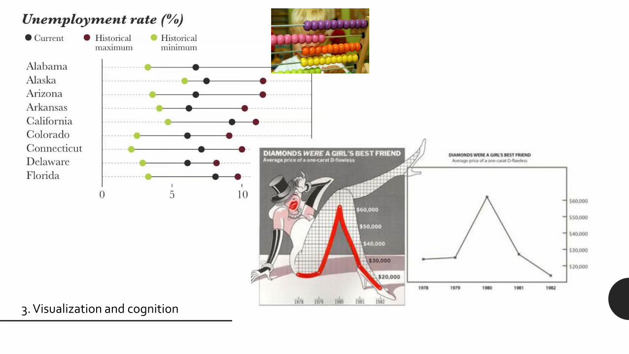
3 Visualization and cognition
4 Explanation exploration confirmation
5 Different visualizations different narratives
6 The visualization pipeline from data to insight
7 Data types items and attributes
ID Gender Age Assumption date Role Seat
M Rossi 01066 M 43 01032009 Researcher Genoa
L Bianchi 01043 F 36 15062015 Senior Researcher Genoa
G Neri 01432 M 59 01091998 Research Director Pisa
T Smith 02312 M 32 01012019 Technologist Pisa
D Verdi 00043 F 55 01052005 Senior Researcher Pisa
W James 01203 M 48 01032004 Technician Bologna
8 Fundamental graphs
0
500
1000
1500
2000
2500
3000
3500
Researcher SeniorResearcher
ResearchDirector
0
10
20
30
40
50
60
70
80
90
2015 2016 2017 2018 2019
Fundamental graphs [Continued]
Stacked bar charts
Representation of additional
attributes
As many bars as the number of
categories for the first attribute
and as many segments within each
bar as the values for the other
categorical attribute
Good to communicate proportion [Davide Rucci AA 2018-2019 httpsdrdavgithubioERC-Academic-Profiles]
Grouped bar charts
Representation of additional
attributes
The same bar chart is repeated
multiple times for the number of
categories in the additional
attribute
Good for comparison of individual
values[Davide Rucci AA 2018-2019 httpsdrdavgithubioERC-Academic-Profiles]
Grouped bar charts
Representation of additional
attributes
The same bar chart is repeated
multiple times for the number of
categories in the additional
attribute
Good for comparison of individual
values[Davide Rucci AA 2018-2019 httpsdrdavgithubioERC-Academic-Profiles]
Stacked line charts
Representation of additional
attributes
Values across categories are stacked
one on top of the other
The shape of lines is affected by the
shape of the lines below
Not meaningful for data that should
not be summed [Matteo Loporchio AA 2018-2019 httpsmloporchiogithubioD3IE-Italy]
Line charts series
Representation of additional
attributes
Collection of lines in the same
chart
Easy to compare values but
overlapping curves can make the
graph hard to read[A tour through the visualization zoo httpsqueueacmorgdetailcfmid=1805128]
Bubble charts
Representation of additional
attributes
Variant on scatterplots
Circle areas represent an additional
attribute
Colors can distinguish categories or
represent additional attributes
Limited data size capacity
[Gapminder httpsgapminderorg Hans RoslingTed Talk httpswwwtedcomtalkshans_rosling_shows_the_best_stats_you_ve_ever_seenlanguage=itt-283414]
Small multiples
Representation of additional
attributes
Each graph in its own chart
It can be done with any graphs
[A tour through the visualization zoo httpsqueueacmorgdetailcfmid=1805128]
Sunburst charts
To show hierarchies
Each ring represents a level in the
hierarchy moving outwards
[Data Visualization Catalogue httpsdatavizcataloguecom]
Sunburst charts
To show hierarchies
Each ring represents a level in the
hierarchy moving outwards
[Space Radar httpsgithubcomzz85space-radar]
Treemaps
Alternative way to visualize hierarchies
Each rectangle represents a category with
nested subcategory rectangles
When a quantity is assigned to a category
its area size is displayed in proportion to
that quantity and to the other quantities
within the same parent category in a part-
to-whole relationship
[Data Visualization Catalogue httpsdatavizcataloguecom]
[Pantheon Project MIT httpspantheonworldexploreviz]
Flow maps
Depict the movement of entities
by placing stroked lines on top of
maps (space and time)
Thickness color etc can encode
additional information
[A tour through the visualization zoo httpsqueueacmorgdetailcfmid=1805128]
[Minardrsquos map of Napoleonrsquos Russian campaign in 1812]
[httpshttpsxkcdcom657]
but alsohellip
Wordclouds
Representation of how frequently
words appear in a given body of
text through the size of the word
Variations in arrangement and
color
Mainly used for aesthetic reasons
[Worldcloud generator httpswwwjasondaviescomwordcloud]
Wordclouds
Representation of how frequently
words appear in a given body of
text through the size of the word
Variations in arrangement and
color
Mainly used for aesthetic reasons
[wwwwordcloudscom]
Calligrams
Texts arranged so that they form a
thematically related image
The image created by the words
illustrates the text by expressing
visually something associated to
(or contradicting) what the text
says
[Le Charivari 1834 httpsenwikipediaorgwikiCalligram]
Visual encoding and decoding
Visual encoding
bull Visual encoding means going from data to visual
representations
bull Encoding requires not only to choose a graph that is
appropriate for the data at hand but also to select the
individual graphical elements
Graphical elements
bull Marks are visual objects representing data items
ndash points
ndash bars
ndash lines
ndash areas
ndash hellip
[Mario Salinas AA 2017-2018 ReviewerNet httpsreviewernetorg]
Marks
Channels
Contextual components
Graphical elements
bull Channels are the visual properties that encode data
attributes
ndash position
ndash size (length width area)
ndash angle and slope
ndash color (multiple channels)
ndash shape and texture
ndash hellip
Marks
Channels
Contextual components
[Giuliano Gradilone AA 2018-2019 httpsgiulitz189githubioNotable-Italians]
Graphical elements
bull Contextual components
ndash Legends labels annotations
ndash Grids reference lines
ndash hellip
Marks
Channels
Contextual components
Visual decoding
bull Visual decoding means deconstructing a visual
representation it into its major units by identifying
ndash the graphical elements
bull what are the visual marks What are the visual channels
ndash the mapping rules (ie the information that the
graphical elements represent)
bull what data items do the mark represent What attributes
do the channel represent
bull It is useful for evaluating and redesigning
visualizations
Visual decoding
[New York Times One Race Every Medalist Ever httparchivenytimescomwwwnytimescominteractive20120805sportsolympicsthe-
100-meter-dash-one-race-every-medalist-everhtml_r=1]
Quality evaluation
bull Expressiveness principle the visual representation
should represent all of and only the relationships that
exist in the data
ndash Consider the lie factor a value to describe the relation
between the size of effect shown in a graphic and the
size of effect shown in the data [Edward Tufte]
ndash Do not present information that is not in the data Expressiveness
Effectiveness
0
50
100
150
200
250
300
350
Skirt Trousers Sweaters Jacket Shoes
2018
Items sold
Quality evaluation
bull Expressiveness principle the visual representation
should represent all of and only the relationships that
exist in the data
ndash Consider the lie factor a value to describe the relation
between the size of effect shown in a graphic and the
size of effect shown in the data [Edward Tufte]
ndash Do not present information that is not in the data Expressiveness
Effectiveness
Quality evaluation
bull Effectiveness principle the relevance of information
displayed should match the effectiveness of the
channel
ndash relevant information should be prioritized then encoded
with the most effectiveaccurate channels
Expressiveness
Effectiveness
Quality evaluation
bull Effectiveness principle the relevance of information
displayed should match the effectiveness of the
channel
ndash relevant information should be prioritized then encoded
with the most effectiveaccurate channels
Expressiveness
Effectiveness
[A Cairo The functional art]
[Cleveland nd McGill 1984 ndash Adapted from A Cairo The functional art]
Perceptual accuracy
Quantitative attributes
Perceptual accuracy
[Data Visualization Course by John C Hart for Coursera 2015]less accurate
Evaluation examples
[Example taken from ttpwwwperceptualedgecom]
ldquothis graph [hellip] shows that while the number of people
dying from communicable diseases is still far too high
those numbers continue to come down In fact fewer kids
are dying more kids are going to school and more
diseases are on their way to being eliminated But there
remains much to do to cut down the deaths in that yellow
block even more dramatically ldquo [Bill Gates Wired
Magazine]
bull The size of rectangles represent years of life lost
bull The color hue represents groups of causes
bull The color intensity represents the change from one
year to another
[Example taken from ttpwwwperceptualedgecom]
ldquothis graph [hellip] shows that while the number of people
dying from communicable diseases is still far too high
those numbers continue to come down In fact fewer kids
are dying more kids are going to school and more
diseases are on their way to being eliminated But there
remains much to do to cut down the deaths in that yellow
block even more dramatically ldquo [Bill Gates Wired
Magazine]
bull Since this is a 3D projection shapes are skewed by
perspective and shadows
bull Area is not the best channel to represent quantities
ndash and we also have rectangles here with different
proportions
bull Positive and negative changes difficult to evaluate
bull Labels difficult to read
[Example taken from ttpwwwperceptualedgecom]
[Example taken from ttpwwwperceptualedgecom]
ldquothis graph [hellip] shows that while the number of people
dying from communicable diseases is still far too high
those numbers continue to come down In fact fewer kids
are dying more kids are going to school and more diseases
are on their way to being eliminated But there remains
much to do to cut down the deaths in that yellow block
even more dramatically ldquo [Bill Gates Wired Magazine]
bull Three aligned bar charts (years of life lost for every
single cause amount of change absolute values of
deaths)
bull Better representation of both quantities and changes
and proper space for labels
[Example taken from ttpwwwperceptualedgecom]
[Example taken from ttpwwwperceptualedgecom]
[Example taken from ttpwwwperceptualedgecom]
Questions
[httpsxkcdcom688]
52

Recap from the previous lesson
1 Visualization is in the mainstream
2 Difference with scientific visualization
3 Visualization and cognition
4 Explanation exploration confirmation
5 Different visualizations different narratives
6 The visualization pipeline from data to insight
7 Data types items and attributes
ID Gender Age Assumption date Role Seat
M Rossi 01066 M 43 01032009 Researcher Genoa
L Bianchi 01043 F 36 15062015 Senior Researcher Genoa
G Neri 01432 M 59 01091998 Research Director Pisa
T Smith 02312 M 32 01012019 Technologist Pisa
D Verdi 00043 F 55 01052005 Senior Researcher Pisa
W James 01203 M 48 01032004 Technician Bologna
8 Fundamental graphs
0
500
1000
1500
2000
2500
3000
3500
Researcher SeniorResearcher
ResearchDirector
0
10
20
30
40
50
60
70
80
90
2015 2016 2017 2018 2019
Fundamental graphs [Continued]
Stacked bar charts
Representation of additional
attributes
As many bars as the number of
categories for the first attribute
and as many segments within each
bar as the values for the other
categorical attribute
Good to communicate proportion [Davide Rucci AA 2018-2019 httpsdrdavgithubioERC-Academic-Profiles]
Grouped bar charts
Representation of additional
attributes
The same bar chart is repeated
multiple times for the number of
categories in the additional
attribute
Good for comparison of individual
values[Davide Rucci AA 2018-2019 httpsdrdavgithubioERC-Academic-Profiles]
Grouped bar charts
Representation of additional
attributes
The same bar chart is repeated
multiple times for the number of
categories in the additional
attribute
Good for comparison of individual
values[Davide Rucci AA 2018-2019 httpsdrdavgithubioERC-Academic-Profiles]
Stacked line charts
Representation of additional
attributes
Values across categories are stacked
one on top of the other
The shape of lines is affected by the
shape of the lines below
Not meaningful for data that should
not be summed [Matteo Loporchio AA 2018-2019 httpsmloporchiogithubioD3IE-Italy]
Line charts series
Representation of additional
attributes
Collection of lines in the same
chart
Easy to compare values but
overlapping curves can make the
graph hard to read[A tour through the visualization zoo httpsqueueacmorgdetailcfmid=1805128]
Bubble charts
Representation of additional
attributes
Variant on scatterplots
Circle areas represent an additional
attribute
Colors can distinguish categories or
represent additional attributes
Limited data size capacity
[Gapminder httpsgapminderorg Hans RoslingTed Talk httpswwwtedcomtalkshans_rosling_shows_the_best_stats_you_ve_ever_seenlanguage=itt-283414]
Small multiples
Representation of additional
attributes
Each graph in its own chart
It can be done with any graphs
[A tour through the visualization zoo httpsqueueacmorgdetailcfmid=1805128]
Sunburst charts
To show hierarchies
Each ring represents a level in the
hierarchy moving outwards
[Data Visualization Catalogue httpsdatavizcataloguecom]
Sunburst charts
To show hierarchies
Each ring represents a level in the
hierarchy moving outwards
[Space Radar httpsgithubcomzz85space-radar]
Treemaps
Alternative way to visualize hierarchies
Each rectangle represents a category with
nested subcategory rectangles
When a quantity is assigned to a category
its area size is displayed in proportion to
that quantity and to the other quantities
within the same parent category in a part-
to-whole relationship
[Data Visualization Catalogue httpsdatavizcataloguecom]
[Pantheon Project MIT httpspantheonworldexploreviz]
Flow maps
Depict the movement of entities
by placing stroked lines on top of
maps (space and time)
Thickness color etc can encode
additional information
[A tour through the visualization zoo httpsqueueacmorgdetailcfmid=1805128]
[Minardrsquos map of Napoleonrsquos Russian campaign in 1812]
[httpshttpsxkcdcom657]
but alsohellip
Wordclouds
Representation of how frequently
words appear in a given body of
text through the size of the word
Variations in arrangement and
color
Mainly used for aesthetic reasons
[Worldcloud generator httpswwwjasondaviescomwordcloud]
Wordclouds
Representation of how frequently
words appear in a given body of
text through the size of the word
Variations in arrangement and
color
Mainly used for aesthetic reasons
[wwwwordcloudscom]
Calligrams
Texts arranged so that they form a
thematically related image
The image created by the words
illustrates the text by expressing
visually something associated to
(or contradicting) what the text
says
[Le Charivari 1834 httpsenwikipediaorgwikiCalligram]
Visual encoding and decoding
Visual encoding
bull Visual encoding means going from data to visual
representations
bull Encoding requires not only to choose a graph that is
appropriate for the data at hand but also to select the
individual graphical elements
Graphical elements
bull Marks are visual objects representing data items
ndash points
ndash bars
ndash lines
ndash areas
ndash hellip
[Mario Salinas AA 2017-2018 ReviewerNet httpsreviewernetorg]
Marks
Channels
Contextual components
Graphical elements
bull Channels are the visual properties that encode data
attributes
ndash position
ndash size (length width area)
ndash angle and slope
ndash color (multiple channels)
ndash shape and texture
ndash hellip
Marks
Channels
Contextual components
[Giuliano Gradilone AA 2018-2019 httpsgiulitz189githubioNotable-Italians]
Graphical elements
bull Contextual components
ndash Legends labels annotations
ndash Grids reference lines
ndash hellip
Marks
Channels
Contextual components
Visual decoding
bull Visual decoding means deconstructing a visual
representation it into its major units by identifying
ndash the graphical elements
bull what are the visual marks What are the visual channels
ndash the mapping rules (ie the information that the
graphical elements represent)
bull what data items do the mark represent What attributes
do the channel represent
bull It is useful for evaluating and redesigning
visualizations
Visual decoding
[New York Times One Race Every Medalist Ever httparchivenytimescomwwwnytimescominteractive20120805sportsolympicsthe-
100-meter-dash-one-race-every-medalist-everhtml_r=1]
Quality evaluation
bull Expressiveness principle the visual representation
should represent all of and only the relationships that
exist in the data
ndash Consider the lie factor a value to describe the relation
between the size of effect shown in a graphic and the
size of effect shown in the data [Edward Tufte]
ndash Do not present information that is not in the data Expressiveness
Effectiveness
Quality evaluation
bull Expressiveness principle the visual representation
should represent all of and only the relationships that
exist in the data
ndash Consider the lie factor a value to describe the relation
between the size of effect shown in a graphic and the
size of effect shown in the data [Edward Tufte]
ndash Do not present information that is not in the data Expressiveness
Effectiveness
0
50
100
150
200
250
300
350
Skirt Trousers Sweaters Jacket Shoes
2018
Items sold
Quality evaluation
bull Expressiveness principle the visual representation
should represent all of and only the relationships that
exist in the data
ndash Consider the lie factor a value to describe the relation
between the size of effect shown in a graphic and the
size of effect shown in the data [Edward Tufte]
ndash Do not present information that is not in the data Expressiveness
Effectiveness
Quality evaluation
bull Effectiveness principle the relevance of information
displayed should match the effectiveness of the
channel
ndash relevant information should be prioritized then encoded
with the most effectiveaccurate channels
Expressiveness
Effectiveness
Quality evaluation
bull Effectiveness principle the relevance of information
displayed should match the effectiveness of the
channel
ndash relevant information should be prioritized then encoded
with the most effectiveaccurate channels
Expressiveness
Effectiveness
[A Cairo The functional art]
[Cleveland nd McGill 1984 ndash Adapted from A Cairo The functional art]
Perceptual accuracy
Quantitative attributes
Perceptual accuracy
[Data Visualization Course by John C Hart for Coursera 2015]less accurate
Evaluation examples
[Example taken from ttpwwwperceptualedgecom]
ldquothis graph [hellip] shows that while the number of people
dying from communicable diseases is still far too high
those numbers continue to come down In fact fewer kids
are dying more kids are going to school and more
diseases are on their way to being eliminated But there
remains much to do to cut down the deaths in that yellow
block even more dramatically ldquo [Bill Gates Wired
Magazine]
[Example taken from ttpwwwperceptualedgecom]
ldquothis graph [hellip] shows that while the number of people
dying from communicable diseases is still far too high
those numbers continue to come down In fact fewer kids
are dying more kids are going to school and more
diseases are on their way to being eliminated But there
remains much to do to cut down the deaths in that yellow
block even more dramatically ldquo [Bill Gates Wired
Magazine]
bull The size of rectangles represent years of life lost
bull The color hue represents groups of causes
bull The color intensity represents the change from one
year to another
[Example taken from ttpwwwperceptualedgecom]
ldquothis graph [hellip] shows that while the number of people
dying from communicable diseases is still far too high
those numbers continue to come down In fact fewer kids
are dying more kids are going to school and more
diseases are on their way to being eliminated But there
remains much to do to cut down the deaths in that yellow
block even more dramatically ldquo [Bill Gates Wired
Magazine]
bull Since this is a 3D projection shapes are skewed by
perspective and shadows
bull Area is not the best channel to represent quantities
ndash and we also have rectangles here with different
proportions
bull Positive and negative changes difficult to evaluate
bull Labels difficult to read
[Example taken from ttpwwwperceptualedgecom]
[Example taken from ttpwwwperceptualedgecom]
ldquothis graph [hellip] shows that while the number of people
dying from communicable diseases is still far too high
those numbers continue to come down In fact fewer kids
are dying more kids are going to school and more diseases
are on their way to being eliminated But there remains
much to do to cut down the deaths in that yellow block
even more dramatically ldquo [Bill Gates Wired Magazine]
bull Three aligned bar charts (years of life lost for every
single cause amount of change absolute values of
deaths)
bull Better representation of both quantities and changes
and proper space for labels
[Example taken from ttpwwwperceptualedgecom]
[Example taken from ttpwwwperceptualedgecom]
[Example taken from ttpwwwperceptualedgecom]
Questions
[httpsxkcdcom688]
52

Grouped bar charts
Representation of additional
attributes
The same bar chart is repeated
multiple times for the number of
categories in the additional
attribute
Good for comparison of individual
values[Davide Rucci AA 2018-2019 httpsdrdavgithubioERC-Academic-Profiles]
Grouped bar charts
Representation of additional
attributes
The same bar chart is repeated
multiple times for the number of
categories in the additional
attribute
Good for comparison of individual
values[Davide Rucci AA 2018-2019 httpsdrdavgithubioERC-Academic-Profiles]
Stacked line charts
Representation of additional
attributes
Values across categories are stacked
one on top of the other
The shape of lines is affected by the
shape of the lines below
Not meaningful for data that should
not be summed [Matteo Loporchio AA 2018-2019 httpsmloporchiogithubioD3IE-Italy]
Line charts series
Representation of additional
attributes
Collection of lines in the same
chart
Easy to compare values but
overlapping curves can make the
graph hard to read[A tour through the visualization zoo httpsqueueacmorgdetailcfmid=1805128]
Bubble charts
Representation of additional
attributes
Variant on scatterplots
Circle areas represent an additional
attribute
Colors can distinguish categories or
represent additional attributes
Limited data size capacity
[Gapminder httpsgapminderorg Hans RoslingTed Talk httpswwwtedcomtalkshans_rosling_shows_the_best_stats_you_ve_ever_seenlanguage=itt-283414]
Small multiples
Representation of additional
attributes
Each graph in its own chart
It can be done with any graphs
[A tour through the visualization zoo httpsqueueacmorgdetailcfmid=1805128]
Sunburst charts
To show hierarchies
Each ring represents a level in the
hierarchy moving outwards
[Data Visualization Catalogue httpsdatavizcataloguecom]
Sunburst charts
To show hierarchies
Each ring represents a level in the
hierarchy moving outwards
[Space Radar httpsgithubcomzz85space-radar]
Treemaps
Alternative way to visualize hierarchies
Each rectangle represents a category with
nested subcategory rectangles
When a quantity is assigned to a category
its area size is displayed in proportion to
that quantity and to the other quantities
within the same parent category in a part-
to-whole relationship
[Data Visualization Catalogue httpsdatavizcataloguecom]
[Pantheon Project MIT httpspantheonworldexploreviz]
Flow maps
Depict the movement of entities
by placing stroked lines on top of
maps (space and time)
Thickness color etc can encode
additional information
[A tour through the visualization zoo httpsqueueacmorgdetailcfmid=1805128]
[Minardrsquos map of Napoleonrsquos Russian campaign in 1812]
[httpshttpsxkcdcom657]
but alsohellip
Wordclouds
Representation of how frequently
words appear in a given body of
text through the size of the word
Variations in arrangement and
color
Mainly used for aesthetic reasons
[Worldcloud generator httpswwwjasondaviescomwordcloud]
Wordclouds
Representation of how frequently
words appear in a given body of
text through the size of the word
Variations in arrangement and
color
Mainly used for aesthetic reasons
[wwwwordcloudscom]
Calligrams
Texts arranged so that they form a
thematically related image
The image created by the words
illustrates the text by expressing
visually something associated to
(or contradicting) what the text
says
[Le Charivari 1834 httpsenwikipediaorgwikiCalligram]
Visual encoding and decoding
Visual encoding
bull Visual encoding means going from data to visual
representations
bull Encoding requires not only to choose a graph that is
appropriate for the data at hand but also to select the
individual graphical elements
Graphical elements
bull Marks are visual objects representing data items
ndash points
ndash bars
ndash lines
ndash areas
ndash hellip
[Mario Salinas AA 2017-2018 ReviewerNet httpsreviewernetorg]
Marks
Channels
Contextual components
Graphical elements
bull Channels are the visual properties that encode data
attributes
ndash position
ndash size (length width area)
ndash angle and slope
ndash color (multiple channels)
ndash shape and texture
ndash hellip
Marks
Channels
Contextual components
[Giuliano Gradilone AA 2018-2019 httpsgiulitz189githubioNotable-Italians]
Graphical elements
bull Contextual components
ndash Legends labels annotations
ndash Grids reference lines
ndash hellip
Marks
Channels
Contextual components
Visual decoding
bull Visual decoding means deconstructing a visual
representation it into its major units by identifying
ndash the graphical elements
bull what are the visual marks What are the visual channels
ndash the mapping rules (ie the information that the
graphical elements represent)
bull what data items do the mark represent What attributes
do the channel represent
bull It is useful for evaluating and redesigning
visualizations
Visual decoding
[New York Times One Race Every Medalist Ever httparchivenytimescomwwwnytimescominteractive20120805sportsolympicsthe-
100-meter-dash-one-race-every-medalist-everhtml_r=1]
Quality evaluation
bull Expressiveness principle the visual representation
should represent all of and only the relationships that
exist in the data
ndash Consider the lie factor a value to describe the relation
between the size of effect shown in a graphic and the
size of effect shown in the data [Edward Tufte]
ndash Do not present information that is not in the data Expressiveness
Effectiveness
Quality evaluation
bull Expressiveness principle the visual representation
should represent all of and only the relationships that
exist in the data
ndash Consider the lie factor a value to describe the relation
between the size of effect shown in a graphic and the
size of effect shown in the data [Edward Tufte]
ndash Do not present information that is not in the data Expressiveness
Effectiveness
0
50
100
150
200
250
300
350
Skirt Trousers Sweaters Jacket Shoes
2018
Items sold
Quality evaluation
bull Expressiveness principle the visual representation
should represent all of and only the relationships that
exist in the data
ndash Consider the lie factor a value to describe the relation
between the size of effect shown in a graphic and the
size of effect shown in the data [Edward Tufte]
ndash Do not present information that is not in the data Expressiveness
Effectiveness
Quality evaluation
bull Effectiveness principle the relevance of information
displayed should match the effectiveness of the
channel
ndash relevant information should be prioritized then encoded
with the most effectiveaccurate channels
Expressiveness
Effectiveness
Quality evaluation
bull Effectiveness principle the relevance of information
displayed should match the effectiveness of the
channel
ndash relevant information should be prioritized then encoded
with the most effectiveaccurate channels
Expressiveness
Effectiveness
[A Cairo The functional art]
[Cleveland nd McGill 1984 ndash Adapted from A Cairo The functional art]
Perceptual accuracy
Quantitative attributes
Perceptual accuracy
[Data Visualization Course by John C Hart for Coursera 2015]less accurate
Evaluation examples
[Example taken from ttpwwwperceptualedgecom]
ldquothis graph [hellip] shows that while the number of people
dying from communicable diseases is still far too high
those numbers continue to come down In fact fewer kids
are dying more kids are going to school and more
diseases are on their way to being eliminated But there
remains much to do to cut down the deaths in that yellow
block even more dramatically ldquo [Bill Gates Wired
Magazine]
[Example taken from ttpwwwperceptualedgecom]
ldquothis graph [hellip] shows that while the number of people
dying from communicable diseases is still far too high
those numbers continue to come down In fact fewer kids
are dying more kids are going to school and more
diseases are on their way to being eliminated But there
remains much to do to cut down the deaths in that yellow
block even more dramatically ldquo [Bill Gates Wired
Magazine]
bull The size of rectangles represent years of life lost
bull The color hue represents groups of causes
bull The color intensity represents the change from one
year to another
[Example taken from ttpwwwperceptualedgecom]
ldquothis graph [hellip] shows that while the number of people
dying from communicable diseases is still far too high
those numbers continue to come down In fact fewer kids
are dying more kids are going to school and more
diseases are on their way to being eliminated But there
remains much to do to cut down the deaths in that yellow
block even more dramatically ldquo [Bill Gates Wired
Magazine]
bull Since this is a 3D projection shapes are skewed by
perspective and shadows
bull Area is not the best channel to represent quantities
ndash and we also have rectangles here with different
proportions
bull Positive and negative changes difficult to evaluate
bull Labels difficult to read
[Example taken from ttpwwwperceptualedgecom]
[Example taken from ttpwwwperceptualedgecom]
ldquothis graph [hellip] shows that while the number of people
dying from communicable diseases is still far too high
those numbers continue to come down In fact fewer kids
are dying more kids are going to school and more diseases
are on their way to being eliminated But there remains
much to do to cut down the deaths in that yellow block
even more dramatically ldquo [Bill Gates Wired Magazine]
bull Three aligned bar charts (years of life lost for every
single cause amount of change absolute values of
deaths)
bull Better representation of both quantities and changes
and proper space for labels
[Example taken from ttpwwwperceptualedgecom]
[Example taken from ttpwwwperceptualedgecom]
[Example taken from ttpwwwperceptualedgecom]
Questions
[httpsxkcdcom688]
52

Grouped bar charts
Representation of additional
attributes
The same bar chart is repeated
multiple times for the number of
categories in the additional
attribute
Good for comparison of individual
values[Davide Rucci AA 2018-2019 httpsdrdavgithubioERC-Academic-Profiles]
Stacked line charts
Representation of additional
attributes
Values across categories are stacked
one on top of the other
The shape of lines is affected by the
shape of the lines below
Not meaningful for data that should
not be summed [Matteo Loporchio AA 2018-2019 httpsmloporchiogithubioD3IE-Italy]
Line charts series
Representation of additional
attributes
Collection of lines in the same
chart
Easy to compare values but
overlapping curves can make the
graph hard to read[A tour through the visualization zoo httpsqueueacmorgdetailcfmid=1805128]
Bubble charts
Representation of additional
attributes
Variant on scatterplots
Circle areas represent an additional
attribute
Colors can distinguish categories or
represent additional attributes
Limited data size capacity
[Gapminder httpsgapminderorg Hans RoslingTed Talk httpswwwtedcomtalkshans_rosling_shows_the_best_stats_you_ve_ever_seenlanguage=itt-283414]
Small multiples
Representation of additional
attributes
Each graph in its own chart
It can be done with any graphs
[A tour through the visualization zoo httpsqueueacmorgdetailcfmid=1805128]
Sunburst charts
To show hierarchies
Each ring represents a level in the
hierarchy moving outwards
[Data Visualization Catalogue httpsdatavizcataloguecom]
Sunburst charts
To show hierarchies
Each ring represents a level in the
hierarchy moving outwards
[Space Radar httpsgithubcomzz85space-radar]
Treemaps
Alternative way to visualize hierarchies
Each rectangle represents a category with
nested subcategory rectangles
When a quantity is assigned to a category
its area size is displayed in proportion to
that quantity and to the other quantities
within the same parent category in a part-
to-whole relationship
[Data Visualization Catalogue httpsdatavizcataloguecom]
[Pantheon Project MIT httpspantheonworldexploreviz]
Flow maps
Depict the movement of entities
by placing stroked lines on top of
maps (space and time)
Thickness color etc can encode
additional information
[A tour through the visualization zoo httpsqueueacmorgdetailcfmid=1805128]
[Minardrsquos map of Napoleonrsquos Russian campaign in 1812]
[httpshttpsxkcdcom657]
but alsohellip
Wordclouds
Representation of how frequently
words appear in a given body of
text through the size of the word
Variations in arrangement and
color
Mainly used for aesthetic reasons
[Worldcloud generator httpswwwjasondaviescomwordcloud]
Wordclouds
Representation of how frequently
words appear in a given body of
text through the size of the word
Variations in arrangement and
color
Mainly used for aesthetic reasons
[wwwwordcloudscom]
Calligrams
Texts arranged so that they form a
thematically related image
The image created by the words
illustrates the text by expressing
visually something associated to
(or contradicting) what the text
says
[Le Charivari 1834 httpsenwikipediaorgwikiCalligram]
Visual encoding and decoding
Visual encoding
bull Visual encoding means going from data to visual
representations
bull Encoding requires not only to choose a graph that is
appropriate for the data at hand but also to select the
individual graphical elements
Graphical elements
bull Marks are visual objects representing data items
ndash points
ndash bars
ndash lines
ndash areas
ndash hellip
[Mario Salinas AA 2017-2018 ReviewerNet httpsreviewernetorg]
Marks
Channels
Contextual components
Graphical elements
bull Channels are the visual properties that encode data
attributes
ndash position
ndash size (length width area)
ndash angle and slope
ndash color (multiple channels)
ndash shape and texture
ndash hellip
Marks
Channels
Contextual components
[Giuliano Gradilone AA 2018-2019 httpsgiulitz189githubioNotable-Italians]
Graphical elements
bull Contextual components
ndash Legends labels annotations
ndash Grids reference lines
ndash hellip
Marks
Channels
Contextual components
Visual decoding
bull Visual decoding means deconstructing a visual
representation it into its major units by identifying
ndash the graphical elements
bull what are the visual marks What are the visual channels
ndash the mapping rules (ie the information that the
graphical elements represent)
bull what data items do the mark represent What attributes
do the channel represent
bull It is useful for evaluating and redesigning
visualizations
Visual decoding
[New York Times One Race Every Medalist Ever httparchivenytimescomwwwnytimescominteractive20120805sportsolympicsthe-
100-meter-dash-one-race-every-medalist-everhtml_r=1]
Quality evaluation
bull Expressiveness principle the visual representation
should represent all of and only the relationships that
exist in the data
ndash Consider the lie factor a value to describe the relation
between the size of effect shown in a graphic and the
size of effect shown in the data [Edward Tufte]
ndash Do not present information that is not in the data Expressiveness
Effectiveness
Quality evaluation
bull Expressiveness principle the visual representation
should represent all of and only the relationships that
exist in the data
ndash Consider the lie factor a value to describe the relation
between the size of effect shown in a graphic and the
size of effect shown in the data [Edward Tufte]
ndash Do not present information that is not in the data Expressiveness
Effectiveness
0
50
100
150
200
250
300
350
Skirt Trousers Sweaters Jacket Shoes
2018
Items sold
Quality evaluation
bull Expressiveness principle the visual representation
should represent all of and only the relationships that
exist in the data
ndash Consider the lie factor a value to describe the relation
between the size of effect shown in a graphic and the
size of effect shown in the data [Edward Tufte]
ndash Do not present information that is not in the data Expressiveness
Effectiveness
Quality evaluation
bull Effectiveness principle the relevance of information
displayed should match the effectiveness of the
channel
ndash relevant information should be prioritized then encoded
with the most effectiveaccurate channels
Expressiveness
Effectiveness
Quality evaluation
bull Effectiveness principle the relevance of information
displayed should match the effectiveness of the
channel
ndash relevant information should be prioritized then encoded
with the most effectiveaccurate channels
Expressiveness
Effectiveness
[A Cairo The functional art]
[Cleveland nd McGill 1984 ndash Adapted from A Cairo The functional art]
Perceptual accuracy
Quantitative attributes
Perceptual accuracy
[Data Visualization Course by John C Hart for Coursera 2015]less accurate
Evaluation examples
[Example taken from ttpwwwperceptualedgecom]
ldquothis graph [hellip] shows that while the number of people
dying from communicable diseases is still far too high
those numbers continue to come down In fact fewer kids
are dying more kids are going to school and more
diseases are on their way to being eliminated But there
remains much to do to cut down the deaths in that yellow
block even more dramatically ldquo [Bill Gates Wired
Magazine]
[Example taken from ttpwwwperceptualedgecom]
ldquothis graph [hellip] shows that while the number of people
dying from communicable diseases is still far too high
those numbers continue to come down In fact fewer kids
are dying more kids are going to school and more
diseases are on their way to being eliminated But there
remains much to do to cut down the deaths in that yellow
block even more dramatically ldquo [Bill Gates Wired
Magazine]
bull The size of rectangles represent years of life lost
bull The color hue represents groups of causes
bull The color intensity represents the change from one
year to another
[Example taken from ttpwwwperceptualedgecom]
ldquothis graph [hellip] shows that while the number of people
dying from communicable diseases is still far too high
those numbers continue to come down In fact fewer kids
are dying more kids are going to school and more
diseases are on their way to being eliminated But there
remains much to do to cut down the deaths in that yellow
block even more dramatically ldquo [Bill Gates Wired
Magazine]
bull Since this is a 3D projection shapes are skewed by
perspective and shadows
bull Area is not the best channel to represent quantities
ndash and we also have rectangles here with different
proportions
bull Positive and negative changes difficult to evaluate
bull Labels difficult to read
[Example taken from ttpwwwperceptualedgecom]
[Example taken from ttpwwwperceptualedgecom]
ldquothis graph [hellip] shows that while the number of people
dying from communicable diseases is still far too high
those numbers continue to come down In fact fewer kids
are dying more kids are going to school and more diseases
are on their way to being eliminated But there remains
much to do to cut down the deaths in that yellow block
even more dramatically ldquo [Bill Gates Wired Magazine]
bull Three aligned bar charts (years of life lost for every
single cause amount of change absolute values of
deaths)
bull Better representation of both quantities and changes
and proper space for labels
[Example taken from ttpwwwperceptualedgecom]
[Example taken from ttpwwwperceptualedgecom]
[Example taken from ttpwwwperceptualedgecom]
Questions
[httpsxkcdcom688]
52

Sunburst charts
To show hierarchies
Each ring represents a level in the
hierarchy moving outwards
[Data Visualization Catalogue httpsdatavizcataloguecom]
Sunburst charts
To show hierarchies
Each ring represents a level in the
hierarchy moving outwards
[Space Radar httpsgithubcomzz85space-radar]
Treemaps
Alternative way to visualize hierarchies
Each rectangle represents a category with
nested subcategory rectangles
When a quantity is assigned to a category
its area size is displayed in proportion to
that quantity and to the other quantities
within the same parent category in a part-
to-whole relationship
[Data Visualization Catalogue httpsdatavizcataloguecom]
[Pantheon Project MIT httpspantheonworldexploreviz]
Flow maps
Depict the movement of entities
by placing stroked lines on top of
maps (space and time)
Thickness color etc can encode
additional information
[A tour through the visualization zoo httpsqueueacmorgdetailcfmid=1805128]
[Minardrsquos map of Napoleonrsquos Russian campaign in 1812]
[httpshttpsxkcdcom657]
but alsohellip
Wordclouds
Representation of how frequently
words appear in a given body of
text through the size of the word
Variations in arrangement and
color
Mainly used for aesthetic reasons
[Worldcloud generator httpswwwjasondaviescomwordcloud]
Wordclouds
Representation of how frequently
words appear in a given body of
text through the size of the word
Variations in arrangement and
color
Mainly used for aesthetic reasons
[wwwwordcloudscom]
Calligrams
Texts arranged so that they form a
thematically related image
The image created by the words
illustrates the text by expressing
visually something associated to
(or contradicting) what the text
says
[Le Charivari 1834 httpsenwikipediaorgwikiCalligram]
Visual encoding and decoding
Visual encoding
bull Visual encoding means going from data to visual
representations
bull Encoding requires not only to choose a graph that is
appropriate for the data at hand but also to select the
individual graphical elements
Graphical elements
bull Marks are visual objects representing data items
ndash points
ndash bars
ndash lines
ndash areas
ndash hellip
[Mario Salinas AA 2017-2018 ReviewerNet httpsreviewernetorg]
Marks
Channels
Contextual components
Graphical elements
bull Channels are the visual properties that encode data
attributes
ndash position
ndash size (length width area)
ndash angle and slope
ndash color (multiple channels)
ndash shape and texture
ndash hellip
Marks
Channels
Contextual components
[Giuliano Gradilone AA 2018-2019 httpsgiulitz189githubioNotable-Italians]
Graphical elements
bull Contextual components
ndash Legends labels annotations
ndash Grids reference lines
ndash hellip
Marks
Channels
Contextual components
Visual decoding
bull Visual decoding means deconstructing a visual
representation it into its major units by identifying
ndash the graphical elements
bull what are the visual marks What are the visual channels
ndash the mapping rules (ie the information that the
graphical elements represent)
bull what data items do the mark represent What attributes
do the channel represent
bull It is useful for evaluating and redesigning
visualizations
Visual decoding
[New York Times One Race Every Medalist Ever httparchivenytimescomwwwnytimescominteractive20120805sportsolympicsthe-
100-meter-dash-one-race-every-medalist-everhtml_r=1]
Quality evaluation
bull Expressiveness principle the visual representation
should represent all of and only the relationships that
exist in the data
ndash Consider the lie factor a value to describe the relation
between the size of effect shown in a graphic and the
size of effect shown in the data [Edward Tufte]
ndash Do not present information that is not in the data Expressiveness
Effectiveness
Quality evaluation
bull Expressiveness principle the visual representation
should represent all of and only the relationships that
exist in the data
ndash Consider the lie factor a value to describe the relation
between the size of effect shown in a graphic and the
size of effect shown in the data [Edward Tufte]
ndash Do not present information that is not in the data Expressiveness
Effectiveness
0
50
100
150
200
250
300
350
Skirt Trousers Sweaters Jacket Shoes
2018
Items sold
Quality evaluation
bull Expressiveness principle the visual representation
should represent all of and only the relationships that
exist in the data
ndash Consider the lie factor a value to describe the relation
between the size of effect shown in a graphic and the
size of effect shown in the data [Edward Tufte]
ndash Do not present information that is not in the data Expressiveness
Effectiveness
Quality evaluation
bull Effectiveness principle the relevance of information
displayed should match the effectiveness of the
channel
ndash relevant information should be prioritized then encoded
with the most effectiveaccurate channels
Expressiveness
Effectiveness
Quality evaluation
bull Effectiveness principle the relevance of information
displayed should match the effectiveness of the
channel
ndash relevant information should be prioritized then encoded
with the most effectiveaccurate channels
Expressiveness
Effectiveness
[A Cairo The functional art]
[Cleveland nd McGill 1984 ndash Adapted from A Cairo The functional art]
Perceptual accuracy
Quantitative attributes
Perceptual accuracy
[Data Visualization Course by John C Hart for Coursera 2015]less accurate
Evaluation examples
[Example taken from ttpwwwperceptualedgecom]
ldquothis graph [hellip] shows that while the number of people
dying from communicable diseases is still far too high
those numbers continue to come down In fact fewer kids
are dying more kids are going to school and more
diseases are on their way to being eliminated But there
remains much to do to cut down the deaths in that yellow
block even more dramatically ldquo [Bill Gates Wired
Magazine]
[Example taken from ttpwwwperceptualedgecom]
ldquothis graph [hellip] shows that while the number of people
dying from communicable diseases is still far too high
those numbers continue to come down In fact fewer kids
are dying more kids are going to school and more
diseases are on their way to being eliminated But there
remains much to do to cut down the deaths in that yellow
block even more dramatically ldquo [Bill Gates Wired
Magazine]
bull The size of rectangles represent years of life lost
bull The color hue represents groups of causes
bull The color intensity represents the change from one
year to another
[Example taken from ttpwwwperceptualedgecom]
ldquothis graph [hellip] shows that while the number of people
dying from communicable diseases is still far too high
those numbers continue to come down In fact fewer kids
are dying more kids are going to school and more
diseases are on their way to being eliminated But there
remains much to do to cut down the deaths in that yellow
block even more dramatically ldquo [Bill Gates Wired
Magazine]
bull Since this is a 3D projection shapes are skewed by
perspective and shadows
bull Area is not the best channel to represent quantities
ndash and we also have rectangles here with different
proportions
bull Positive and negative changes difficult to evaluate
bull Labels difficult to read
[Example taken from ttpwwwperceptualedgecom]
[Example taken from ttpwwwperceptualedgecom]
ldquothis graph [hellip] shows that while the number of people
dying from communicable diseases is still far too high
those numbers continue to come down In fact fewer kids
are dying more kids are going to school and more diseases
are on their way to being eliminated But there remains
much to do to cut down the deaths in that yellow block
even more dramatically ldquo [Bill Gates Wired Magazine]
bull Three aligned bar charts (years of life lost for every
single cause amount of change absolute values of
deaths)
bull Better representation of both quantities and changes
and proper space for labels
[Example taken from ttpwwwperceptualedgecom]
[Example taken from ttpwwwperceptualedgecom]
[Example taken from ttpwwwperceptualedgecom]
Questions
[httpsxkcdcom688]
52

Sunburst charts
To show hierarchies
Each ring represents a level in the
hierarchy moving outwards
[Space Radar httpsgithubcomzz85space-radar]
Treemaps
Alternative way to visualize hierarchies
Each rectangle represents a category with
nested subcategory rectangles
When a quantity is assigned to a category
its area size is displayed in proportion to
that quantity and to the other quantities
within the same parent category in a part-
to-whole relationship
[Data Visualization Catalogue httpsdatavizcataloguecom]
[Pantheon Project MIT httpspantheonworldexploreviz]
Flow maps
Depict the movement of entities
by placing stroked lines on top of
maps (space and time)
Thickness color etc can encode
additional information
[A tour through the visualization zoo httpsqueueacmorgdetailcfmid=1805128]
[Minardrsquos map of Napoleonrsquos Russian campaign in 1812]
[httpshttpsxkcdcom657]
but alsohellip
Wordclouds
Representation of how frequently
words appear in a given body of
text through the size of the word
Variations in arrangement and
color
Mainly used for aesthetic reasons
[Worldcloud generator httpswwwjasondaviescomwordcloud]
Wordclouds
Representation of how frequently
words appear in a given body of
text through the size of the word
Variations in arrangement and
color
Mainly used for aesthetic reasons
[wwwwordcloudscom]
Calligrams
Texts arranged so that they form a
thematically related image
The image created by the words
illustrates the text by expressing
visually something associated to
(or contradicting) what the text
says
[Le Charivari 1834 httpsenwikipediaorgwikiCalligram]
Visual encoding and decoding
Visual encoding
bull Visual encoding means going from data to visual
representations
bull Encoding requires not only to choose a graph that is
appropriate for the data at hand but also to select the
individual graphical elements
Graphical elements
bull Marks are visual objects representing data items
ndash points
ndash bars
ndash lines
ndash areas
ndash hellip
[Mario Salinas AA 2017-2018 ReviewerNet httpsreviewernetorg]
Marks
Channels
Contextual components
Graphical elements
bull Channels are the visual properties that encode data
attributes
ndash position
ndash size (length width area)
ndash angle and slope
ndash color (multiple channels)
ndash shape and texture
ndash hellip
Marks
Channels
Contextual components
[Giuliano Gradilone AA 2018-2019 httpsgiulitz189githubioNotable-Italians]
Graphical elements
bull Contextual components
ndash Legends labels annotations
ndash Grids reference lines
ndash hellip
Marks
Channels
Contextual components
Visual decoding
bull Visual decoding means deconstructing a visual
representation it into its major units by identifying
ndash the graphical elements
bull what are the visual marks What are the visual channels
ndash the mapping rules (ie the information that the
graphical elements represent)
bull what data items do the mark represent What attributes
do the channel represent
bull It is useful for evaluating and redesigning
visualizations
Visual decoding
[New York Times One Race Every Medalist Ever httparchivenytimescomwwwnytimescominteractive20120805sportsolympicsthe-
100-meter-dash-one-race-every-medalist-everhtml_r=1]
Quality evaluation
bull Expressiveness principle the visual representation
should represent all of and only the relationships that
exist in the data
ndash Consider the lie factor a value to describe the relation
between the size of effect shown in a graphic and the
size of effect shown in the data [Edward Tufte]
ndash Do not present information that is not in the data Expressiveness
Effectiveness
Quality evaluation
bull Expressiveness principle the visual representation
should represent all of and only the relationships that
exist in the data
ndash Consider the lie factor a value to describe the relation
between the size of effect shown in a graphic and the
size of effect shown in the data [Edward Tufte]
ndash Do not present information that is not in the data Expressiveness
Effectiveness
0
50
100
150
200
250
300
350
Skirt Trousers Sweaters Jacket Shoes
2018
Items sold
Quality evaluation
bull Expressiveness principle the visual representation
should represent all of and only the relationships that
exist in the data
ndash Consider the lie factor a value to describe the relation
between the size of effect shown in a graphic and the
size of effect shown in the data [Edward Tufte]
ndash Do not present information that is not in the data Expressiveness
Effectiveness
Quality evaluation
bull Effectiveness principle the relevance of information
displayed should match the effectiveness of the
channel
ndash relevant information should be prioritized then encoded
with the most effectiveaccurate channels
Expressiveness
Effectiveness
Quality evaluation
bull Effectiveness principle the relevance of information
displayed should match the effectiveness of the
channel
ndash relevant information should be prioritized then encoded
with the most effectiveaccurate channels
Expressiveness
Effectiveness
[A Cairo The functional art]
[Cleveland nd McGill 1984 ndash Adapted from A Cairo The functional art]
Perceptual accuracy
Quantitative attributes
Perceptual accuracy
[Data Visualization Course by John C Hart for Coursera 2015]less accurate
Evaluation examples
[Example taken from ttpwwwperceptualedgecom]
ldquothis graph [hellip] shows that while the number of people
dying from communicable diseases is still far too high
those numbers continue to come down In fact fewer kids
are dying more kids are going to school and more
diseases are on their way to being eliminated But there
remains much to do to cut down the deaths in that yellow
block even more dramatically ldquo [Bill Gates Wired
Magazine]
[Example taken from ttpwwwperceptualedgecom]
ldquothis graph [hellip] shows that while the number of people
dying from communicable diseases is still far too high
those numbers continue to come down In fact fewer kids
are dying more kids are going to school and more
diseases are on their way to being eliminated But there
remains much to do to cut down the deaths in that yellow
block even more dramatically ldquo [Bill Gates Wired
Magazine]
bull The size of rectangles represent years of life lost
bull The color hue represents groups of causes
bull The color intensity represents the change from one
year to another
[Example taken from ttpwwwperceptualedgecom]
ldquothis graph [hellip] shows that while the number of people
dying from communicable diseases is still far too high
those numbers continue to come down In fact fewer kids
are dying more kids are going to school and more
diseases are on their way to being eliminated But there
remains much to do to cut down the deaths in that yellow
block even more dramatically ldquo [Bill Gates Wired
Magazine]
bull Since this is a 3D projection shapes are skewed by
perspective and shadows
bull Area is not the best channel to represent quantities
ndash and we also have rectangles here with different
proportions
bull Positive and negative changes difficult to evaluate
bull Labels difficult to read
[Example taken from ttpwwwperceptualedgecom]
[Example taken from ttpwwwperceptualedgecom]
ldquothis graph [hellip] shows that while the number of people
dying from communicable diseases is still far too high
those numbers continue to come down In fact fewer kids
are dying more kids are going to school and more diseases
are on their way to being eliminated But there remains
much to do to cut down the deaths in that yellow block
even more dramatically ldquo [Bill Gates Wired Magazine]
bull Three aligned bar charts (years of life lost for every
single cause amount of change absolute values of
deaths)
bull Better representation of both quantities and changes
and proper space for labels
[Example taken from ttpwwwperceptualedgecom]
[Example taken from ttpwwwperceptualedgecom]
[Example taken from ttpwwwperceptualedgecom]
Questions
[httpsxkcdcom688]
52
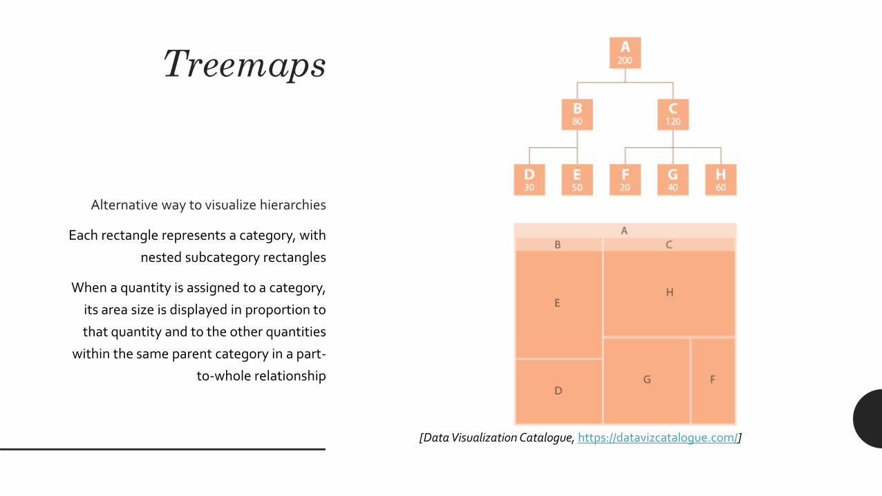
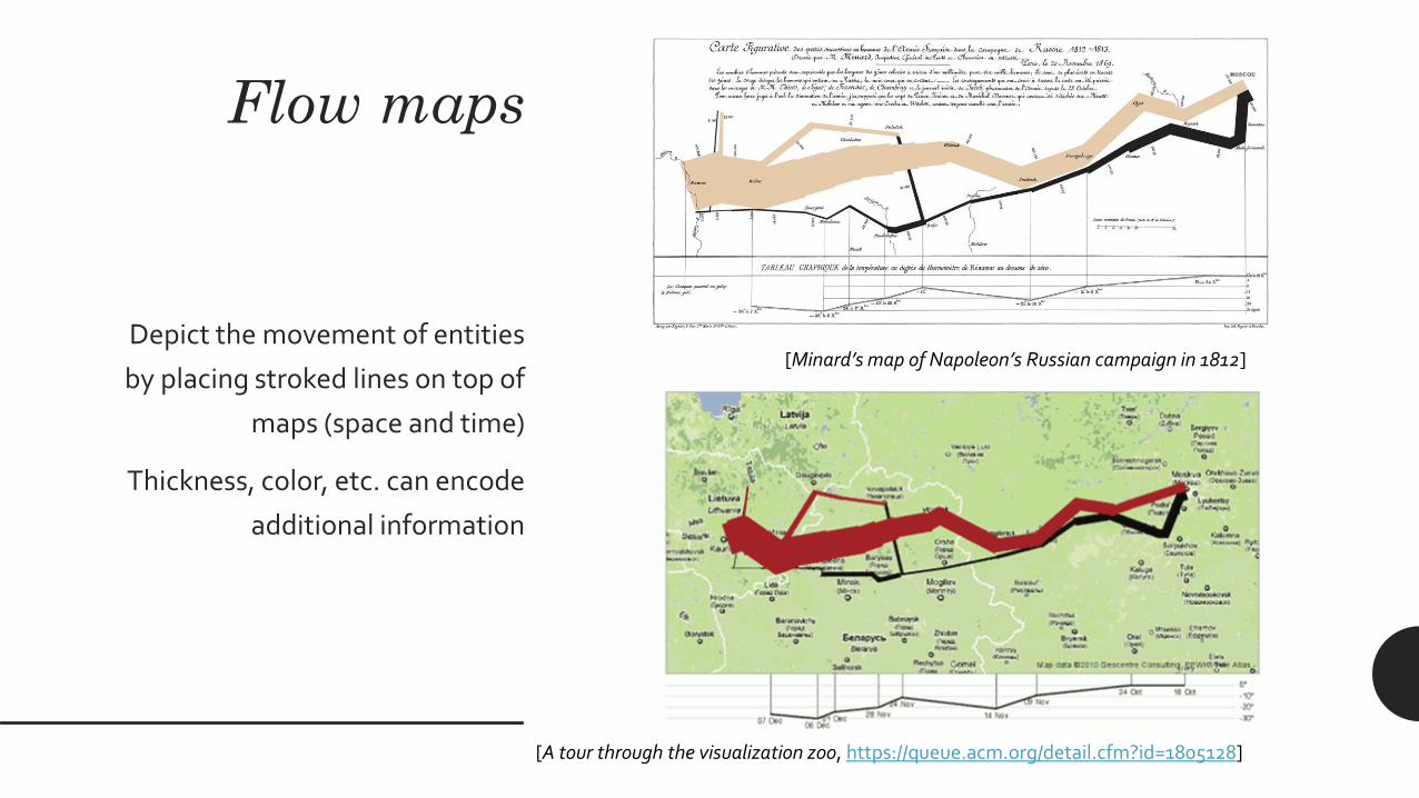
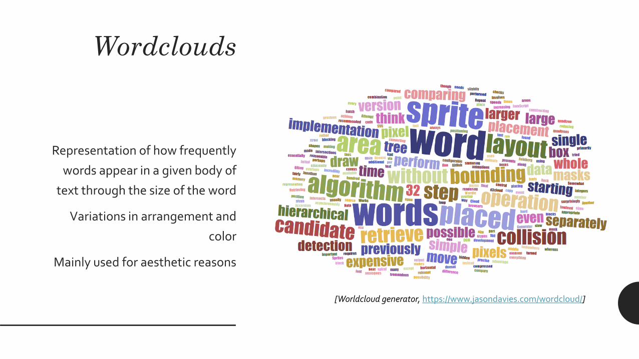
Wordclouds
Representation of how frequently
words appear in a given body of
text through the size of the word
Variations in arrangement and
color
Mainly used for aesthetic reasons
[wwwwordcloudscom]
Calligrams
Texts arranged so that they form a
thematically related image
The image created by the words
illustrates the text by expressing
visually something associated to
(or contradicting) what the text
says
[Le Charivari 1834 httpsenwikipediaorgwikiCalligram]
Visual encoding and decoding
Visual encoding
bull Visual encoding means going from data to visual
representations
bull Encoding requires not only to choose a graph that is
appropriate for the data at hand but also to select the
individual graphical elements
Graphical elements
bull Marks are visual objects representing data items
ndash points
ndash bars
ndash lines
ndash areas
ndash hellip
[Mario Salinas AA 2017-2018 ReviewerNet httpsreviewernetorg]
Marks
Channels
Contextual components
Graphical elements
bull Channels are the visual properties that encode data
attributes
ndash position
ndash size (length width area)
ndash angle and slope
ndash color (multiple channels)
ndash shape and texture
ndash hellip
Marks
Channels
Contextual components
[Giuliano Gradilone AA 2018-2019 httpsgiulitz189githubioNotable-Italians]
Graphical elements
bull Contextual components
ndash Legends labels annotations
ndash Grids reference lines
ndash hellip
Marks
Channels
Contextual components
Visual decoding
bull Visual decoding means deconstructing a visual
representation it into its major units by identifying
ndash the graphical elements
bull what are the visual marks What are the visual channels
ndash the mapping rules (ie the information that the
graphical elements represent)
bull what data items do the mark represent What attributes
do the channel represent
bull It is useful for evaluating and redesigning
visualizations
Visual decoding
[New York Times One Race Every Medalist Ever httparchivenytimescomwwwnytimescominteractive20120805sportsolympicsthe-
100-meter-dash-one-race-every-medalist-everhtml_r=1]
Quality evaluation
bull Expressiveness principle the visual representation
should represent all of and only the relationships that
exist in the data
ndash Consider the lie factor a value to describe the relation
between the size of effect shown in a graphic and the
size of effect shown in the data [Edward Tufte]
ndash Do not present information that is not in the data Expressiveness
Effectiveness
Quality evaluation
bull Expressiveness principle the visual representation
should represent all of and only the relationships that
exist in the data
ndash Consider the lie factor a value to describe the relation
between the size of effect shown in a graphic and the
size of effect shown in the data [Edward Tufte]
ndash Do not present information that is not in the data Expressiveness
Effectiveness
0
50
100
150
200
250
300
350
Skirt Trousers Sweaters Jacket Shoes
2018
Items sold
Quality evaluation
bull Expressiveness principle the visual representation
should represent all of and only the relationships that
exist in the data
ndash Consider the lie factor a value to describe the relation
between the size of effect shown in a graphic and the
size of effect shown in the data [Edward Tufte]
ndash Do not present information that is not in the data Expressiveness
Effectiveness
Quality evaluation
bull Effectiveness principle the relevance of information
displayed should match the effectiveness of the
channel
ndash relevant information should be prioritized then encoded
with the most effectiveaccurate channels
Expressiveness
Effectiveness
Quality evaluation
bull Effectiveness principle the relevance of information
displayed should match the effectiveness of the
channel
ndash relevant information should be prioritized then encoded
with the most effectiveaccurate channels
Expressiveness
Effectiveness
[A Cairo The functional art]
[Cleveland nd McGill 1984 ndash Adapted from A Cairo The functional art]
Perceptual accuracy
Quantitative attributes
Perceptual accuracy
[Data Visualization Course by John C Hart for Coursera 2015]less accurate
Evaluation examples
[Example taken from ttpwwwperceptualedgecom]
ldquothis graph [hellip] shows that while the number of people
dying from communicable diseases is still far too high
those numbers continue to come down In fact fewer kids
are dying more kids are going to school and more
diseases are on their way to being eliminated But there
remains much to do to cut down the deaths in that yellow
block even more dramatically ldquo [Bill Gates Wired
Magazine]
[Example taken from ttpwwwperceptualedgecom]
ldquothis graph [hellip] shows that while the number of people
dying from communicable diseases is still far too high
those numbers continue to come down In fact fewer kids
are dying more kids are going to school and more
diseases are on their way to being eliminated But there
remains much to do to cut down the deaths in that yellow
block even more dramatically ldquo [Bill Gates Wired
Magazine]
bull The size of rectangles represent years of life lost
bull The color hue represents groups of causes
bull The color intensity represents the change from one
year to another
[Example taken from ttpwwwperceptualedgecom]
ldquothis graph [hellip] shows that while the number of people
dying from communicable diseases is still far too high
those numbers continue to come down In fact fewer kids
are dying more kids are going to school and more
diseases are on their way to being eliminated But there
remains much to do to cut down the deaths in that yellow
block even more dramatically ldquo [Bill Gates Wired
Magazine]
bull Since this is a 3D projection shapes are skewed by
perspective and shadows
bull Area is not the best channel to represent quantities
ndash and we also have rectangles here with different
proportions
bull Positive and negative changes difficult to evaluate
bull Labels difficult to read
[Example taken from ttpwwwperceptualedgecom]
[Example taken from ttpwwwperceptualedgecom]
ldquothis graph [hellip] shows that while the number of people
dying from communicable diseases is still far too high
those numbers continue to come down In fact fewer kids
are dying more kids are going to school and more diseases
are on their way to being eliminated But there remains
much to do to cut down the deaths in that yellow block
even more dramatically ldquo [Bill Gates Wired Magazine]
bull Three aligned bar charts (years of life lost for every
single cause amount of change absolute values of
deaths)
bull Better representation of both quantities and changes
and proper space for labels
[Example taken from ttpwwwperceptualedgecom]
[Example taken from ttpwwwperceptualedgecom]
[Example taken from ttpwwwperceptualedgecom]
Questions
[httpsxkcdcom688]
52

Graphical elements
bull Channels are the visual properties that encode data
attributes
ndash position
ndash size (length width area)
ndash angle and slope
ndash color (multiple channels)
ndash shape and texture
ndash hellip
Marks
Channels
Contextual components
[Giuliano Gradilone AA 2018-2019 httpsgiulitz189githubioNotable-Italians]
Graphical elements
bull Contextual components
ndash Legends labels annotations
ndash Grids reference lines
ndash hellip
Marks
Channels
Contextual components
Visual decoding
bull Visual decoding means deconstructing a visual
representation it into its major units by identifying
ndash the graphical elements
bull what are the visual marks What are the visual channels
ndash the mapping rules (ie the information that the
graphical elements represent)
bull what data items do the mark represent What attributes
do the channel represent
bull It is useful for evaluating and redesigning
visualizations
Visual decoding
[New York Times One Race Every Medalist Ever httparchivenytimescomwwwnytimescominteractive20120805sportsolympicsthe-
100-meter-dash-one-race-every-medalist-everhtml_r=1]
Quality evaluation
bull Expressiveness principle the visual representation
should represent all of and only the relationships that
exist in the data
ndash Consider the lie factor a value to describe the relation
between the size of effect shown in a graphic and the
size of effect shown in the data [Edward Tufte]
ndash Do not present information that is not in the data Expressiveness
Effectiveness
Quality evaluation
bull Expressiveness principle the visual representation
should represent all of and only the relationships that
exist in the data
ndash Consider the lie factor a value to describe the relation
between the size of effect shown in a graphic and the
size of effect shown in the data [Edward Tufte]
ndash Do not present information that is not in the data Expressiveness
Effectiveness
0
50
100
150
200
250
300
350
Skirt Trousers Sweaters Jacket Shoes
2018
Items sold
Quality evaluation
bull Expressiveness principle the visual representation
should represent all of and only the relationships that
exist in the data
ndash Consider the lie factor a value to describe the relation
between the size of effect shown in a graphic and the
size of effect shown in the data [Edward Tufte]
ndash Do not present information that is not in the data Expressiveness
Effectiveness
Quality evaluation
bull Effectiveness principle the relevance of information
displayed should match the effectiveness of the
channel
ndash relevant information should be prioritized then encoded
with the most effectiveaccurate channels
Expressiveness
Effectiveness
Quality evaluation
bull Effectiveness principle the relevance of information
displayed should match the effectiveness of the
channel
ndash relevant information should be prioritized then encoded
with the most effectiveaccurate channels
Expressiveness
Effectiveness
[A Cairo The functional art]
[Cleveland nd McGill 1984 ndash Adapted from A Cairo The functional art]
Perceptual accuracy
Quantitative attributes
Perceptual accuracy
[Data Visualization Course by John C Hart for Coursera 2015]less accurate
Evaluation examples
[Example taken from ttpwwwperceptualedgecom]
ldquothis graph [hellip] shows that while the number of people
dying from communicable diseases is still far too high
those numbers continue to come down In fact fewer kids
are dying more kids are going to school and more
diseases are on their way to being eliminated But there
remains much to do to cut down the deaths in that yellow
block even more dramatically ldquo [Bill Gates Wired
Magazine]
[Example taken from ttpwwwperceptualedgecom]
ldquothis graph [hellip] shows that while the number of people
dying from communicable diseases is still far too high
those numbers continue to come down In fact fewer kids
are dying more kids are going to school and more
diseases are on their way to being eliminated But there
remains much to do to cut down the deaths in that yellow
block even more dramatically ldquo [Bill Gates Wired
Magazine]
bull The size of rectangles represent years of life lost
bull The color hue represents groups of causes
bull The color intensity represents the change from one
year to another
[Example taken from ttpwwwperceptualedgecom]
ldquothis graph [hellip] shows that while the number of people
dying from communicable diseases is still far too high
those numbers continue to come down In fact fewer kids
are dying more kids are going to school and more
diseases are on their way to being eliminated But there
remains much to do to cut down the deaths in that yellow
block even more dramatically ldquo [Bill Gates Wired
Magazine]
bull Since this is a 3D projection shapes are skewed by
perspective and shadows
bull Area is not the best channel to represent quantities
ndash and we also have rectangles here with different
proportions
bull Positive and negative changes difficult to evaluate
bull Labels difficult to read
[Example taken from ttpwwwperceptualedgecom]
[Example taken from ttpwwwperceptualedgecom]
ldquothis graph [hellip] shows that while the number of people
dying from communicable diseases is still far too high
those numbers continue to come down In fact fewer kids
are dying more kids are going to school and more diseases
are on their way to being eliminated But there remains
much to do to cut down the deaths in that yellow block
even more dramatically ldquo [Bill Gates Wired Magazine]
bull Three aligned bar charts (years of life lost for every
single cause amount of change absolute values of
deaths)
bull Better representation of both quantities and changes
and proper space for labels
[Example taken from ttpwwwperceptualedgecom]
[Example taken from ttpwwwperceptualedgecom]
[Example taken from ttpwwwperceptualedgecom]
Questions
[httpsxkcdcom688]
52

Visual decoding
[New York Times One Race Every Medalist Ever httparchivenytimescomwwwnytimescominteractive20120805sportsolympicsthe-
100-meter-dash-one-race-every-medalist-everhtml_r=1]
Quality evaluation
bull Expressiveness principle the visual representation
should represent all of and only the relationships that
exist in the data
ndash Consider the lie factor a value to describe the relation
between the size of effect shown in a graphic and the
size of effect shown in the data [Edward Tufte]
ndash Do not present information that is not in the data Expressiveness
Effectiveness
Quality evaluation
bull Expressiveness principle the visual representation
should represent all of and only the relationships that
exist in the data
ndash Consider the lie factor a value to describe the relation
between the size of effect shown in a graphic and the
size of effect shown in the data [Edward Tufte]
ndash Do not present information that is not in the data Expressiveness
Effectiveness
0
50
100
150
200
250
300
350
Skirt Trousers Sweaters Jacket Shoes
2018
Items sold
Quality evaluation
bull Expressiveness principle the visual representation
should represent all of and only the relationships that
exist in the data
ndash Consider the lie factor a value to describe the relation
between the size of effect shown in a graphic and the
size of effect shown in the data [Edward Tufte]
ndash Do not present information that is not in the data Expressiveness
Effectiveness
Quality evaluation
bull Effectiveness principle the relevance of information
displayed should match the effectiveness of the
channel
ndash relevant information should be prioritized then encoded
with the most effectiveaccurate channels
Expressiveness
Effectiveness
Quality evaluation
bull Effectiveness principle the relevance of information
displayed should match the effectiveness of the
channel
ndash relevant information should be prioritized then encoded
with the most effectiveaccurate channels
Expressiveness
Effectiveness
[A Cairo The functional art]
[Cleveland nd McGill 1984 ndash Adapted from A Cairo The functional art]
Perceptual accuracy
Quantitative attributes
Perceptual accuracy
[Data Visualization Course by John C Hart for Coursera 2015]less accurate
Evaluation examples
[Example taken from ttpwwwperceptualedgecom]
ldquothis graph [hellip] shows that while the number of people
dying from communicable diseases is still far too high
those numbers continue to come down In fact fewer kids
are dying more kids are going to school and more
diseases are on their way to being eliminated But there
remains much to do to cut down the deaths in that yellow
block even more dramatically ldquo [Bill Gates Wired
Magazine]
[Example taken from ttpwwwperceptualedgecom]
ldquothis graph [hellip] shows that while the number of people
dying from communicable diseases is still far too high
those numbers continue to come down In fact fewer kids
are dying more kids are going to school and more
diseases are on their way to being eliminated But there
remains much to do to cut down the deaths in that yellow
block even more dramatically ldquo [Bill Gates Wired
Magazine]
bull The size of rectangles represent years of life lost
bull The color hue represents groups of causes
bull The color intensity represents the change from one
year to another
[Example taken from ttpwwwperceptualedgecom]
ldquothis graph [hellip] shows that while the number of people
dying from communicable diseases is still far too high
those numbers continue to come down In fact fewer kids
are dying more kids are going to school and more
diseases are on their way to being eliminated But there
remains much to do to cut down the deaths in that yellow
block even more dramatically ldquo [Bill Gates Wired
Magazine]
bull Since this is a 3D projection shapes are skewed by
perspective and shadows
bull Area is not the best channel to represent quantities
ndash and we also have rectangles here with different
proportions
bull Positive and negative changes difficult to evaluate
bull Labels difficult to read
[Example taken from ttpwwwperceptualedgecom]
[Example taken from ttpwwwperceptualedgecom]
ldquothis graph [hellip] shows that while the number of people
dying from communicable diseases is still far too high
those numbers continue to come down In fact fewer kids
are dying more kids are going to school and more diseases
are on their way to being eliminated But there remains
much to do to cut down the deaths in that yellow block
even more dramatically ldquo [Bill Gates Wired Magazine]
bull Three aligned bar charts (years of life lost for every
single cause amount of change absolute values of
deaths)
bull Better representation of both quantities and changes
and proper space for labels
[Example taken from ttpwwwperceptualedgecom]
[Example taken from ttpwwwperceptualedgecom]
[Example taken from ttpwwwperceptualedgecom]
Questions
[httpsxkcdcom688]
52

Quality evaluation
bull Expressiveness principle the visual representation
should represent all of and only the relationships that
exist in the data
ndash Consider the lie factor a value to describe the relation
between the size of effect shown in a graphic and the
size of effect shown in the data [Edward Tufte]
ndash Do not present information that is not in the data Expressiveness
Effectiveness
Quality evaluation
bull Expressiveness principle the visual representation
should represent all of and only the relationships that
exist in the data
ndash Consider the lie factor a value to describe the relation
between the size of effect shown in a graphic and the
size of effect shown in the data [Edward Tufte]
ndash Do not present information that is not in the data Expressiveness
Effectiveness
0
50
100
150
200
250
300
350
Skirt Trousers Sweaters Jacket Shoes
2018
Items sold
Quality evaluation
bull Expressiveness principle the visual representation
should represent all of and only the relationships that
exist in the data
ndash Consider the lie factor a value to describe the relation
between the size of effect shown in a graphic and the
size of effect shown in the data [Edward Tufte]
ndash Do not present information that is not in the data Expressiveness
Effectiveness
Quality evaluation
bull Effectiveness principle the relevance of information
displayed should match the effectiveness of the
channel
ndash relevant information should be prioritized then encoded
with the most effectiveaccurate channels
Expressiveness
Effectiveness
Quality evaluation
bull Effectiveness principle the relevance of information
displayed should match the effectiveness of the
channel
ndash relevant information should be prioritized then encoded
with the most effectiveaccurate channels
Expressiveness
Effectiveness
[A Cairo The functional art]
[Cleveland nd McGill 1984 ndash Adapted from A Cairo The functional art]
Perceptual accuracy
Quantitative attributes
Perceptual accuracy
[Data Visualization Course by John C Hart for Coursera 2015]less accurate
Evaluation examples
[Example taken from ttpwwwperceptualedgecom]
ldquothis graph [hellip] shows that while the number of people
dying from communicable diseases is still far too high
those numbers continue to come down In fact fewer kids
are dying more kids are going to school and more
diseases are on their way to being eliminated But there
remains much to do to cut down the deaths in that yellow
block even more dramatically ldquo [Bill Gates Wired
Magazine]
[Example taken from ttpwwwperceptualedgecom]
ldquothis graph [hellip] shows that while the number of people
dying from communicable diseases is still far too high
those numbers continue to come down In fact fewer kids
are dying more kids are going to school and more
diseases are on their way to being eliminated But there
remains much to do to cut down the deaths in that yellow
block even more dramatically ldquo [Bill Gates Wired
Magazine]
bull The size of rectangles represent years of life lost
bull The color hue represents groups of causes
bull The color intensity represents the change from one
year to another
[Example taken from ttpwwwperceptualedgecom]
ldquothis graph [hellip] shows that while the number of people
dying from communicable diseases is still far too high
those numbers continue to come down In fact fewer kids
are dying more kids are going to school and more
diseases are on their way to being eliminated But there
remains much to do to cut down the deaths in that yellow
block even more dramatically ldquo [Bill Gates Wired
Magazine]
bull Since this is a 3D projection shapes are skewed by
perspective and shadows
bull Area is not the best channel to represent quantities
ndash and we also have rectangles here with different
proportions
bull Positive and negative changes difficult to evaluate
bull Labels difficult to read
[Example taken from ttpwwwperceptualedgecom]
[Example taken from ttpwwwperceptualedgecom]
ldquothis graph [hellip] shows that while the number of people
dying from communicable diseases is still far too high
those numbers continue to come down In fact fewer kids
are dying more kids are going to school and more diseases
are on their way to being eliminated But there remains
much to do to cut down the deaths in that yellow block
even more dramatically ldquo [Bill Gates Wired Magazine]
bull Three aligned bar charts (years of life lost for every
single cause amount of change absolute values of
deaths)
bull Better representation of both quantities and changes
and proper space for labels
[Example taken from ttpwwwperceptualedgecom]
[Example taken from ttpwwwperceptualedgecom]
[Example taken from ttpwwwperceptualedgecom]
Questions
[httpsxkcdcom688]
52

Quality evaluation
bull Expressiveness principle the visual representation
should represent all of and only the relationships that
exist in the data
ndash Consider the lie factor a value to describe the relation
between the size of effect shown in a graphic and the
size of effect shown in the data [Edward Tufte]
ndash Do not present information that is not in the data Expressiveness
Effectiveness
0
50
100
150
200
250
300
350
Skirt Trousers Sweaters Jacket Shoes
2018
Items sold
Quality evaluation
bull Expressiveness principle the visual representation
should represent all of and only the relationships that
exist in the data
ndash Consider the lie factor a value to describe the relation
between the size of effect shown in a graphic and the
size of effect shown in the data [Edward Tufte]
ndash Do not present information that is not in the data Expressiveness
Effectiveness
Quality evaluation
bull Effectiveness principle the relevance of information
displayed should match the effectiveness of the
channel
ndash relevant information should be prioritized then encoded
with the most effectiveaccurate channels
Expressiveness
Effectiveness
Quality evaluation
bull Effectiveness principle the relevance of information
displayed should match the effectiveness of the
channel
ndash relevant information should be prioritized then encoded
with the most effectiveaccurate channels
Expressiveness
Effectiveness
[A Cairo The functional art]
[Cleveland nd McGill 1984 ndash Adapted from A Cairo The functional art]
Perceptual accuracy
Quantitative attributes
Perceptual accuracy
[Data Visualization Course by John C Hart for Coursera 2015]less accurate
Evaluation examples
[Example taken from ttpwwwperceptualedgecom]
ldquothis graph [hellip] shows that while the number of people
dying from communicable diseases is still far too high
those numbers continue to come down In fact fewer kids
are dying more kids are going to school and more
diseases are on their way to being eliminated But there
remains much to do to cut down the deaths in that yellow
block even more dramatically ldquo [Bill Gates Wired
Magazine]
[Example taken from ttpwwwperceptualedgecom]
ldquothis graph [hellip] shows that while the number of people
dying from communicable diseases is still far too high
those numbers continue to come down In fact fewer kids
are dying more kids are going to school and more
diseases are on their way to being eliminated But there
remains much to do to cut down the deaths in that yellow
block even more dramatically ldquo [Bill Gates Wired
Magazine]
bull The size of rectangles represent years of life lost
bull The color hue represents groups of causes
bull The color intensity represents the change from one
year to another
[Example taken from ttpwwwperceptualedgecom]
ldquothis graph [hellip] shows that while the number of people
dying from communicable diseases is still far too high
those numbers continue to come down In fact fewer kids
are dying more kids are going to school and more
diseases are on their way to being eliminated But there
remains much to do to cut down the deaths in that yellow
block even more dramatically ldquo [Bill Gates Wired
Magazine]
bull Since this is a 3D projection shapes are skewed by
perspective and shadows
bull Area is not the best channel to represent quantities
ndash and we also have rectangles here with different
proportions
bull Positive and negative changes difficult to evaluate
bull Labels difficult to read
[Example taken from ttpwwwperceptualedgecom]
[Example taken from ttpwwwperceptualedgecom]
ldquothis graph [hellip] shows that while the number of people
dying from communicable diseases is still far too high
those numbers continue to come down In fact fewer kids
are dying more kids are going to school and more diseases
are on their way to being eliminated But there remains
much to do to cut down the deaths in that yellow block
even more dramatically ldquo [Bill Gates Wired Magazine]
bull Three aligned bar charts (years of life lost for every
single cause amount of change absolute values of
deaths)
bull Better representation of both quantities and changes
and proper space for labels
[Example taken from ttpwwwperceptualedgecom]
[Example taken from ttpwwwperceptualedgecom]
[Example taken from ttpwwwperceptualedgecom]
Questions
[httpsxkcdcom688]
52
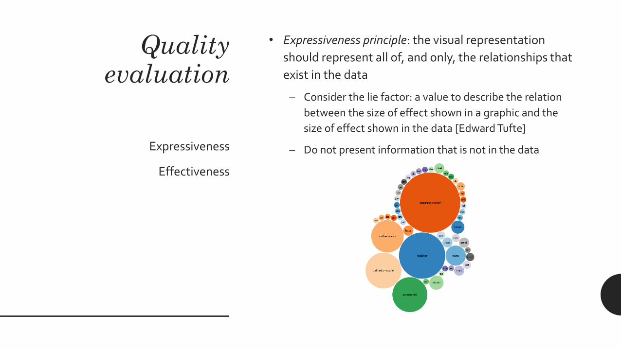
Quality evaluation
bull Expressiveness principle the visual representation
should represent all of and only the relationships that
exist in the data
ndash Consider the lie factor a value to describe the relation
between the size of effect shown in a graphic and the
size of effect shown in the data [Edward Tufte]
ndash Do not present information that is not in the data Expressiveness
Effectiveness
Quality evaluation
bull Effectiveness principle the relevance of information
displayed should match the effectiveness of the
channel
ndash relevant information should be prioritized then encoded
with the most effectiveaccurate channels
Expressiveness
Effectiveness
Quality evaluation
bull Effectiveness principle the relevance of information
displayed should match the effectiveness of the
channel
ndash relevant information should be prioritized then encoded
with the most effectiveaccurate channels
Expressiveness
Effectiveness
[A Cairo The functional art]
[Cleveland nd McGill 1984 ndash Adapted from A Cairo The functional art]
Perceptual accuracy
Quantitative attributes
Perceptual accuracy
[Data Visualization Course by John C Hart for Coursera 2015]less accurate
Evaluation examples
[Example taken from ttpwwwperceptualedgecom]
ldquothis graph [hellip] shows that while the number of people
dying from communicable diseases is still far too high
those numbers continue to come down In fact fewer kids
are dying more kids are going to school and more
diseases are on their way to being eliminated But there
remains much to do to cut down the deaths in that yellow
block even more dramatically ldquo [Bill Gates Wired
Magazine]
[Example taken from ttpwwwperceptualedgecom]
ldquothis graph [hellip] shows that while the number of people
dying from communicable diseases is still far too high
those numbers continue to come down In fact fewer kids
are dying more kids are going to school and more
diseases are on their way to being eliminated But there
remains much to do to cut down the deaths in that yellow
block even more dramatically ldquo [Bill Gates Wired
Magazine]
bull The size of rectangles represent years of life lost
bull The color hue represents groups of causes
bull The color intensity represents the change from one
year to another
[Example taken from ttpwwwperceptualedgecom]
ldquothis graph [hellip] shows that while the number of people
dying from communicable diseases is still far too high
those numbers continue to come down In fact fewer kids
are dying more kids are going to school and more
diseases are on their way to being eliminated But there
remains much to do to cut down the deaths in that yellow
block even more dramatically ldquo [Bill Gates Wired
Magazine]
bull Since this is a 3D projection shapes are skewed by
perspective and shadows
bull Area is not the best channel to represent quantities
ndash and we also have rectangles here with different
proportions
bull Positive and negative changes difficult to evaluate
bull Labels difficult to read
[Example taken from ttpwwwperceptualedgecom]
[Example taken from ttpwwwperceptualedgecom]
ldquothis graph [hellip] shows that while the number of people
dying from communicable diseases is still far too high
those numbers continue to come down In fact fewer kids
are dying more kids are going to school and more diseases
are on their way to being eliminated But there remains
much to do to cut down the deaths in that yellow block
even more dramatically ldquo [Bill Gates Wired Magazine]
bull Three aligned bar charts (years of life lost for every
single cause amount of change absolute values of
deaths)
bull Better representation of both quantities and changes
and proper space for labels
[Example taken from ttpwwwperceptualedgecom]
[Example taken from ttpwwwperceptualedgecom]
[Example taken from ttpwwwperceptualedgecom]
Questions
[httpsxkcdcom688]
52

Quality evaluation
bull Effectiveness principle the relevance of information
displayed should match the effectiveness of the
channel
ndash relevant information should be prioritized then encoded
with the most effectiveaccurate channels
Expressiveness
Effectiveness
Quality evaluation
bull Effectiveness principle the relevance of information
displayed should match the effectiveness of the
channel
ndash relevant information should be prioritized then encoded
with the most effectiveaccurate channels
Expressiveness
Effectiveness
[A Cairo The functional art]
[Cleveland nd McGill 1984 ndash Adapted from A Cairo The functional art]
Perceptual accuracy
Quantitative attributes
Perceptual accuracy
[Data Visualization Course by John C Hart for Coursera 2015]less accurate
Evaluation examples
[Example taken from ttpwwwperceptualedgecom]
ldquothis graph [hellip] shows that while the number of people
dying from communicable diseases is still far too high
those numbers continue to come down In fact fewer kids
are dying more kids are going to school and more
diseases are on their way to being eliminated But there
remains much to do to cut down the deaths in that yellow
block even more dramatically ldquo [Bill Gates Wired
Magazine]
[Example taken from ttpwwwperceptualedgecom]
ldquothis graph [hellip] shows that while the number of people
dying from communicable diseases is still far too high
those numbers continue to come down In fact fewer kids
are dying more kids are going to school and more
diseases are on their way to being eliminated But there
remains much to do to cut down the deaths in that yellow
block even more dramatically ldquo [Bill Gates Wired
Magazine]
bull The size of rectangles represent years of life lost
bull The color hue represents groups of causes
bull The color intensity represents the change from one
year to another
[Example taken from ttpwwwperceptualedgecom]
ldquothis graph [hellip] shows that while the number of people
dying from communicable diseases is still far too high
those numbers continue to come down In fact fewer kids
are dying more kids are going to school and more
diseases are on their way to being eliminated But there
remains much to do to cut down the deaths in that yellow
block even more dramatically ldquo [Bill Gates Wired
Magazine]
bull Since this is a 3D projection shapes are skewed by
perspective and shadows
bull Area is not the best channel to represent quantities
ndash and we also have rectangles here with different
proportions
bull Positive and negative changes difficult to evaluate
bull Labels difficult to read
[Example taken from ttpwwwperceptualedgecom]
[Example taken from ttpwwwperceptualedgecom]
ldquothis graph [hellip] shows that while the number of people
dying from communicable diseases is still far too high
those numbers continue to come down In fact fewer kids
are dying more kids are going to school and more diseases
are on their way to being eliminated But there remains
much to do to cut down the deaths in that yellow block
even more dramatically ldquo [Bill Gates Wired Magazine]
bull Three aligned bar charts (years of life lost for every
single cause amount of change absolute values of
deaths)
bull Better representation of both quantities and changes
and proper space for labels
[Example taken from ttpwwwperceptualedgecom]
[Example taken from ttpwwwperceptualedgecom]
[Example taken from ttpwwwperceptualedgecom]
Questions
[httpsxkcdcom688]
52

Quality evaluation
bull Effectiveness principle the relevance of information
displayed should match the effectiveness of the
channel
ndash relevant information should be prioritized then encoded
with the most effectiveaccurate channels
Expressiveness
Effectiveness
[A Cairo The functional art]
[Cleveland nd McGill 1984 ndash Adapted from A Cairo The functional art]
Perceptual accuracy
Quantitative attributes
Perceptual accuracy
[Data Visualization Course by John C Hart for Coursera 2015]less accurate
Evaluation examples
[Example taken from ttpwwwperceptualedgecom]
ldquothis graph [hellip] shows that while the number of people
dying from communicable diseases is still far too high
those numbers continue to come down In fact fewer kids
are dying more kids are going to school and more
diseases are on their way to being eliminated But there
remains much to do to cut down the deaths in that yellow
block even more dramatically ldquo [Bill Gates Wired
Magazine]
[Example taken from ttpwwwperceptualedgecom]
ldquothis graph [hellip] shows that while the number of people
dying from communicable diseases is still far too high
those numbers continue to come down In fact fewer kids
are dying more kids are going to school and more
diseases are on their way to being eliminated But there
remains much to do to cut down the deaths in that yellow
block even more dramatically ldquo [Bill Gates Wired
Magazine]
bull The size of rectangles represent years of life lost
bull The color hue represents groups of causes
bull The color intensity represents the change from one
year to another
[Example taken from ttpwwwperceptualedgecom]
ldquothis graph [hellip] shows that while the number of people
dying from communicable diseases is still far too high
those numbers continue to come down In fact fewer kids
are dying more kids are going to school and more
diseases are on their way to being eliminated But there
remains much to do to cut down the deaths in that yellow
block even more dramatically ldquo [Bill Gates Wired
Magazine]
bull Since this is a 3D projection shapes are skewed by
perspective and shadows
bull Area is not the best channel to represent quantities
ndash and we also have rectangles here with different
proportions
bull Positive and negative changes difficult to evaluate
bull Labels difficult to read
[Example taken from ttpwwwperceptualedgecom]
[Example taken from ttpwwwperceptualedgecom]
ldquothis graph [hellip] shows that while the number of people
dying from communicable diseases is still far too high
those numbers continue to come down In fact fewer kids
are dying more kids are going to school and more diseases
are on their way to being eliminated But there remains
much to do to cut down the deaths in that yellow block
even more dramatically ldquo [Bill Gates Wired Magazine]
bull Three aligned bar charts (years of life lost for every
single cause amount of change absolute values of
deaths)
bull Better representation of both quantities and changes
and proper space for labels
[Example taken from ttpwwwperceptualedgecom]
[Example taken from ttpwwwperceptualedgecom]
[Example taken from ttpwwwperceptualedgecom]
Questions
[httpsxkcdcom688]
52

[Example taken from ttpwwwperceptualedgecom]
ldquothis graph [hellip] shows that while the number of people
dying from communicable diseases is still far too high
those numbers continue to come down In fact fewer kids
are dying more kids are going to school and more
diseases are on their way to being eliminated But there
remains much to do to cut down the deaths in that yellow
block even more dramatically ldquo [Bill Gates Wired
Magazine]
bull The size of rectangles represent years of life lost
bull The color hue represents groups of causes
bull The color intensity represents the change from one
year to another
[Example taken from ttpwwwperceptualedgecom]
ldquothis graph [hellip] shows that while the number of people
dying from communicable diseases is still far too high
those numbers continue to come down In fact fewer kids
are dying more kids are going to school and more
diseases are on their way to being eliminated But there
remains much to do to cut down the deaths in that yellow
block even more dramatically ldquo [Bill Gates Wired
Magazine]
bull Since this is a 3D projection shapes are skewed by
perspective and shadows
bull Area is not the best channel to represent quantities
ndash and we also have rectangles here with different
proportions
bull Positive and negative changes difficult to evaluate
bull Labels difficult to read
[Example taken from ttpwwwperceptualedgecom]
[Example taken from ttpwwwperceptualedgecom]
ldquothis graph [hellip] shows that while the number of people
dying from communicable diseases is still far too high
those numbers continue to come down In fact fewer kids
are dying more kids are going to school and more diseases
are on their way to being eliminated But there remains
much to do to cut down the deaths in that yellow block
even more dramatically ldquo [Bill Gates Wired Magazine]
bull Three aligned bar charts (years of life lost for every
single cause amount of change absolute values of
deaths)
bull Better representation of both quantities and changes
and proper space for labels
[Example taken from ttpwwwperceptualedgecom]
[Example taken from ttpwwwperceptualedgecom]
[Example taken from ttpwwwperceptualedgecom]
Questions
[httpsxkcdcom688]
52

[Example taken from ttpwwwperceptualedgecom]
ldquothis graph [hellip] shows that while the number of people
dying from communicable diseases is still far too high
those numbers continue to come down In fact fewer kids
are dying more kids are going to school and more
diseases are on their way to being eliminated But there
remains much to do to cut down the deaths in that yellow
block even more dramatically ldquo [Bill Gates Wired
Magazine]
bull Since this is a 3D projection shapes are skewed by
perspective and shadows
bull Area is not the best channel to represent quantities
ndash and we also have rectangles here with different
proportions
bull Positive and negative changes difficult to evaluate
bull Labels difficult to read
[Example taken from ttpwwwperceptualedgecom]
[Example taken from ttpwwwperceptualedgecom]
ldquothis graph [hellip] shows that while the number of people
dying from communicable diseases is still far too high
those numbers continue to come down In fact fewer kids
are dying more kids are going to school and more diseases
are on their way to being eliminated But there remains
much to do to cut down the deaths in that yellow block
even more dramatically ldquo [Bill Gates Wired Magazine]
bull Three aligned bar charts (years of life lost for every
single cause amount of change absolute values of
deaths)
bull Better representation of both quantities and changes
and proper space for labels
[Example taken from ttpwwwperceptualedgecom]
[Example taken from ttpwwwperceptualedgecom]
[Example taken from ttpwwwperceptualedgecom]
Questions
[httpsxkcdcom688]
52

[Example taken from ttpwwwperceptualedgecom]
[Example taken from ttpwwwperceptualedgecom]
ldquothis graph [hellip] shows that while the number of people
dying from communicable diseases is still far too high
those numbers continue to come down In fact fewer kids
are dying more kids are going to school and more diseases
are on their way to being eliminated But there remains
much to do to cut down the deaths in that yellow block
even more dramatically ldquo [Bill Gates Wired Magazine]
bull Three aligned bar charts (years of life lost for every
single cause amount of change absolute values of
deaths)
bull Better representation of both quantities and changes
and proper space for labels
[Example taken from ttpwwwperceptualedgecom]
[Example taken from ttpwwwperceptualedgecom]
[Example taken from ttpwwwperceptualedgecom]
Questions
[httpsxkcdcom688]
52
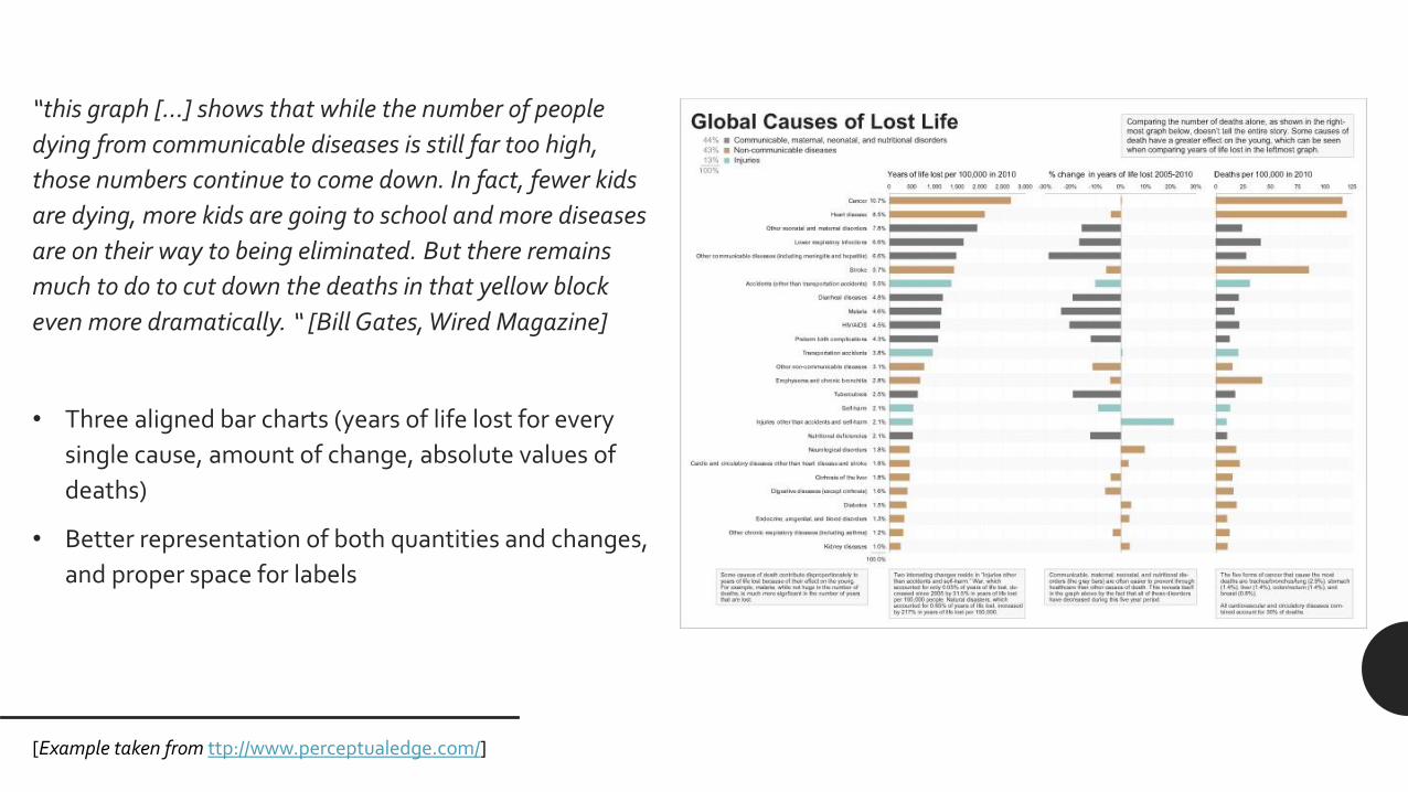
[Example taken from ttpwwwperceptualedgecom]
[Example taken from ttpwwwperceptualedgecom]
[Example taken from ttpwwwperceptualedgecom]
Questions
[httpsxkcdcom688]
52

[Example taken from ttpwwwperceptualedgecom]
[Example taken from ttpwwwperceptualedgecom]
Questions
[httpsxkcdcom688]
52

[Example taken from ttpwwwperceptualedgecom]
Questions
[httpsxkcdcom688]
52

Questions
[httpsxkcdcom688]
52