Embed Size (px)
Citation preview
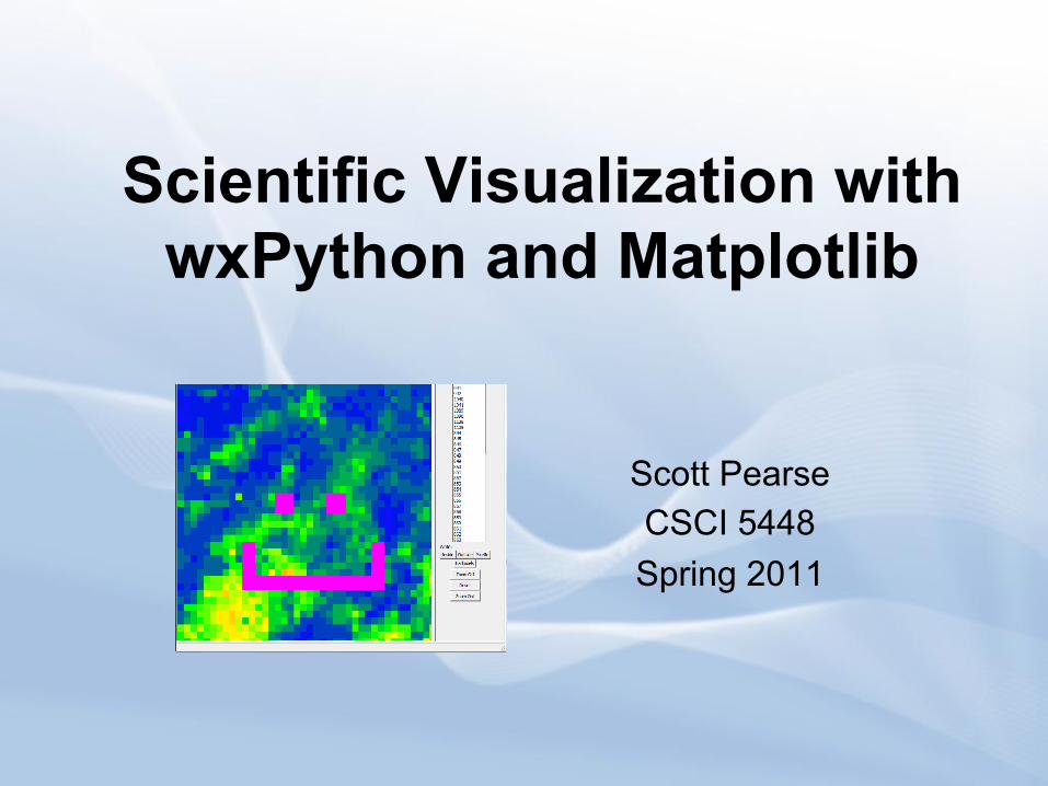
Scientific Visualization with wxPython and Matplotlib
Scott Pearse CSCI 5448 Spring 2011

In this presentation, you will be shown how to use wxPython and Matplotlib to help you eliminate annoying inefficiencies that may exist
in your scientific analysis!
About:
What is WxPython??
1) A wrapper for the GUI API "WxWidgets", written in C++ 2) An alternative to PyQt and Tkinter 3) First modern version released in 1998
wxPython In Action The primary reference manual for wxPython, written by Robin Dunn

What is Matplotlib??
1) An extension that allows the easy generation of a variety of graphs, including 3D plotting. 2) Contains tools for basic graph functions such as axis manipulation.
Examples of a histogram, topography, and radial mapping made with Matplotlib

Presentation Outline
• Part 1 - How Pixelpicker was made with wxPython – How to make a frame – How to customize a frame – How to add widgets – How to add click events
• Part 2 – Add plots to our application – How to make a plot – How to make it interact with our program
This presentation is divided into two parts. The first deals with how to make a basic GUI with wxpython. The second explains how to apply a plot into our application.

Making Pixelpicker with wxPython
What is PixelPicker? • Pixelpicker is a tool I needed to help me identify anomalous radar data,
which is routinely found in NEXRAD WSR-88D precipitation sensors. • Pixelpicker allows the user to select pixels that just look bad from a
summation image that spans an arbitrary period of data.

Radar Anomalies Include: • Bad Pixels
– Pixels that are just stinkin bad – Can be caused by ground clutter (ie tall
buildings or non-ideal topography) – Bad pixel example shown on the right, in red.
This one actually measures in the hundreds of inches of rain, as opposed to its neighbors which are in the tens of inches.
• Cones of Silence – WSR-88D stations are located on the ground, and
their radar signals propogate outward at ~1 degree from the ground.
– This means that there is a radius around the station where the radar waveform is (typically) too low to intercept clouds or precip
– Even if there's a big cloud directly above the radar station or its nearby area, the station will not receive data from the because its waveform does not intercept it. This area is called a 'cone of silence'.
– Cone of silence can be seen in the image to the right, in the lower left corner.

Radar Anomalies (continued) • Radar extent discontinuities
– WSR-88D weather stations have a typical range of 230km (this can be highly modified by engineers at the radar site)
– When creating a 'mosaic' image of radar data, these extents overlap, and are not always continuous.
– Identification of these boundaries is necessary for 'radar smoothing‘
– One discontinuity can be seen in the picture on the right, spanning the lower left corner.
• Brightband Reflectivity – Radar signals are interpreted by their
reflection off of water particles in the atmosphere
– However the reflectivity of these particles changes dramatically with varying atmospheric conditions.
– Snow and ice have a high reflectivity coefficient, and return a high percentage of incident radiation.
– This phenomenon results in what looks like high amounts of precipitation, and is referred to as ‘brightbanding’.

Why use wxPython to make tools like Pixelpicker?
The old way to identify radar discontinuities was to write out the # of each pixel into a text document, then forward this doc for further processing. This meant using the mouse to scroll to the pixel in question (via another wxPython application that identifies pixel numbers), then scrolling back to the editor to write its value. The user would sometimes lapse across thousands of iterations of this process, and it was insanely inefficient. It's much easier to just click on a radar pixel, and have a program document which pixel was clicked.
Not every job in the world is this mundane or inefficient, but they are out there. If we can create tools to visually represent scientific data, and leave the monotony to the machines, our lives will be better.
Enter wxPython.
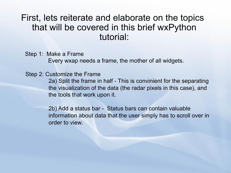
First, lets reiterate and elaborate on the topics that will be covered in this brief wxPython
tutorial:
Step 1: Make a Frame Every wxap needs a frame, the mother of all widgets.
Step 2: Customize the Frame
2a) Split the frame in half - This is convinient for the separating the visualization of the data (the radar pixels in this case), and the tools that work upon it.
2b) Add a status bar - Status bars can contain valuable information about data that the user simply has to scroll over in order to view.

Reiteration and Elaboration (continued)
Step 3: Add Widgets These will be the workhorse of our program, and will implement t are needed to get acutal work done
For some of you, these terms may be new. On the next slide, we have a visual diagram of pixelpicker, with labels to associate these terms with.

wxPython Terminology Diagram

Make a Frame The code below comprises the simplest wxPython application ever
concieved. It creates our "Frame", (also referred to as a window) that will contain all of the widgets and tools that we will define later in the program.

What does it mean?
This is our basic constructor for the frame. It will be heavily added to later on, so we can initialize a window that is much nicer and very fancy :) Note that the frame's size is declaired in its constructor as a tuple data type
wx.App initializes the underlying GUI toolkit for WxPython. Every application needs this!
Initialize our frame, which is implemented above
Show our frame! If necessary, frame.Hide() can be called which does the opposite. This can be used for 'tabs' in a preferences menu.
#This keeps our GUI in a continuous loop that is ready to receive key events from the user. It does not return until the program closes!
These calls are the backbone of every wxPython application. Each program needs these calls for the program to initialize and function properly.
What does it mean?

Now that we've created our frame, we need to articulate our needs and customize it!
There are a plethora of utilities that frames
implement. For simplicity's sake I am going to emphasize two that I consistently use in my scientific wxPython applications.
The first is a splitter window, and the second is a status bar.

Why use a splitter window? It is convenient for the separating the visualization of the data (the radar pixels in this case), and the tools that work upon it. In this example, I want to keep my pixels separate from the lists of data I want to display, and the buttons I will use to take action upon those lists. Setting up the splitter window is invoked within the constructor (__init__ of TestFrame) of our frame and is shown below:
The bottom four lines constitute the splitter window

What does it mean?
This creates a SplitterWindow object within our frame, which will contain a panel on the left and right of the ‘split’
Our panels will hold the contents of the left and right side of our frame, and are defined here. Note that the first argument in the signature is our splitter window object. If we were only placing one panel in our frame, we would put ‘self’, which would target the parent frame.
Finally we apply the splitter, and define which panels will be on the left and right. We have split it vertically in this case, but horizontal splitting is also an option. The third argument is the offset from the left side of the frame, where we will put the divider.

Applying a Status Bar Status bars can be useful for displaying information on the fly during the use of your application. For example, a text editor often displays the page number being viewed, along with the row and column that the cursor lies at.
The following lines create the status bar, and add text to it. The text may be dynamically written by making the SetStatusText() call in order to display useful information, such as cursor location.
These lines were included in the constructor of our frame. However SetStatusText can be called anywhere in your application.

Adding Widgets Widgets are pre-built tools that range from buttons
to text fields to drop-down boxes. They are crucial to any modern user-friendly interface.
For our example, we will be adding two buttons to our application that will modify the status bar.

What does it mean? Within our constructor, we create two buttons and bind them to functions that are defined later on.
These create two buttons labeled ‘Si’ and ‘No’ in panels p1 and p2 of our application. These buttons are bound to functions self.Si and self.No, which are contained within our TestFrame class, and are triggered by the button’s click.
The Si and No functions are (again) contained witin our frame, and trigger a change in the statusbar text to “Si” or “No”.
What does it mean?

Now we have a basic wxPython application that demonstrates some of the basic tools that are used to
create a GUI for our users. Now lets look at how to represent scientific data with the graphing tools in
Matplotlib.
The tools that we will use are imported from the Matplotlib library, shown below.
On to Matplotlib!

We will want to have our plot designated into one of the two panels we have created previously. This means we will need a dedicated constructor for one of our panels, as opposed to using the generic constructor we relied on last time. Our new constructor is shown below:
Configuring our new graph panel

What does it mean? This initializes the top level container for all plot elements. Everything in the plot goes within this object, just like everything in our wx application goes into our frame!
Our figure can contain many subplots, but here we will only make one. add_subplot() is what does this for us. The 111 is a grid parameter, encoded as an integer. It means 1x1 grid, first subplot. If you want two subplots, the number would be 2x1; the first subplot would be 211, and the second subplot would be 212. Hope that makes sense…
t and s are what I chose for axis values. I should have chosen x and y, so sorry. Anyways, they are arrays that contain values that link with each other to form our plot. These arrays must have the same size! Here, t is just an incrementing list from 0 to 10, and s is an randomly chosen set of integers.
This initializes the top level container for all plot elements. Everything in the plot goes within this object, just like everything in our wx application goes into our frame!
What does it mean?

What does it mean? (continued)
This command creates and plots the t and s arrays that were defined earlier. Since self.axes was defined as a subplot of self.figure, this also plays a role in generating self.figure, the container of our subplot.
Finally, we have our canvas object, which ‘paints’ our object onto the screen. Simply pass in our figure and the FigureCanvas tool does the rest.
And voila! Our plot appears in the left panel of our application.

And there we have it • There are many other widgets utilized by
wxPython. Not everything can be handled by buttons alone. However the widgets all have a similar implementation. Extensive documentation exists online, as well as helpful online forum. When in doubt, google it.
• Matplotlib also extends much further than what was shown here, but these basics pertain to the entire toolset.
• With these two toolsets, inefficiencies in work processes can be cured, and science can be improved!