Embed Size (px)
DESCRIPTION
REALLY GOOD PRESENTATION MADE BY YUVAL!
Citation preview
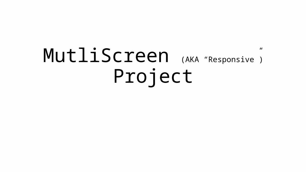
MutliScreen (AKA “Responsive”) Project
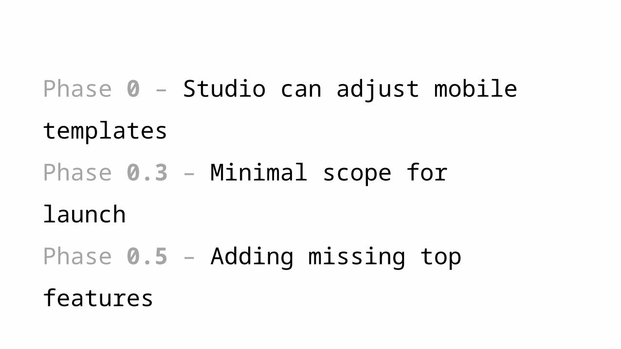
Phase 0 – Studio can adjust mobile templates
Phase 0.3 – Minimal scope for launch
Phase 0.5 – Adding missing top features
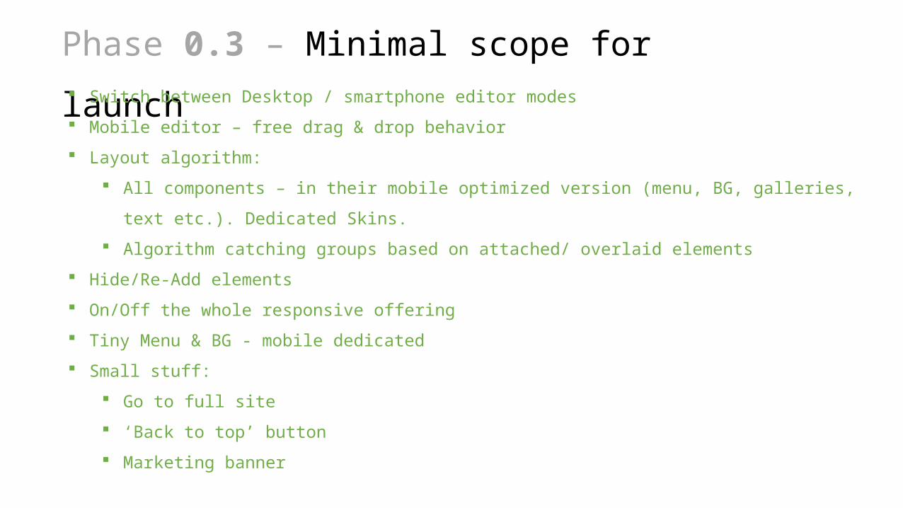
Phase 0.3 – Minimal scope for launch Switch between Desktop / smartphone editor modes
Mobile editor – free drag & drop behavior
Layout algorithm:
All components – in their mobile optimized version (menu, BG, galleries, text etc.). Dedicated Skins.
Algorithm catching groups based on attached/ overlaid elements
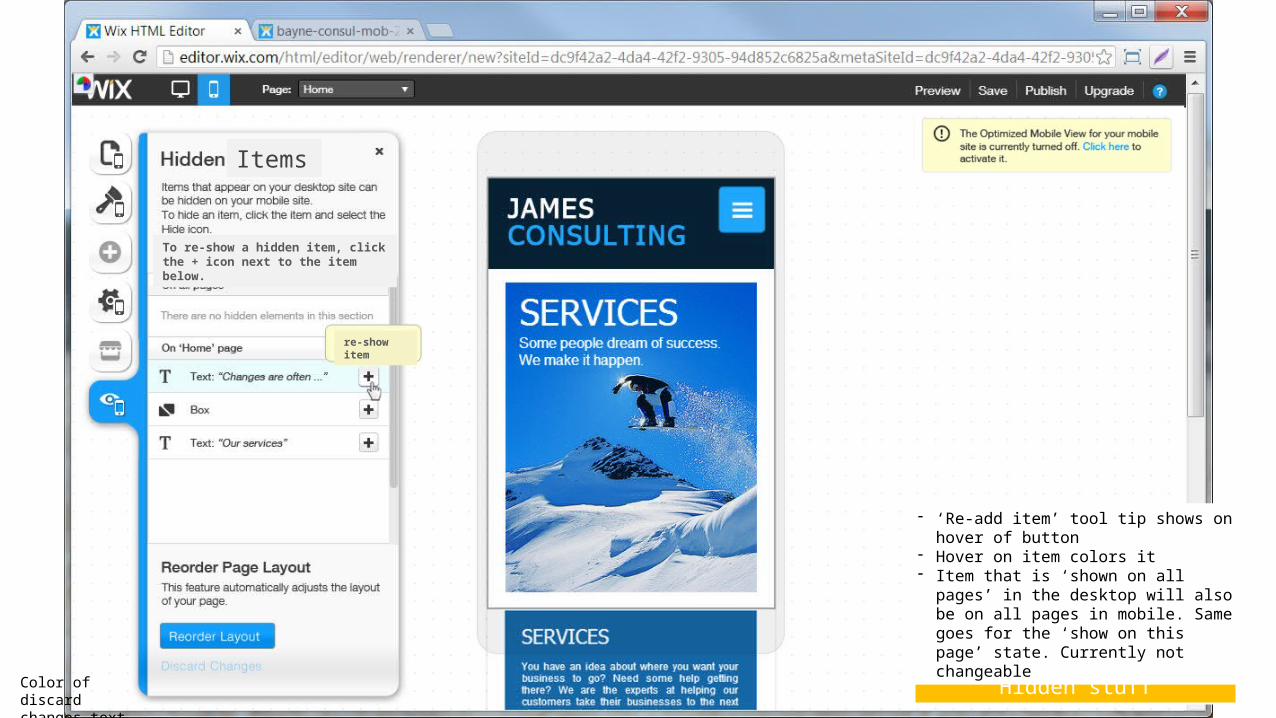
Hide/Re-Add elements
On/Off the whole responsive offering
Tiny Menu & BG - mobile dedicated
Small stuff:
Go to full site
‘Back to top’ button
Marketing banner
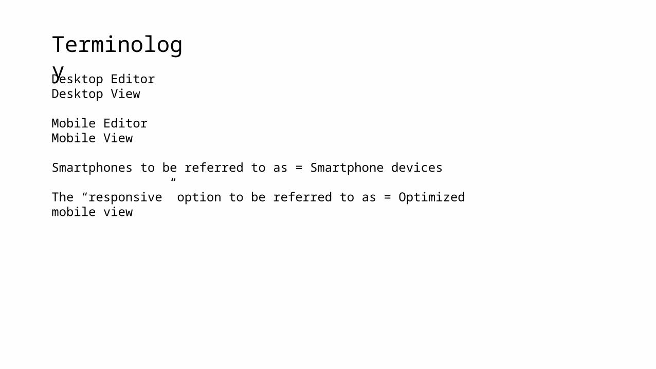
Desktop EditorDesktop View
Mobile EditorMobile View
Smartphones to be referred to as = Smartphone devices
The “responsive” option to be referred to as = Optimized mobile view
Terminology
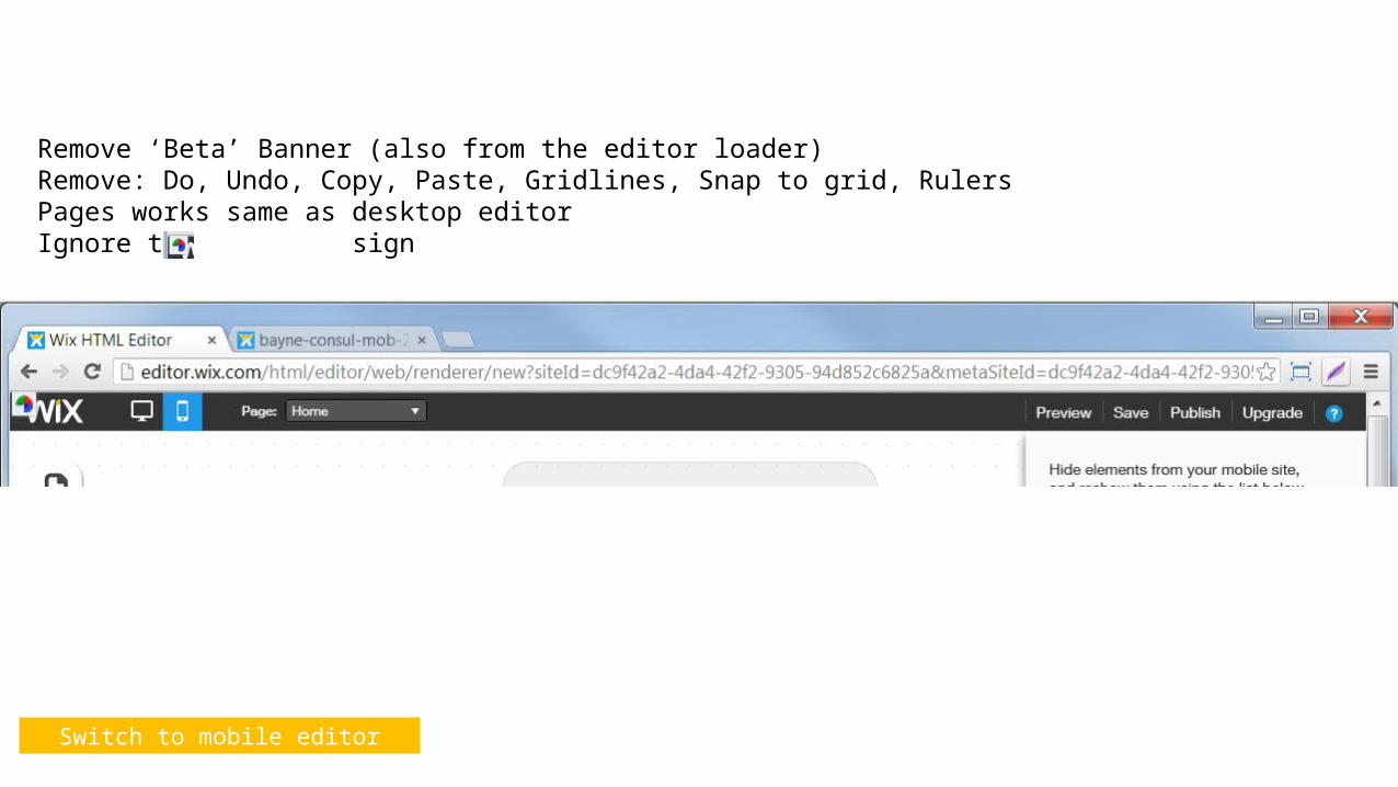
Switch to mobile editor
Remove ‘Beta’ Banner (also from the editor loader)Remove: Do, Undo, Copy, Paste, Gridlines, Snap to grid, RulersPages works same as desktop editorIgnore the sign
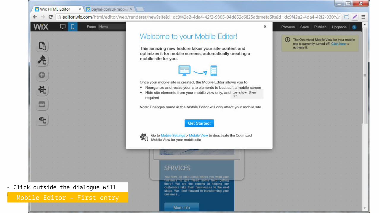
- Click outside the dialogue will not close it
Mobile Editor – First entry
re-show them if
Mobile Editor
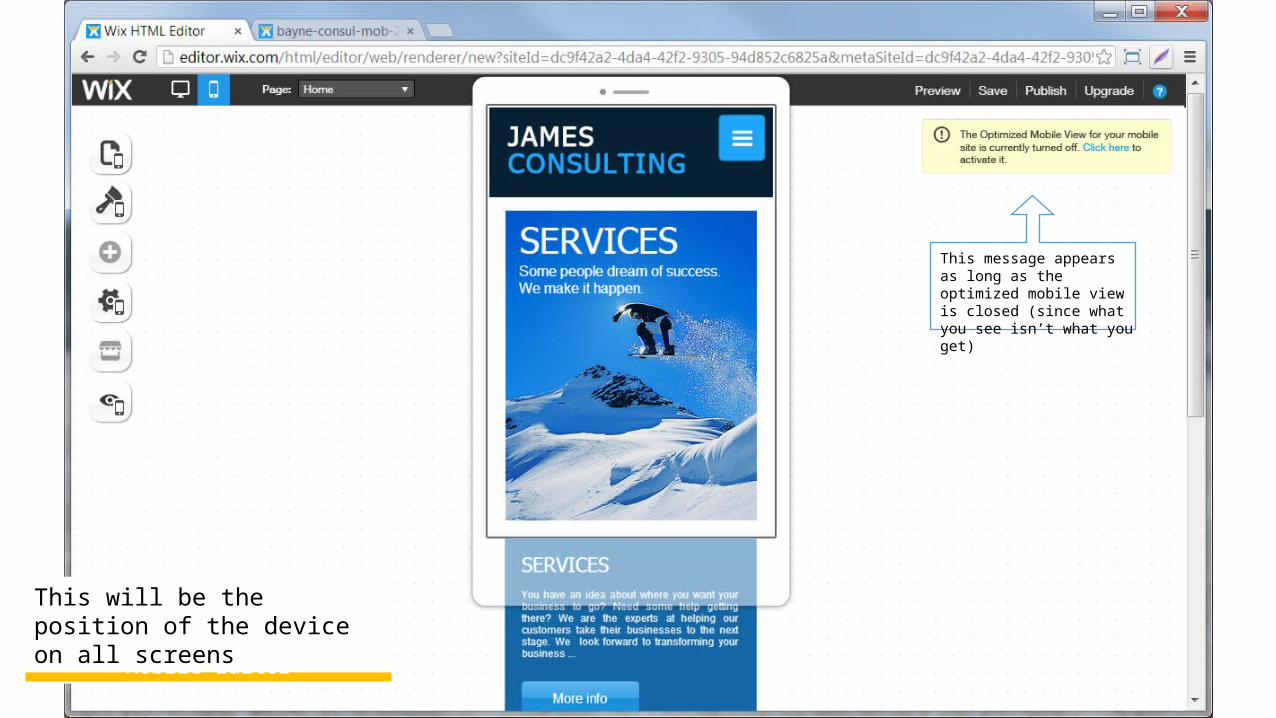
This message appears as long as the optimized mobile view is closed (since what you see isn’t what you get)
This will be the position of the device on all screens
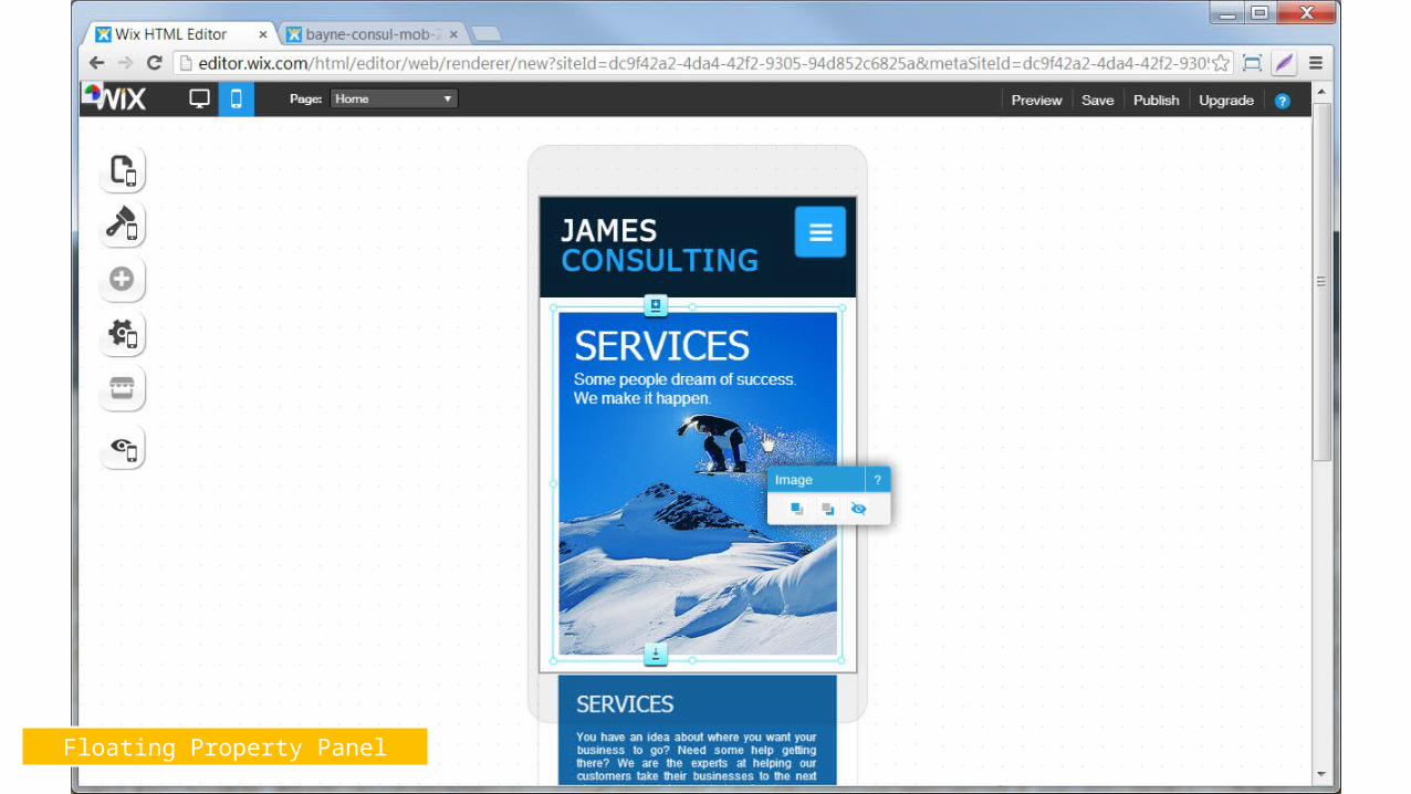
Floating Property Panel
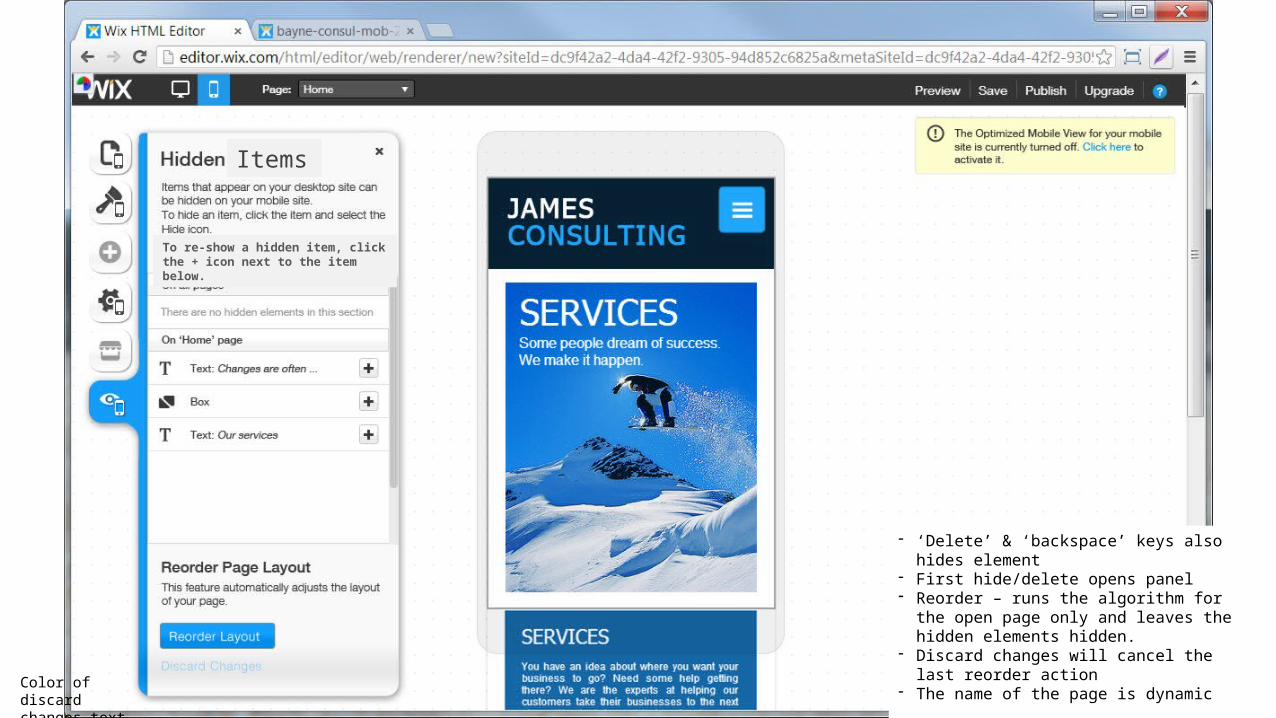
Hidden stuff
- ‘Delete’ & ‘backspace’ keys also hides element- First hide/delete opens panel- Reorder – runs the algorithm for the open page
only and leaves the hidden elements hidden.- Discard changes will cancel the last reorder action- The name of the page is dynamic
Color of discard changes text - TBD
Items
To re-show a hidden item, click the + icon next to the item below.
Hidden stuff
- ‘Re-add item’ tool tip shows on hover of button
- Hover on item colors it- Item that is ‘shown on all pages’ in the
desktop will also be on all pages in mobile. Same goes for the ‘show on this page’ state. Currently not changeable
Color of discard changes text - TBD
Items
re-show item
To re-show a hidden item, click the + icon next to the item below.
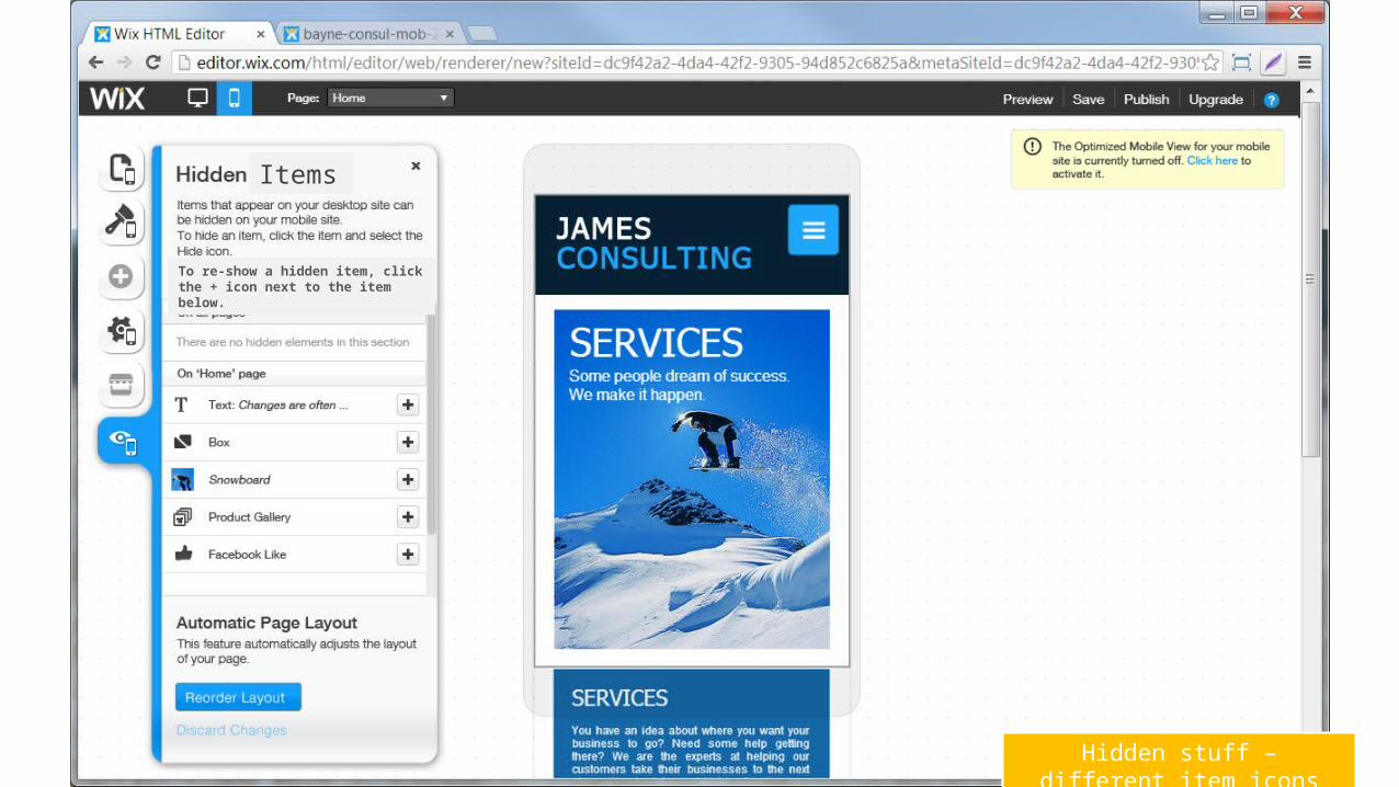
Hidden stuff – different item icons
Items
To re-show a hidden item, click the + icon next to the item below.
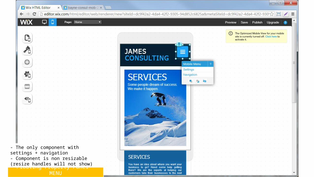
Floating Property Panel - MENU
- The only component with settings + navigation- Component is non resizable (resize handles will not show)
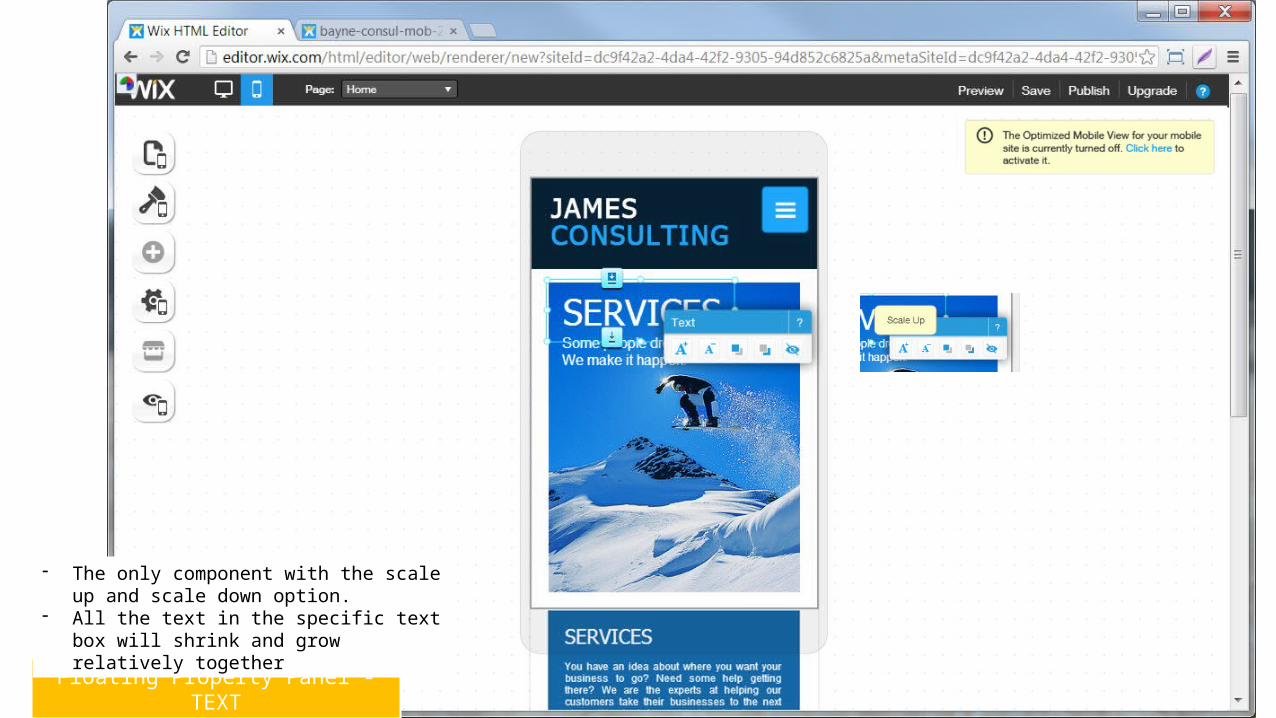
Floating Property Panel - TEXT
- The only component with the scale up and scale down option.
- All the text in the specific text box will shrink and grow relatively together
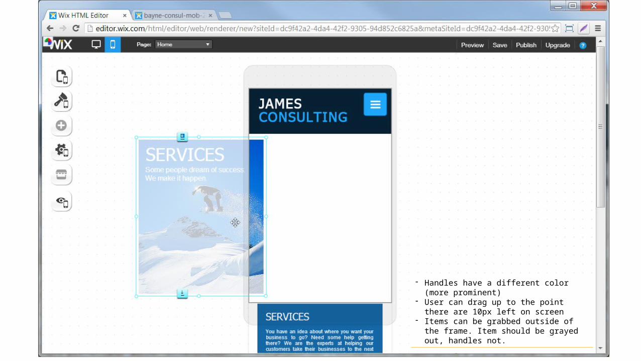
Drag out of frame
- Handles have a different color (more prominent)- User can drag up to the point there are 10px left
on screen- Items can be grabbed outside of the frame. Item
should be grayed out, handles not.
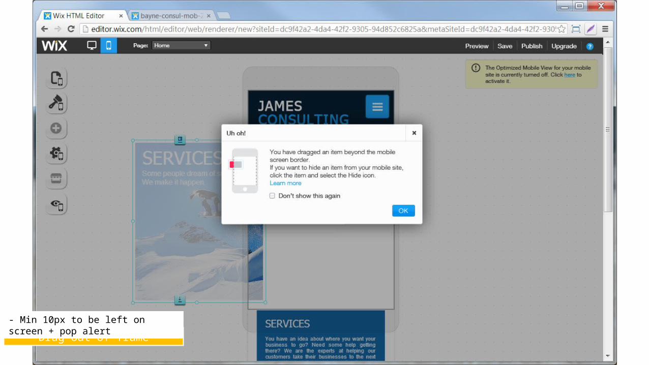
Drag out of frame
- Min 10px to be left on screen + pop alert
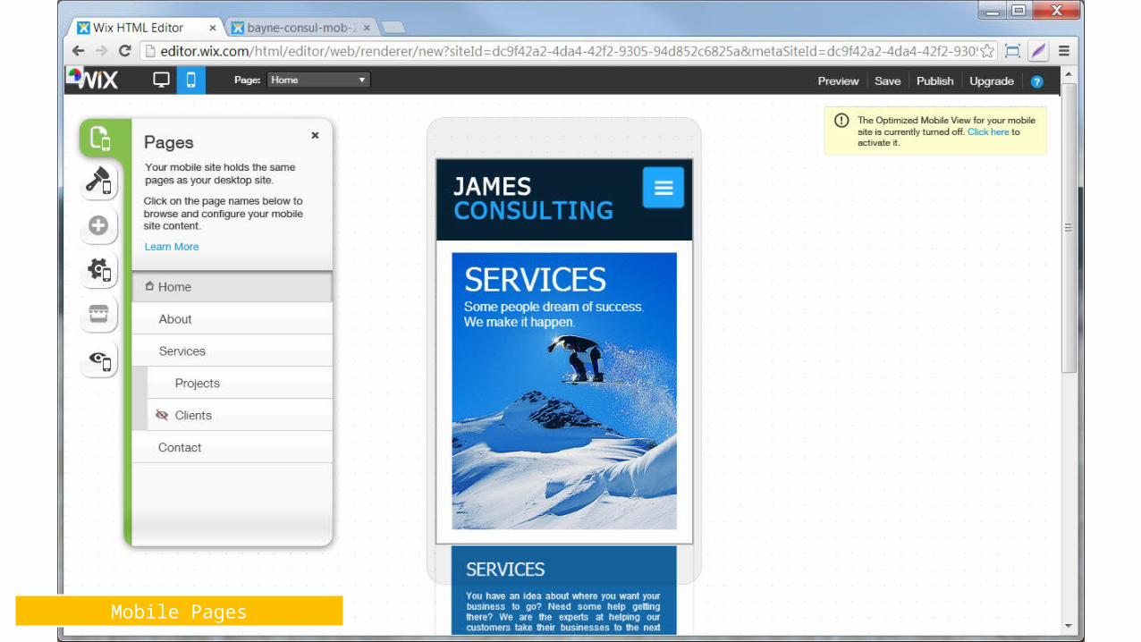
Mobile Pages
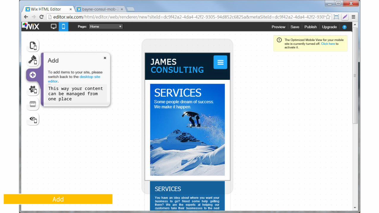
Add
This way your content can be managed from one place
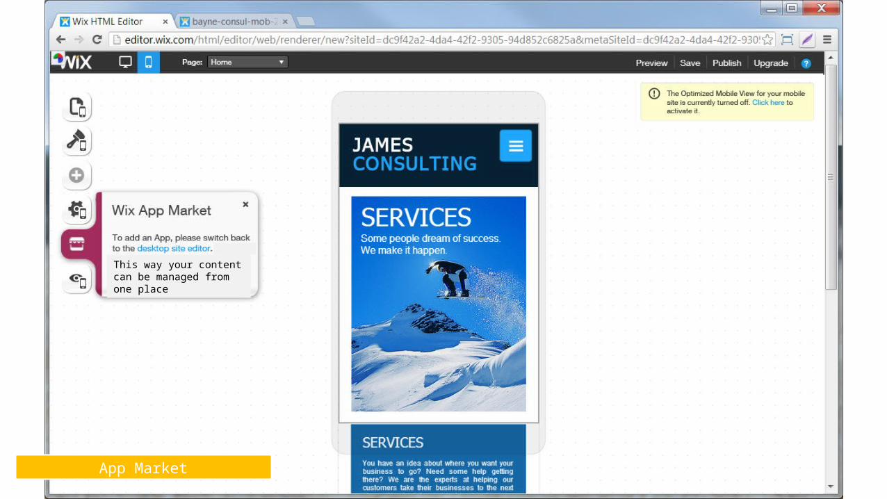
App Market
This way your content can be managed from one place
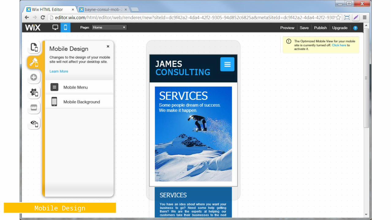
Mobile Design
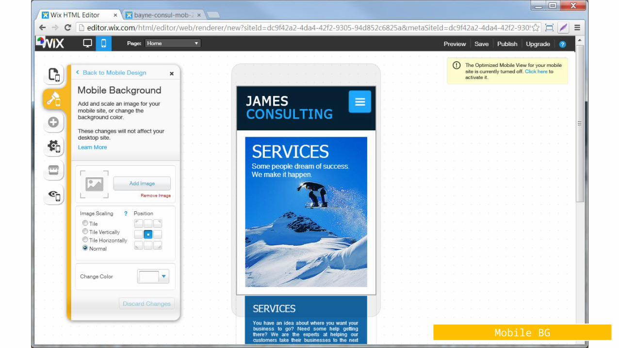
Mobile BG
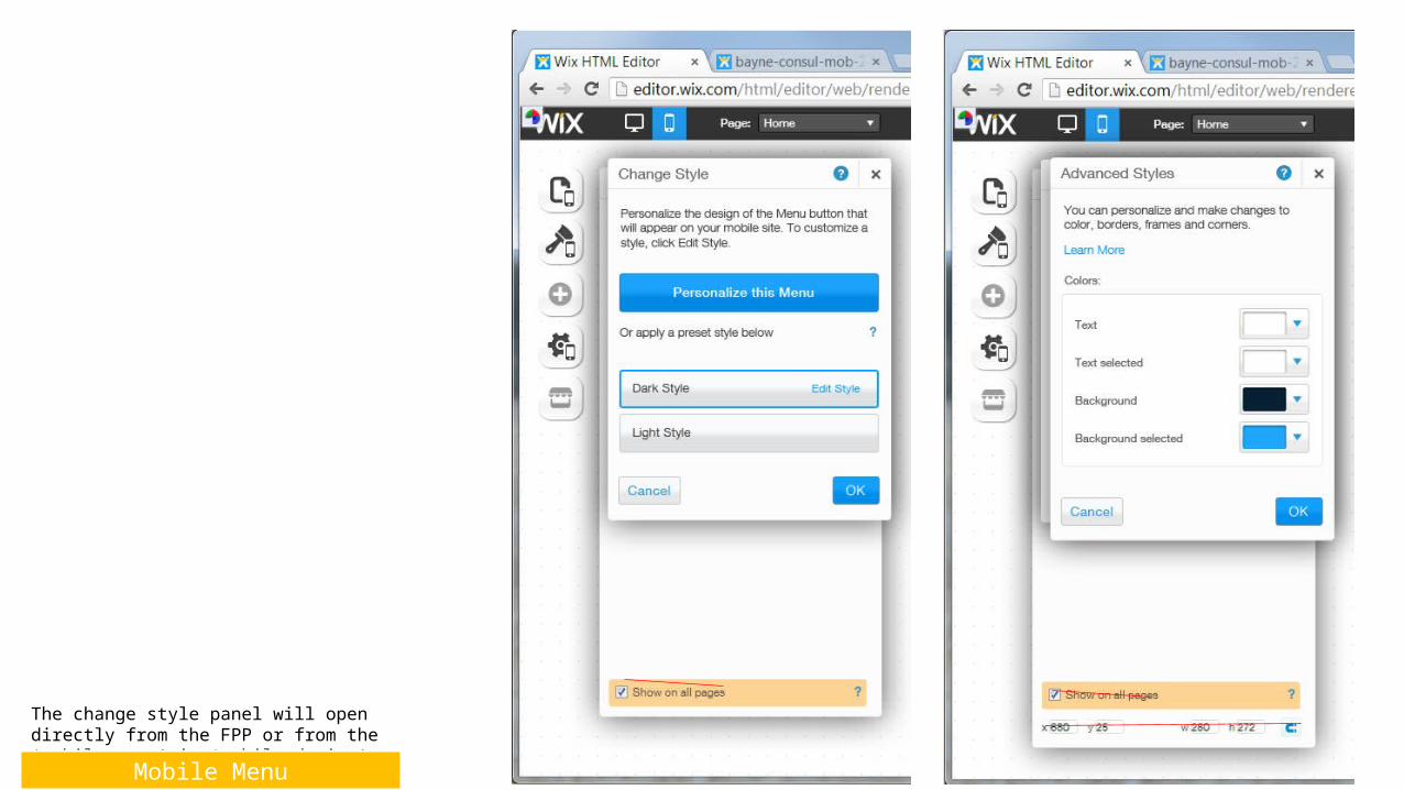
The change style panel will open directly from the FPP or from the ‘mobile menu’ in ‘mobile design’
Mobile Menu
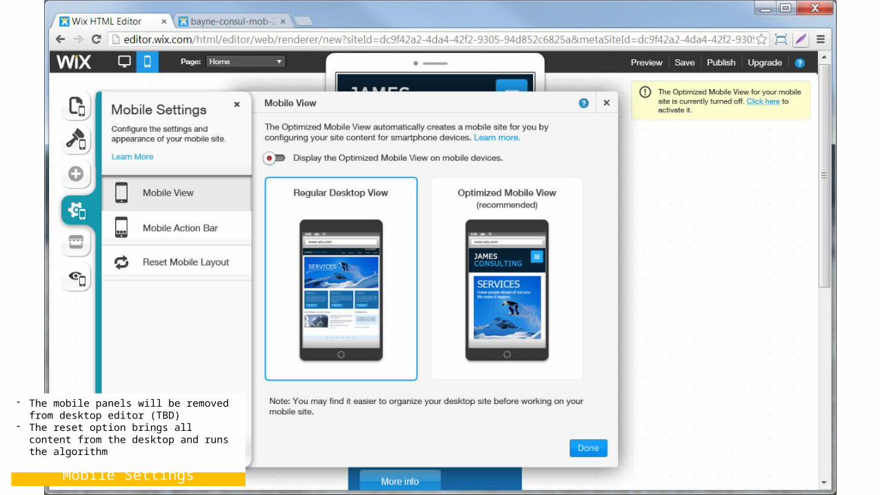
Mobile Settings
- The mobile panels will be removed from desktop editor (TBD)
- The reset option brings all content from the desktop and runs the algorithm
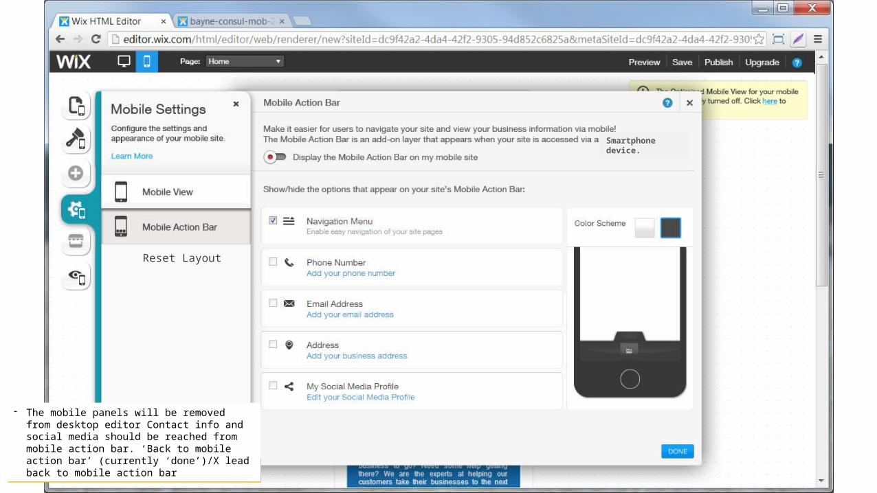
Mobile Settings
- The mobile panels will be removed from desktop editor Contact info and social media should be reached from mobile action bar. ‘Back to mobile action bar’ (currently ‘done’)/X lead back to mobile action bar
Smartphone device.
Reset Layout
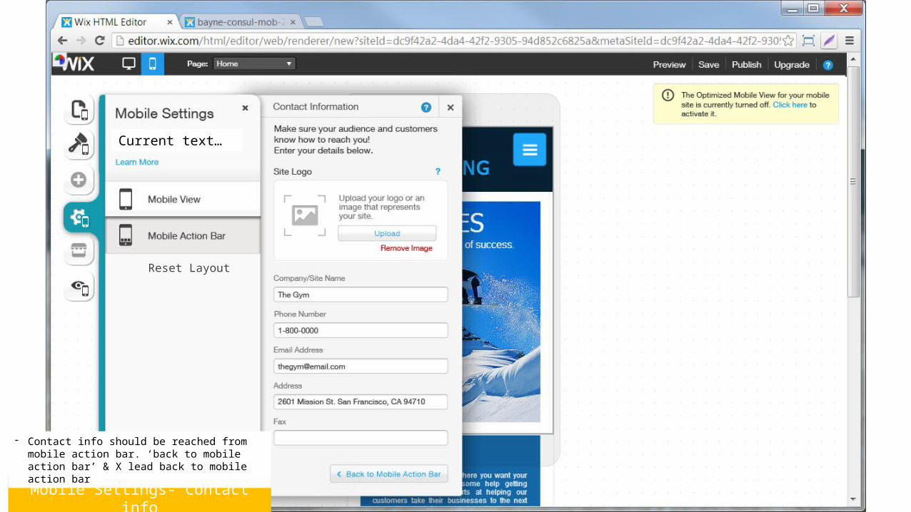
Mobile Settings- Contact info
- Contact info should be reached from mobile action bar. ‘back to mobile action bar’ & X lead back to mobile action bar
Current text…
Reset Layout
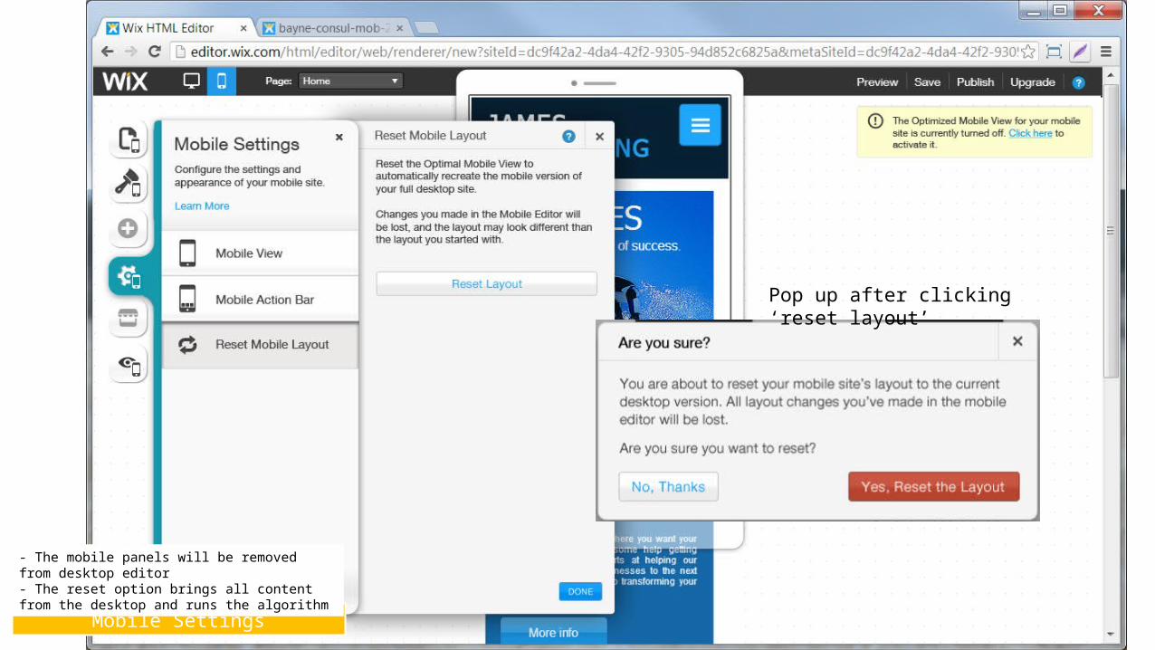
Mobile Settings
- The mobile panels will be removed from desktop editor- The reset option brings all content from the desktop and runs the algorithm
Pop up after clicking ‘reset layout’
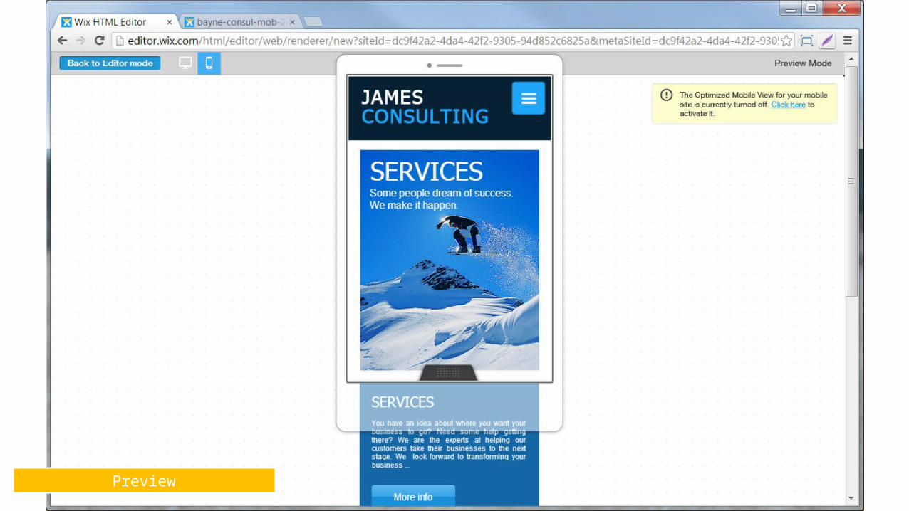
Preview
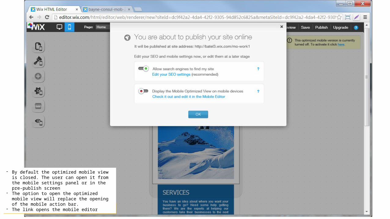
Adjusted pre-publish
- By default the optimized mobile view is closed. The user can open it from the mobile settings panel or in the pre-publish screen
- The option to open the optimized mobile view will replace the opening of the mobile action bar.
- The link opens the mobile editor
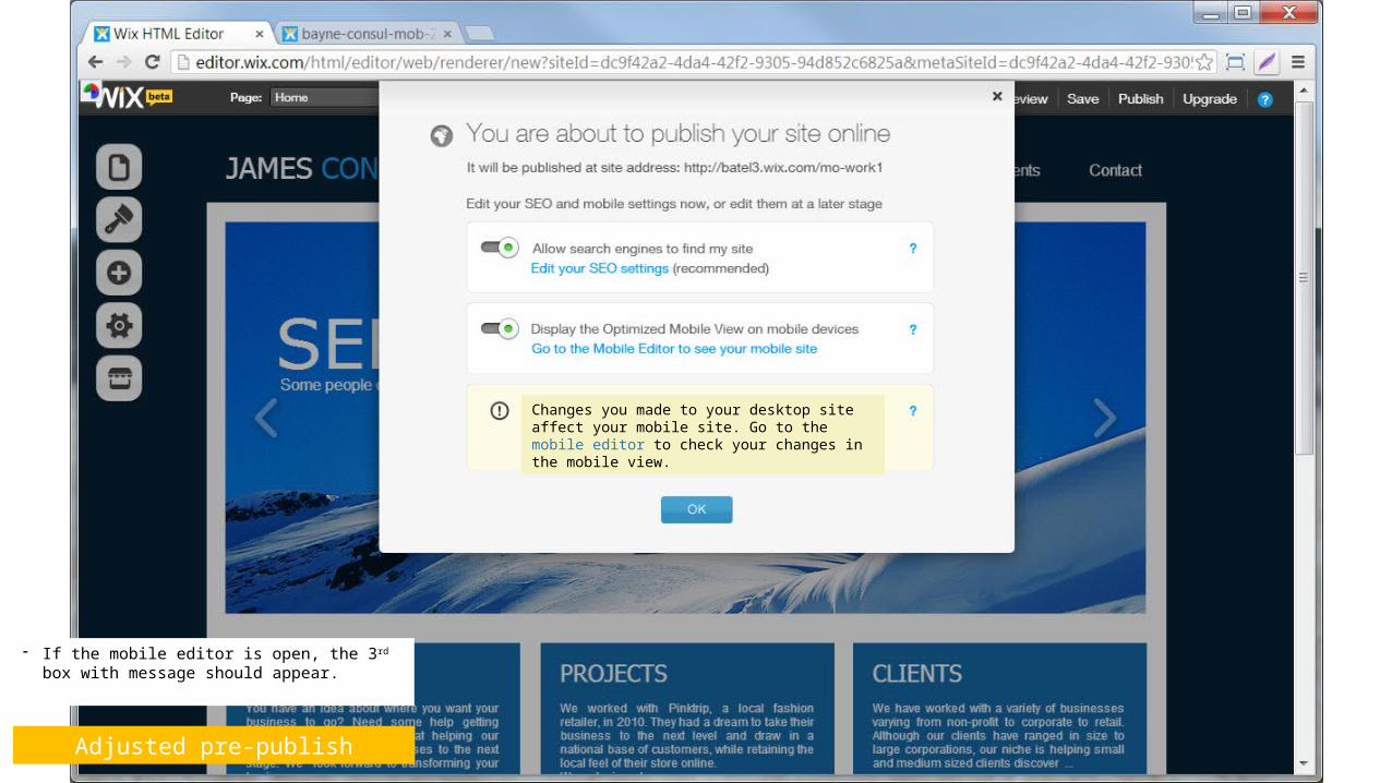
Adjusted pre-publish
- If the mobile editor is open, the 3rd box with message should appear.
Changes you made to your desktop site affect your mobile site. Go to the mobile editor to check your changes in the mobile view.
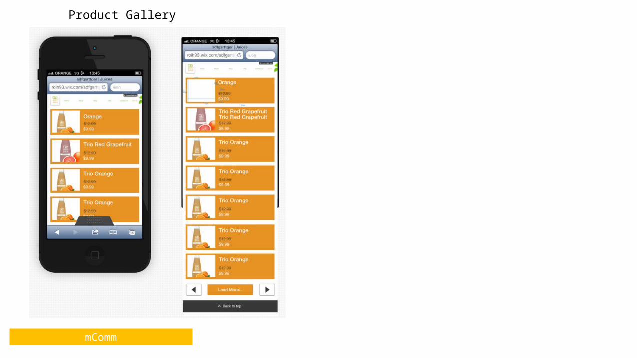
mComm
Product Gallery
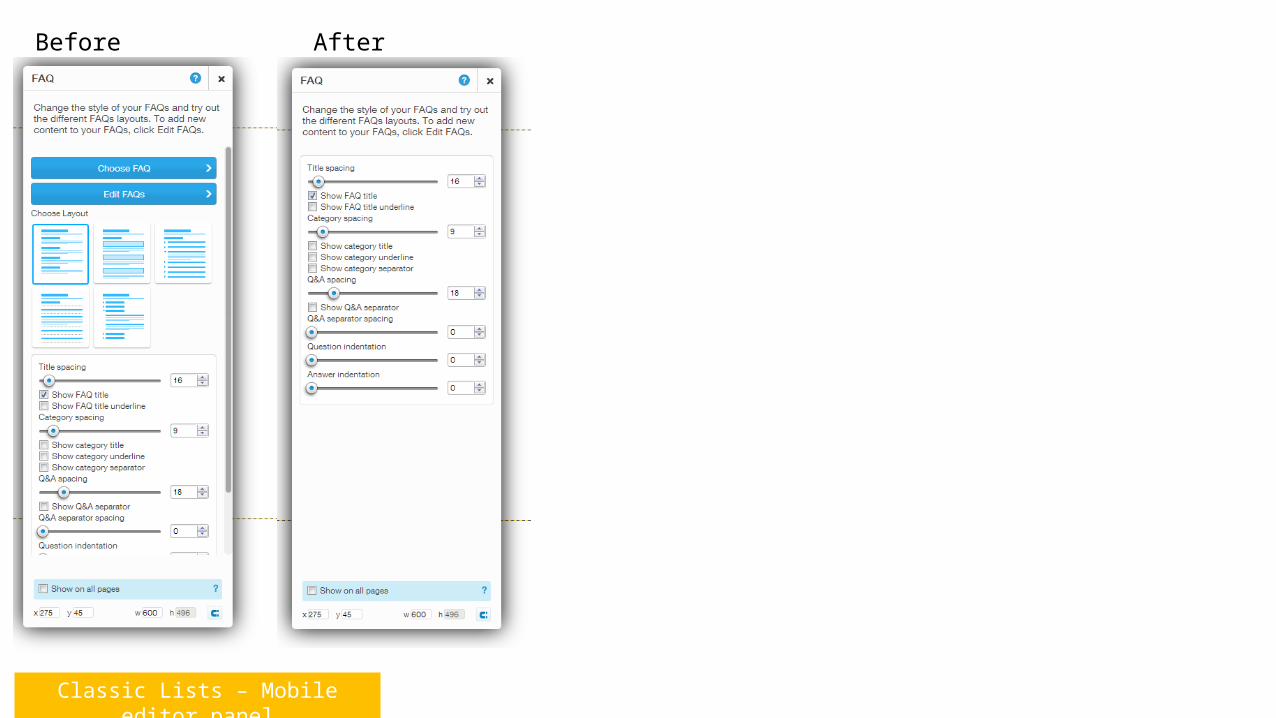
Classic Lists – Mobile editor panel
Before After
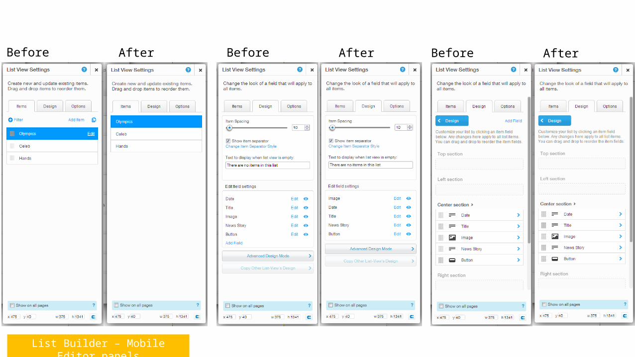
List Builder – Mobile Editor panels
Before After Before After Before After
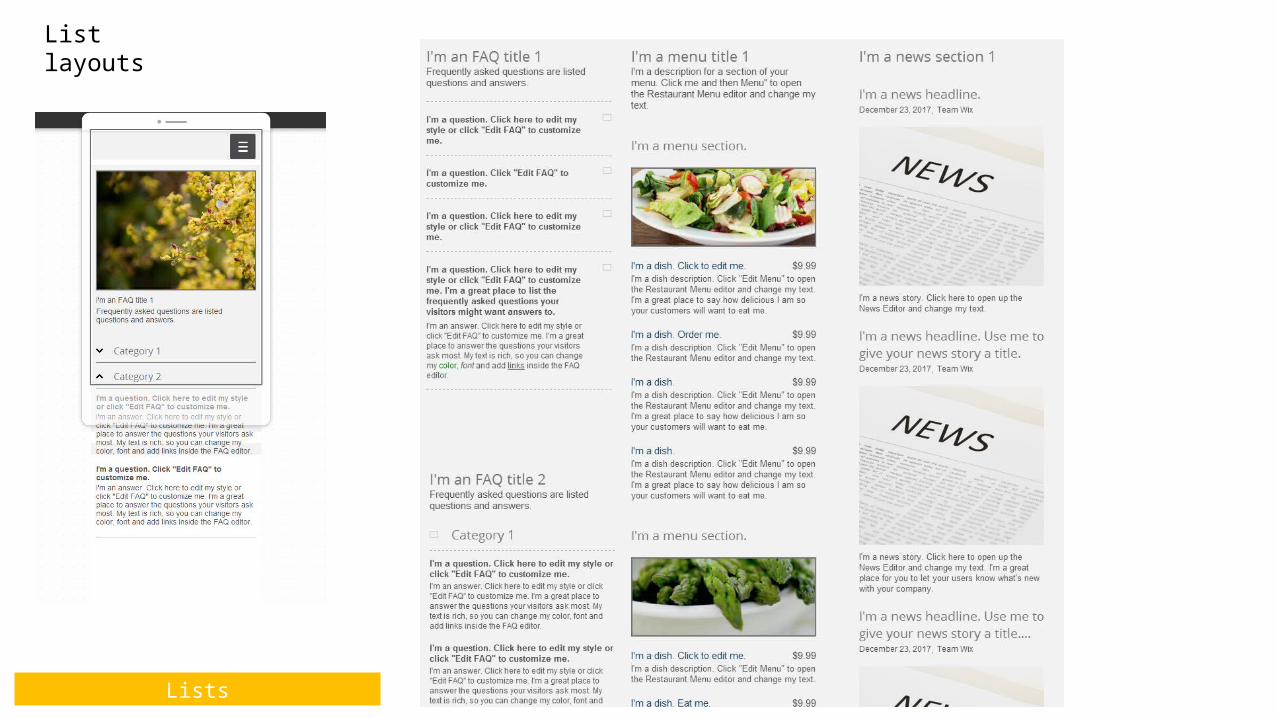
Lists
List layouts
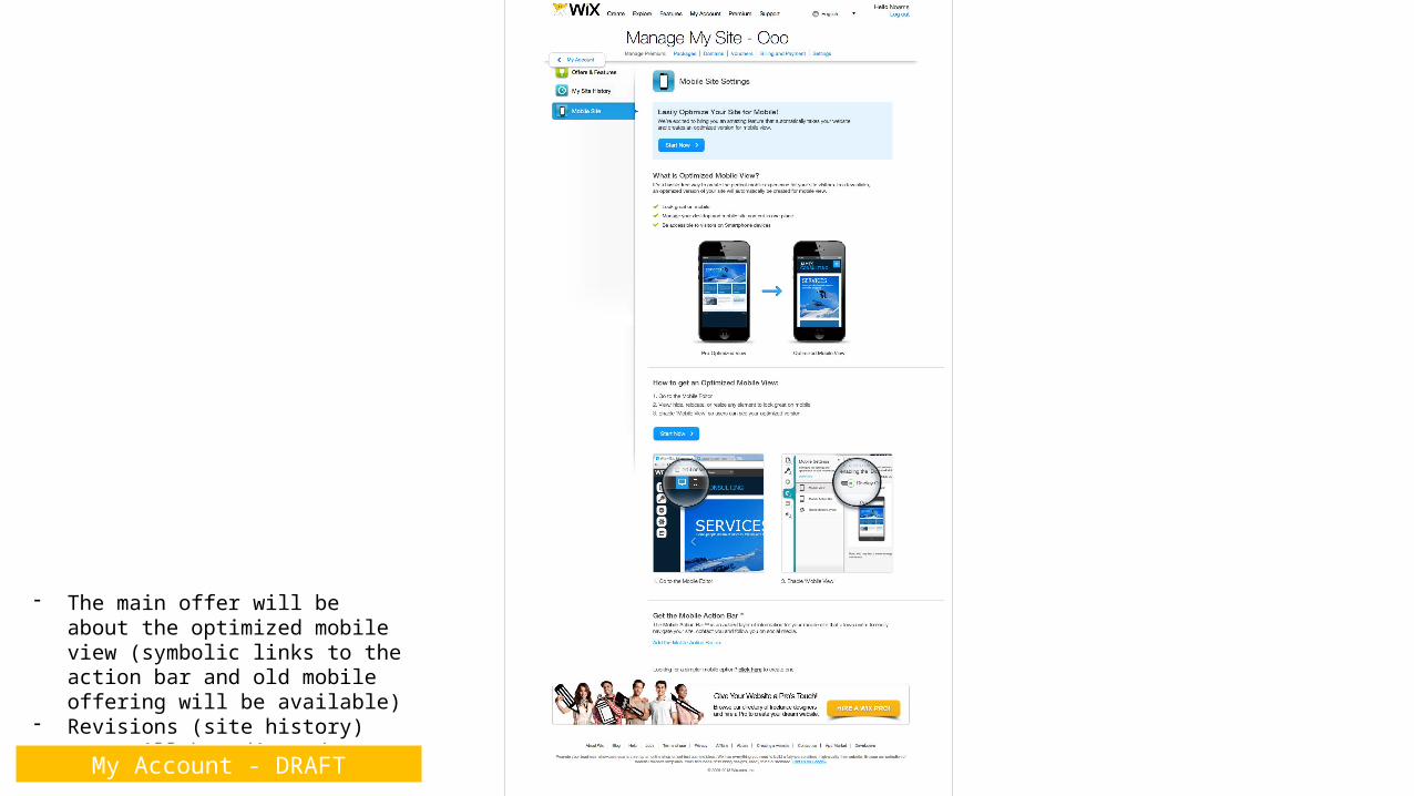
- The main offer will be about the optimized mobile view (symbolic links to the action bar and old mobile offering will be available)
- Revisions (site history) text will be adjusted as well
My Account - DRAFT
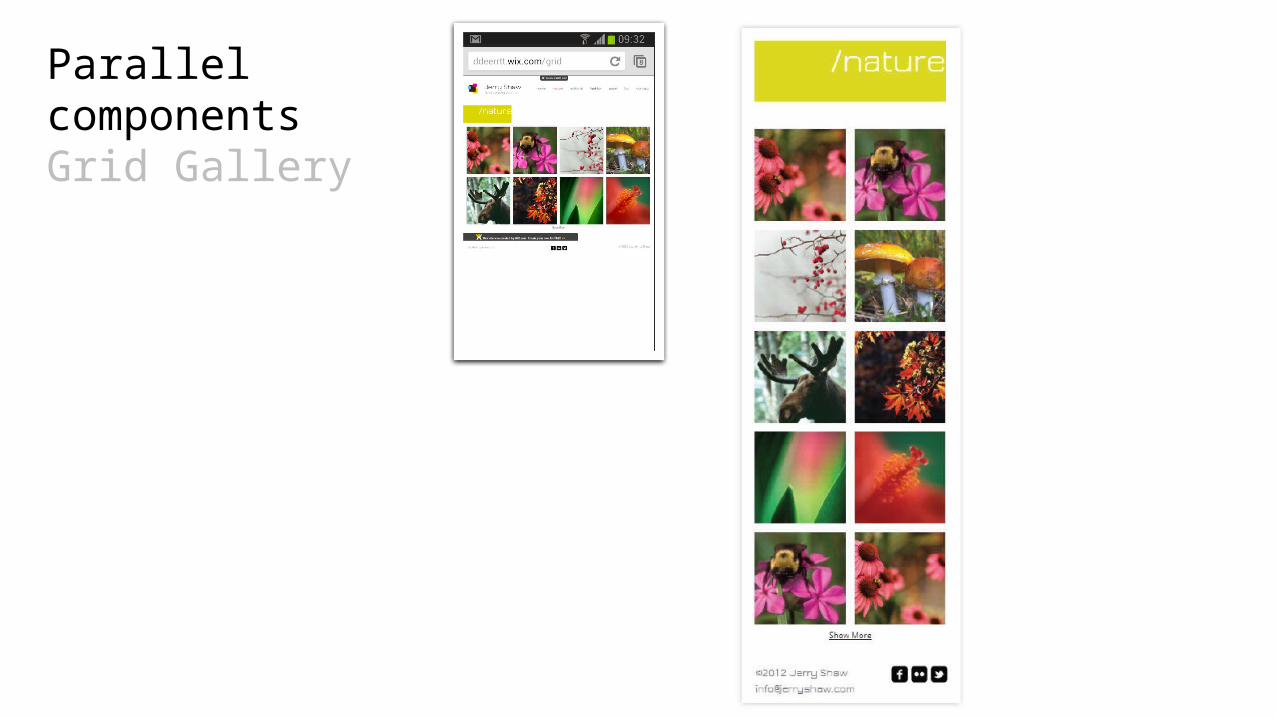
Parallel componentsGrid Gallery
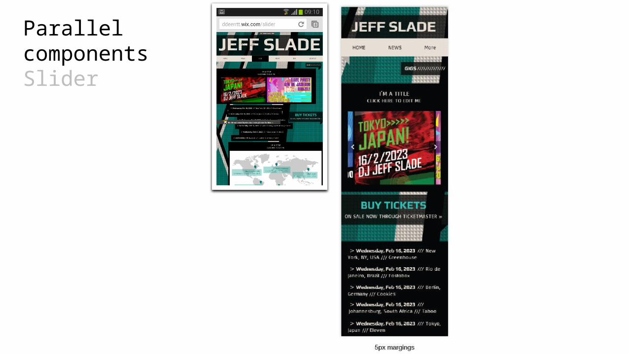
Parallel componentsSlider
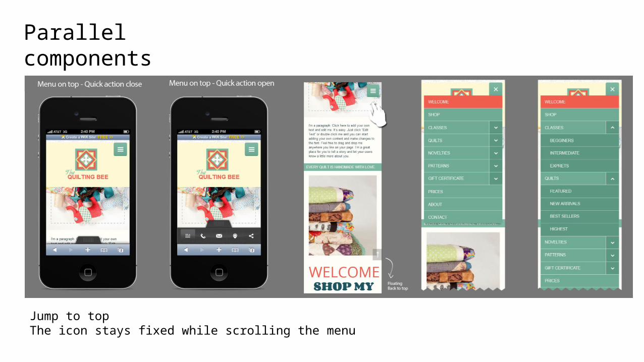
Parallel componentsMenu
Jump to topThe icon stays fixed while scrolling the menu
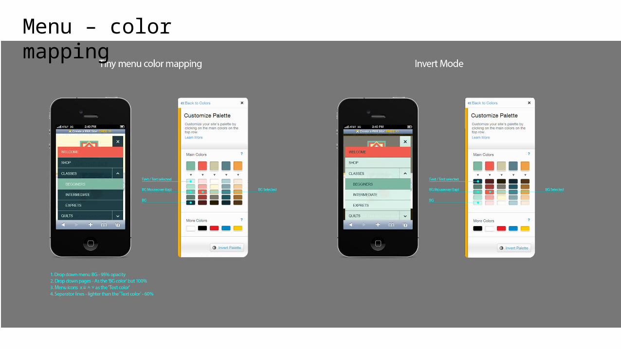
Menu – color mapping
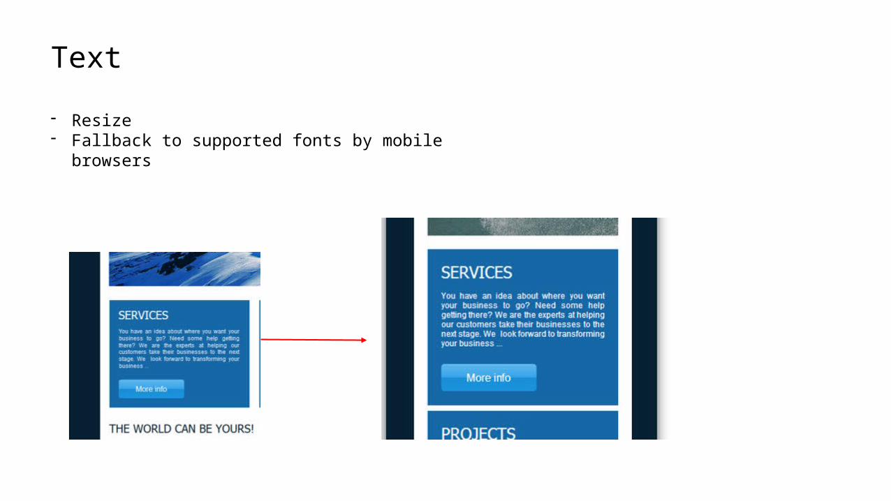
Text
- Resize- Fallback to supported fonts by mobile browsers
Phase 0.5 – Will not be included in initial launch All components panel
True show/hide behavior
Override style for components in mobile editor
Override color, alignment, style etc. for text!
Reorder by groups
Trim text with ‘more’ button
Tablets support (edit a view)
Optimal Merge with quick actions bar experience
Horizontal view of mobile in editor & preview
Show mobile templates in create
Post publish SMS/QR code offering
Boundary box for a hidden element. Click to close the space.