Embed Size (px)
DESCRIPTION
portfolio
Citation preview
portfolio
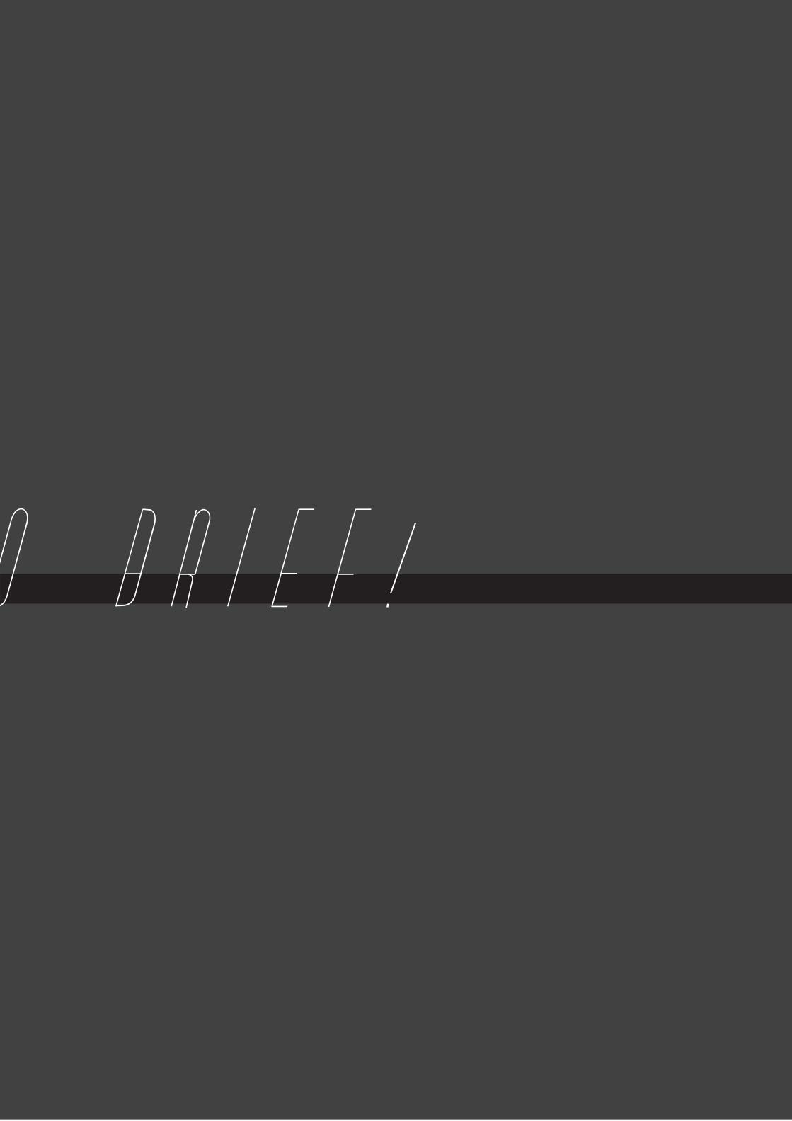
ORIGINS BRIEF!
ORIGINS BRIEF!
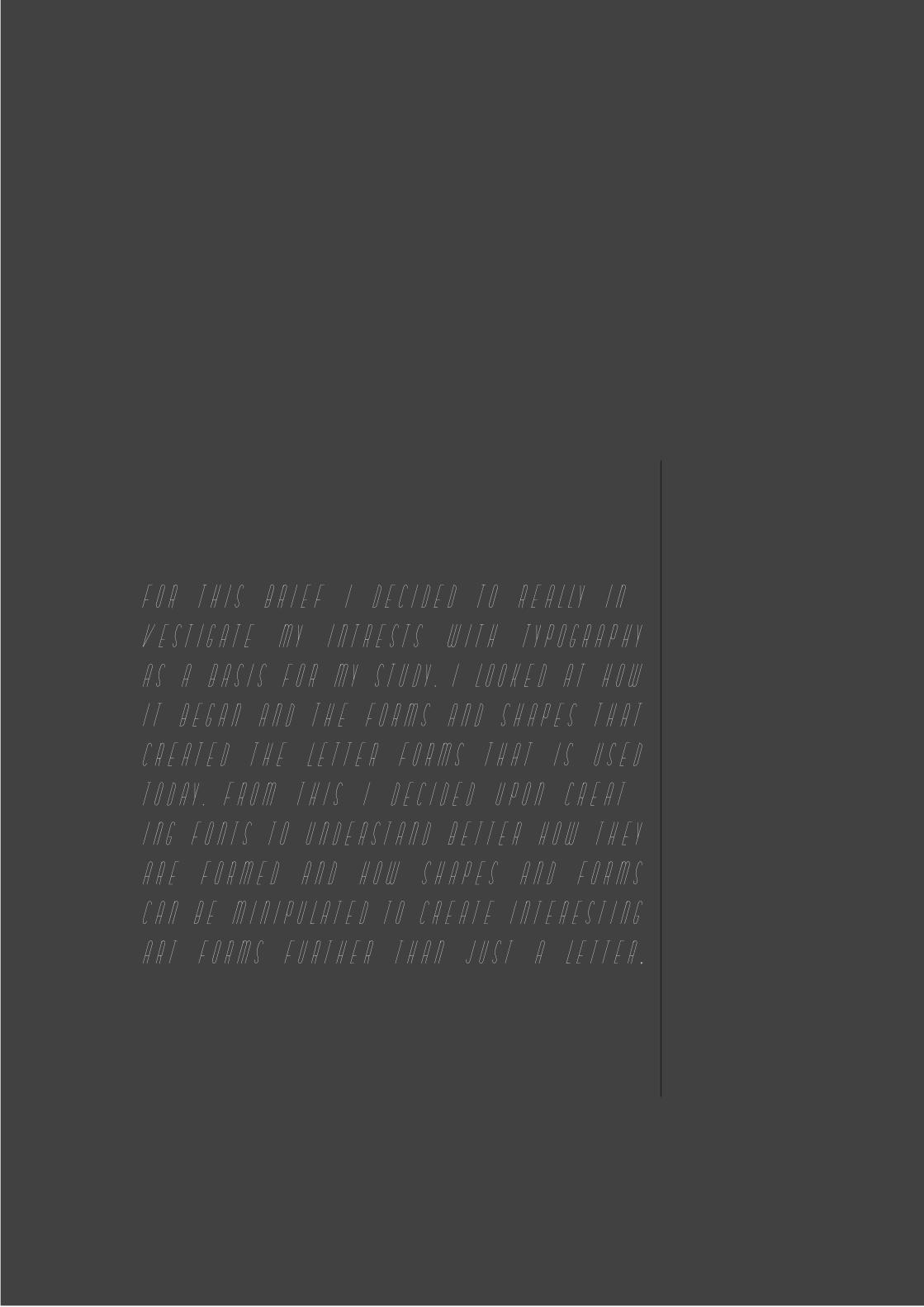
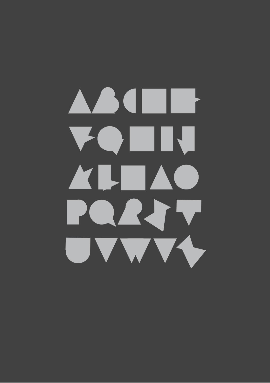
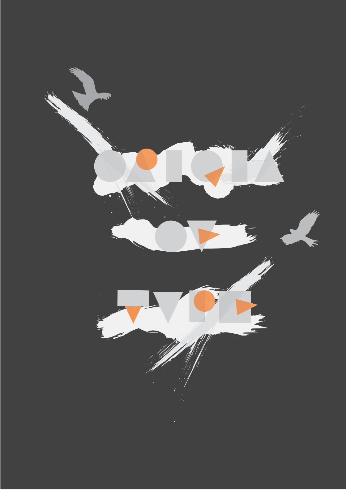
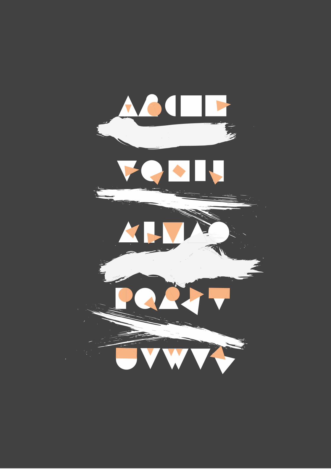
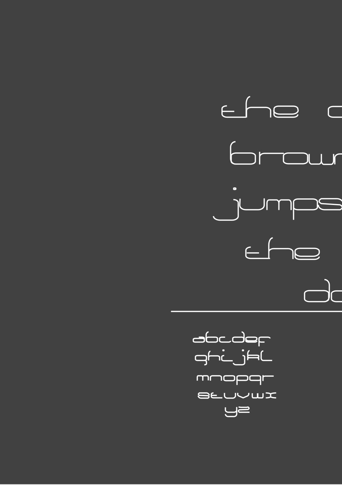
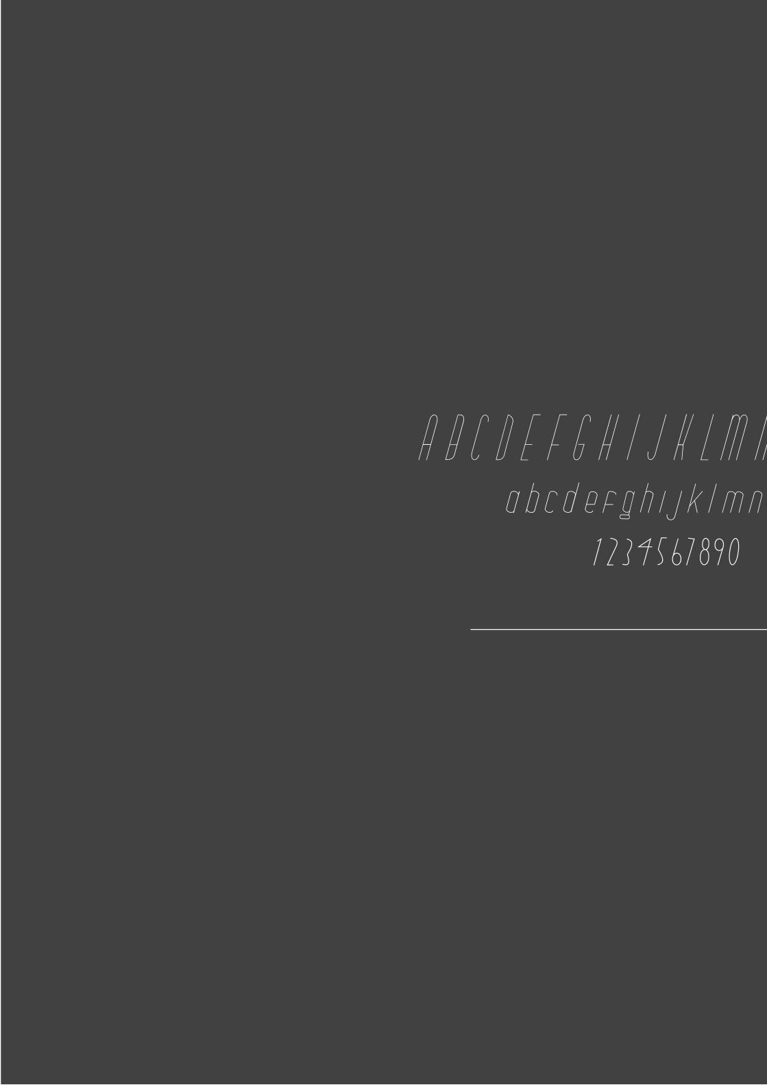
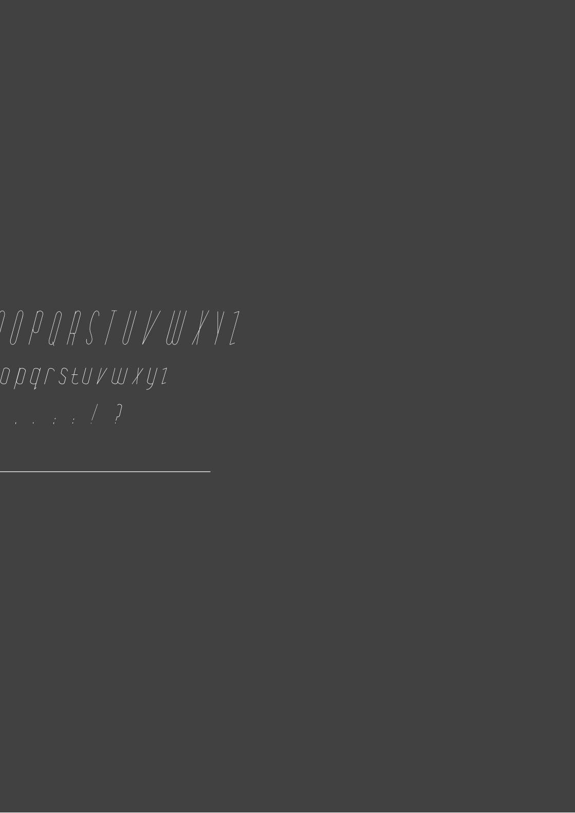
FOR THIS BRIEF I DECIDED TO REALLY IN=
VESTIGATE MY INTRESTS WITH TYPOGRAPHY
AS A BASIS FOR MY STUDY. I LOOKED AT HOW
IT BEGAN AND THE FORMS AND SHAPES THAT
CREATED THE LETTER FORMS THAT IS USED
TODAY. FROM THIS I DECIDED UPON CREAT=
ING FONTS TO UNDERSTAND BETTER HOW THEY
ARE FORMED AND HOW SHAPES AND FORMS
CAN BE MINIPULATED TO CREATE INTERESTING
ART FORMS FURTHER THAN JUST A LETTER,.
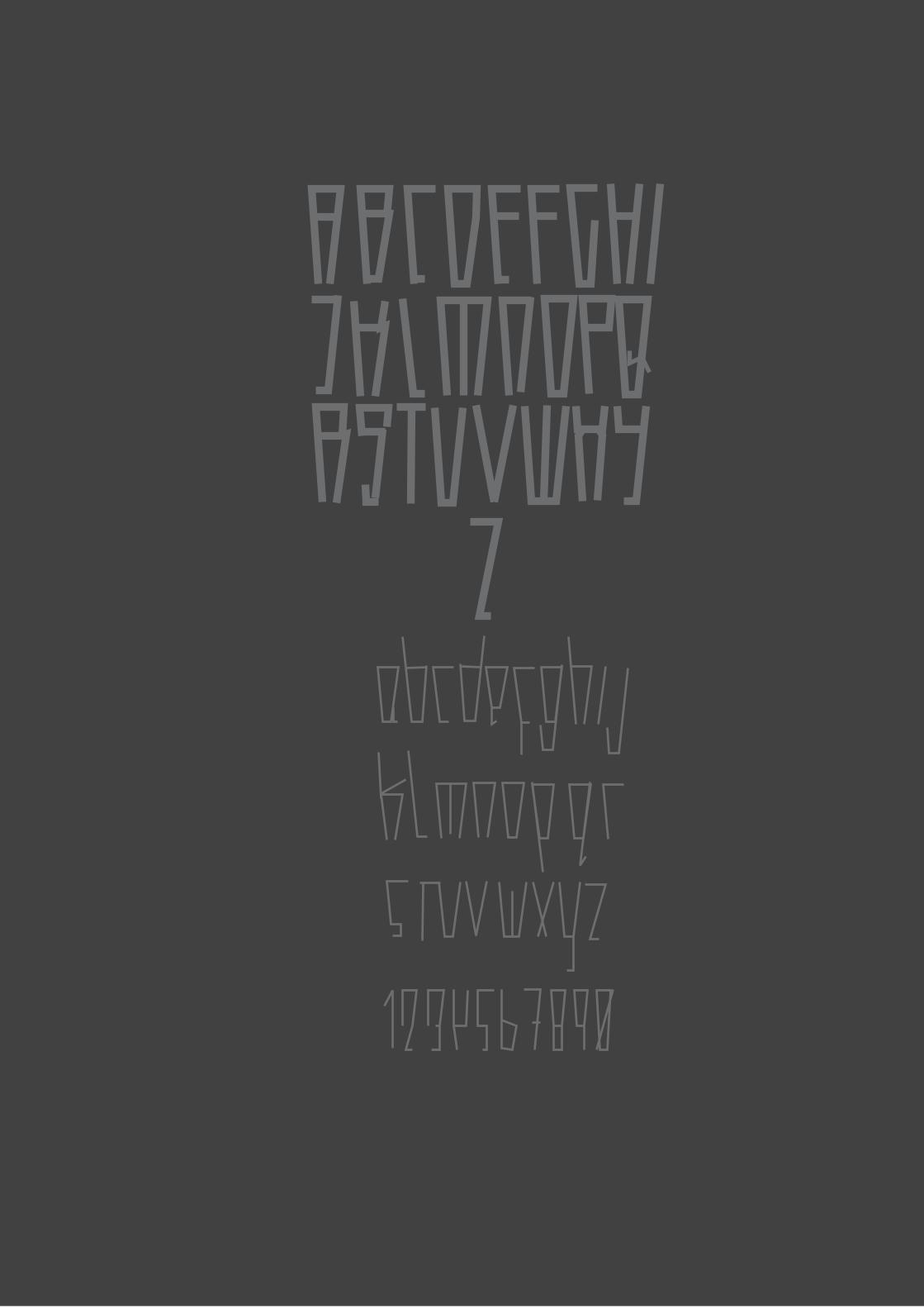

ABCDEFGHIJKLMNOPQRSTUVWXYZ abcdefghijklmnopqrstuvwxyz
1234567890 , . ; : ! ?
ABCDEFGHIJKLMNOPQRSTUVWXYZ abcdefghijklmnopqrstuvwxyz
1234567890 , . ; : ! ?


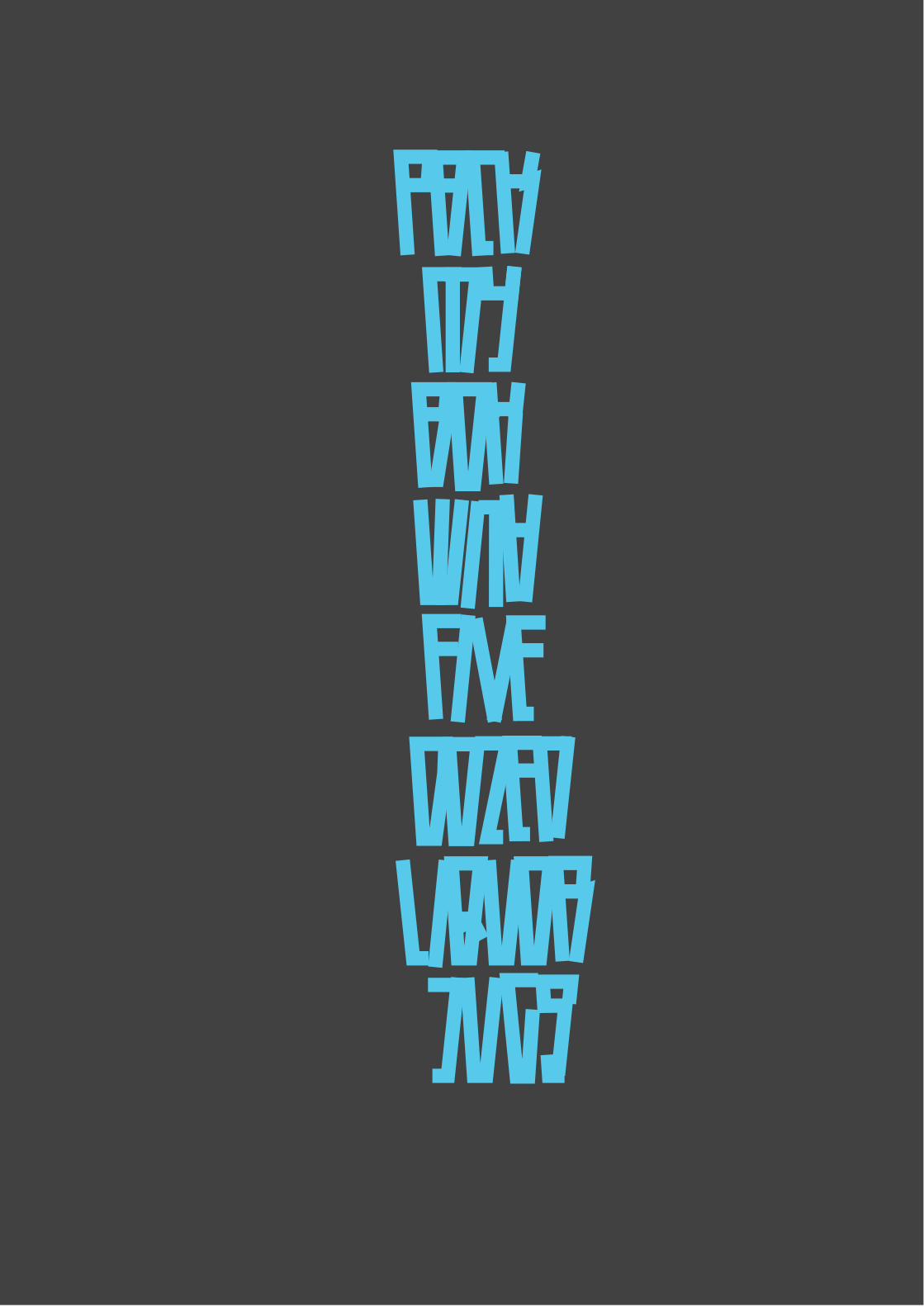
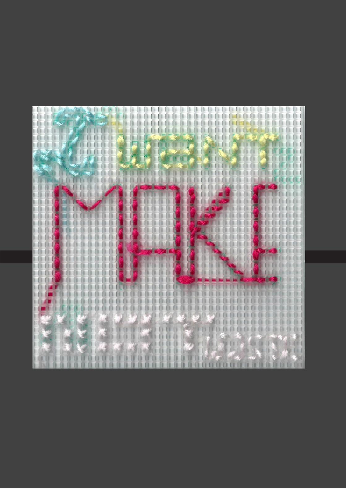
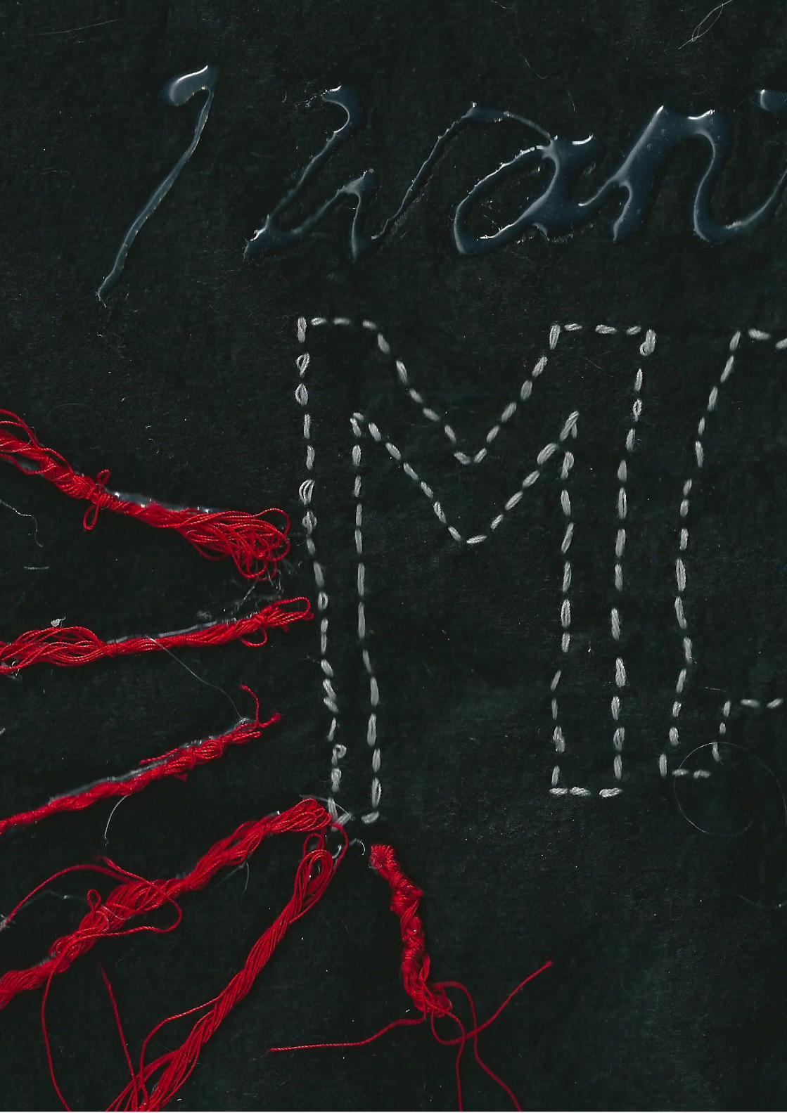
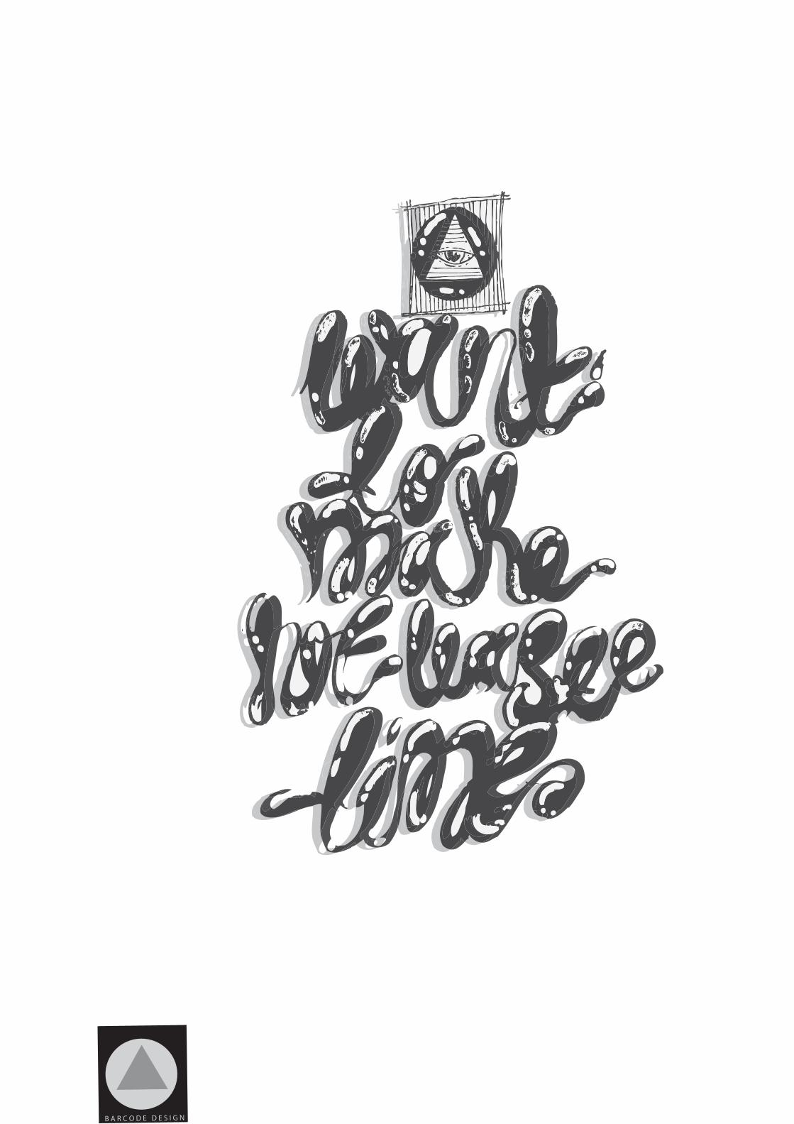
MANIFESTO BRIEF!
MANIFESTO BRIEF!
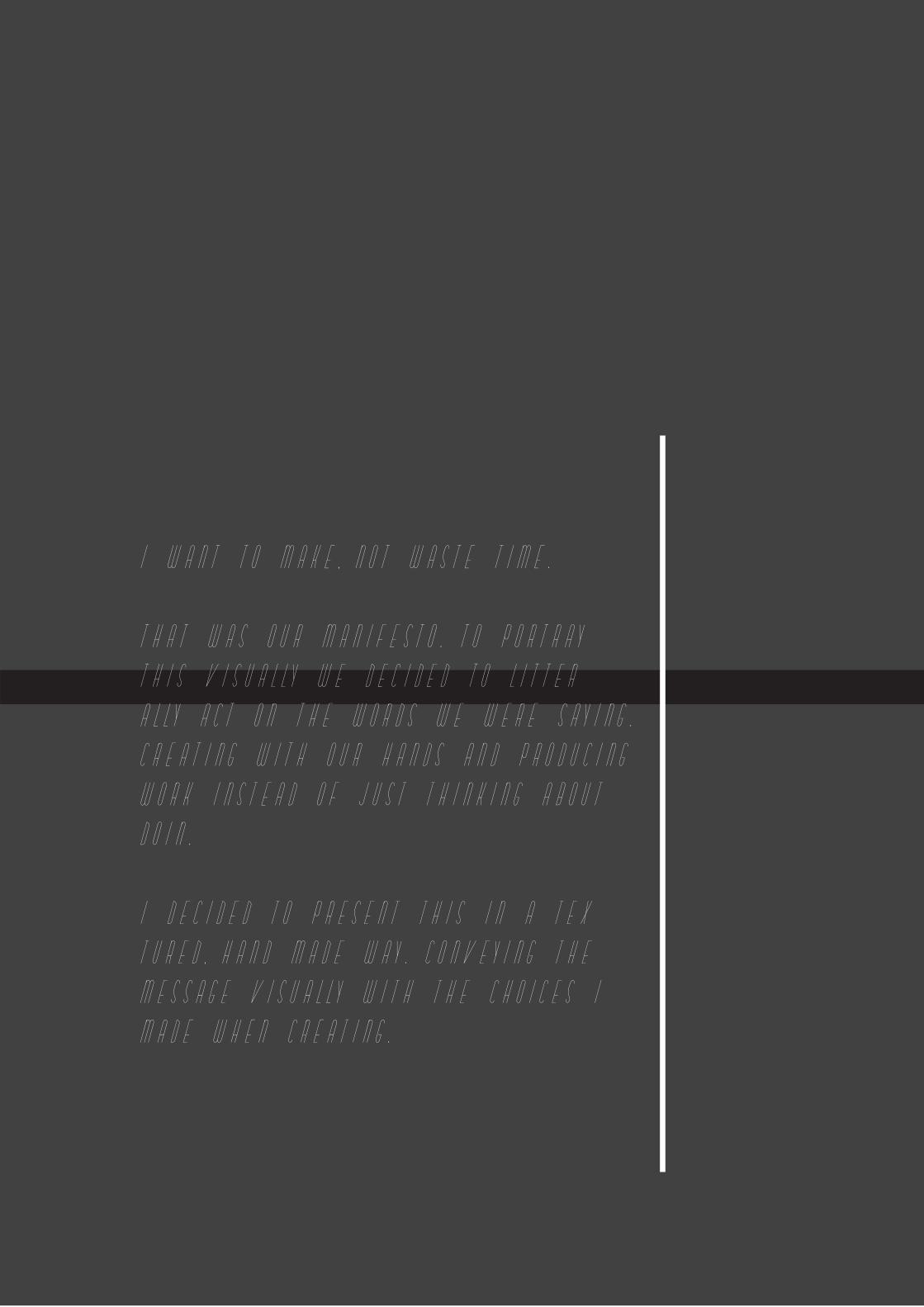
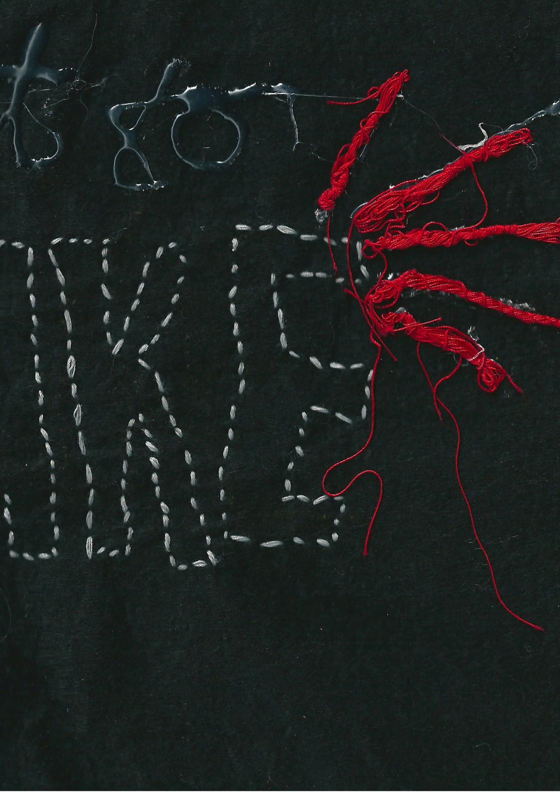
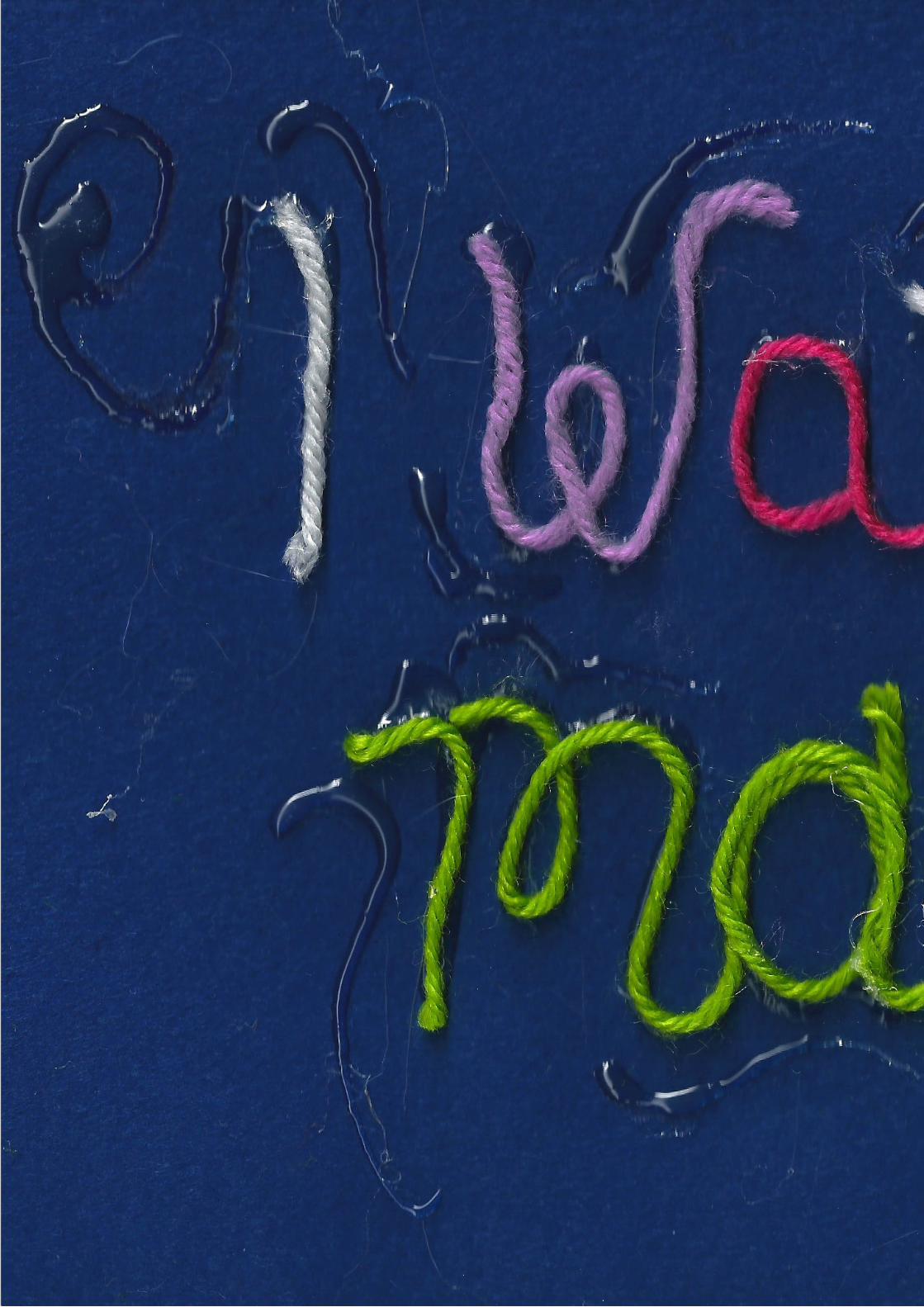
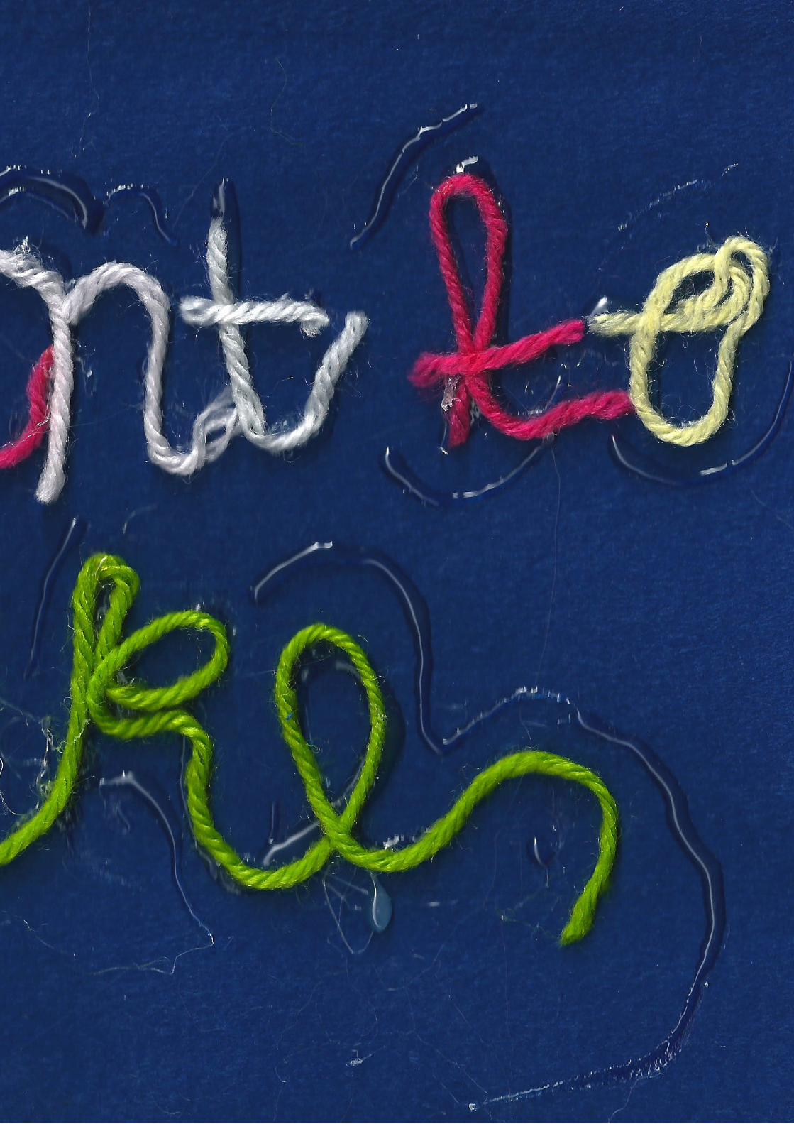
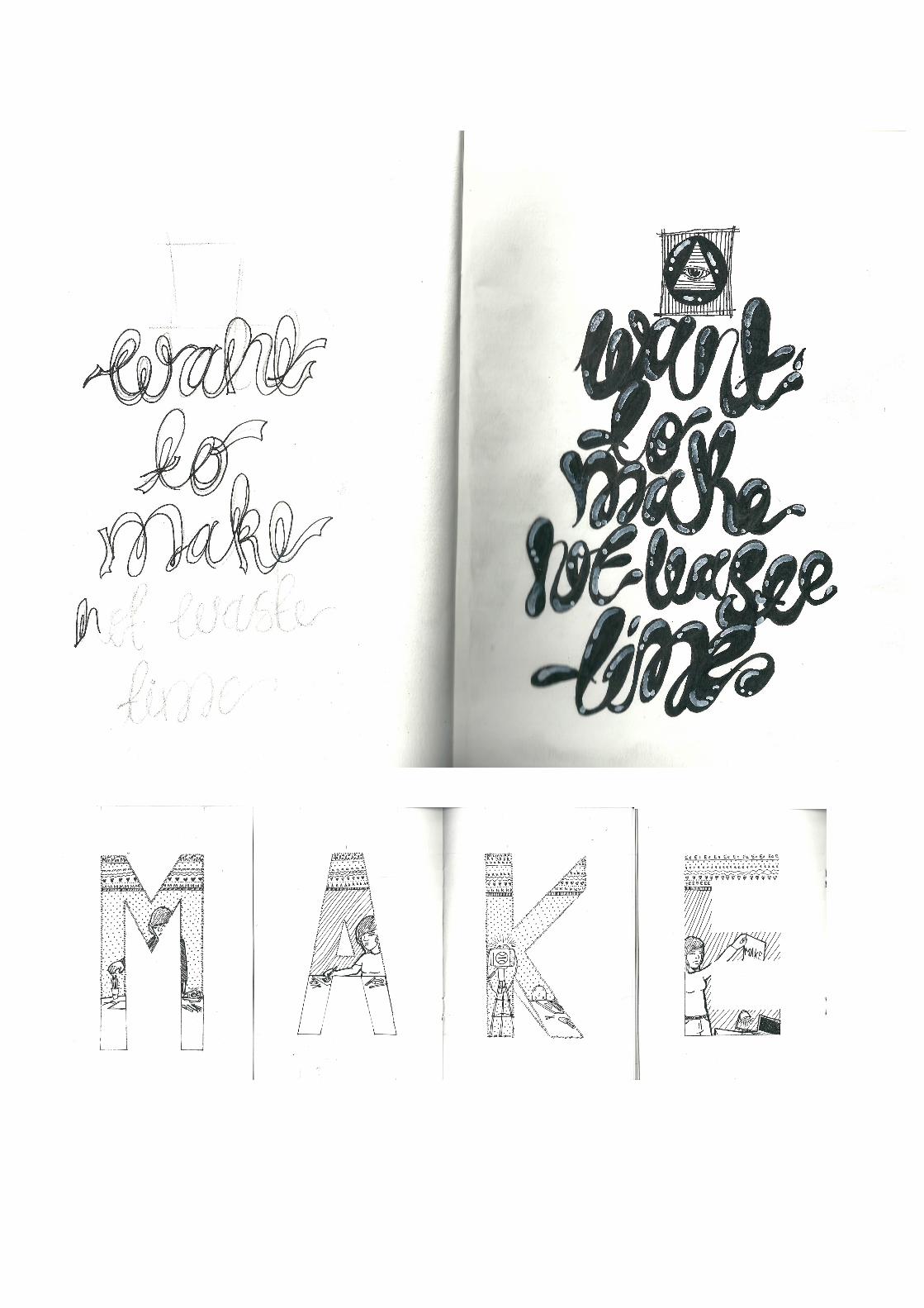
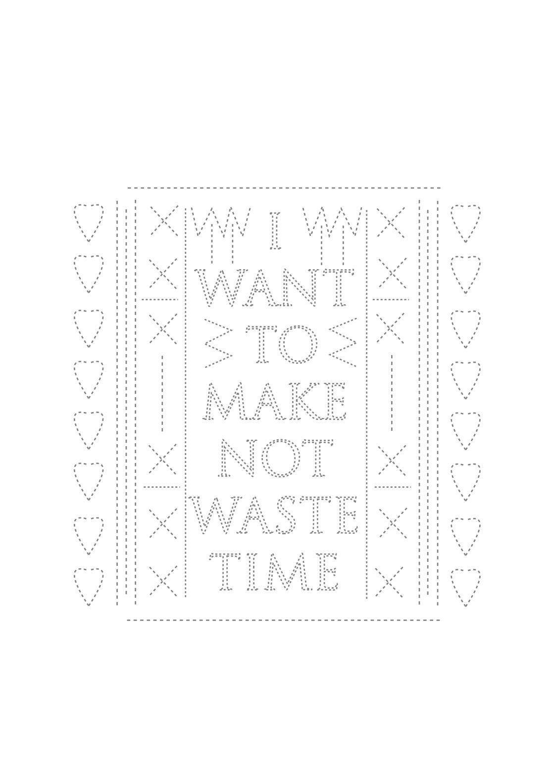
I WANT TO MAKE, NOT WASTE TIME.
THAT WAS OUR MANIFESTO. TO PORTRAY
THIS VISUALLY WE DECIDED TO LITTER=
ALLY ACT ON THE WORDS WE WERE SAYING.
CREATING WITH OUR HANDS AND PRODUCING
WORK INSTEAD OF JUST THINKING ABOUT
DOIN.
I DECIDED TO PRESENT THIS IN A TEX=
TURED, HAND MADE WAY. CONVEYING THE
MESSAGE VISUALLY WITH THE CHOICES I
MADE WHEN CREATING.
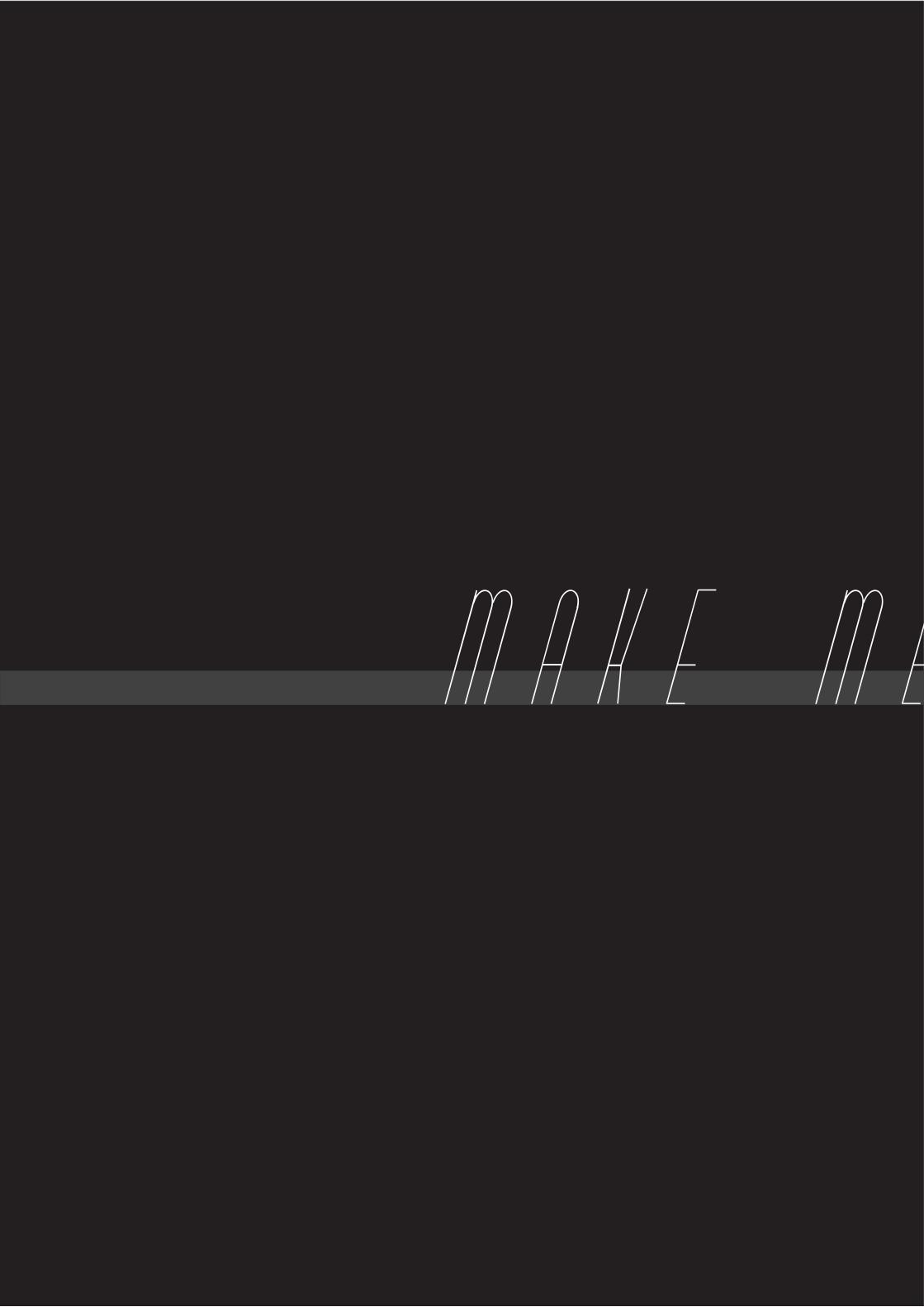
MAKE ME THINK!
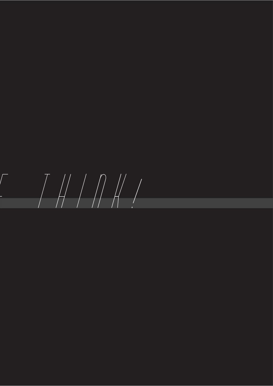
MAKE ME THINK!
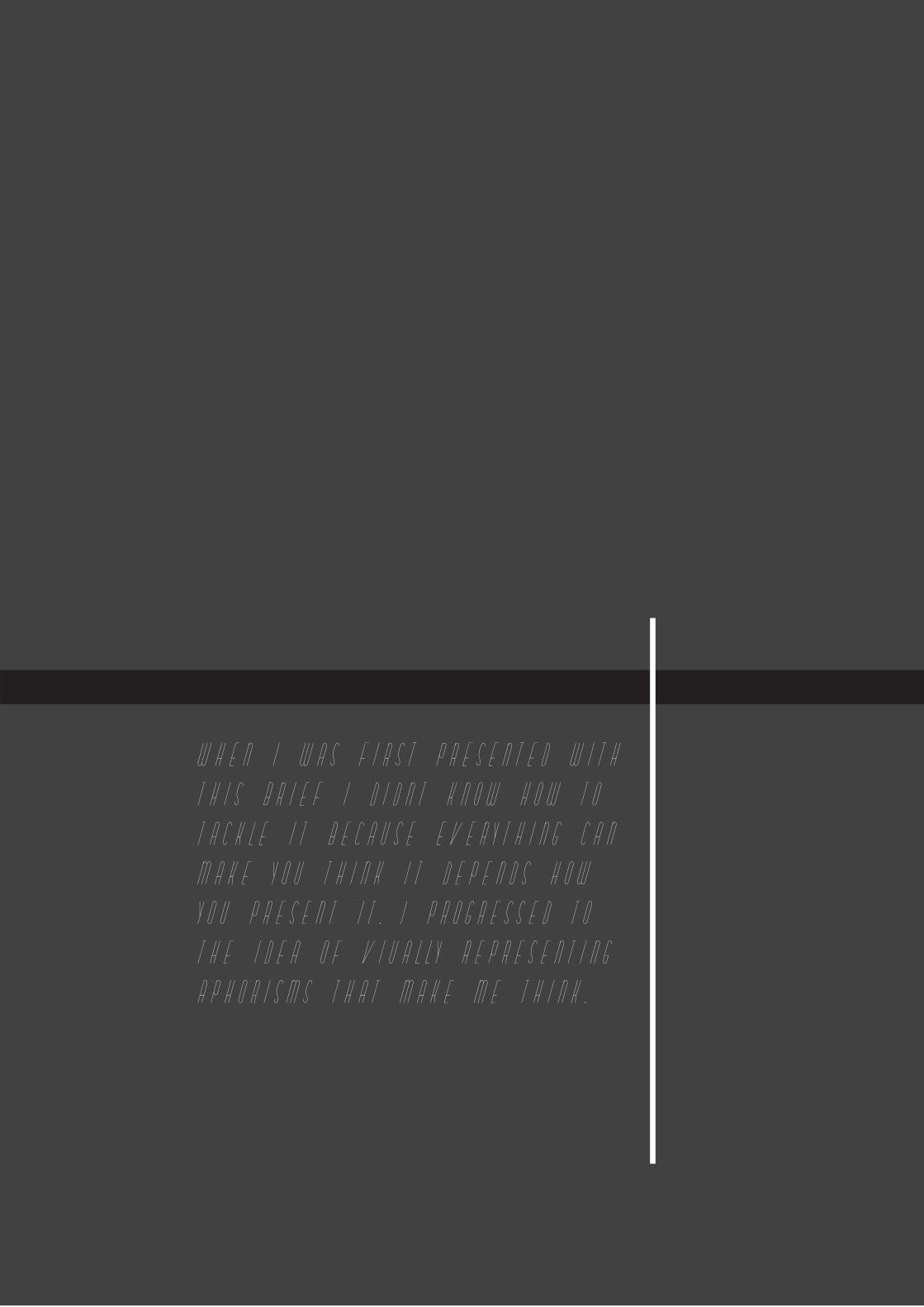
WHEN I WAS FIRST PRESENTED WITH
THIS BRIEF I DIDNT KNOW HOW TO
TACKLE IT BECAUSE EVERYTHING CAN
MAKE YOU THINK IT DEPENDS HOW
YOU PRESENT IT. I PROGRESSED TO
THE IDEA OF VIUALLY REPRESENTING
APHORISMS THAT MAKE ME THINK.
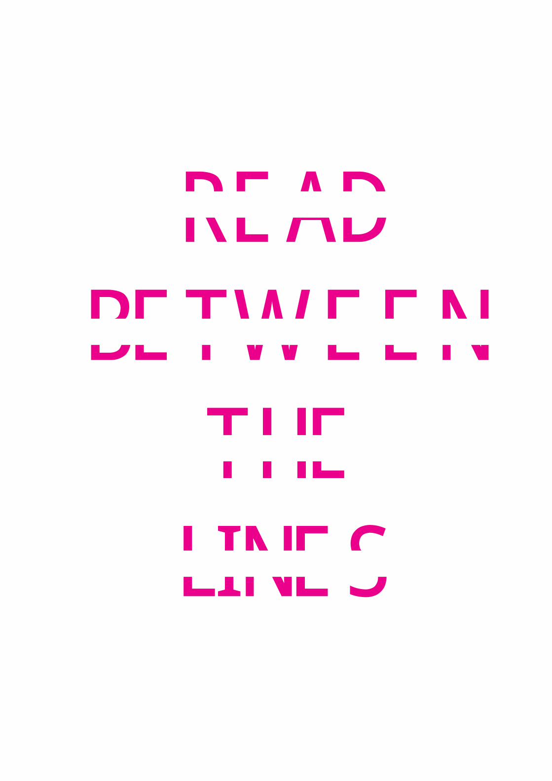
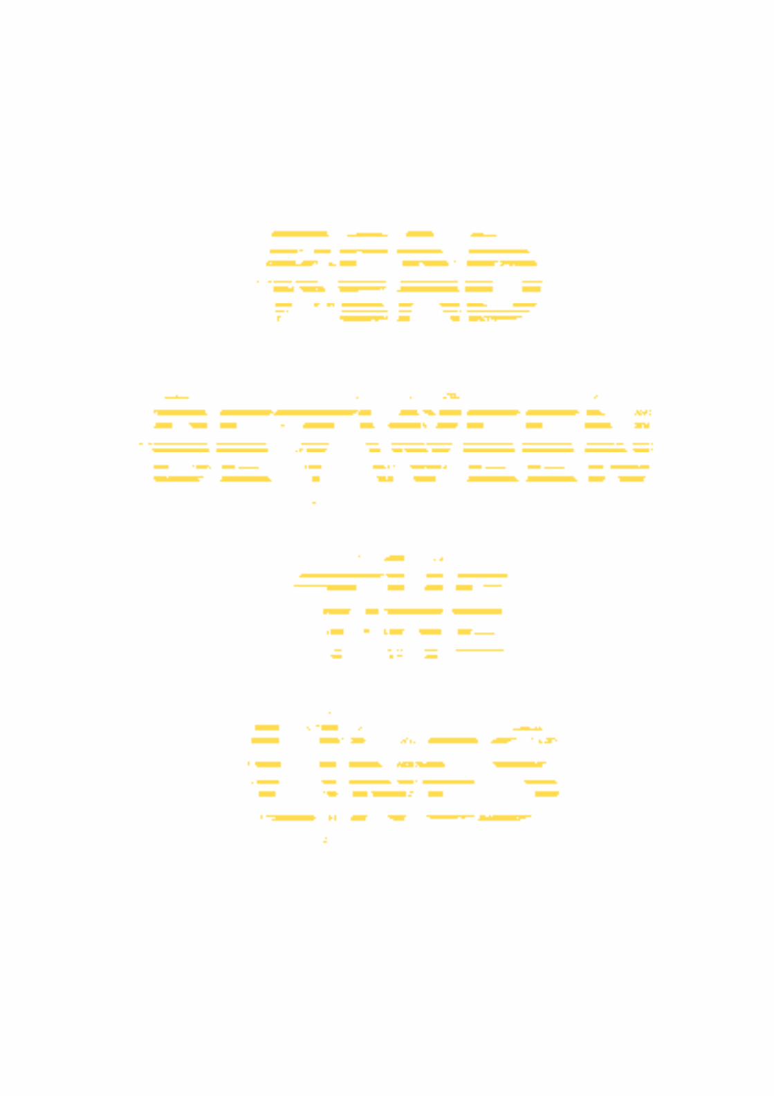
READBETWEEN
THELINES

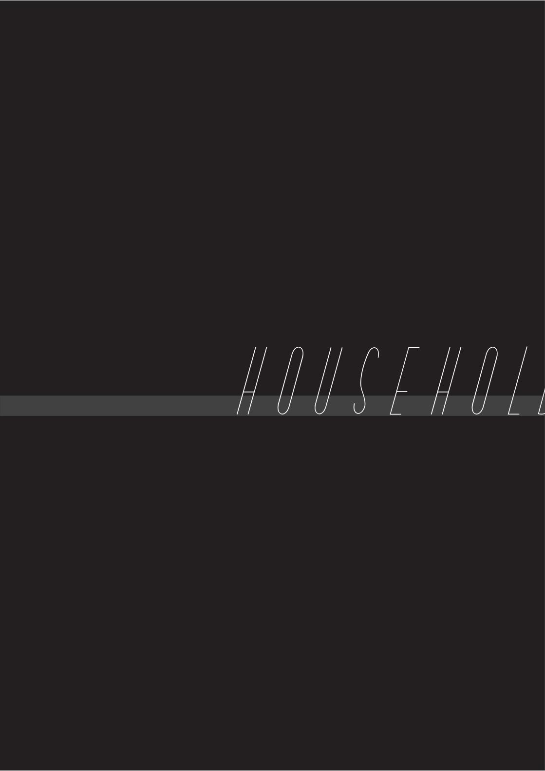
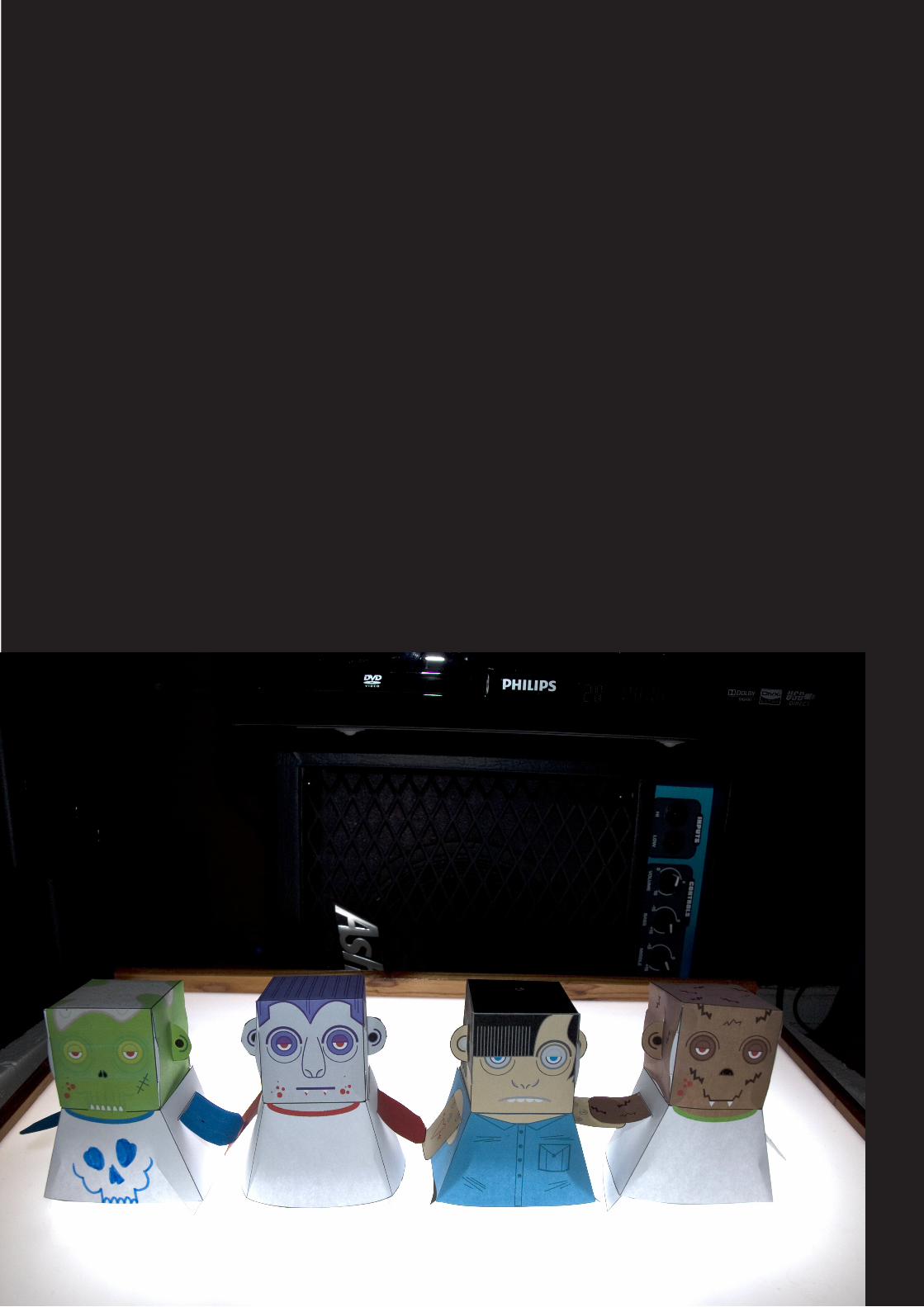
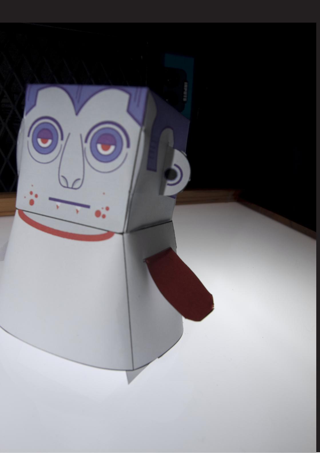
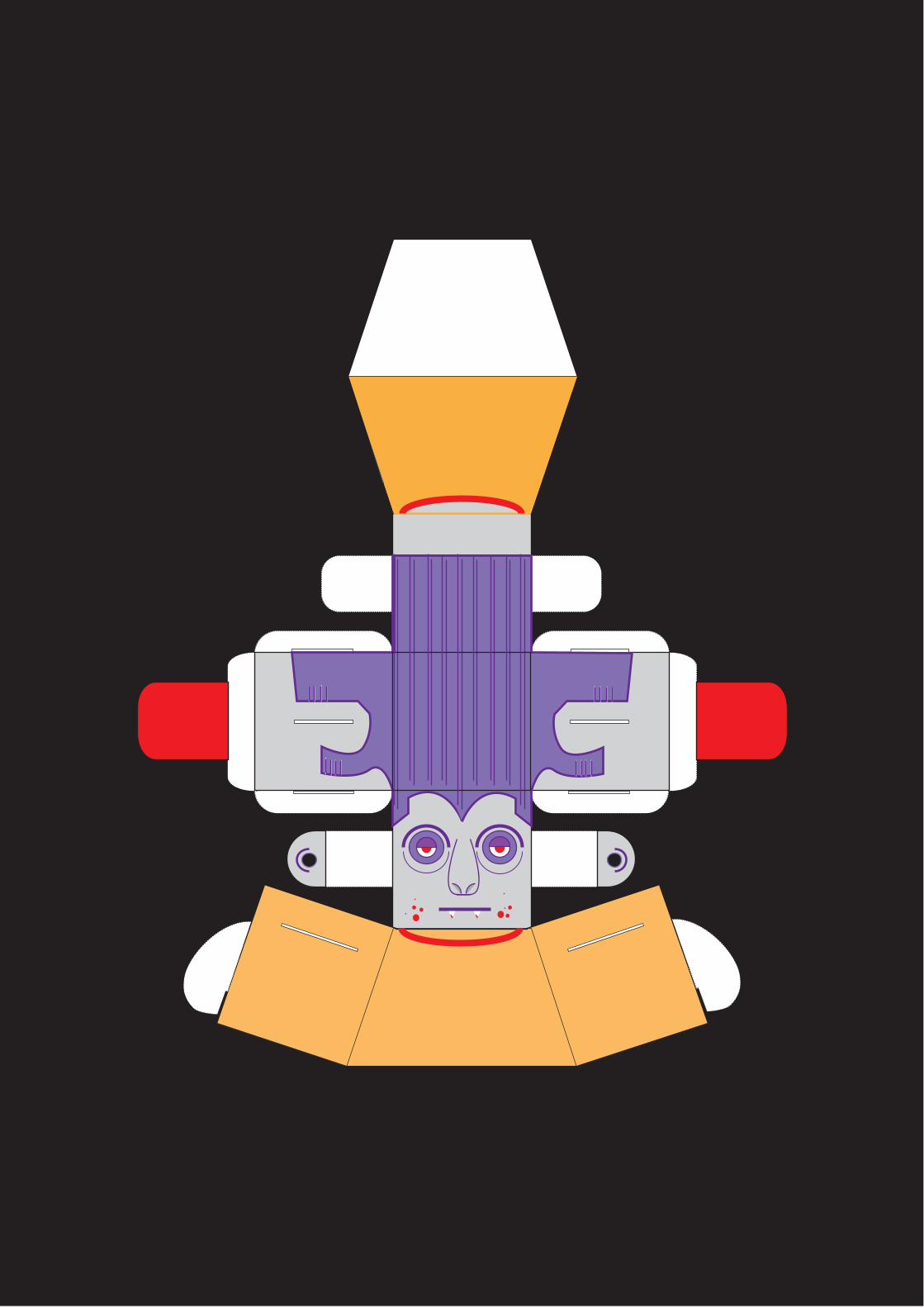
HOUSEHOLD BRIEF!
HOUSEHOLD BRIEF!
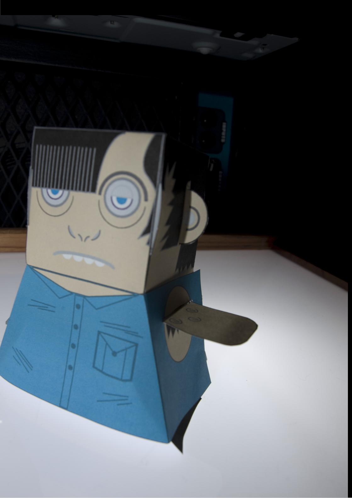
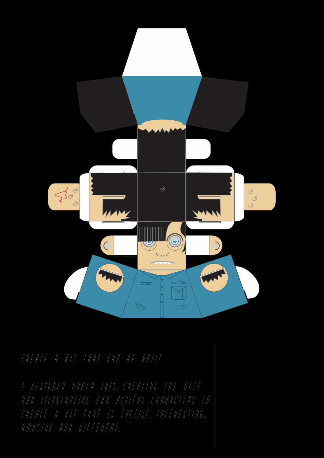
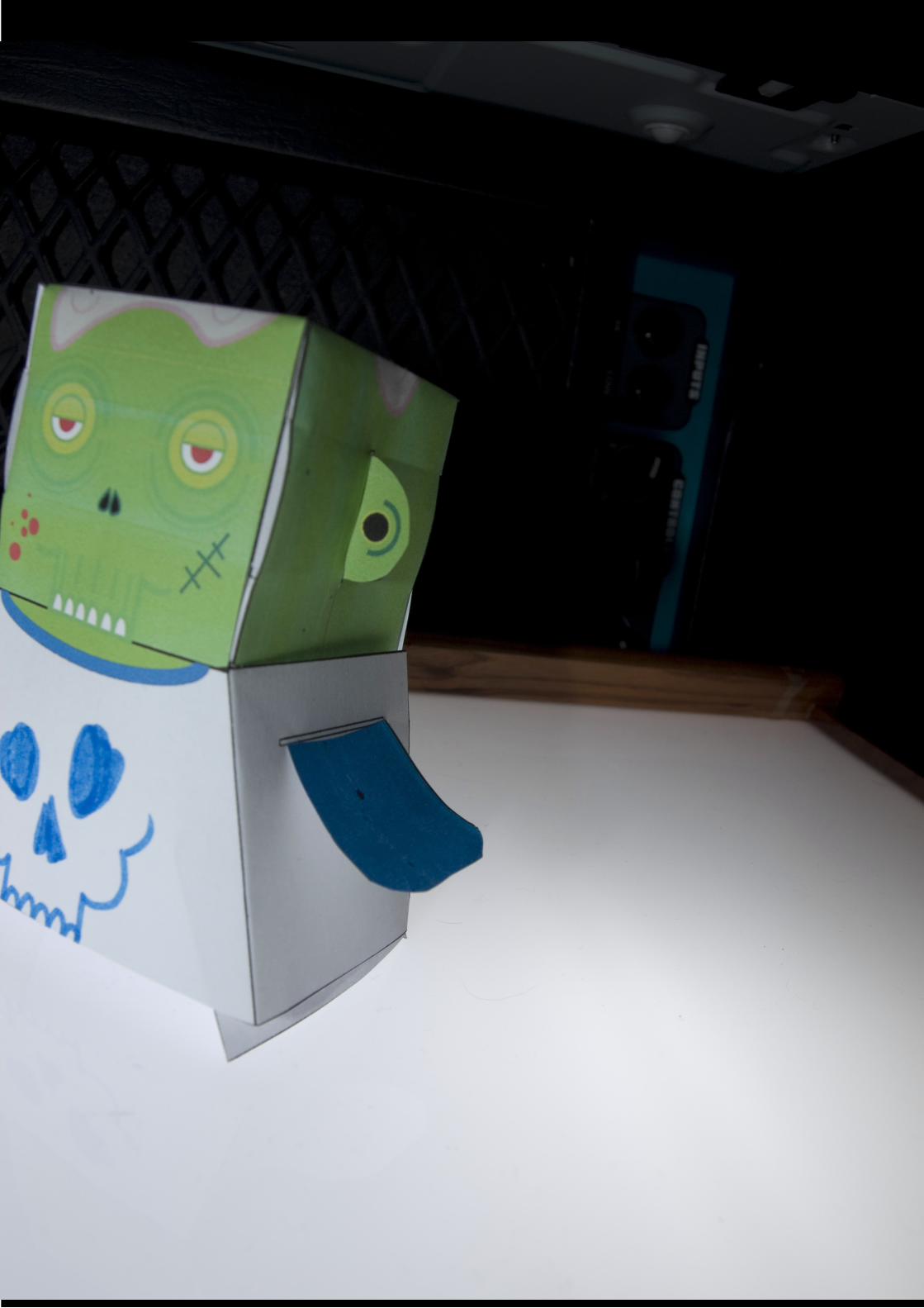
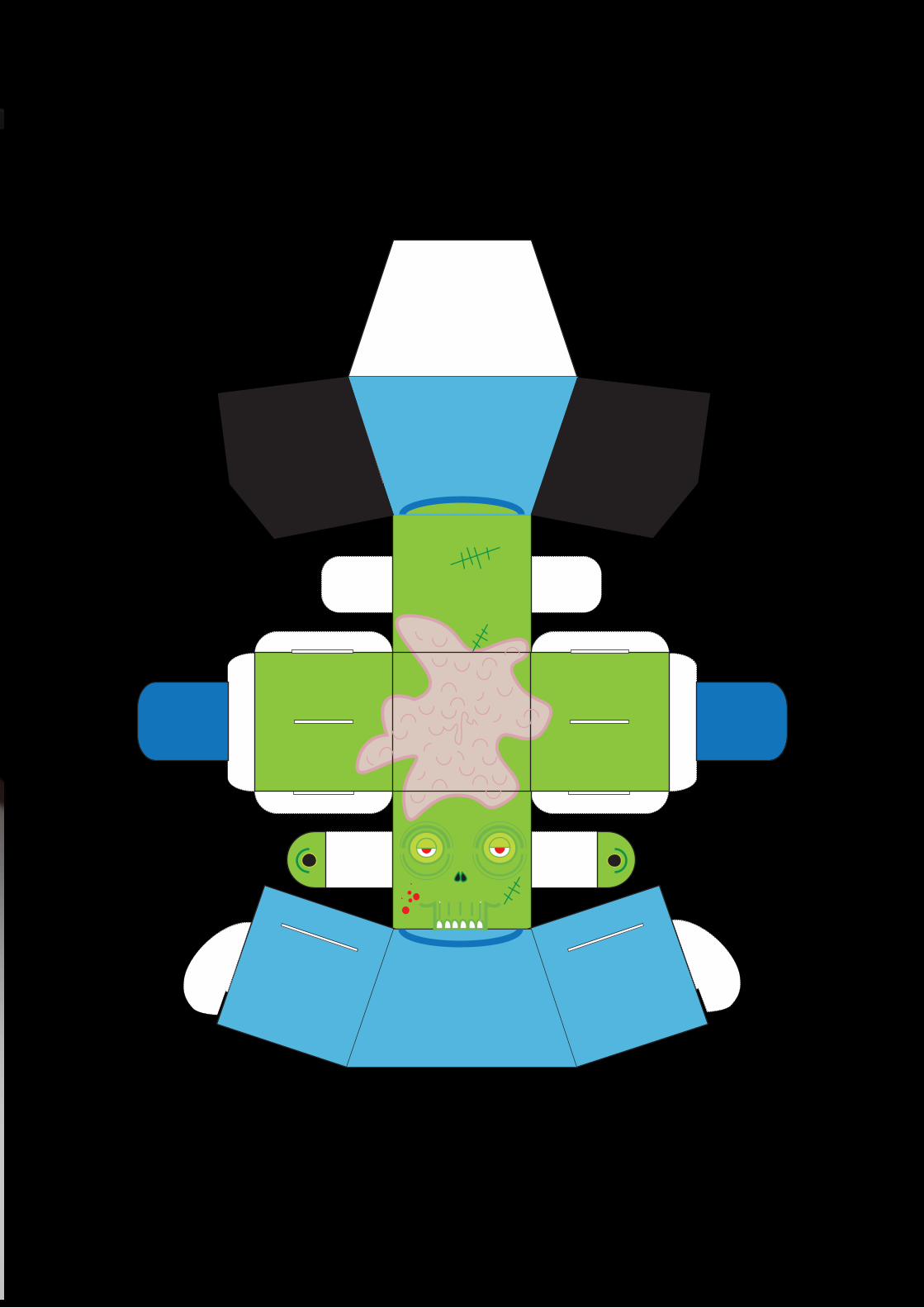
CREATE A KIT THAT CAN BE BUILT.
I DESIGNED PAPER TOYS, CREATING THE NETS
AND ILLUSTRATING FUN PLAYFUL CHARACTERS TO
CREATE A KIT THAT IS TACTILE, INTERESTING,
AMUSING AND DIFFERENT.

PAPER CO BRIEF!
PAPER CO BRIEF!
Less
Ink,
Same I
mapac
t.
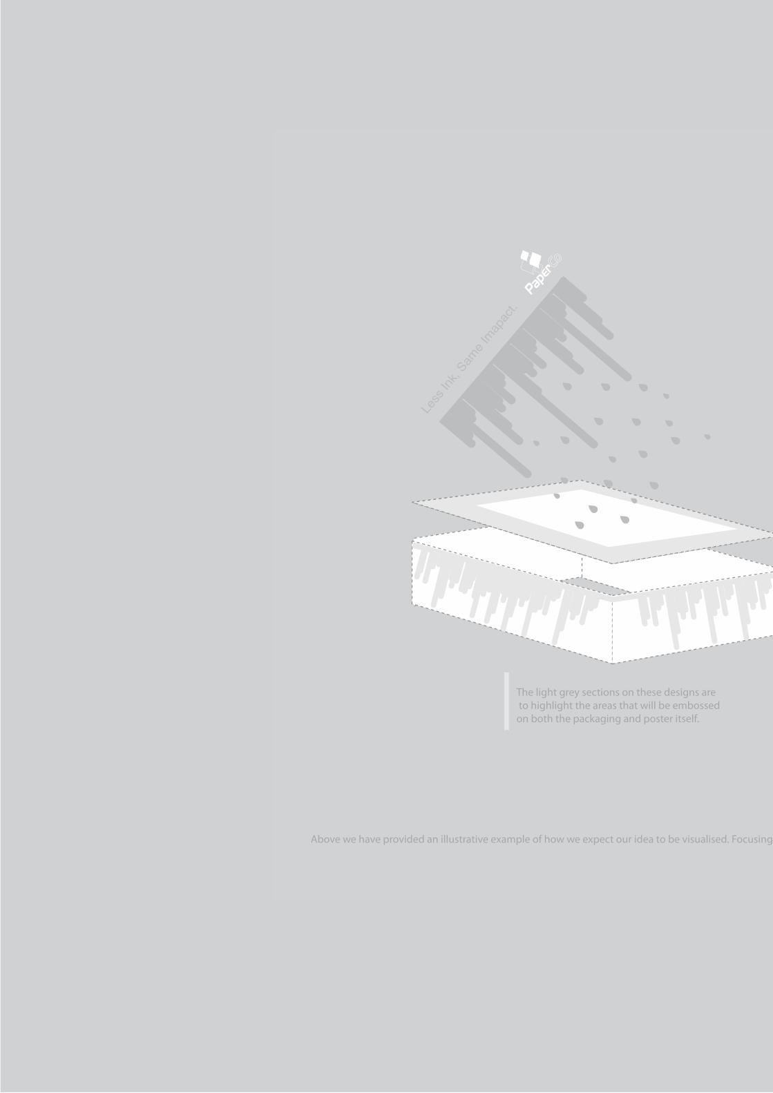
Less Ink, Same Imapact.
Above we have provided an illustrative example of how we expect our idea to be visualised. Focusing primarily on the idea of minimalising ink coverage we have created a keepsake that needs no ink.
The light grey sections on these designs are to highlight the areas that will be embossed on both the packaging and poster itself.
Less
Ink,
Same I
mapac
t.
Less Ink, Same Imapact.
Above we have provided an illustrative example of how we expect our idea to be visualised. Focusing primarily on the idea of minimalising ink coverage we have created a keepsake that needs no ink.
The light grey sections on these designs are to highlight the areas that will be embossed on both the packaging and poster itself.
100% RECYCLED PAPER + INITIATIVE = LESS INK.
THE LESS INK USED, THE EASIER IT IS TO RECYCLE AND THE CLOSER WE GET TO PAS 2020 (A
IMED
AT
IMPR
OVI
NG T
HE ENVIRONMENTAL IMPACT O
F DIRECT MARKETING).
SUSTAINABILITY AND RESPONSIBILITY AND DEDICATION TO OUR ENVIROMENT IS WHY PAPERCO IS C
HAIN
OF
CUST
ODY CERTIFIED.
100% RECYCLED PAPER + INITIATIVE = LESS INK.
THE LESS INK USED, THE EASIER IT IS TO RECYCLE AND THE CLOSER WE GET TO PAS 20
20 (AIMED AT IMPR
OVIN
G THE ENVIRONMENTAL IMPACT OF DIRECT MARKETING).
SUSTAINABILITY AND RESPONSIB
ILITY AND DEDICATION TO OUR ENVIROMENT IS WHY PAPERCO
IS CHAIN OF
CUST
ODY CERTIFIED.
100% RECYCLED PAPER + INITIATIVE = LESS INK.
THE LESS INK USED, THE EASIER IT IS TO RECYCLE AND THE CLOSER WE GET TO PAS 2020 (A
IMED
AT IMPROVING
THE
ENVIRONMENTAL IMPACT OF DIRECT MARKETING).
SUSTAINABILITY AND RESPONSIBILITY AND DEDICATION TO OUR ENVIROMENT IS WHY PAPERCO IS
CHAIN OF CUST
ODY C
ERTIFIED.
DED
ICAT
ED
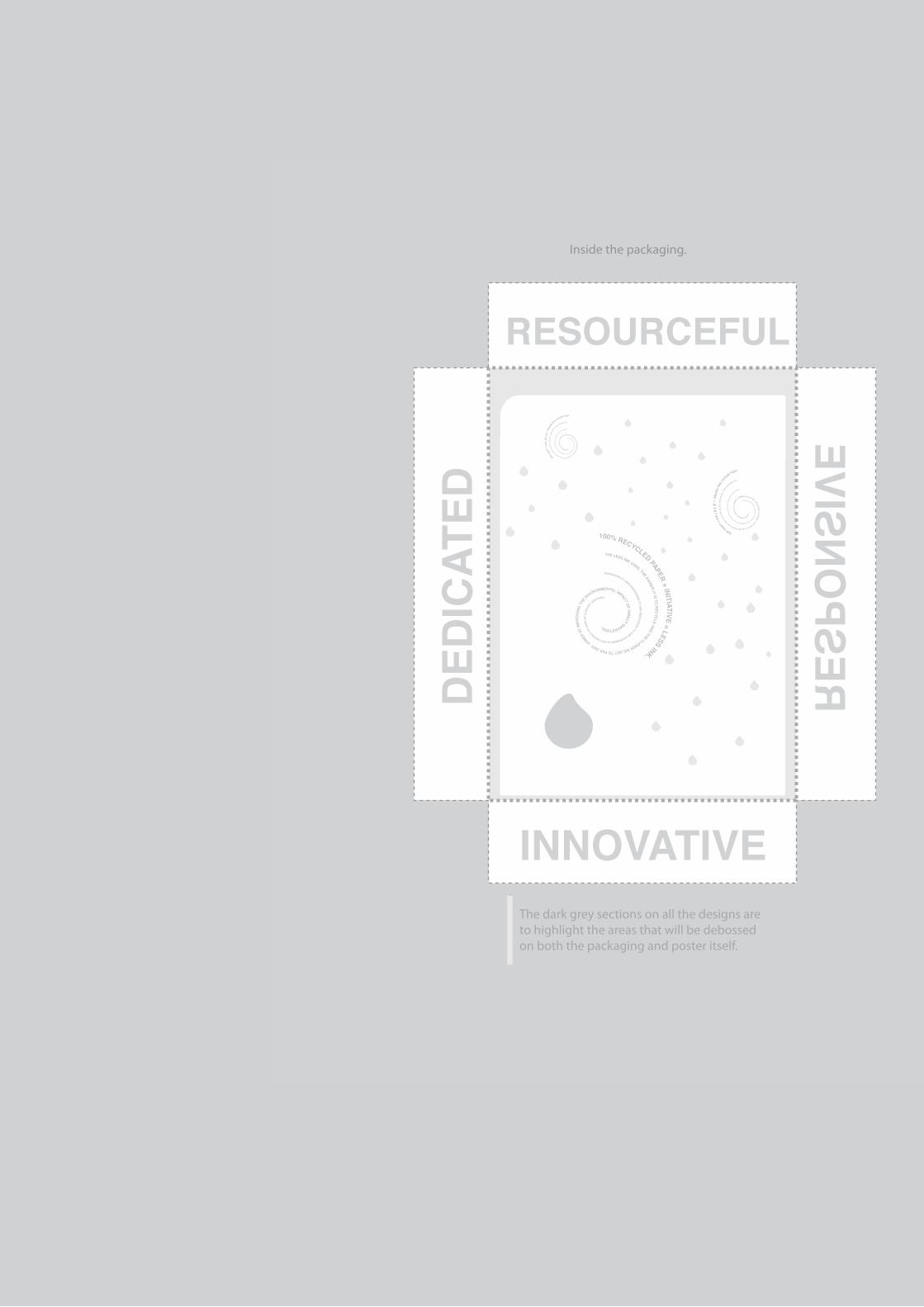
RESPONSIVE
INNOVATIVE
RESOURCEFUL
The dark grey sections on all the designs areto highlight the areas that will be debossed on both the packaging and poster itself.
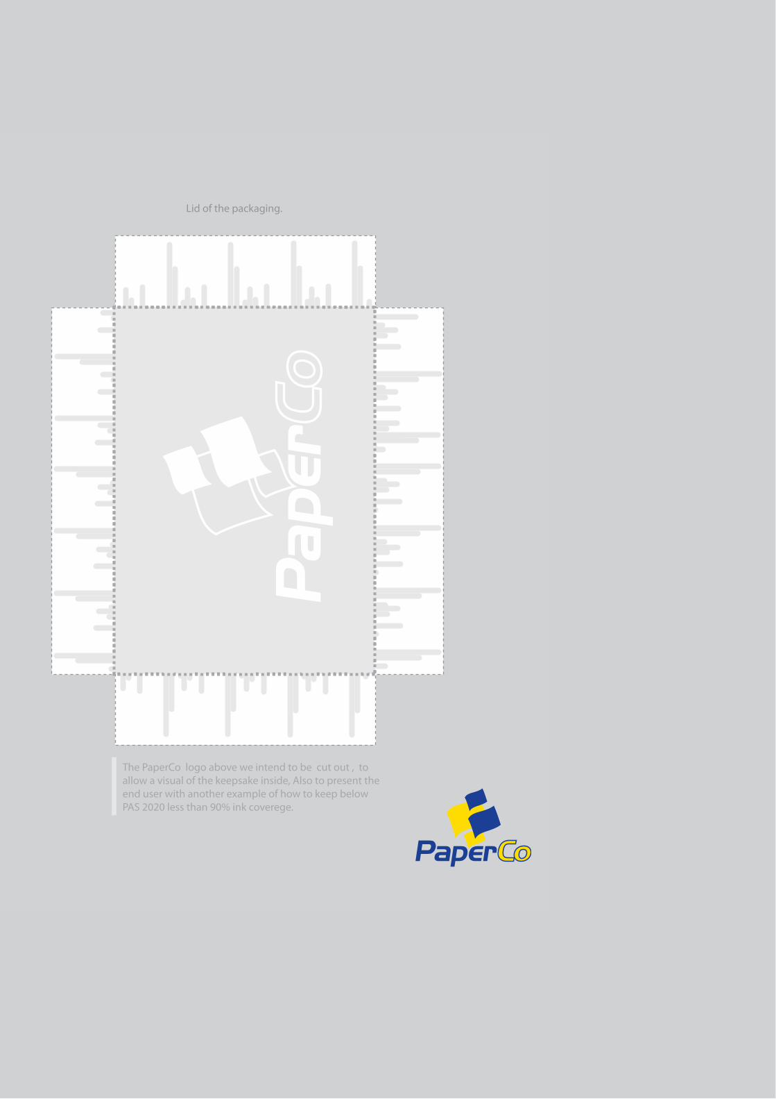
Inside the packaging. Lid of the packaging.
The PaperCo logo above we intend to be cut out , toallow a visual of the keepsake inside, Also to present the end user with another example of how to keep below PAS 2020 less than 90% ink coverege.
100% RECYCLED PAPER + INITIATIVE = LESS INK.
THE LESS INK USED, THE EASIER IT IS TO RECYCLE AND THE CLOSER WE GET TO PAS 2020 (A
IMED
AT
IMPR
OVI
NG T
HE ENVIRONMENTAL IMPACT O
F DIRECT MARKETING).
SUSTAINABILITY AND RESPONSIBILITY AND DEDICATION TO OUR ENVIROMENT IS WHY PAPERCO IS C
HAIN
OF
CUST
ODY CERTIFIED.
100% RECYCLED PAPER + INITIATIVE = LESS INK.
THE LESS INK USED, THE EASIER IT IS TO RECYCLE AND THE CLOSER WE GET TO PAS 20
20 (AIMED AT IMPR
OVIN
G THE ENVIRONMENTAL IMPACT OF DIRECT MARKETING).
SUSTAINABILITY AND RESPONSIB
ILITY AND DEDICATION TO OUR ENVIROMENT IS WHY PAPERCO
IS CHAIN OF
CUST
ODY CERTIFIED.
100% RECYCLED PAPER + INITIATIVE = LESS INK.
THE LESS INK USED, THE EASIER IT IS TO RECYCLE AND THE CLOSER WE GET TO PAS 2020 (A
IMED
AT IMPROVING
THE
ENVIRONMENTAL IMPACT OF DIRECT MARKETING).
SUSTAINABILITY AND RESPONSIBILITY AND DEDICATION TO OUR ENVIROMENT IS WHY PAPERCO IS
CHAIN OF CUST
ODY C
ERTIFIED.
DED
ICAT
ED
RESPONSIVE
INNOVATIVE
RESOURCEFUL
The dark grey sections on all the designs areto highlight the areas that will be debossed on both the packaging and poster itself.
Inside the packaging. Lid of the packaging.
The PaperCo logo above we intend to be cut out , toallow a visual of the keepsake inside, Also to present the end user with another example of how to keep below PAS 2020 less than 90% ink coverege.
Context.
We have designed a direct mail piece which raises awareness with end userson the importance of sustainability of paper and responsible procurement, particularly focusing around the ideasaround PAS 2020.
Our response to this brief, is a collectable user friendly keepsake, which is both sustainable and economic,in terms of it’s ability to maximise the use of recycled paper and its exaggeration of its ink coverage.
Process
We decided to break down the brief and specialise in one area, so that our design was more direct. By doing this we was able to present a clearer message to end users and designers. We decided to be playful and experimental with our ideas to create a piece that tactfully and subtly conveys our message on ink coverage.
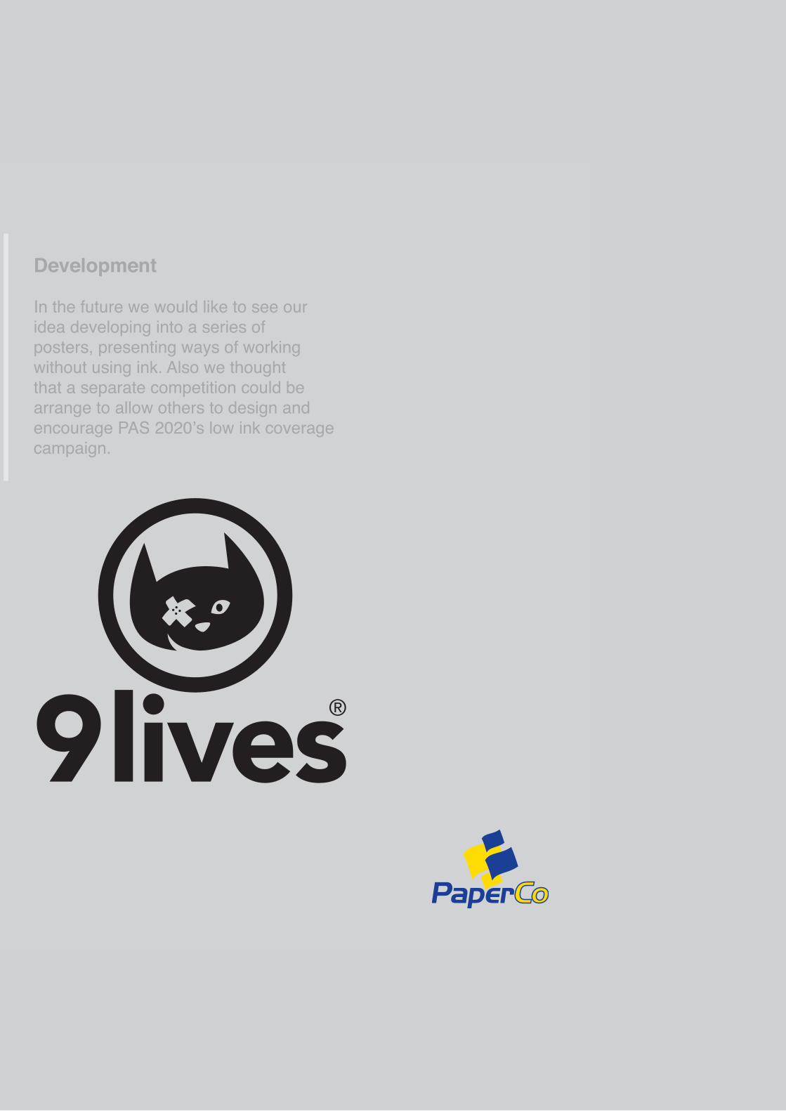
Development
In the future we would like to see ouridea developing into a series of posters, presenting ways of working without using ink. Also we thought that a separate competition could be arrange to allow others to design andencourage PAS 2020’s low ink coveragecampaign.
RationalThis design is intended to be a direct mail keepsake, which clearly conveys that using less ink can be just as affective, whilst still presenting the sustainability of PaperCo’s 9 lives paper and our environment.
We have conveyed this by eliminating ink entirely from our design in an exaggeration of PAS 2020’s ink requirements. By doing this we are showing end users and designers techniques that are available to them presenting them with a constant reminder of the environmental impact ink coverage is making. To visuallyportray this we decided upon using embossing, debossing and cutout techniques.
The paper stock we decided would be most efficient is the 9 lives offset A3 160 g/m (white) for the poster design. We came to decide upon this particular paper stock because we wanted the entire pieceto be recycled as efficiently as possible. Also we feel this stock would work best with the embossing and debossing.
We decided to agree on this particular design because we needed it to be a simple design in order for the embossing to look effective. The design was created to focus on our message, and for it to be direct in its presentation. The droplet and dripshapes were decided to link back to ink usage but to allow a contrast in written and visual. Our intention for this A3 poster design is to make our audience think about ink coverage and to contemplateother techniques. also we chose to present our message usinga poster design because its a user friendly, collectible, keepsakethat can be hung as a constant reminder.
The will be packaged in a thin A3 box containing additional information and acting as a protection, and an additional keepsake. the box will contain the majority of the information on PaperCo and PAS 2020.The designs we intend on being embossed and debossed similarly to the A3 poster design. The lid of the box will be a cut out of the recognisable PaperCo logo. The box shall be made from 9 lives 55 silk 400 gsm paper.
DESIGN INVESTIGATION!
DESIGN INVESTIGATION!

http://www.youtube.com/watch?v=dUEjeKRTgaw
http://www.youtube.com/watch?v=dUEjeKRTgaw

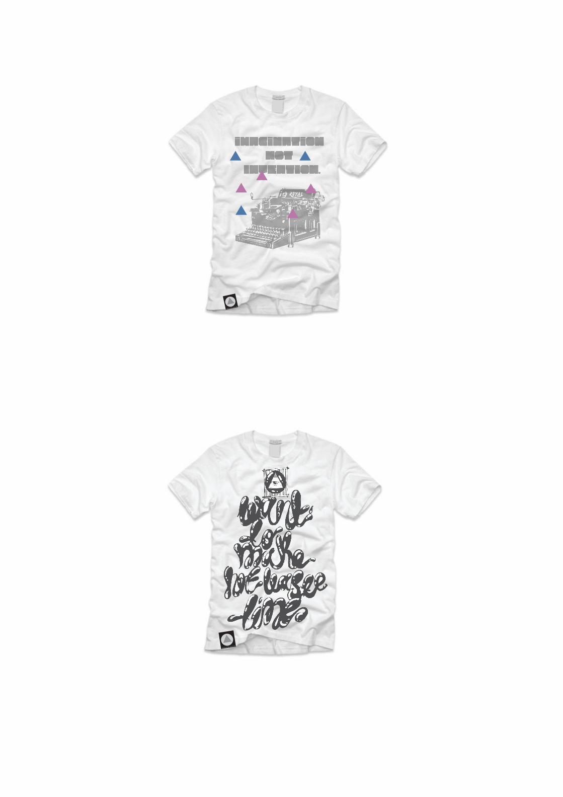
APHORISM!
APHORISM!

http://vimeo.com/20598038IMAGINATION. NOT INVENTION, IS THE SUPREME MASTER OF ART AS IS LIFE.
http://vimeo.com/20598038IMAGINATION. NOT INVENTION, IS THE SUPREME MASTER OF ART AS IS LIFE.
MAKE AND DO!
MAKE AND DO!
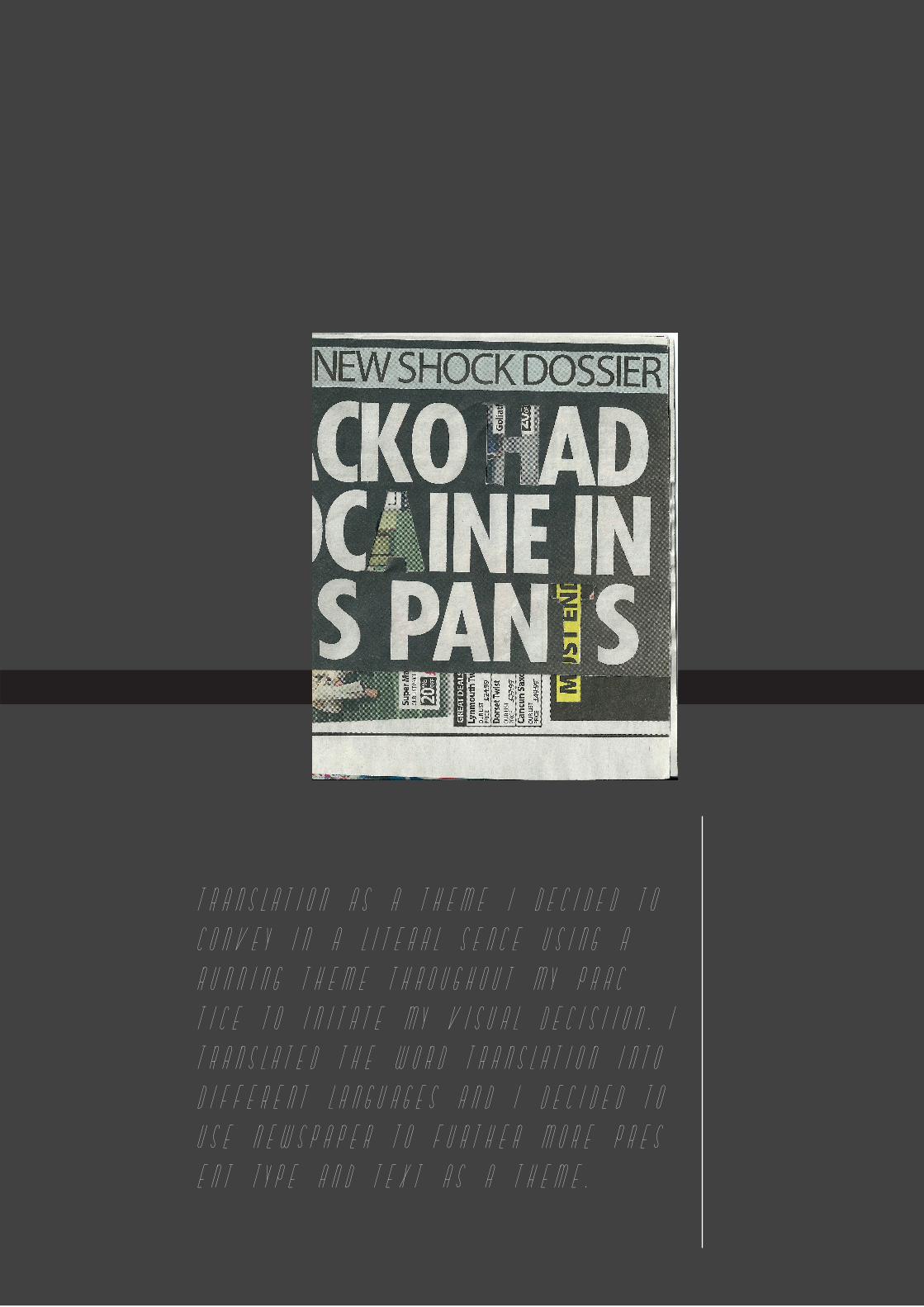
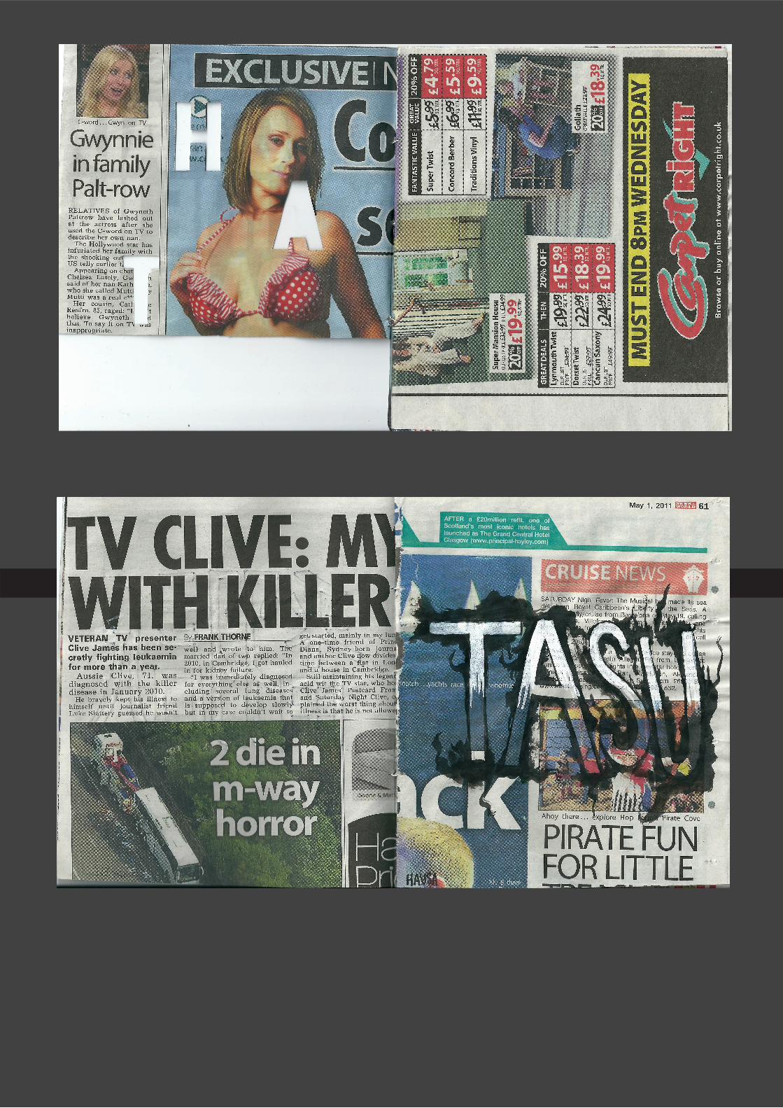
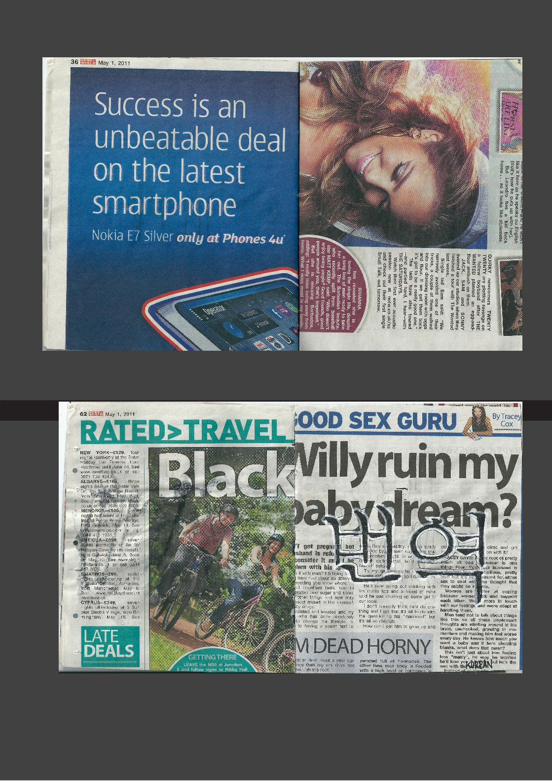
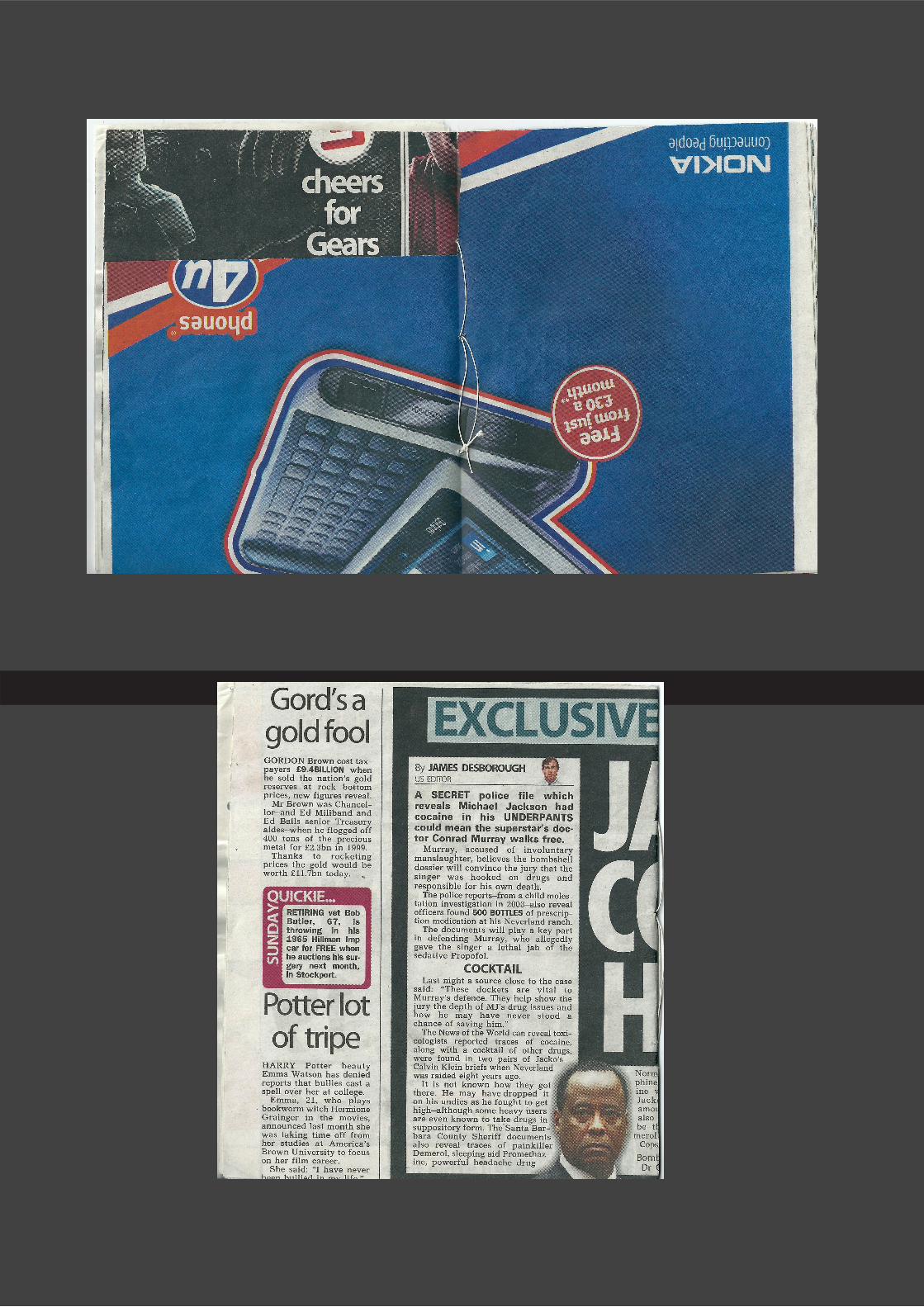
TRANSLATION AS A THEME I DECIDED TO
CONVEY IN A LITERAL SENCE USING A
RUNNING THEME THROUGHOUT MY PRAC=
TICE TO INITATE MY VISUAL DECISIION. I
TRANSLATED THE WORD TRANSLATION INTO
DIFFERENT LANGUAGES AND I DECIDED TO
USE NEWSPAPER TO FURTHER MORE PRES=
ENT TYPE AND TEXT AS A THEME.
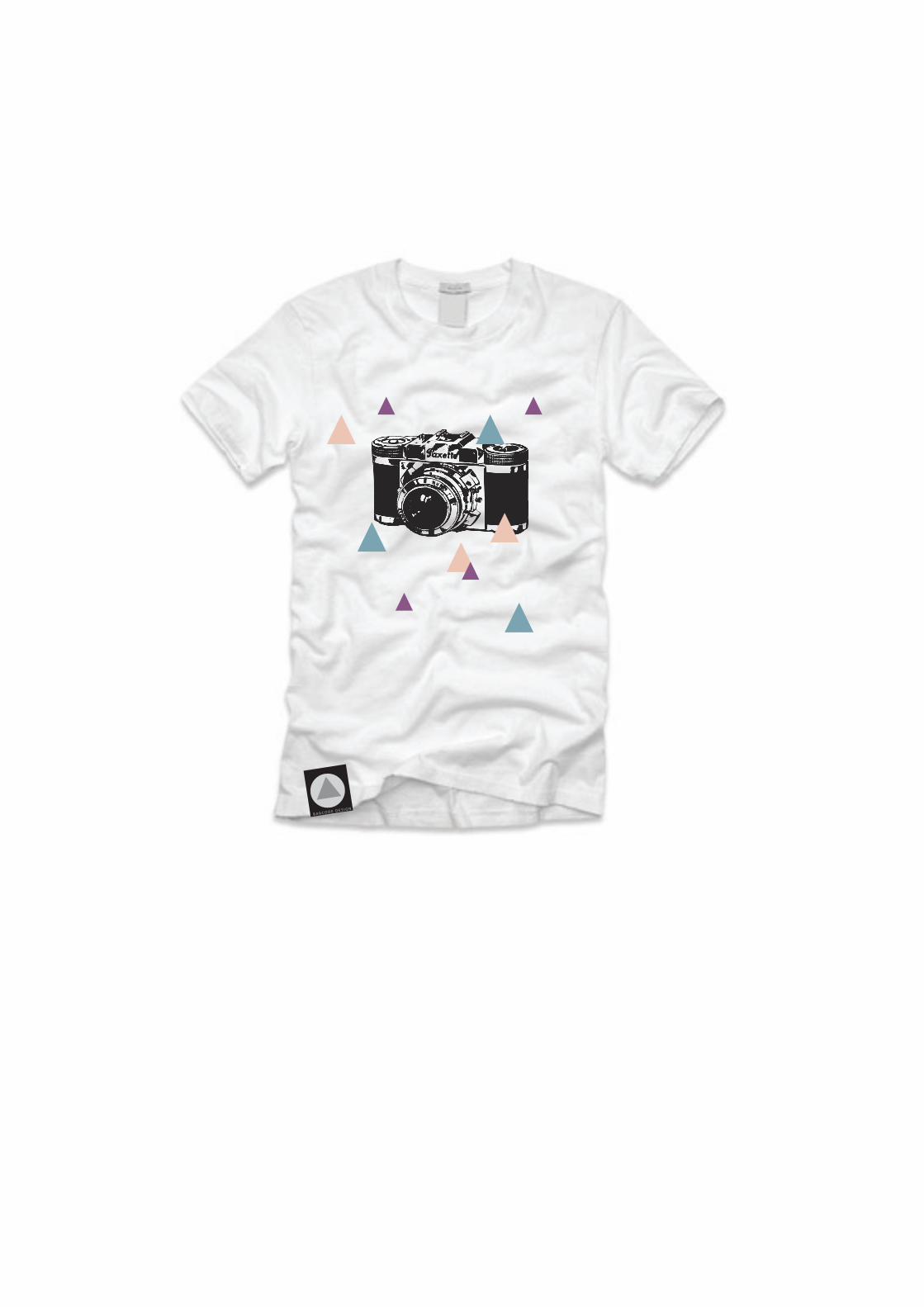
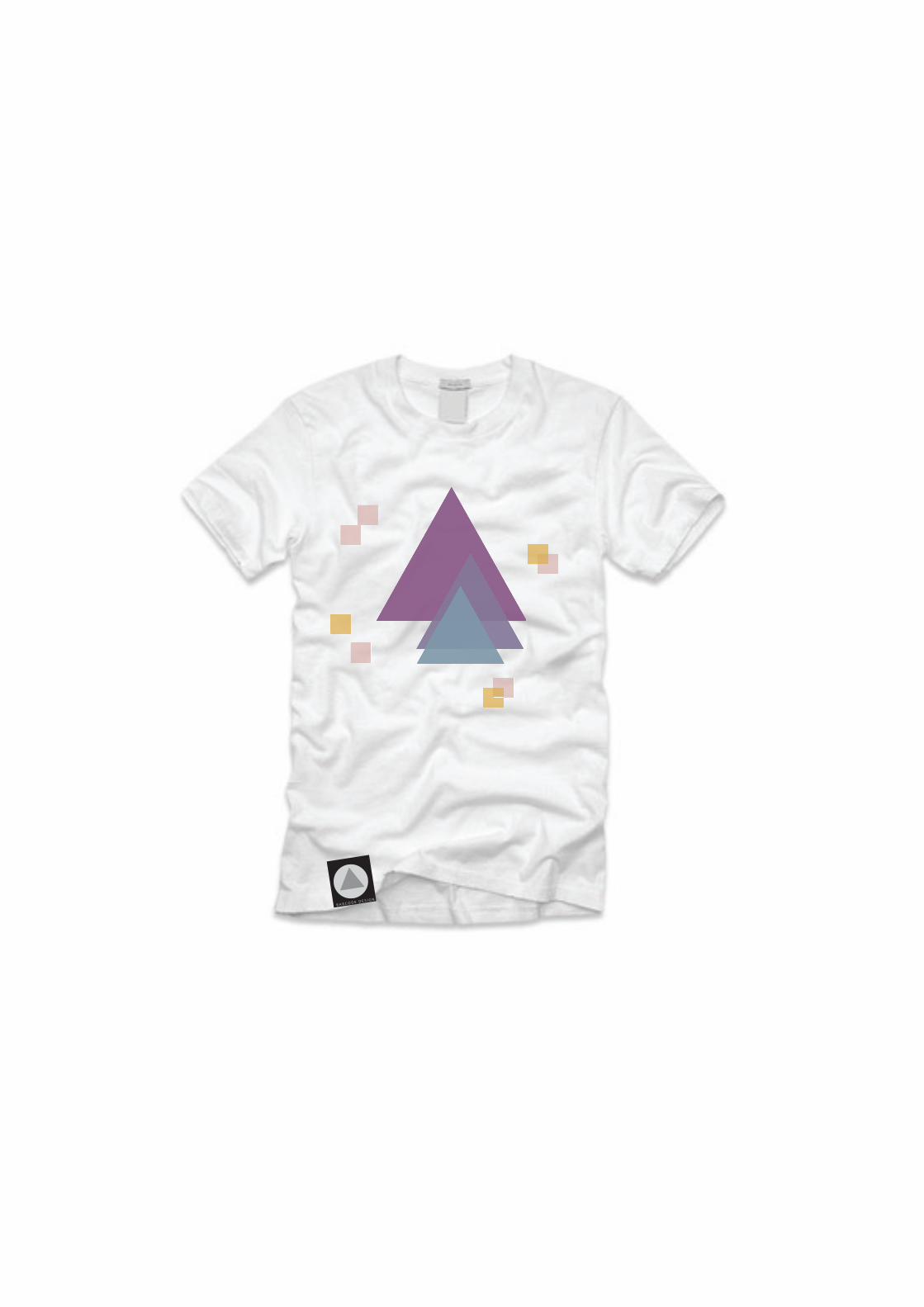
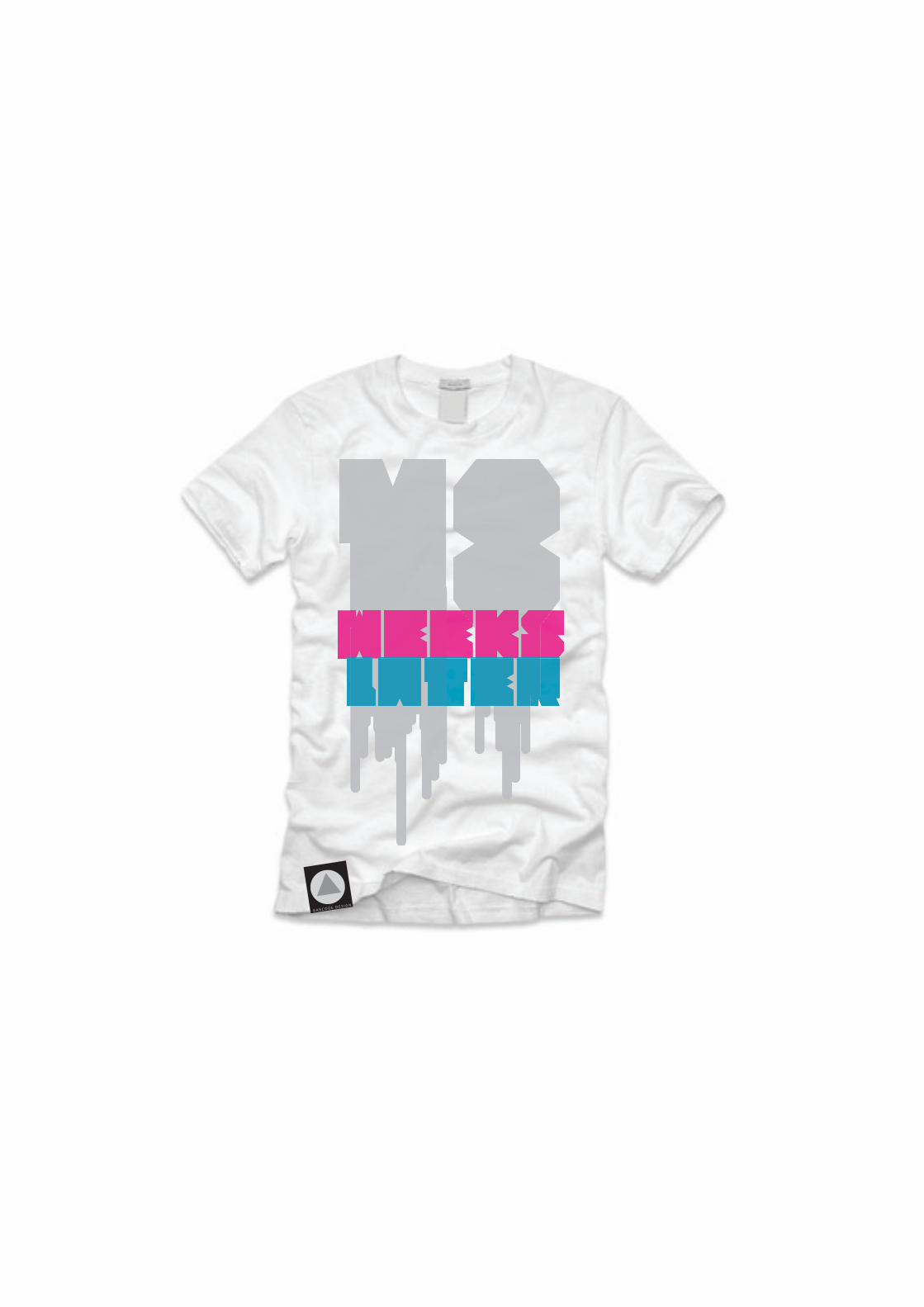
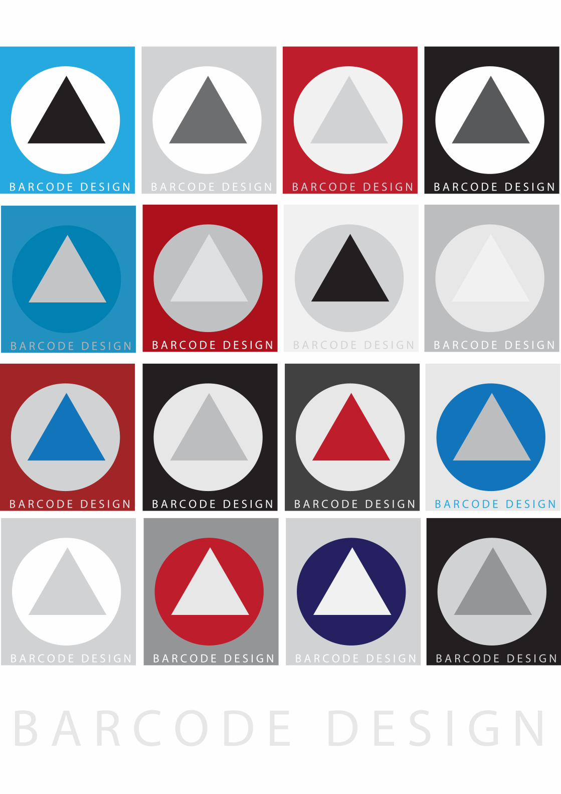
INDEPENDANT PRACTICE!
INDEPENDANT PRACTICE!
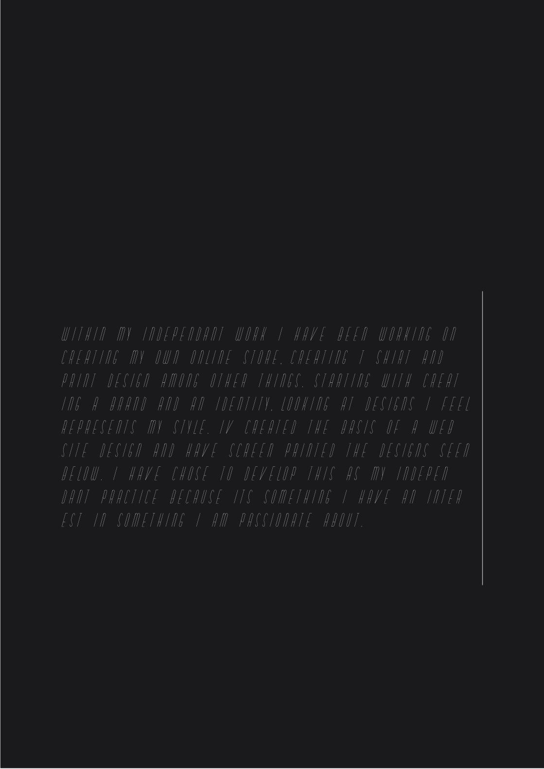
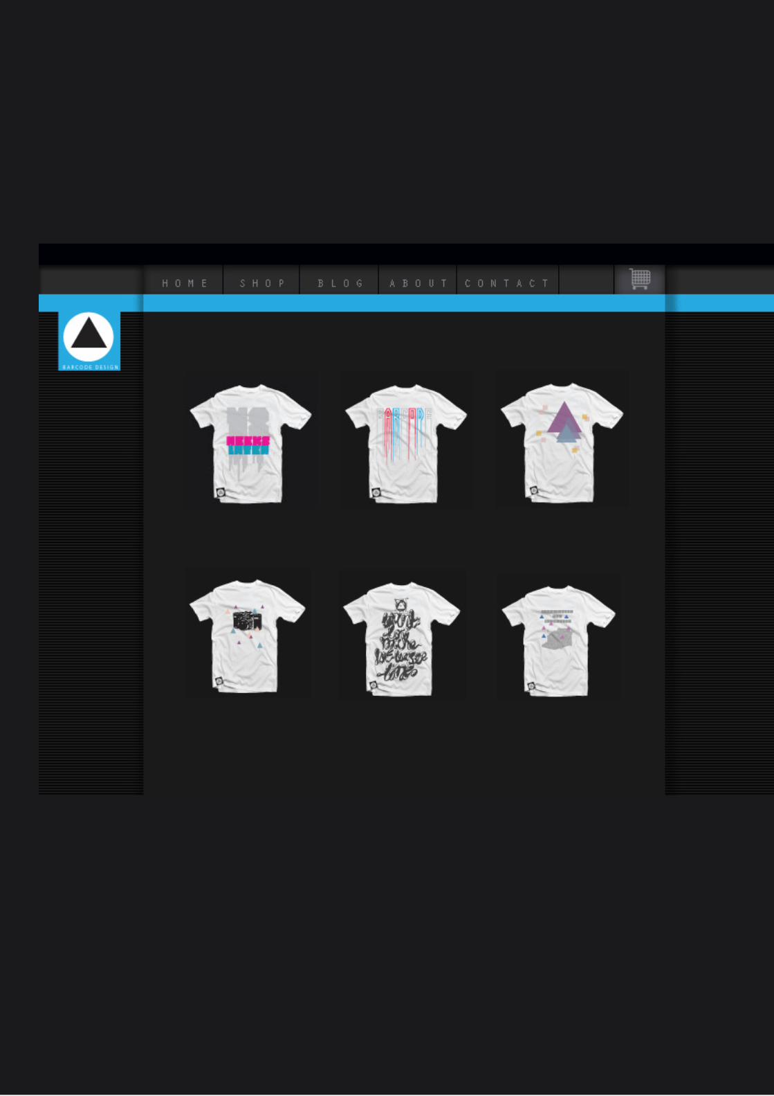
WITHIN MY INDEPENDANT WORK I HAVE BEEN WORKING ON
CREATING MY OWN ONLINE STORE, CREATING T=SHIRT AND
PRINT DESIGN AMONG OTHER THINGS. STARTING WITH CREAT=
ING A BRAND AND AN IDENTITY, LOOKING AT DESIGNS I FEEL
REPRESENTS MY STYLE. IV CREATED THE BASIS OF A WEB=
SITE DESIGN AND HAVE SCREEN PRINTED THE DESIGNS SEEN
BELOW. I HAVE CHOSE TO DEVELOP THIS AS MY INDEPEN=
DANT PRACTICE BECAUSE ITS SOMETHING I HAVE AN INTER=
EST IN SOMETHING I AM PASSIONATE ABOUT.
B A R C O D E D E S I G N
B A R C O D E D E S I G N
B A R C O D E D E S I G N
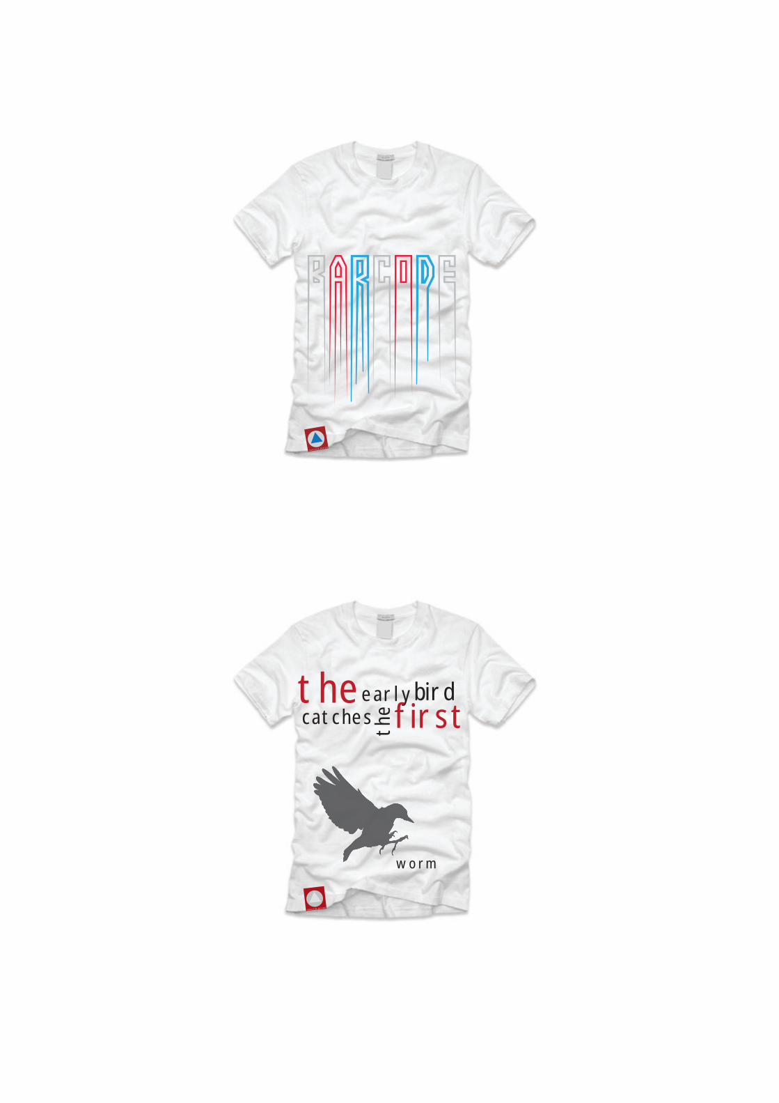
B A R C O D E D E S I G N
theearlybirdcatches th
e first
worm
B A R C O D E D E S I G N
B A R C O D E D E S I G N
B A R C O D E D E S I G N
B A R C O D E D E S I G N
B A R C O D E D E S I G N
B A R C O D E D E S I G N B A R C O D E D E S I G N B A R C O D E D E S I G N B A R C O D E D E S I G N
B A R C O D E D E S I G N B A R C O D E D E S I G N B A R C O D E D E S I G N B A R C O D E D E S I G N
B A R C O D E D E S I G N B A R C O D E D E S I G N B A R C O D E D E S I G N B A R C O D E D E S I G N
B A R C O D E D E S I G N B A R C O D E D E S I G N B A R C O D E D E S I G N B A R C O D E D E S I G N
B A R C O D E D E S I G N
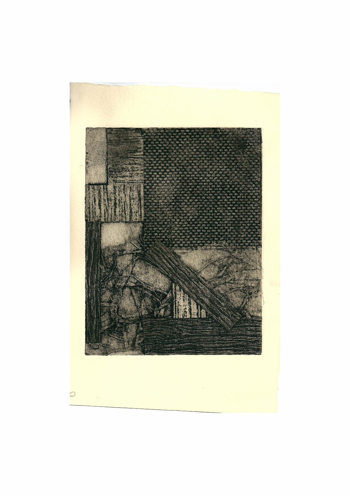
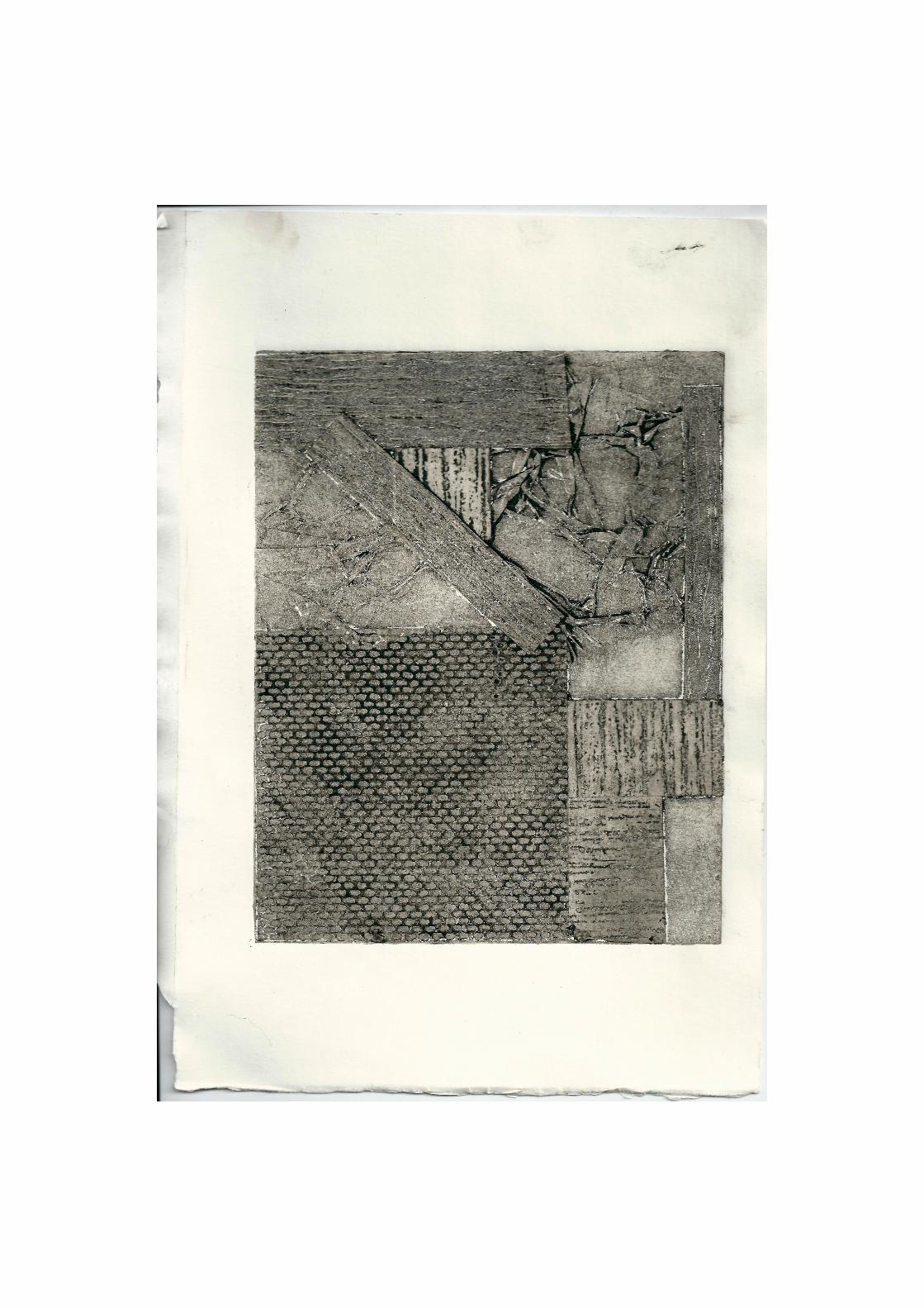
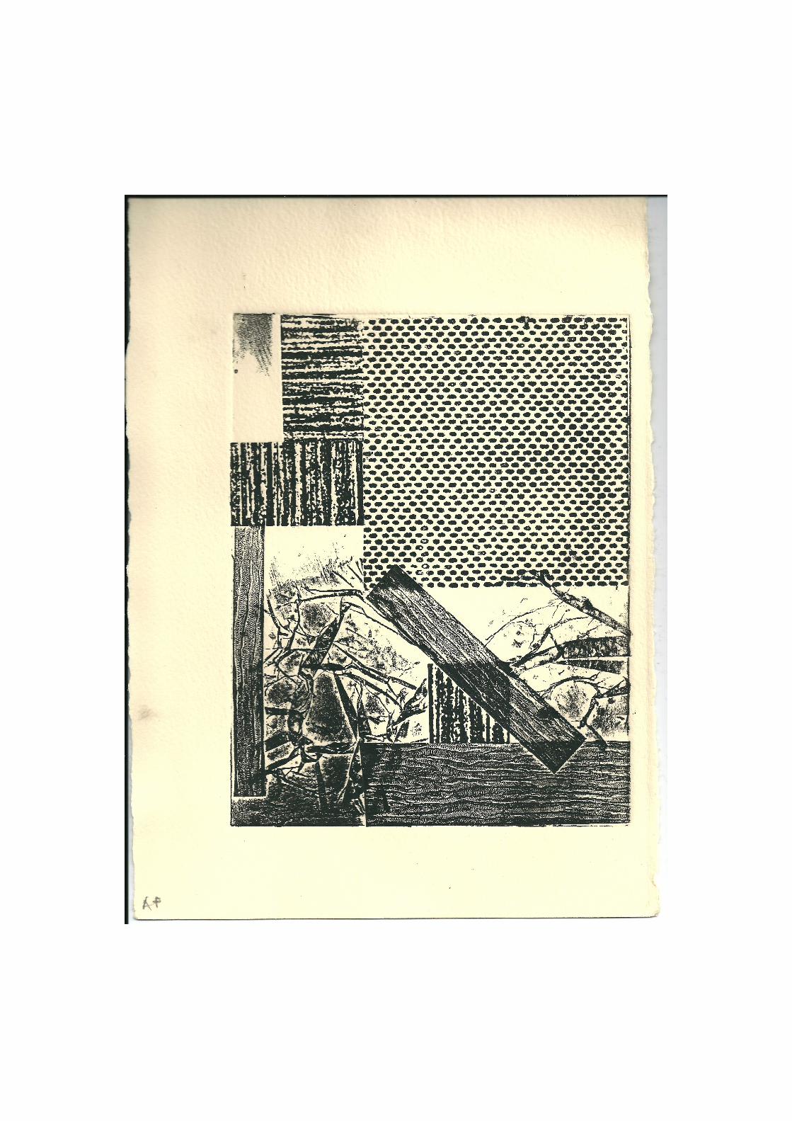
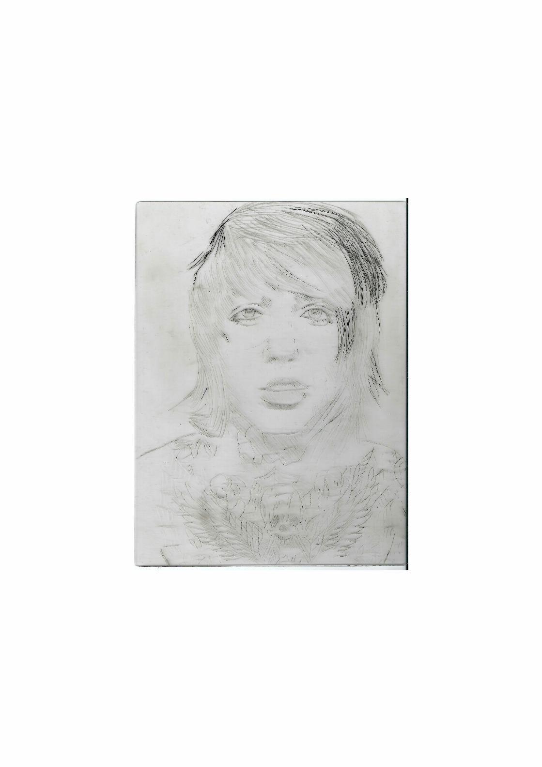
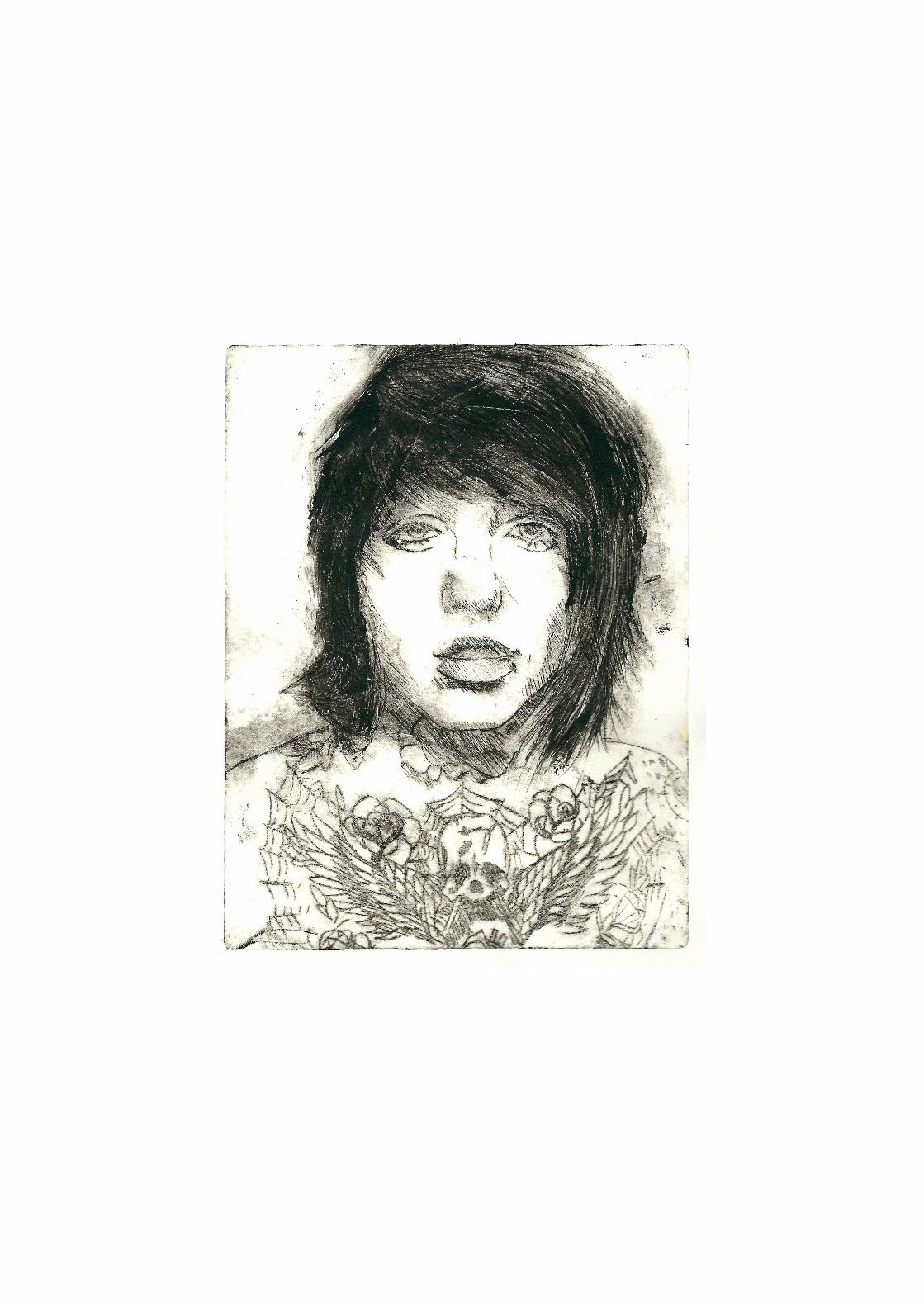
ANOTHING ASPECT OF MY INDEPENDANT PRACTICE IS
PRINT MAKING, I HAVE NARROWED DOWN MY PRINTS TO
THE MOST INTERESTING, USING TECHNIQUES I HAD NEVER
USED BEFORE I CREATED TEXTURED INTERESTING PRINTS
USING COLLAGRAPH AND INTAGLIO PRINT METHODS ALSO
EXPERIMENTING WITH EMBOSSING.
EVALUATIONWITHING THIS SEMESTER I HAVE REALISED AN AREA OF
PRACTICE I NEVER REALLY CONSIDERED AS A FEILD I WOULD
PUSH FORWARD AND LEARN FROM, TYPOGRAPHY AFTER THIS SE=
MESTER HAS NOW BECOME A PRIORITY IN MY DEVELOPMENT.
I HAVE ALO LEARNED TO WORK WITH DIFFERENT PEOPLE AND
I FEEL MORE CONFIDENT WITHIN MY PRACTICE TO GIVE MY
SKILLS TO A GROUO OF STRANGERS AND CREATE INTERESTING
AND DIFFERENT WORK
HAVING THE OPPURTUNITY TO WORK EXTERNALLY WITH PAPER
CO AND OTHER DESIGNERS WITHIN WORKSHOPS HAS GIVEN ME
A BETTER INSIGHT TO THE GRAPHIC DESIGN ON A BROADER
SENSE. HAVING A DESIGN INVESTIGATION AND GOING TO DIF=
FERENT AGENCEIES ALLOWED ME TO EXPERIENCE A THE PROF=
FESIONAL ASPECT TO MY FUTURE CARRIER.
I WOULD LIKED TO HAVE DEVELOPED MY INDEPENDANT PRAC=
TICE MORE THROUGHOUT THIS SEMESTER BY EXPERIMENTING
MORE AND TAKING MORE RISKS. I WOULD ALSO HAVE LIKED TO
HAVE BEEN ABLE TO GET INVOLVED WITH MORE WORKSHOPS.
BIBLIOGRAPHYWEBSITES
HTTP:// WWW.AIRSIDE.COM
HTTP:// WWW.KEMISTRY.COM
HTTP:// WWW.JWTDESIGN.COM
BOOKS
ONE HUNDRED AT 360’, GRAPHIC DESIGN’S NEW GLOBAL GENERATION, LAURENCE KING PUBLISH=
ING. 2007.
VECTOR GRAPHICS AND ILLUSTRATOR, A MASTER CLASS IN DIGITAL IMAGE=MAKING, JACK
HARRIS AND STEVEN WITHROW. 2008
GRAPHIC DESIGN, A NEW HISTORY, STEPHEN J . ESKILSON, LAURENCE KING PUBLISHING, 2007.
STREET ART, THE SPRAY FILES, LOUIS BOU, COLLINS DESIGN, 2005.
STREET SKETCHBOOK, TRISTAN MANCO, THAMES AND HUDSON LTD, 2007.


![B.Sc. III Yr. Electronics [Optional] Sem](https://img.pdfslide.net/doc/110x75/5868b9db1a28abbe3f8bf081/bsc-iii-yr-electronics-optional-sem.jpg)