Embed Size (px)
Citation preview
Sensemaking of Evolving Web SitesUsing Visualization Spreadsheets
Ed H. Chi, Stuart K. CardXerox Palo Alto Research Center
3333 Coyote Hill RoadPalo Alto, CA 94304 USA
{echi,card}@parc.xerox.com
AbstractIn the process of knowledge discovery, workers examineavailable information in order to make sense of it. Bysensemaking, we mean interacting with and operating onthe information with a variety of information processingmechanisms [3,18]. Previously, we introduced a conceptthat uses the spreadsheet metaphor with cells containingvisualizations of complex data. In this paper, we extendand apply a cognitive model called “visual sensemaking” tothe Visualization Spreadsheet. We use the task of makingsense of a large Web site as a concrete example throughout the paper for demonstration. Using a variety ofvisualization techniques, such as the Disk Tree and ConeTree, we show that the interactions of the VisualizationSpreadsheet help users draw conclusions from the overallrelationships of the entire information set.
KeywordsInformation visualization, Spreadsheet, Sensemaking,World Wide Web, Information ecologies, Log file analysis
1. IntroductionA graphic is not “drawn” once and for all; it is“constructed” and reconstructed until it reveals all therelationships constituted by the interplay of the data.... Agraphic is never an end in itself; it is a moment in theprocess of decision-making. –Jacques Bertin [3]
In the present and the past, knowledge workers haveutilized various technologies to reduce the cost ofaccessing, processing, and understanding large data sets.The vision of Vannevar Bush’s ‘MEMEX’ was to enableworkers to make sense of information by employingtechnology that allow them to “make real use of therecord” [4] by extracting relationships between pieces ofinformation. Recently, researchers have shown thatinformation visualization techniques are capable ofcommunicating vast amounts of information very quickly[5]. Typically this is accomplished by carefully examining
the task requirements and then designing an applicationthat fits the needs of the user.
The exploratory nature of many tasks suggests that weneed to construct an environment that provides a set ofdata and graphic processing primitives that users canemploy as needed. The techniques of informationprocessing play an equally important role in enabling usersto make sense of the data.
Since the structure of many exploratory tasks is iterative[18, 3], the environment needs to support cyclic processes.These processing techniques include visualizationinteractions that directly manipulate the displayedinformation. Thus, we have identified both the needs foran exploratory information visualization environment aswell as a user cognitive model.
In this paper, we extend and apply a cognitive model called“sensemaking” to an information visualization environmentcalled the “Visualization Spreadsheet.” Previously, wepresented the Visualization Spreadsheet as an informationvisualization environment capable of integrating variousinformation visualization techniques in a single system [8].We also presented an interaction and operator frameworkfor visualization systems [7], as well as a single-viewapplication for visualizing Web site traffic evolution [9]. Inthis paper, we use the “Visual Sensemaking” model toshow the advantages of the Visualization Spreadsheet inreal-world analysis scenarios involving usage patterns ofWeb sites. We:
1. Extend the sensemaking cognitive task model toinformation visualization.
2. Apply the visualization operator framework called“Data State Model” to Web site usage analysis.
3. Demonstrate visual sensemaking in specific Web siteanalysis tasks in the Visualization Spreadsheet.
4. Analyze the advantages of the VisualizationSpreadsheet from the visual sensemaking perspective.
To ensure the reality of our analysis scenarios, we use alarge 15,000 file Web site associated with hundreds ofmegabytes of real-world usage information. The Web siteis constantly changing, and our discoveries are directresults of needed sensemaking tasks.
The rest of the paper is structuredas follows. In Section 2, weintroduce some background on Webvisualizations and the VisualizationSpreadsheet. Section 3 describesthe visual sensemaking cycle.Section 4 describes the operators inthe Web analysis system. In Section5, we show how to use thespreadsheet in visual sensemakingof the Xerox.com web site.
2. BackgroundIn this section, we present relatedwork to Web visualization andintroduce the VisualizationSpreadsheet.
Site administrators want to discoverusage patterns of their Web sites sothat they can more effectivelydeliver information to users.Marketing strategists would alsolike to mine information aboutusers, such as product interest.Users need tools to navigate andlocate information faster. Tosupport these tasks, variousresearchers have visualizedhypertext spaces using variousmethods [10,16,12,1,19,2,14]. Each system is designed forspecific tasks, and has enabled users to better understandWeb spaces.
Our targeted users include Web analysts, marketers,advertisers, Webmasters, and administrators, who have aneed to reduce the cost of accessing millions of pieces ofrelated usage information. We hope that, by reducing theircost of comprehending this immense amount of dynamicWeb data, we will enable sensemaking tasks to beperformed much faster than before. Since Web sites andtheir associated usage data change daily, this cost-structurereduction is critical in maintaining timely Web sites.
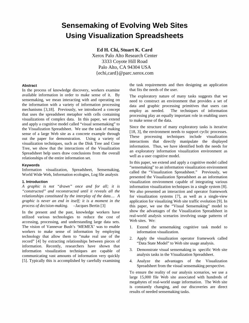
We use the visualization spreadsheet paradigm in thesensemaking of Web sites. We present a visualizationapplication called the Web Analysis VisualizationSpreadsheet (WAVS) that enables the processing andsubsequent understanding of an evolving Web site’scontent, usage, topology, and rating (CUTR). Figure 1shows the WAVS system during one step of the analysis.
The spreadsheet metaphor provides a structured, intuitive,and powerful interface for exploratory data analysis [8].Spreadsheets have proven to be highly successfulenvironments for interacting with numeric data byproviding an environment that easily affords theapplication of a variety of operators and the definition ofdata dependencies. The concept of the VisualizationSpreadsheet [8] is based on three characteristics:
(1) Grid: The tabular layout lets users view collections ofvisualizations simultaneously. The VisualizationSpreadsheet displays the visualization of an arbitrarilylarge data set in each cell.
(2) Operators: Operators are available for generating ormodifying cell contents. Operators can be appliedacross a specified range of operand cells, such as anentire column or row.
(3) Dependency: The spreadsheet keeps track of thedependencies between cells and automatically updatesthe cells appropriately when they are manipulated.
We can integrate a variety of different visualizationtechniques together in a single system and allow it to beuser-programmable, so that it can be tailored to manyanalysis situations.
For the purpose of this paper, we will examine theapplication of WAVS to the evolving Xerox.com Web siteover a one-year period, which contains roughly 15,000 filesand their associated evolving attributes. We usevisualization techniques such as the Disk Tree [9] andCone Tree [17] to show the Web site structures andassociated usage data.
3. Cognitive Model: Visual Sensemaking CycleInformation is the reply to a question. –Jacques Bertin [3]
In this section, we apply concepts from the sensemakingcognitive model to information visualization. We use theWeb analysis task as an example to demonstrate how these
Figure 1: Web Analysis Visualization Spreadsheet showing the Xerox.com website using Cone Trees. Columns 1—5 show the site on week 1—4 of April 1997and week 3 of August 1997. (Red=high usage, blue=low usage) Row 1thresholds the frequency of usage to values between 0 and 100, whereas Row2=[100,500] and Row 3=[500,2000]
concepts can be used productively in this particular datadomain. We can generalize to other data domains with thiscognitive framework.
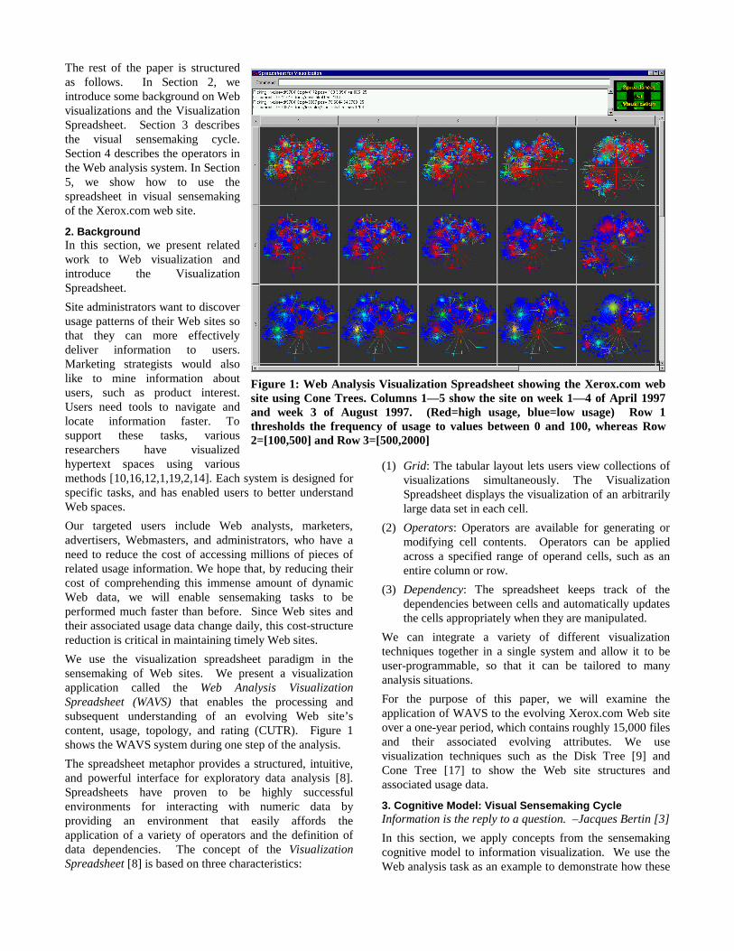
3.1 Stages of Visual SensemakingThe central concept in sensemaking is that users performoperations to gain successive understanding of theinformation. In order to model this process, Bertinmentions the five major stages of decision-making [3]. Weextend these five major stages to define the finer-grainednine-stage visual sensemaking cycle, which is shown inFigure 2. The gray boxes denote Bertin’s five stages ofdecision-making. The other four boxes denote the addedfiner grain stages.
1. Defining the problem: An analyst, when faced with aproblem, first defines the problem by asking certainquestions. Often the questions are formed in the contextof a hypothesis. E.g. are certain areas of the Web siteaccessed more than other areas? Do the access patternsin these areas change over time?
2. Defining the data: Once the problem is framed in thecontext of hypotheses, we must now gather the raw datathat are necessary for answer the questions.
3. Choosing an analytical abstraction: The raw data mustbe organized into data structures for easy access andquery later. E.g. we extract the Web linkage informationinto graphs represented using adjacency lists.
4. Choosing visualization abstractions: We know certaindata abstractions are visualizable. Depending on thestructure of the analytical abstractions and thevisualization techniques that are available to us, we canchoose among a variety of visualization abstractions.Alternatively, new techniques can be invented tovisualize new abstractions. E.g. we know that visualizinga graph of on the order of 100 nodes is difficult.Unfortunately, the Web graphs we are dealing with areon the order of 10,000 nodes. To solve this problem andin order to take advantage of the hierarchical nature ofthe Xerox Web site, we choose a hierarchicalrepresentation for our visualization abstraction. Weshow back links as detail-on-demand.
5. Adopting a processing language: The next step in visualsensemaking is to determine the operators that areappropriate for the task. We will describe this in detail inSection 4. For an example, see Table 3.
6. Transcribe the value into view: This stage is essentiallythe execution of the visualization pipeline to generate anew visualization state. The user sees visualizations thatshed light on the hypothesis that was posed in stage 1.
7. Processing the value or view: At this stage, we performcertain interactive operators on the results, such asrotation, scaling, detail-on-demand zooming, or value-filtering. Specific visual features will grab the users’attention.
8. Interpret and deciding: The users cognitively process thevisualization in order to understand the visual features inthese specific views.
9. Iterate: After some new understanding of the data,further hypotheses will be formed, and new visualizationswill then need to be constructed to answer thosequestions. The process repeats until the analyst issatisfied that she has completely made sense of the data.
3.2 Information LevelThe aim in the above visual sensemaking cycle is tosuccessively discover new higher-level knowledge in theinformation. The visual sensemaking cycle can be vieweda “Knowledge Crystallization” task [5]. This requires thediscovery of new relationships between informationsubsets in each cycle.
1. Elementary or Local Level: Uncovering localinformation is finding a specific entry in the data. In anyanalysis, the tool should always provide access to theprecise specific values using detail-on-demand. E.g.,what is the usage rate of the home page?
2. Intermediate or Comparison Level: Information at thislevel consists of relationships that exist between subsetsof information. E.g., are usage patterns in May 1998similar to a year ago?
3. Overall or Global Level: This is the highest discoverylevel attainable from the data. The knowledge obtainedat this level is condensed from the correlation betweenone aspect of the data with another aspect. For example,are there any usage trends governed overall by time?
Using the information level as a measuring stick, we cangain understanding of how effective a visualization systemis in uncovering new knowledge.
Taking the information level concept together with thevisual sensemaking cycle, we can better model theexploratory nature of many tasks. We showed Webanalysis to be one such task. In the next section, we define
Iterate
Interpret and deciding
Processing the value or view
Transcribe the value into view
Adopting a processing language
Choosing visualization abstractions
Choosing an analytical abstraction
Defining the data
Defining the problem
Figure 2: Visual Sensemaking Cycle
the processing operators in this task. These operators arewhat enabled us to carry out the real-world analysisscenarios in Section 5.
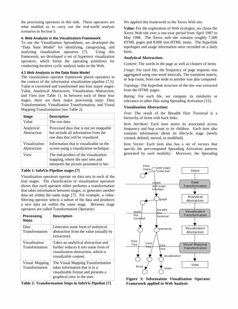
4. Web Analysis in the Visualization FrameworkTo use the Visualization Spreadsheet, we developed the“Data State Model” for identifying, categorizing, andanalyzing visualization operators [7]. Using thisframework, we developed a set of hypertext visualizationoperators, which forms the operating primitives forconducting iterative cyclic analysis tasks on the Web.
4.1 Web Analysis in the Data State ModelThe visualization operator framework places operators inthe context of the information visualization pipeline [7,5].Value is converted and transformed into four major stages:Value, Analytical Abstraction, Visualization Abstraction,and View (see Table 1). In between each of these fourstages, there are three major processing steps: DataTransformation, Visualization Transformation, and VisualMapping Transformation (see Table 2).
Stage DescriptionValue The raw data.
AnalyticalAbstraction
Processed data that is not yet mappablebut include all information from theraw data that will be visualized.
VisualizationAbstraction
Information that is visualizable on thescreen using a visualization technique.
View The end-product of the visualizationmapping, where the user sees andinterprets the picture presented to her.
Table 1: InfoVis Pipeline stages [7]
Visualization operators operate on data sets in each of thefour stages. The classification of visualization operatorsshows that each operator either performs a transformationthat takes information between stages, or generates anotherdata set within the same stage [7]. For example, a value-filtering operator selects a subset of the data and producesa new data set within the same stage. Between stageoperators are called Transformation Operators:
ProcessingSteps
Description
DataTransformation
Generates some form of analyticalabstraction from the value (usually byextraction).
VisualizationTransformation
Takes an analytical abstraction andfurther reduces it into some form ofvisualization abstraction, which isvisualizable content.
Visual MappingTransformation
The Visual Mapping Transformationtakes information that is in avisualizable format and presents agraphical view to the user.
Table 2: Transformation Steps in InfoVis Pipeline [7]
We applied this framework to the Xerox Web site:
Value: For the exploration of Web ecologies, we chose theXerox Web site over a one-year period from April 1997 toMay 1998. The Xerox web site contains roughly 7,500HTML pages and 8,000 non-HTML items. The hyperlinktopologies and usage information were recorded on a dailybasis.
Analytical Abstraction:
Content: The words in the page as well as clusters of items
Usage: For each file, the frequency of page requests wasaggregated using one-week intervals. The transition matrix,or hop count, from one node to another was also computed
Topology: The hyperlink structure of the site was extractedfrom the HTML pages.
Rating: For each file, we compute its similarity orrelevance to other files using Spreading Activation [15].
Visualization Abstraction:
Tree: The result of the Breadth First Traversal is ahierarchy of items with back links.
Item Attribute: Each item stores its associated accessfrequency and hop count to its children. Each item alsocontains information about its lifecycle stage (newlycreated, deleted, moved, or modified).
Item Vector: Each item also has a set of vectors thatspecify the pre-computed Spreading Activation patternsgenerated by each modality. Moreover, the Spreading
Value
Analytical Abstraction
Visualizat ion Abstraction
View
Data Transform at ion
Visualization Transform at ion
Visual Mapping Transform at ion
web p ag e collec tion
c reate web p age linkdag e
bre adth firs t tra versal
gra ph
hierarchy
visualizatio n
Disk Tree
Cone Tree
Filter Value
depth first tra versal
Disk Tree
rotate focus
Figure 3: Information Visualization OperatorFramework applied to Web Analysis
Activation is computed over the evolving documentcollection, which enables the comparison of results fromdifferent time periods.
4.2 Classification of Web Analysis OperatorsUsing the Data State Model as a basis, we classified andstudied operators in the Web analysis domain. At the heartof the WAVS system is the set of Web analysisvisualization operators. The operators are significantbecause the operators that are applicable to a wide varietyof different analysis scenarios for understanding a Website’s content, usage, topological, rating patterns. Figure 3contains a depiction of the framework with some Webanalysis operators. We present the details of Web analysisoperators in the context of this framework in Table 3.
5. REAL-WORLD ANALYSIS SCENARIOSIn this section, we will demonstrate how the WAVSenables users to gain successive higher levels of knowledgeon a large Web site.
5.1 Faddishness of InformationIn previous work [9,15], we showed the importance offinding various patterns of faddishness in information. Aproblem encountered in using the Time Tubes visualizationis the choice of color scale for mapping frequency of
usage. Each color scale has advantages and disadvantages.As a result, we typically found ourselves experimentingwith many different color scales without finding a perfectscale. The Visualization Spreadsheet provided theappropriate tools for experimenting with color scales.
First Sensemaking Cycle: Cone Tree
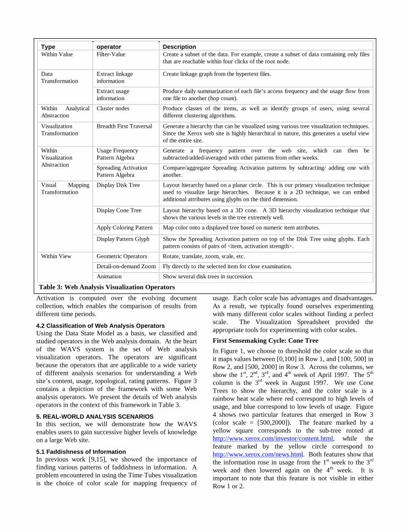
In Figure 1, we choose to threshold the color scale so thatit maps values between [0,100] in Row 1, and [100, 500] inRow 2, and [500, 2000] in Row 3. Across the columns, weshow the 1st, 2nd, 3rd, and 4th week of April 1997. The 5th
column is the 3rd week in August 1997. We use ConeTrees to show the hierarchy, and the color scale is arainbow heat scale where red correspond to high levels ofusage, and blue correspond to low levels of usage. Figure4 shows two particular features that emerged in Row 3(color scale = [500,2000]). The feature marked by ayellow square corresponds to the sub-tree rooted athttp://www.xerox.com/investor/content.html, while thefeature marked by the yellow circle correspond tohttp://www.xerox.com/news.html. Both features show thatthe information rose in usage from the 1st week to the 3rd
week and then lowered again on the 4th week. It isimportant to note that this feature is not visible in eitherRow 1 or 2.
Type operator DescriptionWithin Value Filter-Value Create a subset of the data. For example, create a subset of data containing only files
that are reachable within four clicks of the root node.
Extract linkageinformation
Create linkage graph from the hypertext files.DataTransformation
Extract usageinformation
Produce daily summarization of each file’s access frequency and the usage flow fromone file to another (hop count).
Within AnalyticalAbstraction
Cluster nodes Produce classes of the items, as well as identify groups of users, using severaldifferent clustering algorithms.
VisualizationTransformation
Breadth First Traversal Generate a hierarchy that can be visualized using various tree visualization techniques.Since the Xerox web site is highly hierarchical in nature, this generates a useful viewof the entire site.
Usage FrequencyPattern Algebra
Generate a frequency pattern over the web site, which can then besubtracted/added/averaged with other patterns from other weeks.
WithinVisualizationAbstraction Spreading Activation
Pattern AlgebraCompare/aggregate Spreading Activation patterns by subtracting/ adding one withanother.
Display Disk Tree Layout hierarchy based on a planar circle. This is our primary visualization techniqueused to visualize large hierarchies. Because it is a 2D technique, we can embedadditional attributes using glyphs on the third dimension.
Display Cone Tree Layout hierarchy based on a 3D cone. A 3D hierarchy visualization technique thatshows the various levels in the tree extremely well.
Apply Coloring Pattern Map color onto a displayed tree based on numeric item attributes.
Visual MappingTransformation
Display Pattern Glyph Show the Spreading Activation pattern on top of the Disk Tree using glyphs. Eachpattern consists of pairs of <item, activation strength>.
Geometric Operators Rotate, translate, zoom, scale, etc.
Detail-on-demand Zoom Fly directly to the selected item for close examination.
Within View
Animation Show several disk trees in succession.
Table 3: Web Analysis Visualization Operators
Value to Structure Mapping
One important lesson learned from thisexample is the importance of beingable to map values onto the structure ofthe spreadsheet. By using thehorizontal dimension of thespreadsheet for time and the verticaldimension for various usage colorscales, we externalize the variability ofthe two variables we are interested incorrelating. Without the spreadsheet,correlating between these two variables visually is difficult.We call this process Value to Structure Mapping. Byemploying external cognition, we reduce the cognitive loadof the user and speed up the sensemaking.
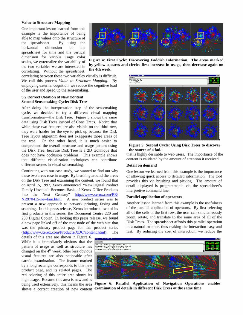
5.2 Correct Creation of New ContentSecond Sensemaking Cycle: Disk Tree
After doing the interpretation step of the sensemakingcycle, we decided to try a different visual mappingtransformation—the Disk Tree. Figure 5 shows the samedata using Disk Trees instead of Cone Trees. Notice thatwhile these two features are also visible on the third row,they were harder for the eye to pick up because the DiskTree layout algorithm does not exaggerate those areas ofthe tree. On the other hand, it is much easier tocomprehend the overall structure and usage pattern usingthe Disk Tree, because Disk Tree is a 2D technique thatdoes not have occlusion problems. This example showsthat different visualization techniques can contributedifferent senses in visual sensemaking.
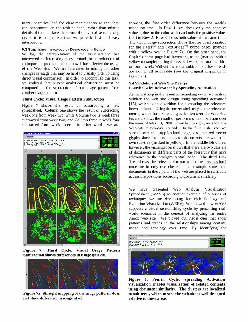
Continuing with our case study, we wanted to find out whythese two areas rose in usage. By brushing around the areason the Disk Tree and examining the content, we found thaton April 15, 1997, Xerox announced “New Digital ProductFamily Unveiled: Becomes Basis of Xerox Office Productsinto the Next Century” http://www.xerox.com/PR/NR970415-newfam.html. A new product series was topresent a new approach to network printing, faxing andscanning. In this press release, Xerox introduced two of itsfirst products in this series, the Document Centre 220 and230 Digital Copier. In looking this press release, we founda new page linked off of the root node of the web site thatwas the primary product page for this product series(http://www.xerox.com/Products/XDC/content.html). Thedetails of this area are shown in Figure 6.While it is immediately obvious that thepattern of usage as well as structure haschanged on the 4th week, other less obviousvisual features are also noticeable aftercareful examination. The feature markedby a long rectangle corresponds to this newproduct page, and its related pages. Thered coloring of this entire area shows itshigh usage. Because this area is new and isbeing used extensively, this means the areashows a correct creation of new content
that is highly desirable to web users. The importance of thecontent is validated by the amount of attention it received.
Detail on demand
One lesson we learned from this example is the importanceof allowing quick access to detailed information. The toolprovides this via brushing and picking. The amount ofdetail displayed is programmable via the spreadsheet’sinterpretive command line.
Parallel application of operators
Another lesson learned from this example is the usefulnessof the parallel application of operators. By first selectingall of the cells in the first row, the user can simultaneouslyzoom, rotate, and translate to the same area of all of theDisk Trees. The spreadsheet affords this parallel operationin a natural manner, thus making the interaction easy andfast. By reducing the cost of interaction, we reduce the
Figure 4: First Cycle: Discovering Faddish Information. The areas markedby yellow squares and circles first increase in usage, then decrease again onthe 4th week.
Figure 6: Parallel Application of Navigation Operations enablesexamination of details in different Disk Trees at the same time.
Figure 5: Second Cycle: Using Disk Trees to discoverthe source of a fad.
users’ cognitive load for view manipulation so that theycan concentrate on the task at hand, rather than minutedetails of the interface. In terms of the visual sensemakingcycle, it is imperative that we provide fast and easyinteractions.
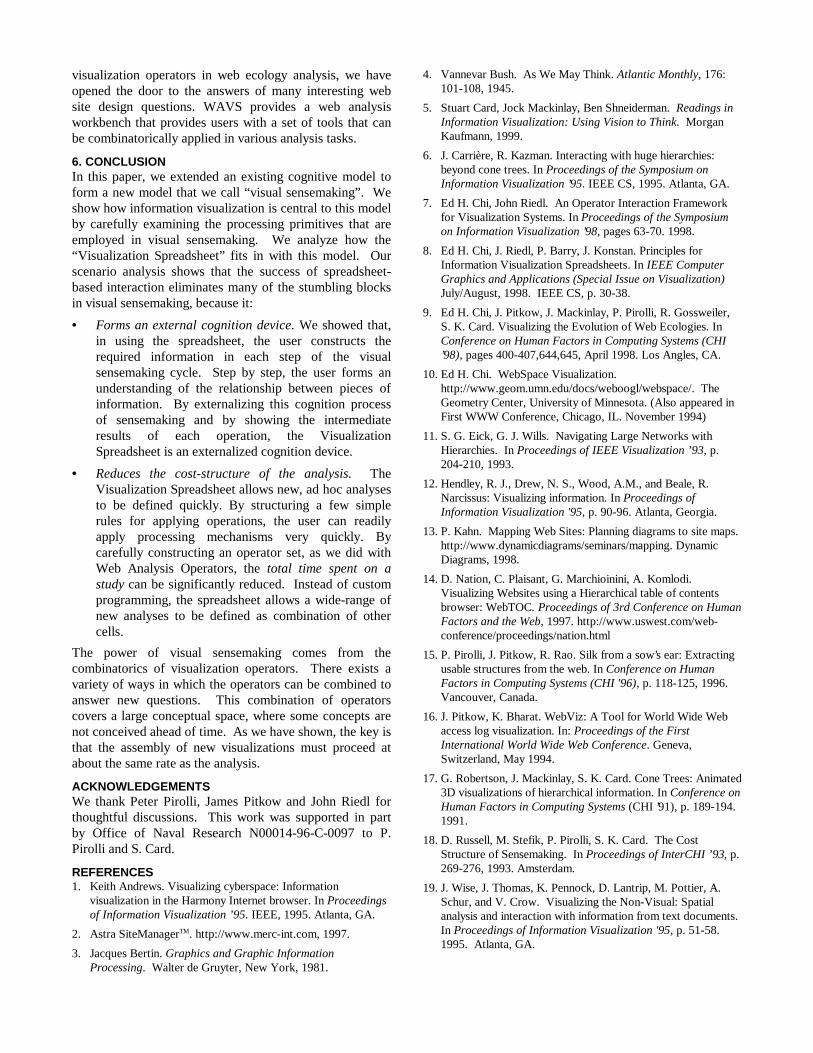
5.3 Surprising Increases or Decreases in UsageSo far, the interpretation of the visualizations hasuncovered an interesting story around the introduction ofan important product line and how it has affected the usageof the Web site. We are interested in mining for otherchanges in usage that may be hard to visually pick up usingdirect visual comparison. In order to accomplish this task,we realized that a new analytical abstraction must becomputed — the subtraction of one usage pattern fromanother usage pattern.
Third Cycle: Visual Usage Pattern Subtraction
Figure 7 shows the result of constructing a newspreadsheet. Column one shows the result of subtractingweek one from week two, while Column two is week threesubtracted from week two, and Column three is week foursubtracted from week three. In other words, we are
showing the first order difference between the weeklyusage patterns. In Row 1, we show only the negativevalues (blue on the color scale) and only the positive values(red) in Row 2. Row 3 shows both values at the same time.The visual usage subtraction shows the rise of informationfor the PagisTM and TextBridgeTM home pages (markedwith a yellow oval in Figure 7). On the other hand, theCopier’s home page had increasing usage (marked with ayellow rectangle) during the second week, but not the thirdor fourth week. Without the visual subtraction, these trendsare not at all noticeable (see the original mappings inFigure 7a).
5.4 Validation of Web Site DesignFourth Cycle: Relevance by Spreading Activation
As the last step in the visual sensemaking cycle, we wish tovalidate the web site design using spreading activation[15], which is an algorithm for computing the relevancebetween items. Using document similarity as our relevancemetric, we perform spreading activation over the Web site.Figure 8 shows the result of performing this operation overthe week of May 10, 1998. From left to right, we show theWeb site in two-day intervals. In the first Disk Tree, wespread over the supplies.html page, and the red vectorglyphs show that most relevant documents are within itsown sub-tree (marked in yellow). In the middle Disk Tree,however, the visualization shows that there are two clustersof documents in different parts of the hierarchy that haverelevance to the workgroup.html node. The third DiskTree shows the relevant documents to the services.htmlnode are in only one cluster. This example shows thedocuments in these parts of the web are placed in relativelyaccessible positions according to document similarity.
We have presented Web Analysis VisualizationSpreadsheet (WAVS) as another example of a series oftechniques we are developing for Web Ecology andEvolution Visualization (WEEV). We showed how WAVSsupports a visual sensemaking cycle by presenting real-world scenarios in the context of analyzing the entireXerox web site. We picked out visual cues that showpatterns and trends in the relationships among content,usage and topology over time. By identifying the
Figure 8: Fourth Cycle: Spreading Activationvisualization enables visualization of related contentsusing document similarity. The clusters are localizedto sub-trees, which means the web site is well designedrelative to these areas.
Figure 7: Third Cycle: Visual Usage PatternSubtraction shows differences in usage quickly.
Figure 7a: Straight mapping of the usage patterns doesnot show difference in usage at all.
visualization operators in web ecology analysis, we haveopened the door to the answers of many interesting website design questions. WAVS provides a web analysisworkbench that provides users with a set of tools that canbe combinatorically applied in various analysis tasks.
6. CONCLUSIONIn this paper, we extended an existing cognitive model toform a new model that we call “visual sensemaking”. Weshow how information visualization is central to this modelby carefully examining the processing primitives that areemployed in visual sensemaking. We analyze how the“Visualization Spreadsheet” fits in with this model. Ourscenario analysis shows that the success of spreadsheet-based interaction eliminates many of the stumbling blocksin visual sensemaking, because it:
• Forms an external cognition device. We showed that,in using the spreadsheet, the user constructs therequired information in each step of the visualsensemaking cycle. Step by step, the user forms anunderstanding of the relationship between pieces ofinformation. By externalizing this cognition processof sensemaking and by showing the intermediateresults of each operation, the VisualizationSpreadsheet is an externalized cognition device.
• Reduces the cost-structure of the analysis. TheVisualization Spreadsheet allows new, ad hoc analysesto be defined quickly. By structuring a few simplerules for applying operations, the user can readilyapply processing mechanisms very quickly. Bycarefully constructing an operator set, as we did withWeb Analysis Operators, the total time spent on astudy can be significantly reduced. Instead of customprogramming, the spreadsheet allows a wide-range ofnew analyses to be defined as combination of othercells.
The power of visual sensemaking comes from thecombinatorics of visualization operators. There exists avariety of ways in which the operators can be combined toanswer new questions. This combination of operatorscovers a large conceptual space, where some concepts arenot conceived ahead of time. As we have shown, the key isthat the assembly of new visualizations must proceed atabout the same rate as the analysis.
ACKNOWLEDGEMENTSWe thank Peter Pirolli, James Pitkow and John Riedl forthoughtful discussions. This work was supported in partby Office of Naval Research N00014-96-C-0097 to P.Pirolli and S. Card.
REFERENCES1. Keith Andrews. Visualizing cyberspace: Information
visualization in the Harmony Internet browser. In Proceedingsof Information Visualization ’95. IEEE, 1995. Atlanta, GA.
2. Astra SiteManagerTM. http://www.merc-int.com, 1997.
3. Jacques Bertin. Graphics and Graphic InformationProcessing. Walter de Gruyter, New York, 1981.
4. Vannevar Bush. As We May Think. Atlantic Monthly, 176:101-108, 1945.
5. Stuart Card, Jock Mackinlay, Ben Shneiderman. Readings inInformation Visualization: Using Vision to Think. MorganKaufmann, 1999.
6. J. Carrière, R. Kazman. Interacting with huge hierarchies:beyond cone trees. In Proceedings of the Symposium onInformation Visualization ’95. IEEE CS, 1995. Atlanta, GA.
7. Ed H. Chi, John Riedl. An Operator Interaction Frameworkfor Visualization Systems. In Proceedings of the Symposiumon Information Visualization ’98, pages 63-70. 1998.
8. Ed H. Chi, J. Riedl, P. Barry, J. Konstan. Principles forInformation Visualization Spreadsheets. In IEEE ComputerGraphics and Applications (Special Issue on Visualization)July/August, 1998. IEEE CS, p. 30-38.
9. Ed H. Chi, J. Pitkow, J. Mackinlay, P. Pirolli, R. Gossweiler,S. K. Card. Visualizing the Evolution of Web Ecologies. InConference on Human Factors in Computing Systems (CHI’98), pages 400-407,644,645, April 1998. Los Angles, CA.
10. Ed H. Chi. WebSpace Visualization.http://www.geom.umn.edu/docs/weboogl/webspace/. TheGeometry Center, University of Minnesota. (Also appeared inFirst WWW Conference, Chicago, IL. November 1994)
11. S. G. Eick, G. J. Wills. Navigating Large Networks withHierarchies. In Proceedings of IEEE Visualization ’93, p.204-210, 1993.
12. Hendley, R. J., Drew, N. S., Wood, A.M., and Beale, R.Narcissus: Visualizing information. In Proceedings ofInformation Visualization '95, p. 90-96. Atlanta, Georgia.
13. P. Kahn. Mapping Web Sites: Planning diagrams to site maps.http://www.dynamicdiagrams/seminars/mapping. DynamicDiagrams, 1998.
14. D. Nation, C. Plaisant, G. Marchioinini, A. Komlodi.Visualizing Websites using a Hierarchical table of contentsbrowser: WebTOC. Proceedings of 3rd Conference on HumanFactors and the Web, 1997. http://www.uswest.com/web-conference/proceedings/nation.html
15. P. Pirolli, J. Pitkow, R. Rao. Silk from a sow’s ear: Extractingusable structures from the web. In Conference on HumanFactors in Computing Systems (CHI '96), p. 118-125, 1996.Vancouver, Canada.
16. J. Pitkow, K. Bharat. WebViz: A Tool for World Wide Webaccess log visualization. In: Proceedings of the FirstInternational World Wide Web Conference. Geneva,Switzerland, May 1994.
17. G. Robertson, J. Mackinlay, S. K. Card. Cone Trees: Animated3D visualizations of hierarchical information. In Conference onHuman Factors in Computing Systems (CHI ’91), p. 189-194.1991.
18. D. Russell, M. Stefik, P. Pirolli, S. K. Card. The CostStructure of Sensemaking. In Proceedings of InterCHI ’93, p.269-276, 1993. Amsterdam.
19. J. Wise, J. Thomas, K. Pennock, D. Lantrip, M. Pottier, A.Schur, and V. Crow. Visualizing the Non-Visual: Spatialanalysis and interaction with information from text documents.In Proceedings of Information Visualization '95, p. 51-58.1995. Atlanta, GA.