Embed Size (px)
Citation preview
ServiceLink Reports & Dashboards User Guide
Last updated 8/7/18 i
TABLE OF CONTENTS
I. ServiceLink Reporting Accessing ServiceLink Reports
Getting Started
View / Run
Create New
Report Data
Refining Report Data
Report Type
Bar Reports
Other Proportional Reports
Time Series Reports
Multidimensional Reports
Scores
Statistical Analysis Visualizations
Other Reports
Configure Report
Group By
Additional Group By
Track By / Stack By
Aggregation
Max Number of Groups
Style
Keyboard Shortcuts
Saving your Report
Advanced Reporting
Drilldowns
Last updated 8/7/18 ii
Defining a Report Drilldown
Datasets
Adding Multiple Datasets to a Single Report
Distributing Reports
Export Data
Visual Task Board
Task Board Elements
Task Board Types
Task Board Tools
Task Board Screen
Add to Dashboard
II. ServiceLink Homepages & Dashboards Differences between Homepages and Responsive and Non-Responsive Dashboards
Comparing Dashboard Type
Determining is a Dashboard is Responsive
Homepages
Dashboards
Sharing a Dashboard
Managing a Dashboard
Deleting a Dashboard
Duplication a Dashboard
Removing a User from a Dashboard
Marking a Dashboard as a Favorite
Setting Dashboards as your Home

Last updated 8/7/18 iii
III. Appendices Appendix A – Creating a Report (ServiceNow Video Tutorial)
Appendix B – Drilldowns & Datasets (ServiceNow Video Tutorial)
Appendix C – Working with Dashboards (ServiceNow Video Tutorial)
Last updated 8/7/18 4
I. ServiceLink Reporting ServiceNow reports are visualizations of your data that you can share with users on dashboards and service portals, export to PDF, and send via email.
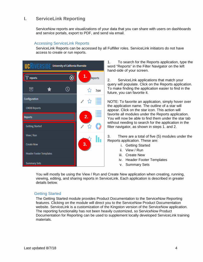
Accessing ServiceLink Reports ServiceLink Reports can be accessed by all Fulfiller roles. ServiceLink initiators do not have access to create or run reports.
1. To search for the Reports application, type the word “Reports” in the Filter Navigator on the left hand-side of your screen. 2. ServiceLink applications that match your query will populate. Click on the Reports application. To make finding the application easier to find in the future, you can favorite it. NOTE: To favorite an application, simply hover over the application name. The outline of a star will appear. Click on the star icon. This action will favorite all modules under the Reports application. You will now be able to find them under the star tab without needing to search for the application in the filter navigator, as shown in steps 1. and 2. 3. There are a total of five (5) modules under the Reports application. These are:
i. Getting Started ii. View / Run iii. Create New iv. Header Footer Templates v. Summary Sets
You will mostly be using the View / Run and Create New application when creating, running, viewing, editing, and sharing reports in ServiceLink. Each application is described in greater details below.
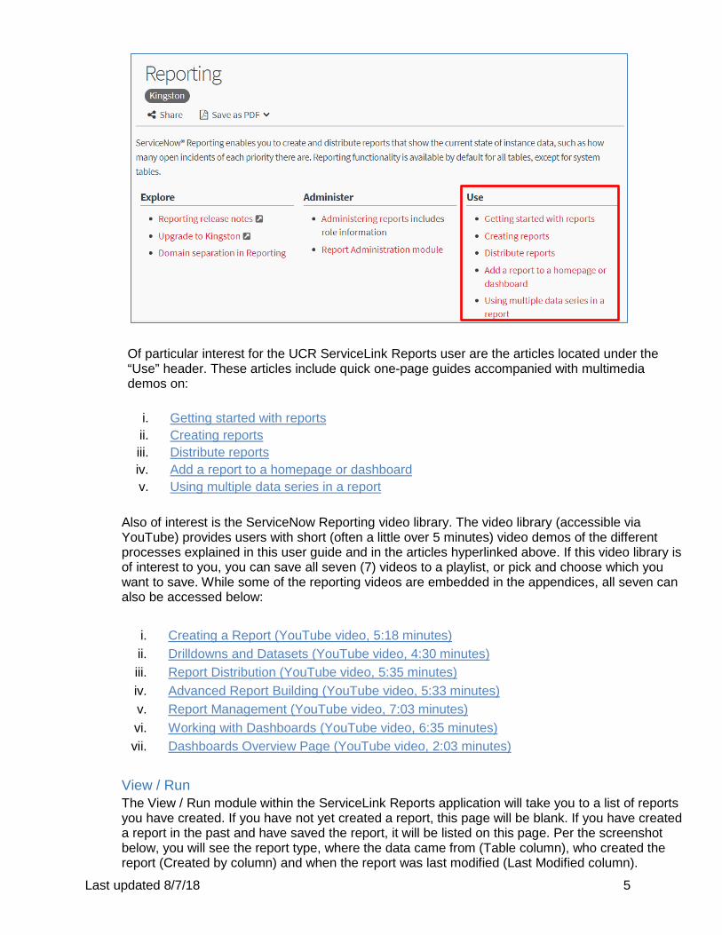
Getting Started The Getting Started module provides Product Documentation to the ServiceNow Reporting features. Clicking on the module will direct you to the ServiceNow Product Documentation website. ServiceLink is a customization of the Kingston version of the ServiceNow application. The reporting functionality has not been heavily customized, so ServiceNow Product Documentation for Reporting can be used to supplement locally developed ServiceLink training materials.
1.
2.
3.
Last updated 8/7/18 5
Of particular interest for the UCR ServiceLink Reports user are the articles located under the “Use” header. These articles include quick one-page guides accompanied with multimedia demos on:
i. Getting started with reports ii. Creating reports iii. Distribute reports iv. Add a report to a homepage or dashboard v. Using multiple data series in a report
Also of interest is the ServiceNow Reporting video library. The video library (accessible via YouTube) provides users with short (often a little over 5 minutes) video demos of the different processes explained in this user guide and in the articles hyperlinked above. If this video library is of interest to you, you can save all seven (7) videos to a playlist, or pick and choose which you want to save. While some of the reporting videos are embedded in the appendices, all seven can also be accessed below:
i. Creating a Report (YouTube video, 5:18 minutes) ii. Drilldowns and Datasets (YouTube video, 4:30 minutes) iii. Report Distribution (YouTube video, 5:35 minutes) iv. Advanced Report Building (YouTube video, 5:33 minutes) v. Report Management (YouTube video, 7:03 minutes) vi. Working with Dashboards (YouTube video, 6:35 minutes) vii. Dashboards Overview Page (YouTube video, 2:03 minutes)
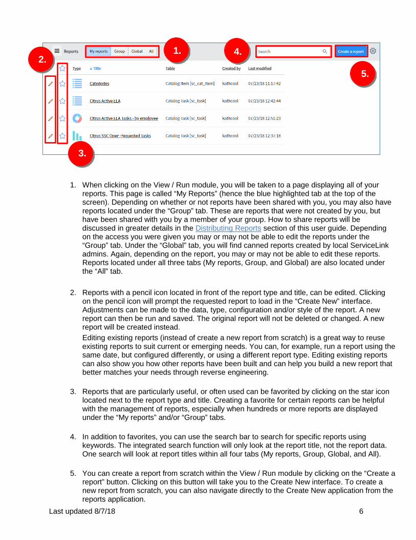
View / Run The View / Run module within the ServiceLink Reports application will take you to a list of reports you have created. If you have not yet created a report, this page will be blank. If you have created a report in the past and have saved the report, it will be listed on this page. Per the screenshot below, you will see the report type, where the data came from (Table column), who created the report (Created by column) and when the report was last modified (Last Modified column).
Last updated 8/7/18 6
1. When clicking on the View / Run module, you will be taken to a page displaying all of your
reports. This page is called “My Reports” (hence the blue highlighted tab at the top of the screen). Depending on whether or not reports have been shared with you, you may also have reports located under the “Group” tab. These are reports that were not created by you, but have been shared with you by a member of your group. How to share reports will be discussed in greater details in the Distributing Reports section of this user guide. Depending on the access you were given you may or may not be able to edit the reports under the “Group” tab. Under the “Global” tab, you will find canned reports created by local ServiceLink admins. Again, depending on the report, you may or may not be able to edit these reports. Reports located under all three tabs (My reports, Group, and Global) are also located under the “All” tab.
2. Reports with a pencil icon located in front of the report type and title, can be edited. Clicking
on the pencil icon will prompt the requested report to load in the “Create New” interface. Adjustments can be made to the data, type, configuration and/or style of the report. A new report can then be run and saved. The original report will not be deleted or changed. A new report will be created instead. Editing existing reports (instead of create a new report from scratch) is a great way to reuse existing reports to suit current or emerging needs. You can, for example, run a report using the same date, but configured differently, or using a different report type. Editing existing reports can also show you how other reports have been built and can help you build a new report that better matches your needs through reverse engineering.
3. Reports that are particularly useful, or often used can be favorited by clicking on the star icon
located next to the report type and title. Creating a favorite for certain reports can be helpful with the management of reports, especially when hundreds or more reports are displayed under the “My reports” and/or “Group” tabs.
4. In addition to favorites, you can use the search bar to search for specific reports using
keywords. The integrated search function will only look at the report title, not the report data. One search will look at report titles within all four tabs (My reports, Group, Global, and All).
5. You can create a report from scratch within the View / Run module by clicking on the “Create a
report” button. Clicking on this button will take you to the Create New interface. To create a new report from scratch, you can also navigate directly to the Create New application from the reports application.
2.
2.
3.
1. 2. 4.
5.
Last updated 8/7/18 7
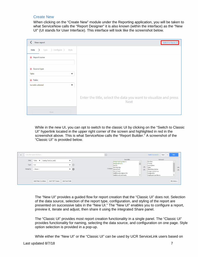
Create New When clicking on the “Create New” module under the Reporting application, you will be taken to what ServiceNow calls the “Report Designer” it is also known (within the interface) as the “New UI” (UI stands for User Interface). This interface will look like the screenshot below.
While in the new UI, you can opt to switch to the classic UI by clicking on the “Switch to Classic UI” hyperlink located in the upper right corner of the screen and highlighted in red in the screenshot above. This is what ServiceNow calls the “Report Builder.” A screenshot of the “Classic UI” is provided below.
The “New UI” provides a guided flow for report creation that the “Classic UI” does not. Selection of the data source, selection of the report type, configuration, and styling of the report are presented on successive tabs in the “New UI.” The “New UI” enables you to configure a report, preview it, iterate and adjust, then share it using the integrated Share panel. The “Classic UI” provides most report creation functionality in a single panel. The “Classic UI” provides functionality for naming, selecting the data source, and configuration on one page. Style option selection is provided in a pop-up. While either the “New UI” or the “Classic UI” can be used by UCR ServiceLink users based on
Last updated 8/7/18 8
your preference, this User Guide will focus more heavily on the “New UI” as it supports MetricBase Time Series reports, which the “Classic UI” does not.
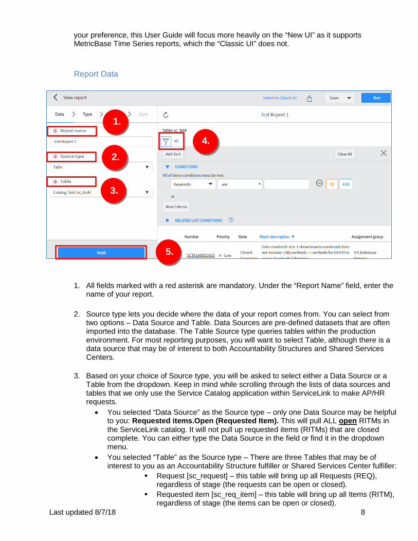
Report Data
1. All fields marked with a red asterisk are mandatory. Under the “Report Name” field, enter the
name of your report.
2. Source type lets you decide where the data of your report comes from. You can select from two options – Data Source and Table. Data Sources are pre-defined datasets that are often imported into the database. The Table Source type queries tables within the production environment. For most reporting purposes, you will want to select Table, although there is a data source that may be of interest to both Accountability Structures and Shared Services Centers.
3. Based on your choice of Source type, you will be asked to select either a Data Source or a
Table from the dropdown. Keep in mind while scrolling through the lists of data sources and tables that we only use the Service Catalog application within ServiceLink to make AP/HR requests.
• You selected “Data Source” as the Source type – only one Data Source may be helpful to you: Requested items.Open (Requested Item). This will pull ALL open RITMs in the ServiceLink catalog. It will not pull up requested items (RITMs) that are closed complete. You can either type the Data Source in the field or find it in the dropdown menu.
• You selected “Table” as the Source type – There are three Tables that may be of interest to you as an Accountability Structure fulfiller or Shared Services Center fulfiller:
Request [sc_request] – this table will bring up all Requests (REQ), regardless of stage (the requests can be open or closed).
Requested item [sc_req_item] – this table will bring up all Items (RITM), regardless of stage (the items can be open or closed).
1.
2.
3.
4.
5.
Last updated 8/7/18 9
Catalog Task [sc_task] – this table will bring up all Tasks (SCTASK), regardless of stage (the tasks can be open or closed).
You can either type the Table in the field or find it in the dropdown menu.
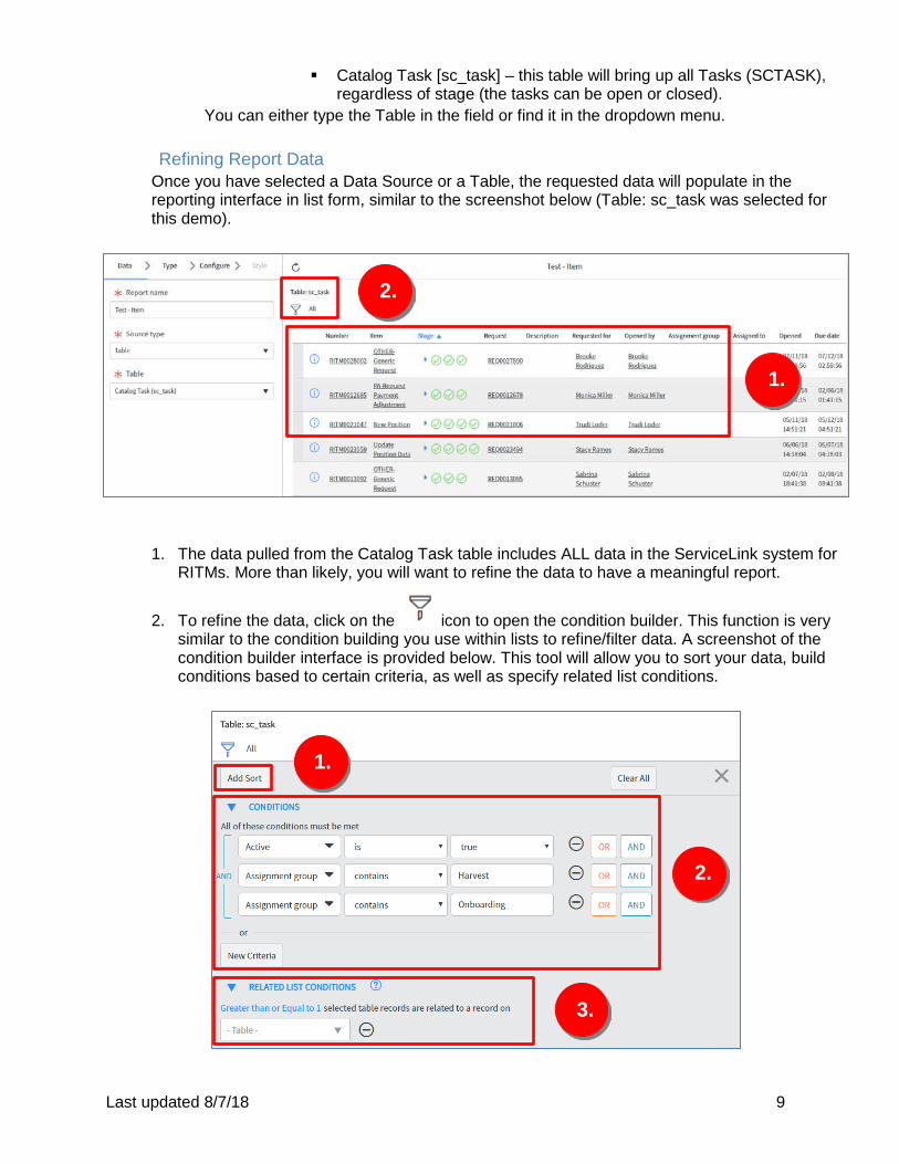
Refining Report Data Once you have selected a Data Source or a Table, the requested data will populate in the reporting interface in list form, similar to the screenshot below (Table: sc_task was selected for this demo).
1. The data pulled from the Catalog Task table includes ALL data in the ServiceLink system for RITMs. More than likely, you will want to refine the data to have a meaningful report.
2. To refine the data, click on the icon to open the condition builder. This function is very similar to the condition building you use within lists to refine/filter data. A screenshot of the condition builder interface is provided below. This tool will allow you to sort your data, build conditions based to certain criteria, as well as specify related list conditions.
2.
1.
1.
2.
3.
Last updated 8/7/18 10
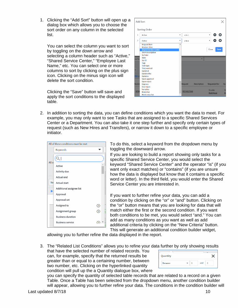
1. Clicking the “Add Sort” button will open up a dialog box which allows you to choose the sort order on any column in the selected list. You can select the column you want to sort by toggling on the down arrow and selecting a column header such as “Active,” “Shared Service Center,” “Employee Last Name,” etc. You can select one or more columns to sort by clicking on the plus sign icon. Clicking on the minus sign icon will delete the sort condition. Clicking the “Save” button will save and apply the sort conditions to the displayed table.
2. In addition to sorting the data, you can define conditions which you want the data to meet. For example, you may only want to see Tasks that are assigned to a specific Shared Services Center or a Department. You can also take it one step further and specify only certain types of request (such as New Hires and Transfers), or narrow it down to a specific employee or initiator.
To do this, select a keyword from the dropdown menu by toggling the downward arrow. If you are looking to build a report showing only tasks for a specific Shared Service Center, you would select the keyword “Shared Service Center” and the operator “is” (if you want only exact matches) or “contains” (if you are unsure how the data is displayed but know that it contains a specific word or letter). In the third field, you would enter the Shared Service Center you are interested in. If you want to further refine your data, you can add a condition by clicking on the “or” or “and” button. Clicking on the “or” button means that you are looking for data that will match either the first or the second condition. If you want both conditions to be met, you would select “and.” You can add as many conditions as you want as well as add additional criteria by clicking on the “New Criteria” button. This will generate an additional condition builder widget,
allowing you to further refine the data displayed in the report.
3. The “Related List Conditions” allows you to refine your data further by only showing results that have the selected number of related records. You can, for example, specify that the returned results be greater than or equal to a certaining number, between two number, etc. Clicking on the hyperlinked quantity condition will pull up the a Quantity dialogue box, where you can specify the quantity of selected table records that are related to a record on a given Table. Once a Table has been selected from the dropdown menu, another condition builder will appear, allowing you to further refine your data. The conditions in the condition builder will
Last updated 8/7/18 11
depend on the Table selected. Not all tables listed in the dropdown menu may be helpful to Accountability Structure fulfiller and Shared Services Center fulfiller roles.
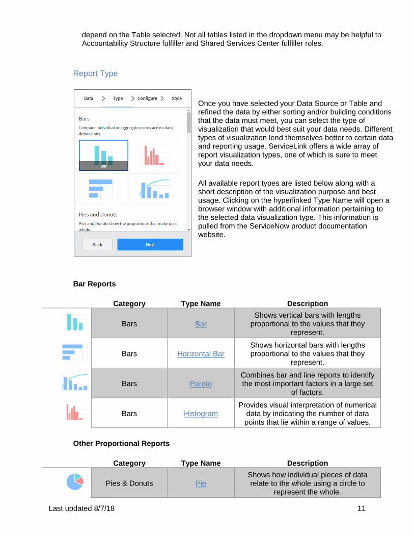
Report Type
Once you have selected your Data Source or Table and refined the data by either sorting and/or building conditions that the data must meet, you can select the type of visualization that would best suit your data needs. Different types of visualization lend themselves better to certain data and reporting usage. ServiceLink offers a wide array of report visualization types, one of which is sure to meet your data needs. All available report types are listed below along with a short description of the visualization purpose and best usage. Clicking on the hyperlinked Type Name will open a browser window with additional information pertaining to the selected data visualization type. This information is pulled from the ServiceNow product documentation website.
Bar Reports
Category Type Name Description
Bars
Bar
Shows vertical bars with lengths proportional to the values that they
represent.
Bars
Horizontal Bar
Shows horizontal bars with lengths proportional to the values that they
represent.
Bars
Pareto
Combines bar and line reports to identify the most important factors in a large set
of factors.
Bars
Histogram
Provides visual interpretation of numerical data by indicating the number of data points that lie within a range of values.
Other Proportional Reports
Category Type Name Description
Pies & Donuts
Pie
Shows how individual pieces of data relate to the whole using a circle to
represent the whole.
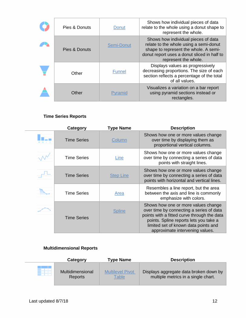
Last updated 8/7/18 12
Pies & Donuts
Donut
Shows how individual pieces of data relate to the whole using a donut shape to
represent the whole.
Pies & Donuts
Semi-Donut
Shows how individual pieces of data relate to the whole using a semi-donut shape to represent the whole. A semi-
donut report uses a donut sliced in half to represent the whole.
Other
Funnel
Displays values as progressively decreasing proportions. The size of each section reflects a percentage of the total
of all values.
Other
Pyramid
Visualizes a variation on a bar report using pyramid sections instead or
rectangles.
Time Series Reports
Category Type Name Description
Time Series
Column
Shows how one or more values change over time by displaying them as proportional vertical columns.
Time Series
Line
Shows how one or more values change over time by connecting a series of data
points with straight lines.
Time Series
Step Line
Shows how one or more values change over time by connecting a series of data points with horizontal and vertical lines.
Time Series
Area
Resembles a line report, but the area between the axis and line is commonly
emphasize with colors.
Time Series
Spline
Shows how one or more values change over time by connecting a series of data
points with a fitted curve through the data points. Spline reports lets you take a limited set of known data points and
approximate intervening values.
Multidimensional Reports
Category Type Name Description
Multidimensional
Reports
Multilevel Pivot
Table
Displays aggregate data broken down by multiple metrics in a single chart.
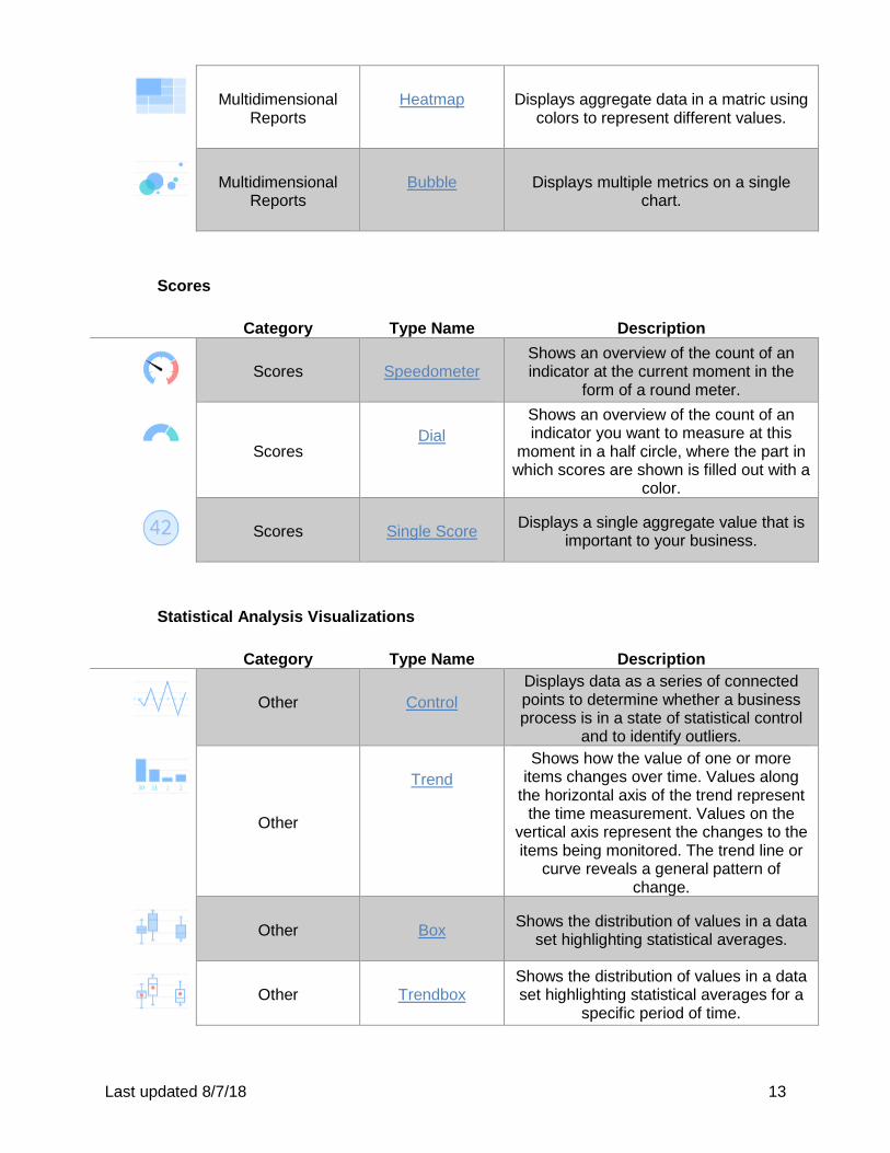
Last updated 8/7/18 13
Multidimensional
Reports
Heatmap Displays aggregate data in a matric using
colors to represent different values.
Multidimensional
Reports
Bubble
Displays multiple metrics on a single
chart.
Scores
Category Type Name Description
Scores
Speedometer
Shows an overview of the count of an indicator at the current moment in the
form of a round meter.
Scores
Dial
Shows an overview of the count of an indicator you want to measure at this
moment in a half circle, where the part in which scores are shown is filled out with a
color.
Scores
Single Score
Displays a single aggregate value that is important to your business.
Statistical Analysis Visualizations
Category Type Name Description
Other
Control
Displays data as a series of connected points to determine whether a business process is in a state of statistical control
and to identify outliers.
Other
Trend
Shows how the value of one or more items changes over time. Values along
the horizontal axis of the trend represent the time measurement. Values on the
vertical axis represent the changes to the items being monitored. The trend line or
curve reveals a general pattern of change.
Other
Box
Shows the distribution of values in a data set highlighting statistical averages.
Other
Trendbox
Shows the distribution of values in a data set highlighting statistical averages for a
specific period of time.
Last updated 8/7/18 14
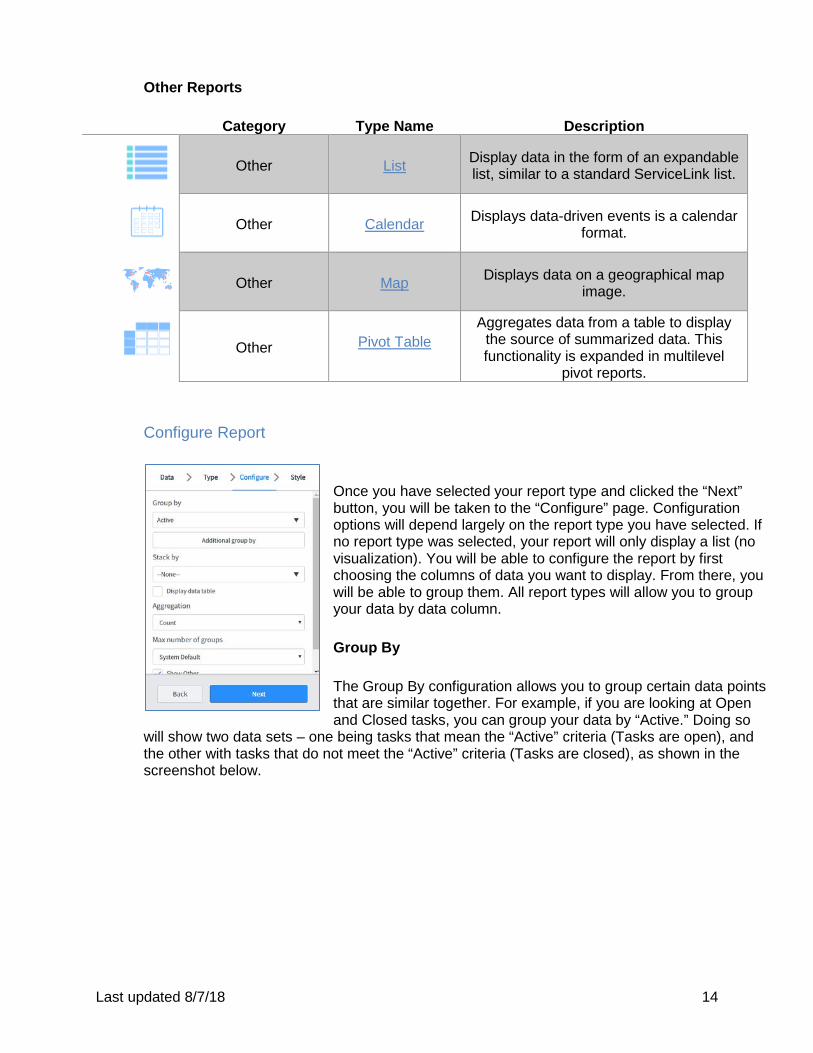
Other Reports
Category Type Name Description
Other
List
Display data in the form of an expandable list, similar to a standard ServiceLink list.
Other
Calendar
Displays data-driven events is a calendar format.
Other
Map
Displays data on a geographical map image.
Other
Pivot Table
Aggregates data from a table to display the source of summarized data. This functionality is expanded in multilevel
pivot reports. Configure Report
Once you have selected your report type and clicked the “Next” button, you will be taken to the “Configure” page. Configuration options will depend largely on the report type you have selected. If no report type was selected, your report will only display a list (no visualization). You will be able to configure the report by first choosing the columns of data you want to display. From there, you will be able to group them. All report types will allow you to group your data by data column. Group By The Group By configuration allows you to group certain data points that are similar together. For example, if you are looking at Open and Closed tasks, you can group your data by “Active.” Doing so
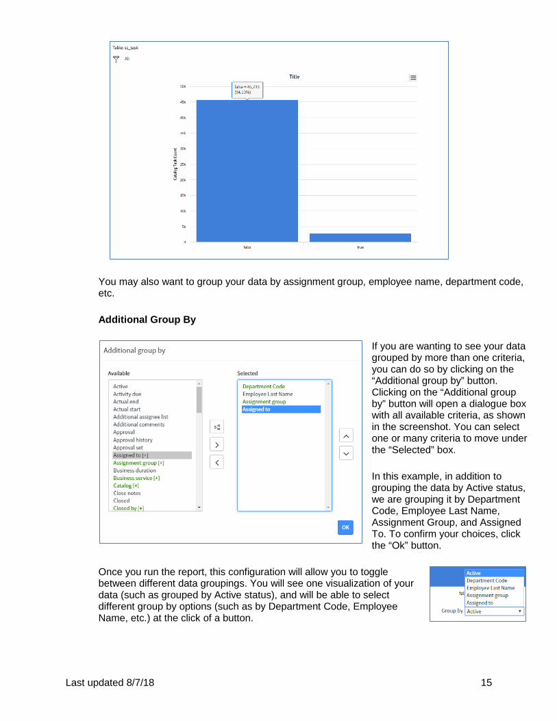
will show two data sets – one being tasks that mean the “Active” criteria (Tasks are open), and the other with tasks that do not meet the “Active” criteria (Tasks are closed), as shown in the screenshot below.
Last updated 8/7/18 15
You may also want to group your data by assignment group, employee name, department code, etc. Additional Group By
If you are wanting to see your data grouped by more than one criteria, you can do so by clicking on the “Additional group by” button. Clicking on the “Additional group by” button will open a dialogue box with all available criteria, as shown in the screenshot. You can select one or many criteria to move under the “Selected” box. In this example, in addition to grouping the data by Active status, we are grouping it by Department Code, Employee Last Name, Assignment Group, and Assigned To. To confirm your choices, click the “Ok” button.
Once you run the report, this configuration will allow you to toggle between different data groupings. You will see one visualization of your data (such as grouped by Active status), and will be able to select different group by options (such as by Department Code, Employee Name, etc.) at the click of a button.
Last updated 8/7/18 16
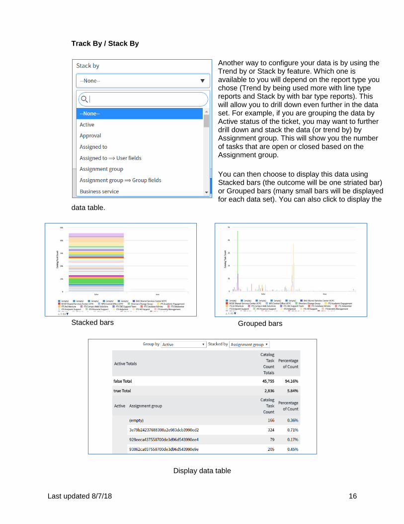
Track By / Stack By
Another way to configure your data is by using the Trend by or Stack by feature. Which one is available to you will depend on the report type you chose (Trend by being used more with line type reports and Stack by with bar type reports). This will allow you to drill down even further in the data set. For example, if you are grouping the data by Active status of the ticket, you may want to further drill down and stack the data (or trend by) by Assignment group. This will show you the number of tasks that are open or closed based on the Assignment group. You can then choose to display this data using Stacked bars (the outcome will be one striated bar) or Grouped bars (many small bars will be displayed for each data set). You can also click to display the
data table.
Stacked bars
Grouped bars
Display data table
Last updated 8/7/18 17
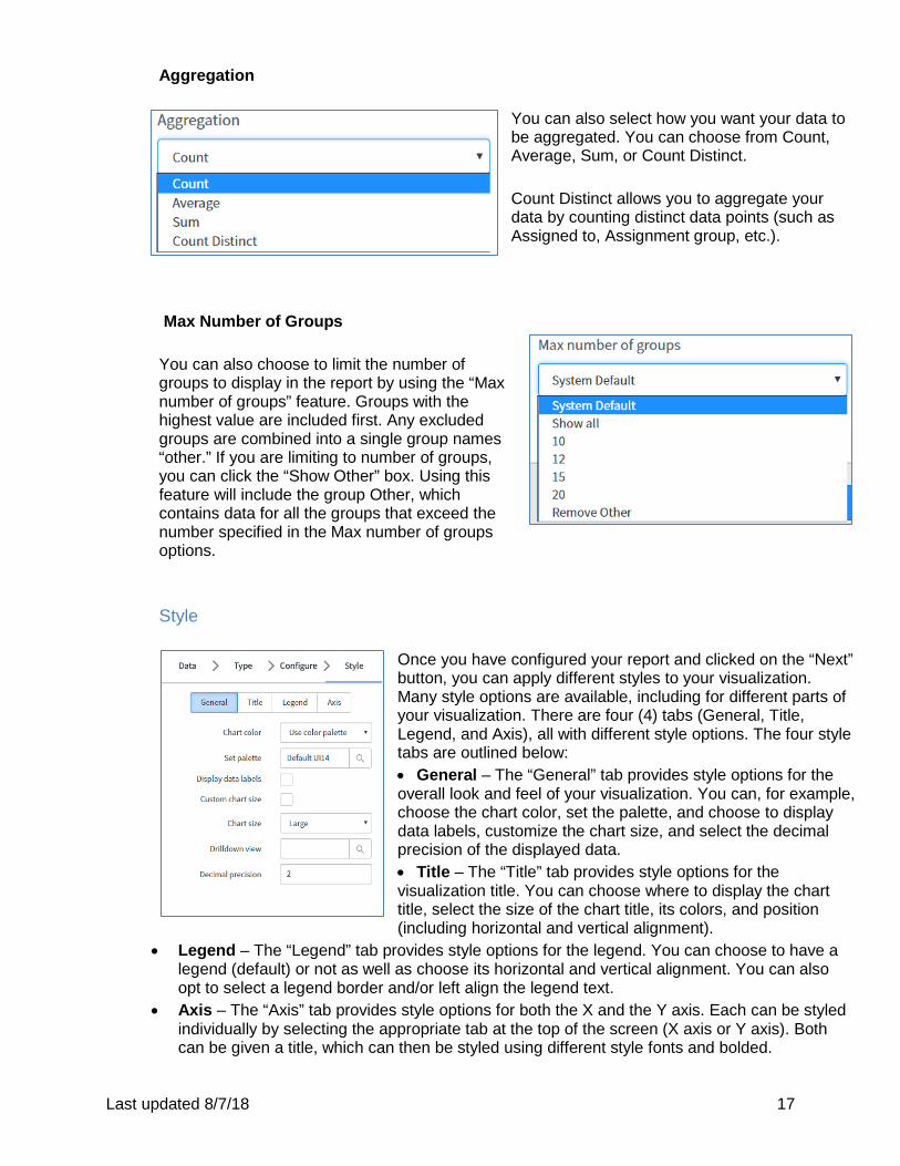
Aggregation
You can also select how you want your data to be aggregated. You can choose from Count, Average, Sum, or Count Distinct. Count Distinct allows you to aggregate your data by counting distinct data points (such as Assigned to, Assignment group, etc.).
Max Number of Groups
You can also choose to limit the number of groups to display in the report by using the “Max number of groups” feature. Groups with the highest value are included first. Any excluded groups are combined into a single group names “other.” If you are limiting to number of groups, you can click the “Show Other” box. Using this feature will include the group Other, which contains data for all the groups that exceed the number specified in the Max number of groups options.
Style
Once you have configured your report and clicked on the “Next” button, you can apply different styles to your visualization. Many style options are available, including for different parts of your visualization. There are four (4) tabs (General, Title, Legend, and Axis), all with different style options. The four style tabs are outlined below: • General – The “General” tab provides style options for the overall look and feel of your visualization. You can, for example, choose the chart color, set the palette, and choose to display data labels, customize the chart size, and select the decimal precision of the displayed data. • Title – The “Title” tab provides style options for the visualization title. You can choose where to display the chart title, select the size of the chart title, its colors, and position (including horizontal and vertical alignment).
• Legend – The “Legend” tab provides style options for the legend. You can choose to have a legend (default) or not as well as choose its horizontal and vertical alignment. You can also opt to select a legend border and/or left align the legend text.
• Axis – The “Axis” tab provides style options for both the X and the Y axis. Each can be styled individually by selecting the appropriate tab at the top of the screen (X axis or Y axis). Both can be given a title, which can then be styled using different style fonts and bolded.
Last updated 8/7/18 18
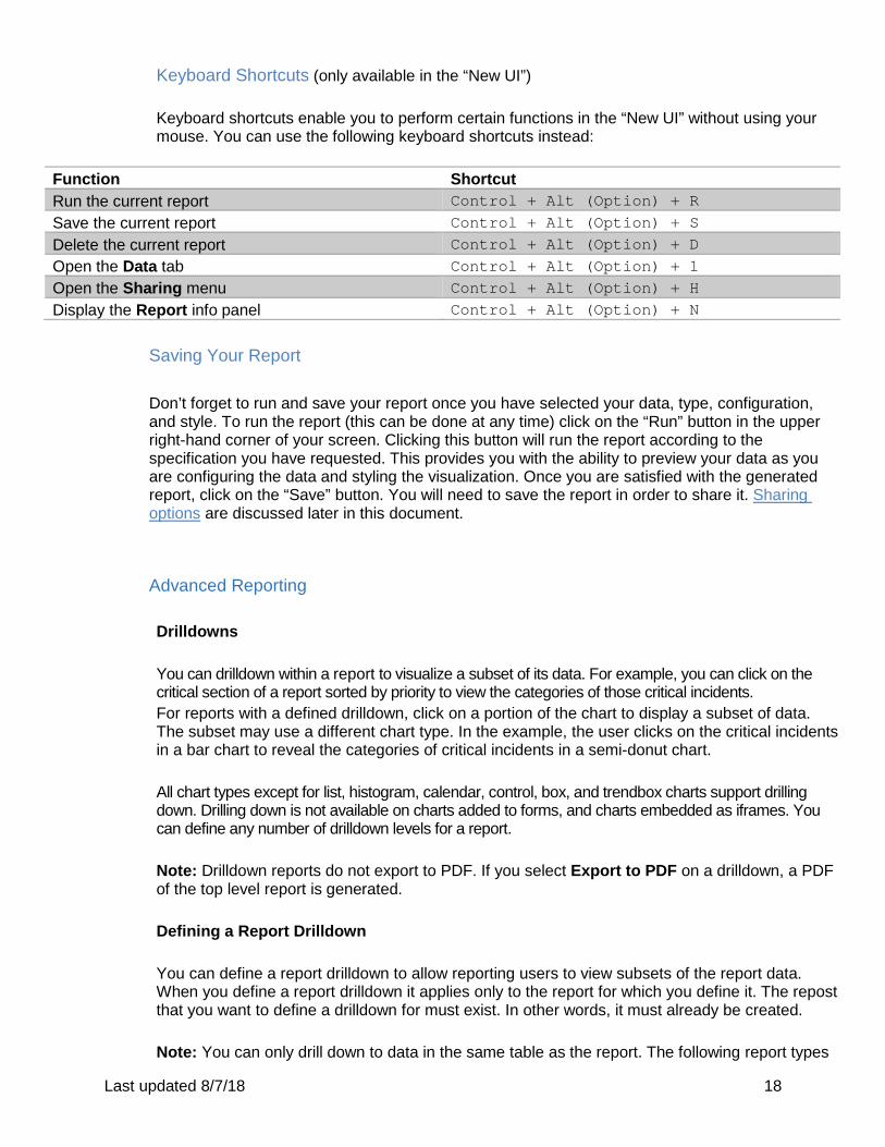
Keyboard Shortcuts (only available in the “New UI”) Keyboard shortcuts enable you to perform certain functions in the “New UI” without using your mouse. You can use the following keyboard shortcuts instead:
Function Shortcut Run the current report Control + Alt (Option) + R
Save the current report Control + Alt (Option) + S Delete the current report Control + Alt (Option) + D Open the Data tab Control + Alt (Option) + 1 Open the Sharing menu Control + Alt (Option) + H Display the Report info panel Control + Alt (Option) + N
Saving Your Report Don’t forget to run and save your report once you have selected your data, type, configuration, and style. To run the report (this can be done at any time) click on the “Run” button in the upper right-hand corner of your screen. Clicking this button will run the report according to the specification you have requested. This provides you with the ability to preview your data as you are configuring the data and styling the visualization. Once you are satisfied with the generated report, click on the “Save” button. You will need to save the report in order to share it. Sharing options are discussed later in this document.
Advanced Reporting Drilldowns You can drilldown within a report to visualize a subset of its data. For example, you can click on the critical section of a report sorted by priority to view the categories of those critical incidents. For reports with a defined drilldown, click on a portion of the chart to display a subset of data. The subset may use a different chart type. In the example, the user clicks on the critical incidents in a bar chart to reveal the categories of critical incidents in a semi-donut chart. All chart types except for list, histogram, calendar, control, box, and trendbox charts support drilling down. Drilling down is not available on charts added to forms, and charts embedded as iframes. You can define any number of drilldown levels for a report.
Note: Drilldown reports do not export to PDF. If you select Export to PDF on a drilldown, a PDF of the top level report is generated. Defining a Report Drilldown You can define a report drilldown to allow reporting users to view subsets of the report data. When you define a report drilldown it applies only to the report for which you define it. The repost that you want to define a drilldown for must exist. In other words, it must already be created. Note: You can only drill down to data in the same table as the report. The following report types
Last updated 8/7/18 19
do not support the drilldown feature: list, histogram, calendar, control, box, and trendbox.
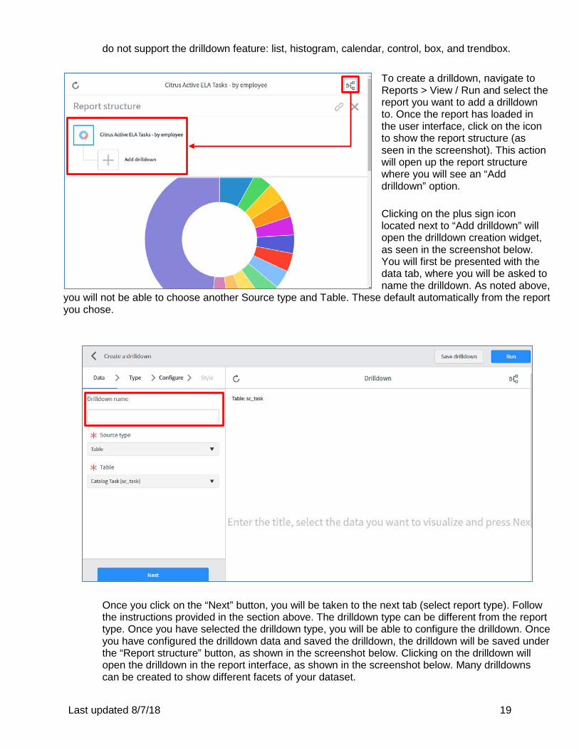
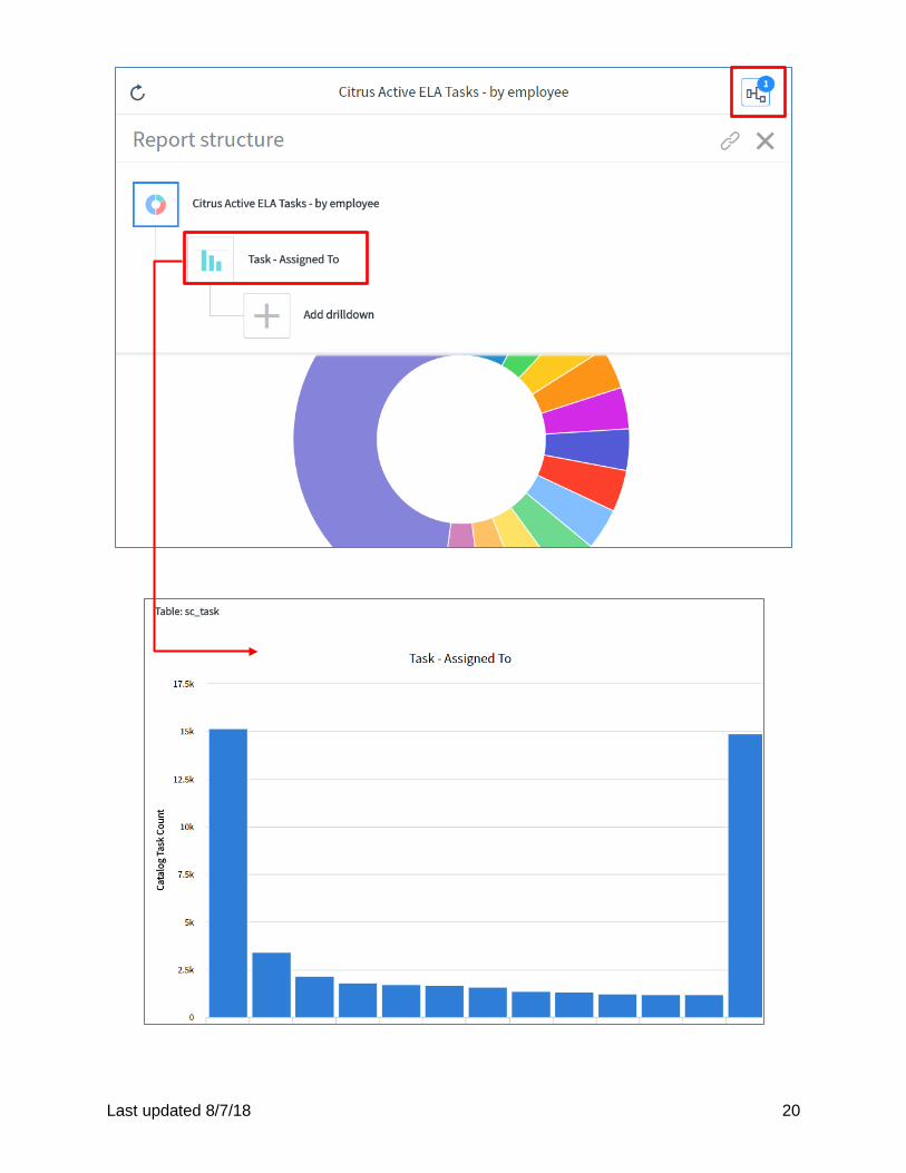
To create a drilldown, navigate to Reports > View / Run and select the report you want to add a drilldown to. Once the report has loaded in the user interface, click on the icon to show the report structure (as seen in the screenshot). This action will open up the report structure where you will see an “Add drilldown” option. Clicking on the plus sign icon located next to “Add drilldown” will open the drilldown creation widget, as seen in the screenshot below. You will first be presented with the data tab, where you will be asked to name the drilldown. As noted above,
you will not be able to choose another Source type and Table. These default automatically from the report you chose.
Once you click on the “Next” button, you will be taken to the next tab (select report type). Follow the instructions provided in the section above. The drilldown type can be different from the report type. Once you have selected the drilldown type, you will be able to configure the drilldown. Once you have configured the drilldown data and saved the drilldown, the drilldown will be saved under the “Report structure” button, as shown in the screenshot below. Clicking on the drilldown will open the drilldown in the report interface, as shown in the screenshot below. Many drilldowns can be created to show different facets of your dataset.
Last updated 8/7/18 20
Last updated 8/7/18 21
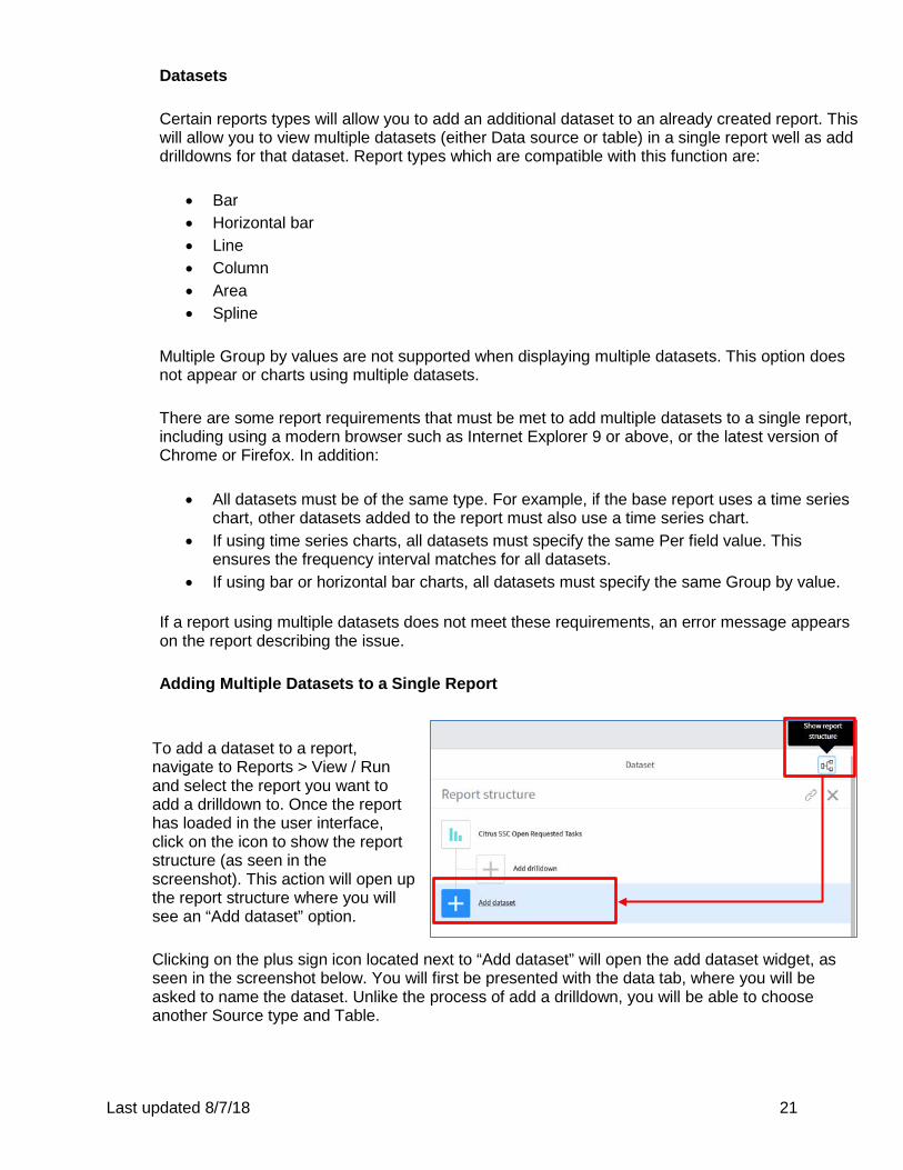
Datasets Certain reports types will allow you to add an additional dataset to an already created report. This will allow you to view multiple datasets (either Data source or table) in a single report well as add drilldowns for that dataset. Report types which are compatible with this function are:
• Bar • Horizontal bar • Line • Column • Area • Spline
Multiple Group by values are not supported when displaying multiple datasets. This option does not appear or charts using multiple datasets. There are some report requirements that must be met to add multiple datasets to a single report, including using a modern browser such as Internet Explorer 9 or above, or the latest version of Chrome or Firefox. In addition:
• All datasets must be of the same type. For example, if the base report uses a time series chart, other datasets added to the report must also use a time series chart.
• If using time series charts, all datasets must specify the same Per field value. This ensures the frequency interval matches for all datasets.
• If using bar or horizontal bar charts, all datasets must specify the same Group by value.
If a report using multiple datasets does not meet these requirements, an error message appears on the report describing the issue. Adding Multiple Datasets to a Single Report
To add a dataset to a report, navigate to Reports > View / Run and select the report you want to add a drilldown to. Once the report has loaded in the user interface, click on the icon to show the report structure (as seen in the screenshot). This action will open up the report structure where you will see an “Add dataset” option.
Clicking on the plus sign icon located next to “Add dataset” will open the add dataset widget, as seen in the screenshot below. You will first be presented with the data tab, where you will be asked to name the dataset. Unlike the process of add a drilldown, you will be able to choose another Source type and Table.
Last updated 8/7/18 22
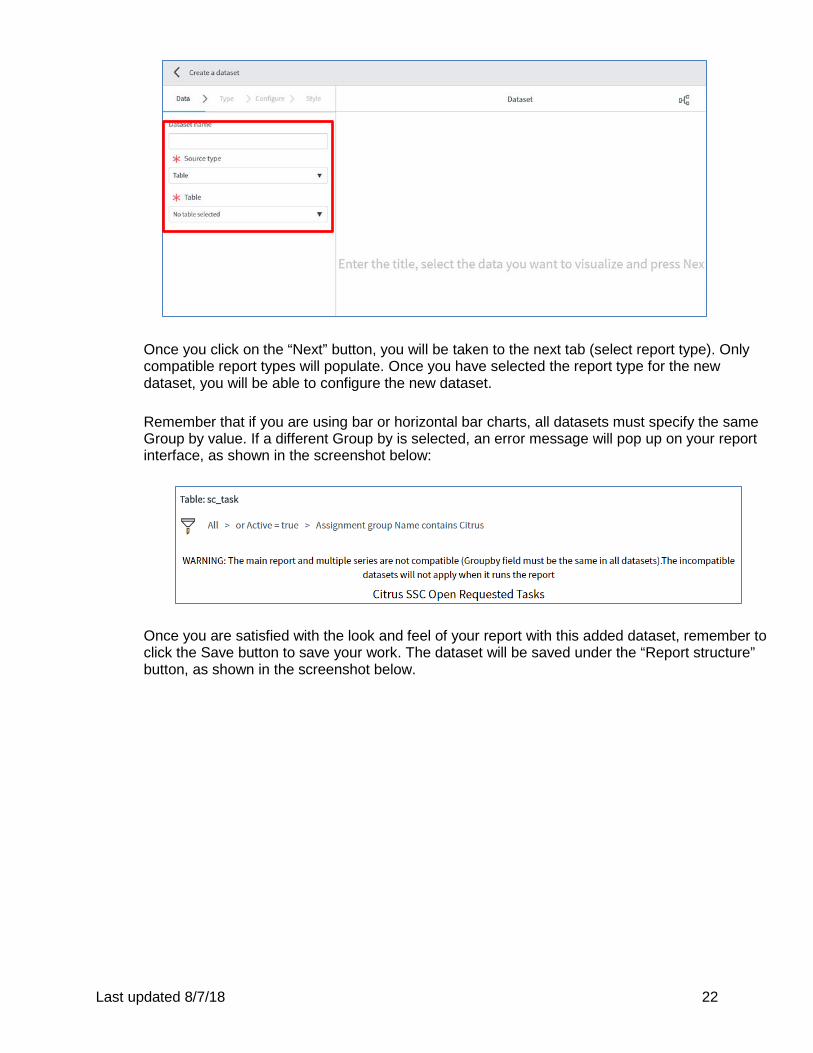
Once you click on the “Next” button, you will be taken to the next tab (select report type). Only compatible report types will populate. Once you have selected the report type for the new dataset, you will be able to configure the new dataset.
Remember that if you are using bar or horizontal bar charts, all datasets must specify the same Group by value. If a different Group by is selected, an error message will pop up on your report interface, as shown in the screenshot below:
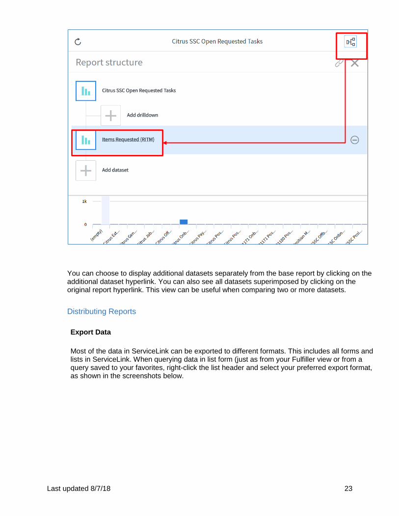
Once you are satisfied with the look and feel of your report with this added dataset, remember to click the Save button to save your work. The dataset will be saved under the “Report structure” button, as shown in the screenshot below.
Last updated 8/7/18 23
You can choose to display additional datasets separately from the base report by clicking on the additional dataset hyperlink. You can also see all datasets superimposed by clicking on the original report hyperlink. This view can be useful when comparing two or more datasets. Distributing Reports Export Data Most of the data in ServiceLink can be exported to different formats. This includes all forms and lists in ServiceLink. When querying data in list form (just as from your Fulfiller view or from a query saved to your favorites, right-click the list header and select your preferred export format, as shown in the screenshots below.
Last updated 8/7/18 24
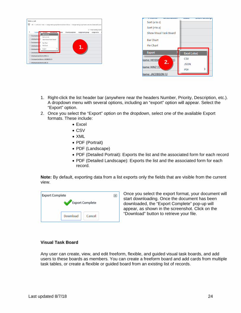
1. Right-click the list header bar (anywhere near the headers Number, Priority, Description, etc.).
A dropdown menu with several options, including an “export” option will appear. Select the “Export” option.
2. Once you select the “Export” option on the dropdown, select one of the available Export formats. These include:
• Excel • CSV • XML • PDF (Portrait) • PDF (Landscape) • PDF (Detailed Portrait): Exports the list and the associated form for each record • PDF (Detailed Landscape): Exports the list and the associated form for each
record.
Note: By default, exporting data from a list exports only the fields that are visible from the current view.
Once you select the export format, your document will start downloading. Once the document has been downloaded, the “Export Complete” pop-up will appear, as shown in the screenshot. Click on the “Download” button to retrieve your file.
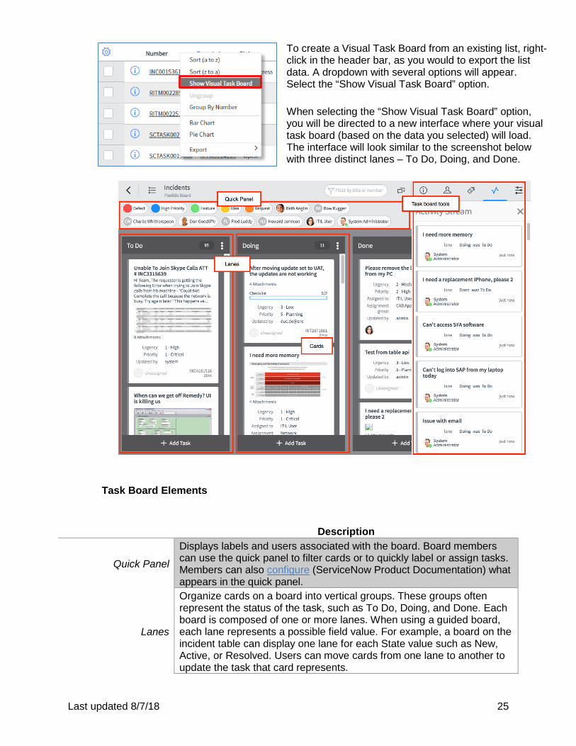
Visual Task Board
Any user can create, view, and edit freeform, flexible, and guided visual task boards, and add users to these boards as members. You can create a freeform board and add cards from multiple task tables, or create a flexible or guided board from an existing list of records.
1.
2.
Last updated 8/7/18 25
To create a Visual Task Board from an existing list, right-click in the header bar, as you would to export the list data. A dropdown with several options will appear. Select the “Show Visual Task Board” option. When selecting the “Show Visual Task Board” option, you will be directed to a new interface where your visual task board (based on the data you selected) will load. The interface will look similar to the screenshot below with three distinct lanes – To Do, Doing, and Done.
Task Board Elements
Description
Quick Panel
Displays labels and users associated with the board. Board members can use the quick panel to filter cards or to quickly label or assign tasks. Members can also configure (ServiceNow Product Documentation) what appears in the quick panel.
Lanes
Organize cards on a board into vertical groups. These groups often represent the status of the task, such as To Do, Doing, and Done. Each board is composed of one or more lanes. When using a guided board, each lane represents a possible field value. For example, a board on the incident table can display one lane for each State value such as New, Active, or Resolved. Users can move cards from one lane to another to update the task that card represents.
Last updated 8/7/18 26
Cards
Cards represent individual tasks. Users can add comments, attachments, and labels to cards and assign users to cards. Each card is tied to a task record; updating one immediately updates the other. For freeform boards, each card represented a personal task. For flexible and guided boards, each card represents a record from the list that board was created from.
Task board tools Displays board information, board members, board activity stream, and board labels.
The type of board that is created and the lanes that appear on the board depend on which type of column you select. If you select a reference or choice column, the board is a guided board. Each lane in a guided board represents one possible value for that column and the cards appear in the appropriate lane. For example, if you create a guided task board from tasks using the State column, the board shown one lane for each task state, such as New or Closed. If you select a column that is not a reference or choice (as seen in the screenshot above), the board is a flexible board and the board shows the default lanes – To Do, Doing and Done. When you first open a flexible board, all cards will be in the To Do lane (you can move the cards by dragging them to different lanes). Note: For guided board created from choice fields, such as State, the system create a lane for each possible choice value. For guided boards create from reference fields, the system creates a lane only for each value in use by a task card. Lanes are added as needed if the reference field values change. To add a lane to any board, click on the “Add Lane” field, as shown in the screenshot. Task Board Types
Description
Freeform Boards Display any kind of task record, including personal tasks. Members of freeform boards can add and remove task cards and lanes.
Flexible Boards
Display tasks that match the configured filter against a particular table. Members of flexible boards can add task cards, which are removed automatically when the tasks no longer match the filter conditions. Members can define custom lanes, similar to a freeform board.
Guided Boards
Displays tasks that match the configured filter against a particular table, like flexible boards. Members of guided boards can add task cards, which are removed automatically when the tasks no longer match the filter conditions. Guided board lanes correspond to field values and cannot be edited in more cases.
The icon beside the board name on the Task Boards pages identifies the type of board. Freeform boards appear with a grid of four squares ; flexible boards appear with a vertical line beside
two squares ; guided boards appear with two vertical lines . After a board is created, board members can:
Last updated 8/7/18 27
• Add and modify lanes • Create and modify task cards • Add and remove members • Configure the look and feel of the board.
Task Board Tools The task board tool area in any given Visual Task Board contains several tabs, each represented by an icon. Click an icon to open the tab. Click to same icon again to hide the tab. Tab Name Description
Info
Contains the following information about the task board:
• Name • Board Type • Table name and a link to open the table view
(visible on data driven boards only) • Filter conditions (vision on date driven boards
only) • Lane field (visible to the board owner, on data
driven boards only) • Owner • Number of lanes • Number of cards • URL to share the board with others
Members
List all members and assignees of the board. You can add or remove board members, promote assignees to be members, and filter the board by member or assignee.
Labels
Use labels to visually distinguish tasks on the task board. Filter board contents by toggling the label. You will need to enable labels (ServiceNow Product Documentation) before being able to use this tab.
Activity Display all of the activity for card on the board.
Configuration
Configure the settings for the task board. This setting is only available for the board owner. For more information, see Configure a task board (ServiceNow Product Documentation)
Last updated 8/7/18 28
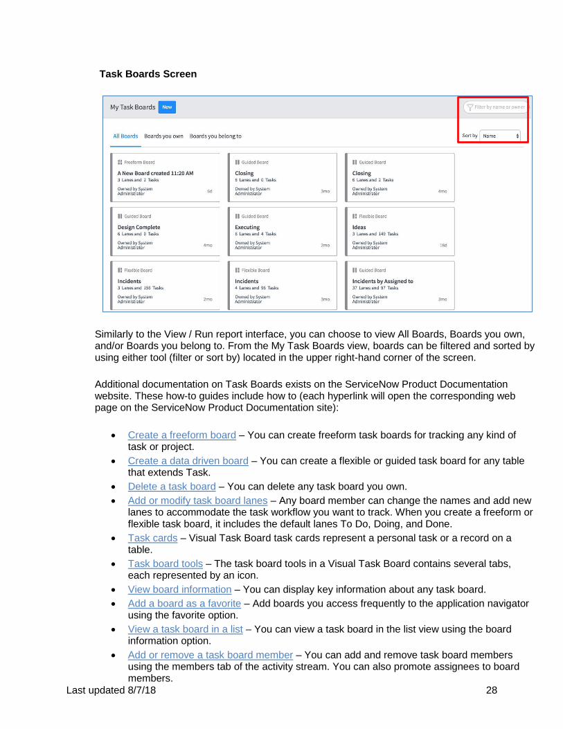
Task Boards Screen
Similarly to the View / Run report interface, you can choose to view All Boards, Boards you own, and/or Boards you belong to. From the My Task Boards view, boards can be filtered and sorted by using either tool (filter or sort by) located in the upper right-hand corner of the screen. Additional documentation on Task Boards exists on the ServiceNow Product Documentation website. These how-to guides include how to (each hyperlink will open the corresponding web page on the ServiceNow Product Documentation site):
• Create a freeform board – You can create freeform task boards for tracking any kind of task or project.
• Create a data driven board – You can create a flexible or guided task board for any table that extends Task.
• Delete a task board – You can delete any task board you own. • Add or modify task board lanes – Any board member can change the names and add new
lanes to accommodate the task workflow you want to track. When you create a freeform or flexible task board, it includes the default lanes To Do, Doing, and Done.
• Task cards – Visual Task Board task cards represent a personal task or a record on a table.
• Task board tools – The task board tools in a Visual Task Board contains several tabs, each represented by an icon.
• View board information – You can display key information about any task board. • Add a board as a favorite – Add boards you access frequently to the application navigator
using the favorite option. • View a task board in a list – You can view a task board in the list view using the board
information option. • Add or remove a task board member – You can add and remove task board members
using the members tab of the activity stream. You can also promote assignees to board members.
Last updated 8/7/18 29
• Share a Visual Task Board in a Connect conversation – You can share a Visual Task Board in a Connect Chat conversation.
• Create a Connect conversation from a Visual Task Board – Create a Connect Chat conversation from a Visual Task Board to collaborate with board members and keep track of activity as it happens.
Add to Dashboard
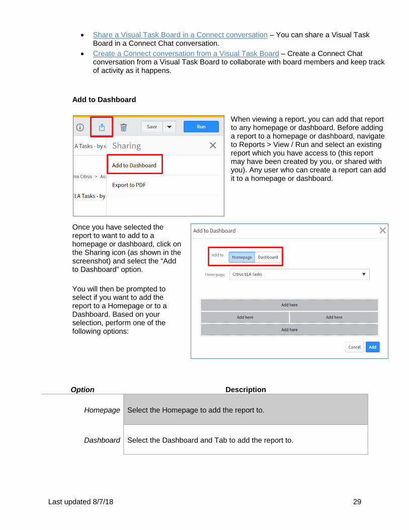
When viewing a report, you can add that report to any homepage or dashboard. Before adding a report to a homepage or dashboard, navigate to Reports > View / Run and select an existing report which you have access to (this report may have been created by you, or shared with you). Any user who can create a report can add it to a homepage or dashboard.
Once you have selected the report to want to add to a homepage or dashboard, click on the Sharing icon (as shown in the screenshot) and select the “Add to Dashboard” option.
You will then be prompted to select if you want to add the report to a Homepage or to a Dashboard. Based on your selection, perform one of the following options: Option Description
Homepage Select the Homepage to add the report to.
Dashboard Select the Dashboard and Tab to add the report to.
Last updated 8/7/18 30
Perform one of the following options:
Option Description
For responsive dashboards
Click Add. The widget is added to the dashboard in the top position and the dashboard opens. Click Edit to move or resize the widget.
For non-responsive dashboards and
homepages
Click Add here to add the report in a specific position, or click Add to add the report to the first available position on the homepage or dashboard.
For additional information on Homepages and Dashboards, including the difference between homepages and responsive and non-responsive dashboard, please consult the next section – ServiceLink Homepage & Dashboards.
II. ServiceLink Homepages & Dashboards
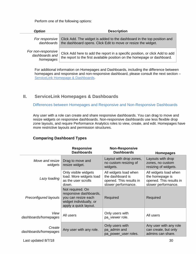
Differences between Homepages and Responsive and Non-Responsive Dashboards Any user with a role can create and share responsive dashboards. You can drag to move and resize widgets on responsive dashboards. Non-responsive dashboards use less flexible drop zone layouts, and require Performance Analytics roles to view, create, and edit. Homepages have more restrictive layouts and permission structures. Comparing Dashboard Types
Responsive Dashboards
Non-Responsive Dashboards
Homepages
Move and resize widgets
Drag to move and resize widget.
Layout with drop zones, no custom resizing of widgets.
Layouts with drop zones, no custom resizing of widgets.
Lazy loading
Only visible widgets load. More widgets load as the user scrolls down.
All widgets load when the dashboard is opened. This results in slower performance.
All widgets load when the homepage is opened. This results in slower performance.
Preconfigured layouts
Not required. On responsive dashboards, you can resize each widget individually, or apply a quick layout.
Required Required
View dashboards/homepages All users Only users with
pa_viewer role. All users
Create dashboards/homepages Any user with any role.
Only users with pa_admin and pa_power_user roles.
Any user with any role can create, but only admins can share.
Last updated 8/7/18 31
Share Permissions Dashboard owners can share with users, groups, and roles.
Users with pa_admin and pa_power_user roles can share. Users with pa_admin and pa_power_user roles can edit and view. Users with pa_viewer role can view dashboards that have been shared with them.
Only admins can assign read and write roles.
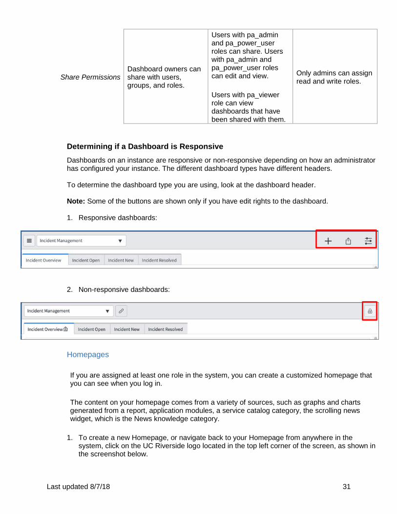
Determining if a Dashboard is Responsive
Dashboards on an instance are responsive or non-responsive depending on how an administrator has configured your instance. The different dashboard types have different headers. To determine the dashboard type you are using, look at the dashboard header. Note: Some of the buttons are shown only if you have edit rights to the dashboard. 1. Responsive dashboards:
2. Non-responsive dashboards:
Homepages If you are assigned at least one role in the system, you can create a customized homepage that you can see when you log in. The content on your homepage comes from a variety of sources, such as graphs and charts generated from a report, application modules, a service catalog category, the scrolling news widget, which is the News knowledge category.
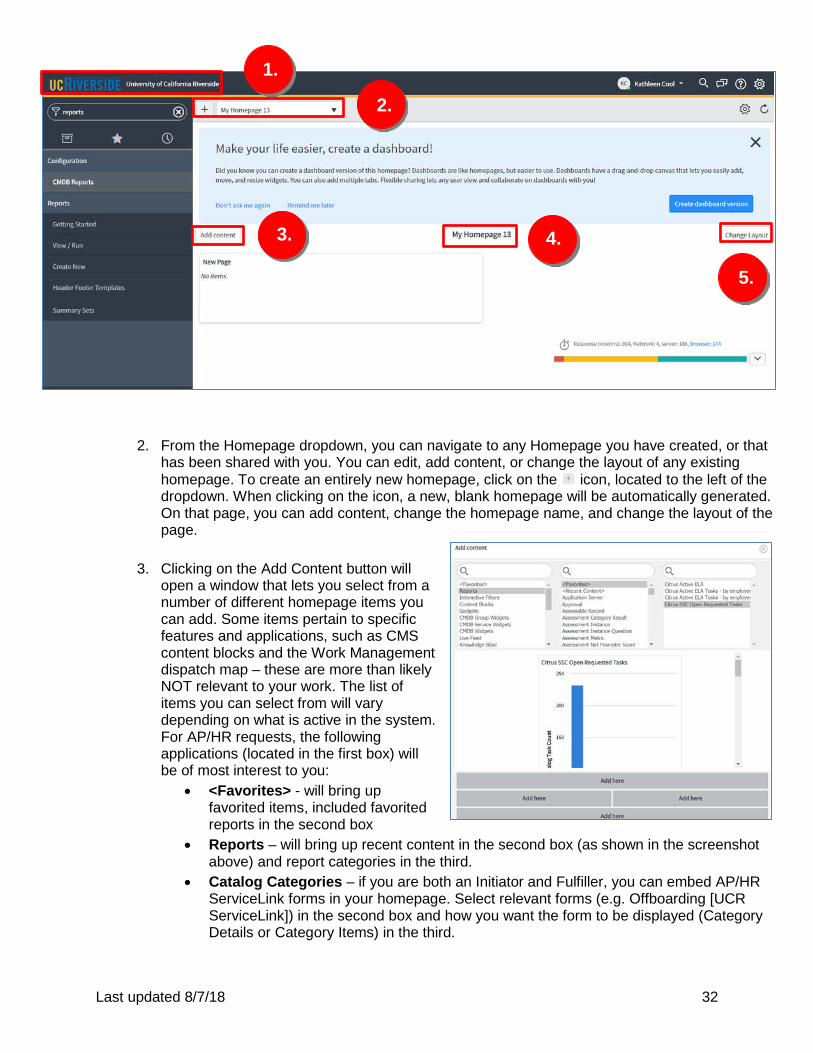
1. To create a new Homepage, or navigate back to your Homepage from anywhere in the system, click on the UC Riverside logo located in the top left corner of the screen, as shown in the screenshot below.
Last updated 8/7/18 32
2. From the Homepage dropdown, you can navigate to any Homepage you have created, or that has been shared with you. You can edit, add content, or change the layout of any existing homepage. To create an entirely new homepage, click on the icon, located to the left of the dropdown. When clicking on the icon, a new, blank homepage will be automatically generated. On that page, you can add content, change the homepage name, and change the layout of the page.
3. Clicking on the Add Content button will
open a window that lets you select from a number of different homepage items you can add. Some items pertain to specific features and applications, such as CMS content blocks and the Work Management dispatch map – these are more than likely NOT relevant to your work. The list of items you can select from will vary depending on what is active in the system. For AP/HR requests, the following applications (located in the first box) will be of most interest to you:
• <Favorites> - will bring up favorited items, included favorited reports in the second box
• Reports – will bring up recent content in the second box (as shown in the screenshot above) and report categories in the third.
• Catalog Categories – if you are both an Initiator and Fulfiller, you can embed AP/HR ServiceLink forms in your homepage. Select relevant forms (e.g. Offboarding [UCR ServiceLink]) in the second box and how you want the form to be displayed (Category Details or Category Items) in the third.
1.
2.
3. 4.
5.
Last updated 8/7/18 33
Once content has been selected, choose where the content will be located on your homepage by clicking “Add here.”
4. To change the title of your homepage, click on the current Homepage name or generic
numbering sequence (e.g. My Homepage 13). Clicking on the Homepage name will allow you to modify the name of the homepage anytime you are editing the content of the page.
5. To change the
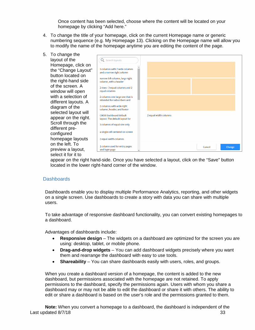
layout of the Homepage, click on the “Change Layout” button located on the right-hand side of the screen. A window will open with a selection of different layouts. A diagram of the selected layout will appear on the right. Scroll through the different pre-configured homepage layouts on the left. To preview a layout, select it for it to appear on the right hand-side. Once you have selected a layout, click on the “Save” button located in the lower right-hand corner of the window.
Dashboards
Dashboards enable you to display multiple Performance Analytics, reporting, and other widgets on a single screen. Use dashboards to create a story with data you can share with multiple users. To take advantage of responsive dashboard functionality, you can convert existing homepages to a dashboard. Advantages of dashboards include:
• Responsive design – The widgets on a dashboard are optimized for the screen you are using: desktop, tablet, or mobile phone.
• Drag-and-drop widgets – You can add dashboard widgets precisely where you want them and rearrange the dashboard with easy to use tools.
• Shareability – You can share dashboards easily with users, roles, and groups.
When you create a dashboard version of a homepage, the content is added to the new dashboard, but permissions associated with the homepage are not retained. To apply permissions to the dashboard, specify the permissions again. Users with whom you share a dashboard may or may not be able to edit the dashboard or share it with others. The ability to edit or share a dashboard is based on the user’s role and the permissions granted to them. Note: When you convert a homepage to a dashboard, the dashboard is independent of the
Last updated 8/7/18 34
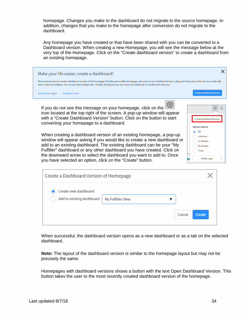
homepage. Changes you make to the dashboard do not migrate to the source homepage. In addition, changes that you make to the homepage after conversion do not migrate to the dashboard. Any homepage you have created or that have been shared with you can be converted to a Dashboard version. When creating a new Homepage, you will see the message below at the very top of the Homepage. Click on the “Create dashboard version” to create a dashboard from an existing homepage.
If you do not see this message on your homepage, click on the icon located at the top right of the screen. A pop-up window will appear with a “Create Dashboard Version” button. Click on the button to start converting your homepage to a dashboard.
When creating a dashboard version of an existing homepage, a pop-up window will appear asking if you would like to create a new dashboard or add to an existing dashboard. The existing dashboard can be your “My Fulfiller” dashboard or any other dashboard you have created. Click on the downward arrow to select the dashboard you want to add to. Once you have selected an option, click on the “Create” button.
When successful, the dashboard version opens as a new dashboard or as a tab on the selected dashboard. Note: The layout of the dashboard version is similar to the homepage layout but may not be precisely the same. Homepages with dashboard versions shows a button with the text Open Dashboard Version. This button takes the user to the most recently created dashboard version of the homepage.
Last updated 8/7/18 35
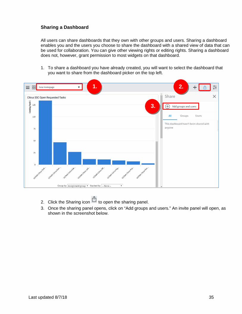
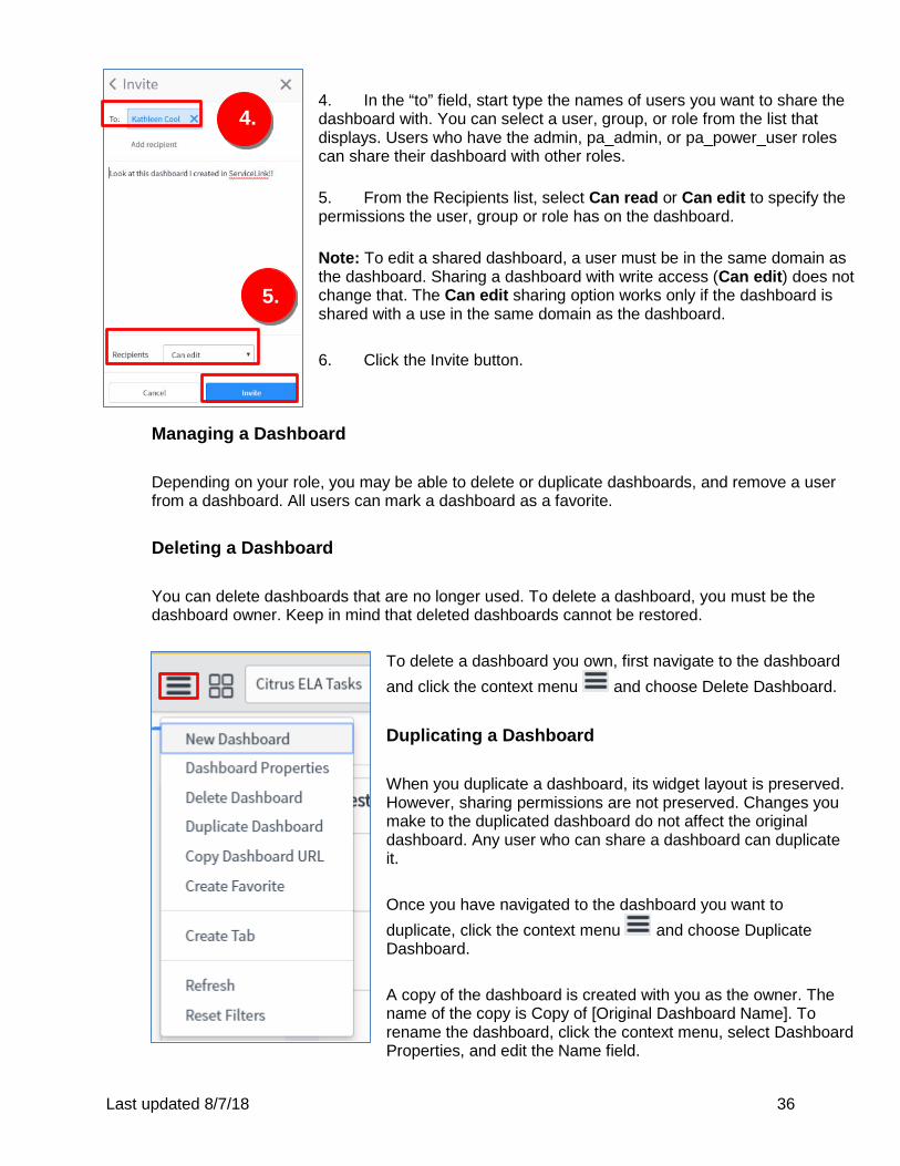
Sharing a Dashboard All users can share dashboards that they own with other groups and users. Sharing a dashboard enables you and the users you choose to share the dashboard with a shared view of data that can be used for collaboration. You can give other viewing rights or editing rights. Sharing a dashboard does not, however, grant permission to most widgets on that dashboard. 1. To share a dashboard you have already created, you will want to select the dashboard that
you want to share from the dashboard picker on the top left.
2. Click the Sharing icon to open the sharing panel. 3. Once the sharing panel opens, click on “Add groups and users.” An invite panel will open, as
shown in the screenshot below.
1. 2.
3.
Last updated 8/7/18 36
4. In the “to” field, start type the names of users you want to share the dashboard with. You can select a user, group, or role from the list that displays. Users who have the admin, pa_admin, or pa_power_user roles can share their dashboard with other roles. 5. From the Recipients list, select Can read or Can edit to specify the permissions the user, group or role has on the dashboard. Note: To edit a shared dashboard, a user must be in the same domain as the dashboard. Sharing a dashboard with write access (Can edit) does not change that. The Can edit sharing option works only if the dashboard is shared with a use in the same domain as the dashboard. 6. Click the Invite button.
Managing a Dashboard Depending on your role, you may be able to delete or duplicate dashboards, and remove a user from a dashboard. All users can mark a dashboard as a favorite. Deleting a Dashboard You can delete dashboards that are no longer used. To delete a dashboard, you must be the dashboard owner. Keep in mind that deleted dashboards cannot be restored.
To delete a dashboard you own, first navigate to the dashboard and click the context menu and choose Delete Dashboard. Duplicating a Dashboard When you duplicate a dashboard, its widget layout is preserved. However, sharing permissions are not preserved. Changes you make to the duplicated dashboard do not affect the original dashboard. Any user who can share a dashboard can duplicate it. Once you have navigated to the dashboard you want to duplicate, click the context menu and choose Duplicate Dashboard. A copy of the dashboard is created with you as the owner. The name of the copy is Copy of [Original Dashboard Name]. To rename the dashboard, click the context menu, select Dashboard Properties, and edit the Name field.
4.
5.
5.
Last updated 8/7/18 37
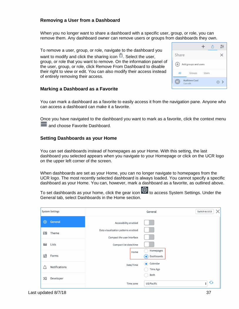
Removing a User from a Dashboard When you no longer want to share a dashboard with a specific user, group, or role, you can remove them. Any dashboard owner can remove users or groups from dashboards they own. To remove a user, group, or role, navigate to the dashboard you want to modify and click the sharing icon . Select the user, group, or role that you want to remove. On the information panel of the user, group, or role, click Remove From Dashboard to disable their right to view or edit. You can also modify their access instead of entirely removing their access. Marking a Dashboard as a Favorite You can mark a dashboard as a favorite to easily access it from the navigation pane. Anyone who can access a dashboard can make it a favorite. Once you have navigated to the dashboard you want to mark as a favorite, click the context menu
and choose Favorite Dashboard.
Setting Dashboards as your Home You can set dashboards instead of homepages as your Home. With this setting, the last dashboard you selected appears when you navigate to your Homepage or click on the UCR logo on the upper left corner of the screen. When dashboards are set as your Home, you can no longer navigate to homepages from the UCR logo. The most recently selected dashboard is always loaded. You cannot specify a specific dashboard as your Home. You can, however, mark a dashboard as a favorite, as outlined above.
To set dashboards as your home, click the gear icon to access System Settings. Under the General tab, select Dashboards in the Home section.

Last updated 8/7/18 38
When you next navigate to your Homepage or click on the UCR logo, the last dashboard you selected appears.

Last updated 8/7/18 39
Appendices

Last updated 8/7/18 40
Appendix A
Creating a Report – ServiceNow Video

Last updated 8/7/18 41
Appendix B
Drilldowns and Datasets – ServiceNow Video

Last updated 8/7/18 42
Appendix C
Working with Dashboards – ServiceNow Video