Embed Size (px)
Citation preview


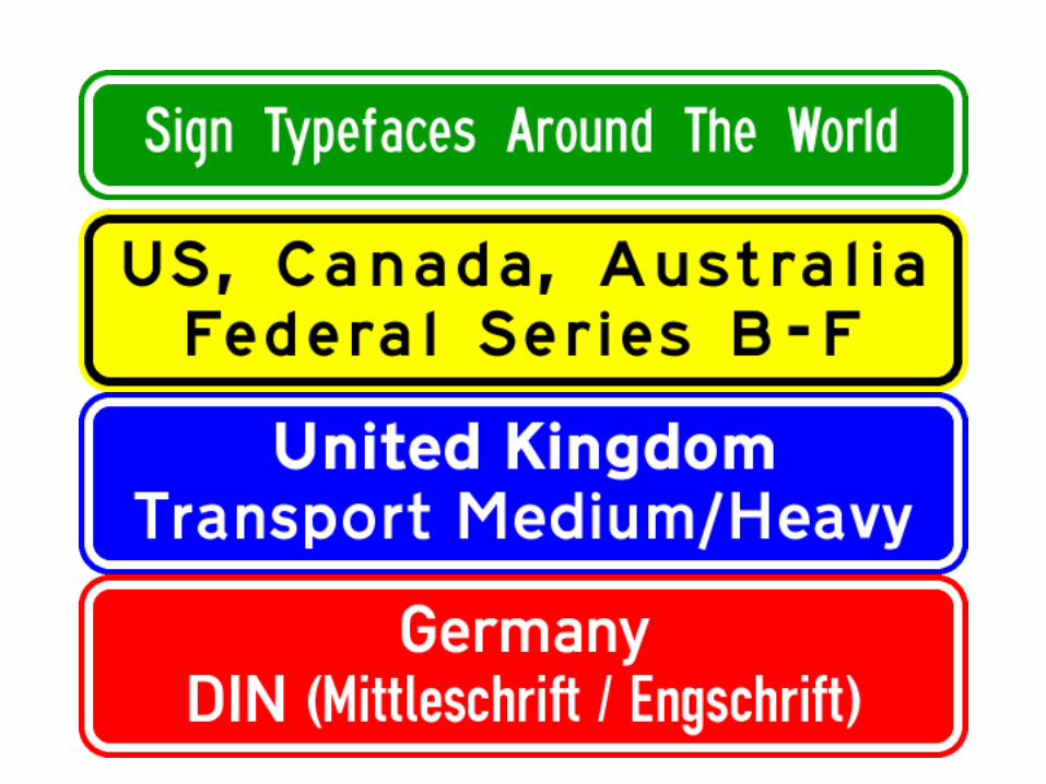
• Sign lettering originally hand-painted or embossed on steel plates
• No standardization
• As motor vehicles traveled at higher speeds, signs became more difficult to read

• Originated in 1940s• Established uniform typefaces for US
signs• Different series = different widths• Series A = narrowest• Series F = widest• Wider typefaces generally more legible
• Worked adequately for many years

• Fat stroke width = narrow internal spaces• especially on certain letters

• Overglow (halation)• Caused by greater brightness of letters
vs. background• causes letters to blur• Internal spaces ‘disappear’

• Federal Series worked well• but can we do better?
• Research goals:• Reduce overglow / halation• Improve legibility for given letter size• Improve legibility for older drivers

• Studies recommend larger letter sizes for older drivers• but this could greatly increase sign
sizes
• What if you could get increased legibility with same letter sizes?

• Five different studies to refine concept• Used both laboratory and field studies• Looked at existing typefaces• Adapted the "best of" each• Developed and refined letter shapes,
spacing, etc. in successive studies

• Studies showed substantial improvements in legibility vs. E(M)• Up to 12-16%• in some cases

• Interim Approval• Use allowed with FHWA’s permission• Is NOT yet OK for unrestricted use
• Clearview Interim Approval• Issued by FHWA September 2004• Arizona OKd by FHWA September 2005• Only for “positive contrast signs”• light text on dark background

Pennsylvania Michigan
Texas
…and soon inArizona

-W series - for light texton dark background(positive contrast)
-B series - for dark texton light background(negative contrast)
NOT yet approved by FHWA!

• and yet, they appear the same!
• Stroke width compensates for relative appearance


• Fractions• “oddball” sizes
• Spacing between letters of different sizes• ClearviewHwy in SignCAD doesn’t
properly space:• Cardinal directions with larger 1st letter• Suffixes (st, nd, rd, th)
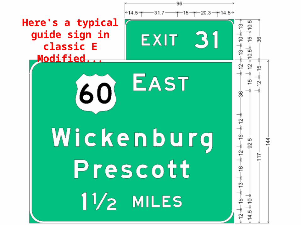
Here's a typical guide sign in classic
E Modified...

• Series E Modified:• Whole numeral and fraction are same
height• Fractional numeral is exactly 2/3
fraction height • Simple, clean math for fractions

Now let's take this guide sign...

…and convert it to Clearview

• Clearview:• Fraction now larger than whole numeral• Fraction is not aligned with other letters• No easy way to lay out by hand on sign
panel• Doesn’t line up with baseline, loop height,
or uppercase height• Offset vertically - not centered

• Actual fraction vertical dimension is 109% of 'nominal' size
• Fractional numeral in Clearview is 8% smaller than standard size• Violates MUTCD (Table 2E-4)
• Actual fraction dimension is "odd" size• Doesn't line up well with even-inch spacing

• Need to increase fraction size to get MUTCD compliance• 16.4" nominal fraction size yields 10"
fractional numerals
…but now the fraction is actually over 19" tall!
… and still doesn't line up with anything

• For SignCAD plans to display correct Clearview fraction size, designers must convert every fraction to graphic• One done, cannot be changed• Very tedious manual work• If not done, sign dimensions are wrong• Doesn’t ensure the sign will actually be built
with correct fraction

• Use the built-in fraction
• Keep converting fractions to graphic
• Develop a new fraction• If made same height as whole numeral,
then dimensions are much simpler• Turns out some sign manufacturers
were already making Clearview signs this way! (not using built-in fractions)

• ADOT-modified fraction:• Same height as whole numeral• Same height as traditional fraction• Keeps sign panel dimensions simple• Ensures that sign as designed will be
consistent with sign as built• Use this modified fraction instead of built-in
fraction on ADOT projects!

• If all letters are the same size, no problem with spacing in SignCAD

• SignCAD reverts to 0” default spacing between letters of different sizes• this doesn't really look right...

• Sign designers must insert space by hand to fix• Tedious work• Hoping to automate in future in SignCAD

• ADOT is developing SignCAD templates for nearly all standard guide signs• Freeways• Conventional roadways• Ramps & freeway crossroads

• Templates will have “info boxes”• Correct vertical dimensions• Hints & tips for formatting
• Templates will incorporate Clearview typefaces • Including ADOT-specific fractions
• Still under development• Will be released when completed


• Richard C. Moeur, PE• (602) 712-6661• http://www.richardcmoeur.com/
• FHWA webpage on Clearview:• http://mutcd.fhwa.dot.gov/HTM/clearfont/index.htm
• ClearviewHwy font website:• http://www.clearviewhwy.com/
• 'Freeware' Clearview fonts:• http://www.triskele.com/