Embed Size (px)
Citation preview

SIMULATION STUDY OF STATISTICAL PROCESS
CONTROL SCHEMES PERFORMANCE FOR MONITORING
VARAITION
HADEER TALEB SHOMRAN
This project reports submitted in partial fulfillment of there Requirement for
Masters of Engineering in Mechanical
Faculty of Mechanical and Manufacturing Engineering
University Tun Hussein Malaysia
DES 2013

i
APCTRAC
The research objectives are to study evaluate performance of traditional control
charts that are Shewhart and EWMA both .In monitoring small and large process mean
shifts and to propose an improved statistical process control charting procedure that
effective for monitoring all process mean shifts . In general Process mean shift can be
described as unstable patterns. In this research concentration on the shifts pattern
Average run length ARL in both types ARL stable and ARL unstable, Type I Error and
Type II Error is used as the performance measures The charting procedures were coded
in MATLAB program and extensive simulation experiments were conducted. Design of
Experiment (DOE) methods were applied in selecting the suitable design parameters of
control charts before conducting the detail ARL simulations. The ARL simulation
identifies each control chart monitoring advantages and disadvantages . In general
EWMA control charts are more effective for detecting the variation process in small
mean shifts compare with the Shewhart control charts While the Shewhart control charts
were more effective for detecting the variation process in large mean shift . Specifically,
EWMA with (λ=0. 05, L=2. 615) and (λ=0. 1 , L=2. 81) were identified produced a
small Type ΙI error, so effective for monitoring small and process mean shift, more
effective than Shwehart control chart . But at large mean shift 3σ Shwehart gives more
effective to detect the variation in the process .

iv
TABLE OF CONTENTS
CHAPTER CONTENT PAGE
ABSTRACT
LAST FIUGER
LAST TABLE
TABLE OF CONTENT
I INTRODUCTION
1.1 Introduction 1
1.2 Statement of the Problem 2
1.3 Objectives 2
1.4 Scope and Key Assumptions 3
1.5 Definitions of Terms 3
1.6 Research Activity Plan 4
1.7 Summary 5
II LITERATURE REVIEW
2.1 Introduction 6
2.2 Tools of statistical process control 7
2.2.1 Histogram 7
2.2.2 Check sheets 8
2.2.3 Pareto chart 9
2.2.4 Scatter Diagram 10
2.2.5 Cause and Effect Diagrams (Fishbone Diagram) 11
2.2.6 Control chart 12
2.3 Types of Control Charts 13
2.3.1 Variable control charts 14
2.3.2 Attribute control chart 14
2-4 Shewhart control chart (X- bar and R - bar ) 15
2.4.1 X- bar Chart 15
2.4.2 R-bar chart (range chart ) 17
2-5 compute and establish an X - Bar chart and R-chart 17

v
2-5-1 Ddentify Quality characteristics 17
2-5-2 Choose a sub-group rational 17
2-5-3 collect the data 18
2-5-4 plot data and establish X-bar and R-chart 18
2-6 When should be apply the X- bar chart 25
2-7 EWAM control chart 26
2-7-1 Example of EWMA chart 30
2-8 ARL for X- bar chart 32
2-9 ARL of EWMA control chart 34
2-10 Summary 35
III RESEARCH METHODOLOGY
3.1 Introduction 36
3-2 summery of Research Methodology 37
3.3 Source of Data: 38
3.3.1 Synthetic Data 38
3.3.2 Published Data 39
3.4 Pattern Data. 39
3.5 Control Chart Performance Measure 39
3.6 Design of Experiment Plan 42
3.7 Validation of Result 43
3.8 Summary 43
IV GENERATION OF PROCESS DATA STREAMS
4.1 introductio 44
4.2 flow the data in MATLAB 45
4.3 Simulation the pattern data 46
4.4 Simulating the pattern data for Shewhart X-bar and 46
EWMA Chart .
4.5 Simulations of synthetic data for Shewhart X-bar chart 46
4.5.1a In control process data ( h = 0) for 1000 data 47
4.5.1b In control process data ( h = 0) for 4000 data 48

vi
4.6 Out control process data ( h 0) 48
4.6.1a Out control process data ( h 0.5) 49
4.6.1b Out control process data ( h 2) 50
4.6.1c Out control process data ( h=3) 51
4.7 Simulations of synthetic data for EWMA chart 52
4.7.1a Iin control process Data (h 52
4.7.2a Out control process Data (h=0.5) 53
4.7.2b Out control process Data (h=2) 54
4.7.2c Out control process Data (h = 3) 55
4.8 Table DOM the result of simulation 57
4.9 Discussion of Results 58
4.10 Summary 59
V SELECTION OF DESIGN PARAMETERS FOR SHEWHART
AND EWMA CONTROL CHARTS
5.1 Introduction: 57
5.2 Design Parameters for Shewhart X-bar Control Chart: 58
5.2.1 Selection of Design Parameters Shewhart : 58
5.2.2 Design of Experiment Factorial Plots 59
(main effect ) Shewhart.
5.2.3 Design of Experiment Factorial PloT 60
(interaction factors ) Shewhart:
5.3 Design Parameters for EWMA Control Chart: 61
5.3.1 Selection of Design Parameters (EWMA): 62
5.3.2 Design of Experiment Factorial Plots 62
(main effect) for EWMA (unstable)
5.3.3 Design of Experiment Factorial Plots 64
(interaction factor) for EWMA

vii
5.4 Performance of Shewhart Control Chart : 66
5.4.1 Performance Shewhart control with 66
Shift Pattern:
5.5 Performance of EWMA Control Chart: 67
5.5.1 Performance EWMA control chart with 67
Shift Pattern
5.6 Comparion between the Shewhart and EWMA 71
performance control charts
5.6.1 Comparison between the Shewhart and 71
WEMA at stable process (Size of shift =0):
5.6.2 Comparison between the Shwehart and 72
WEMA at ARL unstable ( medium &large shift)
5.7 Summary: 73
VI DISCUSSION
6.1 Introduction: 74
6.2 Errors in Interpreting the Control Charts Performances: 74
6.3 Proposed Charting Scheme for Monitoring Process Shift: 79
6-4 guideline for selection control chart in monitoring 80
process shifts variation:
6-5 Summary: 81
VII CONCLUSION AND SUGGESTION
7.1 Introduction : 82
7.2 Suggestion for Further Study 83
REFERENCES 84

ii
LIST OF FIGURES
FIGURE TITLE PAGE
1.1 Research Activity Plan 4
2.1 Histogram diagram 7
2.2 Shown Pareto chart 9
2.3 Scatter Diagram 10
2.4 Cause and Effect Diagrams (Fishbone Diagram) 11
2.5 Simple graphical method. 12
2.6 Shewhart X-bar chart control 18
2.7 WEMA chart control is shown two points are out –contro 20
2.7.1 EWMA chart control 25
3.1 Method for counting ARL 39
4.2 flow the data in MATLAB 44
4.5.1a Show the process data in control for Shewhart 46
4-5-1b Show the process data in control for Shewhart X-bar Chart ( h=0). 47
4.6.1a Show the process data in control for 48
4.6.1b Show the process data in control for Shewhart X-bar Chart ( h=2) 49
4.6.1c Show the process data in control for Shewhart X-bar Chart 50
4.7.1.a Show the process data in control on EWMA (λ=0.4, L=3.054 h=0.5) 51
4.7.1.b Show the process data in control on EWMA (λ=0.4, L=3.054 ,h=2) 52
4.7.1c Show the process data in control on EWMA (λ=0.4, L=3.054, h=3) 53
5.1 Main Effects Plot for Shewhart control chart (run length 10.000) 59
5.2 Design of Experiment Factorial Plots (interaction factors ) 60
5.3 Design of Experiment Factorial Plots (main effect ) for 63
EWMA (Unstable Process)
5.4 Design of Experiment Factorial Plots (interaction factor ) 64
For EWMA (Unstable Process)
5.5 the effect the value mean of shift on performance for Shewhart control 67
( b=0. 3, 0.7)
5.6 Shows ARL stable and unstable for EWMA control chart. 69

iii
5.7 Performance with Shift Pattern (at small process mean shifts) 70
5.8 Shows ARL unstable for EWMA (at medium and large process mean shift) 71
5.9 Compares Shewhart and EWMA control chart 71
5.10 Comparable Shwehart and EWMA control charts (small) size 72
5.11 Compares between the Shwehart and WEMA at ARL unstable (medium & 73
large shifts)
6:1a Shows Type II Error for Shewhart and EWMA Control charts and ARL 78
unstable at (small , medium , large ) mean shifts
6:1b Shows Type II Error for Shewhart and EWMA Control charts and ARL 79
unstable at small mean shifts

iii
LIST OF TABLE
TABLE TITLE PAGE
1.1 simplify the meaning of technique 3
2.2 shows the results 8
2.3 data collected by check sheet 9
2.4 for factors (Dale H. Besterfield 2001. Table B) 22
2-5 Sample data for EWMA 28
2-7 ARL for several EWMA Control chart 32
3-1 show the deffrent result of ARL in EWMA chart 40
3-2 Table of expected ARL 41
3-3 ARL for Shewhart x-bar chart 42
4-5-1a Parameter for Standardized Shewhart X-bar control chart 46
4.5.1b Parameter for Standardized Shewhart X-bar control chart 47
4-6-1a Parameter for Standardized Shewhart X-bar control chart (h=0.5) 48
4-6-1b Parameter for Standardized Shewhart X-bar control chart(h=2) 49
4-4-2b Parameter for Standardized Shewhart X-bar control chart (h=3) 50
4-6-2a Parameter for Standardized EWMA control chart (h=0.5) 51
4.7.1b Parameter for Standardized EWMA control chart (h=2) 52
4-4-2b Parameter for Standardized EWMA control chart (h=3) 53
4.8 The result of ARL from simulation for Shewhart and EWMA 54
5.2 Analysis Factorial Design ( mean shift ) for Shewhart control chart 61
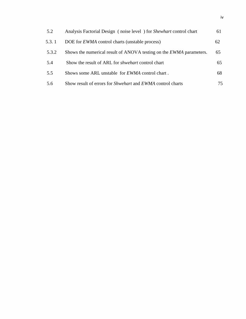
iv
5.2 Analysis Factorial Design ( noise level ) for Shewhart control chart 61
5.3. 1 DOE for EWMA control charts (unstable process) 62
5.3.2 Shows the numerical result of ANOVA testing on the EWMA parameters. 65
5.4 Show the result of ARL for shwehart control chart 65
5.5 Shows some ARL unstable for EWMA control chart . 68
5.6 Show result of errors for Shwehart and EWMA control charts 75

1
CHAPTER I
INTRODUCTION
1.1 Introduction:
In recent years, Statistical Process Control tools in have been widely
implemented manufacturing industries in all industrialized countries examples
In Malaysia, the application is increasing especially in discrete part industries.
Selection of Statistical Process Control is critical in quality control improvement.
For example, Shewhart Control Charting Scheme Shewhart is effective for
quality control in monitoring large shift process variation. Inversely with the
EWMA control chart is effective with small shift process variation (Montgomery
2001) . Generally the Control charts are an essential tool of continuous quality
control. Control charts monitor processes to show how the process is performing
and how the process and capabilities are affected by changes in the process. This
information is then used to make quality improvements Control charts are also
used to determine the capability of the process. They can help identify special or
assignable causes for factors that impede peak performance. Control charts
show if a process is in control or out of control (Montgomery2005). They
show the variance of the output of a process over time, such as a
measurement of width, upper and lower limits to see if it fits within the
expected, specific, predictable and normal variation If so, however, the
variance falls outside the limits, or has a run of non-natural points, the
process is considered out of control.

2
1.2 Statement of the Problem :
There is possibility that Industrial Practiceness incorrectly selected the
suitable Statistical Process Control tools due to lack of fundamental
knowledge in Statistical Process Control. Especially since the manufacturing
process influenced by many factors direct and indirect inside the factory,
which may Create to a variation in the operation , Hence , this will affect
the quality of product that being manufactured, Therefore, it is necessary to
investigate the performance of Statistical Process Control tools in
monitoring process variation. In particular, this study focus on Shewhart and
EWMA control charting scheme. The findings of this study could be a
reference which is useful for Industrial Practice ness to correctly select the
specific Statistical Process Control tools in dealing with process variation.
1.3 Objectives :
i. To study evaluated the performance of Statistical Process Control
charting scheme in monitoring process variation. In particular, this
study focuses on Shewhart chart and EWMA chart control .
ii. To propose a guideline for choosing suitable Statistical Process
Control tools in monitoring process variation. In particular this study
focus on optimal design parameters for Shewhart chart and EWMA control
chart.

3
2.4 Scope and Key Assumptions:
The scope of this research involves three items as follow:
i. Process variables to be monitored are limited to sudden mean
shifts.
ii. The performance of the statistical process control charting
schemes is evaluated based computer simulation using synthetic
and real process data streams.
iii. The design parameters for the Sewhart control chart 3σ and
EWMA control harts
2.5 Definition of Terms
In conduct in this project . Some of the terms as shown in the table are
used to simplify the meaning of techniques as shown in the table (1-1).
Table (1.1): simplify the meaning of technique
Process Mean Shift
Small mean shift
Mean of unstable process data, shifted from the
mean of stable process less than 1.5σ.
Large mean shift
Mean of unstable process data, shifted from the
mean of stable process equal or more than 1.5σ.

4
1.6 Research Activity Plan:
the research activities conducted within two semesters. It was
divided into four phases. As shown in the figure (1.1)
LITERATURE STUDY
NO NO
Yes Yes
NO NO
Yes Yes
Journals and
Published Book
Shewhart
control chart
EWMA control
chart
Learn & Familiar
Tool (MATLAB)
Focusing
Study
Generate synthetic
data / search
published data
Analyze each control chart performances.
1- Compare with other research finding.
2- Proposed the improved charting scheme
that effective for monitoring small and
larg eprocess mean shifts.
Face 1
Develop basic program for
control charts for
simulation
Face 2
Install function:
1- detecting out-of-control
point
2- Computing ARL
Face 3
Run:
1- DOE and
parameterselection
2- Actual ARL simulation
Face 4
1 Validate chart performance
2- Statistical data analysis
figure (1.1) : Research Activity Plan

5
In the first semester. Research activity it was studying a research
published and books that are related to performance of control schemes
Focus on study the performance of Shewhat control chart and EWMA to
monitor the production process to detect possible variation that occurs in
the process. Then learning the MATLAB program , which was developed to
study the control charts. By Using simulation Synthetic Data in the
program. Drawn the charts and Analysis to detect the performance of
control charts. After each of the simulations for She what control chart and
EWMA charts. We get the Results and then compared with published
results.
1.7 Summary:
This chapter Included the background of control charts and the
statement of the problem. Find targets. And the scope and key assumption
definition of terms of research and research activities in monitoring the
variance process. Shewart control chart is insensitive in the detection of
small shift while the performance of the EWMA is more sensitive in
detecting small shifts. In the production process problem is that the
difference of the average process usually either unexpectedly it will deform
to shifts small or large. In this research to evaluate the performance of
Shewart control chart and EWMA chart . And suggest any suitable process
control. This chapter presented on a preliminary basis for this study.

6
CHAPTER 2
LITERATURE REVIEW
2.1 Introduction:
Statistical Process Control (SPC) is a tool that measures and achieves quality. Is an
Effective method of monitoring the production Processes (Jordan Journal of
Mechanical and Industrial Engineering 2012) . That allows for maintaining certain
standards without inspecting and regulating every step and product of the process
by applying statistical techniques (a series of steps designed to produce a repeated
and consistent result) to determine whether the output of a process conforms to the
product or service design (MIKEL J. Harry & Prem S . MANN 2010). The basic
idea in statistical process control (SPC) is to take random samples of products from
manufacturing line and examine the products to ensure that certain criteria of
quality are satisfied (Montgomery, 1991). And then study the Statistics for Search
for out assignable causes of inferior quality to bring the process back to control.
Statistical process control is a powerful collection of problem-solving tools useful
in achieving process stability and improving capability (Dale H. Besterfield 2001).
Problem-solving tools useful in achieving process stability and improving capability
through the reduction of variability. These tools, often called magnificent seven are;
histogram, check sheet, Pareto chart, Scatter diagram, Cause and effect diagrams
(Fishbone Diagram) (Jordan Journal of Mechanical and Industrial Engineering
2012) , in1920s by Dr. Walter Shewhart Which is one of the most important and
powerful tools for SPC . Then in 1950 s Enter the EWMA control chart, the EWNA
chart is more sensitive than the Shewhart control chart in the small shifts
(Montgomery2005) .

7
2.2 Tools of statistical process control:
2.2.1 Histogram:
The tool is a special bar chart to measure data. Charts used to draw the frequency of
events in the production process. The data are grouped in neighboring numerical
categories The Minitab software can be organizing the data into groups. And plot
the histogram (Jordan Journal of Mechanical and Industrial Engineering 2012)
Example:
Data concerning the tensile strength test is shown in Table (2.1) and used to
illustrate the histogram in Figure (2.1).
Figure (2.1): Histogram diagram

8
2.2.2 check sheets:
In general the check sheets are tables simply used for data collection and include a
list of nonconformities and the tally of nonconformities . And must contain the
name of the project and the dates of data collection. And the location of data
collection (e.g., in house or at customer's).
Example :
In the Table (2.2) shows the results of the visit by a quality improvement team at a
manufacturing of wood components. After checking the elemental ingredients
(scrap. Rework bins) And speak with customers. The team is agreed on categories
of nonconforming and developed precise definitions of nonconformities and
developed precise definitions for each category. The created a check sheet. Then
inspected each item and tallied the number of frequencies for each case of
nonconformity(Jordan Journal of Mechanical and Industrial Engineering 2012).
Table (2.2 ) shows the results

9
2. 2.3 Pareto chart:
A Pareto chart, named after Vilfredo Pareto, is a type of chart that contains both
bars and a line graph, where individual values are represented in descending order
by bars, and the cumulative total is represented by the line. (Jordan Journal of
Mechanical and Industrial Engineering 2012)
Example:
Pareto chart was constructed based upon data collected by check sheet for the main
tests performed on steel and shown in the following Table ( 2.3) and Figure (2.2)
Table (2.3) data collected by check sheet
Figure (2.2): as shown Pareto chart

10
2.2.4 Scatter Diagram :
The scatter diagram is the simplest of the seven tools and one of the most useful.
The scatter diagram is used to determine the correlation (relationship between two
characteristics (variables) Goetsch).
Example:
Figure (2.3) shows who we can use Scatter Diagram to find the relationship
between the flow of water to cool the steel through the stages of production and the
tensile strength of steel by applying the data that have been collected, which
represents the average reading per hour of water flow and tensile strength. The
scatter diagrams clarify that there is no direct relationship exists between tensile
strength and water flow. (Jordan Journal of Mechanical and Industrial Engineering
2012).
Figure (2.3) Scatter Diagram

11
2.2.5 Cause and Effect Diagrams (Fishbone Diagram ):
Generally the Cause and Effect Diagrams (Fishbone Diagram ) as shown in the
figure (2.4) consists of two parts backbone , which represents the problem and the
five major categories (machines, people, the environment, materials, and style). The
scheme is completed by adding extra thorns, which represent the potential causes of
the problem under each category. (Jordan Journal of Mechanical and Industrial
Engineering 2012).
Figure (2.4) Cause and Effect Diagrams (Fishbone Diagram)

12
2.2.6 Control chart:
Control charts were used to monitor the variable and attribute data .Control charts
the most use of the data for variables are mean and range charts which are used
together (Gerald m. Smith , 2001) . Dr. Walter Shewhart is the first to introduce a
statistical process for quality control of the production process about 60 years ago
.He has written a book titled (economic control of the quality of products
manufactured) in 1931(PeterW.M.johan1990) . 1928 saw the introduction of the
first Statistical Process Control (SPC) Charts. Commissioned by Bell Laboratories
to improve the quality of telephones manufactured, a simple graphical method
developed a simple graphical method the first of a growing range of SPC Charts as
shown in the figure (2-5) Understanding the causes of variation within an industrial
process proved. Indispensable as actions could be taken to improve the process and
output. (By David Howard 2003)
Figure (2.5) simple graphical method.

13
2.3 Types of Control Charts:
The Control charts are divided into two main types The first type is called variables
control charts .The second type is called attributes control charts. The control
charts to monitor the variables are more useful from attribute control charts . But
attributes control charts works best to give the best results in some cases, such as
when tracking paint defects. Characterized for variables control charts using the
number of samples less than when we compared with attribute control charts . The
attribute control chart used the number of samples more than (100 sample) .
Variable control charts use Number of pieces of less use means to reduce the cost
and time required to take measures to correct the production process compared with
the attribute control chart ( Gerald M. Smith 2001) In essence, is a statistical limit
applied to a set of points which represent the sequential production process under
observation or study .Plot the points in random chat. Each Tamer random point .
Through the distribution of points in the chart can characterize the process. They
are going the right way. The emergence of points outside the boundaries of control
indicates the presence of confusion or a series of errors in the procedure, which
refers to taking appropriate action. Control charts Represents a roadmap to monitor
and improve the production process of discovering the Defects and take the
necessary (MIKEL J. Harry & Prem S . MANN 2010) .
.

14
2.3.1 Variable control charts
Is a chart which uses the standard deviation measure to control for the production
process and is used to deal with the variable data (such as speed, temperature,
humidity, etc.). (Montgomery 2005 ). Has a powerful set of charts used to monitor
the production process. (MIKEL j. HARRY and PREM S. MANN , 2010)
I. 1-X Chart
II. 2-R Chart (Range chart)
III. 3-X-R CART
IV. 4-Moving Range (MR) Chart
V. 5-Stander deviation
VI. 6-EWMA Chart
2.3.2 Attribute control chart:
Measurements are classified in attribute control charts as acceptable or
unacceptable (fail corridor, or go or do not go). Uses attribute control chart when
decision-making is difficult (when the user variables control charts ). When
measurements do not apply to the situation (such as visual verification). Or when
the cost of the measurements is expensive because of the time lost. Graphic
attributes generally not more sensitive compared with the variables control charts
Attribute control charts have a set of control charts . (Gerald M. Smith 2001).
I. P Chart
II. C Chart
III. Np Chart
IV. U Chart

15
In this chapter we will focus on the variable control chart identification on
( Shewhart control chart x-bar chart ) and (exponentially weighted moving average
(EWMA)) which represent a search point in this project.
2.4 Shewhart control chart (X- bar and R - bar ):
Control chart was invented by Dr. American Walter Shewhart in the 1920s. When
he was working at Bell Telephone lab , (the research arm of American Telephone
and Telegraph Company). The most popular schemes used on a large scale.
Historically. For several reasons uses the range as a measure of the volatility in the
data is that it is easy to calculate by hand. It also provides a good statistical data for
small and that the sample size is less than (8 samples). While it is difficult to
calculate the standard deviation. It represents a good measure of the variance of the
data. Especially for large projects (large sample sizes) (James R. Evans 1991). In
General the chart consists of two separate parts. The Xbar plot is a plot of averages
on a control chart. The R-bar is a plot of ranges of groups or responses across by
time. And display my often together (Jim Waite . Om 380 . 10/14/2004).
2.4.1 X- bar Chart:
Used to monitor the average or mean value of the production process with time For
each sub-group . In general The chart consists of three horizontal lines (Jim Waite .
Om 380 . 10/14/2004) . Best use with sub-group smaller sample size (each the size
of a sub-group of three to four data points) .It is usually used with an R-chart or
with the deviations-chart . Control limits in a chart depends on the type of planned
joint with control charts ( R- Chart or S-Chart ) ( MIKEL J. Harry & Prem S .
MANN 2010) Better to use the R-chart with the X-bar chart if we do not know the
standard deviation for this process .Because the limits of the graph will depend on
the estimate of the standard deviation. And this must be done properly (AchesonJ.

16
Duncan 1986). In general is a chart sensitive to determine the variations in the
process . And gives a vision of the differences in the process in the short term The
chart consists of three horizontal lines as shown in the figure (2-6) . And the Y-axis
title ( sample mean ) and X-axis title for the time or the number of subgroups.
Center line (CL) Represents the average line in the chart (center line displays the
average of the statistic) . Mediates the limits of the chart and represents the target
line. And points are plotted whenever the nearest was referring to the quality of the
process. Lower control limited (LCL) Represents the minimum of the expected
difference . Points that fall outside the line be outside the control limits. Which may
indicate problems in the production process . This line is the bottom the center line .
Upper control limited (UCL) Represents the upper limit of the variation . Points
that fall outside the limit is out of control (MIKEL J. Harry & Prem S . MANN
2010)
Figure (2-6) Shewhart X-bar chart control

17
2.4.2 R-bar chart (range chart ) :
Is a measure of the regularity of the data set . And can be accessed by taking the
largest and smallest values of group variations . R- Chart (range chart ) give a clear
vision of the limits of control through the presentation of the variability in the
process with the passage of time . Is usually chart sync with the X-Bar chart (mean
chart ) R-Bar (rang chart ) Consists of three horizontal lines, as is the case with the
chart ( X-Bar ), as shown in Figure (8). But the y-axis represents (sample range ).
(MIKEL J. Harry & Prem S . MANN 2010
2.5 compute and establish an X - Bar chart and R-chart :
To compute and establish an X- Bar chart and R-Chart control must follow these
steps
2.5. 1 identify Quality characteristics:
Quality characteristics that can be expressed using X- bar chart and R-chart can be
summarized in seven units President a (unit length, temperature, material density
occasion, mass, time, electric current), as well as any of the units derivative (such as
energy, speed, power, density, and pressure). This property is measurable and can
be represented by using the numbers. (Dale .H.Besterfiled 2001)
2.5.2 Choose a sub-group rational:
Data that is used within the scheme to monitor the production process are consists
of rational subgroup. The data that is collected at random groups are not rational.
Definition of the sub group rational as a set of elements have a difference within
only due to chance. (Dale. H. Besterfiled 2001).

18
There are two charts for selecting the subgroup samples:
i. The first chart uses sub-group taken in one period of time.
ii. The second chart uses sub-group taken over periods of time.
2.5.3 collect the data:
The next step is to compile the data. Usually collected the data is in the factory by
technician assigned the task of data collection. Data is collected in a vertical way
as shown in the table (2.3). And be in the form of sub-groups .And samples.
Sometimes remembers the time of sampling in the table. (Dale. H. Besterfiled
2001).
Table (2.3) : data collected in a vertical way
Number of
subgroups
DETA
TIME
Simple size (No. Observation)
X1 X2 X3
X4
AVERAGE
RANGE
R
1 12/6 8:50 6.35 6.40 6.32 6.37
2 11:30 6.46 6.37 6.36 6.41 3 1: 45 6.34 6.40 6.34 6.36
4 3:45 6.69 6.64 6.68 6.59
5 4:20 6.38 6.34 6.44 6.40 6 12/8 8:35 6.42 6.41 6.43 6.34
7 9:00 6.44 6.41 6.41 6.46 8 9:40 6.33 6.41 6.38 6.36
9 1:30 6.48 6.44 6.47 6.45 10 2:50 6.47 6.43 6.36 6.42
=
=

19
After plotting the data inside the table now we have calculated the chart
Can calculate the X from the data by using the formula
---------------------- (2.1)
Where x=average of the subgroup
n= Simple size (No. observation)
xi= sample
And can find the R (range) from the data by using the formula
-----------------(2.2)
Ri = range of the sub-group
From the data in the table and the number of simple (n) is Equals (4)
= 6.36mm ,
= 0.08mm
S
o
a
f
t
e
r
f
i
n
d
i
n
g
Number
of
subgroups
DETA
TIME Simple size (No. Observation)
X1 X2 X3 X4
AVERAGE
RANGE
R
1 12/6 8:50 6.35 6.40 6.32 6.37 6.36 0.08
2 11:30 6.46 6.37 6.36 6.41 6.40 0.1
3 1: 45 6.34 6.40 6.34 6.36 6.36 0.06 4 3:45 6.69 6.64 6.68 6.59 6.65 0.1
5 4:20 6.38 6.34 6.44 6.40 6.39 0.1 6 12/8 8:35 6.42 6.41 6.43 6.34 6.40 0.09
7 9:00 6.44 6.41 6.41 6.46 6.43 0.05
8 9:40 6.33 6.41 6.38 6.36 6.37 0.08 9 1:30 6.48 6.44 6.47 6.45 6.42 0.04
10 2:50 6.47 6.43 6.36 6.42 6.39 0.11 = 64.17
=
0.81

20
To find the central line for the X and R they are obtained using the formulas
,
---------( 2.3 )
Sinse
X= average of the subgroup average = CL for the x - bar chart
g = number of subgroups
R= average of subgroup ranges (Dale. H. Besterfiled 2001).
By applying the data from the table on the formula
=6.417mm= CL for x-bar chart
= 0.081mm = CL for R-chart
And to fined the stander deviation .
3*σx =A2* R since A2 =
And σx = σ’* ---(2-4)
There for the
σx =
=
R --------------( 2.5 )
Where
n = NO. For sample .
σx = population stander deviation of the subgroup averages.
(A2 , d2) = value of factors for computing central line and standard
Deviation for x- chart and R- chart. (Dale H. Besterfield 2001. Table (2-4 ) )
σ’= actually the process standard deviation.
And all so can calculate the (UCL) AND (LCL) for X-bar chart by estimate
the process standard deviation from the formula. Is not correct to estimate the
process standard deviation from all the data .Just can estimate by using ( historical
data) . If the number of sample size more than (5) sample than can use the S - chart
with an X - bar chart (AchesonJ.Duncan . 1986)

21
= σ’------------( 2.6 )
(S , σ’)=estimate process standard deviation
Where σx = σ’* --------------------- ( 2.7 )
UCL=X + 3*σx --------------------------( 2.8 )
CL = x
LCL = X 3*σx ---------------------------( 2.9 )
To find the (UCL) and (LCL) for x-bar chart and R chart using the formula
For x-bar chart
UCLX = X + A2 *R ------------------------(2.10)
CLx = X --------------------------------------(2.11)
LCLX = X - A2*R ---------------------------(2.12 )
For R-chart
UCLR = D4 * R ---------------------------(2.13)
CLR = R ------------------------------(2.14)
LCLR = D3 * R ---------------------(2.15)
Where
UCLX=Upper control limits for the X - bar chart
CLX= Central line for X-bar chart = X
LCLx= Lower control limit for the X - bar chart
UCLR= Upper control limit for R-chart
CLR=central line for R chart = R
LCLR= Lower control limit for R-Chart
(A2, D2 , D3 ) = value of factors for computing central line and standard
Deviation for x- chart and R- chart. (Dale H. Besterfield 2001. Table B)

22
By applying the data from the table (9) in the formula can find the limits for x-bar
chart and R chart. And from the table (B) find (A2=0.729, D3=0, D4=2.282 ) as
show in figure(5) .
Table (2.4): for factors (Dale H. Besterfield 2001. Table B)
Since
UCLX = X + A2 *R
=6.41+(0.729)*(0.0876)
=6.47mm
CL = X = 6.41mm
LCLX = X A2*R
= 6.41 (0.729)*(0.0876)
=6.35mm
23
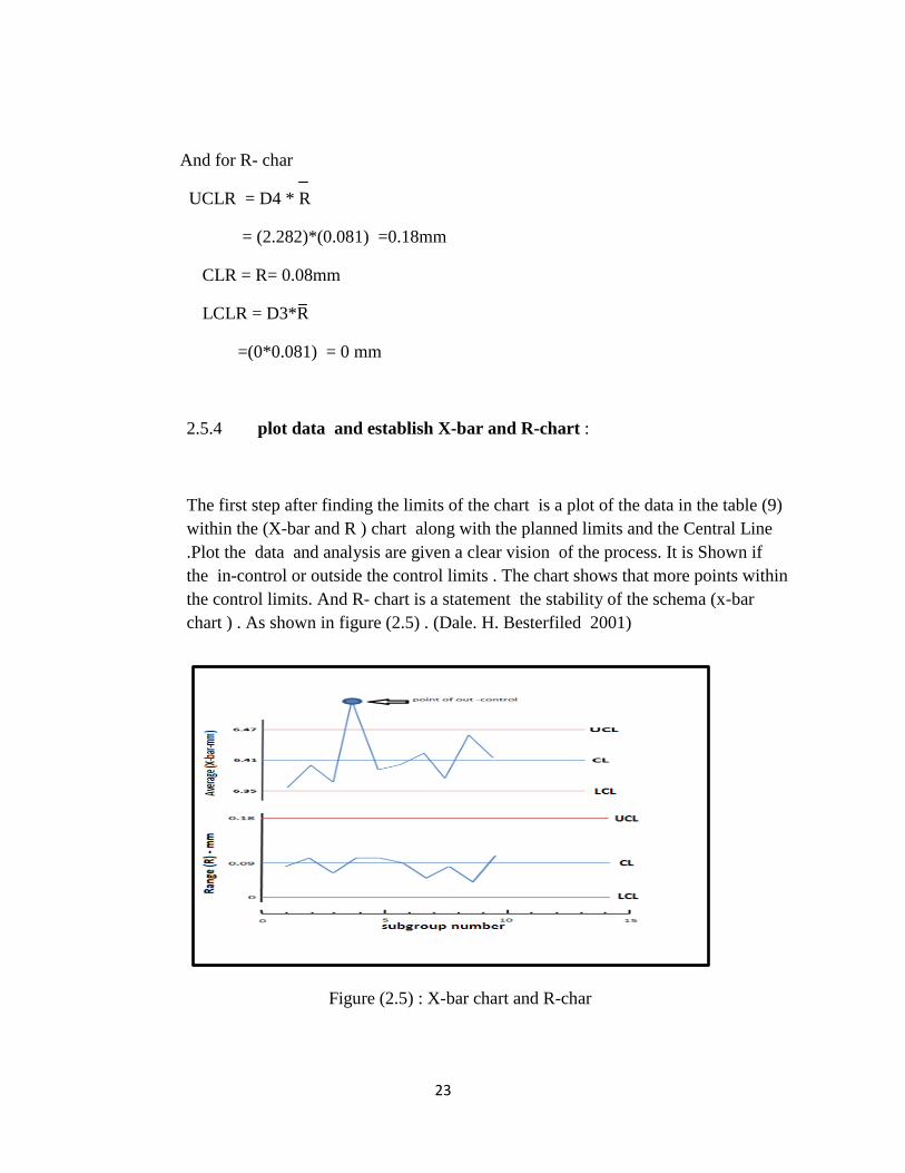
And for R- char
UCLR = D4 * R
= (2.282)*(0.081) =0.18mm
CLR = R= 0.08mm
LCLR = D3*R
=(0*0.081) = 0 mm
2.5.4 plot data and establish X-bar and R-chart :
The first step after finding the limits of the chart is a plot of the data in the table (9)
within the (X-bar and R ) chart along with the planned limits and the Central Line
.Plot the data and analysis are given a clear vision of the process. It is Shown if
the in-control or outside the control limits . The chart shows that more points within
the control limits. And R- chart is a statement the stability of the schema (x-bar
chart ) . As shown in figure (2.5) . (Dale. H. Besterfiled 2001)
Figure (2.5) : X-bar chart and R-char

24
2.6 When can apply the X- bar chart :
i. The chart can be applied to subsets of a small sample . If the number of
samples (1>n<10). We use an R - chart with the X - bar chart when (n>5) .If
the number of samples (n<5) uses S- chart with an X - bar chart .
ii. When you do not know the value of the standard deviation of the process.
Or When we know or can estimate the value of the standard deviation .
(Quality Technology Company and PC FAB (A Magazine )& (Dale. H.
Besterfiled 2002)
2.7 EWAM control chart :
The Exponentially Weighted Moving Average EWMA control chart is one of the
control charts used to detect shifts in the process. First introduced by Roberts
(1959), Of the characteristics of this scheme is quick detection of small and
medium-sized shifts in the process therefore is regarded as the best alternative for
shear control chart. Is more sensitive in the detection of small-to medium-Wave
constant changes in the process. It has three horizontal lines, central line or mean
( CL ), upper control limit (UCL) and lower control limit (LCL) as shown in figure
(11). The two Control limits are not static. Especially at the beginning of the
process . This gives more sensitivity to Detect small fluctuations in the process .
Making the scheme more effective than planning in small operations.
(Montgomery, 1991). The EWMA chart for monitoring the process can use with
rational subgroups. The Shewhart control chart Uses two statistical tests on the
process only the immediate data While the EWMA chart uses the previous data
after multiplication by a. Weighting factor (λ).

85
REFERENCES
1- Book. Introduction of Statistical Process Control. Gerald m. Smith ,
2001
2- E book. Introduction to Statistical Quality control. Douglas C.
Montgomery. John Wiley & Sonc. Six Edition 2005
3- Book. Introduction of Statistical Process control. MIKEL J. Harry &
Prem S . MANN 2010
4- Montgomery .Quality Technology Company and PC FAB .2007
5- Montgomery. American Society for Quality Technometrics. November
2002 .44,NO 4DO1
6- Montgomery . The basis of Statistical Process Control & Process
Behavior Charting .By David Howard 2003
7- Book. Introduction of Statistical Process Control. AchesonJ.Duncan .
1986
8- Montgomery. Mechanical and Industrial Engineering 2012
9- Book. Introduction of Statistical Process control .Peter W.M.johan1990
10- Book. Introduction of Statistical Process control. James R. Evans 1991
11- Book. Introduction of Statistical Process control. Jim Waite . Om 380 .
10/14/2004
12- Montgomery. Integrating Statistical Process Control and Engineering
Process control. Douglas C. Montgomery and J.Bert Keast .2004
13- Book. Introduction of Statistical Process Control. Dale H. Besterfield
2001
14- .Book .Introduction of Statistical Process Control.AchesonJ.Duncan
1986
15- Montgomery. National Institute of Technology, by Rourkela 2011
16- E book .Design of Experiments Guide, Second Edition. Cary, NC: SAS
Institute Inc.2009
17- E book. Introduction to MATLAB for Engineering Students. David .
Houcque .version 1.2 (2005)
18- Montgomery. A control Chart Pattern Recognition System using a
Statistical Correlation Coefficient Method. Jenn-Hwai Yang, Miin-
Shen Yang. Computers & Industrial Engineering (2005)
19- Montgomery. S. j. Chapman. MATLAB Program for Engineering.
Tomson 2004.
20- Book. Pattern Recognition with Fuzzy Objective Function Algorithms.
James. Bezdek 1981.
21- Montgomery. Introduction to statistical quality control. Douglas C.
Montgomery. John Wiley & Sonc. 2009.

86
22- Montgomery. ARL for Shewhart X-bar Control Chart. 2006
23- Montgomery . Design of Experiments Guide, Second Edition. Cary, NC:
SAS Institute Inc.
24- Montgomery, D. C. (1997). Introduction to Statistical Quality Control,
3rd Ed., John Wiley & Sons. New York, NY.
25- Journal of Quality Technology, July 1991, vol. 23, No. 3, pp. 179-193
26- Daniel W. W. In: Biostatistics. 7th ed. New York: John Wiley and Sons,
Inc; 2002. Hypothesis testing; pp. 204–294.