Embed Size (px)
DESCRIPTION
final hand in
Citation preview

Nick Mitchell
Nick Mitchell GDyr 2
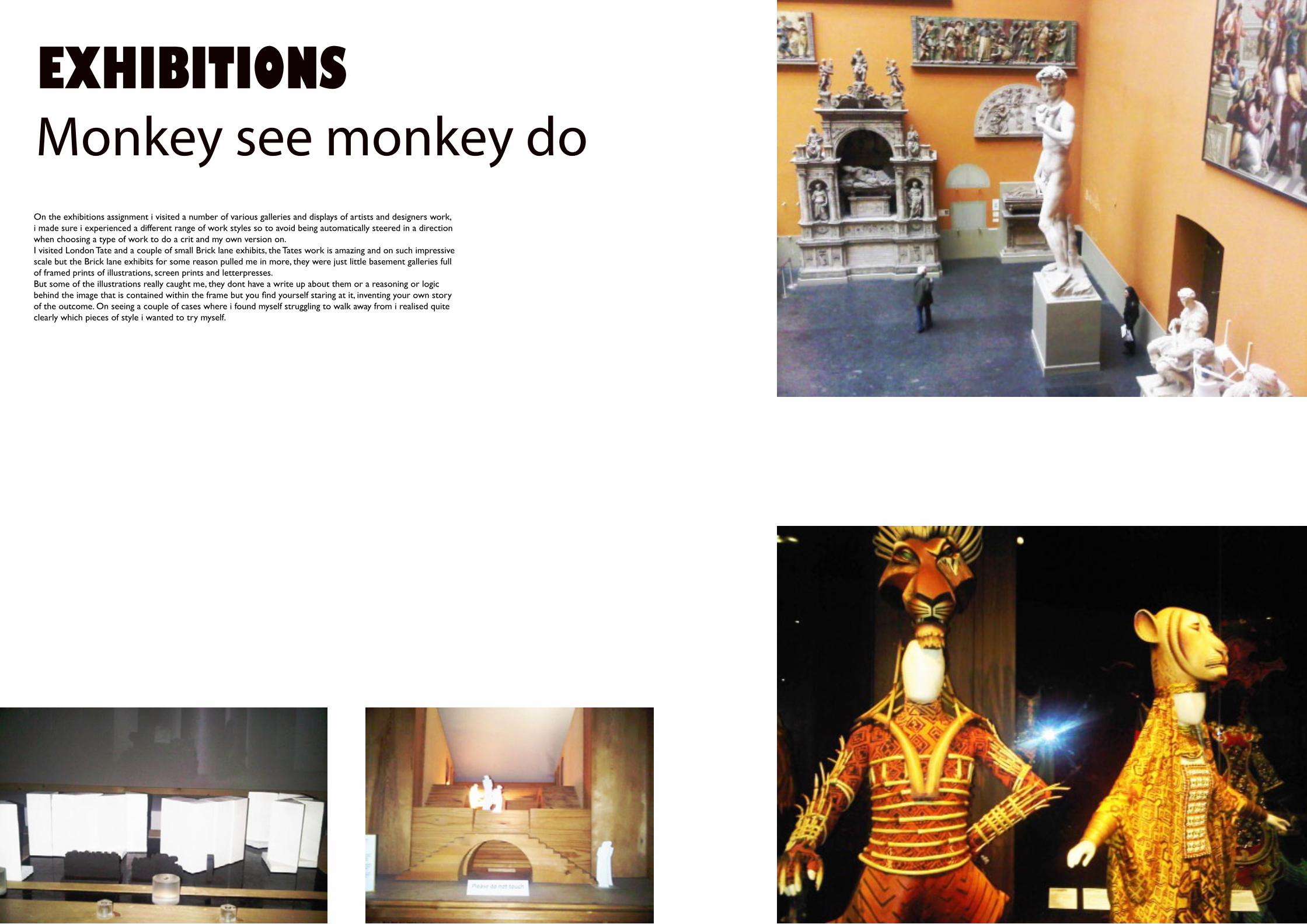
EXHIBITIONS Monkey see monkey do
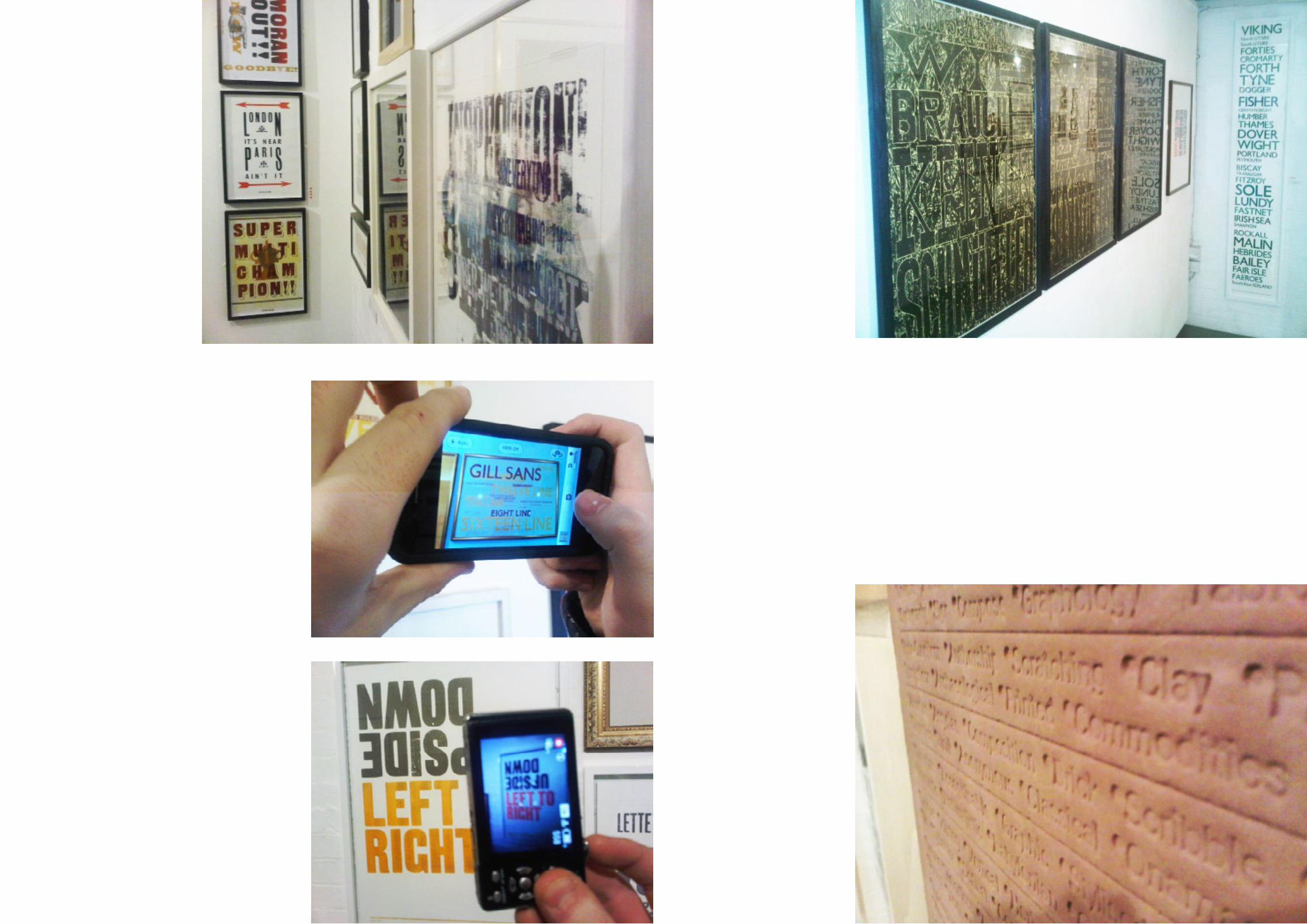
On the exhibitions assignment i visited a number of various galleries and displays of artists and designers work,i made sure i experienced a different range of work styles so to avoid being automatically steered in a directionwhen choosing a type of work to do a crit and my own version on. I visited London Tate and a couple of small Brick lane exhibits, the Tates work is amazing and on such impressive scale but the Brick lane exhibits for some reason pulled me in more, they were just little basement galleries full of framed prints of illustrations, screen prints and letterpresses. But some of the illustrations really caught me, they dont have a write up about them or a reasoning or logic behind the image that is contained within the frame but you find yourself staring at it, inventing your own story of the outcome. On seeing a couple of cases where i found myself struggling to walk away from i realised quite clearly which pieces of style i wanted to try myself.
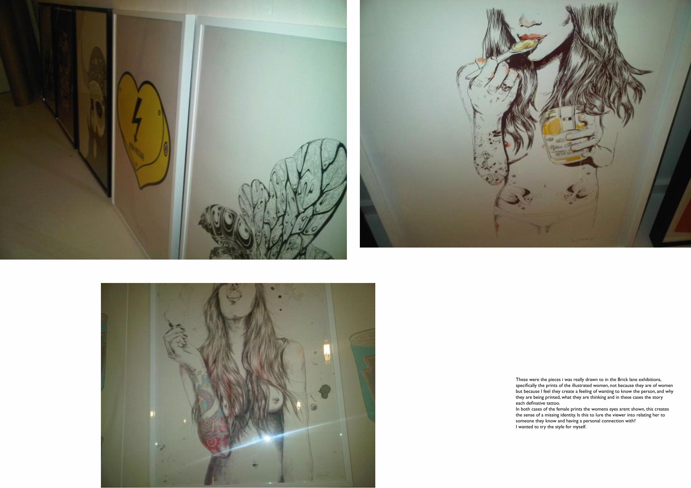
These were the pieces i was really drawn to in the Brick lane exhibitions, specifically the prints of the illustrated women, not because they are of women but because I feel they create a feeling of wanting to know the person, and why they are being printed, what they are thinking and in these cases the story each definative tattoo.In both cases of the female prints the womens eyes arent shown, this creates the sense of a missing identity. Is this to lure the viewer into relating her to someone they know and having a personal connection with?I wanted to try the style for myself.
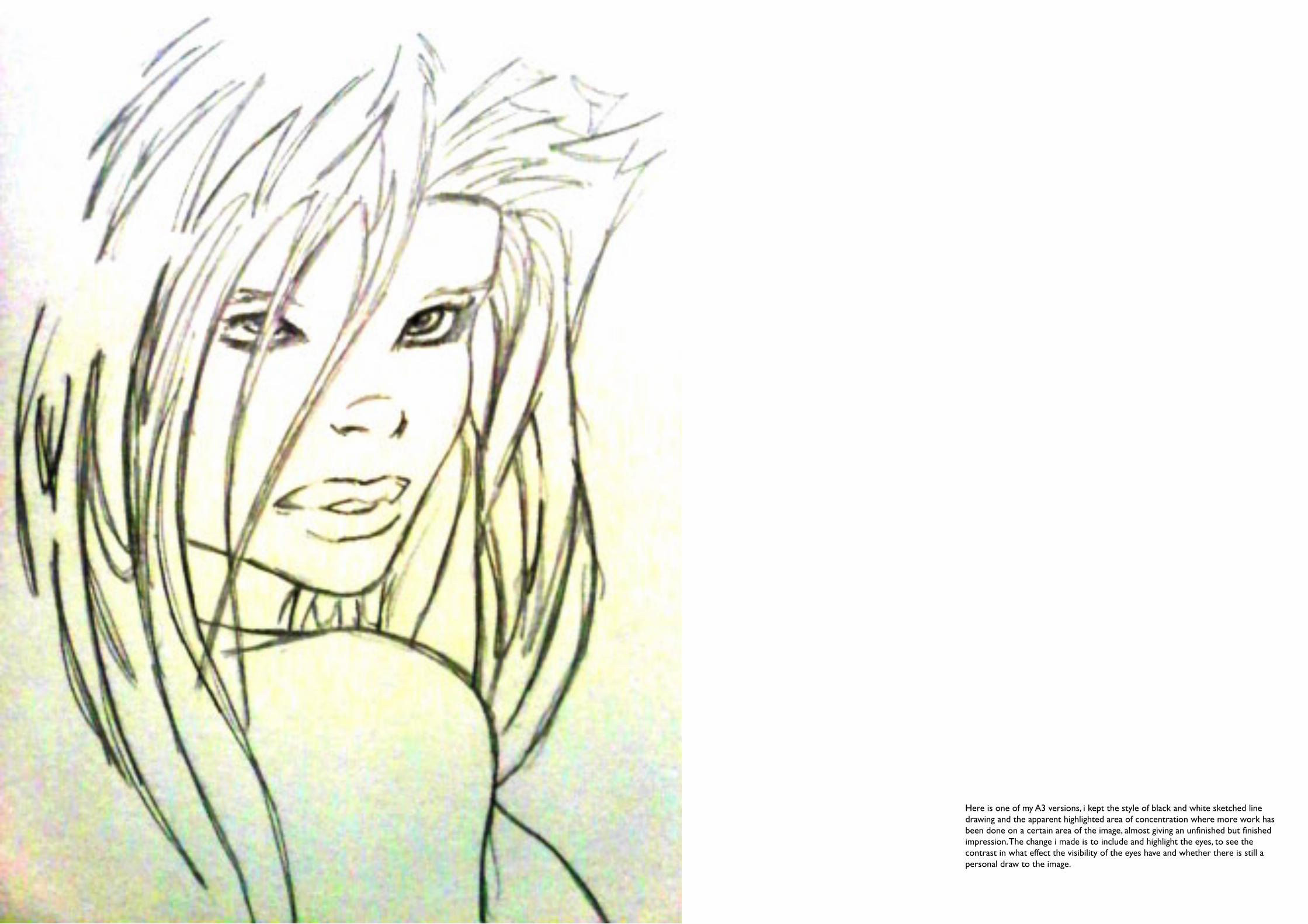
Here is one of my A3 versions, i kept the style of black and white sketched line drawing and the apparent highlighted area of concentration where more work has been done on a certain area of the image, almost giving an unfinished but finished impression. The change i made is to include and highlight the eyes, to see the contrast in what effect the visibility of the eyes have and whether there is still a personal draw to the image.
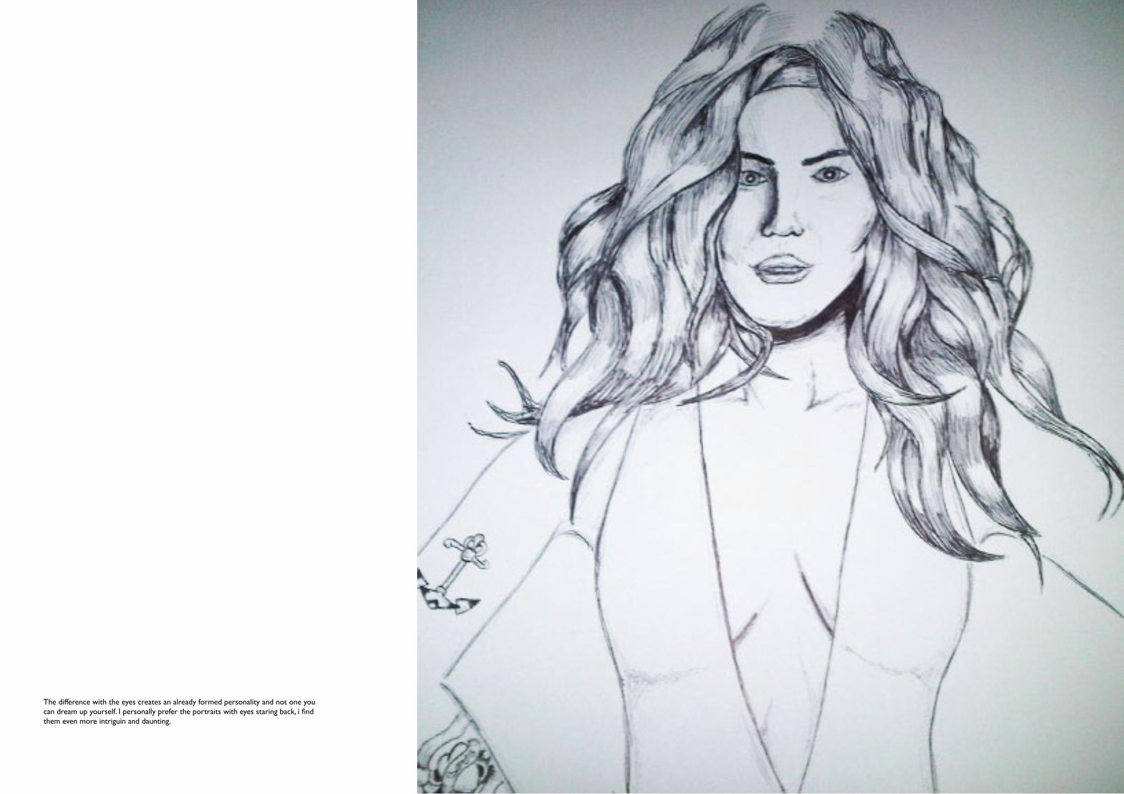
The difference with the eyes creates an already formed personality and not one youcan dream up yourself. I personally prefer the portraits with eyes staring back, i find them even more intriguin and daunting.
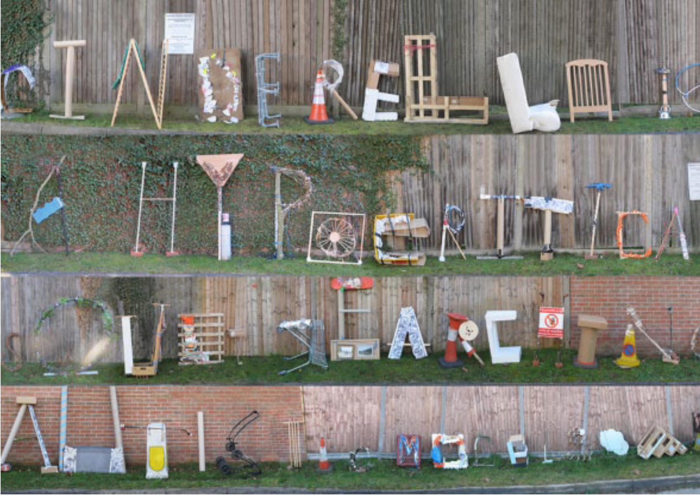
CINDERELLA THE HYPOCRITE
The day Martin O’neil turned up..This one day workshop where designer Martin O’neil asked us to create a phrase as a group,assigned us with one letter, me the ‘T’, and wanted us to use natural surrounding objects to create each letter to result in a large scaled phrase.The idea and method was slightly childish i felt but the final outcome did create an interesting image.
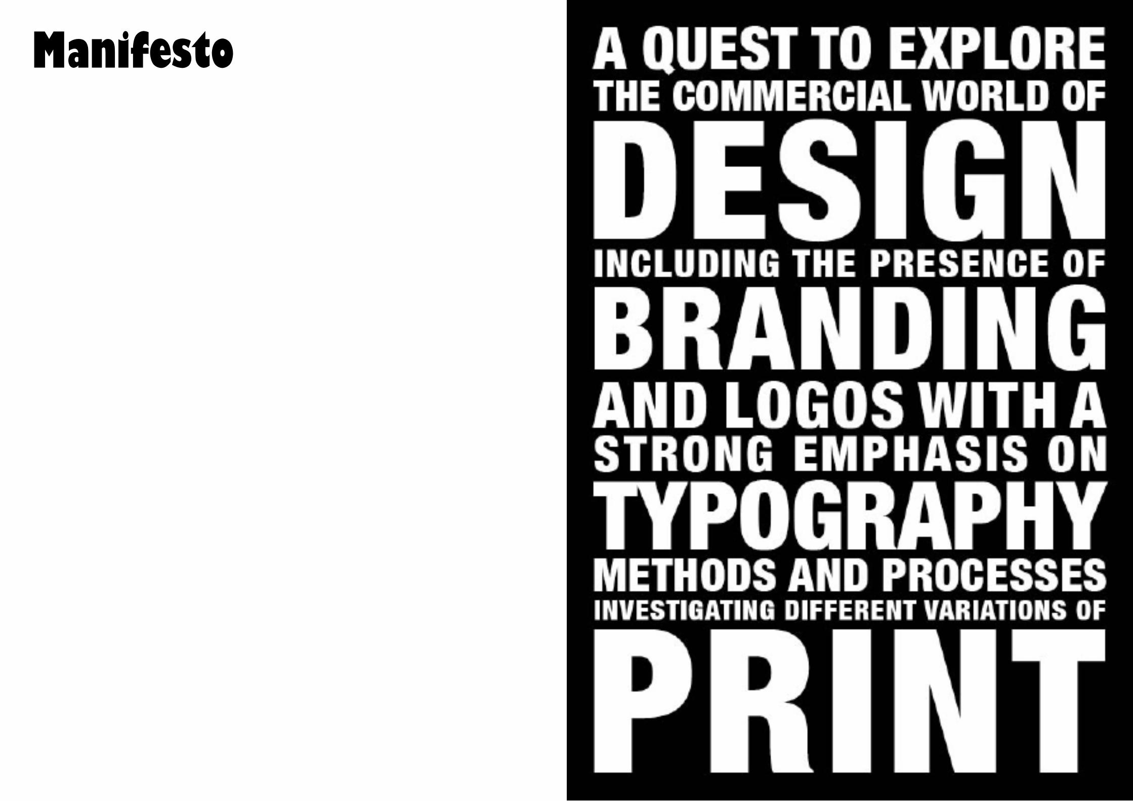
Manifesto
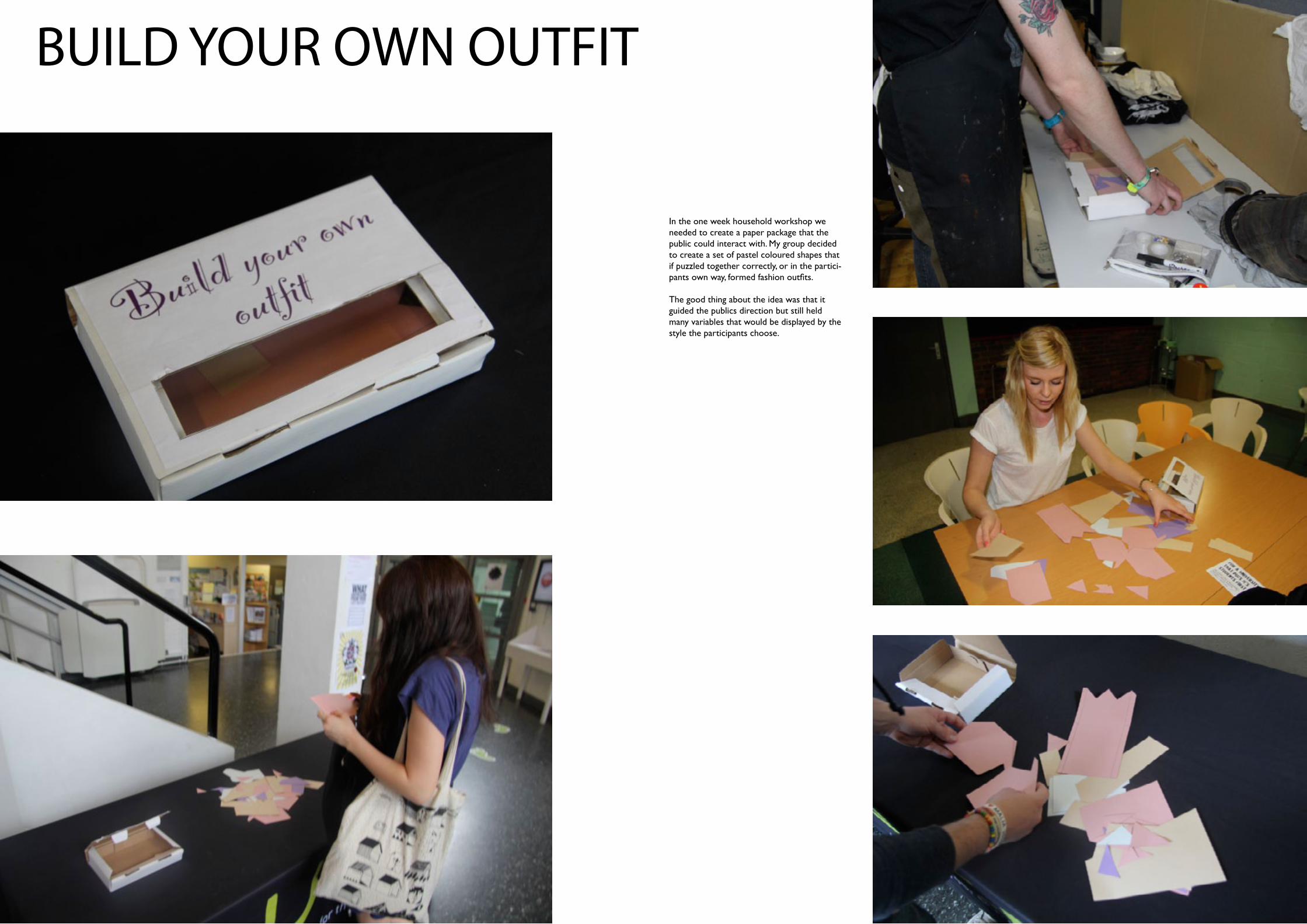
BUILD YOUR OWN OUTFIT
In the one week household workshop we needed to create a paper package that the public could interact with. My group decided to create a set of pastel coloured shapes that if puzzled together correctly, or in the partici-pants own way, formed fashion outfits.
The good thing about the idea was that it guided the publics direction but still held many variables that would be displayed by the style the participants choose.
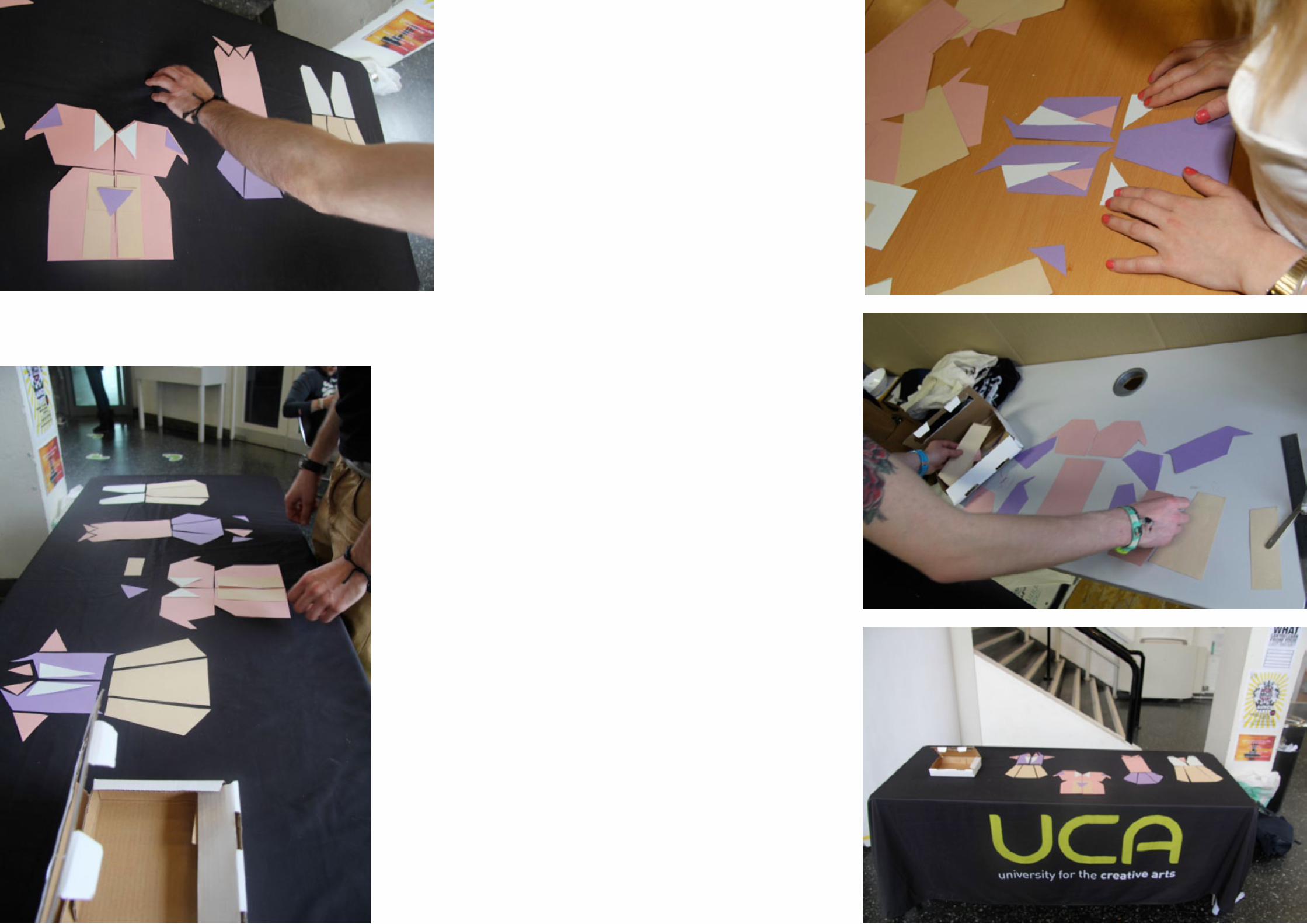
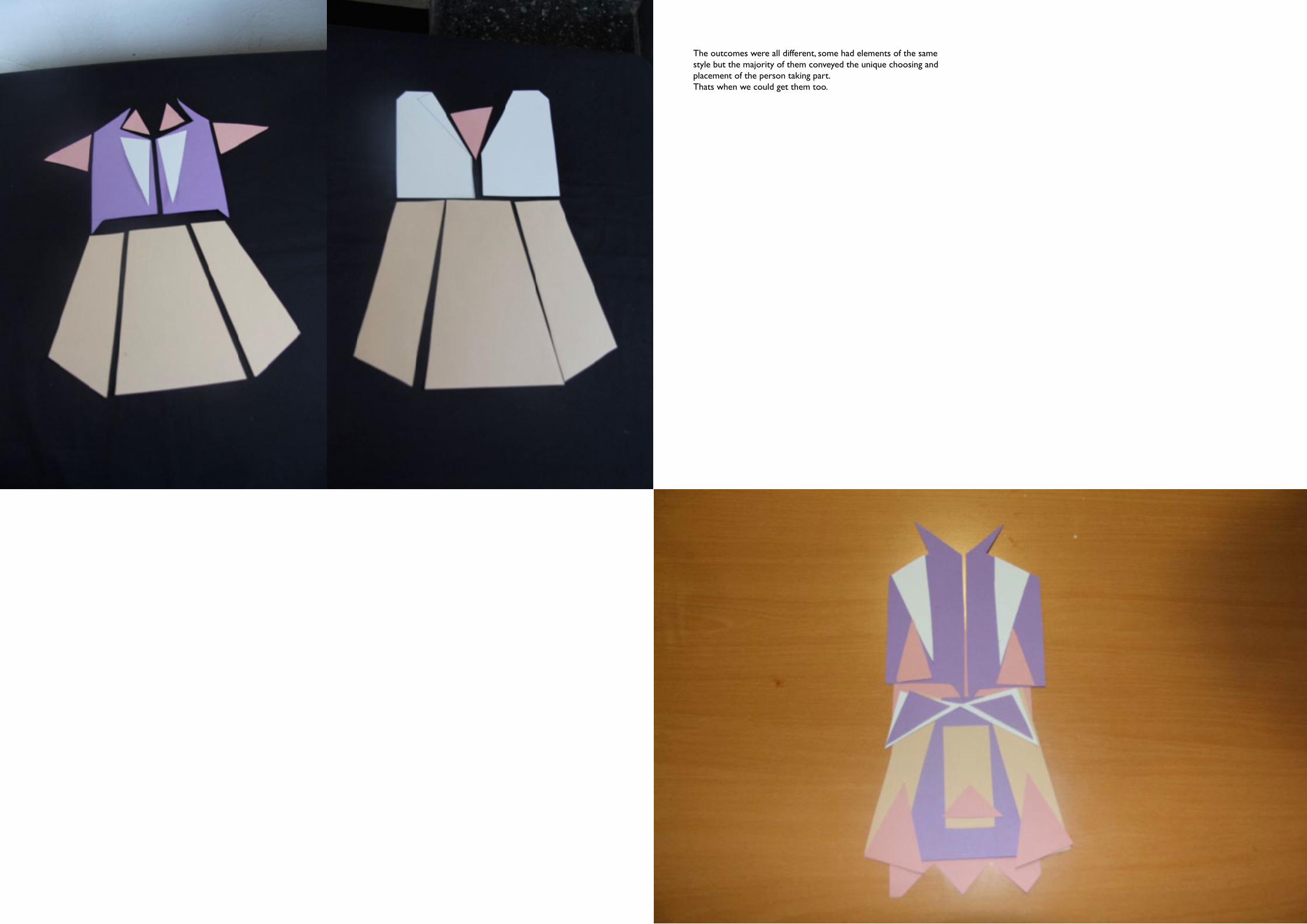
The outcomes were all different, some had elements of the same style but the majority of them conveyed the unique choosing and placement of the person taking part.Thats when we could get them too.
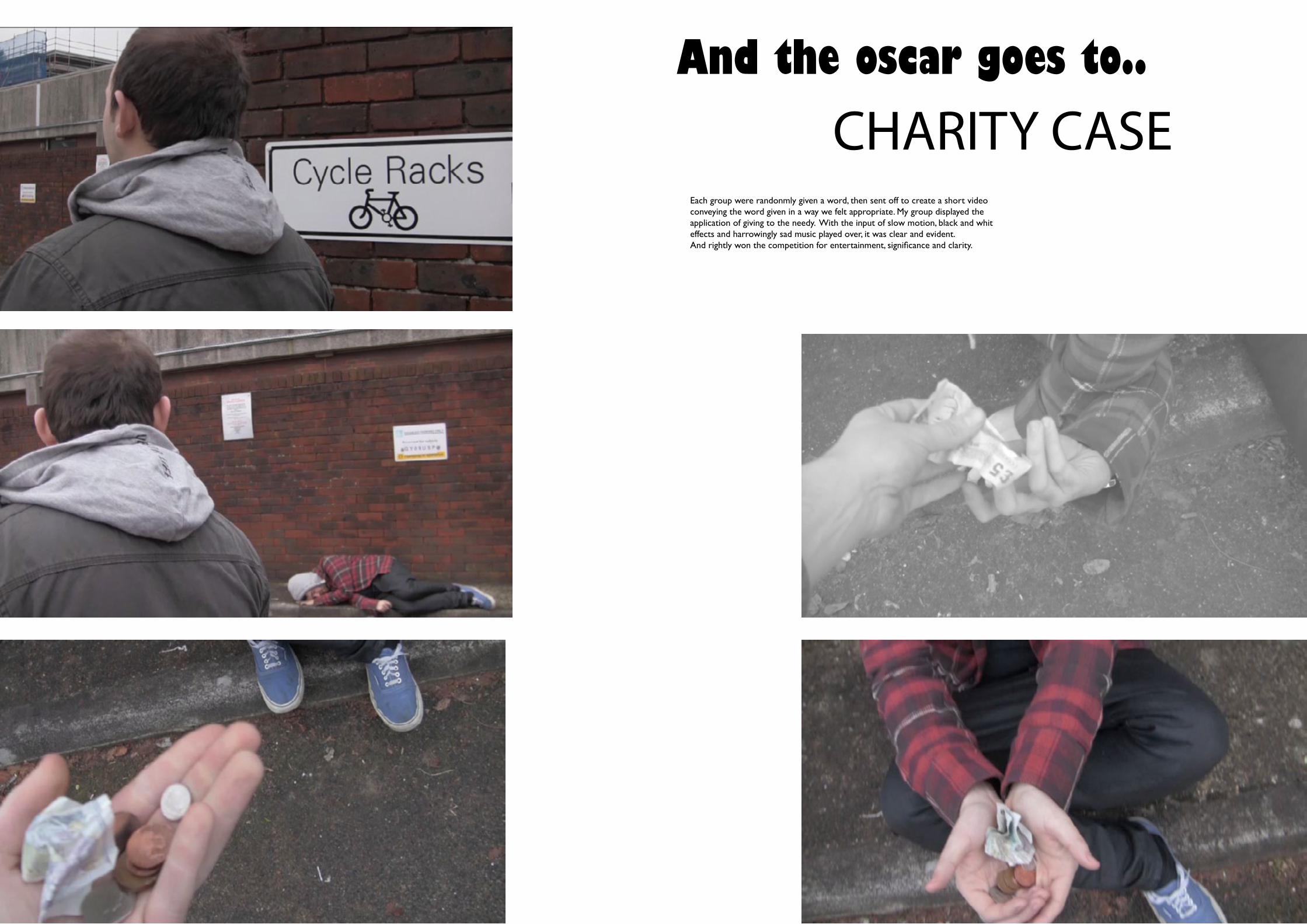
CHARITY CASE Each group were randonmly given a word, then sent off to create a short video conveying the word given in a way we felt appropriate. My group displayed the application of giving to the needy. With the input of slow motion, black and whit effects and harrowingly sad music played over, it was clear and evident.And rightly won the competition for entertainment, significance and clarity.
And the oscar goes to..
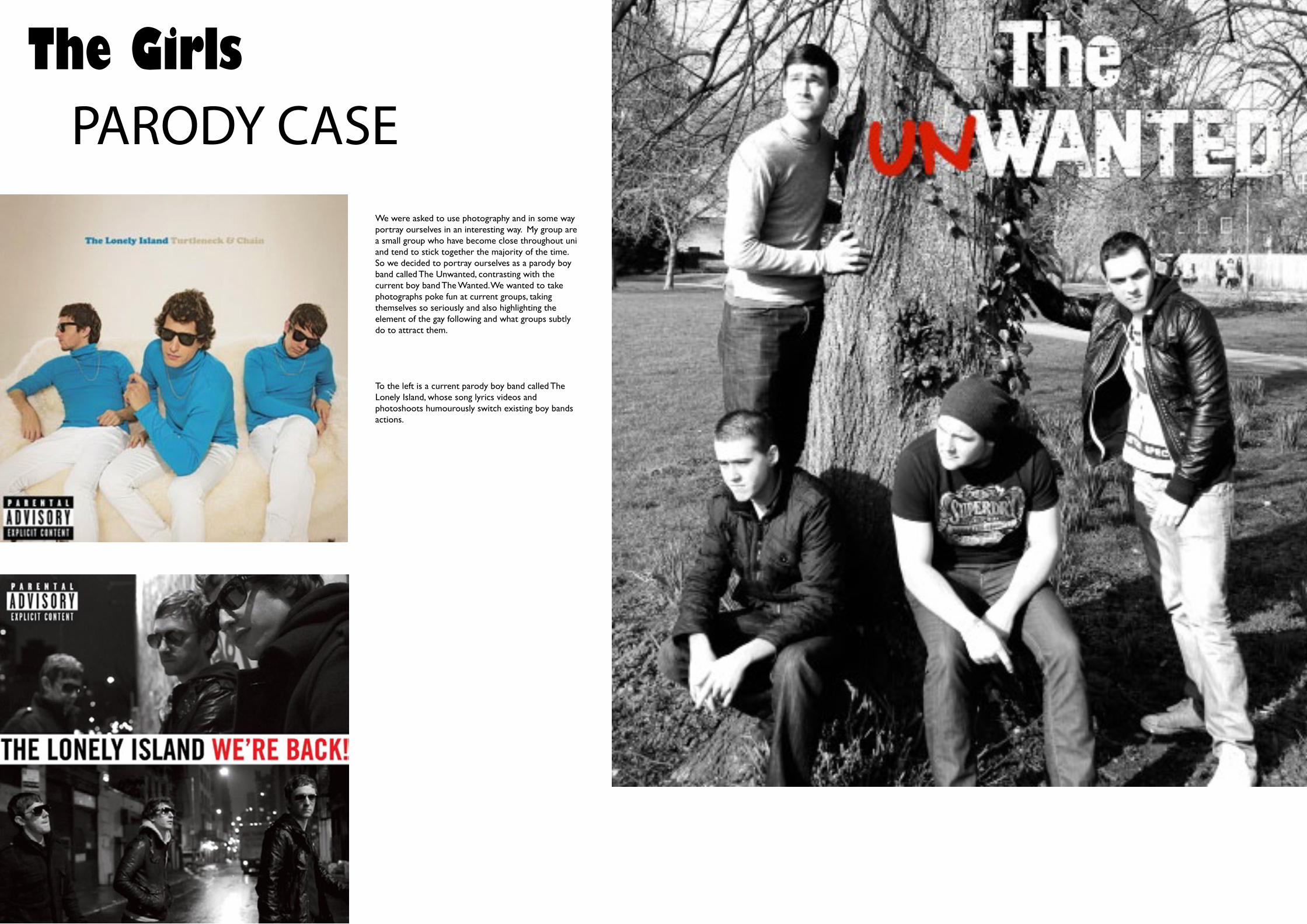
The Girls PARODY CASE
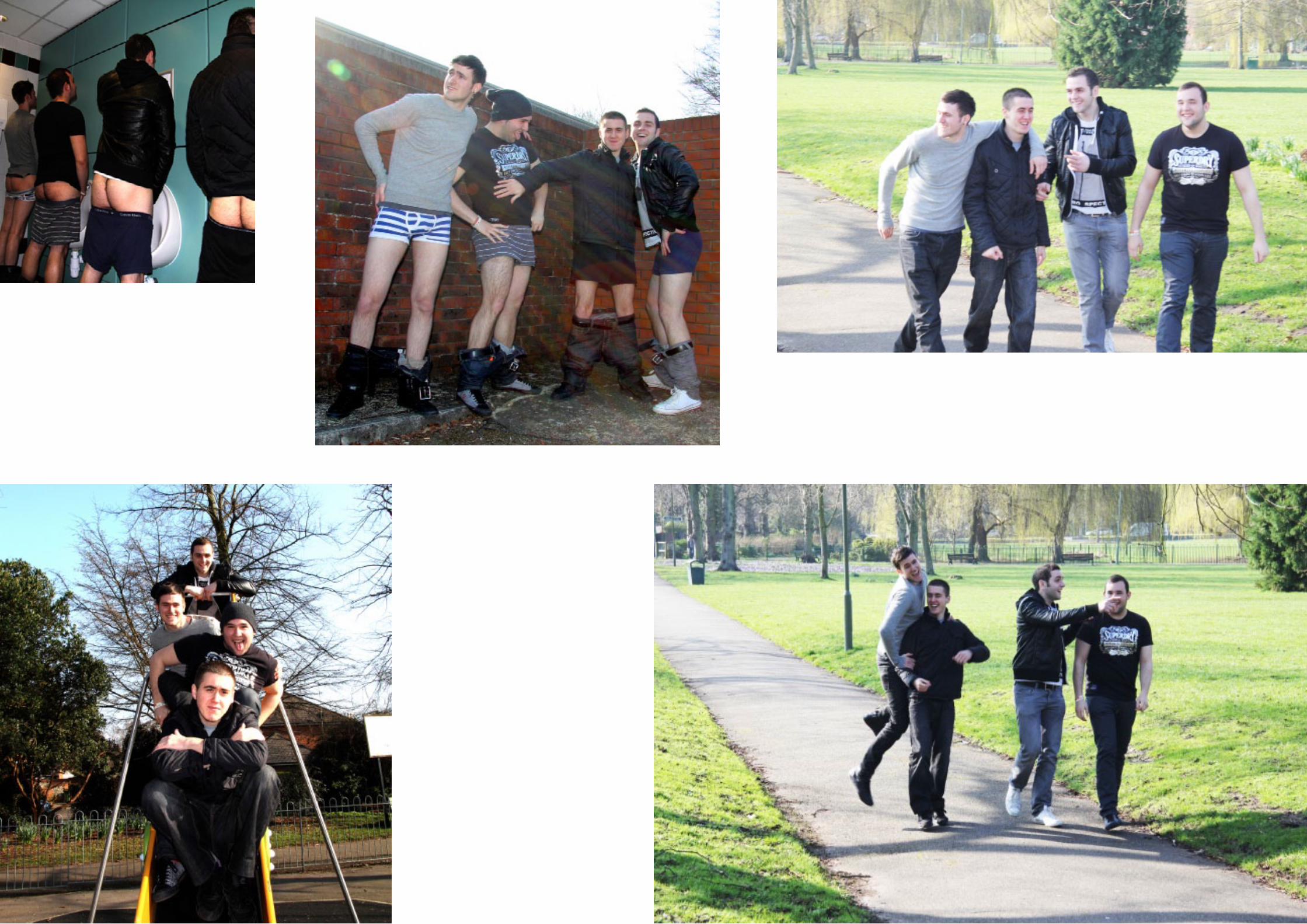
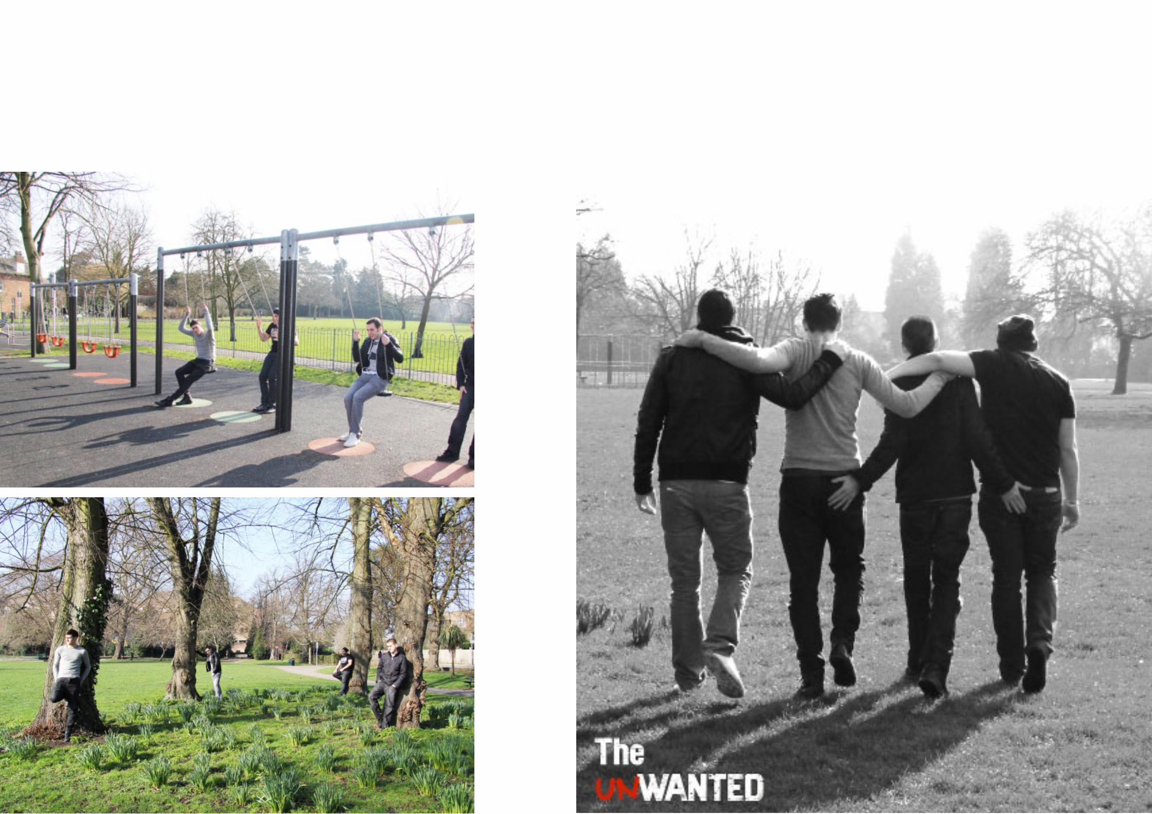
We were asked to use photography and in some way portray ourselves in an interesting way. My group are a small group who have become close throughout uni and tend to stick together the majority of the time. So we decided to portray ourselves as a parody boy band called The Unwanted, contrasting with the current boy band The Wanted. We wanted to take photographs poke fun at current groups, taking themselves so seriously and also highlighting the element of the gay following and what groups subtly do to attract them.
To the left is a current parody boy band called The Lonely Island, whose song lyrics videos and photoshoots humourously switch existing boy bands actions.
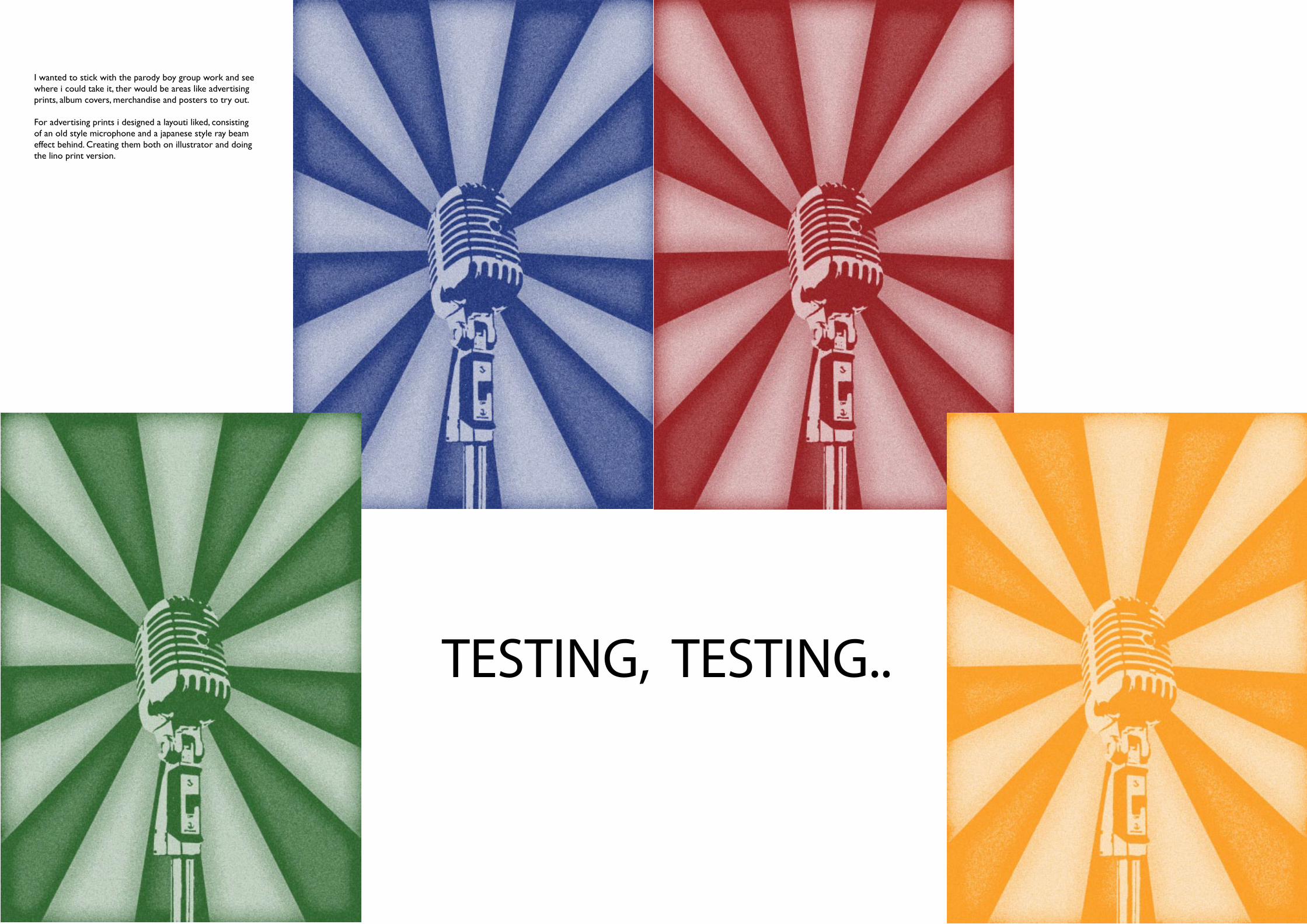
I wanted to stick with the parody boy group work and see where i could take it, ther would be areas like advertising prints, album covers, merchandise and posters to try out.
For advertising prints i designed a layouti liked, consisting of an old style microphone and a japanese style ray beam effect behind. Creating them both on illustrator and doing the lino print version.
TESTING, TESTING..
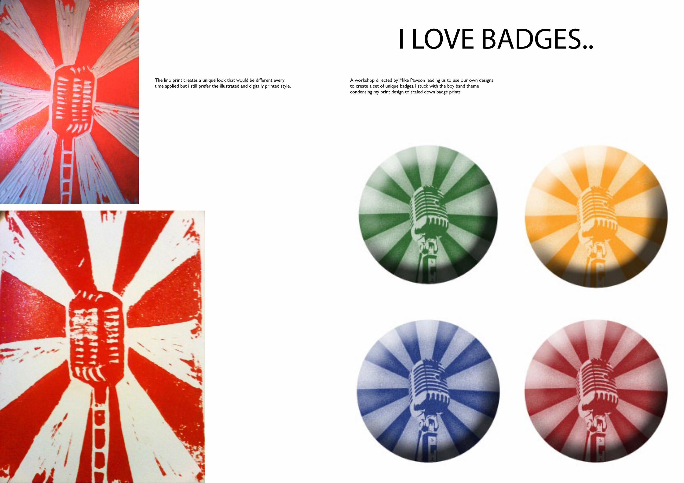
I LOVE BADGES.. A workshop directed by Mike Pawson leading us to use our own designs to create a set of unique badges. I stuck with the boy band theme condensing my print design to scaled down badge prints.
The lino print creates a unique look that would be different every time applied but i still prefer the illustrated and digitally printed style.
Making Do
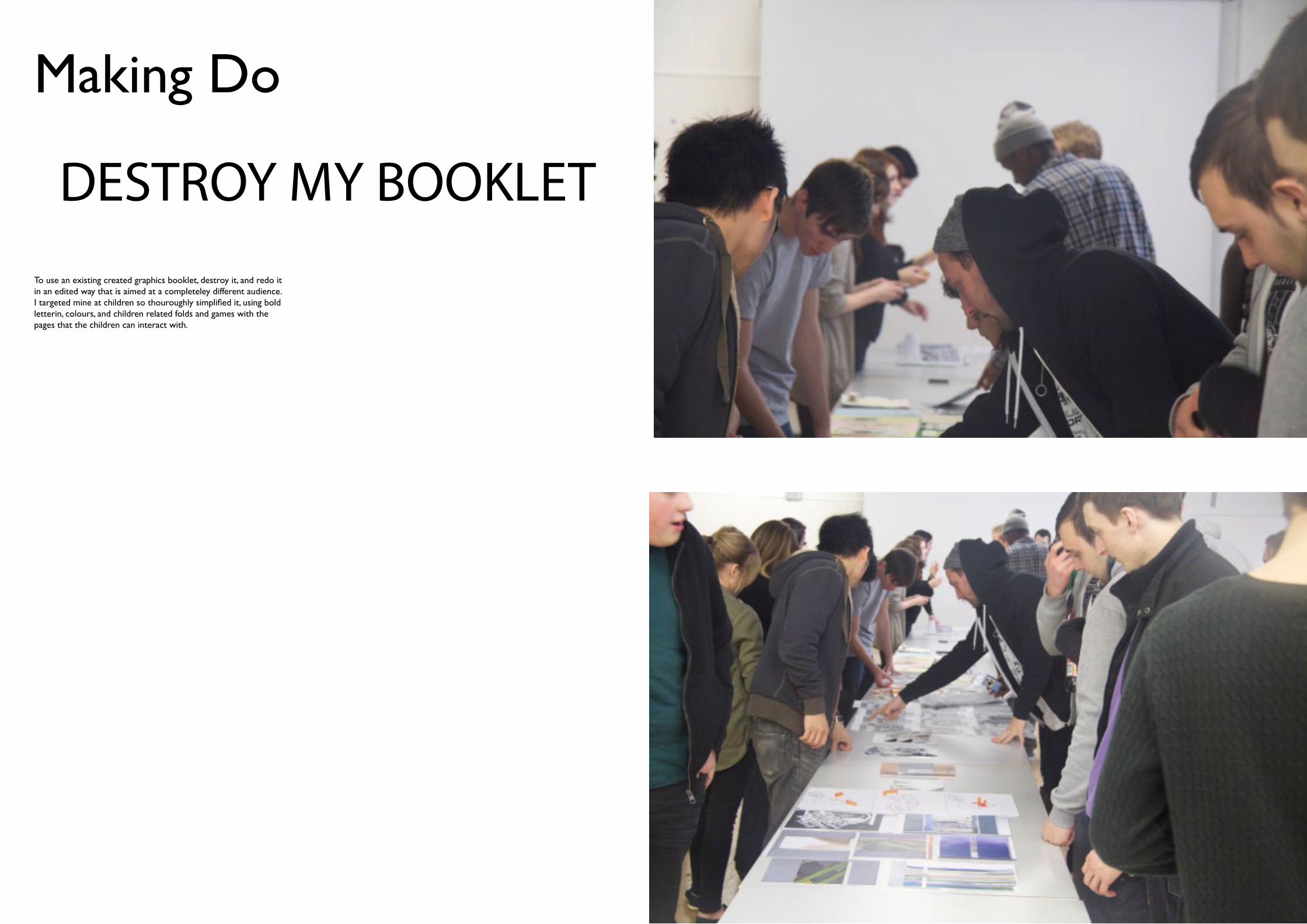
DESTROY MY BOOKLET To use an existing created graphics booklet, destroy it, and redo it in an edited way that is aimed at a completeley different audience.I targeted mine at children so thouroughly simplified it, using bold letterin, colours, and children related folds and games with the pages that the children can interact with.
Aphorism
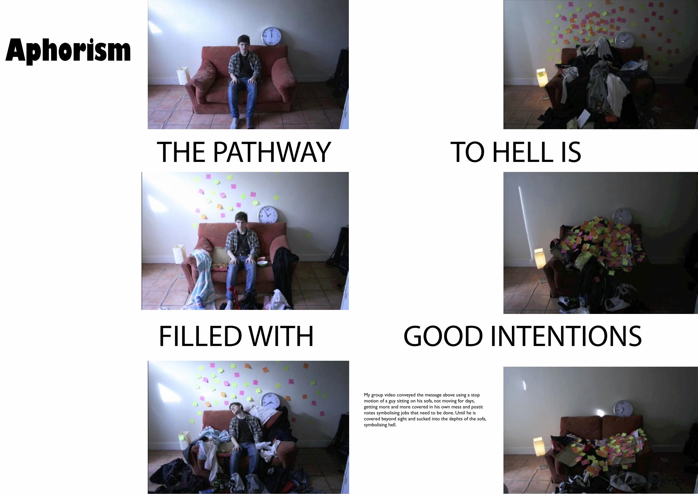
THE PATHWAY TO HELL IS
FILLED WITH GOOD INTENTIONS
My group video conveyed the message above using a stop motion of a guy sitting on his sofa, not moving for days, getting more and more covered in his own mess and postit notes symbolising jobs that need to be done. Until he is covered beyond sight and sucked into the dephts of the sofa, symbolising hell.
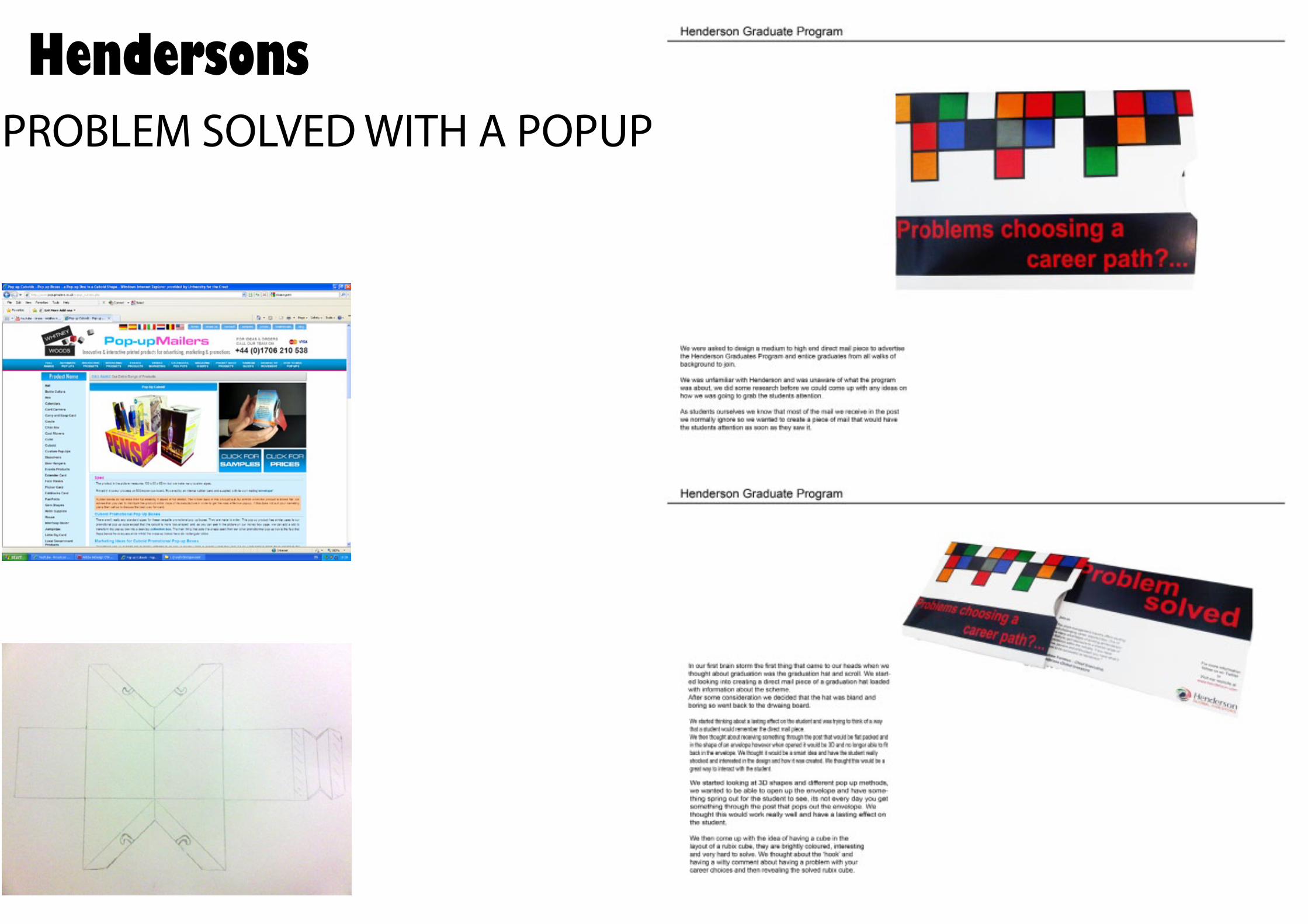
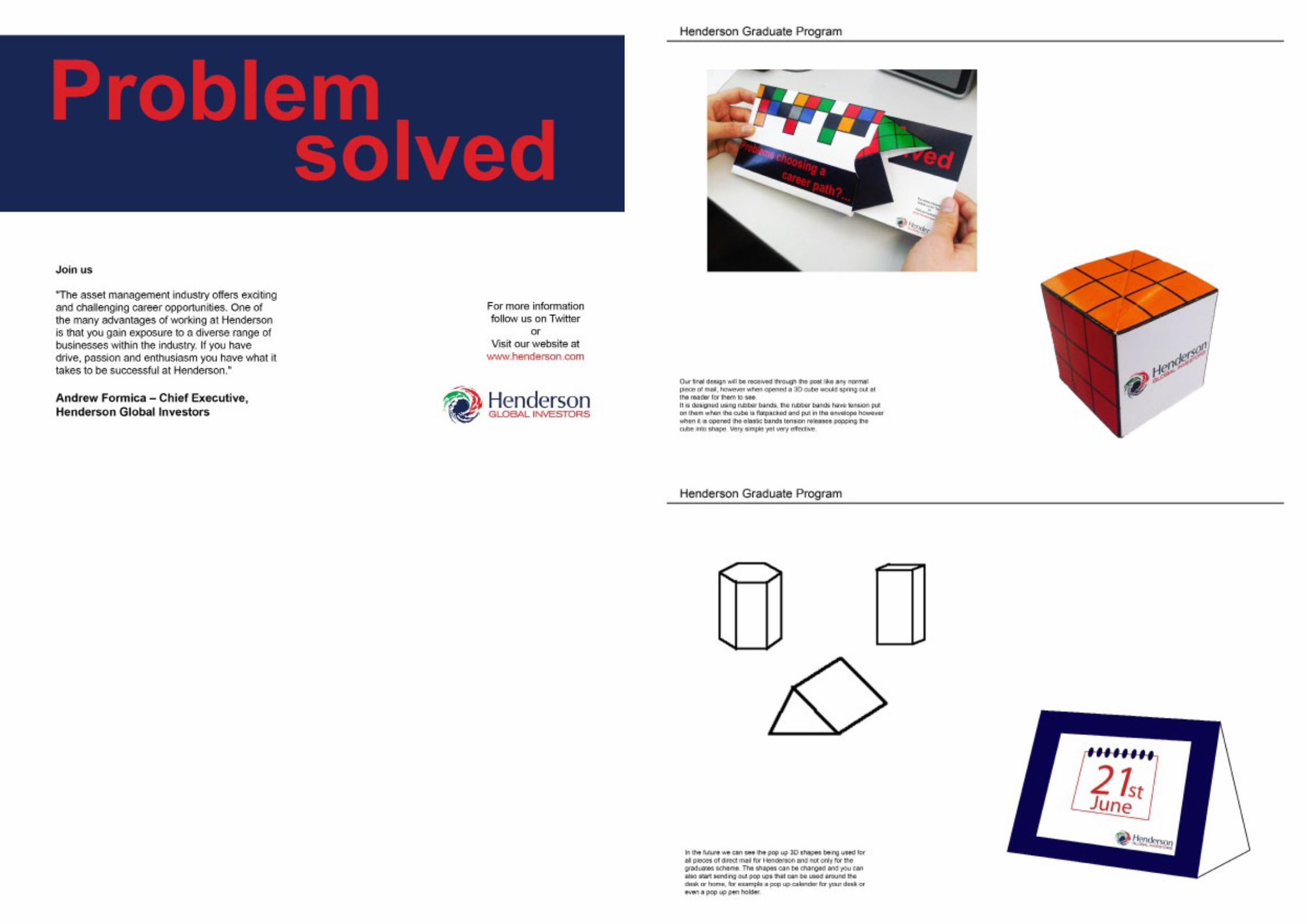
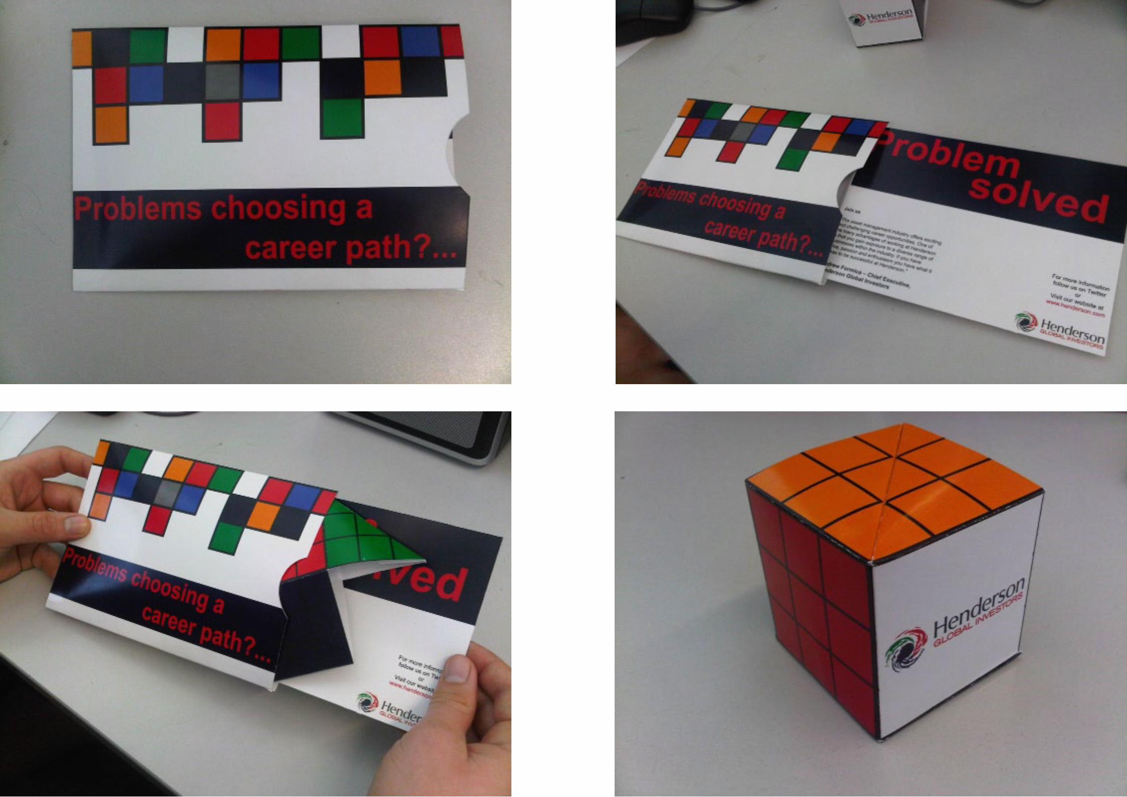
HendersonsPROBLEM SOLVED WITH A POPUP
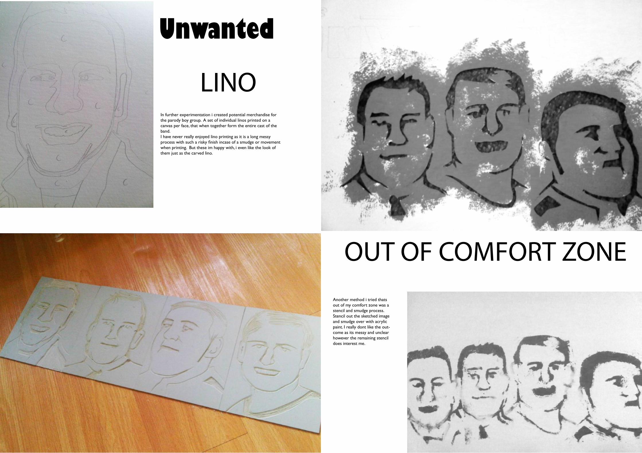
Unwanted
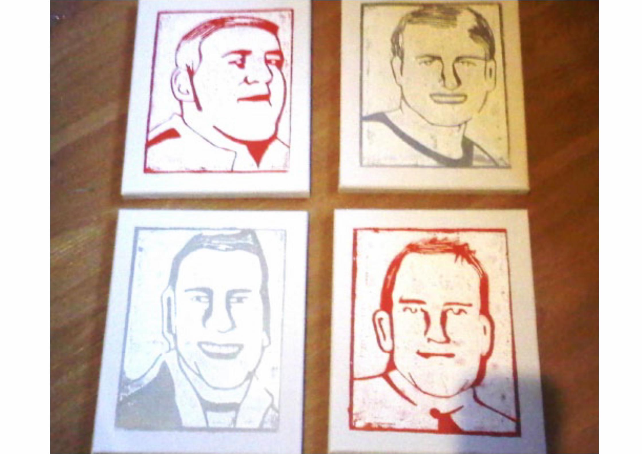
LINO In further experimentation i created potential merchandise for the parody boy group. A set of individual linos printed on a canvas per face, that when together form the entire cast of the band.I have never really enjoyed lino printing as it is a long messy process with such a risky finish incase of a smudge or movement when printing. But these im happy with, i even like the look of them just as the carved lino.
OUT OF COMFORT ZONE Another method i tried thats out of my comfort zone was a stencil and smudge process.Stencil out the sketched image and smudge over with acrylic paint. I really dont like the out-come as its messy and unclear however the remaining stencil does interest me.
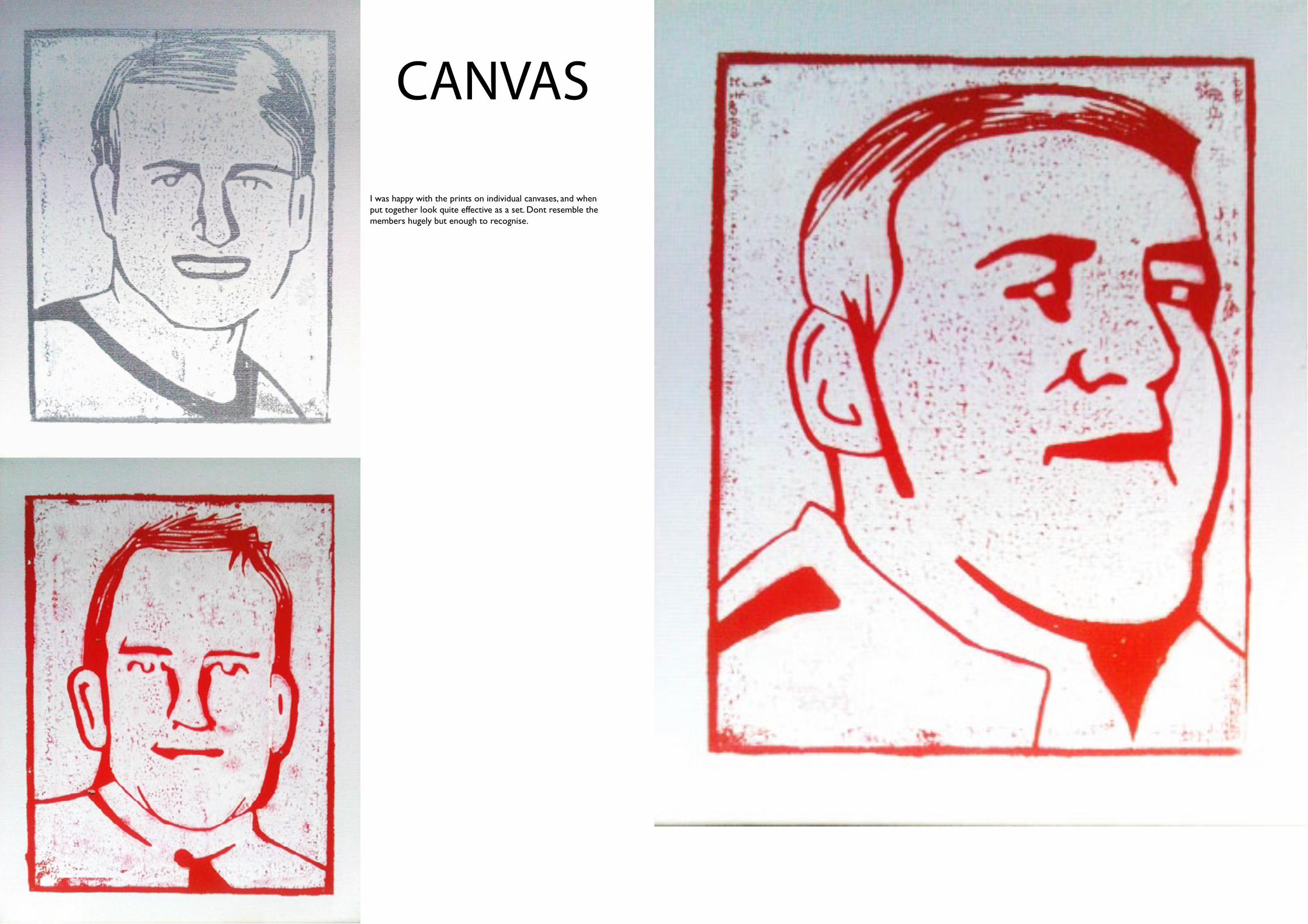
CANVAS
I was happy with the prints on individual canvases, and when put together look quite effective as a set. Dont resemble the members hugely but enough to recognise.
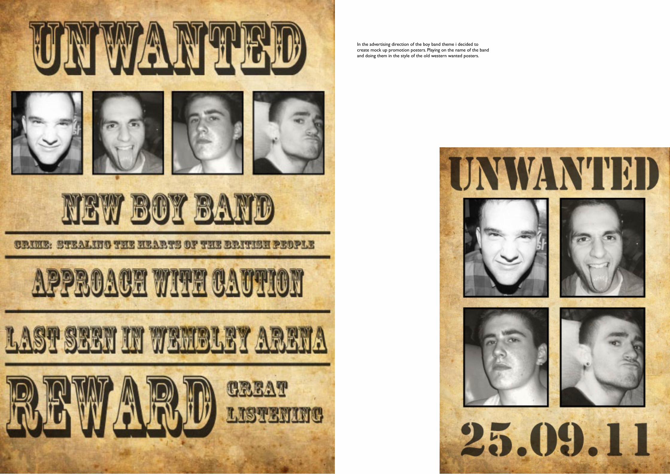
In the advertising direction of the boy band theme i decided to create mock up promotion posters. Playing on the name of the band and doing them in the style of the old western wanted posters.
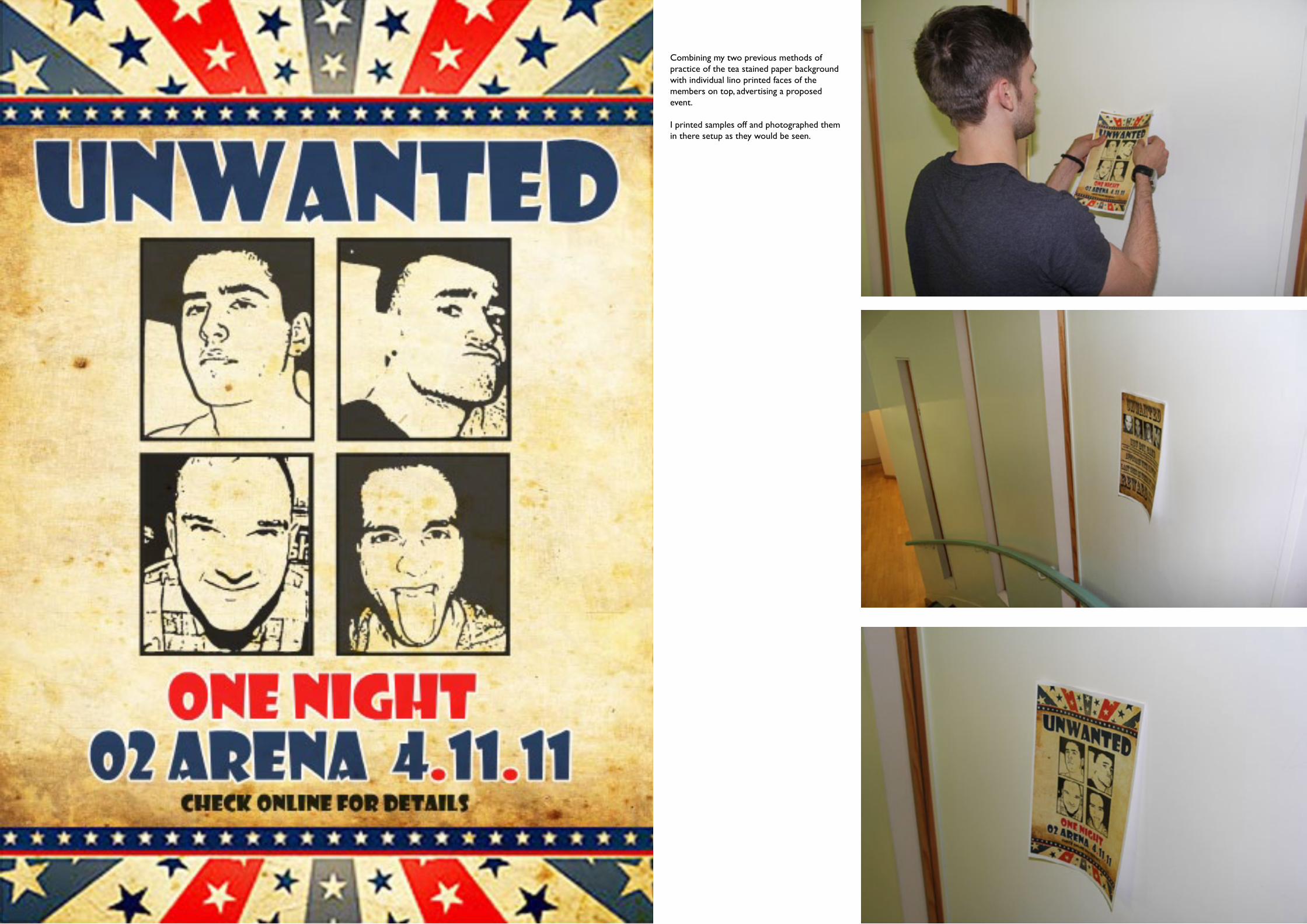
Combining my two previous methods of practice of the tea stained paper background with individual lino printed faces of the members on top, advertising a proposed event.
I printed samples off and photographed them in there setup as they would be seen.
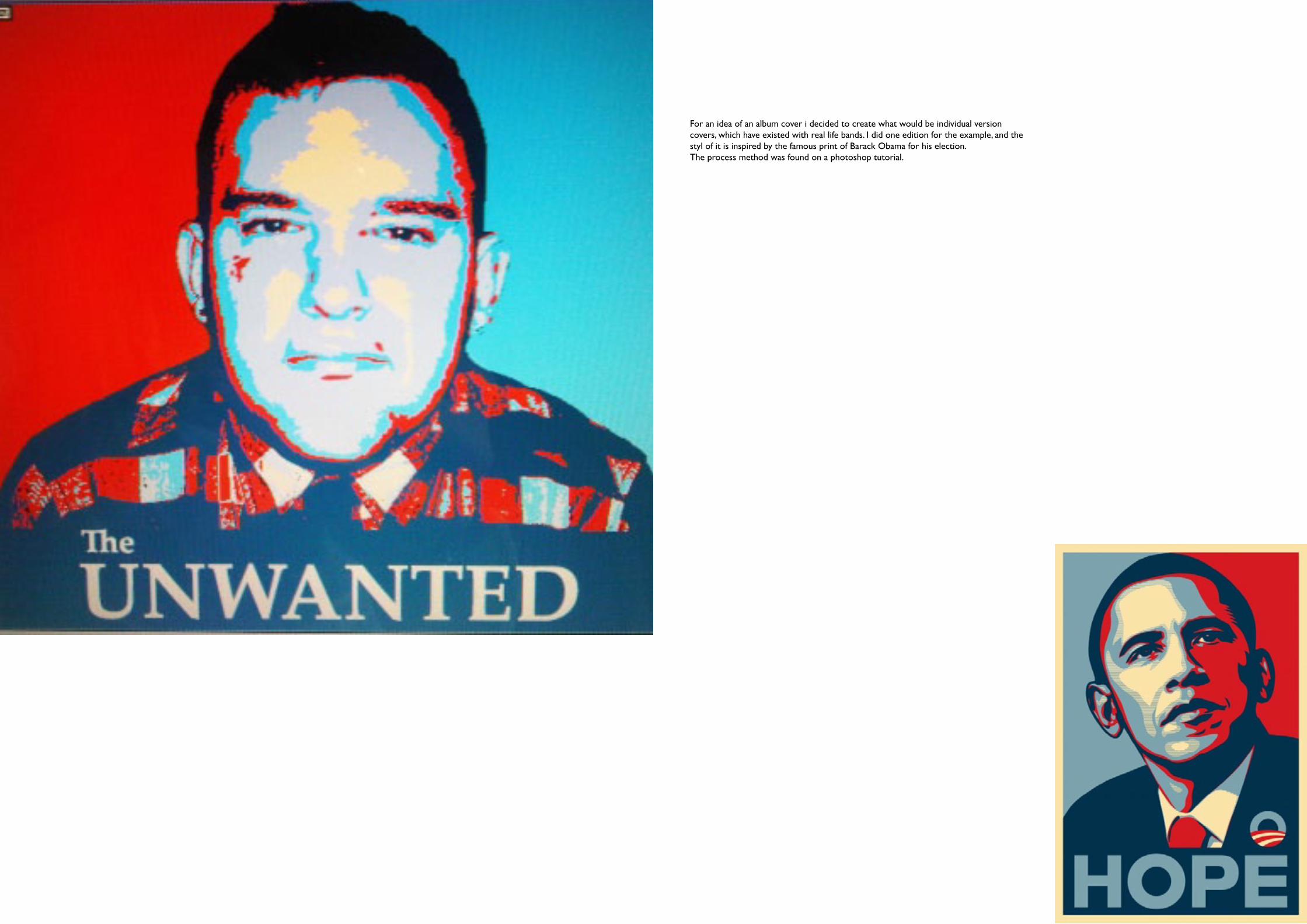
For an idea of an album cover i decided to create what would be individual version covers, which have existed with real life bands. I did one edition for the example, and the styl of it is inspired by the famous print of Barack Obama for his election. The process method was found on a photoshop tutorial.
ALBUM COVERS
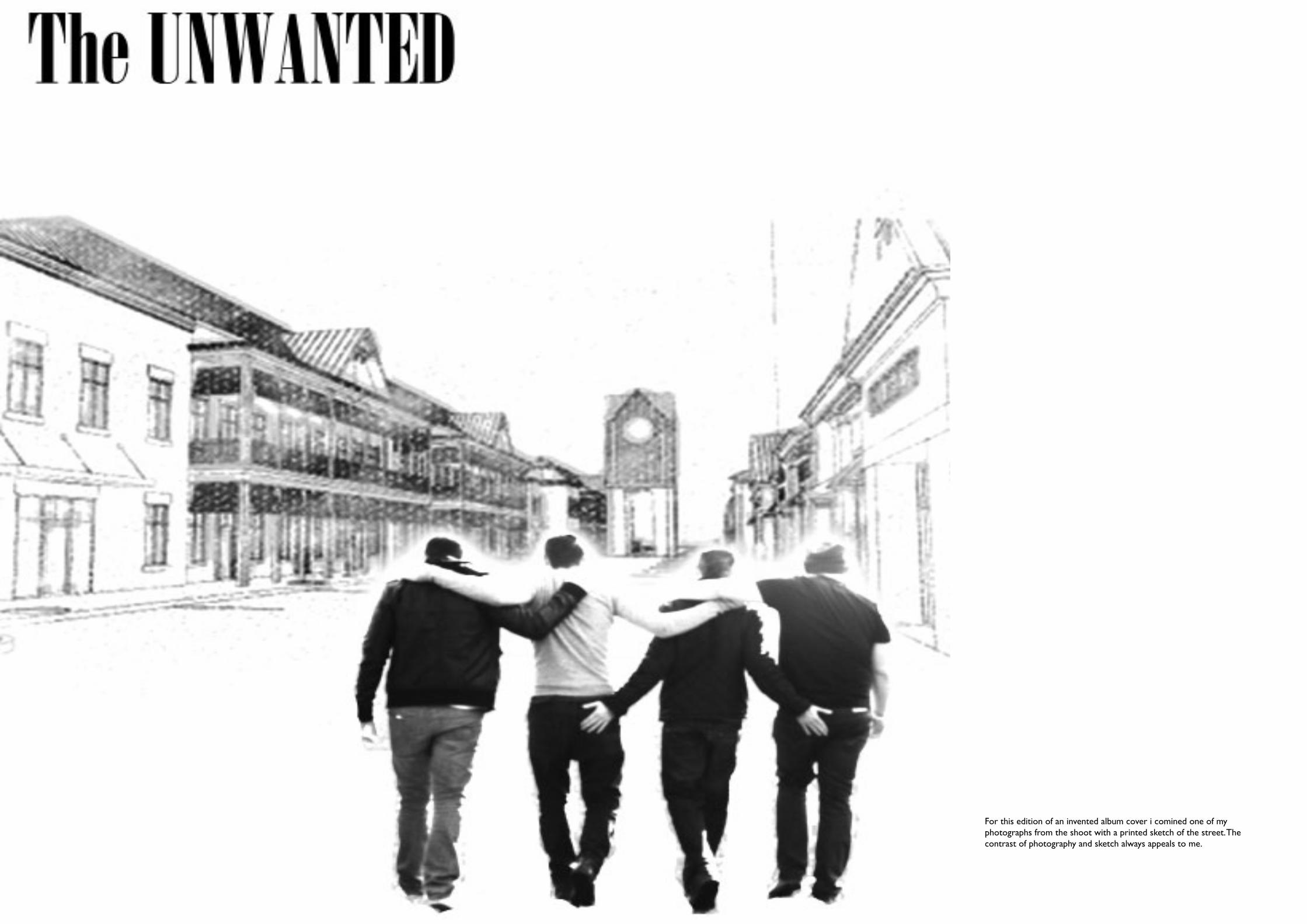
For this edition of an invented album cover i comined one of my photographs from the shoot with a printed sketch of the street. The contrast of photography and sketch always appeals to me.
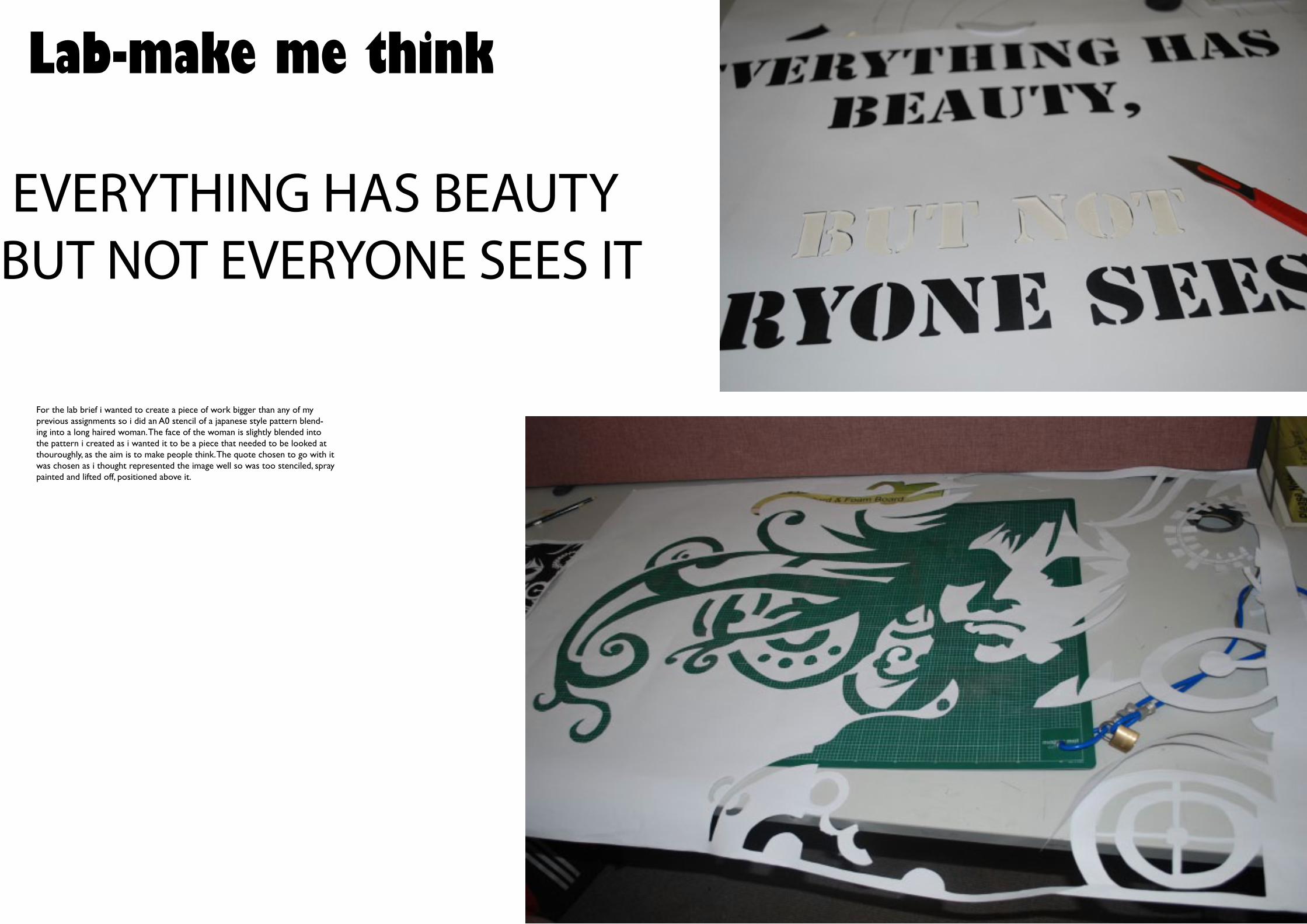
Lab-make me think
EVERYTHING HAS BEAUTY BUT NOT EVERYONE SEES IT
For the lab brief i wanted to create a piece of work bigger than any of my previous assignments so i did an A0 stencil of a japanese style pattern blend-ing into a long haired woman. The face of the woman is slightly blended into the pattern i created as i wanted it to be a piece that needed to be looked at thouroughly, as the aim is to make people think. The quote chosen to go with it was chosen as i thought represented the image well so was too stenciled, spray painted and lifted off, positioned above it.
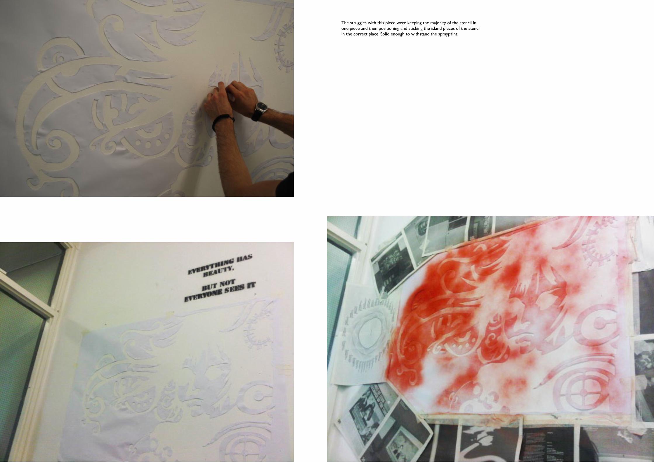
The struggles with this piece were keeping the majority of the stencil in one piece and then positioning and sticking the island pieces of the stencil in the correct place. Solid enough to withstand the spraypaint.
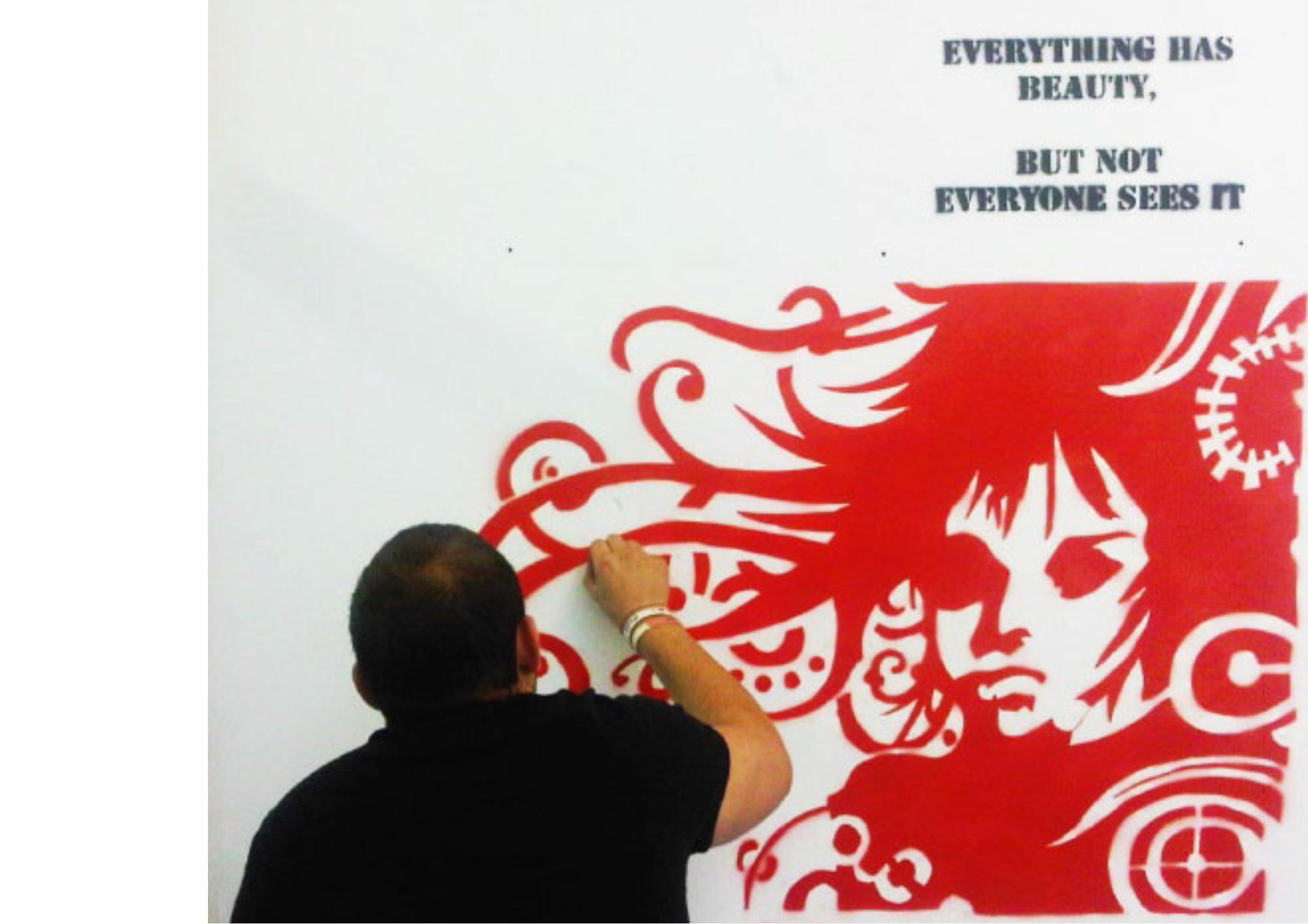
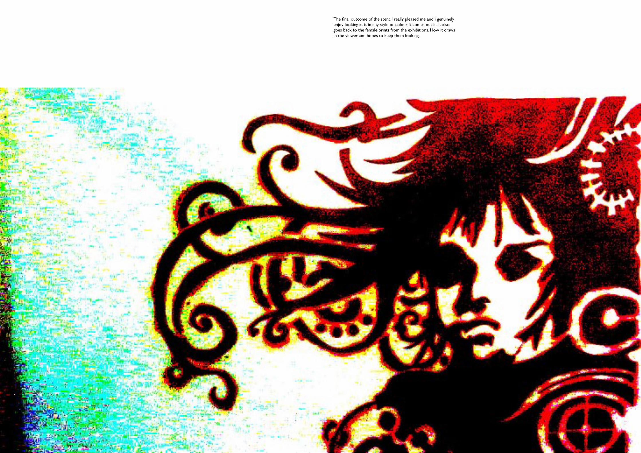
The final outcome of the stencil really pleased me and i genuinely enjoy looking at it in any style or colour it comes out in. It also goes back to the female prints from the exhibitions. How it draws in the viewer and hopes to keep them looking.
EVALUATION
Throughout semester 2 i tried hard to come out of my comfort zone for my independent work. A lot of the briefs were group work so it was difficult to go off and experiment with them. But when taking work further and playing with it i wanted to use methods of which i generally steer clear of, i found the end creation of some of them very pleasing so will remember for the future. I struggled with some of the assignments as they really arnt my type of interest or even what i feel represents graphic design, such as creating a large alphabet letter using litter that i can find. But i still went ahead with it. Thats why with independent of semester 2 i concentrated a lot on the assignment i felt could be included with the area of advertising and branding.