Embed Size (px)
Citation preview
Statistical Quality Control
Quality Control Charts using Excel II
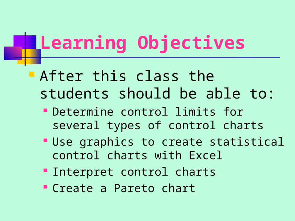
Learning Objectives
After this class the students should be able to: Determine control limits for several
types of control charts Use graphics to create statistical control
charts with Excel Interpret control charts Create a Pareto chart

Time management
The expected time to deliver this module is 50 minutes. 30 minutes are reserved for team practices and exercises and 20 minutes for lecture.
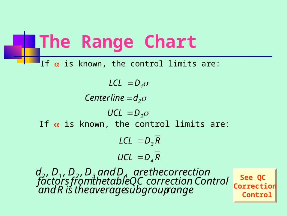
The Range ChartIf is known, the control limits are:
If is known, the control limits are:
2
2
1
DUCL
dline Center
DLCL
RDUCL
RDLCL
4
3
range subgroupaverage the is R and Control correction QC table the from factors
correction the are D andD ,D,D,d 4 3212 See QC Correction
Control
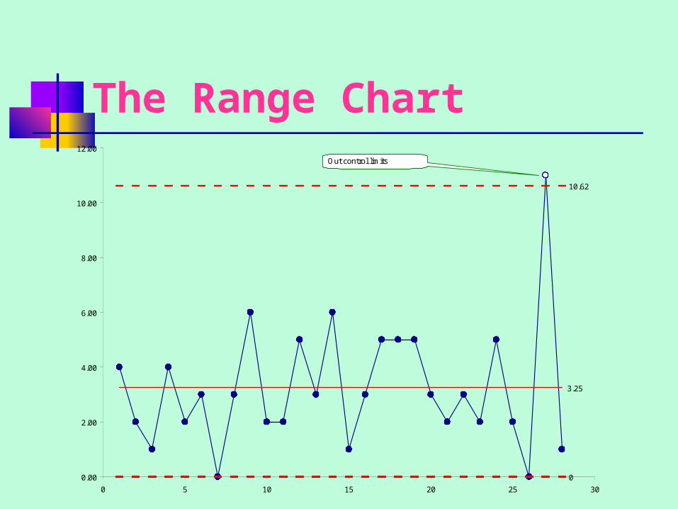
The Range Chart
0
3.25
10.62
0.00
2.00
4.00
6.00
8.00
10.00
12.00
0 5 10 15 20 25 30
Out control limits
Analysis Each point on the range chart represents the
range within each subgroup.
The average subgroup range is 3.25, with the control limits going from 0 to 10.62. According to the range chart shown, only the 27th observation has an out-of-control value.
The special cause should be identified if possible. However, in discussing the problem with the operator, sometimes you might not be able to determine a special cause.
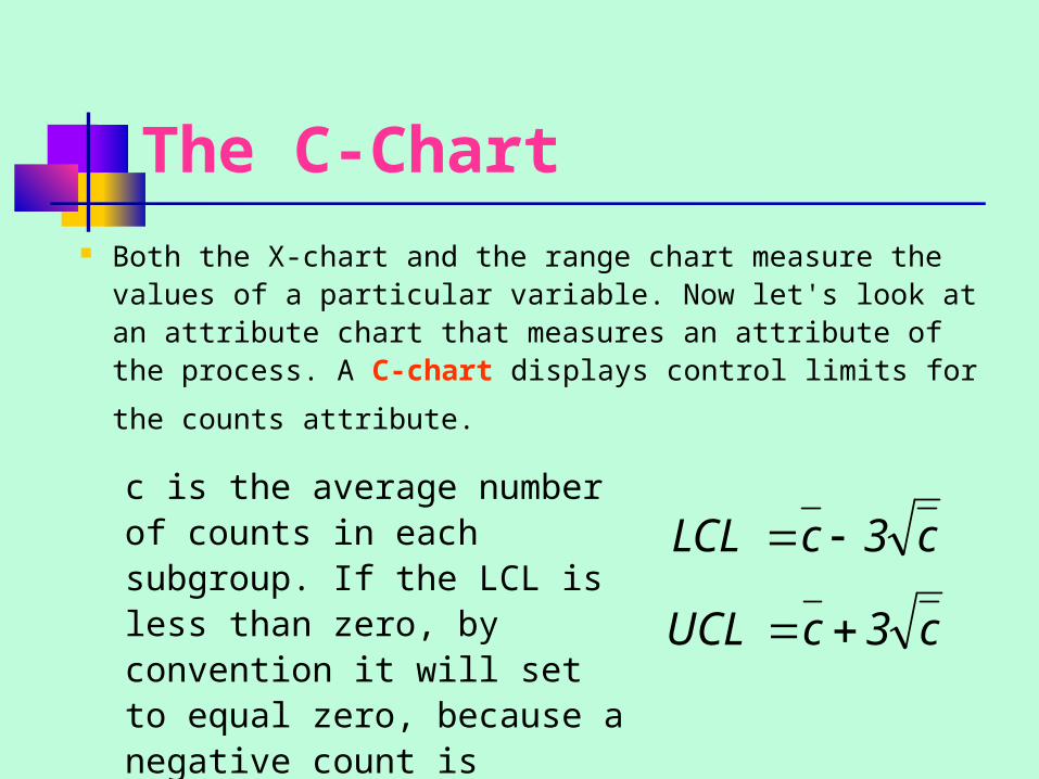
The C-Chart Both the X-chart and the range chart measure the values
of a particular variable. Now let's look at an attribute chart that measures an attribute of the process. A C-
chart displays control limits for the counts attribute.
c3cUCL
c3cLCL
c is the average number of counts in each subgroup. If the LCL is less than zero, by convention it will set to equal zero, because a negative count is impossible.
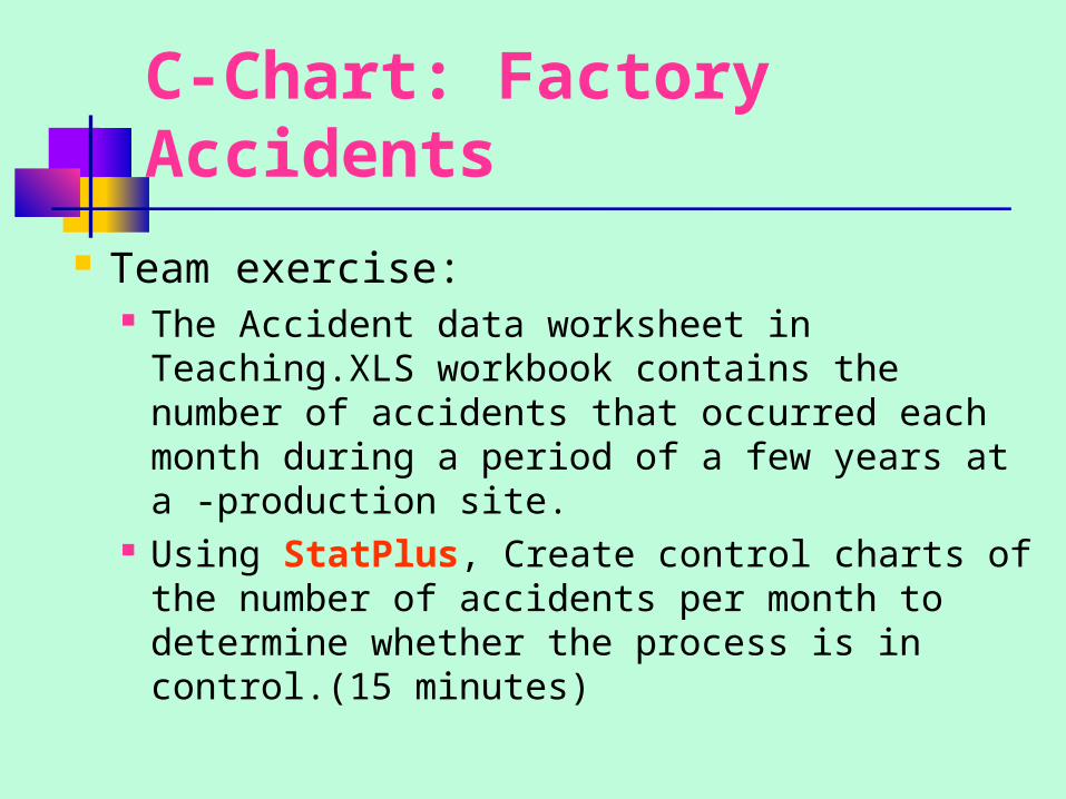
C-Chart: Factory Accidents
Team exercise: The Accident data worksheet in Teaching.XLS
workbook contains the number of accidents that occurred each month during a period of a few years at a -production site.
Using StatPlus, Create control charts of the number of accidents per month to determine whether the process is in control.(15 minutes)

P-Chart P-chart is closely related to the C-chart.
It depicts the proportion of items with a particular attribute, such as defects.
The P-chart is often used to analyze the proportion of defects in each subgroup.
n
p1p3pLCL
n
p1p3pLCL
)(
)(
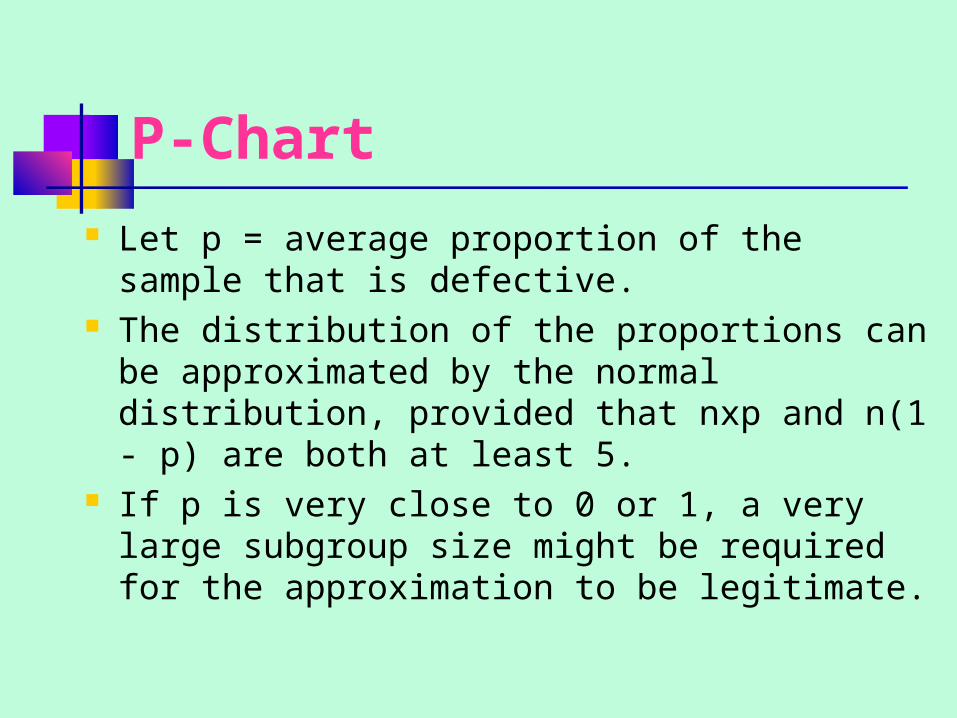
P-Chart Let p = average proportion of the sample
that is defective. The distribution of the proportions can be
approximated by the normal distribution, provided that nxp and n(1 - p) are both at least 5.
If p is very close to 0 or 1, a very large subgroup size might be required for the approximation to be legitimate.
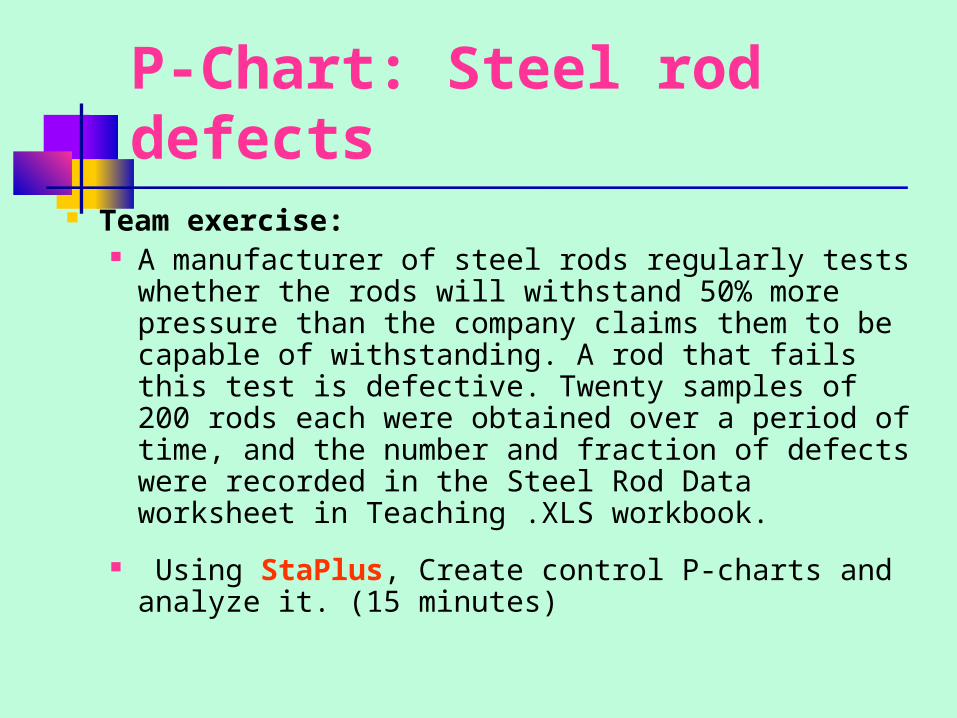
P-Chart: Steel rod defects
Team exercise: A manufacturer of steel rods regularly tests
whether the rods will withstand 50% more pressure than the company claims them to be capable of withstanding. A rod that fails this test is defective. Twenty samples of 200 rods each were obtained over a period of time, and the number and fraction of defects were recorded in the Steel Rod Data worksheet in Teaching .XLS workbook.
Using StaPlus, Create control P-charts and analyze it. (15 minutes)
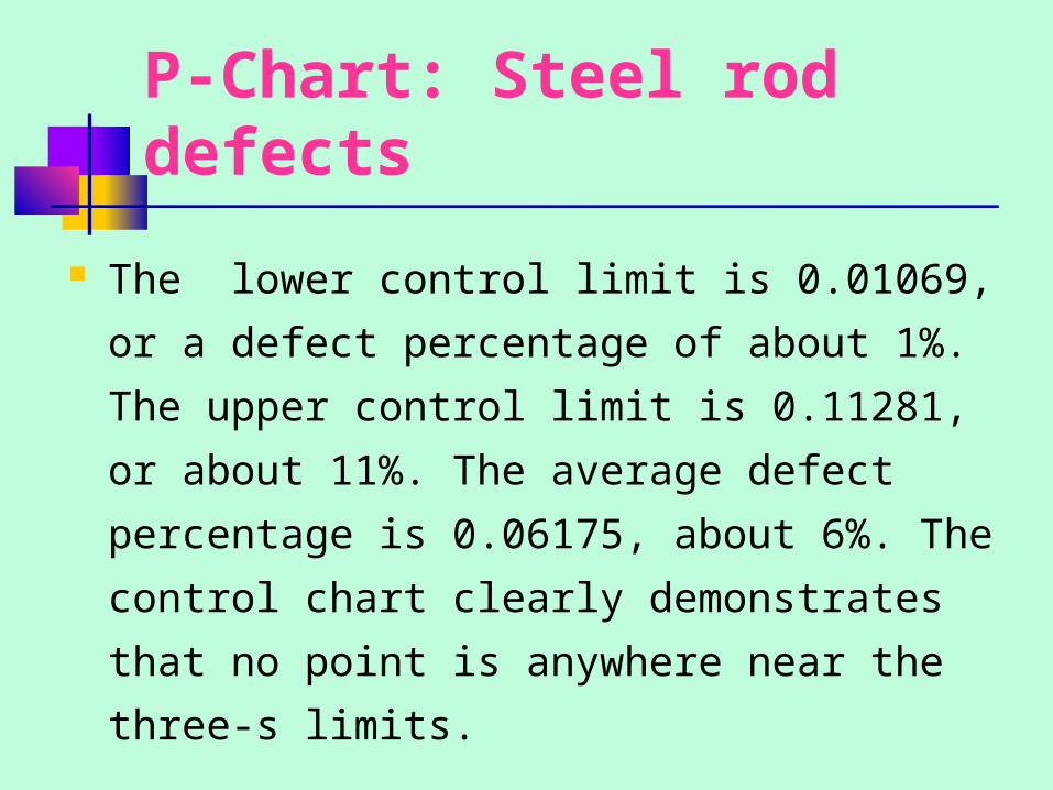
P-Chart: Steel rod defects
The lower control limit is 0.01069, or a
defect percentage of about 1%. The upper
control limit is 0.11281, or about 11%. The
average defect percentage is 0.06175,
about 6%. The control chart clearly
demonstrates that no point is anywhere
near the three-s limits.
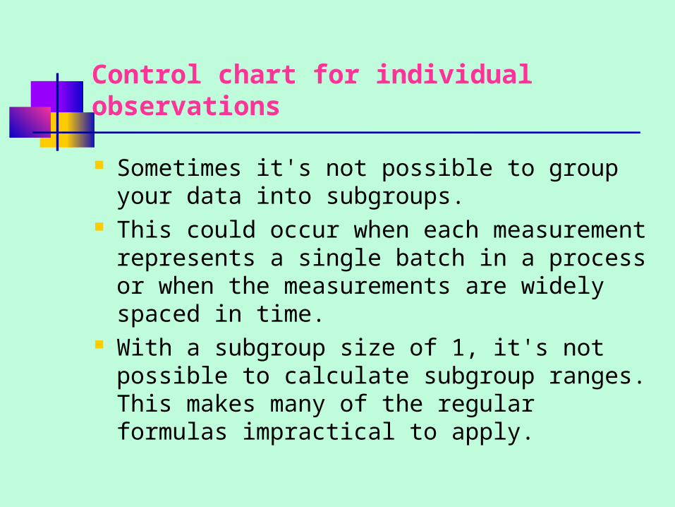
Control chart for individual observations
Sometimes it's not possible to group your data into subgroups.
This could occur when each measurement represents a single batch in a process or when the measurements are widely spaced in time.
With a subgroup size of 1, it's not possible to calculate subgroup ranges. This makes many of the regular formulas impractical to apply.
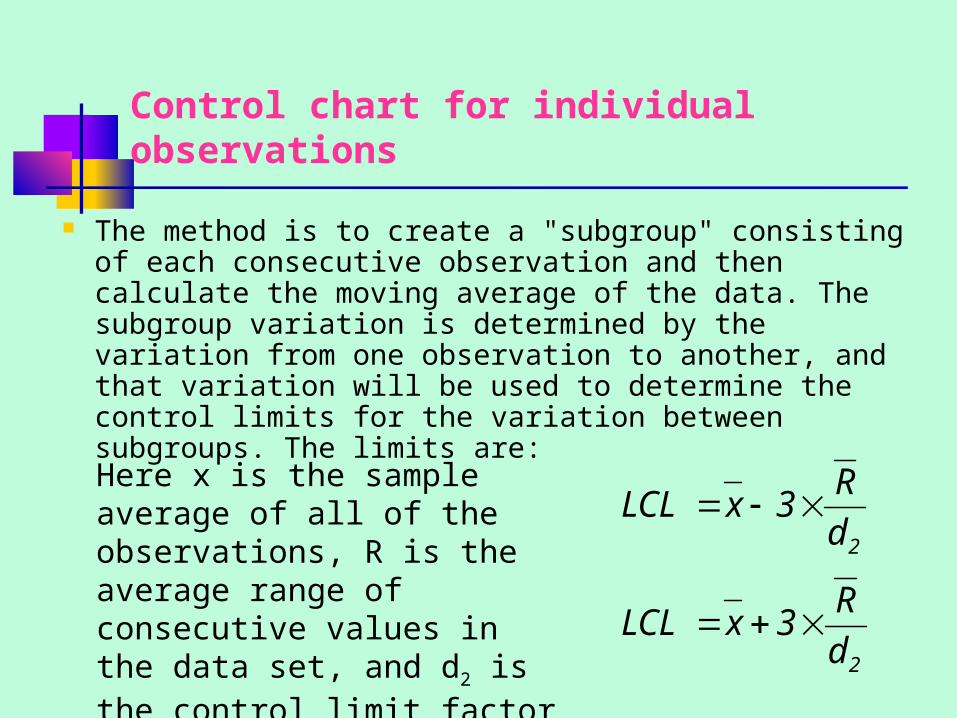
Control chart for individual observations
The method is to create a "subgroup" consisting of each consecutive observation and then calculate the moving average of the data. The subgroup variation is determined by the variation from one observation to another, and that variation will be used to determine the control limits for the variation between subgroups. The limits are:
2
2
d
R3xLCL
d
R3xLCL
Here x is the sample average of all of the observations, R is the average range of consecutive values in the data set, and d2 is the control limit factor from the QC Correction factors, 1.128.
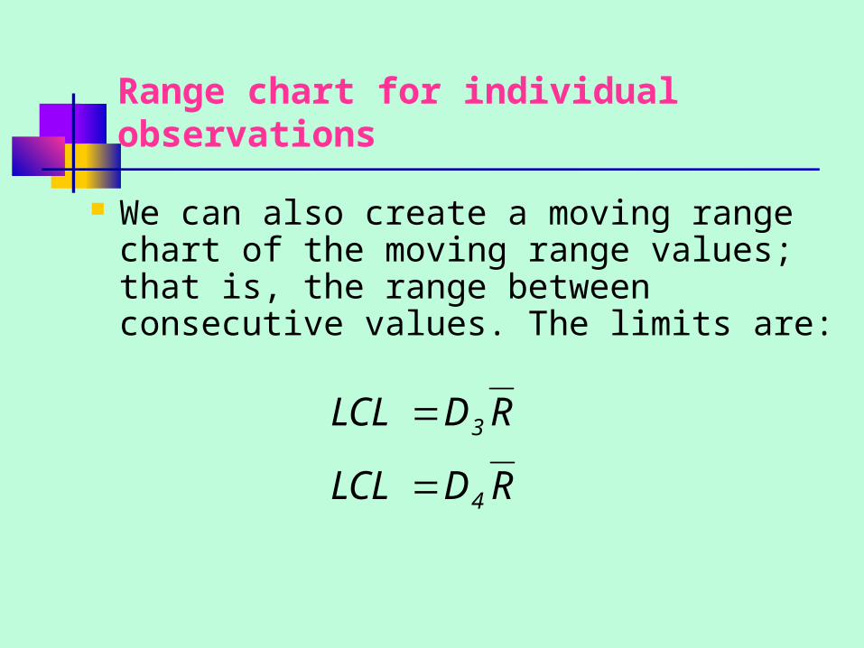
Range chart for individual observations
We can also create a moving range chart of the moving range values; that is, the range between consecutive values. The limits are:
RDLCL
RDLCL
4
3
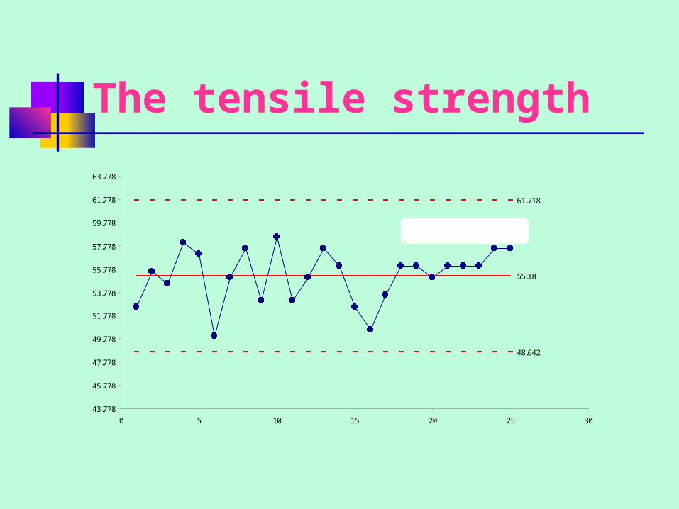
The tensile strength
48.642
55.18
61.718
43.778
45.778
47.778
49.778
51.778
53.778
55.778
57.778
59.778
61.778
63.778
0 5 10 15 20 25 30
Upw ard trend may indicate a process that is not in control
Analysis
The chart shown gives the values of the individual
observations (not the moving averages) plotted alongside
the upper and lower control limits.
No values fall outside the control limits, which would lead
us to conclude that the process is in control. However, the
last eight observations were all either above or near the
center line, which might indicate a process going out of
control toward the end of the process. This is something
that should be investigated further.
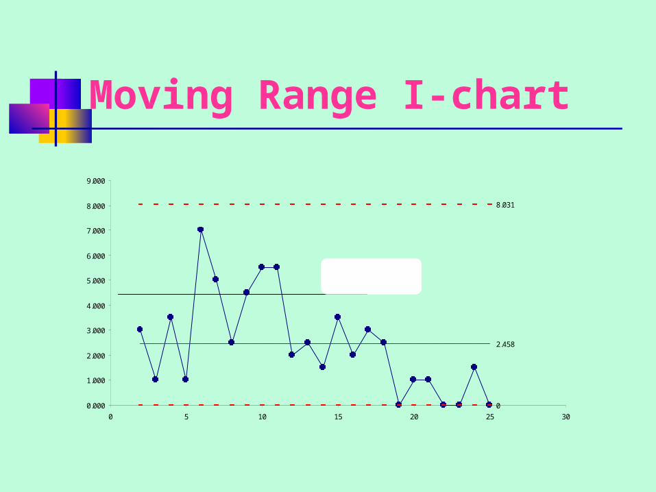
Moving Range I-chart
0
2.458
8.031
0.000
1.000
2.000
3.000
4.000
5.000
6.000
7.000
8.000
9.000
0 5 10 15 20 25 30
Trend in the moving range indicates a process not in control
Analysis
The chart shows additional indications of a process that is not in control. The last seven values all fall below the center line, and there appears to be a generally downward trend to the ranges from the sixth observation on. We would conclude that there is sufficient evidence to warrant further investigation and analysis.

Pareto Chart
Pareto chart create a bar chart of the causes of the problem in order from most to least frequent so that you can focus attention on the most important elements or combination of elements .
Baby powder example Part of the process of company that manufactures
baby powder involves a machine called a filler, which pours the powder into bottles to a specified limit.
The quantity of powder placed in the bottle varies because of uncontrolled variation, but the final weight of the bottle filled with powder cannot be less than 368.6 grams.
Any bottle weighing less than this amount is rejected and must be refilled manually (at a considerable cost in terms of time and labor). Bottles are filled from a filler that has 24 valve heads so that 24 bottles can be filled at one time.
Exercise Sometimes a head is clogged with powder, and this
causes the bottles being filled on that head to receive less than the minimum amount of powder. To gauge whether the machine is operating within limits, random samples of 24 bottles (one from each head) are selected at about 1-minute intervals over the nighttime shift at the factory.
The teams are examine the data and determine which part of the filler is most responsible for defective fills (20 minutes). The worksheet Powder in workbook Teaching.XLS contains the data. Use Pareto Chart.
Data
Reference
“Data Analysis with Excel”. Berk & Carey, Duxbury, 2000, chapter 12, p. 489-503