Embed Size (px)
Citation preview

Statistics
Mathematics DepartmentPhillips Exeter Academy
Exeter, NHJune 2016

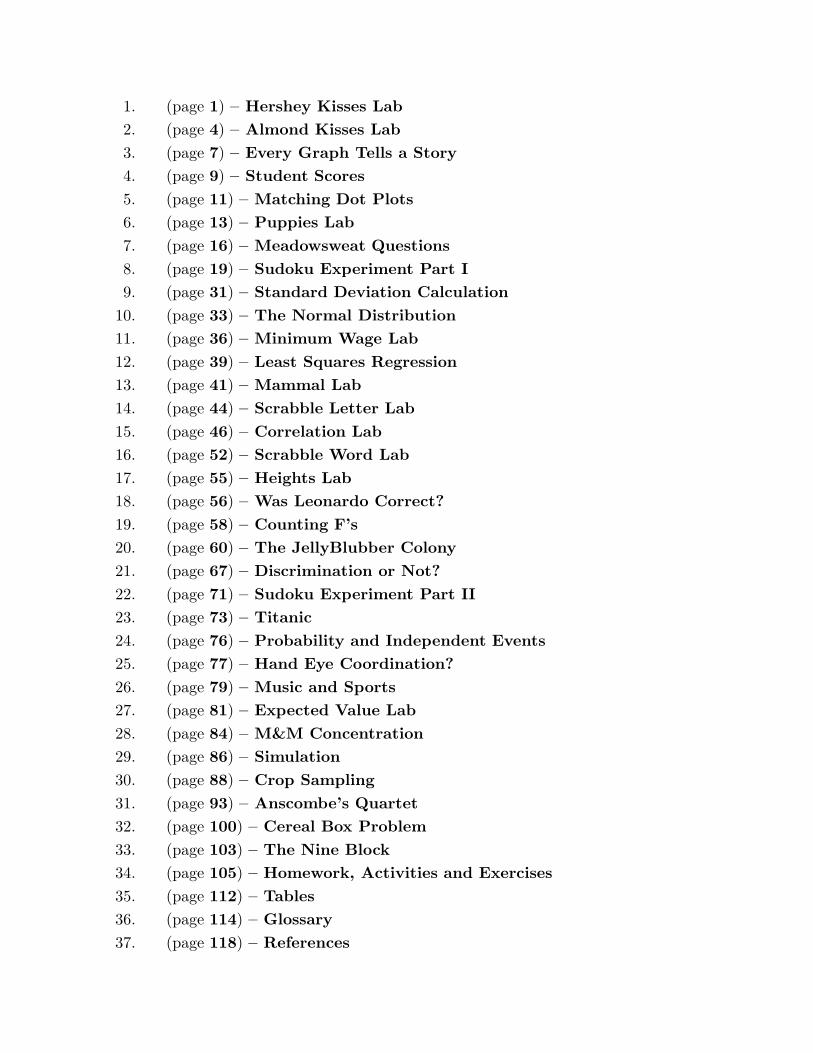
1. (page 1) – Hershey Kisses Lab
2. (page 4) – Almond Kisses Lab
3. (page 7) – Every Graph Tells a Story
4. (page 9) – Student Scores
5. (page 11) – Matching Dot Plots
6. (page 13) – Puppies Lab
7. (page 16) – Meadowsweat Questions
8. (page 19) – Sudoku Experiment Part I
9. (page 31) – Standard Deviation Calculation
10. (page 33) – The Normal Distribution
11. (page 36) – Minimum Wage Lab
12. (page 39) – Least Squares Regression
13. (page 41) – Mammal Lab
14. (page 44) – Scrabble Letter Lab
15. (page 46) – Correlation Lab
16. (page 52) – Scrabble Word Lab
17. (page 55) – Heights Lab
18. (page 56) – Was Leonardo Correct?
19. (page 58) – Counting F’s
20. (page 60) – The JellyBlubber Colony
21. (page 67) – Discrimination or Not?
22. (page 71) – Sudoku Experiment Part II
23. (page 73) – Titanic
24. (page 76) – Probability and Independent Events
25. (page 77) – Hand Eye Coordination?
26. (page 79) – Music and Sports
27. (page 81) – Expected Value Lab
28. (page 84) – M&M Concentration
29. (page 86) – Simulation
30. (page 88) – Crop Sampling
31. (page 93) – Anscombe’s Quartet
32. (page 100) – Cereal Box Problem
33. (page 103) – The Nine Block
34. (page 105) – Homework, Activities and Exercises
35. (page 112) – Tables
36. (page 114) – Glossary
37. (page 118) – References


Statistic Activity Book
Hershey Kisses
Before we begin:
In this lab, when new vocabulary is introduced, the word will be italicized, and thedefinition can be found in the glossary section of your Statistics Activity book. This labis adapted from:
What is the Probability of a Kiss? (It’s Not What You Think) Mary Richard-son, Susan Haller, Journal of Statistic Education Volume 10, Number 3 (2002).
www.amstat.org/publications/jse/v10n3/haller.html
Questions:
What is the chance that a HERSHEY’S KISS will land on its base when tossed out ofa cup onto a table? What is the chance that it will not land on its base? Do we all agreethat there are two possible outcomes when the kiss is tossed onto the table?
In this Activity:
Students work in groups of three collecting data, analyzing data and gaining experiencewith empirical probability and measures of the center of a sample of data.
Materials:
Pencils, ten plain HERSHEY’S KISSES candies, a 16-ounce plastic cup, a flat table ordesktop, sticky notes and lab book.
Procedure:
1. Discuss with your group of three, the subjective probabilities you assign to the kisslanding on its base or on its side and record them in the table below:
HERSHEY’S KISS Tosses Subjective Probabilities
probability of base-landing percent chance of base-landing
probability of side-landing percent chance of side-landing
total 1 100%
2. Assign tasks within your group, Spiller, spills the 10 candies from the cup ontothe table, Counter, counts the number of candies that land on their bases, and Recorder,records the results in their data table.
3. Let Spiller spill the cup ten times, counting and recording each time, and thenswitch rolls so that each person does each task once.
June 2016 1 Phillips Exeter Academy

Statistic Activity Book
Toss # HERSHEY’S KISS # on base
1
2
3
4
5
6
7
8
9
10
Total
4. Refine your subjective probabilities based on the empirical evidence that you nowhave.
HERSHEY’S KISS Tosses Subjective Probabilities Refinements
probability of base-landing percent chance of base-landing
probability of side-landing percent chance of side-landing
total 1 100%
5. Combine the results from all of the groups on the board, using each groups totalsout of 100. Together, consider the best way to display the data.
6. Now, ask your instructor to help you create a stem and leaf plot of the combinedtotals of each student in the class. In later labs, you will learn about more ways to displayyour data.
7. The visual data is very helpful, and you may want to adjust the subjective prob-ability you have assigned to the a base-side landing. You may also want to get somemeasurement of the center of this data. Find the mean and median of each of the threesets of the data that your group collected.
June 2016 2 Phillips Exeter Academy

Statistic Activity Book
HERSHEY’S KISS Statistics
Data set 1 Data set 2 Data set 3
median
mean
8. Combine the results of your calculations on the board again, and discuss yourcollective findings.
9. You are probably ready to come to a consensus on the empirical probability thata HERSHEY’S KISS will land on its base if tossed. Please record this probability, andthen consider the following vocabulary regarding this candy toss. The kiss had apercent chance of landing on its base, and so in the sample space of events for this variableL, which stands for Landing, there are two possible values, B, for base or S, for side, andthe probability of landing on its base, P (B), is .
June 2016 3 Phillips Exeter Academy

Statistic Activity Book
Almond Hershey Kisses
Before we begin:
This lab is meant to be completed after the Hershey Kisses Lab. This lab is adaptedfrom:
What is the Probability of a Kiss? (It’s Not What You Think) Mary Richard-son, Susan Haller, Journal of Statistic Education Volume 10, Number 3 (2002).
www.amstat.org/publications/jse/v10n3/haller.html
Questions:
What is the chance that an almond HERSHEY’S KISS will land on its base when tossedout of a cup onto a table? What is the chance that it will not land on its base?
In this Activity:
Students work in groups of three collecting data, analyzing data and gaining moreexperience with empirical probability and measures of the center of a sample of data. Theysee first hand what it means to generalize results from one population to another. Andthey learn about five-number summaries (minimum, first quartile, median, third quartileand maximum) and box plots.
Materials:
Pencils, ten plain HERSHEY’S KISSES, ten almond HERSHEY’S KISSES candies, a16-ounce plastic cup, a flat table or desktop and sticky notes.
Procedure:
1. Look at both types of kisses, noting their differences and similarities below:
2. Estimate the probability that the almond KISS will land on its base when spilledand record your estimate here:
Estimate
3. As before, assign the jobs of tossing, counting and recording to different people inyour group and then spill a cup with 10 almond candies and 10 plain candies onto thetable 10 times recording the number of each that landed on its base.
June 2016 4 Phillips Exeter Academy

Statistic Activity Book
Toss # Almond KISS # on base Plain KISS # on base
1
2
3
4
5
6
7
8
9
10
Total
4. Rotate jobs and toss again. Rotate jobs and toss again. Each person in the groupshould have recorded 10 separate tosses for each type of candy.
5. Record your group’s data on sticky notes, one for each toss, using different colorsfor different candies and then collect all of the data from the class on the whiteboard. Trya back-to-back stem plot or two frequency plots with the same scale. Discuss your findingsas a class.
6. Having numbers that capture what you see on the board can help you discuss thedata and compare different data sets. Combine your group’s data and compute the median,minimum and maximum of both the almond KISS numbers and the plain KISS numbers.Begin filling in the table below:
Almond KISS Plain KISS
minimum
Q1
median
Q3
maximum
interquartile range
June 2016 5 Phillips Exeter Academy
Statistic Activity Book
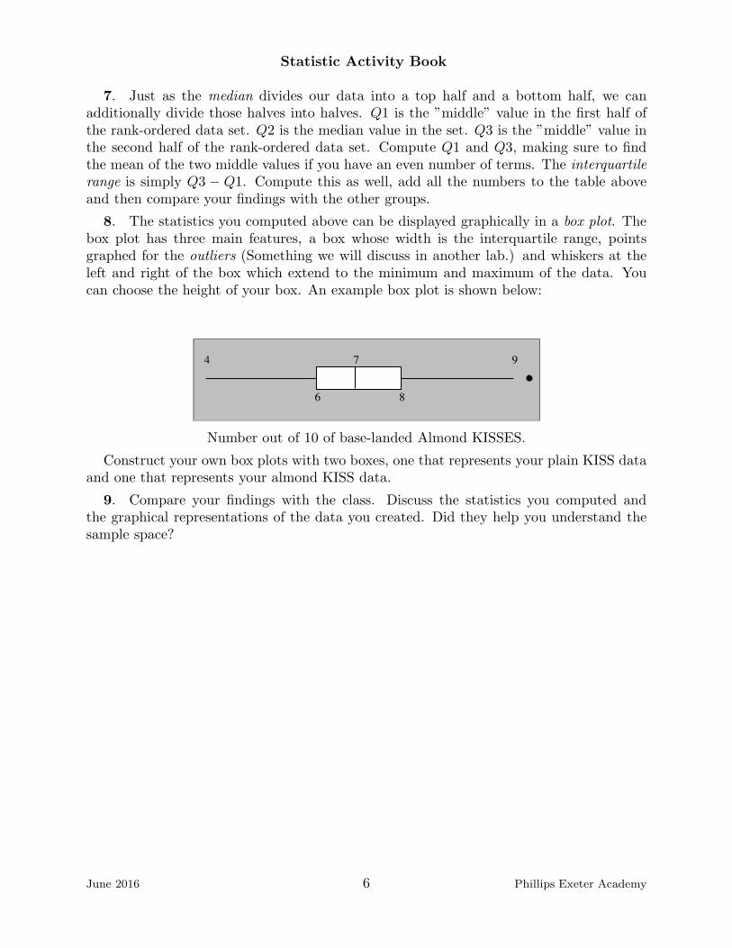
7. Just as the median divides our data into a top half and a bottom half, we canadditionally divide those halves into halves. Q1 is the ”middle” value in the first half ofthe rank-ordered data set. Q2 is the median value in the set. Q3 is the ”middle” value inthe second half of the rank-ordered data set. Compute Q1 and Q3, making sure to findthe mean of the two middle values if you have an even number of terms. The interquartilerange is simply Q3 − Q1. Compute this as well, add all the numbers to the table aboveand then compare your findings with the other groups.
8. The statistics you computed above can be displayed graphically in a box plot. Thebox plot has three main features, a box whose width is the interquartile range, pointsgraphed for the outliers (Something we will discuss in another lab.) and whiskers at theleft and right of the box which extend to the minimum and maximum of the data. Youcan choose the height of your box. An example box plot is shown below:
4 7 9
6 8
Number out of 10 of base-landed Almond KISSES.
Construct your own box plots with two boxes, one that represents your plain KISS dataand one that represents your almond KISS data.
9. Compare your findings with the class. Discuss the statistics you computed andthe graphical representations of the data you created. Did they help you understand thesample space?
June 2016 6 Phillips Exeter Academy
Statistic Activity Book
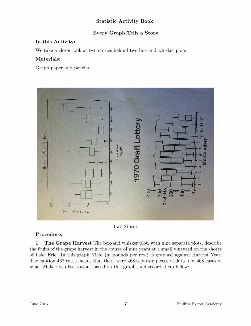
Every Graph Tells a Story
In this Activity:
We take a closer look at two stories behind two box and whisker plots.
Materials:
Graph paper and pencils.
Two Stories
Procedure:
1. The Grape Harvest The box-and whisker plot, with nine separate plots, describethe fruits of the grape harvest in the course of nine years at a small vineyard on the shoresof Lake Erie. In this graph Yield (in pounds per row) is graphed against Harvest Year.The caption 468 cases means that there were 468 separate pieces of data, not 468 cases ofwine. Make five observations based on this graph, and record them below:
June 2016 7 Phillips Exeter Academy

Statistic Activity Book
2. The Draft Lottery The first lottery to select soldiers for the Vietnam War washeld in 1970. The idea was to randomly match each of the 366 days in a (possibly leap)year with the integers 1 through 366. Eligible men whose birthday corresponded to 1, thefirst number picked, were the first to be drafted. The higher the number, the less likely youwere to be drafted. To randomize the 366 possible birthdays, all the dates for January wereput into small capsules, stirred vigorously, and poured into a large glass container. Thecapsules containing a birthday for each of the days in the subsequent months were addedto the glass bowl in order, February followed by March, then April, etc. until Decemberbirthdays were added last.
Then one capsule was drawn at random by a person reaching into the glass and pullingout one capsule. This first capsule, September 14, was assigned draft number 001. Thesecond date drawn, April 24, was assigned number 002. And so on through December,each date being matched with the order in which it was picked. This data is recorded inthe 1970 Draft Lottery box plot on the previous page. Each of the box plots representsone month.
Notice that the minimum for September looks to be very close to 1 and that Aprilsminimum could well be 2.
Comment on this set of box plots which represents the outcome of an allegedly randomprocess. Note especially the trend of the medians of each month as the year progresses.
Discuss your observations.
June 2016 8 Phillips Exeter Academy

Statistic Activity Book
Student ScoresQuestions:
Though they contain a great deal of information, are box plots enough?
In this Activity:
Students will learn about dot plots and compare them with box plots. They shouldbreak up into groups of 2 or 3 to work on this lab.
Materials:
You will need a pencil.
Procedure:
1. Consider the following hypothetical exam score data presented below for threeclasses of students.
Exam Score Data
A-period 50 50 50 63 70 70 70 71 71 72 72 79 91 91 92
B-period 50 54 59 63 65 68 69 71 73 74 76 79 83 88 92
C-period 50 61 62 63 63 64 66 71 77 77 77 79 80 80 92
2. Discuss this data with your group. Does it look like data that could have comefrom three of your classes? Which data represents the most successful class? Which classneeds the most work?
3. By now, you are very familiar with box-plots. Fill in the 5-number summary tablesfor the classes below:
Test Scores Five-Number Summary
A-Period B-Period C-Period
minimum
Q1
median
Q3
maximum
interquartile range
4. Consider the numbers in the table, and discuss with your group, whether this sum-mary gives you any insight into your class scores.
June 2016 9 Phillips Exeter Academy

Statistic Activity Book
5. Divide the task of creating box-plots for this data between the members of yourgroup and compare results when you are all done. Do you have any new conclusions?
6. Another way to create a quick and helpful picture of your data is to create a dotplot of your data. A dot plot is simply a record of the frequency of each score. The variablethat you care about is located on the horizontal axis, and the value of each data point isrecorded as a dot located at its value. The dots accumulate vertically above the values.A dot plot for the A Period class is shown. Divide the task of creating dot plots for theremaining classes between the members of your group and compare results when you aredone.
Scores on Tests.
7. Discuss as a class the differences between the three ways of displaying data, in atable, in a box plot and in a dot plot.
June 2016 10 Phillips Exeter Academy

Statistics Activity Book
Matching DotplotsProcedure:
The following dotplots represent the distributions of the eight variables listed below.The scales of the plots have been omitted intentionally and the order of the plots has beenscrambled. Your task is to match the variable with the plot. Provide a brief explanationof your reasoning in each case.
1. Jersey numbers from the 2014 New England Patriots2. Annual snowfall amounts for a sample of U. S. cities3. Margin of victory in Red Sox 2014 season games4. Prices of properties in the Monopoly board game5. Weights of the New England Patriots 2014 team members6. Ages at which sample mothers had their first child7. Weights of sample of 2014 cars8. Scores on a Statistics exam
A
B
C
D
June 2016 11 Phillips Exeter Academy

Statistics Activity Book
E
F
G
H
June 2016 12 Phillips Exeter Academy

Statistics Activity Book
Puppies LabQuestions:
We have learned about different ways to summarize and display your data and someof the standard vocabulary used when discussing data sets. The shape of the data is animportant topic too.
In this Activity:
We use Labrador Retriever data to learn about histograms and the shape of a data set.
Materials:
Graph paper and pencils.
Procedure:
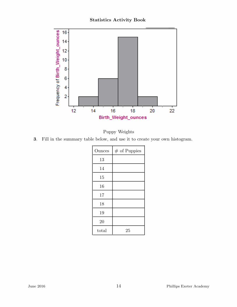
1. The table below shows the weight in ounces of puppies born at Meadowsweet Ken-nels in the last six months. Create a dot plot of the data and discuss the shape of the datawith your group members. Look at each other’s dot plots and discuss their differences andsimilarities.
Puppy Weight
13 14 15 15 16 16 16 16 17 17 17 17 17 17 17 18 18 18 18 18 18 18 18 19 20
2. A histogram is another way to graphically display univariate data, and this type ofdisplay can quickly communicate the shape of a data set. Whereas the primary considera-tion (once you have organized your data set from minimum to maximum) in creating a dotplot is how long to make the number line that contains the data, and the dot plots fromyour group were most likely very similar, a certain amount of design goes into creating ahistogram. The summary table below was used to create the histogram shown on the nextpage.
Ounces # of Puppies
13-14 2
15-16 6
17-18 15
19-20 2
total 25
June 2016 13 Phillips Exeter Academy
Statistics Activity Book
Puppy Weights
3. Fill in the summary table below, and use it to create your own histogram.
Ounces # of Puppies
13
14
15
16
17
18
19
20
total 25
June 2016 14 Phillips Exeter Academy

Statistics Activity Book
4. Discuss the differences between the two histograms with your group and the classas a whole. Does one more effectively represent the data than another? Compare themwith the additional histogram below.
Puppy Weights
June 2016 15 Phillips Exeter Academy
Statistics Activity Book
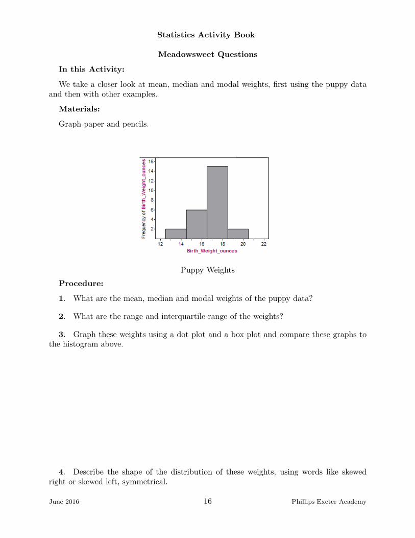
Meadowsweet Questions
In this Activity:
We take a closer look at mean, median and modal weights, first using the puppy dataand then with other examples.
Materials:
Graph paper and pencils.
Puppy Weights
Procedure:
1. What are the mean, median and modal weights of the puppy data?
2. What are the range and interquartile range of the weights?
3. Graph these weights using a dot plot and a box plot and compare these graphs tothe histogram above.
4. Describe the shape of the distribution of these weights, using words like skewedright or skewed left, symmetrical.
June 2016 16 Phillips Exeter Academy

Statistics Activity Book
5. What is the typical weight of a Labrador Retriever puppy born in the last six monthsat the Meadowsweet Kennels? Explain why you chose this value.
6. Describe how variable the data are about the center.
7. The data on the Meadowsweet Labrador Retriever puppies sets are slightly skewed.The mean and the median are different from each other. Is there any relationship betweenthe skewedness of the data and the relative size of the mean and median?
Additional Questions:
8. This example is adapted from How to Lie With Statistics , a classic book by DarrellHuff published in 1954. A company has 25 employees. The president earns $450, 000, thefinancial officer earns $150, 000,the two executives earn $100, 000, the bookkeeper earns$57, 000, three managers earn $50, 000, the four floor managers earn $37, 000, the time-keeper earns $30, 000 and the 12 lowly production workers earn $20, 000. The mean,median and modal salaries give very different answers to the question ”What is the aver-age (center) pay at this company?”. Describe how these answers cast a very different lighton the generosity of the company.
9. The distribution of salaries on a company is shown below. The median salary is$14, 400, and the mean salary is $17, 800.
Job 5 Executives 15 Supervisors 80 Production Workers
Salary Range $40,000 - $87,500 $ 15,800 - $25,000 $9,200 - $15,700
a. If each of the supervisors is a given $1,000 raise, how will this affect the mean,median, mode, range and interquartile range? Think for a moment before you begincalculations.
b. If each of the employees gets a $1,000 raise how will this affect the mean, median,mode, range and interquartile range? Again, see if you can reason out the answer withoutcalculations.
c. What is the total payroll for this company? In other words what is the sum of allthe salaries? Once more, think for a moment before you compute the number.
10. In a boxplot, how much of the data lies inside the box?
11. (From Workshop Statistics) Using 10 integers from 0 to 100 (repeats allowed) con-struct three data sets as describe below, one set for a, one set for b, one set for c.
a. 90% of the data are above the mean.
b. The mean is greater than twice the mode.
c. The mean and median are different and none of the scores are between the meanand median.
June 2016 17 Phillips Exeter Academy

Statistics Activity Book
12. (From Workshop Statistics) Are the following conclusions correct? Discuss withyour neighbor.
a. A real estate agent notes that the mean housing price for an area is $225,700 andconcludes that half of the houses in that area cost more than that.
b. A businesswoman calculates that the median cost of the five business trips she tooklast month is $750 and concludes that the total cost of the trips was $3,750.
c. A restaurant owner decides that more than half of her customers prefer chocolateice cream because chocolate is the mode when customers are offered chocolate, vanilla andstrawberry.
13. A previous president announced, truthfully, that the average net worth of an Amer-ican family had risen 6%, to approximately $420,000. What he did not announce was thatthe median net worth was approximately $100,000, less than a quarter of this average.Comment on whether this was a misleading announcement.
June 2016 18 Phillips Exeter Academy
Statistics Activity Book
Sudoku Experiment Part IBefore we begin:
Data can be gathered in many ways, in experiments, through surveys and throughobservational studies. This lab is explores an experiment, reinforces the use of dot plotsand box plots to describe data and introduces measures of center and spread.
This lab was adapted from: Brophy and Hahn (2014) Engaging Students in a LargeLecture: An Experiment using Sudoku Puzzles. Journal of Statistics Education Volume22, Number 1, www.amstat.org/publications/jse/v22n1/brophy.pdf.
Questions:
In statistics data can come from three places, observational studies, experiments andsurveys. An experiment is a study in which some treatment is imposed on individuals inorder to determine whether the treatment changes the outcome. How can a scientist createan experiment that will give meaningful results?
In this Activity:
Statistics class participants will have all EMI participants complete one of two 6 by6 grid Sudoku puzzles and time how long it takes each person to complete it. Statisticsclass participants will collect the data. Then, using the class data, each participant willcompile the data in various ways and test to see if they can draw any conclusions fromtheir experiment.
Materials:
Enough Sudoku puzzles for all participants and a timer or clock.
Procedure:
1. Make sure that the pile of puzzles is shuffled. Make sure that participants can timethemselves. The best case is to project a stopwatch on a screen so that all participantscan see the same stopwatch.
2. Pass out the puzzle pages face down. Explain that each person will work to completea different puzzle and that the puzzles vary in difficulty from easy to hard.
3. When everyone has a puzzle, tell them that when you say ”begin”, they shouldturn the paper over, read the directions, then do the puzzle. Say ”begin”, and start thestopwatch.
4. When finished, participants will turn their papers over and remain quiet until ev-eryone is finished.
5. Collect and check the puzzles, recording the information on a chart on the nextpage.
June 2016 19 Phillips Exeter Academy

Statistics Activity Book
Sudoku data
Type of puzzle Correct Time to finish Experience
6. You may want to summarize your data in the following table:
Sudoku Data Summary
Puzzle Type Sudoku Experience
Correct Symbols Numbers Total Yes No Total
NO
YES
Total
7. Discuss with your group, why this activity is an experiment and not an observationalstudy.
8. What were the ’treatments’ in this experiment?
June 2016 20 Phillips Exeter Academy

Statistics Activity Book
9. Find the five-number summary for each type. Record the data in the table below:
Sudoku Five-Number Summary
Number Puzzle Symbol Puzzle
minimum
Q1
median
Q3
maximum
interquartile range
10. Draw side-by-side box plots. Do you think that the differences that you see aresignificant?
11. There are two other numbers that are used to describe the center of a data set. Oneis the mean or the arithmetic average, and the other is the mode or the value that appearswith the greatest frequency. In this case, because time is continuous it makes more senseto compute the mode if we round the time to finish to the nearest minute and compute themode of those numbers. Compute the mean and the mode of this data and begin filling inthe table below:
Sudoku Summary Statistics
Number Puzzle Symbol Puzzle
mean
mode
standard deviation
12. The standard deviation is, roughly, the average deviation of each data point from themean. Except for very small data sets, it is cumbersome to compute. Every calculator andstatistics software package will compute it very quickly. The number is used to describe thevariability or spread of your data. Use your calculator to compute the standard deviationfor the time to complete each type of sudoku puzzle, and add this number to the table ofsummary statistics.
13. As you gain more experience with mean and standard deviations, you will see howthese two numbers can provide a great description of a data set, giving a snapshot of bothcenter and variability. Discuss with your group and then with the class as a whole, whichinformation you find most helpful in representing the data, the 5-number summary or themean and standard deviation?
June 2016 21 Phillips Exeter Academy

Statistics Activity Book
June 2016 22 Phillips Exeter Academy
Statistics Activity Book
Sudoku Experiment Part IInstructions:
On the other side of this sheet is a six by six grid of squares broken up into six outlinedboxes with Greek letters placed in a handful of the thirty-six squares. The Greek lettersα, β, δ, ε, λ and µ must each appear once in each of the six outlined boxes, once in each ofthe six rows and once in each of the six columns. Use logic (i.e. do not guess) to determinewhat goes in each empty space.
Before you turn the page over and begin, please answer the following question:
Have you ever played Sudoku before today? Yes � No �
April 2014 23 Phillips Exeter Academy

Statistics Activity Book
Sudoku ExperimentInstructions:
The Greek letters α, β, δ, ε, λ and µ must each appear once in each of the six boxes, oncein each of the six rows and once in each of the six columns. Use logic (i.e. do not guess)to determine what goes in each empty space.
β µ ε
ε λ
λ β µ α ε
δ α β λ µ
λ ε
α β λ
Time to completion: Minutes: Seconds:
April 2014 24 Phillips Exeter Academy

Statistics Activity Book
Sudoku Experiment Part IInstructions:
On the other side of this sheet is a six by six grid of squares broken up into six outlinedboxes with lowercase letters placed in a handful of the thirty-six squares. The lowercaseletters a, b, c, d, e and f must each appear once in each of the six outlined boxes, once ineach of the six rows and once in each of the six columns. Use logic (i.e. do not guess) todetermine what goes in each empty space.
Before you turn the page over and begin, please answer the following question:
Have you ever played Sudoku before today? Yes � No �
April 2014 25 Phillips Exeter Academy

Statistics Activity Book
Sudoku ExperimentInstructions:
The lowercase letters a, b, c, d, e and f must each appear once in each of the six boxes,once in each of the six rows and once in each of the six columns. Use logic (i.e. do notguess) to determine what goes in each empty space.
b f d
d e
e b f a d
c a b e f
e d
a b e
Time to completion: Minutes: Seconds:
April 2014 26 Phillips Exeter Academy

Statistics Activity Book
Sudoku Experiment Part IInstructions:
On the other side of this sheet is a six by six grid of squares broken up into six outlinedboxes with numbers placed in a handful of the thirty-six squares. The numbers 1, 2, 3, 4,5 and 6 must each appear once in each of the six outlined boxes, once in each of the sixrows and once in each of the six columns. Use logic (i.e. do not guess) to determine whatgoes in each empty space.
Before you turn the page over and begin, please answer the following question:
Have you ever played Sudoku before today? Yes � No �
April 2014 27 Phillips Exeter Academy
Statistics Activity Book
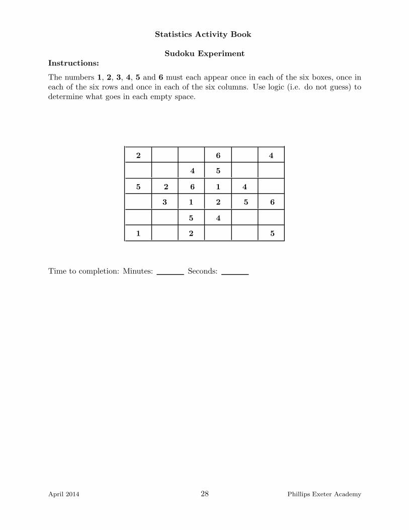
Sudoku ExperimentInstructions:
The numbers 1, 2, 3, 4, 5 and 6 must each appear once in each of the six boxes, once ineach of the six rows and once in each of the six columns. Use logic (i.e. do not guess) todetermine what goes in each empty space.
2 6 4
4 5
5 2 6 1 4
3 1 2 5 6
5 4
1 2 5
Time to completion: Minutes: Seconds:
April 2014 28 Phillips Exeter Academy

Statistics Activity Book
Sudoku Experiment Part IInstructions:
On the other side of this sheet is a six by six grid of squares broken up into six outlinedboxes with symbols placed in a handful of the thirty-six squares. The symbols �, △,
√,
, ⊖ and ♥ must each appear once in each of the six outlined boxes, once in each of thesix rows and once in each of the six columns. Use logic (i.e. do not guess) to determinewhat goes in each empty space.
Before you turn the page over and begin, please answer the following question:
Have you ever played Sudoku before today? Yes � No �
April 2014 29 Phillips Exeter Academy

Statistics Activity Book
Sudoku ExperimentInstructions:
The symbols �, △,√, , ⊖ and ♥ must each appear once in each of the six boxes, once
in each of the six rows and once in each of the six columns. Use logic (i.e. do not guess)to determine what goes in each empty space.
△ ♥
⊖
⊖ △ ♥ �
√� △ ⊖ ♥
⊖
� △ ⊖
Time to completion: Minutes: Seconds:
April 2014 30 Phillips Exeter Academy

Statistics Activity Book
The Standard DeviationBefore we begin:
The standard deviation is a powerful and very commonly used measure of the spreador variability of a data set. It has features in common with the Mean Absolute Deviation.One feature it does not share, however, is ease of computation.
In this Activity:
This lab is designed illustrate how to find the standard deviation using a very small andarbitrary data set.
Procedure:
1. Consider the data 1, 2, 4, 6 and 9. Calculate the mean of this set. The mean isdenoted x and is read ”x bar”.
x =
2. Use the expressions given in the column headings to complete the blanks in thetable below.
Score, x Mean x Deviation from the Mean (x− x) Squared Deviation (x− x)2
1
2
4
6
9
3. Next compute: S = Sum of the Deviations from the Mean and SS = Sum of theSquared Deviations from the Mean, and record them below.
S = and SS =
Discuss these values with your group. Are you surprised by the results?
4. This data set contains 5 points, and so the next step is to compute the followingvalue:
SS4
=
The denominator is one less than the number of data points. This deserves an explanation,but it is a long one, and better left for another time. How do the units of the numbers youjust computed compare to the units of the original data?
June 2016 31 Phillips Exeter Academy

Statistics Activity Book
5. Take the square root of your answer to the previous questions, and record thenumber below:
√
SS4
=
Finally! This number represents the standard deviation. The square root is necessarybecause if the original units are, say, pounds or dollars then without the square root, theunits would be square pounds or square dollars. This value is often denoted Sx and isthe standard deviation of this particular data set. Can you retrace your steps and writeformulas for Sx?
Sx =
6. Now enter this small data set into your calculator to verify your answer. Compareyour answers with the ones your calculator produced.
7. Without doing any calculations how would the standard deviation of a datasetchange if you added 10 to each value? Explain your answer.
8. Without doing any calculations how would the standard deviation of a datasetchange if you multiplied each value by 10? Explain your answer.
June 2016 32 Phillips Exeter Academy
Statistics Activity Book
The Normal Distribution LabBefore we begin:
The normal distribution is probably the most important distribution in all of statisticsbecause it appears so frequently when examining univariate data. If you graph the heightsof a group of 100 female basketball players, the IQs of men aged 30 to 40, the birth weightsof a large group of babies, the lengths of cod caught in the North Sea, you will find thatthe numbers very closely approximate a normal curve.
The normal curve accords with common sense. In the context of, say, heights of humanfemales aged 20 to 25, there are very few extremely high or low heights. As we examineheights closer to the mean, there are more females with these heights.
Many completely unrelated data sets exhibit an approximately normal distribution.
Questions:
What is normal?
In this Activity:
We explore the features of a normal distribution.
Materials:
Graph paper, pencils and a graphing calculator or statistical software package.
Procedure:
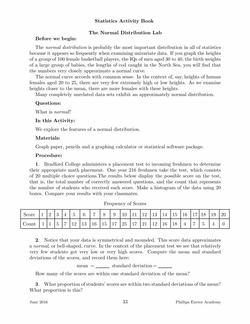
1. Bradford College administers a placement test to incoming freshmen to determinetheir appropriate math placement. One year 216 freshmen take the test, which consistsof 20 multiple choice questions.The results below display the possible score on the test,that is, the total number of correctly answered questions, and the count that representsthe number of students who received each score. Make a histogram of the data using 20boxes. Compare your results with your classmates.
Frequency of Scores
Score 1 2 3 4 5 6 7 8 9 10 11 12 13 14 15 16 17 18 19 20
Count 1 1 5 7 12 13 16 15 17 25 17 21 12 16 18 4 7 5 4 0
2. Notice that your data is symmetrical and mounded. This score data approximatesa normal, or bell-shaped, curve. In the context of the placement test we see that relativelyvery few students got very low or very high scores. Compute the mean and standarddeviations of the scores, and record them here:
mean = standard deviation=
How many of the scores are within one standard deviation of the mean?
3. What proportion of students’ scores are within two standard deviations of the mean?What proportion is this?
June 2016 33 Phillips Exeter Academy

Statistics Activity Book
4. How many students scored within three standard deviations of the mean? Whatproportion is this?
5. Your answers to the previous questions should have given you what is sometimescalled the empirical rule for normal distributions. In data that are approximately normallydistributed 68% lie within one standard deviation of the mean, 95% lie within two standarddeviations of the mean and practically all of the data (99.7% in theory) lie within threestandard deviations of the mean. This tendency is sometimes called the 68-95-99.7 rule.Have you ever heard of it? Do the Bradford College test scores follow this rule? This,like the Pythagorean Theorem, is something to memorize. Below is a sketch of a normaldistribution. What is the mean of the distribution shown?
−4 −3 −2 −1 1 2 3 4
0.2
0.4
x
y
The Normal Distribution: y = 1√2π
e−x2/2
6. Knowing that 99.7% of the data lies within three standard deviations of the mean,what do you guess is the standard deviation of this distribution?
7. The normal distribution in which the mean is 0 and the standard deviation is 1is called the standard normal distribution. Estimate the area between the curve and thex-axis, and deduce another property of a standard normal distribution. Does the standardnormal distribution accurately model the data given by Bradford College? (If not, howcould you transform the given standard normal distribution so that it would?)
8. Statisticians have a name for the number of standard deviations from the mean: az-score. A point with a z-score of 1.5 means that that value lies 1.5 standard deviationsabove the mean. A z-score of −0.6 means that the point lies 0.6 standard deviations belowthe mean. Z-scores are very useful for comparing normal distributions with different meansand standard deviations. What is the z-score of a score of 4 on the Bradford College test?
June 2016 34 Phillips Exeter Academy
Statistics Activity Book
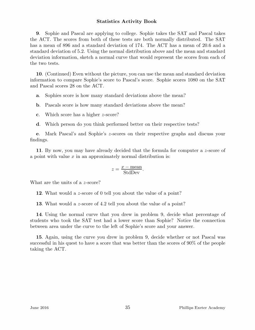
9. Sophie and Pascal are applying to college. Sophie takes the SAT and Pascal takesthe ACT. The scores from both of these tests are both normally distributed. The SAThas a mean of 896 and a standard deviation of 174. The ACT has a mean of 20.6 and astandard deviation of 5.2. Using the normal distribution above and the mean and standarddeviation information, sketch a normal curve that would represent the scores from each ofthe two tests.
10. (Continued) Even without the picture, you can use the mean and standard deviationinformation to compare Sophie’s score to Pascal’s score. Sophie scores 1080 on the SATand Pascal scores 28 on the ACT.
a. Sophies score is how many standard deviations above the mean?
b. Pascals score is how many standard deviations above the mean?
c. Which score has a higher z-score?
d. Which person do you think performed better on their respective tests?
e. Mark Pascal’s and Sophie’s z-scores on their respective graphs and discuss yourfindings.
11. By now, you may have already decided that the formula for computer a z-score ofa point with value x in an approximately normal distribution is:
z = x−meanStdDev
.
What are the units of a z-score?
12. What would a z-score of 0 tell you about the value of a point?
13. What would a z-score of 4.2 tell you about the value of a point?
14. Using the normal curve that you drew in problem 9, decide what percentage ofstudents who took the SAT test had a lower score than Sophie? Notice the connectionbetween area under the curve to the left of Sophie’s score and your answer.
15. Again, using the curve you drew in problem 9, decide whether or not Pascal wassuccessful in his quest to have a score that was better than the scores of 90% of the peopletaking the ACT.
June 2016 35 Phillips Exeter Academy
Statistics Activity Book
Minimum Wage Lab
Questions:
A scatter plot of a data set gives, as they say, a thousand words of information aboutbivariate (two-variable) data. It is very helpful to have a common vocabulary to discussthose scatter plots.
In this Activity:
We introduce the vocabulary used to discuss scatter plots and look at many examples.
Materials:
Ruler and pencils
Procedure:
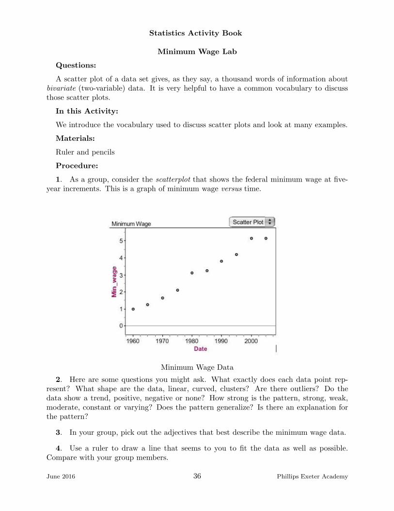
1. As a group, consider the scatterplot that shows the federal minimum wage at five-year increments. This is a graph of minimum wage versus time.
Minimum Wage Data
2. Here are some questions you might ask. What exactly does each data point rep-resent? What shape are the data, linear, curved, clusters? Are there outliers? Do thedata show a trend, positive, negative or none? How strong is the pattern, strong, weak,moderate, constant or varying? Does the pattern generalize? Is there an explanation forthe pattern?
3. In your group, pick out the adjectives that best describe the minimum wage data.
4. Use a ruler to draw a line that seems to you to fit the data as well as possible.Compare with your group members.
June 2016 36 Phillips Exeter Academy

Statistics Activity Book
5. Estimate the slope of the line, and then use coordinates of points on or very closeto the line to compute the equation of this line. Let x stand for the number of years after1960, and write the equation below, using y = mx+ b form:
6. Interpret the value of the slope m and the y-intercept b in the context of this story.Could you safely use the line to estimate the minimum wage in the current year? (Whatis the actual federal minimum wage is currently?)
7. Discuss your findings as a class.
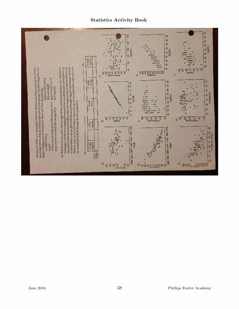
8. Now consider the scatter plots shown on the next page and working with your group,fill in the chart given above the scatterplots.
June 2016 37 Phillips Exeter Academy
Statistics Activity Book
June 2016 38 Phillips Exeter Academy
Statistics Activity Book
Least Squares Regression Lab
Before we begin: This is a short worksheet on the Least Squares Regression line. Thegoal is to summarize and condense some of the ideas about linear regression that appearin a few workshops in this book.
In this Activity: You will explore residuals with a very small data set.
Materials: You will need graph paper, a ruler and a pencil.
Procedure:
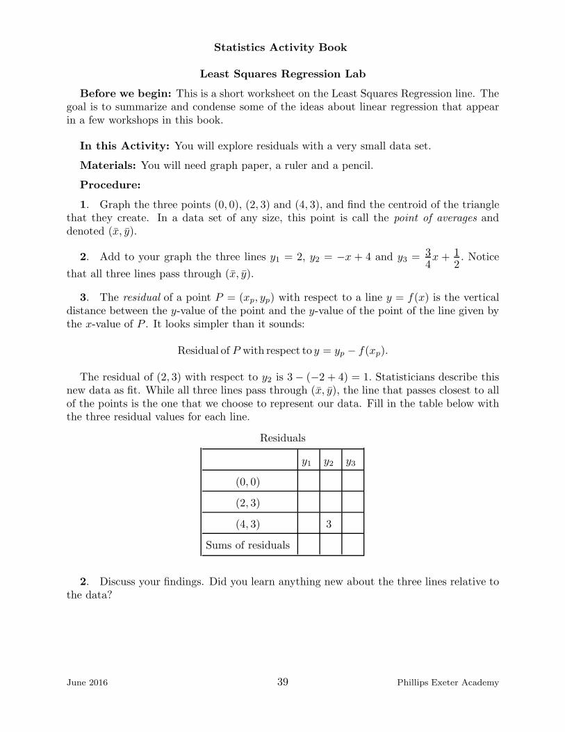
1. Graph the three points (0, 0), (2, 3) and (4, 3), and find the centroid of the trianglethat they create. In a data set of any size, this point is call the point of averages anddenoted (x, y).
2. Add to your graph the three lines y1 = 2, y2 = −x + 4 and y3 = 34x + 1
2. Notice
that all three lines pass through (x, y).
3. The residual of a point P = (xp, yp) with respect to a line y = f(x) is the verticaldistance between the y-value of the point and the y-value of the point of the line given bythe x-value of P . It looks simpler than it sounds:
Residual of P with respect to y = yp − f(xp).
The residual of (2, 3) with respect to y2 is 3− (−2 + 4) = 1. Statisticians describe thisnew data as fit. While all three lines pass through (x, y), the line that passes closest to allof the points is the one that we choose to represent our data. Fill in the table below withthe three residual values for each line.
Residuals
y1 y2 y3
(0, 0)
(2, 3)
(4, 3) 3
Sums of residuals
2. Discuss your findings. Did you learn anything new about the three lines relative tothe data?
June 2016 39 Phillips Exeter Academy

Statistics Activity Book
3. The squares of the residuals give a clearer picture of the ’fitness’ of a line. Fill inthe table this time with the squares of the residuals.
Squares of Residuals
y1 y2 y3
(0, 0)
(2, 3)
(4, 3) 9
Sums of squared residuals
4. The Least Squares Regression Line is the line that makes the sum of the squares ofthe residuals as small as possible. The line will always pass through the point of averages.When, if ever, will the sum of the squares of the residuals equal zero?
June 2016 40 Phillips Exeter Academy
Statistics Activity Book
Mammal LabBefore we begin:
A table of data containing the number of days in a gestation period and the life ex-pectancy for different mammals is located on the back page of this lab.
Questions:
How can we summarize our data with more than numbers or a description of its shape?
In this Activity:
You will learn how to model your data with a line.
Materials:
Graph paper and a graphing device.
Procedure:
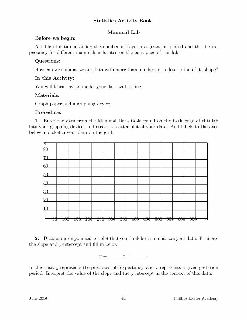
1. Enter the data from the Mammal Data table found on the back page of this labinto your graphing device, and create a scatter plot of your data. Add labels to the axesbelow and sketch your data on the grid.
............ .
.........
....
...........
..........
50 100 150 200 250 300 350 400 450 500 550 600 650
10
20
30
40
50
60
70
80
2. Draw a line on your scatter plot that you think best summarizes your data. Estimatethe slope and y-intercept and fill in below:
y = x + .
In this case, y represents the predicted life expectancy, and x represents a given gestationperiod. Interpret the value of the slope and the y-intercept in the context of this data.
June 2016 41 Phillips Exeter Academy

Statistics Activity Book
3. Compare your summary line to the lines drawn by others in your class. Are theythe same? Same slope? Same y-intercept?
4. Does your line go through all of the points on your scatter plot? Does it go throughany points?
5. A residual is the error of the regression line. That is, it is the difference betweenthe observed y value or height of the data point and the predicted y value or height on thesummary line.
6. For each point on the scatter plot draw a vertical line from your data point to thepoint on the summary line that shares an x-value with your data point. The length ofeach vertical line that you drew represents the absolute value of the residual of each datapoint with respect to the summary line.
7. Draw squares using each residual as one side of the square. The area of each squarerepresents the value of the squared residual. The sum of all of the areas of the squaresrepresents the total sum of the squared residuals. Estimate the sum of the squares of yourresiduals:
sum = .
Compare your squares with the whole class. Which line produced the smallest sum ofsquares.
8. The Least Squares Regression Line is the line that produces the minimum sum ofsquared residuals. Use your calculator’s LinReg feature to find the slope and intercept ofthe Least Squares Regression Line and fill them in below:
y = x + .
In this case, y represents the life expectancy predicted by the least squares regression line,and x represents a given gestation period.
In addition, record the value that your calculator gives you for the variable r:
r = .
The significance of r will be discussed in the next lab.
9. Add the line given by LinReg to your scatter plot (You can ask your calculator todo this automatically.) and compare with the lines and add it to the scatter plot on yourcalculator. Compare with the lines you and your classmates drew.
10. Discuss this new line as a good predictor of life expectance given gestation period.Would you accept this line as a good model for your data?
June 2016 42 Phillips Exeter Academy

Statistics Activity Book
11. Homework. The three data points corresponding to the human, the hippo and theelephant are far away from the bulk of the data, and small changes in their positionswill have a disproportionate effect on the equation of the least squares regression line.Statisticians call these points influential points. Remove these three points from your dataset, and as you did in problem 2) estimate what you think is the line that best modelsthis data. Next have your calculator find the exact least squares regression line. (Makesure to note the value of r for this new line.) Compare your new equation to the one youobtained in class with the three influential points still in the data set.
Mammal Data
Name Gestation Period in Days Life Expectancy in Years
Beaver 105 5
Cat 63 12
Cow 284 15
Deer 201 8
Elephant 660 35
Fox 52 7
Gorilla 258 20
Hippopotamus 238 41
Human 266 80
Horse 330 20
Moose 240 12
Mouse 21 3
Opossum 13 1
Rabbit 31 5
Wolf 63 5
Source: World Almanac and Book of Facts 2001, p.237
June 2016 43 Phillips Exeter Academy
Statistics Activity Book
Scrabble Letter LabBefore we begin:
This lab refers to the scores that each letter is assigned in a standard american-englishscrabble game. A table of these values is given on the back page of this lab.
Questions:
Given a data set, we can choose a line that best matches the data in many ways. Whatqualities would you like the line to have?
In this Activity:
You will make a scatter plot of the data, choose a line that might best match the dataand also find the least squares regression line.
Materials:
You need paper, pencils, a graphing device and the table of letter scores in the text.
Procedure:1. Enter the letter point data from the Scrabble Letter Value table into your calculator
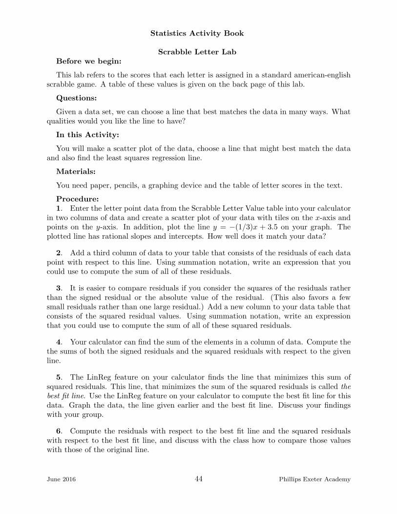
in two columns of data and create a scatter plot of your data with tiles on the x-axis andpoints on the y-axis. In addition, plot the line y = −(1/3)x + 3.5 on your graph. Theplotted line has rational slopes and intercepts. How well does it match your data?
2. Add a third column of data to your table that consists of the residuals of each datapoint with respect to this line. Using summation notation, write an expression that youcould use to compute the sum of all of these residuals.
3. It is easier to compare residuals if you consider the squares of the residuals ratherthan the signed residual or the absolute value of the residual. (This also favors a fewsmall residuals rather than one large residual.) Add a new column to your data table thatconsists of the squared residual values. Using summation notation, write an expressionthat you could use to compute the sum of all of these squared residuals.
4. Your calculator can find the sum of the elements in a column of data. Compute thethe sums of both the signed residuals and the squared residuals with respect to the givenline.
5. The LinReg feature on your calculator finds the line that minimizes this sum ofsquared residuals. This line, that minimizes the sum of the squared residuals is called thebest fit line. Use the LinReg feature on your calculator to compute the best fit line for thisdata. Graph the data, the line given earlier and the best fit line. Discuss your findingswith your group.
6. Compute the residuals with respect to the best fit line and the squared residualswith respect to the best fit line, and discuss with the class how to compare those valueswith those of the original line.
June 2016 44 Phillips Exeter Academy

Statistics Activity Book
Scrabble Letter Value
Letter # of tiles # of points
A 9 1
B 2 3
C 2 3
D 4 2
E 12 1
F 2 4
G 3 2
H 2 4
I 9 1
J 1 8
K 1 5
L 4 1
M 2 3
N 6 1
O 8 1
P 2 3
Q 1 10
R 6 1
S 4 1
T 6 1
U 4 1
V 2 4
W 2 4
X 1 8
Y 2 4
Z 1 10
June 2016 45 Phillips Exeter Academy

Statistics Activity Book
Correlation LabBefore we begin:
Statisticians summarize the characteristics of a set of data in an important numbercalled r, the correlation coefficient. This lab is meant to introduce this number and serveas reference in the future.
Questions:
Wouldn’t it be nice if we could quantify the notions of strength, positive association andthe other words that we use to describe a data set?
In this Activity:
This lab involves reading about r and then playing a guessing game.
Materials:
Pencils.
Procedure:
1. r is a statistic that measures the direction and strength of a linear relationship.Data that is perfectly linear and has a positive slope has a measure of r = 1. Data thatis perfectly linear but has a negative slope has a measure of r = −1. Data that has nodiscernable pattern has a correlation value of r = 0. Thus, −1 ≤ r ≤ 1. Have you seenother important mathematical variables that can take on this range of values?
2. There are two ways to calculate the value of r. Both use the idea that r capturesthe variation in the x direction, as well as the variation in the y direction. One can look atthe standardized scores of each data point and think of r as the average product of thesetwo standardized scores. Here is one version:
r =1
n− 1
∑
(
x− x
sx
)(
y − y
sy
)
.
Can you guess the definitions for x, y, sx and sy? If you graph the standardized data andfit a least squares line to them then the value of r will be exactly the slope of the line fittedto the transformed data. Discuss with your group.
3. One can also think of r as a measure of the variability in the response variable, y,that is explained by the variability of the independent variable, x. In this case:
r2 =SSTotal − SSResidual
SSTotal.
In words, r2 is the ratio of the sums of squares of the variability that is explained bythe model compared to the variability of the most basic model, y = y. Which definitionresonates more with you?
4. There are some important things to keep in mind about correlation. First, corre-lation is a measure of the strength of a LINEAR relationship. One can calculate r for
June 2016 46 Phillips Exeter Academy

Statistics Activity Book
many types of non-linear relationships, but the measure is meaningless if the relationshipis clearly non-linear from a visual examination of the scatterplot. Correlation is also a mea-sure for quantitative variables only. Can you think of a time when believing something islinear when it is not can cause you to make mistakes in predicted values?
5. And second, correlation does not imply causation. Just because two quantitativevariables are strongly linearly correlated, that does not mean that changes in one variablecause changes to occur in the other variable. Both variables may be responding to changesin a third variable that is not in your model. For example, in a sample of elementaryschool students, there is a strong positive correlation between shoe size and scores on astandardized test of arithmetic skills. Does this mean that studying arithmetic makesyour feet bigger? No, shoe size and arithmetic skill are related to each other because bothvariables respond to a third variable, age. Can you think of an example where correlationdoes not mean causation?
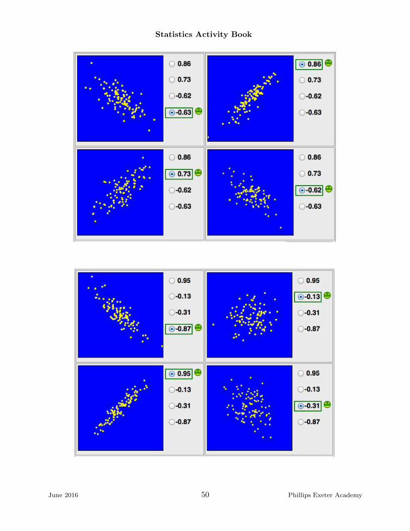
6. To get sense of the measure of correlation, try to guess the correlation r for thescatterplots on the following pages.
June 2016 47 Phillips Exeter Academy

Statistics Activity Book
June 2016 48 Phillips Exeter Academy

Statistics Activity Book
June 2016 49 Phillips Exeter Academy
Statistics Activity Book
June 2016 50 Phillips Exeter Academy

Statistics Activity Book
These graphics were generated athttp://www.istics.net/Correlations/
June 2016 51 Phillips Exeter Academy

Statistics Activity Book
Scrabble Word LabBefore we begin:
This lab refers to the scores that each letter is assigned in a standard american-englishscrabble game. A table of these values is given in the Scrabble Letter Lab. This lab isadapted from:
Workshop Statistics, Discover with data and Fathum.A Rossman, B Chance, R Lock.Key Curriculum Press, Emeryville 2001, 1-930190-07-7.
In this Activity:
You will generate data from the names in the room, plot the data, and consider thetrend, form and strength of data. It is always a good idea to look at your data in the formof a scatterplot before you compute a best fit line and its correlation coefficient.
Materials:
You need paper, pencils, a graphing device and the table of letter scores in the text.
Procedure:
1. Print your whole name in the top row of the table below, one letter per space.
2. Count the number of letters in your name ignoring blanks and spaces.
Number of letters in my name:
3. Using the data given on the back page of the Scrabble Letter Lab, write the pointvalue for each letter in your name in the space below it in the Name Score table above.Add the numbers to compute the scrabble value of your name.
Scrabble value of my name:
4. Repeat these steps with one or more names of your own choosing (”Double 0 Seven”for instance).
Number of letters: Scrabble value:
5. Share your score with the class, and fill in the table given on the last page of thislab with the data.
6. Enter your data into your calculator or graphing utility and make a scatter plot of
June 2016 52 Phillips Exeter Academy
Statistics Activity Book
word length vs point value for each name. Discuss with your group, the strength, trend andform of your data. Comment on the association between the length of names and theirScrabble value. Describe the three features with a few words below:
Strength
Trend
Form
7. How well do you think you could predict the Scrabble value of a person’s namegiven the length of the name? Try to predict the scrabble value of these names: DustinPedroia and Vladimir Putin. Discuss this question as a group. or class.
8. Can you find examples of pairs of names in which the longer name has a lowervalue? Can you find groups of three or four such names?
June 2016 53 Phillips Exeter Academy

Statistics Activity Book
Name Length and Score Data.
Name Number of Letters Scrabble Score
Pat Tecake 9 16
June 2016 54 Phillips Exeter Academy

Statistics Activity Book
Heights Lab
Questions:
Sometimes the r value can be misleading. It is important to also use the residuals toanalyze the fit of your fit.
In this Activity:
You will consider both the residuals and the r-value for the data concerning heights ininches and age in years that is located at the beginning of this lab.
Materials:
Graph paper and a graphing calculator.
Procedure:
1. Enter the data from the table below into your calculator.
Height vs. Age
Age (yrs) 2 3 4 5 6 7 8 9 10 11 12 13 14
Height (inches) 35.1 38.7 41.3 44.1 46.5 48.6 51.7 53.7 56.1 59.5 61.2 62.9 63.6
2. Use your calculator to make a scatter plot of height vs. age. Find the equation ofthe least squares line for predicted median height versus age and graph the line on theplot.
3. Find the value of r that goes with this line. What can you conclude about yourregression line based on r. Discuss the data, the line and r as a group.
4. If L1 contains the ages and L2 contains the heights, then define L3 to be Y 1(L1).Store the residuals of the fitted line in L4 by defining L4 = L2 − L3. Plot the residualsvs age on a new graph. Discuss the proper domain and range for these values with yourneighbor.
5. Do the new data, the residuals, seem to be randomly scattered about the x-axis?What can be said about modeling this data with a line?
June 2016 55 Phillips Exeter Academy

Statistics Activity Book
Was Leonardo Correct?Questions:
Leonardo da Vinci wrote instructions to artists about how to proportion the humanbody in painting and sculpture. Three of Leonardo’s rules were:
• Height equals the span of the outstretched arms.• Kneeling height is three-fourths of the standing height.• The length of the hand is one-ninth of the height.
Discuss as a group. Do these proportions seem reasonable? Is Leonardo really suggestingthat there is a linear relationship between these lengths?
In this Activity:
In this activity, you will gather data, compute the best fit line, compare it to Leonardo’spredicted linear models and use the r-value to support your findings.
Materials:
You will need meter sticks, pencils and classmates to complete this activity.
Procedure:
1. Decide as a class which units of measure you will use. Then working with a partner,measure your height, kneeling height, arm span and hand length, and record it in the tablebelow:
My Lengths
height kneeling height arm span hand length
2. Make a data table that includes the measurements from everyone in the class. Youcan use the table on the next page to record the class data if you wish.
3. Make three scatterplots of the data, arm span vs height, kneeling height vs standingheight and hand length vs height. On each scatter plot, add the lines that Leonardopredicted would model the data.
4. For the plots that have a linear trend, use your calculator to find the least squaresregression line and compute the r value or correlation coefficient.
5. Discuss the meaning of the regression lines as a group. In particular, discuss theslopes and y- intercepts in the context of this activity.
6. How well do the lines fit the data? Does the value of r support Leonardo’s rules?
June 2016 56 Phillips Exeter Academy

Statistics Activity Book
Leonardo’s Lengths
height kneeling height arm span hand length
Letting Height = H, Kneeling Height = K, Arm Span = A, and Hand Length = L,Leonardo says:
K =3
4·H + 0.
A = 1 ·H + 0.
L =1
9·H + 0.
June 2016 57 Phillips Exeter Academy

Statistics Activity Book
Counting F’sBefore we begin:
The text on the following page should not be handed out until you have explained theactivity to the students.
Questions:
Survey’s are a ubiquitous part of life these days. A well-written survey is very difficultto construct. Let’s say, you wanted to find out how many hours a night each participantslept of the week, how would you phrase your question?
In this Activity:
Students are going to count F’s in a text and compare their results.
Materials:
Enough copies of the text on the next page.
Procedure:
1. Pass out the text on the next page face down. Tell the participants that they aregoing to have 1 minute to count all of the F’s in the text.
2. Start your watch and let them count. Stop your watch and record the number ofF’s counted on the board. Did anyone count 34?
3. Let everyone know that no one found the correct number, and give them 3 moreminutes to count the F’s.
4. Again compare answers.
5. Discuss with the group the implications of this activity.
June 2016 58 Phillips Exeter Academy

Statistics Activity Book
THE NECESSITY OF TRAINING HANDS FOR FIRST-CLASS FARMS IN THEFATHERLY HANDLING OF FRIENDLY FARM LIVESTOCK IS FOREMOST IN THEMINDS OF FARM OWNERS. SINCE THE FOREFATHERS OF THE FARM OWN-ERS TRAINED THE FARM HANDS FOR THE FIRST-CLASS FARMS IN THE FA-THERLY HANDLING OF FARM LIVESTOCK, THE OWNERS OF THE FARMS FEELTHEY SHOULD CARRY ON WITH THE FAMILY TRADITION OF TRAINING FARMHANDS IN THE FATHERLY HANDLING OF FARM LIVESTOCK BECAUSE THEYBELIEVE IT IS THE BASIS OF GOOD FUNDAMENTAL FARM EQUIPMENT.
June 2016 59 Phillips Exeter Academy

Statistics Activity Book
Jelly Blubbers Colony
Before we begin:
Make sure that you have plenty of copies of the Jelly Blubbers Colony. This lab wasadapted from a Jellyblubber activity invented by Rex Boggs, a teacher in Queensland,Australia.
Questions:
Sampling is another important activity undertaken by amateur and professional statis-ticians. If I were curious to find out what Americans did to celebrate Memorial Day, Iwould probably ask my friends and family what they were doing, but this would not giveme a very good sample. How could I improve my sample?
In this Activity:
This lab encourages good sampling practices and techniques. Jellyblubbers are a re-cently discovered marine species. Scientists have discovered a colony of jellyblubbers andthey are trying to determine the width of a typical jellyblubber.
Materials:
Just the Jelly Blubbers Colony page.
Procedure:
1. You have been handed a sheet of 100 jellyblubbers. Study the sheet for 10 secondsand then record the numbers of 5 jellyblubbers that you think form a representative sampleof this jellyblubber population. Use the second sheet, which lists all the blubbers and theirwidths, to write down the widths of your chosen blubbers.
Number
Width
2. The sample you chose is called a judgment sample. Compute the mean width ofyour sample and record it below:
Mean Width
3. Share your data with the class by adding your result to the table of widths on theboard. You can record the class data on the data sheet on the last page of this lab.
4. Make a dot plot of the data class collected and notice the shape, approximate centerand range of the graph. Discuss with the class the shape, approximate center and rangeof the graph.
5. Next, use your table of random digits to select ten two-digit numbers from 00through 99. The pair 00 represents 100, and single digit numbers, like 7 for instance,
June 2016 60 Phillips Exeter Academy
Statistics Activity Book
are represented with two-digits, as 07 for instance. Find the mean of these ten numbers.Contribute your mean to the class data. Again, decide how to compare and comment onthe shape, center and range of this new data set. The sample you found using randomnumbers is called a simple random sample, abbreviated SRS.
6. The true mean, the actual, computed mean, of the widths is 18.6 cm. Which ofthe three methods gave a center closest to 19.4? Which method do you think is the moreaccurate for finding the mean, a judgment sample of an SRS? Why?
7. If you shake a collection of blubbers, the larger ones tend to sink and the smallerones rise. You have been a given a sheet divided into five strata. Notice that there is littlevariability among blubbers within each stratum (singular of strata), but more variabilitybetween strata (plural of stratum). Using random numbers and the table of jellyblubberwidths by strata, select two blubbers from each stratum and find the mean of these tennumbers. This method is called stratified sampling. Share your data with the class andcompare the mean of the class data from the stratified samples with the means from theSRS.
8. There are more ways to pick samples! A cluster of blubbers is a group of blubbersnear each other in the non shaken collection. There is usually a lot of variability withineach cluster, but not much variability among clusters. To select a cluster sample pick arandom digit between 1 and 20. Call it r. Multiply this digit by 5. Your cluster willconsist of that number, 5r, and the four numbers preceding it. For example, if you pick11 as your random digit then the cluster will consist of blubbers numbered 55, 54, 53, 52,51. Referring to the table of jellyblubber width values, write down the 5 widths from thiscluster and compute their mean. Share your cluster mean data with the class. Decide onthe best way to graph the class data generates from these cluster samples.
9. There is one more method of sampling using the original population, not the strat-ified population. Pick a random digit between 1 and 20. This number is the first blubber.Add 20 to your random number. This is your second blubber. Continue until you havefive blubbers. For example, if you pick 07 as your random number then your sample willconsist of blubbers 7, 27, 47, 67, 87. Compute the mean jellyblubber width of your sample.This is called a systematic sample. Comment on the graph generated by these means.
10. Discuss with your group and the class as a whole the advantages and disadvantagesof the different sampling methods.
June 2016 61 Phillips Exeter Academy
Statistics Activity Book
Jellyblubber Sampling Means
Sample Width
Sample Number Judgement SRS Stratified Cluster Systematic
Mean of Samples
June 2016 62 Phillips Exeter Academy

Statistics Activity Book
42
37
46
15
27
49
2
31
22
17
55
86
24
6
77
98
92
12
82
66
13
81
60
48
53
64
25 95
3
3429
1
57
80
76
97
7
63
39
40
36
38
85
90
87
18
43
44
83
5693
68
10
79
11
100
35
75
67
9
32
20
61
62
4
74
78
89 19
21
54
88
5
69
23
47
94
16
59
84
91
96
99
65
72
73
70
71
50
52
51
8
45
14
58
30
33
26
4128
June 2016 63 Phillips Exeter Academy
Statistics Activity Book
19
22
21
18
20
June 2016 64 Phillips Exeter Academy

Statistics Activity Book
Jellyblubber Width Values
Blubber # Width Blubber # Width Blubber # Width Blubber # Width
1 9 26 40 51 35 76 7
2 5 27 5 52 37 77 5
3 9 28 49 53 9 78 25
4 33 29 9 54 25 79 17
5 22 30 41 55 5 80 8
6 5 31 5 56 10 81 8
7 10 32 20 57 9 82 5
8 40 33 43 58 45 83 13
9 20 34 7 59 40 84 40
10 10 35 20 60 8 85 10
11 12 36 10 61 20 86 5
12 5 37 5 62 25 87 10
13 8 38 14 63 10 88 27
14 41 39 15 64 8 89 30
15 5 40 10 65 37 90 10
16 32 41 41 66 8 91 40
17 5 42 5 67 20 92 6
18 10 43 17 68 13 93 10
19 21 44 15 69 34 94 25
20 20 45 40 70 42 95 7
21 34 46 5 71 40 96 40
22 5 47 30 72 40 97 8
23 32 48 8 73 40 98 5
24 5 49 5 74 30 99 40
25 9 50 40 75 20 100 20
June 2016 65 Phillips Exeter Academy

Statistics Activity Book
Jellyblubber Width Values, Stratified
Blubber # Width Blubber # Width Blubber # Width Blubber # Width
1 2 26 8 51 13 76 32
2 2 27 8 52 13 77 32
3 5 28 8 53 14 78 33
4 5 29 8 54 15 79 34
5 5 30 8 55 15 80 34
6 5 31 8 56 17 81 35
7 5 32 8 57 17 82 37
8 5 33 9 58 20 83 37
9 5 34 9 59 20 84 40
10 5 35 9 60 20 85 40
11 5 36 9 61 20 86 40
12 5 37 9 62 20 87 40
13 5 38 9 63 20 88 40
14 5 39 10 64 20 89 40
15 5 40 10 65 20 90 40
16 5 41 10 66 21 91 40
17 5 42 10 67 22 92 40
18 5 43 10 68 25 93 40
19 5 44 10 69 25 94 41
20 5 45 10 70 25 95 41
21 6 46 10 71 25 96 41
22 7 47 10 72 27 97 42
23 7 48 10 73 30 98 43
24 7 49 10 74 30 99 45
25 8 50 12 75 30 100 49
June 2016 66 Phillips Exeter Academy

Statistics Activity Book
Discrimination or Not?
The scenario:
At Main Street Bank last year 48 male bank supervisor were each given a personnelfile and asked to judge whether Pat Tecake, the person represented in the file should berecommended for promotion to a branch-manager position or whether the Pat Tecakeshould not be recommended for promotion. The files given to each of the 48 supervisorswere in identical except that half of the files (24) were labelled ”male” and half of the fileswere labelled ”female”. Of the 48 files reviewed, 35 were recommendation for promotion.
In this Activity: You explore the notion of chance variation and see how to usesimulations to determine whether an outcome can be explained by chance variation.
Materials: You will need a deck of cards and pencils.
Procedure:
1. Suppose that the recommendations showed no evidence of discrimination on thebasis of gender. How many male Pats would you expect to be recommended for promotion?How many females? Enter these values in the table below
No discrimination by gender
Promotion No Promotion Total
Male 24
Female 24
35 13 48
2. Now suppose that the recommendations showed strong evidence of discriminationon the basis of gender. How many male Pats might you expect to be recommended forpromotion? How many females? Complete the table below to show a possible example ofthis case.
Discrimination on the basis of gender
Promotion No Promotion Total
Male 24
Female 24
35 13 48
3. Suppose the evidence for discrimination was inconclusive, neither strongly in favornor strongly against. Complete the following table to illustrate this situation.
June 2016 67 Phillips Exeter Academy

Statistics Activity Book
Inconclusive
Promotion No Promotion Total
Male 24
Female 24
35 13 48
4. In the actual situation in the study, the results were that 21 of the 24 files labelled”male” were recommended for promotion, and 14 of the 24 files labelled ”female” wererecommended for promotion. Enter these data into the table below.
Actual
Promotion No Promotion Total
Male 24
Female 24
35 13 48
5. In the actual situation, what percentage of the recommended candidates were male?Female?
6. Do you think there is evidence of discrimination against the female candidates?How certain are you?
7. How likely do you think that mere chance was responsible for the smaller numberof females recommended for promotion?
8. If you were the attorney retained by the female applicants how would you go aboutcollecting evidence to decide whether the results occurred by chance or whether there reallywas discrimination?
Simulating the CaseIf there really were no difference between the male and female candidates then you
might as well roll a die or use playing cards to pick male or female completely at random.Here’s how you will do it.
9. Remove two red cards and two black cards from a full deck of cards. You now have48 cards, 24 of each color. Let black represent male and red represent female.
June 2016 68 Phillips Exeter Academy

Statistics Activity Book
10. Shuffle the cards thoroughly and deal out 35 cards to represent the 35 candidateswho were recommended for promotion. You could do this more efficiently by dealing out13 cards to represent the candidates who were not recommended for promotion.)
11. Count the number of black cards to represent the number of men recommendedfor promotion. Record this number in the table below. And then repeat steps 10 and 11nineteen more times for a total of 20 simulations.
Simulation Data
Trial # 1 2 3 4 5 6 7 8 9 10 11 12 13 14 15 16 17 18 19 20
# of black cards
12. When your table is complete, record your findings on the grid given by placing adot above the number of black cards you counted. The dots will stack up as the numbersare repeated.
............ .
.........
............
..........
1 2 3 4 5 6 7 8 9 10 11 12 13 14 15 16 17 18 19 20 21 22 23 24
12345678910111213141516171819
Number of men recommended for promotion
13. Estimate the chances that 21 or more black cards (males) would have been selectedbased on your simulation.
June 2016 69 Phillips Exeter Academy

Statistics Activity Book
14. Based on your simulation do you think there is any evidence to support the claimthat recommending 21 males out of 35 candidates was due to discrimination rather thanto chance variation? In other words, how do your simulated results compare with those ofthe original study?
15. How do your simulated results compare with those of your classmates?
June 2016 70 Phillips Exeter Academy

Statistics Activity Book
Sudoku Experiment Part IIBefore we begin:
The class will need to have complete Sudoku Experiment Part I in order to completethis lab.
Questions:
Perhaps the differences in times to complete a puzzle were not actually due to whichtype of puzzles were solved, but occurred only by chance. How could we check to see if thedifference in completion times that we recorded were due simply to chance? What doesthat question mean in a statistical context?
In this Activity:
Students will explore the difference of two means to test the strength of their conclusions.Students will analyze the data again, this time using groups of times that are randomlyselected.
Materials:
Students need the data collected in Sudoku Experiment Part I and note cards.
Procedure:1. Using one notecard per Sudoku puzzle, write only the time it took to complete the
puzzle on the notecard. Once you have recorded each time on a separate notecard, shufflethe note cards. Split the deck into two piles divided roughly in half. Compute the meantime for each of the two piles and find their difference. Record your numbers in the tablebelow:
Sudoku Random Grouping Means
Simulation 1 2 3 4 5 6 7 8 Experimental Data
Group 1
Group 2
Difference
2. Shuffle the deck again, and repeat the process of dividing the deck into two partsand computing the mean of each part. Record your data in the your table and then shareyour data with the whole class.
3. Make a dot plot of all of the differences between group means.
4. Describe the distribution of the differences in sample means that were collected.
5. Did any of the simulations result in a difference value as large as the one initiallyfound?
June 2016 71 Phillips Exeter Academy

Statistics Activity Book
6. Use your calculator to compute the standard deviation of the differences. Howmany standard deviations away from the mean does the original difference fall? Does thissuggest that there is a significant difference in the time it takes to do each kind of puzzle,or do you think that the difference was just a matter of chance?
June 2016 72 Phillips Exeter Academy
Statistics Activity Book
Titanic
Before we begin:
This data in this lab comes from:
www.encyclopedia-titanica.org/titanic-statistics.html
and some of the questions come from:
Statistics In Action, A Watkins, R Scheaffer, G Cobb. Key Curriculum Press,Emeryville 2008, 978 -1-55953-909-8.
Questions:
You’ve heard expressions like, ”the chance of striking out a right-handed batter giventhat you are a left-handed pitcher” or ”the chance of having a boy given that you alreadyhave 2 girls.” How can you answer these questions effectively?
In this Activity:
In this lab, we explore these expressions of conditional probability. We begin the dis-astrous event of April 15th, 1912, when the unsinkable Royal Mail Ship Titanic struckan iceberg in the North Atlantic and sank. Only 710 of her 2204 passengers and crewsurvived. The following two-way table records the data on the fate of her passengers.
Titanic Survival Data
Survived Did Not Survive Total
First Class 201 123 324
Second Class 118 166 284
Third Class 181 528 709
Total Passengers 500 817 1317
Materials:
Pencils and paper.
Procedure:
1. Calculate the following probabilities. Leave your answers in fraction form.
A. If one passenger is randomly selected, what is the probability that the passengerwas in first class?
B. If one passenger is randomly selected, what is the probability that this passengersurvived?
C. If one passenger is randomly selected, what is the probability that this passengerwas in first class and survived?
June 2016 73 Phillips Exeter Academy

Statistics Activity Book
D. If one passenger is randomly selected, what is the probability that this passengerwas either in first class or survived or possibly both?
E. If one of the passengers is randomly selected from the first class passengers, whatis the probability that this passenger survived?
F. If one of passengers is randomly selected from the group of survivors, what is theprobability that this passenger was in first class?
2. Why is the answer to part E above larger than the answer to part C above?
3. The questions asked in parts E and F are examples of conditional probability. Inpart E we already know that the passenger is in first class. This is the condition. We couldrephrase the question as, ”What is the probability that the passenger survived, given thathe/she is in first class?” Rephrase the question to part F using this phrasing.
4. How are your answers to parts A, C and E above related?
5. A tree diagram is a great way to help answer the previous question. Below is a partof the tree which illustrates this story.
Each lowercase letter in the diagram should be replace with the probability of the eventat the end of the branch. You have already computed some of the probabilities, add in allof the probabilities to the tree.
6. The conventional shorthand for writing the probability of event S is P (S), soP (first class) = 324/1317. Use your answers to question 5 to find a formula for P (S givenT )in terms of P (S andT ) and P (T ).
7. One more example before we go.This problem is a classic example of a probabilityquestion with a surprising outcome. Suppose there is a rare but serious disease that affects1 % (0.01) of the population. There is a test that correctly identifies 95% (0.95) of thetime that you have the disease if you are in fact infected. The test also correctly identifies95% of the time that you are not infected if you are in fact not infected.
Suppose that during a routine physical you take the test which turns out positive. Thetest says that you are infected.
(A)What is the probability that the test reports a positive result if you are infected?
(B)What is the probability that you are infected if the tests reports a positive result?
June 2016 74 Phillips Exeter Academy

Statistics Activity Book
It may help to assume that the population is one million people. You might also wantto use a tree diagram or a two-way table like the one shown earlier in this lab. In the caseof the table the variables would be test: positive or test: negative and infected ornot infected.
June 2016 75 Phillips Exeter Academy

Statistics Activity Book
Probability and Independent Events
Before we begin:
This is a short worksheet on statistical independence. It seems reasonable to say thatthe price of a dozen eggs in Exeter and today’s temperature in London are independentevents. Knowing the value of one, gives you no further information about the other. Butwhat about events, ”X was in first class” and ”X did not survive”?
In this Activity:
You will explore the notion statistical independence. The statistical definition of inde-pendence is that A and B are independent events if and only if P (A givenB) = P (A).In other words, knowing the probability of B occurring sheds no light on the conditionalprobability of A given B.
Materials: You will graph paper, a deck of cards and a pencil.
Procedure:
1. Are the events ”passenger survived” and ”passenger was in first class” independentevents? Support your answer with appropriate probability calculations.
2. Are the events ”passenger survived” and ”passenger was in third class” independentevents? Support your answer with appropriate probability calculations.
3. Use appropriate probability calculations to support the statement: ”Not all passen-gers on board the Titanic had the same probability of surviving.
4. From a well-shuffled regular 52-card deck, pick a card at random. Note its colorand replace it. Take a second random card from the same deck. Note its color and replaceit. What is the probability that both cards are the same color?
5. From a well-shuffled regular 52-card deck, pick a card at random. Note its colorand do not replace it. Take a second random card from the same deck. Note its color andreplace it. What is the probability that both cards are the same color?
6. Draw a tree diagram to illustrate the probabilities in questions 4 and 5.
7. Would you agree that with the following statement? A and B are independent ifand only if
P (A andB) = P (A) ∗ P (B).
June 2016 76 Phillips Exeter Academy

Statistics Activity Book
Hand Eye Coordination
Questions:
Do you know if your friends are right-handed or left-handed? Can you use this infor-mation to find out if they are right-eyed or left-eye?
In this Activity:
This lab explores the independence of two attributes and gives an example of a two-waytable.
Materials:
People, pencils.
Procedure:
1. Determine whether each person in your group is right-eyed or left-eyed. The pro-cedure for determining which is simple. Pick out an object that is 15 feet or so away fromyou and face the object. Hold your hands together, palms out, at an arms length, makinga small space that you can see through. Look at the chosen object. Now close your righteye, keeping your left eye open. Can you still see the object? If yes, congratulations, youare left-eyed. Repeat, but this time closing your left eye and keeping your right eye open.Can you still see the object? If yes, congratulations, you are right-eyed. Record yourpersonal data below:
Your Hand Eye Information
Name Eyedness L or R Handedness L or R
2. Share your data with the whole group by filling in a large table with the name andhand and eye data. Discuss your findings. Do you see any trends?
3. A two-way table is a great way to summarize data such as the hand and eye datayou have collected. There are four possible combinations for handedness and eyedness,either LL, LR, RL or RR. Count the number of each type of person and record it in thetwo-way table below:
Hand and Eye Two-Way Table
Handedness
Eyedness Right Left
Right
Left
June 2016 77 Phillips Exeter Academy

Statistics Activity Book
4. For a randomly selected member of the class are handedness and eyedness indepen-dent? Discuss with your group and the class.
June 2016 78 Phillips Exeter Academy

Statistics Activity Book
Music and SportsQuestions:
How do you compare data that is not numeric like height in inches or time in seconds?What about data such as your favorite ice cream flavor or the color of your bicycle orwhether you bike, walk, drive, bus or train to work?
In this Activity:
This lab explores categorical data, which is different than the numeric quantitative datathat we have worked with in all of our previous labs.
Materials:
People, pencils, graph paper.
Procedure:
1. Ask your neighbor the following questions and record them below:
Do you play a sport? Yes � No �
Do you play a musical instrument (voice included)? Yes � No �
2. Now collect all of the data from the class on the board and record it in the tablebelow.
Music and Sports
Sports?
Music? Yes No Total
Yes
No
Total
Discuss your observations as a group.
3. Is there an association between playing a sport and playing a musical instrument?If you play a sport, are you more or less likely to play a musical instrument?
4. Of those who play sports, what proportion also play a musical instrument? Of thosewho do not play sports, what proportion play a musical instrument? Does there seem tobe an association?
June 2016 79 Phillips Exeter Academy

Statistics Activity Book
5. One way to visualize this data is to create a graph, similar to a histogram withtwo bars of equal heights, one labeled Yes, and one labeled No, based whether the personplays sports or not. Then each bar is colored with one color to indicate Does play aninstrument and with another color to indicate Does not play an instrument. Now compareareas and see if you change your conclusions about the association between playing a sportand playing an instrument.
June 2016 80 Phillips Exeter Academy

Statistics Activity Book
Expected Value LabQuestions:
The school basketball team is in a one-and-one situation. This means that each timethe team goes up for a free throw, they will get a second free throw if they make the first.Shura is a 60% shooter. This means that in the long run, Shura makes a basket 60% ofthe time. On any given trip to the free throw line, how many points do you expect Shurato make, 0, if she misses the first shot, 1, if she makes the first shot and misses the second,or 2, if she makes both shots?
In this Activity:
Students will simulate Shura’s free throw attempts and learn about expected value.
Materials:
You will need a pencil or pen, a bobby pin and the spinner provided below.
Procedure:
1. Discuss with your classmates how many points you expect Shura to score on anytrip to the free throw line.
2. In 100 trips to the line, about how many points will Shura make in total? Discussagain.
June 2016 81 Phillips Exeter Academy

Statistics Activity Book
3. Over the long run, what do you think will be Shura’s average number of points pertrip to the line? Discuss how to compute this number with your classmates.
4. Place a pen or pencil through the bobby pin you have been given at the center ofthe circle to make a spinner. Try flicking the bobby pin to see if you can simulate Shura’shitting or missing the hoop.
5. Divide into pairs, and assign one person to record and one person to ’throw’. Usethe spinner to simulate 20 trips to the free throw line, and record your results in thespinner’s table. Switch jobs, and simulate 20 more trips, recording your results in thespinner’s table.
Shura’s Simulation
Points Frequency Total Approximate Probability
0 /20
1 /20
2 /20
20
6. Combine the data from the whole class and enter the data in the table below.
Shura’s Simulation, Class Data
Points Total Frequency Total Frequency/Total Number of Trials
0
1
2
7. Based on the class data, what is Shura’s most likely score, 0, 1 or 2?
June 2016 82 Phillips Exeter Academy

Statistics Activity Book
8. Below is a tree diagram that helps analyze the theoretical probabilities of Shura’soutcomes. Discuss the graph with your partner. Can you explain the notation P (A,B)?What is the sum of the three probabilities of the three different outcomes, 0 points, 1 pointor 2 points?
9. Theoretically, in 100 trips to the free throw line, how many 0’s, 1’s and 2’s can weexpect Shura to score?
10. What is Shura’s average score per trip to the line? This number is called the expectedvalue of Shura’s score.
June 2016 83 Phillips Exeter Academy
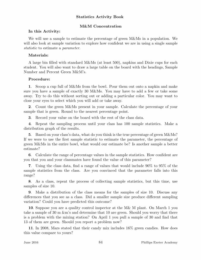
Statistics Activity Book
M&M Concentration
In this Activity:
We will use a sample to estimate the percentage of green M&Ms in a population. Wewill also look at sample variation to explore how confident we are in using a single samplestatistic to estimate a parameter.
Materials:
A large bin filled with standard M&Ms (at least 500), napkins and Dixie cups for eachstudent. You will also want to draw a large table on the board with the headings, SampleNumber and Percent Green M&M’s.
Procedure:
1. Scoop a cup full of M&Ms from the bowl. Pour them out onto a napkin and makesure you have a sample of exactly 30 M&Ms. You may have to add a few or take someaway. Try to do this without sorting out or adding a particular color. You may want toclose your eyes to select which you will add or take away.
2. Count the green M&Ms present in your sample. Calculate the percentage of yoursample that is green. Round to the nearest percentage point.
3. Record your value on the board with the rest of the class data.
4. Repeat the sampling process until your class has 100 sample statistics. Make adistribution graph of the results.
5. Based on your class’s data, what do you think is the true percentage of green M&Ms?If we were to use the first sample statistic to estimate the parameter, the percentage ofgreen M&Ms in the entire bowl, what would our estimate be? Is another sample a betterestimate?
6. Calculate the range of percentage values in the sample statistics. How confident areyou that you and your classmates have found the value of this parameter?
7. Using the class data, find a range of values that would include 90% to 95% of thesample statistics from the class. Are you convinced that the parameter falls into thisrange?
8. As a class, repeat the process of collecting sample statistics, but this time, usesamples of size 10.
9. Make a distribution of the class means for the samples of size 10. Discuss anydifferences that you see as a class. Did a smaller sample size produce different samplingvariation? Could you have predicted this outcome?
10. Suppose you are a quality control inspector at the M& M plant. On March 1 youtake a sample of 30 m &m’s and determine that 10 are green. Should you worry that thereis a problem with the mixing station? On April 1 you pull a sample of 30 and find that13 of them are green. Should you report a problem now?
11. In 2008, Mars stated that their candy mix includes 16% green candies. How doesthis value compare to yours?
June 2016 84 Phillips Exeter Academy

Statistics Activity Book
12. Topics for further discussion include: Were your samples biased? How many samplesdo you need to make a reasonable guess at the parameter’s value? What have otherinterested consumers found to be the value of the parameter?
June 2016 85 Phillips Exeter Academy
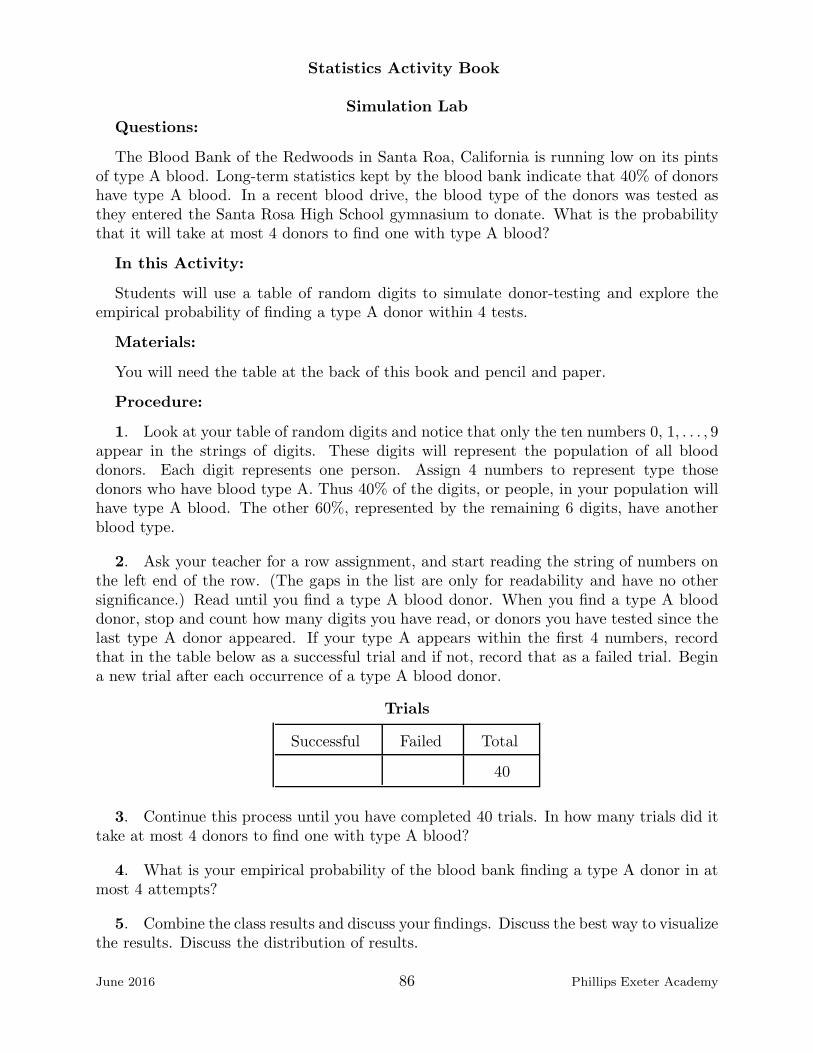
Statistics Activity Book
Simulation Lab
Questions:
The Blood Bank of the Redwoods in Santa Roa, California is running low on its pintsof type A blood. Long-term statistics kept by the blood bank indicate that 40% of donorshave type A blood. In a recent blood drive, the blood type of the donors was tested asthey entered the Santa Rosa High School gymnasium to donate. What is the probabilitythat it will take at most 4 donors to find one with type A blood?
In this Activity:
Students will use a table of random digits to simulate donor-testing and explore theempirical probability of finding a type A donor within 4 tests.
Materials:
You will need the table at the back of this book and pencil and paper.
Procedure:
1. Look at your table of random digits and notice that only the ten numbers 0, 1, . . . , 9appear in the strings of digits. These digits will represent the population of all blooddonors. Each digit represents one person. Assign 4 numbers to represent type thosedonors who have blood type A. Thus 40% of the digits, or people, in your population willhave type A blood. The other 60%, represented by the remaining 6 digits, have anotherblood type.
2. Ask your teacher for a row assignment, and start reading the string of numbers onthe left end of the row. (The gaps in the list are only for readability and have no othersignificance.) Read until you find a type A blood donor. When you find a type A blooddonor, stop and count how many digits you have read, or donors you have tested since thelast type A donor appeared. If your type A appears within the first 4 numbers, recordthat in the table below as a successful trial and if not, record that as a failed trial. Begina new trial after each occurrence of a type A blood donor.
Trials
Successful Failed Total
40
3. Continue this process until you have completed 40 trials. In how many trials did ittake at most 4 donors to find one with type A blood?
4. What is your empirical probability of the blood bank finding a type A donor in atmost 4 attempts?
5. Combine the class results and discuss your findings. Discuss the best way to visualizethe results. Discuss the distribution of results.
June 2016 86 Phillips Exeter Academy
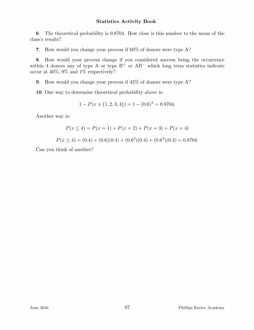
Statistics Activity Book
6. The theoretical probability is 0.8704. How close is this number to the mean of theclass’s results?
7. How would you change your process if 60% of donors were type A?
8. How would your process change if you considered success being the occurrencewithin 4 donors any of type A or type B+ or AB− which long term statistics indicateoccur at 40%, 9% and 1% respectively?
9. How would you change your process if 45% of donors were type A?
10. One way to determine theoretical probability above is:
1− P (x ∋ {1, 2, 3, 4}) = 1− (0.6)4 = 0.8704.
Another way is:
P (x ≤ 4) = P (x = 1) + P (x = 2) + P (x = 3) + P (x = 4)
P (x ≤ 4) = (0.4) + (0.6)(0.4) + (0.62)(0.4) + (0.63)(0.4) = 0.8704.
Can you think of another?
June 2016 87 Phillips Exeter Academy

Statistics Activity Book
Crop SamplingBefore we begin:
This lab was adapted from a lab designed by Carolyn Doetsch, Peter Flanagan-Hyde,Mary Harrison, Josh Tabor and Chuck Tiberio for the North Carolina School of Scienceand Mathematics Statistics Leadership Institute and found at:
courses.ncssm.edu/math/Stat inst01/PDFS/river.pdf
Questions:
At the beginning of the spring a farmer cleared a new field and planted a first cropof corn. The new field is a unique plot of land in that a river runs along one side. Thecorn looks good in some areas of the field but not in others. The farmer is not sure thatharvesting the field is worth the expense. He has decided to harvest 10 plots and use thisinformation to estimate the total yield. Based on this estimate, he will decide whether toharvest the remaining plots and also whether to use this field next year.
In this Activity:
You will explore four different sampling methods: convenience samples, simple randomsamples, vertical strata and horizontal strata and discuss their merits and pitfalls.
Materials:
A calculator, pencils and paper.
Procedure:
1. Convenience Sample. The farmer began by choosing 10 plots that would be easyto harvest. They are filled on the grid below:
June 2016 88 Phillips Exeter Academy
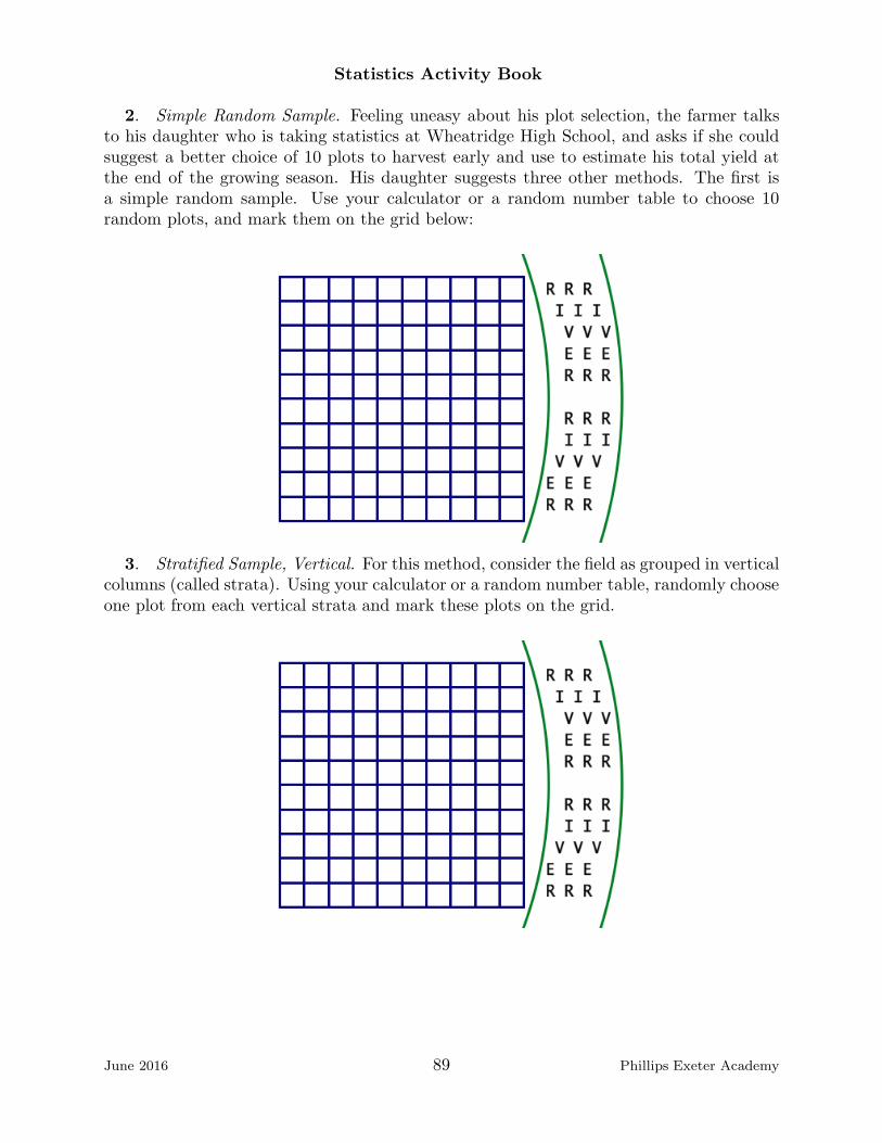
Statistics Activity Book
2. Simple Random Sample. Feeling uneasy about his plot selection, the farmer talksto his daughter who is taking statistics at Wheatridge High School, and asks if she couldsuggest a better choice of 10 plots to harvest early and use to estimate his total yield atthe end of the growing season. His daughter suggests three other methods. The first isa simple random sample. Use your calculator or a random number table to choose 10random plots, and mark them on the grid below:
3. Stratified Sample, Vertical. For this method, consider the field as grouped in verticalcolumns (called strata). Using your calculator or a random number table, randomly chooseone plot from each vertical strata and mark these plots on the grid.
June 2016 89 Phillips Exeter Academy
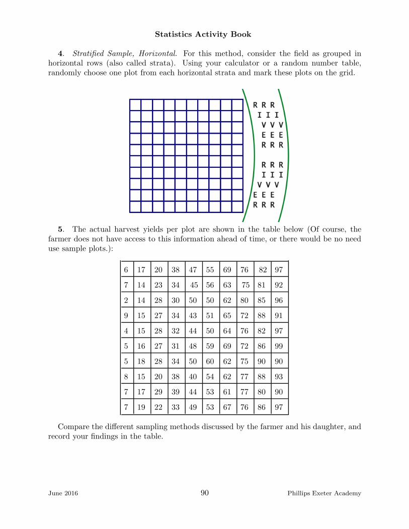
Statistics Activity Book
4. Stratified Sample, Horizontal. For this method, consider the field as grouped inhorizontal rows (also called strata). Using your calculator or a random number table,randomly choose one plot from each horizontal strata and mark these plots on the grid.
5. The actual harvest yields per plot are shown in the table below (Of course, thefarmer does not have access to this information ahead of time, or there would be no needuse sample plots.):
6 17 20 38 47 55 69 76 82 97
7 14 23 34 45 56 63 75 81 92
2 14 28 30 50 50 62 80 85 96
9 15 27 34 43 51 65 72 88 91
4 15 28 32 44 50 64 76 82 97
5 16 27 31 48 59 69 72 86 99
5 18 28 34 50 60 62 75 90 90
8 15 20 38 40 54 62 77 88 93
7 17 29 39 44 53 61 77 80 90
7 19 22 33 49 53 67 76 86 97
Compare the different sampling methods discussed by the farmer and his daughter, andrecord your findings in the table.
June 2016 90 Phillips Exeter Academy

Statistics Activity Book
Method Mean yield per plot Estimate of total yield
convenience sample
simple random sample
vertical strata
horizontal strata
6. You have looked at four different methods of choosing plots. Is there a reason, otherthan convenience, to choose one method over the other?
7. How did your estimates vary according the different sampling methods you used?
8. Compare your results to the rest of the class and discuss your findings.
9. Pool all the results from the class and make a boxplot of the data for the simplerandom sample, which we will call SRS. Do the same for the vertical strata and thehorizontal strata. Discuss the results?
10. Which sampling method is best for the farmer?
11. What was the actual yield of the farmer’s field, and how did the boxplots relate tothis value?
12. A year has gone by, and the farmer has installed an irrigation system to try andeven out the yields in his field. He and his daughter decide to sample his plots using aSRS, and vertically and horizontally stratified samples. Repeat the process of generatinga list of plots to sample for each method, and in each case, mark your chosen plots on thegrids below:
SRS Stratified Sample (Vertical) Stratified Sample (Horizontal)
June 2016 91 Phillips Exeter Academy

Statistics Activity Book
13. The actual harvest yields per plot post irrigation are shown in the table below:
79 81 95 69 65 59 88 65 66 91
80 75 88 80 82 66 76 99 62 61
97 50 92 92 91 84 75 85 63 89
99 71 55 75 65 66 66 86 96 50
57 95 51 79 98 71 70 86 89 76
57 53 90 71 50 76 56 91 85 64
69 95 98 90 93 97 79 95 73 90
58 99 75 51 67 81 55 63 89 74
98 62 73 54 50 76 91 50 90 55
91 59 69 59 71 72 85 85 86 97
Again, compare the different sampling methods and record your findings in the table.
Method Mean yield per plot Estimate of total yield
simple random sample
vertical strata
horizontal strata
14. Compare the class box plots of the sample means obtained from the three samplingmethods. Discuss with the class.
15. Based on the results of both the initial sampling and the post irrigation samplingunder what conditions is it more useful to use stratified sampling? Random sampling?
June 2016 92 Phillips Exeter Academy

Statistics Activity Book
Anscombe’s QuartetQuestions:
Statistics is a relatively new topic of research and application. Statistics is a very activeand dynamic area of research and application.
In this Activity:
Students will read a mathematical article from 1973, and consider an important dataset called Anscombe’s Quartet.
Materials:
You will need the following table of data:
Anscombe’s Quartet
X1 Y1 X2 Y2 X3 Y3 X4 Y4
10 8.04 10 9.14 10 7.46 8 6.58
8 6.95 8 8.14 8 6.77 8 5.76
13 7.58 13 8.74 13 12.74 8 7.71
9 8.81 9 8.77 9 7.11 8 8.84
11 8.33 11 9.26 11 7.81 8 8.47
14 9.96 14 8.1 14 8.84 8 7.04
6 7.24 6 6.13 6 6.08 8 5.25
4 4.26 4 3.1 4 5.39 19 12.5
12 10.84 12 9.13 12 8.15 8 5.56
7 4.82 7 7.26 7 6.42 8 7.91
5 5.68 5 4.74 5 5.73 8 6.89
Procedure:
1. Read the Introduction to the article.
2. Use the data table to create your own scatter plots of the data and discuss withyour classmates.
3. Read the rest of the article for homework and see how Anscombe’s ideas comparewith your and your classmates’ ideas.
June 2016 93 Phillips Exeter Academy
Statistics Activity Book
June 2016 94 Phillips Exeter Academy
Statistics Activity Book
June 2016 95 Phillips Exeter Academy

Statistics Activity Book
June 2016 96 Phillips Exeter Academy

Statistics Activity Book
June 2016 97 Phillips Exeter Academy

Statistics Activity Book
June 2016 98 Phillips Exeter Academy

Statistics Activity Book
June 2016 99 Phillips Exeter Academy

Statistics Activity Book
Cereal Box ProblemBefore we begin:
This lab is based on the following article:The Cereal Box Problem Revisted Jesse L. M. Wilkins, Virginia Polytechnic In-
stitute and State University School of Science and Mathematics (Volume 99(3), March1999),
http://eric.ed.gov/?id=EJ590348
Questions:
Fastbreak Cereal Company wanted to promote their Star Oats cereal, so they madeHarry Potter figurines, Harry, Ron, Hermione, Hagrid, Dumbledore and Draco, and theyplaced a character in each box of Star Oats. You can image what a stir this caused.Assuming equal chances of getting any of the six characters, (i.e. Fastbreak did notwithhold all of the boxes with Dumbledore from shipping to increase demand for its cerealbeyond the increase certainly guaranteed by the insertion of prizes in its packages.) howmany boxes of Star Oats should any kid expect to have to buy, open, consume in order toget a full set of six characters?
In this Activity:
Students will be introduced to Monte Carlo simulation, the process of simulating anevent that is difficult, expensive or otherwise impossible to affect. They will explore theanswer to the above question and discover an empirical answer. They will also exploreways to understand and generate a theoretical answer to the question of how many boxesof cereal one must open to collect all six prizes.
Materials:
You will need one die for each two students and pencils.
Procedure:
1. Break into teams of two, pick a die and assign one of the six numbers to each of theHarry Potter characters. This die will allow us to model buying, opening and consumingboxes of cereal without actually buying, opening and consuming boxes of Star Oats.
Characters’ numbers
Character Harry Ron Hermione Hagrid Dumbledore Draco
Number
2. Have one person roll the die (buy, open and consume boxes of Star Oats) until theyobtain all 6 numbers (characters). Using the table below, the other person can record thenumbers as they are obtained and after they have all been obtained, count the number ofrolls. Divide the work of generating 100 simulated trials amongst the pairs in your class.
June 2016 100 Phillips Exeter Academy
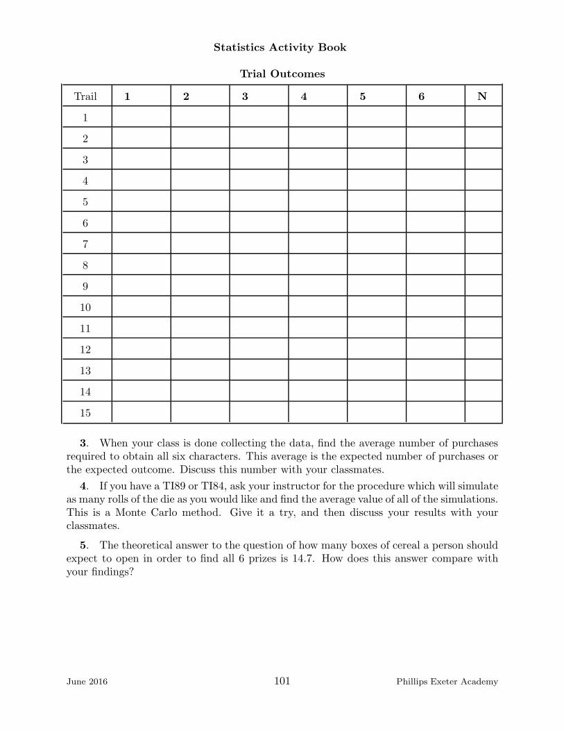
Statistics Activity Book
Trial Outcomes
Trail 1 2 3 4 5 6 N
1
2
3
4
5
6
7
8
9
10
11
12
13
14
15
3. When your class is done collecting the data, find the average number of purchasesrequired to obtain all six characters. This average is the expected number of purchases orthe expected outcome. Discuss this number with your classmates.
4. If you have a TI89 or TI84, ask your instructor for the procedure which will simulateas many rolls of the die as you would like and find the average value of all of the simulations.This is a Monte Carlo method. Give it a try, and then discuss your results with yourclassmates.
5. The theoretical answer to the question of how many boxes of cereal a person shouldexpect to open in order to find all 6 prizes is 14.7. How does this answer compare withyour findings?
June 2016 101 Phillips Exeter Academy
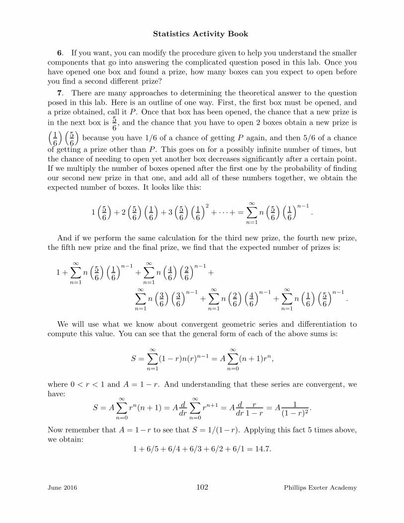
Statistics Activity Book
6. If you want, you can modify the procedure given to help you understand the smallercomponents that go into answering the complicated question posed in this lab. Once youhave opened one box and found a prize, how many boxes can you expect to open beforeyou find a second different prize?
7. There are many approaches to determining the theoretical answer to the questionposed in this lab. Here is an outline of one way. First, the first box must be opened, anda prize obtained, call it P . Once that box has been opened, the chance that a new prize is
in the next box is 56, and the chance that you have to open 2 boxes obtain a new prize is
(
16
)(
56
)
because you have 1/6 of a chance of getting P again, and then 5/6 of a chance
of getting a prize other than P . This goes on for a possibly infinite number of times, butthe chance of needing to open yet another box decreases significantly after a certain point.If we multiply the number of boxes opened after the first one by the probability of findingour second new prize in that one, and add all of these numbers together, we obtain theexpected number of boxes. It looks like this:
1(
56
)
+ 2(
56
)(
16
)
+ 3(
56
)(
16
)2
+ · · ·+ =
∞∑
n=1
n(
56
)(
16
)n−1
.
And if we perform the same calculation for the third new prize, the fourth new prize,the fifth new prize and the final prize, we find that the expected number of prizes is:
1 +
∞∑
n=1
n(
56
)(
16
)n−1
+
∞∑
n=1
n(
46
)(
26
)n−1
+
∞∑
n=1
n(
36
)(
36
)n−1
+∞∑
n=1
n(
26
)(
46
)n−1
+∞∑
n=1
n(
16
)(
56
)n−1
.
We will use what we know about convergent geometric series and differentiation tocompute this value. You can see that the general form of each of the above sums is:
S =∞∑
n=1
(1− r)n(r)n−1 = A∞∑
n=0
(n+ 1)rn,
where 0 < r < 1 and A = 1− r. And understanding that these series are convergent, wehave:
S = A∞∑
n=0
rn(n+ 1) = A ddr
∞∑
n=0
rn+1 = A ddr
r1− r
= A 1(1− r)2
.
Now remember that A = 1− r to see that S = 1/(1− r). Applying this fact 5 times above,we obtain:
1 + 6/5 + 6/4 + 6/3 + 6/2 + 6/1 = 14.7.
June 2016 102 Phillips Exeter Academy

Statistics Activity Book
Nine-BlockBefore we begin: The words of the authors of this activity:
In sum, the 9-block form is designed to scaffold student insight into the systematicityand rigor of combinatorial analysis by serving as a template that helps students initiallysee, create, and organize the combinatorial space.
This lab was adapted from:There Once Was a 9-Block ... - A Middle-School Design for Probability
and Statistics.Abrahamson, D., Janusz, R. M., and Wilensky, U. Journal of StatisticsEducation [Online] (2006).
www.amstat.org/publications/jse/v14n1/abrahamson.html
Questions:
How many different ways are there of filling up a nine-block grid with blue and greenblocks? How would you count the number of ways?
In this Activity:
In this lab students create 9-blocks and discuss ways to count and record all possibilities.The goal is to create a tower of 9-blocks, and then have that as a visual from which todraw conclusions and test hypotheses.
Materials:
9-block grid sheets, colored pencils, crayons or dot markers.
Procedure:
1. Fill in each of the squares below with blue or green. Compare your square withyour neighbor.
June 2016 103 Phillips Exeter Academy

Statistics Activity Book
2. On the grid below draw 5 different possible blue and green 9-blocks. Compare yoursquares with your neighbor’s squares. How many are the same? How many are different?
3. How many possible 9-blocks can be made? How many different 9-blocks has yourclass made so far?
4. Together devise a strategy for creating all 9-blocks.
5. Together devise a strategy for displaying all 9-blocks.
6. How many different 9-blocks have 4 blue squares?
7. How many different 9-blocks have 6 blue squares?
8. How many different 9-blocks have a blue square in the top left-hand corner?
9. How many different 9-blocks have a blue square in each of the corners?
10. HOMEWORK: Make and display all 4-block possibilities and write three probabilityquestions you might use your display to answer.
June 2016 104 Phillips Exeter Academy

Statistics Activity Book
Homework, Activities and Exercises
1. Confirm that the five points in the table all lie on a single line.Write an equation for the line. Use your calculator to make a scatterplot, and graph the line on the same system of axes.
2. Given the line whose equation is y = 2x + 3 and the pointsA = (0, 0), B = (1, 9), C = (2, 8), D = (3, 3), and E = (4, 10), dothe following:(a) Plot the line and the points on the same axes.(b) Let A′ be the point on the line that has the same x-coordinate as A. Subtract they-coordinate of A′ from the y-coordinate of A. The result is called the residual of A.(c) Calculate the other four residuals.(d) What does a residual tell you about the relation between a point and the line?
10−1−2−3
x
−11357
y
3. The table at right shows data that Morgan collected during a10-mile bike ride that took 50 minutes. The cumulative distance(measured in miles) is tabled at ten-minute intervals.(a) Make a scatter plot of this data. Why might you expect thedata points to line up? Why do they not line up?(b) Morgan’s next bike ride lasted for 90 minutes. Estimate itslength (in miles), and explain your method. What if the bike ridehad lasted t minutes; what would its length be, in miles? 50.0
40.0
30.0
20.0
10.0
0.0
time
10.0
8.2
5.7
4.4
2.3
0.0
dist
4. Let P = (1.35, 4.26), Q = (5.81, 5.76), R = (19.63, 9.71), and R′ = (19.63, y), whereR′ is on the line through P and Q. Calculate the residual value 9.71− y.
5. (Continuation)(a) Given that Q′ = (5.81, y) is on the line through P and R, find y. Calculate 5.76− y.(b) Given that P ′ = (1.35, y) is on the line through Q and R, find y. Calculate 4.26− y.(c) Which of the three lines best fits the given data? Why do you think so?
6. Verify that P = (−1.15, 0.97), Q = (3.22, 2.75), and R = (9.21, 10.68) are not collinear.(a) Let Q′ = (3.22, y) be the point on the line through P and R that has the samex-coordinate as Q has. Find y, then calculate the residual value 2.75− y.(b) Because the segment PR seems to provide the most accurate slope, one might regardPR as the line that best fits the given data. The point Q has as yet played no part in thisdecision, however. Find an equation for the line that is parallel to PR and that makes thesum of the three residuals zero. In this sense, this is the line of best fit.
7. Given T = (1.20, 7.48), U = (4.40, 6.12), and V = (8.80, 2.54), find an equation forthe line that is parallel to the line TV and that makes the sum of the three residuals zero.This line is called the zero-residual line determined by T , U , and V .
June 2016 105 Phillips Exeter Academy
Statistics Activity Book
1. Consider the points A = (−0.5,−8), B = (0.5,−5), and C = (3, 4.5). Calculate theresidual for each of these points with respect to the line 4x− y = 7.2. Show that the zero-residual line of the points P , Q, and R goes through their centroid.
3. (Continuation) The zero-residual line makes the sum of the residuals zero. What aboutthe sum of the absolute values of the residuals? Is it possible for this sum to be zero? Ifnot, does the zero-residual line make this sum as small as it can be?
4. Let P = (2, 6), Q = (8, 10), and R = (11, 2). Find an equation for the zero-residualline, as well as the line of slope 2 through the centroid G of triangle PQR. Find the sumof the residuals of P , Q, and R with respect to the second line. Repeat the investigationusing the line of slope −1 through G. Use your results to formulate a conjecture.
5. What is the sine of the angle whose tangent is 2? First find an answer without usingyour calculator (draw a picture), then use your calculator to check.
6. Consider the line y = 1.8x+ 0.7.(a) Find a point whose residual with respect to this line is −1.(b) Describe the configuration of points whose residuals are −1 with respect to this line.
7. The median of a set of numbers is the middle number, once the numbers have beenarranged in order. If there are two middle numbers, then the median is half their sum.Find the median of (a) 5, 8, 3, 9, 5, 6, 8; (b) 4, 10, 8, 7.
8. A median-median point for a set of points is the point whose x-value is the median ofall the given x-values and whose y-value is the median of all the given y-values. Find themedian-median point for the following set of points: (1, 2), (2, 1), (3, 5), (6, 4), and (10, 7).
9. The table shows the population of New Hampshire at the startof each of the last six decades.(a) Write an equation for the line that contains the data points for1960 and 2010.(b) Write an equation for the line that contains the data points for2000 and 2010.(c) Make a scatter plot of the data. Graph both lines on it.(d) Use each of these equations to predict the population of NewHampshire at the beginning of 2020. For each prediction, explain why you could expect itto provide an accurate forecast.
2010
2000
1990
1980
1970
1960
year
1316472
1238415
1113915
920610
746284
606921
pop
10. The zero-residual line determined by (1, 2), (4, k), and (7, 8) is y = x− 2
3. Sketch the
line, plot the points, and find the value of k. Be prepared to explain your method.
June 2016 106 Phillips Exeter Academy

Statistics Activity Book
1. Plot the following nine non-collinear points:(0.0, 1.0) (1.0, 2.0) (2.0, 2.7) (3.0, 4.0) (4.0, 3.0) (5.0, 4.6) (6.0, 6.2) (7.0, 8.0) (8.0, 8.5)
(a) Use your ruler (clear plastic is best) to draw the line that seems to best fit this data.(b) Record the slope and the y-intercept of your line.
2. (Continuation) Extend the zero-residual-line technique to this data set as follows:First, working left to right, separate the data into three groups of equal size (three pointsin each group for this example). Next, select the summary point for each group by findingits median-median point. Finally, calculate the zero-residual line defined by these threesummary points. This line is called the median-median line. Sketch this line, and compareit with your estimated line of best fit.
3. (Continuation) If the number of data points is not divisible by three, the three groupscannot have the same number of points. In such cases, it is customary to arrange thegroup sizes in a symmetric fashion. For instance:(a) Enlarge the data set to include a tenth point, (9.0, 9.5), and then separate the ten pointsinto groups, of sizes three, four, and three points, reading from left to right. Calculate thesummary points for these three groups.(b) Enlarge the data set again to include an eleventh point, (10.0, 10.5). Separate theeleven points into three groups and calculate the three summary points.
4. An avid gardener, Gerry Anium just bought 80 feet ofdecorative fencing, to create a border around a new rectangu-lar garden that is still being designed.(a) If the width of the rectangle were 5 feet, what would thelength be? How much area would the rectangle enclose? Writethis data in the first row of the table.(b) Record data for the next five examples in the table.(c) Let x be the width of the garden. In terms of x, fill in thelast row of the table.(d) Use your calculator to graph the rectangle’s area versus x, for 0 ≤ x ≤ 40. As a check,you can make a scatter plot using the table data. What is special5about the values x = 0and x = 40?(e) Comment on the symmetric appearance of the graph. Why was it predictable?(f) Find the point on the graph that corresponds to the largest rectangular area thatGerry can enclose using the 80 feet of available fencing. This point is called the vertex .
x35
24
22
16
9
5width length area
5. Using only positive numbers, add the first two odd numbers, the first three oddnumbers, and the first four odd numbers. Do your answers show a pattern? What isthe sum of the first n odd numbers?
6. It is often convenient to use what is called sigma notation to describe a series. Forexample, the preceding sum could have been written
∑nk=0
(2k+1) Use sigma notation todescribe the sum of the first n even integers.
June 2016 107 Phillips Exeter Academy
Statistics Activity Book
1. Jan had the same summer job for the years 1993 through 1996, earning $250 in 1993,$325 in 1994, $400 in 1995, and $475 in 1996.(a) Plot the four data points, using the horizontal axis for “year”. You should be able todraw a line through the four points.(b) What is the slope of this line? What does it represent?(c) Which points on this line are meaningful in this context?(d) Guess what Jan’s earnings were for 1992 and 1998, assuming the same summer job.(e) Write an inequality that states that Jan’s earnings in 1998 were within 10% of theamount you guessed.
2. The height h (in feet) above the ground of a baseball depends upon the time t (inseconds) it has been in flight. Cameron takes a mighty swing and hits a bloop single whoseheight is described approximately by the equation h = 80t − 16t2. Without resorting tographing on your calculator, answer the following questions:(a) How long is the ball in the air?(b) The ball reaches its maximum height after how many seconds of flight?(c) What is the maximum height?(d) It takes approximately 0.92 seconds for the ball to reach a height of 60 feet. On itsway back down, the ball is again 60 feet above the ground; what is the value of t whenthis happens?
3. Consider the triangular arrangements of hearts shown below:
♥ ♥ ♥♥
♥ ♥ ♥♥ ♥♥
♥ ♥ ♥ ♥♥ ♥ ♥♥ ♥♥
?(a) In your notebook, continue the pattern by drawing the next triangular array.(b) Let x equal the number of hearts along one edge of a triangle, and let y equal thecorresponding number of hearts in the whole triangle. Make a table of values that illustratesthe relationship between x and y for 1 ≤ x ≤ 6. What value of y should be associatedwith x = 0?(c) Is the relationship between x and y linear? Explain. Is the relationship quadratic?Explain.(d) Is y a function of x? Is x a function of y? Explain.(e) The numbers 1, 3, 6, 10, . . . are called triangular numbers . Why? Find an equationfor the triangular number relationship. Check it by replacing x with 6. Do you get thesame number as there are hearts in the 6th triangle?
June 2016 108 Phillips Exeter Academy

Statistics Activity Book
1. These next few problems show how to compute the slope and intercept of the line thatbest fits the data. Suppose we knew the equation of the line of best fit, y = ax+ b, thenwe could compute the residuals of our 26 data with respect to this line:
S =n∑
k=1
(yk − axk − b)2.
First show how to arrive at the expanded expression:
S =n∑
k=1
y2k + a2x2k + b2 − 2axkyk − 2byk + 2abxk
Next, since we are working with a finite number of finite values, we can rewrite the bigsum as a sum of sums:
S =n∑
k=1
y2k + a2n∑
k=1
x2k − 2a
n∑
k=1
xkyk − 2bn∑
k=1
yk + 2abn∑
k=1
xk + n(b2)
Remember that all of the xk and yk come from our data points and are given. Theunknowns in this equation are a and b! Rewrite the equation using the shorthand notation∑n
k=1xk = S(x),
∑nk=1
x2k = S(x2),
∑nk=1
yk = S(y),∑n
k=1yk = S(y2) and
∑nk=1
xkyk =S(xy).
2. Now rearrange the terms so that your equation has the form S = Aa2 +Ba+ C.
S = S(x2)a2 + (2bS(x)− 2S(xy))a+(
S(y2)− 2bS(y) + nb2)
.
3. And now, use what you know about quadratic equations to find the a-value thatminimizes this quadratic function.
4. Notice that your equation for a includes a b. Rewrite S as a quadratic function in binstead of a.
S = nb2 + (2aS(x)− 2S(y)) b+(
S(y2) + a2S(x2)− 2aS(xy))
5. And find the value of b that minimizes S. (Is this the same minimum value that youobtained in a previous problem?) Now you have two equations in two unknowns, and youcan solve for a and b.
June 2016 109 Phillips Exeter Academy

Statistics Activity Book
1. Use your equations, the ones we got are:
a =nS(xy)− S(x)S(y)
nS(x2)− (S(x))2and b =
S(x)− aS(x)
n,
to calculate a and b for our data set. Remember that you already have a column for x, x2
and y in your calculator. You may want to add a column with xy. Compare with whatthe calculator gave you for the values of a and b.
2. Use your calculator to find the equation of the least-squares line (LinReg) for the fivedata points (2.0,3.2), (3.0,3.5), (5.0,5.0), (7.0,5.8), and (8.0,6.0). Let G be the centroidof these points — its x-coordinate is the average of the five given x-coordinates, and itsy-coordinate is the average of the five given y-coordinates. Verify that G is on the least-squares line.
3. The table at right shows how many seconds are needed for astone to fall to Earth from various heights (measured in meters).Make a scatter plot of this data. Explain how the data suggeststhat the underlying relationship is not linear.(a) Calculate the squares of the times and enter them in a thirdcolumn. A scatter plot of the relation between the first and thirdcolumns does suggest a linear relationship. Use LinReg to find it,letting x stand for height and y stand for the square of the time.(b) It is now easy to write a nonlinear relation between h and t byexpressing t2 in terms of h. Use this equation to predict how longit will take for a stone to fall from a height of 300 meters.
height time10 1.4220 2.0130 2.4640 2.8550 3.1860 3.4970 3.7680 4.0290 4.27
100 4.50
4. (Continuation) This time, calculate the square roots of the heights and enter them ina new column. A scatter plot of the relation between the second column and the newcolumn should reveal a linear relationship. Find it, then use it to extrapolate how muchtime is needed for a stone to fall 300 meters.
June 2016 110 Phillips Exeter Academy
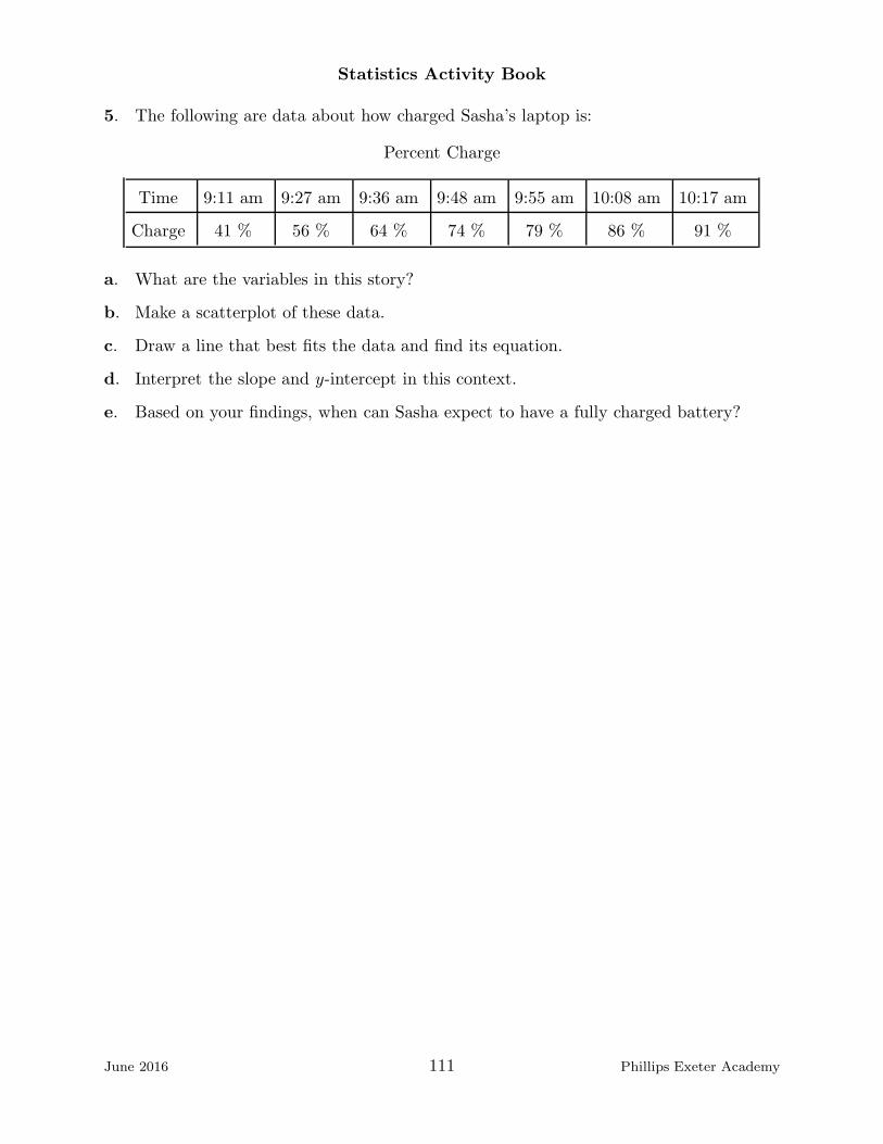
Statistics Activity Book
5. The following are data about how charged Sasha’s laptop is:
Percent Charge
Time 9:11 am 9:27 am 9:36 am 9:48 am 9:55 am 10:08 am 10:17 am
Charge 41 % 56 % 64 % 74 % 79 % 86 % 91 %
a. What are the variables in this story?
b. Make a scatterplot of these data.
c. Draw a line that best fits the data and find its equation.
d. Interpret the slope and y-intercept in this context.
e. Based on your findings, when can Sasha expect to have a fully charged battery?
June 2016 111 Phillips Exeter Academy

Statistics Activity Book
Table entry
Table entry for z is the area under the standard normal curve
to the left of z.
Standard Normal Probabilities
z
z .00
–3.4
–3.3
–3.2
–3.1
–3.0
–2.9
–2.8
–2.7
–2.6
–2.5
–2.4
–2.3
–2.2
–2.1
–2.0
–1.9
–1.8
–1.7
–1.6
–1.5
–1.4
–1.3
–1.2
–1.1
–1.0
–0.9
–0.8
–0.7
–0.6
–0.5
–0.4
–0.3
–0.2
–0.1
–0.0
.0003
.0005
.0007
.0010
.0013
.0019
.0026
.0035
.0047
.0062
.0082
.0107
.0139
.0179
.0228
.0287
.0359
.0446
.0548
.0668
.0808
.0968
.1151
.1357
.1587
.1841
.2119
.2420
.2743
.3085
.3446
.3821
.4207
.4602
.5000
.0003
.0005
.0007
.0009
.0013
.0018
.0025
.0034
.0045
.0060
.0080
.0104
.0136
.0174
.0222
.0281
.0351
.0436
.0537
.0655
.0793
.0951
.1131
.1335
.1562
.1814
.2090
.2389
.2709
.3050
.3409
.3783
.4168
.4562
.4960
.0003
.0005
.0006
.0009
.0013
.0018
.0024
.0033
.0044
.0059
.0078
.0102
.0132
.0170
.0217
.0274
.0344
.0427
.0526
.0643
.0778
.0934
.1112
.1314
.1539
.1788
.2061
.2358
.2676
.3015
.3372
.3745
.4129
.4522
.4920
.0003
.0004
.0006
.0009
.0012
.0017
.0023
.0032
.0043
.0057
.0075
.0099
.0129
.0166
.0212
.0268
.0336
.0418
.0516
.0630
.0764
.0918
.1093
.1292
.1515
.1762
.2033
.2327
.2643
.2981
.3336
.3707
.4090
.4483
.4880
.0003
.0004
.0006
.0008
.0012
.0016
.0023
.0031
.0041
.0055
.0073
.0096
.0125
.0162
.0207
.0262
.0329
.0409
.0505
.0618
.0749
.0901
.1075
.1271
.1492
.1736
.2005
.2296
.2611
.2946
.3300
.3669
.4052
.4443
.4840
.0003
.0004
.0006
.0008
.0011
.0016
.0022
.0030
.0040
.0054
.0071
.0094
.0122
.0158
.0202
.0256
.0322
.0401
.0495
.0606
.0735
.0885
.1056
.1251
.1469
.1711
.1977
.2266
.2578
.2912
.3264
.3632
.4013
.4404
.4801
.0003
.0004
.0006
.0008
.0011
.0015
.0021
.0029
.0039
.0052
.0069
.0091
.0119
.0154
.0197
.0250
.0314
.0392
.0485
.0594
.0721
.0869
.1038
.1230
.1446
.1685
.1949
.2236
.2546
.2877
.3228
.3594
.3974
.4364
.4761
.0003
.0004
.0005
.0008
.0011
.0015
.0021
.0028
.0038
.0051
.0068
.0089
.0116
.0150
.0192
.0244
.0307
.0384
.0475
.0582
.0708
.0853
.1020
.1210
.1423
.1660
.1922
.2206
.2514
.2843
.3192
.3557
.3936
.4325
.4721
.0003
.0004
.0005
.0007
.0010
.0014
.0020
.0027
.0037
.0049
.0066
.0087
.0113
.0146
.0188
.0239
.0301
.0375
.0465
.0571
.0694
.0838
.1003
.1190
.1401
.1635
.1894
.2177
.2483
.2810
.3156
.3520
.3897
.4286
.4681
.0002
.0003
.0005
.0007
.0010
.0014
.0019
.0026
.0036
.0048
.0064
.0084
.0110
.0143
.0183
.0233
.0294
.0367
.0455
.0559
.0681
.0823
.0985
.1170
.1379
.1611
.1867
.2148
.2451
.2776
.3121
.3483
.3859
.4247
.4641
.01 .02 .03 .04 .05 .06 .07 .08 .09
June 2016 112 Phillips Exeter Academy
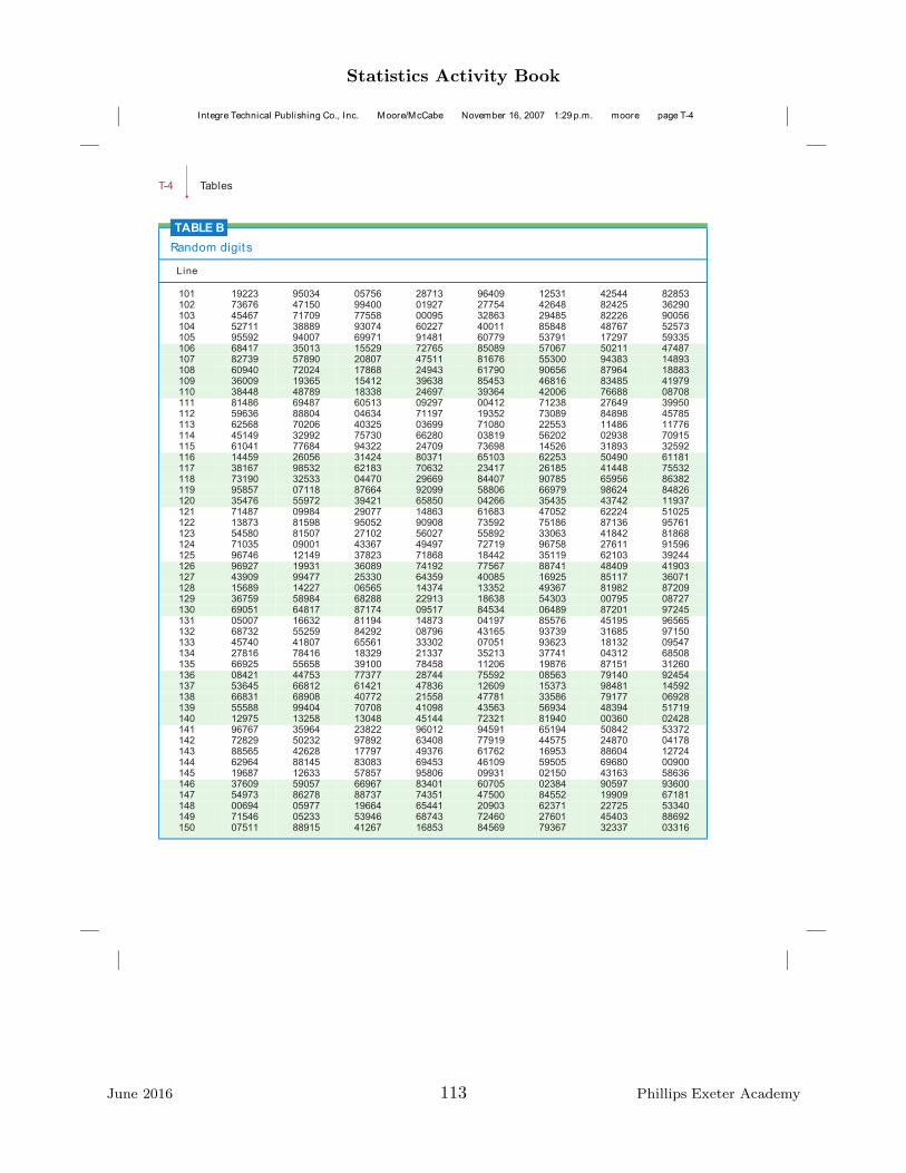
Statistics Activity Book
T-4•
Tables
TABLE B
Random digits
Line
101 19223 95034 05756 28713 96409 12531 42544 82853102 73676 47150 99400 01927 27754 42648 82425 36290103 45467 71709 77558 00095 32863 29485 82226 90056104 52711 38889 93074 60227 40011 85848 48767 52573105 95592 94007 69971 91481 60779 53791 17297 59335106 68417 35013 15529 72765 85089 57067 50211 47487107 82739 57890 20807 47511 81676 55300 94383 14893108 60940 72024 17868 24943 61790 90656 87964 18883109 36009 19365 15412 39638 85453 46816 83485 41979110 38448 48789 18338 24697 39364 42006 76688 08708111 81486 69487 60513 09297 00412 71238 27649 39950112 59636 88804 04634 71197 19352 73089 84898 45785113 62568 70206 40325 03699 71080 22553 11486 11776114 45149 32992 75730 66280 03819 56202 02938 70915115 61041 77684 94322 24709 73698 14526 31893 32592116 14459 26056 31424 80371 65103 62253 50490 61181117 38167 98532 62183 70632 23417 26185 41448 75532118 73190 32533 04470 29669 84407 90785 65956 86382119 95857 07118 87664 92099 58806 66979 98624 84826120 35476 55972 39421 65850 04266 35435 43742 11937121 71487 09984 29077 14863 61683 47052 62224 51025122 13873 81598 95052 90908 73592 75186 87136 95761123 54580 81507 27102 56027 55892 33063 41842 81868124 71035 09001 43367 49497 72719 96758 27611 91596125 96746 12149 37823 71868 18442 35119 62103 39244126 96927 19931 36089 74192 77567 88741 48409 41903127 43909 99477 25330 64359 40085 16925 85117 36071128 15689 14227 06565 14374 13352 49367 81982 87209129 36759 58984 68288 22913 18638 54303 00795 08727130 69051 64817 87174 09517 84534 06489 87201 97245131 05007 16632 81194 14873 04197 85576 45195 96565132 68732 55259 84292 08796 43165 93739 31685 97150133 45740 41807 65561 33302 07051 93623 18132 09547134 27816 78416 18329 21337 35213 37741 04312 68508135 66925 55658 39100 78458 11206 19876 87151 31260136 08421 44753 77377 28744 75592 08563 79140 92454137 53645 66812 61421 47836 12609 15373 98481 14592138 66831 68908 40772 21558 47781 33586 79177 06928139 55588 99404 70708 41098 43563 56934 48394 51719140 12975 13258 13048 45144 72321 81940 00360 02428141 96767 35964 23822 96012 94591 65194 50842 53372142 72829 50232 97892 63408 77919 44575 24870 04178143 88565 42628 17797 49376 61762 16953 88604 12724144 62964 88145 83083 69453 46109 59505 69680 00900145 19687 12633 57857 95806 09931 02150 43163 58636146 37609 59057 66967 83401 60705 02384 90597 93600147 54973 86278 88737 74351 47500 84552 19909 67181148 00694 05977 19664 65441 20903 62371 22725 53340149 71546 05233 53946 68743 72460 27601 45403 88692150 07511 88915 41267 16853 84569 79367 32337 03316
Integre Technical Publishing Co., Inc. Moore/McCabe November 16, 2007 1:29 p.m. moore page T-4
June 2016 113 Phillips Exeter Academy
Statistics Activity Book
Glossary
Association Association describes the strength of the given relationship between twovariables.
Back-To-Back Stem Plot Used to compare two sets of data. The leaves for one set ofdata are on one side of the stem, and the leaves for the other set of data are on the otherside. See stem and leaf plot.
Back-To-Back Stem (and Leaf) Plot A graphic device to compare two data sets. Thetwo sets share common stems. The leaves of one set go to the right, the leaves of the othergo to the left. See Stem (and Leaf) Plot.
Bar Graph A device to display categorical data using (usually) vertical bars, the heightsof which represent the frequency of each category. The bars are separated, unlike a his-togram (q. v.).
Bias Bias is the difference between an estimated expected value and the true value beingestimated.
Bivariate data Ordered pairs of linked numerical observations.
Boxplot or Box-and-Whisker Plot A graphic device to display 1-variable data usingthe minimum, maximum, median and the upper and lower quartiles of the data.
Center A one-digit summary of a data set. Usually the mean or median, sometimes themode.
Conditional Probability The probability that A will occur given the knowledge that Bhas occurred. The probability of A given B, denoted Pr(A|B), is the probability of (Aand B)/(probability of B).
Dot Plot A device to display one-variable data. Each data point is represented (usually)by a single dot. The number of dots corresponding to a value is the frequency of thatvalue.
Empirical Probability An estimate of the probability of an event occurring based on alarge number of trials.
Event A set of possible outcomes from a random situation.
Expected Value The weighted average of all possible outcomes of an event, the weightsbeing the probabilities of each outcome, denoted E(X) =
∑
xip(xi). .
Experiment A procedure to verify or refute a hypothesis. A random, controlled experi-ment allows valid inferences to be drawn. Compare Observational Study.
Five-Number Summary The minimum, maximum, median and quartiles of a set ofobservations; the skeleton of a boxplot.
Form The given data can look linear or non-linear, and its form is the basic function thatdescribes the look of the data.
Frequency The number of occurrences of a particular value. Denoted by the height ofthe bars in a bar graph or histogram.
June 2016 114 Phillips Exeter Academy

Statistics Activity Book
Histogram a device to display data by bars, the height of which represents the frequencyof that observation or group of observations. The bars are drawn without gaps, the widthof each bar being the same and representing individual values of a group of values of thesame size.
Independent Events A and B are independent events if the probability of A and Boccurring is the product of the probabilities of A and the probability of B. Knowing thatone of the events has occurred has no effect on the probability of the other event occurring.For example, drawing two cards from a shuffled deck, noting the color of one and replacingit in a deck before drawing the second are independent events. If the first card is notreplaced, the two events are not independent.
Inference The drawing of conclusions, usually based on a sample. The process of ex-trapolating information from a sample to the parent population.
Influenctial Point A data point for which a small change in position will have a dispro-portionate effect on the least squares residual line.
Interquartile Range Q3 −Q1 A measure of the variability of a set of data.
Least Squares Regression Line The Least Squares Regression Line is the line thatmakes the sum of squares of the residuals with respect to that line as small as possible.
Maximum The greatest value of a set.
Mean The arithmetic of the values of all the observations. Geometrically the mean is thebalance point of a data set.
Mean Absolute Deviation A measure of the variability of a set computed by taking themean of the absolute values of the difference between each observation and the median or
the mean of the set. For the set X = {x1, x2, . . . xn} the MAD is 1n
n∑
i=1
|xi−m(X)|, where
m(X) is the mean or median of the set X.
Median In an ordered list of observations the middle number if there is an odd numberof observations and the mean of the two middle numbers if there is an even number ofobservations. Half of the observations lie above the median, half below. Geometrically themedian divides the data into two equal areas.
Minimum The least value of a set.
Mode The value of the most commonly occurring observation. A useful measure of thecenter of the distribution of categorical data. The modal value.
Normal Distribution The normal distribution with mean equal to µ and standard de-
viation equal to σ is given by y = 1σ√2π
e
−(x− µ)2
2σ2 .
Observational Study A method of collecting data from which it not appropriate to drawinferences.
Outcome The result of a random situation.
June 2016 115 Phillips Exeter Academy

Statistics Activity Book
Outlier An observation that lies outside the overall pattern of the data. In a boxplot anoutlier is arbitrarily defined to be a value that lies either 1.5 interquartile ranges below thelower quartile or 1.5 interquartile ranges above the upper quartile. A value which invitesfurther study.
Parameter A parameter is a numerical value that states something about an entire pop-ulation and is often hard to obtain.
Population The entire set of people or objects about which information is sought.
Quartile For a data set with an even number of observations, the First or Lower quartile,denoted Q1 , is the median of the observations in the lower half of the set, the 25th
percentile. The Upper or Third quartile, the 75th percentile, denoted Q3, is the medianof the observations in the upper half of the set.
Residual The residual of a point with respect to a line is the vertical distance betweenthe y-value of the point and the y-value of the line both given at the x-value of the pointof interest.
Sample A subset of a population. The goal of inference is to extrapolate informationgleaned from a sample (about which everything is known) to the parent population.
Sample Space The set of all possible outcomes of a chance process. The sum of theprobabilities of all the outcomes is 1 or 100 %.
Shape Some of the words used to describe the shape of a one-variable distribution aresymmetrical, mound-shaped, skewed left or right, uniform, bimodal, fan-shaped.
Spread The variability of the observations in a data set. Some measures of spread arerange, interquartile range, standard deviation, mean absolute deviation.
Standard Deviation is a measure of the variability in a data set. It is used almostexclusively in conjunction with the mean to summarize approximately normally distributeddata. Every calculating or computing device will compute the standard deviation of a dataset. It is computed as the square root of the mean of the sum of the squares of the deviations(signed differences) of each data point from the mean. For the set X = {x1, x2, . . . xn} the
standard deviation is
√
√
√
√
1n
n∑
i=1
(xi −m(X))2, where m(X) is the mean of the set X.
Compare Mean Absolute Deviation.
Statistic A statistic is a numerical value that states something about a sample of apopulation and can be different for different samples.
Statistics Statistics are more than one statistic.
Stem Plot, Stem-And-Leaf Plot A graphing technique that displays all the individualvalues in a set. The principal values, which vary for each set, form the stems which arearranged vertically. A stemplot is quickly drawn. The leaves extend horizontally from thestems. When rotated 90 degrees counterclockwise a stem plot looks just like a histogram.
June 2016 116 Phillips Exeter Academy

Statistics Activity Book
Strength The strength of the pattern is an assessment of how tightly clustered the datapoints are around the underlying form.
Subjective Probability An estimate of the probability of an event occurring determinedfrom an (educated) guess.
Theoretical Probability The mathematically determined probability of an event occur-ring.
Trend The pattern displayed by the data.
June 2016 117 Phillips Exeter Academy

Statistics Activity Book
Reference Materials
Morris Code, Scrabble and the Alphabet. Mary Richardson, John Gabrosek, DiannReischman, Phyllis Curtiss, Grand Valley State UniJournal of Statistics Education Volume12, Number 3 (2004).www.amstat.org/publications/jse/v12n3/richardson.html
The Journal of Statistics Education An International Journal on the Teaching andLearning of Statistics, Editor of JSE Michelle Everson,www.amstat.org/publications/jse/jse users.html
An Exercise in Sampling: Rolling Down the River Doetsch, Flanangan-Hyde, Har-rison, Tabor, Tiberio, NCSSM Statistics Leadership Institute (July 2000).courses.ncssm.edu/math/Stat inst01/PDFS/river.pdf.
There Once Was a 9-Block ... - A Middle-School Design for Probability andStatistics.Abrahamson, D., Janusz, R. M., and Wilensky, U. Journal of Statistics Educa-tion [Online] (2006).www.amstat.org/publications/jse/v14n1/abrahamson.html
What is the Probability of a Kiss? (It’s Not What You Think) Mary Richardson,Susan Haller, Journal of Statistic Education Volume 10, Number 3 (2002).www.amstat.org/publications/jse/v10n3/haller.html
The Cereal Box Problem Revisted Jesse L. M. Wilkins, Virginia Polytechnic Instituteand State University School of Science and Mathematics (Volume 99(3)) (March 1999)http://eric.ed.gov/?id=EJ590348
Engaging Students in a Large Lecture: An Experiment using Sudoku Puz-zles Brophy and Hahn (2014) Journal of Statistics Education Volume 22, Number 1,www.amstat.org/publications/jse/v22n1/brophy.pdf.
Graphs in Statistical Analysis F. J. Anscombe The American Statistician, Vol. 27,No. 1 (Feb. 1973), pp.17-21.
illustrativemathematics.org
This site lists all the CCSSM standards in their complete wording. It also gives manyexamples of exercises which illustrate the standards. A very valuable resource.
Middle Grades Mathematics Project Probability Addison Wesley, 1986, ISBN0-201-21478-4
June 2016 118 Phillips Exeter Academy
Statistics Activity Book
Navigating Through Data Analysis in Grades 6-8 NCTM, Reston VA, 2003, ISBN987-0-87353-547-2.
This is an excellent resource, written long before the CCSSM appeared. It contains lots ofgood examples and a CD.
Navigating Through Data Analysis in Grades 9-12, NCTM.
Workshop Statistics, Discovery with Data and Fathom, A Rossman, B Chance, RLock, Key Curriculum Press, 2001. ISBN 1-930190-07-7.
This can be used as a stand-alone statistics text. It comes in versions for Fathom, thegraphing calculator, Excel, Minitab.
Very highly recommended.
Statistics From Data To Decision A Watkins, R Scheaffer, G Cobb. Wiley 2011,ISBN 978-0470-45851-8.
This is only one of a collection of high school texts designed to prepare students for theAP Test. It contains masses of data, excellent examples and a wealth of supplementarymaterial.
Math 1 Phillips Exeter Academy teachers, 1998
Math 2 Phillips Exeter Academy teachers, 1998
Math 3 Phillips Exeter Academy teachers, 1998
Math 4 Phillips Exeter Academy teachers, 1998
June 2016 119 Phillips Exeter Academy