Embed Size (px)
Citation preview

Storyforming
Storyforming
Experiments in creating discursive engagements between people, things, and environments
Loove Broms
Author: Loove Broms
Title: Storyforming: Experiments in creating discursive engagements
between people, things, and environments
Doctoral Thesis 2014
TRITA – MMK 2014:06ISSN 1400-1179ISRN/KTH/MMK/R-14/06-SE
ISBN 978-91-7595-212-3
Main advisor: Sara IlstedtSecondary advisors: Cecilia Katzeff and Johan Redström
KTH School of Industrial Engineering and ManagementDept of Machine Design, Product and Service Design
Royal Institute of Technology Lindstedtsvägen 85 SE-100 44 Stockholm Sweden
Copyright © 2014 Loove Broms
Graphic design & production by: Martin Frostner Andrejs Ljunggren Sara Rutberg
Format: 155 x 230 mm.Paper: Munken print cream (15) 115 & 300 g/m2, Arctic Matt 115 g/m2, Scandia 150 g/m2 (Cover)Fonts: Circular Std & Adobe Caslon
Print & Bookbinding: US-AB KTH Iris print: Aare Grafisk Produktion

Till min son/dotter
This thesis introduces and critically reflects on a design programme, Storyforming, that explores ways to design objects and places to enrich daily life narratives. Using an experimental design approach, the goal is to exemplify and explore this idea with discursive artefacts that, through their physical and temporal form, act as catalysts in the construc-tion of meaningful experiences.
In the current sustainability discourse, behavioural change has been pointed out as a key factor in achieving a sustainable society. Historically, design has been very effec-tive in increasing production and consumption behaviours by creating new types of needs and, in a way, manufac-turing desire (Forty, 1986). Drawing on this, the overarching aim of this thesis is the investigation of the ways design, through a suggested programme, can afford alternative types of meaningful experiences in contrast to the prevail-ing consumer culture.
The empirical work reported in the thesis stems from several research projects looking into the matter of energy use in relation to design. In addition, two of the projects have been carried out in the author’s own design practice. Some concepts are explored more in-depth — involving events such as field studies, situated interviews, workshops, prototype building, design interventions in the form of domestication probes, and contextual studies ranging from a few weeks up to a year — while other concepts exist only as sketches or photo montages. The diversity of these concepts, the design experiments, helps span a design space becom-ing a new provisional design programme. The idea for this
Abstract

programme has evolved from observations and reflections made throughout the experiments presented in the thesis.
The general results are the suggested approach of Storyforming, which focuses on the design of artefacts support-ing daily narratives that can be used to create engagement, meaning, and alternative values applicable to the discourse of sustainable behaviour.
Specific contributions are the selection of design experiments. In the thesis, the experiments have first been examined from the perspective of stories and forming as a basis for the new programme formulation. Through this articulation of the programme, the experiments are revisited through three leitmotifs, part of the provisional programme focusing on different properties related to the aspect of form-ing. From the perspective of the user, these themes — seeing and accessing designs, exploring and expressing complexity, and sharing experiences and negotiating use — are finally elaborated on in relation to other theoretical concepts as well as their implications for future research.
Ideas don't come out of thin air. The general ideas presented in this thesis are a synthesis of intellectual traditions and the continuous influence of people in different contexts that have surrounded me before and during the writing pro-cess. Specific ideas have emerged out of discussions and practi-cal hands-on work together with colleagues and friends to whom I owe a lot of gratitude. Unfortunately, it is impossible to acknowledge and detail each individual contributor here to whom I am indebted. I will attempt to list as many as possible of the people I have had the privilege to work with and hope that the rest will recognise themselves in this work and also know how much I have appreciated their input as well.
First, I would like to express my gratitude to my the-sis advisors that have, all in their own valuable ways, guided me through the process of completing my phd education. I am very grateful for my main supervisor Sara Ilstedt for making my studies possible, showing great trust, and allow-ing me to explore and steer my research towards subjects that have felt central and motivating. I have been fortunate to also have Cecilia Katzeff as a colleague and supervisor a long the way, giving me valuable lessons on how to structure and write academic papers, inspiring glimpses from her background in psychology, and numerous other things. I am also greatly indebted to my supervisor Johan Redström for his exceptional and dedicated guidance with my thesis writ-ing — challenging but always encouraging in a way that has allowed me to surpass what I thought to be my own limits. It has been an exiting journey, one that I feel very privileged to have been able to take.
Acknowledgements

I am very thankful to Jonas Löwgren, who acted as discussant in my final seminars. Jonas' spot-on com-ments and criticism have been very valuable feedback in the writing process. Moreover, a warm thank you to Yngve Sundblad for taking the time to read through and approve the thesis according to the university standards.
I would like to express my appreciation towards my advisor in the early stages of my thesis, Magnus Bång, who together with Carin Torstensson, studio director at Interactive Institute Swedish ict, offered me the possibility of doing my licentiate in such a dynamic environment. At the Interactive Institute, I have been part of several exiting projects where I have met and benefited from the collabora-tion between many people — the majority of the results in this thesis derive from this context. I would especially like to thank Ramia Mazé, Christina Öhman, Sara Backlund, Li Jönsson, Sara Tunheden, Anton Gustafsson, Ther-ese Balksjö, Jonas Andersson, Kristoffer Sjökvist, Erika Lundell, Jin Moen, Åsa Nyblom, Emma Samsioe, Brendon Clark, Anna Vallgårda, Jenny Bergström, Basar Önal, David Molander, and Samuel Pierre. The work described in this thesis wouldn't have been possible without these people and many more.
In the latter part of my phd, I have been employed at kth Royal Institute of Technology where I have been part of the research environment at Green Leap. Here, I have had the privilege to work together with an inspiring group of people consisting of, among others, Teo Enlund, Karin Haberman, Josefin Wangel, Elina Eriksson, and Anna Holmquist. Thank you for many interesting conversations, which I enjoyed and benefited from.
Along the way, I have been constantly inspired by
working together or alongside, Karin Ehrnberger. In many ways, Karin has truly opened my eyes to design research and critical gender thinking within design, which have been invaluable in my research process. The Energy Aware Clock, Aware Laundry Lamp, Share Aware Light, and Interfering Statistics have all been designed together with Karin. It has also been a great experience to make the Energy Plant in collaboration with Marie-Louise Gustafsson and Jonathan Maltz, and the Wattlite and Wattlite Twist together with Li Jönsson. I feel fortunate to have had the opportunity to work with such talented designers. Colour by Numbers is the result of a collaborative effort done together with architect Milo Lavén and artist Erik Krikortz, from whom I have learned not only the many abilities needed to go from creative vision to final installation, but also how to master the art of collaboration despite our different back-grounds — turning our differences into advantages. Moreo-ver, I have had the opportunity to collaborate further with Milo Lavén in the Gradient project. Furthermore, a special thank you to Bengt Sjölén for assisting with technology development both with Colour by Numbers and Fyrfärg.
Throughout my studies, I have had the privilege of being enrolled in the national Swedish phd school in design — The Swedish Faculty for Design Research and Research Education. Here, I have had the opportunity to get a better grasp of the field of design research as a whole as well as getting to know fellow design researchers and phd friends. I would especially like to Martin Avila, Åsa Ståhl, Kristina Lindström, Marcus Jahnke, Fredrik Sandberg, Camille Moussette, and Åsa Wikberg Nilsson for interest-ing and inspiring discussions. I also wish to express my gratitude to the professors and staff involved in initiating

and making the phd school such an inspiring place to be; I would like to especially thank Peter Ullmark, Pelle Ehn, Sara Ilstedt, Karin Blombergsson, Susanne Helgeson, and Bo Westerlund.
I am very grateful for continuous financial support from the Swedish Energy Agency.
All my love to my friends and family for constant support and encouragement. And last but not least, thank you Karin for being my true inspiration in this journey!
Loove BromsStockholm, May 2014
1. Introduction 19 – 25
2. Context 27 – 49 (27 – 32)2.1 Notions of Meaning and Meaningfulness in Design p. 33 – 442.2 Design and Everyday life p. 45 – 49
3. Process 51 – 79 (52 – 54)3.1 Practice 55 – 623.2 Program 63 – 743.3 Papers 75 – 79
Table of content

4. Experiments 81 – 207 (81 – 85)4.1 Colour by Numbers 86 – 103 4.2 Energy Aware Clock 104 – 1174.3 Share Aware Light 118 – 125 4.4 Aware Laundry Lamp 126 – 135 4.5 Energy Plant 136 – 145 4.6 Interfering Statistics 146 – 159 4.7 Watt-lite 160 – 171 4.8 Watt-lite Twist 172 – 1854.9 Fyrfärg 186 – 195 4.10 Gradient 196 – 207
5. Towards Storyforming 209 – 229 (209 – 211)5.1 Unpacking Storyforming 213 – 229
6. Concluding Remarks 231 – 238
7. References 239 – 244
The Papers 245 (245 – 287)• ExploringSustainablePracticesinWorkplace Settings Through Visualizing Electricity Consumption 246 – 261• BecomingtheEnergyAWAREClock–Revisiting the Design Process Through a Feminist Gaze 262 – 270• CoffeeMakerPatternsandtheDesignofEnergy Feedback Artefacts 271 – 281• PersuasiveEngagement:Exploitinglifestyleasa Driving Force to Promote Energy-Aware Use Patterns and Behaviours. 282 – 287
19
1. IntroductionYou keep standing for a good while looking at the colours of the tower changing. And finally all the windows turn red again. There is someone out there that thinks like you, after all. (Dahl, 2007, p.204)

2120 1. Introduction
Throughout modern history, design has been successful in increasing the production and consumption of goods by creating new types of needs and, in a way, manufactur-ing desire (Forty, 1986). Today, modern life itself — and the artefacts in it — is cast in a worldview largely based on consumption and in which meaningful events are sought through fleeting product experiences (Chapman, 2005). When the often short-lived object-user enchantment comes to an end, fully functioning objects are often discarded, making for an ever growing mountain of waste. When producing new things, it is therefore simply not enough to consider only technical aspects of manufacturing and use, such as energy efficiency, choice of materials, recycling, and transportation, without also considering what kind of practices an artefacts will reinforce and what roles it will play in everyday life. Behavioural change has been pointed out by many scholars within the humanities as a key aspect of ecological sustain-ability, and here the design of artefacts constitutes a key element — not only by affording certain actions at a given moment but through addressing our deeper aspirations and re-configuring our life narratives. I will use the terms ‘nar-rative’ and ‘story’ to a great extent in this thesis and, when using them, I do not confine myself to an interpretation connected to written or spoken words, but employ a wider definition of the narrative as a rhetorical mode of discourse including artefacts* (Buchanan, 1985).
We construct our reality in the form of material structures that surrounds us. These artefacts are a reflec-tion of ourselves; we have created them and we understand ourselves through them. The artificial world can be seen as
* I will elaborate some more on this in the following chapter.
the stage on which we enact our daily life. We connect brief events to compose meaning and create a larger whole — an everyday story. There are many fragments that we might leave out of this story; even though they constitute large parts of our time awake, they seem to fade away quickly. Other occurrences become more central. We remember them longer, they constitute key events in how we build identity, construct meaning, and set out goals. By reinforcing certain practices and inhibiting others, artefacts are connected to this process, constantly part of an on-going negotiation of meaning (Mas-
sumi, 1987). As designers, we have the possibility of influencing experiences by the shaping of objects and services — reflect-ing in the process on what should be made visible and what should be hidden. How are our deeper aspirations and dreams manifested in our material culture?
The theme of this dissertation has evolved from projects starting not long before I began the journey of doing phd work. At the same time as I was involved in my first research project, Aware, looking at energy use from a design perspective, I was working on the realisation of a large scale, interactive light installation called Colour by Numbers. This project was installed in a 72-metre high, unused tower previ-ously used for telecom development in the south of Stock-holm. With the installation, you can use a phone to call the tower and change the colours of the top ten floors, allowing for millions of combinations visible over a larger area in all four cardinal directions. In addition to this, you can also see the installation over the Internet through a real-time camera. The light installation became a success, receiving thousands of phone calls over the first days. It figured extensively both in traditional mass media and on blogs around the world. In time, it became a central actor in one bestselling crime

2322 1. Introduction
novel (quoted above) and in one prize-winning youth novel. As of this writing, seven years after its inauguration, Colour by Numbers still averages 24 calls per day. Did we know that the installation would be so successful beforehand? Of course, we had our hopes, but the reception has exceeded those. The way Colour by Numbers gained popularity intrigued me — people used it in creative ways that neither my collaborators nor I had anticipated. It became like a platform allowing all kinds of communications and expres-sions to arise. It took part in people’s lives and manifested itself as a symbol for the area. If the technology somehow malfunctioned, we were quickly informed by people in the surrounding neighbourhood who expressed concern that the installation was not working properly.
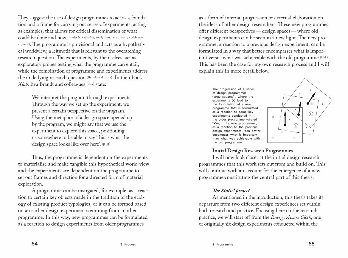
At roughly the same time, I started working in the research project Aware. This project was a follow-up project at the Interactive Institute focusing on energy issues in rela-tion to design. Its predecessor, Static!, had produced a series of design experiments that had received a lot of attention both within research and in the general media (Mazé, 2010). The Static! project explored the aesthetics of energy as material in design and by reflection in use and the Aware project continued in this direction.
Within the discourse of sustainable human-computer interaction (hci), knowledge and information as primary driving forces for saving electricity started to gain increased interest. Different kinds of information devices like elec-tricity displays, apps, and websites, started to slowly emerge through research contexts and on the market. In the Aware project, we were also interested in this. The idea of provid-ing information as a form of democratic process seemed at the time both interesting and challenging. We designed
an electricity display called the Energy Aware Clock in an attempt to challenge the way this type of information could be communicated to electricity customers — all within the framework of the design programme. Informed by a field study, literature, and previous design experiences, we turned our attention to the gender coding of places in the household and the aesthetics associated with these, as well as in what ways the use of electricity reflected daily activities. In the design of the Energy Aware Clock, these themes of explorations were implemented in different ways. For example, materials and the clock metaphor were used to encourage a more central placement. In a subsequent contextual study, nine Energy Aware Clocks were installed into the homes of nine demographically similar households for a three-month study. The receptions were very different: while one household found the clock too visible, moving it to the laundry room, another embraced, explored, and discussed it, connecting certain electrical patterns to certain activities. For them, the display helped form a new kind of daily narrative where electricity use was more visible.
These experiences, in combination with the growing engagement around Colour by Numbers, made me gradually more and more interested in how one could design artefacts that afford the occurrence of certain events into a meaningful and engaging story. I had a feeling, though at the time not so articulated, that this could be an interesting design strategy within the field of design and sustainability.
The objective of this thesis is to introduce, investigate, and critically reflect on a new design programme that I call Storyforming — exploring ways to design meaningful narratives through artefacts. The ambition is not to answer a single research question or to criticise already existing

2524 1. Introduction
approaches but instead to consider an alternative way to approach design.
The design experiments that are included in this thesis were not set up with the intention of exploring Storyforming, since this programme has evolved out of previous programme-experiment dialectics (Brandt et al., 2011). Instead, the experiments have revolved around several different topics within sustainability and design, where Storyforming has evolved as a gradually more visible design space. The exam-ples are selected from a larger set to examine different aspects that can potentially be related to Storyforming.
In addition to describing the design experiments, this work also reports on design interventions in the home, in the workplace, and in public, in which some of the artefacts introduced into the everyday life of participants affected their social interactions. Also, a larger participatory workshop with stakeholders has been conducted around some concepts that functioned as conversation pieces.
The thesis is laid out in five main chapters. In the following chapter, called Context, I will give a short background to what role design has played in society historically and contrast this to today’s culture of mass consumption. I will look at how artefacts create mean-ing and why they become meaningful in relation to some theoretical concepts. I will also look more closely at what role objects play in everyday life. The next chapter, called Process, will go through design research in a general way, and elaborate on the design and design research practice. This chapter also includes a description of the program-matic research approach and a personal account of how I came in contact with it. A short summary of the publica-tions that are included is then followed by Experiments.
This chapter contains descriptions of all the design experi-ments seen through the perspective of Storyforming, which is also the title of the subsequent chapter. Here I present the new programme and some properties that stand out more distinctly based on experiences from the already existing design experiments. The implications for this work are then elaborated on in Concluding Remarks.
27
2. ContextToday we live in a world of objects designed for rapid consumption, objects requiring a minimum of effort and attention to use them, but also objects that leave no lasting impression on our memories — a throw-away world that requires no effort but, at the same time, produces no real quality. (Manzini, 1992, p. 239)

2928 2. Context
Already in 1964, in the book OneDimensional Man, the philosopher Herbert Marcuse sharply criticised consumerism, claiming that it is a form of social control (Marcuse, 1964). By con-structing concepts of freedom where happiness is symbolised by the consumption of objects, Marcuse suggests that people act irrationally by working more than they need to fulfil very basic needs. New products are constantly produced, calling for the disposal of the older ones, thus fuelling the economy and encouraging people to work more in order to afford more. This leads to a physiologically destructive behaviour that also leaves us ignorant of the environmental damage that consumerism causes. Another danger with this is that when society pro-vides everyone, or at least a majority, with everything needed and desired, all types of critique are absorbed by the existing structure. New radical movements become more like trends that quickly get commercialised and rendered harmless. After some time, we start seeing everything in the same way and it becomes hard to imagine a different society; we become one-dimensional in our thinking.
Society today, still largely influenced by modernistic ideals first proposed during the industrial revolution, oper-ates under a linear perception of time instead of the cyclical conception that came earlier; speed, function, and efficiency are highly idealised and signs of high status. These types of norms have just recently started to become more questioned but are deeply embedded everywhere in society. Bruno Latour makes parallels to Walter Benjamin’s metaphor of the ‘angel of history’ to comment on modernism:
I don’t wish to embrace Walter Benjamin’s tired ‘Angel of History’ trope, but there is something right in the position he attributed to the angel:
it looks backward and not ahead. ‘Where we see the appearance of a chain of events, he sees one single catastrophe, which unceasingly piles rubble on top of rubble and hurls it before his feet.’ But contrary to Benjamin’s interpretation, the Modern who, like the angel, is flying backward is actually not seeing the destruction; He is generat-ing it in his flight since it occurs behind His back! It is only recently, by a sudden conversion, a metanoia of sorts, that He has suddenly realized how much catastrophe His development has left behind him. The ecological crisis is nothing but the sudden turning around of someone who had actually never before looked into the future, so busy was He extricating Himself from a hor-rible past. There is something Oedipal in this hero fleeing His past so fiercely that He cannot realize — except too late — that it is precisely His flight that has created the destruction He was trying to avoid in the first place (Latour, 2010, p. 485).
The success of technological innovation during the industrial revolution led to the belief that it would bring the forces of nature and culture under control, liberating us from misery and toil and by dominating nature, producing liberation and enrichment (Borgmann, 1987). Although this is true to some extent that technological inventions and ingenuities have liberated us in many ways, this development has also created many problems — the ecological crisis stands out as a clear example of this. Still, with this catastrophe approaching quickly, the modernist (and post-modernist) machine, embodied in endless artefacts, steams onwards mediating certain actions

3130 2. Context
and inhibiting others. It is not simply a question of everyday moral decisions:
The landscape as well as the city are both highly structured, and our existence furnished with many different kinds of devices and technological systems. These are what instruct people in contemporary societies ‘how to live’ (de Vries, 1999, pp. 15-16).
New technological innovations, life cycle analyses, shifting from products to services, and an increase in recy-cling are all necessary and important actions needed to curb the effects imposed on the environment caused by consumer-ism. But they are just symptoms of the larger problem — the high level of consumption itself. Products are not just result of their primary function; they are constantly replaced for their values as signs. Mainstream industrial design has rightfully been accused of dealing almost exclusively with packaging of technology into archaic product typologies with mostly short-lived relationships with the user. Material possessions have become increasingly important as signifiers of status in a rapidly changing culture that is based on a constant evolu-tion of new products. Today, communal values that used to fulfil many basic needs have been exchanged for an individual search for new relations with countless designed experiences.
This epoch-making societal transition has cast us within an abstract version of reality in which empathy and meaning are sought from toasters, mobile phones, and other fabricated experiences. Today, empathy is consumed not so much from each other, but through fleeting embraces with designed objects (Chapman, 2005, p.18).
Adrian Forty points out in his book Objects of Desire that, historically, design has been very effective in increas-ing production and consumption by creating new types of needs and, in a way, manufacturing desire (Forty, 1986). As an example of this, one can look at the development of electri-cal appliances. Although becoming increasingly popular, electricity was in the beginning of the 20th century mainly used for lighting and little else in the household. This led to very uneven power consumption with peaks in the morn-ings and evenings and almost zero consumption during the daytime. In order to meet demand, the electricity companies had to sustain the same high capacity at all hours, which was not very cost effective. A lot of effort went in to looking for ways to increase consumption during the daytime, and one successful attempt to achieve this was the introduction of electrical appliances. Peter Behrens, a German artist and architect, and considered by many to be the prototypical industrial designer, was hired by aeg — a company that primarily produced electricity but was beginning to enter the consumer market — to design and market their electrical appliances. This turned out to be highly successful. By com-bining branding and design, the demand for electric kitchen appliances increased tremendously. Common household objects like dishwashers, electric stoves, toasters, kettles, and irons were developed, designed in different styles, and mar-keted as signs of a modern lifestyle where household chores would be easy and fun to do. Household appliances were said to free up time, making the housewife more of a supervisor of labour than the one actually doing the work. In hindsight, studies have shown that the increased standards of washing and cleaning actually have resulted in women doing more cleaning today than ever before (Ilstedt Hjelm, 2004).

32 332. Context
After the modernist era came pop design that rejected the modernist obsession with functionality and durability. Putting the consumer in focus, it became more important for things to be nice than functional. In the seventies, pop design paved the way for postmodern design, completely rejecting the modernist ideals of form following function. Objects no longer merely fulfilled functions but became icons of lifestyle and social status.
As we can see, new technology and the design of artefacts and cultural norms have created a logic of life that to a large extent is organised around economic growth and high consumption, something that we know is not sustainable. Despite the fact that this is not news, there is a clear discrep-ancy between knowing and doing (DiSalvo et al., 2013). No matter how hard one tries to act on this knowledge, it is challenging because daily life itself, and the artefacts in it, push in the opposite direction. To change this, there is no easy solution, no silver bullet, but rather, many complex challenges that need to be addressed and questioned. This needs to be done in order to build knew knowledge on how to make artefacts that reflect and support sustainable ways of living. This is the context in which this thesis operates. In the following pages, we will go through some key concepts used to acknowledge and reflect on this process.
1. Notions of Meaning andMeaningfulness in Design
Our life is greatly affected by technology. Inventions like the telephone, the washing machine, the freezer and fridge, the car, and much more have affected our existence and the way we define ourselves. And not only ourselves, but how we look at others as well: time and distance, our concept of cleanliness, gender, and much more change over time in relation to tech-nological innovations. What came first and what affects the other? Do we shape these technological inventions as we see fit or do they shape us in ways that we do not entirely control? Electricity, the Internet, and even language are man-made con-structions that shape how we interpret our surroundings. Pre-vious inventions become parts of mental frameworks that are used when trying to understand something new. Inventions are often anchored in materiality; they are cast into forms and have their identities over time manifested in product topologies. The telephone and the car with their own iconic silhouettes are good examples of this. These artefacts mean something to us, but they can also be meaningful in a more existential way (Hallnäs & Redström, 2002). How do we differentiate between the meaning — as material mass-communication — and the more existential meaningfulness and how have these two concepts been approached in design?
MeaningHow objects are assigned meaning has been
approached within several different research fields. I will go through some of the more established traditions here and how they relate to design research.

34 352. Context
SemioticsThe way meanings are embodied in artefacts has found
popular use in design practice through semiotics — the phenomena of signs. Traditionally concerned only with the classification of sign systems, contemporary product semiotics also incorporate how meanings are communicated through signs. Semiotics builds on the idea that an object can be read just like a text that conveys a number of semantic messages. Semioticians do not mean that the object carries meaning like water in a bucket; instead meaning is constructed in the present when the object is ‘read’. The interpretation of the object is always dependent on the context and the back-ground (Ilstedt Hjelm, 2002). For example, different cultures might interpret certain signs completely differently and thus certain products might not be received the same in these cultures.
When designers work with products, they often use terms like signs, functions, meanings, or styles — all part of product semantics. It is said that the designer inscribes messages into the object, which are then read upon interac-tion with it. Of course, as just stated, the interpretation of the message can vary and the user can choose to use, or abuse, the object in different ways. Product semiotics has been used within industrial design as a way to practise ‘good design’. Rune Monö’s book Design for Product Understanding, which attempts to develop a language of form for product designers, has been used extensively in design education in Sweden (Monö,
1997). When creating a new artefact, one may deliberately cut and paste, merge, and make references to the common mate-rial knowledge existing in the internal cognitive models of people. This is not only a conscious strategy for designers, but constitutes a common pattern of how new inventions develop their own shapes out of the already known to gradually evolve
into an identity of their own. As an example, the last horse-carriage and the first car looked similar — the car was just a carriage with the horses removed (Ilstedt Hjelm, 2004).
Another powerful tool for designers connected to meaning is the concept of the product ‘myth’, coined by the literary theorist, philosopher, linguist, and semiotician Roland Barthes. Barthes described myths as the domi-nating ideologies of our time (Barthes, 1973). The myths have become so dominant, so normalised, that they seem to be completely natural and normal. They are viewed as ‘truths’. Like metaphors, myths help us to make sense of our expe-rience within a culture. Forty states: ‘Unlike the more or less ephemeral media, design has the capacity to cast myths into enduring, solid, and tangible form, so that they seem to be reality itself ’ (Forty, 1986).
Some Notions of Meaning from Cognitive PsychologyBarthes and other semioticians are not the only ones
to have approached the subject of meaning through our way of classifying and categorising objects in social and cultural learning. Cognitive scientist Donald Norman calls this type of classifications ‘cultural constraints’, which form behavioural boundaries that help us navigate the unknown (Norman, 1999). According to Norman, there are three forms of constraints: physical, logical, and cultural. Logical and cultural con-straints are weaker than physical ones in the sense that they can be refused or simply ignored. They take a longer time to adopt, but once adopted also take a long time to go away. For example, pink for girls and blue for boys would be a cultural constraint according to Norman, while knowing how to insert a credit card into the narrow slot on an atm is a logical con-straint. Things like gates and fences are physical constraints.
1. Notions of Meaning and Meaningfulness in Design
36 372. Context
Also, in the ‘good design’ tradition, the term affordance is commonly used in hci discourse and denotes the quality of an object that allows an individual to perform an action. Made popular by Norman, the term has its origin in perceptual psychology where it was coined by James Gibson (Gibson, 1977). Gibson’s original definitions cover how an animal makes sense of its environment by means of its actionable properties, that is, the possible actions that exist between an actor and the world. Norman, on the other hand, originally used the term to denote how objects direct actions, for example, how a door handle can be designed to show users where to put their hands (Norman,
1990). According to this, the affordance is more a property of the object. It can be seen as the offered ‘action space’ that is directly perceived by the user. Norman later suggested using the term ‘perceived’ affordance instead to denote what he meant, which does not need to be the same as ‘real’ affordance (Norman, 1999). A perceived affordance is what the user interprets to be doable rather than what is actually possible.
Actor-Networks and ScriptsAnother perspective on users inspired by semiotics
is Actor-Network Theory (ant) developed by Madeleine Akrich and Bruno Latour (Akrich, 1992). ant is an attempt to explain how material-semiotic networks tie together to act as a larger whole. The clusters of different actors that constitute this whole can be both material and semiotic, both human and non-human. These networks are rarely static but exist in a constant state of making and re-making. The rela-tions within these networks are constantly performed and negotiated since they would otherwise dissolve. In this way, meanings get inscribed into — and are played out in interac-tion with — artefacts. Akrich likens this way of inscription
to film scripts where the vision of the designer is written into the object as programmes of use creating frameworks of action where users are obliged to act in relation to other actors within different networks (ibid.). Technical objects ‘define a framework of action together with the actors and the space in which they are supposed to act’ as Akrich puts it (ibid., p. 208). Scripting is most evident when objects are designed to configure users in a very specific way. One example of this is a particular design of public toilets where the flush button was hidden behind the raised toilet seat. To carry out the culturally embedded practice of flushing the toilet, users were required to first put the seat back down — a practice that is less universal (Ingram et al., 2007). Another example of scripting is Langdon Winner’s famous example of a set of bridges over a road that leads to a beach in New York. The bridges were built so low that only cars and not buses could pass under them. Winner argues that artefacts have politics in this way, since the bridges only let people that could afford a car, primarily white people, have easy access to the beach (Winner, 1988). Of course, the user can always reject the action-narrative inscribed into an object, be it toilet-flushing or bridges, and this is part of the negotiations that manifest the networks of actors and make them evolve.
MeaningfulnessI have up till now talked about the meaning of arte-
facts through semiotic as well as cognitive terms to describe how meaning is mediated through artefacts, inscribed by the designer, and read and interpreted by the user. Semiotics and cognitive psychology do well in describing how meaning is expressed through form, but in this frame of reference, the possibility of items also having an agency of their own falls
1. Notions of Meaning and Meaningfulness in Design

38 392. Context
out of focus. Artefacts do not exist in a vacuum. They are more than just ‘signs’ or the ‘intentions of designers’ — they have their own materiality or intentionality (Ihde, 1990) that create practices beyond what is ‘spoken’ through the language of semiotics. Next, we will look at a few theoretical concepts that better enable us to approach the topic of meaningful experiences through design.
IntentionalityWe have relationships to objects as things and not
merely as signs, and they shape everyday practices through their material properties — objects do more than we tell them to do (Verbeek & Kockelkoren, 1998). For example, the shape of a table also shapes the way we interact; a round table versus a square alters the distance to other guests, influencing hierarchies and conversations during dinner. Writing a text with a mobile phone produces a different text that writing with a pen or a computer, and traversing a city by foot, bike, bus, subway, or car dramatically alters the experience and our view of the city itself. Judy Attfield (2000) writes of this matter:
The rediscovery of ‘things’ by design theoreticians confirms the turn away from the immateriality encouraged by theories of representation that reduce all meaning to language. (p. 7)
Another example of object intentionality is Martin Hei-degger’s notion of readiness-to-hand, which also goes beyond the linguistic aspects between people and things. According to Heidegger, an object can be either present-at-hand or ready-to-hand (Heidegger, 1978). When using a hammer, our atten-tion is not directed towards the hammer but at the nail. The
hammer withdraws from our consciousness and so becomes ready-to-hand, shaping our relationship with the world. If the hammer breaks, it no longer enables the hammering of the nail and our attention is directed towards the hammer itself — it becomes present-at-hand. This kind of engagement, the practice of hammering that the hammer provides and numerous other more complex tasks that technology enables, has also been described as the mediating property of objects. They in a way create layers of realities that only reveal them-selves when something malfunctions — going from ready-to-hand to present-at-hand. The energy system serves as a good example of this, invisible and ready-to-hand when function-ing, only rising to a cognitive level of consciousness when not functioning properly like in a power outage — ironically, in a way only present when absent.
Focal thingsThis type of hidden technology, or the lack of engag-
ing capacity, has been labelled the ‘device paradigm’ by the philosopher Albert Borgmann (Borgmann, 1987). Technological products can be seen as consisting of two main elements according Borgmann: the ‘machinery’ and the ‘commodity’ that it delivers when functioning. The energy system, or the heating system as Borgmann uses as an example, is a device like this. The machinery is hidden away inside walls, behind covers and painted in white — the warmth that it generates is the commodity. We are surrounded by artefacts func-tioning like this: from basic infrastructure like telephony, the Internet, water, and electric systems to cars, elevators, computers, washing-machines, and much more. These objects have hidden machinery that delivers a commod-ity with the press of a button. One could say that we have
1. Notions of Meaning and Meaningfulness in Design
40 412. Context
become ‘button-pressers’ of sorts, ‘controllers’ of appliances and processes instead of being an embodied part of the underlying processes (Dreyfus, 1991). In pre-technological times, things were different. For example, looking at heating, there was no heating system but a wood-burning fireplace, a focal point of the household. By using wood for making fire, the process of cutting down trees, chopping the wood into pieces, and carrying it into the house for cooking and heating gave a much more direct relationship to energy use and what certain activities required energy-wise, like cook-ing and heating. But the stove was more than just engaging in its maintenance — it was a focal centre in the household, something to gather around for warmth and cooking, for light, and for social interaction. Borgmann pleads for more contemporary artefacts containing this focal ability, where engagement is encouraged instead of consumption, as in the case of devices. Critics of Borgmann have pointed out that these ideas are similar to older traditions within the phi-losophy of technology, claiming that technology alienates humans from what they ‘really are’ or what reality ‘really is’ (Verbeek, 2002). It is highly questionable if such a reality ever existed and with many communication technologies, people experience them as also giving quality to their lives in a deeper way than by just delivering a commodity, for exam-ple, by bringing them closer to friends and relatives (ibid.). Martin Avila provides an example of this kind of difference in perspectives with a painting by the street artist Banksy (Avila, 2012). Placed in a serene country landscape is a cctv mast, a sign of human presence. Are we being watched? Who is watching? We see this technology as an intrusion clearly contrasting the ‘natural’ scenery. But as Avila points out, there are also other traces of human presence:
There are also tracks, traces which have been naturalized throughout the years. Perhaps, even more importantly, we assume that the tracks were made by a vehicle such as a cart lead by horses [...] If this is the case, how has our human relation-ship with horses developed, to the point that we perceive the tracks in the image as natural rather than artificial? To what extent does the cart become naturalized in this human-nonhuman relationship? We could ask ourselves, why do we accept the imprints left on the ground and not the cctv mast? (p. 18)
Clearly, looking at the design of artefacts through the bifurcation of devices delivering commodities or focal things encouraging engagement risks over-simplifying the implica-tions of technology and how it shapes human practice. Still, from a design perspective, the image of the device and the focal thing can still be valuable when reflecting on how to design contemporary artefacts (Fallman, 2009). Here, this distinc-tion is interesting to reflect on when approaching feelings of meaningfulness. We are unlikely to have any deeper relation to artefacts that we cannot see or access and these artefacts are unlikely to appear in any daily narratives except for when they break down. Drawing inspiration from the concept of focal things is interesting in that it has potential to enrich life and create well-being by creating everyday experiences that are engaging.
According to the medical sociologist Aaron Antonov-sky, famous for his work on factors that support human health and well-being or ‘salutogenesis’ — the study of the origin of health — a sense of coherence is the most central
1. Notions of Meaning and Meaningfulness in Design
42 432. Context
factor in how people handle stress in everyday life (Antonovsky,
1987). Coherence depends on three components: comprehen-sibility, manageability, and meaningfulness, where the latter element is the most important. The design of meaningful and engaging experiences therefore has direct implications for human health and the extent to which one feels that life makes sense emotionally. When emotionally engaged, we feel as though that part of life is worth investing energy in and that it is worthy of commitment and engagement.
Narratives as ArtefactsThe use of stories as a way to organise life experiences
has been studied within the field of psychology. Narrative psychology is a viewpoint within psychology that is con-cerned with how people deal with experiences by construct-ing stories and listening to the stories of others. According to this field, human activity and our experiences are filled with meaning and stories rather than logical arguments. Whereas cognitive and perceptive psychology focus on the mind as an ‘information processor’, narrative psychology is concerned with how people deal with experiences by constructing stories and listening to the stories of others as part of a social experience — seeing the mind as the creator of meanings. Drawing on this from a design perspective, even though design is a language with its different ‘symbols’ and ‘grammar’, one should consider not only what makes up this language but also what kind of narratives this language is used to create. In his book Acts of Meaning, the psycholo-gist Jerome Bruner elaborates on narratives as the primary mode of how we organise experiences (Bruner, 1990). Questioning the overly mechanistic view of human perception follow-ing the cognitive revolution in the 1950’s, Bruner’s work
focuses on the ‘making of meaning’ as a more active way of understanding one’s surroundings. The world is not just passively ‘taken in’ and interpreted but actively constructed as a way of understanding it (ibid). As was touched upon in the introduction, it has been shown that experiences that do not get structured narratively suffer loss in memory (Mandler, 1984). In our memories, experiences are systematically altered to fit our canonical representations of the social world (Bruner, 1990). When something happens that is out of the ordinary — that is, different from the existing practices of how things are expected to be done — a person who experiences this will most likely explain it through telling a story that contain reasons and in which the exception is given meaning (ibid.). Drawing on this, it is clear that stories, as human construc-tions, are a powerful artefact that turns consecutive events into something with meaning. The elements that allow meaningful stories to arise are knowable and reproducible, which also makes them designable.
The idea of creating objects that can ‘stage or dramatise’ is not novel. In the project Design Noir, Anthony Dunne and Fiona Raby do exactly this, letting the user become both a protagonist and co-producer of a narrative experience (Dunne & Raby, 2001). They compare product design to the ‘Hollywood blockbuster’ and turn their attention to its opposite, the ‘Film Noir’ genre of cinema marked by a mood of pessimism and menace, calling it ‘Design Noir’. By making products that create dilemmas rather than solving them, the user is invited to a psychological adventure (ibid.) Here Dunne and Raby challenge the status quo of main-stream product design, presenting an alternative to engage the user’s imagination through design. This is an interesting example of how one may introduce alternative experiences
1. Notions of Meaning and Meaningfulness in Design

44 452. Context
that can constitute meaningful building blocks in someone’s lifeworld (Hallnäs & Redström, 2002).
In the book Emotionally Durable Design, Jonathan Chapman devotes a chapter to ‘sustaining narratives’ stressing the importance of narratives as a way to increase the durability of relationships established between users and products (Chapman,
2005). The main question asked is why users discard products while they are still working. The same questions of how to create attachment and prolong product lifespan are addressed by Verbeek, who seeks more ‘engaging objects’ (Verbeek & Kockelkoren,
1998, p. 40) and by Manzini (quoted in the beginning of the chapter) (Manzini, 1992, p. 239). Based on this, it is clear that there is a great potential for designers and design researchers to explore sustainable and intellectually rewarding narratives in opposi-tion to the dominant ‘Hollywood blockbuster’ of consumerism. The artefact as a central and present actor in forming meaning-ful stories together with users thus deserves further inquiry to study how this can be approached through the design process and in what ways these types of stories can emerge through the use of artefacts.
2. Design and Everyday Life
To understand what people are and what they might become, one must understand what goes on between people and things. (Csikszentmihalyi, 1981, p. 1)
As soon as one acknowledges the way design influences the way we think in everyday situations, looking upon the regime of industrial design as a mass medium, the utilisation of the persuasive powers of artefacts becomes a tempting instrument to wield. In the field of persuasive technology, broadly defined as the study of how technology can be used to influence people’s attitudes or behaviours (IJsselsteijn et al., 2006), researchers have directed their efforts primarily at look-ing at how interactive computer technology can affect user behaviour through use. According to B.J. Fogg, founder of the field, behavioural change requires a trigger, motivation, and the ability to change (Fogg, 2002). A computational device can then be used to apply, for example, a factor of reduction (making some easier to do), conditioning (learning through rewards or punishment), tailoring (providing relevant information at the right moment), and tunnelling (guiding the user through a process), to name some suggested ways to change behaviour. Through the production of new consumer goods, or in this instance more specifically through com-puter and mobile devices, websites, and applications, users can potentially be persuaded to change their behaviours in different ways. From a wider design perspective, previously mentioned concepts within sociology, cognitive psychology, and design — scripts, affordances, constraints, and semiot-ics — can also be seen as instruments with similar powers.

46 472. Context 2. Design and Everyday Life
Unfortunately for these kinds of approaches, human-artefact behaviour does not only exist within a single instance that then can be repeated to constitute the larger whole. Con-nected to ideas around ‘motivation’ and the ‘ability for change’ are other kinds of factors that to a large extent also influence the outcome of a behaviour.
Considering that products and places are important not only for their own sake but for the practices they enable, the importance of artefacts required to accomplish what people perceive to be ordinary ways of life becomes more clear — artefacts and practices are closely connected (Ingram et
al., 2007). Importantly, practices are not fixed states of affairs. Even though they might contain habits that are repeated in certain manners, like showering daily or eating dinner at a certain time, they are part of a dynamic process where habit and practitioners evolve (Shove, 2012). From the perspective of practice theory, objects and people can be said to be ‘carri-ers’ of practice. Artefacts act as ‘knots of socially sanctioned knowledge’ that define a social order and direct how activi-ties are carried out (Preda, 1999, p. 347). These activities can become practices revolving around objects, provisional relations that form complex compositions between humans and artefacts. Constantly negotiated and undergoing change, they form assemblages, a concept introduced by Gilles Deleuze and Félix Guattari (Deleuze & Guattari, 1987). According to them, an assemblage is a spatio-temporal composition of humans and/or nonhumans, in which there are ‘vitalities at play’ that make it unpredictable. As a result of this, material things can be said to be part of an on-going struggle to create order and meaning out of a constant stream of experiences. We live in an artificial world, arranged in such a way that it can resonate meaning and purpose back to us, at least in our
daily doings. Practices therefore make things important, but not all things, as touched upon earlier. Devices that deliver commodities rarely bestow strong attachments and the same holds true for objects trapped in the postmodern platonic enchantment, where there is little or no attachment to the actual thing but instead to the product as an icon, a symbol, and a sign (Verbeek & Kockelkoren, 1998).
Theory related to design can provide us with an understanding of design as a cultural phenomenon and con-tribute to our understanding of how people make sense of designed objects, although many artificial objects often con-stitute ‘a silent and unnoticed part of our physical surround-ings’ (Attfield, 2000, p. 14) that we do not even reflect on. When designing new products that are bought, these designs are also included in an already existing ecology of artefacts, integrated with existing objects and practices within a culture of everyday life (ibid.). When brought into homes, there might be conflicts over use, ownership, and placement of objects, as well as anxieties to be dealt with regarding the disruptions new products might bring to established rou-tines and rituals. In the case of the household, this has been accounted for through domestication theory (Silverstone & Hirsch,
1992), describing how members of a household try to make sense of and use a new artefact. According to this theory, objects and their functions are never finally decided, but are constantly re-negotiated in order to maintain control and balance within the household as the object goes through different phases of domestication.
In the book The Meaning of Things: Domestic Symbols and the Self, Mihaly Csikszentmihaly and Eugene Rochberg-Halton study the significance of material belongings in con-temporary urban life and how ‘people carve meaning out of

48 492. Context 2. Design and Everyday Life
their domestic environment’ (Csikszentmihalyi, 1981, p. 308). People find signification in objects that are ‘plausible, concrete symbols of the foremost goals, the most salient actions and events in that person’s life’ (Csikszentmihalyi, 1991, p. 30). As an empirical basis for their observations, Csikszentmihaly and Rochberg-Halton arranged a number of interviews in households:
In one interview a woman showed us with pride a plastic statuette of the Venus de Milo. It was a tacky specimen, with thick seams and blurred features. With some hesitancy the interviewer asked the woman why the statue was so special to her? She answered with great enthusiasm that the statue had been given to her by a Tupperware regional sales manager as a prize for the quantity of merchandise she had sold. Whenever she looked at the Venus replica, she didn’t see the cheap goddess, but an image of herself as a capable, successful businessperson. (Csikszentmihalyi, 1991, p. 28)
Seeing a cherished object connects the past, the now, and the future in a sensible way and produces a feeling of order in the mind. As illustrated with the above example, not all artefacts perceived as meaningful need to be of high aesthetic value, nor do they always have to be of a nostalgic value, evoking memories of past experiences and relation-ships. The study indicated that younger generations instead prefer objects with a high activity potential.
What a person experiences with an object, and what the actual interaction means to that person create the perceived value of the object. The meaning of our private lives
can therefore be said to be built in conjunction with these artefacts. While Csikszentmihaly and Rochberg-Halton focus on households, I believe this holds true for the attri-bution of meaningfulness in a larger context, something I explore further in this work.

51
3. ProcessWhat interests me is the way in which, by drawing lines, arrang-ing words, or distributing surfac-es, one also designs divisions of communal space. It is the way in which, by assembling words or forms, people define not merely various forms of art, but certain configurations of what can be seen and what can be thought, certain forms of inhabiting the material world. (Ranciere, 2007, p. 91)
52 533. Process
Building on experimental design research, this thesis sets out, within a general discourse of sustainability and design, to critically examine the implications of affording meaningful narratives in everyday life through design. Through a series of design experiments, I investigate this design space, along with the multitude of possible outcomes, in order to better understand what this area of exploration can lead to.
In order to clarify how this research is conducted, I will in this chapter elaborate on this type of research in gen-eral and the design and design research practice in particular, positioning this in relation to the field of interaction design from which within I operate. From there, I will move on to a description of the programmatic research approach and how it is conducted both on a general level and through examples from my own experiences participating in these kind of programmes at the Interactive Institute. Being part of this research context, critically exploring the area of energy and design from different angles, the process of the emergence of a new research programme is laid out to prepare the reader for the following chapter, which contains descriptions of the experiments. Before describing the experiments, there will also be a short summary of the publications included in the thesis and in what they have contributed to the formulation of the new programme.
Design-led ResearchDesign-oriented research is a science of the artificial,
focusing on what should be and how to achieve it (Simon, 1996). This is in contrast to the positivist natural sciences that study how things are and what already exists (ibid.). In a science for design, the concern is how designers can change existing regularities and overcome contingencies that cause recur-
ring problems to make a difference in present and future societies (Krippendorff, 2004). Design thinkers hail from a variety backgrounds but strive towards the same goal — to add to, or change, the real world (Nelson & Stolterman, 2003). In design-oriented research, the knowledge that stems from studying a design artefact in use or from the process of bringing it into being is the main contribution while the artefact in itself is more of a means than an end (Frayling, 1993). Still, the research artefacts are important results since they express things that might not have been clearly articulated or focused on but are up for other researcher to reflect and react on.
The resulting design experiments should therefore be seen as a form of materialised discussion and ways to map out and understand a design space. As stated by Alex Seago and Anthony Dunne, this type of design is to be seen as ‘a form of socio-aesthetic research towards the integration of aesthetic experience and everyday life through the develop-ment of conceptual products rather than working prototypes or models which attempt to simulate a final product designed for mass production’ (Seago & Dunne, 1999, p. 14). The artefacts are used to uncover unknown aspects of a topic and to disclose tensions between the designer's various intentions, as well as to provoke a reaction in the recipient of the object. The sug-gestions result in scenarios that can be tested and discussed by stakeholders such as users, policy- and decision-makers, producers, and designers. This type of inductive approach has the potential to create new knowledge and understand-ing of what further questions to ask. It is often referred to as research through design, or simply rtd (Frayling, 1993). According to art historian and writer Christopher Frayling, one can, by using design to support critical reflection, gain valuable knowledge about how to design future systems of products,
54 553. Process
places, and services (ibid., cf. A Schön, 1983). The physical results create a basis for more nuanced discussions about what we desire and demonstrate alternative possibilities to what already exists. Design artefacts act as mediators or agents of key ideas explored, rather than as mere instruments of utility. After all, design is about creating something new and not just recreating what already is. When creating something new, you always make implicit or explicit decisions that are rooted in ethics and not just in logic. For example, socio-technological concepts such as the sustainable society are related to how we wish our society to look in the future. The function of the artefact in this research context is to be a tool for thought to raise awareness and understanding of different issues and concerns.
1. Practice
It is now easier to imagine the end of the world than to imagine the end of capitalism.
(Jameson, 1994, p. xii)
By practice I mean an activity, the on-going pursuit of a craft or profession with a customary set of routines, contrasted to theory but not isolated from it. In the following sections, I will start out with some notes on general design practice and then contrast this to the practice of critical design, the practice of interaction design and how this work positions itself within these three practices.
Contemporary and mainstream design, as an activity, profession, and outcome seems to be ill-equipped to deal with societal issues of pressing importance (Fuad-Luke, 2005). The general public confirms this, perceiving designers as mere stylists for a rampant consumer economy (ibid.). Design is thought to deal with only the surface of products and sometimes the word is even used to describe a certain type of aesthetics as an extra product value — expressions like ‘buy this designed kitchen aid’ is not uncommon. Perhaps this is a good example of how closely design is linked to the mass production of goods and the manufacturing of desire (Forty, 1986). Design culture is being stuck in a cage of aesthetic convention as Stuart Walker eloquently puts it (Walker, 2002).
Throughout the history of contemporary design there have been efforts in challenging this regime. Already in the 1960’s, the anti-design movement contested design as being ‘blindly “in service” to values set by historical convention or hegemonic ideologies, espousing instead a political and

56 573. Process 1. Practice
ethical agenda as proper to design’ (Mazé & Redström, 2007).
Since design was supposed to be about how things ought to be (Simon, 1996), we should engage in devising such desirable realities for ourselves. A critique of society could therefore also be a critique of artefacts in its widest sense, meaning everything constructed by the human race, tangible or intangible.
Critical PracticeCritical practice can allow new ways of thinking and
practising design. Designers need not only engage in solving problems but can also take a holistic perspective questioning the reason for a problem, for whom it is a problem, and why it is a problem. Asking questions like this tends to produce results that critically rethink the parameters of the problem itself, allowing inquiries into existing conventions and norms.
Critical design, most well-known in the field of product and interaction design by the work of Anthony Dunne and Fiona Raby, aims to ask questions rather than find answers and to make complex issues more tangible and therefore more easily debated. In recent years, there has been increased attention on what critical design should be critical of (Mazé, 2009) and there have been voices raised questioning the political accountability of the field. It has been accused of having a perspective entrenched in first-world privileges, often failing to acknowledge issues of class, race, and gender (Prado & Olveira, 2014). Others have questioned its potential as a research approach, arguing its unclear methods are difficult to adopt within hci research (Bardzell et al.). Despite this critique, critical design has shown potential in drawing attention to the social, cultural, and ethical implications of design, aspects that are usually difficult to see (Dunne & Raby, 2001). As objects find
their forms, they become naturalised, cast as tangible myths (Barthes, 1973), and as such they become difficult to break out of, arguably even for the critical field itself. Latour uses the term ‘black box’ to describe a sealed network of people and things: ‘A black box contains that which no longer needs to be con-sidered, those things whose contents have become a matter of indifference.’ (Callon, 1991, p. 285). To open up the black box and visualise the elements, Latour implies that something in the system needs to happen or break down. Critical design could be seen as an approach to make this happen (Ehrnberger et al., 2013).
One way of making ‘it happen’ is through design inter-ventions. All design practice could be said to intervene into the world one way or another, intentionally or unintentionally. The commercial product, the exhibition, and the everyday bricolage are all forms of interventions. These interventions can be done with different intentions, for example, a research intention. Also here, the work of Anthony Dunne and Fiona Raby provides a well-known example. In their book Design Noir, they describe the Placebo project where conceptual design artefacts were placed in households (Dunne & Raby, 2001). The objects were designed to ‘elicit the secret life of electronic objects’, deliberately made to be open, vaguely familiar but still with an unknown use. The participants had to host the artefacts in their homes and then describe how they inter-preted and made use of them. The designs were open-ended, meaning that the objects did not clearly solve a well-defined problem. By producing working design prototypes that can be tested in real settings, the discrepancy between design intentions and actual use allows for a deeper, more refined articulation of socio-technical relations that can be difficult to understand by mere observation. By perturbing existing ecolo-gies, the ‘design probe’ provokes and exposes relations that

58 593. Process 1. Practice
would otherwise remain hidden. The open and provocative aspect of an artefact can therefore be intentional on the part of the designer as a way of understanding use, meaning-making, and how material newcomers might be incorporated into the already present ecology of things in the household (Routarinne &
Redström, 2007).In this thesis the design experiments are situated in
different contexts, levels of uncertainty, and critical examina-tion — something that is meant to create a tension, further spanning the design space of exploration. A multitude of approaches and contexts can here be a strength in that they permit a more nuanced and better understanding of the space explored, allowing for a multiplicity of different views and standpoints. To name just one example of differentiation, the sketch, the exhibition, and the study all have different points of entry, inquiry, and evaluation. Just as light rays take different, sometimes intersecting paths depending on the entry point and angle in to a prism, existing information can be divided into multiple readings — perspectives — that overlap each other depending on the point of entry. Originally describing a physical phenomena of how light spreads in different angles when, for example, passing through a prism, feminist technoscience studies scholar Donna Haraway uses this as a metaphor to describe critical practice for knowledge making (Haraway, 1996). This is different from general notions of reflexivity, which Haraway argues do not go far enough to attend to effects that are relationally produced. Diffraction, on the other hand, allows multiplicity and differences and enables critique, thus clarifying which differences matter, how they matter, and for whom (ibid.).
The design theorist Håkan Edeholt proposes a blend-ing of reflective practice (Schön, 1983) with Haraway’s concept
of diffraction, a merging of reflection in the now and how things ought to be (Edeholt, 2004). This runs along the same lines as ideas proposed by Christopher Frayling, mentioned above. By using design to support critical reflection, it is possible to gain valuable knowledge about how to design future systems of products, places, and services (Frayling, 1993).
In this way, the materialisation of concepts and theories becomes an integrated part of the designed object, allowing for a form of internal evolution of theory and knowledge as opposed to external construction (Mazé & Redström, 2007). Also, tacit knowledge embodied in discursive artefacts, artefacts used as materialised arguments in an on-going conversation (Buchanan,
1985; B. M. Tharp & Tharp, 2009), can create a basis for more nuanced discussions and reflections leading to a clearer understanding of and valuable insights into some of the numerous small and large design decisions that were not as clearly articulated at the time of conception. Standing in ‘the swamp’ of everyday practice, immersed in confusing but critical situations where experience, trial and error, and intuition come into play, it is unlikely that all design decisions can be articulated and reflected upon right from the beginning (Schön, 1995).
x
x
x x
x
x
x
x
xprobable
possibl
e
potential
preferablepresent
Critically exploring, through experimental artefacts (x), a design space of possible futures ranging from the probable, the potential and the possible. This also enables for speculation of what the preferable future should be like and how design can contribute to this.

60 613. Process 1. Practice
Interaction DesignThis thesis can be viewed as being a part of the field
of interaction design (Moggridge, 2006). Historically, interaction design can be said to have emerged from two different intellectual strands: human-computer interaction (hci) and the discipline of design. hci, originating from experimental psychology and computer science, has traditionally focused on the usability and usefulness of digital products and services in predominately work-oriented situations. The focus has mostly been on the performance of the individual user. The design-oriented tradition on the other side is a combi-nation of disciplines like graphic design, industrial design, and architecture, which increasingly incorporate digital and interactive materials into their practices. In addition to this, participatory design (Ehn & Kyng, 1991), with its strong focus on the user, can also be seen as an important influence on the field of interaction design. Even though there is a convergence of these research fields, there exist differences in the intellectual traditions that still influence interaction design as a practice. These dissimilarities mainly revolve around how the practice of design and design research is approached, the types of questions that are asked, and the types of outcome. In other words, the differences can be said to be in the degree of interest in aesthetic and ethical quali-ties, defining and re-defining the goal (and the question) throughout the process versus a more pre-defined goal, and the variation in importance ascribed to making ideas explicit throughout the process (Löwgren, 2010).
The definition of interaction design is still not entirely settled, although the focus on digital materials is largely agreed upon. On the other hand, there are those that disagree also here:
There is a common misunderstanding that interaction design is concerned fundamentally with the digital medium. It is true that the new digital products have helped designers focus on interaction and the experience of human beings as they use products. However, the concepts of interaction have deep roots in twentieth-century design thinking and have only recently emerged from the shadow of our preoccupation with ‘visual symbols’ and ‘things’. As they have become a growing focus of attention in the design community, the implications have emerged with force, changing many features of design practice and design education. This is arguably the centre of design research in the United States today, taking a variety of forms but always turning toward questions of action. How do we plan an action, how do we create the concrete form of experience, and how do we evaluate the consequences of action? (Buchanan, 2001, p. 11)
In this line of thinking, interaction design would be about the shaping of all kinds of products, services, and environments with a special focus on use rather than form only. ‘Like many other design fields, interaction design also has an interest in form but its main focus is on behaviour’ (Cooper et al., 2007, p. 610).
A more pragmatic argument for the coupling of interaction design and digital materials has also been suggested, emphasising the connection to the production of digital software, electronics, and the telecommunication
62 633. Process
industry (Löwgren, 2010). As the fields of interaction design and industrial design converge, the borders certainly become blurrier. It is my impression that the majority of practicing interaction designers, at least in Sweden, work predomi-nantly with screen-based types of design, such as user interface design in mobile applications and websites.
In relation to these traditions, I hope that the work described in this thesis might provide some interesting exam-ples of how interaction design can encompass both different scales, from hand held devices to architectural installations, and different contexts ranging from the private to the public, and different extents through the use of digital technology as a design material. When claiming that the research in this thesis is practice-led, the ‘practice’ is interaction design done in a research context and with a critical design inquiry.
2. Programme
Moving on from a more general discussion about design research and the contexts of critical design and design research practice, we will now look closer at the research methodology.
Conducting my phd work to a large extent at the Interactive Institute, an experimental it and design research institute in Sweden, I have had the opportunity to become part of a research context where there has been an on-going development of a research methodology that strives to engage and cultivate design as part of the research encounter (Brandt
et al., 2011, p. 9). At this time, Interactive Institute housed several artistically driven studios where I participated in some exhi-bition productions as a freelancing interaction designer. Prior to this, I had also conducted my master’s thesis in this envi-ronment. Later, being employed as an interaction designer in the Aware project conducted at the research studio Power *, I was also immersed in an on-going discourse around how design research could offer new perspectives on energy use in everyday life (Redström, 2010). This research constitutes the starting point for what is presented in this thesis. But before giving a more detailed background of the circumstances of this, I will give a more general description of the methodological approach of an experimental design research programme.
Successful in acknowledging ‘designerly’ ways of work-ing in order to produce new knowledge, the practice-based approach of experimental design research proposed by Johan Redström and colleagues has gained popularity in recent years.
* Later renamed to Energy Design.
64 653. Process 2. Programme
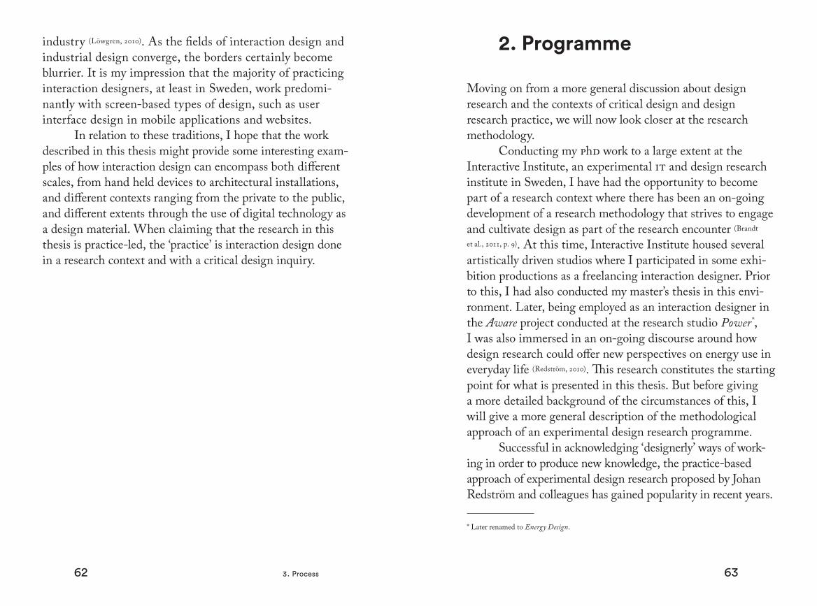
They suggest the use of design programmes to act as a founda-tion and a frame for carrying out series of experiments, acting as examples, that allows for critical dissemination of what could be done and how (Binder & Redström, 2006; Brandt et al., 2011; Koskinen et
al., 2008). The programme is provisional and acts as a hypotheti-cal worldview, a leitmotif that is relevant to the overarching research question. The experiments, by themselves, act as exploratory probes testing what the programme can entail, while the combination of programme and experiments address the underlying research question (Brandt et al., 2011). In their book Xlab, Eva Brandt and colleagues (2011) state:
We interpret the program through experiments. Through the way we set up the experiment, we present a certain perspective on the program. Using the metaphor of a design space opened up by the program, we might say that we use the experiment to explore this space, positioning us somewhere to be able to say ‘this is what the design space looks like over here’. (p. 35)
Thus, the programme is dependent on the experiments to materialise and make tangible this hypothetical world-view and the experiments are dependent on the programme to set out frames and direction for a directed form of material exploration.
A programme can be instigated, for example, as a reac-tion to certain key objects made in the tradition of the ecol-ogy of existing product typologies, or it can be formed based on an earlier design experiment stemming from another programme. In this way, new programmes can be formulated as a reaction to design experiments from older programmes
as a form of internal progression or external elaboration on the ideas of other design researchers. These new programmes offer different perspectives — design spaces — where old design experiments can be seen in a new light. The new pro-gramme, a reaction to a previous design experiment, can be formulated in a way that better encompasses what is impor-tant versus what was achievable with the old programme (ibid.). This has been the case for my own research process and I will explain this in more detail below.
Initial Design Research ProgrammesI will now look closer at the initial design research
programmes that this work sets out from and build on. This will continue with an account for the emergence of a new programme constituting the central part of this thesis.
The Static! projectAs mentioned in the introduction, this thesis takes its
departure from two different design experiences set within both research and practice. Focusing here on the research practice, we will start off from the Energy Aware Clock, one of originally six design experiments conducted within the
x x
x
x
xx
x
xx
xx
x x
The progression of a series of design programmes (large squares), where the experiments (x) lead to the formulation of a new programme that is formulated as a reaction to some key experiments conducted in the older programme (circled “x”es). The new programme, as a reaction to the previous design experiments, can better encompass what is important than what was achievable with the old programme.
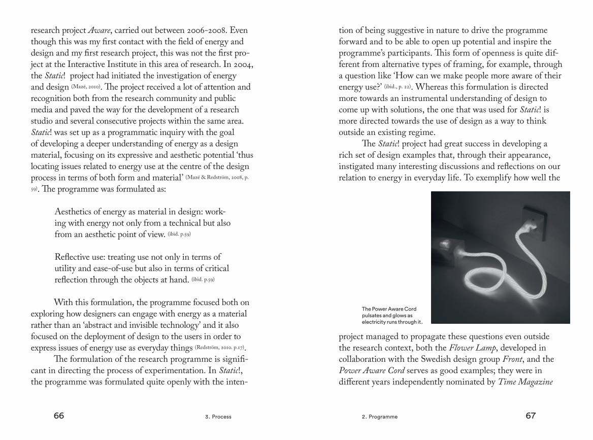
66 673. Process 2. Programme
research project Aware, carried out between 2006-2008. Even though this was my first contact with the field of energy and design and my first research project, this was not the first pro-ject at the Interactive Institute in this area of research. In 2004, the Static! project had initiated the investigation of energy and design (Mazé, 2010). The project received a lot of attention and recognition both from the research community and public media and paved the way for the development of a research studio and several consecutive projects within the same area. Static! was set up as a programmatic inquiry with the goal of developing a deeper understanding of energy as a design material, focusing on its expressive and aesthetic potential ‘thus locating issues related to energy use at the centre of the design process in terms of both form and material’ (Mazé & Redström, 2008, p.
59). The programme was formulated as:
Aesthetics of energy as material in design: work-ing with energy not only from a technical but also from an aesthetic point of view. (ibid. p.59)
Reflective use: treating use not only in terms of utility and ease-of-use but also in terms of critical reflection through the objects at hand. (ibid. p.59)
With this formulation, the programme focused both on exploring how designers can engage with energy as a material rather than an ‘abstract and invisible technology’ and it also focused on the deployment of design to the users in order to express issues of energy use as everyday things (Redström, 2010. p.17).
The formulation of the research programme is signifi-cant in directing the process of experimentation. In Static!, the programme was formulated quite openly with the inten-
tion of being suggestive in nature to drive the programme forward and to be able to open up potential and inspire the programme’s participants. This form of openness is quite dif-ferent from alternative types of framing, for example, through a question like ‘How can we make people more aware of their energy use?’ (ibid., p. 22). Whereas this formulation is directed more towards an instrumental understanding of design to come up with solutions, the one that was used for Static! is more directed towards the use of design as a way to think outside an existing regime.
The Static! project had great success in developing a rich set of design examples that, through their appearance, instigated many interesting discussions and reflections on our relation to energy in everyday life. To exemplify how well the
project managed to propagate these questions even outside the research context, both the Flower Lamp, developed in collaboration with the Swedish design group Front, and the Power Aware Cord serves as good examples; they were in different years independently nominated by Time Magazine
The Power Aware Cord pulsates and glows as elec tricity runs through it.
68 693. Process 2. Programme
for the award ‘Invention of the Year’. The materiality of these discursive artefacts of course are much more accessible and easy to react to by the public than a traditional research paper which also serves as yet another good example of the persuasive influence of design.
The discursive artefacts from the project were not done as quick mock-ups to show proof of concept; on the contrary, much time and effort were put into making the examples as realistic as possible, resembling real commercial products.
Many of them were also fully functional. This grade of realism very often made people believe that they indeed were actual products that could be bought, something that often resulted in heated debates around these ‘products’. When it comes to cultural expressions such as books and mov-ies, critical awareness among the public seems to be much higher than when it comes to reflecting on material culture; it appears to be more taken as a given.
The Aware projectAfter Static! came the Aware project that in many ways
continued on the same path as its predecessor, operating within the same programme, but through its experiments
exploring other realms in a design space of possible material expressions. The project was initiated with a qualitative data collection phase consisting of a set of stakeholder interviews in the domestic context. The goal was to get an understand-ing of energy use as a socio-cultural phenomenon in the home for both the ethnologist and the designers who worked side-by-side in this process. One important reason for this setup was to give the designers first-hand experience of the home environment to bring into the design process that was initiated alongside the interview phase. To reflect the open-ness of the design programme, the questions put together for the interview guide not only reflected on the use of energy but also on concepts such as beauty, well-being, and everyday life, questions that could still implicitly yield answers related to the topic of energy and design. Nine interviews were conducted with informants of varying ages, family situations, and kinds of housing. The interviews lasted for around two hours and were followed by a tour of the home with discussion and photographing. The interviews were then transcribed and analysed using methods such as meaning concentration (Kvale,
1997) and affinity diagrams to inform both the design process and later reflections and interpretations on the experiments. Within the design programme, it is not just the programme that determines the outcome. Just as the programme creates a frame for experimentation, the experiment itself creates a frame for the design work. When we work with a particular experiment, apart from our individual ideas about the design programme itself, our lived-world experiences as designers and other matters also influence the design outcome (Brandt et al., 2011).
Out of around thirty conceptual ideas that were gener-ated, six were collectively chosen for further refinement and prototyping (Broms et al., 2011). Of these six, three are accounted for
The Flower Lamp opens up and closes in relation to how much electricity is being drawn off the grid.

70 713. Process 2. Programme
in this thesis, namely: Energy Aware Clock [4.2] , Share Aware Light [4.3], and Aware Laundry Lamp [4.4]. Just as with the discursive artefacts produced within Static!, the design experi-ments from Aware received a lot of attention in many different contexts spanning from research to exhibitions and the press. The Energy Aware Clock continued as a design intervention in nine households for three months in a follow-up study and has also resulted in a commercial product.
The Switch! projectAlready within the Aware project, inspired by the
experiences from making the light installation Colour by Numbers, an interest for a discursive engagement between people and things that evolves over time had started to grown on me, even though not well articulated at the time. By ‘discursive engagement’, I here mean the user’s engagement in an on-going dialogue of meaning-making in relation to an artefact, turning series of events into a meaningful narrative. Participating in several subsequent projects within the field of energy and design, it became clear to me that this had been an interest that I brought with me into the design phase of the different research projects. It became part of another energy display called the Energy Plant [4.5] done within the project DEsigning SMart Energy (desme) initiated by Western Finland Design Centre Muova,* where the Interactive Institute participated in the design-related parts of the project. The project Switch! conducted at the Interactive Institute helped form the idea of Interfering Statistics [4.6], shaping everyday life through tangible statistics.
Starting in the year 2007, Switch! continued the inquiry
* A research and development organisation that is part of the University of Art and Design in Helsinki and the University of Vaasa, Finland.
into the aesthetics of energy and reflective use that was initi-ated with Static!. But whereas both Static! and Aware focused more on isolated people-product relations and the actual use of objects as the point of intervention, the research programme within Switch! turned its attention towards larger spatial scale and longer-term aspects of energy use with a more macro-scopic perspective (Mazé & Redström, 2008).
The project was guided by a series of collaborative sessions where each session focused on different aspects of the overall programme to establish a common conceptual and practical background for the project participants. This was done, for example, through presentations and readings as well as hands-on workshops and collaborative analysis. Through the course of these events, smaller workgroups formed around briefs originating from ideas that grew out of complementary research questions, areas of interest, and expertise in relation to the programme. Some examples of these briefs explored were Energy Futures (drawing on future studies to develop critical design for transitioning urban cultures to future scenarios), 3Ecologies (developing interactive visualisations of the eco-logical complexity of product life-cycles to make the futures produced through consumption choices more tangible), and Telltale (accompanying transitions in energy use within families through a piece of furniture that collect traces of energy). Interfering Statistics was a series of concepts developed within a brief that we named Ab|Norm, a series of sketches that were used as props in participatory workshops querying norms of energy design and use in the public realm (Mazé, 2013).
Adjacent projectsThe following projects, including desme, were
conducted within the same framework of research as Static!,
72 733. Process 2. Programme
Aware, and Switch!, but were not run with a clearly articu-lated design programme due to varying research traditions within the studio. For example, two projects that I partici-pated in had a larger focus on the investigation of behaviours associated with energy use in work-related practices. By using design interventions, IndustryWise turned our attention to factories and employees working on the factory floor, while InCharge focused on offices (Katzeff et al., 2013). The experimental artefacts used in these projects, Wattlite [4.7] and Wattlite Twist [4.8], drew on the design experiment Interfering Statistics but now as something explored further within the workplace context.
Parallel to the realisation of the aforementioned design experiments within the area of energy and design two projects have been carried out within the framework of my own interaction design practice, namely Colour by Numbers [4.1] and Gradient [4.10], as well as another, Fyrfärg [4.9], a result of an internal commission from the Royal Institute of Technology where I had been conducting the later part of my phd education. These external projects were also influenced by, and then themselves influenced, the experiences made within the practice of design research.
Towards a New ProgrammeWorking on the experiments from the research projects
as well as the aforementioned work conducted within my own practice as an interaction designer has given me the ability to collect an extensive repertoire of what design coming out of, or in relation to, the initial programmes can be like. Reflect-ing on the design experiments and their design processes has allowed me to consider alternative perspectives that have grown clearer over time, allowing for the articulation of a new
design programme. As mentioned earlier, a new programme has the potential for design experiments to be viewed in new ways, possibly eliciting important aspects that would be difficult to do within the original programme. In this way, the experiments guide the formation of the new programme in order for the programme to tell us more precisely what it is about the experiment that is important (Brandt et al., 2011). In the case of the examples included in this thesis, they make relevant contributions in exploring the original design programmes relating to energy and design but they, when viewed from another perspective, have also begun to map out aspects of meaningful experiences and the construction of everyday narratives. This is something that has relevance both to the original programme and to the sustainability discourse in general, as well as other areas where an exploration of meaning-making through narratives in relation to artefacts can be of value.
I have chosen to call this new programme Storyforming. This name is both provisional and hypothetical, suggestive, and open to interpretation, and is meant to be evocative and bring images to mind of what this word could imply. As described in the context chapter [2], people ascribe meaning to objects and events, and objects are often perceived as more meaningful if they have been part of significant events. How can the design of artefacts allow for these series of events to occur in order to create meaningful experiences? Storyforming is the conceptual framing that sets out a new creative direction for a design space exploration based in earlier experiments. The word story paired with forming is deliberately suggestive in order to generate ideas through the design process about how artefacts can be used to afford meaningful stories to arise in one form or another. To better see this new direction, I

74 753. Process
3. Papers
The following section includes short descriptions of the papers included as part of the thesis. They were selected out of a total of eight publications produced during my phd studies as being the most relevant to describing the progression end-ing in this thesis. Since the papers were written with the per-spective of their respective research projects, they are done in slightly different writing traditions and with different research emphases. Looking at the sum of papers as a whole, they all contribute by adding knowledge to the overall progression of the ideas presented in the thesis.
Here I will summarise and point out the most relevant parts from the papers in relation to the thesis.
Exploring sustainable practices in workplace settings through visualising electricity consumption. Katzeff, C. Broms, L., Jönsson L., Westholm U., &
Räsänen M. (2013). acm Transactions on Computer-Human Interaction 20, 5, Article 31
This article points to the challenge of how future workplaces should accommodate productivity needs and personal comfort levels whilst striving to reduce energy use. Two different prototypes for visualising energy use, Wattlite and Wattlite Twist, were inserted as design probes in differ-ent types of workplace settings, factories and offices, and then evaluated. The paper briefly accounts for the design process of the two design experiments but focuses mainly on the study and its results. In the chapters describing Wattlite [4.7] and Wattlite Twist [4.8], as well as Interfering Statistics [4.6], we will go deeper into the design process.
will first look at the already existing experiments in detail to be able to discuss their commonalities and what binds them together in relation to the new programme.
In the experiment chapter [4], I will therefore discuss a selection of ten experiments. Through their physical and temporal form, these objects investigate different ways that we can create artefacts that can be part of a programme investigating discursive engagements between artefact and user, aiding in the construction of meaningful experiences. After going through the experiments, with respect to stories and forming, I will begin to synthesise the experiences and formulate the new design programme in more detail.

76 773. Process 3. Papers
As the second author of this paper, I had been work-ing closely with the first author and contributed to several sections of the text, especially those describing the design processes, the intentions for the design experiments, and all design related aspects of the research process.
Becoming the Energy Aware Clock – Revisiting the Design Process Through a Feminist Gaze. Ehrnberger, K., Broms, L., & Katzeff, C. (2013).nordes ‘13: In the proceedings of Experiments in
Design Research, the 5th Nordic Design Research Confer-ence, Copenhagen, Denmark.
In this paper, we explored how feminist theory may be combined with design research as a strategy to break away from a gendered interpretation of technology that influences our design decisions. We did this be revisiting the design process of the Energy Aware Clock using feminist technosci-ence studies scholar Donna Haraway’s theory of the cyborg in order to clarify useful concepts that can be derived from feminist theory and that can act as important tools for designers engaged in creative processes. When designing the Energy Aware Clock, although not articulated at the time, a feminist perspective was used when discussing, for example, the significance of place in the household in relation to design. The gender perspective, looking at how the gendering of artefacts has become normalised and invisible, has many similarities to the concept of energy and has therefore been a very useful approach when working with all the energy-related design experiments.
For this paper, apart from an overall involvement in the discussion of the paper, I contributed with ideas on how to further connect concepts from feminist theory to aspects of
the design process. I also did substantial parts of the writing.
Coffee Maker Patterns and the Design of Energy Feedback Artefacts.Broms, L., Katzeff, C., Bång, M., Nyblom, Å., Ilstedt
Hjelm, S., & Ehrnberger, K. (2010). dis ‘10: Proceedings of the 8th acm Conference on Designing Interactive Systems, Århus, Denmark.
This paper takes it starting point from smart energy metres and stresses the importance of acknowledging the social implications of design when conceiving them. It then reflects on the design of the Energy Aware Clock and discusses it in relation to how it was domesticated in nine households for three months. It describes an initial field study that was made to inform the design process, the design workshops, the design of the experimental artefact, and the intervention study in the households. The three themes that were identified as problem areas in the field study — com-plexity, visibility, and accessibility — are revisited both in the following article, and in the chapter in this thesis called Unpacking storyforming [5.1] (Ehrnberger et al., 2013). They have also been influential in many of the following design experi-ments. This paper contains much of what is presented in the chapter about the Energy Aware Clock [4.2].
This paper was very much a team effort even though I had the main responsibility of writing it and putting it together. Continuing the reflection on the design process, for which I had written a previous paper together with three of the co-authors (Broms et al., 2009), it adds the work of a field study carried out and reported by the remaining authors. Together with the second author, I compared the design intentions with the results from the field study and reflected on the results.

78 793. Process 3. Papers
Persuasive Engagement: Exploiting lifestyle as a driv-ing force to promote energy-aware use patterns and behaviours. Broms, L., Bång, M., & Ilstedt Hjelm, S. (2008). drs
‘08 Proceedings of Design Research Society, Sheffield, uk.This paper looks at how aspects of lifestyle-thinking
can be used in design as central driving forces that can lead to changed behaviour. It builds on the idea that behavioural changes related to energy use might be successfully carried out when people are offered desirable alternatives that are engag-ing and that do not impose a perceived extra burden in their everyday life. Aware Laundry Lamp [4.4] and Energy Plant [4.5] are used as examples. Even though the paper has a quite instrumental approach to design for behavioural change, from this perspective it approaches the idea of ‘engaging narratives’: ‘objects and services could have a narrative so engaging that the user feel urged to change behaviour in order to actively participate in its use. The appearance of the artefact could focus on enhancing this story, providing clear visual information that is easy to grasp and interact with’.
I was responsible for initiating the process of writing the paper, making an outline, selecting the design cases, and writing an initial draft. However, being my first paper, I received a lot of input from my co-writers and this steered it in a slightly different direction than if I would have writ-ten it today.
Apart from the papers included in this thesis I have also been engaged in several others listed below:
Broms, L., Katzeff, C., Bång, M., Nyblom, Å., Ilstedt Hjelm, S., & Ehrnberger, K. (2011). Days in the Life of
the Energy Aware Clock – Design of an Ambient Energy Feedback Interface. Swedish Design Research Journal, 11(1), 30–37.
Spagnolli, A., Corradi, N., Gamberini, L., Hoggan, E., Jacucci, G., Katzeff, C., Broms, L., & Jönsson, J. (2011) Eco-Feedback on the Go: Motivating Energy Awareness. ieee Computer, 44(5), 38–45.
Broms, L. (2011). Sustainable Interactions: Studies in the Design of Energy Awareness Artefacts, Linköping Studies in Science and Technology: Thesis, Department of Computer and Information Science, Linköpings Universitet, isbn 10: 9173931632.
Jönsson, L., Broms, L., & Katzeff, C. (2010). WattLite: Energy statistics made tangible. dis ‘10: Proceedings of the 8th acm Conference on Designing Interactive Systems.
Broms, L. Ehrnberger, K., Ilstedt Hjelm, S., & Bang, M. (2009) The Energy Aware Clock: Incorporating electricity use in the social interactions of everyday life. Proc. EcoDe-sign 2009, Japan Society of Mechanical Engineers
81
4. Experiments

83
In this chapter, I will give a thorough account of the design experiments with respect to stories and forming. That is, the process of form-giving* as well as both speculative and real stories of use relating to each experiment. This is done as a way of critically examining the design experiments in light of the forthcoming Storyforming programme in order to better understand what this changed perspective can entail for the formulation of the new programme itself. In what ways do the experiments act as catalysts in the construction of meaningful narratives when interacted with by users? The design experiments in this way enable an investigation of different aspects of strategies to create and sustain discursive engagements that bestow a sense of meaningfulness.
The experiments are selected out of a larger quantity based on their relevance to the concept of Storyforming. As mentioned earlier [3.1], they have been conducted in different contexts — both within the area of research but also within my own interaction design practice. Within both these contexts, I have been engaged in design processes done in collaboration with people with different backgrounds such as design, architecture, art, and engineering, to mention the most well established. Also, apart from being conducted in different environments of practice and with people with dif-ferent backgrounds, the experiments differ in other aspects as well. Some are only sketches while others exist as function-ing prototypes, some have been shown only in exhibition contexts while others have been evaluated in field studies over months and even years. They range from the private household to public spaces and from handheld devices to architectural installations. The reason for these variations are
* I will begin with forming for the sake of chronology.

84 854. Experiments
connected to both interest and opportunities and limita-tions related to both my research and design practice. The context — academic and private practice and the traditions of inquiry, the field of hci and design, and methods of evalu-ation — through practice, exhibitions, workshops, and field studies, adds up to a patchwork of overlapping methodolo-gies and traditions. Projects conducted from within my private practice have made the realisation of ideas possible with different stakeholders (with different demands), differ-ent contexts, and different forms of validation, as compared to carrying out work in my role as a researcher. Research projects with a more open critical inquiry made it possible to create a collection of different design experiments that opened up many different paths to explore further, some of the results of which carried on to become part of this work. Other research projects had a larger focus on behavioural aspects allowing for a comparison of discrepancies between the design intention (an envisioned use) and the actual use, providing interesting knowledge of how design ideas reso-nate in reality. These differences in conjunction enable us to create a larger tension in the interaction with the programme where similarities and differences have a potentially higher chance of emerging as more redolent and evocative.
For all the experiments reported in this thesis, I was involved in and contributed extensively to the design process. My thoughts and experiences have, together with different team members, co-shaped the outcome, resulting in the physical objects. Apart from my own ideas and input, these objects wouldn’t have been the way they are without these collaborative efforts. Ideas get mixed and move along from project to project, influenced by the people you meet and work with. With this in mind, the selection of experiments
described here, and the way in which I have chosen to pre-sent them, are still a reflection of my own research interest and my own design process. Other project members could highlight other aspects, assemble other types of collections, and perhaps suggest other design programmes in order to reflect their own research agendas. What I have chosen to focus on in this thesis reflects my own contributions in this larger context. Project members and collaborating design-ers that have in different ways contributed to the results are credited in the acknowledgements.

86 874. Experiments
1. Colour by Numbers
Colour by Numbers is an interactive light installa-tion installed in a 72-metre high, unused telecom tower at Telefonplan (Telephone-square), part of the suburb of Midsommarkransen in the south of Stockholm. Built in 1948, the building was originally used by the company lm Ericsson to house experiments with micro-wave technology and later used for early mobile telephony. The company, one of Sweden’s biggest, had at the time a large influence on the area, from the name of the subway station ‘Telefonplan’ to the whole
infrastructure of the suburb that grew up around it, including homes for workers and cultural facilities. The tower was like a finger pointing out the company’s territory (Bydler, 2006). Over time, the corporate suburb ‘has become a typical city collage where the architectural form didn’t reveal anything about its function, and flexibility and pragmatism are the watchwords [...] The tower was left behind, uncommunicative, its sides like blank pages. Here was a visible area, but no one to take visual control over it’. (ibid., p. 1)
In 2006, when contacting Ericsson, still somewhat present in the area at the time, an interest in making a new use for the tower was nonexistent. The property owner on
View from the tower over Telefonplan.
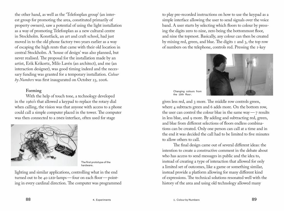
88 894. Experiments 1. Colour by Numbers
the other hand, as well as the ‘Telefonplan group’ (an inter-est group for promoting the area, constituted primarily of property owners), saw a potential of using the light installation as a way of promoting Telefonplan as a new cultural centre in Stockholm. Konstfack, an art and craft school, had just moved in to the old phone factory two years earlier as a way of escaping the high rents that came with their old location in central Stockholm. A ‘house of design’ was also planned, but never realised. The proposal for the installation made by an artist, Erik Krikortz, Milo Lavén (an architect), and me (an interaction designer), was good timing indeed and the neces-sary funding was granted for a temporary installation. Colour by Numbers was first inaugurated on October 23, 2006.
FormingWith the help of touch tone, a technology developed
in the 1960’s that allowed a keypad to replace the rotary dial when calling, the vision was that anyone with access to a phone could call a simple computer placed in the tower. The computer was then connected to a dmx-interface, often used for stage
lighting and similar applications, controlling what in the end turned out to be 40 led-lamps — four on each floor — point-ing in every cardinal direction. The computer was programmed
The first prototype of the hardware.
to play pre-recorded instructions on how to use the keypad as a simple interface allowing the user to send signals over the voice band. A user starts by selecting which floors to colour by press-ing the digits zero to nine, zero being the bottommost floor, and nine the topmost. Basically, any colour can then be created by mixing red, green, and blue. The digits 1 and 3, the top row of numbers on the telephone, controls red. Pressing the 1-key
gives less red, and 3 more. The middle row controls green, where 4 subtracts green and 6 adds more. On the bottom row, the user can control the colour blue in the same way — 7 results in less blue, and 9 more. By adding and subtracting red, green, and blue from different selections of floors endless combina-tions can be created. Only one person can call at a time and in the end it was decided the call had to be limited to five minutes to allow others to call.
The final design came out of several different ideas: the intention to create a constructive comment in the debate about who has access to send messages in public and the idea to, instead of creating a type of interaction that allowed for only a limited set of outcomes, like a game or something similar, instead provide a platform allowing for many different kind of expressions. The technical solutions resonated well with the history of the area and using old technology allowed many
Changing colours from the 15th floor.
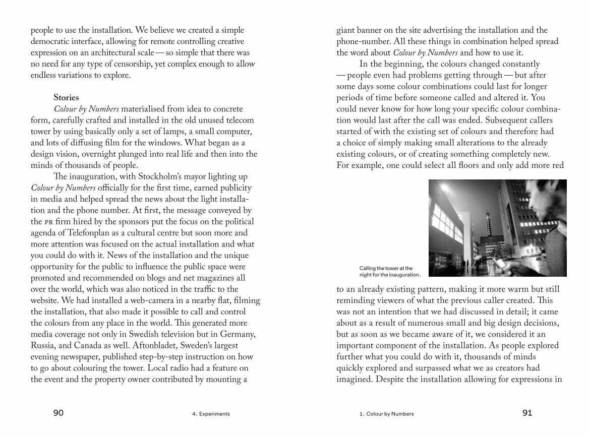
90 914. Experiments 1. Colour by Numbers
people to use the installation. We believe we created a simple democratic interface, allowing for remote controlling creative expression on an architectural scale — so simple that there was no need for any type of censorship, yet complex enough to allow endless variations to explore.
StoriesColour by Numbers materialised from idea to concrete
form, carefully crafted and installed in the old unused telecom tower by using basically only a set of lamps, a small computer, and lots of diffusing film for the windows. What began as a design vision, overnight plunged into real life and then into the minds of thousands of people.
The inauguration, with Stockholm’s mayor lighting up Colour by Numbers officially for the first time, earned publicity in media and helped spread the news about the light installa-tion and the phone number. At first, the message conveyed by the pr firm hired by the sponsors put the focus on the political agenda of Telefonplan as a cultural centre but soon more and more attention was focused on the actual installation and what you could do with it. News of the installation and the unique opportunity for the public to influence the public space were promoted and recommended on blogs and net magazines all over the world, which was also noticed in the traffic to the website. We had installed a web-camera in a nearby flat, filming the installation, that also made it possible to call and control the colours from any place in the world. This generated more media coverage not only in Swedish television but in Germany, Russia, and Canada as well. Aftonbladet, Sweden’s largest evening newspaper, published step-by-step instruction on how to go about colouring the tower. Local radio had a feature on the event and the property owner contributed by mounting a
giant banner on the site advertising the installation and the phone-number. All these things in combination helped spread the word about Colour by Numbers and how to use it.
In the beginning, the colours changed constantly — people even had problems getting through — but after some days some colour combinations could last for longer periods of time before someone called and altered it. You could never know for how long your specific colour combina-tion would last after the call was ended. Subsequent callers started of with the existing set of colours and therefore had a choice of simply making small alterations to the already existing colours, or of creating something completely new. For example, one could select all floors and only add more red
to an already existing pattern, making it more warm but still reminding viewers of what the previous caller created. This was not an intention that we had discussed in detail; it came about as a result of numerous small and big design decisions, but as soon as we became aware of it, we considered it an important component of the installation. As people explored further what you could do with it, thousands of minds quickly explored and surpassed what we as creators had imagined. Despite the installation allowing for expressions in
Calling the tower at the night for the inauguration.

92 934. Experiments 1. Colour by Numbers
only one spacial dimension the ways that people discovered usages were a positive surprise.
Contrary to my own belief, in an interview study with six users, four of them had discovered the installation by themselves oblivious to the information about the project distributed in media:
At first, I didn’t understand what it was. I thought it contained a pattern changing over time. But as I get up at the same time each morning, and saw it each evening, I noticed that there was no pattern relating to the 24 hours of the day, or through the week. And then I overheard someone talking about it, and I understood that there was some kind of interactivity. I then surfed the net, found their page, and called.
Another respondent stated:
At first, I didn’t understand that it was changing. But oh, it’s so cool that the tower shines! But then, with time, I realised that it didn’t have the same colours, and once when my girlfriend and I were watching, because it is such a nice view, it changed in front of our eyes. Cool! So then I started to suspect something was fishy.
Linda Ryan Bengtsson, at the time carrying out a phd in media and communication studies examining the blurred borders between media interfaces and the physical environ-ment due to the introduction of digital technology, followed
almost the whole process of contriving Colour by Numbers as well as how it was received in public over time. She inter-viewed six people living in the area who showed interest in the installation by e-mailing the official e-mail address. Of these six, five were male and one female, and ages varied between 30-55. I will here give some excerpts of Ryan Bengtsson’s work — a much more thorough account is given in her thesis (Ryan Bengtsson, 2012).
Ryan Bengtsson points out that, after some initial difficulties in understanding how to control the lights, the respondents felt directly connected to the lights where the phone itself became a tool that they used automatically, almost like a remote control. This was something that I noticed myself doing, unconsciously raising the telefon towards the tower just as you would when wanting to change a channel on the television. This even happened to me once when only having access to the real-time video provided by the website. The need to focus on the technical aspects disappeared and the focus shifted from ‘how to do it’ to ‘what to do’.
After the respondents had mastered the controls, it seemed important to find a purpose with the design they created according to Ryan Bengtsson. For example, they developed their own unique patterns signaling ‘now I am here’, another user set the lights to mimic the colour of the sky hop-ing that someone would notice this and yet another respond-ent even utilised his five minute time frame to put on a show that he hoped would catch the eyes of the passengers passing by in the subway train:
I felt like taking part in the production when the metro passed. Okay, it isn’t me that built the

94 954. Experiments 1. Colour by Numbers
tower. It isn’t me that installed the lights. But right now it is my show.
Apart from the creative expressions, the social dimension was a central factor in the interaction with Colour by Numbers — to feel the presence of others and to be seen. Just as drawings, pictures, texts, or any other creative outcome is rarely kept to oneself, the users hoped that someone else would appreciate their creations and understand what they tried to communi-cate. Finding ways to communicate and also satisfying the needs of fun, excitement, and expression were central, accord-ing to the interviews Ryan Bengtsson conducted.
I experienced several times, I don’t know if it was the same person, but it happened several times with different patterns. If you can call a person a pattern, several individuals were present. It could have been the same person constructing several different patterns, but that is not my interpretation. My interpretation is that there were several people that I was com-municating with by changing my signature, just as they had their signature. That was the feeling anyway. I don’t know if this was true or not but I like to believe so. I really want to believe so because it feels quite nice I have to say.
Another interviewee stated:
My girlfriend got totally into it and wanted to change it. Then another user would change it back. They were kind of duelling, it was like a
battle. The person that my girlfriend was fight-ing would only colour the top four floors. My girlfriend thought maybe they could only see the four top floors from their house.
Also, along the lines of continuing on the creation of a previ-ous caller by making small changes, one informant said:
Once when I had uploaded a design with one [window] in an unusual colour, magenta, it stayed through several... When I looked later all win-dows had been changed except for the window with the unusual colour.
Another respondent made a habit of calling in and subtract-ing all the green from the windows allowing the previous caller to set the boundaries for his own expression.
The installation itself was also given a kind of life of its own as users gradually developed a relationship with it over time. Users felt a sort of responsibility for not making the installation feel lonely. As expressed by one informant:
Sometimes I would think, oh no, now it has been like that for too long, now I’ll call it and make a change.
Another user compared the light-installation to that of the presence of a goldfish. The respondents were of course aware that the installation was only a piece of technology and stated that they felt stupid and childish having this experience.
These sorts of emotions were something that developed over time by those who lived in the area. Ryan

96 974. Experiments 1. Colour by Numbers
Bengtson also had a small focus group that used the instal-lation for a shorter period of time and that did not live in the neighbourhood. They did not develop the same strong attachment to Colour by Numbers.
People living in the area felt proud of having their own landmark. They showed it to friends and family and tried to located it from different places in town:
As I knew where it was and that it was tall and changeable I would try to locate the tower wherever I was. Then I could also identify my home. I could see the tower from Essingeleden [highway] at quite a distance and also traveling on tvärbanan [public transport]. And also coming from the south towards the city. I could see it from many places, and I did actively look for the tower.
Seeing it every day developed bonds and created a strong connection. Users were connecting with each other and with the installation itself. When it was taken down the first of April 2007, we soon received numerous emails from people liv-ing in the area expressing sadness that Colour by Numbers had disappeared. Later in 2007, Colour by Numbers played a central part in a best-selling crime novel called Himmelsöga by Arne Dahl (2007) and three years later it figured in the youth-novel Här ligger jag och blöder by Jenny Jägerfeld (2010). The character in the book has some problems controlling the installation:
The voice on the phone said that you could get all colours by mixing red, blue, and green, but I didn’t really understand. How could you get yellow? I almost got possessed in trying to get yellow. I called and called, mixed and mixed and it became green and red, and cerise and purple but not yellow.(p. 191).
In the beginning of 2011, the installation became a perma-nent feature at Telefonplan and as of this writing, Colour by Numbers still averages 24 calls per day boosted by occasional coverage in different media. The engagement with calling has endured over time and the installation has become a symbol of the area, appearing in all sorts of contexts. As of this writ-ing, the latest additions are a company using the tower with coloured windows in its logotype, and for Christmas a video of a diy project with an interactive gingerbread Colour by Numbers replica was uploaded to Youtube.
To make the installation more accessible, we recently developed a smart-phone application that allows the user to select floors by pressing on a live-feed of the tower and mix colours by spinning red, green, and blue wheels. I recently tested a version of the app on a six-year-old boy who had never interacted with the installation before. He almost instantly took the phone from my hands, selected some floors by press-ing on the picture of the tower, and eagerly started to colour it. He later told others of this experience and comments on it regularly when passing by. I can see that the installation has started to become meaningful for him
By the introduction of the smartphone application, the amount of active users has increased. During the first five months, approximately 2500 people have downloaded the app. Colours are set in the same tradition as before by first selecting floors and then spinning red, green and blue wheels to add or subtract red, green and blue.
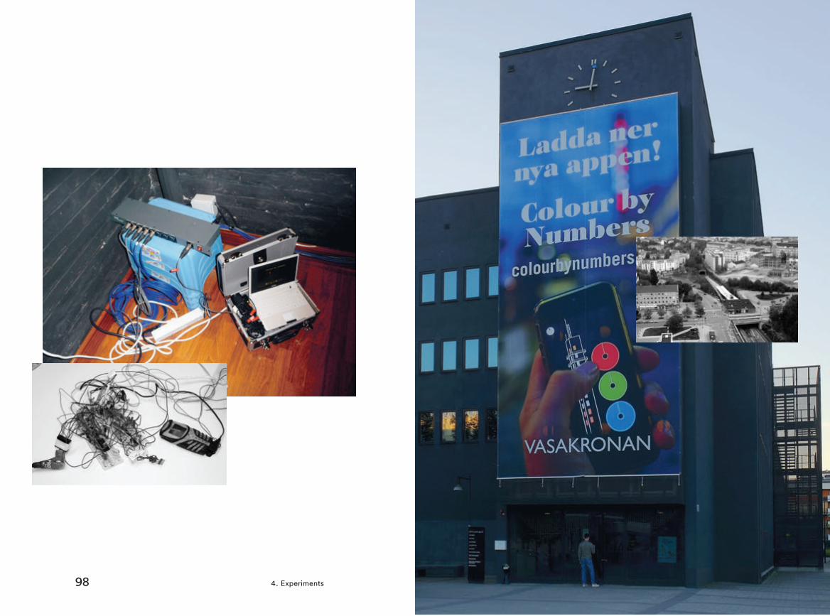
98 994. Experiments 1. Colour by Numbers

100 1014. Experiments 1. Colour by Numbers

102 1034. Experiments 1. Colour by Numbers
Colour by Numbers was also installed in the Perigodes Tower in Seville, Spain, as part of the Seville Bienal in 2008, before becoming a permanent installation at Telefonplan in 2011.
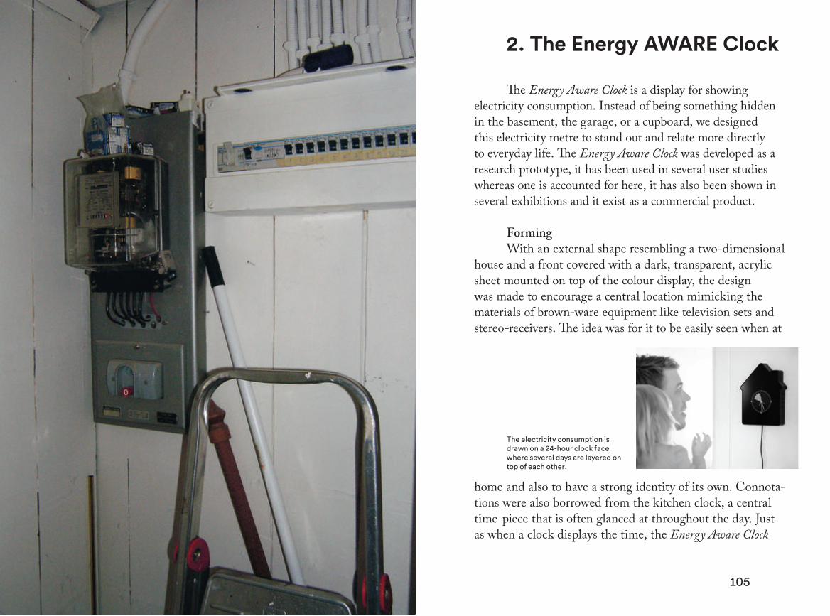
105104
2. The Energy AWARE Clock
The Energy Aware Clock is a display for showing electricity consumption. Instead of being something hidden in the basement, the garage, or a cupboard, we designed this electricity metre to stand out and relate more directly to everyday life. The Energy Aware Clock was developed as a research prototype, it has been used in several user studies whereas one is accounted for here, it has also been shown in several exhibitions and it exist as a commercial product.
FormingWith an external shape resembling a two-dimensional
house and a front covered with a dark, transparent, acrylic sheet mounted on top of the colour display, the design was made to encourage a central location mimicking the materials of brown-ware equipment like television sets and stereo-receivers. The idea was for it to be easily seen when at
home and also to have a strong identity of its own. Connota-tions were also borrowed from the kitchen clock, a central time-piece that is often glanced at throughout the day. Just as when a clock displays the time, the Energy Aware Clock
The electricity consumption is drawn on a 24-hour clock face where several days are layered on top of each other.

106 1074. Experiments 2. The Energy AWARE Clock
also displays electricity consumption — now and earlier. The metre visualises the daily electricity rhythms of the house-hold on, by default, a 24-hour clock-face. 24-hours were finally decided on after some discussion to allow for the days to layer on top of each other. This made it possible to, as the day progressed and the dial moved forward, compare today’s consumption with yesterdays and the day before yesterday before they faded away in the background. The length of the dial represents the present consumption and as the dial moves forward it leaves a trace behind lasting for three days. One touch-button was added to change time-scale of one turn ranging from one minute to a whole year and another button where implemented to allow for numeric values to be switched on and off.
At the time of the initial study, the only feedback on electricity use was the electricity bill that came once a month or even quarterly making any type of comparison hard to do
(Broms et al., 2010). With the Energy Aware Clock, we wanted to work with relations, allowing the users to experience and explore their electricity-patterns instantaneously and over time, sort of like a diary. Removing numbers all together would have
The workplace in the basement where the senior informant kept log of the household’s electricity consumption.
made the electricity metre more provoking as an experimental artefact but then again, switching the numbers on and off made for an easy comparison with the relations between different electrical appliances whose patterns could be seen on the circu-lar graph, putting the abstract numbers into perspective.
The Energy Aware Clock was deliberately designed in opposition to a traditionally male technocratic style where interfaces to the energy system were made to advocate ‘pure function’ and resembling apparatuses from the factory floor. Based on results from the field study, three areas regarding how the energy systems were connected with the social aspects of life in the households were singled out as being of particular interest to address. They were: complexity, visibility, and accessibility — all in their way relating to the problem of either grasp-ing information about electricity consumption or not being able to see it (ibid.). The complexity theme focused on the problem of understanding one’s electricity use, even when wanting to. In the study informing the design process, there was a senior informant, 81 years old, who had an electricity diary in which he wrote down the current position of the electricity metre every day at noon. By doing this routine he could keep track of the consumption from day to day going down in the basement and writing down the numbers. He was the only person in the field study with this kind of dedication. Second, the topic of ‘visibility’ brought forward the fact that the electricity system often was found hidden behind covers and assimilated to the background surface, for example painted white. And finally the ‘accessibility’ theme focused on the fact that interfaces to the energy system were located in places isolated from the everyday living areas. The gendering of spaces in the household were related to this. Women still take the main responsibility for the household and children, whereas men are responsible

108 1094. Experiments 2. The Energy AWARE Clock
for the maintenance of the house. As a result of this, women and children have different movement patterns and mainly move around in the part of the home where little of the electricity system is shown, while the male domain is in the garage, the workshop, and the basement where the electrical system is more visible (ibid.; Ehrnberger et al., 2013).
With the Energy Aware Clock, we wanted to make a simple interface, moving away from the numbers and units standardised by the industry for communicating electricity consumption. The circular graph still needed to reflect the electricity usage throughout the day in all its complexity, giving users the possibility of exploring this hidden world. Television sets switched on in the evening, toasters and micro-wave ovens turned on for short intense use, freezers, fridges, and floor-heating going on and off, water heating up after showers, and much more — all electrical appliances overlap to create an intricate pattern to reflect on. No single answer is given, and no behaviour is affirmed or dismissed; electrical patterns are presented as a reflection of real life patterns in all their complexity.
StoriesIn 2007, when we presented an early concept of the
Energy Aware Clock in a research project looking for an electricity display to try out in-situ in a number of rental apartments, some participants, mainly a group of property owners and people working in the energy field, got upset. The sketches with the circular graph enclosed in the house-shape were so different from what they had expected that they left the meeting early in an upset fashion. ‘We have worked so many years to make the customers understand the concept of kilowatt-hours, do you seriously mean that we should throw
those efforts overboard?’ was one reason given*. It became apparent to us that leaving the tradition of the design aesthet-ics reminiscent from industry was not entirely unproblematic for the industry itself. In households on the other hand, this shift in style did not seem to be very provocative. The new electricity metre was seen as something entirely new and not compared to what had previously been hidden away or com-municated through the electricity bills.
As a design intervention, the Energy Aware Clock was developed into a set of fully working prototypes installed in nine homes using a domestication probe methodology (Gaver &
Dunne, 1999; cf. Routarinne & Redström, 2007). With this method, the proto-
type was installed in the home to stimulate a dialogue about the object and the new situation. This was done as a way of capturing and understanding more difficult and underlying social aspects that were hard to elicit by doing only inter-views. Data from nine families who tested the electricity display were collected through qualitative in-depth interviews
* Quoted as I remember it.
The Energy Aware Clock exhibited at the Visual Voltage exhibition (a collaboration between Interactive Institute and the Swedish Institute) – The exhibition has been in Shanghai, Washington, Brussels, Berlin, Beijing and Tokyo (2008-2010).

110 1114. Experiments 2. The Energy AWARE Clock
at the end of a three-month period (Broms et al., 2010). One major finding from the interviews was that the Energy Aware Clock went through at least two phases — an exploration phase and a confirmation phase. In the first phase, participants explored the household to map out the amount of electricity used by
different appliances. Appliances were turned on and off to see what the effects were on the metre. After approximately two weeks, the participants gradually started to use the display more and more for confirmation, to check if everything was ok. As stated by one participant:
In the beginning we had fun looking at it and then you could run to switch something on and then go and look [again]. But once you’ve done this for a while, [...] you’ve become aware of [how much electricity] everything uses.
The Energy Aware Clock went through an exploration phase and a confirmation phase.
And described by another informant:
You just check it. It’s like looking at the oil gauge in the car. You just take a quick glance [to] see that everything’s OK. That’s how you use it when you’ve gotten used to it.
During the exploration phase, the detailed information provided allowed for quite nuanced reasoning about, for example, different dishwashing programmes. One respond-ent said:
You run the eco-programmes. [...] I have com-pared these to the regular programmes on the dishwasher and the washing machine. [...] I like seeing that less electricity actually was used [for the eco programme].
After a while, during the confirmation phase, the electrical patterns were also connected to everyday life events:
After a while [of having the Energy Aware Clock], we could see very clearly [...] when we go to work and when we get home [...] lights are switched on and the TV is on [...] everything is on maximum. And then, you notice how it drops [...] you see how everything is switched off.
We could see that thinking about electric-ity had resurfaced into everyday life activities.
Over time, some respondents learned how to recognise electrical patterns related to certain appliances:

112 1134. Experiments 2. The Energy AWARE Clock
Yes, like right now, this is fun. That pattern is the coffee maker, you recognise it immediately [...] before it could be switched on the whole Saturday before lunch, but now when you see this you are reminded of how darn much effect [it uses].
Here we can see that we put on some coffee [...] or the washing machine. Yes, yes, yes, the dishwasher was on when I got home, so it probably is that that caused this [pattern].
The patterns drawn on the display of the Energy Aware Clock encouraged exploration and reflection over time. Relations between what happened during the day and what you could see on the display were not something that was always figured out straight away but gradually evolved over time.
Even though most households appreciated the Energy Aware Clock, these feelings were not mutual for all partici-pants. The central placement was expressed as a problem by one household:
It was just too present, [...] and we felt that we can’t affect our energy use that much [...] I mean, to use the dishwasher and the washing machine as much as we need to. It has kind of a high priority now when we have children and limited time and so on. So we felt that [the clock] added unnecessary stress. Because we try to keep it [the electricity consumption] down as much as we can anyway. So, really, it was quite negative.
Despite trying to present the information as neutral as possible, visualising the use of electricity was not without
problems as can be seen in the quote above. The perceived quality of life was in conflict with acts of electricity conserva-tion. Resurfacing electricity use on a cognitive level is not without complications since it imposes different kinds of real and perceived burdens that somehow have to be motivated. Threatening what is considered the good life is not a popular alternative. Some informants even talked about ‘giving up life’. In some cases, these feelings projected on to the electric-ity display were so strong that the will to engage further with it became very low while other households engaged enthu-siastically exploring and discovering relations between their actions and the electricity use. The narrative proposed with the Energy Aware Clock, focused on the act of measuring, led to feelings of unease in some of the informants.
Next we will look at some other design experiments that explore different ways of proposing narratives around electricity use.

114 1154. Experiments 2. The Energy AWARE Clock

116 1174. Experiments 2. The Energy AWARE Clock
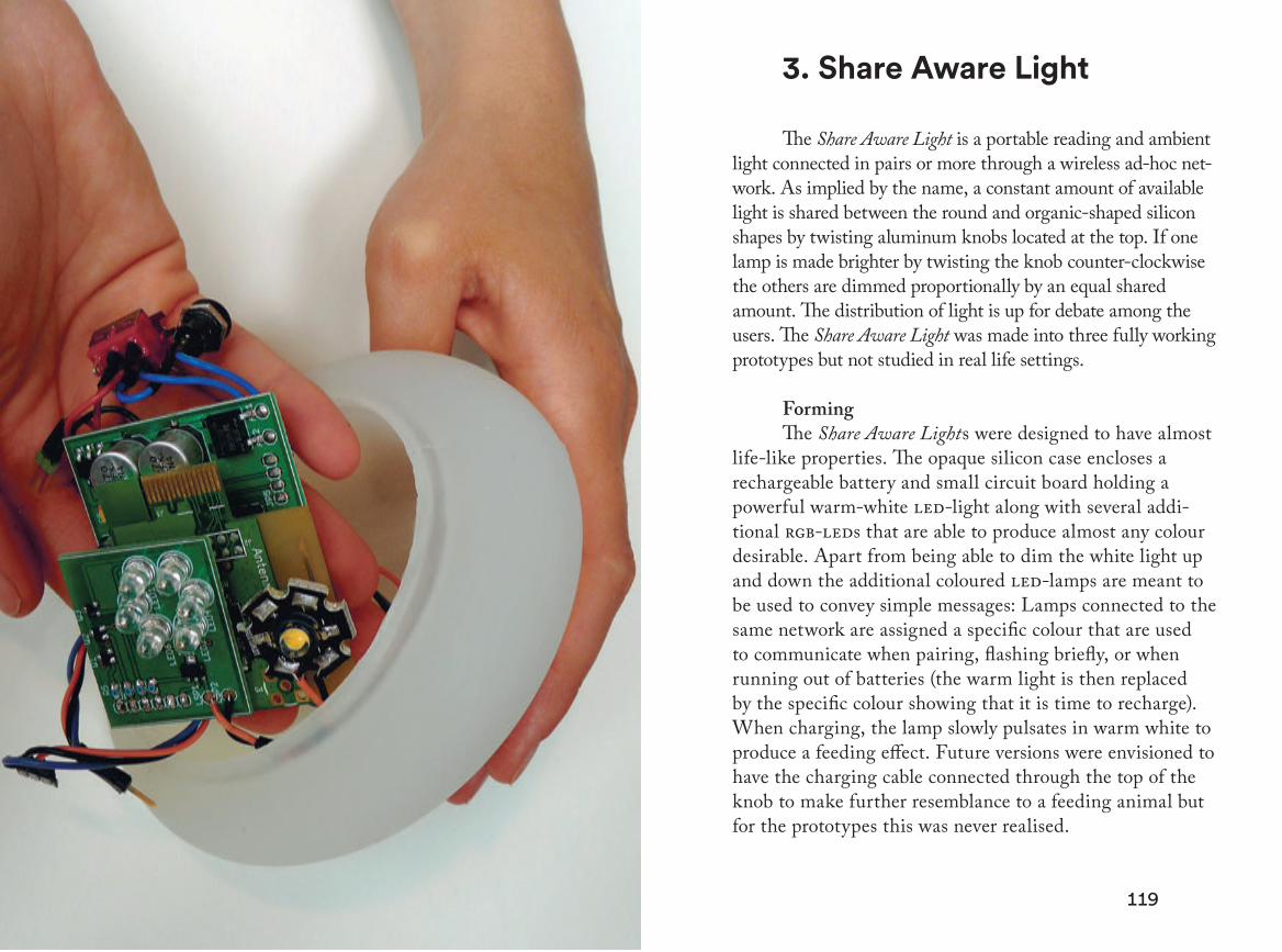
119118 4. Experiments
3. Share Aware Light
The Share Aware Light is a portable reading and ambient light connected in pairs or more through a wireless ad-hoc net-work. As implied by the name, a constant amount of available light is shared between the round and organic-shaped silicon shapes by twisting aluminum knobs located at the top. If one lamp is made brighter by twisting the knob counter-clockwise the others are dimmed proportionally by an equal shared amount. The distribution of light is up for debate among the users. The Share Aware Light was made into three fully working prototypes but not studied in real life settings.
FormingThe Share Aware Lights were designed to have almost
life-like properties. The opaque silicon case encloses a rechargeable battery and small circuit board holding a powerful warm-white led-light along with several addi-tional rgb-leds that are able to produce almost any colour desirable. Apart from being able to dim the white light up and down the additional coloured led-lamps are meant to be used to convey simple messages: Lamps connected to the same network are assigned a specific colour that are used to communicate when pairing, flashing briefly, or when running out of batteries (the warm light is then replaced by the specific colour showing that it is time to recharge). When charging, the lamp slowly pulsates in warm white to produce a feeding effect. Future versions were envisioned to have the charging cable connected through the top of the knob to make further resemblance to a feeding animal but for the prototypes this was never realised.

120 1214. Experiments 3. Share Aware Light
These aforementioned design choices were made to explore the idea of turning a limitation, sharing a set amount of light, into part of the object identity using different metaphors and in the envisioned use, to allow for new types of situations to arise — for example, negotiations of sharing. Instead of allowing for electricity to blend in, being purely a commodity as we are mostly accustomed to, we wanted make the limited energy part of the very essence of the object’s identity. For battery-powered devices like mobile phones, laptops, and such, this limitation is also present, such that one often has to relate to it, but contrary to the idea with
Share Aware Light, battery drain would in these cases not likely be described as a positive feature. Making a battery that never runs out and putting it inside a mobile phone still makes it basically the same, just without the need to think about charging taken out of the equation. If you instead turn each Share Aware Light into an independent light source with an endless supply of electricity, it would become something entirely different. Now they would be more like ordinary lamps — the limitation is central to the object identity. This restriction also makes it interesting as an active instigator
In a tactile and visible way, the technical platform opened up for possibilities to create new types of situations and stories.
of narratives around the distribution of light. Turning it on initiates a negotiation stretched out over space, mediated by radio-waves. In cases where Share Aware Light would be used by a single person it would still allow you to use the light where needed the most — a clever use of light, an ‘intel-ligent’ lamp.
Stories When sharing light, having it taken away might
be provoking but also engaging — connecting you with someone else. Just as with Colour by Numbers, this way of connecting and communicating without using words has many interesting implications. It acts as a platform that allows users to invent their own uses and their own meaning and therefore also the possibility of exploring and making up their own stories that they fill with meaning. Short messages can easily be constructed and connected over the Internet, light can be shared over long distances, making for a more ambient way of communicating and negotiating presence.
Interacting with the three prototypes in the office was an exiting experience, the circumstances of which I wish would have allowed me to explore further. Turning the knob
The Share Aware Light prototype had an organic form to fit comfortably in the hand.

122 1234. Experiments 3. Share Aware Light
up to increase the light of the lamp I held in my hand while seeing two other lamps further away instantly dim down was a surprisingly strong experience, just as when changing the lights of Colour by Numbers with a mobile phone for the first time. Using the lamps only for a short while put the imagi-nation in motion thinking of the ways one could use them.
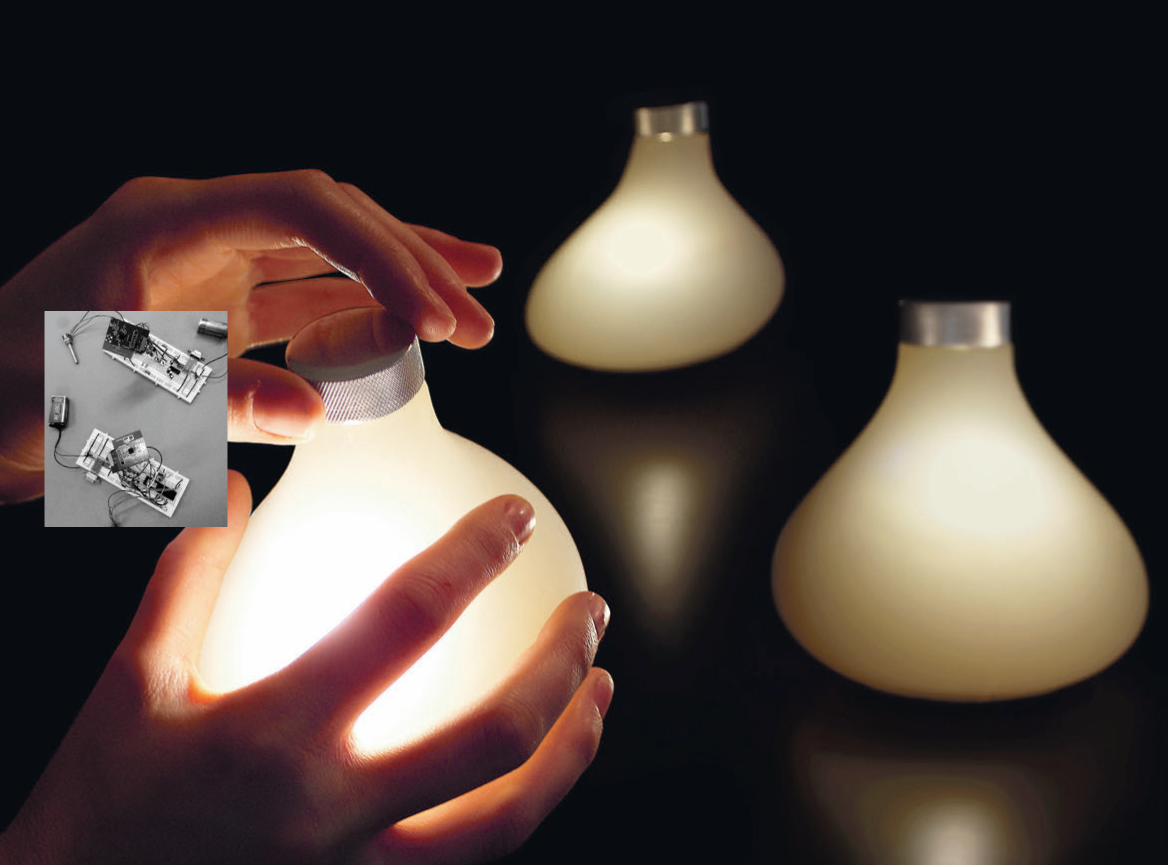
124 1254. Experiments 3. Share Aware Light

126 127
4. Aware Laundry Lamp
The Aware Laundry Lamp is the third and final result chosen from the Aware project. It is a fusion between a lamp and a drying rack giving its owner the possibility of hanging clothes to dry as part of an aesthetic expression, instead of simply tossing the clothes into a tumble dryer that is often placed in the bathroom or the laundry room. Drying the clothes in a more sustainable way also becomes a much more social experience.
FormingInspired by a participant, hanging clothes to dry in
his apartment during the initial field study in the Aware project, the idea for the Aware Laundry Lamp was born. By combining a drying rack with a floor lamp and turning it into a laundry lamp built on the idea of combining the act of hang-drying clothes with that of home decoration. Tum-ble drying is one of the most intensive electricity-consuming activities in a home and it was therefore interesting to reflect upon how alternative practices could be encouraged. The home as an expression of the self, has in recent decades become more and more similar to fashion design, leading to more rapid replacement of furniture that was previ-ously owned for a lifetime. Makers of low-cost furniture, like ikea, have also made this economically feasible. With the Aware Laundry Lamp, the idea was to instead make a piece of interior decoration where the use also allowed for a continuous flow of expressions, making the user an everyday designer of sorts. Hang-drying clothes is also a common image used in advertisements for freshness and cleanli-

128 1294. Experiments 4. Aware Laundry Lamp
ness — blue skies and a warming sun — connotations we did not mind associating with the laundry lamp. Could this way of drying clothes appeal to our desire for beauty, self expres-sion, and environmental consciousness as opposed to the
more modernist ideals of speed, efficiency, and convenience? Made in both a floor and a ceiling version, users can make a statement with what kind of laundry they put on display blurring the border between what is to be left private and what is to be shown. Also, since tumble dryers are tradi-tionally often stowed away in laundry rooms and basements, the Aware Laundry Lamp instead encourages placement in a more central location through its form, just as with, for example, the Energy Aware Clock. The act of hang-drying clothes could therefore also be a social act, adding the possibility of the ambience of warm light shining through different coloured laundry drying slowly.
The ceiling version of the Aware Laundry Lamp.
StoriesA total of three Aware Laundry Lamps were pro-
duced — two floor versions and one celling version. The first floor version was taken back for two weeks to the one household that had given rise to the original idea. This household had already been using a laundry rack at the time for the field study and during the interview it was standing in the room full of only white clothes. This led us to reflect on the aesthetic expression of clothes drying.
Perhaps not so surprising, the participant that had left his clothes out to dry in the apartment during the first interview had no problem with having clothes on display using the laundry lamp:
I don’t think one should try to hide things; it is a home after all [...] I enjoy coming home to people and you can see that things have happened [since the last visit]. It is something personal.
The changing states of friends’ homes were seen as something positive, a sign that life was happening there, and the ability
The floor version of the laundry lamp back where it all started, in the household where the idea was born.

130 1314. Experiments 4. Aware Laundry Lamp
to change the way the laundry lamp looked was seen as a reflection of this. This participant also pointed out that on a
rainy day he could toss a jacket over it to dry and he wouldn’t mind experimenting more with what you could use it for. He mentioned Christmas decorations and pieces of coloured textile as examples.
Using laundry as an aesthetic element in exhibi-tions seemed more provoking. The laundry lamp has been extensively shown in exhibitions around the world and raised many eyebrows from visitors. More on a side note, the Swedish minister Birgitta Ohlsson questioned the amount of female underwear hanging on the laundry lamp when visit-ing one exhibition with the Aware Laundry Lamp. Drying laundry had become politics when moved from the tumble dryer to an exhibition.
Whether in exhibitions or the home environment, the visibility and centrality of the Aware Laundry Lamp seemed to put thoughts in motion, making people reflect
Using laundry as an aesthetic element in the home.
on its presence and how laundry could be put on display. Compared to the more hidden spinning of clothes in the tumble dryer, the laundry lamp made drying them a shared, debated experience.

132 1334. Experiments 4. Aware Laundry Lamp

134 1354. Experiments 4. Aware Laundry Lamp
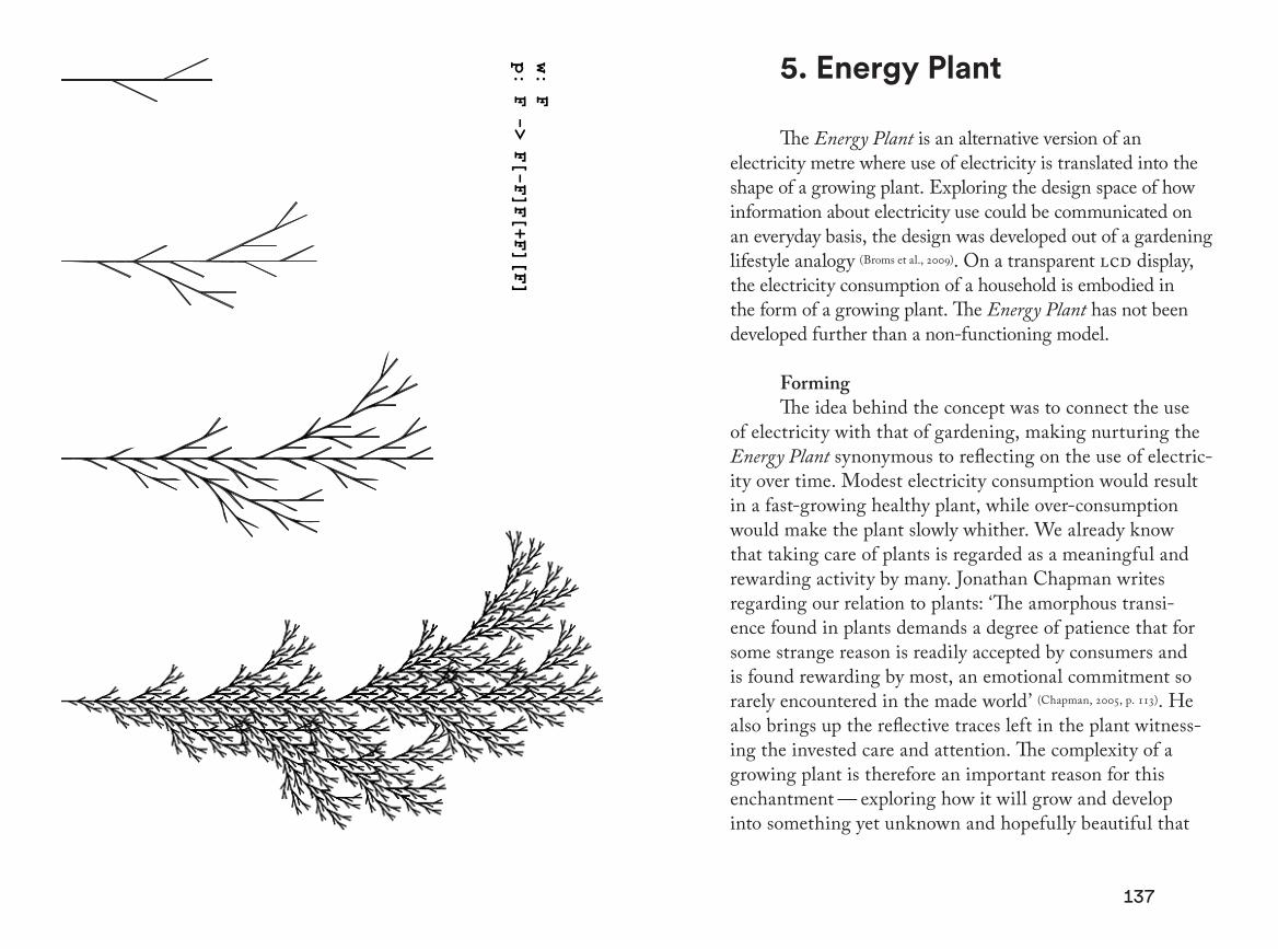
136 137
w: F
p: F -> F[-F]F[+F][F]
5. Energy Plant
The Energy Plant is an alternative version of an electricity metre where use of electricity is translated into the shape of a growing plant. Exploring the design space of how information about electricity use could be communicated on an everyday basis, the design was developed out of a gardening lifestyle analogy (Broms et al., 2009). On a transparent lcd display, the electricity consumption of a household is embodied in the form of a growing plant. The Energy Plant has not been developed further than a non-functioning model.
FormingThe idea behind the concept was to connect the use
of electricity with that of gardening, making nurturing the Energy Plant synonymous to reflecting on the use of electric-ity over time. Modest electricity consumption would result in a fast-growing healthy plant, while over-consumption would make the plant slowly whither. We already know that taking care of plants is regarded as a meaningful and rewarding activity by many. Jonathan Chapman writes regarding our relation to plants: ‘The amorphous transi-ence found in plants demands a degree of patience that for some strange reason is readily accepted by consumers and is found rewarding by most, an emotional commitment so rarely encountered in the made world’ (Chapman, 2005, p. 113). He also brings up the reflective traces left in the plant witness-ing the invested care and attention. The complexity of a growing plant is therefore an important reason for this enchantment — exploring how it will grow and develop into something yet unknown and hopefully beautiful that
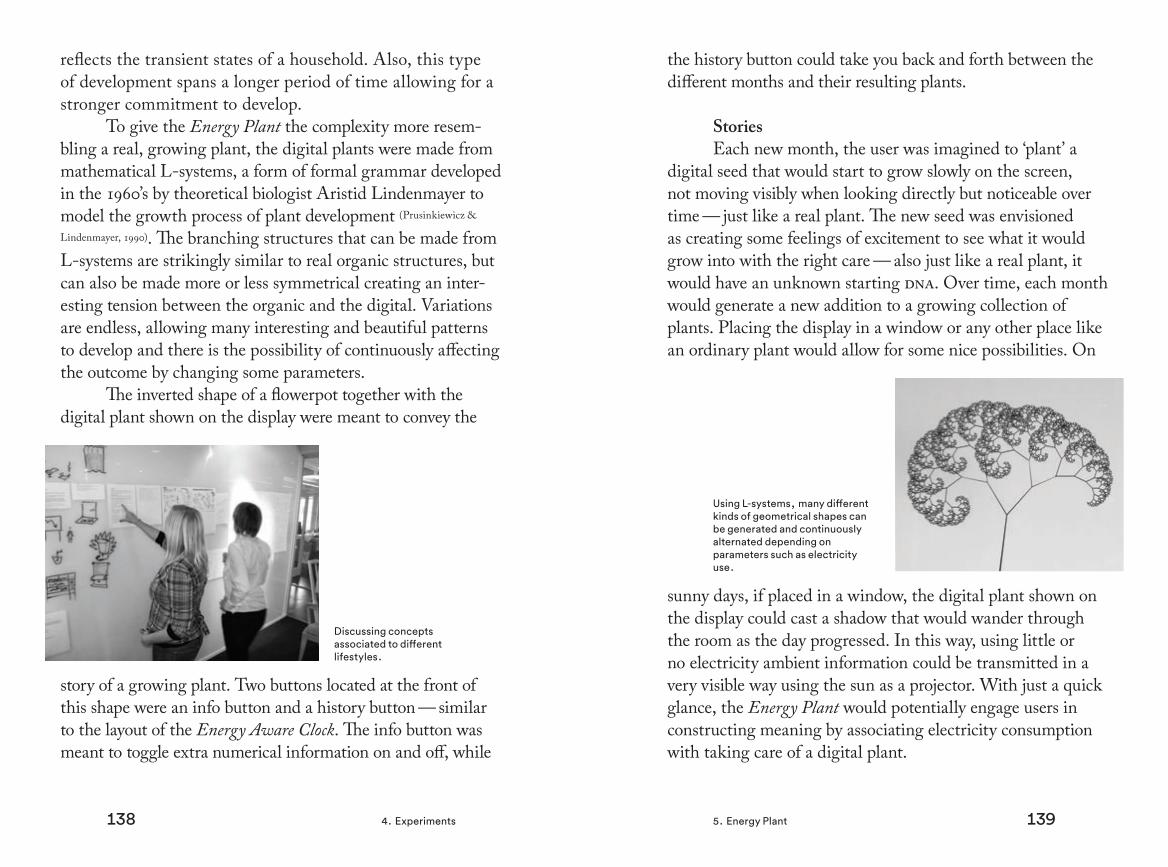
138 1394. Experiments 5. Energy Plant
reflects the transient states of a household. Also, this type of development spans a longer period of time allowing for a stronger commitment to develop.
To give the Energy Plant the complexity more resem-bling a real, growing plant, the digital plants were made from mathematical L-systems, a form of formal grammar developed in the 1960’s by theoretical biologist Aristid Lindenmayer to model the growth process of plant development (Prusinkiewicz &
Lindenmayer, 1990). The branching structures that can be made from L-systems are strikingly similar to real organic structures, but can also be made more or less symmetrical creating an inter-esting tension between the organic and the digital. Variations are endless, allowing many interesting and beautiful patterns to develop and there is the possibility of continuously affecting the outcome by changing some parameters.
The inverted shape of a flowerpot together with the digital plant shown on the display were meant to convey the
story of a growing plant. Two buttons located at the front of this shape were an info button and a history button — similar to the layout of the Energy Aware Clock. The info button was meant to toggle extra numerical information on and off, while
Discussing concepts associated to different lifestyles.
the history button could take you back and forth between the different months and their resulting plants.
StoriesEach new month, the user was imagined to ‘plant’ a
digital seed that would start to grow slowly on the screen, not moving visibly when looking directly but noticeable over time — just like a real plant. The new seed was envisioned as creating some feelings of excitement to see what it would grow into with the right care — also just like a real plant, it would have an unknown starting dna. Over time, each month would generate a new addition to a growing collection of plants. Placing the display in a window or any other place like an ordinary plant would allow for some nice possibilities. On
sunny days, if placed in a window, the digital plant shown on the display could cast a shadow that would wander through the room as the day progressed. In this way, using little or no electricity ambient information could be transmitted in a very visible way using the sun as a projector. With just a quick glance, the Energy Plant would potentially engage users in constructing meaning by associating electricity consumption with taking care of a digital plant.
Using L-systems, many different kinds of geometrical shapes can be generated and continuously alternated depending on parameters such as electricity use.

140 1414. Experiments 5. Energy Plant
With the Energy Aware Clock, we could see that the display spurred discussions among the participants around what electrical appliances caused what patterns on the display. Some patterns emerging on the screen became recognised as in the case with the ‘coffee-maker-pattern’ (Broms et al., 2010) [4.2]. Electricity became more present in the daily narratives as informants constructed explanations for what was happening in their domestic environment and what was happening on the screen. With the Energy Plant, the possibility of explor-ing an individual appliance’s electricity consumption would be much less obvious. Here, the visibility of the plant would be more of an overall symbol reminding users of the state of the whole household. The narratives that could occur around the Energy Plant would ideally relate to and strengthen this symbol driven by its presence. Visualising the overall electric-ity use more as a symbol might not be as far-fetched as one might first think. With the Energy Aware Clock, a few state-ments from the household members related to the metre based on its symbolic value as a reminder to save electricity. For example, the participants that moved it to the laundry room felt pressured just by observing it. The Energy Plant, arguably a more positive symbol than the Energy Aware Clock, could potentially engage the user’s imagination around electricity use in a less direct way, even though there is a chance for rejection even here. The aesthetic and algorithmic beauty of a digital plant has to compete against feelings of ‘giving up life’ as were expressed by one participant in the study with the Energy Aware Clock. This is also an overarching challenge when exploring the design space around how to create a captivating object that can potentially instigate more sustainable narra-tives around electricity that feel sensible and meaningful.

142 1434. Experiments 5. Energy Plant

144 1454. Experiments 5. Energy Plant

146 147
6. Interfering Statistics
Interfering Statistics is a concept based on the idea of introducing statistical information in the public space in a tangible way, allowing for ‘statistical interventions’ that would influence the very reality it is set to measure. The concepts exist only as sketches, but some of the ideas have been devel-oped further in other projects.
FormingAs an interaction designer, I had for quite some time
developed an interest in the visual qualities of statistical infor-mation, — information aesthetics. The Energy Aware Clock was one of the first attempts that surfaced from this interest. Wanting to operate as much as possible in the physical space as opposed to, for example, the virtual space, and thinking about how statistics could be made accessible in an aestheti-cally intriguing way, I felt it was compelling to constitute a more integrated part of a design. Perhaps the statistics in itself could co-shape the physical space affecting the outcome of the very patterns it was set to visualise. I had a feeling that this strategy could have potential for many interesting applications. These thoughts found a place to be cultivated in the research project Switch! among many others with relation to energy use in public (Mazé, 2013). Setting out from a series of collaborative and experimental sessions revolving around different aspects of the overall programme, Switch! was based on six sub-projects driven by smaller project teams. Interfering Statistics emerged as a result of one of these sub-projects. As stated earlier in the Process chapter [3.2], Switch! directed its attention towards a larger spatial scale and longer-term
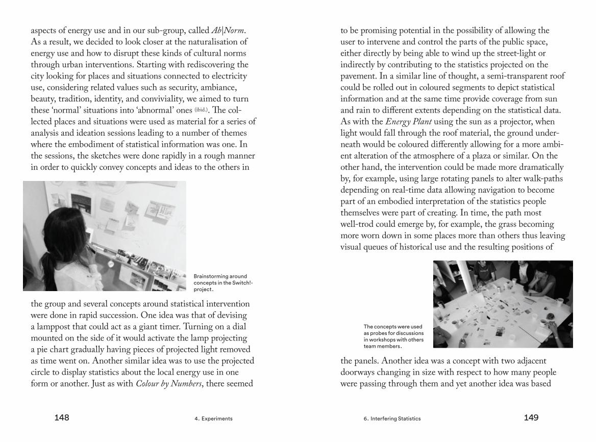
148 1494. Experiments 6. Interfering Statistics
aspects of energy use and in our sub-group, called Ab|Norm. As a result, we decided to look closer at the naturalisation of energy use and how to disrupt these kinds of cultural norms through urban interventions. Starting with rediscovering the city looking for places and situations connected to electricity use, considering related values such as security, ambiance, beauty, tradition, identity, and conviviality, we aimed to turn these ‘normal’ situations into ‘abnormal’ ones (ibid.). The col-lected places and situations were used as material for a series of analysis and ideation sessions leading to a number of themes where the embodiment of statistical information was one. In the sessions, the sketches were done rapidly in a rough manner in order to quickly convey concepts and ideas to the others in
the group and several concepts around statistical intervention were done in rapid succession. One idea was that of devising a lamppost that could act as a giant timer. Turning on a dial mounted on the side of it would activate the lamp projecting a pie chart gradually having pieces of projected light removed as time went on. Another similar idea was to use the projected circle to display statistics about the local energy use in one form or another. Just as with Colour by Numbers, there seemed
Brainstorming around concepts in the Switch!-project.
to be promising potential in the possibility of allowing the user to intervene and control the parts of the public space, either directly by being able to wind up the street-light or indirectly by contributing to the statistics projected on the pavement. In a similar line of thought, a semi-transparent roof could be rolled out in coloured segments to depict statistical information and at the same time provide coverage from sun and rain to different extents depending on the statistical data. As with the Energy Plant using the sun as a projector, when light would fall through the roof material, the ground under-neath would be coloured differently allowing for a more ambi-ent alteration of the atmosphere of a plaza or similar. On the other hand, the intervention could be made more dramatically by, for example, using large rotating panels to alter walk-paths depending on real-time data allowing navigation to become part of an embodied interpretation of the statistics people themselves were part of creating. In time, the path most well-trod could emerge by, for example, the grass becoming more worn down in some places more than others thus leaving visual queues of historical use and the resulting positions of
the panels. Another idea was a concept with two adjacent doorways changing in size with respect to how many people were passing through them and yet another idea was based
The concepts were used as probes for discussions in workshops with others team members.

150 1514. Experiments 6. Interfering Statistics
on using tall apartment buildings as large scale bar-graphs depicting the electricity use for each building respectively.
The sketches of Interfering Statistics as well as other concepts acted as props for discussions both in internal
sessions as well as in workshops with others in Switch! As a form of rough ‘rapid prototyping’, the sketches evolved by being revised and discarded and acting as placeholders for ideas and discussions (ibid.). They worked so well that we decided to use some carefully selected sketches in a work-shop with external stakeholders in the energy and design sectors to provoke hands-on and high-level discussions around the situation depicted.
StoriesThe workshop was set up with the intention of engag-
ing the participants both as energy users and as experts with knowledge from their respective fields that could be brought into the workshop. There were six participants from energy engineering, product and service design, art, architecture, and landscape architecture (ibid.). Starting from the personal
Using large rotating panels to alter walk-paths based on statistics.
perspective, participants were asked to describe an ordinary day in their lives:
Think about a typical situation or happening in your everyday life that takes place in a public space. For example, it might be when you are taking your children to kindergarten, visiting a friend, or taking a long walk on a Sunday. [...] Tell the story in three steps. What details are important in the story? Who is there? What does the environment look like? How do you feel? [...] Write down some key words and illustrate this through drawings or diagrams if you would like. The story should not focus on energy nor be work-related. The story does not need to have a good ending or a punch line.
The participants were given time to write down and illustrate a personal story of their own that they shared with the group. The intention of this was to elicit meaningful stories anchored in real, personal experiences with many details about social, material, and emotional factors that would be useful in the next stage of the workshop. Next, the participants were
Workshop participant illustrating a personal story.

152 1534. Experiments 6. Interfering Statistics
matched into pairs that were decided beforehand to mix different backgrounds and perspectives. The participants were given four cards with one design concept on each. Three of the cards were related to the theme of Interfering Statistics and the groups were then asked to choose one story from the previous exercise and insert two of the concepts into it:
Choose two of the concepts that you think work best within the situations that you described in the first activity. Now, create two new stories combining the concepts and the situations by asking yourselves ‘Where is energy present?’ [...] Here are some things you might consider as you make up the stories: How does the situa-tion change if the concept is intervened into it? How does it affect the location and the people? Short-term, long-term? Positive and negative aspects? What is interesting or exciting with this concept? Where is it placed and why? How can the concept be changed to fit into the setting? Is there a place where it would fit better? [...] Draw a map or scenario of where and how your story takes place. Document your discussion on the worksheet.
The purpose here was for the groups to, while still immersed in their ‘ordinary day story’, think and reflect on the impli-cations of the new concepts as they were immersed in this familiar setting, creating a new type of fictional story rooted in their own experiences. In this way, the sketches were functioning more as conversation pieces than traditional design proposals or solutions (Mazé & Redström, 2008), pushing the
participants’ imaginations in certain directions. The concepts were adapted in different ways, sometimes quite radically, as they were merged with the existing stories. For example, inspired by the concept of the rotating panels, a trip to a specific grocery market where one participant was provoked by all the large suvs was transformed into a story of how drivers could get different kinds of real-time feedback on the parking lot. Cars were controlled and steered in different directions depending on factors such as the intensity of cars, creating a narrower passage as the number of cars increased, and the difference in car weight, giving smaller cars access to more
attractive parts of the parking lot. This new story shows in a good way how the participants were able to develop stories rich in details and personal meaning while still containing some thought-provoking elements from the original concepts. The workshop generated interesting discussions around public space and how energy could be presented in public, both from a private and a professional perspective. The discussions
Documenting and discussing the concepts and how to insert them in an ‘ordinary day story’.

154 1554. Experiments 6. Interfering Statistics
tended to lean more towards questions of form than the social and political implications of the narratives, as was our original intention. Still, coming up with narratives anchored in private experiences but revolving around new types of practices in relation to the concepts proved very fruitful when thinking outside present norms around energy use in the public space.

156 1574. Experiments 6. Interfering Statistics

158 1594. Experiments 6. Interfering Statistics

161160
7. Watt-lite
The Wattlite is an electricity visualisation made for the factory environment. Consisting of three over-sized flashlights used in conjunction, a number of 30 fully working prototypes were made and placed in eight factories over a four-week period.
Forming In the project IndustryWise, targeted to factories and
employees working on the factory floor, the goal was to develop a tool that could motivate personnel to reflect on excessive use of electricity in their workplace. Eight industrial
companies, producing things such as cutlery and steel pipes, were included in a study to inform the design process. During the visits, a series of direct observations was recorded through notes and photographs. Information about the work environ-ment were gathered through a questionnaire posing ques-tions concerning attitudes, activities, and energy efficiency. Based on this information, as well as on previous research and design experiences, the idea of a circular light-projection
Watt-lite on location in one of the factories.

162 1634. Experiments 7. Watt-lite
from Interfering Statistics was transformed into a new context, changing the street pavement to a concrete floor and the lamppost to an oversized flashlight (Jönsson et al., 2010; Katzeff et al.,
2013). The idea was further developed within the project in the end, resulting in a set of three flashlights that could change the radius of the projected light circle. By sending data about a factory’s electricity use wirelessly to the torches, they were intended to convey this information in a more tangible way. The dimension of the light circle expanded and contracted to depict the increase and decrease in use of electricity for the whole factory. If the light circle were small, the electricity consumption at the company would be low and if the circle were large the electricity consumption would be high. One
Wattlite was made dark grey, showing real-time electricity use in white light by loading new information every 30 sec-onds, providing close to immediate feedback on the electric-
By overlapping the different projections, real-time electricity consumption can be compared with the maximum and minimum use.
ity use for the whole factory. In addition to this dark grey flashlight there were two in a lighter-grey colour equipped with a blue and an orange cord projecting blue and orange circles respectively. The torch with a blue beam and blue cable
would visualise the smallest amount of electricity used during the day. The other one would use an orange beam and orange cable to visualise the highest amount of electricity used dur-ing the current day. These two flashlights were meant to con-stitute points of reference for the white projection, enabling comparison and reflection. The real-time consumption could easily be compared with the maximum and minimum usage during a day. In this way, the energy statistics were meant to become literally more concrete. By grabbing a flashlight, users were envisioned as interacting with the information by, for example, making notes on the floor and by overlapping the different projections, exploring the electrical patterns of the factory projected through the torches.
Wattlite would be an unfamiliar object to the staff in the factories, but the shape of a torch was thought to give a hint of treating it as an exploratory device, a detective’s tool that could show what might otherwise be hidden. By adding a handle we sought to reproduce the impression of a tool that could be carried around and survive being bumped
A lens, a colour filter and a circular shutter in front of a LED-lamp and the electronics constitutes the interior of the flashlight.

164 1654. Experiments 7. Watt-lite
into things. It was consciously designed to be larger than a standard torch, relating to the scale of measurement — the whole of the factory. By specifying use through material and shape, while leaving the meaning of the electricity statistics to be determined by the users, our intention was for an explora-tory type of engagement where the user tries to grasp both the system and its situation of use (Jönsson et al., 2010).
StoriesThirty Wattlite prototypes were manufactured in total
and 24 of these were installed in eight factories over a four-week period. Just as with the Energy Aware Clock, the place-ment greatly influenced the engagement from the employees. For the factories, these kinds of decisions were more often
taken at a managerial level as opposed to choices made in a private household. Wattlite’s placement in locations already used for social gatherings, like next to the coffee machine, received much more attention than those placed in a corridor not passed on a daily basis. One participant stated:
I like that they are by the coffee machine [...] then
The direct feedback from the torches sparked discussions and reflections among the employees while queuing up for their coffee on their brakes.
everybody can see how much we are consuming at the moment. [...] We talk about the different sizes of the projections.
In this type of social location, the direct feedback from the torches sparked discussions and reflections among the employees while queuing up for their coffee on their brakes. These kinds of reflections in relation to the information pro-vided by the projections enabled the employees to reflect on and make sense of working practices in relation to electricity use. The discussions touched on a variety of issues including what event that where responsible for the circles’ sizes, how to influence this, deviations from a ‘normal’ state of electric-ity use and the size of the circles in relation to the factory’s production. These discussions were sometimes supported by physical interaction with the Wattlite projection:
I tried to draw marks on the floor where the max [for the white circle] is. You can then draw a diagram [showing] where the border of the circle is supposed to be during breaks [when production is supposed to go down]
The Wattlite also clearly articulated the use of electricity in relation to the actual production of the factory, which was not without conflicting emotions:
We want the orange one to be as big as possible [...]. We want a lot of production. Everyone is happy when the orange is large.
The same participant stated a bit embarrassed that he under-

166 1677. Watt-lite
stood these feelings as defeating the purpose of the Wattlite since it was not meant to measure profit but in his words, ‘as a way to save the planet’. Still, unnecessary electricity consumption was spotted thanks to the flashlights according to the same person:
Last Friday, Neil actually went back into the workshop after noticing that something was out of balance. He saw it on the light circles. [...] It took him half an hour to find out what was left switched on, and before he could go home.
All in all, while sometimes creating conflicting emotions around the factory production, making money, and ‘saving the planet’, it is clear that the Wattlites engaged the workers in exploring their workplace through the lens of electricity use, enabling them to see and reflect on issues that had previ-ously been hidden. By being so visible and easy to access, for example, hanging by the coffee machine, deviations from the normal ‘balance’ of the factory were spotted, giving rise to at least one reported story of an electricity hunt.
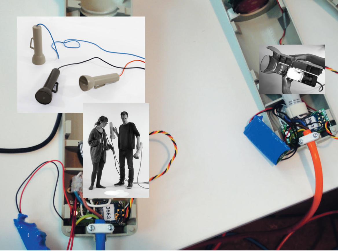
168 1694. Experiments 7. Watt-lite

170 1714. Experiments 7. Watt-lite

173172
8. Watt-lite TWIST
Based on design ideas of a projected pie chart from Switch! and the oversized flashlight in IndustryWise, we contin-ued to develop another version of the torch with a wind-up timer that could measure an amount of energy, in kilowatt-hours, instead of just the present effect in Watts. Also here, the design process was accompanied by a field study allowing us to contrast the design ideas within the present context of the office setting. In the inCharge project came also the opportu-nity to utilise separate measuring.
FormingJust as with the Wattlite, the new version of the over-
sized flashlight, called the Wattlite Twist, built on the idea of making energy statistics more tangible and to encourage an exploratory, open-ended, and social type of interaction.
Being that informants interacted spontaneously with the Wattlite and also based on findings that exploratory learning is enhanced by physical interaction (Klemmer et al., 2006; Marshall et al.,
2003) it seemed like an interesting opportunity to devise an
Discussing how the projected pie chart should work.
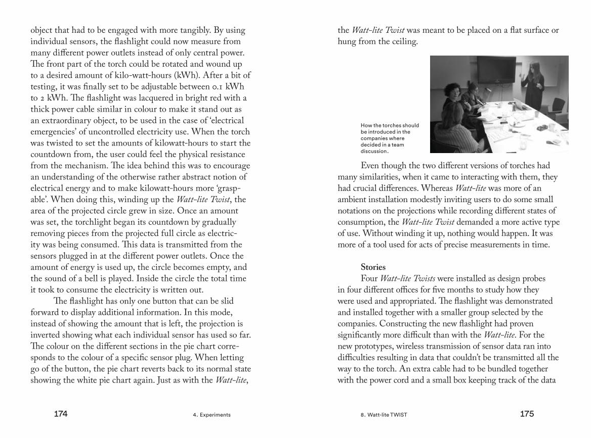
174 1754. Experiments 8. Watt-lite TWIST
object that had to be engaged with more tangibly. By using individual sensors, the flashlight could now measure from many different power outlets instead of only central power. The front part of the torch could be rotated and wound up to a desired amount of kilo-watt-hours (kWh). After a bit of testing, it was finally set to be adjustable between 0.1 kWh to 2 kWh. The flashlight was lacquered in bright red with a thick power cable similar in colour to make it stand out as an extraordinary object, to be used in the case of ‘electrical emergencies’ of uncontrolled electricity use. When the torch was twisted to set the amounts of kilowatt-hours to start the countdown from, the user could feel the physical resistance from the mechanism. The idea behind this was to encourage an understanding of the otherwise rather abstract notion of electrical energy and to make kilowatt-hours more ‘grasp-able’. When doing this, winding up the Wattlite Twist, the area of the projected circle grew in size. Once an amount was set, the torchlight began its countdown by gradually removing pieces from the projected full circle as electric-ity was being consumed. This data is transmitted from the sensors plugged in at the different power outlets. Once the amount of energy is used up, the circle becomes empty, and the sound of a bell is played. Inside the circle the total time it took to consume the electricity is written out.
The flashlight has only one button that can be slid forward to display additional information. In this mode, instead of showing the amount that is left, the projection is inverted showing what each individual sensor has used so far. The colour on the different sections in the pie chart corre-sponds to the colour of a specific sensor plug. When letting go of the button, the pie chart reverts back to its normal state showing the white pie chart again. Just as with the Wattlite,
the Wattlite Twist was meant to be placed on a flat surface or hung from the ceiling.
Even though the two different versions of torches had many similarities, when it came to interacting with them, they had crucial differences. Whereas Wattlite was more of an ambient installation modestly inviting users to do some small notations on the projections while recording different states of consumption, the Wattlite Twist demanded a more active type of use. Without winding it up, nothing would happen. It was more of a tool used for acts of precise measurements in time.
StoriesFour Wattlite Twists were installed as design probes
in four different offices for five months to study how they were used and appropriated. The flashlight was demonstrated and installed together with a smaller group selected by the companies. Constructing the new flashlight had proven significantly more difficult than with the Wattlite. For the new prototypes, wireless transmission of sensor data ran into difficulties resulting in data that couldn’t be transmitted all the way to the torch. An extra cable had to be bundled together with the power cord and a small box keeping track of the data
How the torches should be introduced in the companies where decided in a team discussion.

176 1774. Experiments 8. Watt-lite TWIST
was therefore forced to be place right next to the Wattlite Twist, making it harder to move around. Also, the small laser projector embedded inside the torch was prone to overheating and not suitable to be left on around the clock. As a result of these limitations, one caretaker, who would be responsible for switching the flashlight on and off and reporting any problems, was appointed in the group.
Based on knowledge from both the study with the Energy Aware Clock and the Wattlite, the time that the Wattlite Twist was out in the offices was divided in to two periods with different arrangements. The first phase was set up to allow for continuous exploration, where the participants were thought to discover their office in a more open fashion. The torch was thought to trigger people’s reflections and discus-sions in a playful way, relating to their own activities in relation
Early cad drawing of the flashlight.
to the electricity consumption of individual appliances. For the first phase, the instructions given to the group emphasised the freedom of use and importance of using the Wattlite Twist in a way that suited them best. They were told to place it in a spot that they found appropriate and were also encouraged to move it around if they wished. The group were given eight sensors that they could plug in to any electrical outlet of their choice, measuring any device within wireless range of the flashlight, and were encouraged to explore freely as they desired. After some discussions within the research group, the sensors were not marked with their corresponding colours to encourage participants to actively try to figure out this information them-selves by trying out electrical appliances in the office.
The first round of interviews were conducted after six to eight weeks. From the open-ended questions we asked, we could tell that the Wattlite Twist was engaged by the whole group for the first couple of weeks but the interest in explor-ing gradually decreased until only the person responsible for the torch dutifully carried on starting and winding it up every morning. Two of the four offices systematically tried to figure the colour scheme for the sensors by testing them one by one:
What we first did was to try to figure out those different colours. We put the main sensor on the coffee machine and this is how we discov-ered that it consumed very, very much just in no time [...] Then, we went on very enthusiasti-cally [...] two afternoons I think we spent on this. All my colleagues ran around moving the sensors and we thought that we had it almost figured out [...] Then, after a few days it turned out that things weren’t the way we thought

178 1794. Experiments 8. Watt-lite TWIST
after all and then we started to move [the sen-sors] around [again].
In the third office, one respondent claimed that they hadn’t been able to figure out which sensor had which colour while another respondent claimed they figured it out easily.
Seemingly not collaborating within the group could be one possible explanation of the different stories. In the fourth office, there was no attempt at all in exploring the relation-ship between the colours and the sensors. The participants expressed frustration that this information had not been given to them and stated that they did not have the time to try to figure out this relationships by themselves, even though this was the intention of the study. It could be added that this office was disappointed with the design of the prototype from the beginning since they had envisioned something else when they agreed to participate. Unfortunately, the version that this office got also proved to have the most technical problems, which did not exactly make things better.
At the end of the period that the companies had the Wattlite Twist in their possession, we introduced an event
Team competition in getting different appliances to consume an equal amount of electricity.
where the groups could use the flashlights in a more playful setting, competing in two teams with one flashlight each. For example, the teams competed in getting two different appli-ances of their choice to consume an equal amount of electricity in the shortest time possible. These playful events were appre-ciated and the teams got very active in their attempts to win by understanding the amount of energy certain electrical products used. After this event the torches were returned to the places they were taken from in the offices but the interest in using them after such a long time remained low and they remained largely unengaged.
The context in which a design intervention is placed influences the way it is interacted with to large extents. Prac-tices common in the work environment differ greatly in the domestic or public context. In offices, the participants had little time to set aside for non-work related practices and this was generally not encouraged at the management level. Certain company cultures seemed to be more open to setting time aside for discussion, playfulness, and exploration; others expressed that there was no time at all. In general, the Wattlite Twist had more problems in the offices than the Wattlite did in the factories. Where the former required almost constant engage-ment, the ambient character of the latter allowed for a more passive type of interaction, glancing at it when passing by or while on a coffee break. The Wattlite behaved similarly to the Energy Aware Clock, transitioning from a more intense exploratory period into a state more marked by sporadic confir-mation. Since this was not really possible with Wattlite Twist, it was simply left in the same spot where it was placed when it arrived, even though it was possible to move around. Similarly, the different wireless sensors were mostly left connected to the same appliances as they were after the initial two weeks.

180 1814. Experiments 8. Watt-lite TWIST
Electricity exploration was not engaging enough to sustain interest for any longer period of time. The winding up of the flashlight required an effort that after a while became more like a burden. In more targeted and shorter events, like in the initial introduction or the playful competitions, the Wattlite Twist seemed to work much better. Also, individuals in the offices and the factories had more limited possibilities to affect the use of electricity compared to the context of the home but re-surfacing and visualising electricity use in the everyday environment gave rise to a higher consciousness and active reasoning among employees.

182 1834. Experiments 8. Watt-lite TWIST

184 1854. Experiments 8. Watt-lite TWIST

186 1874. Experiments
9. Fyrfärg
Fyrfärg is a light installation with a Swedish name that can be interpreted in two different ways. Fyrfärg translates to ‘four colour’ or ‘process colour’ meaning the subtractive colour model used in printing. More importantly ‘fyr’ also means lighthouse, signifying a central aspect of the light installation now permanently located at the top section of the ‘kth building’ at kth, Royal Institute of Technology.
When the house was run by the Red Cross, this small tower originally housed a large water tank that provided water pressure for the rest of the building. Now, the large tank has been removed to make room for the lamps used in the installation. The Red Cross Hospital had owned the building between 1927 and 2010 when Akademiska Hus, the property owner for academic buildings in Sweden, bought the house to make it available to rent for the university, which needed more space. Now, the building is to host the adminis-trative arm of the university and a total remake of the interior and exterior parts was initiated to suit its new purpose.
Visiting the site in an early phase of the project.
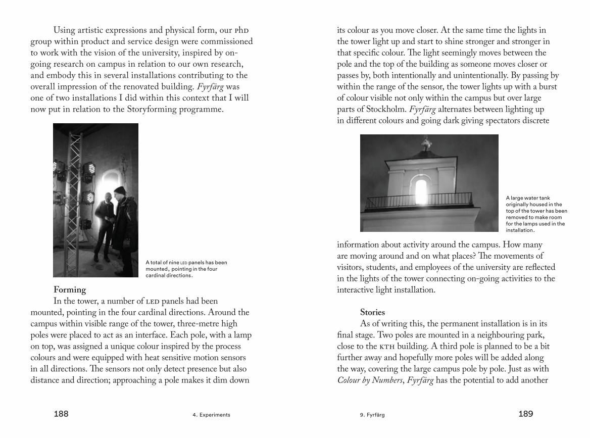
188 1894. Experiments 9. Fyrfärg
Using artistic expressions and physical form, our phd group within product and service design were commissioned to work with the vision of the university, inspired by on-going research on campus in relation to our own research, and embody this in several installations contributing to the overall impression of the renovated building. Fyrfärg was one of two installations I did within this context that I will now put in relation to the Storyforming programme.
FormingIn the tower, a number of led panels had been
mounted, pointing in the four cardinal directions. Around the campus within visible range of the tower, three-metre high poles were placed to act as an interface. Each pole, with a lamp on top, was assigned a unique colour inspired by the process colours and were equipped with heat sensitive motion sensors in all directions. The sensors not only detect presence but also distance and direction; approaching a pole makes it dim down
A total of nine led panels has been mounted, pointing in the four cardinal directions.
its colour as you move closer. At the same time the lights in the tower light up and start to shine stronger and stronger in that specific colour. The light seemingly moves between the pole and the top of the building as someone moves closer or passes by, both intentionally and unintentionally. By passing by within the range of the sensor, the tower lights up with a burst of colour visible not only within the campus but over large parts of Stockholm. Fyrfärg alternates between lighting up in different colours and going dark giving spectators discrete
information about activity around the campus. How many are moving around and on what places? The movements of visitors, students, and employees of the university are reflected in the lights of the tower connecting on-going activities to the interactive light installation.
StoriesAs of writing this, the permanent installation is in its
final stage. Two poles are mounted in a neighbouring park, close to the kth building. A third pole is planned to be a bit further away and hopefully more poles will be added along the way, covering the large campus pole by pole. Just as with Colour by Numbers, Fyrfärg has the potential to add another
A large water tank originally housed in the top of the tower has been removed to make room for the lamps used in the installation.
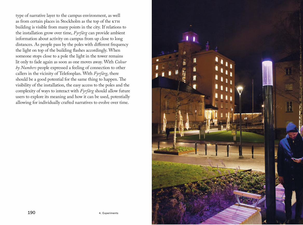
190 1914. Experiments 9. Fyrfärg
type of narrative layer to the campus environment, as well as from certain places in Stockholm as the top of the kth building is visible from many points in the city. If relations to the installation grow over time, Fyrfärg can provide ambient information about activity on campus from up close to long distances. As people pass by the poles with different frequency the light on top of the building flashes accordingly. When someone stops close to a pole the light in the tower remains lit only to fade again as soon as one moves away. With Colour by Numbers people expressed a feeling of connection to other callers in the vicinity of Telefonplan. With Fyrfärg, there should be a good potential for the same thing to happen. The visibility of the installation, the easy access to the poles and the complexity of ways to interact with Fyrfärg should allow future users to explore its meaning and how it can be used, potentially allowing for individually crafted narratives to evolve over time.
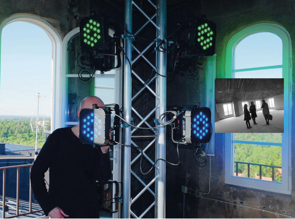
192 1934. Experiments 9. Fyrfärg

194 1954. Experiments 9. Fyrfärg

196 1974. Experiments
10. Gradient
Gradient, the last case presented in this chapter, is a collection of seven concepts developed by commission in 2007/2008 together with architect Milo Lavén. Operating in the cityscape, these large-scale installations were meant to embody different natural sources of energy — sun, wind, and water — connecting these in a visual way to human culture. The installations were, due to various reasons, never realised and exist only as photomontages. I will here go through a selection of these concepts, namely the ones relat-ing to wind, for the purpose of further spanning the space of storyforming.
FormingFor this project, done within the framework of my
own practice, the client had initially asked for an interac-tive installation to celebrate the one-hundredth anniversary of a large Swedish organisation working with nature and
environment issues. In this light, and from previous experi-ences working with energy awareness where we often got
An artificial reed made of plastic rods.

198 1994. Experiments 10. Gradient
the question of how much electricity different prototypes consumed, devising a range of installations where self-pro-pulsion would constitute the central identity of the artefact felt like an interesting path to explore. The aesthetic value would be essential and closely connected to the construc-tion and function of the installations. The purpose of the collection would be to emphasise natural sources of energy in the cityscape rather than any actual useful production of electricity, the installations would sustain nothing more than themselves.
Whereas the availability of electricity can be said to have disengaged us from the practice of attaining energy, lead-ing to a separation of electricity use from electricity production [2], the idea of the installations was to, on a symbolic level, narrow this gap. Instead of designing something according to the well-established bifurcation of ‘nature’ and ‘culture’ (Haraway,
1991), we wanted to bring these concepts closer together using,
Acting as a wind cone, the tube can spin freely in the wind while floating in the water.
in semiotic terms, metaphors that mixed symbols of nature and the aesthetics of human culture. Care for the environ-ment can partially be related to people’s relation to nature and researchers have pointed towards the importance of develop-ing an emotional bond to nature for environmental engage-ment to transcend into environmentally sustainable behaviour (Johansson & Küller, 2005). Gradient was an attempt to strengthen this bond through design in a spectacular way.
As an example, using wind as a power source, four instal-lations were to be built on the complex patterns made by wind (nature), filtered through clusters of turbines and leds (culture), expressing wind in a more ‘tangible’ way. One concept envi-sioned visualising streams of wind by spanning a net with many small wind-turbines attached, each driving a single led-lamp, under a bridge. Another idea was to make an artificial reed by attaching plastic rods of different lengths anchored underneath the water. The wind would slowly power up a wind turbine at
A cluster of turbines.

200 2014. Experiments 10. Gradient
the top of the rod powering a xenon-flash inside each strand emitting short light-bursts along the waterline at night and dur-ing the dark winter season. With increased wind, the sparks in the artificial reed would occur more often. Thinking along the same lines, we came up with a concept of a physical vector field laid out over the water made out of tubes acting as wind cones, swivelling towards the wind and also glowing in the dark using led lamps and wind turbines. It would be almost like a met-rological weather chart of wind directions and corresponding strengths but laid out on the water in the physical world. Look-ing back at the project, the forth and final installation based on wind intrigued me the most. With Vindklocka, Swedish for the Wind Clock, we sketched another clock manifestation*, propelled entirely by wind but where the large digits were made out of small wind turbines constituting its glowing pixels. Here was a typical symbol for modernist ideals — timekeeping — in the hands of the whimsical wind — a force of nature.
StoriesThe idea was for the Wind Clock to go on and off,
sometimes shining stronger and sometime glowing very
* Compare to Energy Aware Clock, [4.2]
faint as the wind rushed through its ‘pixels’. While the other wind installations were exploring the potential of utilising the wind in the cityscape from purely an aesthetic viewpoint, the Wind Clock become something more by also performing a clear function — telling time. Including time in a very concrete way also made it possible to become part of other types of narrative experiences. Thinking about time while looking at the Wind Clock could potentially cast another light on the daily experience as a whole. Time flickering in the wind generates new types of narratives as people carve meaning out of their daily life. Just as the Energy Aware Clock resurfaced electricity as a phenomena into everyday narratives, the Wind Clock would introduce the wind when telling time, making for a new type of narrative where an artefact offers a more complex type of behaviour allowing for new and varying types of experiences.
These words conclude this section of the design experiments and I will now move on to the articulation of the Storyforming programme.
The Wind Clock is telling time using wind.
Small turbines visualizing the movements of the wind under the bridge.
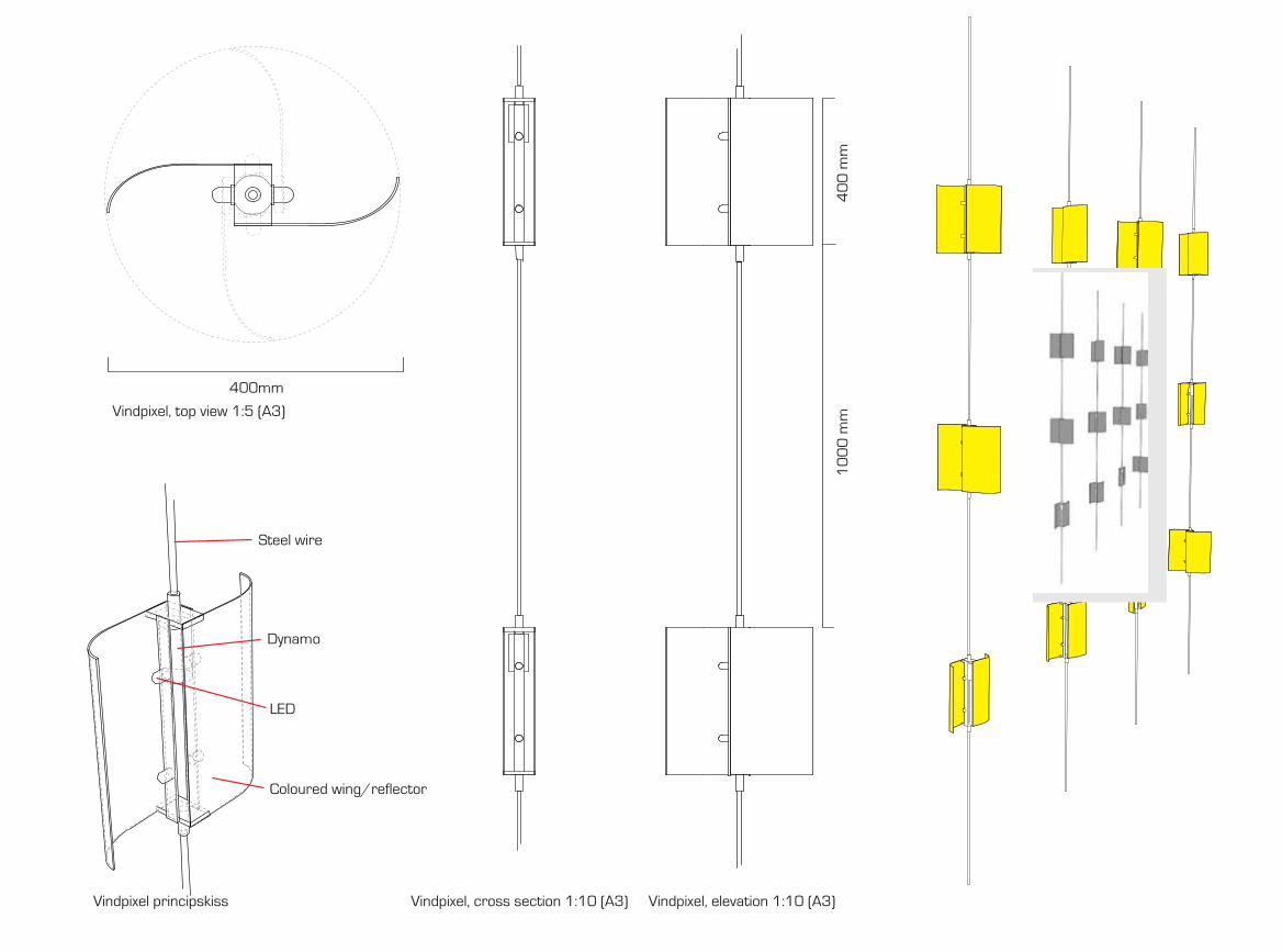
202 2034. Experiments 10. Gradient
400mm
40
0 m
m1
00
0 m
mVindpixel, top view 1:5 (A3)
Vindpixel principskiss Vindpixel, cross section 1:10 (A3) Vindpixel, elevation 1:10 (A3)
VINDPIXEL
-
--
-
LED
Dynamo
Steel wire
Coloured wing/reflector

204 2054. Experiments 10. Gradient
G R A D I E N T ETT PROJEKT AV MILO LAVÉN OCH LOOVE BROMS FÖR STILT AB
VINDBLIXT
Concrete Weight
Steel rod
DynamoCapacitor
Xenon flash
White, semi-transparentplastic tube
Propeller
Vindblixt, principle drawing
12
00
- 2
40
0 m
mm
10
0m
m
100mm
Vindblixt, front view 1:10 (A3)
70
0m
m8
0m
m
VINDVEKTOR
LED
Dynamo
Line
Weight
Coloured wind cone/diffuser
Flotation block
Propeller
600mm
Vindvektor, principskiss Vindvektor, top view 1:10 (A3)
Vindvektor, side view 1:10 (A3) Vindvektor, front view 1:10 (A3)

206 2074. Experiments 10. Gradient

209
5. Towards StoryformingOne cannot design meanings into artefacts, only provide the affordances of meaningful interactions to arise.Klaus Krippendorff, talk on the key concepts of his book The Semantic Turn at Konstfack University Collage on Arts, Craft and Design, Stockholm, May 2012
210 2115. Towards Storyforming
In previous chapters, I briefly sketched out the design research methodology leading up to Storyforming and then moved directly on to the design experiments, approaching them through this perspective. Both the processes and their out-comes were then examined from the viewpoints of stories and forming with the intention of allowing a closer articulation of the characteristics and implications of this design space. Based on these experiences, this enables me to attempt to more clearly articulate the Storyforming programme.
I will go about this by de-assembling the word into two smaller components – story and forming, defining them as follows:
The story constitutes our material at hand, a discourse between human and material, or semiotic, actors where peo-ple attempt to create meaning by connecting events from the past, the now, and the future into narratives to create order. Here, narratives are not only defined as the written or spoken account but as part of a design rhetoric involving artefacts. As designers, we have the ability to indirectly form these narratives by designing artefacts that, through their physical and temporal gestalt, can act as catalysts in the construction of meaningful experiences.
Story: A discursive
engagement between people, things, and
environments.
Forming: through seeing and
accessing designs, exploring and expressing complexity, and
sharing experiences and negotiating use.
From the perspective of the user, the suggested form-related leitmotifs therefore investigate ways of affording these alternative types of discourses that evolve and manifests themselves over time creating new values and meanings. Seeing and accessing; exploring and expressing; and sharing and negotiating all signify the act of an envisioned user engaged in a narrative, though this is in the mind of the practicing designer. In actual use, the user might engage in the discur-sive artefact or reject it, as with all designs.
Based on this proposition, I will continue to unpack the emerging structures of this design space sketched by the programme by going through the experiments and experi-ences one more time on the basis of the concepts used in the definition of the programme.

213
1. Unpacking Storyforming
Drawing on the experiences from the design experi-ments, I will now begin to unpack Storyforming. As stated earlier, this word is not a definition but a projection, not a concept but a name. The programme enables me to point out a direction of exploration and since there already exists a substantive number of experiments conducted that are relevant to the new programme, I can already begin discuss-ing how they resonate together. The Storyforming programme is intended to work like an engine building up inertia to propel the design process towards the aim of affording narra-tives through interaction with the design experiments. In some of the cases, there is proof of narratives forming very clearly — even of the fictional kind as with Colour by Numbers — while in some of the other experiments the narratives are more loosely represented.
Clearly, stories are connected to the design process so let’s begin by discussing the leitmotifs connected to the process of forming: ‘seeing and accessing designs’, ‘explor-ing and expressing complexity’ and ‘sharing experiences and negotiating use’, as they are sketched out by the programme. These generative propositions will help to ‘unpack’ Storyforming and to see in what ways one can begin to understand how the design of artefacts can provide affordance for discursive engagements to occur. Again, when going through the leitmotifs, it is important to keep in mind that these themes are not exclusionary categories or analytical distinctions but instead, generative in the sense that they are set up with the intention of suggesting new directions for exploring the pos-sibilities of, and unpacking, the design programme.

214 2155. Towards Storyforming 1. Unpacking Storyforming
Seeing and AccessingOne reoccurring consideration throughout the work
with all the experiments has been related to form decisions regarding an artefact’s visibility and placement. Remember-ing the discussion on how people carve meaning out of their belongings from the Context chapter [2.2], how a person becomes attached to and values an object or place — how it becomes meaningful — is dependent on the lived experi-ences with it. These types of meaningful experiences have the ability to connect the past, the now, and the future pro-ducing a feeling of order in the mind according to Mihaly Csikszenmihalyi (Csikszentmihalyi, 1991). Seeing a cherished object has the potential to bring these feelings to mind. Therefore, the first encounter, seeing an object for the first time, and the subsequent encounters that may evolve into a narrative, starts off with reflections on visibility.
I see visibility and accessibility both in the sense of physical visibility (being present) but also in a semiotic context (what the artefact communicates). For example, the Energy Aware Clock is visible through its placement in the kitchen, but it is also visible in the way it presents itself by, for example, attempting to speak with one voice instead of many. Through its gestalt, it is meant to both encour-age a central placement for easy access on the one hand, and on the other, it was designed to radiate significance by attempting to differentiate itself from other artefacts. In this way, artefacts can act as platforms for narratives by first encouraging greater visibility and accessibility through form.
The Energy Aware Clock has, along with a plethora of other smart electricity displays, been introduced on the commercial market. Some of these allow the user to do
many other things, not related to communicating electric-ity use. In one model, one can, for example, read certain messages like commercial offers, do time booking for the laundry room, look at the weather forecast, and much more — mere electricity information alone was perhaps not deemed interesting enough, or maybe insufficient to moti-vate the total cost of making the display. These speculations aside, I would argue that this multifunctionality risks dilut-ing the narrative qualities of electricity in its own right and, as an extension of this, how people engage and assign value to it. There will be less room for engaging discourses around electricity use if the information provided becomes just a feature together with other types of information. Also, the physical object becomes less related to the digital content since any screen would do, and therefore the physical arte-fact risks failing to become a visible symbol for electricity. With the Energy Aware Clock, we wished for the narrative to be reflected in the shape of the electricity metre — both physically and in the graph projected on the screen — com-municating as one entity.
Moving on to another example, with Colour by Numbers, the location and visibility of the tower were also central — the sheer size helped in reaching out. Despite a lot of coverage in media, many of the users living in the neighbourhood discovered the interactivity of the installa-tion by observing the changing lights of the tower. Seeing it from day to day allowed for a continuity, which is also an important aspect of visibility that allows for narratives to develop. Through its presence and the changing colours in the windows, the light installation seemed to evoke curios-ity. The same will probably hold true for the second light installation, Fyrfärg.
216 2175. Towards Storyforming 1. Unpacking Storyforming
The Share Aware Light, the Aware Laundry Lamp, and the Energy Plant were, just as with the Energy Aware Clock, designed with materials and shapes meant to visually afford more accessible placement in households. Additionally, we designed them with the intention of standing in opposition to current regimes of electricity use in the home, contrasting their appearance to the present ecology of household appli-ances and furniture. The Share Aware Light and the Aware Laundry Lamp use light to create visible expressions while the Energy Plant extends its presence through the shadow that wanders over the floor as the sun passes in the sky outside. In the work environment, the Wattlite and Wattlite Twist take this visibility further, projecting on adjacent floors and walls. The latter of the two was given a red coat-ing to stand out as much as possible against the other inte-riors of the office. Of course, this type of accessibility and strong presence is not a guarantee for user engagement; the Wattlite Twist was left untouched after some time and the Energy Aware Clock was banished to the laundry room by one household that felt pressured by its appearance. To take place in the everyday life of people requires skilled craft-ing of artefact presence and the reactions are often hard to predict. In the study with the Energy Aware Clock, the nine households participating were very similar demographically but the reactions to the design probe were, despite this, very different (Broms et al., 2010). For the design experiments explor-ing how to resurface energy awareness, the extra cognitive burden imposed by communicating electricity has been a challenge to motivate.
Nevertheless, acknowledging that such basic things as placement and visibility affect who and how one will potentially engage in a narrative is not without significance.
In the case of the Energy Aware Clock, we discussed the gender coding of spaces in relation to the design of the display (Ehrnberger et al., 2013). But also in the study with Wattlite, the placement turned out to be crucial for how and how much the torches were interacted with [4.7] (Jönsson et al., 2010). Space has its politics and artefacts have ecologies that are constantly negotiated in, for example, the domestication process [2.2] (Silverstone & Hirsch, 1992). Other design experiments also claim their space, making visibility a central aspect. Gradient aspires to inspire alternative types of narratives through its form highlighting a different kind of relations to arise within the cityscape. Interfering Statistics is on the same page as well, wanting to move statistical information out into everyday life, even letting data literally push us in different directions. Also here, the continuity of the pres-ence of these objects are important in evolving narratives.
As a first step in unpacking Storyforming, wanting to invite users to engage in certain kinds of discourses, based on the experiences making the aforementioned design experi-ments, attention to placement and the visibility of artefacts in everyday life resonate within all the experiments. This visibility is related to both physical presence and visual communication. Artefacts occupy a stage like actors inviting people to interact with, relate to, and reflect on their presence. Just as human actors in a play or movie rarely stand mute for any long period, artefacts designed for story building should engage the user’s imagination through their design, produc-ing experiences that become building blocks that can lead to meaningful narratives that evolve over time. The visibility and continuity of this presence is therefore also important. Artefacts here need to stand out from ‘a silent and unnoticed part of the physical surroundings’ (Attfield, 2000) [2.1]. The design

218 2195. Towards Storyforming 1. Unpacking Storyforming
experiments have explored this in different ways affording central placement and visibility through their form.
Exploring and ExpressingThe second leitmotif of the programme builds on
designing layers of complexity into artefacts, affording narratives of exploration or creative expression. Complexity allows for a more evolutionary experience that evolves over time, enabling users to create rich and individually crafted relationships with objects (Chapman, 2005). According to Jonathan Chapman, a lot of products today are consumed much in the same way as stories, movies, and gossip. In society as a whole, there is a strong emphasis on ‘uncovering the mystery, reaching the end and, ultimately, knowing all there is to know about a particular place, thing, or occurrence’ (ibid., p. 120). If the mystery is too quickly unveiled, the discursive progres-sion between user and object stops, and the product risks quickly losing its attraction. Instead, objects can be designed with a narrative stamina that allows their stories to unravel over periods of years instead of just over a few days (ibid.).
The implementation of complexity in design is not in conflict with any principles of usability. The first is related to the experience while the second is focused more on use. In terms of experience, it is often complexity rather than simplicity that is sought and appreciated (Norman, 2004; Stolterman,
2008). The most meaningful artefacts in our lives are most likely not those that are simple in their communication, but they can still be simple to use.
Continuing to open up the Storyforming programme, when looking back at the design experiments discussed in this thesis, I can see that they have more or less directly been designed as platforms for catalysing complexity over extended
periods of time. In some cases, their complexity lies more in a prolonged exploratory type of use, while in others the complexity for the user lies more in creative expression.
When entering the lifeworld of a person, objects are subjected to an exploratory phase. In the case of the household, it has been accounted for through domestication theory (Silverstone & Hirsch, 1992) [2.1]. As a new object is incor-porated in the ecology of household goods, they undergo a phase of exploration that after some time passes as the artefact becomes domesticated. Aside from this first phase, there is also a potential for, through design, inviting users to participate in narratives for continuous exploration of the object itself and, through it, the relationship to some types of external phenomena that give further depth to the experience. This mode of exploration can become part of the artefact experience, and not simply a transient phase.
With the Energy Aware Clock, as it entered a process of domestication, it went though the initial phase of explora-tion until after around two weeks when the interaction with the metre gradually progressed into something that was more like confirmation, checking to see if everything was normal. Still, even after this transition, the electricity metre could still be regarded as allowing for a continuous type of exploration of the home through its form. Even when confirming the already known, there is the possibility of exploring if the information presented is complex enough for new types of events to occur and overlap (Ehrnberger et al., 2013). Two types of known events might intersect creating a new pattern that only one with knowledge of the original two patterns might decipher. Everyday life is filled with reoccur-ring events that soon become familiar, but in these events there are also complex patterns hidden that, when reflected

220 2215. Towards Storyforming 1. Unpacking Storyforming
through the artefact, open up possibilities for new interpreta-tions to occur. These occasions can in turn help shape daily life narratives, aiding the creation of experiences that feel meaningful. Designing the Energy Aware Clock to lift the veil from the hidden world of electricity allowed new types of narratives to form, as can be seen from the stories told in the study. Instead of just telling time, it also told stories of electricity use with the promising potential of engaging household members in continuous exploration and reflection. The branching structures of the Energy Plant allowed for exploration of other kinds of patterns. Whereas the circular graph of the Energy Aware Clock reflects the complexity of real life event, the Energy Plant instead creates a new form of slow algorithmic complexity. Although also possible to explore for longer periods of time, the connection to electric-ity use is more abstract.
Related to exploring and the inclusion of complexity in design, expressive elements allow for people to demon-strate creativity in the shape of the artefact in a way setting their own parameters of what it should be. With Colour by Numbers this creative part is central. The tower was turned into a canvas for anyone with a phone to utilise. Despite only consisting of ten floors, the possibilities for creating various patterns are high and people came up with imaginative ways of combining colours and bestowing meanings in them that we had not been able to anticipate. The ability to catalyse the creativity of the user makes Colour by Numbers exiting to explore and the complexity gives enough room for self-expression. As expressed by Linda Ryan Bengtsson (2012):
The artists defined the technology and form of the installation, but they did not specifi-
cally define how it should be used. They only explained how to use it but not why or for what purpose. (p. 122)
Similar to Colour by Numbers but on a different scale, the Aware Laundry Lamp also allowed for creativity. Combining a drying rack with a lamp, the laundry lamp superimposed the metaphor of lamp aesthetics onto that of hanging clothes to dry. Even though it has a more clearly defined use than Colour by Numbers, creativity is also encouraged here as the laundry becomes part of the user’s own design. The laundry can be used to transform the lamp visually, turning hang-drying clothes into a creative experience.
With Fyrfärg, the spatial possibility for creative expression is limited to one window — one colour — chang-ing over time. One might believe that such a limitation could not allow for any greater complexity to explore, but the movements of people in the area reflected in the light on top of the building still allow for complex patterns to arise that can be read and interpreted if one learns to decipher the signals from the top of the building. The col-our of the light tells the location and the frequency of the activity in that specific location. Also here the complexity stems from people interacting with the installation, filling it with content and meaning that can encourage a strong subject-object relationship to develop over time. Similarly to, for example, the Energy Aware Clock, interpreting the expressions of the installation allows for a continuous type of exploration that evolves and give the installation identity much in the same way as expressed by some respondents with Colour by Numbers when they stated that they felt obliged to take care of it.

222 2235. Towards Storyforming 1. Unpacking Storyforming
Just as with Fyrfärg, the information from the three simple circles presented by Wattlite produced a rich com-plexity that echoed the behaviour of the factory workers. The lack of numerical representation forced the employees to take notes themselves, for example, by making marks on the floor in order to make more sense of what the circles com-municated and ‘uncover the mystery’. An unusually large white circle after work hours, showing electricity use in real time, set an employee out on an expedition in the factory to locate the machine that had been left on. This form of exploratory loop, where the artefact through its form echoes the behaviour of its users, appears to have potential as a way to allow meaningful stories to arise in the everyday. Catalysing this complexity in a successful way is still a challenge. For Wattlite Twist, the exploration was intense in the beginning but faded quickly with time. The constant winding up of kilowatt-hours did not work well as an ambi-ent interface and, if no one pushed the information button on the body of the torch, the pie chart did not offer very much complexity to dive into if one was just passing by. The amount of effort needed to explore with the Wattlite Twist appears to have been too high compared to what came out in the other end. With decreasing amounts of interaction as time passed, the narrative experiences with the artefact also came to a standstill.
The Share Aware Light affords negotiations of amounts of light catalysing the possibility of a multitude of different narratives arising around this imposed limitation. Hav-ing both an organic shape and animal-like behaviour, for example, metaphorically associating charging with feeding, it allows users to read in complex properties that extend beyond the technology itself. The complexity can therefore
here be said to lie both in the interaction with and the interpretation of the object, making a limitation — the lack of light — into an identity that can be explored and evolve over longer periods of time. This way of adding ‘temper’, adds complexity in the way that the artefacts stop being subservient material actors that only deliver a commodity on demand. Utilising sun, wind, and water as sources of complexity, the installations in the Gradient project do not involve people directly in the act of either exploration or expression. Still, the varying intensity of the wind propel-ling the Wind Clock, to pick one example, would change over the course of the day and between the seasons adding a layer of complexity to keeping time, turning what would traditionally be seen as a limitation into the object identity that could be related to over time. Left to itself, the Wind Clock might be of peripheral importance as a timepiece, but when attention is paid to it, there would be something more than time being communicated — a complexity that could also be discovered and related to over time.
In summary, unpacking Storyforming through the leitmotif of ‘exploring’ and ‘expressing’, the possibilities of evolving narratives by designing layers of complexities become available in a wide variety of ways. Through designs inviting users to, in one way or another, input information, which adds layers of complexity to the artefact, allows both narratives of exploration and expression to arise. In addi-tion to this, design experiments like the Share Aware Light and Gradient show that imposing limitations as an entry point for design can impose restrictions on use that have the possibility of building object identities in ways that can be explored and evolve over longer periods of time. I will elaborate more on this in the following section.

224 2255. Towards Storyforming 1. Unpacking Storyforming
Sharing and NegotiatingIn the final leitmotif called ‘sharing’ and ‘negotiating’,
I will look at the design experiments from their potential to encourage social interactions as a way to allow engaging narratives to emerge throughout daily use. Through user alterations of artefact expression, the changed states can be re-interpreted and acted upon, connecting people through the use of a particular object. Let’s go through the design experiments reflecting on these properties.
With Colour by Numbers, as illustrated by some of the quotes, users developed different degrees of attachment to the installation, some of which were quite strong. People cared about it, like a pet, a plant, or a goldfish. We noted this affection also by how any technical problems were swiftly reported to us by anxious users sending e-mails, and once, when the tower was given the exact same colour-pattern for extended periods of time by a mysterious caller, people contacted us expressing annoyance and frustration. They did not appreciate that type of misuse. The tower had clearly gained in emotional value as opposed to when it existed as an empty structure. Also, when asked, respond-ents could tell stories of situations where Colour by Numbers had become a very present actor in their lives. It was looked after in different places in town and even if not actively calling, the knowledge that other people did, made it more interesting, as stated by one respondent. Through everyday encounters, these kinds of bonds grew stronger. The addi-tional focus group that Ryan Bengtsson put together, com-posed of people who did not live near the site and only used the installation for a shorter period of time, did not express the same feelings of attachment as those who lived around it and saw it every day. Central to the leitmotif, one respond-
ent stated that the bonds to the installation would not have existed if the changing of the colours in the windows were simply the work of a computer. The fondness grew out of the knowledge that the colour combinations shown were the effort of others; Colour by Numbers became like a friend in the dark night, something that was cared for in a collabora-tive manner by those living around it. In this sense, the installation acted like a conduit for sharing presence for the people living in the neighbourhood. When connecting in this way, allowing for expressions to be stripped away from some of the traditions, norms, and preconceptions associated with physical social encounters, the installation seems to allow anonymous relationships to form between the people living near Telefonplan. These kinds of relation-ships, connecting with someone unknown, in combination with collaborative experiences with friends and family, gave rise to many different kinds of narratives leaving impres-sions in peoples lives. It appears to constitute an important part of the essence of Colour by Numbers; it was present in many of the stories reported by the respondents. By sharing the experience, people using the installation negotiated its meaning collaboratively.
Several other design experiments also built on similar social experiences related to sharing and negotiating. For example, Fyrfärg was designed to connect people around the university campus. Here, the space for creative expres-sion was not as open to the user as with Colour by Numbers. Instead, the windows in the Fyrfärg tower lit up in a single colour, with the strength of the light varying depending on the distance of people interacting with or just passing by a light pole. The interactions could be conscious or uncon-scious, but the idea of communicating with other people in

226 2275. Towards Storyforming 1. Unpacking Storyforming
other locations is still central. Instead of using an artefact at hand, like a mobile phone, the whole body is involved when controlling the lights of Fyrfärg. It is reasonable to assume that, most of the time, the interactions are going to be of a more passive nature than is the case with, say, Colour by Numbers, to which respondents felt connected even if they did not call the installation themselves. After some time, students and employees at the university will probably learn that the flashing light at the top of the kth building reflects the activity on different parts of the campus and that the colour tells them where this activity is taking place. Then there would be the potential for anonymous connectedness just as with Colour by Numbers. Experiences are shared among people at the campus and the exact use of the instal-lation is up to its users to negotiate.
On another scale, the Energy Aware Clock encourages, through its design, social interactions between household-ers. Acting like a real-time electricity diary, providing infor-mation related to the electricity-consuming actions of its users, the clock does not merely report data about electricity usage; it tells stories about what has happened throughout the day and further back in time, allowing users to reflect and discuss questions like ‘What events caused certain patterns?’ Connections are in this way made back in time, to oneself and to others. Who came home and turned on the dishwasher? Was someone at the house during lunch? Stories are laid out over time, connecting both actions to the household members and user to user as information gets imprinted, interpreted, shared, and negotiated between the inhabitants. The Energy Aware Clock was designed with the intention of participating in everyday life by visualising the flow of electricity so that it could be reflected upon and
made debatable. Similarly, the Energy Plant and the Wattlite reflect this on-going process as well, making electricity use a more tangible and sharable experience.
With the Aware Laundry Lamp, sharing takes place through the laundry in the combined drying rack and lamp. Social connections are thus made throughout the day both by hanging laundry, which shares an experience, and by the ways the laundry is set to dry on the lamp, which shares an expression of creativity. The idea of the central placement further amplifies the social aspects.
In the office environment, the ambitions for social interaction were increased a few notches with the Wattlite Twist as a design intervention. Despite this, we know that the engagement did not last as long as hoped for. This time, electricity exploration in itself did not sustain inter-est for any very long time and the collaborative experience was not as powerful as with Colour by Numbers. Judging by the answers of the repondents working in the factories, the Wattlite was used more regularly. Just as with others of these design experiments, but without the winding up of the Wattlite Twist, active engagement was voluntary. Wattlite was an experience shared by the coffee machine that could be reflected upon from day to day. The connectedness to the social context expressed through the artefact is engaging in itself and, as can be seen in many of the experiments, this more passive form of engagement was enough to continuously evolve the narrative.
Differentiating itself from the other design experi-ments, the Share Aware Light relies more notably on the idea of instigating negotiations of use. Designed originally to critically explore how we take a seemingly endless supply of electricity for granted, the Share Aware Light expressed
228 2295. Towards Storyforming 1. Unpacking Storyforming
our desire to investigate how an imposed limitation could become a more central aspect of a product identity, thus catalysing the possibility of a multitude of different nar-ratives arising around this playfully imposed limitation. Contrary to modernistic ideals of efficiency and commodi-fication, the lamp is an attempt to reflect on how to create meaningful experiences that work in the other direction. The Share Aware Light is about making the negotiation over light feel magical and wondrous in the minds of the users. On another scale, the Wind Clock in the Gradient project also imposes a limitation that becomes central to the day-to-day experience of telling time. The biggest difference from the previous example is that the negotiation does not take place in the actor-constellation of user-artefact-user but instead in that of nature-artefact-observer, making the negotiation in this case one that is more a shared experience in relation to time and wind.
In this final theme unpacking aspects of the Storyforming programme, I have elaborated on aspects of social interactions through artefacts as a way of allowing engag-ing narratives to emerge. This has proven to be central to many of the design experiments. We have seen this in both the shared experiences of use and in the on-going negotia-tions that drive narratives forward. Connecting to other human beings in one way or another will always be a crucial aspect of life. The lived experience with an object or place therefore can increase in value if interacted with in rela-tion to others. These experiences with friends and family, as well as shorter social encounters, help inscribe meaning into artefacts, creating bonds between the user and the artefact, the past, the now, and the future [2.2] (Csikszentmihalyi,
1991). Central here is the inclusion of these aspects already in
the design process, manifesting themselves in the physical and temporal properties of the designs as a way to assist narratives. Connecting back to the leitmotif of ‘seeing’ and ‘accessing’, the placement of an object also relates to aspects of the sharing and negotiation of experiences. I will discuss this relation and more in the concluding remarks below.

231
6. Concluding Remarks

232 2336. Concluding Remarks
In the introduction of this thesis, I began with a few words on human-artefact relationships, acknowledging the fact that artificial things make up our lifeworld. We both create them and understand ourselves through them. Through the everyday stream of impressions, we connect past and future events to the now, composing narratives that create meaning as we navigate our lives.
Becoming part of a research context regularly using experimental design programmes to investigate how to, by using design to support critical reflection, offer new perspec-tives on sustainable energy use in everyday life, I have been immersed in a larger conversation around what a sustainable life might be. Introduced by Johan Redström and colleagues, design programmes offer a methodology for the construction of a foundation and a frame for carrying out design experi-ments that have the potential to allow critical dissemination of what can be done and how (Binder & Redström, 2006; Brandt et al., 2011;
Koskinen et al., 2008). The experiences from the design experiments situated within this sustainability context, as well as some projects within my own interaction design practice, led to questions about the ways one can design narratives that feel engaging and meaningful. A better understanding of how to afford discursive engagements that form alternative concep-tions of reality might be of interest within the sustainable interaction design discourse among others. Originating from these questions and experiences, I have proposed a new design programme called Storyforming.
This new provisional programme aims to examine how to create alternative experiences that feel meaningful by making artefacts that afford certain narratives between people, things, and environments. Storyforming also sug-gests discursive engagements through three leitmotifs:
‘seeing’ and ‘accessing’; ‘exploring’ and ‘expressing’; and ‘sharing’ and ‘negotiating’. Unpacking the Storyforming programme from these perspectives, I re-visited already existing design experiments drawing on the leitmotifs to see in what ways they could offer insight in how to afford meaningful stories to form.
Based on the experiments, placement and visibility emerged as essential conditions affecting who may engage in a narrative and how one would do it. Materials and shape relate to this, affecting how an object becomes interpreted, appropriated, and used. For example, when designing the Energy Aware Clock [4.2], we considered these aspects in detail. Here we abandoned the traditional industrial expres-sion of energy metres for one of brown-ware, such as televi-sions and stereos, to afford a central placement.
The aspects of seeing and accessing can also be related to Borgmann’s concept of the device paradigm. According to the device paradigm, modern technology deconstructs things and reconstitutes them as devices deprived of a natural centre. Therefore they also lack a social and ecological context (Borgmann, 1999)[2.1]. In the example of the Energy Aware Clock, we attempted to re-introduce such a centre — a ‘focal thing’ — related to the use of energy. The clock was given the shape of a house to further enhance this relation.
This aspect of centrality also connects to the leitmotif of sharing and negotiating by highlighting the potential for encouraging social interactions as a way to allow engaging narratives to emerge throughout daily use. Moving on to another example, the light installation Colour by Numbers [4.1] acted as a ‘focal thing’ — on an architectural scale — to gather around for the people living in the neighbour-hood, building relations through the changing colours of
234 2356. Concluding Remarks
the windows. Similarly the Aware Laundry Lamp [4.4], a combined lamp and drying rack, has the potential to become a focal thing, asking for central placement through its form and thus making hang drying clothes a more socially shared experience.
These first two leitmotifs of Storyforming in this way both relate to Borgmann’s concept of focal things as it has been used in design practice. The theme of exploration and creative expression could here be viewed as the third layer of a focal unit. Even though narratives of exploration and creative expression do not necessarily have to be shared within a social context, they most likely are. The mysteries of a discursive engagement easily become more complex if interactions occur within not only user-object but user-object-user types of rela-tionships, as can be seen in many of the design experiments. We enjoy sharing our discoveries and we like to show our creative expressions to others, as was evident from the design experiments that were field tested. The suggested leitmotifs for forming stories, in combination, can therefore be said to encourage practices that are characterised by their engaging capacity — a key characteristic of a focal thing.
Within the programme, one can continue to inves-tigate other ways of evolving the narrative that allow an engaging capacity to emerge. For example, one such new theme relating to sustainability can be taken from a perspec-tive of human ecology (Young, 1974), affording narratives where the individual feels part of a social and ecological context. Our environmental engagement can be connected to different spheres — the personal, the social and the biosphere (Corbett,
2005) — and narratives connecting all three of these spheres stand a higher chance of being perceived as meaningful. In some ways, the Gradient project, as a public installation that
on a symbolic level connects ‘nature’ with that of human cul-ture, can be viewed as an initial experiment in this direction.
Reflecting on how to afford the construction of alterna-tive stories through design has relevance for how we perceive life and assign significance to different kind of practices. In today’s hyper-commercialistic and market-driven society, there exists an abundance of streamlined consumer prod-ucts and spaces designed in a way that affords an extremely resource-intense kind of consumption. One approach to curb high consumption is the use of information and knowledge as basis for changed behaviour. Unwanted behaviours have been attributed to lack of knowledge, leading to the belief that if only people knew more about the effects of their behaviour, they would change their actions. Some of the design experi-ments in this thesis are also attributable to this tradition of ‘serving information on a plate’ — for example, the Energy Aware Clock. Contrary to this popular belief, information by itself seems unsuccessful in changing behaviours. For example, mass media campaigns on energy savings have resulted in an increase in attitudes and knowledge (Staats et al.,
1996), but there has been no evidence that they have resulted in any reductions of energy use. In narrative psychology, human experiences are explained as being ‘filled’ by meaning and stories rather than controlled by logical arguments [2.1]. The behavioural changes seen in the study of the Energy Aware Clock can therefore be explained by other factors relating to things such as the social context, relevance, and occurrences of meaningful experiences. Artefacts and practices are closely connected (Ingram et al., 2007)[2.1], and answers to certain undesired behaviours should therefore be sought in the actual design of products and spaces, and what roles they play for us.
As pointed out by Bill Gaver, less purposeful, more

236 2376. Concluding Remarks
exploratory, and playful engagements are poorly served by current technologies. In response to this, he proposes design-ing for homo ludens, people as playful creatures (Gaver, 2002;
Gaver et al., 2006). This connects to a similar discussion within the field of Interaction Design and hci, where the perspective of the focal thing has been suggested as a way to move away from the focus on efficient use and instead move toward a discussion of meaningfulness (Fallman, 2009; Verbeek, 2002). Others in the design and sustainability discourse have pointed to the importance of narratives as a way to increase the durabil-ity of relationships established between users and products (Chapman, 2005). It is possible to devise new orders and meanings in the spatio-temporal compositions between humans and artefacts — new types of assemblages supporting new kinds of practices [2.2]. We, as humans and as designers, choose what should be hidden and what should be made visible and meaningful.
In the light of these discussions, the potential for exploring the design space of engaging narratives through the Storyforming programme seems promising. The use of design to engage the user’s imagination through daily interactions has been examined within the field of critical design, for example, in the Placebo project (Dunne & Raby, 2001)[3.1], but there are many areas in sustainability discourse and interaction design that can be investigated further.
Remembering the quote earlier [2] in which Bruno Latour draws parallels to the ‘angel of destruction’ and the modernist, he summarises the human predicament in an illustrative way:
It is only recently, by a sudden conversion, a metanoia of sorts, that He has suddenly realized
how much catastrophe His development has left behind him. The ecological crisis is nothing but the sudden turning around of someone who had actually never before looked into the future, so busy was He extricating Himself from a horrible past. There is something Oedipal in this hero fleeing His past so fiercely that He cannot real-ize — except too late — that it is precisely His flight that has created the destruction He was trying to avoid in the first place. (Latour, 2010, p. 485)
This fleeing a ‘horrible past’, which materialised in the construction of a reality reflecting our deeper aspirations and dreams of personal fulfilment, has caused the ecological crisis in ways that we slowly are just now coming to realise. Because of this, ecological sustainability is not primarily a ‘technical problem’ but more a problem of the human condition. It can-not be solved by technical solutions alone without also look-ing at the construction of our ideas of human self-fulfilment and how this is manifested in our material culture. Today, life itself, and the artefacts in it, push in the prevailing tradition of consumerism where meanings are sought from environ-mentally unsustainable consumable objects and experiences.
Focusing on the design of artefacts that afford engag-ing narratives forming through user interaction, I have in this work explored how one, as a designer, can move from ques-tions about rational consumption to questions about mean-ingful experiences. Making engaging narratives that involve sustainable practices allows the possibility of overcoming user-artefact resistance for change in this matter. According to Aaron Antonovsky, when emotionally engaged, we feel as though that part of life is worth investing energy in and
238 2396. Concluding Remarks
that it becomes meaningful for us (Antonovsky, 1987)[2.1]. In this thesis, I have therefore explored alternatives to the dominant ‘Hollywood blockbuster’ (Dunne & Raby, 2001)[2.1] of consumerism creating discursive artefacts that attempt to afford alternative narratives that provide meaningful experiences to users in the course of everyday life. The different contexts of academic and private practice, the traditions of inquiry spanning hci and design research, and the different kinds of evaluation through practice, exhibitions, workshops, and field studies have helped create a variety of design experiences with diverse outcomes to reflect on.
In future work, I intend to explore additional leitmo-tifs within the Storyforming programme, for example, the connection of the personal, social, and ecological contexts, the relation to focal things and how stories may be formed around these relations from a design perspective in order to afford significant events that produce meaningful experiences.
The story constitutes our material at hand, the pos-sibility of creating discursive engagements between people, things, and environments. As people create meaning by connecting event from the past, the now, and the future, there exists an opportunity in reflecting on the implications for design to co-create the making of meaning through these events to afford beneficial and sustainable life stories.
References

240 241References
Akrich, M. (1992). The de-scription of technical objects. In W. E. Bijker & J. Law (Eds.), Shaping Technology/Building Society (pp. 205–224).
Cambridge, MA: MIT Press.Antonovsky, A. (1987). Unraveling the
mystery of health: How people manage stress and stay well. San Francisco, CA: Jossey-Bass.
Attfield, J. (2000). Wild Things. Oxford: Berg.
Avila, M. (2012). Devices: On hospitality, hostility and design (Doctoral dissertation). University of Gothenburg, Gothenburg.
Bardzell, S., Bardzell, J., Forlizzi, J., Zimmerman, J., & Antanitis, J. (2012). Critical design and critical theory: The challenge of designing for provocation. Presented at the DIS ‘12: Proceedings of the Designing Interactive Systems Conference, Newcastle, ACM.Barthes, R. (1973). Mythologies. London: Paladin.
Binder, T., & Redström, J. (2006). Exemplary design research. DRS Proceedings of Design Research Society. Lisbon.
Borgmann, A. (1987). Technology and the character of contemporary life: a philosophical inquiry. Chicago: University of Chicago Press.
Borgmann, A. (1999). Holding on to reality. Chicago: University of Chicago Press.
Brandt, E., Redström, J., Eriksen, M. A., & Binder, T. (2011). XLAB. Copenhagen: The Danish Design School Press.
Broms, L. (2011). Sustainable interactions: Studies in the design of energy awareness artefacts (Thesis 1485). Linköping University: Linköping.
Broms, L., Bång, M., & Hjelm, S. (2008). Persuasive engagement: Exploiting lifestyle as a driving force to promote energy-aware use patterns and behaviours. Presented at Undisciplined! Proceedings of the Design Research Society Conference 2008. Sheffield.
Broms, L., & Ehrnberger, K., Ilstedt Hjelm, S., Bang, M. (2009). The Energy AWARE Clock: Incorporating Electricity Use in the Social Interactions of
Everyday Life. Proceedings of the 6th International Symposium on Environmentally Conscious Design and Inverse Manufacturing (EcoDesign 2009). Sapporo.
Broms, L., Katzeff, C., Bång, M., & Nyblom, Å. (2010). Coffee maker patterns and the design of energy feedback artefacts (pp. 93–102). Presented at the DIS ‘10: Proceedings of the Designing Interactive Systems Conference. Aarhus.
Bruner, J. S. (1990). Acts of Meaning. Cambridge, MA: Harvard University Press.
Buchanan, R. (1985). Declaration by design: Rhetoric, argument, and demonstration in design practice. Design Issues, 2(1), 4–22. doi:10.2307/1511524?ref=search-gateway:d21ca4f90fd9dcefcb2d80ba8acbe89c
Buchanan, R. (2001). Design research and the new learning. Design Issues, 17(4), 3–23.
Bydler, C. (2006). Claiming Space. Retrieved October 29, 2013, from http://www.colourbynumbers.org/pdf/claiming_space.pdf
Callon, M. (1991). Techno-economic networks and irreversibility. In J. Law (Ed.), A Sociology of monsters: Essays on power (pp. 132-165). London: Routledge.
Chapman, J. (2005). Emotionally durable design. London: Earthscan.
Cooper, A., Reimann, R., & Cronin, D. (2007). About face 3: The essentials of interaction design. New York, NY: John Wiley & Sons, Inc.
Corbett, J. (2005). Altruism, self-interest, and the reasonable person model of environmentally responsible behavior. Science Communication, 26(4), 368–389. doi:10.1177/1075547005275425
Csikszentmihalyi, M. (1981). The Meaning of Things. Cambridge: Cambridge University Press.
Csikszentmihalyi, M. (1991). Design and order in everyday life. Design Issues, 8(1), 26–34.
de Vries, G. (1999). Zeppelins. Utrecht: Van Gennep.
Dahl, A. (2007). In authors (Trans. of quote), Himmelsöga. [Eye in the Sky]. Stockholm: Bonnier
Deleuze, G. & Félix G. (1987). In Massumi, B. (Trans.), A thousand plateaus: Capitalism and schizophrenia. Minneapolis: University of Minnesota Press.
DiSalvo, C., Redström, J., & Watson, M. (2013). Commentaries on the special issue on practice-oriented approaches to sustainable HCI. ACM Transactions on Computer-Human Interaction, 20(4), 1–15. doi:10.1145/2509404.2509408
Dreyfus, H. L. (1991). Being-in-the-world. Cambridge, MA: MIT Press.
Dunne, A., & Raby, F. (2001). Design noir: The secret life of electronic objects. Basel: August and Birkhauser.
Edeholt, H. (2004). Design, innovation och andra paradoxer: om förändring satt i system. [Design, innovation and other paradoxes: about systemizing change]. Chalmers University of Technology, Gothenburg.
Ehn, P., & Kyng, M. (1991). Cardboard computers: Mocking-it-up or hand-on the future. In J. Greenbaum & M. Kyng (Eds.), Design at Work: Cooperative design of computer systems (pp. 169–195). Hillsdale, NJ: Lawrence Erlbaum Associates.
Ehrnberger, K., Broms, L., & Katzeff, C. (2013). Becoming the Energy AWARE Clock. Proceedings of Nordes: Nordic Design Research Conference, 258–266. Copenhagen.
Fallman, D. (2009). A different way of seeing: Albert Borgmann’s philosophy of technology and human–computer interaction. AI & Society, 25, 53–60.
Fogg, B. (2002). Persuasive technology: Using computers to change what we think and do. San Francisco, CA: Morgan Kaufmann.
Forty, A. (1986). Objects of desire. London: Thames and Hudson.
Frayling, C. (1993). Research in Art and Design. London: Royal College of Art.
Fuad-Luke, A. (2004). Slow theory: A paradigm for living sustainably. Retrieved February 23, 2007, from http://www.slowdesign.org/pdf/Slow%20design.pdf
Gaver, W. (2002). Designing for homo ludens. I3 Magazine, June 2002.
Gaver, W., & Dunne, T. (1999). Cultural probes. Interactions, vi(1), 21-29.
Gaver, W., Bowers, J., Boucher, A., Law, A., Pennington, S., & Villar, N. (2006). The history tablecloth: Illuminating domestic activity. DIS ‘06: Proceedings of The 6th Conference on Designing Interactive Systems. doi:10.1145/1142405.1142437
Gibson, J. J. (1977). The theory of affordances. In R. Shaw & J. Bransford (Eds.), Perceiving, Acting, and Knowing: Toward an Ecological Psychology. Hillsdale, NJ: Lawrence Erlbaum Associates.
Hallnäs, L., & Redström, J. (2002). From use to presence. ACM Transactions on Computer-Human Interaction, 9(2), 106–124.
Haraway, D. (1991). Simians, cyborgs, and women. New York: Routledge.
Haraway, D. (1996). Modest witness. In P. Galison & D. Stump (Eds.), The disunity of science: Boundaries, contexts, and power. Stanford, CA: Stanford University Press.
Heidegger, M. (1978). Being and time. Oxford: Blackwell.
Ihde, D. (1990). Technology and the lifeworld. Bloomington, IN: Indiana University Press.
IJsselsteijn, W., de Kort, Y., Midden, C., Eggen, B., & van den Hoven, E. (2006). Persuasive Technology for Human Well-Being: Setting the Scene. Persuasive Technology, In Proceedings of First International Conference on Persuasive Technology for Human Well-Being, Persuasive 2006, Eindhoven. doi: 10.1007/11755494_1
Ilstedt Hjelm, S. (2002). Semiotics in product design (No. TRITA-NA-D0210 CID-175 ISSN 1403-0721). Report number: CID-175. ISSN number: ISSN.
Ilstedt Hjelm, S. (2004). Making sense: Design for well-being (Doctoral dissertation). KTH Royal Institute of Technology. Department of Numerical Analysis and Computing Science, Stockholm.
Ingram, J., Shove, E., & Watson, M. (2007). Products and practices: Selected concepts from science and technology studies and from social theories of consumption and practice 1. Design Issues, 23(2), 3–16.

242 243References
Jameson, F. (1994). The seeds of time. New York: Columbia University Press.
Johansson, M., & Küller, M. (Eds.). (2005). Svensk miljöpsykologi. [Swedish Environmental Psychology]. Lund: Studentlitteratur.
Jägerfeld, J. (2010). In authors (Trans. of quote), Här ligger jag och blöder. [Here I Lie and Bleed]. Stockholm: Gilla Böcker.
Jönsson, L., Broms, L., & Katzeff, C. (2010). Watt-Lite: Energy statistics made tangible (pp. 240–243). Presented at the DIS ‘10: Proceedings of the Designing Interactive Systems Conference. Aarhus.
Katzeff, C., Broms, L., Jönsson, L., Westholm, U., & Räsänen, M. (2013). Exploring sustainable practices in workplace settings through visualizing electricity consumption. Transactions on Computer-Human Interaction (TOCHI), 20(5). doi:10.1145/2533682.2501526
Klemmer, S. R., Hartmann, B., & Takayama, L. (2006). How bodies matter (pp. 140–149). Presented at the DIS ‘06: Proceedings of the 6th conference on Designing Interactive systems, New York, NY: ACM. doi:10.1145/1142405.1142429
Koskinen, I., Binder, T., & Redström, J. (2008). Lab, field, gallery and beyond. Artifact, 2(1), 46–57. doi:10.1080/17493460802303333
Krippendorff, K. (2004). The semantic turn. Boca Raton, FL: Taylor & Francis.
Kvale, S. (1997). Den kvalitativa forskningsintervjun. [The Qualitative Research Interview]. Lund: Studentlitteratur.
Latour, B. (2010). An attempt at a “Compositionist Manifesto.” New Literary History, 41(3), 471–490.
Löwgren, J. (2010, November 17). Interaction Design. Interaction-Design.org. Retrieved November 18, 2010, from http://www.interaction-design.org/encyclopedia/interaction_design.html
Mandler, J. M. (1984). Stories, Scripts, and Scenes. Hillsdale, N.J.: Lawrence Erlbaum.
Manzini, E., & Cullars, J. (1992). Prometheus of the everyday: The ecology of the artificial and the designer’s responsibility. Design Issues 9(1), 5–20.
Marcuse, H. (1964). One-dimensional man. Boston, MA: Beacon Press.
Marshall, P., Price, S., & Rogers, Y. (2003). Conceptualising tangibles to support learning (pp. 101–109). Presented at the IDC ‘03: Proceedings of the 2003 conference on Interaction design and children, ACM. doi:10.1145/953536.953551
Mazé, R. (Ed.). (2013). SWITCH! Kista: Interactive Institute Swedish ICT.
Mazé, R., & Redström, J. (2007). Difficult Forms. Presented at the Proceedings of the IASDR07 Conference on Emerging Trends in Design Research. Hong Kong: The Hong Kong Polytechnic University.
Mazé, R., & Redström, J. (2008). Switch! Energy ecologies in everyday life. International Journal of Design, 2(3), 55–70.
Mazé, R. (2009). Critical of What? In Ericson, M., Frostner, M., Kyes, Z., Teleman, S., & Williamsson, J. (Eds.), Iaspis Forum on Design and Critical Practice. Berlin.
Mazé, R. (Ed.)(2010). Static! Stockholm: Arvinius Förlag.
Moggridge, B. (2006). Designing interactions. Cambridge, MA: The MIT Press.
Monö, R. (1997). Design for product understanding: The aesthetics of design from a semiotic approach. Stockholm: Liber.
Nelson, H. G., & Stolterman, E. (2003). The design way: Intentional change in an unpredictable world: Foundations and fundamentals of design competence. Englewood Cliffs, NJ: Educational Technology Pub., Co.
Norman, D. (1990). The design of everyday things. New York, NY: Doubleday.
Norman, D. (1999). Affordance, conventions, and design. Interactions, 6(3), 38–43.
Norman, D. (2004). Emotional design. New York, NY: Basic Books.
Prado, L., & Oliveira, P. (2014). Questioning the “critical” in Speculative & Critical Design. Medium.com. Retrieved April 8, 2014, from https://medium.com/designing-the-future/5a355cac2ca4
Preda, A. (1999). The turn of things. The Sociological Quarterly, 40(2), 347–366.
Prusinkiewicz, P., & Lindenmayer, A. (1990). The algorithmic beauty of plants. New York, NY, Inc: Springer-Verlag.
Redström, J. (2010). Research frames. In Mazé, R. (Ed.), Static! Stockholm: Arvinius Förlag.
Routarinne, S., & Redström, J. (2007). Domestication as design intervention. In the proceedings of Design Inquiries, the Second Nordic Design Research Conference 2007, Stockholm.
Ryan Bengtsson, L. (2012). Re-negotiating social space: Public art installations and interactive experience (Doctoral dissertation). Karlstad Univesity. Media and Communication Studies, Karlstad.
Schön, D. A. (1983). The reflective practitioner: how professionals think in action.
New York: Basic Books.Schön, D. A. (1995). Knowing-in-action:
The new scholarship requires a new epistemology. Change: The Magazine of Higher Learning, 27(6), 27–34.
Seago, A., & Dunne, A. (1999). New methodologies in art and design research: The object as discourse. Design Issues, 15(2), 11–17. doi:10.2307/1511838?ref=search-gateway:dafdefa452a1ab24faa60fcedb939647
Shove, E. (2012). Habits and their creatures. In Warde, A., & Southerton, D. (Eds.), The habits of consumption. (pp. 100-113). Helsinki : Collegium.
Silverstone, R., & Hirsch, E. (Eds.)(1992). Consuming technologies: Media and information in domestic spaces. London : Routledge.
Simon, H.( 1996). The sciences of the artificial. Cambridge, MA: MIT Press
Staats, H. J., Wit, A. P., & Midden, C. (1996). Communicating the greenhouse effect to the public: Evaluation of a mass media campaign from a social dilemma perspective. Journal of Environmental Management, 45, 189–203.
Stolterman, E. (2008). The nature of design practice and implications for interaction design research. International Journal of Design,
2(1), 55–65. Retrieved from http://www.ijdesign.org/ojs/index.php/IJDesign/article/viewFile/240/139
Tharp, B. M., & Tharp, S. M. (2009). The 4 Fields of Industrial Design: (No, not furniture, trans, consumer electronics, & toys). Retrieved May 22, 2014, from http://www.core77.com/blog/featured_items/the_4_fields_of_industrial_design_no_not_furniture_trans_consumer_electronics_toys_by_bruce_m_tharp_and_stephanie_m_tharp__12232.asp
Verbeek, P. (2002). Devices of engagement: On Borgmann’s philosophy of information and technology. Techné, 6(1), 69–92.
Verbeek, P., & Kockelkoren, P. (1998). The things that matter. Design Issues, 14(3), 28–42. Design Issues, 17(4), 3–23.
Walker, S. (2002). The cage of aesthetic convention: Stasis in industrial design and the necessity of the avant-garde. The Design Journal, 5(2), 3–7. doi:10.2752/146069202789272726
Winner, L. (1988). The whale and the reactor: A search for limits in an age of high technology, (19–39)/200.
Young, G. L. (1974). Human ecology as an interdisciplinary concept. London, New York: Academic Press.
List of Figures
p.59. Illustration by author, adapted from illustrations shown in presentations by Stuart Candy presenting at Pecha Kucha Melbourne, Vol. 20, Going Nowhere, 2012 (http://vimeo.com/63217332) and c.f. by Anthony Dunne presenting at Resonate, 2013 (http://vimeo.com/65074246) [accessed 16 July 2014].
p.65. Illustration by author, adapted from (Brandt et al., 2011, p.34).
p.67. The Power Aware Cord, photo by Interactive Institute.
p.68. The Flower Lamp, photo by Interactive Institute.
p.86-89, 98-103. Colour by Numbers, photos by author.

244 References
p.91. Colour by Numbers, photo by Malin Arnesson.
p.104. AWARE study, photo by author. p.105, 115. The Energy AWARE Clock, photo by the author.
p.106, 114. AWARE Study, photo by AWARE team member.
p.109, 117. Visual Voltage exhibition, photo by Interactive Institute.
p.110, 116. Clockwise study, photo by Interactive Institute.
p.114. AWARE Study, photo by AWARE team member.
p.115. The Energy AWARE Clock, photo by author, post processing by Olle Dierks.
p.118-123. Share AWARE Light, photos by the author.
p.124, 125. Share AWARE Light, photo by Olle Dierks.
p.126. AWARE Laundry Lamp, photo by Interactive Institute.
p.128, 132. AWARE Laundry Lamp, photo by Olle Dierks.
p.129-130, 134, 135. AWARE study, photo by the author.
p.133. AWARE Laundry Lamp, 3D-model by Pau Francia Payàs.
p.134. AWARE Laundry Lamp, photo by the author.
p.136, 139, 145. L-systems, renderings by the author.
p.138, 142. The DESME project, photo by the author.
p.141. The Energy Plant, rendering by Jonathan Maltz and the author.
p.142-143, 144. The Energy Plant, photo by the author, post processing by Jonathan Maltz.
p.146, 150, 156-157. Interfering Statistics, sketches by the author.
p.148, 149, 151, 153, 155, 156, 158, 159. Workshops in the Static! project, photos by the author.
p.160. Watt-lite, photo by the author. p.161, 164, 167, 170 Study in the IndustryWise project, photos by Li Jönsson.
p.162, 168. Watt-lite, photo Markus Gårder.p.163, 168, 169. Watt-lite technology, photo by
the author.p.170, 180. Studio photography of Watt-lite,
photo by the author.p.172, 185. Watt-lite TWIST technology, photo
by the author.p.173, 175, 184, 185. Workshop in the InCharge
project, photos by the author.
p.176, 184. Cad drawing of Watt-lite TWIST, by David Molander and Samuel Pierre. p.178, 182. InCharge study, photo by the author.
p.181. Testing the Watt-lite TWIST prototype, photo by the author.
p.182, 183. The Watt-lite TWIST, photo by Li Jönsson.
p.186, 192, 193, 194. Mounting the lamps for Fyrfärg, photo by the author.
p.187, 193, 195. Visiting the site, photo by the author.
p.188, 189, 191, 194, 195. Fyrfärg test run, (cropped) photos by Andrea Johnson.
p.196, 201, 203. Gradient, photos by the author, 3D-renderings and post processing by Milo Lavén.
p.197, 198, 199, 202, 203, 204, 205, 207. Gradient, 3D-models by Milo Lavén.
p. 200, 206, 207. Gradient, photos and post-processing by the author.


![[Bengt B. Broms] Lateral Resistance of Pile](https://img.pdfslide.net/doc/110x75/577c7ad21a28abe0549643cd/bengt-b-broms-lateral-resistance-of-pile.jpg)