Embed Size (px)
Citation preview

Student Workbook
1

Student Workbook
2
PREFACE TO THE WORKBOOK
Learning statistics requires that you DO statistics. This workbook is intended to be used in conjunction with various data sets that are provided with the textbook, Statistical Persuasion. You’ll also need access to at least three pieces of software: (1) the statistical software package SPSS (either the software loaded onto computers at your work or school as part of a site license or the Student Version of SPSS that can be purchased with the textbook and loaded onto your personal computer); (2) Microsoft Excel, and (3) Microsoft Word. Some of the exercises in this workbook replicate the step-by-step instructions illustrated and interpreted in the textbook, but you may not have had the opportunity or occasion to work on these exercises when reading that text. Indeed, if you are using this workbook as part of a class in applied statistics, I recommend that you read each chapter in the textbook prior to your instructor’s lecture on the topics covered in the assigned readings. Hopefully, your course provides you with the opportunity for the instructor to work through these step-by-step instructions together with you in a computer lab where she can interpret the results, reinforce the concepts and terms that the book and lecture introduce, answer your penetrating or puzzled questions, and make sure that no one becomes entirely befuddled and left in the dust. Each exercise asks you to build upon the lessons of each chapter and apply them in an example that often reinforces the demonstrations that your lab instructor or you on your own provide. In some instances, the exercises draw on materials in the textbook and lecture beyond the materials covered in the lab. Whatever the case, you’ll learn these materials through repeating a pattern of reading, listening, questioning, and doing. Enjoy yourself. Despite what you might believe, statistics can be fun. You’ll develop new skills and learn something about crime, education, welfare, and more in working with the data provided with the textbook. The Texas Education Agency materials found on this website are copyrighted © and trademarked ™ as the property of the Texas Education Agency and may not be reproduced without the express written permission of the Texas Education Agency

Student Workbook
3
We will begin the exercises by using Excel. It’s a ubiquitous software application that includes statistical and graphing capabilities. It’s a great program for creating and managing small data sets and conducting simple statistical procedures. Its statistical procedures, however, are limited and/or cumbersome and the workbook and textbook turn rather quickly to a program designed expressly for statistical analysis, SPSS. We will, however, return to Excel throughout the workbook and textbook when a quick and easy analysis or graphical display of a small data set is called for. You will, of course, learn how to import Excel files into SPSS for heavier lifting. It’s easy. The workbook begins simply and moves slowly at first. But the exercises will pick up steam and become more demanding as you work your way through the workbook. The workbook and textbook cover a fairly broad set of concepts and procedures that are appropriate for an upper level undergraduate or beginning graduate school course in applied statistics. Working through the exercises will equip you with skills to conduct useful statistical analysis and graphically display your results. You will also be better able to spot poorly designed studies, statistical analysis, and graphical display by others who unwittingly error or seek to deceive.
Student Workbook
4
EXERCISE 1: FILES AND FORMULAS IN EXCEL Key terms: Backward research design, files, formulas, functions, file
structure, codebook, worksheet, variable names, formula bar Data sets: In-class student questionnaire
You will find in Appendix C of Statistical Persuasion a questionnaire that you should complete if you’ve not already. You should enter the responses to those questions as part of this first exercise in creating a record that will be combined with responses from others who are using this textbook (either on your own or part of a class that is using this text). You will examine a file that combines your responses with others in the next exercise.
You will also find at the conclusion of this exercise a version of that questionnaire to which I’ve added variable names to the questions and your responses. You will use these names to create a file with a single respondent, you, in the step-by-step instructions that will soon be described to you. This version of the questionnaire (with variable names) resembles what is called a codebook (although codebooks also often include descriptions of the data collection methods, codes for missing observations, and the methods for transforming or creating new variables). Look for codebooks to familiarize yourself with key elements of any data set you analyze and create your own codebook if you’re the data collector. This is not only useful for others who may later analyze your data; it will help remind you of things you’ll quickly forget.
The questionnaire purposely includes some questionable questions, which violate rules for question construction that you will study in Chapter III of Statistical Persuasion and return to in a corresponding exercise. Don’t fret if you find it difficult to answer any question. Just do the best you can. The exercise will create opportunities to learn from my (purposeful) mistakes in constructing the questions.

Student Workbook
5
Files Step 1: Launch Excel by double clicking on the Excel icon
on your desktop or by clicking on the Start button at the lower left corner of your screen, which will display “All programs,” including Excel.
When you first open Excel, your screen will look something like the following (it depends on what version of Excel you’re using. I’ll be using the 2007 version):
You begin with a workbook that includes three worksheets
(also known as spreadsheets whose tabs you can see in the bottom left part of the screen). You can reliable these (which is often a good idea) after entering or importing data.
The screen is organized into rows and columns. Typically,
you enter or import data that are organized in the following ways:
Columns are the variables of your data set (e.g., text or numbers that indicate someone’s level of education, race, gender, or answers to a question about their attitudes towards this course). Columns are designated by letters, starting with A through Z, followed by AA through AZ, BA through BZ, and on. All told, Excel gives you 256

Student Workbook
6
columns. If your file includes more than 256 variables, you will have to graduate to a more robust program. But this is unlikely.
Rows include information about a unit in your data set, typically a person, although it may be other types of units like a firm, a school district, or a year, examples of which we’ll see later. Rows are identified by numbers. Excel gives you 65,536 rows! In other words, if you have more than 65,536 people in your study, look for a different statistical program, or import only a sample from the larger file.
Cells are defined by the intersection of columns and rows, which is called a cell reference. The first cell outlined in black when you open a worksheet has the cell reference of A1. You’ve got 16,777,216 cells to work with on any worksheet (65,536 x 256 = 16,777,216). Any cell outlined in black is an active cell into which can be added anything you type, including a formula as well as a piece of datum (the singular of data). You may move from one cell to another by clicking on the
cell or by using your arrow keys. Hitting “ENTER” will move your active cell one below the
current one. Hitting “TAB” will move the active cell one to the right.
You can activate an entire column by clicking on the
letter(s) at the top of a column. Activate a row by clicking on the number that identifies that row.
Step 2: Let’s enter the data from the questionnaire you
completed, consulting the codebook for variable names. Begin by entering the variable names in the
first row. It is generally a good idea to reserve that first row for variable names because some Excel procedures will assume or ask you if that first row contains labels (e.g., names) instead of data.
Note that these names (or labels, as Excel calls them) cannot include spaces or punctuation. If you want a space between
N.B.: There’s always more than one way to skin a cat. I’ll usually, however, tell you how to do something only one way. You may know or later find a better way. No problem. It’s been my experience that telling someone three or more ways to do something usually results in them learning none.
Student Workbook
7
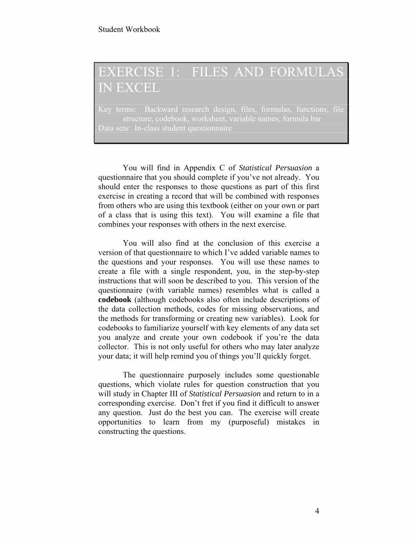
words, use an underscore (_ ) between the words as we’ve done in the class questionnaire with, say, the variable we’ve named “DO_IT.”
Here’s what your screen might look like after you’ve
entered the responses from your questionnaire, given the variable names provided to you:
Step 3: Now, change the name of the worksheet onto
which you’ve entered your data by giving the sheet your last name. To reliable a sheet, right click on the worksheet title at the bottom left of the page (e.g., “Sheet1”) and click on “RENAME.” Label this worksheet CLASSQUEX.
To insert an additional worksheet, right click on a sheet
name and then click on “INSERT.” To change the order of worksheets by the old click and
drag technique. The workbook is relabeled when you save the document.
Step 4: Save the file or Book as [your last name].lab1.
Formulas
Excel can be used to conduct mathematical operations like addition and multiplication, tasks that will, for example, come in handy when you create new variables from some combination of existing ones, as we’ll do shortly. Formulas (and their cousin, Functions) are also useful in executing “What If” scenarios that Excel is frequently used for.
Creating a formula in Excel is easy.
Student Workbook
8
First, activate a cell in which the results of the formula are to appear.
Next, enter the equal sign (=), which is the symbol that Excel knows is the start of a formula.
Third, enter the formula, which can include any combinations of cell references (e.g., B1) or constants (e.g., 5) and arithmetic operators like addition or multiplication.
After entering your formula, press the Enter key, and your results appear in the active cell.
Typical operators and the symbol you use to evoke an operation in Excel are: Operation Symbol Example
Addition + (plus) = A1 + B1, which adds the values of
cells A1 and B1 Subtraction - (minus) = C3 – D3, which subtracts the value
in cell D3 from the value in cell C3 Division / (slash) = R20/5, which divides the number
in cell R20 by the constant 5 Multiplication *
(asterick) = S22 * (B2/C1), which multiplies the value found in cell s22 by the division of cells B2 by C1
Power of ^ (carat) = 5 ^ 2, which raises 5 to the power of 2
Step 5: Let’s create a formula from the data you’ve
recently entered from the class questionnaire. Move your cursor to cell AE1 and activate it by left
clicking your cursor in that cell. (This cell should be empty. If it’s not, you’ve probably skipped a column or double entered a variable. Find and correct the problem before proceeding.) Type the variable label: PRIMED.
Hit ENTER, which should move the active cell to AE2. (If not, move your cursor to that cell and click on it.)
Now, let’s enter a formula that creates a new variable, which is the arithmetic sum of the answers to questions 1c, 1g, and 1h on the questionnaire you completed in class, otherwise known by the variable names LOOKING, READY, and CHALLENGE. I’m guessing (we’ll later test) that these three variables are correlated or tend to move together. That is to say, students who agree to one of these
Student Workbook
9
statements will likely (although not always) agree to the other two statements.
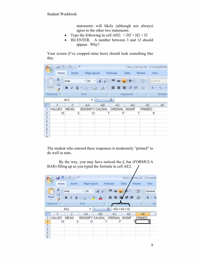
Type the following in cell AH2: = D2 + H2 + I2 Hit ENTER. A number between 3 and 12 should
appear. Why? Your screen (I’ve cropped mine here) should look something like this: The student who entered these responses is moderately “primed” to do well in stats.
By the way, you may have noticed the fx bar (FORMULA BAR) filling up as you typed the formula in cell AE2.

Student Workbook
10
You could have typed the formula here in the first place, but it is useful for us now to know that you can click on any cell to see if a formula is being used to produce a number you find there. (Sure, you’re likely to know this if you entered the data, but you’ll be using others’ Excel spreadsheets and this is a handy way to check their work to make sure their formulas are correct.) Here, I’ve clicked on cell AE2. It’s active because it has a bold border.
Step 6: Let’s practice formulas one more time. Without the step-by-step instructions I provide above, create a new variable in column AF that you label “AGE.” Create it by taking the number you entered for the year in which you were born and subtracting that from the current year. I want to see your approximate age appear in cell AF2.
Step 7: Let’s name the data in column AF2 “AGE.” This
is what your screen should look after hitting ENTER, activating AF2, and typing “AGE” in the Name Box if we used the entire student file:
NAME BOX
Naming a cell or range of cells By the way, if you frequently return to a particular cell or a range of cells, you can give it a name rather than type AB2 or C2:C22 (which is Excel’s way of designating a range of values, here the values found in cells C2 through C22). To apply a name, select the cell or range of cells. Do not include the row in which your variable name may appear. Type the name you want to use to designate that cell or range in the Name Box to the left of the Formula Bar at the top of the worksheet, and then present ENTER. Remember: no spaces or punctuation in the name.
Student Workbook
11
This is all pretty simple. Those of you with a lot of experience with Excel will likely know this stuff cold. Patience. It will become more challenging as we progress through the book and workbook. In the meantime, finish the simple Exercise you’ll below. Assignment #1 (Pass/Fail) Save this spreadsheet and email it to
your instructor.

Student Workbook
12
RHETORIC
CHALLENGE
SMART
FELS_NO
CODEBOOK Student Questionnaire The last four digits of your student identification number: ____ ____ ____ ____ 1. In general, how strongly do you agree or disagree with each of the following statements (please circle the number that best represents your response): Agree Agree Disagree Disagree Strongly Somewhat Somewhat Strongly
a. The palms of my hands become sweaty when I even hear the word “statistics.” 4 3 2 1 b. Statistics is often boring and difficult to understand. 4 3 2 1 c. I’m looking forward to learning how to use statistics to design better public policies. 4 3 2 1 d. I don’t hate mathematics. 4 3 2 1 e. One can learn statistics only by actually doing it. 4 3 2 1 f. Statistics are a rhetorical tool for persuasion. 4 3 2 1 g. My prior education has prepared me to do well in this class. 4 3 2 1 h. I like academic challenges. 4 3 2 1 i. It’s not how hard your work that leads to success; it’s how smart you work. 4 3 2 1
2. How many courses have you taken at Fels previous to this semester? _____ 3. In what year were you born? 19____
ID
PALMS
BORING
LOOKING
LIKE
DO_IT
READY
BIRTH
Student Workbook
13
MAJOR
COURSES
STATGRADE
GENDER
4. What was your undergraduate major? _______________________________ 5. What was your undergraduate GPA? ___._____
Note: You will not enter the information you recorded as
responses to these two questions because they may enable others in your class to deduce the identity of anyone who responded to other questions. You have no business knowing the undergraduate GPA of your classmates. Skip your responses to these two questions in creating the data file called for in Exercise 1.
6. How many undergraduate courses in statistics did you take? _____ If zero, skip to Question 8. 7. If you took one or more undergraduate courses in statistics, what was your average letter grade in that/those course(s)? ______ 8. What is your gender (please circle one number)? Male ... 1 Female ... 2 9. Do you have children under eighteen years old living at home with you? Yes ... 1 No ........ 2 10. Are you a U.S. citizen? Yes ... 1 No ........ 2 11. What ethnic/racial group do you consider yourself a member of?
White 1 Black/African-American 2 Hispanic/Latino 3 Asian/Pacific Islander 4 Other 5
GPA
KIDS
CITIZEN
RETHNICITY

Student Workbook
14
12. I consider myself proficient in the use of the following software programs: Yes No
a. SPSS 1 2 b. Microsoft WORD 1 2 c. Microsoft EXCEL 1 2 d. Microsoft POWERPOINT 1 2 e. Microsoft ACCESS 1 2
13. How tall are you? _______ inches. 14. What is your height, as measured by a fellow student in class today? ______ inches. 15. What is the value of X in the following equation? ______ 5 = X 2 6 16. What is the mean of the following set of observations? ______ 5, 2, 3, 10, 7, 3 17. What does “b” signify in the following regression equation (circle the letter corresponding to what you believe to be the correct answer)? Y = a + bX = e
a. The independent variable b. The dependent variable c. The intercept d. The regression slope e. The error term f. None of the above
TALL
HEIGHT
KNOWSPSS
KNOWWORD
KNOWEXCEL
KNOWPPT
KNOWACCESS
MEAN
BSIGNIFY
Student Workbook
15
Please indicate whether the following statements are True or False. 18. A high correlation demonstrates a causal relationship between two variables. True False 19. Measures of respondents’ gender on a survey are considered ordinal rather than nominal or interval. True False 20. A relationship that is reported as being significant at “p = .956” is considered “statistically significant.” True False
CAUSAL
ORDINAL
SIGNIF
Student Workbook
16
EXERCISE 2: FUNCTIONS AND FILES (IMPORTING THEM INTO EXCEL) Keywords: Experiments, surveys, samples, cross-sectional, longitudinal,
matched comparison, quasi-experimental, interrupted time series, focus groups, observational studies, response rates, response bias, levels of measurement, confidentiality, anonymity, deductive disclosure, functions, formula tab, scale construction, importing files, paste special, delimiter, levels of measurement, validity, reliability
Data sets: Homicides 1980 to 2004 In-class student survey, “Class survey” 2006 Report to Congress on Welfare Dependency DFIN.DAT from the Texas Education Indicators file Functions
Excel provides a number of functions. What’s a function? Well, it’s a predefined formula, like
adding up all the numbers in a column (a sum, designated by the Greek letter sigma, ∑) or calculating the mean of the values in a column.
There are a few functions that Excel makes easy for you to
use and a larger set that requires you to enter them as part of a formula in a cell.
Let’s start with the quick and easy functions first. It’s
easiest if we illustrate this with an example.
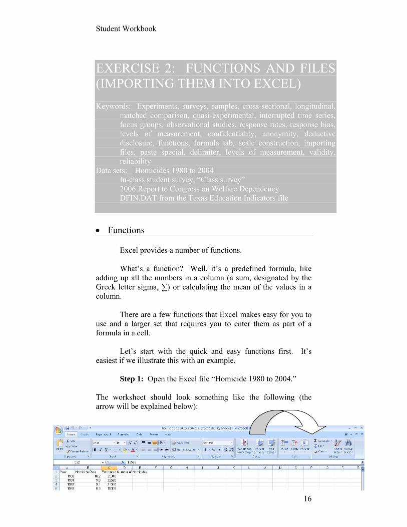
Step 1: Open the Excel file “Homicide 1980 to 2004.” The worksheet should look something like the following (the arrow will be explained below):
Student Workbook
17
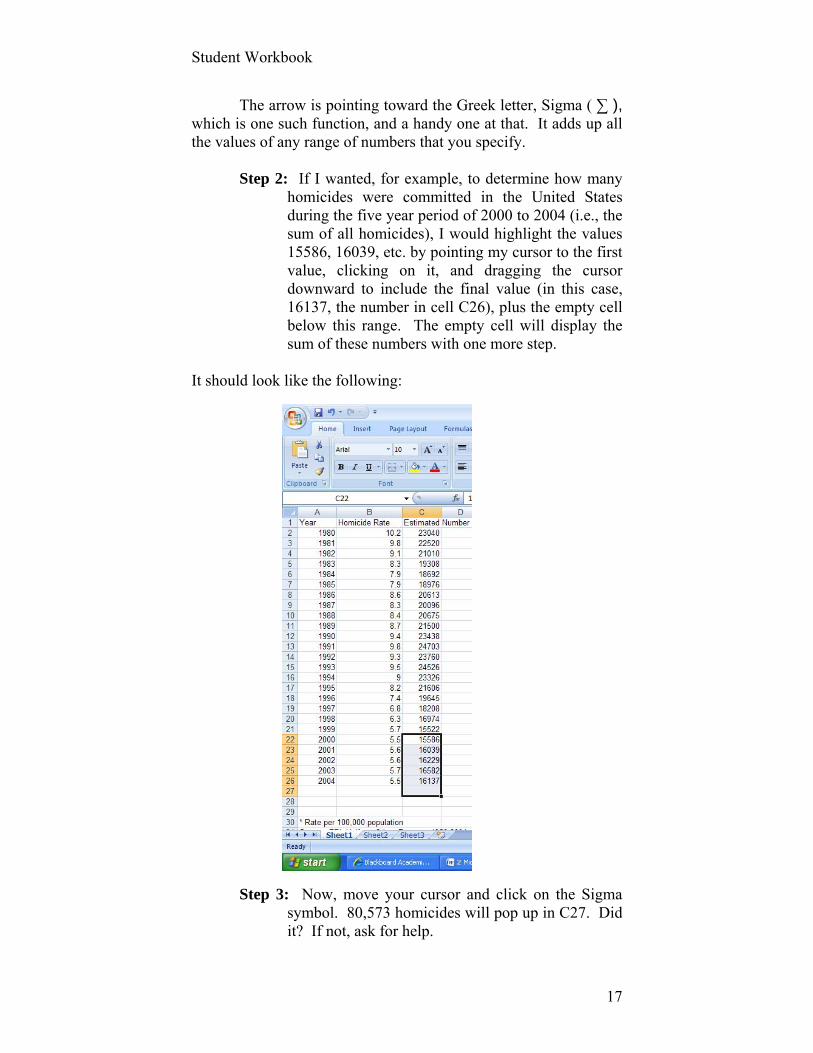
The arrow is pointing toward the Greek letter, Sigma ( ∑ ), which is one such function, and a handy one at that. It adds up all the values of any range of numbers that you specify.
Step 2: If I wanted, for example, to determine how many
homicides were committed in the United States during the five year period of 2000 to 2004 (i.e., the sum of all homicides), I would highlight the values 15586, 16039, etc. by pointing my cursor to the first value, clicking on it, and dragging the cursor downward to include the final value (in this case, 16137, the number in cell C26), plus the empty cell below this range. The empty cell will display the sum of these numbers with one more step.
It should look like the following:
Step 3: Now, move your cursor and click on the Sigma
symbol. 80,573 homicides will pop up in C27. Did it? If not, ask for help.
Student Workbook
18
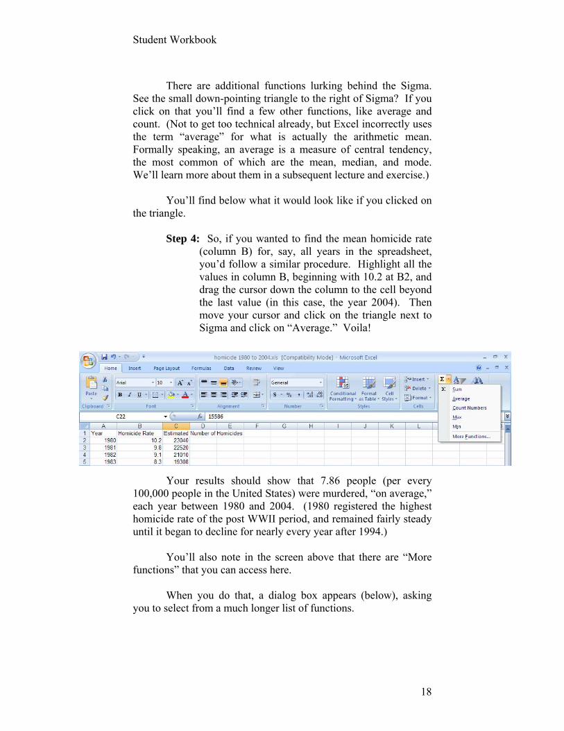
There are additional functions lurking behind the Sigma.
See the small down-pointing triangle to the right of Sigma? If you click on that you’ll find a few other functions, like average and count. (Not to get too technical already, but Excel incorrectly uses the term “average” for what is actually the arithmetic mean. Formally speaking, an average is a measure of central tendency, the most common of which are the mean, median, and mode. We’ll learn more about them in a subsequent lecture and exercise.)
You’ll find below what it would look like if you clicked on
the triangle.
Step 4: So, if you wanted to find the mean homicide rate (column B) for, say, all years in the spreadsheet, you’d follow a similar procedure. Highlight all the values in column B, beginning with 10.2 at B2, and drag the cursor down the column to the cell beyond the last value (in this case, the year 2004). Then move your cursor and click on the triangle next to Sigma and click on “Average.” Voila!
Your results should show that 7.86 people (per every
100,000 people in the United States) were murdered, “on average,” each year between 1980 and 2004. (1980 registered the highest homicide rate of the post WWII period, and remained fairly steady until it began to decline for nearly every year after 1994.)
You’ll also note in the screen above that there are “More
functions” that you can access here. When you do that, a dialog box appears (below), asking
you to select from a much longer list of functions.
Student Workbook
19
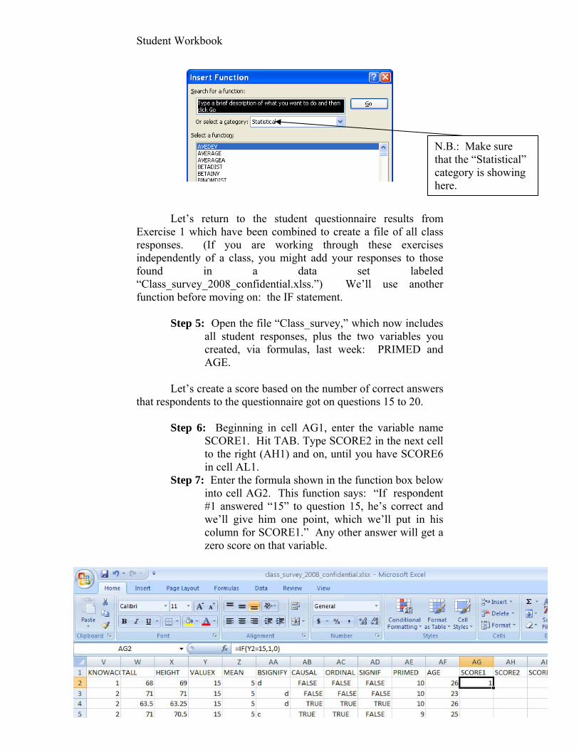
Let’s return to the student questionnaire results from Exercise 1 which have been combined to create a file of all class responses. (If you are working through these exercises independently of a class, you might add your responses to those found in a data set labeled “Class_survey_2008_confidential.xlss.”) We’ll use another function before moving on: the IF statement.
Step 5: Open the file “Class_survey,” which now includes all student responses, plus the two variables you created, via formulas, last week: PRIMED and AGE.
Let’s create a score based on the number of correct answers
that respondents to the questionnaire got on questions 15 to 20.
Step 6: Beginning in cell AG1, enter the variable name SCORE1. Hit TAB. Type SCORE2 in the next cell to the right (AH1) and on, until you have SCORE6 in cell AL1.
Step 7: Enter the formula shown in the function box below into cell AG2. This function says: “If respondent #1 answered “15” to question 15, he’s correct and we’ll give him one point, which we’ll put in his column for SCORE1.” Any other answer will get a zero score on that variable.
N.B.: Make sure that the “Statistical” category is showing here.
Student Workbook
20
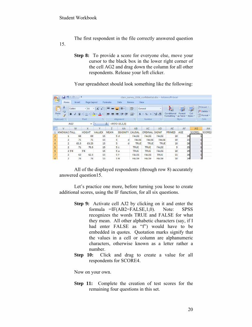
The first respondent in the file correctly answered question
15.
Step 8: To provide a score for everyone else, move your cursor to the black box in the lower right corner of the cell AG2 and drag down the column for all other respondents. Release your left clicker.
Your spreadsheet should look something like the following:
All of the displayed respondents (through row 8) accurately
answered question15. Let’s practice one more, before turning you loose to create
additional scores, using the IF function, for all six questions.
Step 9: Activate cell AJ2 by clicking on it and enter the formula =IF(AB2=FALSE,1,0). Note: SPSS recognizes the words TRUE and FALSE for what they mean. All other alphabetic characters (say, if I had enter FALSE as “f”) would have to be embedded in quotes. Quotation marks signify that the values in a cell or column are alphanumeric characters, otherwise known as a letter rather a number.
Step 10: Click and drag to create a value for all respondents for SCORE4.
Now on your own. Step 11: Complete the creation of test scores for the
remaining four questions in this set.

Student Workbook
21
Step 12: Create a summary score, called SCORETOT, as the sum of SCORE1 through SCORE6.
Step 13: Calculate the arithmetic mean of all students’ SCORETOT, using the AVERAGE function. (Return to Exercise 1 if you’ve forgotten how to do this.)
Importing Files
There will be instances when you find existing data that will help you answer the questions you want and inform the decisions you or a client want to make. Some of these files are relatively easy to download and analyze because they already exist as an Excel file (or SPSS or SAS or other statistical software program). No need to practice downloading a file that is already in the format of the software you will use. Other files, however, may be in the form of tables that require slightly more effort to convert into a format that you can analyze, e.g., Excel. (We’ll import an Excel spreadsheet into SPSS in a later exercise.) How to Download a html Page from a Website into an Excel File
Step 1: Go to the following web page: http://www.census.gov/govs/estimate/0539pasl_1.html [N.B.: The last character in pasl is the letter “L” in lower case. The character that is opposite the underscore is the number one.]
` This html page presents data from the U.S. Bureau of the Census that describes sources and amounts of revenues and expenditures for Pennsylvania in the fiscal year 2004-2005. Other states as well as the U.S. total are available at that site as well as well as more recent data. If you move your cursor anywhere in the table and click on the right mouse button, you’ll see a drop down box with a command, “Export to Microsoft Excel.” Click on this. [By the way, open this html page using Microsoft Explorer. If you open it using another web browser (e.g., Foxfire), you may not be granted the authority to “Export to Microsoft Excel.” If you find yourself in this unfortunate circumstance, save the file as a text file, copy it, and use the paste special feature to paste the file into an open and empty Excel spreadsheet.]
Student Workbook
22
How to Import a Table that Exists in a PDF Format into Excel
Go to the 2006 Report to Congress on Welfare Dependency, which can be found among the data sets for the workbook. It’s a PDF file.
Using Adobe Acrobat Professional, find Tables IND3a (on
page II-13, which is the 39th of 176 pages in this PDF file). The table reports the number and percent of the U.S. population who received AFCD or TANF by age between 1970 and 2004.
Step 1: Highlight the headings and data of the table. (Don’t highlight the table title and footnotes yet.)
Within any cell in the table, right click on your mouse and move the cursor to “Open Table in Spreadsheet.” [This option will not appear if you’ve opened the file with Adobe Reader.]
Student Workbook
23
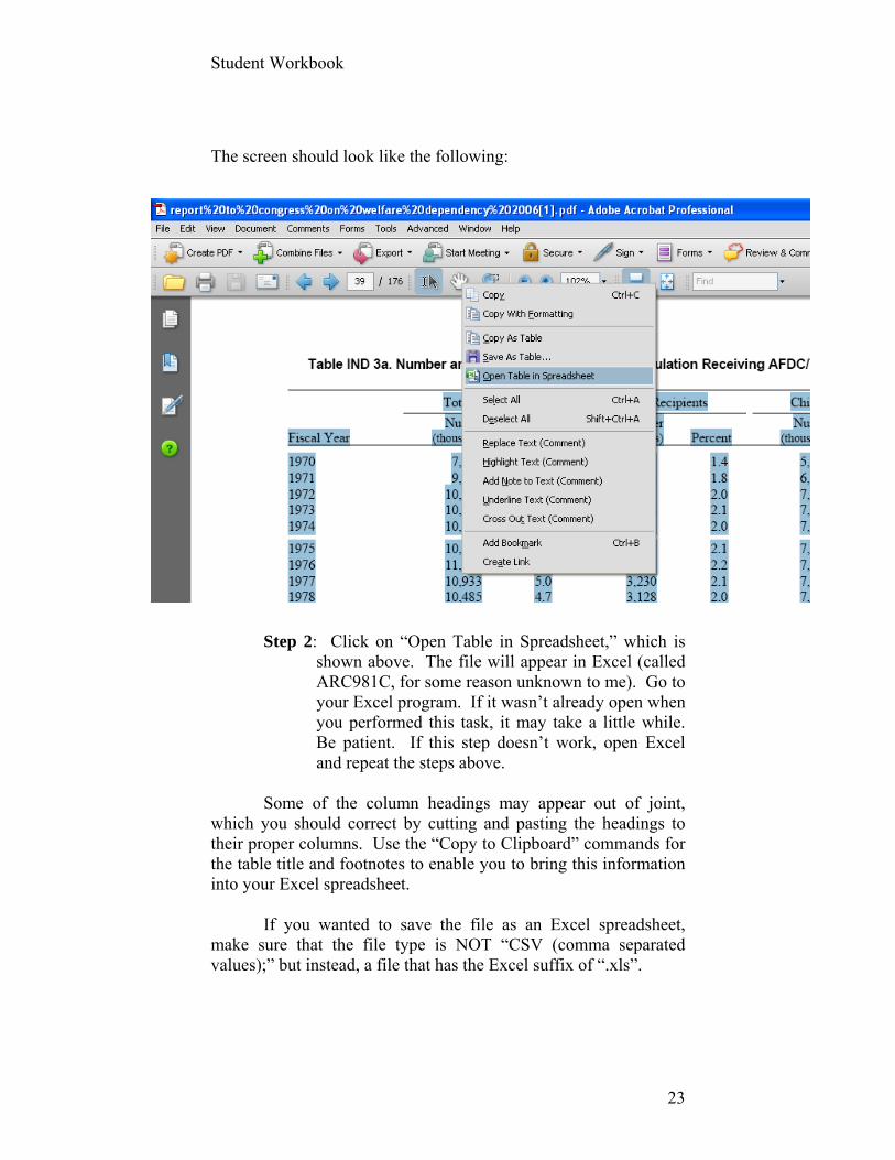
The screen should look like the following:
Step 2: Click on “Open Table in Spreadsheet,” which is
shown above. The file will appear in Excel (called ARC981C, for some reason unknown to me). Go to your Excel program. If it wasn’t already open when you performed this task, it may take a little while. Be patient. If this step doesn’t work, open Excel and repeat the steps above.
Some of the column headings may appear out of joint,
which you should correct by cutting and pasting the headings to their proper columns. Use the “Copy to Clipboard” commands for the table title and footnotes to enable you to bring this information into your Excel spreadsheet.
If you wanted to save the file as an Excel spreadsheet,
make sure that the file type is NOT “CSV (comma separated values);” but instead, a file that has the Excel suffix of “.xls”.
Student Workbook
24
How to Import a Text File into Excel
Step 1: Open DFIN.DAT from the Texas Education Indicators file among the files provided to you. This data set includes financial data for all 1,227 school districts in Texas for the year 2006.
Step 2: Open a blank Excel worksheet. Step 3: Within Excel, Open the DFIN.DAT file N.B.: In order to see this file among your list of data sets,
you may have to change “files of type” (at the bottom of the dialogue box) to “All files (*.*).”
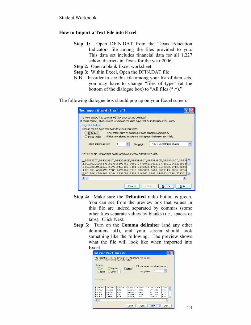
The following dialogue box should pop up on your Excel screen:
Step 4: Make sure the Delimited radio button is green.
You can see from the preview box that values in this file are indeed separated by commas (some other files separate values by blanks (i.e., spaces or tabs). Click Next.
Step 5: Turn on the Comma delimiter (and any other delimiters off), and your screen should look something like the following. The preview shows what the file will look like when imported into Excel.

Student Workbook
25
Step 6: Click on Next and then Finish. The data, with variable names in the first row, should appear in your Excel spreadsheet.
You should now be able to import into Excel nearly any
format of data or tables that you find on the web. Time to exercise.
Student Workbook
26
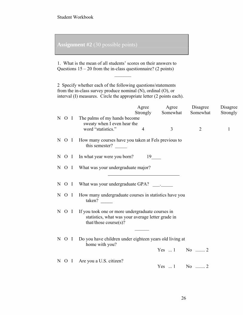
Assignment #2 (30 possible points) 1. What is the mean of all students’ scores on their answers to Questions 15 – 20 from the in-class questionnaire? (2 points) _______ 2 Specify whether each of the following questions/statements from the in-class survey produce nominal (N), ordinal (O), or interval (I) measures. Circle the appropriate letter (2 points each). Agree Agree Disagree Disagree Strongly Somewhat Somewhat Strongly N O I The palms of my hands become sweaty when I even hear the word “statistics.” 4 3 2 1 N O I How many courses have you taken at Fels previous to
this semester? _____ N O I In what year were you born? 19____ N O I What was your undergraduate major? ______________________________ N O I What was your undergraduate GPA? ___._____ N O I How many undergraduate courses in statistics have you
taken? _____ N O I If you took one or more undergraduate courses in
statistics, what was your average letter grade in that/those course(s)?
______ N O I Do you have children under eighteen years old living at
home with you? Yes ... 1 No ........ 2 N O I Are you a U.S. citizen? Yes ... 1 No ........ 2

Student Workbook
27
N O I I consider myself proficient in the use of the following
software programs: Yes No a. SPSS 1 2 N O I How tall are you? _______ inches. 3. Find questions that have been used in previous research to measure the anxiety that statistics might cause students to have (yes, this constitutes a review of some of the literature on this topic). Report the wording of this question here and the results of any tests for reliability and validity that may have been conducted. (3 points) 4. What might you do as Secretary of the Texas Department of Education to make sure that your tests of the knowledge and skills of students in grades 3-11 are as valid as possible? (5 points)

Student Workbook
28
Exercise 3: SPSS, Data Transformation, Index Construction, and Screening Cases Keywords: Data editing and cleaning, missing data, data transformations,
Cronbach’s Alpha, standardization, Z-scores, per capita, CPI, SPSS
Data sets: Class_survey Orange County public perceptions (“public_perceptions_orange_county_1.sav” or “Public
Perceptions Orange Cnty.sav” if you are using the Student Version of SPSS)
www.bls.gov/cpi Importing an Excel Spreadsheet into SPSS
. . . is easy. Remember to make sure your Excel spreadsheet has variable labels in the first row and data in the remaining rows.
Now, launch SPSS. Close the dialogue box that appears. Go to the Data View screen, making sure that the upper left
cell is highlighted. Click at the top of your screen FILE/OPEN/DATA and
browse for the class survey results among the data sets available to you.
Use the drop down list in the FILES OF TYPE: to select Excel (*.xls).
Click OPEN. Save the file as an SPSS file with .sav suffix.
That’s it.
Data Editing and Transformation
Let’s create a new variable using SPSS from the combination of a couple of arithmetic functions. We will also use this example to illustrate recodes, missing values, and screening. We will use the example from Chapter IV in which the Orange County Florida Mayor is interested in understanding citizens’
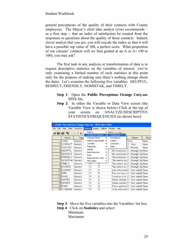
Student Workbook
29
general perceptions of the quality of their contacts with County employees. The Mayor’s chief data analyst (you) recommends – as a first step -- that an index of satisfaction be created from the responses to questions about the quality of those contacts. Indeed, clever analyst that you are, you will rescale the index so that it will have a possible top value of 100, a perfect score. What proportion of our citizens’ contacts will we find graded at an A or A+ (90 to 100), you may ask?
The first task in any analysis or transformation of data is to request descriptive statistics on the variables of interest (we’re only examining a limited number of such statistics at this point only for the purpose of making sure there’s nothing strange about the data). Let’s examine the following five variables: HELPFUL, RESPECT, FRIENDLY, NOMISTAK, and TIMELY.
Step 1: Open the Public Perceptions Orange Cnty.sav SPSS file.
Step 2: In either the Variable or Data View screen (the Variable View is shown below) Click at the top of your screen on ANALYZE/DESCRIPTIVE STATISTICS/FREQUENCIES (as shown here):
Step 3: Move the five variables into the Variables: list box. Step 4: Click on Statistics and select:
Minimum Maximum
Student Workbook
30
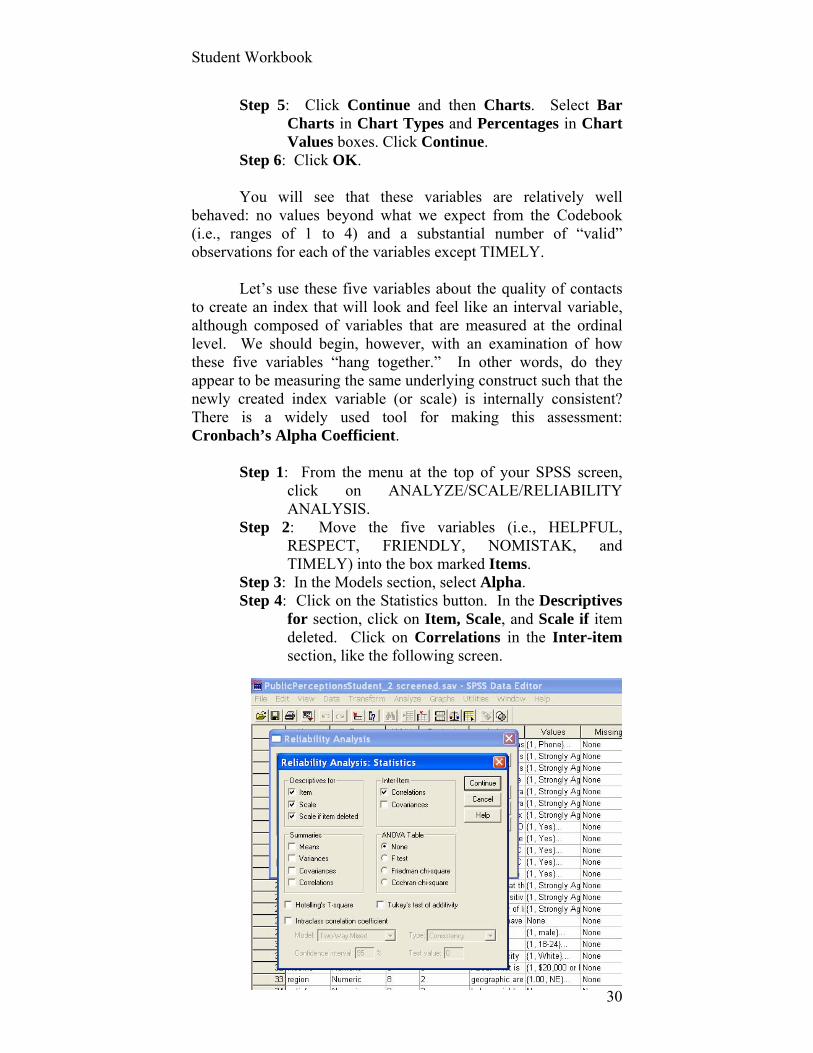
Step 5: Click Continue and then Charts. Select Bar Charts in Chart Types and Percentages in Chart Values boxes. Click Continue.
Step 6: Click OK. You will see that these variables are relatively well behaved: no values beyond what we expect from the Codebook (i.e., ranges of 1 to 4) and a substantial number of “valid” observations for each of the variables except TIMELY. Let’s use these five variables about the quality of contacts to create an index that will look and feel like an interval variable, although composed of variables that are measured at the ordinal level. We should begin, however, with an examination of how these five variables “hang together.” In other words, do they appear to be measuring the same underlying construct such that the newly created index variable (or scale) is internally consistent? There is a widely used tool for making this assessment: Cronbach’s Alpha Coefficient.
Step 1: From the menu at the top of your SPSS screen, click on ANALYZE/SCALE/RELIABILITY ANALYSIS.
Step 2: Move the five variables (i.e., HELPFUL, RESPECT, FRIENDLY, NOMISTAK, and TIMELY) into the box marked Items.
Step 3: In the Models section, select Alpha. Step 4: Click on the Statistics button. In the Descriptives
for section, click on Item, Scale, and Scale if item deleted. Click on Correlations in the Inter-item section, like the following screen.
Student Workbook
31
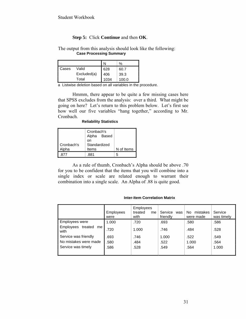
Step 5: Click Continue and then OK.
The output from this analysis should look like the following: Case Processing Summary
N % Cases Valid 628 60.7 Excluded(a) 406 39.3 Total 1034 100.0
a Listwise deletion based on all variables in the procedure. Hmmm, there appear to be quite a few missing cases here that SPSS excludes from the analysis: over a third. What might be going on here? Let’s return to this problem below. Let’s first see how well our five variables “hang together,” according to Mr. Cronbach. Reliability Statistics
Cronbach's Alpha
Cronbach's Alpha Based on Standardized Items N of Items
.877 .881 5
As a rule of thumb, Cronbach’s Alpha should be above .70 for you to be confident that the items that you will combine into a single index or scale are related enough to warrant their combination into a single scale. An Alpha of .88 is quite good. Inter-Item Correlation Matrix
Employees were
Employees treated me with
Service was friendly
No mistakes were made
Service was timely
Employees were 1.000 .720 .693 .580 .586 Employees treated me with .720 1.000 .746 .484 .528
Service was friendly .693 .746 1.000 .522 .549 No mistakes were made .580 .484 .522 1.000 .564 Service was timely .586 .528 .549 .564 1.000
Student Workbook
32
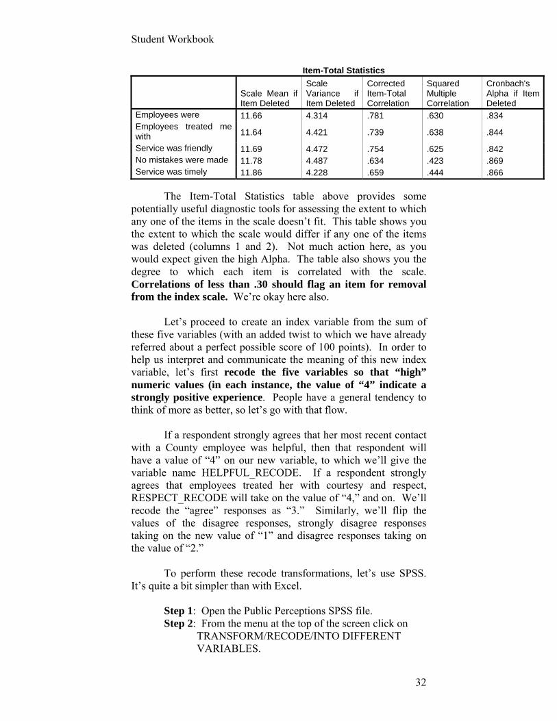
Item-Total Statistics
Scale Mean if Item Deleted
Scale Variance if Item Deleted
Corrected Item-Total Correlation
Squared Multiple Correlation
Cronbach's Alpha if Item Deleted
Employees were 11.66 4.314 .781 .630 .834 Employees treated me with 11.64 4.421 .739 .638 .844
Service was friendly 11.69 4.472 .754 .625 .842 No mistakes were made 11.78 4.487 .634 .423 .869 Service was timely 11.86 4.228 .659 .444 .866
The Item-Total Statistics table above provides some potentially useful diagnostic tools for assessing the extent to which any one of the items in the scale doesn’t fit. This table shows you the extent to which the scale would differ if any one of the items was deleted (columns 1 and 2). Not much action here, as you would expect given the high Alpha. The table also shows you the degree to which each item is correlated with the scale. Correlations of less than .30 should flag an item for removal from the index scale. We’re okay here also. Let’s proceed to create an index variable from the sum of these five variables (with an added twist to which we have already referred about a perfect possible score of 100 points). In order to help us interpret and communicate the meaning of this new index variable, let’s first recode the five variables so that “high” numeric values (in each instance, the value of “4” indicate a strongly positive experience. People have a general tendency to think of more as better, so let’s go with that flow. If a respondent strongly agrees that her most recent contact with a County employee was helpful, then that respondent will have a value of “4” on our new variable, to which we’ll give the variable name HELPFUL_RECODE. If a respondent strongly agrees that employees treated her with courtesy and respect, RESPECT_RECODE will take on the value of “4,” and on. We’ll recode the “agree” responses as “3.” Similarly, we’ll flip the values of the disagree responses, strongly disagree responses taking on the new value of “1” and disagree responses taking on the value of “2.” To perform these recode transformations, let’s use SPSS. It’s quite a bit simpler than with Excel.
Step 1: Open the Public Perceptions SPSS file. Step 2: From the menu at the top of the screen click on
TRANSFORM/RECODE/INTO DIFFERENT VARIABLES.

Student Workbook
33
Your screen should look something like the following (as you can see, I’m in the VARIABLE VIEW screen, although I could also request this transformation from the DATA VIEW screen as well):
Step 3: The following dialog box will appear into which
you’ll enter the old and new variable names and labels.
#1 #1
#2

Student Workbook
34
Step 4: Click on the button Old & New Values. The
screen above shows my last step in recoding HELPFUL.
Step 5: Click on ADD and then CONTINUE, following the same procedure for each of the remaining variables.
Step 6: Don’t forget to change the labels associated with each of the numeric categories of these recoded variables (i.e., value labels). Even though we’ll be creating a transformed variable with these five variables shortly, it’s always good practice to make these labeling changes at the time you transform the variables, lest you forget how you recoded them. How? Here’s one of several ways:
a. In the Variables View screen of the SPSS file of Public Perceptions, scroll down to the bottom where you will find your five newly recoded variables. Click on the cell in the column VALUES for the first of your recoded variables. This cell will become highlighted and a gray box with 3 dots will appear in that cell.
b. Click on the gray box and relabel the category values where
i. You assign “1” the value label “strongly disagree” (Don’t use quotes). Click ADD
ii. “2” is “disagree” Click ADD iii. “3” is “agree” Click ADD iv. “4” is “strongly agree” Click ADD and OK.
Student Workbook
35
Step 7: After changing one, you can COPY and PASTE these value labels to the remaining four variables by right clicking in the Values box of the first variable (in the Variable View mode of SPSS) for which you’ve provided new labels. Select COPY. Click and drag on the “Values” cells of the four other variables for which you like to copy the same labels. Click your right button and select PASTE.
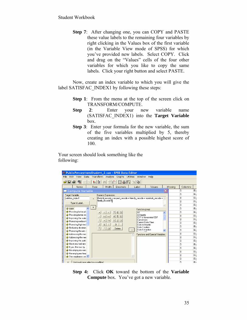
Now, create an index variable to which you will give the label SATISFAC_INDEX1 by following these steps:
Step 1: From the menu at the top of the screen click on TRANSFORM/COMPUTE.
Step 2: Enter your new variable name (SATISFAC_INDEX1) into the Target Variable box.
Step 3: Enter your formula for the new variable, the sum of the five variables multiplied by 5, thereby creating an index with a possible highest score of 100.
Your screen should look something like the following:
Step 4: Click OK toward the bottom of the Variable
Compute box. You’ve got a new variable.

Student Workbook
36
Step 5: Run descriptive statistics on this new variable to make sure everything appears to have worked properly. Request the statistics reported below. You should produce output something like the following:
Statistics satisfac_index1
Valid 628 N Missing 406
Mean 73.2882 Std. Error of Mean .51439 Median 75.0000 Mode 75.00 Std. Deviation 12.89046 Skewness -.600 Std. Error of Skewness .098 Kurtosis 2.600 Std. Error of Kurtosis .195 Range 75.00 Minimum 25.00 Maximum 100.00
25 70.0000 50 75.0000
Percentiles
75 75.0000
Frequency Percent Valid Percent Cumulative Percent
25.00 8 .8 1.3 1.3 30.00 1 .1 .2 1.4 35.00 4 .4 .6 2.1 40.00 4 .4 .6 2.7 45.00 6 .6 1.0 3.7 50.00 9 .9 1.4 5.1 55.00 23 2.2 3.7 8.8 60.00 30 2.9 4.8 13.5 65.00 56 5.4 8.9 22.5 70.00 80 7.7 12.7 35.2 75.00 282 27.3 44.9 80.1 80.00 31 3.0 4.9 85.0 85.00 20 1.9 3.2 88.2 90.00 16 1.5 2.5 90.8 95.00 20 1.9 3.2 93.9 100.00 38 3.7 6.1 100.0
Valid
Total 628 60.7 100.0 Missing System 406 39.3 Total 1034 100.0
Student Workbook
37
What conclusions can you draw about these sets of
statistics? One of our conclusions (in addition to some substantive
and technical ones noted in Chapter IV) is that the number of missing values is still large and unsettling. If you return to the questionnaire from which these data were collected, you will note that a prior question asked whether the respondent had contacted a County employee within the prior 12 months. One could argue that this question should have been a screener or filter for the subsequent questions that are of interest to us here. Any respondent who answered “No,” should not have been asked the subsequent questions that evaluate those contacts.
If you run descriptive statistics on the five recoded variables after selecting for only those with a contact, you’ll see that data for about 30 percent of the variable TIMELY are missing. For some reason, quite a few people didn’t answer this question. Given the question’s location at the bottom of the page, it may not have been printed on a number of questionnaires. For whatever reason, this is an intolerable level of missing data, which damages the integrity of our summary index. You will correct this problem in the assignment below.
Constant Dollars Transformations Before turning to the assignment, however, let’s examine another useful and widespread data transformation, the expression of dollars that adjusts for the changing value of the dollar from year-to-year. This transformation will be part of this week’s exercise too. To adjust for changes in the value of money requires the analyst to transform dollar figures into what are called “constant” dollars. For example, what was the national debt in 1968 according to the relative value of the dollar in, say, 2007? (One can also reverse this process and express the national debt in 2007 in 1968 constant dollars.)
Obviously, “current” dollars don’t take into account the changing (often declining) value of the dollar. In other words, a buck in 2007 can’t buy what it did in 1968. To take the changing value of the dollar into account requires that we have a measure of the value of the dollar. There are many, but we will use for our
Student Workbook
38
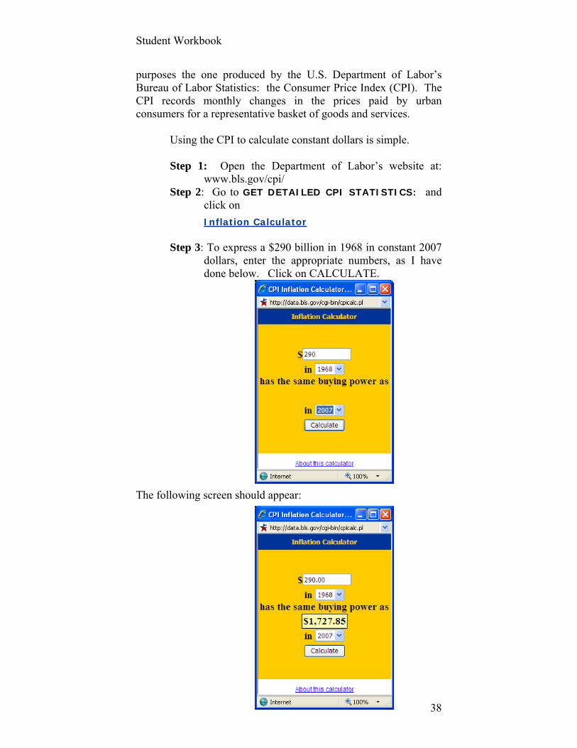
purposes the one produced by the U.S. Department of Labor’s Bureau of Labor Statistics: the Consumer Price Index (CPI). The CPI records monthly changes in the prices paid by urban consumers for a representative basket of goods and services. Using the CPI to calculate constant dollars is simple.
Step 1: Open the Department of Labor’s website at:
www.bls.gov/cpi/ Step 2: Go to GET DETAILED CPI STATISTICS: and
click on
Inflation Calculator
Step 3: To express a $290 billion in 1968 in constant 2007 dollars, enter the appropriate numbers, as I have done below. Click on CALCULATE.
The following screen should appear:

Student Workbook
39
Two-hundred ninety billion dollars in 1968 has the purchasing power of $1,728 billion in 2007! Amazing. Ok, now let’s exercise these procedures.

Student Workbook
40
Assignment # 3 (40 possible points) A. Recalculate a new index variable, much as we did above with the five variables. This time, however, exclude TIMELY. Calculate and report Cronbach’s Alpha from the remaining four variables. Create an index from the sum of the four recoded variables, multiplied by a constant such that the upper most possible value of this new index is 100. Name this new index SATISFAC_INDEX2. Submit the following descriptive statistics for this new index: mean, median, minimum and maximum. Write a one paragraph conclusion about the “story” of citizen satisfaction with contacts with county employees that you would submit to the County’s Mayor. B. The following part of the exercise is one analogous to being thrown in a pool to see if you can swim. In other words, it requires you to conduct some tasks that we have not yet covered in the workbook. Use help functions in the software you’ll use or consult the textbook.
Prepare and submit three “quick and dirty” graphs for:
(1) the U.S. national debt in current dollars for every year between (and including) 1993 and 2007 (2) the national debt in constant $2007 for these same years (3) the per capita national debt in constant $2007 for these same years
You may use SPSS or Excel. Data required for these graphs can be found at:
www.cbo.gov/budget/historical.shtml. www.census.gov/popest The Consumer Price Index calculator can be found at: www.bls.gov/cpi In addition to the graphs, describe in a paragraph or two what you conclude
from them. Write this description as if directed to a daily newspaper audience.

Student Workbook
41
EXERCISE 4: DESCRIPTIVE STATISTICS AND GRAPHICAL DISPLAY
Keywords: Descriptive statistics, central tendency, mean, median, mode,
dispersion, variance, standard deviation, distribution, shape, skewness, kurtosis, normal, outliers, quartiles, interquartile range, boxplot,
Data sets: Community Indicators (“comm indic vs_1.sav”)
You have already requested some descriptive statistics in the context of exploring data and detecting and editing data sources that may be a little “messy.” Obviously, descriptive statistics are also used to describe three of the most important, if simple, aspects of data:
(1) central tendencies, (2) dispersion, and (3) the shape of a variable’s distribution. These statistics are the foundation for all subsequent
statistics and are important accompaniments to the more sophisticated statistics that we will explore later. Exercise 4 will help you explore these descriptive statistics, the conditions under which they’re most appropriate to calculate and report, and their interpretation.
We will first use the Community Indicators data set, which
can be found among the data sets accompanying the text and workbook.
Step 1. Open the Community Indicators data set in SPSS.
Let’s calculate some descriptive statistics for a number of
the variables in that data set that may be of interest to us. In particular, let’s calculate descriptive statistics for the following variables: POP, VIOLENTCRIME, FTLAW, UNEMPL, and INCOME.
Student Workbook
42
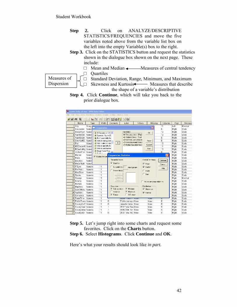
Step 2. Click on ANALYZE/DESCRIPTIVE STATISTICS/FREQUENCIES and move the five variables noted above from the variable list box on the left into the empty Variable(s) box to the right.
Step 3. Click on the STATISTICS button and request the statistics shown in the dialogue box shown on the next page. These include: □ Mean and Median Measures of central tendency □ Quartiles □ Standard Deviation, Range, Minimum, and Maximum □ Skewness and Kurtosis Measures that describe
the shape of a variable’s distribution Step 4. Click Continue, which will take you back to the
prior dialogue box.
Step 5. Let’s jump right into some charts and request some
favorites. Click on the Charts button. Step 6. Select Histograms. Click Continue and OK. Here’s what your results should look like in part.
Measures of Dispersion

Student Workbook
43
Statistics
98 95 81 90 88
0 3 17 8 10
552740.43 4902.60 2251.89 8.634 42751.86
330310.50 2878.00 957.00 8.300 42316.50
918901.944 7716.534 6050.179 2.8369 8877.906
6.259 4.662 7.426 1.430 1.013
.244 .247 .267 .254 .257
46.490 25.484 60.472 2.867 1.763
.483 .490 .529 .503 .508
7847534 55418 52035 14.8 45456
160744 270 300 4.1 26309
8008278 55688 52335 18.9 71765
216747.50 1512.00 589.00 6.800 37409.50
330310.50 2878.00 957.00 8.300 42316.50
530514.25 4730.00 1783.00 9.500 46170.25
Valid
Missing
N
Mean
Median
Std. Deviation
Skewness
Std. Error of Skewness
Kurtosis
Std. Error of Kurtosis
Range
Minimum
Maximum
25
50
75
Percentiles
Totalpopulation
ViolentsCrimes - Total
Full-Time LawEnforcementEmployees
Unemployement Rate(incudes
someestimates
of counties)
Medianhouseholdincome ($)
6000050000400003000020000100000
Violents Crimes - Total
80
60
40
20
0
Fre
qu
enc
y
Mean = 4902.6Std. Dev. = 7716.534N = 95
Violents Crimes - Total
The histograms that SPSS produces (following the
frequency tables) have a range for each bar that SPSS defines for us. These are not always helpful or informative. Fortunately, we can change them, as can nearly all of the attributes to a graph produced by SPSS (and Excel for that matter). We may not need to do so in a preliminary analysis of the data, but we almost always need to do so before presenting the charts to a target audience. The default charts often violate guidelines for graphical display, to which we will turn shortly.
Here’s what your histogram for the number of violent
crimes in 95 of these 98 cities should resemble:

Student Workbook
44
How might this graph be improved? Don’t bother. It’s a fundamentally flawed graph that no
amount of editing can help. Its first and fatal flaw is the variable’s failure to take the population size of each city into account. One of the more easily interpretable and communicable transformation to achieve this end is to create a variation of per capita for total violent crimes. We don’t, however, merely want to divide, say, the total number of violent crimes by the total population. We would find, for example, that there were .007 violent crimes per each resident of New York City in the early 21st century (55,688/8,008,278) and .008 violent crimes per each resident of St. Paul, MN (2,408/287.151).
These per capita numbers, however, are difficult to
communicate in a way that audiences can “get their arms and brains around.” And who wants to keep track of three decimal places? Let’s try per 100,000 people.
Step 7: Create new variables for violent crimes by dividing this variable by the POPulation for that city and then multiplying it by 100,000.
In SPSS, this is accomplished by clicking:
TRANSFORM/COMPUTE and entering the following information in the Target Variable and Numeric Expression boxes (as below).
Step 8: After creating new variables for this variable and
for full-time law enforcement officers per 100,000 residents (FTLaw_per100k), re-run the same summary statistics as above.
Student Workbook
45
Statistics
95 81
3 17
875.7300 312.3910
776.7507 278.1154
420.70371 124.58827
.660 1.335
.247 .267
.232 1.800
.490 .529
1893.67 657.49
151.12 106.77
2044.80 764.26
572.6158 222.4680
776.7507 278.1154
1174.0823 362.9051
Valid
Missing
N
Mean
Median
Std. Deviation
Skewness
Std. Error of Skewness
Kurtosis
Std. Error of Kurtosis
Range
Minimum
Maximum
25
50
75
Percentiles
ViolentCrimies Per
100,000FTLaw_per100k
2000.001500.001000.00500.000.00
Violent Crimies Per 100,000
20
15
10
5
0
Fre
qu
ency
Mean = 875.73Std. Dev. = 420.70371N = 95
Violent Crimies Per 100,000
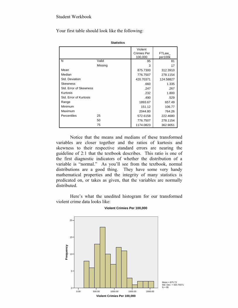
Your first table should look like the following:
Notice that the means and medians of these transformed
variables are closer together and the ratios of kurtosis and skewness to their respective standard errors are nearing the guideline of 2:1 that the textbook describes. This ratio is one of the first diagnostic indicators of whether the distribution of a variable is “normal.” As you’ll see from the textbook, normal distributions are a good thing. They have some very handy mathematical properties and the integrity of many statistics is predicated on, or takes as given, that the variables are normally distributed.
Here’s what the unedited histogram for our transformed
violent crime data looks like:
Student Workbook
46
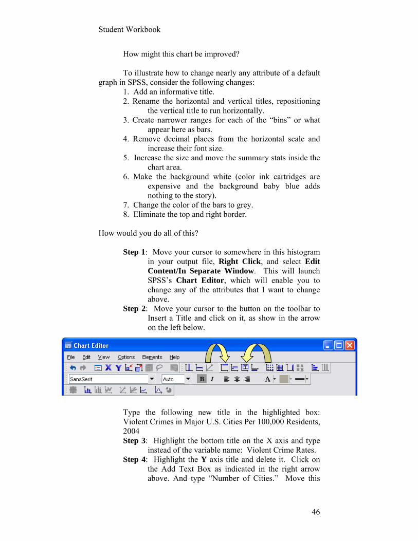
How might this chart be improved? To illustrate how to change nearly any attribute of a default
graph in SPSS, consider the following changes: 1. Add an informative title. 2. Rename the horizontal and vertical titles, repositioning
the vertical title to run horizontally. 3. Create narrower ranges for each of the “bins” or what
appear here as bars. 4. Remove decimal places from the horizontal scale and
increase their font size. 5. Increase the size and move the summary stats inside the
chart area. 6. Make the background white (color ink cartridges are
expensive and the background baby blue adds nothing to the story).
7. Change the color of the bars to grey. 8. Eliminate the top and right border.
How would you do all of this?
Step 1: Move your cursor to somewhere in this histogram in your output file, Right Click, and select Edit Content/In Separate Window. This will launch SPSS’s Chart Editor, which will enable you to change any of the attributes that I want to change above.
Step 2: Move your cursor to the button on the toolbar to Insert a Title and click on it, as show in the arrow on the left below.
Type the following new title in the highlighted box: Violent Crimes in Major U.S. Cities Per 100,000 Residents, 2004 Step 3: Highlight the bottom title on the X axis and type
instead of the variable name: Violent Crime Rates. Step 4: Highlight the Y axis title and delete it. Click on
the Add Text Box as indicated in the right arrow above. And type “Number of Cities.” Move this

Student Workbook
47
text box near the top of the Y axis. You can’t rotate the title on the Y axis in SPSS. A text box is necessary to achieve this effect.
Step 5: Click the bold X on the tool bar and highlight Custom/Interval Width and enter 50. Click Apply.
Step 6: Double click anywhere inside one of the bars. Click on the Fill & Border tab and highlight one of the grey boxes in the color palette. Click Apply and Close.
Step 7: Double click on one of the numbers of the horizontal scale.
In the Text Style tab, change Preferred Size to 12. Click Apply.
In the Scale tab, change maximum to 2200. Click Apply. In the Number Format tab, insert 0 (i.e., zero) into decimal places box. Click Apply and Close. Do the same thing for the numbers on the vertical axis.
Step 8: Double click on mean or std. dev to the right of the chart.
In the Text tab, change preferred size to 12. Click Apply. Move your cursor to the border of the box in which these statistics reside until your cursor changes to a figure that looks like the four arrows of a compass and drag that box into the upper right corner of the chart. Expand the box (if needed) so that each of these three statistics is on only one line. Click Close.
Step 9: Double click on the background blue. In the Fill & Border tab, click on the Fill Box and click on the White box in the color palette. In the Border box within the same tab, select the white or transparent palette. Click Apply and Close.
Step 10: Click on Edit at the top of your screen and select Copy Chart, which you can paste into a WORD document to be submitted to whomever you’d like.
Your chart should look something like the
following:
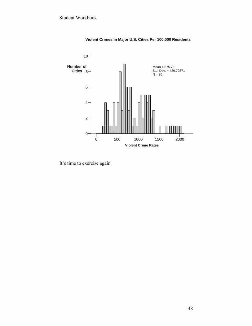
Student Workbook
48
2000150010005000
Violent Crime Rates
10
8
6
4
2
0
Mean = 875.73Std. Dev. = 420.70371N = 95
Violent Crimes in Major U.S. Cities Per 100,000 Residents
Number ofCities
It’s time to exercise again.
Student Workbook
49
Assignment #4 (50 possible points) A.
Create an index for FTLAW per 100,000 residents, submit all descriptive statistics for this new variable, plus an edited histogram that conforms to the principles of good graphic design. Copy and paste the edited histogram into a Word file. B.
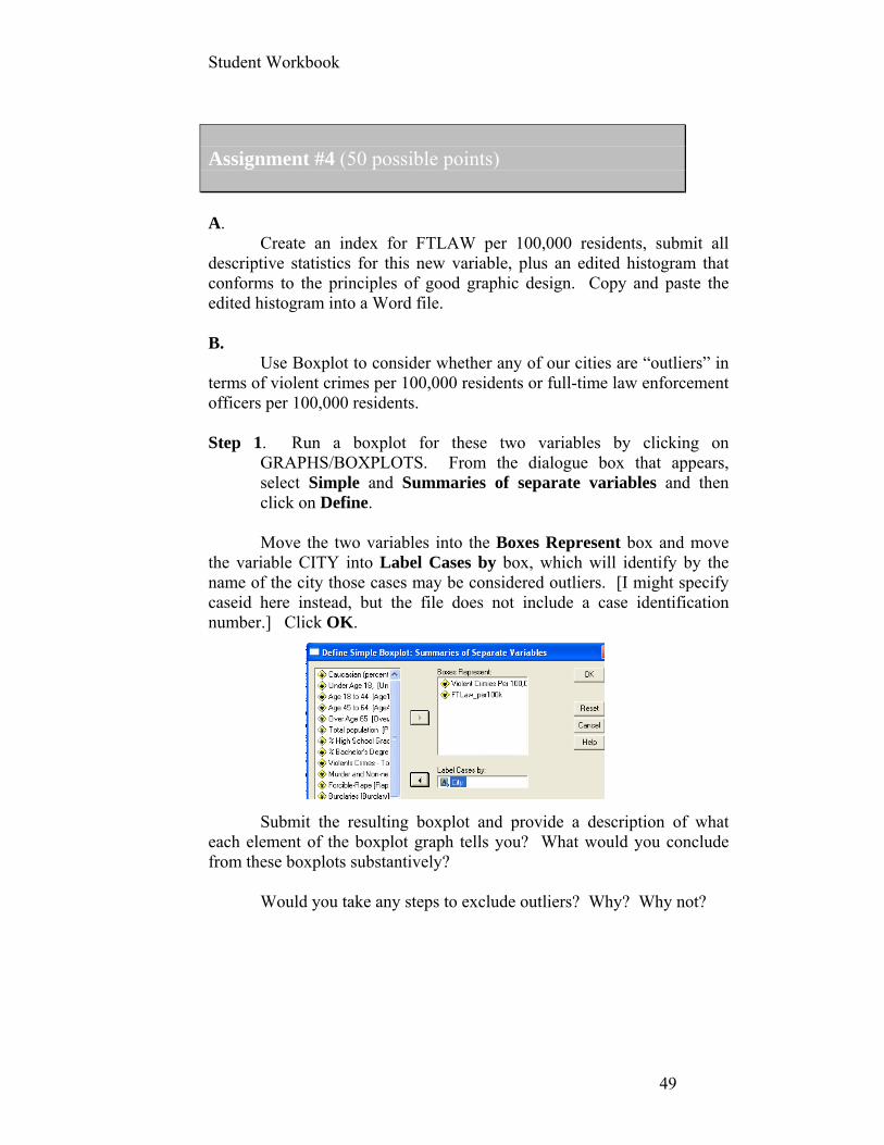
Use Boxplot to consider whether any of our cities are “outliers” in terms of violent crimes per 100,000 residents or full-time law enforcement officers per 100,000 residents. Step 1. Run a boxplot for these two variables by clicking on
GRAPHS/BOXPLOTS. From the dialogue box that appears, select Simple and Summaries of separate variables and then click on Define. Move the two variables into the Boxes Represent box and move
the variable CITY into Label Cases by box, which will identify by the name of the city those cases may be considered outliers. [I might specify caseid here instead, but the file does not include a case identification number.] Click OK.
Submit the resulting boxplot and provide a description of what
each element of the boxplot graph tells you? What would you conclude from these boxplots substantively?
Would you take any steps to exclude outliers? Why? Why not?
Student Workbook
50
Exercise 5: More Descriptive Stats and Graphs Keywords: Simple random sample, inference, p-values, null hypothesis,
statistical significance, confidence level, confidence interval, standard error
Data sets: Texas Academic Excellence Indicator System (“Texas_Acad_Excellence_Indicator_System_sample.sav”) We will be turning in this and subsequent exercises to another data set, which comes from the Texas Academic Excellence Indicator System 2006 and includes variables from across a number of files that the Texas Department of Education makes available to the public. A more complete description of the data can be found in the codebook for this file, which includes a list of variables names and their descriptions.
Charts for Single Categorical Variables
Let’s call for a graph or two and work through steps in generating and editing them.
You may have noticed in your prior assignment that one
strategy for producing graphs is to request a graph using the standard defaults of the software and then edit elements of the graph to better suit your purposes. That will be the same strategy here.
Step 1: Open the Texas Academic Excellence Indicator System 2006 file in SPSS.
Step 2: Let’s create bar charts for two variables I created from recoding the proportion of students who are black and Hispanic into variables with four categories that I thought might be a useful way of categorizing school districts, using my sociological imagination (i.e., I didn’t peak at the data first).
.

Student Workbook
51
Greater than 50 percent25 to 50 percent5 to 25 percent0 to 5 percent
Percent of Black Students in District
60
50
40
30
20
10
0
Per
cen
t
Percent of Black Students in District
There are several ways to create a bar chart, but we’ll use a technique we’ve already seen by using the descriptive statistics function.
Step 3: Select ANALYZE/DESCRIPTIVE STATISTICS/FREQUENCIES. While we’re at it, let’s go ahead and request stats as well a bar graph.
Notice that I selected PERCENTAGES in the Chart Values
section rather than FREQUENCIES. Why? The bar graphs should look something like the following:

Student Workbook
52
Greater than 50 percent25 to 50 percent5 to 25 percent0 to 5 percent
Percent of Hispanic Students in District
40
30
20
10
0
Pe
rce
nt
Percent of Hispanic Students in District
The “story” here is fairly interesting, but we won’t linger.
The graphs aren’t too bad, but could be improved.
What improvements would you suggest? Here’s a few I’d suggest (with the steps to achieve these
changes to follow):
Increase the size of the value labels on the chart. Moving them to a document like this has made it difficult to read the categories.
Eliminate one of the two chart labels. Make the scales across the two tables have the same range.
We can try 60 percent as the max, although note that this truncation of scale could possibly exaggerate the differences we see here.1
Insert the actual percent values of each bar. Include the total number of school districts on which these
bars are based.
1 After rescaling the Y axis to range from 0 to 60 for both charts, I calculated Tufte’s (2001) Lie Factor for both. The area of the bar in the Hispanic chart for 5 to 25 percent is 2.25 square inches, compared to .56 square inches for 0 to 5 percent. This is 4.02 times greater, compared to the actual difference of 40% vs. 10%, which is 4.0 times greater. No lies in this chart!
Student Workbook
53
Eliminate the background color and change the colors of the bars in such a way that you could tell which group you were looking at without even reading the chart title.
Step 4: To edit any chart in the SPSS Viewer file like the
two here, double click anywhere in a chart to launch the Chart Editor.
Step 5: To edit an element of a chart, click on it to activate the element for editing.
Step 6: Click at the top of the Chart Editor on EDIT/PROPERTIES. The resulting dialogue box/tabs will differ, depending on the elements you selected to edit.
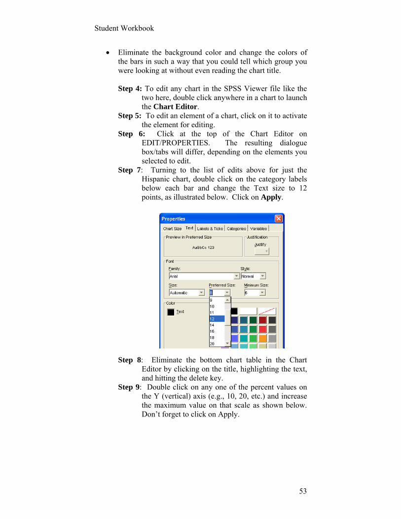
Step 7: Turning to the list of edits above for just the Hispanic chart, double click on the category labels below each bar and change the Text size to 12 points, as illustrated below. Click on Apply.
Step 8: Eliminate the bottom chart table in the Chart
Editor by clicking on the title, highlighting the text, and hitting the delete key.
Step 9: Double click on any one of the percent values on the Y (vertical) axis (e.g., 10, 20, etc.) and increase the maximum value on that scale as shown below. Don’t forget to click on Apply.
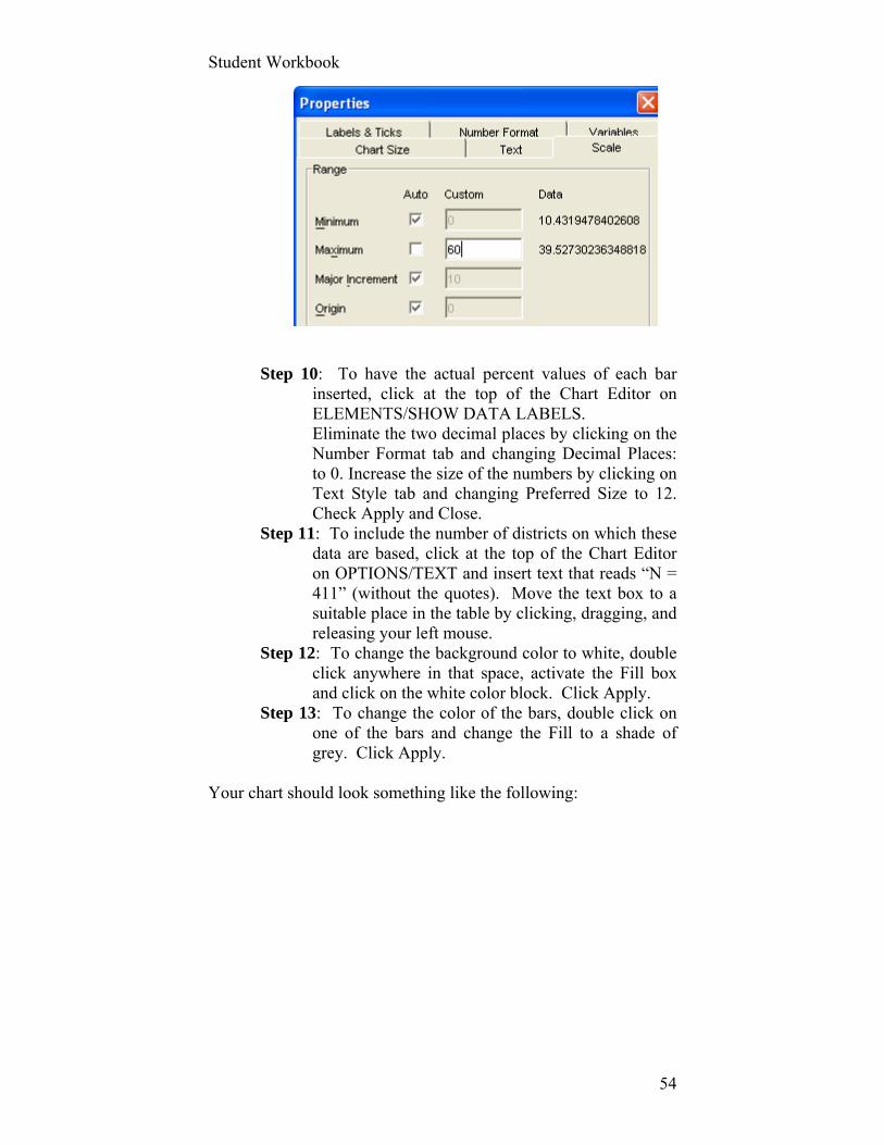
Student Workbook
54
Step 10: To have the actual percent values of each bar
inserted, click at the top of the Chart Editor on ELEMENTS/SHOW DATA LABELS. Eliminate the two decimal places by clicking on the Number Format tab and changing Decimal Places: to 0. Increase the size of the numbers by clicking on Text Style tab and changing Preferred Size to 12. Check Apply and Close.
Step 11: To include the number of districts on which these data are based, click at the top of the Chart Editor on OPTIONS/TEXT and insert text that reads “N = 411” (without the quotes). Move the text box to a suitable place in the table by clicking, dragging, and releasing your left mouse.
Step 12: To change the background color to white, double click anywhere in that space, activate the Fill box and click on the white color block. Click Apply.
Step 13: To change the color of the bars, double click on one of the bars and change the Fill to a shade of grey. Click Apply.
Your chart should look something like the following:

Student Workbook
55
Surely, this edited bar chart can be further improved. The
best way to learn how to create charts that better meet your audiences’ needs is to experiment – nay, play – with the many options. Just don’t get so fancy that the reaction of the viewer is “How did she create a graph like that?” The purpose is to convey a message about the content or “story” that the data tell. The message should not be “Boy, what a chart wizard I am.”
Bar Charts to Illustrate Differences Between Two or More Groups on an Interval Variable
The above chart illustrates a box chart for a single variable
with four categories. You can, of course, use bar charts to illustrate differences between two or more groups on an interval variable (e.g., percent of students passing the state’s tests).
We’ll turn here to one such chart. Let’s say we were interested in examining graphically
whether district test scores (as measured by the proportion of all tests that 3 to 11 graders passed in a district in 2006) vary by the proportion of black students in a district, using the variable above
Student Workbook
56
(BLACK_PERCENT_4CAT). Within these four categories of % black students, we also want to examine whether economic disadvantage (ECON_DISADVS_THIRDS) makes an additional impact on test scores or, indeed, whether test performance is not about race as much as economic circumstances.
The procedures here differ from those of a bar chart for a
single categorical variable.
Step 14: From the menu at the top of your SPSS screen, click on GRAPHS/BAR.
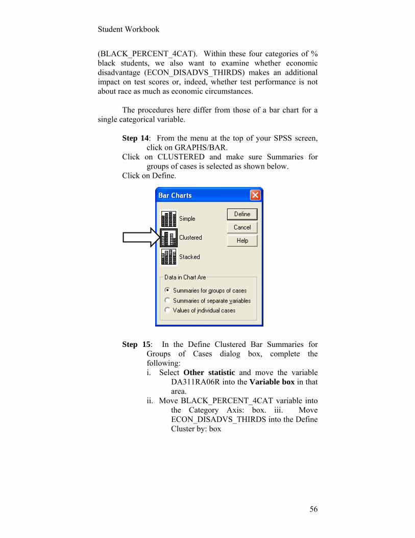
Click on CLUSTERED and make sure Summaries for groups of cases is selected as shown below.
Click on Define.
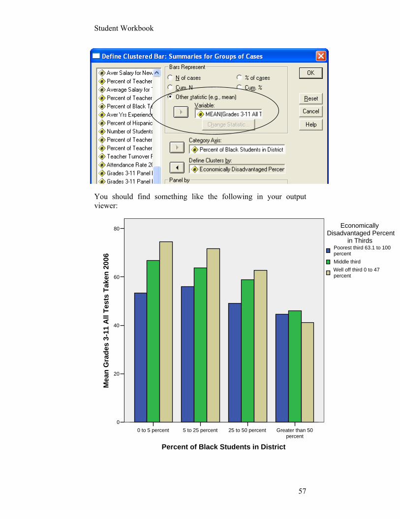
Step 15: In the Define Clustered Bar Summaries for
Groups of Cases dialog box, complete the following: i. Select Other statistic and move the variable
DA311RA06R into the Variable box in that area.
ii. Move BLACK_PERCENT_4CAT variable into the Category Axis: box. iii. Move ECON_DISADVS_THIRDS into the Define Cluster by: box
Student Workbook
57
Greater than 50percent
25 to 50 percent5 to 25 percent0 to 5 percent
Percent of Black Students in District
80
60
40
20
0
Mea
n G
rad
es 3
-11
All
Tes
ts T
aken
20
06
Well off third 0 to 47percent
Middle third
Poorest third 63.1 to 100percent
EconomicallyDisadvantaged Percent
in Thirds
You should find something like the following in your output viewer:

Student Workbook
58
Pretty dramatic results, although our focus in this assignment is technique rather than interpretation. You’ll get to dive into the juicy substance of these data in later exercises and discussion. We will also want to run additional statistics with this chart to make sure, for example, that each bar is based on an adequate number of districts. We’ll return to this example in the next session when we examine these differences through Analysis if Variance (ANOVA) techniques.
Let’s exercise our new skills.
Student Workbook
59
Assignment # 5 (50 possible points)
A. As one component of this assignment, make at least three editorial
changes to the clustered bar graph above and submit, along with answers to part B of this assignment. B.
Let’s return again to some descriptive statistics for the file’s variables. To make this assignment a little more challenging (i.e., some thinking will be required rather than following cookbook instructions), please find the answers to the following questions, which you should submit as part of your assignment for this week (hint: run descriptive statistics): 1. What is the mean percent of teachers with a masters degrees among
these school districts? 2. What are the median years of experience of teachers in Texas school
districts? 3. What is the mean number of students per teacher in Texas school
districts? And what is the standard deviation of this number? 4. What percentage of public school districts in Texas has African
American teachers composing 5 or fewer percent of their faculties? 5. What percentage of public school districts in Texas has Hispanic
teachers composing five or fewer percent of their faculties? 6. What is the mean total expenditure per pupil in Texas and is this
number distributed normally across school districts? Justify your answer to the second part of the question.
7. What is the mean expenditure per pupil in Texas on transportation and is this number distributed normally across all school districts? Justify your answer to the second part of the question.
8. What is the mean expenditure per pupil in Texas on athletics and is this number distributed normally across all school districts? Justify your answer to the second part of the question.
9. Looking at all the descriptive statistics for these data, how would you describe this system to a friend at a cocktail party in about three sentences?
Submit the answers to these questions as part of this week’s exercise.

Student Workbook
60
Midterm Paper Assignment (150 possible points)
The Orange County, Florida, Mayor is considering the commission of a study of the county’s residents in order to learn more about citizens’ levels of satisfaction with government services and the quality of their contact with county employees. A similar survey was last conducted in December 1998/January 1999 by the University of Central Florida under a grant of $31,000 from the county.
There is some sentiment among members of the Board of
County Commissioners to replicate the 1998/1999 study in terms of the research design (a random digit dial telephone survey) and survey instrument (i.e., the questions asked of respondents).
You have been hired to evaluate the strengths and
weaknesses of that prior survey effort and its results. Questions that the Mayor and Commissioners would like
you to address include (although your evaluation is not limited to): 1. An assessment of the overall data collection strategy. For
example, was the response rate of the prior survey sufficient and should we be concerned about possible non-response bias, given the results of the previous survey? If yes, how might this problem be reduced, assessed, and compensated for in future surveys?
2. The quality of the survey questionnaire itself. Do you have any concerns for the validity or reliability of its measures? If so, for which ones and why? If there are questions that are poorly written, but tap important concepts, how would you rewrite them to overcome any problems they may have? How would you recommend any new survey check for the validity and reliability of its measures?
3. What decisions on the part of the County government would be better informed by the responses to a questionnaire like the 1998/1999 survey? More specifically,
What might the County conclude and do about levels of satisfaction with County services and with the quality of contacts with County employees from a survey like the previous one? Why?

Student Workbook
61
4. Is such a survey an appropriate and/or sufficient tool for helping the County increase the level of satisfaction and the quality of contact with government employees or are there alternative performance managements systems you might recommend in addition or in lieu of the replication of such a survey, given that the County expects to spend about the same amount of money on any new research effort.
Any other advice you can provide, based on your
assessment of the 1998/1999 study, would be welcomed by the Mayor and Commissioners (as long as your report is no more than 10 double-spaced pages, not counting any appendices you may provide).
Information about the 1998/99 survey and a copy of the
questionnaire can be found among the data sets provided by the text and workbook, as well as the data from that survey and its codebook. (N.B.: In order to create a file within the restrictions of SPSS Student Version 13.0, I eliminated the answers to Question 1, “How important are the following issues for you?” and a number of others) A description of the methods used in the survey can be found below.
Student Workbook
62
Orange County Florida Citizen Survey 1998/1999 Source: Berman, E. M. (2002). Exercising essential statistics. Washington DC: CQ Press.
The government of Orange County Florida commissioned the University of Central Florida to conduct a study of its residents’ satisfaction with county services and attitudes toward preferred policy priorities in order to update the County’s strategic plan. The Survey Research Laboratory at the University conducted a survey of the county’s residents between December 19, 1998, and January 14, 1999 for this purpose. Although not available to you, many of the questions used in this survey replicate ones used in a similar study conducted in 1996 for the county.
The survey lab trained and supervised all interviewers in
administering the survey. Most calls were made between 1:00 and 6:00 pm on Saturdays and Sundays and between 5:30 and 9:30 pm on Mondays through Thursdays. Up to three callbacks were made to operable numbers in which no one answered the phone on previous attempts.
The lab used random digit dialing to collect the data. This
sampling technique selected “numbers at random from the appropriate exchanges in the Greater Orlando directory, and then substitut[ed] two randomly generated digits for the last two numbers” in order to include unlisted as well as listed numbers (p. 8). A total of 9,503 different telephone numbers were selected initially using this technique. Of these numbers, 3,669 (38.6%) were considered ineligible for interviews (i.e., outside of the sampling frame) because they turned out to be phone numbers of:
businesses or government offices, fax lines, disconnected or out of service numbers, or residents of adjacent Seminole County.
An additional 2,818 (29.7%) were not reached after four attempts, which included no answers, busy signals, or an answering machine responses. In all, interviewers spoke with 3,016 residents who were asked to participate in the survey. Of these, 1,034 agreed to participate and completed the interview. The Survey Lab estimated that the standard error for the estimate of means of 3.1 percent with a confidence interval of 95 percent.
Student Workbook
63
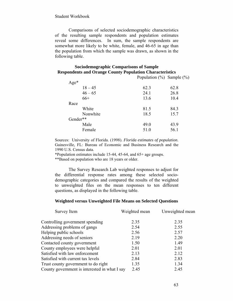
Comparisons of selected sociodemographic characteristics of the resulting sample respondents and population estimates reveal some differences. In sum, the sample respondents are somewhat more likely to be white, female, and 46-65 in age than the population from which the sample was drawn, as shown in the following table.
Sociodemographic Comparisons of Sample Respondents and Orange County Population Characteristics
Population (%) Sample (%) Age* 18 – 45 62.3 62.8 46 – 65 24.1 26.8 66+ 13.6 10.4 Race White 81.5 84.3 Nonwhite 18.5 15.7 Gender** Male 49.0 43.9 Female 51.0 56.1 Sources: University of Florida. (1998). Florida estimates of population. Gainesville, FL: Bureau of Economic and Business Research and the 1990 U.S. Census data. *Population estimates include 15-44, 45-64, and 65+ age groups. **Based on population who are 18 years or older. The Survey Research Lab weighted responses to adjust for the differential response rates among these selected socio-demographic categories and compared the results of the weighted to unweighted files on the mean responses to ten different questions, as displayed in the following table. Weighted versus Unweighted File Means on Selected Questions
Survey Item Weighted mean Unweighted mean Controlling government spending 2.35 2.35 Addressing problems of gangs 2.54 2.55 Helping public schools 2.56 2.57 Addressing needs of seniors 2.19 2.20 Contacted county government 1.50 1.49 County employees were helpful 2.01 2.01 Satisfied with law enforcement 2.13 2.12 Satisfied with current tax levels 2.84 2.83 Trust county government to do right 1.35 1.34 County government is interested in what I say 2.45 2.45

Student Workbook
64
Source: University of Central Florida (1999). Orange county citizen survey. None of these differences were statistically significant.
Student Workbook
65
Exercise 6: Crosstabs and Group Differences
Key words: Group differences, t-tests, ANOVA, independent and paired
samples, non-parametric statistics, levels of measurement, interaction effects, nonlinearity
Data sets: Texas Academic Excellence sample file Orange County public perceptions_with satisfac
Contingency Tables: Percentage Differences Between
Two or More Categories Step 1: Open the Texas Academic Excellence file in SPSS.
We will assume that test scores are our outcome or “dependent” variable and that the other (“independent” or “explanatory”) variables in this exercise are influencing or “causing” different levels of academic performance.
Step 2: From the tool bar at the top of your screen, click ANALYZE/DESCRIPTIVE STATISTICS/CROSSTABS
Step 3: Let’s treat three variables that are recoded from interval to categorical level variables as independent variables that one might believe have an effect on test performance, which has also been recoded to contain three categories (test_passed_percent). The three independent variables are:
(1) the size of the school district (n_of_students_thirds), (2) teaching experience (teach_w_11to20_thirds), and (3) the economic status of school districts’ students (econ_disadvs_thirds).
All of these variables have been recoded into three, roughly
equal size categories.
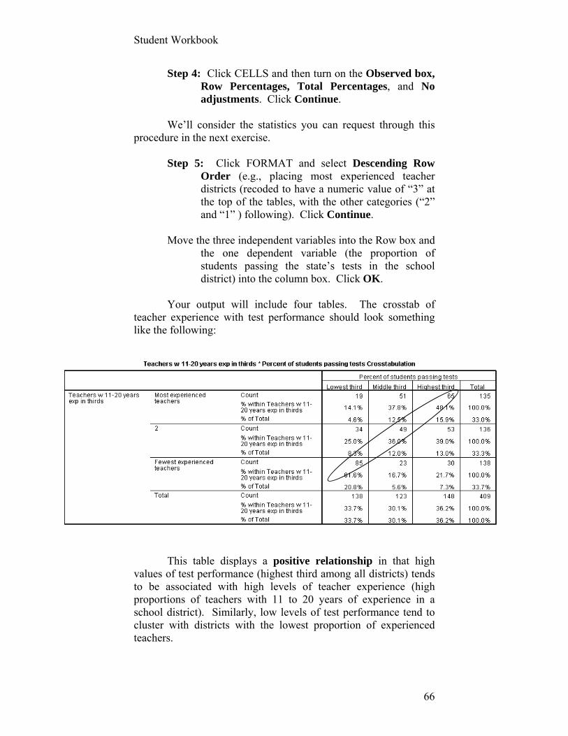
Student Workbook
66
Step 4: Click CELLS and then turn on the Observed box, Row Percentages, Total Percentages, and No adjustments. Click Continue.
We’ll consider the statistics you can request through this
procedure in the next exercise.
Step 5: Click FORMAT and select Descending Row Order (e.g., placing most experienced teacher districts (recoded to have a numeric value of “3” at the top of the tables, with the other categories (“2” and “1” ) following). Click Continue.
Move the three independent variables into the Row box and
the one dependent variable (the proportion of students passing the state’s tests in the school district) into the column box. Click OK.
Your output will include four tables. The crosstab of
teacher experience with test performance should look something like the following:
This table displays a positive relationship in that high
values of test performance (highest third among all districts) tends to be associated with high levels of teacher experience (high proportions of teachers with 11 to 20 years of experience in a school district). Similarly, low levels of test performance tend to cluster with districts with the lowest proportion of experienced teachers.
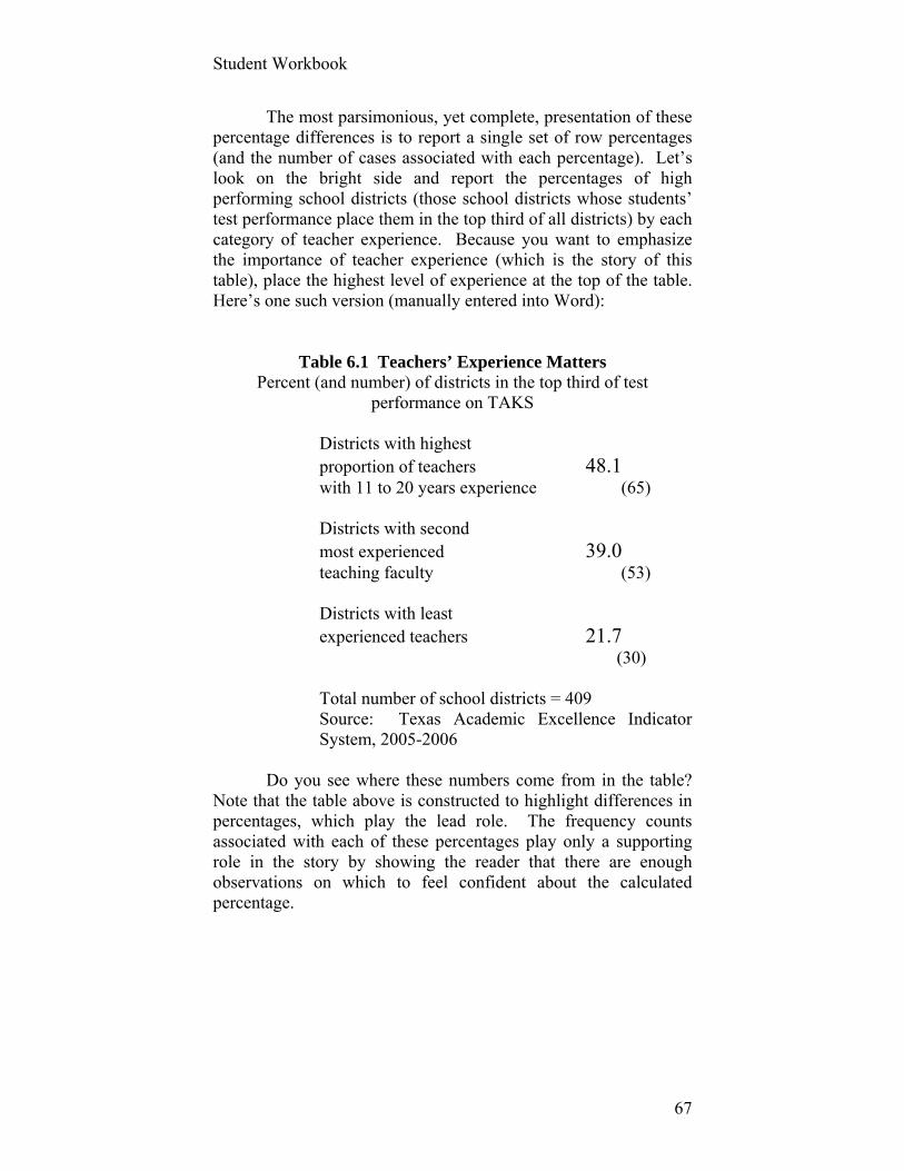
Student Workbook
67
The most parsimonious, yet complete, presentation of these percentage differences is to report a single set of row percentages (and the number of cases associated with each percentage). Let’s look on the bright side and report the percentages of high performing school districts (those school districts whose students’ test performance place them in the top third of all districts) by each category of teacher experience. Because you want to emphasize the importance of teacher experience (which is the story of this table), place the highest level of experience at the top of the table. Here’s one such version (manually entered into Word):
Table 6.1 Teachers’ Experience Matters Percent (and number) of districts in the top third of test
performance on TAKS
Districts with highest proportion of teachers 48.1 with 11 to 20 years experience (65) Districts with second most experienced 39.0 teaching faculty (53) Districts with least experienced teachers 21.7 (30) Total number of school districts = 409 Source: Texas Academic Excellence Indicator System, 2005-2006
Do you see where these numbers come from in the table? Note that the table above is constructed to highlight differences in percentages, which play the lead role. The frequency counts associated with each of these percentages play only a supporting role in the story by showing the reader that there are enough observations on which to feel confident about the calculated percentage.
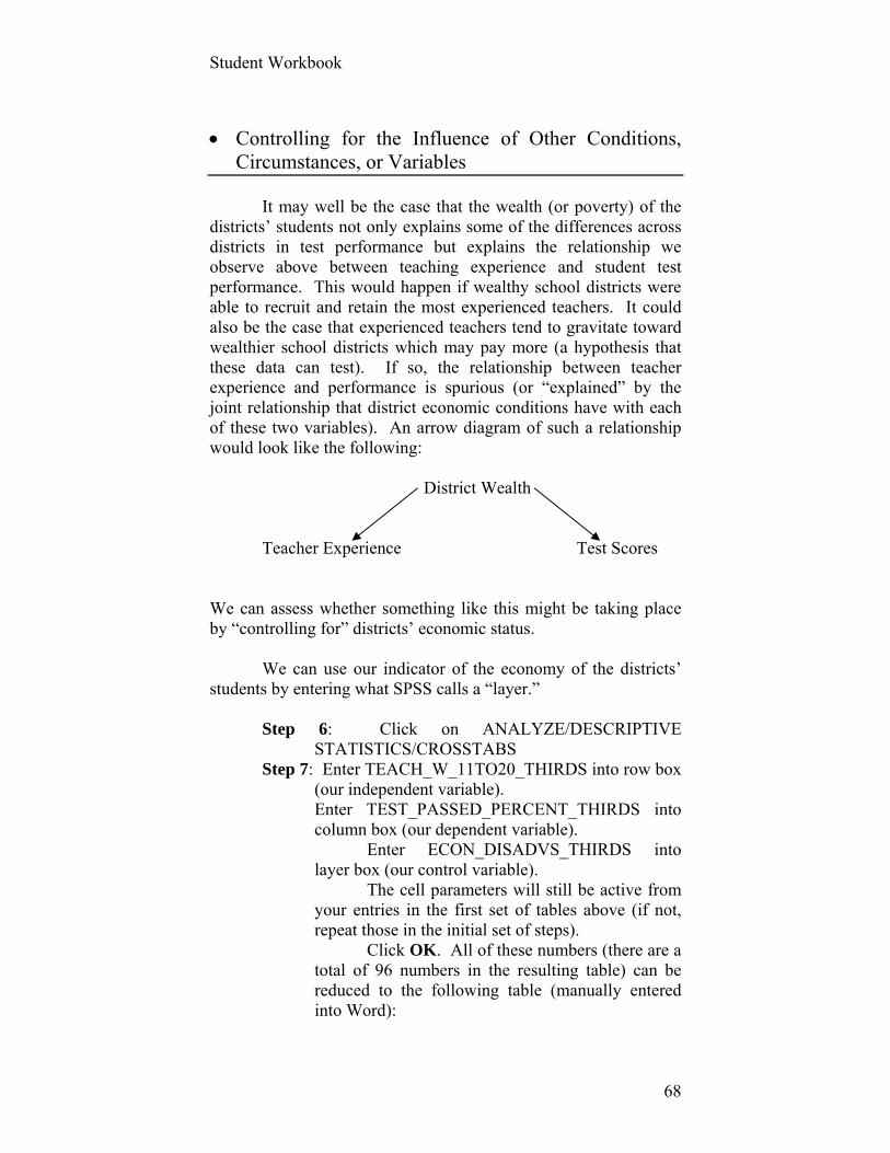
Student Workbook
68
Controlling for the Influence of Other Conditions, Circumstances, or Variables
It may well be the case that the wealth (or poverty) of the districts’ students not only explains some of the differences across districts in test performance but explains the relationship we observe above between teaching experience and student test performance. This would happen if wealthy school districts were able to recruit and retain the most experienced teachers. It could also be the case that experienced teachers tend to gravitate toward wealthier school districts which may pay more (a hypothesis that these data can test). If so, the relationship between teacher experience and performance is spurious (or “explained” by the joint relationship that district economic conditions have with each of these two variables). An arrow diagram of such a relationship would look like the following:
District Wealth Teacher Experience Test Scores
We can assess whether something like this might be taking place by “controlling for” districts’ economic status. We can use our indicator of the economy of the districts’ students by entering what SPSS calls a “layer.”
Step 6: Click on ANALYZE/DESCRIPTIVE STATISTICS/CROSSTABS
Step 7: Enter TEACH_W_11TO20_THIRDS into row box (our independent variable).
Enter TEST_PASSED_PERCENT_THIRDS into column box (our dependent variable). Enter ECON_DISADVS_THIRDS into layer box (our control variable).
The cell parameters will still be active from your entries in the first set of tables above (if not, repeat those in the initial set of steps). Click OK. All of these numbers (there are a total of 96 numbers in the resulting table) can be reduced to the following table (manually entered into Word):

Student Workbook
69
Economically Middling Economically Disadvantaged Districts Advantaged Districts Districts Districts with highest proportion of teachers 17.4 33.3 74.1 with 11 to 20 years experience (4) (16) (43) Districts with second most experienced 8.3 36.4 67.4 teaching faculty (3) (20) (29) Districts with least experienced teachers 10.3 20.5 48.4 (7) (8) (15)
Total number of school districts = 401 Source: Texas Academic Excellence Indicator System, 2005-2006
What would you conclude substantively about this table
that could also provide a useful and informative table title?
Exploring Differences between Groups Though Different Test Statistics
We easily compared the means of nine different groups in the previous example, although we didn’t request any statistics that might help us determine whether the differences among these different group means are statistically significant (that is to say, were unlikely to arise as a result of a particular “luck” of a (random sample) draw from the population of school districts). All of the following tests have two things in common: the dependent variable is continuous and one or more of the independent variable(s) is(are) categorical. They vary by the number of independent variables they include, the number of categories each independent variable may have, and whether the data are parametric or not (i.e., are the variances of the groups equal and is the dependent variable continuous and normally distributed?). We’ll test some of these assumptions as we go.
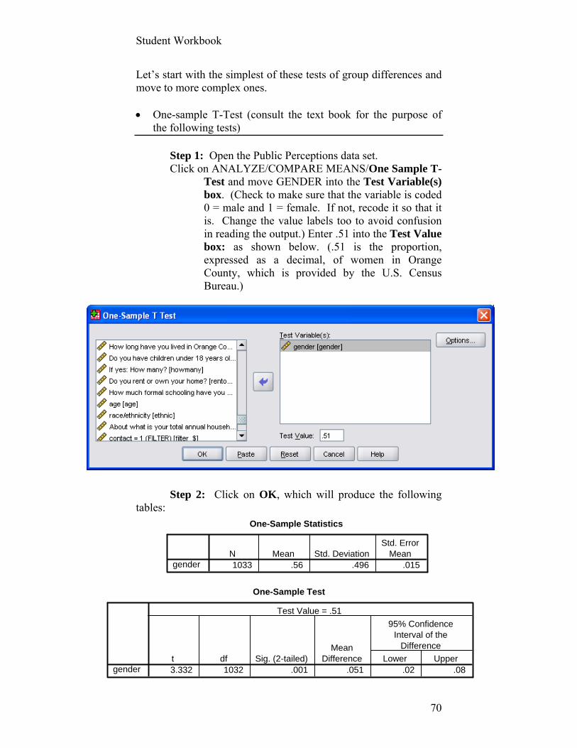
Student Workbook
70
One-Sample Test
3.332 1032 .001 .051 .02 .08gendert df Sig. (2-tailed)
MeanDifference Lower Upper
95% ConfidenceInterval of the
Difference
Test Value = .51
One-Sample Statistics
1033 .56 .496 .015genderN Mean Std. Deviation
Std. ErrorMean
Let’s start with the simplest of these tests of group differences and move to more complex ones. One-sample T-Test (consult the text book for the purpose of
the following tests)
Step 1: Open the Public Perceptions data set. Click on ANALYZE/COMPARE MEANS/One Sample T-
Test and move GENDER into the Test Variable(s) box. (Check to make sure that the variable is coded 0 = male and 1 = female. If not, recode it so that it is. Change the value labels too to avoid confusion in reading the output.) Enter .51 into the Test Value box: as shown below. (.51 is the proportion, expressed as a decimal, of women in Orange County, which is provided by the U.S. Census Bureau.)
Step 2: Click on OK, which will produce the following
tables:
Student Workbook
71
These tables show that the Public Perception survey has a significantly higher proportion of women in the sample than exists in the population from which the sample was drawn. One response to this condition is to use weights to boost the weight given to each male’s responses and/or reducing the weight given to females (see Data Transformation Chapter). T-test for Independent Samples.
Step 1: Let’s see whether respondents’ assessment of County government service delivery differed between those who had contact with the County in the last year versus those who did not. (Recall that many people were asked to assess the timeliness, helpfulness, etc. of government employees even when they had not had such contact. This is a subtle check on the validity of the responses to these questions. Why?) Click on ANALYZE/COMPARE MEANS/Independent Samples T-Test
Step 2: Enter the satisfaction index and contact variables into their appropriate variable boxes, as follows:
Note that I can’t click on OK here. If you don’t know why,
click on Help, which will produce the following message:
“For numeric grouping variables, define the two groups for the t test by specifying two values or a cut point:

Student Workbook
72
Use specified values. Enter a value for Group 1 and another for Group 2. Cases with any other values are excluded from the analysis. Numbers need not be integers (for example, 6.25 and 12.5 are valid).
Cut point. Alternatively, enter a number that splits the values of the grouping variable into two sets. All cases with values less than the cut point form one group, and cases with values greater than or equal to the cut point form the other group.”
After defining groups, corresponding to the valid values of 1 and 2 for CONTACT, click on OK to produce the following two tables:
The overall level of satisfaction differs by less than one
point on a scale that ranges from 20 to 100. Those who contacted county government had no statistically different assessment of those services than those who did not have any contact within the past year. Hmmm. Moving right along. One-Way Analysis of Variance (ANOVA) Between-Groups ANOVA
Let’s return to the Texas Education Indicator data set to learn whether there is a difference in test performance across districts that are distinguished by their per pupil expenditures (in this case, a variable recoded into five groups with roughly equal numbers of school districts: EXPEND_PER_FIFTHS).
Student Workbook
73
Step 1: Open this data set and click at the top of the screen on ANALYZE/COMPARE MEANS/ONE-WAY ANOVA
Step 2: Move the dependent variable (“Grade 3-11 All Tests Taken 2006”) into the Dependent List: box and the independent variable (“Per Pupil Expenditures in Fifths”) into the box labeled Factor.
Step 3: Click Options button and enable Descriptive, Homogeneity of variance test, Brown-Forsythe, Welsh, and Means Plot. Make sure that Missing values Exclude cases Analysis by analysis. Click Continue.
Step 4: Click on button marked Post Hoc. Click on Tukey. Click Continue and then OK.
Your output should look something like the following (with
my notes of interpretation):
Here again, you can learn a lot from the simplest of
statistics, which presage what we will find in subsequent ANOVA results in this example. The mean of tests passed does not vary dramatically across different expenditure levels (although the groups themselves vary considerably in per pupil expenditures by as much as 10:1). The districts in the lowest fifth do fare worse than others, but there’s considerable variation in that group (compare that group’s Std. Deviation to its mean), which might give hope to policy wonks that poor districts can match wealthier districts in test performance despite meager resources.
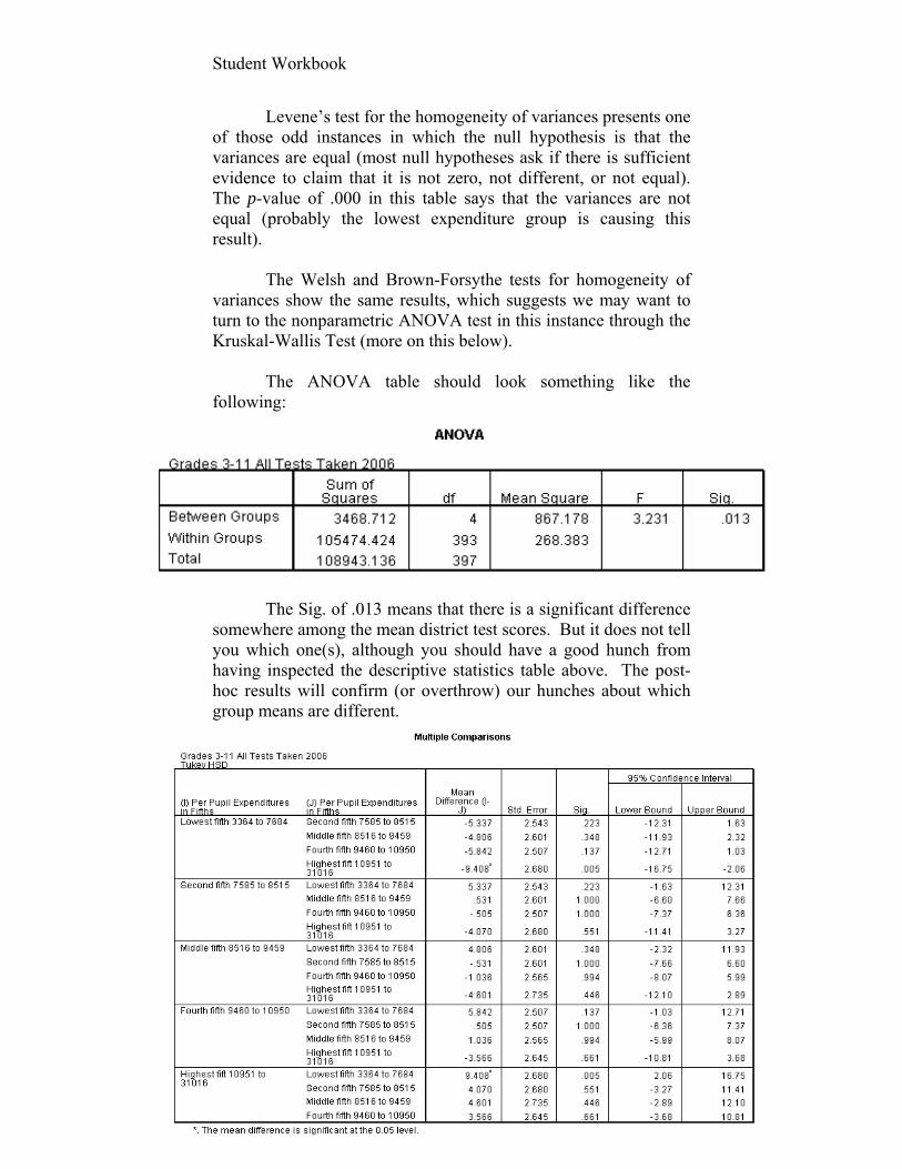
Student Workbook
74
Levene’s test for the homogeneity of variances presents one of those odd instances in which the null hypothesis is that the variances are equal (most null hypotheses ask if there is sufficient evidence to claim that it is not zero, not different, or not equal). The p-value of .000 in this table says that the variances are not equal (probably the lowest expenditure group is causing this result).
The Welsh and Brown-Forsythe tests for homogeneity of
variances show the same results, which suggests we may want to turn to the nonparametric ANOVA test in this instance through the Kruskal-Wallis Test (more on this below).
The ANOVA table should look something like the
following:
The Sig. of .013 means that there is a significant difference
somewhere among the mean district test scores. But it does not tell you which one(s), although you should have a good hunch from having inspected the descriptive statistics table above. The post-hoc results will confirm (or overthrow) our hunches about which group means are different.
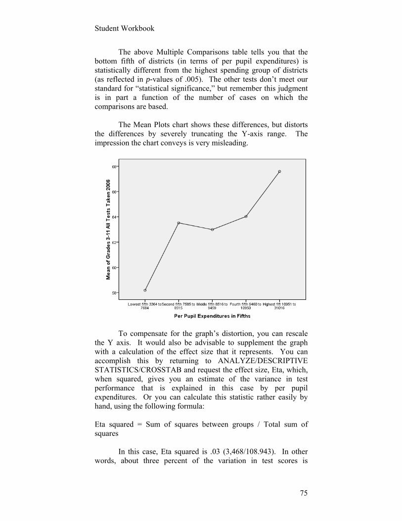
Student Workbook
75
The above Multiple Comparisons table tells you that the bottom fifth of districts (in terms of per pupil expenditures) is statistically different from the highest spending group of districts (as reflected in p-values of .005). The other tests don’t meet our standard for “statistical significance,” but remember this judgment is in part a function of the number of cases on which the comparisons are based.
The Mean Plots chart shows these differences, but distorts
the differences by severely truncating the Y-axis range. The impression the chart conveys is very misleading.
To compensate for the graph’s distortion, you can rescale
the Y axis. It would also be advisable to supplement the graph with a calculation of the effect size that it represents. You can accomplish this by returning to ANALYZE/DESCRIPTIVE STATISTICS/CROSSTAB and request the effect size, Eta, which, when squared, gives you an estimate of the variance in test performance that is explained in this case by per pupil expenditures. Or you can calculate this statistic rather easily by hand, using the following formula: Eta squared = Sum of squares between groups / Total sum of squares
In this case, Eta squared is .03 (3,468/108.943). In other words, about three percent of the variation in test scores is

Student Workbook
76
explained by district finances (when the latter is a categorical variable divided into five roughly equal groups). Time to exercise.

Student Workbook
77
Assignment # 6 (40 points) Use the Orange County Public Perception (with the satisfaction index) data set to complete this multiple-part assignment. A. 1. Examining just the responses to Question III on the (“How
satisfied are you with the following services…?”), remove from the analysis any respondent to a question who declares “Don’t Know”.
2. Run descriptive statistics for the answers to these 13 statements (Variable names: LAWENF, FIRE, PAVE, etc.) so as to determine what percentage of valid cases answer “Very Satisfied” or “Satisfied.”
3. Prepare and submit a single chart or table that orders the responses to these 13 variables from the most to the least satisfactory public services in Orange County by reporting the percent of respondents who answered “Very satisfied” or “Satisfied.” Combine these two responses into a single percentage. You may use either Excel, SPSS, or Word for this task, applying principles of good graphical and tabular display.
B. Submit an edited table that displays the relationship between
SCHLSAT and TAXLEVL. Assume that attitudes toward the school system affect attitudes toward taxes. Provide a brief interpretation of your results.
C. Using the four-variable satisfaction index you created in a previous
exercise, conduct a Between Groups ANOVA using EDUC as the independent variable. Insert the test of homogeneity, ANOVA, and Tukey HSD multiple comparison tables. Provide a brief written interpretation of your results.
Student Workbook
78
Exercise 7: Statistics as Relationships: Measures of Association Key words: parametric, nonparametric, independent and dependent
observations, direction of relationships, chi square, continuity correction, Phi, contingency coefficient, Cramer’s V, asymmetric measures of association, Lambda, tau, Spearman’s Rho, Pearson correlation coefficient, and partial correlation coefficient
Data sets: Texas Academic Excellence sample file Orange County public perceptions
Statisticians have worked hard over the last century to provide you with a wide variety of measures of association that offer summary estimates of the strength of the relationships between two or more variables. They also tell you whether the results you obtain from a sample allow you to confidently assert that your results characterize the population from which your sample was drawn. These measures are often used in combination with crosstabs or pivot tables to convey a fuller sense of the size and direction of the relationship than tables or graphs alone can provide.
The challenge for the analyst (and the weary reader of someone else’s analysis) is to determine which one or more of these measures of association are appropriate in assessing a particular relationship between two or more variables. The selection of the most appropriate such test(s) depends on a number of characteristics about the variables you are analyzing. These include (roughly in declining order of importance) whether:
1. Variables are parametric (i.e., normally distributed, a mean that is a valid measure of central tendency, equally spaced intervals between the categories of variables)
2. The level of measurement of the variables in the relationship is nominal, ordinal, or continuous
3. Observations are independent (e.g., my selection into the study has nothing to do with your selection into the study) or dependent (e.g., before and after scores of the same respondents; respondents who are selected to be in a study because they match
Student Workbook
79
other respondents in the study on certain characteristics; and ratings of different people by the same evaluators)
4. You assume the relationships among variables is causal 5. Relationships are linear 6. Sample size is small (under 50) 7. The contingency table is square or rectangular (i.e., the
number of rows and columns differ). 8. You have one or more predictor and/or outcome
variables. Moreover, different measures of association look at relationships through different lenses:
1. Some focus on how strong a relationship is and its direction. Many such measures range from -1.0 to +1.0 where these extremes represent a relationship between, say, two variables that are precisely aligned with each other. Such variables are said to covary perfectly. Zero means no relationship. Negative numbers mean the relationship is negative (i.e., high numeric values of one variable tend to be paired with low values of the other). Positive numbers signify positive relationships (i.e., high values of one variable tend to be paired with high values on the other).
2. Other measures of association assess how much of the variation of a dependent variable is “explained by” one or more independent variables. Obviously, such a number can range from zero to 100 percent.
3. And yet other measures of association estimate how much better your prediction of one variable is, given knowledge of the level or score on another. Such measures of association are known as Proportional Reduction in Error (PRE) measures.
Believe it or not, some stats look at relationships from more
than one of these vantage points. Fortunately, SPSS simplifies the selection process for you
by grouping different measures of association into sets, depending on some of the most important characteristics above. It is also the case that many of these statistics, although based on different algorithms or interpretations, tell essentially the same story about the strength, direction, and statistical significance of a relationship. If totally confused by the bewildering array of tools from which to
Student Workbook
80
choose, you can always try several that appear to fit the requirements at hand, build different houses with each, and then step back and see if all are about equally livable. This is what we might call internal convergence. That is to say, the conclusions from a single study are not an artifact of the particular statistical tools selected to draw those conclusions.
Let’s work through some of these measures by asking
SPSS to calculate them.
Nonparametric measures of association By definition, measures of association for nearly all nominal and categorical variables are nonparametric (with the exception of dichotomous, “dummy” variables that are coded “0” and “1”, which we will return to later). Because the numeric distances between categories of such variables are arbitrary, the mean for such variables is not a valid measure of their centers. Nor are such variables likely to be normally distributed. This is all not a problem because of the variety of measures of association that are available for assessing the strength of such relationships that do not assume that the variables are continuous and normally distributed. There are even measures of association that are suitable for mixed combinations of nominal, ordinal, and continuous variables. Let’s return, first, to the Public Perceptions data set to illustrate some of these measures, beginning first with nonparametric measures of association under the condition that the observations are “independent,” which is clearly the case with this survey. Let’s focus first on measures of association for nominal variables. Nominal (and Thus Nonparametric) Variables of Independent Observations Let’s examine the relationships between HELPFUL, FRIENDLY, and WORKS. [Ignore for the moment that these variables are actually “ordinal.” We will shortly transform them into nominal variables in this example.]
Step 1: Open the Public Perceptions data set in SPSS. Step 2: Click ANALYZE/DESCRIPTIVE
STATISTICS/CROSSTABS

Student Workbook
81
Step 3: Move HELPFUL into the Row(s): box and FRIENDLY into the Column(s): box. We are not assuming that one of these variables causes the other, so it doesn’t matter which is entered as a row variable and which is entered as a column one.
Step 4: Click Statistics and select Chi-square, Uncertainty Coefficient, Row %, Cramer’s V, Lambda, and Phi. Click Continue.
Step 5: Click Cells and activate Expected and Observed in the Counts box and No adjustments in the Noninteger Weights box. Click Continue.
Step 6: Click Format and select Descending. I like highest numeric values at the top of the table. Click Continue and OK.
The differences between observed and expected counts are
used to calculate Chi-square. Observed counts are the number of cases that actually fall in each cell of the crosstab. Expected counts simply indicate the number of observations you would expect to find in a cell if there was no relationship between the variables (mathematically, this number is the product of the row and column marginal frequencies for a cell divided by the total number of cases in the entire table, which explains the fact that many of the expected observations have a decimal place).
Chi-square makes few assumptions. (It’s kind of like the sledge hammer of statistics.) But one of those assumptions is that no cell in the table has an expected value of less than five observations. We can see from the table we generated from the above procedure that there are a number of cells in which this is the case. Indeed, it’s important enough that SPSS even tells us, in a footnote to the Chi-square table, that we’ve violated this assumption five times. As a possible solution to this violation of one of Chi-square’s assumptions, let’s create new variables of these two that have only two values:
0 = “disagree” and “strongly disagree” 1 = “agree” and “strongly agree” Name these variables HELPFUL2 and FRIENDLY2. This
recoding creates two of the infamous “dummy” variables about which you’ll read more in the chapter on regression. Among their several interesting properties, the mean of such variables tells you what percent of your cases are designated as “1” (in this case, “agree” or “strongly agree”)
Student Workbook
82
Chi-Square Tests
234.772b 1 .000
230.621 1 .000
176.213 1 .000
.000 .000
234.494 1 .000
845
Pearson Chi-Square
Continuity Correctiona
Likelihood Ratio
Fisher's Exact Test
Linear-by-LinearAssociation
N of Valid Cases
Value dfAsymp. Sig.
(2-sided)Exact Sig.(2-sided)
Exact Sig.(1-sided)
Computed only for a 2x2 tablea.
0 cells (.0%) have expected count less than 5. The minimum expected count is 18.69.
b.
After creating these two new variables, re-run the steps above. The Chi-square table should look something like the following:
We’re good on expected cell frequencies as indicated in
footnote b. The size of Chi-square, however, is partly a function of the
number of cells and observations (n), so it doesn’t have a handy interpretation other than to say whether its Sig. value is statistically significant. In other words, Chi-square provides no sense of how large or small the relationship is. It only tells you whether the relationship is statistically significant. (i.e., What are the probabilities that our results are the “luck of the draw”?).
The Continuity Correction corrects for the fact that Chi-
squares are a little too generous in their estimates in a 2x2 table like the one here. Fisher’s Exact Test is also only calculated on a 2x2 table and can be used when you have expected cell frequencies of five or fewer observations (which is likely to arise when you have fewer than 50 observations in your study or run crosstabs of variables with numerous categories). Ignore the other stats in this table. If you’re really curious about them, use the Help function in SPSS to tell you more.
We can also ignore, in this example, the table of directional
measures because we are making no assumption that one of these variables “causes” the other. We will invoke this assumption below in seeing whether respondents’ evaluation of the service results in a more trusting attitude that the County government will do what is right most of the time (TRUST).

Student Workbook
83
Symmetric Measures
.527 .000
.527 .000
.466 .000
845
Phi
Cramer's V
Contingency Coefficient
Nominal byNominal
N of Valid Cases
Value Approx. Sig.
Not assuming the null hypothesis.a.
Using the asymptotic standard error assuming the nullhypothesis.
b.
Phi falls between 0 and 1 only in a 2x2 table. Beyond
these dimensions, it has no upper bound and, therefore, suffers from the same awkward absence of an upper bound that we’ve seen with Chi-square.
The Contingency Coefficient has a PRE interpretation
(i.e., a value of 0.47 indicates that knowledge of one variable reduces error in predicting values of the other variable by 47%). Unfortunately, its algorithm makes it very difficult ever to reach a value of 1.0.
Cramer’s V varies between 0 and 1, irrespective of the
dimensions of the crosstab. And it is equivalent, as above, to Phi in a 2x2 table. Seems to me that Cramer’s V trumps these other measures, so let’s just request it and Chi-square in future analyses of nominal variables. (Include Chi-square because of its familiarity and the fact that Cramer’s V is derived from it, adjusting for sample size and the number of rows and columns in a table). That simplifies matters, doesn’t it? Report Chi-square, the number of observations on which the statistic is calculated and/or its degrees of freedom, and Cramer’s V value and Sig (although I prefer the Sig to be reported as a p-value).
Is a Cramer’s V of .53 small, moderate, or strong, however? Such judgments help in a narrative report of the findings. But they are somewhat arbitrary and authors will differ somewhat on the ranges they assign to these adjectives. Here’s one such designation:
.00 to .20 Weak
.21 to .40 Moderate
.41 to .60 Strong
.61 to 1.00 Very strong
Student Workbook
84
Directional Measures
.024 .030 .770 .441
.000 .000 .c
.c
.035 .044 .770 .441
.049 .017 .000d
.049 .017 .000d
.045 .015 2.927 .000e
.057 .019 2.927 .000e
.038 .013 2.927 .000e
Symmetric
Helpful_dichotomyDependent
Do you trust OrangeCounty Government todo what is right most ofthe time? Dependent
Helpful_dichotomyDependent
Do you trust OrangeCounty Government todo what is right most ofthe time? Dependent
Symmetric
Helpful_dichotomyDependent
Do you trust OrangeCounty Government todo what is right most ofthe time? Dependent
Lambda
Goodman andKruskal tau
Uncertainty Coefficient
Nominal byNominal
ValueAsymp.
Std. Errora
Approx. Tb
Approx. Sig.
Not assuming the null hypothesis.a.
Using the asymptotic standard error assuming the null hypothesis.b.
Cannot be computed because the asymptotic standard error equals zero.c.
Based on chi-square approximationd.
Likelihood ratio chi-square probability.e.
So, “Having a friendly encounter with a County employee is strongly related to having a helpful one as well,” your memo to the County Mayor might read.
Assuming Causation Leads to a Different Choice of Statistics
If we assume one nominal variable is the outcome of another, we’ll select a different set of statistics that are designated as directional or asymmetric.
We can repeat many of the same steps above, except
assume that respondents’ evaluation of the helpfulness of County employees leads them to be more trusting of the County government to “do what is right most of the time.” As a result, we’ll also ask for row percentages in Cells. Be sure, as we did in the Crosstab exercise, to place the dependent variable (TRUST) in the Column: box and the independent variable (HELPFUL2) in the Row: box. The Chi-square of 40.16 with 1 degree of freedom is statistically significant (table not shown here). So too are some of the directional measures of association, as shown in the table below.
Student Workbook
85
SPSS doesn’t know which variable your theory or model assumes to be the independent or dependent variable, so it calculates it both ways for you to choose. Lambda and the Uncertainty Coefficient also present symmetric versions that don’t assume a causal relationship.
Lambda is a PRE measure and, therefore, ranges between
0 and 1. In this example, the data are consistent with the argument that a helpful encounter with a County employee improves our prediction of how trusting citizens are of the government by about four percent, although this result may have arisen from chance. Even if it didn’t, it’s substantively very small.
Goodman and Kruskal tau is a variation of Lambda.
Instead of comparing how much better your prediction would be in comparison to the category with the largest number of observations (as Lambda does), tau uses the proportion of observations within each category to calculate its improvement in prediction.
The Uncertainty Coefficient (U) also has a PRE
interpretation (i.e., a value of 0.04 indicates that knowledge of one’s assessment of the helpfulness of an encounter with a County employee reduces error in predicting value of trust in County government by 4 percent). In this particular instance, the relationship is statistically significant, while not so in Lambda. Don’t sweat the small stuff. Lambda is simply calculated in ways that will not detect a relationship in this instance.
Your report might read, “While Goodman and Kruskal’s
tau and the Uncertainty Coefficient are statistically significant and Lambda is not, the important point to make is that the relationship is negligible. Providing helpful service to citizens appears inconsistent with the theory that this will improve the trust they have in the County to do what is right most of the time.” Measures of Association When the Variables are Ordinal (and the observations are still independent and the variables are not assumed to be causally related) The tools at our disposal under these circumstances (nonparametric, independent, ordinal, and non-directional) are:
Tau-b Tau-c Gamma
Student Workbook
86
There is one other measure of association that can be used with ordinal variables: Spearman’s Rank Order correlation. This measure is nonparametric and is used with observations that are independent. It is often employed when your variables have a large number of categories. The question this test answers is whether the rank orders of two variables are related. That is to say, does an observation that ranks highly on one variable also rank highly on another? Spearman’s Rho, as it is also called, presumes no causal order and can be used when variables are not related in a linear way, as perhaps revealed by a scattergram. Rho may also be your tool of choice when you have two continuous variables that are not normally distributed. An Ordinal Measure of Association, Assuming Causation: Somer’s d Hopefully, you’ve got the gist of calling for such measures by now and don’t require instructions or explanation.
Measures of Association for Continuous Variables There are two sets of statistics that can be used when your observations are independent and your variables continuous and normally distributed: (1) Pearson correlation coefficient (and partial and part correlation coefficients) and (2) Regression. The Pearson correlation coefficient (r) does not assume a causal relationship while Regression analysis does. We’ll turn to Regression in the next exercise.
Both sets of these statistics are calculated to determine the strength and direction of linear relations. If two variables are closely related but not in a linear fashion, the statistics generated in correlation and regression will make it appear that they are not related, when it may be more proper to conclude that the variables are not related linearly. (Nonlinear bivariate relationships can sometimes be detected by examining a scatterplot of two such variables.)
Step 1: Open the Texas education data set, which is jam-packed with continuous variables. Let’s request a Pearson correlation matrix of a half-dozen or so variables that we believe might be related to our continuous measure of test performance. Click on ANALYZE/CORRELATE/BIVARIATE
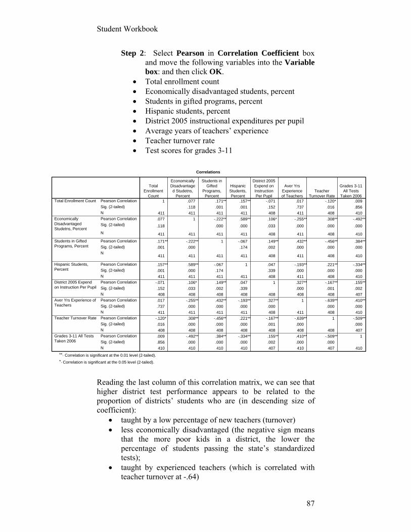
Student Workbook
87
Correlations
1 .077 .171** .157** -.071 .017 -.120* .009
.118 .001 .001 .152 .737 .016 .856
411 411 411 411 408 411 408 410
.077 1 -.222** .589** .106* -.255** .308** -.492**
.118 .000 .000 .033 .000 .000 .000
411 411 411 411 408 411 408 410
.171** -.222** 1 -.067 .149** .432** -.456** .384**
.001 .000 .174 .002 .000 .000 .000
411 411 411 411 408 411 408 410
.157** .589** -.067 1 .047 -.193** .221** -.334**
.001 .000 .174 .339 .000 .000 .000
411 411 411 411 408 411 408 410
-.071 .106* .149** .047 1 .327** -.167** .155**
.152 .033 .002 .339 .000 .001 .002
408 408 408 408 408 408 408 407
.017 -.255** .432** -.193** .327** 1 -.639** .410**
.737 .000 .000 .000 .000 .000 .000
411 411 411 411 408 411 408 410
-.120* .308** -.456** .221** -.167** -.639** 1 -.509**
.016 .000 .000 .000 .001 .000 .000
408 408 408 408 408 408 408 407
.009 -.492** .384** -.334** .155** .410** -.509** 1
.856 .000 .000 .000 .002 .000 .000
410 410 410 410 407 410 407 410
Pearson Correlation
Sig. (2-tailed)
N
Pearson Correlation
Sig. (2-tailed)
N
Pearson Correlation
Sig. (2-tailed)
N
Pearson Correlation
Sig. (2-tailed)
N
Pearson Correlation
Sig. (2-tailed)
N
Pearson Correlation
Sig. (2-tailed)
N
Pearson Correlation
Sig. (2-tailed)
N
Pearson Correlation
Sig. (2-tailed)
N
Total Enrollment Count
EconomicallyDisadvantagedStudetns, Percent
Students in GiftedPrograms, Percent
Hispanic Students,Percent
District 2005 Expendon Instruction Per Pupil
Aver Yrs Experience ofTeachers
Teacher Turnover Rate
Grades 3-11 All TestsTaken 2006
TotalEnrollment
Count
EconomicallyDisadvantaged Studetns,
Percent
Students inGifted
Programs,Percent
HispanicStudents,Percent
District 2005Expend onInstructionPer Pupil
Aver YrsExperienceof Teachers
TeacherTurnover Rate
Grades 3-11All Tests
Taken 2006
Correlation is significant at the 0.01 level (2-tailed).**.
Correlation is significant at the 0.05 level (2-tailed).*.
Step 2: Select Pearson in Correlation Coefficient box and move the following variables into the Variable box: and then click OK.
Total enrollment count Economically disadvantaged students, percent Students in gifted programs, percent Hispanic students, percent District 2005 instructional expenditures per pupil Average years of teachers’ experience Teacher turnover rate Test scores for grades 3-11
Reading the last column of this correlation matrix, we can see that higher district test performance appears to be related to the proportion of districts’ students who are (in descending size of coefficient):
taught by a low percentage of new teachers (turnover) less economically disadvantaged (the negative sign means
that the more poor kids in a district, the lower the percentage of students passing the state’s standardized tests);
taught by experienced teachers (which is correlated with teacher turnover at -.64)
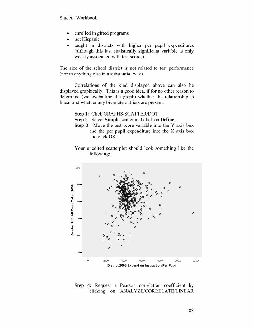
Student Workbook
88
120001000080006000400020000
District 2005 Expend on Instruction Per Pupil
100
80
60
40
20
0
Gra
des
3-1
1 A
ll T
est
s T
aken
20
06
enrolled in gifted programs not Hispanic taught in districts with higher per pupil expenditures
(although this last statistically significant variable is only weakly associated with test scores).
The size of the school district is not related to test performance (nor to anything else in a substantial way). Correlations of the kind displayed above can also be displayed graphically. This is a good idea, if for no other reason to determine (via eyeballing the graph) whether the relationship is linear and whether any bivariate outliers are present.
Step 1: Click GRAPHS/SCATTER/DOT Step 2: Select Simple scatter and click on Define. Step 3: Move the test score variable into the Y axis box
and the per pupil expenditure into the X axis box and click OK.
Your unedited scatterplot should look something like the
following:
Step 4: Request a Pearson correlation coefficient by
clicking on ANALYZE/CORRELATE/LINEAR

Student Workbook
89
and move the same two variables above into the variables box. The r for the graph above is .16 (p = .002, n = 407).
The scatterplot, however, reveals outcomes that the
correlation statistics alone disguise. One school district spends about $12,000 per pupil on instruction but doesn’t appear to be getting the same bang for the buck that other districts do. This may well be that this district has a high percentage of children with special (and relatively costly) needs that are related to lower academic performance on standardized tests. An analyst would want to identify which districts these are and seek explanations for this apparent anomaly. This might be a good candidate outlier to exclude from the analysis.
Similarly, there are a number of school districts that spend
relatively little to educate their students, but do quite well in terms of test performance.
Until these puzzles are solved, you might want to identify which of these districts are so unusual and rerun the correlations to uncover what may be a more defensible measure of the relationship between expenditures and test performance. The Partial Correlation Coefficient We may want to examine the degree to which two variables are linearly related to one another while controlling for one or more other variables. We do so by requesting partial correlation coefficients.
Let us say we want to examine the partial relationship between the proportion of a school district’s students who are Hispanic and test performance when controlling for the extent to which the district is economically disadvantaged in the Texas education file.
Step 1: Click on ANALYZE/CORRELATE/PARTIAL
and move the variables into the Variables: and Controlling for: boxes as shown below and click OK.
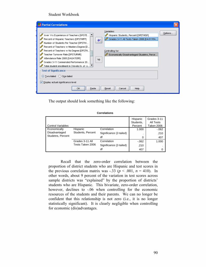
Student Workbook
90
Correlations
1.000 -.062
. .210
0 407
-.062 1.000
.210 .
407 0
Correlation
Significance (2-tailed)
df
Correlation
Significance (2-tailed)
df
HispanicStudents, Percent
Grades 3-11 AllTests Taken 2006
Control VariablesEconomicallyDisadvantagedStudetns, Percent
HispanicStudents,Percent
Grades 3-11All Tests
Taken 2006
The output should look something like the following: Recall that the zero-order correlation between the proportion of district students who are Hispanic and test scores in the previous correlation matrix was -.33 (p < .001, n = 410). In other words, about 9 percent of the variation in test scores across sample districts was “explained” by the proportion of districts’ students who are Hispanic. This bivariate, zero-order correlation, however, declines to -.06 when controlling for the economic resources of the students and their parents. We can no longer be confident that this relationship is not zero (i.e., it is no longer statistically significant). It is clearly negligible when controlling for economic (dis)advantages.
Student Workbook
91
Measures of Association for Dependent Samples or Dependent Observations
As we have noted before, there are three conditions under which the observations in a data set are said to be “dependent.” They are:
before and after scores of the same respondents; respondents who are selected to be in a study because they
match other respondents in the study on certain characteristics (i.e., a matched-comparison study);
and the agreement between ratings.
If any or all of these conditions apply in your analysis, you’ve got to turn to a different tool box to construct your story:
The McNemar test is a nonparametric test that assesses whether changes in responses to a dichotomous variable (e.g., favorable or unfavorable) are statistically different, usually as a result of an experimental intervention or treatment. The statistic is based on the chi-square distribution. Use the McNemar-Bowker test of symmetry for change in responses measured with more than two categories. Cohen’s Kappa assesses the level of agreement between two raters of the same objects. A value of 1 indicates perfect agreement. A value of 0 indicates that agreement is not better than chance. Kappa is available for tables in which both raters use the same category values (i.e., 1, 2, or 3) to rate objects.
Time for some exercise.

Student Workbook
92
Assignment # 7 (40 points)
Use the Texas Academic Excellence data set in SPSS to
complete this assignment. 1a. Request and submit (in a Word document) the
appropriate statistics and properly edited table of the relationship between a dichotomous version of test score performance (test2) and the proportion of districts’ students who are Hispanic (Hisp_dichot) while controlling for the economic (dis)advantages of districts’ students (econ2).
Your theory postulates that districts with high percentages
of Hispanic students will tend to be districts with lower test score performance, i.e., there is a causal relationship. Your interest here is in assessing whether that relationship, which you’ve seen above is empirically present, is a function of districts with high proportions of Hispanic students also being poor districts. In other words, does the economic condition of districts “explain” the relationship? Yet another way of framing that question is: Does the empirical relationship between the percentage of Hispanic students and test score performance “disappear” when controlling for the economic conditions of districts?
1b. In addition, describe the results of this analysis in a
paragraph or two to the head of the Texas Department of Education. What, if any, policy implications follow from your findings?
2. Request and submit (in the same document above) the
appropriate measures of association, related statistical tests, graphs (if appropriate), and accompanying textual description (in several sentences for each) of the results from the following:
a. the relationship between 2005 expenditures on instruction per
pupil and teacher turnover rates. b. the relationship between teacher turnover rates and the percent
of high school students at risk of dropping out. c. the relationship between teacher turnover rates and the percent
of districts’ students passing all tests when controlling for the number of students per teacher.
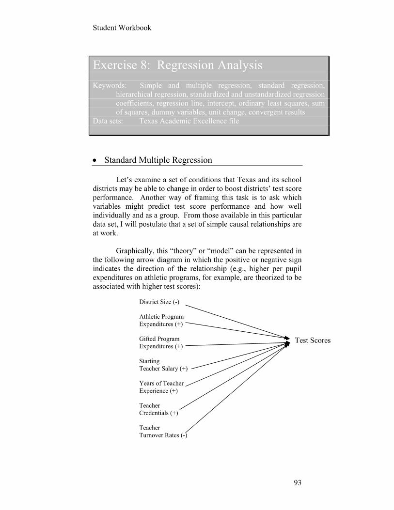
Student Workbook
93
Exercise 8: Regression Analysis Keywords: Simple and multiple regression, standard regression,
hierarchical regression, standardized and unstandardized regression coefficients, regression line, intercept, ordinary least squares, sum of squares, dummy variables, unit change, convergent results
Data sets: Texas Academic Excellence file
Standard Multiple Regression Let’s examine a set of conditions that Texas and its school districts may be able to change in order to boost districts’ test score performance. Another way of framing this task is to ask which variables might predict test score performance and how well individually and as a group. From those available in this particular data set, I will postulate that a set of simple causal relationships are at work. Graphically, this “theory” or “model” can be represented in the following arrow diagram in which the positive or negative sign indicates the direction of the relationship (e.g., higher per pupil expenditures on athletic programs, for example, are theorized to be associated with higher test scores):
District Size (-)
Athletic Program Expenditures (+)
Gifted Program Expenditures (+) Starting Teacher Salary (+)
Years of Teacher Experience (+)
Teacher Credentials (+)
Teacher Turnover Rates (-)
Test Scores

Student Workbook
94
The textbook provides a verbal description of these hypotheses.
This model is a fairly simple -- even naïve -- rendering of the ways in which different conditions may affect district test scores. Such “models,” however, are commonplace. Simplicity has some value, and testing this model may provide a sense of the relative influence of different factors on test performance when controlling for other variables. Remember, of course, that regression analysis will provide you with estimates of the impact of each independent variable on the dependent variable when controlling for the influence of other independent variables.
Let’s see if the data are consistent with our hunches, hypotheses, theories, or model by putting them to a test in SPSS.
Step 1: Open the Texas Indicator System data set and click ANALYZE/REGRESSION/LINEAR
Step 2: Move the continuous version of district test scores into the Dependent: box.
Step 3: Move the seven independent variables specified in the above model into the Independent: box.
Step 4: Make sure that Enter is selected for Method. This call upon SPSS to enter all the independent variables simultaneously, otherwise known as standard multiple regression.
Step 5: Click on Statistics and select Estimates, Confidence Intervals, Model fit, Descriptives, and Part and Partial correlations. Click Continue.
We will examine some of the assumption diagnostics in the next assignment, but ignore them here.
Step 6: Click on Options and select Exclude cases pairwise in the Missing Values section. Click CONTINUE.
Your output should look something like the following:

Student Workbook
95
Correlations
1.000 .009 .246 .274 .052 .410 .062 -.509
.009 1.000 -.159 .132 .310 .017 .203 -.120
.246 -.159 1.000 .148 -.216 .455 -.114 -.363
.274 .132 .148 1.000 .177 .244 .144 -.271
.052 .310 -.216 .177 1.000 -.158 .267 -.014
.410 .017 .455 .244 -.158 1.000 .152 -.639
.062 .203 -.114 .144 .267 .152 1.000 .037
-.509 -.120 -.363 -.271 -.014 -.639 .037 1.000
. .428 .000 .000 .168 .000 .105 .000
.428 . .001 .004 .000 .368 .000 .008
.000 .001 . .001 .000 .000 .011 .000
.000 .004 .001 . .000 .000 .002 .000
.168 .000 .000 .000 . .002 .000 .394
.000 .368 .000 .000 .002 . .001 .000
.105 .000 .011 .002 .000 .001 . .227
.000 .008 .000 .000 .394 .000 .227 .
410 410 407 407 349 410 410 407
410 411 408 408 350 411 411 408
407 408 408 408 349 408 408 408
407 408 408 408 349 408 408 408
349 350 349 349 350 350 350 349
410 411 408 408 350 411 411 408
410 411 408 408 350 411 411 408
407 408 408 408 349 408 408 408
Grades 3-11 All TestsTaken 2006
Total Enrollment Count
District 2005 Expendon Athletics Per Pupil
Distrrict 2005 Expendon Gifted Per Pupil
Aver Salary for NewTeachers
Aver Yrs Experience ofTeachers
Percent of Teachers wMasters Degree
Teacher Turnover Rate
Grades 3-11 All TestsTaken 2006
Total Enrollment Count
District 2005 Expendon Athletics Per Pupil
Distrrict 2005 Expendon Gifted Per Pupil
Aver Salary for NewTeachers
Aver Yrs Experience ofTeachers
Percent of Teachers wMasters Degree
Teacher Turnover Rate
Grades 3-11 All TestsTaken 2006
Total Enrollment Count
District 2005 Expendon Athletics Per Pupil
Distrrict 2005 Expendon Gifted Per Pupil
Aver Salary for NewTeachers
Aver Yrs Experience ofTeachers
Percent of Teachers wMasters Degree
Teacher Turnover Rate
Pearson Correlation
Sig. (1-tailed)
N
Grades 3-11All Tests
Taken 2006
TotalEnrollment
Count
District 2005Expend on
Athletics PerPupil
Distrrict 2005Expend onGifted Per
Pupil
Aver Salaryfor New
Teachers
Aver YrsExperienceof Teachers
Percent ofTeachersw Masters
DegreeTeacher
Turnover Rate
Model Summary
.546a .298 .284 14.231Model1
R R SquareAdjustedR Square
Std. Error ofthe Estimate
Predictors: (Constant), Teacher Turnover Rate, AverSalary for New Teachers, Percent of Teachers wMasters Degree, Distrrict 2005 Expend on Gifted PerPupil, Total Enrollment Count, District 2005 Expend onAthletics Per Pupil, Aver Yrs Experience of Teachers
a.
We have seen a correlation matrix before. Although half of
the matrix is redundant, it displays the bivariate correlations among all of the variables in the model, including the size of each correlation, its direction (negative or positive), the level of statistical significance, and the number of cases on which the correlations are calculated (i.e., the non-missing pairs of variables).
Next, inspect the Model Summary table (above) for the
values reported in the column for R Square. This is a measure of the proportion of the variation across district test scores that is “explained by” the combination of all your independent variables. The variables we entered into this equation explain about 30 percent of the variation in percentage of districts’ students passing the state’s tests. That’s a fairly substantial proportion of explained
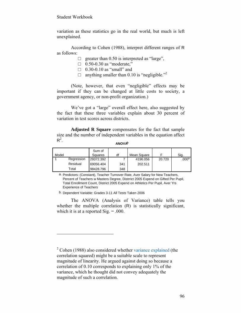
Student Workbook
96
ANOVAb
29372.392 7 4196.056 20.720 .000a
69056.404 341 202.511
98428.796 348
Regression
Residual
Total
Model1
Sum ofSquares df Mean Square F Sig.
Predictors: (Constant), Teacher Turnover Rate, Aver Salary for New Teachers,Percent of Teachers w Masters Degree, Distrrict 2005 Expend on Gifted Per Pupil,Total Enrollment Count, District 2005 Expend on Athletics Per Pupil, Aver YrsExperience of Teachers
a.
Dependent Variable: Grades 3-11 All Tests Taken 2006b.
variation as these statistics go in the real world, but much is left unexplained.
According to Cohen (1988), interpret different ranges of R
as follows: □ greater than 0.50 is interpreted as “large”, □ 0.50-0.30 as “moderate,” □ 0.30-0.10 as “small” and □ anything smaller than 0.10 is “negligible.”2
(Note, however, that even “negligible” effects may be
important if they can be changed at little costs to society, a government agency, or non-profit organization.)
We’ve got a “large” overall effect here, also suggested by
the fact that these three variables explain about 30 percent of variation in test scores across districts.
Adjusted R Square compensates for the fact that sample size and the number of independent variables in the equation affect R2.
The ANOVA (Analysis of Variance) table tells you
whether the multiple correlation (R) is statistically significant, which it is at a reported Sig. = .000.
2 Cohen (1988) also considered whether variance explained (the correlation squared) might be a suitable scale to represent magnitude of linearity. He argued against doing so because a correlation of 0.10 corresponds to explaining only 1% of the variance, which he thought did not convey adequately the magnitude of such a correlation.

Student Workbook
97
Coefficientsa
56.879 6.915 8.225 .000 43.277 70.481
-8.4E-005 .000 -.080 -1.627 .105 .000 .000 .009 -.088 -.074
.004 .006 .037 .702 .483 -.008 .017 .246 .038 .032
.030 .011 .126 2.585 .010 .007 .052 .274 .139 .117
.000 .000 .062 1.190 .235 .000 .001 .052 .064 .054
.504 .307 .110 1.642 .101 -.100 1.107 .410 .089 .074
.090 .099 .046 .914 .361 -.104 .285 .062 .049 .041
-.418 .065 -.401 -6.389 .000 -.547 -.289 -.509 -.327 -.290
(Constant)
Total Enrollment Count
District 2005 Expendon Athletics Per Pupil
Distrrict 2005 Expendon Gifted Per Pupil
Aver Salary for NewTeachers
Aver Yrs Experience ofTeachers
Percent of Teachers wMasters Degree
Teacher Turnover Rate
Model1
B Std. Error
UnstandardizedCoefficients
Beta
StandardizedCoefficients
t Sig. Lower Bound Upper Bound
95% Confidence Interval for B
Zero-order Partial Part
Correlations
Dependent Variable: Grades 3-11 All Tests Taken 2006a.
The Coefficients table tells you which of the independent
variables best predicts districts’ test scores. The unstandardized regression coefficients (B in the table above) tell you how much of a unit change in a particular independent variable is associated with a unit change in the dependent variable, when controlling for other independent variables. In this case, for example, an increase in one percentage point in teacher turnover rates, say, from 20 to 21 percent, is associated with a decline of .42 percentage points in the percentage of a district students who pass the state tests (when holding the other independent variables constant). It is not (repeat not) the expected change in an independent variable given a unit change in the dependent variable. Please don’t get this bass ackward.
Remember also that the size of B is in part a function of the
scale (the type of units) in which the variables are measured. The interpretation of counts (e.g., total enrollment) and expenditure variables, for example, can be troubled by issues of scale, which may require transformations of such variables. We see in the output above, for example, that the regression coefficient associated with total enrollment is -8.4E-005. That is to say each additional (one!) student in a district is associated with a -0.000084 decrease in the proportion of students who pass the state tests. Problems of scale and interpretation would have also likely arisen if we had used total expenditures rather than per pupil expenditures for athletics and gifted programs.
To adjust for this problem, we would want to transform the
above total enrollment counts by dividing them by, say, 1,000. This will likely create a more easily interpretable regression coefficient, but require your written narrative of the results to read, “For every increase of 1,000 pupils in a district, we find a corresponding decrease of 0.08 percentage points of students who pass the state’s tests, which is substantively trivial.”
Student Workbook
98
The interpretation of several other regression coefficients is troubled by scale, range, and the unit in which they are measured. You don’t (or shouldn’t) want to know the effects of a single additional dollar in per pupil expenditures or salaries for those variables whose range is in the thousands of dollars. You would well advised to transform the values, say, of the teacher salary variable and the total instructional expenditures into $1,000s before entering them into a revised regression equation. These variables are also not normally distributed, but their regression coefficients will clearly be more easily interpretable.
Before transforming these variables and re-running the
regression, let’s return to the coefficients table for an interpretation of the standardized regression coefficients, otherwise called Betas. These coefficients are calculated after SPSS (or any other statistical software program) standardizes all the variables in the equation (including the dependent variable).
Such a transformation creates variables that all have a mean of zero and a standard deviation of one, thus placing each variable on the same scale. Standardizing the variables in this way allows you to assess the relative influence of the independent variables on the dependent one, when controlling for all independent variables. In the Coefficient table above, teacher turnover rates remain important (Beta of -.401), average years of teacher experience declines in importance (from a B of .504 to a Beta of .110) and per pupil district expenditures on gifted programs increases in importance (from a B of .030 to .126) when all of the variables are standardized to have means of zeros and standard deviations of one. Beyond providing such a comparative rubric, Betas have a substantive interpretation, although one that requires you to “plug in” the original standard deviations (the ones before SPSS standardized the variables). In general, Betas tell you how much an increase of one standard deviation of an independent variable is associated with an increase of one standard deviation of the dependent variable (when taking all the other independent variables in the equation into account).
In the example in hand, a decrease of 15.10 in a district’s teacher turnover rate (the standard deviation for teacher turnover rates) is associated with an increase of 6.48 percentage points of a district’s students passing the state’s tests (.401 x 16.15; i.e., the Beta coefficient times the standard deviation of test scores). To get a sense of the effect size of turnover rates, consider the fact that an

Student Workbook
99
average of about 63 percent of students in Texas school districts pass these standardarized tests. Increasing this percentage by another 6.48 percentage points would be substantial, especially for those districts at the bottom of the test score distribution.
Incidentally, the PART correlation column – if you square it – tells you how much of the total variance in the dependent variable is uniquely contributed by each independent variable. Note that the sum of these squared values does not equal the R Square of the Model Summary table. The total variance explained there also includes shared contributions (as well as unique ones).
Before moving on to dummy independent variables, consider one last point about scale, ranges, and units of measurement in multiple regression. What would have happened had we (carelessly) transformed per pupil district expenditure on gifted programs into $1,000s? Why? If you don’t know, transform the variable this way, rerun the regression, and observe the surprisingly large apparent effect that per pupil expenditures on gifted programs has on test performance. Here’s a hint to unravel this puzzle: What’s the average district per pupil expenditure on gifted programs? Increasing such expenditures by $1,000 would ... what?
Dichotomous (Dummy) Independent Variables As we saw in the regression example above, you can also find yourself in a situation in which you have one or more dichotomous independent variables. These variables take on the ignominious title of “dummy” variables when their two categories are coded zero and one. Indeed, make sure that all your independent dichotomous variables are so coded before entering them into a regression equation. Their interpretation is often stated as the consequence of moving from the absence of a condition to the presence of that condition. Although somewhat odd, the regression coefficients associated with dummy variables would be interpreted as the effects of moving from non-male to male, from non-tall to tall, or from not smiling to smiling. There is, however, a slightly more complicated rendition of dummy variables in regression analysis in which you can recode any categorical variable with three or more possible conditions to a set of dummy independent variables. This is not rocket science, but there is a small trap that awaits the unsuspecting who recode their categorical variables improperly. Here’s a hint: a variable
Student Workbook
100
with four categories should be recoded into three (and only three) dummy variables before entered into a regression equation. Explanation via example to follow. Let us say that we wanted to include in our regression analysis a categorical measure of the region of the county in which respondents lived, which was coded as follows:
Northeast 1 Midwest 2 South 3 West 4
This categorical variable should be entered into the regression equation as three dummy variables that you create by recoding the responses to the above variable in the following way (Note, these are not the SPSS commands, per se): Dummy1 = 1 if living in the Midwest; otherwise = 0 Dummy2 = 1 if living in the South; otherwise = 0 Dummy3 = 1 if living in the West; otherwise = 0 The regression coefficients of each of these dummy variables would be interpreted as the effect of, say, living in the Midwest, on some dependent variable (let’s say, yearly income if employed full time) in comparison to the one original category that we did not make a dummy variable of: living in the Northeast. Similarly, the regression coefficient in this example for Dummy2 would be the effect of living in the South on earnings in comparison to living in the Northeast. Consult the textbook for a fuller explanation of creating dummy variables from variables with numerous categories. We will return to this procedure in a later exercise. There’s enough in the following exercise to wet your whistle.

Student Workbook
101
Student Workbook
102
Assignment # 8 (50 points)
1. Transform enrollment counts and mean salary for new teachers by dividing by 1,000 and rerun the regression analysis using the following variables:
enrolled students in 1,000s per pupil expenditures for gifted programs per pupil expenditures for athletic programs average salary for new teachers in $1,000s percent teaching staff with masters degrees, and teacher turnover rate Submit the unstandardized regression coefficients as an
equation in the form:
Y = a + b1x1 + b2x2 + … + bixi (sig.) (sig.) (sig.) where you spell out the variables and values that are
represented by Y , a, the x’s and b’s for the six variables in the analysis. Write out a regression equation of the form above in which you spell out the variables (xi’s) and regression coefficients (bi’s).
2. From the equation you produced in #1 above, what
would you predict to be the proportion of a district’s students passing the state test if a district had the following characteristics:
40,000 enrolled students $100 spent per pupil for gifted programs $400 spent per pupil for athletic programs $36,000 average (mean) salary for new teachers 25% of a teaching staff with masters degrees, and a 15% teacher turnover rate.
3. Report and interpret the diagnostic tests available to you (and show the appropriate tables and charts) for detecting the presence of multicollinearity.
Student Workbook
103
Exercise 9: Time Series Analysis, Program Assessment, and Forecasting Keywords: program evaluation, forecasting, seasonal adjustments,
moving averages, smoothing, cumulative effects, step functions, lagged effects, short-term effects, pulse effects, nonlinear effects, auto- or serial-correlation, Durbin-Watson statistic, Kolmogorov-Smirov test
Data sets: Sanitation Absenteeism (“sanitation absences v2_1.sav”) Welfare and Economics (“welfare_and_economics.sav”) Parking Tickets (“parking tickets.xls”)
Detecting and Removing Seasonal/Cyclical Effects
Your city’s director of public works is troubled by his sanitation workers’ absences from work. He knows that short-handed crews do not work as efficiently as fully-staffed crews and that it is difficult to forecast the need for and availability of substitute workers. He would prefer to minimize the use of substitutes and short-staffed crews by reducing the number of absences among his full-time sanitation workers. He, therefore, creates an incentive program whereby unused sick leave at the end of each fiscal year can be “cashed in” as a bonus. (This example is modified from Meier, Brudney and Bohte (2006: 362-364).)
Obviously, the director of public works would like to know
if his incentive program is achieving its objective. He has data on employee absences for 30 work days after he announces the new incentive program. That is to say, he has a time series with which to analyze the results of his program announcement.
These fictional data are included in the file “Sanitation
Absenteeism,” which you should open in SPSS to follow the steps below. Let’s first display worker absences graphically.
Step 1: Click GRAPHS/SCATTER/DOT Step 2: Select Simple scatter (if not already selected) and
click Define.
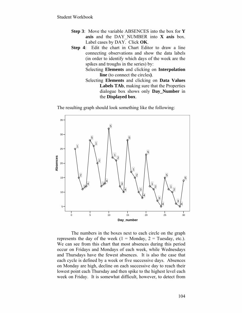
Student Workbook
104
302520151050
Day_number
35
30
25
20
15
10
5
Ab
sen
ces
5
43
21
5
4
3
21
5
4
3
2
1
5
4
3
21
5
43
2
1
5
43
2
1
Step 3: Move the variable ABSENCES into the box for Y axis and the DAY_NUMBER into X axis box. Label cases by DAY. Click OK.
Step 4: Edit the chart in Chart Editor to draw a line connecting observations and show the data labels (in order to identify which days of the week are the spikes and troughs in the series) by: Selecting Elements and clicking on Interpolation
line (to connect the circles). Selecting Elements and clicking on Data Values
Labels TAb, making sure that the Properties dialogue box shows only Day_Number in the Displayed box.
The resulting graph should look something like the following:
The numbers in the boxes next to each circle on the graph
represents the day of the week (1 = Monday, 2 = Tuesday, etc.). We can see from this chart that most absences during this period occur on Fridays and Mondays of each week, while Wednesdays and Thursdays have the fewest absences. It is also the case that each cycle is defined by a week or five successive days. Absences on Monday are high, decline on each successive day to reach their lowest point each Thursday and then spike to the highest level each week on Friday. It is somewhat difficult, however, to detect from
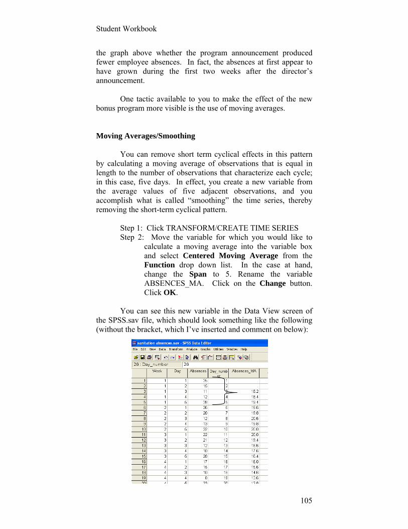
Student Workbook
105
the graph above whether the program announcement produced fewer employee absences. In fact, the absences at first appear to have grown during the first two weeks after the director’s announcement.
One tactic available to you to make the effect of the new
bonus program more visible is the use of moving averages.
Moving Averages/Smoothing You can remove short term cyclical effects in this pattern
by calculating a moving average of observations that is equal in length to the number of observations that characterize each cycle; in this case, five days. In effect, you create a new variable from the average values of five adjacent observations, and you accomplish what is called “smoothing” the time series, thereby removing the short-term cyclical pattern.
Step 1: Click TRANSFORM/CREATE TIME SERIES Step 2: Move the variable for which you would like to
calculate a moving average into the variable box and select Centered Moving Average from the Function drop down list. In the case at hand, change the Span to 5. Rename the variable ABSENCES_MA. Click on the Change button. Click OK.
You can see this new variable in the Data View screen of
the SPSS.sav file, which should look something like the following (without the bracket, which I’ve inserted and comment on below):

Student Workbook
106
302520151050
Day_number
25
20
15
10
5
0
MA
(Ab
sen
ces,
5,5)
The bracket indicates that the mean of the first five
observations on ABSENCES becomes the first value of the third case (18.2). The mean of the next five observations appears as the moving average value for the fourth case (18.4). And on.
A scattergram of this new variable across time is shown in
the edited graph below. This visual display of a five-term moving average strongly
suggests that the new bonus incentive program cut the incidence of absenteeism, after an initial period of about two weeks when the program appeared to have no effect.
There is a problem, however, with this interpretation that is
not uncommon in evaluating program effects. What is it? Consult the textbook if stumped here. You’ll also read there a second technique for removing cyclical effects that relies on the creation of dummy variables from a five-category independent variable for the day of the week, the point at which we concluded last exercise.
Detecting (and Correcting for) Autocorrelation

Student Workbook
107
Statistics
47 47
0 0
36.453 6.1341
35.970 5.4238
3.0428 2.56808
.363 .452
.347 .347
-1.512 -.938
.681 .681
32.9 2.50
41.3 11.32
33.557 3.8986
35.970 5.4238
39.621 8.0317
Valid
Missing
N
Mean
Median
Std. Deviation
Skewness
Std. Error of Skewness
Kurtosis
Std. Error of Kurtosis
Minimum
Maximum
25
50
75
Percentiles
%_out_of_lab_force_
16plus
GDP in 2000dollars intrillions
The substantive question we’re interested in answering in the following example is the extent to which the data are consistent with the argument that Gross Domestic Product (GDP) in the United States between 1960 and 2006 affects the percentage of residents over the age of 16 who are defined as “out of the labor force” (i.e., people who are unemployed and not looking for work, sometimes referred to as “discouraged” workers). The data set, on your course website, is labeled “Welfare and Economics.”
First, run some descriptive statistics on these two variables:
GDP_in_trillions Percent_out_of_labor_force_plus16
Request a One-Sample Kolmogorov-Smirnoff statistic to
formally test whether their distributions are normal. (You may recall from the text that this is achieved by following the choice SPSS presents to you in ANALYZE/NONPARAMETRIC TESTS/1-SAMPLE K-S.) Plot each of these two variables over time, using the Scatter/Dot function.
Your summary descriptive statistics might look something
like the following:
The mean percentage of U.S. residents (over the age of 16)
who are not working and not looking for work is 36.5% during the period 1960 through 2006. The median is a nearby 36%. The lowest percentage of out of the labor force is 32.9 percent; the highest, 41.3 percent. Skewness and Kurtosis are fairly close to their respective standard errors, suggesting that our formal test of whether this variable is normally distributed will confirm our suspicions here that it is normally distributed.
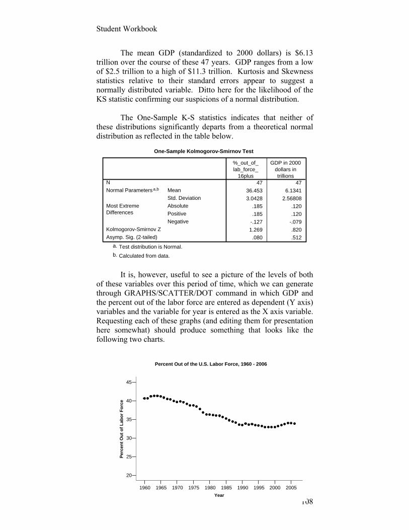
Student Workbook
108
2005200019951990198519801975197019651960
Year
45
40
35
30
25
20
Pe
rce
nt
Ou
t o
f L
abo
r F
orc
e
Percent Out of the U.S. Labor Force, 1960 - 2006
One-Sample Kolmogorov-Smirnov Test
47 47
36.453 6.1341
3.0428 2.56808
.185 .120
.185 .120
-.127 -.079
1.269 .820
.080 .512
N
Mean
Std. Deviation
Normal Parametersa,b
Absolute
Positive
Negative
Most ExtremeDifferences
Kolmogorov-Smirnov Z
Asymp. Sig. (2-tailed)
%_out_of_lab_force_
16plus
GDP in 2000dollars intrillions
Test distribution is Normal.a.
Calculated from data.b.
The mean GDP (standardized to 2000 dollars) is $6.13 trillion over the course of these 47 years. GDP ranges from a low of $2.5 trillion to a high of $11.3 trillion. Kurtosis and Skewness statistics relative to their standard errors appear to suggest a normally distributed variable. Ditto here for the likelihood of the KS statistic confirming our suspicions of a normal distribution.
The One-Sample K-S statistics indicates that neither of
these distributions significantly departs from a theoretical normal distribution as reflected in the table below.
It is, however, useful to see a picture of the levels of both
of these variables over this period of time, which we can generate through GRAPHS/SCATTER/DOT command in which GDP and the percent out of the labor force are entered as dependent (Y axis) variables and the variable for year is entered as the X axis variable. Requesting each of these graphs (and editing them for presentation here somewhat) should produce something that looks like the following two charts.
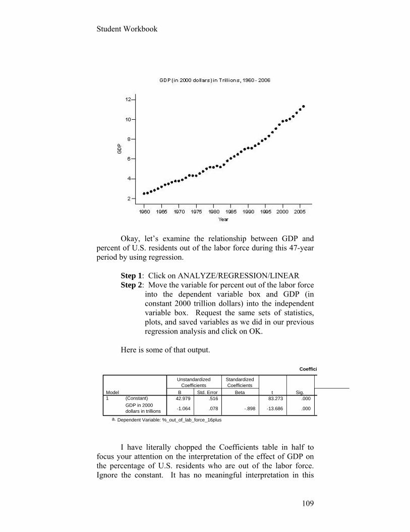
Student Workbook
109
Coeffici
42.979 .516 83.273 .000
-1.064 .078 -.898 -13.686 .000
(Constant)
GDP in 2000dollars in trillions
Model1
B Std. Error
UnstandardizedCoefficients
Beta
StandardizedCoefficients
t Sig.
Dependent Variable: %_out_of_lab_force_16plusa.
Okay, let’s examine the relationship between GDP and
percent of U.S. residents out of the labor force during this 47-year period by using regression.
Step 1: Click on ANALYZE/REGRESSION/LINEAR Step 2: Move the variable for percent out of the labor force
into the dependent variable box and GDP (in constant 2000 trillion dollars) into the independent variable box. Request the same sets of statistics, plots, and saved variables as we did in our previous regression analysis and click on OK.
Here is some of that output.
I have literally chopped the Coefficients table in half to
focus your attention on the interpretation of the effect of GDP on the percentage of U.S. residents who are out of the labor force. Ignore the constant. It has no meaningful interpretation in this
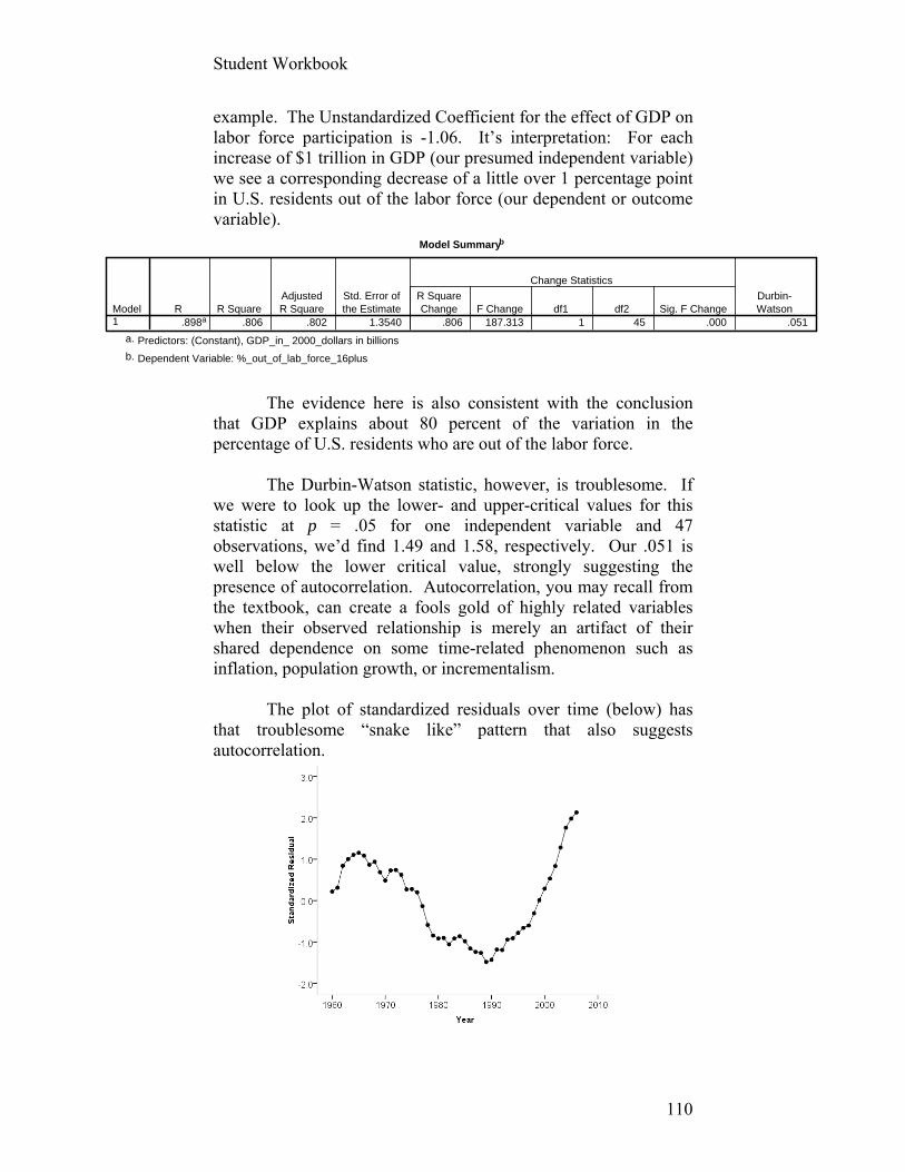
Student Workbook
110
Model Summaryb
.898a .806 .802 1.3540 .806 187.313 1 45 .000 .051Model1
R R SquareAdjustedR Square
Std. Error ofthe Estimate
R SquareChange F Change df1 df2 Sig. F Change
Change Statistics
Durbin-Watson
Predictors: (Constant), GDP_in_ 2000_dollars in billionsa.
Dependent Variable: %_out_of_lab_force_16plusb.
example. The Unstandardized Coefficient for the effect of GDP on labor force participation is -1.06. It’s interpretation: For each increase of $1 trillion in GDP (our presumed independent variable) we see a corresponding decrease of a little over 1 percentage point in U.S. residents out of the labor force (our dependent or outcome variable).
The evidence here is also consistent with the conclusion
that GDP explains about 80 percent of the variation in the percentage of U.S. residents who are out of the labor force.
The Durbin-Watson statistic, however, is troublesome. If
we were to look up the lower- and upper-critical values for this statistic at p = .05 for one independent variable and 47 observations, we’d find 1.49 and 1.58, respectively. Our .051 is well below the lower critical value, strongly suggesting the presence of autocorrelation. Autocorrelation, you may recall from the textbook, can create a fools gold of highly related variables when their observed relationship is merely an artifact of their shared dependence on some time-related phenomenon such as inflation, population growth, or incrementalism.
The plot of standardized residuals over time (below) has
that troublesome “snake like” pattern that also suggests autocorrelation.
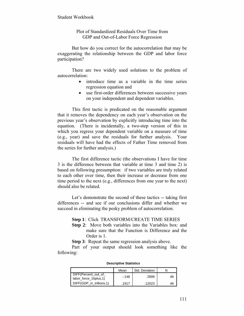
Student Workbook
111
Descriptive Statistics
-.148 .2899 46
.1917 .12023 46
DIFF(Percent_out_of_labor_force_16plus,1)
DIFF(GDP_in_trillions,1)
Mean Std. Deviation N
Plot of Standardized Residuals Over Time from GDP and Out-of-Labor Force Regression
But how do you correct for the autocorrelation that may be
exaggerating the relationship between the GDP and labor force participation?
There are two widely used solutions to the problem of
autocorrelation: introduce time as a variable in the time series
regression equation and use first-order differences between successive years
on your independent and dependent variables. This first tactic is predicated on the reasonable argument
that it removes the dependency on each year’s observation on the previous year’s observation by explicitly introducing time into the equation. (There is incidentally, a two-step version of this in which you regress your dependent variable on a measure of time (e.g., year) and save the residuals for further analysis. Your residuals will have had the effects of Father Time removed from the series for further analysis.)
The first difference tactic (the observations I have for time
3 is the difference between that variable at time 3 and time 2) is based on following presumption: if two variables are truly related to each other over time, then their increase or decrease from one time period to the next (e.g., differences from one year to the next) should also be related.
Let’s demonstrate the second of these tactics -- taking first
differences -- and see if our conclusions differ and whether we succeed in eliminating the pesky problem of autocorrelation.
Step 1: Click TRANSFORM/CREATE TIME SERIES Step 2: Move both variables into the Variables box: and
make sure that the Function is Difference and the Order is 1.
Step 3: Repeat the same regression analysis above. Part of your output should look something like the
following:
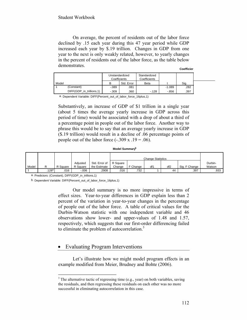
Student Workbook
112
Coefficien
-.089 .081 -1.089 .282
-.309 .360 -.128 -.856 .397
(Constant)
DIFF(GDP_in_trillions,1)
Model1
B Std. Error
UnstandardizedCoefficients
Beta
StandardizedCoefficients
t Sig.
Dependent Variable: DIFF(Percent_out_of_labor_force_16plus,1)a.
Model Summaryb
.128a .016 -.006 .2908 .016 .732 1 44 .397 .933Model1
R R SquareAdjustedR Square
Std. Error ofthe Estimate
R SquareChange F Change df1 df2 Sig. F Change
Change Statistics
Durbin-Watson
Predictors: (Constant), DIFF(GDP_in_trillions,1)a.
Dependent Variable: DIFF(Percent_out_of_labor_force_16plus,1)b.
On average, the percent of residents out of the labor force
declined by .15 each year during this 47 year period while GDP increased each year by $.19 trillion. Changes in GDP from one year to the next is only weakly related, however, to yearly changes in the percent of residents out of the labor force, as the table below demonstrates.
Substantively, an increase of GDP of $1 trillion in a single year (about 5 times the average yearly increase in GDP across this period of time) would be associated with a drop of about a third of a percentage point in people out of the labor force. Another way to phrase this would be to say that an average yearly increase in GDP ($.19 trillion) would result in a decline of .06 percentage points of people out of the labor force (-.309 x .19 = .06).
Our model summary is no more impressive in terms of
effect sizes. Year-to-year differences in GDP explain less than 2 percent of the variation in year-to-year changes in the percentage of people out of the labor force. A table of critical values for the Durbin-Watson statistic with one independent variable and 46 observations show lower- and upper-values of 1.48 and 1.57, respectively, which suggests that our first-order differencing failed to eliminate the problem of autocorrelation.3
Evaluating Program Interventions Let’s illustrate how we might model program effects in an example modified from Meier, Brudney and Bohte (2006).
3 The alternative tactic of regressing time (e.g., year) on both variables, saving the residuals, and then regressing these residuals on each other was no more successful in eliminating autocorrelation in this case.

Student Workbook
113
Week Number
151050
Par
kin
g t
icke
ts
100
80
60
40
Parking Tickets Issued (16 weeks)
Springfield VT officials have noticed increasing petty lawlessness in town, as reflected in more illegal parking. They decide to hire a Parking Enforcement Officer (PEO, also formerly known as a meter maid).4 These officials suspect that the PEO will have an immediate, but lasting, effect (i.e., step effect) and a longer term cumulative impact after she figures out where and when likely offenses are to occur (i.e., increasing effect). Unlike the Director of Public Works in the first example, Springfield officials began monitoring the number of tickets issued eight weeks prior to hiring and training the PEO. They then collected data on the number of tickets issued for the eight weeks after he hit the streets and ask you to determine whether their policy is “working.” Your data can be found on the course website as the Excel file “Parking Tickets.” First step: import this Excel data file into SPSS and save as a SPSS.SAV file. Now, generate a graph of parking tickets across the 16 weeks for which you have data. (Consult previous examples if you don’t recall how to request such a graph from SPSS.) After some editing, your graph should look something like the following:
4 I am indebted to a student of mine, Meredith Guillot, for pointing out this more politically correct designation.
PEO at Work
No PEO

Student Workbook
114
.124 8.095
.244 4.095
.171 5.857
Tolerance VIF
Collinearity Statistics
Notice in the Excel file (or SPSS Data View) how the two program effects being evaluated here (step and cumulative) are constructed below:
With Parking_tickets as the dependent variable, ask SPSS
to calculate the appropriate regression statistics, graphs, and diagnostics to assess the effects of hiring a PEO in contrast to the longer term effects of the passage of time.
We can see from the Correlations table (not shown here)
that we may have a problem with multicollinearity insofar as all independent variables are related to each other above the general guideline of [.70]. Fortunately, the formal tests for collinearity (Tolerance and VIF) are within suggested limits (see far right of Coefficients table). (Tolerances are not less than .10 and VIFs are not greater than 10.)
The model summary table (below) indicates that our three
independent variables explain about 94 percent of the variation in parking tickets issued during this 16-week period. The overall model is statistically significant and the Durbin –Watson statistic of 1.853 falls within the acceptable range of 1.73 and 2.27 for 16 observations and 3 independent variables. (Do you know where

Student Workbook
115
Model Summaryb
.977a .955 .944 4.051 .955 85.752 3 12 .000 1.853Model1
R R SquareAdjustedR Square
Std. Error ofthe Estimate
R SquareChange F Change df1 df2 Sig. F Change
Change Statistics
Durbin-Watson
Predictors: (Constant), Cumulative_impact, Step_impact, Week_#a.
Dependent Variable: Parking_ticketsb.
these numbers came from?). It looks at first blush as a great success. The exercise to follow will ask you to question this conclusion.

Student Workbook
116
Assignment #9 (50 points) All in all, the diagnostics in the parking tickets example
suggest that the model is relatively well behaved (as it relates to the assumptions on which it is based). A question, however, remains on the table. Is it a successful program (i.e., are we getting enough benefits from the program to justify its costs)?
How would you answer this question? What might you need to know in addition to what you have
available to you in the data and analysis? Invent reasonable guesses for what you believe you need to know in order to provide the mayor and city council the answer to the question of whether the PEO program is working?
Finally, what would you predict to be the number of tickets
issued in each of the three weeks after the time period you have available to you? Will the results of your regression model hold for an extended period into the future? Why? Why not?
Write a memo to your exhausted professor that provides the
answers and solutions to the questions above.
Student Workbook
117
Final Assignment (worth 300 points) The Governor of Texas is committed to helping improve the performance of the state’s 1,227 public school districts and is asking you to answer a number of questions that he hopes will help the state achieve the following objective:
To improve the performance of all students on the Texas Assessments of Knowledge and Skills (TAKS)
Using the sample from the Texas Academic Excellence Indicator data set (selected variables), please prepare: (1) a policy memorandum to the Governor’s deputy chief of staff (no more than 10 pages), and (2) a technical appendix that will support your policy memorandum conclusions and analysis against any criticism of your methodology (no more than 25 pages).
The policy memorandum (worth a maximum of 150 points) should answer the following questions (although probably not in this order):
1. What characteristics of school districts appear to be most
highly associated with (or predictive of) district school performance (as measured by the percentage of students in districts who pass TAKS) when taking into account (controlling for) all of these characteristics?
Are there conditions that do not appear to be associated with test performance that are surprising or that suggest areas where fewer resources should be allocated?
2. Where would you recommend that the Governor ask school districts and the state legislature to place a greater and lesser commitment of resources in order to increase TAKS test scores for all districts? How much of a change in these characteristics do you recommend the state and its districts strive to achieve? What effect on test scores are your recommendations likely to have? Why?
3. Which 10 school districts appear to be “under” performing, given what you would expect to find in
Student Workbook
118
a district with similar characteristics? Identify the school district (by name) of these “under-performing” schools.
4. Similarly, which 10 districts appear to be “over-achieving” districts, based on what we would predict their test performance scores to be in light of their characteristics? Which districts are these (by name).
5. Given what you now know about the conditions that appear to promote high test performance among school districts, what questions would you like to better answer and what research would you recommend be commissioned to help move the Governor’s objectives forward?
Assume that your target audience for this memo is a busy
public official who knows little about statistics. Remember to apply the principles of persuasive argumentation and good graphical and tabular design, as well as good memo writing, e.g., don’t bury the lead.
Also prepare and submit a technical appendix (worth a
maximum of 150 points) to your memorandum that provides descriptive statistics for the variables used in your analysis (in summary form), the detailed statistical results of any models you tested (with any important interpretations not provided in the policy memorandum), assessments of the assumptions on which your statistical tests are based (e.g., absences of outliers, multicollinearity, heteroskedasticity), any data transformations you conducted (e.g., the removal of outliers), the results of any statistics calculated on data that you transformed in order to better meet test assumptions (e.g., Do the results with and without outliers differ substantially?). Provide and discuss your use of diagnostic tests and guidelines for identifying violations to any of the assumptions required of your statistical tools.
Remember, tables and charts in this technical appendix do
not speak for themselves. The purpose of this appendix is to persuade a technical expert that you followed sound statistical procedures in, for example, completing data transformations and in detecting and correcting any violations of the assumptions or requirements of the statistical tools you used. Dumping output without providing any narrative as to what the output was saying about the technical aspects of your analysis demonstrates only that you know how to cut and paste output. It reveals nothing about your understanding of the statistics on which the policy

Student Workbook
119
recommendations of your policy memorandum are based. The technical consultants to the Governor who will be evaluating the quality of your statistical analysis are not fond of:
□ uninterpreted output, □ mindless data analysis, and □ the careless use of statistical vocabulary.