Embed Size (px)
Citation preview

Studies Manual
Ensign 10
Copyright © 2017 Ensign Software, Inc.
Last Update 4 September 2017
Table of Contents
Studies........................................................................................................................................4Overview.................................................................................................................................5Properties ...............................................................................................................................6
Description................................................................................................................................10Accumulation / Distribution...................................................................................................10Accumulation Swing Index....................................................................................................11Aroon Index...........................................................................................................................12Auto Trend............................................................................................................................13Average True Range.............................................................................................................16Bollinger Bands.....................................................................................................................17Chaikin Indicator...................................................................................................................19Color Band............................................................................................................................20
ESPL Color Band Studies................................................................................................21Commodity Channel Index...................................................................................................22Cycle Forecast......................................................................................................................25Design Your Own..................................................................................................................25Directional Movement Index.................................................................................................26Divergence............................................................................................................................27Donchian Channel................................................................................................................29Ensign Map...........................................................................................................................31Ergodic Indicator...................................................................................................................34Heiken-Ashi...........................................................................................................................35High/Low Stop.......................................................................................................................36Hull Average..........................................................................................................................37Keltner Channel....................................................................................................................38MACD Oscillator...................................................................................................................40
MACD Oscillator Fundamental Behavior.........................................................................41Market Facilitation Index.......................................................................................................45Mid Range.............................................................................................................................46Momentum............................................................................................................................47Money Flow Index.................................................................................................................48Moving Averages..................................................................................................................49On Balance Volume..............................................................................................................50Overlay..................................................................................................................................51
Overlay History.................................................................................................................51Parabolic Stop.......................................................................................................................53Pesavento Patterns...............................................................................................................54Point and Figure....................................................................................................................56Predictive Average................................................................................................................57Price Action...........................................................................................................................58
Price Action and Color Band Labels.................................................................................59Price Histogram....................................................................................................................60
2
Properties.........................................................................................................................61Formula.............................................................................................................................62Study Mode.......................................................................................................................62Style..................................................................................................................................64Split Out TPOs .................................................................................................................67Value Area........................................................................................................................68Point of Control.................................................................................................................69Plot VAH, POC and VAL...................................................................................................70Other Options...................................................................................................................70Current Leftward...............................................................................................................73
PVI or NVI Volume Index......................................................................................................75Volume Price Trend..........................................................................................................76
Rate of Change.....................................................................................................................77Rainbow Histogram...............................................................................................................78Regression Channel.............................................................................................................79Relative Strength Index........................................................................................................81Stochastic.............................................................................................................................84
Stochastic Fundamental Behavior....................................................................................84Stochastic Momentum Index................................................................................................90Three Point Break.................................................................................................................91Trailing Stop..........................................................................................................................92Triple Average.......................................................................................................................93Trix Oscillator........................................................................................................................94Uniform Channel...................................................................................................................95Ultimate Oscillator.................................................................................................................97Volatility Stop........................................................................................................................98Volume Weighted Average Price..........................................................................................99William's %R.......................................................................................................................104
Markers...................................................................................................................................105
3
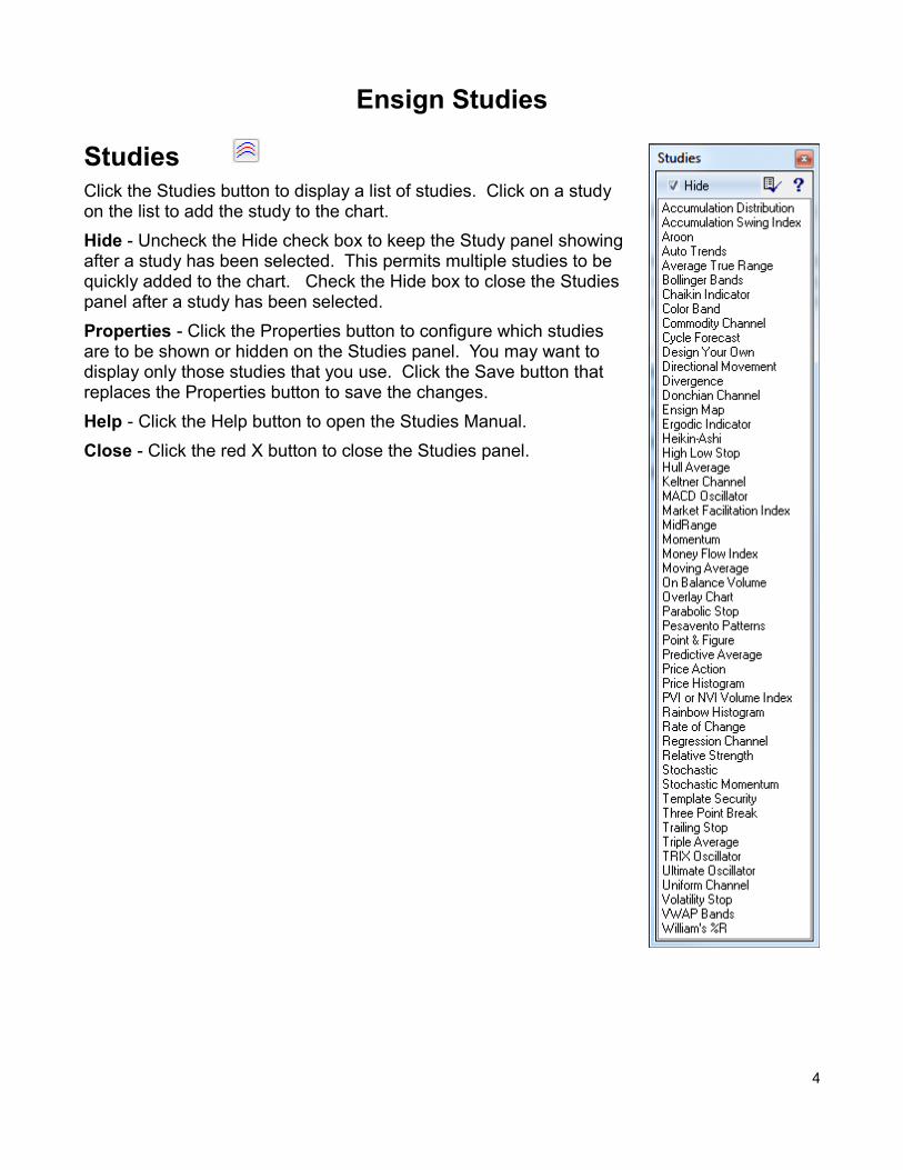
Ensign Studies
StudiesClick the Studies button to display a list of studies. Click on a studyon the list to add the study to the chart.
Hide - Uncheck the Hide check box to keep the Study panel showing after a study has been selected. This permits multiple studies to be quickly added to the chart. Check the Hide box to close the Studies panel after a study has been selected.
Properties - Click the Properties button to configure which studies are to be shown or hidden on the Studies panel. You may want todisplay only those studies that you use. Click the Save button thatreplaces the Properties button to save the changes.
Help - Click the Help button to open the Studies Manual.
Close - Click the red X button to close the Studies panel.
4
OverviewEnsign 10 has many Technical Studies to help analyze charts and to facilitate trading decisions. Studies can be drawn directly on a chart (overlaid on the chart bars), or drawn in nine study sub-windows that show below the chart. The study sub-windows can be vertically adjusted in size by holding down the mouse and dragging up or down in the sub-window.
Study Templates are used to apply multiple Studies to a chart with just one mouse click. For example, a Template could be used to quickly apply a Moving Average, Stochastic, and Relative Strength study to a chart. This is much faster than applying each study one at a time.
To view the properties window for any of the studies, click the Chart Objects button, then select the desired study on the list and click Properties. The properties window for each study displays several selections.
The Properties window allows you to customize the study settings and specify which study sub-window to plot the study in. Changing a study parameter in the Properties window will dynamically update the study on the chart. This allows you to experiment with different study settings and see the immediate result on the chart.
read more » Descriptions and Formula
5
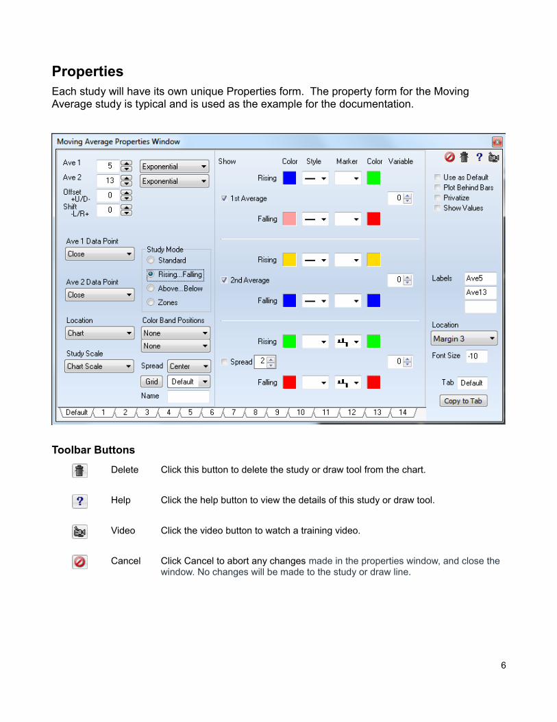
Properties Each study will have its own unique Properties form. The property form for the Moving Average study is typical and is used as the example for the documentation.
Toolbar Buttons
Delete Click this button to delete the study or draw tool from the chart.
Help Click the help button to view the details of this study or draw tool.
Video Click the video button to watch a training video.
Cancel Click Cancel to abort any changes made in the properties window, and close the window. No changes will be made to the study or draw line.
6
Check Box Options
✔ Use as Default - Place a check mark next to 'Use as Default' to save the current settings as the default for all subsequent uses of this study or draw tool.
✔ Plot Behind Bars – Place a check mark in this box to have the study lines appear on the chart behind the chart bars.
✔ Privatize - Pace a check mark next to 'Privatize' to hide a studies name and parameter settings. A chart will then display the name of the study as 'Custom'.This allows users to develop a proprietary settings and systems without disclosing the exact studies and settings they are using. privatized studies can be saved and distributed in templates. Apply the 'Template Security' study to a chart to control the security settings.
✔ Show Values - Place a check mark next to 'Show Values' to display the studies values on the left edge of the chart (in the studies panel). These values show for the position of the cursor as it moves across the chart.
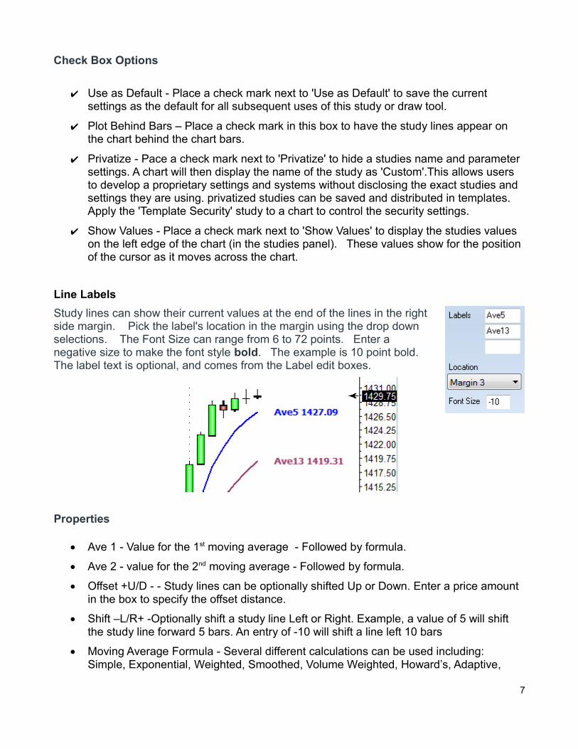
Line Labels
Study lines can show their current values at the end of the lines in the rightside margin. Pick the label's location in the margin using the drop downselections. The Font Size can range from 6 to 72 points. Enter a negative size to make the font style bold. The example is 10 point bold.The label text is optional, and comes from the Label edit boxes.
Properties
Ave 1 - Value for the 1st moving average - Followed by formula.
Ave 2 - value for the 2nd moving average - Followed by formula.
Offset +U/D - - Study lines can be optionally shifted Up or Down. Enter a price amount in the box to specify the offset distance.
Shift –L/R+ -Optionally shift a study line Left or Right. Example, a value of 5 will shift the study line forward 5 bars. An entry of -10 will shift a line left 10 bars
Moving Average Formula - Several different calculations can be used including: Simple, Exponential, Weighted, Smoothed, Volume Weighted, Howard’s, Adaptive,
7
Butterworth, Gaussian, Attenuation and Median Filter.
Ave 1 & 2 Data Points – This study can be calculated from one of several data point prices selected from the drop down menu.
Study Mode – This study can color the average line based on 4 different modes
o Standard – Plot the lines using the standard colors, styles, and markers.
o Rising…Falling - The rising colors will be used when the study is rising. The falling colors will be used when the study is falling.
o Above…Below - The Above colors will be used when the study is above the average line. The Below colors will be used when the study is below the average line
o Zones – The zones mode allows you to have 3 different line settings based on the study value. Enter study values in the upper Zone box, and the lower Zone box. When the study is in each of the set zones the colors for that zone will be used.
Location – A study can be plotted directly on the chart or in one of nine sub-windows. Select the location from the drop-down box.
Study Scale – Use the drop-down box to select the desired study scale.
Color Band Positions – This drop-down list allows a study to be plotted as a color bar instead of a regular line. This can be useful in condensing a study down to just a band. The color of the band will indicate if it is up or down. The first color band drop-down list is used to specify a location for the first study line. The second color band drop-down list is useful to specify a position for the second study line. A variety of positions can beselected
Spread Alignment – Select ‘Left’ , ‘Center’, or ‘Right’ to shift the spread histogram lines one pixel to the left or right hand of the chart. This may be desirable if the histogram lines overlay and hide the chart bars. Shifting the histogram lines one pixel allows both the bars and the histogram to be displayed at the same time.
Study Grid Lines – If a study is plotted in a study sub-window, then the grid line style, color, and different grid levels can be selected. Click the button that says ‘Grid’ to access the separate study grid window.
Name – At the bottom of each property window is a box that allows you to change the name of that study. Simply type a new name in the text box next to ‘Name’.
Study Line Settings – The right side of this property window has controls for the way line settings.
o Show – Place a check in the Show boxes to display or hide a specific study line. Anoptional moving average line can be plotted. The spread is equal to the study minusits moving average. The spread is often displayed as a histogram, and uses the histogram marker.
o Zones – are used to select the levels of each zones when using that study mode.
o Color – Click the square color boxes to specify a color for the line.
8
o Style – A study line can be solid, thick, thin, dashed, dotted or a variety of other styles. Select a line style from the drop-down list.
o Marker – Select an optional marker to mark each value of the study on the chart.
o Marker Color – Click the square color boxes to specify a color for the marker.
o Variables – There are 255 global variables which can hold study values. If this studyis required as input for a ‘Design Your Own’ (DYO) study or an ESPL study, then you can store the indicated study value into the global variable.
o Spread Multiplier – The spread multiplier box is used to increase or decrease the height or amplitude of the spread lines.
Tab – Each study has 14 tabs at the bottom of the study properties window. These tabs allow you to save separate settings of that particular study. The box next to the word ‘Tab’ allows you to enter your own name for that tab.
read more » Data Point
9
Description
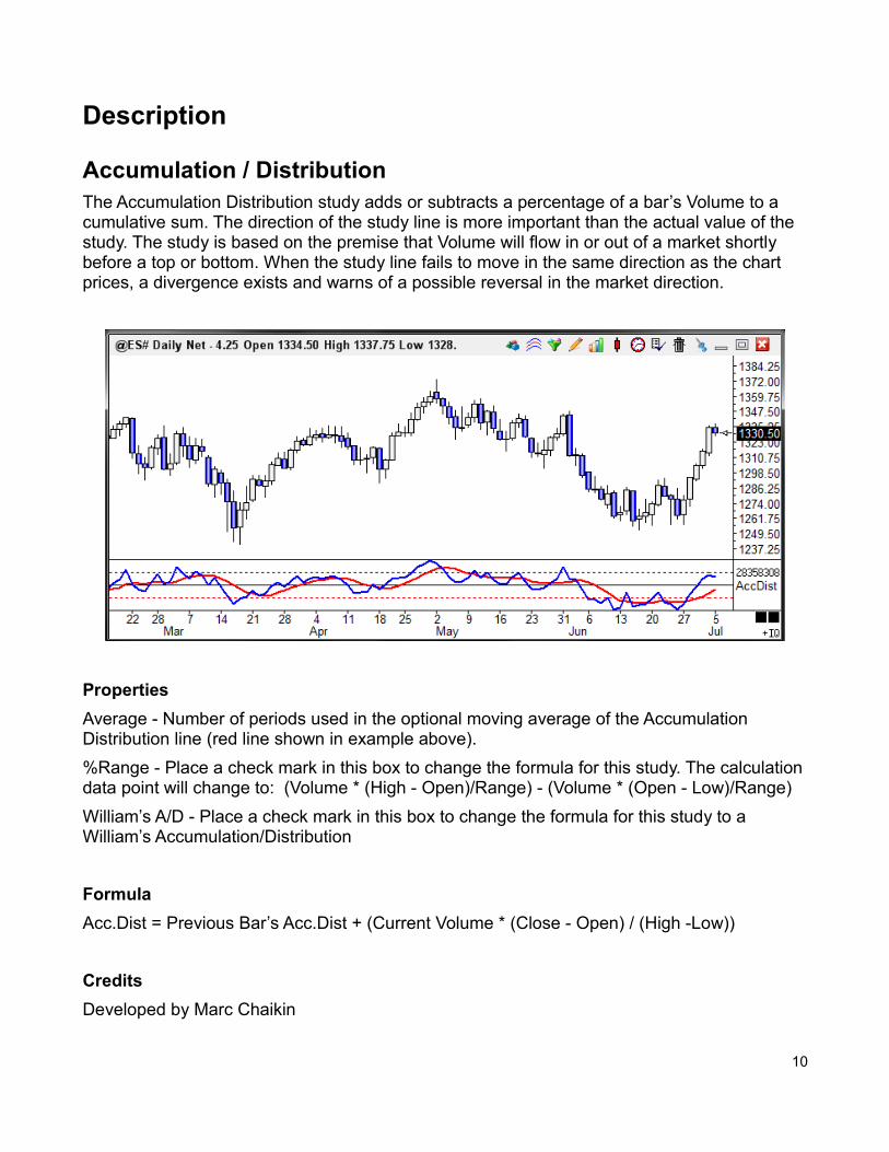
Accumulation / DistributionThe Accumulation Distribution study adds or subtracts a percentage of a bar’s Volume to a cumulative sum. The direction of the study line is more important than the actual value of the study. The study is based on the premise that Volume will flow in or out of a market shortly before a top or bottom. When the study line fails to move in the same direction as the chart prices, a divergence exists and warns of a possible reversal in the market direction.
Properties
Average - Number of periods used in the optional moving average of the Accumulation Distribution line (red line shown in example above).
%Range - Place a check mark in this box to change the formula for this study. The calculationdata point will change to: (Volume * (High - Open)/Range) - (Volume * (Open - Low)/Range)
William’s A/D - Place a check mark in this box to change the formula for this study to a William’s Accumulation/Distribution
Formula
Acc.Dist = Previous Bar’s Acc.Dist + (Current Volume * (Close - Open) / (High -Low))
Credits
Developed by Marc Chaikin
10
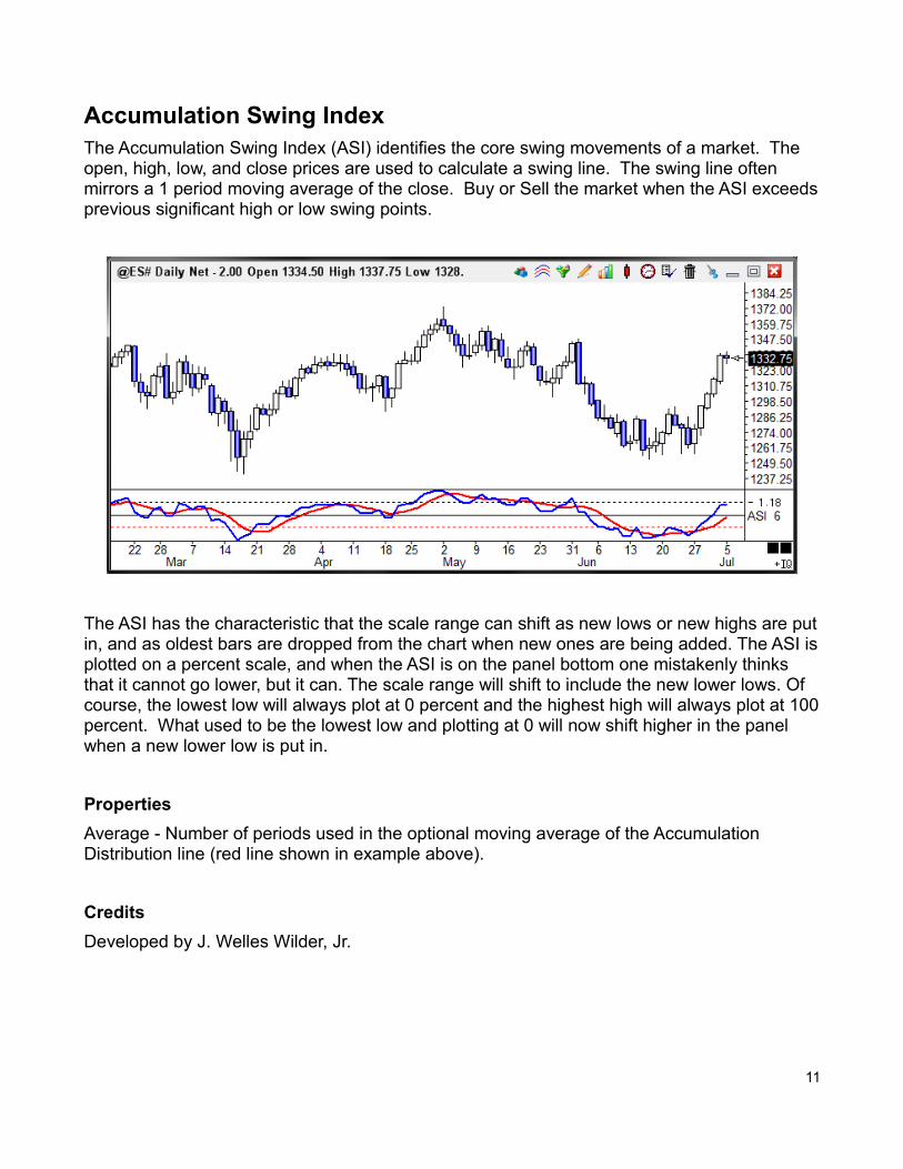
Accumulation Swing IndexThe Accumulation Swing Index (ASI) identifies the core swing movements of a market. The open, high, low, and close prices are used to calculate a swing line. The swing line often mirrors a 1 period moving average of the close. Buy or Sell the market when the ASI exceedsprevious significant high or low swing points.
The ASI has the characteristic that the scale range can shift as new lows or new highs are putin, and as oldest bars are dropped from the chart when new ones are being added. The ASI isplotted on a percent scale, and when the ASI is on the panel bottom one mistakenly thinks that it cannot go lower, but it can. The scale range will shift to include the new lower lows. Of course, the lowest low will always plot at 0 percent and the highest high will always plot at 100percent. What used to be the lowest low and plotting at 0 will now shift higher in the panel when a new lower low is put in.
Properties
Average - Number of periods used in the optional moving average of the Accumulation Distribution line (red line shown in example above).
Credits
Developed by J. Welles Wilder, Jr.
11
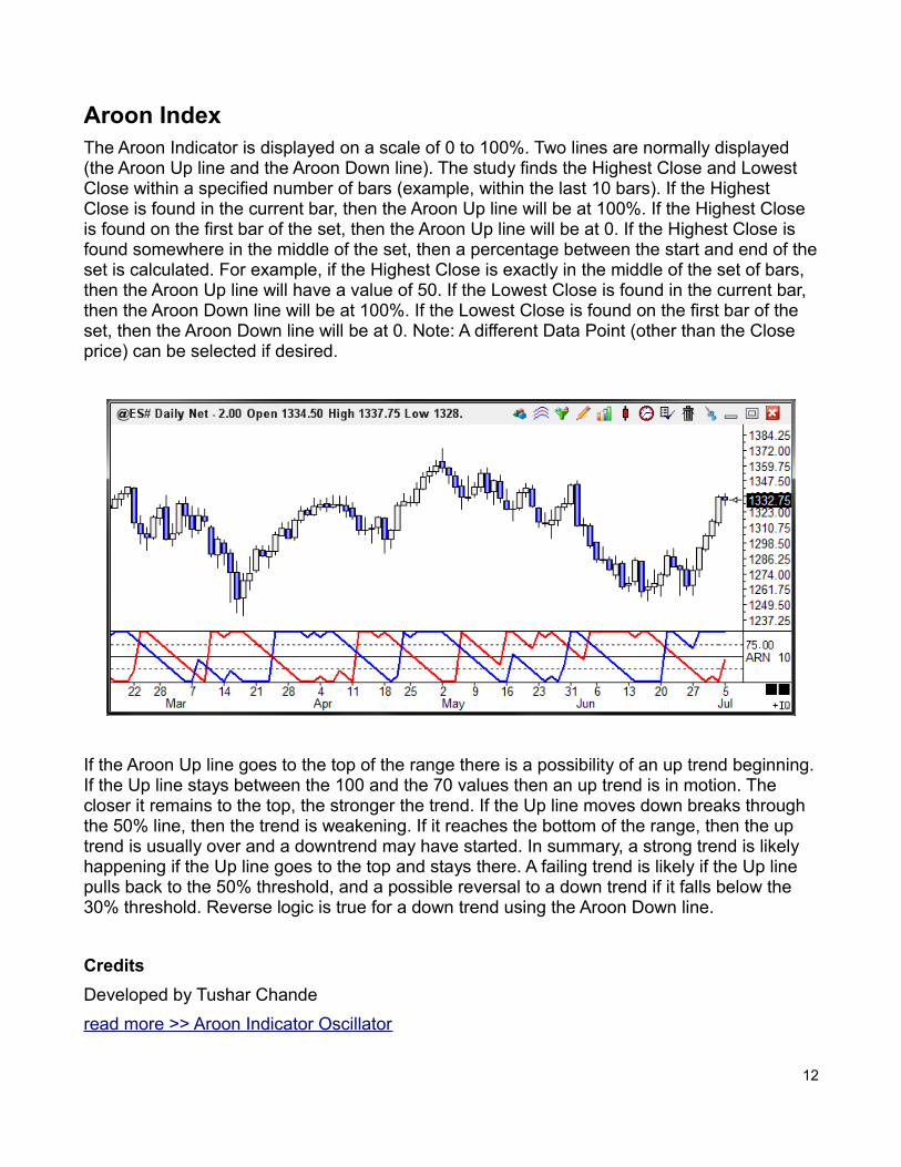
Aroon IndexThe Aroon Indicator is displayed on a scale of 0 to 100%. Two lines are normally displayed (the Aroon Up line and the Aroon Down line). The study finds the Highest Close and Lowest Close within a specified number of bars (example, within the last 10 bars). If the Highest Close is found in the current bar, then the Aroon Up line will be at 100%. If the Highest Close is found on the first bar of the set, then the Aroon Up line will be at 0. If the Highest Close is found somewhere in the middle of the set, then a percentage between the start and end of theset is calculated. For example, if the Highest Close is exactly in the middle of the set of bars, then the Aroon Up line will have a value of 50. If the Lowest Close is found in the current bar, then the Aroon Down line will be at 100%. If the Lowest Close is found on the first bar of the set, then the Aroon Down line will be at 0. Note: A different Data Point (other than the Close price) can be selected if desired.
If the Aroon Up line goes to the top of the range there is a possibility of an up trend beginning.If the Up line stays between the 100 and the 70 values then an up trend is in motion. The closer it remains to the top, the stronger the trend. If the Up line moves down breaks through the 50% line, then the trend is weakening. If it reaches the bottom of the range, then the up trend is usually over and a downtrend may have started. In summary, a strong trend is likely happening if the Up line goes to the top and stays there. A failing trend is likely if the Up line pulls back to the 50% threshold, and a possible reversal to a down trend if it falls below the 30% threshold. Reverse logic is true for a down trend using the Aroon Down line.
Credits
Developed by Tushar Chande
read more >> Aroon Indicator Oscillator
12
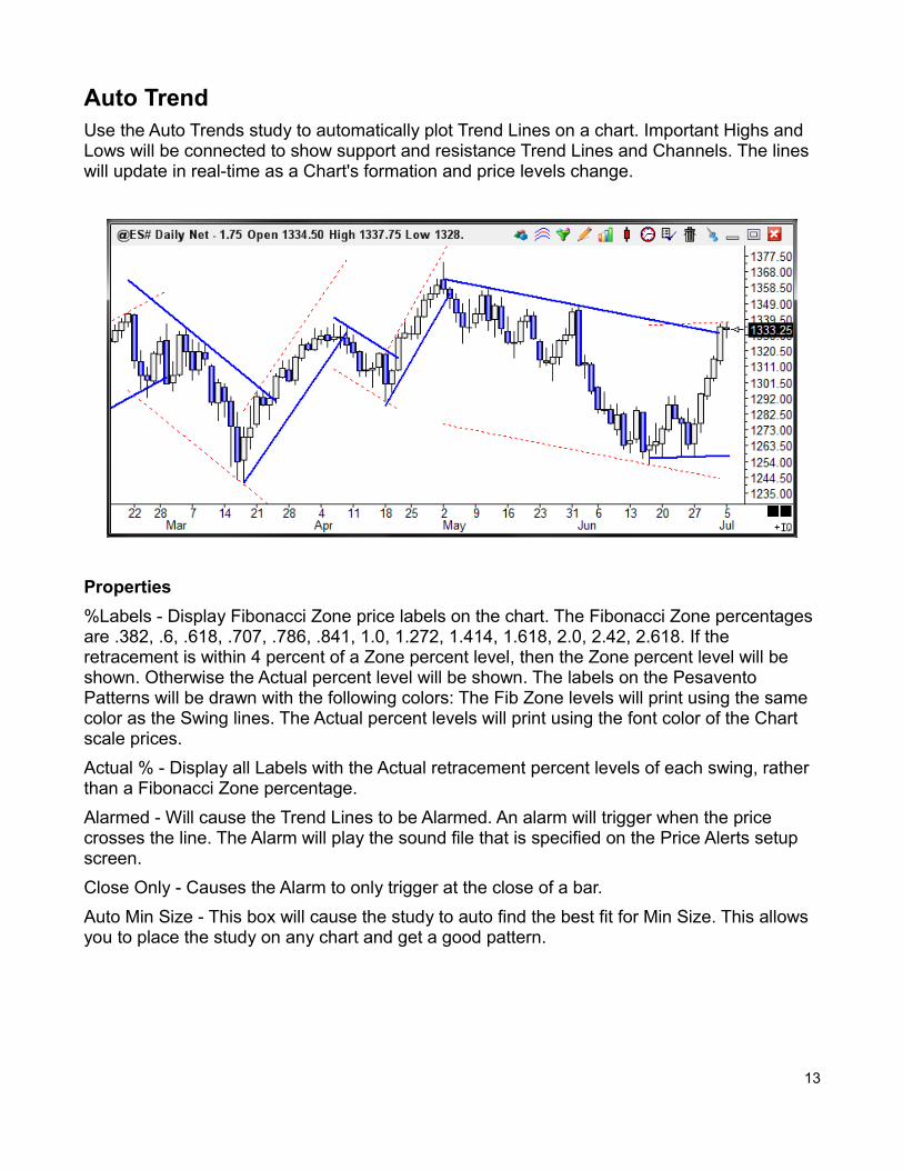
Auto TrendUse the Auto Trends study to automatically plot Trend Lines on a chart. Important Highs and Lows will be connected to show support and resistance Trend Lines and Channels. The lines will update in real-time as a Chart's formation and price levels change.
Properties
%Labels - Display Fibonacci Zone price labels on the chart. The Fibonacci Zone percentages are .382, .6, .618, .707, .786, .841, 1.0, 1.272, 1.414, 1.618, 2.0, 2.42, 2.618. If the retracement is within 4 percent of a Zone percent level, then the Zone percent level will be shown. Otherwise the Actual percent level will be shown. The labels on the Pesavento Patterns will be drawn with the following colors: The Fib Zone levels will print using the same color as the Swing lines. The Actual percent levels will print using the font color of the Chart scale prices.
Actual % - Display all Labels with the Actual retracement percent levels of each swing, rather than a Fibonacci Zone percentage.
Alarmed - Will cause the Trend Lines to be Alarmed. An alarm will trigger when the price crosses the line. The Alarm will play the sound file that is specified on the Price Alerts setup screen.
Close Only - Causes the Alarm to only trigger at the close of a bar.
Auto Min Size - This box will cause the study to auto find the best fit for Min Size. This allows you to place the study on any chart and get a good pattern.
13
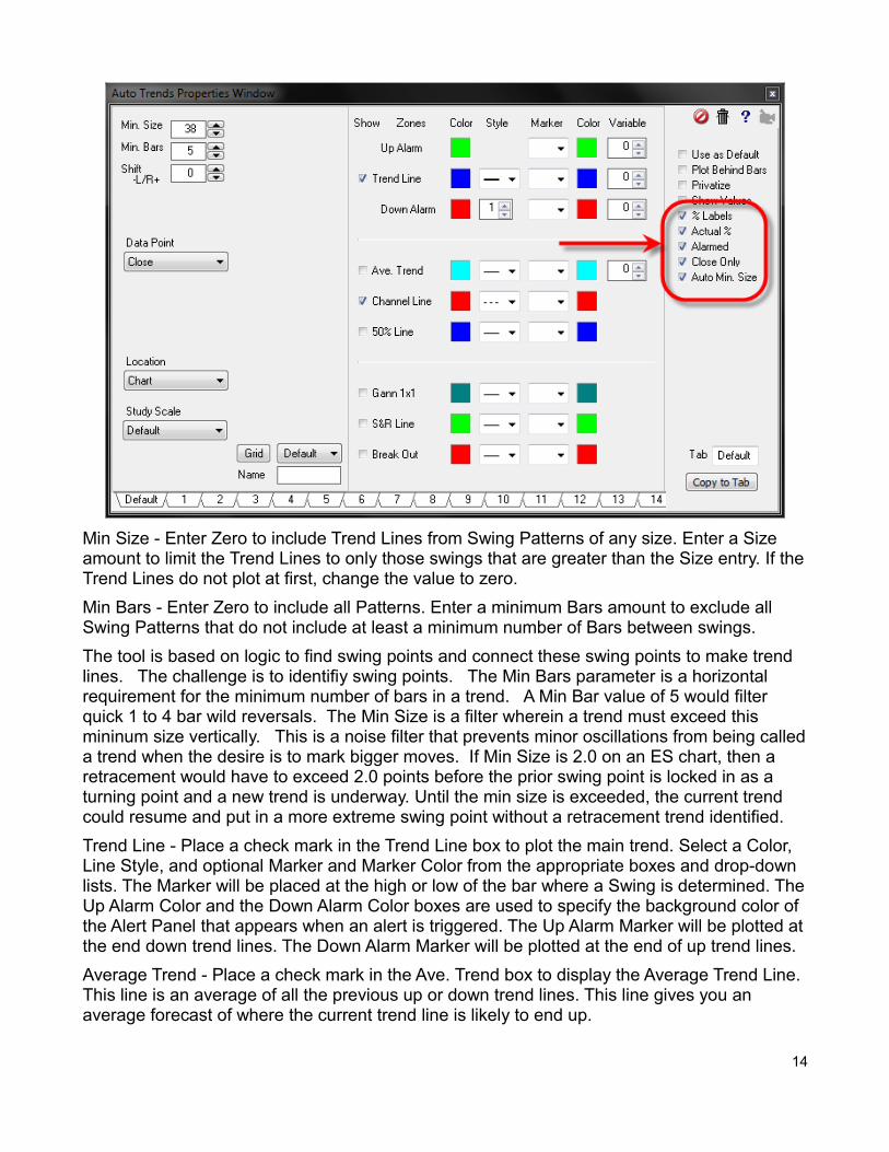
Min Size - Enter Zero to include Trend Lines from Swing Patterns of any size. Enter a Size amount to limit the Trend Lines to only those swings that are greater than the Size entry. If theTrend Lines do not plot at first, change the value to zero.
Min Bars - Enter Zero to include all Patterns. Enter a minimum Bars amount to exclude all Swing Patterns that do not include at least a minimum number of Bars between swings.
The tool is based on logic to find swing points and connect these swing points to make trend lines. The challenge is to identifiy swing points. The Min Bars parameter is a horizontal requirement for the minimum number of bars in a trend. A Min Bar value of 5 would filter quick 1 to 4 bar wild reversals. The Min Size is a filter wherein a trend must exceed this mininum size vertically. This is a noise filter that prevents minor oscillations from being calleda trend when the desire is to mark bigger moves. If Min Size is 2.0 on an ES chart, then a retracement would have to exceed 2.0 points before the prior swing point is locked in as a turning point and a new trend is underway. Until the min size is exceeded, the current trend could resume and put in a more extreme swing point without a retracement trend identified.
Trend Line - Place a check mark in the Trend Line box to plot the main trend. Select a Color, Line Style, and optional Marker and Marker Color from the appropriate boxes and drop-down lists. The Marker will be placed at the high or low of the bar where a Swing is determined. TheUp Alarm Color and the Down Alarm Color boxes are used to specify the background color of the Alert Panel that appears when an alert is triggered. The Up Alarm Marker will be plotted atthe end down trend lines. The Down Alarm Marker will be plotted at the end of up trend lines.
Average Trend - Place a check mark in the Ave. Trend box to display the Average Trend Line. This line is an average of all the previous up or down trend lines. This line gives you an average forecast of where the current trend line is likely to end up.
14
Channel Line - Place a check mark in the Channel Line box to plot a parallel Channel line. Select a Color, Line Style, and optional Marker and Marker Color from the appropriate boxes and drop-down lists. The Channel Line Marker will be plotted at the end of the Channel Line.
50% Line - Place a check mark in the 50% Line box to plot a line half way between the Trend Line and the Channel Line. The optional 50% Line Marker will be plotted at the end of the 50% Line.
Gann 1 x 1 - Place a check mark in the Gann 1x1 box to plot a Gann 1 by 1 line from the Swing points. This is the same technology used by the Pyrapoint study.
S & R Line - Place a check mark in the S & R Line box to plot Support and Resistance Lines. These lines are drawn from key highs and lows on the chart, from an expanding formation. Select a Color, Line Style, and optional Marker and Marker Color. The Marker will be plotted at the beginning of the line. An optional multiplier value allows you to extend the lines.
Break Out - Place a check mark in the Break Out box to plot Break Out Lines. These lines aresimilar to the S & R Lines. The Break Out lines are drawn from key highs and lows that slope down from high points, or slope up from low points. For example, a Pennant formation would draw Break Out Lines.
Credits
Ensign's methodology for implementing automated trend lines is proprietary, yet very similar to the concepts published in Siligardos' article (Technical Analysis of Stocks & Commodities magazine, Nov 2006 issue).
read more >> Auto Trend Line Extendedread more >> Auto Trends Channel Priceread more >> Auto Trends Features and Propertiesread more >> Auto Trends on CCI Study
15
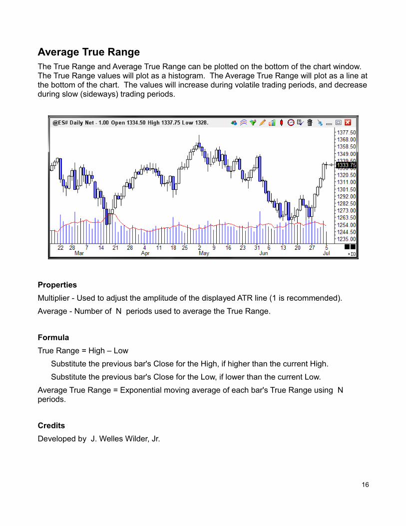
Average True RangeThe True Range and Average True Range can be plotted on the bottom of the chart window. The True Range values will plot as a histogram. The Average True Range will plot as a line atthe bottom of the chart. The values will increase during volatile trading periods, and decreaseduring slow (sideways) trading periods.
Properties
Multiplier - Used to adjust the amplitude of the displayed ATR line (1 is recommended).
Average - Number of N periods used to average the True Range.
Formula
True Range = High – Low
Substitute the previous bar's Close for the High, if higher than the current High.
Substitute the previous bar's Close for the Low, if lower than the current Low.
Average True Range = Exponential moving average of each bar's True Range using N periods.
Credits
Developed by J. Welles Wilder, Jr.
16
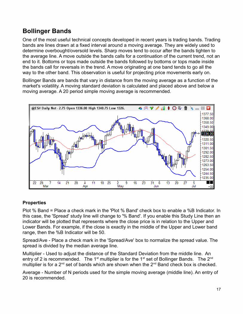
Bollinger BandsOne of the most useful technical concepts developed in recent years is trading bands. Tradingbands are lines drawn at a fixed interval around a moving average. They are widely used to determine overbought/oversold levels. Sharp moves tend to occur after the bands tighten to the average line. A move outside the bands calls for a continuation of the current trend, not anend to it. Bottoms or tops made outside the bands followed by bottoms or tops made inside the bands call for reversals in the trend. A move originating at one band tends to go all the way to the other band. This observation is useful for projecting price movements early on.
Bollinger Bands are bands that vary in distance from the moving average as a function of the market's volatility. A moving standard deviation is calculated and placed above and below a moving average. A 20 period simple moving average is recommended.
Properties
Plot % Band = Place a check mark in the 'Plot % Band' check box to enable a %B Indicator. Inthis case, the 'Spread' study line will change to '% Band'. If you enable this Study Line then anindicator will be plotted that represents where the close price is in relation to the Upper and Lower Bands. For example, if the close is exactly in the middle of the Upper and Lower band range, then the %B Indicator will be 50.
Spread/Ave - Place a check mark in the 'Spread/Ave' box to normalize the spread value. The spread is divided by the median average line.
Multiplier - Used to adjust the distance of the Standard Deviation from the middle line. An entry of 2 is recommended. The 1st multiplier is for the 1st set of Bollinger Bands. The 2nd multiplier is for a 2nd set of bands which are shown when the 2nd Band check box is checked.
Average - Number of N periods used for the simple moving average (middle line). An entry of 20 is recommended.
17
Formula
Simple Moving Average = Sum of last N data points / N. This will be the middle line.
Deviation = (Price of data point - Average) ^ 2 calculated for the last N bars.
Mean Deviation = Sum of Deviations / N calculated for the last N bars.
Standard Deviation = Square Root of (Mean Deviation)
Bollinger Bands Lines = Simple moving average line plus and minus the Standard Deviation xMultiplier
Credits
Bollinger Bands are credited to John Bollinger, President, Bollinger Capital Management, Inc. For more information regarding Bollinger Bands or John Bollinger's Capital Growth Letter, contact: John Bollinger's Capital Growth Letter, P.O. Box 3358, Manhattan Beach, CA 90266, (310) 798-8855.
18
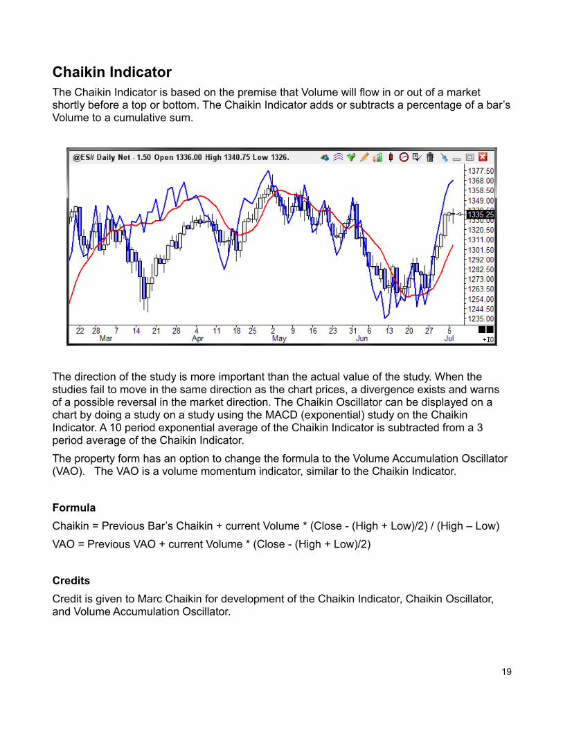
Chaikin IndicatorThe Chaikin Indicator is based on the premise that Volume will flow in or out of a market shortly before a top or bottom. The Chaikin Indicator adds or subtracts a percentage of a bar’sVolume to a cumulative sum.
The direction of the study is more important than the actual value of the study. When the studies fail to move in the same direction as the chart prices, a divergence exists and warns of a possible reversal in the market direction. The Chaikin Oscillator can be displayed on a chart by doing a study on a study using the MACD (exponential) study on the Chaikin Indicator. A 10 period exponential average of the Chaikin Indicator is subtracted from a 3 period average of the Chaikin Indicator.
The property form has an option to change the formula to the Volume Accumulation Oscillator (VAO). The VAO is a volume momentum indicator, similar to the Chaikin Indicator.
Formula
Chaikin = Previous Bar’s Chaikin + current Volume * (Close - (High + Low)/2) / (High – Low)
VAO = Previous VAO + current Volume * (Close - (High + Low)/2)
Credits
Credit is given to Marc Chaikin for development of the Chaikin Indicator, Chaikin Oscillator, and Volume Accumulation Oscillator.
19
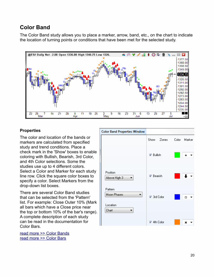
Color BandThe Color Band study allows you to place a marker, arrow, band, etc., on the chart to indicate the location of turning points or conditions that have been met for the selected study.
Properties
The color and location of the bands ormarkers are calculated from specifiedstudy and trend conditions. Place a check mark in the 'Show' boxes to enablecoloring with Bullish, Bearish, 3rd Color,and 4th Color selections. Some thestudies use up to 4 different colors. Select a Color and Marker for each studyline row. Click the square color boxes tospecify a color. Select Markers from thedrop-down list boxes.
There are several Color Band studies that can be selected from the 'Pattern'list. For example: Close Outer 10% (Markall bars which have a Close price near the top or bottom 10% of the bar's range). A complete description of each study can be read in the documentation forColor Bars.
read more >> Color Bandsread more >> Color Bars
20
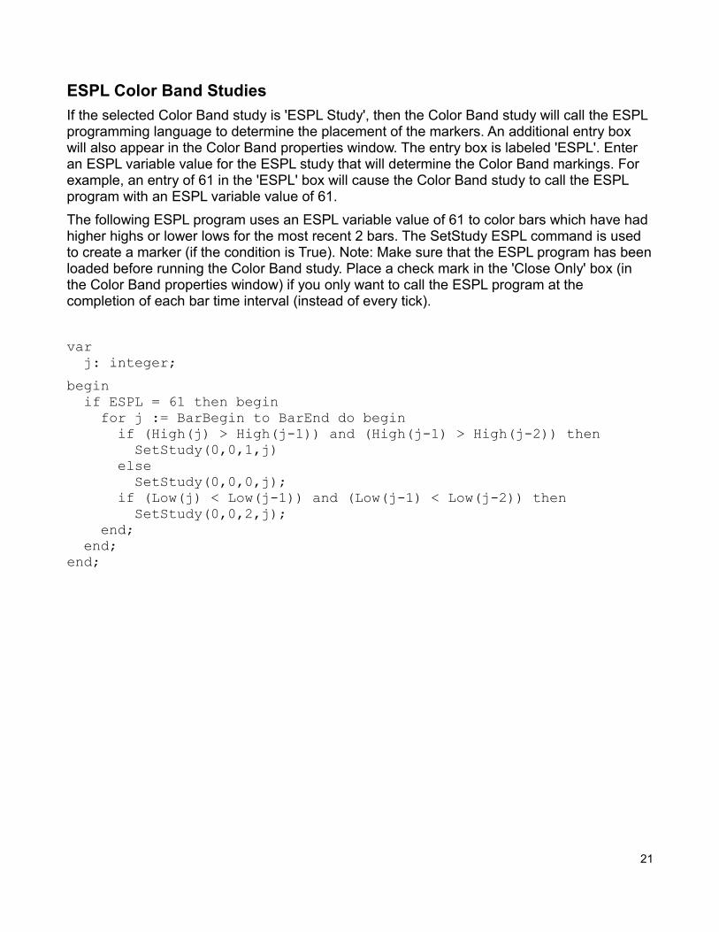
ESPL Color Band Studies
If the selected Color Band study is 'ESPL Study', then the Color Band study will call the ESPL programming language to determine the placement of the markers. An additional entry box will also appear in the Color Band properties window. The entry box is labeled 'ESPL'. Enter an ESPL variable value for the ESPL study that will determine the Color Band markings. For example, an entry of 61 in the 'ESPL' box will cause the Color Band study to call the ESPL program with an ESPL variable value of 61.
The following ESPL program uses an ESPL variable value of 61 to color bars which have had higher highs or lower lows for the most recent 2 bars. The SetStudy ESPL command is used to create a marker (if the condition is True). Note: Make sure that the ESPL program has beenloaded before running the Color Band study. Place a check mark in the 'Close Only' box (in the Color Band properties window) if you only want to call the ESPL program at the completion of each bar time interval (instead of every tick).
var j: integer;
begin if ESPL = 61 then begin for j := BarBegin to BarEnd do begin if (High(j) > High(j-1)) and (High(j-1) > High(j-2)) then SetStudy(0,0,1,j) else SetStudy(0,0,0,j); if (Low(j) < Low(j-1)) and (Low(j-1) < Low(j-2)) then SetStudy(0,0,2,j); end; end;end;
21
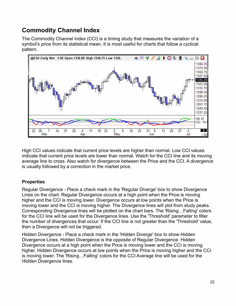
Commodity Channel IndexThe Commodity Channel Index (CCI) is a timing study that measures the variation of a symbol's price from its statistical mean. It is most useful for charts that follow a cyclical pattern.
High CCI values indicate that current price levels are higher than normal. Low CCI values indicate that current price levels are lower than normal. Watch for the CCI line and its moving average line to cross. Also watch for divergence between the Price and the CCI. A divergenceis usually followed by a correction in the market price.
Properties
Regular Divergence - Place a check mark in the 'Regular Diverge' box to show Divergence Lines on the chart. Regular Divergence occurs at a high point when the Price is moving higher and the CCI is moving lower. Divergence occurs at low points when the Price is moving lower and the CCI is moving higher. The Divergence lines will plot from study peaks. Corresponding Divergence lines will be plotted on the chart bars. The 'Rising…Falling' colors for the CCI line will be used for the Divergence lines. Use the 'Threshold' parameter to filter the number of divergences that occur. If the CCI line is not greater than the 'Threshold' value, then a Divergence will not be triggered.
Hidden Divergence - Place a check mark in the 'Hidden Diverge' box to show Hidden Divergence Lines. Hidden Divergence is the opposite of Regular Divergence. Hidden Divergence occurs at a high point when the Price is moving lower and the CCI is moving higher. Hidden Divergence occurs at low points when the Price is moving higher and the CCI is moving lower. The 'Rising…Falling' colors for the CCI Average line will be used for the Hidden Divergence lines.
22
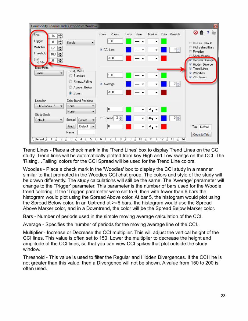
Trend Lines - Place a check mark in the 'Trend Lines' box to display Trend Lines on the CCI study. Trend lines will be automatically plotted from key High and Low swings on the CCI. The'Rising…Falling' colors for the CCI Spread will be used for the Trend Line colors.
Woodies - Place a check mark in the 'Woodies' box to display the CCI study in a manner similar to that promoted in the Woodies CCI chat group. The colors and style of the study will be drawn differently. The study calculations will still be the same. The 'Average' parameter willchange to the 'Trigger' parameter. This parameter is the number of bars used for the Woodie trend coloring. If the 'Trigger' parameter were set to 6, then with fewer than 6 bars the histogram would plot using the Spread Above color. At bar 5, the histogram would plot using the Spread Below color. In an Uptrend at >=6 bars, the histogram would use the Spread Above Marker color, and in a Downtrend, the color will be the Spread Below Marker color.
Bars - Number of periods used in the simple moving average calculation of the CCI.
Average - Specifies the number of periods for the moving average line of the CCI.
Multiplier - Increase or Decrease the CCI multiplier. This will adjust the vertical height of the CCI lines. This value is often set to 150. Lower the multiplier to decrease the height and amplitude of the CCI lines, so that you can view CCI spikes that plot outside the study window.
Threshold - This value is used to filter the Regular and Hidden Divergences. If the CCI line is not greater than this value, then a Divergence will not be shown. A value from 150 to 200 is often used.
23

Formula
Simple Moving Average = Sum of the last N Prices / N
Mean Deviation = Sum of last (Data Point Price -Average) / N
CCI = 150 x (Data Point Price -Simple Moving Average) / Mean Deviation
Credits
Developed by Donald Lambert
24
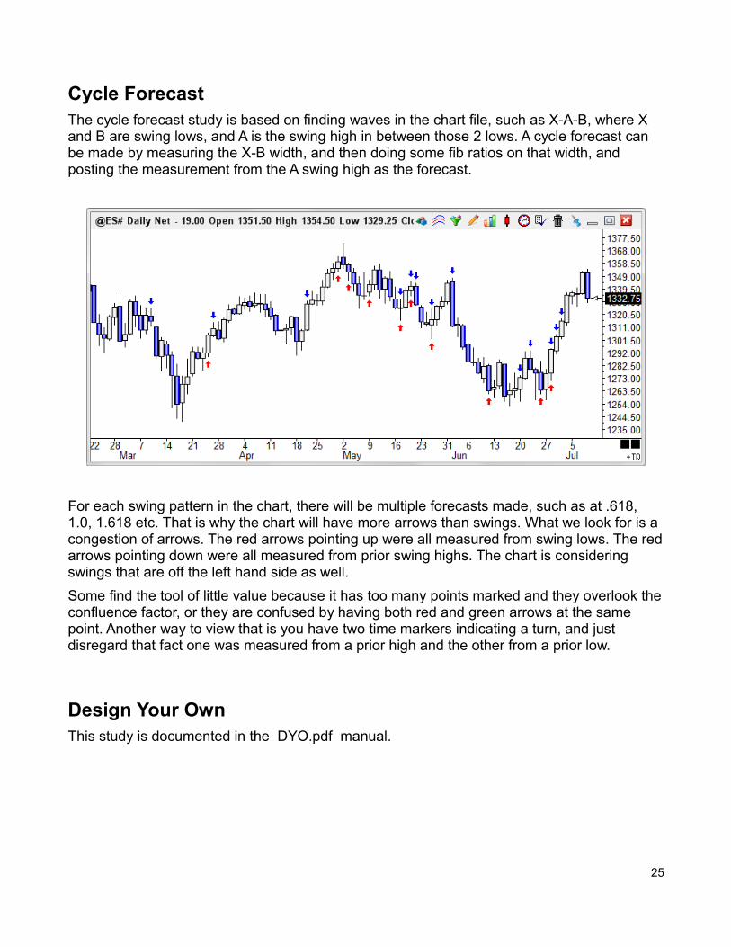
Cycle ForecastThe cycle forecast study is based on finding waves in the chart file, such as X-A-B, where X and B are swing lows, and A is the swing high in between those 2 lows. A cycle forecast can be made by measuring the X-B width, and then doing some fib ratios on that width, and posting the measurement from the A swing high as the forecast.
For each swing pattern in the chart, there will be multiple forecasts made, such as at .618, 1.0, 1.618 etc. That is why the chart will have more arrows than swings. What we look for is a congestion of arrows. The red arrows pointing up were all measured from swing lows. The redarrows pointing down were all measured from prior swing highs. The chart is considering swings that are off the left hand side as well.
Some find the tool of little value because it has too many points marked and they overlook theconfluence factor, or they are confused by having both red and green arrows at the same point. Another way to view that is you have two time markers indicating a turn, and just disregard that fact one was measured from a prior high and the other from a prior low.
Design Your OwnThis study is documented in the DYO.pdf manual.
25
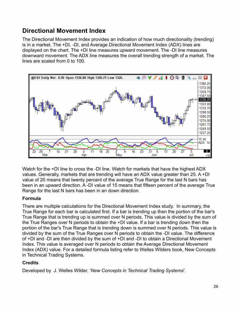
Directional Movement IndexThe Directional Movement Index provides an indication of how much directionality (trending) is in a market. The +DI, -DI, and Average Directional Movement Index (ADX) lines are displayed on the chart. The +DI line measures upward movement. The -DI line measures downward movement. The ADX line measures the overall trending strength of a market. The lines are scaled from 0 to 100.
Watch for the +DI line to cross the -DI line. Watch for markets that have the highest ADX values. Generally, markets that are trending will have an ADX value greater than 25. A +DI value of 20 means that twenty percent of the average True Range for the last N bars has been in an upward direction. A -DI value of 15 means that fifteen percent of the average True Range for the last N bars has been in an down direction.
Formula
There are multiple calculations for the Directional Movement Index study. In summary, the True Range for each bar is calculated first. If a bar is trending up then the portion of the bar's True Range that is trending up is summed over N periods. This value is divided by the sum of the True Ranges over N periods to obtain the +DI value. If a bar is trending down then the portion of the bar's True Range that is trending down is summed over N periods. This value is divided by the sum of the True Ranges over N periods to obtain the -DI value. The difference of +DI and -DI are then divided by the sum of +DI and -DI to obtain a Directional Movement Index. This value is averaged over N periods to obtain the Average Directional Movement Index (ADX) value. For a detailed formula listing refer to Welles Wilders book, New Concepts in Technical Trading Systems.
Credits
Developed by J. Welles Wilder, 'New Concepts in Technical Trading Systems'.
26
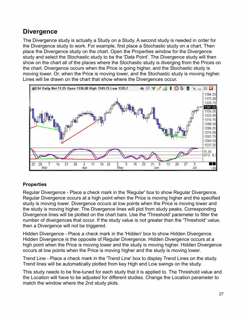
DivergenceThe Divergence study is actually a Study on a Study. A second study is needed in order for the Divergence study to work. For example, first place a Stochastic study on a chart. Then place the Divergence study on the chart. Open the Properties window for the Divergence study and select the Stochastic study to be the 'Data Point'. The Divergence study will then show on the chart all of the places where the Stochastic study is diverging from the Prices on the chart. Divergence occurs when the Price is going higher, and the Stochastic study is moving lower. Or, when the Price is moving lower, and the Stochastic study is moving higher. Lines will be drawn on the chart that show where the Divergences occur.
Properties
Regular Divergence - Place a check mark in the 'Regular' box to show Regular Divergence. Regular Divergence occurs at a high point when the Price is moving higher and the specified study is moving lower. Divergence occurs at low points when the Price is moving lower and the study is moving higher. The Divergence lines will plot from study peaks. Corresponding Divergence lines will be plotted on the chart bars. Use the 'Threshold' parameter to filter the number of divergences that occur. If the study value is not greater than the 'Threshold' value, then a Divergence will not be triggered.
Hidden Divergence - Place a check mark in the 'Hidden' box to show Hidden Divergence. Hidden Divergence is the opposite of Regular Divergence. Hidden Divergence occurs at a high point when the Price is moving lower and the study is moving higher. Hidden Divergence occurs at low points when the Price is moving higher and the study is moving lower.
Trend Line - Place a check mark in the 'Trend Line' box to display Trend Lines on the study. Trend lines will be automatically plotted from key High and Low swings on the study.
This study needs to be fine-tuned for each study that it is applied to. The Threshold value and the Location will have to be adjusted for different studies. Change the Location parameter to match the window where the 2nd study plots.
27
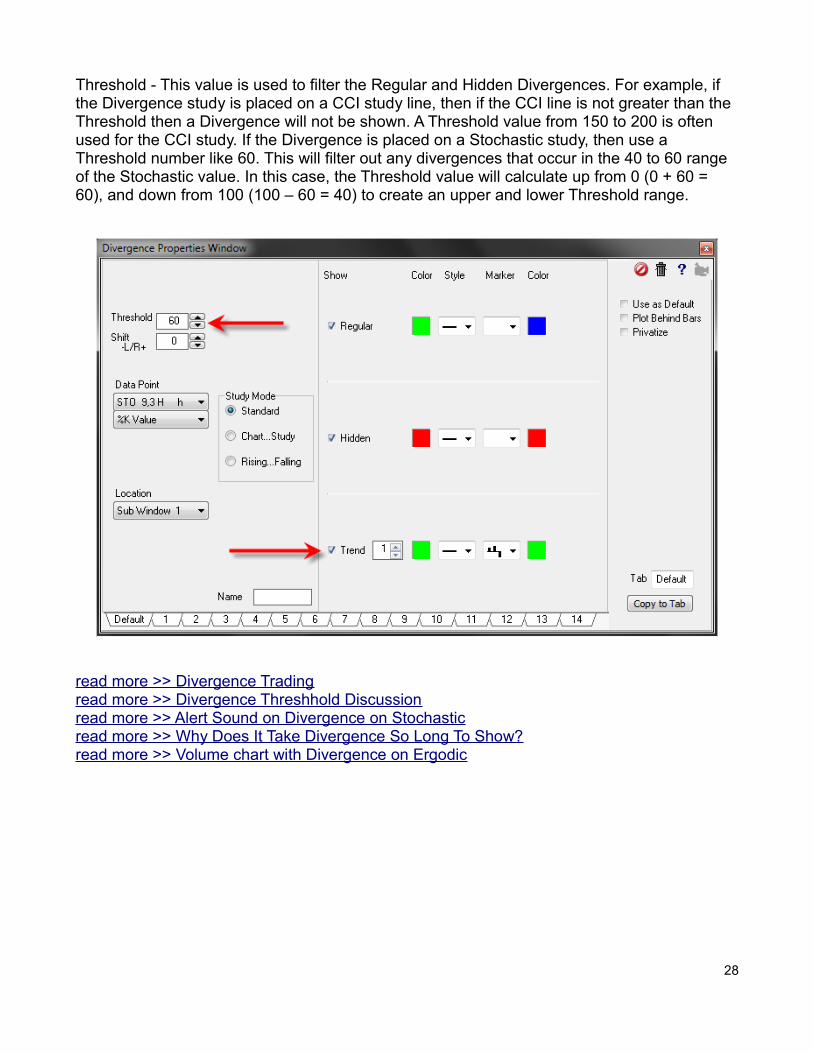
Threshold - This value is used to filter the Regular and Hidden Divergences. For example, if the Divergence study is placed on a CCI study line, then if the CCI line is not greater than the Threshold then a Divergence will not be shown. A Threshold value from 150 to 200 is often used for the CCI study. If the Divergence is placed on a Stochastic study, then use a Threshold number like 60. This will filter out any divergences that occur in the 40 to 60 range of the Stochastic value. In this case, the Threshold value will calculate up from 0 (0 + 60 = 60), and down from 100 (100 – 60 = 40) to create an upper and lower Threshold range.
read more >> Divergence Tradingread more >> Divergence Threshhold Discussionread more >> Alert Sound on Divergence on Stochasticread more >> Why Does It Take Divergence So Long To Show?read more >> Volume chart with Divergence on Ergodic
28
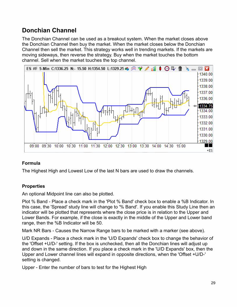
Donchian ChannelThe Donchian Channel can be used as a breakout system. When the market closes above the Donchian Channel then buy the market. When the market closes below the Donchian Channel then sell the market. This strategy works well in trending markets. If the markets are moving sideways, then reverse the strategy. Buy when the market touches the bottom channel. Sell when the market touches the top channel.
Formula
The Highest High and Lowest Low of the last N bars are used to draw the channels.
Properties
An optional Midpoint line can also be plotted.
Plot % Band - Place a check mark in the 'Plot % Band' check box to enable a %B Indicator. Inthis case, the 'Spread' study line will change to '% Band'. If you enable this Study Line then anindicator will be plotted that represents where the close price is in relation to the Upper and Lower Bands. For example, if the close is exactly in the middle of the Upper and Lower band range, then the %B Indicator will be 50.
Mark NR Bars - Causes the Narrow Range bars to be marked with a marker (see above).
U/D Expands - Place a check mark in the 'U/D Expands' check box to change the behavior of the 'Offset +U/D-' setting. If the box is unchecked, then all the Donchian lines will adjust up and down in the same direction. If you place a check mark in the 'U/D Expands' box, then the Upper and Lower channel lines will expand in opposite directions, when the 'Offset +U/D-' setting is changed.
Upper - Enter the number of bars to test for the Highest High
29
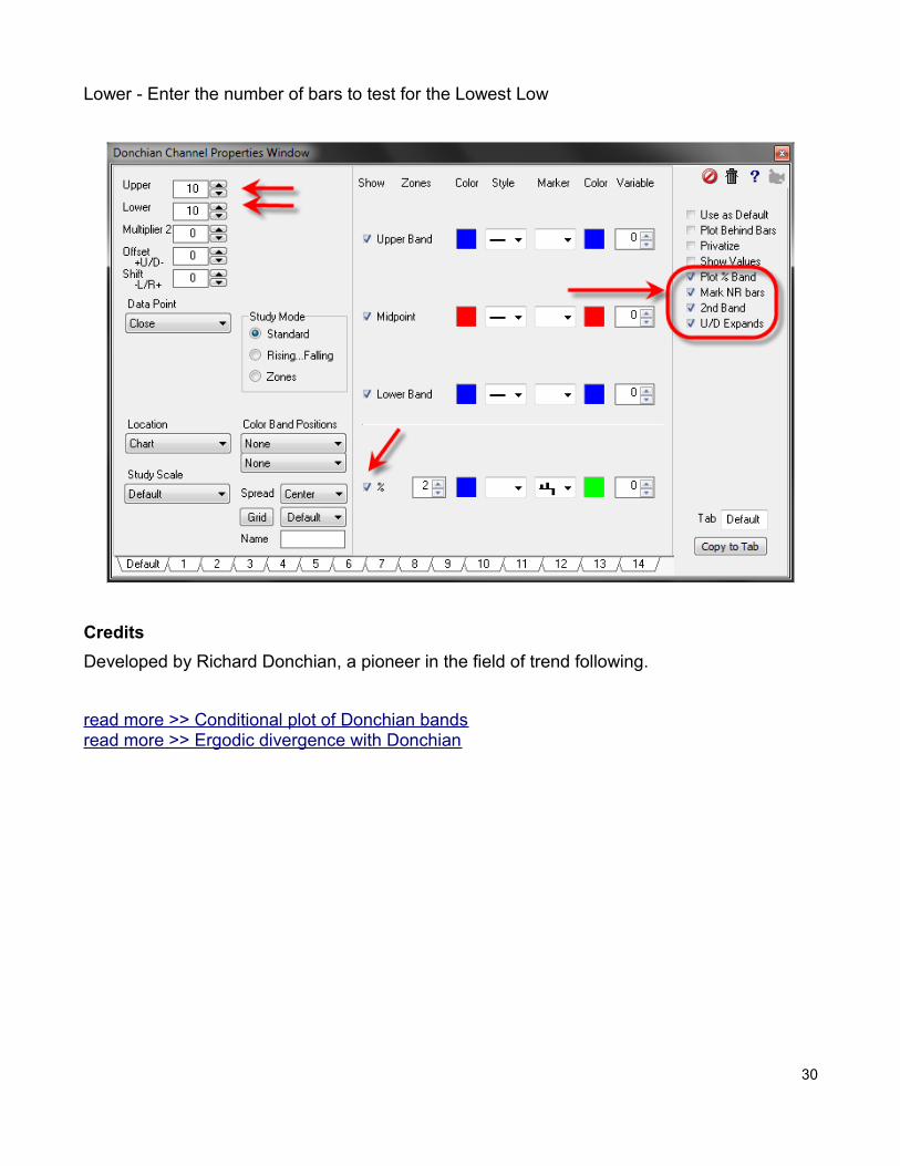
Lower - Enter the number of bars to test for the Lowest Low
Credits
Developed by Richard Donchian, a pioneer in the field of trend following.
read more >> Conditional plot of Donchian bandsread more >> Ergodic divergence with Donchian
30
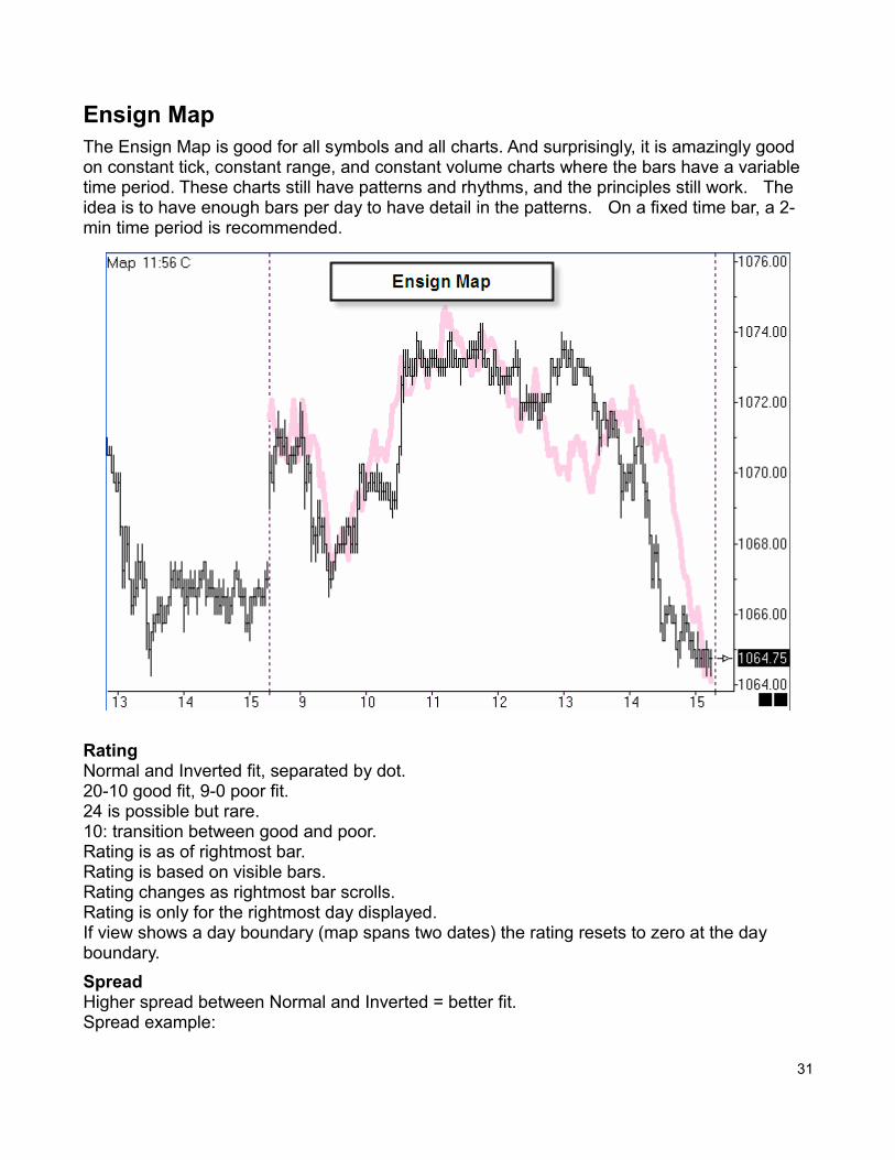
Ensign MapThe Ensign Map is good for all symbols and all charts. And surprisingly, it is amazingly good on constant tick, constant range, and constant volume charts where the bars have a variable time period. These charts still have patterns and rhythms, and the principles still work. The idea is to have enough bars per day to have detail in the patterns. On a fixed time bar, a 2-min time period is recommended.
RatingNormal and Inverted fit, separated by dot.20-10 good fit, 9-0 poor fit.24 is possible but rare.10: transition between good and poor.Rating is as of rightmost bar.Rating is based on visible bars.Rating changes as rightmost bar scrolls.Rating is only for the rightmost day displayed.If view shows a day boundary (map spans two dates) the rating resets to zero at the day boundary.
Spread Higher spread between Normal and Inverted = better fit.Spread example:
31
19.0 spread of 19-0 = 19 indicates more strength.12.10 spread of 2 indicates less strength.Recalculate if spread is low.Low on sideways narrow range days.
Time Specifies current time (should it be time of bar that was farthest right when map was calculated?).
Equal Weights Unchecked gives recent patterns a higher weighting in evaluations.
Lock Shift Unchecked allows shifting the Map to align swings.
Calculating the Map
1. For next day, calculate map at end of current day's session. 2. For today, position chart so last bar on chart is through yesterday, calculate map, then
drag chart to left to show the map for today based on yesterday. 3. Bars that are off the right side of the chart are not included in the Map calculation. 4. Often times the initial calculation may be out of phase briefly but the actual and the
map are decently good, so keep it, and the actual rejoins the Map for a great correlation.
Recalculating the Map
1. After one hour (30 bars on 2-min chart) into today's session, or after midnight if using both sessions, consider recalculating if the fit is not good.
2. Recalculating before having 30 bars might be too little data or pattern to consider. Try to avoid recalculation to avoid the challenge. If too quick to recalculate, it might improve on the current phase, only to drift out of correlation in the near future.
3. Part of the genius of the Map is rhythms, or cycle widths, and it measures time. If the cycle is, say 90 minutes, then aligning Map's last swing point with actual swing point, now improves on the 90 minute timing for the next swing point. The drift was in the alignment of the swing point, and not in the width of the cycle found.
Price Preparation (Pesavento)
1. For next trading day, mark hourly and daily bar charts with Fibonacci price levels. 2. Look for key prices, and patterns such as Gartley and Butterfly. Multiple Fibonacci tools
might be applied to a chart, and the key prices are those where there is congestion of multiple levels at the same price. The Fibonacci Levels used are 0.618, 0.786, 1.00, 1.272, and 1.618.
Timing Process (Pesavento)
1. Watch for correlation in Time forecast with market turns (harmony). 2. When price is at the time for a trend change, use Fibonacci levels tool to see which
level should be used for reversal entry price. Use only 2m chart for day trading. 3. If chart shows good correlation, meaning actual turns are happening within 15 minutes
of the forecast time for the turn and have correct direction going into the turn, then confidence in Time forecast, so trade the chart.
32
4. If correlation is off, then ignore chart. Market must be in sync or harmony with Time forecasts on 2-min bar charts.
Trading the Map Entry=Fibonacci level.Stop=few pips beyond Fibonacci level.Profit=Fibonacci Level price the market is nearest when it was the time for a trend change.
ExampleIf price descending, but slightly above the 1.27 level, and it is time (within 15m) for the market to change, place an order to enter at 1.27 level price, stop a few ticks/pips lower. Wait for timeof next turn, and possibly raise stop to breakeven.
33
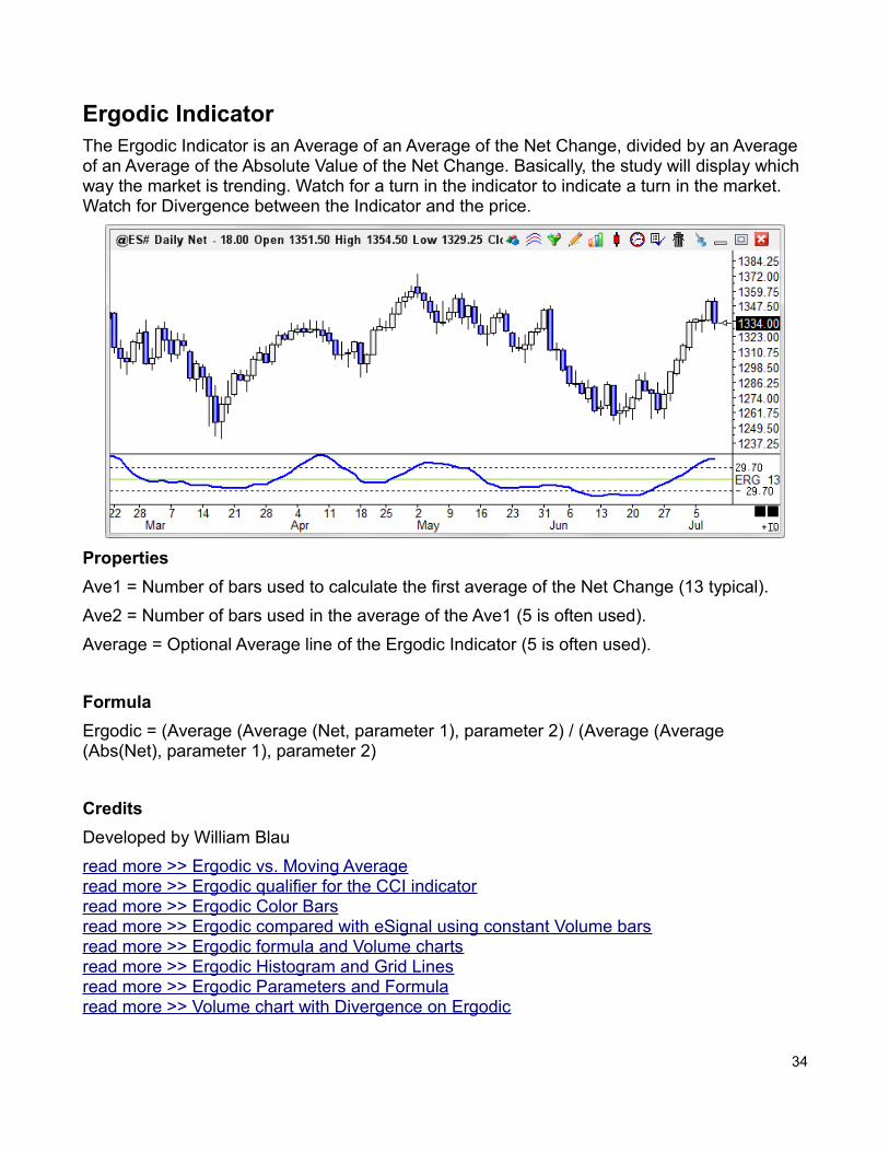
Ergodic IndicatorThe Ergodic Indicator is an Average of an Average of the Net Change, divided by an Average of an Average of the Absolute Value of the Net Change. Basically, the study will display which way the market is trending. Watch for a turn in the indicator to indicate a turn in the market. Watch for Divergence between the Indicator and the price.
Properties
Ave1 = Number of bars used to calculate the first average of the Net Change (13 typical).
Ave2 = Number of bars used in the average of the Ave1 (5 is often used).
Average = Optional Average line of the Ergodic Indicator (5 is often used).
Formula
Ergodic = (Average (Average (Net, parameter 1), parameter 2) / (Average (Average (Abs(Net), parameter 1), parameter 2)
Credits
Developed by William Blau
read more >> Ergodic vs. Moving Averageread more >> Ergodic qualifier for the CCI indicatorread more >> Ergodic Color Barsread more >> Ergodic compared with eSignal using constant Volume barsread more >> Ergodic formula and Volume chartsread more >> Ergodic Histogram and Grid Linesread more >> Ergodic Parameters and Formularead more >> Volume chart with Divergence on Ergodic
34
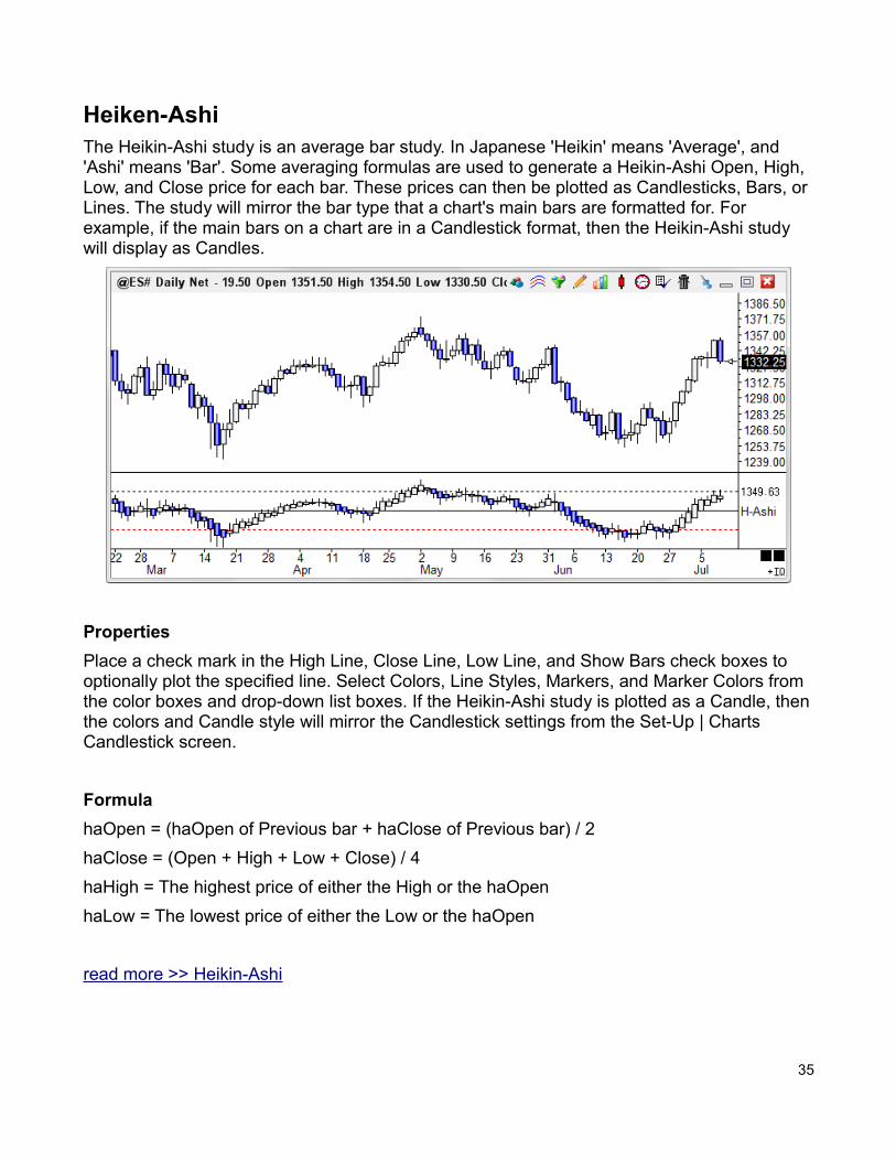
Heiken-AshiThe Heikin-Ashi study is an average bar study. In Japanese 'Heikin' means 'Average', and 'Ashi' means 'Bar'. Some averaging formulas are used to generate a Heikin-Ashi Open, High, Low, and Close price for each bar. These prices can then be plotted as Candlesticks, Bars, or Lines. The study will mirror the bar type that a chart's main bars are formatted for. For example, if the main bars on a chart are in a Candlestick format, then the Heikin-Ashi study will display as Candles.
Properties
Place a check mark in the High Line, Close Line, Low Line, and Show Bars check boxes to optionally plot the specified line. Select Colors, Line Styles, Markers, and Marker Colors from the color boxes and drop-down list boxes. If the Heikin-Ashi study is plotted as a Candle, thenthe colors and Candle style will mirror the Candlestick settings from the Set-Up | Charts Candlestick screen.
Formula
haOpen = (haOpen of Previous bar + haClose of Previous bar) / 2
haClose = (Open + High + Low + Close) / 4
haHigh = The highest price of either the High or the haOpen
haLow = The lowest price of either the Low or the haOpen
read more >> Heikin-Ashi
35
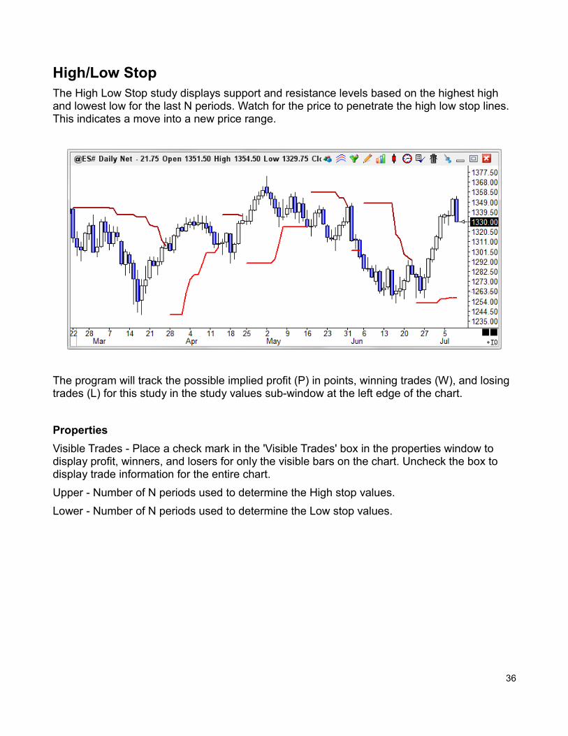
High/Low StopThe High Low Stop study displays support and resistance levels based on the highest high and lowest low for the last N periods. Watch for the price to penetrate the high low stop lines. This indicates a move into a new price range.
The program will track the possible implied profit (P) in points, winning trades (W), and losing trades (L) for this study in the study values sub-window at the left edge of the chart.
Properties
Visible Trades - Place a check mark in the 'Visible Trades' box in the properties window to display profit, winners, and losers for only the visible bars on the chart. Uncheck the box to display trade information for the entire chart.
Upper - Number of N periods used to determine the High stop values.
Lower - Number of N periods used to determine the Low stop values.
36
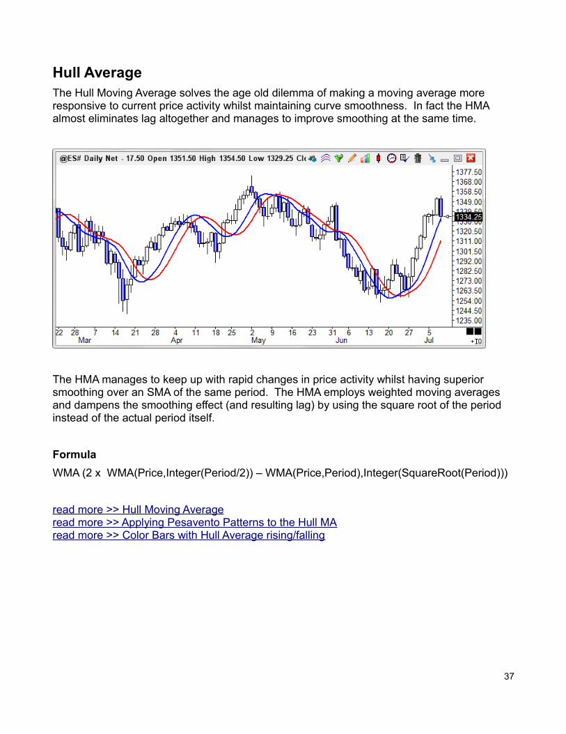
Hull AverageThe Hull Moving Average solves the age old dilemma of making a moving average more responsive to current price activity whilst maintaining curve smoothness. In fact the HMA almost eliminates lag altogether and manages to improve smoothing at the same time.
The HMA manages to keep up with rapid changes in price activity whilst having superior smoothing over an SMA of the same period. The HMA employs weighted moving averages and dampens the smoothing effect (and resulting lag) by using the square root of the period instead of the actual period itself.
Formula
WMA (2 x WMA(Price,Integer(Period/2)) – WMA(Price,Period),Integer(SquareRoot(Period)))
read more >> Hull Moving Averageread more >> Applying Pesavento Patterns to the Hull MAread more >> Color Bars with Hull Average rising/falling
37
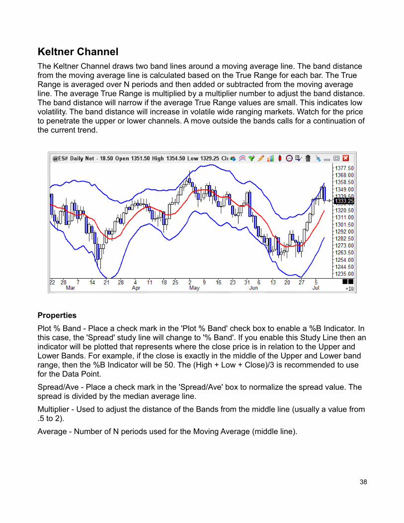
Keltner ChannelThe Keltner Channel draws two band lines around a moving average line. The band distance from the moving average line is calculated based on the True Range for each bar. The True Range is averaged over N periods and then added or subtracted from the moving average line. The average True Range is multiplied by a multiplier number to adjust the band distance.The band distance will narrow if the average True Range values are small. This indicates low volatility. The band distance will increase in volatile wide ranging markets. Watch for the price to penetrate the upper or lower channels. A move outside the bands calls for a continuation ofthe current trend.
Properties
Plot % Band - Place a check mark in the 'Plot % Band' check box to enable a %B Indicator. Inthis case, the 'Spread' study line will change to '% Band'. If you enable this Study Line then anindicator will be plotted that represents where the close price is in relation to the Upper and Lower Bands. For example, if the close is exactly in the middle of the Upper and Lower band range, then the %B Indicator will be 50. The (High + Low + Close)/3 is recommended to use for the Data Point.
Spread/Ave - Place a check mark in the 'Spread/Ave' box to normalize the spread value. The spread is divided by the median average line.
Multiplier - Used to adjust the distance of the Bands from the middle line (usually a value from.5 to 2).
Average - Number of N periods used for the Moving Average (middle line).
38
Formula
Moving average line = Select from Simple, Exponential, Weighted, or Smoothed averaging.
True Range = High – Low
(Substitute the previous bar's Close for the High, if higher than the current High)
(Substitute the previous bar's Close for the Low, if lower than the current Low)
Average True Range (ATR) = Average of each bar's true range using N periods
Upper Channel = Moving average line + ( ATR * Multiplier)
Lower Channel = Moving average line - ( ATR * Multiplier)
Credits
Developed by Chester W. Keltner
read more >> Keltner Channel Shaded Bands
39
MACD OscillatorThe Moving Average Convergence Divergence (MACD) study shows the relationship between two moving averages. The MACD is calculated by subtracting two moving averages.A moving average of the MACD line is then calculated, to act as a Trigger line. Watch for the MACD line and the Trigger line to cross. The study is often drawn as a Spread histogram, representing the difference between the MACD line and the Trigger line. If the MACD is displayed as a Spread histogram, watch for the histogram level to cross up or down through the zero line.
Properties
A Data Point for Ave 1 and Ave 2 can be selected independently.
Ave 1 - Number of N periods used in the first moving average (a value of 5 is often used).
Ave 2 - Number of N periods used in the second moving average (a value of 35 is often used).
These 2 average lines are then subtracted from each other to produce the MACD value.
Average - Number of N periods used to average the MACD value. This is the Trigger line. A value of 9 is often used.
Formula
Ave1 = A Moving average of the last N periods as specified by the Ave1 parameter and Data Point.
Ave2 = A Moving average of the last N periods as specified by the Ave2 parameter and Data Point.
MACD = Ave1 - Ave2
Average of MACD (Trigger) = A Moving average of the MACD for the last N periods as specified by the Average parameter. The calculation for the Trigger line will be an Average of the MACD.
Credits
The MACD was developed by Gerald Appel
read more >> MACD Acceleration and Decelerationread more >> MACDs in the B-Line template changeread more >> What is a MACD spread histogramread more >> Cannot compare MACD with SMAread more >> Dinapoli Stochastic and MACDread more >> I want to invert the MACD plot
40
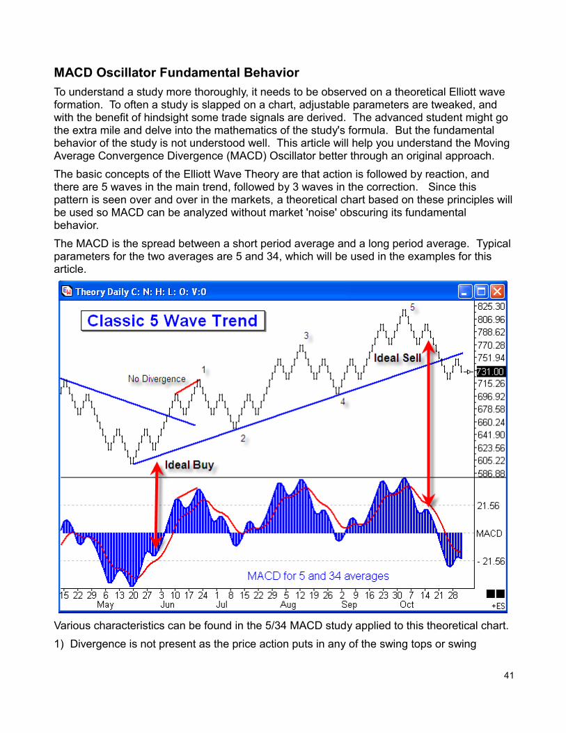
MACD Oscillator Fundamental Behavior
To understand a study more thoroughly, it needs to be observed on a theoretical Elliott wave formation. To often a study is slapped on a chart, adjustable parameters are tweaked, and with the benefit of hindsight some trade signals are derived. The advanced student might go the extra mile and delve into the mathematics of the study's formula. But the fundamental behavior of the study is not understood well. This article will help you understand the Moving Average Convergence Divergence (MACD) Oscillator better through an original approach.
The basic concepts of the Elliott Wave Theory are that action is followed by reaction, and there are 5 waves in the main trend, followed by 3 waves in the correction. Since this pattern is seen over and over in the markets, a theoretical chart based on these principles willbe used so MACD can be analyzed without market 'noise' obscuring its fundamental behavior.
The MACD is the spread between a short period average and a long period average. Typicalparameters for the two averages are 5 and 34, which will be used in the examples for this article.
Various characteristics can be found in the 5/34 MACD study applied to this theoretical chart.
1) Divergence is not present as the price action puts in any of the swing tops or swing
41
bottoms. Other studies, however, such as Stochastic and Relative Strength often show divergence.
2) The patterns formed by waves 1, 3 and 5 are very similar. So traders really need to countwaves and wait for the completion of the 5th wave to have the ideal entry signal.
3) The pattern at the Ideal Sell is a lower right side shoulder on both the price action and on the MACD study. The pattern at the Ideal Buy is a raised right side shoulder on the chart and on the study.
4) If you want an earlier signal you might plot a Moving Average of the MACD such as is illustrated by the Red study line. The signal would be the MACD crossing its average. In the example, a 9 period average is plotted as the Red line. Again, wait for the crossing after the 5th wave is in place.
5) The a-b-c correction in the retracement waves 2 and 4 will cause the MACD to cross its average and cross below the zero line. Both of these would be false signals. Wait for the completion of the 5th wave.
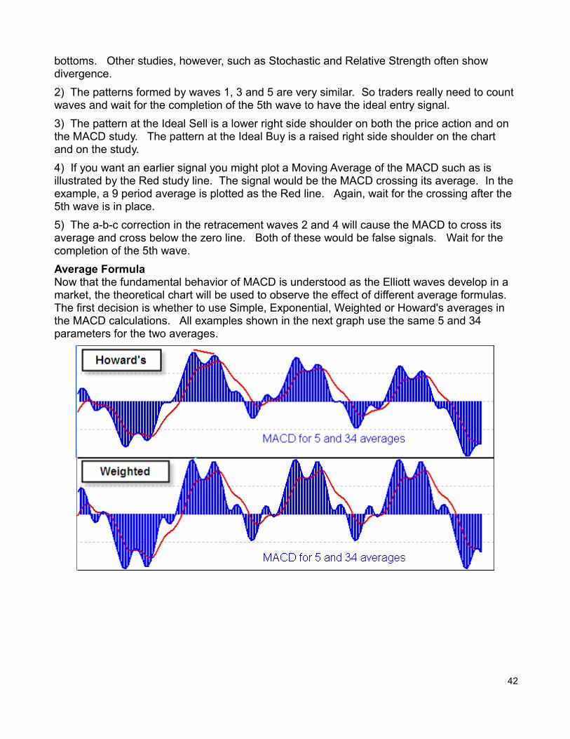
Average FormulaNow that the fundamental behavior of MACD is understood as the Elliott waves develop in a market, the theoretical chart will be used to observe the effect of different average formulas. The first decision is whether to use Simple, Exponential, Weighted or Howard's averages in the MACD calculations. All examples shown in the next graph use the same 5 and 34 parameters for the two averages.
42
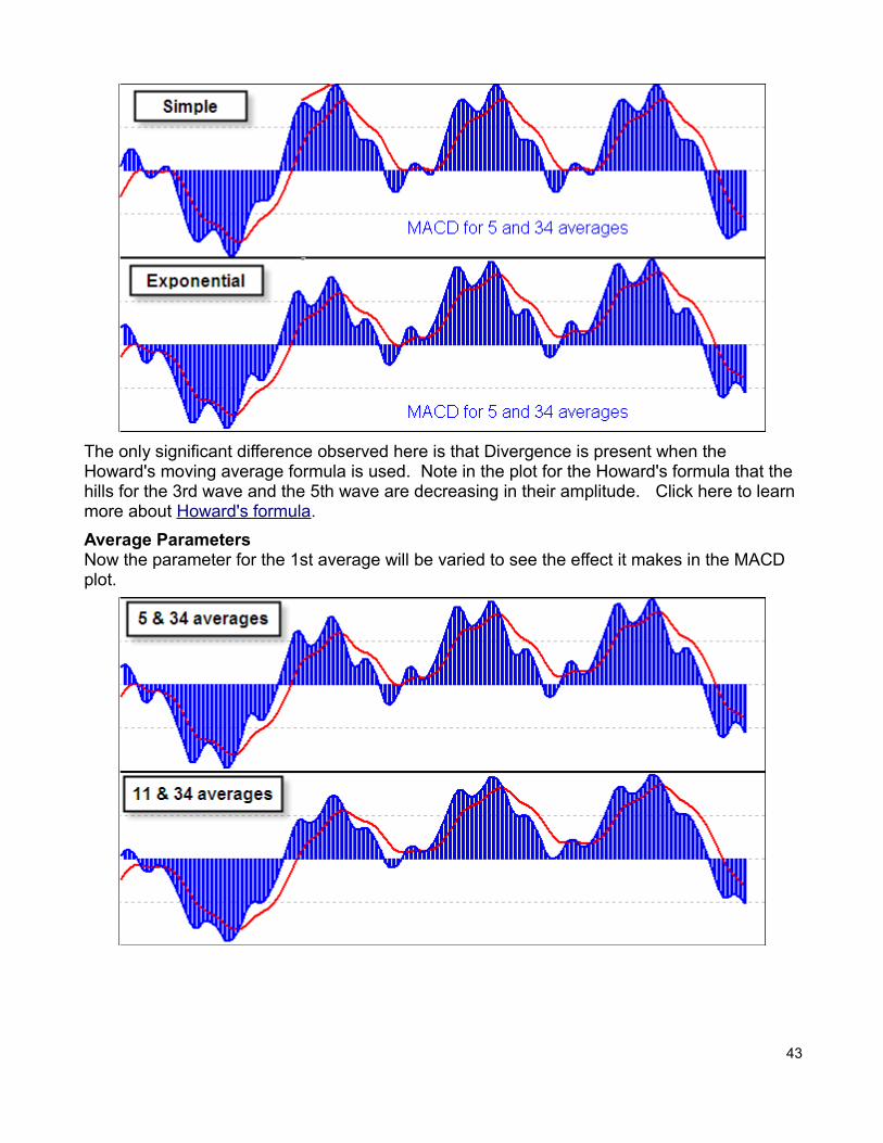
The only significant difference observed here is that Divergence is present when the Howard's moving average formula is used. Note in the plot for the Howard's formula that the hills for the 3rd wave and the 5th wave are decreasing in their amplitude. Click here to learn more about Howard's formula.
Average ParametersNow the parameter for the 1st average will be varied to see the effect it makes in the MACD plot.
43
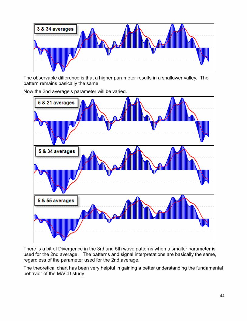
The observable difference is that a higher parameter results in a shallower valley. The pattern remains basically the same.
Now the 2nd average's parameter will be varied.
There is a bit of Divergence in the 3rd and 5th wave patterns when a smaller parameter is used for the 2nd average. The patterns and signal interpretations are basically the same, regardless of the parameter used for the 2nd average.
The theoretical chart has been very helpful in gaining a better understanding the fundamentalbehavior of the MACD study.
44
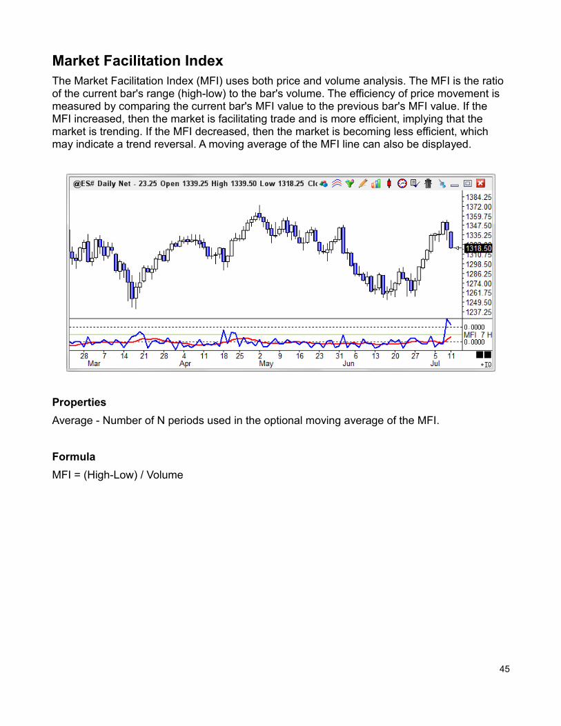
Market Facilitation IndexThe Market Facilitation Index (MFI) uses both price and volume analysis. The MFI is the ratio of the current bar's range (high-low) to the bar's volume. The efficiency of price movement is measured by comparing the current bar's MFI value to the previous bar's MFI value. If the MFI increased, then the market is facilitating trade and is more efficient, implying that the market is trending. If the MFI decreased, then the market is becoming less efficient, which may indicate a trend reversal. A moving average of the MFI line can also be displayed.
Properties
Average - Number of N periods used in the optional moving average of the MFI.
Formula
MFI = (High-Low) / Volume
45
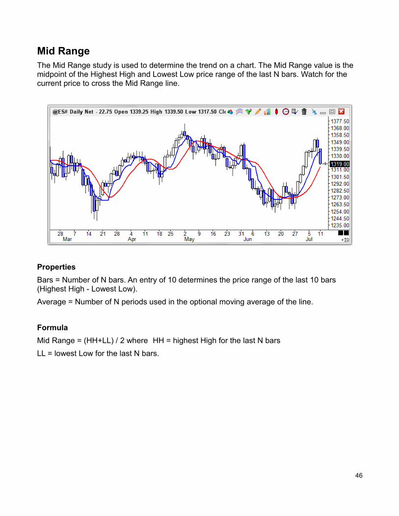
Mid RangeThe Mid Range study is used to determine the trend on a chart. The Mid Range value is the midpoint of the Highest High and Lowest Low price range of the last N bars. Watch for the current price to cross the Mid Range line.
Properties
Bars = Number of N bars. An entry of 10 determines the price range of the last 10 bars (Highest High - Lowest Low).
Average = Number of N periods used in the optional moving average of the line.
Formula
Mid Range = (HH+LL) / 2 where HH = highest High for the last N bars
LL = lowest Low for the last N bars.
46
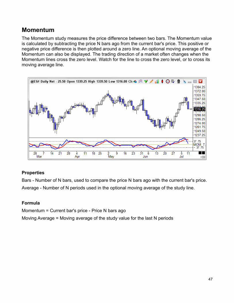
MomentumThe Momentum study measures the price difference between two bars. The Momentum valueis calculated by subtracting the price N bars ago from the current bar's price. This positive or negative price difference is then plotted around a zero line. An optional moving average of theMomentum can also be displayed. The trading direction of a market often changes when the Momentum lines cross the zero level. Watch for the line to cross the zero level, or to cross its moving average line.
Properties
Bars - Number of N bars, used to compare the price N bars ago with the current bar's price.
Average - Number of N periods used in the optional moving average of the study line.
Formula
Momentum = Current bar's price - Price N bars ago
Moving Average = Moving average of the study value for the last N periods
47
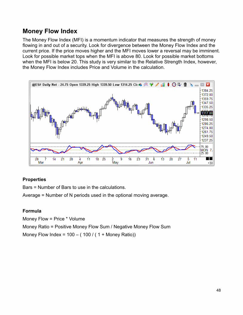
Money Flow IndexThe Money Flow Index (MFI) is a momentum indicator that measures the strength of money flowing in and out of a security. Look for divergence between the Money Flow Index and the current price. If the price moves higher and the MFI moves lower a reversal may be imminent.Look for possible market tops when the MFI is above 80. Look for possible market bottoms when the MFI is below 20. This study is very similar to the Relative Strength Index, however, the Money Flow Index includes Price and Volume in the calculation.
Properties
Bars = Number of Bars to use in the calculations.
Average = Number of N periods used in the optional moving average.
Formula
Money Flow = Price * Volume
Money Ratio = Positive Money Flow Sum / Negative Money Flow Sum
Money Flow Index = 100 – ( 100 / ( 1 + Money Ratio))
48
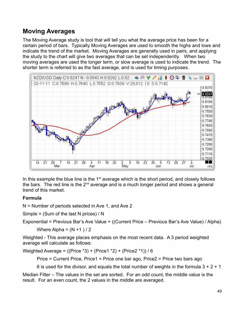
Moving AveragesThe Moving Average study is tool that will tell you what the average price has been for a certain period of bars. Typically Moving Averages are used to smooth the highs and lows andindicate the trend of the market. Moving Averages are generally used in pairs, and applying the study to the chart will give two averages that can be set independently. When two moving averages are used the longer term, or slow average is used to indicate the trend. Theshorter term is referred to as the fast average, and is used for timing purposes.
In this example the blue line is the 1st average which is the short period, and closely follows the bars. The red line is the 2nd average and is a much longer period and shows a general trend of this market.
Formula
N = Number of periods selected in Ave 1, and Ave 2
Simple = (Sum of the last N prices) / N
Exponential = Previous Bar’s Ave Value + ((Current Price – Previous Bar’s Ave Value) / Alpha)
Where Alpha = (N +1 ) / 2
Weighted - This average places emphasis on the most recent data. A 3 period weighted average will calculate as follows:
Weighted Average = ((Price *3) + (Price1 *2) + (Price2 *1)) / 6
Price = Current Price, Price1 = Price one bar ago, Price2 = Price two bars ago
6 is used for the divisor, and equals the total number of weights in the formula 3 + 2 + 1
Median Filter – The values in the set are sorted. For an odd count, the middle value is the result. For an even count, the 2 values in the middle are averaged.
49
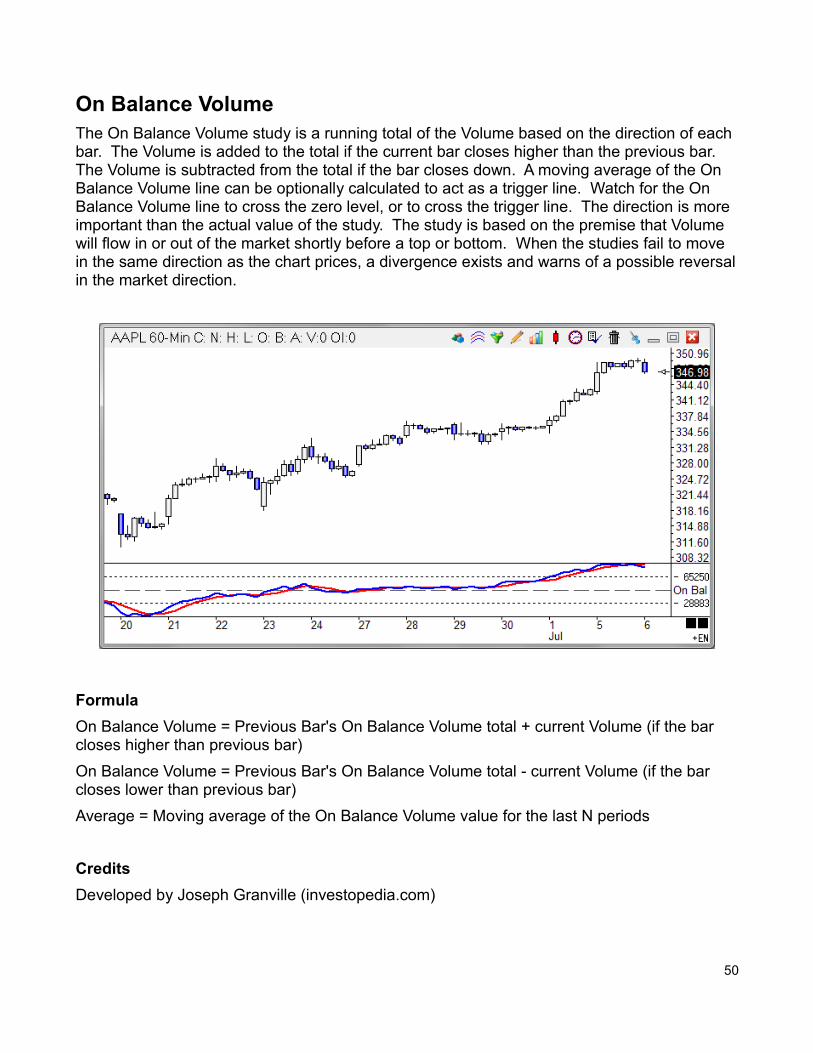
On Balance VolumeThe On Balance Volume study is a running total of the Volume based on the direction of each bar. The Volume is added to the total if the current bar closes higher than the previous bar. The Volume is subtracted from the total if the bar closes down. A moving average of the On Balance Volume line can be optionally calculated to act as a trigger line. Watch for the On Balance Volume line to cross the zero level, or to cross the trigger line. The direction is more important than the actual value of the study. The study is based on the premise that Volume will flow in or out of the market shortly before a top or bottom. When the studies fail to move in the same direction as the chart prices, a divergence exists and warns of a possible reversalin the market direction.
Formula
On Balance Volume = Previous Bar's On Balance Volume total + current Volume (if the bar closes higher than previous bar)
On Balance Volume = Previous Bar's On Balance Volume total - current Volume (if the bar closes lower than previous bar)
Average = Moving average of the On Balance Volume value for the last N periods
Credits
Developed by Joseph Granville (investopedia.com)
50
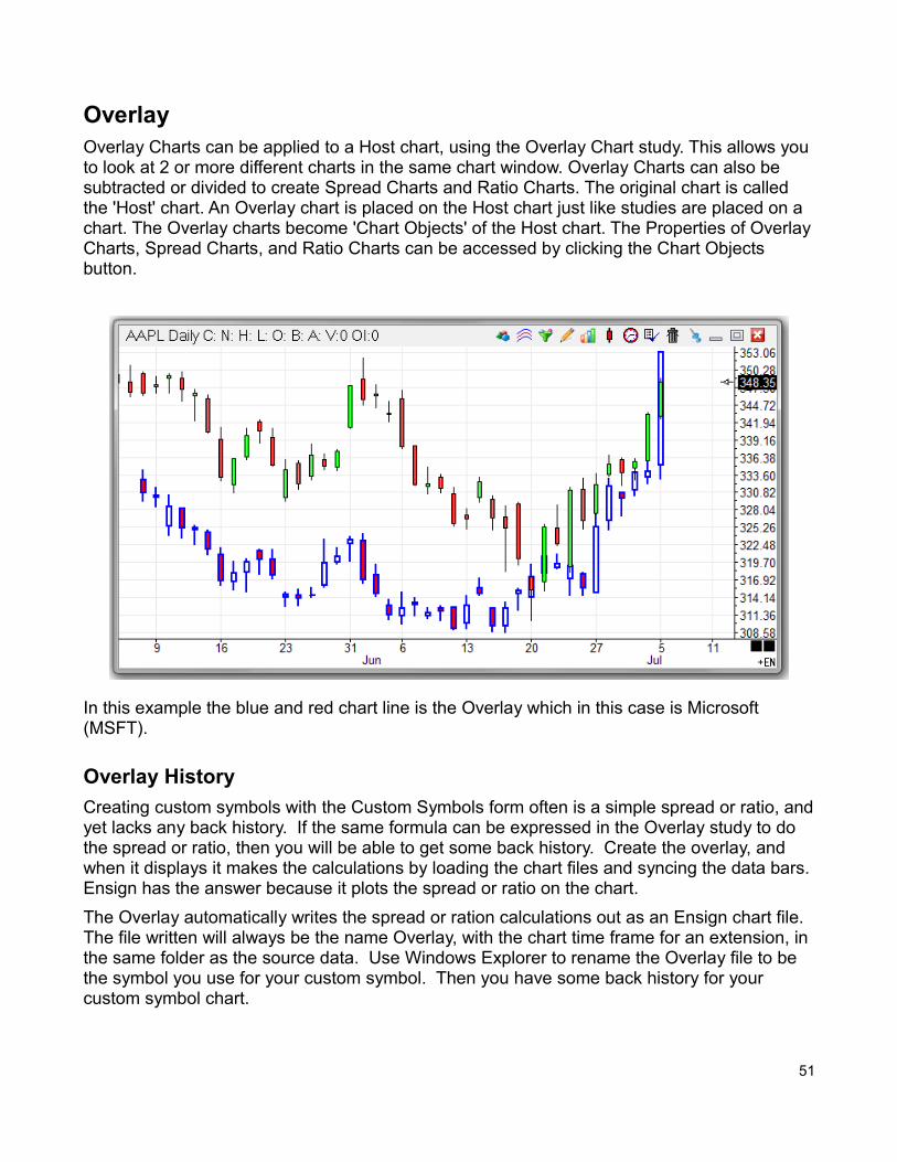
OverlayOverlay Charts can be applied to a Host chart, using the Overlay Chart study. This allows you to look at 2 or more different charts in the same chart window. Overlay Charts can also be subtracted or divided to create Spread Charts and Ratio Charts. The original chart is called the 'Host' chart. An Overlay chart is placed on the Host chart just like studies are placed on a chart. The Overlay charts become 'Chart Objects' of the Host chart. The Properties of OverlayCharts, Spread Charts, and Ratio Charts can be accessed by clicking the Chart Objects button.
In this example the blue and red chart line is the Overlay which in this case is Microsoft (MSFT).
Overlay History
Creating custom symbols with the Custom Symbols form often is a simple spread or ratio, andyet lacks any back history. If the same formula can be expressed in the Overlay study to do the spread or ratio, then you will be able to get some back history. Create the overlay, and when it displays it makes the calculations by loading the chart files and syncing the data bars.Ensign has the answer because it plots the spread or ratio on the chart.
The Overlay automatically writes the spread or ration calculations out as an Ensign chart file. The file written will always be the name Overlay, with the chart time frame for an extension, in the same folder as the source data. Use Windows Explorer to rename the Overlay file to be the symbol you use for your custom symbol. Then you have some back history for your custom symbol chart.
51
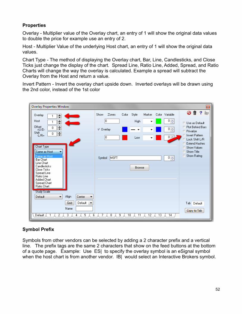
Properties
Overlay - Multiplier value of the Overlay chart, an entry of 1 will show the original data values to double the price for example use an entry of 2.
Host - Multiplier Value of the underlying Host chart, an entry of 1 will show the original data values.
Chart Type - The method of displaying the Overlay chart, Bar, Line, Candlesticks, and Close Ticks just change the display of the chart. Spread Line, Ratio Line, Added, Spread, and RatioCharts will change the way the overlay is calculated. Example a spread will subtract the Overlay from the Host and return a value.
Invert Pattern - Invert the overlay chart upside down. Inverted overlays will be drawn using the 2nd color, instead of the 1st color
Symbol Prefix
Symbols from other vendors can be selected by adding a 2 character prefix and a vertical line. The prefix tags are the same 2 characters that show on the feed buttons at the bottom of a quote page. Example: Use ES| to specify the overlay symbol is an eSignal symbol when the host chart is from another vendor. IB| would select an Interactive Brokers symbol.
52
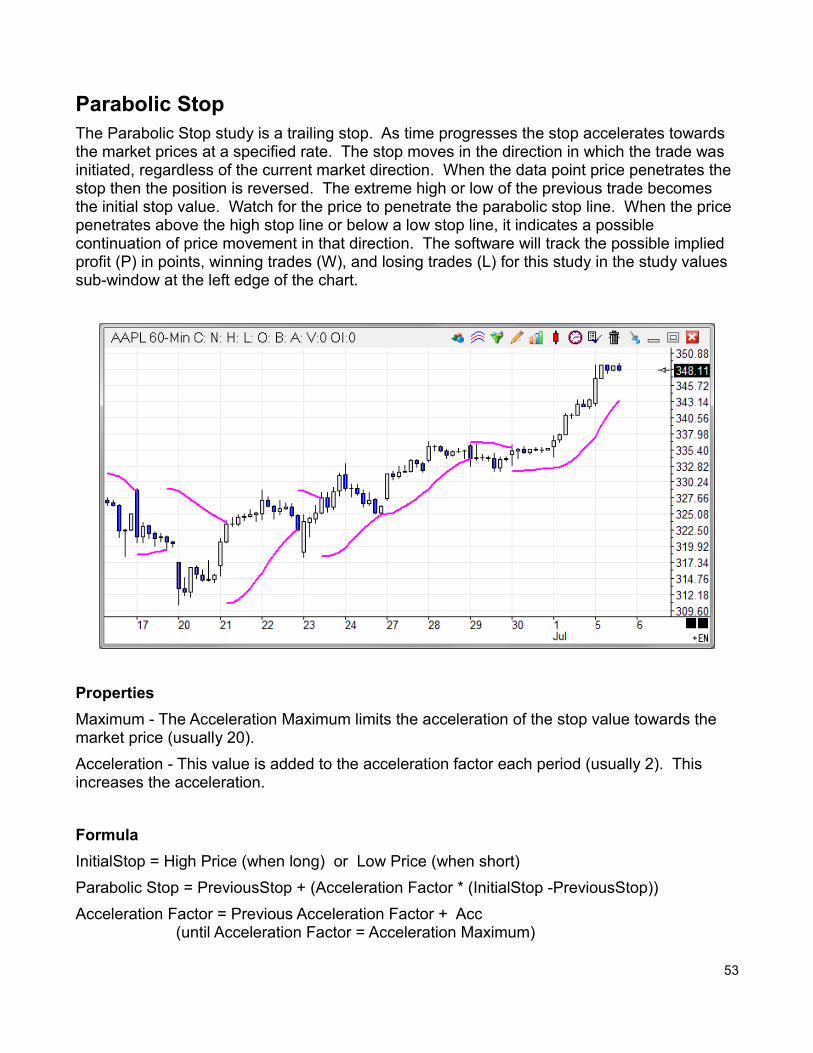
Parabolic StopThe Parabolic Stop study is a trailing stop. As time progresses the stop accelerates towards the market prices at a specified rate. The stop moves in the direction in which the trade was initiated, regardless of the current market direction. When the data point price penetrates the stop then the position is reversed. The extreme high or low of the previous trade becomes the initial stop value. Watch for the price to penetrate the parabolic stop line. When the price penetrates above the high stop line or below a low stop line, it indicates a possible continuation of price movement in that direction. The software will track the possible implied profit (P) in points, winning trades (W), and losing trades (L) for this study in the study values sub-window at the left edge of the chart.
Properties
Maximum - The Acceleration Maximum limits the acceleration of the stop value towards the market price (usually 20).
Acceleration - This value is added to the acceleration factor each period (usually 2). This increases the acceleration.
Formula
InitialStop = High Price (when long) or Low Price (when short)
Parabolic Stop = PreviousStop + (Acceleration Factor * (InitialStop -PreviousStop))
Acceleration Factor = Previous Acceleration Factor + Acc (until Acceleration Factor = Acceleration Maximum)
53
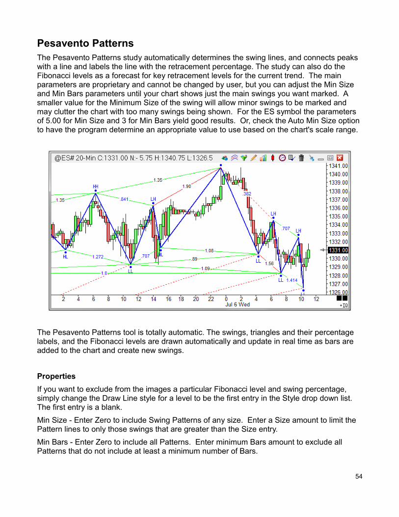
Pesavento PatternsThe Pesavento Patterns study automatically determines the swing lines, and connects peaks with a line and labels the line with the retracement percentage. The study can also do the Fibonacci levels as a forecast for key retracement levels for the current trend. The main parameters are proprietary and cannot be changed by user, but you can adjust the Min Size and Min Bars parameters until your chart shows just the main swings you want marked. A smaller value for the Minimum Size of the swing will allow minor swings to be marked and may clutter the chart with too many swings being shown. For the ES symbol the parameters of 5.00 for Min Size and 3 for Min Bars yield good results. Or, check the Auto Min Size option to have the program determine an appropriate value to use based on the chart's scale range.
The Pesavento Patterns tool is totally automatic. The swings, triangles and their percentage labels, and the Fibonacci levels are drawn automatically and update in real time as bars are added to the chart and create new swings.
Properties
If you want to exclude from the images a particular Fibonacci level and swing percentage, simply change the Draw Line style for a level to be the first entry in the Style drop down list. The first entry is a blank.
Min Size - Enter Zero to include Swing Patterns of any size. Enter a Size amount to limit the Pattern lines to only those swings that are greater than the Size entry.
Min Bars - Enter Zero to include all Patterns. Enter minimum Bars amount to exclude all Patterns that do not include at least a minimum number of Bars.
54
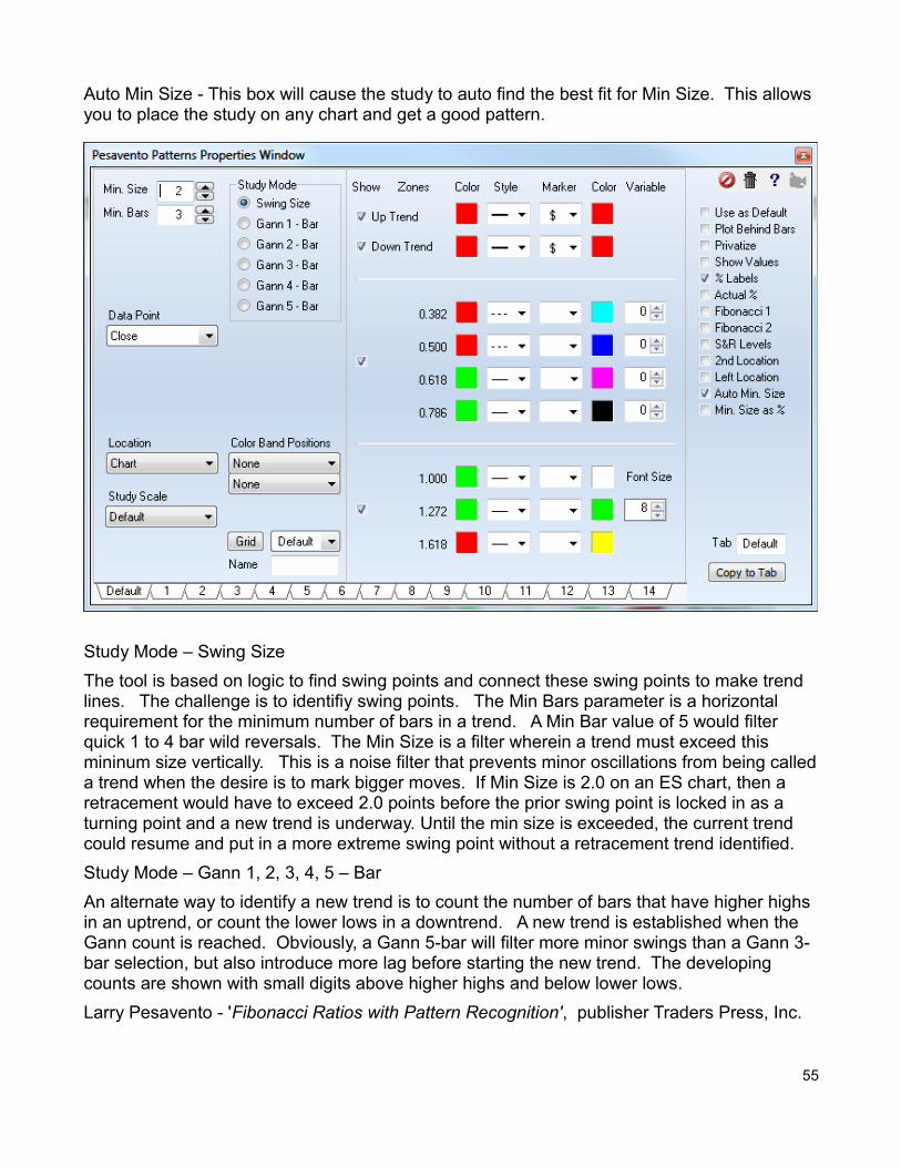
Auto Min Size - This box will cause the study to auto find the best fit for Min Size. This allows you to place the study on any chart and get a good pattern.
Study Mode – Swing Size
The tool is based on logic to find swing points and connect these swing points to make trend lines. The challenge is to identifiy swing points. The Min Bars parameter is a horizontal requirement for the minimum number of bars in a trend. A Min Bar value of 5 would filter quick 1 to 4 bar wild reversals. The Min Size is a filter wherein a trend must exceed this mininum size vertically. This is a noise filter that prevents minor oscillations from being calleda trend when the desire is to mark bigger moves. If Min Size is 2.0 on an ES chart, then a retracement would have to exceed 2.0 points before the prior swing point is locked in as a turning point and a new trend is underway. Until the min size is exceeded, the current trend could resume and put in a more extreme swing point without a retracement trend identified.
Study Mode – Gann 1, 2, 3, 4, 5 – Bar
An alternate way to identify a new trend is to count the number of bars that have higher highs in an uptrend, or count the lower lows in a downtrend. A new trend is established when the Gann count is reached. Obviously, a Gann 5-bar will filter more minor swings than a Gann 3-bar selection, but also introduce more lag before starting the new trend. The developing counts are shown with small digits above higher highs and below lower lows.
Larry Pesavento - 'Fibonacci Ratios with Pattern Recognition', publisher Traders Press, Inc.
55
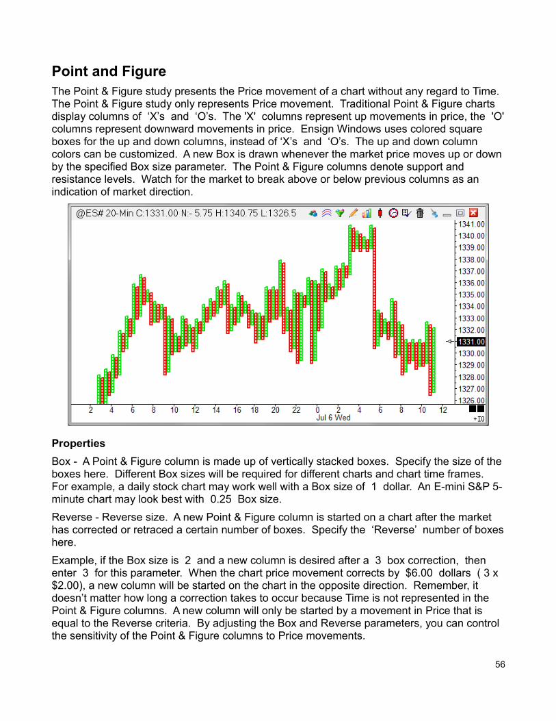
Point and FigureThe Point & Figure study presents the Price movement of a chart without any regard to Time. The Point & Figure study only represents Price movement. Traditional Point & Figure charts display columns of ‘X’s and ‘O’s. The 'X' columns represent up movements in price, the 'O'columns represent downward movements in price. Ensign Windows uses colored square boxes for the up and down columns, instead of ‘X’s and ‘O’s. The up and down column colors can be customized. A new Box is drawn whenever the market price moves up or downby the specified Box size parameter. The Point & Figure columns denote support and resistance levels. Watch for the market to break above or below previous columns as an indication of market direction.
Properties
Box - A Point & Figure column is made up of vertically stacked boxes. Specify the size of theboxes here. Different Box sizes will be required for different charts and chart time frames. For example, a daily stock chart may work well with a Box size of 1 dollar. An E-mini S&P 5-minute chart may look best with 0.25 Box size.
Reverse - Reverse size. A new Point & Figure column is started on a chart after the market has corrected or retraced a certain number of boxes. Specify the ‘Reverse’ number of boxeshere.
Example, if the Box size is 2 and a new column is desired after a 3 box correction, then enter 3 for this parameter. When the chart price movement corrects by $6.00 dollars ( 3 x $2.00), a new column will be started on the chart in the opposite direction. Remember, it doesn’t matter how long a correction takes to occur because Time is not represented in the Point & Figure columns. A new column will only be started by a movement in Price that is equal to the Reverse criteria. By adjusting the Box and Reverse parameters, you can control the sensitivity of the Point & Figure columns to Price movements.
56
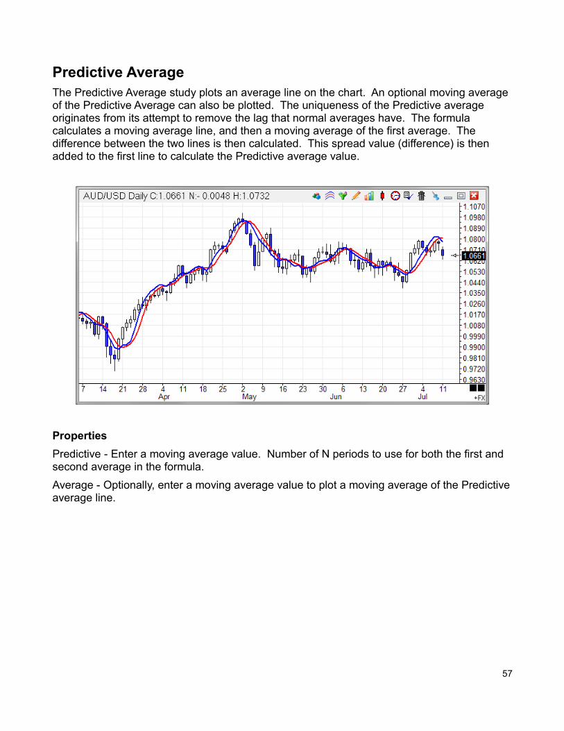
Predictive AverageThe Predictive Average study plots an average line on the chart. An optional moving average of the Predictive Average can also be plotted. The uniqueness of the Predictive average originates from its attempt to remove the lag that normal averages have. The formula calculates a moving average line, and then a moving average of the first average. The difference between the two lines is then calculated. This spread value (difference) is then added to the first line to calculate the Predictive average value.
Properties
Predictive - Enter a moving average value. Number of N periods to use for both the first and second average in the formula.
Average - Optionally, enter a moving average value to plot a moving average of the Predictiveaverage line.
57
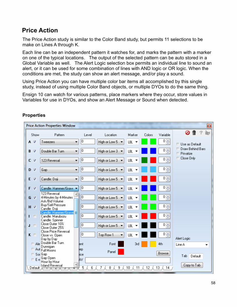
Price ActionThe Price Action study is similar to the Color Band study, but permits 11 selections to be make on Lines A through K.
Each line can be an independent pattern it watches for, and marks the pattern with a marker on one of the typical locations. The output of the selected pattern can be auto stored in a Global Variable as well. The Alert Logic selection box permits an individual line to sound an alert, or it can be used for some combination of lines with AND logic or OR logic. When the conditions are met, the study can show an alert message, and/or play a sound.
Using Price Action you can have multiple color bar items all accomplished by this single study, instead of using multiple Color Band objects, or multiple DYOs to do the same thing.
Ensign 10 can watch for various patterns, place markers where they occur, store values in Variables for use in DYOs, and show an Alert Message or Sound when detected.
Properties
58
The form's Pattern drop down list has 42 color bar studies. The form has a Level field that current does nothing, but is on the form in anticipation that some of the future studies may need to have a value entered or some other parameter to make the pattern selection work.
The Location drop down box is the typical one found on other studies, such as on the Study Alert form and on the DYO property form. The Marker selection list is the standard list of markers available on most study forms. The two color boxes are typically for the True condition and the False condition, with the True color being the left box and the False color being the right side box. If the pattern uses 4 colors (such as 4x4 minute and Dunnigan) the 3rd and 4th colors needed will be the two color boxes at the bottom of the color column.
The edit box is where the WAV file path would be entered if the WAV bullet is selected. Oftenplaying a WAV file is not going to be done, in which case you can enter an alert message on this edit line. If the line is used for the WAV file path, then a default alert message will be taken from the Alert Logic line that is selected, and might be something like "Line A". A personal message would be better than "Line A" and the personal message will come from the edit box as discussed. Alerts from this study will show on the Alerts form under the Studyand under the Sound bullet selections on that form.
Price Action and Color Band Labels
The Price Action study and the Color Band study can use the LBL marker to place labels on the chart. A suggested location for the labels is the 'High or Low' selection. The following Pattern selections will show these labels.
Pattern Label
Island Reversal IR
Key Reversal Pair KP
Close Outer 10% C10
Close Outer 25% C25
Gap GAP
Gap Open GO
Large/Small Range LR or SR
Large/Small Volume LV or SV
Turning Point TP
Outside/Inside Range OR or IN
Narrow Range NR
Close Price Reversal CR
Pivot Point Reversal PR
Double Bar Turn DB
Tweezers TW
123 Reversal 123
Candle: Doji DJ
Candle: Hammer/Grave HM or GS
Candle: Marubozu MB
Candle: Spinner SP
59
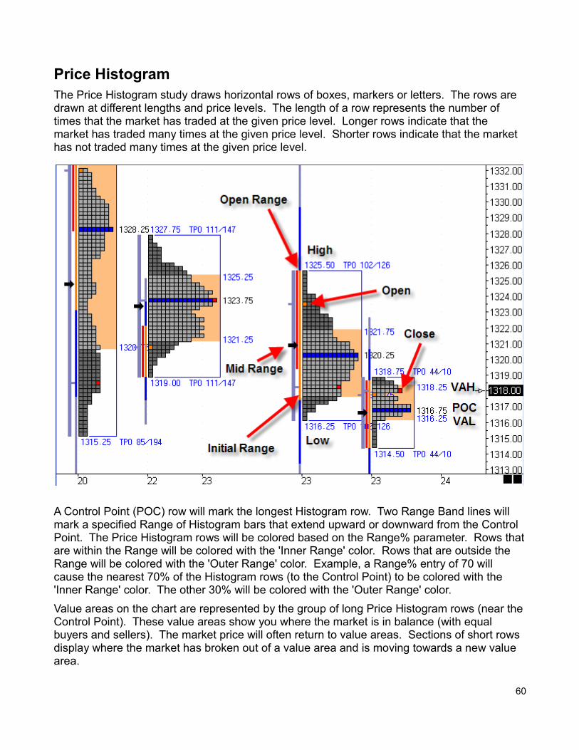
Price HistogramThe Price Histogram study draws horizontal rows of boxes, markers or letters. The rows are drawn at different lengths and price levels. The length of a row represents the number of times that the market has traded at the given price level. Longer rows indicate that the market has traded many times at the given price level. Shorter rows indicate that the market has not traded many times at the given price level.
A Control Point (POC) row will mark the longest Histogram row. Two Range Band lines will mark a specified Range of Histogram bars that extend upward or downward from the Control Point. The Price Histogram rows will be colored based on the Range% parameter. Rows thatare within the Range will be colored with the 'Inner Range' color. Rows that are outside the Range will be colored with the 'Outer Range' color. Example, a Range% entry of 70 will cause the nearest 70% of the Histogram rows (to the Control Point) to be colored with the 'Inner Range' color. The other 30% will be colored with the 'Outer Range' color.
Value areas on the chart are represented by the group of long Price Histogram rows (near theControl Point). These value areas show you where the market is in balance (with equal buyers and sellers). The market price will often return to value areas. Sections of short rows display where the market has broken out of a value area and is moving towards a new value area.
60
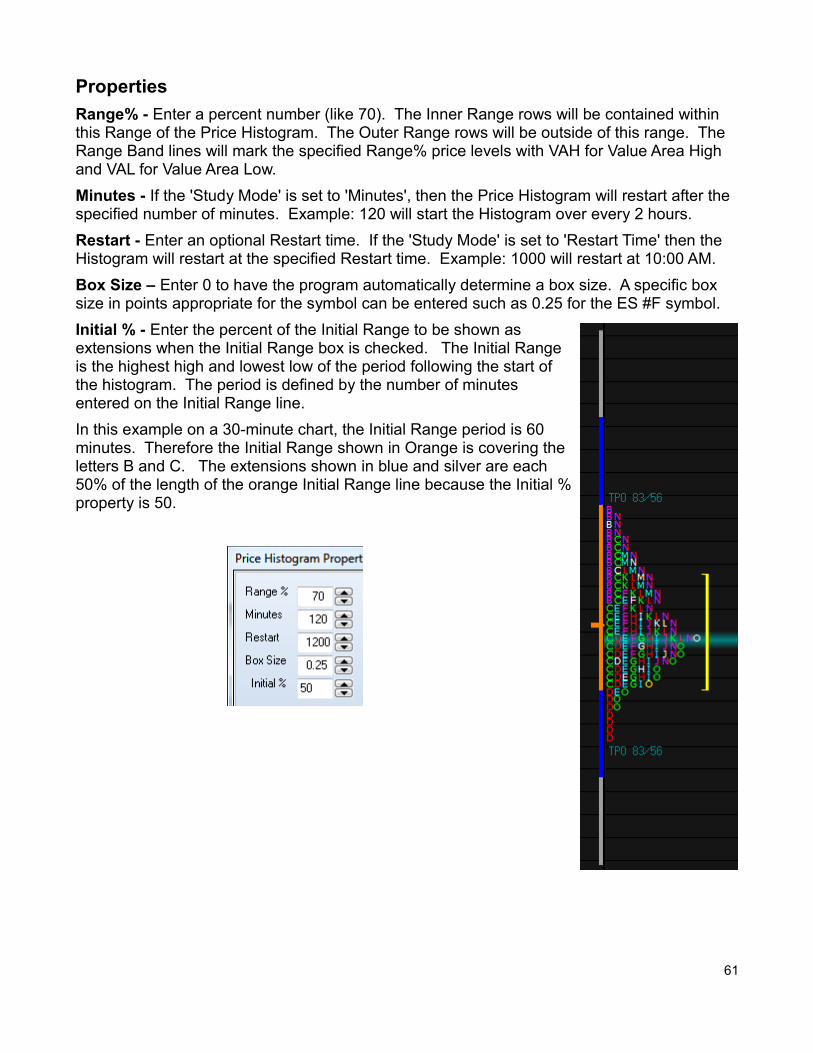
Properties
Range% - Enter a percent number (like 70). The Inner Range rows will be contained within this Range of the Price Histogram. The Outer Range rows will be outside of this range. The Range Band lines will mark the specified Range% price levels with VAH for Value Area High and VAL for Value Area Low.
Minutes - If the 'Study Mode' is set to 'Minutes', then the Price Histogram will restart after the specified number of minutes. Example: 120 will start the Histogram over every 2 hours.
Restart - Enter an optional Restart time. If the 'Study Mode' is set to 'Restart Time' then the Histogram will restart at the specified Restart time. Example: 1000 will restart at 10:00 AM.
Box Size – Enter 0 to have the program automatically determine a box size. A specific box size in points appropriate for the symbol can be entered such as 0.25 for the ES #F symbol.
Initial % - Enter the percent of the Initial Range to be shown asextensions when the Initial Range box is checked. The Initial Rangeis the highest high and lowest low of the period following the start ofthe histogram. The period is defined by the number of minutes entered on the Initial Range line.
In this example on a 30-minute chart, the Initial Range period is 60minutes. Therefore the Initial Range shown in Orange is covering theletters B and C. The extensions shown in blue and silver are each50% of the length of the orange Initial Range line because the Initial %property is 50.
61
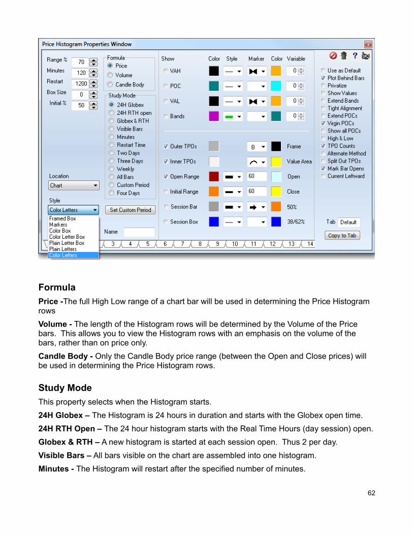
Formula
Price -The full High Low range of a chart bar will be used in determining the Price Histogram rows
Volume - The length of the Histogram rows will be determined by the Volume of the Price bars. This allows you to view the Histogram rows with an emphasis on the volume of the bars, rather than on price only.
Candle Body - Only the Candle Body price range (between the Open and Close prices) will be used in determining the Price Histogram rows.
Study Mode
This property selects when the Histogram starts.
24H Globex – The Histogram is 24 hours in duration and starts with the Globex open time.
24H RTH Open – The 24 hour histogram starts with the Real Time Hours (day session) open.
Globex & RTH – A new histogram is started at each session open. Thus 2 per day.
Visible Bars – All bars visible on the chart are assembled into one histogram.
Minutes - The Histogram will restart after the specified number of minutes.
62
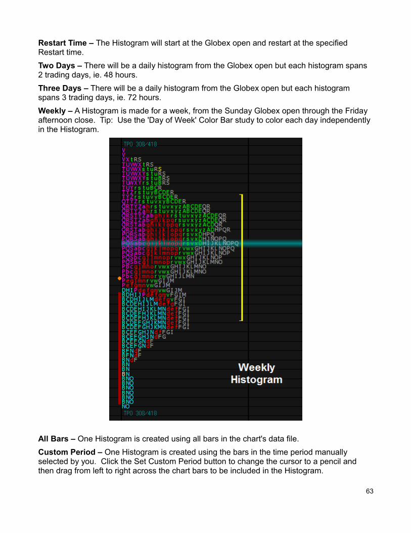
Restart Time – The Histogram will start at the Globex open and restart at the specified Restart time.
Two Days – There will be a daily histogram from the Globex open but each histogram spans 2 trading days, ie. 48 hours.
Three Days – There will be a daily histogram from the Globex open but each histogram spans 3 trading days, ie. 72 hours.
Weekly – A Histogram is made for a week, from the Sunday Globex open through the Friday afternoon close. Tip: Use the 'Day of Week' Color Bar study to color each day independently in the Histogram.
All Bars – One Histogram is created using all bars in the chart's data file.
Custom Period – One Histogram is created using the bars in the time period manually selected by you. Click the Set Custom Period button to change the cursor to a pencil and then drag from left to right across the chart bars to be included in the Histogram.
63
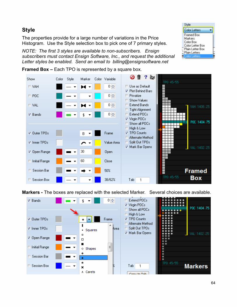
Style
The properties provide for a large number of variations in the PriceHistogram. Use the Style selection box to pick one of 7 primary styles.
NOTE: The first 3 styles are available to non-subscribers. Ensignsubscribers must contact Ensign Software, Inc., and request the additionalLetter styles be enabled. Send an email to [email protected]
Framed Box – Each TPO is represented by a square box.
Markers - The boxes are replaced with the selected Marker. Several choices are available.
64
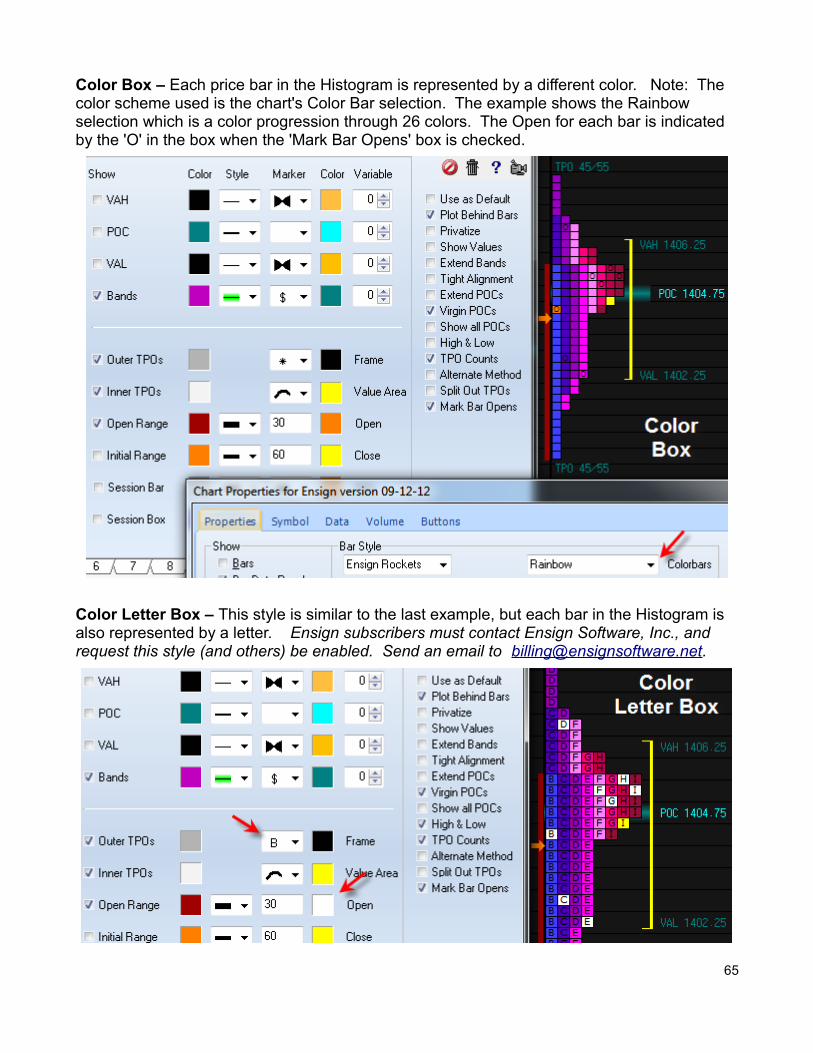
Color Box – Each price bar in the Histogram is represented by a different color. Note: The color scheme used is the chart's Color Bar selection. The example shows the Rainbow selection which is a color progression through 26 colors. The Open for each bar is indicated by the 'O' in the box when the 'Mark Bar Opens' box is checked.
Color Letter Box – This style is similar to the last example, but each bar in the Histogram is also represented by a letter. Ensign subscribers must contact Ensign Software, Inc., and request this style (and others) be enabled. Send an email to [email protected].
65
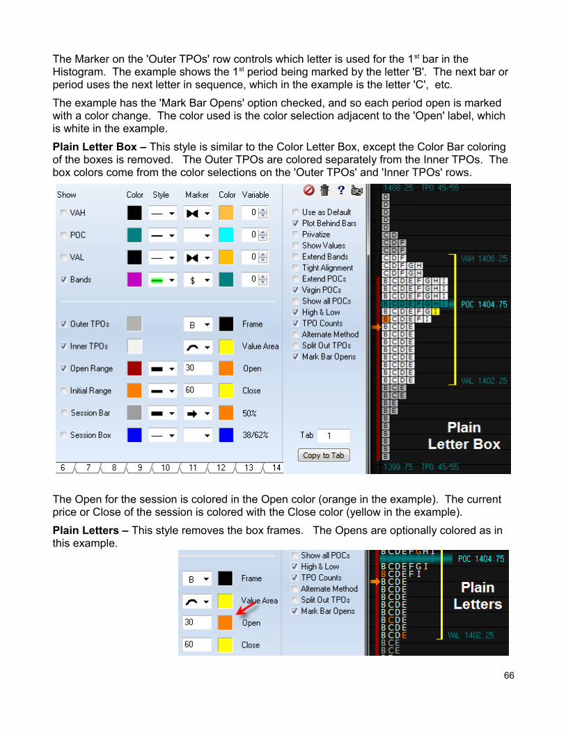
The Marker on the 'Outer TPOs' row controls which letter is used for the 1st bar in the Histogram. The example shows the 1st period being marked by the letter 'B'. The next bar or period uses the next letter in sequence, which in the example is the letter 'C', etc.
The example has the 'Mark Bar Opens' option checked, and so each period open is marked with a color change. The color used is the color selection adjacent to the 'Open' label, which is white in the example.
Plain Letter Box – This style is similar to the Color Letter Box, except the Color Bar coloring of the boxes is removed. The Outer TPOs are colored separately from the Inner TPOs. The box colors come from the color selections on the 'Outer TPOs' and 'Inner TPOs' rows.
The Open for the session is colored in the Open color (orange in the example). The current price or Close of the session is colored with the Close color (yellow in the example).
Plain Letters – This style removes the box frames. The Opens are optionally colored as in this example.
66
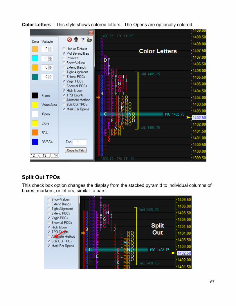
Color Letters – This style shows colored letters. The Opens are optionally colored.
Split Out TPOs
This check box option changes the display from the stacked pyramid to individual columns of boxes, markers, or letters, similar to bars.
67
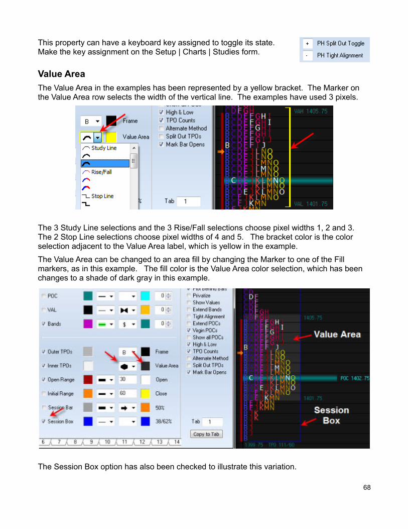
This property can have a keyboard key assigned to toggle its state. Make the key assignment on the Setup | Charts | Studies form.
Value Area
The Value Area in the examples has been represented by a yellow bracket. The Marker on the Value Area row selects the width of the vertical line. The examples have used 3 pixels.
The 3 Study Line selections and the 3 Rise/Fall selections choose pixel widths 1, 2 and 3. The 2 Stop Line selections choose pixel widths of 4 and 5. The bracket color is the color selection adjacent to the Value Area label, which is yellow in the example.
The Value Area can be changed to an area fill by changing the Marker to one of the Fill markers, as in this example. The fill color is the Value Area color selection, which has been changes to a shade of dark gray in this example.
The Session Box option has also been checked to illustrate this variation.
68
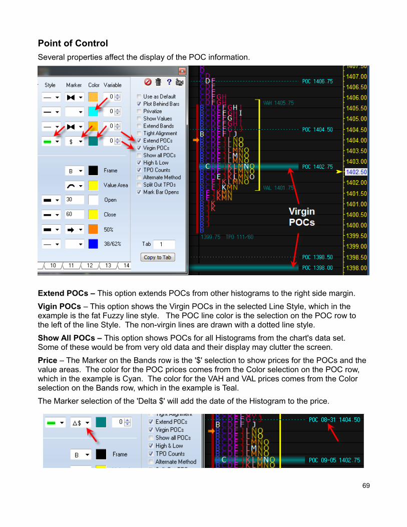
Point of Control
Several properties affect the display of the POC information.
Extend POCs – This option extends POCs from other histograms to the right side margin.
Vigin POCs – This option shows the Virgin POCs in the selected Line Style, which in the example is the fat Fuzzy line style. The POC line color is the selection on the POC row to the left of the line Style. The non-virgin lines are drawn with a dotted line style.
Show All POCs – This option shows POCs for all Histograms from the chart's data set. Some of these would be from very old data and their display may clutter the screen.
Price – The Marker on the Bands row is the '$' selection to show prices for the POCs and the value areas. The color for the POC prices comes from the Color selection on the POC row, which in the example is Cyan. The color for the VAH and VAL prices comes from the Color selection on the Bands row, which in the example is Teal.
The Marker selection of the 'Delta $' will add the date of the Histogram to the price.
69
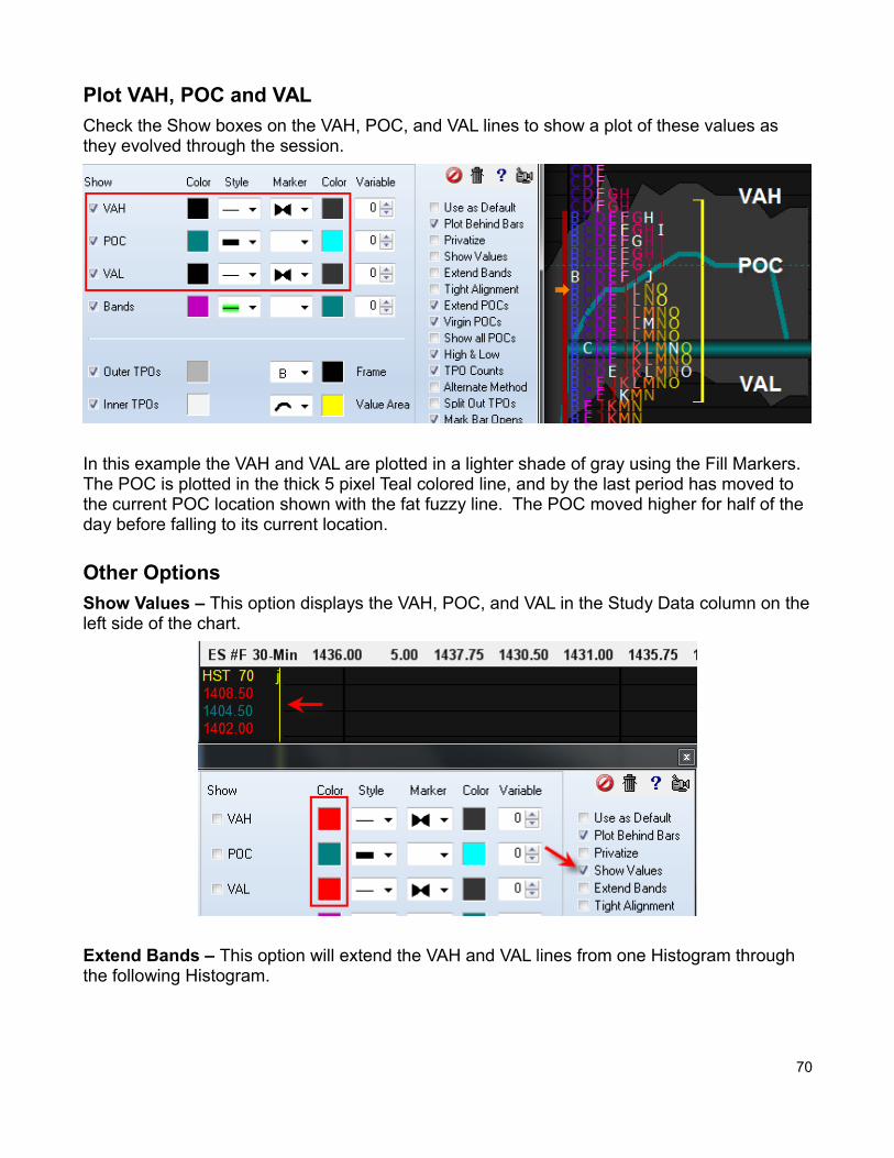
Plot VAH, POC and VAL
Check the Show boxes on the VAH, POC, and VAL lines to show a plot of these values as they evolved through the session.
In this example the VAH and VAL are plotted in a lighter shade of gray using the Fill Markers. The POC is plotted in the thick 5 pixel Teal colored line, and by the last period has moved to the current POC location shown with the fat fuzzy line. The POC moved higher for half of the day before falling to its current location.
Other Options
Show Values – This option displays the VAH, POC, and VAL in the Study Data column on theleft side of the chart.
Extend Bands – This option will extend the VAH and VAL lines from one Histogram through the following Histogram.
70
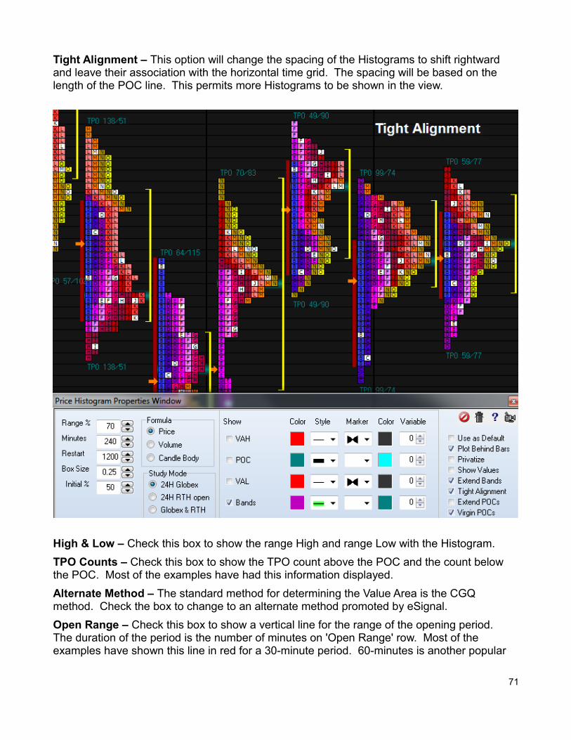
Tight Alignment – This option will change the spacing of the Histograms to shift rightward and leave their association with the horizontal time grid. The spacing will be based on the length of the POC line. This permits more Histograms to be shown in the view.
High & Low – Check this box to show the range High and range Low with the Histogram.
TPO Counts – Check this box to show the TPO count above the POC and the count below the POC. Most of the examples have had this information displayed.
Alternate Method – The standard method for determining the Value Area is the CGQ method. Check the box to change to an alternate method promoted by eSignal.
Open Range – Check this box to show a vertical line for the range of the opening period. The duration of the period is the number of minutes on 'Open Range' row. Most of the examples have shown this line in red for a 30-minute period. 60-minutes is another popular
71
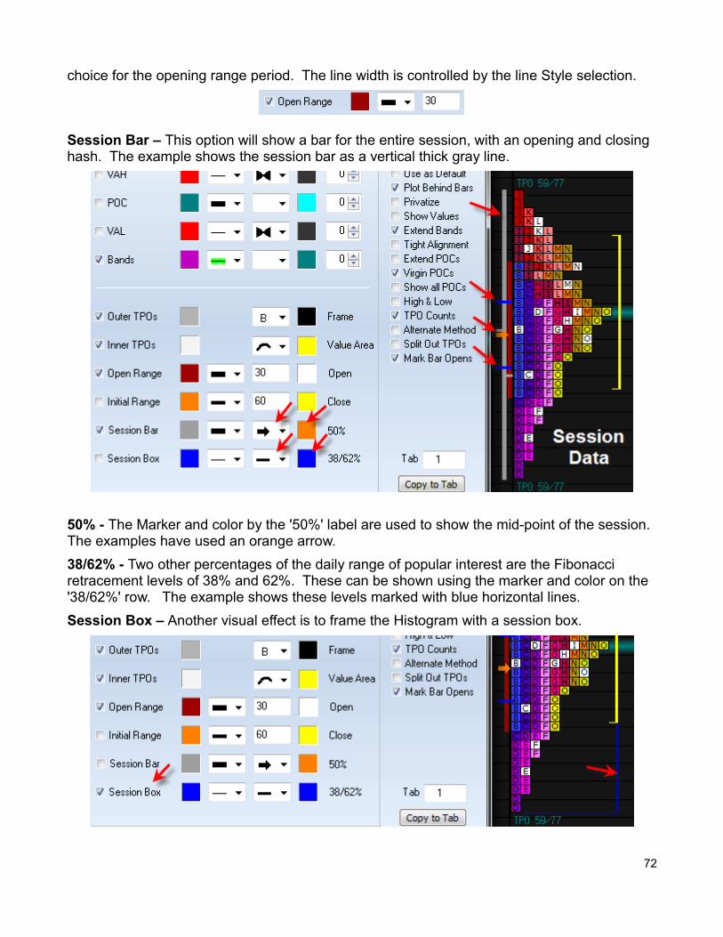
choice for the opening range period. The line width is controlled by the line Style selection.
Session Bar – This option will show a bar for the entire session, with an opening and closing hash. The example shows the session bar as a vertical thick gray line.
50% - The Marker and color by the '50%' label are used to show the mid-point of the session. The examples have used an orange arrow.
38/62% - Two other percentages of the daily range of popular interest are the Fibonacci retracement levels of 38% and 62%. These can be shown using the marker and color on the '38/62%' row. The example shows these levels marked with blue horizontal lines.
Session Box – Another visual effect is to frame the Histogram with a session box.
72
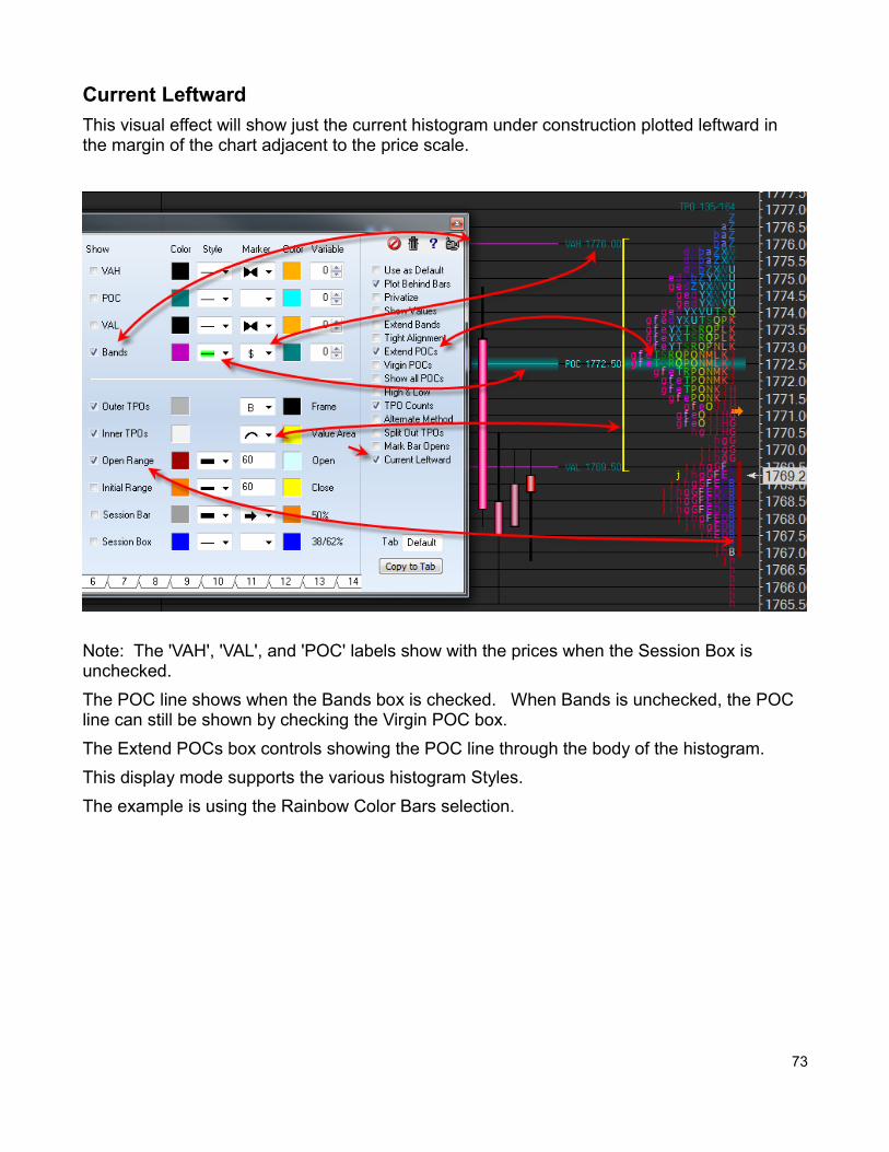
Current Leftward
This visual effect will show just the current histogram under construction plotted leftward in the margin of the chart adjacent to the price scale.
Note: The 'VAH', 'VAL', and 'POC' labels show with the prices when the Session Box is unchecked.
The POC line shows when the Bands box is checked. When Bands is unchecked, the POC line can still be shown by checking the Virgin POC box.
The Extend POCs box controls showing the POC line through the body of the histogram.
This display mode supports the various histogram Styles.
The example is using the Rainbow Color Bars selection.
73
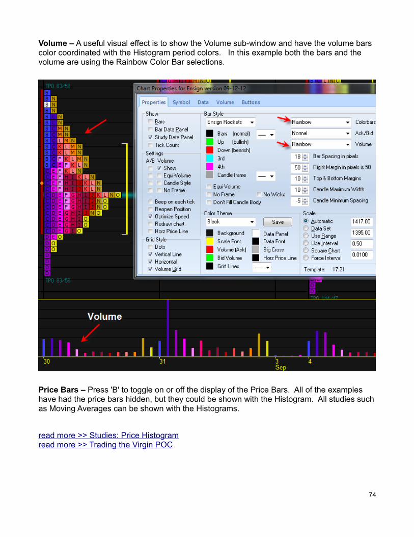
Volume – A useful visual effect is to show the Volume sub-window and have the volume bars color coordinated with the Histogram period colors. In this example both the bars and the volume are using the Rainbow Color Bar selections.
Price Bars – Press 'B' to toggle on or off the display of the Price Bars. All of the examples have had the price bars hidden, but they could be shown with the Histogram. All studies suchas Moving Averages can be shown with the Histograms.
read more >> Studies: Price Histogramread more >> Trading the Virgin POC
74
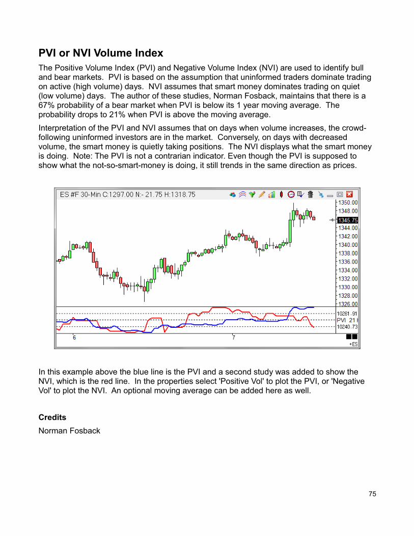
PVI or NVI Volume IndexThe Positive Volume Index (PVI) and Negative Volume Index (NVI) are used to identify bull and bear markets. PVI is based on the assumption that uninformed traders dominate trading on active (high volume) days. NVI assumes that smart money dominates trading on quiet (low volume) days. The author of these studies, Norman Fosback, maintains that there is a 67% probability of a bear market when PVI is below its 1 year moving average. The probability drops to 21% when PVI is above the moving average.
Interpretation of the PVI and NVI assumes that on days when volume increases, the crowd-following uninformed investors are in the market. Conversely, on days with decreased volume, the smart money is quietly taking positions. The NVI displays what the smart money is doing. Note: The PVI is not a contrarian indicator. Even though the PVI is supposed to show what the not-so-smart-money is doing, it still trends in the same direction as prices.
In this example above the blue line is the PVI and a second study was added to show the NVI, which is the red line. In the properties select 'Positive Vol' to plot the PVI, or 'Negative Vol' to plot the NVI. An optional moving average can be added here as well.
Credits
Norman Fosback
75
Volume Price Trend
An optional check box on the property form changes the formula to the Volume Price Trend formula. The Volume Price Trend is a volume-weighted momentum indicator. It is used to determine balance between demand and supply. The price trend denotes the relative supply or demand of a security, while volume indicated that actual size of the force. Volume is higherwith a price move in the dominant direction.
Formula:
VPT = Previous VPT + Current Volume * (Price – Prior Price) / Prior Price)
Credits
Steven L. Killie
76
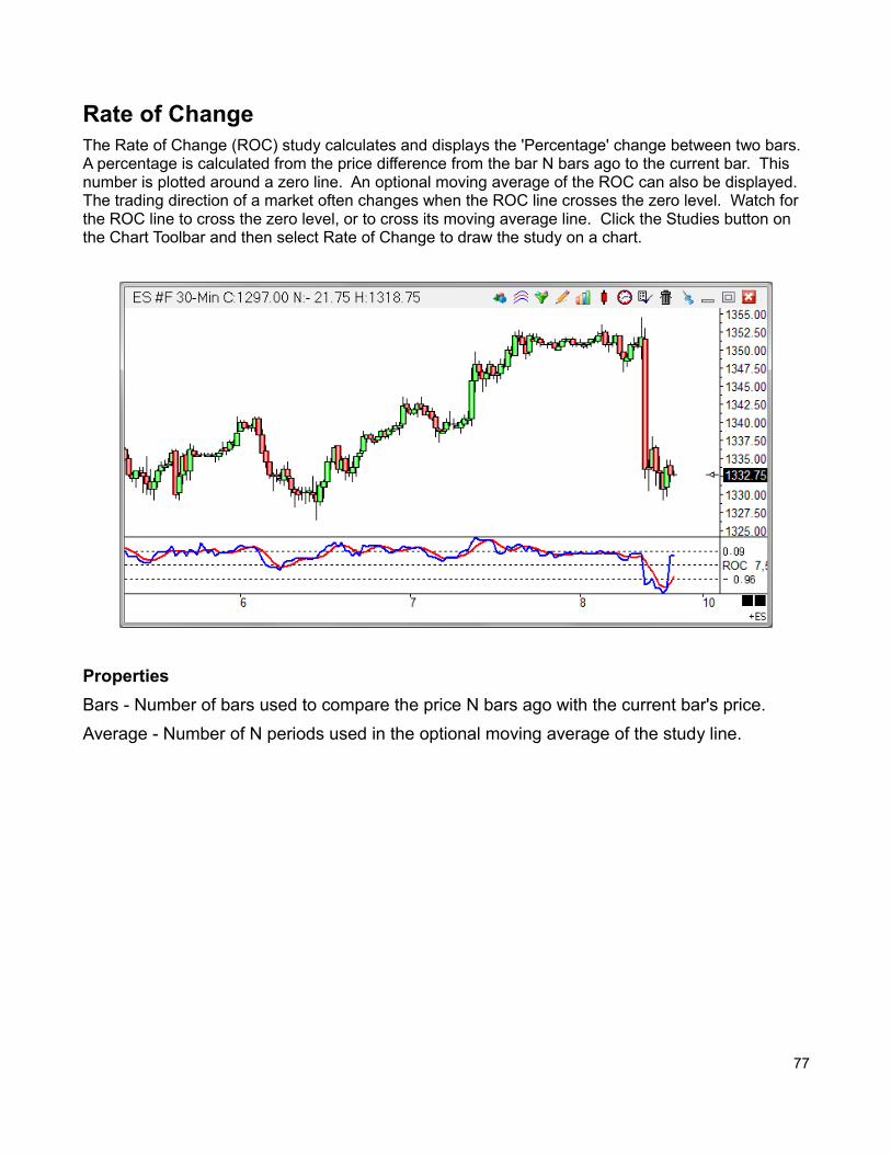
Rate of ChangeThe Rate of Change (ROC) study calculates and displays the 'Percentage' change between two bars. A percentage is calculated from the price difference from the bar N bars ago to the current bar. This number is plotted around a zero line. An optional moving average of the ROC can also be displayed. The trading direction of a market often changes when the ROC line crosses the zero level. Watch for the ROC line to cross the zero level, or to cross its moving average line. Click the Studies button on the Chart Toolbar and then select Rate of Change to draw the study on a chart.
Properties
Bars - Number of bars used to compare the price N bars ago with the current bar's price.
Average - Number of N periods used in the optional moving average of the study line.
77
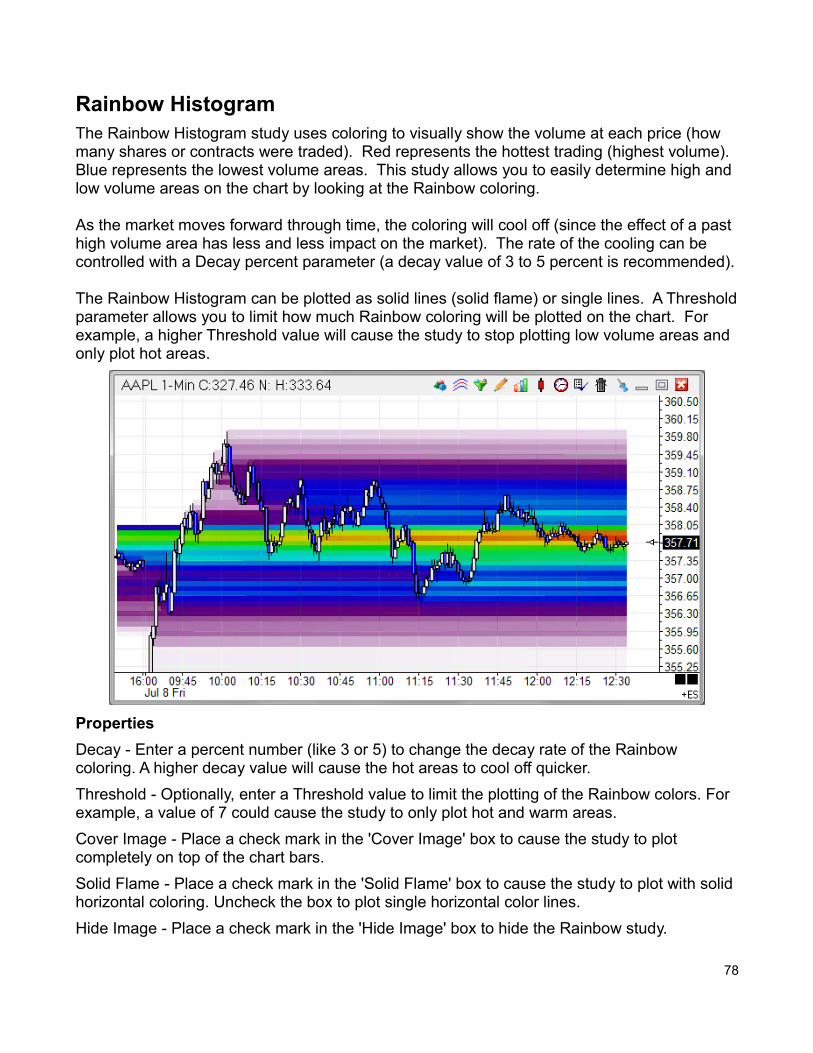
Rainbow HistogramThe Rainbow Histogram study uses coloring to visually show the volume at each price (how many shares or contracts were traded). Red represents the hottest trading (highest volume). Blue represents the lowest volume areas. This study allows you to easily determine high and low volume areas on the chart by looking at the Rainbow coloring.
As the market moves forward through time, the coloring will cool off (since the effect of a past high volume area has less and less impact on the market). The rate of the cooling can be controlled with a Decay percent parameter (a decay value of 3 to 5 percent is recommended).
The Rainbow Histogram can be plotted as solid lines (solid flame) or single lines. A Thresholdparameter allows you to limit how much Rainbow coloring will be plotted on the chart. For example, a higher Threshold value will cause the study to stop plotting low volume areas and only plot hot areas.
Properties
Decay - Enter a percent number (like 3 or 5) to change the decay rate of the Rainbow coloring. A higher decay value will cause the hot areas to cool off quicker.
Threshold - Optionally, enter a Threshold value to limit the plotting of the Rainbow colors. For example, a value of 7 could cause the study to only plot hot and warm areas.
Cover Image - Place a check mark in the 'Cover Image' box to cause the study to plot completely on top of the chart bars.
Solid Flame - Place a check mark in the 'Solid Flame' box to cause the study to plot with solid horizontal coloring. Uncheck the box to plot single horizontal color lines.
Hide Image - Place a check mark in the 'Hide Image' box to hide the Rainbow study.
78
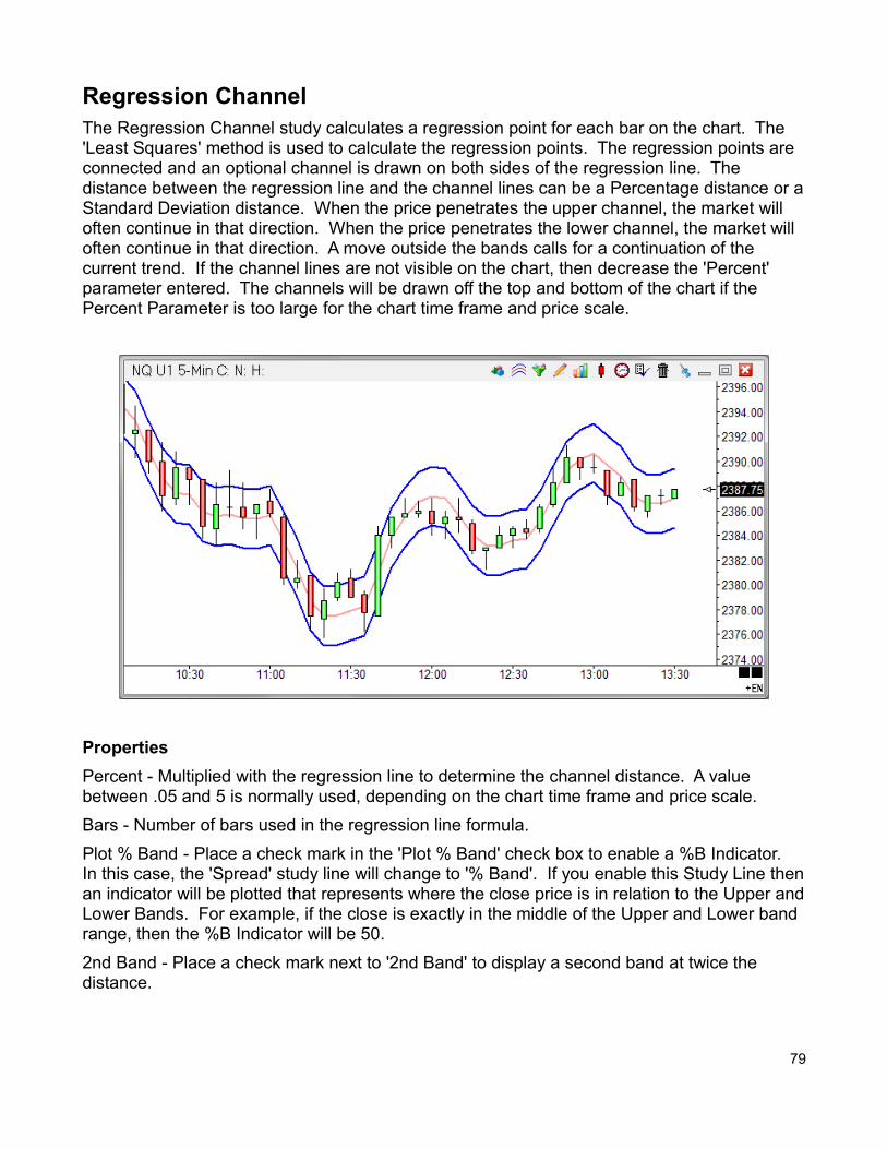
Regression ChannelThe Regression Channel study calculates a regression point for each bar on the chart. The 'Least Squares' method is used to calculate the regression points. The regression points are connected and an optional channel is drawn on both sides of the regression line. The distance between the regression line and the channel lines can be a Percentage distance or aStandard Deviation distance. When the price penetrates the upper channel, the market will often continue in that direction. When the price penetrates the lower channel, the market will often continue in that direction. A move outside the bands calls for a continuation of the current trend. If the channel lines are not visible on the chart, then decrease the 'Percent' parameter entered. The channels will be drawn off the top and bottom of the chart if the Percent Parameter is too large for the chart time frame and price scale.
Properties
Percent - Multiplied with the regression line to determine the channel distance. A value between .05 and 5 is normally used, depending on the chart time frame and price scale.
Bars - Number of bars used in the regression line formula.
Plot % Band - Place a check mark in the 'Plot % Band' check box to enable a %B Indicator. In this case, the 'Spread' study line will change to '% Band'. If you enable this Study Line thenan indicator will be plotted that represents where the close price is in relation to the Upper andLower Bands. For example, if the close is exactly in the middle of the Upper and Lower band range, then the %B Indicator will be 50.
2nd Band - Place a check mark next to '2nd Band' to display a second band at twice the distance.
79
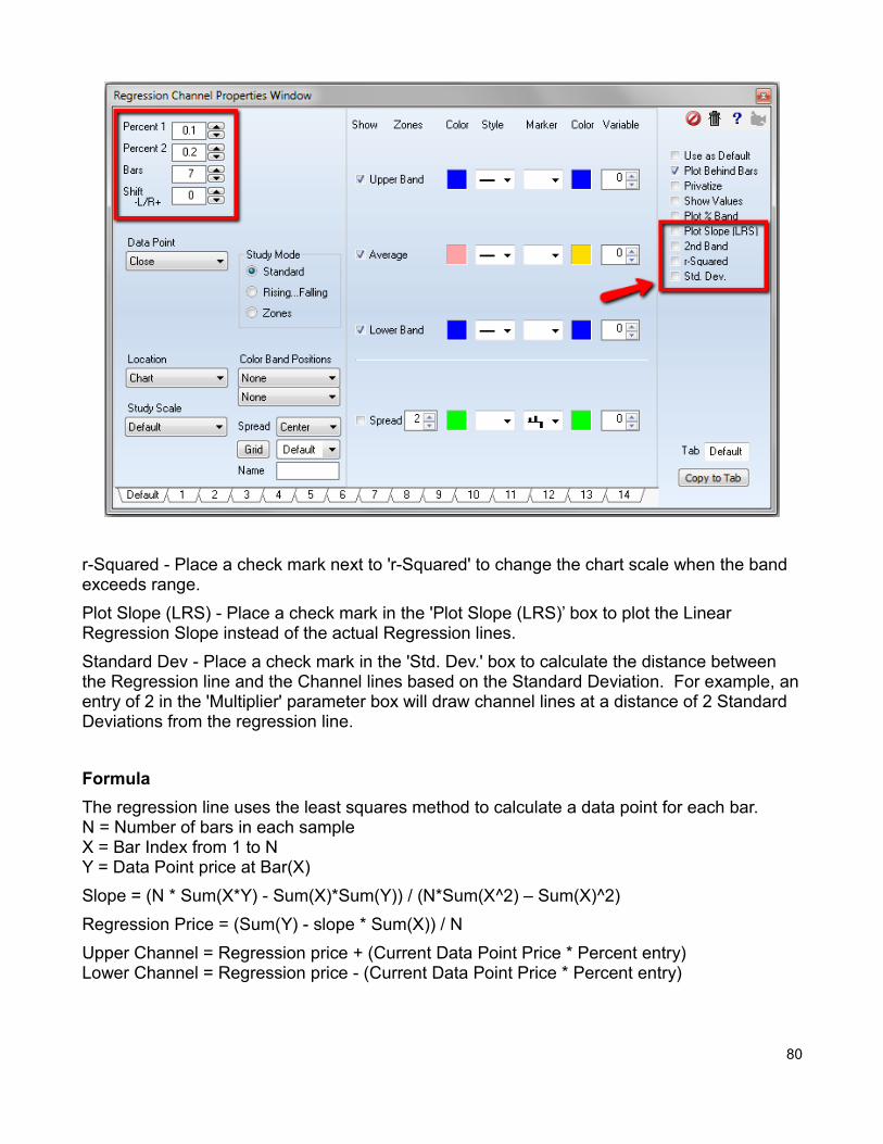
r-Squared - Place a check mark next to 'r-Squared' to change the chart scale when the band exceeds range.
Plot Slope (LRS) - Place a check mark in the 'Plot Slope (LRS)’ box to plot the Linear Regression Slope instead of the actual Regression lines.
Standard Dev - Place a check mark in the 'Std. Dev.' box to calculate the distance between the Regression line and the Channel lines based on the Standard Deviation. For example, anentry of 2 in the 'Multiplier' parameter box will draw channel lines at a distance of 2 Standard Deviations from the regression line.
Formula
The regression line uses the least squares method to calculate a data point for each bar.N = Number of bars in each sampleX = Bar Index from 1 to NY = Data Point price at Bar(X)
Slope = (N * Sum(X*Y) - Sum(X)*Sum(Y)) / (N*Sum(X^2) – Sum(X)^2)
Regression Price = (Sum(Y) - slope * Sum(X)) / N
Upper Channel = Regression price + (Current Data Point Price * Percent entry)Lower Channel = Regression price - (Current Data Point Price * Percent entry)
80
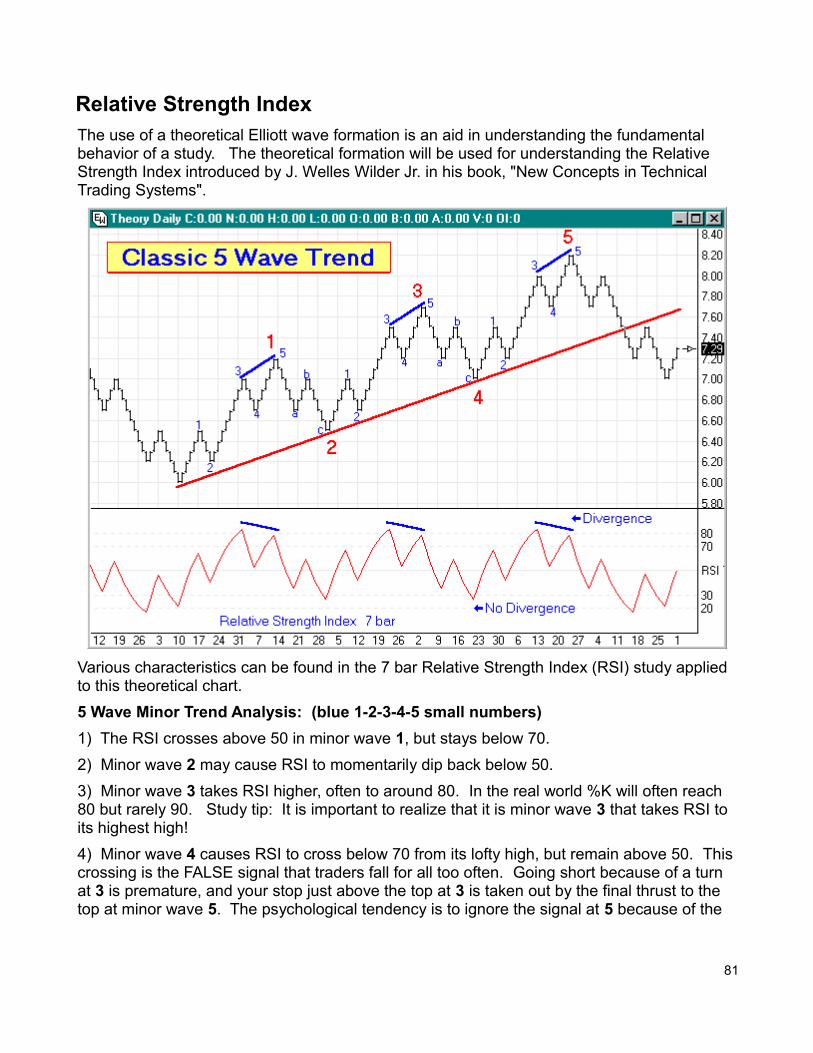
Relative Strength IndexThe use of a theoretical Elliott wave formation is an aid in understanding the fundamental behavior of a study. The theoretical formation will be used for understanding the Relative Strength Index introduced by J. Welles Wilder Jr. in his book, "New Concepts in Technical Trading Systems".
Various characteristics can be found in the 7 bar Relative Strength Index (RSI) study applied to this theoretical chart.
5 Wave Minor Trend Analysis: (blue 1-2-3-4-5 small numbers)
1) The RSI crosses above 50 in minor wave 1, but stays below 70.
2) Minor wave 2 may cause RSI to momentarily dip back below 50.
3) Minor wave 3 takes RSI higher, often to around 80. In the real world %K will often reach 80 but rarely 90. Study tip: It is important to realize that it is minor wave 3 that takes RSI to its highest high!
4) Minor wave 4 causes RSI to cross below 70 from its lofty high, but remain above 50. Thiscrossing is the FALSE signal that traders fall for all too often. Going short because of a turn at 3 is premature, and your stop just above the top at 3 is taken out by the final thrust to the top at minor wave 5. The psychological tendency is to ignore the signal at 5 because of the
81
loosing short attempted at wave 3.
5) Minor wave 5 causes RSI to rise again, often crossing back above 70, but the market lacks the duration in trend to elevate RSI to a higher high. When RSI turns down and crosses 70 the second time, this is the signal. Study tip: Look for divergence, where the price action put in new highs, but the study does not. Divergence between RSI and price is a very strong indicator of a turning point. Divergence is marked on the theoretical chart with short blue lines.
3 Wave Minor Correction Analysis: (blue a-b-c letters)
a) Minor wave a returns to the previous support level of minor wave 4. But the drop of RSI is huge, falling from a lofty high below 40. This rapid fall is similar to the rapid rise that occurred in minor wave 1.
b) Minor wave b is a Fibonacci retracement from a back towards 5. The example has its price stopping at the top of wave 3. The effect on RSI is to rally back above 50, possibly around 60.
c) Minor wave c takes RSI to new lows around 30. The example shows a drop slightly below 30. Study tip: Divergence will not occur this time. Therefore, the signal to go long is the first time RSI crosses above 30. This is shown in the example at major waves 2 and 4 (large red numbers) where the market meets the long term support trend line shown in red.
Signal SummaryThe process starts over again as Relative Strength Index behaves in a similar fashion for major waves 3 and 5 as it did for major wave 1. The a-b-c correction of major wave 4 will besimilar to major wave 2. The ideal place to short is after major wave 5 is in place, at what willbe minor wave 2 of the first trend leg of the new major correction.
Study tip: Relative Strength had three turns with divergence at the end of major waves 1, 3 and 5 marked in red. RSI turns at the end of the two reaction waves 2 and 4 did not have divergence. Look for this pattern to help you identify the 5th major Elliott wave. The divergence signal at the end of wave 5 is the ideal place to go short after a major up-trend, orlong after a major down-trend.
Bar ParameterNow that the fundamental behavior of Relative Strength Index is understood as the Elliott waves develop in a market, the theoretical chart will be used to observe the effect of different bar parameters on the RSI. The bar parameter is used in the RSI formula to average the Up and Down net totals. Changes in the bar parameter affect the volatility of the study as illustrated below. Study tip: Use a bar parameter that produces RSI highs around 80 and lows around 20.
82
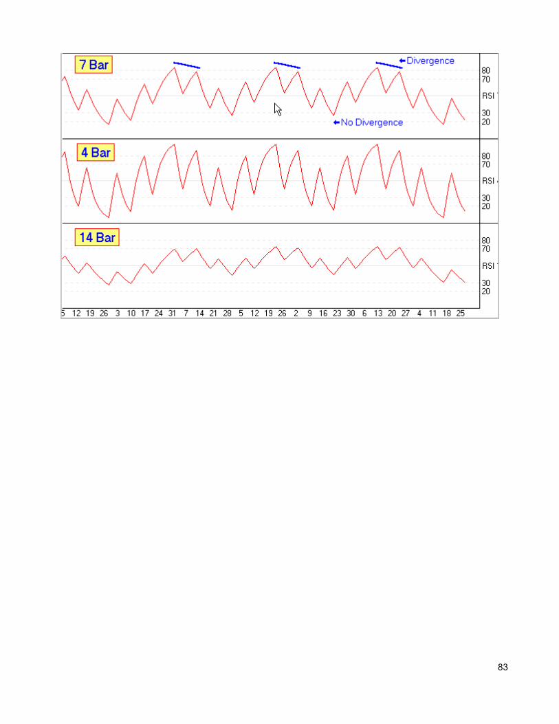
83
StochasticThe Stochastic study calculates a value between 0 and 100 which represents the relation of the Current price to the highest high and lowest low of the last N bars. For example, if N is equal to 10 then the Current price is compared to the high low price range of the last 10 bars.The Stochastic value will be 100 if the Current price is equal to the highest high of the last 10 bars. The Stochastic value will be 0 if the Current price is equal to the lowest low of the last 10 bars. The Stochastic value will be 50 if the Current price is exactly in the middle of the price range of the last 10 bars. The Raw Stochastic value is often called Fast %K. A moving average of the Fast %K value is calculated to obtain a smoother value. The smoothed value is called both Fast %D or Slow %K. A moving average of Slow %K is calculated to obtain a 2nd smoothed value. This value is called Slow %D.
In summary, the initial stochastic value (Fast %K) is averaged twice to obtain the Slow %K and Slow %D values. These values are then plotted on the chart. Stochastic values above 80indicate a possible overbought condition. Values below 20 indicate a possible oversold condition. Watch for divergence between the %D line and the price. A divergence occurs when the %D value starts to go up while the price of the bars is still going down. When a divergence occurs, a possible trigger is the %K crossing the %D line. Click the Studies buttonon the Chart Toolbar and then select Stochastic to draw the study on a chart.
Cross-over Forecast
Ensign 10 calculates and displays the price that the current bar must close at, in order for theStochastic lines to cross. This is called the Stochastic cross-over forecast. The cross-over price is displayed as the third Stochastic number in the studies panel on the left edge of the chart. This number is very useful for traders who trigger trades based on the crossing of the Stochastic lines.
Stochastic Fundamental Behavior
To understand a study more thoroughly, it needs to be observed on a theoretical Elliott wave formation. Too often a study is slapped on a chart, adjustable parameters are tweaked, and with the benefit of hindsight some trade signals are derived. The advanced student might go the extra mile and delve into the mathematics of the study's formula. But the fundamental behavior of the study is not understood well. This article will help you understand Stochastic better through an original approach.
The basic concepts of the Elliott Wave Theory are that action is followed by reaction, and there are 5 waves in the main trend, followed by 3 waves in the correction. Since this pattern is seen over and over in the markets, a theoretical chart based on these principles willbe used so Stochastic can be analyzed without market 'noise' obscuring its fundamental behavior.
84
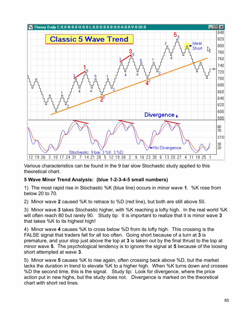
Various characteristics can be found in the 9 bar slow Stochastic study applied to this theoretical chart.
5 Wave Minor Trend Analysis: (blue 1-2-3-4-5 small numbers)
1) The most rapid rise in Stochastic %K (blue line) occurs in minor wave 1. %K rose from below 20 to 70.
2) Minor wave 2 caused %K to retrace to %D (red line), but both are still above 50.
3) Minor wave 3 takes Stochastic higher, with %K reaching a lofty high. In the real world %Kwill often reach 80 but rarely 90. Study tip: It is important to realize that it is minor wave 3 that takes %K to its highest high!
4) Minor wave 4 causes %K to cross below %D from its lofty high. This crossing is the FALSE signal that traders fall for all too often. Going short because of a turn at 3 is premature, and your stop just above the top at 3 is taken out by the final thrust to the top at minor wave 5. The psychological tendency is to ignore the signal at 5 because of the loosingshort attempted at wave 3.
5) Minor wave 5 causes %K to rise again, often crossing back above %D, but the market lacks the duration in trend to elevate %K to a higher high. When %K turns down and crosses%D the second time, this is the signal. Study tip: Look for divergence, where the price action put in new highs, but the study does not. Divergence is marked on the theoretical chart with short red lines.
85
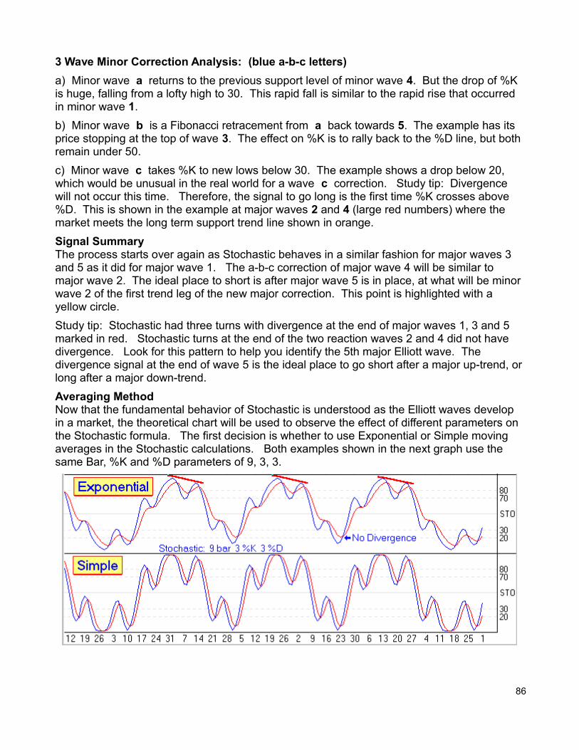
3 Wave Minor Correction Analysis: (blue a-b-c letters)
a) Minor wave a returns to the previous support level of minor wave 4. But the drop of %K is huge, falling from a lofty high to 30. This rapid fall is similar to the rapid rise that occurred in minor wave 1.
b) Minor wave b is a Fibonacci retracement from a back towards 5. The example has its price stopping at the top of wave 3. The effect on %K is to rally back to the %D line, but both remain under 50.
c) Minor wave c takes %K to new lows below 30. The example shows a drop below 20, which would be unusual in the real world for a wave c correction. Study tip: Divergence will not occur this time. Therefore, the signal to go long is the first time %K crosses above %D. This is shown in the example at major waves 2 and 4 (large red numbers) where the market meets the long term support trend line shown in orange.
Signal SummaryThe process starts over again as Stochastic behaves in a similar fashion for major waves 3 and 5 as it did for major wave 1. The a-b-c correction of major wave 4 will be similar to major wave 2. The ideal place to short is after major wave 5 is in place, at what will be minor wave 2 of the first trend leg of the new major correction. This point is highlighted with a yellow circle.
Study tip: Stochastic had three turns with divergence at the end of major waves 1, 3 and 5 marked in red. Stochastic turns at the end of the two reaction waves 2 and 4 did not have divergence. Look for this pattern to help you identify the 5th major Elliott wave. The divergence signal at the end of wave 5 is the ideal place to go short after a major up-trend, orlong after a major down-trend.
Averaging MethodNow that the fundamental behavior of Stochastic is understood as the Elliott waves develop in a market, the theoretical chart will be used to observe the effect of different parameters on the Stochastic formula. The first decision is whether to use Exponential or Simple moving averages in the Stochastic calculations. Both examples shown in the next graph use the same Bar, %K and %D parameters of 9, 3, 3.
86
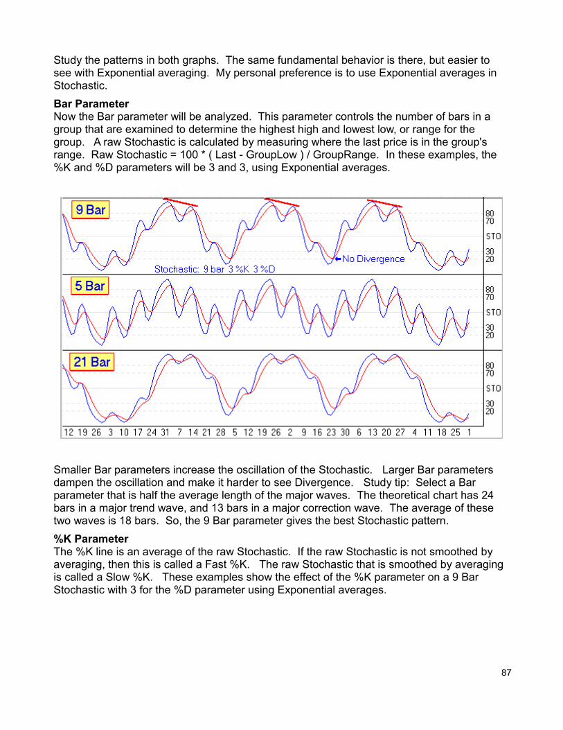
Study the patterns in both graphs. The same fundamental behavior is there, but easier to see with Exponential averaging. My personal preference is to use Exponential averages in Stochastic.
Bar ParameterNow the Bar parameter will be analyzed. This parameter controls the number of bars in a group that are examined to determine the highest high and lowest low, or range for the group. A raw Stochastic is calculated by measuring where the last price is in the group's range. Raw Stochastic = 100 * ( Last - GroupLow ) / GroupRange. In these examples, the %K and %D parameters will be 3 and 3, using Exponential averages.
Smaller Bar parameters increase the oscillation of the Stochastic. Larger Bar parameters dampen the oscillation and make it harder to see Divergence. Study tip: Select a Bar parameter that is half the average length of the major waves. The theoretical chart has 24 bars in a major trend wave, and 13 bars in a major correction wave. The average of these two waves is 18 bars. So, the 9 Bar parameter gives the best Stochastic pattern.
%K ParameterThe %K line is an average of the raw Stochastic. If the raw Stochastic is not smoothed by averaging, then this is called a Fast %K. The raw Stochastic that is smoothed by averaging is called a Slow %K. These examples show the effect of the %K parameter on a 9 Bar Stochastic with 3 for the %D parameter using Exponential averages.
87
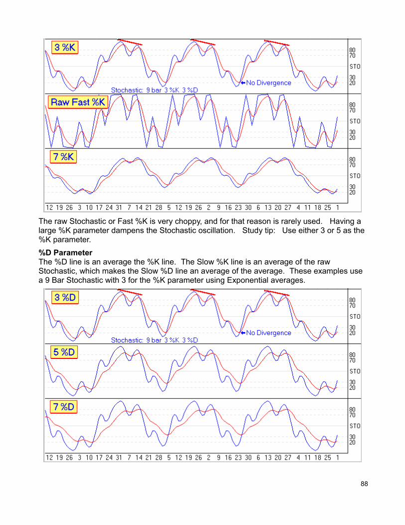
The raw Stochastic or Fast %K is very choppy, and for that reason is rarely used. Having a large %K parameter dampens the Stochastic oscillation. Study tip: Use either 3 or 5 as the %K parameter.
%D ParameterThe %D line is an average the %K line. The Slow %K line is an average of the raw Stochastic, which makes the Slow %D line an average of the average. These examples use a 9 Bar Stochastic with 3 for the %K parameter using Exponential averages.
88
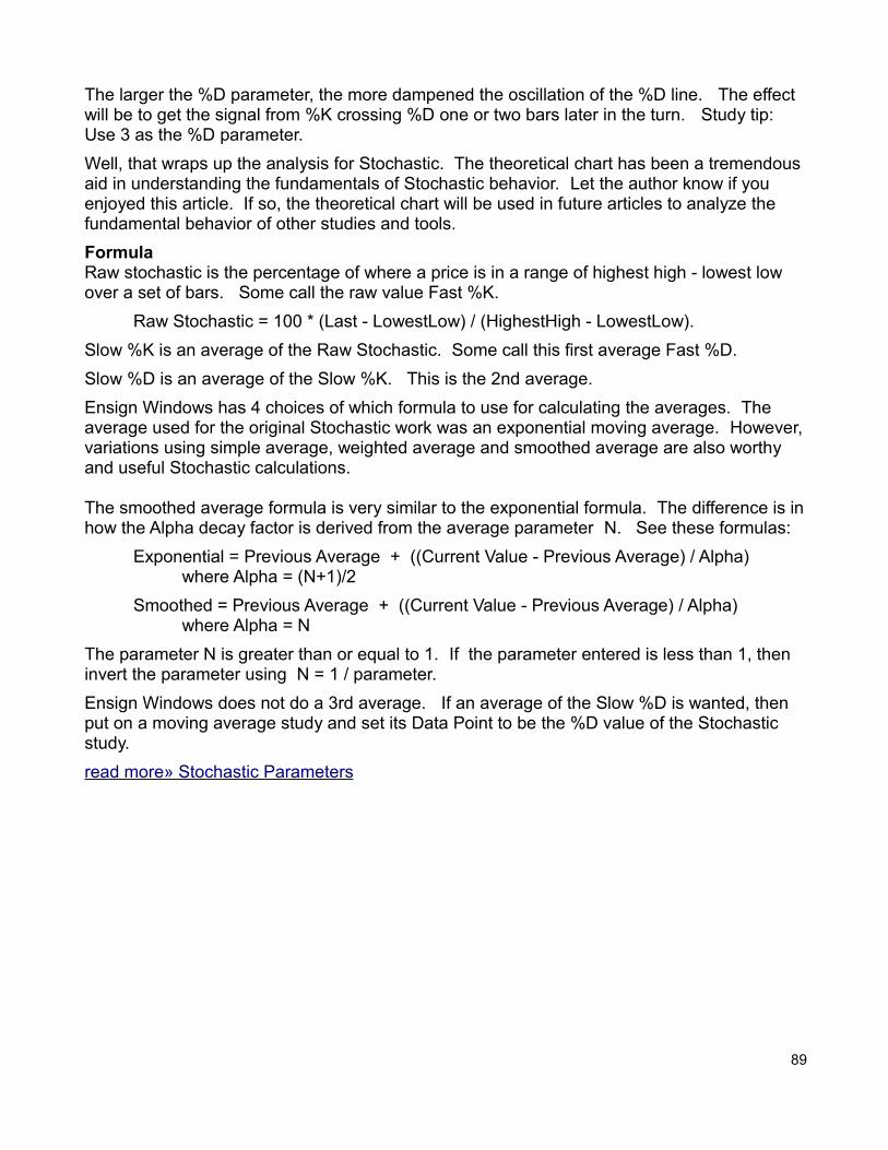
The larger the %D parameter, the more dampened the oscillation of the %D line. The effect will be to get the signal from %K crossing %D one or two bars later in the turn. Study tip: Use 3 as the %D parameter.
Well, that wraps up the analysis for Stochastic. The theoretical chart has been a tremendousaid in understanding the fundamentals of Stochastic behavior. Let the author know if you enjoyed this article. If so, the theoretical chart will be used in future articles to analyze the fundamental behavior of other studies and tools.
FormulaRaw stochastic is the percentage of where a price is in a range of highest high - lowest low over a set of bars. Some call the raw value Fast %K.
Raw Stochastic = 100 * (Last - LowestLow) / (HighestHigh - LowestLow).
Slow %K is an average of the Raw Stochastic. Some call this first average Fast %D.
Slow %D is an average of the Slow %K. This is the 2nd average.
Ensign Windows has 4 choices of which formula to use for calculating the averages. The average used for the original Stochastic work was an exponential moving average. However,variations using simple average, weighted average and smoothed average are also worthy and useful Stochastic calculations.
The smoothed average formula is very similar to the exponential formula. The difference is inhow the Alpha decay factor is derived from the average parameter N. See these formulas:
Exponential = Previous Average + ((Current Value - Previous Average) / Alpha) where Alpha = (N+1)/2
Smoothed = Previous Average + ((Current Value - Previous Average) / Alpha) where Alpha = N
The parameter N is greater than or equal to 1. If the parameter entered is less than 1, then invert the parameter using N = 1 / parameter.
Ensign Windows does not do a 3rd average. If an average of the Slow %D is wanted, then put on a moving average study and set its Data Point to be the %D value of the Stochastic study.
read more» Stochastic Parameters
89
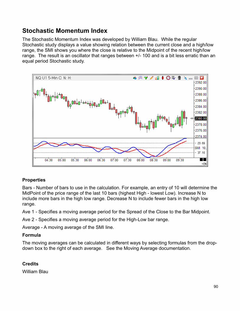
Stochastic Momentum IndexThe Stochastic Momentum Index was developed by William Blau. While the regular Stochastic study displays a value showing relation between the current close and a high/low range, the SMI shows you where the close is relative to the Midpoint of the recent high/low range. The result is an oscillator that ranges between +/- 100 and is a bit less erratic than an equal period Stochastic study.
Properties
Bars - Number of bars to use in the calculation. For example, an entry of 10 will determine theMidPoint of the price range of the last 10 bars (highest High - lowest Low). Increase N to include more bars in the high low range. Decrease N to include fewer bars in the high low range.
Ave 1 - Specifies a moving average period for the Spread of the Close to the Bar Midpoint.
Ave 2 - Specifies a moving average period for the High-Low bar range.
Average - A moving average of the SMI line.
Formula
The moving averages can be calculated in different ways by selecting formulas from the drop-down box to the right of each average. See the Moving Average documentation.
Credits
William Blau
90
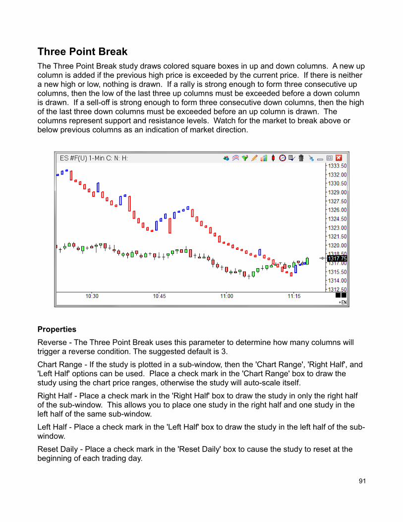
Three Point BreakThe Three Point Break study draws colored square boxes in up and down columns. A new upcolumn is added if the previous high price is exceeded by the current price. If there is neither a new high or low, nothing is drawn. If a rally is strong enough to form three consecutive up columns, then the low of the last three up columns must be exceeded before a down column is drawn. If a sell-off is strong enough to form three consecutive down columns, then the highof the last three down columns must be exceeded before an up column is drawn. The columns represent support and resistance levels. Watch for the market to break above or below previous columns as an indication of market direction.
Properties
Reverse - The Three Point Break uses this parameter to determine how many columns will trigger a reverse condition. The suggested default is 3.
Chart Range - If the study is plotted in a sub-window, then the 'Chart Range', 'Right Half', and 'Left Half' options can be used. Place a check mark in the 'Chart Range' box to draw the study using the chart price ranges, otherwise the study will auto-scale itself.
Right Half - Place a check mark in the 'Right Half' box to draw the study in only the right half of the sub-window. This allows you to place one study in the right half and one study in the left half of the same sub-window.
Left Half - Place a check mark in the 'Left Half' box to draw the study in the left half of the sub-window.
Reset Daily - Place a check mark in the 'Reset Daily' box to cause the study to reset at the beginning of each trading day.
91
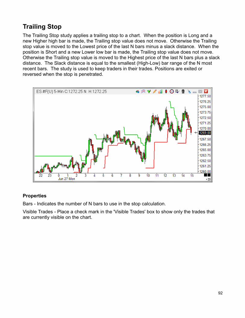
Trailing StopThe Trailing Stop study applies a trailing stop to a chart. When the position is Long and a new Higher high bar is made, the Trailing stop value does not move. Otherwise the Trailing stop value is moved to the Lowest price of the last N bars minus a slack distance. When the position is Short and a new Lower low bar is made, the Trailing stop value does not move. Otherwise the Trailing stop value is moved to the Highest price of the last N bars plus a slack distance. The Slack distance is equal to the smallest (High-Low) bar range of the N most recent bars. The study is used to keep traders in their trades. Positions are exited or reversed when the stop is penetrated.
Properties
Bars - Indicates the number of N bars to use in the stop calculation.
Visible Trades - Place a check mark in the 'Visible Trades' box to show only the trades that are currently visible on the chart.
92
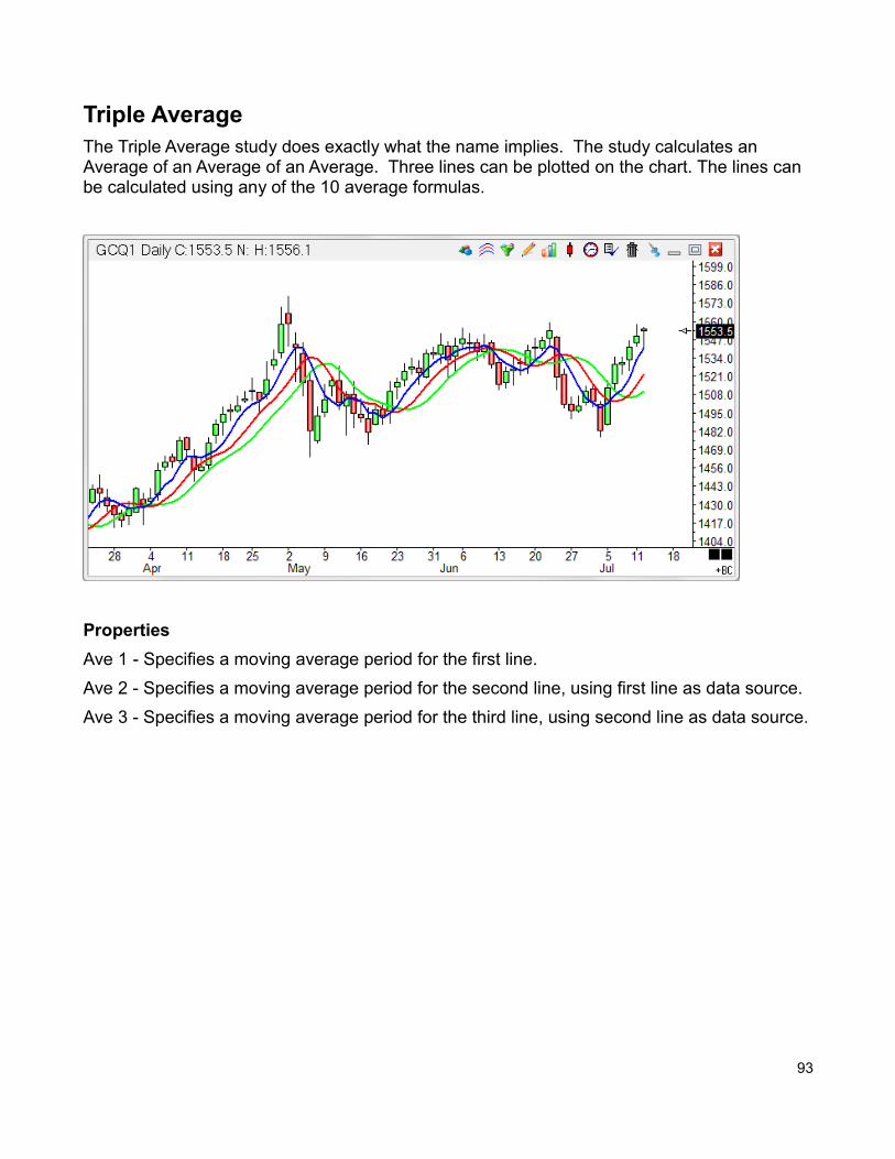
Triple AverageThe Triple Average study does exactly what the name implies. The study calculates an Average of an Average of an Average. Three lines can be plotted on the chart. The lines can be calculated using any of the 10 average formulas.
Properties
Ave 1 - Specifies a moving average period for the first line.
Ave 2 - Specifies a moving average period for the second line, using first line as data source.
Ave 3 - Specifies a moving average period for the third line, using second line as data source.
93
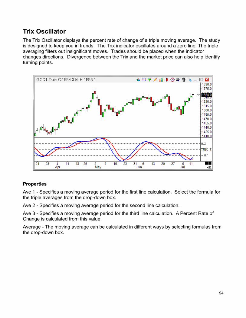
Trix OscillatorThe Trix Oscillator displays the percent rate of change of a triple moving average. The study is designed to keep you in trends. The Trix indicator oscillates around a zero line. The triple averaging filters out insignificant moves. Trades should be placed when the indicator changes directions. Divergence between the Trix and the market price can also help identify turning points.
Properties
Ave 1 - Specifies a moving average period for the first line calculation. Select the formula for the triple averages from the drop-down box.
Ave 2 - Specifies a moving average period for the second line calculation.
Ave 3 - Specifies a moving average period for the third line calculation. A Percent Rate of Change is calculated from this value.
Average - The moving average can be calculated in different ways by selecting formulas from the drop-down box.
94
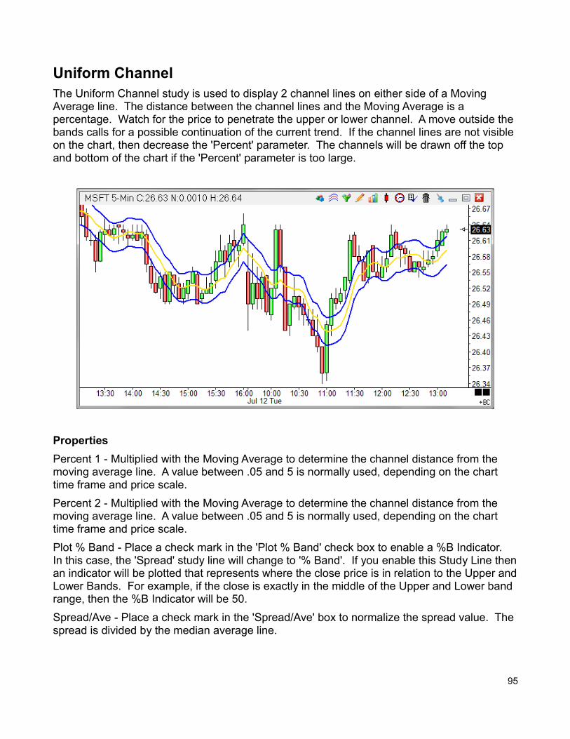
Uniform ChannelThe Uniform Channel study is used to display 2 channel lines on either side of a Moving Average line. The distance between the channel lines and the Moving Average is a percentage. Watch for the price to penetrate the upper or lower channel. A move outside the bands calls for a possible continuation of the current trend. If the channel lines are not visible on the chart, then decrease the 'Percent' parameter. The channels will be drawn off the top and bottom of the chart if the 'Percent' parameter is too large.
Properties
Percent 1 - Multiplied with the Moving Average to determine the channel distance from the moving average line. A value between .05 and 5 is normally used, depending on the chart time frame and price scale.
Percent 2 - Multiplied with the Moving Average to determine the channel distance from the moving average line. A value between .05 and 5 is normally used, depending on the chart time frame and price scale.
Plot % Band - Place a check mark in the 'Plot % Band' check box to enable a %B Indicator. In this case, the 'Spread' study line will change to '% Band'. If you enable this Study Line thenan indicator will be plotted that represents where the close price is in relation to the Upper andLower Bands. For example, if the close is exactly in the middle of the Upper and Lower band range, then the %B Indicator will be 50.
Spread/Ave - Place a check mark in the 'Spread/Ave' box to normalize the spread value. The spread is divided by the median average line.
95
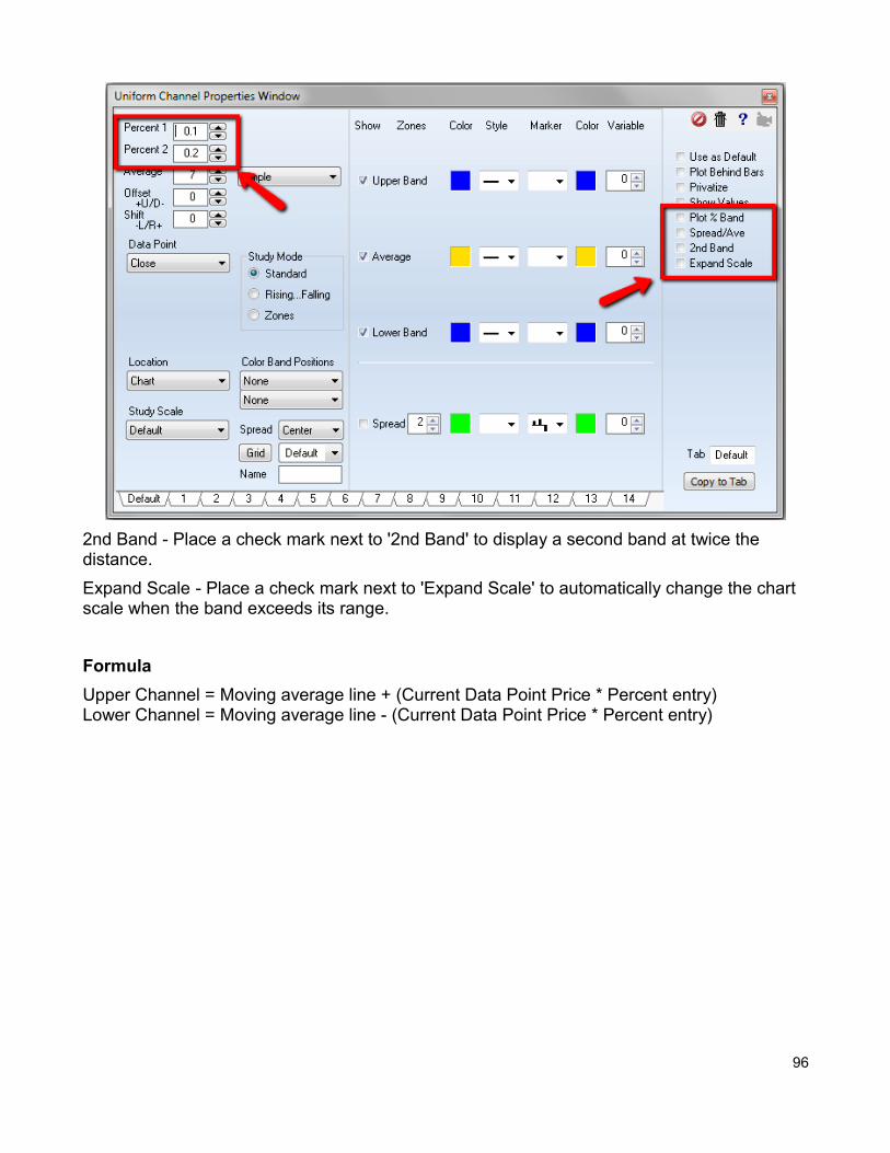
2nd Band - Place a check mark next to '2nd Band' to display a second band at twice the distance.
Expand Scale - Place a check mark next to 'Expand Scale' to automatically change the chart scale when the band exceeds its range.
Formula
Upper Channel = Moving average line + (Current Data Point Price * Percent entry)Lower Channel = Moving average line - (Current Data Point Price * Percent entry)
96
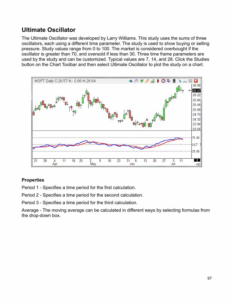
Ultimate OscillatorThe Ultimate Oscillator was developed by Larry Williams. This study uses the sums of three oscillators, each using a different time parameter. The study is used to show buying or selling pressure. Study values range from 0 to 100. The market is considered overbought if the oscillator is greater than 70, and oversold if less than 30. Three time frame parameters are used by the study and can be customized. Typical values are 7, 14, and 28. Click the Studies button on the Chart Toolbar and then select Ultimate Oscillator to plot the study on a chart.
Properties
Period 1 - Specifies a time period for the first calculation.
Period 2 - Specifies a time period for the second calculation.
Period 3 - Specifies a time period for the third calculation.
Average - The moving average can be calculated in different ways by selecting formulas from the drop-down box.
97
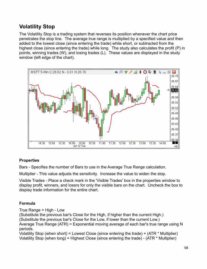
Volatility StopThe Volatility Stop is a trading system that reverses its position whenever the chart price penetrates the stop line. The average true range is multiplied by a specified value and then added to the lowest close (since entering the trade) while short, or subtracted from the highest close (since entering the trade) while long. The study also calculates the profit (P) in points, winning trades (W), and losing trades (L). These values are displayed in the study window (left edge of the chart).
Properties
Bars - Specifies the number of Bars to use in the Average True Range calculation.
Multiplier - This value adjusts the sensitivity. Increase the value to widen the stop.
Visible Trades - Place a check mark in the 'Visible Trades' box in the properties window to display profit, winners, and losers for only the visible bars on the chart. Uncheck the box to display trade information for the entire chart.
Formula
True Range = High - Low (Substitute the previous bar's Close for the High, if higher than the current High.)(Substitute the previous bar's Close for the Low, if lower than the current Low.)Average True Range (ATR) = Exponential moving average of each bar's true range using N periods.Volatility Stop (when short) = Lowest Close (since entering the trade) + (ATR * Multiplier)Volatility Stop (when long) = Highest Close (since entering the trade) - (ATR * Multiplier)
98
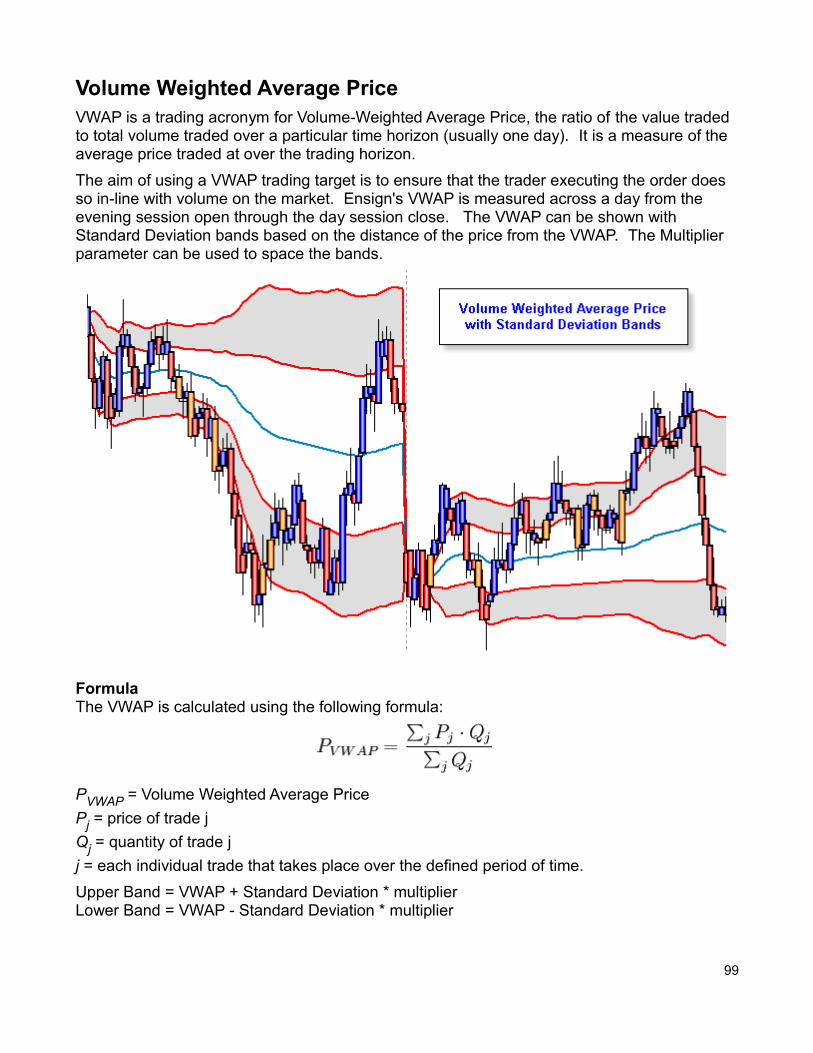
Volume Weighted Average PriceVWAP is a trading acronym for Volume-Weighted Average Price, the ratio of the value traded to total volume traded over a particular time horizon (usually one day). It is a measure of the average price traded at over the trading horizon.
The aim of using a VWAP trading target is to ensure that the trader executing the order does so in-line with volume on the market. Ensign's VWAP is measured across a day from the evening session open through the day session close. The VWAP can be shown with Standard Deviation bands based on the distance of the price from the VWAP. The Multiplier parameter can be used to space the bands.
FormulaThe VWAP is calculated using the following formula:
PVWAP = Volume Weighted Average Price
Pj = price of trade j
Qj = quantity of trade j
j = each individual trade that takes place over the defined period of time.
Upper Band = VWAP + Standard Deviation * multiplierLower Band = VWAP - Standard Deviation * multiplier
99
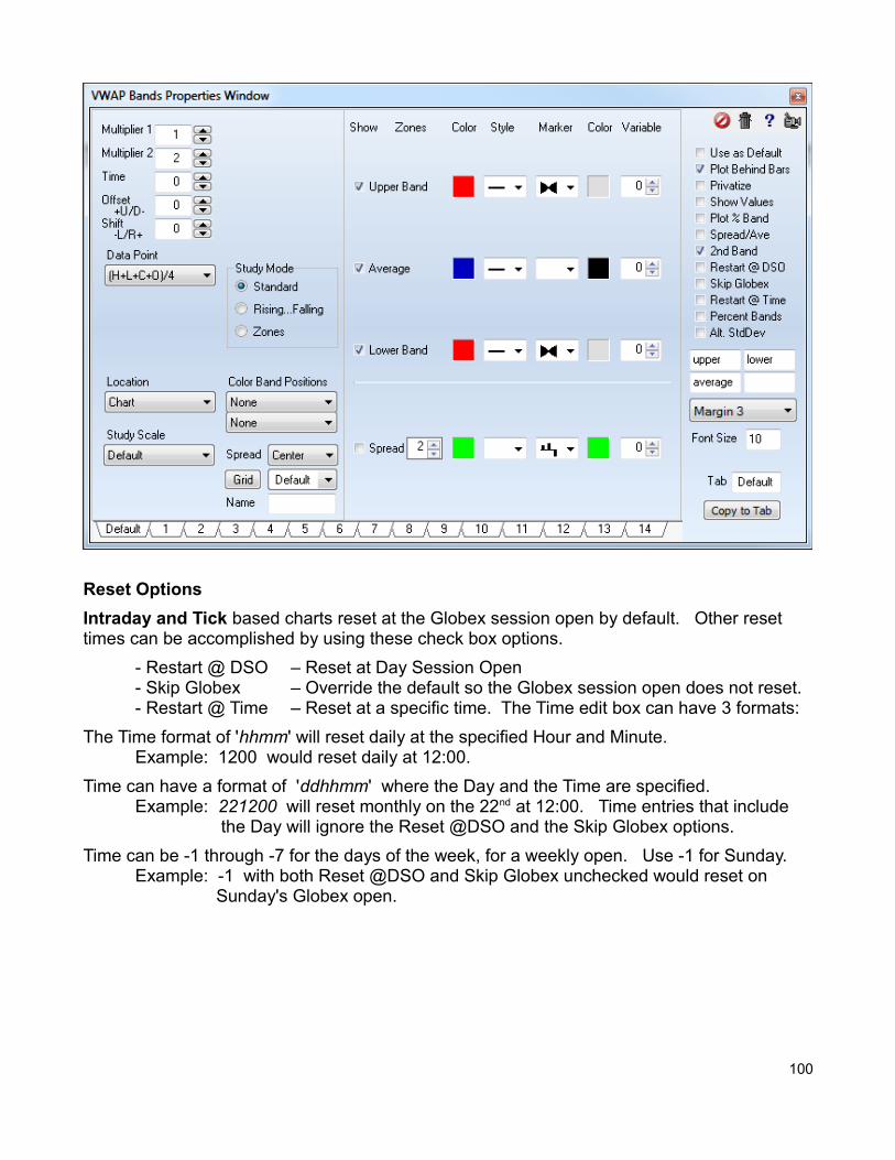
Reset Options
Intraday and Tick based charts reset at the Globex session open by default. Other reset times can be accomplished by using these check box options.
- Restart @ DSO – Reset at Day Session Open- Skip Globex – Override the default so the Globex session open does not reset.- Restart @ Time – Reset at a specific time. The Time edit box can have 3 formats:
The Time format of 'hhmm' will reset daily at the specified Hour and Minute. Example: 1200 would reset daily at 12:00.
Time can have a format of 'ddhhmm' where the Day and the Time are specified. Example: 221200 will reset monthly on the 22nd at 12:00. Time entries that include
the Day will ignore the Reset @DSO and the Skip Globex options.
Time can be -1 through -7 for the days of the week, for a weekly open. Use -1 for Sunday.Example: -1 with both Reset @DSO and Skip Globex unchecked would reset on
Sunday's Globex open.
100

Continuous Intraday and Tick based charts can have a continuous calculation across N days where there is no reset event. The parameters would be set this way to implement the continuous calculation.
- Restart @ DSO – Unchecked- Skip Globex – Checked- Restart @ Time – Unchecked- Time – Enter the number of days for the continuous calculation. The example shows an entry for 1 and one half days.
When Time has a value of 0 the continuous calculation will be across the entire chart instead of across N number of days.
101
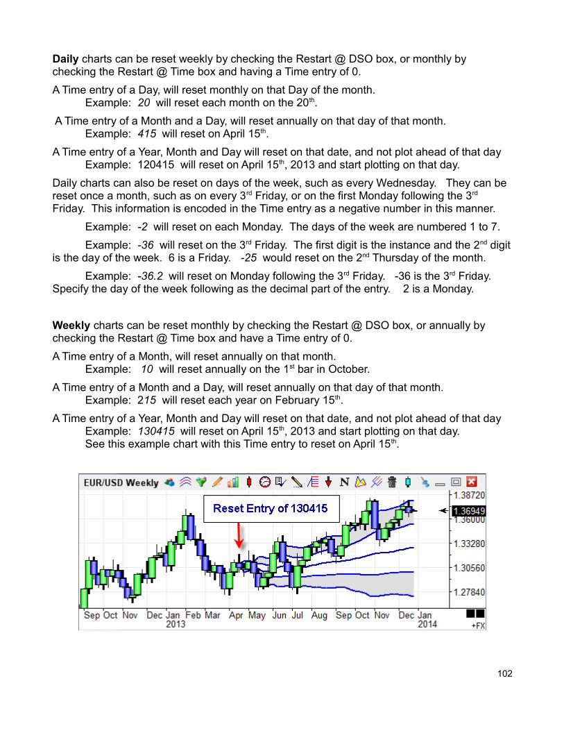
Daily charts can be reset weekly by checking the Restart @ DSO box, or monthly by checking the Restart @ Time box and having a Time entry of 0.
A Time entry of a Day, will reset monthly on that Day of the month. Example: 20 will reset each month on the 20th.
A Time entry of a Month and a Day, will reset annually on that day of that month. Example: 415 will reset on April 15th.
A Time entry of a Year, Month and Day will reset on that date, and not plot ahead of that dayExample: 120415 will reset on April 15th, 2013 and start plotting on that day.
Daily charts can also be reset on days of the week, such as every Wednesday. They can be reset once a month, such as on every 3rd Friday, or on the first Monday following the 3rd Friday. This information is encoded in the Time entry as a negative number in this manner.
Example: -2 will reset on each Monday. The days of the week are numbered 1 to 7.
Example: -36 will reset on the 3rd Friday. The first digit is the instance and the 2nd digitis the day of the week. 6 is a Friday. -25 would reset on the 2nd Thursday of the month.
Example: -36.2 will reset on Monday following the 3rd Friday. -36 is the 3rd Friday. Specify the day of the week following as the decimal part of the entry. 2 is a Monday.
Weekly charts can be reset monthly by checking the Restart @ DSO box, or annually by checking the Restart @ Time box and have a Time entry of 0.
A Time entry of a Month, will reset annually on that month.Example: 10 will reset annually on the 1st bar in October.
A Time entry of a Month and a Day, will reset annually on that day of that month. Example: 215 will reset each year on February 15th.
A Time entry of a Year, Month and Day will reset on that date, and not plot ahead of that dayExample: 130415 will reset on April 15th, 2013 and start plotting on that day.See this example chart with this Time entry to reset on April 15th.
102
Monthly and Quarterly charts can be reset annually by checking the Restart @ Time box and having a Time entry of 0.
A Time entry of a Month, will reset annually on that month.Example: 3 will reset each year on the March bar.
A Time entry of a Year and a Month, will reset and start plotting on that month of that year.Example: 510 will reset on October, 2005.
Yearly chart will reset by checking the Restart @ Time box and having a Time entry of the year. The plotting of the study will begin on that year bar.
Example: 5 will reset on the 2005 bar.
LabelsEnter text in the edit boxes on the right hand side. Use the drop down list to select a locationin the Margin for the labels, and a font size. The property form shows labels of 'upper', 'lower', 'average'. The 4th label box is for labeling the 'spread'.
ParametersPlot % Band – Check to change the Spread plot to show Close as a percent of the Band.Spread/Ave – Check to change the Spread by dividing by the Average.Percent Bands – Check this box to change the bands to Percent bands instead of VWAP.Alt. StdDev – Check to plot a Standard Deviation relative to the final VWAP value.
103
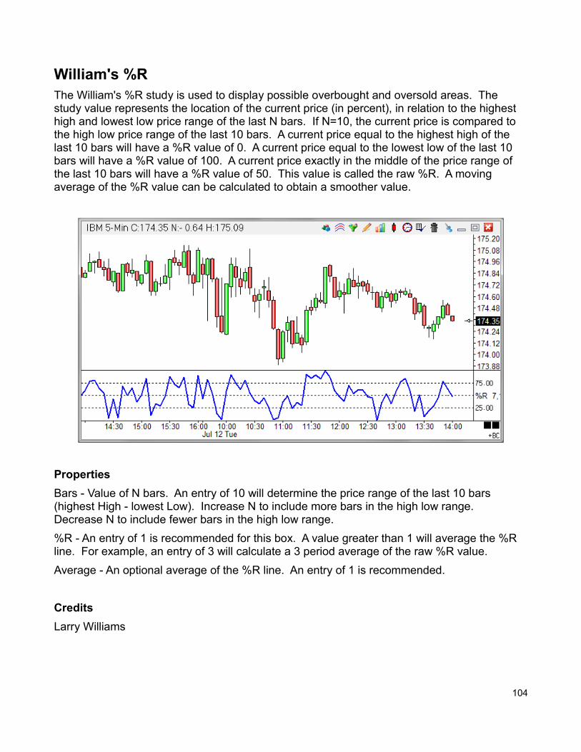
William's %RThe William's %R study is used to display possible overbought and oversold areas. The study value represents the location of the current price (in percent), in relation to the highest high and lowest low price range of the last N bars. If N=10, the current price is compared to the high low price range of the last 10 bars. A current price equal to the highest high of the last 10 bars will have a %R value of 0. A current price equal to the lowest low of the last 10 bars will have a %R value of 100. A current price exactly in the middle of the price range of the last 10 bars will have a %R value of 50. This value is called the raw %R. A moving average of the %R value can be calculated to obtain a smoother value.
Properties
Bars - Value of N bars. An entry of 10 will determine the price range of the last 10 bars (highest High - lowest Low). Increase N to include more bars in the high low range. Decrease N to include fewer bars in the high low range.
%R - An entry of 1 is recommended for this box. A value greater than 1 will average the %R line. For example, an entry of 3 will calculate a 3 period average of the raw %R value.
Average - An optional average of the %R line. An entry of 1 is recommended.
Credits
Larry Williams
104
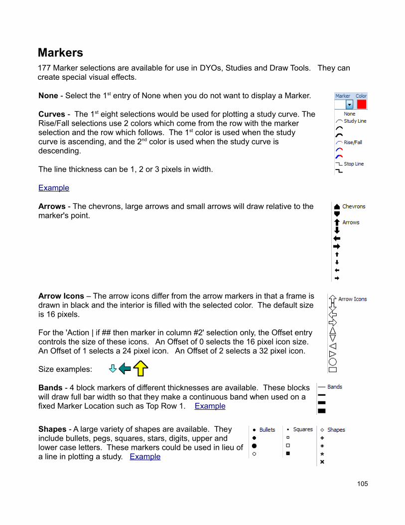
Markers177 Marker selections are available for use in DYOs, Studies and Draw Tools. They can create special visual effects.
None - Select the 1st entry of None when you do not want to display a Marker.
Curves - The 1st eight selections would be used for plotting a study curve. TheRise/Fall selections use 2 colors which come from the row with the marker selection and the row which follows. The 1st color is used when the study curve is ascending, and the 2nd color is used when the study curve is descending.
The line thickness can be 1, 2 or 3 pixels in width.
Example
Arrows - The chevrons, large arrows and small arrows will draw relative to the marker's point.
Arrow Icons – The arrow icons differ from the arrow markers in that a frame isdrawn in black and the interior is filled with the selected color. The default size is 16 pixels.
For the 'Action | if ## then marker in column #2' selection only, the Offset entry controls the size of these icons. An Offset of 0 selects the 16 pixel icon size. An Offset of 1 selects a 24 pixel icon. An Offset of 2 selects a 32 pixel icon.
Size examples:
Bands - 4 block markers of different thicknesses are available. These blocks will draw full bar width so that they make a continuous band when used on a fixed Marker Location such as Top Row 1. Example
Shapes - A large variety of shapes are available. Theyinclude bullets, pegs, squares, stars, digits, upper andlower case letters. These markers could be used in lieu ofa line in plotting a study. Example
105
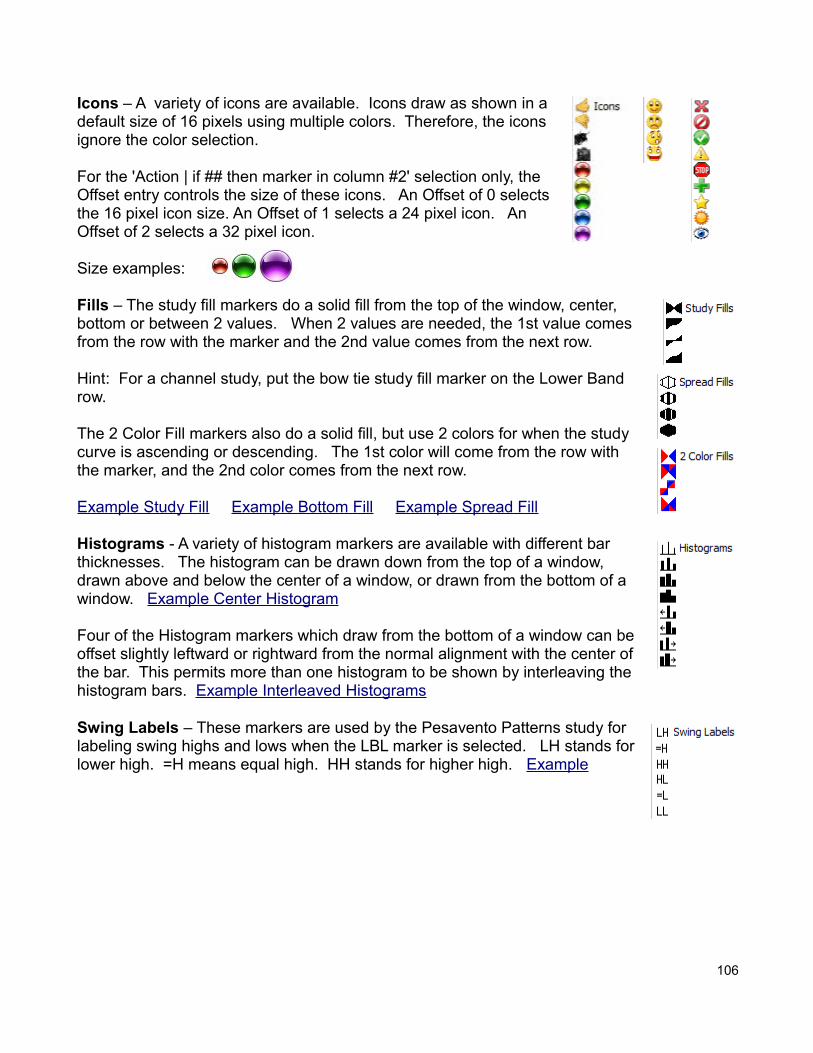
Icons – A variety of icons are available. Icons draw as shown in adefault size of 16 pixels using multiple colors. Therefore, the iconsignore the color selection.
For the 'Action | if ## then marker in column #2' selection only, theOffset entry controls the size of these icons. An Offset of 0 selectsthe 16 pixel icon size. An Offset of 1 selects a 24 pixel icon. AnOffset of 2 selects a 32 pixel icon.
Size examples:
Fills – The study fill markers do a solid fill from the top of the window, center, bottom or between 2 values. When 2 values are needed, the 1st value comesfrom the row with the marker and the 2nd value comes from the next row.
Hint: For a channel study, put the bow tie study fill marker on the Lower Band row.
The 2 Color Fill markers also do a solid fill, but use 2 colors for when the study curve is ascending or descending. The 1st color will come from the row with the marker, and the 2nd color comes from the next row.
Example Study Fill Example Bottom Fill Example Spread Fill
Histograms - A variety of histogram markers are available with different bar thicknesses. The histogram can be drawn down from the top of a window, drawn above and below the center of a window, or drawn from the bottom of a window. Example Center Histogram
Four of the Histogram markers which draw from the bottom of a window can beoffset slightly leftward or rightward from the normal alignment with the center ofthe bar. This permits more than one histogram to be shown by interleaving thehistogram bars. Example Interleaved Histograms
Swing Labels – These markers are used by the Pesavento Patterns study for labeling swing highs and lows when the LBL marker is selected. LH stands forlower high. =H means equal high. HH stands for higher high. Example
106
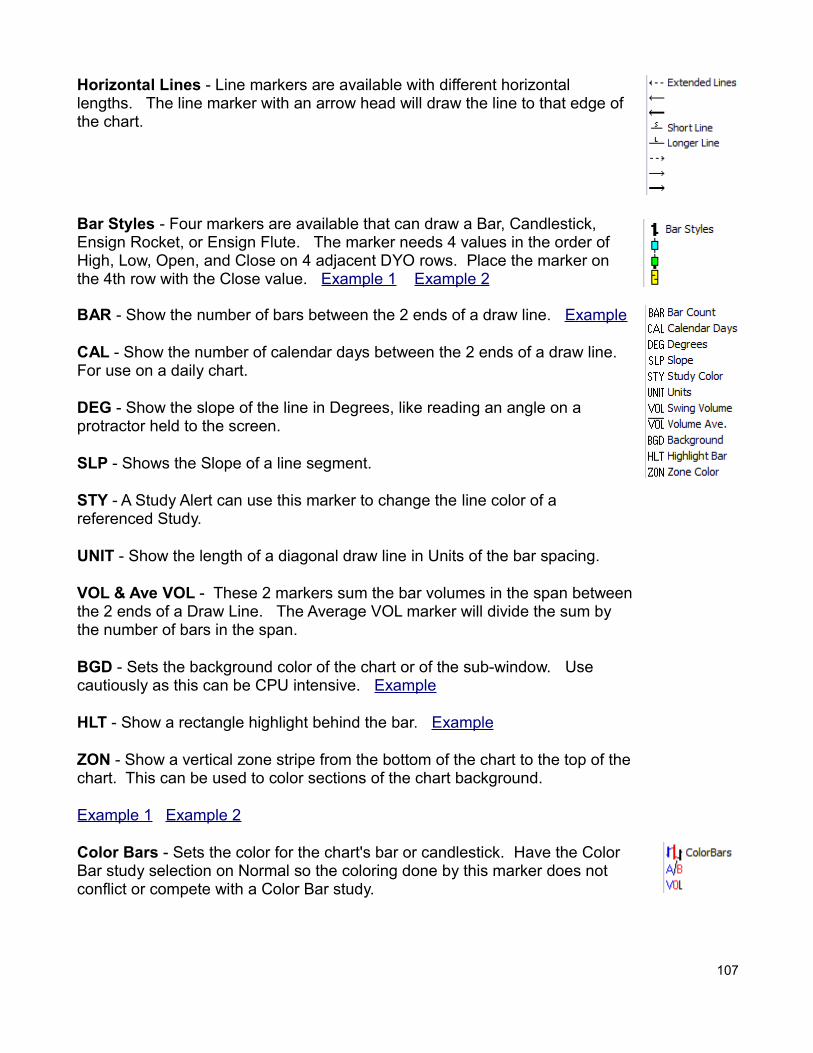
Horizontal Lines - Line markers are available with different horizontal lengths. The line marker with an arrow head will draw the line to that edge of the chart.
Bar Styles - Four markers are available that can draw a Bar, Candlestick, Ensign Rocket, or Ensign Flute. The marker needs 4 values in the order of High, Low, Open, and Close on 4 adjacent DYO rows. Place the marker on the 4th row with the Close value. Example 1 Example 2
BAR - Show the number of bars between the 2 ends of a draw line. Example
CAL - Show the number of calendar days between the 2 ends of a draw line. For use on a daily chart.
DEG - Show the slope of the line in Degrees, like reading an angle on a protractor held to the screen.
SLP - Shows the Slope of a line segment.
STY - A Study Alert can use this marker to change the line color of a referenced Study.
UNIT - Show the length of a diagonal draw line in Units of the bar spacing.
VOL & Ave VOL - These 2 markers sum the bar volumes in the span betweenthe 2 ends of a Draw Line. The Average VOL marker will divide the sum by the number of bars in the span.
BGD - Sets the background color of the chart or of the sub-window. Use cautiously as this can be CPU intensive. Example
HLT - Show a rectangle highlight behind the bar. Example
ZON - Show a vertical zone stripe from the bottom of the chart to the top of thechart. This can be used to color sections of the chart background.
Example 1 Example 2
Color Bars - Sets the color for the chart's bar or candlestick. Have the Color Bar study selection on Normal so the coloring done by this marker does not conflict or compete with a Color Bar study.
107
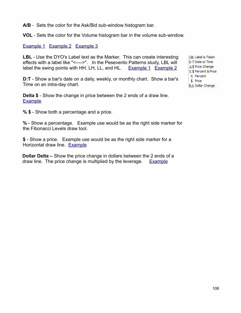
A/B - Sets the color for the Ask/Bid sub-window histogram bar.
VOL - Sets the color for the Volume histogram bar in the volume sub-window.
Example 1 Example 2 Example 3
LBL - Use the DYO's Label text as the Marker. This can create interestingeffects with a label like "<---->". In the Pesevento Patterns study, LBL willlabel the swing points with HH, LH, LL, and HL. Example 1 Example 2
D:T - Show a bar's date on a daily, weekly, or monthly chart. Show a bar'sTime on an intra-day chart.
Delta $ - Show the change in price between the 2 ends of a draw line. Example
% $ - Show both a percentage and a price.
% - Show a percentage. Example use would be as the right side marker for the Fibonacci Levels draw tool.
$ - Show a price. Example use would be as the right side marker for a Horizontal draw line. Example
Dollar Delta – Show the price change in dollars between the 2 ends of a draw line. The price change is multiplied by the leverage. Example
108