Embed Size (px)
Citation preview
Department of Informatics
Master thesis, 30 hp
Human-Computer Interaction and Social Media
SPM 2019.13
Supporting User
Engagement in Participatory
Design: A Multiple-fidelity
Prototyping Approach
Charlotte Lau

1
Supporting User Engagement in
Participatory Design: A Multiple-
fidelity Prototyping Approach
Abstract Over the history of interaction design, concepts and methods of prototyping have been significantly developed to address new challenges faced by the field and the ever-going advancement of new technologies. Some of the important developments are related to the notions of mixed-fidelity prototyping, experience prototyping, and prototypes as filters. Building upon these developments, this study explores a multiple-fidelity prototyping approach, that is, using progressively higher fidelity prototypes in iteration. The study focused particularly on the design of user engagement. It documented, and contributed to, an actual design process of Xplore, an augmented reality game-based learning application. Three participatory design-style workshops employing low-, mixed-, and high-fidelity prototypes were conducted respectively. Thematic analyses of participants’ interactions revealed sets of themes in the workshops, which reflected the changing focus and scope of the design space. The implications of the results obtained in the study highlighted the role of prototypes of each fidelity level in engaging users in a design process, as well as the potential benefits of combining multiple fidelity prototypes when designing for user engagement.
Keywords: Prototyping approach, multiple-fidelity prototyping, prototype fidelity, prototypes as filters, participatory design, augmented reality, game-based learning, experience design, user engagement
1 Introduction The popularity of the mobile game, Pokémon Go, has made location-based augmented reality (AR) a widely accepted and desirable game technology in recent years. Godwin-Jones (2016) stated that, many research studies have made use of this trend and created numerous research-based designs that combined AR games with education, including second language learning. This paper documents the design process of an AR game-based Swedish learning application named Xplore, which is created as a result of this study and as a deliverable for Xlent Norr in Umeå, Sweden. Examples of AR game-based language learning application include Mentira for Spanish (Holden & Sykes, 2011), Xplorez for French (Perry, 2015), and Imparapp for Italian (Brick and Cervi-Wilson, 2016), which were created with the aim to enhance learning as an outcome and/or experience.
2
Participatory design is commonly adopted within the context of game-based learning, where prototypes are being created and evaluated with the users. Prototyping plays a significant role within the field of human-computer interaction (HCI) and interaction design. It is a fundamental stage within a design development as it gives designers the opportunity to envisage and communicate design ideas with each other and with the target users whom they design for (Benyon, 2013). Prototypes often allow users to assess design ideas and reflect upon their needs and desires, which in turn helps the designer to improve and achieve the optimal design. This collaboration between the designer and user is the essence of participatory design, where end users take part actively in making design decisions throughout the design process (Greenbaum and Kyng, 1991). A huge benefit of participatory design is mutual learning, meaning that designers can understand user’s perspective in the design context while users are able to impact on the design without extensive knowledge in the technology (Bødker et al., 1993; Danielsson and Wiberg, 2006). It is also a common approach in user experience design and it has gained tremendous attention in the design of technology-mediated learning since users are the ones who could validly evaluate their learning experience (Danielsson and Wiberg, 2006).
Participatory design is a similar notion as user-centred design as both approaches put end users in focus and aims to create designs that satisfy their needs and wishes. However, the distinction between them is that the research and design work is done together with the users in participatory design instead of solely for the users as in user-centred design (Sanders, 2002; Iivari, 2004). According to Sanders, the attitude of this collaboration has shifted as users are regarded as co-designers. Low-fidelity prototyping, specifically paper prototyping, is often used when designing with users as it does not require prior training and it allows for idea generation and evaluation on the fly (Bailey, Niehl, Cook and Metcalf, 2008). In spite of that, its simplicity posed problems in designing for more complex systems such as AR as it cannot fully demonstrate the technology (Thompson and Potter, 2018). It implies that using only low-fidelity prototype is insufficient in creating a design with good usability and user experience. More advanced prototypes such as those in mixed-fidelity (a pre-recorded footage with added visual effects) and high-fidelity (with strong resemblance to the final product) are also used in designing AR, with a major drawback as they inhibit spontaneous design visualisation (de Sa and Churchill, 2012). As each prototype fidelity has its advantages and disadvantages, the choice of fidelity requires careful consideration. Nevertheless, it is a common issue that designers often confine themselves in using only one type of fidelity (Petrie & Schneider, 2006; Coyette, Kieffer and Vanderdonckt, 2007), typically due to concerns in production speed and accuracy trade-off. This paper sees the potential in using three types of prototype fidelities (low-fidelity, mixed-fidelity and high-fidelity) within a design process. Through the design development of Xplore, a mobile AR game-based language learning application, this research study investigates how different prototype fidelities contribute to the creation of user experience, particularly user engagement.
New methods are constantly in demand to tailor for designing user experience (Buchenau and Fulton Suri, 2000). Besides, the constant emergence of new technologies poses challenge to current prototyping methods. Prototyping methods should, therefore, progress with technological advancement in order to be sufficient for all design activities involved. In AR,

3
new prototyping methods have been developed constantly to allow for visualisation and user contribution (de Sa and Churchill, 2012; Lauber, Böttcher and Butz, 2014; Nebeling, Nebeling, Yu and Rumble , 2018). This paper presents a novel prototyping approach, which involves the use of multiple fidelities to supplement three existing prototype fidelities with one another. Additionally, the role of prototypes has transformed as prototypes are no longer for evaluative purpose only. According to Lim, Stolterman and Tenneberg (2008), prototypes are not just considered as a tool for validating existing design ideas, but also for generating new ideas. They view prototypes as filters and manifestations of design ideas as they put spotlight on specific aspects within a design space. This study makes use of this perspective to explain the differences of the findings between the three prototypes (low-, mixed- and high-fidelity) created. Through the design development of Xplore, it strives to answer the following research questions:
How does multiple fidelity prototypes benefit participatory design of user engagement? How does each prototype fidelity contribute to the design of user engagement? How does user engagement progress as the level of fidelity increases? And what is/are the possible explanation(s) behind such differences?
This paper aimes to highlight the importance of using multiple fidelities in designing for user engagement as a practical approach in participatory design. It provides the opportunity for users to take part actively throughout the entire design process, as evaluators as well as co-designers.
The following approach was adopted to answer the research questions. A brief user research was conducted prior to this study, which built the foundation of the design by presenting three design concepts. The design process of Xplore was divided into three phases, each consisted of an iteration of a prototype design and focus group workshop. During phase one, the design concepts were visualised in form of a low-fidelity prototype, which was then demonstrated in the workshop. Any improvements and new, feasible design ideas would be implemented into a mixed-fidelity prototype in phase two, followed by another workshop. Similar procedure was applied in phase three, where a high-fidelity prototype was created, demonstrated and discussed in a workshop. Participants of the workshops were asked to use the prototype and discuss them in an unstructured manner. Their discussions were recorded, transcribed and analysed. A thematic analysis was conducted in order to identify patterns between the data generated by the three prototypes, which were then explained based on the similarities and differences between the different prototype fidelities.
The aim of this study is to provide insights on the importance of multiple prototype fidelities and how it benefits the development of user engagement using an iterative and participatory design approach. A gradual development in user engagement is expected as the design progressed. It is assumed that the nature of the prototype, particularly the strengths and weaknesses of each prototype fidelity, accounted for the progression and focus within user engagement. As a result, not knowing the effects of using multiple fidelity within a design development would potentially mean that some design aspects can be overlooked. Such restriction would also imply limited user influence, which should be avoided within participatory design.

4
2 Related research This chapter offers an overview of the basis of this research study which involves learning as an experience, user engagement and various prototyping techniques. It also provides further explanation to highlight the proposed research gap.
2.1 Designing for learning as an experience The deliverable of this study was to develop a design that promotes pleasurable language learning experience, participarly user engagement which is an attribute of user experience (O’Brien and Toms, 2008). Designing for experience means that the purpose of design is beyond the materialistic pursuit (Hassenzahl, 2011). It is essential to look past what is being designed and how it is designed. The starting point should instead be why such design is being used, which reflects upon user’s needs and emotions towards the activity in focus. Knowing the why helps the designer to accurately define what is needed and how it comes about to achieve the best design that the user desires.
Kolb (1984) defined learning as “the process whereby knowledge is created through the transformation of experience”. According to this view, learning is a continuous and experiential process rather than an outcome. Assuming learning takes place in various forms, the experience in the learning process itself is the determining factor to its success. The optimal learning experience is described as a state of ‘flow’ (Csikszentmihalyi, 1990), a mental state in which the learner completely immersed themselves, focusing on nothing else but the learning activity. Game plays an important role in learning as it enhances intrinsic motivation (Malone and Lepper, 1987), which is a driving force that is unaffected by external rewards and would lead to increased engagement and learning (Ryan and Deci, 2000). Game-based learning, especially with mobile and location-based applications, brings learning outside the classroom to authentic environments which enhances immersiveness and engagement (Huizenga, Admiraal, Akkerman and Dam, 2009).
2.2 Defining user engagement Within the context of HCI, engagement is described as “a desirable – even essential – human response to computer-mediated activities” (Laurel, 1993). It is also defined as
a category of user experience characterized by attributes of challenge, positive affect, endurability, aesthetic and sensory appeal, attention, feedback, variety/novelty, interactivity, and perceived user control (O’Brien and Toms, 2008).
O’Brien and Toms explained that engagement and flow, within the context of computer-based activities, shared some common qualities such as attention, feedback, control, interactivity and motivation. However, there are subtle differences between the two as flow involves intrinsic motivation and focused attention, while engagement can occur even during involuntary activities and/or while multitasking. In the case of game-based learning applications, achieving engagement is reasonably more probable to be influenced than achieving flow as students/learners may be sceptical to play games for educational purposes at the first place (Godwin-Jones, 2016), whether due to concerns regarding learning efficiency or enjoyment.
5
2.3 Learning through playing There are currently numerous mobile language learning applications available. Many of them employed gamification as an approach, which introduced game and social elements to facilitate and maintain learner’s interest and motivation (Benyon, 2013). Duolingo was one of the most popular mobile language learning application in recent years that used gamified learning to make the learning activity perceivably more fun and rewarding. Having fun is crucial for sustaining motivation and attention, which are the prerequisite of effective learning (Lazzaro, 2012). However, these applications leaned heavily towards the learning aspect, which required the learner to be highly motivated to begin with. Game-based learning application, however, creates a better attitude due to preconceived assumptions of play.
Play is first of all assumed to be pleasurable and enjoyable, to be characterized by freedom and spontaneity, and to elicit active (as opposed to passive) engagement by players. Second, it is generally assumed that play is unproductive and without ‘real’ consequence in life – its motivations are said to be intrinsic as opposed to extrinsic. (Schwartzman, 1978).
As game play is assumed to be a voluntary activity, it is more motivating to use game as an approach to attract people to use a learning application. Learning can thus be achieved as a byfall of playing. However, when designing for game-based language learning applications, one should account for the balance between game quality and learning potential (Holden and Sykes, 2011; Godwin-Jones, 2016). If the design failed to retain the user’s interest, learning will not occur regardless of efficiency as they would perceive it as boring and simply stop playing. On the other hand, if too much focus is put on the game experience, it is doubtful that the user would receive enough challenge and make progress in learning.
Location-based learning applications, as mentioned above, help to create immersive and engaging experiences. Some of these applications targeted for language learning purpose used augmented reality (AR), which is a technology that combines the physical and virtual world (Kesim and Ozarslan, 2012). It superimposes digital elements onto the view of user’s real-world environment which enhances the physical reality (Azuma, 2001). Since the Pokémon GO craze in 2016, AR has gained tremendous popularity and public attention. Although it was not designed for educational purpose, it suggested the potential to integrate location-based AR with language learning into a fun and engaging activity. Furthermore, the popularity and trendiness of Pokémon GO plays a beneficial role in attracting users to AR game-based language learning applications (Godwin-Jones, 2016).
2.4 General prototyping techniques As for any human-centred design, prototype development is an essential part of the process as it assists externalisation and communication of design ideas (Benyon, 2013). Prototyping can take place at multiple stages during the design process, in different levels of fidelity (“Prototyping methods”, 2010).
The simplest form is the low-fidelity (lo-fi) prototype, particularly paper prototype, which allows for rapid and spontaneous idea generation and evaluation (Bailey et al., 2009). The major advantage of lo-fi prototyping is that it only requires tools as simple as pen and paper, and communications between designers and users can take place efficiently. Users can effortlessly and willingly make changes without any prior training or skills, while designers
6
will be more accepting towards changes (Snyder, 2003). However, Rudd (1996) explained that lo-fi prototypes are often unpolished and underdeveloped, which is not sufficient for error checking and can lead to failure in uncovering design flaws and ignorance of important design decisions.
In contrast with lo-fi prototypes, Rudd described high-fidelity (hi-fi) prototypes as highly realistic and they are able to fully represent the design as if it was a real product. However, speed and accuracy trade-off is often the criterion when considering the choice of fidelity. It is often time-consuming and effortful to implement a nearly complete, product-like prototype. Besides, both designers and users will likely to commit to the design as the prototype already achieved high level of details, both functionally and aesthetically. It puts boundary in the design’s creative potential as they became too fixated on this specific design outcome, ignoring other possible design alternatives.
Medium-fidelity (mid-fi or me-fi) lies somewhat between the hi-fi and lo-fi prototype continuum (Coyett et al., 2007). A mid-fi prototype has the characteristics of a hi-fi prototype, but the functions and data presented are often limited. Engelberg and Seffah (2002) claimed this type of fidelity presents detailed information like hi-fi, but in “schematic (‘wireframe’) or approximate form”.
Mixed-fidelity (mixed-fi) is different from mid-fi as it combines hi-fi and lo-fi elements within a single prototype. There are various ways of implementing a mixed-fi prototype. One option is to use hand-drawn sketches (a typical lo-fi element), scan to a computer and simulate interactive behaviours (a hi-fi element) in a computer program (de Sa, Carriço, Duarte and Reis, 2008). A mixed-fi prototype possesses the data model and level of interactivity like hi-fi, but remains the level of visual refinement and functionality like lo-fi (McCurdy, Connors, Pyrzak, Kanefsky and Vera, 2006).
2.5 Prototyping for experience Experience does not merely depend on an artefact’s “look and feel” and its usefulness to the user (Buchenau and Fulton Suri, 2000). Even if two products have the same functions and equivalent usability, the experience they evoked can be immensely different. Buxton (2007) claimed that their difference lies on the quality of experience, which is a conscious and intentional choice in a design.
Buchenau and Fulton Suri defined experience prototype as “any kind of representation, in any medium, that is designed to understand, explore or communicate what it might be like to engage with the product, space or system we are designing”. They implied that prototyping for experience does not require a fixed protocol. It is rather more important for the designer to be thoughtful of what kind of experience they want to convey. They should choose their method of prototyping carefully so that the prototype is created and tailored to encapsulate the intended experience. Moreover, one should note that experience is not only influenced by solely the design itself. Buchenau and Fulton Suri noted that, other external or contextual factors, such as social circumstances and environmental conditions, should also be taken into account. The customisation requirement of experience prototyping demands for new design approaches.
7
To meet this demand, the designer needs to focus on "exploring by doing" and actively experiencing the sometimes subtle differences between various design solutions (Buchenau and Fulton Suri, 2000).
When making such design decisions, it is often constructive to involve users as they are the ones that decide whether the experience was enjoyable (Danielsson and Wiberg, 2006) and in this case, which design solution provides the best experience. With this view, the tie of active user involvement in experience design and prototyping is strengthened.
2.6 Prototyping for augmented reality As explained earlier that AR combines the physical and virtual reality, such complex technology proposes challenges in creating prototypes that can effectively and sufficiently envisage design concepts. More research has been done on lo-fi prototyping for AR in recent years, aiming to create a simple yet representative means of visualisation for designing with users without having to teach them the respective prototyping technique. Examples include papAR (Lauber, Böttcher and Butz, 2014), which uses an extra layer of transparent film to imitate the superimposed images; ProtoAR (Nebeling et al., 2018) which supplements paper sketches with play-doh and interactive capturing tools; and Friend Radar (de Sa and Churchill, 2012) which simulates some degree of realism by using a non-functional phone, mock-ups and ‘Wizard of Oz’ technique where the interactions were mimicked by a facilitator. Thompson and Potter (2018) suggested that involving users in the early stage of design is highly beneficial to the final product, and low-fidelity prototyping is more appropriate for this purpose due to its flexibility and effortlessness. However, they also pointed out that using solely lo-fi prototypes is insufficient as they lack the complexity to accurately represent the AR technology.
De Sa and Churchill (2012) agreed that lo-fi prototypes are better suited for early design development, specifically for triggering user’s imagination and exploration of new concepts and use of technology. It gives rise to active conversation and idea generation on the spot. It also makes it possible for users to quickly create new icons and features during evaluation sessions. However, they argued that lo-fi prototypes are not sophisticated enough to validate current concepts and features, contribute to usability testing nor to evaluate user experience. These qualities are rather fulfilled by hi-fi prototypes, which supports high level of details, interactions and experience. The drawback of a hi-fi prototype is that it demands long periods of time and extensive programming knowledge. It is also be prone to bugs and other technical limitations such as internet connection, especially for location-based AR that uses Global Positioning System (GPS) coordinates, accelerometer, gyroscope, et cetera.
Mixed-fidelity prototypes are also a useful approach in designing for AR. This study employed mixed-fi video prototyping approach suggested by de Sa and Churchill (2012), who used a pre-recorded footage with applied visual effects to give the impression of AR. It holds the same benefits of hi-fi prototypes only to a lesser extent, while requiring a lot less time and skills to build. It has the ability to evoke a realistic, in-situ experience to the user despite the lack of interactivity and user control.
2.7 Designing in iterations with various prototype fidelities Although the creation and evaluation of prototype typically occur in iterations, designers often confine themselves to using only one fidelity (Petrie & Schneider (2006); Coyette et al., 2007).

8
As the focus of this study is user engagement, which is a quality of user experience (O’Brien and Toms, 2008), an eventual hi-fi prototype is preferred to sufficiently generate and evaluate the full experience. Coyette et al. presented the multi-fidelity prototyping approach, which combined sketches (no fidelity), lo-fi, mid-fi, and hi-fi into one single prototype. Their study showed that such multi-fidelity approach, if transitioned smoothly between fidelities, is highly advantageous for designing user interface. Unfortunately, there is no existing platform that supports multi-fidelity prototyping for AR. Considering the benefits of designing in iteration and the strengths and limitations of each prototype fidelity as mentioned in the earlier sections, this study used all three prototype fidelities successively and cumulatively in the order of lo-fi, mixed-fi and hi-fi in separate prototypes. To clarify, one prototype fidelity was used in each iteration and not only does the level of prototype fidelity increased over time, but the design also progressed as it iterated.
As the idea of a game encourages the intention of use, it must be engaging itself for the user to maintain their motivation in playing the game. In other words, in the context of learning, the game must be designed to be engaging in order to retain the intention of use, so that learning can take place. The involvement of multiple prototype fidelities in an iterative design approach signifies the use of various techniques and mediums, each of which contributes to a specific stage in the design process (Petrie & Schneider, 2006; Rudd, Stern and Isensee, 1996), in this case, the development of user engagement. This claim can be further explained by the anatomy of prototype, which desscribes prototypes as filters and manifestations of design ideas (Lim et al., 2008). According to this perspective, prototypes are not only used for evaluation but also for generation of design ideas as they assist designers to frame and explore a design space. Though prototypes are often incomplete, this characteristic in fact brings advantage as it “filters the qualities the designer wants to examine and explore”. For example, when designing for ergonomics, the form/shape of the product and how it physically fits the target users are of interest. Its function and aesthetics are rather irrelevant in this respect. Viewing prototypes as manifestations of design ideas correspond with the externalisation or materialisation of thoughts. The use of prototypes allows designers to visualise and share their ideas with the world. The resolution of a prototype, which is equivalent to fidelity, is an example of manifestation dimension. The choice of material can affect the shape, form and appearance of the prototype. A lo-fi prototype can simply be rough sketches on papers without much details or interactions, while a hi-fi prototype which is digitally produced is often highly interactive and aesthetically pleasing. This implies that the choices of filtering and manifestation dimensions have direct effect on one another. These choices, which are reflected by the prototype, in turn affect the user’s perception and understanding of the design. This study, thereby, uses prototype fidelity as filtering dimension to design for user engagement in a gradual manner. Through a series of research methods, it is aimed to provide insights on how each level of prototype fidelity contributed to the creation of user engagement in collaboration with the users, how the prototype fidelities differentiated from one another, how each of them affected the generated findings and how the differences came about.
9
3 Research methodology This chapter outlines the employed method that aimed to answer the proposed research questions. It briefly describes a prior user research that laid the foundation to the design, followed by the overall procedure of the study which involved three design iterations. Each iteration consisted of the production of a prototype and a focus group workshop. The design was improved and envisaged in progressively higher prototype fidelity (that is, low-, mixed- and high-fidelity) as it iterated. Each prototype was demonstrated and discussed in the focus group workshop which engaged users to evaluate the design in progress and to generate new design ideas. The data collected from each workshop were then brought to a thematic analysis. Pattern(s) that emerged among and between workshops were juxtaposed in order to discern how user engagement evolved as prototype fidelity increased.
3.1 Design foundation A brief user research was conducted prior to this study, which consisted of a brainstorming session with a stakeholder, an interview with a Swedish teacher as well as developments of requirement specification and persona. The user research resulted in the identification of three main concepts, which served as the foundation of the design:
1. Learning a language through exploration and repetition 2. Maintaining motivation through game play 3. Achieving long-term, sustainable learning
The enlisted design concepts were oriented towards learning as an experience. They helped to answer why (Hassenzahl, 2011) the design to be made was of importance, which is to make learning an engaging activity to help the user develop a learning habit and maintain their learning motivation in the long run.
Three prototypes in the order of low-, mixed- and high-fidelity were developed in iteration based on the above concepts. They were evaluated and improved between each development stage. Using an iterative participatory approach means that end users became actively involved throughout the design process, who collaborate with the designer/developer to evaluate and contribute to the design until an optimal design had been produced (Dix, Finlay, Abowd, Beale, 2004; Osman, Baharin, Ismail and Justoff, 2009). As learning was viewed as an experience in this study, designing with users was of particular importance since experience is subjective. What is considered as a fun and enjoyable learning experience for a designer may vary from the user (Danielsson and Wiberg, 2006), and user involvement gives designers access to user’s implicit thoughts and feelings (Sander, 2002).
The prototypes produced in this study were delimited to vertical prototypes due to time constraint. They laid focus on only a specific set of functionalities and features that aimed to achieve user engagement. It was not considered as a limitation to the design since all prototypes aimed to obey the economic principle of prototyping, meaning that they are not required to be complete. They are instead allowed to be in their simplest and most efficient form while still able to envisage design ideas (Lim et al., 2008). Furthermore, an incomplete prototype helps the designer to filter the qualities of interest and put focus on specific design space.

10
3.2 Procedure A minimum of three design iterations is recommended by Nielsen (1993). This study employed three iteration cycles, which are described in the following as phase one, phase two and phase three that focused on lo-fi, mixed-fi and hi-fi prototype respectively.
The design process started with phase one, the lo-fi prototype, which was expected to take the least amount of time. As the final deliverable is a high-fidelity prototype in form of a game application, it was estimated to take several weeks before it was implemented and ready to be tested. The hi-fi prototype for phase three would thus be developed in parallel with the mixed-fi prototype in phase two. Each prototype was demonstrated and discussed in a workshop participated by a focus group which consisted of four to six potential users. All workshops were held in the MIT-building at Umeå University, Sweden. Holding workshop is a common practice in participatory design (Danielsson and Wiberg, 2006) and user experience design (Gibbons, 2018). Gibbons explained that workshops bring people together which facilitate collection of knowledge, generation of new ideas and ideation of design solutions. The workshops were held in groups instead of individually with the intend to create a friendlier atmosphere. Participants are likely to be less intimidated to discuss in a group as they feel less like they were being tested instead of the prototype. However, it means that they may be more prone to peer pressure in case of varying or opposing opinions (Sternberg and Sternberg, 2012). It is important to create an open and pleasant group dynamic so that all participants feel comfortable to share their thoughts and ideas.
It was estimated to take approximately one hour per workshop. At the beginning of each workshop, participants were asked to introduce themselves and they were given information about the workshop and the design, such as the purpose of the workshop, design goals, persona, et cetera. Each prototype was demonstrated in various ways depending on their characteristics such as interactivity, followed by a discussion session. The discussions were unstructured, meaning that no protocol was prepared which is useful in minimising the designer’s influence on the generated data and preconception on the results (Benyon, 2013). Participants were allowed to discuss, criticise and make suggestions freely. This approach helps to identify the topics that the participants were drawn into based on the prototype fidelity, which were compared to the intended qualities of interests as filtered by each prototype. Although unstructured, the workshop should strive to uncover and resolve as many usability issues as possible in order to ensure the best achievable experience in the future prototype(s) as usability typically contributes to the overall user experience (Roto, Law, Vermeeren, and Hoonhout, 2011) and user engagement (O’Brien and Toms, 2008). The workshops also intended to generate new design insights for better user engagement. In other words, the workshops contribute to both the evaluative and generative value of prototypes.
11
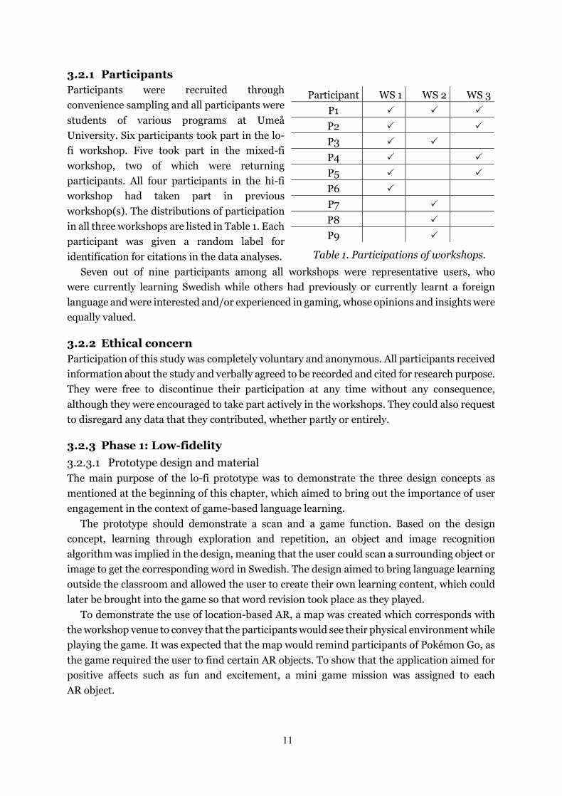
3.2.1 Participants Participants were recruited through convenience sampling and all participants were students of various programs at Umeå University. Six participants took part in the lo-fi workshop. Five took part in the mixed-fi workshop, two of which were returning participants. All four participants in the hi-fi workshop had taken part in previous workshop(s). The distributions of participation in all three workshops are listed in Table 1. Each participant was given a random label for identification for citations in the data analyses.
Seven out of nine participants among all workshops were representative users, who were currently learning Swedish while others had previously or currently learnt a foreign language and were interested and/or experienced in gaming, whose opinions and insights were equally valued.
3.2.2 Ethical concern Participation of this study was completely voluntary and anonymous. All participants received information about the study and verbally agreed to be recorded and cited for research purpose. They were free to discontinue their participation at any time without any consequence, although they were encouraged to take part actively in the workshops. They could also request to disregard any data that they contributed, whether partly or entirely.
3.2.3 Phase 1: Low-fidelity 3.2.3.1 Prototype design and material The main purpose of the lo-fi prototype was to demonstrate the three design concepts as mentioned at the beginning of this chapter, which aimed to bring out the importance of user engagement in the context of game-based language learning.
The prototype should demonstrate a scan and a game function. Based on the design concept, learning through exploration and repetition, an object and image recognition algorithm was implied in the design, meaning that the user could scan a surrounding object or image to get the corresponding word in Swedish. The design aimed to bring language learning outside the classroom and allowed the user to create their own learning content, which could later be brought into the game so that word revision took place as they played.
To demonstrate the use of location-based AR, a map was created which corresponds with the workshop venue to convey that the participants would see their physical environment while playing the game. It was expected that the map would remind participants of Pokémon Go, as the game required the user to find certain AR objects. To show that the application aimed for positive affects such as fun and excitement, a mini game mission was assigned to each AR object.
Participant WS 1 WS 2 WS 3 P1 🗸🗸 🗸🗸 🗸🗸 P2 🗸🗸 🗸🗸 P3 🗸🗸 🗸🗸 P4 🗸🗸 🗸🗸 P5 🗸🗸 🗸🗸 P6 🗸🗸 P7 🗸🗸 P8 🗸🗸 P9 🗸🗸
Table 1. Participations of workshops.
12
Swedish would be the only language available to the application’s setting, regardless of the user’s Swedish level. However, important feedback such as correct/incorrect answers would be assisted by additional visual indicators, for example, colours and icons.
The visualisation of AR technique required indications of the virtual and physical reality separately, so that participants would understand what took place in corresponding reality. The material used to visualise the design ideas was a set of plastic film with similar size as a smartphone screen. Sketches were drawn on the plastic film using a black marker and the interactable elements such as a button were made of paper and attached using glue pads.
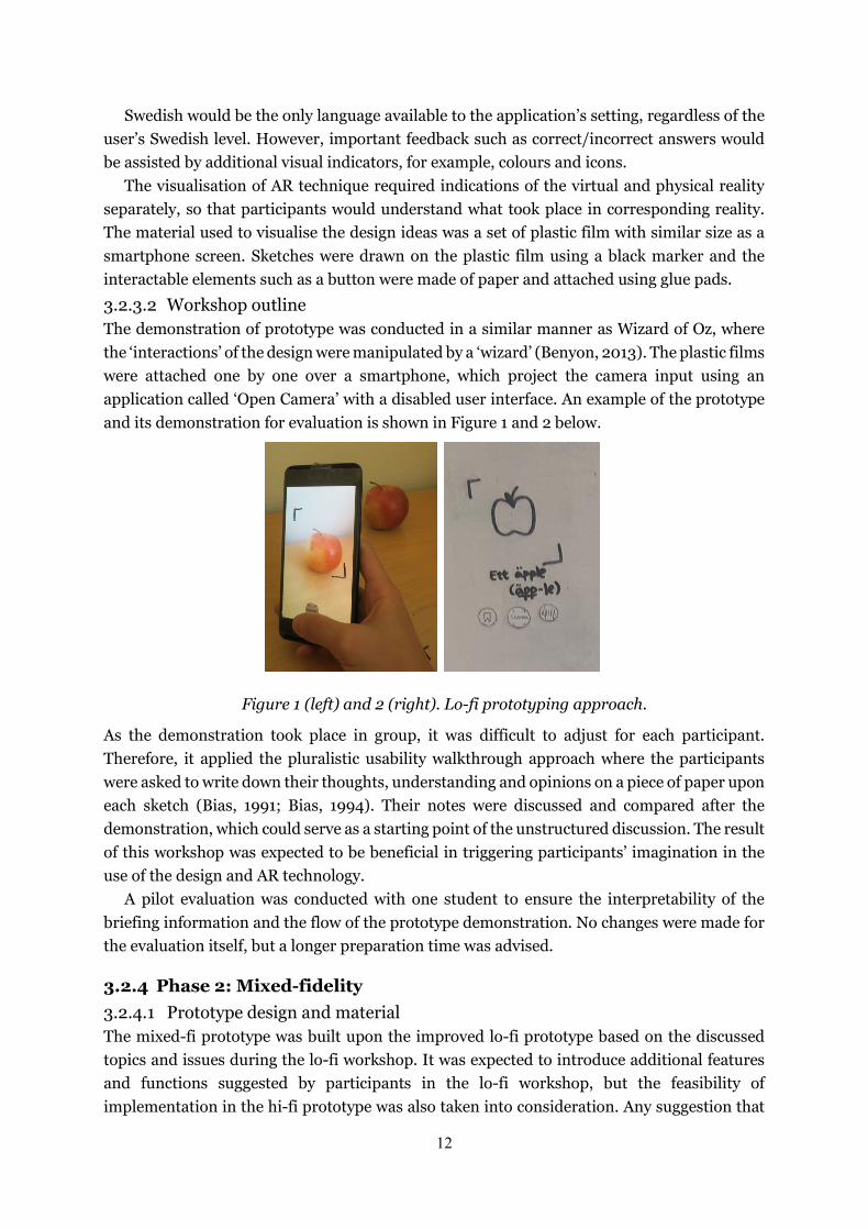
3.2.3.2 Workshop outline The demonstration of prototype was conducted in a similar manner as Wizard of Oz, where the ‘interactions’ of the design were manipulated by a ‘wizard’ (Benyon, 2013). The plastic films were attached one by one over a smartphone, which project the camera input using an application called ‘Open Camera’ with a disabled user interface. An example of the prototype and its demonstration for evaluation is shown in Figure 1 and 2 below.
Figure 1 (left) and 2 (right). Lo-fi prototyping approach.
As the demonstration took place in group, it was difficult to adjust for each participant. Therefore, it applied the pluralistic usability walkthrough approach where the participants were asked to write down their thoughts, understanding and opinions on a piece of paper upon each sketch (Bias, 1991; Bias, 1994). Their notes were discussed and compared after the demonstration, which could serve as a starting point of the unstructured discussion. The result of this workshop was expected to be beneficial in triggering participants’ imagination in the use of the design and AR technology.
A pilot evaluation was conducted with one student to ensure the interpretability of the briefing information and the flow of the prototype demonstration. No changes were made for the evaluation itself, but a longer preparation time was advised.
3.2.4 Phase 2: Mixed-fidelity 3.2.4.1 Prototype design and material The mixed-fi prototype was built upon the improved lo-fi prototype based on the discussed topics and issues during the lo-fi workshop. It was expected to introduce additional features and functions suggested by participants in the lo-fi workshop, but the feasibility of implementation in the hi-fi prototype was also taken into consideration. Any suggestion that
13
was regarded as too complicated to implement in the hi-fi prototype would not be introduced to the mixed-fi prototype to ensure an incremental and consistent design.
The use of digital material (video clips with added visual effects) in the mixed-fi prototype made design refinement possible. Apart from the functionality and data dimensions as filtered by the lo-fi prototype, this prototype displayed spatial structure as it involved using the physical space for re-enactment of the AR experience. It supported the display of output feedback but not user control due to the fact that it was a video. It presented the interaction flow of the design automatically. The use of micro-interactions was considered during the production of the mixed-fi prototype, but they were intentionally excluded due to perceivably higher realism. The prototype was expected to invite participant to press on the video as if it was actually interactive, which could serve as a behavioural indication of user engagement.
Two footage were used in the mixed-fi prototype. One was for scan mode (footage A) and the other for game mode (footage B) similar to the lo-fi prototype. Footage A was filmed at the workshop venue. Footage B was filmed in a hallway at the university, outside of the workshop venue. The user interface elements were produced in Adobe Illustrator. The interactions were animated in Adobe After Effects and the AR effects used 3D motion tracking in Cinema 4D. Pronunciations of words were also included, which were downloaded from the website Lexin1. The prototype was exported as a video which could be viewed in any smartphone. This prototype aimed to present some degree of immersiveness an interactivity that were not possible for the previous lo-fi prototype.
3.2.4.2 Workshop outline No pilot study was conducted for this workshop other than reviewing the video when it was exported to ensure that it functioned properly. Screenshots of representative moments in the prototype were collected and printed out for discussions.
The mixed-fi prototype which were two videos, were uploaded to Creative Cloud, an online file storage and sharing platform, which generated two sharable links that were sent to the participants’ phones. They were given no more instructions other than to watch the videos. Participants who had previously taken part in the lo-fi workshop watched the videos first while others received more information about the background of the design and the study.
After all the participants had watched the videos, they gathered again to start the discussion by describing what they saw, did and understood. They were given screenshots of the prototype in case they wanted to address on specific issues. They were also adviced to watch the video again as often as they needed throughout the workshop.
3.2.5 Phase 3: High-fidelity 3.2.5.1 Prototype design and material Based on the mixed-fidelity prototype and the workshop findings, more features for both scan and game mode were introduced. The hi-fi prototype was produced with higher finesse and refinement, which aimed to resemble a finished product. Some user interface elements in the mixed-fi prototype were reused, others were created in Adobe Illustrator. The prototype would support the interactive AR game but exclude the scan mode from the design as the object and image recognition funtction was considered too complicated, which would violate the
1 Lexin: https://lexin.nada.kth.se/lexin/
14
economic principle of prototyping. As the participants of this prototype workshop were recruited from the previous workshops, their understanding of the design should not be affected by the absence of the scan mode. The prototype would instead focus on the game and all the intended interactable elements should be functional. Tutorial for each game mission was added, which was created in Adobe After Effects.
The prototype was created as an application in Unity which was a cross-platform game engine. It used a system development kit (SDK) called Mapbox2 that supported location-based AR. It was built in an Android environment as the phone for evaluation used an Android operating system. Other requirements for the phone include GPS, internet connection and AR support. Online assets such as 3D objects and images for the game missions were downloaded from Unity Asset Store3 and PngImg.com4.
This application aimed to provide a highly immersive, real-time game experience with full user control which was absence in the lo-fi and mixed-fi prototypes.
3.2.5.2 Workshop outline Participants of this workshop took turn to play the game as the application was only available in one mobile device. Observational data based on each participant’s reactions and behaviour were noted to be brought up for discussion. The benefit of acquiring observational data is that participants can express their thoughts through actions and emotion that may not be consciously registered in their mind (Sanders, 2002). To seek explanation to their behaviour, the collected observational data were brought up during the discussion after all participants had tested the application.
The testing took place outdoor as AR objects were placed at specific GPS coordinates outside of the university building. Although the application used exact coordinates, the locations where the AR objects appeared were not entirely precise nor the same at every start-up. This was a major technical limitation of the application, but it did not pose any potential problem as a prototype for evaluation. An identical application was also developed for the workshop environment so that participant could play the game again during discussion.
A pilot test was conducted to ensure that the application did not contain unexpected errors. No changes were made in the application, although it required a minute to start up properly and to fetch location data. To make sure the participant’s perception of the application were unaffected by the delay, they were preoccupied with the following user scenario:
You’ve started using this app for a couple of days. Using the object and image recognition feature in the app, you have learned a few Swedish words. Those words are saved into different lists of categories and can be generated into the content of your game. Now you’re at campus and you’ve just finished lunch with a few minutes to spare, you realised the weather is very nice so perhaps it’s a good time to start playing the game outside.
It was assumed that participants would experience positive emotions and feel focused while playing the game. They were asked to describe how they felt and what they did during the discussion session after testing. Their reported feelings and actions would be compared with the observational data.
2 Mapbox SDK https://www.mapbox.com/ 3 Unity Asset Store: https://assetstore.unity.com/ 4 Pngimg.com: http://pngimg.com/

15
3.2.6 Data collection and analysis All discussions were audio recorded with participants’ permission. Participants’ written notes in the pluralistic usability walkthrough during the lo-fi workshop were collected for usability improvement. The raw observational data for the hi-fi workshop were not presented in this paper since they were included in the discussion.
The recordings were transcribed and coded per workshop for thematic analysis. A thematic analysis aims to identify patterns of themes within qualitative data (Mortensen, 2019). It is a flexible and explorative method that helps to map and structure messy data. The transcripts were revised and assigned to codes, which are mere descriptions of the content and one abstraction level away (Howitt, 2010). Codes were categorised into themes, some of which were expected to relate to user engagement and its attributes. It was hoped that the analysed data would show indications of user engagement as reflected by each prototype, and correlations between the level of prototype fidelity and the generated themes. There might be recurring and new themes as the iteration progressed. Codes and quotes within the same theme of different prototypes were examined to determine whether the level of abstraction varied. Differences in themes between prototypes would also be discussed and explained based on the characteristics of each prototype. Note that the data were approached with preconceived understanding of user engagement and other related research topics mentioned in earlier chapters. In other words, the preparations for this research study could have influenced the generated codes and themes.
4 Results This chapter documented the results, which are the (lo-fi, mixed-fi and hi-fi) prototypes and the workshop findings as presented by the generated codes from the thematic analyses, supplemented with quotations.
4.1 Phase 1: Lo-fi prototype
4.1.1 Design The lo-fi prototype took one working day to create. The design consisted of two modes, a scan mode and a game mode. An overview of the prototype can be found in Appendix A.
Figure 3a-3d (from left to right). Scan mode in low fidelity.
16
In scan mode, the user was able ‘scan’ an object, for example an apple as shown in the prototype (Figure 3a). Through an object and image recognition algorithm, they would receive a 3D representation of the object or image that they scanned and the corresponding word (Figure 3b). They could choose to bookmark the word to a customised dictionary list (Figure 3c) and the bookmark would be indicated as a feedback once the word was saved (Figure 3d).
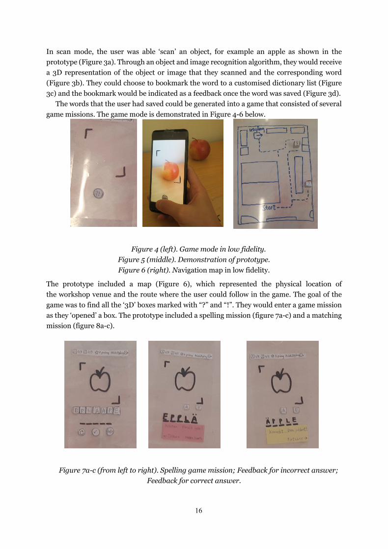
The words that the user had saved could be generated into a game that consisted of several game missions. The game mode is demonstrated in Figure 4-6 below.
Figure 4 (left). Game mode in low fidelity. Figure 5 (middle). Demonstration of prototype. Figure 6 (right). Navigation map in low fidelity.
The prototype included a map (Figure 6), which represented the physical location of the workshop venue and the route where the user could follow in the game. The goal of the game was to find all the ‘3D’ boxes marked with “?” and “!”. They would enter a game mission as they ‘opened’ a box. The prototype included a spelling mission (figure 7a-c) and a matching mission (figure 8a-c).
Figure 7a-c (from left to right). Spelling game mission; Feedback for incorrect answer; Feedback for correct answer.

17
In the spelling mission, an image or a 3D object is presented, together with the alphabets of the corresponding word in random order. The user could get the pronunciation of the word as a hint using the sound button (icon at bottom-right corner in Figure 7a), press the letters to arrange into correct spelling and re-do (icon at bottom-left corner) the game task if necessary. The word was submitted for spell check by pressing the checkmark icon. When submitted, the user would receive a simple feedback which showed whether the answer provided was correct or incorrect. The purpose of using colour was to help user to figure out the meaning of the messages even though they did not understand the language well enough to read the text. Red is often associated with alertness which could be indicated as incorrect, while yellow is a rather neutral colour.
Figure 8a-d (from left to right): Matching game mission; Feedback for incorrect answer; Feedback for correct answer; User’s achievement at the end of the game.
The matching task consisted of an image or 3D object, a list of words that was displayed, one at a time. The user could scroll through the list by clicking the left or right arrow. The selected answer was submitted upon pressing the checkmark icon.
The game was over when all the AR objects had been opened. The user’s achievement would be presented (figure 8d) stating an encouraging message, a trophy, the final score, and the number of tasks and objects accomplished.
4.1.2 Workshop An audio of 47 minutes and 9 seconds was recorded which produced eight pages of transcript. A total of 57 codes were generated and assigned to eight themes: Interpretation/validation of data type, user engagement as a concept, learning, navigation, challenges and rewards, feedback, flexibility and freedom, and variety. The codes and themes of this workshop can be found in Appendix B.
Interpretation/validation of data type: Participants shared their experience in language learning and the difficulties they had encountered, which led to validation and improvement of design concepts and features that were currently envisaged in the prototype. As usability is a prerequisite of user experience, participants were asked to evaluate the prototype in this respect to ensure that the presented functions and data are easily understood and potentially able to fulfil the design goals. The representativeness of visual indicators such
18
as icons and colours were specifically addressed, which contributed to the design’s comprehensibility.
User engagement as a concept and learning: As the design shared certain common properties with existing applications, such as Pokémon Go and Duolingo, participants naturally compared them with one another. One participant quickly mentioned the notion and importance of user engagement. They noticed that these applications often introduced new features to keep users interested. This was, however, not always a feasible approach especially for language learning since learning is a slow process and occurs gradually over a long period of time. They believed that Duolingo and Pokémon Go, although widely popular, failed to engage users in the long run despite constant updates. It seemed impractical to add new features continuously, but it was necessary to develop high user engagement in other ways so that the user would be motivated to learn every day for months, and even years. They suggested that the application should involve engaging features that could potentially increase user’s learning awareness and to help them form a learning habit. Other participants firmly concurred the importance of user engagement and it became a major topic of discussion.
Challenges and rewards: Participants believed that the game tasks should be neither too difficult nor too easy. As noted by a participant (P5), “difficulty creates engagement and it's rewarding. If it’s easy people will get bored”. Rewards were presented by a scoring system, which was validated by the participants. It conveyed user’s performance and could create a sense of accomplishment for having completed a task correctly. The initial idea of the scoring system was to avoid any deduction of score, but from a gaming perspective, “people always have this mental image of punishments being bad, but in games it’s often the opposite and the most successful games can be the most difficult ones” (P5). Another participants pointed out that “it’s not that you are punished for doing things wrong but the reward is not as great so there is a big difference between them” (P1). The objective of a scoring system should, therefore, encourage users to learn and improve, especially when they made mistakes.
Navigation: Participants believed that challenges within the game did not confine to learning, as they could also be extended to game navigation, meaning the distribution of AR objects. They could be less straightforward to find while still being visible.
Feedback: At the end of the game, the user was given a trophy for having acquired a certain amount of score. The idea was supported by the participants, and they suggested that it could be integrated as a progression system which envisages the user’s learning progress and provides them a sense of accomplishment.
Flexibility and freedom: As mentioned earlier, the level of challenge should be optimal. As Swedish language skills may vary among users and each user would accomplish more over time, it is important for the user to be able to adjust the difficulty level according to their ability in order to avoid boredom. Providing flexibility and freedom could promote learning and maintaining engagement in the long run. It is also believed to be beneficial in sustaining motivation, especially since the game currently required the user to play outside and be physically active. One participant noted that “on one hand I could see myself thinking that is something really fun and I would look forward to doing it, but there are times where you’re really tired and don’t feel like it” (P5). It seemed unlikely that the user would spend the extra physical and/or mental effort to learn or practice a language. Therefore, allowing them to
19
choose the game location and/or difficulty level would help combating such unmotivated moments and maintaining a learning habit.
Variety: Participants suggested different ways to increase the variety of feasible features that could maintain long-term user engagement. Apart from difficulty levels of similar game tasks, learning could also be brought beyond nouns and individual words, for instance adjectives, grammar, forming sentences, et cetera. The game could also make use of the AR technique to alter the spatial orientation of the physical space like simulating a labyrinth.
4.2 Phase 2: Mixed-fi prototype
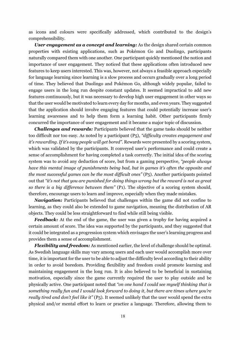
4.2.1 Design The mixed-fi prototype took four working days to create. Both scan mode and game mode were included in this prototype but in separate videos. The video for scan mode was 22 seconds long and was taken where the evaluation workshop would take place, while the one for game mode was 1 minute and 2 seconds long and was filmed at the hallway outside the workshop venue. An overview of the screenshots and a link to the video prototypes can be found in Appendix C.
Figure 9a-c (from left to right). Learning mode in mixed-fidelity.
The design concepts were identical to the lo-fi prototype as they were validated by participants in the previous workshop. There were, however, small adjustments on the icon representations and placements for higher usability.
Following the suggestions by the lo-fi workshop participants, the scanned words were saved automatically as the user scanned an object/image, which they could later remove if desired. A text message was displayed as a feedback for saving the word. The sound button (bottom right corner in Figure 9b and 9c) provided the pronunciation of the word and the corresponding syllable was highlighted as the audio was played. Note that the prototype was not interactable, meaning that the ‘interactions’ were automatically displayed.
20
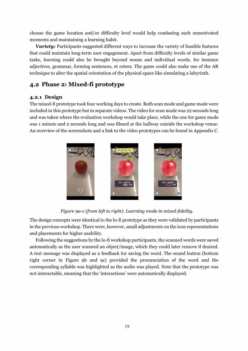
Figure 10a-e (from left to right). Game mode in mixed-fidelity.
This prototype mimicked the physical location, thus the map in the lo-fi prototype (Figure 6) was unnecessary in this context. The game mechanics were similar to the lo-fi prototype with higher refinement. Using 3D motion tracking, the AR boxes were placed in different locations (Figure 10b and 10e) for the participants to ‘find’.
Interaction flow and output feedback were displayed in the prototype to demonstrate how the game worked, for example the distance metre at the bottom left corner in Figure 10a, 10b and 10e which indicated the estimated distance between the user and the closest AR object.
The scoring system was also displayed in a more dynamic manner. The number in the score bar decreased as the game mission was being completed, and the remaining score was added to the total score in the UI panel. The colour for correct answer in the feedback dialogue box was changed to green (Figure 10d) as participants believed that it was a more appropriate indication for correct or continue.
4.2.2 Workshop The recorded discussion was 50 minutes and 46 seconds long and a total of eleven pages of excerpts were created. 71 codes were generated and organised into thirteen themes, seven of which were recurring themes from the lo-fi workshop: navigation, challenges and rewards, interpretation/validation of data type, learning, flexibility and freedom, variety, and feedback. Six new themes were produced, namely behavioural indications of engagement, interactions, user interface, experienced emotions, perceived user control and safety. The codes and themes of this workshop can be found in Appendix D.
Navigation: During the lo-fi workshop, a participant suggested increasing the challenge in game navigation as the user looked for AR objects. In this workshop, another participant who was present in the previous workshop provided an explanation to this claim that, “finding the boxes is kind of like a part of the game” (P1). They detected a potential problem that it was entirely possible for the user to miss an AR object and consequently become unable to complete the game. There were also concerns about the accessibility of AR objects when navigating in the physical space. One participant, who had experienced similar issue when playing Pokémon Go, pointed out that the AR object could “potentially get stuck on somewhere that you can’t get to or safely get to” (P9). Participants suggested that the AR objects could be scattered near a predefined location or a route planned by the user so that

21
they would only appear near to the user’s presence. As some participants were worried about the safety of playing an AR game outdoor, allowing the user to map their route could be a possible solution for both safety and accessibility issues. Apart from the game navigation, there were also discussions concerning the transitions between scan mode, play mode and a possible collage of scanned words. Participants were interested to gain a holistic understanding of the application’s navigation and how different modes were connected to each other.
Challenges and rewards, interpretation/validation of data type and learning: Some participants realised that the scoring system was flawed as it was currently impossible to obtain maximum score. Participants believed that it could result in frustration and lower user’s motivation as they could not achieve the best score no matter how well they performed in a task. To resolve this problem, one participant suggested to “have a delay to start with and have a native person do it to see how long it takes (to perform the task) and then (and use the time it took as) a benchmark for before (the score) start counting down” (P9). Participants reacted negatively to the deduction of score for playing the pronunciation of the word in the spelling tasks, although it was a “huge hint” to the task (P5). Participants believed that it was rather a learning opportunity as pronunciation is generally considered as important yet the most challenging in language learning. Even though it revealed the answer, the user would still need to put in the effort and spell the word. Participants suggested that a hint could be to reveal one letter instead of to play the pronunciation and deduct score only when the user got a letter as hint. User should also be able to score higher for better performance in terms of time, which would give them motivation to improve.
Participants also preferred to view their progress when they finished each task and not just until the entire game had been completed. This implied that accomplishments could have positive affect not only on long-term motivation as suggested by the findings in the lo-fi workshop, but also short-term, and rather instant, motivation.
Flexibility and freedom: Participants agreed that the game tasks were fast-paced as the user would want to complete the tasks as quickly as possible, one participant suggested to provide the option to type in the word instead of arranging individual letters for higher efficientcy. Although reasonable, this feature was more suitable for a higher difficulty level where the user spelled a word without any letter provided to them. However, if it was to be implemented in the next prototype, or noted as a future development, a virtual keyboard should be provided to the user so that they would not be required to install an additional keyboard or change the keyboard language when they played the game. It would be more convenient for the user as they did not have to spend the time and effort in preparing for playing the game.
Variety and feedback: In the lo-fi workshop, participants believed that presenting a trophy as reward at the end of a game would create a sense of accomplishment, which would in turn motivate the user to improve. It was still perceived as a positive feature during this workshop, but the participants would also like to receive more frequent and instantaneous feedback throughout the game. One participant asserted that they would like “as much feedback as possible, since you’re using (the application) to learn” (P1). This included text feedback that responded to correct or incorrect answers, visualisation of syllables when a word was pronounced, and overall acquired achievement at the end of the game. In terms of audio
22
feedback, participants discussed a possible issue in audibility due to potentially loud background/outdoor noises, but later agreed that the user would very likely own and use earphones or headphones.
Behavioural indications of engagement: Participants were asked to watch the video without further information. They re-enacted the movement of the footage and followed it to match their environment with the projected physical space. Most of them reported that they wanted to interact with the prototype and/or had actually tapped on the screen, even knowing it was a non-interactable video. Furthermore, they stopped at the game mission location while an AR object was being ‘opened’. These behaviours reflected the presence of user engagement. Participants believed that the design could enhance learning enjoyment, although they were uncertain about the learning effect as it was still functionally underdeveloped.
Interactions: Participants were concerned that the game would quickly grow boring if the game tasks consisted of the same content time after time, even if various difficulty levels were available. Some suggested to remove the word from the application altogether, but it was later decided that archiving the learnt words was a better option as the user might eventually want to retrieve/review the words that they had learnt. This alternative could lower the potential repetativeness of the game while still allowing the user’s vocabulary collage to expand over time, which was perceived as a form of achievement.
User Interface: A participant described the user interface as “unintrusive, (the icons) don’t distract you from the game but you could still see them if you needed them because you know they’re there“ (P9). The user interface was salient for user to notice their presence and acquire information when necessary, but not enough to monopolise their attention so the user could focus on finding the AR objects and proceeding to the game tasks. Participants suggested using a larger variety of AR objects, such as different shapes and colours, to make the game appear more fun. Other than the aesthetic differences, variety could also be used informatively as an indication of the type of game task the AR object represents. An example would be to use similar AR objects shape in red for spelling tasks and in yellow for matching tasks.
Integration of background music, though not implemented, was discussed briefly during the workshop. Some believed that adding some adventurous tunes may create game immersion, while others suspect that it would eventually get repetitive or even annoying. Although there were opposing opinions, participants were not too reluctant to the idea and showed interest in testing it if possible, as long as they were assured that the option of turning it on/off would be available. These opposing opinions strongly highlighted the importance of customisation which allowed the application to be appealing and engaging for as many users as possible despite their individual differences and preferences.
Experienced emotions and perceived user control: Positive emotions were reported participants had “super fun” (P1, P3, P9) while using the prototype and they “laughed all the way through” (P1, P3). Although this was a desirable indication of user engagement, the precise factor(s) that contributed to such response remained inconclusive. It was believed that the level of refinement of the prototype itself had (both positive and negative) effects on the perception of the design. Since the mixed-fi prototype was based on a video, there was a profound lack of user control that resulted in serious discussions. Participants were negatively
23
surprised by the ‘sudden’ appearances of events and feedback. They preferred to, for example, initiate a game mission by pressing an AR object themselves.
I would have liked to press it, I like pressing things, then I’m in control of the flow of what’s happening. If this is an application for learning, which it actually is, then I think it’s important to let the user be in control of the pace in the application, so they’re not surprised ... when they’re approaching a box (P1).
Although manual game mission initiation was intended, it was not possible to be applied and micro-interactions were not presented in the prototype. A positive side of the absence of micro-interactions was realism, as it ‘tricked’ participants into thinking that the prototype was interactable, which indicated behavioural engagement as mentioned earlier in this chapter. Additionally, discussions on user control pinpointed which events should be prompted by the user and which in automation in order to get an optimal balance between creating a sense of control and convenience for better user engagement as well as learning.
Participants were asked whether certain features in existing applications were utterly undesirable that the design should avoid. They expressed hatred towards daily reminder/notification as they were ineffective in establishing a habit of use. All participants agreed that they were annoying and repelling. Some would even take the extra steps to block the notification in their phone settings.
Safety: Haptic feedback was discussed since it was used in Pokémon Go but never considered in the creation of the design. It was suggested to be introduced in the game when the user was approaching near an AR object, so that it could immerse them in the game without the need for constantly looking down at the mobile device. This suggestion could also lower the likelihood of the user missing an AR object and their concern in safety.
4.3 Phase 3: Hi-fi prototype
4.3.1 Design The hi-fi prototype took four weeks to create in Unity. Due to the economic principles of prototyping, the high-fidelity prototype omitted the object and image recognition function as presented in the earlier prototypes. Since the participants of the coming workshop were already recruited during the previous workshops, they understood and would be reminded that the game content was created by the user according to the objects or images they had encountered in real life. Therefore, only the game mode was available in the application. An overview of the screenshots and a link to a pre-recorded video that demonstrates the prototype can be found in Appendix E.
24
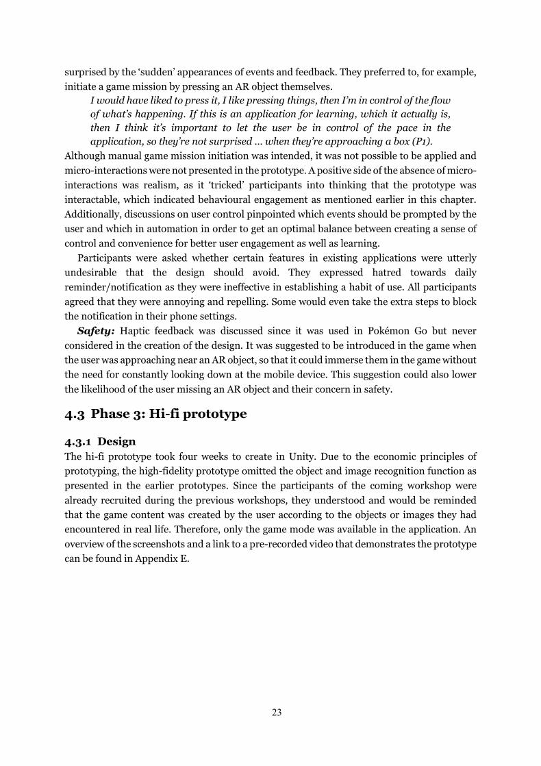
Figure 11 (left) and 12 (right). Home screen; Game settings.
A homescreen (Figure 11) was added in the application to demonstrate how the learning and game modes were connected in the same design. To make the game more customisable for the user, the application included an additional page for game settings (Figure 12) after pressing ‘Spela’ (Play) in the homescreen. Only the ‘Till hemsidan’ (To homepage) and ‘Start spelet’ (Start game) were interactable on this page as the game settings were only for display at the moment.
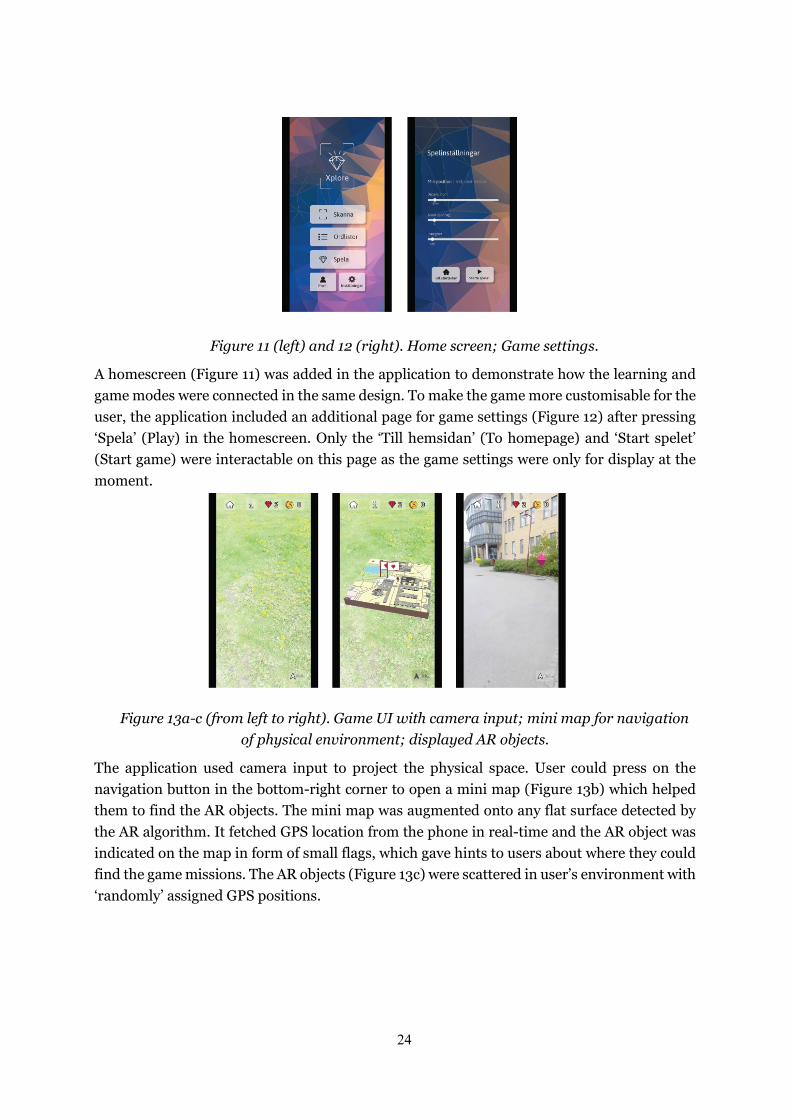
Figure 13a-c (from left to right). Game UI with camera input; mini map for navigation of physical environment; displayed AR objects.
The application used camera input to project the physical space. User could press on the navigation button in the bottom-right corner to open a mini map (Figure 13b) which helped them to find the AR objects. The mini map was augmented onto any flat surface detected by the AR algorithm. It fetched GPS location from the phone in real-time and the AR object was indicated on the map in form of small flags, which gave hints to users about where they could find the game missions. The AR objects (Figure 13c) were scattered in user’s environment with ‘randomly’ assigned GPS positions.
25
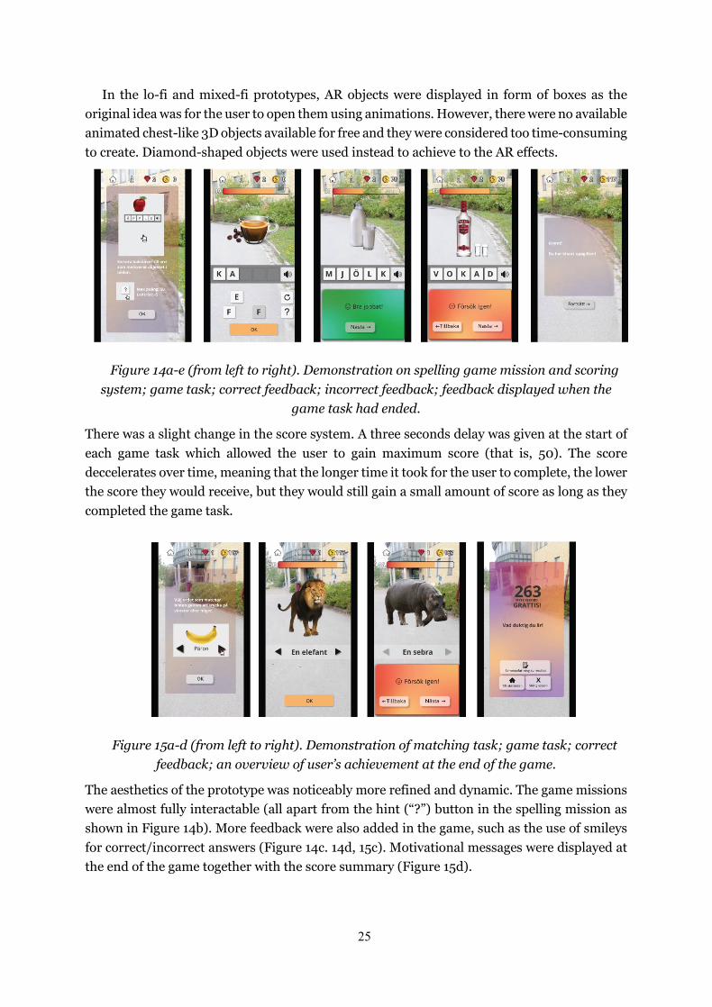
In the lo-fi and mixed-fi prototypes, AR objects were displayed in form of boxes as the original idea was for the user to open them using animations. However, there were no available animated chest-like 3D objects available for free and they were considered too time-consuming to create. Diamond-shaped objects were used instead to achieve to the AR effects.
Figure 14a-e (from left to right). Demonstration on spelling game mission and scoring system; game task; correct feedback; incorrect feedback; feedback displayed when the
game task had ended.
There was a slight change in the score system. A three seconds delay was given at the start of each game task which allowed the user to gain maximum score (that is, 50). The score deccelerates over time, meaning that the longer time it took for the user to complete, the lower the score they would receive, but they would still gain a small amount of score as long as they completed the game task.
Figure 15a-d (from left to right). Demonstration of matching task; game task; correct feedback; an overview of user’s achievement at the end of the game.
The aesthetics of the prototype was noticeably more refined and dynamic. The game missions were almost fully interactable (all apart from the hint (“?”) button in the spelling mission as shown in Figure 14b). More feedback were also added in the game, such as the use of smileys for correct/incorrect answers (Figure 14c. 14d, 15c). Motivational messages were displayed at the end of the game together with the score summary (Figure 15d).
26
4.3.2 Workshop The discussion session took 1 hour and 13 minutes, which yielded thirteen pages of excerpts. 92 codes were generated from the hi-fi workshop. They were divided into seventeen themes, twelve of which were recurring ones from the lo-fi and/or mixed-fi workshops, namely behavioural indications of engagement, safety, perceived user control, interactions, challenges and rewards, flexibility and freedom, navigation, variety, feedback, learning, user interface, and experienced emotions. Five new themes emerged in this workshop, which were aesthetics, comprehensibility, social elements, factors that lower engagement , and user engagement as an outcome. The codes and themes of this workshop can be found in Appendix F.
Behavioural indications of engagement: Participants felt the most focused while completing the game tasks, especially after they noticed the score bar as one participant claimed, “as soon as I saw the timer I forgot about everything else, the focus was 100% on playing as fast as possible” (P1). During discussion, participants (P2, P4) revealed that, on hindsight, it would have been interesting to deliberately answer incorrectly to see what kind of feedback they would receive. This comment reflected that they took the game seriously as they strove for best possible performance.
Safety: Participants reported feeling focused while playing the game. In the previous workshop, attention was associated with safety as the user might divert all their attention in the game and not in where they were going. It became a concern that directly affected some of the participants’ acceptance of the design. However, after participants tested the high-fidelity prototype, they asserted that they were aware of their surrounding environments as they looked at the physical space through the phone camera. Some of them claimed that they attempted to observe people around them and were surprised that people seemed to be indifferent to have a phone pointed at them. They did so only out of curiosity and made clear that they would not be bothered even if people were staring. They believed that safety was no longer a concern, but they suggested to inform the user about safety by providing a disclaimer.
Perceived user control: In the matching game mission, only one option was displayed on the screen at a time and the user had to press the arrow to browse through the options. The initial thought was to make the game more challenging to achieve the highest score. However, participants perceived this presentation of options as effortful and cumbersome. They prefered to see all the options at once so that they could complete the game more efficiently.
Interactions: Based on the prototype, participants raised a problem regarding the interactivity and distribution of AR objects. Since the user could choose geographical location and the number of game missions, one possible and troublesome scenario would be an overwhelming number of AR objects densely distributed in a small space. This would eventually be problematic to the usability of the game as it might cause sensory overload and lowered interactive precision. The discussion led to a practical design solution which is to limit the exhibition of AR objects to, for example, five at a time depending on the area of the chosen location/radius.
Challenges and rewards: The current scoring system allowed for the possibility to gain maximum score, although it could be difficult. One participant implied that making a game challenging and difficult to get full score could create engagement since “the faster you’re capable of doing something, the more faster you want to do it” (P5).
27
As the application relied on location-based AR and as outdoor GPS had higher precision, it should encourage users to play outside in order to enjoy a more immersive, quest-like experience. It could help promoting a learning habit if the user received extra rewards for having played at new locations as they could associate their outdoor activities with the game.
Flexibility and freedom: Having the application adjusted according to the user’s needs and preferences could make learning accessible anytime, anywhere and anyhow. It is important for the user to customise the game and to learn under different circumstances.
If the weather is shaky or I’m really tired and I only want to practice before I go to bed, like I’ve gotten ready to go to sleep, I don’t want to walk a kilometre. It’s really nice that if you just wanted to practice, I’d practice, and if I wanted to go for a walk somewhere, that’s also an option. I’d feel really annoyed if it’s like, I want to get better at Swedish but I really don’t feel like taking a walk right now and I’d be like, come on! I’m not gonna do it now! So that’s (location option) really good. I just feel like it’s prioritising learning, you can make it easy or difficult, choices are in your hands, the most important thing is you actually study. I like that (P5).
Navigation: When participants were asked to open a map, some attempted to click on the information button which they later explained that they expected this button to show them where they could find a map. Although the map button on the interface could be more salient, it showed the usefulness of the information button and what content the user would expect from it.
The purpose of the AR mini map was to help the user navigate without demanding any map reading skills. Participants liked this feature, but they pointed out the mismatch in orientations between the map and themselves would create problem in understanding where they should go. They understood the technical limitations of the prototype after being explained, and agreed that it would have been a good feature if it worked properly.
Variety: In the lo-fi workshop, Participants encouraged a variety of game missions within a game as it was considered boring to play similar missions in repetition. Participants of this workshop elaborated this idea as they suggested to randomise game missions and tasks within each mission to avoid repetition between games. One participant aruged that, “…the high impact moments (that is, the most exciting, or the best moments), you don’t mind to play in repetition” (P5). This could imply that, even though repetitiveness might be inevitable, the perception of repetitiveness would be reduced if the game was fun and exciting.
Feedback: Participants liked the pop-up instructions at the start of the game mission. They believed that the feedback after each game task and mission gave them assurance that they were doing well. They claimed that such feedback maintained their willingness to keep playing,
I want to see the result of my prestige, that I beat my own record, I want to see that I get better at things. I think that could keep me going for a while at least, so long as I get the feedback that I did a better job than last time, it would keep me hooked (P1).
At the moment, all the feedback was merely to tell whether the user had answered correctly or not, and to encourage them to continue the game. Participants believed that it was sufficient
28
for beginner level as in the prototype, but it “should have more proper feedback for advanced stages” (P4) to display their progress and recommend ways to improve.
Learning: Some features (or suggestions of feature) in the design were considered as fun or potentially fun but not necessary for language learning, for example the use of mini games and the implementation of background music. One participant believed that the user would learn more or less just from using the application, as they put it
generally speaking, playing a game is a lot more fun than learning a language so even if you learned as much in 1 hour class than 20 hours in video games, no one would want to sit for 50 hours of lesson compared to 4000 hours on a game, it’s less efficient but more fun (P5).
Therefore, when evaluating the usefulness of this application, the level of fun and engagement should also be accounted for.
User interface, experienced emotions and aesthetics: Participants were quickly drawn to the aesthetics of the user interface. They described the user interface as polished, clean, and cosy. They addressed that the illustrations of instructions were helpful in creating excitement and in preparing the user for the upcoming game mission. High quality images in the game tasks were reportedly a huge surprise to the participants as they did not anticipate such realistic images in the application. One participant was particularly intrigued as they said
I was like ‘Wow there’s a lion!’ then I clicked on the lion and I was like ‘Oh I did that!’ and then there was another huge animal pops up and I was like ‘Oh my! this is exciting’, and I like that … You feel like a kid in preschool ‘Oh lion! A rhinoceros! Cool!’, it was exciting (P5).
All participants agreed that the overall prototype seemed complete, it was “more than being parts of the UI where you think ‘that clearly is just a prototype’” (P1). All of them, on various occasions, have referred the prototype as “the app”, which suggested high resemblance to a real product.
Some participants tried to press everything they saw in the entire application, including the home page, even though they were informed that not every button was actionable. They explained that it was due to the feeling conveyed by the user interface.
I really wanted to click around more other than playing the game itself. I think it was a very positive thing that I actually wanted to explore the app rather than the game function. I think it has a lot to do with the UI that it felt very cosy in a sense, even though it was very clean (P1, P4).
There were criticisms towards the form and the quality of the AR objects, which affected user excitement negatively. Participants believed that the resolution of the AR objects was incoherent with the rest of the UI. Besides, the diamond-shaped objects were not considered as representational for the action of ‘opening’ a game task. Although it invited participants to press on it, it was not informative enough to convey its context. “A random shape doesn’t necessarily contain something. But a chest..., we expect it to have something inside” (P5). Therefore, when choosing the forms of AR objects, those that represents the function to contain or to open were preferred.
One participant mentioned a theory called the peak-end rule, which they explained as a movie theory that says the only two moments you really remember in a movie are the best and the worst moments. They are the ones that you remember. And
29
everything else that comes in between doesn’t really impact the audience as much. (P5)
When asked about the best moment(s) during testing, all participants agreed on seeing the unexpected high quality images and at the achievements at the end. These moments were directly linked to emotions such as excitement, nostalgia and a sense of accomplishment.
Comprehensibility: Comprehensibility in this analysis referred to the overall understanding of the design, not simply the interpretation of icons and texts. One participant happened to summarise the design objective that, “It’s just all about engagement, the cleverest thing would be just to keep people (playing), turning it on, using it, giving them the gratification that they’re doing well“ (P2). It showed that participants understood the main concept and purpose of using user engagement as the core value of the design, and that the design did successfully create user engagement. Participants were also able to estimate the interaction flow of the location settings that was added in this prototype even though interactions of this function were not implemented.
“As far as I understand the design of the game, if you choose a destination, it’s basically exactly the same as choosing the destination on Google Map, where you have this position and a destination, then you have a narrow set trail which takes you there. And the objects would be placed along the trail for you to find. But if you set it to radius then, say 1 km, then its 1 km radius around you, so if you want to go to this edge first and you can work your way in around and back, circle around to find all the objects” (P1).
This showed high level of understanding of the design despite the prototype being incomplete. Social elements: Participants of the lo-fi workshop briefly mentioned that introducing
social elements could potentially be helpful in increasing user engagement. Although not implemented in any of the prototypes, this discussion continued in the hi-fi workshop as participants explained in detail on how and why social interactions would favour user engagement.
Participants claimed that they liked to show off their achievements and feel like they were better than their peers. They emphasised that they only cared about competing with people they knew and not with strangers. It was not uncommon for existing application to have a global ranking system, but the participants revealed that unless they had one of the ten highest score, they would not feel the sense of competitiveness or the motivation to achieve higher rankings. Instead, a desirable ranking system should allow the user to join their friends or peers so that they could compete with each other. This was also associated with the feeling of nostalgia as one participant shared one of their high school memories that
it really brings you back to high school when you were playing with your friends, we used to download games and compete who is the fastest. It’s really more exciting to compete with your peers than anything (P5).
Factors that lower engagement: Participants mentioned three elements that were unfavourable to user engagement, and should most preferably avoid in the design. One noted “whenever something annoys me, even just the smallest annoyance it kind of makes me want to never use it again, if something crashes one time I’m gonna uninstall it, I don’t wanna use it anymore” (P5). The application should be free of design flaws and technical issues. It should strive to make the interactions as seamless as possible.
30
“Streak” is a feature in many applications that aimed to help their user to maintain daily usage. Participants asserted that keeping a streak could create user engagement, but it was not sustainable over a long time. “You eventually just lose the drive, if you ever lost the streak then you don’t bother anymore“ (P5). They suggested that rewards should be based on learning performance instead of frequency of use in order for the user to maintain the learning experience. Consequently, the user could progress after they achieved certain amount of score, even if they failed to use the application everyday.
One participant disliked a game concept called min-maxing, which is a common strategy that allows the player to level up as fast as possible with the least effort, such as to perform easier task with lower rewards repetitively to gain higher scores over time. They believed that a learning game should avoid this concept as “it’d quickly become incredible unfun” (P5). The game should rather focus on having fun instead of solely levelling up.
User engagement as outcomes: Making the game exciting helps to maintain user engagement in the long run. One participant liked the idea of using various game missions as they mentioned that,
the benefit of having missions and to make it more exciting is that, if you have something exciting to look forward to then the mundane stuff seems a lot less boring and all of the sudden, you’re enjoying that a lot more than you would otherwise. (P2, P5)
Despite user’s strong intrinsic motivation, not all aspects of language learning was considered as fun. One participant continued,
its like you already have the motivation you really want to learn (the language), but it’s so boring, so uninteresting, so I feel like the app doesn’t necessarily make it exciting or make you love it, its just to make it a little less painful (P5).
This statement reinforced the basis of game-based learning that it is important to have fun when it comes to learning.
Nevertheless, the importance of fun could become a problem itself as emotions and feelings are subjected to each individual. “Everybody has a different idea of what is fun and what is not. Maybe you don’t like pokemon go and maybe you like it very much. It’s the same in here (the application)” (P4). Another participant claimed that the flexibility and customisability of the design served as an advantage as it could help to overcome individual differences. “You can get stuff that’s more like a game and you can get stuff that’s more like language learning and it (the application) really offers the tools to customise your experience” (P5).
As the design was largely inspired and influenced by Duolingo and Pokémon Go, participants were asked whether they considered the design as the mere combination of the two. They believed that the design has more potential as it put user engagement in focus, which was in itself the novelty of the design. “I definitely thinks its something more because both of those applications bore me. ...There’s a lot more potential in this (design) because it is actually a game” (P5). The design was implemented in form of a game, which created excitement and competition (even with the user themselves). By playing the game, the user would be able to learn as “you’ll find quite quickly the way that you’re learning with the application to you is just even more encouragement to just do more of it“ (P2).
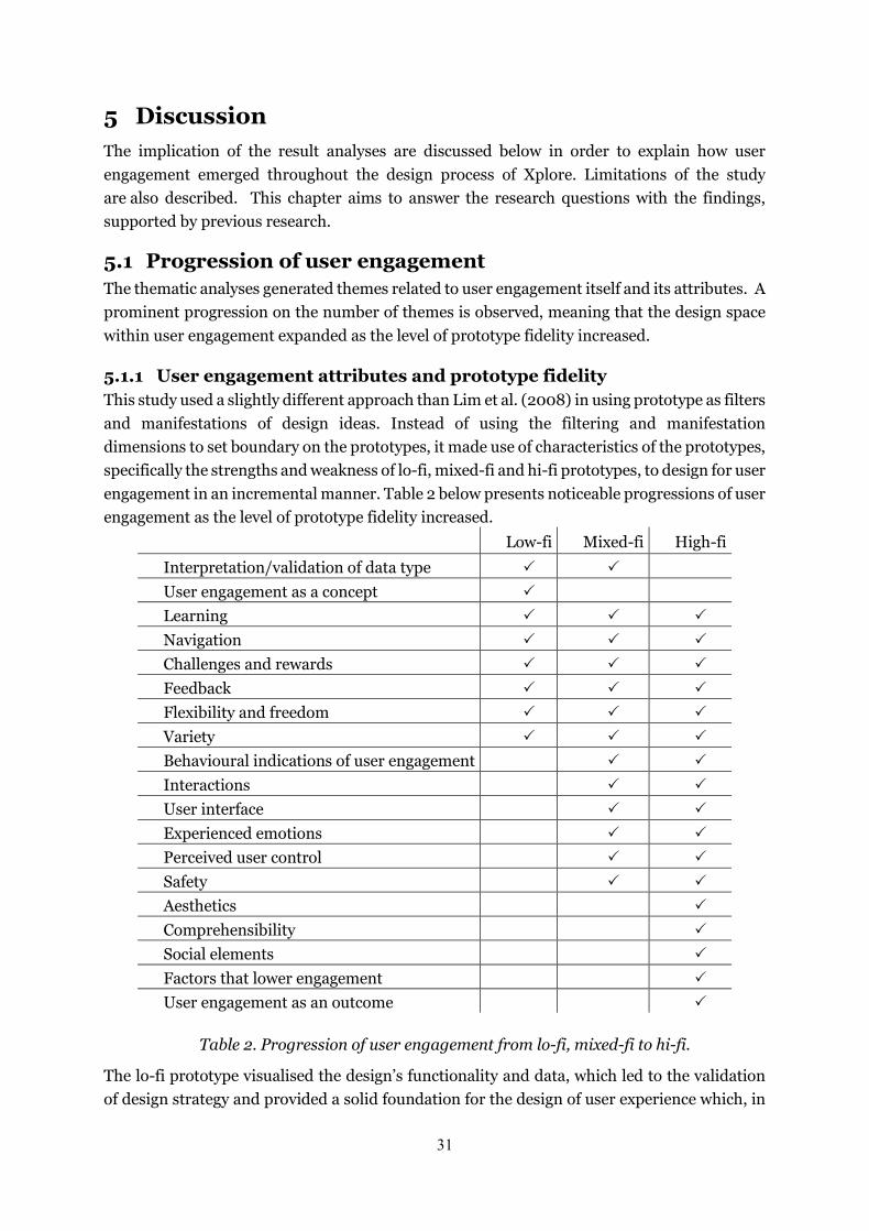
31
5 Discussion The implication of the result analyses are discussed below in order to explain how user engagement emerged throughout the design process of Xplore. Limitations of the study are also described. This chapter aims to answer the research questions with the findings, supported by previous research.
5.1 Progression of user engagement The thematic analyses generated themes related to user engagement itself and its attributes. A prominent progression on the number of themes is observed, meaning that the design space within user engagement expanded as the level of prototype fidelity increased.
5.1.1 User engagement attributes and prototype fidelity This study used a slightly different approach than Lim et al. (2008) in using prototype as filters and manifestations of design ideas. Instead of using the filtering and manifestation dimensions to set boundary on the prototypes, it made use of characteristics of the prototypes, specifically the strengths and weakness of lo-fi, mixed-fi and hi-fi prototypes, to design for user engagement in an incremental manner. Table 2 below presents noticeable progressions of user engagement as the level of prototype fidelity increased.
Low-fi Mixed-fi High-fi
Interpretation/validation of data type 🗸🗸 🗸🗸
User engagement as a concept 🗸🗸
Learning 🗸🗸 🗸🗸 🗸🗸 Navigation 🗸🗸 🗸🗸 🗸🗸 Challenges and rewards 🗸🗸 🗸🗸 🗸🗸 Feedback 🗸🗸 🗸🗸 🗸🗸 Flexibility and freedom 🗸🗸 🗸🗸 🗸🗸 Variety 🗸🗸 🗸🗸 🗸🗸 Behavioural indications of user engagement 🗸🗸 🗸🗸 Interactions 🗸🗸 🗸🗸 User interface 🗸🗸 🗸🗸 Experienced emotions 🗸🗸 🗸🗸 Perceived user control 🗸🗸 🗸🗸 Safety 🗸🗸 🗸🗸 Aesthetics 🗸🗸 Comprehensibility 🗸🗸 Social elements 🗸🗸 Factors that lower engagement 🗸🗸 User engagement as an outcome 🗸🗸
Table 2. Progression of user engagement from lo-fi, mixed-fi to hi-fi.
The lo-fi prototype visualised the design’s functionality and data, which led to the validation of design strategy and provided a solid foundation for the design of user experience which, in
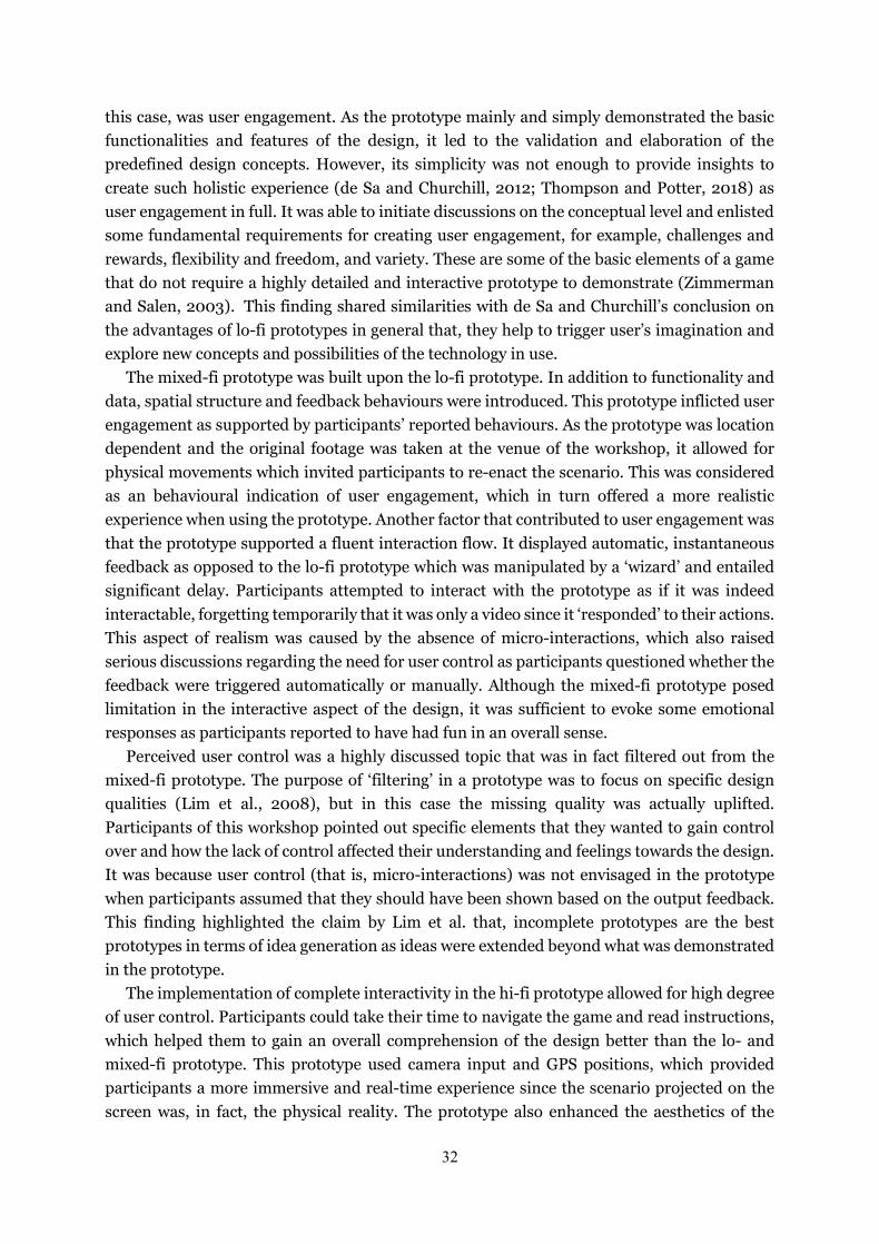
32
this case, was user engagement. As the prototype mainly and simply demonstrated the basic functionalities and features of the design, it led to the validation and elaboration of the predefined design concepts. However, its simplicity was not enough to provide insights to create such holistic experience (de Sa and Churchill, 2012; Thompson and Potter, 2018) as user engagement in full. It was able to initiate discussions on the conceptual level and enlisted some fundamental requirements for creating user engagement, for example, challenges and rewards, flexibility and freedom, and variety. These are some of the basic elements of a game that do not require a highly detailed and interactive prototype to demonstrate (Zimmerman and Salen, 2003). This finding shared similarities with de Sa and Churchill’s conclusion on the advantages of lo-fi prototypes in general that, they help to trigger user’s imagination and explore new concepts and possibilities of the technology in use.
The mixed-fi prototype was built upon the lo-fi prototype. In addition to functionality and data, spatial structure and feedback behaviours were introduced. This prototype inflicted user engagement as supported by participants’ reported behaviours. As the prototype was location dependent and the original footage was taken at the venue of the workshop, it allowed for physical movements which invited participants to re-enact the scenario. This was considered as an behavioural indication of user engagement, which in turn offered a more realistic experience when using the prototype. Another factor that contributed to user engagement was that the prototype supported a fluent interaction flow. It displayed automatic, instantaneous feedback as opposed to the lo-fi prototype which was manipulated by a ‘wizard’ and entailed significant delay. Participants attempted to interact with the prototype as if it was indeed interactable, forgetting temporarily that it was only a video since it ‘responded’ to their actions. This aspect of realism was caused by the absence of micro-interactions, which also raised serious discussions regarding the need for user control as participants questioned whether the feedback were triggered automatically or manually. Although the mixed-fi prototype posed limitation in the interactive aspect of the design, it was sufficient to evoke some emotional responses as participants reported to have had fun in an overall sense.
Perceived user control was a highly discussed topic that was in fact filtered out from the mixed-fi prototype. The purpose of ‘filtering’ in a prototype was to focus on specific design qualities (Lim et al., 2008), but in this case the missing quality was actually uplifted. Participants of this workshop pointed out specific elements that they wanted to gain control over and how the lack of control affected their understanding and feelings towards the design. It was because user control (that is, micro-interactions) was not envisaged in the prototype when participants assumed that they should have been shown based on the output feedback. This finding highlighted the claim by Lim et al. that, incomplete prototypes are the best prototypes in terms of idea generation as ideas were extended beyond what was demonstrated in the prototype.
The implementation of complete interactivity in the hi-fi prototype allowed for high degree of user control. Participants could take their time to navigate the game and read instructions, which helped them to gain an overall comprehension of the design better than the lo- and mixed-fi prototype. This prototype used camera input and GPS positions, which provided participants a more immersive and real-time experience since the scenario projected on the screen was, in fact, the physical reality. The prototype also enhanced the aesthetics of the
33
design, both in terms of the overall user interface as well as individual elements such as images and illustrations, which reportedly evoked fun, excitement and nostalgia. Aesthetics, which is the superficial level of a design, initiates a point of engagement as it is the first factor that attracts the user (O’Brien and Toms, 2008). The engagement level was evident to be maintained throughout the game as participants were motivated and determined to explore the design and to do their best in the game.
5.1.2 Determining factor in the degree of user control: user’s anticipation Perceived user control belongs to one of the general interaction design principles (Nielsen, 1994b) and an important attribute that sustains user engagement (O’Brien and Toms, 2008). However, the degree of user control requires careful consideration. There were instances in all three workshops when participants wanted to gain more or less control over different elements in the design. Based on the findings of this study, it is observed that the degree of user control depended on the user’s expectation towards the output feedback. Participants wanted to press the AR object to open a game mission, as they were curious of what they would see or had to do next. The feedback, such as the type of game mission and visual effects that followed, were not predictable and the only way of knowing was by pressing it. On the other hand, when navigating through the options in the matching game mission, it was obvious that the result of pressing the left/right arrow would simply be another word. The user might need to press the same button several of times before they could see the answer and they were actually losing score while doing so. Therefore, the effort required and the cost in pressing multiple times resulted in negative user engagement. Too much control was thought to be effortful and cumbersome, while too little control disrupted the interaction flow which led to lower comprehensibility. In other words, the degree of control must be optimal for best user engagement and it is dependent upon user’s expectation to the output feedback.
5.1.3 From speculation to (in)validation of safety as an issue Safety was a debated issue in this study as it was one of the main concerns that affected participants’ choice and willingness to use the design. It is related to the user’s environmental condition that belongs to what Buchenau and Fulton Suri (2000) described as a contextual factor. Although it is not dependent on the design per se, it has direct influence on the experience of use. During the lo-fi workshop, participants pointed out that using the application required them to look at the phone more often as they looked for AR objects actively. This was perceived as an undesirable quality due to social etiquette and safety concern. During the mixed-fi workshop, participants attempted to mitigate their safety concern by introducing haptic feedback. This feature would allow them to look at their phone only when necessary. It was later discovered in the hi-fi workshop that participants were not as concerned about safety as they did when they used the lower fidelity prototypes. It was because they got to experience the design as if it was a real product. The application projected the real-time, physical environment through the lens of the camera. Participants quickly realised that they were aware of their surroundings, including passersby. Therefore, instead of ‘solving’ the problem, they disregarded it altogether. It was a speculative problem prompted by the lo-fi prototype that was, once again, due to its power to provoke imagination on hypothetical situations and on the use of design (de Sa and Churchill, 2012). On the other
34
hand, when using the hi-fi prototype, they actually got to experience the design, reflected on their presumptions, and thus invalidated safety as an issue.
5.1.4 Emergence of new design ideas, even from high-fidelity prototype New design ideas emerged throughout the entire design process, during all iterations. Previous research suggested that users are often reluctant to suggest design changes due to bad conscience and the belief that the design was already complete (Rudd, 1996). It was not the case in study since participants suggested features for the design’s future development even during the hi-fi workshop. They especially elaborated on and argued for social interactions as a new requirement to elevate user engagement, and recommended features such as competition with friends, friend lists, ranking system, et cetera. A plausible explanation is that, the completeness of the hi-fi prototype portrayed a realistic and holistic view of the design. It enhanced participants’ overall comprehension so that they were able to explain the rationale and benefits of introducing social interactions in a more practical way. This validated the view that prototypes, even in high-fidelity, has the capacity to generate new design ideas and expand the design space (Lim et al., 2008). It is also possible that participants’ open-mindedness have contributed to further discovery of design ideas beyond the hi-fi prototype. As more advanced technologies and new product are being developed constantly, people may become more adapted, and thus less resistant, to changes.
5.1.5 Other user engagement attributes Novelty, endurability and attention were the user engagement attributes defined by O’Brien and Toms (2008) that were not explicitly presented in the findings. It is likely because they were rather perceived implicitly, meaning that participants might not be aware of such feelings (Sanders, 2002). User engagement was the design strategy suggested by participants of the lo-fi workshop. It was implied that, if executed successfully, user engagement could to become the novel component of Xplore. They believed that existing applications such as Pokémon Go and Duolingo, although highly popular, failed to engage them in the long run. Due to the similarities between the design of Xplore and these existing applications, user engagement became the key element that characterised their differences. User engagement was reported and/or reflected behaviourally, which was discussed during both the mixed-fi and hi-fi workshops. Additionally, participants of the hi-fi workshop claimed that Xplore was more than the combination of Duolingo and Pokémon Go. Its potential could exceed beyond these applications because it can engage users, meaning that user engagement itself could indeed be a novel design element. The novelty in Xplore thus comes from the experience of the learning activity, which corresponded with Buxton’s (2007) claim that it is the experience provided to the user that makes the difference, even if the functions and the use of AR technology in Duolingo and Pokémon Go, respectively, were highly similar.
There were possible indications of endurability and attention among the collected data. For instance, the higher the challenge in getting the best score, the more motivated the user could become to play again in order to gain a higher sense of achievement. The willingness of playing in repetition showed endurance and attention.
35
5.1.6 Perceived affordance: explanation to differences between findings A plausible explanation to the effect of prototype fidelity on the discussion of user engagement and its attributes is perceived affordances. Norman (1993) described perceived affordance as “what people perceive the object can do”. Participants were naturally drawn to the design aspects that the prototypes afforded. For example, the simplicity of lo-fi prototype affords visualisation of basic functions but not interactions, therefore learning was one of the topics of discussion while interactivity was not. Similarly, the mixed-fi prototype was simple looking and it did not contain high quality images, so appearance and aesthetics were not brought up until later at the hi-fi workshop.
5.2 Choice of research methodology Some choices regarding the research metholodogy might have influenced the result findings. They are discussed as follows.
5.2.1 Criteria of prototypes The prototypes could have been more ‘economical’ or ‘filtered’ as both the lo-fi and mixed-fi prototype became more detailed than it needed to fulfil its minimal requirement (Lim et al., 2008). This was, however, decided with consideration of perceived realism. As the focus of this study is user engagement, it was hoped that the degree of realism would evoke some user experience or the intention of creating an immersive user experience.
5.2.2 Number of participants in the workshops Having workshops with a focus group rather than individual participation eases the pressure of speech (Benyon, 2013). However, individual testing could potentially simplify the evaluation process as only one set of method can be used for all prototypes, for example think aloud protocol followed by user interviews. Such approach potentially allows for more consistent results, but a drawback of think aloud protocol is that participants often forget to speak their mind. Although it could be a sign of focused attention, which is an attribute of user engagement (O’Brien and Toms, 2008), it could be hard to reflect other attributes introspectively and promptly.
5.2.3 Selection of participants Participants of usability and user experience evaluations are often recommended to be representative users, meaning that they were actually part of the target group for whom the design was created (“How to Recruit Users for Usability Studies”, 2018). Two participants recruited for this study were not regarded as representative users, but they were rather experienced in playing video/computer games which gave another important perspective to such design as a game-based learning application. They were as actively involved in the discussions and their input were as valuable as the representative participants. In other words, this study showed that design evaluations could benefit from including non-representative users, depending on nature of the design context in focus.
All participants were university students, who were trained to thinking analytically and critically. It had perhaps influenced the findings positively, but it also implies that the same study may not yield similar results with other user groups such as immigrants.
36
It was observed that returning participants took part more actively in the discussions. It was likely that they created a mental image of the design since they participated in the study for the first time, so that they could draw comparison between the earlier and later designs. It created participant’s engagement in the design process and heightened their anticipation towards the next stage of the design and even the final product, which from a practitioner/business person's perspective could be highly beneficial.
5.2.4 Thematic analysis: Themes interrelatedness and descriptions Using thematic analysis, codes were grouped into themes in order to define patterns in the data. It was difficult at times to assigned codes to appropriate themes as they could seemingly belong to two separate themes. For example, regarding game tasks becoming too easy over time could be grouped under ‘variety’ or ‘challenges and rewards’. Besides, the attributes of user engagement can often be interrelated as shown in the analyses, for example, perceived user control affects design comprehension, which effectively influences the perceived usefulness of the design and perceived emotion. Mortensen (2019) described that thematic analysis is an iterative process where “you go back and forth between themes, codes, and extracts until you feel that you have coded all the relevant data and you have the right number of coherent themes to represent your data accurately”. It was often required to take a step back and look at the quotes in order to make better judgments.
To further support the reliability of the findings and to develop a common ground with the readers, the themes generated in the thematic analysis are defined below. The definition are based on or quoted from related research articles, online dictionaries and the result findings of this study. The themes are sorted in the order of appearance from lo-fi to hi-fi workshops: Interpretation/validation of data type is the participant’s expressions of their thoughts on certain data type such as icons, colour, text, et cetera; user engagement as a concept describes the importance of user engagement and explains the qualities that could engage users; learning is “the acquisition of knowledge or skills through study, experience, or being taught.” (Google Dictionary); navigation is the path that the user explores from point A to point B, both in the user interface and physical location; challenges and rewards are the “the level of effort experienced by participant, both in terms of cognition and navigation, which leads to recognition of achievement such as scores” (O’Brien and Toms, 2008); feedback is the “response or reaction from the task environment or system that communicates the appropriateness of the users’ past actions or demonstrates progress toward a specific goal; it serves as a basis for future action” (O’Brien and Toms, 2008); flexibility and freedom “allow users to tailor the design/application to suit their needs and preferences” (Nielsen, 1994b); variety is “the quality or state of having different forms or types” (Merriam-Webster Online); behavioural indications of user engagement are the observed behaviours that shows user engagement such as temporary suspension of movement; interactions are “the degree of information exchange between systems and users” (Huang, 2003; O’Brien and Toms, 2008); user interface is “the access points where users interact with designs” (interaction-design.org); experienced emotions are the feelings experienced by participants, such as excitement and fun; perceived user control is “how ‘in charge’ users feel over their experience with the technology” (O’Brien and Toms,

37
2008); safety is “the condition of being safe from undergoing or causing hurt, injury, or loss” (Merriam-Webster Online); aesthetics is the “visual beauty or the study of natural and pleasing computer-based environments” (O’Brien and Toms, 2008); comprehensibility is the overall understanding of the design; social elements convey the “social or community aspects of using interface or performing task” (O’Brien and Toms, 2008); factors that lower engagement are the things to avoid in the design; and user engagement as an outcome is manifested as when a participant feels engaged by specific elements in the design.
5.3 Limitations of the study There were technical limitations such as the response time of the prototype and AR accuracy could have influenced the level of user engagement perceived by the participants. Additionally, external factors, such as weather condition, are not design-related but had, or could have also affected user engagement throughout the prototype demonstrations. As they were predictable or known prior to the workshops, participants were informed about them as potential issues with hopes to minimise the negatives effects on participants’ engagement in the design.
Participants described in more than one occasion that, some features such as the use of mini games and background music were positive qualities of user engagement but deemed unnecessary for learning. According to Hassenzahl (2011), designing for experience means to create a design that satisfy beyond the functional needs. If language acquisition was the ultimate outcome of using the design, the introduction of user engagement would enhance learning as an experience and make the learning process more enjoyable. However, for future reference, it is important to study the balance between learning potential and game quality to ensure an optimal design and postive learning outcome in the long run (Holden and Sykes, 2011; Godwin-Jones, 2016).
This study can be supplemented in the future by examining user engagement of an even higher fidelity prototype, or even a completely developed design. Additional engaging elements such as social interactions, as suggested in the hi-fi workshop, is yet to be examined. If time and resources allow, it is recommended to create prototypes that integrate more AR elements for higher variety of game features. Although this multiple-fidelity prototyping approach did contribute to the design of user engagement together with the users, further research on the instant and long term engagement are needed.
Furthermore, comparing learning effects and experiences with other methods such as classroom learning would also be of interest. According to O’Brien and Toms (2008), engagement can take place outside the context of user experience with the application. It is not uncommon for the user to use other learning methods together with mobile application(s), and some may prefer those methods at times. It is not a design intention to dominate learning engagement, but rather to help the user to achieve long term and sustainable learning as stated in the design concept, meaning to develop a learning habit over time. User engagement within the application helps user to keep learning in mind as it increases learning awareness, according to the findings, which could help promoting a learning habit more effectively.
38
6 Conclusion This study brought out the importance of a successive prototyping development within interaction and user experience design. It presented a multiple-fidelity approach in iteration to design for user engagement together with the users. By using prototype fidelities as filters, prototypes were used for evaluating current design ideas as well as generating new insights across all design stages. It allowed users to take part more actively within the design process and to explore the design space together with the designer. Prototypes in various fidelities (lo-fi, mixed-fi and hi-fi) contributed to the design process of Xplore, an augmented reality game-based learning application. Each prototype had impacted on the participant’s focus on different attributes within user engagement. There was also a noticeable increment in the scope of user engagement as the level of prototype fidelity increased. The strengths and weaknesses of each prototype fidelity were believed to have created various perceived affordances, which shifted participants’ focus in the design space and thus resulted in different findings between iterations.
Two contributions of this multiple-fidelity design approach were discovered. It benefited the exploration of a sizable design space such as user engagement, where numerous constituents were involved. The designer would then be able to delimit the area in focus while still create a thorough design as a whole, since the level of prototype fidelities complemented each other. The use of progressively higher fidelity prototypes in iteration allowed for a more complete and in-depth investigation within a design space. This approach also amplified users’ role as co-designers, who were encouraged to generate new ideas actively in a participatory design process. Despite the contributions of this approach supported by the promising findings presented in this study, future research regarding the experience and outcome of user engagement as well as learning would be of interest.
39
Acknowledgement “Feeling gratitude and not expressing it is like wrapping a present and not giving it.” —William Arthur Ward
I would like to take the opportunity to express my utmost gratitude towards my teacher and supervisor, Victor Kaptelinin, for all your help, patience and guidance. You have been very kind and encouraging all along. Thanks for always challenging and nudging me to learn and improve.
I am thankful for Peter from Xlent who gave me the opportunity for this thesis project, and Lisa who always made sure that I was on schedule and offered to help whenever I needed. Also, thank you everyone at Xlent for being so kind and welcoming.
To all my precious participants, I cannot thank you enough. Without you, this thesis couldn’t have happened. Thank you all for taking the time and energy even though you are very busy with your life and studies. I am priviledged to have became friends with some of you, and for that I am very grateful.
Special thanks to those who believed in me when I didn’t believe in myself. Thank you Amanda, Philip, Max, Louise, Simon, and Jasmina. You guys are ok.
Many thanks to the HCI-2017 class for two wonderful years. Last but not least, many thanks to our teacher Rikard Harr, I don’t think we’ve shown
enough appreciation for the past two years.
40
Reference Azuma, R.T. (1997) A survey of augmented reality. Presence: Teleoperators and Virtual Environments 6:4, 355-385, 1997. Bailey, B.P., Biehl, J.T., Cook, D.J. & Metcalf, H.E. (2008). Adapting Paper Prototyping for Designing User Interfaces for Multiple Display Environments. Personal and Ubiquitous Computing, 12, 269-277. Benyon, D. (2013). Designing Interactive Systems: A Comprehensive Guide to HCI, UX and Interaction Design. Pearson: Harlow. Bias, R.G. (1991) Walkthroughs: efficient collaborative testing. IEEE Software, 8(5), 94-95. Bias, R.G. (1994) Pluralistic usability walkthrough: coordinated empathies. In J. Nielsen & R.L. Mack (Eds.), Usability Inspection Methods (pp. 63-76). New York, NY: Wiley and Sons, Inc. Bødker, S., Grønbæk K. and Kyng, M. (1993) Cooperative Design: Techniques and Experiences from the Scandinavian Scene, in Schuler, D. and Namioka, A., (Eds.) Participatory Design. Principles and Practices, Lawrence Erlbaum, pp. 157–176. Buchenau, M. and Fulton Suri, J. (2000). Experience prototyping. In Proceedings of the 3rd conference on Designing interactive systems: processes, practices, methods, and techniques (DIS '00), Daniel Boyarski and Wendy A. Kellogg (Eds.). ACM, New York, NY, USA, 424-433. DOI=http://dx.doi.org/10.1145/347642.347802 Buxton, B. (2007). Sketching User Experiences: Getting the Design Right and the Right Design. Morgan Kaufmann Publishers Inc., San Francisco, CA, USA. Cervi-Wilson, T. & Brick, B., 4 Jun 2018, Innovative language teaching and learning at university: integrating informal learning into formal language education. Rosell- Aguilar, F., Beaven, T. & Fuertes Gutiérrez, M. (eds.). Research-publishing.net, p. 49- 58 10. Coyette A., Kieffer S., Vanderdonckt J. (2007) Multi-fidelity Prototyping of User Interfaces. In: Baranauskas C., Palanque P., Abascal J., Barbosa S.D.J. (eds) Human-Computer Interaction – INTERACT 2007. INTERACT 2007. Lecture Notes in Computer Science, vol 4662. Springer, Berlin, Heidelberg Csikszentmihalyi, M. (1990). Flow: The Psychology of Optimal Experience, Journal of Leisure Research, 24:1, 93-94,DOI: 10.1080/00222216.1992.11969876 Danielsson, K., & Wiberg, C. (2006). Participatory design of learning media: Designing educational computer games with and for teenagers. Interactive Technology & Smart Education, 3 , 275–291. de Sa, M. and Churchill, E., “Mobile augmented reality: exploring design and prototyping techniques,” in Proceedings of the 14th international conference on Human- computer interaction with mobile devices and services. ACM, 2012, pp. 221–230. Dix, A., Finlay, J., Abowd, G.D., & Beale, R. (2004). Human Computer Interaction. Essex: Pearson Education Limited Engelberg, D. & Seffah, A. (2002). A Framework for Rapid Mid-Fidelity Prototyping of Web Sites. 203-215. 10.1007/978-0-387-35610-5_14. Gibbons, S. (2018). A Model for Conducting UX Workshops and Exercises. [online] NN/g available at: https://www.nngroup.com/articles/ux-workshop-exercises/

41
Godwin-Jones, R. (2016). Augmented reality and language learning: From annotated vocabulary to place-based mobile games. Language Learning & Technology, 20(3), 9–19. Retrieved from http://llt.msu.edu/issues/october2016/emerging.pdf Greenbaum, J. & Kyng, M. (Eds.). (1991). Design at Work: Cooperative Design of Computer Systems. Hillsdale, NJ: Lawrence Erlbaum Associates. Hassenzahl M. (2011). User Experience and Experience Design. The encyclopaedia of human–computer interaction, 2nd edn. Interaction Design Foundation, Aarhus, Denmark. Available at: https://www.interaction-design.org/literature/book/the- encyclopedia-of-human-computer-interaction-2nd-ed/user-experience-and- experience-design Holden, C. & Sykes, J. (2011). Leveraging mobile games for place-based language learning. International Journal of Game-Based Learning (IJGBL), 1(2), 122. Huizenga, J. & Admiraal, W., Akkerman, S. & Dam, G. (2007). Learning History by Playing a Mobile City Game. European Conference on Games Based Learning, ECGBL 2007. Iivari, N. (2004). Enculturation of user involvement in software development organizations - An interpretive case study in the product development context. ACM International Conference Proceeding Series. 82. 287-296.10.1145/1028014.1028059. Kesim M, Ozarslan Y. (2012). Augmented reality in education: current technologies and the potential for education. Procedia - Social and Behavioral Sciences 2012; 47:297-302 Kolb, D. A. (1984). Experiential learning: Experience as the source of learning and development. New Jersey: Prentice Hall. Lauber, F. & Böttcher, C. & Butz, A. (2014). PapAR: Paper Prototyping for Augmented Reality. 10.1145/2667239.2667271. Laurel, B. (1993). Computers as Theatre. Addison-Wesley, Reading, MA, USA. Lazzaro, N. (2012) 4keys2fun. Retrieved May 20, 2019, from https://www.nicolelazzaro.com/the4-keys-to-fun/ Lim, Y., Stolterman, E., & Tenenberg, J. (2008). The anatomy of prototypes: Prototypes as filters, prototypes as manifestations of design ideas. ACM Transactions in Computer- Human Interaction, 15, 1–27. Malone, T. & Lepper (1987). Making Learning Fun: A Taxonomy of Intrinsic Motivations for Learning. In Snow, R. & Farr, M. J. (Ed), Aptitude, Learning, and Instruction Volume 3: Conative and Affective Process Analyses. Hillsdale, NJ Mortensen, D. (2019). How to Do a Thematic Analysis of User Interviews. [online] Available at: https://www.interaction-design.org/literature/article/how-to-do-a-thematic- analysis-of-user-interviews Nebeling, M. Nebeling, J., Yu A. and Rumble R. (2018). "ProtoAR: Rapid Physical-Digital Prototyping of Mobile Augmented Reality Applications", Proc. CHI, 2018. Nielsen, J. (1993). "Iterative User Interface Design". IEEE Computer. 26 (11): 32–41. doi:10.1109/2.241424. Nielsen, J. (1994b). Heuristic evaluation. In Nielsen, J., and Mack, R.L. (Eds.), Usability Inspection Methods, John Wiley & Sons, New York, NY. Norman, D. A. (1993), Things that make us smart: defending human attributes in the age of the machine, Addison-Wesley Longman Publishing Co., Inc., Boston, MA.
42
O'Brien, H. L and Toms, E. G. (2008). What is user engagement? A conceptual framework for defining user engagement with technology, Journal of the American Society for Information Science and Technology, v.59 n.6, p.938-955, April 2008 [doi>10.1002/asi.v59:6] Osman, A., Baharin, H. & Ismail, M. H.& Jusoff, K. (2009). Paper Prototyping as a Rapid Participatory Design Technique. Computer and Information Science. 2. 10.5539/cis.v2n3p53. Perry, B. (2015). Gamifying French Language Learning: A Case Study Examining a Quest- based, Augmented Reality Mobile Learning-tool, In Procedia - Social and Behavioral Sciences, Vol. 174, pp. 2308--2315, 2015. Petrie, J.N., Schneider, K.A. (2006) Mixed-Fidelity Prototyping of User Interfaces. In: Doherty, G., Blandford, A. (eds.) DSVIS 2006. LNCS, vol. 4323, pp. 26–28. Springer, Heidelberg Roto, V., Law, E., Vermeeren, A., and Hoonhout, J. (2011). User Experience White Paper: Bringing Clarity to the Concept of User Experience. Result from Dagstuhl Seminar on Demarcating User Experience, September 15-18, 2010. Rudd, J., Stern, K., & Isensee, S. (1996). Low vs. high-fidelity prototyping debate. Interactions 3(1), 76-85. Ryan, R. M., & Deci, E. L. (2000). Self-determination theory and the facilitation of intrinsic motivation, social development, and well-being. American Psychologist, 55, 68–78. Salen, K. and Zimmerman, E. (2003) Rules of Play: Game Design Fundamentals. Cambridge MA: MT Press Visual Communication, 2005, vol 4(1): 121-126 Sanders, E. B. N. (2002). From user-centred to participatory design approaches. In J. Frascara (Ed.), Design and the social sciences: Making connections (pp. 1-8). London: Taylor & Francis. Schwartzman, H. (1978). Transformations: The anthropology of children’s play. New York: Plenum. Snyder, C. (2003). Paper Prototyping. San Francisco, CA: Morgan Kaufmann Publishers. Sternberg, R. J., & Sternberg, K. (2012). Cognitive psychology. Australia: Cengage Learning/Wadsworth. Thompson, A. & Potter, L. E. (2018). Taking the 'A' Out of 'AR': Play Based Low Fidelity Contextual Prototyping of Mobile Augmented Reality. 647-653. 10.1145/3270316.3271518. Usability Body of Knowledge. (2010). Prototyping methods. [online]. Available at: https://www.usabilitybok.org/prototyping-methods
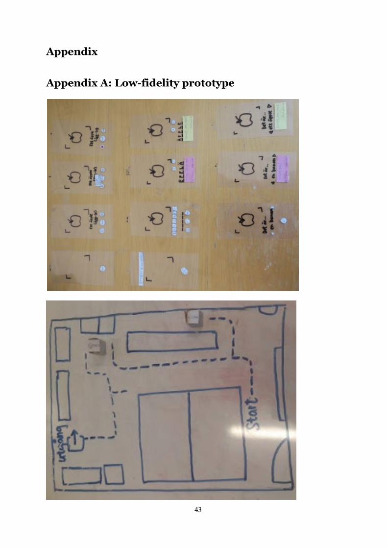
43
Appendix
Appendix A: Low-fidelity prototype
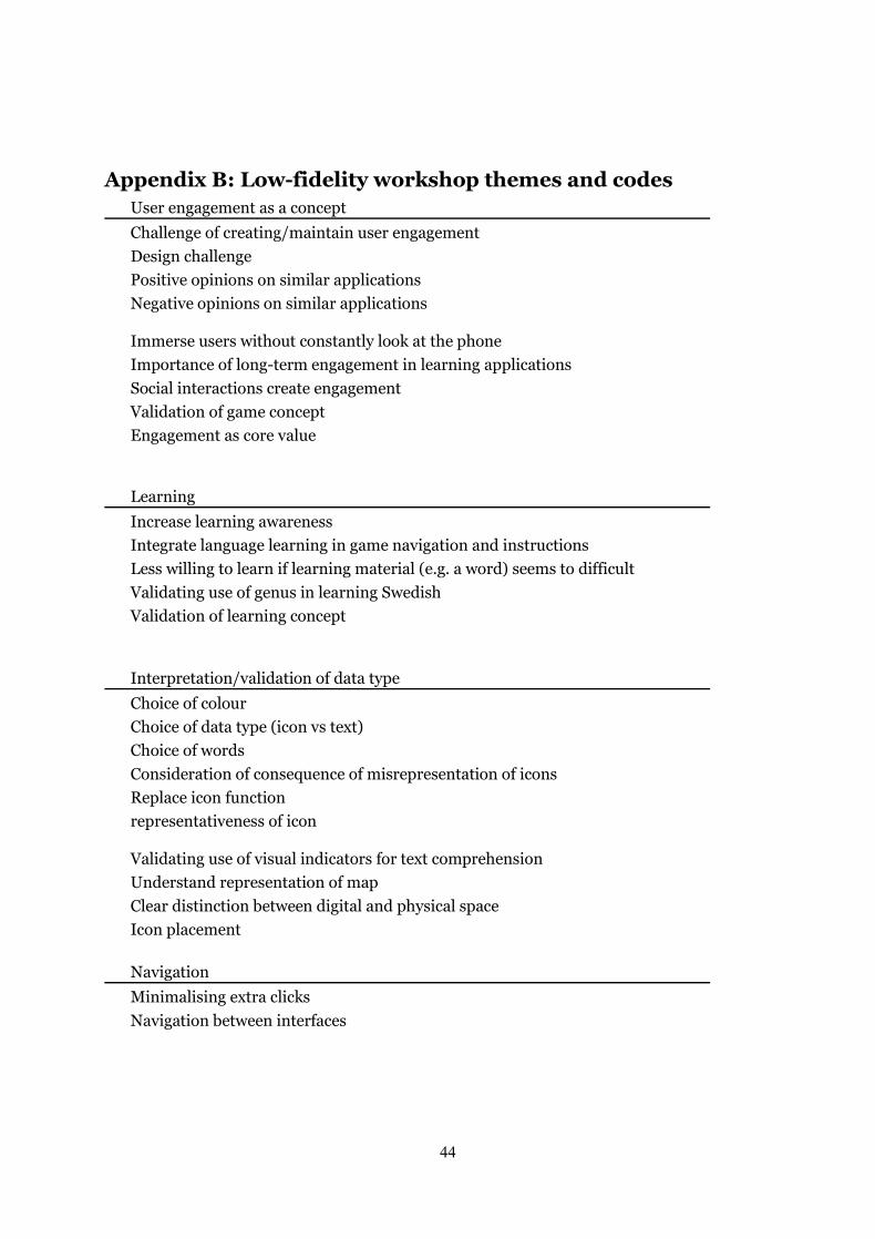
44
Appendix B: Low-fidelity workshop themes and codes User engagement as a concept Challenge of creating/maintain user engagement Design challenge Positive opinions on similar applications Negative opinions on similar applications
Immerse users without constantly look at the phone Importance of long-term engagement in learning applications Social interactions create engagement Validation of game concept Engagement as core value Learning Increase learning awareness Integrate language learning in game navigation and instructions Less willing to learn if learning material (e.g. a word) seems to difficult Validating use of genus in learning Swedish Validation of learning concept Interpretation/validation of data type Choice of colour Choice of data type (icon vs text) Choice of words Consideration of consequence of misrepresentation of icons Replace icon function representativeness of icon
Validating use of visual indicators for text comprehension Understand representation of map Clear distinction between digital and physical space Icon placement Navigation Minimalising extra clicks Navigation between interfaces

45
Challenges and rewards Allow users to want to achieve better performance Difficulty creates engagement Difficulty is rewarding Gain a sense of achievement upon completion of game Having a progression system to maintain a sense of accomplishment Higher reward for better performance Higher reward for more effortful game/task Increase difficulty in finding AR objects Lower reward for using hints Not punishing users for making mistakes Various difficulty level (learning) Punishment is not always bad Reward Scoring system Too little challenge creates boredom Ways to increase task difficulty Validating using trophy as reward Flexibility and freedom Give users the freedom to choose game (task) difficulty Give users the freedom to choose game location and scale Give users the freedom to switch tasks Learning language as a personal activity 'Bad' days when users have low learning motivation Variety
Existing application adds features to maintain user engagement Functionalities for language learning Alternatives of game mechanics Game becomes too easy over time Possibilities to extend the use of AR Feedback Display feedback message Expectation of feedback behaviour

46
Appendix C: Mixed-fidelity prototype Link to Scan mode: https://adobe.ly/2EPkdEw Link to Game mode: https://adobe.ly/2SNtU9X
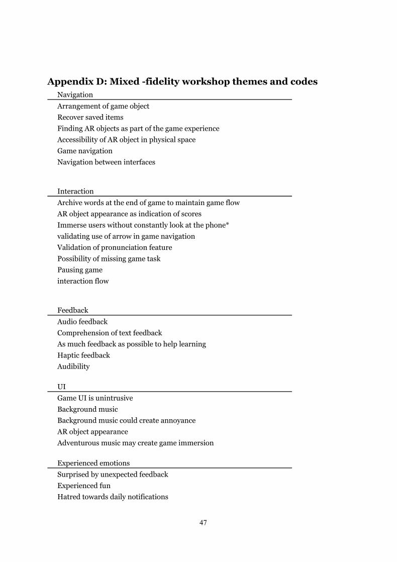
47
Appendix D: Mixed -fidelity workshop themes and codes Navigation Arrangement of game object Recover saved items Finding AR objects as part of the game experience Accessibility of AR object in physical space Game navigation Navigation between interfaces Interaction Archive words at the end of game to maintain game flow AR object appearance as indication of scores Immerse users without constantly look at the phone* validating use of arrow in game navigation Validation of pronunciation feature Possibility of missing game task Pausing game interaction flow Feedback Audio feedback Comprehension of text feedback As much feedback as possible to help learning Haptic feedback Audibility UI Game UI is unintrusive Background music Background music could create annoyance AR object appearance Adventurous music may create game immersion Experienced emotions Surprised by unexpected feedback Experienced fun Hatred towards daily notifications
48
Variety Various game mode Various game tasks Challenge and reward Higher reward for more effortful game/task Improving scoring system Intention to achieve best performance reward connecting to user profile Gain a sense of achievement throughout the entire game Higher reward for better performance Obtain achievements Reward Possibility to gain max score Intention to play game task as quickly as possible Various difficulty level (learning) Flexibility and freedom Provide options to map their game route/location Options to type in letters 'Bad' days when users have low learning motivation Give users the freedom to choose game (task) difficulty Give users the freedom to choose game location and scale Provide options to remove words that users have learnt Prevent user error by giving them alternatives Option to turn on/off background music Provide UI keyboard Perceived user control Important to have control over the application Micro-interaction Prototype issue Game task initiation Interpretation/validation of data type representativeness of icon Redundant icon icon appearance Visibility of icons in different physical condition
49
Behavioural indications of engagement Intention to interact with prototype Stopped while playing game task Learning Learning is limited Desirable feature but unnecessary for learning design perceived as creating more enjoyable learning experience Design perceived as supplementary learning material Pronunciation as part of learning instead of a hint Perceived potential learning effect Provide hints to assist task completion Safety Safety concern
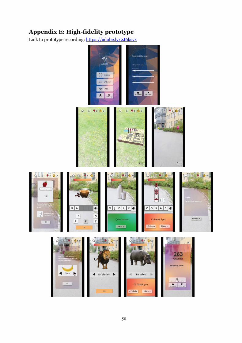
50
Appendix E: High-fidelity prototype Link to prototype recording: https://adobe.ly/2J6ksvx
51
Appendix F: High-fidelity workshop themes and codes Interactivity AR object affordance AR object distances and interactivity AR object appearance as indication of scores Distribution of AR objects Navigation Navigate to open mini map Mini map as hint, not shortcut Game navigation Mini map placement Mini map orientation Learning Integrate learning in the use of the application Importance of genus Integrate learning in everyday life Learning through playing Learning a language is dull at times Usefulness of app Playing game makes the boring part of language learning less painful Advantage of game tasks Balance between learning and playing Aesthetics Illustrations AR object quality Polished UI Complete UI Clean UI Realistic AR object appearance Images Feelings/emotions cosiness Nostalgia Positive surprises experienced engagement peak-end rule Excitement
52
Feelings/emotions (continue) Experienced best moment Experienced fun Surprised as passersby seemed indifferent to player's action
User engagement as outcome fun vs efficiency make it fun Exciting game tasks give user something to look forward to Tendency to play in repetition if game content is fun Desirable feature but unnecessary for learning Novelty Engagement as core value Others Possibilities to extend the use of AR Prototype issue Safety Safety concern Aware of surrounding people while playing Safety disclaimer Awareness of surrounding environment Social elements Challenge friends compete with peers Urge to show off achievements ranking system Social interactions create engagement Perceived user control Display all options on screen in game task Feedback Pop-up instruction at start of game task Display feedback to assure player is doing great Display tutorial of app for first-time user Requests more feedback for higher difficulty level
Flexibility and freedom provide options to select game type Flexibility Provide options to map their game route/location
53
Flexibility and freedom (continue) Provide options to disable tutorial/instructions Allow users to select preferences in general settings Challenge and reward Possibility to gain max score Extra points for playing outside Extra points for playing in new location Gain a sense of achievement upon completion of game Reward based on learning performance, not continuity User challenge themselves Make game challenging and difficult to get full score challenge creates engagement Factors that lower engagement Refusal to use any application due to slightest inconvenience Disadvantage of hot streak Avoid min-maxing Disadvantage of min-maxing Variety Randomise game tasks to avoid being repetitive Various difficulty level (learning) Comprehensibility Clear instructions Understanding of design Concept flow Understanding of game interaction flow (location settings) Behavioural indications of engagement Intention to explore app Tempted to answer wrong to see what happened Intention to achieve best performance Player was not bothered if people stared Participants attempted to score high urge to complete things Focused attention while playing UI icon appearance Comprehensible UI Validating use of visual indicators for text comprehension
![UbiOpticon: Participatory Sousveillance with Urban Screens ...applications for participatory urbanism, civic innovation, and community engagement [7]. In the urban context, both Townsend](https://img.pdfslide.net/doc/110x75/60c4634cffa19a4b915a3106/ubiopticon-participatory-sousveillance-with-urban-screens-applications-for.jpg)