Embed Size (px)
Citation preview
Team Virtual Dreams – BrazilBruno França dos Reis – Popfly User Name - bfreisRoberto Sonnino – Popfly User Name – robertos
Eduardo Sonnino – Mentor
MashUp
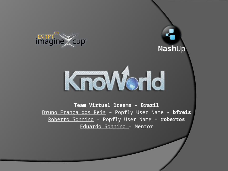
What’s in this plan The problem The solution Main functions Some mashup possiblities The blocks Outreach plan
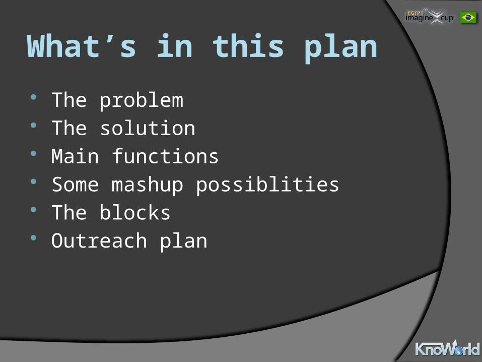
The problem Lots of world data is available, but it’s hard
to analyze We can’t associate changes in world
indicators with historic events easily New visualizations are needed to create
relationships between data and enable better solutions
End users don’t have easy access to data and analysis tools
The solution: Mix world indicator data from Gapminder
with an RSS with events in a Timeplot graph to analyze causes and consequences of the world’s problems!
KnoWorld allows you to:Compare indicators visually and create new
conclusionsEmpower the home user with easily-accessible
world dataCreate new visualization possibilities!
Millennium Goals affected All of them! Users can create mashups using
more than 200 indicators that correspond to all UN Millennium Goals
With some creativity, users can create visualizations and monitors for all the official UN Millennium Goal indicators
View the official UN indicator list at http://tinyurl.com/mdg-ind
Architecture Two core components:
Gapminder data (more than 200 world indicators from UN, World Bank, and others)
Timeplot visualization (plot a series of data and events vs. time)
Additional components:Google Charts (bar, line and map charts)Country Flags (get country flag images for mashups)Country Codes (get the country code from its name)
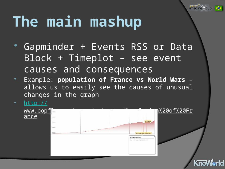
The main mashup Gapminder + Events RSS or Data Block +
Timeplot – see event causes and consequences
Example: population of France vs World Wars – allows us to easily see the causes of unusual changes in the graph
http://www.popfly.com/users/robertos/Population%20of%20France
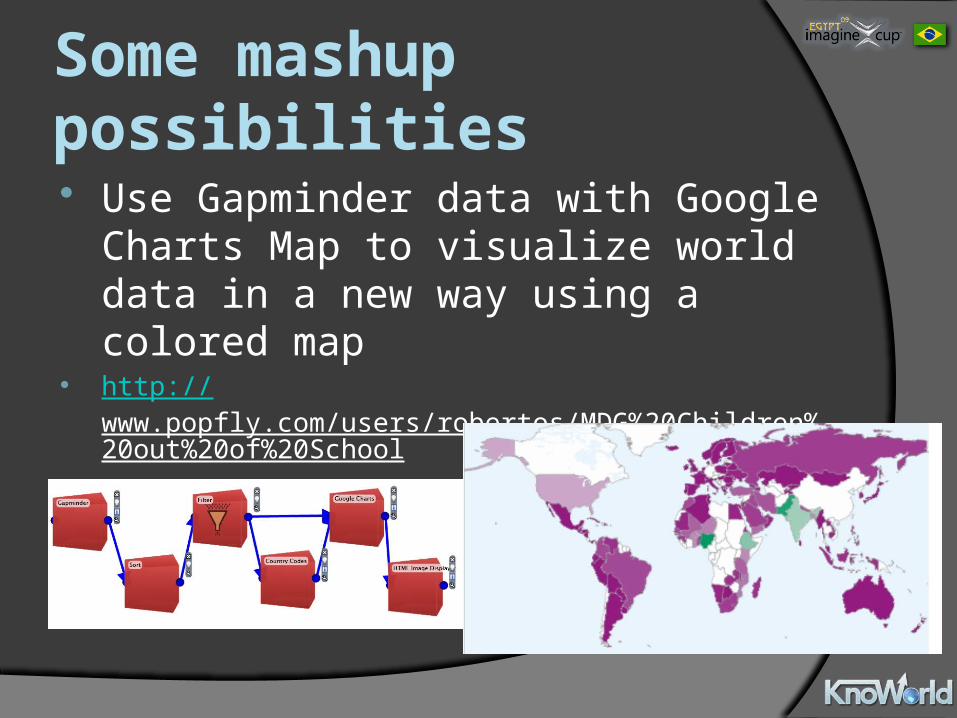
Some mashup possibilities Use Gapminder data with Google Charts
Map to visualize world data in a new way using a colored map
http://www.popfly.com/users/robertos/MDG%20Children%20out%20of%20School
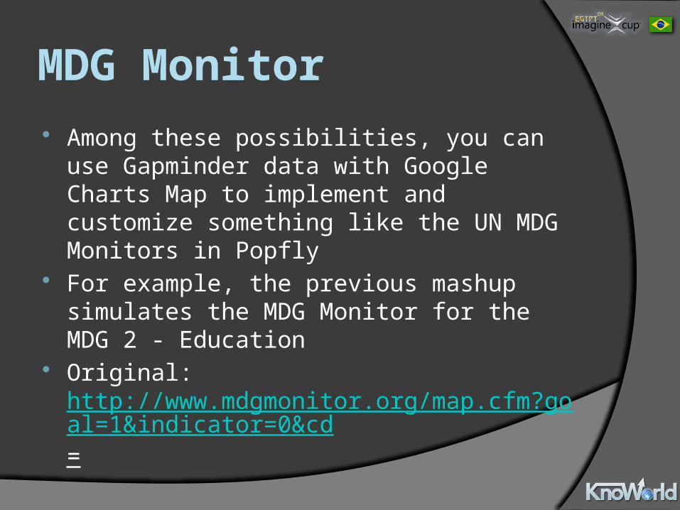
MDG Monitor Among these possibilities, you can use
Gapminder data with Google Charts Map to implement and customize something like the UN MDG Monitors in Popfly
For example, the previous mashup simulates the MDG Monitor for the MDG 2 - Education
Original: http://www.mdgmonitor.org/map.cfm?goal=1&indicator=0&cd=
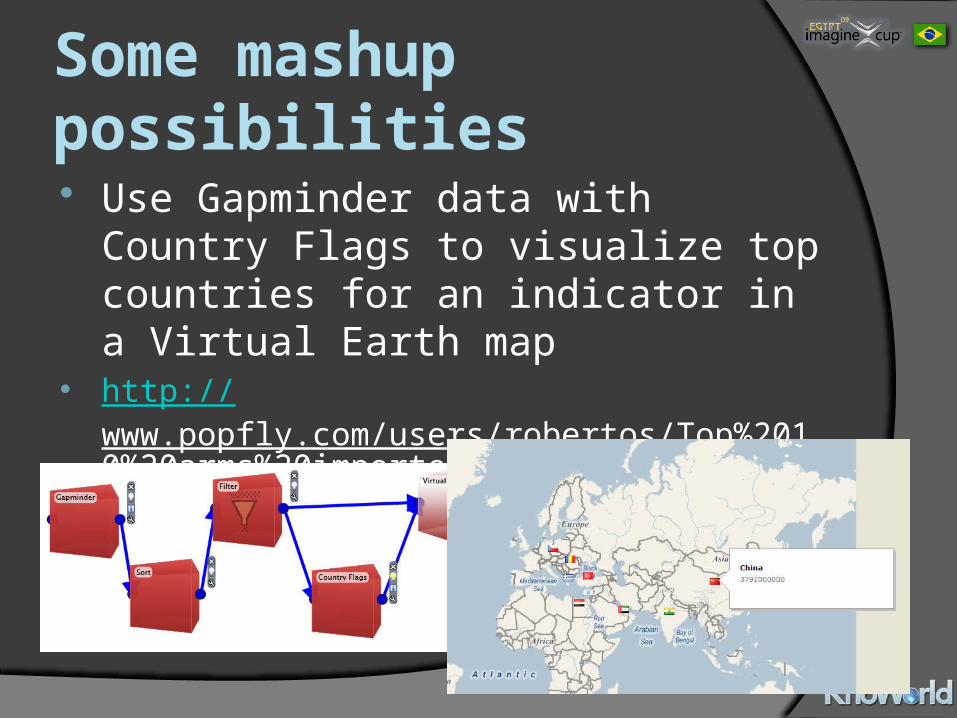
Some mashup possibilities Use Gapminder data with Country Flags to
visualize top countries for an indicator in a Virtual Earth map
http://www.popfly.com/users/robertos/Top%2010%20arms%20importers%20in%202005
Some other ideas Use Gapminder data with Google Charts Line to
mix world indicators and create new relationships
Mash with Google Charts Bar/Line to visualize and compare world indicators
Use data with Google Charts Map and an image display block to analyze the geographic situation of the indicator through time
Use indicators with Google Charts and Virtual Earth to visualize country data in small graphs in their respective locations in the map
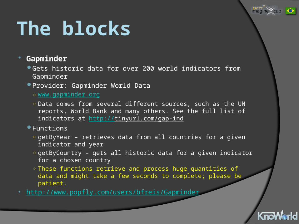
The blocks Gapminder
Gets historic data for over 200 world indicators from Gapminder Provider: Gapminder World Data
○ www.gapminder.org○ Data comes from several different sources, such as the UN reports,
World Bank and many others. See the full list of indicators at http://tinyurl.com/gap-ind
Functions○ getByYear – retrieves data from all countries for a given indicator and
year○ getByCountry – gets all historic data for a given indicator for a chosen
country○ These functions retrieve and process huge quantities of data and might
take a few seconds to complete; please be patient. http://www.popfly.com/users/bfreis/Gapminder
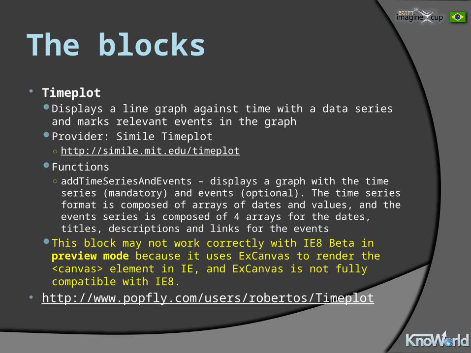
The blocks Timeplot
Displays a line graph against time with a data series and marks relevant events in the graph
Provider: Simile Timeplot○ http://simile.mit.edu/timeplot
Functions○ addTimeSeriesAndEvents – displays a graph with the time series
(mandatory) and events (optional). The time series format is composed of arrays of dates and values, and the events series is composed of 4 arrays for the dates, titles, descriptions and links for the events
This block may not work correctly with IE8 Beta in preview mode because it uses ExCanvas to render the <canvas> element in IE, and ExCanvas is not fully compatible with IE8.
http://www.popfly.com/users/robertos/Timeplot
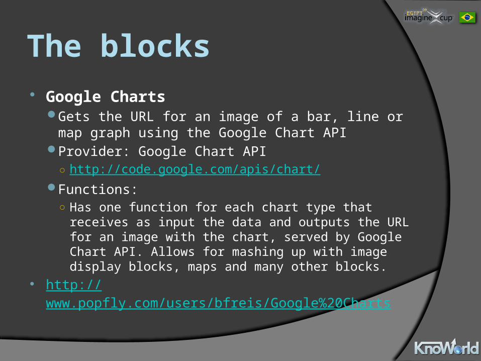
The blocks Google Charts
Gets the URL for an image of a bar, line or map graph using the Google Chart API
Provider: Google Chart API○ http://code.google.com/apis/chart/
Functions:○ Has one function for each chart type that receives as
input the data and outputs the URL for an image with the chart, served by Google Chart API. Allows for mashing up with image display blocks, maps and many other blocks.
http://www.popfly.com/users/bfreis/Google%20Charts
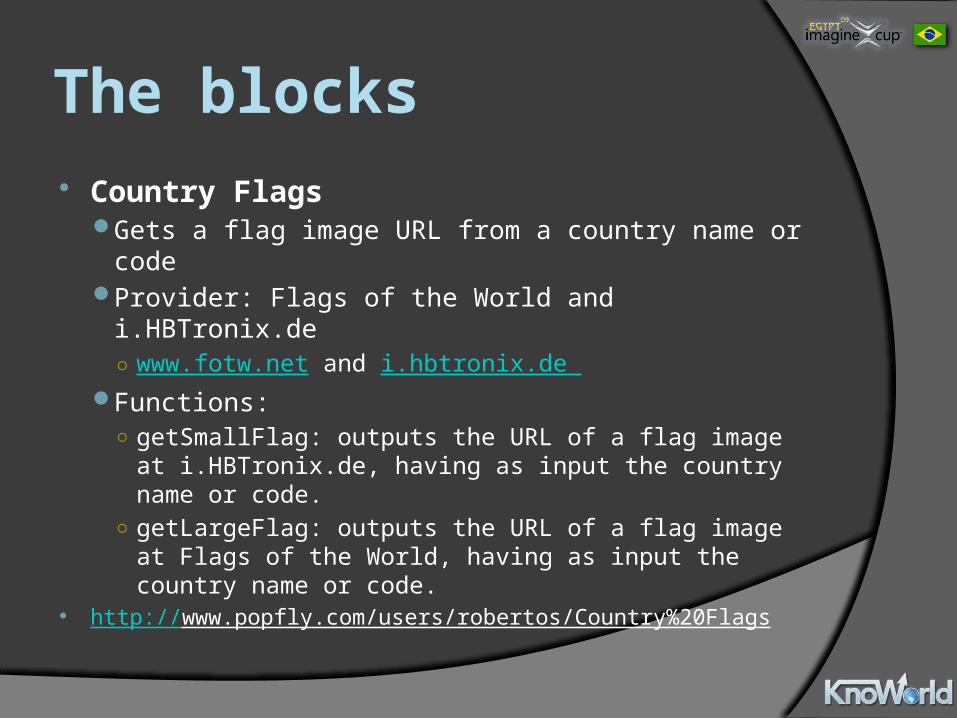
The blocks Country Flags
Gets a flag image URL from a country name or codeProvider: Flags of the World and i.HBTronix.de○ www.fotw.net and i.hbtronix.de
Functions:○ getSmallFlag: outputs the URL of a flag image at
i.HBTronix.de, having as input the country name or code.
○ getLargeFlag: outputs the URL of a flag image at Flags of the World, having as input the country name or code.
http://www.popfly.com/users/robertos/Country%20Flags
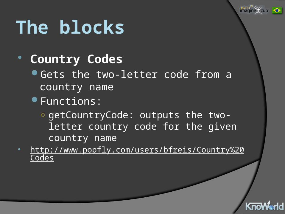
The blocks Country Codes
Gets the two-letter code from a country nameFunctions:○ getCountryCode: outputs the two-letter country
code for the given country name http://www.popfly.com/users/bfreis/Country%20Codes
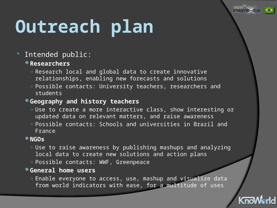
Outreach plan Intended public:
Researchers○ Research local and global data to create innovative relationships,
enabling new forecasts and solutions○ Possible contacts: University teachers, researchers and students
Geography and history teachers○ Use to create a more interactive class, show interesting or updated
data on relevant matters, and raise awareness○ Possible contacts: Schools and universities in Brazil and France
NGOs○ Use to raise awareness by publishing mashups and analyzing local data
to create new solutions and action plans○ Possible contacts: WWF, Greenpeace
General home users○ Enable everyone to access, use, mashup and visualize data from world
indicators with ease, for a multitude of uses
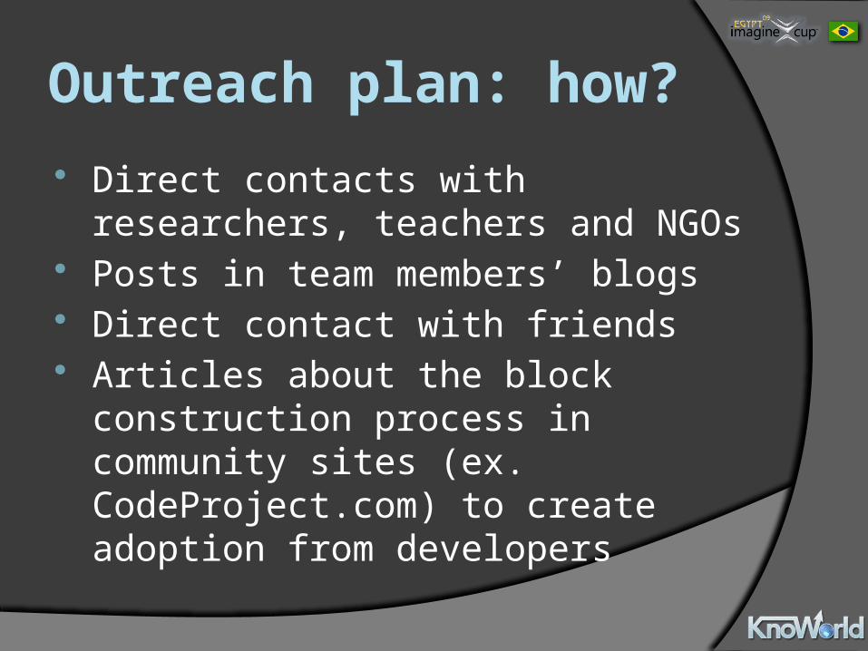
Outreach plan: how? Direct contacts with researchers, teachers
and NGOs Posts in team members’ blogs Direct contact with friends Articles about the block construction
process in community sites (ex. CodeProject.com) to create adoption from developers
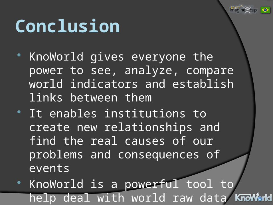
Conclusion KnoWorld gives everyone the power to see,
analyze, compare world indicators and establish links between them
It enables institutions to create new relationships and find the real causes of our problems and consequences of events
KnoWorld is a powerful tool to help deal with world raw data and turn it into real solutions!

Thank you!Team Virtual Dreams – Brazil
MashUp


![Mashups - Information Sciences Institute · •Data Extraction –Simile, Dapper, D.Mix [Hartman 2007], OpenKapow •Widget Approach –Yahoo’s Pipes, Microsoft’s Popfly, IBM’s](https://img.pdfslide.net/doc/110x75/5f72fd461c8c296ad86094ba/mashups-information-sciences-adata-extraction-asimile-dapper-dmix-hartman.jpg)