Embed Size (px)
Citation preview
TECHNOLOGY AND DESIGN: VANCOUVER MAGAZINE BEFORE AND AFTER
DESKTOP PUBLISHING by
Tatiana MacNeill BA (Honours Communications), Simon Fraser University, 2003
BA (Honours Sociology), University of Victoria, 2000
A PROJECT SUBMITTED IN PARTIAL FULFILLMENT OF THE REQUIREMENTS FOR THE DEGREE OF
MASTER OF PUBLISHING
In the Faculty of Arts & Social Sciences
Publishing Program
O Tatiana MacNeill2005
SIMON FRASER UNIVERSITY
Summer 2005
All rights reserved. This work may not be reproduced in whole or in part, by photocopy
or other means, without permission of the author.
APPROVAL
Name:
Degree:
Title of Project:
Tatiana MacNeill
Master of Publishing
Technology and Design: Vancouver Magazine Before and After Desktop Publishing
Examining Committee:
Ron Woodward, MA Senior Supervisor Senior Lecturer, Master of Publishing Program Simon Fraser University
Rowland Lorimer, PHD Supervisor Director, Master of Publishing Program Simon Fraser University
Date Approved:
Jim Sutherland External Examiner Editorial Director Transcontinental Media West
SIMON FRASER UNIVERSITY
PARTIAL COPYRIGHT LICENCE
The author, whose copyright is declared on the title page of this work, has granted to Simon Fraser University the right to lend this thesis, project or extended essay to users of the Simon Fraser University Library, and to make partial or single copies only for such users or in response to a request from the library of any other university, or other educational institution, on its own behalf or for one of its users.
The author has further granted permission to Simon Fraser University to keep or make a digital copy for use in its circulating collection.
The author has further agreed that permission for multiple copying of this work for scholarly purposes may be granted by either the author or the Dean of Graduate Studies.
It is understood that copying or publication of this work for financial gain shall not be allowed without the author's written permission.
Permission for public performance, or limited permission for private scholarly use, of any multimedia materials forming part of this work, may have been granted by the author. This information may be found on the separately catalogued multimedia material and in the signed Partial Copyright Licence.
The original Partial Copyright Licence attesting to these terms, and signed by this author, may be found in the original bound copy of this work, retained in the Simon Fraser University Archive.
W. A. C. Bennett Library Simon Fraser University
Burnaby, BC, Canada
ABSTRACT
This report examines the nature and dynamics of the relationship between technology and
design on a practical level. Prompted by technological innovation, the report investigates the
ways in which technological change appears to influence the practice of design.
On a theoretical level, this report draws on the work of Herbert A. Simon who provides
insight into the impact of technology on design. On a practical level, the report advances the
relationship between technology and design by detailing the major influences of desktop
publishing on publication design in the early years of its implementation.
The manifestation of technology in design is explored through an analysis of the design
of Vancouver Magazine, as well as an examination of information gathered directly from the past
and current art directors of Vancouver Magazine that were present before, during, and after
desktop publishing to provide context to the observed changes in production technologies and
their influence on the design of Vancouver Magazine.
iii
DEDICATION
I would like to dedicate this work to my parents, Dimitri and Galina Alpatoff, and my
husband, Sean MacNeill, who have all inspired me in my intellectual endeavours. I will forever
be in debt to their love and support.
ACKNOWLEDGEMENTS
I would like to acknowledge the many people who made this report possible. I would like
to thank Jim Sutherland for providing me with the opportunity to work at Vancouver Magazine,
as well as the past and current art directors of Vancouver Magazine, including Rick Staehling,
Chris Dahl, Cathy Mullaly, Doris Cheung, and Randy Watson, who candidly shared their
opinions with me.
I would like to thank Rowland Lorimer for his invaluable comments and suggestions
regarding this work. And lastly, I would like to thank Ron Woodward for his sound advice and
direction, as well as support and encouragement throughout the writing period of this report.
TABLE OF CONTENTS
.. Approval ............................................................................................................................ 11
... Abstract ............................................................................................................................. 111
Dedication ......................................................................................................................... iv
Acknowledgements ........................................................................................................... v
Table of Contents ............................................................................................................. vi .. List of Figures .................................................................................................................. VII
Chapter One ...................................................................................................................... 1 Introduction ..................................................................................................................... 1 The Influences on Design ................................................................................................ 3
The Social. Cultural. and Historical Influences on Design ......................................... 3 The Political Influences on Design .............................................................................. 4 The Technological Influences on Design .................................................................... 5
Chapter Two .................................................................................................................... 15 The Arrival of Desktop Publishing and Its Influence on Publication Design ............... 15
What is Desktop Publishing? ..................................................................................... 15 ........................................................................................ Before Desktop Publishing 16
............................................................................ The Arrival of Desktop Publishing 18 ................................................................................ Timeline of Desktop Publishing 22
Chapter Three ................................................................................................................. 30 A Case Study of Vancouver Magazine Before and After Desktop Publishing ............. 30
Background of Vancouver Magazine ........................................................................ 30 Interviews with the Art Directors of Vancouver Magazine ....................................... 31
................................................. An Analysis of the Design of Vancouver Magazine 47
Part Four .......................................................................................................................... 88 Conclusion .................................................................................................................... 88
Appendix .......................................................................................................................... 95
References ........................................................................................................................ 97
LIST OF FIGURES
Figure 1: The June 1975 Cover of Vancouver Magazine ................................................. 49 Figure 2: The April 1975 Cover of Vancouver Magazine ................................................ 51 Figure 3: A February 1975 Inside Spread of Vancouver Magazine ................................. 53 Figure 4: A December 1975 Inside Spread of Vancouver Magazine ............................... 55 Figure 5: The August 1980 Cover of Vancouver Magazine ........................................ 57 Figure 6: The December 1980 Cover of Vancouver Magazine ........................................ 59 Figure 7: An April 1980 Inside Spread of Vancouver Magazine ..................................... 61 Figure 8: A November 1980 Inside Spread of Vancouver Magazine ............................... 63 Figure 9: The August 1985 Cover of Vancouver Magazine ........................................ 65 Figure 10: A March 1985 Inside Spread of Vancouver Magazine ................................... 67
............................. Figure 1 1 : A November 1985 Inside Spread of Vancouver Magazine 69
Figure 12: The January 1990 Cover of Vancouver Magazine .......................................... 72 Figure 13: The February 1990 Cover of Vancouver Magazine ........................................ 73
...................................... Figure 14: A May 1990 Inside Spread of Vancouver Magazine 75
...................................... Figure 15: The Winter 1995/96 Cover of Vancouver Magazine 78
...................................... Figure 16: The November 1995 Cover of Vancouver Magazine 80
............................. Figure 17: A September 1995 Inside Spread of Vancouver Magazine 83 ................................... Figure 18: A March 1995 Inside Spread of Vancouver Magazine 85
vii
CHAPTER ONE
Introduction
This report examines the nature and dynamics of the relationship between technology and
design on a practical level. The research is qualitative in nature, consisting of collected
information from journals, articles, books, the Internet, and email and phone responses from art
directors.
Prompted by technological innovation, the study investigates the ways in which
technological change appears to influence the practice of design. The main argument of the report
is that there is a direct relationship between technology and design. Drawing primarily on the
work of Herbert A. Simon, it is argued that aesthetic and functional considerations should not be
separated in design and that the options for these two elements of design are dictated by the
inherent qualities of the technology of production.
The study is divided into four main sections. The first section examines the social,
cultural, political, and historical influences on design and their impact on contemporary practice.
Thereafter, the section sheds significant light upon approaches and attitudes toward the nature and
dynamics of the relationship between production technology and design.
The second section presents a timeline of digital production technologies that appear to
have changed the face of publication design and still continue to shape it today. It discusses the
influences of changing digital production technologies and methods appropriate to the practice of
publication design.
The third section uses Vancouver Magazine as a specific case study to further evaluate
the nature and dynamics of the relationship between production technology and design. It
examines the changes in the design of the magazine before and after the widespread adoption of
desktop publishing in the mid-1980s. But in spite of this technological premise, the discussion
bears in mind that technology might have an influence but is not the cause of such changes.
The third section is divided into two parts. The fust part analyzes information gathered
directly from the past and current art directors of Vancouver Magazine that were present before,
during, and after the arrival of desktop publishing. A structured email interview was used to
gather data from the art directors, including their attitudes about the nature of the relationship
between the introduction of digital production technologies and the design of Vancouver
Magazine, as well as their opinions of whether changes in digital production technologies altered
the way that they approached the design of the magazine.
In order to better understand the implications of digital production technologies on the
design of Vancouver Magazine, the second part examines the changes in the design of the
publication before and after the advent of desktop publishing in relation to changing digital
production technologies.
The fourth section summarizes the main argument and key points of the report. Working
from the information gathered, conclusions are drawn regarding the nature of the relationship
between digital production technologies and the design of Vancouver Magazine. The objective of
the study is to contribute to a greater understanding of how the technology employed in the
production of Vancouver Magazine has influenced the changes to its design.
The Influences on Design
Design is everywhere in society. It permeates every object in the material world. As
Margolin notes, "Design determines the shape and height of a shoe heel, the access to computer
functions through software, the mood of an office interior, special effects in films, and the
structure and elegance of bridges" (1989, p.3). Everything in society is designed - magazines,
newspapers, books, movies, commercials, billboards, product packaging, clothing, furniture,
buildings, and automobiles.
Design can be analyzed at an aesthetic level that concerns itself with the visual
appearance of an object. But design extends far beyond simply an aesthetic level to a social,
cultural, economic, political, historical, and technological context. While design can be said to be
largely about aesthetics, the practice of design is a product of social, cultural, economic, political,
historical, and technological influences. It is important to gain a broad perspective on how these
factors influence design and vice versa. By understanding the relationship between these factors,
it is possible to build a sense of continuity and context in the practice of design.
The Social, Cultural, and Historical Influences on Design
Designers bring their own personal style and individual taste into their creations. They
take their inspiration from outside their profession as well. Their study of the world around them
carries over to the decisions they make about design. According to Hurlburt, "Today's graphic
designer cannot ignore the forces within and without his field that have influenced the form and
function of page-layouts" (1977, p.9). There are many forces that influence design: individuals,
art movements, schools of thought, culture (i.e. design in Canada versus South Africa), the
marketplace, the goal of the client company, and the palette of the environment (i.e. summer
weather versus winter weather), to name a few areas.
Design reflects the prevailing aesthetic of the time, as it conforms to tastes in fashion, art,
and architecture. Something as simple as fashion in clothes, for example, can influence graphic
design. As Nelson points out, the layered look in fashion relates to the boxes within boxes that
some designers use when creating magazine layouts (1987, p.35).
Although a variety of factors contribute to the general aesthetic, the revival of styles from
the past is a customary source 'of inspiration for designers. Since trends are cyclical in nature,
design classics from earlier periods re-emerge and influence design decisions today. For example,
graphic designers use typefaces that mimic old typewriter typefaces for newspapers and
magazines. And industrial designers use materials such as translucent plastic and brushed chrome
to mimic the retro look of the 1950s and 1960s.
The Political Influences on Design
The political environment influences design as well. As Pile suggests, "Design exists in
the social milieu and is responsive to the social, political, and economic ideologies of the time"
(Woodward, 1995). This responsiveness to the social, political, and economic ideologies of the
time is displayed by either accepting the status quo or rejecting the current state of affairs. Such a
phenomenon is best illustrated in the early twentieth century art movements in Europe.
According to Meggs, the art movements such as Cubism, Futurism, Dadaism, Surrealism,
de Stijl, Suprematism, Constructivism, and Bauhaus attempted to liberate design from its
traditional restraints (1983, p.274). But such attempts to liberate design were not always looked
upon favourably. To illustrate, right-wing German authorities in the early 1920s favoured classic
typefaces and disliked the use of sans serif fonts by the Bauhaus, perceiving it as a break from
tradition. Attempting to change the typography in a society that strongly valued tradition was not
taken well. But it was this type of radical departure that helped define the Bauhaus as the creators
of the modern style in design (Hurlburt, 1977, p.47). Due to the political situation, the Bauhaus
was forced to leave Germany in 1925 as well as close its art school in 1933.
Like other prominent art movements of the early twentieth century, the Bauhaus had a
significant impact on the development of design in the twentieth century. The Bauhaus directly
shaped the graphic language of form and visual communications in the twentieth century, as well
as pioneered production techniques and stylistic devices that are still used today. Their avant-
garde ides and techniques played a major role in bringing current design to where it is today. The
influences of the Bauhaus are varied and widespread and can still be seen in all forms of printed
matter, including books, magazines, advertisements, and brochures. There is little doubt that
design still continues to be strongly influenced by many periods, art movements, and individuals
from the past.
The Technological Influences on Design
Debates regarding the impact of technology on society have been pursued in a variety of
books and articles. For example, Feenberg (1999) investigated the relationship between
technology and society through the theoretical perspective of technological determinism. As this
report attempts to establish a relationship between technology and design, it is important to
discuss the impact of technology on society through the technology-led theory of technological
determinism.
The theory of technological determinism relates to the studies of Marshall McLuhan
(191 1-1980), the founder of modern media studies. Discussions around technology often call
forth McLuhan's conviction that specific technologies help shape certain forms of social change
(King, 1999). Technological determinism casts technology in a cause and effect relationship in
which technology is the cause of change in society. In other words, social change is the result of
innovations in technology.
In the book Understanding Media (1964), McLuhan argues that technology is a dominant
force that "shapes and controls the scale and form of human association and action" (1964, p.9).
It is not the technology that is important, but the way in which people choose to use the
technology. From this perspective, the Internet is an agent of social change. The way that people
use the Internet to communicate and find information changes the way that they interact with
each other.
According to Feenberg, McLuhanYs technological determinism is parallel to traditional
Marxist approaches of economic determinism. Marxists argue that the economy is an autonomous
force subject to natural laws and therefore resistant to control. Technological determinism follows
a similar logic in that technological development follows its own course of action and just
appears out of the blue with little, if any, input from its creators or intended users (Feenberg,
1999). From this perspective, human choice is diminished in controlling the direction of
technological change. Because technology is disconnected from human influence, it is neutral or
value-free to such an extent as it merely fulfils natural needs (Feenberg, 1999).
A number of scholars have criticized technological determinism for failing to
acknowledge human action in the creation of technology. The process of creating technology and
getting it into the hands of users is largely ignored. Technical improvements do not shape in any
simple way the appearance and the function of technical objects, but in fact designers play a
central role in the design and use of technology.
A key feature of technological activity is the ability to design. And this means that
technological activity would not exist without human activity. In creating technical objects,
designers influence society based on their design decisions. Technology is socially constructed,
not determined by science and engineering alone but shaped by social forces, along with cultural,
economic, and political factors.
Despite the criticism regarding technological determinism, it is difficult to ignore the fact
that technological innovations such as the printing press, television, telephone, plane, and
automobile have all shaped society in clear and definable ways. For example, the automobile
caused a number of changes in society from the creation of suburbia to the paving of farmland
and forests to the creation of pollution.
Following this line of thinking, technological innovations have an impact on design in
society. The introduction of lithography in the eighteenth century influenced the design of
posters. Invented by Alois Senefelder in Bohemia in 1798, lithography was a printing process that
generated images and text for reproduction by placing ink on a series of metal or stone carvings
(Lupton, 1998). Early lithographs were done in black ink. But within a few years of its invention,
the lithographic process was done in colour to create multi-colour printed images.
Before the introduction of lithography, posters were metal engravings or woodblocks
with mostly text and few images or colour. According to Lupton, lithography enabled designers
to draw images with a crayon or brush for reproduction directly onto printing stones and plates or
on transfer paper (1998). For the first time, designers were able to combine type and images with
vibrant colours. Where text dominated earlier posters, those produced with lithography had more
images and colour. The ability of lithography to combine type, images, and colour greatly
impacted the design of posters.
Cyberspace is another example that shows how technology has influenced design. A
virtual reality within computers and computer networks, cyberspace has influenced the design of
typography and fashion. The Internet has allowed for the creation of innovative forms of
typography unique to cyberspace such as Multi User Dimension Object Oriented (MOO), a text-
based virtual environment that people can work on together to build into a new kind of
community, and Multi User Dungeons (MUD'S), a multi-user, interactive fantasy game that
simulates a terrain through textual descriptions. With the invention of cyberspace, it was
necessary for designers to create new forms of typography such as animated and dimensional
type.
Cyberspace has influenced fashion design as well. The creation of cyberspace has
spawned science fiction movies such as The Matrix, a film based in a virtual reality constructed
in cyberspace. The characters in these science fiction movies wear fashionable designs that reflect
how society sees itself in the future. Fashion designers draw creative inspiration from cyberspace,
which in turn influences their design decisions.
The impact of technology on design is further illustrated through the work of Herbert A.
Simon (1916-2001), a prominent figure in the area of computer science, organizational
development, and artificial science. In the book The Sciences of the ArtiJcial (1969), Simon
proposes a theory of design based on the science of design, which he calls artificial science to
distinguish it from natural science.
In making a distinction between natural science and artificial science, Simon argues that
natural science such as physics, biology, and chemistry is concerned with knowledge about
natural objects in the world; about their characteristics and properties; about their behaviour and
interaction with each other (1969, p.1). Unlike natural science, artificial science such as
engineering, medicine, business, and architecture is concerned with knowledge about artifacts or
human-made objects in the world; about the way that they adapt to the goals and purposes of the
designer. For Simon, artifacts have desired properties to the environment in which they live
(1969, p.4). While natural objects such as trees and flowers are given, artificial objects such as
computers and automobiles are human-made.
In contrast to the natural scientist who studies natural objects such as birds and fish by the
methods of natural science without any particular attention to goals, the engineer, and in
particular the designer, is concerned with how artificial objects should be in order to fulfil certain
goals. Artificial objects differ from natural objects precisely because they function in relation to a
particular goal. From this perspective, artificial objects would have been different had the goals
been different.
Simon has broadened the notion of design by pointing out that "everyone designs who
devises courses of action aimed at changing existing situations into preferred ones" (1969, p. 11 1).
This clear statement of design as a practice focused on how to do things to accomplish a
particular goal is valuable, as it suggests that anyone who formulates programs of action to
change existing states to preferred ones is involved in the design process.
From a historical perspective, the design of artifacts is an activity that has been carried
out for centuries. It is practiced by disciplines not only related to the production of artifacts such
as engineering and architecture, but also those disciplines related to formulating programs of
action aimed at changing existing situations into preferred ones such as medicine and business -
all of which are centrally concerned with the process of design. Design is central to any discipline
that intentionally transforms the world in one way or another.
Simon further frames artificial science in terms of an inner environment, an outer
environment, and the meeting place between the two environments to achieve a particular goal.
An artifact has an inner environment - how the artifact is organized and how it operates - and
it is placed in an outer environment - the external forces and effects that act upon the artifact.
For Simon, the inner environment of an artifact and the outer environment in which it performs
operate in accordance with natural laws (1969, p.6). This suggests that artificial science must
complement natural science in that artifacts must not be in opposition to nature to function
properly.
The inner environment of an artifact must realize the goals of the outer environment. The
designer must shape the artifact in such a way that it is both purposeful and functional. If the
inner environment of the artifact is appropriate to the outer environment in which it operates, the
designer will have succeeded in making the artifact into what it should be (Simon, 1969, p.6).
Anything human-made such as a clock is an example of an artifact. The inner
environment of a clock is its internal construction and the outer environment is the force that acts
upon it to mold it. If a clock is intended to serve as an instrument for measuring time with
accuracy on a ship, it will not only require an inner design that records and measures time, but it
will also have to operate in an environment in which the motion of the ship is tolerated.
An automobile is another example of an artifact. If an automobile is intended to bring a
person from point A to B, it will not only require an inner design that has an engine and seats for
passengers, but it will also have to operate in an environment in which it can handle the harsh
elements of the environment such as rain and snow. If the automobile is designed in such a way
that it can be adapted to its environment (i.e. snow tires, wind shield wipers, etc.), the designer
will have succeeded in making it function in relation to a particular goal.
Simon's claim that an artifact has to be adaptable to its environment implies that the
design has to take into account the context of human action. Designers play a central role in the
design of artifacts, while users make use of them. Where there is an artifact, there is human action
in creation and use.
An artifact is characterized in terms of its goals and functions. To so characterize an
artifact is to affirm the notion of functionalism in design - a powerful theory in the literature of
architecture and design. Functionalism in design has its roots in the social theory of
functionalism, which in turn has its roots in the writings of sociologists Herbert Spencer (1820-
1903) and a mile Durkheim (1858-1917) (Anderson & Kaspersen, 2000, p.215). Spencer and
Herbert compared society to a biological organism: a system of interdependent parts all of which
make a contribution to the overall working and sustenance of the system (Anderson & Kaspersen,
2000, p.215). In short, the form of an object is explained in terms of the function it performs or
the contribution it makes to an overall system.
Functionalism in design is found in architecture. There it expresses itself as a philosophy
of design, holding that an object's form or dimensional appearance should be adapted to usage
and material (Anderson & Kaspersen, 2000, p.214). If the function of a chair is to support a
person sitting on it, the form must be a horizontal surface and a vertical surface resting on a
frame. The chair is strictly functional in its appearance with no embellishments or decorations
added to its form. This suggests that function is the primary consideration at the expense of
aesthetic considerations.
The major idea behind functionalism in design is the notion of form and function. In
1896, the American architect Louis Henri Sullivan (1 856-1924) coined the phrase "form follows
function" in architecture, implying that function precedes form; that it exists independently before
form appears (Pile, 1979, p.67).
Outlining the principles for designing a building, Sullivan proposed that design should
indicate the functions of a building and that, where the function does not change, the form should
not change; thus the famous motto "form follows function" (Janson, 1982, p.7). The main point is
that there should be a reason for a building looking the way that it does.
The slogan "form follows function" became a maxim for architects and designers of the
modernist movement. For example, the Bauhaus art movement in the early 1920s defined modem
design based on a strictly functional paradigm.
As Pile suggests, "The most basic idea of functionalism - the view that a thing must do
what it is intended to do - can be seen to be almost universally accepted" (1979, p.68). But
accepting this theory does not mean that aesthetic and functional considerations should be
separated in the design of things. As Woodward proclaims, "It means that the functional value of
an object must be part of the design solution in the same way that the aesthetic value is part of the
solution" (1995).
There is little doubt that a design task requires a process of searching for a functional as
well as an aesthetic solution that can be reached in a practical and effective way. The shape of an
object must not only serve a useful purpose, but it must also be attractive to the user. The way
that a person feels about an object influences how successful he or she will be in using it. A
person required to use an object that he or she does not like because of its appearance will be
unhappy, no matter how well the object works. Because function and aesthetic are both part of the
design process, these elements must not be separated in the design of objects.
The view that aesthetic and functional considerations should not be separated in the
design of artifacts is consistent with Simon's theory that every production technology carries with
it its own functional and aesthetic potentials. The theory establishes a strong relationship between
the technology of production and an artifact's functional and aesthetic potentials. The technology
of production is the part of the outer environment of the artifact, while the artifact's functional
and aesthetic potentials is the inner environment of the artifact represented by the actions of the
designer.
Simon's theory further suggests that the options for function and aesthetics are set forth
by the inherent qualities of the technology employed in production. To illustrate, a hammer is a
production technology with a particular functional potential and aesthetic quality. It must be
shaped in a certain way to accomplish its basic function of hitting nails into wood. As such, it is
designed to have a handle with a perpendicularly attached head of metal. The shape of the
hammer makes it adapted to drive nails into wood efficiently, which means that function is
closely linked to shape.
The relationship between the functional and aesthetic potentials of an artifact and the
technology of production can be applied to published content. The basic production technology of
ink-on-paper, as in a printed and traditionally bound book, can be distributed to a variety of
formats. The content of a printed book can be distributed in electronic format, as well as made
available online through CD-ROM or e-book. Although the content will remain the same, a
change in the production technology from printed book to digital format will alter the function
and appearance of the content.
The printed book is a portable, accessible artifact with a cover, spine, and printed pages.
It is usually identified with its physical package and therefore has aesthetic potential. It has
inherent properties such as tangibility, legibility, and portability, as well as aesthetic and physical
limitations such as size, type and thickness of paper, matte, and gloss. Once the raw materials (i.e.
tress) are converted to a frnished product, the function and appearance of the printed book is set
and cannot be altered without destroying it.
In contrast to a tangible printed book, the e-book is not bound by the physical world, but
it exists in the virtual world. The e-book is more flexible than a printed book in so far as it exists
as code and can be displayed in a number of different ways. Instead of paging through a printed
book to view the content, users can view the content of an e-book on a computer display or
monitor. The appearance of the content is different than that of a printed book. If the content is on
a server connected to the Internet, it becomes available at any workstation connected to the
Internet.
Some advances in technology allow for more functional potential and variety. The e-book
has different functional potential than the printed book, as it can encourage readers to click
through to other sources of information if such a feature is built in. An e-book has significant
advantages for users in terms of searching capabilities and ease of use. With built-in dictionaries,
unlimited full text searches, as well as hyperlinked footnotes and bibliographies, an e-book can
direct readers to its sources, including in some instances the full text of those sources. The printed
book can have footnotes and bibliographies as well, but obviously it cannot let users increase or
decrease their font size, have animated illustrations or music, or recognize voice commands and
visual cues like the e-book.
Moving the content of a printed book to an e-book alters the appearance and function of
the publishing format, although the content remains the same. If the content of a printed book is
moved to an e-book, the content will work differently because of the different functionality of the
Internet. The claim that the production technology of an e-book is different than the production
technology of a printed book goes back to the Simon's theory that there is an inherent functional
and aesthetic potential that arises from the technology of production.
Simon appears to be accurate in his analysis because moving the content of a printed
book to e-book does change the functional and aesthetic potential of the artifact. But it can be
argued that moving the content of a printed book to e-book does not only alter the functional and
aesthetic potential of the artifact, but it also changes the functional and aesthetic potential of the
design process. In this sense, it is possible to apply Simon's theory to the artifact as well as to the
process of designing that artifact.
One can build on Simon's theory and take it to the next level by including the way in
which the designer performs the task and not just the way that the artifact looks and functions. In
the case of a magazine, a single technological artifact such as a computer is not enough to create a
publication. The designer of the magazine must have a computer as well as a suite of digital
production technologies such as a scanner, keyboard, DTP software, and offset printing.
When a computer is part of a larger process or suite of digital production technologies to
create a magazine, the technology may alter the final product functionally or aesthetically as well
as the functional process of producing the magazine. In other words, the technology may change
the form or function of the final product and/or the process of production. As such, a change in
the technology alters the functional and aesthetic potential of the design and the design process.
CHAPTER TWO
The Arrival of Desktop Publishing and Its Influence on Publication Design
This section examines the timeline of digital production technologies. It builds an
argument that these technologies have changed the face and process of design. More specifically,
the section discusses the effects and influences of the changing digital production technologies
and methods used in the practice of publication design. The research is based on sources cited in
the bibliography, as well as online sources such as Wikipedia, Glencoe Norton, and About.com.
What is Desktop Publishing?
The advent of a number of digital production technologies in the mid-1980s changed the
world of publishing, typesetting, and publication design. According to Barnard, the introduction
of Apple's Macintosh computer with graphical user interface and "What You See Is What You
Get" (WYSIWYG) screen; Apple's Laserwriter printer capable of printing high-quality output;
Adobe's Postscript page description language with rasterizer and digital fonts to drive laser
printers and phototypesetters; and Aldus PageMaker (now Adobe PageMaker) for electronically
assembling pages, complete with digital graphics, ushered in the era of desktop publishing (1990,
p.79). Coupled with the development of composition languages to drive the whole desktop
publishing system as well as scanning devices that could digitize photographs, illustrations, and
text, these technical advances constituted a revolution of worldwide scope and importance.
Paul Brainerd, the founder and president of the former Aldus Corporation (now Adobe
Systems), is credited for coining the phrase desktop publishing (Meggs, 1998, p.457). In its
classic definition, desktop publishing (DTP) refers to a single person using a personal computer
to control the entire publishing process of a single publication from the generation of content to
the assembly of pages (Kleper, 2001, p. xxxiii and xxxii). As Brabyn points out, DTP is a "means
of producing documents, complete with graphics, ranging from one-page information or
advertising leaflets, through brochures and price lists, to newsletters, magazines and even books,
on equipment which can be comfortably housed on a reasonably large desk" (1988). DTP
software such as PageMaker, QuarkXPress, and InDesign is specifically designed for such tasks.
According to Silver and Silver, the first basic DTP system had a group of elements
integrated into a system (1991, p.8). The microcomputer such as the Macintosh computer or IBM
personal computer was the major component of the system. As Silver and Silver suggest, the
microcomputer was equipped with a monitor, input and output devices such as a keyboard and
mouse, storage for floppy and hard disks, as well as a microprocessor chip that could manipulate
millions of bits of information in a fraction of a second (1991, p.12). The system often had a
scanner and laser printer.
In order to complete the DTP system, a specialized piece of page makeup software such
as PageMaker was required. The software program could combine text and graphics files into
documents of varying lengths, as well as perform page makeup and editing functions. As Silver
and Silver note, "In addition to assembling words and pictures, the software allowed rules,
borders, or tint areas to be incorporated into a design in order to create pages that resembled those
generated by traditional typesetting means" (1991, p. 14).
Before Desktop Publishing
Well before the development of DTP as it is known today, graphic designers created
magazines manually using a variety of non-computer techniques and equipment. They were
involved in manual paste-up, assembling the text and graphical elements on the page as specified
on the page dummy prior to reproduction.
Using rulers and drafting instruments, graphic designers marked the position of typeset
copy, artwork, page edges, folds, and colour on the pages, as well as cut and trimmed typeset
copy and artwork to a specified size. All elements were fastened in place to boards or camera-
ready mechanicals. Tissue overlays specified colour breaks, notes Stanley Rosen, the team leader
of print solutions for Vancouver-based prepress equipment provider Creo, and errors in
typography were corrected by waxing re-typeset copy onto the mechanicals (Ferriolo, 2003). The
mechanicals, along with spec sheets full of instructions for the printer, were then sent to the
printer. The processes and steps used to create a magazine were complex, labour intensive,
expensive, and time-consuming.
Before DTP, graphic designers could not see the layout of an actual page of text with
colour artwork included. This meant that they had to pre-visualize all components of the design
before beginning a layout, as well as commit to specific typefaces, fonts, and sizes for headlines,
decks, and body copy and then order these elements from outside suppliers, which was a
ponderous, slow, and expensive process. If there was a change in the layout, designers had to
reset and paste-up type. For instance, if a heading was too small, it had to be reset larger, cut in,
and pasted into the layout, therefore limiting the flexibility and options of the design process.
To realize the printed page of a layout, graphic designers were dependent on a variety of
outside professionals such as printers and typesetters who had complex and expensive equipment.
According to Silver and Silver, "This was because typesetting and printing equipment was
expensive, difficult to operate, and required specialized facilities suitable to operating heavy
machinery" (1 991, p.4).
Although designers could create typefaces with ink and paper, it was nearly impossible
for them to use the typefaces in a layout. This in turn limited designers to what the typesetter
produced. The dependence on the typesetter created a symbiotic relationship between graphic
designers, typesetters, and printers.
The Arrival of Desktop Publishing
The change to DTP in the mid-1980s is used to advance the argument that the
technology, singly and as a whole, affected publication design in a substantial way. The use of
computers for publication design began in the mid-1980s with the introduction of Apple's
Macintosh computer and DTP software. Although the computer was formally introduced during
this time, it was only adopted into widespread industry use in the early 1990s.
The computer had a graphical user interface (GUI) that allowed for direct visual onscreen
manipulation of text and images. With its onscreen point and click display, graphic designers
could select menu commands with a mouse rather than having to remember keyboard commands.
With the introduction of the computer, graphic designers had immediate and complete
control over the design elements on the desktop such as text and images. The elements could be
laid out on a computer screen in a format of "What You See Is What You Get" (WYSIWYG).
What this meant was that text and images on the screen were the same size and in the same place
as on the printed version.
The acronym WYSIWYG was a rather optimistic claim at the time. The resolution of a
computer display screen was considerably inferior to that achieved with a high-quality printer or
to that of a professional printer and typesetter. As such, WYSIAWYG ("What You See Is Almost
What You Get") would have been a more appropriate acronym.
DTP changed the face of publication design with its ability to integrate text and graphics
electronically. Graphic designers could create the layout of a magazine instantly before their eyes
on the computer screen with page-layout programs such as PageMaker and QuarkXPress. This
had a positive impact on the design process, as it was possible to make changes interactively,
have instant feedback, and see a design evolve right before the eyes.
With the WYSIWYG operating system, PageMaker and QuarkXPress laid out pages of
text and graphics on the computer screen, thus eliminating the need to physically cut and paste
text and graphics onto special paper and then send it to the typesetter (Kleper, 2001, p.352).
According to Spring, the page-layout programs imitated the manual paste-up process because the
design elements were treated as individual entities that could be moved around and placed
anywhere on the full screen page-layout much in the same way that designers manually typeset
galleys (1991, p.139).
With PageMaker and QuarkXPress, it was possible to combine text and graphics, alter
type size and choice of font, arrange text into columns and headlines, move text around the page,
control word spacing and letterspacing, and import bit-mapped text and graphics.f?om a variety of
word processors (Silver & Silver, 1991, p.15). The ability to interact with a page-layout to
combine text with artwork in different ways in a dynamic environment demonstrates how a
change in the technology to DTP carried with it a functional change in the design process.
The success of PageMaker and QuarkXPress led to the development of a variety of other
tools aimed at supporting the publishing industry, most notably graphics programs such as
Photoshop and Illustrator, desktop scanners, laser printers, CD-ROMs, PDF files, and external
storage devices. Many publications were quick to adopt these DTP technologies as a means to
greater design flexibility and productivity.
The introduction of graphics programs and desktop scanners to manipulate photos and
images greatly impacted publication design. Desktop scanners captured photographs, images, or
art as digital data that were either incorporated directly into an electronic page-layout or further
manipulated with the use of graphics software in ways that were previously impossible to produce
without the use of expensive airbrush technology.
The manipulation of images via Photoshop and Illustrator enabled unprecedented image
manipulation and creation. After images were manipulated in these graphics programs, they were
placed directly into a page-layout application, making it possible to produce an entire page with
type, photographs, illustrations, and line art that was ready for printing (Kepler, 200 1, p.2 17).
Another digital production technology that had a significant impact on the design process
was Portable Document Format (PDF), a universal format that preserved the original formatting
of a document regardless of what application was used to create it. With a PDF reader, graphic
designers could open a PDF document with whatever browser or operating system they were
using at the time (Ferriolo, 2003). The document was preserved in its original layout and
therefore it appeared exactly as intended. As Kleper suggests, "The format's most compelling
feature, as its name implies, was its portability" (200 1, p.3 1 1).
Such standards and advances in digital production technology created a faster and more
efficient way to move design files around the world. With this transportation piece of software,
graphic designers had an easy and ubiquitous medium to share and collaborate on their designs.
They could share design files with other people involved with the conceptualization of a printed
piece across long distances instantly.
The technology of PDF created a dramatic change in the relationship between graphic
designers, clients, and printers. Due to the arrival of PDF documents, designers and clients did
not need to meet face-to-face to discuss the design of a layout. Instead, a designer would send a
PDF file to a client who would make extensive remarks directly on the PDF file and then send it
back to the designer. The designer would make the requested changes to the file and then send it
back to the client who would review it. If pleased with the results, the client would send the file to
the printer. With this universal file format, designers, clients, and printers could work as a
collaborative team more accurately and efficiently. Not only did PDF allow for more effective
communication between designers, clients, and printers, but it also reduced the chance of errors in
production.
DTP was a far more efficient method of producing the layout of a magazine than manual
paste-up methods. Since it was possible to produce a magazine in-house with a camera-ready
layout ready for printing, graphic designers were able to bypass the outside proof printer and
typesetter (Silver & Silver, 1991, p.7). DTP was used to do much of the typesetting and page-
layout work that was formerly completed by outside professionals.
Not only was the time-consuming and expensive step of having a magazine
professionally typeset and printed avoided, but also alternative designs could be experimented
with quickly and easily. The electronic environment offered many new options in terms of
typefaces, layout, and design in an almost instantaneous manner that was not possible by
traditional methods. It was possible to create more elaborate layouts and variations in design in
seconds as compared to the lengthy process of changing a design in the traditional fashion.
In addition to changing the appearance of publication design, DTP influenced the work
created and the means of producing it. The technology changed the physical process and working
habits of graphic designers. Before DTP, graphic designers had to interact with a number of
people on a daily basis, including typesetters, paste-up artists, and airbrush artists. But with the
arrival of DTP, the interaction was no longer necessary, which meant that graphic designers had
more time and freedom to work on a design.
In summary, the introduction of the computer and DTP software, along with many other
sophisticated DTP technologies such as desktop scanners and PDF files, laid the foundation for
major changes in publication design. DTP became an essential tool for the creation of complex
page-layout as well as the manipulation of photos and images.
With the arrival of DTP, graphic designers were quick to explore the creative possibilities
of this innovative design tool for producing the layout of a magazine. They could explore
unprecedented options made possible by the powerful capacities of the technology. The
advantages of DTP over traditional publishing were immense: ease of use, low cost, speed,
efficiency, and flexibility in design.
Timeline of Desktop Publishing
The main technological events that changed the face of publication design begin with the
digital production technology that led up to the DTP revolution in the mid-1980s, as well as the
digital production technology that supported publication design before, during, and after the
arrival of DTP. The following is a timeline of the changing digital production technologies from
1945 to the present.
1945
The world's first digital computer is introduced.
1960s
Following the invention of word processing in the 1960s, computers are increasingly
used to edit texts, although their widespread use in publishing does not take off until the mid-
1980s.
The American computer scientist Douglas Engelbart invents the first computer mouse
prototype in 1965.
1975
The first commercially available microcomputer, the MITS Altair 8080, is the first
machine to be called a personal computer (PC).
Bill Gates and Paul Allen form the company Microsoft, a manufacturer of a wide range
of software products for a number of computing devices, and unveil the BASIC language
interpreter for the MITS Altair 8080 computer.
1976
Steve Wozniak and Steve Jobs form the company Apple Computer, whose main business
is computer technologies, and build the Apple I computer, which is less powerful but less
expensive and less complicated than the MITS Altair 8080 computer.
1977
Apple Computer unveils the Apple I1 computer, which comes already assembled in a
plastic case with a built-in keyboard and power supply. The Apple I1 is the first computer to
generate colour graphics.
Fully assembled microcomputers are released to the general market, with Radio Shack,
Commodore, and Apple all selling models.
1978
Apple Computer adds floppy disk drives to the Apple I1 computer; INTegrated
ELectronics (Intel), whose main business is the design and manufacturing of microprocessors,
releases the 8086 microprocessor, a 16-bit chip that sets a new standard for power, capacity, and
speed in microprocessors; and Epson Corporation, currently a manufacturer of computer products
such as inkjet printers, scanners, and desktop computers, announces the MX-80 dot-matrix
printer, coupling high performance with a relatively low price.
1980
Hewlett-Packard, a global company with products in the fields of computing, printing,
and digital imaging, introduces its first PC.
International Business Machines Corporation (IBM), an information technology company
that manufacturers and sells computer hardware, software, and services, chooses Microsoft to
provide the operating system for its upcoming PC.
1981
The Xerox Corporation, a supplier of dry paper photocopier machines and associated
supplies, unveils the Xerox Star computer with user-friendly icons, buttons, and menus that are
operated with a hand-manipulated little box on wheels - the first mouse accessible to the public.
The mouse provides easier control than typing codes into a keyboard. According to Meggs, "The
mouse made computers accessible through intuitive processes rather than a tedious mathematical
coding and empowered thousands of. . . designers to use computers" (1998, p.455).
IBM introduces its first DOS-based PC.
1982
Former Xerox PARC scientists John Warnock and Charles Geschke form Adobe Systems
Incorporated, a computer software company, which is credited with early inventions such as
Adobe Postscript to later offerings such as Adobe Illustrator, Adobe Photoshop, Adobe Acrobat,
and Adobe InDesign.
1983
Apple Computer introduces the Lisa computer, the first mainstream commercial
computer with a purely graphical operating system and mouse.
Dan Gelbart and Ken Spencer form the digital printing firm Creo Incorporated, a provider
of prepress equipment in Vancouver, British Columbia, Canada. Currently, Creo supplies on-
press imaging technology, components for digital presses, and colour servers for high-speed
digital printers. The product line includes software and hardware for computer-to-plate imaging,
systems for digital photography, scanning, proofing, as well as printing plates and proofing
media. On January 3 1,2005, the Eastrnan Kodak Company announces that it has entered into an
agreement to acquire Creo.
1984
Apple Computer releases a new version of the Lisa computer with all new software and
the Macintosh operating system.
Apple Computer introduces the user-friendly Macintosh microcomputer with a black and
white screen as a non-compatible competitor to the DOS-based IBM PC. Unlike the DOS-based
IBM PC, the Macintosh computer has a graphical user interface (GUI) that allows for direct
visual onscreen manipulation of text and images.
In addition to being the first computer to combine text and graphics in its operating
system as well as in its application software, the Macintosh computer has the first consumer
based WYSIWYG interface for printing. According to Meggs, "Apple Computer's 1984
introduction of the first generation Macintosh computer, based on technology pioneered in its
Lisa computer, foretold a graphic revolution soon to occur" (1 998, p.455).
Adobe Systems releases Postscript, the industry standard page description language for
professional digital typesetting. As a piece of software that sits in a laser printer, Postscript can
produce crisp print in a number of typefaces, create typeset quality fonts and high quality
graphics, as well as integrate all aspects of page composition such as type, line graphics,
photographs, and other graphic images (Barnard, 1990, p.80). According to Kleper, "Its
[Postscript] importance cannot be exaggerated, neither for its significant contribution as a graphic
arts imaging tool, nor for its impact on derivative technologies such as the PDF file format"
(2001, p.298). With its powefil graphics handling, Postscript fust appears in the Apple
Laserwriter printer in 1985.
Hewlett-Packard introduces the LaserJet laser printer, the first desktop laser printer with a
resolution of 300 dots per inch (DPI). The LaserJet provides high quality output that is
competitive with the printing presses of the day. As Barnard suggests, "The introduction of low
cost laser printers has arguably been the single most important factor in the rapid development of
DTP" (1990, p.78).
1985
Apple Computer releases the Apple LaserWriter, a laser printer incorporating Adobe
Postscript. With its 300 DPI printing, the LaserWriter is able to produce fast, camera-ready
quality printing, albeit in black and white. For Kleper, the LaserWriter makes it possible to
produce high-resolution characters on the basis of content of the file that was created on the
computer screen (200 1, p.88).
Although the LaserWriter is able to produce quality printing, it is still no replacement for
traditional printing and typesetting. By today's standards, the quality of printing was average
because jagged edges appeared in both text and line art at low resolutions. But the LaserWriter
was revolutionary at the time, as it created a shift in the perception of what was possible for
publishing with a computer.
Aldus Corporation releases Aldus PageMaker (now Adobe PageMaker) for the
Macintosh computer, the first electronic page-layout program. Aldus PageMaker, coupled with
Apple's Macintosh computer, Apple's LaserWriter printer, and Adobe's Postscript system, usher
in the DTP era.
Aldus releases Aldus Illustrator for the Macintosh computer, a drawing and painting
program designed for the creation of original artwork and illustrations. With a wide range of
drawing and painting brushes that create circles, rectangles, freehand lines, curves, and fill areas
with tint-screen patterns, Illustrator is designed to simulate the most basic designer tools such as
the paintbrush, airbrush, or pen and ink. According to Silver and Silver, Illustrator stores artwork
and illustrations as files and then transfers them to DTP software (1991, p.15). Once the files are
imported to DTP software, it is easy to crop, move, or reduce the artwork or illustrations.
Microsoft announces the Windows 1.0 operating environment, featuring the first GUI for
the PC. There are small aesthetic differences between the Microsoft computer and the Macintosh
computer, but functionally both computers are nearly equivalent.
1986
IBM delivers the PC laptop, IBM's first Intel-based laptop computer with a 3.5-inch
floppy disk drive.
The compact disc (CD) is introduced.
1987
Apple Computer releases the Macintosh I1 computer aimed at the DTP market. As the
first serious professional computer with a colour monitor as a separate component, the Macintosh
I1 takes up part of a desk and includes a graphics card that displays millions of colours.
Ouark Incorporated releases the first version of QuarkXPress, a page-layout application
that is in direct competition with Aldus PageMaker. QuarkXPress has highly sophisticated
graphical effects and fine typographical controls such as ultra fine kerning increments, type
rotation, as well as automatic stretching and condensing (Barnard, 1990, p.87).
IBM releases a new operating system, OSl2, allowing the use of a mouse with IBMs for
the first time. According to Silver and Silver, "This computer brought the power of DTP to IBM
and compatible users" (1 991, p.5).
Aldus releases a PageMaker version for IBMs and IBM-compatible computers, as well as
a newer version of Illustrator for the Macintosh computer.
1988
Hewlett-Packard introduces the first popular ink jet printer and the Deskjet, while IBM
and Microsoft ship OSl2 1 .O, the first multitasking desktop operating system.
1989
Corel Corporation introduces CorelDRAW, a vector-based drawing application. Around
the same time, CorelDRAW is marketed as a graphics software suite, featuring additional
components such as Corel Trace, Corel Texture, and Corel Photo-Paint.
1990
Adobe releases the photo manipulation tool Photoshop for the Macintosh computer, as
well as low-resolution flatbed desktop scanners.
The Eastman Kodak Company introduces the Photo CD, which provides the means for
film-based images to be recorded at high resolution onto a Photo CD that can be read on both
Macintosh and Windows-based computers (Kleper, 200 1, p.2 17).
The World Wide Web is born when Tim Berners-Lee, a researcher at the high-energy
physics laboratory in Geneva called CERN, develops HyperText Markup Language (HTML).
With HTML, the Internet can expand into the World Wide Web using specifications such as the
Uniform Resource Locator (URL) and HyperText Transfer Protocol (HTTP) to create a new form
of information distribution.
1991
The World Wide Web is launched.
1993
Adobe releases Photoshop for Windows (three years later than the Macintosh version);
Adobe Portable Document Format (PDF), a file format that represents documents in a manner
independent of the original application software, hardware, and operating system used to create
those documents; and Adobe Acrobat Reader, the first software to support PDF.
1994
Aldus is taken over by Adobe.
1995
Microsoft releases Windows 95, with true multitasking, networking capability, and less
dependence on DOS, as well as the Internet Explorer web-browser.
1999
Adobe releases Adobe InDesign in an effort to compensate for the limitations of
PageMaker and to deliver a viable alternative to QuarkXPress. As a new competitor in the
publishing field, Adobe InDesign boasts a new approach to page-layout with a more design-
oriented workflow.
2003
Adobe simultaneously upgrades InDesign, Illustrator, Photoshop, and GoLive, and
packages them as Adobe Creative Suite. The bundle provides tighter integration with InDesign
and a new common file system.
CHAPTER THREE
A Case Study of Vancouver Magazine Before and After Desktop Publishing
The nature and dynamics of the relationship between production technology and design
can be seen in the progression of Vancouver Magazine from 1975 to 1995. This section examines
the changes in the design of the magazine before and after the widespread adoption of DTP in the
mid-1980s, as well as identifies the changes in design attributable to changes in aesthetic
potential contributed to new digital production technologies being utilized.
Vancouver Magazine spans the time when design moved from typesetters and paste-up
methods to computers and digital production technologies. As such, the magazine is an
appropriate case study to examine the relationship between changes in digital production
technologies and their potential influence on design and the design process.
This section is divided into two parts. The first part analyzes information gathered
directly from the past and current art directors of Vancouver Magazine that were present before,
during, and after the arrival of DTP to provide context to the observed changes in digital
production technologies and their influence on the design of the magazine. The second part
examines the changes in the design of Vancouver Magazine before and after the arrival of DTP in
relation to changing digital production technologies.
Background of Vancouver Magazine
Vancouver Magazine is the city magazine of Vancouver, British Columbia, Canada. The
publication covers a wide variety of topics in Vancouver, including fashion, food, wine,
shopping, real estate, local personalities, civic events, politics, and popular culture.
The magazine started out in 1967 as an ad-driven flyer called Dick MacLean 's. Dick
MacLean 's became Vancouver Leisure in 1974, but publication immediately ceased. In that same
year, the magazine was purchased and relaunched as Vancouver Magazine, a magazine for the
city and the people who lived in it.
The original premise behind Vancouver Magazine was that it would be a politically
oriented publication. According to the November 1997 issue of Vancouver Magazine, the
magazine was launched as "a lean and aggressive, politics-obsessed civic watchdog." In the years
that followed, the political component of the magazine waned and current components such as
dining and shopping were added.
Interviews with the Art Directors of Vancouver Magazine
This report gathered information directly from the past and current art directors of
Vancouver Magazine, including Rick Staehling, Chris Dahl, Cathy Mullaly, Doris Cheung, and
Randy Watson, who provided information on the implications of digital production technology on
the design of Vancouver Magazine.
The art directors of Vancouver Magazine were contacted by telephone and email, and
asked to participate in a structured email interview. Information was provided on who was
administering the interview, what the purpose of the interview was, how the interview would be
used, and clear directions for the return of the interview. A copy of the interview is located in the
Appendix.
The interview consisted of an extensive set of questions. The information sought included
insights into the relationship between digital production technology and the design of Vancouver
Magazine, as well as opinions on whether changes in digital production technology altered the
way that the magazine was designed.
All five art directors were asked the same questions. As the art directors would be
responding to the same set of questions, it was anticipated that the responses would provide
reliable information for the group. There was a "Not Applicable" response to all questions for
those art directors who did not deem a question applicable to their own experience as art director
of Vancouver Magazine.
An important consideration in the design of the questions was to ensure that each
question was interpreted the same way and that the meaning of the terms was clear. There were
no predetermined set of responses and. therefore the art directors could formulate their own
answers.
The interview was composed of three parts. The first part of the interview contained
questions seeking information on the background of the art directors. The information gathered
included number of years as a graphic designer in the design industry, number of years as the art
director of Vancouver Magazine, and current position in the workplace. This information
provided an overall picture of the art directors involved in the study.
The second part of the interview asked the art directors to identify the factors that
influence graphic design. The information gathered provided insight into the social, cultural,
political, and historical influences on graphic design.
The third part of the interview contained questions seeking information on traditional
methods of graphic design versus modern techniques of graphic design. This information
provided insight into the design techniques and challenges before the arrival of DTP in the design
workplace.
In addition, the art directors were asked to provide information on the impact of DTP in
the design workplace, their first impressions of DTP technology, and whether they were early
advocates of the application of the technology to design. Here the main thrust of the interview
was to determine whether changes in digital production technologies altered the way that the art
directors designed the magazine. Also gathered were details about the impact of electronic page-
layout programs, graphics programs, hardware, and software in the design workplace.
The interview was distributed on November 10, 2004 and returned on November 19,
2004 via email. All five art directors Staehling, Dahl, Mullaly, Cheung, and Watson completed
the interview. The information from the returned interviews was collected and analyzed, and the
findings will be discussed in the remainder of this section.
Background of the Art Directors of Vancouver Magazine
The first part of the interview contained questions seeking information on the background
of the art directors of Vancouver Magazine. All five art directors provided information on their
background.
Rick Staehling has been a graphic designer for twenty years. After graduating from the
University of Michigan and the Art Center College of Design in Los Angeles, Staehling was the
art director of the magazines Western Living, Vancouver Magazine, and Equity, as well as
Douglas & McIntyre Educational. He was the art director of Vancouver Magazine for two six-
year stints - one in the early 1980s and the other in the early 1990s. He has written extensively
about movies for Rolling Stone, The Georgia Straight, and Vancouver Magazine. Currently, he is
a film critic for CBC Radio British Columbia, as well as the editor of Uniglobe Travel
International's magazine Travel Etc. When asked to define his current approach to magazine
design, Staehling says, "Work with the editor to create a publication that truly matters to readers,
thus increasing circulation and ad sales" (email interview, November 19,2004).
Chris Dahl has been a graphic designer since 1968. He has been in the design industry for
thirty-eight years. He was the art director of Vancouver Magazine for three years in the mid-
1980s, the art director of Western Living Magazine from 1986 to 1989, and the art director of
Equity Magazine in 1990. After leaving Western Living Magazine, he opened up his own business
called Chris Dahl Art & Design. Currently, he is the assistant director at Design Communications,
as well as the Public Affairs Officer and Visual identity and Design Strategist at the University of
British Columbia. When asked to define his current approach to magazine design, Dahl
maintains, "Engage the reader in one second. Be unexpected in the headline or the image. Prepare
many points of entry in the piece. The picture is the hero - lay back on the layout acrobatics.
Entertain!" (email interview, November 19,2004).
Cathy Mullaly has been a graphic designer for twenty years. She worked at Vancouver
Magazine from 1984 to 1989 - first as the assistant art director for two years and then as the
associate art director for three years. Currently, she is the art director of BCBusiness Magazine, a
business publication providing commentary on the major trends and issues shaping British
Columbia, and Appeal Magazine, a food magazine published two times a year for Save-On-
Foods. When asked to define her current approach to magazine design, Mullaly claims, "Simply
put, less is always more. I like working with typography as part of the design but not to the point
where it overpowers photography" (email interview, November 19,2004).
Doris Cheung has been a graphic designer for seven years. She was involved in the
relaunch and redesign of Rice Paper, a magazine showcasing diverse perspectives on Canadian
identity and culture through the experiences and expressions of Asian Canadians. She worked at
Vancouver Magazine as the assistant art director in 1998 and as the art director in 2000 - a
position she held until 2002. She is currently the art director of Western Living Magazine. Her
current approach to magazine design is as follows: "My approach to magazine design
incorporates thought-provoking imagery with a strong use of typography that communicates the
story to the target audience" (email interview, November 19,2004).
Randy Watson has been a graphic designer since 1988. A graduate of the graphic arts
program at Kwantlen College, he worked at Western Living Magazine as the associate art director
for four years and as the art director for three years. He maintained his own illustration and design
shop for several years as well. Currently, he is the art director of Vancouver Magazine - a
position he obtained over a year ago. When asked to define his current approach to magazine
design, Watson maintains, "Magazines should always ride on the edge of surprise yet remain true
to their brand. On the art side, original thought and visuals are key" (email interview, November
19,2004).
The Influences on Design
The second part of the interview asked the art directors of Vancouver Magazine to
identifl the factors that influence graphic design in general. All five art directors provided insight
into the factors that impact graphic design.
Mullaly and Cheung maintain that design is influenced by popular culture as well as
current trends in different categories of design, namely fashion, architecture, industrial design,
fine art, colour trends, and conceptual thinking. Dahl says that the media, especially movies,
television, advertising, music, photography, painting, and printmaking, influence graphic design.
As far as aesthetic influence, Staehling claims that individuals influence the design of a
publication. Staehling refers to the "titans" of the past such as Joseph Muller-Brockman, Alvin
Lustig, Alexey Brodovitch, and Willy Fleckhaus who are revisited and reinterpreted every few
years, as well as the of-the-moment designers such as Chip Kidd, Bruce Mau, and David Carson
who are copied slavishly.
Watson agrees that famous graphic designers such as Alexey Brodovitch, Paul Rand, and
Saul Bass influence graphic design. According to Watson, Brodovitch is the father of the modem
magazine, while Rand and Bass are the fathers of modem logo and corporate design. As Watson
notes, "Rand and Bass had taken abstract concepts such as the personality of modem corporate
organizations and synthesized these personalities into boiled down symbols or logos to
communicate to the buying public concepts like trust, stability, a brand you can rely on and want
to be a part of' (email interview, November 19,2004).
Watson goes on to say that Neville Brody, whose artistic contribution challenged the
conventions of graphic design, and Fred Woodward, who used type and images effortlessly to
express the rock and roll theme of the magazine Rolling Stone, continue to inspire him. As
Watson suggests, "He [Fred Woodward] has now taken his sensibilities and turned GQ into
another echelon of magazine design" (email interview, November 19,2004).
Watson points out that the political environment influences graphic design as well. For
example, the propaganda posters of the early twentieth century influenced the design of layouts
during that time. For Watson, "On the dark side, look at the success of the Nazi party to rally and
inspire a whole population through in part the use of strong symbols with supporting design and
philosophies" (email interview, November 19,2004).
Most importantly, notes Watson, designers reflect their own personality into their
creations. He sums this point up nicely: "The successfid original modern magazine designer in a
major part seems to inject his or her own personalities into the design" (email interview,
November 19,2004).
Desktop Publishing
The third part of the interview contained questions seeking information on the differences
in the design workplace before and after the arrival of DTP. The aim was to determine whether
changes in digital production technologies altered the way that the art directors of Vancouver
Magazine designed the publication.
The Differences Between Traditional and Electronic Publishing Techniques in Publication Design
The art directors of Vancouver Magazine were asked to state the main differences
between traditional paste-up techniques and electronic methods in publication design, as well as
to identify the design challenges before DTP that changed with the arrival of DTP into the
mainstream design industry. The art directors Staehling, Dahl, Mullaly, and Watson provided
insight into this question.
According to Staehling, there was a limited amount of time and flexibility to work on a
design with manual paste-up. As Staehling suggests, "Paste-up was messy, slow, labour intensive,
and limited in what you could do as a designer" (email interview, November 19, 2004). Before
DTP, it was a lengthy process to produce a publication from the preparation of the dummy to the
shipment of files.
With the arrival of DTP, the paste-up process was performed electronically on the
computer screen with page-layout programs such as PageMaker and QuarkXPress and graphics
programs such as Photoshop and Illustrator. Due to the electronic process, Staehling says that he
could try out different formats and type faces without a lot of additional work. For the first time,
he could play around with type better, create rules and drop caps easier, make corrections quicker,
use runarounds, and create complex charts, graphs, and sidebars. As Staehling notes, "Retouching
photographs was suddenly easy, fast, and cheap compared to pre-computer days" (email
interview, November 19, 2004). In addition to having time to develop alternate designs for the
same story, Staehling could place more legitimate demands on editors to write display copy to
certain lengths.
Like Staehling, Dahl maintains that manual paste-up was time-consuming and labour
intensive. Dahl required significant amounts of time and manpower to produce a colour
publication before DTP. As Dahl points out, "At Vancouver Magazine in the early 1980s, I
required two weeks, a design assistant, a paste-up artist or two, an advertising art director, a film
house for scanning and page proofs, and a typesetting house for headlines and galleys" (email
interview, November 19, 2004). But with the arrival of DTP, the tasks that previously required
personnel were automated. Dahl claims that he could produce a 56 pp full colour publication
plate-ready by himself in just a week. The automation of manual processes brought on by DTP
significantly decreased the time to produce Vancouver Magazine.
According to Dahl and Mullaly, a major challenge before DTP was not being able to see
what was being designed on a page. Prior to DTP, Dahl and Mullaly used the Linotype CRTronic,
a terminal similar to a computer with a keyboard and black screen with whitish green type.
According to Dahl, "The CRTronic was QUASIWYG (i.e. quasi in what you get) - meaning the
monitor did not show you what the page was going to look like, it only displayed the code for the
commands" (email interview, November 19, 2004). What this meant was that a layout had to be
figured out in advance and then mathematically coded. As Mullaly recalls, "I always liked math
so it worked for me but some people found that daunting" (email interview, November 19,2004).
With the Linotype CRTronic, Dahl and Mullaly had to pre-visualize all components of
the design before beginning a layout, which was a ponderous, slow, and expensive process. It was
necessary to commit to specific typefaces, fonts, and sizes for headlines, decks, and body copy,
and then order these elements from outside suppliers. As Dahl says, "I had to shepherd the
illustrations and photographs I commissioned through the frustrating and exacting process of
colour separations" (email interview, November 19, 2004). It was then necessary to mark up
instructions on tissue overlays taped to paste-ups indicating the colour for type and images, as
well as provide detailed comments regarding close crops and layering of images for the film
house. As Dahl recalls, "Then I would pray that I had made the right calls and nervously await the
arrival of the colour proofs" (email interview, November 19,2004).
Because there was no way to visualize the layout of an actual page of text with images
before DTP, Mullaly says that she had to use her imagination to guess what kind of type and how
much leading would be appropriate for a layout. She created thumbnail sketches or rough pencil
drawings of small versions of a full-sized image, but in many cases these sketches did not
translate to the full size page. She would then work late hours into the evening, cutting the galleys
by hand and preparing the layouts by pasting type and images into the correct position on camera-
ready mechanicals.
But with the introduction of DTP, Mullaly maintains that she could produce many more
options of type that could be seen right away on the screen. As Mullaly suggests, "I loved being
able to see what was happening as it was designed. I could make art from a word in a headline by
playing with the type and I couldn't see what I was doing before DTP" (email interview,
November 19, 2004). The ability to interact with a page-layout to combine text with artwork in
different ways in a dynamic environment demonstrates how a change in the technology to DTP
carried with it a functional change in the design process.
Mullaly goes on to say that it was difficult to order type from outside typesetters for the
paste-up process. If the size or the shape of the type were misjudged, Mullaly would have to
reorder it. As Mullaly recalls, "I was never really great at ordering type. I often misjudged the
size or the shape and would have to cut it up into pieces in order to make it work. I'd often go
home with a key word waxed to my elbow" (email interview, November 19, 2004). But with
DTP, it was much easier and quicker to complete a task such as ordering type from outside
typesetters.
Watson claims that it was difficult to spec type or mark up pages for the typographer
before DTP. Since there were no computers to spec type, the mark up of type sizes, typefaces,
upper and lower cases, and so on were performed by hand. DTP reduced the amount of time to
complete this task. What would take days to perform was completed in minutes with DTP. This
had a positive impact on the design process because more creative time could be spent on the
design of a layout.
Another design challenge prior to DTP was the inability to print proofs of work. As
Watson notes, "Printing out proofs of your work with ease was also another boon to the design
world" (email interview, November 19, 2004). The ability to print out proofs demonstrates how a
change in the technology to DTP carried with it a change in the function of the design process.
With the introduction of DTP, Watson and Mullaly could explore different options of
type and images much quicker and easier than before DTP. As Mullaly recalls, "You could try
more things, take some chances, or create things that previously would be too labour intensive on
a monthly production schedule" (email interview, November 19,2004).
For Staehling, Dahl, Mullaly, and Watson, the electronic process had a number of
advantages over manual paste-up, including the ability to see what was being designed on the
screen, ease with which changes could be made, as well as flexibility in trying out different
formats and typefaces without a lot of additional work or time. The additional capabilities of DTP
were some of the most significant functional changes to the design process introduced by digital
production technology.
First Impressions of DTP in the Mid-1980s
The art directors of Vancouver Magazine were asked to reveal their first impressions of
DTP technology when it arrived in the mid-1980s, as well as to indicate whether they were early
advocates of the application of this digital production technology to design. All five art directors
answered this question.
Both Dahl and Mullaly were impressed with DTP when it first arrived on the scene. They
believed that DTP had a positive impact on the design process because it provided far more
options and greater control of type, images, colour, and ideas in less time. As such, the digital
production technology was embraced as an innovative tool capable of expanding the scope of
design possibilities and the very nature of the design process.
Dahl used DTP for the first time in 1989 when he opened up his own business. The first
thing that he did for the business was purchase a complete DTP system - an IBM computer, 20-
inch colour monitor, flatbed scanner, and postscript printer. As Dahl recalls, "It cost me $42,000!
But I could now do everything myself' (email interview, November 19, 2004). No longer was it
necessary to have design assistants, paste-up artists, advertising art directors, film houses, and
typesetting houses. The use of DTP meant substantial savings in production and design costs, as
well as far greater access to and control of the entire production and design process.
Considering the benefits of DTP, Mullaly notes that the technology had its own set of
problems. Although it was quicker and easier to design a layout with DTP, it didn't necessarily
mean that the design was good. As Mullaly states, "I think that typography and design suffered as
anything you could do in Illustrator was okay and it was a bit of a dog's breakfast" (email
interview, November 19,2004). So much of what emerged from the computer was in the form of
design cliches or overused graphic techniques such as drop shadows and shadow boxes,
exaggerated typography, excessive textures, and intrusive geometric shapes. Clearly, these design
effects reflected the organization and capacity of the technology.
Mullaly says that things have come a long way since the early days of DTP and for the
most part clean and simple design is back in vogue. It appears that the more simplistic design of
today is a trend not resulting from DTP, but in fact a reaction to the overused cliches of DTP in
the previous years. Because these design effects added to the value of a design, they were a
popular design trend when they were first introduced, but they quickly became overused.
Watson says that he was "pretty green" as a designer when DTP arrived in the mid-
1980s, but he still believed that it was a tool of efficiency and practicality. He claims that DTP
significantly reduced the time involved in designing a layout, as well as increased the flexibility
in regards to typography, grids, and formats.
Like Mullaly, Watson says that DTP had several disadvantages. The technology turned
anyone who had a computer into a "designer" and whether they knew what they were doing
aesthetically was beside the point. As a result, there was a flood of "design" in the public place
that was awful at best. As Watson notes, "There became a steady decline in the knowledge of
tried and true principles of design, and now with few at the helm who could stand up for the
benefits of graphic design, the boss or client who majors in accounting or sales became the author
of what was needed in the market place as far as visuals" (email interview, November 19,2004).
In contrast to Watson and Mullaly, Staehling was not an early advocate of DTP when it
first arrived in the mid-1980s. He did not think that the technology worked well and therefore was
not interested in using it until it did. As Staehling points out, "When the technology was
introduced, it was embraced but with reservations since the machines were hopelessly slow"
(email interview, November 19, 2004). For instance, it took a long time for an image to rebuild
itself on the computer screen using PageMaker when DTP first arrived into the mainstream
design industry.
Although Cheung was not directly involved in the DTP revolution in the mid-1980s, she
says that it was necessary to know the technology in order to stay on top of things. As Cheung
points out, "It was a necessity to know all aspects of DTP technology including prepress to
conform to current workflows and production requirements" (email interview, November 19,
2004). The additional capabilities of prepress (i.e. all those functions in the offset process that
take place from the time the file arrives until the plates are burned) such as electronic page-layout
and colour management were some of the most significant functional changes introduced by
DTP.
The Impact of DTP on the Work Process
The art directors of Vancouver Magazine were asked to specify whether DTP impacted
the work process at Vancouver Magazine. The art directors Staehling and Watson provided
insight into this question.
Staehling says that the digital production technology "absolutely" altered the way that he
worked on the design of Vancouver Magazine in the early 1990s. As Staehling recalls, "I was
able to delegate a lot of the formatted, repetitive work and spend more time on covers, features,
and assigning art" (email interview, November 19,2004).
As mentioned previously, Watson believed that DTP was a tool of efficiency and
practicality. Not only did the technology allow him to explore multiple typographic options
within a single design much quicker and easier, but it also removed the mundane tasks of the
design process such as creating templates, ordering scans, and marking up pages for the
typographer.
The Impact of Hardware and SoMare on the Design of Vancouver Magazine
The art directors of Vancouver Magazine were asked to identify the technological
advances in hardware and software that played a part in influencing changes in the way that
Vancouver Magazine was designed. The art directors Staehling and Watson answered this
question.
Staehling and Watson claim that the desktop scanner was a major breakthrough in the
design workplace. The scanner had a number of advantages such as the ability to convert flat art,
photographic prints, tear sheets, and three dimensional objects into digital format quickly and
easily. For Watson, the scanner allowed for the quick placement of ideas and images without the
fear of spending time or money on drum scans.
The Changes in the Aesthetic of Vancouver Magazine Before, During, and After DTP
The art directors of Vancouver Magazine were asked to indicate the changes in the
overall aesthetic of Vancouver Magazine before, during, and after DTP. The art directors
Staehling, Watson, and Mullaly provided insight into this question.
With the arrival of DTP, Staehling claims that the grid became more varied, stories were
broken into smaller units, and asymmetrical design rules were common after the arrival of DTP.
Watson maintains that page-layouts and images became less formal and more fun. As
Watson notes, "This creates more of a sense of entertainment tied with information which is what
magazines are about" (email interview, November 19,2004).
According to Mullaly, the introduction of DTP did not make the magazine better
aesthetically, but it was the person using whatever tool was available at the time. As Mullaly
notes, "You can take a lousy art director and top-notch equipment but you'll have a better
magazine designed by a great art director doing paste-up" (email interview, November 19,2004).
The Impact of Digital Production Technology on Publication Design
The art directors of Vancouver Magazine were asked to indicate whether digital
production technology has an influence on publication design. The art directors Dahl, Mullaly,
and Watson provided insight into this question.
Dahl claims that digital production technology offers an unlimited array of information
and imagery as a design palette. For Dahl, "Today's designer can quickly explore hundreds of
options that prior to desktop publishing and the World Wide Web would not be possible" (email
interview, November 19,2004).
Mullaly says that digital production technology has an influence on publication design
because it offers a wide range of tools for precise control over text and image placement. But
Mullaly is quick to point out the disadvantages of the impact of technology on publication design.
She says that technology takes away from the creative process of designing a layout because there
is less time to spend on the design. As Mullaly maintains, "I do like simple clean design but often
it's due to lack of time rather than being the right choice. I often find I just don't have the time to
explore as many solutions to a layout or time to do that little something extra" (email interview,
November 19,2004).
Watson claims that he can explore an original vision quicker with many more options
with digital production technology. But, like Mullaly, Watson says that there are negative aspects
of the impact of technology on publication design. As Watson notes, "Unfortunately when you
become dependant on that process, you lose the immediacy and the tactile or visceral sense of
your creation, therefore the design loses a certain organic quality and becomes more
homogenized" (email interview, November 19,2004).
Summary
This section has examined information gathered directly from the past and current art
directors of Vancouver Magazine that were present before, during, and after the arrival of DTP to
provide context to the observed changes in digital production technologies and their influence on
the design of Vancouver Magazine. The art directors of Vancouver Magazine, including
Staehling, Dahl, Mullaly, Cheung, and Watson, shed significant insight into the differences in
designing Vancouver Magazine before and after the arrival of DTP.
Before DTP, the art directors of Vancouver Magazine could not see the layout of an
actual page of text with images. The design process required pre-visualization of all design
components before beginning the layout. This meant that it was necessary to commit to specific
typefaces, fonts, and sizes for headlines, decks, and body copy, and then order these elements
from outside suppliers.
The art directors of Vancouver Magazine required significant amounts of time and
manpower to produce the magazine before DTP. The paste-up process was ponderous and slow,
as it required the art directors to cut the galleys by hand and prepare the layout by pasting type
and images into the correct position on camera-ready mechanicals. As such, there was a limited
amount of time and flexibility to work on the design of the magazine.
With the arrival of DTP, the paste-up process was performed electronically on the
computer screen with page-layout programs such as PageMaker and QuarkXPress and graphics
programs such as Photoshop and Illustrator. The electronic process provided the art directors of
Vancouver Magazine with the ability to see what was being designed on the computer screen.
Because it was possible to see the design on the computer screen, the art directors of
Vancouver Magazine could explore different options of type and images much quicker and easier
than before DTP. The technology significantly reduced the time involved in designing the
magazine, as well as increased the options and flexibility in regards to typography, grids, and
formats. What would take days to perform was completed in minutes with DTP.
DTP offered an unlimited array of information and imagery as a design palette. The art
directors of Vancouver Magazine could experiment with the design of the magazine, take more
chances, and create things that previously would have been too time-consuming and labour
intensive. For the first time, it was possible to play around with type easily, create rules and drop
caps, make corrections, and produce complex charts, graphs, and sidebars. With the arrival of
DTP, the grid became more varied, stories were broken into smaller units, and asymmetrical
design rules were common in the design of Vancouver Magazine.
DTP had a positive impact on the design process at Vancouver Magazine because it
provided far more options and greater control of type, images, colour, and ideas in less time. The
ability to interact with a page-layout to combine text with artwork in different ways in a dynamic
environment demonstrates how a change in the technology to DTP carried with it a functional
change in the design process.
An Analysis of the Design of Vancouver Magazine
In order to record the changes in design before and after the advent of DTP in the mid-
1980s, Vancouver Magazine is examined from 1975 to 1995 at five-year intervals in relation to
changes in digital production technologies. The span of twenty years is a sufficient amount of
time for this study because it represents the time immediately before and after the arrival of DTP.
The design elements that indicate the use of DTP are criteria used to evaluate the
relationship between digital production technologies and the design of Vancouver Magazine. The
elements include the use of drop shadows, wraparound text, type sculptures, type over images,
inset photos, outline type, and curved text, as well as the disappearance of widows and orphans
and loose lines in typography.
The Design of Vancouver Magazine in 1975
The 1975 covers of Vancouver Magazine were created using manual paste-up techniques.
The covers are highly segmented in that the images and type are separated from each other into
individual entities. Before DTP, the simplest method for combining images with type was to keep
them in separate areas on the covers.
The segmentation of the covers is achieved through the use of boxes: a box contains the
image, another contains the logo, and a third contains the coverlines. The logo is the nameplate
on the cover that identifies the publication, while the coverlines or sell lines are the short phrases
that tell the reader what lies beyond the cover.
As Figure 1 reveals, the June 1975 cover of Vancouver Magazine has a large illustration
framed inside a box with the logo and coverlines outside the box. There is a red border around the
illustration to set it apart from other elements on the cover. The fact that the illustration is framed
with an outside border and that the border is placed away from the edge of the illustration is a
sign of the way that borders were created with pens or tape before DTP.
The logo above the illustration runs across the top of the page and is set in a simple
lowercase serif typeface. Above the logo is a thin rule that was manually created.
There is little space between the letters on the logo of the June 1975 cover of Vancouver
Magazine. Before DTP, the space between the letters was fixed in metal type. The typesetter
could add more space between the letters by positioning each letter by hand and inserting tiny
strips of metal in each piece of type. The tightly set type on the logo of the June 1975 cover of the
magazine may be due to a typographical trend or to the individual skill of the paste-up artist using
Letraset.
The June 1975 cover of Vancouver Magazine has coverlines at the top of the page, which
are expressed quietly, in modest serif or sans serif type that do not intrude upon the logo or
illustration. There are no coverlines placed on top of the illustration, which points to the lack of
integration between the illustration and type.
In today's world of DTP, the illustration on the cover would most likely bleed off the
page and the logo would be built into the illustration. The coverlines at the top of the page would
be brought down over the illustration in different colours. The June 1975 cover of Vancouver
Magazine cover does not appear this way because it was difficult to achieve this with manual
paste-up methods.
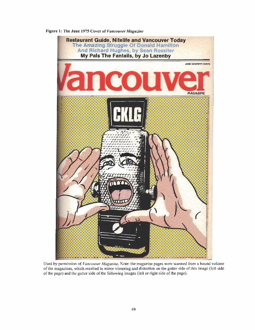
Figure 1: The June 1975 Cover of Vancouver Magazine ' P;. q r . k -. Q -
sstaurant ~ u i d e , Nitelife a n d i The Amazing Struggle Or Donard Hamilton
And Richard Hughes, by Sean Rossiter My Pals The Fantails, by Jo Lazenby
I
Used by permission of Vancouver Magazine. Note: the magazine pages were scanned from a bound vol of the magazines, which resulted in minor trimming and distortion on the gutter side of this image (left of the page) and the gutter side of the following images (left or right side of the page).
lume side
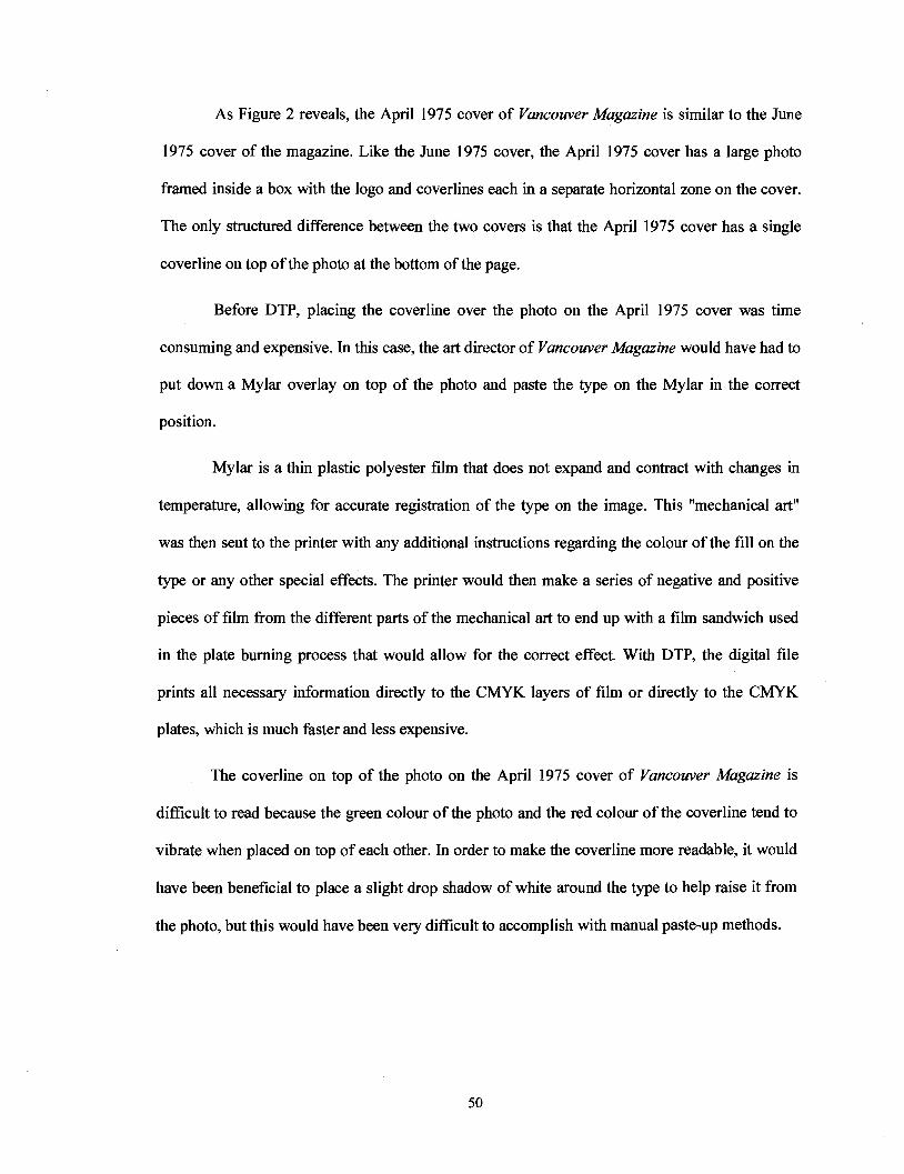
As Figure 2 reveals, the April 1975 cover of Vancouver Magazine is similar to the June
1975 cover of the magazine. Like the June 1975 cover, the April 1975 cover has a large photo
framed inside a box with the logo and coverlines each in a separate horizontal zone on the cover.
The only structured difference between the two covers is that the April 1975 cover has a single
coverline on top of the photo at the bottom of the page.
Before DTP, placing the coverline over the photo on the April 1975 cover was time
consuming and expensive. In this case, the art director of Vancouver Magazine would have had to
put down a Mylar overlay on top of the photo and paste the type on the Mylar in the correct
position.
Mylar is a thin plastic polyester film that does not expand and contract with changes in
temperature, allowing for accurate registration of the type on the image. This "mechanical art"
was then sent to the printer with any additional instructions regarding the colour of the fill on the
type or any other special effects. The printer would then make a series of negative and positive
pieces of film from the different parts of the mechanical art to end up with a film sandwich used
in the plate burning process that would allow for the correct effect. With DTP, the digital file
prints all necessary information directly to the CMYK layers of film or directly to the CMYK
plates, which is much faster and less expensive.
The coverline on top of the photo on the April 1975 cover of Vancouver Magazine is
difficult to read because the green colour of the photo and the red colour of the coverline tend to
vibrate when placed on top of each other. In order to make the coverline more readable, it would
have been beneficial to place a slight drop shadow of white around the type to help raise it from
the photo, but this would have been very difficult to accomplish with manual paste-up methods.
Figure 2: The ~pri l1975 Cover of Vancouver Magazine
MAGAZINI
Used by perm~ssion of Vancouver Magazine
The 1975 inside spreads of Vancouver Magazine have headings, subheadings, and body
text that alternate between a serif and sans serif typestyle. There is an abundance of boxes, rules,
and borders around type and images, especially in the service and departmental pages.
As Figure 3 shows, the February 1975 department page in Vancouver Magazine has a
series of boxes and rules around the type and images. The boxes and rules separate all elements
on the page from each other.
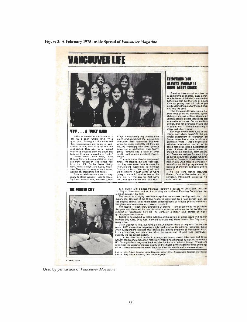
Figure 3: A Februarv 1975 Inside S ~ r e a d of Vancouver Magazine
WOW - Women of the World - IS no1 jusl a good female band. it's a good band. The e~gh l lunky ladies and the~r soundwoman ore based in Van- couver, meklng lheir mark on the clly Club Clrcull They wan1 to be booked into clubs because lhey are good. not because lhey are a novelty or "cute."
Valerle Hood. Linda Eklof. Twyla Brwks. RhondaJonesand Cathie Lloyd are from Vancouver. The others hail from the U.S - Debb~e Bates. Kathy Dahl. Netti Delucch~. and Nancy Dacu- mas. They play an array of reed. brass, woodwind, percussion and gultar
Their vocal-dommanl style IS lunky soul a la Stevie Wonder. Roberta Flack. Sly Sloneand K I ~ I Dee, and the~r sound
I
IS I~ght. Occasionally they do miss a lew notes. and somtimes the instrumentr overpower their harmon~u. Bul even when the music is slightly off. they are visually appealing with lheir obvious enjoyment 01 perlormmg. their flashy. pretly feshicms and r lastc o l what could resull in some enceilenl c h m e grophy.
The girls know they've progressed since tirst starling out one year .go. bul they also know lhere IS r m for ~mprovernent. According l o manager Charles La Marr. W e are good, and we all believe in each other. so we're golng lo lnake il." And as one 01 the girls put 11. "The day we feel we're best, vre'll get 1narri.d mnd have kids."
Breathes lhora soul who h8s nu at wme lime or another. made a men orable dinner of British Columbia shaC fish, at no con but the time of digg* them up, prylng lhem on rocks or !p. eralh Lramo them out of tne sell ch~o and in lo~lh ioan?
~ h a l t h e s i coaslal waters are a I r e sure I~OM 01 clams. mussab, oyrloia shrlma crabs. 111 urchin&. a b o l w Ud w r i w s aquatii plants (%awed) gar l 1 mattar of course. &I superslilmm o e w t . and no1 evewane knows wm Is tDible and - mok importanfly - w h m and when it b so.
For those whose taste run8 to 8vCd things (and who's doesn??). lnr rn vincicd Oepnrlment of Recreation YU C o w ~ a t i o n h a 1 new brochure - Serstmrr Treats - t h a is choclr-bnd valuable tnlwrnalion MI ell oi *r mom creatures. p f w a supplementq sheel 04 thol r 44 places where ycc 8hOuld nor po warning, clam dipgag mtc. There am recipes lor 8uch IIinC e Ethel Crwther'v Qyaler Chowder. E 8 y crab CBsseroIe. Fned Mussels an6 K* Pickle. And there is synoptic k bmat ion on liahtng regulaliona. (h lreezing of shellfish, rod tides and p 1ame it.
It's free from Marine Resource Branch. Depl, of Recrealion and Can rewalion. Parliamenl Bulldings. We :oria. V8V 1x4.
REwrmm It all began with 1 Local lnllialives Program a couple o l years ago. Last yes the City of Vancouver to& up the funding via its Social Planning Department, an* is doing so agaln kf 1973.
TI?Q result IS a highly readable magazine on rnalters dealing with the Urbd cxperlence Content oi Ihe Urban Reader is generated by a four person slaff, ard Ihe orlQinal format (that relied upon condensations of arlicles printed elsewherel hes glven way to a review and research content.
Ten Issuer - each likely averaging 24-pages - an, expected to be published this yew. end there will be two hislorical specials to follow up on the eonsiderabls success of "Vancouver: Turn 01 The Century." a larger issue printed on higher quahly paper last summer
TWIU 10 be covered m 1975's editions o l lhie review of urban news and opinia
Urban Redder is free. but have a care. A Budden (load ot requmstl fo l the Cur rently 5.000 Circulation magazine mght wall overtax its printing resource#. Editac Anne Kloppenborg stresses t h n copies are always available a1 Vancouver Pubk
Used by permission of Vancouver Magazine
As Figure 4 shows, the article in the December 1975 issue of Vancouver Magazine has
three columns with type that is justified or aligned to both the left and right margins. Due to type
set in lines of equal length, some of the lines have more space between the words, while others
have noticeably less space between the words. There are large spaces between the words on the
second line at the top of the second column.
In addition to the loose lines of text, a number of lines have widows and orphans, a single
dangling word or short phrase at the end or beginning of a paragraph that appears at the bottom or
top of a paragraph or column. The widows and orphans create rivers of white space throughout
the type that interfere with eye movement from one line of text to the next, as well as create an
unbalanced appearance.
In 1975, Vancouver Magazine did not have the in-house technology to deal with such
minor problems as widows and orphans and loose lines of text in paragraphs, columns, and pages.
To adjust such pagination errors, the magazine had to send the page to a typesetter to manipulate
and reset the type, which was expensive and time-consuming.
The introduction of later versions of electronic page-layout programs such as PageMaker
4.0 included automatic controls to help prevent pagination errors such as widows and orphans and
loose lines of text. The automatic controls added extra space at the beginning or end of a page or
paragraph, forcing the text that might otherwise split to remain together on a page. Other DTP
tools to prevent widows and orphans and loose lines of type included tracking, letter spacing, and
character spacing.
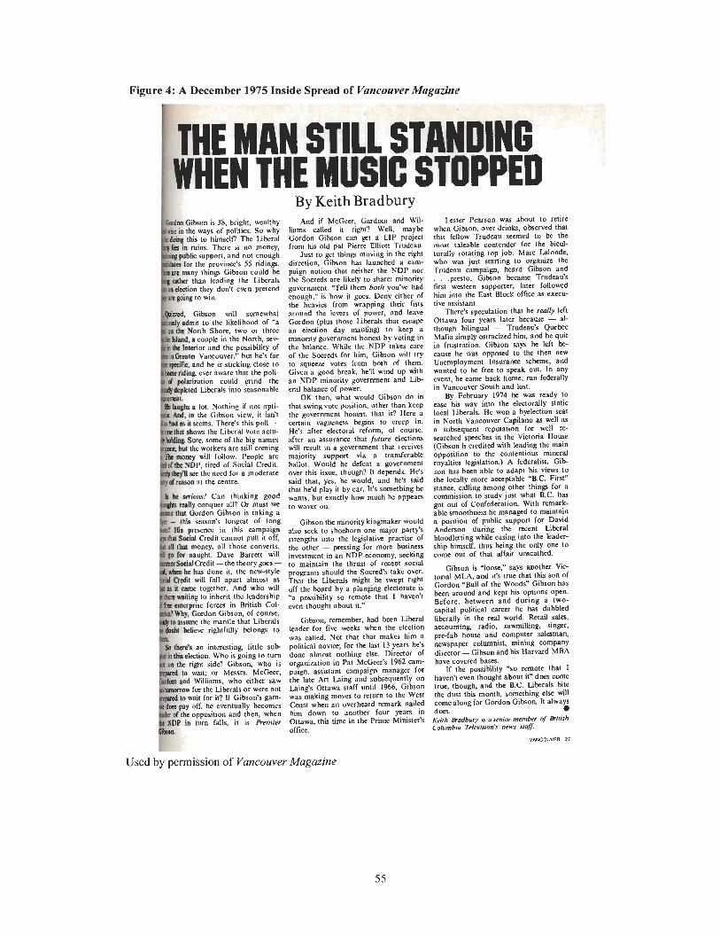
Figure 4: A December 1975 Inside Spread of Vancouver Magazine
: [- By Keith Brad bury
on is 38. bright. wealthy And if McGeer. Gardom and Wid- Lcster Pearson was about to relire ways of politics. So why liams called it right? Well. maybe whcn Gibson, over drinks. observed that to himself? The liberal Gordon Gibson can get a LIP project this fellow Trudeau seemed to be the
ins. There is no money, from his old pal Pierre Elliott Trudcau. most saleable contender for the bieul- support, and not enough Just to get thine moving in the right turally rotating top job. Marc Lalonde.
for the province's 55 ridingr. direction, Gibson has launched a cam- who was just starling to organize the thing Gibson could be paign nolion that neither the NDP nor Tmdeau campaign, heard Gibson and n leading the Libcrals the Soereds are Likely to share: minority . . .presto. Gibson became Trudeau's hey don't even pretend government. T e l l them both you've had first watcrn supporter. later followed
enoush." is how it g m . Deny either of him into the East Block office as exmu- the hcavics from wrapping their fists live assistant.
on will somewhat around the levers of power, and leave There's speculation that he really left the likelihood of 'a Gordon (plus those Liberals that escape Ottawa four years later because - al-
Shore, two or three an election day mauling) to keep a though bilingual - Trudeau's Quebec ple in the North. xv- minority government honest by voting in Mafia simply ostracized him, and he
ior and the possibility of the balance. Whiie the NDP takes care in frustration. Gibson say3 he Idt bc couver:' but he's far of the Socreds for him, Gibson will try cause he wvas oppoxd lo the then new
is sticking close to to squeeze votes from both of them. Uoemploymcnt Insurance scheme, and aware that the poli- Given a good break, he'll wind up with wanted to be free to speak Out. In any
could grind the an NDP minority government and L i b event, he came back home, ran federally Liberals into seasonable era1 balance of power. in Vancouver South and lost.
OK then. what would Gibson do in By February 1974 he Was ready lo lot. Nothing if not opti- that swing votc paition, other than keep ease his way into the electorally static Ihe Gibron view, it isn't the government honest, that is? Here a local Liberals. He won a byelection seat ems . There's this poll - certain vagueness begins to crcep in. in Noah Vancouver Capilano ar well as
bows the Liberal votc actu- He's d k r electoral rcform, of course, a subsequent reputation for well re- re, some of the big names after an assurance that jufurc elections searched speeches in the Victoria HOW e workers are still coming will result in a government that receives (Gibson is credited with leading the main Hill follow. Peopk are majority support via a transferable opposition to thc contenliots mineral
P, tired of Social Credit. hallot. Would he defeat a government royalties lcgialalion.) A federalist. G i b though? It depends. He's son hHs hen ahle to adapt his views to hc would, and he's said the locally more acceptable W.C. First" by car. It's something he stance. calling among other thin@ for a
tly how much he appears commission to study just what B.C. has got out of Confederation. With remark- able smoothness he mansged to maintain
'8 l0ng-t or long Gibson the minority kingmaker would a position of public support for DaAd in this also scck lo shoehorn one major party's Anderson during the recent Liberal
it Cannot Pull it off, strengths into the legislative practise of bloodletting while easing inlo the leader- Y, all those the other - pressing for more business ship himself. thus being the only one to
aught. Dave Barrett will investment in an NDP economy, seeking come out of that affair urucathed. Credit -the theory goes - to maintain the thrust of recent socid has done it. the newstyle programs should the ~ ~ ~ ~ ~ , j + ~ lakc over, Gibson is 'loose:' says mother Vie- will fnll apart almost as ~h~~ the ~ i b e ~ d ~ might be right torial MLA, and it's true that this son of e together. And who will off board by a plunging is Gordon 'Bull of the Woods" Gibson has
it the leadership possibility so remote thnt I havenvt been around and kept his options open. in British Col- even thought about it." Bcforc, between and during a two-
capital political career he has dabbled tle that Liberals Gibaon, remember. had been Liberal liberally in the real world. Retail Sale,
rightfully belong to leader for five weeks whcn the election accounting, radio, sawmilling, singer. was called. Not that that makes him a prefab house and computer s thman.
interesting, little s u b political novice; for the last 13 years he's newspaper columnist, mining company n. Who is going to turn done almost nothing else. Dircclor of director - Gibson end hi Harvard MBA side? Gibson, who is organimtion in Pat McGeer's 1962 cam- have covcred b ~ . ; or Messn. McGeer, paign. assistant campaign manager for If the possibility P o remote that I
ms, who either saw the late Arl Laing and sabsequently on haven't even thought about itw does Wme e Liberals or were not LaingS Ottawa staff until 1%6, Gibson true, though, and the B.C. Liberals bite r it? If Gibson's gum- was making moves to return to the West the dust t h i month, xomcthing else d l c eventually becomes Coast when an overheard remark nailed came along for Gordon Gibson. It always
sition and then, when him down to another four F a n in does. 0 in turn falls, it is Pkmier Ottawa, this limc in the Prime Minister's Keith fbadbury u asenlor member c?f a i h h
office. Columbia Trlrvisinn's nms sfq0:
VANCOWER 27
Used by permission of Vancouver Magazine
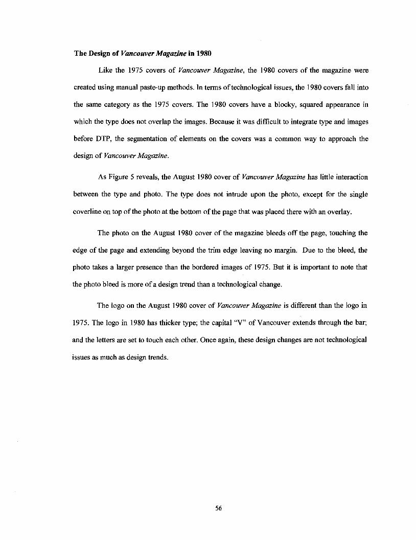
The Design of Vancouver Magazine in 1980
Like the 1975 covers of Vancouver Magazine, the 1980 covers of the magazine were
created using manual paste-up methods. In terms of technological issues, the 1980 covers fall into
the same category as the 1975 covers. The 1980 covers have a blocky, squared appearance in
which the type does not overlap the images. Because it was difficult to integrate type and images
before DTP, the segmentation of elements on the covers was a common way to approach the
design of Vancouver Magazine.
As Figure 5 reveals, the August 1980 cover of Vancouver Magazine has little interaction
between the type and photo. The type does not intrude upon the photo, except for the single
coverline on top of the photo at the bottom of the page that was placed there with an overlay.
The photo on the August 1980 cover of the magazine bleeds off the page, touching the
edge of the page and extending beyond the trim edge leaving no margin. Due to the bleed, the
photo takes a larger presence than the bordered images of 1975. But it is important to note that
the photo bleed is more of a design trend than a technological change.
The logo on the August 1980 cover of Vancouver Magazine is different than the logo in
1975. The logo in 1980 has thicker type; the capital "V" of Vancouver extends through the bar;
and the letters are set to touch each other. Once again, these design changes are not technological
issues as much as design trends.
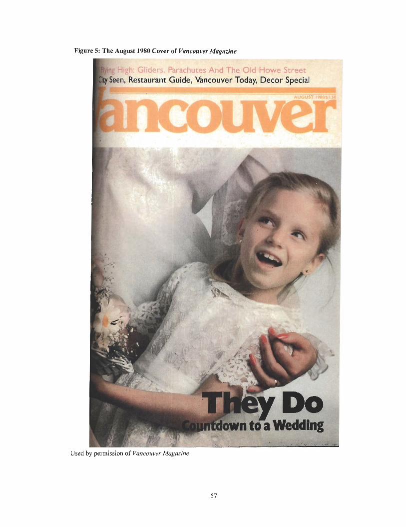
Figure 5: "' - ' igust 1980 Cover of Vancouver Magazine
I - la - - - -- r Y ? .
d - 5 t ~ig i i LJ C i ';;-XI;U;?S O ~ G I S&Y eer R,estauran+ Guide, v3ncouv- Tn,r5u Speck'
- -- - a -:A
Used by permission of Vancouver Magazine
Although the type and images are segregated into different areas on the 1980 covers of
Vancouver Magazine, these elements are not separated on the December 1980 cover of the
magazine. As Figure 6 shows, the type and image overlap on the December 1980 cover, therefore
providing greater interaction between the elements. The coverlines intrude upon the image, while
the image intrudes upon the logo. Since it was a common practice to have an image overlap a
logo prior to DTP, this points to how the technique was possible before the arrival of DTP.
The photo of the woman on the December 1980 cover of Vancouver Magazine is
surrounded by a number of large, vivid coverlines in striking fonts, in multiple colours, in serif
and sans serif type, and in different sizes. The coverlines have broken out of the quiet, restrained
fonts into more varied and bolder voices.
Compared to the other 1980 covers of Vancouver Magazine, the December 1980 cover of
the magazine would have been more expensive to produce because of the multiple layers. The
December 1980 cover looks like it was created with a DTP system, but obviously it was not
because DTP had not yet arrived into the mainstream design industry. The December 1980 cover
shows how the paste-up technology of the time was becoming more sophisticated and how the
film houses were able to handle many things through sophisticated film techniques.
Figure 6: The December 1980 Cover of Vancouver Magazine
i !I1 I Want fo, hrist mas.,,
kery Can uo
Worth 1
LC. l
C Used by permission of Vancouver Magazine
As Figure 7 reveals, the April 1980 inside spread of Vancouver Magazine is set in three
columns with rules separating each column. The typesetting house built the whole page of this
inside spread with the bars between the text, type, drop cap, and dingbat. These elements were
pasted down and then the photo was dropped into place.
There is more variety in the layout with the inclusion of a greater amount of white space
in the upper right hand comer and a larger photo that bleeds off the page. The increase in white
space makes the layout more visually appealing and easier to read by providing a resting space
for the eye and creating a contrast with the text on the page. These design changes are not so
much related to technology but to the design trend of the time. However, it was quicker and easier
to make such changes with the arrival of DTP.
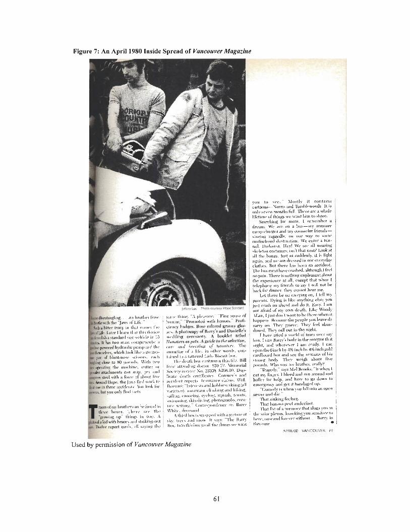
Figure 7: An April 1980 Inside Spread of Vuncouver Magazine
APRlUBO VANCOUVER 6"
Used by permission of Vancouver Magazine
As Figure 8 shows, the November 1980 inside spread of Vancouver Magazine has the
same problem as the 1975 inside spreads of the publication with widows and orphans and loose
lines in typography.
The November 1980 inside spread of Vancouver Magazine has several drop caps, capital
letters larger than the standard text size set into a block of text at the beginning of a paragraph
with one or more lines indented to accommodate the large letter. The drop caps create graphic
interest, attract attention, and enhance the appearance of the page.
The drop caps are basic because they are boxed off from the block of text to the right of
the drop caps. The block of text to the right does not fit around the contour of the initial letter,
therefore leaving a large white gap between the drop cap and the block of text. This is somewhat
problematic because it is unclear whether the large initial letter is itself a word.
With the large capital A, the text does not mimic the slope of the A because it was
difficult to achieve this with manual paste-up methods. With paste-up, the drop cap was placed on
a piece of paper and pasted up, then the block of text was placed on a separate piece of paper and
pasted up, and then the lines of text around the drop cap were sliced apart so that each line could
be moved over individually beside the drop cap.
With the November 1980 inside spread of Vancouver Magazine, the pull quote in the
middle of the page is not centered properly in the box. The spacing around the pull quote is
unusual in that there is more spacing at the top of the quote than at the bottom of the quote.
Because the page was set on a typesetting machine, it was difficult and time-consuming to cut the
lines apart and slide them up as opposed to DTP methods. But with the arrival of DTP, the art
director could quickly and easily move the quote up in order to leave more space at the bottom.
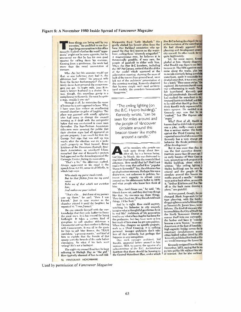
Figure 8: A November 1980 Inside Spread of Vartcouver Magazine
T hew Chlngr; are bclnl; add by my e~wmies.'hc conf~dod ta nwdur. ihg a h a ~ w ~ v e w l i o n in hll omce
recently. I asked whether t b word "oppo nents" might not be more apposite. hut he convinced me that he has his own gnod reasons for calling thcnl his enemies. Coining from a gentlemnn, the work had morc than the usnal connotation ol menace.
\% else hut his enemies would say that. as one ludicrous story had it. the aldcrmnn had "stolen" his prcscnt wife from the forn~er harbormt~ster? This cer- tainly shows how personnl the rumormon. gers can g e t To I@n with. Jtmn Ken- nedy's former hushand is n doctor In a way, though. this scurrilous gossip is a compli~ncnt to Kennedy, Hc must hc quite R man. wouldn't you say?
Through it all. he mnintnins thc scnsr ofhumor he is not supposed to have. Why. I have seen him retlucc an ovcrflowinpl council charnher to gales of Inughtcr. Tht place wns jnmmed with s e n 1 6 ngitatnr? who had come to disrupt the council meeting as it dcalt with the anti-postel bvlaw that wac overturned in court soon thereafter. The Non-Partisan Association aldermen were assuring the puhlic thal their election s i p s had all nppeared on private property. I can vouch for that: the George Puil sign that svnr still up twc weeks after the election was on a junk- yartl's propcrty on \Vest S~wond. Bruce Erickwn of the Downtown Eastside Resi- dents Association, an ~mrefinctl fellow, rcmarked that one of Ken~~edy'x poster? had appeiuetl on the s l~rout l ingnro~~r~d the Carnegir Center during its renovation.
'That's n lie," the alderman replied. Always uppermost in his mind is tht speech from Act Ill, scene iii of'Othello, in which lago says:
\Ylw ntenlr my puwe .vted~ t m s h . . But he lllnt J7lchc.s jrnm ine my guotr nu111L' Rulm 111e u j .!hat ~olt ir l~ no1 o~r i rhe , him. Arid n ~ a k c ~ me pwr i~tdeerl.
' lhat 's a lie. . . But if one of n ~ y posters LW up there," he said. "then I was rramed." Just in w e anyone iu the 3ha1nbcr missed it amid the laughter. he repeated it: "I wasfiamerl."
H e call console himself with the snrc mowledge that they only h t h e r to frame ! l ~ e great ones. It is his reward for Iwing brthright. It takes a cerhin kind of ~uniption to call another a lc le r~na~~ a Communist awl sny that another is flirting with Comrnun~sts. It wils all in the garlie 'or him to call htey Brown, the TEAS1 m~dida te , "a prnyiug ~nantis," and kind of him to explain that the female of that species eats the b w r l s of the 11131e hefr~rr mpulation. So whnt if his fact* wcrr wrong'? He's not a I~iuIo!tist.
The night ci tyco~~ncil liredhcr. he kept r k r r i n g to Shcbgh Day as 'thc girl." How typiually c h i e n l d him to dl Md.
Used by permission of Vancouver Magazine
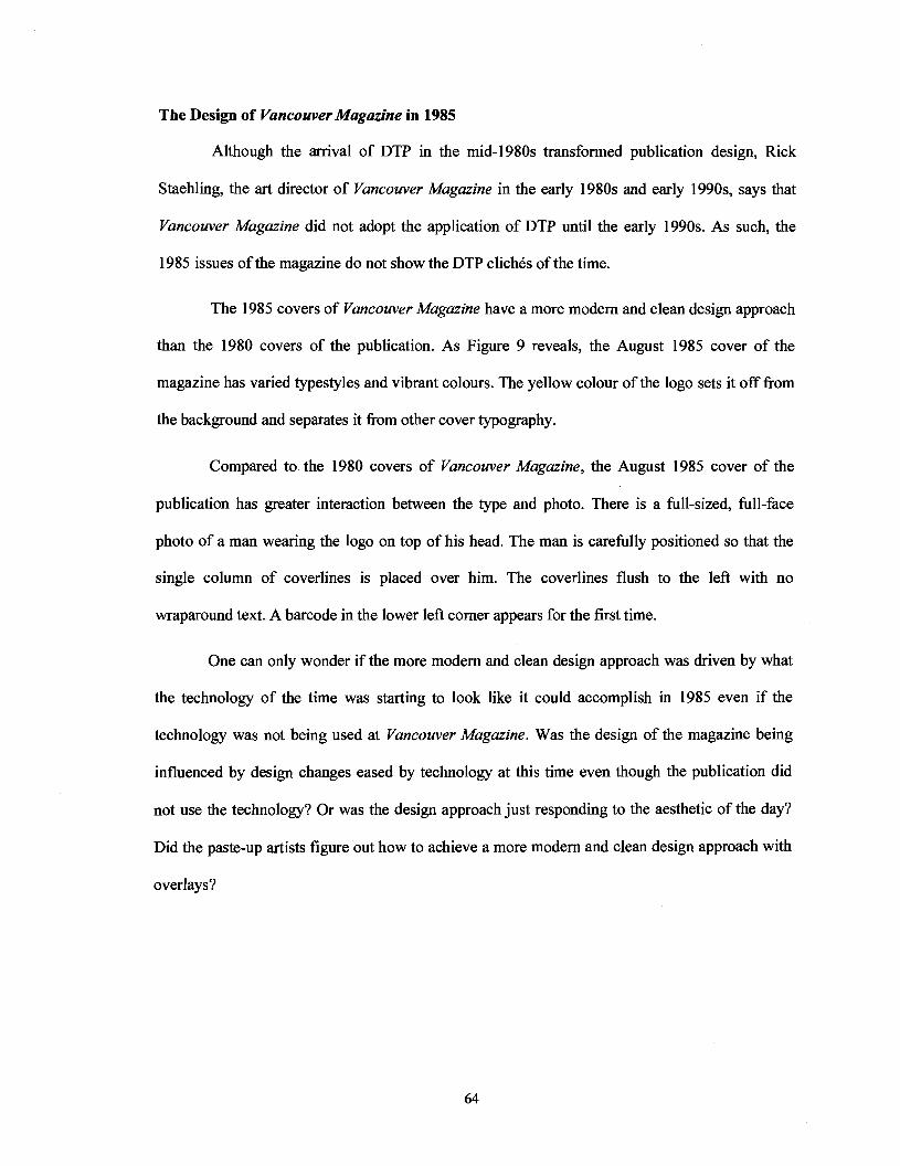
The Design of Vancouver Magazine in 1985
Although the arrival of DTP in the mid-1980s transformed publication design, Rick
Staehling, the art director of Vancouver Magazine in the early 1980s and early 1990s, says that
Vancouver Magazine did not adopt the application of DTP until the early 1990s. As such, the
1985 issues of the magazine do not show the DTP clichCs of the time.
The 1985 covers of Vancouver Magazine have a more modern and clean design approach
than the 1980 covers of the publication. As Figure 9 reveals, the August 1985 cover of the
magazine has varied typestyles and vibrant colours. The yellow colour of the logo sets it off fiom
the background and separates it fiom other cover typography.
Compared to the 1980 covers of Vancouver Magazine, the August 1985 cover of the
publication has greater interaction between the type and photo. There is a full-sized, full-face
photo of a man wearing the logo on top of his head. The man is carefully positioned so that the
single column of coverlines is placed over him. The coverlines flush to the left with no
wraparound text. A barcode in the lower left corner appears for the first time.
One can only wonder if the more modem and clean design approach was driven by what
the technology of the time was starting to look like it could accomplish in 1985 even if the
technology was not being used at Vancouver Magazine. Was the design of the magazine being
influenced by design changes eased by technology at this time even though the publication did
not use the technology? Or was the design approach just responding to the aesthetic of the day?
Did the paste-up artists figure out how to achieve a more modern and clean design approach with
overlays?
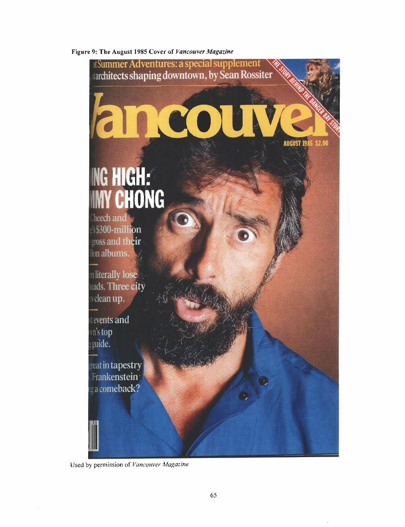
9: The August 1985 Cover of Vancouver Magazine
Used by permission of Vancouver Magazine
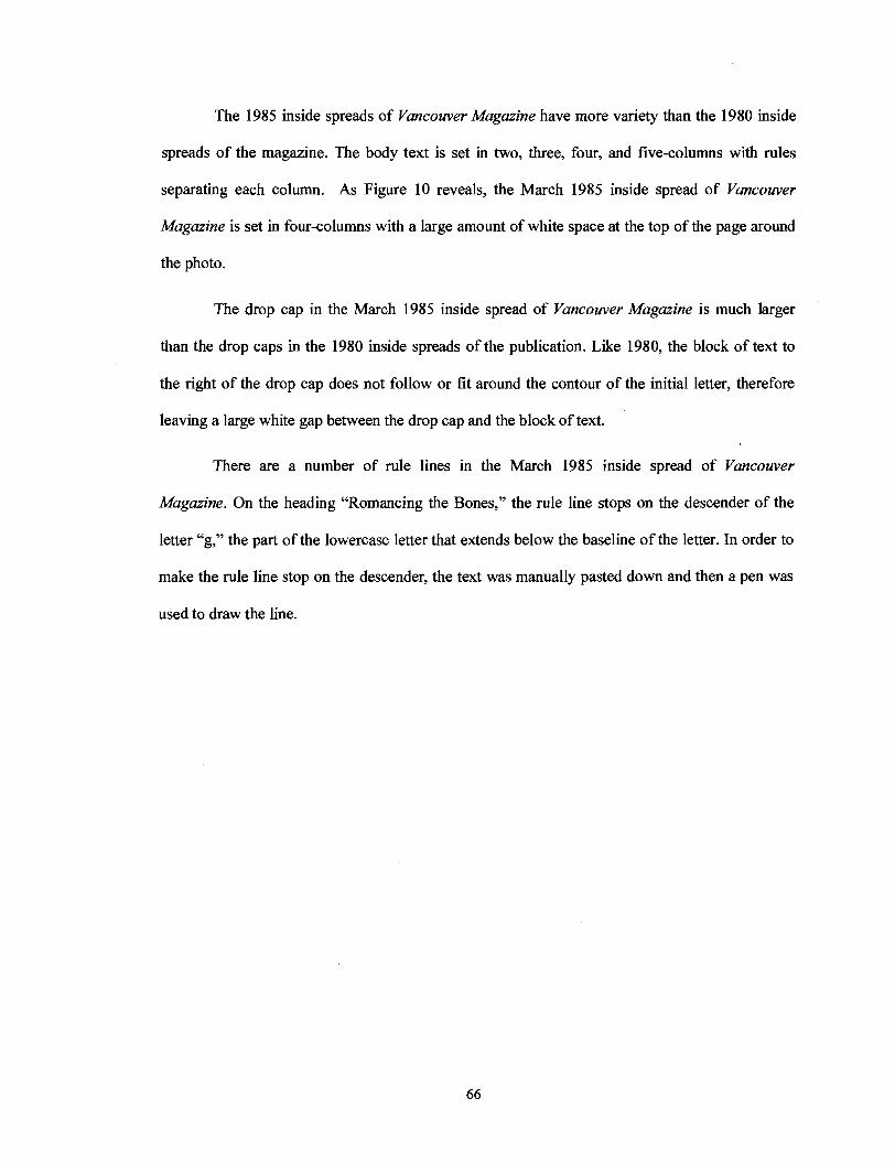
The 1985 inside spreads of Vancouver Magazine have more variety than the 1980 inside
spreads of the magazine. The body text is set in two, three, four, and five-columns with rules
separating each column. As Figure 10 reveals, the March 1985 inside spread of Vancouver
Magazine is set in four-columns with a large amount of white space at the top of the page around
the photo.
The drop cap in the March 1985 inside spread of Vancouver Magazine is much larger
than the drop caps in the 1980 inside spreads of the publication. Like 1980, the block of text to
the right of the drop cap does not follow or fit around the contour of the initial letter, therefore
leaving a large white gap between the drop cap and the block of text.
There are a number of rule lines in the March 1985 inside spread of Vancouver
Magazine. On the heading "Romancing the Bones," the rule line stops on the descender of the
letter "g," the part of the lowercase letter that extends below the baseline of the letter. In order to
make the rule line stop on the descender, the text was manually pasted down and then a pen was
used to draw the line.
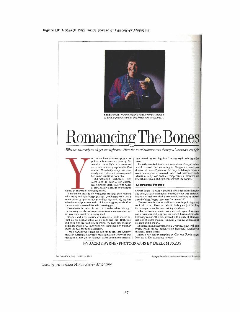
Figure 10: A March 1985 Inside Spread of Vancouver Magazine
Y ou do not have lo dress up, nor are polire table manners a priority. No wonder ribs at Hy's oral home are so tlrndy. A survey reported in Re.s rurrrmrr Hospirdiry magazine says nearly one restaurdnl in Iwo now of. frrs some variety of pork ribs.
Old-fashioned barbecued ribs seem lo be the favorire, parlicularly real Southern style. involving hours ofslow, smoky cookingovc~~spccial
woods in enormous barbecueovens. Ribs can be dressed up with apple stutling. then roasted
with herbs and light butter basling. Or Chinese style. with sweet-plunl or apricot sauces and hot ITIusVdrd. My mother added mashedpolatoesand a thick lomatogravy madeafter the meat was removed fmm Ihr roasting pan.
Coleslaw is the saladofchoice. Use ~ t d or whirccabbugc: the dressing may be as simple as sour-cream masonnaisc or as involved as cooked caraway wed.
Shapes and sizes include country-style pork spareribs. thick pieces best attacked wi~h a knife and fork. Both side and back ribs are sold in long strips, the back ribs mcaticr and molt cxpensivc. Baby back ribs from specially bulchzr shops are best for cocklail panics.
Three Vancouver shops for top-grade ribs are Quality Meats in Kerrisdale. Hycrest MralsunSouthGranvilleand Jackson's Meats on 4th Avenue. Most cookbooks suggesl
Used by permission of Vancouver Magazine
As Figure 11 shows, the November 1985 inside spread of Vancouver Magazine has a
larger drop cap, heading, subheading, and pull quote. These elements are in bolder colours, in
more striking fonts, in serif and sans serif type, and in different sizes.
For the first time, the drop cap in the November 1985 inside spread of Vancouver
Magazine is above the block of text to the right, as well as lined up with the byline, the short
phrase that indicates the name of the author of the article.
The byline and pull quote, a small selection of text pulled out and quoted in larger
typeface, cross over the photo on the right to attract attention. Letraset was not used to set the
byline and pull quote, but instead these elements was pasted down on a piece of overlay and then
placed over the photo.
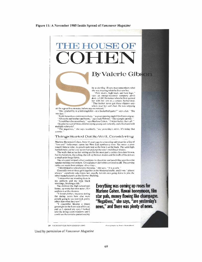
Figure 11: A November 1985 Inside Spread of Vancouver Magazine
THE HOUSE OF ]
COHEN . he is dcr::Ltg. Every man remembers what she wxs wearing when IIC first saw her.
"Pink shorts. high l~ecls and bare legs." says an energy-resource company presi- dent. a UBC freshman when he first spotted her with her son in a campuh barhershop. "'That bnrbcr ncvcr got those clippers any- where near her son's hair. He was saiaoine. . . -
air for a good five minutes before anyone noticed." "She swished by in a full-lengrh fur-at a basketball game!" says a fan. "She
was lale." 'Gold-lan~edresscutdownto thcre." saysan opening-night Film Festival goer. "All suede and leather and boots." says Jack\Vebster. "like ajunglc animal." "lcould havebeenanybody." saysMarleneCohen. "l'mjusl lucky. that'sall." Despitetwooul ofthreechildren dying youngand violcntly.:lnda husbnnd with
multiple sclerosis? "The negatives." she says resolulcly. "arc yeslcrday's news. It's loday that
counts."
Things Started Out So Well, Considwing
Marlene Bernstein Cohen. born 53 years ;yo to a t~aveling salesman for a line of "low-end" ladieswear. opens her West End penthouse door. She wears a pink- roned Chinese robc. its peach sash tied so the bow is at the back.l'hc siltin high- heeled mules on her size-seven feet pick up the robe's multihued shades.
The walls that act as her selling are for the mosl part a satiny chocolate brown. but the furniture, thecciling.the roll-upRon~an shadesand the wallsofthedenare a sniall-print beige fabric.
She sits amid striped velvet cushions in chocolate and pcitcl~ like your Cavorite sundae meltingeverywhere. Crystal piecesdot tablescoveredin silk.Thc serving tables are made Rnm antique-silver trays.
"I hitchhiked toschoolevery morning." she says. "11 wils safe." Generally twoor threegirls together it] the Montreal traffic, andjt was "almost
always" somebody who knew her. usually Jewish men going down to join the othermanufaclurersat rhe Hermes Building.
"I remember me strndingthcre in mv unifurm and mv lone black , b,
stockings. hitchinga ride." She disliked the high-school uni-
forms. so wrote her own notes: Hcr utrfonn is or rhc ckennrrs.
"I loved clothes. because duriug the dating ycars how clse were people going to see you look prelly otherthan what they saw'?"
"I remember kissing a [dale] goodnight in the front seat of hisear. and as 1 opened my eyes I looked into the living-room windows ilnd I
By Valerie Gi
I
Everythmg was coming up roses for Matiene Cohen. Hawaii hone- film star pals, money flowing like pam- "Nega~vesY d e says, j Z L a f s news," and there was plenty d! n e w
could see t h c ~ u r t a i n ~ ~ a r t e d i ~ n d m ~ A . . , . , .
;?H \'ANCX)U\'EIt SO\'I<X1IIIFII l t )H3
Used by permission of Vancouver Magazine
The Design of Vancouver Magazine in 1990
The year 1990 marks a dramatic change in the design of Vancouver Magazine. Staehling,
the art director at the time, oversaw the introduction of the Macintosh computer and DTP
software. The change from typesetters and paste-up techniques to computers and digital
production technology was a transition period for Vancouver Magazine. Although the magazine
had access to a full range of DTP tools, it still used paste-up methods occasionally throughout the
early 1990s to supplement the capabilities of early DTP.
As Figure 12 and Figure 13 reveal, the January and February 1990 covers of Vancouver
Magazine are more varied than the 1985 covers of the magazine. There is an increase in the use
of fonts, typestyles, and colours, as well as a broad range of typographical treatments such as
bolder and italicized type. The new type choices are contemporary and more appropriate than the
generic fonts of previous years. The change in type choices is consistent with the increased
potential of DTP to manipulate type.
Before DTP, the typesetter was responsible for setting type on lead casting machines. If
the art director wanted to change the type on a page of Vancouver Magazine, the art director had
to send the page to the typesetter to have the type reset, which was expensive and time-
consuming. With the arrival of DTP, computers and page-layout software made it possible to
manipulate digital fonts and do in minutes what once took typesetters hours, even days, to
accomplish. For the first time, typographic experimentation was easy and immediate.
The type on the January and February 1990 covers of Vancouver Magazine is placed
prominently on top of the photos. As such, there is significant interaction between the design
elements. The covers have a number of coverlines over the photos that are either flushed right,
flushed left, or centred. The largest coverlines are set off graphically from the other coverlines
with a distinctive size, colour, and font treatment, while the secondary coverlines step down in
importance to avoid competing with other elements on the cover.
The logo on the February 1990 cover of Vancouver Magazine is placed underneath the
photo, while the logo on the January 1990 cover of the magazine is placed over the photo. The
people on the January 1990 cover are wearing the logo on their foreheads.
In addition to a major font change on the logo of the January and February 1990 covers
of Vancouver Magazine that may or may not have been available before DTP, there is a drop
shadow around the logo for the first time. The drop shadow creates the 3D illusion that the type is
standing out from the background and casting a shadow. Because it was very difficult to create a
drop shadow before DTP, the fact that a drop shadow appears on the logo of the January and
February 1990 covers of Vancouver Magazine is significant. The presence of a drop shadow
indicat'es the use of DTP.
It is possible to see through the images to the underlying background on the January and
February 1990 covers of Vancouver Magazine. The February 1990 cover has a photo of a woman
with her head over the logo and it is possible to see through her hair so that the background shows
through. Before DTP, it would not have been possible to see through the image to the underlying
background. The image would have been opaque, crossed over the top of the logo, and covered
the underlying background. The paste-up artist would have had to cut all the fuzzy part of the hair
off to create a clean edge around the hairline.
With the arrival of DTP, the art director of Vancouver Magazine was not limited to
having a clean cut along the hairline of the woman. With Photoshop, it was quick and easy to
delete the area surrounding the image and then save the image as a transparent GIF format. This
not only allowed for the underlying background to show through, but it also opened up numerous
possibilities for artistically combining images, backgrounds, and text. The fact that it is possible
to see through the images on the January and February 1990 covers of Vancouver Magazine is a
function of DTP.
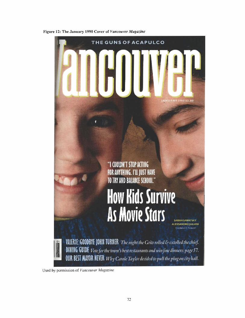
Figure 12: The January 1990 Cover of Vancouver Magazine
T H E GUNS OF ACAPULCO
"I (OUlDH STOP HIHG , . . [OR AHYTHIHG. I'll JUST HRVt
8;' TO TRY AND BAIAMt S(N001."
r.5 SARAH SAWTSKY I 1
L - ALESSANDROJULIANI 1
= . -
DIUIN 6 GUID[ ~ot&or,.thr m u d s be&*urantsand &t$&dhtners:p'ag.V. I
Used by permission of Vancouver Magazine
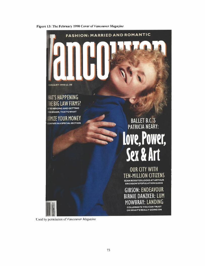
Figure 13: The February 1990 Cover of Vancouver Magazine
FASHION: M A R R I E D AND ROMANTIC
!HAT'S HAPPENING I aWWERGtHG IHEBIG LAW ANDGETnNG FIRMS! .
%NBIEOER.THATS WHAT
llMlZE YOUR MONEY , A
WNPAPEINASPECIALSECTIDN
:A
b BALLET B.& PATRICIA N EARY: =.
1' bve, Power, OUR CITY W I T H
TEN-MI LLION CITIZENS SEAN ROSITER LOOKS AT ARTHUR
E R I C W S POPUIATION GUESS
GIBSON: ENDEAVOUR BlRNlE DANZKER: LUM MOWBRAY: LANDING
COLUMNISTS YOU CAN TRUST ON WHAT'S REALLY GOING ON
Used by permission of Vancouver Magazine
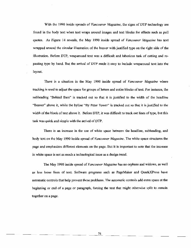
With the 1990 inside spreads of Vancouver Magazine, the signs of DTP technology are
found in the body text when text wraps around images and text blocks for effects such as pull
quotes. As Figure 14 reveals, the May 1990 inside spread of Vancouver Magazine has text
wrapped around the circular illustration of the beaver with justified type on the right side of the
illustration. Before DTP, wraparound text was a difficult and laborious task of cutting and re-
pasting type by hand. But the arrival of DTP made it easy to include wraparound text into the
layout.
There is a situation in the May 1990 inside spread of Vancouver Magazine where
tracking is used to adjust the space for groups of letters and entire blocks of text. For instance, the
subheading "Behind Bars" is tracked out so that it is justified to the width of the headline
"Beaver" above it, while the byline "By Peter Tower" is tracked out so that it is justified to the
width of the block of text above it. Before DTP, it was difficult to track out lines of type, but this
task was quick and simple with the arrival of DTP.
There is an increase in the use of white space between the headline, subheading, and
body text on the May 1990 inside spread of Vancouver Magazine. The white space structures the
page and emphasizes different elements on the page. But it is important to note that the increase
in white space is not as much a technological issue as a design trend.
The May 1990 inside spread of Vancouver Magazine has no orphans and widows, as well
as less loose lines of text. Software programs such as PageMaker and QuarkXPress have
automatic controls that help prevent these problems. The automatic controls add extra space at the
beginning or end of a page or paragraph, forcing the text that might otherwise split to remain
together on a page.
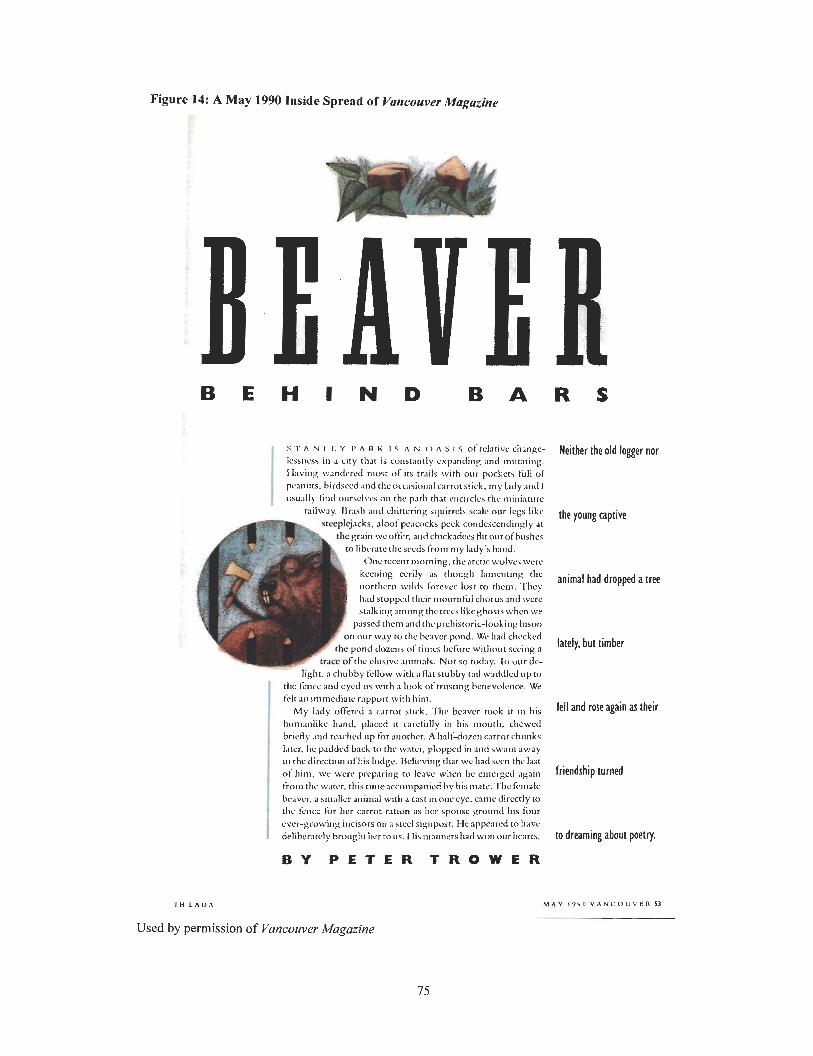
Figure 14: A May 1990 Inside Spread of Vancouver Magazine
H I N D
s T A N I. T: Y I' A R K I s A N o A s I s of rclattvc changc- l c u ~ ~ v a in i c ~ t y tliat is co~~stant ly crpmdirts m d rnwxing. Having wandcred must o f its trails with our pockets full of pcanuts. birdseed and the I ~ F C J S ~ O I I ~ carrorstick. my lady and I ~tsually b i d oursclvcs on the path that ct~c~rclcs thc tt~itriarurc
railway. I h s l ~ and chitccring squirrels scale olrr legs like steeplejacks. aloof pcacocks peck condcsccrtdingly at
thegrain wcol'kr, and chickadees Hit outofbushcs to libr.rarc thcscccla from nly lady's Innd. rn Oncrccenr morning, thearctic w o l v c ~ wcrc
keening eerily as though I;rmcnting the nortllcrn wilds hrcvcr lost to thcrn. 'Tlicy had stoppcd their nio~rrnfi~l chor t~s and were stalking among the trcrslikcghosts when we
passed them and tltcprcliistoric-looking bison on our way to the hcavcr pond. We had chcckcd I;hc pond dozens d t i n i o ; hdorc withoitr seCitig a
F t r a c e of the clusivc animals. Not so today. XI our dc- )I&. a chubby fcllow wit11 a Hat stubby tall wwidled up to
the kncc and eyed 11s with a look o f tnrsting bcnrvolence. We felt an irnmcdiatc rapport with hint.
My lady o K e r d a c:trrot slick. Tire bcavcr took it in his h~trnaniikc hdnd. placed it rarchlly in his rnouth. chcwcd brirfly and reached up for mother. A half-dozen carrot chunks later. hc paddod back to thr warcr, plopped in artd swat11 away In thc direction oftris lodge. Dclicving t h t we had ncm the Inqt o f him, we \vew preparing to leave when he cmcrgcd agnilr t iom the water. this tinleaccompanicd by his mate. The fc~nalc bc.rvcr. a srttallcr al~imal with a cast in one cyc. camc directly to thc icncc for her carrot ration as her spoi~sc proond his four ever-growin:: incisors on a stccl signpost. Hc appcircd to have deliberatrly brought her to us. His tttattlrers had wort our11c;irts.
B Y P E T E R T R O W E R
T l l L A D A
Used by permission of Vancouver Magazine
Neither the old logger nor
the young captive
animal had dropped a tree
lately* but timber
fell and rare again as their
friendship turned
to dreaming about poetry.
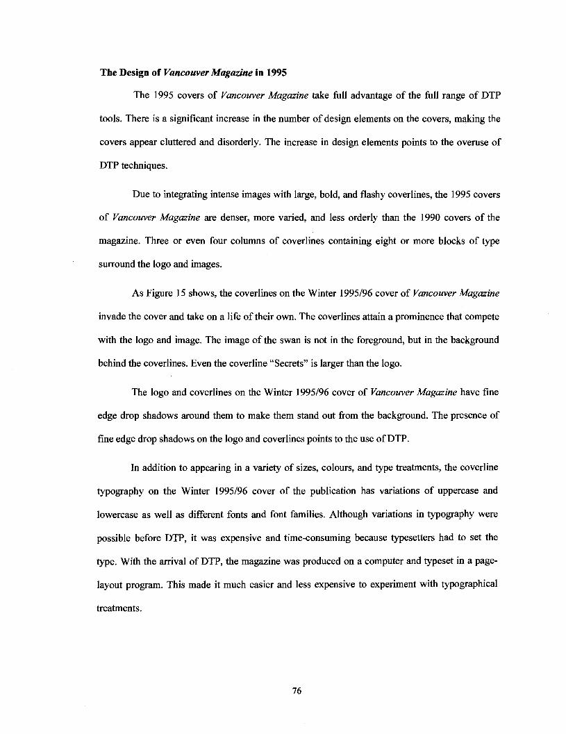
The Design of Vancouver Magazine in 1995
The 1995 covers of Vancouver Magazine take fill advantage of the fill range of DTP
tools. There is a significant increase in the number of design elements on the covers, making the
covers appear cluttered and disorderly. The increase in design elements points to the overuse of
DTP techniques.
Due to integrating intense images with large, bold, and flashy coverlines, the 1995 covers
of Vancouver Magazine are denser, more varied, and less orderly than the 1990 covers of the
magazine. Three or even four columns of coverlines containing eight or more blocks of type
surround the logo and images.
As Figure 15 shows, the coverlines on the Winter 1995196 cover of Vancouver Magazine
invade the cover and take on a life of their own. The coverlines attain a prominence that compete
with the logo and image. The image of the swan is not in the foreground, but in the background
behind the coverlines. Even the coverline "Secrets" is larger than the logo.
The logo and coverlines on the Winter 1995196 cover of Vancouver Magazine have fine
edge drop shadows around them to make them stand out from the background. The presence of
fine edge drop shadows on the logo and coverlines points to the use of DTP.
In addition to appearing in a variety of sizes, colours, and type treatments, the coverline
typography on the Winter 1995196 cover of the publication has variations of uppercase and
lowercase as well as different fonts and font families. Although variations in typography were
possible before DTP, it was expensive and time-consuming because typesetters had to set the
type. With the arrival of DTP, the magazine was produced on a computer and typeset in a page-
layout program. This made it much easier and less expensive to experiment with typographical
treatments.
The logo on the Winter 1995196 cover of Vancouver Magazine is different than the 1990
logo of the magazine in that it is smaller and set in capital letters. These design changes are
purely aesthetic not technological, but technology may have played a role to make the changes
possible.
For the first time, type sculptures appear on the Winter 1995196 cover of the magazine in
which different elements of type are laid on top of each other to build a sculpture. For example,
the coverline "Best bets" crosses over the coverline "Secrets," while the "t" in the coverline
"Secrets" crosses over the logo.
With manual paste-up methods, it was nearly impossible to create type sculptures
because there was no way to visualize the layout with type placed over type. But with the arrival
of DTP, computers and page-layout software made it possible to manipulate type and do in
minutes what once took typesetters hours, even days, to accomplish. As it was very difficult to
create type sculptures before DTP, the fact that type sculptures appear on the Winter 1995196
cover of Vancouver Magazine is significant. The presence of type sculptures in the design of the
magazine indicates the use of DTP.
Figure 15: The Winter 1995196 Cover of Vancouver Magazine
Used by permission of Vancouver Magazine
As Figure 16 reveals, the November 1995 cover of Vancouver Magazine is similar to the
Winter 1995196 cover of the magazine. The November 1995 cover has a jumble of coverlines
crowded closely together on the right side of the page. The cluttered coverlines are set in bold and
vivid typography, as well as in various sizes.
What is interesting about the November 1995 cover of Vancouver Magazine is the curved
text on the logo. The text on the logo flows along a curved line and communincates the height of
the cover model. The absense of curved text in issues of the publication before DTP points to how
it was difficult to create text on a curved line.
With the introduction of graphics programs such as Illustrator and Photoshop, the art
director of Vancouver Magazine could easily create text on a path using vector-drawing tools.
Once the path was created in the desired shape, the text was applied to the path, following the
shape of the path. The path was removed, leaving the curved text. The presence of curved text on
the logo of the November 1995 cover of Vancouver Magazine points to the use of DTP.
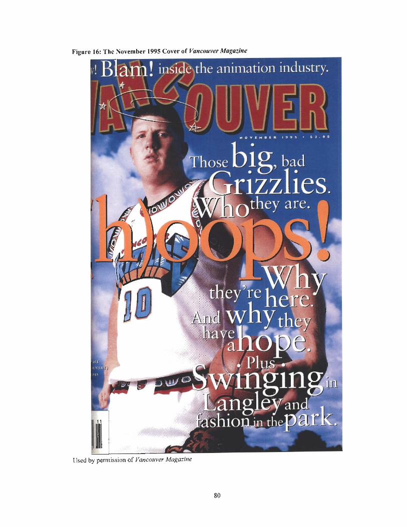
Figure 16: The November 1995 Cover of Vancouver Magazine
the animation industiy. -' *- -, -$ ,!L" 7 , ' r - -7 I
Used by permission of Vancouver Magazine
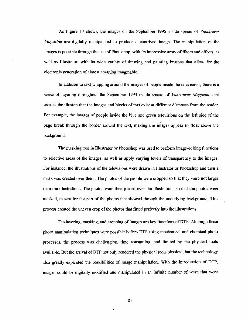
As Figure 17 shows, the images on the September 1995 inside spread of Vmcouver
Magazine are digitally manipulated to produce a contrived image. The manipulation of the
images is possible through the use of Photoshop, with its impressive array of filters and effects, as
well as Illustrator, with its wide variety of drawing and painting brushes that allow for the
electronic generation of almost anything imaginable.
In addition to text wrapping around the images of people inside the televisions, there is a
sense of layering throughout the September 1995 inside spread of Vancouver Magazine that
creates the illusion that the images and blocks of text exist at different distances from the reader.
For example, the images of people inside the blue and green televisions on the left side of the
page break through the border around the text, making the images appear to float above the
background.
The masking tool in Illustrator or Photoshop was used to perform image-editing functions
to selective areas of the images, as well as apply varying levels of transparency to the images.
For instance, the illustrations of the televisions were drawn in Illustrator or Photoshop and then a
mask was created over them. The photos of the people were cropped so that they were not larger
than the illustrations. The photos were then placed over the illustrations so that the photos were
masked, except for the part of the photos that showed through the underlying background. This
process created the uneven crop of the photos that fitted perfectly into the illustrations.
The layering, masking, and cropping of images are key functions of DTP. Although these
photo manipulation techniques were possible before DTP using mechanical and chemical photo
processes, the process was challenging, time consuming, and limited by the physical tools
available. But the arrival of DTP not only rendered the physical tools obsolete, but the technology
also greatly expanded the possibilities of image manipulation. With the introduction of DTP,
images could be digitally modified and manipulated in an infinite number of ways that were

previously impossible to produce physically. The level of sophistication of image manipulation
vastly increased with the arrival of DTP.
Figure 17: A September 1995 Inside Spread of Vancouver Magazine
Used by permission of Vancouver Magazine
As Figure 18 reveals, the March 1995 inside spread of Vancouver Magazine has a large,
splashy, and dramatic image that has been altered using computer program tools and software. A
number of photos have been combined into a single image to create a photomontage.
Before DTP, the art director of Vancouver Magazine would have had to use a sharp
instrument such as a pair of scissors or a scalpel to cut the edges of the photos and then paste
them down on top of each other. But the joining and compositing of photos to create a
photomontage became much quicker and easier digitally.
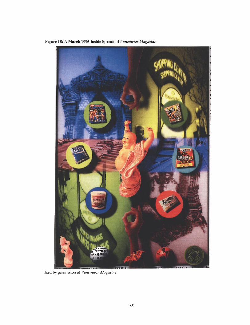
Figure 18: A March 1995 Inside Spread of Vancouver Magazine
Used by permission of Vancouver Magazine
Summary
This section has examined the design of Vancouver Magazine from 1975 to 1995 at five-
year intervals in relation to changes in digital production technologies. Using DTP as a
technological benchmark to evaluate the impact of technology on the design of the magazine
highlights the differences before and after the arrival of DTP in the mid-1980s. The design
elements that indicate the use of DTP such as drop shadows and wraparound text were criteria
used to evaluate the relationship between digital production technologies and the design of
Vancouver Magazine.
This section has cited numerous examples of design effects that were easily done on a
DTP system that changed the visual appearance of Vancouver Magazine. These examples are
strong evidence for the notion that DTP encouraged a difference in the visual appearance of the
publication.
With the advent of DTP, the design of Vancouver Magazine had a more interesting
approach to art. For instance, there was an increase in the use of type sculptures, drop shadows,
wraparound text, type over images, inset photos, outline type, and curved text - all of which
represented the new functionality and aesthetic potential of the technology.
There was a decrease in the presence of orphans and widows and loose lines in
typography in the design of Vancouver Magazine with the introduction of software programs that
allowed for the manipulation of type. There were more orphans and widows and loose lines in
typography before DTP than after the arrival of the sophisticated technology.
With the adoption of DTP, there was an almost limitless flexibility and variety to the
design of Vancouver Magazine. There was an increase in distinct typography in which a number
of different typefaces were used in various combinations. The different typefaces served as a
contrast to the traditional typefaces of the past and modernized the appearance of the design.
Although different typefaces were used before DTP, they involved photomechanical
processes that were slow and expensive. The introduction of DTP created a market for digital
type that provided easier access to it.
It is possible that the increase in different typefaces was representative of a design trend,
but technology certainly accounted in part for the increase in different typefaces. Because type no
longer needed to be set and reset at the typesetters with DTP, it was possible to experiment with
type using graphics software such as Photoshop and Illustrator.
With the arrival of DTP, Vancouver Magazine was more expressive in its use of images
and colour. There were large and vibrant images throughout the publication, much of them
dropped out against white in an attempt to break away from the blockier, more squared
appearance before DTP and to give the pages more white space. In addition, images were
digitally modified and manipulated in an infinite number of ways that was previously impossible
to produce physically. The graphics programs greatly expanded the possibilities of image
manipulation.
The changes in the design of Vancouver Magazine have been influenced by technological
factors. The impact of technology on the design of the magazine is evident in the increase in
design elements that were difficult to achieve before the arrival of DTP such as drop shadows,
type sculptures, wraparound text, type over photos, inset photos, drop shadows, outline type, and
curved text. These elements were not present in the design of Vancouver Maguzine before DTP.
PART FOUR
Conclusion
This report has examined the impact of technology on design using Vancouver Magazine
as a case study within the context of a variety of influences such as social and political factors to
technological factors such as DTP and its impact on contemporary design. The aim of the report
was to provide a greater understanding of the relationship between technology and design on a
practical level.
On a theoretical level, this report has drawn on the work of Herbert A. Simon who
defined design as the process of creating courses of action aimed at changing existing situations
into preferred ones. This broad view of design includes the creation of all varieties of artifacts for
human use and a science of design that Simon characterizes as a science of the artificial or a
broadly conceived practice of design.
Simon has described nature as the ground of meaning against which a science of the
artificial can be defined. According to Simon, natural science is knowledge about natural objects
and phenomena in the world, whereas artificial science is knowledge about objects and
phenomena invented by humans. His proposal reveals the distinction between describing or
explaining what is already found to be in existence versus creating what does not exist.
Simon argues that design is concerned with the construction of artifacts and artifacts are
objects that are created by individuals to help them achieve certain goals or perform practical
purposes. Designers create artifacts that are governed by simple laws, the apparent complexity
resulting from that of the environment in which they are trying to adapt to.
The essence of Simon's theory is that aesthetic and functional considerations should not
be separated in the design of artifacts and that every production technology carries with it its own
functional and aesthetic potentials. The theory establishes a strong relationship between the
technology of production and an artifact's functional and aesthetic potentials. The technology of
production is the part of the outer environment of the artifact, while the artifact's functional and
aesthetic potentials is the inner environment of the artifact represented by the actions of the
designer.
Simon's theory further suggests that the options for function and aesthetics are set forth
by the inherent qualities of the technology employed in production. As mentioned earlier in this
report, the relationship between the functional and aesthetic potentials of an artifact and the
technology of production can be applied to such artifacts as a hammer and published content.
These examples reveal the relationship between the design of artifacts and the technology specific
to their production. As such, Simon makes a strong case for a relationship between technology
and design.
On a practical level, this report has advanced the relationship between technology and
design by detailing the major influences of digital production technologies on publication design
in the early years of its implementation. The arrival of the computer and DTP software in the
mid-1980s, along with the introduction of many other sophisticated digital production
technologies such as desktop scanners and PDF files in the 1990s, had an enormous impact on all
aspects of publication design in a relatively short period of time.
The impact of DTP on design practice was substantial. With the arrival of DTP,
"Procedures including layout, typesetting, making position photostats, and pasting elements into
position were all combined into a seamless electronic process" (Meggs, 1998, p.457). The
advantage of the electronic process was the ease with which changes could be made to the design
of a layout, as well as the ability to materially shorten the time to produce a finished product. This
advantage was heightened if last minute changes were required to the design of a layout.
With the introduction of DTP, magazines immediately began converting to digital design.
Graphic designers were quick to explore the creative possibilities of this innovative design tool
for producing the layout of a magazine. They could explore unprecedented options made possible
by the powerful capacities of the technology. The advantages of DTP over traditional publishing
were immense: ease of use, low cost, speed, efficiency, and flexibility in design.
Despite the advantages of the arrival of DTP in the mid-1980s, the technology had
disadvantages as well. For instance, the computers were hopelessly slow when the technology
first arrived on the scene. Also, the technology turned anyone who had a computer into a designer
and whether they knew what they were doing aesthetically was beside the point. Desktop users
untrained in DTP tended to overdesign a publication by using too many typefaces and design
elements. So much of what emerged from the computer was in the form of design cliches such as
drop shadows and shadow boxes, exaggerated typography, excessive textures, and intrusive
geometric shapes. But the benefits of utilising DTP for publication design outweighed the
negative aspects.
The manifestation of technology in design was illustrated through an analysis of the
design of Vancouver Magazine from 1975 to 1995 at five-year intervals, as well as an
examination of information gathered directly from the past and current art directors of Vancouver
Magazine that were present before, during, and after the arrival of DTP. The information gathered
provided context to the observed changes in digital production technologies and their influence
on the design of Vancouver Magazine.
The past and current art directors of Vancouver Magazine, including Rick Staehling,
Chris Dahl, Cathy Mullaly, Doris Cheung, and Randy Watson, shed significant insight into the
differences in designing Vancouver Magazine before and after the arrival of DTP. The change to
DTP, singly and as a whole, affected the design of Vancouver Magazine in a substantial way.
Before DTP, the art directors of Vancouver Magazine created the magazine manually
using a variety of non-computer techniques and equipment. Under the traditional publishing
system, the art directors required significant amounts of time and manpower to produce the
magazine. They were involved in manual paste-up, assembling the text and graphical elements on
the page as specified on the page dummy prior to reproduction.
The manual paste-up process was ponderous and slow, as it required the art directors of
Vancouver Magazine to cut the galleys by hand and prepare the layout by pasting type and
images into the correct position on camera-ready mechanicals. This in turn left a limited amount
of time and flexibility to work on the design of the magazine.
Because the art directors of Vancouver Magazine could not see the layout of an actual
page of text with colour artwork included before DTP, they had to pre-visualize all components
of the design before b e g i ~ i n g a layout. This meant that they had to commit to specific typefaces,
fonts, and sizes for headlines, decks, and body copy and then order these elements from outside
suppliers, which was a ponderous, slow, and expensive process. If the art directors wanted to
change the type on a page before DTP, they had to send the page to the typesetter so that the type
could be reset, making the process costly and time-consuming.
With the arrival of DTP, the art directors of Vancouver Magazine moved away from
manual methods of production and design to computer-based systems that altered both the design
process and the design itself. Because it was possible to produce the magazine in-house with a
camera-ready layout for printing, the art directors could bypass the outside proof printer and
typesetter. DTP was used to do much of the typesetting and page-layout work that was formerly
completed by outside professionals, which meant that the magazine was able to save significant
amounts of time and money in preparing the pages for printing.
With the introduction of DTP, the art directors of Vancouver Magazine performed the
paste-up process electronically on the computer screen with electronic page-layout programs such
as PageMaker and QuarkXPress and graphics programs such as Photoshop and Illustrator. The
electronic process provided the art directors with the ability to see what was being designed on
the screen, which meant that they could explore different options of type and images much
quicker and easier than before DTP.
Because DTP provided the art directors of Vancouver Magazine with immediate and
complete control over all elements on the desktop, they gained greater control over the design
process. They could interact with a page by combining text and graphics, moving text around on
the page, altering type size and choice of font, controlling word spacing and letterspacing, and
importing text and graphics from a variety of word processors. Their ability to interact with a
page-layout to combine text with artwork in different ways in a dynamic environment
demonstrates how a change in the technology to DTP carried with it a functional change in the
design process.
DTP offered many alternatives by simplifying the most tedious processes in design and
page-layout. By providing new processes and capabilities, DTP expanded the creative potential of
the design process by making possible an enhanced ability to manipulate images, colour, and
form. It was possible to manipulate images in ways that were previously impossible to produce
without the use of expensive airbrush technology.
With the arrival of DTP, the art directors of Vancouver Magazine could quickly and
easily explore multiple approaches to the design of the magazine with capabilities for multiple
typefaces and fonts per page, automatic wraparound text and graphics, kerning, colour control,
elaborate rules and borders, built in scaling and cropping of images and graphics, and complex
charts and graphs. These additional capabilities were some of the most significant functional and
visual changes introduced by DTP.
DTP allowed the art directors of Vancouver Magazine to manipulate digital fonts and do
in minutes what once took typesetters hours, even days, to accomplish. They could create more
elaborate layouts and variations in design in seconds as compared to the lengthy process of
changing a design in the traditional fashion. DTP provided the art directors with the opportunity
to achieve certain things that were almost impossible before DTP without spending large amounts
of time and money. What would take days to perform was completed in minutes with DTP.
In addition to significantly reducing the time and money involved in designing
Vancouver Magazine, DTP increased the options and flexibility of the design in regards to
typography, grids, and formats. With the advent of DTP, the art directors of Vancouver Magazine
could take more chances with the design, experiment without getting locked into something on a
permanent basis, and create things that previously would have been too time-consuming and
labour intensive. The art directors could quickly and easily play around with type, create rules
and drop caps, make corrections, as well as produce complex charts, graphs, and sidebars. For the
first time, typographic experimentation was easy and immediate.
The change to DTP altered the general aesthetic of the covers and inside spreads of
Vancouver Magazine. The arrival of DTP created a significant increase in distinct typography in
which a number of different typefaces were used in various combinations, as well as more
interesting approaches to art. For instance, there was an increase in the use of type sculptures,
drop shadows, wraparound text, type over images, inset photos, outline type, and curved text -
all of which represented the new fbnctionality and aesthetic potential of the technology.
With the advent of DTP, the grid became more varied, stories were broken into smaller
units, and asymmetrical design rules were common in the design of Vancouver Magazine. The
presence of orphans and widows and loose lines in typography disappeared with the introduction
of software programs that allowed for the manipulation of type. There were more orphans and
widows and loose lines in typography before DTP than after the arrival of the sophisticated
technology.
The digital production technologies used to produce Vancouver Magazine, along with
personal, economic, and social factors, have been a driving force behind the visual changes in the
magazine. The impact of technology on the design of the magazine is evident in the increase in
design elements that were difficult to achieve before the arrival of DTP such as drop shadows,
type sculptures, wraparound text, type over photos, inset photos, drop shadows, outline type, and
curved text. Their increase after the introduction of DTP supports the argument that there is a
direct relationship between technology and design.
APPENDIX
Email Interview
This interview was emailed to the past and current art directors of Vancouver Magazine on Wednesday November 10, 2004.
The following is a set of questions regarding your experience with digital production technologies and the design of Vancouver Magazine. The reason for these questions is to determine the nature of the relationship between digital production technologies and design.
Thank you for taking the time to answer this questionnaire. Your input is very much appreciated and will be invaluable to the study. Please answer all of the questions on the Word document. If a question does not apply to your own experience as the art director of Vancouver Magazine, please put NIA in the space.
When you have finished answering the questionnaire, please email it to me as soon as possible or at the latest by Friday November 19,2004.
Once again, thank you for your time and participation.
Background
1. How long have you been a graphic designer?
2. How long were you the art director at Vancouver Magazine?
3. What is your current position?
The Influences on Graphic Design
Please refer to your own experience as a graphic designer in general.
1. What are the major influences on graphic design?
2. How would you define your approach to magazine design in twenty-five words or less?
Before Desktop Publishing (DTP)
Please refer to your own experience as the art director of Vancouver Magazine. ?+%en you see the reference to before and after DTP, it is referring to the time when DTP had arrived into the mainstream design workplace.
1. What are the main differences between using paste-up techniques and electronic page-layout technologies in magazine design?
2. What design challenges did you face before the arrival of DTP that changed after DTP found its way into the mainstream design industry?
The Arrival of DTP
Please refer to your own experience as the art director of Vancouver Magazine.
1. What was your first impression of DTP technology when it arrived in the mid-1980s? Were you an early advocate of the application of this technology to design?
2. Did the arrival of DTP alter the way that you worked? If so, please explain.
3. What design challenges changed after the arrival of DTP in the design workplace?
4. How did electronic page-layout programs (i.e. PageMaker and QuarkXPress) alter what you were doing with the design of Vancouver Magazine? What did these programs allow you to do that you could not previously do?
5. How did the arrival of graphics programs (i.e. Photoshop and Illustrator) impact the design of Vancouver Magazine? What did these programs enable you to do with photographs, type, and illustrations that you could not previously do or could not afford to do?
6. What other technological advances in both hardware and software other than those mentioned in this interview played a part in influencing changes in the design of Vancouver Magazine. Please be specific.
7. Can you identie changes in the overall aesthetic of Vancouver Magazine before and after DTP?
8. From your experience, were there any other changes to the design of Vancouver Magazine that were brought on by changes in digital production technology that have not been addressed in this interview?
9. Are there any new digital production technologies soon to arrive that you see making inroads in the future of graphic design?
10. Do you think that technology has an impact on graphic design? If so, please explain.
About. (2004). About: Practical Advice and Solutions. Retrieved Fall 2004 from http://www.about.com/
Anderson, Heine, & Kaspersen, Lars Bo. (2000). Classical and Modern Social Theory. Malden, Massachusetts: Blackwell Publishers Inc.
Barnard, Michael. (1990). Magazine and Journal Production. London: Blueprint; New York, NY: Van Nostrand Reinhold.
Brabyn, Howard. (1988, July). The Desktop Revolution in Publishing and Printing. FindArticles. Retrieved Fall 2004 from htt~://www.findarticles.com/p/articles/mi ml310/is 1988 Julylai 6622598
Buchanan, Richard. (1989). Declaration by Design: Rhetoric, Argument, and Demonstration in Design Practice. Published in Victor Margolin. Design Discourse: History, Theory, Criticism. (pp. 9 1 - 109). Chicago: The University of Chicago Press.
Feenberg, Andrew. (1999). Technology, Philosophy, Politics. Published in Questioning Technology. (pp. 1-23). London, New York: Routledge Press.
Ferriolo, Shayn. (2003, April). Production Page: Evolution or Revolution? Catalog Age. Retrieved Fall 2004 from http://catalogagemag.com/production/marketing~ev01uti0nor~revoIuti0n/
Fry, Tony. (1999). A New Design Philosophy: An Introduction to Defuturing. Sydney: UNSW Press. Retrieved Fall 2004 from http://www.fbe.unsw.edu.au/news/BE/Nov2002/pa~e4- s f
Glencoe Norton. (2004). The History of Microcomputers. Glencoe Norton Online. Retrieved Fall 2004 from http://www.glencoe.com/norton/online/index.phtml
Hurlburt, Allen. (1977). Layout: The Design of the Printed Page. New York: Watson-Guptill Publications.
Janson, H.W. (1982). Form Follows Function, or Does It: Modernist Design Theory and the History of Art. Maarssen, The Netherlands: G. Schwartz.
King, Emily. (1999). New Faces: Type Design in the First Decade of Device Independent Digital Typesetting (1 987- 1997). Typotheque. Retrieved Fall 2004 from http://www.~otheque.com/articles/EK PhD historiographv2.html
Kleper, Michael L. (2001). The Handbook of Digital Publishing. Upper Saddle River, NJ: Prentice Hall PTR.
Lupton, Ellen. (1998). Design and the Production of the Mechanical Age. Published in Graphic Design in the Mechanical Age: SelectionsJi.om the Merrill C. Berman Collection. (pp. 50-81). New Haven and London: Yale University Press.
Margolin, Victor. (1989). Design Discourse: History, Theory, Criticism. Chicago: The University of Chicago Press.
McLuhan, Marshall. (1964). Understanding Media: The Extensions of Man. New York: McGraw-Hill Book Company.
Meggs, Philip B. (1998). A History of Graphic Design. New York: Chichester [England]: Wiley.
Meggs, Philip B. (1983). A History of Graphic Design. New York: Van Nostrand Reinhold.
Nelson, Roy Paul. (1 987). Publication Design. Dubuque, Iowa: W.C. Brown.
Pile, John F. (1 979). Design: Purpose, Form, and Meaning. Arnherst, M A : University of Massachusetts Press.
Silver, Gerald A., & Silver, Myrna L. (1 99 1). Layout, Design, and Typography for the Desktop Publisher. Dubuque, Iowa: Wm. C. Brown.
Simon, Herbert A. (1969). The Sciences of the Artijkial. Cambridge: M.I.T. Press.
Spring, Michael B. (1991). Elecrronic Printing and Publishing: The Document Processing Revolution. New York: M. Dekker.
Wikipedia. (2004). Wikipedia: The Free Encyclopaedia. Retrieved Fall 2004 from httv://en.wikipedia.orn/wiki/Main Pane
Woodward, Ron. (1995). Publication Design: Theory and Practice and What Influences Design? Comprehensive Exams. Master of Publishing Program at Simon Fraser University.
Vitta, Maurizio. (1989). The Meaning of Design. In Victor Margolin. Design Discourse: History, Theory, Criticism. (pp. 3 1-36). Chicago: The University of Chicago Press.