Embed Size (px)
Citation preview
Microsoft Excel doesn’t offer a built-in
waterfall chart, but a few extra columns
of formulas added to your data can easily
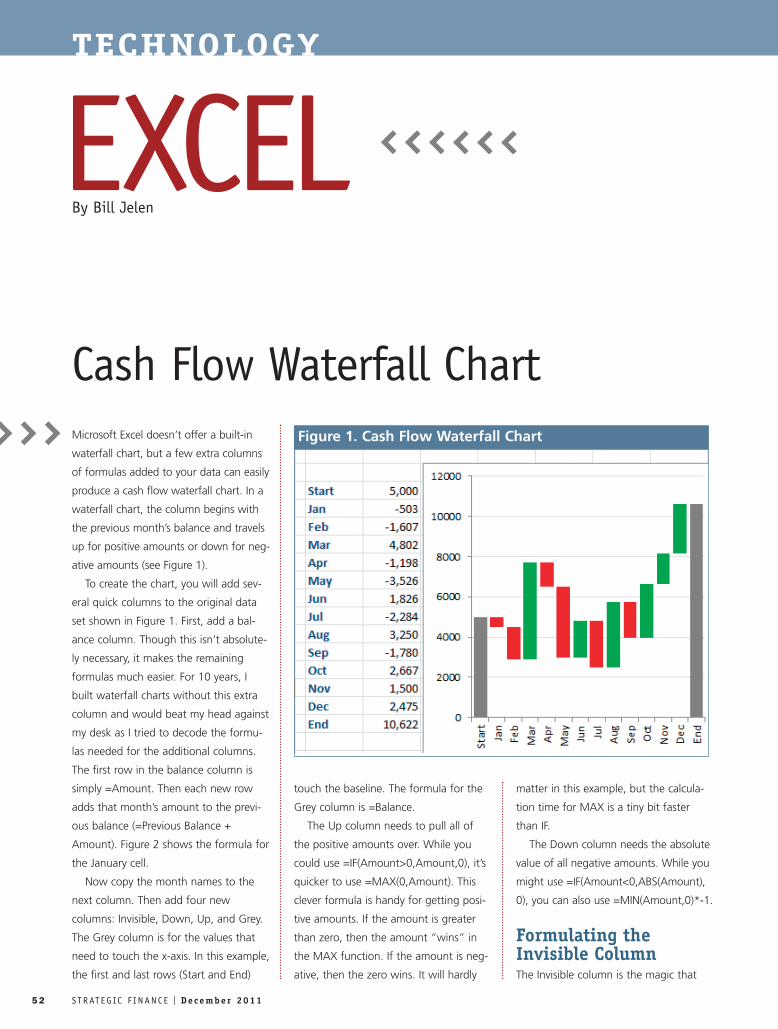
produce a cash flow waterfall chart. In a
waterfall chart, the column begins with
the previous month’s balance and travels
up for positive amounts or down for neg-
ative amounts (see Figure 1).
To create the chart, you will add sev-
eral quick columns to the original data
set shown in Figure 1. First, add a bal-
ance column. Though this isn’t absolute-
ly necessary, it makes the remaining
formulas much easier. For 10 years, I
built waterfall charts without this extra
column and would beat my head against
my desk as I tried to decode the formu-
las needed for the additional columns.
The first row in the balance column is
simply =Amount. Then each new row
adds that month’s amount to the previ-
ous balance (=Previous Balance +
Amount). Figure 2 shows the formula for
the January cell.
Now copy the month names to the
next column. Then add four new
columns: Invisible, Down, Up, and Grey.
The Grey column is for the values that
need to touch the x-axis. In this example,
the first and last rows (Start and End)
touch the baseline. The formula for the
Grey column is =Balance.
The Up column needs to pull all of
the positive amounts over. While you
could use =IF(Amount>0,Amount,0), it’s
quicker to use =MAX(0,Amount). This
clever formula is handy for getting posi-
tive amounts. If the amount is greater
than zero, then the amount “wins” in
the MAX function. If the amount is neg-
ative, then the zero wins. It will hardly
matter in this example, but the calcula-
tion time for MAX is a tiny bit faster
than IF.
The Down column needs the absolute
value of all negative amounts. While you
might use =IF(Amount<0,ABS(Amount),
0), you can also use =MIN(Amount,0)*-1.
Formulating theInvisible ColumnThe Invisible column is the magic that
52 S T R AT E G IC F I N A N C E I D e c e m b e r 2 0 1 1
TECHNOLOGY
EXCELCash Flow Waterfall Chart
By Bill Jelen
Figure 1. Cash Flow Waterfall Chart
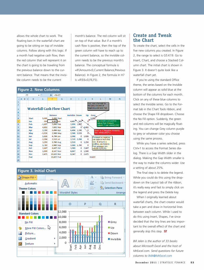
allows the whole chart to work. The
floating bars in the waterfall chart are
going to be sitting on top of invisible
columns. Follow along with this logic: If
a month had negative cash flow, then
the red column that will represent it on
the chart is going to be traveling from
the previous balance down to the cur-
rent balance. That means that the invisi-
ble column needs to be the current
month’s balance. The red column will sit
on top of that value. But if a month’s
cash flow is positive, then the top of the
green column will have to reach up to
the current balance, so the invisible col-
umn needs to be the previous month’s
balance. The conceptual formula is
=IF(Amount<0,Current Balance,Previous
Balance). In Figure 2, the formula in H7
is =IF(E6<0,F6,F5).
Create and Tweak the ChartTo create the chart, select the cells in the
five new columns you created. In Figure
2, the range to select is G5:K19. Go to
Insert, Chart, and choose a Stacked Col-
umn chart. The initial chart is shown in
Figure 3. It doesn’t quite look like a
waterfall chart yet.
If you’re using the standard Office
theme, the series based on the Invisible
column will appear as solid blue at the
bottom of the columns for each month.
Click on any of these blue columns to
select the Invisible series. Go to the For-
mat tab in the Chart Tools ribbon, and
choose the Shape Fill dropdown. Choose
the No Fill option. Suddenly, the green
and red columns will be magically float-
ing. You can change Grey column purple
to grey or whatever color you choose
using the same process.
While you have a series selected, press
Ctrl+1 to access the Format Series dia-
log. There is a Gap Width slider in the
dialog. Making the Gap Width smaller is
the way to make the columns wider. Use
a setting of about 25%.
The final step is to delete the legend.
While you could do this using the drop-
down on the Layout tab of the ribbon,
it’s really easy and fast to simply click on
the legend and press the Delete key.
When I originally learned about
waterfall charts, the chart creator would
take a pen and draw in horizontal lines
between each column. While I used to
do this using Insert, Shapes, I’ve since
decided that the tiny lines are less impor-
tant to the overall effect of the chart and
generally skip this step. SF
Bill Jelen is the author of 33 books
about Microsoft Excel and the host of
MrExcel.com. Send questions for future
columns to [email protected]
D e c e m b e r 2 0 1 1 I S T R AT E G IC F I N A N C E 53
Figure 2. New Columns
Figure 3. Initial Chart