Embed Size (px)
Citation preview

GEORGIA DOT RESEARCH PROJECT 2013
FINAL REPORT
TECHNOLOGY SCAN OF FUTURE TRAVELER INFORMATION SYSTEMS AND APPLICATIONS IN
GEORGIA
OFFICE OF MATERIALS & RESEARCH RESEARCH & DEVELOPMENT BRANCH

This page intentionally left blank.

i
GDOT Research Project No. 11-25 (UTC)
Final Report
TECHNOLOGY SCAN OF FUTURE TRAVELER INFORMATION SYSTEMS AND APPLICATIONS IN GEORGIA
By Dr. Kari E. Watkins Assistant Professor
School of Civil and Environmental Engineering
Georgia Institute of Technology
Contract with
Georgia Department of Transportation
In cooperation with
U.S. Department of Transportation Federal Highway Administration
September 2013
The contents of this report reflect the views of the author(s) who is (are) responsible for the facts and the accuracy of the data presented herein. The contents do not necessarily reflect the official views or policies of the Georgia Department of
Transportation or the Federal Highway Administration. This report does not constitute a standard, specification, or regulation.

ii
This page intentionally left blank.

iii
1.Report No.: FHWA-GA-13-11-25
2. Government Accession No.: 01476064
3. Recipient's Catalog No.:
4. Title and Subtitle:
Technology Scan of Future Traveler Information Systems and Applications in Georgia
5. Report Date: October 2013 6. Performing Organization Code
7. Author(s):
Dr. Kari E. Watkins, PE (P.I.) James Wong, Maria Roell
8. Performing Organ. Report No.:
9. Performing Organization Name and Address: Georgia Institute of Technology School of Civil and Environmental Engineering
10. Work Unit No. 11. Contract or Grant No.: GDOT PI# 0009929 (RP 10-01, UTC)
12. Sponsoring Agency Name and Address: Georgia Department of Transportation Office of Materials & Research 15 Kennedy Drive Forest Park, GA 30297-2534
13. Type of Report and Period Covered: Final; Jan 2012-Oct 2013 14. Sponsoring Agency Code:
15. Supplementary Notes: Prepared in cooperation with the U.S. Department of Transportation, Federal Highway Administration. 16. Abstract:
Statewide traveler information provided in Georgia through its NaviGAtor/5-1-1 system is primarily based on Intelligent Transportation Systems (ITS) related to freeway traffic management. The purpose of this study is to evaluate traveler information in Georgia and to provide recommendations on potential conceptual alternatives to the existing NaviGAtor system that could improve its effectiveness. The evaluation applies several different methodologies including website comparisons, a survey of NaviGAtor users, a feedback system and a futures workshop which applies a visioning process to the current state of the NaviGAtor system. Four proposed alternatives address information delivery to customers and methods through which data can be fed into the broader system. The final recommendation is a hybrid of those alternatives that suggests that the agency: enters into third-party data agreements to cost effectively increase coverage of travel speeds; pursues an open data approach that invites broader participation by web developers to improve information dissemination; and, incorporates static and real-time information from the Metropolitan Atlanta Regional Transit Authority (MARTA) and Hartsfield-Jackson International Airport. This research will be of interest to those researchers and practitioners involved in managing traveler information programs, especially those contemplating changes to existing traditional ITS systems.
17. Key Words: Traveler information; 511; Real-time information; traffic management centers; highways; transit; Georgia NaviGAtor
18. Distribution Statement:
19. Security Classification (of this report): Unclassified
20. Security Classification (of this page): Unclassified
21. Number of Pages:
141
22. Price:
Form DOT 1700.7 (8-69)

iv
This page intentionally left blank.

v
TABLE OF CONTENTS
Executive Summary ................................................................................................. 1 Literature Review ..................................................................................................... 7
Traveler Information Federal Mandate .................................................................. 8 Typology of Traveler Information .......................................................................... 9
Information Types ............................................................................................. 9 Location Awareness ........................................................................................ 10 Static or Real-Time Information ....................................................................... 11 Timing of Information Delivery ......................................................................... 12 Information Delivery Mechanisms .................................................................... 13
Traveler Information Delivery Mechanisms ......................................................... 14
Traveler Information Systems (First Generation) ............................................. 14 Advanced Traveler Information Systems (Second Generation) ....................... 15 Intelligent Traveler Information Systems (Third Generation) ............................ 16
Internet Based Traveler Information .................................................................... 17 Website Design................................................................................................... 18 Demand for Traveler Information ........................................................................ 19 Developing a Traveler Information Program ........................................................ 21
Goals of Traveler Information Provision ........................................................... 21 Traveler Decision Influences ........................................................................... 22 Evaluating a Program with Goals .................................................................... 24
Effectiveness in Changing Travel Decisions ....................................................... 24 National Trends in Real Time Traveler Information ............................................. 26
National 511 System ....................................................................................... 27
Existing Integrated Multimodal Traveler Information Systems ............................. 27
PATH2Go, San Francisco US-101 Corridor .................................................... 28 Goroo, Chicago RTA ....................................................................................... 28
International Perspectives on Multimodal Traveler Information ........................... 29 Summary ............................................................................................................ 32
Existing Transportation Data Flows in Georgia ....................................................... 35
Methodology ....................................................................................................... 35 Transit Information Availability ............................................................................ 35
Transit Organizations in Georgia ..................................................................... 35
Highway Information Availability ......................................................................... 39
Evaluation of Existing Georgia NaviGAtor System .................................................. 43
Website Evaluation ............................................................................................. 45
Methodology.................................................................................................... 45

vi
Results ............................................................................................................ 58
Survey ................................................................................................................ 67
Methodology.................................................................................................... 67 Results ............................................................................................................ 68
Future’s Workshop .............................................................................................. 83
Methodology.................................................................................................... 83 Results ............................................................................................................ 85
Feedback Website .............................................................................................. 89
Methodology.................................................................................................... 89 Results ............................................................................................................ 91
Combined Analysis ............................................................................................. 97 Recommendations for Georgia’s ATIS .............................................................. 102
Technological Recommendations .................................................................. 102 Website Recommendations ........................................................................... 103
Recommendations for User-Based ATIS Development ..................................... 104
Proposed Alternatives for the NaviGAtor System ................................................. 107 Recommendations ............................................................................................... 118 REFERENCES ..................................................................................................... 122

vii
LIST OF TABLES
Table 1 Public availability of traveler information among transit operators. ............... 37
Table 2 Availability of Various ITS Data among Georgia Agencies ........................... 40
Table 3 Preliminary ratings of state and regional traveler information websites ........ 46
Table 4 Preliminary ratings of state and regional traveler information websites ........ 48
Table 5 A comparison of criteria used between Currie and Gook and Roell .............. 50
Table 6 Descriptions of criteria used in this study ..................................................... 52
Table 7 Scoring system applied to each criterion ...................................................... 55
Table 8 Statements used to determine user satisfaction with each metric of
the website................................................................................................... 81
Table 9 Results of Workshop .................................................................................... 86
Table 10 Ideas from UserVoice by number of votes and color coded by type of
request as of 10/23/2012 ............................................................................. 94

viii
This page intentionally left blank.

ix
LIST OF FIGURES
Figure 1 Scores of all evaluated websites for only the Functionality Category ......... 59
Figure 2 Scores of all evaluated websites for only the Accessibility Category
with Los Angeles and New Jersey removed due to lack of data ................ 61
Figure 3 Scores of all evaluated website for only the Usability Category ................. 64
Figure 4 Scores of all evaluated websites for only the Features Category............... 66
Figure 5 Scores of all evaluated websites; Scale = 0-5 ........................................... 67
Figure 6 Age of respondents ................................................................................... 70
Figure 7 Primary mode of transportation of respondents ......................................... 70
Figure 8 Income level of respondents ..................................................................... 71
Figure 9 The ways in which respondents currently access the NaviGAtor
website...................................................................................................... 72
Figure 10: The ways in which respondents would prefer to access the NaviGAtor
website...................................................................................................... 73
Figure 11 Combined mobile methods of access ........................................................ 73
Figure 12 Use of other sources outside of GDOT...................................................... 74
Figure 13 The frequency at which respondents use NaviGAtor at different
points in their trip ....................................................................................... 75
Figure 14 Average satisfaction rating by tool ............................................................. 76
Figure 15 Average importance rating ........................................................................ 77
Figure 16 Distribution of responses for level of importance and satisfaction for
each tool on the NaviGAtor website .......................................................... 78
Figure 17 Combined satisfaction and importance ranking across all tools ................. 79
Figure 18 New tool ranking scores ............................................................................ 80

x
Figure 19 Responses to statements about website metrics ....................................... 82
Figure 20 Overall satisfaction results ........................................................................ 82
Figure 21 Screenshot of Feedback tab on NaviGAtor home page ............................. 90
Figure 22 Screenshot of Feedback window after tab is clicked ................................. 91
Figure 23 Existing Organization of Traveler Information .......................................... 108
Figure 24 Independent Agency Model ..................................................................... 110
Figure 25 Open Data Model .................................................................................... 112
Figure 26 Third Party Data Model ........................................................................... 114
Figure 27 Multimodal Data ...................................................................................... 116
Figure 28 Recommended Model ............................................................................. 120
1
Executive Summary The Georgia Department of Transportation (GDOT) actively monitors and
manages traffic on Georgia’s freeways using a variety of highway-based intelligent
transportation system (ITS) technologies. The ITS devices that monitor conditions are
largely operated on a private fiber optic network controlled by GDOT’s traffic
management center (TMC). From early on in the development of its ITS program, GDOT
made a point of making its data available for public consumption through news outlets
and other avenues. The traffic data itself provides a benefit for individual users who may
use it to avoid congestion. While the system has grown impressively since its inception
leading up to the 1996 Olympic Games, the basic sensing equipment, communication
flows and overall business plan for its operation and maintenance have remained largely
unchanged. To that end, GDOT and the Georgia Transportation Institute / University
Transportation Center (GTI/UTC) have commissioned this research to (1) identify the
future opportunities for traveler information systems in Georgia, and (2) identify specific
strategies that could improve the ITS program in the state. The research includes four
primary tasks: a literature review to provide context for the project, an inventory of
existing transportation data flows in Georgia, an evaluation of the customer-facing
Georgia NaviGAtor website, and a set of alternatives and recommendations for
implementing improved traveler information within the state.
Undertaking an inventory of the existing transportation data flows in Georgia is
important to understand how these flows relate to the traveler information program in the
state. Transit and highway data are largely maintained in separate silos because of the
organizational boundaries of transportation agencies in Georgia. For transit agencies,
small and large operators were contacted to assess their electronic dissemination of
schedules and maps, real-time incidents, live parking availability and other data. The
agencies had a mix of information available through generally un-standardized formats.

2
Smaller agencies seemed to have a better ability to deploy off-the-shelf real-time
monitoring systems compared to large agencies like MARTA. While many times real-
time information is available to customers of that specific service, it is rarely shared
directly with other agencies or with riders on other services for transfers. Highway
information is less segmented by geographic region, but is currently only available for
freeways and select arterials. Multiple jurisdictions were asked about the availability of
traffic counts, signal operations, travel time monitoring, incident reporting and live video
streams. Most local agencies had very limited capacity in terms of live traffic condition
monitoring and only one had a seamless integration of incident reporting to GDOT’s
TMC.
While both highway and transit agencies at the local scale are limited in
deployment of fully integrated traveler information systems, the centralized NaviGAtor
system has robust functionality in terms of its video detection system and incident
management processes. Its limitation, however, is due to its use almost exclusively on
freeways. For the information that is available through NaviGAtor, the main traveler
information portal is the NaviGAtor website. The website itself was evaluated in the
context of other statewide and regional traveler information websites around the country
using a methodology that considers the functionality, accessibility, usability and features
of the site. In a review of some of the best examples on the state and regional scale,
Georgia ranked in the middle for overall score. Its highest scores came from technical
factors such as web browser compatibility and web page load time; its lowest scores
were in usability and accessibility, categories that address design choices and
navigation of the site. Georgia’s NaviGAtor website ranked in the middle among others
when looking at the features available, which largely relates to the underlying NaviGAtor
system.

3
The NaviGAtor website was also evaluated by users who were invited to
participate in a survey. These were website users who generally drove alone, had higher
incomes and ranged in age groups. They reported that they accessed NaviGAtor using
computers and mobile devices, but would like to have better mobile access using
smartphone apps or mobile-optimized websites. Many users also reported that the
NaviGAtor website was only one of the different methods they used to get traveler
information; other sources included Google/Bing or other online trip planners, mobile
map applications, in-vehicle GPS systems and radio/television sources. For those using
the NaviGAtor website, they were most likely to use it shortly before leaving for a trip. A
series of feature-oriented questions revealed that overall, users found features such as
the traffic map, incidents, closures, construction notification and cameras to be of high
importance to them. For each of those features, their satisfaction was above the
midpoint on the scale, but far from the highest levels of satisfaction. The tools that
respondents would most like to see in the future were personalized accounts and a
travel-time calculator. Overall, just over 50 percent of surveyed respondents reported a
satisfied or very satisfied experience with Georgia’s NaviGAtor site. Another method of
user response was a direct feedback link provided on the website for a one-month
period in October 2012. This feedback mechanism allowed users to make suggestions
to the site and then vote for suggestions made by other users. The most popular
suggestions were for adding GA-400 to the traffic map, providing cameras on the traffic
map, calculating trip times compared to historic travel times, and to show how intense
traffic incidents are.
The third method of evaluation for the website and the broader traveler
information program in Georgia included a Futures Workshop. The concept behind this
method of public involvement is to engage users in a series of visioning exercises that
start with identifying the challenges facing a process, then allowing brainstorming of

4
ambitious, unconstrained ideas, which are gradually adapted to the actual constraints of
a process. Due to several logistical challenges, the workshop had insufficient attendees
to make broad conclusions about public attitudes and ideas, but their results are still
worth mentioning. Many of the group’s critiques focused on website design choices
regarding navigation, placement of ads, color choices and website complexity. Some
other critiques were about the accuracy of the site itself. The outcome, however, was a
set of suggestions that could be considered by GDOT for improving the site’s design.
These include location-awareness, an incident reporting feature, voice control and
activation, better integration with local business listings and points of interest, and better
incident notifications.
The website feature analysis discussed above addresses many of the end-user
concerns about information delivery, but many of those suggestions require changes
that are fully integrated into the NaviGAtor system, not just the website. The existing
NaviGAtor system is designed such that GDOT is supposed to be the central aggregator
of freeway-based data from traffic control centers (TCCs) around the state. It can then
manage those facilities and in doing so, provide data as a byproduct that can be shared
through the website, 5-1-1 or through a content server to news outlets and third parties.
The limiting factor in the existing system, however, is the low participation rate by TCCs
around the state. Except for 2-3 TCCs, there are very few other agencies participating in
real-time incident or traffic condition monitoring.
Four different alternatives which could improve certain aspects of the NaviGAtor
system are presented in this report; the first two address information delivery to
customers while the third and fourth address methods through which data can be fed
into the system. The first is an independent agency approach which requires local
jurisdictions be responsible for providing methods to share local traveler information,
including the GDOT information for their area. This is a decentralized process that
5
reduces GDOT’s responsibility in providing traveler information, but is susceptible to
excessive coordination and the same challenge to the existing system with low local
participation. An open data approach emphasizes the role of third parties in information
dissemination by creating web-friendly interfaces that website developers could use to
get information out through various apps and websites. The third approach calls for a
reduction in publicly owned infrastructure-based monitoring and instead calls on third-
parties that generate data using mobile device locations to be the primary source of
traffic data. The major advantage is in scope of roadways covered in this alternative,
although it would make poor use of the existing investment in infrastructure that the state
has already made. The final approach focuses on the multi-modal data ecosystem that
can provide far more context for highway information. The vision of this approach is to
provide a one-stop site for traffic conditions, transit conditions, parking availability, airport
delays, and all other major transportation-related events. It requires not only that GDOT
play a coordination role, but that other agencies provide data in an accessible format to
be incorporated on the NaviGAtor website.
In light of the organizational and financial requirements of the various
alternatives, the final recommendation is a combination of selected elements from those
approaches. The researchers recommend that GDOT enter into agreements to use
third-party data for those areas where freeway and arterial monitoring are not yet
implemented, and that the agency research how its peers are approaching this new
public-private partnership. A set of web-friendly interfaces should be developed that
make all data on the NaviGAtor system easily available to website and application
developers; furthermore, GDOT should support those developers with periodic outreach
to ensure that Georgia’s travelers are being served well. Lastly, data from MARTA and
Hartsfield-Jackson International Airport should be incorporated into the NaviGAtor

6
website as the best near-term examples of multimodal information. These changes
would improve the availability of multimodal traveler information in Georgia.

7
Literature Review At its core, traveler information seeks to give travelers a new dimension of
knowledge about their trip, which can then lead to a reduction in congestion. Travelers
may choose to use different routes, to leave at different times, to use a different mode, to
travel to a different destination or to not make a trip at all. These decisions are made by
both drivers and transit riders and can work to spread out the users across the
transportation system to increase the effectiveness of that system. Transit and highway-
based information have generally developed along separate tracks without a high
degree of collaboration, primarily due to the modal-based structure of public
transportation and highway operations. To better understand the opportunities for
multimodal traveler information, this literature review defines traveler information, as well
as documents several different perspectives on traveler information programs.
The literature review begins by defining the mandates related to traveler information
and exploring all of the ways traveler information systems can be designed including a
thorough discussion of different traveler information typologies for both highway and
transit information and the kind of information available. It then discusses the public’s
demand for traveler information and effectiveness of traveler information in changing
travel decisions. The purpose and goals of a travel information program are then
defined, highlighting the importance of moving beyond the practice of sharing
information publicly as an afterthought to operations. A cursory look at different delivery
mechanisms is presented before the last two sections, which build off the understanding
created in the previous sections and identify the national trends in real-time data and the
existing multimodal information systems in the country. By understanding the content of
this document, readers will be well equipped to consider the opportunities and
requirements of a multimodal traveler information system.

8
Traveler Information Federal Mandate
After lobbying by USDOT, the FCC designated 5-1-1 as a national calling number
for all travel-related information on July 21, 2000. While the FCC has set aside a single
port of call for traveler information, the actual day-to-day implementation of 511 systems
is left completely open to states and local governments. While the 511 number is
available, states are not required to make use of that specific program for traveler
information. Instead, federal legislation only requires that traveler information be
provided in some format; the 511 program tends to be the simplest implementation.
The federal mandate to collect and distribute real-time traveler information via a
“Real-Time System Management Information Program (RTSMIP)” is contained in
SAFETEA-LU Section 1201 [1]. The traveler information provision is designed to
address congestion problems, enhance the security of the transportation system,
improve response to adverse weather and traffic incidents and to promote the sharing
and exchange of highway traveler information at regional and national levels. The
purpose of the RTSMIP is to “provide, in all States, the capability to monitor, in real-time,
the traffic and travel conditions of the major highways of the United States.” This
legislation also contained a mandate for the adoption of technical standards for the inter-
jurisdictional exchange of this real-time information. [2]
In November 2010 a final ruling was delivered that created a new Section 511 under
CFR 23 which would establish the RTSMIP discussed above. Minimum standards exist
for the accuracy, availability and timeliness of reporting of construction activities,
roadway or lane blocking incidents, weather observations and travel time information
based on whether or not the incident’s location falls inside or outside of the metro area.
Section 1201 of SAFETEA-LU originally limited its scope of impacted parties to
states and local governments who would then share their data with other states, local

9
governments and the traveling public. Recent updates have expanded the scope of
participants to include “partnerships with other commercial entities” like software and
application developers who may provide “value-added information products”[1].
Similarly, whereas the wording in SAFETEA-LU limited the geographic scope of
collecting and monitoring real-time traffic and travel data to highways only, the updated
final ruling for Section 511.313 additionally mandates that an RTSMIP must be in place
along all “State-designated metropolitan area routes of significance” by November 8,
2016.
Typology of Traveler Information
Before embarking on a traveler information program, agencies should have a firm
grasp on the goals of the program and the types of traveler information that can lead to
those desired outcomes. Understanding the different kinds of traveler information will
help during the selection process. For both drivers and transit riders, traveler information
is often classified using one or more of the following question frameworks: what data is
provided, when is it provided and how is it provided? The answer to each question
describes the data and interaction with the user. Other methods for classification have
been proposed based on the level of interactivity of information [3], [4], or the generation
of the system [5]. Yet another method considers what the authors call the content,
condition and composition of the information [6]. These will all be addressed in brief as
they are somewhat less relevant than the what/when/how frameworks.
Information Types
The first question in the classification framework asks what information is being
provided. At a conceptual level, drivers and transit riders seek similar kinds of
information. That is, information that will inform them how long a trip will last or

10
instructions on how to make a trip. For transit riders, total travel time will be the sum of
scheduled or typical travel times in a trip chain [7]; for drivers the typical observed
speeds or the real-time congestion measures feed into the total calculation of travel time
[8]. Regardless of the calculation, the traveler still seeks to understand the time-impact
of the trip under consideration. The timing of when a user receives this information will
be discussed next, but it is useful to recognize that travel time information can be
provided both before and during a trip. Changeable message signs, for example, may
display minutes until a major interchange, providing a travel time estimate during a trip.
Unlike travel time predictions or observations, trip planning helps travelers navigate
unfamiliar journeys by providing driving directions or transit itineraries (the corollary to
directions for public transportation). This information is the result of an inquiry consisting
of a start and end point, and a desired time of departure or arrival (which may be “now”).
Using these parameters, most trip planners will provide driving directions with alternate
routes and expected travel time (based on expected driving speed) or a series of transit
itineraries that may include walking directions and transfer instructions. Like the concept
of travel times, trip planning outputs are not defined by when they are delivered to
travelers in relation to a journey. For a simple example, consider in-vehicle navigation
systems that ask for a destination to provide turn-by-turn directions at the beginning of a
trip. When a driver is off course, the system will often re-plan the trip and provide an
updated set of directions. The second part is still a trip planning function, but it is
tailored to the location of the user.
Location Awareness
As part of the third-generation traveler information system, which is based on
intelligent information delivery, some applications are making use of the location-aware
features found on mobile phones, GPS units and other devices. Location-aware devices
11
allow for information delivery that is tailored to a user because the device can tell where
the user is on their journey [4]. Going back to the in-vehicle navigation systems, a
feedback loop exists to adjust the driving directions based on where the vehicle is at any
point, allowing for recovery from wrong turns. Similarly, in transit application, location-
awareness allows the program to identify stops and stations near the user. Location
awareness is not a different kind of final traveler information, but rather a way to
augment other types of traveler information to better serve the user.
Static or Real-Time Information
Another method of categorizing types of traveler information uses the distinction of
static or real-time data. Characteristics of static information are that it is relatively
unchanging over time (such as street maps, transit schedules and general agency
information). Conversely, real-time information usually includes some kind of operational
information with frequent mechanized status updates like GPS traces, sometimes more
than once per minute. This information is time-sensitive in that it will eventually “expire”,
or become irrelevant for active use. The widely cited work by Adler and Blue indicated
an early understanding for the potential of real-time information to affect traveler
decisions [5], some of which are now being realized. The three generations of traveler
information defined in their work include traveler information systems (TIS), the one-way
communication of system conditions (like highway advisory radio); advanced traveler
information systems (ATIS) which allow for interaction and customization of information
based on specific users (like online trip planning); and finally intelligent traveler
information systems (ITIS) like those that preemptively notify travelers of disruptions. All
three generations are predicated on real-time information. Since the early 1990s, the
internet has provided a new platform on which different real-time information delivery
mechanisms are based, many achieving the predictions made by Adler about

12
coordinated information systems and agency-based dissemination (like transit websites)
[9]. For transit, the most popular real-time information applications include next vehicle
arrival/departure prediction times, identification of service disruptions and
announcements about the current routes [10].
Timing of Information Delivery
The temporal element of the information is described in relation to a person’s
journey (rather than the real-time/static designation). A driver may be given directions
before or during their trip. When a radio broadcasts a traffic report, an individual might
be listening to it over breakfast (pre-trip) or while on the way to work (en route).
Pre-trip information can be used to select route, itineraries or to make mode-choice
decisions before a traveler begins their journey. Familiar users such as daily commuters
will want to get status updates of their typical routes as close to the time of departure as
possible. Less familiar users are more likely to be looking for information like driving
directions or possible transit itineraries. Notice that two types of information are
described here, but both are sought before the trip begins. The literature points a limited
number of studies that identify pre-trip as the most influential time to influence traveler
behavior because of the maximum potential to decrease travel time [11]. Compared to
auto travel, Grottenhuis suggests that transit information is almost always required pre-
trip. Due to recent advances in mobile phones and transit agencies’ ability to deliver
information wirelessly and in real time, that statement from 2006 is likely less relevant.
Another opportunity to provide travelers with relevant information is en-route or on-
board. Examples include drivers listening to radio broadcasts of traffic while driving or
seeing congestion information on an in-vehicle navigation system; transit riders might
experience announcements with service alerts while on board a vehicle. These two
examples represent broadcast mediums, but advances in mobile technology enable the

13
delivery of personalized, relevant information during a trip. Two major studies that aim to
improve information delivery en route are the Connected Traveler program in the San
Francisco Bay Area and the TRAC-IT program in Florida. The focus in both projects is to
better supply individuals with information after they have begun their trip using primarily
mobile phone platforms [4], [7].
Information Delivery Mechanisms
Delivery mechanisms represent the third main classification of traveler information.
Having addressed the kind of information to be provided and when it would be delivered,
the question of how to deliver the information remains. Examples discussed have
already included radio broadcasts, in-vehicle navigation systems, changeable message
signs and other technologies. Information delivery mechanisms have also been more
broadly classified using a scale of functionality. In Peng/Huang [3], the authors present a
scale that uses static web browsing as the most basic functional level. Text search and
graphic links follow the first level which is then superseded with interactive map-based
search, customized and personalized queries and finally online transactions [3]. A PDF
of a train schedule would lie at the very basic end of this spectrum, opposite a web portal
that provides status updates on a user’s typical transit route and ways to purchase
monthly tickets.
Information delivery mechanisms can also be categorized by analyzing how they
actually provide information based on human sensory abilities. Many kinds of alerts and
other travel information can be spoken to travelers, shown to them on screens or made
to vibrate and alert travelers of certain circumstances.

14
Traveler Information Delivery Mechanisms
The field of traveler information delivery mechanisms continues to grow due to
technological advances in mobile technology and private investment in the field. The
focus of this section is to present an outline of approaches to providing information to
travelers about their trips; it does not include sensing technologies or the differences
between infrastructure and probe-based collection. It is sorted first by the generation of
traveler information (basic, advanced and intelligent), then by the timing of the
information delivery. Where transit and auto modes have separate delivery mechanisms,
transit will be presented first for consistency. Discussion of these technologies is
generally common knowledge, but more information can be found through the US DOT
Research and Innovative Technology Administration’s (RITA) Intelligent Transportation
Systems Joint Programs Office (ITS-JPO)
(http://www.itsknowledgeresources.its.dot.gov); their knowledge database provides a
wealth of information about many different technologies and their costs, deployment
statistics and applications.
Traveler Information Systems (First Generation)
These were the earliest kinds of traveler information based on a one-way broadcast
of information to users.
• Call Centers – some of the earliest deployments of traveler information trace back to call centers to provide information to travelers. Since the early 2000s, departments of transportation have worked to deploy the 511 national traveler information service.
• Highway Advisory Radio (HAR) – HAR was introduced by the FCC in 1978 and allows local departments of transportation the ability to broadcast traffic conditions to an area geographically constrained to the facility (like an interstate) [12]. These are primarily used for traffic but there is no constraint on the kind of information delivered. Often, signs in the roadside will have flashing beacons indicating relevant information.

15
• News Broadcasts – News broadcasts have long been involved in providing traveler information with regional updates at regular frequencies. Radio stations often rely on a mix of sources; listeners can report conditions and news stations can operate helicopters to check for traffic jams on the region’s highways.
• Variable Message Signs / Dynamic Message Signs (VMS) – Located on specific routes, DMSs advise travelers of events relative to the specific facility on which they are traveling. This often consists of congestion alerts and weather advisories. This information may be time sensitive and displayed only while current or relevant. For transit, these signs can be used to provide information on the next arriving service or any delays or system information.
• Mapping – At their most basic level, maps provide information to travelers about the availability of transportation in a region. Printed, and now viewable online with many interactive features, maps give static information about both highway facilities using street maps and transit facilities using system maps. While we think of trip-planning as a function of the capabilities of the internet, the concept has roots further back as AAA has provided Triptiks ® which may have been the earliest mapped turn-by-turn directions for drivers taking road trips to unfamiliar areas.
• Audible Transit Announcements – Whether on board a transit vehicle or while waiting in a station, transit agencies can provide information through audible announcements. These often augment variable message signs and carry similar information about service disruptions and next vehicle arrivals.
Advanced Traveler Information Systems (Second Generation)
Second generation, or Advanced Traveler Information Systems (ATIS) are used to
provide some level of customized or interactive information to the traveler [5], [11]. Web-
based trip planning, for example, requires an interaction of trip start and end points
which then queries specific information to be returned.
• Websites – Both transit and highway agencies have made use of websites to provide a wealth of static, and more recently real-time, information. These sites often have trip-planning components as well as real-time conditions for different facilities. The effectiveness of different types of websites in providing sufficient decision-making support has been researched and found that a wide spectrum of sophistication exists among agencies’ implementations [13].
• Interactive Voice Response (IVR) – Call in centers use these automated response systems to give customers access to current information without the need for a customer service agent. Often times, the same amount of information is made available from websites as in IVR systems to add redundancy and

16
multiple methods of information delivery. This is especially helpful for those with visual impairments.
• Web Enabled Mobile Devices – This broad category includes smartphones, tablets, laptops and other devices that can access the Internet. These devices instantly connect travelers who are in the en-route phase of their trip, offering them as much information as was previously available only as pre-trip information. These are identified separately from websites because myriad apps designed specifically for devices like iPhones, Android phones and Blackberry phones have emerged on the market. Also included in this category are the tools built specifically for en-route navigation or trip planning using location awareness. The capabilities of these devices continue to increase as application developers find new uses for the data available from the transportation system.
Intelligent Traveler Information Systems (Third Generation)
As the third generation of traveler information systems, ITIS is considered the most
advanced type of information delivery. The characteristics associated with these are that
the information preempts travelers’ request of the information. Consider a commuter who
takes the train to work; some device wakes him up early to advise him of 20 minute
delays on the train. These ideas are already coming to fruition in the wide array of apps
produced for those web enabled devices. The following other technologies assist in
delivering ITIS.
• Text Message Notifications – Text messages or Simple Message Services (SMS) provide simple connectivity to travelers who do not have access to the Internet at a point in time. The limited length of the messages encourages concise information. These notification systems can also be combined with more sophisticated web-based user interfaces which can personalize alerts so that only pertinent information is sent to a user.
• Email – E-mail can be used for all levels of traveler information (TIS, ATIS, ITIS). The most advanced alert and notification systems can be set up so that travelers receive notification when disruptive events or congestion is identified on a specific route or during a specific time (such as a daily commute). By automatically sending information to the user without their request for it, the system takes the burden off the traveler to remember to check conditions daily.
• In Vehicle Navigation Systems – A number of consumer-grade in-vehicle navigation systems are equipped with real-time traffic information sourced from private radio frequencies like the Total Traffic Network, operated by Clear
17
Channel [14]. These devices provide turn-by-turn directions and can automatically reroute travelers based on congestion or construction events. Some mobile phone devices are similarly equipped with these kinds of capabilities.
The list of example traveler information delivery mechanisms is not inclusive of all
technologies. The rapidly changing market of available technology complicates a static
documentation of the different delivery mechanisms.
Internet Based Traveler Information
The internet offers many more features than many of the other types of technologies
mentioned. The internet can offer both pre-trip information via a computer and en route
information via an internet enabled device. It is also the most cost-effective method of
disseminating information. [15] The internet, along with radio and television, is one of the
most popular types of technology used by the public for traveler information. Not only is
this one of the most popular mediums for users to seek traveler information, but it is also
the technology with the largest propensity to change travel decisions. [11]
As of 2010, the U.S. Department of Commerce National Telecommunications and
Information Administration found that over 70% of U.S. households have access to the
internet and there are current initiatives to increase this percentage, particularly for
segments of the population in rural and low income areas. [15]The popularity and
potential effectiveness of the internet heightens the importance of proper execution of
websites and mobile apps.
There are many possible reasons why internet resources are the most effective
mediums for changing travel decisions. One difference inherent in using the internet, as
opposed to listening to the radio to obtain information, is that it is a predominantly active
behavior. Unlike merely having a radio on in the background, using the internet to find
traveler information requires conscious effort. This required effort could mean that
internet users are more predisposed to using the information they find to better inform

18
their travel decisions. [16] Therefore, the traveler information users who are most likely
to be affected by traveler information can be targeted through this specific technology,
making the importance of proper implementation of internet-based ATISs more crucial to
ATIS effectiveness than any other type of ATIS technology.
Website Design
Internet-based ATIS technologies are primarily made up of websites and internet
enabled mobile applications. Because mobile phone traveler information applications
are relatively new, little research has been done on their proper implementation. ATIS
websites, on the other hand, have been studied for the past decade for their
effectiveness and proper design. According to the literature, the building blocks of an
effective website are functionality and reliability, accessibility, and usability. Functionality
and reliability refers to the functionality of the software. It is important for the public to be
able to trust a website to work properly for them to use it frequently. While some
technical problems are inevitable, it is important that they are fixed promptly and that the
users are kept up-to-date about any changes to give the website credibility. Another way
of establishing credibility with users and demonstrating proper functionality is through
time stamping relevant information and displaying the date of the site’s last update.
Maintaining this type of currency is especially important in traveler information, because
the information is dynamic. [13], [17]
Website accessibility refers to its accessibility to those with disabilities. For
example, green and red should not be used on top of each other, as those who are color
blind will not be able to see the contrast. Other features that fall under this category are
the ability to display an HTML version of the site, the ability to convert the text to a
different language, and the use of graphics for lower reading levels. [18]

19
The usability of a website encompasses many different aspects. For instance, ease
of navigation makes the website easier to understand and use. One rule of thumb for
creating easy, quick navigation is to use the “three click” rule. [17] As the title suggests,
this means that it should take no more than three mouse clicks to get to any pertinent
information. Consistency is another quality of usability. The website should remain
consistent within itself, and within general internet convention, such as using blue
underlined hyperlinks that turn purple after use. Keeping these types of features
consistent will also help new users with navigation. [13] While the quality of information
itself is one of the most important aspects of an ATIS website, it is argued by the Transit
Cooperative Research Program (TCRP) that a very important part of a transit website is
the homepage. [17] The importance is similar to the importance of a first impression. If
the homepage loads quickly, is easy to navigate, and is attractive, the user is more likely
to remain in the website. The user will also have confidence that the website will be
pleasant to use and meet their needs. The TCRP suggests the three previously
mentioned criteria as a way to create effective home pages: quick load time, ease of
navigation, and aesthetic quality. TCRP also suggest that while alerts are appropriate
for the home page, its main purpose is to be a portal for the rest of the site. Therefore, it
should be kept clean and simple. [17]
Demand for Traveler Information
Traveler information’s effectiveness is always constrained by the level of demand
from the public. There have been many studies on this topic and so far the results seem
inconclusive. The conventional school of thought on traveler information was that
humans are rational decision makers who make their decisions based on an internal
cost benefit analysis, Rational Choice Theory. [18], [19] According to this theory, people
are prone to seeking information that will better prepare them to make the best decision.

20
In terms of travel decisions, it has generally been believed that an individual will always
choose the least congested or most efficient route, unless they are working with
imperfect or incomplete information. It is also assumed that they will make use of any
and all information that is available to them to make this decision. [20], [21] However, in
recent years more focus has been placed on the psychology behind individuals’ decision
making and how it affects demand for traveler information, as well as traveler
information’s ability to change individual’s travel decisions. [20], [21]
Studies have found that most people do not make decisions as stated in Rational
Choice Theory. Instead, it is theorized that they use habitual behavior or satisficing
behavior to make decisions. An individual demonstrating habitual behavior would not
seek out traveler information to make a travel decision. Instead, they would favor a
commonly used route or their preferred transportation mode. Studies have shown that
most people choose their travel route based on past experience and familiarity. [20], [21]
Additionally, it is thought that most individuals have a ‘primary’ mode of transportation
that they habitually use and a ‘default’ mode of transportation that they will use in the
event that they are unable to use their primary mode. This means that individuals are
not actively seeking information on alternative routes or transportation modes.
[22]However, traveler information can change these habits when unfamiliar trips are
required. [21]
Satisficing behavior is an approach to decision making that assumes individuals
have a minimum set of requirements for any decision. Once the minimum requirements
have been met by an alternative, no further information is needed; that alternative is
used, even if it is not the most efficient. Satisficing behavior is demonstrated frequently
with fatalistic attitudes. For example, commuters who have accepted longer travel times
as a fact of life are less likely to seek out traveler information or change their travel
decision. [21], [23], [24]

21
Despite these behavioral tendencies, there are certain conditions and demographics
that show a higher demand for traveler behavior. Lyons [21] found three significant
attributes that contributed to travelers using traveler information in the Los Angeles and
Seattle regions: 1. those who were exposed to the greatest amount of congestion and
volatility in traffic conditions, 2. those whose arrival times were more sensitive, and 3.
those whose arrival times had more variability or uncertainty. Also in high demand in
these regions was en route information when unexpected congestion occurred.
Simply providing traveler information is not enough to effectively change travel
decisions. One solution could be to reach out to potential users through features like
automatic alerts. [21] ATIS effectiveness is more important given the low level of
demand for traveler information. Effective systems can be created by knowing who the
users are and what they want.
Developing a Traveler Information Program
Goals of Traveler Information Provision
While many agencies have already begun to establish traveler information systems
with varying degrees of maturity, it is important for those organizations to have a clear
set of goals for a traveler information program. Without these defined goals, traveler
information may become simply a byproduct of the information collected for other uses.
Different resources have varying perspectives on how and why to provide traveler
information. For example, the latest transportation authorization bill describes traveler
information as one of many goals to be addressed through real-time system
management; the others include improved surface transportation security, addressing
congestion, and responding to weather events [1]. To that end, systems designed under
this set of goals will be oriented toward many different goals, rather than focused on the
data needed to help travelers. A more pointed set of goals framed around traveler

22
information provision comes from one of the defining articles for the subject area. In
1998, Adler and Blue proposed that the purpose of any traveler information provision
program is three-fold: (1) to provide travelers with a decision-making support system; (2)
to better manage traffic flow; and (3) to enhance driving conditions [5].
Traveler Decision Influences
As Adler and Blue [5] suggested, one reason to implement a traveler information
program is to support driver decision making. A number of factors influence the ultimate
travel decisions that are made by citizens:
• Time - time available to get to destination and travel time reliability
• Income - car ownership and ability/willingness to pay
• Infrastructure – quality, accessibility, presence of alternative mode networks
• Expected Delays – congestion levels and any known construction activities
• Weather
• Parking – availability and proximity to destination
• Personal Considerations – disabilities and personal preference/comfort
The nature of the trip being made also has a considerable impact as to whether or
not a traveler might consult a real-time travel information system. Both the temporal
length of the trip and the purpose of travel affect a traveler’s likelihood of seeking trip-
related information. Travelers are more apt to change their travel decisions when the trip
being made is work-based. Also, those who are facing longer commutes “may be more
inclined to enact route diversions in the face of uncertainty”. Thus, it is reasonable to
assume that as travel times and commuting distances increase, more travelers will be
utilizing real-time travel information systems to navigate their way to work.

23
In terms of methods of information dissemination, most people acquire trip-related
information from the television, followed closely by radio and the internet [11]. In
evaluating the acceptance of the 511 call-in system, Khattak, et al. noted from a survey
in North Carolina that the public does consider 511 phone service to be a travel
information source primarily in the case of major disruptive events (like ice storms) [11].
Therefore, the 511 service is unlikely to be the first place to look for those who are taking
recurring trips. It should also be noted that in both the pre-trip and the en route category,
variable message signs did not prove to have a significant effect on traveler decision-
making [11].
In terms of eliciting a substantial change in travel decisions (e.g. changing time of
trip, mode, route or cancel the trip), Khattak, et al. found the internet to be, by far, the
most effective medium at influencing a change, followed by radio and television [11].
Given user preferences for accessing traveler information via the internet, state DOTs
would do well to invest in enhancing their provision of information via the internet in
order to elicit more dramatic changes in regional travel behavior. In terms of eliciting a
route diversion, the radio is quite effective, followed closely by the internet and television
[11]. As the radio is the medium that is most widely used and most widely available,
providing more real-time traveler information over the radio should be an effective way to
assist those travelers who are already en route and may need to divert to an alternate
route, as well as those who do not have convenient access to the internet.
The currency (degree to which a traveler information website site is kept up to date)
is an important characteristic/determinant of a quality website for users [13]. As such,
those managing real-time traveler information systems should always clearly indicate
when the data was updated and by whom in order to establish a good rapport and trust
with the users of the system.

24
Evaluating a Program with Goals
By providing travelers with access to trip-related data, transportation agencies hope
to positively affect travel decision changes surrounding mode choice, route choice,
destination choice, departure time and whether or not the trip is taken at all. In
evaluating the effectiveness of traveler information websites, Horan, et al. applied
research from computer science fields and augmented an evaluation model designed for
government-to-citizen services. The result was a model that identifies five key areas to
focus on while developing a traveler information program. According to the research,
traveler information websites should be usable (easy to navigate, complete information,
sufficient coverage); reliable (accurate and always available information); efficient (easy
to access); customizable; and flexible (dynamic content). [25] These identify both goals
and evaluation metrics to consider in the design of a traveler information program.
Effectiveness in Changing Travel Decisions
In the literature, the demonstrated ability of traveler information to affect travel
decisions has been mixed. However, many of the studies that found the effects to be
negligible or inconclusive were done in the late 1990’s and early 2000’s. [26–31] This
was a time when new types of traveler information, such as internet-based traveler
information, had not yet become popular. Also, the technological breakthroughs since
have made information of all kinds much more accessible. For example, the Apple
iPhone was released in 2007, marking a breakthrough in mobile internet-enabled
devices and the newest medium through which, travelers can receive information en
route. It is very possible that the full potential of traveler information’s ability to affect
travel decisions is yet unknown. However, through the more recent studies, it is clear
that many variables play a significant role in determining the effectiveness of an ATIS.

25
Khattak, et.al. in northern California, analyzed associations between the number of
traveler information sources an individual reported using and the probability of their
reported travel behavior adjustments. Their research, which used data from the 2006
Greater Triangle Household Travel Survey, found that 22% of the respondents that used
traveler information used an alternative route when one information source was
accessed, but the chances jumped to 54% when an additional source was used, and
adding a third source increased the chances of a route change to 83%. [11] Meaning
that these respondents allowed traveler information to change their travel decisions
more often when that information was coming from multiple sources.
Khattak, et.al. also found many other variables significant to the likelihood of travel
decision changes. One of the significant variables was trip type. Work-related travel
time had a stronger effect on travel decision changes than non-work related travel time.
Also, accessing traveler information five days a week, as opposed to at least once a
week, changed the chance of travel decision changes from 22% to 65%. Additionally,
those using internet sources were also more likely to adjust their travel decisions. [11]
One of the other findings of Khattak, et.al. was that 49% of respondents reported
using no traffic information at all. The data for this study had come from a 2006 survey,
so this is further evidence that more research needs to be done today on how travelers
access ATISs. New research is needed because of the availability of new technologies
that could presumably change traveler information demand, but also because it is
important to stay up to date with the public’s information needs in order to develop a truly
effective ATIS.
Other studies have continued to increase the understanding of the variables
associated with traveler decision changes due to traveler information. For instance,
Wang’s study [32] explored if spatial patterns existed in the effectiveness of an ATIS to
change travel behavior. This study, unlike Khattak’s, found that the purpose of the trip,

26
work-related or non-work-related, was less influential than the distance being traveled.
In this case, the travel time of the trip was more strongly associated with travel decision
changes. [32] It is important to consider how travelers’ decisions are influenced when
developing a traveler information program.
National Trends in Real Time Traveler Information
Traveler information is part of an increasingly networked system that has presented
opportunities and challenges for agencies across the country. Reviews of national trends
have been reported by both the U.S. Government Accountability Office and consultants
for the U.S. Department of Transportation’s Research and Innovative Technology
Administration. Both bring up a number of issues and comments related to data
coverage, usage and the future opportunities for private involvement in the traveler
information ecosystem.
ITS deployment statistics report that as of 2010, about 55 percent of urban freeway
miles were covered by some real-time traffic data collection technology which could
range from loop detectors to MAC address readers. About 79 percent of agencies
reporting some level of real-time traffic data collection (excluding CCTV); of those
agencies, 85 percent reported use of roadside infrastructure while only 30 percent used
any kind of probe technology (tag readers, cell phones etc.). In contrast, transit
agencies report a far lower deployment of real-time monitoring systems covering
approximately 35 percent of the nation’s fixed-route bus fleet (by number of equipped
buses). The convergence of the two modes lies in the use of transit vehicles as probes
for traffic conditions, but only seven agencies (of 143 respondents) reported this kind of
application [33]. In general the national survey provides good information as a national
summary and attempts to categorize the kinds technologies used. Still, the diversity of

27
available technologies and the rapid pace of changes and deployment means that the 3-
year cycle of this survey may have limited ability to stay current.
National 511 System
At this time, a truly collaborative national system for 511 and traveler information
systems continues to be a lofty goal and different stakeholders have conflicting views on
how a system might be implemented [34]. With considerable implementation latitude
provided to the states and without federal funding, there is limited federal oversight for
the specific application of individual 511 systems. As discussed earlier, there is no
federal mandate for a 511 system; real time information must be provided in some
format under certain reporting conditions:
The extent of the final rule is solely the provision of real-time information. It does not require the dissemination of the information in any particular manner, just that the State make said information available. The final rule does not require or mandate a particular technology nor on a technology dependent application. States establishing a real-time information program would be able to employ any solution chosen to make information available. [2]
With such relaxed rules, the future of a collaborative system with seamless
integration among state and regional agencies that report travel conditions is unlikely. To
that end, regions will be best served by pursuing systems that are internally
interoperable and that best address local needs.
Existing Integrated Multimodal Traveler Information Systems
Multimodal traveler information is an emerging topic area that has received attention
from only a few agencies, especially when focusing on real-time applications. The body
of published literature evaluating existing multimodal traveler information systems is
limited, mostly because there are very few implementations. Two worth discussing are

28
the federally funded Connected Traveler project in the San Francisco Bay Area known
as PATH2GO and an online multimodal trip planner for the Chicago area called Goroo.
PATH2Go, San Francisco US-101 Corridor
Perhaps the most fully developed application exploring changes in travel behavior
resulting from traveler information is the PATH2GO system, currently under testing in the
San Francisco Bay Area. The PATH2GO project fuses real-time information into a
multimodal trip planner for the US-101 corridor. In doing so, researchers are exploring
the ability for the information provision to impact traveler mode choice to better balance
a corridor that has excess regional transit capacity and high roadway congestion.
The traveler information tool is based on the premise that transit services provide a
competitive alternative to driving during peak hours along the US-101 corridor (in terms
of travel time). It has three modules designed to assist travelers in decision making: (1)
trip planning with multiple mode comparison; (2) static transit information search; and (3)
en route location-aware, real-time information [7]. The third element represents some of
the greatest advances made during this project with several algorithms published in
journals and presented at the ITS World Congress [8]. The project is currently being
deployed (Fall 2011) and as such, results from testing have not yet been published. The
work on the PATH2GO system seems to focus more on user preferences and
evaluation, however, rather than a feedback mechanism to assess whether or not the
availability of traveler information actually impacted travel decisions.
Goroo, Chicago RTA
One of the more ambitious projects concerning traveler information took place in the
Chicago, IL region over five years beginning in 2004. The goal of the project was to
develop a way to combine local data sources to create a unified traveler information

29
platform. According to an evaluation, however, the project itself resulted in a tool that
would not be transferrable to other jurisdictions.
… [Due] to a combination of technical and institutional issues, the schedule and final product of this new system diverged from the initial product envisioned. A proprietary end-to- end traveler information solution was procured rather than developing a tool integrating information from local databases, and this product was not developed to be ITS standards compliant. [35]
The alternative outcome of this project revealed several key lessons about
developing tools for multimodal traveler information tools that are useful to consider. The
evaluation reports that the experience of creating a unified system led the project team
to suggest that transit agencies can best use their resources to provide standardized
data feeds and allowing access to third parties and developers. The use of standardized
feeds, such as those identified in the National ITS Architecture or other standards like
the General Transit Feed Specification (GTFS) would also help eliminate the challenges
of multi-jurisdiction agreement on standards.
International Perspectives on Multimodal Traveler Information
The United States generally tracks behind European and Asian peers in the areas of
multimodal ITS. Several key projects from abroad are either under development, testing
or active use such as In Time, a joint project by the Interconnected Transport Support
Programme European Union, which attempts to create “a standardized interface as a
start point in conceiving a unified platform for the management of global mobile, real-
time travel and traffic information for urban areas.” [36] This project seeks to create the
internal workings of a real-time multimodal information system on which future user
applications can be based. A second unnamed project comes from German and
Austrian efforts to create a portable, multimodal trip guidance system. Based on the
ideas perfected using in-vehicle navigation, these devices would be able to help users

30
navigate not only while driving, but also within transit vehicles, pedestrian environments,
building and other non-traditional locations. [37] In Sweden, one of the more recent
projects focuses on multimodal traveler information within two specific corridors in
Grothenburg, like the Connected Traveler project in San Francisco, rather than a
regional deployment. That project also includes a real-time data fusion engine
component which is intended to be opened up to developers to build on top of it. [38] In
that project, researchers and staff learned that it is critical that agencies provide
accurate, up-to-date traveler information. It is on this platform that private developers
can then build additional applications with functionality to it. [39]
While the scale of these projects focuses on dense urban interactions, other
projects have focused on the multimodal aspect of intercity travel which brings with it
further ramifications on traveler options. One system that expands on the urban travel
model is ENOSIS, based in Greece and developed between 2006 and 2009. This
product allows users to access local urban trip planning and information, but also
incorporates long haul trips by way of regional trains, air travel or ferry. The traveler-
centric system uses a variety of communication mechanisms to provide en-route
services to travelers like SMS messages when gate information is available or possible
changes to routing. [40] It stops short, however, of providing the kind of real-time
portable assistance described earlier. The experience in Taiwan likewise focuses
primarily on these intercity trips without a real-time element. Still, however, information
like airline routing involves considerable sources of constantly changing data (like
pricing). The Taiwanese researchers cited challenges that include more complex routing
algorithms that deal with a larger variety of modes, an increased number of nodes and
routing choices and a larger opportunity to have longer distance trips with shorter travel
times (a potential challenge to convince riders of). [41]

31
The biggest challenge from abroad which has been cited as major issue, or as the
centerpiece of the project, is the ability to fuse information and data from a number of
different modes and agencies. Projects based in the European Union were particularly
vulnerable to the challenges of cooperation among organizations with data sharing due
to the large number of countries and cities in a small area. [37],[42] Their broad
acceptance and reliance on ISO quality and standardization, however, provides some
advantages towards the technical challenges of sharing data. A corollary to the United
States’ efforts in developing a National ITS Architecture can be found based on the ISO
standards. Researchers in Illinois have successfully explored the ability to create an
ISO-based open architecture that would satisfy many of the requirements for multimodal
information. The impetus for that and other similar projects point to the need for there to
be a common language of data given the “heterogeneity of spatial data”. [43] One of the
more ambitious projects underway at this point is the VIAJEO project which attempts to
create an open set of standards for exchanging real-time transportation information. The
goal is to create a protocol and platform which can be ubiquitous across not only
different modes, but different countries. To date, most of the work has been in identifying
the needs of different travel user groups and the availability of data in open or
proprietary formats among the different test cities (Athens, São Paolo, Beijing and
Shanghai) and will progress through 2012 for actual implementation and testing. [44]
The ability to successfully fuse information from a diverse group of systems remains
a challenge abroad as it does at home. Similar to the attempts to standardize data
exchange using either ISO or VIAJEO, the United States’ National ITS Architecture
continues to develop its own protocols and standards for data exchange. The RITIS
system, identified earlier as the first tangible regional real-time multimodal data fusion
engine in the United States, is the best implemented example to date and remains a
research-based experiment.

32
Summary
The concept of multimodal traveler information has emerged largely in the last
decade as technological advances and data availability have made it possible. This
literature review focuses on the existing research related to the development of traveler
information programs, the types of traveler information, methods and technologies
through which to share that information and examples of multimodal traveler information
systems in the United States.
Traveler information programs should be designed based on a series of goals about
the behavior of travelers and their satisfaction. Different agencies may have varying
philosophies, but most attempt some combination of the following: to provide travelers
with a decision-making support system; to better manage traffic flow; and to enhance
driving conditions. By providing travelers with access to trip-related data, many
transportation agencies hope to positively affect travel decision changes surrounding
mode choice, route choice, departure time and whether or not the trip is taken at all.
As part of the evaluation on how specific technologies will affect traveler behavior,
system designers should first look at the factors influencing the ultimate travel decisions
made by citizens. The primary variables of influence include time, income, availability of
facilities, expected delays, weather, parking and other personal considerations.
Travelers most often utilize information in order to modify their current route in the
presence of unexpected congestion. During different stages of the trip, travelers have
varying likelihoods of use for different technologies including news broadcasts, internet
enabled devices and in-vehicle navigation systems.
Before embarking on a traveler information program, agencies should have a firm
grasp on the goals of the program and the types of traveler information that can lead to
those desired outcomes. For both drivers and transit riders, traveler information is often

33
classified using one or more of the following question frameworks: what data is provided,
when is it provided and how is it provided? The answer to each question describes the
data and interaction with the user. The first question in the classification framework asks
what information is being provided. At a conceptual level, drivers and transit riders seek
similar kinds of information: information that will inform them how long a trip will last or
instructions on how to make a trip. For transit riders, total travel time will be the sum of
scheduled or typical travel times in a trip chain; for drivers the typical observed speeds
or the real-time congestion measures feed into the total calculation of travel time [8]. The
“what” classification also includes an assessment of whether data is real-time or static,
based on the rate at which it is updated.
The temporal element of the information is described in relation to a person’s
journey. When a radio broadcasts a traffic report, an individual might be listening to it
over breakfast (pre-trip) or while on the way to work (en route). The literature points to a
limited number of studies that identify pre-trip as the most influential time to influence
traveler behavior because of the maximum potential to decrease travel time [45].
Compared to auto travel, transit information is almost always required pre-trip [6].
Traveler information delivery mechanisms represent the third main classification of
traveler information. Having addressed the kind of information to be provided and when
it would be delivered, the question of how to deliver the information remains. Information
delivery mechanisms can be broadly classified using a scale of functionality from basic
information publication to highly interactive, customized information delivery.
Traveler information has evolved from highway advisory radio and posted schedules
to in-vehicle traffic/navigation and next bus arrival predictions. This follows the
progression laid out by Adler et al. from Traveler Information Systems (TIS) to Advanced
TIS (ATIS) and Intelligent TIS (ITIS). TISs are characterized by the basic nature of
broadcast information. ATISs allow users to query specific information about a trip or

34
segment that is of concern to them. Finally, ITIS shifts towards traveler information
services that can predict user needs and alert them to impending congestion or delays.
A series of examples of traveler information devices are contained in this literature
review for reference.
Finally, there are two existing examples of multimodal information provision in the
United States that show up in published literature, PATH2GO and Goroo. PATH2GO is
based on research in progress on the US-101 Corridor in the San Francisco Bay Area
called the Connected Traveler. The corridor has many options with competitive travel
times and thus traveler information can have a tangible impact on traveler decisions
based on minor changes in travel conditions for different modes. The results of this study
are still pending, though the development of tools to present real-time multimodal
traveler information is the most advanced in the United States. For trip planning
purposes, Goroo provides a robust multi-modal trip planner based on proprietary
information protocols in the Chicago region. Because it was not developed in the open-
source format, it is difficult to replicate the resulting application in other markets; still, the
final developed tool and the report about its development lead to useful lessons for
future information providers.

35
Existing Transportation Data Flows in Georgia
Methodology
The purpose of this task was to develop an understanding of how transportation
data is generated and shared among various organizations in Georgia. The first task
was to better understand the organizational boundaries of various agencies. Each
agency’s area of responsibility dictates the kind and amount of data it might collect as
part of its operations. Second, a basic set of categories was developed for transit and
highway technologies that may be common among the various agencies. These were
purposefully broad as the interview technique was a broad conversation. The intricacies
of standards and applications related to data exchange require more focused study;
future research is most needed to understand those intricacies following the
identification of specific information flows that need more attention. After developing
these categories, researchers held a series of phone conversations with staff at
agencies in the Atlanta region about their experiences working with traffic and transit
data, how they stored and used their data, and with whom they had data exchange
protocols. The results of these conversations are summarized here.
Transit Information Availability
Transit Organizations in Georgia
Since the first rail lines opened in 1979, Atlanta has relied primarily on the Metro
Atlanta Regional Transit Administration (MARTA) for rapid transit services. There are
many other agencies that emerged over the decades following to provide commuter and
feeder services to the core system. The agencies each serve within their own
jurisdictional boundaries. They are largely independent and fairly uncoordinated.
Regardless of the level of coordination between Atlanta’s transit systems,
passengers and potential riders should be able to make use of these services without

36
having to search a multitude of websites for information about each unique service
operator. Information about transit services should not only be available, but also
integrated among the different service operators. The state of the art in integrated transit
information is the instance where trip planning can occur on one web service without
regard for which agency operates the transit; the New York State 511 website and
Google Maps are prime examples of this level of integration.
To help achieve the eventual integration of transit traveler information among
different service operators, researchers identified 13 major operators in the region and
assessed their data availability using different metrics. There are four primary agencies
in the region including MARTA, GRTA, Cobb County Transit and Gwinnett County
Transit, along with Hartsfield-Jackson International Airport which has its own internal
people-moving transit system. The remainder of the operators tend to have one or two
routes circulating people to nearby MARTA stations or serving major institutions.
Because of the diversity of operators and transit services provided, a generic list of
transit information was used as part of the inventory process:
• Schedule and Map – The most fundamental set of instructions for any transit rider is the map and schedule to determine when a service will arrive and where it will go. This information can take many forms including printed fold-outs, online trip planners or even call-in services.
• Live and Real Time Information – This broadly includes any method that yields an up-to-the-minute description of transit service. This may include, among other applications, a countdown clock at a station announcing the time until the next arrival, a mobile phone app that provides the location of a vehicle or announcements on board a vehicle announcing where a bus is at any point.
• Parking – The nature of many transit services in the Atlanta region is to provide connecting bus service along congested commuter routes. Park and ride lots are commonplace here with parking provided at most of the stations and major bus stops outside Downtown Atlanta. Because these are many times at capacity, drivers should be able to know how many parking spaces are available in a lot before going into it. Knowing if a lot is full could save an exit off the interstate and several minutes of frustration.

37
• Service Information – Service information is a kind of real-time information that provides more generalized descriptions of deviations from expected service. Instead of saying that a specific bus is running 5 minutes late, service information might alert riders that a specific route is experiencing high congestion and is running late. This information is useful in an alert format that summarizes information rather than requiring a rider to ask the status of a specific bus or route.
• Connecting Information – Similar to the maps first discussed, connecting information should include instructions for riders to transfer between services to enhance the interconnectedness of the various transit operators in the region.
Through web searches, first-hand experiences and discussions with certain transit
operators, researchers compiled a summary of the availability of these information types,
identifying both the operator and level of availability for each kind of traveler information.
The summary is shown in TABLE 1.
TABLE 1 Public availability of traveler information among transit operators.
The information in TABLE 1 is a summary of public facing information. Riders are
not expected to contact specific people operating transit, but they are supposed to
instead be able to easily access the different information described earlier.
Not surprisingly, all major transit operators provide route and schedule information
to their riders. Conversely, there are limited deployments of live or real time information.
The highest concentration of real time availability is actually among smaller operators.
This is likely the result of having compact transit systems and fewer vehicles and
Type Agency Schedule/Map Live Parking Service Info Connecting Info Other
Hartsfield Airport Available Available Open/Closed on website Available Available for flights
MARTA Available Rail Stations Locations and Capacities Available Route Map Attraction infoGRTA Available No Locations, Monthly Occupancy Available Website Links
Cobb Co. Transit Available No Locations No NoGwinnett Co. Tansit Available No Locations No No
Tech Trolley Available Yes/ App No No Website LinksThe Cliff Available Yes/App Locations No MARTA Routes, Website Links Vanpool vacancies
Atlantic Station Available Yes/ App MARTA Lots and Capacities No Website LinksThe Buc Available Yes No No MARTA website Attraction info
Panther Express Available Yes/ app No No MARTA/GRTA fare infoWoodruff Library Transit Available Yes No No No BusBuzz Text Connect
CATS Available No No No Xpress routes, website
Transit Information
Small Operators
Major Agencies
Airport

38
infrastructure. With a large system such as MARTA’s bus network, the systems design
for several hundred buses is complicated and expensive. Many of the smaller agencies
with real time information use either NextBus or Transloc, two private contractors that
provide transit real time services. In addition, MARTA recently opened up their real-time
data to developers and is currently testing their own real-time location map that is being
refined over time.
Information about parking availability is sparse and generally not provided with real-
time space-level information. Hartsfield-Jackson Airport, for example, has information
online about whether a lot is open or closed, not how many spaces are available. In fact,
only one lot operated by MARTA has capabilities to report the number of spaces
available at any time. Unfortunately, the sign with this information is located after an
inbound driver exits the freeway to reach the park and ride lot and the only exit is
outbound from the city, forcing drivers to waste time turning around at the next
interchange if the lot is full. A better placement for this information would be on the
freeway before the exit such that a driver has sufficient time to decide whether or not to
try to ride transit that day. Researchers have learned that GRTA has monthly surveys of
parking occupancy but these are internal studies and are not at a refined enough level to
provide useful decision-making information to travelers.
MARTA, GRTA and the Airport all have some level of service alerts available to the
public on websites and, to varying extents, social media as well.
In all, transit traveler information is provided at a generally basic level throughout the
region when compared to other major cities. The presence of over a dozen transit
operators contributes to the disparate and largely uncoordinated levels and types of
information available to riders. This presents a significant barrier for potential transit
riders, especially those who are less technologically savvy and who would need to track
down information from many different sources.

39
Highway Information Availability
The network of freeways, arterials and local streets in Georgia is managed by a
combination of the Georgia Department of Transportation (GDOT) and a series of local
municipalities. In general, GDOT operates and maintains US and state designated
routes including freeways and principal arterials, while municipal and city departments of
transportation are usually responsible for the lower order roadways. This distribution of
responsibility has shaped the development of the organizational boundaries for traveler
information in the same way it affects things like repaving schedules. GDOT operates a
statewide traffic management system to monitor traffic operations on all major freeways;
the system is extendible such that municipalities can create local centers that can report
information on their roadways and share the information with GDOT. The information to
be shared includes traffic speeds, incident reports and streaming video. In addition to
this live information, the various organizational entities maintain their own collections of
traffic signal timing information and traffic counts, among other things. A brief summary
of available data and technology is shown in Table 2.

40
Table 2 Availability of Various ITS Data among Georgia Agencies
Phone interviews were conducted as part of the research effort to catalog and
understand the available information at a number of agencies throughout the
metropolitan Atlanta region. The survey of agencies sought to determine what kind of
information and data was being collected and what was being shared with others. Where
possible, the data format of the information was reviewed to determine any logical
opportunities for data sharing. For those localities with designated NaviGAtor systems
that extend GDOT’s primary service, a set of specific data streams and connections
have been built into the design of the system. These are an implementation of the
system architecture of the NaviGAtor system.
The following types of information were discussed during phone interviews with
staff at each of the participating agencies:
• Traffic Counts – The Highway Performance Monitoring System (HPMS) is organized through the Federal Highway Administration and provides high level usage statistics on roadways of national importance. These are typically in the form of annual daily traffic counts at permanent monitoring stations and average annual daily traffic counts at temporary installments. In addition to this information, DOTs will often have more localized information in the form of hourly traffic data and turning movement counts for specific studies.
• Signal Operations – Traffic signals are typically independently operated but programmed through either a central control or coordinated through a signal timing plan that considers the impact of traffic flow through multiple intersections. Signal controller data may be helpful for neighboring jurisdictions to coordinate arterial corridors. The format of this data is highly dependent on the type of signal
Agencies Traffic Counts Controller Reports Signal Operations Travel Time Live Video Incident Reporting GDOT ContactState DOT Have ability Available Available Available Available Direct N/ACobb Co. Available Traffic MapJohn's Creek Available Available Available Limited 13 cameras Website/Traffic Map Nav/PhoneAlpharetta Available Ability Ability None Available Waiting for Nav. PhoneSandy Springs Available Available Available None Available Website/Twitter NoneDouglas Co. Ability Available Available Web (Construction) GDOT OwnedGwinnett Co. Available Ability Available Limited Available Web (Closures) NoneSRTA Avaiable 60mi N/A N/A 15mi stretch Navigator None None
Department of Transportation Information
41
controllers used by a jurisdiction and whatever has been traditionally used by that agency. Most of the local TCC’s have the capabilities to collect these counts and gather controller reports and signal operations because the technology required to do so has become a basic design standard. While these sets of data can be obtained they are affected by the TCC’s choice of software. Older software programs more commonly used are SEPAC and ACTRA, but some agencies including Sandy Springs and Douglas County have been upgrading to newer software called TACTICS. TACTICS has improved error reporting, better overall functionality, and has modules for adaptive signal control. Also while these agencies may have the ability the collect this information they may not do so on a regular basis because of their own lack of necessity for the information and the raw computing power required to collect and store the data.
• Travel Time – travel time is a defined by the beginning and end location along a roadway as well as the actual value for the travel time. In some cases, a series of speed readings along a segment will be used to generate an approximated travel time. In more robust studies, license plate matching or MAC address reading are used for direct reading of travel times. Some agencies may be able to share this data in real time for display on traveler-facing signs, but they can also be used for one-time studies. John’s Creek and Gwinnett County are the only TCCs in the area capable to collecting travel time. While they have the ability the monitored corridors are very limited and the data is only used internally. John’s Creek has begun using Blue Toad technology to collect travel times along certain corridors in the city, and the State Road and Tollway Authority can monitor a 15 mile segment of their road.
• Live Video – Pan-tilt-zoom cameras are an important visual aid to traffic operators who use these devices to assist in deploying assistance to disabled vehicles or during a crashLive video is obtained by the use of CCTVs that are placed throughout an area but due to the size of the data it often requires fiber to carry the data from the camera to the TCC. These are not to be confused with the video detection system which uses a form of video surveillance to assess traffic speed and volume, but does not actually transmit an image back to the management center. CCTVs are an expensive improvement for a city to make, often requiring them to run many miles of fiber for few cameras. Most agencies in the greater Atlanta area have their own CCTV network but also make use of GDOT’s Navigator cameras. The number of cameras in each agency varies while some use only Navigator, however there is currently no shared direct feed or control of cameras between local TCCs and the State TMC. In some cases, live video streams can be shared with news organizations or the public via the Internet.
• Incident Reporting – NaviGAtor has a module that allows agencies to report incidents from their facilities to GDOT, although in conversations with various staff from different stakeholders, it appears that this module is seldom used.

42
Some agencies will make phone calls to neighboring jurisdictions while others have no formal plan for sharing incident reports with one another. Each agency has their own way of providing the public and GDOT with incident reports. John’s Creek, Sandy Springs, Douglas County, and Gwinnett County each have a website where they list current or planned incidents that will affect traffic. As well, John’s Creek and Cobb County have an online traffic map indicating the location of incidents. While a few of these agencies have access to NaviGator to share this information with the state, the system seems underutilized due to its unfriendly interface. As a result there is little to no contact between local agencies and the state for incident reporting.

43
Evaluation of Existing Georgia NaviGAtor System Due to the large number of variables and the ever changing technological
landscape, creating an effective ATIS requires a user-based approach. To study user-
based approaches to effective ATIS development, a variety of ATISs had to be
evaluated for typical attributes and general quality. There are many ways this evaluation
could be done, considering all of the different forms ATISs can take. Websites were
chosen to be the main focus of evaluation because this research was conduct at GDOT
while it was in the process of a major redesign of its 511 website. The use of a previous
study by Currie and Gook [13] led to a website evaluation rubric specific to traveler
information websites.
Once the Georgia website was evaluated with respect to other similar ATIS
websites, the user perspective of traveler information could be ascertained. The three
strategies used in this regard were a survey, a forum, and a feedback website. The
survey was used to study the demographic and usage characteristics of the users, the
forum was held as a future’s workshop, which is a way to find creative solutions to
complex problems. [46] The purpose of this forum was to allow the ATIS users to share
and brainstorm creative solutions for the system from their prospective. The feedback
website is an online discussion board where users can submit their own ideas for the
ATIS or vote on other users’ ideas. These techniques were chosen based on their
different strengths and weaknesses.
When studying the user perspective of ATIS, it is important to be able to identify the
demographic and usage characteristics of its current users. This identification is one of
the key strengths of survey results. A survey is able to gather detailed information and
reach the greatest number of people, at the same time. The detailed information that
was particularly important for this study is how users currently access the site and what
information they use most frequently, in comparison to how they would most like to

44
access the site and what information they would most like to use. However, surveys are
restricted to a set of answers provided by the researcher. Surveys fail to adequately
provide room for the creative thinking required to achieve elegant solutions to any user
problems. Also, with no opportunities to ask for explanations, the full meaning of the
respondent’s answers might be misinterpreted.
The forum and feedback website were chosen to supplement the survey results with
more creative and in-depth responses from the public. These two techniques also have
different strengths and weaknesses. A forum, because it is a facilitated small group, has
the potential to result in creative ideas that are targeted to specific problems. On the
other hand, a feedback website provides a public arena for ongoing discussion, where a
breadth of ideas can be proposed and a wide array of people can participate.
The type of forum used in this study is called a future’s workshop. [46] This style of
workshop is used to identify the root of problems and find innovative solutions. In the
past, the workshop has been primarily used to solve complex social and environmental
problems. [46] However, today the workshop’s use in varying fields has been
increasingly common. The advantage of a future’s workshop is its structure. A futures
workshop begins with a critique phase, which allows the participants to identify the main
problems they experience in the ATIS. After problem identification, utopian futures are
imagined and described in the fantasy phase, as a way to identify goals and interests.
Finally, implementation strategies are proposed as a way to reach the major goals
uncovered in the fantasy phase. Through this structure, the entire experience of ATIS
usage is explored from the current problems, to the ideal system, to the ways in which
the public would like the problems to be addressed.
A feedback website also inspires creative problem solving from users, but it has the
capability of reaching a much greater number of participants than a future’s workshop.
The way in which most feedback websites work is through a tab on the participating

45
organization’s website. Once clicking on the tab, labeled “feedback”, the user is shown
ideas from fellow users and has the opportunity to vote for one of the ideas already
proposed, or to propose their own. The primary advantage to this participation method,
besides its widespread distribution, is the ability of the participants and the organization
to see and respond to each other’s ideas. This increases dialogue between the
organization and its users, which could make ATIS development much more
transparent. Also, the participating organization automatically receives a prioritized list of
ideas directly from the system’s users, because of the ability for participants to vote on
ideas.
In this chapter, individualized methodologies and results will be explained in further.
Then, they will be examined together in a combined analysis of their effect on ATIS
development. Finally, conclusions and recommendations for creating a user-based
approach to ATIS development in Georgia will be presented.
Website Evaluation
Methodology
The websites that were evaluated in this study were chosen based on a preliminary
review of all of the state traveler information websites, as well as 12 regional 511
websites. During the preliminary evaluation, general notes were taken on usability, and
features. Based on these initial categories, websites were given a rating of 0-10. The
top 5 state traveler information websites and the top 5 regional websites were selected
to be evaluated using the evaluation rubric created for this study. Table 3 shows the
preliminary ratings of the state and regional traveler information websites used in this
study. Georgia’s 511 website was also included, creating a total of 11 websites to be
evaluated.

46
Table 3 Preliminary ratings of state and regional traveler information websites
Name 511 Website Sponsoring Agency Notes
Good Example?
(0-10) Alabama www.dot.state.al.us/ Alabama DOT General DOT Site w/ limited ATI. 1 Alaska 511.alaska.gov Alaska DOT and Public Facilities
6
Arizona www.az511.com/adot/files/
Arizona Departmend of Transportation
8
Arkansas www.arkansashighways.com/
Arkansas Highway and Transportation Department
4
California caltrans511.dot.ca.gov/ Caltrans (California DOT) Forwards to regional 511 systems; useful but not lots of info there. 3
Colorado www.cotrip.org/home.htm ITS Brand, Colorado DOT 8 Connecticut www.dotdata.ct.gov/ITI/Master_ITI.html Connecticut DOT ATIS is mostly a map, hard to get to 5
Delaware www.deldot.gov/index.shtml Delaware DOT General DOT Site w/ATIS; not a separate site. 6
Florida www.fl511.com/ Florida DOT Highway based 7 Hawaii hawaii.gov/dot Hawaii DOT No ATIS 1 Idaho 511.idaho.gov/ Idaho Transportation Department Multimodal - highway/transit/trucking 7 Illinois www.dot.il.gov/tpublic.html Illinois DOT Jump Page - low usability 4
Indiana pws.trafficwise.org/ipws/ci/ Indiana DOT TrafficWise for statewide, links to local areas 6
Iowa www.511ia.org/ Iowa DOT Similar to Idaho; Highway Based 7
Kansas kandrive.org Kansas DOT Easy jump site; mapping element, highway based 6
Kentucky 511.ky.gov/ Kentucky Transportation Cabinet Same structure as Iowa 6 Louisiana 511la.org/ Louisiana DOT and Development Same structure as Iowa 6 Maine www.511.maine.gov Maine DOT Same structure as Iowa 6
Maryland www.md511.org Maryland DOT Login Features, highway based, links to other sites 7
Massachusetts mass511.com MassDOT Traffic map, focus on login features (Run by Sendza Inc) 7
Michigan mdotnetpublic.state.mi.us/drive/ Michigan DOT Map based, traffic based 6 Minnesota www.511mn.org/ Minnesota DOT Same structure as Iowa 6 Mississippi www.mstraffic.com Mississippi DOT Map based, traffic based 6 Missouri maps.modot.mo.gov/timi/ Missouri DOT Map based, traffic based 6
Montana roadreport.mdt.mt.gov/map/ Montana DOT Map based, traffic based. Nice Public Involvement section for active projects 6
Nebraska www.511.nebraska.gov Nebraska Department of Roads Map based, traffic based 6 Nevada www.safetravelusa.com/nv/ Nevada DOT Map based, traffic based 6

47
Table 3 Preliminary ratings of state and regional traveler information websites
Name 511 Website Sponsoring Agency Notes
Good Example?
(0-10) New Hampshire 511nh.com/ New Hampshire DOT Map based, traffic based 6
New Jersey www.511nj.org/
511NJ - Joint venture, led by NJDOT
Map based, travel times, good access to info. Mostly auto based 9
New Mexico advanced.nmroads.com/ New Mexico DOT Map Based, Login capabilities 7
New York www.511ny.org/ New York State DOT Good jump page w/ Multimodal options. 9
North Carolina tims.ncdot.gov/tims/ North Carolina DOT Map based, traffic based 6 North Dakota www.dot.nd.gov/travel-info/ North Dakota DOT Map based, traffic based 6
Ohio www.artimis.org Ohio DOT & (w/ Kentucky/Indiana) Map based, traffic based - early adopter, low progress 4
Oklahoma www.dps.state.ok.us/cgi-bin/weathermap.cgi
Oklahoma Department of Public Safety Almost non-existent 1
Oregon www.tripcheck.com Oregon DOT Has multimodal elements, focus on traffic 7
Pennsylvania www.511pa.com/ Pennsylvania DOT Jump page has traffic info and link to robust alt transp info site 7
Rhode Island www2.tmc.state.ri.us/
State of Rhode Island Department of Tansportation Same structure as Iowa 6
South Carolina www.511sc.org South Carolina DOT Map based, traffic based 6 South Dakota www.sddot.com/travinfo.asp State of South Dakota DOT Mostly Safe Travel USA site. 6
Tennessee www.tn511.com/ Tennessee DOT Map based, traffic based (Branded Smart Way) 6
Texas www.txdot.gov/travel/ Texas DOT Several options for info, some multi-modal 6
Utah commuterlink.utah.gov/ Utah DOT Map based, traffic based 6 Vermont www.511vt.com/ Vermont Agency of Transportation Map based, traffic based 6
Virginia www.511virginia.org Virginia DOT Map based, travel times, good access to info. Mostly auto based 7
Washington www.wsdot.wa.gov/traffic/ Washington State DOT Map based, traffic based 6 West Virginia www.transportation.wv.gov West Virginia DOT No ATIS 1 Wisconsin www.511wi.gov Wisconsin DOT Map based, traffic based 6 Wyoming wyoroad.info/ Wyoming DOT Map based, traffic based 6

48
Table 4
Preliminary ratings of state and regional traveler information websites
US Metropolitan Statistical Areas (Sorted by 2010 Population) 511 Website Sponsoring Agency Notes
Good Example?
(0-10) New York-Northern New Jersey-Long Island, NY-NJ-PA MSA No central site for Traveler Info -
Los Angeles-Long Beach-Santa Ana, CA MSA go511.com
LASAFE - Los Angeles County Service Authority for Freeway Emergencies
Multimodal Jump Page; Choose county; 9
Chicago-Joliet-Naperville, IL-IN-WI MSA www.travelmidwest.com/
Lake Michigan Interstate Gateway Alliance
Map based traffic info, Gateway Traveler Information System 6
Dallas-Fort Worth-Arlington, TX MSA dfwtraffic.dot.state.tx.us Map based traffic info; not really a central
resource 6
Philadelphia-Camden-Wilmington, PA-NJ-DE-MD MSA www.phillytraffic.com/
GVF Transportation Management Association
Multimodal information, Jump page and traffic info 7
Houston-Sugar Land-Baytown, TX MSA www.houstontranstar.org/
Partnership - TxDOT, Harris Co, Metro Transi Auth of Harris Co, City of Houston
Multimodal information, Jump page and traffic info; login abilities 8
Washington-Arlington-Alexandria, DC-VA-MD-WV MSA
No central site for Traveler Info - active workd by MATOC. See RITIS. -
Miami-Fort Lauderdale-Pompano Beach, FL MSA www.511southflorida.com Florida Department of Transportation Statewide site with focus on SE FL, no
separate site for region 4
Boston-Cambridge-Quincy, MA-NH MSA No central site for Traveler Info -
San Francisco-Oakland-Fremont, CA MSA www.511.org
Metropoloitan Transportation Commission (SF Bay Area)
Multimodal Information from home page, best site nationally 10

49
Many studies have been done on evaluating websites, including those that focus on
user satisfaction [25] and those that focus on the website itself. [13] The rubric used for
website evaluation in this study is focused on the website itself and is based on previous
research done by Currie and Gook [13] on measuring the performance of transit
passenger information websites. While the method and some of the criteria included in
their study are directly utilized here, some of the content and scoring mechanisms were
changed due to the broader context of traveler information and technological
improvements since their study was published in 2009. Also, the Currie and Gook study
focused primarily on the usability, accessibility, and consistency of the website. The
features included in their study were primarily targeted to these areas of interest. This
study, on the other hand, is more concerned with the features and functionality of
traveler information and has therefore added more to these categories. Table 5 below
contains the criteria for both reports.

50
Table 5 A comparison of criteria used between Currie and Gook and Roell
Currie and Gook This Study
Criteria Criteria Accessibility
Home page accessibility (Etre.com) Home page accessibility: Etre.com score Journey planner input page (etre.com) Traffic Map accessibility:Etre.com score
Good home page load speed Home page load time pingdom.com Traffic map load time pingdom.com
Languages available Text available in HTML and plain text format
Images, graphics, and PDF have alternative text
Print quality Internet Explorer, Firefox, Chrome
Capability Usability
Colored lines to denote routes on map Appropriate font style Aesthetics: fonts, colors, page balance Appropriate font size Appropriate font color (Etre.com) Brightness: Etre.com Appropriate background color Color contrast: Etre.com Number of clicks to find desired information 3 Click Rule Current location within site shown clearly homepage link available on all pages Navigation pane content information currency Time Stamps Hyperlink identification Hyperlinks conventionality Navigation tools (pane) consistency Navigation Pane consistency Colors and fonts consistency Wording consistency
Direct link from home page to most accessed information
Javascript is unobtrusive Minimal usage of frames
Information located on the left side of home page
Features Trip Planning Real-Time Traffic Map features/ layers
Personalized Account
Integration Level
Streaming Video
Feedback form Feedback Tool Search function
Frequently asked questions Links Site description Site map Contact details

51
Most of the criteria added were functions or features that are available on traveler
information websites today, such as a trip planning tool. The level of sophistication of
these tools is also considered. Another area that has greater emphasis in this study is
the navigation of the website, such as navigation pane content and direct links from the
home page to the most accessed information. This increased emphasis was added in
place of some of the usability and consistency criteria used by Currie and Gook including
search function and site map, which were considered a given for most websites today.
Also, it was decided that while features such as a site map make navigation easier, it is
more important for information and navigation to be made obvious without the
assistance of such tools. A description of each criterion used in this study can be found
in Table 6 below.

52
Table 6 Descriptions of criteria used in this study
Website Evaluation Rubric Descriptions
Criteria Description Functionality
Internet Explorer Capability Firefox Capability Chrome Capability
How well the website functions in all of the major browsers used today. Each test (plan a trip, view camera, move traffic map) is given separate values and averaged together. If a website doesn't have the function needed for the test (i.e. no trip planner) then that test is skipped and the other two are averaged for the final score.
Time Stamps Looked for on all data (incidents, cameras, etc.). Accuracy and existence are factored into the final score.
Home page load time Traffic map load time pingdom.com
Three times were logged for all sites and averaged together to get the final score.
Accessibility
Etre.com score Home page accessibility Traffic Map accessibility
Etre is a web development consulting firm specializing in usability and accessibility. One of their online tools checks the script of a specific webpage for common accessibility errors, which are coded in terms of severity; Priority 1 errors must be fixed, whereas Priority 3 errors can be fixed. The homepage and traffic map scores are both considered for this assessment.
Brightness: Etre.com Color contrast: Etre.com
Etre.com also offers checks for brightness and contrast of text color by selecting colors that are closest to those on the webpage in question.
Usability
Navigation Pane consistency This criterion refers to the navigation pane's placement and wording on all pages in the website.
Navigation pane content This criteria refers the content of the navigation pane and is specific to how much information can be consistently reached throughout all of the pages of the website
Hyperlinks conventionality Hyperlinks are a main tool for navigation. The internet convention of hyperlinks (underlined, blue, purple after use) is assessed by how many of the common elements exist.
3 Click Rule The 3 Click Rule was tested by counting the number of clicks necessary to get to the traffic map, incidents, and construction and averaging the number of clicks together.
Direct link from home page:
The navigation from the homepage required the listing of all information given on the homepage and directly linked to the homepage. This information was checked against the most common and most useful information for a traffic information website, such as those listed.
Aesthetics Aesthetics were critiqued based on font, color use, overall visual balance and any other visual interruptions of the homepage.
53
Table 6 Continued
Features
Integration Level A general range of one mode to integrated multimodal was used.
Trip Planning
Trip planning tools included any tool which could be used to specify origin and destination. A range based on the elements included in the trip planner and possible options was used.
Real-Time Traffic Map The traffic map was judged based on the ease of using features, such as zoom and different layers
Map Layers: road network, cameras, incidents, construction, traffic (colors), changeable message signs, arterial level data, weather
The average of scores for each of these layers in the traffic map was also considered. Existence and proper functioning was given a 3 on the 0-5 scale to account for the few instances where a tool was made exceptional by some account, either by providing different traffic colors for the color blind, or some other means of functionality.
Personalized account Only the existence of these tools were considered Streaming video
Feedback tool The feedback tool was given a range from supplying an email address to having a public forum type of feedback for the public to discuss new ideas.
The scoring system applied to each criterion, shown in Table 7, replicates Currie
and Gook’s study. Each item is scored on a 0-5 scale and is given a weighted multiplier
of 1-3 to give priority to those criteria that are more important to a traveler information
website. Minor adjustments to the scales and weights have been made to Currie and
Gook’s original methodology. For example, the webpages loaded much more quickly
than Currie and Gook’s previous webpage load time scale would account for, so the
scale was changed to account for the range present in the data.
Also, due to the greater emphasis on features, the maximum number of points
possible for this category is greater than the rest. In this study, the functionality category
constitutes 75 possible points, the accessibility and usability categories are 70 points
each, and the features category makes up 95 possible points, totaling 310 possible
points. The disparity between the categories is acceptable in this study because the
quality of features on traveler information websites greatly affects the sites effectiveness.

54
One of the areas where this scoring rubric departs from Currie and Gook’s is in the
accessibility category. The erte.com test that runs through a website’s script was
originally scored at 5 points for 0 errors, 4 for 1-3, 3 for 4-6, 2 for 7-9, and 1 for 10 or
more errors. However, some the websites had a total of errors that were well outside of
this range. In the results, a break occurred, at which sites had more than 60 errors. A
new scoring scale was created to account for this break, which gave 1 point for 10-60
errors and 0 points for over 60 errors.
Several items are made up of averages in this scoring rubric, including the
compatibility of the website with different browsers, the amount of clicks it takes to get to
certain features and the scores of each layer on the traffic map. In the case of the map
layers, the scores are averaged in order to keep the maximum points possible for each
category relatively even. Otherwise they were averaged to ensure the quality of the
result. This type of scoring system is used in spite of its inherent problem of subjectively
quantifying unquantifiable data. The subjective nature of this system is necessary,
however, in order to compare different websites.

55
Table 7 Scoring system applied to each criterion
Website Evaluation Rubric Criteria Score system Weight
Functionality
IE Capability 0- no functionality 3 - Plan a trip 3- text/graphics skewed - View camera 5- no change - Move traffic map
Firefox Capability 0- no functionality 3 - Plan a trip 3- text/graphics skewed - View camera 5- no change - Move traffic map
Chrome Capability 0- no functionality 3 - Plan a trip 3- text/graphics skewed - View camera 5- no change - Move traffic map
Time Stamps 0- no time stamp 1 1- inaccurate times 5 accurate times Home page load time 1- more than 4 seconds 3 pingdom.com 2- 3-4 seconds (average of three) 3- 2-3 seconds 4- 1-2 seconds 5- less than 1 second Traffic map load time 1- more than 4 seconds 2 pingdom.com 2- 3-4 seconds (average of three) 3- 2-3 seconds 4- 1-2 seconds 5- less than 1 second
Accessibility
Home Page: Etre.com 0- over 60 Priority 1 Error 1- 10-60 errors 3 Priority 2 Error 2- 7-9 errors 2 Priority 3 Error 3- 4-6 errors 1 4- 1-3 errors 5- 0 errors Traffic Map: Etre.com 0- over 60 Priority 1 Error 1- 10-60 errors 3 Priority 2 Error 2- 7-9 errors 2 Priority 3 Error 3- 4-6 errors 1 4- 1-3 errors 5- 0 errors Brightness: Etre.com 1- score = <50 1 2- score = 50-74 3- score = 75-99 4- score = 100-124 5- score = >125 Color contrast: Etre.com 1- score = <200 1 2- score = 200-299 3- score = 300-399 4- score = 400-499 5- score = >500

56
Table 7 Continued Criteria Score system Weight
Usability
Navigation Pane consistency 1- inconsistent, wording/ placement 2 3- Consistent, but not on all pages 5- consistent throughout website Navigation pane content 1- not useful, 5- prolific 3 Hyperlinks conventionality 1- unconventional 1 (underlined, blue, 3- have some elements but not all purple after use) 5- conventional 3 Click Rule 1- more than 3 clicks 3 - To traffic map 2- 3 clicks - To incidents 3- 2 clicks - To construction 4- 1 click 5- 0 clicks
Direct link from home page to: 1- no crucial info linked 2 incidents, construction, traffic 2- Some of crucial info linked map, cameras, trip planner 3- Most crucial information linked 4-All crucial information linked 5- All crucial info, plus extras Aesthetics 0- inappropriate - 5-exceptional 3
Features
Integration Level 1- Unimodal 3 2- Unimodial; connection to other modes 3- Multimodal 4- Partially integrated multimodal 5- Integrated Multimodal Trip Planning 1- Most basic, least amount of features 3 directions, alternatives, trip times, 3- provides some of optimal features alt modes, origin/destination 5- provides all optimal features Real-Time Traffic Map 1-difficult to use 5- exceptional 3 Map Layers
0- not available - 5-exceptional 3
road network camera 0- not available - 5-exceptional incidents 0- not available - 5-exceptional construction 0- not available - 5-exceptional traffic (colors) 0- not available - 5-exceptional changeable message signs 0- not available - 5-exceptional covers arterials 0- not available - 5-exceptional weather 0- not available - 5-exceptional
Personalized Account 0- not available - 5-exceptional 3 Streaming Video 0- not available - 5-exceptional 1 Feedback Tool 0- not available - 5-exceptional 3
To evaluate the websites, two online tools were utilized, Etre.com and
pingdom.com. Etre is a web design consulting firm that specializes in website usability
and accessibility. Two of its online tools were used in this study, including an

57
accessibility tool and a color brightness and contrast tool. The accessibility tool is given
a website URL and runs through the script of a website looking for common errors. A
brief report is then given stating the number of Priority 1 errors that must be fixed,
Priority 2 errors that should be fixed, and Priority 3 errors that may be fixed. [47]
Etre.com’s color brightness and contrast tool allows two colors to be selected from their
given array (one for background and one for font) and the values of the colors are then
scored on brightness and level of contrast. [48]The World Wide Web Consortium, which
establishes web design standards, recommends that color brightness should be 125 or
greater, and color contrast should be 500 or greater. These standards were created as
a resource for web designers to create legible websites. [49]
Pingdom is a company that specializes in maintaining a website’s uptime, or the
time in which it is operational. Pingdom offers an online tool that measures how long a
webpage takes to load. A detailed report is then given cataloguing each element’s load
time and suggestions for increasing the loading speed. The speed itself is gathered by
loading the page several times on Google’s Chrome browser in Dallas, Texas and
recording the data. [50] For this study, three separate tests were done for each page and
averaged together, in case of any technological interference.
The rest of the evaluations in this section of the study were made based on the
researcher’s best judgment. This was primarily executed by order of comparison. For
example, after having examined all of the chosen websites extensively, most of the
differences between them became increasingly obvious and were used in creating the
scoring scales. One such example is seen in the traffic map layers. The layers
originally had a binary scoring system, 5 points if it was available and 0 points if it was
not available. However, after scrutinizing all of the websites it became clear that some
of these features, while present, were not as detailed or as functional on some websites,

58
as compared to the others. In this way, the range of quality in each criterion provided
the scoring ranges.
The final score for each website was calculated by multiplying each individual score
with its criteria’s weight. The sum of the products was divided by the sum of the weights.
The formula to the overall score of each website is shown in the equation below. The
resulting scoring scale is then 0-5.
𝑁𝑖𝑊𝑖 + 𝑁2𝑊2 + 𝑁3𝑊3 + ⋯+ 𝑁𝑓𝑊𝑓
∑𝑊
Results
A table of all of the numeric results for the website evaluations can be found in
Appendix A. A description of each category’s results, as well as the overall result of the
rubric is provided below.
Functionality
The most important metric in the functionality category was the website’s
compatibility with the three most common browsers used today, Internet Explorer,
Mozilla Firefox, and Google Chrome. Most of the websites did very well with all of these
browsers with the exception of Colorado, Los Angeles, and Houston. These three sites’
traffic maps were much slower loading in Internet Explorer than the other two browsers.
However, because they did eventually function, they were each given a score of three.
The other metrics in the functionality category included the presence and accuracy
of time stamps, and the load times of the home pages and traffic map pages for each
website. About half of the sites earned the full amount of points for time stamps. Most
of the other websites lost points for not including time stamps on all time sensitive
information. However, neither New Jersey nor Philadelphia included any timestamps,
only providing the dates of planned construction.

59
The load times of the different websites had a much greater range. The shortest
load time of any webpage was Houston’s home page at 0.110 seconds and the longest
was Arizona’s traffic map at 5.140 seconds. Most of the websites maintained similar
load times for their homepages and their traffic map pages. However, Arizona’s load
times were 1.353 and 5.140 seconds for its homepage and traffic map, respectively and
Colorado’s load times were 0.506 and 4.730 seconds for its homepage and traffic map,
respectively. The two fastest websites overall were Houston and Florida and the slowest
website overall was Arizona.
Scores of all evaluated websites for the functionality category are shown in Figure 1
below. The graph shows that all of the websites scored high in this category with Florida
earning a perfect score of 5.
Figure 1 Scores of all evaluated websites for only the Functionality Category

60
Accessibility
The accessibility category was made up of the Etre.com online tools. The
accessibility tool runs through a website’s script to find common accessibility errors such
as a scripts incompatibility with common screen reading software. Two of the websites,
New Jersey and Los Angeles, were not able to participate in the etre.com accessibility
test. However, the tool was used successfully for all of the other websites. Since this
test has the highest weighting in the accessibility category, the averages of the other
website’s errors were used for New Jersey and Los Angeles for the final scoring.
None of the tested websites had any Priority 1 errors with the exception of Georgia’s
NaviGAtor site, which had three on its home page. The Priority 2 errors demonstrated
much more variability. The only site without any Priority 2 errors was Florida. The rest
of the tested websites had a range of Priority 2 errors from 6 (Arizona) to 104 (New
York). The Priority 3 errors were not nearly as varied. Most websites had 0 errors; the
rest had a range of errors from 1 to 11.
Etre.com also offers a color brightness and contrast tool. This tool did not require
the use of the website URL so every website was able to be tested. The only website
that did not pass this test was the Georgia NaviGAtor site. Its use of a bright blue
background and white text failed both the brightness and contrast test. Most of the other
websites used black text on a white field and therefore, passed both of these categories.
It should be noted, however, that the colors used for the test are chosen from a set of
provided colors, not a continuous spectrum. The colors that were chosen for the test for
the NaviGAtor website were the closest colors available, but may not have been exactly
the same color combination. It is suggested that the NaviGAtor website make use of a
darker color of the text and a lighter color for the background.

61
Scores of all evaluated websites in the accessibility category are shown below in
Figure 2. This category produced much greater discrepancies between the websites
than the functionality category. Through this graph it is clear that Florida was much
more accessible than the rest of the sites tested.
Figure 2 Scores of all evaluated websites for only the Accessibility Category with Los
Angeles and New Jersey removed due to lack of data
Usability
The usability category contains criteria related to consistency, navigation, and
aesthetics. Consistency was tested in the website’s navigation pane and its hyperlinks.
Consistency of the navigation pane was present for most of the websites with the
exception of Houston’s site, which had tabs that were generally consistent, but
disappeared on several pages. Likewise, most of the websites had hyperlinks that were
consistent with internet convention, although only New Jersey used every element of
conventional hyperlinks.
Florida
Chicago
Houston
Philadelphia
Arizona
Colorado
San Francisco
New York
Georgia
0.0 0.5 1.0 1.5 2.0 2.5 3.0 3.5 4.0 4.5 5.0Evaluation Score
Web
site
s Ev
alua
ted

62
The navigation metric for each of the pages consists of the content available in the
navigation pane, compliance with the 3 Click Rule, and the amount of information linked
directly to the homepage. There was more variability in the navigation pane content,
then in its consistency. New Jersey, San Francisco, and Los Angeles’s websites all
demonstrated excellent navigation panes. In their sites, the use of drop-down menus
significantly increased the amount of information that could be found from any page. In
contrast, Houston and Philadelphia’s websites’ navigation panes contained the least
amount of information. The Philadelphia website’s navigation pane content was limited
because the website itself has much less information than any of the other websites
evaluated. The Houston website’s navigation pane, on the other hand, consisted solely
of a link to the home page, their contact information, and an about section. This is the
least frequently used information on traveler information websites and makes their
website significantly more difficult to navigate.
The number of mouse clicks it takes to get to important information is also a
navigational concern. All of the websites abided by the 3 Click Rule, none needed more
than three clicks to get to any of the three tools tested. Most of the time, two clicks were
necessary it was because the information required some amount of sorting such as by
information type or roadway. San Francisco had a high number of clicks because of the
large amount of information available on the site. San Francisco’s homepage works as
a portal to get to transit, traffic, rideshare, bicycling, and parking specific homepages,
which then lead to more direct navigation opportunities for information specific to each.
The amount of content linked directly to the home page also helps with navigation.
This criterion also had a lot of variation among the websites. Georgia, Chicago, and
Philadelphia’s websites did the worst in this category. Philadelphia’s website scored
poorly because of the site’s lack of content, Chicago’s homepage was a full screen traffic
map, which made it difficult to make many direct links outside of the navigation pane,

63
and Georgia’s NaviGAtor homepage was mostly ads, limiting the space that could be
used for information. Most of Georgia’s website’s information was also kept in lists of
roads that had to be individually selected, so that direct links to information could not
exist, with the exception of the traffic map.
The aesthetics criterion contained all of the visual elements of the homepage for
each website and was also quite variable. San Francisco’s website had the only perfect
score for this criterion because the homepage had a very simple and clear layout. San
Francisco’s used appropriate fonts, creating an obvious navigation flow. Georgia had
the lowest score for this criterion because the NaviGAtor website used distracting colors,
inappropriate fonts, and confusing graphics, such as a picture that looks like an
interactive traffic map. It was also difficult to distinguish the boxes that contain important
information from the boxes that contain ads. The inappropriate, large size of the
agencies’ icons along the top of the screen also caused an imbalance in the page, which
makes navigation more difficult. Houston’s webpage had many issues, the biggest of
which is using appropriate font styles to create information flow. Instead, lists of many
types of information and destinations were displayed without visual distinctions.
The final scores for all of the evaluated websites in the usability category are shown
below in Figure 3. This category has a greater range of scores than the previous two
categories. Also, websites that had low scores in the other two categories achieved
much higher scores in this category, such as San Francisco and New York. There are
two possible reasons for some of these switches. Firstly, the increased usability in these
websites may cause a more complicated script, which could affect usability.
Alternatively, it could be that usability is simply a higher priority to these sites, than
accessibility. The reason for the discrepancy is most likely different for each site based
on the web designer and the agency’s priorities.

64
Figure 3 Scores of all evaluated website for only the Usability Category
Features
The features category is focused on the content of the website and includes six
main features: level of integration, real-time traffic map, traffic map layers, trip planning,
streaming video, personalized account, and a feedback tool. Most of the websites
evaluated were unimodal. However, New York was partially integrated multi-modal due
to its addition of transit information on its real-time traffic map. San Francisco and Los
Angeles were also considered partially integrated multimodal, although not as strongly
as New York, because their trip planners allowed for some multimodal options.
All of the websites contained a real-time traffic map. Some of the functionality
varied across websites. For instance, Florida’s map does not show half of is data layers
unless it is almost fully zoomed in. However, most of the websites presented well-
functioning traffic maps. Also, many of the websites offered almost all of the data layers

65
included in this evaluation, with the exception of Philadelphia, which only includes traffic
congestion. Several websites, however, produced above average data layers. For
example, San Francisco and Los Angeles provided color-blind options for their traffic
congestion colors. Also, Colorado’s camera format allowed the user to tab through
multiple directions of stills provided from the same location. The ability to roll-over or
click data icons for more information on the map was also standard for most of the
websites.
Trip planning, streaming video, and personalized account tools across the websites
were either non-existent or of low quality with a few exceptions. The New York and San
Francisco sites both had fully-developed trip planners. Streaming video was used
extensively in New Jersey and Los Angeles, and New Jersey, New York, Florida, and
San Francisco all had personal account abilities.
A full feedback tool, such as the one utilized in this study, was not available on any
of the websites, with the exception of Georgia’s. New York and Chicago both provided
surveys for satisfaction and suggestions, however, most of the websites only provided a
“contact us” page. Florida’s website only provided an email address and Philadelphia’s
website did not provide any contact information.
The final scores for all of the websites in the features category are shown below in
Figure 4. This was by far the lowest scoring section for all of the websites overall. This
category was set up to find which websites were utilizing some of the new opportunities
present with today’s technologies such as trip planners. Some of the items were fairly
new concepts, such as a feedback tool, so it was expected that no website would have
all of the elements included in the rubric.

66
Figure 4 Scores of all evaluated websites for only the Features Category
Overall
Figure 5 shows the scores of all of the evaluated websites. While most of the
criteria had plenty of variability between sites, this graph shows that the final scores
were fairly evenly distributed. This suggests that each website has its own strengths
and weaknesses. Philadelphia’s lower score can be attributed to its lack of information
availability. Most of the information that is standard for traveler information websites was
not offered of Philadelphia’s such as any information on incidents in or a data layer on its
traffic map for construction. The score increase between Georgia and Chicago
represents an overall quality departure. Georgia and Houston lost many of their points
in the usability section for poor navigation.

67
Figure 5
Scores of all evaluated websites; Scale = 0-5
Overall the website evaluation shows that there are many different aspects of
traveler information websites that can be focused on in their design. However, they are
all important to the overall quality and effectiveness of the website. Many of the
websites evaluated displayed strong quality in one or two aspects, but fell below in the
other aspects. None of the websites evaluated exhibited excellence in every category.
However a website with all of these qualities would most likely have a higher quality and
be more effective in reducing congestion.
Survey
Methodology
The survey used in this study was designed to be administered online through
Georgia Tech’s School of Civil and Environmental Engineering’s online survey platform.
A link to the survey was posted on the alerts page of the NaviGAtor website and was

68
also visible on the alerts section on the homepage, making all of the respondents self-
selected. This format and distribution method was used to obtain as many respondents
who were familiar with the NaviGAtor website as possible. Since no contact information
was known about the website’s users, a link on the website itself was the best way to
survey that group.
The content of the survey included demographic, traveler information technology
and access, current available features, possible future features, and satisfaction
questions. The main purpose of the survey was to ascertain how most people use and
access the information, what information they most typically use, how satisfied they are
with the website, and if they would prefer different methods for access or different
capabilities. The survey questions can be found in Appendix B.
The survey was finalized and IRB certified in early July 2012. As part of the
certification, no minors under the age of 18 were allowed to complete the survey. The
survey officially went live on August 10th 2012 and collected data for 33 days until
September 12th 2012.
Results
During the month that the survey was online, 65 NaviGAtor users responded.
However, retention of respondents slowly declined throughout the survey. Question 1
retained 94%, question 5, 80%, question 6, 78%, question 9, 51%, and question 13, the
second to last question, retained 48% of the original respondents. Therefore, the total
number of completed surveys is 31, less than half of the original respondents. The high
dropout rate is, in part, due to question 8, where the number of respondents dropped
from 51 to 33. This question involved ranking 11 potential new tools for the website in
order of importance. However, the process of clicking each individual button, as well as
reading each description, may have been a factor some of the respondents to drop out.

69
The total estimated number of visitors to the NaviGAtor website daily is 20,000.
Given the high percentage of dropouts and the small sample size, this survey is not
representative of the user population. The error values for such a small sample size
would be too wide for most statistical testing to be considered significant. However, the
trends it does show have the potential to offer some insight into some of the population’s
opinion of Georgia’s ATIS.
Demographics
Figure 6-Figure 8 show the age of all of the respondents, their primary mode of
transportation, and their income level. Figure 6 shows that very few respondents were
under the age of 25. However, the other age ranges had a pretty even response rate
with a slightly higher rate of respondents in the 25-35 range and a slightly lower rate of
response from users 55 and older. Also, Figure 7 shows that almost all of the
respondents stated that their primary mode of transportation is driving alone. This is not
surprising since the NaviGAtor website is currently unimodal and only provides traffic
information on major highways. Finally, Figure 8 shows that most of the respondents
were at an income level of over $75,000. The clear over sampling of high income
individuals is considered to be a major flaw in the survey results.

70
Figure 6 Age of respondents
Figure 7 Primary mode of transportation of respondents

71
Figure 8 Income level of respondents
Access
One of the major goals of this study was discovering how the users of NaviGAtor
access the site and if they would prefer a different method of access. Figure 9 shows
the ways in which respondents currently access the Navigator website. This question
allowed the respondents to check all that applied. The table in the top right hand corner
of the chart displays the number of respondents who reported one, two, and three
current sources. Of those who responded, most access NaviGAtor’s traveler information
through the website on their computer. The second most used source is a mobile device
and calling is the least used method of access for those taking the survey. This is not
surprising since the survey itself was online, so the users of the website had a much
higher chance of seeing the survey.

72
Figure 9 The ways in which respondents currently access the NaviGAtor website
In comparison, Figure 10 shows the ways in which respondents would prefer to
access the NaviGAtor traveler information. This question was a single answer question
and mobile-optimized website and smart phone specific application were broken out into
two separate methods of access. However, if they are combined to resemble Figure 9,
such as they are in Figure 11, then the difference between the current method of access
and the preferred method is abundantly clear. Most of the respondents currently use
their computer to access NaviGAtor, but would like to use their mobile. The higher
socioeconomic status of the respondents could be a factor in the apparent desire for
mobile access.
Number of Sources RespondentsOne source 48Two sources 11
Three sources 2

73
Figure 10: The ways in which respondents would prefer to access the NaviGAtor website
Figure 11 Combined mobile methods of access

74
Outside Sources
Other sources were also considered. Figure 12 shows the other sources
respondents use outside of GDOT. It also includes a table of the number of respondents
who reported one, two, and three or more additional sources. Most of these sources are
trip planners or can be used as trip planners, a tool that the NaviGAtor system does not
offer. Based on these results it appears that most NaviGAtor users are supplementing
NaviGAtor with additional sources.
Figure 12
Use of other sources outside of GDOT
Number of Sources RespondentsOne source 48%Two sources 34%
Three or more sources 18%

75
Frequency of Use
The frequency at which respondents use NaviGAtor at different points in their trip is
shown in Figure 13. The responses for frequency of use when first planning a trip and
during the trip are mostly unvaried. However, over half of the respondents reported to
check NaviGAtor shortly before leaving, every time they make a trip. The high use of
NaviGAtor shortly before leaving suggests that the survey respondents are a group more
likely to change their travel decisions based on traveler information, because they are
only seeking the information shortly before making their travel decisions.
Figure 13 The frequency at which respondents use NaviGAtor at different points in their trip
Satisfaction
Another major goal of the survey was to ascertain what information the users of
NaviGAtor were most interested in and whether the current tools provided were meeting
their expectations. These questions used range answers, such as very important,
important, neutral, unimportant, not at all important, and no answer. These options were
weighted with values from 5-0 respectively. The results were then averaged for each
tool. Figure 14 shows the average satisfaction rating by tool and Figure 15 shows the

76
average importance rating. Ideally, the tools considered to be most important would also
be most satisfactory. Comparing these two graphs, it becomes clear that this is not the
case. Several tools, including traffic map, which is considered the most important, are
found at much lower satisfaction ratings than their respective importance rating. This
may be because the tools that are thought of as more important are likely held to a
higher standard than those tools that are not as important or not used as often.
Figure 14
Average satisfaction rating by tool

77
Figure 15
Average importance rating
Figure 16 shows the distribution of responses for level of importance and
satisfaction for each tool on the NaviGAtor website. Each individual graph has a
satisfaction scale increasing from left to right and an importance scale increasing from
bottom to top. The shading of the color indicates the number of data points, the darkest
having the most data points, the lightest only having one. Therefore, a darker color
represents increasing agreement across respondents. For example, almost every data
point lies in the top importance level for the traffic map, yet they are evenly spread
across satisfaction. This distribution would indicate that while most respondents find the
traffic map to be of top most importance, only about half of the respondents are satisfied
with its current abilities. From this graphic we can see that the most important tools are
traffic map, congestion, incidents, and closures. However, the most satisfactory tools
are much harder to determine because they are less concentrated. This could mean

78
that while most users are looking for the same information, their expectation of how the
information will be displayed varies.
Figure 16 Distribution of responses for level of importance and satisfaction for each tool on
the NaviGAtor website

79
The importance and satisfaction ratings for each tool were averaged to show how
the tools compare to each other in Figure 17. This graphic also plots each tool along an
importance scale (y-axis) and a satisfaction scale (x-axis). If the tools exhibited a linear
pattern it would indicate that the ATIS developer was putting more effort into all of the
most important tools, as opposed to the less important tools. This graph demonstrates
this effect to some extent as all of the data is clustered in either the
unimportant/dissatisfied or the important/satisfied quadrants. However, tools such as
the traffic map and incidents should be improved since they are the top most rated tools
for importance and are not found to be as satisfactory as other tools.
Figure 17
Combined satisfaction and importance ranking across all tools

80
New Features
To survey what types of information the current users of NaviGAtor might feel is
missing from the system as it is, 11 different tools, common to other ATIS websites, but
not available on NaviGAtor, were described and participants were asked to rank them in
order of importance. Their answers were weighted, 11 points for an answer of 1 and so
on, and averaged for each tool. Figure 18 shows the new tool ranking scores with a
margin of error of 17.06%. Most of the tools rank too closely to separate them out from
each other with any confidence. However, the travel time calculator is clearly
considered more important by the survey respondents.
Figure 18 New tool ranking scores
Website Satisfaction
Finally, the last piece of targeted information in the survey was the participants’
opinion of the site itself. For these questions, a series of statements were provided, for
which the respondents would answer how strongly they agreed or disagreed with them.
Table 8 shows the statements used to determine user satisfaction with each metric of
the website. A distinction is made between needed information and desired information,

81
because it is important to know if the users’ basic needs are being met, in comparison to
the information they would ideally like to have. For example, incidents represent
information they need, but travel time between two points is information they desire.
Table 8 Statements used to determine user satisfaction with each metric of the website
Metric Statement
Currency All of the information I get from the NaviGAtor website is kept up-to-date.
Navigation The first time I used the NaviGAtor website it was not hard to find what I was looking for.
Usability I find the NaviGAtor website easy to read and understand. Format The format of the NaviGAtor website is easy to use. Organization The organization of the NaviGAtor website is easy to understand. Desired Information
The information I would like to have is available on the NaviGAtor website.
Needed Information The information I need is available on the NaviGAtor website.
The responses to the statements about website metric are shown in Figure 19. The
responses are shown by percentage from strongly agree, which is always positive in this
case, to disagree, which is always negative. This chart can be read in multiple ways. A
low percentage of agreement, as well as a high percentage of disagreement indicates a
negative response. For example, the most negative responses, as determined by the
percentage of disagreement, were to the usability and organization of the website. In
contrast, the least positive responses, as determined by the percentage of agreement,
were for usability and format. Because usability is in both of these categories, it can be
assumed that this is the least agreeable statement. However, while most of the
statements are more variable, it is clear that needed information is the most positive
statement, suggesting that the respondents continue to use NaviGAtor because their
basic information needs are being met.
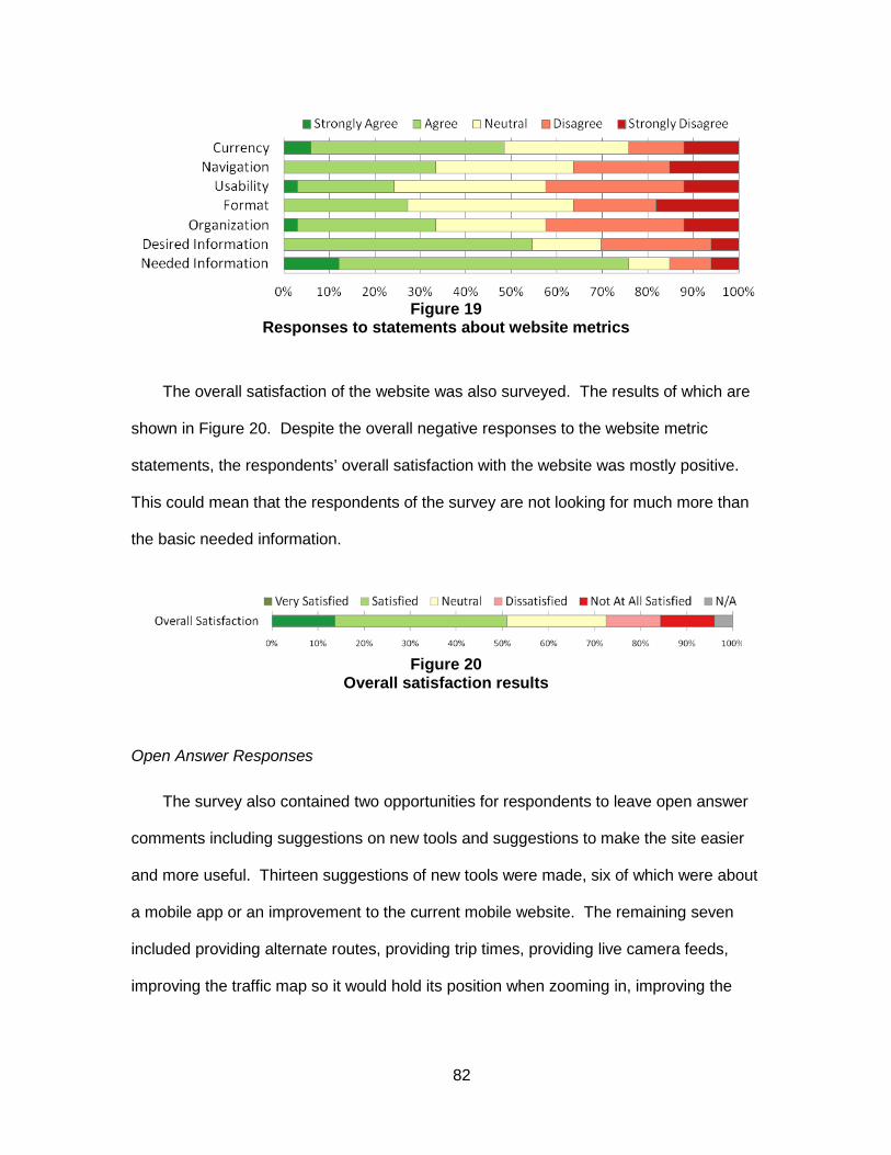
82
Figure 19
Responses to statements about website metrics
The overall satisfaction of the website was also surveyed. The results of which are
shown in Figure 20. Despite the overall negative responses to the website metric
statements, the respondents’ overall satisfaction with the website was mostly positive.
This could mean that the respondents of the survey are not looking for much more than
the basic needed information.
Figure 20
Overall satisfaction results
Open Answer Responses
The survey also contained two opportunities for respondents to leave open answer
comments including suggestions on new tools and suggestions to make the site easier
and more useful. Thirteen suggestions of new tools were made, six of which were about
a mobile app or an improvement to the current mobile website. The remaining seven
included providing alternate routes, providing trip times, providing live camera feeds,
improving the traffic map so it would hold its position when zooming in, improving the

83
display of the upcoming construction, including the live map and incident report on the
home page, and getting access to more cameras.
The second open response question yielded ten suggestions. These included three
suggestions about improving the legibility of current and upcoming construction,
including putting upcoming construction on the traffic map. Also, two suggestions were
made about improving the mobile version of the website, two suggestions were made
about removing the ads on the homepage The rest of the suggestions included
improving the zooming functions on the traffic map, improving the reliability of cameras
and road signs, and providing more relevant information on the homepage.
Future’s Workshop
Methodology
The basic structure of a future’s workshop is: critique phase, fantasy phase, and
implementation phase. The critique phase is meant to expose and bring to light the
actual problem situation. The fantasy phase, designed after Alex Osborne’s
brainstorming techniques, is meant to develop new ideas. While the future’s workshop
was created to empower oppressed groups and create social change, this technique has
been used extensively in environmental issues, and has been increasingly applied in
varied settings with many objectives. [46]
The main purpose of a future’s workshop is to gain implementable ideas to fix a
problem. In the critique phase, the goal is to list all of the negative aspects of the forum
topic. Then the fantasy phase changes those negative statements to positives and
expands to encompass anything and everything needed in a utopian version of the
forum topic. Working backwards from there, an implementation phase is used to define
the ways in which some pieces of the fantasy phase could be provided and prioritized.
The main outcome of this workshop is to devise creative and implementable solutions.

84
A future’s workshop was chosen as a method for collecting data on GDOT’s 511
traveler information system, because a main piece of creating an effective and efficient
traveler information system is to create the system that the public wants to use. A
future’s workshop can allow more freedom than a survey and inspire a more creative
environment. However, the workshop’s structure was changed slightly because the
participants were not capable of implementation and had no way of knowing by what
means their ideas would or could be implemented. Therefore, the implementation phase
was omitted and more focus was placed upon the fantasy phase.
To receive the most creative responses to the workshop, a supportive environment
is necessary so that average commuters would not feel intimidated by industry
professionals such as Intelligent Transportation Systems specialists. Therefore, the
decision was made to hold separate workshops for each stakeholder group.
Stakeholder groups that had a formal organizations and regularly scheduled meetings
were initially targeted, as it would be easier to coordinate logistics for the workshops.
Unfortunately, although several organizations were willing to participate in the forums,
schedule conflicts prevented any of their participation.
The general public workshop was also difficult to coordinate, because the general
users of 511 do not have any kind of formal coalition. To gather them together, the
database created from the “Contact us” page of the NaviGAtor website was used. The
“Contact us” page of NaviGAtor contains a form, in which users can send a message to
the website’s managers. The form itself asks for general information including name, e-
mail, telephone number, “nature of request”, and message. The “nature of request”
question has four options including website or system problem, ramp meter, camera, or
sign malfunction, schedule a tour of the TMC, and other. After the user completes the
form, its contents are placed into a database. The database used in this research
contained almost 1,500 emails from January 28th 2011 to June 26th 2012. The

85
messages containing comments about the 511 system were found and the commenter
was asked to participate in a Future’s Workshop via email. Initially only those comments
that were not aggressive were chosen, however, due to the lack of response, all of the
most recent comments about the 511 system were chosen. In total, almost 100 people
were asked to participate via email, of which, five people confirmed their interest in
attending, ultimately resulting in three actual attendees.
During the workshop, large pieces of paper were used by the recorder to record the
ideas made by the participants as the facilitator conducted the workshop. These
comments were later permanently recorded and coded by topic using three different
categories including functionality/features, organization/aesthetics, and data/information.
These were then analyzed on content and given implementation strategies.
Results
The workshop lasted an hour and yielded a total of 32 main discussion points, 13
during the critique phase and 19 during the fantasy phase. These were coded into the
three previously named categories: functionality/features, organization/aesthetics, and
data/information. The results are provided in Table 9.

86
Table 9 Results of Workshop
Functionality/Features Organization/Aesthetics Data/Information Critiques
Moving map location difficult: zooming/scale Mobile app and website take too long to load App hard to navigate while driving: dangerous Radio updates take too long while driving: ads, announcers Too many menus when calling 511 The web interface is too complex: difficult to navigate (fake map on the home page) Takes too long to get important information on website, not all in one place: incidents Map is too small Too many tabs on website Too many ads on website Inaccurate information: sometimes listed correctly, but misplaced on map, or missing, etc. Too much jargon: connector, spaghetti junction There is not enough information about incidents: exit number, mile post, clearance time
Fantasy Allow app to use GPS to give relevant updates Put quick button on app screen to call in incidents Shorten load times on website and app Allow hovering on map to see features: cameras, incidents, construction, etc. Create app that can use voice control Allow use of origin and destination instead of only dropdown menu on map Include local businesses in app using GPS
- Could sort/filter by popularity/ratings - Could pay for the advertisement = revenue
Have a place for public input instead of ‘contact us’ White background for website Simple map (green, yellow, red is good) Unite under one name: NaviGAtor and 511 confusing, 511 is enough Make map bigger Work with WSB to build on what they have
- Allow others to use data to make websites/apps Include estimated time of clean up for incidents Show closed roads as different than red on map Remove jargon from radio and 511 or also include mile markers and exit numbers Give alternate route for avoiding traffic via website, app, or radio Put estimated time on changeable message signs Add pavement markers and directional signs to confusing parts of the system for wayfinding
While the results of the forum may be useful for gauging what the public wants, the
actual contents of this list are merely suggestions. The more important result comes

87
from teasing out the participants actual interests from the list. For example, four of the
13 critiques are related to the participant’s dissatisfaction with receiving information while
driving including “Mobile app takes too long to load”, “App hard to navigate while driving:
dangerous”, “Radio updates take too long while driving”, and “Too many menus when
calling 511”. Also, 7 (37%) of the 19 suggestions made in the fantasy phase are
relevant to receiving information while driving including “Allow app to use GPS to give
relevant updates”, “Put quick button on app screen to call in incidents”, “Shorten load
time on app”, “Create app that can use voice control”, “Include local businesses in app
using GPS”, “Give alternative route info for avoiding traffic”, and “Put estimated time on
changeable message signs”. Given the consistency, one of the public’s main interests
may be the availability of travel information during one’s trip. Looking more closely at all
11 of the comments made on this subject we see that safety, speed,
convenience/relevance, and accuracy appear to be priorities.
With a better understanding of actual interests regarding information while traveling,
the solution can have a better gauge of effectiveness. For instance, many of these
interests can be included in the development of a new app. If a new app is designed,
which is hands-free, can update quickly and frequently with regard to the user’s current
location, and in which the information is accurate, then all of the interests regarding a
mobile app will have been met. One such application of this nature currently exists. It is
called “Trip Talk” and was created by Information Logistics for the Pennsylvania
Turnpike. While reviews for this app are mixed, with a score of 3.8 out of 5 from 29
reviewers, its features contain all of the elements found to be of interest to the public in
this forum. The application is opened at the beginning of the trip and remains on
throughout the duration. The app automatically “broadcasts” traffic updates and
advisories, using public agency’s data, within a specified range of the mobile device’s
GPS. When there are no updates, the app remains silent, outside of advertisements for

88
businesses also within range of the GPS. It is likely that there are many apps currently
being developed that are similar to this one and are worth looking into.
Most of the other suggestions are fairly straightforward. For example, there appears
to be an interest for speed and convenience with regard to the website, in which load
times and the poor organization make finding information quickly difficult. Most of the
solutions to these issues are technical. For instance showing camera pictures, incident
reports, and construction reports when hovering over the icons shown on the map,
changing the programming to allow faster loading speeds, and adding a trip planning
function by allowing users to input an origin and destination can all take time to
implement. However, in lieu of these technical changes, organizational changes can be
made to meet some of the vested interests and make the website more efficient. For
instance, the real time traffic map can be relocated to the home page. Additionally, the
incidents and construction pages can include the actual report listed below the location
to minimize the number of clicks. In fact, given the space required to report incidents
and construction, including both on one page could also be feasible.
Some suggestions may not be feasible. For example, working with WSB on
creating a traveler information website might not work, as it is important to have a 511
website as a resource for out of town travelers. However, the interest behind it suggests
that the organization and functionality of WSB’s website is superior to GDOT’s, for all of
the reasons listed in the critique phase, and can be used as a model to be improved
upon.
The WSB comment in the fantasy phase also suggests that GDOT allow its data to
be used by private website and application developers. While GDOT currently does
allow developers to use their data, advertising its availability more explicitly to
developers could generate more interest and, thus lead to the creation of more
applications and websites.

89
Feedback Website
Methodology
One of the tools used to seek out user input in GDOT’s ATIS was an online
feedback tool. Online feedback tools are a new way to survey a customer base. There
are many online feedback tools for purchase and they have many different formats and
features. Common features include a short satisfaction pop-up survey, a forum where
users can seed ideas, questions, problems, and praise, a tab on the side of the website,
and an analytic component to view some of the website’s statistics. Different feedback
tools also have different functionalities, for instance, the ability to customize the tool, and
the level of moderation available for the comments can vary between different websites.
This was a large factor in choosing a feedback tool for this study, because, as a public
institution, GDOT had to be very careful about what kinds of comments were shown on
the site. Five of the most popular tools available today are CrowdSound, IdeaScale,
GetSatisfaction, UserEcho, and UserVoice. UserVoice was chosen for this study
because it was available to public institutions for free through a civil engagement
discount, free use for government agencies, and had all of the functionality we were
interested in. The functionalities that we were most interested in through this study were
a high level of customizability, the ability for users to see other users’ ideas, and the
ability for users to vote for each other’s ideas, all of which were offered by UserVoice.
Once UserVoice was selected as the online tool, the site was set up and
customized to restrict the form to only ideas, which were to be approved through email
before being published. The reason the form was restricted to ideas was because of the
backlash from the public after the NaviGAtor website was redesigned. GDOT found the
comments sent in after the redesign to be aggressive in nature. In order to keep the
users of NaviGAtor thinking toward the future in positive ways, it was decided that

90
moderated new ideas would be appropriate at the start, with the addition of comments
and problems later.
The feedback tab was put on the NaviGAtor website on August 20th. Screen
shots of the tab are provided in Figure 21 and Figure 22 below. The tab was seeded
with eight ideas for features that were found from surveying other ATIS websites and
used in the survey including ‘Let people calculate the approximate time of their trip’,
‘Show when the next bus/train is coming’, and ‘Show the status of ramp meters’. This
was in an effort to show users how the system worked and to note their reactions to
these ideas.
Figure 21
Screenshot of Feedback tab on NaviGAtor home page

91
Figure 22
Screenshot of Feedback window after tab is clicked
Results
In the two months that the UserVoice feedback website has been active, 40 ideas have been added. Between September 24th and October 24th, there have also been 144 visits and 25 active users.

92
Table 10 below contains all of the ideas ordered by number of votes and color
coded by type of request as of October 23rd 2012.
Twenty-six of the ideas have one vote, seven have two votes, one has three votes,
and seven have more than 3 votes with 16 as the highest number of votes for any one
idea. This level of activity is low considering the amount of people visiting the site each
day; however, it is not unexpected. There are many possible reasons for the low
percentage of participation. For example, the feedback tab, as an internet convention, is
a fairly new concept that many of the NaviGAtor users may not be familiar with.
Therefore, they may be less likely to see the tab. Also, many users of the NaviGAtor
system, according to our survey, use the NaviGAtor site shortly before leaving on their
trip, which could indicate that they do not have time to browse the ideas. This is further
illustrated by the same ideas being suggested with only one vote each. It is possible
that there will be an increase in feedback site usage the longer it is left active.

93
Table 10 also breaks down the ideas into type of request using the same categories
as the forum comments. The breakdown is 21 ideas for features/functionality, 13 ideas
for data/information, and 4 ideas for organization/aesthetics. Similar to the workshop
comments, the feedback ideas tend to find more solutions in the creation of features or
improved functionality, rather than through changes to the organization of the site.
However, there are many more ideas related to functionality and the site working
properly in the feedback ideas than in the workshop comments. This is most likely
because when something does go wrong, the feedback tab is readily accessible. Adding
the questions, problems, and praise options into the feedback tab would help sort these
ideas out into temporary glitches and more persistent issues.

94
Table 10 Ideas from UserVoice by number of votes and color coded by type of request as of
10/23/2012 Functionality/Features Organization/Aesthetics Data/Information Number of Votes Idea Comment
16 votes Show GA 400 traffic GA 400 traffic should be displayed on your maps.
15 votes Put the cameras back on the traffic map
11 votes Trip Times vs. Historical Trip Times
Bring back the option to calculate current trip times between exits/interchanges and pair them with the old historical trip times. So, if the current trip time is longer than the historical trip time (say for the past year), let us know. If it's speedier, that will help people choose the right route.
10 votes Impact of Incidents I miss the detail on the incidents. Showing moderate for example, then an approximate time the road will be cleared.
8 votes Let people calculate the approximate time of their trip
This could be in the form of a travel time calculator.
6 votes
Show the status of all of the ramp meters, whether they are on, off, or not functioning
6 votes Have more cameras Would be nice to have more cameras for a more complete traffic view and instead of snap shots how about live cameras.
3 votes Adjust scroll bar logic/ clean up icons
Scroll bar scrolls both page and zoom simultaneously; it's annoying, only do zoom! Certain boards will only show if you zoom in.
2 votes Show when the next train or bus is coming
Use GPS to map or give estimated times of arrival of transit vehicles
2 votes Add a weather map to the traffic map
Overlay weather on the traffic map to review both conditions at the same time
2 votes Include transit alerts Map and list all of the transit service interruptions or diversions
2 votes Show current price of HOT lane
2 votes Update incident reports as soon as they are cleared
2 votes Update FAQs
Your FAQ section has info that is obviously pre 2011 as many answers state "expected 2011" and such. If you don't keep FAQs current, they are pointless. Save resources by just deleting that section of the site if it's not current and misleading.

95
Functionality/Features Organization/Aesthetics Data/Information Number of Votes Idea Comment
2 votes Put traffic signs on map
1 vote Site doesn’t work with internet explorer 9 Says it’s some kind of JavaScript error
1 vote show alternative routes to avoid traffic
Have an icon to click on which shows alternate routes to avoid or go around major traffic incidents.
1 vote Make live traffic video available
Picture is worth 1000 words. Video is worth 1000 pictures + you could make $ from advertisements on the site, more than enough to pay for the necessary upgrades. Maybe feed it through YouTube?
1 vote Need a chart to show best times of the day to travel interstates
I want to calculate the best time-of-day to travel alternate routes to work. The traffic rush-hour seems to be getting wider, but is it starting earlier, later, or what? I want to drive from Cartersville to Norcross, and I am looking for "Best Drive Times" that are very specific.
1 vote Give option to save preferences
After turning some features off, such as cameras, need to be able to save this view in a profile
1 vote Show scale at bottom of traffic maps. Google has it, you don’t.
1 vote
Show cameras, incidents, cms, etc. when button is turned on
I have cameras, incidents, cms, closure and construction turned on, and it says they are on...but they are not on.
1 vote Make the map bigger. Make the page fill the screen.
The current map page leaves about 1-1/2" of blue margin on the left and right sides. Why not just make the page fill the screen? Give the user a 'full screen' option to view the map. I constantly have to zoom in and then zoom out to see various parts and to read the street names.
1 vote update the traffic on the map more frequently
1 vote Keep up the good work
1 vote Simplify look
Takes too long to load on computer or portable phone. More space between color lines showing traffic flow along a highway so we can see which direction is having traffic flow issues.

96
Functionality/Features Organization/Aesthetics Data/Information Number of Votes Idea Comment
1 vote: Get a mobile app! Develop a mobile application for the georgia-navigator.com website!!!
1 vote Make the site work without JavaScript
1 vote Show routes for SR 316
It would help if you would let drivers know about roads leading out of town, like Highway 316 towards Athens. This would help drivers know in advance if alternates should be used before we get to the area and get locked into a traffic jam.
1 vote Have mobile apps for Android and iPhone
1 vote Make camera timestamps visible on first click
Visitors have to click image a second time to get a full size view to be able to read the timestamp
1 vote Show ramp closures
1 vote Speed up page loading for mobile
1 vote
Find a way to enlarge sensor map page without changing the map itself
1 vote Fix the Get The App button
The app center opens, but it doesn't take you to the app for Navigator. What's the name of the app? Can't find it...
1 vote Continue the good work!
1 vote
Use Hwy 41 as a description for Cobb Parkway instead of Hwy 3
1 vote Add a link to multi-modal trip planner
Add a link to a trip planner that includes transit or bike directions, such as OpenTripPlanner (http://opentripplanner.com/).
1 vote include personal account abilities
Allow users to sign into their own account on NaviGAtor to save typical trip routes and get updates on those specific routes.
1 vote 511 Line and your cameras don’t seem to be working
I have noticed lately that the camera network and 511Live for my mobile devices are not working. Any idea when these will come back online?

97
Combined Analysis
While larger samples and more representative participants would have improved
this study, all four of the methods used in this research are informative to an internet-
based ATIS design process. The website evaluation provides a baseline for comparison
of features with other traveler information websites, as well as provides a checklist of
criteria that traveler information websites should try to accommodate. Survey methods
provide the demographic characteristics of users and can gather the general
preferences of those users. Future’s workshops provide face-to-face interaction,
improving the relationship between the agency and the users of the ATIS, as well as
providing a helpful dialogue to tease out users’ actual interests. Feedback websites also
improve the relationship between the agency and the users, as well as providing the
user’s priorities and creative problem solving abilities to the agency.
The results obtained from the website evaluation were varied for most of the
categories, but lacked a large range in the overall results, because each website
excelled in different categories. It is possible that one category might be more effective
in increasing user satisfaction than the other. This could be studied by surveying all of
the users across the different websites to see which are the most satisfied in comparison
to the how well each website performed in each of the categories. While surveying
users from every website for satisfaction was outside of the scope of this study, the
results of the public participation methods can be used to make some assumptions
about which categories are currently the most important to Georgia’s NaviGAtor users.
In this case, the users represented in this study seem most interested in the availability
of features, the ease of navigation, and convenience.
The users’ preference for features in the website was most apparent in their
discussions of the traffic map. Many of the comments they made were about putting

98
information that GDOT already has access to on the map, which would add to the level
of features offered in the map’s data layers. Participants also had recommendations
for improving the functionality of the map, such as the ability to roll-over icons for
information, or improving the zoom mechanism. In the survey, respondents also
showed a preference for a travel time calculator to be added to the list of available
features on the website.
The ease of navigation and convenience was also very important to the participants
of these methods. The organization of the website was mentioned frequently as a
problem during the future’s workshop, as well as in the feedback site’s ideas. The
survey respondents also scored usability as the lowest metric in the website satisfaction
questions. Thus, our recommendations for the website include reorganization and an
update to the navigation pane.
Based upon this study’s website evaluation, Georgia’s NaviGAtor website was
ranked fourth for features and ninth for usability. These results suggest that the users
of the website have identified the deficiencies the site has in these areas. It could also
imply that user satisfaction for the NaviGAtor website would increase with the
improvement of the navigation and organization of the website. However, this does not
give much insight into whether or not these categories are the most important for
website quality. More data would be needed to compare the level of satisfaction
between websites with different deficiencies to see which categorical deficiencies have
the greatest impact on overall website satisfaction.
The results of the survey, future’s workshop, and feedback site were in agreement
with each other and reinforced one another. Each of these methods suggested that
most of the basic information considered as necessary is available, but it may not be
presented in the most convenient ways. They also all found a preference for increasing
the mobile capabilities of Georgia’s ATIS.

99
The survey was especially effective for examining the usage characteristics of its
respondents. For instance, there was a significant preference shown for mobile use, but
a majority of the respondents responded that their current method of use was their
computer. It was also clear that most of the respondents check the site most often
shortly before leaving. This type of frequency suggests that the users are likely to
change their travel decisions based on the traveler information, because this is the time
when many travel decisions are being made. It also means that it is important to keep
the website convenient and easy to use, because users may be under time constraints.
This usage pattern could explain a disparity that can be seen between the website
evaluation and the public participation comments. In the website evaluation of webpage
load time, NaviGAtor was among the top performing websites as compared to the other
site evaluated. However, many of the comments in the future’s workshop and the
feedback site were about the website taking too long to load. The users’ perception of
time in this case is may be affected by the time pressure they are usually under when
they are accessing the site.
The survey had very few respondents compared to the volume of visitors the
website regularly receives. Several factors could have contributed to the low response
rate on the survey. First, the survey was only advertised in the alerts box on the
homepage and on the alerts page itself. Therefore, as more alerts were added, the
survey link moved down the list and eventually out of sight. Second, the time in which
users might regularly access the site, according to the survey results, would mean that
most users may be using the site quickly and may not want to stop to take the survey.
The high dropout rate could also indicate this, as users may have left the survey
because they no longer felt they had the time to finish it. Therefore, a different
recruitment plan is needed with a more prevalent placement of the survey link. The user

100
of the website could also be prompted to take the survey upon entering the site via a
pop-up message.
Overall, the survey was effective at providing general characteristics of the
respondent population, but was less useful in describing the areas with the biggest need
for improvement, or the ways in which most users would like to see the issues resolved.
These characteristics are supported by Rowe and Frewer’s study[30], which found that
surveys are able to clarify agreement and disagreement in a population, but do not give
a clear direction for policy makers. The future’s workshop and the feedback website
also had small samples, but provided a better picture of these aspects of the ATIS
development process.
The future’s workshop was held with a very limited number of participants. There
are many possibilities for this low level of enthusiasm. Firstly, the workshop was held at
5:30pm on a workday, so people might be less inclined to take the time to participate.
Secondly, the only users whose contact information was available were those who were
dissatisfied enough with the website that they sent a comment to GDOT via the Contact
Us page. These users may have been too discouraged by then to feel that a workshop
was worth their time. Third and finally, it is generally difficult to get participants involved
in workshops, because workshops are thought of as inconvenient.
Even with the low level of participation, the results of the workshop seemed to
reflect the interests of many of the general users of Georgia’s 511 system in the Atlanta
area. Also, the results were instructive in determining the participants’ actual interests
imbedded in their suggestions. In reaching these interests, simple solutions that resolve
multiple suggestions can be found more easily. This is the greatest advantage of this
participation method as Rowe and Frewer found “’focus groups’ advantage lie in…
identifying values that underlie opinions.” [30] The participants also expressed gratitude
in our holding the workshop. They mentioned that they had felt that their feedback was

101
unimportant to GDOT’s web development and that they had had a lack of trust for the
agency. Therefore, the workshop helped to make the participants feel that their
opinions were being heard. However, this is too small a sample size to make any
conclusions about how the general public would feel in a future’s workshop.
The feedback website also had fewer participants than the number of daily users of
the site would warrant. The reasons for the low response rate were most likely time
constraints, similar to the survey, and also unfamiliarity with the feedback tab. Also,
there were six ideas submitted to the feedback website that were not approved by the
moderator due to their negative or unhelpful language. While none of them were
outright offensive, they did display anger, which does not help produce a creative
discussion forum. These comments were either edited by the site moderator to be more
direct and less emotional, and then resubmitted to the forum or deleted, in the case of
those that did not have any focused directives. The number of angry ideas submitted
was not significant compared to the acceptable ideas posted (6/40), suggesting that the
users who were completely dissatisfied were not the only ones using the feedback site.
The results do coincide with survey and future’s workshop comments. This could
mean that even though there was a low participation rate for each method, they each
gave a fair representation of the general user’s perspective of the NaviGAtor website.
However, because the survey and feedback site’s participants were both self-selected
and the workshop’s participants were selected from a list of users who had previously
made comments on the site, it is more likely that there is a significant bias toward a
specific group of users. Further research should be done on the actual composite of the
NaviGAtor users using a wider participant base.
Overall, all of the participation methods showed different strengths and weaknesses.
The survey provided the most analytical data for the widest span of users, but lacked
any real depth of user input. The future’s workshop provided the most in-depth user

102
input, but is also the most difficult to implement and involves the least amount of users.
Finally, the feedback website provides a medium level of user input at a wide span, but
lacks the analytical data of the survey and the ability to tease out users’ actual interests
versus their suggestions. The small sample size and clear bias toward higher incomes,
in the case of the survey, require this test to be repeated for larger samples to make any
strong conclusions.
Recommendations for Georgia’s ATIS
This study found many potential issues in GDOT’s current ATIS. Its technological
shortcomings caused the most user dissatisfaction, but the website’s navigation and
features were also frequently mentioned throughout all of the public participation
methods and the website evaluation. Several recommendations for each of these issues
are outlined below, as well as a recommendation for all Departments of Transportation
on the use of public participation to avoid user dissatisfaction and increase the
effectiveness of ATISs to reduce congestion.
Technological Recommendations
The most frequently mentioned recommendation in all of the three participation
methods used was the lack of options for mobile access of traveler information. The
typical mobile-optimized website and mobile application can cause some major safety
issues when they are applied to traveler information, because of the distraction they can
create while driving. This was recognized by participants in the future’s workshop.
There are several options in creating mobile traveler information without endangering
drivers. One of these options, the Trip Talk application, was already mentioned in this
report. It is recommended that this application be further researched by GDOT, along

103
with similar technologies, in order to create a safe, user-friendly mobile traveler
information option for travelers in Georgia.
It is also recommended that GDOT ensure the quality of its data. This will allow it
the freedom to open its data up to mobile application creators, in order to give the users
more options as to how we could receive their traveler information. In order to have an
ATIS that is effective in reducing congestion, the greatest number of people possible
must use the information often to make their travel decisions. Providing many different
options will work to meet the greatest number of people’s preferences. This is only
possible if many developers are given the opportunity to create applications, resulting in
competition, which will increase the sophistication and functionality of the applications.
Website Recommendations
One of the factors that led to an increase in demand for traveler information in the
literature was for those who were exposed to the greatest amount of congestion and
volatility in traffic conditions. Atlanta’s congestion fits this description well. Therefore,
there is a high probability that demand for traveler information is high for the commuters
in the Atlanta area. Coupled with the fact that internet technologies are the most
effective form of ATIS, it is important that Georgia’s NaviGAtor website be high quality.
The results of the website evaluation find that NaviGAtor’s lowest scoring category is
usability. Most of the site’s potential issues in this category were for poor navigation. It
is recommended that the website’s organization be changed, specifically for construction
and incidents. Currently, these alerts are found by clicking through individual roads.
Providing an interactive table with both construction and incidents, where sorting and
filtering by construction or incidents, time, road, and direction would be more convenient.
Based upon the color, fonts, use of graphics, and page balance the aesthetics of the
NaviGAtor website were also ranked very low. The agency icons at the top of the page

104
were very large and eye-catching, making the actual traveler information harder to find.
Also, the current advertisements are displayed in the same area and using the same
designs as the actual information. It is recommended that the icons be reduced in size
and that the ads be more obviously separated so that the information that a user
requires stands out more clearly. The picture of the traffic map on the home page was
also found to be confusing to some users, so it is recommended that either a small
version of the actual, interactive map replace the current picture, or that the picture be
removed all together.
The survey found that most users find the real time traffic map to be of the greatest
importance, but they were not fully satisfied with it in its current state. It is recommended
that the traffic map be reformatted according to some of their requests to make it easier
to use. For instance, implementing roll-over information instead of clicking each icon for
more information would make using the map faster. Also, providing the planned
construction in its own data layer would increase the amount of information that can be
displayed. Finally, the zooming mechanism was cited several times for its
inconvenience. Consultation with web developers may provide more options for this
function.
The survey also found that a travel time calculator is one of the most desired tools
for the current website. Travel times were also mentioned in the future’s workshop and
the feedback website. The addition of this information, whether in the form of a
calculator or tabulated for each road segment, is an addition the users of NaviGAtor
would most likely welcome.
Recommendations for User-Based ATIS Development
It is recommended that GDOT should keep the feedback website active. Not only is
the service free to public institutions, the moderation of the ideas is simple and quick,

105
very similar to the processing of the comments made on a Contact Us page. The
minimal to nonexistent cost of the service is worth the added transparency between
agency and user, as well as providing the agency with a wealth of knowledge from the
user on how to make a more effective ATIS. It is also recommended that the options for
questions, problems, and praise be opened up for users, as these would mostly serve to
assist the moderator in sorting the responses.
It is also recommended that a user survey be provided periodically to stay informed
on any changes to the users’ general demographics, usage characteristics, and overall
satisfaction with the site. This could provide insights before dramatic upgrades or
changes to the system take place, which could be taken into consideration when
planning a system redesign.
Implementing future’s workshops is only recommended for ATIS development when
the results of both the feedback website and surveys are predominantly negative. Also,
different recruiting methods are recommended to have more users engaged in the
process. Future’s workshops can be used to find the actual interests of the systems
users to discover the precise reason of their dissatisfaction more than either of the other
methods. It can also give the agency more credibility and create more loyal users.
However, the workshops are also the most difficult to implement, and the feedback
website can provide similar results if very in-depth information is not needed.

106
This page intentionally left blank

107
Proposed Alternatives for the NaviGAtor System Georgia has an opportunity to augment the NaviGAtor system to improve the way it
generates and disseminates traveler information. In examining the literature and work in
other states and regions, several ideas emerge about how to reorganize traveler
information in Georgia. The following discussion presents the existing flows of data and
communication within the NaviGAtor II framework, and then describes four different
approaches with potential advantages and disadvantages. The first two approaches
address the way information from GDOT and municipalities is provided to the traveling
public; the third approach speaks primarily to how information could be collected and
aggregated from a third party. Lastly, a fourth model considers the usefulness and
requirements of creating a NaviGAtor system with multimodal information. The
conclusion of this section is a recommendation that pulls the best features of each of the
alternatives.
Existing Model
The Georgia Department of Transportation manages NaviGAtor II and the traffic
management center in order to operate its state routes and Interstates. The NaviGAtor
system receives data from Closed Circuit Television (CCTV) cameras, the Vehicle
Detection System (VDS), vehicle presence detection from inductive loops and the
Roadway Weather Information System (RWIS). CCTV, VDS and the inductive loops on
interstates are all infrastructure based systems built, maintained and operated by the
GDOT. In addition to the state-run infrastructure, local jurisdictions can build Traffic
Control Centers (TCCs) that relay information from similar devices on local facilities.
These local facilities are not operated through GDOT, but its devices communicate
compatibly with the TMC. The data sharing occurs over hardwire connections using
specific data standards identified by the Georgia and Atlanta Regional Commission’s ITS

108
Architecture. The existing model is shown in Figure 23 with the inputs represented at the
top and traveler information output represented below.
Figure 23 Existing Organization of Traveler Information
The online NaviGAtor is intended to be a resource for all travelers in Georgia by
combining the state-generated information with congestion and incident information from
many local jurisdictions. The 5-1-1 phone system and website should provide travelers in
any part of the state information about local, state and US routes. In practice, however,
there are only a few TCCs that have the capability to fully integrate with NaviGAtor; for
example, most localities are not reporting incidents to the system. Therefore, many
areas lack any coverage at all through the statewide website. In addition to their own

109
website, GDOT maintains a data content server used by news outlets and third parties
that consume traffic data and relay it to the traveling public through other channels.
Independent Agency Approach
The first alternative replaces the statewide NaviGAtor website with a series of local
traveler information sites operated by municipalities. The major challenge for the
effectiveness of NaviGAtor is that travelers can often get better local information from
either local news or other sources; outside the Atlanta region, there is no congestion or
speed data through NaviGAtor, just limited incident information. The proposed solution is
to establish GDOT as a data source rather than an information source. The nuance here
is that data is a set of raw information formatted only for data exchange and is not
accessible to everyday users. Information is the translation of that data into usable
material such as a travel time or arrival prediction. Under this scenario, each local
jurisdiction is responsible for serving both local and statewide traveler information to
local travelers.

110
Figure 24 Independent Agency Model
As shown in Figure 24, this alternative is advantageous to GDOT because it limits
the amount of digital coordination required with local jurisdictions and instead relies on
them to create their own information resources for local use. Considering the entire
public sector, however, it relies on more coordination among agencies with one another
and the public. Major metropolitan areas in other parts of the U.S. have taken a similar
approach by building robust regional 5-1-1 websites like, for example, San Francisco
and Los Angeles. The disadvantages, however, are that locally produced websites may
vary in offerings and quality. Because of local development requirements for individual
sites, the total cost will likely be higher than the single site. Lastly, other than Atlanta, it is
unclear if the remainder of metro areas in Atlanta would have the critical mass of data
resources needed to create a useful local traveler information resource. Larger and more
urbanized states might find this to be a better alternative.
111
Open Data Approach
In the second alternative, GDOT and the TCCs transition away from traveler
information provision entirely and begin to focus primarily on roadway operations and
incident management. Under the open data approach, all of the data generated during
the day-to-day operations of highway facilities would be provided free-of-charge to any
third-party. This data includes facility speeds, traffic volumes and current toll prices
among other things. The intention is for third-party website and mobile app developers to
generate services that leverage traffic data into something useful for the traveling public.
This is a popular method used in transit traveler information. Under the open data
approach, the NaviGAtor website and any GDOT-run mobile apps will be either
discontinued or reduced to minimal functionality, leaving the more user-oriented
functionality to third parties. GDOT and local agencies will rely on news outlets and third-
party websites to generate many different sources for traveler information so that the
public can pick the ones it prefers. This model, shown in Figure 25, represents
decreased public responsibility for serving information to the public and instead relies
primarily on third parties to deliver it.

112
Figure 25 Open Data Model
In order for this to be successful, all participating agencies must provide their
information to a publicly-accessible server using the same data specifications and
formats. After the agencies submit the data together, developers will use an Application
Programming Interface (API) to access the information. An API is a set of instructions
that tells developers how to request information from a server and in what format they
will get data back. This allows a very standard method for accessing data from any part
of the state. Data access alone will not lead to success, however. Open data
approaches are best implemented when an agency provides clear and concise
documentation to ensure that developers understand how to use the data. In addition,
agencies should work with those developers to give them insight into what needs aren’t
being met for travelers. News outlets and website and mobile app developers that use
publicly generated open data are doing so to serve their customers: travelers and transit
113
system users. These are the same people that public agencies like GDOT serve,
underscoring the importance of supporting those developers.
The advantage of the open data approach is that it provides a way for agencies to
focus on operations and incident management, while allowing for a robust set of traveler
information tools run by third parties using publicly generated data.
Third Party Data Approach
While the first two alternatives speak to how information flows from the TMC to the
public, the third alternative is focused primarily on how information is provided to the
agencies themselves. This alternative is, perhaps, the most disruptive to the typical
operations at GDOT but has a high potential for cost savings and improved traveler
information for the public. In this scenario, GDOT would primarily rely on a third-party
technology to retrieve crowd-sourced traffic probe data for roadways. The model,
described in Figure 26 shows that GDOT becomes primarily a pass-through of the third-
party data to the public after using if for traffic operations.

114
Figure 26 Third Party Data Model
GPS-enabled smart phones and devices can now be tracked with enough accuracy
to produce statistically significant traffic speed data [51]. The high market penetration of
mobile devices, and thus geographic coverage, means that companies with expertise in
mobile GPS may be able to provide traffic speed information on all facilities rather than
just those with an infrared based monitoring system. A third-party that supports GDOT
would be bound by certain reliability metrics and service-outage restrictions to ensure
the integrity of the data. In this scenario, the existing pan-zoom-tilt camera system would
continue to operate as this is the only technology currently providing real time visuals of
the roadway. In addition, the existing infrastructure would be maintained for its planned
useful life to calibrate the probe data and provide a backup system. Since private third
parties collect this data, it is unclear how the cost to those companies relates the price

115
charged to DOTs and public entities. Furthermore, the cost to agencies to include
provisions that allow them to share the data with third parties or the public may be
considerably higher.
The disadvantages of this model have in part been mentioned; the lack of internal
control for the data stream means that the agency is relying on a trusted third-party
rather than having a more active purview over the data. It may also be a difficult concept
for many individuals who have long devoted time and energy into the existing VDS
system since this model replaces that work flow.
Multi-Modal Data Integrator
The initial motivation for this project was, in part, to explore the ability for a central
agency to act as a data integrator in order to serve the needs of both drivers and non-
drivers. To that end, it is worthwhile to consider the NaviGAtor system in this capacity.
Currently, the NaviGAtor system provides information and updates on traffic conditions
and incidents. In the multi-modal data model, NaviGAtor would be expanded to include
information from a variety of modes and regions as shown in Figure 27. In the event that
other transportation-related agencies provide data access on conditions related to their
facilities and operations, the NaviGAtor system would find prominent ways to integrate
that data by collecting and using it through Internet-based application programming
interfaces (APIs). For example, travel conditions for a point-to-point trip should include
not only traffic delays, but also any nearby transit delays. These integration techniques
are best seen in robust regional traveler information sites such as 511.org for the San
Francisco Bay Area.

116
Figure 27 Multimodal Data
As of November 2012, MARTA began providing a live data feed1 for the location of
its in-service buses, giving third-parties access to the information (including GDOT, for
example). For non-public-facing data feeds, such those from Atlanta’s Hartsfield-
Jackson International Airport, GDOT would work with those agencies to find ways to
easily provide that information. In this scenario, a person traveling from Midtown to the
Airport might check their planned route online and see what delays they might encounter
from MARTA, the Connector or even the security lines at the airport’s south terminal.
A robust system like this would be impressive and useful to travelers of any mode.
The challenge, however, is the shortage of transportation-related agencies with data that
are willing to share that information and guarantee its reliability. Many public agencies
1 MARTA Developer Resources: http://www.itsmarta.com/marta-developer-resources.aspx

117
fail to see the value in publishing live status information and have not invested in the
information infrastructure to do so. Furthermore, a major barrier to data aggregating is
lack of standards. At the state level, GDOT may find agencies that do the same type of
work in different places; in the event that they share data, it may be done inconsistently.
While transit has succeeded in a standardized route and schedule data format (called
the General Transit Feed Specification), other modes and information have not. Parking
information, for example, might come in different formats from the airport, Park Atlanta,
and the local parking authorities elsewhere in the state.

118
This page intentionally left blank.

119
Recommendations The intent of these alternatives was to identify extremes from which GDOT could
select certain elements. The alternatives affect different aspects of the agency’s
operations and each one has both advantages and disadvantages, making a single
recommendation challenging. The following discussion represents several
considerations related to NaviGAtor and its future implementations.
First, GDOT has made a tremendous investment in the existing NaviGAtor system.
Since the beginning of the effort leading into the 1996 Olympics, the department has
expanded to monitor over 500 miles of freeway with speed detection and adjustable
cameras. This expense is not one to be discarded or overhauled without significant
justification.
The second consideration is the lack of technology to create alternatives for all
infrastructure-based monitoring. There are already companies that can monitor speeds
using mobile GPS-enabled devices and the data they provide is being validated in
research. Existing research, however, does not support any claim that traffic volumes
can be reliably determined with probe-based methods. The reason is that there is no
technology that has a 100 percent market penetration from which a sensor could pick up
readings; loop detectors and video detection remain the state of the art (although loops
are highly susceptible to failure).
The third consideration is the growing private market and its impacts on public
resources. The market for traveler information is not served exclusively by the public
sector; several major players provide traffic data to the public including news outlets and
companies working with navigation systems. Any change to data sharing between the
public and private sectors will impact the market and should be done so in such a way
that maximizes use of public funds. For example, agencies should ensure that data
provided to third parties is not paid for through other channels for their own use.

120
Additionally, to the extent possible agencies should avoid loss of control of data (or
restrictions about publication).
In light of these considerations, certain elements from each of the proposed
alternatives are appropriate for use in Georgia. These are described here and in Figure
28:
Figure 28
Recommended Model
• GDOT should enter into agreements to use third-party data from major routes not
yet served by infrastructure. This takes advantage of new technology that can
improve traveler information for those using Georgia’s facilities. It also gives
GDOT new insights that can help them better manage those facilities. Before
entering into these agreements, GDOT should study pricing structures paid by
other public agencies around the country and compare the key elements of those
agreements related to data restrictions.
121
• Create a method for data integration using web API’s among different public
transportation agencies, namely MARTA and the Hartsfield-Jackson Atlanta
International Airport. MARTA already generates a publicly-facing feed and the
airport has several status indicators that may be shared (security lines, airport
delays etc.) if approached by other public agencies.
• Upgrade NaviGAtor to become the most inclusive data source for all publicly
generated information. This includes the ongoing process to better integrate
incident reporting statewide into the GDOT system.
• Upgrades to the NaviGAtor system should include an open, web-friendly API.
Making an API with thorough documentation and instructions for use will
encourage web developers to use the data. Having more websites and apps will
lead to greater public use of the data generated by agencies. Relating to the first
recommendation, any third-party data can ideally be shared in this API for public
use.
• The best open data ventures have been those where agencies actively interact
with and support the developer community. Clear and concise documentation of
the data helps those who are not specialists in traffic data use it responsibly. An
open dialogue between agencies and developers can also help developers
understand what needs aren’t being met by the agency for incorporation in apps
and websites.
• By pursuing an open data platform, GDOT will be in a better position to benefit
from third-party applications that find innovative ways to deliver its data to a
broad range of travelers. If a positive response from the developer community
leads to many new apps that serve NaviGAtor data on a variety of mobile
devices, it would give GDOT an opportunity to stop using resources to make
mobile apps itself.

122
This page intentionally left blank.

123
REFERENCES
[1] Safe, Accountable, Flexible, Efficient Transportation Equity Act: A Legacy for Users, vol. 307, no. c. 2005, pp. 1–314.
[2] US Department of Transportation, “Final Rule: Real-Time System Management Information Program,” Federal Register, vol. 75, no. 215, pp. 68418–68429, 2010.
[3] Z.-R. Peng and R. Huang, “Design and development of interactive trip planning for web-based transit information systems,” Transportation Research Part C: Emerging Technologies, vol. 8, no. 1–6, pp. 409–425, 2000.
[4] S. J. Barbeau, N. Georggi, and P. Winters, “Dynamic travel information personalized and delivered to your cell phone.” National Center for Transit Research (U.S.), 2011.
[5] J. L. Adler and V. J. Blue, “Toward the design of intelligent traveler information systems,” Transportation Research Part C: Emerging Technologies, vol. 6, pp. 157–172, 1998.
[6] J. Grotenhuis, B. Wiegmans, and P. Rietveld, “The desired quality of integrated multimodal travel information in public transport: Customer needs for time and effort savings,” Transport Policy, vol. 14, no. 1, pp. 27–38, Jan. 2007.
[7] L. Zhang, J.-Q. Li, K. Zhou, S. D. Gupta, M. Li, W. Zhang, M. A. Miller, and J. A. Misener, “Design and Implementation of a Traveler Information Tool with Integrated Real-time Transit Information and Multi-modal Trip Planning,” Transportation Research Record: Journal of the Transportation Research Board, vol. 2215, 2011.
[8] L. Zhang, J.-Q. Li, K. Zhou, S. D. Gupta, M. Li, W. Zhang, and J. A. Misener, “Connected Traveler - Toward the Field Testing of a Multi-Modal Mobile Traveler Information System,” in ITS World Congress, 2010, p. 13.
[9] D. Deeter, “NCHRP Synthesis 399: Real-Time Traveler Information Systems.” Transportation Research Board, p. 70p, 2009.
[10] C. Schweiger, “Use and Deployment of Mobile Device Technology for Real-Time Transit Information,” Washington, D.C., 91, 2011.
[11] A. Khattak, X. Pan, B. Williams, N. Rouphail, and Y. Fan, “Traveler Information Delivery Mechanisms: Impact on Consumer Behavior,” Transportation Research Record: Journal of the Transportation Research Board, vol. 2069, no. 1, pp. 77–84, Dec. 2008.
[12] Federal Communications Commission, Travelers’ information stations, vol. 242, no. 8. US Government Printing Office, 2011, pp. 366–368.
[13] G. Currie and M. Gook, “Measuring the Performance of Transit Passenger Information Websites,” Transportation Research Record: Journal of the Transportation Research Board, vol. 2110, no. -1, pp. 137–148, 2009.
[14] Clear Channel Broadcasting Inc., “Total Traffic Network,” 2012. [Online]. Available: http://totaltraffic.com/. [Accessed: 01-Apr-2012].

124
[15] Economics and Statistics Administration and National Telecommunications and Information Administration, “Exploring The Digital Nation: Home Broadband Internet Adoption In The United States,” Washington, D.C., 2010.
[16] A. Khattak, X. Pan, B. M. Williams, N. Rouphail, and Y. Fan, “Traveler Information Delivery Mechanisms: Impact on Consumer Behavior,” Transportation Research Record: Journal of the Transportation Research Board, vol. 2069, no. 1, pp. 77–84, Dec. 2008.
[17] B. Schaller, “TCRP Synthesis 43 - Effective Use of Transit Websites: A Synthesis of Transit Practice,” Washington, D.C., 2002.
[18] M. Meyerson and E. Banfield, Politics, Planning and the Public Interest: The Case of Public Housing in Chicago. Free Press of Glencoe, 1964, p. 353.
[19] J. S. Coleman, Rational Choice Theory: Advocacy and Critique. London: Sage Publications, 1992.
[20] G. Lyons and S. Farag, “Assessing the Demand for Travel Information: Do We Really Want to Know?,” no. October, 2008.
[21] G. Lyons, “The role of information in decision-making with regard to travel,” in Intelligent Transport Systems, IEE Proceedings, 2006, vol. 153, no. 3, pp. 199–212.
[22] S. Kenyon and G. Lyons, “The value of integrated multimodal traveller information and its potential contribution to modal change,” Transportation Research Part F: Traffic Psychology and Behaviour, vol. 6, no. 1, pp. 1–21, 2003.
[23] H. A. Simon, Administrative behavior, vol. 4. Cambridge Univ Press, 1957.
[24] M. Ben-Akiva and S. Lerman, Discrete choice analysis: theory and application to travel demand, vol. 9. MIT press, 1985.
[25] T. Horan, T. Abhichandani, and R. Rayalu, “Assessing User Satisfaction of E-Government Services: Development and Testing of Quality-in-Use Satisfaction with Advanced Traveler Information Systems (ATIS),” in 39th Hawaii International Conference on System Sciences, 2006.
[26] A. Khattak, F. Targa, and Y. Yim, “Advanced Traveler Information Systems,” Assessing the Benefits and Costs of ITS, pp. 217–240, 2004.
[27] K. Chatterjee, N. B. Hounsell, P. E. Firmin, and P. W. Bonsall, “Driver response to variable message sign information in London,” Transportation research part C: Emerging technologies, vol. 10, no. 2, pp. 149–169, 2002.
[28] Y. Yim, R. W. Hall, and S. Weissenberger, TravInfo Evaluation: Traveler Response Element Broad Area Study. California PATH Program, Institute of Transportation Studies, University of California, 1997.
[29] L. G. Smith, Impact assessment and sustainable resource management. Longman Scientific & Technical, 1993.
[30] G. Rowe and L. J. Frewer, “Public participation methods: A framework for evaluation,” Science, technology & human values, vol. 25, no. 1, pp. 3–29, 2000.

125
[31] D. Zumkeller and S. C. Geweke, “Simulation Game to Explore Effects of Information on Traveler Behavior,” in Transportation Research Board 85th Annual Meeting, 2006, no. 06–1031.
[32] X. Wang and A. Khattak, “Role of travel information in supporting travel decision adaption: exploring spatial patterns,” Transportmetrica, pp. 1–19, May 2011.
[33] Research and Innovative Technology Administration (RITA), “2010 Deployment Tracking Survey Results,” ITS Metropolitan Deployment Tracking Database, 2011. [Online]. Available: http://www.itsdeployment.its.dot.gov/default.aspx. [Accessed: 24-Mar-2012].
[34] US GAO, “Efforts to Address Highway Congestion through Real-Time Traffic Information Systems Are Expanding but Face Implementation Challenges,” Washington, D.C., GAO-10-121R, 2009.
[35] L. Biernbaum, L. Rainville, and A. Spiro, “Multimodal Trip Planner System Final Evaluation Report,” Cambridge, MA, FTA-MA-ITS-2011.1, 2011.
[36] M. Minea, M. Böhm, and S. Dumitrescu, “Data Fusion Integrated Mobile Platform for Intelligent Travel Information Management,” in ICCGI: 2011: The Sixth International Multi-conference on Computing in the Global Information Technology, 2011, pp. 89–94.
[37] K. Rehrl, S. Bruntsch, and H.-J. Mentz, “Assisting Multimodal Travelers: Design and Prototypical Implementation of a Personal Travel Companion,” IEEE Transactions on Intelligent Transportation Systems, vol. 8, no. 1, pp. 31–42, Mar. 2007.
[38] S. Planath, “Promoting Public Transport Through ITS: Towards Greener Transports in the Gothenburg Region,” in ITS World Congress, 2011, pp. 1–8.
[39] L. Olsson, K. Johansson, and M. Gustafsson, “Deploying ITS in Göteborg’s 3700M€ Infrastructure Program,” in 2011 ITS World Congress, 2011, pp. 1–9.
[40] K. G. Zografos, K. N. Androutsopoulos, and V. Spitadakis, “Design and Assessment of an Online Passenger Information System for Integrated Multimodal Trip Planning,” Transportation, vol. 10, no. 2, pp. 311–323, 2009.
[41] J. Su and C. Chang, “The multimodal trip planning system of intercity transportation in Taiwan,” Expert Systems with Applications, vol. 37, no. 10, pp. 6850–6861, Oct. 2010.
[42] M. Minea, M. Böhm, and S. Dumitrescu, “Data Fusion Integrated Mobile Platform for Intelligent Travel Information Management,” in ICCGI: 2011: The Sixth International Multi-conference on Computing in the Global Information Technology, 2011, pp. 89–94.
[43] S. Jang and T. J. Kim, “Modeling an Interoperable Multimodal Travel Guide System using the ISO 19100 Series of International Standards,” in ACM-GIS’06, 2006, pp. 115–122.
[44] T. W. Christensen and J. P. Kristensen, “Requirements and User Needs for an Open Travel Information Platform in Cities in Europe, China and Brazil,” in 2011 ITS World Congress, 2011, pp. 1–11.
[45] S. Son, A. Khattak, and J. Chen, “Comparative Analysis of University Students ’ Acquisition and Use of Travel Information,” Transportation Research Record: Journal of the Transportation Research Board2, vol. 2243, pp. 46–54, 2011.

126
[46] R. V. V Vidal, The Future Workshop: Democratic Problem Solving. IMM, Informatik og Matematisk Modelling, DTU, 2005.
[47] Etre, “Accessibility Check,” 2012. [Online]. Available: http://etre.com/tools/accessibilitycheck/.
[48] Etre, “Color Check,” 2012. [Online]. Available: http://etre.com/tools/colourcheck/.
[49] W. W. W. Consortium, “Standards,” 2012. [Online]. Available: http://www.w3.org/standards/.
[50] Pingdom, “Full Page Test,” 2012. [Online]. Available: http://tools.pingdom.com/fpt/.
[51] J. C. Herrera, D. B. Work, R. Herring, X. (Jeff) Ban, Q. Jacobson, and A. M. Bayen, “Evaluation of traffic data obtained via GPS-enabled mobile phones: The Mobile Century field experiment,” Transportation Research Part C: Emerging Technologies, vol. 18, no. 4, pp. 568–583, Aug. 2010.