Embed Size (px)
Citation preview

Test Docs DocumentationRelease 1
InfoService
May 17, 2016


Contents
1 Very first nothing meaning article, as example 31.1 Subsection Header . . . . . . . . . . . . . . . . . . . . . . . . . . . . . . . . . . . . . . . . . . . . 3
2 Microsoft (bla bla bla) Enterprise Mobility - Technical Documentation Contributor Guide 52.1 Contribute to the Azure RMS documentation . . . . . . . . . . . . . . . . . . . . . . . . . . . . . . 52.2 Ways to contribute . . . . . . . . . . . . . . . . . . . . . . . . . . . . . . . . . . . . . . . . . . . . 52.3 Suggesting changes to Github articles . . . . . . . . . . . . . . . . . . . . . . . . . . . . . . . . . . 52.4 Repository organization . . . . . . . . . . . . . . . . . . . . . . . . . . . . . . . . . . . . . . . . . 62.5 Use GitHub, and Git to contribute to this repository . . . . . . . . . . . . . . . . . . . . . . . . . . . 72.6 Resources . . . . . . . . . . . . . . . . . . . . . . . . . . . . . . . . . . . . . . . . . . . . . . . . . 7
3 About This Book 9
4 Zen Applications 114.1 Zen Classes as CSP Classes . . . . . . . . . . . . . . . . . . . . . . . . . . . . . . . . . . . . . . . 114.2 Zen Application Configuration . . . . . . . . . . . . . . . . . . . . . . . . . . . . . . . . . . . . . . 114.3 Zen Application Classes . . . . . . . . . . . . . . . . . . . . . . . . . . . . . . . . . . . . . . . . . 134.4 Sample Development Project . . . . . . . . . . . . . . . . . . . . . . . . . . . . . . . . . . . . . . 14
5 Zen Pages 215.1 Zen Page Contents . . . . . . . . . . . . . . . . . . . . . . . . . . . . . . . . . . . . . . . . . . . . 215.2 Zen Methods on Client and Server . . . . . . . . . . . . . . . . . . . . . . . . . . . . . . . . . . . . 245.3 Server Side Methods . . . . . . . . . . . . . . . . . . . . . . . . . . . . . . . . . . . . . . . . . . . 285.4 Client Side Methods . . . . . . . . . . . . . . . . . . . . . . . . . . . . . . . . . . . . . . . . . . . 295.5 Zen Properties on Client and Server . . . . . . . . . . . . . . . . . . . . . . . . . . . . . . . . . . . 305.6 Zen Page Class Parameters . . . . . . . . . . . . . . . . . . . . . . . . . . . . . . . . . . . . . . . . 315.7 Zen Special Variables . . . . . . . . . . . . . . . . . . . . . . . . . . . . . . . . . . . . . . . . . . 325.8 Client Side Functions, Variables, and Objects . . . . . . . . . . . . . . . . . . . . . . . . . . . . . . 355.9 Zen Runtime Expressions . . . . . . . . . . . . . . . . . . . . . . . . . . . . . . . . . . . . . . . . 395.10 Zen Proxy Objects . . . . . . . . . . . . . . . . . . . . . . . . . . . . . . . . . . . . . . . . . . . . 425.11 Zen JSON Component . . . . . . . . . . . . . . . . . . . . . . . . . . . . . . . . . . . . . . . . . . 465.12 Zen Page Event Handling . . . . . . . . . . . . . . . . . . . . . . . . . . . . . . . . . . . . . . . . 515.13 Zen Page URI Parameters . . . . . . . . . . . . . . . . . . . . . . . . . . . . . . . . . . . . . . . . 525.14 Zen Layout Handlers . . . . . . . . . . . . . . . . . . . . . . . . . . . . . . . . . . . . . . . . . . . 525.15 Zen Utility Methods . . . . . . . . . . . . . . . . . . . . . . . . . . . . . . . . . . . . . . . . . . . 53
6 Zen Security 556.1 Controlling Access to Applications . . . . . . . . . . . . . . . . . . . . . . . . . . . . . . . . . . . 556.2 Controlling Access to Pages . . . . . . . . . . . . . . . . . . . . . . . . . . . . . . . . . . . . . . . 56
i

6.3 Controlling Access to Components . . . . . . . . . . . . . . . . . . . . . . . . . . . . . . . . . . . 566.4 Legacy Application Access . . . . . . . . . . . . . . . . . . . . . . . . . . . . . . . . . . . . . . . 576.5 CSP Localization . . . . . . . . . . . . . . . . . . . . . . . . . . . . . . . . . . . . . . . . . . . . . 576.6 Zen Localization . . . . . . . . . . . . . . . . . . . . . . . . . . . . . . . . . . . . . . . . . . . . . 59
7 Custom Components 637.1 Composite Components . . . . . . . . . . . . . . . . . . . . . . . . . . . . . . . . . . . . . . . . . 647.2 Overriding Component Style . . . . . . . . . . . . . . . . . . . . . . . . . . . . . . . . . . . . . . . 657.3 Creating Custom Components . . . . . . . . . . . . . . . . . . . . . . . . . . . . . . . . . . . . . . 657.4 Custom Style . . . . . . . . . . . . . . . . . . . . . . . . . . . . . . . . . . . . . . . . . . . . . . . 697.5 Custom Properties . . . . . . . . . . . . . . . . . . . . . . . . . . . . . . . . . . . . . . . . . . . . 717.6 The %DrawHTML Method . . . . . . . . . . . . . . . . . . . . . . . . . . . . . . . . . . . . . . . 747.7 Custom Methods . . . . . . . . . . . . . . . . . . . . . . . . . . . . . . . . . . . . . . . . . . . . . 807.8 Sample Code . . . . . . . . . . . . . . . . . . . . . . . . . . . . . . . . . . . . . . . . . . . . . . . 847.9 Creating Custom Meters . . . . . . . . . . . . . . . . . . . . . . . . . . . . . . . . . . . . . . . . . 86
8 Client Side Layout Managers 878.1 Using Active Groups to Manage Layout . . . . . . . . . . . . . . . . . . . . . . . . . . . . . . . . . 878.2 Adding Objects Dynamically . . . . . . . . . . . . . . . . . . . . . . . . . . . . . . . . . . . . . . 928.3 < activeHGroup > and < activeVGroup > . . . . . . . . . . . . . . . . . . . . . . . . . 938.4 < corkboard > . . . . . . . . . . . . . . . . . . . . . . . . . . . . . . . . . . . . . . . . . . . 948.5 < desktop > . . . . . . . . . . . . . . . . . . . . . . . . . . . . . . . . . . . . . . . . . . . . 958.6 < snapGrid > . . . . . . . . . . . . . . . . . . . . . . . . . . . . . . . . . . . . . . . . . . . 988.7 < dragGroup > . . . . . . . . . . . . . . . . . . . . . . . . . . . . . . . . . . . . . . . . . . 100
9 Client Side Menu Components 1019.1 Building Client Side Menus . . . . . . . . . . . . . . . . . . . . . . . . . . . . . . . . . . . . . . . 1019.2 < csMenuBar > . . . . . . . . . . . . . . . . . . . . . . . . . . . . . . . . . . . . . . . . . . 1069.3 < csMenuBarItem > . . . . . . . . . . . . . . . . . . . . . . . . . . . . . . . . . . . . . . . . 1069.4 < contextMenu > . . . . . . . . . . . . . . . . . . . . . . . . . . . . . . . . . . . . . . . . . 1069.5 < csMenuItem > . . . . . . . . . . . . . . . . . . . . . . . . . . . . . . . . . . . . . . . . . 1069.6 < csMenuSeparator > . . . . . . . . . . . . . . . . . . . . . . . . . . . . . . . . . . . . . . . 1079.7 < buttonBar > . . . . . . . . . . . . . . . . . . . . . . . . . . . . . . . . . . . . . . . . . . . 1079.8 < buttonBarItem > . . . . . . . . . . . . . . . . . . . . . . . . . . . . . . . . . . . . . . . . 107
10 Client Side Library 10910.1 Writing Custom Drag and Drop Methods . . . . . . . . . . . . . . . . . . . . . . . . . . . . . . . . 10910.2 Debugging Client Side Code . . . . . . . . . . . . . . . . . . . . . . . . . . . . . . . . . . . . . . . 111
11 Indices and tables 115
ii

Test Docs Documentation, Release 1
Contents:
Contents 1

Test Docs Documentation, Release 1
2 Contents

CHAPTER 1
Very first nothing meaning article, as example
1.1 Subsection Header
• A bullet list item
• Second item
– A sub item
• Spacing between items creates separate lists
• Third item
1. An enumerated list item
2. Second item
(a) Sub item that goes on at length and thus needs to be wrapped. Note the indentation that must match thebeginning of the text, not the enumerator. Editing
i. List items can even include
paragraph breaks.
3. Third item
4. Another enumerated list item
5. Second item
A sentence with links to Wikipedia and the Linux kernel archive.
Another sentence with an anonymous link to the Python website.
some literal text
This may also be used inline at the end of a paragraph, like so:
some more literal text
print("A literal block directive explicitly marked as python code")
3

Test Docs Documentation, Release 1
4 Chapter 1. Very first nothing meaning article, as example

CHAPTER 2
Microsoft (bla bla bla) Enterprise Mobility - Technical DocumentationContributor Guide
You’ve found the GitHub repository that houses the source for the Microsoft Azure Rights Manage-ment (RMS) documentation, published to the Microsoft Enterprise Mobility (EM) Documentation Center athttps://docs.microsoft.com/en-us/enterprise-mobility/.
2.1 Contribute to the Azure RMS documentation
Thank you for your interest in Enterprise Mobility documentation! See below for details on how you can contribute toour technical documentation.
2.2 Ways to contribute
You can contribute to Enterprise Mobility documentation in a few different ways:
• Participation in an Azure RMS Microsoft forum or Stack Overflow discussion.
• Submitting general feedback/comments at the bottom of articles, or “sidenote” comments within the article fora specific paragraph or sentence.
• Submitting a Pull Request in Github, containing your actual suggested article changes (next section)
2.3 Suggesting changes to Github articles
2.3.1 Minor corrections
You can easily make minor contributions to technical articles directly in the GitHub user interface. Either find thearticle by browsing this repository, or visit the article on https://docs.microsoft.com/en-us/enterprise-mobility/ andclick the “Edit” link in the upper-right corner of the article. This will drop you directly into the Github page for thearticle source, allowing you to create make changes and submit a pull Request which contains your changes.
Minor corrections or clarifications you submit for documentation and code examples in this repository are covered bythe Microsoft Terms of Use (ToU).
5

Test Docs Documentation, Release 1
2.3.2 Larger submissions
If you are making substantial changes to an existing article, adding or changing images, or contributing a new article,you need to fork this repository (via the Github user interface), install Git Bash and a Markdown editor, and learnsome git commands.
If you submit a pull request with new or significant changes to documentation and code examples, we may need tocorrespond with you in the pull request, asking you to submit an online Contribution License Agreement (CLA).
2.4 Repository organization
The content in the repository is loosely aligned with the organization of documentation on the correspondinghttps://docs.microsoft.com/en-us/enterprise-mobility/ page. A series of subdirectories are used for separation of ar-ticle types, along with media content (ie: image files) and include files (markdown files that are reused across multiplemain articles).
2.4.1 Main articles directory
The main articles directory is found directly off the root of the repository, and contains a set of subdirectories with arti-cles formatted as markdown files with an .md extension. For the Azure RMS repository, this is the \Azure-RMSDocssubdirectory.
Within the root of this directory are general articles that relate to the overall service, along with another series ofsubdirectories, which match the common scenarios as outlined on the main landing page for the service. For instance,the “Understand & Explore” articles are in the Understand subdirectory, “Deploy & Use” articles are found in theDeployUse subdirectory, etc.
• Article filenames: Note that filenames use the following rules:
– Contain only lowercase letters, numbers, and hyphens.
– No spaces or punctuation characters. Use the hyphens to separate words and numbers in the file name.
– No more than 80 characters - this is a publishing system limit
– Use action verbs that are specific, such as develop, buy, build, troubleshoot. No -ing words.
– No small words - don’t include a, and, the, in, or, etc.
– Must be in markdown and use the .md file extension.
• Media subdirectory: As mentioned, each article directory also contains a \media subdirectory for corre-sponding media files, inside which are images used by articles that have image references.
• Includes subdirectory: Whenever we have reusable content that is shared across two or more articles, we placeit in an includes subdirectory off of the main articles directory. In the markdown file that wishes to use theinclude file, a corresponding INCLUDE markdown extension is placed in the location where the include fileneeds to be referenced.
The format of the extension is as follows:
> [!INCLUDE[accessibility6](./includes/accessibility6_md.md)]
The statement must begin with > [!INCLUDE, followed immediately by a user-defined name for the includesite enclosed in brackets, [accessibility6], followed immediately by the relative path to the includefile enclosed in parentheses, (./includes/accessibility6_md.md), and terminated with the closingbracket, ].
6Chapter 2. Microsoft (bla bla bla) Enterprise Mobility - Technical Documentation Contributor Guide
Test Docs Documentation, Release 1
2.4.2 Markdown file template
For convenience, each repository contains a markdown template file named template.md, which can be used as a“starter file” if you need to create a new article for submission to the repository. The file contains various examples ofusing markdown to format an article, along with general instructions.
At the top of the file, you’ll also see a “metadata” section, which contains various tags used for tracking informationrelating to the article. Article metadata enables certain functionality, such as author attribution, contributor attribution,breadcrumbs, article descriptions, and SEO optimizations as well as reporting Microsoft uses to evaluate the perfor-mance of the content. So, the metadata is important! If you’re unsure of the values to use for the metadata section,you can leave them blank and they will be reviewed/completed by the pull request reviewer for the repository.
2.5 Use GitHub, and Git to contribute to this repository
If you’re unfamiliar with Git, you may want to review some basic Git terminology. In addition, this StackOverflowthread contains a glossary of Git terms you’ll encounter in this set of steps.
Once you’ve configured your Github account, installed a client Git tool (such as Git Bash), and created your own forkof the repository, you can used the following general steps to start contributing to this repo:
1.Clone the repository:
git clone https://github.com/Microsoft/Azure-RMSDocs.git
2.Create a branch for your local work.3.Edit the Markdown files using your favorite Markdown editor.4 Commit andpush your changes back up to your forked repository:
git add -ugit commit -m "update doc"git push
5.Return to Github and create a pull request, requesting that your branch be pulled into the “master” branch of therelated Enterprise Mobility repository.
1. Your content will be automatically published once the pull request is accepted.
2.5.1 Branches
We recommend that you create local working branches that target a specific scope of change. Each branch shouldbe limited to a single concept/article both to streamline work flow and reduce the possibility of merge conflicts. Thefollowing efforts are of the appropriate scope for a new branch:
• A new article (and associated images)
• Spelling and grammar edits on an article.
• Applying a single formatting change across a large set of articles (e.g. new copyright footer).
2.6 Resources
2.6.1 Markdown
All the articles in this repository use GitHub flavored markdown. See Markdown basics for a good reference on gettingstarted, and the Github Markdown Cheatsheet for a handy syntax reference.
2.5. Use GitHub, and Git to contribute to this repository 7
Test Docs Documentation, Release 1
This is not an exhaustive list, but here are a few ideas for Markdown editors that you may wish to try:
• Atom: GitHub’s Atom markdown editor: http://atom.io. It does not require a license for business use. It hasspell check.
• Prose: This is a lightweight, elegant, on-line, and open source markdown editor that offers a preview. Visithttp://prose.io and authorize Prose in your repository.
• Visual Studio Code - A lightweight but powerful source code editor which runs on your desktop and is availablefor Windows, OS X and Linux.
• Notepad: You can use Notepad for a very lightweight option.
Addresses advanced Zen application programming issues such as security, localization, client side layout management,and custom components.
8Chapter 2. Microsoft (bla bla bla) Enterprise Mobility - Technical Documentation Contributor Guide

CHAPTER 3
About This Book
This book addresses advanced Zen application programming issues such as security, localization, client side layoutmanagement, and custom components.
This book contains the following sections:
• “Zen Applications” provides details about Zen applications.
• “Zen Pages” provides details about Zen page classes.
• “Zen Security” explains how to provide security at the application, page, or component level.
• “Zen Localization” explains how to substitute translated messages for different language locales.
• “Custom Components” explains how to fit new components into the Zen framework.
• “Client Side Layout Managers” explains how users can adjust page layout at runtime.
• “Client Side Menu Components” describes menu components that are easily fine-tuned.
• “Client Side Library” describes the Zen library of client side functions and properties.
There is also a detailed table of contents.
The following books provide related information:
• Using Zen provides the conceptual foundation for developing Web applications using Zen.
• Using Zen Components details the simple built-in Zen components for Web application development.
• Using Zen Reports explains how to generate reports in XHTML and PDF formats based on data stored in Caché.
For general information, see Using InterSystems Documentation.
9

Test Docs Documentation, Release 1
10 Chapter 3. About This Book

CHAPTER 4
Zen Applications
applicationapplicationsZen applicationZen applicationsA Zen application specifies the full set of activities that canresult when a Zen client and server interact. These activities may consist of displaying Web pages, issuing queriesto a database, writing data to disk, and more. When you create a Zen application, you create a suite of Zen classesthat specify these activities. The language you use for these classes is Caché ObjectScript MDASH with embeddedsnippets of XML, HTML, SVG, and JavaScript as needed.
This chapter explores Zen application programming based on the foundation provided by Using Zen. It provides thefollowing topics:
• Caché Server PagesCSPZen Classes as CSP Classes
• Zen Application Configuration
• Zen Application Classes
• Sample Development Project
4.1 Zen Classes as CSP Classes
The base application class %ZEN.application and the base page class %ZEN.Component.page each inheritfrom %CSP.page. This means that every Zen application class and every Zen page class is also an instantiable CachéServer Page. All the CSP page class properties, methods, parameters, and variables (such as %session) are availableto Zen application and page classes.
Important
Experienced CSP programmers should note there are important differences between Zen and CSP classes.For example, the allowed expressions that can appear within #()# syntax is much more restrictive in Zenthan it is in CSP. For details, see the section “Zen Runtime Expressions.”
4.2 Zen Application Configuration
A Zen application may require configuration of its Caché system settings. In order to accomplish this, you need toconfigure the Web application associated with the Zen application. This section explains what this means, and how toperform the configuration steps.
Zen application code resides in a Caché namespace. Each Caché namespace has at least one Web application mappedto it. By default, when you create a new namespace called myNamespace it comes with a Web application alreadymapped to it. This Web application has default settings already in place, including the following settings which aresignificant for Zen:
11

Test Docs Documentation, Release 1
• Web application Name MDASH The application name. The default value is:
/csp/‘‘myNamespace
A Web application of this name is automatically created each time you create a new Caché namespace for anypurpose.
• CSP Files Physical Path MDASH The location on the server where the application stores its files. The defaultvalue is:
install-dir‘‘/CSP/‘‘myNamespace
Where install-dir is the Caché installation directory.
At compile time, a Zen class generates JavaScript (.js) and Cascading Style Sheet (.css) files. It mayalso include external .js or .css files at compile time. If the Zen class is a custom component, it uses theINCLUDEFILES class parameter to list external files, and if it is an application or page, it uses the CSSIN-CLUDES or JSINCLUDES class parameters to do so. To specify the files, you can use full URLs or simple filenames. In the latter case, Zen assumes that the path to these files is the CSP Files Physical Path for the defaultWeb application for the Caché namespace.
Usually a Zen application uses all default settings for its Caché namespace and associated Web application. Thismeans that usually you do not need to configure the CSP Files Physical Path. Everything works without yourintervention. However, if you want to find the generated files, or supply external .js or .css files to use withyour Zen application, then you need to know what the path is: It is the CSP Files Physical Path.
• Default Timeout MDASH Number of seconds of inactivity that cause the Zen application to time out.
• Serve Files MDASH For Zen applications, InterSystems strongly recommends that you set this value to “Al-ways” or “Always and cached.” Do not set it to “No.”
If you do not wish to serve files from Caché, you must ensure there are copies of all the Zen static files in eachdirectory that is using Zen. The Zen static files are found in the /csp/broker directory under the Cachéinstallation directory. Place a copy of each of these files on your web server in the directory associated witheach Zen application. If you are serving files from Caché, you do not need to do this.
• Custom Error Page MDASH The page that is displayed when the Zen application encounters an error that itcannot resolve, such as a page missing from the application. By default, this field is blank and the default errorpage for the browser displays. When a value is supplied for this field, it must be a URL in the appropriateformat; that is, it must be the Web application Name followed by the package and class name of the Zen page todisplay, for example:
/csp/‘‘myNamespace‘‘/MyDemo.Error.csp
• Login Page MDASH The URL of the page to use as the application login page. This URL must begin with theWeb application Name followed by the package and class name of the Zen page to display, for example:
/csp/‘‘myNamespace‘‘/MyDemo.Login.csp
The Change Password Page is similar to Login Page, but specifies the page that allows a user to change hisor her password. For a discussion and examples, see “Controlling Access to Applications” in the chapter “ZenSecurity.”
At compile time, a Zen application finds its associated Web application and applies its configuration settings. That is,Zen cascades through the following sequence and returns the first Web application that it finds:
1. The Zen application knows which Caché namespace it resides in, for example myNamespace.
2. If there is a Web application in this namespace whose name is /csp/‘‘myNamespace, Zen uses the settingsfrom this Web application.
12 Chapter 4. Zen Applications

Test Docs Documentation, Release 1
3. If not, Zen searches for any Web application mapped to myNamespace and returns one based on standardCaché global collation order. For example, if there are Web applications /A and /X that map to myNamespace,Zen uses the settings from application /A.
Important
There is no way to configure an explicit association between a Zen application and a Web application. Thesimplest way to manage the implicit association is to keep each Zen application in its own Caché names-pace that has no other application in it and, when you need to configure application settings, configure thedefault Web application for that namespace.
Whether or not you actually need to configure Web application settings depends on the features that you add to yourZen application. The beginning of this section lists the settings you most often need to adjust. When you need toconfigure Web application settings, the basic procedure is as follows:
• Start the Management Portal.
• Navigate to the System,Security Management,Web Applications page.
• Find the appropriate Web application in the list and click its Edit button. The System,Security Management,WebApplications,Edit Web Application page displays.
• Make changes as needed, and click Save.
failoversticky sessionsticky sessionsload balancingFor High Availability solutions running over CSP, InterSystemsrecommends that you use a hardware load balancer for load balancing and failover. InterSystems requires that youenable sticky session support in the load balancer. This guarantees that MDASH once a session has been establishedbetween a given instance of the gateway and a given application server MDASH all subsequent requests from that userrun on the same pair.
This configuration assures that the session ID and server-side session context are always in sync; otherwise, it ispossible that a session is created on one server but the next request from that user runs on a different system where thesession is not present, which results in runtime errors (especially with hyperevents, which require the session key todecrypt the request). To enable sticky session support, see your load balancer documentation.
Note
It is possible to configure a system to work without sticky sessions, but this requires that the CSP sessionglobal be mapped across all systems in the enterprise and can result in significant lock contention so it isnot recommended.
4.3 Zen Application Classes
A Zen application class is a class derived from %ZEN.application that provides high-level housekeeping andacts as the single root for all of the pages in the application. The application class does not keep an inventory of itsassociated pages. The association between the application and its pages occurs because every Zen page class has anoptional parameter called APPLICATION that identifies the application class. This parameter is optional because anapplication class is optional. Your Zen application needs to provide an application class only if you consider it a usefulconvenience. However, if you do provide an application class, you may provide only one application class and everypage in your application must identify this application using the APPLICATION parameter.
The following table lists the elements of a Zen application class.
When programming, be aware that the application class can contain server-side methods written in ObjectScript,Caché Basic, or Caché MVBasic only. It cannot contain any client-side methods marked with the javascript keyword,or client/server methods marked with the ZenMethod keywords. The application class can execute methods on theserver only.
4.3. Zen Application Classes 13

Test Docs Documentation, Release 1
4.4 Sample Development Project
The chapter “Zen Layout” in the book Using Zen explains how to use template pages and panes to organize layoutand style for a Zen application. This topic traces an example that uses composites and dynamic page generation toorganize behavior for a Zen application. This example uses Zen to add new order entry module pages to an existingWeblink application. Constraints are as follows:
• You need to be able to call the new pages from within your existing application.
• You do not have the luxury of rewriting the whole application, so you want to evolve into Zen one module at atime.
• Your order entry page needs to have flexible content. That is, you need to be able to easily update portions ofthe page depending on the context.
• Your order entry page is so big and complex, you want to only build what you need when the page is first loadedand then fill in some empty segments on the fly.
• Ideally, you want to break up the page into segments that can be written simultaneously by different developers.
The following example addresses these constraints. It purposely does not address layout or style but focuses onbehavior.
• The following class provides the main page. It defines a set of named groups. Each group is populated withcomponents from the server in response to user events. The main page also defines an API (set of methods)that the various components can call to work with the page. For example, there is a method that loads a newcomponent into one of the groups on the page. Note the parameter USERPACKAGES, the groups g1 and g2,and the method loadForm, which adds a specific type of form to the page based on the parameters provided toit.
• The contents of each group is defined using a composite component. A composite is a custom component thatyou build by grouping one or more built-in Zen components in a specific way. For full details, see the “Com-posite Components” section in the chapter “Custom Components.” Composites can be developed individuallyby different developers; this satisfies the project constraints. In the sample code, there are four such compos-ites: searchForm is the starting form that drives the loading of other forms. formOne, formTwo, andformThree are sample forms.
Class TestMe.MainPage Extends %ZEN.Component.page{
/// Comma-separated list of User class packages whose HTML class/// and style definitions are in pre-generated include files.Parameter USERPACKAGES = "TestMe.Components";
/// Class name of application this page belongs to.Parameter APPLICATION;
/// Displayed name of this page.Parameter PAGENAME;
/// Domain used for localization.Parameter DOMAIN;
/// This Style block contains page-specific CSS style definitions.XData Style{<style type="text/css">
/* style for title bar */#title {
background: #C5D6D6;
14 Chapter 4. Zen Applications

Test Docs Documentation, Release 1
color: black;font-family: Verdana;font-size: 1.5em;font-weight: bold;padding: 5px;border-bottom: 1px solid black;text-align: center;
}
/* container style for group g1 */#g1 {
border: 1px solid black;background: #DDEEFF;
}
/* container style for group g2 */#g2 {
border: 1px solid black;background: #FFEEDD;
}</style>
}
/// This XML block defines the contents of this page.XData Contents [ XMLNamespace = "http://www.intersystems.com/zen" ]{<page xmlns="http://www.intersystems.com/zen"
xmlns:testme="TestMe"title="">
<html id="title">TestMe Test Page</html><vgroup id="gSearch" width="100%">
<testme:searchForm/></vgroup><spacer height="40"/><!-- these groups are containers for dynamically loaded components --><hgroup>
<vgroup id="g1"/><spacer width="20"/><vgroup id="g2"/>
</hgroup></page>
}
/// Create a form (via a composite element) and place it into the group with/// the id groupId. formClass is the name of the composite element/// containing the form. formId is the id applied to the form.ClientMethod loadForm(formClass, formId, groupId) [ Language = javascript ]{try {
// if there is already a form, get rid of itvar comp = zen(formId);if (comp) {
zenPage.deleteComponent(comp);}
var group = zen(groupId);var form = zenPage.createComponentNS('TestMe',formClass);form.setProperty('id',formId);
4.4. Sample Development Project 15
Test Docs Documentation, Release 1
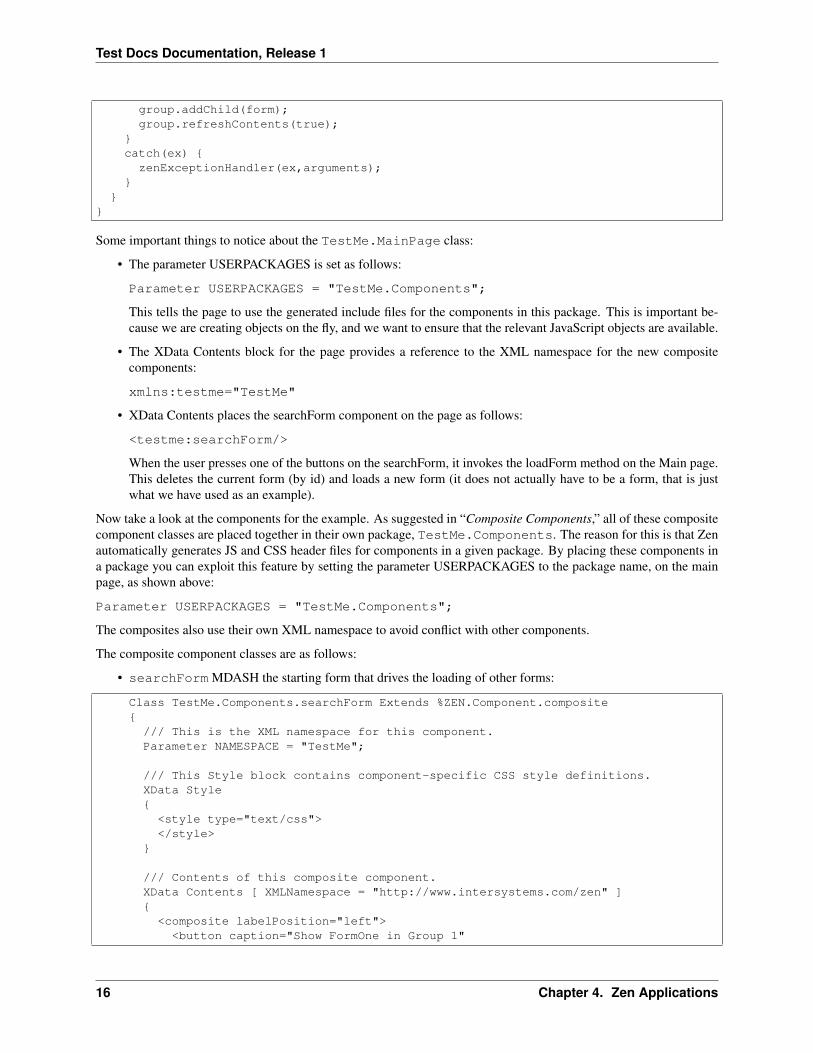
group.addChild(form);group.refreshContents(true);
}catch(ex) {
zenExceptionHandler(ex,arguments);}
}}
Some important things to notice about the TestMe.MainPage class:
• The parameter USERPACKAGES is set as follows:
Parameter USERPACKAGES = "TestMe.Components";
This tells the page to use the generated include files for the components in this package. This is important be-cause we are creating objects on the fly, and we want to ensure that the relevant JavaScript objects are available.
• The XData Contents block for the page provides a reference to the XML namespace for the new compositecomponents:
xmlns:testme="TestMe"
• XData Contents places the searchForm component on the page as follows:
<testme:searchForm/>
When the user presses one of the buttons on the searchForm, it invokes the loadForm method on the Main page.This deletes the current form (by id) and loads a new form (it does not actually have to be a form, that is justwhat we have used as an example).
Now take a look at the components for the example. As suggested in “Composite Components,” all of these compositecomponent classes are placed together in their own package, TestMe.Components. The reason for this is that Zenautomatically generates JS and CSS header files for components in a given package. By placing these components ina package you can exploit this feature by setting the parameter USERPACKAGES to the package name, on the mainpage, as shown above:
Parameter USERPACKAGES = "TestMe.Components";
The composites also use their own XML namespace to avoid conflict with other components.
The composite component classes are as follows:
• searchForm MDASH the starting form that drives the loading of other forms:
Class TestMe.Components.searchForm Extends %ZEN.Component.composite{/// This is the XML namespace for this component.Parameter NAMESPACE = "TestMe";
/// This Style block contains component-specific CSS style definitions.XData Style{
<style type="text/css"></style>
}
/// Contents of this composite component.XData Contents [ XMLNamespace = "http://www.intersystems.com/zen" ]{
<composite labelPosition="left"><button caption="Show FormOne in Group 1"
16 Chapter 4. Zen Applications

Test Docs Documentation, Release 1
onclick="zenThis.composite.btnForm1();"/><button caption="Show FormTwo in Group 1"
onclick="zenThis.composite.btnForm2();"/><button caption="Show FormTwo in Group 2"
onclick="zenThis.composite.btnForm3();"/><button caption="Show FormThree in Group 2"
onclick="zenThis.composite.btnForm4();"/></composite>
}
/// User click on form 1 button.ClientMethod btnForm1() [ Language = javascript ]{
// Notify the page that the search button was pressed// and that a new form should be loaded.zenPage.loadForm('formOne','form1','g1');
}
/// User click on form 2 button.ClientMethod btnForm2() [ Language = javascript ]{
// replace contents of 'g1' with formTwozenPage.loadForm('formTwo','form1','g1');
}
/// User click on form 3 button.ClientMethod btnForm3() [ Language = javascript ]{
// replace contents of 'g2' with formTwozenPage.loadForm('formTwo','form2','g2');
}
/// User click on form 4 button.ClientMethod btnForm4() [ Language = javascript ]{
// replace contents of 'g2' with formThreezenPage.loadForm('formThree','form2','g2');
}}
Every component that is part of a composite can refer to its containing composite group via its compositeproperty. You can see this in the syntax used to invoke client-side methods defined in the composite class, whenthe user clicks a button on this form:
onclick="zenThis.composite.btnForm1();"
• formOne MDASH a sample form:
Class TestMe.Components.formOne Extends %ZEN.Component.composite{/// This is the XML namespace for this component.Parameter NAMESPACE = "TestMe";
/// This Style block contains component-specific CSS style definitions.XData Style{
<style type="text/css"></style>
}
4.4. Sample Development Project 17

Test Docs Documentation, Release 1
/// Contents of this composite component.XData Contents [ XMLNamespace = "http://www.intersystems.com/zen" ]{
<composite labelPosition="left"><titleBox title="Form One"/><text id="ctrlF1" label="Search:"/>
</composite>}
}
• formTwo MDASH another sample form:
Class TestMe.Components.formTwo Extends %ZEN.Component.composite{/// This is the XML namespace for this component.Parameter NAMESPACE = "TestMe";
/// This Style block contains component-specific CSS style definitions.XData Style{
<style type="text/css"></style>
}
/// Contents of this composite component.XData Contents [ XMLNamespace = "http://www.intersystems.com/zen" ]{
<composite labelPosition="left"><titleBox title="Form Two"/><text id="ctrlF1" label="F1:"/><text id="ctrlF2" label="F2:"/><text id="ctrlF3" label="F3:"/><text id="ctrlF4" label="F4:"/>
</composite>}
}
• formThree MDASH yet another sample form:
Class TestMe.Components.formThree Extends %ZEN.Component.composite{/// This is the XML namespace for this component.Parameter NAMESPACE = "TestMe";
/// This Style block contains component-specific CSS style definitions.XData Style{
<style type="text/css"></style>
}
/// Contents of this composite component.XData Contents [ XMLNamespace = "http://www.intersystems.com/zen" ]{
<composite labelPosition="left"><titleBox title="Form Three"/><colorPicker
onchange="zenThis.composite.colorChange(zenThis.getValue());"/>
18 Chapter 4. Zen Applications

Test Docs Documentation, Release 1
</composite>}
/// colorChangeClientMethod colorChange(color) [ Language = javascript ]{
alert('You have selected: ' + color);}
}
4.4. Sample Development Project 19
Test Docs Documentation, Release 1
20 Chapter 4. Zen Applications

CHAPTER 5
Zen Pages
pagepagesZen pageZen pagesPages within a Zen application are derived from the class %ZEN.Component.page.A page class defines and serves the contents of a Zen page in a browser. This chapter explores Zen page programming.It begins from the foundation provided by:
• The book Using Zen
• The previous chapter in this book: “Zen Applications”
This chapter provides technical details to support the information listed above. Topics in this chapter include:
• Zen Page Contents
• Zen Methods on Client and Server
• Server Side Methods
• Client Side Methods
• Zen Properties on Client and Server
• Zen Page Class Parameters
• Zen Special Variables
• Client Side Functions, Variables, and Objects
• Zen Runtime Expressions
• Zen Proxy Objects
• Zen JSON Component
• Zen Page Event Handling
• Zen Page URI Parameters
• Zen Layout Handlers
• Zen Utility Methods
5.1 Zen Page Contents
The visible contents of a page are defined by a set of Zen components that belong to the page. This is the componentobject model for the page. To review background information and diagrams that illustrate the component object modeland its relationship to the page, see the “Zen Application Concepts” chapter in the book Using Zen.
21

Test Docs Documentation, Release 1
The sections in this topic explain how to specify the component object model for a Zen page. The following list oftechniques contains links to the sections that provide details. You can specify Zen page contents as follows:
• Defining Page Contents Statically Using XML You can provide an XML block named XData Contents in theZen page class.
• Modifying Page Contents Prior to Display You can override the %OnAfterCreatePage() callback method so thatit invokes server-side methods that retrieve pointers to components, add components, modify components, hideor redisplay components, and remove components from the component object model.
• Modifying Page Contents after Display. After the page has displayed, set up handlers for user actions (such asclicks) so that they invoke client-side or server-side methods that retrieve pointers to components, add compo-nents, modify components, hide or redisplay components, or remove components from the component objectmodel.
You can also override the onloadHandler() client-side method to modify the page before it displays on the client side.This JavaScript method runs on the client side just prior to displaying the page. See the entry for onloadHandler() inthe table in section “Client Side Callback Methods for the Page” for more information.
You can define the basic page using XML, then use any combination of the above techniques to modify it dynamicallyat runtime.
5.1.1 Defining Page Contents Statically Using XML
A Zen page class can provide an XData Contents block (an XML document embedded within the class definition)that defines the set of components used for the page. It is possible to define the contents of a page programmatically,but in most cases an XML block is more convenient.
The following XData Contents block defines a simple page object containing a single button component:
XData Contents [XMLNamespace="http://www.intersystems.com/zen"]{<page xmlns="http://www.intersystems.com/zen" title="My Page">
<button caption="Hey"/></page>}
The XData Contents block is not processed at runtime. Instead, at compile time the class compiler uses theXData Contents information to generate a method called %CreatePage. You can view (but not modify) thismethod if you like by compiling a page class and then using the View Other command in Studio to see the code gen-erated for the page class. The %CreatePage method is called at runtime to create the contents of the page componentmodel.
For a detailed description of XData Contents, see the chapters “Zen Layout” and “Zen Style” in the book Using Zen.
Note
InterSystems recommends that you include an XML namespace declaration within an XData Contentsdefinition. You do this by providing the xmlns attribute with the < page > element. For example:
<page xmlns="http://www.intersystems.com/zen" >
As you add custom components, chances increase for conflicts between components in different names-paces. This is also true for other Zen elements such as < composite > and < pane > . Addingthe xmlns attribute to the < page > prevents namespace conflicts.
22 Chapter 5. Zen Pages

Test Docs Documentation, Release 1
5.1.2 Modifying Page Contents Prior to Display
If you need to programmatically modify the contents of a page before displaying it, add code to the %OnAfterCre-atePage() callback method as in the following example. This example creates a new group component, then adds thegroup to the page using the %AddChild() method of the page. Subsequently, it creates several components, sets theirproperties, and adds them to the group using %AddChild() method of the group:
Method %OnAfterCreatePage() As %Status{
Set tGroup = ##class(%ZEN.Component.group).%New()Do %page.%AddChild(tGroup)
Set tBtn = ##class(%ZEN.Component.button).%New()Set tBtn.caption = "Button 1"Do tGroup.%AddChild(tBtn)
Set tBtn = ##class(%ZEN.Component.button).%New()Set tBtn.caption = "Button 2"Do tGroup.%AddChild(tBtn)
Quit $$$OK}
Any text you add for captions or other labels is not automatically localized as it is when you add a caption attributeusing XML. If you want localized captions, your %OnAfterCreatePage() method must call the $$$Text localizationmacros. This is not shown in the example above.
If the component is not visible (such as < timer > ) you may add it to a page using %AddComponent() insteadof %AddChild(). For components that are visible, the methods %AddChildBefore() and %AddChildAfter() are alsoavailable. These methods have a second parameter that identifies the existing, sibling component.
One of the best ways to get a sense of how pages are put together programmatically is to look at the generated codefor the %CreatePage method in any Zen page class that uses XData Contents to define page contents. To do this:
1. Open the page class in Studio.
2. Choose View > View Other or Ctrl-Shift-V or the icon.
3. Select the file marked LDQUO1RDQUO and click Open.
4. Search for this string: %CreatePage
5. Scroll through the method to see how components are added to the page.
The following table lists the server-side methods that allow you to dynamically manipulate the component objectmodel for a page. These methods are final and you cannot override them. All group components, including the page,support these methods. You can invoke these methods on a group or page object at any hierarchical level in thecomponent object model.
5.1.3 Modifying Page Contents after Display
If you need to modify components in a page dynamically based on user interactions on the client side, you can dothis as well. The SAMPLES namespace class ZENTest.DynamicComponentsTest provides useful examplesof doing this from both the client and the server sides in response to user input. The “Sample Development Project”section provides another example of dynamically adding components to a page. Remember that you need to bothcreate the component and add it as a child of the page before the user can see it.
In order for components to display correctly on a Zen page, Zen must load the relevant CSS and JavaScript. In theinterest of improving performance, Zen pages do not automatically load CSS and JavaScript for all components. Zen
5.1. Zen Page Contents 23

Test Docs Documentation, Release 1
determines which files to load by parsing the XData Content block and methods called during display of the page, suchas %OnAfterCreatePage(). When you add components to the page dynamically in a client- or server-side method, youmust use the %import property to identify the components so Zen can load the required CSS and JavaScript files. Zenchecks for redundancy, so if the import property specifies a file that has already been loaded, the file is not includedtwice.
The following code illustrates an %import property for the < svgFrame > and < lineChart > components.
Property %import As %ZEN.Datatype.string(MAXLEN = 1000, XMLNAME = "import")[InitialExpression = "%ZEN.SVGComponent.svgFrame,%ZEN.SVGComponent.lineChart"];
If a page displays correctly even though you have not used %import for all dynamically added components, you shouldnot assume that using %import is not necessary. The required CSS and JavaScript may have been included in filesloaded as a result of parsing the XData Content block. However, InterSystems may change the organization of theseCSS and JavaScript files at any time.
The following tables list the client-side methods that allow you to dynamically manipulate the component objectmodel for a page. These methods are final and you cannot override them. The page supports the following client-sidemethods for creating and deleting component objects.
All group components, including the page, support client-side methods for adding and removing component objectsonce they are created. You can invoke these methods on a group component at any hierarchical level in the componentobject model, including the page itself.
5.2 Zen Methods on Client and Server
ClientMethodZenMethodmethodmethodsclientserverclient methodserver methodclient methodsserver methodsThefollowing table outlines the possibilities for different types of methods in a Zen page class.
Any method defined within a page class whose name does not start with % becomes a method of the client-side pageobject. Any method whose name starts with % is server-only.
Any instance method defined with the keyword ClientMethod with [Language = javascript] becomes aclient-side instance method of the client page object. When called, it executes within the browser.
Any method defined with its [ZenMethod] keyword set automatically becomes a client-side instance method ofthe client page object. When the client-side method is called, the server-side version of the method is executed. Anycontext needed to run the server method is automatically provided. An instance method runs as an instance methodon the server; the serialized state of its client object is shipped to the server and instantiated. A class method runs as aclass method on the server (but is called as an instance method on the client).
5.2.1 Synchronous and Asynchronous Methods
AJAXServer-side methods can be called synchronously or asynchronously. This happens very smoothly and automat-ically as follows: If a server-side method has a return type, it is called synchronously, and its return value is returnedto the client. If the method has no return type, it is called asynchronously; the client does not wait for the return value.
The CSP hyperevent logic handles all the details of this, so (unlike AJAX) you do not need to provide any additionalapplication logic to enable asynchronous calls. In this way, Zen takes the next step past most AJAX frameworks.
The main advantages of asynchronous methods are:
• The browser can keep working while the server request is processed
• You can call a server method, modify the client (say by displaying a message), and the server logic can updatethis message when it completes
24 Chapter 5. Zen Pages

Test Docs Documentation, Release 1
Some of the Zen components take advantage of asynchronous methods. For example, the < dataCombo >control uses an asynchronous method to execute a server-side query. This allows the < dataCombo > to displaya loading... message while the query is running. This message is replaced when the response from the serverarrives, so the user does not see the message if the query is quick.
Zen offers a client-side flag zenSynchronousMode that you can set to true to force all methods to be executedsynchronously, regardless of their return values. When false, methods are synchronous if they have a return value,asynchronous otherwise. When you want to set this flag:
1. First, get and store the current value of zenSynchronousMode.
2. Then, set the flag as you wish.
3. When your processing is done, restore the previous value of zenSynchronousMode.
In addition to this convention, the client-side refreshContents method (available for every component) offers a singleoptional argument whose value can be true or false. This flag specifies whether the client should refresh thecomponent synchronously (true) or asynchronously (false). If this argument is omitted, the default is false.
5.2.2 Collections as Method Arguments and Return Types
It is possible to pass a collection between the client and server using a Zen class method. This section explains theconventions for doing so. Both lists and arrays are supported. For an example using lists, see the section “Using aJavaScript Method” in the “Zen Charts” chapter of Using Zen Components.
Important
For the conventions described in this topic to work, the [ZenMethod] must be a class method, declaredusing the ClassMethod keyword as shown in the examples. Collections cannot be arguments or returntypes for instance methods. Also, only collections of literals are supported this way. If an applicationneeds to pass something more complex, it must define a Zen object class and use that instead.
Lists
To pass a list collection as an argument to a server-side Zen class method, use %ListOfDataTypes as the data type,as shown here:
ClassMethod MyMethod(list as %Library.ListOfDataTypes) [ZenMethod]{
Set x = list.GetAt(1)}
From the client, you can call this method by passing it a JavaScript Array object:
var list = new Array();list[list.length] = 22;zenPage.MyMethod(list);
To return a list from the server, use %ListOfDataTypes as the return value for the server-side Zen class method:
ClassMethod MyMethod() as %Library.ListOfDataTypes [ZenMethod]{
Set ret = ##class(%Library.ListOfDataTypes).%New()Do ret.Insert("red")Quit ret
}
From the client, this method returns a JavaScript Array object, which is 0NDASHindexed. For example:
5.2. Zen Methods on Client and Server 25

Test Docs Documentation, Release 1
var list = zenPage.MyMethod();alert(list[0]); // should show 'red'
Arrays
To pass an array collection as an argument to a server-side Zen class method, use %ArrayOfDataTypes as the datatype, as shown here:
ClassMethod MyMethod(arg as %Library.ArrayOfDataTypes) [ZenMethod]{
Set x = arg.GetAt("item1")}
From the client, you can call this method by passing it a JavaScript associative array (an Object in JavaScript). Forexample:
var arr = new Object();arr['item1'] = 22;zenPage.MyMethod(arr);
To return an array from the server, use %ArrayOfDataTypes as the return value for the server-side Zen classmethod:
ClassMethod MyMethod() as %Library.ArrayOfDataTypes [ZenMethod]{
Set ret = ##class(%Library.ArrayOfDataTypes).%New()Do ret.SetAt("red","color")Quit ret
}
From the client, this method returns a JavaScript associative array (an Object in JavaScript). For example:
var arr = zenPage.MyMethod();alert(arr['color']); // should show 'red'
Example: Passing Collections Between Client and Server
The following Zen page class example shows the code conventions required for the following behavior:
• Clicking the top button sends a collection object from client to server.
• Clicking the bottom button retrieves a collection object from the server and sends it to the client.
Class MyApp.Test Extends %ZEN.Component.page{
XData Contents [XMLNamespace = "http://www.intersystems.com/zen"]{<page xmlns="http://www.intersystems.com/zen" title= "">
<button caption="Ship array to server"onclick="zenPage.testClientToServer();" />
<button caption="Get array from server"onclick="zenPage.testServerToClient();" />
</page>}
ClientMethod testClientToServer() [ Language = javascript]{
26 Chapter 5. Zen Pages

Test Docs Documentation, Release 1
var list = new Array();list[list.length] = 22;alert(zenPage.MyClientToServer(list));
}
ClassMethod MyClientToServer(pList As %ListOfDataTypes) As %String [ZenMethod]{Set ^%x = pList.GetAt(1)Quit ^%x
}
ClientMethod testServerToClient() [ Language = javascript]{var list = zenPage.MyServerToClient();alert(list.join('\n'));
}
ClassMethod MyServerToClient() As %ListOfDataTypes [ZenMethod]{Set pList = ##class(%ListOfDataTypes).%New()Do pList. Insert("RED")Do pList. Insert("GREEN")Do pList. Insert("BLOOP")Quit pList
}}
5.2.3 Embedded HTML and JavaScript
The following sample %DrawHTML method uses a syntax that you see commonly throughout the Zen documentationand sample code: The keyword &html followed by HTML statements enclosed in angle brackets <
> . This is ObjectScript syntax for embedded HTML statements:
Method %DrawHTML(){
&html<<div class="MyComponent">Message</div>>}
ObjectScript offers a similar syntax for embedded JavaScript statements in server-side methods marked with the[ZenMethod] keyword. Within these methods, the keyword &js can be followed by JavaScript statements en-closed in angle brackets <>. While executing the method on the server, Zen finds the snippet of JavaScript code andsends this snippet to the client for execution. Note that you must escape any angle brackets used inside the bracketsthat enclose the embedded JavaScript. For example:
Method BtnClickMe() [ZenMethod]{
&js<alert('Client Method');>Quit
}
In addition to &html<> and &js<>, there is also an &sql<> convention for SQL statements. Each of these Ob-jectScript language conventions offers a useful shortcut for enclosing snippets of code within Zen application and pageclasses. For syntax details, see the definition of the & symbol in the Caché ObjectScript Reference.
Important
5.2. Zen Methods on Client and Server 27

Test Docs Documentation, Release 1
The “&js < ... > ” should ONLY be used when working in Synchronous mode and interacting withClassMethods where there is no Document Object Model (DOM) synchronization happening.
In an instance method, if you are modifying elements in the DOM, this code is returned by the hyperevent,bundled in to a function and executed in the browser immediately on return; then the DOM then happens,overwriting any and all changes made by the function. If you are calling Asynchronously, this is also arisk that these functions may not execute in the order you expect them to.
5.2.4 Automatic Type Conversion for Server Side Methods
The mechanism for handling type conversions when invoking a server-side method works as follows:
• When calling a server-side method, any %ZEN.Datatype.boolean arguments are converted from client-side true/false to server-side 1/0.
• If a server method has a %ZEN.Datatype.boolean return type, its return value are converted to a client-sidetrue/false value.
• If a server method has a %ZEN.Datatype.list return type, its return value are converted to a client-sidearray.
• If a server method has a numeric return type, its return value are converted to a client-side numeric value (unlessit the method returns “”).
• Methods that take object-valued arguments behave well if the argument is missing or null.
5.3 Server Side Methods
The topics in this section describe important page and component methods that run on the server side.
5.3.1 Server Side Callback Methods for the Page
Callback methods are user-written methods within a Caché class that are triggered, not by a method call, but by specificsystem events. To distinguish callback methods, Caché developers give them names of the following form:
%OnEvent
where the keyword Event identifies the Caché system event that triggers the callback. If an event supports a callbackmethod, the method controlling the event automatically executes the callback method, if it exists within the class.
You must never execute callback methods by calling them explicitly. Instead, provide an implementation of the methodwithin your class so that Caché can invoke the method automatically when the time is right. If you want your class todo nothing in response to an event, omit any implementation or override of the corresponding callback method.
When an HTML page derived from %ZEN.Component.page is drawn, it invokes a number of callback methodsthat are executed on the server before the page content is sent to the browser. The following table lists these methods.A page class can override these methods to control the behavior of the page.
5.3.2 Server Side Methods for the Page
The page class contains a number of server-side methods that can be useful when working with the component objectmodel on the server, running background tasks on the server, or processing form submits. These methods are final andyou cannot override them.
28 Chapter 5. Zen Pages

Test Docs Documentation, Release 1
The following table lists the general purpose server-side methods. For a list of the server-side page class methodsthat allow you to modify the component object model, see the section “Defining Page Contents Dynamically on theServer.”
5.3.3 Running Background Tasks on the Server
backgroundTimerIntervalbackground taskbackground jobtimeoutThere is a mechanism for starting a background jobfrom a Zen page and tracking its progress within the page. The method runs in the background but the Zen page doesnot wait for the method to return before allowing the user to continue to interact with the Zen application. This canbe useful for cases where a page needs to initiate a long-running task and wants to provide some degree of feedbackto the client while waiting for that task to complete. Running a background task prevents a premature timeout ofthe Zen page, since the maximum configurable timeout for a Zen page may be less than the time required for somelong-running tasks to complete. You must have a product license installed in order to use this Zen feature.
A Zen page class has a backgroundTimerInterval property. This is the interval, in milliseconds, at which timer eventsare fired to check on the status of background tasks started by this page. The default is 1000.
The following table describes the server-side methods that support background tasks; these are available in any classthat inherits from %ZEN.Component.page.
5.3.4 Server Side Callback Methods for Components and Pages
The following table lists and describes server side callback methods supported by components (including the pageitself). These are methods which, if defined, are called in response to specific events. These methods are available foryou to implement or override, for example if you are writing custom components.
5.4 Client Side Methods
The topics in this section describe important page and component methods that run on the client side.
5.4.1 Client Side Callback Methods for the Page
The client-side page object zenPage inherits a number of callback methods; the following table lists and describesthem. These are JavaScript methods which, if defined, are called in response to specific events. These methods areavailable for you to implement or override, for example if you are writing custom components.
5.4.2 Notifying the Client When Server Side Methods Run
onServerMethodCallA Zen page can be notified before and after a server method is invoked. To be notified beforea server method is called, a Zen page class should implement the abstract method onServerMethodCall, a client-sideJavaScript method. For example:
ClientMethod onServerMethodCall(method) [ Language = javascript ]{
alert('Call: ' + method);}
onServerMethodReturnTo be notified just after a server method returns code to the client, a Zen page should implementthe abstract method onServerMethodReturn, a client-side JavaScript method. For example:
5.4. Client Side Methods 29

Test Docs Documentation, Release 1
ClientMethod onServerMethodReturn(method) [ Language = javascript ]{
alert('Return: ' + method);}
onServerMethodErrorTo be notified when a server method returns an error, a Zen page should implement the abstractmethod onServerMethodError, a client-side JavaScript method. For example:
ClientMethod onServerMethodError(error) [ Language = javascript ]{
alert('Return: ' + error);}
5.4.3 Client Side Methods for the Page
The client-side page object zenPage inherits a number of JavaScript methods that can be useful in client-side pro-gramming. Unlike the methods described in the previous section, “Client Side Page Callback Methods,” these methodsare final and cannot be overridden.
The following table lists the general purpose client-side methods. For a list of the client-side page class methods thatallow you to modify the component object model, see the section “Defining Page Contents Dynamically on the Client.”
5.4.4 Client Side Callback Methods for Components and Pages
Components (including the page itself) inherit a number of callback methods; the following table lists and describesthem. These are JavaScript methods which, if defined, are called in response to specific events. These methods areavailable for you to implement or override, for example if you are writing custom components.
5.4.5 Client Side Methods for Components and Pages
Every component on the page (including the page itself) inherits a number of useful JavaScript methods. The followingtable lists these methods. Specific components also have specialized methods not listed in the table. Unlike themethods described in the previous section, “Client Side Page Callback Methods,” these methods are final and cannotbe overridden. You can call them from your page class or custom component class as specified here.
5.5 Zen Properties on Client and Server
Any property defined within a Zen page class whose name does not start with % also becomes a property of the client-side page object. These client-side properties are initialized to the values they held on the server side, immediatelybefore the pageRSQUOs %DrawHTML method was invoked.
If you want to provide values for these page properties before the page displays, you can provide initial values for pageclass properties in one of the following ways:
• Define an InitialExpression for the property in the page class definition, for example:
Property dayList As %ZEN.Datatype.caption[ InitialExpression = "Sun,Mon,Tue,Wed,Thu,Fri,Sat" ];
• Set the property in the %OnCreatePage or %OnAfterCreatePage callback methods.
In server-side methods, you can get and set values of class properties directly, using normal dot syntax. For example:
30 Chapter 5. Zen Pages

Test Docs Documentation, Release 1
Method serverInstanceMethodCreate() [ ZenMethod ]{
#; createSet group = %page.%GetComponentById("group")If '$IsObject(group) {&js<alert('Unable to find group.');>Quit
}Set count = group.children.Count()
Set cal = ##class(%ZEN.Component.calendar).%New()Set cal.id = "NewCal"_countDo group.%AddChild(cal)
Set btn = ##class(%ZEN.Component.button).%New()Set btn.id = "NewBtn"_countSet btn.caption = "New Button"Do group.%AddChild(btn)
Set btn = ##class(%ZEN.Component.text).%New()Set btn.label = "Hey"Do group.%AddChild(btn)
}
To ensure proper synchronization of values between client and server, you should not access property values directlyin client-side methods. You must use the get and set methods provided in the component classes. For single-valuedproperties, use the getProperty and setProperty methods. For example:
var index = table.getProperty('selectedIndex');
Or:
var svg = zen('svgFrame');svg.setProperty('layout','');svg.setProperty('editMode','drag');
Important
Do not confuse getProperty and setProperty with the getValue and setValue methods, which get and setthe value of a control component, and do not apply to any other component property.
There is a limitation on the values that you can assign to the properties of Zen components. You cannot use valuesin the DOM that include any of the ASCII characters with numeric values 0 through 10. These characters are usuallyexpressed in ObjectScript code using the $CHAR ($C) function with a numeric value, for example $C(1) or $C(4).These special characters are reserved for use as delimiters within the Zen serialization code. Therefore, if you use anyof the ASCII characters 0 through 10 in the values of ZEN component properties, these values cause errors when Zendeserializes the page.
Note that MultiDimensional properties are not supported as standard Zen page properties. You can achieve the sameresult using lists or arrays, or via JSON.
5.6 Zen Page Class Parameters
There are a number of class parameters that a page class can use to control the behavior of the page. This section liststhe most useful of them. Others are described in the online class documentation.
APPLICATIONAPPLICATIONPackage and class name of the associated application.
5.6. Zen Page Class Parameters 31

Test Docs Documentation, Release 1
AUTOLOGOUTAUTOLOGOUTIf 1 (true) attempt to refresh this page when its session has expired. If 0 (false) donot. The default is 1.
If AUTOLOGOUT is 1, a Zen page generates JavaScript to set up a timer that reloads the page at about the time whenthe server session expires. It also generates code so that the client automatic logout timer is reset on every call to theserver (the server already resets the session timeout). If AUTOLOGOUT is 0, then none of this code is generated.
If the onlogoutHandler client-side page method is defined and AUTOLOGOUT is set to 1 (true), onlogoutHandler isinvoked each time the logout timer for this page fires. Subsequent behavior depends on the return value of the method,as follows:
• If this method returns true, the normal page logout behavior fires. That is, the page is reloaded, causing a loginpage to appear if the current session has ended.
• If this method returns false, Zen does whatever this method specifies and then suppresses the normal page logoutbehavior.
CSSINCLUDESpage CSSINCLUDESCSSINCLUDES, pageCSSComma-separated list of Cascading Style Sheet(.css) files for the page. You can use URLs or simple file names. If you use simple file names, the CSP FilesPhysical Path specifies the physical path to these files. For further information, see the section “Zen ApplicationConfiguration.” For information about style sheets, see the “Zen Style” chapter in the book Using Zen.
DOMAINDOMAINYou must provide a value for this parameter if you wish to use Zen localization. The default is “”(an empty string indicating no domain).
HTMLATTRSHTMLATTRSZen appends this string to the generated HTML tags at the beginning of the output page,as a set of whitespace-delimited attributes. The default is “” (an empty string indicating that nothing should beappended).
JSINCLUDESpage JSINCLUDESJSINCLUDES, pageJavaScriptComma-separated list of JavaScript (.js) includefiles for the page. You can use URLs or simple file names. If you use simple file names, the CSP Files Physical Pathspecifies the physical path to these files. For further information, see the section “Zen Application Configuration.”
PAGENAMEPAGENAMEDefines a text string that you can use in titles or labels. If not specified, the Zen page classname is used.
PAGETITLEPAGETITLEDefault value for the < page > componentRSQUOs title attribute.
RESOURCERESOURCEName of a system Resource for which the current user must hold USE privileges in order toview this page or to invoke any of its server-side methods from the client.
RESOURCE may be a comma-delimited list of resource names. In this case, the user must hold USE privileges on atleast one of the given Resources in order to use the page.
For further details, see the section “Application Resources” in the “Assets and Resources” chapter of the Caché SecurityAdministration Guide.
SHOWSTATSSHOWSTATSIf 1 (true) display server statistics (such as the time it took to process the page) within acomment at the end of the page. If 0 (false) do not. The default is 1.
USERPACKAGESUSERPACKAGESpage USERPACKAGESUSERPACKAGES, pageComma-separated list of user-defined class packages whose HTML class and style definitions are in pre-generated include files.
USERSVGPACKAGESUSERSVGPACKAGESpage USERSVGPACKAGESUSERSVGPACKAGES, pageComma-separated list of user-defined class packages whose SVG class and style definitions are in pre-generated include files.
5.7 Zen Special Variables
Zen offers several special variables to represent instantiated objects of various types within the Zen application. Thesevariables offer a convenient way to reference the methods and properties of these objects from within Zen page or Zen
32 Chapter 5. Zen Pages
Test Docs Documentation, Release 1
component class code.
Note that the %url special variable contains values only when a page is first served; If you refer to %url in subsequentmethod calls or component refreshes, its properties have no value. If you need to refer to a value passed in via a URIparameter, define a property of your page class, link it to a URI parameter using the ZENURL parameter, and thenrefer to this value via the %page object. For details, see the section “Zen Page URI Parameters.”
Note
In general, local variable names starting with the % character are for system use only. Local variables thatyou define in your applications may begin with “%Z” or “%z”; all other percent variables are reservedfor system use according to the rules described in “Rules and Guidelines for Identifiers” in the CachéProgramming Orientation Guide.
5.7.1 %application
%applicationapplication%applicationThe server-side %application variable is available in every Zen page class.It is intended for use in methods that run while the page object is being created. It refers to the instance, on the server,of the application class that is associated with this page. This allows the page to invoke server-side methods definedin the application class.
For example, the following method is defined in the application class ZENDemo.Application in the SAMPLESnamespace:
ClassMethod GetQuickLinks(Output pLinks) As %Status{
Set pLinks("Home") = "ZENDemo.Home.cls"Set pLinks("Expense Calculator") = "ZENDemo.ExpenseCalculator.cls"Set pLinks("MVC Master Detail") = "ZENMVC.MVCMasterDetail.cls"Set pLinks("MVC Chart") = "ZENMVC.MVCChart.cls"Set pLinks("MVC Meters") = "ZENMVC.MVCMeters.cls"Set pLinks("MVC Form") = "ZENMVC.MVCForm.cls"Set pLinks("Test Suite") = "ZENTest.HomePage.cls"Set pLinks("Controls") = "ZENDemo.ControlTest.cls"Set pLinks("Methods") = "ZENDemo.MethodTest.cls"Quit $$$OK
}
Page classes that are associated with this application can then invoke this method as follows:
Class ZENDemo.ExpenseCalculator Extends %ZEN.Component.page{
/// Application this page belongs to.Parameter APPLICATION = "ZENDemo.Application";
// ...Intervening lines removed...
/// Return an array of quick links to be displayed by the locator bar.ClassMethod GetQuickLinks(Output pLinks) As %Status{// dispatch to our application classQuit %application.GetQuickLinks(.pLinks)
}}
There is no client-side equivalent for %application.
5.7. Zen Special Variables 33

Test Docs Documentation, Release 1
5.7.2 %page and zenPage
%pagezenPagepage%pageZen offers special variables to represent the Zen page object on the client and server sides:
• In ObjectScript, Caché Basic, or Caché MVBasic code that runs on the server side, the page object is %page:
Set btn = %page.%GetComponentById("NewBtn1")
• In Zen runtime expressions, the page object is %page:
text id="rows" label="Rows:" value="#(%page.Rows)#" size="5"/>
• In JavaScript methods that run on the client side, the page object is zenPage:
var chart = zenPage.getComponentById(’chart’);
• In JavaScript expressions that are values of XML attributes, the page object is zenPage:
<button caption="+" onclick="zenPage.makeBigger();"/>
5.7.3 %this, this, and zenThis
%thisthiszenThisthis%thisZen offers special variables to represent a Zen object (component or page) on the client andserver sides:
• In ObjectScript, Caché Basic, or Caché MVBasic code that runs on the server side, the object itself is %this:
Set %this.Name = pSource.Name
• In Zen runtime expressions, the object itself is %this:
<html>Item #(%this.tuple)#: <b>#(%query.Title)#</b></html>
• In JavaScript methods that run on the client side, the object itself is this:
var out = this.getComponentById(’events’);
• In JavaScript expressions that are values of XML attributes, the object itself is zenThis:
onchange="zenPage.changeLayout(’svgFrame’,zenThis.getValue());"
5.7.4 %zenContext
%zenContextzenContext%zenContextWhen any activity on the server is being initiated by Zen, the server-side specialvariable %zenContext tells you which type of activity it is. %zenContext is a string. If %zenContext has thevalue:
• page, Zen is serving the page in response to an HTTP request
• submit, Zen is processing a submit request
• method, Zen is processing a hyperevent
Sometimes it is possible to have trouble with code being executed at compile time. To detect this, check for:
$G(%zenContent)==""
There is no client-side equivalent for %zenContext.
34 Chapter 5. Zen Pages

Test Docs Documentation, Release 1
5.8 Client Side Functions, Variables, and Objects
This section describes the client-side JavaScript utility functions, variables, and objects that are available for use inZen page classes.
5.8.1 zen
zenzen(‘‘id‘‘)
Find a Zen component by id value. Returns the object that matches the input id.
The zen(‘‘id‘‘) JavaScript function is equivalent to the following client-side JavaScript method call on the pageobject:
zenPage.getComponentById(‘‘id‘‘)
You can use the zen(‘‘id‘‘) function wherever JavaScript syntax is appropriate; for example:
<button caption="Save" onclick="zen('MyForm').save();"/>
5.8.2 zenEvent
zenEventzenEvent.‘‘property
Suppose you have:
• A Zen component such as < listBox >
• ...with an event handler attribute such as onchange
• ...whose value is a JavaScript expression
• ...that invokes a client-side JavaScript method defined in the page class
• ...such as notifyOnChange in the following < listBox > example:
<listBox id="listBox" label="listBox" listWidth="240px"onchange="zenPage.notifyOnChange(zenThis);"value="2">
<option value="1" text="Apple" /><option value="2" text="Banana" style="font-size: 1.5em; "/><option value="3" text="Cherry" />
</listBox>
Inside the client-side JavaScript method, such as notifyOnChange, it is convenient to be able to refer to the JavaScriptobject that represents the event itself (the mouse click or a key press). This object contains supplementary informationthat you might want to use in processing the event. The zenEvent special variable is available for this purpose. EachzenEvent.type value is a text string; for example, your code might check the event type as follows:
if (zenEvent.type=="mousedown") {// do something}
The following JavaScript example retrieves the zenEvent.target value to determine the exact target of a mouseclick that occurred within a group. The goal is to find out whether the click was on the group itself (which has anenclosing < div > and therefore a zen attribute) or on a component within the group.
5.8. Client Side Functions, Variables, and Objects 35

Test Docs Documentation, Release 1
// look at source element; IE does not support standard target property.var target = (null == zenEvent.target) ? zenEvent.srcElement : zenEvent.target;
// all enclosing divs will define an attribute called 'zen'.var zen = target.getAttribute('zen');if (zen) {
// do something}
The zenEvent object is a direct analog for the DOM window.event data structure. The following properties areavailable on the zenEvent object:
• zenEvent.clientX
• zenEvent.clientY
• zenEvent.returnValue
• zenEvent.srcElement
• zenEvent.target
• zenEvent.type may have one of the following values.
The W3C has defined the type, scope, and handling for these events; however, support for this standard variesfrom browser to browser. Firefox is generally compliant in its implementation. Internet Explorer implementsa commonly used subset of the standard, provides functional alternatives for many parts of the standard thatthey do not support, and continues to support a wide variety of proprietary legacy events that predate the W3Crecommendation. Developers seeking cross-platform support should confine their designs to the events in thefollowing list:
– beforeunload
– blur
– change
– click
– contextmenu
– dblclick
– error
– focus
– keydown
– keyup
– keypress
– load
– mousedown
– mouseup
– mousemove
– mouseout
– mouseover
– reset
36 Chapter 5. Zen Pages

Test Docs Documentation, Release 1
– resize *
– select *
– submit
– unload
Note
For the events marked with an asterisk (*) in the previous list, the name and intent are standard acrossall browsers, but the scope, target context, and propagation rules are browser specific. Safari imple-ments most of the standard events as well as several platform-specific extensions. Some versions ofSafari do not natively recognize dblclick.
5.8.3 zenGetProp
zenGetPropzenGetProp(‘‘id‘‘,‘‘prop‘‘)
Returns the value of a named property within a Zen component, where:
• id is either the id of a component, or the component object itself.
• prop is the name of the property to set.
The zenGetProp(‘‘id‘‘,‘‘prop‘‘) JavaScript function is equivalent to the following ObjectScript methodcall:
zenPage.getComponentById(‘‘id‘‘).getProperty(‘‘prop‘‘)
For example, this JavaScript:
zenGetProp(’ctrlButton’,’hidden’);
Is equivalent to this ObjectScript:
zenPage.getComponentById(’ctrlButton’).getProperty(’hidden’);
5.8.4 zenIndex
zenIndexzenIndex(‘‘idx‘‘)
Find a Zen component by the system-assigned index number of the component. For components within repeatinggroups, the index may include a dot followed by a 1-based number indicated the position of this component within therepeating group. Returns the object that matches the input idx number.
This JavaScript function is equivalent to the following ObjectScript method call:
zenPage.getComponent( idx‘‘)
5.8.5 zenInvokeCallbackMethod
zenInvokeCallbackMethod(‘‘attr‘‘,‘‘ptr‘‘,’‘‘name‘‘’,‘‘arg1‘‘,‘‘val1‘‘,‘‘arg2‘‘,‘‘val2‘‘,‘‘arg3‘‘,‘‘val3‘‘)
zenInvokeCallbackMethodA utility function used by components to invoke a callback method. The full list of zenIn-vokeCallbackMethod arguments is as follows. The first three arguments are required; the others are optional:
• A callback attribute of the component object, for example this.onclick or this.onchange. The valueof this attribute must be a JavaScript expression that invokes a client-side JavaScript method.
• A pointer to the component object, for example this
5.8. Client Side Functions, Variables, and Objects 37

Test Docs Documentation, Release 1
• The HTML name for the event (must be quoted)
• If an optional fourth argument is provided, it is the name of a formal parameter to be passed to the callbackmethod.
• If there is a fourth argument, a fifth argument must provide a value for the formal parameter.
• zenInvokeCallbackMethod permits up to two more pairs of argument names and argument values. These are theoptional sixth, seventh, eighth, and ninth arguments for zenInvokeCallbackMethod.
For example:
zenInvokeCallbackMethod(this.onclick,this,’onclick’)
For more information about this example, see the “Attaching Event Handlers to HTML Elements” section in the chapter“Custom Components.”
5.8.6 zenLaunchPopupWindow
Deprecated. Use a client-side method that calls the Zen page method launchPopupWindow instead. For full informa-tion, see “Popup Windows” in the “Popup Windows and Dialogs” chapter of Using Zen Components.
5.8.7 zenLink
zenLink(‘‘uri‘‘)
zenLinkA function that escapes any special characters found in a string that is intended to be used as a URI. uri mustbe a valid string. Enclose literal strings in single quotes, for example:
zenLink(’MyApp.MyDialog.cls’)
Also see the section “Popup Windows” in the “Popup Windows and Dialogs” chapter of Using Zen Components.
5.8.8 zenPage
zenPagezenPage.‘‘property
zenPage.‘‘method‘‘(‘‘parameters‘‘)
zenPage is the client side equivalent of %page. See “%page and zenPage” in the section “Zen Special Variables.”
5.8.9 zenSetProp
zenSetPropzenSetProp(‘‘id‘‘,‘‘prop‘‘,‘‘value‘‘)
Set the value of a named property within a Zen component, where:
• id is either the id of a component, or the component object itself.
• prop is the name of the property to set.
• value is the value to assign to the property.
The zenSetProp(‘‘id‘‘,‘‘prop‘‘,‘‘value‘‘) JavaScript function is equivalent to the following Ob-jectScript method call:
zenPage.getComponentById(‘‘id‘‘).setProperty(‘‘prop‘‘,‘‘value‘‘)
For example, this JavaScript:
38 Chapter 5. Zen Pages

Test Docs Documentation, Release 1
zenSetProp(’ctrlButton’,’hidden’, false);
Is equivalent to this ObjectScript:
zenPage.getComponentById(’ctrlButton’).setProperty(’hidden’,false);
5.8.10 zenSynchronousMode
zenSynchronousModezenSynchronousMode
A flag with the value true (all methods are executed synchronously regardless of whether or not they have returnvalues) or false (methods are synchronous if they have a return value, asynchronous otherwise). See the section“Synchronous and Asynchronous Methods.”
5.8.11 zenText
zenText(‘‘id‘‘,‘‘p1‘‘,‘‘p2‘‘,‘‘p3‘‘,‘‘p4‘‘)
zenText is the client side equivalent for $$$Text. See “Localization for Client Side Text” in the chapter “Zen Localiza-tion.”
5.8.12 zenThis
zenThis.‘‘property
zenThis.‘‘method‘‘(‘‘parameters‘‘)
zenThis is the client side equivalent for %this. See “%this, this, and zenThis” in the section “Zen Special Variables.”
5.9 Zen Runtime Expressions
expressionexpressionsruntime expressionruntime expressionsruntimeRather than always providing static informationin a Zen page description, sometimes it is useful for the page running on the client to be able to invoke runtime expres-sions that execute on the server. For example, perhaps the caption text for a button needs to be different depending onthe identity of the currently logged-in user, which can only be determined from the server at runtime. Various runtimevalues can play a part in these decisions. For this reason, Zen provides a way for client-side application code to containexpressions that are resolved only on the server, and only at runtime.
Important
The syntax rules for Zen runtime expressions are extremely specific.
A runtime expression is enclosed within #()# and looks something like this:
<button caption="#(myObject.myProperty)#" />
Where myProperty has a specific value on the server at runtime.
Zen runtime expression syntax can be used, with restrictions, in the following contexts only:
• XML that is embedded within an XData block (certain XML elements and attributes only)
• JavaScript that is embedded within a
> block in a ZenMethod
• A JavaScript expression provided as the value of an XML attribute such as onclick
5.9. Zen Runtime Expressions 39

Test Docs Documentation, Release 1
• HTML that is embedded within an
> block in a server-side method
The following items cannot appear within the #()# delimiters of a Zen runtime expression:
• Methods, such as %this.method(). Only properties are allowed.
• Properties at a level greater than first level. For example, chaining such as this.parent.other.thing.is not allowed.
• Calls to macros, such as $$$Text.
• JavaScript expressions.
• ObjectScript expressions. The exception to this rule is when a runtime expression appears inside a server-sideObjectScript method or ZenMethod. See “Runtime Expressions in Server-Side Methods.”
5.9.1 Runtime Expressions in XML
Zen runtime expressions can be used within a Zen class XData block, but only the values of specific XML elementsand attributes can contain Zen runtime expressions. One such example is the < button > caption attribute:
<button caption="#(%query.Name)#" onclick="alert('#(%query.Name)#')"/>
Of all the possible < button > attributes, only caption, value, and hidden support Zen runtime expressions.The value of onclick in the above example does contain a Zen runtime expression, but this is acceptable becausethe value of onclick is a JavaScript expression, which may contain #()# syntax. Refer to the restrictions listed inthe topic above.
XML elements and attributes that support Zen runtime expressions are clearly identified throughout this book; youmay find them by searching for the #()# string in the book text.
Another way to tell that an XML attribute supports runtime expressions is to consult the Caché class documentationto see if the corresponding property has the datatype parameter ZENEXPRESSION set to 1 (true).
You cannot cause a property to support runtime expressions by setting ZENEXPRESSION=1. Built-in Zen componentclasses provide ZENEXPRESSION=1 to indicate that the property supports runtime expressions, not to enable it to doso.
On the other hand, when you create your own component subclasses, you can set ZENEXPRESSION=1 for propertiesin those subclasses. It must be a property of a custom component class and not a property of one of the built-in Zencomponent classes. For details, see the “Datatype Parameters” section in the chapter “Custom Components.”
A significant number of XML attributes support Zen runtime expressions, but only one XML element supports them.This is the < html > component, which may contain literal text and #()# runtime expressions. For example:
<html>Item #(%this.tuple)#: <b>#(%query.Title)#</b></html>
5.9.2 Runtime Expressions and Special Variables
A runtime expression may use the server-side special variables listed in the section “Zen Special Variables.” Zenruntime expressions support the following server-side special variables only:
• %composite
• %page
• %query
• %session
40 Chapter 5. Zen Pages

Test Docs Documentation, Release 1
• %this
• %url
By limiting expressions to a predefined set of object property values, the page developer maintains control over whichserver-side values the client can see. Otherwise it would be possible for a page to execute code that the page developerdid not intend, and thus present a security risk.
For example, the %session you see in a Zen expression is not the %session object from the server side. It is aclient-side expression that can be evaluated to get a user-data value from the %session object. Suppose your pagehas a component whose id is test. If your Zen expression uses:
#(%session.test)#
Then on the server this becomes:
%session.Data("test")
And the value associated with the component whose id is test is returned in place of the Zen expression.
For more information about the %session object, see the “%CSP.Session Object” section in the book Using CachéServer Pages (CSP).
5.9.3 Runtime Expressions in Server-Side Methods
The following is an example of a server-side method with an &html<> block, in which a runtime expression invokesthe ObjectScript function $ZCONVERT ($ZCVT) to help it to write out the elements of a bulleted list:
Method %DrawHTML(){
&html<<div class="demoSidebar">>Write $ZCVT(..text,"O","HTML")
#; bulletsSet tCount = ..bullets.Count()If (tCount > 0) {&html<<ul>>For n = 1:1:tCount {
Set tBullet = ..bullets.GetAt(n)&html<<li>#($ZCVT(tBullet.text,"O","HTML"))#</li>>}
&html<</ul>>}
}&html<</div>>
}
The following is an example of a ZenMethod with a
> block, in which a runtime expression passes the server-side identifier pIndex to JavaScript code that needs toexecute on the client. In a later &js<> block, runtime expressions invoke the ObjectScript function $RANDOM ($R)to produce drawing coordinates, and provide CSS style statements to configure a graphical object:
ClassMethod GetSVGContents(pIndex As %Integer) [ ZenMethod ]{
#; get the svg component&js<var svg = zenPage.getComponent(#(pIndex)#);>
#; linesFor i=1:1:30 {
5.9. Zen Runtime Expressions 41
Test Docs Documentation, Release 1
&js<var line = svg.document.createElementNS(SVGNS,'circle');//line.setAttribute('x1',200);//line.setAttribute('y1',100);line.setAttribute('r',5);line.setAttribute('cx',#(10+$Random(380))#);line.setAttribute('cy',#(10+$Random(180))#);line.setAttribute('style',
'#("fill: yellow; stroke: black; stroke-width: 2;")#');svg.svgGroup.appendChild(line);
>}
Quit}
Note
The samples in this topic demonstrate how runtime expressions can be used in a server-side method. In aclient-side JavaScript method, you can achieve similar results without using runtime expressions.
5.10 Zen Proxy Objects
zenProxyproxyZen proxyproxy objectproxy objectsIt can be convenient to have a simple way to pass arbitrary databetween the client page and a server process. For this reason, Zen defines a simple generic object called a proxy object.You can:
1. Create this object within a client page
2. Pass it to the server (where it is automatically marshalled as a server object)
3. Use and modify it on the server
4. Pass values to the client
This section describes this sequence and provides syntax examples.
5.10.1 Proxy Objects on the Client
On the client, a proxy object is simply an instance of a JavaScript zenProxy object. You can create a zenProxyobject and fill in its properties as you would any other object; for example:
var proxy = new zenProxy();proxy.Name = 'John Smith';proxy.City = 'Boston';
Set Properties
A proxy object is completely generic; it has no predefined properties. You can set whatever property value you wishwithin a zenProxy object, subject to the following restrictions:
• The value of a property must be a literal value (string or number) and not an object or function. Only literalvalues are supported; you cannot set the value of a zenProxy property to be an object. If you need a morecomplex object like this, build a normal Zen object.
• The name of a property must be valid in JavaScript.
42 Chapter 5. Zen Pages

Test Docs Documentation, Release 1
• A zenProxy object cannot be a property of a Zen component. If you use the following syntax in a Zen componentclass, it fails to compile:
Property a As %ZEN.proxyObject;
You may subclass %ZEN.Component.object instead.
Clear Properties
You can remove all properties within a zenProxy object by using its clear method:
obj.clear();
5.10.2 Passing a Proxy Object to the Server
You can pass a proxy object to the server by defining a ZenMethod and declaring one of its arguments to be of type%ZEN.proxyObject. For example:
ClassMethod MyMethod(pProxy As %ZEN.proxyObject) As %Boolean [ZenMethod]{
Set x = pProxy.NameQuit 1
}
5.10.3 Proxy Objects on the Server
When the client invokes MyMethod (as defined in the previous topic) it passes an instance of the zenProxy objectto the server. On the server, this instance is automatically converted to a %ZEN.proxyObject with all the sameproperties as the client object.
The server side %ZEN.proxyObject object is also completely generic, with no predefined properties.
Important
Do not attempt to use the $Data or $Get function with an instance of %ZEN.proxyObject. If you doso, the function returns an “Invalid Property” error.
Get Properties
You can retrieve values from the %ZEN.proxyObject object using normal property syntax. For example:
Set a = pProxy.property1Set b = pProxy.property2
You can also get the complete set of properties within a %ZEN.proxyObject object as a local array using the%CopyToArray method:
Do pProxy.%CopyToArray(.array)
If you refer to a property that is not currently defined, you get a value of “” and not an error.
5.10. Zen Proxy Objects 43

Test Docs Documentation, Release 1
Set Properties
Setting a property automatically defines a property if it is not already defined:
Set pProxy.property3 = "value"
There is also a %CopyFromArray method to set the complete set of properties within a %ZEN.proxyObject object.
Clear Properties
You can remove all properties from the server side %ZEN.proxyObject object using its %Clear method:
Do pProxy.%Clear()
5.10.4 Passing Values to the Client
If a ZenMethod that is passed a %ZEN.proxyObject object modifies it, the changes are automatically applied tothe client version of the object when the method call completes. This includes any properties that have been added orremoved.
Important
If your ZenMethod has no return value, then it is executed asynchronously. This is Zen normal behavior;for details, see the section “Synchronous and Asynchronous Methods.” In this case, changes to the client-side zenProxy object are still applied, but you do not know when these changes are applied.
It is also possible to define a ZenMethod that returns a %ZEN.proxyObject:
ClassMethod MyCreate() As %ZEN.proxyObject [ZenMethod]{
Set tProxy = ##class(%ZEN.proxyObject).%New()Set tProxy.Data = "Some data from the server"Quit tProxy
}
A client method can call this ZenMethod as follows:
ClientMethod clientMethod() [Language = JavaScript]{
var proxy = zenPage.MyCreate();alert(proxy.Data);
}
5.10.5 Proxy Object Examples
This section describes built-in Zen components that offer opportunities to use proxy objects.
< html >
The < html > component provides an OnDrawContent callback that can supply the content of the component.This callback is passed a seed value: an application-specific string that is interpreted by the callback method. If theclient sets this seed value to a zenProxy object, then it is automatically marshalled as a %ZEN.proxyObject on theserver when the OnDrawContent callback is called.
Suppose a Zen page defines an < html > component as follows:
44 Chapter 5. Zen Pages

Test Docs Documentation, Release 1
<html id="html" OnDrawContent="DrawHTML"></html>
And also defines OnDrawContent as follows. This OnDrawContent method checks to see if the input argument pSeedis an object, and if so it retrieves and displays its Name and SSN properties. Otherwise, it displays an error message:
ClassMethod DrawHTML(pSeed As %String) As %Status{
If $IsObject(pSeed) {&html<<table>>&html<<tr><td>Name:</td><td>#(pSeed.Name)#</td></tr>>&html<<tr><td>SSN:</td><td>#(pSeed.SSN)#</td></tr>>&html<</table>>
}Else {&html<<i>No data to display</i>>
}Quit $$$OK
}
You could update this < html > component from a client side JavaScript method by instantiating a new zenProxyobject, assigning values to Name and SSN properties on that object, assigning this zenProxy object as the value of theseed property for the < html > component, and then refreshing the component, as in the following JavaScriptexample:
ClientMethod updateHTML() [Language = JavaScript]{
// find the html componentvar html = zen('html');if (html) {var proxy = new zenProxy();proxy.Name = 'John';proxy.SSN = '222-22-2222';
// set seed value and invoke server refreshhtml.setProperty('seed',proxy);html.refreshContents();
}}
For more about the < html > component, see its description in the “Other Zen Components” chapter of UsingZen Components.
< dataController >
The < dataController > component has a method, getDataAsObject(), that returns the current set of propertieswithin a < dataController > as a zenProxy object. This provides an easy way to get data from a controller andpass it to the server for some purpose other than those already built into the < dataController > .
For more about the < dataController > component, see the “Data Controller” section of the “Model View Con-troller” chapter in Using Zen Components.
< form > and < dynaForm >
The < form > and < dynaForm > components have a method, getValuesAsObject(), that returns the currentvalues of all controls in this form as a zenProxy object. The names of the properties within the proxy object are basedon each controlRSQUOs name attribute.
5.10. Zen Proxy Objects 45

Test Docs Documentation, Release 1
For more about the < form > and < dynaForm > components, see the “Zen Forms” chapter in Using ZenComponents.
5.11 Zen JSON Component
JSONjsonProviderThe Zen < jsonProvider > component provides a way to transport object data between aserver and client, or between client and server, using JavaScript Object Notation (JSON) format. Zen also provides aspecialized version of the < jsonProvider > , which is discussed in the section “jsonSQLProvider.”
JSON refers to a JavaScript programming technique that allows you to define a set of one or more objects using objectliteral syntax. For example:
var obj = {name:'Bill', home:'New York'};
The Zen < jsonProvider > works as follows:
• Place an instance of the invisible < jsonProvider > component in your < page > definition in XDataContents.
• Supply a value for the < jsonProvider > OnGetTargetObject attribute that is the name of a method inthe page class that creates an object or set of objects and returns it. The returned object can be an instance of aspecific class or classes, or it can use the Zen proxy object class, %ZEN.proxyObject.
• Write the OnGetTargetObject callback method. See “The OnGetTargetObject Callback Method.”
• When the page is rendered, the < jsonProvider > converts the target object to a set of JavaScript objects.You can see these objects if you view the source of the page as sent to the client.
• The < jsonProvider > has a client-side method, getContentObject(), which returns the client-side versionof the target object. This is a graph of generic JavaScript Object objects that have the same properties and valuesas the target objects. If the target object refers to other objects or has collections (literal or object-valued) thenthe JavaScript object has corresponding object or collection properties. The client can modify these client-sideobjects or replace them completely using the getContentObject() method.
• The client can ship its content objects back to the server for processing by calling the submitContent() method.This converts the objects back into server-side objects and invokes the page class method specified by the <jsonProvider > OnSubmitContent property, if there is one.
• If you are using OnSubmitContent, write the corresponding method in the page class (see details below).The OnSubmitContent callback method can modify the objects shipped to it or return a completely differentset of objects. This makes it possible to use < jsonProvider > as a way to execute different types of serveroperations.
• Alternative actions are available depending on the attributes you choose for the < jsonProvider > elementin XData Contents, and how you write your callback methods in the Zen page class.
Using the < jsonProvider > component as an object transport has advantages and disadvantages when comparedwith other mechanisms provided by Zen (such as the built-in transport provided for Zen components). The mainadvantage is that you can transport data without having to create or modify server classes. You can ship almost anyserver-side object using this technique. The disadvantages are:
• You can ship a set of objects, but the objects must form a graph from a parent object down through levels ofchildren; this is due to how JSON format data is reconstituted on the client. You cannot have child objects referto parents, siblings or other objects outside of the graph.
• This approach uses late binding, so it is not as efficient as the code-generated approach used by Zen components.
• Not all object properties are supported: you cannot ship streams or binary values. Only references to childobjects are transported.
46 Chapter 5. Zen Pages

Test Docs Documentation, Release 1
A < jsonProvider > element may contain zero or more < parameter > elements. Each < parameter> is passed as an argument to the callback method identified by OnGetTargetObject, OnGetArray, orOnRenderJSON, depending on which is being used to populate the JSON format object. These < jsonProvider> attributes are mutually exclusive, so only one of themMDASHOnGetTargetObject, OnGetArray, orOnRenderJSONMDASHactually uses the < parameter > values supplied with the < jsonProvider > .
The < parameter > element has the following attributes.
The section “The OnGetTargetObject Callback Method.” provides an example using < parameter > . The syntaxis the same for the other callbacks. For additional examples of using < parameter > elements with Zen compo-nents, see the sections “Data Sources” and “Query Parameters” in the “Zen Tables” chapter of Using Zen Components.
5.11.1 JSON Provider Properties
As an XML element in XData Contents, < jsonProvider > has the attributes listed in the following table.
Several of these attributes override each other, as follows:
• The OnGetTargetObject callback method provides the view of the object.
• If an OnGetArray callback is defined, the page invokes the OnGetArray callback to get the view, instead ofthe OnGetTargetObject callback.
• If an OnRenderJSON callback is defined, the activities in the OnRenderJSON callback override all of thedefault behavior of the < jsonProvider > component when it is rendered. This means the callbacks identi-fied by OnGetTargetObject or OnGetArray are not invoked. The OnRenderJSON callback does all ofthe work itself.
The OnGetArray Callback Method
The method identified by the OnGetArray property provides an easy way to ship a set of identical objects to theclient by filling in a multidimensional array.
The following example shows the required signature for the method identified by OnGetArray:
Method GetArray(ByRef pParameters,Output pMetaData,Output pData) As %Status
{Set pMetaData = $LB("name","rank","serialNo")Set pData(1) = $LB("Smith","Captain","444-33-2222")Set pData(2) = $LB("Jones","Corporal","333-22-3333")Quit $$$OK
}
Where:
• pParameters is an array of < parameter > values subscripted by paramName . < parameter >values are optional in a < jsonProvider > definition. You only need to specify them if the callback methodrequires them. See OnGetTargetObject for a < parameter > example.
• pMetaData is a $List containing the names of the properties of the objects in the order in which they appear.The method must fill in this structure.
• pData is an array containing the data. Each node in the array should be a $List containing values for properties.This must match the metadata provided in pMetaData. The array of data can use any subscript value it wants.It is possible to define a hierarchical array. In this case, child nodes are placed within a parent collection calledchildren. The method must fill in this structure.
5.11. Zen JSON Component 47

Test Docs Documentation, Release 1
In the above case the < jsonProvider > definition would specify:
<jsonProvider OnGetArray="GetArray" />
The above example would result in two objects being shipped to the client in JSON format as follows:
var content = {name:'Smith',rank:'Captain',serialNo:'444-33-2222',children:[{name:'Jones',rank:'Corporal',serialNo:'333-22-3333'}
]};
The OnGetTargetObject Callback Method
The following example shows the required signature for the method identified by OnGetTargetObject:
Method GetTarget(ByRef pParameters,Output pObject As %RegisteredObject) As %Status
{Set pObject = ##class(MyApp.MyClass).%New()Set pObject.Name = "Bob"Set pObject.Department = pParameters("Dept")Quit $$$OK
}
Where:
• pParameters is an array of < parameter > values subscripted by paramName . < parameter >values are optional in a < jsonProvider > definition. You only need to specify them if the callback methodrequires them.
• pObject is an instance of the object whose data is to be provided to the client in JSON format. The methodmust return this object by reference. pObject can be any object that satisfies JSON restrictions as describedin this topic. In fact, pObject can be a Zen proxy object as described in the “Zen Proxy Objects” section.
Important
InterSystems recommends that you do not ship a persistent object direct from the database in this fashion,especially if it has references to other objects, as you may end up shipping your entire database to theclient. You should always use a simpler wrapper object in this case.
In the above case the < jsonProvider > definition would specify:
<jsonProvider OnGetTargetObject="GetTarget" ><parameter paramName="Dept" value="Sales" />
</jsonProvider>
This doesnRSQUOt look to me like a realistic or robust example of using parameters
The OnRenderJSON Callback Method
Note
This is an advanced callback for very special situations. It lets you write out the exact JSON content youwish to render to the client. You should be an expert in JavaScript debugging to use this feature.
48 Chapter 5. Zen Pages

Test Docs Documentation, Release 1
The following example shows the required signature for the method identified by OnRenderJSON:
Method RenderHandler(ByRef pParameters) As %Status{
/// Render activities hereQuit tSC
}
Where:
• pParameters is an array of < parameter > values subscripted by paramName . < parameter >values are optional in a < jsonProvider > definition. You only need to specify them if the callback methodrequires them. See OnGetTargetObject for a < parameter > example.
In the above case the < jsonProvider > definition would specify:
<jsonProvider OnRenderJSON="RenderHandler" />
The OnSubmitContent Callback Method
The following example shows the required signature for the method identified by OnSubmitContent:
Method SubmitHandler(pCommand As %String,pProvider As %ZEN.Auxiliary.jsonProvider,pObject As %RegisteredObject,Output pResponse As %RegisteredObject) As %Status
{Set tSC = $$$OKIf ($IsObject(pObject)) {Set tSC = pObject.%Save()
}Quit tSC
}
Where:
• pCommand is the command string supplied to submitContent().
• pProvider is the JSON provider object.
• pObject is the submitted object after it has been converted from JSON format back into an object instance.
• If the callback method returns an object via the pResponse argument, this object is returned to the client andbecomes the new content of the JSON provider.
In this case the < jsonProvider > definition would specify:
<jsonProvider OnSubmitContent="SubmitHandler" />
5.11.2 JSON Provider Methods
A < jsonProvider > element is the XML projection of the %ZEN.Auxiliary.jsonProvider class. Objectsof this class offer several methods that you can call to work with the component on the client side. The following tabledescribes them.
5.11. Zen JSON Component 49

Test Docs Documentation, Release 1
5.11.3 jsonSQLProvider
jsonSQLProvider The < jsonSQLProvider > component uses an SQL statement to supply data to the client.The class %ZEN.Auxiliary.jsonSQLProvider extends both %ZEN.Auxiliary.jsonProvider and%ZEN.Component.querySource. You can provide the SQL statement in the following ways:
• As the value of the sql attribute
• In the OnGetSQL callback method
• As a class query by providing queryClass and queryName attributes
The following code fragment illustrates use of the sql attribute.
<page xmlns="http://www.intersystems.com/zen"><jsonSQLProvider id="json"sql="SELECT ID,Name,SSN,DOB FROM Sample.Person" />
<dataGrid id="grid" controllerId="json"/></page>
You can also supply parameters to the SQL statement, as illustrated in this example:
<page xmlns="http://www.intersystems.com/zen"><jsonSQLProvider id="jsonSQL"sql="SELECT ID,Name,Age FROM Sample.Person where Name %STARTSWITH ? or Age ?" ><parameter paramName="1" value="Z"/><parameter paramName="2" value="80"/>
</jsonSQLProvider><dataGrid id="grid" controllerId="jsonSQL"/>
</page>
The next code fragment sets the OnGetSQL attribute of the < jsonSQLProvider > , and provides parameters thatare passed to the event handler.
<page xmlns="http://www.intersystems.com/zen"><jsonSQLProvider id="jsonSQL" OnGetSQL="GetSQL" ><parameter paramName="1" value="Z"/><parameter paramName="2" value="80"/>
</jsonSQLProvider><dataGrid id="grid" controllerId="jsonSQL"/>
</page>
This code sample shows an implementation of the OnGetSQL callback method, which uses the parameters suppliedin the < jsonSQLProvider > .
Method GetSQL(ByRef pParm As %String,ByRef pSQL As %String,pCriteria As %ZEN.proxyObject,ByRef pPagingInfo As %String) As %Status
{Set pSQL = "SELECT ID,Name,Age FROM Sample.Person where Name %STARTSWITH ? or Age > ?"Quit $$$OK
}
The next example uses a class query to provide the SQL statement:
<page xmlns="http://www.intersystems.com/zen"><jsonSQLProvider id="jsonSQL"queryClass="Sample.Person" queryName="ByName" ><parameter paramName="1" value="Z"/>
</jsonSQLProvider>
50 Chapter 5. Zen Pages

Test Docs Documentation, Release 1
<dataGrid id="grid" controllerId="jsonSQL"/></page>
See the section “Referencing a Class Query” in the book Using Zen Components for more information on using aclass query to supply a the SQL statement.
The < jsonSQLProvider > component defines the following attributes:
The methods %WriteJSONFromSQL and %WriteJSONStreamFromSQL also support use of class queries and param-eters. The first example shows use of a class query with %WriteJSONFromSQL.
set pid="Z"set provider=##class(%ZEN.Auxiliary.jsonSQLProvider).%New()set provider.queryClass="Sample.Person"set provider.queryName="ByName"set param=##class(%ZEN.Auxiliary.parameter).%New()set param.value=piddo provider.parameters.SetAt(param,1)do provider.%WriteJSONFromSQL("","",,1000,,provider)quit
The next example provides two parameters to the SQL statement supplied to %WriteJSONFromSQL.
set pid="Z"set provider=##class(%ZEN.Auxiliary.jsonSQLProvider).%New()set query="Select * from Sample.Person where Name %STARTSWITH ? or Age > ?"set provider.sql=queryset param=##class(%ZEN.Auxiliary.parameter).%New()set param.value=pidset param1=##class(%ZEN.Auxiliary.parameter).%New()set param1.value=20do provider.parameters.SetAt(param,1)do provider.parameters.SetAt(param1,2)do provider.%WriteJSONFromSQL("","",,1000,,provider)quit
The final example provides two parameters to the SQL statement supplied to %WriteJSONStreamFromSQL.
set pid="Z"set provider=##class(%ZEN.Auxiliary.jsonSQLProvider).%New()set query="Select * from Sample.Person where Name %STARTSWITH ? or Age > ?"set provider.sql=queryset param=##class(%ZEN.Auxiliary.parameter).%New()set param.value=pidset param1=##class(%ZEN.Auxiliary.parameter).%New()set param1.value=30do provider.parameters.SetAt(param,1)do provider.parameters.SetAt(param1,2)do provider.%WriteJSONStreamFromSQL(.stream,"",,1000,,provider)quit
5.12 Zen Page Event Handling
eventeventsMany components define event handlers such as onclick, onchange, etc. See the description of anyZen control component, such as < button > , < image > , or < submit > , in the “Zen Controls” chapterof Using Zen Components. Also see the description of zenEvent in the section “Client Side Functions, Variables, andObjects.”
5.12. Zen Page Event Handling 51

Test Docs Documentation, Release 1
While a page is being displayed, Zen traps all events until the page finished building. This is to prevent the user fromclicking on an element before the browser has finished building the zenPage object on the client side.
5.13 Zen Page URI Parameters
ZENURLSometimes it is useful to pass values to a Zen page via URI parameters. The ZENURL datatype parameterenables this feature.
Suppose that when you define a property in a Zen page class you apply the datatype parameter ZENURL to it, asfollows:
Property employeeID As %ZEN.Datatype.string(ZENURL="ID");
The previous example assigns a URI parameter with the name ID to the class property with the name employeeID.When this Zen page is requested by passing a URI to a browser, the value specified for ID is assigned to employeeID.The following URI:
MyApp.MyPage.cls?ID=48
Causes the following code to run:
Set %page.employeeID = $GET(%request.Data("ID",1))
If the URI parameter assigned to a property does not pass the propertyRSQUOs validation test for any reason, suchas a value greater than the propertyRSQUOs MAXVAL, the page is not displayed and an error message is displayedinstead.
5.14 Zen Layout Handlers
The actual work of laying out a group componentRSQUOs children is handled by the %ZEN.LayoutManager class.It is possible to implement layout strategies in addition to those normally provided. If you wish to serve the page usingyour own, custom layout handler code, you can.
Zen provides a simple, built-in layout strategy with the intention of making rapid application development easier.Components start at top left of the page and work their way to the right and bottom. You can achieve a lot, veryquickly, by manipulating nests of vertical and horizontal groups.
There may be cases when your layout needs finer control. If so, ultimately it might suit your project best to developyour own layout handler for use with Zen. For these cases, Zen provides an onlayoutHandler callback method. Thisclient-side method, if defined, is called when a page is first displayed and whenever the size of the page is changedthereafter. This provides a way to define code that adjusts the size and position of components whenever the size ofthe containing page is changed.
For example:
ClientMethod onlayoutHandler(load) [ Language = javascript ]{
// adjust size of lookout menuvar menu = zen('lookout');
// find div for titleBox & mainMenuvar title = zen('titleBox');var divTitle = title.getEnclosingDiv();
// find height of windowvar winHeight = zenGetWindowHeight();
52 Chapter 5. Zen Pages
Test Docs Documentation, Release 1
// adjust size of menuvar sz = winHeight - (parseInt(divTitle.offsetHeight)) - 20;menu.setSize(null,sz);
}
5.15 Zen Utility Methods
The %ZEN.Utils class includes a number of utility methods for performing various common functions. Most ofthese classes are for internal use by the Zen library.
ZENTest.LogPage in the SAMPLES namespace is an example of a page class that uses some of these utilitymethods to respond to the userRSQUOs selection of whether or not to enable logging for the application. The pageclass provides:
• A < tablePane > definition for the event log display, plus the following < checkbox > :
<checkbox id="cbEnabled" caption="Logging Enabled"onchange="zenPage.enabledChange(zenThis);"/>
• This client-side method:
ClientMethod enabledChange(cb) [ Language = javascript ]{this.EnableLog(cb.getValue()==1 ? true : false);this.refreshLog();
}
• And this Zen method:
ClassMethod EnableLog(flag As %Boolean = "") As %Boolean [ ZenMethod ]{If (flag = "") {
Set flag = ##class(%ZEN.Utils).%LoggingEnabled()}If (flag) {
Do ##class(%ZEN.Utils).%StartLog()}Else {
Do ##class(%ZEN.Utils).%StopLog()}Quit 1
}
The result is as follows:
To read more about %ZEN.Utils, start the InterSystems online documentation system and choose Class ReferenceInformation for the %SYS namespace.
5.15. Zen Utility Methods 53

Test Docs Documentation, Release 1
54 Chapter 5. Zen Pages

CHAPTER 6
Zen Security
securityYou can provide application-level security for Zen using a combination of a Zen form and system configurationsettings. For background information, see the section “Application Resources and Their Privileges” in the “Assets andResources” chapter of the Caché Security Administration Guide. For instructions, see the next section, “ControllingAccess to Applications.”
There are additional techniques for controlling access to individual pages and components within a Zen application.See the sections later in this chapter, “Controlling Access to Pages” and “Controlling Access to Components.”
6.1 Controlling Access to Applications
By default, when a user starts your Zen application it prompts the user to log in by displaying the standard Cachéusername and password dialog box. If you wish your application to present a custom login form, you must create andconfigure this form as follows:
1. Create a new Zen page class.
2. Within XData Contents, provide a < loginForm > component. < loginForm > is a special-purposecomponent that simplifies the development of login pages and ensures that login processing is handled entirelyby CSP.
3. Make sure that the < loginForm > contains the following controls:
• <text name="CacheUserName"/> for the username
• <password name="CachePassword"/> for the password
Ensure that you provide a name attribute for each of these controls and that the corresponding name values areexactly as shown above: "CacheUserName" and "CachePassword". You may provide other attributesfor the controls as desired; a label is useful for each control so that the user knows what to enter.
4. Provide a < submit > button. By default, pressing Enter triggers a form submit. If you do not wantthis behavior, add the attribute ondefault="return true;" to the < loginForm > definition. Yourminimal user login form now looks like this:
<page xmlns="http://www.intersystems.com/zen" title=""><loginForm id="loginForm" >
<text name="CacheUserName" label="User:" /><password name="CachePassword" label="Password:" /><submit caption="Login" />
</loginForm></page>
5. Define other characteristics of the form as desired.
55

Test Docs Documentation, Release 1
6. Start the Caché Management Portal.
7. Navigate to the System,Security Management,Web Applications page.
Note
For background information about this step, see the “Zen Application Configuration” section in thechapter “Zen Application Programming.”
8. Find the appropriate Web application in the list and click its Edit button. The System,Security Management,WebApplications,Edit Web Application page displays.
9. In the Login Page field, enter the package and class name of your new Zen page class. Be sure to include theWeb application Name at the start of the path, for example:
/csp/myNamespace/myPackage.myLoginPage.cls
10. Click Save.
A change password form is also possible using the < password > component. You must use"CacheOldPassword" as the name of the control containing the old password value, "CachePassword" asthe name of the control containing the new password value, and "CacheRepeatPassword" as the name of thecontrol where the user retypes the new password value for verification. Also, when you configure the application youmust identify this Zen page as the Change Password Page rather than the Login Page:
<page xmlns="http://www.intersystems.com/zen" title=""><form><text name="CacheUserName" label="Name:"/><password name="CacheOldPassword" label="Old Password:"/><password name="CachePassword" label="New Password:"/><password name="CacheRepeatPassword" label="Retype New Password:"/><submit caption="Submit"/>
</form></page>
6.2 Controlling Access to Pages
Each Zen page has a class parameter called RESOURCE that, if defined, provides the name of a system Resource forwhich the current user must hold USE privileges in order to view this page or to invoke any of its server-side methodsfrom the client.
For background information about class parameters such as RESOURCE, see the “Page Class Parameters” section inthe chapter “Zen Application Programming.” To understand what a system Resource is and what the USE privilegemeans, see the section “Application Resources and Their Privileges” in the “Assets and Resources” chapter of theCaché Security Administration Guide.
6.3 Controlling Access to Components
Each Zen component (subclass of %ZEN.Component.component) has a server-only property called %resourcethat determines whether or not this component should be added to the set of page components. The component projectsthis property to XML as an attribute called resource. You can use this resource when adding a component to XDataContents. For example:
<button id="myButton" caption="Press Me" resource="ADMIN" />
56 Chapter 6. Zen Security

Test Docs Documentation, Release 1
If a resource value is specified, the current user must hold USE privileges on this resource or the component is notadded to the set of page components when the user attempts to display the page. This property is not available fromthe client.
6.4 Legacy Application Access
It is possible to use Web Application Configuration page of the Management Portal, as described in “Zen ApplicationConfiguration,” to permit “Unauthenticated Access.” This setting allowed applications implemented prior to Cache 5.2to continue working without requiring changes. InterSystems does not recommend using this setting on productionsystems for any application. The only time this setting should be used on a production server is for a legacy applicationfor a short period of time until the existing application is modified to run securely with access controlled by Roles andResources. There may be cases on development systems where it is convenient to allow an application to run with“Unauthenticated Access” until the application under development is ready to interact with Caché Security. But youmust be aware that %UnknownUser of such a Web Application is running with %ALL as a role and likely has theprivileges of the account used to start and stop the system with regard to operating system level privileges.
When the conversion section is written, put this sentence after the one ending LDQUORoles and ResourcesRDQUO,with a link: See the section Converting Web Applications from Unknown User to Authenticated Access for guidanceon how to perform this conversion. Not yet written as of 11/25/2013. Zen Localization ================
localizationlanguagelanguageslocalelocalestranslationWhen you localize the text for an application, you create aninventory of text strings in one language, then establish a convention for substituting translated versions of thesemessages when the application locale is different. Most of the information you need to localize Zen pages can befound in the “Localizing Text in a CSP Application” chapter in the book Using Caché Server Pages (CSP). Everythingdescribed in that chapter for development of CSP pages also applies to Zen pages.
There are a few additional details that apply only to Zen. This chapter:
• Summarizes the CSP information
• Describes Zen extensions to CSP techniques
Important
In order for Zen localization techniques to work in any Zen class, the class must provide a value for theDOMAIN class parameter.
6.5 CSP Localization
Important
This topic briefly outlines material from the “Localizing Text in a CSP Application” chapter in the bookUsing Caché Server Pages (CSP). If you are new to CSP, please read the other chapter before continuingin this book.
For a simple demonstration of a localized Web application, enter the following URI while Caché is running. Substituteyour Caché Web server port number for 57772:
http://localhost:57772/csp/samples/language.csp
6.5.1 Localization Practices
Caché supports the following process for localizing Web application text:
1. Developers determine where text strings are displayed in the application user interface.
6.4. Legacy Application Access 57

Test Docs Documentation, Release 1
2. Developers create an XML message file that contains text strings in the original language.
3. Developers import the XML into a Caché namespace.
This adds new entries to the Message Dictionary in that namespace.
4. Developers give the XML to a team of translators.
5. Translators produce a new XML message file by substituting translated text for the original.
6. Developers import the new XML into a Caché namespace.
Translated and original texts coexist in the Message Dictionary.
7. At runtime, the application chooses which text to display based on the browser default language.
6.5.2 Message Dictionary
message dictionarydictionary, messageA Message Dictionary is a simple database of text strings organized by domainname, language name, and message ID:
• The text of each message is a string of up to 32K characters. A message may consist solely of text, or it mayalso contain one or more parameters specified by %1, %2, etc.
• A domain name is any arbitrary string. It identifies a group of related text items, such as all messages for aspecific application or page.
• A language name is an all-lowercase language tag that conforms to RFC1766. It consists of one or more parts:a primary language tag (such as en or ja) optionally followed by a hyphen (-) and a secondary language tag(en-gb or ja-jp).
• A message ID is any arbitrary string; it uniquely identifies a message. The message ID only needs to be uniquewithin a domain. You may assign a message ID or allow Caché to assign one, depending on the conventionsyou use to create the message.
Each user-defined namespace in Caché stores its Message Dictionary in a subscripted global called ^CacheMsg. Theorder of subscripts in ^CacheMsg is domain, language, and message ID.
6.5.3 $$$Text Macros
Important
For $$$Text macros to work in any Zen class, the class must provide a value for the DOMAIN classparameter.
$$$Texttext$$$Texttext$$$TextJStext$$$TextHTML$$$TextJS$$$TextHTMLThe easiest way to create a MessageDictionary is to automatically generate Message Dictionary entries at compile time, by seeding the CSP class codewith $$$Text macro calls. $$$Text automatically creates the message at compile time and generates the code thatretrieves the message at runtime, as this topic explains.
When it comes time to translate the application messages into another language, you can export the full list of messagesfor the original language out of the Message Dictionary by running an Export command. This generates a completeXML message file in the original language. See the section “Managing a Message Dictionary” in the “Localizing Textin a CSP Application” chapter of Using Caché Server Pages (CSP).
The return value of a $$$Text macro is a %String. The correct $$$Text macro to use depends on the format you needfor this output string:
• $$$Text
• $$$TextJS (applies JavaScript escaping to the $$$Text result)
58 Chapter 6. Zen Security

Test Docs Documentation, Release 1
• $$$TextHTML (applies HTML escaping to the $$$Text result)
The %String returned by $$$Text may be assigned to a variable, which you can use to represent the message insubsequent calls. For example:
Set tmsg = $$$TextJS("Error saving production")&js<alert('#(tmsg)#: #($ZCVT($ZE,"O","JS"))#');>
Or, you can simply insert a $$$Text macro anywhere you need a string:
&js<alert('#($$$TextJS("Error saving production"))#: #($ZCVT($ZE,"O","JS"))#');>
$$$Text Arguments
$$$Text has the arguments text, domain, and language as described in the following table. Only the firstargument, text, is required.
$$$Text at Compile Time
When you compile a class that contains calls to $$$Text, $$$TextJS, or $$$TextHTML macros, each call generatesa message in the Message Dictionary, with text, message ID, domain, and language as provided by the macroarguments.
$$$Text at Runtime
If the message text contains arguments (%1, %2, %3, %4) you must specify the corresponding substitution text beforedisplaying the text. Since $$$Text returns a string, you can use any string operation native to your coding language.For example, in JavaScript:
var prompt = '#($$$TextJS("Remove user %1 from this Role?"))#';prompt = prompt.replace(/%1/g,member.userName);
You can also input the $$$Text string into the first argument of the %response.FormatText method or a $$$FormatTextmacro. For details, see the section “Localization from Class Code” in the “Localizing Text in a CSP Application”chapter of Using Caché Server Pages (CSP).
6.6 Zen Localization
Important
For the following conventions to work in any Zen class, the class must provide a value for the DOMAINclass parameter.
captionZENLOCALIZEDOMAINZen pages are CSP pages. All CSP localization practices also apply to Zen pages.However, Zen adds the following conventions to make localization even easier:
• Any Zen property that has its ZENLOCALIZE parameter set to 1 (true) automatically generates a Message Dic-tionary entry. Caché generates the Message Dictionary using similar conventions as when you use textid=""in < csp:text > and other localizable CSP tags. That is:
– The message text is the string value of the property
– The message ID is the 32NDASHbit CRC of the text
– The domain takes the value of the DOMAIN class parameter
6.6. Zen Localization 59

Test Docs Documentation, Release 1
– The language takes the value of the browser default language (at runtime)
• The Zen datatype class, %ZEN.Datatype.caption, has a default value of 1 (true) for its ZENLOCALIZEparameter, so any property defined as having a type of %ZEN.Datatype.caption is automatically localizedas described above.
6.6.1 Localization for Zen Components
If a Zen component has any string-valued properties with its datatype parameter ZENLOCALIZE set to 1, then whenZen generates the %CreatePage method from the < page > description, Zen automatically localizes the textsupplied for those properties.
It is convenient to give all string-valued properties the Zen datatype %ZEN.Datatype.caption, which has ZEN-LOCALIZE automatically set to 1, but you can also set ZENLOCALIZE directly by including the datatype parameterZENLOCALIZE=1 in the property definition.
If all of the following conditions are true:
• You are using components that have properties with ZENLOCALIZE set to 1
• You place these components within the < page > element in XData Contents
• Your Zen page class has a DOMAIN parameter value defined
Then the code that Zen generates for the %CreatePage method automatically calls $$$Text to localize each of theseproperties. Of course, you must provide the translations yourself, as described in “Localization Practices.” However, ifyou do this and also use ZENLOCALIZE and $$$Text as described in this section, all of the mechanisms for deliveringthese translated strings work automatically. The result is that Zen automatically serves the correct translation to theuser by detecting the language locale for the browser or the Caché server at runtime.
The following is a simple example:
<button caption="OK" />
Generates the following code in %CreatePage:
Set bttn.caption = $$$Text("OK")
Important
If you programmatically build pages (without using < page > ) there is no automatic localization ofcomponent properties, even if ZENLOCALIZE=1. In this case your code must issue a call to $$$Text foreach one of these strings, as shown in the previous example of generated code for a button caption.
6.6.2 Localization for Custom Components
If you are creating a new component, you can define properties that should be localized as datatype%ZEN.Datatype.caption:
Property title As %ZEN.Datatype.caption;
Within your component, to refer to the property simply use the property name with double dot syntax (..title inthis example). You do not need $$$Text within your custom component code unless you have some static text that youwish to localize. Whenever a < page > references your component, your property is automatically localized inthe same way as built-in Zen components. For example:
<MyComponent title="AAA" />
Generates code like this in %CreatePage:
Set MyCmp = $$$Text("AAA")
60 Chapter 6. Zen Security
Test Docs Documentation, Release 1
6.6.3 Localization for Client-side Text
Zen supports a variant of $$$Text that you can use within JavaScript methods. This feature greatly simplifies the useof localized strings in client-side code.
The syntax for JavaScript localization is similar to the $$$Text macro in ObjectScript:
var str = $$$Text('This is a localized string.');
When a method containing this code runs in a Zen page, $$$Text returns a localized string if localization has beenenabled by setting the DOMAIN parameter, and a localized version of the string is available. $$$Text takes an optionalsecond argument, which is a DOMAIN name. This argument lets you override the default localization domain:
var str = $$$Text('This is a localized string.', 'MyDomain');
JavaScript does not support macros, so $$$Text is implemented as a function that returns a string. Strings in JavaScriptcan be quoted with either single quotes (’) or double quotes ("), and both conventions are supported. Both argumentsto $$$Text must be literal (quoted) strings or the function does not return localized values. The complete $$$Text()expression must be written on a single line of code. All occurrences of $$$Text(‘string’) are processed, wherever theyappear in the JavaScript, including in comments and strings. This does not effect the behavior of the code, but mayadd extra entries to the string table.
You can use explicit id values for strings, such as “@33@MyString”, in the same manner as the server-side $$$Text.
In Caché version 2010.2, the $$$Text function exists but simply returns the string it is passed.
The JavaScript function, $$$FormatText is also supported. This substitutes all occurrences of %1,%2,%3,%4 with thevalues of up to four parameters:
alert($$$FormatText('Ok to delete file %1?', filename));
$$$Text automatically captures string content and adds it to the localization global. The macro preprocessor does thisin the case of the $$$Text macro in ObjectScript. As there are no macros in JavaScript, the compiler that convertsJavaScript methods into client-side functions scans JavaScript for occurrences of $$$Text(‘string’,’domain’) and pullsthe first argument (and the second if it is present) and constructs a JavaScript array of localized values, which is servedas part of the page. The $$$Text function uses this array to convert strings to the localized version. The generation ofthe array uses the server-side $$$Text macro, which ensures that the JavaScript localized strings are created using thesame mechanism as server-side strings.
When a Zen page is rendered, the array of localized strings is created for every type of component and superclasses ofthat component found on the page. If a component is added to a page dynamically and Zen determines that the classdefinition for this component must be dynamically loaded, then localized strings are generated for this component aswell.
6.6.4 Localization with zenText
zenTextAn additional client side equivalent of $$$Text is the zenText JavaScript function:
zenText(‘‘id‘‘,‘‘p1‘‘,‘‘p2‘‘,‘‘p3‘‘,‘‘p4‘‘)
This function finds a localized text message from a set of client-side text resources, where:
• id is the id of the text message.
• p* variables are optional. Zen substitutes them for %1, %2, and so on if these variables appear in the messagetext.
If no localized strings are defined for the supplied id, zenText returns a default string.
6.6. Zen Localization 61

Test Docs Documentation, Release 1
You can define a set of localized text messages by overriding the %OnGetJSResources callback method in yourZen page class, and filling it with Set statements, such as those that define the resources MyMessage andFieldValidation in the following example:
Method %OnGetJSResources(ByRef pResources As %String) As %Status [ Private ]{
Set pResources("MyMessage") = $$$Text("This is my message")Set pResources("FieldValidation") = $$$Text("Field %1 has an error")Quit $$$OK
}
The %OnGetJSResources method fills in an array containing pairs of resource identifiers and text strings. %OnGetJS-Resources is invoked automatically, allowing you to access these resources from JavaScript using the zenTextfunction whenever you need it; for example:
alert(zenText('MyMessage'));alert(zenText('FieldValidation','SSN'));
Note
It is possible to define client side resources that apply to every page in the application. To do this, overridethe %OnGetJSResources method within the application class rather than in the page class.
As with $$$Text, you must provide the translations for strings such as "This is my message" yourself, asdescribed in “Localization Practices.” However, if you do this and also use zenText and %OnGetJSResources asdescribed in this section, all of the mechanisms for delivering these translated strings work automatically. The resultis that Zen automatically serves the correct translation to the user by detecting the language locale for the browser orthe Caché server at runtime.
There are some localized text strings already defined as resources for client side localization in all Zen page classes.The following display lists them. The syntax in this example is not complete, because the right-hand side of the displayis truncated to keep the lines short. However, each line shows enough to indicate what to expect from this resource ifyou invoke it using zenText:
Set pResources("zenMonthNames") = $$$Text("January,February,March,April,May,JuneSet pResources("zenMonthShortNames") = $$$Text("Jan,Feb,Mar,Apr,May,Jun,Jul,AuguSet pResources("zenDayNames") = $$$Text("Sunday,Monday,Tuesday,Wednesday,ThursdaSet pResources("zenDayShortNames") = $$$Text("S,M,T,W,T,F,S","%ZEN")
Note
For information about JavaScript functions other than zenText, see “Client-Side Functions and Vari-ables” in the “Zen Page Classes” section of the chapter “Zen Pages.”
62 Chapter 6. Zen Security
CHAPTER 7
Custom Components
One of the most powerful features of the Zen framework is that it lets you easily develop new, reusable componentsthat automatically work with other Zen components.
From its first chapter, “Introducing Zen,” the book Using Zen asserts that the Zen application development frameworkis extensible. The claim is certainly true. However, Zen anticipates many of the features that you might consider addingyourself. It is worthwhile to examine all of the available Zen components before beginning a custom developmenteffort. Possibly, the features you want are available in a Zen component that already exists.
The book Using Zen Components presents the details of existing Zen components by category: tables, meters, charts,forms, controls, menus, popups, and other. After examining all of these chapters, you might find that you still wish tocreate custom components. If so, continue with this chapter to view the options and instructions for doing so.
Important
InterSystems strongly recommends that you do not create any classes in a package calledZEN.Component using any combination of uppercase and lowercase characters. Creating a packagecalled ZEN.Component breaks the Zen framework for generating client-side code.
In general, the most common way to extend Zen is to create a custom component. Custom components fit into theexisting Zen framework with minimal effort. They provide the style and behavior that you need while still obeyingthe Zen layout conventions and leveraging the Zen client/server framework. The following list outlines the options forcreating custom components, and provides links to the sections in this chapter that describe each option:
• “Composite Components” describes how to build a composite component. A composite arranges a group ofexisting, built-in Zen components in a particular way. You can place this arrangement on the page as if it werea single component.
• “Overriding Component Style” explains how to make simple changes to the style of a built-in Zen componentby subclassing it and overriding its XData Style block.
• “Creating Custom Components” describes how to extend the roster of Zen components by writing a new com-ponent class that is a subclass of one of the standard base classes for Zen components. The resulting class isautomatically projected as XML for use in any Zen page XData Contents block.
This chapter provides several sections that support “Creating Custom Components”:
– “Custom Style” places an XData Style block in the subclass.
– “Custom Properties” defines properties in addition to those inherited from the base class.
– “The %DrawHTML Method” is a required method that provides the HTML (or SVG) needed to create thevisual representation on the client side.
– “Custom Methods” defines methods in addition to %DrawHTML and those inherited from the base class.
63

Test Docs Documentation, Release 1
– “Sample Code” provides a sample custom component class and shows how to reference it from the XDataContents block in a Zen page class.
• “Creating Custom Meters” shows how to add a new type of meter to Zen by subclassing the base meter classand adding the method calls required to render the new meterRSQUOs SVG contents on the client.
7.1 Composite Components
compositeA composite component assembles a group of built-in Zen components and lets you refer to the group fromXData Contents as if it were a single component. Zen places the children of the composite within the pageRSQUOsobject model as if XData Contents referenced them explicitly. This shorthand is convenient, and it also prevents errorswhen you want to repeat identical component arrangements on different pages.
The following table is your checklist for building a composite component class. Not every item in the checklist isnecessary for every composite. This checklist lists every possible item, and notes those that are optional. See theexample of a composite component class that follows the table.
The following is a sample composite component class that provides two buttons:
Class MyApp.myComposite Extends %ZEN.Component.composite{
/// Define xml namespace for this componentParameter NAMESPACE = "http://www.intersystems.com/myApp";
/// Contents of this composite component:XData Contents [XMLNamespace="http://www.intersystems.com/zen"]{<composite>
<button caption="OK"onclick="zenThis.composite.okBtn();"/>
<button caption="Cancel" /></composite>
}
ClientMethod okBtn() [Language = JavaScript]{alert('ok');
}}
The correct way to reference this composite component from an XData Contents block is as follows:
XData Contents [XMLNamespace="http://www.intersystems.com/zen"]{<page xmlns="http://www.intersystems.com/zen"
xmlns:myApp="http://www.intersystems.com/myApp"><myApp:myComposite />
</page>}
Where:
• The < page > element references the namespace defined for the composite component, and defines an aliasfor it, by providing the following attribute within the opening < page > element:
xmlns:myApp="http://www.intersystems.com/myApp"
This statement defines an alias myApp for the namespace that was defined in the composite component class
64 Chapter 7. Custom Components

Test Docs Documentation, Release 1
Parameter NAMESPACE = "http://www.intersystems.com/myApp";
• The < myApp:myComposite > element references the myComposite component. This reference has theform:
<‘‘alias‘‘:‘‘component‘‘>
where alias is the namespace alias defined in the < page > element (myApp in this case) andcomponent is the name of the custom component class (myComposite in this case).
7.1.1 The composite Property
When you work with composite components programmatically, every component within a composite has a propertycalled composite that points to the containing composite object. This makes it easy to define actions for a compositethat refer to methods of the composite class. You can see this in the first < button > element from the exampleabove:
<button caption="OK"onclick="zenThis.composite.okBtn();"/>
The onclick attribute value for this < button > definition uses zenThis.composite to represent thecontaining composite object. This convention allows the < button > to call the okBtn method that is definedwithin the composite class.
7.1.2 Composites and Panes
To review panes and how their contents are defined, see the section “Panes” in the “Zen Layout” chapter of Using Zen.
When a < pane > component is placed within a composite element, the contents of the pane can be defined withinthe composite class (or subclass of the composite). At runtime, the composite first looks for a pane with a given namewithin the current page; if it does not find it there, it looks within the composite class.
7.2 Overriding Component Style
If you have subclassed one of the built-in Zen components, you can override the styles defined for that component.See “Overriding Built-in Styles” in the “Zen Style” chapter of Using Zen. Briefly noted, the instructions are:
1. Determine the relevant CSS style name
2. Subclass the built-in Zen component
3. Use the Zen Style Wizard to edit XData Style.
However, if you want to define an entirely new CSS style (with a new name) and apply that style to a component, thereare additional steps to perform. You must not only define the CSS style, but also reference it from the class code thatrenders the custom component as HTML. At this point, you are truly creating a custom component. For details, seethe section “Creating Custom Components.”
7.3 Creating Custom Components
Each Zen component is implemented as a class and is completely self-contained. The component class specifies itsown behavior (server and client methods) and appearance (SVG or HTML, DHTML, and stylesheets) in one logicunit: the class. Each component class has an XML projection. This projection consists of:
7.2. Overriding Component Style 65

Test Docs Documentation, Release 1
• An XML element with the same name as the class ( < page > , < html > , < hgroup > , etc.)
• XML attributes, which are properties of that class (width, height, etc.)
To build a Zen page you place a selection of the available XML elements and attributes in a well-formed XMLdocument in the Zen page class. The container for this document is called XData Contents. At compile time, Zengenerates the code required to display the page in the browser with the layout, style, and behavior that you have chosenfor its components. At runtime, Zen handles all of the display details and correctly executes any snippets of JavaScript,HTML, or CSS that are embedded or referenced in the component or page classes.
Zen components provide all of these features automatically because they inherit them from their base classes. This issomething you can do yourself. To create a custom component, simply choose the appropriate base class and extendit. Your new class automatically gets the following features:
• An XML projection to use in the page class XData Contents
• Any properties, methods, parameters, or other characteristics of its parent(s)
• Appropriate handling of any client-side material in the class:
– JavaScript
– CSS style definitions
– HTML
– SVG
• Properties can be exposed as settings, to be observed and modified using the client-side getProperty and set-Property methods.
The following table is your checklist for creating a custom component class. To understand syntax and usage detailsabout each item in the table, use the links within the table, or consult the topics following the table.
7.3.1 Package for Custom Component Classes
Important
InterSystems strongly recommends that you do not create any classes in a package calledZEN.Component using any combination of uppercase and lowercase characters. Creating a packagecalled ZEN.Component breaks the Zen framework for generating client-side code.
InterSystems suggests you use one class package for all your custom component classes. There are several reasons forthese conventions:
• The Zen framework automatically generates JavaScript and CSS stylesheet include files for your custom com-ponents. These files are generated on a per-class-package basis, so it is much easier to organize this if yourcustom components are contained within their own package.
• You might encounter compile order issues when a Zen page references a custom component, or when a Zenpage references a composite component that includes a custom component. There are several ways to preventcompile order issues, as described in the next section, “Compile Order for Custom Component Classes.” Oneapproach is to place all custom components in one package and ensure that your build procedure compiles thatpackage before any package that contains Zen page classes.
When you reference the custom component in a Zen page XData block, do not use the package name. Use only theclass name, as shown in the example in the next section, “XML Namespace for Custom Component Classes.”
66 Chapter 7. Custom Components

Test Docs Documentation, Release 1
7.3.2 XML Namespace for Custom Component Classes
Custom components need their own XML namespace to avoid naming conflicts with other components. Define andreference this namespace as follows:
• Provide the NAMESPACE parameter in each custom component class that you create. In the following example:
– The custom component class name is:
myCustom
– The namespace is:
http://www.mycompany.com/mycomponents
Class MyPackage.myCustom Extends %ZEN.Component.textarea{
/// This is the XML namespace for this component.Parameter NAMESPACE = "http://www.mycompany.com/mycomponents";
/// This Style block contains component-specific CSS style definitions.XData Style{}
/* Here is the rest of the class... */}
• Define a prefix for the namespace at the beginning of each XData block that references a custom component.Then, when referencing the custom component, use the prefix. In the following example:
– The custom component class name is:
myCustom
– The namespace is:
http://www.mycompany.com/mycomponents
– The prefix is:
myco
XData demoPane [ XMLNamespace = "http://www.intersystems.com/zen" ]{<pane xmlns="http://www.intersystems.com/zen"
xmlns:myco="http://www.mycompany.com/mycomponents"valign="top" >
<myco:myCustom id="DemoText" name="DemoText"label="Operator Instructions:"cols="32" rows="8"title="Type comments and drag text into the editing area"hint="Describe how to use the product at this step."enclosingClass="myValid" />
<hgroup align="center"><button caption="Clear" onclick="zenPage.clearAllValues()" /><button caption="Revert" onclick="zenPage.revertToSaved()" /><submit caption="Save" />
</hgroup></pane>}
7.3. Creating Custom Components 67

Test Docs Documentation, Release 1
InterSystems suggests that you define one XML namespace to use for all of your custom components, and use thatXML namespace only for custom components.
7.3.3 Compile Order for Custom Component Classes
You might encounter compile order issues when a Zen page references a composite or custom component. Thesymptom of a compile order issue is when you receive a compile-time error message that you can fix by simplyrecompiling your code. In these cases, to prevent error messages and compile the application correctly, your buildprocedure must compile the classes in order beginning at the lowest level class and working upward, as follows:
1. Custom components. These are the lowest level classes for the compile order, so compile them first.
2. Composite components. These might reference custom components, so compile them after any custom compo-nents.
3. Pages. These might reference composite or custom components, so compile pages last, after you have alreadycompiled custom and composite components.
There are several ways to prevent issues with compile order in Zen applications:
• Allow all classes to remain in the same package, but provide the DependsOn keyword in higher-level classesthat need to reference lower-level classes. This is easiest to achieve when there are a small number of classesand not much layering of references to other classes. Simply place a DependsOn statement at the beginning ofeach higher-level class definition that references a lower-level class. The DependsOn value must identify thepackage and class name of the lower-level class. For example:
Class MyPackage.MyZenPage Extends %ZEN.Component.page[ DependsOn = MyPackage.myCustom ]
{/* Here is the rest of the class... */}
• For larger applications, InterSystems recommends that you place all custom component classes in one package,all composite components in a second package, and all Zen page classes in a third package. Ensure that yourbuild procedure compiles these three package in the proper order, from the lowest to the highest level, byinvoking separate commands to compile each package individually.
• It is also possible to allow larger applications to keep all classes in the same package if you assign the classes toseparate compile groups. You can do this by adding the System keyword in the lower-level classes to sort theminto compile groups, as follows:
1. Set custom component classes to [System=3] so these are compiled first.
2. Set composite components to [System=4] so these are compiled next.
3. Provide no System keyword or value for the remainder of the application classes, so these are compiledlast.
You can set the System keyword in Studio. Setting the value for this property to 3 or 4 has the desired result. Avalue of 0 is the default value; it is the same as having no System value set for the class.
Caution
InterSystems strongly recommends you do not use the value 1 or 2 for the System keyword. Valueslarger than 4 are not supported and the Studio Inspector does not allow you to choose them.
68 Chapter 7. Custom Components

Test Docs Documentation, Release 1
7.3.4 Zen Component Wizard
Use the Caché Studio New Zen Component Wizard to create a new Zen component class. You can start the wizardusing the Studio File New command, selecting the Zen tab, and clicking the New Zen Component icon.
7.3.5 Component Base Classes
When creating a new component, you must choose a base class for it. There are five significant options to choosefrom. The following figure and table summarize the choices.
7.3.6 Component Class Parameters
Depending on the base class you choose for your custom component, various class parameters are available for youruse. Each of the component base classes sets its class parameters to values that are typically useful for that type ofcomponent. You can reset these values if you wish. The following table describes the class parameters that are mostlikely to be of interest.
For others, you may examine the Class Reference documentation for the your base class, as follows: Start the In-terSystems online documentation. Select Class Reference from the menu bar at the top of the documentation homepage. Choose the %SYS namespace and %ZEN.Component or %ZEN.SVGComponent package. Click on theclass name.
7.4 Custom Style
styleTo define a new CSS style for a custom component, you can place an XData Style block in the subclass. Withinthis block place a <style type="text/css"> tag and a closing </style> tag. Within the < style >element, place whatever CSS style definitions you like.
The built-in class %ZEN.Component.group includes the following XData Style block:
XData Style{<style type="text/css">/* @doc="Table used by groups." */table.group {
padding: 0px;}
/* @doc="Cell within table used by groups." */table.group td {
padding: 0px;}
/* @doc="Header within table used by groups." */table.group th {
padding: 0px;}</style>}
Note the /* @doc="text" */ syntax in the above example. When you provide a comment for an XData Styleentry using this syntax, the Zen Style Wizard automatically includes a description of your style in its list of availablestyles. To display this list while editing a Zen class in Studio, choose Tools > Templates > Templates or press
7.4. Custom Style 69
Test Docs Documentation, Release 1
CTRL-T to display the list of Zen templates. Select the Zen Style Wizard; a list of all defined styles appears. This listis organized alphabetically by component name.
While viewing the list of styles in the Zen Style Wizard, you can select the radio button next to the name of the stylesyou want to edit and click OK. Templates for these styles appear in your XData Style block.
Important
If you are overriding existing styles in a subclass of one of the built-in Zen components, the Zen StyleWizard offers the most convenient way to select the styles you want to override.
The XData Style example above is a definition of styles for a built-in Zen component, %ZEN.Component.group.Suppose you wish to create a custom component with entirely new styles. In that case you want to create stylesnamed appropriately for your component. A component called MyComponent might include an XData Style blocklike the one shown in the following example. Zen automatically includes this style definition in any page that uses <MyComponent > in its XData Contents block:
XData Style{<style type="text/css">/* @doc="Main style definition for MyComponent." */.MyComponent {
color: blue;background: yellow;white-space: nowrap;
}</style>}
Simply defining a XData Style block is not sufficient: the component class must actually use the newly definedCSS styles within the HTML that it generates. To accomplish this, you must provide a reference to the style in the%DrawHTML method that renders HTML for the custom component class. The following sample %DrawHTMLmethod references the MyComponent style defined in the XData Style example above:
Method %DrawHTML(){
&html<<div class="MyComponent">Message</div>>}
By convention, any CSS style names you provide in an XData Style block should use a name that is related to thename of the component, as in the example above. This helps to avoid conflicts (which cannot be detected in advancedue to the nature of CSS) and makes it easier for users to determine how to override styles. A component should neverredefine a style defined by another component, or define an element-wide style selector (such as LDQUOinputRDQUOor LDQUOtableRDQUO), as this causes interference with other components.
Important
To review the order of precedence rules for CSS styles defined in component, page, and applicationclasses, see the section “Cascade of Styles” in the “Zen Style” chapter of Using Zen. Custom componentsare subject to these rules.
7.4.1 XData SVGStyle
SVGXData SVGStylestyle Style does not apply to Zen SVG components. Zen SVG components use XData SVGStyle.
To define styles for a custom Zen SVG component class, you can provide an XData SVGStyle block and add CSSstatements between the <style type="text/css"> tag and the closing </style> tag. For example:
70 Chapter 7. Custom Components

Test Docs Documentation, Release 1
XData SVGStyle{<style type="text/css">.customSVGComponent {
fill: url(#myGrad);stroke: black;stroke-width: 2px;
}</style>}
7.4.2 XData SVGDef
XData SVGDefdefs The XData SVGStyle example above is from the class ZENTest.customSVGComponent inthe SAMPLES namespace. It refers to a color myGrad as the fill color for the customSVGComponent shape.
myGrad is defined in the same class, but in a separate block called XData SVGDef. This block defines myGrad as ashaded gradient from blue to red:
XData SVGDef{<defs><linearGradient id="myGrad" x1="0%" y1="0%" x2="0%" y2="100%"><stop offset="0%" style="stop-color:darkblue" /><stop offset="30%" style="stop-color:#FF00FF" /><stop offset="70%" style="stop-color:#FF00FF" /><stop offset="100%" style="stop-color:darkred" /></linearGradient></defs>}
7.4.3 Zen Color Definitions
The built-in class %ZEN.SVGComponent.svgPage provides an XData SVGDef block with several useful colordefinitions:
• The glow-silver color produces a metallic look for instrumentation items such as the < speedometer >meter.
• Meters such as the traffic light use glow-red, glow-yellow, and glow-green for indicator lamps.
• Lamp colors glow-blue, glow-purple, glow-orange, and glow-teal are also available.
< svgFrame > always references this class, or some subclass of it, through its svgPage attribute, so these colorsare always available to any SVG component.
7.5 Custom Properties
Since a component is a class, it may define properties in addition to those it inherits. The definition of these propertiesinfluence how they work on the server, how they can be used within the componentRSQUOs corresponding JavaScriptclass definition, and how they can be specified within an XML representation of the page.
7.5. Custom Properties 71
Test Docs Documentation, Release 1
7.5.1 Naming Conventions
There are case-sensitive naming conventions for properties in Zen classes. For details, see the section “Zen NamingConventions” in the “Zen Tutorial” chapter of Using Zen. These conventions may be summarized as follows:
• Client-only properties: myProperty
• Server-only properties (the % is essential): %MyProperty
• Properties that invoke an event handler via Javascript: onmousedown
• Properties that identify a server-side callback method: OnCreateDataSet
• Other properties: myProperty
7.5.2 XML Projection
All Zen components are derived from the %XML.Adaptor class and use its mechanisms for defining their XMLbehavior. If you would like more detail about this, see Projecting Objects to XML. In particular, for the XML-PROJECTION parameter introduced in this topic, see the section “Controlling the Projection for Simple Properties,”which contains a table that describes the effects of each possible value of XMLPROJECTION: “attribute”, “element”,“wrapped”, “none”, and more.
All simple properties of Zen components should have an XMLPROJECTION value of “attribute”. If you do not wantto make a property visible via XML, set its XMLPROJECTION parameter to “none” as in the following example:
Property beeswax As %ZEN.Datatype.string(XMLPROJECTION="none");
Datatypes from the %ZEN.Datatype package use a default XMLPROJECTION value of “attribute” so that they areprojected as XML attributes. Zen datatypes offer many conveniences when you are defining properties in a customcomponent class. For details, see the section “Datatype Classes.”
7.5.3 setProperty Method
If you add a property to a custom component class, you must override the setProperty method in the subclass toimplement cases for each property that you have added to the class. You can default to the superclass method forproperties of the superclass. There is an example of this practice in this chapter. See the sample component class inthe section “Helper Methods for %DrawHTML.”
7.5.4 Datatype Parameters
All Zen classes inherit (from %ZEN.componentParameters) the following set of property parameters, whichyou can apply to any property you add to a Zen class. The property does not need to have a Zen datatype to use theseparameters:
• ZENCLIENTONLY
• ZENENCRYPT
• ZENEXPRESSION
• ZENLOCALIZE
• ZENSETTING
72 Chapter 7. Custom Components

Test Docs Documentation, Release 1
ZENCLIENTONLY
ZENCLIENTONLYThere are cases when a Zen component might define properties whose value only makes sensewithin the client environment. For example, the window property of %ZEN.Component.object, or thesvgGroup property used by SVG components. If the property parameter ZENCLIENTONLY is set to 1 (true)this indicates that a given property should be part of the client object model, but is never synchronized with any server-side changes to the object, and is not included within the serial state of the object. The ZENCLIENTONLY parametervalue is an internal notation and is typically not required for use by Zen developers.
ZENENCRYPT
ZENENCRYPTZENENCRYPT is not a data encryption tool. It is used to prevent a property that controls the be-havior of a component from being manipulated on the client. The best example is the showQuery property of%ZEN.Component.tablePane. ZENENCRYPT is set to true for this property so that no one can change theproperty in JavaScript on the client, and then be able to see the query being executed in the table. It is a protectionmechanism in Zen to prevent modification of a componentRSQUOs critical behaviors.
ZENEXPRESSION
ZENEXPRESSIONWhen a property has ZENEXPRESSION to 1 (true) this indicates that the property can interpret aZen #()# expression to get its value at runtime. For details, see the “Zen Runtime Expressions” section in the chapter“Zen Application Programming.”
Important
You cannot cause a property to support runtime expressions by setting ZENEXPRESSION=1. Built-in Zen component classes provide ZENEXPRESSION=1 to indicate that the property supports runtimeexpressions, not to enable it to do so.
ZENLOCALIZE
ZENLOCALIZEAny Zen property that has its ZENLOCALIZE parameter set to 1 (true) automatically generates aMessage Dictionary entry that can be used to translate the value of the property into another language. For details, seethe chapter “Zen Localization.”
It is a good practice to localize any string-valued properties that contain messages that you want to displayto communicate with the Zen application user. It is convenient to give these properties the Zen datatype%ZEN.Datatype.caption, which always has ZENLOCALIZE set to 1, but you can also set ZENLOCALIZEdirectly by including ZENLOCALIZE=1 in the property definition. Unlike the restriction on ZENEXPRESSION,setting the datatype parameter ZENLOCALIZE=1 actually enables the property to be automatically localized.
The ZENLOCALIZE parameter:
• Applies only if the class that uses it also defines a localization domain by providing a value for the DOMAINclass parameter.
• Applies only to code that Zen generates from the XML description within XData Contents in the page class. Ifyou bypass XData Contents and work with Zen pages programmatically, then you are responsible for handlingthe equivalent localization tasks, including calls to $$$Text macros. See the chapter “Zen Localization.”
ZENSETTING
ZENSETTINGSet ZENSETTING to 1 (true) to specify that the property should be considered as a LDQUOsettin-gRDQUO within the client class definition. This means that:
7.5. Custom Properties 73

Test Docs Documentation, Release 1
• The property becomes visible to Zen utilities such as the Control Test page
• You can observe and modify its value using the client-side getProperty and setProperty methods
Every datatype class in the %ZEN.Datatype package already sets ZENSETTING to 1. When you use the%ZEN.Datatype classes, you must set ZENSETTING to 0 for any properties that you do not want to be treatedas settings. For example, properties that are of type %ZEN.Datatype.list or are projected as an object type onthe client do not behave correctly with getProperty and setProperty, which treat the property as a string.
7.5.5 Datatype Classes
For convenience, Zen provides a set of datatype classes that you can use when defining properties in Zen classes. Thedatatype classes are in the %ZEN.Datatype package. The following table lists them.
When you define new Zen classes, you are free to use any datatype classes you wish. Using the %ZEN.Datatypeclasses makes it easier to understand the purpose of a property in the context of a Web application. Also, in manycases datatype classes automatically enable features that you would otherwise have to encode yourself, including easylocalization, event handler conventions, and language-independence for Boolean values and list arrays.
Fundamentally, all Zen datatypes classes are strings. All of the datatypes listed in the following table share the samebase class, %ZEN.Datatype.datatype, whose value is defined as type %Library.String. As you can seefrom the entries in the table, each of these strings is interpreted by its subclass in a uniquely useful way.
7.6 The %DrawHTML Method
&htmlWRITE%DrawHTMLDrawHTML%DrawHTMLEach custom component class must provide an implementa-tion of the %DrawHTML method. %DrawHTML is responsible for providing the HTML (or SVG) needed to createthe client-side visual representation of a Zen component. The method is called when the page containing the com-ponent is first served. It may subsequently be called if the page needs to dynamically refresh the contents of thecomponent, such as when the query for a < tablePane > is re-executed.
The basic operation of the %DrawHTML method is very simple: Any output that this method produces is served upas HTML within the browser. You can output from %DrawHTML using the WRITE command, as follows:
Method %DrawHTML(){
Write "This is some <b>HTML!</b>",!}
As an alternative to WRITE, you can use the ObjectScript syntax for embedded HTML statements. This syntax uses&html followed by HTML statements enclosed in angle brackets <
> as in the following example:
Method %DrawHTML(){
&html<This is some <b>HTML!</b>>}
Any output from %DrawHTML is enveloped by the componentRSQUOs enclosing < div > element, as suppliedby the Zen framework.
What makes this convention powerful is that %DrawHTML is an instance method of the component class: it canexecute logic and has access to the componentRSQUOs properties and methods, as well as the underlying Cachédatabase. It supports Caché ObjectScript expression, CSP #()# syntax, and Zen #()# expression syntax. The followingsimple example uses a number of these features:
74 Chapter 7. Custom Components

Test Docs Documentation, Release 1
Method %DrawHTML(){
#; draw items as specified by myCountFor i=1:1:..myCount {
&html<This is item #(i)#.<br/>>}
}
7.6.1 Helper Methods for %DrawHTML
The Zen framework defines three server-side helper methods for use in the %DrawHTML method for custom compo-nents: %MakeId, %Attr, and %GetEventHandlers. The class code for < button > shows one way to use thesemethods effectively in %DrawHTML:
Class %ZEN.Component.button Extends control{
Parameter DEFAULTCONTROLCLASS = "button";
/// Caption displayed for this button.<br>/// This is a localized value.Property caption As %ZEN.Datatype.caption;
/// defines style sheet used by this componentXData Style{<style type="text/css">/* @doc="Style for button (input)." */.button {}</style>}
Method %DrawHTML(){
Set disabled = $S(..disabled:"disabled",1:"")Set tIgnore("onchange") = ""&html<<input type="button" class="#(..controlClass)#"id="#(..%MakeId("control"))#" #(..%Attr("title",..title))##(..%Attr("name",..name))# #(..%Attr("value",..caption))# #(disabled)##(..%Attr("style",..controlStyle))# #(..%GetEventHandlers(.tIgnore))#>>
}
/// This method fills in reasonable default values for/// this control. Used by tools (such as Control Tester) to/// dynamically create controls.Method %SetDefaultValues(){
Set ..caption = "Button"}
/// Set the value of a named property.ClientMethod setProperty(property, value, value2) [ Language = javascript ]{
switch(property) {
7.6. The %DrawHTML Method 75

Test Docs Documentation, Release 1
case 'caption':this.caption = value;var el = this.findElement('control');if (el) {
el.value = this.caption;}break;
case 'value':// do not set control value; just internal valuethis.value = value;break;
default:// dispatchreturn this.invokeSuper('setProperty',arguments);
}return true;
}}
Important
This example is close, but not identical, to the built-in class %ZEN.Component.button.
The following topics discuss how each of the %DrawHTML helper methods is used:
• %MakeId MDASH Generate the id value for the HTML element that displays the component on the page. Usea consistent naming scheme so that the client-side method findElement can find the HTML element on the page.
• %Attr MDASH Assign a value to an attribute of the HTML element that displays the component on the page.This method may be called repeatedly to assign values to all the HTML attributes required to render the compo-nent.
• %GetEventHandlers MDASH Retrieve all of the event handling information from the component definition, sothat the HTML representation of the component can correctly match each user event with the code that shouldexecute.
7.6.2 Identifying HTML Elements
%MakeIdmakeIdmakeId%MakeIdThe %MakeId server-side method ensures uniqueness for the id of every HTMLelement on the output page. The example in the “Helper Methods for %DrawHTML” section calls %MakeId fromembedded HTML to set the id for the HTML < input > element as follows:
id="#(..%MakeId("control"))#"
%MakeId concatenates the string provided by the caller with the underscore character LDQUO_RDQUO followed bythe unique sequential number that Zen assigns to every component it places on the page. It then gives this identifier toZen to use as the value for the id attribute in the enclosing < div > for the element. Additionally, if the componentis part of a repeating group, Zen adds a further underscore character LDQUO_RDQUO followed by the tuple number.
Thus, if you view the source of any generated Zen page you see enclosing < div > elements with generated idvalues like spacer_23 in the following example:
<div class="spacer" id="spacer_23" style="width:20px;"/>
The following more complex excerpt shows how Zen provides unique HTML id values for each element in a repeatinggroup of radio buttons. This excerpt is part of the page that results when Zen renders the class ZENDemo.FormDemofrom the SAMPLES namespace:
76 Chapter 7. Custom Components

Test Docs Documentation, Release 1
<tr valign="top"><td style="padding: 4px; padding-left: 5px; padding-right: 5px;" ><span id="zenlbl_26" class="zenLabel" >Marital Status:</span><div class="zendiv" id="MaritalStatus" ><input type="hidden" id="hidden_26" name="$V_MaritalStatus" value=""><span class="radioSetSpan"><input type="radio" id="textRadio_1_26"
name="r26" value="S" onclick="zenPage.getComponent(26).clickItem(1);"><a class="radioSetCaption" id="caption_1_26" href=""
onclick="javascript:zenPage.getComponent(26).clickItem(1);return false;">Single</a> </span>
<span class="radioSetSpan"><input type="radio" id="textRadio_2_26"name="r26" value="M" onclick="zenPage.getComponent(26).clickItem(2);">
<a class="radioSetCaption" id="caption_2_26" href=""onclick="javascript:zenPage.getComponent(26).clickItem(2);return false;">Married</a> </span>
<span class="radioSetSpan"><input type="radio" id="textRadio_3_26"name="r26" value="D" onclick="zenPage.getComponent(26).clickItem(3);">
<a class="radioSetCaption" id="caption_3_26" href=""onclick="javascript:zenPage.getComponent(26).clickItem(3);return false;">Divorced</a> </span>
<span class="radioSetSpan"><input type="radio" id="textRadio_4_26"name="r26" value="W" onclick="zenPage.getComponent(26).clickItem(4);">
<a class="radioSetCaption" id="caption_4_26" href=""onclick="javascript:zenPage.getComponent(26).clickItem(4);return false;">Widowed</a> </span>
<span class="radioSetSpan"><input type="radio" id="textRadio_5_26"name="r26" value="O" onclick="zenPage.getComponent(26).clickItem(5);">
<a class="radioSetCaption" id="caption_5_26" href=""onclick="javascript:zenPage.getComponent(26).clickItem(5);return false;">Other</a> </span>
</div></td></tr>
The client-side equivalent for %MakeId is a JavaScript method called makeId. The custom meter component examplesuse makeId.
7.6.3 Finding HTML Elements
findElementfindSVGElementWhen you are writing client-side code and need to access a specific HTML element onthe page, you can use the findElement method. Its argument is the value that you assigned to the id attribute whenplacing the component on the page. findElement combines this string with the sequential identifier for the element onthe output page to generate the appropriate HTML id for the element on the output page. It uses this information toobtain a pointer to the component object within the page object model for the rendered page, then returns that pointerso that you can use properties and methods of the component object.
Ordinary Zen components inherit findElement from %ZEN.Component.object. For SVG components you mustuse findSVGElement from %ZEN.SVGComponent.svgComponent. The custom meter component examples usefindSVGElement.
findElement and findSVGElement work correctly only if you have assigned HTML id values using %MakeId (on theserver) or makeId (on the client).
7.6. The %DrawHTML Method 77

Test Docs Documentation, Release 1
7.6.4 Setting HTML Attribute Values
Attr%Attr%Attr&htmlWRITEThe %Attr server-side method assigns a value to an attribute of the HTML element thatdisplays the component on the page. This method may be called repeatedly to assign values to all the HTML attributesrequired to render the component. The following sample %DrawHTML method uses %Attr in rendering the <button > component:
Method %DrawHTML(){
Set disabled = $S(..disabled:"disabled",1:"")Set tIgnore("onchange") = ""&html<<input type="button" class="#(..controlClass)#"
id="#(..%MakeId("control"))#" #(..%Attr("title",..title))##(..%Attr("name",..name))# #(..%Attr("value",..caption))##(disabled)# #(..%Attr("style",..controlStyle))##(..%GetEventHandlers(.tIgnore))#>>
}
Suppose the value of the < button > controlStyle attribute is currently myActionStyle. As the%DrawHTML method outputs HTML, an expression in this format:
#(..%Attr("style",..controlStyle))#
Generates the following output:
style="myActionStyle"
7.6.5 Attaching Event Handlers to HTML Elements
eventevents%GetEventHandlersGetEventHandlers%GetEventHandlersThe %GetEventHandlers server-side methodgets all the event handler attributes for a given component and uses them to write out any event handler attributesfor the HTML that displays that component in the output page.
Important
%GetEventHandlers can only find event handler attributes whose underlying property has been definedusing the datatype class %ZEN.Datatype.eventHandler.
For a list of the event handler attributes that you can specify for a control component on a Zen form, see the section“Control Attributes” in the “Zen Controls” chapter of Using Zen Components. The types of events covered by this listinclude mouse movements, mouse clicks, or key clicks. Other types of Zen component have event handlers, but Zencontrols offer the single largest pool for comparison.
Preceding chapters have explained that to set up an event handler for a built-in Zen component you must specify aJavaScript expression as the value of the corresponding event handler attribute. Generally this JavaScript expressioninvokes a client-side method that serves as the LDQUOhandlerRDQUO for this event. Of course, if you set up thecomponent this way you must also write the client-side method that is being invoked.
For custom components, you must take additional steps to connect each user event with its appropriate handler. Thisconnection takes place in the %DrawHTML method for the custom component. Consider the %DrawHTML methodfor the < image > component:
Method %DrawHTML(){
#; handle onclick directlySet tIgnore("onclick")=""Set tIgnore("onchange")=""
#; select image to display
78 Chapter 7. Custom Components

Test Docs Documentation, Release 1
Set tSrc = ..srcIf (..streamId '= "") {Set tSrc = ##class(%CSP.Page).Link("%25CSP.StreamServer.cls?STREAMOID="_$ZCVT(..streamId,"O","URL"))
}
#; disabled logicSet tSrc = $Case(..disabled,0:tSrc,:$S(..srcDisabled="":tSrc,1:..srcDisabled))
&html<<img id="#(..%MakeId("control"))#"#($S(..onclick="":"",1:"class=""imageLink"""))##(..%Attr("src",tSrc))##(..%Attr("title",..title))##(..%Attr("width",..width))##(..%Attr("height",..height))##(..%GetEventHandlers(.tIgnore))#onclick="zenPage.getComponent(#(..index)#).imageClick();"/>>
}
In the above example, some interesting things take place with regard to event handlers. The following line tells%GetEventHandlers to ignore any value provided for the onchange event handler, even if it discovers that there issuch a value:
Set tIgnore("onchange") = ""
You must provide one such line for each event handler that you want to handle directly in %DrawHTML, as shownfor onclick and onchange in the example above. Then, at the end of %DrawHTML, pass the variable tIgnoreto %GetEventHandlers by reference, as shown in the example:
#(..%GetEventHandlers(.tIgnore))#
The %DrawHTML example above asks %GetEventHandlers to ignore onclick and onchange, but for differentreasons in each case: < image > ignores onchange because it does not accept user input. < image >ignores onclick because it is designed to handle all onclick events in the same way, without permitting the Zenprogrammer to specify a different behavior in the page class. Therefore, it provides code in %DrawHTML to handlethis event directly. Any event handlers that are not expressly ignored by %DrawHTML in this way are written out tothe page exactly as defined by the Zen programmer.
Now consider this expression from the example above:
#($S(..onclick="":"",1:"class=""imageLink"""))#
This expression uses the ObjectScript $SELECT function to return the first true expression it encounters in a list ofexpressions. Looking at the expressions provided: If the < image > componentRSQUOs onclick attributevalue is an empty string, this statement writes an empty string. Otherwise, this statement formats the HTML elementon the output page by writing out the following string:
class="imageLink"
The following expression directs the client-side HTML page to invoke the componentRSQUOs imageClick method inresponse to any user mouse clicks on the corresponding HTML element.
onclick="zenPage.getComponent(#(..index)#).imageClick();"
The imageClick method is a client-side JavaScript method in the < image > component class. It uses theJavaScript helper method zenInvokeCallbackMethod to invoke onclick callback method for this < image >component. The imageClick method looks like this:
ClientMethod imageClick() [ Language = javascript ]{
if (!this.disabled) {
7.6. The %DrawHTML Method 79
Test Docs Documentation, Release 1
// invoke callback, if presentzenInvokeCallbackMethod(this.onclick,this,'onclick');
}}
Where the zenInvokeCallbackMethod arguments are as follows:
• this.onclick MDASH The componentRSQUOs onclick attribute value (a JavaScript expression thatinvokes a client-side JavaScript method)
• this MDASH A pointer to the component object
• ’onclick’ MDASH The HTML name for the event (must be quoted)
This completes the connection between the HTML element, the event, and its handler. You must provide similarconventions for any event that you intend your custom component to support.
7.6.6 HTML for Dynamic Components
%DrawHTML works differently for components that change in response to runtime information or that are generatedusing SVG.
The < calendar > is an example of a component that writes no static HTML at all. Its %DrawHTML methodsimply sets the values of properties such as the currently selected month and date, in preparation for the more complexJavaScript method renderContents that is invoked whenever the page needs to redraw the calendar. renderContentsand its helper methods generate an array of dynamic HTML statements based on the userRSQUOs current selectionsof calendar month and date. For details, examine the class code for %ZEN.Component.calendar.
7.7 Custom Methods
Since a component is a class, it may define methods in addition to those it inherits. The definitions of these methodsinfluence where and how they can be used. These rules are exactly the same for methods in Zen component classes asthey are for methods within a Zen page. The following table summarizes the conventions for method in Zen classes.For details, see the “Zen Page Methods” section in the chapter “Zen Application Programming.”
The most important method in your custom component class is the required server-side method %DrawHTML. Theprevious section describes how to work with this method. The following sections describe other methods that youmight want to override in a custom component class. These include:
• %OnDrawEnclosingDiv
• %OnDrawTitleOptions
• Data Drag and Drop Methods
7.7.1 %OnDrawEnclosingDiv
If defined in a component subclass, this callback method, makes it possible for the subclass to inject additional HTMLattributes into the componentRSQUOs enclosing < div > element at runtime. %OnDrawEnclosingDiv has noinput arguments. If implemented, the method should return a %String value. The string must include a leadingspace to avoid conflict with other attributes that may already be modifying the < div > element.
80 Chapter 7. Custom Components

Test Docs Documentation, Release 1
7.7.2 %OnDrawTitleOptions
The .expando class offers a server-side callback method %OnDrawTitleOptions which, if defined in a subclass of.expando, provides a way to add content to the right side of the title bar when the < expando > has its framedattribute set to true. Any HTML written by %OnDrawTitleOptions is injected into the title bar of the < expando> when it is displayed. For details, see “ < expando > ” in the “Navigation Components” chapter of UsingZen Components.
7.7.3 Data Drag and Drop Methods
drag and dropdragdropIt is possible to provide values for the component attributes onafterdrag, onbeforedrag,ondrag, and ondrop each time you place a component on the page, as described in the “Drag and Drop” section ofthe “Zen Component Concepts” chapter of Using Zen. However, rather than requiring Zen application developers toset data drag and drop attributes per component, you can build the desired behavior into a custom control component.This way, when placing a component on the page, developers can simply choose the custom control, which alreadyhas the desired behavior.
If you want to customize data drag and drop for a custom control class, there is a group of methods in the baseclasses %ZEN.Component.component and %ZEN.Component.control that you can override. Each of thesemethods accepts one parameter, dragData, which is a pointer to a JavaScript object whose methods and proper-ties are defined in the Zen client side library. These methods also call functions defined within the library, such asZLM.setDragAvatar. For full details about any of these items, refer to the “Client Side Library” chapter in thisbook.
Note
Because the library is written in JavaScript, which does not facilitate generated class documentation,there is no Class Reference documentation for it in the InterSystems online documentation system. Seethe “Client Side Library” chapter for all details.
The following table traces the sequence of internal events when drag and drop occurs between a source Zen componentand a target Zen component. During these events, certain JavaScript methods in the source and target componentclasses call certain JavaScript functions within the Zen client side library. The component methods are triggeredautomatically by the Zen framework. When you customize data drag and drop for a custom control class, you canchange the details of what happens inside these methods when they are automatically invoked.
There are several methods in the base classes %ZEN.Component.component and%ZEN.Component.control that are designed for you to override. The next several sections describethem. Other methods in the previous table are part of the Zen framework, and InterSystems recommends that you donot attempt to customize them. The methods designed for override are:
• getDragData
• dragStartHandler
• dragFinishHandler
• dropStartHandler
getDragData
getDragData is a JavaScript method that is called automatically each time the user begins a drag operation on anycontrol or < image > component. Other components do not support the getDragData method. The base class forcontrol components, %ZEN.Component.control, implements a base version of getDragData that looks like thefollowing example. Its purpose is to set the text and value fields in the dataDrag object.
7.7. Custom Methods 81

Test Docs Documentation, Release 1
ClientMethod getDragData(dragData) [ Language = javascript ]{
dragData.value = this.getValue();if (null != this.text) {// if there is a text property, use it as the text valuedragData.text = this.text;
}else {dragData.text = dragData.value;
}return true;
}
Subclasses of %ZEN.Component.control can override getDragData to provide customized behavior. It doesnot matter what happens inside the method as long as it sets values for dataDrag.text and dataDrag.valuebefore it returns true. The next example shows how the class %ZEN.Component.image overrides getDragData.This method assigns the string value of the < image > text attribute as both the logical value and the displayvalue to be dragged:
ClientMethod getDragData(dragData) [ Language = javascript ]{
dragData.value = this.text;dragData.text = this.text;return true;
}
dragStartHandler
dragStartHandler is a JavaScript method that is automatically called whenever a drag operation is started within acomponent. The base class for control components, %ZEN.Component.control, implements a base versionof the dragStartHandler method, which looks like the following example. This dragStartHandler method does thefollowing:
• Calls getDragData to set dragData.text and dragData.value
• Creates an avatar (icon) to represent the field as it is dragged across the page
• Calls a client side library function (ZLM.setDragAvatar) to use this icon
ClientMethod dragStartHandler(dragData) [ Language = javascript ]{
// get drag dataif (!this.getDragData(dragData)) {return false;
}
// avatarvar icon = this.getEnclosingDiv().cloneNode(true);icon.style.position="absolute";icon.style.border ="1px solid darkgray";icon.style.background ="#D0D0F0";ZLM.setDragAvatar(icon);
return true;}
Subclasses of %ZEN.Component.control can override dragStartHandler to provide customized behavior. Forexample, the class %ZEN.Component.abstractListBox overrides dragStartHandler as shown in the next ex-
82 Chapter 7. Custom Components

Test Docs Documentation, Release 1
ample. This example does the following:
• Omits any call to getDragData.
• Acquires a pointer (dragItem) to the specific list item where the drag began
• Finds the exact pointer (anchor) to this item within the list control
• Sets the sourceItem, value, and text fields in the dragData object
• Creates an avatar (icon) to represent the field as it is dragged across the page
• Calls a client side library function (ZLM.setDragAvatar) to use this icon
ClientMethod dragStartHandler(dragData) [ Language = javascript ]{
var ok = false;var dragItem = this._dragSource;if (null != dragItem) {delete this._dragSource;var anchor = this.findElement('item_' + dragItem);if (anchor) {
dragData.sourceItem = dragItem;ok = true;dragData.value = this.getOptionValue(dragItem);dragData.text = this.getOptionText(dragItem);
// avatarvar icon = anchor.cloneNode(true);icon.style.position ="absolute";icon.style.width = this.getEnclosingDiv().offsetWidth + 'px';icon.style.border = "1px solid darkgray";ZLM.setDragAvatar(icon);
}}return ok;
}
dragFinishHandler
dragFinishHandler is a JavaScript method that is automatically called whenever a drag operation that was startedwithin this component is completed. This occurs as soon as the user releases the mouse button after having held itdown for the LDQUOdragRDQUO operation. dragFinishHandler provides an opportunity to tie up any loose ends thatmay remain for the source component at this point.
dropStartHandler
dropStartHandler is a JavaScript method that is automatically called whenever a drop operation is started withina component. The base class for control components, %ZEN.Component.control, implements a base ver-sion of dropStartHandler that looks like the following example. It sets the value of the target control todragData.toString(). This value was previously set by the activities of other drag and drop methods in theclass. Generally it is the value acquired from the source control.
ClientMethod dropStartHandler(dragData) [ Language = javascript ]{
this.setValue(dragData.toString());return true;
}
7.7. Custom Methods 83

Test Docs Documentation, Release 1
Subclasses of %ZEN.Component.control can override dropStartHandler to provide customized behavior. Forexample, the class %ZEN.Component.listBox overrides the base control dropStartHandler as shown in the nextexample. This example does the following:
• Gets the value and text fields from the dragData object.
• If this < listBox > is receiving a drop from some other component:
Call appendOption to:
– Create a new list option that has the value and text fields as its logical and display values
– Append this new option to the < listBox >
– Redisplay the < listBox >
• If this < listBox > is receiving a drop from itself:
– Call the client side library function ZLM.getDragInnerDestination to retrieve the identifier forthe innermost enclosing < div > where the drag operation ended.
– Use this to calculate the appropriate dragData.targetItem identifier.
– Call moveOption to:
* Move the list option at position dragData.sourceItem to the position identifieddragData.targetItem
* Shift the other list options to make room
* Redisplay the < listBox >
ClientMethod dropStartHandler(dragData) [ Language = javascript ]{
var value = dragData.value;var text = dragData.text;
if (this != dragData.sourceComponent) {// drag from another component: appendthis.appendOption(value,text);
}else {// move item within this listvar tgtId = ZLM.getDragInnerDestination().id;var tgtIndex = -1;if (tgtId && tgtId.indexOf('item')!=-1) {
tgtIndex = tgtId.split('_')[1];}dragData.targetItem = tgtIndex;var srcIndex = dragData.sourceItem;this.moveOption(srcIndex,tgtIndex);
}return true;
}
7.8 Sample Code
The following is an example of a custom component that defines a title bar. This example is from the ZENDemopackage in the SAMPLES namespace:
84 Chapter 7. Custom Components

Test Docs Documentation, Release 1
Class ZENDemo.Component.demoTitle Extends %ZEN.Component.component{
/// XML namespace for this component.Parameter NAMESPACE = "http://www.intersystems.com/zendemo";
/// Domain used for localization.Parameter DOMAIN = "ZENDemo";
/// Title displayed within this pane.Property title As %ZEN.Datatype.caption;
/// Category displayed within this pane (above the title).Property category As %ZEN.Datatype.caption
[ InitialExpression = {$$$Text("ZEN Demonstration")} ];
/// defines style sheet used by this componentXData Style{<style type="text/css">.demoTitle {
color: black;background: #c5d6d6;width: 100%;padding: 0px;border-bottom: 1px solid darkblue;font-size: 1.4em;font-family: verdana;text-align: center;
}</style>}
/// Draw the HTML contents of this component.Method %DrawHTML(){
Set tCategory = ..category
&html<<table class="demoTitle" border="0" cellpadding="0" cellspacing="0"width="100%">
<tr><td align="left" width="40">
<img width="185" height="60" src="images/zentitle.jpg"/></td>
<td align="left" width="90%" style="padding-left:20px;"><div style="font-size: 0.6em;">#($ZCVT(tCategory,"O","HTML"))#</div><div>#($ZCVT(..title,"O","HTML"))#</div></td><td> </td></tr></table>>
}}
The purpose of defining a custom component for a title bar is to provide a consistent look for every page in a Webapplication. Page classes in the ZENDemo package provide countless examples of the correct way to reference acustom component. An XData Contents block that provides a correct reference looks like this:
XData Contents [XMLNamespace="http://www.intersystems.com/zen"]{<page xmlns="http://www.intersystems.com/zen"
7.8. Sample Code 85

Test Docs Documentation, Release 1
xmlns:demo="http://www.intersystems.com/zendemo"title="Control Test">
<demo:demoTitle id="title"title="Zen Control Test Page"category="Zen Test Suite" />
<!-- more page contents here -->
</page>}
Where:
• The < page > element references the namespace defined for the custom component, and defines an aliasfor it, by providing the following attribute within the opening < page > element:
xmlns:demo="http://www.intersystems.com/zendemo"
This statement defines an alias demo for the full namespace name.
• The < demo:demoTitle > element references the demoTitle custom component. This reference has theform:
<‘‘alias‘‘:‘‘component‘‘>
where alias is the namespace alias defined in the < page > element (demo in this case) and componentis the name of the custom component class (demoTitle in this case).
There are further examples of custom components, and references to these components, in the SAMPLES namespace.You can examine these classes in Studio. The examples of custom component classes include:
• ZENDemo.Component.demoMenu, a subclass of %ZEN.Component.composite
• ZENDemo.Component.sidebar, a subclass of %ZEN.Component.component
• ZENDemo.Component.bullet, a subclass of %ZEN.Component.object
• ZENTest.customComponent, a subclass of %ZEN.Component.control
• ZENTest.customSVGComponent, a subclass of %ZEN.SVGComponent.svgComponent
7.9 Creating Custom Meters
metermetersThe following table is your checklist for building a custom meter component. To supplement the infor-mation in this table, see the odometer, clock, and other custom meter examples that have been posted on the ZenCommunity pages:
http://www.intersystems.com/community/zen
86 Chapter 7. Custom Components

CHAPTER 8
Client Side Layout Managers
layoutlayout managerlayout managersAt runtime, Zen builds a page description on the server and ships it to the client,where the page description is unpacked, expanded, and displayed as specified. This is the classic browser-based Webapplication that serves previously laid-out pages to remote users upon receiving their requests for display. In this case,the Zen application maintains full control over what it shows to the user.
Note
For more about this typical case, see the section “Zen Pages at Runtime” in the “Zen Client and Server”chapter of Using Zen.
Client side layout provides a useful exception to this typical case. This chapter explains how to add components toZen pages that permit a user to initiate client side adjustments to the page layout after the page has been rendered onthe client. That is, the user directly manipulates the page layout by clicking and dragging the mouse.
Under this model, the user interface runs in a Web browser, but it is not confined to the strict request-response in-terchange of a Web application. Rather, the browser is the means for delivering a dynamic user interface that mightotherwise be written in a language such as Visual Basic. Zen supports this type of application by providing severaloptions for client side layout management.
8.1 Using Active Groups to Manage Layout
groupgroupsactive groupactive groupsThe simplest option for client side layout management is to write Zen pagesusing the built-in client side layout managers. These built-in components are called active group components. Each ofthem is a Zen group component, with special capabilities to permit direct manipulation on the client side. Each activegroup is also a client side layout manager; the terms are interchangeable.
The built-in active groups are:
• < activeHGroup >
• < activeVGroup >
• < corkboard > , which may contain < dragGroup > components
• < desktop > , which may contain < dragGroup > components
• < snapGrid > , which may contain < dragGroup > components
This chapter describes how to use the built-in active groups. The next several sections describe:
• Vertical and Horizontal Active Groups
• Active Groups that Resize Proportionally
• Calculating Percentages for Three-Way Splits
87
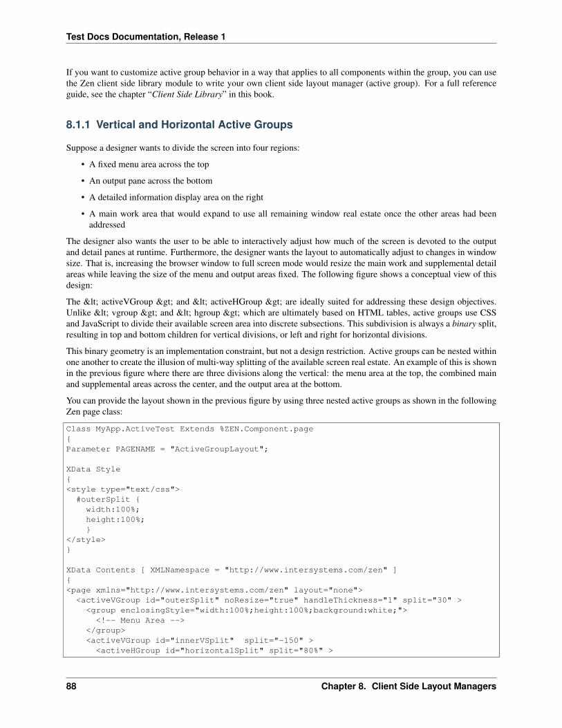
Test Docs Documentation, Release 1
If you want to customize active group behavior in a way that applies to all components within the group, you can usethe Zen client side library module to write your own client side layout manager (active group). For a full referenceguide, see the chapter “Client Side Library” in this book.
8.1.1 Vertical and Horizontal Active Groups
Suppose a designer wants to divide the screen into four regions:
• A fixed menu area across the top
• An output pane across the bottom
• A detailed information display area on the right
• A main work area that would expand to use all remaining window real estate once the other areas had beenaddressed
The designer also wants the user to be able to interactively adjust how much of the screen is devoted to the outputand detail panes at runtime. Furthermore, the designer wants the layout to automatically adjust to changes in windowsize. That is, increasing the browser window to full screen mode would resize the main work and supplemental detailareas while leaving the size of the menu and output areas fixed. The following figure shows a conceptual view of thisdesign:
The < activeVGroup > and < activeHGroup > are ideally suited for addressing these design objectives.Unlike < vgroup > and < hgroup > which are ultimately based on HTML tables, active groups use CSSand JavaScript to divide their available screen area into discrete subsections. This subdivision is always a binary split,resulting in top and bottom children for vertical divisions, or left and right for horizontal divisions.
This binary geometry is an implementation constraint, but not a design restriction. Active groups can be nested withinone another to create the illusion of multi-way splitting of the available screen real estate. An example of this is shownin the previous figure where there are three divisions along the vertical: the menu area at the top, the combined mainand supplemental areas across the center, and the output area at the bottom.
You can provide the layout shown in the previous figure by using three nested active groups as shown in the followingZen page class:
Class MyApp.ActiveTest Extends %ZEN.Component.page{Parameter PAGENAME = "ActiveGroupLayout";
XData Style{<style type="text/css">
#outerSplit {width:100%;height:100%;}
</style>}
XData Contents [ XMLNamespace = "http://www.intersystems.com/zen" ]{<page xmlns="http://www.intersystems.com/zen" layout="none">
<activeVGroup id="outerSplit" noResize="true" handleThickness="1" split="30" ><group enclosingStyle="width:100%;height:100%;background:white;">
<!-- Menu Area --></group><activeVGroup id="innerVSplit" split="-150" >
<activeHGroup id="horizontalSplit" split="80%" >
88 Chapter 8. Client Side Layout Managers

Test Docs Documentation, Release 1
<group enclosingStyle="width:100%;height:100%;background:#ccccff;"><!-- Main Work Area -->
</group><group enclosingStyle="width:100%;height:100%;background:#ccffff;"><!-- Supplemental Detail Area -->
</group></activeHGroup><group enclosingStyle="width:100%;height:100%;background:cyan;">
<!-- Output Area" --></group>
</activeVGroup></activeVGroup>
</page>}
ClientMethod onloadHandler() [ Language = javascript ]{ZLM.refreshLayout();
}
ClientMethod onlayoutHandler() [ Language = javascript ]{ZLM.notifyResize(document.body);
}}
In the previous code example:
• The < activeVGroup > called outerSplit divides the window vertically into two regions. The top areais 30 pixels tall, is not user adjustable, and is partitioned off from the bottom area by a divider that is 1 pixelwide. The bottom area uses all but 31 pixels of the windowRSQUOs height; 31 is the top height plus the handlethickness. The top area contains the label identifying the menu area. The bottom area contains an additional< activeVGroup > .
• The < activeVGroup > called innerVSplit again divides the window vertically where one region is150 pixels tall. In this case, however, the split property is negative, indicating that the property is referring tospace reserved for the bottom area. By default, the split is user adjustable and displays an adjustment bar ofsufficient thickness to be easily grabbed by the mouse pointer.
• The constraints set up by the two < activeVGroup > elements have the effect of reserving 30 pixels atthe top of the window, 150 pixels at the bottom, and a few (actually, 8) for adjustment and partition bars. Allremaining vertical pixels are funneled into the first child of the innerVSplit group. This child is an <activeHGroup > that partitions the middle band of the window into the main work area and the supplementaldetail area. This split is an 80% division of the available window width and is user adjustable by default.
8.1.2 Active Groups that Resize Proportionally
< activeVGroup > and < activeHGroup > allow “size to fit” operations on their contents. The followingfour steps are required to enable this functionality. Once this is set up, the groups automatically expand to fill thewindow on initial page load and adjust their sizes automatically in response to window resize events:
1. The < page > component must have its layout attribute set to "none":
<page xmlns="http://www.intersystems.com/zen" layout="none">
This shifts responsibility for page layout from the server to the browser.
8.1. Using Active Groups to Manage Layout 89

Test Docs Documentation, Release 1
2. The outermost active group in the XData Contents block must have its CSS width and height explicitly setto 100%. This can be set using the enclosingStyle attribute for the < activeVGroup > or <activeHGroup > . Alternatively you can do it as shown in the previous example of a Zen page class:
• Define a CSS style rule:
XData Style{<style type="text/css">
#outerSplit {width:100%;height:100%;}
</style>}
• ...and apply this rule to the outermost active group using the id attribute:
XData Contents [ XMLNamespace = "http://www.intersystems.com/zen" ]{<page xmlns="http://www.intersystems.com/zen" layout="none">
<activeVGroup id="outerSplit" noResize="true" handleThickness="1" split="30" ><!-- Everything else -->
</activeVGroup></page>}
3. The following must be true all the way down the hierarchy of group components, from the top-level < page> container down to any group that you wish to resize automatically along with the window that contains it.If you do not wish a group to resize in this way, these restrictions are not necessary:
• No active group can use the layout attribute.
• Every group that is not an active group must have its CSS width and height attributes set to 100%.
The previous Zen page class example adheres to these rules. It also shows examples of using theenclosingStyle attribute, instead of a formal CSS style rule, to define the CSS width and height. Forexample:
<group enclosingStyle="width:100%;height:100%;background:#ccffff;">
4. onloadHandler and onlayoutHandler methods in the Zen page class must call back into the Zen client side librarymodule to ensure that any user adjustments to the window size force a recalculation of the active groupsRSQUOgeometry. The previous Zen page class example shows the correct calls, as follows:
ClientMethod onloadHandler() [ Language = javascript ]{
ZLM.refreshLayout();}
ClientMethod onlayoutHandler() [ Language = javascript ]{
ZLM.notifyResize(document.body);}
8.1.3 Calculating Percentages for Three-Way Splits
The following class code shows how to implement a page that requires areas of the screen to be split three ways, usingthe binary splits provided by < activeVGroup > and < activeHGroup > . This design has the following
90 Chapter 8. Client Side Layout Managers

Test Docs Documentation, Release 1
features:
• The screen has a 10% top margin, 10% bottom margin, 12.5% left and right margins and a work area in themiddle. Thus, the main work area consumes 75% of the width and 80% of the height of the available pixels inthe window.
• The main work area is divided into thirds. Each of these thirds has its own vertical scroll bar. Resizing thewindow resizes these areas automatically.
• Visible handle thicknesses shows how the screen is being cut up. Setting handleThickness to zero wouldmake these handles disappear entirely.
The following figure shows a conceptual view of this design:
You can create the layout by using active groups as shown in the following Zen page class:
Class MyApp.LayoutTest Extends %ZEN.Component.page{
Parameter PAGENAME = "LayoutTest";
/// This Style block contains page-specific CSS style definitions.XData Style{<style type="text/css">#outerSplit {
width:100%;height:100%;
}</style>}
/// This XML block defines the contents of this page.XData Contents [ XMLNamespace = "http://www.intersystems.com/zen" ]{<page xmlns="http://www.intersystems.com/zen" >
<activeVGroup id="outerSplit" noResize="true"handleThickness="1" split="90%" >
<activeVGroup id="topMarginSplit" noResize="true"handleThickness="1" split="11%" >
<!-- Top Margin --><group id="Top"/><activeHGroup id="rightMarginSplit" handleThickness="1"
noResize="true" split="88%" ><activeHGroup id="leftMarginSplit" handleThickness="1"
noResize="true" split="14%" ><!-- Left Margin -->
<group id="Left"/><group layout="none"
enclosingStyle="width:100%;height:100%;background:#ccccff;"><!-- Main Work Area --><activeHGroup id="outerThreeway" noResize="true"
handleThickness="2" split="67%" ><activeHGroup id="innerThreeway" noResize="true"
handleThickness="2" split="50%" ><group id="leftLeft"
enclosingStyle="width:100%;height:100%;overflow:scroll;background:#ffcccc;"><label value="Left-Left"/>
</group><group id="leftRight"
8.1. Using Active Groups to Manage Layout 91

Test Docs Documentation, Release 1
enclosingStyle="width:100%;height:100%;overflow:scroll;background:#ccffcc;"><label value="Left-Right"/>
</group></activeHGroup><group id="rightRight"
enclosingStyle="width:100%;height:100%;overflow:scroll;background:#ffffcc;"><label value="Right-Right" />
</group></activeHGroup>
</group></activeHGroup><!-- Right Margin -->
</activeHGroup></activeVGroup><!-- Bottom Margin -->
</activeVGroup></page>}
ClientMethod onloadHandler() [ Language = javascript ]{ZLM.refreshLayout();
}
ClientMethod onlayoutHandler() [ Language = javascript ]{ZLM.notifyResize(document.body);
}}
In this example, the binary nature of active group splits, combined with this designRSQUOs requirement that allgeometries be measured in percentages, requires the developer to pay close attention to the underlying constraintsenforced by active groups. Within the main work area, the developer achieves an equal three-way split by nesting twohorizontal splits. The outer split divides the total area at 67%, giving two-third of the horizontal pixels to the left childand one-third to the right. The inner split divides the left child at 50%, not 33%. Dividing the two-thirds area evenlyin half yields the desired result of visually splitting the total area into equal thirds.
A similar technique correctly balances the left and right margins of the page relative to the central work area. Theouter split divides the total area at 88%, giving the larger portion to the left child and creating a 12% right margin. Theinner split divides the left child at 14%, not 12%. This produces a left margin that is of equal width to the right margincreated by the outer split. The central work area is now approximately 75% of the window width and is correctlycentered between the left and right margins.
8.2 Adding Objects Dynamically
In order to dynamically add a child object to an active group such as < desktop > , < corkboard > , or <snapGrid > , the active group needs to do client-side initialization of the child object.
The first step is to make sure that the entire DOM object is ready before calling the initialize code. Do this by callingthe refreshContents() method with a parameter of 1 or true, to force a synchronous object creation.
Next re-initialize the active group and its children. You can do this with a call to ZLM.initLayout(), provided that theactive group itself was statically defined as part of the base page.
You can call ZLM.initLayout() repeatedly as needed, but does take time to run, so if you know you are creating anumber of drag groups in a row, it is best to call refreshContents() once after all the new children have been added,
92 Chapter 8. Client Side Layout Managers

Test Docs Documentation, Release 1
and call ZLM.initLayout() once after refreshContents() returns. You can add windows individually, but batching themwhen feasible cuts down on server chatter and client-side processing.
As an example, the following code shows the proper order for the calls to add an empty, resizable drag group from theclient without a full page refresh.
XData Contents [ XMLNamespace = "http://www.intersystems.com/zen" ]{<page xmlns="http://www.intersystems.com/zen"><hgroup><button caption="add" onclick="zenPage.addClientSide();"/></hgroup><snapGrid id="snapGrid" cols="10" rows="10"enclosingStyle="height:500px;width:500px;background-color:silver"></snapGrid>
</page>}
ClientMethod addClientSide() [ Language = javascript ]{var sg=zen("snapGrid");var dg=zenPage.createComponent("dragGroup");dg.homeCol=1;dg.homeRow=1;dg.rowSpan=2;dg.colSpan=2;dg.header="new";
sg.addChild(dg);sg.refreshContents(1)ZLM.initLayout();
}
8.3 < activeHGroup > and < activeVGroup >
activeHGroupactiveVGroupAn < activeHGroup > is an active group that displays a two-part split pane with leftand right partitions, optionally separated by a moveable adjustment bar. An < activeHGroup > can have only twochild components. The first child defined in the < activeHGroup > appears in the left partition and the secondchild appears in the right partition. The “H” in the < activeHGroup > name means horizontal.
There is also an < activeVGroup > for the same functionality with vertical alignment. The split panes for <activeVGroup > are top and bottom rather than left and right.
Usually, both children of an < activeHGroup > or < activeVGroup > are groups. Each of these child groupsdefines the layout for its partition. The two children of an < activeHGroup > or < activeVGroup > maycontain any number or type of Zen components, according to their usual allowances and restrictions, depending onwhich types of group they are: < hgroup > , < desktop > , < activeVGroup > , and so on.
< activeHGroup > and < activeVGroup > each have the following attributes.
< activeHGroup > and < activeVGroup > divide the screen as specified by the split property based onthe size of the window at the time the page is loaded, and allow the user to readjust this layout as desired with theadjustment handles. You can reset the size of the panes programmatically, including changing whether the split iscalculated as a fixed size or a ratio. If the value of the split property is a string ending in a percent sign, suchas LDQUO75%,RDQUO the split is calculated as a ratio. If the value of split is a string ending in px, such asLDQUO75px,RDQUO the split is calculated as a fixed width. If the value of split is a number, such as 50%,
8.3. < activeHGroup > and < activeVGroup > 93
Test Docs Documentation, Release 1
the split is resized using the specified number and retaining whatever units are in use at the time. For example, thefollowing code fragment creates an < activeVGroup > with split set to the default value of 50%:
<activeVGroup id="activeVGroup" handleThickness="5"><vgroup><hgroup><button caption="Change To Pixels" valign="top"onclick="zenPage.changeSize('pixels');" />
<button caption="Change To Percent" valign="top"onclick="zenPage.changeSize('percent');" />
<button caption="Change Size Same Units" valign="top"onclick="zenPage.changeSize('same');" />
</hgroup></vgroup>
</activeVGroup>
The onclick event handler for the buttons changes the size and units of the split, as follows:
ClientMethod changeSize(mode) [ Language = javascript ]{
var avgr = zenPage.getComponentById('activeVGroup');switch (mode){
case 'pixels':avgr.setProperty('split',"75px");break;
case 'percent':avgr.setProperty('split',"75%");break;
case 'same':avgr.setProperty('split',30);break;
}}
If you want the groups to automatically recalculate their layouts in response to a resize of the base window itself, youneed to add the following call inside the optional onlayoutHandler JavaScript callback method for the Zen page:
ZLM.notifyResize(document.body);
When this call is in place, the notifyResize function is called automatically both when the page first loads and inresponse to window resizing at the browser level. Placing notifyResize in the onlayoutHandler callback allows you toplace other LDQUOresizing reactionsRDQUO in the onlayoutHandler callback, if you desire further processing.
For more about onlayoutHandler, see the section “Zen Layout Handler.”
8.4 < corkboard >
corkboardcork boardA < corkboard > may contain one or more < dragGroup > components. A <corkboard > is an active group whose child components may visually overlap. As soon as the user clicks ona < dragGroup > in a < corkboard > , that < dragGroup > comes to the foreground. The usercan subsequently drag the < dragGroup > and drop it in a new position in the < corkboard > . Thedragged component overlays everything else inside the < corkboard > . No other component, besides the draggedcomponent, is moved out of its current position.
The user cannot move components into or out of the < corkboard > . Direct manipulation can only occur withinthe < corkboard > container.
94 Chapter 8. Client Side Layout Managers

Test Docs Documentation, Release 1
The immediate children of a < corkboard > component must be < dragGroup > components, but there areno restrictions placed on the contents of the < dragGroup > components themselves. A < dragGroup >may contain any component that is valid in a group.
< corkboard > has the following attributes.
8.5 < desktop >
desktopdesk topA < desktop > may contain one or more < dragGroup > components. A < desktop> is an active group that LDQUOtilesRDQUO its child components so that each one is fully visible and none ofthem overlap. As soon as the user clicks on a < dragGroup > in a < desktop > , that < dragGroup> comes to the foreground. The user can subsequently drag the < dragGroup > and drop it in a new positionin the < desktop > . When the user drags and drops a < dragGroup > component into a new position, thedragged component moves the other < dragGroup > components in the < desktop > out of its way. All <dragGroup > components change position after the dragged component is dropped.
The user cannot move components into or out of the < desktop > . Direct manipulation can only occur withinthe < desktop > container.
The immediate children of a < desktop > component must be < dragGroup > components, but there are norestrictions placed on the contents of the < dragGroup > components themselves. A < dragGroup > maycontain any component that is valid in a group.
< desktop > has the following attributes.
The underlying geometric model for the < desktop > is a simple one based on rows and columns. For this reasonthe < desktop > component supports row and column style settings that can enforce row and column alignmentconstraints on the < dragGroup > components that it contains.
The arrangement of < dragGroup > components within the < desktop > varies, but in general this arrange-ment is biased in favor of “row collapse.” This means that if a < dragGroup > is removed from a given row, anyother groups in the same row move to the left, collapsing the length of the row and possibly creating blank space at theextreme right end of the row. This convention maximizes the use of the visible portions of the window and minimizesthe need for horizontal scrolling.
You can suggest an initial layout of the < dragGroup > components within the < desktop > by supplyingCSS styles such as valign:top and align:left for these components. You can also set the CSS style propertiestop and left to explicit pixel values; for example:
<dragGroup enclosingStyle="top:150px; left:233px;" ><!-- contents of drag group here -->
</dragGroup>
When rendering the < desktop > component, Zen makes every effort to abide by such suggestions within theother constraints that are currently active. However, row and column styles, automatic row collapse, and the prohibitionagainst overlapping < dragGroup > components make it impossible to guarantee that the placement suggestedvia CSS is respected exactly.
The < desktop > component has the following attributes.
It is possible to query, save, and restore the < desktop > state. The < desktop > component providesJavaScript methods that allow you to save and restore a particular userRSQUOs choice of geometry for the <desktop > MDASH that is, how the user sized and placed components within the < desktop > during aprevious session with the Zen page. You can work with this information as follows:
getStategetStatelayout‘‘=getState()
8.5. < desktop > 95

Test Docs Documentation, Release 1
The getState method returns a string that records the < desktop > state. The format for this string is an internalencoding that you do not need to understand in order to use this method. Simply store the string, in any way desired,to retrieve it for later use with restoreState.
restoreStaterestoreStaterestoreState(‘‘layout‘‘)
Inputs a string that tells the < desktop > which geometry to use when it displays. layout must be a stringthat was previously acquired using getState. The restoreState method does not actually open any windows. It takeswhatever windows happen to be open, and restores them to where they were when the layout string was saved.
8.5.1 < desktop > Row Style
rowStyledesktop rowStylerowStyle, desktopThe < desktop > can enforce sizing and alignment constraints onthe < dragGroup > components within its rows. You can choose a configuration by assigning a value to therowStyle attribute. Valid values are:
• FILL_ROW MDASH All groups within a row have the height of the tallest group in the row. By default the topand bottom edges of all the sub-windows align. Height is allowed to vary from one row to the next.
• ALIGN_ROW_TOP MDASH (the default) The top edge of all < dragGroup > components within a rowalign. The height of individual < dragGroup > components within the row is allowed to vary. The rowspacing is driven by the tallest group within the row.
• ALIGN_ROW_CENTER MDASH All < dragGroup > components are centered vertically within theirrespective rows. The height of individual < dragGroup > components is allowed to vary. The row spacingis driven by the tallest group within the row.
• ALIGN_ROW_BOTTOM MDASH The bottom edge of all < dragGroup > components within a row align.The height of individual < dragGroup > components within the row is allowed to vary. The row spacingis driven by the tallest group within the row.
• FILL_UNIFORM MDASH All < dragGroup > components within the desktop take on the height of thetallest < dragGroup > . This results in all rows being uniformly spaced vertically and all < dragGroup> components being both top and bottom aligned.
• ALIGN_UNIFORM_TOP MDASH All rows within the desktop take on uniform spacing dictated by the heightof the tallest group within the component. Within each row, the top edges of individual < dragGroup >components align. The height of individual < dragGroup > components is allowed to vary.
• ALIGN_UNIFORM_CENTER MDASH All rows within the desktop take on uniform spacing dictated by theheight of the tallest group within the component. Within each row, individual < dragGroup > componentsare centered vertically. The height of individual < dragGroup > components is allowed to vary.
• ALIGN_UNIFORM_BOTTOM MDASH All rows within the desktop take on uniform spacing dictated by theheight of the tallest group within the component. Within each row, the bottom edges of individual < drag-Group > components align. The height of individual < dragGroup > components is allowed to vary.
8.5.2 < desktop > Column Style
colStyledesktop colStylecolStyle, desktopIn general, the < desktop > geometry conventions are biased towardsrows. In fact, by default the < desktop > does not recognize the existence of columns.
However, assigning a value to the colStyle attribute alters this behavior, so that the < desktop > counts allthe first elements of the rows as column one, all the second elements as column two, and so forth. Unlike rows, whichrepack themselves when they are removed or added, columns are allowed to have embedded gaps in which a short rowdoes not reach a given column.
96 Chapter 8. Client Side Layout Managers
Test Docs Documentation, Release 1
You can choose a column style, and force < desktop > to recognize columns, by assigning a value to thecolStyle attribute. If you do not, the concept of columns is ignored and only row-based constraints apply.
Valid values for colStyle are:
• FILL_COLUMN MDASH All < dragGroup > components within a given column take on the width of thewidest group within the column. All < dragGroup > components become both left and right aligned. Thespacing of the columns is allowed to vary from one column to the next
• ALIGN_COLUMN_LEFT MDASH The width of the column is dictated by the width of the widest group withinthat column but the width of individual sub- windows is allowed to vary. All < dragGroup > componentsare left aligned within their columns. The spacing of the columns is allowed to vary from one column to thenext
• ALIGN_COLUMN_CENTER MDASH The width of the column is dictated by the width of the widest groupwithin that column, but the width of individual < dragGroup > components is allowed to vary. All <dragGroup > components are centered within their columns. The spacing of the columns is allowed to varyfrom one column to the next
• ALIGN_COLUMN_RIGHT MDASH The width of the column is dictated by the width of the widest groupwithin that column, but the width of individual < dragGroup > components is allowed to vary. All <dragGroup > components are right aligned within their columns. The spacing of the columns is allowed tovary from one column to the next
• FILL_WIDTH MDASH The total width of the longest row dictates the layout bounds for the entire < desktop> . The widths of < dragGroup > components within shorter rows are scaled up proportionately toensure that right edge of the last group in each row is aligned with that of every other row in the < desktop> .
• ALIGN_WIDTH_LEFT MDASH Similar to FILL_WIDTH. The < dragGroup > components within rowsare horizontally spaced based on the width of the longest row. The widths of individual < dragGroup >components are not padded, creating the appearance of random spacing within a row.
• ALIGN_WIDTH_CENTER MDASH Similar to FILL_WIDTH. The < dragGroup > components withinrows are horizontally spaced based on the width of the longest row. The widths of individual < dragGroup> components are not padded, and the < dragGroup > components are centered within the revisedspacing bounds.
• ALIGN_WIDTH_RIGHT MDASH Similar to FILL_WIDTH. The < dragGroup > components withinrows are horizontally spaced based on the width of the longest row. The widths of individual < dragGroup> components are not padded, and the < dragGroup > components are right aligned within the revisedspacing bounds.
• FILL_UNIFORM MDASH All columns take on the width and spacing dictated by the widest < dragGroup> within the < desktop > . All < dragGroup > components are given uniform width, and areautomatically left and right aligned
• ALIGN_UNIFORM_LEFT MDASH Similar to FILL_UNIFORM, but all < dragGroup > componentswithin a column are left aligned.
• ALIGN_UNIFORM_CENTER MDASH Similar to FILL_UNIFORM, but all < dragGroup > componentswithin a column are centered within the column spacing.
• ALIGN_UNIFORM_RIGHT MDASH Similar to FILL_UNIFORM, but all < dragGroup > componentswithin a column are right aligned.
8.5. < desktop > 97

Test Docs Documentation, Release 1
8.6 < snapGrid >
snapGridsnap gridA < snapGrid > is an active group which can contain one or more < dragGroup >components, organized so that each one is aligned with a grid. The number of rows and columns specified defines theunderlying grid. The resulting grid is a normalized space, meaning that a four column layout results in the width ofeach column being 25% of the total width.
You can define different layouts for portrait and landscape page orientation, such that the number of columns and rowschanges if the geometry of the < snapGrid > becomes taller than it is wide (or vise versa). This is particularlyuseful for adapting layouts on devices such as tablets and mobile phones.
The immediate children of a < snapGrid > component must be < dragGroup > components, but thereare no restrictions placed on the contents of the < dragGroup > components themselves. A < dragGroup >may contain any component that is a valid child of a group.
Child components may visually overlap. A < dragGroup > in a < snapGrid > comes to the foregroundwhen the user clicks on it. If the appropriate user gestures are enabled, the user can drag and drop the < dragGroup> . When dropped, a < dragGroup > snaps to the closest grid lines. The grid itself does not scroll, howeverthe < dragGroup > components in the grid may.
The user cannot move components into or out of the < snapGrid > . Direct manipulation can only occur withinthe < snapGrid > container.
< snapGrid > has the following attributes.
8.6.1 Dynamic and Static Layout
The ability to resize and drag and drop < dragGroup > components in a < snapGrid > is primarily controlledby the < dragGroup > . The attributes moveEnabled and resizeEnabled specify whether you can moveor resize the group. < dragGroup > also relies on the header and the resize button to provide affordances for userdrag and resize gestures. Without them, the drag group cannot be moved or resized. You can use the < snapGrid> method broadcast to control various aspects of appearance and behavior for all < dragGroup > componentsin the grid. The method restyleHeaderStyles in the class ZENDemo.SnapGridDemo in the SAMPLES namespaceillustrates this use of broadcast.
broadcast sends a signal to each of the active drag group components in the snap grid. Valid signals include:
• resize NDASH call the onresize handler for each of the drag groups.
• disableResize NDASH remove the resize button from the lower right corners of the drag groups.
• disableMaxToggle NDASH redefine the drag group header to be a drag handle rather than a maximize button.
• enableMaxToggle NDASH redefine the drag group header to be a maximize button rather than a drag handle.
• enableResize NDASH restore the resize button to the lower right corners of the drag groups.
• processAppMessage NDASH simply pass the value given to the < dragGroup > children. Subclasses of< dragGroup > can override the default processAppMessage() method to extend the broadcast facility toaddress application specific signals. The mechanism only passes a single value argument, but this value cantake the form of a JSON string or an arbitrary JavaScript object so multiple discrete data can be packaged into asingle broadcast value.
• removeDragHeader NDASH completely hide the drag handle and resize the window to use the recovered space.
• restoreDragHeader NDASH restore the drag handle and resize the window to account for the newly used space.
• setBodyStyleNDASH given a JSON representation of a style object in value, add the given rules to the existingstyle of the drag body.
98 Chapter 8. Client Side Layout Managers

Test Docs Documentation, Release 1
• setHeaderStyle NDASH given a JSON representation of a style object in value, add the given rules to the existingstyle of the drag header.
• setHeaderLayout NDASH set the headerLayout property of all child drag groups to the given value.
Note that when you run ZENDemo.SnapGridDemo, it comes up with headers and resize buttons visible, and youcan move and resize the drag groups. The Remove Headers button removes these affordances, and as a result, the gridlayout is static. The Restyle Headers button restores the headers functioning as maximize buttons.
8.6.2 Orientation-specific Layout
The < snapGrid > component can adjust the layout of rows and columns in response to the geometry of thewindow it is being viewed in. The properties rowsPortrait and colsPortrait specify the number of rows andcolumns for portrait mode, and rowsLandscape and colsLandscape for landscape mode. If you set only oneof these two sets of properties, Zen uses the default row and column values for the unspecified set.
This feature is useful when creating applications to be viewed on a device such as a cell phone or tables, that changesthe display orientation when the orientation of the device changes. The following example codes a page that respondsto changes in window geometry when viewed in a browser. CSS sets the height and width of the < snapGrid > to100%, and the page layout must be set to “none” as described in the section “Active Groups that Resize Proportionally.”
Class demo.SnapGridLP Extends %ZEN.Component.page{/// This Style block contains page-specific CSS style definitions.XData Style{<style type="text/css">#snapGrid {width: 100%;height: 100%;background-color: silver;
}</style>
}/// This XML block defines the contents of this page.XData Contents [ XMLNamespace = "http://www.intersystems.com/zen" ]{<page xmlns="http://www.intersystems.com/zen"layout="none"><snapGrid id="snapGrid"colsLandscape="10"colsPortrait="5"rowsLandscape="5"rowsPortrait="10"
><dragGroup id="dg1" onclick=""moveEnabled="true" resizeEnabled="true"headerLayout="C" header="1"homeCol="1" homeRow="1"colSpan="1" rowSpan="1">
</dragGroup></snapGrid></page>
}}
8.6. < snapGrid > 99

Test Docs Documentation, Release 1
8.7 < dragGroup >
dragGroupdrag groupA < dragGroup > is the only Zen group component that can be the direct child of a <desktop > , < corkboard > , or < snapGrid > . The < dragGroup > itself can contain anycomponent you can put in a group.
A < dragGroup > can display a header bar, which can have a text label and various buttons. A < dragGroup> can be resized, maximized, minimized, closed, and restored by clicking its buttons and by dragging the header orthe resize icon in the lower right corner. In many ways the < dragGroup > is similar to a desktop window suchas you would typically see on a Macintosh or PC desktop.
< dragGroup > has the following attributes.
100 Chapter 8. Client Side Layout Managers
CHAPTER 9
Client Side Menu Components
menumenusThis chapter describes built-in Zen components that are designed to make it easy to render a moreLDQUOnative applicationRDQUO look and feel for Zen pages through the use of a client side menu system. Thesemenu components provide simple mechanisms for JavaScript post-processing on the client side, so that their appear-ance and layout can respond to user actions on the client side.
Note
The style for more traditional menu components is defined with CSS and HTML, without the option forsubsequent post-processing in JavaScript. For full information about those components, see the “Naviga-tion Components” chapter of Using Zen Components.
9.1 Building Client Side Menus
The original < menu > component offers a simple HTML label in a box with all of its (limited) rendering doneat the server with a little help from CSS preferences. It is perfectly serviceable as a menu, but its appearance has verylittle flexibility.
In contrast, the < csMenuBar > defers its rendering until it has actually been loaded by the client and has accessto more information about the userRSQUOs machine (browser, operating system, available fonts, etc). The <csMenuBar > makes heavy use of JavaScript to do things that are difficult (or in some cases impossible) to do withCSS alone. It can render a menu that looks and acts more like a user might find in applications such as MicrosoftOutlook or Word. This menu includes features such as icons, keyboard shortcuts, scrolling of long menus withoutscrollbars, and so on.
In general, the cs prefixed widgets such as < csMenuBar > form one set of tools, while the traditional menuwidgets described in the “Navigation Components” chapter of Using Zen Components form another. These sets are notinterchangeable. For example, a < csMenuBar > consists of < csMenuBarItem > , < contextMenu >, < csMenuItem > , and < csMenuSeparator > elements. A mixed specification in which < csMenuItem> elements are separated by < menuSeparator > elements causes the menu subsystem to break.
It is important to note that there is inconsistency in the naming conventions. Not all of the client side widget namesstart with cs. The cs prefix is used only when the newer, client side widget name conflicts with the older, originalwidget names. Unfortunately this means that < contextMenu > , the widget at the heart of the client side menusubsystem, does not use the cs prefix, but every element around it does.
The following is a summary of the nesting structure for the client side menu elements:
<csMenuBar><csMenuBarItem>
<contextMenu><csMenuItem />
101

Test Docs Documentation, Release 1
<csMenuItem /><csMenuSeparator /><csMenuItem /><csMenuItem>
<contextMenu><csMenuItem /><csMenuItem />
</contextMenu></csMenuItem>
</contextMenu></csMenuBarItem>
</csMenuBar>
The next several sections describe how to work with client side menu components to provide:
• Drop down menus
• Menu picks or choices
• Popup or context menus
• Cascading menus
• Button bars
• Icons
For a syntax guide to specific components, see the later sections in this chapter:
• < csMenuBar >
• < csMenuBarItem >
• < contextMenu >
• < csMenuItem >
• < csMenuSeparator >
• < buttonBar >
• < buttonBarItem >
9.1.1 Drop Down Menus
The following sample < csMenuBar > element defines a horizontal menu bar with two picks: File and Edit.Each of these picks displays a different < contextMenu > . The < csMenuItem > components in thisexample illustrate a variety of options for setting associated icons, alternate captions, keyboard shortcuts, and so on.The following figure illustrates the File pick from this menu.
<csMenuBar id="mainMenu" width="100%"><csMenuBarItem caption="File" contextKey="f" ><contextMenu id="fileMenu" >
<csMenuItem icon="images/file.png" caption="New" key="Ctrl-N"contextKey="n" onclick="alert('New requested');" />
<csMenuItem icon="/csp/broker/images/open.png" caption="Open..."key="Ctrl-O" contextKey="o"onclick="alert('Open requested');" />
<csMenuItem caption="Close" key="Ctrl-W"contextKey="c" onclick="alert('Open requested');" />
<csMenuSeparator /><csMenuItem id="savePick" icon="/csp/broker/images/save.png"
102 Chapter 9. Client Side Menu Components
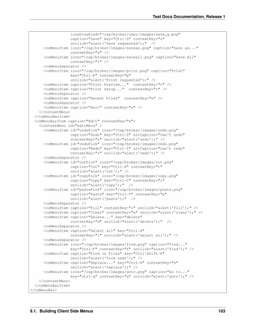
Test Docs Documentation, Release 1
iconDisabled="/csp/broker/user/images/save_g.png"caption="Save" key="Ctrl-S" contextKey="s"onclick="alert('Save requested');" />
<csMenuItem icon="/csp/broker/images/saveas.png" caption="Save as..."contextKey="a" />
<csMenuItem icon="/csp/broker/images/saveall.png" caption="Save All"contextKey="l" />
<csMenuSeparator /><csMenuItem icon="/csp/broker/images/print.png" caption="Print"
key="Ctrl-P" contextKey="p"onclick="alert('Print requested');" />
<csMenuItem caption="Print Preview..." contextKey="v" /><csMenuItem caption="Print Setup..." contextKey="r" /><csMenuSeparator /><csMenuItem caption="Recent Files" contextKey="e" /><csMenuSeparator /><csMenuItem caption="Exit" contextKey="x" />
</contextMenu></csMenuBarItem><csMenuBarItem caption="Edit" contextKey="e"><contextMenu id="editMenu" >
<csMenuItem id="undoPick" icon="/csp/broker/images/undo.png"caption="Undo" key="Ctrl-Z" altCaption="Can't undo"contextKey="u" onclick="alert('undo');" />
<csMenuItem id="redoPick" icon="/csp/broker/images/redo.png"caption="Redo" key="Ctrl-Y" altCaption="Can't redo"contextKey="r" onclick="alert('redo');" />
<csMenuSeparator /><csMenuItem id="cutPick" icon="/csp/broker/images/cut.png"
caption="Cut" key="Ctrl-X" contextKey="t"onclick="alert('cut');" />
<csMenuItem id="copyPick" icon="/csp/broker/images/copy.png"caption="Copy" key="Ctrl-C" contextKey="c"onclick="alert('copy');" />
<csMenuItem id="pastePick" icon="/csp/broker/images/paste.png"caption="Paste" key="Ctrl-V" contextKey="p"onclick="alert('paste');" />
<csMenuSeparator /><csMenuItem caption="Fill" contextKey="i" onclick="alert('fill');" /><csMenuItem caption="Clear" contextKey="a" onclick="alert('clear');" /><csMenuItem caption="Delete..." key="delete"
contextKey="d" onclick="alert('delete');" /><csMenuSeparator /><csMenuItem caption="Select all" key="Ctrl-A"
contextKey="l" onclick="alert('select all');" /><csMenuSeparator /><csMenuItem icon="/csp/broker/images/find.png" caption="Find..."
key="Ctrl-F" contextKey="f" onclick="alert('find');" /><csMenuItem caption="Find in Files" key="Ctrl-Shift-F"
onclick="alert('find next');" /><csMenuItem caption="Replace..." key="Ctrl-H" contextKey="e"
onclick="alert('replace');" /><csMenuItem icon="/csp/broker/images/goto.png" caption="Go to..."
key="ctrl-g" contextKey="g" onclick="alert('goto');" /></contextMenu>
</csMenuBarItem></csMenuBar>
9.1. Building Client Side Menus 103

Test Docs Documentation, Release 1
The following figure illustrates the Edit pick from this menu.
9.1.2 Menu Picks or Choices
Zen client side menus support the following types of menu pick:
9.1.3 Popup or Context Menus
You can use client-side menu components to define a popup or context menu for a region. To accomplish this, wrapa < contextMenu > definition inside a group of some kind. The wrapper component can be nearly anything, butis most often a reasonably significant portion of the page: a < vgroup > , < hgroup > , < form > ,etc. Define the < contextMenu > as a child of the wrapper component, and a sibling of other elements within thewrapper. You can optionally specify exact bounds, as for the < group > shown in the next example, but this isnot required.
Subsequently, when the user right-clicks the mouse anywhere within the wrapper component, Zen displays and acti-vates the < contextMenu > child component, rather than the browserRSQUOs default right-click menu.
<group width="400" height="800" enclosingStyle="background:#aaffaa;" ><contextMenu id="rightPopUp" ><csMenuItem caption="Fido Cascade" >
<contextMenu ><csMenuItem caption="Sit" /><csMenuItem caption="Stay" /><csMenuItem caption="Play dead" />
</contextMenu></csMenuItem><csMenuItem caption="Scout Cascade" >
<contextMenu ><csMenuItem caption="Whoa" /><csMenuItem caption="Giddy Up" />
</contextMenu></csMenuItem><csMenuItem caption="Kitty Cascade" >
<contextMenu ><csMenuItem caption="Ignore me" /><csMenuItem caption="Do as you please" />
</contextMenu></csMenuItem>
</contextMenu></group>
The following figure displays the popup menu that the previous example defines.
9.1.4 Cascading Menus
You can cascade menus by nesting < contextMenu > elements within < csMenuItem > elements. Thiscascading technique works for regular menus as well as for popup or context menus. See the examples in the openingsection of this chapter, “Building Client Side Menus,” and in the previous section, “Popup or Context Menus.”
9.1.5 Button Bars
buttonBarbuttonBarItemThe < buttonBar > component is closely related to the client side menu components. A< buttonBar > may appear inside any sort of group container, and may contain one or more < buttonBarItem
104 Chapter 9. Client Side Menu Components

Test Docs Documentation, Release 1
> components. The following < hgroup > element defines a button bar with three buttons, rollover tool tips,and selection actions (the alert code).
<hgroup id="bbArea" ><buttonBar id="editStuff" ><buttonBarItem icon="images/cut.png" caption="Cut"
onclick="alert('Cut requested');" /><buttonBarItem icon="images/copy.png" caption="Copy"
onclick="alert('Copy requested');" /><buttonBarItem icon="images/paste.png" caption="Paste"
onclick="alert('Paste requested');" /></buttonBar>
</hgroup>
The style for this bar is defined in the XData Style section as follows:
#bbArea {background:#bbbbbb;background-image: url(images/grad-halfgray-10x30.png);background-repeat:repeat-x;
}
The following figure displays the button bar that this example defines.
For some image files that you can use as icons in button bars, see the section “Icons.”
9.1.6 Icons
The following table lists the icons that are available in the csp/broker/images directory, which is a subdirectoryof the Caché installation directory. The gray background color shown for icons in the table is just an example; theicons display over whatever background color the designer chooses for the containing component.
Icon images may be referenced using the icon, altIcon, or disabledIcon attributes in Zen components suchas < buttonBarItem > or < csMenuItem > . When you reference these images, the prefix csp/broker isautomatically implied. Reference them using this syntax:
images/‘‘filename
For example:
altIcon="images/cut.png"
The name‘‘Inv.png images are used automatically in place of their name‘‘.png counterparts when Zen detectsthat it is rendering the icon against a dark background color. name‘‘.png icons are intended for use against lightbackground colors. This behavior can be seen in the system default color scheme for Zen, as follows:
1. The dark arrow over the light background:
2. ...automatically changes to a light arrow when it is over a dark background:
3. ...and changes back to a dark arrow when it is over a light background:
The switch to using light or dark icons happens automatically, as long as you define the foreground and backgroundcolors of both < csMenuItem > and < csActiveMenuItem > using CSS. This allows Zen to calculate whichicon yields optimum contrast with the current color. This is important even if the foreground or background coloris being created using an image to create a gradient effect, as seen in the dark blue selected items in the previousexamples.
9.1. Building Client Side Menus 105

Test Docs Documentation, Release 1
9.2 < csMenuBar >
csMenuBarThe < csMenuBar > component may appear inside any type of group container. The < csMenuBar> element defines a horizontal menu bar with one pick for each < csMenuBarItem > that is its direct child.< csMenuBar > may contain as many sibling < csMenuBarItem > components as are required to define thechoices on the menu bar. For a < csMenuBar > example, see the section “Building Client Side Menus.”
< csMenuBar > has the following attributes.
9.3 < csMenuBarItem >
csMenuBarItemThe < csMenuBarItem > component may appear only within a < csMenuBar > container.Each < csMenuBarItem > defines one choice on the menu bar. For an example, see the section “Building ClientSide Menus.”
< csMenuBarItem > has the following attributes.
9.4 < contextMenu >
contextMenuThe < contextMenu > component may appear inside any type of group container, including <csMenuItem > , < vgroup > , < hgroup > , < form > , etc.
The group may contain other elements besides < contextMenu > , but to allow other elements to appear insidethe group along with < contextMenu > you must set the containing groupRSQUOs layout attribute to “none”.In the following example, a < button > appears in addition to the < contextMenu > , so the < form >has layout set to “none”:
<form height="600" width="400" layout="none" ><button caption="MyButton"/><contextMenu id="cm1"><csMenuItem caption="context"/><csMenuItem caption="menu"/><csMenuItem caption="1"/>
</contextMenu></form>
To understand more about how < contextMenu > may be used to specify various types of menus, see the examplesin the sections “Building Client Side Menus” and “Popup or Context Menus.”
A < contextMenu > component may contain as many sibling < csMenuItem > and < csMenuSeparator> components as are required to define and organize the individual choices on the menu.
< contextMenu > has the following attributes.
9.5 < csMenuItem >
csMenuItemThe < csMenuItem > component may appear only within a < contextMenu > container. <contextMenu > may contain as many sibling < csMenuItem > and < csMenuSeparator > componentsas are required to define and organize the choices on the menu.
< csMenuItem > has the following attributes.
106 Chapter 9. Client Side Menu Components

Test Docs Documentation, Release 1
9.6 < csMenuSeparator >
csMenuSeparatorThe < csMenuSeparator > component may appear only within a < contextMenu > con-tainer. < contextMenu > may contain as many sibling < csMenuItem > and < csMenuSeparator >components as are required to define and organize the choices on the menu. < csMenuSeparator > simplyprovides a horizontal line to separate sections of menu choices.
The < csMenuSeparator > component has no attributes. For example:
<csMenuSeparator />
For more detailed examples, see the section “Drop Down Menus.”
9.7 < buttonBar >
buttonBarThe < buttonBar > component may appear inside any type of group container. < buttonBar >may contain as many sibling < buttonBarItem > components as are required to define the choices on the buttonbar. For an example, see the section “Button Bars.”
< buttonBar > has the following attributes.
9.8 < buttonBarItem >
buttonBarItemThe < buttonBarItem > component may appear only within a < buttonBar > container. Each< buttonBarItem > defines one choice on the button bar. For an example, see the section “Button Bars.”
< buttonBarItem > has the following attributes.
9.6. < csMenuSeparator > 107

Test Docs Documentation, Release 1
108 Chapter 9. Client Side Menu Components

CHAPTER 10
Client Side Library
The chapter “Client Side Layout Managers” describes the default client side layout functionality built into Zen. Zenalso offers a client side library module that allows you to override Zen defaults to provide extremely fine control overall client side activities for your application.
When your Zen page uses components that this book explicitly identifies as client side components, all entities in theclient side library module are available to you automatically. For the list of these components, see the previous twochapters, “Client Side Layout Managers” and “Client Side Menu Components.” When this is the case there is no needto add any statements to your Zen page classes in order to call functions from the client side library. In other cases youcan reference the library by adding it to the list of JavaScript files in the value of the JSINCLUDES parameter for thepage class or application class. For example:
Parameter JSINCLUDES = "zenCSLM.js";
This chapter provides a reference guide to the JavaScript methods and properties in the Zen client side library module.This chapter documents the support that the library provides for:
• Writing Custom Drag and Drop Methods
• Debugging Client Side Code
By convention, the names of entities defined in the client side library use the prefix ZLM followed by a dot, as inZLM.setDragAvatar or ZLM.getDragInnerDestination. You can think of the ZLM prefix as a names-pace that keeps the library entities distinct from other functions that you might define when working with Zen.
Note
Because the library is written in JavaScript, which does not facilitate generated class documentation, thereis no Class Reference documentation for it in the InterSystems online documentation system. Refer tothis chapter for all details.
10.1 Writing Custom Drag and Drop Methods
This section describes parts of the library that are important when you are customizing drag and drop methods forcustom components, as outlined in the “Data Drag and Drop Methods” section in the chapter “Custom Components.”
The following table describes the methods and properties of the JavaScript object called zenDragData that is auto-matically made available to subclasses of %ZEN.Component.component as a special variable called dataDrag.
The Zen client side library module provides the following functions to support custom drag and drop methods.
109

Test Docs Documentation, Release 1
10.1.1 ZLM.getDragData
getDragDataZLM.getDragDataZLM.getDragDataZLM.getDragData()
Returns a pointer to the dragData JavaScript object whose structure is described in the section “Data Drag andDrop Methods.” This object contains all the information needed to execute a drag and drop operation.
10.1.2 ZLM.getDragDestination
getDragDestinationZLM.getDragDestinationZLM.getDragDestinationZLM.getDragDestination()
Returns a pointer to the enclosing < div > for the Zen element where the current drag operation ended.
10.1.3 ZLM.getDragInnerSource
getDragInnerSourceZLM.getDragInnerSourceZLM.getDragInnerSourceZLM.getDragInnerSource()
Returns a pointer to the innermost enclosing < div > element that initiated the current drag operation. This< div > is a descendant of the enclosing < div > for the Zen element that would be returned byZLM.getDragSource.
10.1.4 ZLM.getDragInnerDestination
getDragInnerDestinationZLM.getDragInnerDestinationZLM.getDragInnerDestinationZLM.getDragInnerDestination()
Returns a pointer to the innermost enclosing < div > element where the current drag operation ended. This< div > is a descendant of the enclosing < div > for the Zen element that would be returned byZLM.getDragDestination.
10.1.5 ZLM.getDragSource
getDragSourceZLM.getDragSourceZLM.getDragSourceZLM.getDragSource()
Returns a pointer to the enclosing < div > for the Zen element that initiated the current drag operation.
10.1.6 ZLM.setDragAvatar
setDragAvatarZLM.setDragAvatarZLM.setDragAvatarZLM.setDragAvatar(‘‘newDiv‘‘)
Allows a user-defined dragStartHandler to set the icon to use as the drag avatar of the object being dragged.The newDiv argument is the pointer to an enclosing < div > object, which can be set up for the call toZLM.setDragAvatar as shown in the following example, and in other examples in the section “Data Drag and DropMethods”:
Method dragStartHandler(dragData) [ Language = javascript ]{
// get drag dataif (!this.getDragData(dragData)) {return false;
}
// avatarvar icon = this.getEnclosingDiv().cloneNode(true);
110 Chapter 10. Client Side Library

Test Docs Documentation, Release 1
icon.style.position="absolute";icon.style.border ="1px solid darkgray";icon.style.background ="#D0D0F0";ZLM.setDragAvatar(icon);
return true;}
10.1.7 ZLM.setDragCaption
setDragCaptionZLM.setDragCaptionZLM.setDragCaptionZLM.setDragCaption(‘‘caption‘‘)
Allows a user-defined dragStartHandler to set the caption string of the object being dragged. The caption argumentis a text string.
10.2 Debugging Client Side Code
This topic describes a set of Zen client side library module functions that support debugging by logging messages to aconsole window devoted to Zen client side activities. The following is a sample message console window. The outputin this example reflects calls to ZLM.cerr and ZLM.dumpObj. These are only two of the available functions.
If a message console window is not already open as a result of a previous call to ZLM.showMsgConsole, any of thelogging functions described in this section has the effect of opening the message console window. If there is a messageconsole window already open, the logging function keeps writing to that window.
The logging functions are extremely useful in that they can be called from client-side JavaScript methods and fromserver-side Zen methods using
> syntax; that is:
&js<ZLM.cerr("We are now in a ZenMethod");>
This way, activities on both the server and the client side can write to the same message console window, showing theactual sequence of activities on both sides. The window stays open until full control returns to the server, for examplewhen a form is submitted and its server-only method %OnSubmit executes. At that time the window automaticallycloses.
The Zen client side library module provides the following logging functions.
10.2.1 ZLM.showMsgConsole
showMsgConsoleZLM.showMsgConsoleZLM.showMsgConsoleZLM.showMsgConsole()
Opens an extra window to serve as an error console. Initializes this window to respect whitespace and to use amonospaced font. As a debugging tool, this window is a useful alternative to a series of JavaScript alert calls whichrequire you to repeatedly dismiss popup windows when messages display. The window stays open and displays alltext provided by subsequent calls to ZLM.cerr.
10.2.2 ZLM.cerr
cerrZLM.cerrZLM.cerrZLM.cerr(‘‘msg‘‘)
Output a string to the message console window for debugging purposes. The msg argument is a text string. Thefollowing line can appear in a client-side JavaScript method:
10.2. Debugging Client Side Code 111
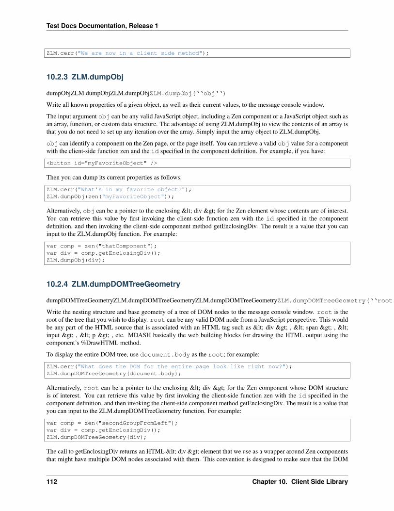
Test Docs Documentation, Release 1
ZLM.cerr("We are now in a client side method");
10.2.3 ZLM.dumpObj
dumpObjZLM.dumpObjZLM.dumpObjZLM.dumpObj(‘‘obj‘‘)
Write all known properties of a given object, as well as their current values, to the message console window.
The input argument obj can be any valid JavaScript object, including a Zen component or a JavaScript object such asan array, function, or custom data structure. The advantage of using ZLM.dumpObj to view the contents of an array isthat you do not need to set up any iteration over the array. Simply input the array object to ZLM.dumpObj.
obj can identify a component on the Zen page, or the page itself. You can retrieve a valid obj value for a componentwith the client-side function zen and the id specified in the component definition. For example, if you have:
<button id="myFavoriteObject" />
Then you can dump its current properties as follows:
ZLM.cerr("What's in my favorite object?");ZLM.dumpObj(zen("myFavoriteObject"));
Alternatively, obj can be a pointer to the enclosing < div > for the Zen element whose contents are of interest.You can retrieve this value by first invoking the client-side function zen with the id specified in the componentdefinition, and then invoking the client-side component method getEnclosingDiv. The result is a value that you caninput to the ZLM.dumpObj function. For example:
var comp = zen("thatComponent");var div = comp.getEnclosingDiv();ZLM.dumpObj(div);
10.2.4 ZLM.dumpDOMTreeGeometry
dumpDOMTreeGeometryZLM.dumpDOMTreeGeometryZLM.dumpDOMTreeGeometryZLM.dumpDOMTreeGeometry(‘‘root‘‘)
Write the nesting structure and base geometry of a tree of DOM nodes to the message console window. root is theroot of the tree that you wish to display. root can be any valid DOM node from a JavaScript perspective. This wouldbe any part of the HTML source that is associated with an HTML tag such as < div > , < span > , <input > , < p > , etc. MDASH basically the web building blocks for drawing the HTML output using thecomponent’s %DrawHTML method.
To display the entire DOM tree, use document.body as the root; for example:
ZLM.cerr("What does the DOM for the entire page look like right now?");ZLM.dumpDOMTreeGeometry(document.body);
Alternatively, root can be a pointer to the enclosing < div > for the Zen component whose DOM structureis of interest. You can retrieve this value by first invoking the client-side function zen with the id specified in thecomponent definition, and then invoking the client-side component method getEnclosingDiv. The result is a value thatyou can input to the ZLM.dumpDOMTreeGeometry function. For example:
var comp = zen("secondGroupFromLeft");var div = comp.getEnclosingDiv();ZLM.dumpDOMTreeGeometry(div);
The call to getEnclosingDiv returns an HTML < div > element that we use as a wrapper around Zen componentsthat might have multiple DOM nodes associated with them. This convention is designed to make sure that the DOM
112 Chapter 10. Client Side Library

Test Docs Documentation, Release 1
tree branches off in an orderly fashion. If the return value is used as input to ZLM.dumpDOMTreeGeometry you geta snapshot of the HTML structure created by the call to %DrawHTML for this component, plus any modifications tothat structure resulting from applied stylesheets and/or “onload” client-side post-processing.
10.2.5 ZLM.dumpElementStyle
dumpElementStyleZLM.dumpElementStyleZLM.dumpElementStyleZLM.dumpElementStyle(‘‘div‘‘)
Report all known style properties of a given component to the message console window. div is a pointer to theenclosing < div > for the Zen component whose style properties are of interest.
You can retrieve the value of div by first invoking the client-side function zen with the id specified in the componentdefinition, and then invoking the client-side component method getEnclosingDiv. The result is a value that you caninput to the ZLM.dumpElementStyle function. For example:
var comp = zen("advancedOptions");var div = comp.getEnclosingDiv();ZLM.dumpElementStyle(div);
10.2. Debugging Client Side Code 113

Test Docs Documentation, Release 1
114 Chapter 10. Client Side Library

CHAPTER 11
Indices and tables
• genindex
• modindex
• search
115