Embed Size (px)
Citation preview
TestGraf
A Program for the Graphical Analysis of Multiple Choice Test and Questionnaire Data
J. O. Ramsay, McGill University
August 1, 2000
The development of TestGraf was supported by grant AP320 from the Natural Sciences and Engineering Research Council of Canada. The author would also like to express his appreciation to members of his Department for making available their data, to Raymond Baillargeon for his valuable editorial assistance, and to the users of TestGraf who have provided invaluable feedback.
The author can be contacted at: Department of Psychology McGill University 1205 Dr. Penfield Ave. Montreal, Quebec Canada H3A 1B1 telephone (514) 398-6123 fax (514) 398-4896 electronic mail [email protected]
1
I. The Objectives of TestGraf TestGraf is designed to aid the development, evaluation, and use of multiple choice examinations, psychological scales, questionnaires, and similar types of data. Using TestGraf does not require any formal statistical knowledge. The essential aspects of each display were designed to be self-explanatory, although more statistically sophisticated users will also find information that they may find helpful. Most of the output from TestGraf is in graphical form, and the program is used interactively. TestGraf does have hard copy capability, but since TestGraf analyses take very little time on computers of even modest power, there will be only a limited need for printed copies of its displays. The minimal data appropriate for a TestGraf analysis are characterized by:
• a set of examinees, respondents, cases, or other types of choice generators, and • a set of choice situations, such as items or questions on examinations or
questionnaires. A question or choice situation may be one of two types: Multiple Choice Exam Item: Each question presents a list of possible answers, and the
student is required to choose one. One of the answers is designated correct, and all other are considered by the examiner to be incorrect. Aside from correct versus incorrect, there is no particular ordering characterizing the answers.
Scale Item: Each possible answer associated with this type of question has a numerical
weight that is assigned to it by the person constructing the item. This means that the answers are ordered in terms of the ordering of the weights attached to them. In this sense, multiple choice exam items are scale items where one option receives a weight of one and the others a weight of zero.
A set of questions can be mixtures of these two types of items. For example, an examination may contain both multiple choice items and open-ended short-answer questions. The latter have alternatives determined by the possible scores that the grader gives to the responses. Or, alternatively, a small subset of the multiple choice items, called a testlet, may be scored by counting the number of correct answers, and this count can be assigned to these items as a block, thereby treating them collectively as a single scale item. TestGraf was conceived for use with tests or questionnaires where the responses of any individual are primarily determined by the amount or level of some single ability, characteristic, or trait. Or, alternatively, where the user of the program is interested in the extent to which a single proficiency or trait determines performance. In the case of examinations, this manual will tend to refer to this presumed single dimension as proficiency, since the term ability has connotations that are often not entirely 2
appropriate to exam performance. For psychological scales, containing mostly or entirely scale-type items, this dimension will be called the trait presumed to determine option choices. TestGraf makes use of modern statistical methods to produce accurate estimates of examinee or respondent characteristics. For example, for examination data, TestGraf enables better estimates of examinee proficiency or ability by making use of the information provided by which wrong options were chosen for incorrectly answered items. These estimates will be more precise than the conventional estimates based only on number correct, and especially for examinees of low to medium proficiency. These more efficient estimates, which are still expressed in familiar terms as numbers correct, can be used to either replace or modify the classical number correct scores reported for examinees. TestGraf also graphs the range of proficiency or trait values that are consistent with the set of choices made by an individual. This means that TestGraf conveys the relative precision or level of confidence attached to the best estimate, so that one can assess how much information is provided by a respondent's data about her/his position on the proficiency or trait continuum in question. Instructors or questionnaire developers will find TestGraf helpful for diagnosing problems with items, and for deciding whether to rewrite items in order to clear up ambiguous wording or to offer wrong options that are more plausible. Although by default TestGraf is used to study the internal structure of a test or scale, TestGraf can also be used to study how individual items relate to scores on some entirely separate set of scores of measures on the examinees or respondents. For example, TestGraf might be used by an instructor to see how well test items relate to the final grade of examinees, which might be a composite of other tests as well as this one. Finally, TestGraf can be used to graphically display the differences among two or more groups of examinees or respondents in terms of how they respond to items. Used in this way, TestGraf can, for example show whether there are systematic ways in which females and males respond to a particular question, or whether different ethnic or language groups respond to questions in different ways. The next section discusses the installation of TestGraf. If you prefer to first see what TestGraf does, it might be preferable to skip this section and turn to Section 3.
3
II. Installation of TestGraf In the following notes on installation, and throughout the documentation, commands that are to be typed into the personal computer are indicated in the following typewriter font: This is an example of typewriter font. A. System Requirements These notes describe the version of TestGraf that runs within Windows 95, 98 or NT operating systems. Versions of the program are also available for MS/DOS and for Unix systems. B. Obtaining TestGraf The executable file, TestGraf98.exe, as well as the manual and sample data sets, are downloadable by the ftp communications utility from this site: ego.psych.mcgill.ca/pub/ramsay/testgraf To use ftp, follow these steps: 1. type ftp ego.psych.mcgill.ca 2. when ego responds, asking for a name, type anonymous as the user name, and then your
email address as the password. 3. Once you are logged in, to get the program, type cd pub/ramsay/testgraf to get to the
directory where TestGraf is found. 4. Before getting the executable file for the program itself, be sure that your ftp utility is in
binary mode. If you are not sure, type binary. 5. To get the program itself, type get TestGraf98.exe. 6. Use the ls command to show the other files at this site, and get these with the get
command as well. 7. You may download the manual as either a .pdf file that can be read and printed using
Adobe Acrobat Reader, or as a PostScript file with extension .ps. To print the PostScript file, you will need either access to a PostScript capable laser printer, or else have software such as ghostview or gsview that translates PostScript files into printable form.
You may also use an Internet browser such as Netscape, and go to the address http://www.psych.mcgill.ca/faculty/ramsay.html There you will find instructions for how to proceed.
4
The program on diskette and a printed copy of this manual may also be obtained directly from the author. A reimbursement of $35.00 US is requested to cover the costs of reproduction and mailing. A cheque or money order should be made payable to McGill University.
C. Installation
Download the files to the desired directory on your computer. The program assumes that it is residing in directory c:testgraf.dir, but you can use another directory if you wish. The program may be run using the Run menu pop-up item that appears when you click the Start button, clicking on the program icon that appears when you use Windows Explorer, or by setting up a Shortcut icon on your desktop. D. Source Code TestGraf for Windows was developed using the Power++ development utility developed by Sybase, Inc. Unfortunately, shortly before this manual was written, Sybase discontinued support of Power++. However, porting the code to other development environments such as Microsoft's Visual C++ should not prove difficult. The program itself is coded in C++, and the code was compiled using Watcom C++ Version 11.0. The code will be supplied on request by the author. E. Costs and Restrictions All components of TestGraf and the other programs are provided either free of copyright restrictions or under license from the holder of the copyright. The latter case is noted where appropriate in the manual. However, it is unethical to distribute any part of the program commercially or for profit. F. Changes in This Version Files produced by previous versions of TestGraf are not compatible with this version. The data must be reanalyzed using the original raw data files. Moreover, the program will be revised from time to time, and no promise is made that future versions will be compatible with data set up by this version. The program will, however, display prominently the date at which the program was revised in a way that makes it incompatible with previous versions. If you are familiar with the earlier MS/DOS version, you will see many improvements in this version. Instead of using a number of separate programs, the capabilities of the previous version are combined into a single program. The visual interface provided by Power++ makes using the program much self-explanatory, and using the program is now much streamlined. For example,
• Input of information about a TestGraf analysis is through dialog boxes and other Windows displays that have become familiar to Windows users, and therefore should be easier to work with.
5
• Enhancements of the program are incorporated in this version, or will appear soon.
• An entire TestGraf project is integrated into six stages within the same program, so that several sets of data can be analyzed at the same time, and earlier analyses can be revised without starting from scratch. By contrast, some operations with the earlier version required using a completely separate program.
• Re-writing the program in C++ and incorporating object-oriented programming makes it much easier to install new types of analyses and displays.
• Letting Windows control operations such as printing and file management means that the program will remain functional for longer as equipment and operating systems change.
One feature in an earlier version has been dropped. This is the dynamic display of item characteristics for four-option items using a tetrahedron. While cute, too few users seemed to find this useful, and the amount of code that it required was substantial.
6
III. Three Tutorial Analyses These three analyses are of data supplied with the program, and may be followed as a tutorial on the use of TestGraf. A. The Introductory Psychology Data In order to get a quick idea of what TestGraf is all about, you may want to try the following analysis. The data being analyzed in this tutorial came from a multiple-choice examination given to 379 students in an introductory course in psychology in the Christmas exam period of 1989 at McGill. The test itself consisted of 100 multiple-choice items, each having four response options. Let us assume that somewhere on your hard disk you have a text or ASCII file called psych101.dat that contains the raw data. To see how these data should be set up, refer to Section V. In the following tutorial analysis, you will process your data in three stages: New stage sets up your raw data for analysis. You will be required to indicate the number of
items, the number of characters of examinee label, and a few other critical aspects of the data. Normally, this information will be a part of your data file (see the original manual for how to do this).
Analyze stage estimates response functions for each option, as well as a wide range of other statistical measures of the characteristics of the test.
Display stage graphs the results computed in the “Analyze” stage. Here we go. 1. Find the file TestGraf98.exe, perhaps by using Windows Explorer. Double-click on it
to launch it. You now see the TestGraf window shown in Figure 1. 2. The menu at the top of this window has nine options. Each of these will be described
later, but for now, click once on the left most New option. 3. A file dialog box appears. Use this box to locate on your hard disk the file called
psych101.dat. This file contains the raw data to be analyzed. It contains responses of 379 introductory psychology students to 100 exam items, each having four options. Once you have this psych101.dat file in view, either click on it once and click on the OK button, or double-click on the file name.
4. A dialog box titled New File Information appears. Although there is nothing in this box that strictly needs changing for the analysis of these data, you might want to enter a title in the first title box. When through, click on the OK button.
5. The program moves quickly through the setup phase, with a small bar in the upper right indicating the progress of the calculations. When the setup is finished, a box informs you that the setup phase is completed. Click on the OK button in that box.
7
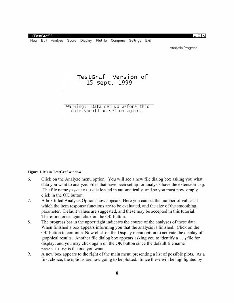
Figure 1. Main TestGraf window. 6. Click on the Analyze menu option. You will see a new file dialog box asking you what
data you want to analyze. Files that have been set up for analysis have the extension .tg. The file name psych101.tg is loaded in automatically, and so you must now simply click in the OK button.
7. A box titled Analysis Options now appears. Here you can set the number of values at which the item response functions are to be evaluated, and the size of the smoothing parameter. Default values are suggested, and these may be accepted in this tutorial. Therefore, once again click on the OK button.
8. The progress bar in the upper right indicates the course of the analyses of these data. When finished a box appears informing you that the analysis is finished. Click on the OK button to continue. Now click on the Display menu option to activate the display of graphical results. Another file dialog box appears asking you to identify a .tg file for display, and you may click again on the OK button since the default file name psych101.tg is the one you want.
9. A new box appears to the right of the main menu presenting a list of possible plots. As a first choice, the options are now going to be plotted. Since these will be highlighted by
8
default, click on OK. You will now see the four option characteristic curves for the first item. Each of these curves describes the probability that an option will be chosen as a function of total test score. The option designated correct is shown in green, and the others in red. The vertical dashed lines indicate total test score levels below which (from left to right) 5%, 25%, 50%, 75%, and 95% of the students fall in terms of actual total test score.
10. Clicking on Next displays the curves for the next item, or you can enter a specific item number in the box below if you wish. Clicking on Plot will cause the display to be printed. Of course, your printer must be previously turned on and ready for this to happen. And, if this is your first use of TestGraf, you may see the plots coming out too large or too small. If so, you will later have to modify a few values by clicking on the “Settings” menu item.
11. There are two horizontal axes possible in this version. These are called display variables. Expected score is what is presented by default. But those used to thinking about ability as having a standard normal distribution (mostly psychometricians) may prefer the Standard Normal option. This can be presented by clicking on the Display Variable menu item. In this version, the graph is immediately redrawn with this variable.
12. When you tire of looking at option characteristic curves, click on the Quit menu item. This returns you to the main display menu. On the main display menu, you may want to now choose the Items option. This will display only the right-answer curve, along with 95% confidence limits on the position of the curve.
13. You may want to take a quick look at other plots. These are described Section ??. If you want to print a plot, first select the Toggle Print of Plots option before selecting the plot. Printing can be terminated by selecting the Toggle Print of Plots again. Recall, though, the caution above about printer settings.
14. When you are through looking at graphs, you can conclude by clicking on the Quit display option, and then shut down TestGraf by clicking on the Exit menu option.
This analysis of the introductory psychology data also produced two files in text or ASCII format containing various numerical results:
• The file named psych101.itm was generated in the setup phase, and contains summary statistics for each of the options within each of the items in the test. It is a good idea to examine this file to be sure that TestGraf processed the data correctly. For example, in this analysis a missing response (there are some in the data) was assumed indicated by a blank character. Nonblank characters in the data would have been treated as actual responses, and generated their own option characteristic curves.
• The file named psych101.prb contains results computed during the analysis phase. These include the probabilities of choosing the options for each level of the trait, stored for convenience as integers between 0 and 1000. You can also see commonly computed summary statistics such as the item-total score point-biserial correlation, as well as values of parameters for two parametric models, the three-parameter logistic model for right/wrong scored examinations, and a logistic-quadratic model for general scoring.
9
These files can be examined using NotePad or some other editing software, or you can see the item and option information by choosing the Edit option on the main menu. With some editing, results in these files can also be set up for input to other programs such as Excel, SAS, or SPSS. You might want to use NotePad or some other editor to examine the file psych101.dat to see how it is set up. If you look at the file, you will notice that
• the first line contains the number of items, 100, and the number of subject label characters, 0.
• the next two lines contain the key, which in this case is the characters indicating the correct option for each item. The position of these key characters provides a template that tells TestGraf98 how the data are set up on subsequent lines for each subject.
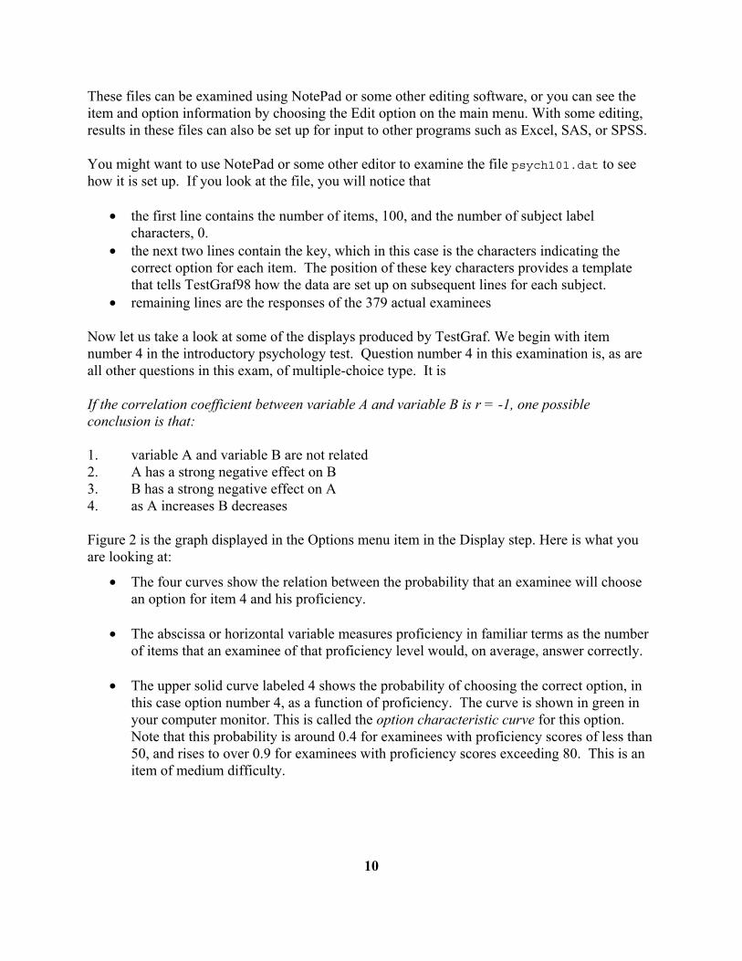
• remaining lines are the responses of the 379 actual examinees Now let us take a look at some of the displays produced by TestGraf. We begin with item number 4 in the introductory psychology test. Question number 4 in this examination is, as are all other questions in this exam, of multiple-choice type. It is If the correlation coefficient between variable A and variable B is r = -1, one possible conclusion is that: 1. variable A and variable B are not related 2. A has a strong negative effect on B 3. B has a strong negative effect on A 4. as A increases B decreases Figure 2 is the graph displayed in the Options menu item in the Display step. Here is what you are looking at:
• The four curves show the relation between the probability that an examinee will choose an option for item 4 and his proficiency.
• The abscissa or horizontal variable measures proficiency in familiar terms as the number
of items that an examinee of that proficiency level would, on average, answer correctly.
• The upper solid curve labeled 4 shows the probability of choosing the correct option, in this case option number 4, as a function of proficiency. The curve is shown in green in your computer monitor. This is called the option characteristic curve for this option. Note that this probability is around 0.4 for examinees with proficiency scores of less than 50, and rises to over 0.9 for examinees with proficiency scores exceeding 80. This is an item of medium difficulty.
10
• The remaining curves, shown in red in your monitor, show the probability-proficiency relation for each of the three incorrect options. We see that the very weakest examinees seem to prefer option 2 to the others, and that examinees at all proficiency levels are least likely to choose option 3.
• The vertical dashed lines indicate the percentages of students whose actual numbers
correct fell below various values. For example, we see that 50% of the students had scores of 65 or less. Also, 50% of the students had scores that fell between 57 and 73.
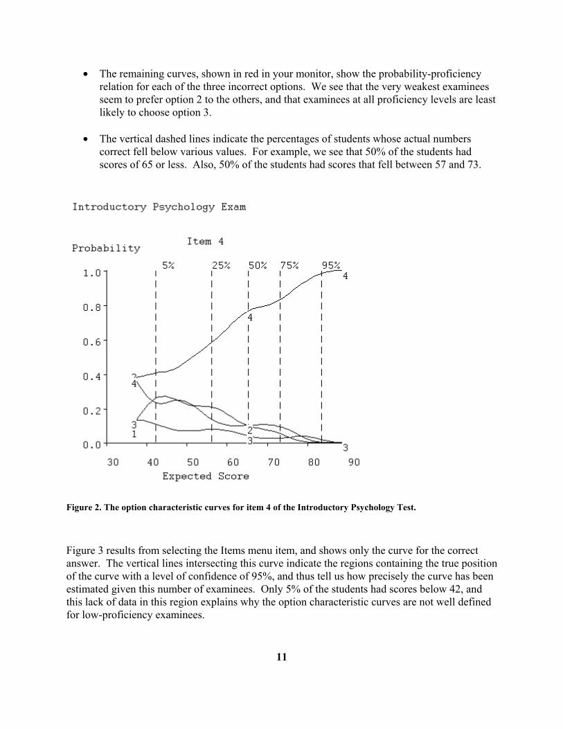
Figure 2. The option characteristic curves for item 4 of the Introductory Psychology Test. Figure 3 results from selecting the Items menu item, and shows only the curve for the correct answer. The vertical lines intersecting this curve indicate the regions containing the true position of the curve with a level of confidence of 95%, and thus tell us how precisely the curve has been estimated given this number of examinees. Only 5% of the students had scores below 42, and this lack of data in this region explains why the option characteristic curves are not well defined for low-proficiency examinees.
11
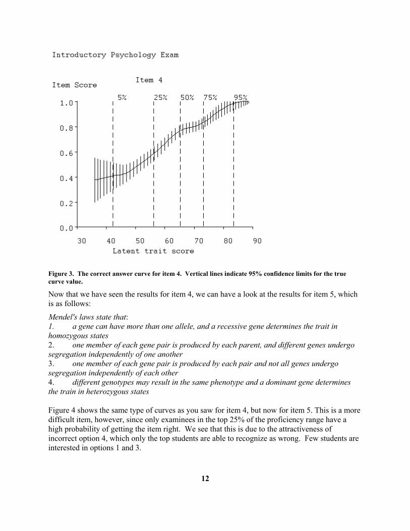
Figure 3. The correct answer curve for item 4. Vertical lines indicate 95% confidence limits for the true curve value. Now that we have seen the results for item 4, we can have a look at the results for item 5, which is as follows:
Mendel's laws state that: 1. a gene can have more than one allele, and a recessive gene determines the trait in homozygous states 2. one member of each gene pair is produced by each parent, and different genes undergo segregation independently of one another 3. one member of each gene pair is produced by each pair and not all genes undergo segregation independently of each other 4. different genotypes may result in the same phenotype and a dominant gene determines the train in heterozygous states Figure 4 shows the same type of curves as you saw for item 4, but now for item 5. This is a more difficult item, however, since only examinees in the top 25% of the proficiency range have a high probability of getting the item right. We see that this is due to the attractiveness of incorrect option 4, which only the top students are able to recognize as wrong. Few students are interested in options 1 and 3.
12
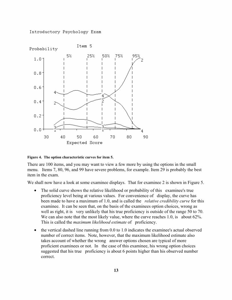
Figure 4. The option characteristic curves for item 5. There are 100 items, and you may want to view a few more by using the options in the small menu. Items 7, 80, 96, and 99 have severe problems, for example. Item 29 is probably the best item in the exam.
We shall now have a look at some examinee displays. That for examinee 2 is shown in Figure 5.
• The solid curve shows the relative likelihood or probability of this examinee's true proficiency level being at various values. For convenience of display, the curve has been made to have a maximum of 1.0, and is called the relative credibility curve for this examinee. It can be seen that, on the basis of the examinees option choices, wrong as well as right, it is very unlikely that his true proficiency is outside of the range 50 to 70. We can also note that the most likely value, where the curve reaches 1.0, is about 62%. This is called the maximum likelihood estimate of proficiency.
• the vertical dashed line running from 0.0 to 1.0 indicates the examinee's actual observed number of correct items. Note, however, that the maximum likelihood estimate also takes account of whether the wrong answer options chosen are typical of more proficient examinees or not. In the case of this examinee, his wrong option choices suggested that his true proficiency is about 6 points higher than his observed number correct.
13
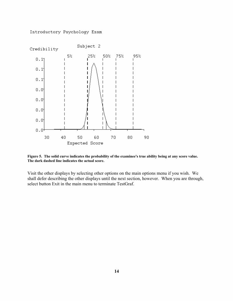
Figure 5. The solid curve indicates the probability of the examinee's true ability being at any score value. The dark dashed line indicates the actual score. Visit the other displays by selecting other options on the main options menu if you wish. We shall defer describing the other displays until the next section, however. When you are through, select button Exit in the main menu to terminate TestGraf.
14
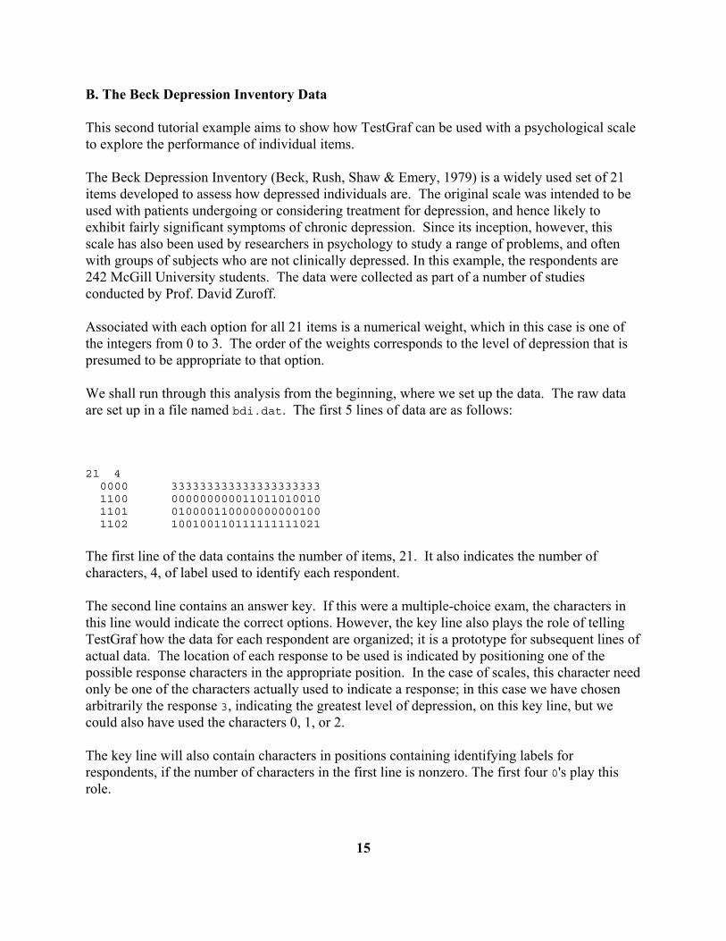
B. The Beck Depression Inventory Data This second tutorial example aims to show how TestGraf can be used with a psychological scale to explore the performance of individual items. The Beck Depression Inventory (Beck, Rush, Shaw & Emery, 1979) is a widely used set of 21 items developed to assess how depressed individuals are. The original scale was intended to be used with patients undergoing or considering treatment for depression, and hence likely to exhibit fairly significant symptoms of chronic depression. Since its inception, however, this scale has also been used by researchers in psychology to study a range of problems, and often with groups of subjects who are not clinically depressed. In this example, the respondents are 242 McGill University students. The data were collected as part of a number of studies conducted by Prof. David Zuroff. Associated with each option for all 21 items is a numerical weight, which in this case is one of the integers from 0 to 3. The order of the weights corresponds to the level of depression that is presumed to be appropriate to that option. We shall run through this analysis from the beginning, where we set up the data. The raw data are set up in a file named bdi.dat. The first 5 lines of data are as follows: 21 4 0000 333333333333333333333 1100 000000000011011010010 1101 010000110000000000100 1102 100100110111111111021
The first line of the data contains the number of items, 21. It also indicates the number of characters, 4, of label used to identify each respondent. The second line contains an answer key. If this were a multiple-choice exam, the characters in this line would indicate the correct options. However, the key line also plays the role of telling TestGraf how the data for each respondent are organized; it is a prototype for subsequent lines of actual data. The location of each response to be used is indicated by positioning one of the possible response characters in the appropriate position. In the case of scales, this character need only be one of the characters actually used to indicate a response; in this case we have chosen arbitrarily the response 3, indicating the greatest level of depression, on this key line, but we could also have used the characters 0, 1, or 2. The key line will also contain characters in positions containing identifying labels for respondents, if the number of characters in the first line is nonzero. The first four 0's play this role.
15
Once the data are set up in this way, we invoke TestGraf, and click on the New button to set up the data for analysis. This setup phase only needs to be done once, while we may want to run TestGraf many times, so it makes sense to relegate the initial processing of the raw data to a separate part of the program. Be sure to click the Scale button in the dialog box to inform TestGraf that items are of the scale type by default, rather than of multiple-choice type. Once the data have been set up in the New step, press the Analyze button to begin the TestGraf analysis. Since the data are now being analyzed for the first time, you will see TestGraf report on its progress as it sets up results for each item. Once the Analyze phase is complete, we can then have a look, by clicking on the Display button, at one of the best items in the scale (for this population, at least), number 11. It is as follows:
0 I am no more irritated by things than I ever am. 1 I am slightly more irritated now than usual. 2 I am quite annoyed or irritated a good deal of the time. 3 I feel irritated all of the time now.
Figure 6 is similar to that shown in Figure2 for the Psychology test, and is what you will see with the Options display option. We see how the probabilities of choosing the four options are estimated to vary with score on the entire scale. As one would hope, only those with the smallest scale scores are choosing option 0; that is, a low depression scale score is associated with choosing the option claimed to go with the least level of depression. As the total depression score increases, respondents are estimated to be more likely to choose the next level option with a score of 1. Then the option with a score of 2 begins to take over, although it doesn't reach its peak. Few respondents ever choose the option scored as 3. This is not surprising, since the vertical dashed lines indicate that only 25% of the respondents achieve scores of 9 or above, out of a maximum score of 63. In fact, clinically depressed patients would usually have scores far higher than even those in this group scoring in the top 5%. University students are generally a pretty happy lot! It is very much to be expected, then, that even on a good item, few of these respondents will choose option indicating the most depression. Figure7, what you will see with the Items display option, shows how the average score on this item varies with the score on the entire test. Again, one is pleased to see that the average item score climbs consistently as the total test score increases. Of course, it does not approach the maximum value of 3, but this is only because none of the total scale scores come anywhere near their largest values, either. The data just do not offer any information about what would happen with total scale scores of, say, 30 or more.
16
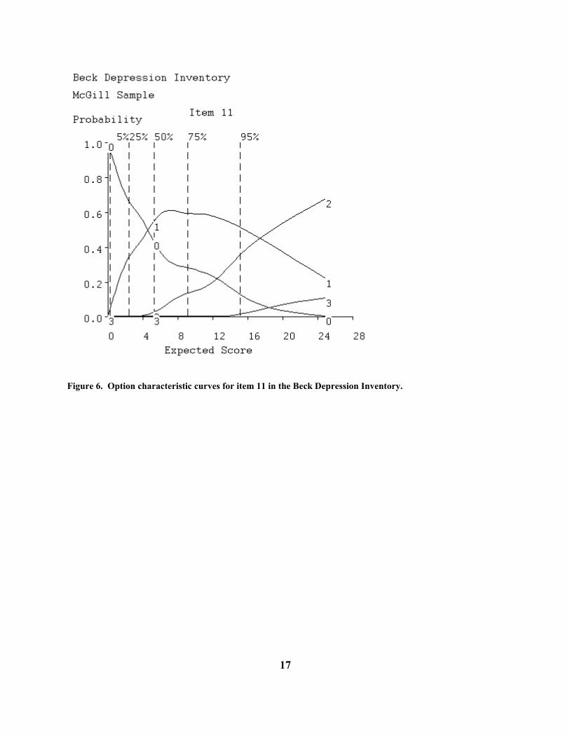
Figure 6. Option characteristic curves for item 11 in the Beck Depression Inventory.
17
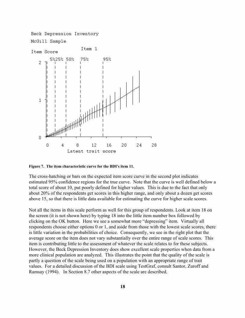
Figure 7. The item characteristic curve for the BDI's item 11.
The cross-hatching or bars on the expected item score curve in the second plot indicates estimated 95% confidence regions for the true curve. Note that the curve is well defined below a total score of about 10, put poorly defined for higher values. This is due to the fact that only about 20% of the respondents get scores in this higher range, and only about a dozen get scores above 15, so that there is little data available for estimating the curve for higher scale scores. Not all the items in this scale perform as well for this group of respondents. Look at item 18 on the screen (it is not shown here) by typing 18 into the little item number box followed by clicking on the OK button. Here we see a somewhat more “depressing” item. Virtually all respondents choose either options 0 or 1, and aside from those with the lowest scale scores, there is little variation in the probabilities of choice. Consequently, we see in the right plot that the average score on the item does not vary substantially over the entire range of scale scores. This item is contributing little to the assessment of whatever the scale relates to for these subjects. However, the Beck Depression Inventory does show excellent scale properties when data from a more clinical population are analyzed. This illustrates the point that the quality of the scale is partly a question of the scale being used on a population with an appropriate range of trait values. For a detailed discussion of the BDI scale using TestGraf, consult Santor, Zuroff and Ramsay (1994). In Section 8.7 other aspects of the scale are described.
18
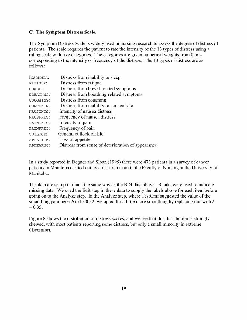
C. The Symptom Distress Scale. The Symptom Distress Scale is widely used in nursing research to assess the degree of distress of patients. The scale requires the patient to rate the intensity of the 13 types of distress using a rating scale with five categories. The categories are given numerical weights from 0 to 4 corresponding to the intensity or frequency of the distress. The 13 types of distress are as follows: INSOMNIA: Distress from inability to sleep FATIGUE: Distress from fatigue BOWEL: Distress from bowel-related symptoms BREATHNG: Distress from breathing-related symptoms COUGHING: Distress from coughing CONCENTR: Distress from inability to concentrate NAUSINTS: Intensity of nausea distress NAUSFREQ: Frequency of nausea distress PAININTS: Intensity of pain PAINFREQ: Frequency of pain OUTLOOK: General outlook on life APPETITE: Loss of appetite APPEARNC: Distress from sense of deterioration of appearance In a study reported in Degner and Sloan (1995) there were 473 patients in a survey of cancer patients in Manitoba carried out by a research team in the Faculty of Nursing at the University of Manitoba. The data are set up in much the same way as the BDI data above. Blanks were used to indicate missing data. We used the Edit step in these data to supply the labels above for each item before going on to the Analyze step. In the Analyze step, where TestGraf suggested the value of the smoothing parameter h to be 0.32, we opted for a little more smoothing by replacing this with h = 0.35. Figure 8 shows the distribution of distress scores, and we see that this distribution is strongly skewed, with most patients reporting some distress, but only a small minority in extreme discomfort.
19
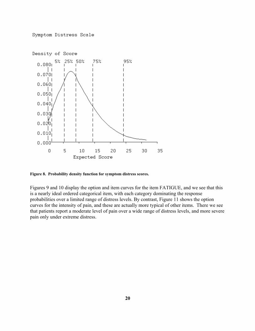
Figure 8. Probability density function for symptom distress scores. Figures 9 and 10 display the option and item curves for the item FATIGUE, and we see that this is a nearly ideal ordered categorical item, with each category dominating the response probabilities over a limited range of distress levels. By contrast, Figure 11 shows the option curves for the intensity of pain, and these are actually more typical of other items. There we see that patients report a moderate level of pain over a wide range of distress levels, and more severe pain only under extreme distress.
20
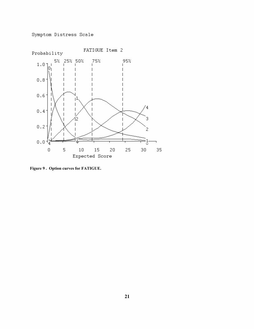
Figure 9 . Option curves for FATIGUE.
21
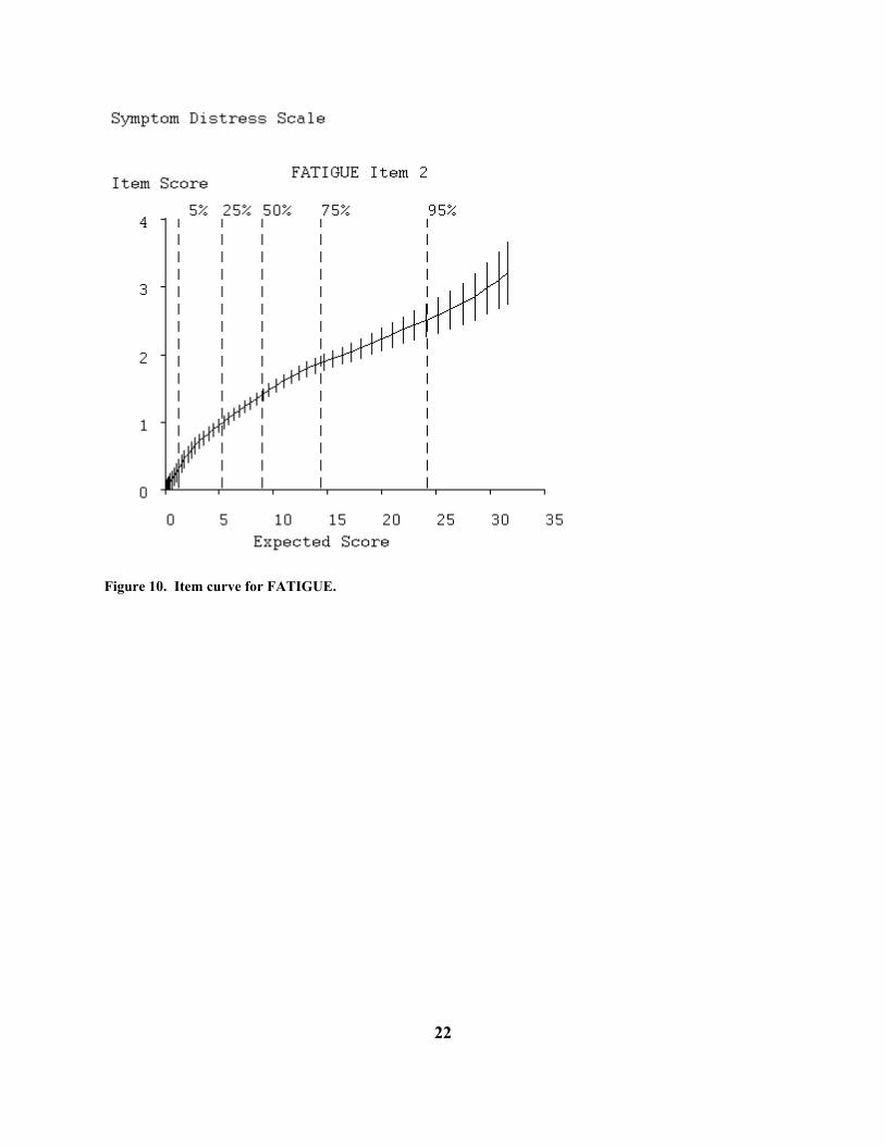
Figure 10. Item curve for FATIGUE.
22
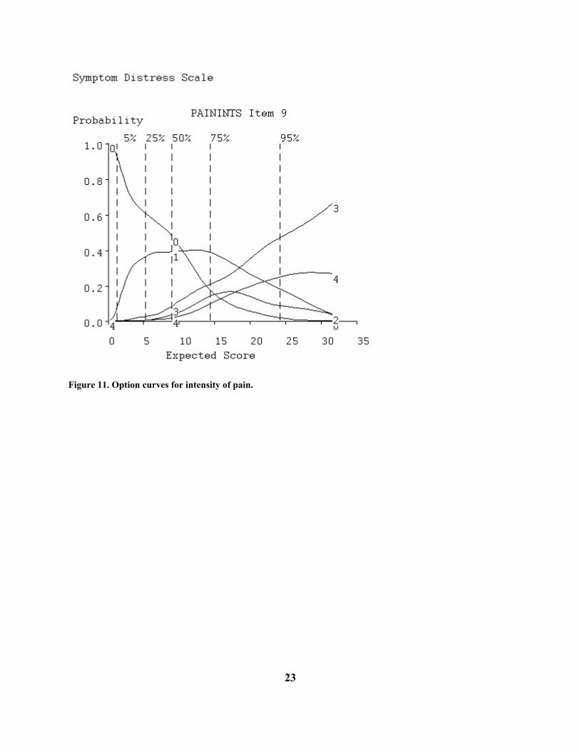
Figure 11. Option curves for intensity of pain.
23
IV. A General Description of TestGraf In this section we offer a general overview of TestGraf followed by a more detailed description of each of the displays that it produces. The fundamental objective of TestGraf is to display the relationship between the probability that examinees or respondents choose various options for each item and the proficiency or trait level of the examinee making the choice. Thus, TestGraf estimates and works with the probability of choosing an option as a function of proficiency or trait level. This function or curve is called the option characteristic curve. The displays in Figures 2 and 3 are the core of the program. Once these option characteristic curves are estimated, various other useful quantities can also be estimated based on these curves. These additional results include the examinee relative credibility curves, an example of which is in Figure 5, as well as the test information function, test characteristic function, standard error of total number correct score, and a principal components analysis of correct option item characteristic curves. For each examinee or respondent there is the possibility of estimating the proficiency or latent trait score by maximum likelihood, thereby producing a more efficient or accurate estimate that the traditional scoring methods, and also of displaying the likelihood function itself. A. Notation To aid further discussion, we introduce a little notation: 1. i=1, ... ,n: is the index for items, of which there are n.
2. m=1, ... ,Mi: the index for the options within item i, of which there are Mi.
3. a=1, ... ,N: the index for examinees or respondents, of which there are N.
4. θ: indicates a proficiency or trait level. This is an unobserved or latent variable.
5. Pim(θ): the fundamental notion of TestGraf. It is the function relating the probability of choosing option m for item i to proficiency level θ. One might think of Pim(θ) as the proportion of examinees with proficiencies at or near θ who choose this option for this item.
6. η(θ): the test or scale score that examinees with proficiency or trait level θ will, on the average, have. It is presumed to be an increasing or monotonic function, meaning that it preserves the rank ordering of any collection of θ values. The main use of the values η in TestGraf is to define the horizontal or abscissa or AX@ values used in the graphs produced by TestGraf, and used in this way, η(θ) is called a display variable.
24
7. q=1, ... ,Q: the index for values θq of the proficiency or η(θq) that will be displayed and used by TestGraf. There are Q of these, and by default TestGraf uses Q = 51.
8. xa: a score or quantity that either may be input into TestGraf for examinee a, or computed from the data. For examinations, xa is by default the number of items correctly answered, and in this case TestGraf computes these numbers internally. For scale or mixed types of exams or questionnaires, it is by default the total of the scale scores for each item. But xa can also be any score or measure for examinee a, and in this case is input to TestGraf for its use, and consequently overrides these default values.
9. wim: a numerical weight to be attached to option m for item i for a scale type item.
10. yima: an indicator variable which takes on the values:
• “1” if examinee a chose option m for item i • “0” if examinee a did not choose option m for item i
B. How TestGraf Works The program estimates the option characteristic curves Pim(θ) by going through the following steps: 1. A value or score xa is associated with each examinee by one of the following methods:
1. computing the number of correct answers for each examinee for multiple choice items,
2. computing the scale score for scales or mixed item types, which is the sum over items of the numerical weights associated with the options chosen,
3. reading in values from a file. These values can arise from any source, including
1. scores on a completely different test or scale,
2. scores arising from some specialized scoring procedure, or proficiency or trait estimates produced by a previous TestGraf analysis of the same data.
2. The examinees or respondents are sorted on the basis of the values or scores xa, with
ranks within tied values assigned randomly,
3. The ath examinee by order of size of xa is assigned the ath quantile of the standard normal distribution, za. This is the value such that the area under the standard normal density function to the left of this value is equal to a/(N+1).
4. For the mth option for the ith item the indicator values yima are computed. Here examinee 25
index a refers to the ath examinee by order of size of za rather than by the original order.
5. The relationship Pim(θ) is estimated by smoothing the relationship between the 0-1 indicator variable values yima and the standard normal quantiles za. Smoothing is in effect a type of local averaging, in which for any proficiency or trait level θ the probability of choice Pim(θ) at that level is a weighted average of the values of yima for examinees or respondents with proficiency or trait levels close to θ.
The smoothing technique used is a kernel smoothing operation that uses what is called a Gaussian kernel with a smoothing parameter that is given a default value by TestGraf and that the user can modify. Further details of this smoothing process are deferred to Section 6.
At this point it is worth addressing a potential criticism of the way TestGraf works. One might be skeptical of the default choice made by TestGraf of ranking examinees or respondents according to test or scale score, since one of the central goals of a program like TestGraf is to replace these inefficient and even biased indicators of latent trait value by something more statistically powerful and accurate.
Also, one might well wonder whether there is any point to a TestGraf analysis if the basis of the analysis is just test scores: “Why not just use the test scores themselves, as we have always done?” These are fair questions and deserve a careful answer.
First, recall that it is not the score values themselves that are used, but only their ranks; if one were to input score ranks rather than scores, TestGraf would produce exactly the same results. Subsequently, these ranks are then replaced by what amounts to a smooth and only moderately nonlinear transformation of rank. Thus, the actual score values are not used.
Nevertheless, insofar as the ranks are based on inefficient indicators of proficiency such as number of correct items, they are themselves subject to considerable error variability. Here, however, is where the next phase, the smoothing step 5, plays a critical role. It turns out that even a substantial amount of error in the ranks or the quantile replacements has only a small impact on the estimated curve values. This can be demonstrated both by mathematical analysis and by the analysis of simulated data, where one knows the values of the curves being estimated. See Douglas (1977) and Ramsay (1991) for further details.
Finally, TestGraf permits the iterative refinement of the values used in Step 1. TestGraf can compute more accurate maximum likelihood estimates of trait values, and these can be cycled back into the program as an undoubtedly more efficient basis for ranking examinees. Even here, however, experience with many types of data has shown that only tiny changes in estimated curve values result, and then only for extreme values of the trait. Moreover, these changes become rapidly negligible if the cycles or iterative refinements are continued, so two or three cycles are the maximum that will almost always be worthwhile. But for the vast majority of applications, no iterative refinement is really necessary, and the default choice of test or scale score for ranking examinees works fine.
26
C. Details on Displays 1. The Variable Displayed as the Latent Trait TestGraf does not use the numerical values of the scores xa; it first replaces these by their ranks, and then replaces the ranks by the corresponding standard normal quantiles prior to smoothing. It is permissible to do this because one cannot measure a latent variable like proficiency or trait θ in the usual sense. Rather, one can only know its values to within any transformation that preserves rank order, called a monotone transformation. That is, we can also use some alternative value g(θ), so long as function g is rank order preserving. This issue is discussed in Ramsay (1991, 1998). As a consequence, we are free to use any variable that we like in the plots as the independent or abscissa variable, so long as it preserves the order of the scores xa used as a basis for the smoothing step. We call the proficiency or trait variable displayed in the plots the display variable. TestGraf permits two types of proficiency or trait measures to be used as the independent variable in the plots: Expected Score η(θ): This means the expected or average number of correct items that an
examinee at a particular proficiency level will achieve. If the data come from a psychological scale, expected scale score is used. This quantity is usually an order-preserving or monotone transformation of the standard normal quantile scores. TestGraf defaults to using this as the independent variable because it is easy for most users to interpret or assess relative to their experience with other tests. The expression for this score is as follows for multiple-choice examinations:
(1) ( )η ( )θθ ∑=
=n
iirP
1
where PiR(θ) is the probability of the correct response on item i at proficiency level θ. For scales or for mixtures of multiple choice and scale items, on the other hand, the expression is
(2) ( ) ( )θθη ∑∑= =
=n
i mimim
M i
Pw1 1
27
It can happen that this expected number correct or scale score fails to be completely increasing in θ, and in this case TestGraf warns the user that the resulting plots may be unsatisfactory. This event is rare, however, and tends to affect the plots only for extreme proficiency or trait levels. It is almost always curable by increasing the smoothing parameter by a small amount.
Standard Normal θ: These are the standard normal quantiles used as a basis for smoothing in
TESTGRAF, and are familiar to psychometricians as a means of quantifying the latent trait score. Users already familiar with most parametric item response models may be happy with this choice.
The earlier version of TestGraf also permitted the use of formula score and of observed score as the display variable. Later versions of this version may also make these options available, and also add new possibilities. The user has the option of changing the display variable prior to any display, and in the display of the option characteristic curves, each display can be repeated with a new choice of display variable. TestGraf also permits some control over how the display variable is plotted by permitting the user to specify the plotting range and the number of tick or hash marks. This can be especially useful in comparing results between different groups of examinees or respondents. The number of evaluation points θq, q=1, ... ,Q, for which the curve values are computed can be set as high as 101 in TestGraf. For most purposes the default of 51 gives sufficient accuracy, and higher values necessarily involve more computation. For the normal display variable, the evaluation points are equally spaced and will range from -2.5 to 2.5 for small to medium numbers of examinees. You can, however, override these limits in the Analyze step. Using fixed limits greatly facilitates the comparison of results between groups having different numbers of cases. Only 1.6%, or 16 in 1000 cases will fall outside of these limits, of which half will fall above 2.5 and half below -2.5. Only large sets of data will yield useful information outside of this range. The range and spacing of the other display variables, such as expected test or scale score, will vary from one set of data to another, since the distribution of these variables depends on the characteristics of the test.
28
2. Summary of Display Options
Once TestGraf has finished computing or setting up the analysis, it presents a menu of display options. This menu of options is as follows:
Option characteristic curve plots: For each item the option characteristic curves Pim(θ) are displayed along with other useful information. Figures 2 and 3 in Section 3 are examples in the context of examination data.
Item characteristic curve plots: For multiple choice items, the correct option only is displayed, and the size of the 95% confidence limits at each score value are indicated by vertical lines. For scales where each option has a numerical weighting, the expected item score as a function of trait level is displayed.
Expected Total Score: The expected total score as a function of the display variable is shown. This is helpful only if the display variable is Standard Normal, since for the Expected Score display variable, the relationship is simply a diagonal straight line. For examination data the expected total score is the expected number of items correctly answered as a function of proficiency. For scales it is the expected total scale score as a function of trait level. This plot is useful especially if TestGraf issues a warning message to the effect that expected score is not a monotone transformation of the standard normal quantiles.
Standard Error Total Score: The estimated standard error or sampling standard deviation of the total score as a function of proficiency or trait level. This can be denoted by σ(θ).
Distribution of Scores: This display shows the distribution of total scores in terms of a smooth curve called a probability density function indicating the relative probability that various score values will occur.
Test Information Function: The amount of information in the test about proficiency, denoted by I(θ). The standard error of a maximum likelihood estimation of trait score is also plotted using the Standard Error of Score option, and the reliability function is displayed using the Reliability Function option.
Individual Score Credibility plots: For each examinee or respondent, the likelihood or relative credibility of the true proficiency or trait level being at value θ is shown. This offers not only an indication of the best estimate of proficiency or trait level, but also provides an indication of how precisely this is estimated on the basis of the responses given by this particular examinee or respondent.
Principal components of item characteristic curves: A principal components analysis of the shapes of the correct-answer characteristic curves is carried out, and the curves themselves are plotted at the positions defined by their principal components scores.
Select Display Variable: Selecting this option permits the display variable to be changed for subsequent plots. The desired display variable is selected by highlighting it and clicking on the OK button.
Toggle Print of Plots: If this option is selected, each subsequent plot will be printed out. Quit: Selecting this terminates the Display phase of TestGraf.
We now discuss these displays and other menu options in the Display step in greater detail.
29
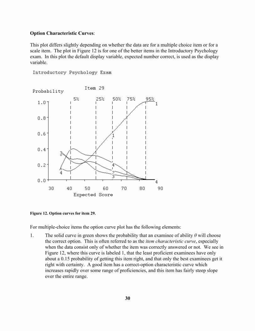
Option Characteristic Curves: This plot differs slightly depending on whether the data are for a multiple choice item or for a scale item. The plot in Figure 12 is for one of the better items in the Introductory Psychology exam. In this plot the default display variable, expected number correct, is used as the display variable.
Figure 12. Option curves for item 29. For multiple-choice items the option curve plot has the following elements:
1. The solid curve in green shows the probability that an examinee of ability θ will choose the correct option. This is often referred to as the item characteristic curve, especially when the data consist only of whether the item was correctly answered or not. We see in Figure 12, where this curve is labeled 1, that the least proficient examinees have only about a 0.15 probability of getting this item right, and that only the best examinees get it right with certainty. A good item has a correct-option characteristic curve which increases rapidly over some range of proficiencies, and this item has fairly steep slope over the entire range.
30
2. The solid curves in red (here curves 2, 3, and 4) indicate the probabilities of choosing each of the incorrect options. We note here, for example, that option 2 is the favorite wrong answer (called a distractor) for the weakest examinees, but that option 4 is the strongest competitor of the correct answer for most proficiency values. Ideally, all distractors should be chosen by some range of examinees, and this is the case here.
3. The vertical dashed lines indicating various quantiles of the distribution of actual or
observed number correct. Thus, for example, only 5% of the examinees obtained less than 45 correct, and the median number correct (the 50% line) is at 65. Only 5% of the examinees exceeded 83, so that the bulk of the observed numbers correct for this exam are concentrated in the relatively narrow range of 55 to 75. These quantile markers do not change from one item display to another, since they are characteristics of the test as a whole.
4. It is possible to label each item with something other than a number, such as a short
character string. By default the item number is also used as a label. Note, however, that the item number is, properly speaking, the index of the item among those actually analyzed, but it often happens that the label does not correspond to the item number on the original exam. This can occur, for example, when the examiner decides to omit a particular item from the analysis.
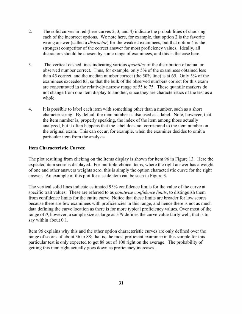
Item Characteristic Curves: The plot resulting from clicking on the Items display is shown for item 96 in Figure 13. Here the expected item score is displayed. For multiple-choice items, where the right answer has a weight of one and other answers weights zero, this is simply the option characteristic curve for the right answer. An example of this plot for a scale item can be seen in Figure 3. The vertical solid lines indicate estimated 95% confidence limits for the value of the curve at specific trait values. These are referred to as pointwise confidence limits, to distinguish them from confidence limits for the entire curve. Notice that these limits are broader for low scores because there are few examinees with proficiencies in this range, and hence there is not as much data defining the curve location as there is for more typical proficiency values. Over most of the range of θ, however, a sample size as large as 379 defines the curve value fairly well, that is to say within about 0.1. Item 96 explains why this and the other option characteristic curves are only defined over the range of scores of about 36 to 88; that is, the most proficient examinee in this sample for this particular test is only expected to get 88 out of 100 right on the average. The probability of getting this item right actually goes down as proficiency increases.
31
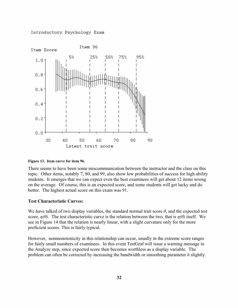
Figure 13. Item curve for item 96. There seems to have been some miscommunication between the instructor and the class on this topic. Other items, notably 7, 80, and 99, also show low probabilities of success for high ability students. It emerges that we can expect even the best examinees will get about 12 items wrong on the average. Of course, this is an expected score, and some students will get lucky and do better. The highest actual score on this exam was 91. Test Characteristic Curves:
We have talked of two display variables, the standard normal trait score θ, and the expected test score, η(θ). The test characteristic curve is the relation between the two, that is η(θ) itself. We see in Figure 14 that the relation is nearly linear, with a slight curvature only for the more proficient scores. This is fairly typical. However, nonmonotonicity in this relationship can occur, usually in the extreme score ranges for fairly small numbers of examinees. In this event TestGraf will issue a warning message in the Analyze step, since expected score then becomes worthless as a display variable. The problem can often be corrected by increasing the bandwidth or smoothing parameter h slightly.
32
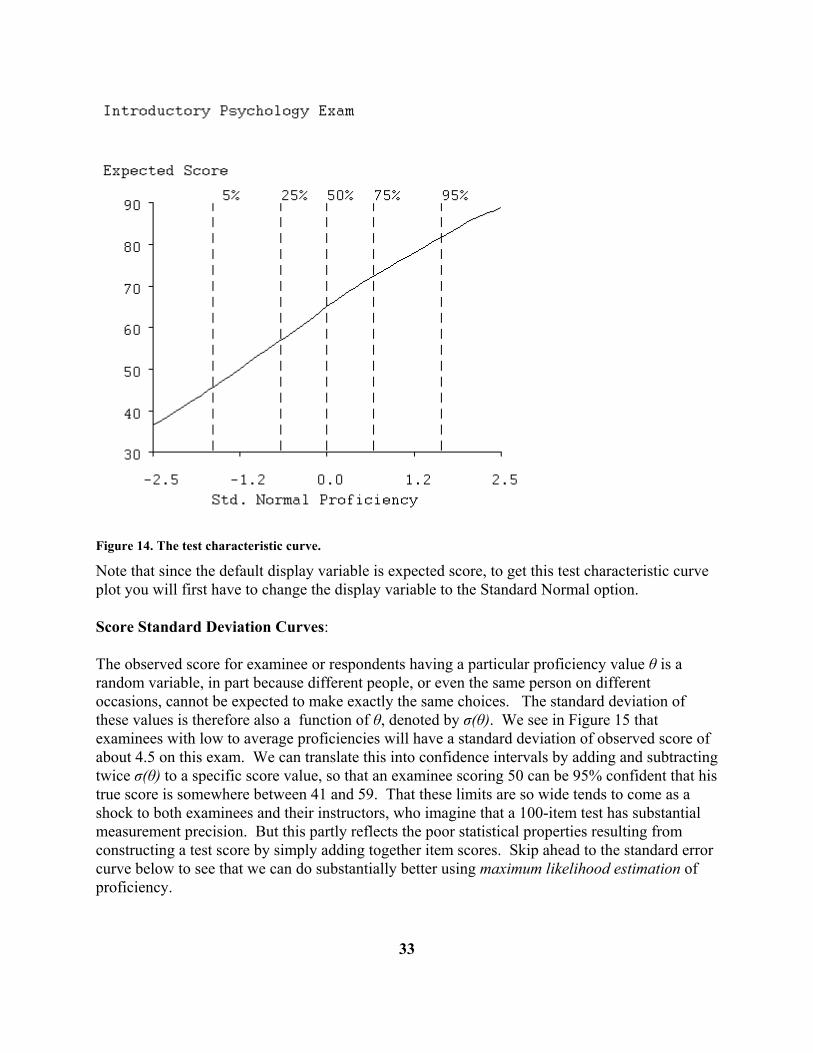
Figure 14. The test characteristic curve. Note that since the default display variable is expected score, to get this test characteristic curve plot you will first have to change the display variable to the Standard Normal option. Score Standard Deviation Curves: The observed score for examinee or respondents having a particular proficiency value θ is a random variable, in part because different people, or even the same person on different occasions, cannot be expected to make exactly the same choices. The standard deviation of these values is therefore also a function of θ, denoted by σ(θ). We see in Figure 15 that examinees with low to average proficiencies will have a standard deviation of observed score of about 4.5 on this exam. We can translate this into confidence intervals by adding and subtracting twice σ(θ) to a specific score value, so that an examinee scoring 50 can be 95% confident that his true score is somewhere between 41 and 59. That these limits are so wide tends to come as a shock to both examinees and their instructors, who imagine that a 100-item test has substantial measurement precision. But this partly reflects the poor statistical properties resulting from constructing a test score by simply adding together item scores. Skip ahead to the standard error curve below to see that we can do substantially better using maximum likelihood estimation of proficiency.
33
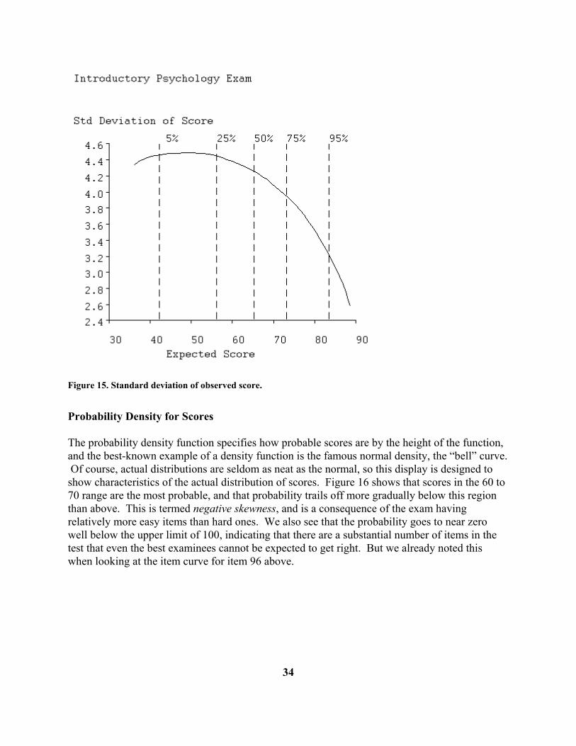
Figure 15. Standard deviation of observed score. Probability Density for Scores The probability density function specifies how probable scores are by the height of the function, and the best-known example of a density function is the famous normal density, the “bell” curve. Of course, actual distributions are seldom as neat as the normal, so this display is designed to show characteristics of the actual distribution of scores. Figure 16 shows that scores in the 60 to 70 range are the most probable, and that probability trails off more gradually below this region than above. This is termed negative skewness, and is a consequence of the exam having relatively more easy items than hard ones. We also see that the probability goes to near zero well below the upper limit of 100, indicating that there are a substantial number of items in the test that even the best examinees cannot be expected to get right. But we already noted this when looking at the item curve for item 96 above.
34
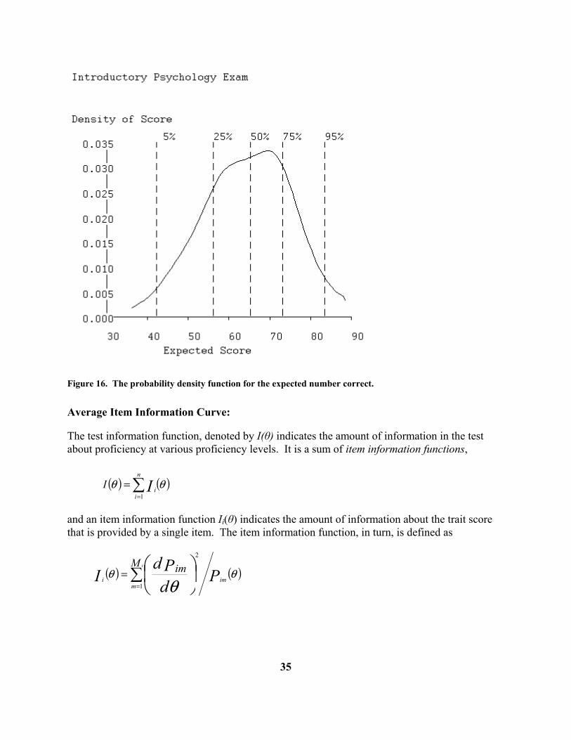
Figure 16. The probability density function for the expected number correct.
Average Item Information Curve: The test information function, denoted by I(θ) indicates the amount of information in the test about proficiency at various proficiency levels. It is a sum of item information functions,
( ) ( )θθ ∑=n
iII=i 1
and an item information function Ii(θ) indicates the amount of information about the trait score that is provided by a single item. The item information function, in turn, is defined as
( ) ( )∑
=
=M imi
mimi Pd
PdI
1
2
θθθ
35
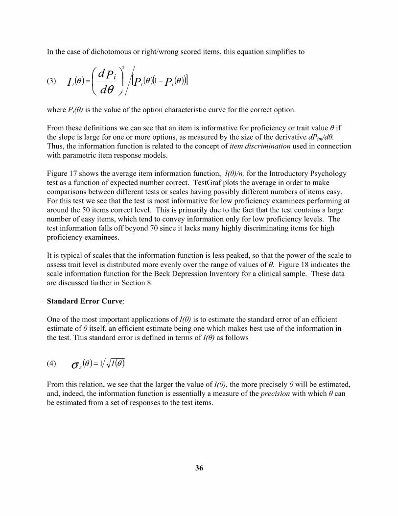
In the case of dichotomous or right/wrong scored items, this equation simplifies to
(3) ( ) ( ) ( )( )[ ]θθθθ PPdPd
I iiii −=
1
2
where Pi(θ) is the value of the option characteristic curve for the correct option. From these definitions we can see that an item is informative for proficiency or trait value θ if the slope is large for one or more options, as measured by the size of the derivative dPim/dθ. Thus, the information function is related to the concept of item discrimination used in connection with parametric item response models. Figure 17 shows the average item information function, I(θ)/n, for the Introductory Psychology test as a function of expected number correct. TestGraf plots the average in order to make comparisons between different tests or scales having possibly different numbers of items easy. For this test we see that the test is most informative for low proficiency examinees performing at around the 50 items correct level. This is primarily due to the fact that the test contains a large number of easy items, which tend to convey information only for low proficiency levels. The test information falls off beyond 70 since it lacks many highly discriminating items for high proficiency examinees. It is typical of scales that the information function is less peaked, so that the power of the scale to assess trait level is distributed more evenly over the range of values of θ. Figure 18 indicates the scale information function for the Beck Depression Inventory for a clinical sample. These data are discussed further in Section 8. Standard Error Curve: One of the most important applications of I(θ) is to estimate the standard error of an efficient estimate of θ itself, an efficient estimate being one which makes best use of the information in the test. This standard error is defined in terms of I(θ) as follows
(4) ( ) ( )θθσ ε I1= From this relation, we see that the larger the value of I(θ), the more precisely θ will be estimated, and, indeed, the information function is essentially a measure of the precision with which θ can be estimated from a set of responses to the test items.
36
Figure 17. Average item information curve.
37
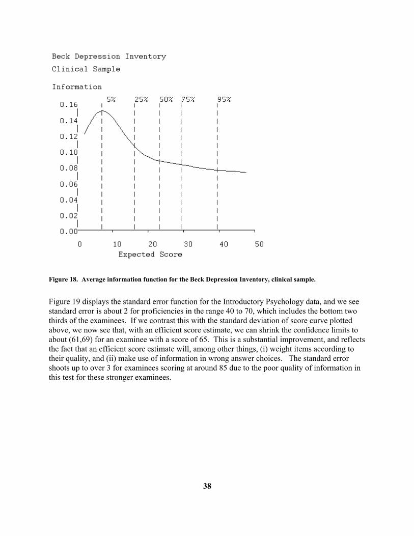
Figure 18. Average information function for the Beck Depression Inventory, clinical sample. Figure 19 displays the standard error function for the Introductory Psychology data, and we see standard error is about 2 for proficiencies in the range 40 to 70, which includes the bottom two thirds of the examinees. If we contrast this with the standard deviation of score curve plotted above, we now see that, with an efficient score estimate, we can shrink the confidence limits to about (61,69) for an examinee with a score of 65. This is a substantial improvement, and reflects the fact that an efficient score estimate will, among other things, (i) weight items according to their quality, and (ii) make use of information in wrong answer choices. The standard error shoots up to over 3 for examinees scoring at around 85 due to the poor quality of information in this test for these stronger examinees.
38
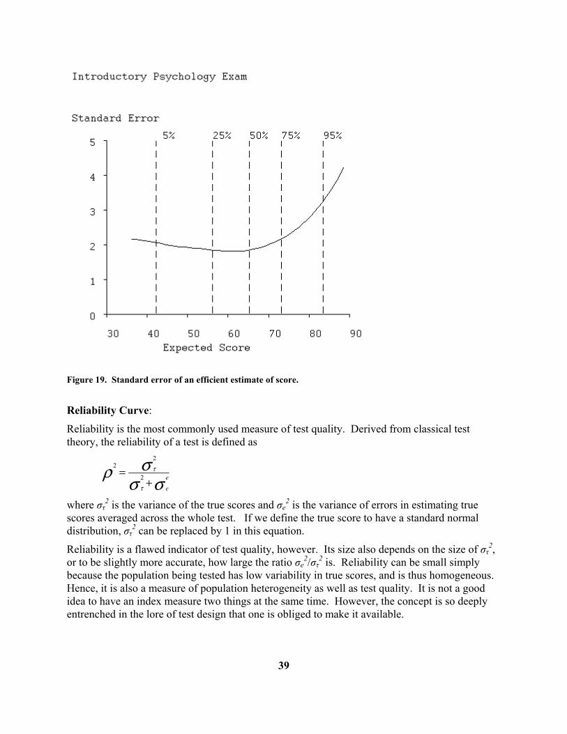
Figure 19. Standard error of an efficient estimate of score. Reliability Curve:
Reliability is the most commonly used measure of test quality. Derived from classical test theory, the reliability of a test is defined as
σσ
σρτ
τe
e+= 2
22
where στ2 is the variance of the true scores and σe2 is the variance of errors in estimating true
scores averaged across the whole test. If we define the true score to have a standard normal distribution, στ2 can be replaced by 1 in this equation.
Reliability is a flawed indicator of test quality, however. Its size also depends on the size of στ2, or to be slightly more accurate, how large the ratio σe
2/στ2 is. Reliability can be small simply because the population being tested has low variability in true scores, and is thus homogeneous. Hence, it is also a measure of population heterogeneity as well as test quality. It is not a good idea to have an index measure two things at the same time. However, the concept is so deeply entrenched in the lore of test design that one is obliged to make it available.
39
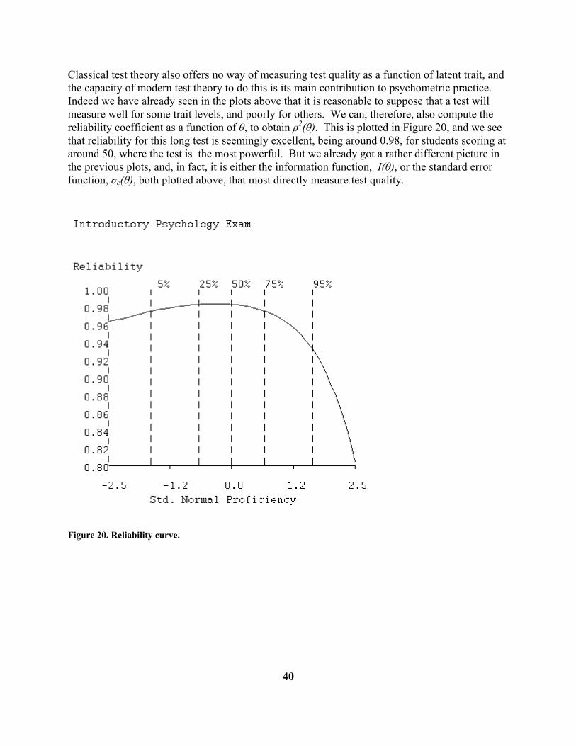
Classical test theory also offers no way of measuring test quality as a function of latent trait, and the capacity of modern test theory to do this is its main contribution to psychometric practice. Indeed we have already seen in the plots above that it is reasonable to suppose that a test will measure well for some trait levels, and poorly for others. We can, therefore, also compute the reliability coefficient as a function of θ, to obtain ρ2(θ). This is plotted in Figure 20, and we see that reliability for this long test is seemingly excellent, being around 0.98, for students scoring at around 50, where the test is the most powerful. But we already got a rather different picture in the previous plots, and, in fact, it is either the information function, I(θ), or the standard error function, σe(θ), both plotted above, that most directly measure test quality.
Figure 20. Reliability curve.
40
Examinee or Respondent Plots: This display for a typical examinee was shown in Figure 5. The curve plotted shows how likely it is that a specific examinee has a actual or true number correct score given his pattern of responses on this test and given that the option characteristic curves are as indicated. The proficiency value for which it reaches its maximum is called the maximum likelihood estimate of proficiency for this examinee, denoted by θa. This estimate is based not only on how many items were answered correctly, but also on
• whether the items answered correctly were difficult or easy, • whether the items answered incorrectly were difficult or easy, • whether the correctly answered items where of high quality or not, and • whether the options chosen for incorrectly answered items were typical of stronger or
weaker examinees. Thus, the maximum likelihood estimate makes use of much more information than the conventional number-right score, and will tend to be a more accurate estimate of proficiency. The screen display also shows the observed number correct as a vertical dashed line, and the numerical value is given at the right of the display, but this has been removed in Figure 5. When there is a substantial difference between the point of maximum curve value and this line, it is probable that the pattern of option choices for incorrectly-answered items gave important additional information about proficiency. This can be seen in Figure 5. The width of the base of the curve indicates how precisely the proficiency of the examinee is estimated. For some examinees the relative credibility curve will be much wider than for others, and can on occasion also be bimodal. This indicates a response pattern giving a mixed message: the examinee passed some tough items, which therefore indicate high proficiency, and at the same time failed some easy items, suggesting lower proficiency. This can happen when the examinee knows some part of the material well and another part poorly. The curve rightly reflects the resulting ambiguity about the examinee's true proficiency. When the data are scale responses, the independent variable is trait level rather than proficiency, but otherwise the display is the same. Principal Component Plot: The purpose of this plot, shown in Figure 21, is to display all of the correct-option characteristic curves or all of the expected item scores simultaneously so as to show relationships among them. This is done by a principal components analysis of the values of the curves at each point of curve evaluation θq, q = 1,...,Q. Prior to the analysis, the average curve is calculated across items, and subtracted from each item characteristic curve. In other words, the principal components analysis is carried out on the centered item characteristic curves.
41
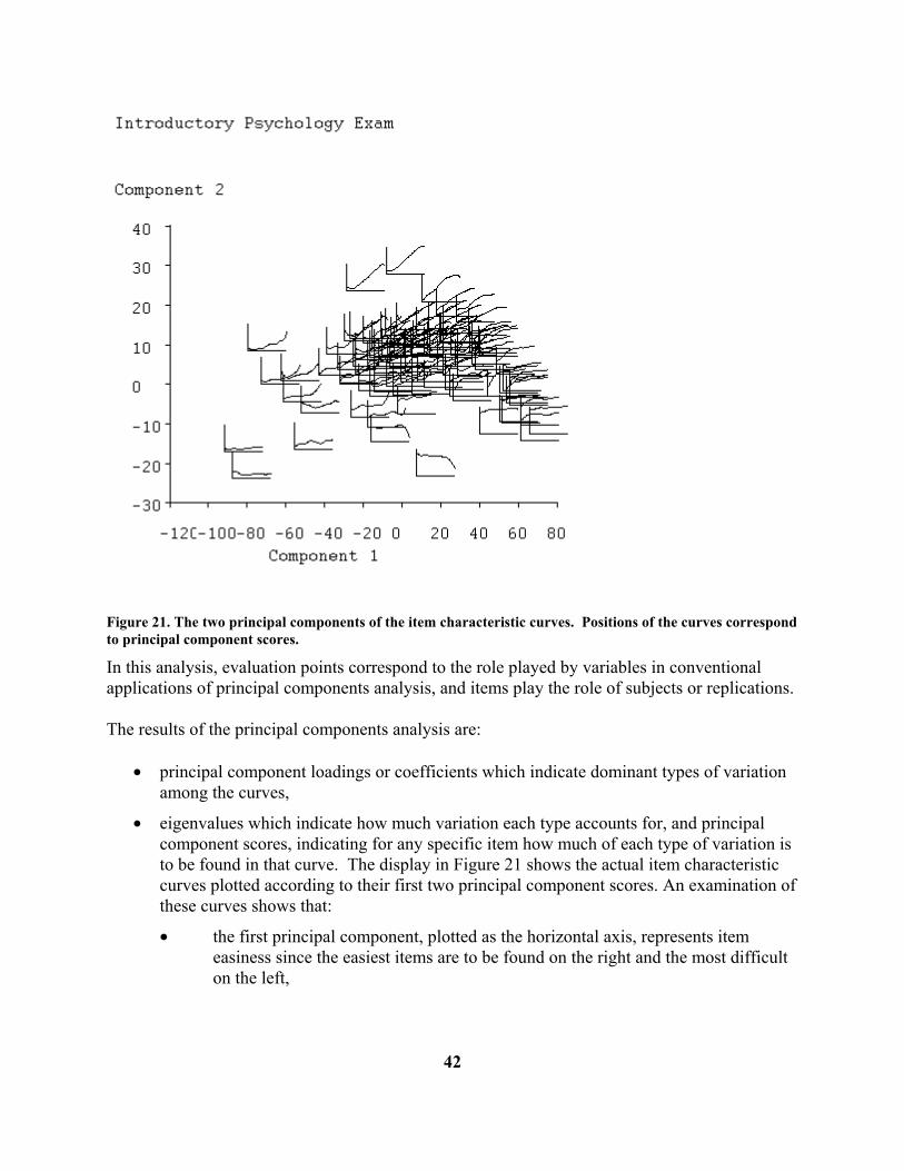
Figure 21. The two principal components of the item characteristic curves. Positions of the curves correspond to principal component scores. In this analysis, evaluation points correspond to the role played by variables in conventional applications of principal components analysis, and items play the role of subjects or replications. The results of the principal components analysis are:
• principal component loadings or coefficients which indicate dominant types of variation among the curves,
• eigenvalues which indicate how much variation each type accounts for, and principal component scores, indicating for any specific item how much of each type of variation is to be found in that curve. The display in Figure 21 shows the actual item characteristic curves plotted according to their first two principal component scores. An examination of these curves shows that:
• the first principal component, plotted as the horizontal axis, represents item easiness since the easiest items are to be found on the right and the most difficult on the left,
42
• the second principal component, the vertical axis, corresponds to item
discriminability since items low on the plot tend to be have shallow of low slope, while those high in the plot have high slope,
• actually, though, the items distribute themselves along an inverted AU@ or
horseshoe, and discriminability is more nearly indicated by whether the item falls above or below this curve,
• while the large majority of items have moderate slope and are of medium
difficulty, there is a tail to the lower right of items which are extremely easy and therefore necessarily have shallow slope,
• there is a corresponding tail to the lower left of items having low curve values for
all abilities and hence also failing to discriminate,
• items 29 and 54 stand out from the pack as being unusually discriminating,
• items 7 and 80 have near zero discriminability, and are extremely difficult, and
• finally, items 96 and 99 are outliers in that they actually have negative discriminability.
Thus, the principal components plot tends to be a useful overall summary of the composition of the test, at least as far as its correct-answer curves go. The display in Figure 21 is fairly typical of most academic tests, and it is also usual to have only two dominant principal components, reflecting item difficulty and discrimination, respectively. It is possible, however, to display up to five principal components.
43
V. How to Run TestGraf In this section, we will have a look at each of the steps that are possible in a TestGraf analysis. These appear at the top of the main TestGraf window. A. The New Step 1. Setting up the Raw Data File (.dat): The first task prior to an invocation of TestGraf is to set up the raw data file correctly. This will not usually involve a great deal of effort, but this phase does require the use of a plain text or ASCII editor such as the Notepad program. TestGraf requires that the data be set up in a particular way in order to determine obvious features of the data such as the number of examinees or respondents, the number of items, the number of lines of data per examinee or respondent, and the organization of the data within these lines. Otherwise TestGraf is used interactively. The raw data file on which TestGraf operates must have the extension .dat. An example would be psych101.dat. TestGraf prompts for confirmation or specification of various critical aspects of the data that it estimates. The user can either accept this estimated or default value, or change the value in question. If the data are set up properly, the user has usually only to confirm the decisions made by TestGraf prior to the program proceeding to carry out its job. The first several lines for the introductory psychology exam are as follows: 100 7 0000000 14242212433411231342221214131311 . . . 32432133441222323211234244314142 . . . 8600001 14242222433411212342224214114311 . . . 34432232131212311212334244314442 . . . 8600002 14214242433411231341224234134311 . . . 24422134444232312112424211344442 . . . .
. .
These lines have the following features:
• The first line contains the number of items to be analyzed and the number of characters of label identifying examinees. If there are no labels for examinees or respondents, the number 0 must nevertheless appear after the number of items on this first line.
• The next line or lines contains a key or prototypical response. This is required for two purposes:
44
• in the context of examinations, it indicates which options are to be scored correct.
• TestGraf also uses this key line or lines to determine where to find the item responses of actual respondents. For this reason, the key line or lines should be set up in exactly the same columns and lines as the response data for actual examinees or respondents.
The first characters in the key line indicate the location of the examinee label characters, if any. For the Introductory Psychology data the key label is 7 zeros followed by 4 blanks, "0000000 ", indicating that the examinee label characters will occupy the first 7 positions in each examinee=s first line, and that these will be followed by 4 blanks.
The seven label characters for the Introductory Psychology data are followed in the first line for each examinee by 60 characters designating the correct options. Because there are more than 60 items, the key is carried on to the next line after an initial 11 blank spaces. This arrangement is identical to that used in the lines containing the actual responses of examinees, and thus acts as a template.
• Don’t use characters in the key line that are never used as an actual response. If you do,
TestGraf will consider this as an actual option that is never chosen, and issue a warning message.
• Subsequent lines for the introductory psychology exam file contain the actual responses for each examinee in exactly the same format as for the key. That is, the key is just a set of responses for an examinee getting all items correct. The first line for each examinee contains a series of up to 7 characters that identify the examinee . The next line for the same examinee begins with 11 blanks, followed by the correct option choices for the remaining 40 items.
Columns in the key line(s) not used for label information or for response information should be left blank. Moreover, if any item is to be omitted from an exam, this is achieved by simply leaving the corresponding position in the key line blank. We might have done this, for example, for item 96 once we saw its item characteristic curve shown above. The setup for the Beck Depression Inventory data was given in Section 3. But be careful: if your file contains characters in the columns specified in the key lines that you did not intend to indicate an examinee response, TestGraf will nevertheless assume that these characters are an actual response. As indicated below, you can reserve a special character to indicate a missing response, although these may also be just left blank. Check your file for any characters besides those identifying options or missing responses. Unwanted characters should be edited out of the .dat file before processing by TestGraf. Also, check the final lines of your file; it can happen that unwanted lines have been added along the way. In fact, scan the entire file to check that everything is in order; there is no substitute for checking your data!
45
TestGraf will assist you by displaying all the characters that it has identified as indicating responses in the “Edit” step. It would be wise to use this step after setting up some new data to check that TestGraf has processed your data as you intended. It is also a good idea to inspect the file with the extension .itm generated by TestGraf, since it also summarizes item information. This requires the use of an editor such as Notepad. In summary, the things that you must satisfy in setting up your raw data are:
• The first line must contain the number of items to be analyzed and the number of characters of label. Use 0 if there are no labels. The next line(s) must contain the exam key. This is the template for reading in actual labels and responses. Label characters, if any, must come first.
• Subsequent line(s) must contain the responses of examinees in the same pattern as used for the key.
2. Omit Character(s):
It is common for examinees or respondents to fail to produce a response for one or more items. This can be indicated in various ways in the raw data file. Leaving this character blank, for example, is a commonly used procedure. Or one may choose some other character such as A*@ as a placeholder for omitted responses. Unless TestGraf is told that this omit character is to indicate an omitted response, it will assume that this is a response like any other, and generate a corresponding item option. Now this may be the right thing to do, especially if there are large numbers of omitted responses, as would happen if the test were too long for most examinees to finish. But TestGraf does handle omitted responses differently than designated responses. The difference between an omitted response and an actual response is important in estimating the option characteristic curves. Omitted responses are bypassed in estimating these curves, but actual responses have their own curves associated with them. On the other hand, an option characteristic curve is generated for every actual designated response, so that if you choose to designate omitted responses with some character and choose not to tell TestGraf that this character is to be treated as an omit, an option characteristic curve will be computed for this response, just like the others. This may, of course, be what you desire. By default TestGraf assumes that a blank indicates an omitted response. The last question asked by TestGraf is whether this is to be so, and if not, the user can enter the appropriate character. But note that if a nonblank character is used, a blank is then treated as an actual response, and will have its own curve associated with it. Finally, note that it is common in raw data files to find extraneous characters that the user did not know were there. Be sure to check your data!
46
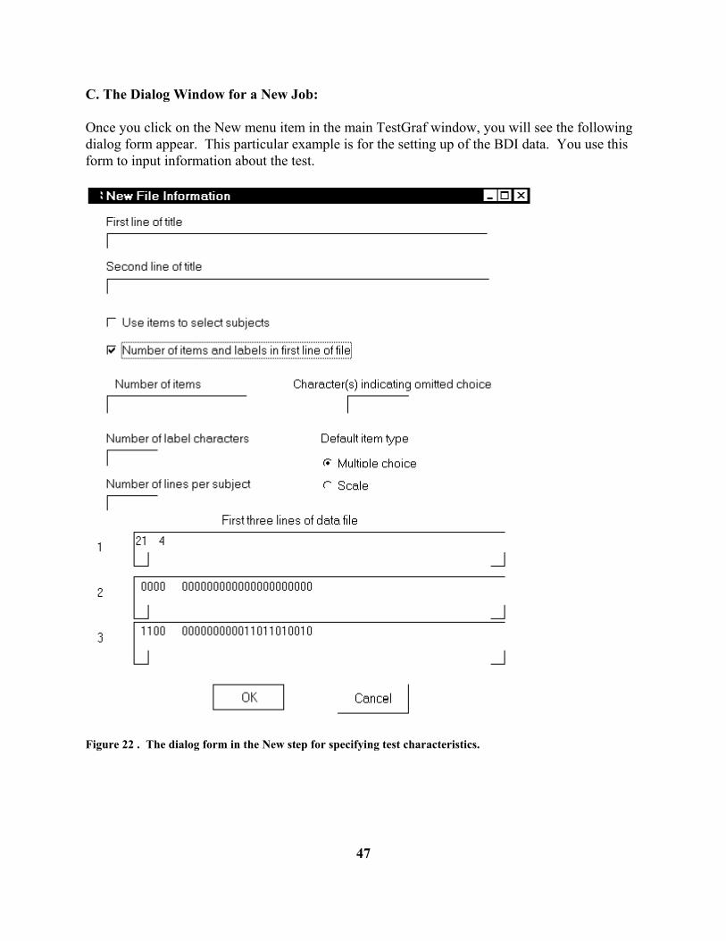
C. The Dialog Window for a New Job: Once you click on the New menu item in the main TestGraf window, you will see the following dialog form appear. This particular example is for the setting up of the BDI data. You use this form to input information about the test.
Figure 22 . The dialog form in the New step for specifying test characteristics.
47
Looking at the form from top to bottom,
• the first two boxes permit you to input two lines of title describing the data. For example, we might say ABDI Data@ in the first box, and “Undergraduate Sample” in the second.
• the small check box that is blank by default permits the designation of items that select subsamples of examinees. Checking this option is something you will do if you want to compare subsamples of examinees, such as males and females, using the Compare step in TestGraf.
• normally you will use the first line of the data to indicate the number of items in the test (meaning only those that you will actually use), as well as the number of label characters. But if you don=t want to do this, click on this box to let get this information from this form in the next two boxes.
• the next two boxes down on the left provide an alternative method for inputting of the number of items and number of label characters. If you wish, you can eliminate the first line in the raw data .dat file indicating this information, and input it here instead.
• The next box down on the left indicates the number of lines of data per subject. Normally, TestGraf figures these things out using the key line(s), so this may be left blank. But, if more than one line of data per examinee is used in the raw data file, and the items that you want to actually analyze occur only in the first line, TestGraf will have no way of knowing how many lines of data there are per examinee. Here is an example, the GMAT test analyzed in Section IX. The first few lines of data are
25 0 1111111111111111111111111 11111121101110333333111111111011211333331110011111110111102033333111111111111222 20333F 11101110201001000333000121120021200110331100111020100001222000013110122112000001 20000F
Notice that the second key line is blank, since all the items to be analyzed (the quantitative subscale, are in the first line of each subject=s two data lines. Thus, for this scale, you would have to enter 2 in the Number of lines per subject box. Otherwise TestGraf will conclude that there is only one line per subject.
• the characters used to indicate omitted items are entered into the left box. Blank is an omit character by default, and thus need not be explicitly entered.
• the pair of check buttons below the omit character box are for switching between multiple choice and scale types as the default type for items. Since this form is for the BDI data, we have to click on the Scale button, at which point the Multiple Choice check will disappear.
• the last three lines display the first three lines of the .dat file. Use this display to check that your data have been properly set up. If not, click on the Cancel button, exit TestGraf, and use an editor to set up the data as required.
48
To summarize, most of the defaults apply to the BDI data, except for the need to check the Scale button, and the optional entry of one or two lines of title. To set up the Introductory Psychology data, only titles would have to be entered.
Once the test information has been entered, just click on the OK button to continue.
TestGraf asks for a default item type, and all items are set up by TestGraf to be this type. Normally exams consist of items that are all of the multiple choice type, and scales are comprised of items all of which are of the scale type, and in this case no additional work needs to be done. However, if the data come from exams or questionnaires where these types are mixed, then the Edit phase must be used to change the required items from the default type to the appropriate type. For mixed item types, the default choice should naturally be that of the majority of items. B. The Edit Step
The Edit step permits you to change these aspects of options and items:
1. Options: the weights may be changed for any option. If the option is within a multiple-choice item, a change of its weight will change the item to a scale item.
2. Items: • the type can be changed. If the item is changed from a scale to a multiple choice
type, the correct answer will be set to the first option by default, and the first option=s weight will become 1, and the weights for all other options will become 0.
• if the item is of multiple-choice type, the correct answer can be changed. For example, if the type has been changed from scale to multiple choice, then this permits you to designate an option other than the first as the correct answer.
• a label can be supplied of up to 8 characters in length. • for scale items, the weights may be reversed. This is useful for questionnaires
using the same weighting scheme throughout, but having the wording of the question imply either a positive or a negative sense of the weights. Naturally, TestGraf expects the weights for every item to increase in the positive sense of the trait being measured.
The window that you will see when you click on the Edit option will ask you whether you want to change options or items. Depending on what you choose, a window will pop up asking to designate the item and/or option to modify. When you are finished with your changes, click on Quit, once for the item or option to change window, and once again to quit the Edit step.
Once the Edit step is finished, TestGraf will recompute scores and item-test correlations, and mark the file as unanalyzed. You must then pass through the Analyze step again before being able to display results.
Other possible edit options will be added soon, so you should recheck the ftp site for TestGraf from time to time.
49
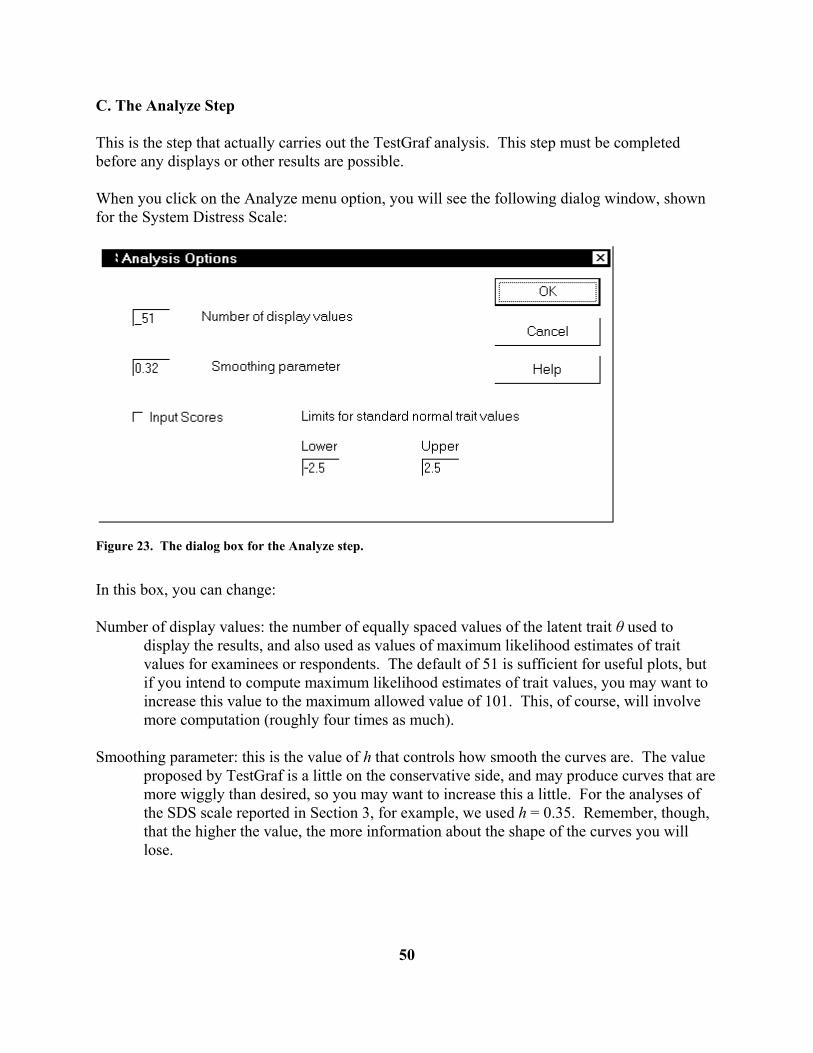
C. The Analyze Step This is the step that actually carries out the TestGraf analysis. This step must be completed before any displays or other results are possible. When you click on the Analyze menu option, you will see the following dialog window, shown for the System Distress Scale:
Figure 23. The dialog box for the Analyze step. In this box, you can change: Number of display values: the number of equally spaced values of the latent trait θ used to
display the results, and also used as values of maximum likelihood estimates of trait values for examinees or respondents. The default of 51 is sufficient for useful plots, but if you intend to compute maximum likelihood estimates of trait values, you may want to increase this value to the maximum allowed value of 101. This, of course, will involve more computation (roughly four times as much).
Smoothing parameter: this is the value of h that controls how smooth the curves are. The value
proposed by TestGraf is a little on the conservative side, and may produce curves that are more wiggly than desired, so you may want to increase this a little. For the analyses of the SDS scale reported in Section 3, for example, we used h = 0.35. Remember, though, that the higher the value, the more information about the shape of the curves you will lose.
50
Input scores: If you check this box, TestGraf will look for a file with the same set of characters
preceding the period as the raw data .dat file has, but with the remaining characters being .abi. It will expect this file to be in the same format as what TestGraf itself uses when the Score step is used. See below in the subsection on files that TestGraf produces for more details.
Limits for standard normal trait values: These are the limits within which the values of θ
are made equally spaced. TestGraf chooses these limits depending on the number of examinees, and switches to wider limits for larger numbers of N. You may want to override these limits, and especially if you want to compare subsamples of examinees. See Section ?? for an example of this.
However, for a first analysis of the data, it recommended to just accept the default choices, and click immediately on the OK button to launch the analysis. The small Analysis Progress bar will give a rough indication of how the analysis is progressing. For moderate sample sizes, such as we had for the three tutorial examples, the analysis will progress rapidly to its conclusion. For samples in the tens of thousands or beyond, some steps will take substantially longer, so don=t despair if the analysis seems stuck. D. The Score Step
If you click on this step, TestGraf will compute a score using maximum likelihood estimation, conditional on the curves computed previously in the Analyze step, for each examinee or respondent. These values are output to a file with the same initial characters as the .dat file, but with the final characters being .abi. See the subsection on files created by TestGraf for more details on what this file contains. The .abi file is set up so that it can be used without modification to provide input scores on a subsequent analysis. In this way, you can iteratively compute estimates of both curves and of the trait estimates that depend on them, until you see no appreciable change from one iteration to another. E. The Display Step
In this step you display the results computed in the Analyze step. This section has already been described in some detail in Section ??.
51
F. The Plotfile Step
This step outputs all the results available in the Display step to a file with the extension .pwo. The file may be modified to tailor and customize plots, and is then input into program TestLasr to produce PostScript versions of these plots, which may then be printed. Details on this process are found in Section ??. G. The Compare Step
An important part of many test analysis projects is the comparison of groups of examinees or respondents. These groups may be defined by factors such as gender, ethnic or racial groupings, educational background, and etc. The Compare step permits you to specify a set of TestGraf analyses, each involving the same items and options, in order to compare results. In this step, for example, you can compute measures of differential item functioning or DIF in order to determine if certain items or options are biased for or against certain groups. This step is taken up in detail in Section ?? H. The Settings Step
The simplest procedure for generating printed plots is to turn on the interactive printing option in the Display step. If a series of plots are to be printed, just click on the Toggle Printing menu option prior to choosing plots to display. If only an occasional plot is to be printed for item displays, this can also be achieved by clicking on the Print button in the dialog box for the next item to display. However, you may need to first configure your printer. The size of the plot is controlled by three constants: PWIDE: the width of the plot PHITE: the height of the plot CHITE: the height of numbers and characters These are in units that have different implications for different printers. By clicking on the Settings option in the main TestGraf menu, you can change these, try a plot, and adjust until your plot is of the appropriate size. I. The Exit Step
Clicking on this menu option or clicking on the small x at the extreme upper right of the window ends the TestGraf session and removes the window from your screen,. J. Files Produced by TestGraf
TestGraf produces a number of files. With all but one exception, these may be examined with an ASCII editor such as Notepad, and may be modified as desired for import into other software. These are described below.
52
1. The Item or .itm File:
TestGraf produces a file that contains information about each item. This file can be examined by standard editor such as NotePad to obtain useful information about items, such as the frequencies with which options are chosen. The first several lines of this file for the introductory psychology exam are as follows: ******************************************************* Introductory Psychology Exam Omit characters 379 Number of examinees or respondents 100 Number of test or scale items 398 Number of options ******************************************************* ******** Item 1 ********** Item Label Multiple choice Item Type 1 Correct Option 4 Number of Options Option Data Label Weight Freq. 1 1 1 1 292 2 2 2 0 42 3 3 3 0 11 4 4 4 0 33 Item omit frequency 1 The first few lines contain summaries of the test as a whole. Subsequent lines summarize item properties. The information recorded for each item consists of:
• a label of up to 8 characters for the item, • the type of the item (multiple choice or scale), • in the case of multiple choice options only, the index of the correct option, • the number of options for the item, and • information for each option, consisting of:
o the character associated with the option, o a label of up to 8 characters for the option, o a numerical weight for the option, o the frequency with which the option was chosen, and o the frequency with which the item was omitted.
This file can be modified; TestGraf does not use this file once it is generated. The earlier version of the program did, but the “Edit” step now replaces the role of the .itm file in the earlier version. This file is simply there for your convenience by providing a permanent record of characteristics of items and options.
53
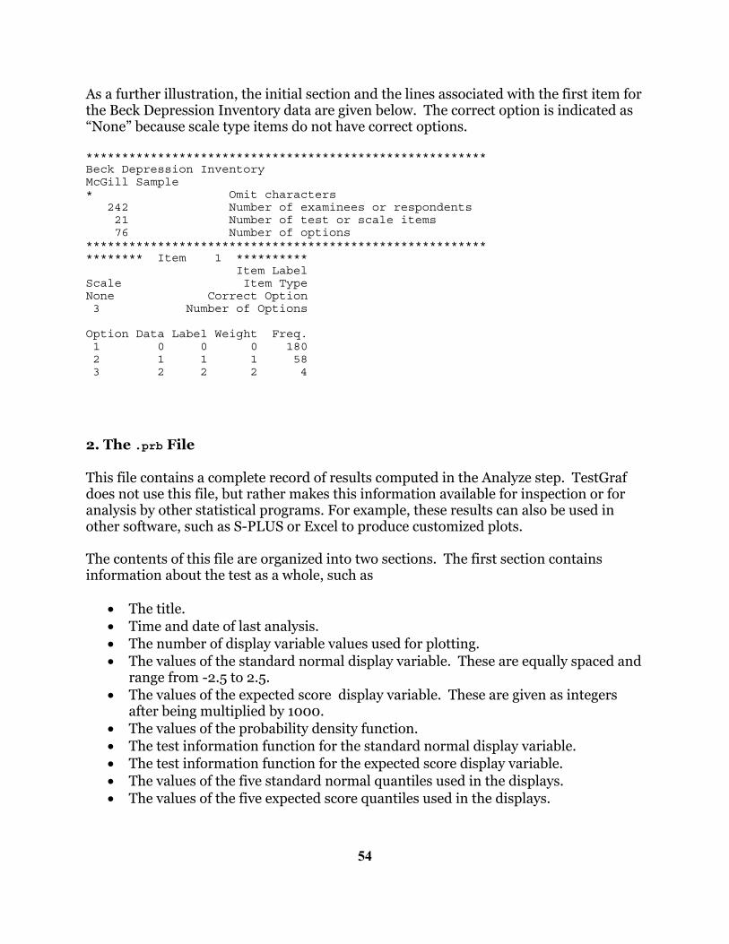
As a further illustration, the initial section and the lines associated with the first item for the Beck Depression Inventory data are given below. The correct option is indicated as “None” because scale type items do not have correct options. ******************************************************** Beck Depression Inventory McGill Sample * Omit characters 242 Number of examinees or respondents 21 Number of test or scale items 76 Number of options ******************************************************** ******** Item 1 ********** Item Label Scale Item Type None Correct Option 3 Number of Options Option Data Label Weight Freq. 1 0 0 0 180 2 1 1 1 58 3 2 2 2 4
2. The .prb File This file contains a complete record of results computed in the Analyze step. TestGraf does not use this file, but rather makes this information available for inspection or for analysis by other statistical programs. For example, these results can also be used in other software, such as S-PLUS or Excel to produce customized plots. The contents of this file are organized into two sections. The first section contains information about the test as a whole, such as
• The title. • Time and date of last analysis. • The number of display variable values used for plotting. • The values of the standard normal display variable. These are equally spaced and
range from -2.5 to 2.5. • The values of the expected score display variable. These are given as integers
after being multiplied by 1000. • The values of the probability density function. • The test information function for the standard normal display variable. • The test information function for the expected score display variable. • The values of the five standard normal quantiles used in the displays. • The values of the five expected score quantiles used in the displays.
54
The second section contains information for each item, and within each item, information for each option.
• The item-total score correlation. • For multiple-choice items only, estimates of the parameters for the three-
parameter logistic model for the correct answer curve. • For each option, values the parameters of a logistic-quadratic model, computed
for both the standard normal and for the expected score display variables. • Option characteristic curve values Pim(θq). The values of the curves at the
argument values θ1, ... ,θq are saved in this file. Although these values are probabilities, and hence lie in the unit interval [0,1], TestGraf outputs them as integers between 0 and 1000 since this economizes on both the storage that they require within the program and on the size of the output file. These values can then be used in another plotting program if desired, but they must be divided by 1000.0 beforehand. The main reason for outputting the option characteristic curve values is that TestGraf itself can read them in on subsequent invocations of the program, thereby saving considerable computation time.
• Standard errors for the correct answer curve (multiple choice exams) or expected item score (scales). It is these values that define the vertical cross-hatching for this curve in the item displays. As with the curve values themselves, these standard errors are output by first multiplying them by 1000 and outputting them as integers.
3. The .abi File
If the Score step is chosen to compute maximum likelihood proficiency estimates for each examinee, these are output to a file with extension .abi. These estimates are expressed both in terms of standard normal deviates, and in terms of expected number correct. Note that these values are output in such a way that they can be used as input on a subsequent TestGraf analysis, thereby producing an iterated set of estimates. See Section 9 for further details. The first six lines of this file for the Introductory Psychology data are as follows: Trait Scores Subj. No. Actual Score Expected Score Display Score 1 74 73.572 0.8 2 56 59.935 -0.4 3 89 88.566 2.5 4 70 67.276 0.2
4. The .tg File
Unlike other files, this is a binary direct access file used by TestGraf to make its computations more efficient. It is not intended for editing or any other form of modification.
55

5. The .cmp File In the event that two or more groups are being compared in the Compare step, TestGraf will also output a file containing statistics summarizing the differences between the groups for each item.
See Section VII for more details.
56
VI. A Statistical Description of TestGraf A technical account of much of TestGraf can be found in Ramsay (1991). In this section a less technical discussion of how TestGraf works is offered, with a brief introduction to the idea of kernel smoothing. Some knowledge of modern test theory is presumed, such as can be found in Allen and Yen (1979), Hambleton, Swaminathan, and Rogers (1991), and Lord (1981). A. Kernel Smoothing and Nonparametric Regression
One of the more dramatic developments in contemporary statistics has been the evolution of techniques for the direct estimation of functions. This contrasts with the older approach of specifying a family of functions that were defined by a certain number of parameters, and then using the data to estimate the parameters. The principal problem with the parametric approach was that no matter how many parameters were used, some application always managed to present itself that needs more flexibility than the parametric family could provide. And, moreover, if a generous number of parameters were used to give sufficient flexibility for almost all problems, then many problems calling for simpler functions were over-fitted. Overfitting data leads to many problems, among which are needlessly expensive computation, poor estimation properties for the parameters actually needed, and poor power for hypothesis tests. These issues are well known in the context of the linear model or multiple regression, where great stress is placed on using the minimal number of independent variables, and hence parameters required to fit the data.
The parametric function family used most widely to model the characteristic curve for the correct option in multiple-choice exams is the three-parameter logistic or 3PL model
( ) ( ) ( )[ ]( )[ ]ba
baccP−+
−−+=θ
θθ7.1exp1
7.1exp1
Although only three parameters are involved, this apparently simple model has turned out to well illustrate the problems of parametric function estimation. For example, when the item is easy, there are typically virtually no data available for estimating the guessing parameter c, and then large changes in c can be compensated for by corresponding changes in the discrimination parameter a. The result is that a, which can play an important role in describing the item, is then poorly estimated. Thus, it is wise to set c = 0, called the 2PL model, when the item has low difficulty. Even when the item is of moderate difficulty, the covariance between3PL parameter estimates is high, and large amounts of data are required to estimate them well, even though the function itself may be well defined. Thissen and Wainer (1982) discuss these and other problems with the 3PL model. Computer programs for fitting the 3PL model are comparatively slow, complex, and loaded with heuristic devices for preventing failure.
57
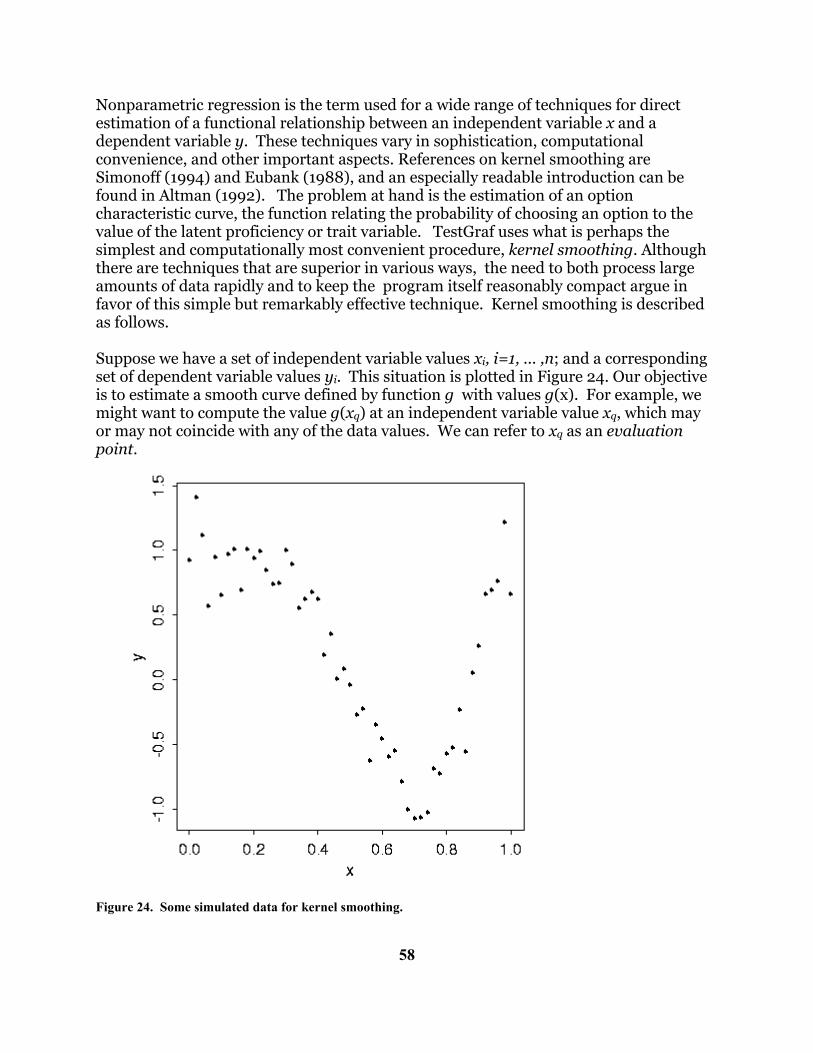
Nonparametric regression is the term used for a wide range of techniques for direct estimation of a functional relationship between an independent variable x and a dependent variable y. These techniques vary in sophistication, computational convenience, and other important aspects. References on kernel smoothing are Simonoff (1994) and Eubank (1988), and an especially readable introduction can be found in Altman (1992). The problem at hand is the estimation of an option characteristic curve, the function relating the probability of choosing an option to the value of the latent proficiency or trait variable. TestGraf uses what is perhaps the simplest and computationally most convenient procedure, kernel smoothing. Although there are techniques that are superior in various ways, the need to both process large amounts of data rapidly and to keep the program itself reasonably compact argue in favor of this simple but remarkably effective technique. Kernel smoothing is described as follows. Suppose we have a set of independent variable values xi, i=1, ... ,n; and a corresponding set of dependent variable values yi. This situation is plotted in Figure 24. Our objective is to estimate a smooth curve defined by function g with values g(x). For example, we might want to compute the value g(xq) at an independent variable value xq, which may or may not coincide with any of the data values. We can refer to xq as an evaluation point.
Figure 24. Some simulated data for kernel smoothing.
58
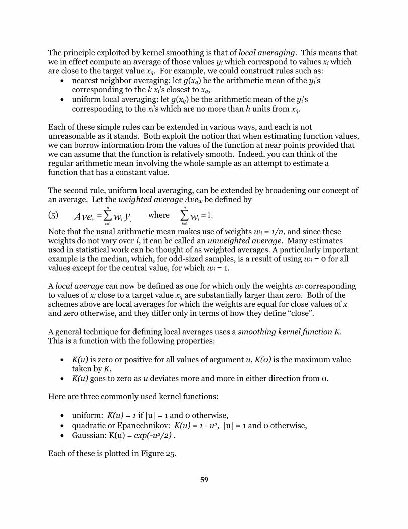
The principle exploited by kernel smoothing is that of local averaging. This means that we in effect compute an average of those values yi which correspond to values xi which are close to the target value xq. For example, we could construct rules such as:
• nearest neighbor averaging: let g(xq) be the arithmetic mean of the yi's corresponding to the k xi's closest to xq,
• uniform local averaging: let g(xq) be the arithmetic mean of the yi's corresponding to the xi's which are no more than h units from xq.
Each of these simple rules can be extended in various ways, and each is not unreasonable as it stands. Both exploit the notion that when estimating function values, we can borrow information from the values of the function at near points provided that we can assume that the function is relatively smooth. Indeed, you can think of the regular arithmetic mean involving the whole sample as an attempt to estimate a function that has a constant value. The second rule, uniform local averaging, can be extended by broadening our concept of an average. Let the weighted average Avew be defined by
(5) where ywAve i
n
iiw ∑
=
=1
.11
=∑=
n
iiw
Note that the usual arithmetic mean makes use of weights wi = 1/n, and since these weights do not vary over i, it can be called an unweighted average. Many estimates used in statistical work can be thought of as weighted averages. A particularly important example is the median, which, for odd-sized samples, is a result of using wi = 0 for all values except for the central value, for which wi = 1. A local average can now be defined as one for which only the weights wi corresponding to values of xi close to a target value xq are substantially larger than zero. Both of the schemes above are local averages for which the weights are equal for close values of x and zero otherwise, and they differ only in terms of how they define “close”. A general technique for defining local averages uses a smoothing kernel function K. This is a function with the following properties:
• K(u) is zero or positive for all values of argument u, K(0) is the maximum value taken by K,
• K(u) goes to zero as u deviates more and more in either direction from 0. Here are three commonly used kernel functions:
• uniform: K(u) = 1 if |u| = 1 and 0 otherwise, • quadratic or Epanechnikov: K(u) = 1 - u2, |u| = 1 and 0 otherwise, • Gaussian: K(u) = exp(-u2/2) .
Each of these is plotted in Figure 25.
59
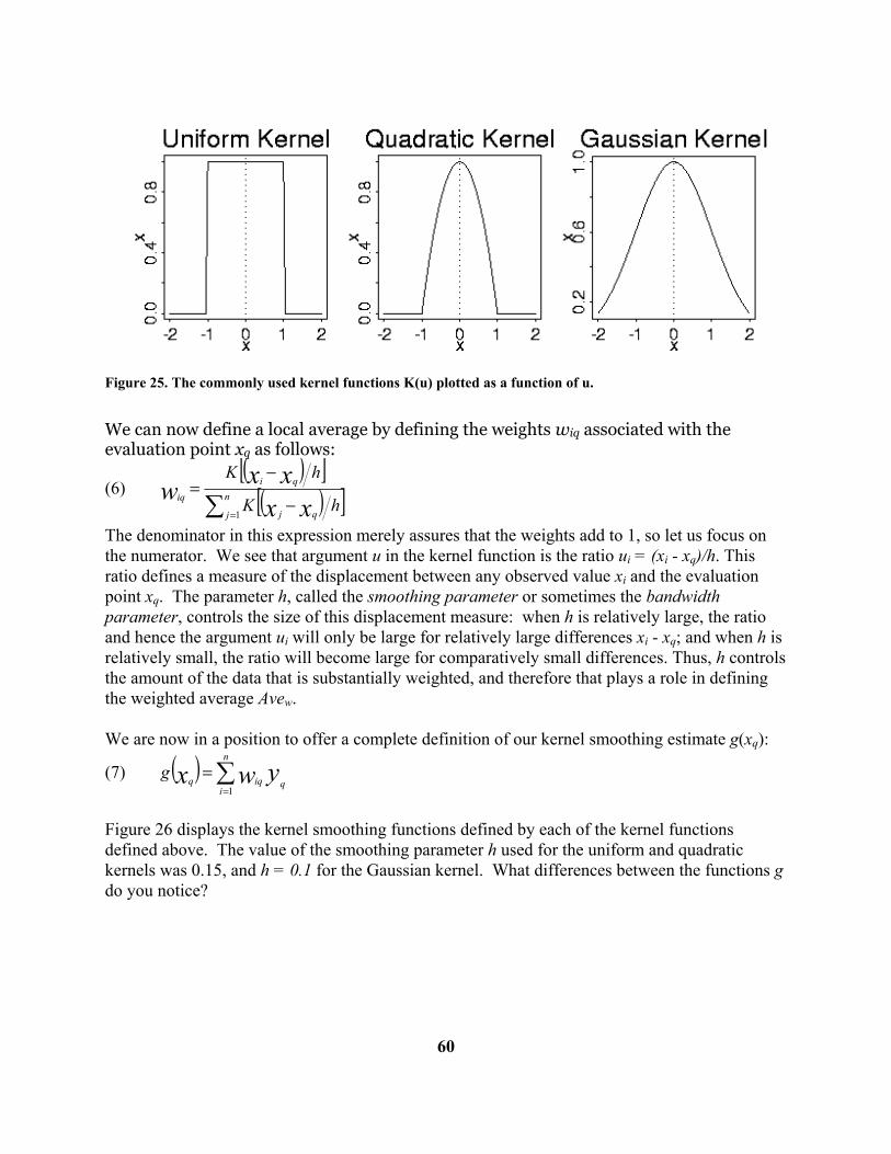
Figure 25. The commonly used kernel functions K(u) plotted as a function of u.
We can now define a local average by defining the weights wiq associated with the evaluation point x as follows: q
(6) ( )[ ]
( )[ ]∑ =−
−= n
j qj
qiiq hK
hK
xxxxw
1
The denominator in this expression merely assures that the weights add to 1, so let us focus on the numerator. We see that argument u in the kernel function is the ratio ui = (xi - xq)/h. This ratio defines a measure of the displacement between any observed value xi and the evaluation point xq. The parameter h, called the smoothing parameter or sometimes the bandwidth parameter, controls the size of this displacement measure: when h is relatively large, the ratio and hence the argument ui will only be large for relatively large differences xi - xq; and when h is relatively small, the ratio will become large for comparatively small differences. Thus, h controls the amount of the data that is substantially weighted, and therefore that plays a role in defining the weighted average Avew. We are now in a position to offer a complete definition of our kernel smoothing estimate g(xq):
(7) ( ) ∑=
=n
iqiqq ywxg
1
Figure 26 displays the kernel smoothing functions defined by each of the kernel functions defined above. The value of the smoothing parameter h used for the uniform and quadratic kernels was 0.15, and h = 0.1 for the Gaussian kernel. What differences between the functions g do you notice?
60
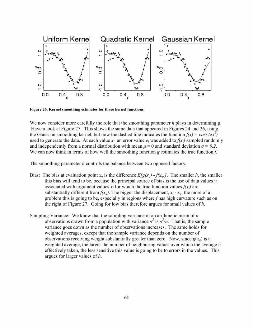
Figure 26. Kernel smoothing estimates for three kernel functions. We now consider more carefully the role that the smoothing parameter h plays in determining g. Have a look at Figure 27. This shows the same data that appeared in Figures 24 and 26, using the Gaussian smoothing kernel, but now the dashed line indicates the function f(x) = cos(2πx2) used to generate the data. At each value xi an error value ei was added to f(xi) sampled randomly and independently from a normal distribution with mean µ = 0 and standard deviation σ = 0.2. We can now think in terms of how well the smoothing function g estimates the true function f. The smoothing parameter h controls the balance between two opposed factors: Bias: The bias at evaluation point xq is the difference E[g(xq) - f(xq)]. The smaller h, the smaller
this bias will tend to be, because the principal source of bias is the use of data values yi associated with argument values xi for which the true function values f(xi) are substantially different from f(xq). The bigger the displacement, xi - xq, the more of a problem this is going to be, especially in regions where f has high curvature such as on the right of Figure 27. Going for low bias therefore argues for small values of h.
Sampling Variance: We know that the sampling variance of an arithmetic mean of n
observations drawn from a population with variance σ2 is σ2/n. That is, the sample variance goes down as the number of observations increases. The same holds for weighted averages, except that the sample variance depends on the number of observations receiving weight substantially greater than zero. Now, since g(xq) is a weighted average, the larger the number of neighboring values over which the average is effectively taken, the less sensitive this value is going to be to errors in the values. This argues for larger values of h.
61
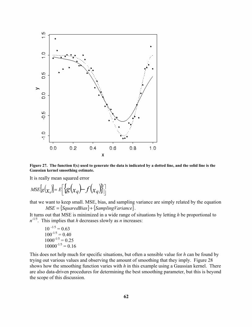
Figure 27. The function f(x) used to generate the data is indicated by a dotted line, and the solid line is the Gaussian kernel smoothing estimate. It is really mean squared error
( )[ ] ( ) ( ){ }
= − xfxgx qqEgMSE q
2
that we want to keep small. MSE, bias, and sampling variance are simply related by the equation { } { rianceSamplingVasSquaredBiaMSE += }.
It turns out that MSE is minimized in a wide range of situations by letting h be proportional to n-1/5. This implies that h decreases slowly as n increases:
10 -1/5 = 0.63 100-1/5 = 0.40 1000-1/5 = 0.25 10000-1/5 = 0.16
This does not help much for specific situations, but often a sensible value for h can be found by trying out various values and observing the amount of smoothing that they imply. Figure 28 shows how the smoothing function varies with h in this example using a Gaussian kernel. There are also data-driven procedures for determining the best smoothing parameter, but this is beyond the scope of this discussion.
62
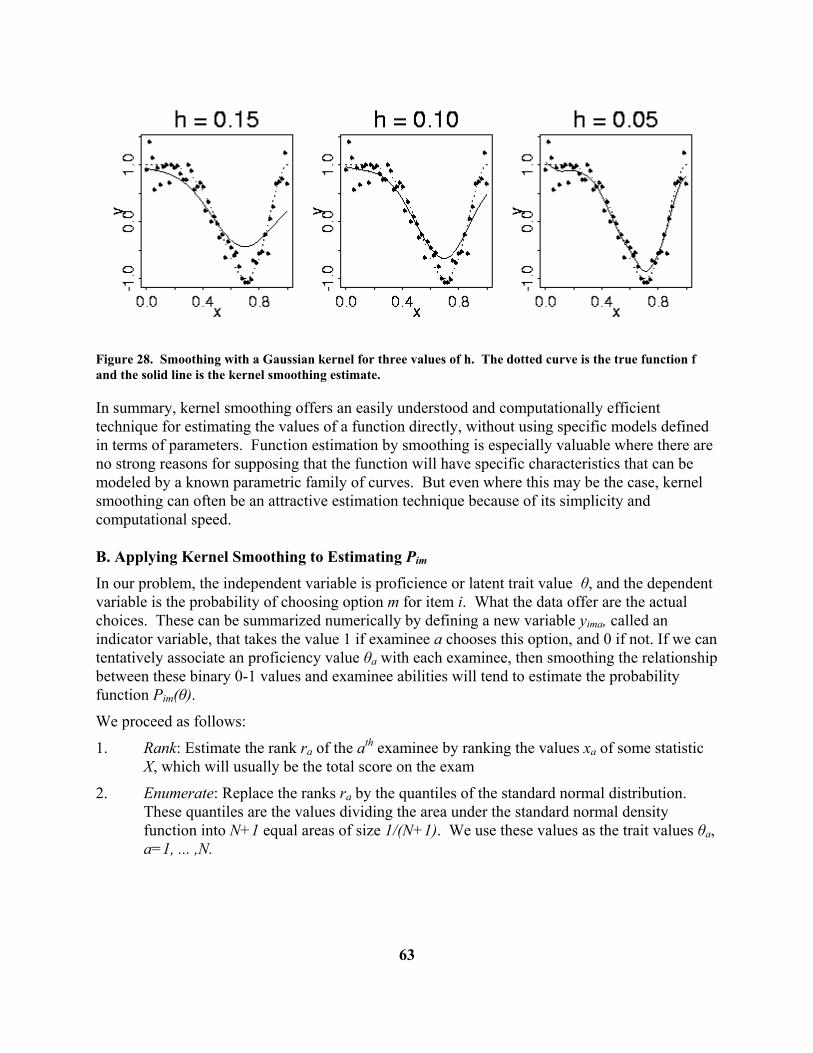
Figure 28. Smoothing with a Gaussian kernel for three values of h. The dotted curve is the true function f and the solid line is the kernel smoothing estimate.
In summary, kernel smoothing offers an easily understood and computationally efficient technique for estimating the values of a function directly, without using specific models defined in terms of parameters. Function estimation by smoothing is especially valuable where there are no strong reasons for supposing that the function will have specific characteristics that can be modeled by a known parametric family of curves. But even where this may be the case, kernel smoothing can often be an attractive estimation technique because of its simplicity and computational speed. B. Applying Kernel Smoothing to Estimating Pim
In our problem, the independent variable is proficience or latent trait value θ, and the dependent variable is the probability of choosing option m for item i. What the data offer are the actual choices. These can be summarized numerically by defining a new variable yima, called an indicator variable, that takes the value 1 if examinee a chooses this option, and 0 if not. If we can tentatively associate an proficiency value θa with each examinee, then smoothing the relationship between these binary 0-1 values and examinee abilities will tend to estimate the probability function Pim(θ).
We proceed as follows:
1. Rank: Estimate the rank ra of the ath examinee by ranking the values xa of some statistic X, which will usually be the total score on the exam
2. Enumerate: Replace the ranks ra by the quantiles of the standard normal distribution. These quantiles are the values dividing the area under the standard normal density function into N+1 equal areas of size 1/(N+1). We use these values as the trait values θa, a=1, ... ,N.
63
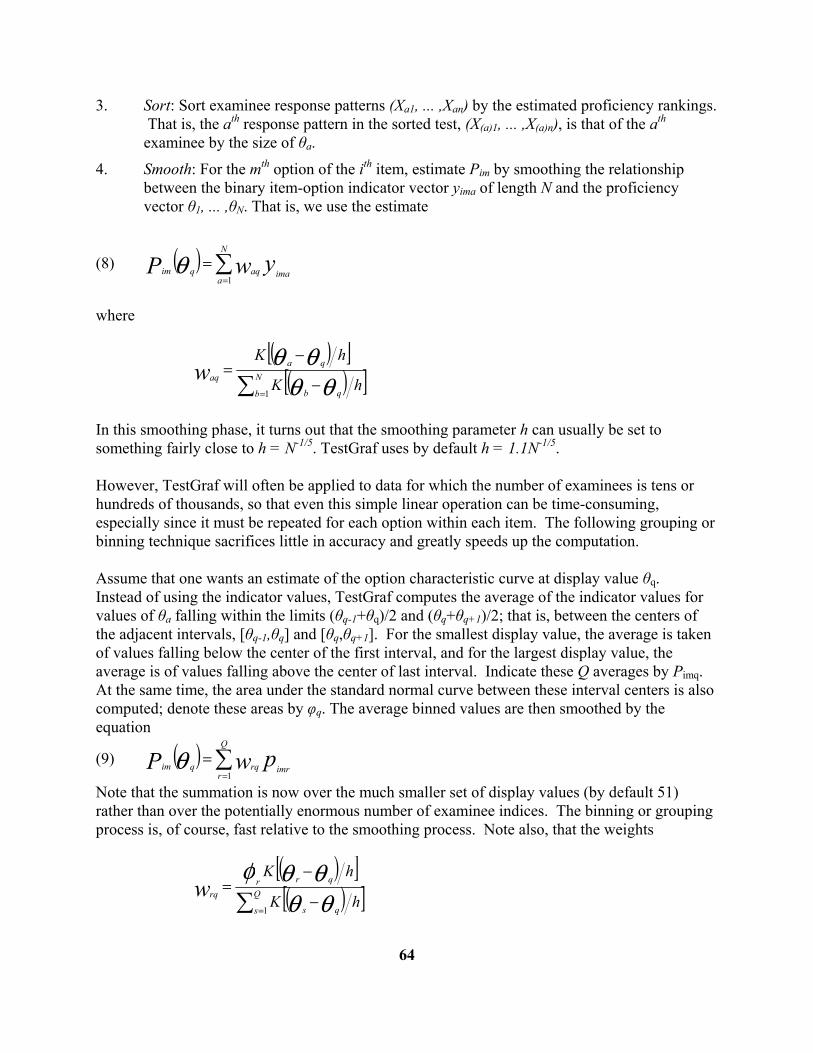
3. Sort: Sort examinee response patterns (Xa1, ... ,Xan) by the estimated proficiency rankings. That is, the ath response pattern in the sorted test, (X(a)1, ... ,X(a)n), is that of the ath examinee by the size of θa.
4. Smooth: For the mth option of the ith item, estimate Pim by smoothing the relationship between the binary item-option indicator vector yima of length N and the proficiency vector θ1, ... ,θN. That is, we use the estimate
(8) ( ) ywP ima
N
aaqqim ∑
=
=1
θ where
( )[ ]( )[ ]∑ =
−
−= N
b qb
qaaq hK
hKw
1 θθθθ
In this smoothing phase, it turns out that the smoothing parameter h can usually be set to something fairly close to h = N-1/5. TestGraf uses by default h = 1.1N-1/5. However, TestGraf will often be applied to data for which the number of examinees is tens or hundreds of thousands, so that even this simple linear operation can be time-consuming, especially since it must be repeated for each option within each item. The following grouping or binning technique sacrifices little in accuracy and greatly speeds up the computation. Assume that one wants an estimate of the option characteristic curve at display value θq. Instead of using the indicator values, TestGraf computes the average of the indicator values for values of θa falling within the limits (θq-1+θq)/2 and (θq+θq+1)/2; that is, between the centers of the adjacent intervals, [θq-1,θq] and [θq,θq+1]. For the smallest display value, the average is taken of values falling below the center of the first interval, and for the largest display value, the average is of values falling above the center of last interval. Indicate these Q averages by Pimq. At the same time, the area under the standard normal curve between these interval centers is also computed; denote these areas by φq. The average binned values are then smoothed by the equation
(9) ( ) pwP imr
Q
rrqqim ∑
=
=1
θNote that the summation is now over the much smaller set of display values (by default 51) rather than over the potentially enormous number of examinee indices. The binning or grouping process is, of course, fast relative to the smoothing process. Note also, that the weights
( )[ ]( )[ ]∑ =
−
−= Q
s qs
qrrrq hK
hKw
1 θθθθφ
64
do not depend on the item or option, so that a matrix of order Q containing their values can be computed initially and then used for all curves. The use of binning prior to smoothing is discussed in detail in Härtle (1990), and he refers to the process as warping. This smoothing approach to estimating Pim has a number of important advantages over parametric or semiparametric approaches: 1. It is fast. Since the smoothing process involves simply taking a linear combination of
observed values, which from a computational perspective is a simple operation, computation tends to go from 500 to 1000 times faster than is typical for standard programs like LOGIST or BILOG. Most previous approaches have concentrated on just estimating the characteristic curve for the correct option, thus forcing only right-wrong scoring. There is considerable information in choices among wrong answers for examinees, as we shall see later, and thus this approach is able to extract more information from the test about examinee proficiency, as well as provide useful information about how choices among wrong answers vary with proficiency. It is a simple matter to estimate confidence limits for the value of a curve at any proficiency value θ. An estimate of the standard error of the estimated curve value Pim(θq) is given by
( ) ( ) ([ ]θθθ aimaim
N
aimaq PPws −=∑
=
11
2 ) .
2. One is not constrained to have characteristic curves that can only exhibit features permitted by parametric models such as the 3PL model. That is, for example, characteristic curves can be nonmonotonic, meaning that they can both decrease and increase.
3. Simulation studies have shown that even when the data are sampled from a population where the curves belong to the 3PL family, the estimated characteristic curves have MSE's as good as those obtained by maximum likelihood estimation using the appropriate parametric models. That is, one appears to lose nothing in terms of efficiency of estimation.
A weakness of the approach is its use of total score to rank examinees. As we already know, total number correct is both a biased and inefficient estimate of examinee proficiency. However, since what is being estimated in this method is not proficiency but merely proficiency rank order, and since the smoothing process tends to average out modest errors in ranking, this limitation appears to not seriously affect the estimates of the characteristic curves provided the test has at least 15 or so items. On the other hand, when the items are of the scale type, excellent estimates of option characteristic curves have been obtained with as few as three items.
65
Once the characteristic curves are estimated for each item and option, one then proceeds to estimate the proficiency of the examinees based on these curves. These estimates can then be fed back into the process as a basis for ranking, and the curves re-estimated. This loop or iteration can be continued until the estimated curves and abilities do not change appreciably. Experience shows that this happens after only two or three iterations. Further details of this iterative refinement process are given in Section 9. C. Other Details The appropriate size of the bandwidth parameter h depends on the number of examinees or respondents, N. This version uses by default the value
Nh 2.01.1 −=
Confidence limit estimates are necessarily only approximations, since they are based on asymptotic behavior of the curves, and do not take into account bias in the estimate of the curve itself. The same smoothing process used to compute curve values can be used to compute these estimates, but is itself only an approximation to a more complete estimation procedure.
The estimation of the test information function presents many serious statistical problems, and the best approach to its estimation is still being researched by the author. The current procedure uses a parametric model for the option characteristic curves. The parameters of a logistic-quadratic model are estimated from the smoothing probability function estimates by a crude but fast regression procedure, and these are then used to compute the test information function. This is the best we have to offer at the moment, but be aware that any estimates will have a substantial sampling variation, and these estimates can be substantially biased. They are intended to give only a general idea of the information content of the test, and then only over ranges of θ for which there are substantial numbers of observations.
The C++ source code for TestGraf is distributed so that anyone curious about the inner workings of the program can see what is going on, and perhaps even experiment with modifications. Inquiries are welcomed, and the author can be reached at the electronic mail address [email protected]. None of the source code is viewed by the author or anyone else as proprietary, and it can be used as desired. It would be unethical, of course, to redistribute any part of the code commercially for profit.
66
Although the current version of TestGraf uses kernel smoothing to estimate option characteristic curves, other smoothing procedures can also be used, and will probably play some role in future versions. Of these alternative smoothing techniques, the two most important appear to be
• local polynomial smoothing. Hastie and Loader (1993) offer a readable and persuasive account of the advantages of this approach over kernel smoothing.
• spline smoothing. Although rather more technical, spline smoothing promises to permit useful estimation of the derivatives of option characteristic curves as well as the curves themselves, which is essential to nonparametric estimation of the information function.
67
VII. How to Compare Results from Several Groups A. Differential Item Functioning or DIF One often wishes to explore ways in which two or more groups differ with respect to their responses to a specific test or scale. Broadly speaking, there are roughly two ways in which groups can differ: 1. in terms of the distribution of proficiency. That is, for example, a specific group may
have both observed and latent scores whose mean and other aspects of the distribution differ from what other groups produce. This can happen for exams, for example, when a particular group comes from a disadvantaged educational background.
2. in terms of probabilities of choosing among options even when observed and latent
scores are made equal. This is often called differential item functioning, or DIF in the psychometric literature. This can happen, for example, when one group tends to read or interpret the options in a different way than another, or is disadvantaged with respect to the specific item, but not necessarily with respect to the test as a whole.
It is the second type of variation, differential item functioning or DIF, which is the focus of this section, and of the Compare step in TestGraf. A recent collection of papers on DIF is Holland and Wainer (1993). Differential item functioning, then, means that for two or more individuals, each with latent proficiency or trait level θ, the probability of choosing option m on item i, Pim(θ) is not constant, but varies from individual to individual or group to group. This concept can extend also to the omit response. It is of fundamental importance to separate this type of intergroup response variation, DIF, from the more obvious intergroup variation of type 1. DIF can properly be called item bias, and is usually regarded as undesirable, whereas large group differences in score can be understandable, and not necessarily reflect badly on the nature of the test. As an example, we would expect big differences in how grade five and grade eight students were able to handle a test of proficiency to manipulate fractions, and we wouldn't think badly of the test when these differences showed up. However, if we compare the performance of a bright fifth grader with a somewhat mediocre proficiency eighth grader, and we know from other evidence that their fraction-handling skills are reasonably identical, then we would not be pleased to see a particular test item show real differences in performance. That is, performance on the item should depend only on how much a student knows about fractions, and not on the student's grade or other characteristics. DIF might come about in this case, for example, if the question used sophisticated sentence structure in posing the problem, and thus placed the fifth grade student at a disadvantage unrelated to math competency because of less developed language skills.
68
B. An Overview of How to Compare Subgroups Before the Compare option can be used to compare groups in order to detect DIF, the data for each subgroup must be separately analyzed by TestGraf. This, in turn, means that we have to do something to select only the data belonging to a particular subgroup. To be sure, this can always be done using editing software on the master raw data file to select out those examinees falling into a specific group.. However, subgroup selection can also achieved rather more conveniently by running TestGraf separately for each subgroup. This approach keeps the master raw data file intact, and will usually be less work. TestGraf selects a specific subgroup, and produces files containing information for only this subgroup, by designating one or more items as subgroup specification items. These items are not a part of the items analyzed by TestGraf, but are only used to select the subgroup. In order to illustrate subgroup selection and comparison, we shall use data from an administration of the General Management Aptitude Test to 2735 prospective applicants to graduate business schools. The GMAT is developed by Educational Testing Service, and the data considered here are for 25 multiple-choice items in a quantitative subscale within the test. For subgroup selection purposes, data are available on whether the examinees were male or female. The responses actually coded were not the original option choices, but
• 0: the question was incorrectly answered • 1: the question was correctly answered • 2: the question was omitted, but subsequent questions were answered • 3: the question and all subsequent questions were omitted
Here are the first seven lines of the raw data file, set up to select only the male examinees: 26 0 1111111111111111111111111 M 11111121101110333333111111111011211333331110011111110111102033333111111111111222 20333F 11101110201001000333000121120021200110331100111020100001222000013110122112000001 20000F
Note that the final character in the two key lines is an M, and that the data file tells TestGraf that there are 26 items, not 25. This final character in any examinee=s data lines indicates that the examinee associated with this record is a male.
Now, when you click on New, and the New File Information dialog window appears, you must check the “Use items to select subjects” box that appears just below the two title boxes. Aside from adding title information, there is no other change to the default settings required.
69
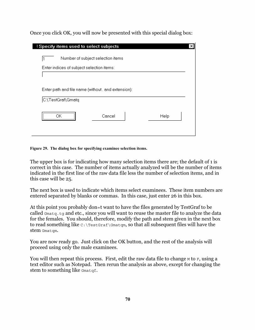
Once you click OK, you will now be presented with this special dialog box:
Figure 29. The dialog box for specifying examinee selection items.
The upper box is for indicating how many selection items there are; the default of 1 is correct in this case. The number of items actually analyzed will be the number of items indicated in the first line of the raw data file less the number of selection items, and in this case will be 25. The next box is used to indicate which items select examinees. These item numbers are entered separated by blanks or commas. In this case, just enter 26 in this box. At this point you probably don=t want to have the files generated by TestGraf to be called Gmatq.tg and etc., since you will want to reuse the master file to analyze the data for the females. You should, therefore, modify the path and stem given in the next box to read something like C:\TestGraf\Gmatqm, so that all subsequent files will have the stem Gmatqm. You are now ready go. Just click on the OK button, and the rest of the analysis will proceed using only the male examinees. You will then repeat this process. First, edit the raw data file to change M to F, using a text editor such as Notepad. Then rerun the analysis as above, except for changing the stem to something like Gmatqf.
70
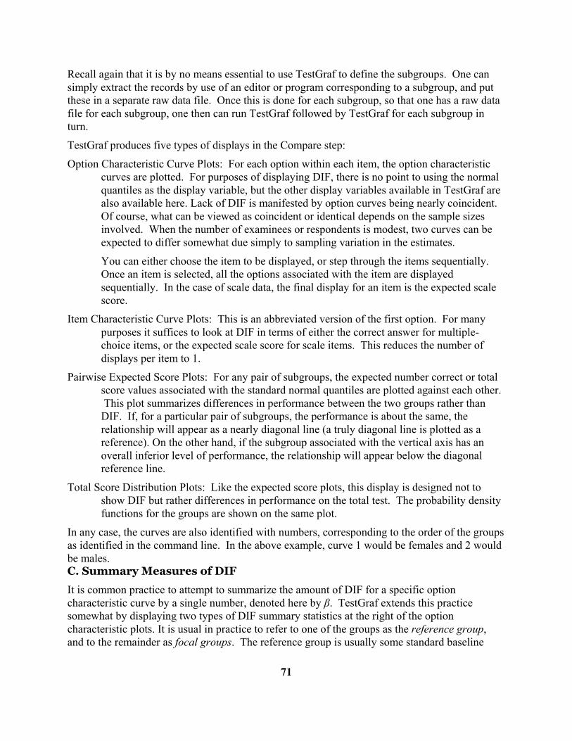
Recall again that it is by no means essential to use TestGraf to define the subgroups. One can simply extract the records by use of an editor or program corresponding to a subgroup, and put these in a separate raw data file. Once this is done for each subgroup, so that one has a raw data file for each subgroup, one then can run TestGraf followed by TestGraf for each subgroup in turn.
TestGraf produces five types of displays in the Compare step:
Option Characteristic Curve Plots: For each option within each item, the option characteristic curves are plotted. For purposes of displaying DIF, there is no point to using the normal quantiles as the display variable, but the other display variables available in TestGraf are also available here. Lack of DIF is manifested by option curves being nearly coincident. Of course, what can be viewed as coincident or identical depends on the sample sizes involved. When the number of examinees or respondents is modest, two curves can be expected to differ somewhat due simply to sampling variation in the estimates.
You can either choose the item to be displayed, or step through the items sequentially. Once an item is selected, all the options associated with the item are displayed sequentially. In the case of scale data, the final display for an item is the expected scale score.
Item Characteristic Curve Plots: This is an abbreviated version of the first option. For many purposes it suffices to look at DIF in terms of either the correct answer for multiple-choice items, or the expected scale score for scale items. This reduces the number of displays per item to 1.
Pairwise Expected Score Plots: For any pair of subgroups, the expected number correct or total score values associated with the standard normal quantiles are plotted against each other. This plot summarizes differences in performance between the two groups rather than DIF. If, for a particular pair of subgroups, the performance is about the same, the relationship will appear as a nearly diagonal line (a truly diagonal line is plotted as a reference). On the other hand, if the subgroup associated with the vertical axis has an overall inferior level of performance, the relationship will appear below the diagonal reference line.
Total Score Distribution Plots: Like the expected score plots, this display is designed not to show DIF but rather differences in performance on the total test. The probability density functions for the groups are shown on the same plot.
In any case, the curves are also identified with numbers, corresponding to the order of the groups as identified in the command line. In the above example, curve 1 would be females and 2 would be males. C. Summary Measures of DIF
It is common practice to attempt to summarize the amount of DIF for a specific option characteristic curve by a single number, denoted here by β. TestGraf extends this practice somewhat by displaying two types of DIF summary statistics at the right of the option characteristic plots. It is usual in practice to refer to one of the groups as the reference group, and to the remainder as focal groups. The reference group is usually some standard baseline 71
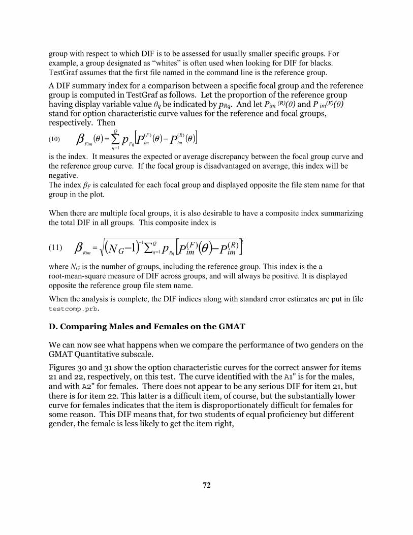
group with respect to which DIF is to be assessed for usually smaller specific groups. For example, a group designated as “whites” is often used when looking for DIF for blacks. TestGraf assumes that the first file named in the command line is the reference group.
A DIF summary index for a comparison between a specific focal group and the reference group is computed in TestGraf as follows. Let the proportion of the reference group having display variable value θq be indicated by pRq. And let Pim (R)(θ) and P im(F)(θ) stand for option characteristic curve values for the reference and focal groups, respectively. Then
(10) β ( ) ( ) ( )[ ]θθθ PPp Rim
Fim
Q
qFqFim
)()(
1−=∑
=
is the index. It measures the expected or average discrepancy between the focal group curve and the reference group curve. If the focal group is disadvantaged on average, this index will be negative. The index βF is calculated for each focal group and displayed opposite the file stem name for that group in the plot. When there are multiple focal groups, it is also desirable to have a composite index summarizing the total DIF in all groups. This composite index is
(11) ( ) ( )[ ]∑ −− =
−= Q
q RqRim PPpN Rim
FimG 1
21 )()(1 θβ
where NG is the number of groups, including the reference group. This index is the a root-mean-square measure of DIF across groups, and will always be positive. It is displayed opposite the reference group file stem name.
When the analysis is complete, the DIF indices along with standard error estimates are put in file testcomp.prb. D. Comparing Males and Females on the GMAT We can now see what happens when we compare the performance of two genders on the GMAT Quantitative subscale.
Figures 30 and 31 show the option characteristic curves for the correct answer for items 21 and 22, respectively, on this test. The curve identified with the A1" is for the males, and with A2" for females. There does not appear to be any serious DIF for item 21, but there is for item 22. This latter is a difficult item, of course, but the substantially lower curve for females indicates that the item is disproportionately difficult for females for some reason. This DIF means that, for two students of equal proficiency but different gender, the female is less likely to get the item right,
72
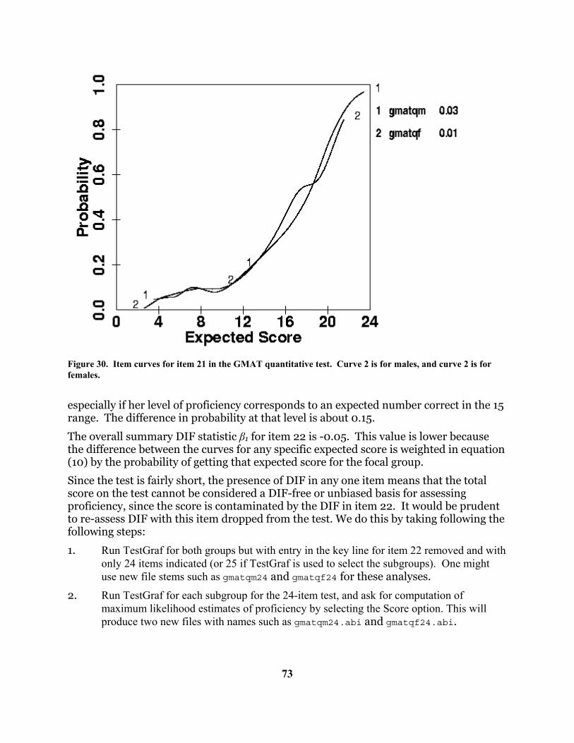
Figure 30. Item curves for item 21 in the GMAT quantitative test. Curve 2 is for males, and curve 2 is for females.
especially if her level of proficiency corresponds to an expected number correct in the 15 range. The difference in probability at that level is about 0.15.
The overall summary DIF statistic β1 for item 22 is -0.05. This value is lower because the difference between the curves for any specific expected score is weighted in equation (10) by the probability of getting that expected score for the focal group.
Since the test is fairly short, the presence of DIF in any one item means that the total score on the test cannot be considered a DIF-free or unbiased basis for assessing proficiency, since the score is contaminated by the DIF in item 22. It would be prudent to re-assess DIF with this item dropped from the test. We do this by taking following the following steps:
1. Run TestGraf for both groups but with entry in the key line for item 22 removed and with only 24 items indicated (or 25 if TestGraf is used to select the subgroups). One might use new file stems such as gmatqm24 and gmatqf24 for these analyses.
2. Run TestGraf for each subgroup for the 24-item test, and ask for computation of maximum likelihood estimates of proficiency by selecting the Score option. This will produce two new files with names such as gmatqm24.abi and gmatqf24.abi.
73
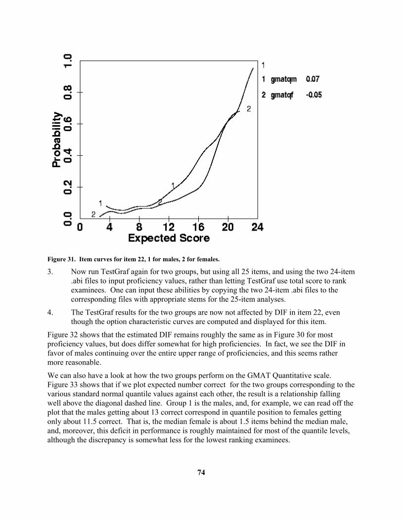
Figure 31. Item curves for item 22, 1 for males, 2 for females.
3. Now run TestGraf again for two groups, but using all 25 items, and using the two 24-item .abi files to input proficiency values, rather than letting TestGraf use total score to rank examinees. One can input these abilities by copying the two 24-item .abi files to the corresponding files with appropriate stems for the 25-item analyses.
4. The TestGraf results for the two groups are now not affected by DIF in item 22, even though the option characteristic curves are computed and displayed for this item.
Figure 32 shows that the estimated DIF remains roughly the same as in Figure 30 for most proficiency values, but does differ somewhat for high proficiencies. In fact, we see the DIF in favor of males continuing over the entire upper range of proficiencies, and this seems rather more reasonable.
We can also have a look at how the two groups perform on the GMAT Quantitative scale. Figure 33 shows that if we plot expected number correct for the two groups corresponding to the various standard normal quantile values against each other, the result is a relationship falling well above the diagonal dashed line. Group 1 is the males, and, for example, we can read off the plot that the males getting about 13 correct correspond in quantile position to females getting only about 11.5 correct. That is, the median female is about 1.5 items behind the median male, and, moreover, this deficit in performance is roughly maintained for most of the quantile levels, although the discrepancy is somewhat less for the lowest ranking examinees.
74
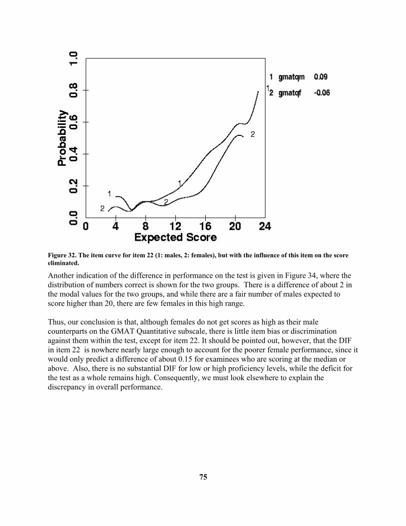
Figure 32. The item curve for item 22 (1: males, 2: females), but with the influence of this item on the score eliminated. Another indication of the difference in performance on the test is given in Figure 34, where the distribution of numbers correct is shown for the two groups. There is a difference of about 2 in the modal values for the two groups, and while there are a fair number of males expected to score higher than 20, there are few females in this high range. Thus, our conclusion is that, although females do not get scores as high as their male counterparts on the GMAT Quantitative subscale, there is little item bias or discrimination against them within the test, except for item 22. It should be pointed out, however, that the DIF in item 22 is nowhere nearly large enough to account for the poorer female performance, since it would only predict a difference of about 0.15 for examinees who are scoring at the median or above. Also, there is no substantial DIF for low or high proficiency levels, while the deficit for the test as a whole remains high. Consequently, we must look elsewhere to explain the discrepancy in overall performance.
75
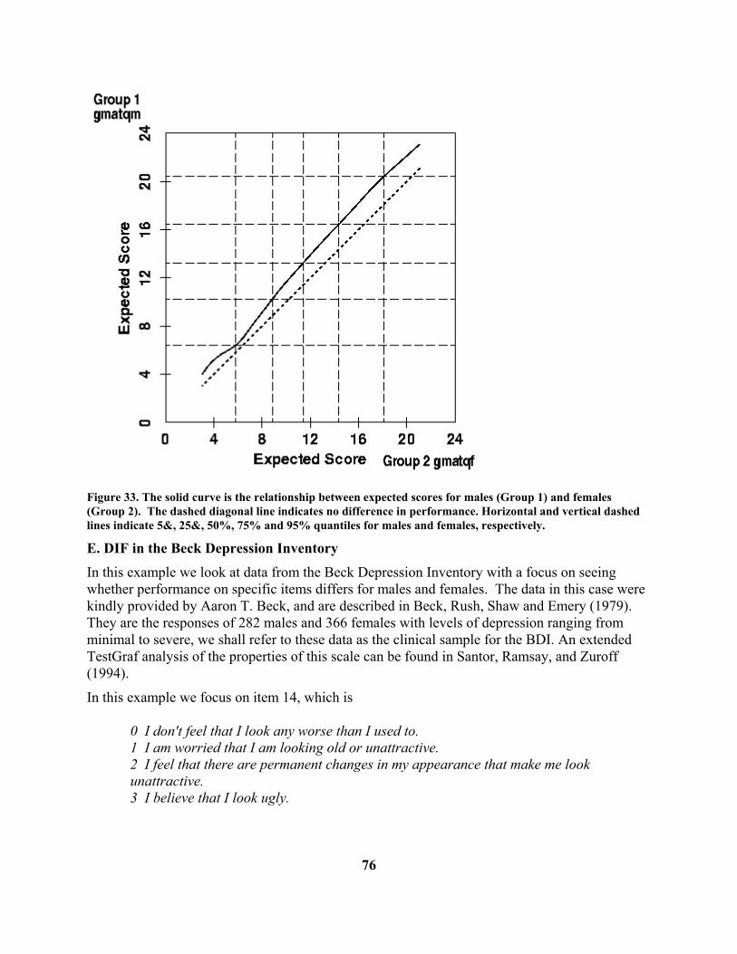
Figure 33. The solid curve is the relationship between expected scores for males (Group 1) and females (Group 2). The dashed diagonal line indicates no difference in performance. Horizontal and vertical dashed lines indicate 5&, 25&, 50%, 75% and 95% quantiles for males and females, respectively. E. DIF in the Beck Depression Inventory
In this example we look at data from the Beck Depression Inventory with a focus on seeing whether performance on specific items differs for males and females. The data in this case were kindly provided by Aaron T. Beck, and are described in Beck, Rush, Shaw and Emery (1979). They are the responses of 282 males and 366 females with levels of depression ranging from minimal to severe, we shall refer to these data as the clinical sample for the BDI. An extended TestGraf analysis of the properties of this scale can be found in Santor, Ramsay, and Zuroff (1994).
In this example we focus on item 14, which is
0 I don't feel that I look any worse than I used to. 1 I am worried that I am looking old or unattractive. 2 I feel that there are permanent changes in my appearance that make me look unattractive. 3 I believe that I look ugly.
76
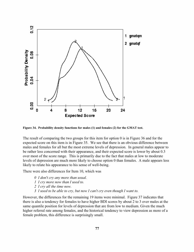
Figure 34. Probability density functions for males (1) and females (2) for the GMAT test. The result of comparing the two groups for this item for option 0 is in Figure 36 and for the expected score on this item is in Figure 35. We see that there is an obvious difference between males and females for all but the most extreme levels of depression. In general males appear to be rather less concerned with their appearance, and their expected score is lower by about 0.3 over most of the score range. This is primarily due to the fact that males at low to moderate levels of depression are much more likely to choose option 0 than females. A male appears less likely to relate his appearance to his sense of well-being.
There were also differences for Item 10, which was
0 I don't cry any more than usual. 1 I cry more now than I used to. 2 I cry all the time now. 3 I used to be able to cry, but now I can't cry even though I want to.
However, the differences for the remaining 19 items were minimal. Figure 37 indicates that there is also a tendency for females to have higher BDI scores by about 2 to 3 over males at the same quantile position for levels of depression that are from low to medium. Given the much higher referral rate among females, and the historical tendency to view depression as more of a female problem, this difference is surprisingly small.
77
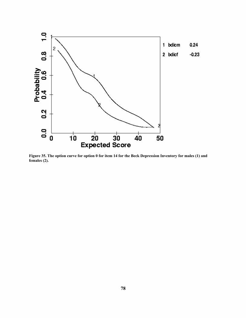
Figure 35. The option curve for option 0 for item 14 for the Beck Depression Inventory for males (1) and females (2).
78
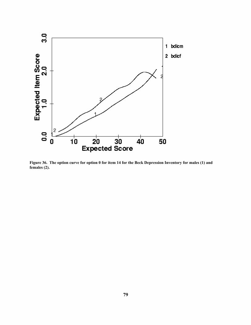
Figure 36. The option curve for option 0 for item 14 for the Beck Depression Inventory for males (1) and females (2).
79
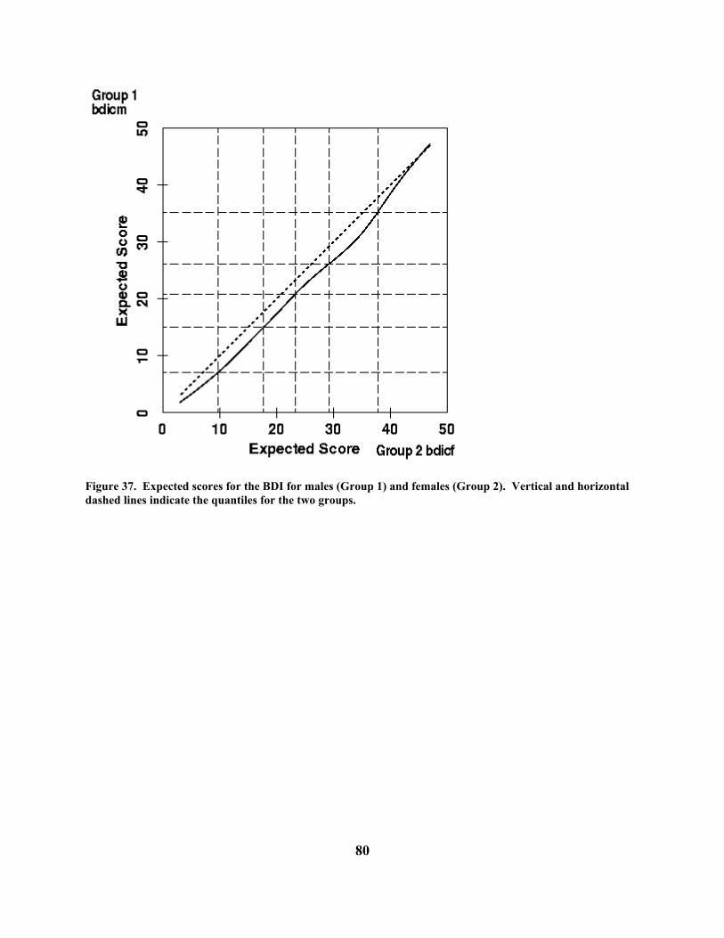
Figure 37. Expected scores for the BDI for males (Group 1) and females (Group 2). Vertical and horizontal dashed lines indicate the quantiles for the two groups.
80
VIII. Refining Scores by Iterating TestGraf By default TestGraf orders examinees by using a number correct or scale score computed from each examinee's responses. This score is determined by weights for options provided by the user of TestGraf. In the case of a multiple-choice examination, the weights are either 1 for the correct answer or zero for any option that is incorrect. In the case of a psychological scale, the weights are fixed by the designer of the scale. Once TestGraf has estimated the option characteristic curves, Pim(θ), however, one can consider discarding these weights in favor of estimates of proficiency or trait value θ computed by maximum likelihood estimation, using the Score menu option in the main TestGraf window. This technique, abbreviated MLE, uses the information in the responses more efficiently than any a priori weighting scheme is likely to do. One might think of this estimation MLE process as one of optimal rather than fixed weighting of the options. MLE weights option choices by taking into account the following factors: 1. the overall quality of the item in terms of the information it provides about θ. That is,
some items will yield a lot of information about proficiency or trait level, and others will have only a modest relationship to whatever the scale measures. MLE weights the former items more heavily than the latter.
2. how informative each option is. Within items, not all options are going to be equally
informative. For example, in multiple-choice examinations not all wrong answers are going to be equally indicative of a low value of proficiency; some are dumber than others. In the case of psychological scales, the scale designer usually uses equally spaced weights for the ordered options (0, 1, 2, and 3 in the Beck Depression Inventory, for example), but varying the spacing may be more appropriate for some items. MLE weights informative options more heavily than noninformative ones, and in effect assigns numerical scores to options that are optimal.
3. just how heavily an option is weighted also depends on θ itself. Some options and items
are highly informative for certain ranges of proficiency or trait, but not so for others. Difficult exam questions are informative for high performing students, and give little information about the bottom of the class. MLE in effect assigns the weight to an option that is appropriate to the value of θ that is being estimated.
All this means that one may choose to use the Score step in TestGraf to provide what are almost certainly better estimates of proficiency or trait level than were provided by the original score. Note that TestGraf can only estimate values of θ at the values being plotted, so if this option is being used, it may be desirable to set the number of plotted values to its maximum value 101.
81
Which raises another issue. If the estimates of θ are so much better than the original scores, why
not use these as a basis for a new TestGraf analysis of the same data? Good idea! Just indicate in the Analyze step dialog window that proficiency values are to be input rather than computed, and reanalyze the data. This process can be repeated any number of times, with the hope that each analysis refines or improves the estimates of θ. Actually, however, one usually sees these estimates stabilize after only a few iterations, and in many cases only one iteration will suffice. As an example, here is what happens with the Beck Depression Inventory for the clinical sample. In the upper part of Figure 38 we see the maximum likelihood estimates at each iteration plotted against those for the previous iteration for three iterations. On the first iteration the previous scores are the raw scale scores. In the lower figures are plotted the changes in score values. We see that on the first iteration a fairly large number of cases change their score values by as much as four up or down. By the second iteration only a few show such changes. On the third iteration the score changes are less than three for all but two cases. For each of these cases the relative credibility curves are bimodal, so that the maximum likelihood estimate is oscillating between two maxima from one iteration to the next. There is little one can do about this, and for all practical purposes we can regard the estimates as sufficiently stabilized by the third iteration.
82
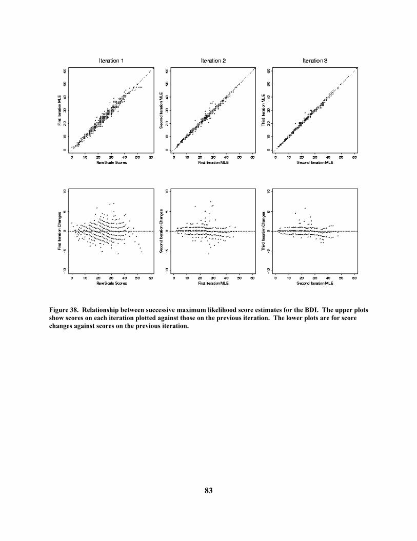
Figure 38. Relationship between successive maximum likelihood score estimates for the BDI. The upper plots show scores on each iteration plotted against those on the previous iteration. The lower plots are for score changes against scores on the previous iteration.
83
IX. Analyses of the Advanced Placement Chemistry Exam Each year Educational Testing Service, on behalf of the College Board, designs and administers a number of examinations for high school students wishing to receive credit at their colleges of choice for advanced level work in their schools. The complete examinations as well as other supporting materials are published annually after they are scored, and can be obtained from Advanced Placement Program, P. O. Box 6672, Princeton NJ 08541. The test contains items called free-response in addition to the usual multiple-choice items, and these are graded by trained and monitored markers. Test items in these exams are carefully selected and reviewed before being used, and a typical Advanced Placement Exam is of about as high a quality as one could reasonably expect of a test designed to measure knowledge at a high school level. In this section we shall use TestGraf to review the 1989 Advanced Placement Chemistry Exam, administered to 18,462 students. The large sample size and the fact that the structure of the exam is rather more complex than most classroom exams means that we can use a wide range of the capabilities of TestGraf. A. An Overview of the Exam The examination consists of two parts:
1. A 75 item multiple-choice section. Each item has five options, and students were allowed one hour and thirty minutes to complete this section. This section was administered first.
2. A free response section, also allocated one hour and thirty minutes. In this section, students were required to:
• do one required problem, with a score from 0 to 9, • do one of two other problems, each with a score from 0 to 9, • solve five out of eight possible chemical reactions, each scored from 0 to 3, for a
total score of from 0 to 15, and • complete three out of five possible essays, each scored from 0 to 8.
It is the second free response section that complicates the analysis of the exam because, first, students have a choice among problems, reactions, and essays, and second, scores on these types of items are what are called graded response in that they are ordered, and numerical weights were used to grade free-response items. They are, therefore, scale items.
An additional factor to be taken into account is the great speededness of the exam, meaning that a significant proportion of the students were unable to complete the multiple choice items in the time allotted.
84
The data to be analyzed for the free response section consisted of a code for each possible problem and for each possible essay, but a single composite score for the chemical reactions. Thus, any student would necessarily have an “omit” response recorded for two of the three problems, and also for two of the five essays. The total number of items to be analyzed are therefore 84, but any one examinee will only have 81 recorded responses. Two additional items of data were also made available:
• the gender of the examinee
• the racial or ethnic group of the examinee, with the following groups coded: o American Indian o Black o Mexican o Asian o Puerto Rican o Latin American or other Hispanic groups o Whites o Other
We are also interested in the exploration of possible sources of item bias using these groups. The first decision taken with respect to these data was to regard the omitting of a multiple-choice item as a specific response, coded in the file as a A0". This is because there are large numbers of omits, and an omitted response is likely to convey useful information about examinee proficiency since it is reasonable to expect that weaker students will take longer to answer questions, and therefore be unable to complete more items. In the free-response section, however, we can distinguish between an item omitted as a consequence of the student not having time to try or giving up, and items omitted because not all problems and essays had to be done. For these final 9 items, therefore, an omit because the item was not chosen by the student was coded as a blank. B. Reviewing the Multiple Choice Section
As mentioned above, each of the 75 multiple-choice items had five options, but since we are coding omit as an additional option, there are actually six options per item.
We begin with a straightforward TestGraf analysis of these multiple-choice items, using all of the default options. Figures 39, and 40 show the option and item characteristic curves for the first item. We note that the median expected number correct is about 34, and that 95% of the examinees score between about 17 and 57, making this a rather difficult exam by classroom standards. We see from the confidence limits for the item curve that the curves are tightly defined with this number of exams, and that there is noticeable imprecision only at extreme proficiencies. We also see that item 1 is rather easy.
85
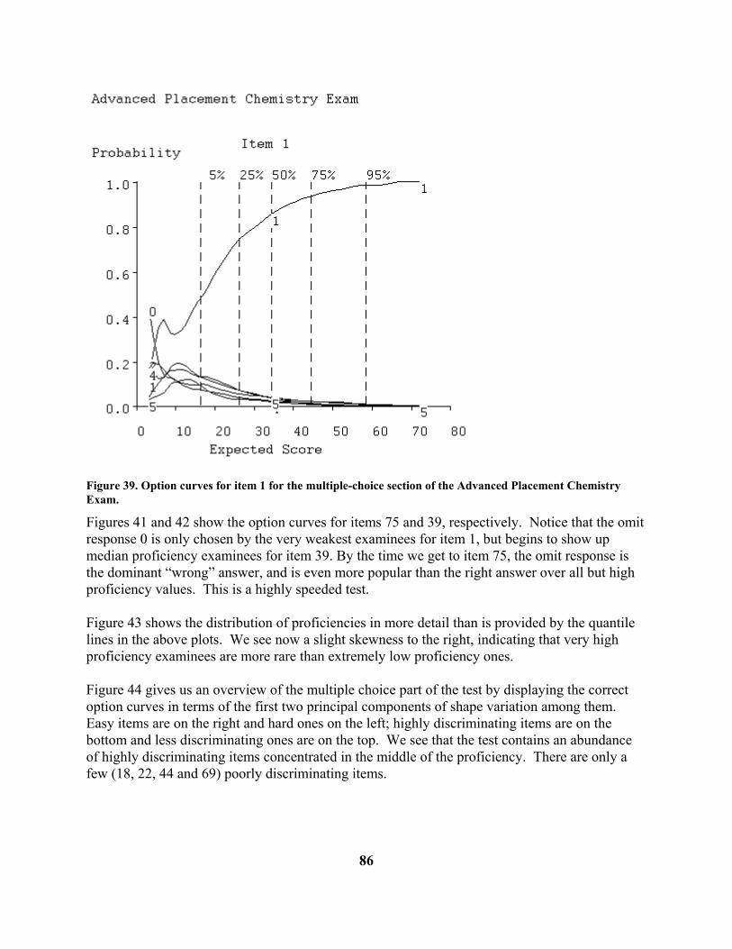
Figure 39. Option curves for item 1 for the multiple-choice section of the Advanced Placement Chemistry Exam. Figures 41 and 42 show the option curves for items 75 and 39, respectively. Notice that the omit response 0 is only chosen by the very weakest examinees for item 1, but begins to show up median proficiency examinees for item 39. By the time we get to item 75, the omit response is the dominant “wrong” answer, and is even more popular than the right answer over all but high proficiency values. This is a highly speeded test.
Figure 43 shows the distribution of proficiencies in more detail than is provided by the quantile lines in the above plots. We see now a slight skewness to the right, indicating that very high proficiency examinees are more rare than extremely low proficiency ones. Figure 44 gives us an overview of the multiple choice part of the test by displaying the correct option curves in terms of the first two principal components of shape variation among them. Easy items are on the right and hard ones on the left; highly discriminating items are on the bottom and less discriminating ones are on the top. We see that the test contains an abundance of highly discriminating items concentrated in the middle of the proficiency. There are only a few (18, 22, 44 and 69) poorly discriminating items.
86
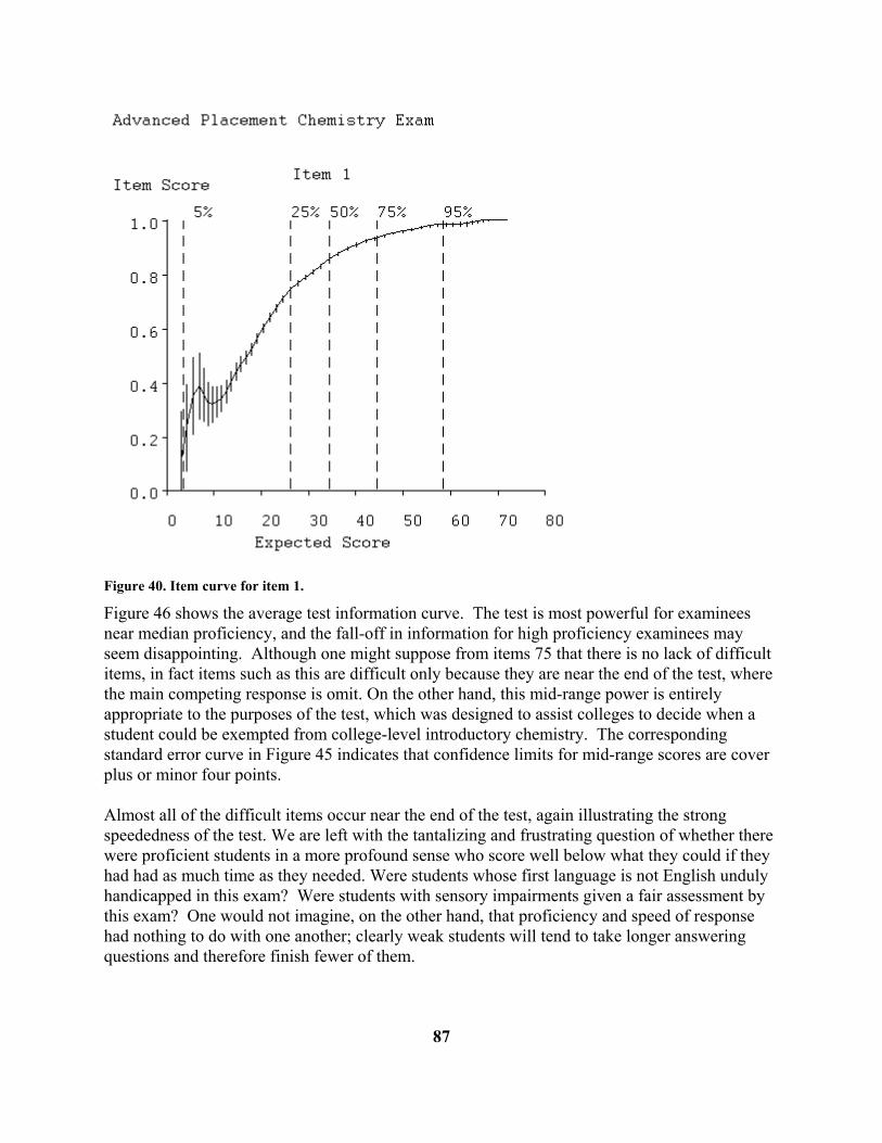
Figure 40. Item curve for item 1. Figure 46 shows the average test information curve. The test is most powerful for examinees near median proficiency, and the fall-off in information for high proficiency examinees may seem disappointing. Although one might suppose from items 75 that there is no lack of difficult items, in fact items such as this are difficult only because they are near the end of the test, where the main competing response is omit. On the other hand, this mid-range power is entirely appropriate to the purposes of the test, which was designed to assist colleges to decide when a student could be exempted from college-level introductory chemistry. The corresponding standard error curve in Figure 45 indicates that confidence limits for mid-range scores are cover plus or minor four points. Almost all of the difficult items occur near the end of the test, again illustrating the strong speededness of the test. We are left with the tantalizing and frustrating question of whether there were proficient students in a more profound sense who score well below what they could if they had had as much time as they needed. Were students whose first language is not English unduly handicapped in this exam? Were students with sensory impairments given a fair assessment by this exam? One would not imagine, on the other hand, that proficiency and speed of response had nothing to do with one another; clearly weak students will tend to take longer answering questions and therefore finish fewer of them.
87
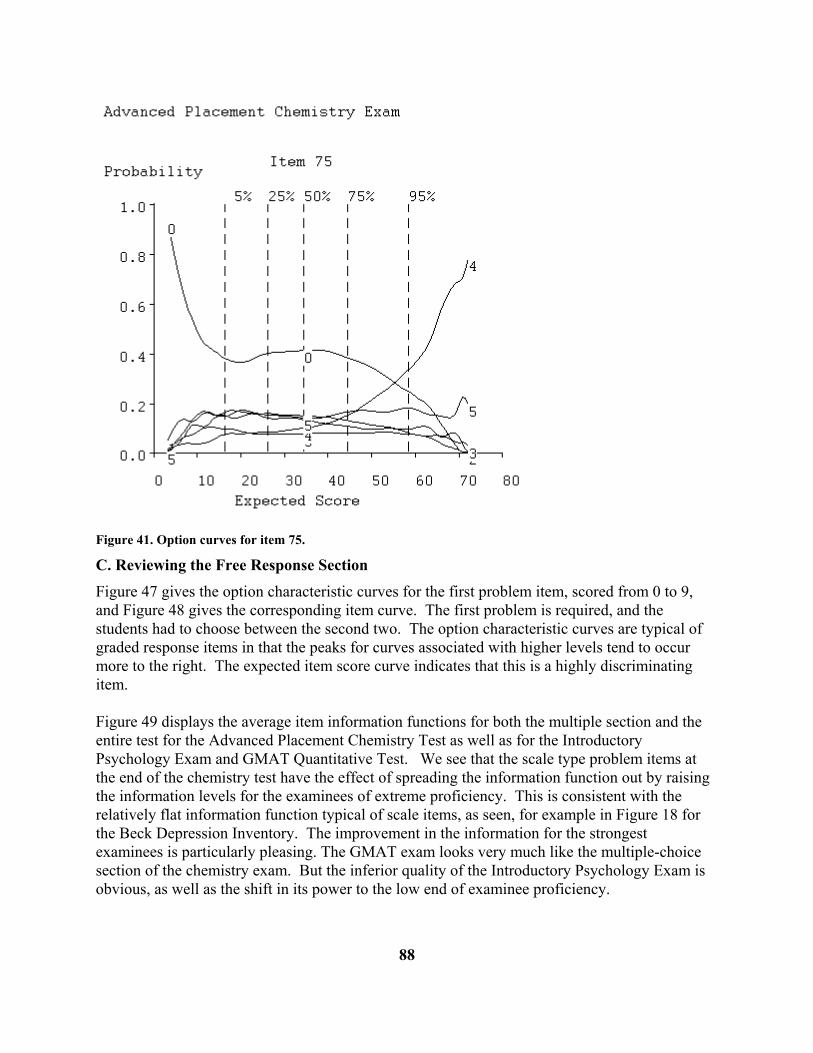
Figure 41. Option curves for item 75. C. Reviewing the Free Response Section
Figure 47 gives the option characteristic curves for the first problem item, scored from 0 to 9, and Figure 48 gives the corresponding item curve. The first problem is required, and the students had to choose between the second two. The option characteristic curves are typical of graded response items in that the peaks for curves associated with higher levels tend to occur more to the right. The expected item score curve indicates that this is a highly discriminating item. Figure 49 displays the average item information functions for both the multiple section and the entire test for the Advanced Placement Chemistry Test as well as for the Introductory Psychology Exam and GMAT Quantitative Test. We see that the scale type problem items at the end of the chemistry test have the effect of spreading the information function out by raising the information levels for the examinees of extreme proficiency. This is consistent with the relatively flat information function typical of scale items, as seen, for example in Figure 18 for the Beck Depression Inventory. The improvement in the information for the strongest examinees is particularly pleasing. The GMAT exam looks very much like the multiple-choice section of the chemistry exam. But the inferior quality of the Introductory Psychology Exam is obvious, as well as the shift in its power to the low end of examinee proficiency.
88
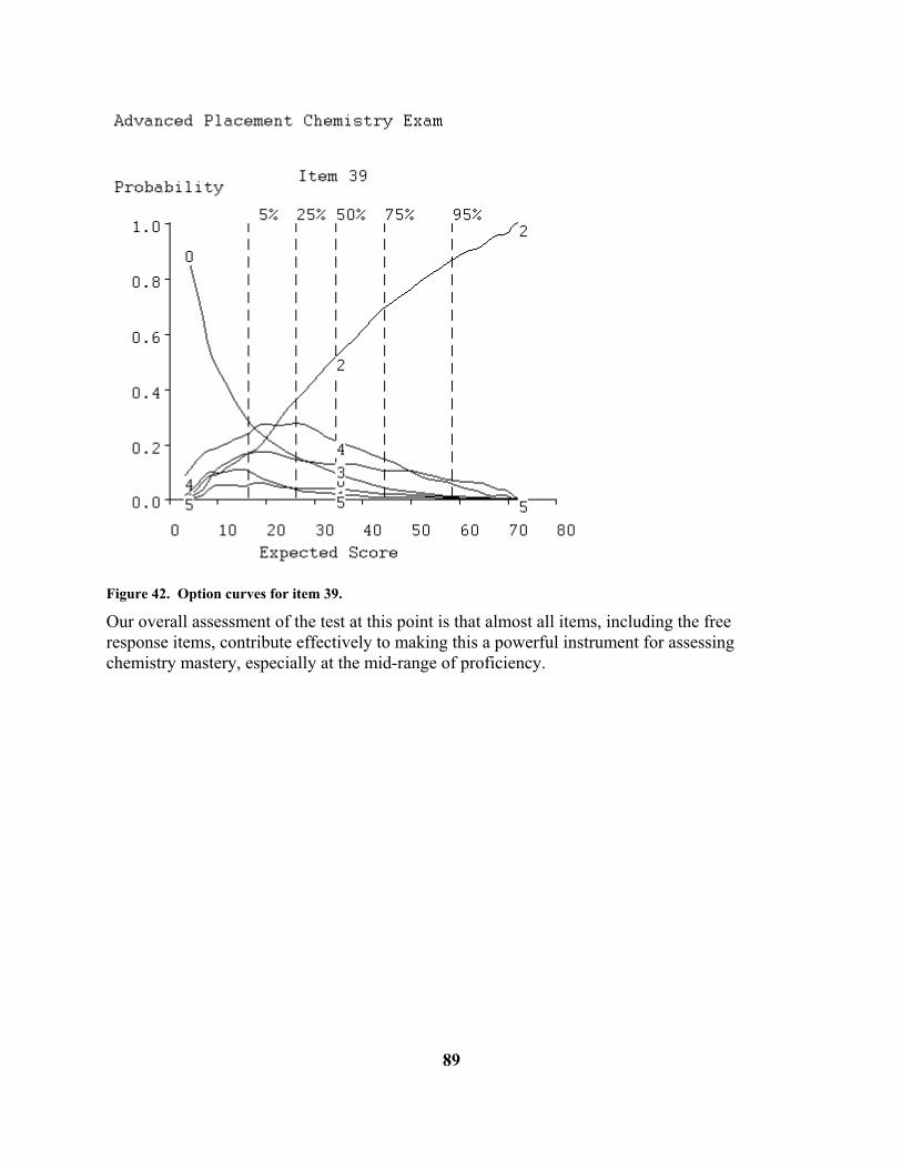
Figure 42. Option curves for item 39. Our overall assessment of the test at this point is that almost all items, including the free response items, contribute effectively to making this a powerful instrument for assessing chemistry mastery, especially at the mid-range of proficiency.
89
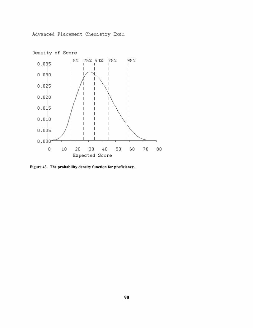
Figure 43. The probability density function for proficiency.
90
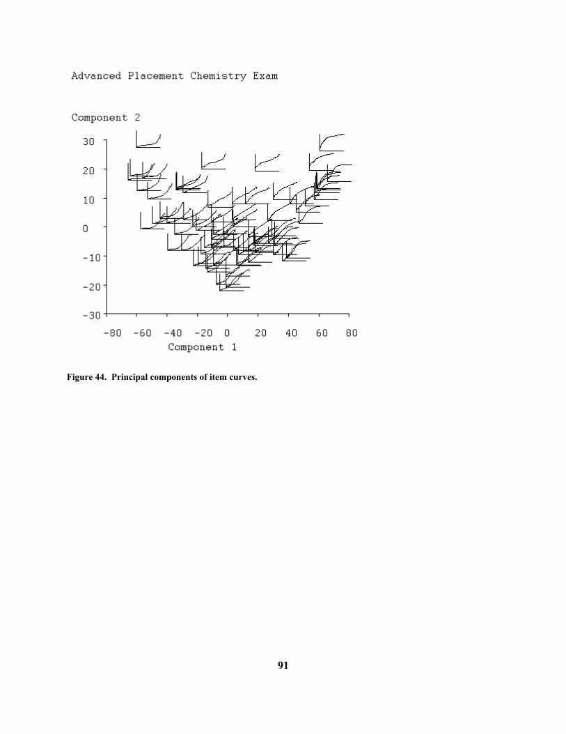
Figure 44. Principal components of item curves.
91
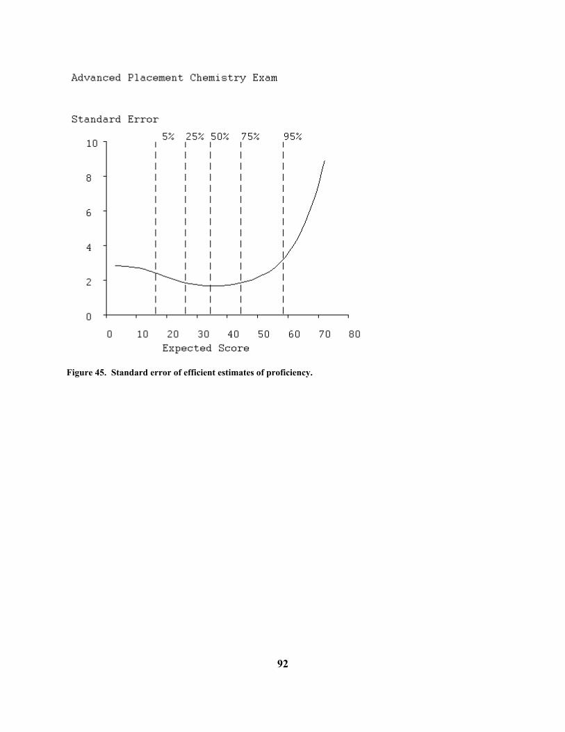
Figure 45. Standard error of efficient estimates of proficiency.
92
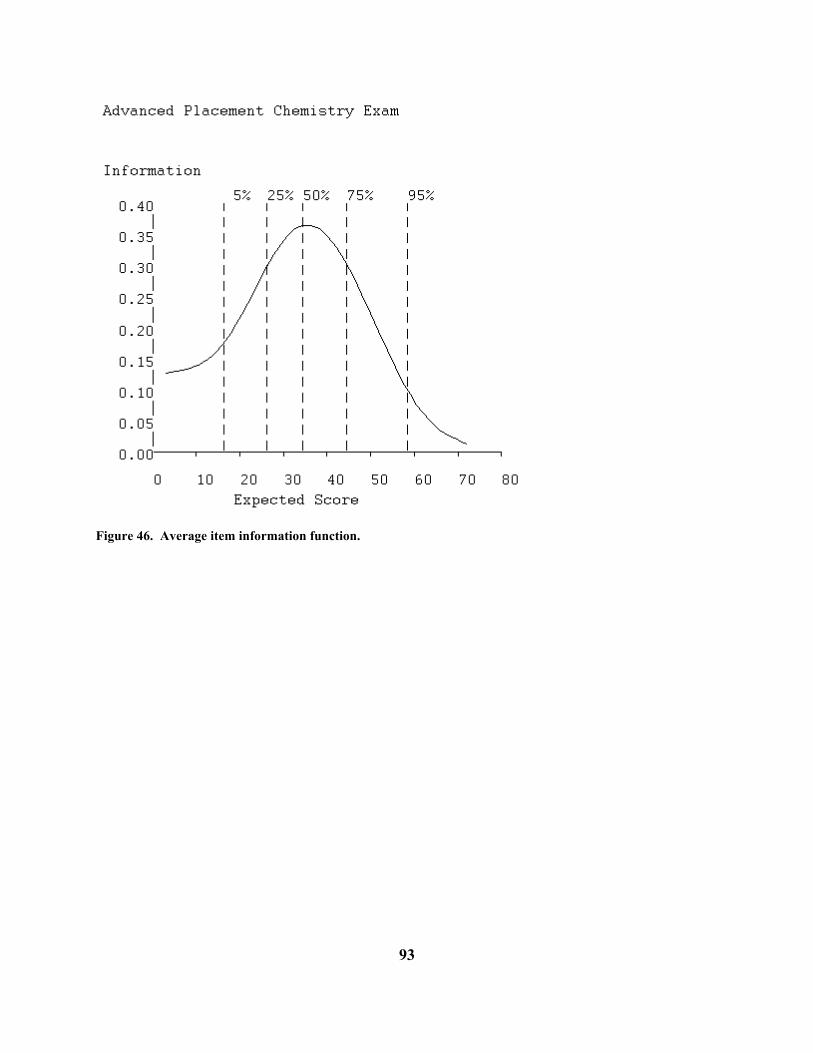
Figure 46. Average item information function.
93
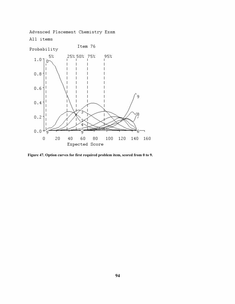
Figure 47. Option curves for first required problem item, scored from 0 to 9.
94
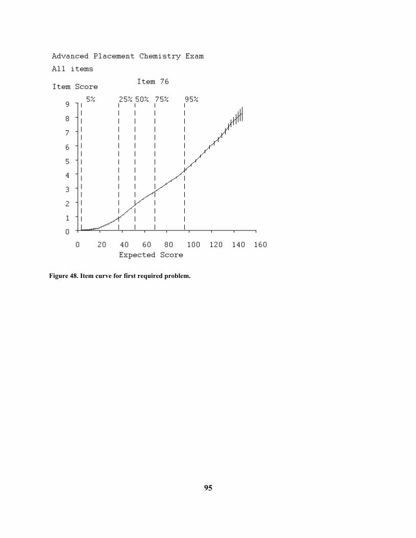
Figure 48. Item curve for first required problem.
95
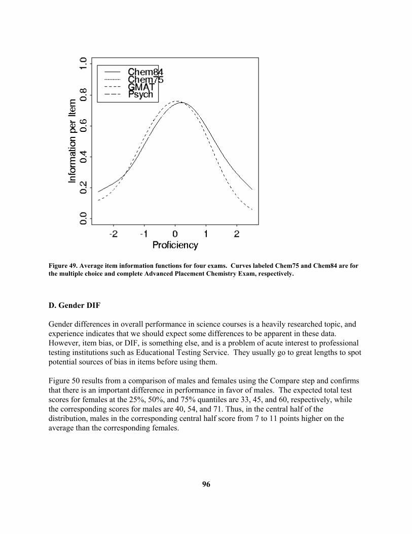
Figure 49. Average item information functions for four exams. Curves labeled Chem75 and Chem84 are for the multiple choice and complete Advanced Placement Chemistry Exam, respectively. D. Gender DIF Gender differences in overall performance in science courses is a heavily researched topic, and experience indicates that we should expect some differences to be apparent in these data. However, item bias, or DIF, is something else, and is a problem of acute interest to professional testing institutions such as Educational Testing Service. They usually go to great lengths to spot potential sources of bias in items before using them. Figure 50 results from a comparison of males and females using the Compare step and confirms that there is an important difference in performance in favor of males. The expected total test scores for females at the 25%, 50%, and 75% quantiles are 33, 45, and 60, respectively, while the corresponding scores for males are 40, 54, and 71. Thus, in the central half of the distribution, males in the corresponding central half score from 7 to 11 points higher on the average than the corresponding females.
96
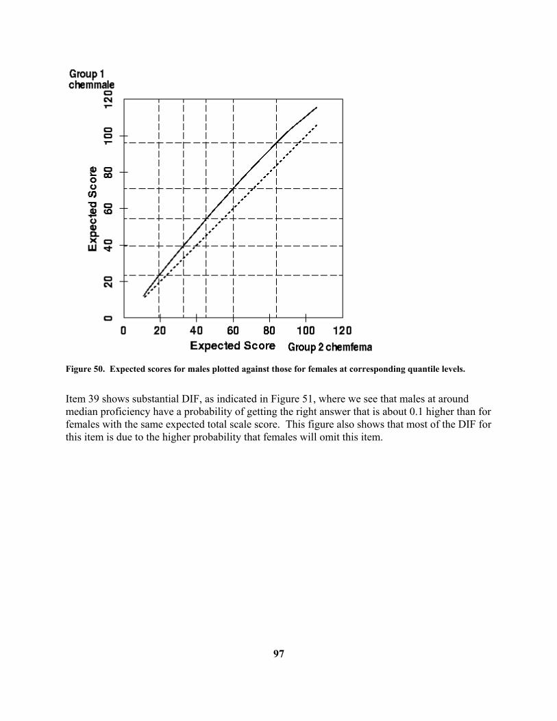
Figure 50. Expected scores for males plotted against those for females at corresponding quantile levels. Item 39 shows substantial DIF, as indicated in Figure 51, where we see that males at around median proficiency have a probability of getting the right answer that is about 0.1 higher than for females with the same expected total scale score. This figure also shows that most of the DIF for this item is due to the higher probability that females will omit this item.
97
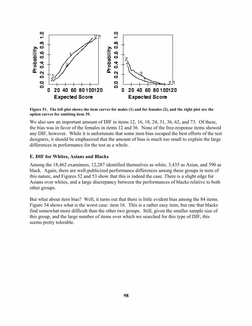
Figure 51. The left plot shows the item curves for males (1) and for females (2), and the right plot are the option curves for omitting item 39. We also saw an important amount of DIF in items 12, 16, 18, 24, 31, 36, 62, and 73. Of these, the bias was in favor of the females in items 12 and 36. None of the free-response items showed any DIF, however. While it is unfortunate that some item bias escaped the best efforts of the test designers, it should be emphasized that the amount of bias is much too small to explain the large differences in performance for the test as a whole. E. DIF for Whites, Asians and Blacks
Among the 18,462 examinees, 12,287 identified themselves as white, 3,435 as Asian, and 590 as black. Again, there are well-publicized performance differences among these groups in tests of this nature, and Figures 52 and 53 show that this is indeed the case. There is a slight edge for Asians over whites, and a large discrepancy between the performances of blacks relative to both other groups. But what about item bias? Well, it turns out that there is little evident bias among the 84 items. Figure 54 shows what is the worst case: item 16. This is a rather easy item, but one that blacks find somewhat more difficult than the other two groups. Still, given the smaller sample size of this group, and the large number of items over which we searched for this type of DIF, this seems pretty tolerable.
98
Figure 52. Expected scores for Whites and Blacks at the same quantile levels.
99
Figure 53. Expected scores for whites and Asians at same quantile levels.
100
Figure 54. Item curves for Whites (1), Blacks (2) and Asians (3) for item 16.
101
X. Printed Versions of Plots in TestGraf There are two means of obtaining printed versions of plots enabled by TestGraf. In addition, there is also the possible of using the screen capture facility in Windows 98. A. Interactive Printing of Plots
The simplest procedure is to turn on the interactive printing option in the Display step. If a series of plots are to be printed, just click on the Toggle Printing menu option prior to choosing plots to display. If only an occasional plot is to be printed for item displays, this can also be achieved by clicking on the Print button in the dialog box for the next item to display. However, you may need to first configure your printer. The size of the plot is controlled by three constants: PWIDE: the width of the plot PHITE: the height of the plot CHITE: the height of numbers and characters
These are in units that have different implications for different printers. By clicking on the Settings option in the main TestGraf menu, you can change these, try a plot, and adjust until your plot is of the appropriate size. B. PostScript Plots
It is possible to produce a high resolution plotted output of the displays in TestGraf using a laser printer that is able to process the PostScript plotting language. This option is convenient one wants to generate all the plots available with one click, rather than going through each display in turn. Moreover, as indicated below, the method that TestGraf uses permits easy editing of the resulting plots so that elements can be added, removed, and new aspects introduced. Thus, this process can be helpful for plots that are to be inserted into a manuscript. The production of a file with PostScript commands appropriate to be sent to a printer is a two stage process. In the first stage, a set of high-level graphics commands are stored in a file with the fixed name testgraf.pwo. The extension .pwo indicates that this or any other file contains these commands. In the second stage these commands are processed by the program TestLasr to produce a file with the fixed name testgraf.ps. It is this file that is directed to the printer. The high-level graphics command language file testgraf.pwo is generated by simply clicking on the Plotfile option in the main menu of TestGraf. testgraf.pwo is a plain text or ASCII file containing a long series of plotting commands and values to plot. These may be modified by using any ASCII editor such as Notepad.
102
The plotting commands output by TestGraf that appear in the testgraf.pwo file are not themselves in the PostScript language. Instead, they are in a language developed at McGill University specifically for the types of plots produced by TestGraf. These commands must be processed by an interpreter program TestLasr to convert them to PostScript. The result is a rather long file with the name testgraf.ps containing PostScript commands. This file testgraf.ps must then be directed to a PostScript laser printer by whatever means is appropriate on your system. If you do not have a PostScript capable laser printer, the file may also be processed by a program such as Ghostview or Gsview, available over Internet, to convert the file to a form that can be processed by your printer. C. The TestGraf Plotting Language The file with the testgraf.pwo extension contains plotting commands in an intermediate plotting language that is fairly easy to interpret. This file is in standard ASCII format, and can be processed using any editor, such as Notepad. The commands fall into two categories:
• page setup or layout commands • graphing commands
The purpose of the page layout commands is to prepare for plotting by specifying the characteristics of the page on which the plot is to be placed. Consequently, these commands use page or physical coordinates, and the unit is inches. The graph setup commands produce the actual plot. But the coordinate system is that of the figure itself, which may be in entirely different units. For example, the program producing the commands may be setup to plot a figure in the unit rectangle with lower left position (0,0) and upper right position (1,1), even though the final plot is supposed to occupy a square 6 inches on a side on the paper. Consequently the coordinate system for the graphing commands is called the graph coordinate system. One of the purposes of the layout or setup commands is to specify the relationship between the two coordinate systems. The graphing commands are divided into those that set up the graph, those that produce the graph itself, and those that control style. Each page may contain multiple graphs, and the graphing commands for each graph must therefore be inside a pair of BeginPage and EndPage commands, and following the page setup commands. The general structure of a plotting job for a single page is as follows:
103
BeginPage ... BeginGraph ... EndGraph ... BeginGraph ... EndGraph EndPage
This structure is repeated for each page.
The commands must use upper and lower case characters exactly as specified below. All commands must start at the beginning of the line. There may be blank lines. Comment lines begin with the percent sign, (%).
Most but not all commands require arguments. Numerical arguments must be separated by one or more spaces from each other and from the command. They may contain decimal points if necessary, but need not. As many lines as desired may be used.
Text or string arguments must be surrounded by quotes (") and anything within the pair of quotes is considered part of the string, even if blank. If nothing is to be plotted, then there must be a pair of adjacent quotes (as in ""). Multiple strings must be separated from each other and from the command by one or more spaces.
Some commands have a fixed number of arguments, and some have a variable number. Where there are a variable number, these are terminated by a semicolon.
Numerical arguments often specify coordinates. In this case, there must be two, and the x-coordinate or width is first. 1. Setup or Layout Commands a. Page Setup Commands These commands set up the plotting region on the page. They must occur before the BeginGraph command that sets up a graph. The coordinates used in several of these commands are those of the page, and are in inches. BeginPage
Specify the beginning of a new page. This must be the first command in a file, but the file may contain other BeginPage commands as well. Arguments: None Example: BeginPage
104
EndPage
Specify the end of a page. This must be the last command in a file, but the file may contain other EndPage commands as well. In effect, this command is an instruction to the printer to actually plot the page. Arguments: None Example:
EndPage
PageOrientation
Specify whether the long side of the page is considered vertical (Portrait) or horizontal (Landscape). Arguments: Portrait or Landscape Example:
PageOrientation Portrait
PageSize
Specify the physical size of the region to contain the plot on the paper. This cannot exceed the size of the paper used by the printer, which is normally 8.5 in. by 11 in. If the PageOrientation is Landscape, then the upper limits of the region would be 11 and 8.5; if Portrait, then 8.5 and 11. But normally the plotting region would be smaller than the physical size of the page itself. Arguments: The width and height of the region in inches. Example:
PageSize 6.5 9
LeftMargin
Specify the left margin between the left physical edge of the paper and the beginning of the plotting region. Note that the sum of the left margin and the width of the plotting region should not exceed the physical width of the paper, where width depends on whether PageOrientation is Landscape or Portrait. Arguments: The left margin in inches. Example:
LeftMargin 1
105
BottomMargin
Specify the bottom margin between the bottom physical edge of the paper and the bottom of the plotting region. Note that the sum of the bottom margin and the height of the plotting region should not exceed the physical height of the paper, where height depends on whether PageOrientation is Landscape or Portrait. Arguments: The Bottom margin in inches. Example:
BottomMargin 1
b. Graph Setup Commands
These commands setup the graph within the plotting region. Remember that there may be multiple plots per plotting region or page, so these commands locate each graph within the region. These commands begin with the BeginGraph command and end with the EndGraph command, and must be contained within a pair of BeginPage and EndPage commands.
BeginGraph
Specify the beginning of a new graph. There may be multiple graphs per page, so in effect this command is an instruction to set up the characteristics of a new graph, including possibly a new relationship between the page and graph coordinates. Arguments: None Example:
BeginGraph
EndGraph
Specify the end of a graph. This command will be the second last command in a file, but there may be multiple EndGraph commands within a page. Arguments: None Example:
EndGraph
LowerLeftCorner
Specify the origin of the graph within the plotting region. This is the point specified in inches within the plotting region from which the graph extends to the right and up. Arguments: Horizontal and vertical position in inches. Example:
LowerLeftCorner 4.5 4.0
106
GraphSize
Specify the size of the graph within the plotting region. It is this command combined with the GraphCoordinates command that specifies the relationship between the physical coordinates and the graph or plotting coordinates. Arguments: Width and height of graph in inches. Example:
GraphSize 4.5 4.0
GraphCoordinates
Specify the range of the x-coordinate or abscissa and the range of the y-coordinate or ordinate. These ranges are in the units of the graph rather than in inches. Each range is mapped on the corresponding physical range specified by the GraphSize command. Arguments: Two x-values, the second larger than the first, and two y-values also in increasing order. Example:
GraphCoordinates 1.5 8.5 1.65 7.65
c. Graph Style Commands These commands determine the font and line characteristics. They may occur anywhere after a BeginPage command, and there may be many of these, depending on how often fonts and line styles need to changed. The fonts and line characteristics set by these commands remain in effect until the next command that changes them. SetFont
Specify the font to be used in plotting characters and text. The font has a size specification and a style specification. The style is any style recognized by the PostScript printer, and is in the PostScript language. A PostScript manual should be consulted for the possible styles. Some common font styles are: Helvetica, Courier, Times, and Times-Roman. Bold or Narrow following a hyphen determines the weight of the lines in the characters. Arguments: A numerical argument specifying the size, and a PostScript style specification determining the style. Example: The following produces largish bold-face Swiss style text. SetFont 20 Helvetica-Bold
The following produces small fine Times style text. SetFont 12 Times-Narrow
107
LineWidth
Specify the width of plotted lines in numbers of the printers unit, the em. A size of 0.5 gives a fairly fine line, and a size of 1.0 gives a line of medium boldness. Arguments: A single numerical argument specifying the width. Example:
LineWidth 1
SetDash
Specify the type of alternation between white space and line in a dashed line. This is essentially the “setdash” command of the PostScript language, and a manual should be consulted for full details. The number of arguments is variable, but must be at least one. The second and subsequent arguments specify a cycle pattern between “on” line drawing and “off” line drawing, and thus can be used to set up complex patterns of white space and lines of varying lengths. The first argument is the number of units into the line taken before the cycle begins. The line drawing begins at that point as if the cycle had been repeated from the beginning. If this sounds complex, most dashed lines will require only two arguments: the first is 0 and the second indicates the length of the line segment and the intervening white space that is desired. Arguments 0 and 3, for example, produce a medium dashed line. If there is only one argument, the dashing is turned off and the line is plotted as solid. Don't forget the semicolon! Arguments: A variable number of numerical values ended by a semicolon. Examples: The following sets up a solid line:
SetDash 0;
The following sets up a dashed line with medium length dashes: SetDash 0 3;
The following sets up a dashed line with longer dashes:
SetDash 0 6;
The following sets up a dashed line alternating between medium and long length dashes:
SetDash 0 6 3 3 3;
108
d. Graph Production Commands
These commands actually do the work. They must follow a BeginGraph command and precede a EndGraph command, and what they do is determined by the graph setup commands and the graph style commands. DrawAxes
Draw a set of axes either as a box around the plot (argument Box) or without axes but with two arrows indicating the directions of increase of the two coordinates (Crossing). Arguments: One argument that is either Box or Crossing. Examples:
DrawAxes Box DrawAxes Crossing
CoordinatesX
Plot tick marks and values at specified x-values on the abscissa. Arguments: A variable number of pairs, each containing an x-value followed by a character string enclosed in quotes. The sequence of pairs is terminated by a semicolon. Example:
CoordinatesX 0.0 "0.0" 0.4 "0.4" 0.8 "0.8" 1.2 "1.2";
CoordinatesY
Plot tick marks and values at specified y-values on the ordinate. Arguments: A variable number of pairs, each containing a y-value followed by a character string enclosed in quotes. The sequence of pairs is terminated by a semicolon. Example:
CoordinatesY 0.0 "None" 0.5 "Half" 1.0 "All";
109
LabelX
Plot a label for the abscissa. The label consists of three strings: the first plotted at the extreme left, the second centered, and the third at the extreme right. Arguments: Three strings enclosed in quotes. Example: This command plots a centered label. LabelX "" "Time" ""
This command plots a label on the extreme left.
LabelX "" "" "Time"
LabelY
Plot a label for the ordinate. The label consists of three strings: the first plotted at the bottom, the second centered, and the third at the top. The labels are plotted parallel to the axis. Arguments: Three strings enclosed in quotes. Example: This command plots a centered label.
LabelY "" "Acceleration" ""
Line
Plot a line segment from an initial to a final point. Arguments: Four numerical arguments: the x- and y-coordinates of the initial point and the x- and y-coordinates of the final point. Example:
Line 0.2 0.3 0.4 0.8
PolyLine
Plot a line through a series of points specified by a sequence of (x,y) coordinate pairs. Arguments: A variable length set of pairs of x- and y-coordinates terminated by a semicolon. Example:
PolyLine 0.2 0.3 0.4 0.8 0.6 1.2 ;
110
XYPolyLine
Plot a line through a series of points specified by a sequence of x-coordinates followed by a sequence of y-coordinates Arguments: A variable length set of x-coordinates followed by a sequence of the same length of y-coordinates. The two sequences are terminated by a semicolon. Example: The data in the PolyLine example above would be give to XYPolyLine as follows:
XYPolyLine 0.2 0.4 0.6 0.3 0.8 1.2 ;
LabelAtPoint
Plot a string of characters at a point. Arguments: A character string enclosed in quotes followed by the x- and y-coordinate at which the plotting is to begin. The characters are plotted horizontally. Example:
LabelAtPoint "TestGraf" 0.5 0.5
VerticalReferenceLines
Plot a series of dashed vertical lines at a set of x-axis positions. Arguments: A variable number of numerical values terminated by a semicolon. Example:
VerticalReferenceLines 0.2 0.5 0.8;
HorizontalReferenceLines
Plot a series of dashed horizontal lines at a set of y-axis positions. Arguments: A variable number of numerical values terminated by a semicolon. Example:
HorizontalReferenceLines 0.2 0.5 0.8;
CircularArc
Draw a circular arc with specified center, radius, and range of angles. Arguments: Five numerical arguments: the x- and y-coordinates of the center of the circle, the radius of the circle, the angle in degrees measured counterclockwise from the horizontal at which the arc begins, and the angle at which it ends.
111
Example: This command draws an arc with center at (5,5), radius 2, through the from 0 to 90 degrees.
CircularArc 5 5 2 0 90
This command draws a circle with center at (1,1) and radius 1. CircularArc 1 1 1 0 360
EllipticalArc
Draw an elliptical arc with specified center, a radius for the x-direction, a radius for the y-direction, an angle through which the ellipse is to be rotated, and range of angles. Arguments: Seven numerical arguments: the x- and y-coordinates of the center of the circle, the two radii for the x- and y-directions before rotation, an angle through which the ellipse is to be rotated counterclockwise, the angle in degrees measured counterclockwise from the horizontal at which the arc begins, and the angle at which it ends. Example: This command draws an ellipse with center at (5,5), radius 2 in the x-direction before rotation, radius 1 in the y-direction, then rotated through 45 degrees.
EllipticalArc 5 5 1 2 45 0 360
Draw a circle with center at (1,1) and radius 1.
CircularArc 1 1 1 0 360
D. The Translation Program TestLasr The program TestLasr that translates these commands into PostScript commands is written in portable C code, and is available on request from the author. The translation program requires two files of PostScript code called header.ps and pwplot.ps to be in the directory where the program is executed. These files provide the initial header lines of the PostScript file and some further PostScript code required by the output file. If printed versions of multiple sets of data are to be produced, and one wishes to save the files, the testgraf.pwo file will have to be renamed prior to the next invocation of TestGraf.
112
References Allen, M. J. & Yen, W. M. (1979) Introduction to Measurement Theory. Belmont, Cal.:
Wadsworth. Altman, N. (1992) An introduction to kernel and nearest-neighbor nonparametric
regression. The American Statistician, 46, 175-185. Beck, A. T., Rush, A., Shaw, B., & Emery, G. (1979) Cognitive Therapy of Depression.
New York: Guilford Press. Degner, L. F. & Sloan, J. A. (1995) Symptom distress in newly diagnosed ambulatory
cancer patients and as a predictor of survival in lung cancer. Journal of Pain and Symptom Management, 10, 423-431.
Douglas, J. (1997) Joint consistency of nonparametric item characteristic curve and
ability estimation. Psychometrika, 62, 7-28. Eubank, R. L. (1988). Spline Smoothing and Nonparametric Regression. New York:
Marcel Dekker. Green, P. J. and Silverman, B. W. (1994) Nonparametric Regression and Generalized
Linear Models: A Roughness Penalty Approach. London: Chapman and Hall. Härtle, W. (1990) Applied Nonparametric Regression. Cambridge: Cambridge University Press. Hambleton, R. K., Swaminathan, H., & Rogers, H. J. (1991) Fundamentals of Item
Response Theory. Newbury Park: Sage Publications. Hastie, T. and Loader, C. (1993) Local regression: Automatic kernel carpentry.
Statistical Science, 8, 120-143. Holland, P. W. & Wainer, H. (Eds) (1993) Differential Item Functioning. Hillsdale, N.J.:
Lawrence Erlbaum. Lord, F. M. (1980) Applications of item Response theory to practical testing problems.
Hillsdale, N.J.: Lawrence Erlbaum. Lord, F. M. & Novick, M. R. (1968) Statistical Theories of Mental Test Scores. Reading,
Mass.: Addison-Wesley. Mislevy, R. J., & Bock. R. D. (1982) BILOG: Item analysis and test scoring with binary
logistic models [Computer Program]. Mooresville, IN: Scientific Software.
113
114
Ramsay, J. O. (1991) Kernel smoothing approaches to nonparametric item characteristic
curve estimation. Psychometrika, 56, 611-630. Santor, D. A., Ramsay, J. O., & Zuroff, D. C. (1994) Nonparametric item analyses of
the Beck Depression Inventory: Evaluating gender item bias and response option weights. Psychological Assessment, 6, 255-270.
Silverman, B. (1986) Density estimation for statistics and data analysis. London:
Chapman and Hall. Simonoff, J. S. (1996) Smoothing Methods in Statistics. New York: Springer Thissen, D. & Wainer, H. (1982) Some standard errors in item response theory.
Psychometrika, 47, 397-412. Wingersky, M. S., Patrick, R., & Lord, F. M. (1988) LOGIST Users Guide. Princeton, NJ:
Educational Testing Service.